Letter from the Studio Sallie Lord | GreyHunt Interiors
Design Brief From Factory Floor to Cultural Core; a Case for Adaptive Reuse 14 An Everyday Getaway Owners of this Northern Indiana Home Curated a Uniquely Modern, Clean Space that Feels Like They’re on Vacation Every Day
PUBLISHER Adam Grubb
EDITORIAL
MANAGING EDITOR Stephanie Decker
SENIOR EDITOR Bailey Shelton
ART | PRODUCTION
DIRECTOR OF BRANDS Erik Anderson
DESIGN Molly Tippner
ADVERTISING | BUSINESS
CHIEF OPERATING OFFICER Jennifer Cisternino
CHIEF CREATIVE OFFICER Camila Schaefer
CONTRIBUTORS
WRITERS
Melanie Brewer, Iona Brannon, Darcie Duranceau, Julia Hockman, Carie McMichael, Bailey Shelton, Sam Vonderau, Jeremy Welu
PHOTOGRAPHERS
360 Tour Designs, Adam Grubb Media, Nolan Calisch, Haus Architecture, Eric Laignel, Tess Lawyer-Smith, Adam Reynolds, Sarah Shields Photography
COVER PHOTO
Sarah Shields Photography
Advertising queries: sales@adamgrubbmedia.com
LETTER FROM THE STUDIO
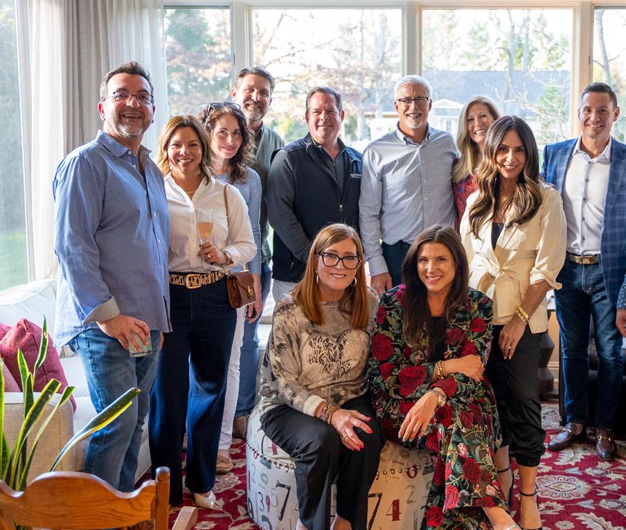
Summer feels like a season of possibility. The longer days and warmer weather feel hopeful. Even the light feels fresher. Somehow everything slows, just enough so that we can notice our surroundings in a whole new way. It is a time when we gather more, open our homes to friends and family, and spend time outdoors. This season is a natural moment to reflect on how architecture and design shape the way we live.
In this issue of FORMA, we explore the relationship between history, innovation, and the evolving way we experience place. Across the design world, there is a growing appreciation for buildings and materials that carry stories. Our Design Brief looks at this idea through the lens of Indianapolis’s industrial heritage. Factories designed decades ago by architects like Sutton and Routt once powered the Midwest economy. Today, many of those structures are finding new life as thoughtfully restored spaces that honor their original character while adapting to modern needs. Projects like The Stutz show how preserving history can become an opportunity for meaningful design thinking. It’s good to embrace the charm that once was in the middle of our fast-paced, day-to-day lives.
Transformation continues as a theme throughout this issue. In Blueprinted, the Holly Creek Overlook home along the Monon Trail in the Windcombe neighborhood shows what modern architecture is capable of. Designed by HAUS Architecture for Modern Lifestyles and built by WERK Building Modern, this home demonstrates how a strong architectural vision and careful collaboration can yield both beautiful design and responsible sustainability.
You will also find inspiration in unexpected places. From the extraordinary acoustics of the Palladium concert hall to the world-class hospitality projects of Rottet Studio, this issue celebrates how ideas travel and evolve.
At its best, design is deeply human. It connects past and future, creativity and craftsmanship, and the places where life unfolds every day. I hope this issue inspires you to look at the spaces around you with fresh appreciation and really take in how design makes you feel.
Sallie Lord, GreyHunt Interiors
Sallie Lord
FROM FACTORY FLOOR TO CULTURAL CORE, A CASE FOR ADAPTIVE REUSE
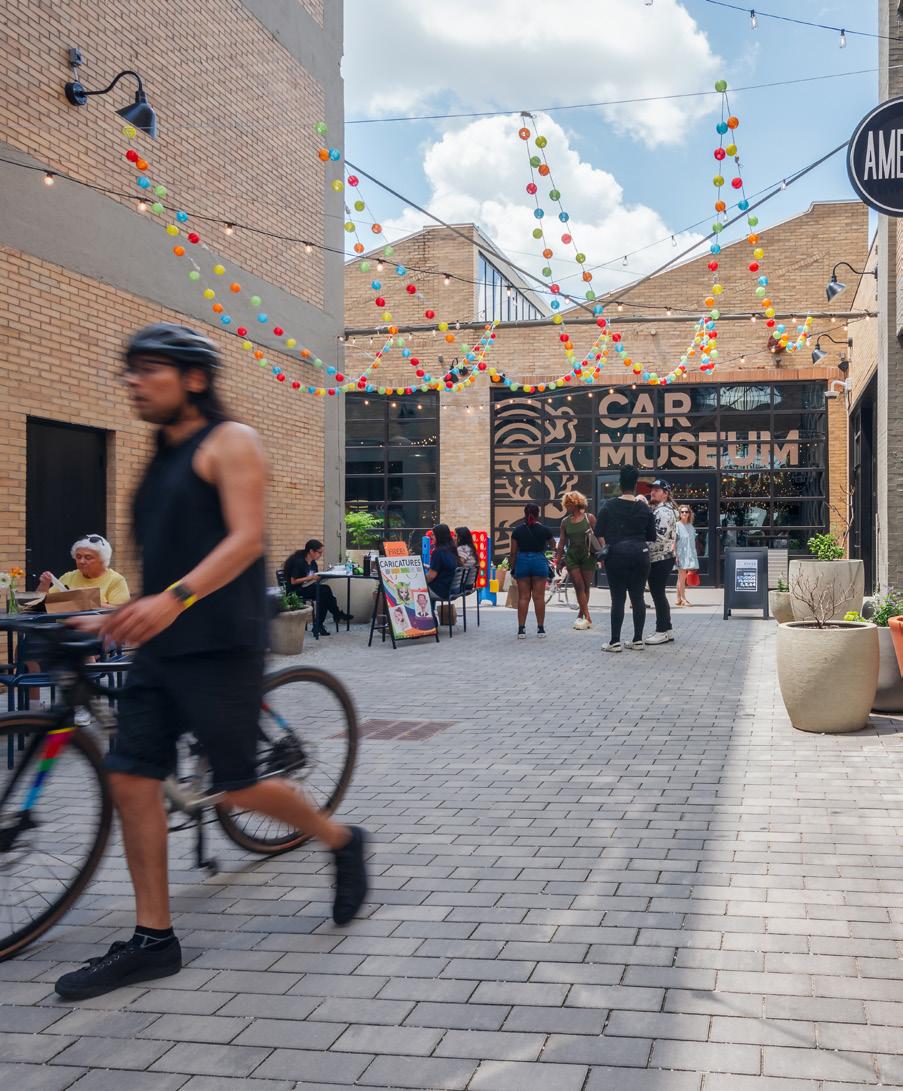
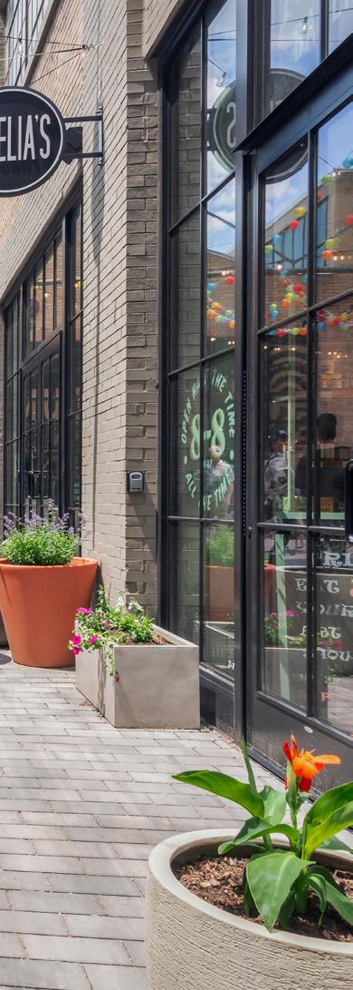
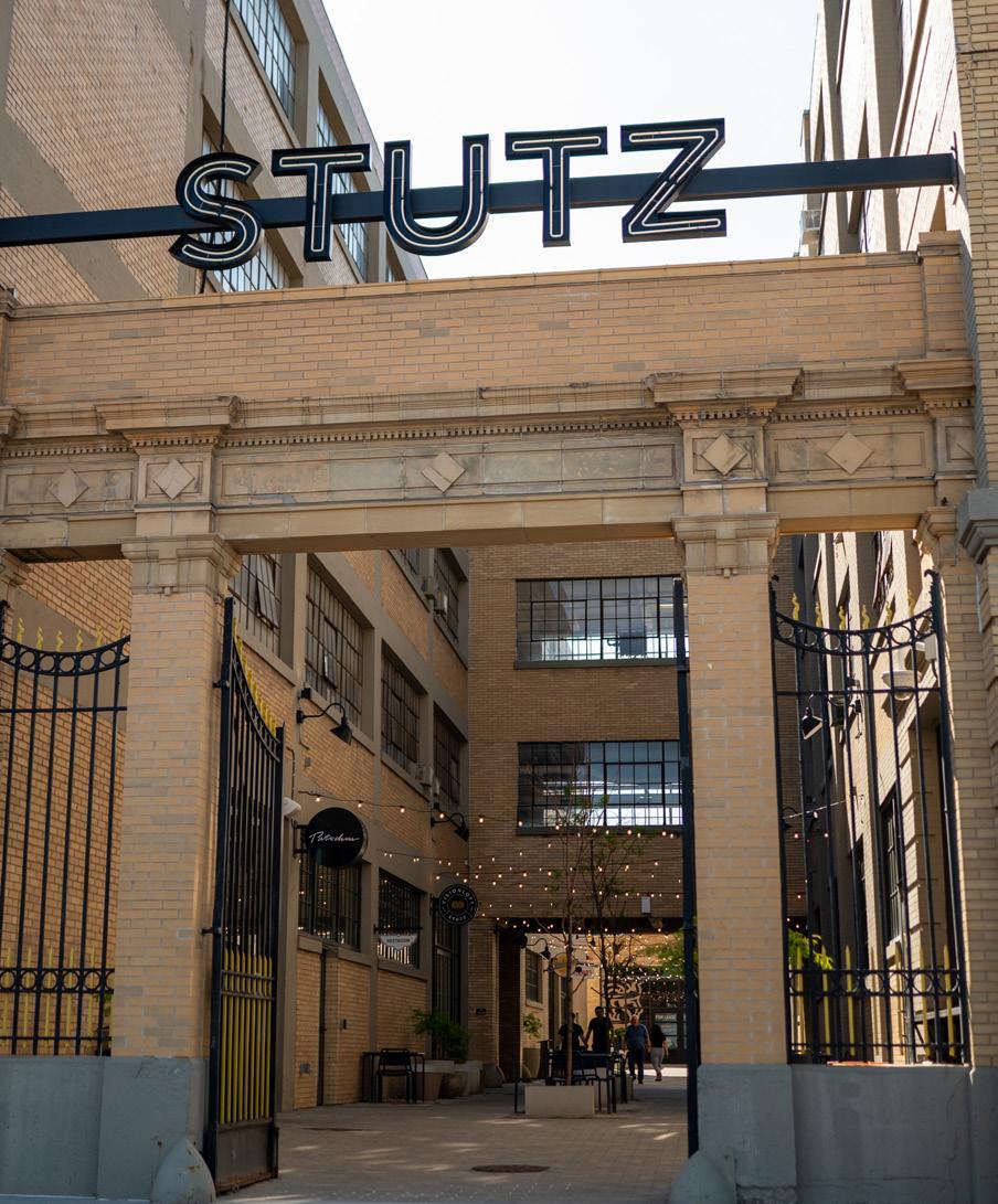
In the morning, The Stutz feels like a quiet pocket of the city where pavers, greenery, and cool air welcome people in from 10th Street. Early activity begins with gym-goers, naturally flowing into coffee at Amelia’s, brunch at Café Patachou, or quick stops at the art supply and plant shops before work.
During the day, the upper floors settle into a steady creative rhythm, with studios and small businesses making, meeting, editing, and building behind the old factory windows. By evening, the same corridors become social again, filling with after-work gatherings, neighbors grabbing tacos, and artists returning from their studios.
Written by Jeremy Welu, Partner, DELV Design Studio and Sam Vonderau, Partner, DELV Design Studio
Photos by Adam Reynolds and Tess Lawyer-Smith
What is now a vibrant hub for community and the creative economy began with a far more utilitarian purpose. Originally designed for manufacturing, The Stutz was built for making and moving racing vehicles, with long rows of factory windows, durable floors, and wide bays as its dominant features.
In its first life, The Stutz was introverted: a controlled interior meant for employees rather than passersby. A century later, that posture has shifted. The building needed to welcome people rather than screen them out. It needed to become extroverted and invite the city inside.
This shift to an extroverted posture was achieved by clearer wayfinding, updated windows, refreshed infrastructure, and selective storefront carving that makes the building more inviting from the sidewalk.
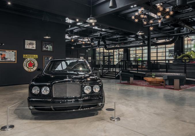
The once-car-travelled ‘roads’ through the building were converted into community halls with intuitive wayfinding. Nature-rich activated alleys with storefronts and restaurants were designed to draw people into and around the complex. The formerly utilitarian loading dock is now a car museum and event space that beckons the community in to learn the story of its automotive roots.
This redirection of energy is the quiet thesis of reclaimed industrial architecture across the Midwest. In a region rich with factories and warehouses, what continues to exist in the fabric of downtown often depends on whether these relics can be reimagined to serve current community needs.
Even with these thoughtful interventions, The Stutz does not pretend to be newly made. Fire doors remain where they always were. Old ramps stay in place. Circulation that would not be designed this way today still guides a visitor through. These quirks create pause. They ask visitors to look around and recognize that the building’s story has not been applied to the surface; it is embedded within its foundation.
Well-executed preservation makes room for a dialogue in design: old structure, new glass; guarded factory, open commons; industrial engine, cultural generator. Some changes
are straightforward, guided by clear preservation standards. Others carry more emotion. Done with restraint, an intervention reads as honest, allowing the original structure to remain in charge.
This is where reclaimed industrial buildings earn their place in the contemporary world: not as museum pieces or blank stages for minimalism, but as working parts of the city again. A factory’s original purpose has a lifespan, but a building’s value does not have to end when the machines move out. Rather than erasing the past, reuse keeps a period of significance alive while setting the structure up for its next life.
The seven buildings that make up The Stutz are stitched together by corridors that once served vehicles and freight. Now pedestrian movement is the main event, and each passage leads to a different pocket of energy: coffee, conversation, a bar, studios, a museum, gatherings that draw people in and let them roam.
The Stutz now runs on different fuel. What was once an introverted factory is now an extroverted heartbeat, a place where Indianapolis’s creative economy finds its rhythm.
Project Team: DELV Design (Indianapolis, IN) Architect of Record | S9ARCHITECTURE (New York, NY), Design Architect
AN EVERYDAY GETAWAY
OWNERS OF THIS NORTHERN INDIANA HOME
CURATED
A UNIQUELY
MODERN,
CLEAN SPACE
THAT FEELS LIKE THEY’RE ON VACATION EVERY DAY.
Written by Bailey Shelton / Photos by Sarah Shields Photography
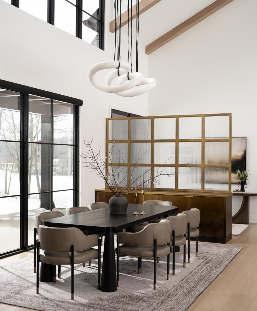
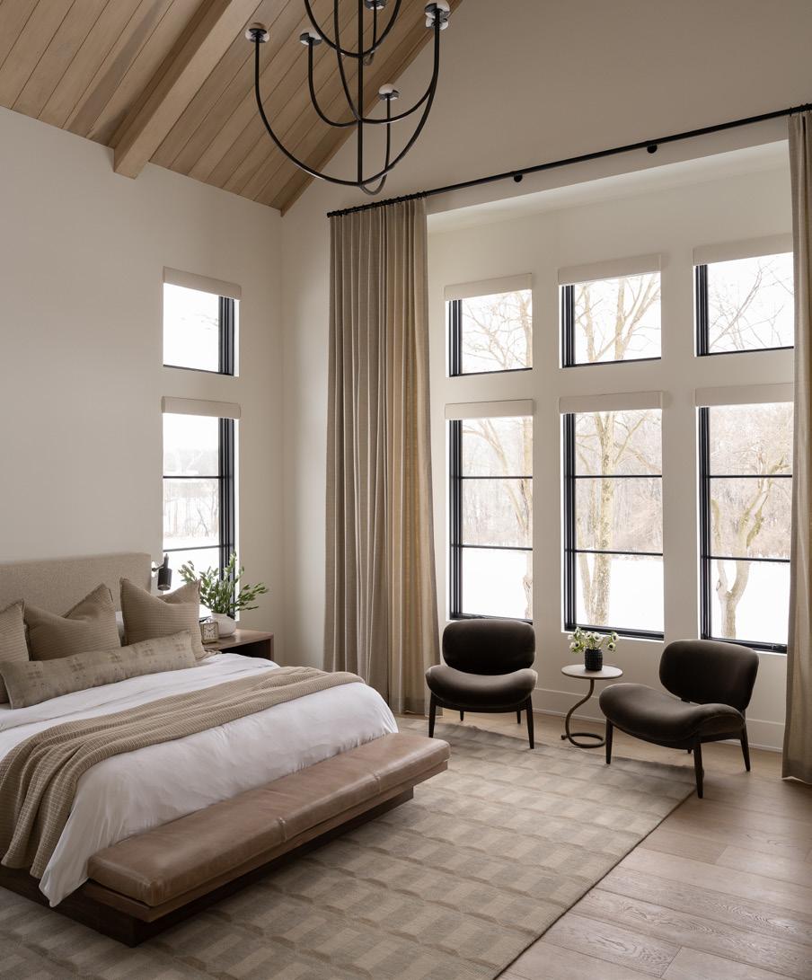
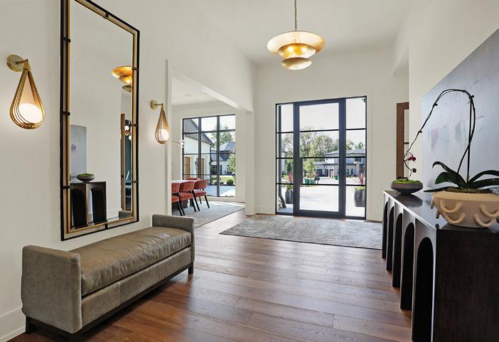
In the entryway of this Northern Indiana home is a physical embodiment of risk and reward. The custom bronze and corrugated glass room divider, which offers a bit of privacy as guests enter the home, required a bit of a gamble for the homeowners. A casual glance would never let on the trial runs of chemical reactions involved in making sure the finish of the bronze matched the fixtures throughout the home. Not too yellow, not too brown. But when there’s trust between homeowners and the team building their home, all things are possible.
“We wanted something modern and clean but still warm… we have teenagers so we didn’t want anything you’d need to be careful about,” says the homeowner.
This transitional property, which balances modern and traditional sensibilities, has all the trappings of a relationship built on trust; the tile work, floating vanities, multi-story custom light fixtures, and bespoke cabinetry would not have been possible without the team behind them and the homeowners who worked closely on every decision to make it happen.
According to Scott Campbell of Scott Campbell Custom Homes, “Our clients’ inspiration and hope was that, while leading with a transitional feel and floor plan, their new home would remain timeless and not denote one particular architectural feel or style. Combining different elements of cool and warm materials, and the craftsmanship of a Scott Campbell custom home, the house was able to bring to fruition our clients’ vision.”
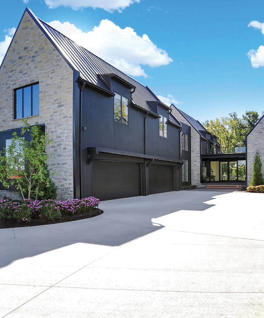
For these homeowners, building a home was always only a matter of finding the right parcel of land. The couple grew up in nearby Logansport, and their family of five felt rooted in that community. The right land in the right area came on the market, and before they knew it they were breaking ground. The property itself is set back from the main road and surrounded by trees, making the homeowners feel like they’re on retreat with their everyday privacy.
The family approached Emily Handke for the architectural design of the property. After the initial design, Scott Campbell Custom Homes came on board as their builder. Glass House Gallery collaborated with the builder, architect, and homeowners to consult on the scale and visual space of the windows and doors. Interior designer Kara Grider acted as a liaison between the homeowners and the various home artisans and contractors that brought the home to life.
“It was a really big plus getting called in before the exterior selections were finalized and the floor plan was complete,” says Grider.
“We went back and forth on a few things, but it’s all been very intentional,” the homeowner says.
UNIFIED KITCHEN AND LIVING
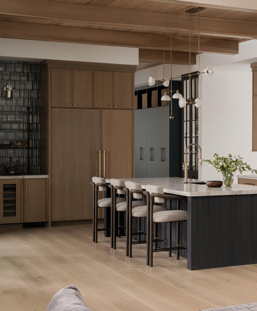
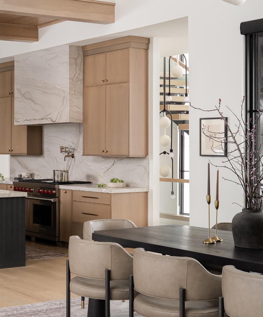
A coordinated effort sits behind every detail of this home. Kara Grider led a team to create the layout of the kitchen and dining area. With appliances from Ferguson Home, the space is designed like a Swiss watch around the cooking habits of the homeowners.
“Kara Grider, the designer, is incredibly talented. Working together on the kitchen layout, appliances, and lighting was such a seamless and inspiring experience,” says Diana Daniely of Ferguson Home.
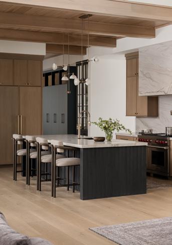
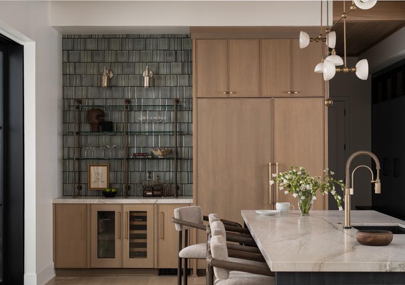
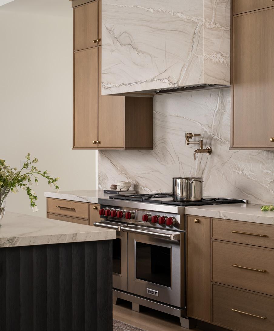
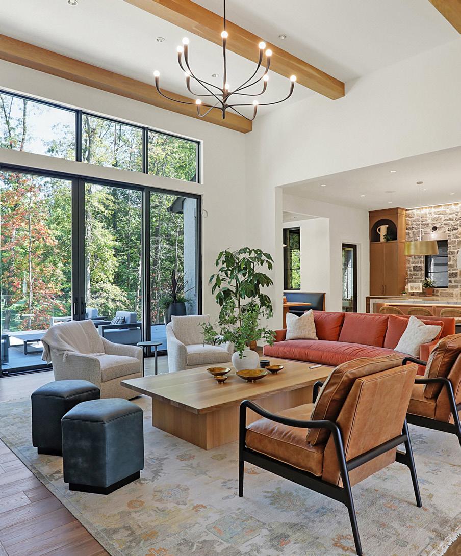
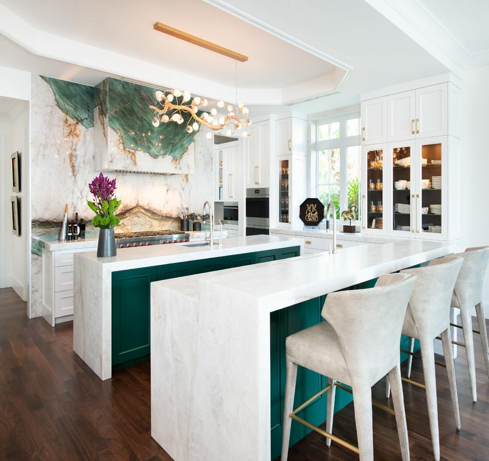
The kitchen features dazzling Brazilian quartzite slabs which carve out the island, wet bar, backsplash, and sculptural range hood. Grider collaborated with Chateau Kitchens and Architectural Brick & Tile to harmonize the flooring, cabinetry, and ceiling with seamless wood tones. Ferguson appliances are integrated into the cabinetry, with discreet cold storage under the bar top and a state-of-the-art range completing the space.
Part of the plans for the entryway flowing into the culinary and living spaces included a room divider. Grider commissioned a custom steel and corrugated glass built-in from Nick Roudebush, co-owner of Mercantile 37. The final finish required a high-stakes chemical treatment process, which meant the patina was more of a calculated risk than a predictable outcome.
“It was originally slated as a halfwall covered in slatboard, which I saw as an opportunity to do something different and work in more of an industrial piece inspired by factory windows,” says Grider. “What we did really opens up that space and creates a clear visual into the home.”
The result serves as functional art: a built-in invitation to the space, a work of craftsmanship, and a tie back to the homeowners’ love of industrial design.
LUXURIOUS ENSUITE AND POWDER BATH
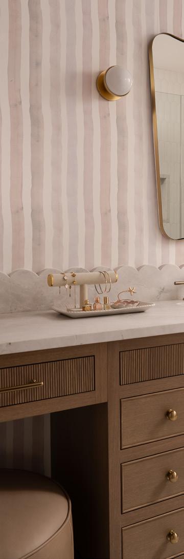
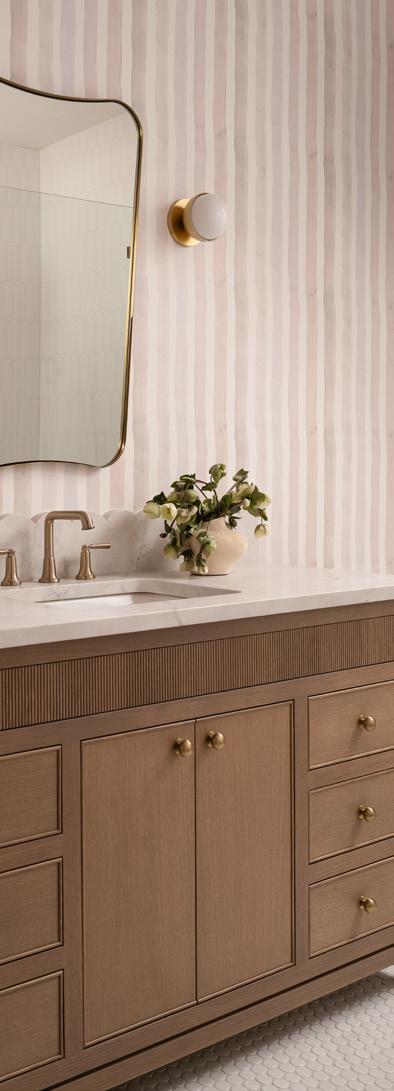
The team at Chateau Kitchens particularly loved the final look of the daughter’s bathroom, where light pink wallpaper pairs with a custom scalloped-edge vanity.
“We love how this space turned out. Warm wood cabinetry with reeded detailing brings texture and refinement to this vanity design showing how truly custom we can make our cabinetry offering,” says Holly Blevins, lead designer at Chateau Kitchens.
They used a combination of their Chateau Signature Series custom cabinetry and Executive Cabinetry line throughout the home. Cabinetry in the kitchen and laundry room, all customized to the daily life and movements of the homeowners, create a functional throughline in major spaces around the home.
Blevins says of the laundry room, “One of the needs was creating a dedicated area for air-drying clothing, which led to the integration of a built-in drying rack while maintaining a clean, streamlined look. These details allowed the cabinetry to work behind the scenes while still aligning with the overall aesthetic of the home.”
Architectural Brick & Tile not only supplied the stone for the exterior of the home, but also the tile of the laundry room floor, kitchen drybar, bathrooms, and specialty Zellige tile of the pantry. Because most of the home works with a neutral and earthy palette, texture creates most of the visual interest around the home.
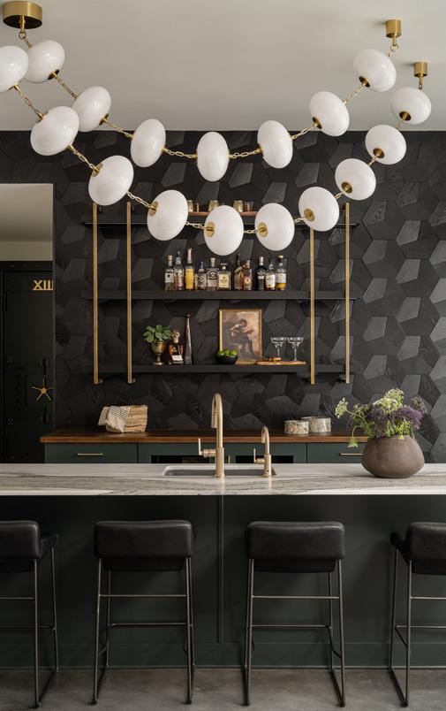
“I especially appreciated the architectural wall design element we provide for the lower-level bar accent wall with the hidden door to the casino room-it’s special details like these that make the home luxurious yet still comfortable and livable. Scott and Kara’s work made this come together like no other home,” says Kelly Cheslyn of Architectural Brick & Tile.
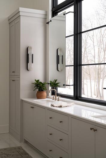
Massive fenestrated windows courtesy of Glass House Gallery, in coordination with Marvin Window & Door, flood the primary suite with light. Dual vanity mirrors are mounted to the same frame to make the most of natural morning light without disrupting the view through the window.
“The primary suite bathroom is a great example of blending function and design. The windows were carefully positioned to bring in natural light while maintaining privacy, allowing for the unique integration of mounted mirrors directly in front of the glass,” says Cori Brown, owner of Glass House Gallery. “That creates a clean, almost floating effect while keeping the space bright and open.”
THE DREAM ENTERTAINMENT SUITE
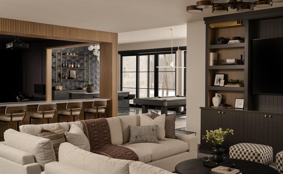
Downstairs is a dream come true for the kids and husband of the family. A golf simulator is framed in a custom ribbed wood paneling. Custom chairs are upholstered in fabric that resembles a course map. Behind the pool table is a full bar top, where a geometric hardwood wall conceals a hidden door. Scott Campbell’s team worked with Architectural Brick & Tile on this unique wall design. They partially disassembled and reassembled the statement wall and door to create the illusion that hides this secret poker room.
“That’s why Scott’s subcontractors are such good quality, because on a project like this, that attention to detail is critical,” says Cheslyn.
The room is a teen’s hideaway for now, leaving the adults to the rest of the entertainment suite, but the original design and motif of the secret room was actually inspired by the dad of the family, and his love for Las Vegas.
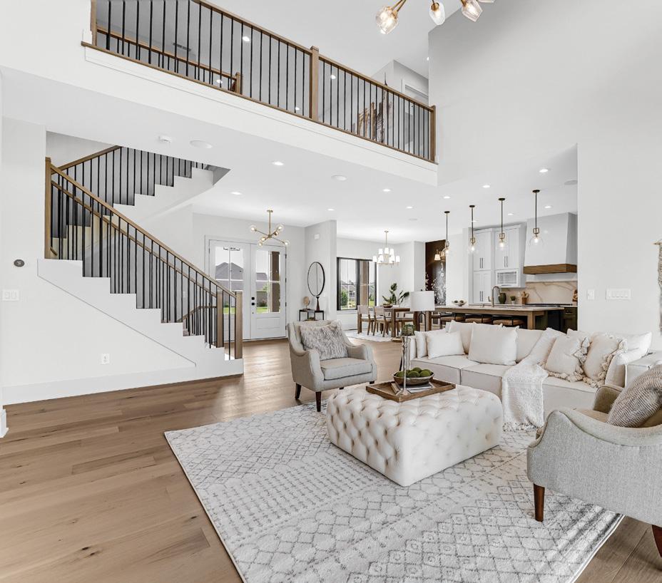
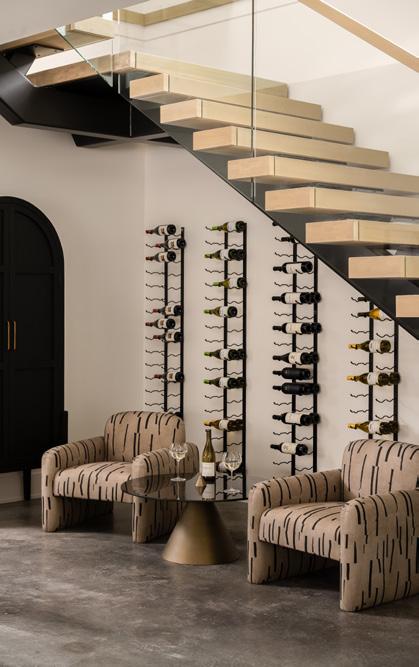
A multistory floating staircase connects upper floors to the kitchen and living area of the main floor and lower level entertainment suite. Large-format glass windows in minimal architectural frames from Glass House Gallery allow natural light to flow uninterrupted throughout the home.
“When you’re working with a team that has an established level of trust and communication, it creates efficiency and elevates the outcome. There’s less friction in the process, and more focus on pushing the design forward rather than solving avoidable issues,” says Brown.
Familiarity also means a shared understanding of expectations: Everyone knows the required level of detail and is committed to achieving it. That consistency shows up in the finished home, where everything feels cohesive, intentional, and well executed.”
Ferguson Home also supplied just over half of the lighting fixtures throughout the property, working closely with Scott Campbell Custom Homes on installation, and with Grider to source fixtures that coordinated well with the custom sculptural pieces that run down the staircase’s center, and throughout the common areas on the main level.
“The team was great. You become so close with them, seeing them every day,” says the homeowner. “I never wanted to build. It seemed so overwhelming. But it was definitely worth it.”
The culmination of efforts among these craftspeople is a home where each room is flooded with unique touches and perfected details. The home is now the go-to hangout spot
for the teen children and their friends. The homeowners love to host and cook around their open-concept space. The family feels almost as though they’re living on a vacation property. The homeowner says, “I remembered going through everything [with the team] in each room, color matching all of the wood, picking the tile, but seeing it all together was something else.”
A CONCERT HALL BUILT FOR SOUND
INSIDE INDIANA’S ONLY CONCERT HALL ENGINEERED FIRST AND FOREMOST AROUND THE EAR.
Written by Iona Brannon / Photos by Tess Lawyer-Smith
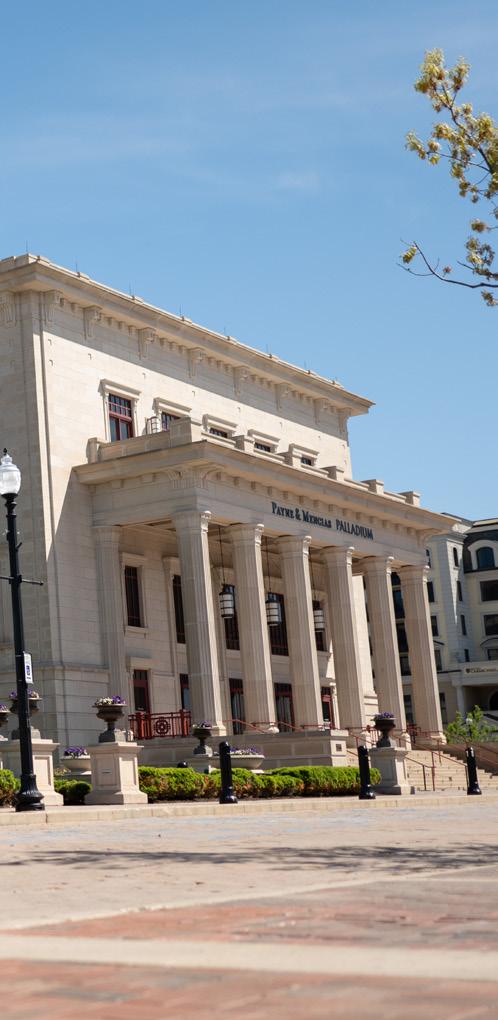
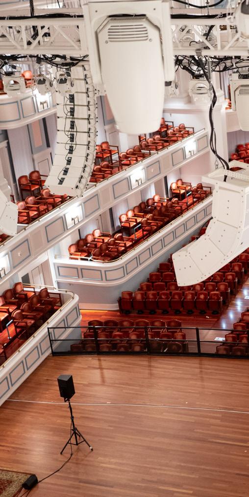
Step through the doors of the Payne & Mencias Palladium on a quiet afternoon, and what’s most noticeable is what’s missing. Sound. The 2½-inch acoustic outer doors of the music hall muffle the outside world. A pause, preparing you for the second set of doors that open to the exquisite hall, 151,000 square feet of space built to be heard.
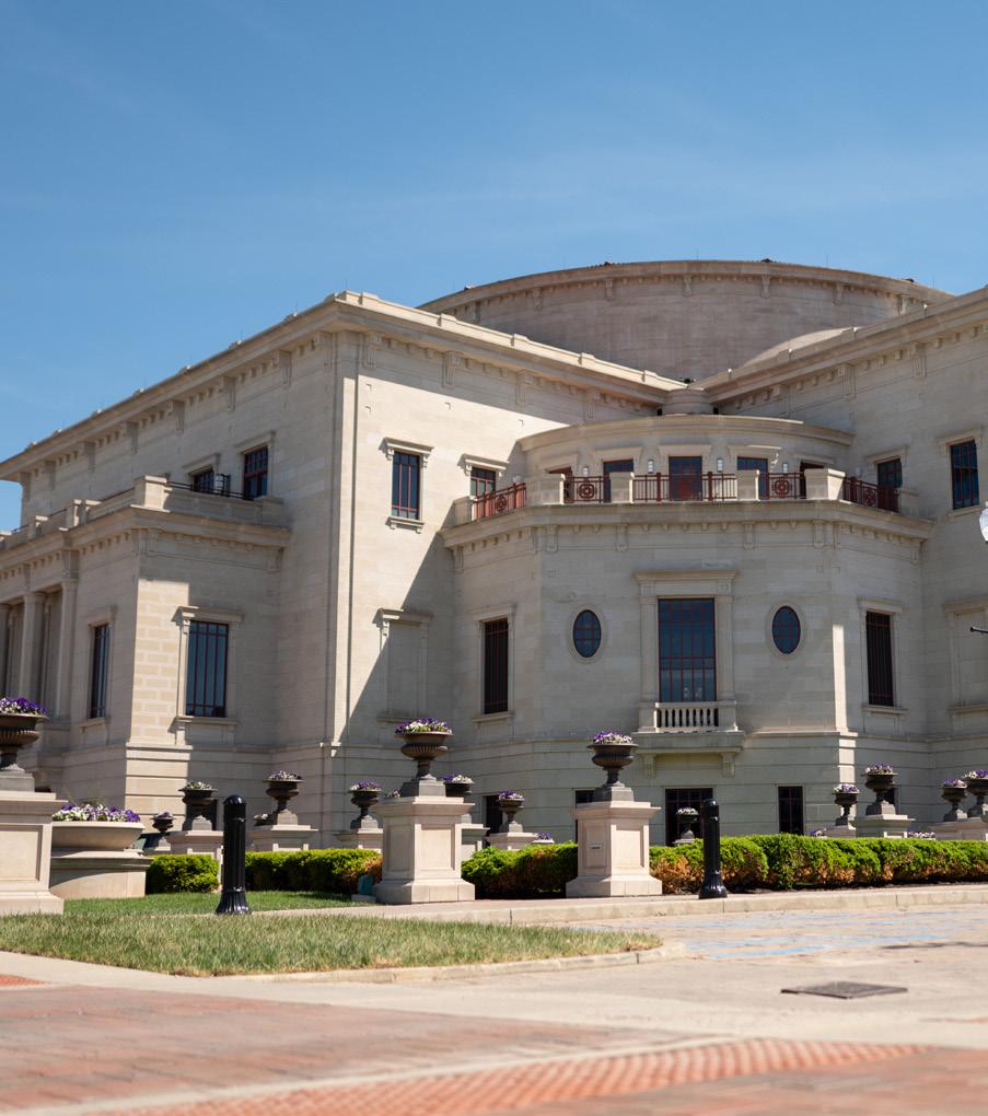
The exterior is cloaked in more than 15,000 pieces of Indiana limestone, quarried and hand-cut two hours south of Carmel. Inside, the main lobbies are carpeted with 8,500 square feet of Italian stone flooring. The hall floor and stage are Brazilian cherry, beloved for both its beauty and density.
The hall’s ceiling is domed; a glass oculus at the crown draws natural light into the hall through a slightly offset, slanted shaft connecting the laylight to the skylight above.
“The design of the room itself is oblong— we kind of say it’s an egg shape, if you will— and it’s designed so that there are no parallel surfaces,” says Jeff Steeg, the Palladium’s original sound engineer.
It’s one of those details, as Steve Knight, principal and managing director of David M. Schwarz Architects, puts it, worth looking for. The glazing has a Sound Transmission Class (STC) rating of 65. According to the building’s lore, a helicopter could hover overhead without disrupting a show.
“The venue is nearly acoustically perfect,” says Jeffrey C. McDermott, president and CEO of Allied Solutions Center. Designed around the listener’s ear, the Palladium opened in 2011 as the flagship venue of what is now known as the Allied Solutions Center for the Performing Arts in Carmel. The $126 million hall remains the only venue of its kind in Indiana, and among the most acoustically sophisticated in the country.
The Palladium’s four-fronted, symmetrical form was inspired by Andrea Palladio’s 16th-century Villa Capra, La Rotonda, in Vicenza, Italy. Washington, D.C.-based David M. Schwarz Architects, with Indianabased CSO Architects as architect of record, borrowed the exterior symmetry and domed profile, combining it with a shoebox-shaped interior seen in the world’s great concert halls.
“Lots of experimentation over time has proven that relatively tall, narrow, and long rooms work best for non-amplified music,” says Knight. “They are optimal not only for initial sound reflections, but also secondary and tertiary reflections—think of sound like a beam of light bouncing off mirrored surfaces.”
The acoustic strategy was the work of Artec Consultants Inc. of New York, which spent three months tuning it, running 35 events with more than 50 performing groups to prepare the space.
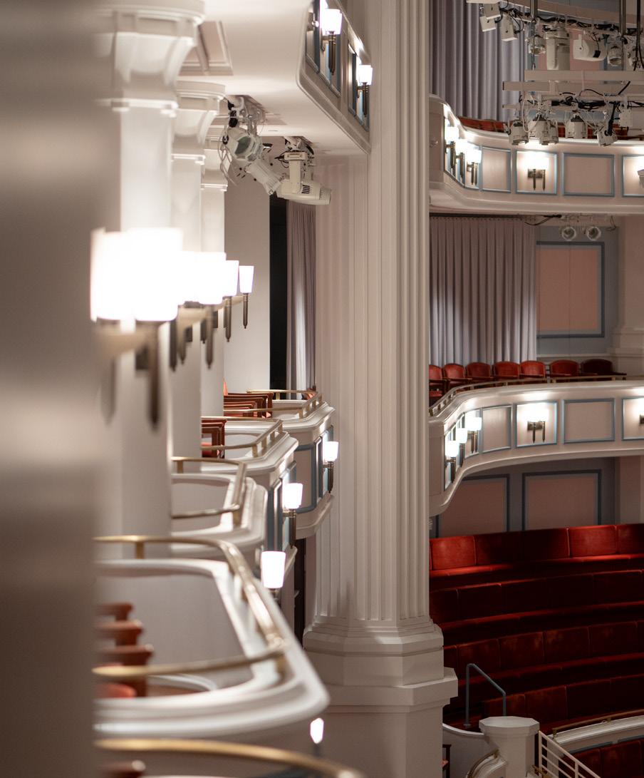
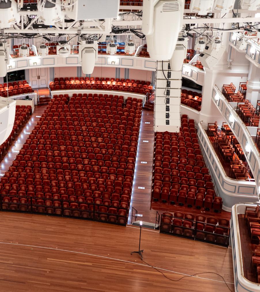
The room was built for symphonic music first, with an intimate single-room design closing the separation between audience and performer. The coffers and ribs on the ceiling, the pilasters and columns on the walls, the ornamental detailing on the balcony fronts, all of it assists in reflecting sound energy back into the room. “Nearly every element in the hall is both acoustically and architecturally driven,” says Knight.
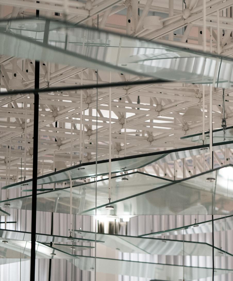
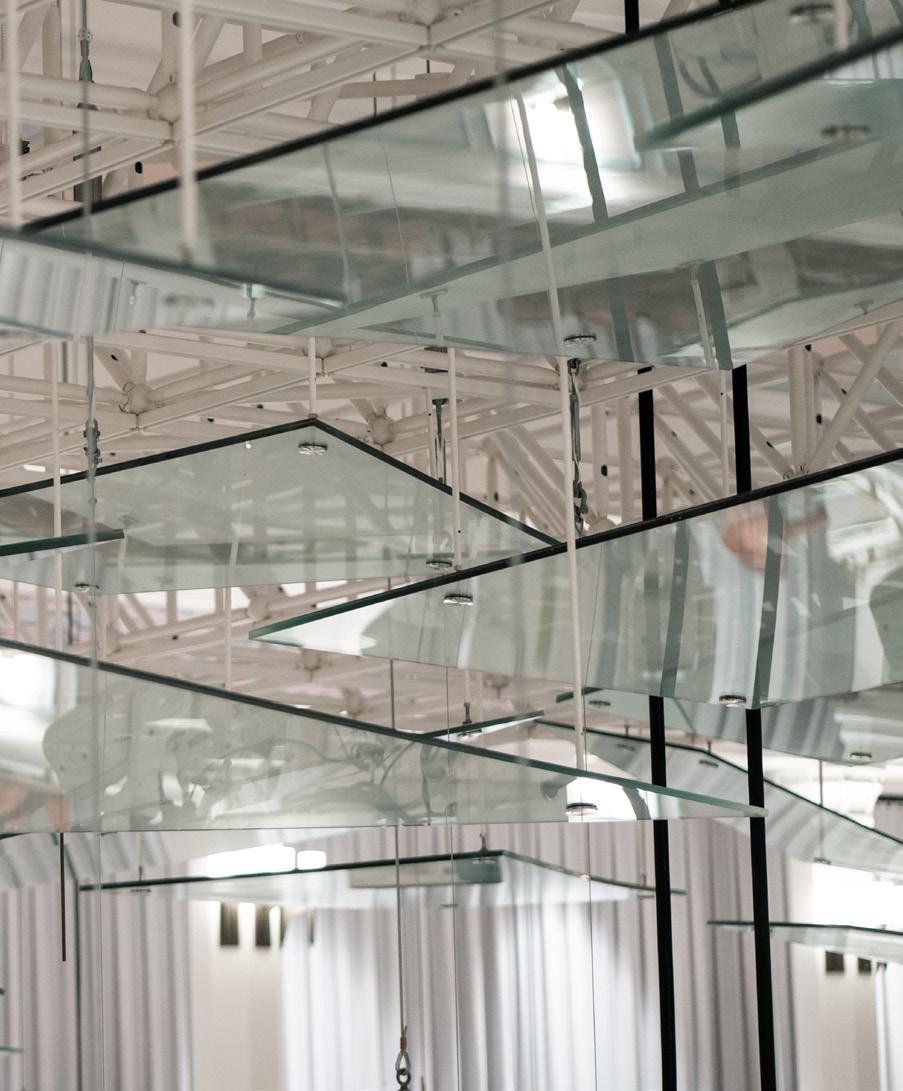
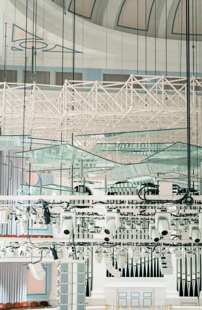
Above the orchestra floor, a 90,000-pound glass canopy hangs from four banks of steel structure. The steel frames are raised or lowered before each performance to tune the room’s reverberation. For a string quartet, the panels descend, and the room opens up. For an amplified rock show, they rise so the sound does not overwhelm the space. Most halls use wood, but the Palladium uses specially engineered glass to preserve the beauty of the ceiling. “The domed ceiling design is so beautiful,” says Knight. “We didn’t want to hide it.”
Curtains lining the box tiers work the same way, staying open to keep walls reflective for classical programs, drawing shut to dampen and control for louder ones.
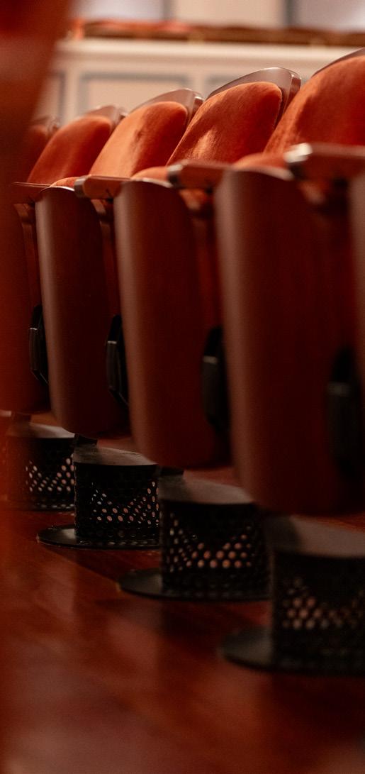
Even the colors are intentional. Knight cites a principle called psychoacoustics, the idea that what you see shapes what you hear. The burgundy mohair seats; the hues of blue warmed with pink, taupe, and off-white on the walls and ceilings; the Brazilian cherry under foot—all of it was chosen with the listener’s experience in mind.
Seats in the main bowl and in the gallery level are staggered, so you’re never sitting directly behind somebody. Below the floor, conditioned air is pressurized through an underfloor system and pushed upward through vents beneath each seat. The energy center itself sits nearly 700 feet away, connected by an underground tunnel, so no mechanical hum ever reaches the hall even as its temperature and humidity are maintained.
Over the years, the hall has hosted naturalization ceremonies, public debates, and performances by iconic artists including Tony Bennett, Natalie Cole, and Kenny Rogers. And it continues to improve. In June 2024, for the first time since the hall opened, the Palladium got a custom built sound system. Carmel-based Haverstick Designs led an acoustic analysis, mapping the entire hall with LiDAR technology and placing microphones throughout to measure reverberation and identify problem surfaces. The result is a hall that delivers sound evenly from the front row to the back wall, with not a single bad seat among the 1,600. “In a sense, the Palladium is finally complete,” McDermott says.
THE EDIT Open Air
The warm weather doesn’t ask permission. It shows up, and suddenly you want to be outside for every meal, every conversation, every quiet moment with a drink in hand. This season, we’re thinking beyond the basics: the furniture that blurs the line between inside and out, the materials that age beautifully under an open sky, and the details that turn a patio into a place you never want to leave. Consider this your blueprint for living—really living—outside.
Curated by Melanie Brewer
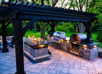
1. DESIGN YOUR OWN OUTDOOR KITCHEN
Wasson
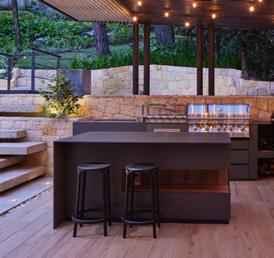
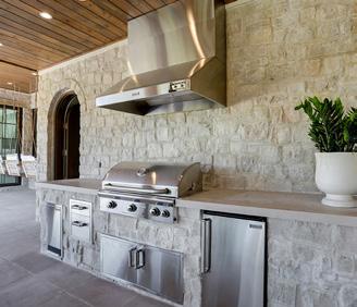
If you’re serious about spending time outside, this is a beautiful place to start. Wasson’s design-build team creates outdoor kitchens that function like a true extension of your home, not just a grill with a few extras. Every detail can be tailored, from storage to refrigeration, resulting in a space that’s both intentional and highly functional. It’s the kind of setup that naturally draws people outside and keeps them there.
wasson1977.com
2. ÎLES CUSHION
Roche Bobois
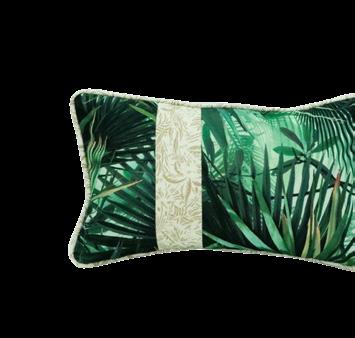
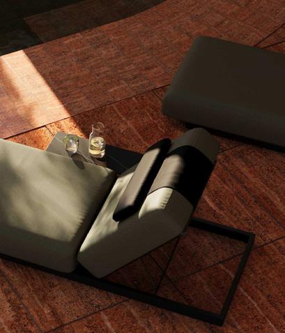
Outdoor spaces can easily feel a little too structured, but this is the kind of piece that softens everything without trying too hard. The Îles cushion has that elevated, tactile quality you’d expect indoors, but it’s made to handle the elements.
roche-bobois.com
3. OPENING GLASS WALL SYSTEMS
NanaWall
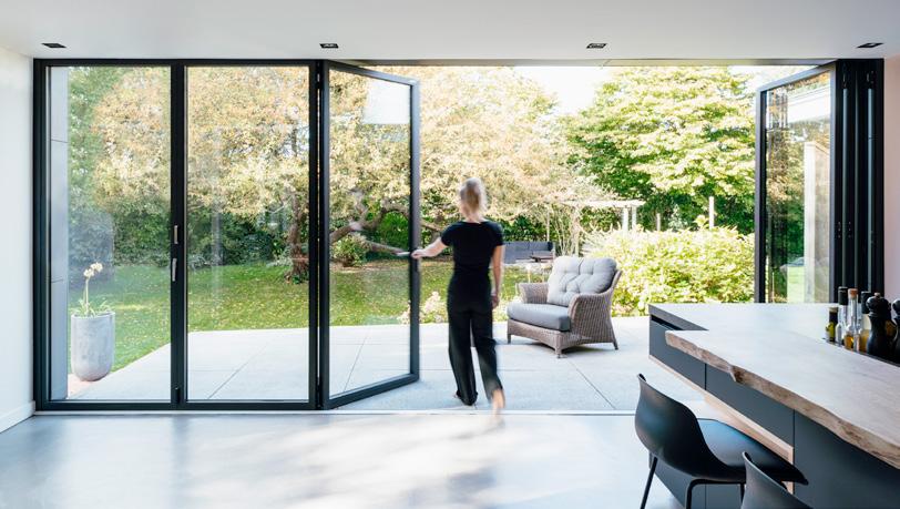
Architects are expanding indooroutdoor spaces with moveable glass solutions beyond the sliding door. NanaWall systems let you open up an entire wall so that indoor spaces flow directly to the patio. When it’s open, rooms can double in size, expanding square footage without having to navigate the door. When it’s closed, the high-end seal keeps wind and water on the right side of the glass.
nanawall.com
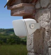
4. OUTDOOR AUDIO SYSTEM
Bowers & Wilkins
Good outdoor sound is harder to get right than people think, and this is where Bowers & Wilkins really stands out. The audio is clear, balanced, and fills the space without feeling overwhelming. You can control everything from your phone and even set up different zones, which makes it perfect for entertaining.
bowerswilkins.com
5.
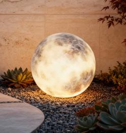
MOONLIGHT LED LAWN LIGHT
Dazuma
This is less about lighting a space and more about setting a mood. The soft glow feels natural, almost like moonlight, and it adds just enough illumination without being harsh or distracting. Placed along a path or tucked into landscaping, it creates a really calm, inviting atmosphere at night.
dazuma.us
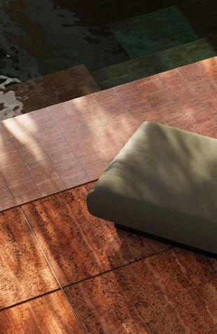
6. SINTERED STONE SURFACES
Neolith
If you want your outdoor space to feel like a true extension of your home, the materials matter. Neolith is one of the best options for that. It looks like interior stone but is built to handle weather, heat, and daily use outside. Using it across countertops or flooring helps everything feel seamless and much more elevated.
neolith.com
7.
PERGOLA
The Smart Pergola
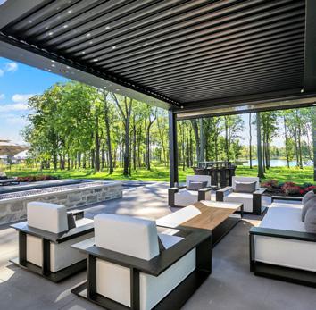
A smart pergola transforms an outdoor space into a fully responsive extension of the home. Built with durable aluminum framing and motorized louvers, it allows for precise control over sunlight, airflow, and weather protection with the touch of a button or through an app. Integrated systems like lighting, retractable screens, and weather sensors work together to adjust the environment in real time— closing automatically during rain, filtering light throughout the day, and creating a comfortable, usable space year-round.
thesmartpergola.com
6.
1.
8. OUTDOOR GRILLS & KITCHENS
Indy Grills
Grills have evolved from a single appliance into the centerpiece of the outdoor experience. Today’s built-in systems are designed with the same intention as an indoor kitchen—highperformance, durable materials, and seamless integration into the overall space. gathering, and everyday use. Through companies like Indy Grills and Outdoor Living, grills are paired with custom cabinetry, refrigeration, and thoughtfully planned layouts, transforming patios into fully functional environments for cooking, gathering, and everyday use. The result is less about the act of grilling itself and more about creating a space designed for connection, comfort, and time spent outside.
indygrills.com
9. LONG BEACH WALL FOUNTAIN
Outdoor Art Pros
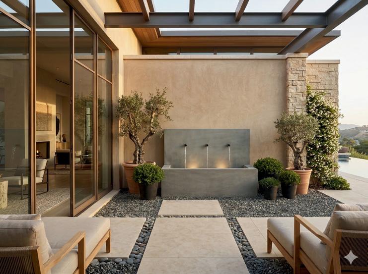
Adding water instantly changes the feel of a space, and this is a clean, architectural way to do it. The vertical design makes it feel intentional, not decorative, and the sound helps soften everything around it, especially if you’re near a street or neighbors. It’s subtle, but it makes a big difference.
outdoorartpros.com
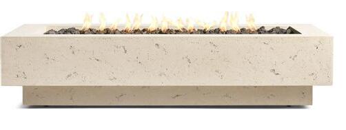
10. IXTAPA RECTANGULAR PLINTH FIRE TABLE
RH Outdoor
This is one of those pieces that people naturally gather around. It works as a table during the day and becomes the focal point at night. The design is clean and substantial, so it doesn’t feel like an afterthought, it feels like part of the space.
rh.com
11. FLORIAN OUTDOOR LOUNGER
Rove Concepts
If you want a spot to actually relax, this is it. The low, elongated design feels more like indoor furniture than typical outdoor seating, and it’s incredibly comfortable without looking bulky. It’s especially good near a pool or along the edge of a patio. roveconcepts.com
12. LISBON OUTDOOR DAYBED
Arhaus
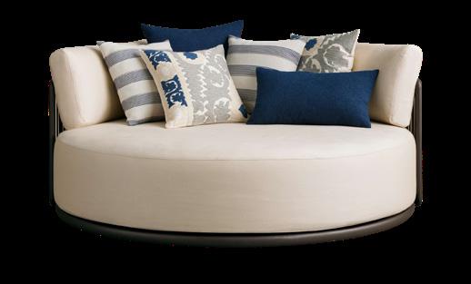
This daybed creates a defined place to slow down, whether that’s reading, napping, or just spending a quiet afternoon outside. The scale and shape make it feel like its own little environment within your space.
arhaus.com
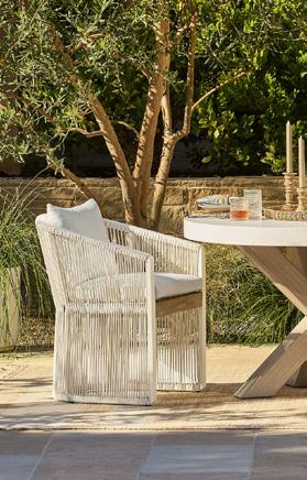
13. ABBOTT ROUND OUTDOOR DINING SET
Pottery Barn
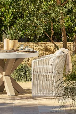
There’s something about a round table that just works better for conversation. Everyone feels included, and it makes outdoor dinners feel more relaxed and connected. This set is durable, comfortable, and easy to live with, which is exactly what you want outside. potterybarn.com
14. CURVED FICONSTONE HOSE STORAGE
West Elm
Small details can make any space feel finished. Instead of leaving a hose exposed, this turns it into something that actually looks intentional. It’s simple, but it keeps everything feeling clean and pulled together.
Written by Carie McMichael / Photos by Nolan Calisch
Move over, minimalism—the sterile and uncluttered white and greige expanses of the last decade are fading from Instagram feeds and are being replaced with layered, curated spaces that marry functionality with personality: Welcome to modern maximalism, elevating design from baseline utility to visual storytelling.
For years minimalism defined the conversation around interiors; clean lines, neutral palettes, and simplicity at every turn. While that foundation still holds value, today’s spaces are evolving into something more nuanced: interiors that feel layered, personal, and deeply connected to how people live.
At Dani Kohl Interiors, this shift isn’t about following trends, it’s about refining them. “Design isn’t all about appearance. It’s about how a space functions, flows, and feels on a daily basis,” says founder Dani Kohl. “How materials come together. The layering, the contrast, the small details all turn a soft palette into something truly elevated—depth, personality, and a stronger sense of story.”
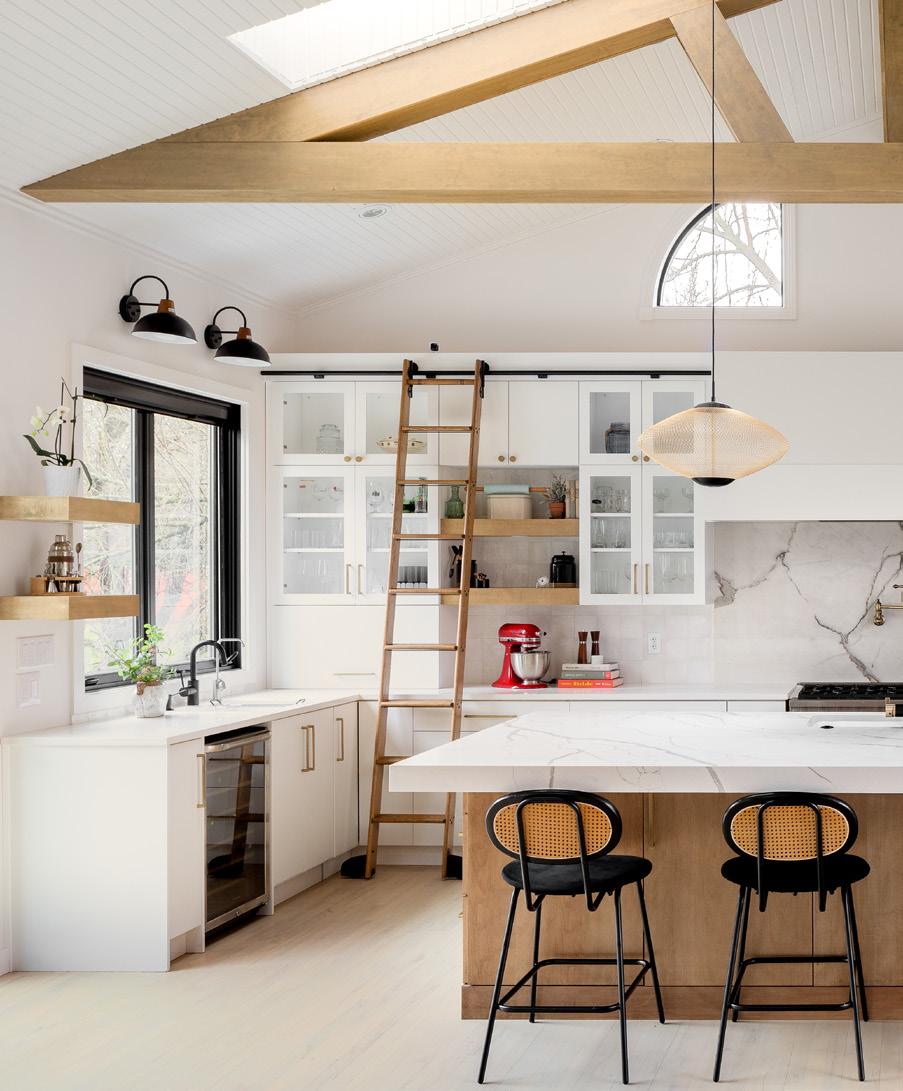
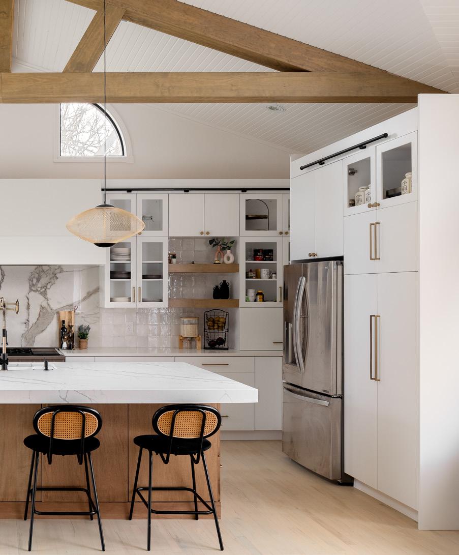
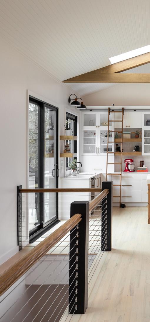
On one of Kohl’s recent remodels, the goal was to create a home that balanced beauty with the realities of everyday life for a family of five. Improving flow, maximizing storage, and designing a kitchen that could function as both a gathering space and a central hub became key priorities.
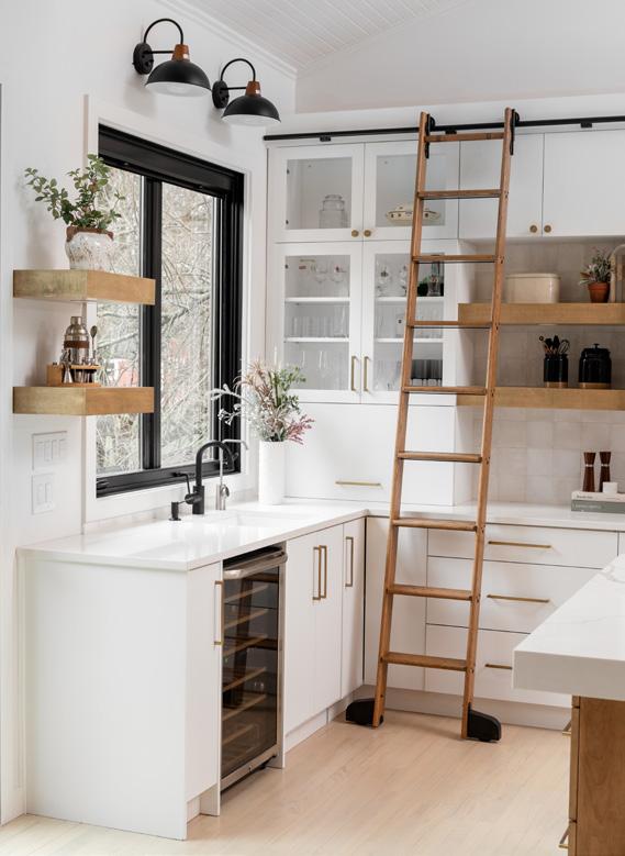
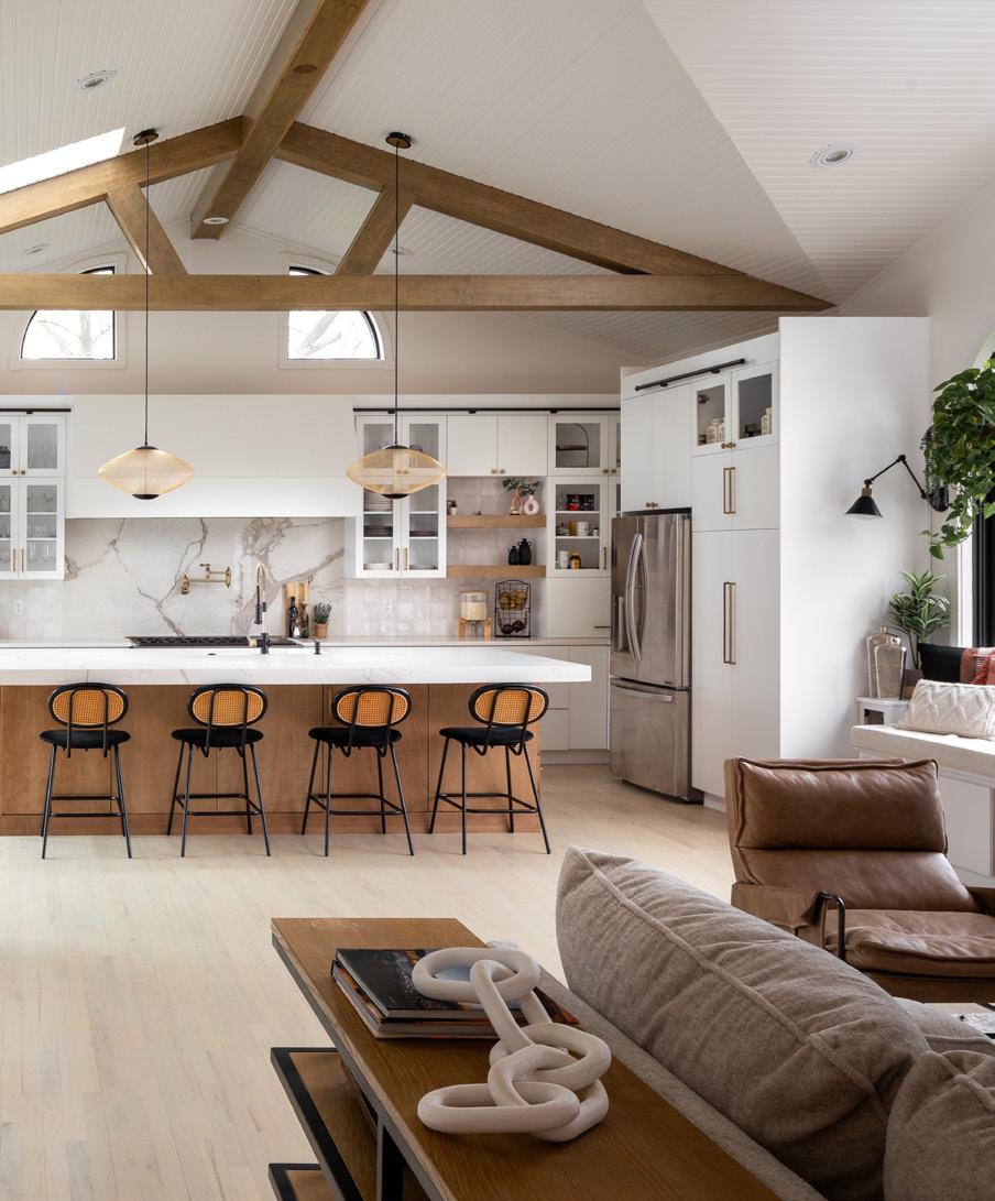
The solution required a bold move: reimagining the layout entirely. By swapping the kitchen and living areas, the space was transformed into a more natural, functional environment that feels intuitive and open. “It’s about finding the right balance,” Kohl explains. “The goal is for the existing architecture and the new design to feel naturally aligned, clear, intentional, and cohesive.”
One of the greatest challenges was a load-bearing wall that once divided the space. Demolishing it allowed the home to breathe, creating open space for longer sightlines and a stronger connection between each area. A structural beam was installed for support, while original elements like the skylight and white plank ceiling were preserved for continuity.
The windows and sliding glass door to the backyard were enlarged to bring in natural light and strengthen the connection to the outdoors. The result is a space that feels expansive, yet grounded. Light, scale, and proportion working together to define the experience.
Materials were also carefully selected to highlight the character of the space: a melting pot of warm woods, quartz stone, metal accents, and curated furniture were layered to create depth. Everything was selected to feel timeless, tactile and layered without being overwhelming.
“We approached it as the final layer of storytelling,” Kohl says. “Each piece was selected to complement the architecture and reinforce the overall concept: refined simplicity. Clean architectural lines, thoughtful materiality, and a restrained palette that allows each element to stand out. It’s about creating impact through balance rather than excess.”
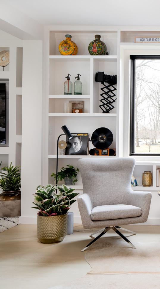
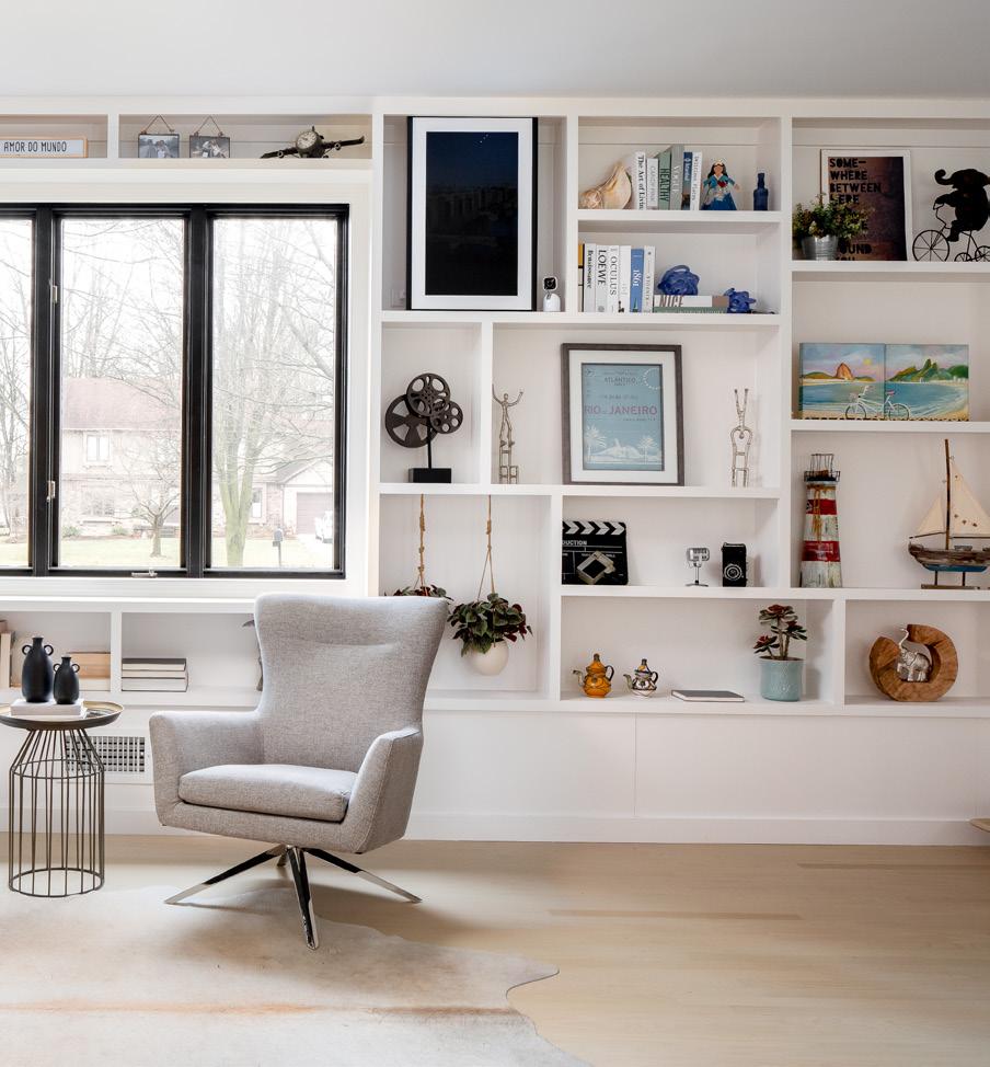
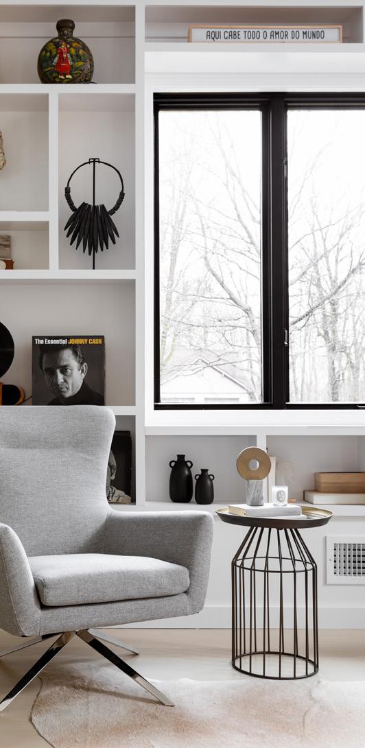
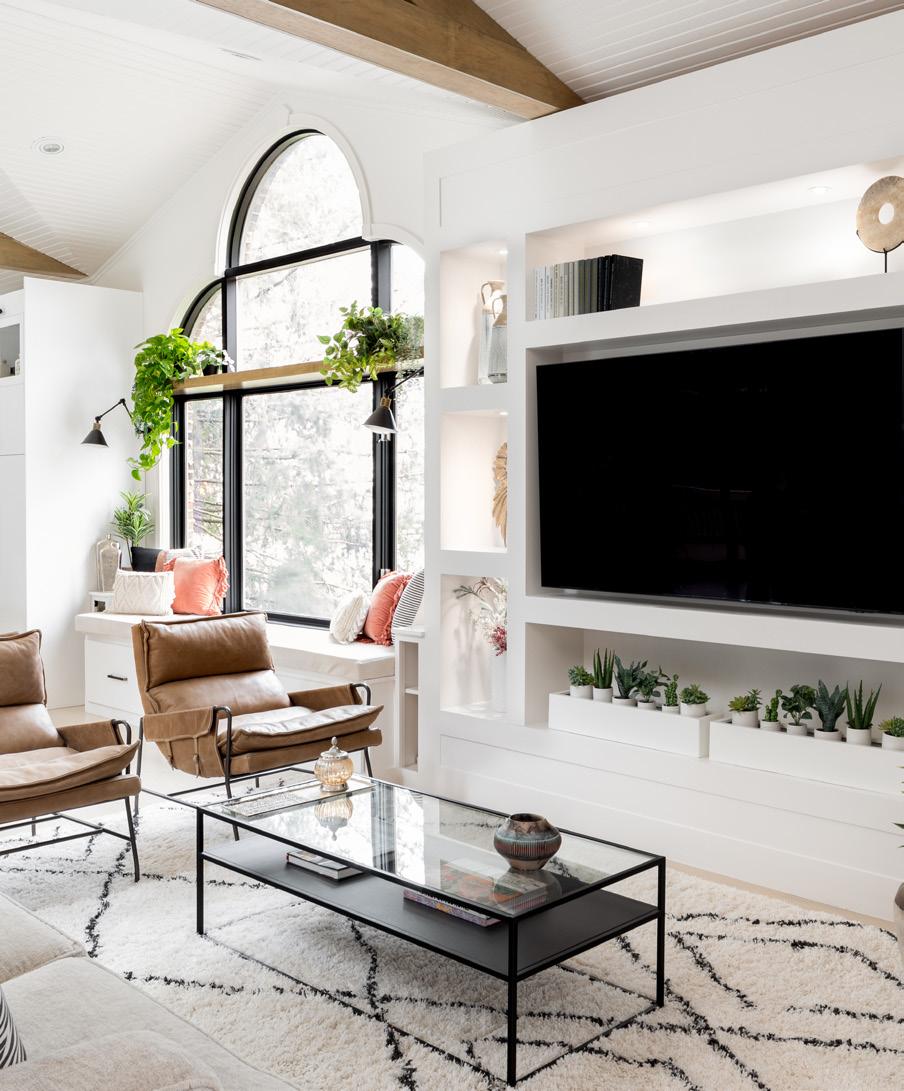
While white is the backdrop of the remodel, the starring role actually belongs to the thoughtfully curated cast of objects and decor that give the space a chic but sophisticated look, like a set for a New York City–based drama. Furnishings are intentional. The ample shelving space houses articles and mementos from
the homeowner’s overseas travels and Brazilian familial roots. Live plants bring the outside indoors, along with texture, movement, and a sense of life that truly completes a space.
“My belief is that design should feel intentional, elevated, and deeply connected to how people live,” Kohl says. “It’s about creating spaces that are both beautiful and meaningful, where every detail has a purpose.”
Sometimes the most impactful designs come from knowing when to hold back, and letting the materials speak for themselves. Careful layering of history, personality, and craft—the result is a space that is rich, intentional, and entirely its own. It’s the kind of outsidethe-box thinking that creates a tableau without compromising identity.
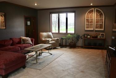
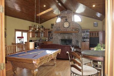
Before
THE DEVIL’S IN THE DETAILS
Written by Julia Hockman / Photos courtesy of HAUS | Architecture for Modern Lifestyles
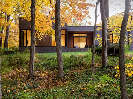
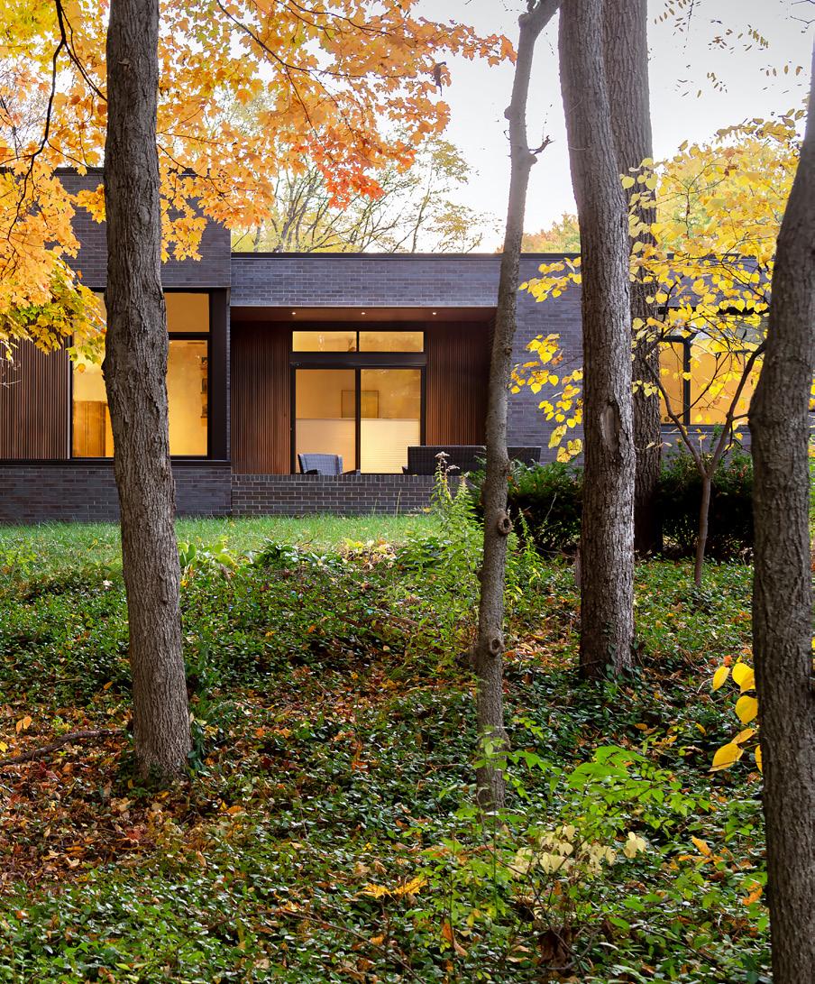
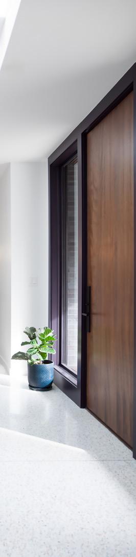
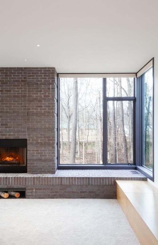
It’s the small, custom elements that can be the most challenging and rewarding parts of any project. That was certainly the case for Holly Creek Overlook, a 3,000-squarefoot residential home in Indianapolis. The house is nearly net-zero, constructed with low-maintenance materials featuring an intentional layout to capture picturesque views of nearby wooded landscapes.
Achieving near net-zero energy in Indianapolis’ climate required a systematic approach. Flat roof construction allowed HAUS | Architecture for Modern Lifestyles to position photovoltaic solar panels at a low incline, hidden behind parapet walls to minimize visual impact from the street.
Battery storage collects solar energy during the day to power the home. At the same time, high-efficiency heat pumps handle all heating and cooling. The result is a net17 home, 83% below standard energy use. The remaining power comes from the grid, largely due to tree cover on the western edge of the property that blocks solar collection in the late afternoon.
HAUS handled the architecture and interior design of the property from start to finish, working with their sister company, WERK | Building Modern, to construct the single-family home.
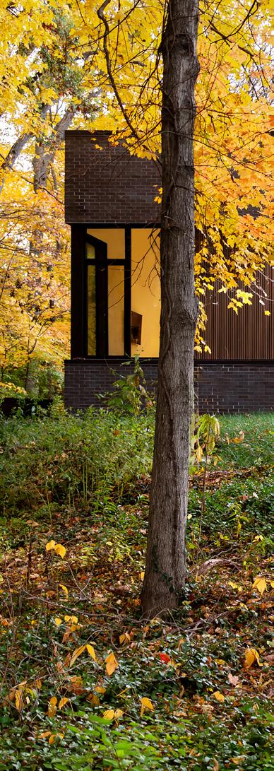
Installing the brick that projects over expansive glass walls required structural steel reinforcement, which wrapped around approximately 30% of the facade.
“I just remember our structural engineers said ‘this is why your projects are more difficult to build than most projects,” says Christopher Short, Principal Architect at HAUS.
The brick, chosen by the client, is a dark gray ironspot. Ironspot brick offers the high tolerance and precise corners suited to modern design, but it needs structural steel support to span the large glass openings that frame views through the trees. Steel columns anchor the corners and intermediate points, including behind the fireplace, while steel lintels wrap the facade to carry the brick over glass and composite wood siding.
Some windows are recessed a full foot into the brick, creating a thicker-looking exterior. “It’s another unique detail that you don’t see very often on residential projects,” says Short.
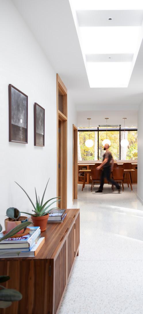
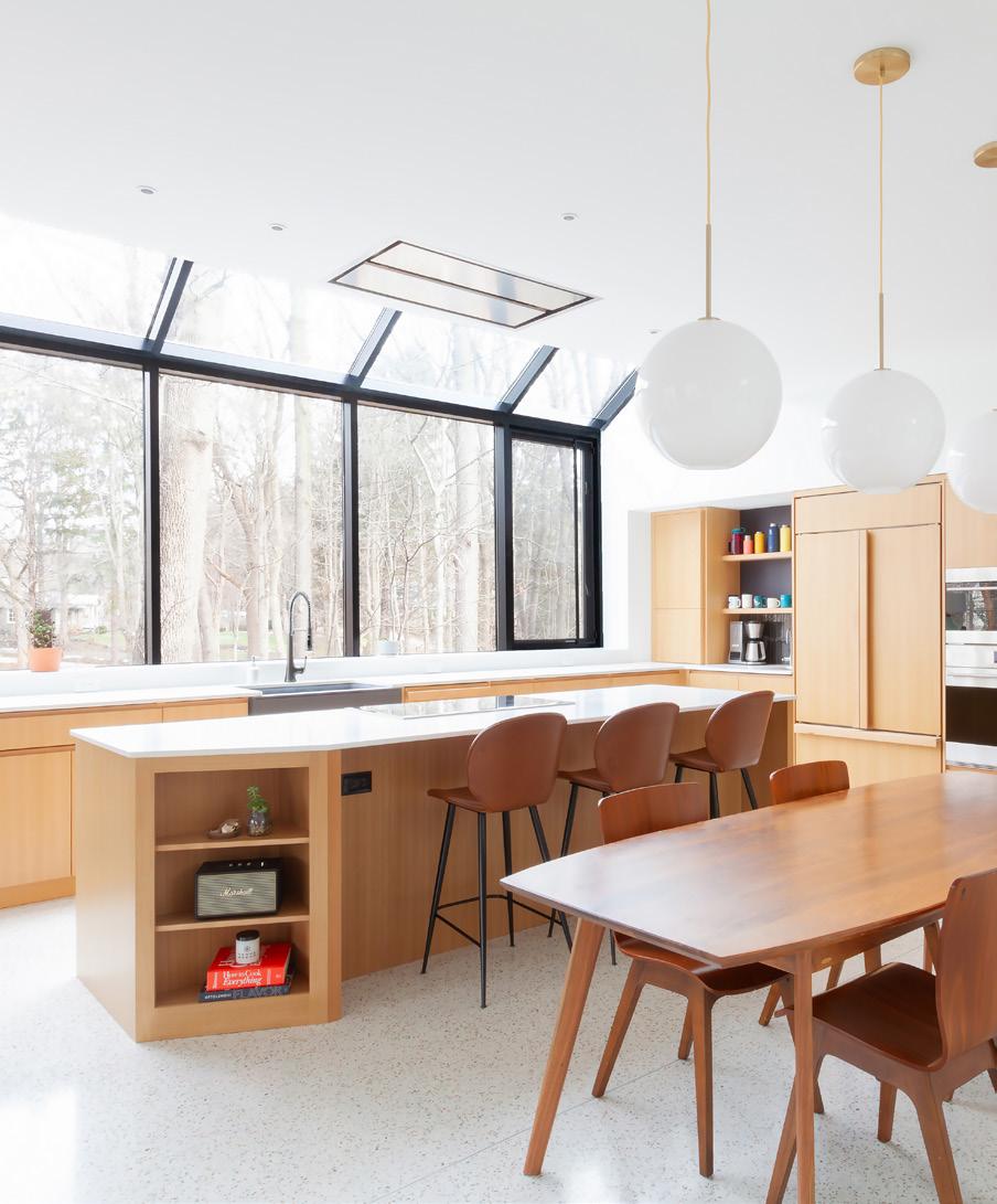
The near net-zero design and brickwork work aren’t the only impressive elements. The interior materials extend the home’s intentional sustainability and durability. At the client’s request, HAUS used a traditional terrazzo flooring in the entry hall, kitchen, and dining areas.
This terrazzo was mixed, set, and finished in-place, making the material completely customizable down to the color, resin, and aggregate. Short says the choice is “very flexible, timeless, and durable,” resulting in flooring that “should last nearly forever.”
Perhaps the most ambitious detail is the interior giant atrium window over the kitchen that uses commercial glazing to curve from vertical wall to horizontal roof plane. The installation required careful coordination of airflow and heating systems beneath the glass. The payoff is exceptional natural light and an unobstructed view.
Holly Creek Overlook demonstrates what’s possible when craftsmanship meets sustainability. By integrating efficient energy systems, structural innovation and enduring materials, HAUS created a home where technical complexity meets intricate design. The result is a timeless modern home built to last, even when it means choosing the harder path.
DO NOT DISTURB:
THE PLAYBOOK TO GREAT HOSPITALITY DESIGN
Written by Bailey Shelton / Photos by Eric Laignel and courtesy of Rottet Studio, STARCK, InterContinental, and Cidade Matarazzo Rosewood
Spencer Bailey has travelled all over the world, to some of the best hotels on offer. From Mexico City to the Scottish Highlands, from Japan to Colorado, and back home again to New York. Even after hundreds of hotel stays, more than 30 of which have been in the past few years, there are still spaces that stick with him.
“I just had the best sleep of my life at the Imperial Hotel in Kyoto that opened two weeks ago. I didn’t even know a bed could be that comfortable.”
Bailey, owner and founder of media startup The Slowdown, has spent the better half of the past three years working with Phaidon and Leading Hotels of the World to assemble and edit a series of books on the hospitality spaces that are doing everything right and then some.
Leading Hotels of the World is a collection of hundreds of luxury hotels that meet certain white-glove criteria. Spencer Bailey’s work with Phaidon endeavors to tell the stories behind these properties, what makes them unique,
the people that define the stay. Fittingly, the first of this series was called Design, the second, Culture. The third, Explore, comes out in June.
“This one is primarily focused on the activities one can do around these properties, the experiential and the well-being, so the spas, the swimming pools, the outdoor facilities, all the experiences and activities that these hotels provide.”
Of course, according to Bailey, all these elements feed into one another.
“There’s one hotel in the book that we featured called the Sonnenalp, in Vail [Colorado], where they have hiking trails that only guests of the hotel have exclusive access to. When you ask, ‘why would you stay at that hotel over, say, the four seasons?’ Well, there’s a personal touch, there’s a local touch. It’s very rooted in community.”
AN EYE TO THE WORLD ABROAD
The rule of the local touch rings true for major hospitality projects around the world. Referring to his hotel portfolio, famed industrial designer Philippe Starck says, “The hotels I create are like a movie of which I am the director. I imagine the coming and going of people, what they are going to experience, what they will feel.”
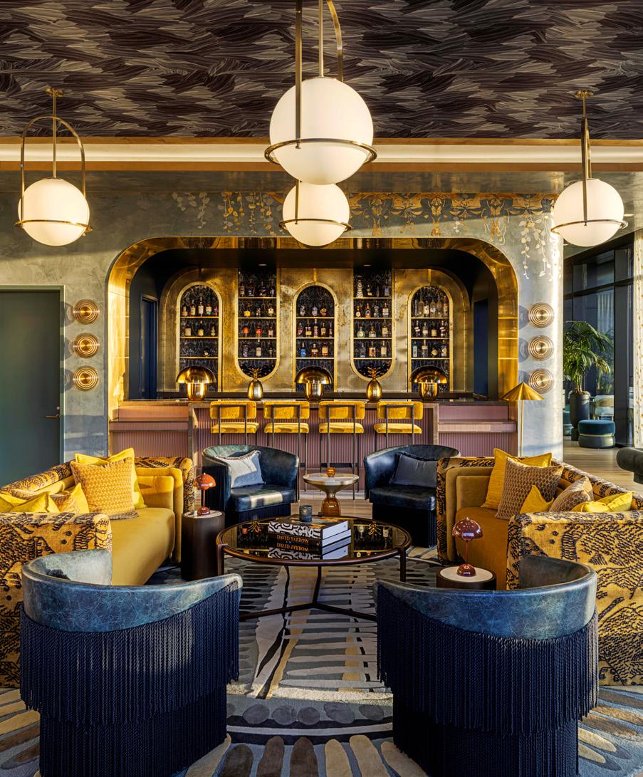
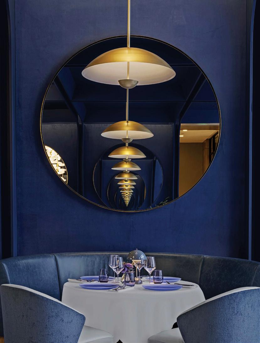
One of the best examples might be the Cidade Matarazzo Rosewood in São Paulo, Brazil, where greenery tries to escape the balconies of the industrial exterior. Inside, guitars adorn walls and shelves in every room, and an array of hide leather, natural wood, and patterned rugs build up a series of small
sitting rooms encased in glass walls. In the restaurant, Starck opted for muralled ceilings, a motif he repeats in Paris’ BRACH. But the Rosewood was imagined as more than a luxury hotel. The retrofitted former Matarazzo Maternity is a multi-use structure meant to be a beating heart of the city.
Stores and entertainment venues have found their home in the tower, and materials used for the creative reuse of the property came from mainly Brazilian sources and were inspired by aspects of São Paulo culture. Local artists provided over 450 site-specific art pieces. Starck, creative director of the project, called it his “love letter to Brazil.”
RESTAURANT & BAR AT CIDADE MATARAZZO ROSEWOOD IN SÃO PAULO, BRAZIL
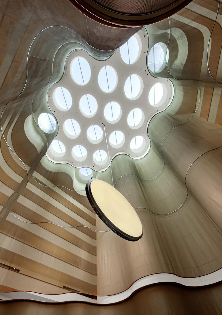
For a domestic example, the Conrad Washington D.C. is a modern marvel in hospitality design. Swiss-based architectural firm Herzog & de Meuron approached the building’s design architecture as if it were a living organism, with dynamic geometric shapes defining the exterior and interior. The atrium is shaped with curving walls which stretch endlessly to the skylight above. Award-winning design firm Rottet Studio, based in Houston, elected to drape the multi-story atrium in a secondary mesh wall, which carries the natural light all the way down, defusing it in a calming glow. A massive, circular pendant serves as a sculptural centerpiece, breaking up the descent while playing off of the curves of the building’s architecture.
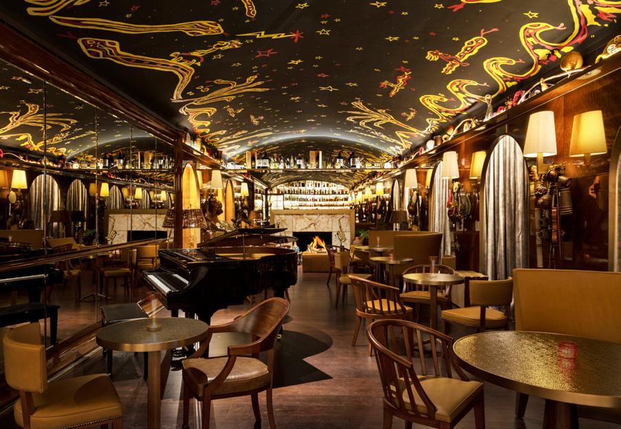
But some of the most astounding work in the Conrad is in its subtle features. Rottet Studio Managing Director Kyle Rottet says their goal for the space meant “mixing contemporary comforts with references to the colonial era.” The bar area is shaped to resemble the arsenal of Colonial Williamsburg. Wingback chairs with simplified silhouettes blend modern and traditional. Humble handcrafted wooden furniture sits alongside a piano and wrap-around windows in the penthouse suite.
WHAT LEADS HOSPITALITY DESIGN
Projects like the Conrad Washington D.C. are leading the portfolio that has helped Rottet Studios climb to the top of the hospitality design industry over the past ten years.
“The main force that separates Rottet Studio from other design firms is the fact that we don’t have any house style. We design uniquely to every single project. Other firms can say that they do, but Rottet Studio takes it to the next level by thoroughly researching the local history and microculture
of the site, then we weave these findings into a storyline that is told through subtle design details, which create moments of surprise and intrigue, to ensure we create an overall experience that is inherently memorable.”
Rottet Studio prides themselves in spaces that build functionality and experience into every detail. Rottet says this has been a priority even from their earliest projects, where they planned every detail down to the tassel on the room key. As early as 2008, Rottet was designing custom furniture with incorporated power outlets to keep busy guests charged.
“Being able to work anywhere these days is super important to any hotel,” Rottet says. “Your lobby isn’t just a lobby anymore. It is also a living room and an office.”
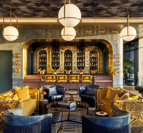
Rottet says their process involves a detailed site visit, not only to the property itself but around the neighborhood, and journeys to popular nearby attractions. This gives them a feel for how guests will exist in the space. In Fort Worth, Rottet’s design of The Crescent Hotel was heavily inspired by the nearby Fort Worth Cultural District and its various museums. The members-only rooftop bar & club on The Crescent’s top floor shines in an eclectic collection of pieces from world travels and gold finishes that reflect the surrounding skyline. The space, dubbed Ralph’s, is named after the father of Mary Ralph Lowe, Texan philanthropist and CEO of Maralo, LLC.
Another example came from a project Rottet Studios completed in Bethesda, Maryland, where the hotel shared an open courtyard with neighboring corporate offices. This corridor began as dead space. Rottet turned the courtyard into a mixed-use green space with moving wall systems and an indoor-outdoor entertainment area.
“So that really helped activate the community and serve a big function, right? Drove a lot more money into the hotel and just created a great sense of community.”
For Spencer Bailey, when it comes to what makes a hotel truly great, Pulitzer Prize–winning architecture critic Paul Goldberger, who wrote the foreword of the first book in Bailey’s series, may have pinpointed the best answer. Goldberger contends that a well-designed hotel can make you feel at home while offering something that clearly indicates you’re somewhere else entirely.
“It’s almost like capturing that feeling of hominess while also offering a level of service and atmosphere that can’t compare, that could never exist at home. That combination
is, I think, what makes a lot of these hotels so special,” Bailey says. He has this scrapbook of memorable experiences from these world-class properties, moments that could never be replicated from home. From The Gleneagles Hotel in Perthshire, Scotland, Bailey spent five days in what he describes as adult summer camp: paddle ball at the sport club, tennis on the outdoor courts, an afternoon at the spa, a falconry workshop, a private picnic at a nearby bothy next to Highland cattle, and drinks at the American Bar, which he described as the best cocktails and bar service he’s ever had.
“Where the best luxury hotels thrive is in that personal touch, the kind of quirky details and beautiful eccentricities that can happen when you have an independent property or a familyrun stay.”
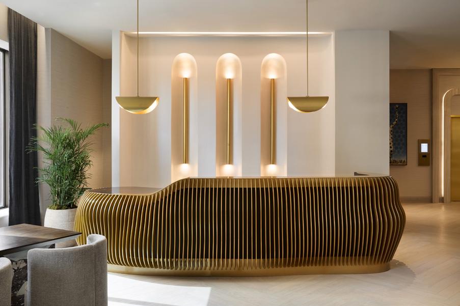
LOBBY AT THE INTERCONTINENTAL INDIANAPOLIS
THE CITY OF FIVE STARS
An unlikely destination is rising in the Midwest. The song of downtown Indianapolis this decade has been one of major investment properties, to the tune of over $3 billion in hospitality projects like the InterContinental Indianapolis, renovation of the old City Hall into a 21C Museum Hotel, and the new Ritz-Carlton set for completion by 2028, to name a few. Rottet Studios, in fact, is one of the partners contracted for the Signia by Hilton. This $710 million project, including an expansion of the Indiana Convention Center, will create 800 hotel rooms, enclosed skywalks, and rooftop entertainment for visitors.
“Our function there is focused on a lot of meeting space, a lot of entertainment space, large open restaurants, essentially anything that pulls activity off the street and brings it inward,” Rottet says.
If culture seems to be the number one for hospitality spaces, that culture isn’t limited to the destination itself. For Indianapolis, major events like the Indianapolis 500, the NCAA Championships, Gen Con, and national conferences have driven visitors to the downtown district. As a result, the city sees thousands pour in for weekends or weeks, all centered around specific events. The Crossroads of America, so named for Indiana’s bisecting highways, is alive and well in the ways people come and go.
As a result, Indianapolis hospitality is not designed around honeymooners or Monday-to-Friday business commuters. Instead, it’s designed to host thousands of cosplayers, or thousands of FFA students, or thousands of Taylor Swift fans. Rooms need to be ready for booking in blocks. There needs to be ample space for getting ready before a show or for a long day out on a conference floor. The dining and entertainment spaces need to be inviting for people who maybe met new friends or colleagues that morning.
If Indianapolis developers were to look to the world for advice in this next era of downtown development, they might heed the advice of Spencer Bailey, whose work has brought him up close and personal with the hotels that are defining global luxury.
“You can’t have a great hotel experience without being rooted deeply in the culture that surrounds the hotel. A hotel should not just be in a place. It should be of a place.”
A key example of top-tier design and service intersecting with culture for Bailey is The Okura Tokyo. Originally designed by Yoshiro Taniguchi in 1962, The Okura reopened in 2019 after a redesign from Taniguchi’s son, Yoshio.
“It’s this extraordinary story of architectural heritage,” says Bailey. “It really became like the definitive midcentury Tokyo hotel, and it was this masterpiece of modernism.”
Many elements of the now-reopened Okura are exact recreations of the original design, in homage to Yoshiro Taniguchi, and the things passed down from father to son.
“They were able to literally salvage the atmosphere and feeling of the place in a way that made the hairs on the back of my neck stand up as I walked in,” says Bailey. “I had visited the old Okura before they tore it down to build the new one, and the sense of respect, the sense of time and care and tradition and ultimately, design, was so powerful.”
It’s hard to capture the element that Bailey describes, that Rottet, Taniguchi, and Starck imbue into their work. In the world of hospitality design, the truly memorable projects are the ones with lasting cultural significance. And culture cannot be bottled.
THE NEW HEARTLAND:
A DESIGN SANCTUARY ON WAYNE STREET
Written by Darcie Duranceau / Photo by Adam Grubb Media
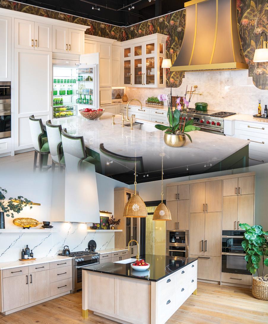
In the quiet revitalization of downtown Fort Wayne, Indiana, 127 West Wayne Street stands as something more than a retail destination. It is a boutique design house. Within these walls, the “Heartland” isn’t just a geographic location, it’s an invitation to enjoy a cup of coffee, a warm croissant, and a taste of thoughtfully executed design.
THE MISSING PIECE
While the showroom is a new anchor for Fort Wayne, its roots stretch back over 35 years to Fort Lauderdale, Florida. Founded in 1989 by Susan Rocco, The Kitchenworks was born out of a desire for public access to high-end cabinetry.
For years, the path to a high-end kitchen in Fort Wayne required a certain level of travel and imagination. Lead Designer Janielle Gregory remembers driving clients to rural barns. “I’d have to ask them to walk through hay and straw, over piles of muck, just to see what the cabinetry options looked like.” Even then, the cabinetry options were hand-built, but not the high-end options that luxury buyers were seeking.
There was a distinct gap between Fort Wayne’s growing ambition and its local resources. Now, Kitchenworks has filled that void. By planting roots at 127 West Wayne, they brought the “showroom experience” home, and created some inspiring examples to jumpstart projects.
A LEGACY OF CRAFT
The Kitchenworks showroom is anchored with two legacy names: Grabill Cabinets and Dutch Made Custom Cabinetry. Kitchenworks has brought them together to create a space that drops jaws.
“We have just enough of the trend to appeal to those who like to be at the forefront of what’s most popular at the moment, but we also keep the more classically traditional customer in mind,” says Ashley James, design concierge.
THE SENSORY WELCOME
Hospitality is the first thing that you’ll find when you enter the doors of Fort Wayne’s Kitchenworks. It is designed to make a client feel welcomed and at ease. “We love to host here. If we’re having a client in the morning, I make sure there are croissants in the oven and the cappuccinos ready,” James says. “I love making people feel special in my own home, and that is the goal here at Kitchenworks, too.”
AN INTERACTIVE EXPERIENCE
Kitchenworks invites every guest to partake in a truly interactive, “hidden luxuries” experience. Visitors can explore a variety of customization options with their cabinetry, including brilliant Corner LeMans System cabinets, aerated produce shelves, and knife block inserts for easy storage.
BEYOND THE KITCHEN
Whether it is a family renovating a historic Northside gem or a professional relocating to the city’s revitalized core, Kitchenworks simplifies the complexity, the showroom serves as a testament to the evolving modern lifestyle. By integrating outdoor living setups, pantry and scullery spaces, laundry room installs, and comprehensive lighting curation, Kitchenworks simplifies the complexity of highend renovation throughout the home. The result is an environment that honors the home as a place where daily life, that comforting choreography of chaos and intention, can unfold.
DESIGNING THE “RURBAN” LIFE
THE QUIET TRANSFORMATION OF ZIONSVILLE’S UNIQUE BALANCE OF TOWN AND LANDSCAPE
Written by Darcie
Duranceau / Photos by 360 Tour Designs
The brick-paved streets and Victorian-style storefronts of Zionsville’s village offer a Main Street hometown feel that is increasingly rare in the Midwest. Certain homebuyers are looking for the dining scene and toptier schools available in large suburbs, while also wanting the wooded privacy afforded to more rural properties. Zionsville pairs the best of both: More than a change of address, this “rurban” area allows for a sort of harmony between rural tranquility and urban connectivity.
However, finding a home that matches the charm of that dream and the pace at which modern life is lived can be more of a challenge. The curb appeal on Main Street is undeniable, but the existing homes in the Village of Zionsville generally lack the acreage that make today’s home functional luxury— home offices, sculleries, year-round outdoor living. Suddenly, building in Zionsville’s highend developments is an attractive prospect.
For over two decades, Joe Garcia, owner of G&G Custom Homes, has helped families realize that they don’t have to settle for a uniform reality. “People go through houses all the time, existing homes and new construction floor plans,” Garcia says, “but they’re never going to find one plan that fits them perfectly.”
“There is a shift in mindset when a person steps away from pre-existing architecture and semi-custom builders to a true custom build,” says Garcia. The primary advantage of building a custom home is removing the constraints of a traditional, existing floor plan.
“The good thing with custom is you can do whatever you want,” Garcia says. It is a process that begins not with a catalog, but with a blank page and a simple question: How are you going to live in this home?”
It’s not just the homeowner shifting toward custom builds in Zionsville. The town’s own strategic evolution also pushes toward “rurbanization,” a term the town uses to describe its blend of rural and urban life, while investing in high-end infrastructure. The nearby Big-4 Rail Trail is a cyclist’s dream, and the new Creekside Corporate Park development aims to attract business and create new jobs while preserving nearly 40% of the property in its natural state. This is a town that embraces building differently.
Within this romantic, television-worthy streetscape is room for Zionsville’s DORA— the Designated Outdoor Refreshment Area that allows for a cocktail carried on a walk through the quaint streets for shopping or socializing. The WheelHouse Social Club offers respite for car enthusiasts and business executives, and Holliday Farms’s twenty-seven-hole, beautifully groomed golf courses and country club draw the community together.
It makes perfect sense to build your dream within a dream in Zionsville, where land values are climbing, the community is evolving, and the future of “Rurban” is being defined. With a custom build, you can create your own niche complete with integrated home office, scullery
space, indoor-outdoor synergy, and so much more. Much like Zionsville did with Creekside Corporate Park, custom building is about blending multiple wants and needs, designing for how you actually live.
The reward for this journey comes in that final walkthrough—the moment you realize you haven’t just bought into a town, you’ve built your place within it. “That’s when I get the best feeling that we hit it out of the park,” Garcia says. “Handing over the keys and seeing the excitement on their faces, and hearing ‘Man, this is exactly what we wanted.’”
DESIGNER: AIME BAKER
FROM GROCERY AISLE TO GATHERING PLACE:
THE EVOLUTION OF THE ELM
Written by Darcie Duranceau /
Photo by Nolan Calisch
For years, the corner of 2nd and Elm in Bloomington, Indiana, was the heartbeat of the neighborhood. Whether it was the old K&S Mart or the Bloomingfoods that followed, it was the kind of place where a “quick trip” for a carton of eggs usually turned into a twenty-minute catch-up with a neighbor by the deli counter. When those doors finally closed, the neighborhood lost its anchor.
But the building wasn’t destined to stay a shell. David and Martha Moore, who locals know through Pictura Gallery and the FAR Center, saw an opportunity to bring back that community energy. As artists and longtime members of the neighborhood, they wanted to create a space that felt like a gift to Bloomington. To do it, they reunited with a designer and family friend they trusted from their other projects: Lauren Bordes.
The Moores wanted their restaurant to echo the feel of their gallery spaces—clean, intentional, and capable of displaying fine art along its walls. Bordes’ vision, heavily influenced by the Moores’ aesthetic, broke
the giant, hollow box of the former grocery store into zones of intimacy without using heavy walls. The result is intimate booths for diners, a sleek bartop, and an open, inviting feel from the original floor plan.
Loren Wood and his team, led by Project Manager Rhett Elliott, were tasked with the delicate job of translating those elegant lines into a physical reality. It was a partnership of total trust, made even more vital by the fact that Bordes lives out of state. Today, the space functions like a shapeshifter, moving through the hours of each day with a quiet intentionality. In the morning, the front is bright and airy, anchored by a custom barista station that serves as an energetic place for coffee and conversation—a place to start the day. As the sun sets, the lighting performs a visual edit; the cafe areas essentially “turn off,” while the bar and dining nooks come alive with a warm and intimate feel. This careful calibration keeps the large space feeling intentional through all hours of operation.
The timing of the build brought a set of truly unusual circumstances. They broke ground in March of 2020, just as the country was shutting down. Because Bordes couldn’t be there in person, and pandemic restrictions made gathering even more difficult, Rhett and the LWB crew became her eyes and hands on the ground. Usually, commercial construction is a sprint against a deadline, but because the world slowed down, the team had what Wood calls “breathing room.” They leaned into the isolation, using the time to obsess over the custom details that usually get rushed. With Bordes’ guidance coming from a distance, the team took extra care to ensure every joint and finish was a perfect realization of the Moores’ vision.
Rhett points to the patience in the technical triumphs throughout the space. The cantilevered wood canopies, for example, are massive, beautiful structures that seem to float over the bar and cafe. Even the lighting was
a feat of collaboration. The Moores lit every piece on the walls in the style of a gallery, from above and below. This lighting can be adjusted by the owners, and each space independent of the others, allowing for a level of curation that shifts with the art on display. The building team worked to hide the tech so perfectly that all you’re left with is the texture of the ornate wood elements, the strength of the wrought iron details, and a sense of belonging.
When Bordes finally was able to visit the finished product a year later, she was moved to tears. It’s rare for a finished building to look exactly like the first dream on paper— especially when the designer has to watch the progress from afar, but because the team had the time, the talent, and the respect for the design, the vision was realized in its truest form. The Elm isn’t just a restaurant; it’s a neighborhood corner brought back to life, exactly as it was meant to be.
HOSTING WITH SUB-ZERO, WOLF, AND COVE:
A TOAST TO WILD AIR
Written by Carie McMichael / Photos by Adam Grubb Media
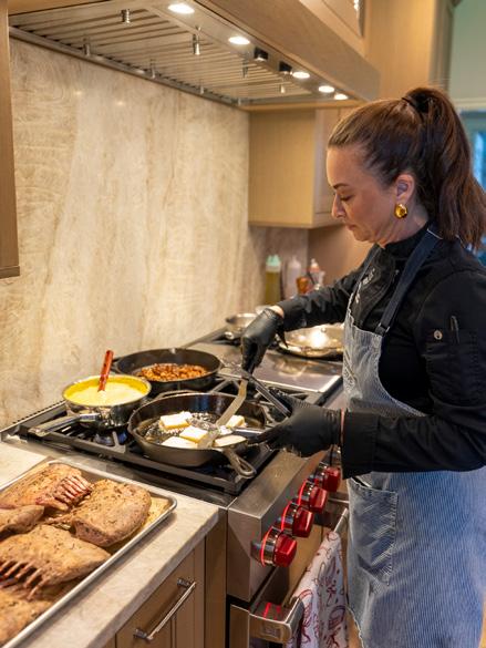
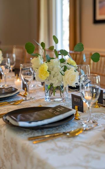
Excited chatter, the clinking of glasses, and a wave of tempting aromas are all classic accompaniments to an elevated dinner party hosted by Gary McNutt of Wedgewood Building Company. Around the room of his picturesque Carmel home are some of Indiana’s premiere custom builders: the team from Gradison Design Build, G&G Custom Homes, and Old Town Design Group, all of whom are toasting to their hard work and shared vision alongside associates of Tisdel Distributing.
Wild Air, a stunning residential development in the making and site of BAGI’s 2026 Home-a-Rama showcase, set the scene and tone of the evening. Tisdel is a distributor of fine appliances with a long history of supporting builders like Wedgewood. Alongside Diana Daniely of Ferguson Home, Alex Cain, territory sales manager for Tisdel, hosted a VIP builder trip last March to the Sub-Zero, Wolf, and Cove factory in Madison, Wisconsin, in the interest of creating appliance packages and promoting a brand experience worthy of their vision for Wild Air.
“This dinner, a celebration of that partnership, is both personal and intentional,” says Cain. “Gary recently remodeled his own kitchen with Sub-Zero, Wolf, and Cove appliances, making his home a fitting setting to gather the four fellow custom home builders of Wild Air in appreciation of their collaboration and shared commitment to excellence as part of Home-A-Rama 2026.”
Executive Artisanal Chef Brandie Lamb and her right-hand Jamie Thibert were centerstage executing Lamb’s refined but restoring menu—methodically arranging canapés, pulling ingredients from the spacious Sub-Zero refrigerator, and orchestrating pans over a Wolf 48-inch dual fuel range. These appliances are designed for hosting, giving both professionals like Lamb and home cooks the opportunity to bring people together over a shared meal.
The appliances complement the design. Their integration is seamless in coordinating with the home’s materials and finishes. The result is a kitchen that balances professionallevel performance with a sophisticated look and feel.
According to Cain, “entertaining is where performance becomes visible.” The beauty comes together when consistent cooking temperatures from Wolf ensure each course is executed as intended while Sub-Zero refrigeration keeps ingredients vibrant and fresh in the days leading up to the event. Even while guests linger at the table, Cove’s whisper-quiet operation allows dishwashing to happen seamlessly in the background.
Whether building or remodeling, designers should remember to lead with lifestyle, and how the reliability of those products will support it. McNutt himself said it best when he raised a glass to his colleagues Cain, Daniely, and Lamb: “This cannot happen without special people. We’re only as good as the weakest link in our vendor chain.”
The builders gathered around McNutt’s table continue to share that vision for the dwellings they’re creating together, and Tisdel Distributing sees nothing but potential for the future, in Wild Air and beyond. The appliances are more than just equipment; they are the quiet foundation for moments of connection, celebration, and everyday living.
THE SHORT LIST
THE DISRUPTORS
People doing things differently—new materials, unusual collaborations, breaking traditional models.
ROD COLLIER, AIA, NCARB
Rottmann Collier Architects ARCHITECT
Indianapolis
Rod Collier doesn’t believe affordability should come at the expense of design. As co-founder of Rottmann Collier Architects beside fellow architect Todd Rottmann, Collier has built a practice around what he calls “contextual modernism”— architecture that feels current without ignoring the character of the neighborhoods it inhabits. Theirs is a philosophy rooted in both restraint and respect, and one that has earned the firm consistent recognition from the AIA along with features in Better Homes & Gardens and Renovation Style Magazine
A Ball State graduate, Collier works across historic preservation and new construction, often partnering with Chicago-based developers on multifamily and middlemarket housing throughout the Midwest. But regardless of scale, the mission remains the same: elevate everyday living through thoughtful design. “If you have a good layout and flow, it’s easier to live in an affordable space,” he says. “We design as if it’s something we would live in ourselves.”
That ethos—never compromising on livability—positions Collier as a quiet disruptor, proving that good design isn’t a luxury, but a baseline.
BRAD KRINER
Wedgewood Building Company
PRESIDENT
Carmel
Wedgewood Building Company has built their reputation on a simple idea: homes should feel as good as they look.
After 25 years in the building industry, Brad Kriner came to Wedgewood last October with that same vision in mind. Through their internal architectural team and focus on design, Wedgewood has become synonymous with a kind of livable luxury—spaces that showcase all the possibilities while staying grounded in the functional needs of a space. That reputation has brought them to neighborhoods like Chatham Hills and Holliday Farms. More recently, the company has also taken on a townhome project, Eleven at Monon Square, which is being built just north of the Palladium in midtown Carmel.
After 15 years in business, Wedgewood has built a portfolio of stunning homes along with a reputation for quality. Two consecutive People’s Choice Awards at Home-A-Rama back in 2019 and 2020 cemented their place in the market, along with steady features in regional publications. But what distinguishes Wedgewood is their adaptability. “It’s one thing to build a beautiful home that’s unachievable for anyone, but we’ve really successfully maintained affordability with everything we do.”
RYAN COYLE
Vive Exterior Design
FOUNDER & PRESIDENT
For Ryan Coyle, the outdoors isn’t an afterthought—it’s the main event. As founder of Vive Exterior Design and Vice President of the Indianapolis Landscape Association, he has spent more than two decades pushing landscape architecture into a more central role as outdoor living rises to the top of homeowner must-haves.
The Vive portfolio spans projects like Cox Hall Gardens in Carmel, the French Lick Springs Hotel, and major healthcare campuses around Indiana. But it’s his residential work—often in collaboration with high-end builders and architects—that reflects a broader cultural shift. Outdoor living is no longer seasonal or secondary; it’s a year-round focus.
For Vive, landscape architecture fully combines flatwork with garden beds, combining patios, outdoor kitchens, and pools with their surroundings in a seamless transition from functional living space to natural landscape. As demand for outdoor living continues to grow, Coyle is helping define what that future looks like: immersive, functional, and designed with the same attention to livability as the rest of the home.
Fishers
CODY BURGESS
Virginia Tile Company DIRECTOR OF SALES
Indianapolis
Cody Burgess, director of sales for Virginia Tile, was raised in the flooring industry. It was on the sales floor of his family’s company in Bloomington where he first met the reps for the company he’d see expand from Michigan and a few outof-state locations to the largest distributor of tile in the United States. Burgess helped to establish the company in Indiana, with friends like ICC, Custom Floors, and ProSource making a massive difference in those early days. With the opening of the company’s 55,000-square-foot Indianapolis flagship showroom in 2024, the community of partners and tradesmen gained a hub where designers, architects, and builders can collaborate.
Although Burgess lovingly describes his work as “an old handshake industry” built first on relationships, the products they offer are evolving every day. Virginia Tile works with key partners to bring in silica-free quartz, and partners with LEED certified manufacturers to meet sustainable building standards. Burgess has a front-row seat to the evolution of tile and flooring. From large-format slabs to texture-driven finishes, he tracks how materials move from international markets into local projects.
Ten years on, relationships are still a vital part of the day to day for Burgess. He’s become a connector—supporting designers, collaborating on specifications, and helping firms like Ratio and Phantom secure commercial-grade materials for the architectural and design work they’re doing in Central Indiana. Always top of mind is a standard of excellence at every level, from regional efforts to conversations on the showroom floor.