5 minute read
Throwing shade


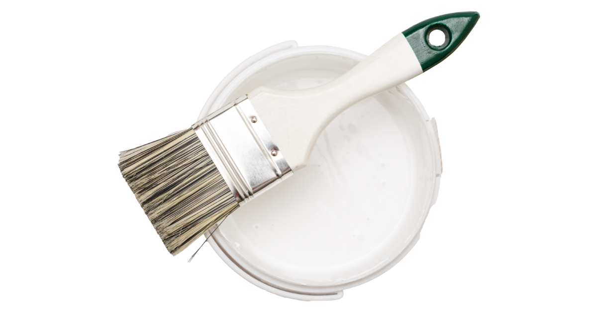
Why on earth are there so many different white paints?
Keep it simple, they said. Go with a fresh white, they said.
Well, they failed to mention there are literally thousands of shades of white – from alabaster to almond milk, thin ice and even house white (and no, a glass of this won’t help you decide – apparently, it’s not for human consumption.)
Nearly everyone who has attempted a budget home makeover has been in this position – staring at a mindboggling array of paint shades, desperately wishing for less choice.
Don’t panic. You are on the right track. Paint is the perfect place to start if you want to give your home a facelift on a budget. Nothing transforms a space more quickly and easily than a fresh coat of paint.
And white is, by far, the most popular interior and exterior colour because it reflects natural light and creates a feeling of greater space. It’s less likely to date than other colours and is no longer considered boring thanks to white-onwhite coastal chic trends. But getting the shade just right can be surprisingly tricky. Go for the wrong undertones and crisp becomes clinical, while cosy can end up looking like a nicotine-stained bedsit.
Unfortunately, there’s no one-white-fits-all shade. But there are a few simple steps you can follow to nail your fresh white makeover.
Warm or cool?
Whites can broadly be divided into shades that carry either warm or cool undertones.
Warms throw subtle red, yellow or orange undertones, while cool whites reflect blue, grey or green tones.
Pro tip: If you’re having trouble telling your warms from your cools, stop comparing them to each other. Instead, take a piece of plain printer paper with you and lay each colour swatch on that. You should immediately see the undertones reveal themselves.
Deciding whether to go warm or cool will hinge on a few key factors:
Architecture: Generally, cool whites tend to suit more open-plan, modern spaces, lending a crisp, minimalist feel to areas with clean lines and plenty of natural light. By contrast, warm whites usually create a cosy feel in older homes with more traditional architectural details.
Décor: If you have flooring and soft furnishings that are going to stay, you need to match the white paint to the undertones already present.
Trends: Cool whites and ‘greiges’ were huge pre-pandemic, but more recently warm whites with earthy undertones have made a comeback and sit comfortably alongside the trend colours of 2023 which include clays, dusky pinks and greens.
Light: Cool whites look crisp and fresh in rooms bathed in natural light, but can appear quite dark and throw a depressing blue cast in rooms with lower light. Warm whites will do the opposite and soften rooms that don’t get much natural light, but they can look too yellow in sundrenched spaces.
If you’re still undecided on tone, get one warm and one cool sample swatch (don’t worry too much about the exact shades just yet) and put them on the wall you want to paint. This should make the initial choice clearer. The major paint companies now sell large peel-and-stick colour swatches online.
Deck the walls
Once you’ve chosen a side in warm versus cool, it’s just a matter of narrowing down your shade to three or four possibles. Grab some sample pots and paint test patches on the walls. Go big – at least 60cm x 60cm – and keep the colours close to each other to avoid the existing wall colour from skewing your perception. You’ll need two coats, particularly with white tones, to get a true reflection of the colour.
Then just sit with it for a while. Look at the test patches at different times of the day and ask anyone who passes through for their opinion.
Take it to the roof
When you’ve settled on a colour, be prepared to take it not just up the walls, but on to the ceiling. It’s a controversial tip, but when painting interiors with a white shade, many top designers, including makeover queens Three Birds Renovations, swear by tinting all paints – including trim and ceiling paint – the same colour as the walls to make rooms appear larger and more cohesive.
Lightbulb moment
A final word. Consider how your lighting choices, or existing lights, will work with your chosen shade of white. Modern LEDs, like paints, come in warm, cool and neutral hues. Cool lights on warm white walls are generally a no-no, because it throws blue tones. However, the reverse – warm lights on cool walls – can work. Cool on cool is great in spaces such as kitchens and offices, but be careful to balance it with warm elements, such as timber or earth-toned soft furnishings in other areas of the house.

