+886 905160476 | harryt511ro@gmail.com | @thoughts_xyx
about me
09.27.2002 Born in Taipei, Taiwan
2021.9-now
• Architecture Bachelor Degree at National Cheng Kung University education
2023.1
• Yuejin Lantern Festival - selected and Built 2023.7
• Buildner “Portable Reading Rooms edition 2 “student award + sustainability award competitions & exhibitions
2023.7-2023.8
• internship:April Yang Design Studio 2024.1
• parttime:Kris Yao|Artech experience
• rhinoceros
• grasshopper
• illustrator
• indesign
• photoshop
• Autocad
• enscape
• blender
• python skills
content
CMM 2.0
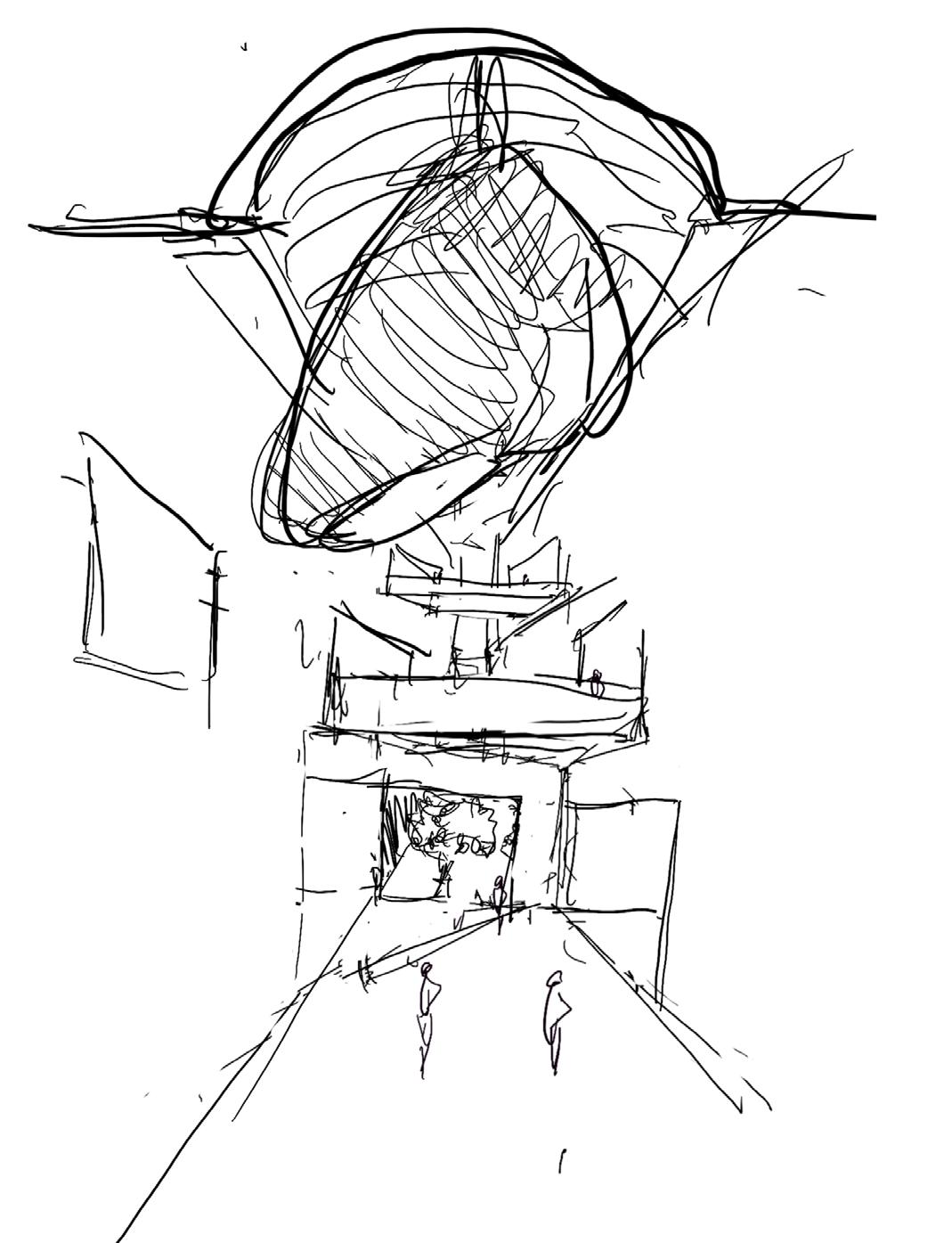
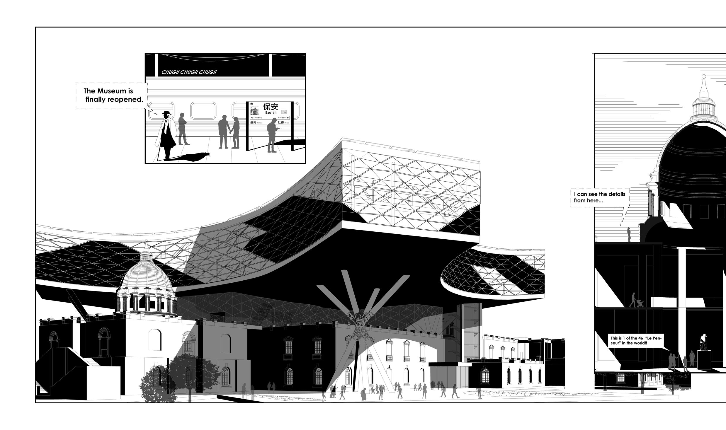
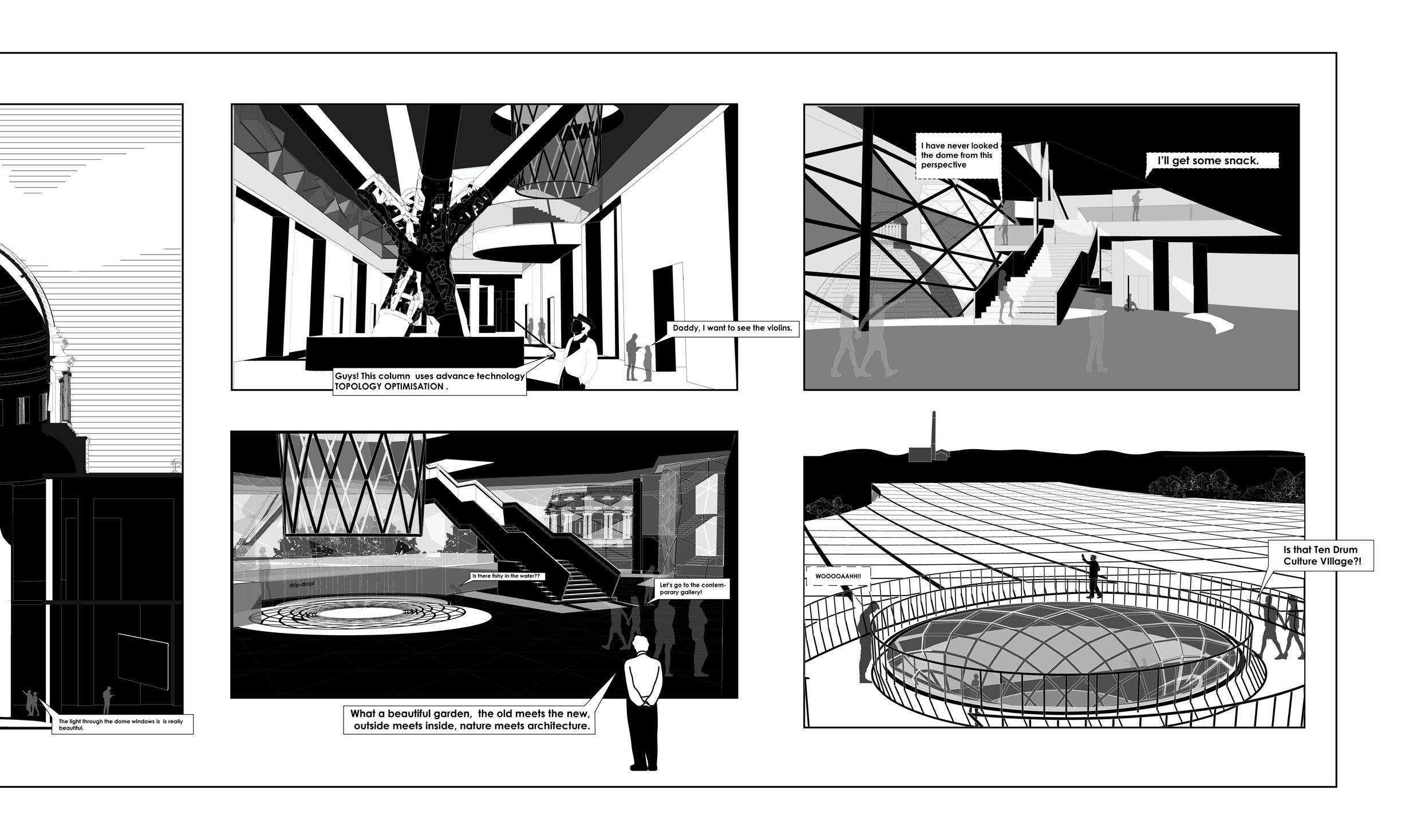
In an era of information explosion, knowledge no longer needs to be transmitted through physical places. Perhaps the purpose of a museum should prioritize its experience. This does not necessarily mean installing slides, playrooms, and so on within the museum. Instead, it should focus more on liberating people from auditory and visual constraints, returning to simplicity from chaos, and harmonizing the enclosed space with openness.
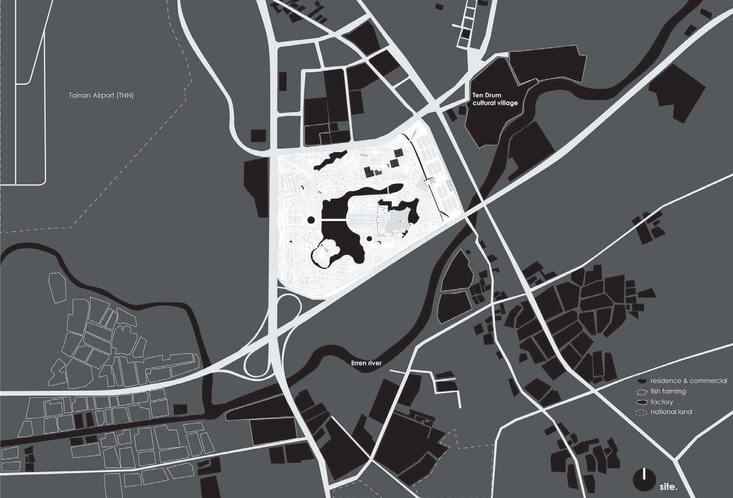
Chimei Museum, the existing museum, which opened in 2015, currently has one of the largest collections of Western art in Taiwan. Our renovation plan designates Chimei Museum as a landmark in Tainan, enhancing its iconic status with vertical extensions.
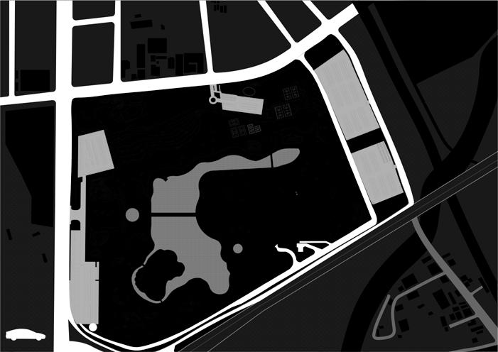
Situated within the Tainan Metropolitan Park, our plan will also incorporate more elements of Tainan, ensuring that the museum serves both tourists and the local community.
we want to adopt an approach that encourages dialogue and conflict to draw people’s attention to this issue. We plan to add a new expansion to the CMM through an “additional rooftop structure” approach. This approach represents an organic architectural concept and symbolizes the collision of different vocabularies. It is also a form of architecture that was commonly seen in Taiwan.
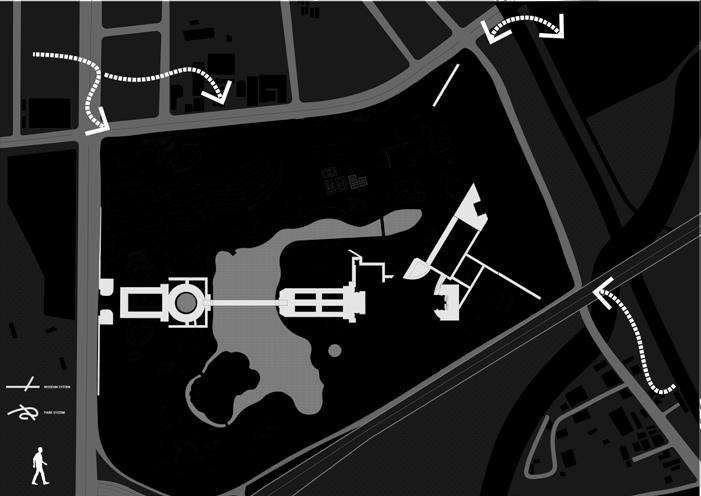
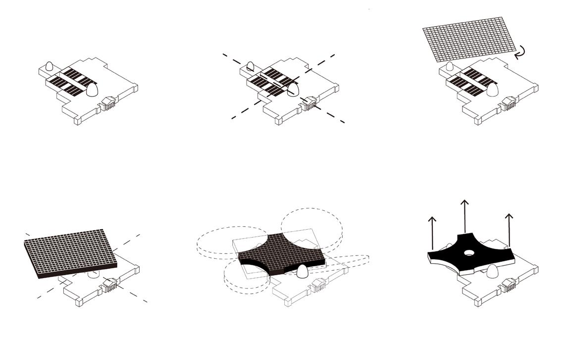
All exhibition areas share an central path.
Add the volume on top of the existing museum.
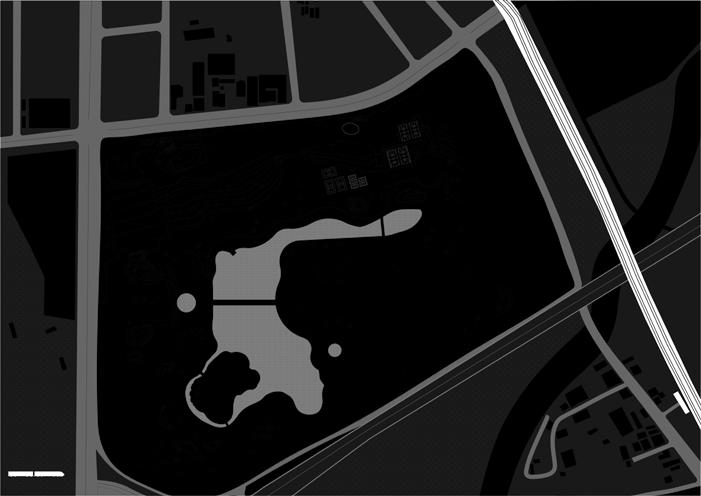
The museum follows these axis.
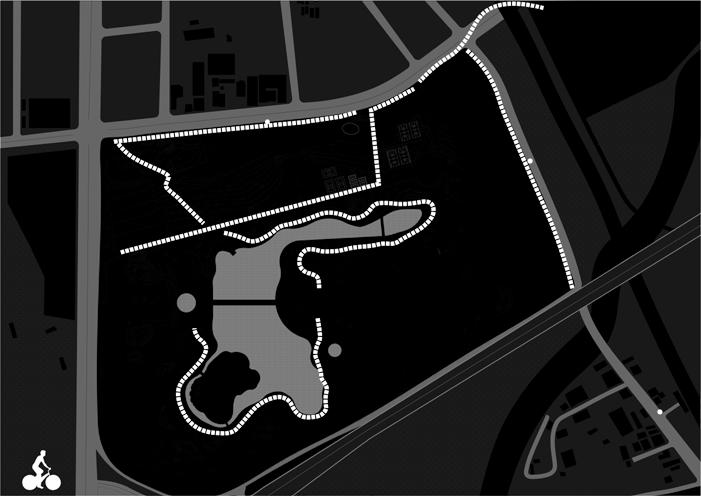
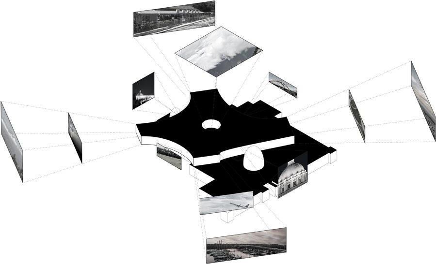
As the highest point in the area, the museum offers views of various landscape at different distances.
Subtract portions of the volume to create a dialogue with the sorroundings.
We rotate the axis, and make it the expansions’grid system.
Elevate the corners to create floating effect.
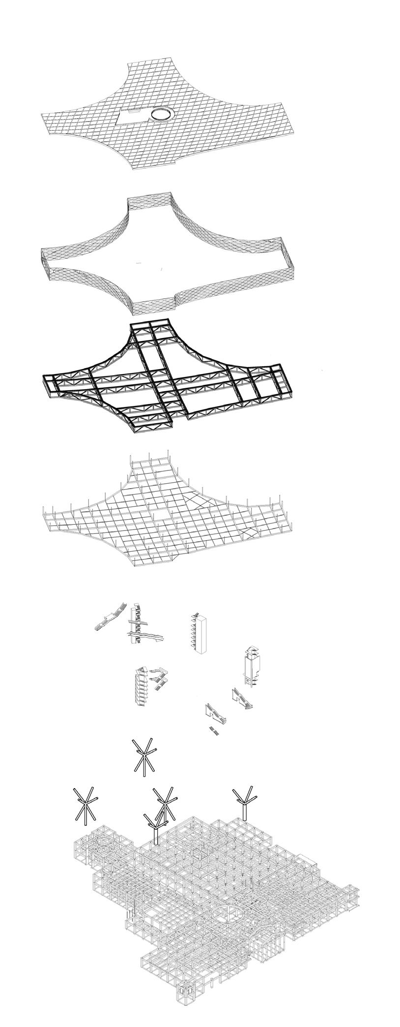
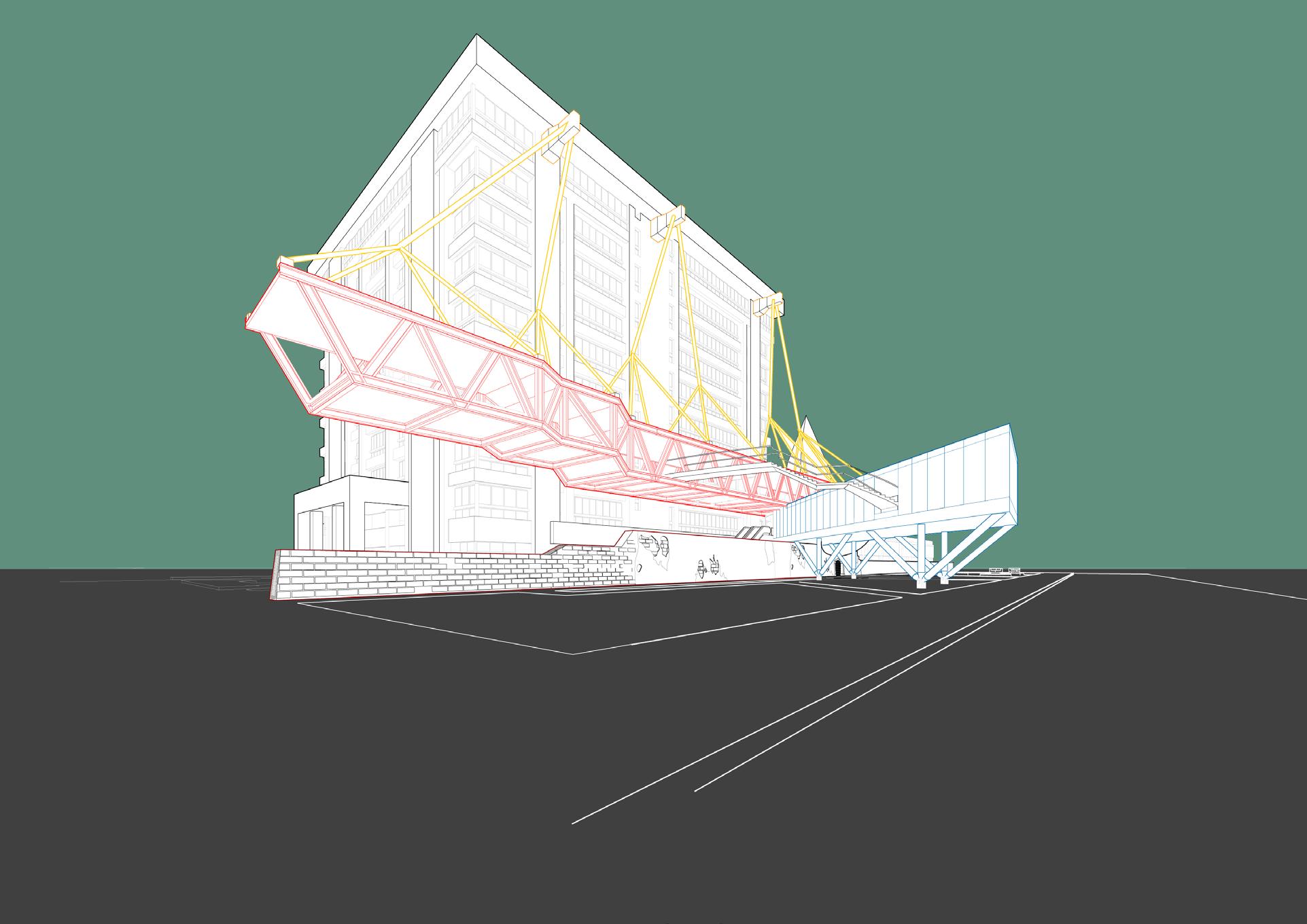
/existing Reinforced concrete frame structure.
/delta columns
/circulation cores
/suspension structure
/steel truss frame
/triangular facade
/roof panels
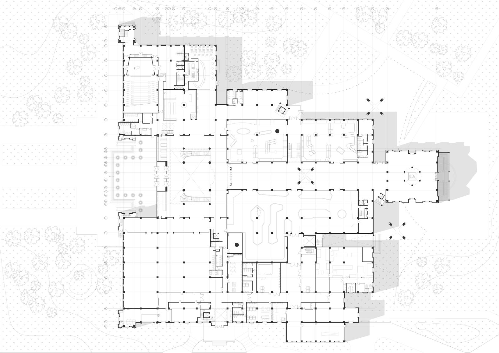
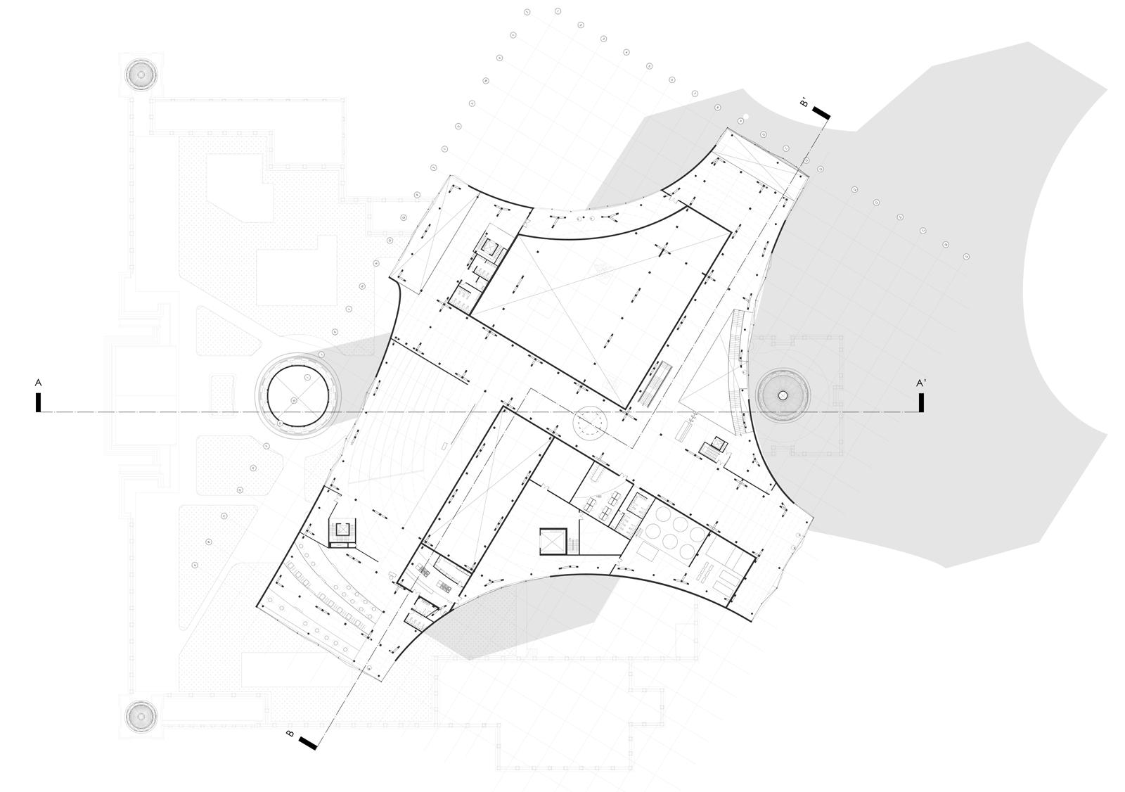
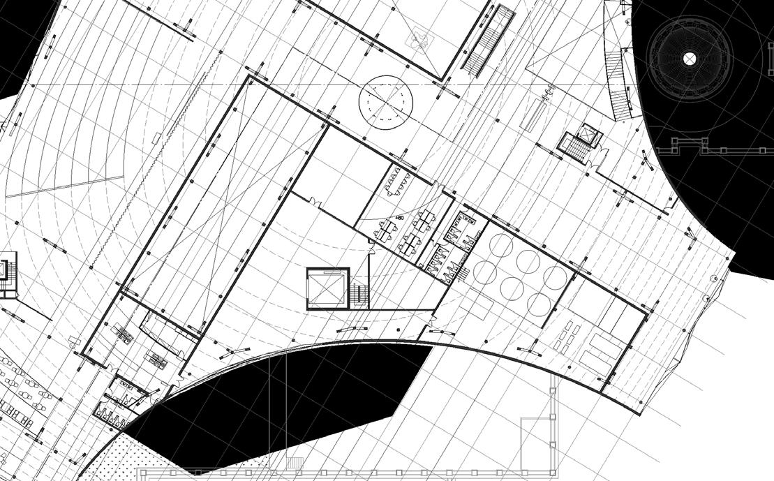
1f plan
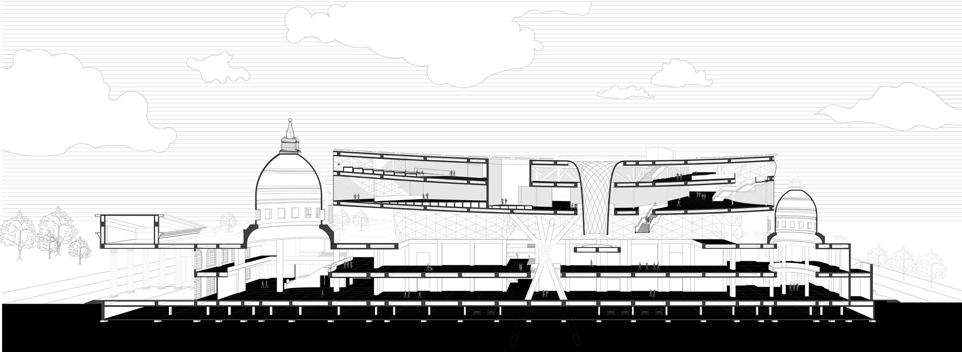
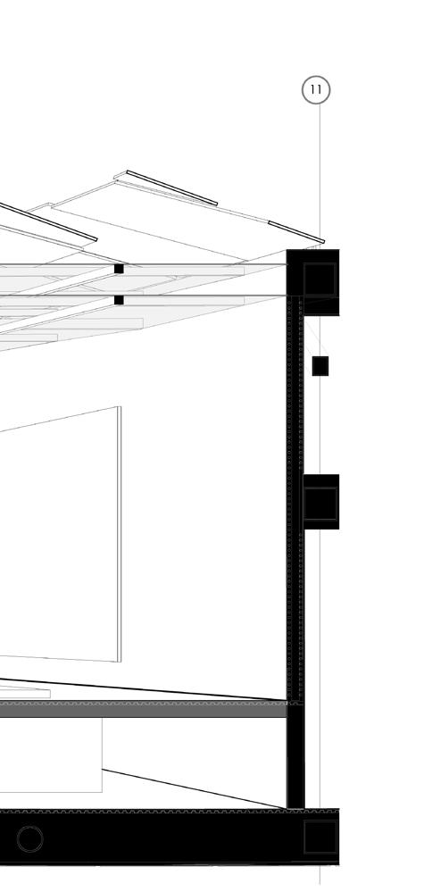
Section
5f plan
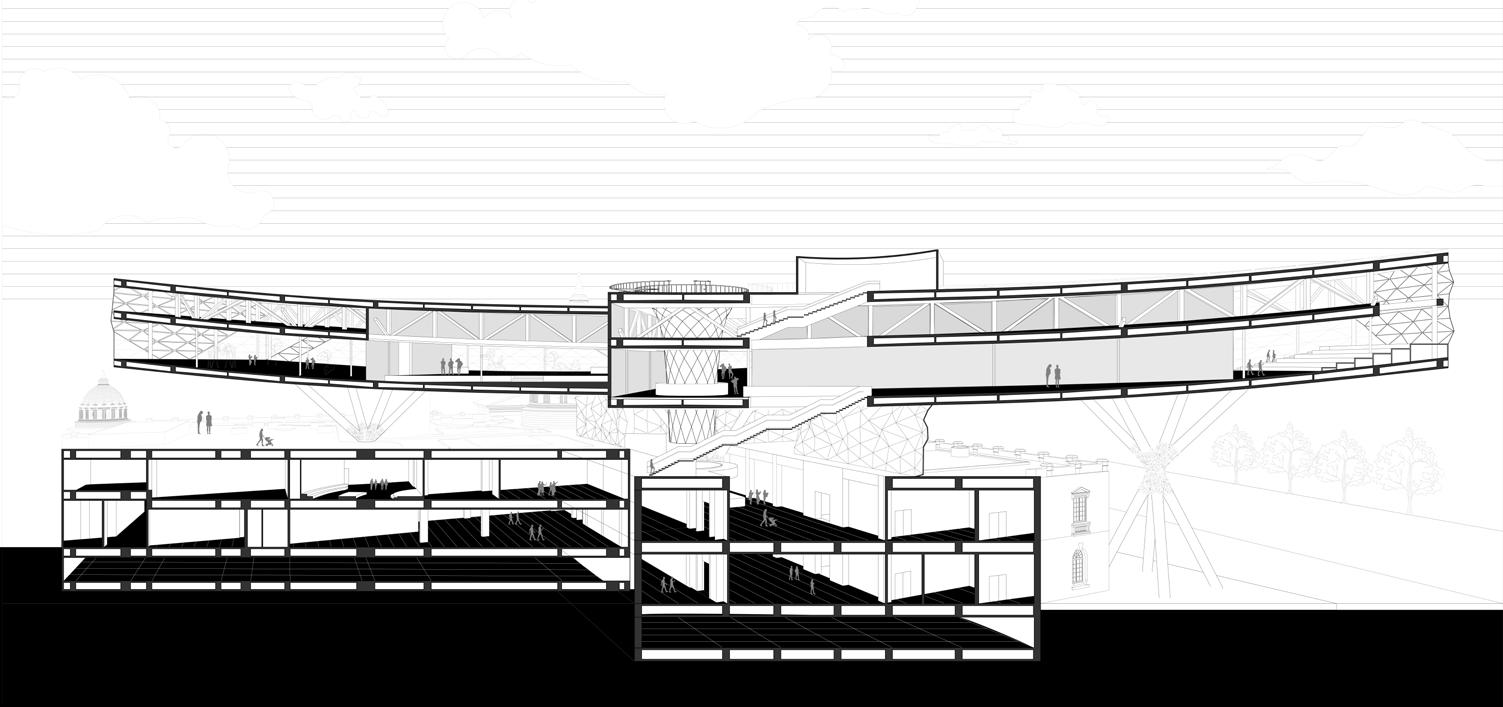
B-B’ Section
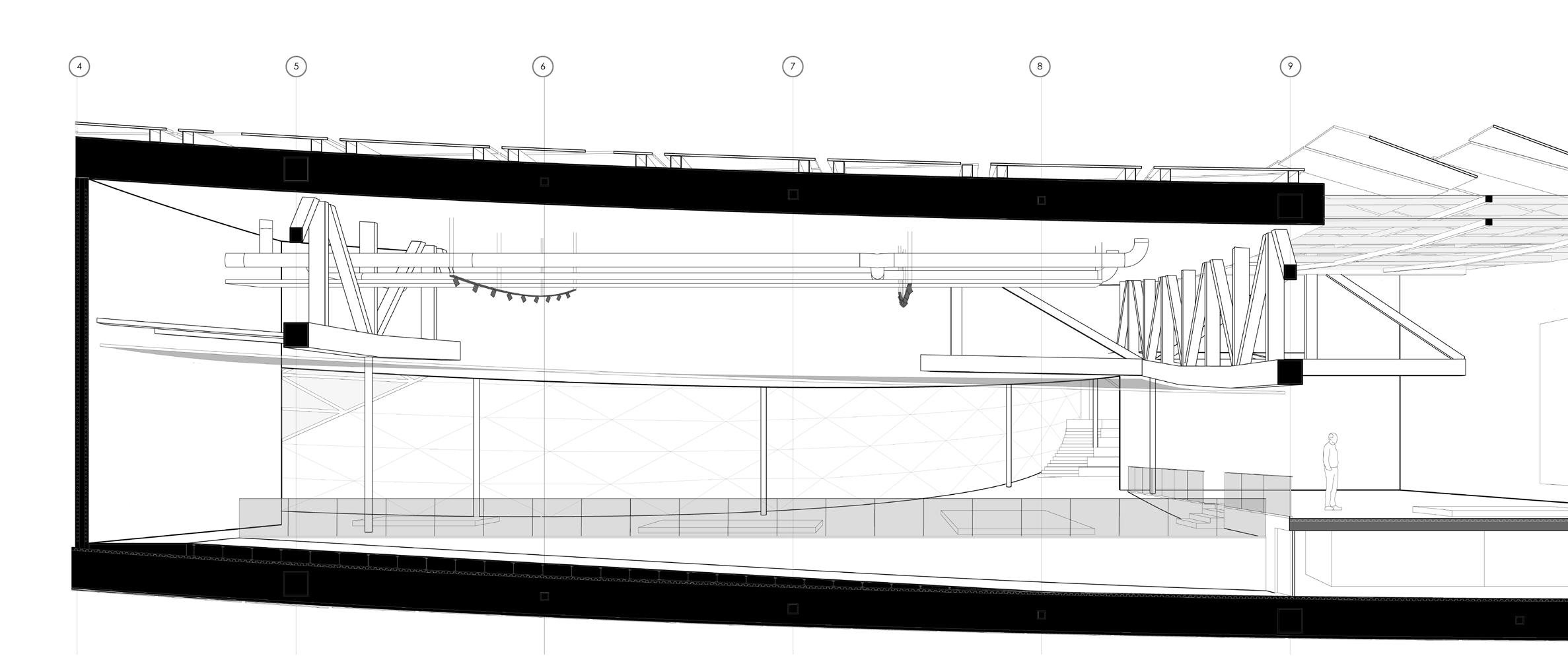
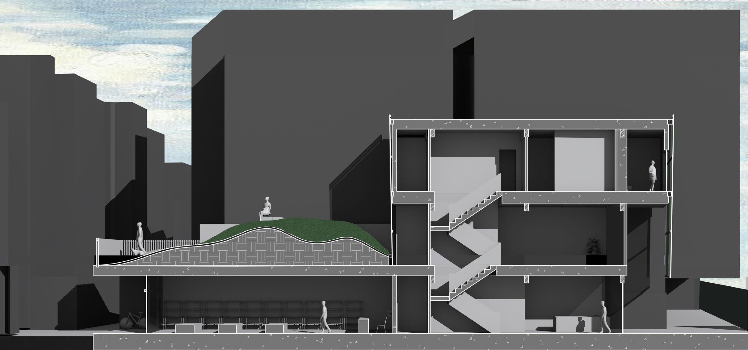
In this section, we can observe many details. The skylight is angled to prevent excessive heat while allowing natural light into the gallery space. It is designed to create variations in height within the exhibition hall, offering different perspectives for viewing the exhibits.
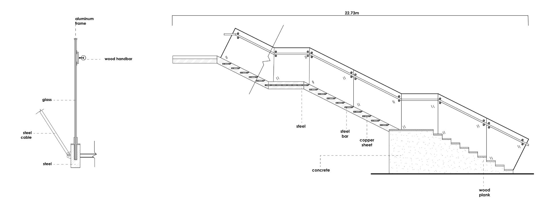
Below is the detailed design of the staircase connecting the third and fourth floors. The transition between these floors is significant to us, serving not only as a primary circulation path but also as a bridge between the old and the new. We use changes in materials to subtly suggest the shift between the old and the new.
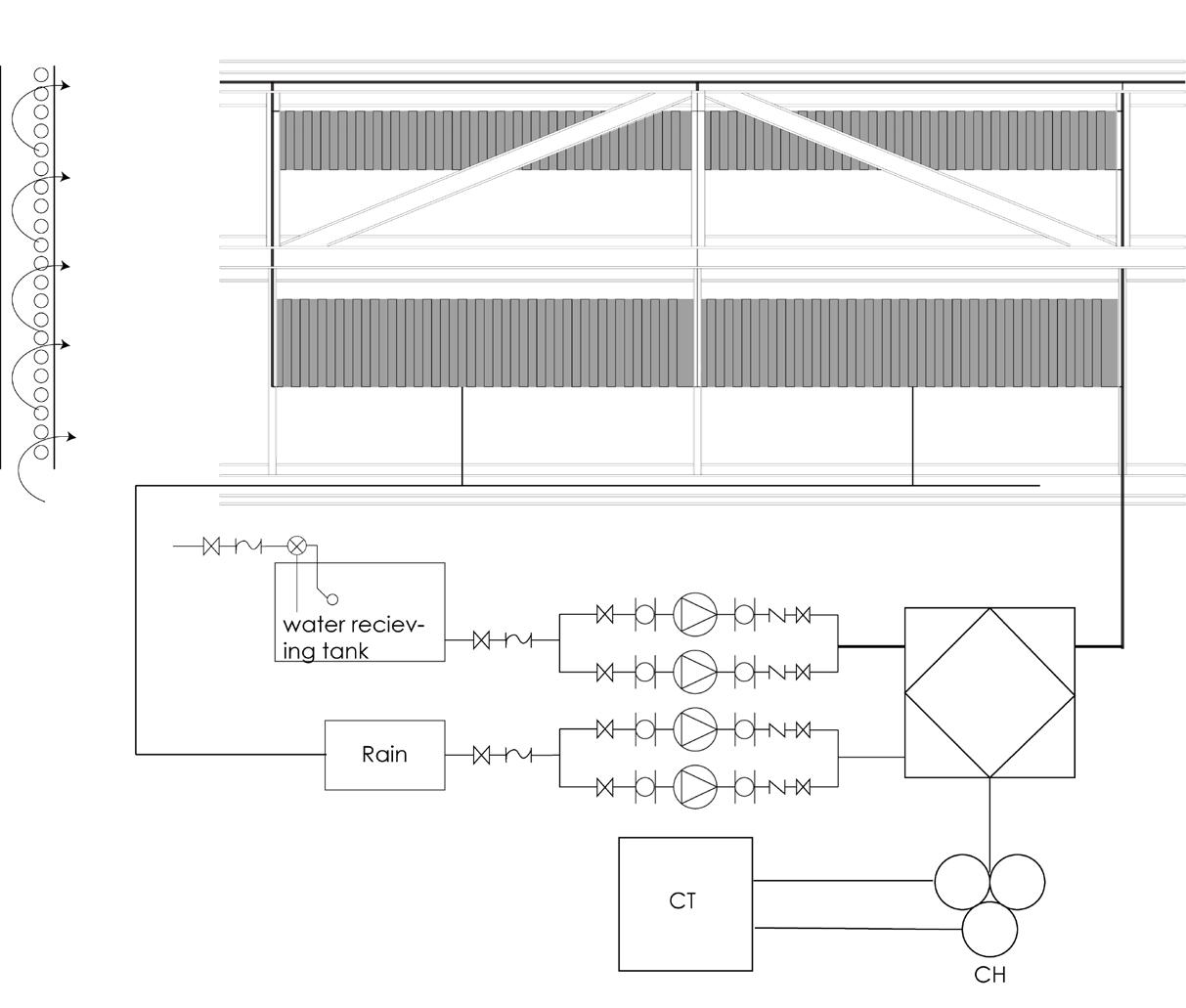
The air conditioning system utilizes watercooling, significantly improving energy efficiency. It integrates rainwater and water systems to enhance environmental friendliness. Additionally, our structural system allows for concealed water pipes, facilitating the recycling of indoor humidity.
Due to the additional volume added above, we need an intermediary transformation process. We install water pumps on the ground to ensure water can be effectively transported to the upper levels.
North Side.
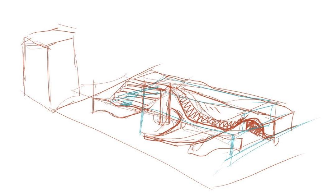
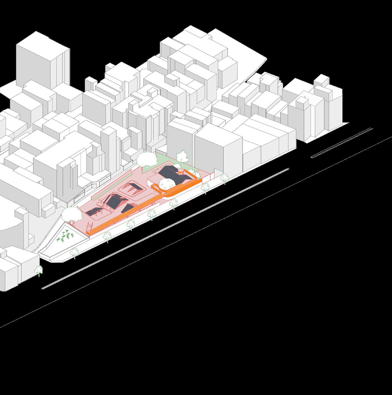
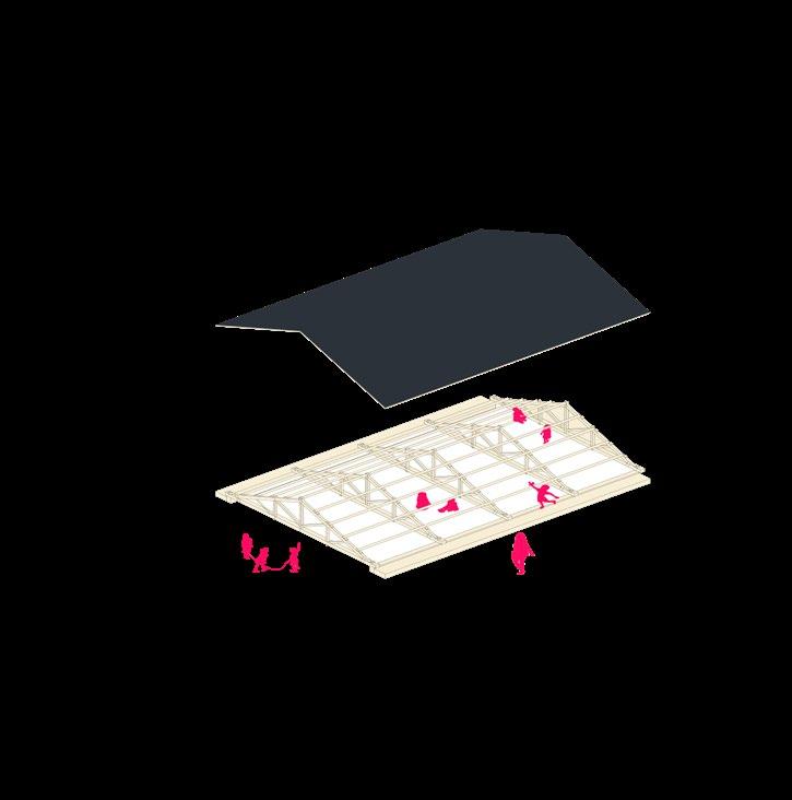
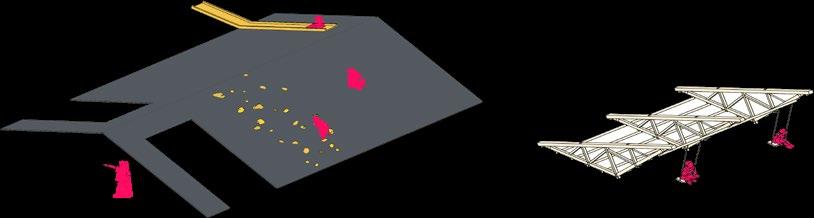
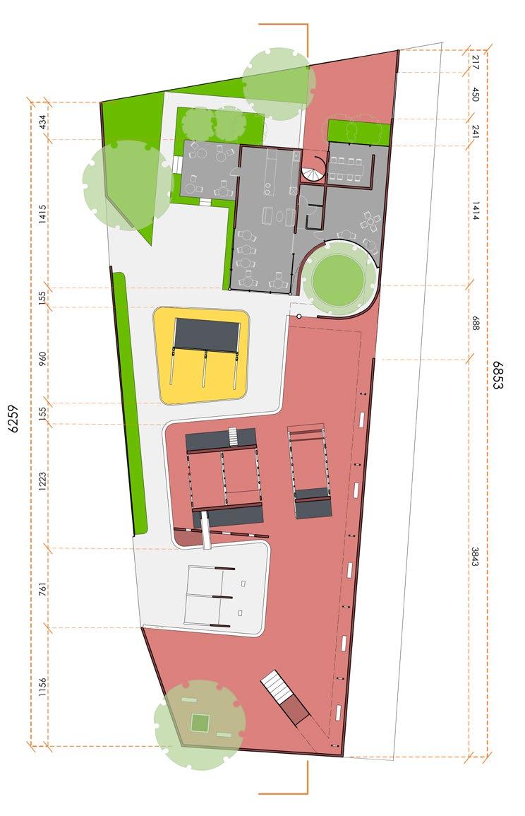
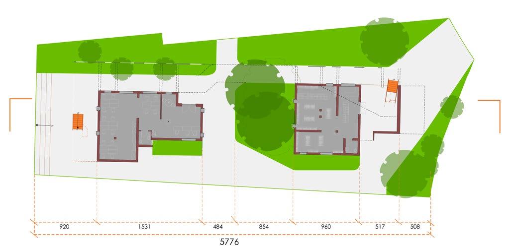
The design originated from my interest of roof trusses. The wooden components, with openings ranging from approximately 40-120 centimeters, intrigued me as potential elements for children’s game. Consequently, I designated the primary function of the northern site as a children’s playground. A pathway that traverses the site, gently ascending and gradually rising above the enclosure walls. This pathway allows people’s views to transition slowly from the inside to the outside, ultimately resting at the sloping roof.
north side concept diagram
north side
south side
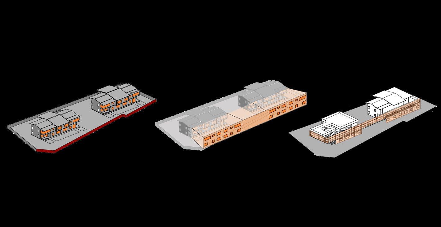
north side plan
1.café
2.sandpit
3.playground
4.swing
5.highwalk
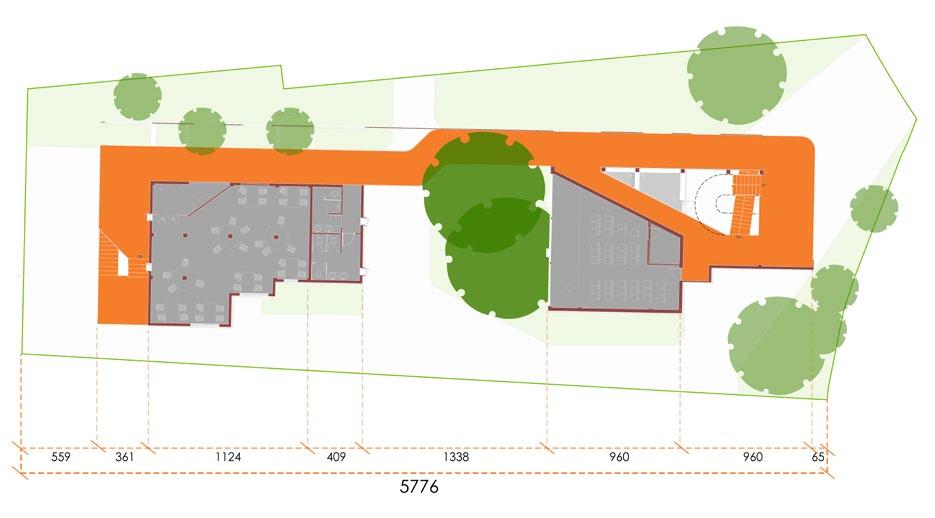
south side 2f plan
south side 1f plan
1.book store
2.school office
3.auditorium
4.study room
5.highwalk
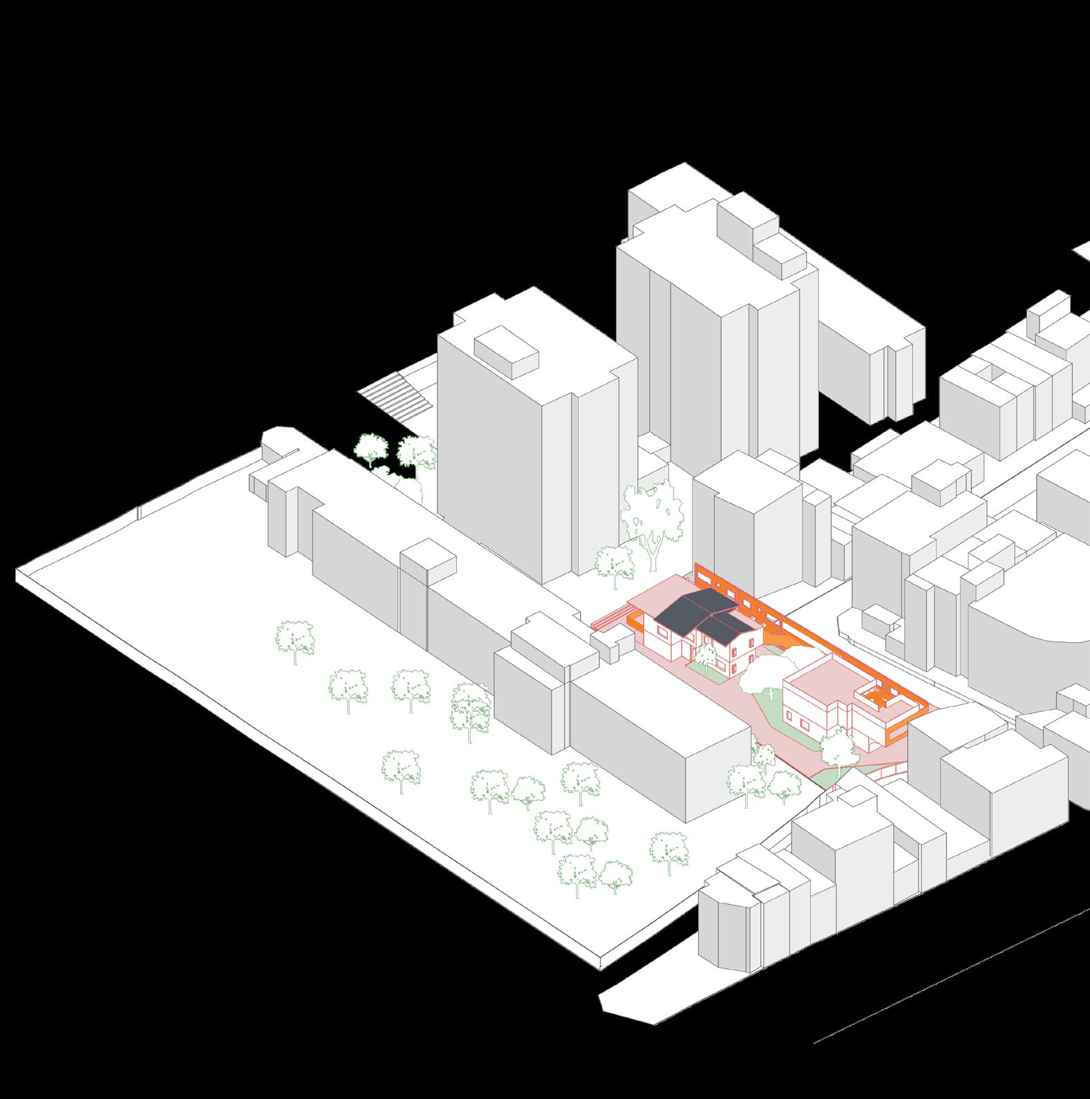
The northern site is more inclined to respond to the history, giving new life to the three abandoned house frames, and refurbishing the old house into a café suitable for residents. Southern side is like a friendly hand reaching out from the school to the community, primarily for student use, but the bookstore and auditorium are also open to residents.
Orange is the theme color I pick for this project, with its warmth and vitality, symbolizing that these two separate sites bear the same mark, telling everyone that schools and neighborhood around it can operate harmoniously.
The Hill
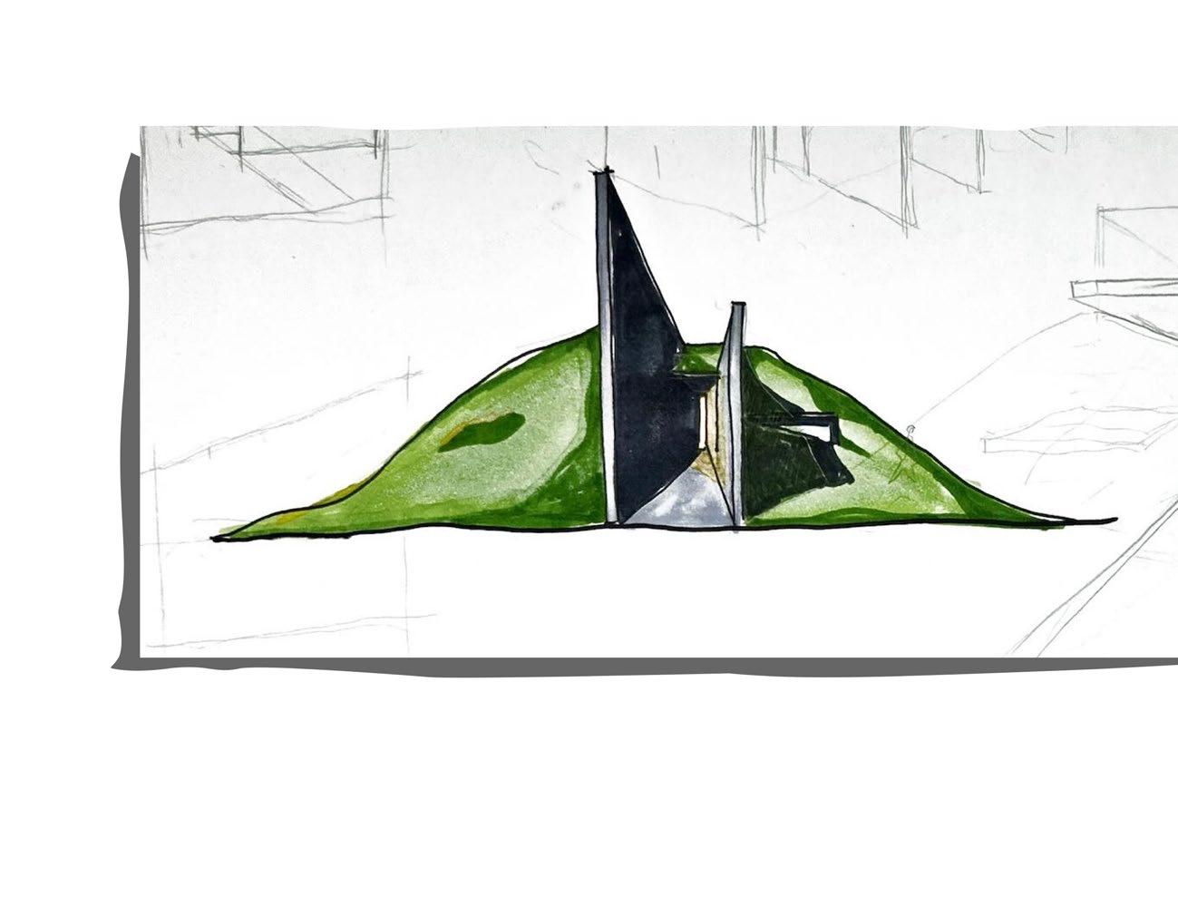
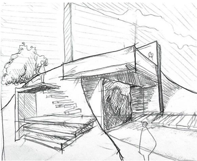
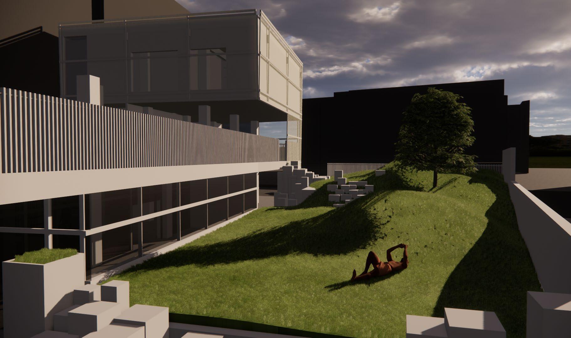
Amidst boring buildings within the city lies The Hills, naturally extending in all directions. It climbs onto the ground, into the mass , and grows unrestrainedly. The undulating terrain offers tranquility, hope that people eventually discover their own space within the vast grassland, embracing the grass and the sky. The large cubic structure float upon the meadow, pure white like clouds.
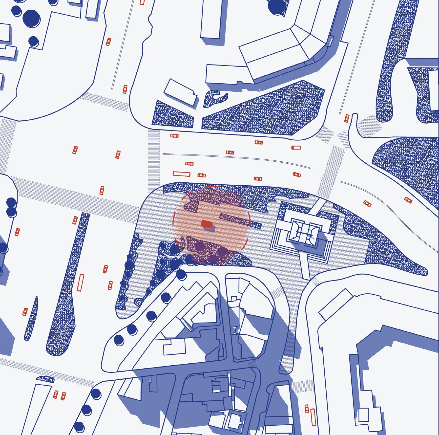
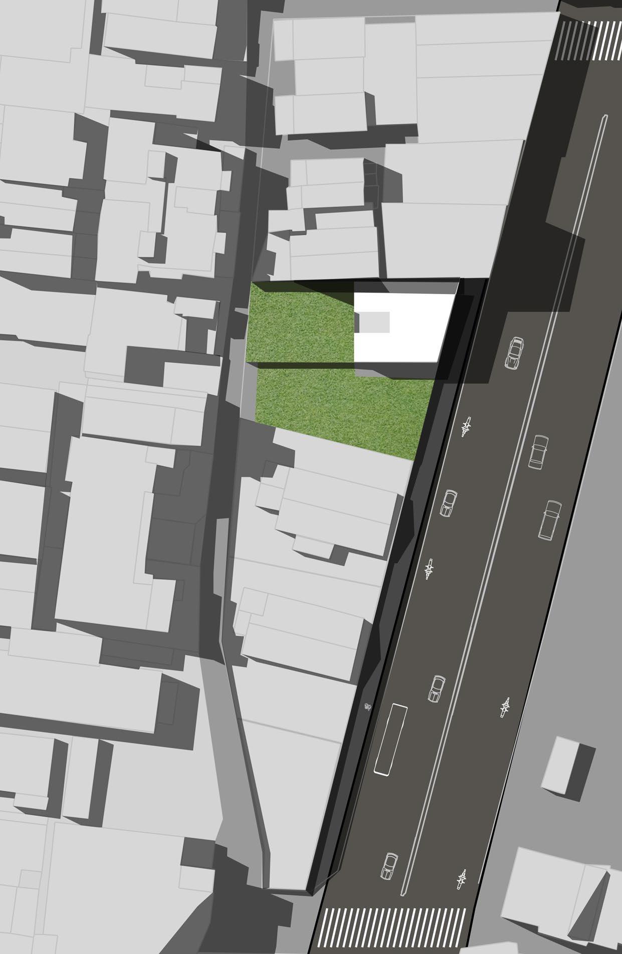
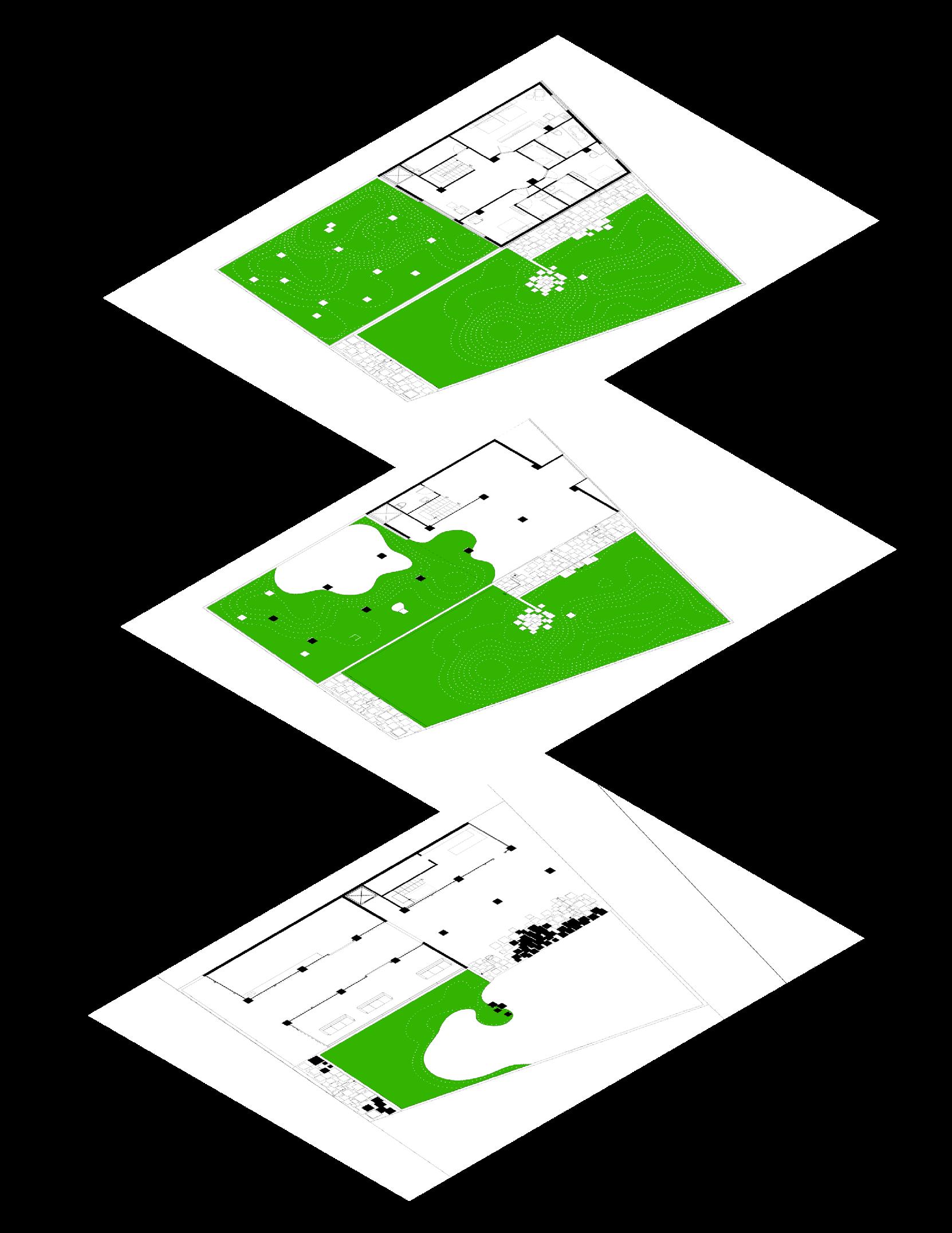
The site is situated adjacent to our campus,formerly housing faculty dorms, which have since been abandoned. It’s nestled between serene alleyways and bustling streets.
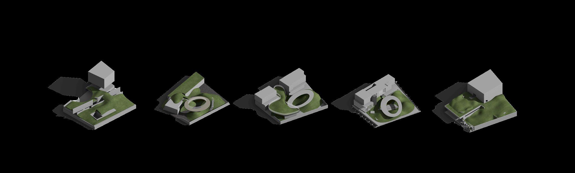
These iterations show some interesting development in the process and me trying to strike a balance between fuctionalities and ambience of the space.
1. Most of the spaces are hidden underground and a long corridor cuts the site in half.
2. The ring creates a space for gathering, and the mass are getting moved onto the ground.
3. this time i created an elevated green space,the ground is left for pedestrian access
5. Back to the first generation, remain the simplicity of the hills is more healing in my opinion.
4. continuing the previous proposal, but add a underground level for gathering
1. Divide the site into four area and elevate each platform to differerent height to create a landscape.
2. Add a corridor to the north side of the site and the mass for the hostel.
3. Further trimming the enclosed masses by creating addintional openings enhances the building’s transpaency
4. The landscape covers the site like a blanket and stairs that allows people to go on top.
The project is more than just a park, it combines park and accommodation spaces, aims to provide relief from the hectic urban life and comfort for the soul. Hoping that everyone can find their own little space in the expansive greens breathing calmly with undulations of the hills, reaching inner peace.
1. Reading room
Bookstore
Hostel lobby
The Hills
Gathering space
Hostel rooms
Unleashed Wall
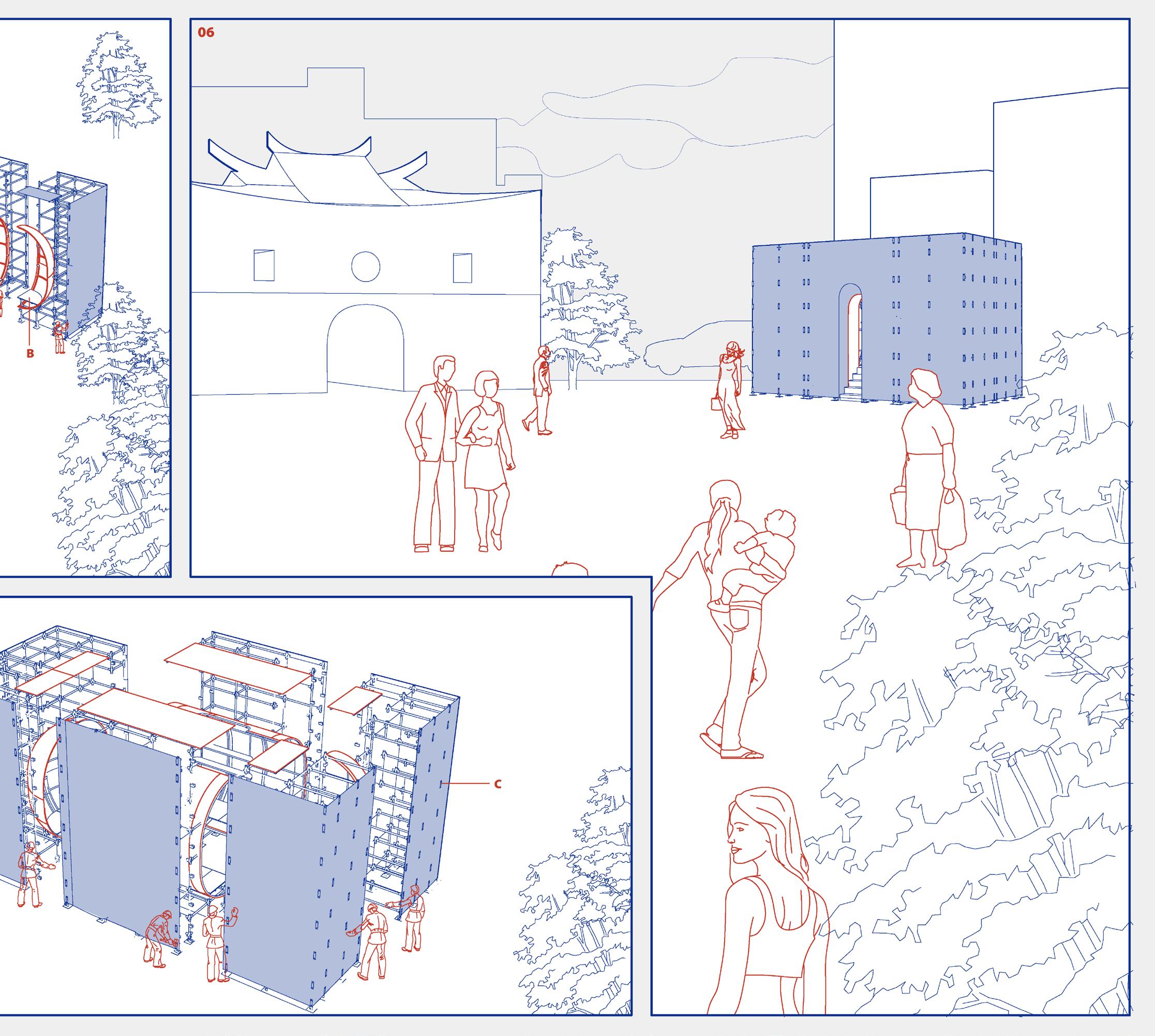
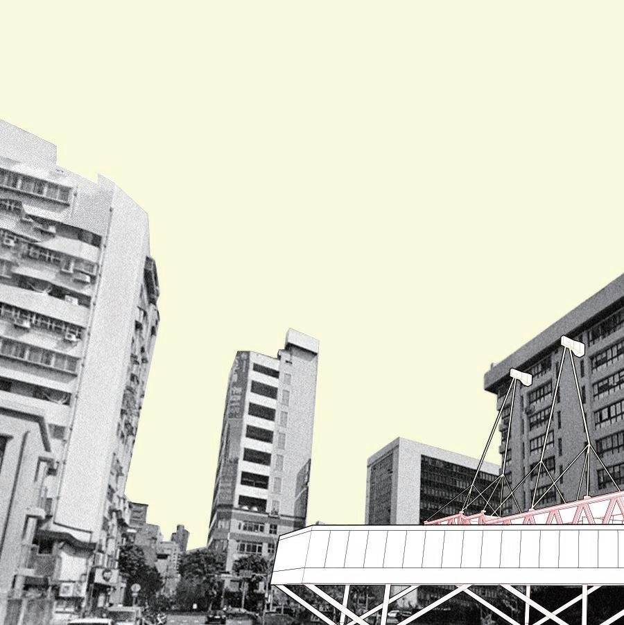
Compared to the spatial essence of a building, walls often seem to exist merely as supporting and boundary-defining elements. Therefore, in relation to the space itself, walls are akin to the background of the space, akin to the “backdrop” of the architecture. Taking this as a starting point, we explore the possibility of reversing this concept and consider the wall itself as the starting point of design, becoming an architecture that originates from the wall. On the other hand, the most essential unit constituting a building is indeed the wall. Walls have the function of delineating the front and back of a space, thereby creating an internal and external division within the space. Hence, we ultimately decide to use walls as the basis and core of the design, attempting to find different results by starting with the wall.


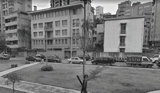



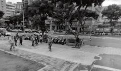







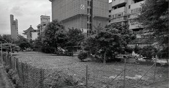
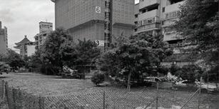




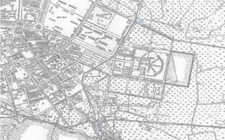
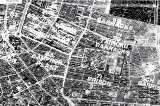
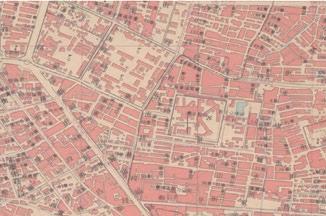
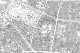
The site was once a prison, constructed in 1904, covering a total area of 58,752 square meters. Renamed "Taipei Prison" in 1924, it was Taiwan's first modern prison, used at the time for detaining and executing anti-Japanese activists and war prisoners. Today, only parts of the wall remains, where memorials for war victims and prisoners have been held occsionally.
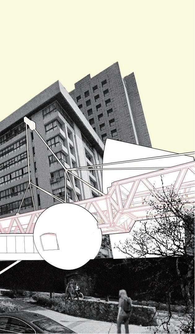
Although the buildings can be seen from the front of the wall, the entrance is not immediately visible, requiring exploration to discover its location. Access to the interior of the buildings can only be gained by circling around to the rear of the walls. Additionally, the design also resonates with existing architectural volumes. A semi-circular volume extends through the Chunghwa Telecom Building, aiming to interact with existing volumes and integrate with the surrounding environment, infusing new vitality into the existing modern architecture.
Methods such as "reversal", "divergence", and "verticality" serve as responses to the walls themselves, extending and amplifying the appearance and characteristics of the walls to create functional spaces.
1.Remained prison wall 2.Library 3.Memorial 4.Lobby 5.Telecom Store 6.Park
Memorial is located in the center of the entire building, with the rest of the space radiating outward, just like the layout of the former prison on the site. The positioning of the memorial hall in such a special location is intended to help people remember history and learn from it.
view inside the memorial
Pixel Moon
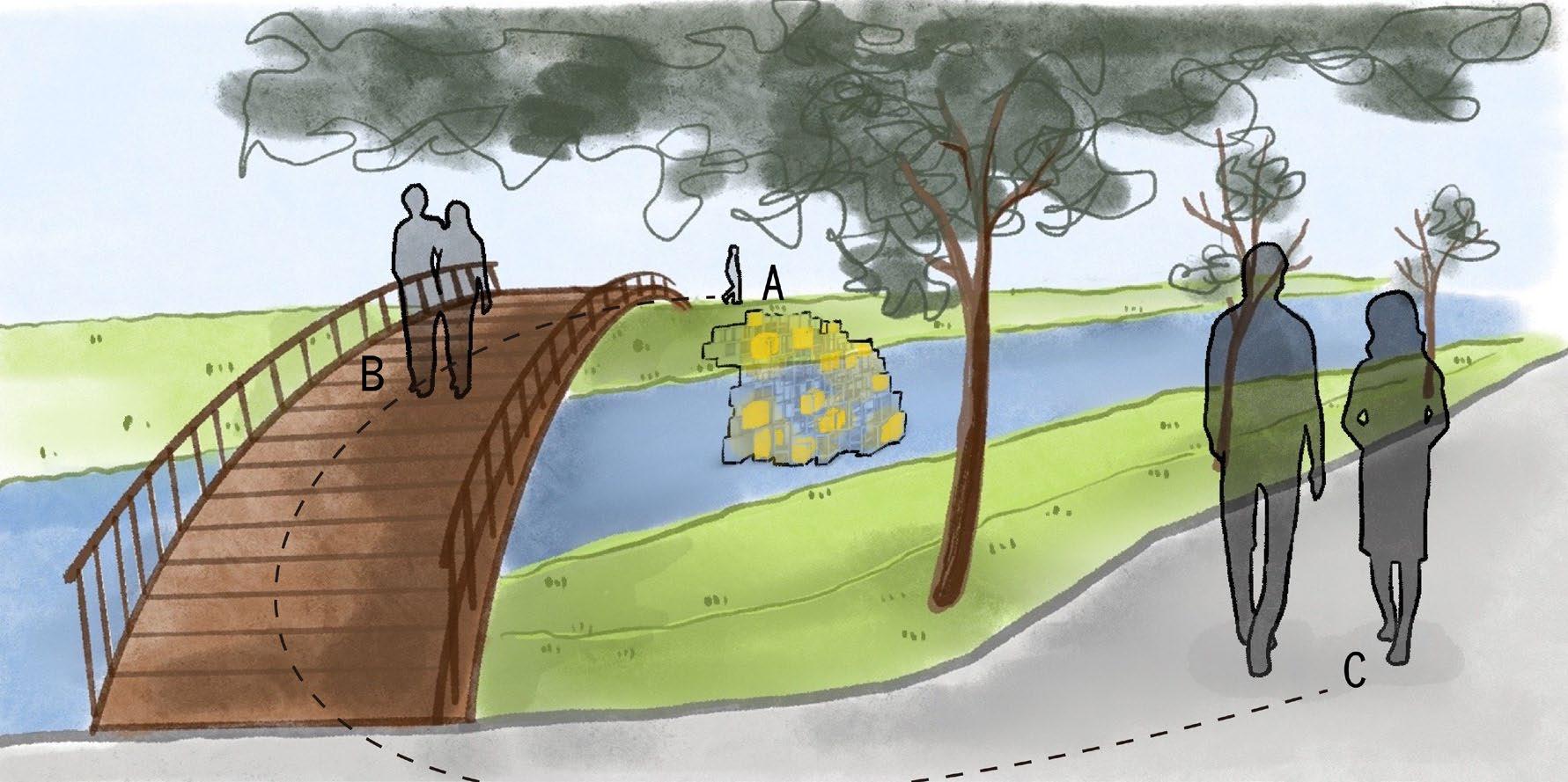
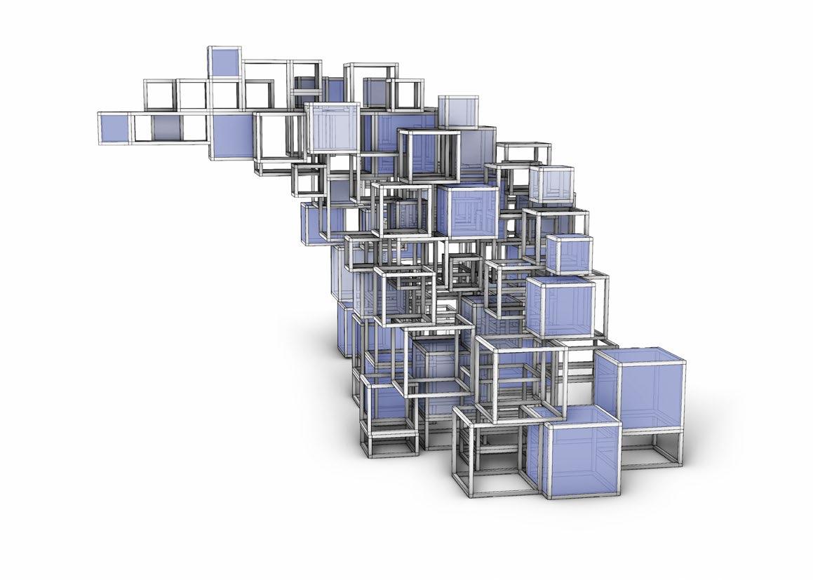
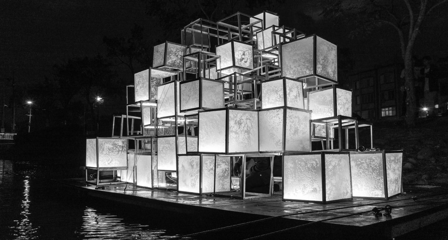
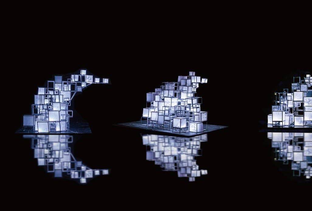
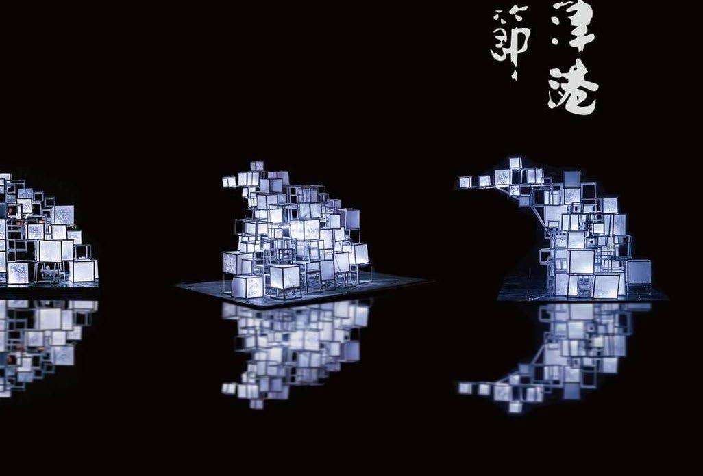
PIXEL MOON took the imagery of the moon, partly in homage to the historical evolution of the name of Yuejin Port, extracting the concept of the moon from its old name “Moon Port.” On the other hand, it aims to express the gentle qualities of the moon. Through the reflection in the water, it creates an image of the moon floating on the river. The intention is for visitors to appreciate the various states of the moon as they stroll through the artwork during their journey. For the construction technique, we employed a method of stacking units to shape the moon, just like pixels. We used small square units to recreate the thickness and curves of the moon. This approach not only gives a simple representation of the moon but also adds a sense of technology, forming a digital pixel effect.
Built / Yuejin Lantern Festival - student group selected
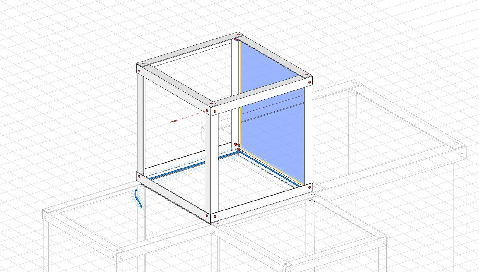
For the construction technique,we employed a method of stacking units to shape the moon, just like pixels. We used small square units to recreate the thickness and curves of the moon. This approach not only gives a simple representation of the moon but also adds a sense of technology, forming a digital pixel effect.
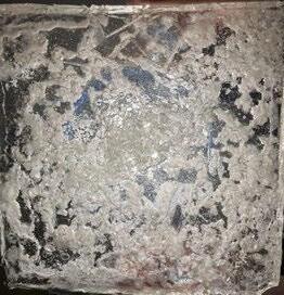
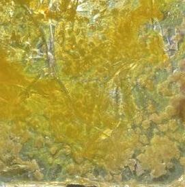
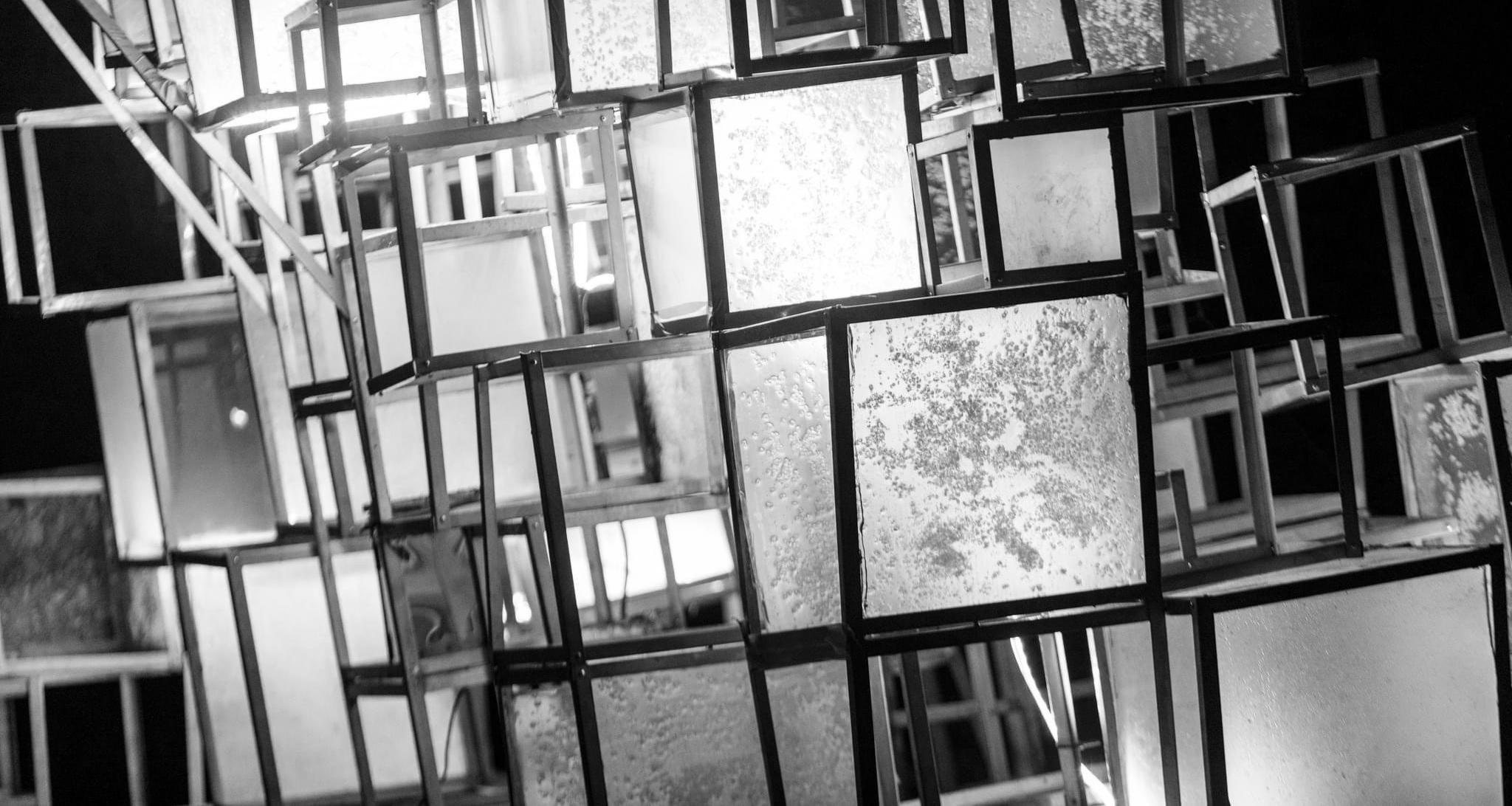
To shape the texture of the moon’s surface, we pour locally abundant coarse salt into water. When light shines through, each piece creates a unique pattern.
LED strip rivet
epoxy raisin + salt panel
L-shape stainless steel silicone
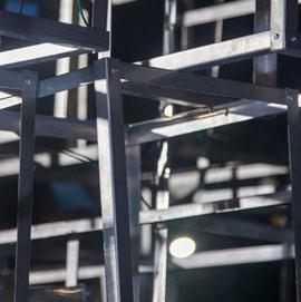
close-up of the Pixel
Pixel Moon floating on the water
With different perspective, comes different view of the Pixel Moon.