Kabel
Designed by Marc SchützKNeue
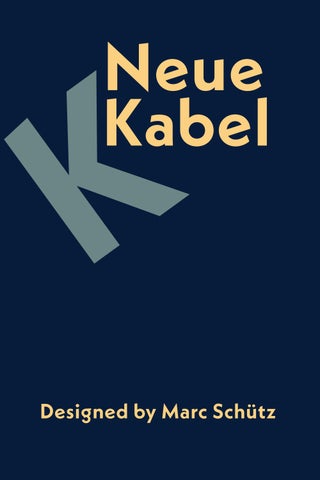
The classic geometric sans serif typeface Kabel of the 1920s has been modernized with a new version of Kabel®. As a tribute to the original intentions of designer Rudolf Koch, archived drawings were used and the font was redesigned for modern use. New additions include the long-lost italics and the missing glyphs - necessary today for editorial and branding purposes.
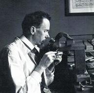
Rudolf Koch, Designer of the original Kabel
The original Kabel®, which was developed by Rudolf Koch in 1927 for the type foundry Gebrüder Klingspor, is an unusual design. Koch's portfolio mainly comprised broken fonts, mostly in the Rotunda or Fraktur style, but also serif fonts. Koch had never designed a sans serif before 1927. However, in an issue of a magazine dedicated to the designer, Koch was quoted as saying: 'It was very tempting to design a typeface with a compass and ruler.'
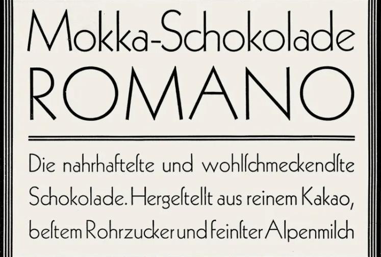
The original Kabel typeface
In 2013, the time was right for a new revival of Kabel®. Schütz designed the new Kabel® with a coherent system of weights, from thin to black. Each typeface includes the long-awaited italics and the small caps that did not exist before. He improved the readability. He also expanded the range of glyphs to include accents and special letters for different languages. The New Cable comprises seven sets of numerals, including tabular numerals and oldstyle numerals for long texts.
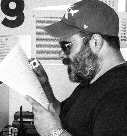 Marc Schütz, Designer of Neue Kabel
Neue Kabel is primarily a display font and works best in large formats. However, a large x-height of the lowercase letters, large counters, generous apertures and moderate contrast in the stroke width ensure that Neue Kabel is easy to read in text sizes.
CROSSBAR CLIPPED AT AN ANGLE ABREVIATED TOP LOOP
UNFINISHED BOWL & LOOP VERTICAL STROKES SHEARED AT AN ANGLE
All the historical alternatives of the original Kabel® have been retained and incorporated into the new font. In this way, users can take themselves back to the year 1927 in typographical terms. Rudolf Koch's design is iconic, but so far none of his digital heirs have been able to follow in his footsteps. Schütz succeeded in combining the characteristics of the past with those of the present and creating a font that meets today's typographic requirements and expectations and offers editorial offices and companies great flexibility of use.
May 2024