My name is Hanna Scheck. With a deep passion for creating human-centered designs and a strong dedication to excellence, I am eager to contribute my skills and enthusiasm to design teams. As a highly motivated and design-oriented student pursuing a master’s degree in Interior Architecture and a minor in Entrepreneurship & Innovation at Kansas State University, I am eager to contribute my skills and my belief in the transformative impact of thoughtful design on daily life.
next advertising office
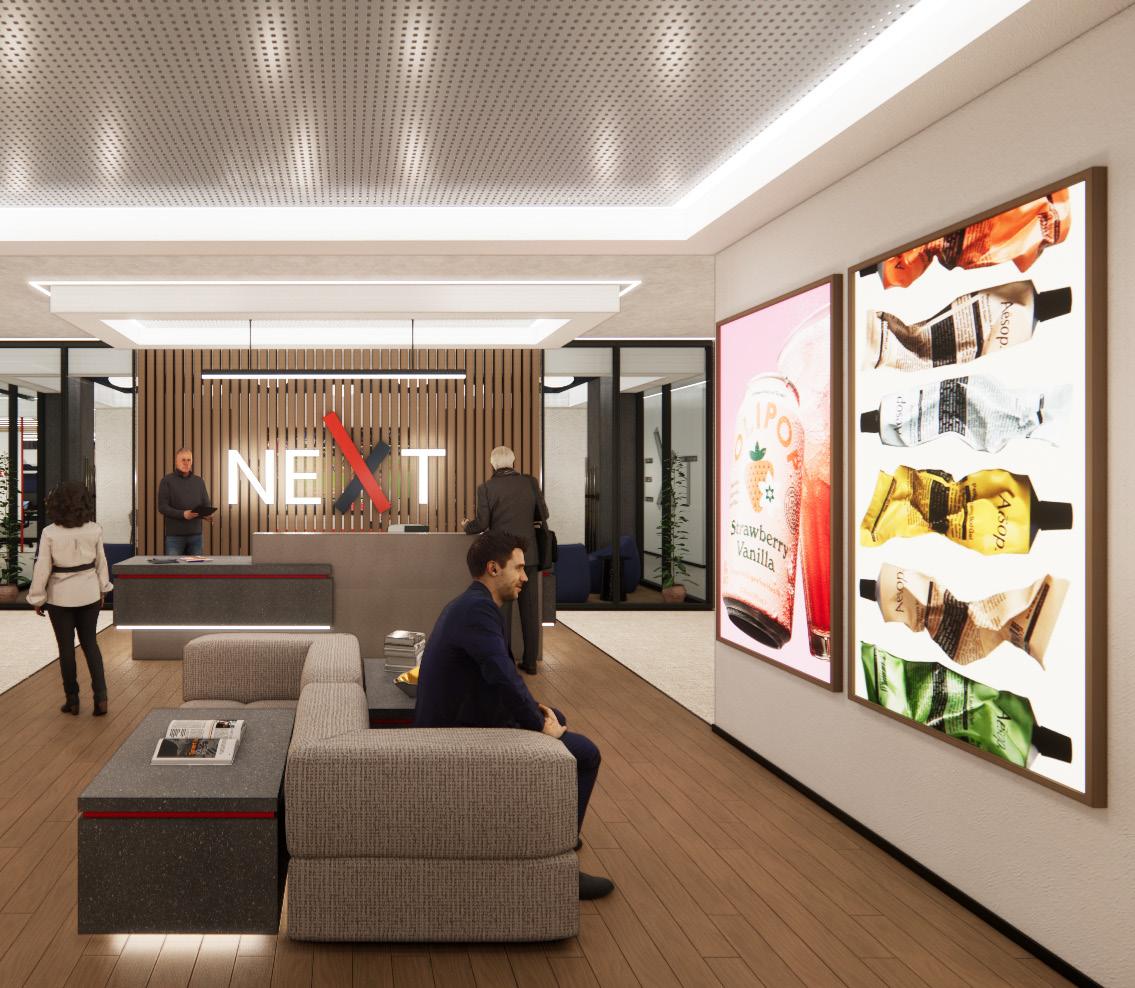
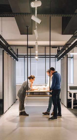
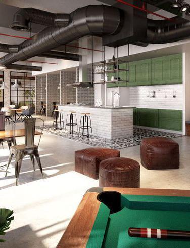
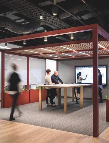
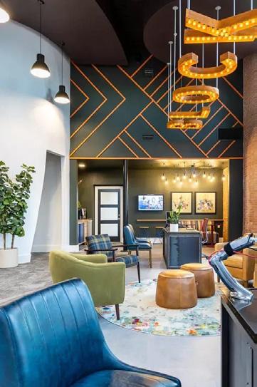
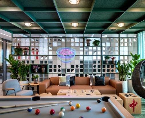
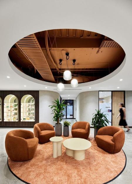
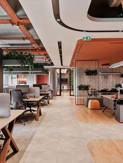
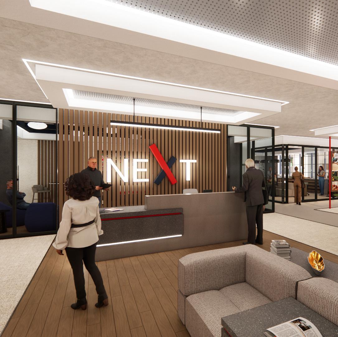
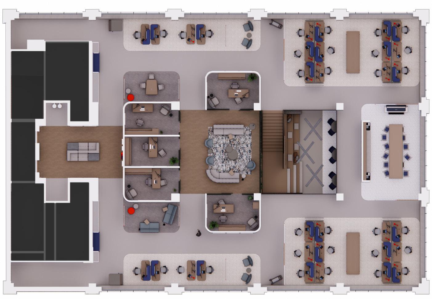
This project reimagines the workplace as a soulful, peoplecentered environment that balances focus, collaboration, and engagement. Inspired by Chicago’s cultural fabric, the design translates neighborhood identity into an inclusive workspace that fosters connection, creativity, and innovation.
pre design.
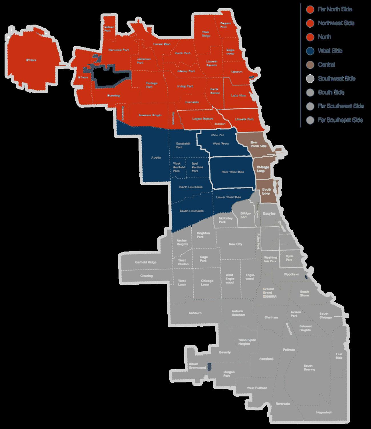
The challenge is to create a workspace that embodies the concept of Soul, fostering an environment that is productive and deeply connected to the individuality, creativity, and well-being of its people. This space must reflect the cultural diversity of Chicago, where distinct neighborhoods such as the West Side, North Side, and Loop influence the design.
The problem lies in balancing the needs for focus, collaboration, and customer engagement while ensuring the space feels inclusive, dynamic, and reflective of the city’s rich diversity. The workspace must honor these cultural identities, embracing the uniqueness of each individual and fostering a collective spirit that supports both personal fulfillment and professional success. By doing so, the space will reflect the essence of Chicago’s diverse communities, encouraging connection, creativity, and innovation within a soulful, adaptable environment.
CHICAGO NEIGHBORHOODS
Chicago is a city of neighborhoods, each with its own character, and this diversity contributes to the “soul” of the city.
Chicago’s neighborhoods are the heartbeat of the city, each with its own unique identity, history, and culture, collectively embodying the soul of Chicago. These neighborhoods represent the diversity, resilience, and creativity that define the city’s spirit.
This connection to “soul” is reflected in the way communities come together, preserving their heritage while embracing change and growth. Just as the soul of a person is multifaceted, so too is Chicago, with its neighborhoods offering a mosaic of experiences that contribute to the city’s overall vitality and character.
rich cultural diversity, more calm, shows individuality
tourist attractions and social spots, community-oriented
THE LOOP THE NORTH SIDE THE WEST SIDE
the city’s central business hub, busy and filled with people
SOUL
Designing a Customer-Centric Workplace
THE WEST SIDE
rich cultural diversity, more calm, shows individuality
focus-centric
linear forms for stability
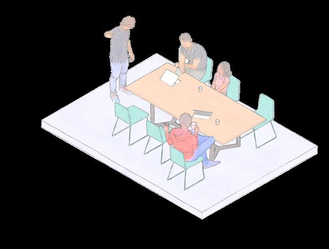
fixed, clear work zones
THE NORTH SIDE
tourist attractions and social spots, community-oriented
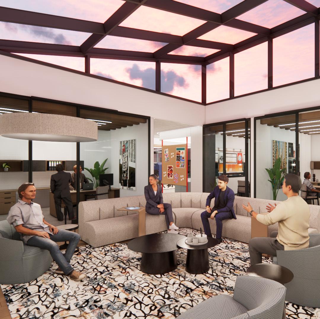
collaboration-centric
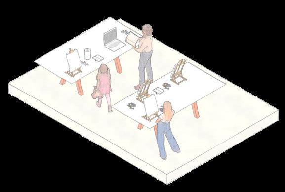
softer forms to encourage movement and interaction
modular furniture
THE LOOP
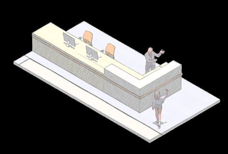
the city’s central business hub, busy and filled with people
customer-centric
augment human interactions
mixed-presence experiences
SPATIAL TYPOLOGIES
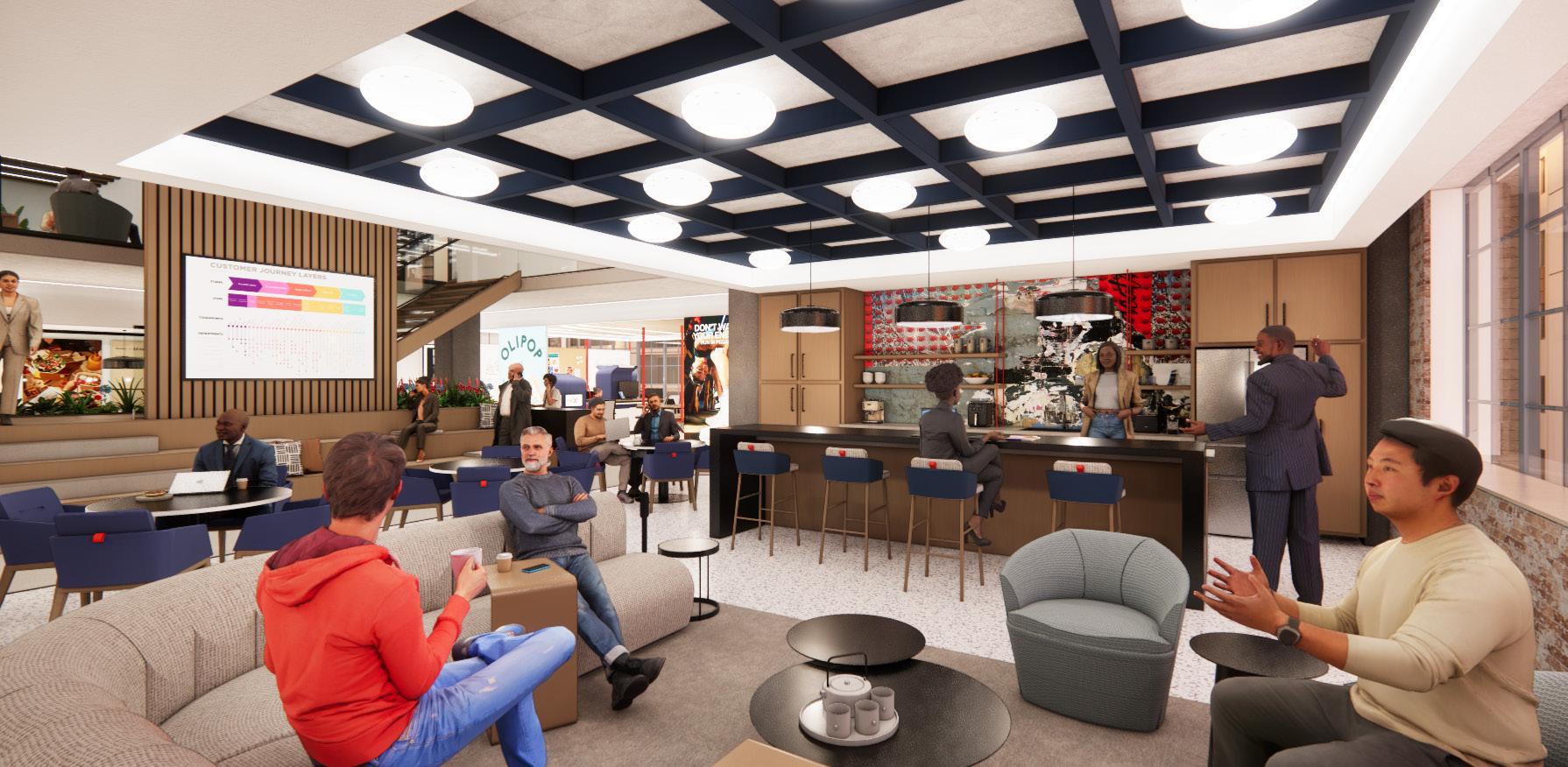
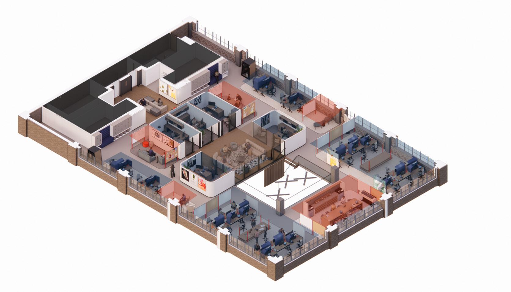
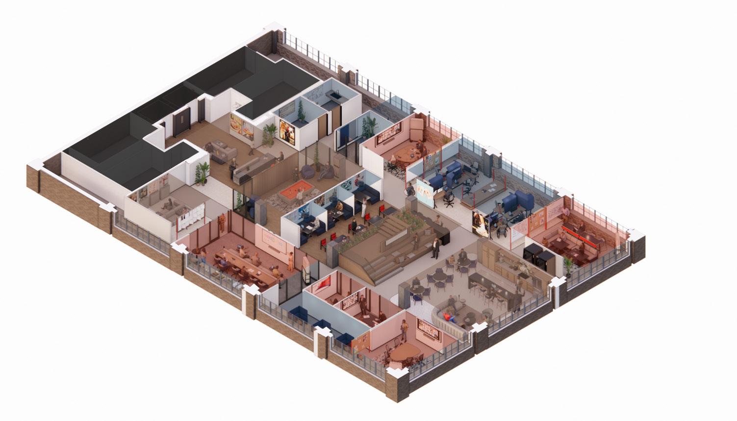
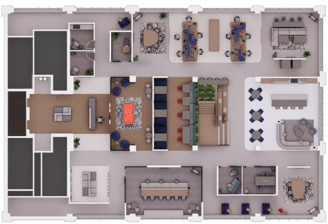
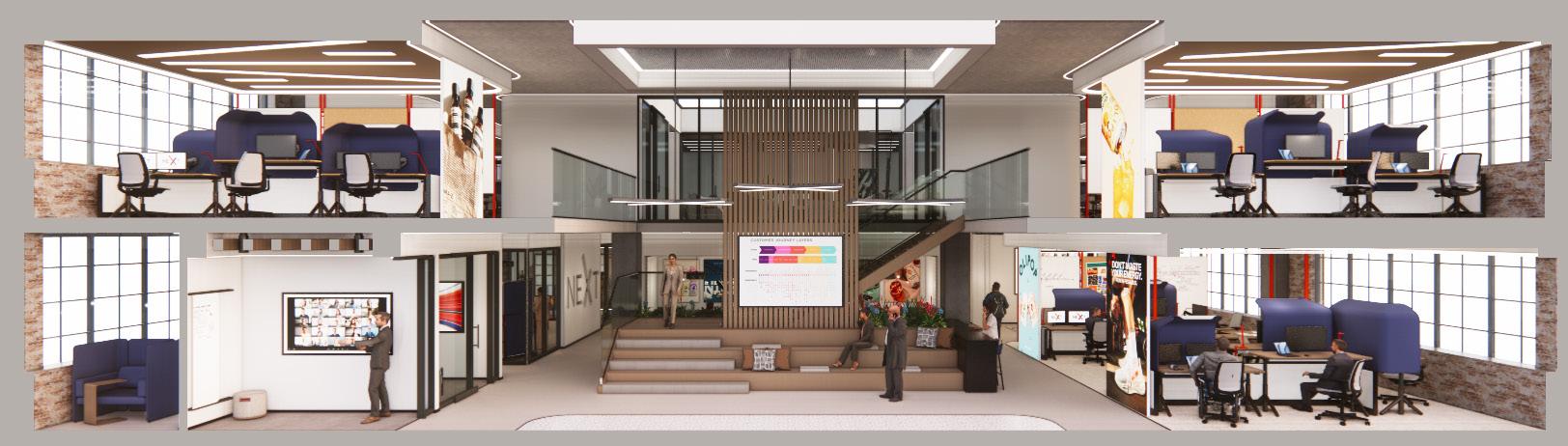
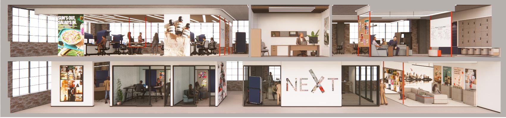
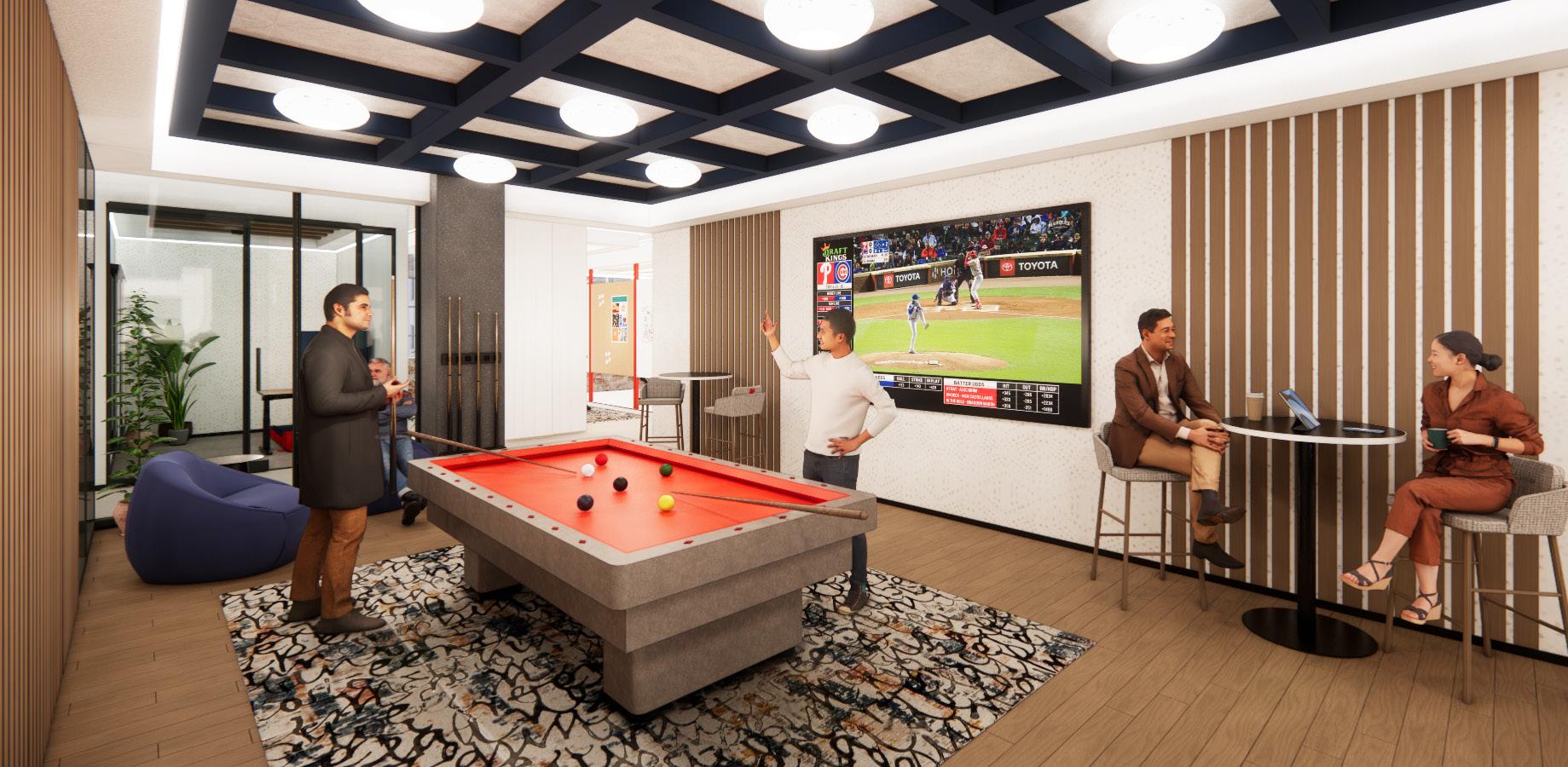
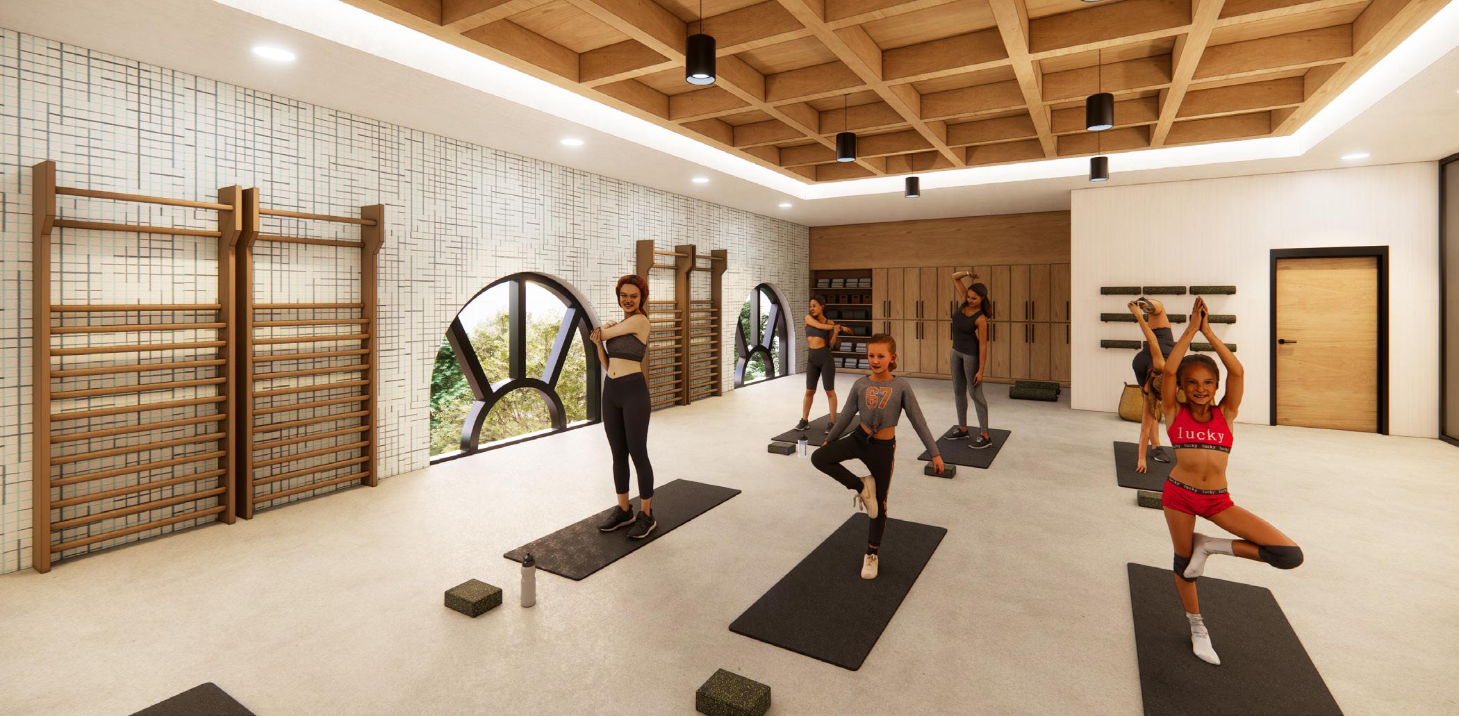
The spatial organization of the space is thoughtfully designed to embody the concept of Soul, with distinct areas that cater to both individual focus and collaborative energy.
The fluid transitions between open and enclosed spaces allow for an adaptive, evolving work environment, ensuring that every area aligns with the rhythm and needs of the team, fostering a soulful connection between people and place.
THE WEST SIDE
THE NORTH SIDE
THE LOOP
HUMANIZING THE BRAND
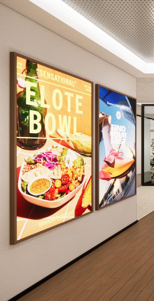
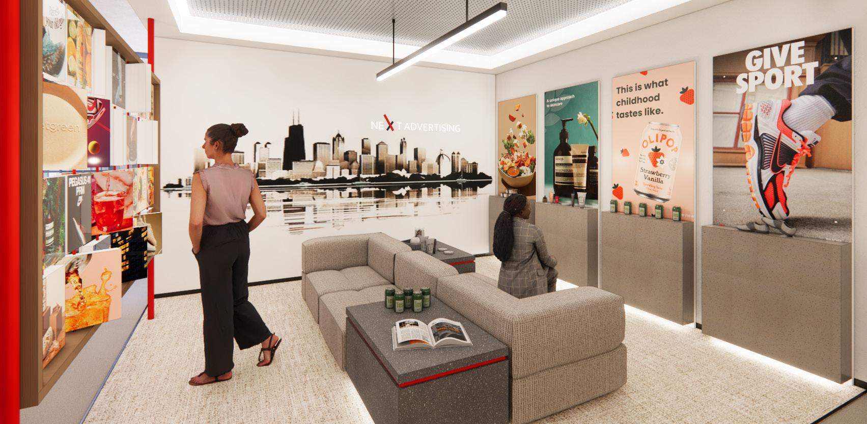
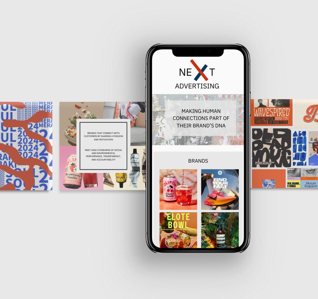
brands that connect with customers by sharing a passion and motivation - making human connections part of their brand’s dna
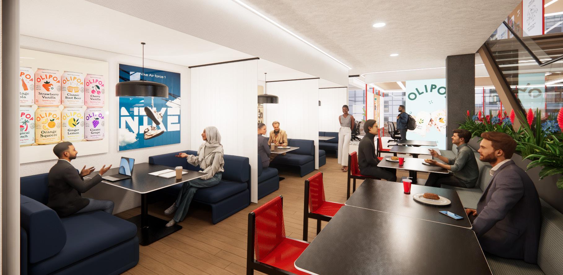
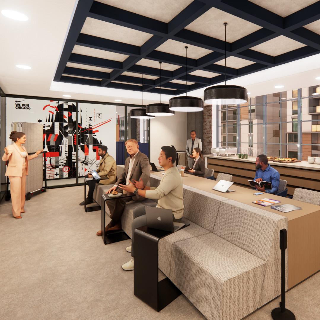
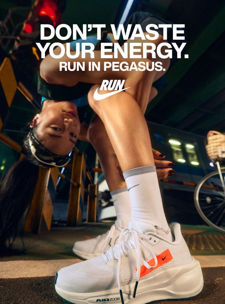
Nike is known for its powerful, soul-stirring storytelling. The brand consistently highlights individuality, perseverance, and personal journeys, aligning with the focus on fostering connections and honoring diversity.
By appealing to consumers seeking comfort and wellness, Olipop taps into deeper emotional connections. This mirrors the idea of a soulful workspace that nurtures both well-being and productivity.
Aesop exudes sophistication in every touchpoint, from product packaging to retail environments, making it a natural fit for customeroriented spaces inspired by the Loop’s professionalism and cultural richness.
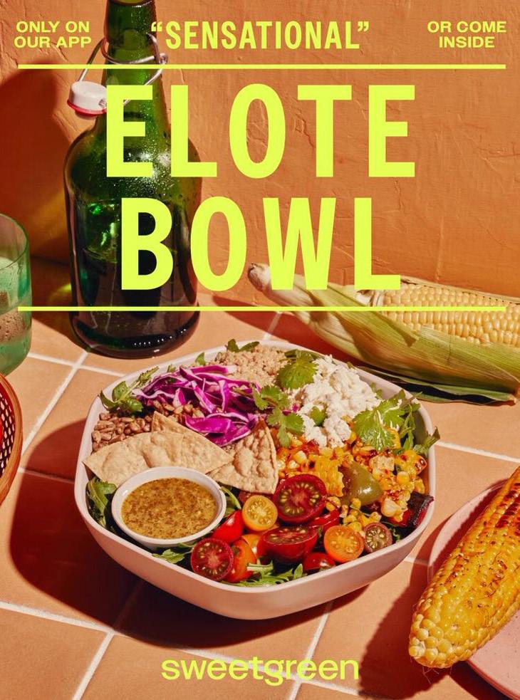
Sweetgreen emphasizes health, sustainability, and connection through its farm-to-table approach. The brand’s commitment to wellbeing and individuality reflects the concept’s emphasis on nurturing people and promoting balance.
NIKE
AESOP
OLIPOP SWEETGREEN
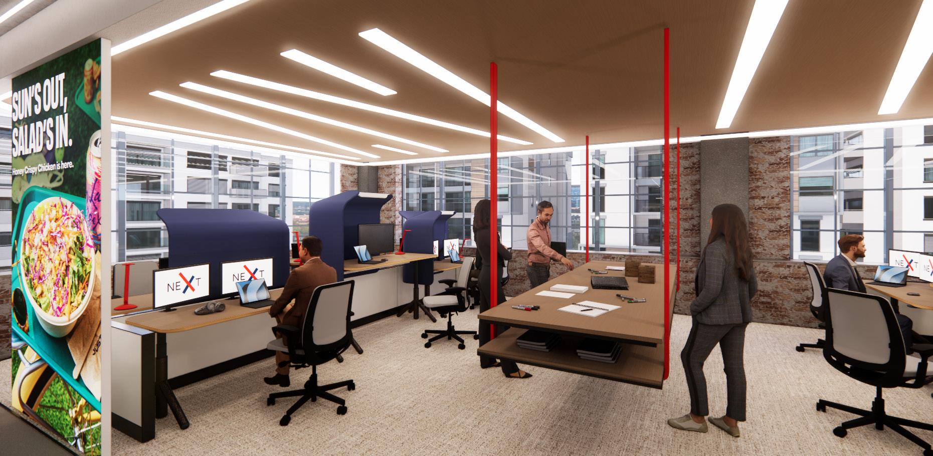
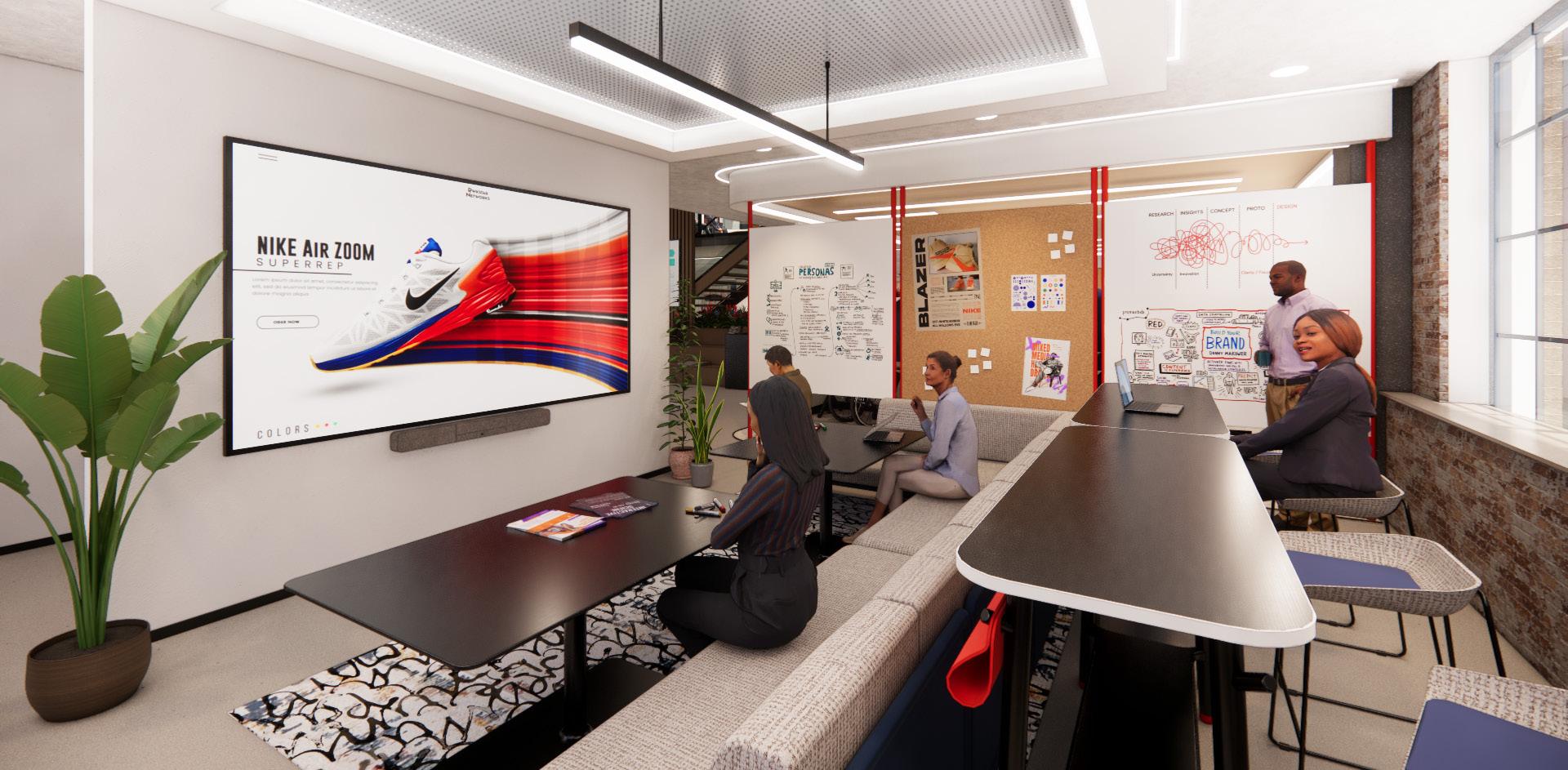
These perspectives highlight how the concept of Soul is applied throughout the space. They visually communicate how zones inspired by Chicago’s neighborhoods, focusing, collaborative, and customer-oriented, are cohesively linked to create a dynamic, flexible environment that balances individuality, connection, and creativity.
SECTION PERSPECTIVE
BRANDING
LOGO DEVELOPMENT
FOCUS-CENTRIC
COLLABORATION-CENTRIC CUSTOMER-CENTRIC
02
patchwork philly
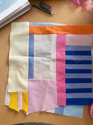
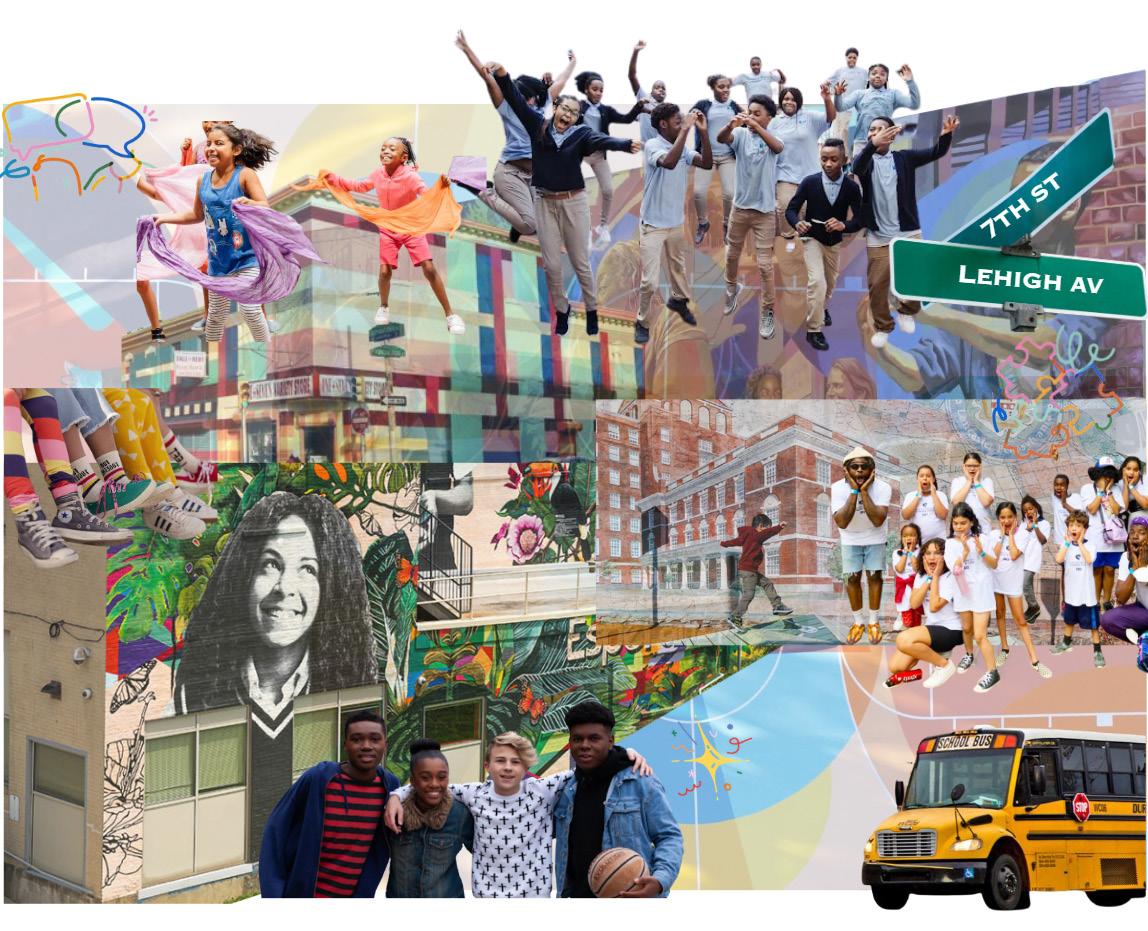
Patchwork Philly is a community-centered project that celebrates the diversity and layered history of North Philadelphia through the metaphor of a patchwork quilt, where youth are empowered to see themselves as essential pieces of a larger, connected community, stitched together through culture, movement, and shared identity.
pre design.
“Patchwork Philly” celebrates the neighborhood’s diversity and layered history as a patchwork quilt, each piece unique, yet stitched together through shared culture, collaboration, and care. The project honors the rich cultural fabric of North Philadelphia, particularly its Latino and African American heritage, while empowering youth to see themselves as vital “pieces” in the evolving story of their community.
Drawing from the neighborhood’s long traditions of public art, storytelling, and cultural pride. To create a vibrant, inclusive environment where youth feel both seen and connected. Each “patch” represents a distinct activity, age group, or cultural expression, that all are visually and spatially connected by a continuous “thread” of movement and transparency. The architecture becomes a symbol of unity within diversity, where individual experiences strengthen collective identity.
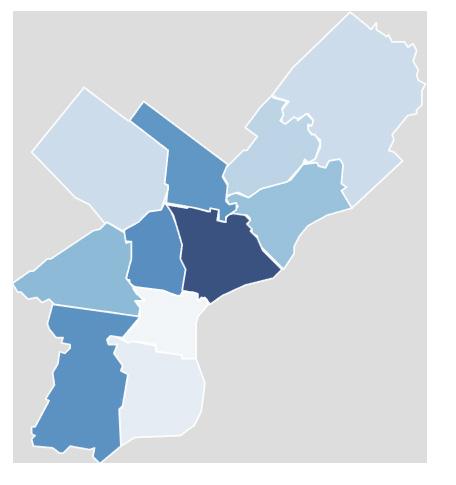
Opportunity youth are young people ages 16-24 who are not in school and not employed. Philadelphia has one of the highest rates of opportunity youth in the country, with North Philadelphia having the largest concentration due to long-term poverty, limited job access, and under-resourced schools.
This affects North Philadelphia greatly, increasing the need for safe spaces, education support, housing, and community programs that help youth reconnect to school, work, and opportunity.
Opportunity
MISSION STATEMENT
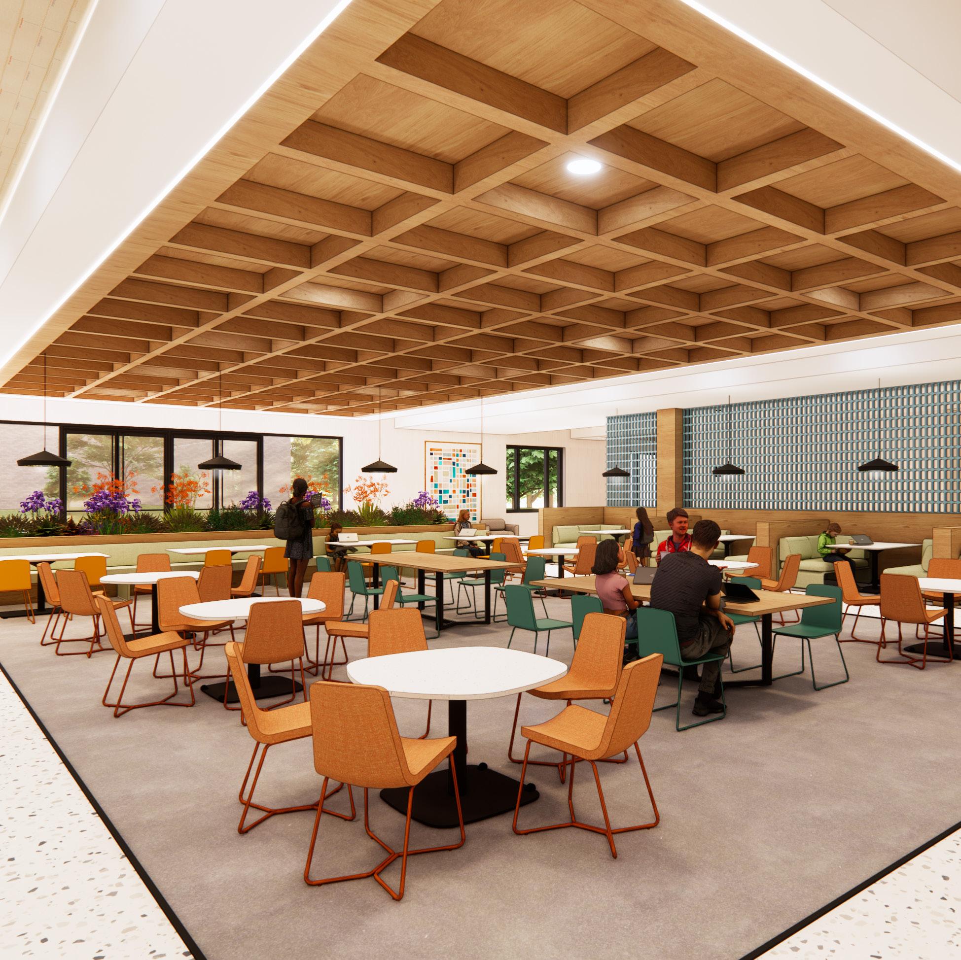
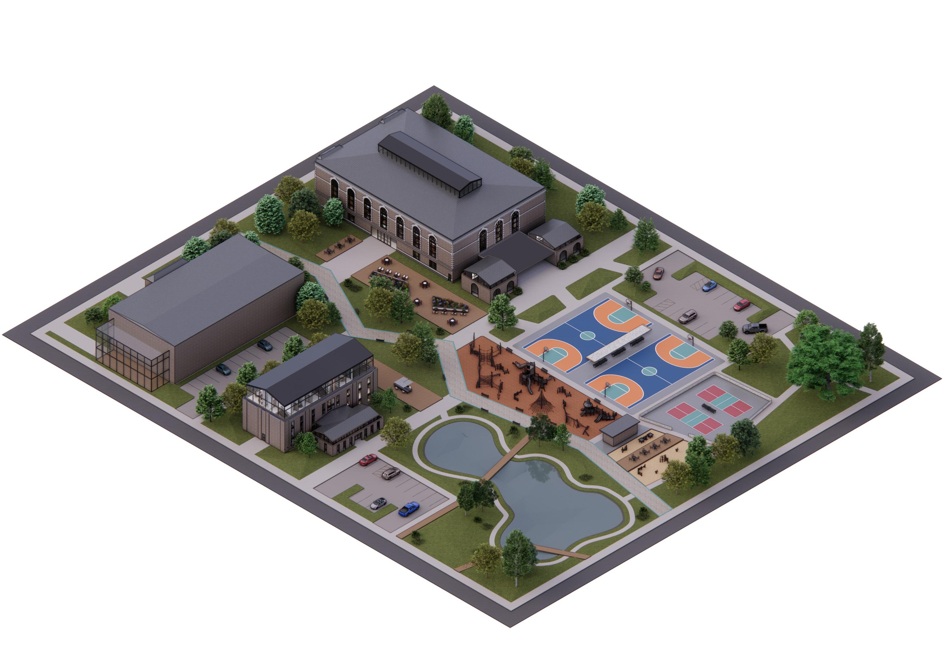
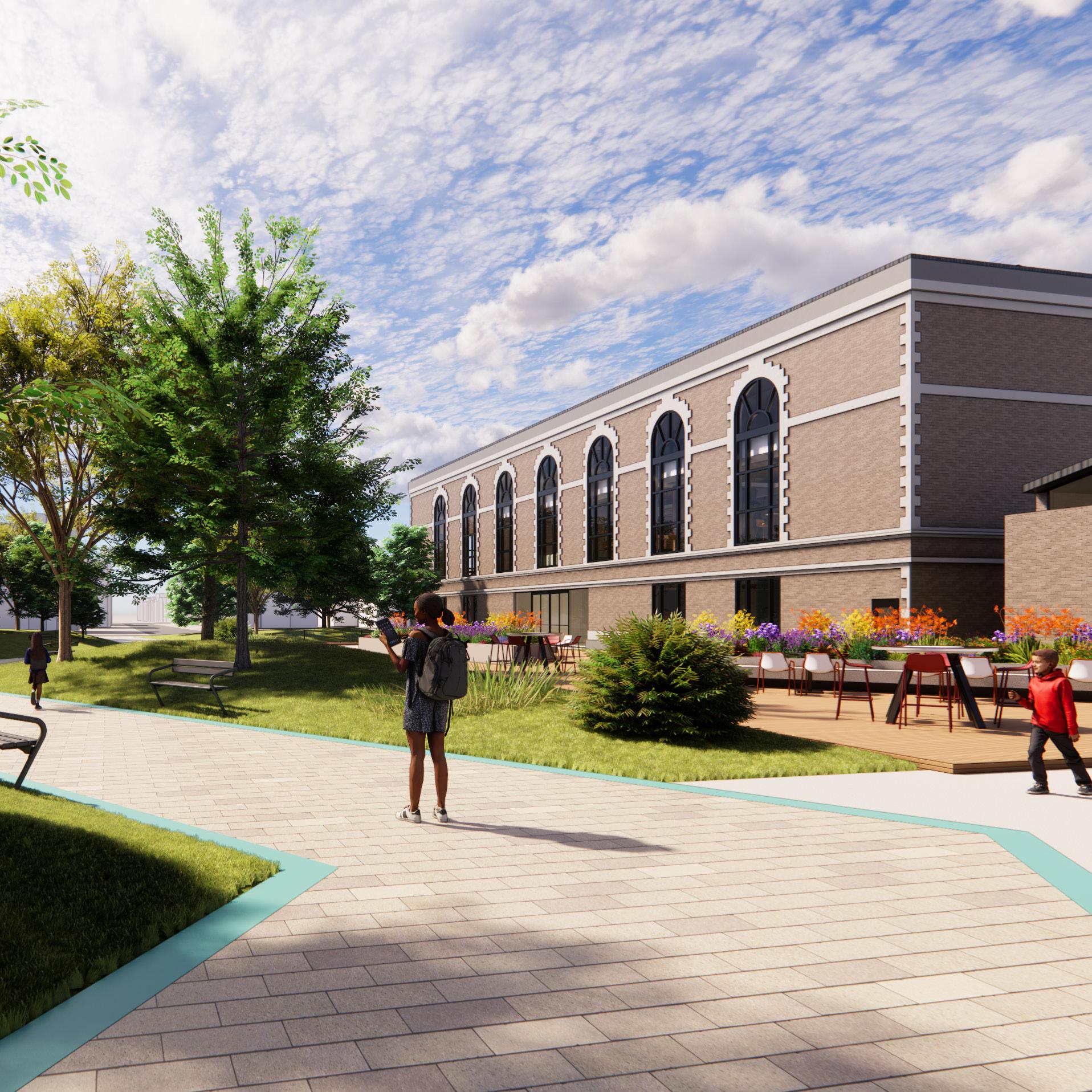
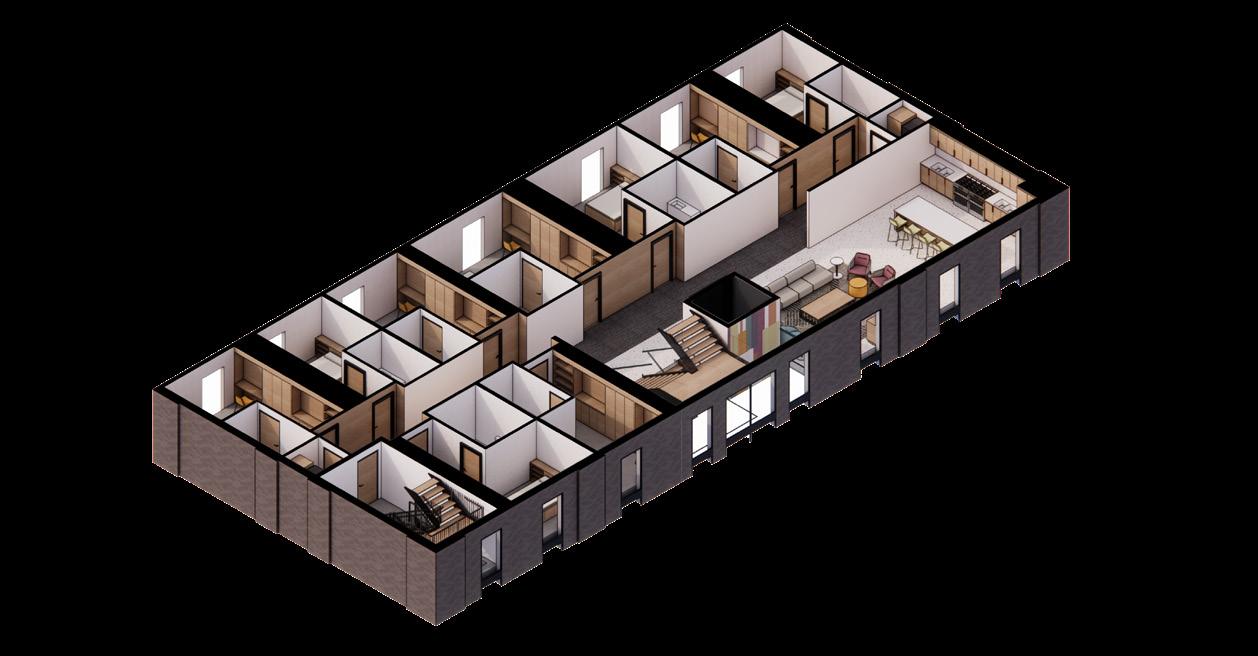
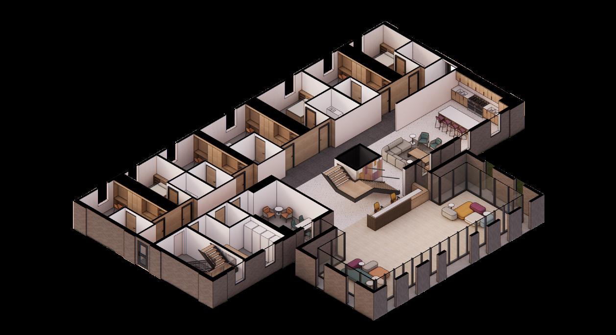
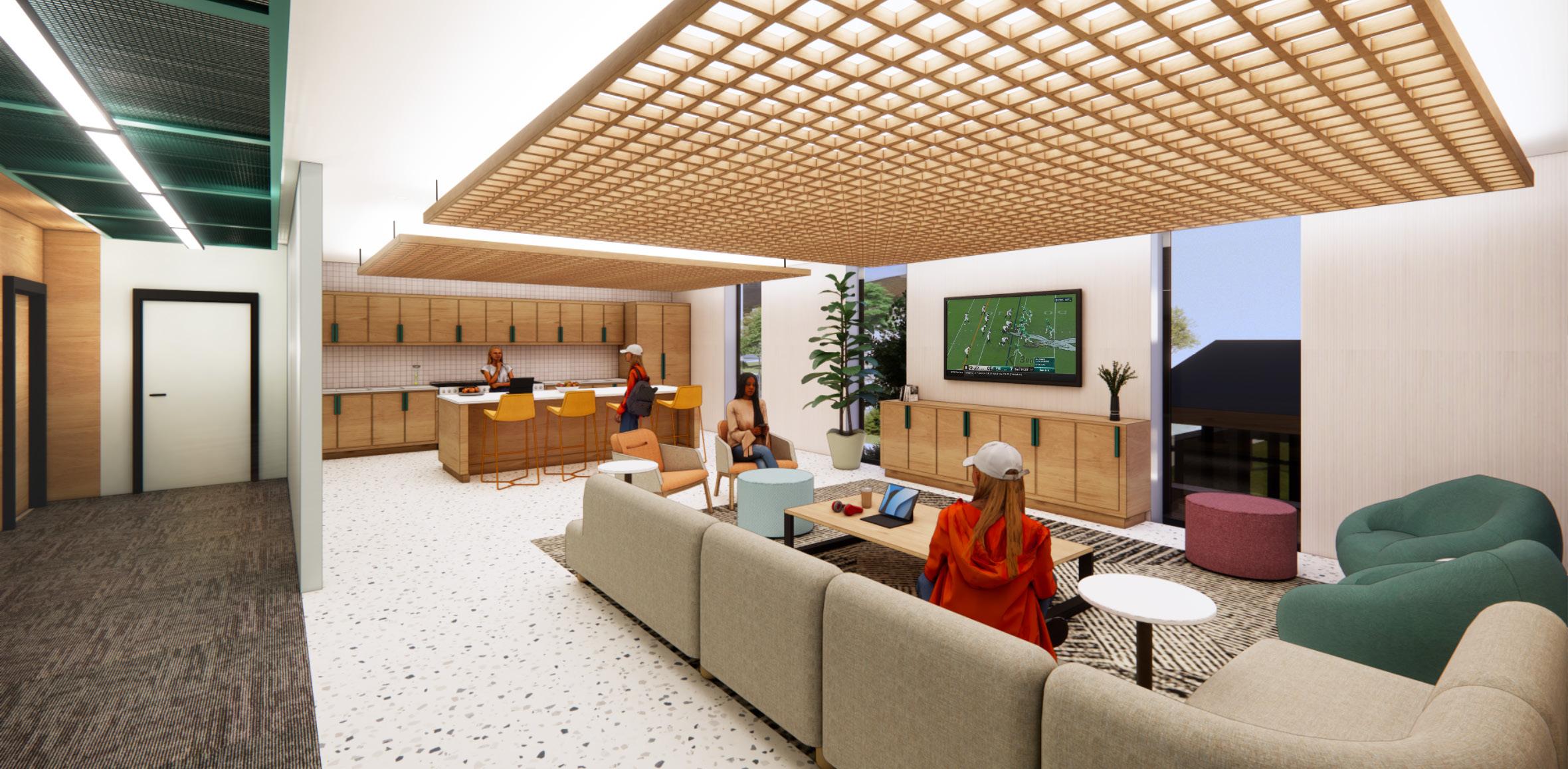
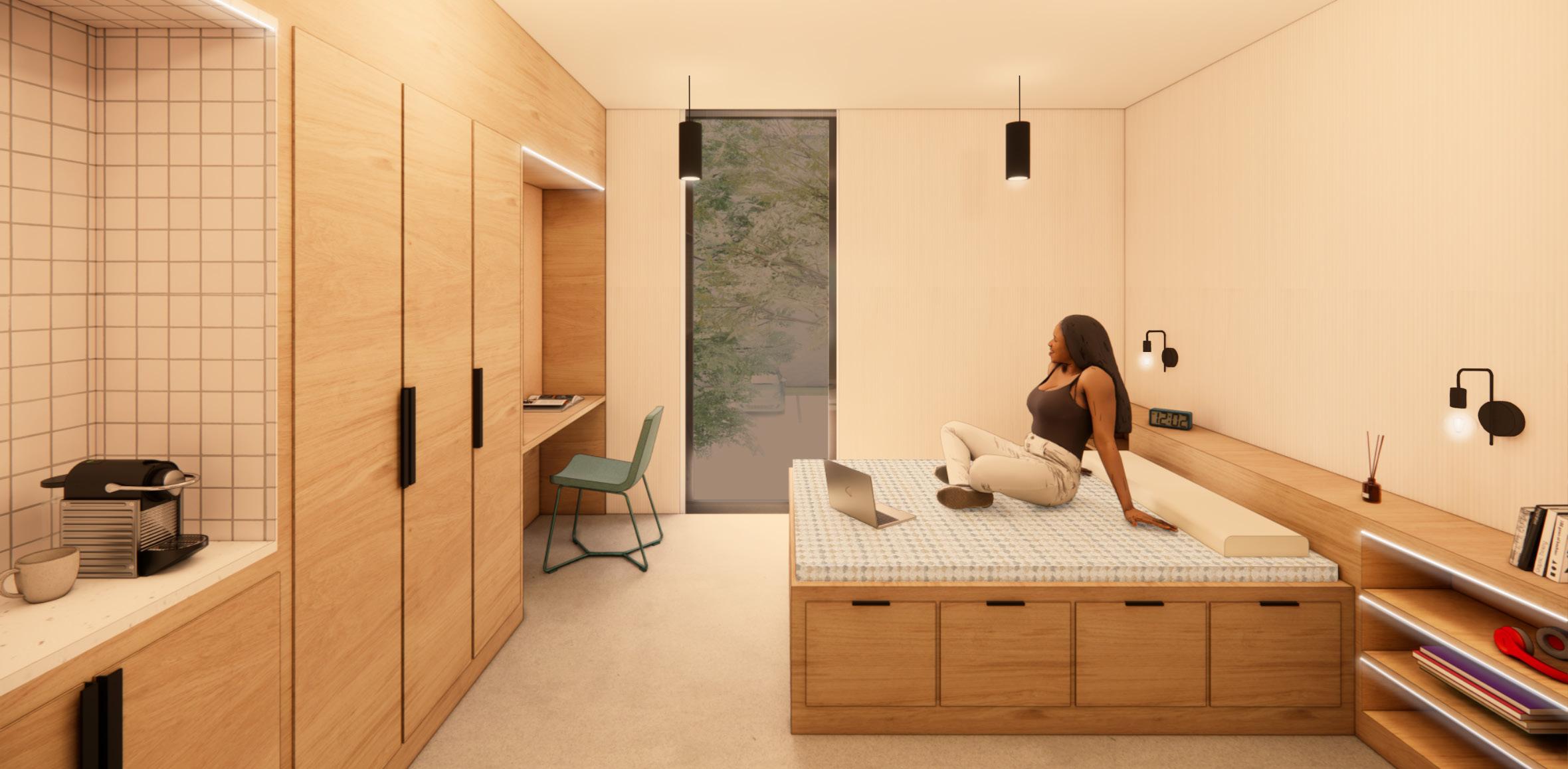
This project designs co-housing and community spaces that serve youth by actively fostering positive youth development, cultural pride, and intergenerational connections. Situated next to schools and the public library, the site functions as a hub for learning, growth, and community engagement, bridging housing with educational and cultural resources.
By creating safe, inclusive, and opportunity-rich environments, the design empowers young people to develop socially, build new skills, explore personal interests, and engage meaningfully with the broader community, ultimately promoting health, equity, and long-term well-being.
WHEN COMMUNITY GIVES YOUTH CONNECTION, AND CULTURE GIVES THEM IDENTITY — DESIGN GIVES THEM SPACE TO THRIVE.
SITE STITCH
Designing a Customer-Centric Workplace
COMMUNITY CENTER
OUTDOOR COURTS & PLAY
YOUNG ADULT HOUSING
WALKING PATH & POND
THE "STITCH"
LILLIAN MARRERO LIBRARY
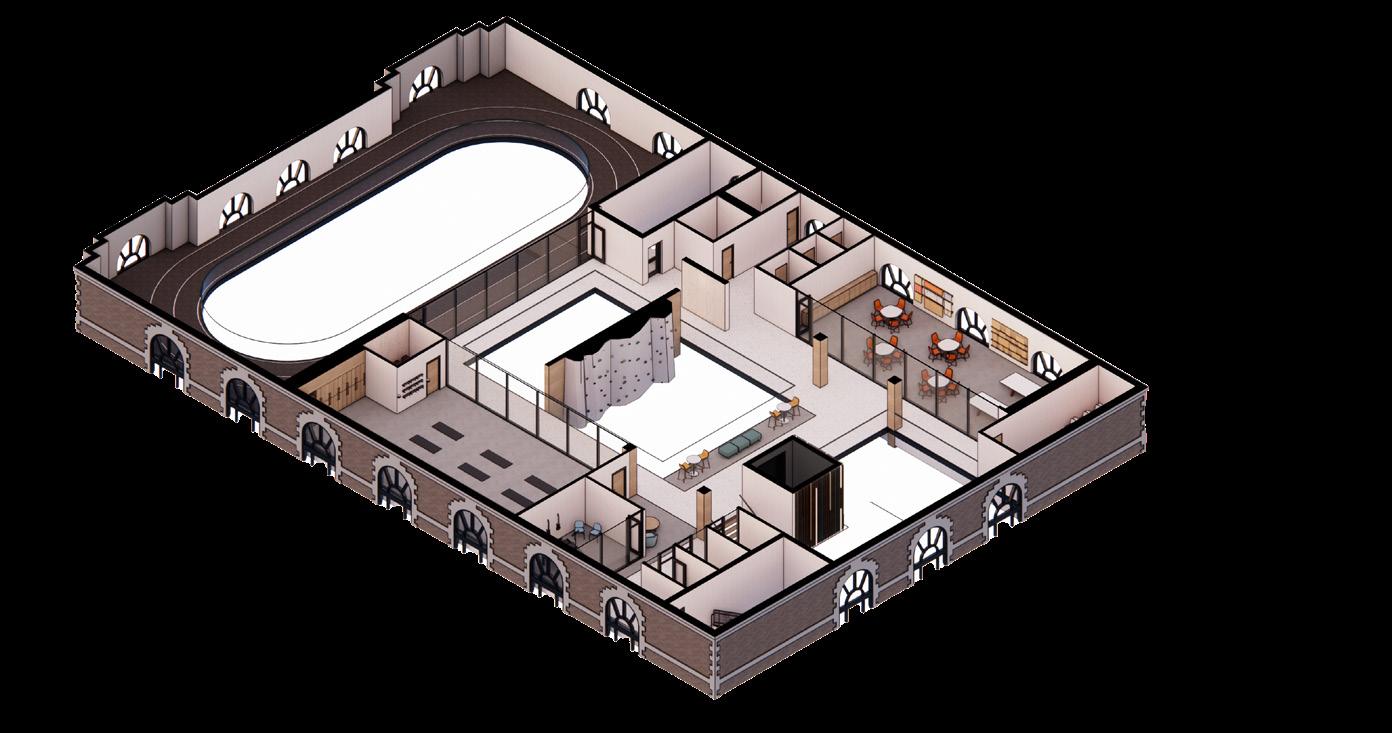
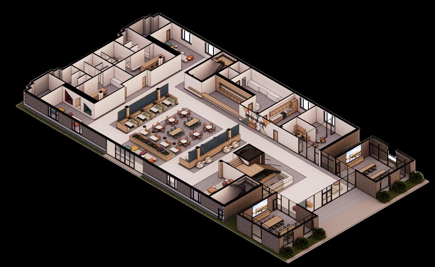
LOBBY CAFE COURT
DANCE STUDIO
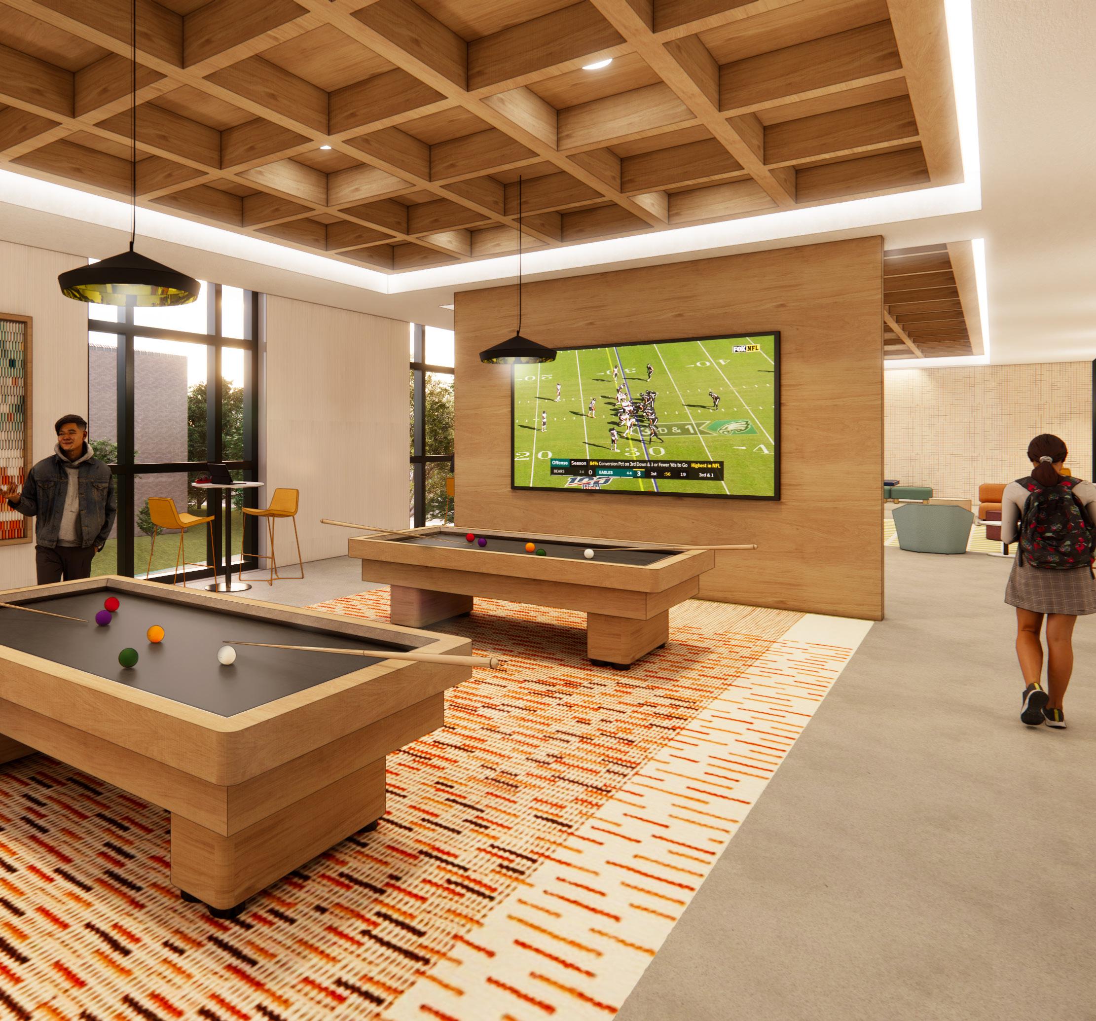
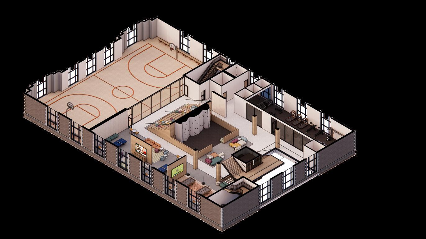
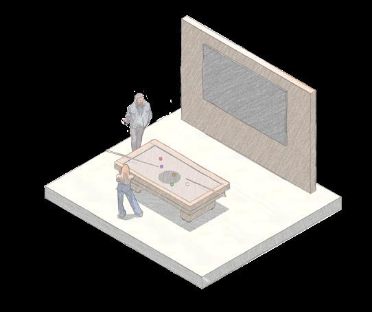
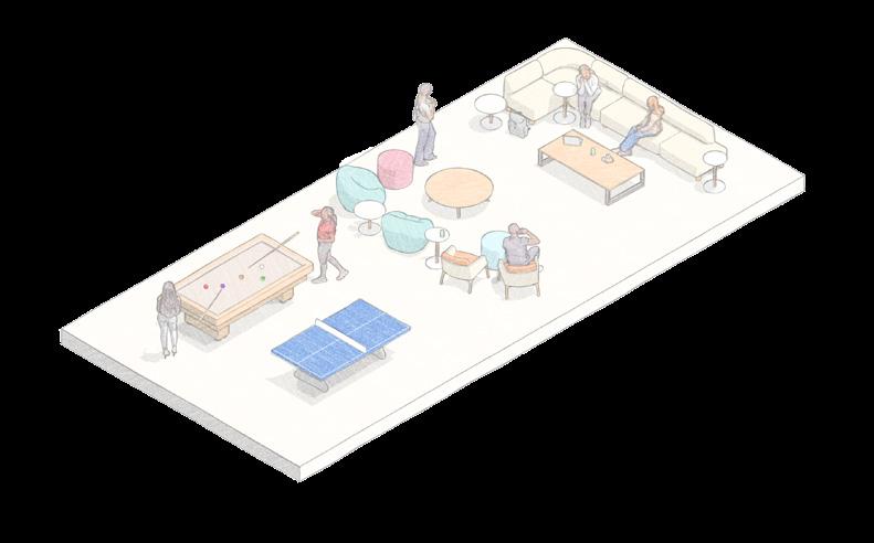
GAME LOUNGE
OFFICES
WEIGHT ROOM
ART ROOM
MUSIC ROOMS
TRACK
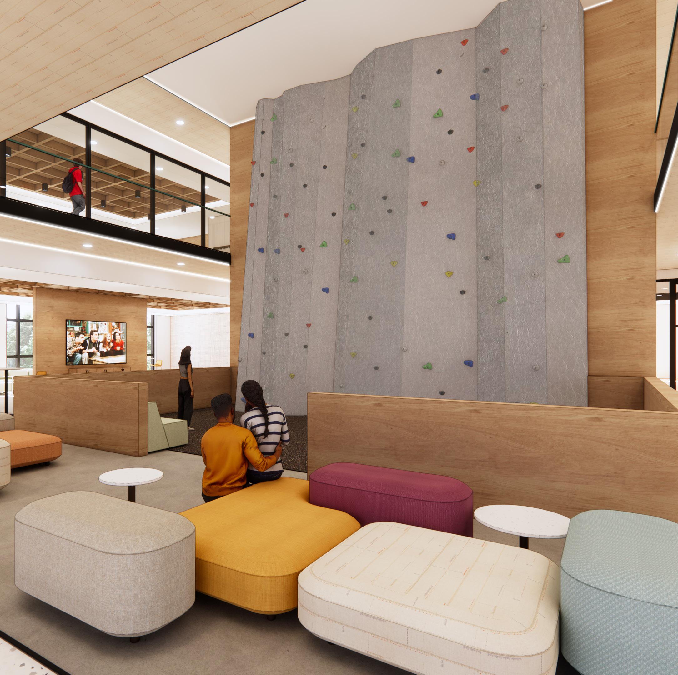
ROCK WALL
WORKSHOP
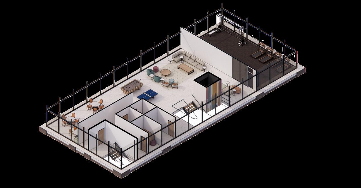
LOUNGE
PRIVATE OFFICES
HOUSING BUILDING SHARED AMENITIES
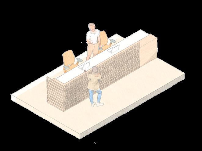
LOBBY
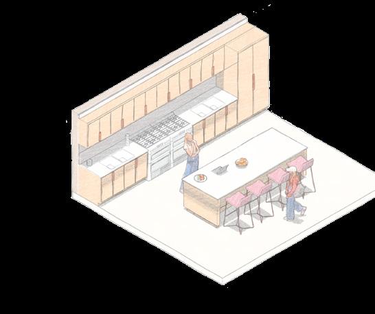
KITCHEN / LOUNGE
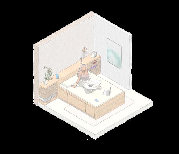
SINGLE UNIT ROOMS
GYM
USER JOURNEY
CAFE
ENTRY
ARTROOM
GAMELOUNGE
ROOM
LOUNGE
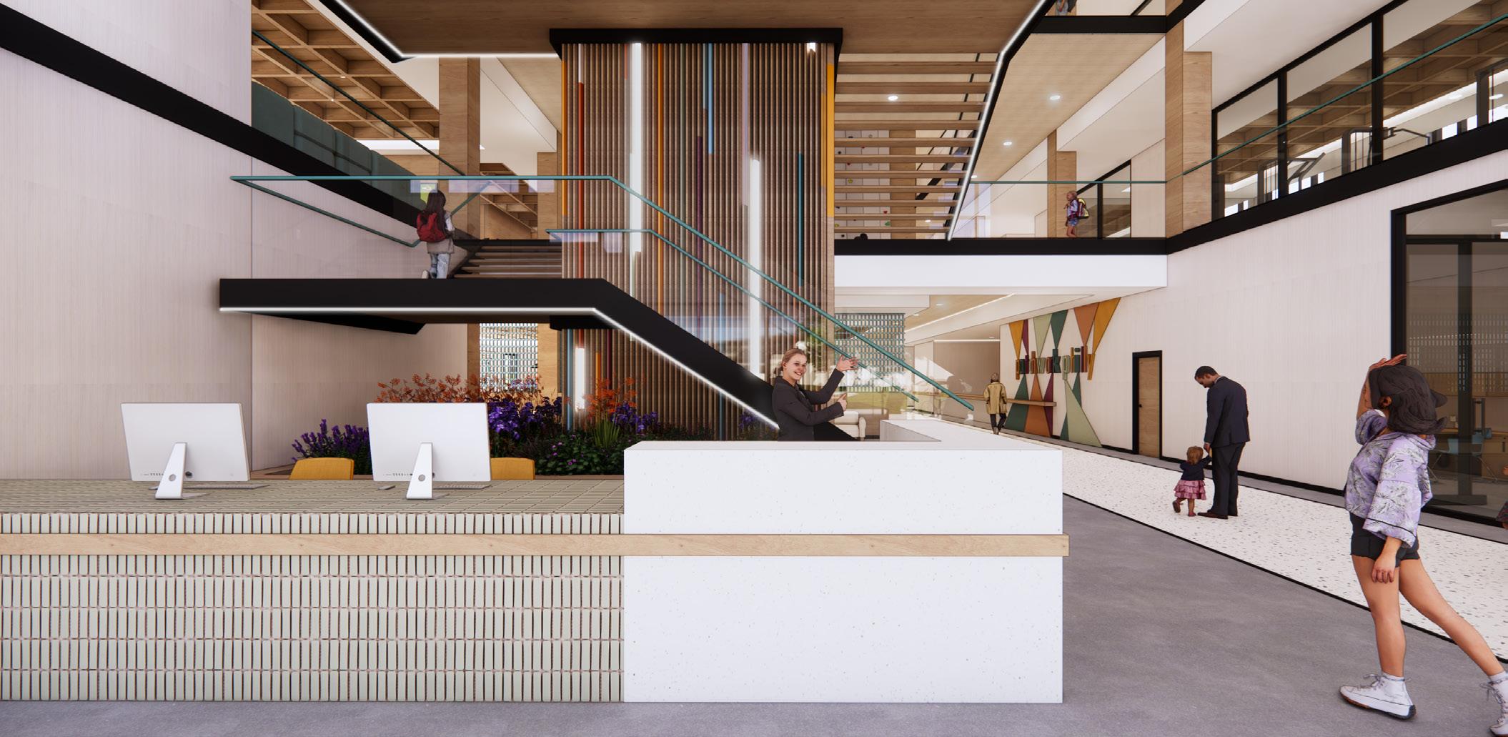
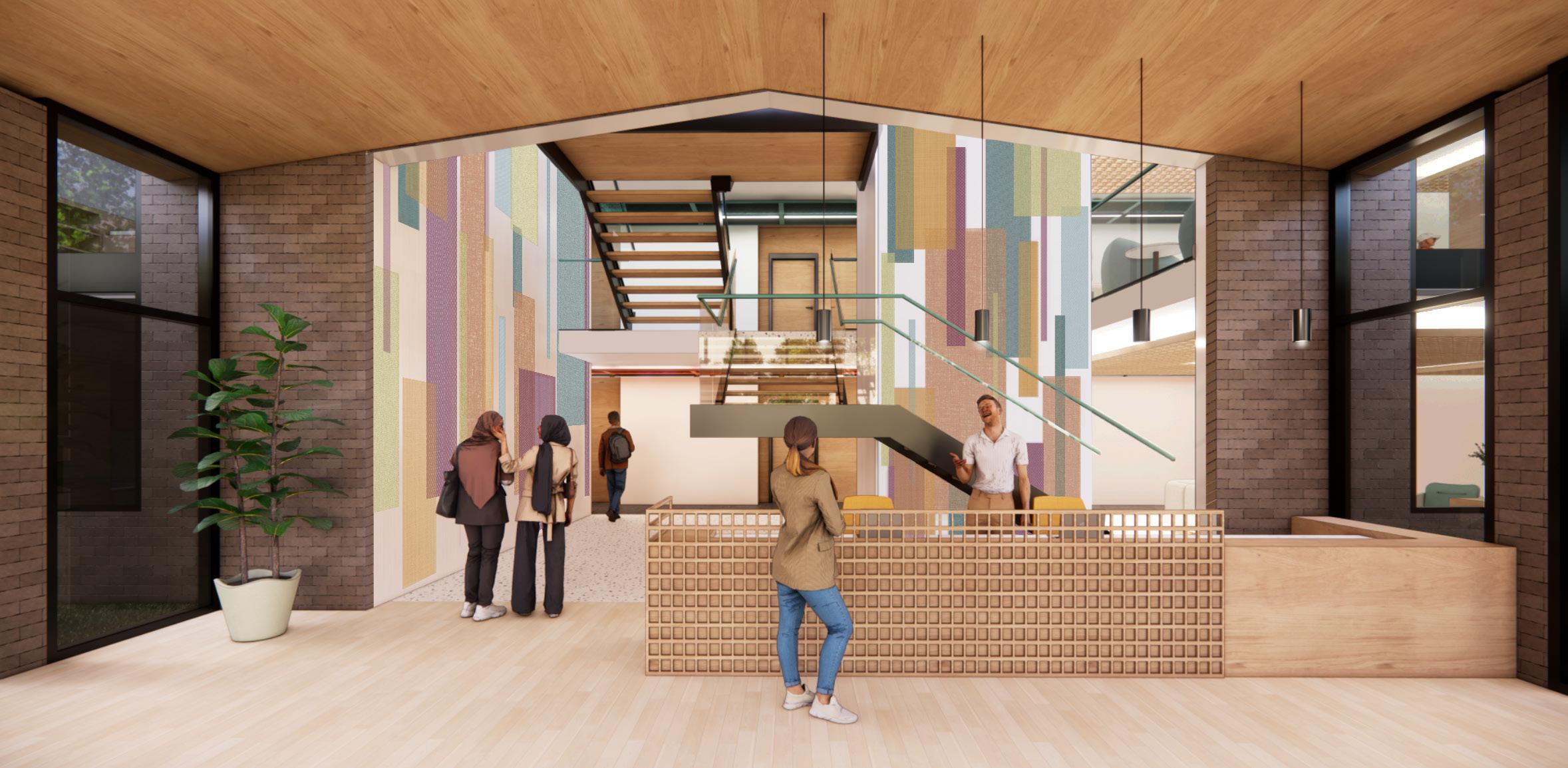
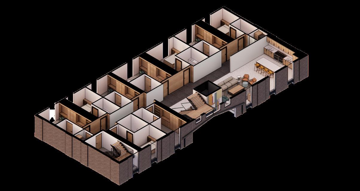
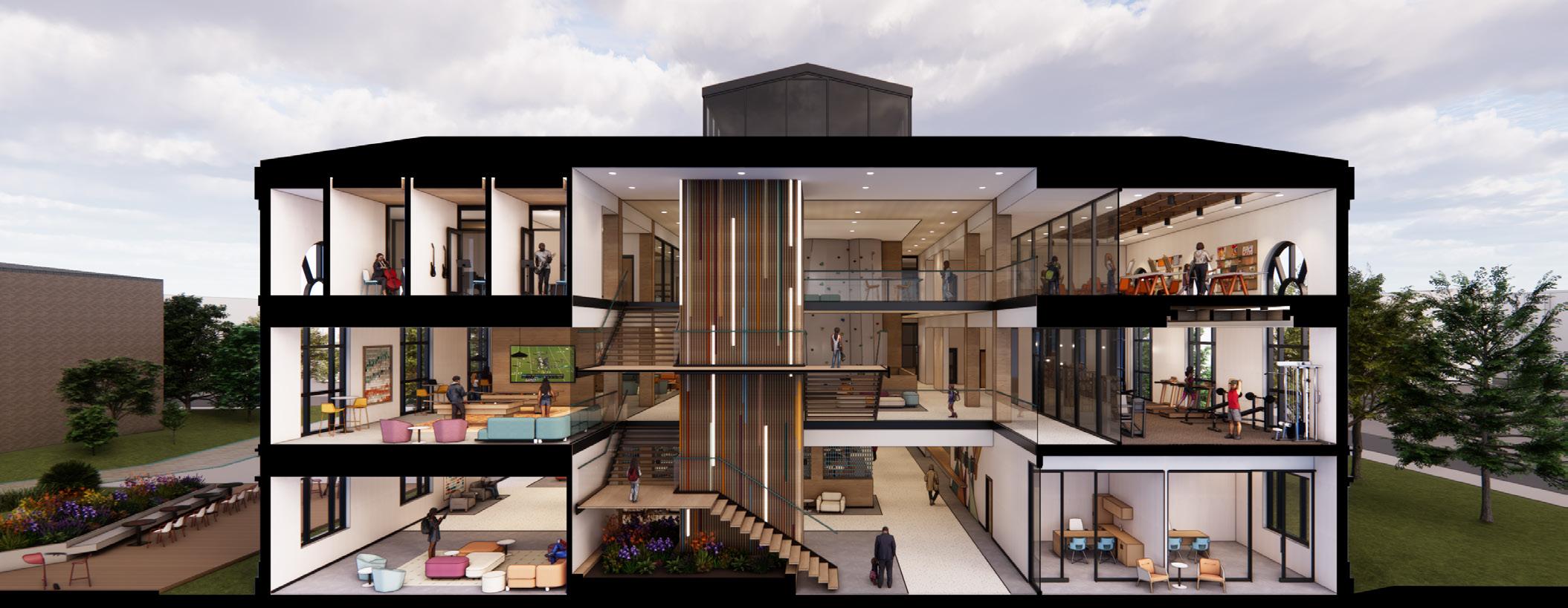
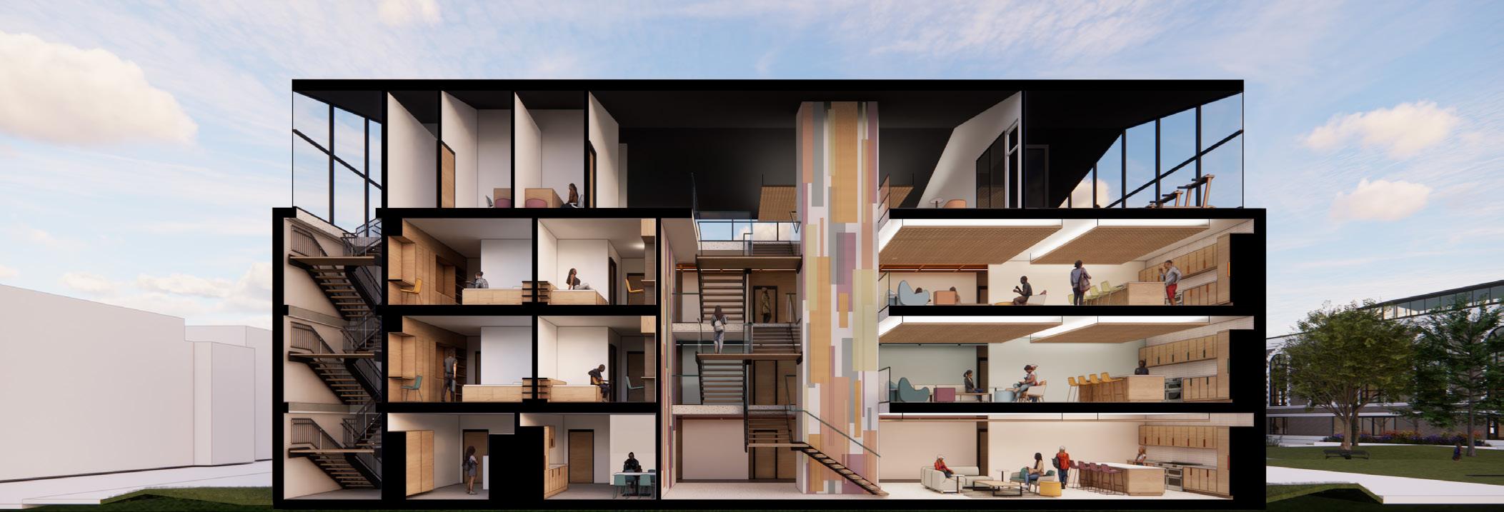
The section perspectives highlight how the building’s vertical circulation elements act as a continuous “stitch,” visually and spatially connecting each level of the project. Through transparency, layered views, and movement, these vertical elements reinforce the patchwork concept by unifying distinct programs while emphasizing connection, flow, and collective identity across floors.
MATERIAL PALETTE
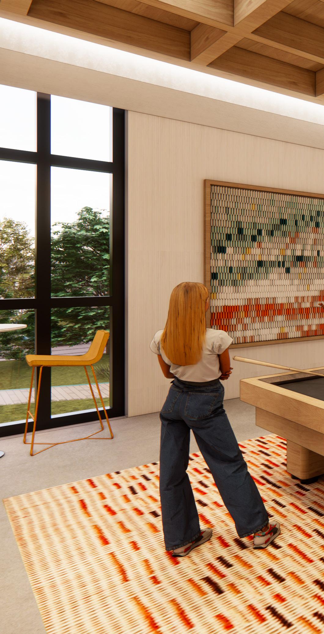
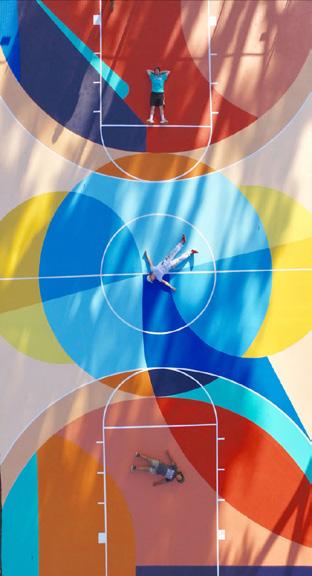
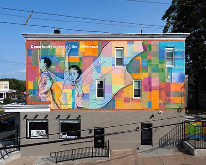
This mural titled “Imagine That” by artist Felix St. Fort is located in Northwest Philadelphia, depicting two children imagining they can be whatever they want to be. Bold colors and playful moves within the mural reflect the idea of emphasizing the power of young people to shape their futures.
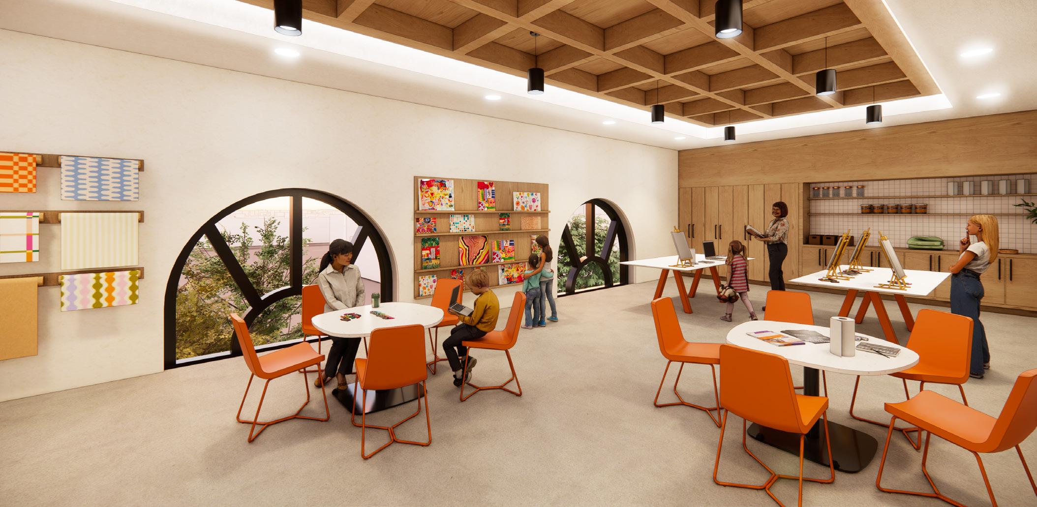
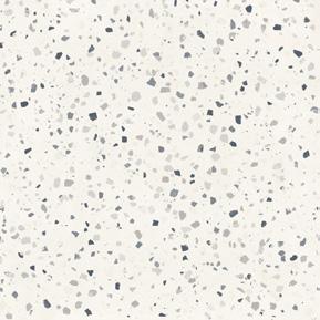
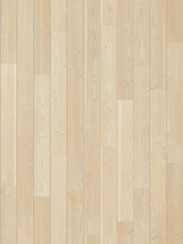
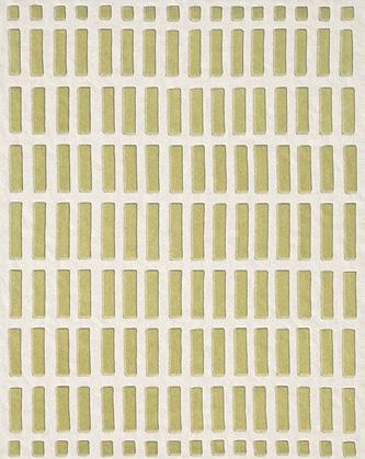
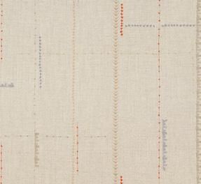
The material palette is inspired by the bright, bold colors and overlapping shapes within the mural, tying back to the overall goal of supporting opportunity youth. Mixing colors, textures, and patterns throughout the design brings the conceptual “patchwork” to life.
tee off golf retail
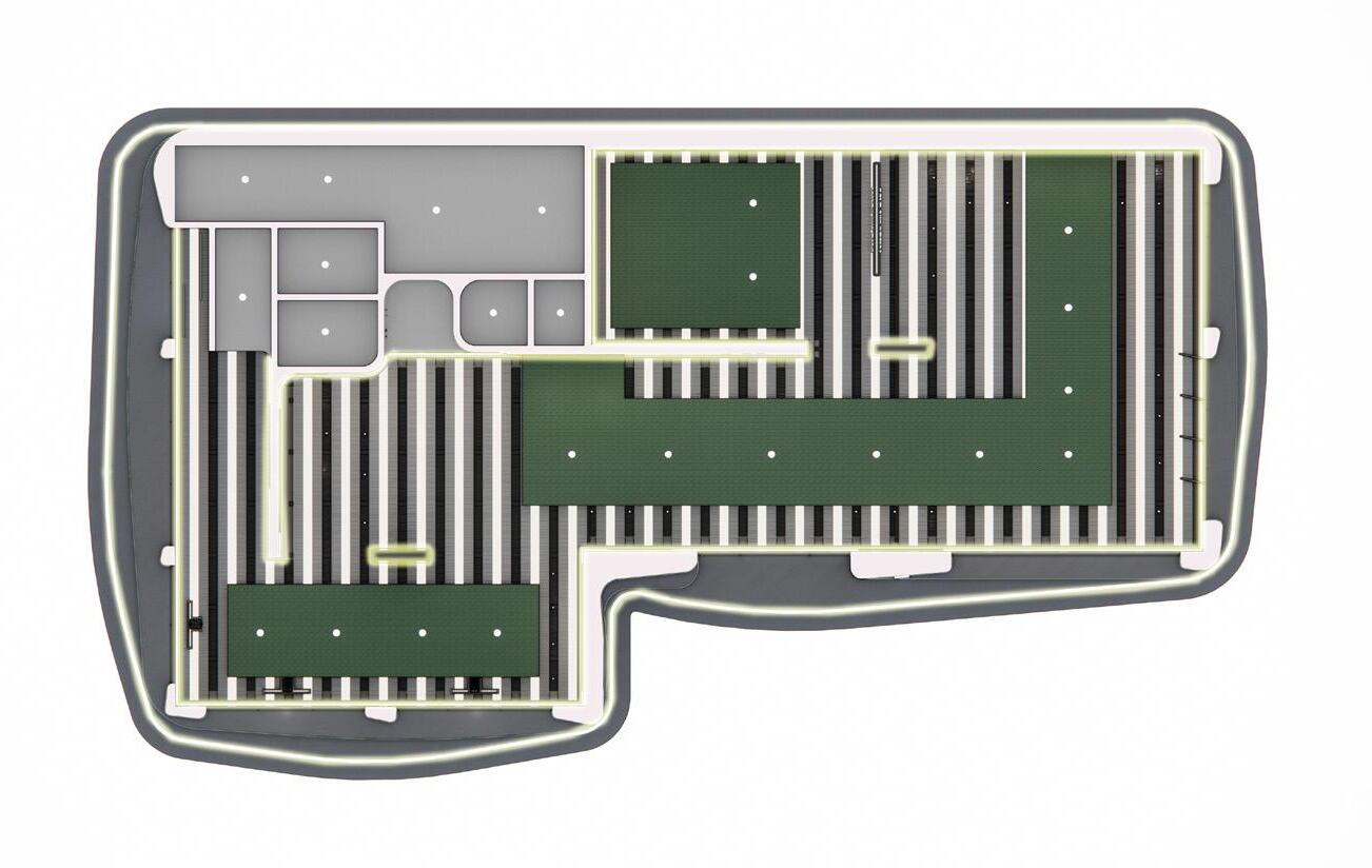
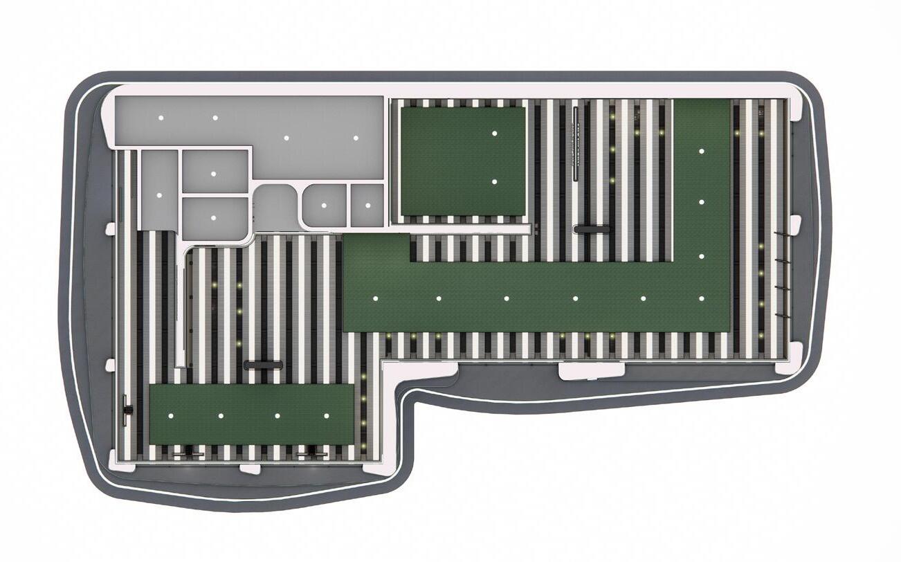
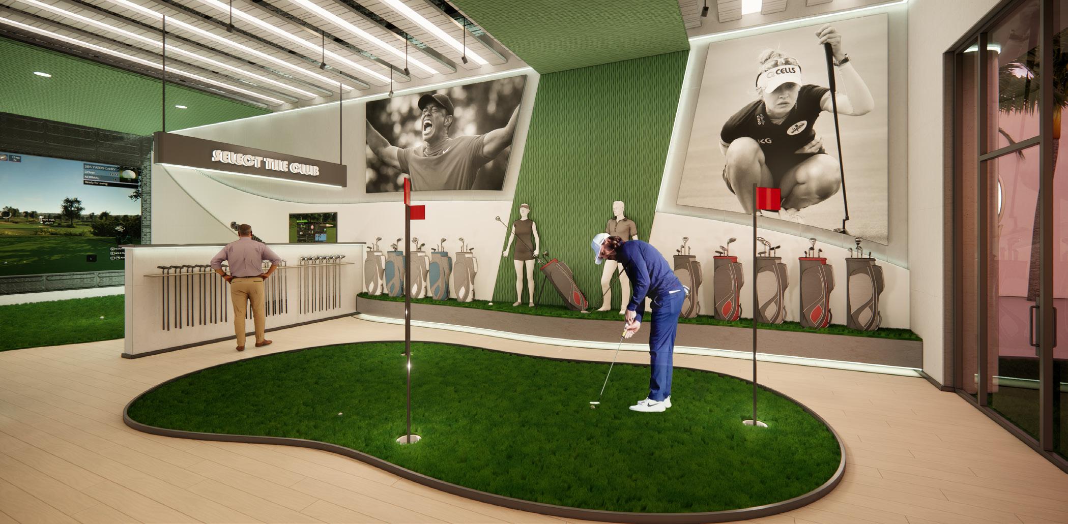
This project uses the Lang Lighting Competition to explore innovative, narrative-driven lighting strategies that balance aesthetics, performance, and sustainability. Lighting is leveraged as a tool to shape space, enhance experience, and support the overall design intent.
pre design.
Integrating the Lang Lighting competition into this project serves as a platform to push the boundaries of lighting design and hone the necessary skills for successful implementation. The competition challenges participants to explore innovative approaches to lighting, both in terms of aesthetic impact and functional effectiveness.
The goal is to not only master technical aspects, such as light placement, intensity, and sustainability, but also to craft a compelling design narrative that aligns with the program’s objectives. By focusing on the use of lighting, the underlying concept, and the related research, participants will develop a comprehensive understanding of how lighting can shape spaces and influence experiences.
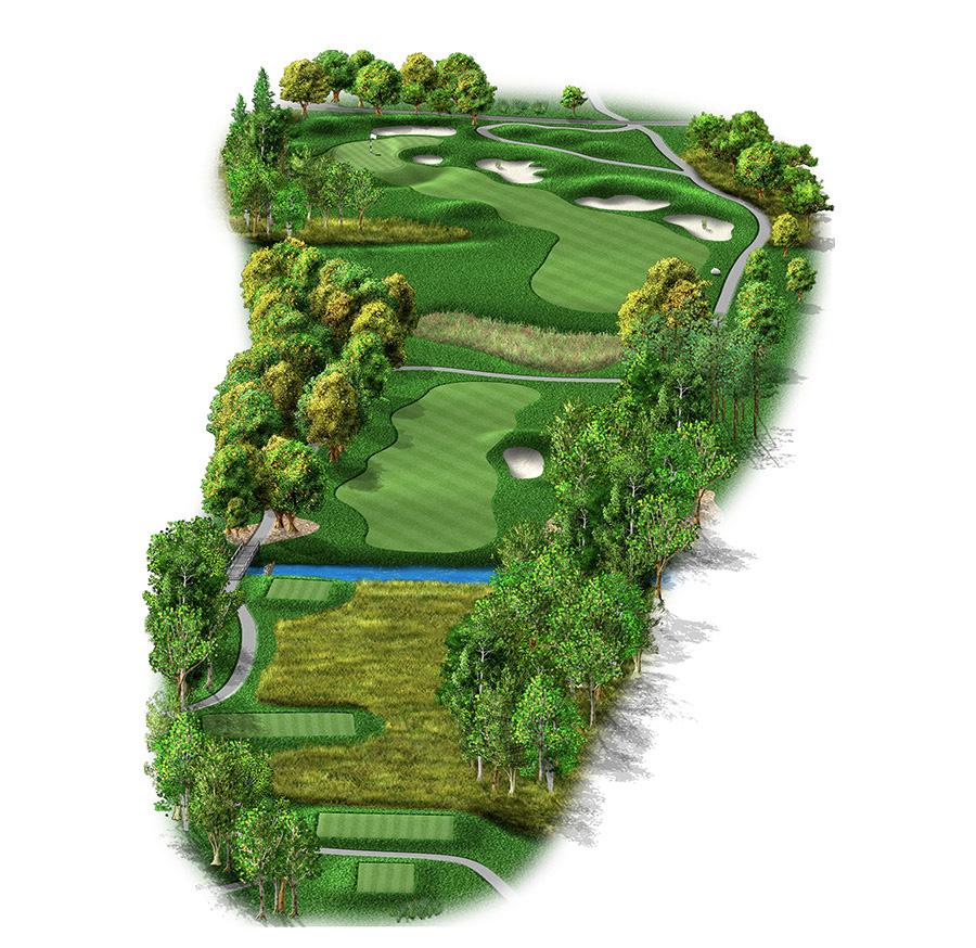
GOLF COURSE TYPOLOGY
Lighting of a Golf Course
GREEN
Where each hole is located, end of a hole.
Soft, ambient lighting with cool tones.
FAIRWAY
Tightly trimmed grass, what most golfers aim for.
Bright, natural daylight simulation.
TEE BOXES
Where the hole begins, area is flat so golfers can get a clean shot.
Soft, diffused lighting with warm tones.
SAND HAZARD
Can include water hazards and bunkers.
Dramatic accent lighting with contrasting colors.
ROUGH
Surrounds the fairway, more challenging and unpredictable. Bright, natural daylight simulation.
WATER HAZARD
Can include water hazards and bunkers.
Dramatic accent lighting with contrasting colors.
FAIRWAY HAZARDS
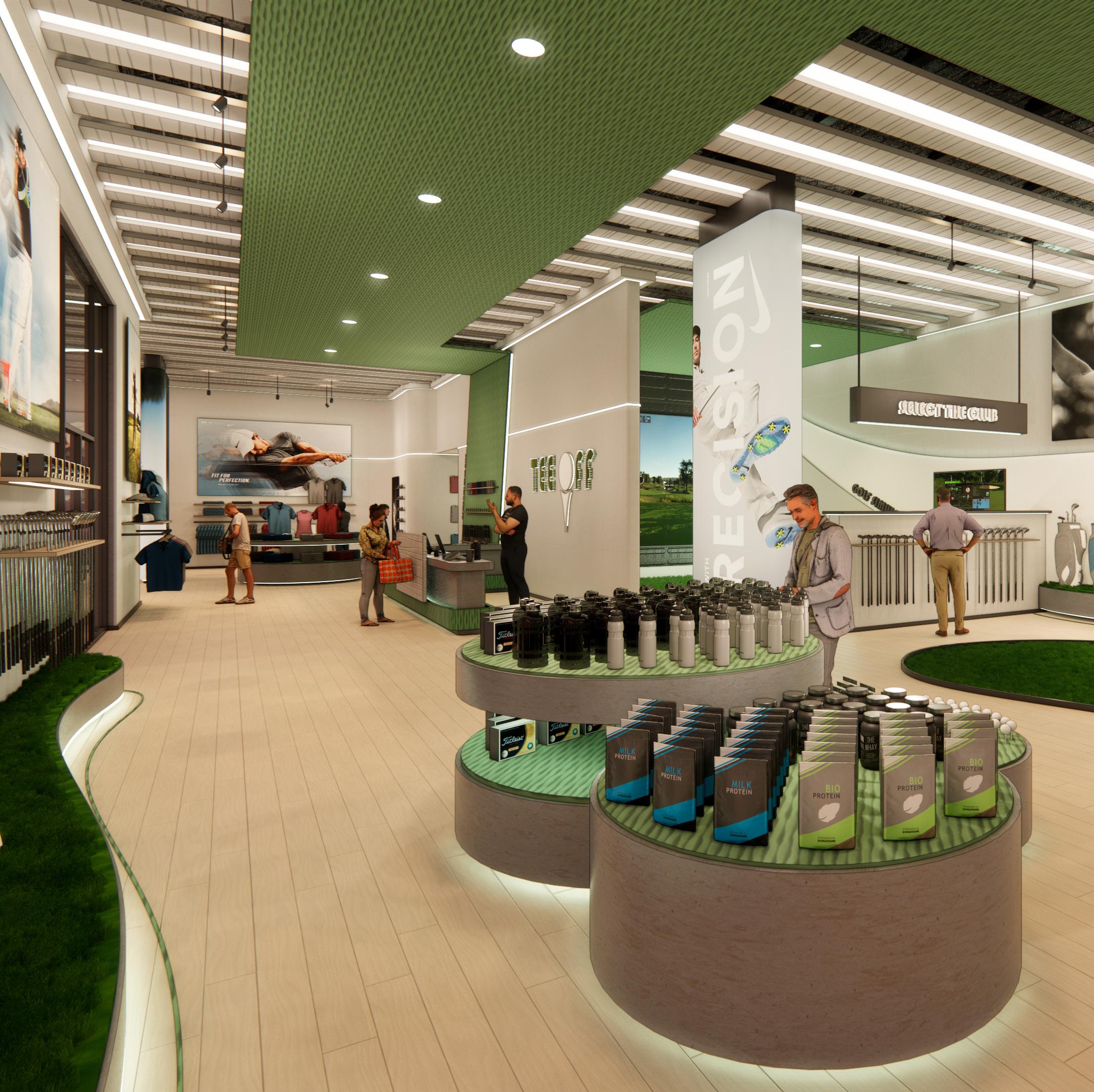
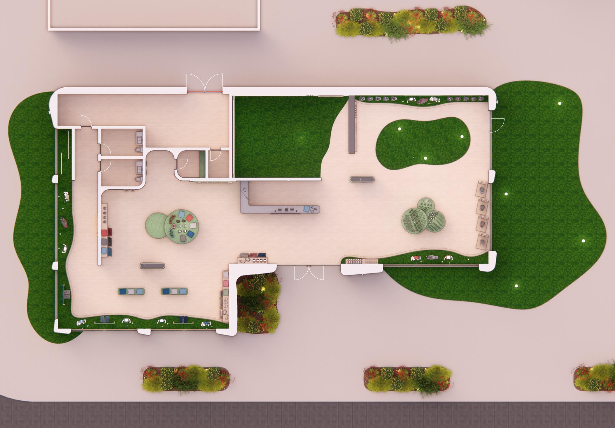
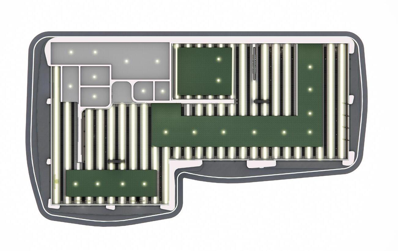
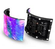
lighting than can be changed to create different atmospheres
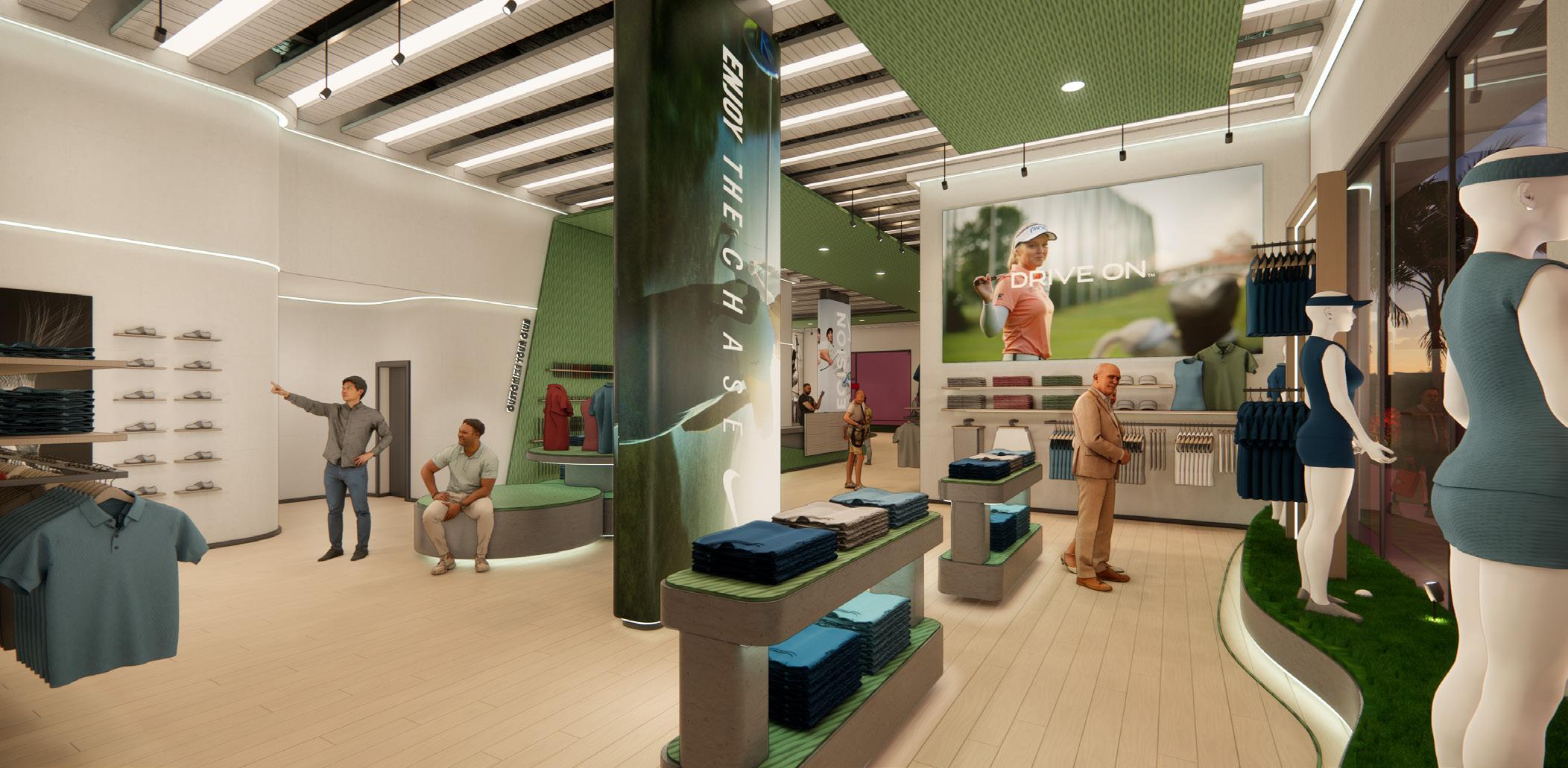
consistent light to help with circulation
ROUGH
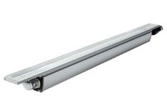
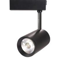
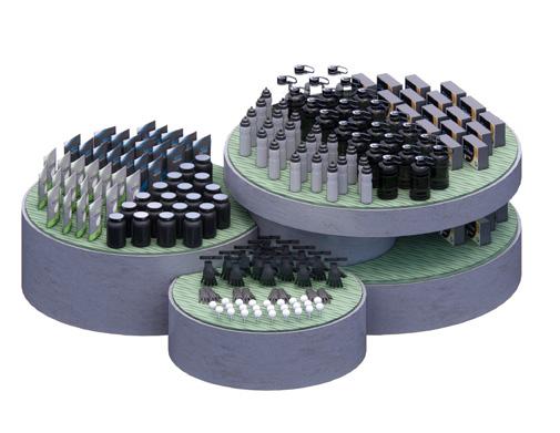
raised elements that use track lights to create lighter and darker spots in the merchandise
TEE BOX
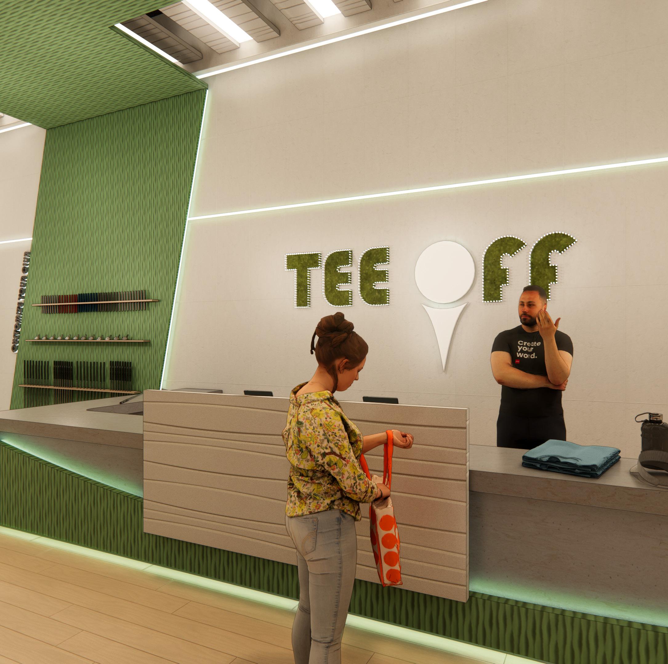
soft warm light for a welcoming atmosphere
GREEN
soft cool light for accurate testing
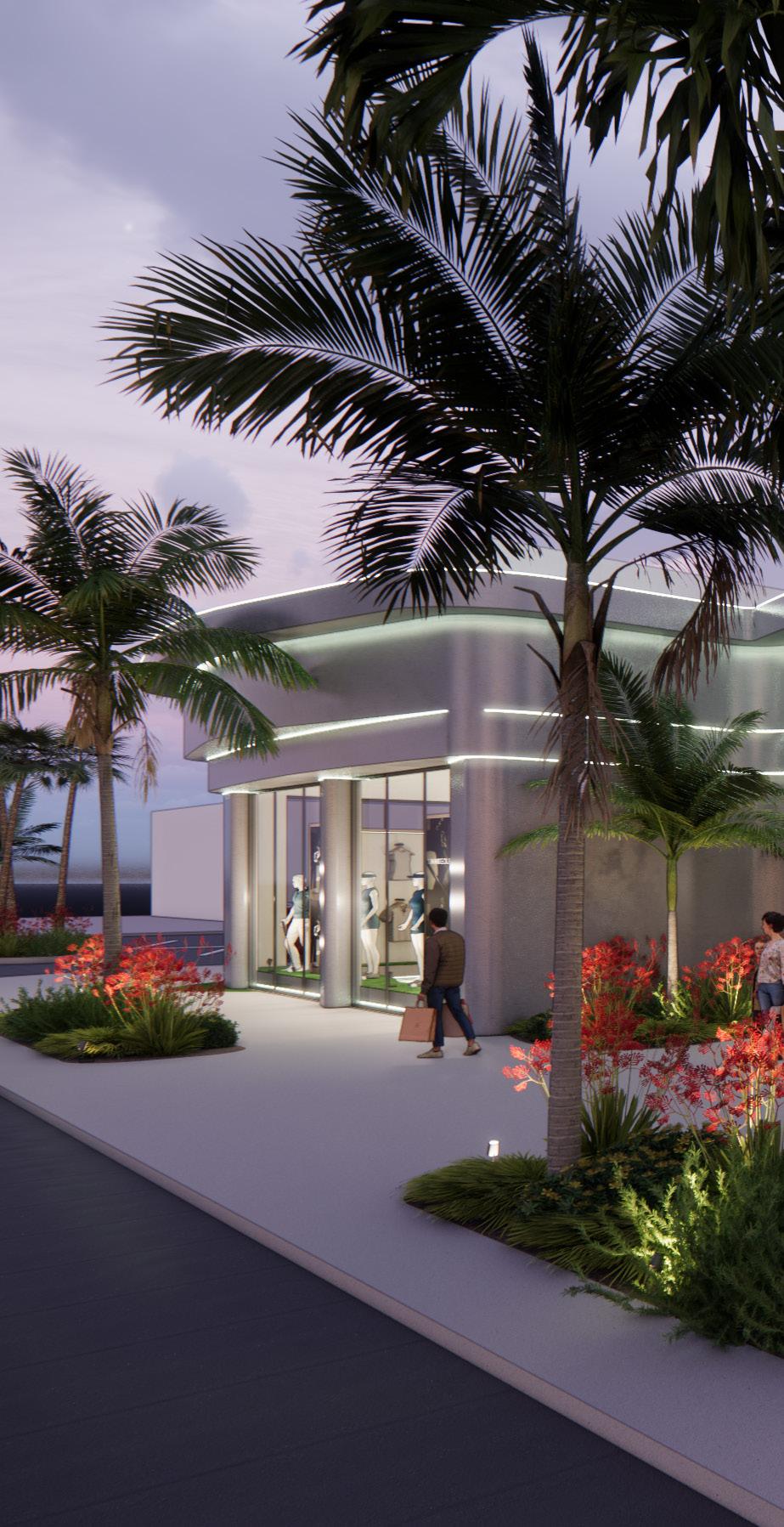
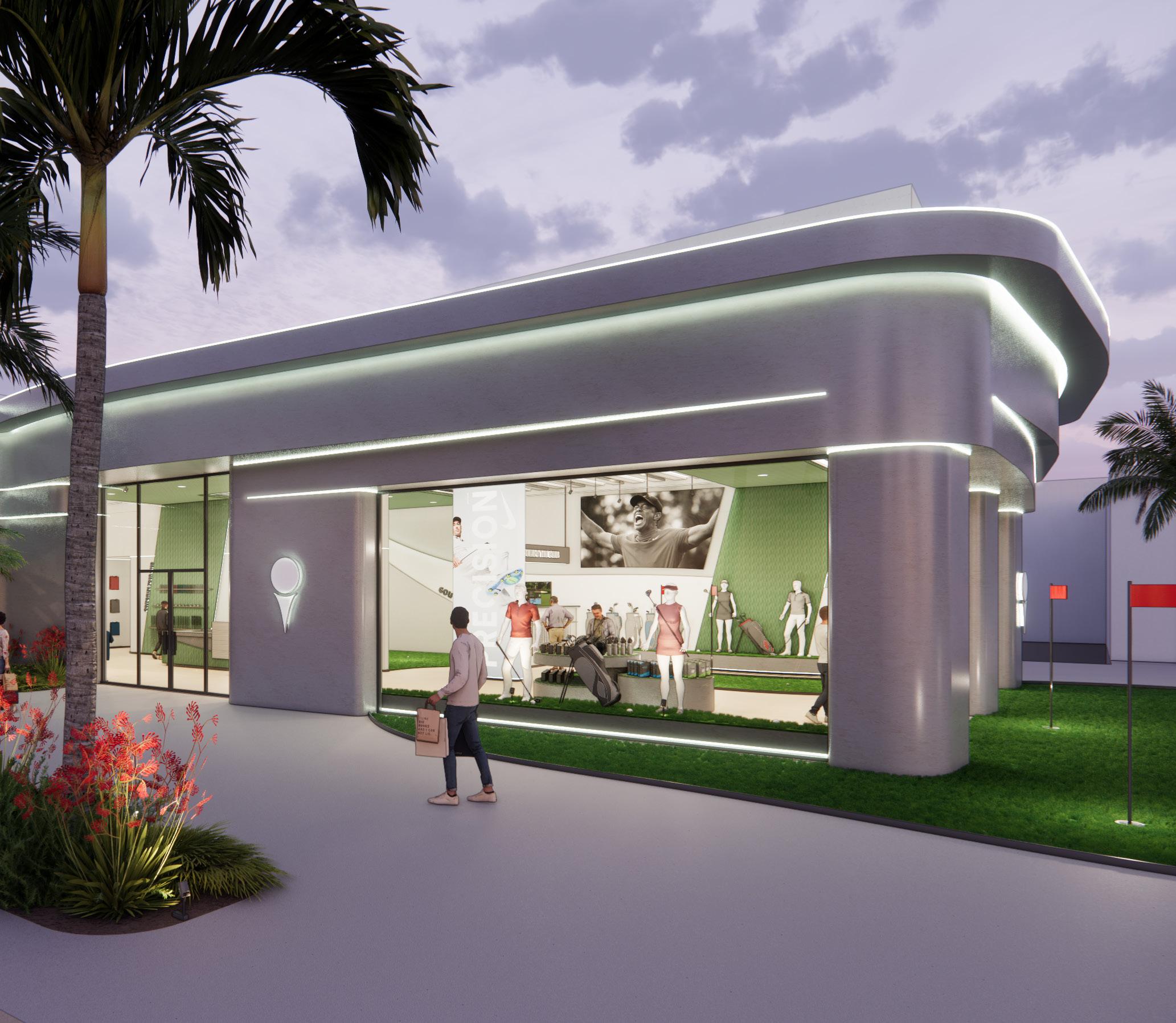
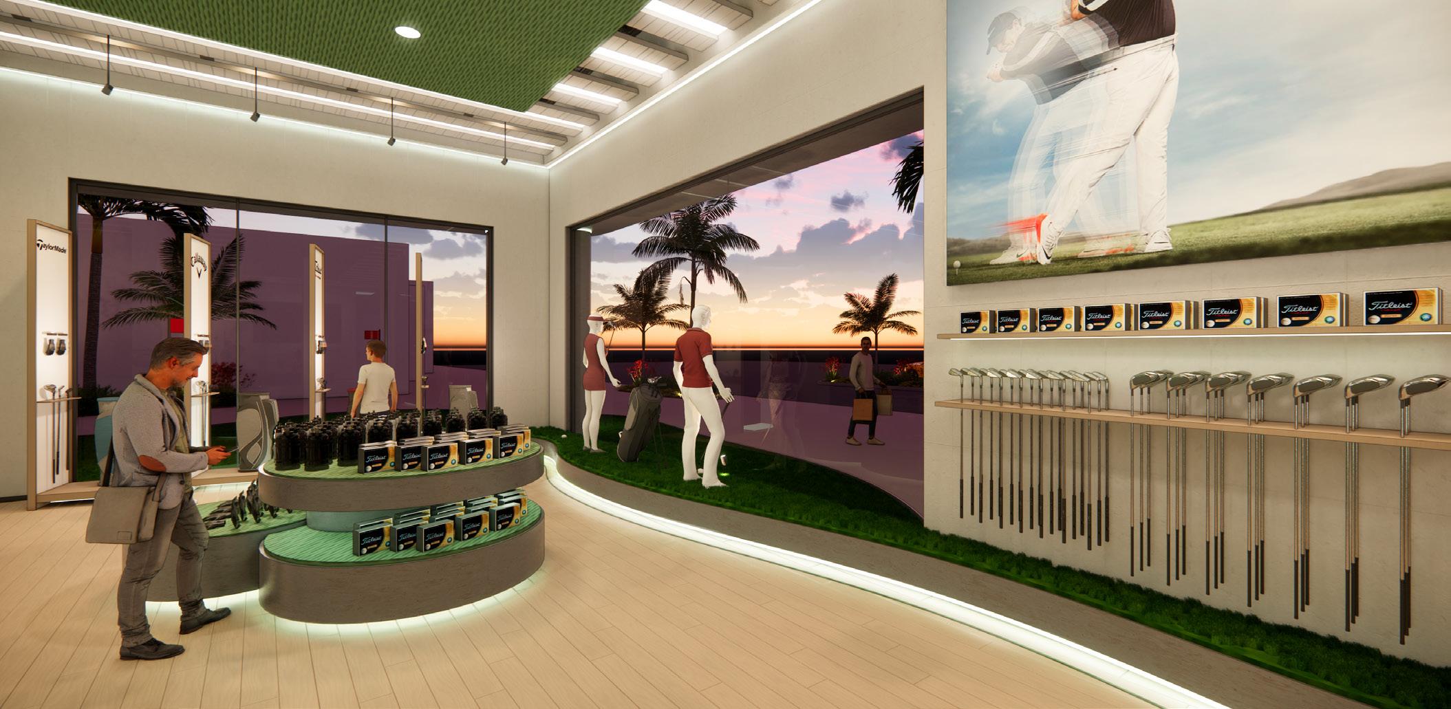
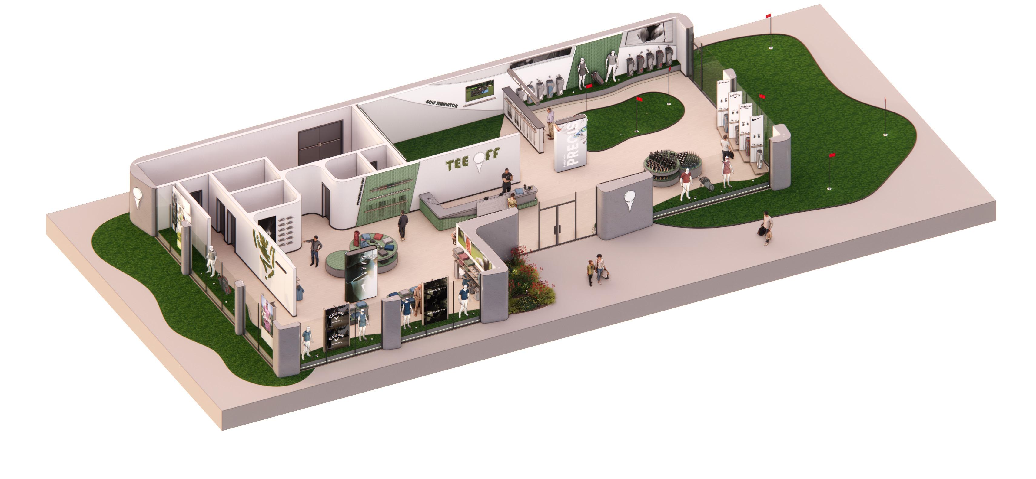
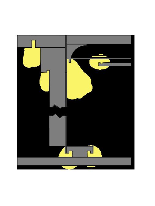
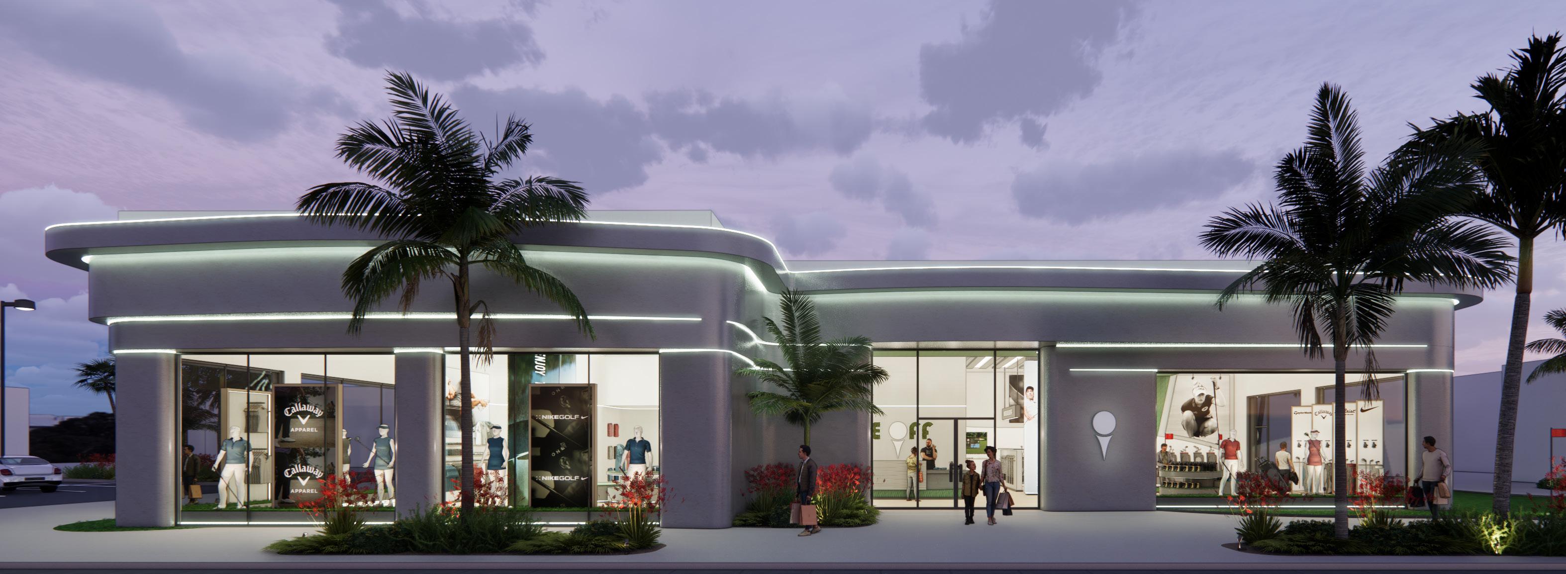
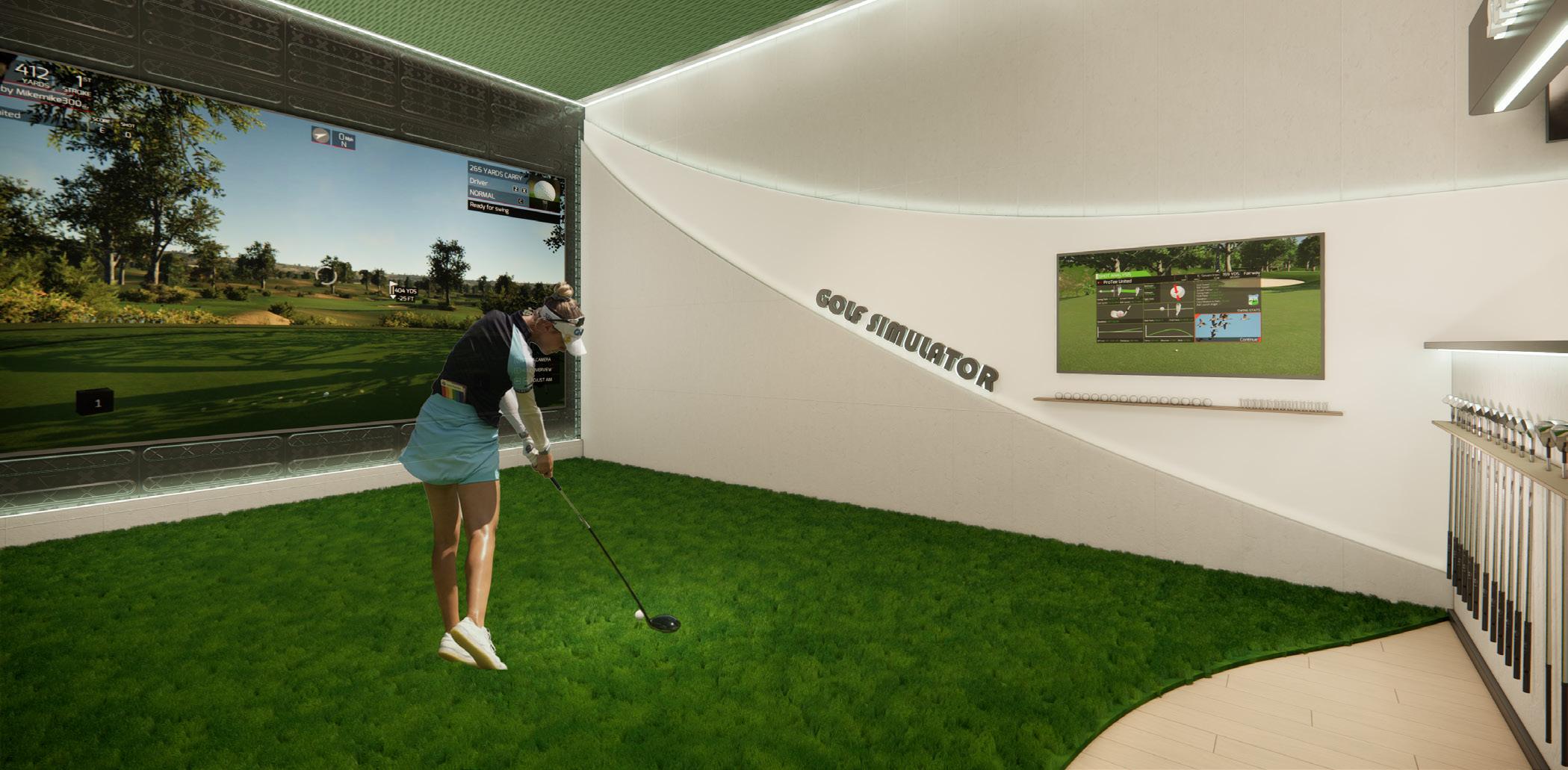
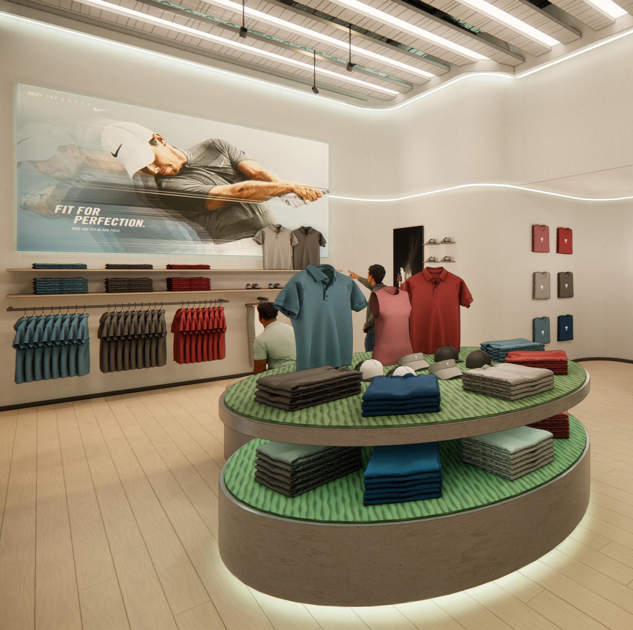
The exterior design of the building captivates customers with expansive storefront views that showcase enticing merchandise and eye-catching displays. Strategically placed lighting accentuates the flowing curves and contours, evoking the natural elegance of a golf course and drawing visitors into the dynamic retail experience within.
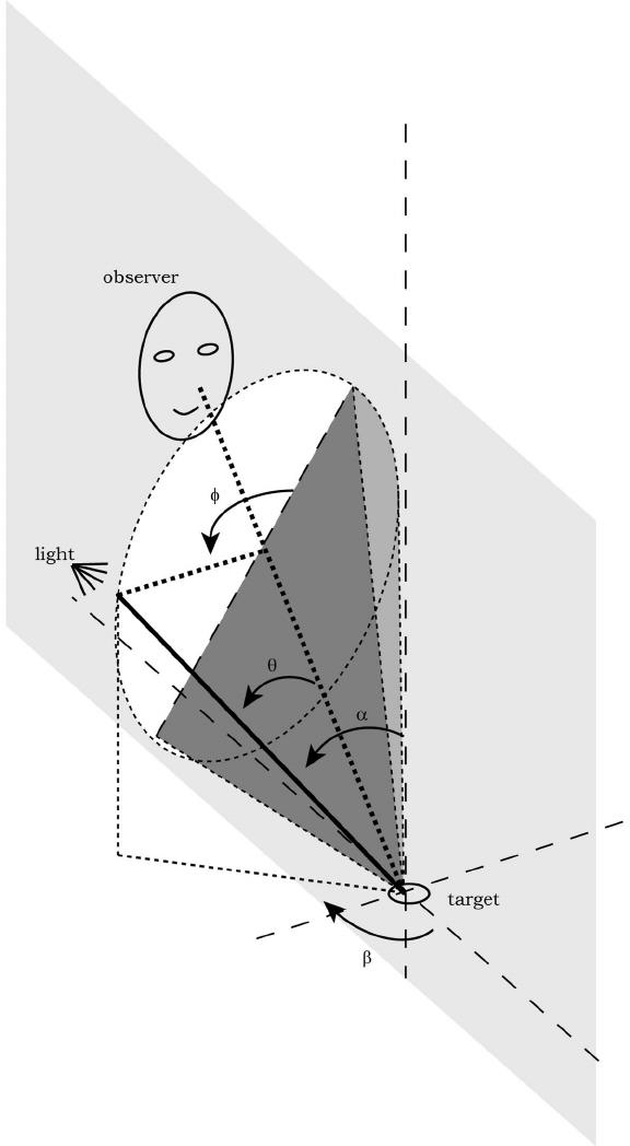
TRANSFORMATIVE LIGHT
DEFINITION: Line-of-light relative to the observer's line-of-sight.
The angles and defining the direction of the line-of-light relative to the setup are transformed into angles defining the light source’s direction relative to the observer’s line-of-sight.
SIMILAR TO A GOLF STANCE.
CONCEPT APPLICATION
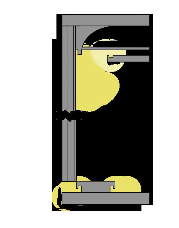
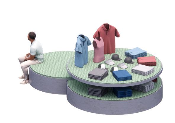
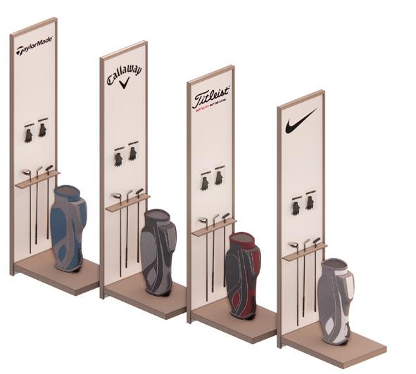
CUSTOM ELEMENTS
CLOTHING DISPLAY
CLUBS AND BAGS DISPLAY
ACCESSORIES DISPLAY
scan the QR code to visit additional works. or visit https://www.hannascheckdesign.com/