2023–24
HANAA JATOI
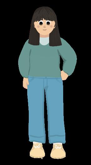
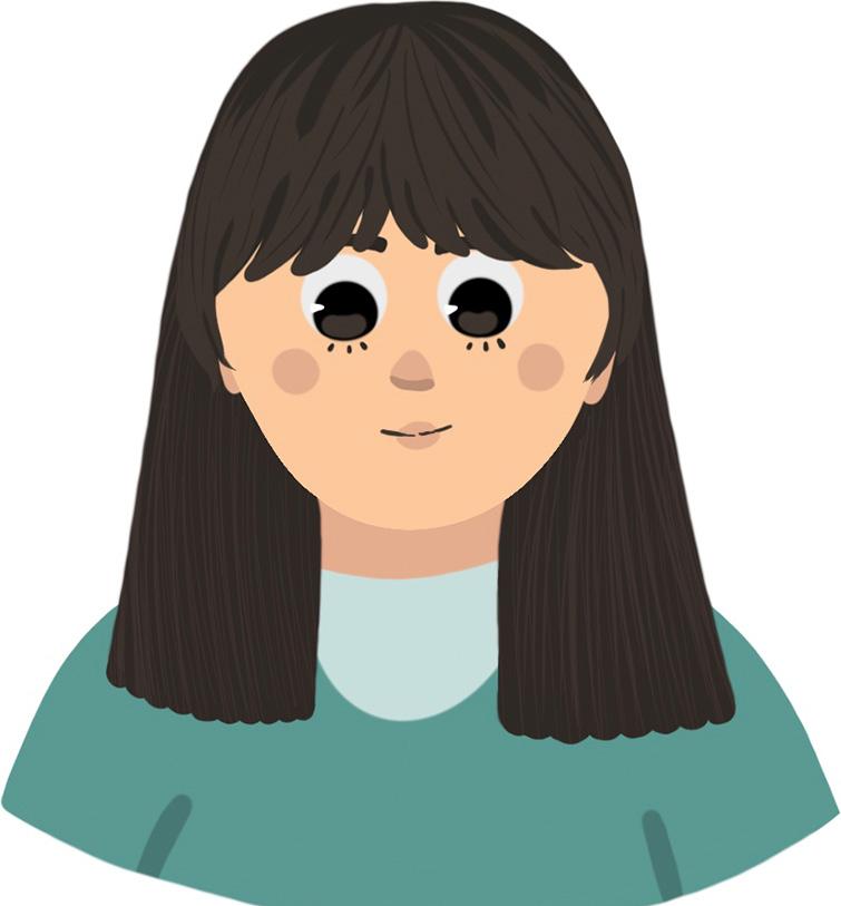
Hello! My name is Hanaa Jatoi. I am a first year student at USC, and I am from Columbia, South Carolina. I love to draw, read, watch movies, and spend time with family. I have enjoyed learning so much about design this year, and I am excited for you to see the work I have done!
Graphic Design and Illustration Faculty,
I am interested in pursuing a BFA in Studio Arts with a concentration in Graphic Design and Illustration at the University of South Carolina.
For as long as I can remember, art has been my passion. However, I didn’t realize that I was meant for design until more recently. When I was in high school, I started designing T-Shirts for clubs I was in. Seeing my designs printed on T-Shirts worn by my peers brought me an irreplaceable feeling of joy and accomplishment. This was when I realized that design is my passion.
This year, I joined the GD+I Club, and this gave me an opportunity to continue to explore my passion for design and become part of a fun, creative environment with people who share my interests.
Currently, I am interested in combining graphic design and illustration with my other passion of storytelling through book illustration and character design.
Joining the GD+I program will help me further my career as a designer and pursue my passion. Thank you for your time and consideration.
Sincerely,
Hanaa Jatoi
SIX WORD MEMOIR
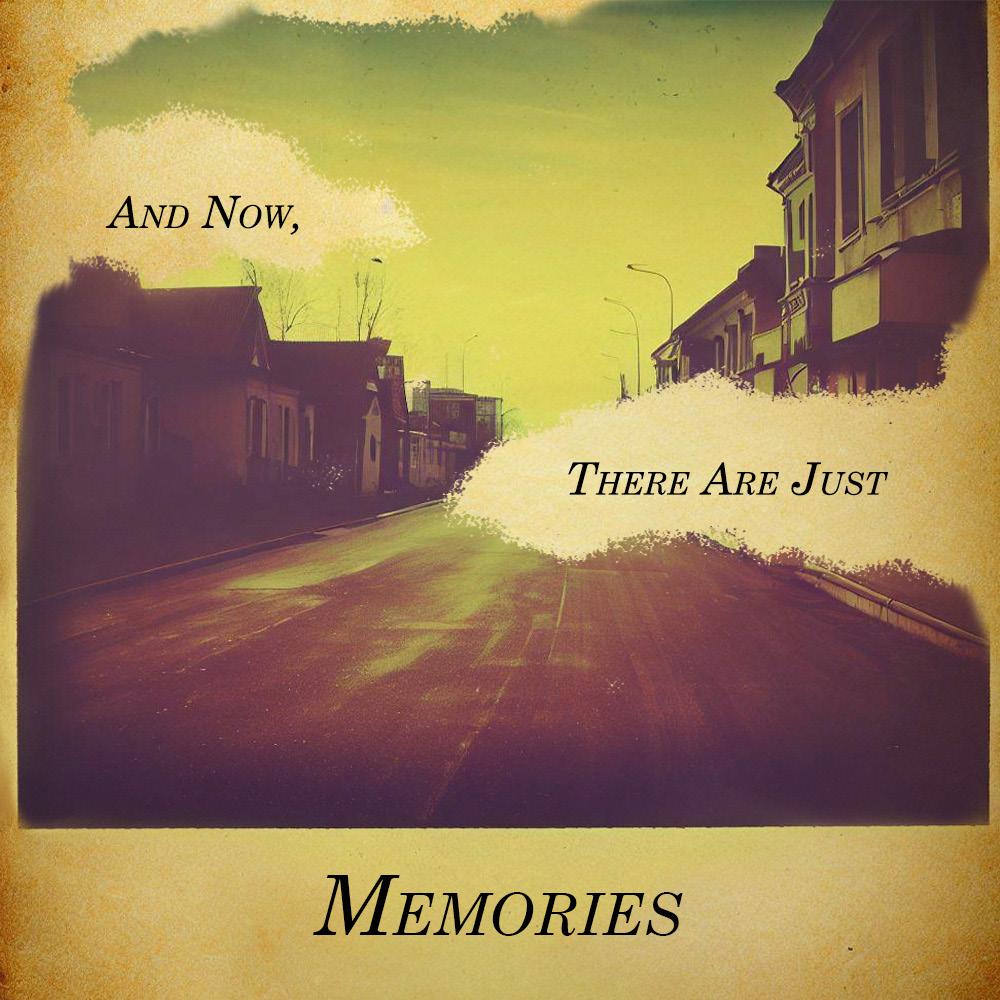
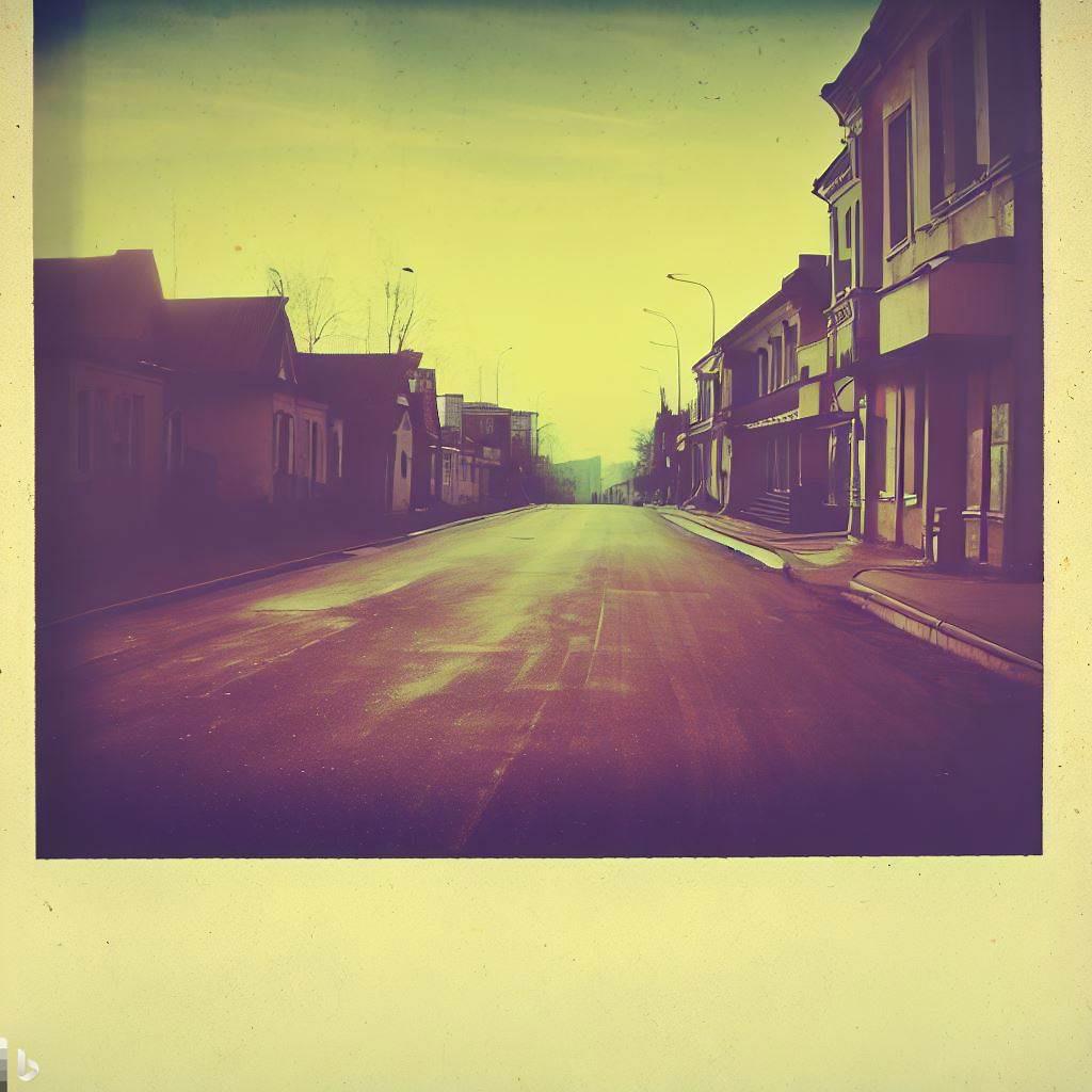
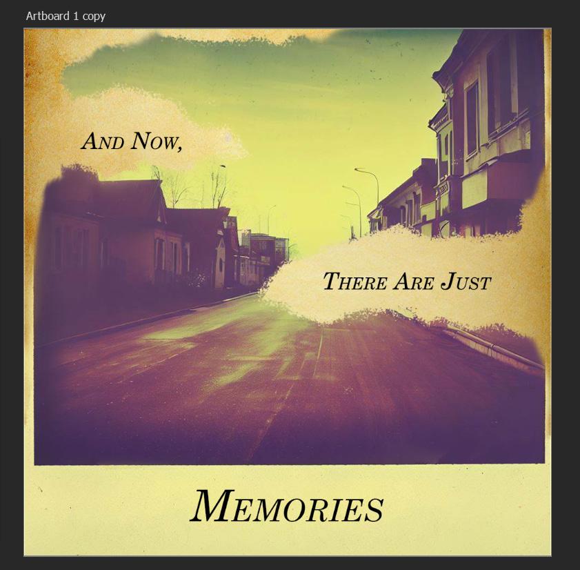
My two memoirs reflect the different aspects of my experience of transitioning from high school to college. In my first memoir, I expressed the idea that I have always known where I will go next, but I don’t know where I will go after I finish college. I captured feelings of confusion and being overwhelmed as well as the contradicting feelings of excitement and wonder. My second memoir is about the people and my experiences from high school that are now memories. I expressed this feeling in the form of a Polaroid photo, which I always find nostalgic.
Image Creator from Microsoft Designer was used to generate the images used in these designs.
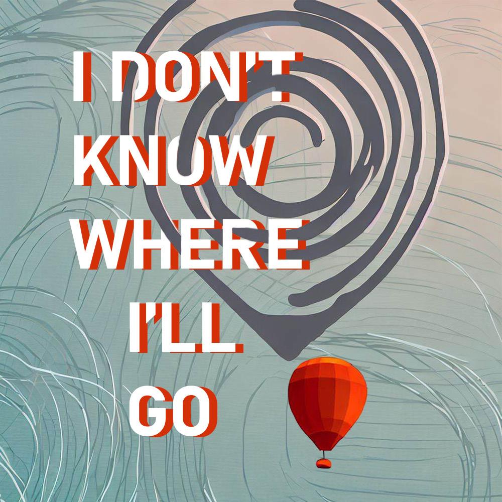
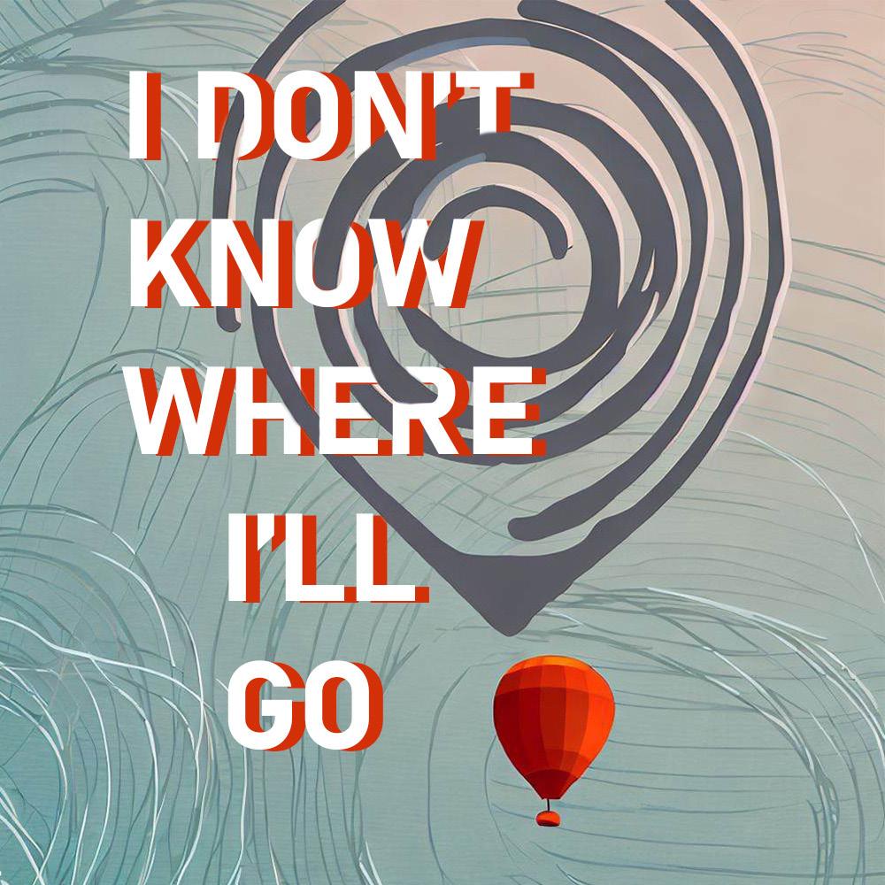
Although I had a general idea of what kind of image I wanted to use, I spent a long time trying different AI prompts to get it to produce an image that I liked. At first, I wanted to use an image that used more loose brush strokes in the style of a digital painting, but I decided this would make the words pop out less, so I changed my AI prompt to get a “minimalist” image. I also had trouble determining which typeface to use and how to incorporate it into the image more. At first, I used a less bold, serif font, but then I decided I wanted something that popped out and was more
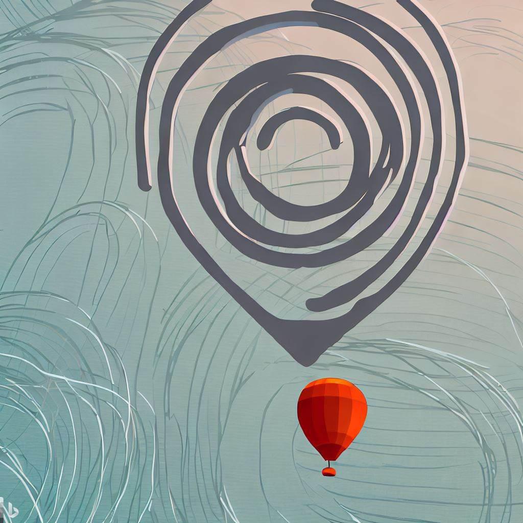
fun. At first, I had trouble making parts of the text disappear behind the loops because my text was on two separate layers, one for the white text and one for the orange text behind it. After some research, I found out how to group the two layers together and add a mask on both layers at once. Before critique, I didn’t have good balance in my image, so I had to move the text down and make the balloon bigger.
This was one of my first times using Photoshop, so I drew on my experience from using Procreate to understand how to utilize layers and blending modes.
I generated two images for this project: a Polaroid photo and worn-out paper. The color of the worn-out paper and the Polaroid paper were very different, so, I ended up adding another layer of the worn-out paper on a lower opacity and a modify blending mode. This made the paper’s color match and gave the Polaroid photo a more
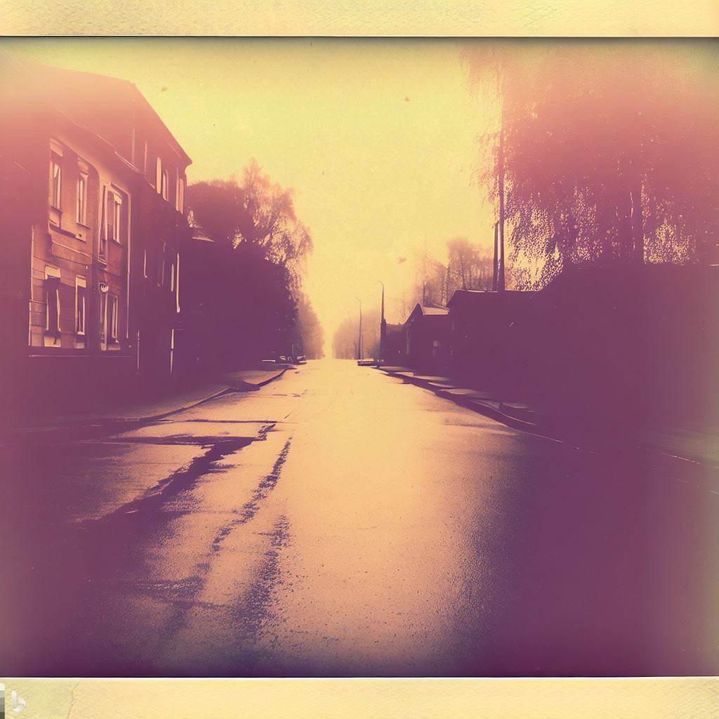
warm color scheme, which I wanted. I was also conflicted about how to write the text because I felt like it was a bit of a risk to make the word “memories” disconnected from the rest of the text. However, I ended up liking the effect of the word written at the bottom of the Polaroid, and I decided to go forth with my idea.
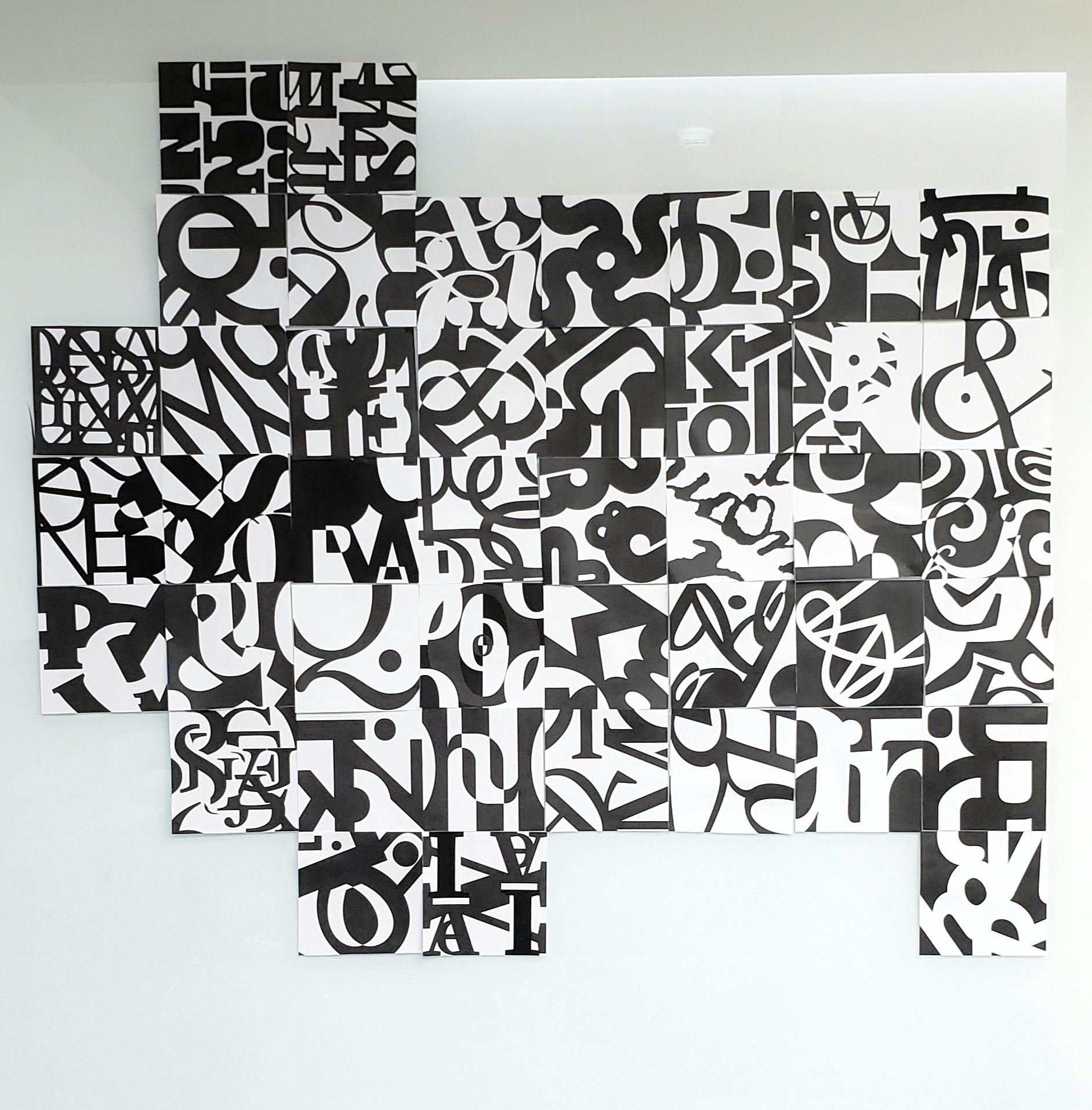
This project was challenging because the concept was hard for me to understand at first since I wasn’t sure how to make a design out of letters. At first, I struggled with making the design abstract while also highlighting elements of the letters. I had to put thought into the exact placement of the letters and not overlap them too much. I also avoided using the pathfinder tool too much because this was making my designs feel cluttered. Even though my designs are pretty geometric, I avoided making the focus exactly in the center by using the rule of thirds to add more movement throughout the design. Overall, I am happy with the final result, which is much neater than all of the designs I did before.
The font Brother 1816 Bold was used for all three designs.
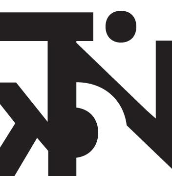
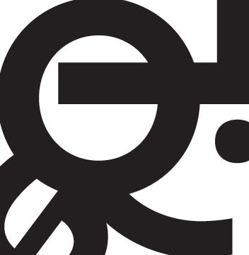
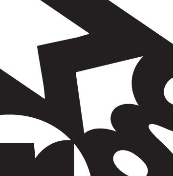
In my first few designs, I used the pathfinder tool too much and broke up all of my letters into very small pieces. The result was messy and incoherent with no particular aspect of the letters being highlighted. Then, my next designs were too geometric and lacked movement. I tried making my designs less geometric and symmetrical and the
result was, once again, too messy. At this point, I was 12 designs in, and I decided I needed to change my way of thinking. For my next three designs, which ended up being my final three, I did more planning than I did with the previous designs, putting more thought into the placement of each individual letter.
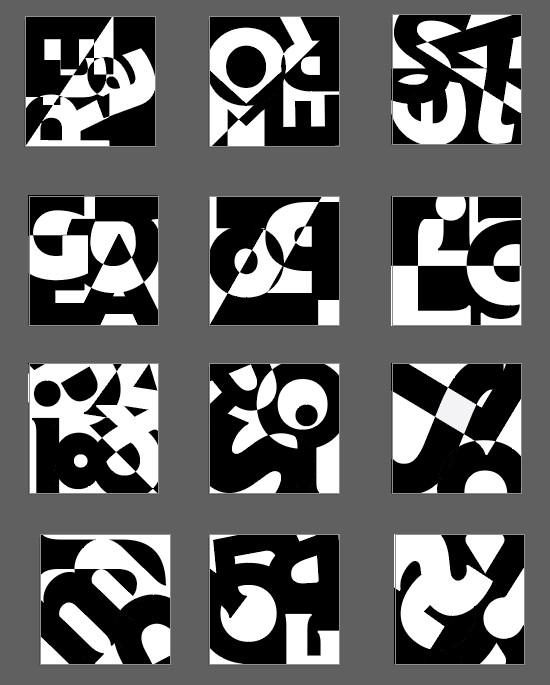
Collaborative installation on white board, made up of a collection of typographic abstraction projects from my ARTS102 class.
I found that the final result of our collective projects worked really nicely together. It was interesting to see the designs that took me so much time become part of something bigger.
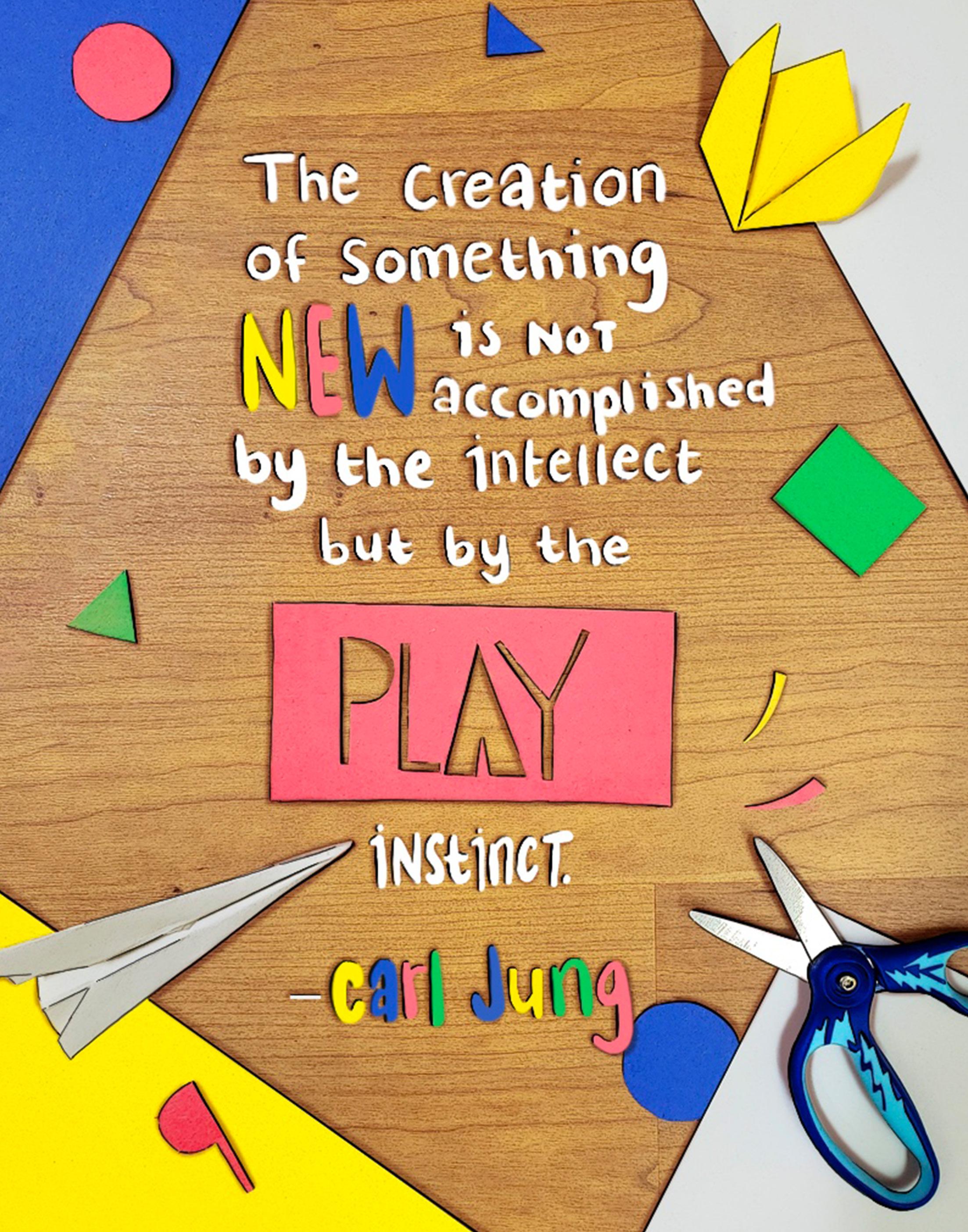
Iwas excited to do this project because I love poster design, and there was so much creative liberty. Carl Jung’s quote, “The creation of something new is not accomplished by the intellect but by the play instinct,” immediately stood out to me because I knew I would be able to play with it and create something fun. I combined crafts, photography, and digital art to evoke this “play instinct.”
This poster combines found typography and handwritten typography.
Thumbnails

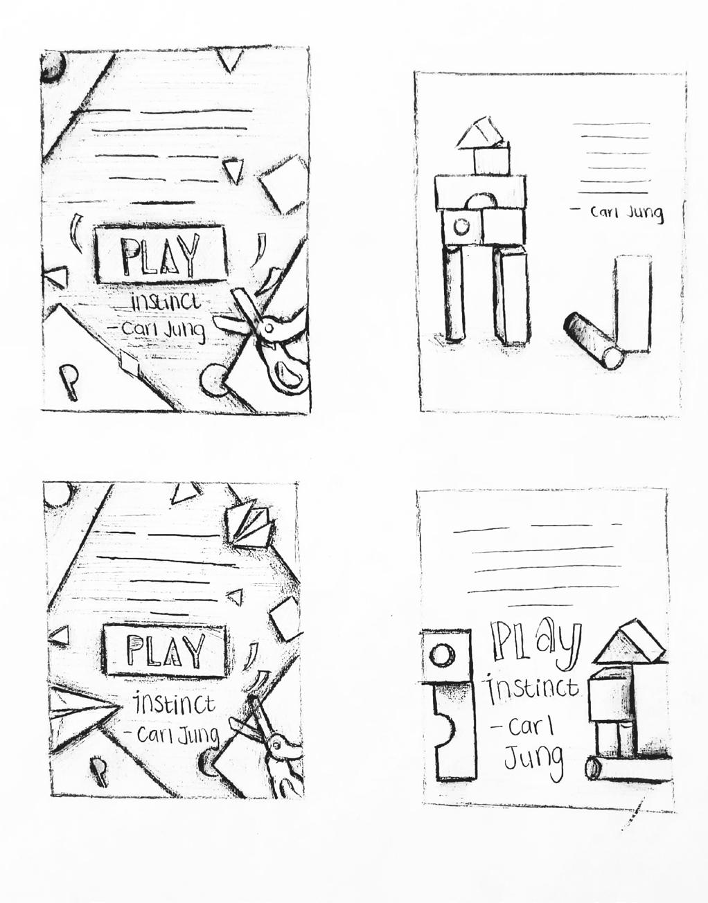
Refined sketches
I did 15 thumbnail designs with the same quote, and I ended up choosing my 13th thumbnail. Then, I sketched a more refined version of this thumbnail, which is when I decided to add the origami and paper airplane into the design for more variation.
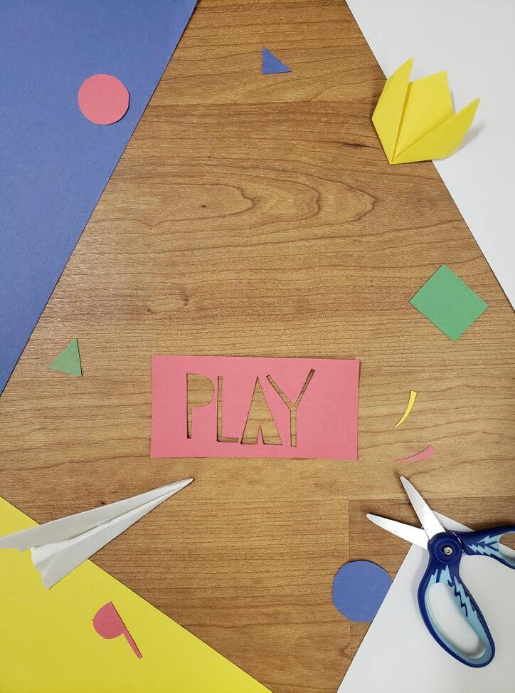
Since I decided to take a photograph for my poster, I had to make everything by hand. I folded the origami and paper airplane, and then I cut out all of the shapes and the word “play.” At first, I was having some trouble figuring out what size I should make all of the objects, so I laid everything out on an 11x15 sheet of paper before I started cutting. Once I took a photo of the layout that I was happy with it, I uploaded it into Photoshop and made some adjustments. I found a tutorial online and learned how to lighten the color of the wood without changing the other colors in the photo. Then, I increased the saturation and contrast of the entire image and added a photocopy filter as a modify layer set at 50% to make the image pop. I then uploaded the edited image into Procreate where I added some outlines and exaggerated the shadows
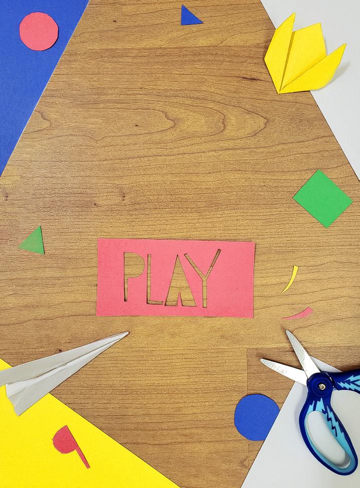
to make the image semi-cartoony. I also decided to write the text by hand in Procreate to match the crafty, playful feel of the image. After getting some feedback, I realized I needed to move the blue paper in the upperleft corner back a bit, so I uploaded the image back into Photoshop and moved the paper digitally. Then, I used a content-aware fill and the stamp tool to add more wood texture in place of where the paper used to be. I cleaned everything up in Procreate.
Concept Statement 1 (Left)
Funky Shark represents an affordable vintage thrift store targeted towards young adults. I used the gestalt principle of proximity to make the fins appear to be connected to the rest of the shark, and I used the principle of closure to make negative space appear to be the shark’s mouth. I chose the typeface Marvin because it is a sans serif font that is very energetic and fun, matching the energy of the store. I chose the serif font Cascadia Mono for the tagline to contrast with it. I chose to use the complementary colors red-orange and teal because orange is a color associated with energy, impulses, and affordability, and this color scheme is associated with the vintage aesthetic
Concept Statement 2 (Right)
Funky Shark represents a vintage thrift store, which sells rare clothing at high prices. I used the gestalt principle of simplicity by designing the shark out of simple shapes and the principle of proximity by placing the separate elements of the shark close together. I chose the sans serif font Dazzle Unicase Bold because it is simple and neat as well as energetic. I chose the serif font Cascadia Mono for the tagline to contrast with it. I used a vintage color scheme with the colors aqua, orange, and yellow because they contrast with each other, and I focused on the color aqua because it is a more mild, classy color.
These logos are for two variations of the same brand.
SHARK FUNKY
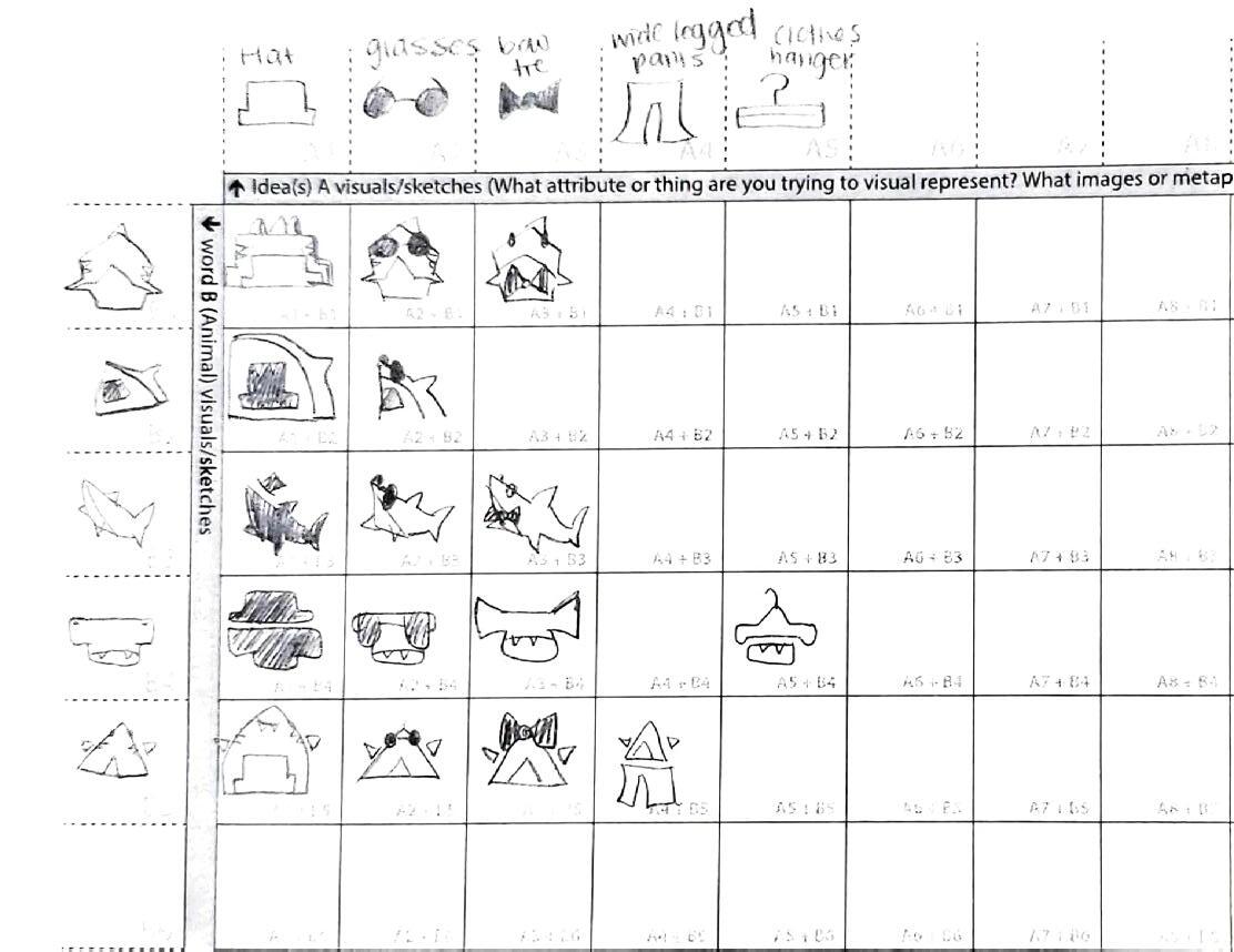
Brainstorming process
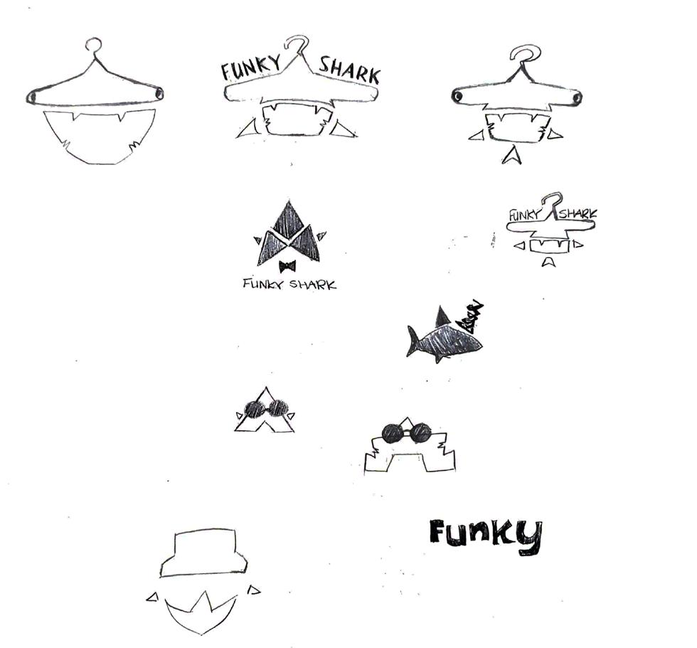
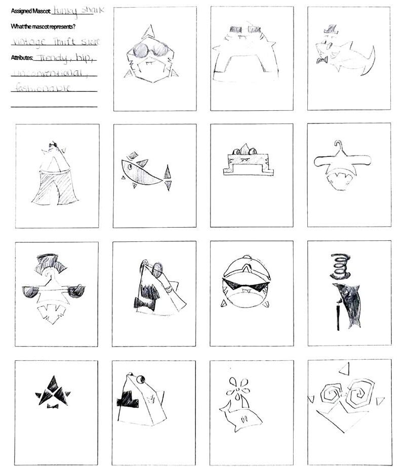
Thumbnails
My design was based on the words “Funky Shark,” so I decided to make my company a vintage clothing store, since the word “funky” is associated with unusual clothing styles. I started brainstorming by thinking of different objects I associate with the word “funky” and clothing. Then, I started sketching thumbnails to combine elements of funky clothing and sharks. I decided to expand on the idea of the hammerhead shark whose head is a clothes hanger and the three triangles, representing the head of a shark, with a bow tie and fins.
For my first design, it was difficult for me to make sure my audience could see that the logo was a shark. To make it look more like a shark, I added eyes, fins, and a tail, and I changed the shape of the shark’s head. However, the concept was still not clear, and the tail felt unnecessary. I tried to make the eyes and mouth stand out more, give the shark a rounder body, and cut out the tail. I liked that my second design was very simple and contrasted with my first one, but it was also hard to recognize as a shark. I fixed this by making some of the edges rounder, adding gills and teeth, and lowering the fins. For the fonts, I wanted to pick something fun and a little funky. I made my first logo have a more playful font, but I wanted my second logo to look a little more classy. I added the tagline “vintage apparel” to make my design more clear, but I had to put a lot of thought into my font choice for this. I ended up choosing a serif font to contrast with the san serif font of my company name.
At first, I wasn’t sure where to place this tagline, especially on my first logo where the company name is written above the design. Before the critique, my tagline was too small and hard to see, so I ended up adjusting the size of the text. I found playing around with color schemes to be quite fun. I wanted to pick vintage color schemes for both, so I looked at some vintage aesthetic images to get inspiration. I incorporated orange into my designs since it is linked to “energetic” and “impulsive” emotions in color psychology, which are important for clothing stores, where purchases are made in a quick and impulsive manner.
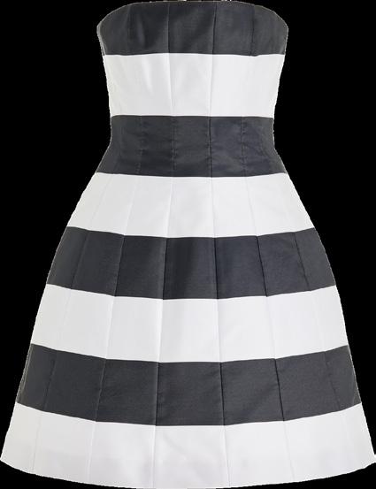
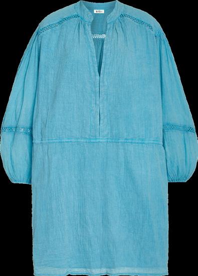
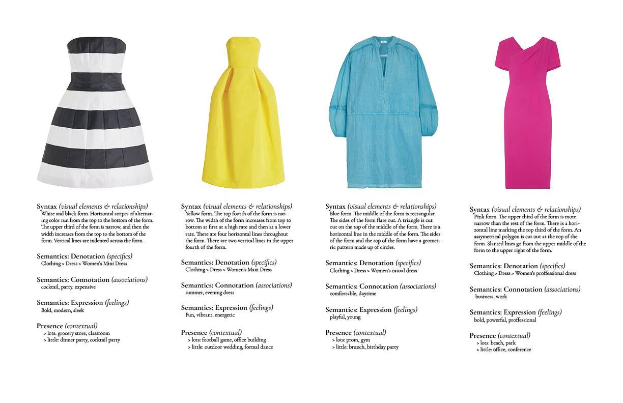
This project was very different from our past projects, and it did not require as much creativity. However, it was very useful in learning how to make layouts in InDesign and how to write bodies of text more efficiently. When we were going over this project in class, I immediately wanted to use dresses for my four items. I wanted to choose a very bright and bold color scheme that was also visually appealing, so I used variations of the primary colors along with a black and white dress to contrast with the rest. Originally, my fourth dress was a magenta ballgown, but it was too long, so
the image ended up much thinner than the rest, ruining the alignment. I then chose another dress of a similar color that was not as long. I chose the font Cormorant Garamond because I was inspired by the neat, serif fonts used in fashion magazines. I made two layouts for my images: one where the four objects were placed next to each other and the other where the four objects were placed in a 2x2 grid. I ended up choosing the 2x2 layout for my final.
All of these dresses are from luxury retailer Moda Operandi.
Version 1
Syntax (visual elements & relationships) White and black form. Horizontal stripes of alternating color run from the top to the bottom of the form. The upper third of the form is narrow, and then the width increases from the top to the bottom of the form. Vertical lines are indented across the form.
Semantics: Denotation (specifics)
Clothing > Dress > Women’s Mini Dress
Semantics: Connotation (associations) cocktail, party, expensive
Semantics: Expression (feelings) bold, modern, sleek
Presence (contextual)
lots: grocery store, classroom little: dinner party, cocktail party
Syntax (visual elements & relationships) Blue form. The middle of the form is rectangular. The sides of the form flare out. A triangle is cut out on the top of the middle of the form. There is a horizontal line in the middle of the form. The sides of the form and the top of the form have a geometric pattern made up of circles.
Semantics: Denotation (specifics)
Clothing > Dress > Women’s casual dress
Semantics: Connotation (associations) comfortable, daytime
Semantics: Expression (feelings) playful, young
Presence (contextual) lots: prom, gym little: brunch, birthday party
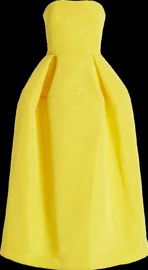
Syntax (visual elements & relationships) Yellow form. The top fourth of the form is narrow. The width of the form increases from top to bottom at first at a high rate and then at a lower rate. There is a horizontal line marking the top fourth of the form. There are two vertical lines in the upper fourth of the form.
Semantics: Denotation (specifics)
Clothing > Dress > Women’s Maxi Dress
Semantics: Connotation (associations) summer, evening dress
Semantics: Expression (feelings) fun, vibrant, energetic
Presence (contextual) lots: football game, office building little: outdoor wedding, formal dance
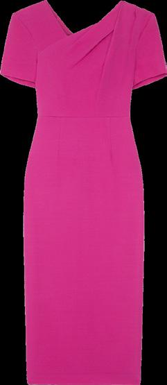
Syntax (visual elements & relationships) Pink form. The upper third of the form is more narrow than the rest of the form. There is a horizontal line marking the top third of the form. An asymmetrical polygon is cut out at the top of the form. Slanted lines go from the upper middle of the form to the upper right of the form.
Semantics: Denotation (specifics)
Clothing > Dress > Women’s professional dress
Semantics: Connotation (associations) business, work
Semantics: Expression (feelings) bold, powerful, professional
Presence (contextual)
lots: beach, park little: office, conference
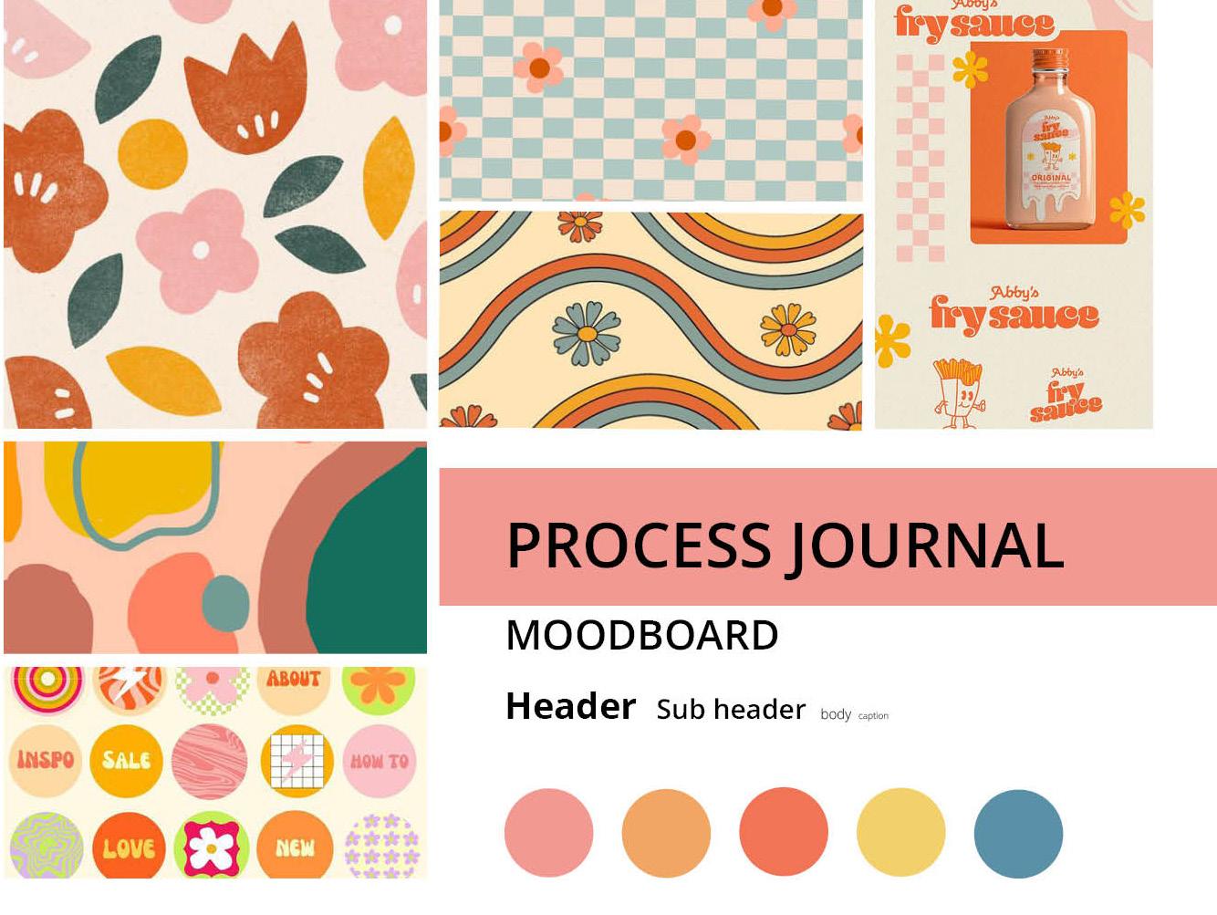
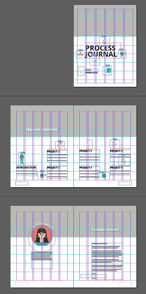
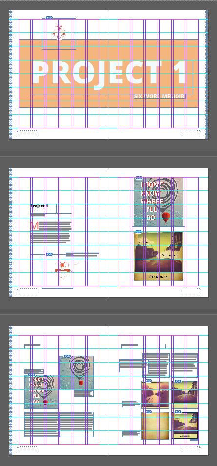
Iwas excited to start this project because it offers a lot of creative freedom. However, it was also a bit daunting to start because it is so big and requires so much material. When picking a theme for my project, I wanted to choose something that would compliment my work and not distract from it. My theme is inspired by retro illustrations. I picked a color scheme by looking at other retro art and selecting colors from them. I decided to make each project color-coded with a checker border at the edge of the pages because I liked the idea of someone being able to flip through my book and know which chapter they are going to land on just by looking at the edges of the pages. I used a checker pattern because it is
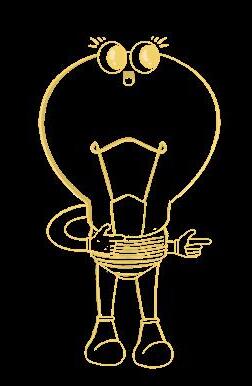
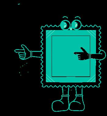
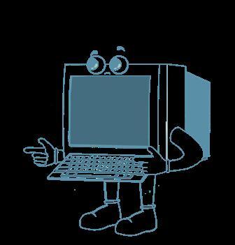
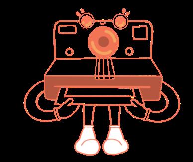
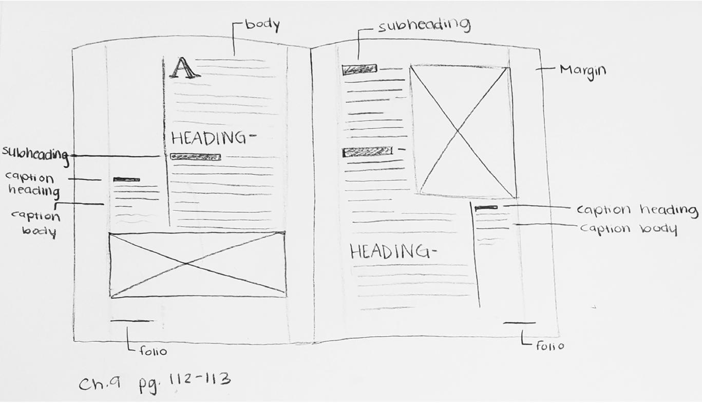
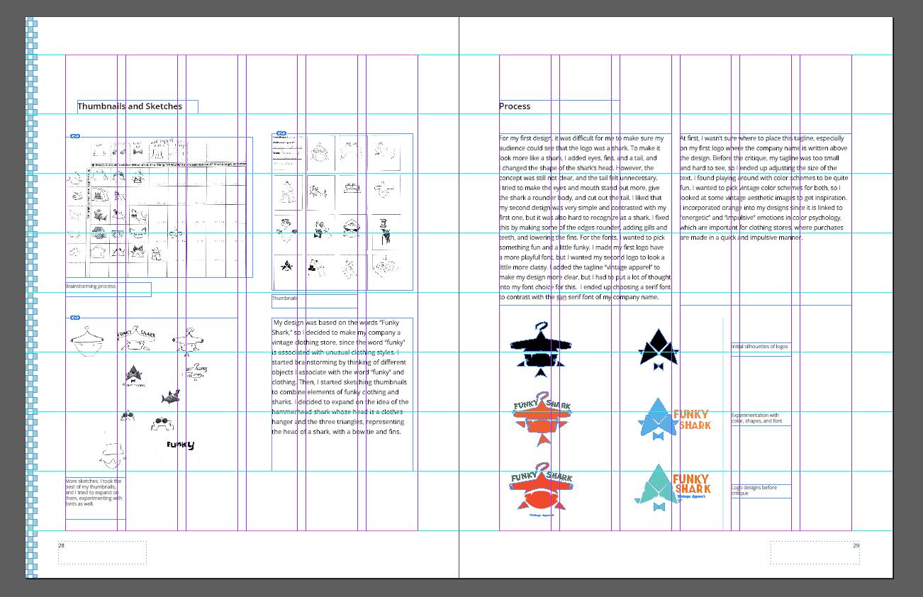
commonly used in retro illustrations. Arranging my spreads took a lot of time and consideration. I first sketched out some ideas, but I ended up having to make a lot of changes as I begin to actually design them. The first few spreads were the hardest to make, but as I got more used to the software, it became an easier process. I also decided to illustrate characters based on the themes of the projects. I thought it would be a fun addition that would also help introduce the projects. Overall, although this project has been a lot of work, it has also been a fun and insightful experience.
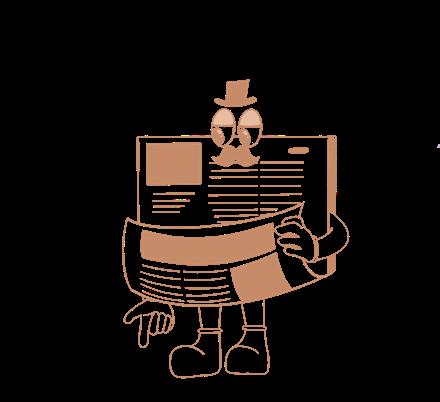
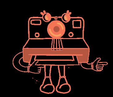
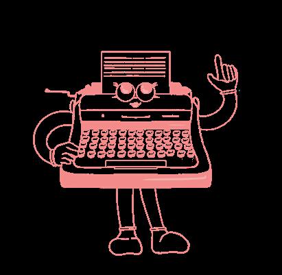
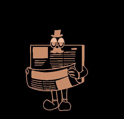
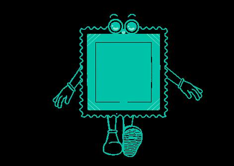
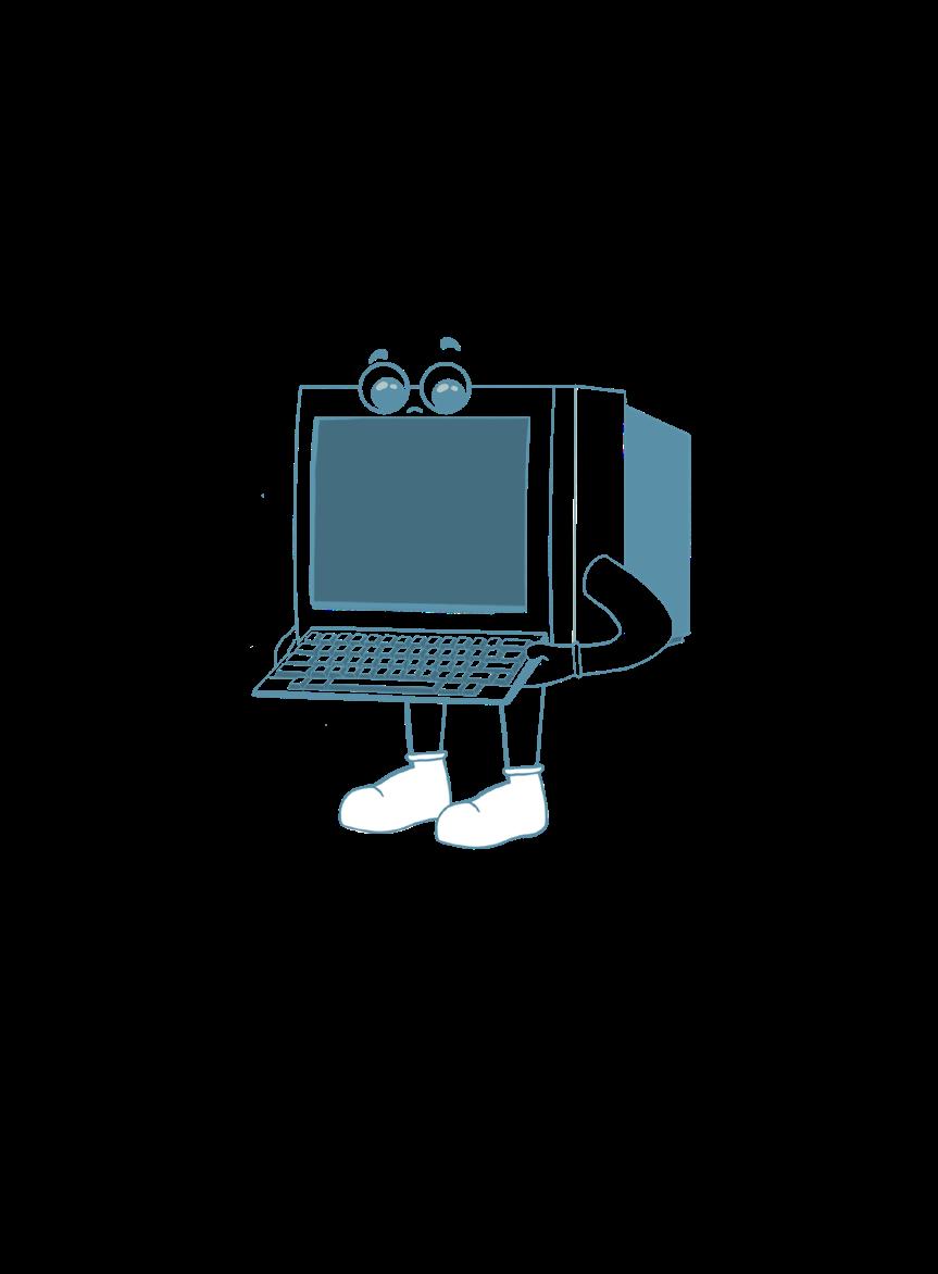
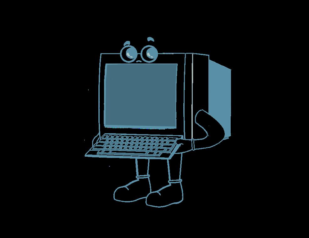
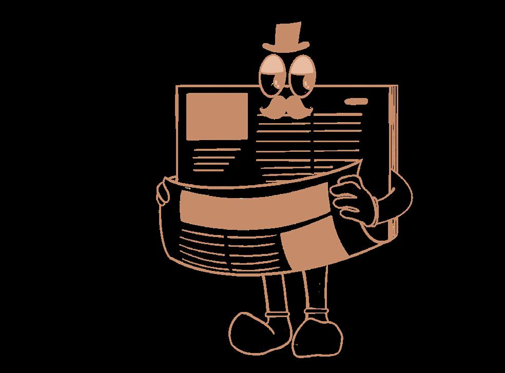
The illustrated characters were originally only used on the first page of each project, and then they became a part of the theme.
Grids and sketches were used to guide the layouts of the spreads.
Hanaa Jatoi
ARTS102
Professor Catherine Chi University of South Carolina Columbia, SC 2023
Project Introduction- Open Sans, ExtraBold, 189 pt
Project Title- Open Sans, ExtraBold, 32 pt
Header- Open Sans, ExtraBold, 24 pt
Subhead- Open Sans, SemiBold, 12 pt
Body Text - Open Sans, Light, Font 9 pt
Caption- Open Sans, Light, Font 7 pt
Page Numbers- Open Sans, Light Font 7.5 pt