47 minute read
1. A world full of images

2Visual language
Unit introduction
In this unit, we will work on our ability to use images as a means of expression, which will give us the tools not only to illustrate, but to communicate what we see in the outside world as well as what is in our inner world: thoughts, emotions and feelings, using our imagination and even creating images of what does not exist. We must show the students the possibility of representing reality in a more or less realistic way, differentiating it from the interpretation, modification or creation of something new, emphasising the role of emotions in artistic activity.
Resources and materials
It is recommended that you first consult all of the information, plan the activities and prepare the resources that are most suitable to tailor the lessons to the unique needs and characteristics of the students. In addition to the student’s book and the teacher’s guide, you will also have access to digital resources available on Anaya’s website.
General suggestions
Previous knowledge and possible difficulties
When teaching the unit, it may be helpful to relate the contents to students’ lives, with an approach based on students’ prior knowledge, going over well-known issues and situations connected to the topic that they can relate to, which will make them more motivated to learn. In this unit, it may be difficult for students to learn how to differentiate strokes, colours and textures and to recognise the value of hand-eye coordination, and therefore it is recommended that you encourage students to experiment, providing daily exercises which involve observation, distinguishing and manual abilities, without forgetting to encourage imagination and creativity.
Related tasks
We can use the first session to introduce the unit and go over the planned tasks. Each block can be covered in a different session. You can propose the activities that are most suitable for understanding and applying the contents, aiming to personalise the teaching to students’ needs.
Values education
You should focus on encouraging students’ imagination and creativity, as well as the satisfaction they will feel after doing a good job, which are aspects that must be included in their portfolio presentation. In the development of the unit, there will be an emphasis on aesthetic, intellectual, social and ethical values. It is important to insist on students’ involvement, on their responsibility for their tasks, and to encourage them to collaborate with each other. We must also emphasise critical observation and reflection, and to do so, questions are included throughout the entire unit.
Key competences. CLC: competence in linguistic communication, CMST: competence in Mathematics, Science and Technology, DC: digital competence, LL: learning to learn, SCC: social and civic competence, SIE: sense of initiative and entrepreneurship, CAE: cultural awareness and expression.
CONTENTS AND COMPETENCES
Unit contents
Opening pages • Cai Guo-Qiang
1. Basic components of images • Basic components • Drawing shapes • Textures • Representation and interpretation
Key competences
CLC
CMST
LL
SCC
CAE
CLC CMST DC SCC CAE
2. Colour: a complex phenomenon • The mechanics of colour perception • From white to black • Let’s organise colours • Warm colours and cold colours • The dimensions of colour • Colour palette • Colour is made CLC CMST DC SCC CAE
Artistic workshop • Action or gestural painting • Jackson Pollock and action painting • Activity: Express your emotions with spontaneous gestures • Activity: Dream, create and share • Spontaneity and expressiveness in figurative art
Final pages • Unit outline and glossary • Check your progress CLC CMST DC LL SCC SIE CAE
CLC DC LL SCC SIE CAE
proJect keys
SDG commitment UN goals: • Reduced inequalities (goal 10.3) • Peace, justice and strong institutions (goal 16.3)
Linguistic plan • Skills: listening and reading (receptive skills), speaking and writing (productive skills)
Developing thinking Technique: • Chain of associated elements
Cooperative learning Technique: • Ideas pool
Emotional education • Cognitive and emotional self-regulation
Enterprising culture • Productive dimension: initiative, innovation and productivity
ICT • Worksheet on language bank (speaking) • Worksheet on language bank (writing) • Document “Advice for creating your portfolio” • Interactive activities, videos and presentations to review and broaden contents
Assessment • Check your progress: let’s reflect together • Creating the portfolio
SDG commitment In the resource bank at anayaeducacion.es you will find documents related to SDG and a video on goal 10.3.
2
visual language
Reading and listening
Cai Guo-Qiang
Cai Guo-Qiang is a Chinese artist that creates art using explosions and fireworks. He created the pyrotechnic performance The Ninth Wave, that you can see in the picture in 2016.
1 Match the words from the text to the definitions.
pyrotechnic firework
a) A small device containing powder that burns or explodes and produces bright coloured lights and loud noises.
b) Connected with fireworks or a display of fireworks.
We can create images by imitating or recreating reality or from our imagination. In The Ninth Wave, Cai Guo-
Qiang plays with an explosion of colours to evoke feelings and awaken the senses. 2 Where do you think Cai Guo-Qiang gets his ideas from?
Are you able to distinguish the elements such as lines, shapes and textures that his images are made of? 3 Describe the colours you see in the performance. How do you think he made these colours? Do you think the colours have a meaning?
Speaking
4 Find a video or picture of one of Cai Guo-Qiang’s performances. Describe the different colours that you can see and how they make you feel. 5 Cai Guo-Qiang works in different countries all over the world. Do you think his work is socially inclusive to all, including inmigrants?
22 I watched a video of Cai Guo-Qiang in the Prado. It was called El espíritu de la pintura. In the video, he put lots of different coloured powders on different canvases. He lit them on fire and there was an explosion of red, yellow, blue and pink as well as other colours. The video made me feel inspired to learn more about pyrotechnics and watch more videos.
anayaeducacion.es Go to the SDG resource 10.3. The Ninth Wave (Sanghai, 2014), pyrotechnic performance by Cai Guo-Qiang.
LANGUAGE BANKLANGUAGE BANKLANGUAGE BANKLANGUAGE BANKLANGUAGE BANKLANGUAGE BANKLANGUAGE BANK LANGUAGE BANKLANGUAGE BANK LANGUAGE BANKLANGUAGE BANK LANGUAGE BANK 23
Visual language
CE: CE.1.1. (EA.1.1.1.) CE.2.4. (EA.2.4.2.) CE.2.6. (EA.2.6.2.)
Suggested methodology
Reading the text that goes with the opening image will allow teachers to get an idea of students’ knowledge before beginning the unit. Moreover, studying the image and discussing it (the image can also be compared to other works by the same artist) will allow students to recognise characteristics of the artistic style and its relation to the unit contents. The work by Cai Guo-Qiang (1957) invites us to reflect on concepts such as the importance of the imagination and creativity in artistic creation and shows how lines, shapes and colours work as artistic devices. We suggest beginning with the description of the image and asking questions that invite students to discover the meaning of the artwork beyond what we see. This way, we can establish relationships with emotions and memories that are inspired by our own interpretation or personal reflection. We can thereby delve into the subjectivity of images, discussing their symbolism and metaphors in art and finish by evaluating the aesthetics of the work by Cai Guo-Qiang. The work that is shown on these pages is a pyrotechnic performance done in Shanghai in 2014. It is titled The Ninth Wave and is related to the origin of the world. The powder is a metaphor for how the artist searches for spirituality, representing a bridge between the visible and invisible world. We can find other images of this same performance or the full audiovisual version to see the entire process. Among Cai Guo-Qiang’s works, we can find drawings, videos, performances, installations, etc. He even does social performances, such as the opening and closing ceremonies of the Olympic Games in Beijing in 2008. In Stairway to Heaven, he builds a ladder that lights up in the sky with the help of a hotair balloon to steady the structure. He dedicated this work to his grandmother, who was 100 years old. In Argentina, he did a tango and fireworks show in La Boca, on the Riachuelo river, for 200,000 people. In spite of his innovative materials and techniques, he was able to do an exhibition (The Spirit of Painting) in the Prado Museum. He is the first contemporary artist to create on site at this museum. Looking and reflecting on images can invite us to not only question their meaning, but also the artist’s intention, the way the work was created and, possibly, the artist’s interest in experimenting with different materials and techniques. We must follow a multidisciplinary approach to art and understand all the different ways of expression.
Keeping the SDG commitment in mind will help prepare the students to be committed citizens. In this case, we recommend observing that in the field of art where the artist is from is not important; it is common to travel to other places to learn from others and exchange knowledge. This leads to a multicultural environment and provides opportunities which can help reduce inequality. In the Reading and listening section, a brief introduction about Cai Guo-Qiang and his art is provided. After reading and listening to the introductory text, students will work on vocabulary and reflect on the questions about the artist and his art. In the Speaking section, students will practise their communication skills in English while working on the suggested questions and tasks: describing the colours of a performance by Cai Guo-Qiang and explaining how they felt when they were watching it, as well as reflecting on the inclusive nature of the artwork. The language bank worksheets (web resources) are designed to work on oral and written expression, combining the English language with the unit contents. This can be a useful resource for the language assistant in the first sessions of the unit although they can be used in any other moment during the teaching of the unit to which they correspond.
BASIC COMPONENTS OF IMAGES
The word stroke can mean to punch, clash or blow. It also means to caress. Brushstroke in painting has the same meaning. Jackson Pollock strikes the canvas with his aggressive way of throwing the paint from a distance. The classical paintings in Europe since the Renaissance use the brush as a caress.
Understand, think and apply…
Reflect and respond
1 a) Are you able to express something with a simple gesture, or just by a stroke? b) Describe the style of images you like to create. Are they real or imaginary? c) Are we able to be aware of our subconscious and express it? What are your dreams?
3
Sometimes a smile, look or gesture is enough to express our happiness or fears. The same is true for visual language; sometimes a simple stroke* or colour blot can show how we feel. A blot, a line on paper, a brushstroke* footsteps in the sand, fingers in clay, a chisel on rock or wood... all of these actions leave a mark. When these marks are organised, they can form shapes that can become images from the imagination or represent elements from reality, sometimes symbolically. Images are distinguished by their characteristics such as: shape, colour, texture and dimension.
Random blots and shoe prints on the sand make up different shapes; one is real, while the other is imaginary.
We can share our dreams and desires through images. Art, invention and creativity, are often metaphorical, and contain metaphorical images. Art helps us explain the unknown, and what lies in our subconscious.
A frame from Peter Pan (1953), directed by Wilfred Jackson and Hamilton Luke.
Your signature is your mark
A signature is an image that accompanies us throughout our entire lives. Some are simple, geometric signatures, such as Alberto Durero’s signature (1), while others may be more expressive, like Picasso’s (2), or very elaborate like the ones used by certain graffiti artists (3). What does your signature look like? Does it represent you? Are you willing to create one to identify your artwork with your characteristic stroke and expression? ã 1.1 Basic components
➜ A dot is the start of everything, a basic expression, the smallest graphic element (called a pixel in digital images). A dot can have smooth or irregular edges, and can be different sizes and shapes. ➜ A line is the path of a dot that moves, and represents its movement. A line can be open or closed, curved, straight, wavy, zigzag or combined.
Understand, think and apply… Transform a space using only dots
2 Imitate Yayoi Kusama (Japan, 1929). Use stickers with different colours, dots and different sizes to, transform a space or object into a wonderful piece of art.
Infinity room, created for the exhibition Infinite Obsession (2015), by Yayoi Kusama.
Create with lines
3 Freely scribble on a sheet of paper. Then, make some lines thicker than others to create shapes. Decorate them with patterns, then colour them in and make up a story about them.
You can even cut them out to make them into three-dimensional sculptures, like the ones by Jean Dubuffet (France 1901-1985).
1 2
Unit 2
Maximum expression in a single stroke
John Ormsbee (1913-2005), an American landscape architect, thought that each stroke transmits emotions, feelings and a general mood. What do your strokes look like?
3
1 2
Examples of strokes and the feelings they represent: 1. Stability. 2. Dynamism. 3. Expressiveness. (Taken and adapted from Mood Line, by Rikard Rodin).
Do you prefer straight or wavy lines? Wavy comes from wave, which means undulation. Other words with similar meanings are squiggly and wiggly: ‘A wiggly line’. As a verb, to wave means to greet someone in the distance with your hand. Discuss with your classmates why greeting someone with your hand is similar to wave and wavy.
1. Picture of scribbles. 2. Defined shapes coloured in. 3. Jardin d'émail (1974), sculptures by Jean Dubuffet.
3
25
Linguistic plan To do the communication activity, students may consult the “expository text” file in the resource bank on the Anaya website (www.anayaeducacion.es).
Academic and professional orientation We must help students make decisions and be independent in their choices.
Emotional education A stroke allows us to express an emotion. Sometimes, small details or a simple gesture can say a lot about how we feel.
Enterprising culture Inviting students to transform a space is a task that fosters the productive dimension of entrepreneurial activity and also helps develop their creative capacity.
The Focus on English sections work on different aspects of vocabulary, complicated meanings, interesting aspects, word formation and cultural references. • The meaning of stroke and brushstroke. • The meaning of wavy (adjective) and (to) wave (noun and verb). Content relation between the meaning of the verb and the noun.
Basic components of images
CE: CE.1.2. (EA.1.2.2.- EA.1.2.3.) CE.1.3. (EA.1.3.1.)
Suggested methodology
In the first unit, we went over the importance of critical understanding of images. Now, we will focus on learning how to create them and we will learn the expressive capabilities of the elements that make up images. We will even look at creating from simple components (dots, strokes, etc.) which we can do freely on a surface or on the designated space, with different degrees of expressiveness, and which become lines, textures and shapes when they are repeated. We must also encourage students to question their own imagination, their individual preferences and their relationship to prior experiences or future aspirations. We recognise the possibility of expressing thoughts and emotions and creating based on what is real and what is imaginary; we must value the world of dreams and the imagination as sources of creation for images, distinguishing between those that are remembered as dreams and those that are consciously formed, in addition to considering the possibility of combining them. We once again emphasise the metaphor as a powerful expressive resource and insist on encouraging students to be creative. Many works can be inspiring for students, such as the story of Alice in Wonderland (illustration by Tennie, 1865); the triptych painting by El Bosco entitled The Garden of Earthly Delights; a short film, Dreams, by Akira Kurosawa (1990) or the film Howl’s Moving Castle, by Hayao Miyazaki (2004).
1.1 Basic components
Establishing the obvious differences, we can relate visual language to verbal language, since this allows us to understand the dot as a minimal element that forms part of lines. We could mention pointillism although we will go over it later in further detail when presenting the content on colour, along with impressionism. We can also go over digital coding, which is based on the combination of simple elements. We can establish a connection with the topic we are dealing with by showing students the amount of information a BiDi code or barcode can contain and recognising that coding and classifying excessively can result in improper use of information, affecting our privacy rights. Many artists have done works on all of these issues. Further related information can be found on the Internet. We suggest finding information on this topic and showing it to the students in class.
Your signature is your mark
This activity is especially appropriate for the students’ age, since they are in a moment of personal reflection on their own identity. It gives them the possibility to reflect on their signature as their own image and mark and to make a conscious decision about it. We can motivate them to do it as a graffiti, first showing them signatures by different artists. Students will take initiative and will work on independence and on the competence of being aware of cultural expressions, identity and selfaffirmation. They can use a pen (ink), a graphite pencil and markers.
Maximum expression in a single stroke
The most important aspect of this unit is understanding the expressive capacity of visual language, starting with the simplest elements from which we form images. We must differentiate the dot in technical drawing, considered the intersection of two lines, from that of artistic drawing, as well as the stroke from the blot. Furthermore, we must distinguish curved, straight and zigzag lines from one another, which can be delineated, dashed, etc. We must do so by showing examples and encouraging students to experiment. By looking at lines with different thicknesses, made with different materials, we will be able to see how a stroke can give expression to a line.
1 BASIC COMPONENTS OF IMAGES
The use of sfumato makes shapes blurred
Sfumato is a technique invented by Leonardo da Vinci (Italy, 14521519) through which the contours of figures are smoothed out by using soft tones and playing with shadows. He used it in La Gioconda (1503), also known as The Mona Lisa. ã 1.2 Drawing shapes
Shape refers to the outer appearance of things. Shapes can be organic or geometric, flat or volumetric. Sometimes, artists draw lines to accentuate shapes (1); other artists define shapes using only colour (2), dots (3) or colour expanses (4), without using contour lines. When drawing shapes, contour is the line that defines the outer part and contained space is the interior of the shape. When the contained space is filled in with one plain colour, we call it a silhouette.
1 3
A woman’s silhouette in Blue Nude (1907), by French painter Henri Matisse.
2 4
1. Woman, Bird and Star (1970), by Joan
Miró. 2. On White II (1923), by Wassily
Kandinsky. 3. Girl Running on a Balcony (1912), by Giacomo Balla. 4. Red Haired Girl Sitting on a Veranda (1884), by Berthe Morisot.
Understand, think and apply… Discover hidden shapes
4 Find figures of objects, animals and people. On a piece of paper, draw or trace the contour lines and mix them up so that they are less recognisable. Then, have a classmate try to guess what each silhouette represents. ã 1.3 Textures
Texture is a surface characteristic that we perceive using sight and touch. Art imitates and recreates textures. Texture and colour reinforce emotions and help us distinguish materials and objects.
1 2
Unit 2
1. Visual textures: Compliance (1905-1909), by Gustav Klimt. 2. Textures obtained through frottage:
Documenta (1959), by Max Ernst. 3. Natural textures: Bird 2 (2014), by Javier
Lorenzo.
3
ã 1.4 Representation and interpretation
There are different ways to express what we see. We can represent reality in a more or less objective way, using techniques that depict an object naturally. When we reproduce elements in an image realistically, it is called a figurative image. When elements from reality are not reproduced realistically, it is called an abstract image. We can represent reality by creating images that are different from the ones that we see. When we express feelings, emotions, dreams or ideas, we can be carried away by fantasy and imagination. The images can be figurative, but not logical. Images may not even have anything to do with reality, which is what we call surrealism.
Understand, think and apply…
Imitate reality
5 In order to draw something realistically, the first and most important thing to do is to observe, then sketch the image on the paper or medium you will draw on. (1), Draw the basic lines (2) and
Draw the contour of the shapes (3). Choose an object that you are interested in and reproduce it following these steps.
Imagine and draw
6 Close your eyes and think of images. They do not have to be real.
Focus on the shapes, lines and textures. Draw what you have imagined.
Tiforal (1947), surrealist painting by Remedios Varo.
1
2
Sketch.
3
Basic lines.
Contour of the shapes.
27 1 Reflect and respond. The questions posed should help the students question the images they create, and see if they recognise their own strokes, if they think they are able to express something unconsciously or express themselves with gestures or shapes. 2 Transform a space using only dots. As an experiment, we propose this creative exercise which has to do with spatial intervention. 3 Create with lines. This activity, which develops creativity, allows students to go deeper into the freedom of expressing their feelings and how to use free and unconscious drawing as a form of liberation and relaxation. We propose using pens, since they glide smoothly, but it would also be okay to use markers, graphite pencils, coloured pencils, some sort of water technique or even digital tools.
Another possibility is to experiment with the density of different materials, showing students paper marbling techniques, or suminagashi, making coloured oil-based inks float on the surface of water. This will allow us to talk about different types of paints: pigments, binders and thinners.
Basic components of images
CE: CE.1.2. (EA.1.2.1.) CE.1.3. (EA.1.3.1.) CE.1.4. (EA.1.4.2.- EA.1.4.4.) CE.1.7. (EA.1.7.1.) CE.1.10. (EA.1.10.1.) CE.2.4. (EA.2.4.1.)
1.2 Drawing shapes
The aim is for students to have a good command of visual language vocabulary. We can begin by looking at a work of art by Matisse and having a debate, asking about concepts such as contour, silhouette and shape, relating them to the interpretation of natural shapes to give them greater expressiveness. We must focus on the use of the line which serves both to define contours and add expressiveness. It does not always define the shapes when they are over a background, allowing them to blend into one another.
1.3 Textures
As an element or attribute of shapes, it might be interesting to ask students to define texture, looking at tactile examples found in works of art by Javier Lorenzo or Javier Solchaga, who use natural materials as well as man-made materials, or visual examples found in works by Gustav Klimt or Max Ernst. You can also look at works by abstract and informal artists, such as Manuel Millares and Manuel Rivera. We should invite students to reflect on their communicative qualities and experiment with different possibilities in that respect, such as trace and transfer, frottage or the use of materials that are ripped or stuck to the surface, which will be a good opportunity to discuss the transition from flat surfaces to relief.
1.4 Representation and interpretation
The degree of iconicity or similarity an image has with reality is a broad topic. We can explore it by discussing the concepts of objectivity and subjectivity, that is, a closer representation or freer interpretation of reality, but keeping in mind that any image is always a code. We can question whether an image that more accurately represents reality is more valuable than one that better expresses emotions.
The use of sfumato makes shapes blurred
As a fun fact, you can tell the class that Leonardo da Vinci mixed colours directly on the canvas and defined the sfumato technique used in The Mona Lisa as a technique to blur the contours of the figures using vague tones and experimenting with shading, without lines or edges, beyond the plane of focus.
Understand, think and apply…
4 Discover hidden shapes. With this activity presented as a game, we can reinforce terms such as “depth” and “shape”, seen in the previous unit, as well as the difference between a silhouette, contour and filled-in shape. 5 Imitate reality. Natural drawing is an activity that is becoming less and less common in art nowadays due to the development of graphic technologies. However, learning to draw, dominate spatial vision, use proportions and orient is fundamental. We must avoid falling back on previously acquired patterns, encouraging visual thought. To do so, it is necessary to observe and draw outlines, learn to fit forms together, draw basic lines and delimit silhouettes and large planes of light and shadows. This activity is designed to motivate students to put these concepts into practice, but it is quite obvious that this is not enough to acquire the skills.
6 Imagine and draw. We suggest evoking images stored in one’s memory, associated with other non-visual sensations. The intention is to create a composition with images that, even though they are figurative, are associated in an illogical manner. Works by Dalí or Magritte are good representations of this concept. Unlike Miró, the shapes in the works by these artists are realistic but because they are out of context, they take on new meanings.
We can invite students to close their eyes and create mental images, playing with elements that are figurative (coming from reality or their memories and dreams) and abstract (points, lines, textures, shapes, colours).
We can use our imagination, suggesting they follow the format of the greguerías by Ramón
Gómez de la Serna: humour + metaphor, an association, an inversion of a logical relationship, a free association of linked or conflicting concepts or other creative techniques.
COLOUR: A COMPLEX PHENOMENON
Understand, think and apply… Reflect and respond
1 a) Are you always able to distinguish blue from green? Do you know how many colours there are? What colours can you see in the dark? Can you imagine a world without colour? b) What colours do you like? What colour is your room? Your rucksack? What colours do you like to dress in? Why? We see everything thanks to light and colour differences. Defining a colour is not easy. When naming colours we use adjectives and refer to objects that we know: pale yellow, tan, vanilla, dark olive green, fire truck red, there are many possibilities. The sun gives the late evening an orangish, pinkish colour; the cold seems to make everything blue. A leaf is not the same in autumn as it is in spring. The lighting, weather, or material a colour is made of affects its appearance.
The greens and blues in the ocean can be very similar. Different blues in a northern landscape.
Colour has a strong influence on our emotions and it can awaken feelings in us that affect all of our senses, given that we relate colours to experiences. Therefore, colour is subjective and symbolic; it varies from person to person and from culture to culture.
Football fans wearing their team's colours. At a Chinese wedding, the bride and groom dress in red.
Colour, symbolism and emotion
In art, design and marketing, the power of colour is taken into consideration. In general, warm colours (reds and yellows) are energetic, and cold colours (blues) are relaxing and give a sensation of freshness. Find images in which one specific colour is dominant and compare them: next to them, describe experiences you have had that are associated with that colour, including emotions you associate with it. ã 2.1 The mechanics of colour perception
Colour* is a sensation our brain perceives. The surface of an object reflects some colours and absorbs all others. The colour we see is the one being reflected off the object in the form of electromagnetic waves that are transformed into what we call colours. White light contains all colours. Each colour has a wavelength. The human eye is only able to see waves that oscillate between about 380 and 780 nanometres; this is called the visible spectrum.
WHITE LIGHT
The entire visible spectrum (400-750 nm)
SUN
Short wavelengths 300 UV Violet Blue Blue-green Green Yellow-green Yellow Orange Red
IR
400 500 600 700 800 Long wavelengths
Wavelength in nm 1 10 102 103 Visible light 104 105 106
X-rays
UV (Ultraviolet)
IR (Infrared)
Light spectrum through Newton's prism and wavelength measurements of the colours.
ã 2.2 From white to black
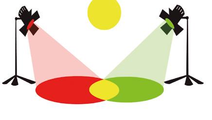
If we mix colours of light, the original colour gets lighter and lighter until we get white. We call the mixture of colours of light additive synthesis. If we mix pigments (which absorb light), we obtain darker colours until we get black. We call the mixture of pigments subtractive synthesis.
Red
Yellow
Green White
Cyan Magenta
Blue violet Magenta
Red
Yellow Black Violet
Green Cyan
Primary colours of light (red, green and blue violet) and their additive mixture. Primary colours of pigment (magenta, yellow and cyan) and their subtractive mixture. Unit 2
Black ink in the printer
The black ink cartridge is not necessary. In fact, the first home printers didn't use one; it was added later since it was the most commonly used colour, and it was economically viable to have it already prepared.
Different colours have different meanings which may be the same or different in different cultures. For example, green is often used to paint the walls of hospitals. Why do you think this is? Look on the Internet for the meaning of colours in different cultures and discuss with your classmate.
Understand, think and apply… Colour a spinning top
2 Take a piece of cardboard and cut out a circle 10 cm in diameter.
Make a small cross in the centre for a pencil, which will be used as an axle to make a spinning top. Cut out several of the same size circles using a separate sheet of paper.
Divide and colour them using different colour combinations. One should contain the three primary colours (cyan, magenta and yellow.) Now, see what happens when you spin the top. Do the colours mix in the same way as when we mix paint? Explain why.
29
Developing thinking We suggest using the “Chain of associated elements” technique, having students describe what they perceive and then analysing associated elements that can help it to be meaningful. The dynamics of this technique can be consulted in the project keys, in the resource bank at anayaeducacion.es. The meaning of colours.
Colour: a complex phenomenon
CE: CE.1.5. (EA.1.5.1.) CE.1.6. (EA.1.6.1.) Suggested methodology
We will briefly introduce the scientific definition of colour as the reflection of light. Students can research more in order to understand colour, based on the decomposition of light, as an energy that bodies either reject or absorb; and pigments as substances created by humans to colour. Students will see the use of colour in daily life and in art and how it adheres to social norms, especially in design and fashion. We will go over colours associated with specific elements and we can even ask students to list others. We will also clearly distinguish the differences between warm colours and cold colours and their associations. The introductory text aims to make students reflect on the extraordinary capability of colour to awaken emotions in us, its wide diversity and how it can be subjectively used and appreciated. The questions we raise should be oriented this way.
2.1 The mechanics of colour perception
The refraction of light in different colours is a phenomenon that we can demonstrate in the classroom by using a glass prism. This way, the scientific concepts shown in the illustration can be treated from an experiential fact. It is important to explain that the different wavelengths make up the different colours. Colour theory relates the unit to impressionism, which is included as an art reference in the artistic workshop, and to the pointillism of Seurat or Signac, and helps us understand contemporary works of art created in a mosaic made from other images, such as those of Lewis Lavoie.
2.2 From white to black
After the previous experience, we can ask the following questions: Why do we say that white light contains all of the colours? Can we get white by mixing different coloured paints? The answers will lead us to conclude that there are different types of colour. It is important to differentiate between the subtractive mixture of colours of pigment and the additive mixture of colours of light. You can show examples of colour harmony and colour contrast in decoration, fashion or any other type of design and discuss them; you can also look at works by Miró or Matisse.
Colour, symbolism and emotion
This complementary information and the activity proposed aim to show students that emotional reactions to a specific colour are rooted in experiences related to that colour, and to enable them recognise its sociocultural meaning and interpretation. By gathering images that highlight a specific colour, students will be able to ponder the reasons behind their emotional response and why they feel that way. We can complement this activity by proposing a list of ten or twelve colours: primary colours, secondary colours, browns, greys, black and white.
Black ink in the printer
This fun fact demonstrates how black is obtained from primary colours of pigment. It is difficult for this to happen with common tempera and acrylic colours used at school, since these colours are less intense.
Understand, think and apply…
1 Reflect and respond. By reading the introductory text and having a debate based on the questions, we will be able to detect students’ prior knowledge of the concept of colour, its expressive power and its symbolism, and understand cultural differences with regard to colour.
We can also ask if colours can be identified with social groups or with gender differences and what the reasons for these associations could be.
The last questions are focused on personal taste and the importance of colour in it. They invite us to reflect on the colours we prefer, the ones we choose for everything that surrounds us, for our personal objects, what they say about us and the why behind all of this. 2 Colour a spinning top. We can do several activities related to optical effects and colour. We suggest doing one with a spinning top, which can be done in several different ways: colouring the circle using only two colours, creating different designs with geometric shapes or making a colour wheel that includes secondary and tertiary colours.
2 COLOUR: A COMPLEX PHENOMENON
A rainbow is caused by the refraction and dispersion of sunlight by rain or other water. A colour wheel reminds us of the rainbow. Compare the two of them.
Green
Colour wheel* with primary and secondary colours.
Cy an b lue
Colour shades are shown in different colour systems, such as the Hickethier cube (above) and the Munsell tree (below). ã 2.3 Let’s organise colours
With the pigments cyan, magenta and yellow you can make all other colours. That is why they are called basic or primary colours. Secondary colours are made from mixing basic colours: cyan and magenta make violet; magenta and yellow make red; yellow and cyan make green. Complementary colours are opposites; they contrast the most with each other on the colour wheel (such as magenta and green). Harmonious or analogous colours are the colours that are closest to each other (such as red, carmine, magenta and purple).
Green
Complementary colours.
Re d
C armi n e
Magenta Purple
Harmonious or analogous colours.
ã 2.4 Warm colours and cold colours
We often associate red and yellow with warmth, and blue with cold. When comparig colours vermilion red isn't the same as carmine; and blue isn't the same as ultramarine. Colour (chroma), saturation (purity) and brightness affect how we perceive colour.
ã 2.5 The dimensions of colour
We can define a colour based on three dimensions:
➜ Shade, tone or chroma: depending on the wavelength. ➜ Brightness: depending on brightness, a colour is lighter or darker. ➜ Saturation: depending on purity, a colour is more intense or subdued. We can distinguish up to 150 different shades. By varying the brightness and saturation of colours, it is possible to have up to 7 000 000 different colours. There are international systems and guides that organise and number colours such as the PANTONE® guide. The easiest is the colour wheel, which only takes shade or tone into account. ã 2.6 Colour palette
A colour palette is a group of colours that go well together for a specific reason, such as they are complementary, they share a base, and they form part of the same colour gamut.
ã 2.7 Colour is made
The colour we perceive depends on:
➜ Distance (blue, when father away; red, when closer).
➜ The strength of the sunlight and how we adapt to light or darkness.
At midday colours are paler; that’s why photographs have truer colour if we avoid the midday hours when the sun is stronger. ➜ What surrounds colour. The Retinex theory shows that colour is made by comparing the reflectance off contiguous surfaces and the assimilation or contrast of adjacent colours. That's why surgeons wear green coats, so if they get stained with blood, the red colour will not contrast as much.
Understand, think and apply… Make compositions by organising colours
3 Organise objects or images by their colour and create different compositions with them. If you choose images, you can cut out small squares and use them in your composition. If you choose objects, take pictures of them.
Make a colour palette
4 Have you ever considered that every place has its own colour palette? Look at the example, choose a picture and make a palette with harmonious colours.
Palette of 17 colours, Svalbard, Arctic (2015), by Francesca Piñol. Unit 2
Colour contrast
Swiss painter Johannes Itten (18881967) established seven types of colour contrast. Here are a few examples:
Contrast of pure colours
Warm-cold contrast
Contrast of complementary colours
(Taken and adapted from: The seven types of colour contrast, by Johannes Itten)
Distance and colour
Did you know that Mark Rothko (1903-1970) preferred his large paintings to be looked at up closely? It is difficult to appreciate a painting this way, but the energy of the colour is mesmerising to the viewer. Can you imagine a room painted black? What would you feel? Would you feel the same if it were painted in a strong red or celestial blue?
No. 1 (1957), by Mark Rothko.
31
The rainbow and the colour wheel and how the latter reminds us of the former.
Colour: a complex phenomenon
CE: CE.1.5. (EA.1.5.1.) CE.1.6. (EA.1.6.1.- EA. 1.6.3.)
2.3 Let’s organise colours
We can mention that there are many systems for ordering colours and international guides that number them and organise them, such as PANTONE®. The colour wheel is the simplest one, since it only uses tone, which might have sufficed when students only had access to colours of pigment. However, nowadays this is not the case due to the use of screens and digital resources, which operate with colours of light. It is important that students learn to recognise the colour mixtures and ranges (both for colours of light and pigment) and the relationships between them to understand how to compose with colour, either using harmony (colours close to each other) or contrast (complementary colours).
2.4 Warm colours and cold colours
We can complete this section by providing subjective concepts and sensations associated with warm colours (love, passion, danger, happiness, warmth, closeness, enthusiasm, liveliness, etc.) and with cold colours (sadness, well-being, professionalism, calm, serenity, distance, loneliness, etc.).
2.5 The dimensions of colour
We can find different nomenclatures for naming dimensions. We can ask students questions such as the following: How many ways can you change a colour: redder, lighter, paler…? What are you changing by modifying each one of these properties? And based on everyday examples, we can ask questions such as: What happens when we change the saturation of a colour on a screen?
2.6 Colour palette
We should introduce this content by observing and analysing the colour palettes of works by different artists and relating them to the world of emotions and feelings. For example, with his colour palette, Vincent van Gogh aimed to produce a colour clash using primary or complementary colours, with no limits to his imagination. The colour palette of Paul Gaugin is segmented into warm and cold colours, and this quite possibly explains that he was searching for personal strength and an attachment to nature through his painting.
2.7 Colour is made
The relativity of colour is one of its most troublesome features, since making it permanent is extremely difficult. Being a product of light, and light being a variable factor, the colour of a surface changes in accordance with time of day, the weather and the use of artificial lights. Colour classification systems, such as Pantone, can help us homogenise parameters, but even so, it is still very complicated. We can begin by asking the following question: Have you ever left your house only to discover that you actually were not wearing the colours you thought you were? We can also show students some examples of optical illusions by Josef Albers.
Colour contrast
There is a classification of the types of colour contrast established by Swiss painter Johannes Itten.
Distance and colour
In addition to the ability to provoke and inspire, colours have energy that is reflected off surfaces. Some theories maintain that this energy can physically influence the body and even be curative (chromotherapy). Mark Rothko defended colour’s ability to influence people both physically and psychologically, and thus he suggested that people approach his paintings. This can inspire students to reflect on the influence of colours. To discuss this topic, the work by Elena Asins entitled Black Hole would be suitable: it consists of a dark room, painted black and with a black cube in the centre that is only perceived by touch.
3 Make compositions by organising colours. Students will experiment with different compositions based on objects or photographs. Beforehand, they can look at images by artist
Elena Nuez, which can be found on her website. 4 Make a colour palette. We will explain that in this work Francesca Piñol experiments with new processes to show the colours of a territory and, at the same time, the mood of nature. From her stay in an arctic region of Norway (Svalbard archipelago), she builds her own colour palette, looking for coincidences, variations, contrasts, and showing us how the biodiversity of a territory defines its idiosyncrasy through colour.
Artistic workshop
Action or gestural painting
Action painting or gestural painting is a form of action art, a technique that emphasises expressiveness and spontaneity. It consists of gestures and moving the entire body, without the need for traditional tools such as a paintbrush or spatula. Large formats are used, in which shapes, textures and colours symbolise emotions and feelings.
• Paint that can be diluted so that it drips easily, ink, or even watercolour. • A large piece of paper or cardboard, fabric or canvas.
➜ With the material of your choice on the ground, different techniques can be used: letting paint drip, swiping it, pouring water on it so that the paint runs, lifting the paper vertically and letting the paint slide down, etc. Paint can also be shot by a paint spray gun, thrown directly from the can or in balloons that explode against the material of your choice. ➜ We can also try other techniques, such as hitting the paintbrush, moving around freely guided by rhythm or emotion; walking on the paint or dragging our feet over it; covering our hands and fingers in paint and spreading them over the paper, etc. We can use paintbrushes, gloves or socks that we no longer use, a piece of cloth, a sponge, etc.
Number 3 Tiger (1949), by Jackson Pollock.
JACKSON POLLOCK and action painting
In the 20th century in the United States, Jackson Pollock (1912-1956), who was influenced by German expressionism, distanced himself from figurative art and created a new painting style known as abstract expressionism. Jackson Pollock developed the technique known as action painting, which consists of throwing paint or letting it drip on canvas, and doing so without using drawings or sketches, but by merely letting himself go.
Jackson Pollock working in his studio in 1950. Unit 2 Unit 2
Let’s create
Express your emotions with spontaneous gestures
1 Pooling ideas Plan a large mural or gestural painting that expresses a value, feeling or mood (love, understanding, generosity). Given that it is a work of action art, the process is an important part. So, get organised and start by taking pictures, recording videos and even audios.
Experiment with different paint effects and share your experiences with the subject you represent.
Then, do some sketches of possible ideas.
Place a large piece of paper on the ground. Choose some music that goes along with the subject, and let the music guide you while you allow the paint to drip. You can each work on one part of the paper until you meet in the middle, or follow an outline that you’ve established. When you have finished, cut the paper into sections so each person has a part of the painting.
Dream, create and share
2 Complete your section of the mural so that it tells a personal story; it might not make sense, or it could even be surreal. Do this by making drawings with stories that also form part of the composition.
Use one or two colours, varying the tone according to the emotions you are expressing.
Include textures, which you can imitate or make up, and hide a QR code in them, which when scanned, will take the viewer to a video or a website with information on the type of action painting you did.
Go over your drawing with ink or with a ballpoint pen.
Compare your project to those of your classmates.
SPONTANEITY AND EXPRESSIVENESS IN FIGURATIVE ART
At the end of the 19th century, figurative artistic styles appeared that were characterised by the use of spontaneous and expressive techniques, such as impressionism and expressionism.
Impressionism Impressionism was developed in France as a reaction to academic art. Impressionist artists wanted to achieve a direct and spontaneous representation of the world. They observed the effects of light and how contours were blurred. They applied dabs of colour directly on the canvas to achieve “optical colour mixing”, a technique on which pointillism is also based.
Expressionism Expressionism originated from Germany. This artistic style is characterised by deforming reality to give priority to the expression of feelings over objective depiction. It emphasises the strength of the stroke and colour. In this sense it is similar to fauvism.
The Large Blue Horses (1911), expressionist painting by Franz Marc (1880-1916). Starry Night (1889), impressionist painting by Vincent van Gogh (1853-1890).
33
Cooperative learning To do the “Express your emotions with spontaneous gestures” activity, we suggest using the “Ideas pool” cooperative learning technique. The dynamics of this technique can be consulted in the project keys, in the resource bank at anayaeducacion.es.
ICT The “Dream, create and share” activity suggests using a QR code to link a video or website where students can find information about the action they are carrying out.
Artistic workshop: Action or gestural painting
CE: CE.1.6. (EA.1.6.3.) CE: CE.1.8. (EA.1.8.1.) CE.1.9. (EA.1.9.1.) CE.1.11. (EA.1.11.1.- EA.1.11.3.- EA.1.11.7.)
Suggested methodology
Any surrealist artist could be used to deal with images which come from the imagination and subconscious. We suggest Jackson Pollock, an abstract artist who represents the maximum expression of the so-called “action painting”, which is done through body motion, as inspiration for our activities. His works inspire an empathetic emotional response in viewers. By observing them, we can see the lively way in which they were produced.
Spontaneity and expressiveness in figurative art
Impressionism is a movement based on the refraction of light, showing a direct view of everyday motifs and weather changes that prior to then were not considered worthy of painting. Works by Monet, as well as Berthe Morisot or Sisley, can be used as examples. Colour theories by Chevrel taken to the extreme, painting with dots of pure colours that the eye naturally mixes when looking at them, were applied by Seurat or Signac. We can find further information on webpages of museums and art collections. In expressionism and fauvism, composition and colour are not used for descriptive purposes, but rather for emotional ones; objects are represented in the colour that is ‘felt’ when looking at them. From the end of the 19th century onwards, some artists, such as Edvard Munch, used brushstrokes that were guided purely by emotion. It is important to put these movements into context, since they occurred in an era dominated by academic art. Both fauvism in Paris (pioneered by Matisse, as well as Derain and Vlaminck) and expressionism (with artists such as Marc and Macke) challenged the status quo by freely colouring shapes and the use of aggressive brushstrokes.
Let’s create
1 Express your emotions with spontaneous gestures. This activity requires special planning and should be adapted to the particular circumstances. It would be ideal to have a space that can get a bit dirty (workshop or outside) or to cover a large surface with painter’s plastic, since free expression, free brushstroke will be fundamental to achieve the main aim of the project: experimentation using the entire body to achieve different effects with the paint. If you do not have this kind of space, you can do the activity in a more controlled way with small creations that can later be joined together in a collective mural.
For motivation, we can use music, close our eyes and visualise, we can use a type of induced meditation controlled by breathing or the reading of a motivational text.
We can ask questions such as: Do you show your emotions with your body? Do you feel free to show your body language? Do you respect the gestures of others when you do not share them or understand them? This way, we can work on cross-disciplinary skills and values education, as well as on social and civil competences. 2 Dream, create and share. Coming back to the beginning of this subject, let’s focus on creativity and imagination as vehicles of expression. With this activity, the intention is to go over the concepts related to the elements of an image in a more focused way. We can ask students to use strokes, lines, shapes, textures and colours and discuss them. To do so, after drawing sketches based on their ideas, we suggest having the class discuss their thoughts and reflections with regard to their drawings, as well as writing them down once the discussion is finished.
Geometric and organic
Open and closed
Figurative and abstract
Real or imaginary
Natural or created
Visual or tactile Mechanics Perception
Their synthesis
Colours of light
Pigment Primary and secondary
Complementary and harmonious
Warm and cold Shade or tone
Saturation
Brightness
Electromagnetic wave Wave produced by electrical charges in motion. A wave is the propagation of energy through space. Fauvism Artistic movement which began at the beginning of the 20th century, characterised by the use of vivid colours and thick brush strokes.
Iconicity Relationship or degree of similarity between an image and what it represents. Metaphorical image Image that expresses a reality or concept different from what is shown, but which maintains a degree of similarity. Nanometre One billionth of a metre (0.000 000 001 m) or one millionth of a millimetre (0.000 001 mm). O-Z
Organic shape Shape characterised by an irregular or asymmetrical form. Performance Artistic action that involves the viewer by combining elements of different artistic fields, such as music, drama and plastic arts. Pointillism Impressionist artistic movement developed at the end of the 19th century, in which artists experimented with painting by using small dots.
Pyrotechnic Relating to the field of pyrotechnics. Pyrotechnics Material for fireworks. QR code Matrix of dots which, just like a bar code, can store information.
Reflectance Property of a body that reflects light.
Imitate colours of light with pigments
2 It is possible to give colour to a painting after it has been painted by using fine layers of very diluted paint that remain transparent. This technique is called glazing. It was used often in the Renaissance.
It was later used by Dutch painter Rembrandt (16061669) to imitate colours of light in a natural way that is difficult to do with colours of pigment. Try it.
Fragment of a self-portrait of Rembrandt.
anayaeducacion.es Go to the SDG resource 16.3.
Let's reflect together
4 Answer the questions. You can also discuss them with your classmates. Then, evaluate your learning and give yourself a score from 1 to 5. a) Do I know the basic elements of visual language? b) Have I developed my imagination, which is necessary for creation? c) Am I able to draw by copying reality? d) Am I able to express my imagination through images? e) Do I know how to distinguish and use different textures? f) Do I know how to distinguish and use different shapes? g) Do I recognise when images are figurative or abstract? h) Do I understand the differences between the representation and interpretation of images? i) Do I know how to distinguish and use different colours? j) Have I learned about new artists, styles and artistic movements? k) Have I learned new techniques for plastic and visual expression? l) Am I able to show feelings and experiment when creating?
35
SDG commitment By observing differences in skin colour, we can once again reflect on the following questions: Do we all have the same opportunities? Why do people emigrate? How can we reduce inequality? You can find the video on goal 16.3 on the website (www.anayaeducacion.es).
Assessment For their evaluation, students will have to turn in a portfolio in which they have incorporated everything we have worked on (from the initial ideas to the final development of the activities), including comments and reflections regarding the texts, which will remain as a report showing their learning process. Encouraging self-evaluation and co-evaluation is essential for students to develop the ability of learning to learn, value their strengths and discover the areas in which they can improve.
CE: CE.1.11. (EA.1.11.1.) CE.2.4. (EA.2.4.3.)
Suggested methodology
At the end of the unit, we can ask students to write what they have learned, using the unit outline and final questions for help. This proposal together with the final activities serve as a selfevaluation (individually or in groups) and as a starting point for new knowledge, since knowledge is an ever-expanding realm in which students can constantly broaden their horizons. This will also help students to become aware of how to connect different knowledge, skills and values, making learning an integral experience. We must always pay attention to the use of proper vocabulary and make sure expression and writing are coherent.
Check your progress
1 Change the degree of iconicity. Students must reduce the lines that make up the image, simplify them to the minimal expression to go from figurative to abstract. 2 Imitate colours of light with pigment. Although the aim is to make students see the effort behind the painting to represent the effects of light, glaze can be related to any activity since transparency can always be an interesting effect. 3 Investigate the colour of your skin. This is an activity to cover the diversity and variety of shades of colour of skin. We suggest discussing colour association with the idea of race and social differences. We can begin by asking students to describe their own skin colour and the differences with respect to others. Have students think whether theses differences are important or not or in what situation they might be. 4 Let’s reflect together. This activity consists of a series of questions, to be discussed in groups, on the contents and artistic references of the unit.
NOTES
Estándares de aprendizaje y criterios de evaluación currÍculo de andalucía