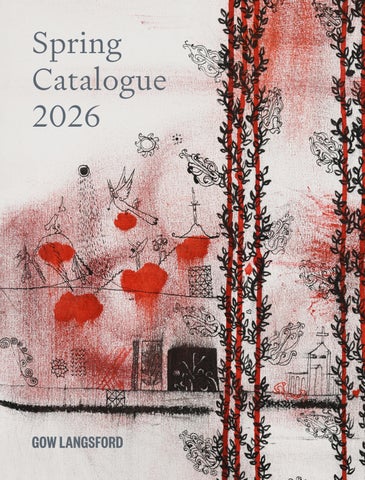
Spring Catalogue 2026
GOW LANGSFORD
Spring Catalogue 2026
24 October– 21 November 2026 Onehunga
This October, Gow Langsford brings its celebrated Spring Catalogue exhibition to Onehunga for the first time, marking the return of one of the gallery’s longest-running exhibition traditions. A cornerstone of the gallery’s programme since the mid-1990s, the Spring Catalogue has long showcased exceptional works by some of Aotearoa New Zealand’s most significant artists. Reimagined for Onehunga, this latest iteration continues that legacy with a carefully curated selection of highly accomplished paintings, sculpture and works on paper from leading figures such as Colin McCahon, Ralph Hotere, Gretchen Albrecht, Patrick Hanly and Gordon Walters, alongside works by prominent Australian artists Dale Frank and Mirdidingkingathi Juwarnda Sally Gabori. Bringing together rare and outstanding works from numerous private collections, the exhibition offers a unique opportunity to experience some of the finest examples of art in a single presentation here in Aotearoa.
1 Rita Angus (1908–1970, NZ) Central Otago Landscape, 1953 ink on paper signed ‘RITA ANGUS’ in ink lower right 230 x 153mm 535 x 415mm framed Provenance The collection of Ron Brownson, Tāmaki Makaurau Auckland; Private collection, Tāmaki Makaurau Auckland
A pioneer of twentieth-century New Zealand modernism, Rita Angus created an extraordinary body of work that is among the most esteemed in the country's history. Celebrated alongside fellow modernists Colin McCahon and Toss Woollaston, Angus favoured a more refined pictorial approach than her contemporaries. Known for her sharp, geometric regional landscapes and highly symbolic portraiture, she created some of Aotearoa New Zealand's most iconic works. Angus spent her career moving between regions across the country, and the landscapes she encountered continually shaped her practice. In February 1953, she returned to Central Otago on a bus trip commissioned by composer and close friend, Douglas Lilburn, to reignite her artistic spirit after a long period of ill health. The return was successfully reinvigorating, with Angus describing the landscape to Lilburn as ‘the same country I remembered but so much more colourful, strange & exhilarating.’1
The trip saw Angus immerse herself in recording the landscape, researching extensively through watercolour studies and drawings; among these was Central Otago Landscape. In this sharply observed ink study, Angus translates the rhythmic topography of the land into rendered geometric forms. In contrast, the more intricately drawn trees sit in the landscape, symbolising Angus's longstanding interest in plant life and its constant cycles of growth and change. This study, among others, has become a record of the long-shared connection to the southern landscape between Angus and Lilburn, and the beginning of what would become her expansive painting Central Otago, 1953-1966/1969. PP 1. Rita Angus, letter to Douglas Lilburn, 1953, Douglas Lilburn Papers, Alexander Turnbull Library, Wellington
2 Gretchen Albrecht (b. 1943, NZ) Aphrodite, 1986 diptych, oil over acrylic on canvas, custom hemisphere shaped cedar signed and dated ‘Albrecht 86’ in ink lower right 1830 x 3660mm overall Provenance Purchased from Sue Crockford Gallery; Private collection, Tāmaki Makaurau Auckland
Gretchen Albrecht is one of Aotearoa New Zealand’s leading abstract painters, recognised for her prismatic and distinctively shaped canvases. First known for her fluid, stained acrylic paintings, Albrecht developed her characteristic hemisphere form in the early 1980s, moving beyond the more conventional rectangle to explore the relationship between colour, geometry and gesture. Painted in 1986, Aphrodite belongs to this important period of Albrecht’s practice in which the hemisphere remained her core motif. The semi-circular form is divided vertically into two distinct fields, with vivid blues and violets gathering at the centre and softer blush pinks, mauves and whites unfolding towards the edges. Broad, visible brushstrokes retain the physical energy of the artist’s gesture, with the layers of luminous paint creating a soft aura of converging colour. The title Aphrodite introduces a metaphoric affinity to the ancient Greek goddess of love and beauty, offering a certain romantic and distinctly feminine reading
of the work. A sense of poetry has long been central to Albrecht’s practice, with her paintings often evoking the rhythms of the natural world and the shifting qualities of light, atmosphere and the seasons. Her hemispherical compositions can suggest cycles of growth and change, while their titles frequently provide an associative or lyrical point of entry into an otherwise abstract visual language. In Aphrodite, these poetic associations feel particularly resonant in the context of spring—the goddess of love and beauty becomes an emblem of awakening, fertility and renewal. The work invites a similarly intuitive emotional response, allowing colour and gesture to conjure a harmonious atmosphere rather than describe a particular place or moment. Seen in this light, Aphrodite belongs to the enduringly poetic dimension of Albrecht’s practice, where abstraction becomes a means of responding to the cycles and sensations of the world around us. MM
3 Michael Illingworth (1932–1988, UK/NZ) Those who live with a sense of guilt, 1964 signed and dated ‘Those who live with a sense of guilt / Illingworth 64’ in ink verso oil on hessian 585 x 840mm 640 x 900mm framed Provenance Purchased from Illingworth: An Exhibition of Recent Works at Barry Lett Galleries, Tāmaki Makaurau Auckland, 1965; Private collection, Tāmaki Makaurau Auckland
Michael Illingworth returned to Aotearoa New Zealand in 1961 after several years in London and Europe, where he encountered a range of post-war artists and ideas. Among these was the Italian artist Enrico Baj, whose simplified, puppetlike figures were an important influence on Illingworth’s developing visual language. This was reflected in Illingworth’s early works, combining European influences with cartoon-like figuration, symbolism and social observation. By the mid-1960s, he was developing a distinctive cast of characters through which he questioned the values and conventions of contemporary society. Those Who Live with a Sense of Guilt belongs to this formative period. A series of figures occupy the composition, their bodies reduced to geometric forms and their faces to expressive, mask-like features. In the largest scene, a pair stand facing the viewer, one holding a cross aloft below a large, outstretched hand. Through this strange cast of characters, Illingworth
transforms human experience into a world of signs and symbols, at once humorous and unsettling. The title introduces a layer of complexity, suggesting the Christian narrative of Adam and Eve’s original sin. The cross, held high, reflects questions of morality, belief and judgement, while a figure outside this scene holds a sphere, reminiscent of the sun depicted above. The figures appear caught within an enigmatic drama whose meaning remains deliberately unresolved. The rocking horse suggests childhood innocence, while the dark hand above is foreboding, set over rolling hills. The work exemplifies the distinctive visual world Illingworth was establishing in the early 1960s, combining European influences with an idiosyncratic form of social observation. Those Who Live with a Sense of Guilt belongs to a period in which he was developing the figurative language and cast of characters that would become central to his contribution to New Zealand painting. AJ
4 Paul Dibble (1943–2023, NZ) Defining the Homelands, 1999 cast bronze signed and dated ‘Paul Dibble 1999 NZ’, engraved on base support and base. ‘PN NZ’ engraved on base. ‘Paul Dibble 1/3’ engraved on head of figure edition 1 of 3 + AP 2700 x 700 x 700mm Provenance Purchased from Gow Langsford Gallery, 1999; Private collection, Tāmaki Makaurau Auckland
Paul Dibble’s ability to resolve complex material challenges was fundamental to his practice. At his death in 2023, he left behind a significant and distinctive body of work shaped by sustained investigation into form, material and technique. Many of the methods that came to define his sculpture were developed through experimentation in the small studio shed at the end of his garden, where he established an inventive and highly individual approach to working in bronze. From 2000, he worked from a larger purpose-built studio in Te Papaioea Palmerston North. Dibble was one of few Aotearoa New Zealand artists to undertake the casting of his own works, giving him an unusual degree of control over the technical processes of their making, from initial construction through to the finished bronze. Geometric figures were a recurring area of interest throughout Dibble’s practice. Defining the Homelands, conceived in 1999, belongs to an important period of hard-edged geometric sculpture. The Geometrics, first produced in the late 1990s
and early 2000s, marked a shift away from the more overtly narrative foundations of Dibble’s earlier work. While the sculptures remain intrinsically figurative, the human form is reduced to a vocabulary of simple geometric shapes—cones, spheres, planes and curves. The precision of these forms gives the sculptures a measured, surreal elegance, while the gestural treatment of the figure retains an unmistakable sense of humanity. Defining the Homelands presents a largerthan-life female figure, constructed from these reduced geometric forms. A cut-out koru appears within the knee, a recurring symbol throughout Dibble’s practice which locates the work within a New Zealand context. The leg is formed from a combination of conical and spherical elements. Particularly unique is the work’s two-tone patination, extending across the figure in an elongated harlequin-like pattern. This introduces colour, rhythm and visual movement, creating a striking tension between the sculpture’s formal restraint and its surface treatment. AJ
5 Don Binney (1940–2012, NZ) Fell Swoop, Te Henga, 1976 oil and acrylic on canvas signed and dated ‘DON BINNEY 1976’ in brushpoint lower right. Artist’s name, title and date inscribed on label affixed verso 760 x 1015mm 785 x 1040mm framed Provenance Private collection, Te Puku o te Ika Central North Island; Private collection by descent
Widely recognised as a leading figure in New Zealand painting during the 1960s, Don Binney is best known for his stylised depictions of birds poised in flight or stillness, suspended against the contours of rolling hills and sweeping skies. Early in his career these forms appeared in abstract, indeterminate spaces, with the landscape rendered as bold curves and richly textured surfaces. Over time his landscapes became more specific, with the compositions becoming those of recognisable environments, particularly of Te Henga Bethells Beach—a site of enduring personal and artistic significance for Binney. By 1976 he’d been painting Te Henga for a decade, a subject invoked repeatedly across his oeuvre that charts his deep and sustained engagement with Aotearoa’s distinct landscape. In Fell Swoop, Te Henga, Binney has reduced the landscape to its essential structures, emphasising the meeting of the land, water and sky while retaining a vivid sense of place. The graphic quality of the black
outlines give definition to the undulating hills, with the variations of greens highlighting the changing light and textures of the landscape—the darker leafy brush pushed close to the frame. Near the centre, the harvested orange field draws the eye, with a grey form suggesting a path cutting across the land, echoing the curves of the rest of the composition. The land is rendered as if viewed from above, which alongside the title Fell Swoop, evokes the sudden, downward movement of a bird in flight characteristic of Binney’s birdseye perspective. Furthermore, Fell Swoop conveys something achieved in a single, swift and decisive action, an apt description of the confidence with which Binney reduces the landscape to its essential forms. This confidence is drawn from Te Henga as a landscape Binney knew intimately, returning repeatedly to paint its hills, dunes, coast and distinctive forms over most of his career. MM
6 Patrick Hanly (1932–2004, NZ) Dancer and Gentleman (Showgirl Series), 1961 varnish and glaze on canvas signed and dated ‘Hanly 61’ in brushpoint lower right 755 x 625mm 800 x 660mm framed Provenance Private collection, Tāmaki Makaurau Auckland
The female figure, expressed through line, curve and form, was an enduring subject matter for Patrick Hanly. After studying fine art in Ōtautahi Christchurch, Hanly travelled to London with his wife Gillian in 1957 to attend the Chelsea School of Art. While in London, Hanly worked as a stage manager at the Gargoyle Club, a private club in Soho, renowned for its works of art by Henri Matisse (The Red Studio, 1911, notably hung behind the bar). Matisse was one of three artists to work on the club’s interior design, and the club’s members included the artists Francis Bacon and Lucian Freud, all of whom had an influence on Hanly’s work during this period. In 1960, Hanly received a grant from the Italian Government to paint in Italy. It was here he worked on his Showgirl Series, inspired by Hanly’s time at the Gargoyle Club. Dancer and Gentleman (Showgirl Series), 1961 was painted during this time. Its composition and manipulation of scale and form reflect the influence of Bacon and Matisse. The woman, bathed in light, takes centre stage, her head thrown back in plea-
sure. The gentleman to the left looks on, his eye accentuated, allowing the viewer to feel the direction of his gaze. Hanly returned to Aotearoa in 1962, continuing to exhibit locally and internationally. In 1963 and 1966 he represented Aotearoa in the Paris Biennale. It was around this time Hanly was working on his Girl Asleep Series, of which Girl Asleep 5 forms part. In this work the female figure is abstracted, stylized with blocks of colour in rolling curvaceous forms, reminiscent of a landscape. The detailing in the hair and eyelashes draws your attention back to the figure as a woman, in the restful innocence of sleep. Hanly talks to Hamish Keith in Art New Zealand about this series: “It was a highly romantic concept: of girls, in the first place, of sleep - the complete innocence that everybody, even the most vile person, takes on in sleep. You don't often see it in people because you're not always watching sleeping people - you're usually asleep at the same time. The best of the Girls Asleep talk about this innocence and delight. It's a beautiful subject”1 This body of work was >
7 Patrick Hanly (1932–2004, NZ) Girl Asleep 5, 1964/77 oil on board signed ‘Hanly 64/77’ in ink lower right 730 x 870mm 780 x 920mm framed Provenance Private collection, Australia
originally shown at Barry Lett Galleries. In the following years, Hanly took back around one third of this series to re-work, as is the case in Girl Asleep 5. He mentions: “I’ve managed to…revitalize some that people have had and they've been more than pleased and so have I.”2 Hanly’s role in Aotearoa’s art scene extended beyond his own practice; he was instrumental in shaping the country's modernist movement. He was also an influential teacher of drawing at the Auckland University School of Architecture. Hanly’s legacy continues to resonate in New Zealand’s art world, with his works held in major public and private collections, including Museum of New Zealand Te Papa Tongarewa and Auckland Art Gallery Toi o Tāmaki. HV 1. Hamish Keith, ‘Patrick Hanly: A Conversation,’ Art New Zealand, accessed online 14.1.26 https://art-newzealand.com/14-hanly/ 2. Ibid
8 Jacqueline Fahey (b. 1929, NZ) Flip, 2001 oil on canvas signed and dated ‘FAHEY 2001’ in brushpoint lower centre 1220 x 710mm 1335 x 840mm framed Provenance Private collection, Tāmaki Makaurau Auckland
There is something wonderfully cacophonous about the suburban pandemonium of Jacqueline Fahey’s Flip, 2001. One can almost hear the discordant clacks and scrapes of boards against concrete, the pounding of the dog’s paws and its breathless panting, punctuated by the raucous jeers and exuberant shouts of teenage boys. That familiar clamour reverberates through the painting, where fractured perspectives, flashes of saturated colour and figures arrested mid-movement lend the scene a frenetic, almost febrile intensity. A dark horizontal band divides the composition into two disparate episodes, connected less by narrative continuity than by a shared charge of movement and disorder. Above, the skater is suspended at the apex of his trick, his white-clad figure thrown into sharp relief against a brooding, indeterminate backdrop. Behind him, shadowy figures gather amid an incandescent blaze of yellow and ochre. Below, the vertiginous curve of a graffiti-covered ramp sweeps through an altogether different commotion. A muscular dog charges head-
long towards the viewer, whilst a barechested young man, red-faced and openmouthed, brandishes a yellow garment overhead. The garment’s brilliant yellow finds an incendiary echo in the blaze above. Across the ramp, calligraphic scrawls animate the concrete, their sweeping lines echoing the exaggerated gestures of the figures themselves. The eye has nowhere obvious to settle, drawn from one incident to the next without any clear point of repose. The strange collision of imagery recalls the heightened visual logic of an early-2000s video game, its exaggerated gestures, compressed space and saturated colours defying conventional pictorial coherence. Nothing quite resolves. Yet amidst this commotion, the dog interrupts the viewer’s wandering attention, fixing us with a direct, disarming gaze. Its russet body hurtles towards the picture plane, momentarily collapsing the distance between painted spectacle and spectator. What is particularly compelling is the intimacy of Fahey’s observation. There is an unmistakable familiarity in her >
rendering of this world; she approaches it not with the detachment of an anthropologist surveying an unfamiliar subculture, but with an instinctive understanding of its rhythms, rituals and unruly vitality. The painting is steeped in the lived textures of Grey Lynn, yet observation never ossifies into mere documentation. Rather, Fahey transforms the familiar through a pictorial language as unruly and unpredictable as the world it depicts. Since the 1950s, Fahey challenged the mythology of the ‘man alone’ tradition in New Zealand painting, in favour of tangled relationships and the contradictions of everyday life. Her paintings register the vicissitudes of ordinary existence, real, raw and at times discomfiting, whilst asserting the significance of subjects long marginalised within the artistic canon. In so doing, she helped redefine the very possibilities of figurative painting in Aotearoa New Zealand. In Flip, as elsewhere, Fahey captures the detail and disorder of everyday life whilst simultaneously unsettling it, rendering the familiar at once immediate and faintly surreal. AF
9 John Pule (b. 1962, Niue) Hake aga, Patopato (Rising, Falling), 2004 oil and ink on canvas signed ‘John Puhiatau Pule’ in ink lower left 2000 x 2000mm Provenance Purchased from John Pule, Gow Langsford Gallery, 2004. Private collection, Tāmaki Makaurau Auckland
‘Desire: a chance to live with a tree.’ John Pule, Tagata Kapakiloi / Restless People, 2004
John Pule is a poet, writer and painter whose work is grounded in Niuean history, ancestral knowledge and the experience of migration and life in Aotearoa New Zealand. While his poetry and painting are distinct practices, both are concerned with questions of place, memory, identity and cultural inheritance. In the early 2000s, Pule’s paintings began to move towards increasingly vibrant, atmospheric compositions, opening up the densely patterned surfaces and motifs of his earlier work. Hiapo, the distinctive freehand form of Niuean tapa, was an important foundation for Pule’s painting, and remains so, though the works of the 2000s did away with the grid-like structure and allowed greater space between individual forms. Hake aga, Patopato (Rising, Falling) belongs to a relatively small group of works known unofficially as the Red Cloud Series, characterised by deep red and black tones, with expansive cloud-like forms in oil stick which are suspended within the compo-
sition and threaded with vines. Small ink vignettes sit within these forms, creating fragments of stories that emerge and recede across the surface. Fish, birds, landscapes and elements associated with earlier works appear alongside churches, angel-like winged figures and people carrying a crucifix. Christian imagery and its impact on Niue are woven through the composition, while the blood-red forms are suggestive of sky, land, and, at times, the human body. There is a tension between the buoyancy of these floating forms and the darker stories and associations they may carry. The vines of ti mata alea, the Cordyline tree, associated with the origin story of the Niuean people, extend through the painting as a potent reminder of ancestry and foundation. They also recall the experience of Pule’s family bringing Niuean plants to Aotearoa and attempting to establish them in unfamiliar soil. The tree becomes both a literal presence and a meta-
phor for connection, continuity and the experience of making a life between places. Pule’s collection of poetry Tagata Kapakiloi / Restless People was published in the same year he painted Hake aga, Patopato (Rising, Falling). The two bodies of work are not literal counterparts, but share a sensibility in which plants, land, ocean, blood, faith and migration recur and shift in meaning. Pule’s poetry offers another way into his imagery. In the simple line, ‘a chance to live with a tree’, the relationship between place, desire and rootedness finds a particularly direct echo in this painting. Hake aga, Patopato (Rising, Falling) belongs to an important period in Pule’s practice, when inherited histories and personal experience were being brought together through an increasingly open and poetic approach to composition. These concerns would continue to evolve over the following decades, with his return to Niue in 2015 marking another significant shift in Pule’s engagement with place, ancestry and cultural memory. Hake aga, Patopato (Rising, Falling) was included in Pule’s solo exhibition of new paintings at Gow Langsford on Kitchener Street in October 2004. AJ
10 Frances Hodgkins (1869–1947, NZ) Maori Girl, 1896 watercolour on paper signed and dated ‘FH / 96’ in watercolour lower right 270 x 235mm 645 x 555mm framed Provenance Collection of Mr W.N. Pharazyn, Waikanae, New Zealand; Private collection, Australia, acquired from the above in 1975; Private collection, Tāmaki Makaurau Auckland The Complete Frances Hodgkins Catalogue Number FH0198
Frances Hodgkins occupies a singular position in Aotearoa New Zealand’s art history. Although she would later establish a reputation as a leading figure in British modernism, the foundations of her practice were laid in Ōtepoti Dunedin. Maori Girl, painted in 1896, belongs to an important period of her early career. Having just received the New Zealand Academy of Fine Arts’ prize for painting from life the previous year, Hodgkins was finishing her studies at the Dunedin School of Art and Design, exhibiting regularly and establishing herself as a professional artist and teacher. The portrait demonstrates Hodgkins’ early command of watercolour. Rather than building the image through dense layers of pigment, she uses transparent washes to establish the form of the face and the tonal relationships of the clothing. The portrait
doesn’t feel elaborately constructed, with a sense of immediacy which is emphasised by Hodgkins leaving much of the paper visible, providing a quiet ground from which the figure of the girl emerges. The texture of the girl’s cloak is conveyed through a few simple forms, the black feathers and tassels captured in quick, expressive lines and triangular shapes. Painted when she was just twenty-seven, Maori Girl belongs to the period immediately before Hodgkins’ decisive departure for Europe in 1901. Within five years she would be exhibiting internationally, eventually becoming an influential figure in the British avant-garde. Yet the technical confidence and perceptiveness evident in this early watercolour already point towards the qualities that would remain central throughout her career: an instinctive sensitivity to colour, an >
economical handling of medium, and an enduring interest in the expressive possibilities of the human figure. Maori Girl thus offers an unusually direct insight into Hodgkin’s artistic formation. It captures the young artist at a moment when observation and watercolour were becoming the foundations of a practice that would ultimately take her far beyond the conventions of nineteenth-century New Zealand painting. IC
11 Robert Atkinson (1863–1896, UK/NZ) ‘He Tangata’, New Zealand Chieftain, c.1890s pencil and watercolour on paper signed ‘Robt. Atkinson / ‘He Tangata’ NZ. Chieftain’ in brushpoint lower left and centre 165 x 115mm 470 x 400mm framed Provenance Private collection, Australia; Private collection, Tāmaki Makaurau Auckland
Robert Atkinson was an English-born artist whose relatively brief career in Aotearoa New Zealand produced a distinctive body of paintings and watercolours of its landscapes and people. Born in Leeds, Atkinson studied art in Antwerp under the Belgian painter Charles Verlat before travelling to New Zealand in 1885. He established a studio in Auckland’s Victoria Arcade, becoming part of the city’s developing artistic community and exhibiting regularly with the Auckland Society of Arts. Executed in pencil and watercolour, Atkinson’s He Tangata, New Zealand Chieftain, c.1890s, is a portrait distinguished by its directness and attention to the sitter. Atkinson travelled and sketched in various parts of the country, including Te Rohe Pōtae King Country and Rotorua, although the circumstances of this particular portrait remain unclear. Atkinson inscribed the work with both He Tangata and New Zealand Chieftain. He tangata translates broadly as ‘a person’, while the English designation
reflects the terminology through which nineteenth-century European artists commonly identified Māori subjects. Read together, the inscriptions reveal contrasting ways of framing the sitter: one offers a broad description of a person, while the other identifies him through a colonial designation of rank. Neither records his personal name or iwi affiliation. Atkinson’s sketches from this period were later reproduced in Kate McCosh Clark’s 1896 publication Māori Tales and Legends, contributing to the circulation of Māori imagery among Pākehā audiences. After returning to England in 1889, where he worked as an illustrator, Atkinson came back to New Zealand in 1895 and died in Dunedin the following year, aged thirty-three. His short career has left a relatively scarce body of work. This portrait offers an opportunity to consider both Atkinson’s practice and the ways in which Māori sitters were represented and identified in nineteenth-century colonial art. IC
12 Charles Frederick Goldie (1870–1947, NZ) No koora te cigaretti: Mihipeka Wairama (Tuhorangi Tribe), 1912 oil on canvas signed and dated ‘-C.F.Goldie 1912.’ in brushpoint lower right. Inscribed ‘No koora te cigaretti/ Mihipeka Wairama / Tuhorangi Tribe.’ in ink verso on frame. Original John Leech frame 203 x 154mm 420 x 372mm framed Provenance Purchased from C.F. Goldie by Sir George Fowlds; Private collection, Tāmaki Makaurau Auckland by descent
Charles Frederick Goldie’s portraits occupy a significant place in Aotearoa New Zealand’s artistic and cultural history. Combining the techniques of European academic painting with close attention to his sitters’ features and expressions, his work has contributed to how generations of viewers have encountered Māori portraiture. By the early twentieth century, Goldie was recognised as one of New Zealand’s leading portrait painters, his paintings widely known through exhibitions and reproductions in the illustrated press. His work of the 1910s is often regarded as the culmination of his practice. Painted in 1912, No koora te cigaretti: Mihipeka Wairama (Tuhourangi Tribe) portrays Mihipeka Wairama, a Tūhourangi woman who was among Goldie’s recurring sitters. A second portrait of Wairama, also painted in 1912, is held in the Art Gallery
of New South Wales. Wairama survived the 1886 Tarawera eruption, which destroyed the Pink and White Terraces and devastated the settlement of Te Wairoa. Goldie depicts her wearing kuru pounamu earrings. Light falls across the waves of her hair and the lines of her face, emerging from the deep shadows of the closely framed composition. The cigarette held between her lips introduces a striking contemporary detail, lending the portrait an informality that contrasts with its otherwise measured presentation. Painted two years later, The Widow: Perira te Kahukura (Ngāheke) is another compelling example of Goldie’s mature practice. The oval format and closely cropped bust composition draw attention to the sitter, Perira te Kahukura, while the meticulous modelling of her face captures the fine lines of age, the planes of her cheeks >
13 Charles Frederick Goldie (1870–1947, NZ) The Widow: Perira te Kahukura (Ngāheke), 1914 oil on canvas signed ‘C.F.Goldie 1914’ in brushpoint lower right 255 x 205mm 515 x 465mm framed Provenance Private collection, Otāutahi Christchurch; Private collection, Tāmaki Makaurau Auckland by descent
and the intricate pattern of her moko kauae. Goldie renders her taonga, including a hei-tiki, korowai and huia feather, with comparable precision. These elements are integral to the portrait, their cultural significance extending well beyond their visual presence. Together, the portraits demonstrate Goldie’s technical virtuosity and his close attention to the individual features and expressions of his sitters. Both women appear contemplative, lending the works a quiet introspection. While Goldie’s portraiture was shaped by a desire to record Māori lives and customs at a time of profound social change, these paintings are distinguished by the particularity of their subjects. The careful rendering of each woman’s face, moko and adornment gives the portraits a compelling presence, sustaining their interest beyond their historical context. IC
14 Ralph Hotere (1931–2013, NZ. Te Aupōuri) Black Painting, 1967-68 enamel on metal with perspex signed and dated ‘Hotere Jan .68’ in brushpoint verso. Inscribed ‘RALPH HOTERE /25 FERRYHILL RD EPSOM - AUCKLAND “BLACK PAINTING” (67-68) $500 REF B. LETT GALLERIES BENSON & HEDGES ART AWARD 1968 in brushpoint verso 1710 x 1210mm 1770 x 1270mm framed Provenance Private collection, Tāmaki Makaurau Auckland
In 1965, upon returning from London’s Central School of Arts and Crafts—a crucible of postwar artistic innovation— Hotere entered a period of radical experimentation that would culminate in his seminal Black Paintings, establishing one of the most distinctive visual languages in Aotearoa New Zealand art. Although indebted to the austere formalism of Ad Reinhardt’s monochromatic paintings, Hotere transformed the elemental forms of geometric abstraction into something altogether more elusive, reconciling material precision with an almost metaphysical sensibility. Within Hotere’s restrained visual vocabulary, the slightest variations in line, surface and light assume an extraordinary psychological and perceptual profundity, belying the apparent simplicity of the monochrome. Black Painting, 1967–68 possesses a profound stillness. Its buffed surface of
polished black lacquer draws the eye into an all-encompassing reflective void, whilst the immaculate finish suppresses almost every trace of the artist’s hand. Slender crimson lines puncture the darkness, suggesting both a window and a cruciform, a threshold offering no passage beyond the immense black. Whilst the lines assert the flatness of the pictorial surface, the lacquer’s reflective sheen creates a depth that feels impossible to locate. As the polished lacquer catches the surrounding light, subtle variations emerge across its surface, giving the impression of a radiance that emanates from within the painting itself. This quality recalls Ian Wedde’s observation that Hotere’s black paintings appear illuminated from within, their darkness experienced not simply as an absence of light, but as a luminous interior space.1 In Black Painting, 1969, undertaken during his Frances Hodgkins Fellowship at >
15 Ralph Hotere (1931–2013, NZ) Black Painting, 1969 acrylic on canvas signed and dated ‘BLACK PAINTING Hotere 69’ in brushpoint verso, inscribed ‘TOP / 36” x 40” verso, exhibition history label affixed verso 910 x 1015mm 935 x 1035mm framed Provenance Private collection, Tāmaki Makaurau Auckland
the University of Otago, Hotere continues this investigation through an increasingly austere formal vocabulary. Abandoning the luminosity of polished lacquer for acrylic on canvas, he introduces a muted surface that appears to absorb rather than reflect light. A thin violet circle occupies much of the square composition, its almost spectral circumference scarcely distinguishable from the surrounding darkness. Enclosing a blackness nearly identical to the field beyond, the circle establishes a boundary without any discernible separation between interior and exterior. A stillness permeates the composition, yet the eye remains occupied by the effort of discerning its subtle variations in tone. Where the earlier painting suggests an illusion of immeasurable depth, here Hotere’s restraint concentrates attention upon the surface itself, transforming the geometric intervention into an experience of sustained perceptual uncertainty. More than three decades later, Untitled (Yellow), (2001) revisits the geometric
vocabulary of Hotere’s early Black Paintings, now articulated through the physical construction of the work itself. Executed in lacquer on corrugated iron with cast pewter mountings, the composition exploits the industrial character of its materials, the vertical ridges catching and dispersing light across the polished black surface. The familiar cruciform reappears, no longer inscribed upon the picture plane, but defined by the negative space separating the two sheets of corrugated iron. The exposed white ground interrupts the imposing darkness, its horizontal axis punctuated by two vivid accents of yellow. Along the upper and lower margins, cast pewter mountings form an irregular constellation of cruciform, floral and star-like motifs. Where the earlier paintings suggested an elusive, immeasurable depth, Untitled (Yellow) gives darkness a palpable material presence, while allowing the absence of material to assume a form of its own. The unifying darkness of these works is suggestive of Te Pō, the realm of darkness >
16 Ralph Hotere (1931–2013, NZ) Untitled (yellow), 2001 lacquer on corrugated iron, cast pewter mountings 2500 x 1700mm Provenance Private collection, United Kingdom
within Māori cosmology, though Hotere consistently resisted interpretations that confined his practice to autobiography or cultural essentialism. “I am Māori by birth and upbringing,” he remarked, “as far as my works are concerned this is coincidental.”2 Such a statement need not be understood as a repudiation of his heritage, but rather as an insistence upon the autonomy and interpretative complexity of the artwork. The blackness of these paintings accommodates a multiplicity of associations, at once cultural, spiritual and deeply personal, without yielding to any one of them. This resistance to a singular interpretation is fundamental to Hotere’s practice. As he observed, “it is the spectator who provokes the change and meaning,” locating the significance of the artwork in the encounter between painting and viewer.2 His black paintings invite an engagement that is necessarily subjective, shaped as much by the spectator’s memories, experiences and associations as by the formal qualities of the works themselves. Rather than presenting darkness as negation or closure, Hotere offers it as a space of inexhaustible possibility, one in which meaning is neither prescribed nor
complete, but remains contingent upon the experience of looking. AF 1. Ian Wedde. “Where Is the Art That Does This?” In Hotere: Out the Black Window: Ralph Hotere’s Work with New Zealand Poets, edited by Gregory O’Brien, Auckland: Godwit, in association with City Gallery Wellington, 1997, p.11 2. Ralph Hotere, 1973, quoted in Gregory O’Brien, Hotere: Out the Black Window: Ralph Hotere’s Work with New Zealand Poets, p.76
17 Dale Frank (b. 1959, AUS) Abbey eyes seeing the back of the head neurons firing regret, 2008 varnish on linen signed, dated and inscribed ‘GL Dale Frank 2008 / Dale Frank / Dale Frank 2008’ in ink verso 2000 x 2600mm Provenance Purchased from Gow Langsford Gallery, 2008; Private collection, Tāmaki Makaurau Auckland
Dale Frank’s paintings resist the expectation that images and language should communicate stable meaning. In Abbey eyes seeing the back of the head neurons firing regret, neither the poured varnish nor the sprawling title functions descriptively. Instead, both operate associatively, generating fleeting recognitions that dissolve almost as quickly as they emerge. As Frank has remarked of his titles, ‘They are parallel to the paintings; they have the same connection to society as the paintings do. People read into them and induce associations that I could not dream of. You cannot read into them; it is a free-form situation just like the paintings.’1 Rather than illustrating or explaining one another, image and language remain deliberately autonomous, each extending the work’s interpretative possibilities while refusing to stabilise meaning. This separation between image and language reflects Frank’s broader irreverence towards the conventions of painting itself. Throughout a career that has consis-
tently resisted stylistic categorisation, he has challenged the expectation that painting should resolve into image, narrative or singular meaning. Working with poured varnish, Frank relinquishes neither authorship nor control but instead redirects them. Gravity, viscosity, temperature and drying time become integral to the painting’s formation, their behaviour carefully anticipated yet never entirely predetermined. The painting is never simply an image but the material trace of its own making, emerging through the continual negotiation between artistic intention and the physical properties of the medium. In Abbey eyes seeing the back of the head neurons firing regret, successive pours of varnish accumulate across the linen in luminous strata of varying density. Broad currents of indigo, violet and green settle across the canvas, while the extraordinary translucency of the varnish allows one layer to remain optically visible through another. Colour appears less applied than suspended within the painting’s surface, >
creating a remarkable sense of depth that continually shifts as changing light reveals, obscures and transforms the relationships between its layers. The work compels the viewer to look through the painting rather than merely at it. Frank’s paintings reward sustained looking precisely because they resist closure. Material, image and language never fully converge, each retaining its own logic while continually generating new relationships with the others. In Abbey eyes seeing the back of the head neurons firing regret, painting is not presented as an object to be deciphered but as an experience of perception itself, where meaning is continually produced rather than wholly possessed. AF 1. Sue Cramer ed., Dale Frank: Ecstasy (Twenty Years of Painting), Exhibition catalogue, Sydney: Museum of Contemporary Art, 2000, p.14
18 Mirdidingkingathi Juwarnda Sally Gabori (1924–2015, AUS)
Black Bream on Sand Bank, 2005-2006 acrylic on canvas signed and inscribed ‘Artist Sally Gabori / Title Black Bream on Sand Bank / Cat No. 1315/C/SG/0506 / Medium: acrylic on canvas’ in ink verso 2070 x 880mm Provenance Purchased in Port Douglas, Australia, 2009; Private collection, Tāmaki Makaurau Auckland
Mirdidingkingathi Juwarnda Sally Gabori, a distinguished Kaiadilt elder from Bentinck Island, was an artist of breathtaking originality in both vision and expression. Behind the radical freedom of her paintings lay a lifetime of looking, deeply attuned to the tides, textures and transformations of Country. The Kaiadilt expression muthaa miburlda ngad, ‘my eyes have seen much,’ speaks to the persistence of memory within the act of looking: the present is always refracted through what has been experienced and known before.1 When Gabori first picked up a paintbrush in 2005, at around eighty years of age, Bentinck Island had long been etched into her vision: its rivers and tidal flats, sandbanks and mangroves, fishing grounds and restless waters. Her emergence as an artist was less a beginning than the discovery of a new language for knowledge long held. Without an inherited tradition of painting on canvas to draw upon, Gabori
approached the unfamiliar medium with astonishing assurance, rapidly forging a pictorial language emphatically her own. The vitality and audacity of her work won immediate admiration. Within eight years, Gabori's paintings had travelled from the Mornington Island Arts and Crafts Centre to Personal Structures, a collateral exhibition of the 55th Venice Biennale in 2013; today, her work is held in major public collections across Australia and internationally, including the National Gallery of Australia, National Gallery of Victoria, QAGOMA and Musée du quai Branly in Paris. Painted around 2005–06, at the very outset of this remarkable career, Black Bream on Sand Bank already possesses the confidence and formal invention that would distinguish Gabori's work. Rising more than two metres, the painting has a commanding presence. Its subject is the tidal world of Bentinck Island, a landscape continuously made and unmade by >
the sea. As the tide retreats, sandbanks surface, mudflats unfurl and shallows teem with fish; when it returns, the boundaries between land and water are drawn anew. Gabori transmutes this protean geography into a fluid pictorial field. Horizon and perspective disappear; we appear at once to look down upon the landscape and to be immersed within its waters. This spatial ambiguity is sustained through an extraordinary economy of form. Against the deep blue of the surrounding water, the sandbank sweeps across the canvas, punctuated by four black bream encircled by brilliant bands of colour. The concentric forms recall the ancient rockwalled fish traps that punctuate Bentinck Island's shoreline, structures Gabori herself had helped maintain as a young woman. Applying fresh colour while the paint beneath remained wet, Gabori allows pigments to bleed, pool and swell across the canvas. Colour ebbs and flows; boundaries advance and recede; forms surface and submerge. Paint itself acquires something of the tidal behaviour of water, where material and subject seem to flow into one another. The painting's fluidity is shadowed by a history of profound rupture. Prolonged drought, the devastating cyclone of 1948 and colonial missionary intervention converged in the displacement of the
Kaiadilt people from Bentinck Island to the mission on neighbouring Mornington Island. Missionaries had long sought to relocate the community, and the environmental crises provided the circumstances for their removal. What followed was decades of enforced exile. Yet Bentinck endured in Gabori's memory with extraordinary specificity, its geography linked to kinship and lived experience. When she began painting more than half a century later, this remembered landscape flooded into the present. There is nothing static about this act of remembrance. In Black Bream on Sand Bank, memory is mutable, as is the landscape. Lived experience is distilled into colour, gesture and form, allowing the familiar contours of the island to assume a radically new pictorial life. Past and present become porous, much like the boundaries between water and land elsewhere in the painting. Black Bream on Sand Bank reveals Gabori's singular ability to transform the intimately known into something formally audacious, exhilarating and entirely her own. AF 1. Nicholas Evans, “Muthaa miburlda ngad: The Life of Sally Gabori,” in Sally's Story (Brisbane: Woolloongabba Art Gallery, 2005), pp.13-15
19 Colin McCahon (1919–1987, NZ) North Otago Landscape, 1967 brush and ink wash on paper signed ‘Colin McCahon. ‘67. NORTH OTAGO LANDSCAPE’ in pen and ink, lower left 390 x 575mm 875 x 805m framed Provenance Private collection, Australia Colin McCahon Trust Record Number cm001106 Reproduced courtesy of the Colin McCahon Trust
Few artists have altered the course of art in Aotearoa New Zealand as profoundly as Colin McCahon. His radical reimagining of landscape painting challenged the conventions of representation, establishing a powerful visual language through which to explore the uncertainties of human existence. The ancient contours of eroded hills, the sweeping expanses of open country alive with the susurration of wind, and the seemingly endless horizons of Aotearoa New Zealand became the setting for an intensely personal investigation into faith, mortality and belonging. Here, McCahon encountered intimations of the sublime: an immensity at once beautiful and disquieting, whose apparent permanence evokes the unfathomable reaches of deep time. Stripped of descriptive particularity, the land seems suspended between geographical reality and metaphysical revelation.
North Otago Landscape, 1967 presents the earth in an almost primeval state, divested of vegetation, habitation and geographical specificity. Beneath an expanse of pale, unmodulated sky, two gently shaded slopes converge around a sharply tapering cleft. Reduced to elemental geological contours, the landscape is laid bare to its essence. This seemingly primordial terrain was deeply familiar to McCahon, who described his enduring attachment to the North Otago of his childhood as a ‘long love affair’.1 The landscape is at once ancient and intimate, its stark austerity approaching the solemnity of prayer. In Look down, O Lord, to my help, 1969, the spirituality of the landscape finds more explicit expression through prayer, as McCahon's questioning of faith acquires the force of fervent incantations. Executed >
20 Colin McCahon (1919–1987, NZ) Look down, O Lord, to my help, 1969 conté on paper signed Psalm 39’ in conté crayon, bottom left, ‘McCahon Sept 30 69’ in conté crayon, bottom right 1593 x 552mm 1793 x 710mm framed Provenance Private collection, Tāmaki Makaurau Auckland Colin McCahon Trust Record Number cm001173 Reproduced courtesy of the Colin McCahon Trust
in conté on an elongated sheet of paper, the work draws upon Psalm 39, its anguished cry for divine intervention rendered in uneven, emphatic lettering. Words swell, fade and fracture across the composition, their fluctuating intensity conveying an almost visceral desperation. The repeated invocation, ‘Look down, O Lord, to my help,’ gathers force as it descends the page, its increasingly emphatic lettering seeming to strain towards a divine response. By 1971, a striking change had taken place in McCahon's treatment of landscape. Where the earlier works are marked by austerity and restraint, the later watercolours reveal a more expansive, experimental use of colour. Their fluid forms and translucent washes register the shifting effects of light and atmosphere. His spiritual searching persists, though here it assumes >
21 Colin McCahon (1919–1987, NZ) Helensville, 1971 watercolour on paper signed and dated ‘McCahon June ‘71’ in pencil lower left, titled ‘Hellensville’ in pencil lower right 760 x 570mm 995 x 795mm framed Provenance Private collection, Te Whanganui-A-Tara Wellington Colin McCahon Trust Record Number cm001735 Reproduced courtesy of the Colin McCahon Trust
a quieter, more contemplative character. McCahon attributed this newfound chromatic freedom to his departure from teaching, remarking that ‘all this colour & fun is a direct result of leaving the school.’2 In Helensville, 1971, washes of ultramarine and ochre unfold beneath a sky suffused with hazy golden light. A broad earthen band bisects the composition, separating the atmospheric depths above from a luminous yellow-green foreground animated by fleeting strokes of blue. Pigment pools, bleeds and dissolves across the paper, softening the apparent solidity of the land. Although the horizontal divisions establish a recognisable geographical structure, the boundaries between earth, water and atmosphere become increasingly elusive. McCahon captures the landscape through its ephemeral conditions, the
enduring substance of the earth momentarily transformed by the passage of light. This sensitivity to colour finds a more transcendent expression in A Poem of Kaipara Flat No. 15, 1971. A vast expanse of golden yellow envelops the composition, its luminous surface animated by delicate variations of pigment. Below, a slender blue-green horizon traces the gently undulating terrain, where loose, gestural marks flicker across the foreground. Between earth and sky, a broad passage of near-white seems to dissolve the boundaries of the physical world. Light assumes an almost divine presence, transforming the familiar landscape into something approaching revelation. Viewed collectively, these works reveal how McCahon transfigured the familiar into the monumental. Under his guidance, >
22 Colin McCahon (1919–1987, NZ) A Poem of Kaipara Flat No.15, 1971 watercolour and pastel on paper signed ‘a poem of Kaipara Flat. 15’ in pencil, lower left, ‘McCahon 71’ in pencil, lower right 1010 x 650mm 1250 x 880mm framed Provenance Private collection, Tāmaki Makaurau Auckland Colin McCahon Trust Record Number cm000459 Reproduced courtesy of the Colin McCahon Trust
the written word assumes an extraordinary visual force, while the simplest arrangements of line and colour possess a startling, raw expressive power. Ultimately, his achievement lies not merely in transforming the representation of Aotearoa New Zealand, but in fundamentally redefining the possibilities of painting itself. AF 1. Barry Lett, exhibition catalogue, quoted in Maria Bloem and Martin Browne, A Question of Faith (Nelson: Craig Potton Publishing; Amsterdam: Stedelijk Museum Amsterdam, 2002), p.208 2. Peter Simpson, Colin McCahon: Is This the Promised Land? Vol. 2, 1960–1987 (Auckland: Auckland University Press, 2020), p.149
23 Teuane Tibbo (1895–1984, Samoa/NZ) Untitled, 1972 acrylic on board signed and dated ‘Teuane Tibbo 1972’ in brushpoint lower rightright 585 x 895mm 675 x 995mm framed Provenance Purchased from Barry Lett Galleries, 1972, Tāmaki Makaurau Auckland. Private collection, Tāmaki Makaurau Auckland
Teuane Tibbo was born in Sāmoa, later moving to Fiji as an adult before settling in Aotearoa New Zealand in 1945. Entirely self-taught, Tibbo began painting at the age of 71, after Pat Hanly introduced her to gallerist Barry Lett in the early 1960s. She went on to produce a significant body of work and is recognised as one of the key figures in the development of contemporary Pacific art in New Zealand. Tibbo’s paintings draw on memories from her childhood in Sāmoa, often conveying the sense of wonder and nostalgia that colours early recollections. In Untitled, 1972, she paints an abundant arrangement of red, pink, white and yellow blossoms against a tropical, blue backdrop. Stylised palms and vivid red hibiscus flowers celebrate the lush flora of the Pacific, while the simplified forms and bright palette suggest a joyful, childlike attentiveness to the natural world. Alive with colour and movement, the painting captures a sense of growth and vitality, imbued with the artist’s warmth and expressive confidence.
In 1964, Tibbo became the first Pacific Island artist to have a solo show at a dealer gallery in New Zealand with her self-titled exhibition Teuane Tibbo at Barry Lett’s Uptown Gallery. She became a prominent figure in the 1960s Auckland art scene, exhibiting alongside contemporaries Colin McCahon, Pat Hanly and Michael Illingworth. Her work is held in the permanent collections of Auckland Art Gallery Toi o Tāmaki, Museum of New Zealand Te Papa Tongarewa, The Hocken Collections, University of Otago Library, the University of Auckland Waipapa Taumata Rau and the National Gallery of Australia, Canberra. Tibbo passed away in 1984, her work has continued to grow in critical esteem posthumously. MM
24 Gordon Walters (1919–1995, NZ) Spiral Theme 3, 1966 pen and ink on paper signed and dated ‘Gordon Walters 1966’ in ballpoint verso 300 x 225mm 595 x 490mm framed Provenance Purchased by the Ministry of Foreign Affairs and Trade; Private collection, Tāmaki Makaurau Auckland
With a career spanning five decades, Gordon Walters is one of Aotearoa New Zealand’s most recognised and influential twentieth-century artists. From the early stages of his career, Walters developed a highly disciplined visual language, refining a limited vocabulary of forms through sustained experimentation. His engagement with international modernism led him towards geometric abstraction, while his sustained study of Māori visual traditions—particularly the organic koru motif found in kōwhaiwhai—became central to his practice. Walters began his koru works as more literal renditions of the kōwhaiwhai designs that adorn warehui or meeting houses. For every painting Walters created numerous studies, from which the final works were meticulously crafted using a ruler and pencil—evidence of his sustained focus on balance and asymmetry. ‘Perfecting the motif took some eight years of dedicated labour. In its final form… it is incredibly simple—so right that it seems obvious and inevitable. The free-flowing hand-drawn
‘koru’ becomes a straight band of tone, its ‘bulb’ a circle.’1 At the heart of Walters’s practice was an interest in the dynamic relationship between positive and negative space. Through the repetition, inversion and abstraction of the koru, he created compositions in which forms appear to advance and recede across the picture plane. His restrained use of colour further heightens these spatial effects. In Untitled, 1977, the stark opposition of black and white produces a pronounced optical tension, with the stacked forms seeming to alternately push forward and withdraw as the eye moves across the surface. This is also seen in Spiral Theme 3, 1966, from an earlier series of works in which Walters explored the spiral shape—its pen and ink curves gradually straighten and fade into thinner horizontals, creating a pulsing, almost hypnotic effect. In Untitled, 1982, Walters achieves a quieter effect through the subtle interplay of grey and white. Walters was said to prefer using these lighter colours, drawn to >
25 Gordon Walters (1919–1995, NZ) Untitled, 1977 PVA and acrylic on canvas signed and dated ‘Gordon Walters 77’ in ink verso 1220 x 940mm Provenance Private collection, Tāmaki Makaurau Auckland
the soft tonal shifts created across the flat surface of the painting. Compositionally, alternating elongated bands are punctuated by just three sets of koru bulbs. Their measured repetition creates a distinct sense of balance and continuity, adding to the painting’s tranquil atmosphere. In Colour Study for ‘Aotea’, 1983, Walters returns to the more traditional kōwhaiwhai colours of red ochre and black, executed in gouache on paper, with visible pencil marks underlying the composition and showing his dedication to precision. By the 1980s, Walters had extended his engagement with Māori visual traditions beyond the koru. In Rauponga, 1986, he distils the intricate rauponga pattern— traditionally associated with Māori carving and characterised by repeated, interlocking forms—to its essential visual qualities. The shapes we encounter are not literal representations of rauponga, but abstractions that evoke its distinctive rhythm and movement. Walters retains the energy of the traditional pattern while reducing it to a composition where colour plays a crucial role in creating spatial tension. The contrast between the white and muted ochre forms
against the dark ground creates a visual rhythm, guiding the viewer through alternating moments of harmony and contrast. Collectively, the works included in this exhibition reveal Walters’ characteristic restraint and his enduring focus on surface, shape, tone and colour. Walters is represented in all of Aotearoa New Zealand’s major collections as well as public collections in Australia. The Auckland Art Gallery Toi o Tāmaki presented Gordon Walters: A Retrospective Exhibition in 1983 and a survey exhibition titled Parallel Lines: Gordon Walters in Context in 1994. His place in art history is memorialised in the Walters Prize exhibition and award, held every three years at Auckland Art Gallery Toi o Tāmaki. MM 1.Michael Dunn, “The Enigma of Gordon Walters Art”, Art New Zealand, No 63, 1992, p.73
26 Gordon Walters (1919–1995, NZ) Untitled, 1982 acrylic on canvas signed and dated ‘Gordon Walters 82’ in ink, verso on stretcherright 650 x 1850mm Provenance Purchased from ARTIS Gallery, Tāmaki Makaurau Auckland, 1985. Collection of Ian Scott (1945 - 2013); Private collection, Tāmaki Makaurau Auckland
27 Gordon Walters (1919–1995, NZ) Colour Study for ‘Aotea’, 1983 gouache on paper signed and dated ‘Colour Study for ‘Aotea’ / Gordon Walters 83’ in pencil; inscribed 22.4.83 in pencil upper right 340 x 255mm 930 x 720mm framed Provenance Private collection, Te Whanganui-A-Tara Wellington; Private collection, Tāmaki Makaurau Auckland
28 Gordon Walters (1919–1995, NZ) Rauponga, 1986 acrylic on canvas signed and dated ‘Gordon Walters 86’ in marker verso. Exhibition label ‘GORDON WALTERS: NEW VISION / EXH #112 / TOUR’ affixed verso 1525 x 1140mm Provenance Private collection, Tāmaki Makaurau Auckland
Upcoming
18 November–24 December 2026, Auckland City
ANDRÉ HEMER
28 November–24 December 2026, Onehunga
ALWAYS SONG IN THE WATER
Image
Yuki Kihara Woven Memories: Evan - Fiji, 2026 pandanus mat, embroidered with the assistance of the Tovio Family, Upolu Island, Sāmoa 830 x 1080mm
Represented Artists
Laurence Aberhart Matthew Browne Steve Carr Philip Clairmont Shane Cotton James Cousins Tony Cragg Yafeng Duan Jacqueline Fahey Graham Fletcher Dale Frank Dick Frizzell Max Gimblett Brett Graham Katharina Grosse Chris Heaphy André Hemer Dame Louise Henderson Michael Hight Sara Hughes Simon Ingram Yuki Kihara Claudia Kogachi Gregor Kregar Virginia Leonard Hugo Koha Lindsay Allen Maddox Karl Maughan David McCracken Alex Monteith Antonio Murado Reuben Paterson Patricia Piccinini John Pule Aiko Robinson Lisa Roet Jono Rotman Bernar Venet John Walsh Grace Wright
GOW LANGSFORD
Locations 4 Princes St. Onehunga Auckland 1061 28-36 Wellesley St. East Auckland Central Auckland 1010
Onehunga
Auckland City
Directors
Left to right
Anna Jackson, John Gow, Gary Langsford
Our Team
Priya Patel Gallery Manager Onehunga
Cassandra Pettifer Gallery Manager Auckland City
Alison Dixon Finance Manager
Joseph Nerney Logistics Manager
Hannah Valentine Head of Design / Senior Advisor (part time)
Madison Macdonald Front of House / Registrar
Max Nasmith Gallery Operations Assistant
Anastasia Falkov Gallery Assistant (part time)
Jienwern Cook Gallery Assistant (part time)
Image
Claudia Kogachi Another Day Installation view, 27 June–25 July 2026, Gow Langsford Onehunga Photography by Sam Hartnett
From the Directors
As we reflect on another year at Gow Langsford, we are reminded that the gallery is built on relationships: with the artists whose work sits at the centre of everything we do, with the collectors who place their trust in us, and with the audiences who continue to engage with and support the visual arts. We are deeply grateful to all who contribute to the life of the gallery and recognise that what we do is, above all, a collaborative endeavour. This year, we are particularly pleased to welcome Priya Patel as a shareholder of the business. This marks an important recognition of her contribution to the gallery, and we are delighted to have her join us in this capacity as we look to the future. And finally, a wholehearted thank you to our wonderful team: Cass, Madi, Hannah, Alison, Joseph, Max, Anastasia and Jienwern. The care, commitment, and collective effort they bring to the gallery make everything we do possible. We are fortunate to work alongside such a talented group of people, and this exhibition is as much a reflection of their efforts as it is of the artists and works it brings together. With thanks to all who make Gow Langsford what it is.
Contact info@gowlangsfordgallery.co.nz www.gowlangsford.co.nz +64 9 303 9395 Hours Onehunga Thursday–Friday 10am–5pm Saturday 10am–4pm Or by appointment Auckland City Monday–Friday 10am–5pm Saturday 10am–4pm
Published online by Gow Langsford on the occasion of the exhibition Spring Catalogue 2026, 24 October–21 November 2026 at Gow Langsford Onehunga Text by Imogen Cahill (IC), Anastasia Falkov (AF), Anna Jackson (AJ), Madi Macdonald (MM), Priya Patel (PP) and Hannah Valentine (HV) Design by Hannah Valentine for Gow Langsford Copyright © all artists, authors and Gow Langsford 2026. All rights reserved. With thanks to:
4 Princes St. Onehunga Auckland 1061
28–36 Wellesley St. East Auckland Central Auckland 1010