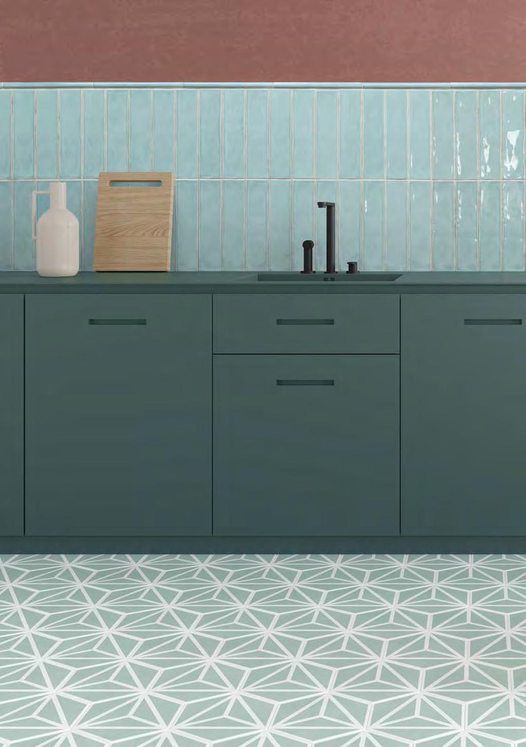
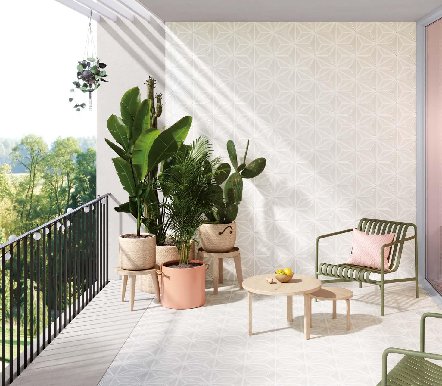
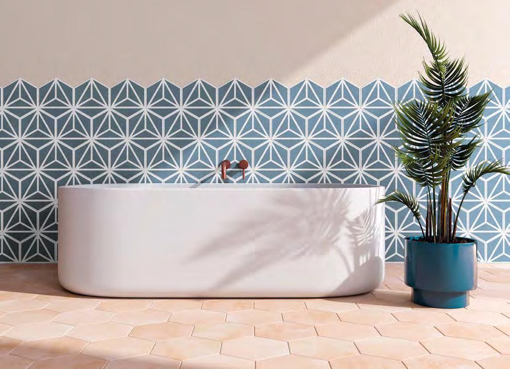
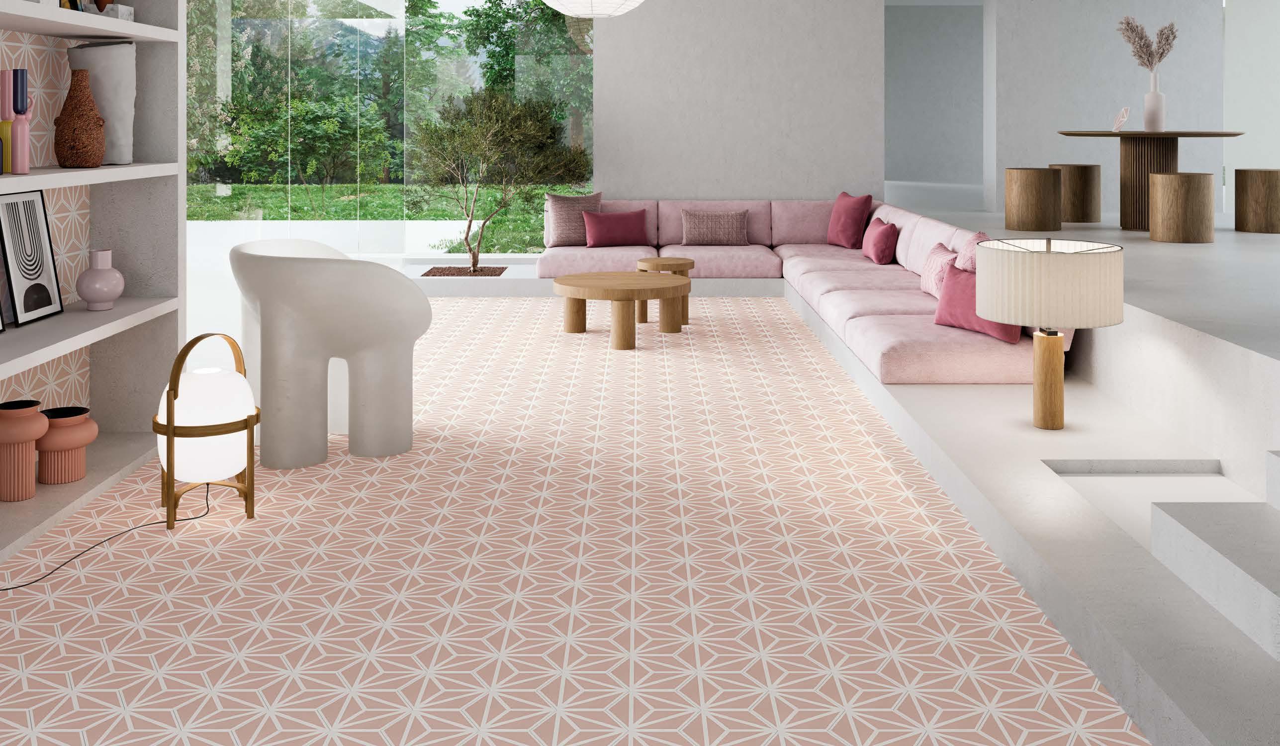
We create stunning new living spaces, able to envelop people in their amazing beauty. We inspire you with trendsetting new visions and designs. We give free rein to artists and designers so that they can channel their creativity into eye-catching innovative new collections. We are the boldest, newest brand at Peronda Group, a family business founded in 1827, specializing in bona fide quality products.
Creamos nuevos espacios y los llenamos de vida, para rodear a las personas y sorprenderlas. Inspiramos y damos una nueva visión apostando por el diseño y las tendencias. Damos voz a diseñadores y artistas que aportan su creatividad transformada en productos innovadores y atractivos. Somos la marca más joven y atrevida del Grupo Peronda. Empresa familiar que nació en 1827 con el objetivo de ofrecer producto genuino y auténtico.
FRAN SILVESTRE ARQUITECTOS
Fran Silvestre–the founder of Fran Silvestre Arquitectos, an architects' studio created in 2005–studied architecture at Valencia Polytechnic University (UPV), where he graduated with honours, in addition to urban planning at Eindhoven University of Technology in Holland. A lecturer at the UPV and the Universidad Europea de Valencia's Projects Departments, he is the director of the March Architecture & Design programmes, and he was awarded a cum laude doctoral degree by the UPV. In 2011, Silvestre was made deputy director of the Escuela Técnica Superior de Valencia and, in 2018, he was appointed to the Victor L. Regnier Distinguished Visiting Chair at Kansas State University in the USA.
FSA collaborates in interior design projects with Alfaro Hofmann and it has collaborated with other studios at an international level, in particular with Álvaro Siza, winner of the Pritzker Award.
The studio has been awarded first prize at Spanish and international awards like the 2019 German Design Award (Frankfurt), the 2016 13th Spanish Architectural & Urban Design Biennial (Granada), the 2013 Red Dot Design Award (Essen), the 2016 IFCC Awards (New York), and the Fundación Caja National Architects' Competition (Barcelona).
Throughout its history, the studio has worked on both small and large-scale projects.
Fran Silvestre Arquitectos fue fundado en 2005 por Fran Silvestre, arquitecto con matrícula de honor por la UPV y Urbanista por la TU/e de Holanda, profesor del Departamento de Proyectos de la UPV y de la Universidad Europea de Valencia, Director de los programas March Arquitectura y Diseño, así como Doctor Cum Laude por la UPV. En el año 2011 fue subdirector de la Escuela Técnica Superior de Arquitectura de Valencia. En 2018 obtuvo la cátedra Victor L. Regnier de la KSU en Estados Unidos.
FSA cuenta con la colaboración en los proyectos de Alfaro Hofmann en Diseño Interior. Asimismo, ha colaborado con estudios a nivel internacional, destacando la colaboración con el premio Pritzker Álvaro Siza.
Ha recibido primeros premios a nivel nacional e internacional como el German Design Award 2019 (Frankfurt), la XIII Bienal Española de Arquitectura y Urbanismo 2016 (Granada), el Red Dot Design Award 2013 (Essen), el IFCC Awards 2016 (Nueva York), o el Concurso nacional Fundación Caja de Arquitectos (Barcelona), entre otros.
A lo largo de su trayectoria, el estudio ha trabajado en proyectos de pequeña y gran escala.
Fran Silvestre
TAMIZ by FRAN SILVESTRE
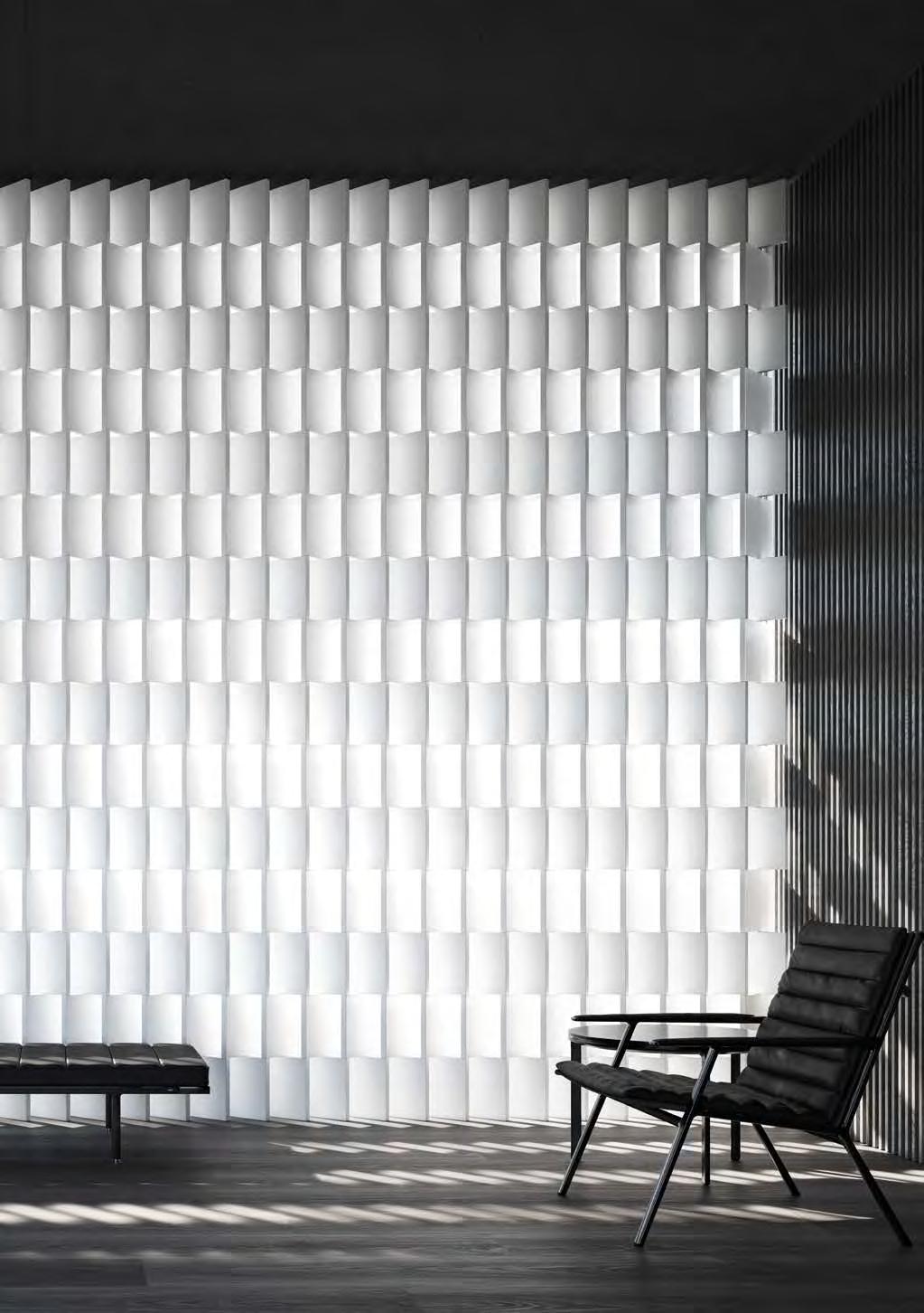
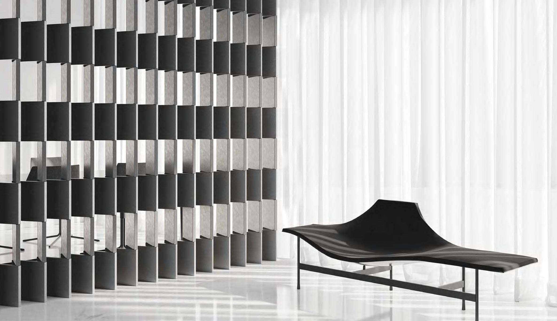
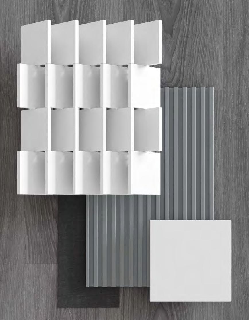
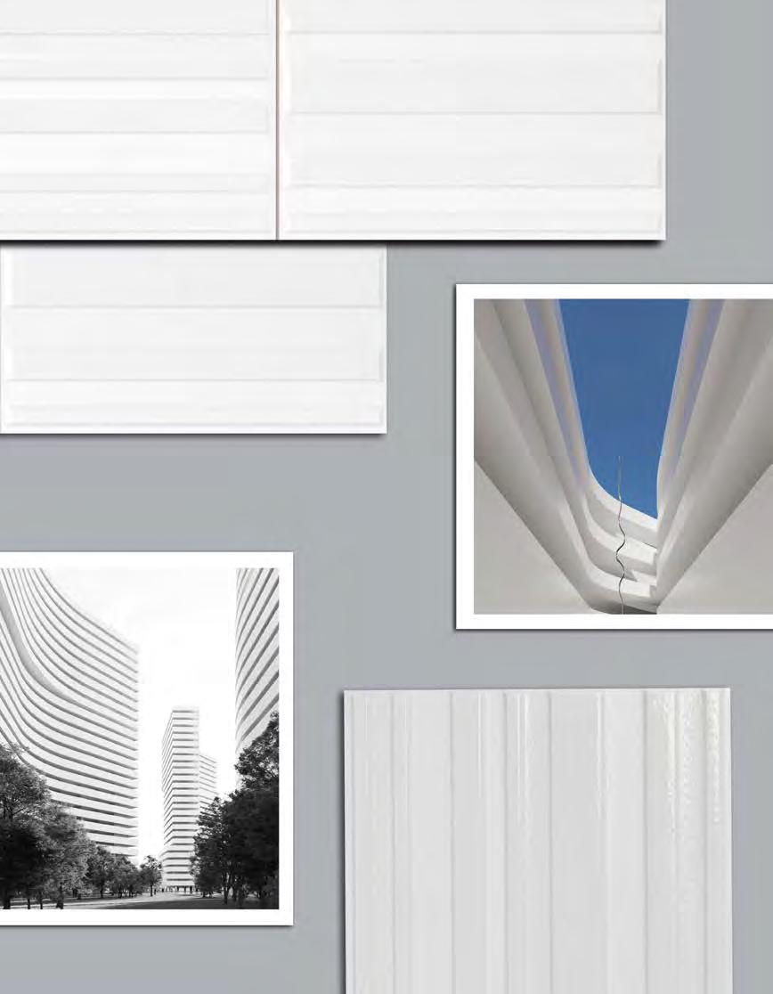
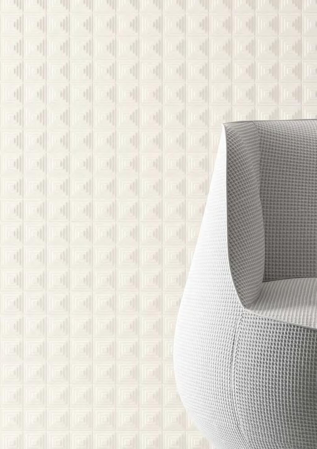
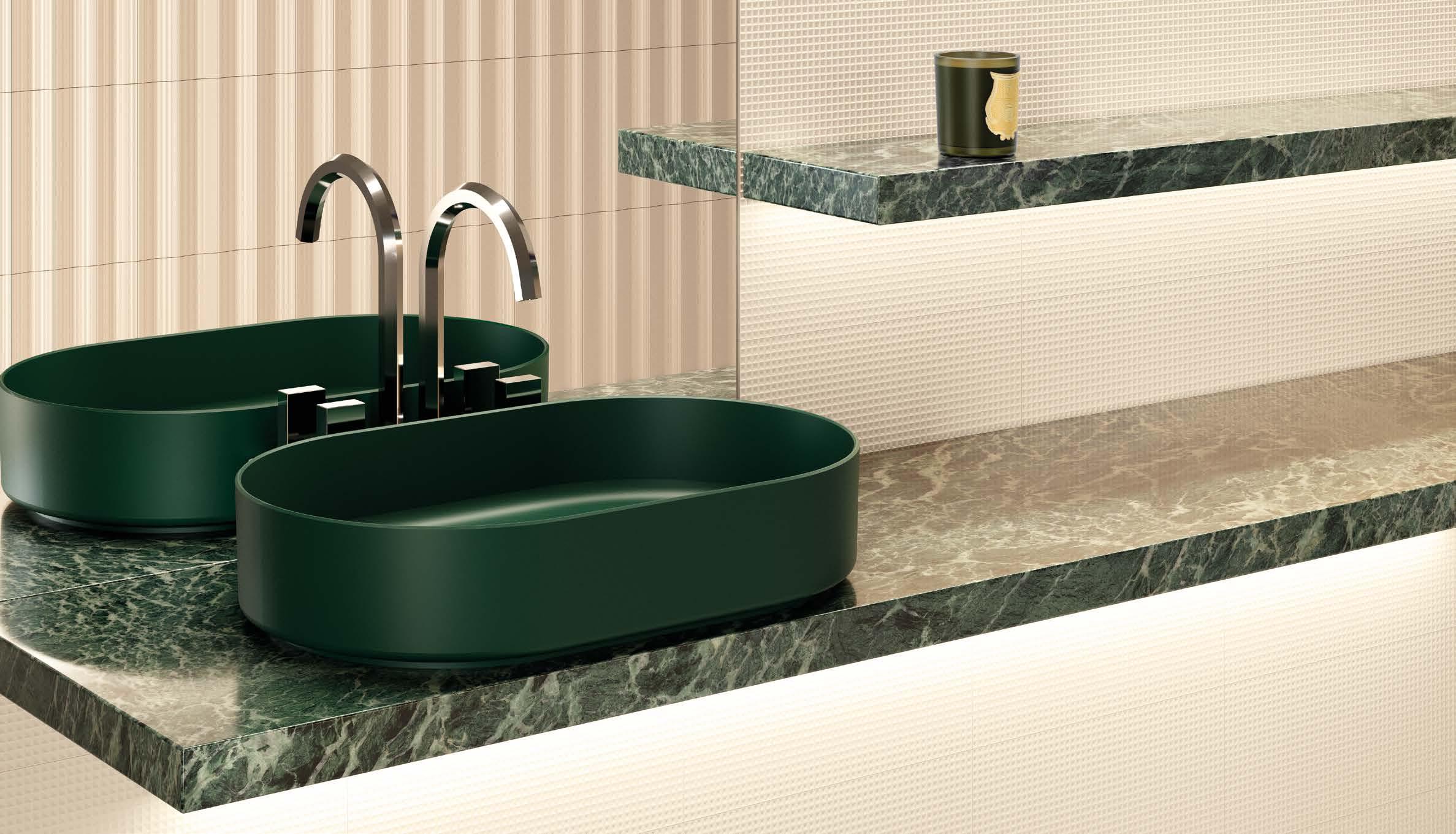
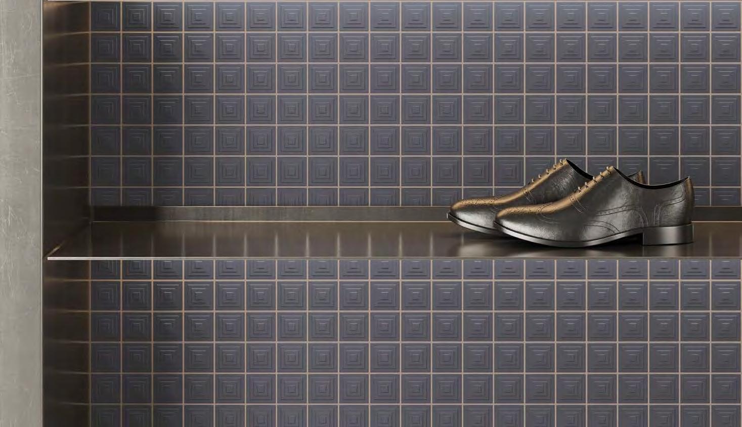
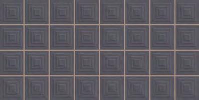
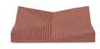
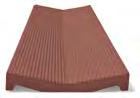
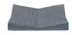
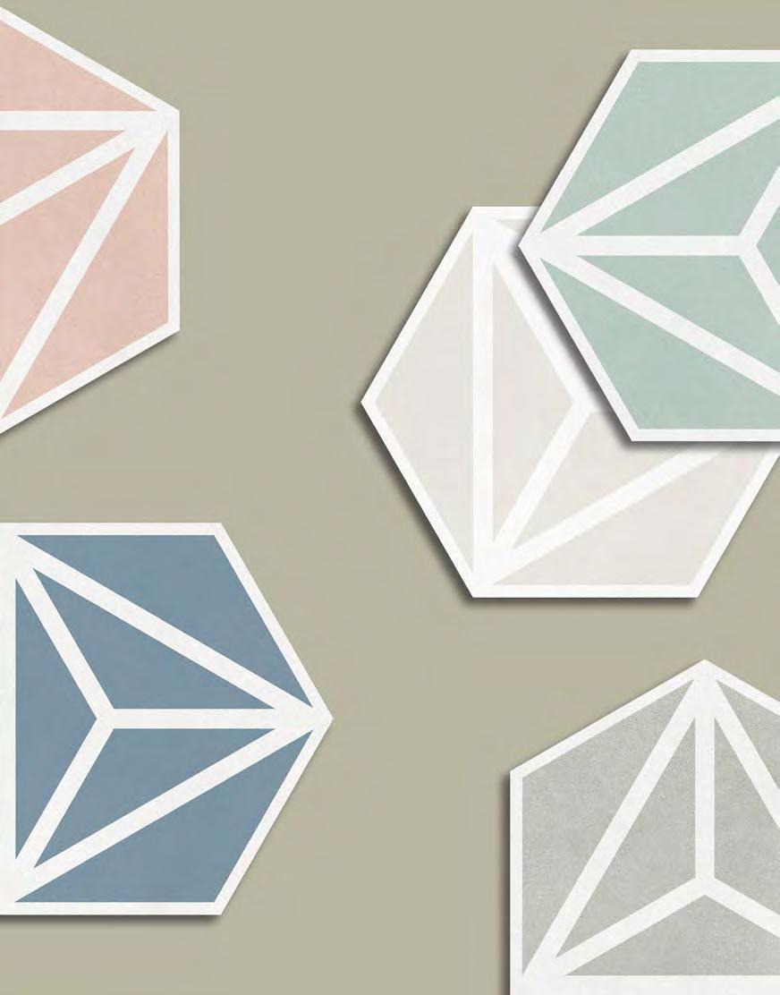
World-renowned architect Fran Silvestre designed the TAMIZ collection for HARMONY. In this new version of latticework, different tiles are combined in the style of a 3D checkerboard, linked at the same points to create a vertical wall able to guarantee both privacy and transparency. By controlling the temperature and filtering the light, the latticework ensures a greater sense of wellbeing. Modern-looking 20 x 20 tiles have been used in this fresh take on a traditional conceptual idea in shades of Grey, White, Blue and Silver.
El arquitecto de talla mundial Fran Silvestre, diseña para HARMONY la colección TAMIZ, una celosía conformada por distintas piezas que, a modo de damero tridimensional, maclan entre ellas por un único punto, y generan un paramento vertical que otorga privacidad a la vez que transparencia. Una celosía que conduce a una mejora del confort térmico y lumínico, controlando ambos aspectos a la vez que los tamiza. Cerámica contemporánea en formato 20 x 20 aplicada a la tradición conceptual. Tradición innovada con tonalidades, grey, white,blue y silver.
TAMIZ WHITE/20X20
TAMIZ by FRAN SILVESTRE
RAS by FRAN SILVESTRE
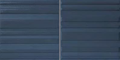
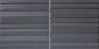
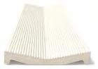
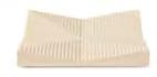
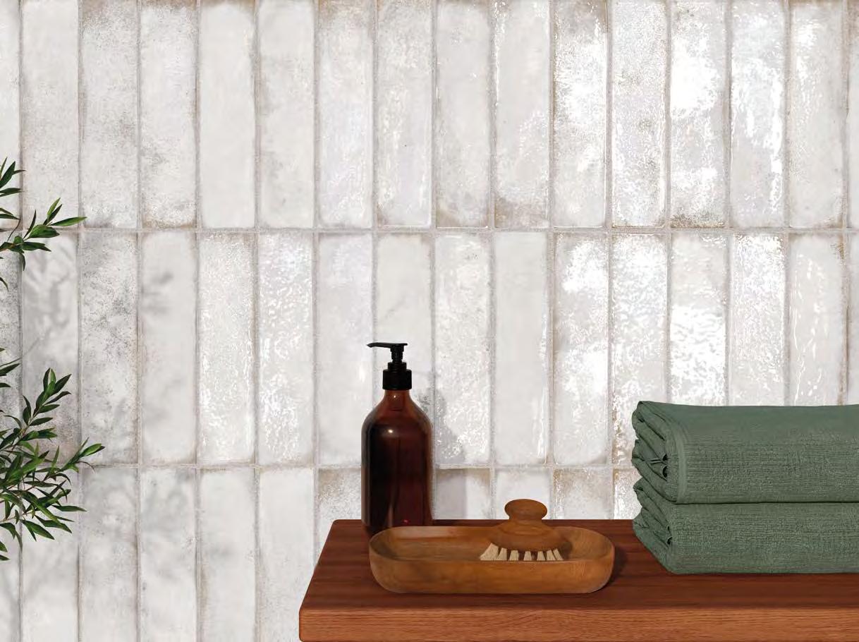
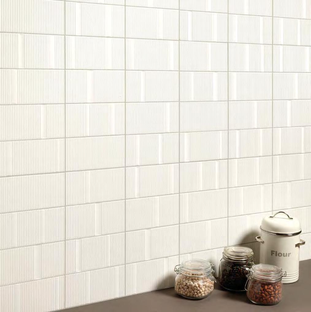
RAS is a collection designed by Fran Silvestre, the founder of internationally acclaimed architects' studio Fran Silvestre Arquitectos. It can be used to create tiled wall surfaces that spark off interplay with the light, leading to chameleonic settings with a dual sense of depth, further enhanced by contrasting finishes. When the surface is bathed in light, a metamorphosis takes place through the shadows cast by its surface reliefs and its grainy appearance. Available in Grey or White, RAS by FRAN SILVESTRE comes in a 20x40 format in a combined matt/gloss finish.
La colección RAS diseñada por Fran Silvestre, el fundador de Fran Silvestre Arquitectos, estudio de gran reconocimiento internacional, es un revestimiento que juega con la incidencia de la luz y que permite una doble lectura del espacio. Una doble profundidad que se manifiesta también a través de un acabado diferente. Cuando es bañado por la luz, da lugar a la proyección de unas sombras que lo transforman por completo gracias a su relieve y granilla. En colores Grey y White, RAS by FRAN SILVESTRE tiene un acabado combinado de mate y brillo presentado en un formato 20 x40.
RAS by FRAN SILVESTRE
ESTUDI{H}AC - JMFERRERO
José Manuel Ferrero founded estudi{H}ac in 2003 so that he could bring to life all the ideas that kept buzzing round in his head. In the space of just 18 years, the design studio has become a leading reference in Spain and abroad.
estudi{H}ac specializes in bespoke product designs and creative concepts for projects.
"Each project starts out with an initial concept". This is then developed by José Manuel Ferrero and his team, combining full creative freedom with the assurance of commercial viability. All projects by estudi{H}ac share two common denominators: colour and simplicity of shape and texture.
En 2003, José Manuel Ferrero, fundó estudi{H}ac con el objetivo de dar vida a todas las ideas que no paraban de surgir en su cabeza y en tan solo 18 años ha convertido su atelier de diseño en referencia del diseño nacional e internacional.
estudi{H}ac está especializado en realizar proyectos a medida de diseño de producto, y conceptos creativos para proyectos.
"La base de cada uno de nuestros proyectos reside en el concepto inicial", de ahí es desde donde José Manuel Ferrero y su equipo conciben la historia propia de cada proyecto. Teniendo una libertad creativa con la seguridad y capacidad de que sea también un proyecto comercial. Hay dos elementos que nunca faltan dentro de los proyectos realizados por estudi{H}ac. El color dentro de la simplicidad de la forma y las texturas.
José Manuel Ferrero
PIQUÉ by ESTUDI{H}AC
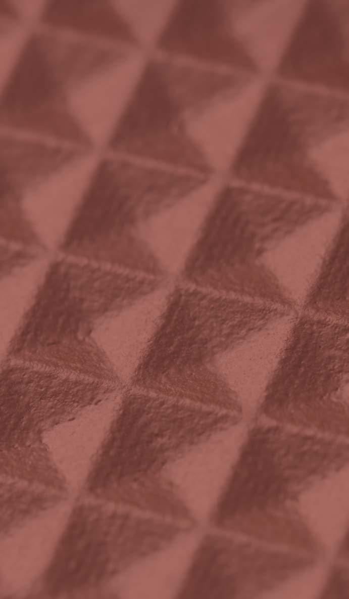
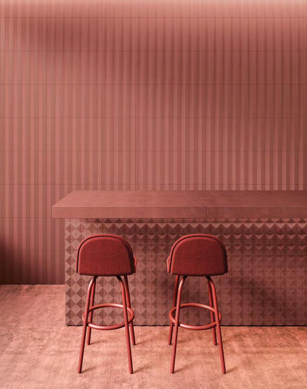
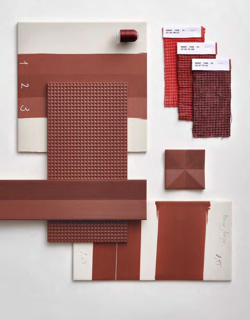
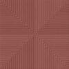
PIQUÉ, a new collection for HARMONY by José Manuel Ferrero from design studio estudi{H}ac, is inspired by an 18th century mechanized technique for weaving double cloth with a heavy cording weft. Fabric textures and a search for a geometrical design that can be broken down in layers to facilitate a study of 3D volumes were both drawn upon in the creation of this 20 x40 tile collection. Relief patterns are contrasted with textures in a collection in shades of Anthracite, Bordeaux, Sand and White, whose models range from realistic reproductions of fabric textures to upside-down 3D mosaics. Piqué also includes two other formats ( 10 x10 and 10 x40) that can be combined with the 20x40 models to create interplay between light and shade so as to highlight the relief patterns.
PIQUÉ la nueva colección de HARMONY diseñada por José Manuel Ferrero de estudi{H}ac se inspira en una técnica mecanizada para tejer paños dobles con una pesada trama de hilos del siglo XVIII. Las texturas textiles y la búsqueda de una geometría que se pudiera desestructurar por capas para generar un estudio de volumetrías tridimensionales han generado una colección que contrasta relieves y texturas en 20 x40 con tonalidades Anthracite, Bordeaux, Sand y White. Capaces de crear desde piezas realistas que recrean fielmente la textura del tejido, hasta mosaicos tridimensionales invertidos. La colección también incluye un formato 10 x10 y 10 x40 para combinar las piezas anteriores y crear efectos de claroscuros según el juego de luces para potenciar los relieves.
PIQUE 3D BORDEAUX/10X40
PIQUE 3D BORDEAUX /10X10
PIQUE MOSAIC ANTH/20X40
PIQUE by ESTUDI{H}AC
DRAW
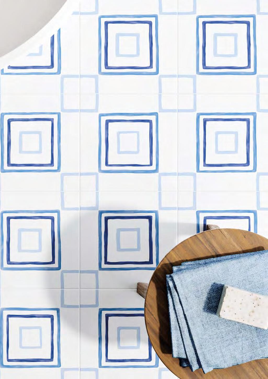
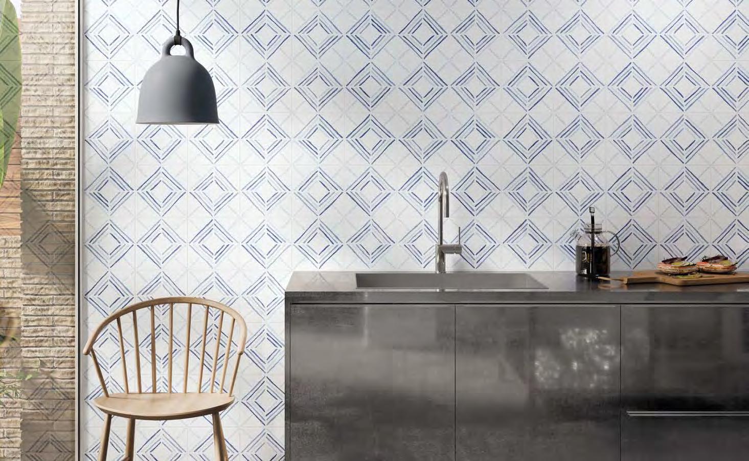
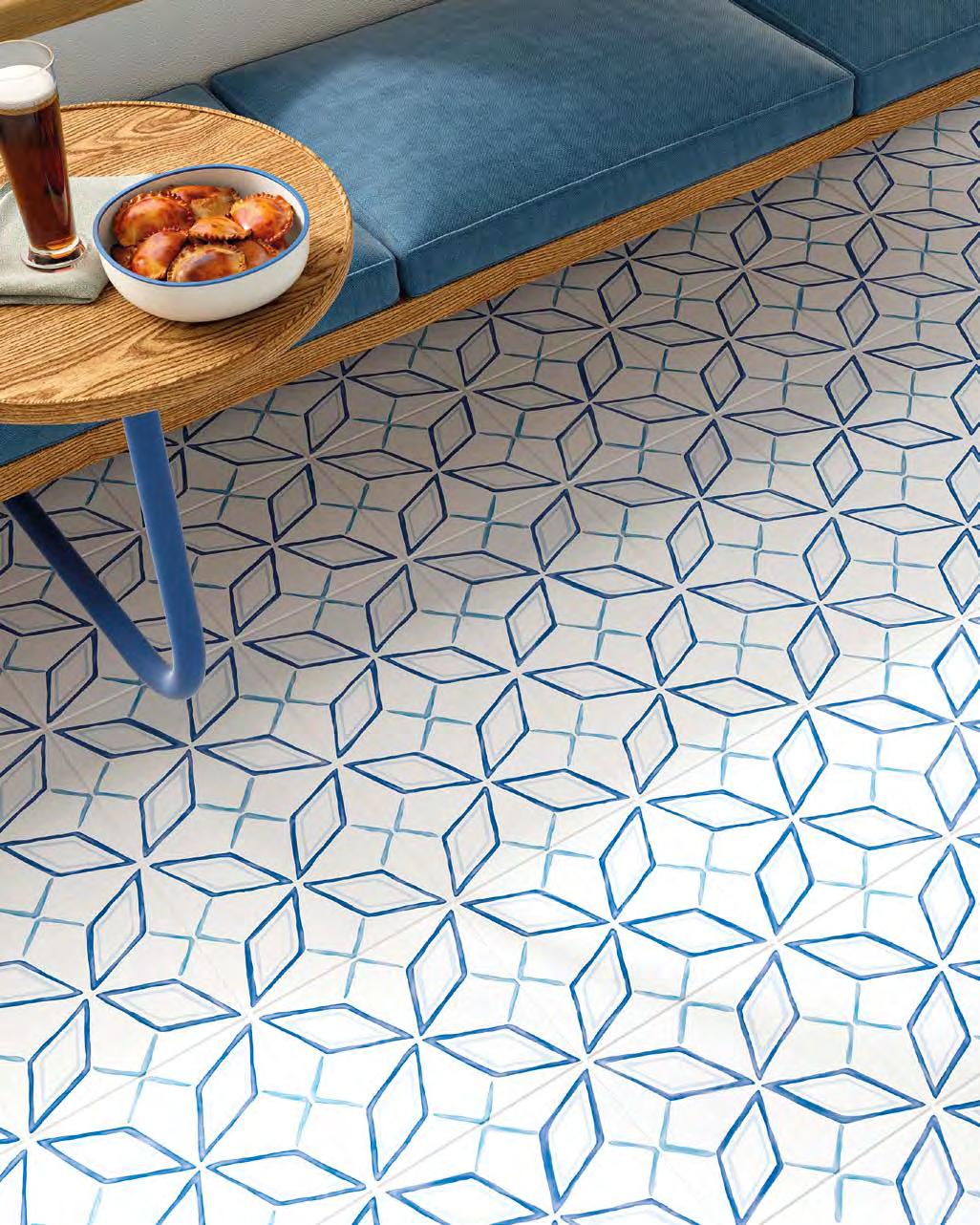
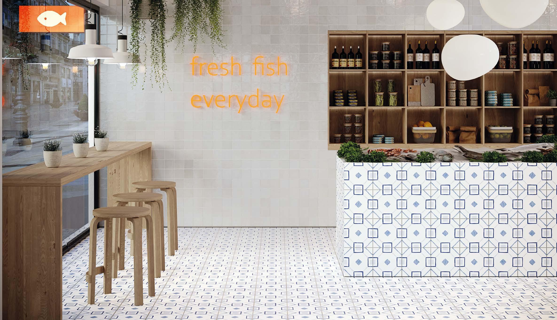
DRAW is HARMONY's most Mediterranean collection. Its irregular brushstrokes, differing intensities of colour, and subtle shine all evoke hand-painted white tiles. With DRAW, delightful settings can be created, whatever the location.
HARMONY presenta en su colección DRAW su estilo más mediterráneo. Sus trazados irregulares, la diferente intensidad de color y un ligero toque de brillo reproducen la artesanía del arte de la cerámica pintada con trazos manuales sobre cerámica blanca.Con estas piezas, DRAW nos ofrece la posibilidad de crear un entorno idílico en cualquier rincón.
DRAW SQUARE/22,3
DRAW DIAMOND/22,3
DRAW STAR/22,3
DRAW ROUND/22,3 RIAD WHITE/10X10
VARADERO MINT /19,8X22,8 POITIERS MINT/30 L.VIENNE MINT/30
VARADERO MOONLIGHT/19,8X22,8
VARADERO AZURE/19,8X22,8 TERRA HEXA/19,8X22,8
VARADERO ROSE/19,8X22,8
VARADERO
31048 VARADERO ROSE/19,8X22,8 Q32 (19,8 x 22,8 cm − 7 13/16x9” 5 patterns
31045 VARADERO MOONLIGHT/19,8X22,8 Q32 (19,8 x 22,8 cm − 7 13/16x9” 5 patterns
31046 VARADERO MINT/19,8X22,8 Q32 (19,8 x 22,8 cm − 7 13/16x9” 5 patterns
31047 VARADERO GREY/19,8X22,8 Q32 (19,8 x 22,8 cm − 7 13/16x9” 5 patterns
31049 VARADERO AZURE/19,8X22,8 Q32 (19,8 x 22,8 cm − 7 13/16x9” 5 patterns
LEGACY
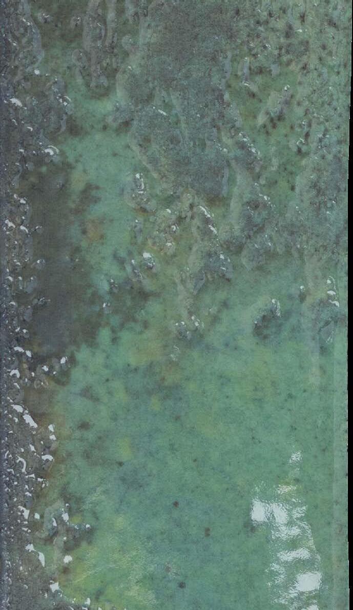
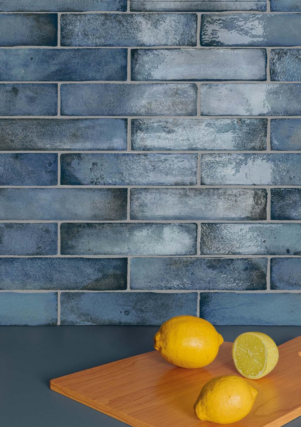
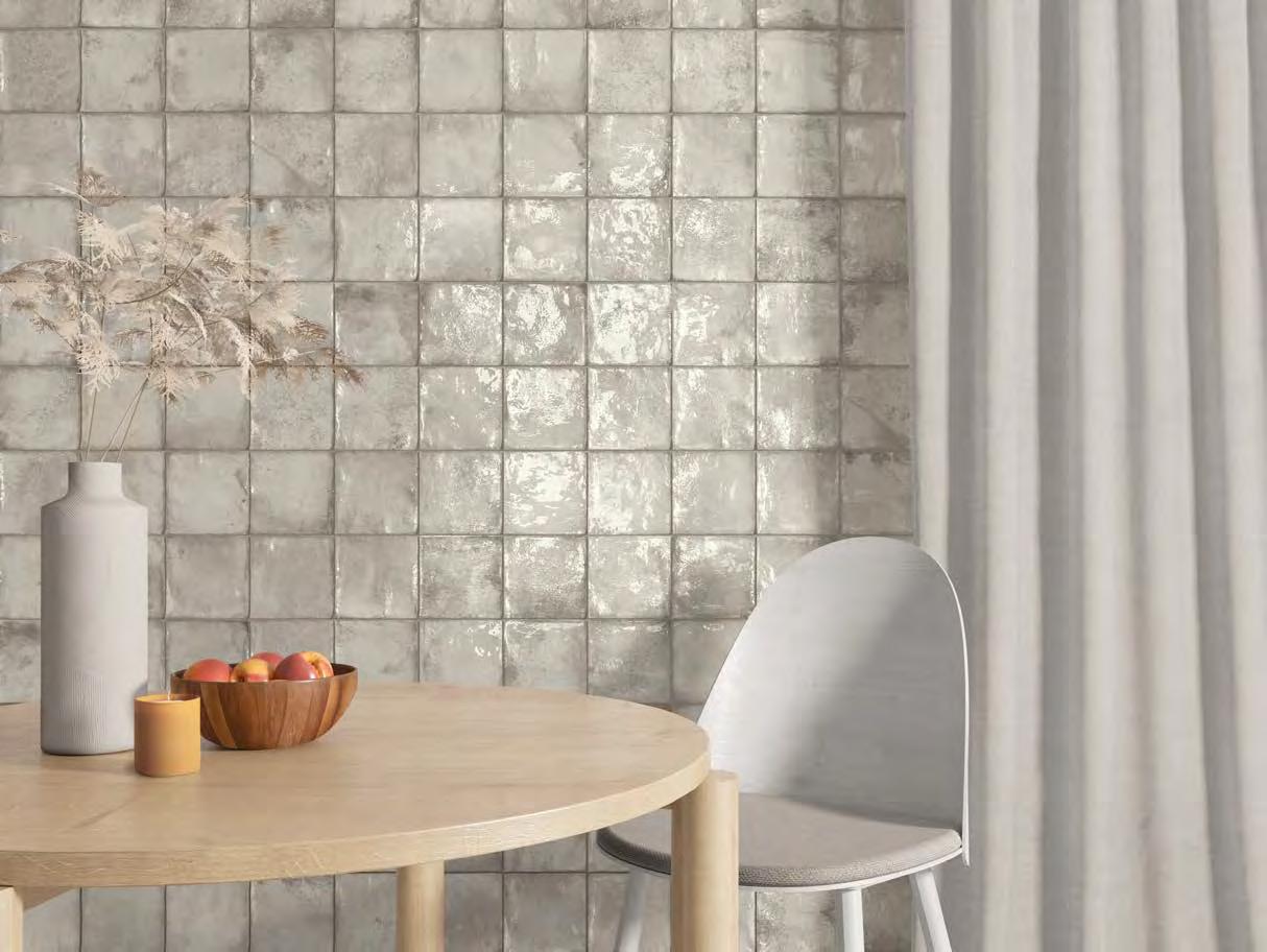
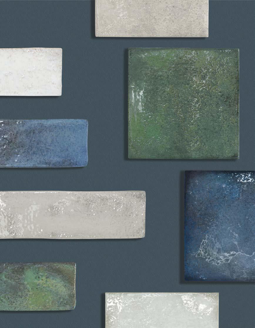
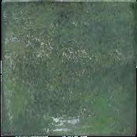
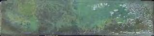
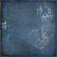
LEGACY pays tribute to the traditional artisanal technique of overlapping reactive glazes, used in the 20 th century to create exclusive, unique looking ceramics of different colours and intensities. The collection's 15x15 and 6x 25 cm tiles, in a choice of Blue, Green, White and Grey, stand out for their shine, volume and sense of depth, making it one of the most refreshing, innovative wall tile collections.
Un homenaje a la antigua técnica de esmaltes reactivos superpuestos empleada durante el siglo XX . En formatos 15x15 y 6x 25 cm. Artesanal y tradicional, su técnica genera piezas únicas y exclusivas de diferentes tonalidades, colores e intensidades. El brillo, volumen y sensación de profundidad de la pieza convierten a LEGACY en una de las colecciones más rompedoras para revestimientos con sus tonalidades.
LEGACY BLUE/6X25
LEGACY GREY/15X15
LEGACY WHITE/6X25
LEGACY
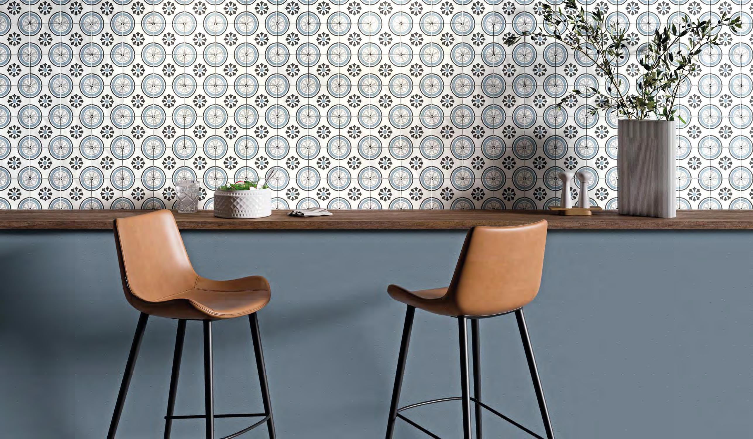
TANGER
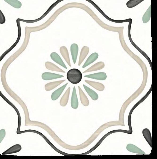
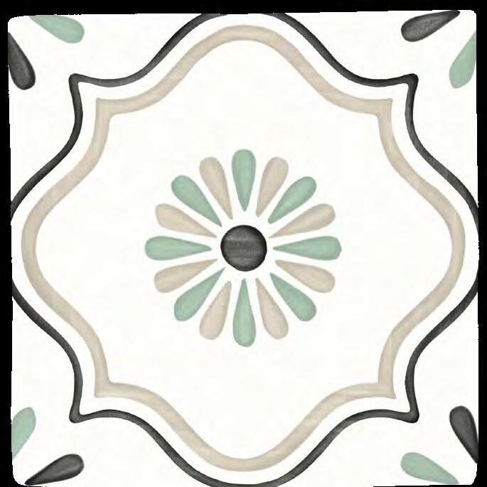
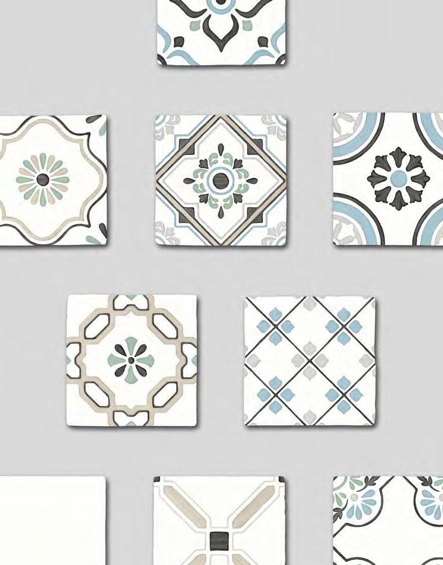
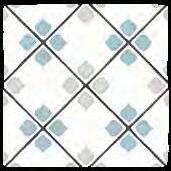
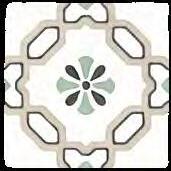
These porcelain tiles are inspired by traditional ones with Arab influences, like those found in Morocco or Southern Spain. The collection's handcrafted appearance evokes the skilled brushstrokes of a craftsman, with their movement and changing intensity of colour, in a design with a mix of organic and ornamental motifs.
Available in a new 12.3 x12.3 porcelain tile format, Tanger is conspicuous for its slightly uneven surface and irregular sides, further enhanced by the collection's different colours.
Producto porcelánico que evoca a la influencia árabe de la cerámica tradicional características del sur de España y Marruecos. Su diseño artesanal nos traslada al trazo a pincel, generando cierta direccionalidad y variación de color. Se trata de una mezcla de patrones orgánicos y ornamentales.
La colección presenta un formato nuevo para la firma: 12,3 X 12,3 porcelánico. De soporte irregular tanto en la superficie como en el contorno y de gran combinación gracias a sus diferentes tonalidades: verde, azul, beige, gris y negro.
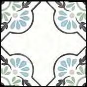
TANGER SAND LILY/12,3X12,3
TANGER SILVER RHOMB/12,3X12,3
TANGER
31079 TANGER BLUE PETALS/12,3X12,3 Q39 (12,3 x 12,3 cm − 4 13/16x4 13/16 ) 6 patterns
31085 TANGER BLUE DHALIA/12,3X12,3 Q39 (12,3 x 12,3 cm − 4 13/16x4 13/16 ) 6 patterns 31083 TANGER SILVER RHOMB/12,3X12,3 Q39 (12,3 x 12,3 cm − 4
31080 TANGER SAND CROSS/12,3X12,3 Q39 (12,3 x 12,3 cm − 4 13/16x4 13/16 ) 6 patterns
31081 TANGER SAND LILY/12,3X12,3 Q39 (12,3 x 12,3 cm − 4 13/16x4 13/16 ) 6 patterns
31087 TANGER PLAIN/12,3X12,3 Q39 (12,3 x 12,3 cm − 4 13/16x4 13/16” 31274 ING.TANGER PLAIN/1,2X12,3 H27 (1,2 x 12,3 cm − 1/2x4 13/16”
BEAT
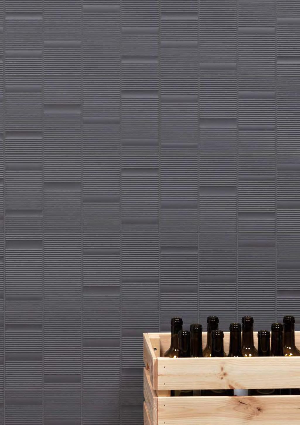
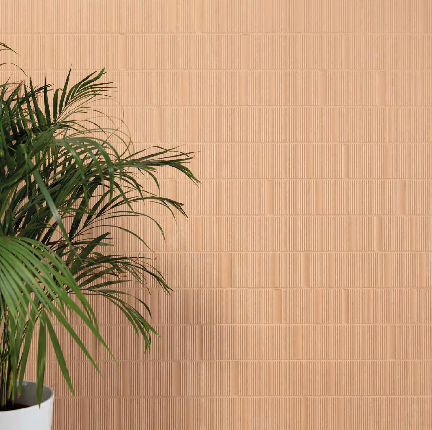
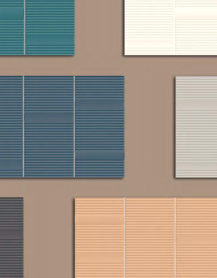
BEAT is a collection perfect for creating soothing, restful settings where you immediately feel at one with your surroundings. Its attractive rounded relief pattern, in a design with a strong sensory appeal, generates a sensation of tranquillity and wellbeing. Its soft, matt, monochrome finish brings a relaxing feel to living spaces, fostering a sense of contentment. BEAT comes in a 20x40 format in a selection of trendsetting colours that can be mixed and matched in multiple different ways. This is a highly versatile collection in a choice of neutral colours (White, Silver and Anthracite) and other more decorative ones (Clay, Blue and Green).
Colección que nace ante la necesidad de generar espacios en los que encontrarnos en calma y relajados. Lugares donde conectar emocionalmente con nuestro entorno. Para ello, se ha creado BEAT. Un cuidado trabajo que nos ofrece un diseño sensorial y gracias a su relieve redondeado se consigue un estado de comodidad y tranquilidad excepcional. Piezas con tonalidades suaves en acabado mate monocolor, consiguiendo crear ambientes más relajantes fomentando el bienestar. Se presenta en formato 20x40 disponibles en una selección de los colores en tendencia, que nos ofrecen múltiples opciones de combinabilidad. Un conjunto muy versátil, diferenciando una gama de neutros como son White, Silver y Anthracite y otras más decorativas, Clay, Blue y Green.
BEAT ANTHRACITE/20X40W
BEAT WHITE/20X40
BEAT CLAY/20X40
BEAT
All colours and hues appearing in this catalogue should be considered approximate, only in view of the printing processes involved. The rights of all contents (texts, photographs, drawings, designs, etc.) of this catalogue remain the property of PERONDA GROUP, S.A (or, failing that, they have the corresponding permissions and authorizations of the owners). No part of this publication may be reproduced, stored in a retrieval system, or transmitted in any form or by any means, electronic, mechanical, photocopying, recording or otherwise, without the prior written permission of the copyright holders.
Debido a los procesos de impresión, los colores que aparecen en este catálogo deben considerarse aproximados, y no exactos. Los derechos de todos los contenidos (textos, fotografías, dibujos, diseños etc) del presente catálogo son propiedad de PERONDA GROUP, S.A (o en su defecto, cuentan con los correspondientes permisos y autorizaciones de sus titulares). No está permitida la reproducción total o parcial de esta publicación, ni su tratamiento informático, ni la transmisión de ninguna forma o por cualquier medio, ya sea electrónico, mecánico, por fotocopia, por registro u otros medios, sin el permiso previo y por escrito de los titulares del copyright.