
COLOUR TRENDS
LET THE LIGHT IN
RESEARCH 08-33
COLOURFUTURESTM 2019 34-39 2019 PALETTE COLOUR OF THE YEAR 2019
PALETTES 40-91
RESOURCES

WELCOME
“We’re excited to present the 2019 edition of ColourFutures, the book that tells the story of how we transform global trends into inspiring paint colour palettes for the home. It all begins with our team at the Global Aesthetic Center – the heart of colour development at AkzoNobel. Every year, we invite top design professionals from all over the world to help us capture the mood of the moment. Our team then uses the findings to understand what consumers will want from paint colour in their home and identify the Colour of the Year and complementary palettes to meet their needs.
In this book, we explore how 2019’s colours will work from room to room, throughout the home.
To accompany the new palettes and the Colour of the Year, we’ve created a wealth of content, from images and videos to print assets, which we share with you here and through our AkzoNobel Brand Center. We hope that you enjoy using the content as much as we’ve enjoyed creating it.”
FOREWORD BY HELEEN VAN GENT
CREATIVE DIRECTOR, GLOBAL AESTHETIC CENTER, AKZONOBEL
THE GLOBAL AESTHETIC CENTER
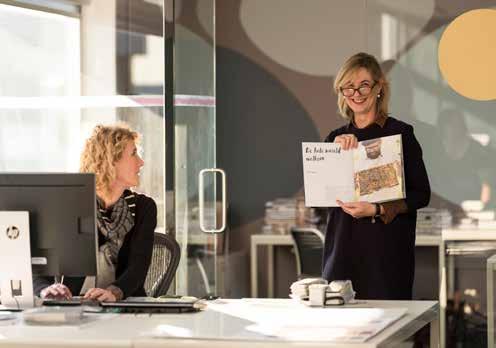
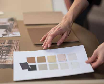
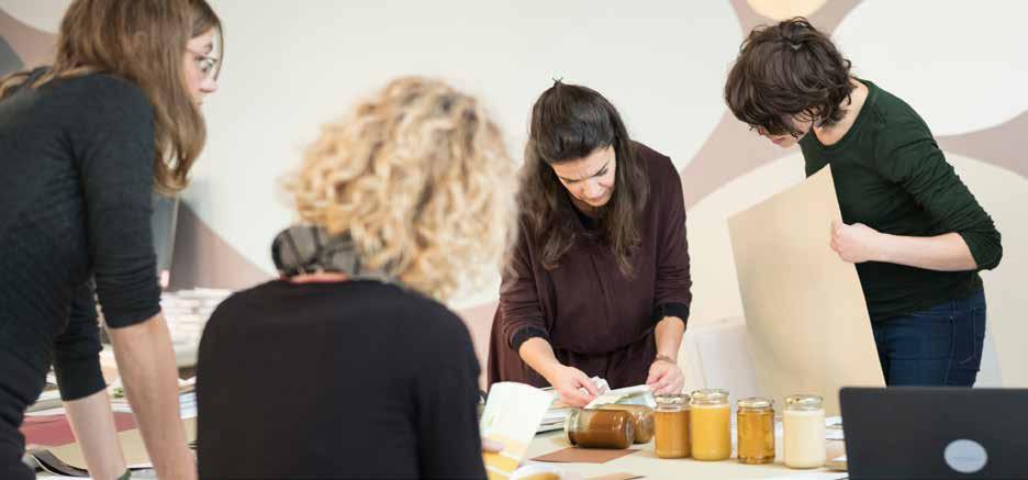
Our colours begin their journey at the Global Aesthetic Center, which has been responsible for trend analysis, colour research, colour design and art direction at AkzoNobel for over 25 years. Led by Creative Director Heleen van Gent, the creative team supports 80 markets around the world in empowering consumers to choose paint colours for their home with absolute confidence.
Colour design and forecasting is the primary role of the Global Aesthetic Center and, to ensure that the team are anticipating consumers’ needs, we continuously monitor social, cultural and design trends as they emerge all over the globe. By connecting these unique insights to everyday life, our team provides informed direction for the markets. It also consistently creates colour palettes that are perfectly matched to consumers’ lifestyles and content that tells the colour story.
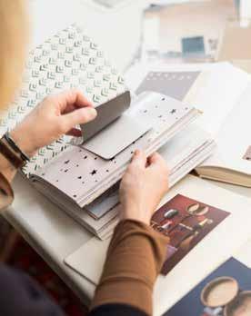
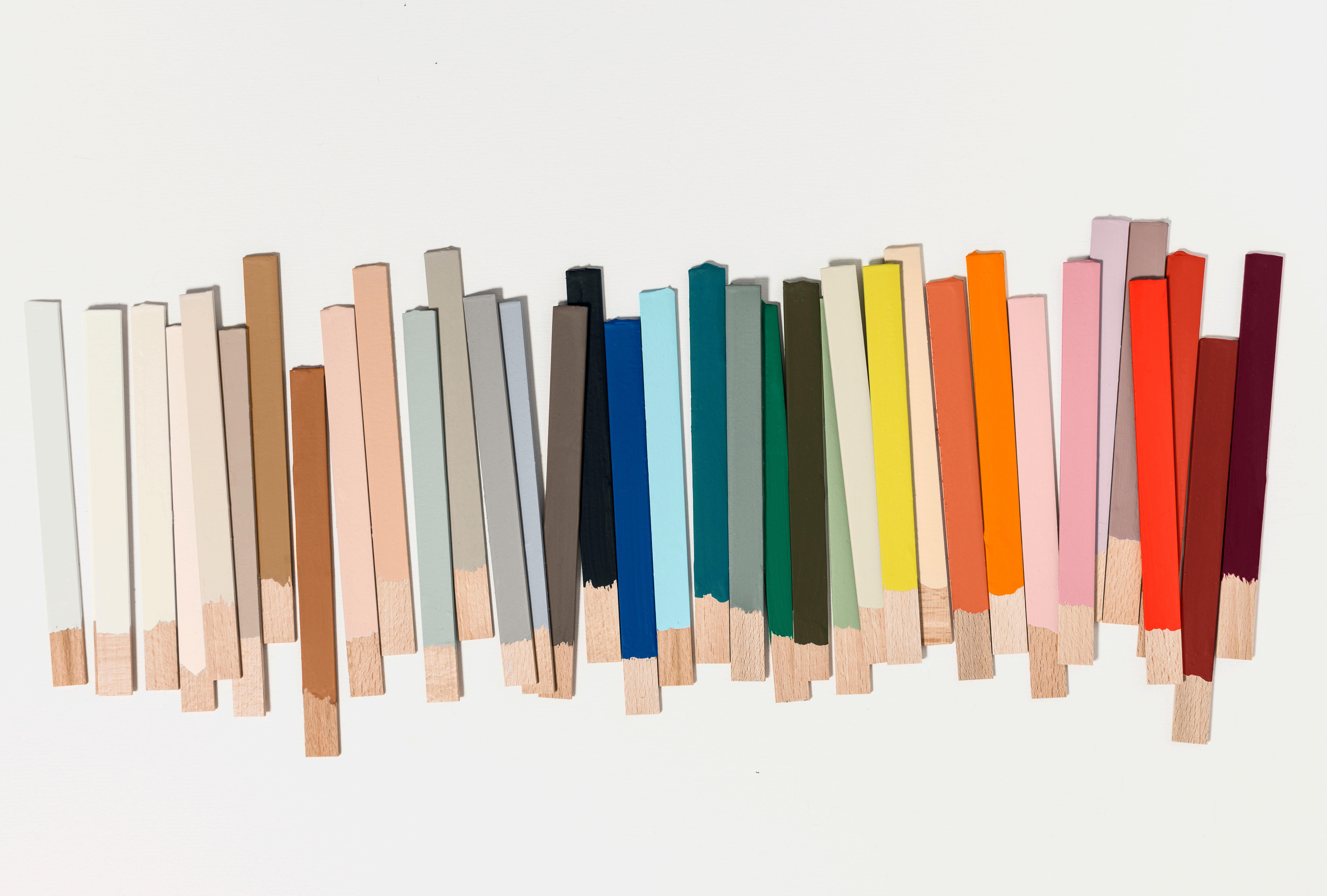
ColourFutures is a central part of the Global Aesthetic Center’s work. Our experts identify the Colour of the Year and four supporting palettes by transforming global trend insights into paint colours that will inspire consumers. In tandem with trend forecasting, the team creates an array of assets, including hundreds of room images, that demonstrate how the colour palettes will translate into real people’s homes all over the world.

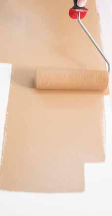
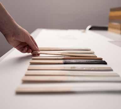

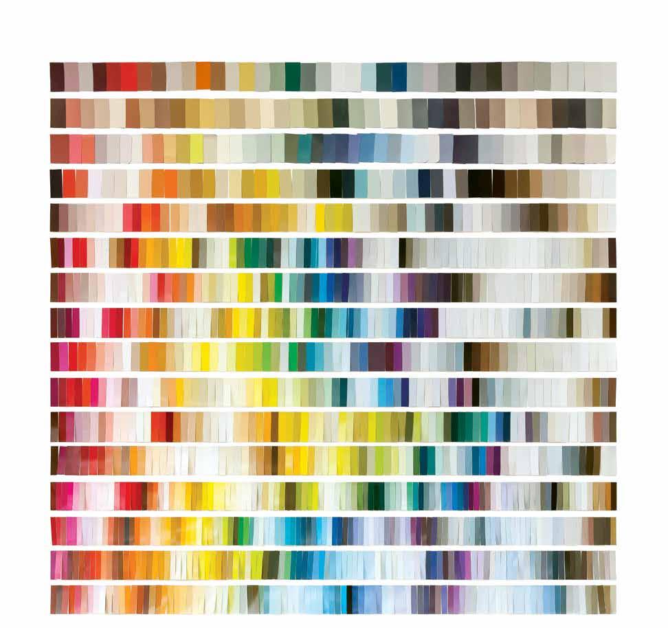
COLOURS ANALYSIS 2004-2019
The evolution of colour trends over the past 16 years
16 YEARS OF SHAPING THE EVOLUTION OF COLOUR
“When you look at how our ColourFutures palettes have evolved over the years, you can chart the fluctuations in our consumers’ appetite for different colours and spot connections with what is going on in the wider world. For example, in 2017, when our consumers felt a need for balance and calm, the palette was dominated by cooler shades of blue and grey. While in 2018, there was a great sense of uncertainty that was reflected in a desire for warm, comforting colours that provided our consumers with solace and refuge. Every year, we create a series of diverse palettes around one central Colour of the Year – our stand-out shade that perfectly captures the mood of the moment.”
Heleen van Gent, Creative Director, Global Aesthetic Center, AkzoNobel
OUR GLOBAL TRENDS FORECAST
Each year, we ask a team of top designers, architects, colour creatives and trend experts to be our eyes and ears around the world. It’s their job to spot the cutting-edge trends that are going to have the biggest impact on our lives in the future. These experts then come to our Global Aesthetic Centre to share their insights with our colour team, at an intense but inspiring three-day trend forecasting session. They bring us vital information about societal, cultural, design and lifestyle trends as well as details about the colours and styles that are being adopted by the most influential fashion, product and interior designers. Together, we build a clear picture of where the world is going, which helps us to define the mood of the moment and the key consumer trends for the coming year.
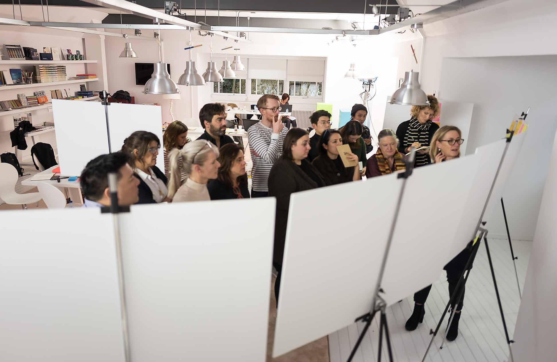
“OUR UNIQUE TREND INSIGHTS ALLOW US TO PREDICT WITH CONFIDENCE WHAT IS GOING TO BE IMPORTANT TO OUR CONSUMERS IN THE COMING YEAR”
Heleen Van Gent


MEET THE EXPERTS
As part of our industry-leading colour research, we invite a dozen independent experts to join us at our Global Aesthetic Center in Amsterdam, where they forecast the emerging design trends for the next 12 months. The expertise of this group is extensive, ranging from architecture to cultural analysis, technology and innovation. By immersing ourselves in these detailed global insights, our team develops a powerful understanding of where our consumers are heading, allowing us to devise colour palettes that will perfectly match their needs.
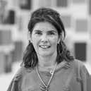

“THERE’S A NEW SENSE OF POSITIVE ENERGY, SMALL ACTS CAN MAKE A BIG DIFFERENCE, IT’S ABOUT DOING SOMETHING THAT COMES FROM WITHIN”



HELEEN VAN GENT,
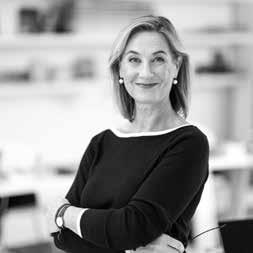
“WE ARE NOTICING A SENSE OF AWAKENING. THERE’S A FRESH NEW MOOD AND WE NEED HOMES THAT REFLECT AND SUPPORT THAT”
Heleen van Gent



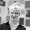

“PEOPLE NEED A PLACE WHERE THEY’RE AT ONE WITH THEMSELVES, TO RECONNECT AND TO GIVE THOUGHT TO WHAT’S IMPORTANT TO THEM”
CLAUDIA LIESHOUT, GLOBAL Creative Director Trend Research, Philips
SAM DEVILLART, AMERICAS Professor for Cultural Analysis, School of Visual Art NYC
CAMERON WOO, SOUTH EAST ASIA Principal, Cameron Woo Design
Adriana Pedrosa
Cameron Woo
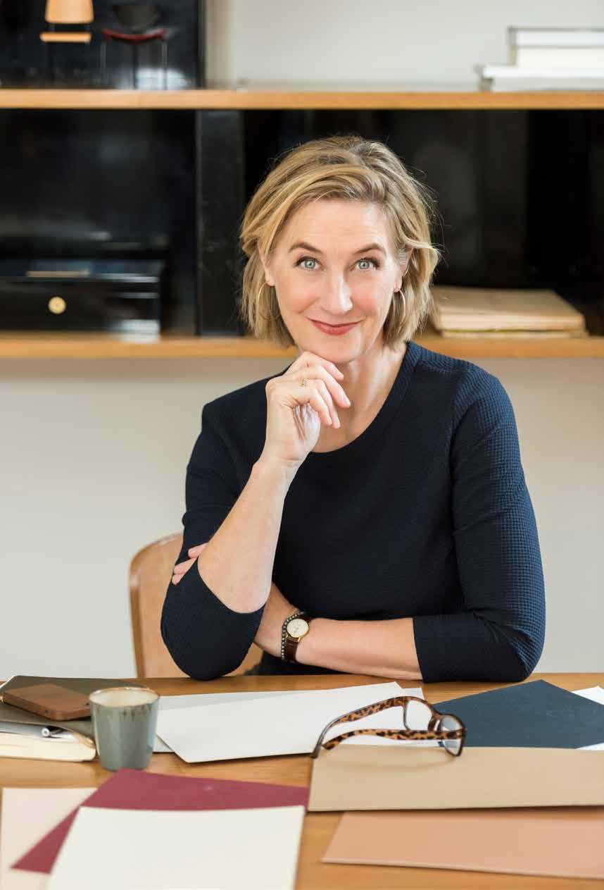
Heleen joined the Global Aesthetic Center in 2009, following 20 years of working in the magazine industry as an interior stylist and design editor. After graduating from The Royal Academy of Art in The Hague, she went on to teach at the Artemis Design Academy in Amsterdam and has edited many books on interior and colour design. She travels the world offering guidance on colour and design to the AkzoNobel markets.
CARLOTA GASPARIAN, LATIN AMERICA Surface and color designer, Atelier de Pinturas
BARBARA MARSHALL, ASIA Marshall Design
ZUZANNA SKALSKA, EASTERN EUROPE Founding Partner, 360°Inspiration
NETHERLANDS
AkzoNobel
JIM BIDDULPH Editor-at-large, Material Lab
ADRIANA PEDROSA, LATIN AMERICA Surface and color designer, Atelier de Pinturas
MARIJN SCHENK EUROPE/CHINA Architect, Next Architects
LEON SUN Editor Director, ELLE DECORATION China
STEPHIE SIJSSENS, EUROPE Color Design Manager, Akzonobel Automotive & Speciality Coatings WILLEKE JONGEJAN Designer, Global Aesthetic Centre
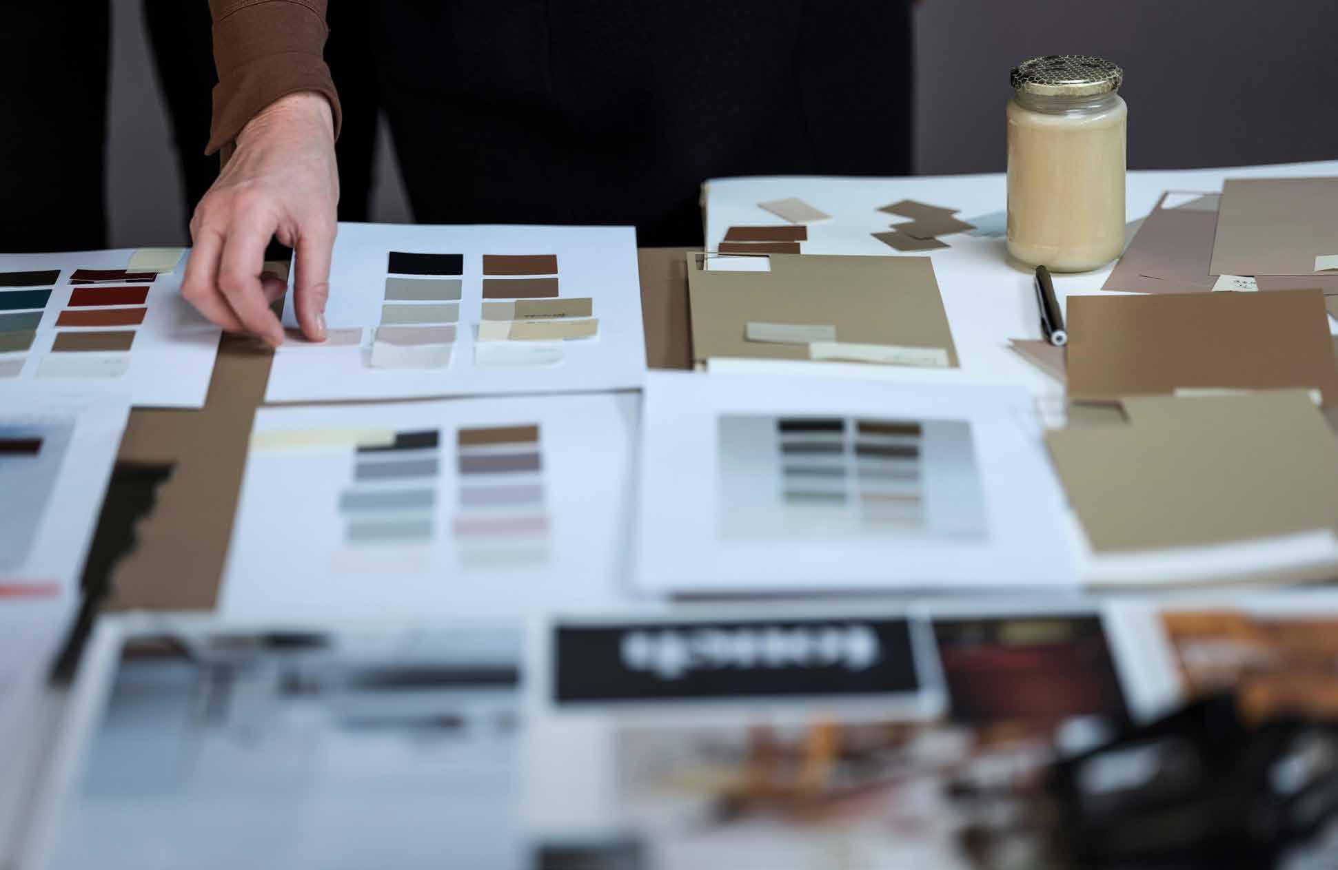
TRANSFORMING TRENDS INTO COLOUR
By bringing together trend experts from all over the world to work with our Global Aesthetic Center team, we gain a unique mix of perspectives from a broad range of disciplines and cultures. This ensures that when we present our overarching theme and key trends for each year, we are confident that they will have universal resonance and relevance.
The next vital step of the process is for the Global Aesthetic Center to use the findings from our forecasting sessions to identify a versatile Colour of the Year that will respond to consumers’ needs and bring the new mood to life in their homes. We then create a collection of palettes around this shade to offer consumers different ways of using the colour, to reflect their own personalities and lifestyles. As well as devising the colour palettes, our talented team at the Global Aesthetic Center also produces an extensive collection of ColourFutures assets for online and offline use, that communicates the trends to the media and consumers, as well as to property developers, interior designers and architects around the world.
It’s all about...
THE MOOD OF THE MOMENT AWAKENING KINDNESS RESILIENCE OPTIMISM
Last year, many of us were left unsettled by global events, so we closed our doors to retreat and regroup. Now we feel ready to throw open our windows and face the world again. Our trend research shows that people around the world are experiencing a renewed sense of energy, optimism and purpose. There’s a desire to reach out, engage with others, to make things better and ‘be the change’. That change can be anything from marching for women’s rights and fishing plastic out of the ocean to small acts of neighbourly kindness. People are ready to seize the moment. Now is the time to think, to dream, to love and to act.
What consumers want
MOOD #1 PEOPLE WANT TO...
THINK
FIND CLARITY TRUST THEMSELVES NURTURE INDEPENDENCE KNOW THEIR TRUTH
We have been living through turbulent times. It feels as though we’re expected to process troubling events on almost a daily basis. With so many news sources, both real and fake, it seems like there are too many versions of the ‘truth’ out there. So we’re seeking clarity, asking searching questions, examining our values and deciding where to place our trust. We want to develop a new sense of independence and self-belief, to become strong, stoic and resilient in the face of adversity.
This sense of awareness has been gaining resonance in recent years, as people strive to be more conscious of what is really going on in the world, navigating their own route through the media bombardment that surrounds us. There’s a growing feeling that we can’t let others do the thinking for us anymore, we need to come up with our own solutions. We’re seeing an increasing emphasis on social design and a re-think of urbanisation, exploring how we can develop ingenious sustainable materials and build happier communities.
There’s a growing desire to create homes where we can contemplate, consider, gain perspective and forge our own conclusions about what really matters to us. Now, more than ever, we need the time and the space to think.
What consumers want
MOOD #2 PEOPLE WANT TO...
DREAM
CREATE
STILLNESS
LET GO SEEK THEIR INNER CHILD WONDER ‘WHAT IF?’
Modern life can be an intense experience. We’re surrounded by stress; whether that’s juggling a never-ending ‘to do’ list or processing the endless clamour of social media. It’s time to embrace the serenity that comes from letting go. Our DREAM mood is about seeking stillness and silence, slowing down and falling into a state of dreamlike wakefulness, where the mind can simply drift away. Once we step off the conveyor belts of our fast-paced lives, our best thoughts and ideas can come to us.
This mood allows us to take time out from the serious concerns of our adult lives to engage with our inner child and once again be playful and experience wonder. In doing so, we become more connected with who we really are. There’s an emerging trend for embracing fantastical experiences and allowing them back into our world through fashion, books, art and design.
It’s all about creating opportunities to dream – in our lives and in our homes. To create the slow pace and peaceful atmosphere that enables us to get lost in the moment. To achieve a calm setting that allows the mind to wander.
MOOD #3 PEOPLE WANT TO...
LOVE What consumers want
PRACTISE KINDNESS CHERISH OTHERS LOVE THEMSELVES CONNECT AND BELONG
Our trend research highlighted isolation and loneliness as the silent epidemics of our time, with a significant negative impact on wellbeing. People are taking positive steps to respond to this and choosing to connect with fellow human beings on many levels. Investing in all of our relationships is being seen as increasingly important; with family, with friends old and new and with our neighbours and communities. It’s about practising forgiveness, tolerance, love and care – starting with ourselves.
We’re finding ways to get together and participate – whether that’s organising street parties, creating community gardens on scraps of wasteland or just coming together to share a meal. Lives are enriched by these small acts of kindness – we’re looking to governments and corporations to be kinder, too. The continued rise in multi-generational living has led to a change in the perception of ageing and the celebration of staying young at heart.
The powerful concept of an ‘open house’, where we can welcome family, friends and neighbours into our lives, is a vital way to bring people together and nurture bonds. The LOVE mood is all about using our homes to enrich our relationships – finding ways to belong.
What consumers want
MOOD #4 PEOPLE WANT TO...
ACT
ENERGISE AND AWAKEN THINK LOCAL BE THE CHANGE MAKE A DIFFERENCE
In recent years, there has been a growing sense that we can’t always look to our governments, our corporations and public figures to do the right thing. We’re fed up of waiting for those in power to take action on the big issues that matter to us. We don’t want to be the silent majority any more; we have to take responsibility, to get involved. Ordinary people are taking action by themselves, starting at a grass roots level. It’s a positive, pro-active mood – we have an urge to do, to act, to take a stand.
All around the world, there’s a growing sense of excitement about the impact that our deeds – no matter how small – can have. The mantra is ‘think global, act local’ –small acts can make a big difference: whether it’s families choosing to buy sustainable produce or surfers taking action against the plastics that threaten our oceans. We’re harnessing social media to come together with like-minded individuals to start and share campaigns and petitions on the issues that matter most to us.
Our most exciting plans can begin at home and people need a place that supports them in their endeavours and spurs them on. Our homes can be that support base, a testing ground and a springboard for action.
OPTIMISM THE 2019 MOOD IS
THE OVERIDING THEME IS
Now is the time to LET
THE LIGHT IN
Translating the trends into our homes
we
WHAT WE NEED
People are feeling energised and ready for action. We want to create a space that reflects a sense of awakening and that embraces our new spirit of positivity. We want homes where we can turn our thoughts and dreams into actions, where we can invite others to join in, where we can…
LET THE LIGHT IN
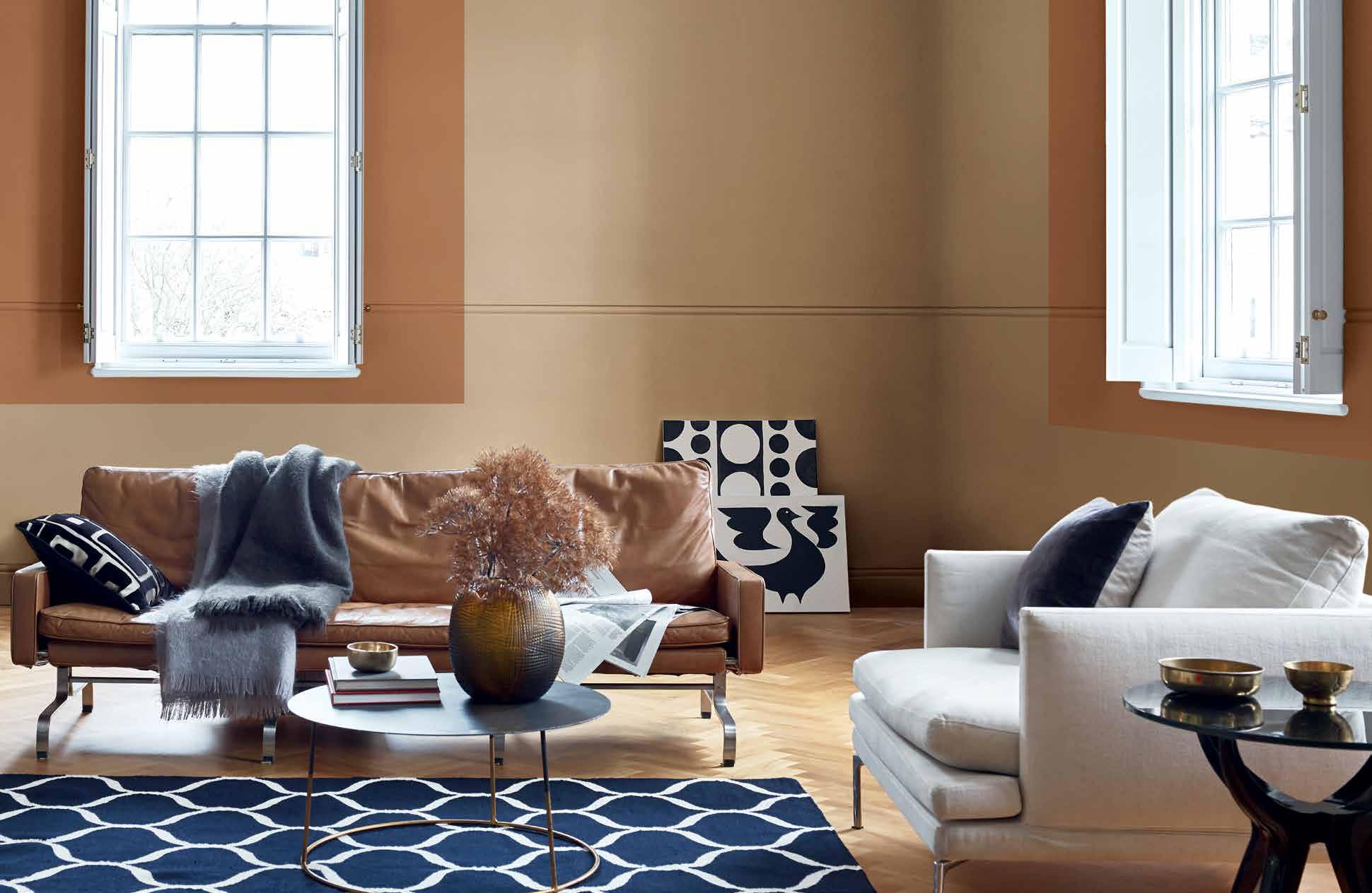
The ColourFutures 2019 mood of the moment:
LET THE LIGHT IN


SPICED HONEY
COLOUR OF THE YEAR 2019
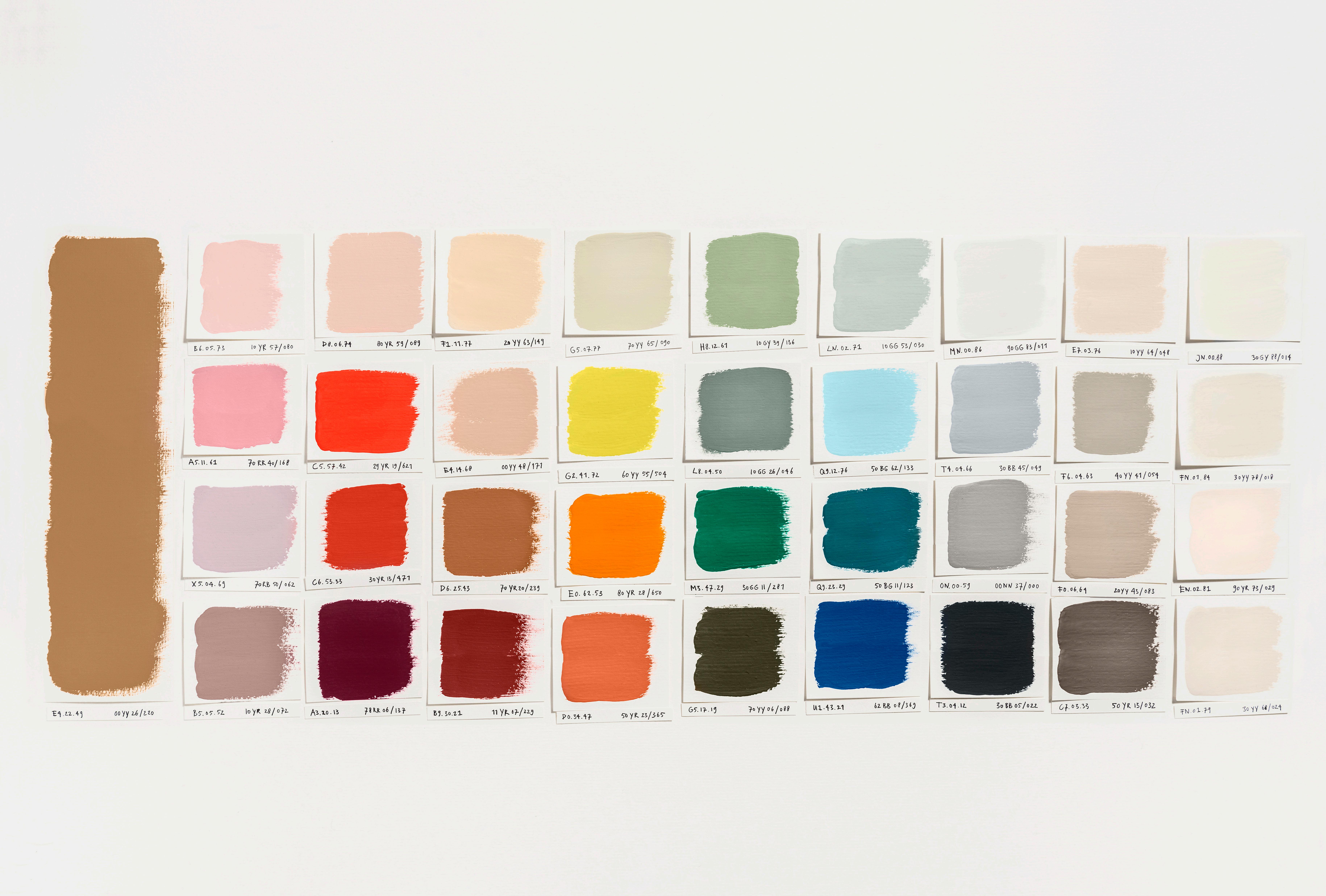
E4.22.49 00YY 26/220
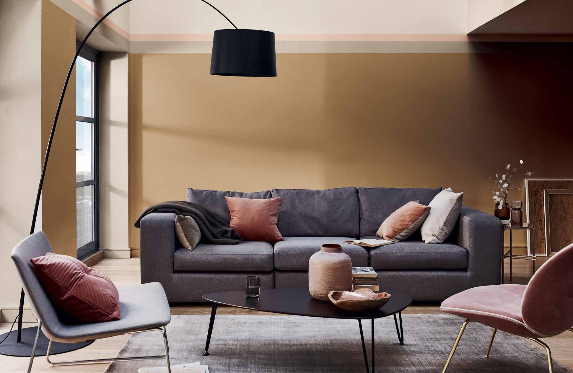
SPICED HONEY
COLOUR OF THE YEAR 2019
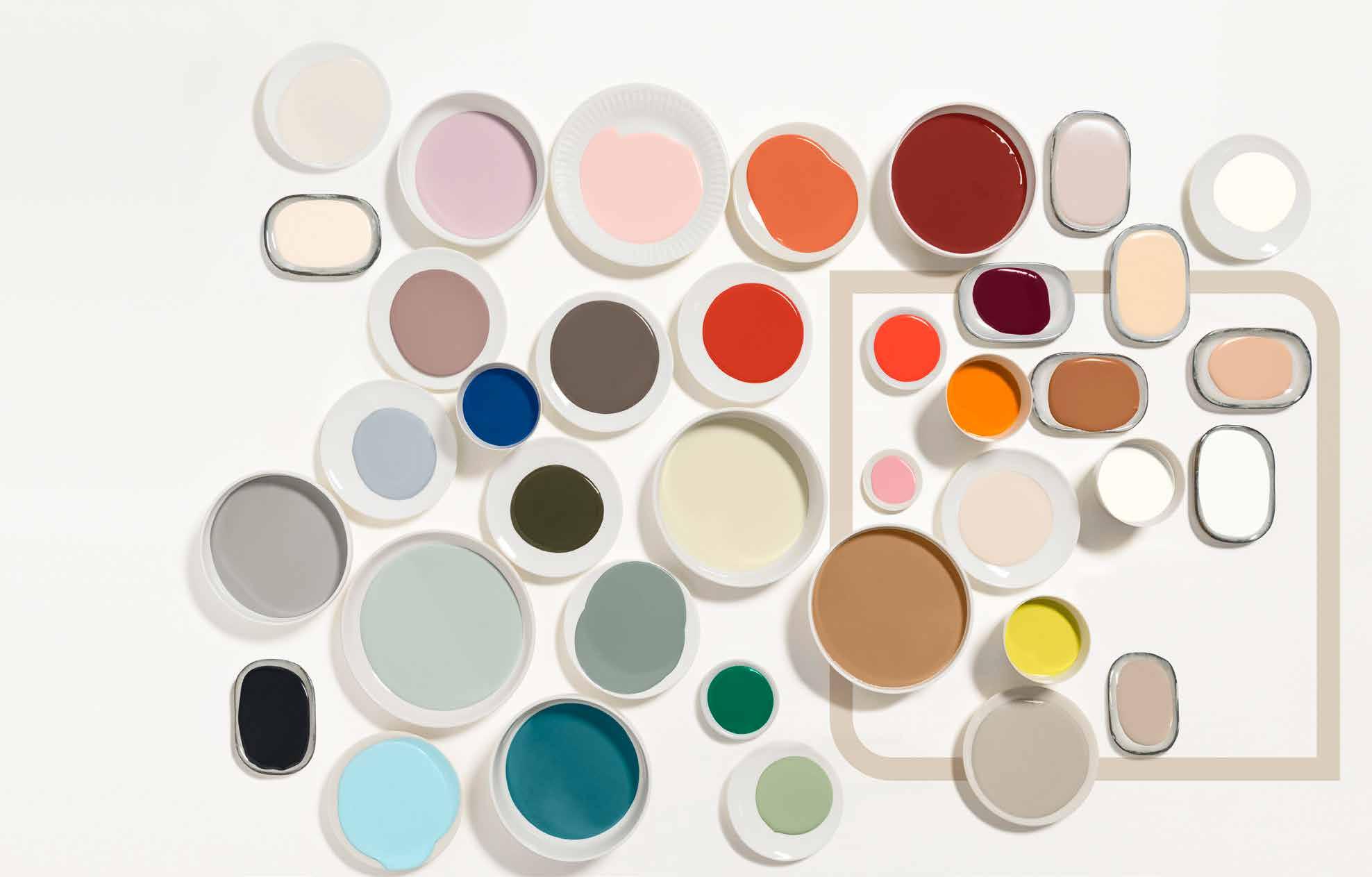
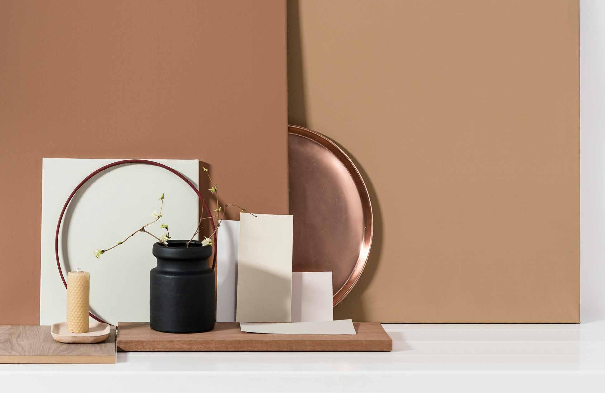
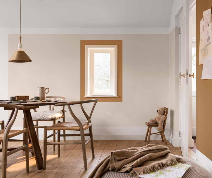
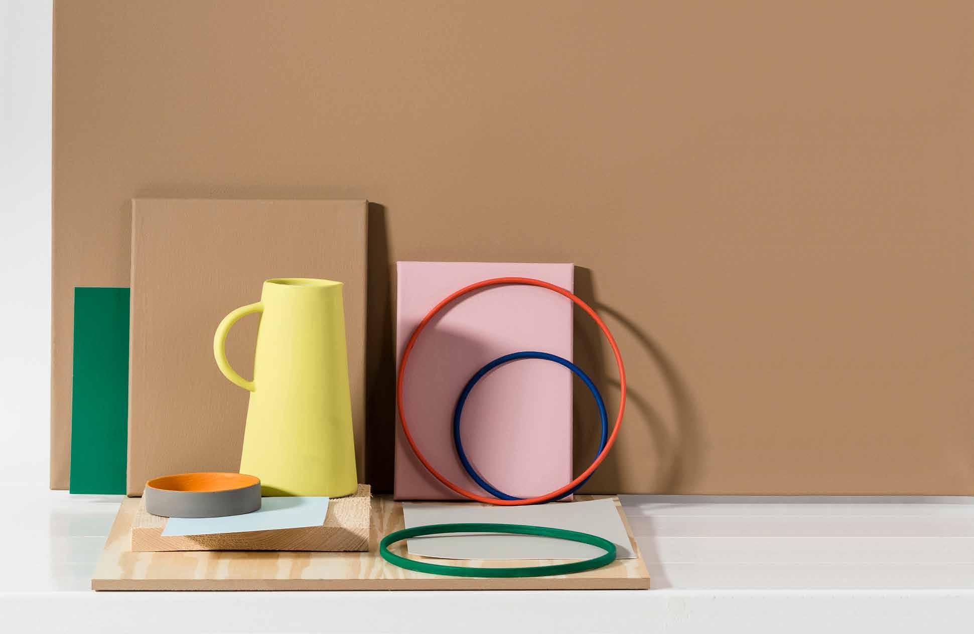
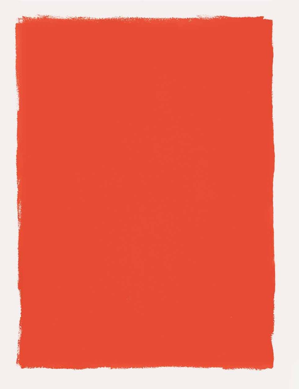
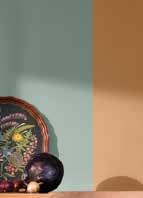
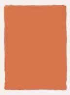
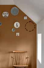
Spiced Honey has a warm amber tone that perfectly captures our ‘Let the Light in’ theme. It can be calming and nourishing or more stimulating and energising, depending on the light and colours surrounding it. Truly versatile and contemporary, our Colour of the Year for 2019 complements a broad spectrum of life and interiors styles and is the ideal choice for reflecting our new sense of optimism.
Revealing the ColourFuturesTM 2019 palettes
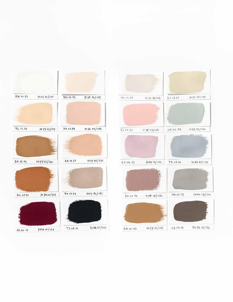
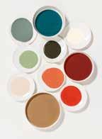
In 2019, we are awakening to a positive new mood and our four ColourFutures 2019 palettes will empower people to create homes full of purpose and possibility. These easy-to-use palettes promise to bring a fresh energy to the world’s walls, with the versatile Colour of the Year 2019, Spiced Honey, at the heart of each one. It’s inspired by the varied
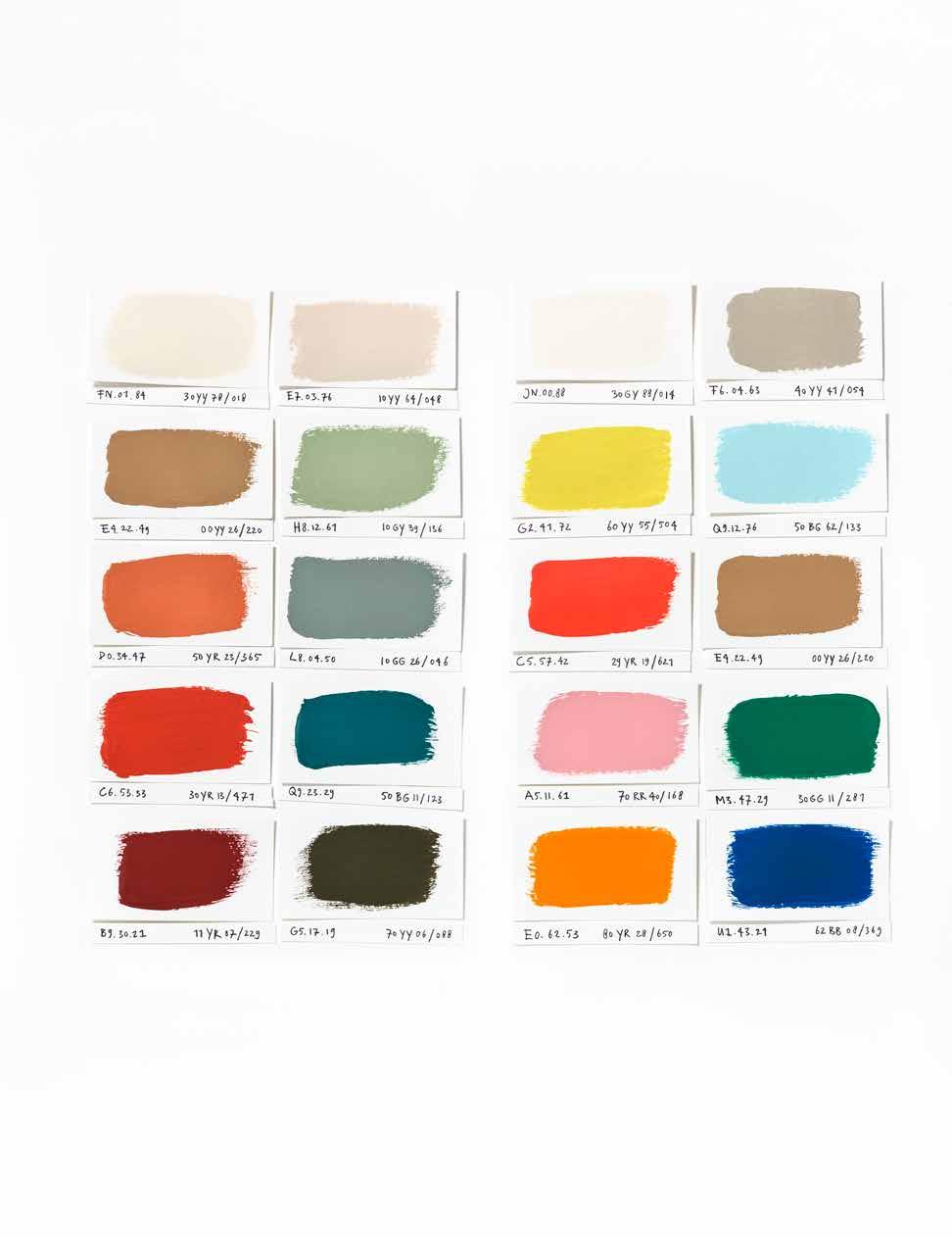
tones and remarkable properties of honey – natural, timeless and enduring, protective, rejuvenating and healing. Our trend forecasters from around the globe have reported a growing appreciation of both the substance and the shade, having seen its use on the rise across fashion, architecture and design.
A SPACE TO THINK
A SPACE TO THINK
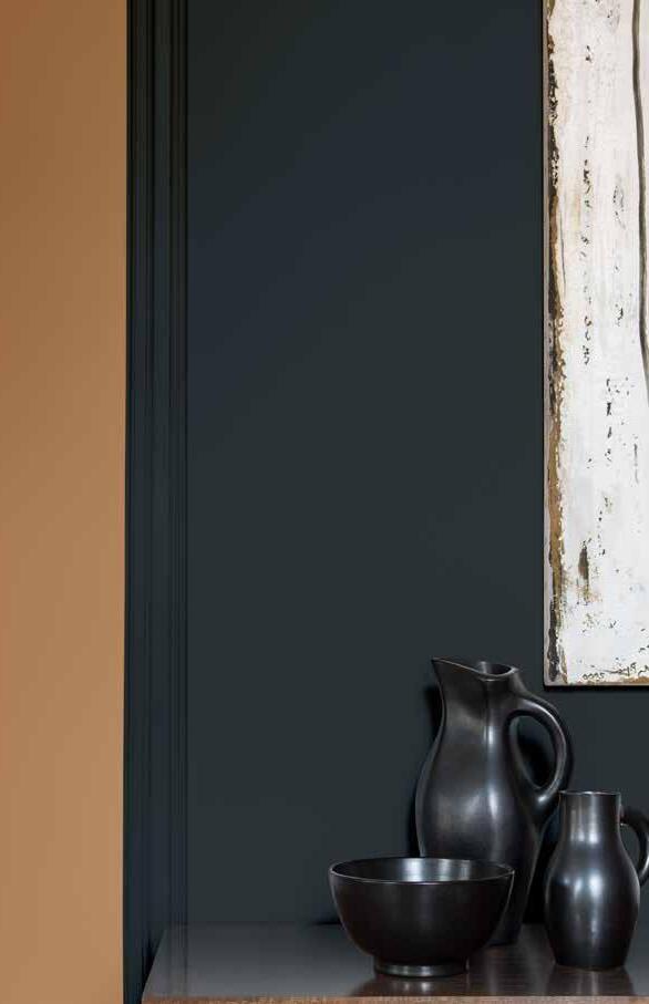
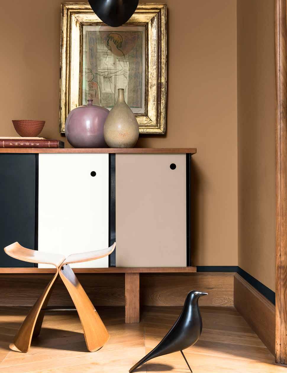
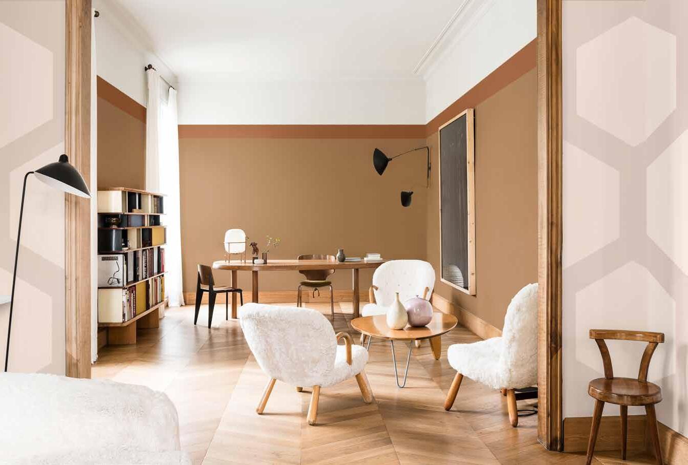
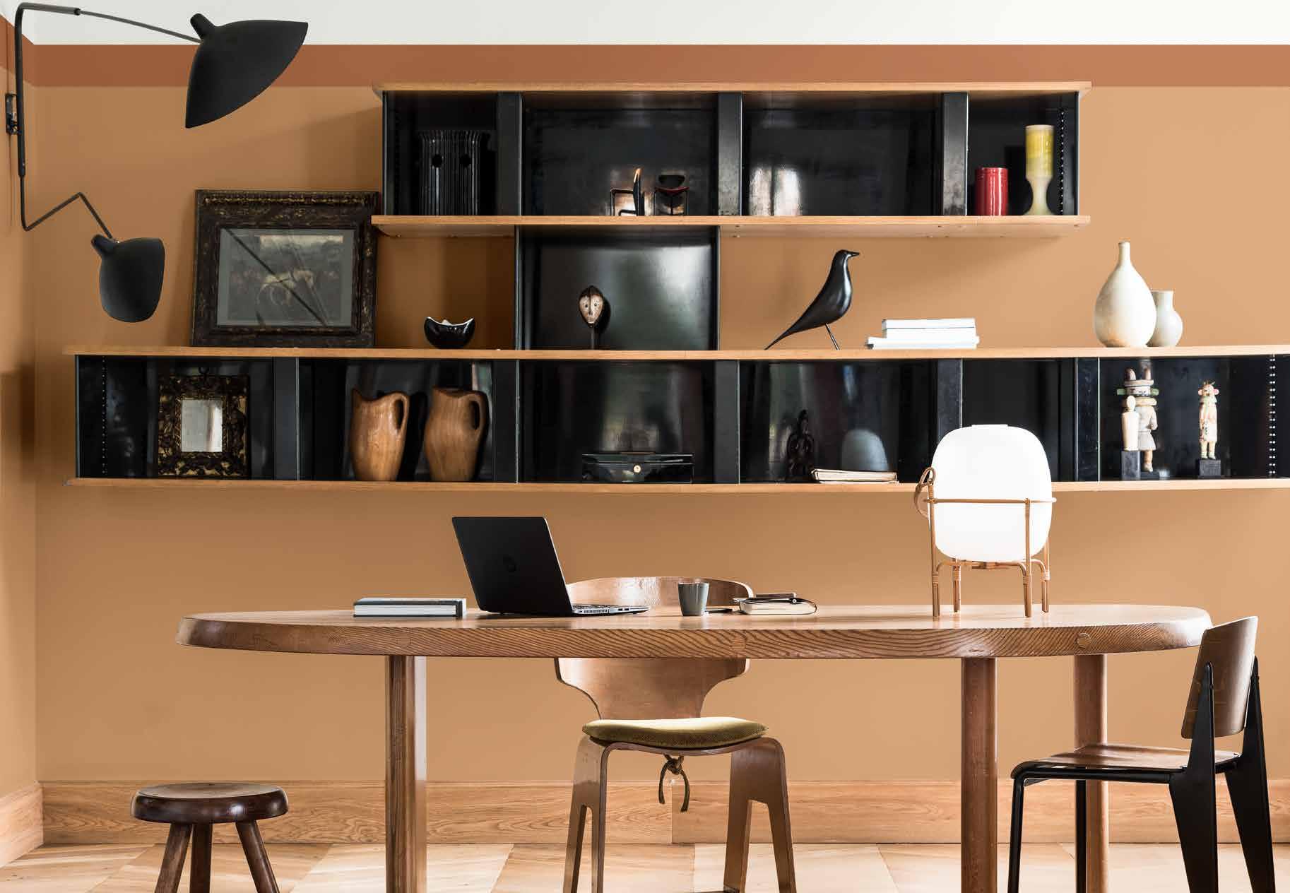
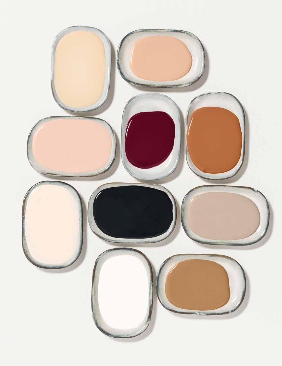
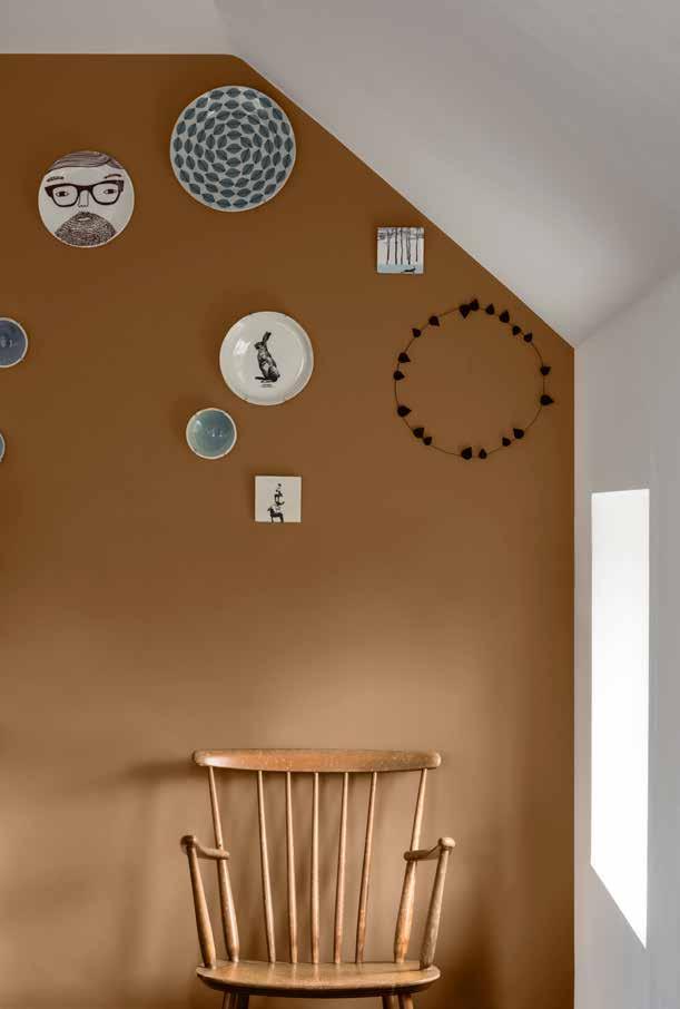
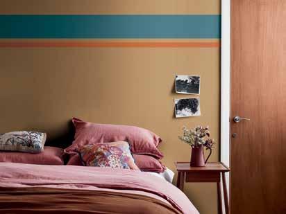
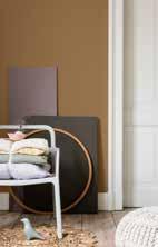
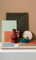
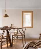
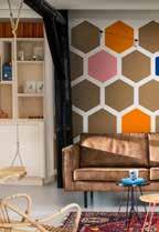
The THINK home creates an atmosphere of calm and clarity where we feel free to be ourselves. It’s a simple contemporary space, combining hotel chic with real-home warmth. The THINK dweller spends time at home to re-boot their brain, away from the sensory overload of the outside world. They love to be surrounded with a careful edit of inspiring objects and art. The relaxed paint colour palette has our warming, honey-hued Colour of the Year at its heart, combined with an inviting mix of rich neutrals and touches of soft pink, intense burgundy and sophisticated deep blue. Polished woods, mid-century furniture, graphic rugs and textiles emphasise the smart, yet soothing, coherence of the look.
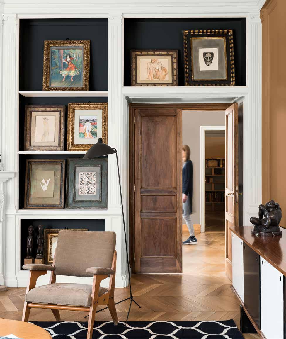
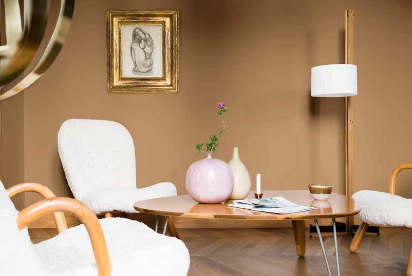
“RICH AND STIMULATING SHADES INCLUDING INTENSE CLARET AND EARTHY OCHRE ARE SHARPENED BY CRISP WHITE AND GRAPHIC BLACK”
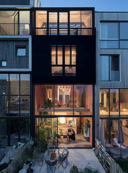
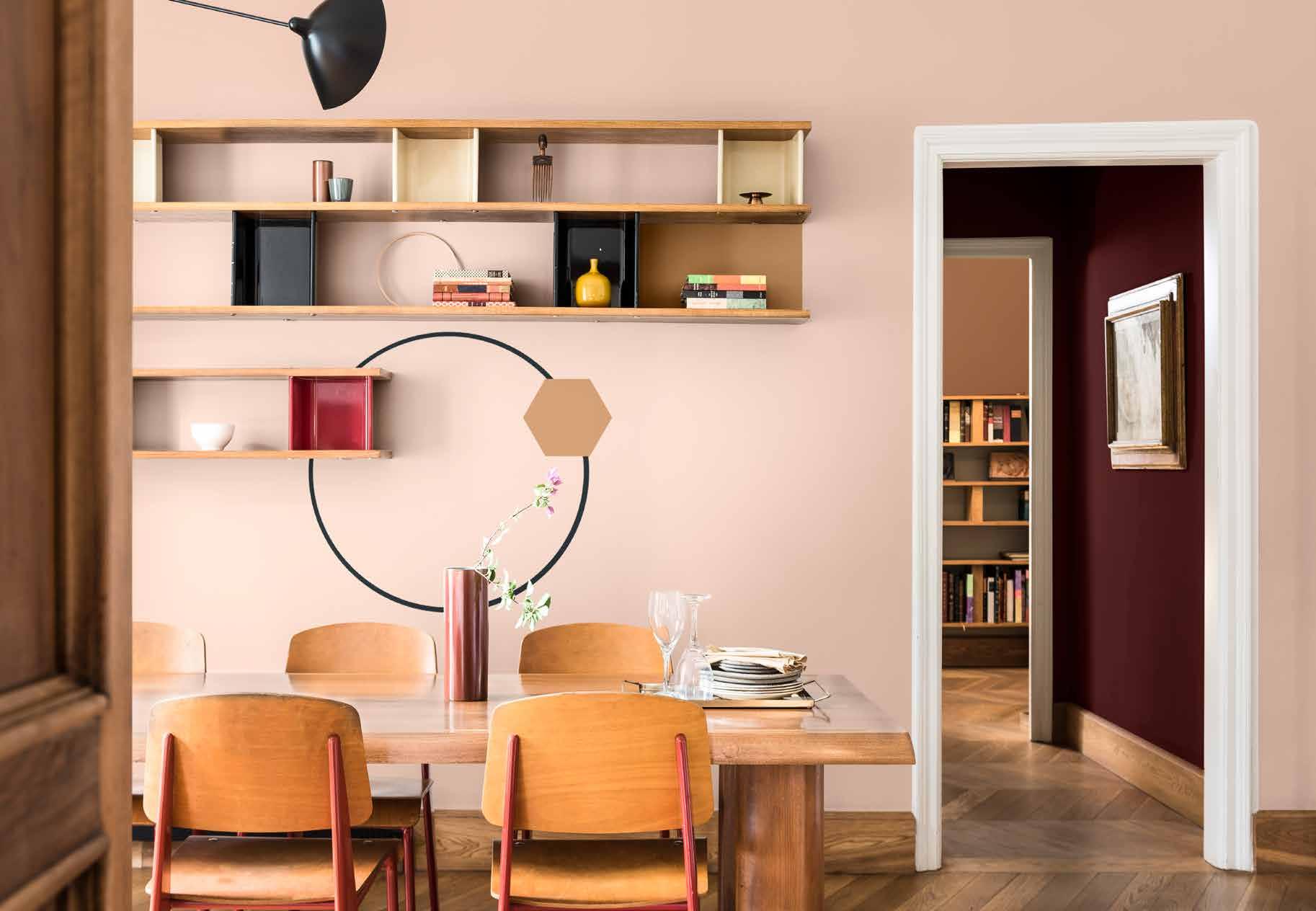
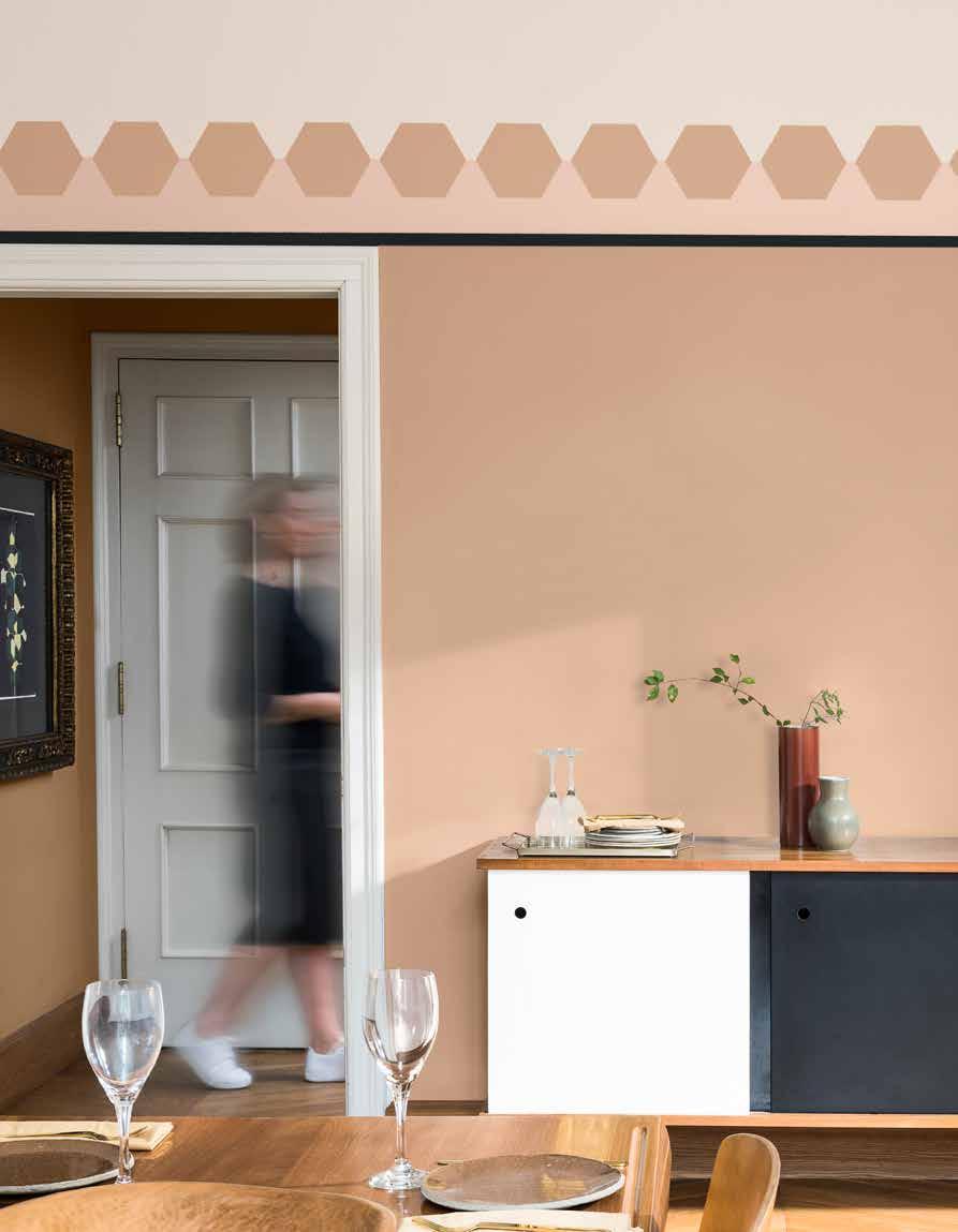
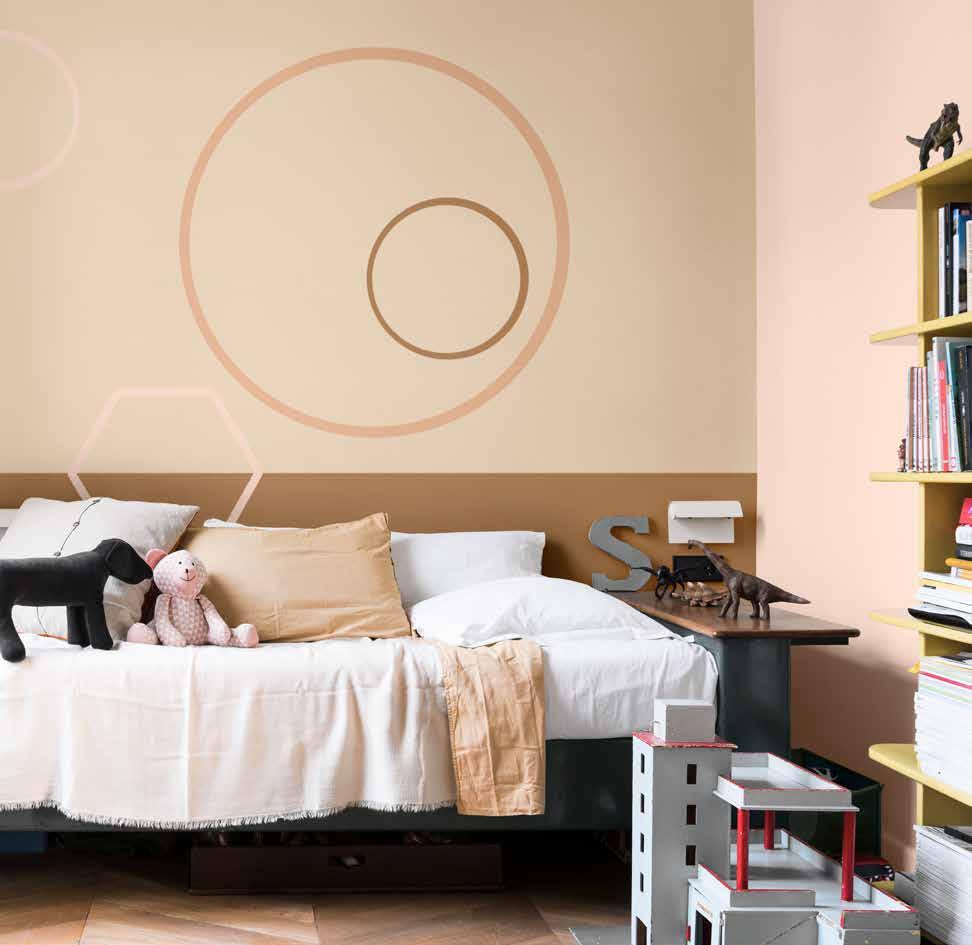
“BOLD GEOMETRIC SHAPES AND A CALMING PALETTE COMBINE TO CREATE THOUGHT-PROVOKING SPACES”
THE THINK PALETTE

A SPACE TO DREAM
A SPACE TO DREAM
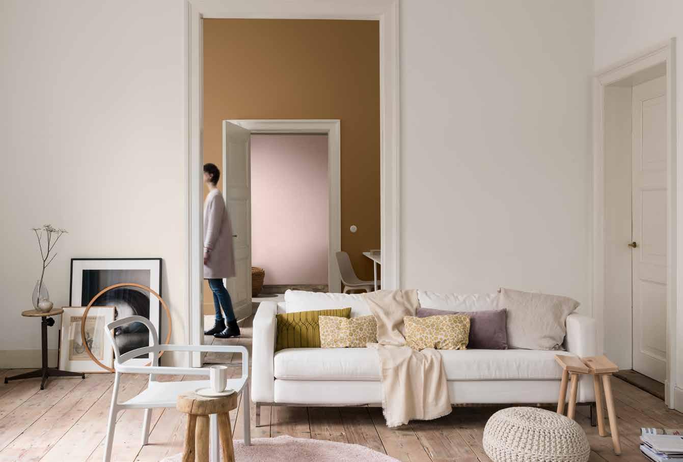
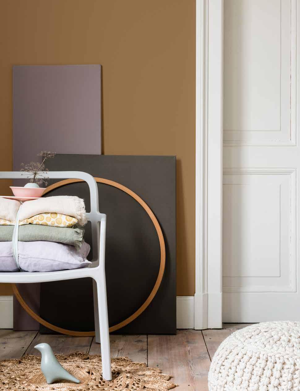
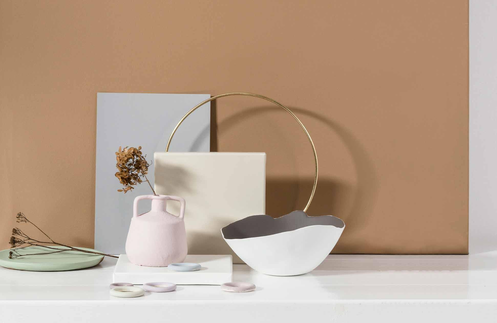
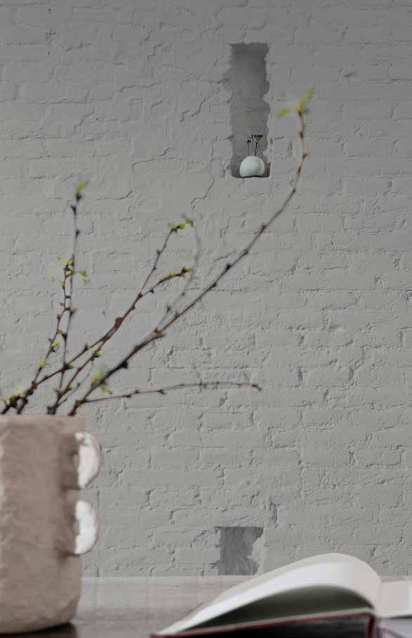
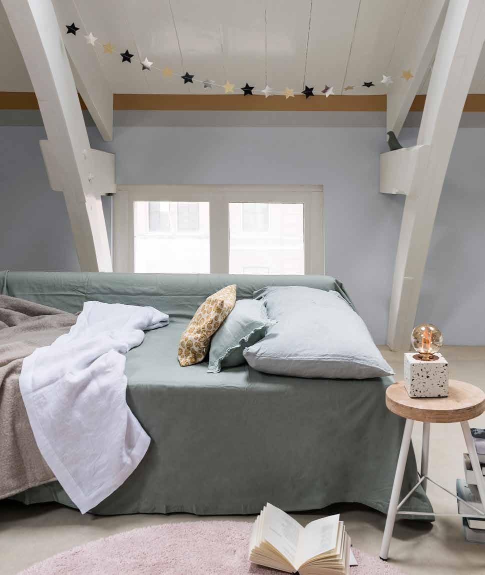
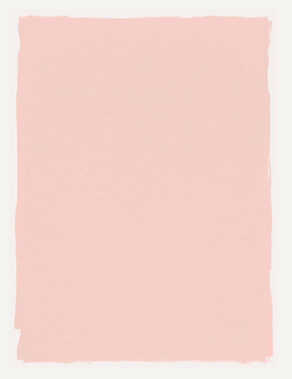
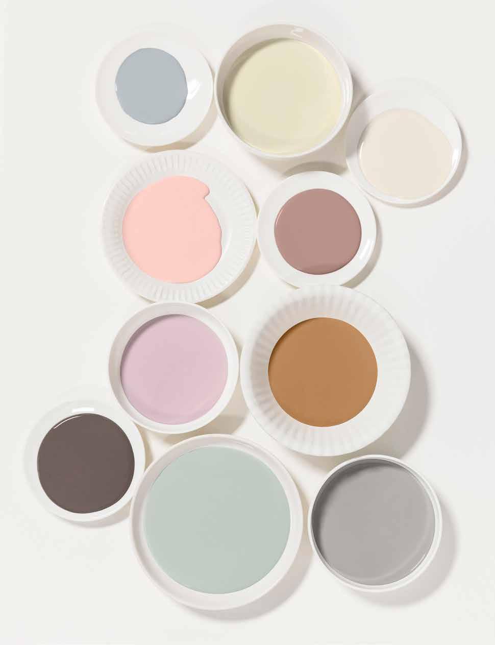
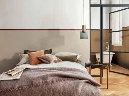
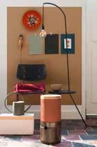
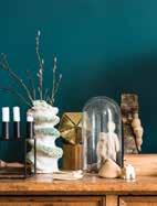
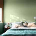
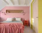
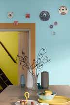
The DREAM home creates a space where we can be still and silent. Somewhere to sit and drift in perfect peace, to become lost in the moment and to wonder ‘what if?’ The DREAM home dweller loves the way their surroundings allow them to stop rushing and relish the here and now. They appreciate a home that is elegant but relaxed, with whimsical playful touches. The dream palette is serene and grown up, yet soft and warm. A gently muted mix of romantic powder pinks and blues create calm, with our honey-toned Colour of the Year bringing depth and sophistication to the look. Plain pale woods, simple hand-thrown vessels and pretty fabrics add to the contemplative, centred feel of this home.
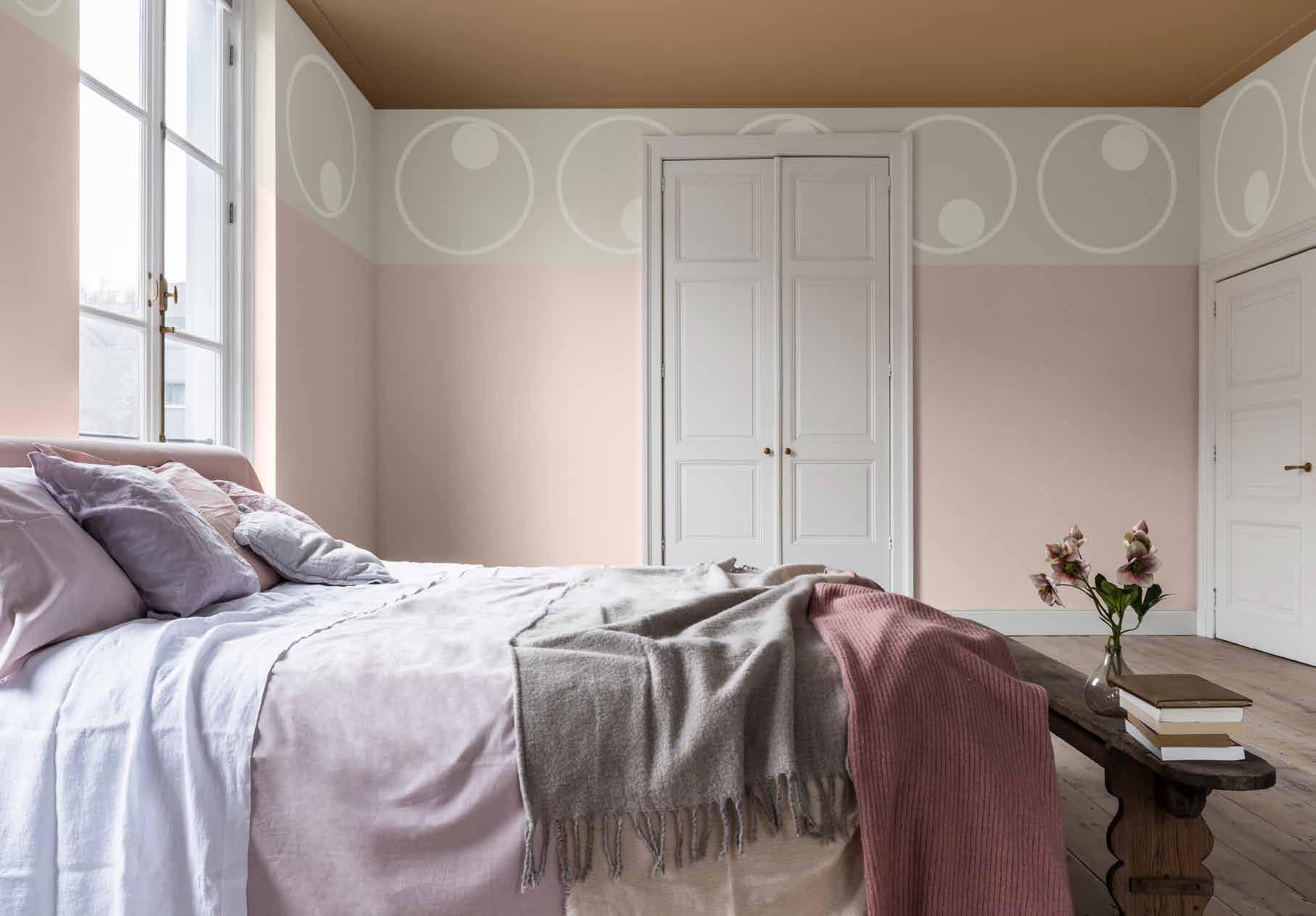
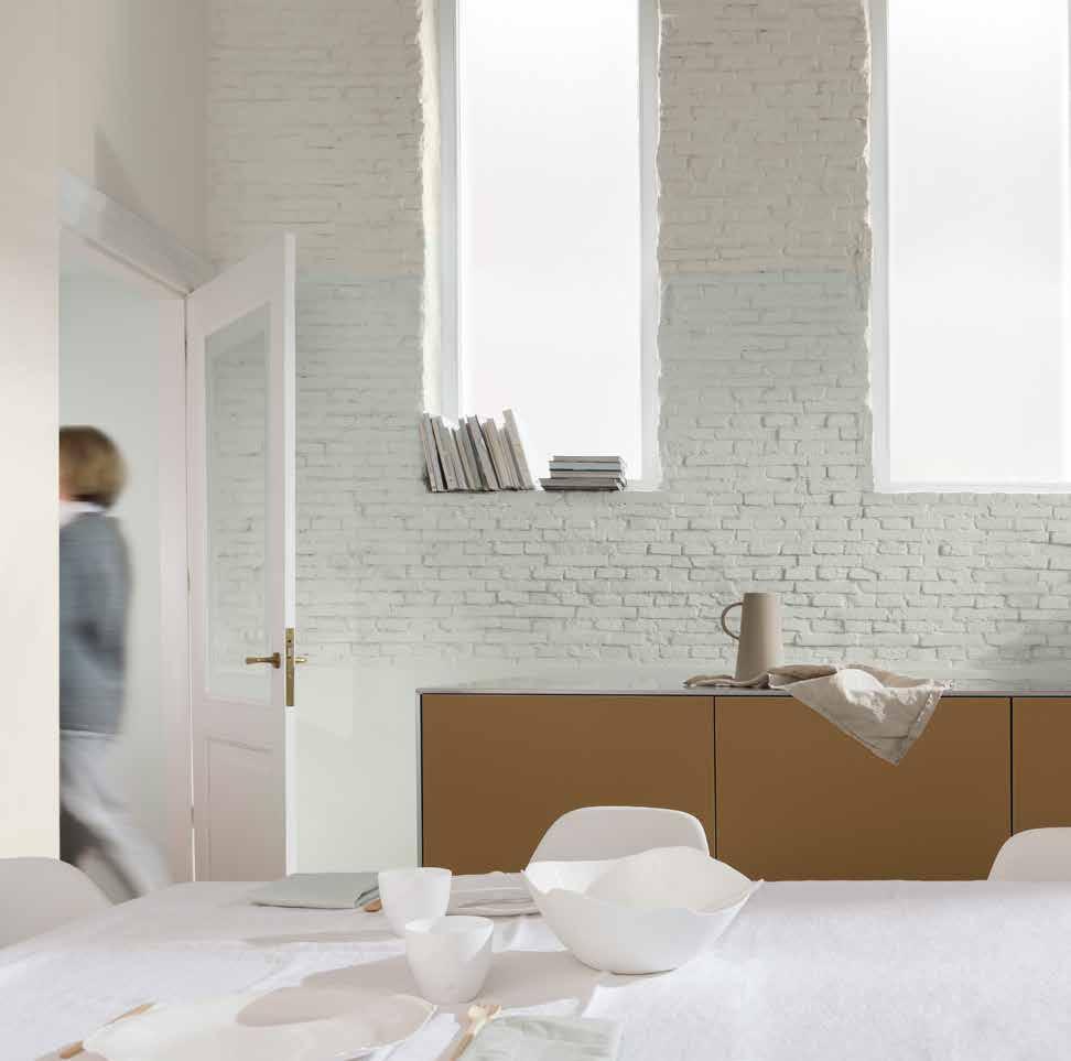
“A BALANCE OF POWDERY PASTELS AND SOFTEST NEUTRALS CREATE A SOOTHING SPACE, WITH ACCENTS OF HONEY FOR DEPTH AND DEFINITION”
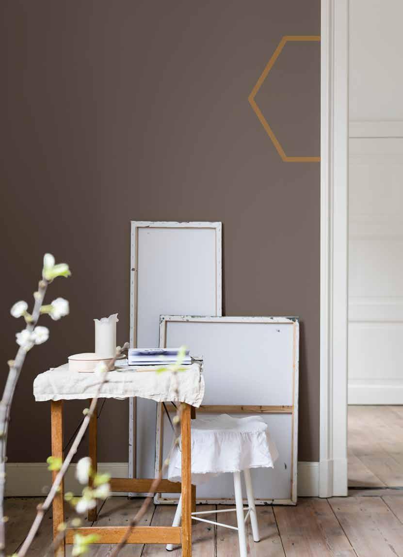
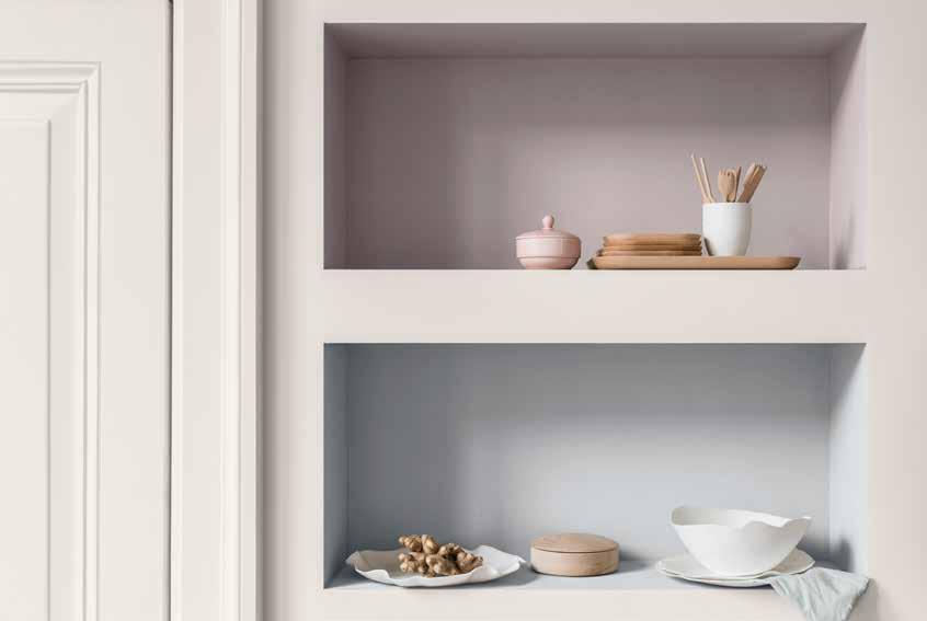
“IN THE DREAM PALETTE, SOFT SHADES LAYER UP TO ACHIEVE A SERENE ATMOSPHERE WHERE WE CAN GET LOST IN THE MOMENT”
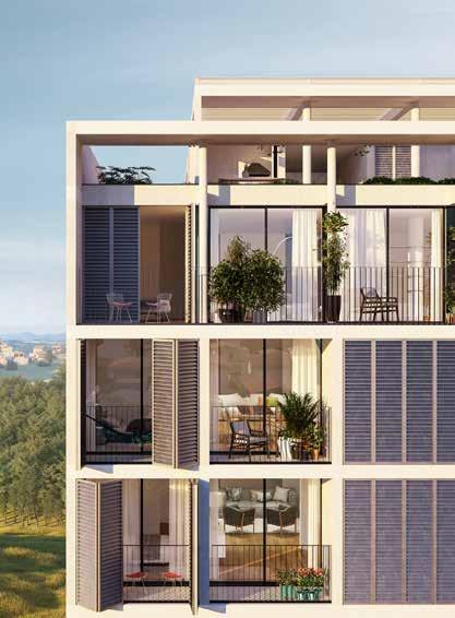
THE DREAM PALETTE
A SPACE TO LOVE
A SPACE TO LOVE
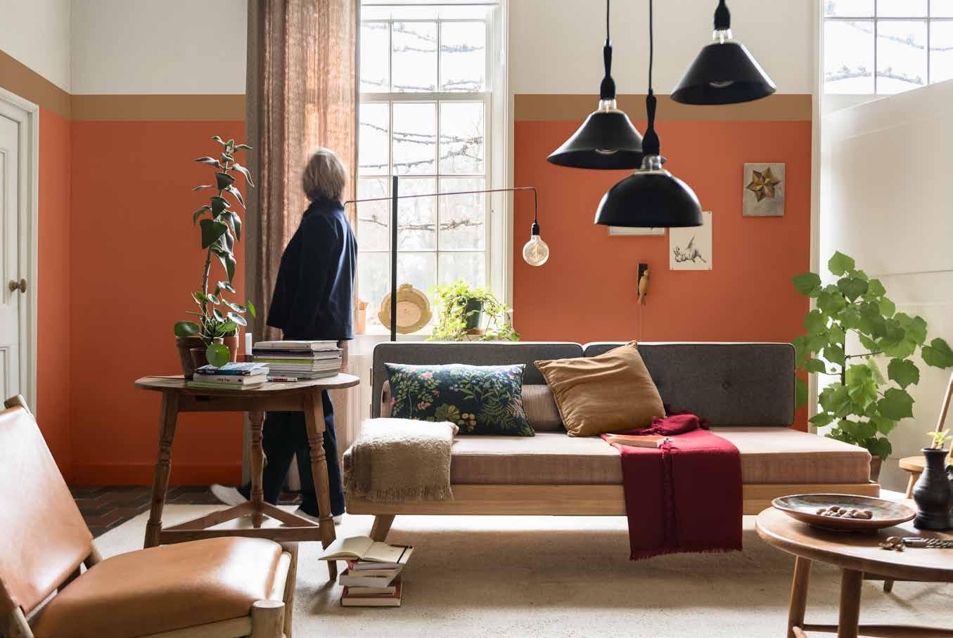
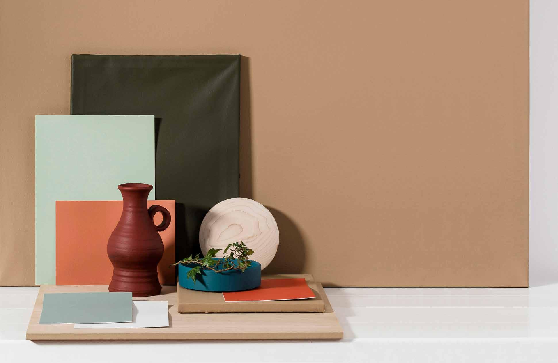
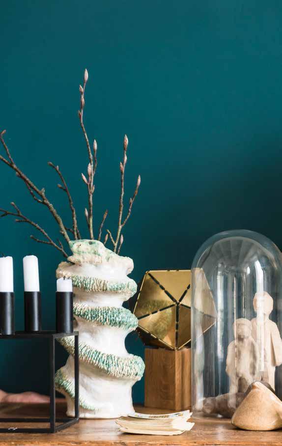
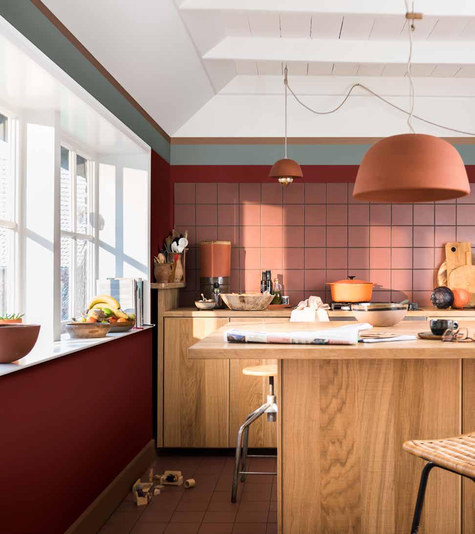
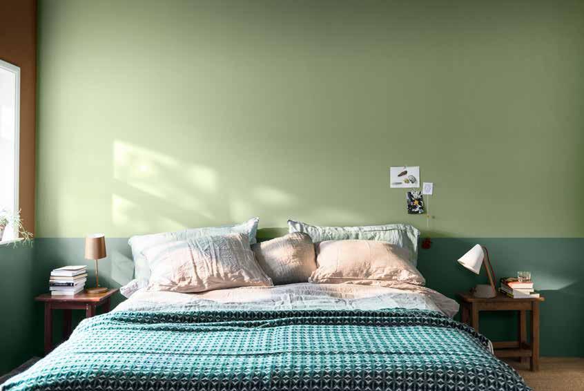
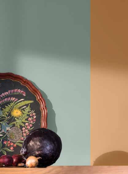
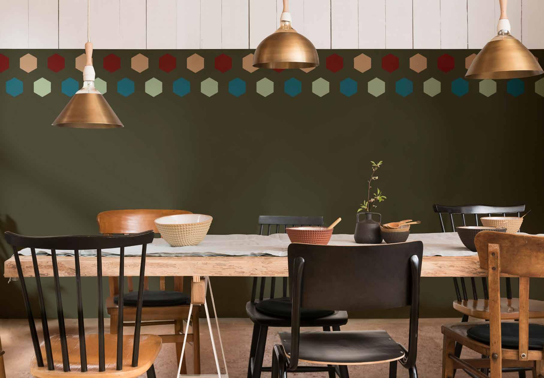
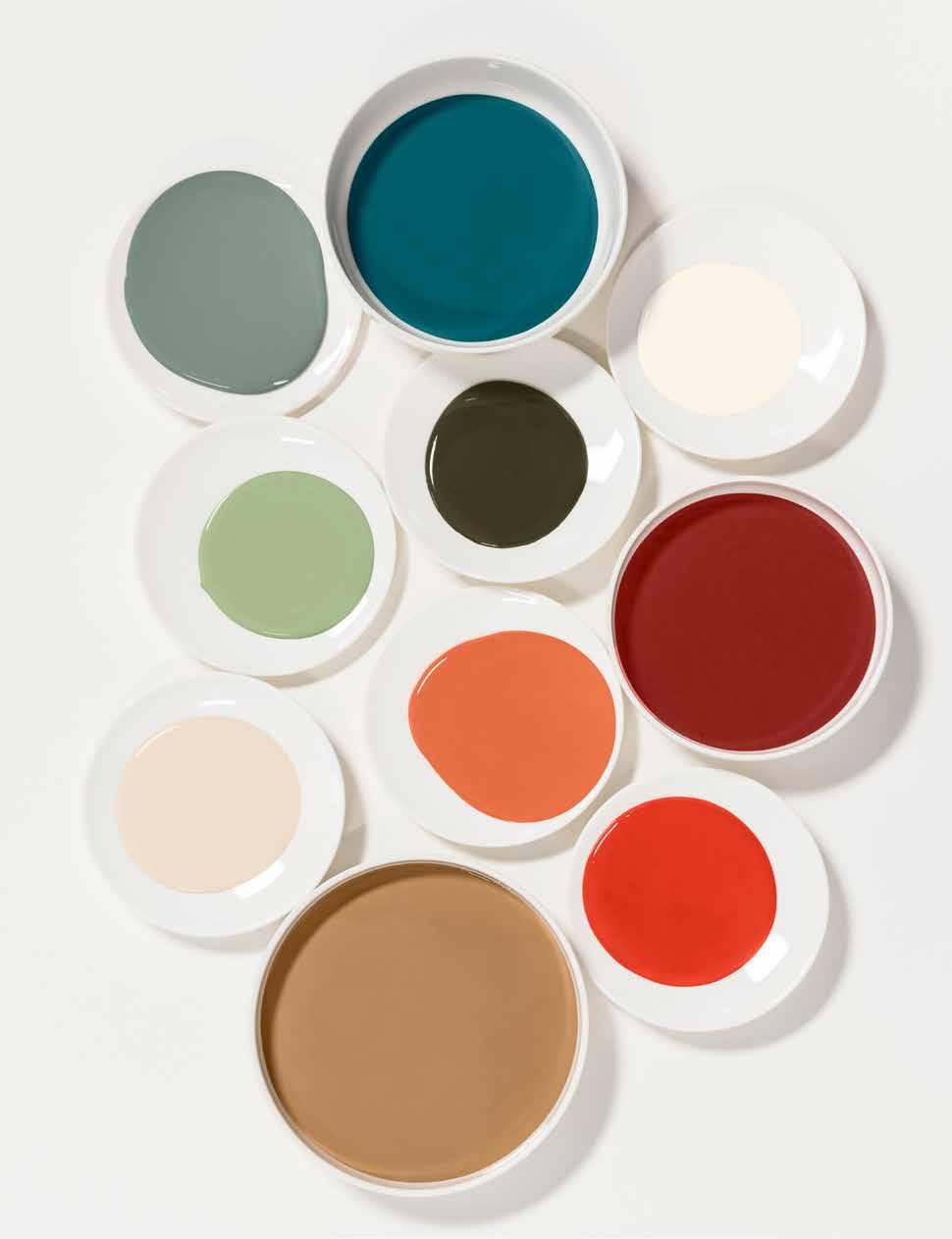
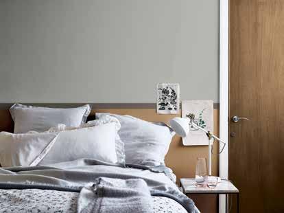
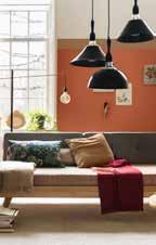
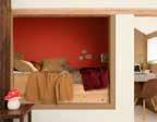
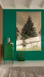
The LOVE home creates a happy and welcoming ‘open house’ atmosphere, where we can surround ourselves with the people and things that matter to us. The LOVE home dweller cherishes things that have a special meaning for them and this is reflected in the offbeat and unusual objects that adorn their rooms, as well as the lush plants that they like to nurture. This palette, our warmest of 2019, is filled with richly pigmented shades including deep forest green, bold teal and intense terracotta red, tempered by our honey-inspired Colour of the Year and pale neutrals. With wooden furniture and botanical prints, it all goes to create a relaxed yet cosy home that’s perfect for sharing with loved ones.
“THE LOVE HOME IS AN INTENSELY WELCOMING SPACE WHERE RICHLY COLOURED WALLS SEEM TO WRAP YOU IN AN EMBRACE”
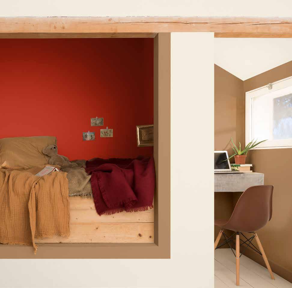
“OUR HONEY-TONED COLOUR OF THE YEAR COMBINES WITH MELLOW WOODS AND COSY KNITS TO CREATE AN INVITING ATMOSPHERE”
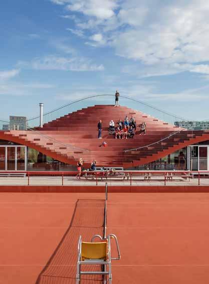
“WE’RE SEEING SHARED OUTDOOR SPACES BEING BROUGHT TO LIFE WITH FLUID SHAPES AND RICH, WARM HUES”
THE LOVE PALETTE

A SPACE TO ACT
A SPACE TO ACT
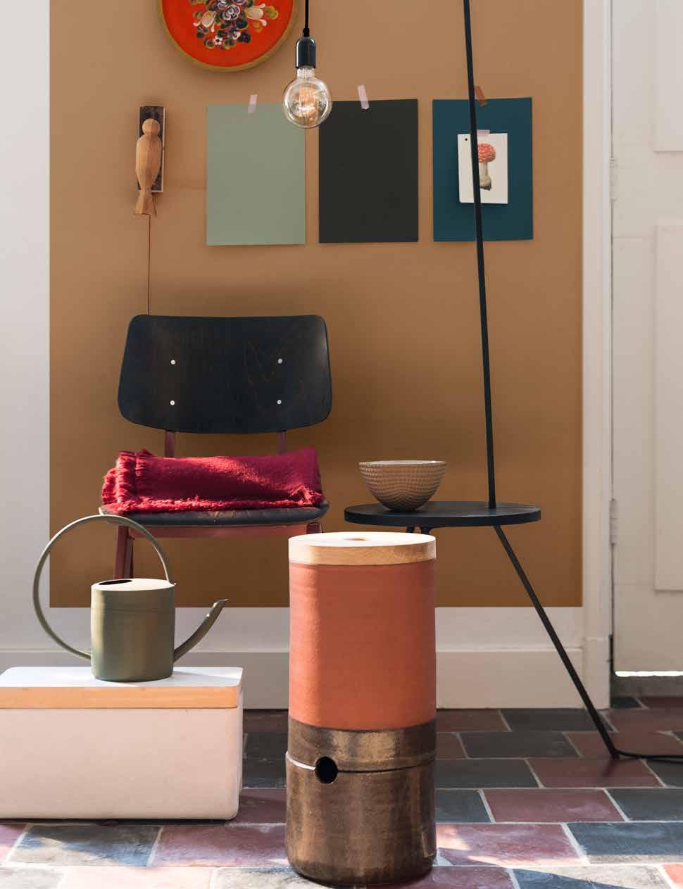
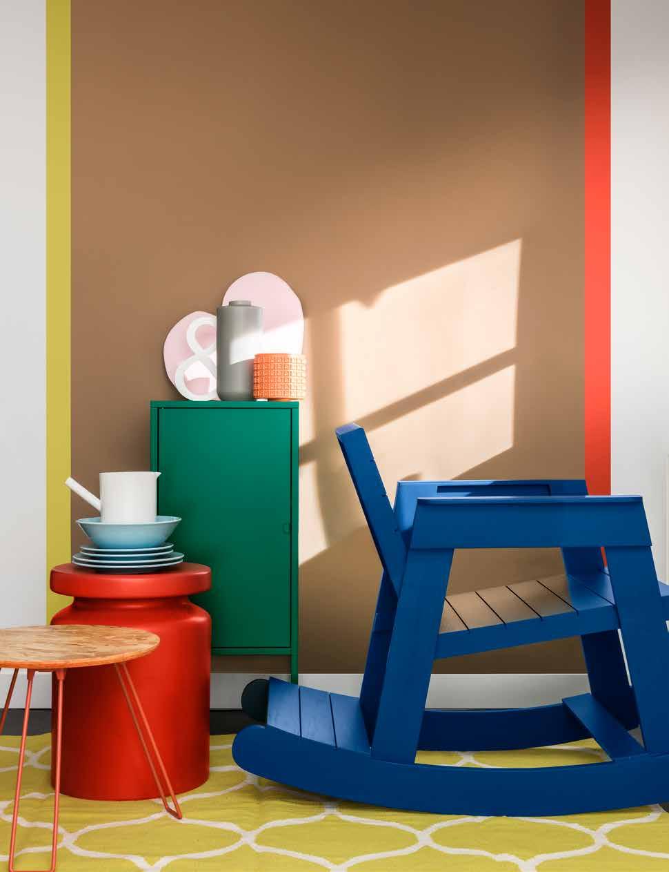
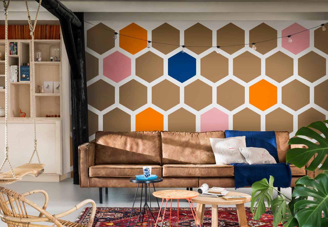
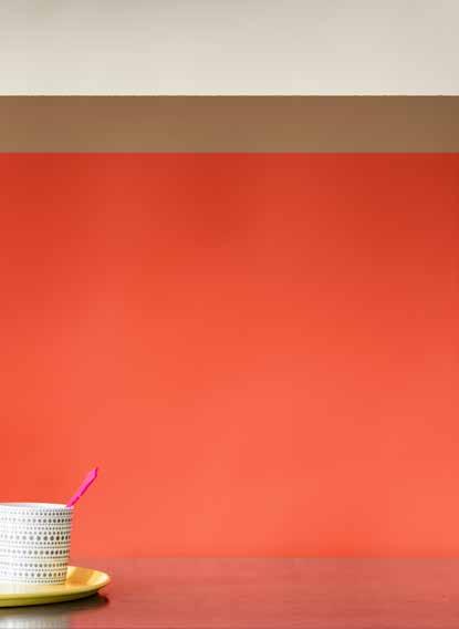
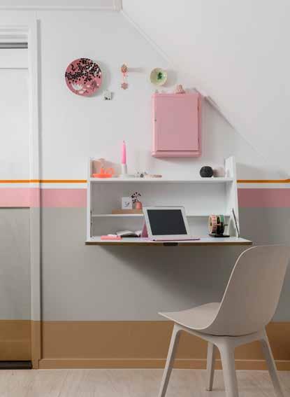
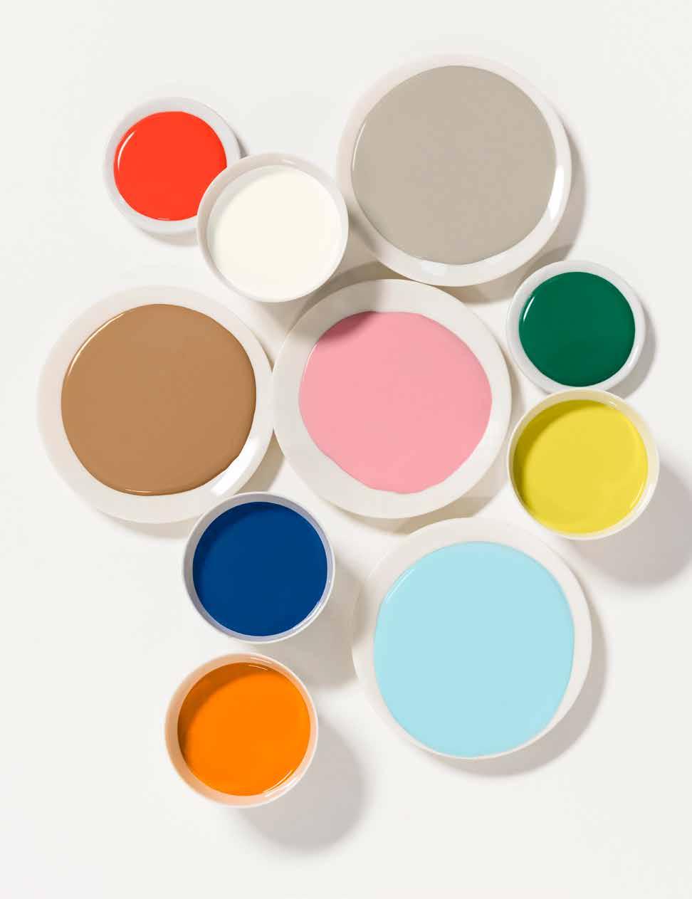
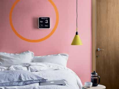
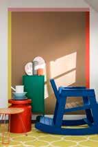
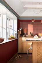
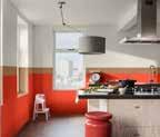
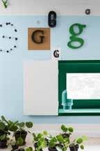
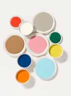
Home can be a place that sparks action and allows you to give things a try, whatever the outcome. It’s the four walls that listen when you first voice an idea, where you solve a problem under the jets of the shower. The ACT home dweller is bold and brave but also fun and uncomplicated. They look to their home to charge them up with energy and momentum. The playful pop-y palette combines vivid red and green with paler pink and blue, underlined by crisp greys and whites. The golden tones of our honeyed Colour of the Year ensure that the palette stays warm and inviting. This home is brought to life with reclaimed furniture that has been painted and personalised by the owners. Bold graphic shapes, low-key cork and plywood with vintage rugs, create a space that inspires action.
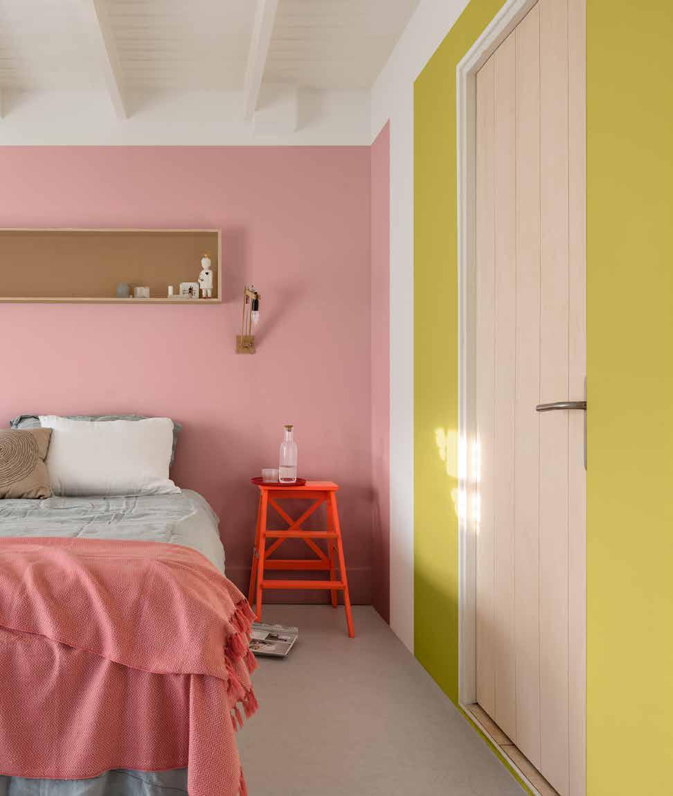
“THE PLAYFUL PALETTE PAIRED WITH ECLECTIC FURNITURE CREATES AN
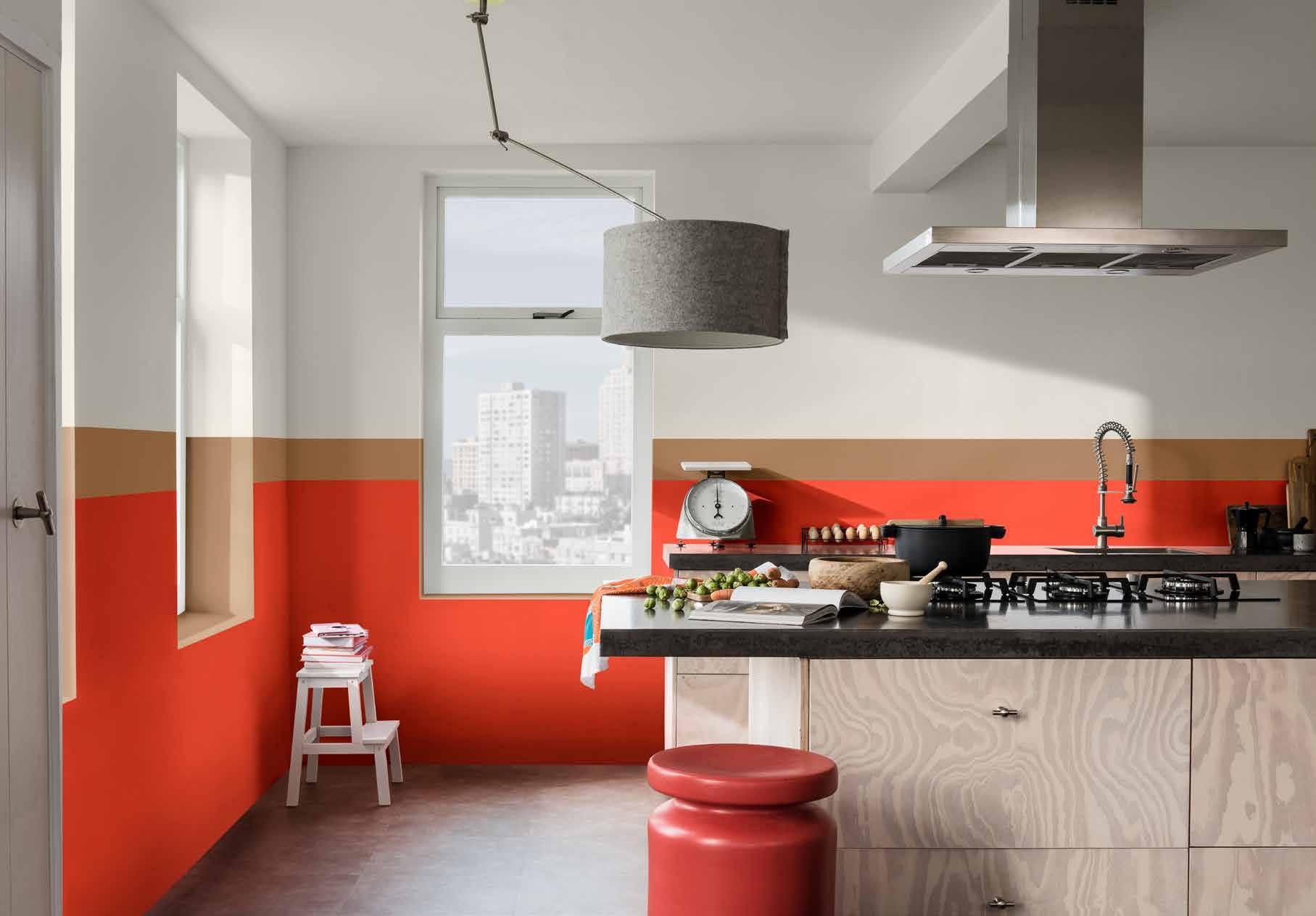
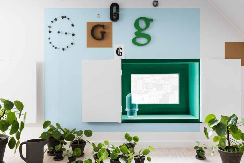
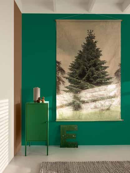
“THE MOOD IN THE ACT HOME IS LIVELY AND UNCOMPLICATED WITH POPS OF VIVID COLOUR GROUNDED BY GOLDEN HONEY TONES”
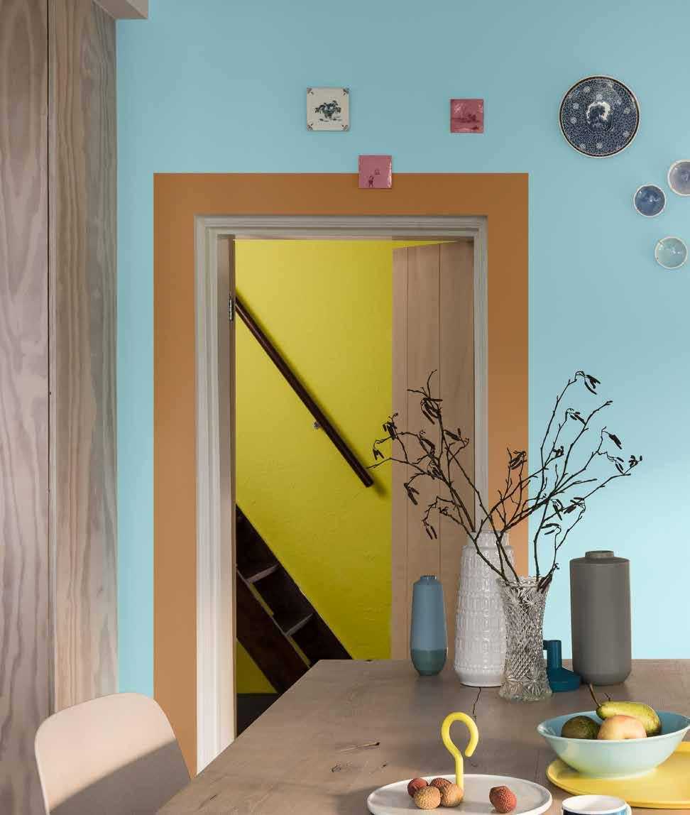
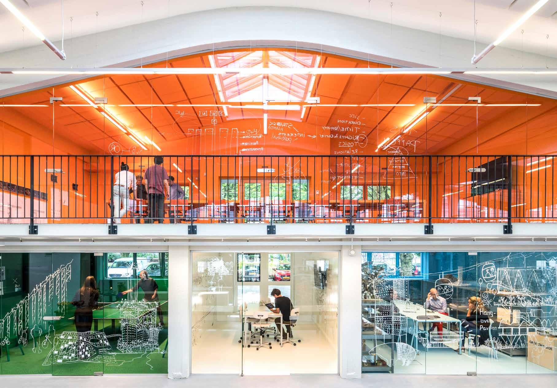
“INVIGORATING, BRIGHT TONES ARE AN INCREASINGLY POPULAR CHOICE FOR CREATIVE SPACES”
THE ACT PALETTE
THE TRANSFORMATIVE POWER OF PAINT
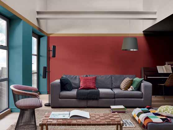
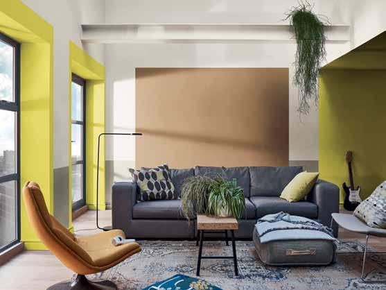
ONE LIVING ROOM, FOUR PALETTES
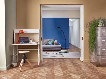
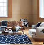
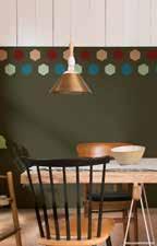
The living room is where people come to relax, dream, think and recharge, but it’s also a space where they spend time with friends and family. People are always searching for new ways to make this a special room that they can enjoy and feel proud of. Our extensive collection of inspiring images is there to meet your feature story needs; whether with simple ‘before and after’ shots or a more detailed exploration of how just one of our paint colour palettes can transform the living room.
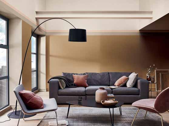
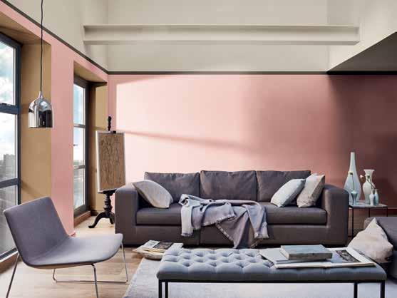
We think it’s important to show consumers how our four easy-to-use paint colour palettes can help them achieve a diverse range of stunning looks in their own homes. So we’ve created a library of images (all freely available for media use via the AkzoNobel Brand Center) that includes all the key rooms and matches the most popular interiors search terms. The wide range of photographs that we offer, including ‘before’ shots, gives you the flexibility to create a variety of different stories to suit the needs of your consumers, as we explain on the following pages.
THE TRANSFORMATIVE POWER OF PAINT
ONE LIVING ROOM, FOUR PALETTES

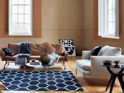
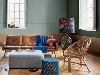
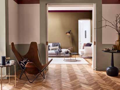
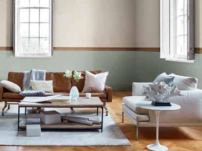
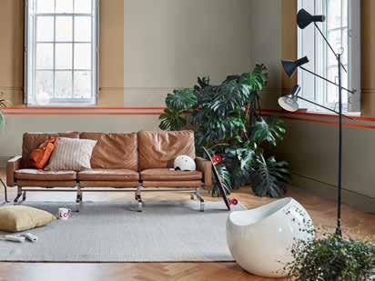
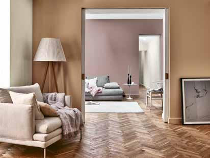
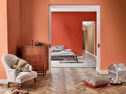
THE TRANSFORMATIVE POWER OF PAINT
ONE BEDROOM, FOUR PALETTES
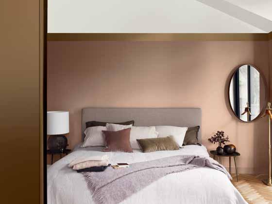
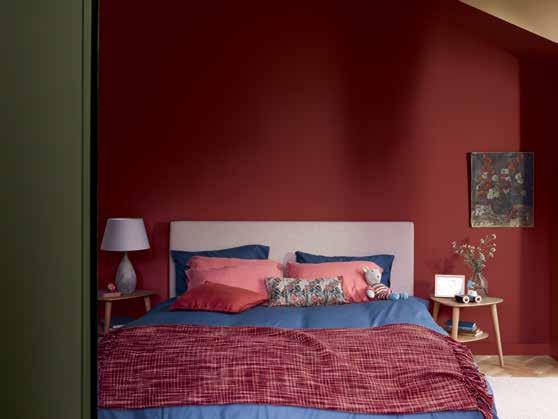
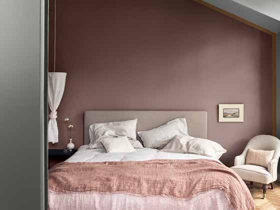
In an increasingly hectic world, the bedroom remains a private, intimate space where we are free to think our own thoughts and dream our own dreams – and it’s a room that consumers are paying ever more attention to. We’ve created a wide selection of inspiring images to help you easily compile a beautiful bedroom story that meets the needs of your readers, such as ‘one bedroom, four ways’ that really brings home the transformative power of paint.
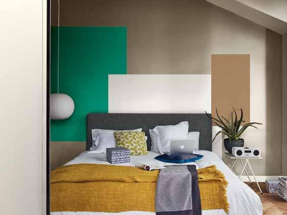
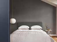
THE THINK SPACE
THE DREAM SPACE
THE LOVE SPACE BEFORE
THE ACT SPACE
THE TRANSFORMATIVE POWER OF PAINT
ONE BEDROOM, FOUR PALETTES
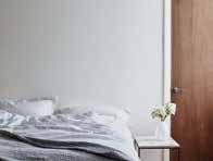
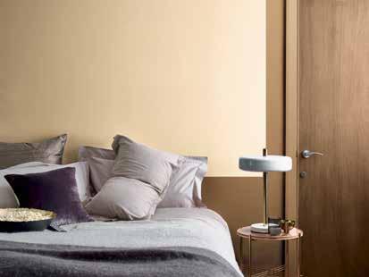
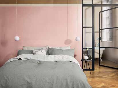
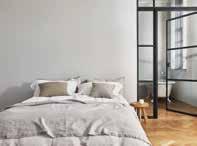
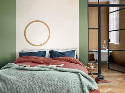
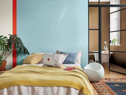
THE TRANSFORMATIVE POWER OF PAINT
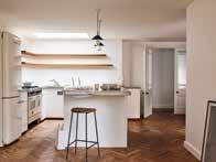
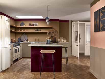
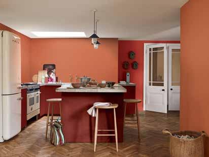
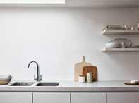
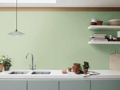
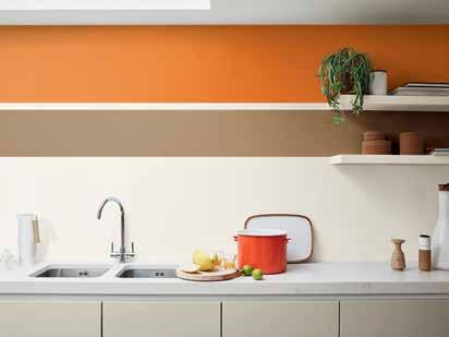
ONE KITCHEN, FOUR PALETTES
Across the world, the role of the kitchen is evolving from a functional cooking space to the new heart of the 21st-century family home. Our library of diverse images helps you to put together beautiful features to meet the needs of your readers in a variety of ways – from simple ‘before and after’ stories to an in-depth feature on any one of our inspiring paint colour palettes at work in a variety of kitchens.
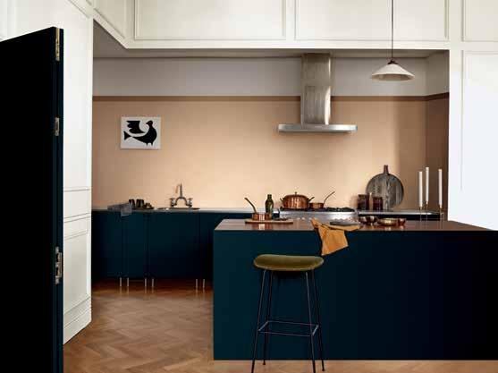
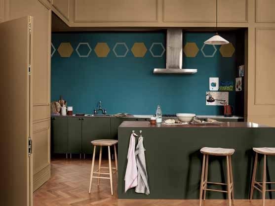
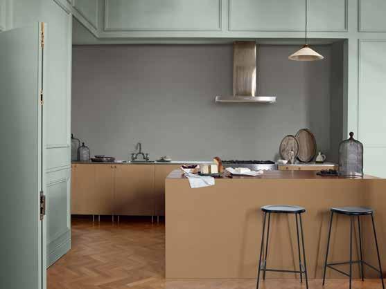
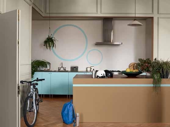
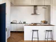
THE THINK SPACE
THE DREAM SPACE
THE LOVE SPACE BEFORE
THE ACT SPACE
THE TRANSFORMATIVE POWER OF PAINT
ONE KITCHEN, FOUR PALETTES
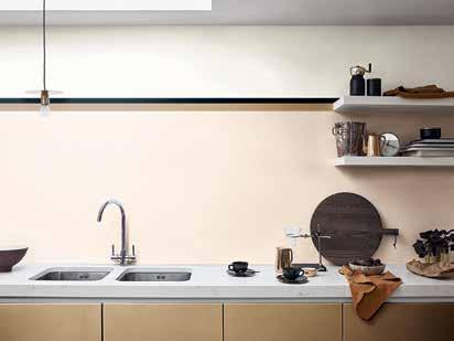
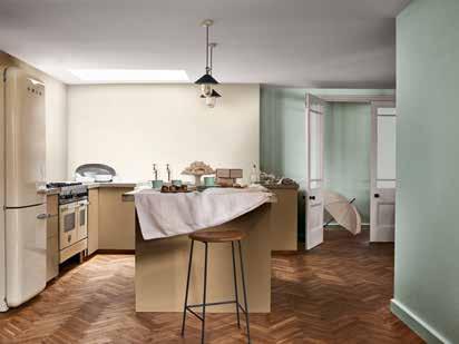
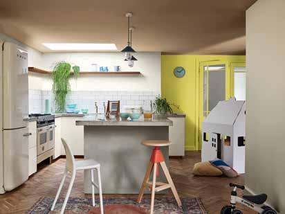
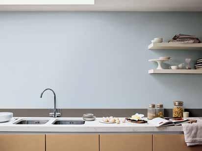
THE TRANSFORMATIVE POWER OF PAINT
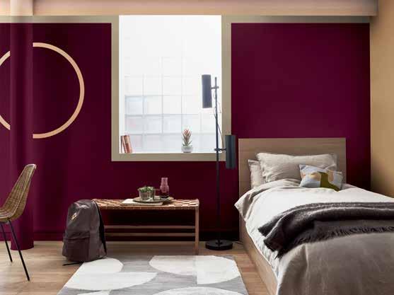
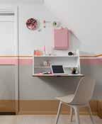
ONE KID’S ROOM, FOUR PALETTES
Consumers are spending ever more time, attention and money on turning their children’s bedrooms into wonderful spaces to grow up in – and they are searching for inspiration to help them in their efforts. So we’ve created an impressive collection of images that show how our four stunning paint colour palettes work in real rooms. You can use them in a variety of ways to bring these stories to life for your readers – for example, by pulling out one key idea, such as ‘how to paint a feature wall that kids will love’.
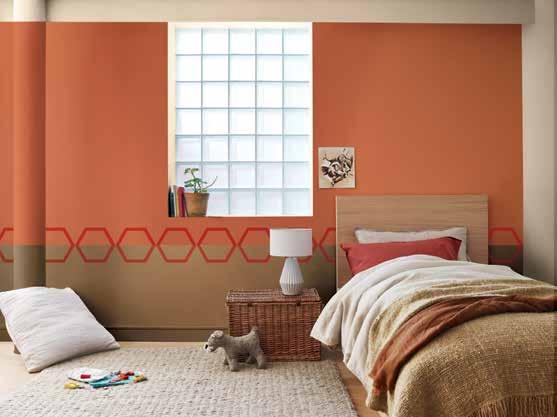
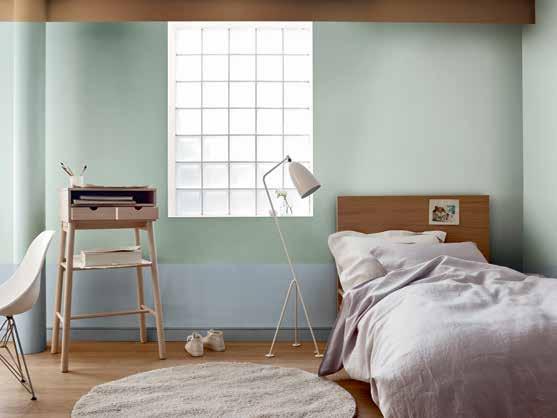
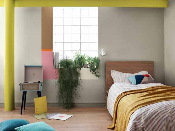
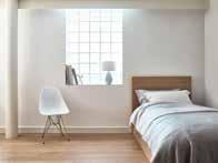
THE THINK SPACE
THE DREAM SPACE
THE LOVE SPACE BEFORE
THE ACT SPACE
THE TRANSFORMATIVE POWER OF PAINT
ONE KID’S ROOM, FOUR PALETTES
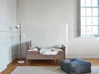
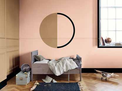
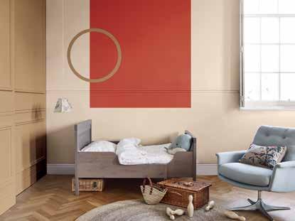
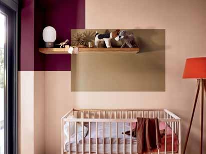
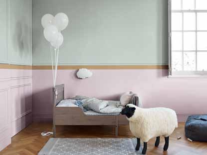
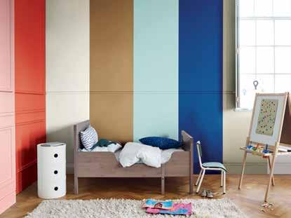
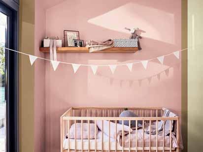
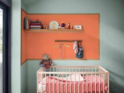
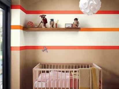
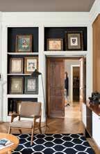
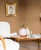
IMAGE LIBRARY
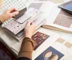
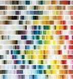
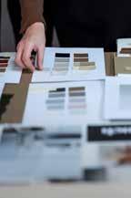
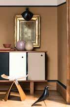
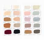
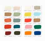
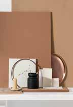
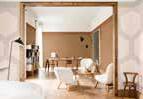
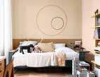
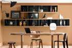
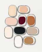
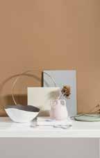
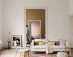
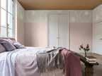
A selection of images from the AkzoNobel Brand Center











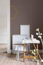
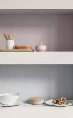
P40-65
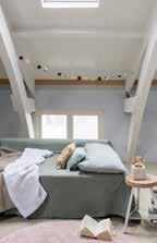

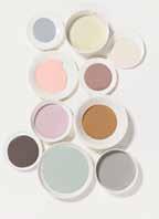




P66-77
P78-93
HELEEN VAN GENT, CREATIVE DIRECTOR, GLOBAL AESTHETIC CENTRE
AkzoNobel Decorative Paints
Global Aesthetic Centre
Rijksstraatweg 31, 2171 AJ Sassenheim, The Netherlands
Tel + 31(0)71 308 2229
Alba, Astral, Bruguer, Coral, Dulux, Dulux Professional, Dulux Trade, Dulux Valentine, Flexa, Inca, Levis, Marshall, Nordsjö, Sadolin, Sikkens, Vivechrom, the AkzoNobel logo, the Flourish logo and all distinctive colour names are trademarks of the AkzoNobel Group of Companies© and Database Right 2015.
This ColourFutures reference manual is and remains the property of AkzoNobel N.V. and is loaned on condition that it is used solely to specify products manufactured/or supplied by AkzoNobel N.V. (and other companies in the AkzoNobel Group) and on condition that it shall be returned to AkzoNobel N.V. on demand. The contents of this reference manual are for information only. No representation or warranty is given, nor liability accepted, regarding the information given. We have reproduced paint colours as faithfully as printing will allow. However, the shape, size and lighting of a surface can influence the appearance of the final colour.
Design – Redwood London +44 (0)20 3787 7000
Content – AkzoNobel Global Aesthetic Centre + 31(0)71 308 2229