
10 minute read
Taking Journalism to New Orbits

from STANDING TALL


Dabancheng, April 2015 Dabancheng, April 2018 Dabancheng, Oct 2018
A set of imagery from 2015 to 2018 shows how China's re-education camps in Xinjiang have grown over the years
Be it for fact-finding or gauging the impact of significant developments, reporting on climate events or conflict zones, because of the unbiased and continuous insights provided by satellite imagery, it is being extensively used in newsrooms today. By Anusuya Datta
Since 2017, there were media reports that China has been sending Muslims in large numbers to re-education camps in Xinjiang. These were largely based on interviews with former inmates. As international pressure began to build, China went about deleting related documents and electronic traces such as social media posts. In a country as closely guarded as China, the story would have been easily suppressed, if it were not for satellite imagery.
Two investigative stories broke simultaneously in the end of October 2018 — by BBC and ABC — giving not only the exact location of the camps, but also satellite images detailing their physical existence. In both cases, the investigative teams painstakingly worked with citizen rights activists and imagery analysts to pour through years of images to tell the world about the horror unfolding in Xinjiang.
Let’s take the BBC investigation. BBC sought help of GMV — a company specializing in Earth Observation data — to look into a list of 101 suspected facilities in Xinjiang. They measured the growth of new sites and the expansion of the existing ones, and identified and compared common features such as watchtowers and security fencing. GMV placed 44 of them in high or very high likelihood category of being prisons.
BBC took one of GMV’s findings — the increase in building size at the facility in Dabancheng — and consulted an Australian company with long experience in prison design. Using the measurements Courtesy: BBC/Google Earth/ESA from the satellite images, they calculated that at an absolute minimum, the facility could provide space for about 11,000 detainees. Even that minimum estimate would place it alongside some of the biggest prisons in the world. And that was just one site. There was a very high probability of 44 sites being prison camps.
That was in late 2018. This year, Xinjiang Data Project by the Australian Strategic Policy Institute (ASPI), a Canberra-based think tank, again used satellite imagery as evidence to show detention facility construction across 2019 and 2020. The researchers identified and mapped over 380 sites across Xinjiang that were newly built or expanded since 2017, with at least 61 sites seeing construction activity between July 2019 and July 2020. This includes at least 14 facilities still under construction, according to latest imagery available.
Xinjiang Data Project presents satellite imagery evidence to show newly built detention facilities occurring between 2019 and 2020

Courtesy: Planet/NYT


Left: September 14, 2019 image almost immediately after the coordinated drone attacks on multiple oil facilities in Saudi Arabia Center and Right: The Planet images also pinpoint exact damage to the storage facilities
ASPI also used the imagery to reconstruct 3D models of each tier of detention facilities — from lowest security (tier 1) to highest security (tier 4) — showing the key structural features.
Grabbing headlines Satellite imagery is certainly grabbing headlines as it becomes an indispensable tool for journalists. Be it for fact-finding or gauging the impact of a significant development, reporting on climate events or conflict zones, because of the unbiased and continuous insights it provides, satellite imagery is being extensively used in newsrooms today.
For instance, Planet came out with an image almost immediately after the coordinated drone attacks on multiple oil facilities in Saudi Arabia on September 14 last year. This is possibly the first time a satellite photo was used as the lead image on Page 1 of The New York Times.
But then the imagery is not just for stunning visual effects, it is also for giving great insights. In the Saudi attack case, they provided immediate and exact details of the damages caused to the oil facilities. Likewise, it can provide insights into almost all spheres of life on Earth, especially the things that the human eye can’t see.
Monitoring disasters: California, Oregon and Washington in US are enduring a fire season of historic proportions. Wildfires this year have left at least 40 people dead, destroyed thousands of structures and scorched millions of acres, causing extreme air pollution that has threatened the health of millions of residents and sparking fears of lasting damage on species and ecosystems. Satellite imagery dated September 9 shows the damages caused by the wildfire around Medford and Oregon.
Change detection: In the past three decades, several of Iraq’s largestlakes have experienced fluctuating water levelsdue to droughts, dam management, and continuing unrest and civil wars. Two lakes in particular — Milh and Habbaniyah — experienced substantial declines in water levels. Now, satellite imagery shows the two lakes are refilling.
Breaking news: On June 22, 2019, a volcano on one of the uninhabited islands that connects Japan to Russia suddenly sprang to life.It was dormant and inactive for nearly a century. The unexpected volcanic activity was first discovered by astronauts on the International Space Station.
Access to the inaccessible In disaster zones where immediate human visit is impossible, satellite imagery can give insight into the damages or warn for worse to come. Multiple satelliteimagery showed the immediate aftermath of August 4 deadly explosionat the port of Beirut which reportedly left around 300,000 people homeless.
Close-up of neighborhoods in Phoenix, Oregon, US shows widespread devastation from the wildfires Steam bellows out of Fukushima reactor complex Unit 3, roughly three minutes after the explosion on March 11, 2011
Courtesy: Maxar Technologies


Courtesy: DigitalGlobe (Maxar Technologies)
In one best case example of access to the inaccessible, Maxar (then DigitalGlobe) took the picture of Fukushima nuclear plant complex, three minutes after the explosion at the third reactor, on March 11, 2011. This is a classic example of how fast satellites can give information from inaccessible places.
Conflict zone reporting Satellite imagery has become an effective tool for reporting in conflict zones. A recent investigation by The Guardian combined imagery with flight data to discover that Turkey and the UAE are using largescale military cargo planes to funnel in goods and fighters to forces insideLibya, in blatant violation of the UN arms embargo, fueling a proxy war and making political solutions difficult.
In addition to broad investigations, one can focus on particular incidents for daily reporting. For instance, India and China were engaged in a violent conflict on the Himalayan border in June. Satellite images by Planet taken less than 24 hours after the face-off on the night of June 15 show a massive build-up by the Chinese side despite a de-escalation agreement on June 6.
Courtesy: HawkEye 360/Planet
HawkEye 360 shows major build-up of Chinese military in the Galwan Valley on May 29, 2020 on the Indo-China border

While these were the first visual details of the spot, a few days later, a unique technology from HawkEye 360 of combining Space-based radio frequency analytics on top of optical imagery substantiated the Indian claim of Chinese build-up on May 22. By overlaying its analysis on Planet’s
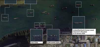
Planet imagery shows cluster of North Korean ships in Taean with some vessels loading coal, October 3, 2019 Courtesy: RUSI/Planett
SkySat imagery, HawkEye 360 was able to reveal Chinese build-up, including trucks, tents, and equipment along the valley.
A set of images dated June 22 from Maxar further shows freshly built structures — not visible in earlier photographs — by China overlooking the Galwan.
Crime and smuggling The Royal United Services Institute (RUSI) — UK’s leading defense and security think tank — exposed North Korean illicit shipping networks using satellite data, open source data-mining and data-fusion techniques. In its latest report, published on March 5, 2020, RUSI used imagery collected over North Korean ports and islands around Zhoushan to confirm that the vessels were all DPRK flagged and were loading coal and other resources, before sailing into Chinese waters, in violation of the UN resolutions.
Interestingly, in March 2020, RUSI reported an unprecedented number of vessels at North Korea’s main ports, in what could be interpreted as Pyongyang ordering its ships back home in the aftermath of the COVID-19 outbreak.
Tracking COVID-19 As COVID-19 brought the entire world to a standstill early this year, the role of satellite data in assessing the industrial and environmental impacts of the pandemic has been paramount. It has come particularly handy for journalists in the past few months, as travel restrictions and safety issues are making on-ground reporting difficult.
Pollution: Satellite data of multiple imagery providers across geographies showed significant reduction in pollution during the lockdown period in March-April this year compared to the same period last year.
Supply chain and manufacturing: A set of imagery from Planet shows the difference in production
Courtesy: Planet/PwC

At Volkswagen plant in Tianjin, China, manufactured cars fill up the space on the left on May 1, 2019, it is only half full in the March 3, 2020 image
capacity at the Volkswagen plant in Tianjin, China. Manufactured cars fill up the space on the left in May 2019, while the March 2020 image is only half full, as production was stopped. The pandemic impacted manufacturing worldwide, given the globalized state of modern supply chains. One can get into visual comparison of imagery taken over different time periods to get an indication of the level of the impact expected in terms of the drop in production.
Air and marine traffic: Aviation has been one of the most impacted industries due to border restrictions and stringent lockdown measures imposed at the onset of the pandemic. Marine traffic too took a major beating as operations at most major ports around the world came to standstill. With both business and leisure travels impacted, satellite data showed the busiest ports and airports around the world looking like ghost townships at the height of the lockdowns. As more than 80% of global trade by volume is transported by sea, one can imagine the impact on the global supply chains.
Impact on economy: Data from satellites can support in quantifying the impact this could have not only on the shipping industry, but also by extension the global economy as a whole.In this satellite
Red are fully loaded oil tankers stranded at sea in April due to no global demand for oil

Courtesy: MarineTraffic data analysis by MarineTraffic in April, red dots represent fully loaded oil tanker ships stranded at sea on April 22 due to no global demand. With ports out of operation, ships were stranded on the high seas. And with production plants shut across the world, there were no takers for oil. On April 20, 2020, pricesof UScrude oilfutures turned negative for the first time ever, at one point plunging roughly 300%.
Free sources of satellite data Despite the humongous costs associated with putting each satellite in place and operating them, there are several sources of data which comes absolutely free. • NASA’s Landsat imagery is freely available on USGS website, and has the longestcontinuous global record of the
Earth's surface. • ESA’s Copernicus Data and Information
Services are available through the DIAS or the Conventional Data Hubs. It is currently the largest space data provider in the world on afree, full and open access basis. • Google Earth gives seamless availability of data, but not all of it great resolution and there could be stitching errors. • Commercial satellite providers like Maxar,
Planet, Airbus etc give some data for free, especially at the times of disasters or for humanitarian causes.
However, many journalists still think that imagery is for just visualization — the last stage while presenting a story — when it could actually be the primary data. But then, it is always prudent to remember that imagery is just one form of data, and not the story in itself. Every imagery needs to be backed up with traditional reporting methods and extensive research. Reporting on disasters or change detection stories is simpler. Investigative stories may take weeks or months to develop, and not all investigations are fruitful.
Anusuya Datta
Editor-At-Large, Technology & Innovation anusuya@geospatialmedia.net


