3 minute read
New Volume, New Look: Introducing Sou'Wester Horizon
by Colby Hernandez, Editor-in-Chief
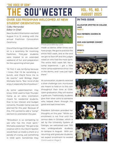
Last year, my job was to create and maintain the uniform look of the Sou’Wester. When I first started, I had to use a Word document because we weren’t sure how I could access Adobe InDesign, the program I use now. Word was a struggle. Consistent readers will remember the dip in quality between volumes 93 and 94. I had no idea what I was doing, but finally, in October, I realized I had access to InDesign through my school account as long as I was on one of the Macs in the Collum Hall computer lab. Trial and error, as well as help from Dr. Shiller and Dr. Annie Laurie Nichols, have led to me being confident in my InDesign abilities. Over the summer, I’ve worked on this. While not officially my senior project, I’d like to think of it as my final sendoff, one last hoorah before I graduate. Yeah, I’m taking classes to help me in my career and future, but this paper is my legacy at GSW. I currently have no idea who will be taking my position after I graduate, but I hope whoever does respects my legacy and the legacy of the Sou’Wester.
Sou’Wester Horizon is inspired by the past but looks toward the future. The horizon symbolizes many things. You can look back on it as well as look towards it, much like looking into the past and the future. As I worked on it, I kept asking myself:
• “Is it easily readable?”
• “Can I print out any random page and use it as a poster?”
• “How can I play with the layout?” “What makes the Sou’Wester a GSW paper?”
Sou’Wester Horizon answers those questions. My biggest supporter, my mom, would only read the paper on her work computer. She complained that the words were just too small. I took that advice and rolled with it. Students can’t always read the paper on a big screen; they’d read it on their phones. I purposely chose a more readable and rounded font with more spacing, making it easier to read across the board. I also wanted a “pretty” paper. This is my work, and I should be able to take pride in it. While I can’t say if everyone would agree that it’s prettier, I have taken steps to ensure an even layout that is modular and aesthetically pleasing. Personally, I would display a blowup on my wall. The modularity also helps with the next question. I have made a style guide that has the exact measurements of each and every text and image box. Finally, is the Sou’Wester spiritually GSW? Besides just using the colors, Sou’Wester Horizon uses the font Norwester, an on-brand name. But other than those, it’s up to you, the reader, to decide that one.
I sincerely hope you enjoy what the paper looks like this year. I’ve already put long hours into it, and I’m writing this before the rest of this issue is started!


