
4 minute read
II IDENTIFYING MARKS

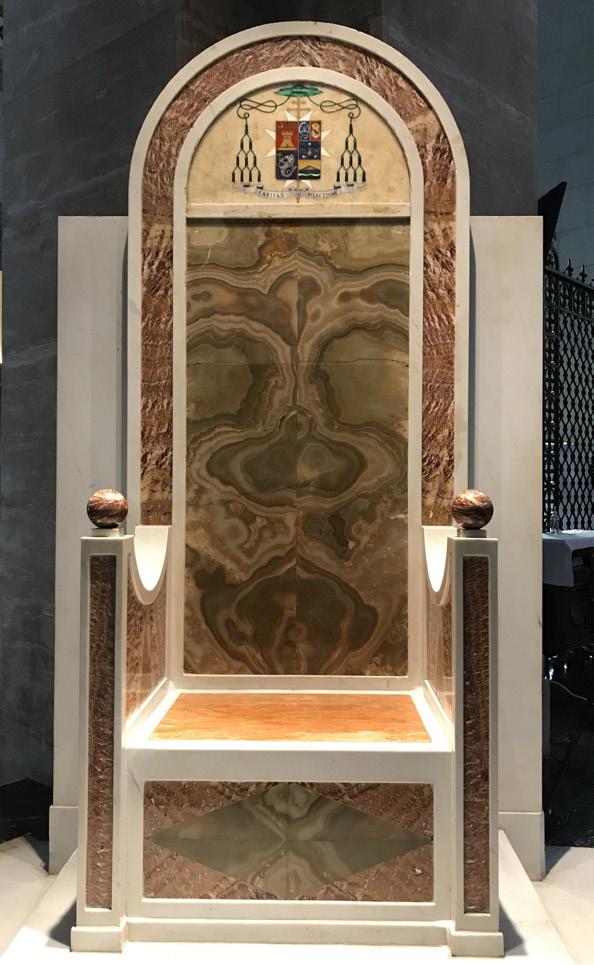
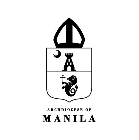
THE COAT OF ARMS
The coat of arms identifies and represents an institution through symbols. The ecclesiastical arms of the Metropolitan See of Manila was designed by ecclesiastical heraldist Archbishop Mariano A. Madriaga, which was later drawn by Filipino artist and heraldist Galo B. Ocampo. It is an adaptation of the arms granted by His Catholic Majesty Philip II of Spain to the first capital of the country honored by the title La Muy Insigne y Siempre Leal Ciudad de Manila (The Noble and Ever Loyal City of Manila) on March 20, 1596.
Advertisement
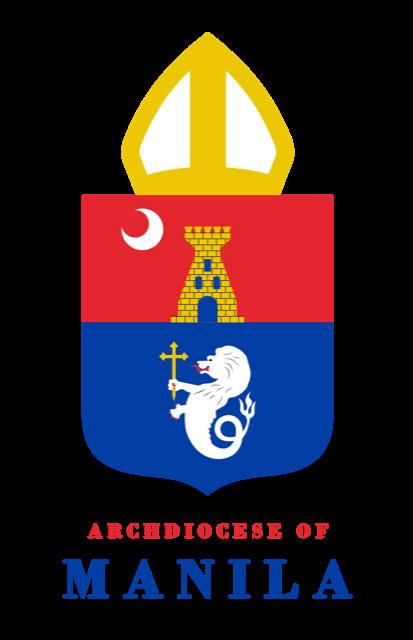
The arms of the Archdiocese of Manila consist of a shield divided horizontally into two fields, the upper gules (red) and the lower azure (blue). In the upper field against the red background is depicted a tower in gold with a door and three windows in blue, and a silver crescent on dexter chief. In the lower field against the blue background is a silver-colored sea lion holding in its right paw a cross fitchée. The castle in the original arms of the City of Manila, which originated from the crest of the Kingdom of Castile, was changed into a tower to represent God Himself, who is called in Psalm 60:4 “turris fortis contra inimicum” (a tower of strength against the enemy). The three windows make the tower reflect the Blessed Trinity: Father, Son, and Holy Spirit, three Persons in one God.
The silver crescent placed in the upper right-hand corner of the shield represents the Immaculate Conception, patroness of the Manila Cathedral, the Archdiocese of Manila, and of the entire Philippines. The symbol of the moon comes from Revelation 12:1 - “A great sign appeared in the sky, a woman clothed with the sun, with the moon under her feet, and on her head a crown of twelve stars.”
The sea lion historically called the Ultramar (in Latin ultra means from beyond and mar connotes the sea) was a distinctive emblem given by the King of Spain to the City of Manila as an overseas colony. The lion is derived from the arms of the Kingdom of León, with a tail of a fish instead of legs to identify Manila as a territory overseas.
The sword held by the sea lion was substituted with a cross fitchée which is a cross whose base is pointed. Crosses of this description are said to have been carried by the early Christians on their pilgrimages so that they might readily be fixed in the ground while performing their devotions. This signifies the missionary call of the Filipino people to plant the faith, not only in Asia, but throughout the world. Another reason for the substitution of the sword by the cross is the policy enshrined in the Constitution of the Philippine Republic: “The Philippines renounces war as an instrument of national policy, adopts the generally accepted principles of international law as part of the law of the land…” (Art. II, Sec. 2). By this, the Filipino faithful proclaim that they cannot “glory except in the cross of our Lord Jesus Christ” (Gal. 6:14).
Surmounting the shield is a miter, a symbol of rank and responsibility for prelates, representing the jurisdiction of the Archdiocese of Manila as a diocese established by the Pope and given to the care of our Archbishop. The miter is also a sign of our final victory in heaven, its symbolism arising from St. Paul’s analogy: “I have fought the good fight, I have finished the race, I have kept the faith. From now on the crown of righteousness awaits me “ (2 Tim. 4:7-8).
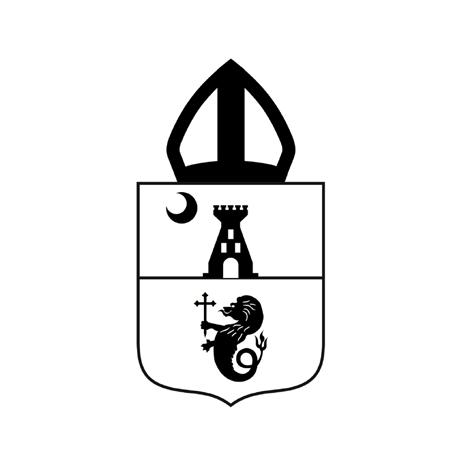
OFFICIAL VARIATIONS
1
2
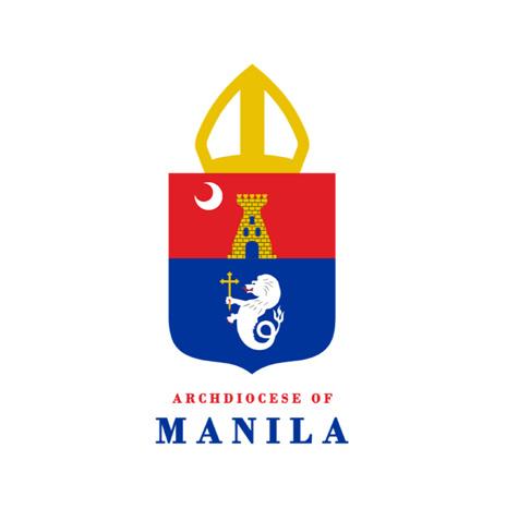
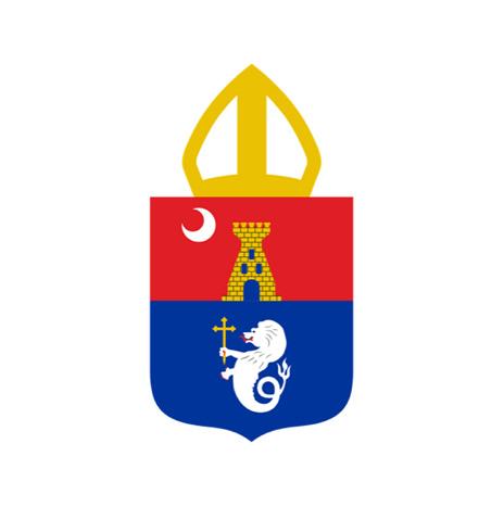
3 These variations of the coat of arms are used for the official materials and formal documents of the Archdiocese of Manila.
1. Vertical coat of arms in full color
2. Vertical coat of arms in black
3. Vertical coat of arms in white for black or other dark backgrounds
Go to page 18 to see the official materials and formal documents where these variations may be used.

INFORMAL LOGO
On the opposite page is the informal logo of the Archdiocese of Manila. This will be available for everyday use of the Archdiocese, especially in social media, in informal events, merchandise, and other materials of the same nature.
This logo was created to make the brand of the Archdiocese closer to the people and to give it a fresher and more current look. This version of the logo, although simplified, still bears the complete parts of the official coat of arms. However, the color variations were minimized and the images were simplified.
The wordmark was replaced by a new typeface, Bodoni, to make it more legible and to differentiate it from the official coat of arms.
OFFICIAL VARIATIONS
A C
B D Only these official variations of the informal logo may be used. See page 20 for the various aplications of these versions.
A. Informal logo in full color
B. Informal logo in black
C. Informal logo without the wordmark
D. Informal logo without the wordmark in black
INAPPROPRIATE USAGE
Official coat of arms for informal applications Different typeface In official typeface but not stacked
Different proportion of coat of arms and wordmark Distorted Busy, low contrast background Different shades of the official colors
Excessive use of Photoshop effects
Solid color other than black
Low resolution
