
1 minute read
MOBILE-FIRST DESIGN

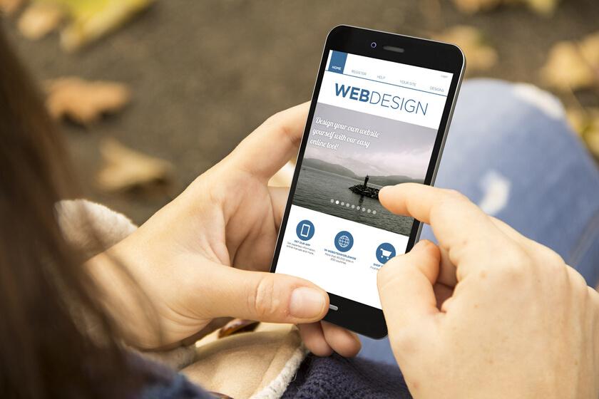
Mobile-friendly is one more craze that is expected to shape the future of web page configuration. With the increasing use of smartphones and tablets, it has become imperative for sites to be optimized for mobile devices. Mobile-first design involves designing business pages with the mobile experience in mind rather than just adapting desktop configurations for smaller screens. This trend is anticipated to lead to a more user-friendly and accessible web, with sites that are optimized for all devices.
Designers and developers will continue to push the boundaries of what is possible, building new and innovative business pages that offer an unparalleled user experience. Whether individuals are seasoned creators or newbies, knowing these trends is essential to excel.
Advertisement
