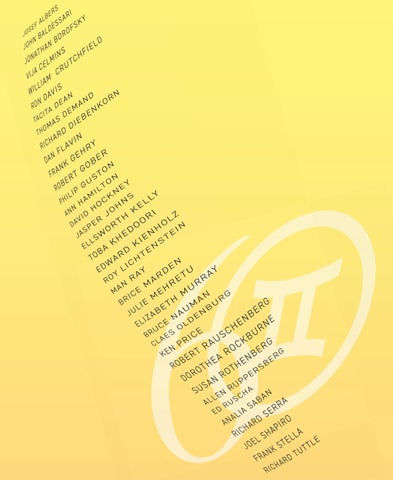
(ALMOST) EVERY YEAR: SIXTY YEARS OF PRINTMAKING AT GEMINI G.E.L. Second of Two Exhibitions Celebrating 60 Years
Curated by Susan Dackerman and Helen Molesworth
(ALMOST) EVERY YEAR: SIXTY YEARS OF PRINTMAKING AT GEMINI G.E.L. Susan Dackerman and Helen Molesworth
(Almost) Every Year: Sixty Years of Printmaking at Gemini G.E.L. highlights the extraordinary range of prints created at Gemini’s Los Angeles workshop from 1966 through the present day. Rather than focusing monographically on the lives and “greatest hits” of the many celebrated artists who worked at Gemini, curators Susan Dackerman and Helen Molesworth have chosen to feature selections from the publisher’s remarkable output from (almost) each of its sixty years, creating a presentation of the work within the framework of changing cultural contexts, artistic strategies, and individual styles. Displaying the work chronologically also highlights the greatest strengths of the Gemini workshop – friendship, collaboration, and continuity. Gemini provided not only the inspirational cauldron of the city of Los Angeles, it also offered the stimulation and collegiality of peers. By showing artists’ work in proximity to the prints of their fellow artists working around the same time, the artists’ mutual admiration and influence become apparent. For instance, in the late 1960s when Robert Rauschenberg was famous for introducing found imagery into lithographs such as Sky Garden, Jasper Johns was more inclined to draw directly on the lithographic stones. Yet, his Figure 7 includes a reproduction of the Mona Lisa, suggesting that Gemini’s artists were not only following the artistic strategies of the time, but also following each other’s work. David Hockney also was well aware of the trend and slyly incorporated his own “found” images – drawn reproductions of his own prints – in his 1973 lithograph, Wind. Affiliations and reciprocal influence among Gemini artists become apparent through the installation of rich and resonant groupings of printed works and multiples by decade. The space devoted to works from the 1970s demonstrates how such artists as Johns, Ed Ruscha, and Ed Kienholz elevated everyday objects like a light bulb, piece of cheese, and oil can to the subject matter of art. Robert Gober’s lithographic depiction of shoes dating from 2000 demonstrates the continuation of the practice. The exhibition highlights the endurance of the most important ideas in contemporary art, as well as their revision in the new century. The same can be seen in works from the 1980s and 90s by Dan Flavin, Elizabeth Murray, and Richard Serra that display the artists’ commitment to the investigation and
exploitation of color – from the brightest reds to the darkest blacks – in both figurative and abstract work. Such experimentation with hue, shade, and contrast commenced at Gemini’s inception, with Josef Albers’ iconic series, White Line Squares and Ellsworth Kelly’s colorful clashing forms, and has continued into the twenty-first century with Tacita Dean’s Pantone Pairs. In the past decade, another generation of artists have been invited to make editions, with dynamic and exciting results. Julie Mehretu’s 2018 aquatint Six Bardos: Dream State captures her dramatic gestures, and Thomas Demand’s 2024 Bobby Fischer’s House uses detailed reconstructions of significant yet ordinary spaces. Comparing these works with those of earlier artists highlights how Gemini continues to create a space where printmaking is a creative tool, maintaining the tradition started in 1966 on Melrose Avenue. It’s worth noting that Gemini, consciously or not, has responded to feminist artistic goals over its lifetime. Although its first decade of production was dominated by male artists, as was typical of the time, by the 1980s Dorothea Rockburne, Vija Celmins, and Susan Rothenberg were among the many notable artists making prints in the studio. By the 1990s, the gender distribution among artists was more even, and today, Gemini’s roster features some of the most important women artists of the day, a testament to the awareness of Gemini’s current owners’ – Suzanne Felsen, Ayn Grinstein, Ellen Grinstein, and Joni Moisant Weyl –of equality of the sexes within artistic production. The exhibition’s title includes the qualifier, “Almost,” because representing every single year by an evocative artwork would require far more gallery space than most galleries – or even museums – have. While at least one work by most of the artists associated with Gemini is presented, it is a mere fraction of what Gemini artists have created there overall. For a more comprehensive selection of the publisher’s prints and multiples, see the National Gallery of Art’s Gemini G.E.L. archive: https://www. geminigel.com/page/national-gallery/ and the artist page of Gemini’s website: https:// www.geminigel.com/artists/. Both are records of Gemini’s consistently astonishing production of the “greatest hits” of American printmaking.
3
HISTORY OF GEMINI Gemini G.E.L. is celebrating sixty years of extraordinary artistic collaboration and technical innovation. Since its founding in Los Angeles in 1966, Gemini has redefined the landscape of printmaking, transforming the concept of editioned works through a unique combination of artistic vision, master craftsmanship, and an enduring spirit of experimentation. Gemini’s history reads like a chronicle of postwar and contemporary art. From early collaborations with Robert Rauschenberg, Jasper Johns, and Claes Oldenburg to ongoing projects with artists such as Tacita Dean, Julie Mehretu and Analia Saban, Gemini has always been a place where ideas are tested, boundaries pushed, and new languages of making are invented. Founded with a focus on lithography, Gemini soon expanded into screenprinting, etching, and three-dimensional multiples. Almost immediately, it became the destination for the creation of groundbreaking editions—a workshop where artists were never told, “no, it’s not possible.” The workshop’s dedication to craftsmanship—its flawless registration, luminous inks, and technical daring—has made it a touchstone of quality, unsurpassed in the field. In recognition of Gemini’s pivotal role in the creative output of its artists, the National Gallery of Art in Washington, D.C., established the Gemini Archive in 1981, where examples of more than 2,700 publications are accessible for viewing to collectors and scholars. At the heart of Gemini lies a deep, ongoing dialogue between artists and printers—a collaboration that merges the imaginative and the technical into something greater than either could achieve alone. Edition-printing may take several months or sometimes years, and it is the printers’ unparalleled mastery of technique, their devotion to precision, and their quiet inventiveness that make possible the creation of works that continue to astonish in their complexity and beauty. Each project is a shared pursuit of excellence, where the printers’ role is as essential and inspired as the artists’. From the very beginning, Gemini was distinguished by its inclusive spirit. One of its first collaborations was with Robert Rauschenberg, whose visionary approach to materials and structure reflected the studio’s ethos of experimentation and openness.
That legacy of inclusion and innovation continues today, shaping Gemini’s ongoing dialogue with artists of diverse perspectives and practices. Gemini transformed the perception of editioned works. Many series produced at the workshop occupy a space between print, painting, and sculpture—each edition nuanced by the process, each impression subtly unique. These works reveal the artist’s hand and mind in new ways, offering intimate insight into their creative process. Through printmaking, artists discover another reality—one where reflection, rethinking, and rediscovery are integral to creation. The works born at Gemini invite us to see familiar artists anew: more personal, more human, more connected. They embody not only the vision of the artist but also the collaborative poetry of the workshop. The over 70,000 photographs taken by Sidney B. Felsen, Gemini’s Co-Founder, which are archived at the Getty Research Institute, document decades of friendship and creativity and capture this intimate world, where the printer’s silent dedication and the artist’s restless imagination converge. Gemini’s original building on Melrose Avenue was later transformed through a series of Frank Gehry–designed additions and alterations between 1975 and 1979. Gehry’s design, completed in 1979, is deceptively simple and subtle, serving as a restrained, elegant setting for the making and exhibiting of art that happens within. Today, Gemini is stewarded by the next generation of four women from the families of co-founders Sidney B. Felsen (1924–2024) and Stanley Grinstein (1927–2014). Ayn Grinstein and Ellen Grinstein Perliter, Suzanne Felsen and Joni Weyl Felsen continue to uphold the founders’ legacy of collaboration, innovation, and artistic excellence. Ultimately, Gemini is more than a print workshop and gallery. It is a living testament to the belief that art is a shared act of creation—a continuous search for beauty, truth, and transformation. As Gemini enters its sixth decade, it remains a beacon for the boundless possibilities of collaboration and the enduring power of art to inspire.
5
1960s
Josef Albers White Line Square XV, 1966 Each lithograph in White Line Squares is printed in three colors, using the squares-within-squares structure Albers had developed in his painting and print series Homage to the Square. The compositions are symmetrical on the vertical axis and asymmetrical on the horizontal, and each holds three close tonal values. A single white line divides one of the three color areas in two — and, because the eye reads that division as a shift in shade, the scheme appears to contain four colors rather than three. White Line Squares was published in Gemini’s founding year and remains the workshop’s first landmark project — an argument, made in ink, that a print could be an instrument of perception rather than a reproduction of one. 7
Man Ray Untitled, 1966 Man Ray’s presence in the first months of Gemini says something about the publisher and workshop’s ambitions: this was a Dada and Surrealist figure then in his mid-seventies, working in Paris, brought into a Los Angeles shop that had barely opened. The edition of 125 is large by the standards of what followed, and the print belongs to a moment when Gemini was still establishing what it could be — and which artists would become a part of Gemini’s rich history.
Frank Stella Star of Persia I, 1967 The Star of Persia lithographs were amongst Stella’s first prints ever to be published anywhere, and began a multi-year collaboration with Gemini. Unlike most early prints, which were based on older paintings, this series is based on an idea for a painting that was never created. The prints are versions of a six-chevron pattern from a drawing for the Notched-V Series (1964–65), which was never made on canvas because the necessary large bolts weren’t available. The series is known for the precise alignment of the chevrons and the use of metallic inks, which were new at the time. In the first two prints, Star of Persia I and Star of Persia II, the colored inks are printed over a metallic silver base that gives a subtle tone and makes the colors stand out. The Irving Blum Memorial Edition is a monochrome version that shows only the Persias’ silver base. 9
William Crutchfield
Old Jenny, Americana Suite, 1967
Crutchfield’s Americana Suite was his first printmaking series at Gemini, illustrating a fantastical world of vehicles like stagecoaches, riverboats, and Model T Fords, all seemingly stranded in time and space. The series reflects his interest in Southwest landscapes and American transportation, capturing a sense of fleeting moments rather than making social commentary. In Old Jenny, a plane is caught in a tree, with the central image holding the composition. Crutchfield’s sketchy, irregular line work, inspired by old wood engravings, gives each print a personal feel. Hand coloring adds uniqueness to each impression through subtle variations in watercolor, emphasizing the translucency of the medium.
Jasper Johns
Figure 7, Black Numerals Series, 1968
Numerals — along with flags and targets — were among the emblematic images Johns used from the beginning of his career, and they were among his earliest subjects in print. He first took them up in 1960, superimposing figures on one another. The Black Numerals series presents the digits 0 through 9 individually, printed in black and transparent gray, and was closely followed by the Color Numerals. Graphic art has been a major component of Johns’s work throughout, and he has experimented across lithography, etching, screenprinting, and monotype. But the medium is never the point; the nature and meaning of image-making is. Each piece summons memories of earlier work, establishes its own internal framework, and — given his methodology of reviewing and revising — invites the viewer to guess at the alternatives that might follow. 11
Claes Oldenburg Profile Airflow, 1969 Although the majority of his collaborations with Gemini were in prints, Oldenburg’s sculpture editions with Gemini are some of his most memorable, none perhaps more so than his Profile Airflow. In January 1966, Oldenburg visited his friend Carl Breer, whose father Robert had designed the classic 1936 Chrysler Airflow. He was able to study one of the few surviving examples of the streamlined car, and began working with the theme soon after. Work on Profile Airflow began in January 1968 and continued through the end of 1969. The artist wanted a translucent material that would be firm but appear soft, solid but appear fluid, rigid but flexible enough to give if pressed — and anything soft and pliable enough to do that would, at the scale required, have been too heavy and would have sagged. Oldenburg spent more than a year completing the wooden relief used to make the molds from which the edition was cast, and a technical problem associated with this edition holds a special place in Gemini lore. Virtually the entire edition was immediately sold and delivered, but one year later the car’s green material was turning brown. Ultimately the research into plastics required to remake the edition led to genuine advances in the technology of the medium.
<
Jasper Johns
Light Bulb, Lead Reliefs, 1969
Gemini worked closely with Johns on some of his most challenging projects. In 1969, six lead reliefs were created from wax and plaster models. Lead’s dull finish and vulnerability to fingerprints highlight its subtlety, with its gray tones fitting Johns’s aesthetic. Molded from Johns’s models, thin lead sheets were pressed and then attached to rigid supports. These Lead Reliefs show Gemini’s confident “we can do anything” attitude, and Lightbulb is the largest and perhaps most dramatic of the six.
13
Robert Rauschenberg Sky Garden, Stoned Moon Series, 1969 Inspired by his attendance at the Apollo 11 launch, Rauschenberg’s Stoned Moon series blends the ethereal with the tangible, and Sky Garden is its luminous centerpiece—a burst of color and wonder. This work, as well as the smaller-scale prints, blend NASA photographs with images of the natural environment, birds, and poetic handwritten reflections. Rauschenberg combined Florida’s swampy landscapes, rocket plumes, boot prints and helmet reflections into visual elegies for space exploration. Rauschenberg was the consummate collaborator, and his infectious smile and his love for people took hold at Gemini. He said “with two people you always have at least three ideas.” The 34 editions in the Stoned Moon Series —Rauschenberg’s second of what would become numerous projects published by Gemini—were proofed over a two-month period in marathon sessions that often occurred round the clock, requiring infinite stamina on the part of both the artist and the printers.
1970s
Ellsworth Kelly
Orange /Green, 1970
Kelly’s art focuses on visual clarity rather than use of metaphors, emphasizing a literal approach rooted in the physical act of looking. His work appears cool and intellectual but remains connected to the real world, inviting viewers to explore form, color, and composition. Early on, color played a key role, with Kelly working from drawings to scaled-up prints where form and color often develop together. His prints are characterized by bold shapes and bright colors, often juxtaposed and layered, with titles that hint at tensions and relationships within the composition. The process involves careful planning of shapes and relationships before applying ink and printing in editions that require consistent color tones, a meticulous task aimed at ensuring uniformity throughout the entire edition. Second only to Rauschenberg in terms of the variety and number of works, Kelly’s relationship with Gemini spanned 44 years and was pivotal in many aspects of Gemini’s history. 15
David Hockney
Wind, Weather Series, 1973
Hockney became interested in lithography and visited Los Angeles in 1973 to work on the Weather Series at Gemini. Living near the workshop, he treated it as an extension of his own studio, allowing spontaneous creation instead of planned visits. Inspired by Hollywood's vibrant light, swimming pools, and reflections, the series combines colors, space, and forms reminiscent of Japanese woodblock prints. These vibrant, simplified images connect to his paintings and reflect his figurative style in an era dominated by abstraction. The series explores lithography and screenprinting by experimenting with different states, colors, and textures, and Wind is Hockney’s summation of the entire Weather suite created on Melrose Avenue.
Bruce Nauman
Pay Attention, 1973
This print has become an object, like a wall-hanging sign. When an image is created on stone in a single drawing, the best results are achieved through a chiseled illusion where the entire surface, not just the letters, has a shallow relief to create a sense of depth. Outside of printmaking, Nauman’s drawings are more about explaining how a piece functions; once the explanation is clear, the drawing feels complete. In his prints, he explores what the drawing is meant to be more deeply, making it a complex investigation. In Pay Attention, Nauman is demanding the viewer look not only at the image but the medium.
17
Ron Davis Framed Block, Rectangle Series, 1974 The Rectangle Series was Davis’s second project at Gemini, featuring prints that echo his paintings and highlight screenprinting’s tactile qualities. Framed Block showcases sharp, smooth shapes from his cut-film stencils, transforming geometric forms into space where color plays a key role. The work balances flatness with implied volume, using hue to define form and space across multiple dimensions. The interaction of layered colors creates a tension that makes the colors the main focus. Overall, the work presents a surreal, ambiguous sense of monumentality. Davis was instrumental in helping to establish and develop Gemini’s screenprinting workshop but worked in a wide variety of media, including making direct-mounted wall works, etchings and lithographs.
Ed Ruscha Exploding Cheese, Various Cheeses, 1976 Various Cheeses is a series of five lithographs depicting pieces and crumbs of cheese set against gray backgrounds. They resemble celestial bodies yet remain grounded and tied to food, highlighting a playful contrast. Throughout his career, Ruscha has explored unusual materials, and these cheese prints exemplify that, giving ordinary cheese a sense of gravity through careful presentation and empty space. Exploding Cheese stands out as the most dynamic in the series, capturing cheese dispersing mid-movement.
19
Edward & Nancy Kienholz
The Econo-Can, Tin TV’s, 1977
Over his nearly 15 years of working with Gemini, Kienholz created a total of eight editions of televisions. They are hypnotic, like real TVs — staring at them, nothing changes, and that’s the point. This irony reveals his complicated relationship with the medium, which he saw as both powerful and problematic. For him, television was a significant part of his politically-charged art. Of the three Tin TVs created in 1977, the Econo-Can is the simplest; it has an electrical cord for connecting it to the outside world but nothing is activated — it uses no energy, thus living up to its title. Kienholz and his wife Nancy were a vital and central part of Gemini’s history of making sculpture editions.
Jasper Johns
Land’s End, 1979
Between 1979 and 1981, Johns “rephrased” his 1963 paintings Land’s End and Periscope in lithography. The Land’s End lithograph echoes the somberness of the painting; on the arm attached to the hand, the calibrated marks of a ruler are visible. Land’s End is a tour-de-force in lithographic accomplishment, with its many complex areas of mark-making all created on a single lithographic aluminum plate, pushing the tonality of this print to its limits. The surface of the plate had to be inked with great precision in order to capture the slight variations in tone that Johns was after.
21
Philip Guston
Door, 1979
Over a period of a brief few months, Guston created 25 lithographs that would be published by Gemini. He was limited to working in his own studio because of health challenges, but was excited about the process and created many drawings on Mylars and aluminum plates, not all of which were ultimately editioned. Early on an accomplished Abstract Expressionist, Guston’s later art is figurative and autobiographical, and Door hints at the struggle Guston felt in being an artist, showing figures in a desolate space with the door as the only outside connection.
Robert Rauschenberg
Rookery Mounds: Crystal, 1979
Rookery Mounds, the historic series of eleven lithographs, marks the first printmaking project in which Rauschenberg utilized his own photographs, with the environs of his Captiva Island residence as their inspiration. Rauschenberg had taken beautiful black-and-white photos beginning in the late 1940s, but by around the early 1960s he had, for the most part, set aside his camera. Rookery Mounds became one platform to announce his return to the camera. Much of the photographic imagery which appears in Rookery Mounds looms large on the page, and compared to prior works, is relatively unlayered. Rauschenberg is making a statement: this is not found imagery plucked from the public domain, these are my photographs. Wheels, tires, fabrics, water, plants and other familiar Rauschenberg visual elements make their appearance in these prints. The eleven lithographs in the Rookery Mounds series are all printed on exquisite sheets of stunning, deckled-edged paper, specially made for the project by Twinrocker. 23
1 980s
Vija Celmins
Constellation–Uccello, 1983
In her first project with Gemini, Celmins experimented with various traditional etching techniques like soft- and hard-ground etching, aquatint, drypoint, and mezzotint. These methods required her to learn and then innovate her own process, figuring out how much pressure was needed for each mark. Essentially, her early prints are about this process of exploration. For this initial project with Gemini, she gathered meaningful images over a year and experimented with different combinations on the plates. The final Constellation–Uccello paired her own image — the night sky, a recurring theme for her— with Paulo Ucello’s Study of a Chalice . When combined on one sheet, these images create a tension—they coexist but do not merge into a single scene. Spanning the years 1982 to 2002, Celmins created three important bodies of work with Gemini, firmly helping to establish Gemini’s etching studio.
Dorothea Rockburne
Uriel, 1983
Uriel is one of four lithographs in Rockburne’s first project at Gemini, reflecting her longstanding interest since the 1970s in the golden section—a mathematical proportion recognized since Euclid’s time. Her work connects a modern, personal vision with an ancient aesthetic tradition. While exploring mathematical forms and craftsmanship, her titles highlight that her art transcends theory, touching on metaphysical themes and art history, especially Renaissance works featuring angels and flowing drapery. She balances precision and measurement with vibrant, carefully mixed colors that evoke both stillness and motion. The materials and techniques— ink, paper, printing, folding— play a key role in conveying layered textures and implied movement, blending tangible craftsmanship with a sense of flight and weightlessness. 25
Richard Diebenkorn
Scrabbling, 1985
Scrabbling is a three-color lithograph by Diebenkorn from his 1980s period at Gemini. It shows a process of continuous searching through lines that are drawn, erased, and reworked, highlighting his iterative approach. Diebenkorn saw the stone as a space for exploration rather than a finished surface, making the tension of the marks part of the artwork. The limited color palette focuses on structure, illustrating how a few bold lines or shapes can define a space, and his prints give a clear look into his creative process. Diebenkorn fully embraced his lithography collaborations with Gemini and created some of the most memorable works of his remarkable printmaking career.
Jonathan Borofsky
Foot Print in Copper (Left), 1986
Foot Print in Copper (Left) fixes the most ordinary mark a body can leave. Issued alongside its right-foot counterpart, it belongs in the category of Gemini projects that sit between print and sculpture — an impression in the most literal sense, taken from a body rather than a plate. It is characteristic of the workshop in the 1980s, by which point the definition of an edition had expanded well past paper. Borofsky’s first project in 1982 included sculpture as well as prints, and throughout his 30-year engagement with Gemini he created over 100 incredibly diverse works, making him one of the top and most innovative collaborators in Gemini’s history.
27
Susan Rothenberg
Boneman, 1986
Boneman is a mezzotint printed on an unusual wood-veneer paper, which adds a textured grain to the artwork. Mezzotint is a highly labor-intensive and physical etching process: the plate is roughened and then smoothed back to create the image from darkness. This technique suits Rothenberg well, as the figures tend to be partial and weighty rather than fully detailed. Her 1986 Gemini project involved exploring a wide variety of printmaking media, including lithography, woodcut and intaglio, and Boneman is where these techniques and the subject matter come together most clearly.
Dan Flavin
(to Don Judd, colorist) 6, 1987
Flavin is best known for installations of fluorescent tubes that carve luminous sculpture out of walls, floors, and ceilings. Prints are relatively rare in his work, but this series invests lithography with the same concerns: actual light, actual color, actual architecture. A single intense hue dominates each sheet, pressing upward against an unprinted band of handmade paper. That band reveals the faint color cast of the paper itself— greenish here — and draws attention to its pronounced deckle and topography. The lateral division is not merely compositional; it restates, on paper, the relationship between light and edge that governs the installations. Flavin frequently titled works as homages, and this one belongs to a group of seven dedicated to Donald Judd. 29
1 990s
Ken Price The Fireworm Cup, 1991 Price, primarily recognized for his ceramic sculptures, had previously only created prints at Gemini, and his Cups mark his first editioned sculptures at the workshop. He transforms the classic cup— usually seen as a functional vessel—into a nonfunctional, lyrical abstraction that harmonizes color and form. The wooden display boxes he created complement this work perfectly, with their clean lines and matte surfaces contrasting with the glossy glazed earthenware.
Roy Lichtenstein
Landscape with Poet, 1996
By 1962, Lichtenstein became a key figure in Pop Art, drawing inspiration from cartoons, ads, and popular media. His signature style featured bold primary colors, thick black outlines, and Benday dots from newspapers, which made his work stand out in modern American art history. In the mid-1990s, he explored Chinese landscape painting, applying his techniques to depict mountain scenes from the Song dynasty using varied dots for subtle monochrome effects. He clarified that his goal wasn’t to pay homage to nature’s beauty in a Zen sense, but rather to create a pseudo-contemplative look that mimicked printed imagery. Landscape with Poet looks less like a Lichtenstein than anything he previously produced: spare, subtly colored, with very few black lines. “The thing that interested me was the mountains in front of mountains in front of mountains,” Lichtenstein said. “And huge nature with little people.” 31
Elizabeth Murray
Fling, 1997
Fling is a colorful work which Murray began in 1993 but set it aside until finalizing the imagery on aluminum plates and silkscreens in 1997. Murray’s work explores the contrast between spontaneous appearance and careful construction. Her shapes are lively and chaotic but thoughtfully designed, with colors that subtly shift the overall balance. Printmaking allowed Murray to experiment with the same dynamic forms through different techniques, often producing images that feel one of a kind. Fling’s imagery is classic Murray, depicting, in a domestic setting, a long-sleeved dress flung over a wooden chair.
Richard Serra
B.B. King, 1999
B.B. King is a monochrome etching that, at about forty-four inches square, feels more like a substantial object on the wall than a typical print. Serra’s use of black isn’t just a color—it’s a material whose density adds a sense of weight. The titles in this series are intentional, reflecting Serra’s focus on rhythm, repetition, and pressure, and he named them after musicians with similar approaches. Standing before this piece, it feels more like his sculpture than a print, emphasizing a physical presence and shaping the space around it. Serra began his printmaking career in 1972 with Gemini, where he made nearly all of the 362 editions he created, working right up to his passing in 2024. 33
2 000s
Brice Marden
Red Line Muses, 2001
For his Gemini series, started in 1999, Marden was inspired by Robert Graves’s depiction of the Muses as joyful, Bacchic celebrants. Marden aimed to capture that wildness in his artwork, depicting lively movements of reveling maenads engaging in primal dances in the woods. These compositions, loosely based on Chinese calligraphy, blend free-form shapes with diagonal lines, drip-like paths, and overlays to create a web of voices. The lines are more flowing, organic, and elongated, resembling Parnassian dancers. Marden explored numerous color and tonal combinations, ultimately producing ten editions and five “states.”
Robert Gober
Untitled, 2002
Through meticulous craftsmanship Gober’s sculpture transforms everyday objects like sinks, drains, doors, and body parts into something strange. His print editions carry this same unsettling effect: what seems simple is made complex by how it’s created. Printmaking works well for him, because of his use of repetitive images or symbols— a repetition which allows their meaning to evolve — and yet he has made very few prints during his over forty years of artmaking. Starting in 1999 and with this 2002 work, Gober made only six prints with Gemini, but each of them are stunning in the quality of their execution and the ideas presented within. 35
Ann Hamilton
gauge (blue), 2007
From her first print with Gemini in 2000 to the present-day, Ann Hamilton has created over 80 extraordinarily wide-ranging prints and sculptures. Hamilton’s work consistently explores giving voice to materials, with her gauge prints making this idea tangible. Her gauge images are created from printmaker’s cheesecloth which she stressed into the patterns she desired using a wire brush. In this context, cloth acts as a recording tool; the marks that ultimately wind up on paper reflect wear, tension, and handling, transformed into notation.
2010s
Joel Shapiro
Up Down Around (d), 2011
Up Down Around features colorful lithograph and screenprint works where Shapiro’s signature beam-like shapes, which blend figures and pure geometry, are spread across each sheet. In sculpture, gravity influences their positioning; on paper, Shapiro creates similar tension using placement and color. The forms appear to tip, cantilever, and balance, mirroring the eye’s movement. The prints vary in size and orientation, reflecting different approaches to exploring the same concept, and Up Down Around (d) is the largest and perhaps most energetic of the series. 37
Frank Gehry
Puzzled #5, 2011
Gehry has long been associated with Gemini, creating prints and sculptures that reflect his architectural style. His editions are handcrafted, with images that are folded, cut, and reassembled, resulting in artworks that challenge straightforward reading. The interlocking parts suggest an improvisational approach that emphasizes process over finality. Gehry’s influence is rooted not only in his designs, like his 1976 Gemini building on Melrose Avenue, but also in his ongoing artistic, structural connection with the workshop. The concept for his Puzzled lithographs emanated from work on a never-realized building project begun in cooperation with the musician and activist Bono. Gehry liked the idea of asking a question with the building — putting forth a puzzle. As Gehry worked on the models for Bono’s project, he began drawing puzzled imagery onto Mylars, and this led to the Gemini print collaboration.
Allen Ruppersberg
The Great Speckled Bird, 2013
Ruppersberg created this piece by printing it on a perforated player-piano roll, featuring the Southern hymn that gives the work its title along with handwritten lyrics of other American hymns placed upon motel stationery which he had collected over the years. Ruppersberg’s focus has always been on the ephemeral printed materials of culture, and this artwork visualizes American vernacular music using discarded materials: a mechanical score that can still be played with readable handwriting on paper salvaged from transient spaces.
39
John Baldessari
The News: Four Ducks Standing on Bench, 2014
Baldessari created The News series by selecting newspaper images that caught his attention, then pairing them with captions from other photos within the same paper. He modified the image and text— the caption no longer explained the picture, and the picture no longer illustrated the caption. The result is a dry, somewhat absurd story that emerges in the gap, highlighting Baldessari’s lifelong idea: much of what we perceive is actually being told to us. Baldessari began collaborating with Gemini in September of 1990, and his involvement with the workshop over a 28-year period evolved considerably with each project. The diversity of the media in which he worked challenged not only himself but his Gemini collaborators.
Richard Tuttle
The Inevitable Husband, A, 2015
The Inevitable Husband series features three prints that mix linocut with aquatint and woodblock techniques. Each sheet includes a handwritten title and signature elements by the artist, blending the marks with the image rather than separating them. The forms are casual and yet precisely placed, reflecting Tuttle’s consistent style. Despite using nine colors in this print, the artwork feels spontaneous, highlighting the contrast between the effort involved and the image’s final casual appearance.
41
Julie Mehretu
Six Bardos: Dream State, 2018
Dream State is one of six large aquatints made at Gemini and released as the Six Bardos, the title drawn from the Tibetan Buddhist bardos — the transitional states between death and rebirth. Mehretu built the image through eighteen colors, layering veils of tone until the architectural framework appears half-submerged, giving the surface an atmospheric feel rather than a clear diagram. Aquatint works well here because it creates tone in broad areas rather than just lines, allowing her to build up richness. Mehretu has said that it is usually in printmaking that new things get invented, which she then wants to carry back into painting and drawing, and the Six Bardos are among the clearest evidence of that exchange.
Tacita Dean
Pantone Pair (Sunshine), 2019
Pantone Pairs features eighty unique monoprints, each blending a vintage postcard from Dean’s collection with a Pantone color card. Dean hand-painted each pairing, applying ink with a palette knife. The color of the inks was determined via the Pantone phone “app,” matching the color on the Pantone card and also locating the precise complementary Pantone color. She then ran the cards through a small hand press, ultimately creating a cohesive piece. The postcards, some partially obscured by paint, depict faces, animals, or buildings, while color swirls transform landscapes into abstract scenes, creating new stories. Every piece is framed in a simple black lacquer frame, measuring 15 x 12½ inches. By altering these old postcards, Dean elevates items once mass-produced, turning them into rare artifacts. The artworks resemble fragments from archaeological finds, with images fading and paint forming mold-like textures, and handwritten messages becoming harder to read—testaments to fleeting moments and forgotten relationships. 43
2 020s
Toba Khedoori
Untitled (branches), 2020
The image of leafless branches symbolizes winter, a time of retreat when deciduous trees shed their leaves to save energy. During this season, their intricate, linear structures become visible, resembling delicate sketches of growth and interconnection in nature. Khedoori’s lithograph captures a close-up of such tangled branches, isolated from their environment. The composition’s branches are carefully drawn, emphasizing every node, twig, and bark detail; her meticulous approach is evident across her work, especially in printmaking, which adds complexity. She applied layers of grease crayon onto aluminum plates and limestone in order to create depth, with darks built up gradually in the two printings of grays off the plates and a final black printing off the limestone.
Thomas Demand
Bobby Fischer’s House, Portals, 2024
In his eleven Portals, Thomas Demand explores architecturally significant spaces with cultural importance, each charged with significant political histories. The creative process mirrors the buildings’ complexity: Demand started with photos of façades, built them into 3D models, photographed these models, and then printed the images as lithographs. Creating the suite involved 90 photolithography plates and 133 colors, with fine embossing added to details like skies, windows, and shadows. The art clearly shows this cycle of breaking down, building up, and reassembling, with colors— sometimes subtle, sometimes bold — enhancing the architectural shapes and shadows. For Bobby Fischer’s House, the image depicts the modest Reykjavík apartment where Fischer lived the last three years of his very complex life. 45
Analia Saban
E-Trash, Data Center, 2026
E-Trash is the only color work in Saban’s most recent project, completing the picture in full color. The cables are the junk, the overflow, the physical residue of digital life. Every email, every stored file, every transaction involves an enormous amount of unseen material labor and physical infrastructure. Saban renders that tangle as something almost painterly, even ecstatic, connecting it to the energy of Abstract Expressionism, the allover field, the sense of total immersion. What part of your life, the work seems to ask, is the computer? What part of your interior life has passed through a cable, a server, a data center?
A RT W O R KS 1960s
1970s
Josef Albers White Line Square XV, 1966 (JA66-1165) 3-color lithograph 21” x 21” (53.3 x 53.3 cm) Edition of 125
Ellsworth Kelly Orange/Green, 1970 (EK70-335) 2 color lithograph 41 1/2” x 30 1/4” (132.1 x 91.4 cm) Edition of 75
Man Ray Untitled, 1966 (MR66-1194) 1 color lithograph 25 ½” x 22” (64.8 x 55.9 cm) Edition of 125 Frank Stella Star of Persia I, 1967 (FS67-110) 7 color lithograph 26” x 31” (66 x 78.7 cm) Edition of 92 William Crutchfield Old Jenny, 1967 (WC67-1181) 2 color lithograph/watercolor 12” x 19 ½” (30.5 x 49.5 cm) Edition of 56 Jasper Johns Figure 7, 1968 (JJ68-196) 2 color lithograph 37” x 30” (94 x 76.2 cm) Edition of 70 Claes Oldenburg Profile Airflow, 1969 (CO68-304) Molded polyurethane relief over 2 color lithograph 33 ½” x 65 ½” (85.1 x 166.4 cm) Edition of 75 Jasper Johns Light Bulb, 1969 (JJ69-220) Lead relief 39” x 17” (99.1 x 43.2 cm) Edition of 60 Robert Rauschenberg Sky Garden, 1969 (RR69-301) 6 color lithograph 89” x 42” (226.1 x 106.7 cm) Edition of 35
David Hockney Wind, 1973 (DH73-508) 11 color lithograph/silkscreen 40” x 31” (101.6 x 78.7 cm) Edition of 98 Bruce Nauman Pay Attention, 1973 (BN72-492) 1 color lithograph 38 1/4” x 28 1/4” (132.1 x 91.4 cm) Edition of 50 Ron Davis Framed Block, 1974 (RD74-5072) 22 color screenprint 16” x 42” (40.6 x 106.7 cm) Edition of 40 Ed Ruscha Exploding Cheese, 1976 (ER75-733) 7 color lithograph 14 3/4” x 20 1/2” (37.5 x 52.1 cm) Edition of 45 Edward & Nancy Kienholz The Econo-Can, 1977 (EDK76-2040) Metal with Frensel lens system 12” x 8 5/8”x 8 ½” (30.5 x 21.9 x 21.6 cm) Edition of 53 Jasper Johns Land’s End, 1979 (JJ78-845) 1 color lithograph 52” x 36” (132.1 x 91.4 cm) Edition of 70 From the Collection of Harold I. Huttas and Scott McPhail Edition of 50
Philip Guston Door, 1979 (PG79-932) 1 color lithograph 20” x 30” (50.8 x 76.2 cm) Edition of 50 Robert Rauschenberg Rookery Mounds - Crystal, 1979 (RR79-898) 3 color lithograph 41” x 31” (104.1 x 78.7 cm) Edition of 55 1980s Vija Celmins Constellation - Uccello, 1983 (VC82-3075) 4 color aquatint/etching 27 ¼” x 23 1/8 ” (69.2 x 58.8 cm) Edition of 49 Dorothea Rockburne Uriel, 1983 (DR81-1020) 7 color lithograph printed on both sides on Transpagra, mounted on rag board 52” x 36” (132.1 x 91.4 cm) Edition of 34 Richard Diebenkorn Scrabbling, 1985 (RIDI84-1103) 3 color lithograph 34 1/8 ” x 25” (86.6 x 63.5 cm) Edition of 47 Jonathan Borofsky Foot Print in Copper (left), 1986 (JB86-2132L) Photo etched copper plate 63 3/4” x 28” x 0 3/16” (161.93 x 71.12 x 0.48 cm) Edition of 18 Susan Rothenberg Boneman, 1986 (SR86-3131) 1 color mezzotint 30” x 20 13/16” (76.2 x 52.8 cm) Edition of 42 Dan Flavin (to Don Judd, colorist)6, 1987 (DF86-1134) 1 color lithograph 29” x 40 ½” (73.7 x 102.9 cm) Edition of 30
47
1990s
2010s
2020s
Ken Price The Fireworm Cup, 1991 (KP91-2177) Fired and glazed earthenware cup 3 7/8” x 6 ¼” x 3 ¼” (9.8 x 15.9 x 8.3 cm) Edition of 25
Joel Shapiro Up Down Around (d), 2011 (JS11-5346) 12 color lithograph/screenprint 38” x 51” (96.5 x 129.5 cm) Edition of 45
Toba Khedoori Untitled (branches), 2020 (TK19-1678) 3 color lithograph 35 3/8” x 45” (89.9 x 114.3 cm) Edition of 32
Roy Lichtenstein Landscape with Poet, 1996 (RL95-5225) 16color/19 run lithograph/screenprint 90 5/16” x 36 1/8” (229.4 x 91.8 cm) Edition of 60
Frank Gehry Puzzled #5, 2011 (FG08-1587) 2 color lithograph 18” x 14” (45.7 x 35.6 cm) Edition of 35
Thomas Demand Bobby Fischer’s House, 2024 (ThD20-1686) 11-color lithograph with embossing 32 3/4” x 28” (83.2 x 71.1 cm) Edition of 48
Elizabeth Murray Fling, 1997 (EM93-1345) 16 color lithograph/screenprint 36” x 27” (91.4 x 68.6 cm) Edition of 40
Allen Ruppersberg Great Speckled Bird, 2013 (AR12-5365) Multi-colored screenprint on perforated player-piano roll. Divided by the artist into 4 panels 11 ¼” x 240 ½” (28.6 x 610.9 cm) Edition of 12
Analia Saban E-Trash, 2026 (AS26-1699) 13-color lithograph 48” x 41 7/8” (121.9 x 106.4 cm) Edition of 42
Richard Serra B.B. King, 1999 (RS98-3281) 1-color etching 44 ¼” x 43 3/4” (112.4 x 111.1 cm) Edition of 32
2000s Brice Marden Red Line Muses, 2000 (BM99-1432) 3 color etching/lithograph 22” x 30” (55.9 x 76.2 cm) Edition of 45 Robert Gober Untitled, 2002 (ROGO01-1485) 4 color lithograph 51” x 36” (129.5 x 91.4 cm) Edition of 65 Ann Hamilton gauge (blue), 2007 (AH07-1556) 2 color lithograph/screenprint 38 ¼” x 56” (97.2 x 142.2 cm) Edition of 16
John Baldessari The News: Four Ducks Standing on a Bench, 2014 (JBA13-5371) Multi color screenprint 46 ¼” x 35 1/8” (117.5 x 89.2 cm) Edition of 50 Richard Tuttle The Inevitable Husband, A, 2015 (RT14-229) 9 color linocut with aquatint and woodblock, hand drawn title and signature elements by the artist 22 3/4” x 33 7/8” (57.79 x 86.04 cm) Edition of 30 Julie Mehretu Six Bardos: Dream State, 2018 (JM17-3567) 18 color aquatint 50 ¼” x 73 ¼” (127.6 x 186.1 cm) Edition of 45 Tacita Dean Pantone Pair (Sunshine), 2019 (TD19-258) Found Pantone card paired with postcard from artist’s collection, monoprinted and framed 12 ½” x 15” (31.7 x 38.1 cm) Series of 80 unique works
SUSAN DACKERMAN is a Lecturer in Art History at UCLA, with a specialization in western print culture. Previously, she has held posts at the Baltimore Museum of Art, Harvard Art Museums, Getty Research Institute, and Stanford University. Her publications include Painted Prints: the Revelation of Color, 2002; Prints and the Pursuit of Knowledge in Early Modern Europe, 2011; Corita Kent and the Language of Pop, 2015, Jasper Johns: A Catalogue Raisonné of the Monotypes, with Jennifer Roberts, 2017, and Dürer’s Knots: Early European Print and the Islamic East, 2024. Dackerman currently is working on two book projects: a textbook on global print histories that positions Gutenberg’s introduction of printing into Europe at the end of the historical trajectory; and a book titled The Extinction of Print: a natural history, which will look at the history of print through the materiality of its matrices, and their relationship to conceptions of the natural world. PHOTO © HELEN MOLESWORTH
P H O T O © C AT H E R I N E O P I E
HELEN MOLESWORTH is a writer, podcaster, and curator based in Los Angeles and Provincetown. In 2023 Phaidon published Open Questions, Thirty Years of Writing About Art, an anthology of her essays. Her podcasts include Death of an Artist a 6-part, podcast about the intertwined fates of Carl Andre and Ana Mendieta and the inaugural season of Recording Artists with The Getty. She is also the host of DIALOGUES, a podcast that features interviews with artists hosted by the David Zwirner Gallery. Her major museum exhibitions include: One Day at a Time: Manny Farber and Termite Art; Leap Before You Look: Black Mountain College 1933–1957; Dance/Draw; This Will Have Been: Art, Love & Politics in the 1980s; Part Object Part Sculpture, and Work Ethic. She has organized one-person exhibitions of Ruth Asawa, Moyra Davey, Noah Davis, Raoul De Keyser, Louise Lawler, Steve Locke, Anna Maria Maiolino, Josiah McElheny, Kerry James Marshall, Catherine Opie, Amy Sillman, and Luc Tuymans. She is the author of numerous catalogue essays and her writing has appeared in Artforum, Art Journal, Documents, and October. The recipient of the 2011 Bard Center for Curatorial Studies Award for Curatorial Excellence, in 2021 she received a Guggenheim Fellowship, and in 2022 she was awarded The Clark Art Writing Prize.
49
GEMINI G.E.L. 8365 M E L R O S E AV E N U E LO S A N G E L E S , C A L I F O R N I A 90069 323.651.0513 G E M I N I G E L .C O M E D I T I O N S @ G E M I N I G E L .C O M M O N D AY– F R I D AY 9:00 A M –5:00 P M