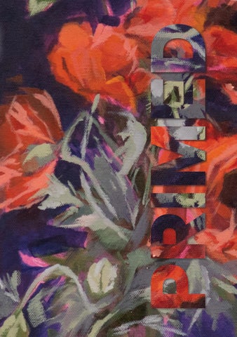
YEAR 12 VISUAL ARTS EXHIBITION Showcasing work from IB Visual Arts VCE Art Making and Exhibiting VCE Media VCE Visual Communication Design Sunday 18 October 2026 Geelong Grammar School Cover Image Credits Beth Lalor (Yr12 EM)
3
08–17
54–87
IB VISUAL ARTS
VCE MEDIA
Ethan Chen Islay Fraser Jack Hardisty Beth Lalor
18–53 VCE ART MAKING AND EXHIBITING Coco Barrow Ella Bishop Nellie Brown Milla Cohen Lidia DeBortoli Missy Fox Chelsea Gardner Charlie Haigh Michelle Law Anthia Lu Willa MacLachlan Lottie Nikakis Sylvie Perrin Shanina Stafford Issy van Drongelen Hattie Wade-Holdaway Adam Wilkins
Bella Anger Lucy Butler Dominic Chin Lucy Danckert Lidia DeBortoli Vincent Dong Allan Gavin Charlie Haigh Lottie Nikakis Izzi O’Connor Georgie Percy Sylvie Perrin Reu Phillis Banjo Thompson Issy van Drongelen Victor Zhuang
88–113 VCE VISUAL COMMUNICATION DESIGN Mia Blackaby-Proctor Lucy Butler Chloe Campbell Juliette Currie Lucy Danckert Zac Eisner Aayan Mubeen Mylie Neville-Smith Clementine Robinson Chloe Sangster Sophia Staehr Hattie Wade-Holdaway Ari Wilson
Welcome to the PRIMED 2026 Exhibition.
INTRODUCTION — PRIMED 2026
FROM THE HEAD OF VISUAL ARTS
This year, our whole-school focus has centred on a simple yet powerful idea: Learning that sticks, and virtuous bliss in ’26! To bring this vision to life, staff and students were encouraged to ‘have their backup bands’ and to believe that they are ‘a heavenly star’. Together, these themes reminded us that meaningful learning is never a solitary journey. It is built through collaboration, encouragement and experiences that leave a lasting impression.
Like stars in the night sky, every student possesses a unique light and purpose. Our role as educators is to help that light shine with confidence – to nurture curiosity, encourage resilience and create the conditions in which young people can discover what they can achieve. The title PRIMED, drawn from the Oxford definition – “prepared for a situation so that an individual knows what to do, especially after being given special information” – captures the essence of our students’ journey. Throughout their studies in Visual Arts, they have developed not only artistic knowledge and technical skills, but also the confidence to think independently, solve problems creatively and contribute meaningfully to the world around them. Whether our graduates continue into Art and Design or follow entirely different pathways, they leave with something enduring. The habits of observation, curiosity, resilience and creative thinking fostered through Visual Arts become part of who they are. This is learning that truly sticks. It is learning that extends well beyond the classroom.
5
INTRODUCTION — PRIMED 2026
In a rapidly and constantly changing world, creativity, adaptability and collaboration have become essential qualities. Visual Arts nurtures all three. It is not about memorising answers but about asking thoughtful questions, exploring possibilities and embracing uncertainty. Students discover that growth often happens beyond their comfort zones and that the most rewarding creative journeys are rarely undertaken alone. Like every great musician, every young artist benefits from a ‘backup band’ – a group of trusted teachers, peers, mentors and family members who encourage, challenge and support them along the way.
The PRIMED 2026 exhibition celebrates that journey. At our School, the Arts are not an optional extra but an essential part of a holistic education. Students work in purpose-built studios, darkrooms, ceramics workshops, digital design spaces and printmaking facilities, exploring a wide range of traditional and contemporary media. Just as importantly, they learn directly from practising artists, gaining invaluable insight into professional creative practice. This year, we have been privileged to welcome two outstanding Artists-inResidence – David Beaumont, whose evocative landscape paintings have encouraged students to observe the natural world with greater sensitivity (Term 1), and Heidi Yardley (Term 2), figurative artist whose thoughtful practice has inspired students to embrace experimentation and personal storytelling. We also look forward to welcoming Dagmar Cyrulla in Term 4, whose visit will further enrich our students’ creative experiences. While the practices of these artists are each unique, they all demonstrate the same enduring truth: creative success depends on far more than talent alone. It requires perseverance, curiosity, discipline, openness to failure and the willingness to keep learning. They offer students something no textbook can fully provide – the lived experience of a practising artist and the confidence to pursue their own creative voice.
6
Most importantly, this exhibition celebrates students. Each brings a different perspective, different strengths and a different story. Like stars, no two shine in the same way. Together, however, they create something far greater than individual could achieve alone – a creative community in which every contribution strengthens the whole.
INTRODUCTION — PRIMED 2026
As you move through this exhibition, you will see far more than finished artworks. You will witness persistence, imagination and personal growth. The works represent countless hours of observation, experimentation, refinement and reflection. Each student has developed ideas, taken creative risks and discovered new ways of expressing their understanding of themselves and the world.
The Visual Arts Department congratulates our 2026 graduates on the creativity, resilience and integrity they have demonstrated throughout their secondary journey. They leave not only with portfolios and achievements, but with friendships, confidence and learning that will stay with them long after they leave our studios. They have their backup band. They know that learning can last a lifetime. They are ready to shine in 2026 and beyond. They are PRIMED. Dr Peter Bajer Head of Visual Arts
7
IB VISUAL ARTS — PRIMED 2026
I NTERNATIO NAL BAC CA L AU R E AT E
VISUAL ARTS
8
9
IB VISUAL ARTS — PRIMED 2026
ETHAN CHEN (P) My exhibition ‘Pass & Awakening’ explores death not as a final disappearance, but as a passage between physical loss and spiritual renewal. The starting point for this enquiry came from my recurring interest in dreams, near-death imagery, and the uncertainty of what may exist between ending and becoming. Rather than presenting death through fear alone, I wanted to visualise it as a liminal state; unstable and transformative. Across my works, vortex, body and light become recurring symbols of transition. The vortex appears as a threshold, pulling the viewer towards the unknown and suggesting awakening, rebirth, or the movement of consciousness beyond ordinary reality. These motifs are influenced by Salvador Dalí’s surreal transformation, Rodin’s expressive use of gesture, and Refik Anadol’s immersive digital dreamscapes. My process combines digital editing and painting. This contrast between digital construction and handmade surface became central to the exhibition. AI allowed me to create dream-like forms that felt subconscious and unstable, while painting reintroduced human touch, texture, and imperfection. I also combined two different styles and art forms into one image. In this way, the works move between control and surrender; technology and spirituality; body and spirit.
10
IB VISUAL ARTS — PRIMED 2026
11
IB VISUAL ARTS — PRIMED 2026
ISLAY FRASER (GA) Exploring the fleeting nature of life through Mono no Aware, the Japanese aesthetic concept of recognising beauty in impermanence, this exhibition reflects on the value of memories, relationships and change. As I approach the end of my childhood and look towards the future, I have become increasingly aware of how quickly moments with family and friends become memories. Rather than viewing change as something to fear, I explore how accepting life’s transience allows us to appreciate the moments we often take for granted. Through photographs, stories and personal accounts, I explore how relationships and experiences shape our identities across different stages of life. Stitching faded imagery and fragmented photographs metaphorically pieces together memories that gradually become unclear, while the repetition of thread connects individuals, experiences and generations. My central work, ‘Retrospection’, brings these ideas together by representing the progression of a lifetime through interconnected memories. The exhibition moves between childhood, adolescence and reflection, encouraging audiences to consider their own memories and relationships. Ultimately, I hope viewers recognise that although moments are temporary, the connections and memories they create can continue to shape who we become.
12
IB VISUAL ARTS — PRIMED 2026
13
IB VISUAL ARTS — PRIMED 2026
JACK HARDISTY (FB) Humour, satire, surrealism and irony are used throughout this exhibition to examine urgent environmental and social issues from an adolescent perspective. By placing familiar figures and objects in unexpected situations, I create a sense of unease that encourages reflection. While the works may initially appear humorous, recurring features such as isolation, realism and slow pacing reveal deeper, and more uncomfortable, truths. Throughout the development of this exhibition, my approach evolved from explicit surrealist imagery to more subtle symbolism, satire and visual juxtaposition. Artists including René Magritte, Jeffrey Smart and Matthew Quick influenced my use of misplaced objects, isolation and ironic humour to communicate complex ideas. Their work demonstrated how surrealism can move beyond visual effect and become a powerful tool for exploring overlooked environmental and social concerns. The arrangement of the exhibition reinforces these themes. At its centre, ‘The Degree of Modern Reflection’ represents a younger generation inheriting and contemplating the consequences of unresolved issues. Environmental works, including ‘Prehistoric Kindling’, ‘The Scent of Hypocrisy’, and ‘As Nature Intended’, are grouped on the left, while works examining social issues, such as ‘Bold and Daring’, ‘The Successor’, ‘Terms & Conditions’, and ‘Need, Not Greed’, are positioned on the right. This deliberate division allows the central artwork to connect both themes through an adolescent perspective. Through my exhibition, I hope viewers recognise the significance of issues that remain hidden and are passed on unresolved. Curating the exhibition also taught me how the placement of artworks can strengthen meaning as well as visual impact.
14
IB VISUAL ARTS — PRIMED 2026
15
IB VISUAL ARTS — PRIMED 2026
BETH LALOR (EM) Art, to me, has always existed as a way to express my unique perspective of the world. As such, I was drawn to the idea of being able to depict the people I care about in the way I truly see them. ‘Exposure’ explores the relationship between exposure as an artistic element and physical or emotional vulnerability. The exhibition consists of four portraits and four diptychs (portrait and accompanying still life). The diptychs connect and allow me to “expose” intimate parts of the subjects’ lives and personalities. Investigating how people can be exposed not only physically, but also through their emotions, relationships and personal experiences. Light is used as a motif, highlighting the relationship between light and exposure. Each piece’s lighting is dependent on the subject, varying in colour, brightness and intensity to create different effects. In ‘Before You Leave’, the carefully chosen palette of ambers and ochres creates warmth, while the low, soft lighting establishes a sense of intimacy. The subject is introduced as hidden through the lighting, whilst being emotionally exposed as the audience is allowed a glimpse of a familiarity that would normally be inaccessible. Each still life extends its paired portrait, allowing me to “expose” intimate parts of the subjects’ lives beyond what their face alone can show. In ‘I At Sea’, a portrait of my grandfather at sea, the paired still life is of his boat, which becomes a stand-in for him, carrying his history and his relationship to the ocean.
16
IB VISUAL ARTS — PRIMED 2026
17
VCE ART MAKING AND EXHIBITING — PRIMED 2026
VICTO RIAN CERT I F I CAT E OF E DUCAT I ON
ART MAKING & EXHIBITING
18
19
VCE ART MAKING AND EXHIBITING — PRIMED 2026
COCO BARROW (HE) Changing Skies
This photograph series ‘Changing Skies’ captures the subjects’ (the three horses) connection to our farm through different lighting appearances and changing moods. Through the use of Wenge timber framing set back and up on foam core with white mount board and art glass, the artwork captures the subjects’ intricate features and peaceful connection to each other, myself and the home. Through the process of taking, reviewing, editing, printing and framing multiple photos, the artwork was able to illuminate a series that captured the continued altering and shifting in Australian winters light, illustrating the intimate relationship between horses, their environment, and the sense of belonging created through companionship. The photographs employ natural light, allow depth of field and selective automatic focus to draw attention to the subjects’ warm brown and ochre tones that contrast through negative space with the cool, pale blues and whites of the sky. The subjects’ calm demeanour emphasises the calmness that accompanies familiarity, painting a familiar experience and connection to viewers.
20
VCE ART MAKING AND EXHIBITING — PRIMED 2026
21
VCE ART MAKING AND EXHIBITING — PRIMED 2026
ELLA BISHOP (GA) Shaped by each other
‘Shaped by each other’ is a distorted portrait of my brother with my own facial features incorporated onto his. This piece represents the complexity of identity and how it can be shaped by your siblings through shared relationships and experiences. The use of these exaggerated features, along with the use of negative space surrounding the subject matter, encapsulates the portrait’s visually strong and engaging distortion without relying on using abstract distortion. The facial features of my own I integrated— my nose on his cheek, an eye on his other cheek and his forehead, my mouth placed in the palm of his hand as well as my own fingers beside his own—crafts the visual representation of shared sibling identity, as we have learned how these shared experiences influence how individual identity develops, though not being entirely individual at all. The development of this artwork using organic, wave-like distortion shifts the idea of the influences of identity into a more personal and familial context. The acrylic artwork encourages the audience to consider influences of their own identity through family, friends and relationships. The purposeful use of negative space reinforces the strength and distortion of the subject matter, while using a limited colour pallet created a more visually cohesive artwork, no feature overshadows another, highlighting the blend of sibling relationships. While painting with this limited pallet, it was useful to paint different sections at the same time using the one colour, this helped make the finished painting look more unified. For this reason, I chose acrylic paint as it’s fast-drying quality meant I could paint light and darker toned colours next to each other without them blending together. This made the shadows and features more defined, crafting a more 3D and lifelike portrait.
22
23
VCE ART MAKING AND EXHIBITING — PRIMED 2026
NELLIE BROWN (YR11 HE) The Passage of Time
‘The Passage of Time’ explores the connection between three generations of women; Grandmother, Mother and Daughter. Through three individual faces, the work reflects the physical similarities that exist across a maternal line, while also considering the less tangible characteristics. The repeated facial features create a visual connection between each woman, particularly through the emphasis on the eyes, which highlight inheritance and reinforce the relationship between the three. Despite these shared qualities, each woman remains individual, reflecting how each generation is influenced by those before it, while continuing to develop their own identity and experiences.
24
VCE ART MAKING AND EXHIBITING — PRIMED 2026
The arrangement of the three also represents the passage of time, creating a progression from Grandmother to Mother to Daughter and, in turn, from past to present and future. This progression considers how families continue to change over time while maintaining connections to their history. Together, the three women present the maternal line as a living thread, where physical features, personal qualities and experiences are carried through generations in ways that create connections that remain present as time continues to pass.
25
VCE ART MAKING AND EXHIBITING — PRIMED 2026
MILLA COHEN (YR11 CL) State of Mind
‘State of Mind’ explores the pressures of perfectionism within a world where imperfection is both inevitable and deeply human. Through layers of intricate crosshatched linework, I varied pencil pressure and density to build tonal variation across the individual squares of the grid. These alternating tones disrupt the grid’s physical rigidity, symbolising how expectations of perfection begin to fracture when confronted by reality, and the value in learning to embrace what falls outside them. The choice of white pencil on black paper creates an entirely monochromatic colour palette, emphasising the construction of form while drawing focus towards the figure and its expression. By placing myself within the work, it becomes a reflection of my own experiences with perfectionism, rather than simply an observation of it. The intentionally offset gaze creates a sense of being absorbed in thought, reflecting how emotions are often internalised rather than overtly expressed. In its entirety, the piece offers a commentary on this state of mind, and how the standards we hold ourselves to can distort the way we perceive what is already whole.
26
VCE ART MAKING AND EXHIBITING — PRIMED 2026
27
VCE ART MAKING AND EXHIBITING — PRIMED 2026
LIDIA DEBORTOLI (EM) Contradiction
‘Contradiction’ explores the theme contradiction of forms, focusing on soft, flowing forms. Inspired by the way fabric drapes and folds, it creates the illusion of fluid movement made from a rigid material. The sculpture is constructed on a MDF Backboard, wire mesh, foam core structure, which was then coated with a multipurpose filler and PVA mixture, forming a strong surface. Through layering, sanding and spray painting, I created smooth, continuous surface that contrasts with rigid materials used to construct the form. Mounted against the wall and painted to match the wall’s shade, the sculpture creates an optical illusion where the wall appears to bend and warp. The interaction between the flowing form, light and shadow encourages viewers to look more closely and question whether the surface is moving or remaining completely still. The work explores the tension between softness and rigid materials, movement and stillness, and organic forms.
28
VCE ART MAKING AND EXHIBITING — PRIMED 2026
29
VCE ART MAKING AND EXHIBITING — PRIMED 2026
MISSY FOX (EM) Letting Go Is a Part of Growing Up
‘Letting Go Is a Part of Growing Up’ explores the emotional experience of love, connection and change as we move from childhood into adulthood. The black-andwhite figure reaches towards the large red heart, symbolising the desire to hold onto meaningful relationships and memories, while also recognising the need to move forward. The repeated heart motif creates a sense of rhythm and repetition, suggesting that love and emotion can feel overwhelming and all-consuming. The dripping red heart introduces ideas of vulnerability, pain and loss, contrasting with the softer pink background. The strong contrast between the monochromatic figure and saturated colour palette establishes a clear focal point and guides the viewer’s eye upwards through the composition. Influenced by the street-art aesthetics of Banksy and Mr Brainwash, the work uses bold symbolism, expressive mark-making and graphic imagery to communicate that growing up involves both holding on and letting go.
30
VCE ART MAKING AND EXHIBITING — PRIMED 2026
31
VCE ART MAKING AND EXHIBITING — PRIMED 2026
CHELSEA GARDNER (YR11 HE) Gracie
‘Gracie’ is a series of three shoulder-up portraits of the same young girl, with each portrait presenting a different facial expression. The repeated format creates a connection between the works, whilst the variation in expression creates a sense of emotional movement. I explored the idea of movement through expression, focusing on the concept that movement does not always need to be physical, but can instead represent internal and emotional movement. By using three portraits of the same subject, I explored how small changes in the eyes, mouth and broader facial features can shift emotional meaning. The repeated composition connects the portraits, while the changing expression suggests a progression between different emotional states. I selected oil pencil for its ability to create controlled tonal layering and fine detail. I refined my pressure control, using lighter pressure for subtle tones and increased pressure from darker values and stronger contrast. University cartridge paper provided a smooth and durable surface that supported repeated layering while maintaining fine detail. I refined my use of layering, blending, pressure control, and tonal gradation to create a realistic modelling of the facial form. My process began with a projected outline to establish the proportions and placement of the portraits. I then progressively built tonal values through multiple layers, continually refining and evaluating my work by adjusting pressure, blending and detail to improve the representation of facial form. I was strongly influenced by Arinze Stanley’s hyper-realistic portraiture, detailed markmaking and strong tonal contrast. His focus on accurately rendering facial features and realistic form influenced my development of a realistic style using oil pencil. Through the final triptych, I aim to communicate movement through emotion and expression. I want the audience to recognise how subtle changes in facial expression and body language can communicate different feelings and compare the changing expressions across the three different portraits, creating a sense of emotional progression and movement.
32
VCE ART MAKING AND EXHIBITING — PRIMED 2026
33
VCE ART MAKING AND EXHIBITING — PRIMED 2026
CHARLIE HAIGH (A) Mr Gaye’s influence… (2026)
This artwork displays Soul artist Marvin Gaye painted with oils on a wooden board, joyfully playing the piano within a transcendent, soulful atmosphere which represents the unpredictability of Soul’s vocals via the sporadic spray-painted gradient texture and the love driven ideas of the genre through the symbolic monochromatic red hue. Gaye’s expression is the focal point and the emotional tie for the work yet the title ‘Mr Gaye’s influence…’ is sewn with a double entendre that suggests an alternative emotion and storyline derived from violence; does the influence belong to Marvin Gaye’s abusive father who influenced his son’s music endeavour as well as eventually being the source of his demise or does it belong to Gaye himself and his impact on the contemporary hip hop genre?
34
VCE ART MAKING AND EXHIBITING — PRIMED 2026
35
VCE ART MAKING AND EXHIBITING — PRIMED 2026
MICHELLE LAW (EM) Well 42
‘Well 42’ explores my connection to Country and the ways that Country, culture and community continue to shape my identity. Rather than depicting a literal landscape, I developed a personal visual language of interconnected organic forms, pathways, directional marks, pattern and repeated dots to represent Country as living, layered and continually evolving. The composition is unified through a predominantly warm palette of reds, pinks, oranges and ochres, referencing my associations with land, warmth and home. In contrast, the large blue organic form establishes a central focal point. Repeated marks and directional lines create rhythm and movement between areas of the composition, representing connection as something active and ongoing. Working with acrylic on canvas allowed me to develop layers of colour, opacity and surface texture. Throughout the artmaking process, I refined paint consistency, layering, brushwork and dotting techniques to achieve greater technical control while retaining variations that reveal the handmade nature of the work. My exploration of abstraction, colour, repetition and mark-making was informed by Emily Kame Kngwarreye’s ability to communicate relationships with Country through visual language rather than literal representation.
36
VCE ART MAKING AND EXHIBITING — PRIMED 2026
37
VCE ART MAKING AND EXHIBITING — PRIMED 2026
ANTHIA LU (YR11 A) Spiky Much?
‘Spiky Much?’ depicts a deep-sea viperfish settled around the base of a mutated statue head in an other-worldly landscape adorned with tall, sharp structures. This drawing presents a dystopian, surreal-style environment featuring unusual, abnormal subject matter combinations. The recurring spiky, messy teeth motifs convey symbolic ideas such as exploring unconventional appearances and bypassing standard, orthodox aesthetics. Graphite was selected as the drawing medium since it provided flexibility. More subtle tones and gradients were produced through a process called graphite painting, in which a graphite stick was shaved using a pair of scissors, and the graphite particles were then distributed onto the paper using a brush, applied in a painting motion. Tonal contrast from the graphite emphasises subject matter impact, creating a focal point. Recurring sharp lines synthesise cohesion with the overall unpleasant and foreign appearance of the environment.
38
VCE ART MAKING AND EXHIBITING — PRIMED 2026
The stark contrast of the cast shadows against the vast, barren landscape highlights the desolate environment and thus, effectively evokes aesthetic qualities of bleak isolation, vulnerability, and alienation. A semi-automated drawing process that relied on intuition, impulse, and instinct was used to detail much of the subject matter. This surrealist-style technique allowed raw ideas and feelings from the subconscious to be reflected onto the paper spontaneously. The art-making process was much more enjoyable, as it allowed more freedom and was less restrictive than drawing based on a reference material or preconceived plan. Artists such as Polish painter Zdzisław Beksiński, Austrian illustrator Alfred Kubin, and French painter Yves Tanguy have helped influence aspects of this drawing through their works depicting foreign entities in surreal and dystopian landscapes, although this artwork remains a visual reflection of personal ideas and aesthetics. Ultimately, ‘Spiky Much?’ invites viewers into an other-worldly realm simmering with liminal energy to appreciate surreal aesthetics.
39
VCE ART MAKING AND EXHIBITING — PRIMED 2026
WILLA MACLACHLAN (CL) In Passing
‘In Passing’ explores identity through movement and my connection and understanding of place. Horses have continued to appear throughout my work because they have been a large part of my upbringing and have become a personal symbol of identity. In this series, the horses gradually increase in movement and are split between adjoining plates, so each horse only becomes whole when the plates are viewed together. I wanted this continuation between the forms to reflect how identity is constantly changing and shaped by different experiences. The vibrant orange surface originates from the red earth of the Australian landscape, particularly the colours I associate with growing up and spending time in the Northern Territory. Around the rims I included fragments of handwritten English and Latin, allowing ideas of progression, narrative and movement to sit subtly within the work without being immediately obvious. I formed the plates using Keane stoneware clay before underglazing, applying a clear satin-matte glaze and firing the ceramic decals of my own pencil drawings and ink lettering onto the finished surfaces. My previous study of Ceramicists Hylton Nel, Malypiya Davey and Tessy King influenced the way I began to see ceramics as something that could hold personal imagery and meaning rather than just form. For me, ‘In Passing’ brings these ideas together and reflects how identity is carried and changed through the places and experiences that become part of us.
40
41
VCE ART MAKING AND EXHIBITING — PRIMED 2026
LOTTIE NIKAKIS (CL) Intertwined
My artwork explores the connection between traditional craftsmanship and industrialisation through the contrasting materials of jute and wire, intertwined through the traditional technique of weaving. The natural jute represents handmade practices and labour-intensive craft traditions, while the rigid wire grid symbolises manufactured systems and industrial production. Through integrating these materials, I aim to highlight how traditional skills continue to exist within an increasingly mechanised world. I also hope to communicate an environmental message, encouraging viewers to consider the value of slower, more sustainable making practices that rely on craftsmanship, natural materials and skill rather than mass production and industrial efficiency. This artwork was created through a repetitive weaving process, with jute woven in and out of a large wire framework by hand. Repetition became an important aspect of the work, reflecting both the slow nature of traditional making and the systematic qualities of industrial production. Acrylic paint was applied directly onto the woven surface following extensive experimentation with colour and paint consistency. The burnt orange line creates emphasis and encourages the viewer’s eye to move vertically throughout the composition. Its linear form mirrors the overall structure of the artwork while symbolising the progression of textile practices from traditional craftsmanship towards industrialisation. The uneven gaps within the line represent the disruption and gradual loss of traditional techniques as industrial methods have become increasingly dominant. Throughout the development of this artwork, I refined my understanding of materiality, scale and presentation. Influenced by the artists Stephanie Ali and Emma Shepherd, I became interested in how fibre-based works interact with light, shadow and surrounding space. Suspending the artwork allows light to pass through the open weave, creating shadows that extend beyond its physical boundaries and reinforce its sculptural qualities. By contrasting organic and industrial materials, I encourage viewers to reflect on the relationship between craftsmanship, labour and contemporary production while engaging with the texture, scale and physical presence of the work.
42
VCE ART MAKING AND EXHIBITING — PRIMED 2026
43
VCE ART MAKING AND EXHIBITING — PRIMED 2026
SYLVIE PERRIN (GA) Vestige
‘Vestig’e is a series of three works depicting fragments from my recurring dreams. I am interested in dreams as a liminal state between consciousness and unconsciousness, in which familiar places become uncanny and ordinary experiences acquire an intangible sense of unease. The figures and environments are derived from imagery I have personally encountered within my dreams, grounding the works in the subjective nature of memory, perception and psychological experience. Working on linen, I used oil pastel to construct the figures and water-soluble oil paint to develop the surrounding environments. This distinction in materiality enables the figures to retain a sense of precision and corporeal presence, while the fragmented, gestural environments appear less stable and more elusive. Through this juxtaposition, I seek to evoke the disorientation of dreaming, positioning the viewer within a psychological half-light where familiar and unfamiliar, clarity and ambiguity, coexist.
44
VCE ART MAKING AND EXHIBITING — PRIMED 2026
45
VCE ART MAKING AND EXHIBITING — PRIMED 2026
SHANINA STAFFORD (CL) Midnight Bloom
A single dahlia-like blossom is the centre piece. Its petals are built up in layered pink, lavender and blush tones that catch the light against a black background. Radiating outward, green stems, star-shaped blooms and clusters of blue florets scatter across the canvas, evoking a garden bloom within the night. Acrylic paint has been piped directly onto the canvas, building each petal, stem and starburst as a raised, textured ridge. This method transforms acrylic paint into a sculptural medium, giving the surface a dimensionality that shifts depending on the angle and quality of light in the room. Up close, the ridged texture reveals the deliberate, repetitive motion of the piping process. The composition balances density and openness. At its centre, the dense, tightly packed ridges of the flower’s petals create a focal point of weight while the surrounding stems and blossoms are rendered in finer, more linear piping, thinning out as they drift toward the edges of the canvas. This contrast in scale and texture gives the piece a sense of quiet movement, as though the smaller blooms are still settling into place around their centre. Set against the black canvas, the flower’s warm palette feels both vivid and isolated, suggesting resilience or vibrancy against a darker backdrop. The work invites viewers to consider growth, individuality, and the quiet persistence of colour and form even in low light.
46
VCE ART MAKING AND EXHIBITING — PRIMED 2026
47
VCE ART MAKING AND EXHIBITING — PRIMED 2026
ISSY VAN DRONGELEN (HE) Who Are We?
‘Who Are We?’ explores identity, individuality and the connections between people through fragmented portraiture. Seven individual faces are separated across ten irregular shards, disrupting the viewer’s ability to reconstruct a single, complete identity and questioning how identity is formed within a collective. This work extends my Unit 3 exploration of tonal reduction and reflection, with critique feedback informing my decision to combine these visual ideas within one resolved composition. I developed the portraits through photographic fragmentation and monochromatic tonal reduction, using controlled acrylic value structures to establish tonal hierarchy, depth and facial definition. Reflective mirror shards were then positioned within the fragmented composition, interrupting the painted surface and incorporating the viewer’s own reflection, immersing them into the artwork. The navy border frames the composition without enclosing it, providing tonal contrast while symbolising the deeper boundaries and connections surrounding individual identity. Subtle thin red thread was stitched through selected shards, introducing linear contrast, repetition and symbolic interconnectedness. Continued art making, experimentation and refinement developed greater control of scale, tonal hierarchy, fragmentation, composition and material integration. The 60 × 60 cm canvas allows the painted, reflective and stitched elements to operate cohesively while retaining visible brushwork and evidence of the art-making process. It is intended for the viewer to look closely, seeing the authentic brush strokes while also recognising their own reflection within the fragmented identities and considers how individual identity can exist within a collective “we.”
48
VCE ART MAKING AND EXHIBITING — PRIMED 2026
49
VCE ART MAKING AND EXHIBITING — PRIMED 2026
HATTIE WADE-HOLDAWAY (FR) Title artwork 1: The Secret Tea Party Society Title artwork 2: The Crimson Queen
My two artworks, ‘The Secret Tea Party Society’ and ‘The Crimson Queen’, are inspired by Alice in Wonderland. I focused on some of the most recognisable parts of the story, including the Queen of Hearts, the tree, the Mad Hatter’s tea party and Alice falling down the rabbit hole. I chose these scenes because they represent imagination, curiosity and the feeling of entering a world that is completely different from our own. The main ideas I explored through these artworks are growth, curiosity and the inner child. As we grow older, we are expected to become more responsible and serious, and sometimes the things we enjoyed as children can get left behind. My artworks question whether growing up really means that we have to lose that imaginative part of ourselves. I created the artworks using papercutting and gouache paint on Fabriano paper. Papercutting allowed me to create small, detailed shapes that fit together almost like pieces of a puzzle. I liked this because it created a neat and controlled appearance, while still making the artwork feel playful. One challenge I experienced was that the Fabriano paper could curl when it became wet from the gouache. To solve this, I placed heavy, wide books over the paper while it dried. I also used tracing paper between the books and the artwork to protect the surface. An artist who influenced my work was Sally Smart, particularly her use of collage and separate pieces to create larger images. Instead of copying her approach, I adapted the idea into my own papercut technique. The precise cuts gave my work a cleaner, almost puzzle-like quality. Most importantly, I want these artworks to remind my audience that being an adult does not mean giving up the things that make us feel happy, curious and imaginative. The inner child is still an important part of who we are. Even while growing up and becoming more responsible, there should still be space for creativity, play and wonder.
50
VCE ART MAKING AND EXHIBITING — PRIMED 2026
51
VCE ART MAKING AND EXHIBITING — PRIMED 2026
ADAM WILKINS (A) Line of action
This drawing depicts a scene of Mads Mikkelsen Dancing from the movie Another Round. I chose to depict this scene as I wanted to convey a sense of movement and motion as seen through dancing. The fluidity and energy of dance is something that I wanted to try and express within the confines of a still image. Movement can mean many things, whether that be growth, progress, change, evolution or decay. But dance is not necessarily any of those things, yet it is undoubtably an expression of movement. It is an expression of oneself, and of the energy and movement of the present moment. The energy that comes from being able to enjoy a place in time to its fullest. I was heavily inspired by the works of Takeru Hokazono and Takehiko Inoue, and in all their works they depict a single moment in time; a snapshot of the world in one instant. I felt that dance exemplified this idea, though I felt that dancing itself is difficult to capture fully in a single static image. Another big inspiration for this piece is the medium of animation, and the technique of onion-skinning, where multiple frames of animation are shown at once, layered on top of one another to help the animator transition from one key image to another smoothly. I utilised alcohol markers for their vibrancy and their ability to be layered to create that streaky imperfect finish. This combined with my coarse and striking linework exaggerates the motion and gives it a sense of energy and weight.
52
53
VCE MEDIA — PRIMED 2026
VICTO RIAN CERT I F I CAT E OF E DUCAT I ON
MEDIA
54
55
VCE MEDIA — PRIMED 2026
! G M WOAH KE
S LI
DRES
JAZ Y BANRSRUP!
JJ!
A PU IKIT
N
OPE
N BLE I TROU ISE? D A R PA ORIA VICT S IT T N A W !
NOW
6 AUG/SEP 202
9 352693
$10.99 AU/
T BRYNN’s HO D SUMMER BO TIPS!
NZ (INC GST
05
)
IN IE WE R HALL U S YO READ D! MIN
HOW WELL DO YOU KNOW
EVIE?
ES, GAM ZES, ! QUIZ D MORE AN
401834
BELLA ANGER (HE) WOAHMG! is a 32-page gossip magazine that aims to draw attention to the issues that casual gossip culture can cause in teenagers and young adults, finding humour in the absurdity of the infallible facades and normalisation of bullying they promote. The magazine also highlights the normalisation of parasocial relations with celebrities, swapping out the famous faces for normal people to demonstrate how truly weird it is to know so much about a person you have never even met, and the dangers of these magazines making them seem like a ‘relatable friend’. That way, I hope readers can learn that ridiculing people to such a personal extent is not in fact normal in any way, shape or form, and that those who they idolise are as human as themselves.
56
VCE MEDIA — PRIMED 2026
57
VCE MEDIA — PRIMED 2026
Republic Economica
By Lucy Butler
Hidden spots in Melbourne
Republic Economica is a popular restaurant in South Yarra, Melbourne, located on Toorak Road and known for its lively, social atmosphere. It has a relaxed, slightly retro interior with warm lighting and a casual vibe that gradually gets busier and more energetic at night, often with music or DJs playing. The menu is mainly Italian-inspired, offering comfort foods like pizza, pasta, and share plates, along with cocktails and reasonably priced meals compared to many inner-city venues. It’s a place where people often go for both dinner and a night out, so it easily shifts from a calm dining spot earlier in the evening to a buzzing social space later on. Because of its central location near transport and nightlife, it’s popular with both locals and visitors looking for a fun, easy-going Melbourne dining experience rather than formal fine dining.
1 criteria 5.indd 1
23/7/2026 11:39 AM
criteria 5.indd 2
2 23/7/2026 11:39 AM
LUCY BUTLER (GA) My media product explores the hidden and lesser-known spots in Melbourne, showcasing locations that are often overlooked or not widely recognised. Through photography and design, I aimed to present Melbourne from a different perspective by focusing on unique architecture, details, atmosphere and environments. I used a range of photographic techniques, including different angles, framing, lighting and perspectives, to create visually interesting images. I then edited and arranged the photographs into a cohesive book, using consistent typography, layout and colour to create a professional and engaging final product. The overall purpose of my product is to encourage the audience to look beyond Melbourne’s well-known attractions and appreciate the hidden places and details that make the city unique.
58
VCE MEDIA — PRIMED 2026
59
VCE MEDIA — PRIMED 2026
DOMINIC CHIN (M) My media product is a stop-motion animation that shows a character that is always running in one direction. The narrative follows a clay figure that keeps running forward with no real stop or destination.
60
VCE MEDIA — PRIMED 2026
61
VCE MEDIA — PRIMED 2026
MELBOURNE, CURATED
SOUTH YARRA
MALVERN
TOORAK
ARMADALE
LUCY DANCKERT (CL) My overarching product is a professionally produced tourism lifestyle magazine that promotes Melbourne’s inner suburbs as desirable destinations for an 18–30-year-old audience. The magazine combines original photography, curated editorial content, contemporary typography, structured layouts and consistent branding to create a cohesive and aspirational visual identity. Rather than simply providing information about locations, the product presents local businesses, food, fashion, shopping and lifestyle experiences in a way that encourages audiences to explore and engage with these places. The use of physical print production, premium paper stock and professional binding further reinforces the magazine’s intended high-quality, editorial aesthetic. Overall, the product demonstrates how media codes and conventions can shape audience perceptions of place, transforming familiar Melbourne locations into curated and desirable lifestyle experiences.
62
VCE MEDIA — PRIMED 2026
Stepping inside Republic Economica feels less like entering a restaurant and more like discovering
REPUBLIC ECONOMICA
one of Melbourne’s most creative social spaces. The venue effortlessly combines a relaxed Europeaninspired dining room with a carefully curated record collection, vintage interiors and an unmistakable appreciation for music and culture. Warm timber finishes, lush greenery and natural light create an inviting atmosphere that encourages guests to linger well beyond their meal. As the team describes
it, Republic Economica is a place where “food, drinks and music” come together to create memorable
experiences. Whether you’re enjoying a leisurely brunch, afternoon cocktails or dinner with friends, every visit feels effortlessly authentic. It’s the kind of venue where exceptional hospitality, thoughtful design and a love of community naturally intersect. Address – 160 Toorak Rd, South Yarra VIC 3141
Opening Hours – Open 9am to 1am daily
Contact – opentable.com.au
4
5
STUPID VINTAGE Unlike a traditional fashion boutique, Stupid Vintage embraces creativity, individuality and sustainability through an ever-changing collection of carefully sourced vintage clothing. Located inside a vibrant two-storey warehouse, every corner is filled with unique pieces waiting to be rediscovered, creating an experience that feels more like exploring a curated gallery than shopping. The business proudly describes
itself as a “double story colourful factory” packed with “350sqm of unique curated vintage clothing,” where every item is hand-
picked from around the world. Working alongside more than 30 Australian vintage sellers, Stupid Vintage
celebrates small businesses, community and circular
“ double story colourful factory ... of unique curated vintage clothing”
fashion. Every visit offers something different, making it a destination for shoppers who value originality over fast fashion.
Address – Factory 1/40 Green St, Windsor VIC 3181 Opening Hours – Open 11am to 6pm daily Contact – 0493 258 667
34
35
63
VCE MEDIA — PRIMED 2026
Somewhere in the Middle of Nowhere
LIDIA DEBORTOLI (EM) My photography book Somewhere in the Middle of Nowhere captures the small and often unnoticed details of my family’s vineyard in the Yarra Valley. It explores the emotional connections we form with places that hold a special place in our hearts. For me, this place has been a part of my family’s story for many generations. The property has been a constant presence throughout different stages of my life, while I have watched it change across the seasons, each one painting the vineyard differently. Despite these changes, the feeling of the place has always remained the same, a constant remainder to slow down and appreciate the beauty it has to offer. Through a series of photographs, I explore the feeling of returning to somewhere familiar, revealing the beauty found in ordinary moments and inviting others to see the comfort and peace within a place that can seem so isolated.
64
VCE MEDIA — PRIMED 2026
The landscape changes with every season, just as people do. The feeling of comfort it brings never changes.
Some of my favourite memories here aren’t planned in fact, they’re the quiet moments shared with the ones who know this place as well as I do.
Somewhere in the Middle of Nowhere Somewhere in the Middle of Nowhere captures the small and often unnoticed details of my family’s vineyard in the Yarra Valley. It explores the emotional connections we form with places that hold a special place in our hearts. For me, this place has been a part of my family’s story for many generations. The property has been a constant presence throughout different stages of my life, while I have watched it change across the seasons, each one painting the vineyard differently. Despite these changes, the feeling of the place has always remained the same, a constant reminder to slow down and appreciate the beauty it has to offer. Through a series of photographs, I explore the feeling of returning to somewhere familiar, revealing the beauty found in ordinary moments and inviting others to see the comfort and peace within a place that can seem so isolated
Each visit offers a different perspective, even when the view remains unchanged.
Ra nihil mo doluptaeriae et ditio coreicitat et ex estorerspis et quia denistiunt que dolorpos
The small details often go unnoticed, yet they are what make this place feel so familiar.
Every season paints the vineyard a little differently.
65
VCE MEDIA — PRIMED 2026
VINCENT DONG (A) My intention is to create a social realist short film that explores friendship, nostalgia and the uncertainty of adulthood through the reunion of a group of old friends in contemporary Beijing. Rather than presenting their emotions through dramatic conflict or explicit explanation, I aim to represent their relationships through ordinary conversations, shared activities and subtle changes in behaviour. The film uses an observational visual style influenced by Chinese social realist and documentary cinema. Handheld tracking, selected static compositions, naturalistic performances and real urban locations are used to create the impression that the audience is observing events as they naturally unfold. Diegetic environmental sound and the absence of non-diegetic music further support this realism and avoid directly manipulating the audience’s emotional response. Through restrained pacing and an open-ended narrative, I intend to encourage the audience to reflect on how friendships change as people enter adulthood and experience different social and economic circumstances. Although the characters temporarily reconnect through shared memories and humour, underlying emotional distance remains. Ultimately, the film aims to present adulthood not through a dramatic resolution, but through ordinary moments of connection, separation and uncertainty.
66
VCE MEDIA — PRIMED 2026
67
VCE MEDIA — PRIMED 2026
ALLAN GAVIN (A) This 3–5-minute, portrait-format short film follows Victor, a studious friend of the filmmaker, using fast-paced clips and narration suited to short-form social media audiences. Unlike glamorised “day in the life” reels, it deliberately shows both highs and lows: an idealised morning run, followed by two quarters of realistic struggles, and a final quarter mixing a healthy cooked meal with an all-nighter. The aim is to subvert unrealistic social media portrayals and offer audiences a relatable, authentic depiction of an ordinary day.
68
VCE MEDIA — PRIMED 2026
69
VCE MEDIA — PRIMED 2026
CHARLIE HAIGH (A) CENTRED is an intimate documentary which explores the artistic process of Sai Neoh. Inspired to capture detail and distinctive techniques of the pottery process. Using various camera techniques, I have observed Sai’s process throughout planning, production, and even distribution. For audiences watching my documentary I intend them to feel inspired to begin a creative pathway or possibly revive a creative endeavour.
70
VCE MEDIA — PRIMED 2026
71
VCE MEDIA — PRIMED 2026
LOTTIE NIKAKIS (CL) My short film explores the disconnect between the craftsmanship behind clothing and the way garments are consumed and discarded. Through a simple linear narrative, dramatic lighting, and a focus on the small details of garment making, I aim to show the time, effort and care that goes into creating clothing. I want the film to make the audience reflect on their own consumption and reconsider how they value the clothes they wear, encouraging them to shop mindfully, appreciate craftsmanship and consume with purpose.
72
VCE MEDIA — PRIMED 2026
73
IZZI O’CONNOR (HE) Low Season explores the Mornington Peninsula during winter, presenting a quieter and more atmospheric perspective of a landscape commonly associated with summer. Through empty beaches, coastal vegetation, mist and changing natural light, the work considers isolation, stillness and the understated beauty of the coastline. The placement of written text across the pages is also deliberately considered, guiding the reader’s eye from one side of each spread to the other and encouraging them to follow the visual sequence of the book. This creates a slower, more immersive reading experience in which the words and photographs work together to lead the audience through the changing landscape.
74
VCE MEDIA — PRIMED 2026
75
VCE MEDIA — PRIMED 2026
GEORGIE PERCY (EM) My short film follows a student progressing through the familiar rhythm of a daily routine, initially in isolation, then gradually in the company of someone else experiencing the same existence. The routine continues largely unchanged, but the presence of a second person begins to alter how it is felt and inhabited. By the film’s close, the routine is largely the same as it was at the outset, yet it carries an entirely different weight, now shared rather than solitary. This transformation is conveyed visually, through a colour grading that moves from greyscale to warm and full as the second character becomes more present, as well as being conveyed the choice of the instrumental version of Nico’s “These Days,” whose unhurried, reflective quality underscores the film’s sense of quiet accumulation rather than dramatic change. The film is silent, allowing the narrative to be carried entirely through performance, visual repetition, and the gradual warming of its world, an invitation to the audience to consider who or what has quietly rendered their own routine more vivid.
76
VCE MEDIA — PRIMED 2026
77
VCE MEDIA — PRIMED 2026
SYLVIE PERRIN (GA) Mothlight explores memory, identity, intimacy and the emotional instability of adolescence through a fragmented, non-linear narrative. Rather than following a traditional story, the film moves fluidly between memory, imagination and present experience, inviting audiences to inhabit the protagonist’s emotional world. Centred on a young woman navigating an intense relationship, the film considers how love can provide comfort while failing to erase deeper struggles, suggesting that no relationship can fully bridge the distance between one person’s inner world and another’s. However deeply we are understood or loved, our experiences ultimately remain our own, revealing the subtle isolation that exists beneath even our closest connections. Through symbolic imagery, poetic voiceover and layered sound, Mothlight prioritises atmosphere and psychological experience over narrative clarity. Drawing on conventions of experimental arthouse cinema and psychological drama, the film encourages viewers to construct meaning through emotion, rhythm, and recurring visual motifs, creating an intimate portrait of memory and perception.
78
VCE MEDIA — PRIMED 2026
79
VCE MEDIA — PRIMED 2026
REU PHILLIS (A) A woman seeking answers about her future visits a mysterious fortune teller, only to be confronted by the trauma of her past. As the line between fate and free will begins to blur, she must decide whether her future is predetermined or hers to create. FORTUNE explores the power of choice, using neo-noir cinematography, stark black-and-white imagery and an atmospheric original score to create a haunting journey from uncertainty to self-determination.
80
VCE MEDIA — PRIMED 2026
81
VCE MEDIA — PRIMED 2026
BANJO THOMPSON (A) Second Hand follows Alex, a smooth-talking, small time con artist, through one chaotic day. He lies, hustles, steals and manipulates his way through the suburbs to reclaim a stolen watch. It’s tense, funny and fast; a scrappy, stylish crime flick that asks what you’re really willing to risk for something that was never quite yours to begin with.
82
83
VCE MEDIA — PRIMED 2026
ISSY VAN DRONGELEN (HE) The Days We Didn’t Notice is a nostalgic coming of age music video documenting the final year of high school from the perspective of eleven Year 12 students. By utilising childhood footage alongside contemporary video recordings, my film explores friendship, memory and the transition from childhood to adulthood. The rhythmic montage editing, handheld cinematography, multiple layers of diegetic sound and symbolic visual motifs help convey the emotions associated with growing up and realising just how quickly time can pass. Produced using genuine moments throughout the year, the production invites the audience to look back at their own memories growing up as they celebrate the relationships and milestones that define adolescence. With an inspired documentary like style and emotion driven narrative, The Days We Didn’t Notice not only serves as a personal record of our graduating class but also a universal reflection on change, nostalgia and moving forward to the future ahead.
84
VCE MEDIA — PRIMED 2026
85
VCE MEDIA — PRIMED 2026
VICTOR ZHUANG (CU) Caught on Camera is a stylised short action film set within a boarding school, which follows a student who accidentally records two teachers arranging the sale of stolen exam papers, and is chased across a boarding school campus by a prefect sent to retrieve the evidence. Its purpose is to entertain through tension, pace and style. The film is inspired by Guy Ritchie’s crime-film conventions of freeze-frame intertitles, sharp editing, fast pacing and a non-linear structuring of time to a school environment, turning an ordinary campus into a crooked one. Produced entirely on location at Geelong Grammar School and driven by stylistic flair, the film is intended for people who enjoy action, thriller and crime narratives.
86
VCE MEDIA — PRIMED 2026
87
VCE VISUAL COMMUNICATION DESIGN — PRIMED 2026
VICTO RIAN CERT I F I CAT E OF E DUCAT I ON
VISUAL COMMUNICATION DESIGN
88
89
About us
Feeding Guide
Support
VCE VISUAL COMMUNICATION DESIGN — PRIMED 2026
little
Shop
MIA BLACKABY-PROCTOR (GA) A logo, packaging design, and website were developed as two design communications in response to the Little Munch brief. The brand identity focused on creating a playful, memorable, and child-friendly logo that appealed to both young children and their parents. The Little Munch logo used rounded typography and a colourful pastel palette to communicate fun, friendliness and approachability. This visual identity reflected the brand’s focus on enjoyable baby food while creating a recognisable identity that could be consistently applied across packaging and digital platforms, such as a website. Shop
About us
The packaging design was developed to contain and protect the baby food purée while visually communicating the Little Munch brand. Bright fruit illustrations, playful typography, and colourful elements created strong shelf appeal and clearly communicated the product flavour. Functional features, including a resealable screw1 cap spout and convenient pouch format, made the product practical and easy for parents to use and store. The design balanced functionality with visual appeal by 2 providing clear product information while maintaining an engaging appearance.
Feeding Guid
Feeding Gu
Begin with a small spoonful and let your baby get used to new flavours.
Try different fruit and vegetable purées to help your little muncher discover new favourites.
3 Let your baby decide how much they want to eat. Look for signs that they are hungry or full.
The website extended the Little Munch brand into a digital platform. Pages including Home, Shop, About Us, Feeding Guide and Support allowed parents to easily access product information and brand resources. Always supervise your baby while eating and introduce I believe that together, these solutions will appeal to parents and caregivers of children aged six months and older who value convenient, nutritious, and visually appealing food products.
90
About us
Feeding Guide
Shop Shop
Support
About us About us
Feeding Guide Feeding Guide
Support Support
Shop
little
Shop
About us
Feeding Guide
Support
About us Welcome to Little Munch! We make yummy fruit and veggie purées for little tummies 6+ months. Our tasty pouches are full of delicious flavours to help your little muncher discover new foods!
Shop
About us
Feeding Guide
Support
Shop
1 2
Let your baby decide how much they want to eat. Look for signs that they are hungry or full.
Try different fruit and vegetable purées to help your little muncher discover new favourites.
Feeding Guide
Support Support
We're here to help! If you have a question about Little Munch, our products or feeding your little muncher, check out our Help Centre or get in touch with us.
3
Begin with a small spoonful and let your baby get used to new flavours.
About us
Support
Feeding Guide 4 As your baby grows, introduce a variety of foods and gradually move towards thicker and lumpier textures.
Contact Us
Always supervise your baby while eating and introduce new foods safely.
Email: hello@littlemunch.com.au Phone: 1800 LITTLE MUNCH Hours: Monday–Friday, 9am–5pm AEST
VCE VISUAL COMMUNICATION DESIGN — PRIMED 2026
Shop
little
WEBSITE FINAL PRESENTATION
SERVING Shake well before serving. Twist off cap and squeeze into a bowl or spoon, or serve directly from the pouch if your child is ready. Refrigerate after opening and consume within 24 hours.
INGREDIENTS Apple, Banana, Strawberry, Blueberry, Raspberry. 100% fruit • No added sugar • No artificial colours or flavours
Servings per package: 1 Serving size: 120 g
ORGANIC GOODNESS FOR EVERYONE
little
BEST BEFORE:
SERVING Shake well before serving. Twist off cap and squeeze into a bowl or spoon, or serve directly from the pouch if your child is ready. Refrigerate after opening and consume within 24 hours.
INGREDIENTS Apple, Banana, Strawberry, Blueberry, Raspberry. 100% fruit • No added sugar • No artificial colours or flavours
Servings per package: 1 Serving size: 120 g
ORGANIC GOODNESS FOR EVERYONE BEST BEFORE:
PACKAGING FINAL PRESENTATION
91
VCE VISUAL COMMUNICATION DESIGN — PRIMED 2026
APRES FRESH
LUCY BUTLER (GA) The brand identity design focused on creating a fresh, recognisable logo that communicated the alpine, social and energetic identity of Après Fresh. Developed in Adobe Illustrator, the logo combined a mountain illustration with spaced typography and a blue and teal colour palette. The mountain imagery created a clear connection to skiing and the alpine environment, while the cool colours represented snow, ice and winter landscapes. The logo was designed to be simple and memorable so it could be applied consistently across the bar, menus, signage and promotional materials. APRES FRESH
The après-ski bar was developed in SketchUp and drew inspiration from the form of a ski gondola. The curved exterior created a direct connection to ski culture while helping the design stand out from traditional rectangular structures. Timber cladding was combined with corrugated metal to balance the warmth of an alpine lodge with a contemporary aesthetic. The interior incorporated a service counter, shelving, beverage storage, and space for ski equipment. Further refinements introduced additional25102860J colour and Après Fresh branding to strengthen the connection between the venue and the visual identity. I hope that together, the two design communications will appeal to young adults aged 18 to 30, and skiers who enjoy après-ski culture, socialising, and live entertainment. By combining a distinctive alpine brand identity with a functional gondola-inspired venue, the final outcomes create a fun, contemporary and memorable Après Fresh experience.
92
VCE VISUAL COMMUNICATION DESIGN — PRIMED 2026
Concept A modern ski gondola designed for Après Fresh, an après-ski brand targeted towards young adults aged 18–30 who enjoy skiing, socialising and mountain culture. The gondola combines modern alpine materials including timber-style siding, shiny corrugated metal and large glass panels to create a contemporary design that connects with the surrounding ski environment. The Après Fresh branding will also be incorporated into the gondola to create a strong and recognisable visual identity. This ski gondola is designed to be both functional and visually engaging. The large glass panels provide passengers with clear views of the surrounding mountains and snow while also creating an open and modern appearance. The timber-style siding introduces warmth and connects the design to traditional alpine architecture, while the corrugated metal adds a contemporary and durable element. Together, these materials create contrast and visual interest while supporting the fresh, modern and mountain-inspired identity of Après Fresh.
view A
view D
view E
I chose modern siding for the main exterior of my ski gondola because it creates a warm and natural appearance that contrasts with the cold alpine environment. The timber look connects to traditional ski lodges and mountain architecture, while the clean vertical lines give the gondola a more contemporary appearance.
I chose shiny corrugated metal to introduce a more industrial and modern material into the gondola design. The reflective metallic surface creates contrast against the warmer siding and relates to the metal structures and machinery commonly associated with ski lifts and gondolas. The corrugated texture also adds visual interest to the design. I chose glass because visibility is an important part of the gondola experience. Large glass sections allow users to see the surrounding mountains, snow and landscape while travelling. The transparent and reflective qualities of glass also give the gondola a clean, modern appearance and work well alongside the metal and siding materials.
view B
25102860J
93
VCE VISUAL COMMUNICATION DESIGN — PRIMED 2026
CHLOE CAMPBELL (CL) A logo and reversible bucket hat were developed as two design communications in response to the SYNTHA Festival brief. The brand identity focuses on a distinctive and memorable logo, created in Adobe Illustrator, which represents SYNTHA as a contemporary electronic music festival. The logo combines condensed typography with a geometric symbol and turquoise circle, creating a simple and recognisable identity. The black, white and turquoise colour palette creates strong contrast, while the geometric forms reflect the modern style of the festival. The logo is designed to remain clear and adaptable across tickets, signage, merchandise and social media, maintaining a consistent visual identity across different applications. The promotional bucket hat was developed to provide sun protection while also functioning as branded festival merchandise. The final design is reversible, with a minimal white side and a more vibrant turquoise side, giving the wearer two different options. Both sides incorporate the SYNTHA symbol to maintain a clear connection with the brand identity. Recycled cotton is proposed as the main material because it is breathable, durable and environmentally responsible. Ventilation eyelets, reinforced stitching and the wide brim also improve comfort and functionality for outdoor festival conditions. Together, these outcomes aim to appeal to fashion conscious young adults aged 16 to 25. By combining a recognisable brand identity with practical and reusable merchandise, both communications create a cohesive identity that represents SYNTHA Festival.
94
VCE VISUAL COMMUNICATION DESIGN — PRIMED 2026
95
VCE VISUAL COMMUNICATION DESIGN — PRIMED 2026
JULIETTE CURRIE (EM) A cocktail packaging design and promotional poster were developed as two design communications in response to the Soléa brief. The packaging design focused on creating a fun and recognisable identity for Soléa’s ready-to-drink cocktail range. Six individual can labels were created for the Negroni, Espresso Martini, Hugo Spritz, Mojito, Paloma and Cosmopolitan. Each flavour uses a different colour palette and cocktail illustration, while maintaining consistent typography, organic shapes and the Soléa logo to connect the collection. The labels also balance visual appeal with functionality by clearly presenting information including ingredients, alcohol percentage, volume and nutritional information. The designs were then applied to a six-can carry box, extending the same colours and graphics across the packaging. The promotional poster was designed to advertise the Soléa launch event and communicate the brand’s summery and social identity. An original cocktail photograph creates the main focal point, while oversized repeated Soléa typography creates visual hierarchy and strengthens brand recognition. Event details are clearly positioned along the bottom of the poster without distracting from the imagery. Overall, the two design solutions create a cohesive identity aimed at young adults aged 18–25. The bright colours, cocktail imagery and playful graphics communicate Soléa as a fresh, social and modern ready-to-drink cocktail brand.
96
VCE VISUAL COMMUNICATION DESIGN — PRIMED 2026
97
VCE VISUAL COMMUNICATION DESIGN — PRIMED 2026
LUCY DANCKERT (CL) The PARADISO project responds to the communication needs of an interactive festival application and a promotional outdoor jacket, creating a cohesive visual identity designed for an 18-to-30-year-old audience. Both outcomes combine a contemporary black, white and blue colour palette with bold, expressive typography and a recordinspired graphic language to communicate the energy of a modern music festival. The interactive application was developed to provide users with accessible and efficient festival information. Features including the lineup, schedule, interactive map, ticket access, merchandise, food, bar, first aid and news allow users to navigate the festival environment easily. Through development, I simplified the navigation system, refined the iconography and introduced a consistent colour palette to improve readability and create a more sophisticated interface. I also created original handwritten PARADISO typography in Procreate after deciding that an existing downloaded font did not achieve the desired visual identity. The outdoor jacket extends the PARADISO identity into a physical, wearable communication. The black and cream garment incorporates bold blue branding, practical pockets, adjustable cuffs, a drawstring hem, high collar and concealed hood to respond to the unpredictable outdoor festival environment. Feedback and experimentation informed the final placement, scale and colour of the graphics. My final design outcomes established PARADISO as a recognisable, functional and contemporary festival brand, creating a cohesive identity across both communications.
98
Stand collar provides added warmth and protection from changing weather conditions
Durable black outer fabric designed for outdoor festival conditions
Cream contrast panels add visual interest while maintaining the bold festival identity Metal snap details add a utility-inspired aesthetic for hidden hood component
Functional side pockets provide convenient storage for personal items Oversized blue PARADISO graphic creates strong brand recognition and visual impact
25141415T PRESENTATION OF COMMUNICATION NEED ONE
Blue PARADISO disc provides minimal, recognisable branding
Adjustable cuff allows the fit to be customised for comfort and movement
Adjustable drawcord hem allows the fit to be tightened for weather protection
VCE VISUAL COMMUNICATION DESIGN — PRIMED 2026
25141415T PRESENTATION OF COMMUNICATION NEED TWO
25141415T PRESENTATION OF COMMUNICATION NEED ONE
99
VCE VISUAL COMMUNICATION DESIGN — PRIMED 2026
ZAC EISNER (YR11 A) Two design communications were developed in response to the Niken x Kodek collaboration brief, focusing on an underwater film camera and a complementary film roll message design. The 1W underwater film camera was developed using Adobe Illustrator and Fusion 360 to create a retro-futuristic product that complemented the existing Niken camera range. The design featured a robust and angular form inspired by the demands of underwater photography. Key features included a built-in light, interchangeable underwater film cartridges, magnetic wireless charging, and a durable metal body. These elements were incorporated to enhance functionality while reinforcing the camera’s distinctive retro-futuristic aesthetic. The WVI film roll package design was developed in Adobe Illustrator to communicate essential product information while promoting the collaboration between Niken and Kodek. Typography, colour, layout and film specifications were carefully arranged to create a design that felt both contemporary and nostalgic. Bright yellow typography improved information hierarchy, while water-inspired patterns visually referenced the film’s underwater colour chemistry. Alternative colour variations were also developed to maintain consistency across different film products within the range. My final design outcomes created a cohesive Niken x Kodek product line that appealed to both professional and recreational underwater film photographers. The camera and film design worked together to establish a distinctive retro-futuristic identity while supporting the practical demands of underwater photography.
100
VCE VISUAL COMMUNICATION DESIGN — PRIMED 2026
101
VCE VISUAL COMMUNICATION DESIGN — PRIMED 2026
POINT COOK GYM 24/7
POINT COOK GYM 24/7
AAYAN MUBEEN (FR) EMPLOYEE Team member
A brand identity and building were developed as two communication designs in response to the Point Cook Gym brief. The building was developed through a floor plan and a set of elevations on Adobe Illustrator to represent the building on a scale, communicating its intended purpose NO. 2526454G as a gym. The building itself follows a square-based shape, VCE with a slant at the back equipped with a pool area and an outdoor area housing a bathroom. The design is intended for the Point Cook area, with an audience of male and female 15-to-60-yearold Point Cook residents of all backgrounds. The building should house up to 70 people, while maintaining a 24/7 schedule. The brand identity was developed on Adobe Illustrator and is intended as a recognisable logo for the audience of male and female between ages 15 to 60. It is supposed to include the “Point Cook” name while being indicative that it is a gym, open 24/7. The design has a dark blue half while the other half is a black colour. The typography used is a simple Adobe font which is large and recognisable while the logo contains a barbell, used to show that it is a gym. My designs reflect the client’s vision of providing a free, 24/7 gym for the Point Cook community. Through a combination of branding and building design, I created an outcome that hopefully will appeal to residents aged 15 to 60.
102
8000
20000
7000
GYM Carpet
POOL
18000
Concrete
32000
OUTDOOR Tiles
ROOF Steel
The concept for the gym was a new free, available twenty four hour gym for the Point Cook community. The concept design is located in West Melbourne. The idea was to have a gym which can hold up to 75 people at one time, while also being equipped with an outdoor area and a pool. It was intended to be used by a large age range and for all people of any backgrounds, as a centre for fitness and physical health.
7000
mATErials POINT COOK GYM
FLOOR PLAN SCALE: 1:200 SHEET SIZE A3
NORTH
AAYAN MUBEEN
05/09/2026
01
ROOF Steel
NORTH ELEVATION
POINT COOK
WALL
White Steel
GYM 24/7
AUTOMATIC DOOR
VCE VISUAL COMMUNICATION DESIGN — PRIMED 2026
CONCEPT
41000 13000
TINTED WINDOW
Glass
Glass
SOUTH ELEVATION
EAST ELEVATION
WEST ELEVATION
The materials used were a variety of steel and metal along with concrete and tinted glass. The exterior building walls use a white steel to prevent overheating, while the roof uses black steel to evaporate rain water quickly. The glass is intended to be tinted, to allow privacy of the users inside. The fence also uses a black metal, easily visible to theany pedestrians and people using the gym.
POINT COOK GYM 24/7
ELEVATIONS SCALE: 1:100 SHEET SIZE A1
POINT COOK GYM AAYAN MUBEEN
05/09/2026
02
2526454G
103
VCE VISUAL COMMUNICATION DESIGN — PRIMED 2026
MYLIE NEVILLE-SMITH (GA) A billboard advertisement and showroom chair were developed as two final design communications in response to the Austin Healey brief. The billboard design promotes the revival of Austin Healey through a bold and refined visual identity. Developed using Adobe Illustrator and Photoshop, the design combines a striking image of the vehicle with the statement “an icon. REBORN.” to communicate the return of the brand. A cohesive red, cream and neutral colour palette draws from Austin Healey’s historic racing identity, while strong contrast, hierarchy and restrained typography ensure the vehicle remains the focal point and the message can be quickly understood within a roadside context. The showroom chair was developed in VectorWorks as a functional furniture piece for use within an Austin Healey showroom. Its form and detailing draw inspiration from the curves, materials and character of classic Austin Healey vehicles. The refined design incorporates supportive bolstering and a durable metal structure, balancing comfort and functionality with a distinctive automotive aesthetic. The two design solutions create a cohesive experience that celebrates Austin Healey’s heritage while repositioning the brand for a modern audience. The billboard generates excitement and recognition externally, while the chair extends this identity into the physical showroom environment, creating a consistent and memorable representation of the revived Austin Healey brand.
104
105
VCE VISUAL COMMUNICATION DESIGN — PRIMED 2026
CLEMENTINE ROBINSON (CL) A logo and promotional design were developed as two design communications in response to the Stonehurst House brief. The brand identity focused on creating a distinctive and memorable logo that communicated the character of Stonehurst House and its connection to the Australian landscape. Developed in Adobe Illustrator, the logo combined a refined serif typeface with an organic, nature-inspired icon to reflect the traditional qualities of the cottage while maintaining a contemporary and approachable aesthetic. An earthy colour palette and understated visual language drew inspiration from the surrounding bushland, reinforcing the accommodation’s connection to nature. The logo was designed to remain clear and recognisable across a range of applications, including social media, signage and promotional materials. The promotional design was developed to communicate the experience of staying at Stonehurst House while appealing to the target audience. Imagery, typography, and layout were carefully considered to create a warm, sophisticated, and inviting visual identity. Elements inspired by the cottage’s heritage and natural surroundings established a cohesive connection between the accommodation and its rural setting. Clear visual hierarchy and thoughtful placement of information ensured key messages were communicated effectively while maintaining visual appeal. My final design solutions appeal to adults aged 18 to 50, with medium-to-high disposable income, who value travel, wellness and nature-based experiences. By combining a contemporary brand identity with an inviting promotional communication, I established Stonehurst House as a distinctive and relaxing Australian getaway.
106
LUXURY COASTAL ESCAPE 15 Dows Lane, Robe
Stonehurst House is a luxury rural retreat inspired by the natural landscape and relaxed coastal character of Robe, South Australia. The architecture combines the traditional form and warmth of a country cottage with refined details that create a contemporary sense of luxury. The exterior features a classic pitched roof, warm terracotta roof tiles, natural rendered walls and timber elements, reflecting the earthy tones and established character of the surrounding landscape. Arched windows and doors add a distinctive architectural feature while creating a strong connection between the interior spaces and the surrounding gardens. Generous outdoor areas extend the living spaces into the landscape, providing guests with opportunities to enjoy the peaceful rural setting. The combination of traditional cottage architecture, natural materials and sophisticated detailing creates the character of Stonehurst House as a private coastal escape.
INSIDE THE HOUSE Stonehurst House contains two bedrooms, one bathroom, a kitchen, living and dining spaces, and an outdoor verandah, providing everything needed for a comfortable weekend stay. The interior offers a warm and inviting environment for cooking, dining, relaxing and socialising, while the outdoor areas extend the living space into the surrounding landscape. Guests can expect a private cottage-style accommodation experience with comfortable bedrooms, functional
BUILDINGS CONTENT
PURPOSE Stonehurst House provides a private and comfortable luxury accommodation experience for guests visiting the Robe region. The house offers a peaceful retreat from everyday life, giving guests a place to relax, reconnect and enjoy time with family or friends while surrounded by the natural beauty of the Limestone Coast. Its location within a rural property surrounded by native bushland and farmland allows guests to experience the quieter side of Robe while remaining close to the region’s beaches, attractions and local hospitality. The house combines the comfort and familiarity of a home with the quality and atmosphere of a boutique holiday stay. Carefully arranged living and outdoor spaces provide opportunities for both socialising and privacy, while the connection between the interior and surrounding landscape allows guests to enjoy the rural setting throughout their stay. Stonehurst House provides a distinctive alternative to standard local accommodation, offering a considered and welcoming space for a luxury weekend escape.
2 BEDROOMS 1 BATHROOM 1 KITCHEN 1 LIVING ROOM 1 OUTDOOR VERANDAH BALCONY
MATERIALS LIMESTONE RENDERED BRICK TIMBER TERRACOTTA TILES GLASS STEEL CONCRETE NATURAL STONE
VCE VISUAL COMMUNICATION DESIGN — PRIMED 2026
STO NEHURST HOUSE
LOCATION Stonehurst House is located in Robe, South Australia, within the Limestone Coast region. Set amongst a peaceful rural landscape, the property is surrounded by native vegetation, open farmland and the natural beauty of the South Australian coast. Robe is known for its beaches, historic township, coastal scenery and relaxed atmosphere, making it a popular destination for weekend getaways and holiday stays. The location provides guests with a balance between privacy and accessibility, allowing them to retreat into the quiet countryside while remaining within easy reach of Robe’s beaches, local shops, cafés, restaurants and attractions. The surrounding landscape becomes an important part of the experience at Stonehurst House, with views and outdoor spaces allowing guests to enjoy the natural setting throughout their stay.
107
VCE VISUAL COMMUNICATION DESIGN — PRIMED 2026
CHLOE SANGSTER (HE) Two design communications were developed for STAKD, a jewellery storage brand designed to make travelling with jewellery easier, safer and more organised. The brand identity and promotional materials were developed in Adobe Illustrator to create an elegant and recognisable visual identity for STAKD. The logo combined a refined serif typeface with a stylised ‘S’, creating a sophisticated mark that appealed to the target audience of young women. A burgundy, light blue and cream colour palette was selected to create contrast while communicating a modern, feminine and premium aesthetic. The identity was applied across business cards, shopping bags and promotional materials to demonstrate how the branding could remain consistent across a range of applications. The STAKD jewellery box was developed and refined using VectorWorks to provide a practical and organised solution for travelling with jewellery. The final design featured four removable trays designed specifically for rings, earrings, necklaces and bracelets. Each tray stacked magnetically to create a compact form, allowing jewellery to remain protected, organised and tangle-free during travel. Rounded rectangular forms, a timber exterior and soft velvet interiors reinforced the product’s premium aesthetic while maintaining a high level of functionality. The two communications create a cohesive brand and product system, combining a recognisable visual identity with a practical, customisable solution for jewellery storage and travel.
108
VCE VISUAL COMMUNICATION DESIGN — PRIMED 2026
109
VCE VISUAL COMMUNICATION DESIGN — PRIMED 2026
COMMUNICATION 2 logo and branding
ALPEN VERDE
ALPEN VERDE S U ST A I N A B L E A C C O M O D A T I O N
SUSTAINABLE ALPINE ACCOMODATION PHONE: 0478 8394 7365 EMAIL: alpenverde@swiss.com
S U ST A I N A B L E A C C O M O D A T I O N
SOPHIA STAEHR (CL) A sustainable alpine accommodation design and brand identity were developed as two design communications in response to the Alpen Verde brief. The brand identity was developed using Adobe Illustrator and Adobe Photoshop, focusing on a recognisable and contemporary logo that communicates sustainability, nature and alpine living. The mountain inspired icon establishes a connection to Zermatt and the Swiss Alps, while the blue colour palette reflects the surrounding alpine environment. The simplified forms and typography create a modern identity that maintains legibility and visual impact across digital and print applications. The accommodation design was developed using SketchUp and Adobe Photoshop, consisting of three identical two-storey houses designed to accommodate four people, with sheltered parking and convenient ski run access. Sustainable materials including European larch, low-carbon concrete, triple glazed Low E glass and recycled aluminium roofing were selected to minimise environmental impact and respond appropriately to the alpine climate. Solar panels further strengthen the sustainable qualities of the design. Together, the outcomes target environmentally conscious travellers aged 20–50 who value sustainability, comfort and high-quality accommodation. The combination of cohesive branding and climate responsive architecture communicates Alpen Verde’s commitment to contemporary, environmentally responsible alpine tourism.
110
SUSTAINABLE ALIPINE HOUSING
overview
MATERIALS
solar panels
ZERMATT CONTEXT
VCE VISUAL COMMUNICATION DESIGN — PRIMED 2026
COMMUNICATION 1
Triple glazed Low-E glass has high thermal insulation and reduces heat loss in Zermatt’s cold alpine climate, lowering the house’s heating requirements and overall energy consumption.
Recycled aluminium standing seam roofing because it is lightweight, durable against harsh alpine snow and weather, recyclable, and has a long lifespan, reducing the roof’s overall environmental impact.
ELEVATIONS
FLOOR PLANS
111
oy VIC
VCE VISUAL COMMUNICATION DESIGN — PRIMED 2026
treet
HATTIE WADE-HOLDAWAY (FR) I have developed two design solutions for Cozy Nookie, a toy brand focused on creating safe, high-quality and sustainable products for a medium-to-high socioeconomic market. Communication 1 focused on the brand identity and logo design. The logo was developed by hand and then in Adobe Illustrator using rounded, bubble-style typography to create a playful yet modern visual identity. A dark blue colour palette was selected to communicate trust, quality and sophistication, while lighter tones enhanced the playful nature of the brand. Rounded shapes and simplified forms reinforced the friendly and approachable aesthetic, appealing to the target audience of young adults aged 19 to 21. Communication 2 focused on the development of a 3D toy concept. The design was hand-rendered on cartridge paper using coloured pencils to create realistic shading and form. The toy’s shape was informed by survey feedback from the target audience and was designed to be safe, sustainable and engaging. Each toy will feature a calming rain sound and lavender scent. Colour was used to communicate different emotions, with purple representing calmness, yellow excitement, blue peacefulness, and pink playfulness. Together, the two communications created a cohesive brand and product system that successfully fulfilled the client’s brief. Overall, this fulfills the client’s brief and connects with each other.
112
VCE VISUAL COMMUNICATION DESIGN — PRIMED 2026
HATTIE LOVE HATTIE LOVE director director
95-103 Pakington 95-103 Pakington Street Street Geelong Geelong West & West & Smith Street, 127 Smith127 Street, Fitzroy VICFitzroy VIC 3065 3065 0414 523 0414 454 523 454
113
VCE VISUAL COMMUNICATION DESIGN — PRIMED 2026
ARI WILSON (YR11 A) I have developed two design communications for K72 Film Studio (the client) and its conceptual film, Limbo, which explored themes of surrealism, artificial reality and impossible architecture. For the first communication, a promotional film poster was developed using Blender, Photoshop and Illustrator to create a visually striking and atmospheric outcome. The design featured impossible geometric forms that conveyed the unnatural and fabricated nature of the film’s world. The central logo established the film’s title, Limbo, while also functioning as a monumental structure within the composition, reinforcing themes of control and distorted reality. Colour played an important role in communicating the film’s narrative, with a bright blue sky creating a sense of beauty and nostalgia that contrasted with the dark purple void below, suggesting mystery and underlying danger. For the second communication, an environmental design was created in Blender to establish the film’s surreal setting. The environment was developed in Blender to create an expansive network of interconnected rooms and spaces that would have been impractical to construct using physical methods. Endless staircases, objects passing through walls, and dense fog were incorporated to create a sense of claustrophobia, uncertainty and surrealism. The repeated geometric forms reinforced the film’s themes of artificiality and disorientation while immersing the viewer in an unfamiliar world. Together, the two communications created a cohesive visual system that appealed to arthouse film audiences through a highly stylised and emotive interpretation of surreal and impossible realities.
114
115
THANK YOU My heartfelt appreciation goes to the entire Visual Arts Department, with particular thanks to Mrs Lucy Haigh, who guided two 12 VCE Art Making and Exhibiting classes, and Ms Jen Nicholls, who taught 12 VCE Media. I would also like to acknowledge and thank all the other members of the department whose dedication and commitment often take place behind the scenes: Ms Marita Seaton, as well as Jane Maaser, Sai Neoh (who photographed all the work) and Sophie Taylor, our Art Technicians. My sincere thanks also extend to the art staff across our other two campuses. I am certain that, at different stages of their creative journeys, many of our art and design graduates were inspired, supported, or taught by them. The staff’s continued guidance and mentorship have been instrumental in bringing the works featured in this catalogue to life. I would like to extend my appreciation to Charlie Haigh (A), Beth Lalor (EM), and Sylvie Perrin (Ga), who proudly represented the Department as Visual Art Captains in 2026. Finally, my sincere thanks go to Sofie van Gunsteren, whose creativity, dedication and hard work made this wonderful publication possible.
4
1