GDUSA - Graphic Design USA Volume 63 / No.3 May/June 2026 Kaye Publishing Corporation (ISSN0274-7499/USPS227020). Published 6 times a year with combined issues in January/February, March/April, May/June, July/August, September/October, November/December.
Executive, editorial and advertising offices at 594 Dean Street, Office 22, Brooklyn NY 11238. Phone: 212.696.4380. Website: www.gdusa.com.
SUBSCRIPTION: Domestic, $72 one year. Canada and Mexico $140 per year. Periodicals postage paid at New York NY and additional mailing office.
POSTMASTER: Send address changes to GDUSA - Graphic Design USA, PO Box 3072, Langhorne PA 19047. Permit #224.
10 2026 LOGO TRENDS REPORT
For more than 20 years, Bill Gardner has compiled and reviewed more than 450,000 logos via LogoLounge.com. And throughout that time, GDUSA has had the opportunity to publish Bill’s trend reports which command attention with a sweeping overview of the past year’s logo designs — the context and culture from which they arise — the patterns he gleans — and the wisdom he imparts along the journey. This time around, you will read about Slip Knot, Open Access, Slash Bar, Breezy, and more. In the bigger picture, he takes on how the growing digital toolkit is shaping a new generation of identity and branding programs. But remember: “This is a trend report, not a trendy report. Trendy is a flash in the pan... trends track the long arc of where design is going.”
20 63RD PRINT DESIGN SURVEY
For the 63rd continuous year, GDUSA has polled our readers on benchmark questions regarding print design, paper specification and print buying. Over the years, the role of graphic designers — and print itself — has evolved, and our polls are one way to take stock of that that evolution. Two findings stand out. First, creative professionals are intensely committed to the inherent qualities print and paper to touch, to engage, to forge a human connection. Second, the advent of AI may be about to write a new chapter in print design; will the designer remain in the plot or be cast to the margins? Exceptional paper maker, Billerud, is, once again, the much-appreciated exclusive sponsor.
Our American Inhouse Design Awards™ is the original and premier showcase of creative excellence honoring designers and departments at corporations, institutions, non-profits, media, education, government, and more. We honor and recognize the value that these creative and content professionals bring to the table — their intimate knowledge of their companies, organizations, and brands, — and the ability to crystallize the message down to its essence and its truth. GDUSA introduced this competition decades ago as an act of defiance: that the work being done inhouse is worthy of design annuals and that their organizations were way better off for it. Truer than ever in 2026!
EDITORS AT GDUSA
Comments, suggestions and letters can be sent to editorial@gdusa.com.
I recently watched a documentary called The AI Doc, in which an impressive array of experts weighs in on the societal impact of artificial intelligence. The predictions range from imminent death-by-robot to an earthly paradise of abundance and ease. Seeking a middle ground, the film embraces the concept of the “apocaloptimist” — someone who rejects both naive denial and inevitable doom.
Our 63rd Annual Print & Paper Survey grapples, in part, with AI’s likely effect on print design. It is fair to say that print designers are positioning themselves as apocaloptimists.
Print has weathered decades of disruption. Challenged repeatedly by new technologies and changing media habits, it has declined in volume, yet consistently found ways to remain relevant, valuable, and effective.
Indeed, the principal finding of this year’s survey is surprisingly reassuring for traditionalists: print remains a vital force and a common thread across professional design practice. Its classic strengths — permanence, tactility, credibility, sensory engagement — continue to resonate and forge meaningful human connections when applied strategically and executed well.
That said, AI cannot and will not be ignored. We are still in the early stages of understanding its consequences, but my sense is that print designers believe that they and the medium itself will prove resilient once again.
The emerging framework is this: graphic design is evolving into a practice where speed and craft coexist, and where AI-powered tools and digital workflows are reshaping the early stages of ideation and production. Yet this shift does not diminish the importance of print design; if anything, it sharpens it. As routine tasks are automated, the role of the print expert becomes more focused, more intentional, and more craft-driven, particularly on projects where physical presence, materiality, and human experience matter
The apocaloptimist’s theory: we stand on the threshold of a new chapter in print communication in which the way ideas are generated may change, but print designers will remain essential in shaping how those ideas are experienced in the real world. — GK
THE VALUE PROPOSITION OF INHOUSE DESIGN
This edition of GDUSA features our 63rd Annual American Inhouse Design Awards™ showcase. The original and premier celebration of inhouse excellence, this competition attracts thousands of entries from every corner of the country and every sector of the economy
The winning work demonstrates graphic design at its best — serving commerce, culture, and causes. It reflects the talent of creative and content professionals who not only produce effective design, but also help their organizationsfulfilltheirmissionandbuildlastingvalue.
GORDON KAYE AND SASHA KAYE-WALSH ARE
In a recently published GDUSA guest commentary, leading inhouse advocate Andy Epstein traces the hard-fought rise of the inhouse designer and department to prominence. He voices concern that today’s “speed-to-market” mentality and “good enough” culture is undermining some of the progress that has been achieved. Yet Andy remains cautiously optimistic that this trend can be reversed because great design is ultimately a win-win for business and society.
We share that optimism. Our confidence is rooted in the enduring value proposition of inhouse design.
Its greatest strength lies in an intimate understanding of institutional identity, corporate culture, and organizational objectives. The best practitioners are keepers of the torch, uniquely positioned to distill and express the essence of an organization — its brands, products and services, traditions, values, and aspirations. At a moment marked by fragmentation, disloction and distrust — when organizations must dig deep to find their authentic voice, maintain or rebuild trust, communicate with clarity and purpose — inhouse designers are uniquely equipped to lead the way.
GDUSA launched this awards program decades ago because we believed that inhouse designers deserve a seat at the table, along with the recognition and rewards that come with it. We believed, as well, that their finest work is the stuff of design annuals. The strength of this year’s competition only reinforces these convictions and suggests why the future of inhouse design will be bright. — SKW
ARCHITECTS OF POSSIBILITY
This marks the 24th year of Bill Gardner’s annual LogoLounge Trend Report — each edition a stupifying feat of observation and insight into the ever-evolving world of logo design and, more broadly, the nature of creativity itself.Being a skeptic by nature, I found myself wondering whether, after nearly a quarter-century of trendspotting, Bill could possibly do it again.
“Hold my beer,” I imagine him saying. Then he rolled up his sleeves and produced a report that exceeds expectations — fresher, deeper, more timely, and more meaningful than ever.
At the heart of his argument is the idea that while many designers continue to create excellent branding, identity systems, and logos within established conventions — nothing wrong with that — a growing cadre of intrepid creatives is pushing the boundaries. They are responding to new media environments, advanced rendering capabilities, increasingly sophisticated digital toolkits, and the continuing integration of AI into the creative process.
The result, Bill argues, is nothing less than transformational.
As he writes: “What’s emerging is a system that feels more fluid than ever. Less fixed. Less precious. Brands aren’t just presenting themselves — they’re behaving ... Designers aren’t just handing off assets — they’re building frameworks. Controlled environments where clients can dial things up or down, shift intensity, adjust frequency, evolve imagery, all while staying inside a defined visual language ... We’re moving from designers as sole authors to designers as architects of possibility — creating toolkits that allow brands to produce endlessly variable expressions that still feel cohesive. It’s control without rigidity. Freedom without chaos.”
Bill has done it again. O ye of little faith. — GK
MATCHING TALENT W ITH SUCCESS NATION W IDE
The Great Resignation has left companies scrambling for talented designers and creatives searching for fulfilling projects. That's where Artisan Talent comes in. We're a boutique creative staffing agency here to make things easier for you - whether you’re hiring talent or finding work. From small agencies to major corporations, our team is in the business of connecting people. That’s what makes us Artisan.
THANKS TO BILLERUD
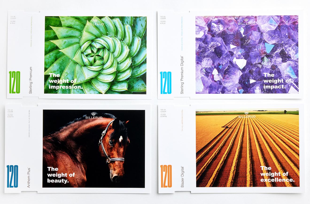
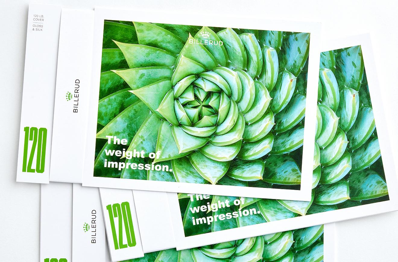
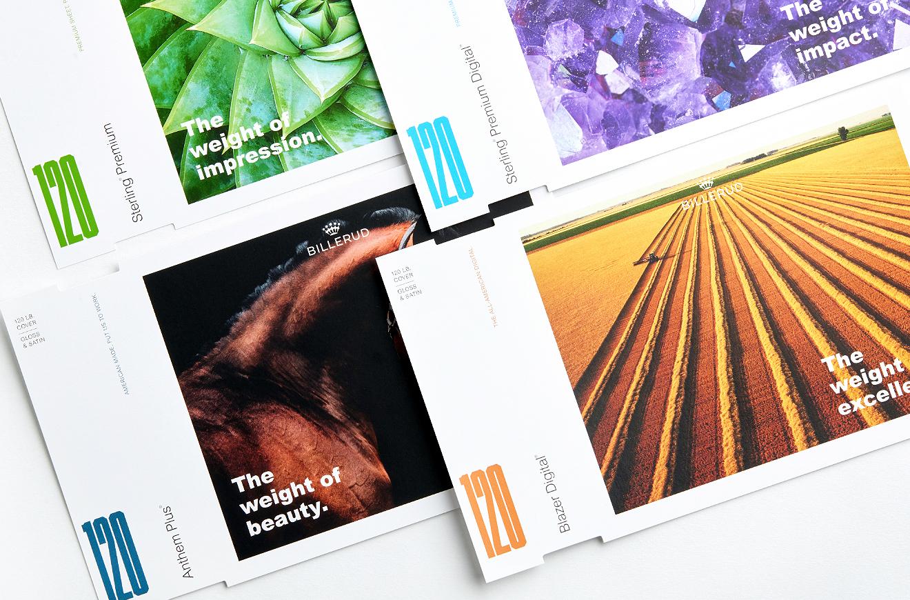
Billerud is exclusive sponsor of GDUSA’s 63rd annual print and paper survey.
Billerud makes high performance packaging materials for a low carbon society. We are a global leader in paper and packaging materials made from cellulose fibers, and we are passionately committed to sustainability, quality and customer value. We serve customers in more than 100 countries through nine production units in Sweden, USA and Finland, and around 5,200 employees in 16 countries. Billerud is listed on the Nasdaq Stockholm. In the United States, Billerud operates out of a regional head office in Miamisburg OH, two mills in Michigan’s Upper Peninsula and a converting facility in Wisconsin. We are a leading supplier of high-quality graphic and label papers, packaging materials, and market pulp. At Billerud, we build brands and business results for our customers.
Our history in the forestry and paper industry spans more than 150 years. Today, our materials are used in packaging and paper products relied on by millions of people across the world every day. Across our nine production units, we manufacture materials that our customers convert into milk cartons, fruit boxes, beauty packaging, carrier bags, cement sacks, labels, high-end publications and magazines – just to name a few applications.
The body of this publication is printed on Influence® Gloss, 60 lb. text from Billerud. Influence® is a high-quality coated No. 3 web paper. More information about the products available from Billerud can be found later in this edition. To learn more, please contact your Billerud sales professional or visit billerud.com.
ABOUT THE COVER
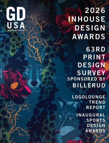
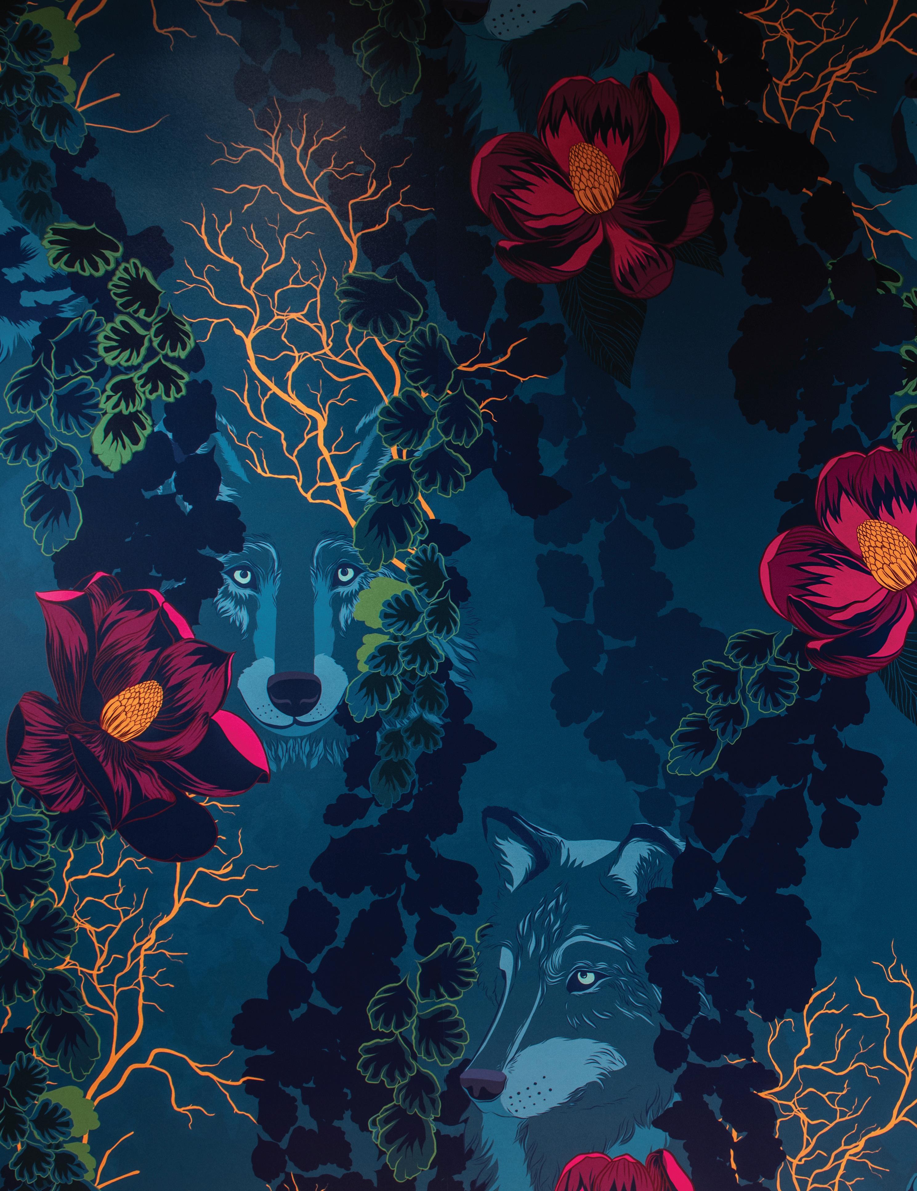
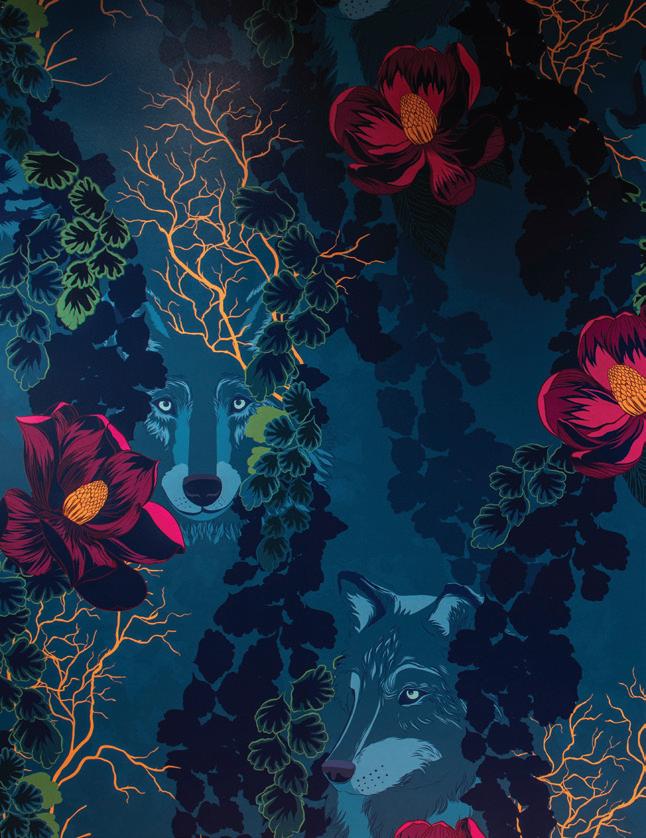
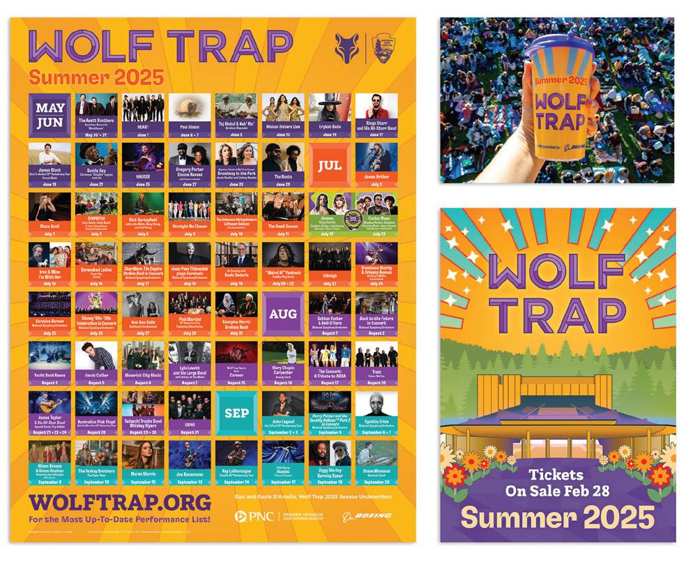
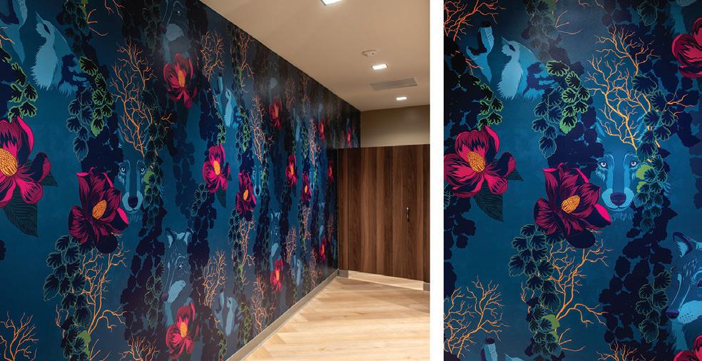
Shown here: Wolf Trap Foundation Creative designed this award-winning wallpaper that captures the spirit of the iconic performing arts center in Fairfax County VA. The 2026 American Inhouse Design Awards™ winners showcase starts at page 34.
COVER PAPER CREDIT: The cover of this edition of GDUSA is printed on FSC-certified Kallima Coated Cover C2S, part of the Kallima Paper family of coated cover paperboard. Kallima products are proudly manufactured by Rayonier Advanced Materials, a global leader in sustainable forest management practices. Their light-weight, fully bleached coated board products are used in commercial printing, publishing, prestige packaging, high-impact graphic corrugated containers, point-of-purchase displays and litho-laminated packaging. Kallima has a distinct low-density high-bulk construction resulting in less trees used and signficant cost savings to the customer. Contact: kallimapaper.com and 1.800.411.7011
Gordon Kaye PUBLISHER
Sasha Kaye-Walsh EDITOR/WEBSITE & SOCIAL MEDIA
Gordon Kaye EDITOR/PRINT
Charlotte Kaye GRAPHIC DESIGN
Kyle Redfield CHIEF TECHNOLOGY OFFICER
Althea Edwards READER SERVICES
Angelo Abbondante ACCOUNTS MANAGER
Shane Lukas Yara-Nee Dennis A Great Idea INTERNET SERVICES
Maliya Malik DESIGN/SOCIAL MEDIA ASSOCIATES
Jeff Rosenberg PHOTOGRAPHY
Ron Andriani VICE PRESIDENT AD SALES + INTEGRATED MARKETING 201.669.9884 randriani@ gdusa.com
Milton L. Kaye 1921-2016 FOUNDER
COPYRIGHT 2026 KAYE PUBLISHING CORPORATION
SCHOOL OF DESIGN
NEW TALENT PREVIEW.
Ready to contribute.
Strategic designers creating across brand systems, packaging, editorial, UX/UI, web, and advertising—developed through rigorous critique and real-world constraints.
See the Class of 2025.
vpa.syr.edu/cmd2025
admissu@syr.edu
2026 ANNUAL LOGOLOUNGE TREND REPORT
BY BILL GARDNER, FOUNDER + PRESIDENT, LOGOLOUNGE.COM
This has been a unique year for this report, as it lands alongside the release of my new book, The LogoLounge Guide to Iconic Branding. Writing it forced me to step back and look at our industry with a wider lens — not just where we are, but where we’re clearly headed. And when you start thinking that way, you can’t help but notice a divide.
There are designers who get it — who are leaning forward, testing edges, pressing into what’s next even when it’s not fully formed. And then there are those still working in follow-on mode, refining, repeating, and sometimes perfecting what’s already been established. There’s a place for both. There always has been. But if the goal is to arrive in tomorrow looking like you belong there, it’s the ones pushing the boundaries today who will already feel at home.
With that in mind, this year’s report takes on a little more weight.
As always, it’s grounded in observation, not opinion. This is the result of reviewing more than 30,000 logos and identity systems—drawn from significant identity projects worldwide over the past year, along with the continued, massive influx of work into the LogoLounge database. When you’re looking at that volume, across that many cultures and categories, patterns don’t just suggest themselves — they insist on being seen.
And what’s emerging is a system that feels more fluid than ever. Less fixed. Less precious. Brands aren’t just presenting themselves — they’re behaving. They flex, they pulse, they reveal layers, they adapt. Identity is shifting from a static artifact into something more expressive, more reactive, and in many cases, more collaborative between designer, system, and client.
A lot of that is being fueled by the continued surge of AI and advanced rendering tools. Three-dimensional
imagery is everywhere — icons, logos, visual fragments, all rendered with a kind of tactile richness that makes them feel almost too real to be digital. These aren’t just embellishments — they’re becoming core ingredients in how brands build atmosphere and presence.
But just as important — maybe more so — is what’s happening behind the mark.
Backgrounds are no longer passive. They’ve become active participants in the identity. We’re seeing brands lean into immersive fields of color and motion — imagery that feels like it’s been viewed through a droplet of water, refracted, softened, slightly out of reach. Focus drifts in and out. Edges dissolve. What you’re left with are these atmospheric gradients that don’t just sit there — they breathe. They shift. They create a sense of depth and emotion that a flat palette never could.
In many cases, these environments feel less like backgrounds and more like conditions — living surfaces that a brand exists within. The gradient isn’t just a color choice anymore, it’s an experience. It pulses, it blurs, it ripples, sometimes echoing sound or motion, sometimes reacting to it. What used to be a static backdrop is now doing as much storytelling as the logo itself. And then you start to see the systems behind it.
Designers aren’t just handing off assets—they’re building frameworks. Controlled environments where clients can dial things up or down, shift intensity, adjust frequency, evolve imagery, all while staying inside a
defined visual language. Koto’s work for MassiveMusic is a strong signal of where this is headed. At the heart of their system sits a generative pattern language that translates sound into sight — visualizing sensations like goosebumps, chills, or a rush of energy. Gradients behave like frequencies, expanding and contracting to create depth and immersion. The result isn’t just expressive — it’s usable. Clients can shape the output while the brand holds its integrity.
That’s a meaningful shift.
We’re moving from designers as sole authors to designers as architects of possibility — creating toolkits that allow brands to produce endlessly variable expressions that still feel cohesive. It’s control without rigidity. Freedom without chaos.
Color is doing some heavy lifting as well. Green is having a moment — actually, more like a takeover — stretching from warm, almost organic tones all the way into those high-voltage, yellow-leaning electrified greens. YInMn blue is still hanging in there, stubborn and saturated, while yellows and purples round out the palette, often pushing combinations into places that would’ve felt illegal not too long ago.
Movement, even when nothing is technically moving, is another clear throughline. Type is leaning forward — literally. Slants, italics, and obliques are everywhere, injecting momentum into otherwise static forms. And just when you think you’ve got that figured out, a few designers throw it in reverse and lean things backward, creating a subtle tension that keeps the eye from getting too comfortable.
Inside the letterforms themselves, we’re seeing a surge of intervention. Negative space isn’t just a byproduct — it’s being actively recruited. Open counters are getting plugged with unexpected forms: eggs, hearts, hammers, squares where circles should live, circles where logic says they shouldn’t. It’s playful, sometimes clever, occasionally forced — but undeniably present.
And then there’s the part of the report where we all collectively agree to ease up just a bit.
If your name starts with an “L,” congratulations — you’ve got options. Maybe too many. Script L’s with that looping flourish on top, mirrored and spun into monograms — it’s a full-on convention at this point. Add in a healthy flock of feathers, a resurgence of pennants, and — somehow — a bumper crop of watermelon marks, and you start to see the edges of saturation creeping in. But that’s the nature of this exercise.
This is a report, not a recommendation. I’m not suggesting you follow these paths — I’m showing you where the paths are getting worn in. These trends are the result of thousands of designers, across disciplines and geographies, solving problems in parallel. They represent motion. Momentum. Evolution.
Your job isn’t to mimic them — it’s to build on them. To stand on their shoulders, see a little further, and decide where the next step goes.
If you want to go deeper on that idea — how to read these signals and turn them into something forward-looking—that’s exactly what Iconic Branding is built to do. It goes beyond the snapshot and into trajectory — connecting the dots so you can start trendcasting your own work into what’s coming next.
Because this isn’t about keeping up.
It’s about deciding where it goes.
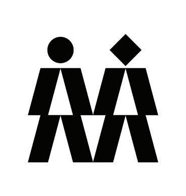
V BALLS
The circle is the ultimate utility player. Give it the right supporting cast and it can be the sun, an eye, a period, or the start of a connectthe-dots adventure that promises to become something meaningful if you just hang in there. But the moment you tack on a few stick limbs, you’ve crossed a line. Congratulations—you’ve made a person. No disclaimers, no turning back. Designers know it, and despite their best efforts, they keep wandering into the same trap with surprising regularity.
This year’s version comes dressed in a chorus line of raised arms—those familiar V shapes signaling victory, unity, celebration, or at the very least, a group that’s getting along nicely for the sake of the brand. Spin them around a center point and suddenly you’ve got energy, motion, even a bit of spectacle. The negative space in the middle pulls its weight too, often forming a secondary symbol or anchoring the composition with just enough purpose to keep it from feeling like decorative confetti. This isn’t a brand-new move—we’ve seen versions of this play before—but lately it’s shown up with a little more swagger and a lot more frequency. Keep it in motion and these marks don’t just sit there—they keep the whole thing in play… and keep the balls rolling.
SLIP KNOTS
In a wordmark filled with introverts, there’s always that extrovert. The overachiever that gets nudged to the left side of the stage so they can gesticulate and flail without taking out the rest of the cast. In these marks, that role falls to a single letter—usually the lead—whose tail refuses to behave. Instead of politely stopping where it should, it loops, twists, and begins tying itself into a knot. Just enough mischief to signal it’s not here to follow the rules, but not so much that it loses the plot. If this move feels familiar, Angi quietly set the table a few years back, and this latest group seems more than happy to keep pulling that thread.
What’s notable is how often that unruly initial is given permission to break away entirely and live a second life as an icon. Handy when you need something to drop into an app button or social avatar, but it’s a risky little game. Designers have long been asked to wedge a stylized monogram into the front of a wordmark, only to watch it clash with the remaining letters like it wandered in from someone else’s brand. The difference here is discipline. These marks build that expressive initial from the same structural DNA as the rest of the wordmark—monoline strokes, shared proportions, familiar terminals—so it can stand alone or slot back into place without breaking the read. It’s a small act of rebellion, carefully engineered—just enough of a knot to catch your eye, but not so tight that it tangles the name.
SAVA STOIC BRIGHTSCOUT
GARDNER DESIGN 5 STONES
CHARLIE COOMBS
MUCHO ALBERT
NEMESIS STUDIO QLYR
DEVIDAS BIELSKIS RIVYL VOOMIE
DESPINA DESIGNS CAPE MAY COUNTY LIBRARY
SLANT BREAK
Imagine driving down a street of beautiful homes—well kept, consistent, playing by the same rules—and then one appears. Not louder, not bigger… just unmistakably better. Suddenly the rest fade a bit, and the drive becomes memorable. That house is no more than an italic letter or two, quietly breaking rank in a picket fence of Roman characters. It’s worth remembering that italic letterforms weren’t born to emphasize—they were the emphasis, developed in the 15th century to mirror the cursive hand of scholars and originally standing on their own, not as accents but as the voice itself.
In today’s wordmarks, where brevity rules and every character has to earn its keep, a single italic letter can deliver all the distinction needed. Just a subtle lean and the mark gains motion, sophistication—almost a whisper of intellect. Placed thoughtfully within a portmanteau, that shift can also guide pronunciation, marking the seam where two ideas fuse. It’s a role often handled with color or awkward capitalization, but italics bring a quieter confidence. And that’s the point: in a lineup of near equals, it doesn’t take much to stand apart—just enough to make people slow down and notice the one house on the street that got it exactly right.
PIANO
The decade of the ’80s had barely begun when Robert Miles Runyon’s Stars in Motion logo was selected for the 1984 Los Angeles Olympic Games. Designers were hungry for a new visual language, and those stepped, parallel lines delivered it in spades. The effect was electric— solid forms dissolved into motion, speed, and dimensionality. It was everything the era seemed to crave, and then some. In short order, the look spread everywhere. It didn’t matter if you were selling bullet trains, donuts, or baby formula—your logo was going to signal one thing: fast.
What began as a meaningful visual device quickly became a default setting. The lines didn’t just suggest movement—they became shorthand for relevance, progress, even credibility. And like most overachievers, the trend eventually wore out its welcome. Fast forward nearly half a century, and the language returns, but with a different intent. Today’s versions feel more restrained, more deliberate—less about velocity and more about rhythm, segmentation, and reveal. For some, it carries a familiar retro hum; for others, it reads as something entirely new. That’s the trick with trends that have good bones—they don’t disappear, they just wait for a better edit.
MBX REAL ESTATE CREATIVE
THACKAWAY MCCORD AVILA RISER NUTRANELLE
COMMON BLOCK
FADERS
Like a voyeur peering into the mind of AI, these marks offer a controlled glimpse beneath the surface—an open port into how an app thinks, moves, or connects. There’s a mystique at play: an inner glow suspended in a foggy chamber. We see just enough to sense activity, but not enough to fully understand it. That ambiguity becomes the hook. It suggests intelligence, complexity, and a kind of quiet confidence—systems at work beneath the surface, doing something more sophisticated than they’re willing to fully explain.
The formula behind the effect is surprisingly consistent. Start with a defined aperture—circular, hexagonal, or softly geometric—and build a monoline pathway that knots, loops, or branches with intention. Then introduce a gradient that allows those lines to fade into the ether, creating depth without weight. Contained within a bold field of color, the fade remains controlled, avoiding the common pitfall of lines disappearing into white when applied across varying backgrounds. The result feels perfectly at home as an app icon—self-contained, dimensional, and quietly active. For those tracking trajectories from past reports, this is less a surprise and more an expected arrival.
CRACK
There’s a certain relief when you examine type with wildly exaggerated ink traps and realize the designer had an agenda far beyond just chasing a trend. Those open recesses and overinflated curves start to feel less like functional decisions and more like something… anatomical. At some point, the form crosses a line. What was meant to be clever becomes impossible to unsee—like overfilled lips or the unmistakable suggestion of a low-rise Levi’s situation that probably should’ve stayed concealed. You can laugh it off, but once it registers, it’s game over.
The irony is the rest of the letterform is often a model citizen—well constructed, balanced, doing everything right. But that one telltale overhang or hyper-exaggerated notch hijacks the entire mark. It stops being about typography and starts being about interpretation. You’re no longer reading it—you’re reacting to it. And that’s a risky place to be unless provocation is part of the brief.
You’re not likely to see this anchoring a Fortune 500 brand unless play is the point. Beyond the visual double-take, these inflated forms also compress spacing and can push legibility to the brink. So if you’re going to go there, own it. Let the mark carry the mischief and keep everything else in the system on its best behavior. Because in this case, restraint isn’t the enemy—but excess, unchecked, absolutely is.
JEROEN VAN EERDEN KFB TECHNOLOGIES
VADIM CARAZAN
LEPISOV BRANDING BRANDFORMA
HOW STUDIO SNOOZ
KOTO MARBLEX
SAINT URBAIN BEAM
SELF-TITLED HOOPLA
BREEZY
When designers talk about the longevity of a logo, they’ll lean on focus groups, durability, and real-world testing. What they rarely mention are gale-force winds, atomic blasts, or a stint in a NASA wind tunnel. And yet, these marks look like they’ve survived exactly that. They entered upright, confident, built with structure and intent—and somewhere along the way took a 20 PSI hit straight through the midsection. What exits is still standing, but just barely. Warped, compressed, with knees that look ready to give out under the pressure.
There’s clearly a method behind the distortion. Centers are smeared, pinched, or pulled as if a finger dragged across fresh icing—disrupting what was once orderly and expected. It creates tension, motion, and a kind of visual double-take that’s hard to ignore. But it also raises the question: why the sudden need for brands to look like they’ve been through the wringer? Stability is implied, but only after surviving some unseen force.
And that may be the point. The moment you tamper with something familiar—bend it, compress it, make it misbehave—the audience notices. They may not understand it, but they’ll remember it. And in branding, that kind of disruption is often exactly what the brand was hoping for.
ROLL OVER
Fold a ribbon or a sheet of paper and you get a crease—something fixed, flat, and predictable. It lives in a single plane, behaving like any other graphic shape waiting to be arranged. But remove the crease and keep the tension, and suddenly the surface comes alive. It rolls instead of folds, moving with a kind of grace from one plane to the next. There’s volume, elasticity, even a sense of resistance. You can almost feel the material—whether it wants to spring back or refuses to lie still without a fight. That sense of stored energy gives these marks a pulse, like they’re caught mid-motion rather than frozen in place.
This year, there are legions of them, and they show up in a wide range of styles. Some lean into gradients and highlights, letting light play across the surface to emphasize depth and curvature. Others stay flatter, using two colors to suggest duality—light and dark, inside and out, one capability folding into another. Still others strip it down to a single tone, relying on line alone to define the sweep and tension of the form. Regardless of execution, the appeal is the same: these marks feel active. They’re not just telling a story—they’re in the middle of one. And that sense of motion makes them hard to ignore.
AJ BRAND CABANA SURF CO.
BLUE BARN DESIGN CO. JANK TATTOOS
MBX REAL ESTATE CREATIVE
NORTHERLY KANOOO
BECKER CREATIVE
BECKER CREATIVE KOCH ENGINEERED SOLUTIONS
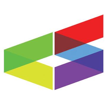
SLASH BAR
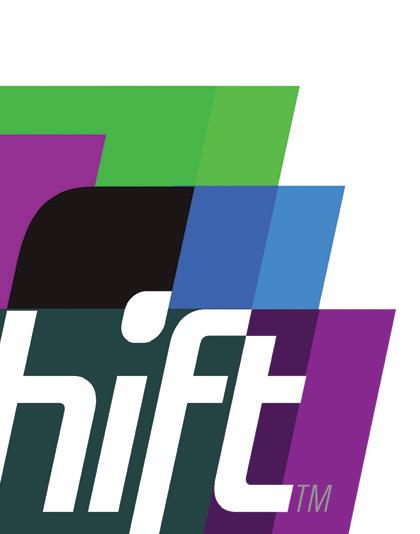
Some shapes whisper. This one leans in and interrupts. The parallelogram—there, we said it, now let’s never say it again—has become the graphic equivalent of someone cutting the line with confidence and somehow getting away with it. It doesn’t sit politely on a baseline or wait its turn in a grid. It slices. It advances. It suggests that whatever comes next is already in motion. You see it and instinctively feel direction, even if you couldn’t point to where it’s headed. That’s the magic trick: a simple tilt that turns a static mark into something that feels like it’s already halfway out the door.
Designers are exploiting that bias with a surprising range of outcomes. These slash bars act as modular building blocks, stacking into isometric illusions or stretching into directional cues that pull the eye forward. Overlaps introduce transparency, creating layered reveals and incidental geometry—often birthing triangles as a kind of visual byproduct rather than the main event. While not a mandate to work alone, they almost always take the lead role, setting the tempo for everything around them. The constraint is tight—just a handful of angled forms—but the variation is anything but. When a shape carries both motion and structure this efficiently, it tends to stick around. This one’s not done yet.
ECHO ARCS
Pattern doesn’t need a full introduction—it just needs a hint and your brain finishes the sentence. A few lines in rhythm and you already know the rules. Stripes are the simplest version of that agreement: steady, predictable, almost obedient. But the moment those lines begin to bend, something shifts. Straight cadence turns into motion. The pattern stops behaving like wallpaper and starts acting like a force— radiating, expanding, echoing outward as if it’s carrying a signal.
Designers are pushing those arcs into more expressive territory by letting them intersect, overlap, and weave through one another. What begins as a set of concentric lines quickly becomes narrative—connections forming, paths crossing, systems building on themselves. Depending on their direction, these arcs can read as divergence or convergence, but more often they rise, splitting upward like branches or figures reaching skyward in unison. The formal constraint is simple—maintain the arc, respect the spacing—but the outcomes are anything but. Line weight, breaks for overlap, and the interplay between multiple arc systems create a surprising range of voice. And almost inevitably, when these arcs crest and meet, they form shapes that feel architectural—vaulted, cathedral-like—quietly reinforcing themes of structure, unity, and lift.
EDGE ADVERTISING CITY PRESS
VADIM CARAZAN
RETHINK YWCABC
DOOK
OUTFIT BRAND STUDIO VANCOUVER MASTER CHORALE
ALEXANDER DIMOV HYDROTEKS
STUDIO DIXON WALTER FOUNDATION
DODD CREATIVE GROUP KNIGHTVEST MANAGEMENT
COLORFORMS
Before there were apps to rearrange, remix, and endlessly refine, there was a thin vinyl shape that clung to a glossy board and refused to commit. In the early 1950s, a pair of New York artists stumbled onto what would become Colorforms—a quiet little revolution built on nothing more than flat color and simple geometry. Circles, wedges, rectangles. No instructions. No final answer. Just the invitation to assemble, disassemble, and try again. Bauhaus for kids before anyone thought to call it that. And somewhere along the way, that idea never really left us. It just grew up, got a business card, and learned how to behave in a boardroom.
What’s resurfacing now feels like a return to that same logic—designers working with a stripped-down kit of geometric parts, assembled with intention but never overworked. These marks rely on a small cast of shapes, often held apart by deliberate alleys of negative space that keep the composition breathing. Frequently, those pieces resolve into monograms or abstracted letterforms, giving the system just enough anchor without locking it down. Color plays a leading role, with palettes that are broad, optimistic, and unafraid to feel a little playful. The result is a kind of visual honesty. There’s nowhere to hide complexity behind texture or ornament, so the idea has to stand on its own. It’s a language of clarity—simple forms coming together to suggest something larger, without ever locking into a single rigid interpretation.
ESTIPONA GROUP
DOUGLAS COUNTY SCHOOL DISTRICT
QUAD QUIVERS
EVERYOTHER
EIGHTYSEVEN MISIDE COMMUNITY NETWORK
We tend to think of “quad” as just a convenient way to say four of something, but its roots point back to quadrus—a square. Pair that with a quiver—the holder that keeps arrows gathered and ready—and this trend starts to feel almost inevitable: four directional elements packed into a tight, square container, each one loaded with intent. It’s also hard to ignore the quiet satisfaction of a double-Q title, but that’s just a bonus. What matters is the structure. Designers are building compact systems where arrows—those most literal of directional cues—are arranged in symmetrical clusters, creating marks that feel both contained and energized.
What’s interesting is how these compositions resist a single read. At first glance, they suggest alignment—multiple forces converging on a shared objective, a tidy visual metaphor for organizational focus. But look a second longer and the story can flip. Those same arrows can feel like they’re competing for center stage, colliding rather than collaborating. In some variations, one breaks rank entirely, turning outward as if it’s found a better path or decided not to wait for consensus. The arrow has always been shorthand for direction, but here it becomes a proxy for people, initiatives, or competing priorities within a system. The square format compresses all of that tension into a concise, highly legible mark. It’s a small container carrying a surprisingly complex narrative about how organizations move—or don’t—together.
DYLAN MERKE DESIGN ONE BRANDING
DYLAN MENKE DESIGN EMERY
CHARLIE COOMBS
GARDNER DESIGN CLEARWAY
ARBOOZ RUS RECYCLING
OPEN AXIS
The asterisk has had a good run. Once a quiet footnote symbol, it’s spent the last decade stepping into the spotlight—expanding, multiplying, and taking on meaning far beyond its original job description. It became a stand-in for convergence, connection, and multi-directional thinking. But what’s interesting now is that designers aren’t simply modifying the asterisk anymore. They’re reverse-engineering it. Instead of starting with the star and reshaping it, they’re bringing other forms—arrows, wings, branches—into alignment to echo its behavior. The result feels familiar, even when the symbol itself is entirely new.
What defines this next turn is tension. These marks hover in a state of near-connection, with elements arranged along shared axes but stopping just short of contact. There’s a palpable push and pull at work—like identical magnetic poles resisting closure, holding a precise gap that becomes the story. That sliver of negative space isn’t accidental; it’s the point. It creates an “almost” moment—suggesting unity, but preserving individuality. The asterisk’s legacy is still there in the radial logic and implied convergence, but now it’s filtered through restraint. These are not explosions of connection—they’re controlled proximities. And in that narrow channel between forms, designers are finding a new kind of energy: one built not on contact, but on the tension of what’s just about to happen.
TOMORROW
BRANDING
BIBI TOURING TOUROPERATOR
PHASERS
We’ve grown comfortable with marks that cycle—color shifting around a circle, gradients chasing themselves, elements scaling up and down in predictable loops. They imply motion, but it’s often a smooth blur, more suggestion than story. What’s emerging now takes a different approach. Instead of blending the movement, designers are breaking it apart—revealing each step in the sequence like frames in a flipbook you can’t help but thumb through twice. The rotation is no longer continuous; it’s staged. You’re not just seeing the outcome, you’re watching the process unfold—one deliberate move at a time.
These marks behave like a magician who insists on showing you the trick in slow motion and still gets the applause. Individual elements rotate, pivot, or step through positions, exposing their phases with a kind of confident transparency. The forms remain flat and simple, but the choreography adds dimension. It’s less about speed and more about precision—each component caught mid-performance, balanced between where it was and where it’s headed. That sequencing opens the door to richer storytelling. A single loop might suggest a basic cycle, or it can map something far more complex—process, transformation, capability. And like any good system, once the rhythm is set, it becomes dependable. You know what comes next. These marks don’t just move—they prove it.
WEGROW TWIN
BÜROCRATIK CORINTIS SA
CHARLIE COOMBS
ARBOOZ CRISTAL LED
MUBEENUL
RIVYL JOSIP MARKUS
TRI-LINK
Triangles have been a bit of a problem child for designers. Too sharp, too cautionary, too busy warning us about merging traffic or imminent peril. For years they came with baggage—point up, point down, pick your mood—and heaven forbid you let one teeter on a corner unless you were rewinding a cassette tape. Then along came its more optimistic sibling—the play button—pointing forward and quietly giving the shape a reason to exist again. Not exactly a rich emotional palette, but enough to keep it in the game. Somewhere along the way, we collectively decided to give the triangle another shot. Turns out it’s been quietly waiting for a redemption arc.
In this round, the triangle doesn’t show up as a single, monolithic form. Instead, it’s built—three distinct parts linked into a unified system. Each element carries its own weight, acknowledging that the whole is only as strong as its weakest participant. Think policy, process, and people… or pick your favorite trio. Designers are leaning into that narrative, creating marks where the connections are as important as the components. There’s a nice bit of irony here too: while triangles may have once felt visually unstable, structurally they’re one of the most reliable forms we’ve got—resisting pressure in ways a square can only dream of. Even the humble three-legged stool figured that out long ago. On uneven ground, three points don’t wobble—they settle in. These marks tap into that same logic. Balanced, interdependent, and just self-aware enough to know they’ve come a long way from their hazard-sign days.
THE 2026 LOGO TREND REPORT
If this report gives you a read on where things are headed, LogoLounge is where you go to stay in the current. It’s a living, breathing repository of global identity work — now pushing well beyond 450,000 logos — where designers from around the world post, study, and pressure-test ideas in real time. You can search by keyword, designer, industry, client type, visual attributes… or just fall down the rabbit hole and see where it takes you. It’s not just inspiration — it’s context. And context is everything when you’re trying to understand momentum.
Membership opens the door to unlimited uploads for consideration in the LogoLounge book series, along with access to curated news and insights built specifically for logo designers. It’s a place to see what’s been done, what’s being done, and more importantly, what’s about to be done.
And if you’re serious about getting to tomorrow before the rest of the design world shows up in tourist class, this year there’s another tool in your kit.The LogoLounge Guide to Iconic Branding picks up where these reports leave off. Instead of just identifying trends, it shows you how to read them, connect them, and project them forward. It’s built to help you move from observer to author — to not just recognize what’s next, but to help define it.
More than 20 years of LogoLounge Trend Reports remain open and available to everyone at logolounge.com — offering a rare look at how ideas evolve over time and how patterns build into movements.If you want to sharpen your instincts, expand your range, and plug into a global community that’s actively shaping the future of identity design, you’ll find it there.
Join us at logolounge.com/join.
ORTEGA GRAPHICS LEVERAGE
BLOCK DESIGNS EL DORADO HIGH SCHOOL
LEPISOV BRANDING
ROBERT FROEDGE THE ABILITY MACHINE
50TH 63RDANNIVERSARYANNUAL
PRINT DESIGN SURVEY
SPONSORED BY BILLERUD
A NEW CHAPTER AND CHALLENGE: PRINT DESIGN IS ABOUT DEPTH OVER VOLUME
This is our 63rd year of conducting a benchmark poll to our audience on the role that print and paper play in the service of graphic communications. The quote above from our April 2026 poll — both a practical and a philosophical take on the value proposition of print design in a digital age — provides a piercing insight as to how the industry is evolving.
Over six decades, GDUSA’s coverage of print design suggests several broad, though admittedly overlapping, chapters in the story of print and paper.
In the first chapter, designers were often perceived (and self-perceived) as decorators and prettifiers. Among the consequences of passivity: decisions were restricted by little product choice and lots of control by printing and production experts.
In phase two, designers emerged as creative masters and thought-leaders who added value to commerce and culture. In this phase, print was the default medium, and control and responsibility for content and production flowed upstream to the creative community — making designers the center of all things print, and sparking a golden age of creative print communications, paper specification and innovative print production..
In phase three, designers are widely appreciated for
the value they bring to the table. But the dramatic rise to dominance of digital communications required the creative community to acquire expertise across multiple media and to recalibrate their relationship with print and paper into a more strategic and selective use.
In 2026, we may well to be on the cusp of a new chapter.
Graphic design today is evolving into a practice where speed and craft increasingly sit side by side. Digital tools and AI-assisted workflows are already reshaping the early stages of the process — for better or worse — helping designers explore more ideas, test more directions, and iterate with greater speed and ease. But this shift doesn’t diminish the importance of the print designer; in many ways, it sharpens it into one that is more focused, more intentional, and more craft-driven — especially in areas where physical presence truly matters.
But seen through this filter, today’s poll results and accompanying reader comments make perfect sense. They reflect the fact: that print and paper remain essential to branding, communication, and creative expression; that in today’s integrated marketing landscape, the best designers and marketers don’t choose between digital and print but combine them for greatest effect; and that print designers aren’t going away but evolving and adapting.
The essence of the theory: As ideation and production accelerate, the value of the print designer increasingly lies in higher-level judgment: shaping the concept, refining direction, and making material choices that give the work weight and clarity in the real world. Print, in this context, becomes less about volume and more about depth. Fewer object, made and disseminated with greater care.
This is, as they say, a developing story.
HALF A DOZEN TAKEAWAYS FROM OUR 2026 READER POLL
MAKING A LIVING: Print remains central to professional practice. Fully 97% of GDUSA designers include print in their mix, 61% of projects involve a print component, and 84% expect print work to hold steady or increase slightly over the next 3–5 years. Engagement varies — designers split roughly into thirds between print-first, hybrid, and digital-first — and our audience tends to skew older — but in 2026, it is safe to say that print remains a vital force and a common thread across the profession.
1
CLASSIC STRENGTHS: Print endures because of its defining qualities: it’s tangible, physical, and lasting, fostering a sense of intimacy and human connection that digital media often lacks. In an environment shaped by digital clutter and fatigue, print’s relative rarity helps it stand out—fresh, personal, surprising, impactful. It also signals trust: well-crafted print feels intentional, credible, and authentic in ways that ephemeral digital communications often do not.
STRATEGIC AND SELECTIVE: Digital is the default — faster, cheaper, more measurable, and often more appealing to clients — so print now plays a more targeted role. The most effective strategies integrate print and digital as complementary tools, especially where communication meets physical experience: branding, packaging, retail environments, events, and high-consideration categories like luxury, real estate, finance, healthcare, and education.
4
CONTROL AND CRAFTSMANSHIP: As print becomes more selective, quality and craftsmanship matter more. Designers continue to assert control over key production and purchasing decisions: 82% specify or recommend paper, and 84% select printers. Again, the depth of engagement varies: print-focused and hybrid designers are the most hands-on, while digital-first practitioners tend to defer.
PRINT DELIVERABLES: The range of print work remains broad. As always, brochures and collateral still lead the pack, with eight-in-ten designers engaged. Other strong areas, some surprisingly so: direct mail, posters, packaging, print ads, invitations, business stationery and cards, annual and corporate reports, catalogs, periodicals and publications, and books.
6 2 3 5
EXPANDING DIGITAL TOOLKIT: AI is now part of the workflow. Three-in-four graphic designers use it in some manner, mostly for early ideation and exploration, less so for production support and iteration, and very few for final cllientready or print-ready deliverables. For now, AI is seen more as a starting point than a finishing tool, especially for print-heavy and brand-sensitive work. While digital tools drive speed and scale, print communication continues to demand craft, material knowledge, and production expertise.
A MESSAGE FROM THE SPONSOR | BILLERUD
ABOUT BILLERUD
Billerud makes high performance packaging materials for a low carbon society. We are a global leader in paper and packaging materials made from cellulose fibers, and we are passionately committed to sustainability, quality and customer value.
We serve customers in more than 100 countries through nine production units in Sweden, USA, and Finland and around 5,200 employees in 16 countries. Billerud is listed on the Nasdaq Stockholm.
In the United States, Billerud operates out of a regional head office in Miamisburg OH, two mills in Michigan’s Upper Peninsula and a converting facility in Wisconsin We are a leading supplier of highquality graphic and label papers, packaging materials, and market pulp. At Billerud, we build brands and business results for our customers.
OUR STORY
Our history in the forestry and paper industry spans morethan150years.Today,ourmaterialsare usedinpackagingand paper products relied upon by millions of peopleacross the world every day.
Across our nine production units in Sweden, Finland and the United States, we manufacture materials that our customers convert into milt cartons, fruit boxes, beauty packaging, carrier bags, cement sacks, labels and high-end magazines — just tonameafewapplications.
OUR PRODUCTS IN NORTH AMERICA
With our distinguished graphic product lines, streamlined supply chain and flexible manufacturing capabilities, we are ready to respond to market demands that best service our customers.
Ours are the best quality papers with a broad selection of forest management and chain-of-custody certification options for all types of printing applications.
Our U.S. mills are strategically located near top industry printers and converters across North America, so our products are available when you need them. And we provide expert customer support, on-site technical service and insightful solutions that bring efficiencyandproductivitystraighttoyourbusiness.
• OUR COATED SHEETS PORTFOLIO:
Billerud’s coated graphic papers for print communication are where industry-leading innovation meets a passion for crafting the best paper to carry your message. Our beautiful optics, broad product line, count-on-it performance and here-for-you service combine to make it easy to build your brand within your budget.
•Sterling® Premium
• Anthem Plus®
• Productolith® Pts.
•. Sterling® Ultra C1S
• OUR COATED DIGITAL PORTFOLIO:
Billerud’s graphic digital paper leadership comes from years of research and experience. From laster to ElectroLink printers to digital offset technologies, in color or black and white, you’ll find the right finish and weight for every application, precision trimmed to assure the highest performance and throughput.
•Sterling® Premium Digital™
• Blazer Digital®
• Productolith Pts. Digital®
OUR INKJET PORTFOLIO:
Billerud keeps you ahead of the technology curve with a broad array of popular web papers trusted by the top equipment manufacturers. Featuring exceptional optics, surface smoothness and consistency, our papers are available in inkjet roll widths for optimal performance in highspeed inkjet presses.
• TrueJet® Book
•Sterling® Ultra EX
•Sterling® Points EX
• Sterling® Premium EX
•Ideal® Jet EX
• Ideal® Caliper EX
OUR WEB PORTFOLIO:
Billerud’s web papers apply industry-leading innovation to deliver the best paper for a variety of print application solutions. Appealing optics, breadth of choice, reliable performance and committed service — this is quality without compromise, products to make your brand look good.
•Sterling® Ultra
•ArborWeb Plus®
•Influence®
•ArborWeb®
•Liberty®
•New Era®
OUR WC WEB CALIPER PORTFOLIO:
Billerud’s web caliper paper offers an enhanced print sur-face that gets your message noticed. Better yield than com-parable coated freesheet and better print quality than comparable uncoated freesheet makes this your go-to paper choice for direct mail, reply card and a variety of other commercial print applications.
•Ideal® Caliper
OUR PACKAGING PORTFOLIO:
Billerud’s expanding packaging portfolio includes a substantive offering for conscientious brand owners looking for paper-based solutions as an alternative to plastics delivering optimal performance, strength and beauty.
CARTONBOARD
Coated Bleached Multi-ply
•CrownBoard Prestige® Coated Unbleached Kraft
•CrownBoard® Craft Coated SBS Paperboard
• Voyager® Pts. SB CONTAINERBOARD
Coated White Kraft Liner
• Tribute®
Lightly Coated White Kraft Liner
• Tribute® Base
OUR LABEL PORTFOLIO:
Billerud is a leading supplier of high-quality pressure sensitive facestock, multi-purpose facestock and release liner label papers engineered to perform in a wide varietiy of complex, demanding and technical end uses.
Pressure Sensitive Face Stock
• OptiLabel™ HB
• OptiLabel™ Dairy
Multipurpose Face Stock
• Sterling® Ultra C1S
Release Liner Face Stock
• Unisil®
To learn more, please contact your Billerud sales professional or visit billerud.com
COMMENTS: HOW DOES PRINT FIT INTO YOUR PROFESSIONAL LIFE?
“Print design remains a valuable part of my work by offering something more tangible and enduring than screen-based experiences. Its physical presence adds credibility, permanence, and intention — whether in packaging, editorial, or branded materials — and invites closer attention... and encourages more deliberate design decisions that lead to stronger, more thoughtful outcomes.”
“Print design is the genesis of all design — explicit structure, image and message hierarchy and balance rely on how the design works on paper. Whether the design progresses and ends in digital media — or — in executing dimensional design of exhitry, signage, packaging - it starts with the strength of the principles based on print.
“Print design sticks in memory because it uses touch. That’s just how brains work.”
“Print design remains a core part of my professional practice, especially in branding, editorial, and environmental graphics. While digital platforms dominate communication, print offers a tangible, controlled experience that reinforces credibility and emotional connection. I see its strengths enduring because physical materials create lasting impressions and elevate brand perception in ways screens often cannot. Rather than competing with digital, print complements it bringing depth, authenticity, and a sense of permanence to the overall design strategy.”
“Print isn’t optional…it’s a necessity. When I hand someone my business card (a silk-laminated, trading card-sized piece larger than standard), it immediately sparks a conversation. People want to touch
it, ask about it, learn more. That reaction is something a digital ad simply can’t replicate. Print and digital work together, one reinforces the other. Print builds credibility and leaves a lasting impression, while digital extends the reach. As long as humans value tangible experiences, print has a place in my work.”
“I’m seeing a trend back to physical printing on paper. If designed well and with intention, print provides stability and credibility to the digital messaging.”
“Print design, as a medium, maintains a uniquely close relationship with its audience in ways digital formats cannot fully replicate. While both are effective tools, print’s tangible nature allows designers to create more grounded, enduring experiences. Its strength lies not only in tactility and perceived credibility but also in its ability to linger, cutting through the noise of rapid, short-form content with intent and longevity. As designers, it is our responsibility to reinforce that print is not a relic but a relevant and powerful medium. ”
“Digital may get attention but print gets remembered.”
“There is a desire for printed material. People enjoy the tactile, the ability to sit with the printed material, read, pause and also allows for less distraction.”
“The digital media world is bombarded and cluttered with digital info. Most of the time this info
COMMENTS: HOW DOES PRINT FIT INTO YOUR PROFESSIONAL LIFE?
is briefly glanced at and then tossed away with the click of a button, disappearing from the viewer’s field of vision and therefore their memory. Print design work is physically present at all times and is more likely to be kept on a desk or coffee table, providing repeated, readily available exposure to the message. While digital media can be effective for immediacy, print is highly effective for and often superior to driving engagement, trust, and lasting memory.”
“Paper makes you feel something — the weight in your hands, the texture under your fingers.”
“Print design fits into my professional life today through teaching ad and project design. I use print design principles to help students understand layout, typography, branding, and visual communication. Whether creating posters, brochures, advertisements, or presentation materials, print design remains an important foundation for developing strong design skills. It allows students to learn how to organize information clearly and creatively while preparing them for both traditional and digital design careers.”
“There’s a ritual to print… opening it, flipping pages. It slows things down in a good way. Same with unboxing.”
“Print design continues to play an important role as it offers something digital media cannot replicate. In an increasingly digital world, printed materials help organizations stand out and carry a stronger sense of credibility. While most print is supported by digital media, I believe the two work best together rather than in competition. Much of my work involves publications, advertising, and brand materials that are meant to be physically experienced. A recent project — a commemorative history book—reinforced this. After months of anticipation, the printed book gave readers something meaningful they could hold, share, and preserve, rather than another file lost in a digital archive.”
“Firm believer in hands on printed pieces as a promotional medium. My customers respond positively and expect it.”
“I think physical media is important and furthers the experience of the viewer/customer. When everything lives only in a digital world, it is easy for just another digital ad to get lost in that world, just as it is easy for that one physical piece to be held onto and remembered.”In a digital world print stands out. It’s becoming more niche and more powerful — like vinyl records for the design world.
“Print is not a format. It is a system governed
by physics — ink, substrates, tolerances, and process. In my work, it remains critical because it demands real decisions, not visual approximations. Its relevance is not nostalgia or tactility; it is accountability. Digital can fake results. Print cannot.”
“People
trust print
because it
carries
physical evidence of effort and care — ink, paper, production.”
“People underestimate how much packaging shapes the way we feel about a brand. Before someone even tries the product, they’re already making judgments based on the box in their hands — the texture, the colors, the weight, the way it opens. Packaging makes a product feel premium, playful, sustainable, luxurious, or personal before a single word is spoken. And that’s why unboxing has become such a big deal. A great unboxing moment turns customers into storytellers, and that’s something traditional advertising can’t really buy anymore.”
“There’s an honesty to print. Once it’s out there, it’s final.”
“Print is a major part of my business and has grown in the past 12 months, especially where exhibit graphics is concerned.”
“In a post-covid, social media world, I am finding
people value in-person experiences. My clients are spending more money in the experiential space – more conferences, activations, trade booths. More events. In my personal work, I am seeing a surge in stationery and posters.”
Packaging is often the first physical brand moment, which makes it interesting.”
“Print is really used now to target now. Instead of trying to reach everyone, it’s become more focused and intentional. As a designer, I’ve noticed brands use print to create more personal and meaningful connections with specific audiences, especially when they want something to feel more premium or memorable.”
“The smartest campaigns don’t choose between print and digital; they choreograph them to work together.”
“I think print design must endure! Even with AI being everywhere, there will still be a need for printed things like: business cards, flyers, physical signage, direct mail, coupons, and packaging. Or even more “boring” things like paper invoices and documentation.”
COMMENTS: HOW DOES IS PRINT FIT INTO YOUR PROFESSIONAL LIFE?
“As more and more digital ads bombard users, there could be an opportunity for ‘old school’ direct marketing to make lasting impressions, as some digital interaction may create distrust through false products, businesses, and/or claims.”
“Annual reports are satisfying to work on because the challenge is simplifying complexity.”
“Packaging design and advertising design aren’t going anywhere. A physical restaurant menu is far superior to a shitty menu on my phone. There’s a reason kids love analog film and vinyl records these days, they are tactile.” “I work for a non-profit. For my audience, print is a medium that conveys authenticity and authority. Because a brochure or flyer is printed, it give the reader a sense that this piece of paper is something worth spending time with.”
Packaging is often the first physical brand moment, which makes it crucial.”
“My primary work is direct mail and marketing communications for political campaigns, and statistics show that print medium is still the most powerful one to educate and inspire voters, so I definitely see these strengths enduring.”
“I think print design must endure! Even with AI
being everywhere, there will still be a need for printed things like: business cards, flyers, physical signage, direct mail, coupons, and packaging. Or even more ‘boring’ things like paper invoices and documentation.”
“We use many printed materials for recruitment purposes for our college. We also still do a printed magazine and many short run or specialty projects for events.”
“Print will always be a vital part of the advertising industry. Especially in consumer advertising.”
“I like brochures because they let me build
structured narratives.”
“We are being asked to do more Invitations and event graphics because people are tired of experiences that disappear after a swipe. A designed invitation feels intentional — it tells you this moment actually matters. Whether it’s a wedding, a launch party, a gallery opening, or even a corporate event, the design sets the emotional tone before anyone walks through the door. Digital convenience never killed the desire for tangible experiences. People want keepsakes again. They want things that feel crafted, personal, and worth remembering. Event graphics and printed invitations create anticipation in a way a calendar link never can. They turn an event from ‘something happening’ into something people genuinely look
forward to.”
“Print doesn’t really compete with digital — it supports it. The two work best when they’re used together. Digital is great for speed and reach, while print adds a more personal, tangible experience that people can connect with differently. When combined, they help create a stronger and more consistent brand experience overall.”
“Spatial design is exciting because it pushes print into 3D thinking.”
“We use print less often, but when we do, it carries more weight because it’s usually tied to a bigger system. Print now feels like a physical doorway into digital experiences.”
“Print is often reserved for the audiences that matter most now. Luxury brands use print because it slows attention down. For cars, real estate, legal and financial stuff, print allows space for detail. When selling expensive products, print signals permanence and seriousness.”
“People
want keepsakes again.”
“I see print and continuing to have value alongside digital. For instance, I design a lot of books for both print and ebook. And brochures are still valuable along with websites and digital advertising.”
“I’m seeing a slight uptick in print work ... mainly for event collateral to give a premium touch.”
“I love and will always love print. Digital is fleeting, you see it one second and it’s gone. Print endures, people cherish and share print and will continue to do that.”
“I think there will always be a place for print. There is nothing like the experience, but sadly, I don’t think people in their 20s and 30s would agree with me.”
“A
good poster in the real world can still cut through everything else going on.”
“We use print as a way to pull people into a bigger digital experience. Print grabs attention first, then directs people online where they can explore more, interact with the brand, or keep engaging with the campaign. The two really work hand in hand.”
“Magazines let you control rhythm across pages, and with books you’re shaping a whole experience.”
“Stakeholder touchpoints are increasingly digital first (and maybe likely digital only). Print materials elevate brand image, but
COMMENT: HOW DOES PRINT DESIGN FIT INTO YOUR PROFESSIONAL LIFE?
don’t make it in front of most who interact with the brand.”
“A
high-end brochure feels more like editorial than advertising.”
“Sustainability isn’t some extra checkbox at the end of a print project anymore — it has to be part of the design process from the beginning. The paper stock, inks, finishes, packaging, shipping, production waste — every decision matters. Good print design isn’t just about making something look beautiful, it’s about making something responsibly and thinking about the full life of the piece after it leaves the press.”
“Most clients say they care about sustainability, and a lot of them genuinely do — but when budgets get tight, cost usually wins. If there’s a cheaper paper stock or production option, that’s often the direction the project goes. As designers, we try to push for more sustainable choices where we can, but budget is still the thing driving most print decisions.”
“Unlike
digital, print comes with real production costs — paper, ink, finishing, distribution, time.”
“I never forget that the paper stock you choose completely changes how a design feels. If I’m working on something with rich photography, bold colors, or high contrast — like luxury packaging, product catalogs, or marketing pieces — I’ll usually spec a premium coated stock because it holds detail bet-
ter and gives the ink more punch. The colors feel sharper, blacks feel deeper, and the whole piece looks more polished. But when I want something to feel warmer, more tactile, or more personal, I’ll lean toward premium text and cover stocks with an uncoated finish. That’s usually better for invitations, stationery, editorial work, or anything where you want people to interact with the paper. Uncoated stocks absorb ink differently, so the colors soften a little, but sometimes that’s the point. Good designers pick it based on emotion. The paper is part of the message.”
“Print is permanent, which is special, but digital lets you adapt in real time. Digital is more dynamic.”
“AI will change print design for sure, but I don’t think it replaces designers. It just removes some of the repetitive work. The real value in print design has always been the thinking — knowing what feels right, what connects emotionally, and what makes something worth holding onto. If anything, AI makes originality and human judgment even more important.”
“The entry barrier is higher in print and there are real consequences.”
“Honestly, the biggest thing AI gives me is help at the very start of a project. It’s great for quickly exploring directions, pulling references together, and stress-testing ideas before I commit to anything. A lot of the early thinking that used to take days —
moodboards, research, rough concepts — get moving in hours. It doesn’t replace the creative decisionmaking, but it makes getting to that point a lot faster and open-ended.”
“The
danger of AI
isn’t bad design, it’s too much ‘good enough’ design.”
“My fear isn’t that AI will take the place of graphic designers completely; it’s that it’ll flood the world with fast, cheap, mediocre design and make people forget the difference between real craft and disposable content. Then design starts to lose its intention and clients stop valuing process, thinking, and originality. That’s the dangerous part, dilution.”
“AI is a great starter but a terrible finisher.”
“Some days I think AI is amazing for creativity, and other days I think it’s making everything start to look the same. I can use it to brainstorm faster, test ideas, write copy, build concepts, and get past creative blocks, it definitely helps. But I also struggle with the fact that a lot of AI-generated work feels kind of empty after a while. Good design usually comes from real experiences, personal taste, mistakes, culture, and human perspective — not just remixing. Print design especially makes me think about this because print feels intentional. You’re choosing paper, texture, finishes, colors, making something physical that people actually interact with. I don’t think AI is automatically bad for creativ-
ity. I just think we have to be careful not to let convenience replace actual ideas.”
“We have to be careful not to let convenience replace actual ideas.”
“People think AI will replace print designers because it can make layouts fast. But print design isn’t just moving stuff around on a page. It’s about materials, texture, scale, color, and knowing how something actually feels in someone’s hands. AI can copy aesthetics, but it can’t replace taste or experience.”
“Print will always be a part of my work. My clients recognize the importance of having something in someone’s hands. Interestingly, I do not use AI for anything other than image searches because the vendors have now incorporated it in so much of their workflows. My clients come to me because I do not use AI.”
“AI and digital tools are changing how ideas are made, but print designers still shape how they are experienced in the real world.”
AMERICAN INHOUSE DESIGN AWARDS
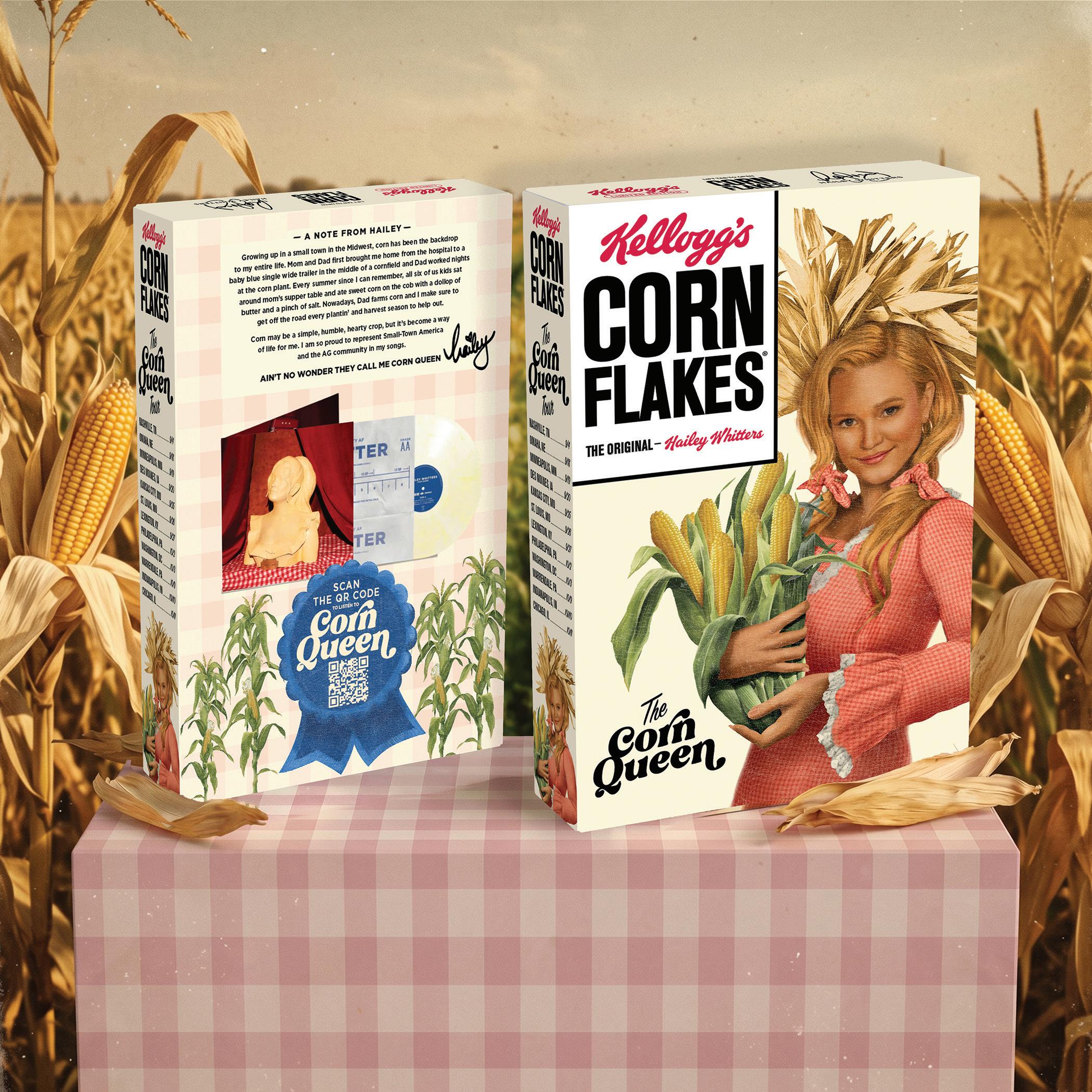
WK Kellogg Co Design Team & PAC Team
We present our 63rd anniversary inhouse awards showcase — the original and premier celebration of creative and communications excellence — winnowed from a competition that saw thousands of entries. The projects and campaigns come from every region of the country and every segment of business and society. This is graphic design for commerce and culture at its best by creative professionals who ably advance their client’s short term objectives, long term mission, and, where appropriate, fundamental values. We honor these creative and content professionals and recognize the value proposition they represent: an intimate knowledge and understanding of their companies, organizations, institutions and brands, and an ability to crystallize the message down to its essence and express the truth of the thing. GDUSA introduced this awards program decades ago as an act of defiance: to declare that the work of inhouse teams is vital to their organizations and absolutely the stuff of design annuals. The 2026 winners gallery is exemplary; you can also view the showcase on our website at gdusa.com and in our digital magazine.
Art Director: Allison Simenkiewicz Designer: Allison Simenkiewicz Writer: Edward Kobesky Contributors: Loriah Webby, Gia Mazur Merwine
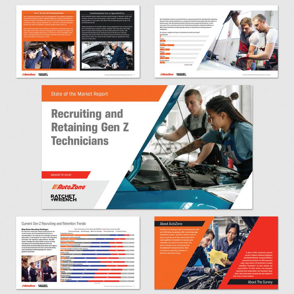
Design Firm: Endeavor B2B Client: AutoZone Winning Entry: AutoZone State of the Market Report Creative Director: Charles Thomas Art Director: Sean Terska Designer: Sean Terska Program Manager: Tschanen Brandyberry
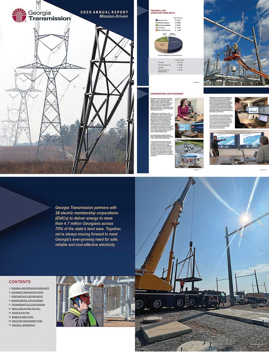
Design Firm: Georgia Transmission in-house External Affairs Department Client: Georgia Transmission Finance Department Winning Entry: Georgia Transmission 2025 Annual Report Art Director: Brian Rickmond Designer: Brian Rickmond Writer: Ryan Russell
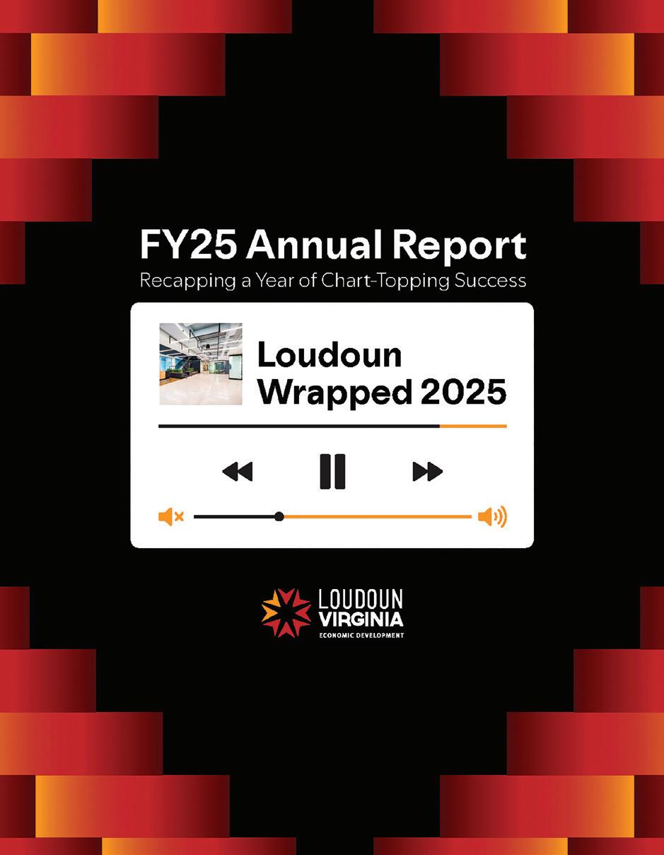
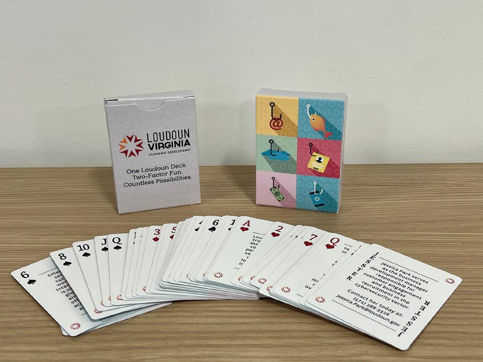
Design Firm: Loudoun Economic Development Winning Entry: Loudoun Wrapped 2025: FY25 Annual Report Creative Director: Mark Armentrout Art Director: Amy Mugford Designer: Darren Varley
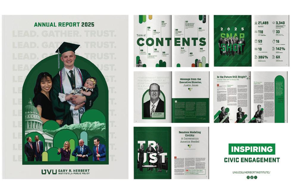
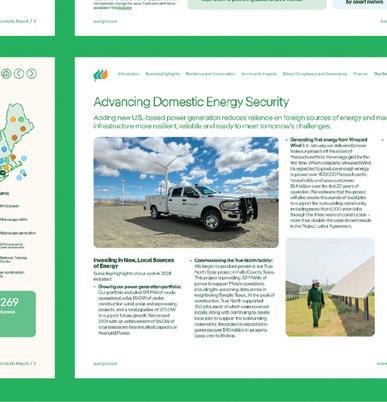
Design Firm: Utah Valley University Winning Entry: UVU Herbert Institute Annual Report 2025 Creative Director: Londan Duffin Art Director: Londan Duffin Designer: Londan Duffin, Brooklyn Anderson Writer: Becca Aylworth-Wright, Rebecca Whyte
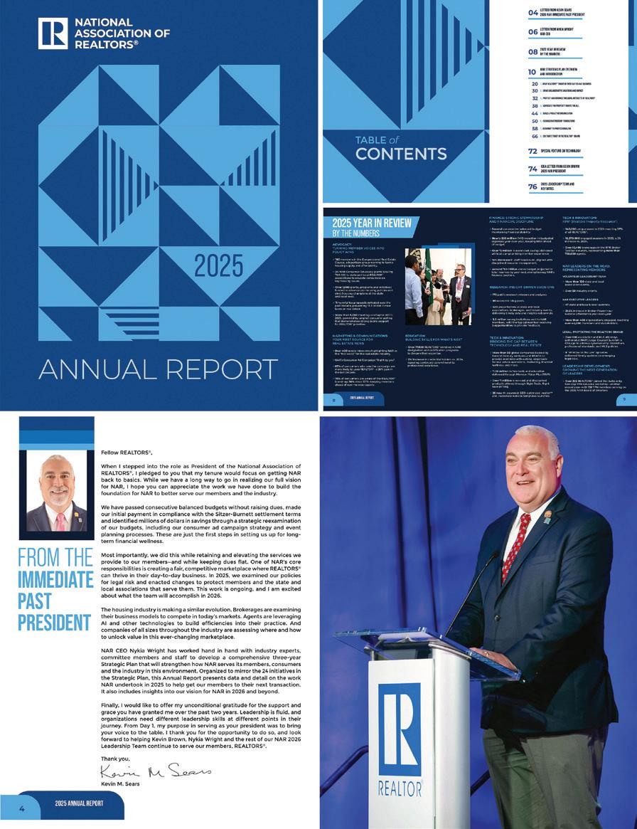
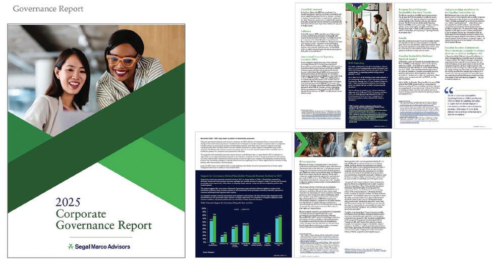
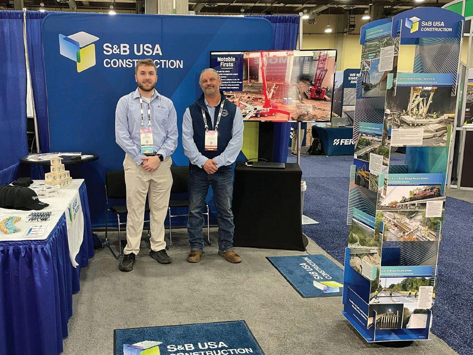
Design Firm: The National Association of REALTORS® Winning Entry: The National Association of REALTORS® 2025 Annual Report Creative Director: Lish Ephraim; Chief Communications & Marketing Officer: Bennett Richardson; VP of Communications: Raffi Williams; Director, Leadership Communications: Mavourneen Bzdil; Communications Coordinator: Alexa McCor-mick; Manager, Design & Brand Strategy: Melissa Dispenza; Senior Graphic Designer: Chris Hansen; Project Manager: Mary-Pat Giovani; Director, Marketing: Bernelly Gamboa; Director, Web & Email Channel Strategy: Brian Miller; Web Content Strategist: Marty Gabel; Speechwriter: Michelle Murray; Senior Speechwriter: Christina Hoffman; Director, Digital Customer Experience: Sam Hanks
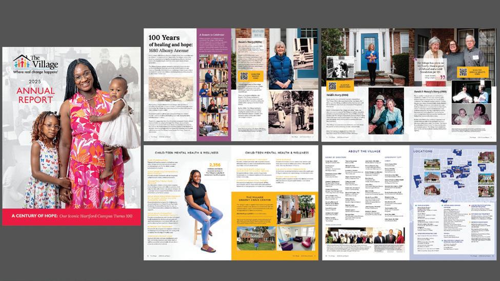
Design Firm: The Village for Families & Children Winning Entry: The Village 2025 Annual Report - A Century of Hope Creative Director: Sarah Heath, Derek Slap Art Director: Sarah Heath Designer: Sarah Heath Writer: Sarah Heath, Derek Slap, Nick Sarnelli Photographer: Leslie Gomez (LMG Photography); Videographer: Enrique Lebron (Retrospective Films); Web Development: Michael Carretta
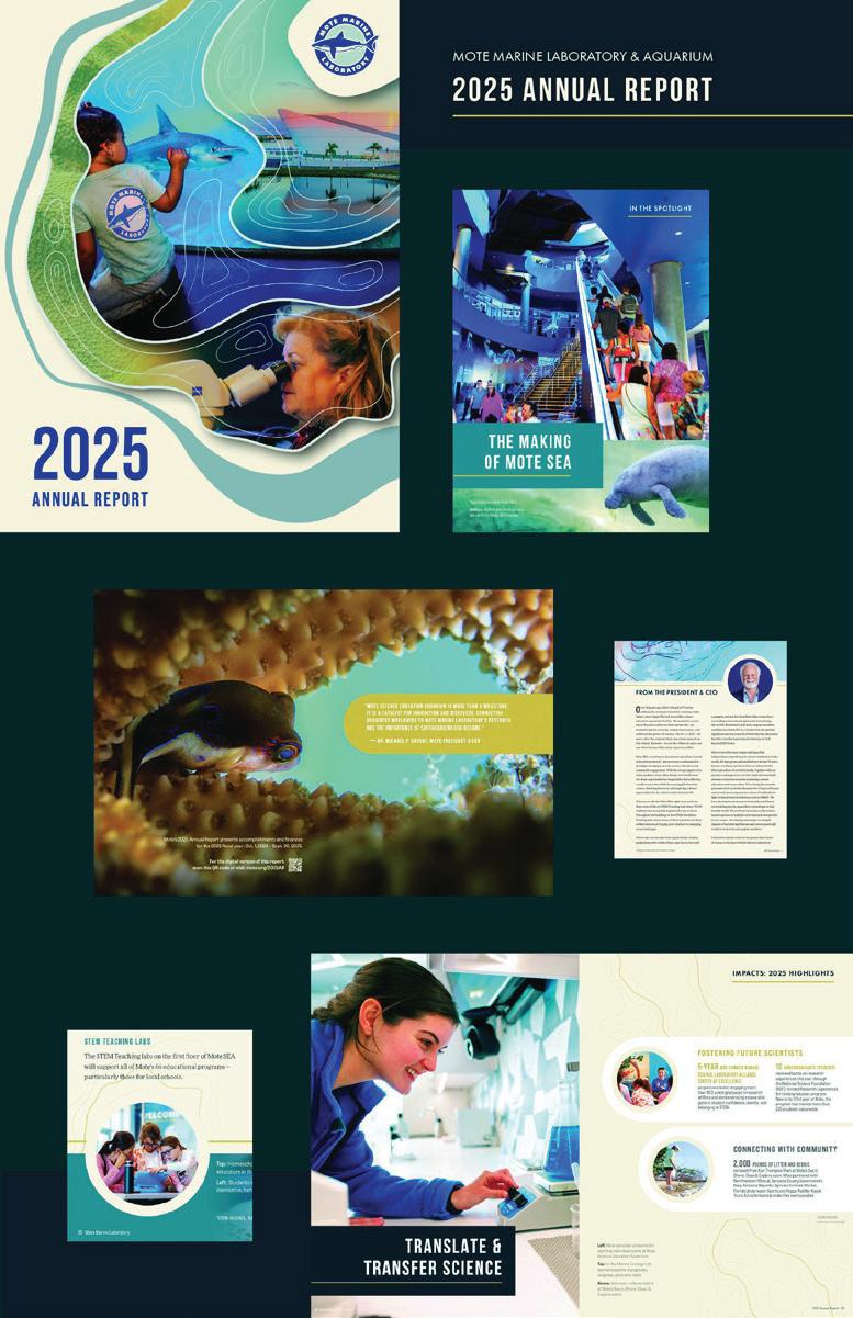
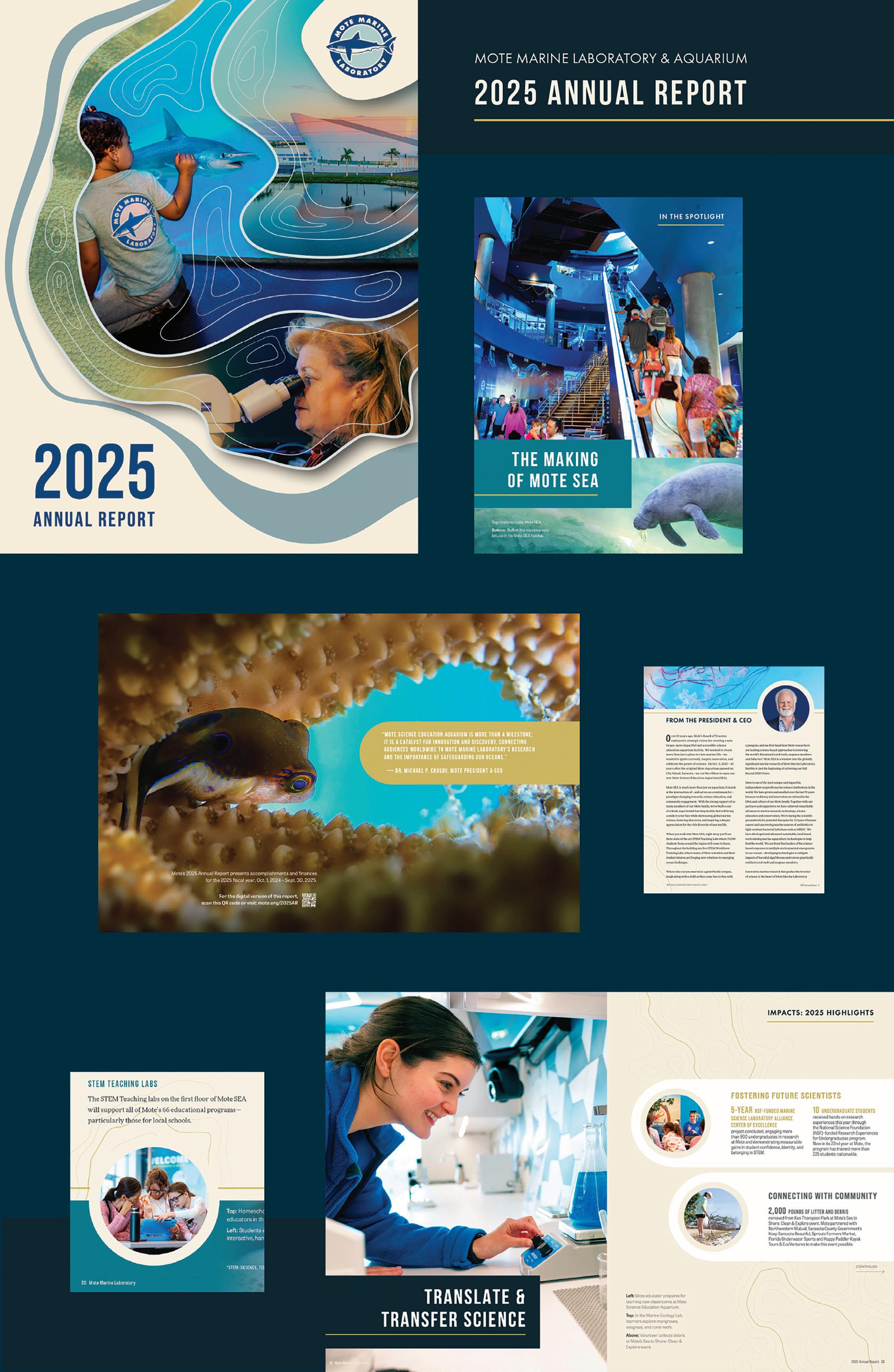
Mote Marine Laboratory & Aquarium’s annual report highlights the multifaceted mission of our independent, nonprofit marine science and education institution and its public-facing Mote Science Education Aquarium (Mote SEA). Our 2025 annual report presented exciting design and storytelling challenges: Emphasizing the new Mote SEA, which recently opened, without losing focus on the hard-core science and technological innovation of Mote Marine Laboratory, which has always been the bedrock of Mote’s mission. We used topographic-style lines to combine a scientific aesthetic with the branding in our new Mote SEA, we featured clean infographic pages with strips of vibrant color from our aquarium animals, and we interspersed stories of innovative research with stories of creating the new Mote SEA. We heavily emphasize the STEM Teaching Labs at Mote SEA, where the science of Mote Marine Laboratory is translated to students.
Design Firm: Mote Marine Laboratory & Aquarium, Creative Services Winning Entry: Mote Marine Laboratory 2025 Annual Report Art Director: Charlotte White Designer: Hazel Robinson, Hayley Rutger, Kevin Toshner Writer: Kevin Cooper, Dr. Michael P. Crosby, Kathryn Gentile, Emma McIntyre, Hayley Rutger, Amber Smalley, Hobart (Skip) Swan
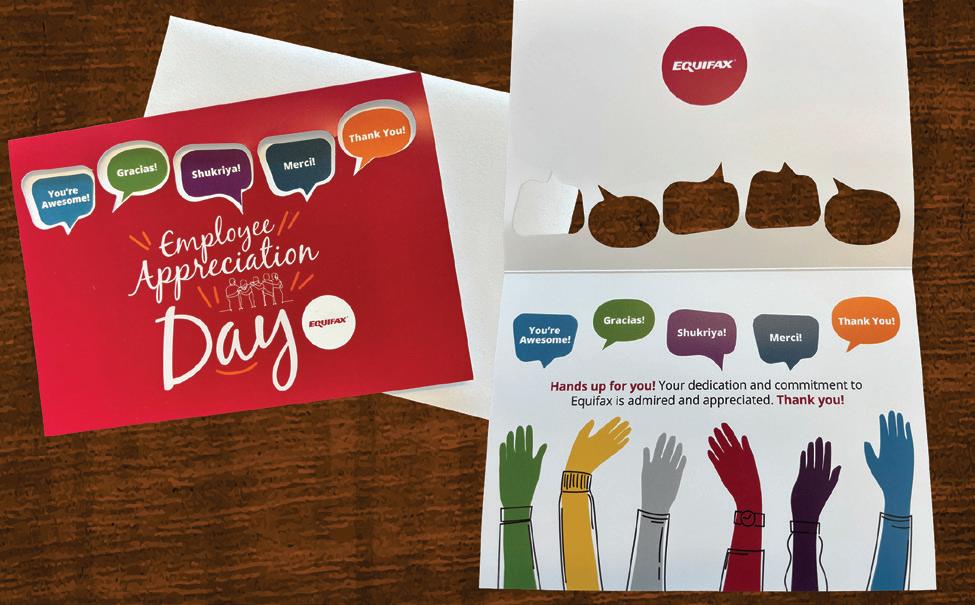
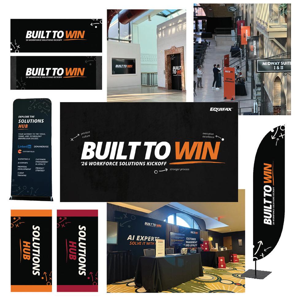
Design Firm: Equifax Workforce Solutions Winning Entry: Equifax Workforce Solutions Employee Appreciation Day Card Creative Director: Carolyn Brown
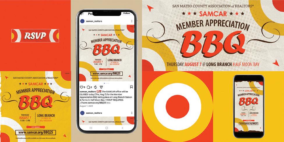
Design Firm: San Mateo County Association of Realtors (SAMCAR) Brand & Communications Client: SAMCAR Winning Entry: Member Appreciation BBQ Invitation Creative Director: Dalen Gilbrech Designer: Dalen Gilbrech
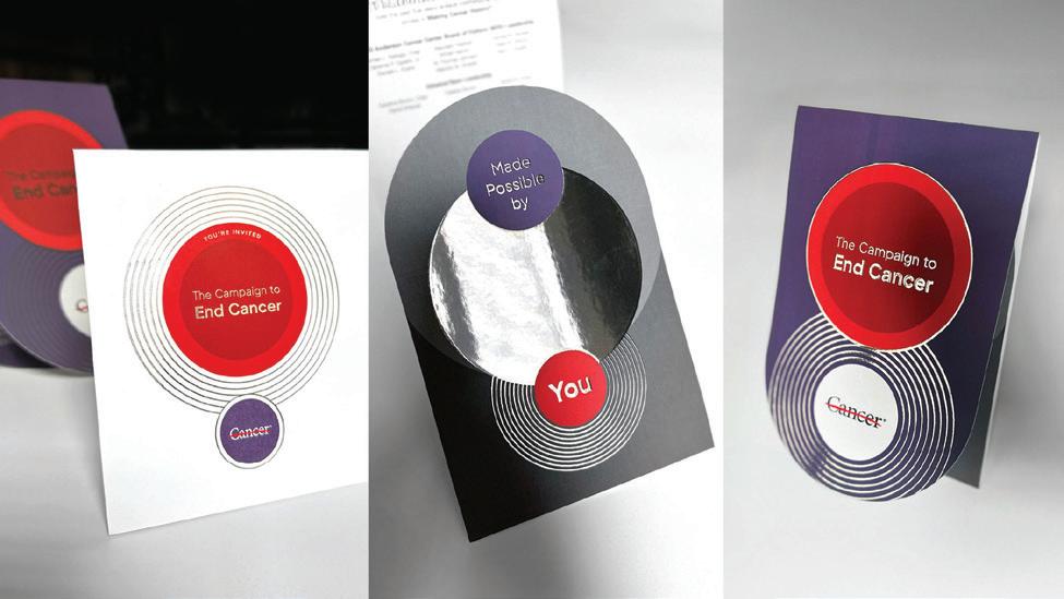
Design Firm: UT MD Anderson Cancer Center Winning Entry: UT MD Anderson: Only Possible Here, The Campaign to End Cancer Launch Invitation Creative Director: Elisa Cisneros Art Director: Marily Scaria Designer: Aike Jamaluddin
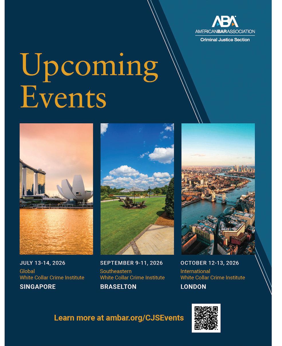
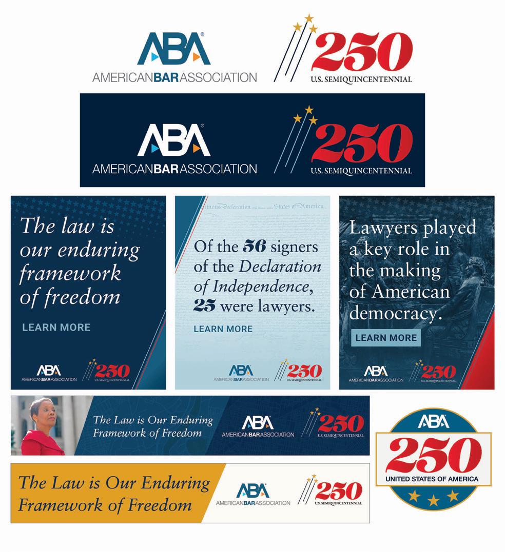
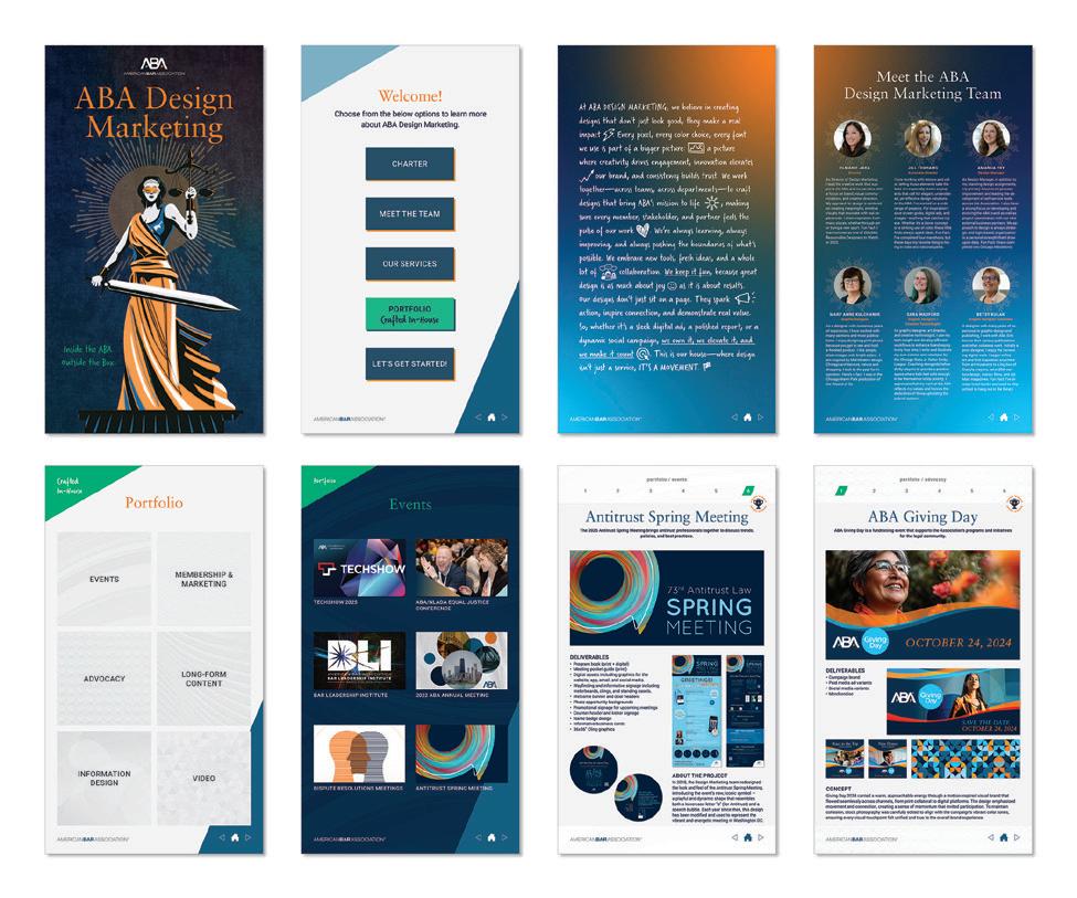
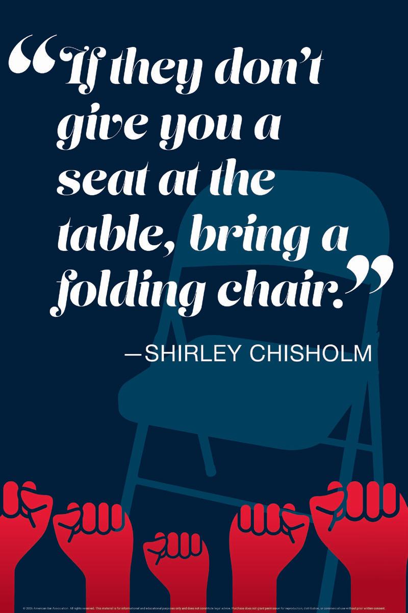
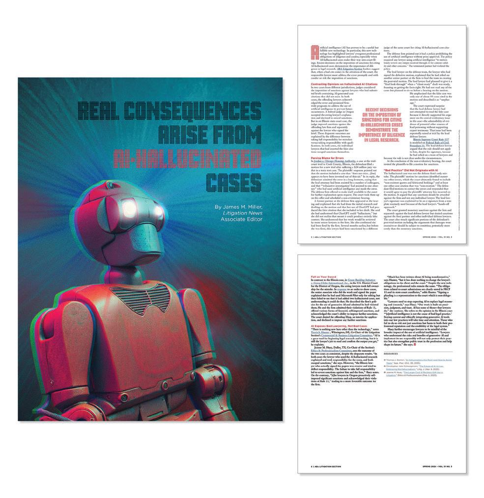
Design Firm: American Bar Association Design Marketing Department Client: ABA Criminal Justice Section Winning Entry: Upcoming Events Advertisement Designer: Sara Wadford
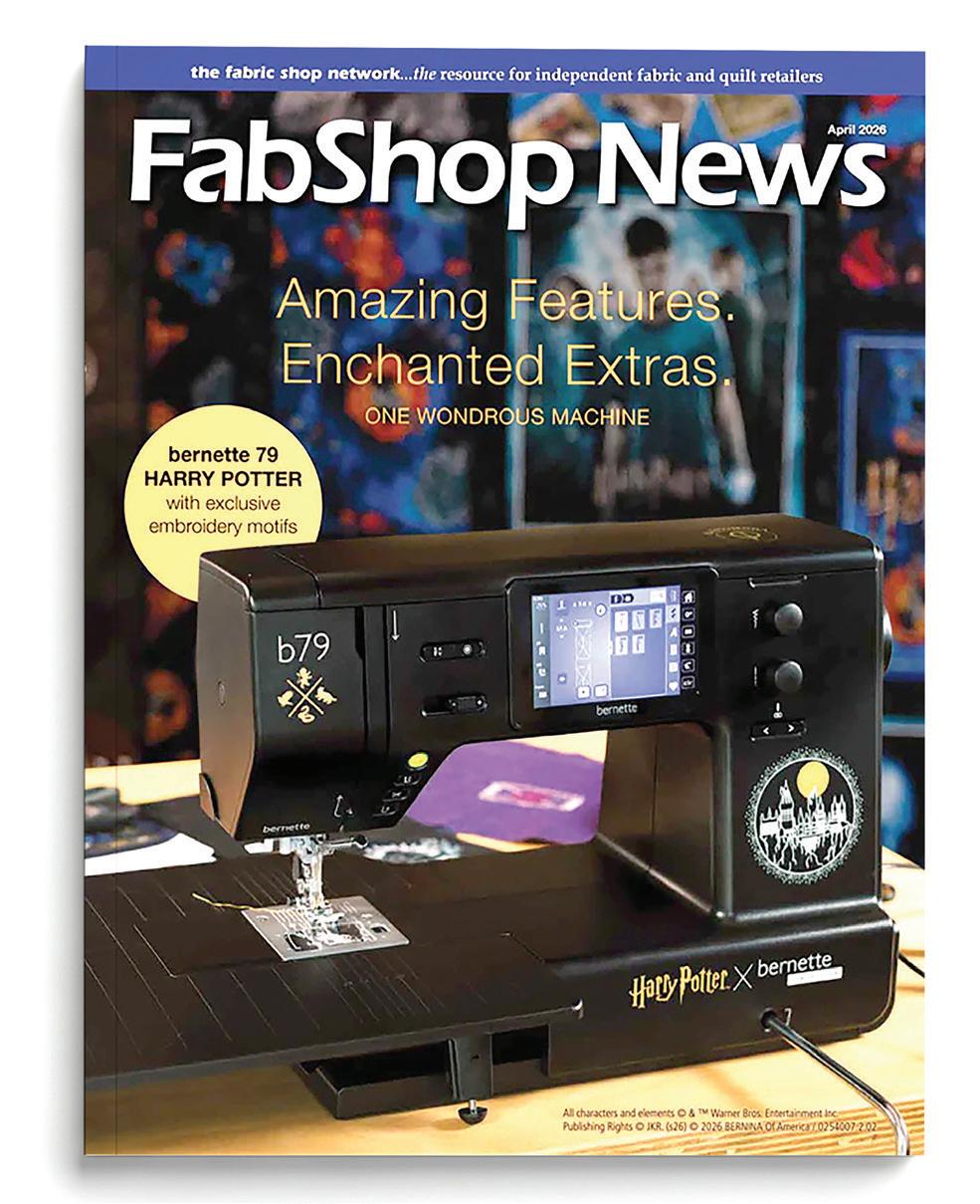
Design Firm: Bernina USA Client: Bernette Winning Entry: Harry Potter Edition Advertising Creative Director: Timothy Schmoll Designer: Timothy Schmoll Other Creative Credits: VP, Marketing: Michaelynn Rose
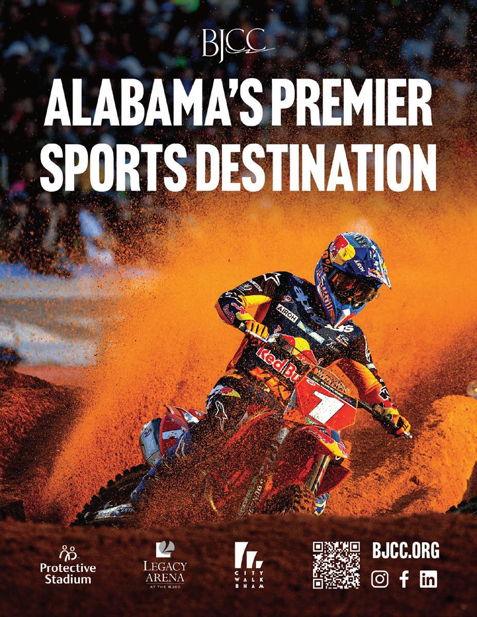
Design Firm: Birmingham Jefferson Convention Complex Client: 2026 Alabama Sports Hall of Fame Winning Entry: 2026 Alabama Sports Hall of Fame Induction Ceremony Program Creative Director: Katy Knauss Designer: Anna Grace Askelson Photographer: Parker Freedman
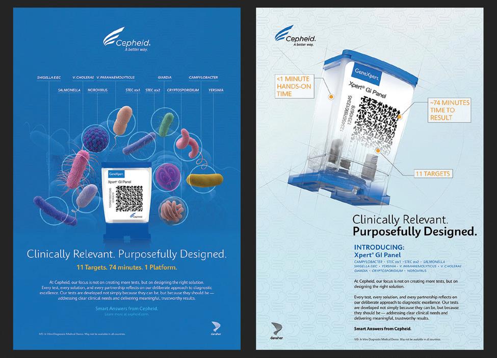
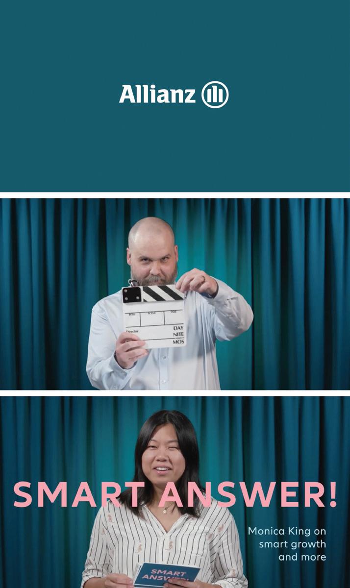
Design Firm: Cepheid One Studio Client: Cepheid Winning Entry: Smart Answers Xpert® GI Panel Launch Creative Director: Kirsten Olivet Director, Marketing Communications: Melanie Stillings; Senior Director, Marketing, US: Nichole Treeter; Director, Creative Strategy: Kristin Bialaszewski; VP, Digital Customer Experience and Marketing Communications: Christine Grand
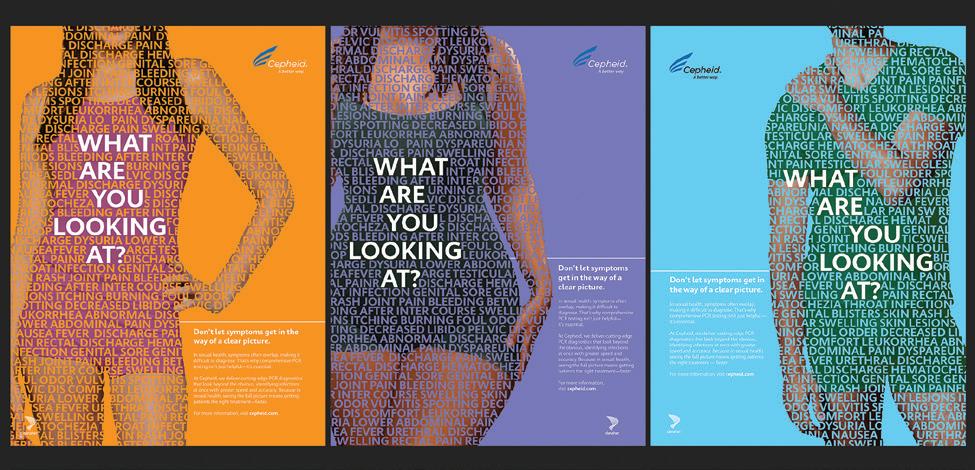
Design Firm: Cepheid One Studio Client: Cepheid Winning Entry: U.S. Sexual Health Campaign Creative Director: Kirsten Olivet Marketing Manager, Sexual Health & Oncology, North America: Shea Erlandson; Melissa Richard, Integrated Marketing Communications Manager: Melissa Richard; Director, Creative Strategy: Kristin Bialaszewski: Fellow, Brand and Creative: Jared Tipton; VP, Digital Customer Experience and Marketing Communications: Christine Grand
Design Firm: Cribl Winning Entry: Cribl RSAC Brand Ads Creative Director: Kaycee Carmichael Chiu Writer: Doug Howatt Motion Designer: Anna Vershinina; Head of Corporate Events: Meredith Torres; Senior Manager, Global Campaign Marketing: Cheryl Fuiji; Senior Director, Demand Generation: Chris Hayward; VP, Product and Technology Marketing: Joel Vincent; Principal GTM Program Manager: Gabby Zurita; Chief Market Officer: Abby Strong
Design Firm: Endeavor B2B Client: Roads & Bridges Winning Entry: 40 Under 40 Advertising Campaign Creative Director: Charles Thomas Art Director: Dara Rubin Designer: Dara Rubin Digital Audience Development Manager: Alden Metzger
Design Firm: Heaven Hill Brands Creative Services Department Client: Heaven Hill Brands Winning Entry: Lunazul Primero Campaign Designer: Sarah Hampton Photo and Video Producer: Chris Humphreys; Photographer, Dean Lavenson, Dean Lavenson Photography; Client: Allison Gillis, Associate Brand Manager, Brittany Wenig
Design Firm: Kahala Brands Client: Wetzel’s Pretzels Winning Entry: National Wetzel’s Day Creative Director: Rebecca Springer Designer: Lisa Havlat Senior Graphic Designer: Lisa Havlat VP of Creative Services: Rebecca Springer
Design Firm: MassMutual, 258° Creative Group Winning Entry: Stable Voyage Plus/JPMC Awareness Campaign Creative Director: Will Uronis Art Director: Mark Coletti Designer: Mark Coletti Writer: Brian Anderson
Design Firm: Navy Federal Credit Union (NFCU) Winning Entry: Fast & Curious Copilot Challenge Art Director: Denise Leonard Designer: Sara Mitchell
Design Firm: Navy Federal Credit Union (NFCU) Winning Entry: Life Safety Train-ing Campaign Art Director: Denise Leonard Designer: Sara Mitchell Design Collaborators: Carl Scott, Nicole Coxwell, Jacob Jackson
Design Firm: Hillpointe Client: Pointe Grand Communities Winning Entry: Pointe Grand Communities Signage Catalog Creative Director: Tyler Garner Art Director: Spencer Patel Designer: Spencer Patel
HILLPOINTE | POINTE GRAND COMMUNITIES SIGNAGE CATALOG
Pointe Grand Communities is a rapidly growing workforce-housing brand developed by Hillpointe LLC, one of the nation’s leading builders of attainable multifamily housing. To support the high-velocity lease-up strategy that defines Hillpointe’s development model, the brand required a scalable, end-to-end signage system capable of driving awareness, guiding prospects, and reinforcing brand equity across every phase of a property’s lifecycle — from groundbreaking to stabilized occupancy. The result is the Pointe Grand Communities Signage Package: a comprehensive, catalog-driven advertising system encompassing more than a dozen distinct sign formats, dozens of individual templates, and a fully codified customization framework that empowers on-site teams while maintaining absolute brand consistency across a growing portfolio of properties.
Design Firm: Stream Realty Partners Winning Entry: Houston Center - Designed To Move You - Ad Campaign Creative Director: Angie Ahearn Designer: Carla Esquivel Writer: Bridget Doyle Production Company: Overtaken Productions
Design Firm: Tarrant County College District Creative Strategy Department Winning Entry: Heart Health Awareness Month Campaign Creative Director: David Mejia Art Director: David Mejia Designer: David Mejia
Design Firm: Tarrant County College District Creative Strategy Department Winning Entry: TCC Foundation Scholarship Promotions Creative Director: Paul Quinones Art Director: Rebecca Lopez Designer: Rebecca Lopez
Design Firm: Wolf Trap Foundation Creative Client: Wolf Trap Foundation for the Performing Arts Winning Entry: Wolf Trap 2025 Summer Creative Campaign Creative Director: Sara Shaffer Designer: Clarisse Gaillard
Design Firm: American Bar Association Design Marketing Department Winning Entry: ABA Honors the U.S. Semiquincentennial Creative Director: Jill Tedhams Art Director: Jill Tedhams Designer: Jill Tedhams
Design Firm: Art Center College of Design Winning Entry: Enfin Levé Techwear Branding Designer: Jonathan Kusnadi Other Creative Credits: Instructor: Elaine Alderette
Design Firm: Auburn University CADC Winning Entry: LAND40 Celebration Branding Designer: Danielle Ravelo Landscape Illustrations: Auburn Landscape Architecture Students
Design Firm: CannonDesign Winning Entry: Facility Optimization Solutions Identity Design Creative Director: Dylan Coonrad Art Director: Nicole Sowinski Other Creative Credits: Illustrator: Maria Schweitzer
Design Firm: Cornett Winning Entry: Cornett Rebrand - New Look Breaks the Natural Order So Brands Can Break Through Creative Director: Patrick Simkins Art Director: Nicole Kukurugya, Randy Steward Designer: Claire Kirner Writer: Coleman Larkin Group Creative Director: Jason Majewski Illustration: Ana Miminoshvili Associate Creative Director: Kathy Martinolich Operations: Cathryn Hahn
Design Firm: Cribl Winning Entry: Cribl President Club 2026 Branding Creative Director: Kaycee Carmichael Chiu Art Director: Mara Sahleanu Designer: Kayla Bannwart VP, Corporate Marketing: Meredith Torres; Chief Market Officer: Abby Strong
Design Firm: Fuszion | Rick Heffner Client: George Mason University School of Art Winning Entry: SEAD Program Logo - Visiting Scholars, Educators, Artists, Designers Program Art Director: Zoe´ Charlton Designer: Rick Heffner
Design Firm: GM Financial Winning Entry: GM Financial 15 Year Anniversary Logo Creative Director: Steven Palmer Art Director: Jenna Jessen, Josh Wiese Designer: JD Lemming Production: Masae Hardwick
Design Firm: Grubhub Studio Winning Entry: Grubhub: A Food-First Visual Identity Other Creative Credits: VP, Brand: Marnie Kain; Director of Creative (Design): Jasmine Sharpe; Creative Director (Copy): Hannah Baker; Designers: Noora Manchanda, Daeun Lee, Kyle Misteravich, Alex Vissaridis; Copywriter: Taylor VanBuren; Director, Brand Insights & Strategy: Piedad Rodriguez; Sr. Manager, Brand: Stacey Leon; Sr. Executive Producer: Yung Savolaninen; Sr. Project Manager: Jess Schultz
Design Firm: JLL Creative Winning Entry: Sixty Three Ontario Logo Creative Director: Shaina Nielson Art Director: Jennifer Bachand Designer: Jen Olson Marketer: Leighann Jandrists
Design Firm: Kahala Brands Client: Cold Stone Creamery Winning Entry: Cold Stone Creamery Branding Redesign Other Creative Credits: Digital Art Director: Jan Messiant; Junior Art Director: Michael Rogoff; Senior Art Director: Amanda Diercksmeier; VP of Creative Services: Rebecca Springer; VP of Marketing & Digital Strategy: Courtney Maxedon
Design Firm: Litehouse Foods - The Point Creative Client: Litehouse Foods Winning Entry: Annual Employee Owner Meeting - Win As 1 Experience Creative Director: Kathy Weisz Art Director: Amber Sirk Designer: Amber Sirk
Design Firm: Mahjong Row & Co. Winning Entry: Mahjong Row & Co. Visual System Creative Director: Tricia Kane Art Director: Monica Lo Designer: Monica Lo
Design Firm: MassMutual, 258° Creative Group Winning Entry: Port 51 Lending Logo Creative Director: Tripp Fischer Art Director: Marcin Witruszynski Designer: Marcin Witruszynski Writer: Brian Anderson Client: Hannah Snow
Design Firm: Navy Federal Credit Union (NFCU) Winning Entry: WIL Divisional Logos & Icons Art Director: Denise Leonard Designer: Sara Mitchell Design Collaborators: Phyllis Copeland, Brittany Rains
Design Firm: Phillips Academy Winning Entry: Phillips Academy Giving Recognition Societies Brand Identity System Art Director: Anne Marino Designer: Anne Marino Project Leaders: Matthew Bellico, Amy Dattilo
Design Firm: Southern Company Winning Entry: 2025 Southern Company at Atlanta Pride Creative Director: Jennifer Higgins Designer: Ginger Avenali Other Creative Credits: Client: Patrick Becker
Strategic Marketing Manager: Diana Tung Senior Marketing Specialist: Gary Climo Senior Marketing Director, Multi-Market: Jordan Leavitt
Design Firm: TreacyDesign/TFX Winning Entry: CXSHIFT Agentic AI Service
Logo Creative Director: Joe Treacy Art Director: Joe Treacy Designer: Joe Treacy Writer: Joe Treacy
Design Firm: Stream Realty Partners Client: Sagard Winning Entry: Rex Distribution Center Industrial Branding Creative Director: Hannah Shumate Designer: Reeves Guyton
Design Firm: UPS Creative Studio Client: UPS Winning Entry: UPS Canada 50th Celebration Design System Creative Director: Meg Best Art Director: Meg Best Designer: Meg Best Writer: Rick Bittner, Dave Goren
Design Firm: Vinicius Lima Client: Grand Valley State University Winning Entry: Digital Literacy Branding Designer: Vinicius Lima
Design Firm: WebMD Health Services Winning Entry: Slice Mascot Creative Director: Nicole Cornett Art Director: Michelle Clark Designer: Sarah Nelson, Kelly Bieksha Lead Communication Strategist: Louise Lumague; Senior Project Manager: Kim Sullivan; Project Manager: Yasmine Khoshbakht
Design Firm: American Bar Association Design Marketing Department Client: ABA Family Law Section Winning Entry: The Indian Child Welfare Act Handbook Designer: Mary Anne Kulchawik
Design Firm: American Bar Association Design Marketing Department Client: ABA Publishing Winning Entry: Zen and the Art of Persuasive Writing Book Design Designer: Elizabeth Kulak
Design Firm: Learning Without Tears Winning Entry: Get Set for School Letters & Literacy Teacher’s Guide + Get Set for School Letters & Literacy California Literature Guide and Resources Creative Director: Shannon Rutledge Art Director: Sammie Simon Designer: Jillian Marsala, Jacquelyn Lamkin Sr. Production Artist: Nichole Mazzeo Digital Illustrator: Liz Amini-Holmes
Design Firm: MAUGEDESIGN Client: VISIBLE MINDS AI, a Sub-brand of MAUGEDESIGN Winning Entry: Wear Intelligence: Making Thinking Visible Creative Director: Carole Maugé-Lewis Art Director: Carole Maugé-Lewis Writer: Carole Maugé-Lewis w/ChatGPT AI Collaboration Visual Systems Designer: Amanda Michael
MAUGEDESIGN | VISIBLE MINDS AI CAMPAIGN
Visible Minds AI is an integrated campaign exploring the relationship between artificial intelligence, creativity, education, and human thinking. Through a system of wearable statements, the campaign transforms ideas such as inquiry, authorship, and critical thinking into visible expressions of identity. Rather than positioning AI as a replacement for human intelligence, the work presents AI as a collaborator that can reveal, extend, and challenge thought. Created in collaboration with Art Director Carole Maugé-Lewis and designer Amanda Michael, this campaign reflects a simple belief: AI should not replace thinking it should make thinking more visible.
Design Firm: MAUGEDESIGN Winning Entry: Endangered Species by Jeff Dennis Creative Director: Carole Maugé-Lewis Art Director: Carole Maugé-Lewis Designer: Carole Maugé-Lewis Writer: Jeff Dennis, Author Cover Artwork: Raúl Martín
Design Firm: HMH Winning Entry: HMH Read 180 Program Guide Creative Director: Mo Bing Chan Art Director: Sylvia Diaz Designer: Rhonda Holcomb
Design Firm: American Psychological Association Client: APA Publishing Winning Entry: Publication Manual 7 Flyer Designer: Angela Dyson
Design Firm: AMPP Creative Services Client: Association for Materials Protection and Performance (AMPP) Winning Entry: AMPP 2026 Media Planner Designer: Stefano Dalu Marketer: Natalie Abel
Design Firm: Avangrid Winning Entry: Powering America Future Corporate Responsibility Report Art Director: Rebecca Smith Designer: Rebecca Smith Writer: Josh Chaitin, Tin Can Strategies
Design Firm: Behr Paint Company - Marketing Creative Client: Behr Paint Company Winning Entry: BEHR 2026 Color Trends Brochure Creative Director: Marianne Hales Designer: Katelyn Grover 3D CGI Artist: Adrian Covarrubias; Project Coordinator: Katherine Dimapilis
Design Firm: Brewer Sewing Winning Entry: Simply Classic Products Brochure Creative Director: Timothy Schmoll Designer: Kate Grinn Other Creative Credits: VP, Marketing: Michaelynn Rose
Design Firm: Company Folders, Inc. Winning Entry: Company Folders Presentation Folder Design Other Creative Credits: Lead Designer: Anatoliy Zernov; Designer: Viktor Yevtushenko
Design Firm: Cribl Winning Entry: Cribl Kickoff 2026: Boldly Go Branding Creative Director: Kaycee Carmichael Chiu Art Director: Mara Sahleanu Designer: Kayla Bannwart Copywriter and Editor: Doug Howatt Motion Graphics: Bright Blue Day Agency Motion Designer: Anna Vershinina Head of Corporate Events: Meredith Torres SVP, Business Operations: Farrah Bui Strategy and Operations: Matt Cox, Eve Marcussen VP, Product and Technology Marketing: Joel Vincent Chief Market Officer: Abby Strong
Design Firm: Cribl Winning Entry: The Telemetry Time Bomb Creative Director: Kaycee Carmichael Chiu Art Director: Mara Sahleanu Designer: Mara Sahleanu Writer: Doug Howatt Senior Manager, Global Campaign Marketing: Cheryl Fuiji Senior Director, Demand Generation: Chris Hayward VP, Product and Technology Marketing: Joel Vincent Sr. Director, Technical Marketing: Bill Emmett VP, Corporate Marketing: Ryan Mattison Chief Market Officer: Abby Strong
Design Firm: GM Financial Winning Entry: 2026 Benefits Guide Creative Director: Steven Palmer Art Director: Jena Jessen Designer: JD Lemming Other Creative Credits: Production: Masae Hardwick
Design Firm: GM Financial Winning Entry: Cadillac Financial 2026 Lease End Guide Creative Director: Steven Palmer Art Director: Jena Jessen Designer: Brian Kyle Production: Hahn Delong
Design Firm: Heaven Hill Brands Creative Services Department Client: Heaven Hill Brands Winning Entry: Corporate Overview Brochure Designer: Tiffany Bohn, Ryan McNulty Writer: Lauren Newcomb, Senior Manager, Brand Public Relations Client: Michelle Brown, Manager, Strategy and Operations
Design Firm: National Community Pharmacists Association (NCPA) Winning Entry: NCPA 2026 Congressional Pharmacy Fly-In Creative Director: Michael Abernethy Art Director: Tyler Poirier
Design Firm: Navy Federal Credit Union (NFCU) Winning Entry: Workplace Expe-rience Summit Booklet 2025 Designer: Phyllis Copeland Design Collaborator: Elizabeth Snyder
Design Firm: Premier World Discovery Winning Entry: E-Brochure Collection
Showcasing Travel Experiences Creative Director: Keith Anderson Art Director: Keith Anderson Designer: Keith Anderson Writer: In-house
Design Firm: Roland Foods Winning Entry: Roland Latin American Pantry Cre-ative Director: Eling Lee Designer: Diana Luistro Writer: Julia Voglino Photographer: Paul Christian, YtC Studios Food Stylist: Dana Beninati Illustrator: Julie Dernigoghossian
Design Firm: Roland Foods Winning Entry: The Grazing Guide Creative Director: Eling Lee Designer: Diana Luistro Writer: Julia Voglino Photographer: Paul Christian, YtC Studios Food Stylist: Dana Beninati
Design Firm: Segal Inhouse Design (InDe) Winning Entry: The Hazards of Mandating Social Security on the Public Sector Report Creative Director: Carolyn Covington-Espiritu Designer: Maggie Salter Writer: Erin Burns
Design Firm: Southern Company Winning Entry: Plant Vogtle COD Clean Energy Brochure Designer: Ginger Avenali Writer: Justin Averette
Design Firm: Stream Realty Partners Client: The Dive Motel Winning Entry: The Dive Motel Marketing Piece Creative Director: Dawn Scott Art Director: Sophia Early Baxter Designer: Sophia Early Baxter Writer: Sophia Early Baxter
Design Firm: The Word & Brown Companies Winning Entry: CaliforniaChoice and ChoiceBuilder Fast Facts Cover Updates Creative Director: Homer Villegas, Studio Director
Design Firm: WebMD Health Services Winning Entry: The Community Kitchen Cookbook Art Director: Mark Arriola Designer: Vanessa Lozano Writer: Pete Latriano Lead Communications Strategist: Louise Lumague Project Manager: Kim Sullivan Project Manager: Yasmine Khoshbakht
Design Firm: Wolf Trap Foundation Creative Client: Wolf Trap Foundation for the Performing Arts Winning Entry: Wolf Trap 2026 Opera Brochure
Creative Director: Sara Shaffer Designer: Clarisse Gaillard
Design Firm: Wolf Trap Foundation Creative Client: Wolf Trap Foundation for the Performing Arts Winning Entry: Wolf Trap 2026 Summer PreSeason Brochure
Creative Director: Sara Shaffer Designer: Cari Gnam
Design Firm: 1930 Ventures Client: Benco Dental Winning Entry: 2026-2027 Annual Catalog Covers Creative Director: Eric Larsen Art Director: Loriah Webby Designer: Melissa Diltz Contributor: Jennifer Ochman
Design Firm: Baltimore Symphony Orchestra Winning Entry: Illuminated Through Sound: 2026-27 Season Catalog Designer: Lauren Smedley SVP Chief Revenue Strategy Officer: Jennifer Barton
Design Firm: Bank of America, Enterprise Creative Solutions Winning Entry: More Rewards Day Direct Mail Creative Director: Steve Strohm Art Director: John Mayberry Writer: Kris Stone Group Account Director: Laura Keehan Account Manager: Charles Flicker Executive Director: Charissa Messer Clients: Whitney Berongi, Jill Hughes, Jeneen Marziani
Design Firm: Learning Without Tears Winning Entry: 2026 Learning Without Tears Product Catalog Creative Director: Shannon Rutledge Art Director: Angie Redmond Designer: Dreama Stafford
Design Firm: Phillips Academy Winning Entry: A Place Where... Fundraising Appeal Gatefold Self-Mailer Art Director: Anne Marino Designer: Anne Marino Writer: Matthew Bellico Strategic Direction: Matthew Bellico Project Manager: Amy Dattilo Photographer: Henry Marte
Design Firm: Proforma Client: Proforma Winning Entry: On Point Onboarding Campaign
Design Firm: Proforma Winning Entry: Proforma Retail Catalog/Retail in Promo
Design Firm: Uline Creative Client: ULINE Winning Entry: Best Thing Since Sliced Bread Catalog Creative Director: Sarah Fritz Art Director: Jeff Mayfield Designer: Veronica Wilkey Photographer: Perry LaFine Retoucher: Jennifer Toussaint VP of Creative: Elizabeth Tenner
Design Firm: WebMD Health Services Winning Entry: Well-Being Awareness Campaign Creative Director: Nicole Cornett Art Director: Michelle Clark Designer: Sarah Nelson, Kelly Bieksha Writer: Pete Latriano, Stephanie Tisza Communications Strategist: Cecily Walters Senior Marketing Manager: Lori Samuels Senior Project Manager: Kim Sullivan Project Manager: Yasmine Khoshbakht Associate Marketing Director: Alissa Barron Stranzl
Design Firm: Uline Creative Client: ULINE Winning Entry: The Box Champions Homage To World Cup Catalog Creative Director: Sarah Fritz Art Director: Jeff Mayfield Designer: Luis Castrejon Photographer: Lisa Marie Duhig Retoucher: Casey Johnson VP of Creative: Elizabeth Tenner
Design Firm: ZLINE Kitchen and Bath Winning Entry: ZLINE Annual Product Catalog Other Creative Credits: Art Direction: Misato Morita; Lead Design: Misato Morita; Graphic Design: Anthony Herring; 3D Render Art Direction: Shannon Maiers; 3D Render Coordination: Branco Ortega; Copywriting: Kevin MacMillan; Photography: Nicholas Teipner; Photo Editing: Cole Giguiere
ZLINE KITCHEN AND BATH | ZLINE CATALOG
This annual product catalog represents a curated selection from a large and diverse product portfolio. The primary challenge was to distill a broad assortment into a clear, cohesive system—balancing simplification with effective representation of each product line.
Ventures Client:
Dental Winning
2025-2026 Dental Survey Creative Director: Eric Larsen Art Director: June Musto Designer: June Musto Writer: Edward Kobesky
Design Firm: 1930
Benco
Entry: Incisal Edge:
Design Firm: Endeavor B2B Client: DigiKey Winning Entry: DigiKey Infographics Creative Director: Charles Thomas Art Director: Emily Rausch Designer: Emily Rausch Senior Program Manager: Dan Blunk
Design Firm: Segal Inhouse Design (InDe) Winning Entry: College and University Benefit Study (CUBS) Infographic Series Creative Director: Sunday Coulter Art Director: Lisa Wong Designer: Lisa Wong Writer: Erin Burns
Design Firm: WebMD Health Services Winning Entry: Well Informed Data Visualization Creative Director: Nicole Cornett Art Director: Michelle Clark Writer:
Stephanie Tisza Lead Communication Strategist: Angela Redeau Senior Communications Strategist: Meghan Barron Senior Communica-tions Strategist:
Design Firm: The Word & Brown Companies Winning Entry: The Word & Brown Companies Multicultural Day Invitation Email Designer: Hugo Miramontes, Senior Graphic Designer
Design Firm: 1930 Ventures Client: Benco Dental Winning Entry: Gold Rush Campaign Creative Director: Eric Larsen Art Director: Loriah Webby Designer: Michael John Gentle, Allison Simenkiewicz, Madi Barcelon Writer: Edward Kobesky, Gia Mazur Merwine Contributors: Christopher Cruz, Nick Bukofski
Karen Sterkenburg Group Account Director & Digital Strategy: Stacy Stigelman Executive Director: Charissa Messer Clients: Bart Stolp, Gina Wilbur, Angela Laughlin, Cindy Thomas
Design Firm: AAUW Naperville IL Area Winning Entry: 70th Anniversary Celebra-tion Campaign Print Design: Kelly Kolton Digital Design: Brionna Belcher Video Design: Sue Topp
Design Firm: Avangrid Winning Entry: Celebrating Women History Month Campaign Art Director: Lisa M. Sencen Designer: Lisa M. Sencen
Design Firm: Bank of America, Enterprise Creative Solutions Winning Entry: FIFA World Cup 2026 Ticket Offer Creative Director: Steve Strohm Art Director: Kelvin Valencia Designer: Jeff Burt Writer: Kristen Kramedas Account Director: Patty Heck; Account Manager:
Design Firm: College for Creative Studies Winning Entry: SEO100 - CCS Student Exhibition 100th Anniversary Campaign Creative Director: Katie Kunesh Design-er: Dan Greco Writer: Elizabeth Botkin Motion Designer: Sophie Boysen
Design Firm: Endeavor B2B Client: International Lineman’s Rodeo Winning Entry: International Lineman’s Rodeo 2025 Marketing Campaign Creative Director: Charles Thomas Designer: Erin Rowe Event Marketing Manager: Chandler Stafford
Design Firm: DAP Global Inc. Winning Entry: DAP Dynaflex Integrated Marketing Campaign Sr. Director, Brand Management: Tracy Myers; Sr. Brand Manager: Katie Hathaway; Producer: Adelyn Navarro; Creative Direc-tion: Steven Wright; Storyboarding & Concepting: Omeed Nabavi; Video & Photography: Producers Agency; Graphic Design: Steven Wright, Eliana Pisciotta
Design Firm: Endeavor B2B Client: Subsea Tieback Forum & Exhibition Winning Entry: Subsea Tieback Forum & Exhibition 2026 Marketing Campaign Creative Director: Charles Thomas Art Director: Sean Terska Designer: Sean Terska Vice President, Event Marketing: Wendy Lissau
2026 | INTEGRATED MARKETING CAMPAIGNS
Design Firm: Frost Creative Studio Client: Frost Bank Winning Entry: Sweet Sixteen: Frost 2025 JD Power Award Campaign Creative Director: Craig Vitello
Designer: Brandon Garrett Writer: Harrison Dromgoole Marketing Program Manager: Annette Sanchez Digital Marketing Manager: Gage Talbert
Design Firm: GM Financial Winning Entry: Spring 2026 SMS Sweepstakes Campaign Creative Director: Steven Palmer Art Director: Josh Wiese Designer: Jason Huenefeld Production: Chris Rotenberry
Design Firm: Janome America Winning Entry: HD9QCP Machine Launch Campaign Marketing Manager and Creative Direction: Krystal Pratt Social Media Coordinator & Graphic Designer: Alessandra Turano Graphic Designer: Hiro Fujita Assistant Manager of Graphic Design: John Britnell Photographer/Videographer: Thomas Sireci Project Manager: Christina LaMere
Design Firm: Loudoun Economic Development Winning Entry: One Loudoun Deck. Two-Factor Fun. Countless Possibilities Art Director: Amy Mugford Contributor: Jessica Park
Design Firm: MassMutual, 258° Creative Group Winning Entry: MassMutual/Boston Red Sox 2025 Campaign Creative Director: Tripp Fischer, Larry Fahey, Will Uronis Art Director: Mark Coletti Designer: Nick Packey, Stacy Jasinski Writer: Lauren Shiraka Clients: Kristin Lane, Christa Perry, Kylie Uehara
Design Firm: PCL Construction Winning Entry: 50 Years in Colorado Campaign Designer: U.S. Creative Services, Marketing & Communications Teams
Design Firm: Performance Foodservice, Inhouse Digital Creative Team Winning Entry: CustomerFirst New Ordering Platform Integrated Campaign Designer: Keli Keener
Design Firm: Tarrant County College District Creative Strategy Department Win-ning Entry: Health Science Integrated Campaign Creative Director: Arturo Martinez Art Director: Arturo Martinez Designer: Arturo Martinez
Design Firm: Tarrant County College District Creative Strategy Department Winning Entry: Trailblazer 2025 Award Ceremony Creative Director: Arturo Martinez Designer: Mokeita White Writer: Jennifer Norris Copy Editor: Mokeita White
Design Firm: The Word & Brown Companies Winning Entry: CHOICE Administrators Broker Appreciation Event Campaign Creative Director: Rikki Nedelkow, Marketing Director and Jessica Haluck, Events Marketing Director Art Director: Homer Villegas, Studio Director Senior Events Manager: Heather McDonald
Design Firm: The Word & Brown Companies Winning Entry: CHOICE Administrators Leadership Management Event Campaign Creative Director: Homer Villegas, Studio Director Marketing Director: Rikki Nedelkow Events Marketing Director: Jessica Haluck Senior Events Manager: Heather McDonald
Design Firm: The Word & Brown Companies Winning Entry: Word & Brown Power of & 2026 Campaign Creative Director: Missy Bynon, Senior Marketing Director Designer: Hugo Miramontes, Senior Graphic Designer Writer: Alex Strautman, Senior Copywriter
Design Firm: UPS Creative Studio Client: UPS Winning Entry: People Powering Peak Unified Design System Creative Director: Meg Best Art Director: Meg Best Designer: Meg Best Writer: Dave Goren Animation: Ryan Davis
Design Firm: WebMD Health Services Winning Entry: What Matters Most Launch Campaign Creative Director: Nicole Cornett Art Director: Mark Arriola Designer: Vanessa Lozano Writer: Pete Latriano, Stephanie Tisza Lead Communication Strategist: Lisa Oesterreicher Lead Communication Strategist: Louise Lumague Sr. Communications Strategist: Ciandra Jackson Senior Project Manager: Kim Sullivan Project Manager: Yasmine Khoshbakht
Design Firm: American Bar Association Design Marketing Department Winning Entry: ABA Design Marketing Portfolio Art Director: Amanda Fry Designer: Amanda Fry Contributed Content: Elmarie Jara, Director; Jill Tedhams, Associate Director; Mary Anne Kulchawik, Graphic Designer; Sara Wadford, Graphic Designer; Betsy Kulak, Graphic Designer Associate
Design Firm: Litehouse Foods - The Point Creative Winning Entry: The Point Creative Branding Creative Director: Kathy Weisz Art Directors: Lindsey Kuhn, Amber Sirk Designers: Lindsey Kuhn, Amber Sirk
Design Firm: 1930 Ventures Client: Benco Dental Winning Entry: Sterling Handpiece Video Creative Director: Eric Larsen Art Director: Eric Larsen
Design Firm: Allianz Life Winning Entry: Smart Answer Video Series Creative Director: Calvin Buchanan Art Director: Laurice Rooney Writer: Craig McNamara Art Director: Jeffrey Yang Video Editor: Dwayne Robinson Project Leader: Tara Layton
Design Firm: Allianz Life Client: Allianz Milano Cortina 2026 Winning Entry: Winter Olympic and Paralympic Games Video Creative Director: Calvin Buchanan Art Director: Taylorn VeVea Writer: Cheyanne Casey Project Leader: Tara Layton
Design Firm: Frost Creative Studio Client: Frost Bank Winning Entry: Frost x Texas Rangers: Our Partnership Video Creative Director: Craig Vitello Writer: Harrison Dromgoole Editor: Danny Nguyen Social Strategist: Daryk Ganske Brand Sponsorship Strategist: Edwin Flato
Design Firm: Segal Inhouse Design (InDe) Winning Entry: 2025 Holiday Spirit Creative Director: Sunday Coulter Art Director: Lisa Wong Designer: Lisa Wong Writer: Beth Hoover
Design Firm: Tarrant County College District Creative Strategy Department Winning Entry: TCC 2025 State of the College Creative Director: Arturo Martinez Art Director: Arturo Martinez Designer: Arturo Martinez
Design Firm: Traffic Planning and Design Client: PennDOT: Pennsylvania Department of Transportation Winning Entry: Bristol Road Extension Highlight Video Creative Director: Elyse Conti Art Director: Danielle Kauffman Designer: Jon Muthersbaugh Writer: Jon Muthersbaugh
Design Firm: UPS Creative Studio Client: UPS Winning Entry: UPS and Happy Returns Are Expanding Return Bar Locations Creative Director: Kelli Stoudenmire Designer: Greg Smolen Writer: Cam Adcock
Design Firm: Wolf Trap Foundation Creative Client: Wolf Trap Foundation for the Performing Arts Winning Entry: Wolf Trap 2026 Opera Video Creative Director: Sara Shaffer Video Editor and Producer: Angelina Nam-kung
Design Firm: DAP Global Inc. Winning Entry: Spray Texture Packaging Design System Sr. Director, Brand Management: Tracy Myers Sr. Brand Manager: Katie Hathaway Art Director: Kim Jensen Graphic Design: Katie Badders; Photography: Omeed Nabavi Styling: Adelyn Navarro
Design Firm: Heaven Hill Brands Creative Services Department Client: Heaven Hill Brands Winning Entry: Evan Williams Bourbon America 250 Packaging Designer: Ryan McNulty, Tim Schoenbaechler Client: Ali Lewellen, Associate Brand Manager and Carrie Shain, Senior Brand Manager
Design Firm: Litehouse Foods - The Point Creative Client: Litehouse Foods Win-ning Entry: Litehouse LTO Packaging Creative Director: Kathy Weisz Designer: Chris Van Stone
Design Firm: Sam’s Club-Member’s Mark Creative Team Winning Entry: Member’s Mark Spring Candles Packaging Creative Director: Jonathan Stiers Designer: Dyallen Efendi
Design Firm: Allianz Life Winning Entry: Allianz Carrier Promotion Creative Director: Calvin Buchanan Art Director: Vangie Johnson Writer: Cheyanne Casey Project Leader: Jenney Seivert
Design Firm: Costco Global Packaging Graphics Client: Costco Wholesale Winning Entry: Kirkland Signature Chocolate Chip Mini Muffin Bites Art Director: Heather Day Designer: Mike Schulze
Design Firm: Costco Global Packaging Graphics Client: Costco Wholesale
Winning Entry: Kirkland Signature Dutch Gouda Cheese Art Director: Heather Day Designer: Mike Schulze
Design Firm: Costco Global Packaging Graphics Client: Costco Wholesale Winning Entry: Kirkland Signature Organic Tofu Art Director: Heather Day Designer: Becka Wilson
Design Firm: The Home Depot Winning Entry: Deckmate Wood Screws Packaging
Creative Director: Anjum Jadavji Art Director: Joseph DiMeo Designer: Joseph
DiMeo Brand Manager: Ian Moses Senior Brand Manager: Danielle Jarlock
Design Firm: The Home Depot Winning Entry: Hampton Bay Vanity Lights Packaging System Design Creative Director: Anjum Jadavji Art Director: Kelly Frazier Designer: Dishita Kothari Designer: Chris McClurken Brand Manager: Jonathan Pulley Senior Brand Manager: Jessica Fuller
Brand
Design Firm: The Home Depot Winning Entry: Husky Gloves Packaging Creative Director: Anjum Jadavji Art Director: Joseph DiMeo Designer: Kim Mason
Manager: John Christian Senior Brand Manager: Danielle Jarlock
Design Firm: UPS Creative Studio Client: UPS Winning Entry: UPS Holiday Packaging Creative Director: Meg Best Art Director: Meg Best Designer: Meg Best
Design Firm: WK Kellogg Co Design Team Client: WK Kellogg Co Winning Entry: Frosted Flakes and Mini Wheats x Detroit Tigers Baseball LTO Package Design Creative Director: Bridget Grever Designer: Paul Seiferth Senior Manager Promotions: Bryan Fuller
Design Firm: WK Kellogg Co Design Team Client: WK Kellogg Co Winning Entry: Special K & Corn Flakes USA 250th Celebration Package Design Creative Director: Bridget Grever Designer: Jaime Prafke
Design Firm: WK Kellogg Co Design Team & PAC Team Client: WK Kellogg Co Winning Entry: Corn Flakes x Hailey Whitters LTO Package Design Creative Director: Bridget Grever Designer: Paul Seiferth Illustrator: Stephen Bailey Senior Manager Content & Culture: Skylar Tisch Manager, Content & Culture: Owen Kline Associate Manager, Content & Culture: Kayla Zevchik
Design Firm: National Community Pharmacists Association (NCPA) Winning Entry: NCPA Independent Rx Forum Podcast Booth Creative Director: Michael Abernethy Art Director: Tyler Poirier
Design Firm: Phillips Client: Phillips in Association with Bacs & Russo Winning Entry: Property of Francis Ford Coppola F.P. Journe FFC Prototype Display Creative Director: Martin Schott Chief Marketing Officer: Amy Wexler Creative Services Manager: Ally Mintz Production: Unique Visuals, Ready Set
Design Firm: S&B USA Winning Entry: Conference Display Tower Designer: Amber George
Design Firm: Tarrant County College District Creative Strategy Department Winning Entry: Fort Worth Main Street Arts Festival Sign Up Signs Creative Director: Paul Quinones Art Director: May Tran Designer: May Tran
Design Firm: American Bar Association Design Marketing Department Winning Entry: ABA Poster Celebrating Shirley Chisholm Creative Director: Jill Tedhams Art Director: Jill Tedhams Designer: Jill Tedhams
Design Firm: Auburn University CADC Winning Entry: 2025 Day of Design Poster Creative Director: Madison Champion Art Director: Madison Champion Designer: Madison Champion Writer: Madison Champion
Design Firm: Bowling Green State University: ITR Winning Entry: Dr. Robin Wall
Kimmerer Poster - IN THE ROUND Native Creative Speaker Series
Creative Director: Jenn Stucker Nature Photography: Jenn Stucker and Jake Stucker Note: Dr. Kimmerer is Potawatomi and this poster is derived from Potawatomi designs; images cropped into the patterns are photographs that capture Northwest Ohio’s native plants.
Design Firm: Brescia University Winning Entry: Cure for the Common Art Major Surreal Mikayla Poster Creative Director: David Stratton Note: Part Of An Integrated Series of ‘Art Major’ Posters
Design Firm: College for Creative Studies Winning Entry: CCS Admissions Poster Creative Director: Katie Kunesh Designer: Dan Greco
Design Firm: Fuszion | Rick Heffner Client: George Mason University School of Art and AIGA DC Winning Entry: The Real Show 2026 Student Design Competition Poster Designer: Rick Heffner Printer: Mosaic
Design Firm: S&B USA Winning Entry: MdQI Award Poster Designer: Amber George
Design Firm: Tarrant County College District Creative Strategy Department Winning Entry: Beyond The Web: The Physics of Spider-Man Poster Creative Director: David Mejia Designer: David Mejia
Design Firm: Tarrant County College District Creative Strategy Department
Client: TCC SE Student Connections Center Winning Entry: Tarrant County College Southeast Mental Health Workshop Designer: Debbie Shannon
Design Firm: Stout Winning Entry: Stout Pitchbook Refresh and Style Guidelines Creative Director: Andrew Scheibe Designer: Gillian Kuhn, Robyn Wolf
Design Firm: Stream Realty Partners Client: Capistrano Valley Christian Schools Winning Entry: Capistrano Valley Christian Schools Presentation Creative Director: Jennifer McVay Art Director: Jennifer McVay Designer: Jennifer McVay
STREAM REALTY PARTNERS | CAPISTRANO VALLEY CHRISTIAN SCHOOLS
Developed for the second round pursuit with Capistrano Valley Christian Schools, this presentation transformed a complex, multi year real estate strategy into a clear and compelling narrative designed for executive leadership and board level stakeholders. The challenge was not simply to communicate real estate services, but to build confidence in a roadmap that would guide the institution’s future growth, expansion, and long term mission.
The presentation was structured around a seven phase framework, leading stakeholders through the process from visioning and strategic planning to site selection, entitlement, and implementation. Complex planning concepts, technical analyses, and real estate considerations were distilled into a highly organized visual story that emphasized clarity, transparency, and decision making confidence. Clean layouts, disciplined information hierarchy, and purposeful graphics ensured that sophisticated content remained accessible and engaging throughout the presentation.
A defining strength of the project was its ability to balance analytical rigor with the school’s values driven mission. The design and messaging reflected both the strategic expertise of the team and the educational purpose of the institution, creating a presentation that felt credible, thoughtful, and aligned with the audience’s priorities. Rather than focusing on services alone, the deck communicated outcomes, illustrating how each phase would support the school’s vision for future generations of students and families.
The result was a highly polished pursuit presentation that elevated the conversation from real estate transactions to long term institutional growth. By transforming technical strategy into a clear, board ready narrative, the presentation helped stakeholders understand the path forward, build trust in the process, and envision the opportunities ahead with confidence.
Design Firm: American Bar Association Design Marketing Department Client: ABA Litigation Section Winning Entry: Litigation News AI Editorial Feature, Spring 2026 Art Director: Amanda Fry Designer: Amanda Fry
Design Firm: E&M Consulting, Inc. Winning Entry: Building Washington Magazine, Spring 2026 - ABC Metro Washington Chapter Creative Director: Caleb Tindal Designer: Dan Opheim
Winning Entry: TrailBlazer Magazine 2026, Find Your Trail America, Celebrating 250 Years Creative Director: Mark Slattery Senior Graphic Designer: Michelle Villadolid Graphic Designer: Taylor Thomas Writer: Claudia Russo
Design Firm: MAR Dsigns Client: Resilience Magazine Winning Entry: Resilience Magazine, Creative Edition, Spring 2026 Designer: Maria Ojeda
Design Firm: National Community Pharmacists Association Client: America’s Pharmacist Winning Entry: Overcoming Disaster from Coast to Coast, August 2025 Creative Director: Michael Abernethy Art Director: Tyler Poirier
Design Firm: National Community Pharmacists Association (NCPA) Client: America’s Pharmacist Winning Entry: The Mental Health Issue, May 2026 Creative Director: Michael Abernethy Art Director: Tyler Poirier
Design Firm: Behr Paint Company - Marketing Creative Client: Behr Paint Company Winning Entry: 2025 BEHR Pro NeoCon Tradeshow Booth Creative Direc-tor: Marianne Hales Designer: Carmen Serrano Interior Designer: Rob Hellander Project Coordinator: Liz Ochoa
Design Firm: Birmingham Jefferson Convention Complex Winning Entry: Breezy Bowl XX Fan Activation Art Director: Anna Grace Askelson Designer: Anna Grace Askelson
Design Firm: Endeavor B2B Client: UAI Week Winning Entry: UAI Week Conference Signage Creative Director: Charles Thomas Art Director: Genny Panky Designer: Morgan Hickethier Senior Director, Event Marketing: Ashley Lutz
Design Firm: National Community Pharmacists Association (NCPA) Winning Entry: NCPA 2025 Annual Convention, Lenticular Wall Creative Director: Michael Abernethy Art Director: Tyler Poirier
Design Firm: NIBCO In-house Marketing Teams Winning Entry: NIBCO AHR Tradeshow Booth Creative Director: Sally Boyer Art Director: Emily Hershberger Designer: Emily Hershberger, Charlie Hartman Tradeshow Specialist: Michelle Mast Director of Product Management: Aaron Edds Webstone General Manager: Lisa Lyons Product Analyst: Jamie Klotz Product Display Engineers: Scott Perry, James Stogdill, Eric Markle Booth Fabricator: WRX
Design Firm: S&B USA Winning Entry: Corporate Office Lobby Floating Logo Wall Designer: Amber George Printer & Installer: SpeedPro Pittsburgh North
Design Firm: Segal Inhouse Design (InDe) Winning Entry: Signage for NY Office Redesign Creative Director: Sunday Coulter Designer: Sunday Coulter
Design Firm: Wolf Trap Foundation Creative Client: Wolf Trap Foundation for the Performing Arts Winning Entry: Wolf Trap Custom Wallpaper Design Creative Director: Sara Shaffer Designer: Jessica Aimone
Design Firm: 1930 Ventures Client: Benco Dental Winning Entry: Incisal Edge: 40 Under 40 America’s Top Young Dentists Social Creative Director: Eric Larsen Art Director: June Musto Designer: June Musto Contributor: Michael John Gentle
Design Firm: Allianz Life Winning Entry: Allianz New Fund Launch Creative Director: Calvin Buchanan Art Director: Elizabeth Blacker Writer: Jessica Horton Scrum Master: Angie Mengelkoch
Design Firm: GM Financial Winning Entry: GM Financial Careers Social Graphics Creative Director: Steven Palmer Art Director: Josh Wiese Designer: JD Lemming Production: Chris Rotenberry
Design Firm: National Community Pharmacists Association (NCPA) Winning Entry: I Am NCPA Social Media Campaign Creative Director: Michael Abernethy Art Director: Tyler Poirier
Design Firm: Segal Inhouse Design (InDe) Winning Entry: Health Plan Cost Trend Survey Social Post Carousel Art Director: Lisa Wong Designer: Lisa Wong Writer: Beth Hoover
Design Firm: Southern Company Winning Entry: 2026 HBCU Social Carousel Designer: Katie DiGiovanna Writer: Sade Hurst
Design Firm: The Word & Brown Companies Winning Entry: CHOICE Administrators Bold Enough to Be California Different Social Campaign Creative Director: Rikki Nedelkow, Marketing Director and Polly Neves, Executive Vice President Art Director: Homer Villegas, Studio Director Writer: Polly Neves, Executive Vice Pres-ident and Rikki Nedelkow, Marketing Director Marketing Project Manager: Brandi Daiken
Design Firm: Stream Realty Partners Winning Entry: Swipe Right Stream Recruiting Social Media Creative Director: Vivian Jang Art Director: Jennifer McVay Designer: Jennifer McVay Writer: Susan Bloomfield, Jenna Thulemeyer
STREAM REALTY PARTNERS | SWIPE RIGHT RECRUITMENT CAMPAIGN
The Swipe Right Campaign reimagined traditional recruiting communications by borrowing the familiar language and behavior of modern dating apps, creating an engaging, candidate focused experience designed to help individuals find their ideal career match. Rather than relying on lengthy descriptions and text heavy recruitment materials, the campaign transformed complex information into a fast paced, highly visual social media experience that felt natural within the platforms where candidates already spend their time.
The creative strategy centered on simplicity, relatability, and engagement. Dense content was distilled into concise, swipeable moments supported by bold headlines, clear messaging, and a strong visual hierarchy that allowed candidates to quickly understand opportunities, culture, and career pathways. Inspired by the familiar concept of swiping to find the right match, the campaign positioned employment opportunities as personal connections, helping prospective candidates envision themselves within the organization in an approachable and memorable way.
A defining success of the project was its ability to translate complex recruiting messages into content that felt authentic to the social media environment without sacrificing clarity or substance. By meeting candidates where they are and communicating in a format they intuitively understand, the campaign increased accessibility, encouraged interaction, and created a stronger emotional connection with the employer brand.
The result: a fresh and contemporary recruiting campaign that stood apart from traditional talent acquisition marketing. By blending strategic messaging, social first design, and cultural relevance, Swipe Right transformed recruitment content into an experience that was engaging, memorable, and purpose built to connect the right candidates with the right opportunity.
Design Firm: Uline Creative Client: ULINE Winning Entry: Immersive Tape Dispenser Careers Social Media Creative Director: Sarah Fritz Art Director: Wendy Gruselle Designer: Veronica Wilkey VP of Creative: Elizabeth Tenner
Design Firm: UT MD Anderson Cancer Center Winning Entry: How To Support Someone With Cancer Social Media Creative Director: Erin McCormick Art Director: Jasmine Raziuddin Writer: Sarah Zizina, Lany Kimmons Creative Communications Director: Elisa Cisneros Communications Director: Laura Nathan-Garner
Design Firm: Tarrant County College District Creative Strategy Department Winning Entry: Heroic Night Social Media Creative Director: Hieu Pham Designer: Hieu Pham
Design Firm: Agiliti Health Winning Entry: Adapt Air Crib Label Design Designer: Andrew Meyer
Design Firm: Agiliti Health Winning Entry: Essentia Pedi Label Design Designer: Andrew Meyer
Design Firm: American Bar Association Design Marketing Department Winning Entry: ABA Techshow 26 Event Branding Designer: Sara Wadford
Design Firm: Tarrant County College District Creative Strategy Department Winning Entry: Mobile Go Unit Trailer Creative Director: Arturo Martinez Designer: Amy Berkbigler Photographer: Deedra Parrish
Design Firm: HMH Winning Entry: HMH Math 180 Student Application Creative Director: Mo Bing Chan Art Director: Sylvia Diaz Designer: David Schroeder, April Zhao, Anika Huq, Andrea Haveman Illustrator: Bo Peng
Design Firm: MetroStar Client: MetroStar Mira Product Team Winning Entry: Mira Career Assistant Creative Director: Ana Zelaya Art Director: Allison Turi Designer: Ana Zelaya Writer: Rachel Coble Developers: Daniel Vasquez, Preetham Ramesh Project Manager: Alyssa Vega Marketing: Stephanie Haynes Product Lead: Jorge Vasquez
Design Firm: Soundable Health Winning Entry: proudP Urinary Health Solution UX/UI Design Creative Director: Eunjin Hong Art Director: Eunjin Hong Designer: Eunjin Hong Writer: Team proudP
Design Firm: Roku, Inc. Winning Entry: Roku Content Management System (Beehive) Design Lead: Fang He Design Manager: Mehul Agrawal, Roshan Menon Writer: Natasha Lesser
Design Firm: The Home Depot Winning Entry: Hubspace Smart Home Platform
In-App Ads Creative Director: Anjum Jadavji Art Director: Kelly Frazier Designer: Dishita Kothari Senior Manager Creative: Paul Mizenko Brand Manager: Kayla Foster Senior Brand Manager: Jessica Fuller
Design Firm: American Psychological Association Client: APA Publishing Win-ning Entry: APA Style Manual Landing Page Designer: Angela Dyson
Design Firm: Bank of America, Enterprise Creative Solutions Winning Entry: Consumer Vehicle Landing Hub Creative Director: Ken Tattersall Art Director: Jason Pennington Designer: Angela Gatangi Writer: Kristen Kramedas Senior Product Owner: Patty Sinkus Account Manager: Karen Sterkenburg Group Account Director & Digital Strategy: Stacy Stigelman Executive Director: Charissa Messer Client: Ginny Connelly
Design Firm: Bank of America, Enterprise Creative Solutions Winning Entry: Erica - The Guide by Your Side Landing Page Creative Director: Ken Tattersall Art Director: Jason Pennington Designer: Kristen Kramedas Senior Product Owner: Patty Sinkus Account Supervisor: Mike Discavage Group Account Director & Digital Strategy: Stacy Stigelman Executive Director: Charissa Messer Client: Jennifer Pruett
Design Firm: Bank of America, Enterprise Creative Solutions Winning Entry: Home Equity Line of Credit - Unlock the Possibilities Landing Page Creative Director: Ken Tattersall Art Director: Angela Gatangi Designer: Kristen Kramedas Senior Product Owner: Patty Sinkus Account Director: Doug Reppa Group Account Director & Digital Strategy: Stacy Stigelman Executive Director: Charissa Messer Clients: Kristin Jenkin, Lesley Wenstrom
Design Firm: Bank of America, Enterprise Creative Solutions Winning Entry: New Alerts Landing Page Creative Director: Ken Tattersall Art Director: Jason Pennington Designer: Kristen Kramedas Senior Product Owner: Patty Sinkus Account Supervisor: Mike Discavage Group Account Director & Digital Strategy: Stacy Stigelman Executive Director: Charissa Messer Client: Jennifer Pruett
Design Firm: Bank of America, Enterprise Creative Solutions Winning Entry: Together We Make Communities Grow - Builder and Real Estate Microsite Creative Director: Ken Tattersall Art Director: Jason Pennington Senior Product Owner: Patty Sinkus Account Director: Patty Heck Group Account Director & Digital Strategy: Stacy Stigelman Executive Director: Charissa Messer Client: Lori Gosewisch
Design Firm: Endeavor B2B Client: ServiceNow Winning Entry: ServiceNow: The Manufacturing CRM Revolution StoryDesign Creative Director: Charles Thomas Art Director: Matt Wiebe Designer: Matt Wiebe Program Director: Jake Browne
Design Firm: Frost Creative Studio Client: Frost Bank Winning Entry: Spurs x Frost Debit Card Landing Page Creative Director: Craig Vitello Art Director: Brandon Garrett Designer: Trey Rodriguez Writer: Harrison Dromgoole Marketing Program Manager: Annette Sanchez Digital Marketing Manager: Gage Talbert
Creative Director: Tyler Garner Designer: Spencer Patel Contributors: Michael Berry II, Dwayne Burns
Design Firm: Litehouse Foods - The Point Creative Client: Litehouse Foods Winning Entry: Organicville Website Redesign Creative Director: Kathy Weisz Art Director: Lindsey Kuhn Designer: Lindsey Kuhn
Design Firm: MetroStar Client: MetroStar Sapphire Product Team Winning Entry: Sapphire Product Page Creative Director: Jason Stoner Art Director: Allison Turi Designer: Eunice Oh, Ana Zelaya Writer: Jason Stoner Motion Graphics + Video: Craig Budde Developer: Allison Turi
Design Firm: The Danberry Co. Winning Entry: Danberry Design House Website Redesign Creative Director: Maria Penler Designer: Maria Penler, Emma Cline
Content Designers: Monica Semenishin, Morgan Bunde Photographers: Rinn
Zach Alvarez, Emma Cline Client: Kevin Warren
Design
Design Firm: ID International Winning Entry: ID International 25 Year Anniversary Website Creative Director: Mathew Jacobs Designer: Mathew Jacobs
Design Firm: Navy Federal Credit Union (NFCU) Winning Entry: Navy Federal Spaces eNet
Art Director: Denise Leonard Designer: Sara Mitchell Design Collaborators: Kalli Fuller, Grace Lee
Design Firm: Performance Foodservice, Inhouse Digital Creative Team Winning Entry: Location Page Redesigns for Enterprise Website Creative Director: Jeff Felton Designer: Keli Keener Web Producer: Amanda Lee
Design Firm: Segal Inhouse Design (InDe) Winning Entry: Human First. AI Forward Campaign Creative Director: Carolyn Covington-Espiritu Art Director: Carolyn Covington-Espiritu Writer: Beth Hoover
Design Firm: The Word & Brown Companies Winning Entry: Word & Brown Carrier Portfolio Web Page Creative Director: Missy Bynon, Senior Marketing Director
Designer: Hugo Miramontes, Senior Graphic Designer Writer: Alex Strautman, Senior Copywriter Marketing Project Manager: Heather Jung Digital Marketing Manager: Vidah Quirante
Design Firm: The Word & Brown Companies Winning Entry: Word & Brown Broker Success Microsite Creative Director: Missy Bynon, Senior Marketing Director Designer: Hugo Miramontes, Senior Graphic Designer Writer: Alex Strautman, Senior Copywriter; Missy Bynon, Senior Marketing Director Marketing Project Manager: Heather Jung
Firm: Cribl Winning Entry: Cribl 2025 Holiday Puzzle Creative Director: Kaycee Carmichael Chiu Art Director: Mara Sahleanu Designer: Kayla Bannwart
Chief People Officer: Lisa Nielsen Senior Director, Talent Success: Marissa Dahlson Manager, Employee Experience: Makenzie Spillner VP, Corporate
Marketing: Ryan Mattison Chief Market Officer: Abby Strong
Rutledge Art Director: Sammie Simon Designers: Jillian Marsala, Sammie Simon Sr. Production
Design
Design Firm: Learning Without Tears Winning Entry: Hop & Roll Mats Creative Director: Shannon
Artist: Nichole Mazzeo
Design Firm: Learning Without Tears Client: Building Writers Cornerstones Winning Entry: Magnetic Sentence Builder + Digital Platform Creative Director: Shannon Rutledge Designer: Camille Antolak Sr. Production Artist: Nichole Mazzeo; Creative Manager, Digital Product Design: Joseph Beason UX & UI Designer: Aaron Jackson Creative Manager, Product Design: Sammie Simon
Design Firm: Navy Federal Credit Union (NFCU) Winning Entry: NFCU Enterprise Campus Map Redesign Art Director: Denise Leonard Designer: Denise Leonard Other Creative Credits: Design Collaborator: Tiffany Tolleson
Design Firm: Savvas Learning Company Winning Entry: Savvas Count On California Transitional Kindergarten Mathematics Program Creative Director: Omar Salgado Art Director: Alicia Fasig, Rowena Vargas, Jen Paley Parker Designers: Katawi Cato, Sherwin Flores, Dave Jackson, Britni Nikolaus, Celio Pedrosa, Michele Ryan, Natasha Voropaeva, Justin Humber
Design Firm: Tarrant County College District Creative Strategy Department Winning Entry: Vietnam at 50 Creative Director: Hieu Pham Designer: Hieu Pham
SPORTS DESIGN AWARDS
GDUSA
We at GDUSA love a good sporting event. New York City—GDUSA’s home for 63 years—is a place of storied fandom. We are immersed in a zeitgeist shaped by pinstripes, script New York on royal blue, seafoam over sleek black, and countless other visual identities that define the city’s sports culture. So when we began a soul-search to find the best examples of why designers remain indispensable in 2026, we needed to look no further than Barclays Center, less than half a mile down the street.
Building a sports brand is about far more than designing a jersey or selecting a color palette. A team’s culture lives in the stadium, on the merchandise, in the fan experience, throughout the surrounding community, and across the digital
Design Firm: Manual Labor Studio Client: Market Street Trust Company | Game On Entry Name: It’s Game On for Women’s Sports!
Creative Director: Samantha Choi Art Director: Kjersti Jorgenson Writer: Kelly Wrather
touchpoints that connect them all. Sports itself extends far beyond professional teams and marquee events. It includes the games you watch on television, the apps where you follow scores and news—or perhaps betting lines—your favorite college, your local high school, and the sporting goods store down the road. Every corner of this sprawling industry is shaped by graphic design. Yet rarely do we hear from the talented designers responsible for translating a city, a team, a school, or a moment into a visual language.
year, GDUSA is giving sports designers the recognition they deserve. On this page and the pages that follow, you will find compelling evidence against the notion that AI will replace the designer. Designers may be assisted by AI, but the creative spark behind these celebrated works remains far beyond the capabilities of Firefly, Nano Banana, or any other generative tool. These designs capture the essence of a moment, the culture of a place, and the aspirations of the communities, transforming them into meaningful visual experiences. Enjoy.
Design Firm: Majestyk Client: TUSL Entry Name: TUSL - Redefining Sports Betting for the Next Generation Creative Director: Mark Garcia Designer: Jade Ng, Joe Accardi Strategist: Donald Coolidge, Technical Lead: Sean OShea, Project Management: Ganan Sivagnanenthirarajah
Design Firm: Kristine Kim Client: Buford Indoor Golf & Academy Entry Name: Buford Indoor Golf & Academy—Digital Marketing Flyer Creative Director: Kristine Kim Art Director: Kristine Kim Designer: Kristine Kim Writer: Kristine Kim & Buford Indoor Golf & Academy
This
Blackhawks Black Jersey Creative Identity
The Chicago Blackhawks’ “Black Jersey Creative Identity” campaign redefined the traditional jersey launch by merging cultural significance with strategic marketing. Designed as a cohesive identity system, the campaign targeted both younger fans and longtime supporters, presenting the black jersey not as a nostalgic relic but as a modern emblem of identity. Utilizing bold typography and high-contrast visuals, the campaign maximized retail impact and created an immersive experience in arenas.
Design Firm: Chicago Blackhawks Entry Name: Blackhawks Black Jersey Creative Identity Art Director: Jack Gambro Writer: Audra Fornaro (Director, Content Production) Jerry Ferguson (EVP of Brand & Marketing)
Sagi Haviv is a partner and designer at Chermayeff & Geismar & Haviv, the firm behind iconic logos for National Geographic, Chase, NBC, Mobil, Warner Bros., and many others. The firm also created the identities for the U.S. Bicentennial in 1976 and the United States’ 250th anniversary in this year. Since joining the firm in 2003 after graduating from Cooper Union, Sagi has become a leading expert on logo design, contributing to major publications and speaking at conferences and institutions around the world. He teaches Visual Identity Design at the School of Visual Arts (SVA) in New York City and is the coauthor of two books on identity design.
Nick Matarese entered the design industry after graduating from the University of Delaware’s Visual Communications program, working on campaigns for adidas, Brute Wrestling, elite athletes, and NCAA programs. In 2010, he founded The Barn Creative, which has since earned more than 100 national awards while creating work for brands including Disney, adidas, NBC Sports, in addition to multiple colleges, breweries, and professional sports teams. He has spoken at Fortune 500 companies, national design conferences, and industry podcasts about his creative process. Nick’s work is driven by a belief in building “franchise brands”—identities that endure, connect emotionally with audiences, and stand the test of time.
Jaden Roberts-Thomas is a graphic designer specializing in sports, currently creating engaging visual content for San Diego Wave FC. Previously, he served as Assistant Director of Graphic Design at the University of Missouri and worked as a Football Recruiting Creative Intern at Wake Forest University. A graduate of Southern Illinois University with a BFA in Radio, TV, and Digital Media, Jaden combines storytelling and visual strategy to build strong brand connections. His collaborative approach and attention to detail help him thrive in fast-paced, team-driven environments.
Nate Evans (they/them) is a graphic designer for the Oklahoma City Thunder with more than six years of experience across the sports, entertainment, and technology industries. Their award-winning work combines strategy, innovation, and precision to create impactful brand experiences. Nate has helped shape major moments for the Thunder, including season launch campaigns, playoff runs, and an NBA Finals campaign. Their expertise spans everything from postseason branding systems to large-scale fan engagement initiatives, bringing a deep understanding of design in high-pressure environments.
Jaden Roberts-Thomas
Nick Matarese
Sagi Haviv
Nate Evans
Wizards Cherry Blossom Uniform Launch
The Washington Wizards, in collaboration with Nike and the NBA, launched their Cherry Blossom City Edition uniform for the 2026-27 season, coinciding with D.C.’s famed "Peak Bloom". This design embraces a retro-modern aesthetic inspired by vintage Japanese postcards, setting it apart from other local teams.
The jersey features a softer color palette, along
with cultural elements such as traditional Kanji and a wave pattern symbolizing the Tidal Basin. This approach transformed the uniform into a piece of D.C. heritage, resonating deeply with local pride.
Design Firm: Monumental Sports and Entertainment Entry Name: Wizards Cherry Blossom Uniform Launch Art Director: Blaine Fridrick Graphic Designer: Kelly Tidball, Graphic Designer: Cedric Young, Digital Graphic Design Manager: Ryan Keep, Contract Art Director: Kris Bazen
FC Como Women
SPORTS DESIGN | 3RD PLACE
The ‘FC Como Women’ brand identity, created by COMMUNION, redefines the landscape of women’s football by merging sports and style in a groundbreaking way. Designed for Mercury 13, the identity aims to establish a new cultural reference point, moving away from traditional football aesthetics. The crest incorporates local weaving history and lake reflections, while the typography exudes modern classicism. Bold colors and oversized motifs challenge established norms, creating a visually striking brand that resonates with female fans and a broader audience.
Design Firm: COMMUNION Client: Mercury 13 Entry Name: FC Como Women Creative Director: Andy Harvey Art Director: Fred Ross Designer: Fred Ross Writer: Alexandra Tyler
Design Firm: Tantrum Agency Client: NBA Entry Name: NBA Basketball School Creative Director: Stacey Smith Designer: Allison Peden Founder and CEO: David Tann; Designer: Michael Gutierrez-Nery
Design Firm: Flipp Advertising Client: Ladd Foundation Entry Name: Ladd Foundation 1616 Creative Director: Craig LePan Art Director: Andrew Klotz Designer: Jen Li & Marina Gaiman Writer: Craig LePan Bryan Jones, Digital Director & Caitlyn Mytopher, Media & Content Manager
Design Firm: Creature Theory Client: Suns Legacy Partners, LLC Entry Name: Valley Suns Identity System Creative Director: Matt Ebbing Art Director: James Laycock Designer: James Laycock Writer: Scott McAfee Illustrator: Jud Lively
Design Firm: Seattle Mariners Client: Seattle Mariners Entry Name: Seattle Mariners 2025 Postseason Designer: Erin Forgerty, Jelissa Prado, Leo Andraca, and Max Young
Design Firm: Multistudio Client: University of Kansas Entry Name: University of Kansas Allen Fieldhouse Creative Director: Nicole Norgren Designer: Amanda Harper, Paul Sinclair, Haleigh Potter, Maile Sackler
Design Firm: Estudio Interlínea Client: Las Cangrejeras de Santurce Entry Name: Cangrejeras de Santurce Dominoes Creative Director: Alberto Rigau
Design Firm: Bradley Brown Design Client: Washington & Jefferson College Alumni & Athletics Departments Entry Name: Washington & Jefferson College: Locker Room Rebranding and Vicki Staton Women’s Wall of Champions Creative Director: Forrest Conroy Art Director: Paul Geinzer Designer: Paul Geinzer Writer: Scott McGuinness (Athletic Director) Sinéad Bligh (College Archivist), SignsPlus (Fabrication, Production, & Installation)
Firm:
Design Firm: Monumental Sports and Entertainment
Client: Washington Capitals Entry Name: CAPITALS X PRIDE JERSEY Art Director: Chuck Kacsur Designer: Andy Mattice Illustrator: David Scheele, Designer: Andy Mattice
Design Firm: TCU Football, Zro_G Client: TCU Football Entry Name: TCU Football Weekly Recruiting Graphics Creative Director: Sam Lazarus Designer: Ella Thomas
Design
Gotham FC Entry Name: Gotham FC 2025 NWSL Playoffs Campaign Art Director: Elizabeth Ingram Designer: Dianna Higaki Senior Brand Marketing Manager: Colin Burke