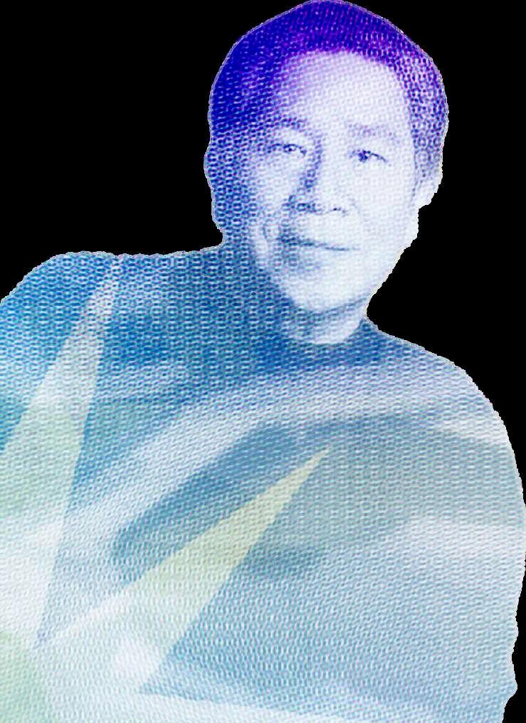
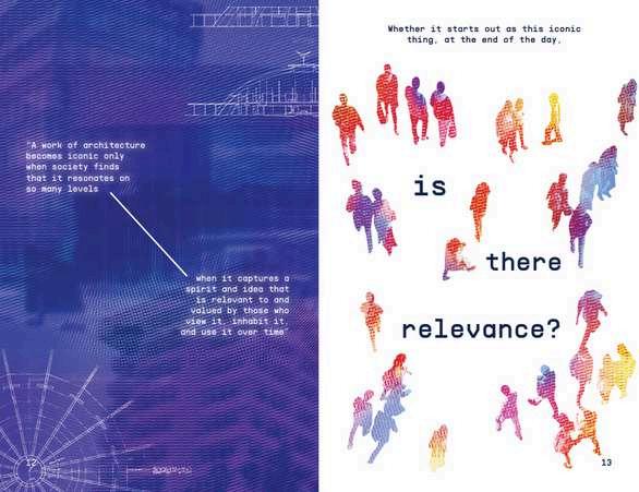
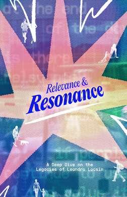
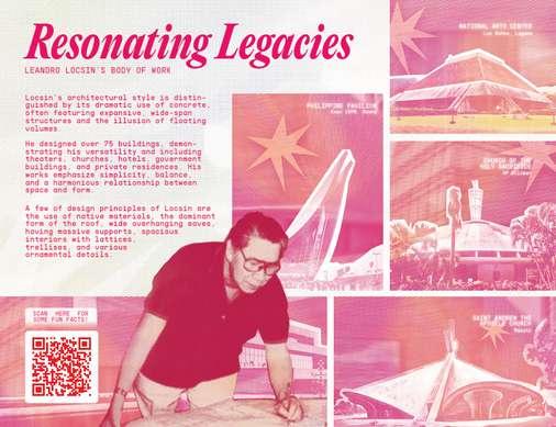
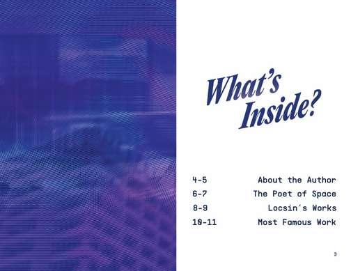
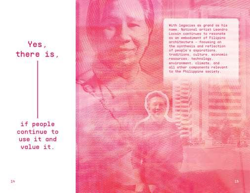
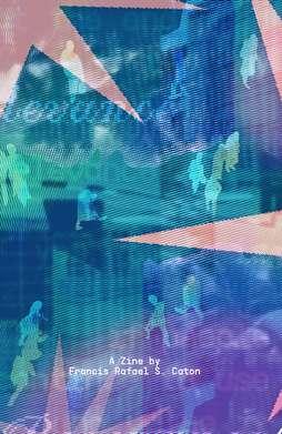
We were assigned to create a zine publication featuring a Filipino National Artist of our choice. This involves doing a lot of research and looking at various inspirations for the overall visuals of the zine. We are also free to incorporate our personal style and design principles that would reflect how we interpret the works and legacies of the our chosen National Artist.
I would like to express my gratitude to my instructor, Prof.Loren Villafuerte, for being generous with their time, patience, support, and criticism which helped make the best version of my work.
ZINE PUBLICATION PROCESS BOOK
by Francis Rafael S. Caton
CONTENTS
I.DEBRIEFING
a. Mind Maps
i. Choosing the National Artist
ii. Zine Visual Direction
II.RESEARCH
a. Literature Review
b. Zine Design Inspiration
c. Proposed Titles
III.ANALYSIS
a. Content Organization
b. Conclusions
IV.IDEATION
a. Visuals
b. Typography
c. Color Palette
V.DESIGNDEVELOPMENT
VI.EVALUATION
I.DEBRIEFING
I.DEBRIEFING
Mind Maps: Choosing the National Artist
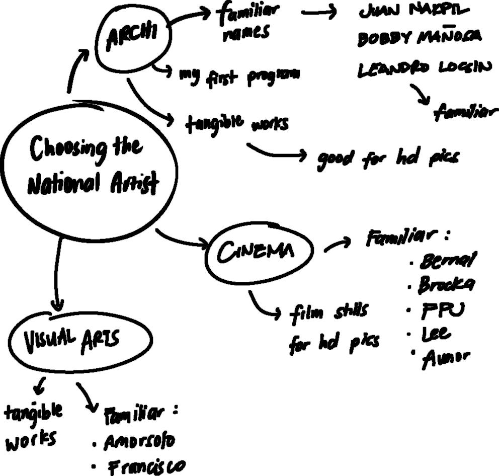
The debriefing phase of this project started with choosing the National artist that I will be studying and designing about. I listed the possible options that lean more on my artistic/creative preferences, namely visual arts, cinema, and architecture. Having a few years of experience with studying the architecture program, I tried to consider it since some names from the list of national artists are already familiar to me. After some considerations, I eventually decided to go for architect LeandroLocsin as my chosen artist.
I.DEBRIEFING
Mind Maps: Zine Visual Direction
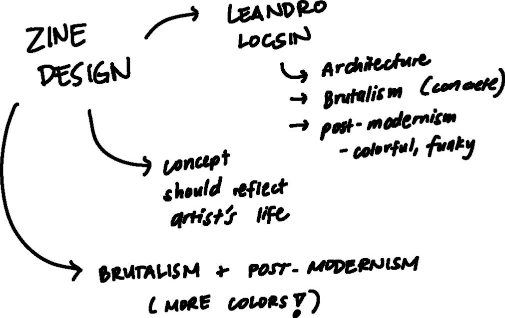
After choosing an artist, I then tried to dump some key words that I know are related to Leandro Locsin. This led me to map out some concepts that I can incorporate to the overall visual direction of my zine. I am interested in going for the colorfulandexperimentalsideofpost-modernism, which ties with Locsin’s design principles.
II.RESEARCH
II.RESEARCH
Literature Review: Summary
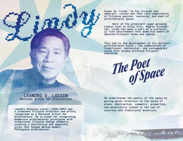
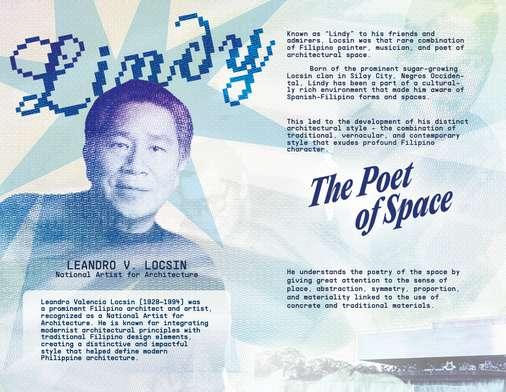
Known as “Lindy” to his friends and admirers, Leandro Locsin was that rare combination of Filipinopainter,musician,andpoetofarchitecturalspace. Born of the prominent sugar-growing Locsin clan in Silay City, Negros Occidental, Lindy has been a part of a culturally rich environment that made him aware of Spanish-Filipino forms and spaces.
This led to the development of his distinct architectural style - the combinationof traditional,vernacular,andcontemporarystyle that exudes profound Filipino character.
He understands the poetryofthespace by giving great attention to the sense of place, abstraction, symmetry, proportion, and materiality linked to the use of concrete and traditional materials.
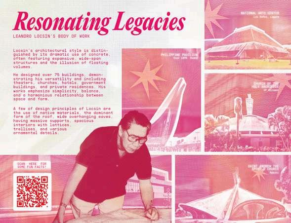
Locsin's architectural style is distinguished by its dramaticuseofconcrete, often featuring expansive, wide-span structures and theillusionoffloatingvolumes. He designedover75buildings, demonstrating his versatility and including theaters, churches, hotels, government buildings, and private residences. His works emphasize simplicity, balance, and a harmonious relationship between space and form.
II.RESEARCH
Zine Design Inspirations
CONCEPT1
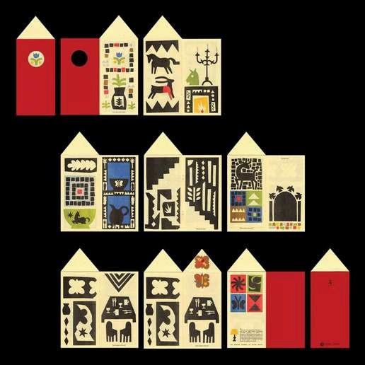
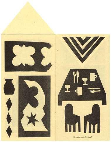
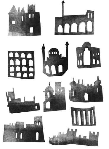
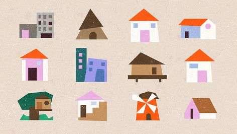
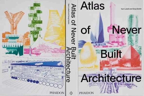
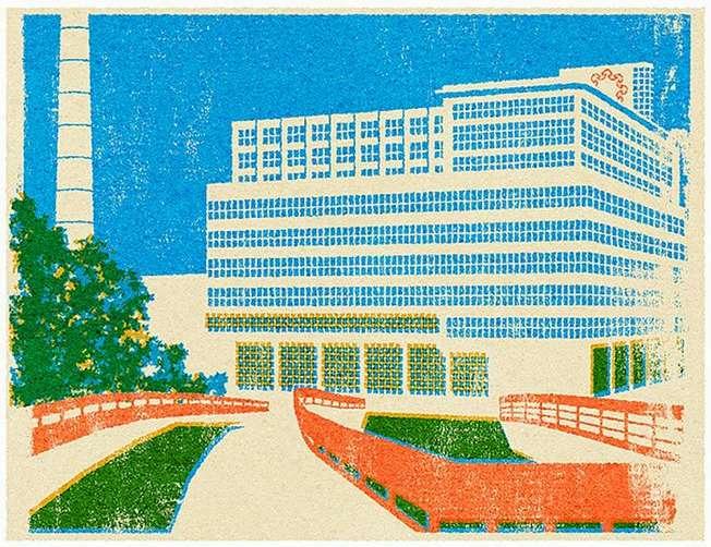
My initial design inspiration follows this papercutoutconcept, where involves a lot of textures, geometric and sharp edges, color and contrast, and icons of buildings instead of using actual pictures. I like how the structures are simplified, and I planned to make Locsin’s works in this style
II.RESEARCH
Zine Design Inspirations
CONCEPT2
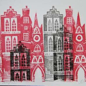
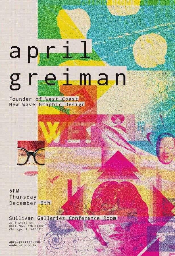
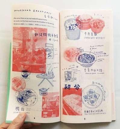
The second concept follows a risoprint-likegraphics, which plays around with textures, colors, and overlays of images. I think that this style follows postmodernism better compared to the first one.
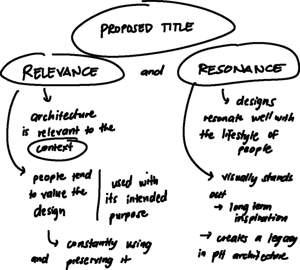
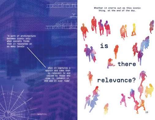
Upon going into extensive research about Locsin and his works, some words tend to be emphasized more when talking about the relationshipofacommunity’s architectureanditsusers.
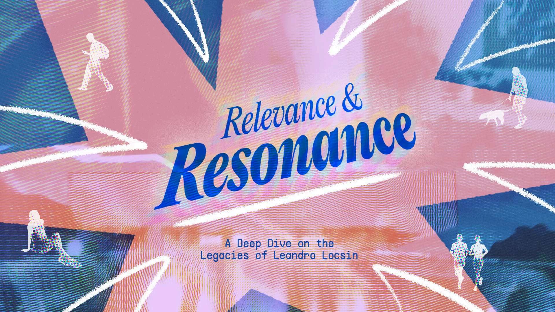
These recurring words are “relevance” and “resonance”. I tried to connect them with my concept, and I think it fits well. In this case, I decided to make the phrase “relevance andresonance” as my title and central concept of my zine.
III.ANALYSIS
III.ANALYSIS Content Organization and Conclusions
After the research phase, I started drafting out the content of my zine. I referenced the flow of the content from the requirement of our second summative project. I wrote the necessary descriptions about the national artist, his body of work and some of the notable works, his most famous work, and some things about his legacy that lasted an impression at least for me.
In this case, I concluded that I will be featuring not just Locsin’s tangible works, but his resonating legacies as well. This includes his design styles and principles that are still referenced and practiced today.
Another is that I will follow a visual direction that combines the contrasting brutalist and post-modernist aesthetics in order to create something experimental, akin to Locsin’s style. This involves a colorful palette, lots of textures, and creative yet professional typography.
IV.IDEATION
IV.IDEATION Visuals
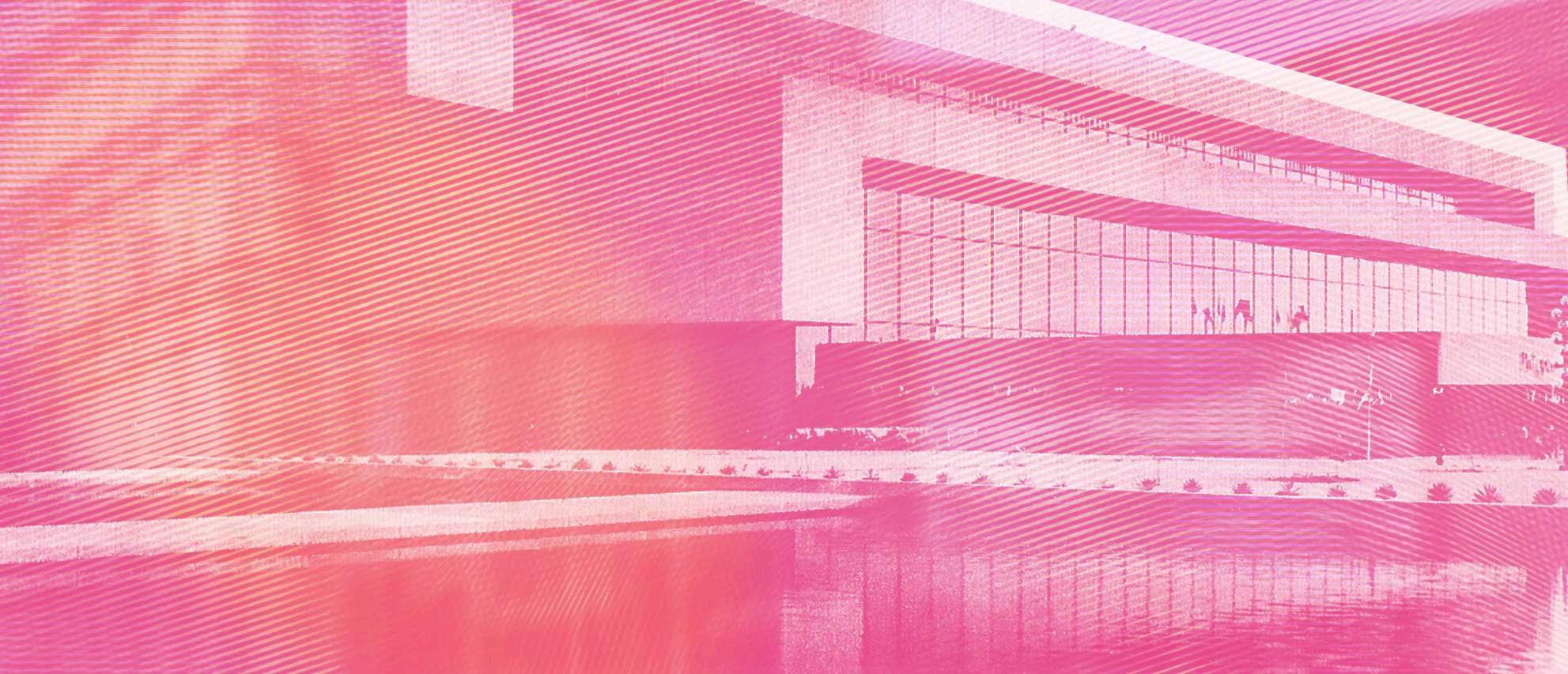
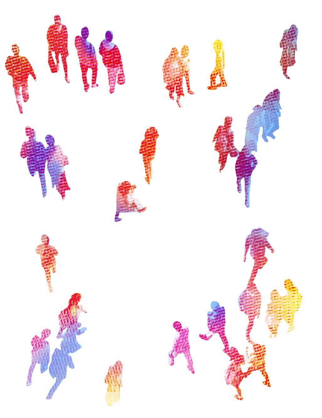
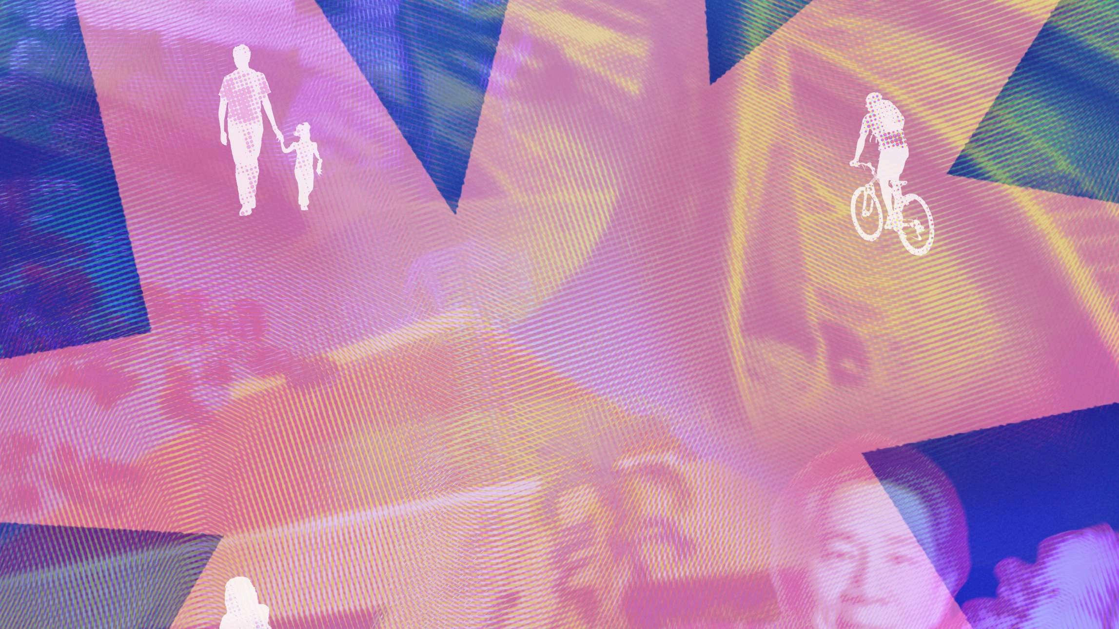
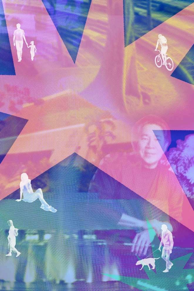
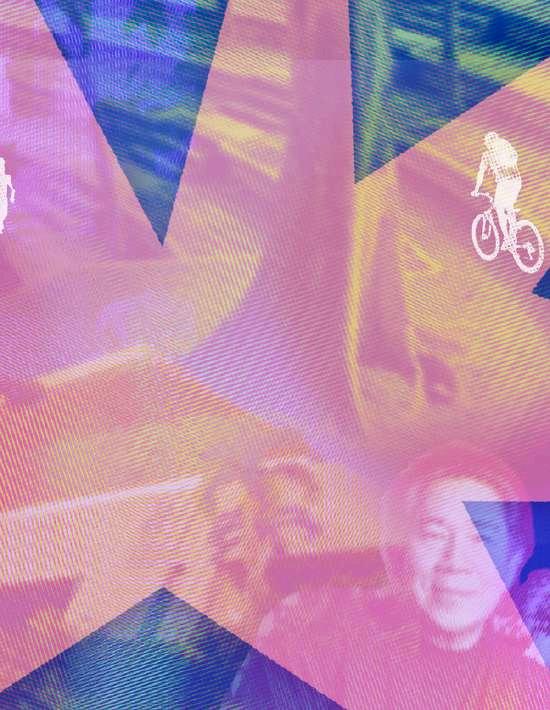
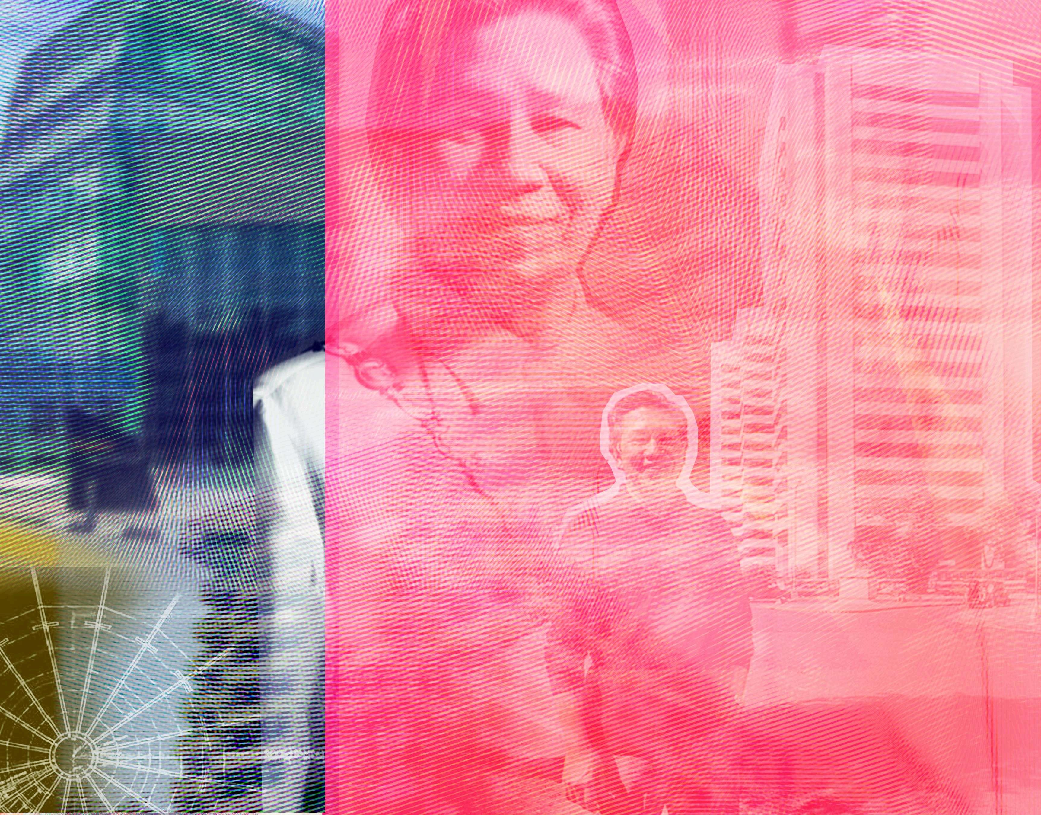
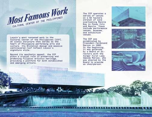
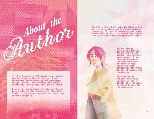
Across the term, I was able to generate this type of graphics for my zine cover, and eventually, the whole zine publication. I initially made the design by merging different images as background and added colors and halftone textures. I was satisfied with this visual so I continued doing it up until the final project. I made background variations based on my color palette, allowing a variety of graphics yet still remaining cohesive with my theme.
IV.IDEATION Typography
These are the typefaces that I used for my zine project. Initially, I used the EditorialNewmainly for titles and main texts, while the SupplyMono was used for body texts. I recently added the PixelScript to add a more experimental look to the overall typography, which is mainly used as an accent or display text. I think the combination of the fonts give off a very creative and adventurous vibe, yet keeping it professional.
IV.IDEATION
I personally prefer to not follow a strict color palette for this project. This way, I have more freedom when it comes to exploringtheblendingmodeof the images and other colors present in my designs. Mixing the colors by using the overlay options is also a fun way to figure out how the visual elements would look. Despite not having a specific palette, I still followed a range of hues, with blue,pink,andyellow as the base colors.
Color Palette
V. DESIGN DEVELOPMENT
V.DESIGNDEVELOPMENT
InitialDesign
FirstIteration
SecondIteration
FinalDesign
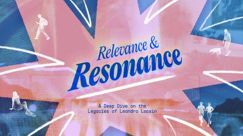
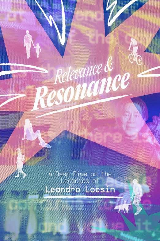
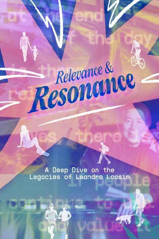
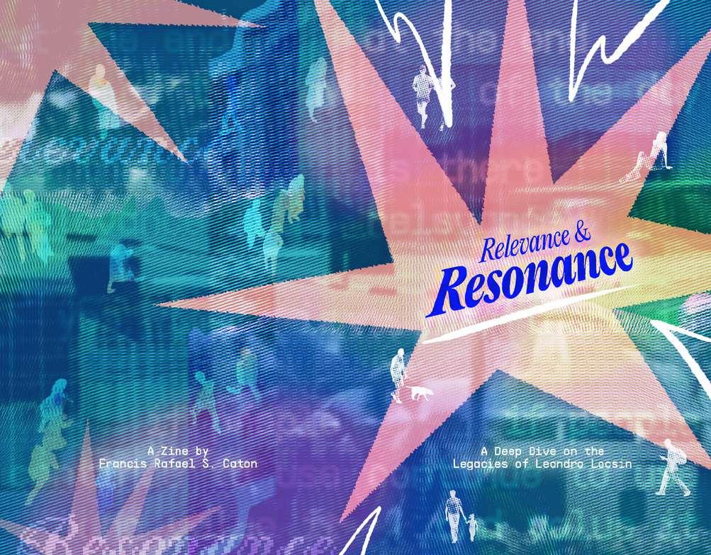
These are my designs for the zine cover. The first one is the background I used for my initial design. The first iteration involves texts and other graphic elements in white, which I thought were legible enough. After some consultations from my instructor, I revised the main text color into blue to create better contrast with the background. I was satisfied with the second iteration, until I created an extended background for my zine covers, which made it to the final product.
V.DESIGNDEVELOPMENT
PresentationSlides
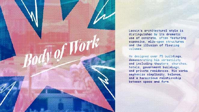
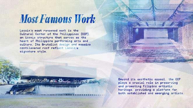
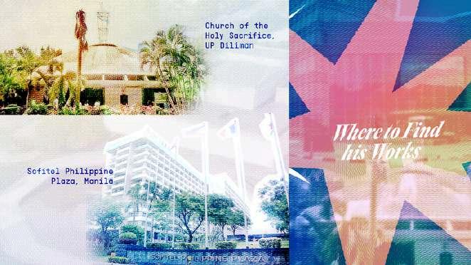
I also made revisions with the layout that I used from my presentation of the same topic. I had fun exploring different layouts and compositions, and it gave me more freedom to try something new and unconventional.
I liked the ones that I made for the slides, but I think I like the layout of the zine pages more.
VI.EVALUATION
VI.EVALUATION
After working meticulously and with keen attention to detail, I was very satisfied with how my final zine project looked. Even though I still recognize and acknowledge that some parts need to be improved, I can say that this is something that I can be proud of. I like how the colors of the pages are alternating in blue and pink, with white as a color in between them to create contrast. I am also glad that I got to experiment with a new art style and explore a software that is unfamiliar to me. This semester-long process may be tiring, but still enjoyable nonetheless.