6.6.26–25.7.26 WITHHANSONHO
HE WRITES STRAIGHT WITH CROOKED LINES
FOST Gallery, Singapore
Hanson Ho
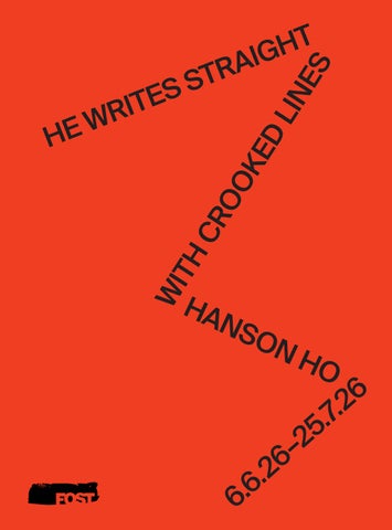
6.6.26–25.7.26 WITHHANSONHO
Both are seen as acts of human creativity. Yet, art and graphic design have long been regarded as related but different disciplines. The former celebrates personal expression and is sometimes highly subjective in nature. In contrast, the latter has traditionally been in the service of a client and is expected to deliver objective results, be it communicating a message or delivering a service that leads to positive outcomes. Design even used to be called “commercial art”—a definition that continues to sum up the divide for many. How then should we approach HE WRITES STRAIGHT WITH CROOKED LINES, an exhibition of artworks by renowned Singapore graphic designer Hanson Ho? Since 1999, he has been running the creative studio H55 (pronounced “H Fifty Five”). His works have been recognised by top design awards from London, New York and Tokyo. In 2012, Ho was also awarded the President*s Design Award Designer of the Year, Singapore’s highest honour for the design industry.1 By these standards, Ho is the epitome of a successful “commercial artist”.
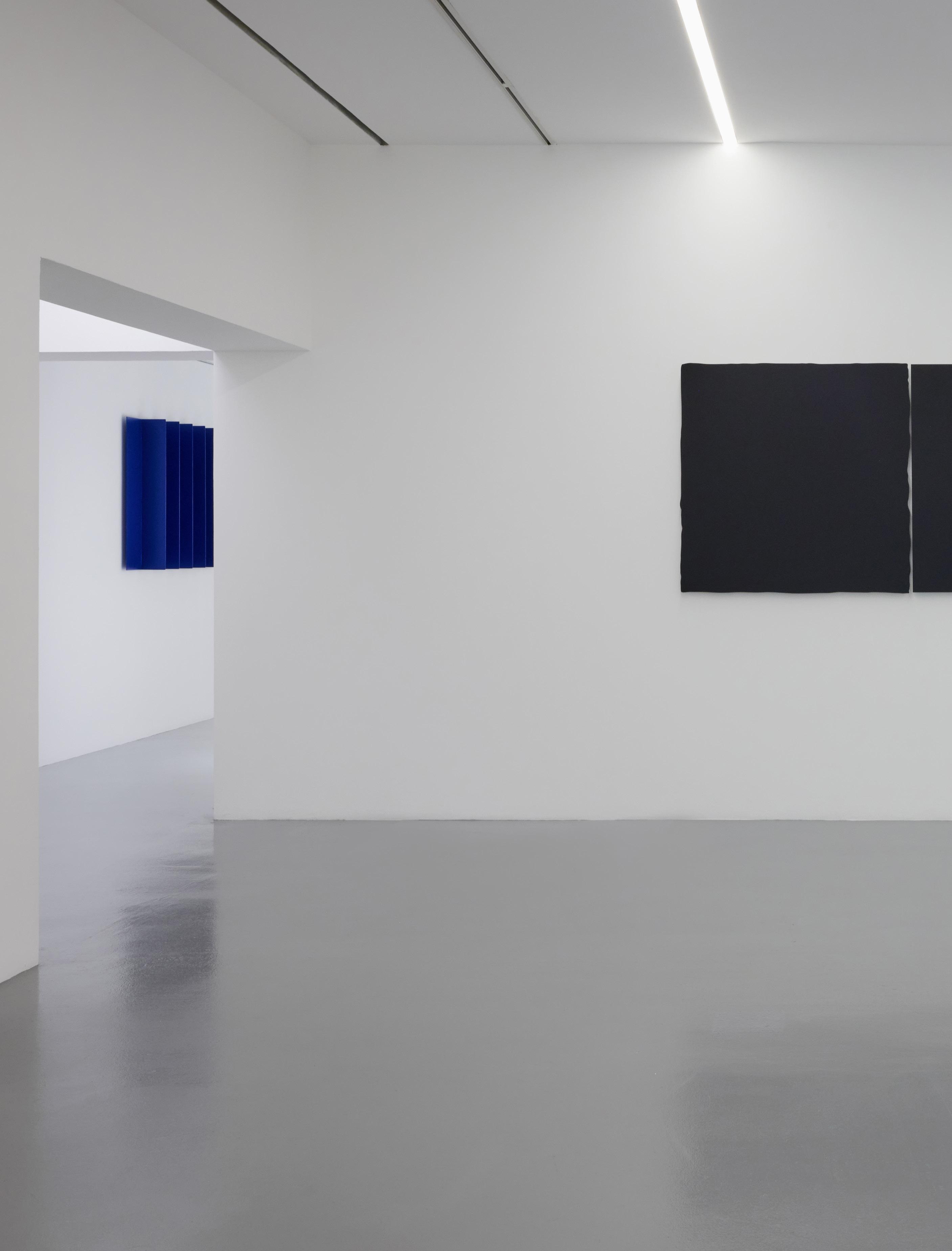
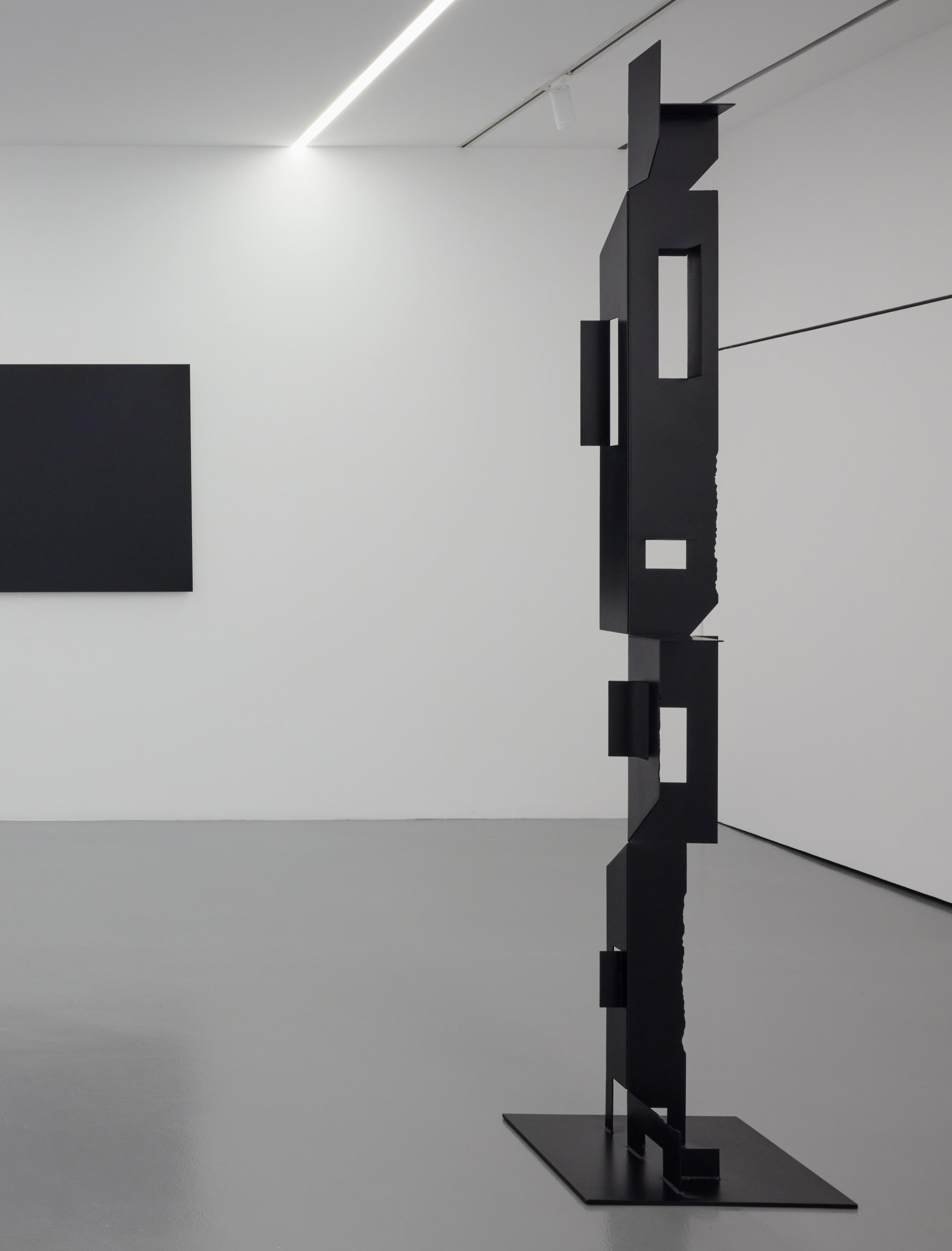
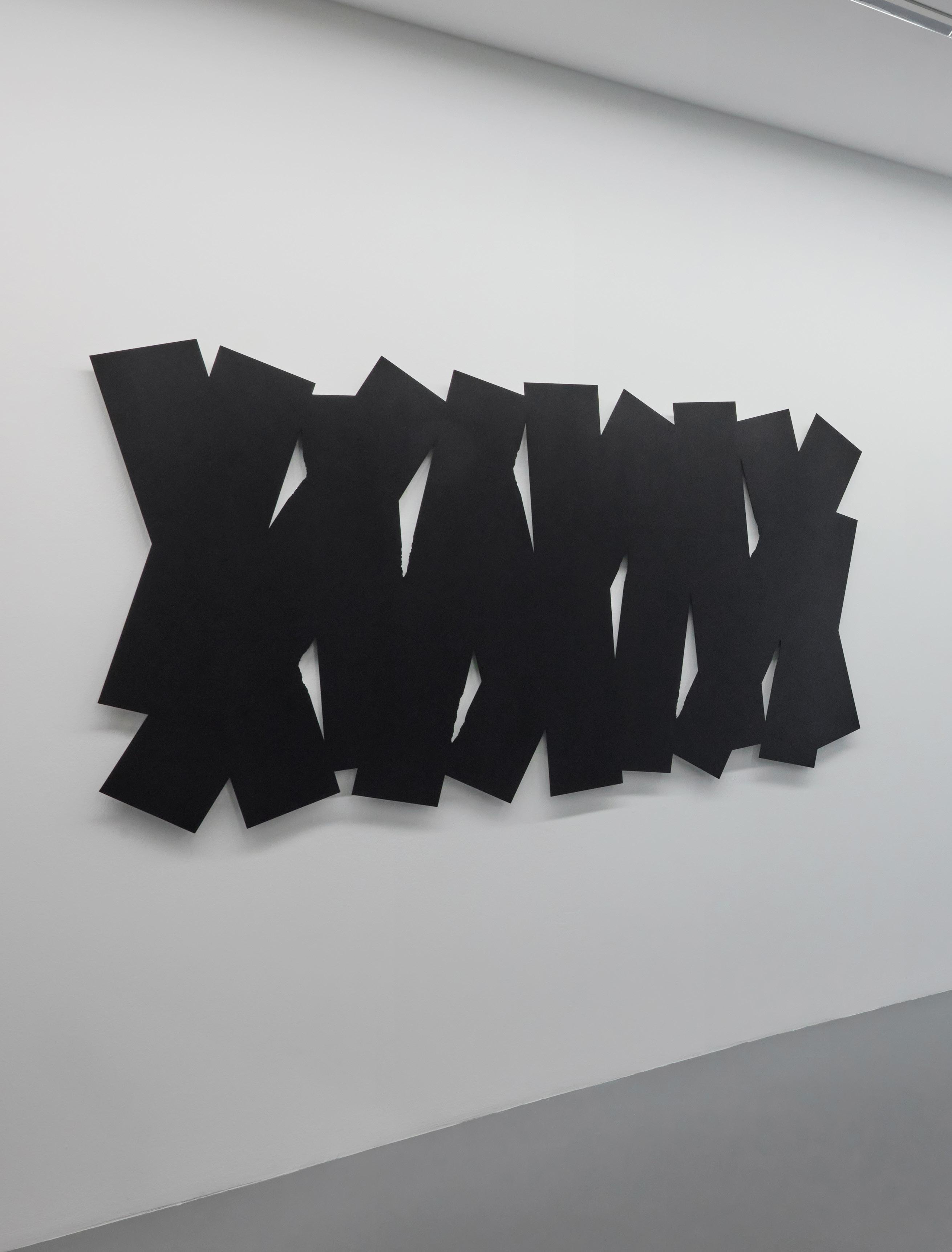
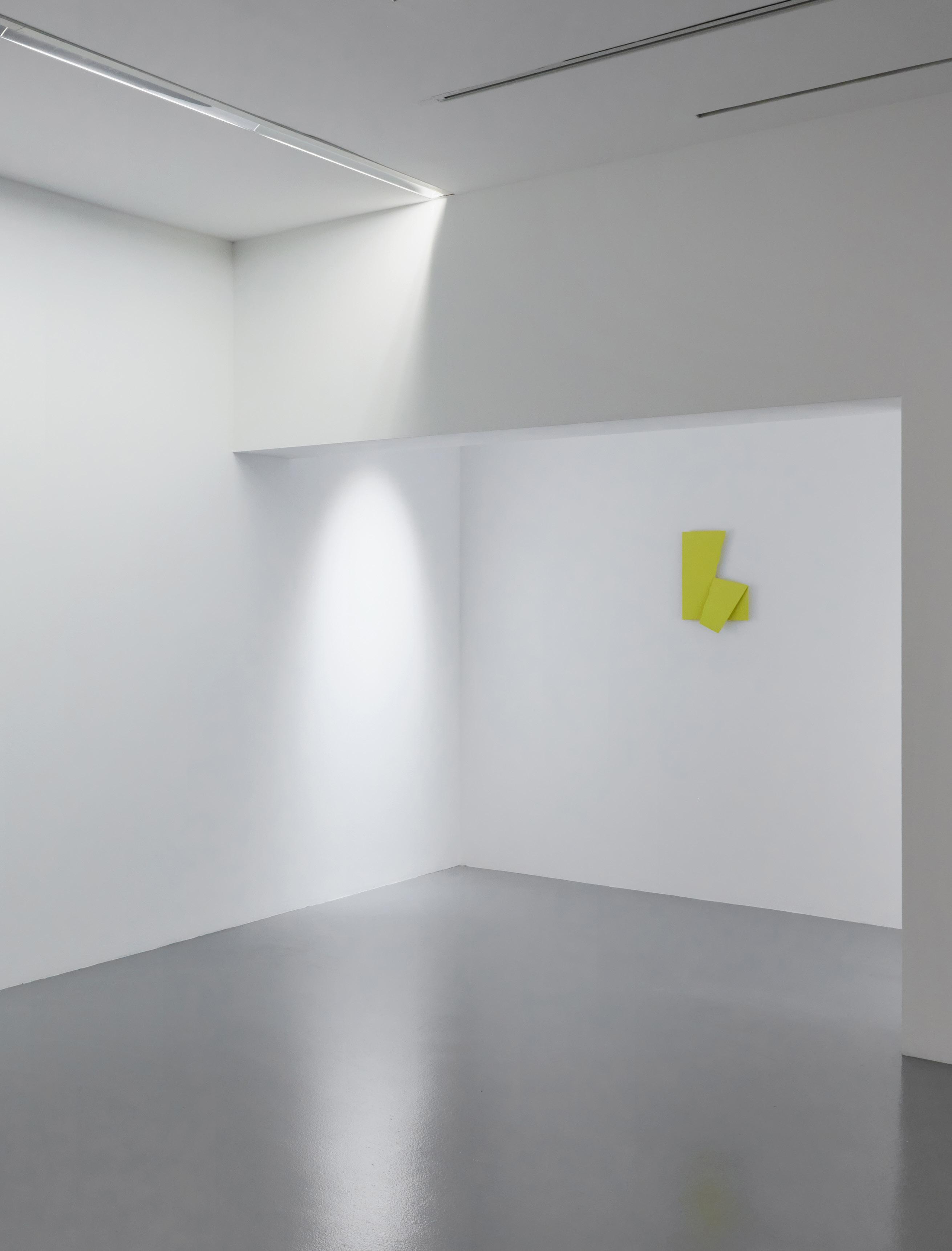
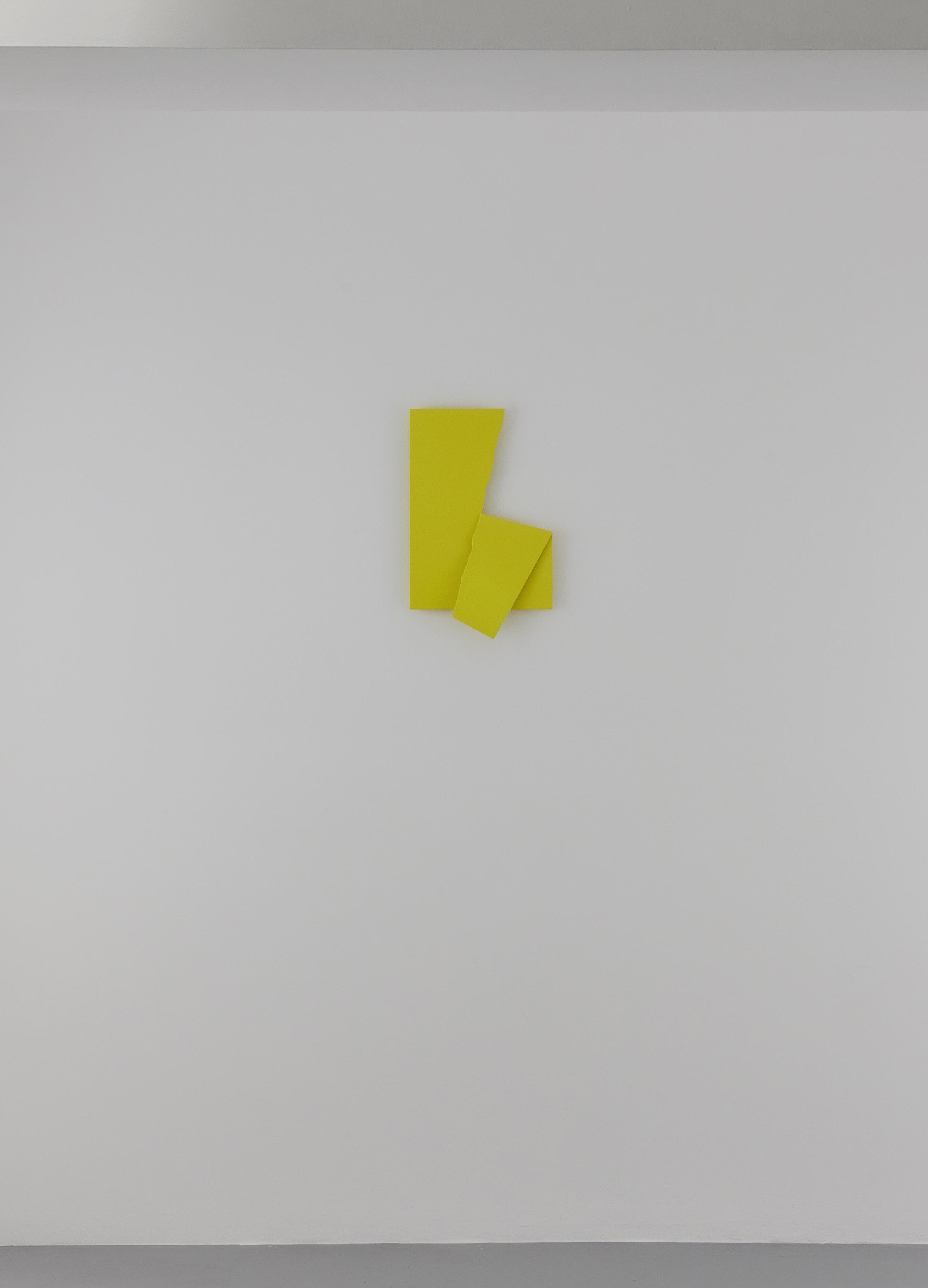
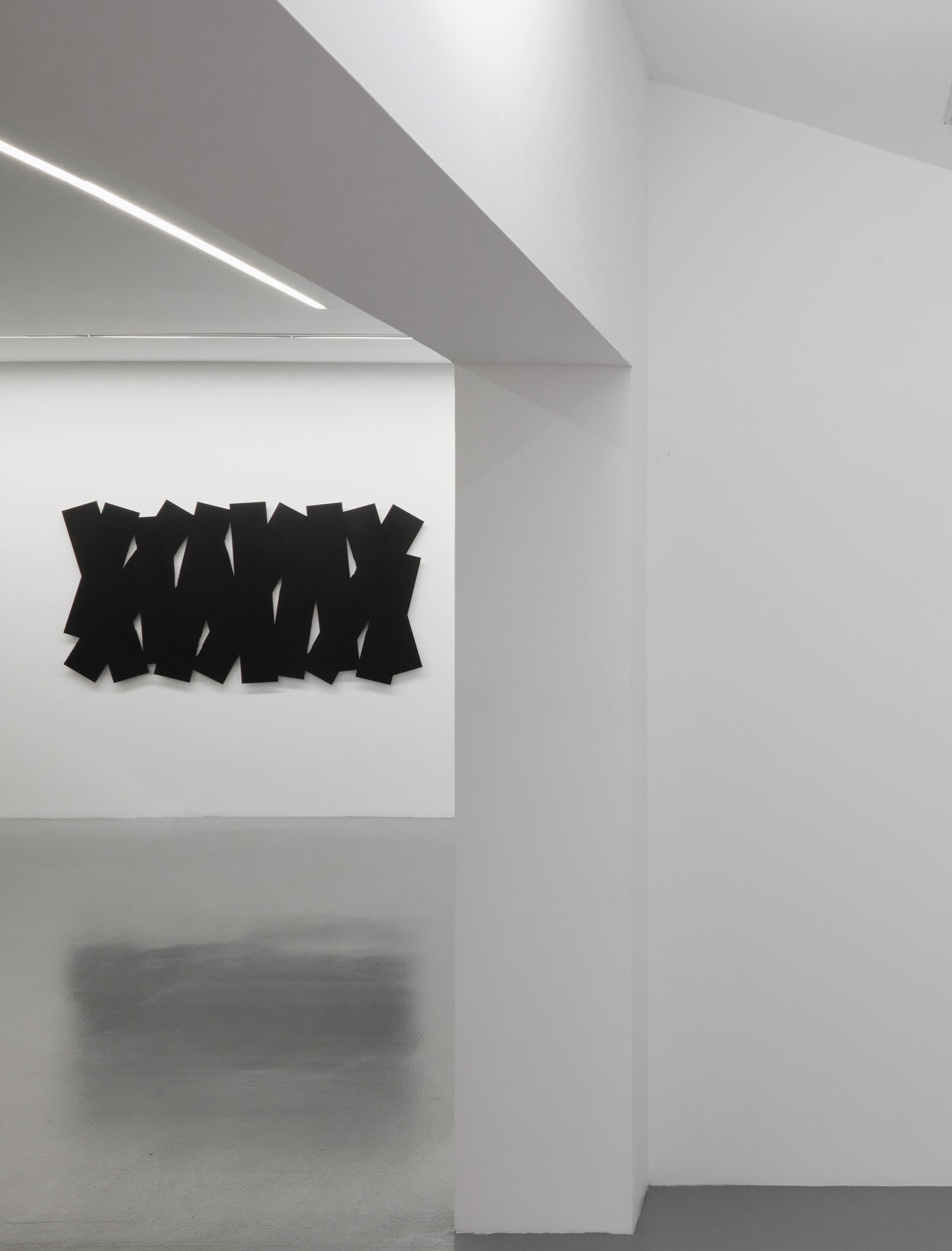
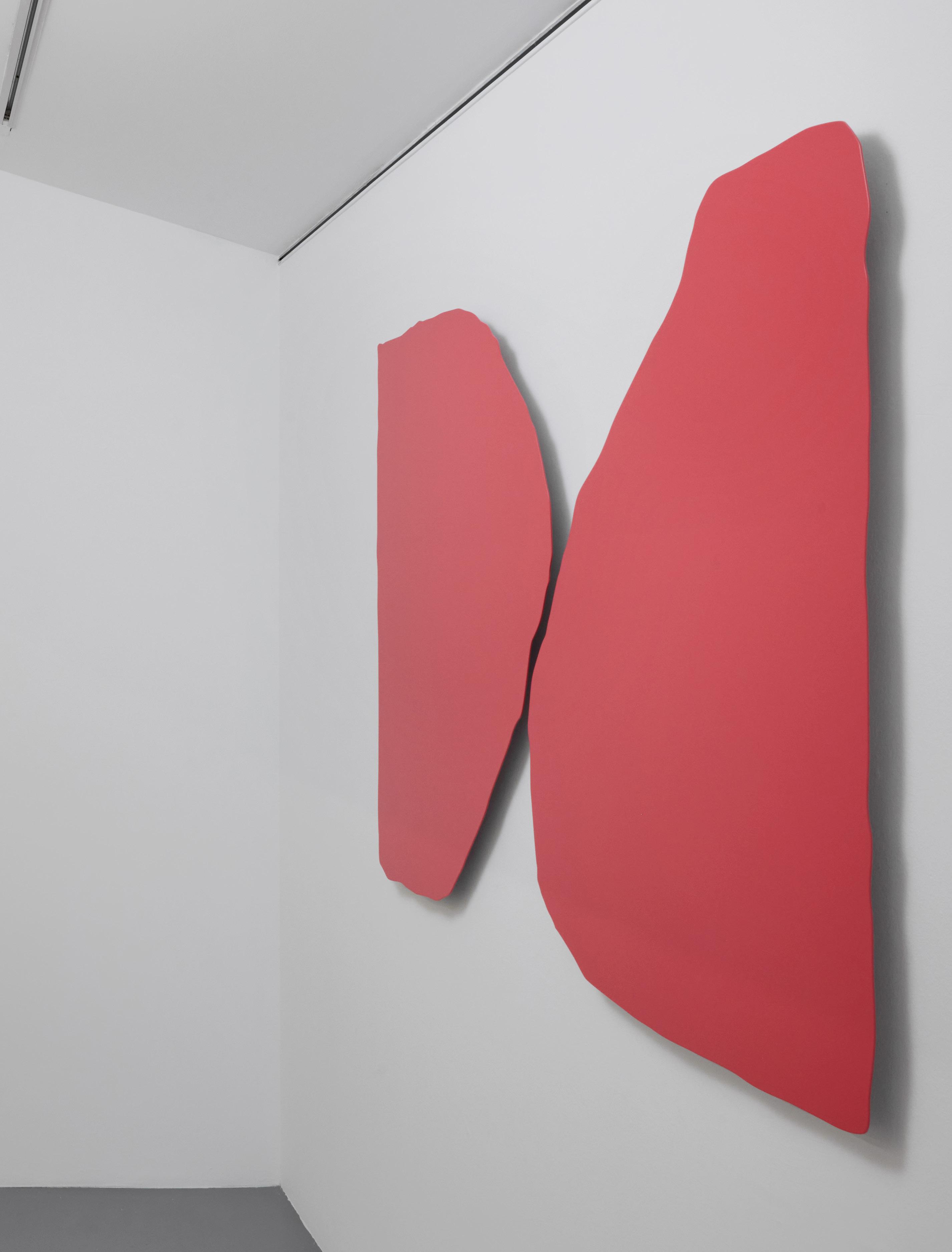
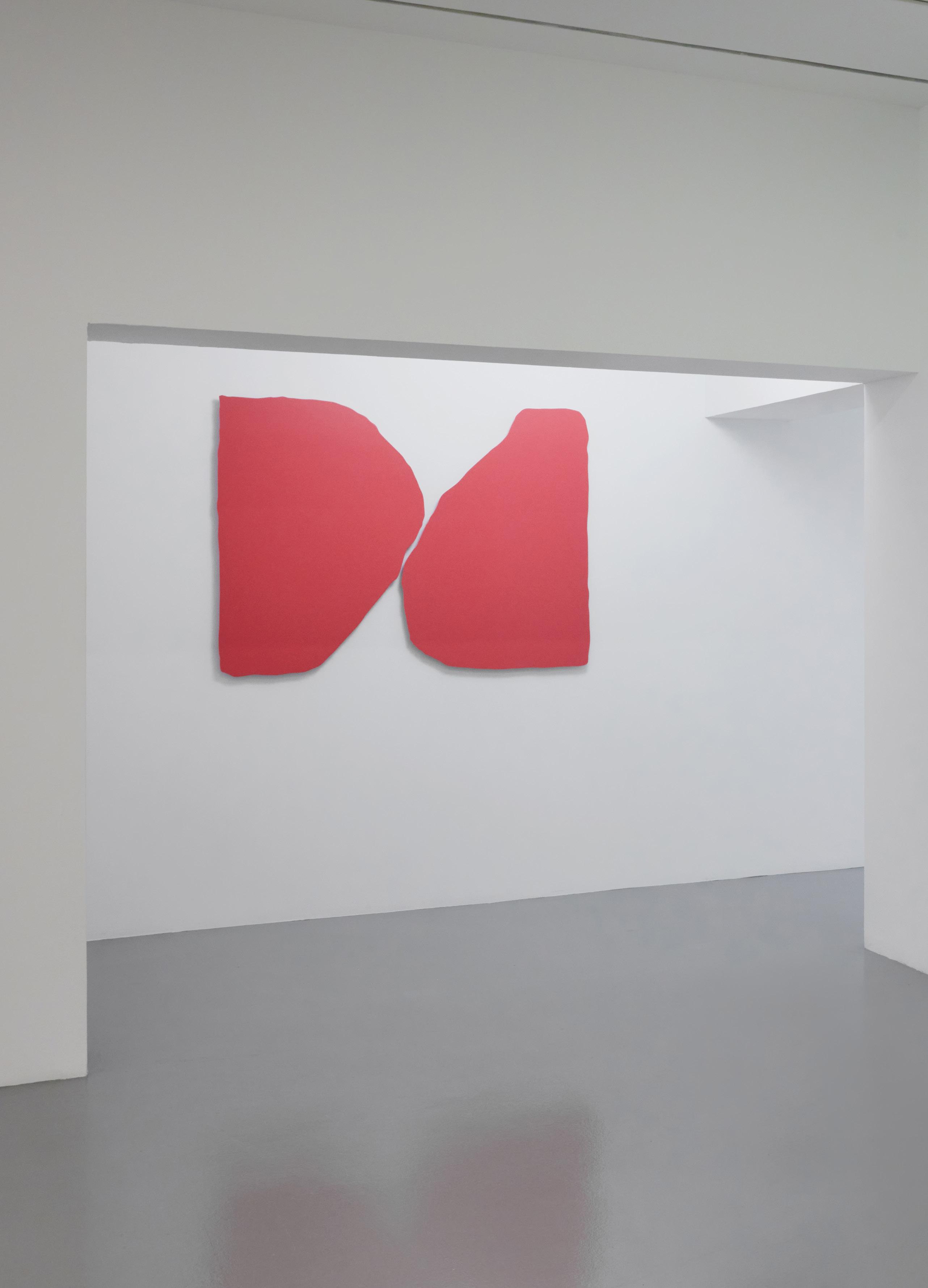
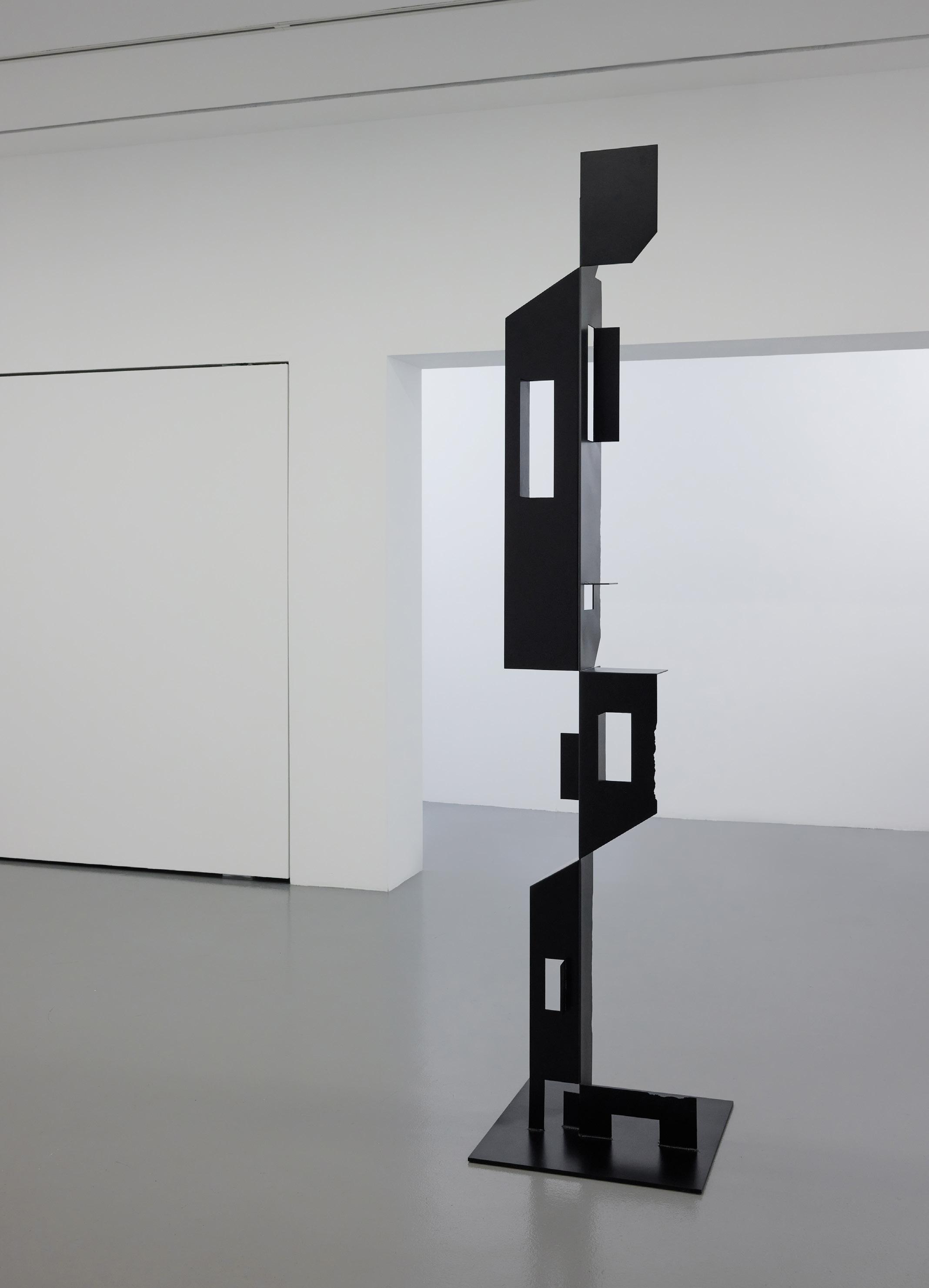
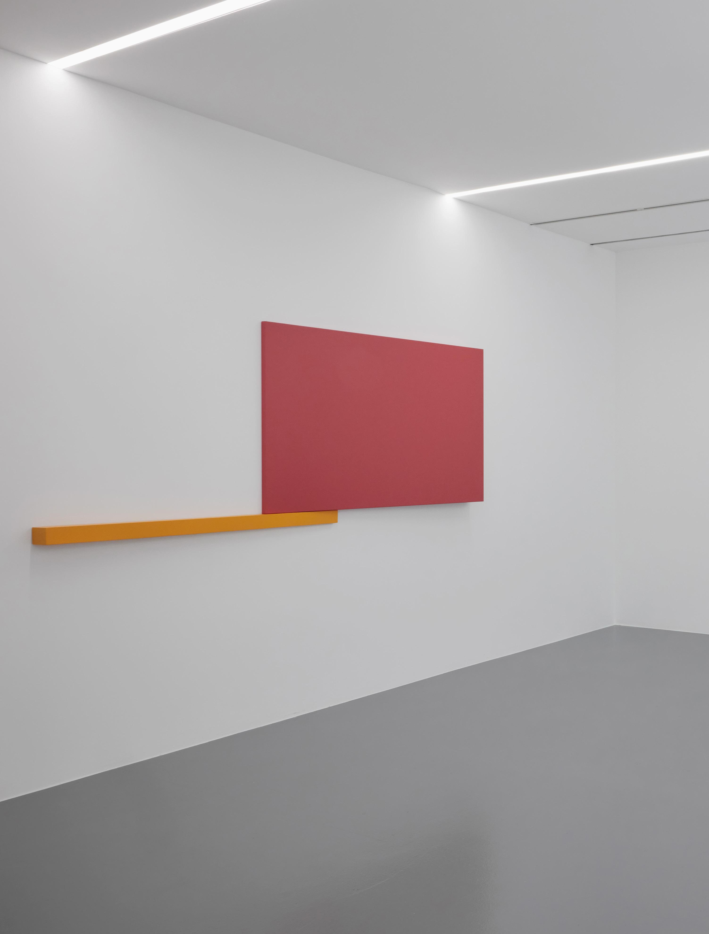
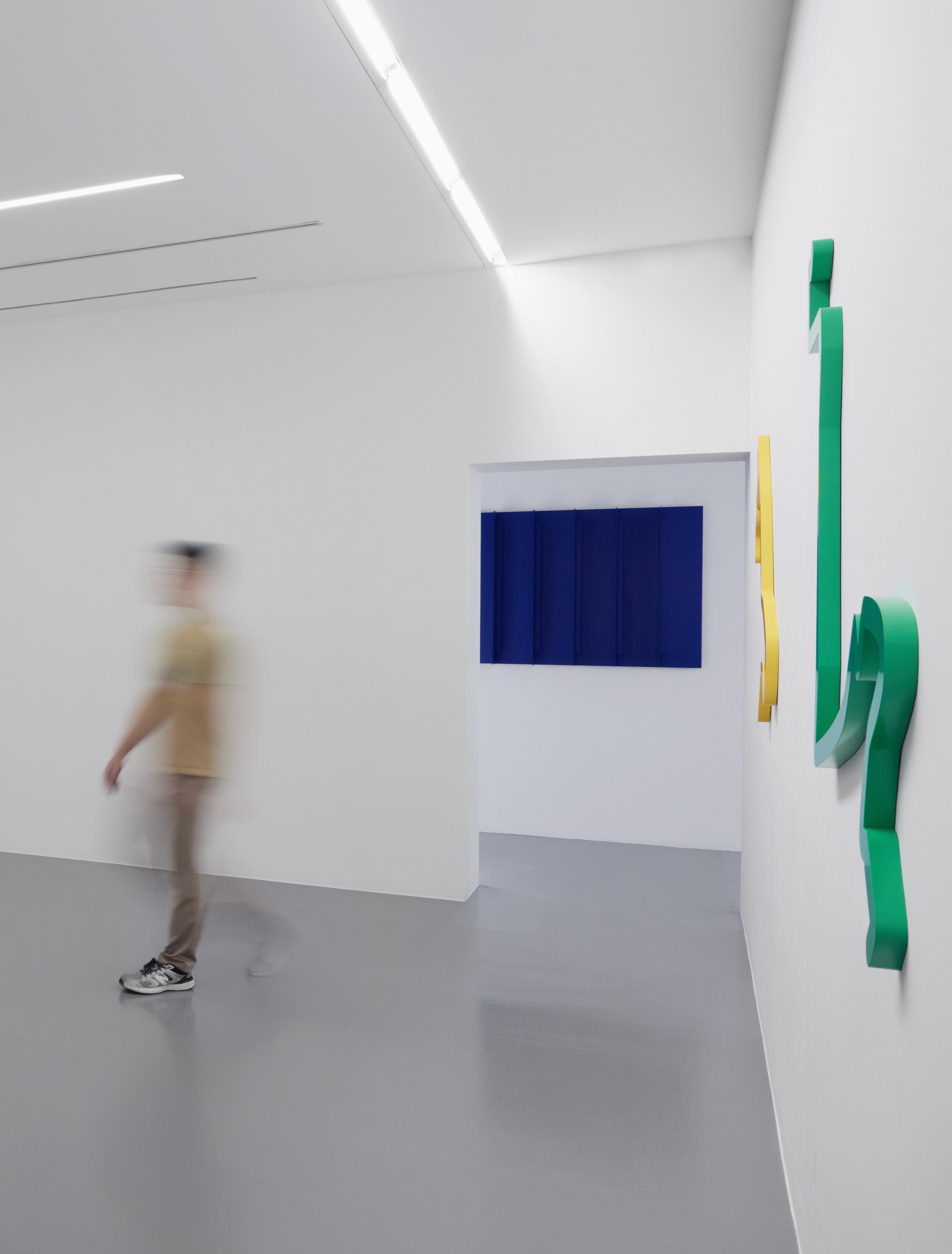
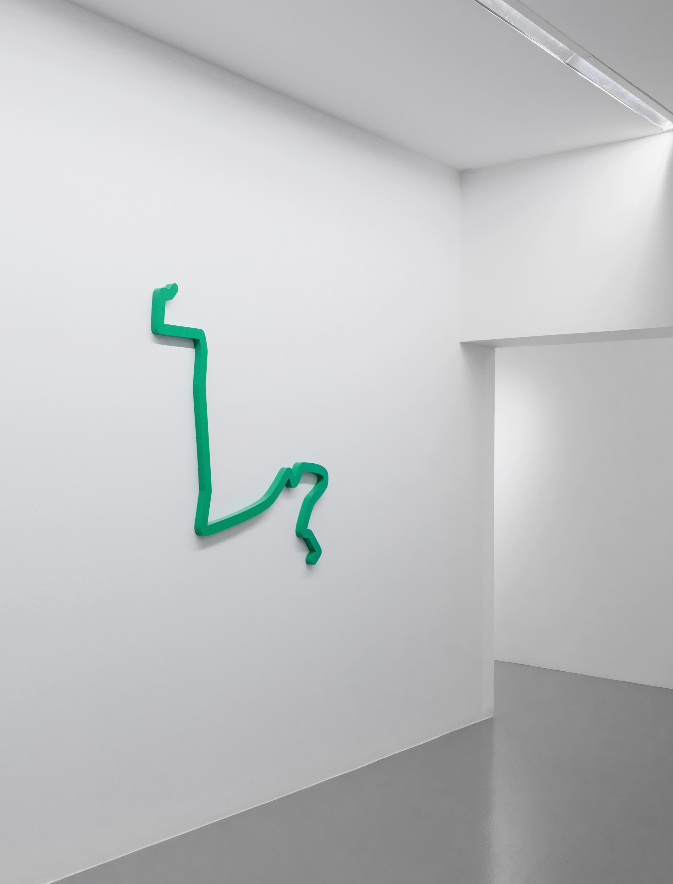
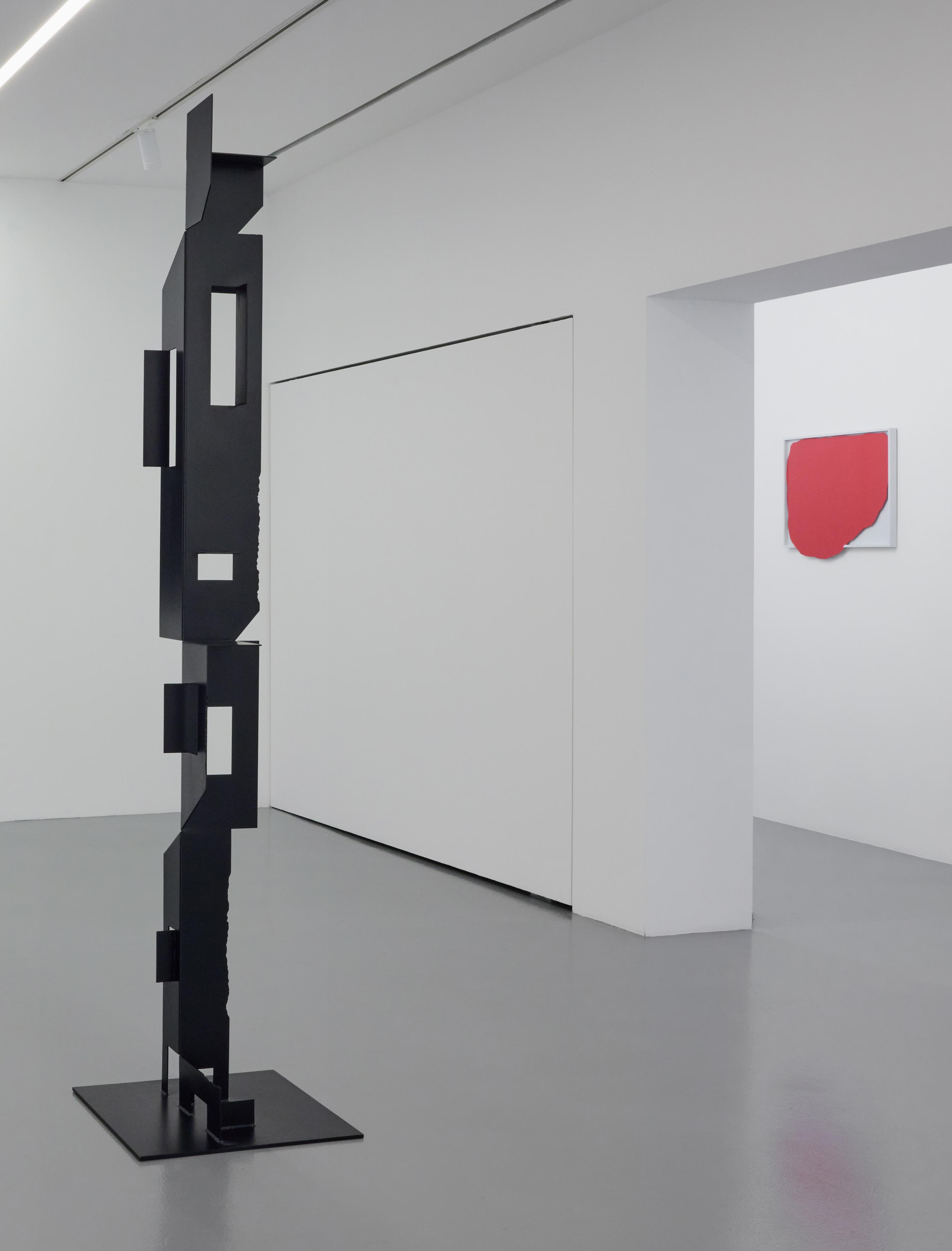
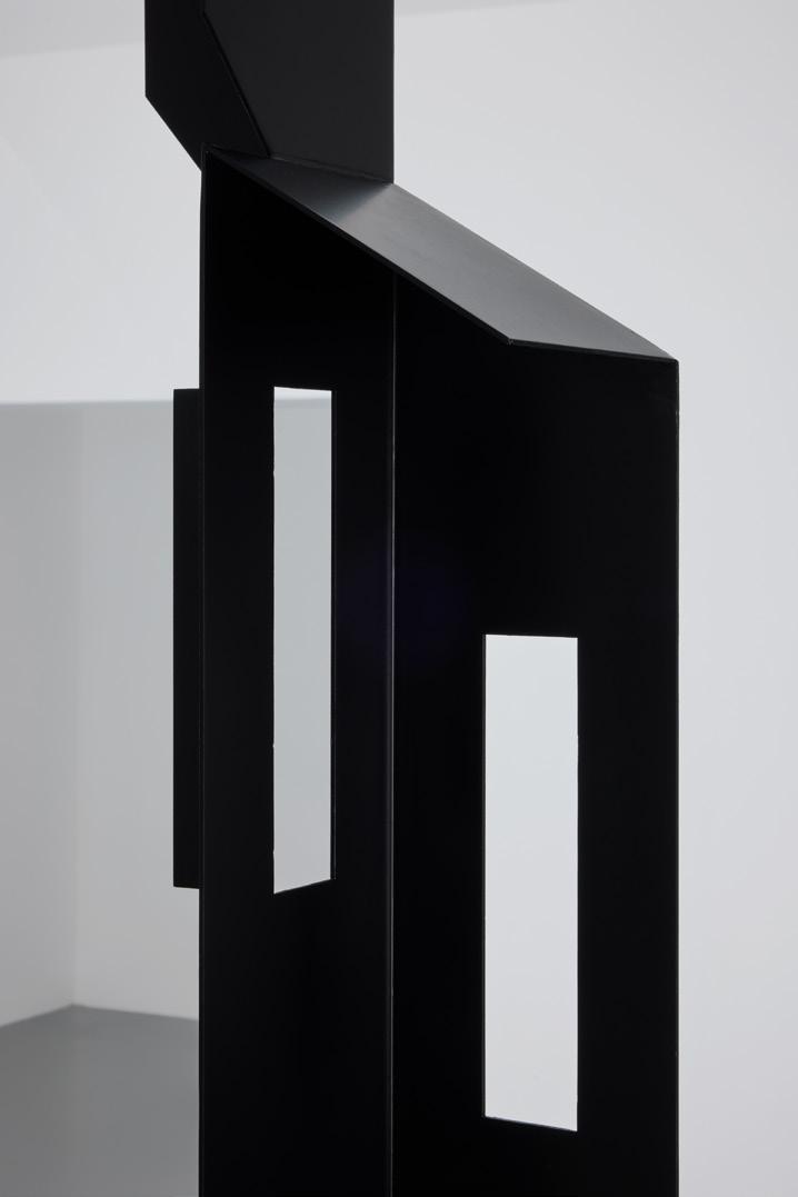
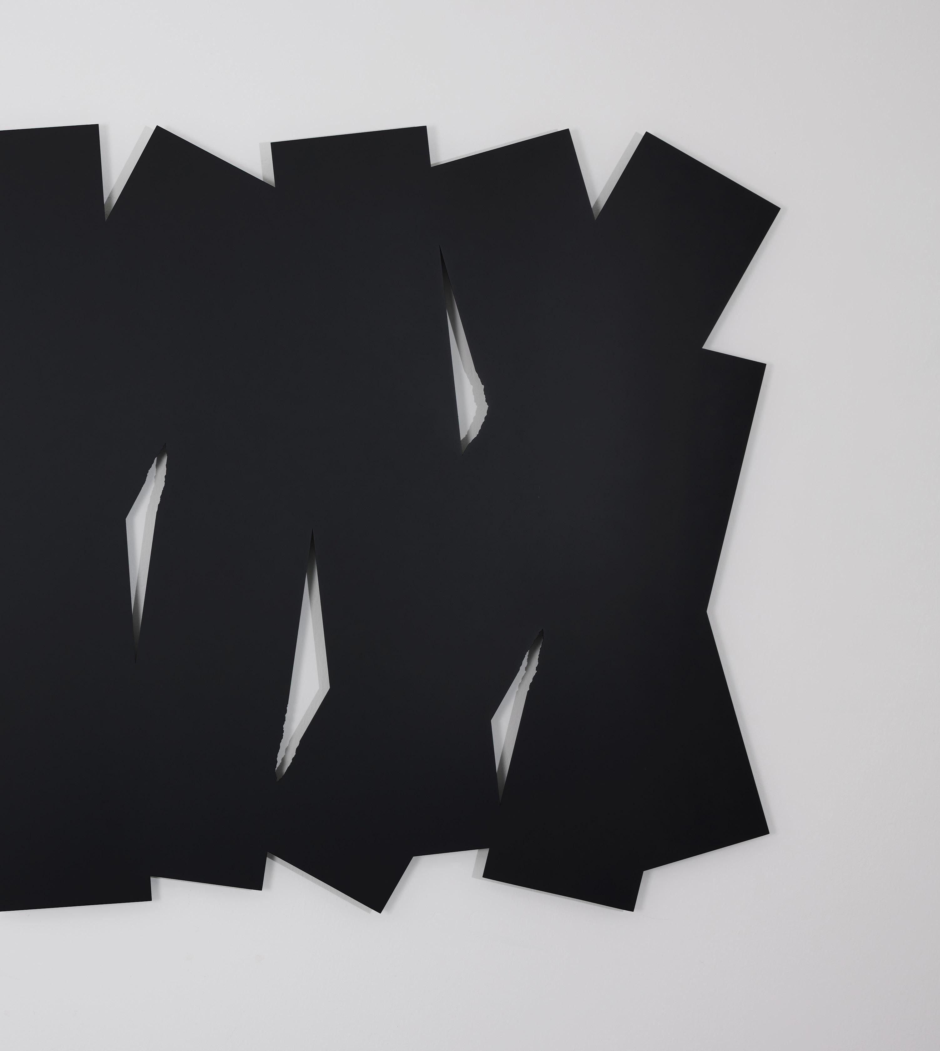
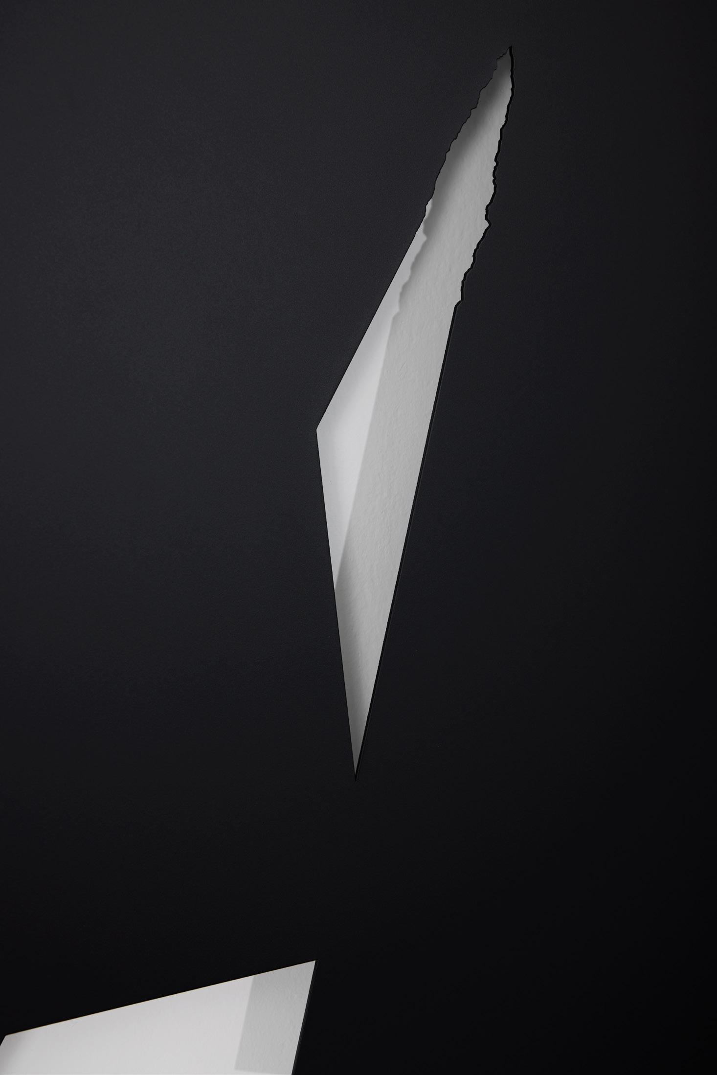
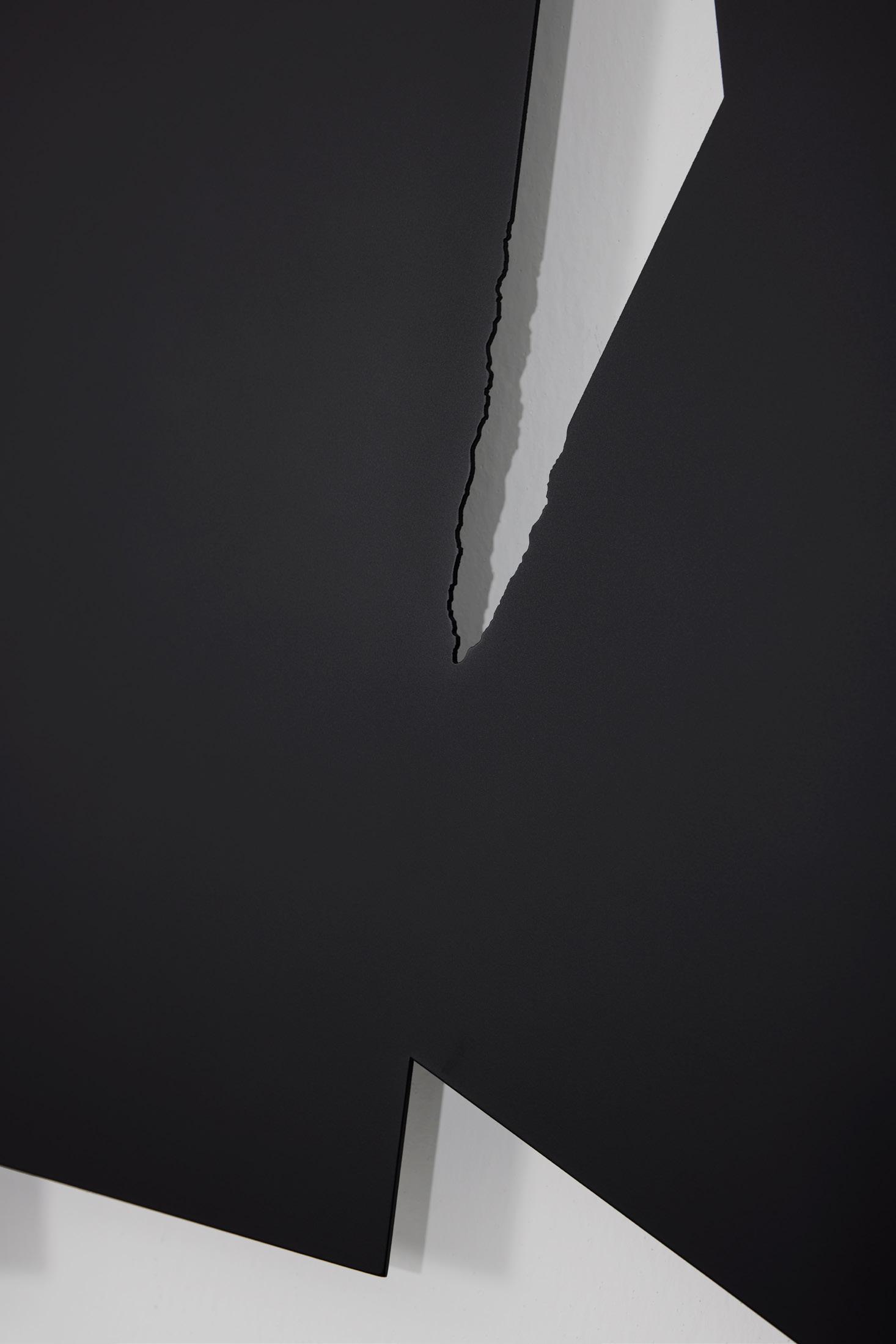
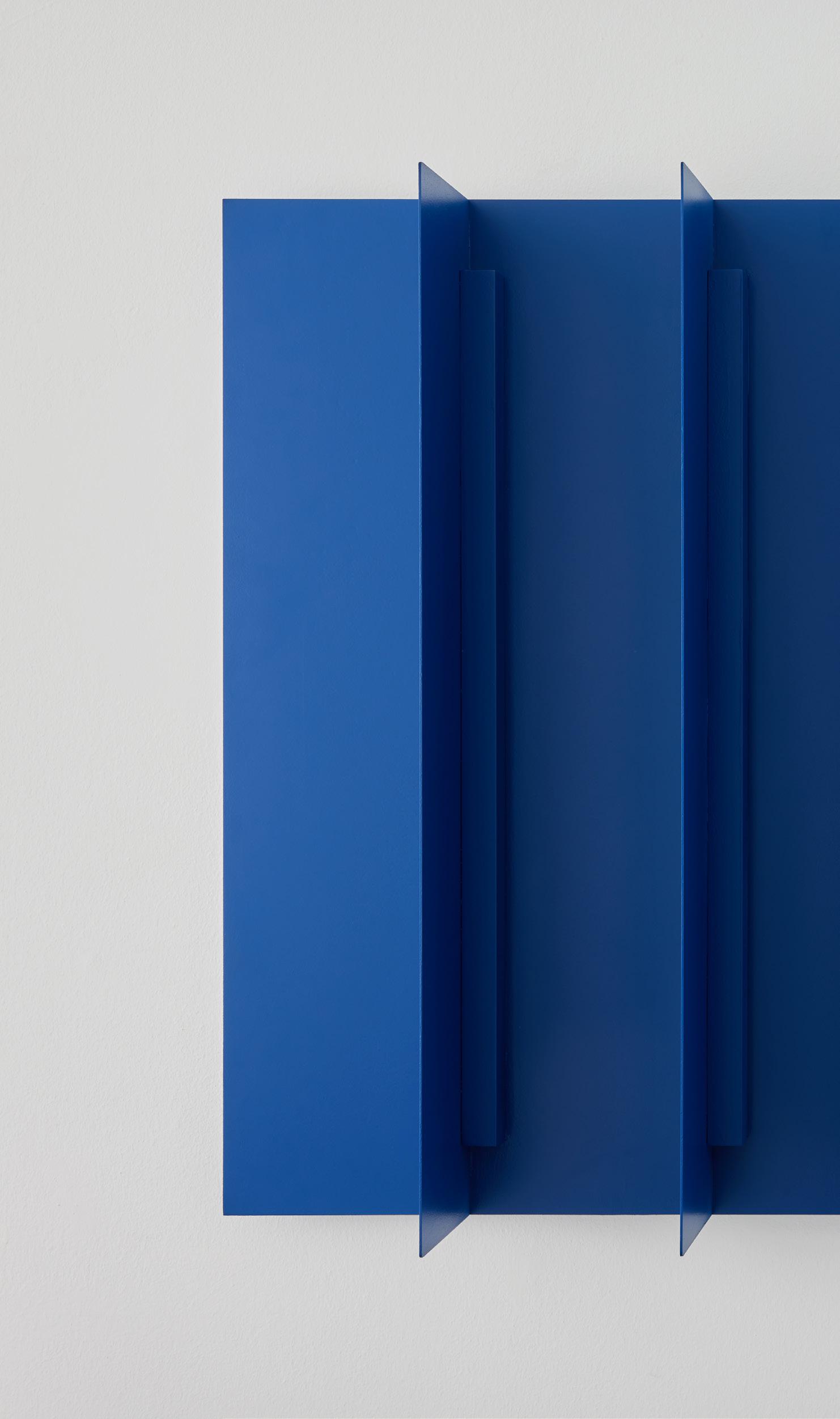
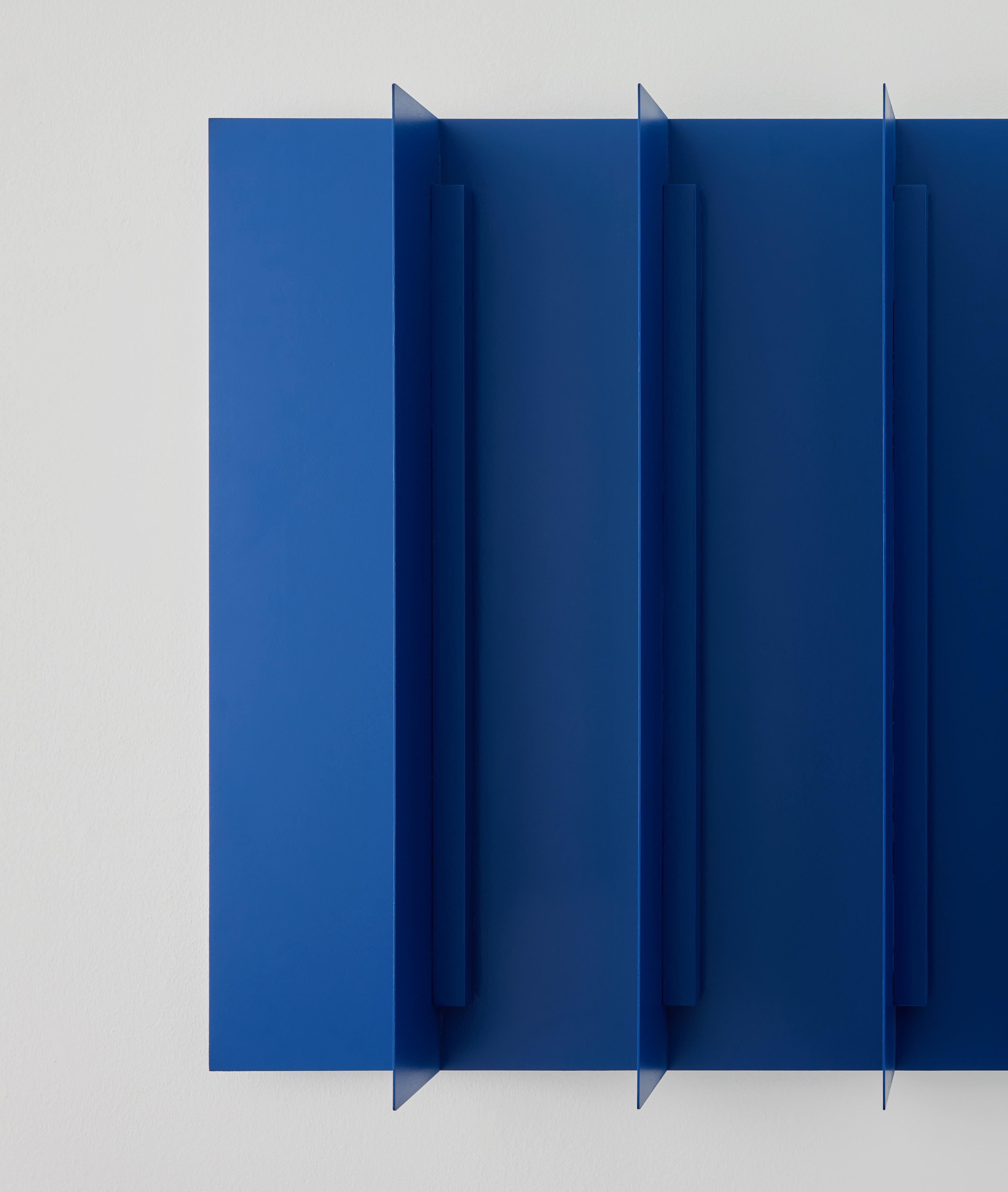
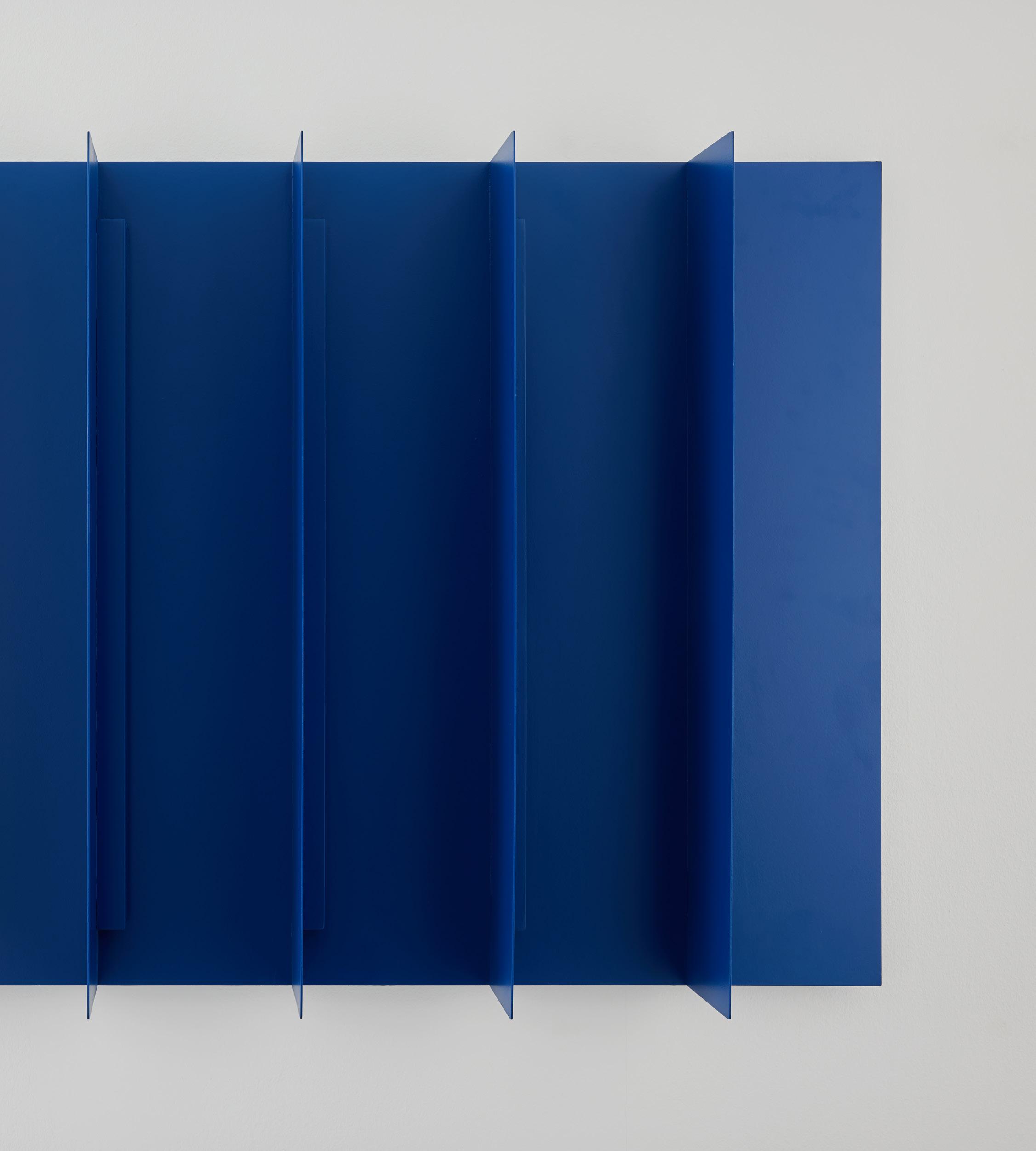
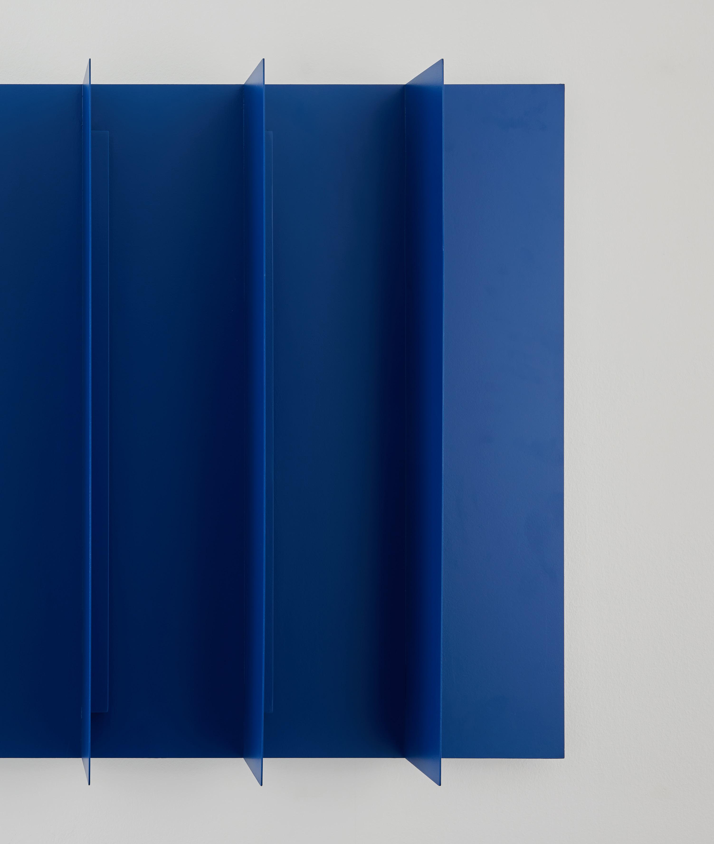
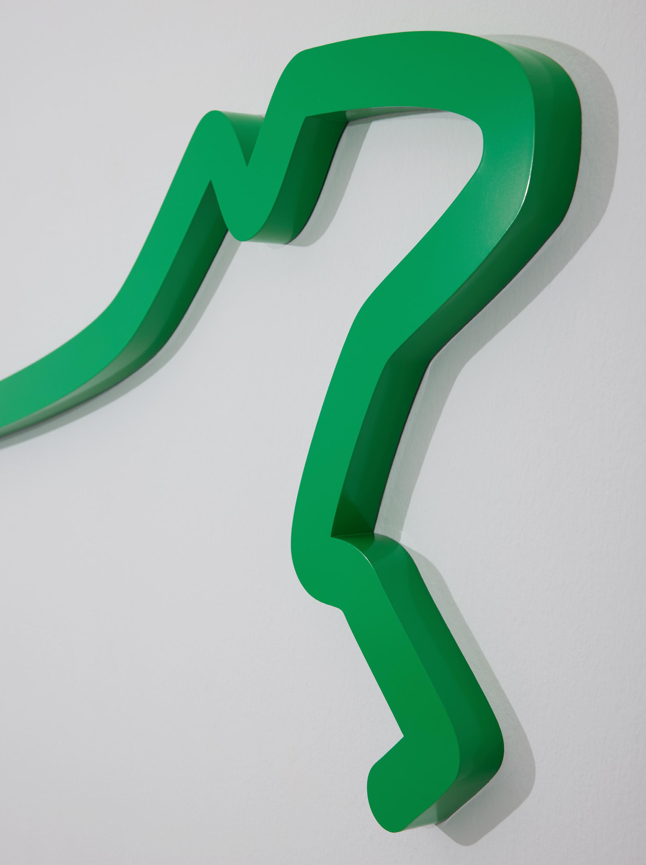
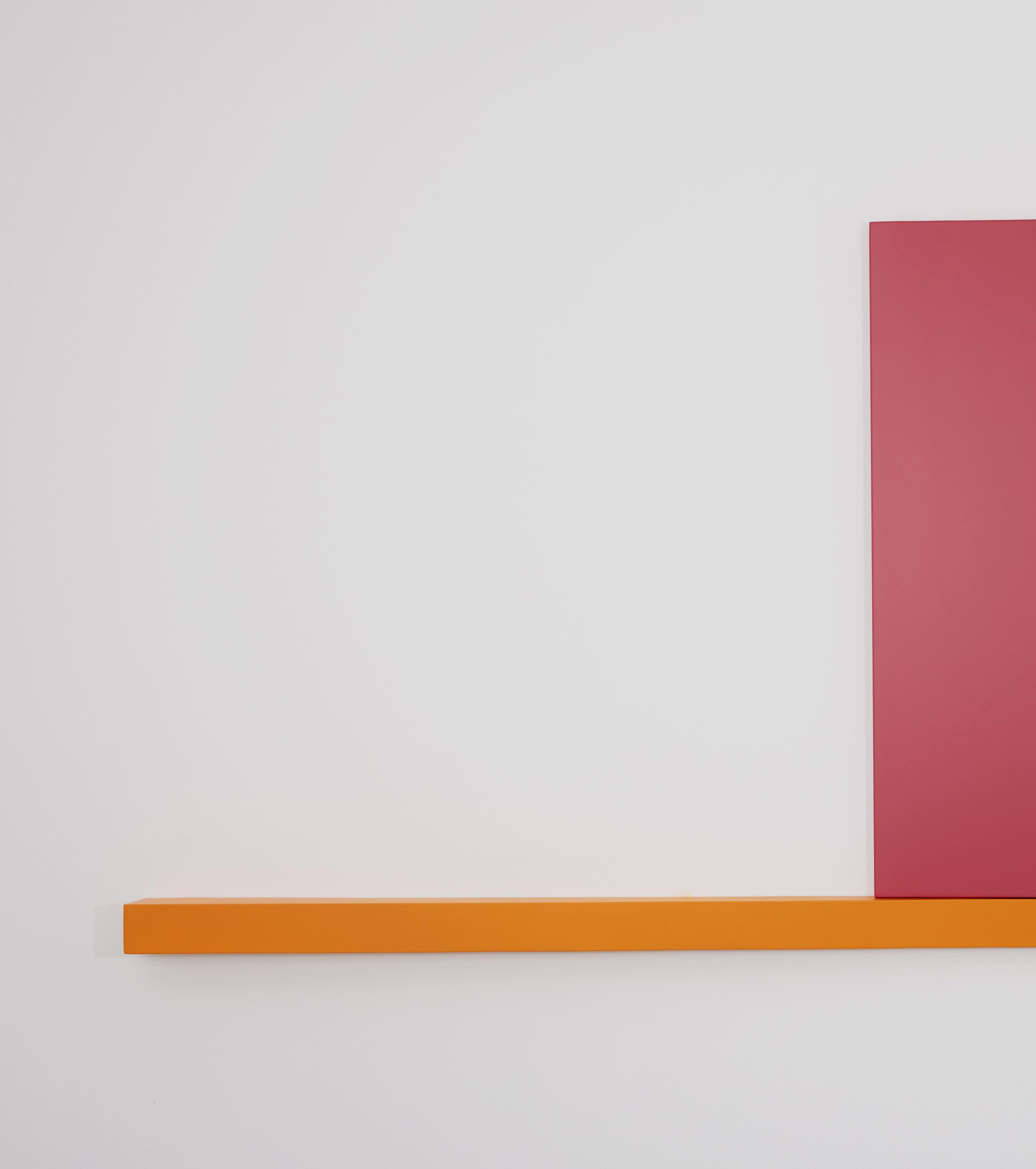
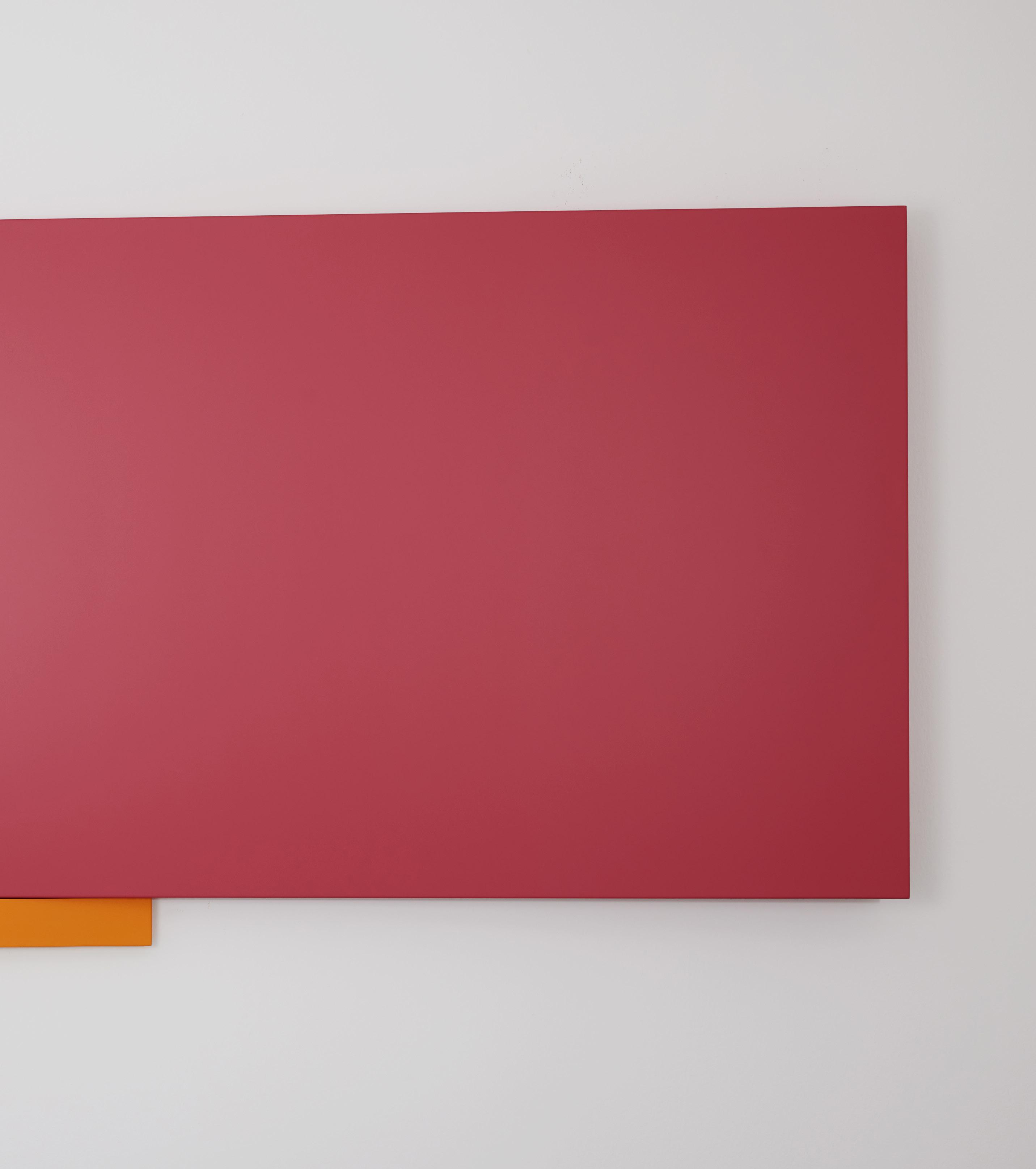
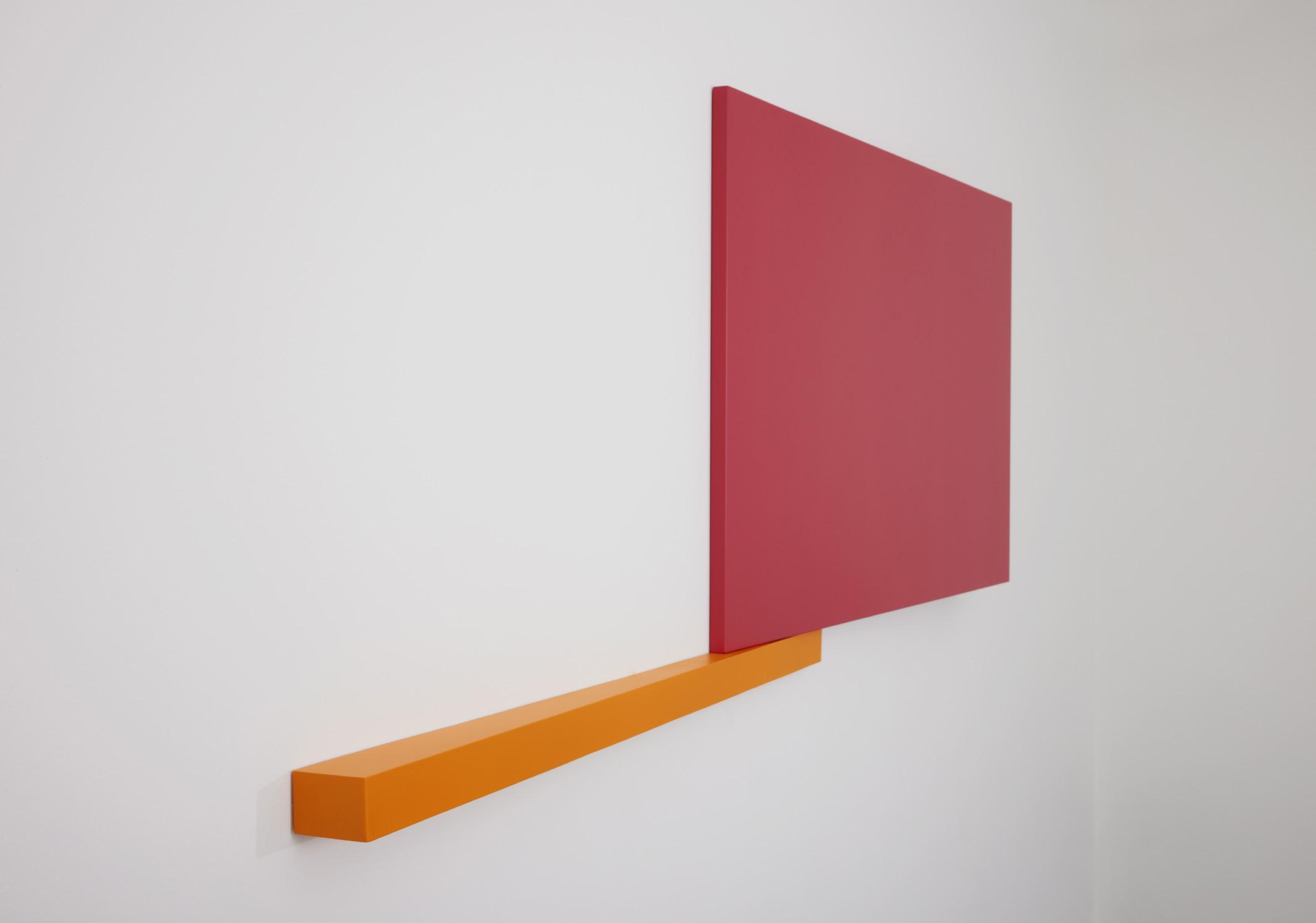
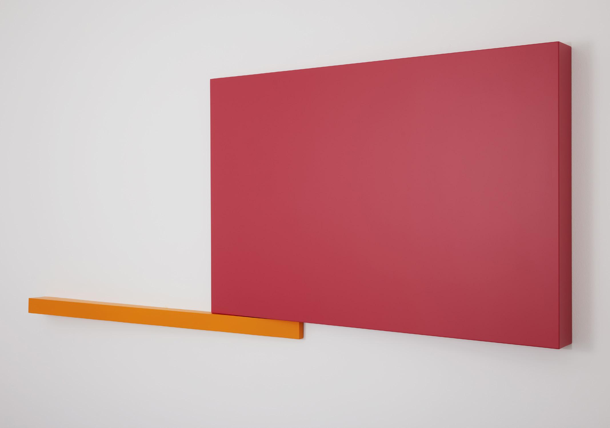
Yet, the 13 metal sculptures in this exhibition are clearly not design products. They deliver no clear message nor offer any discernible function. Each piece, whether hung on the walls or installed in the space of FOST Gallery, is instead an open-ended invitation for interpretation and contemplation. Their abstract forms are reminiscent of the elemental shapes, colours, forms and gestures often used in modern art—they are what define the visual signature of Ho’s designs too.
By retracing the creative journey of Ho over the last two and a half decades, we can see how the line between art and design has sometimes blurred in his works. HE WRITES STRAIGHT WITH CROOKED LINES is thus not an aberration but a progression of an independent creative who has continually interrogated the nature of creation and its connections to life.
Ho formally entered the world of design during the mid-1990s when he enrolled in Temasek Polytechnic’s visual communications course. He began his first semester under the strict tutelage of master potter and Cultural Medallion recipient Iskandar Jalil (1940–) who encouraged him to question
deeply, be true to himself, and express his personal opinions. For the final assignment, Iskandar asked the class to create anything they wanted to express themselves. Ho boldly made his first art installation using styrofoam, soil, grass and painted blocks—while his peers stuck with more traditional mediums taught in class such as paper, clay and painting. His bold approach subsequently led Iskandar to invite a recently graduated Ho to develop another installation for an exhibition with his students. Ho created two large standing wooden signs that read “HERE” and “THERE” and placed them a distance apart at the entrance of the design school for viewers to reflect on how meaning related to context.
Unlike Iskandar’s craft-focused and open curriculum, Ho recalls the other modules that followed in design school were more focused on the techniques of visual communications. He describes the period and the design scene at the time as a “visual cacophony” of styles and approaches that led him to forge his own path.2 While lecturers encouraged the use of visual puns and witty logos advocated in then popular references such as A Smile in the Mind: Witty Thinking in Graphic Design (1996)3, classmates idolised the grunge typography and deconstructive layouts found in Western music album art and independent popular culture magazines, such as Ray Gun, The Face and Emigre. None struck Ho—who was then a mature student, having failed to make it to university after junior college—as particularly useful for developing a viable design practice in Singapore.
Instead, he found an alternative path after a chance encounter in the school library with the works of Swiss graphic designer Josef Müller-Brockmann (1914–1996). The pioneer of the International Typographic Style advocated the rational use of text, geometry and the grid to formulate designs that were orderly, objective and functional. The style brought together the ideas of early modernist art and design movements,
such as Constructivism, De Stijl and the Bauhaus, and gained popularity after the Second World War as many nations sought to modernise. While Müller-Brockmann and such modernist graphic design styles had fallen out of fashion by the 1990s, they resonated with a young Ho who began adopting them in his assignments. He continued refining this method of expression even after establishing H55 as a solo practice soon after graduation.
An early example of a H55 design in this idiom is its 2003 brand identity for The Sandwich Shop in Singapore (Fig. A). Ho stacked three horizontal bars atop of one another equally spaced apart to create an abstract sandwich akin to the sectional view in an architecture drawing. The logo can also be read as the Chinese character “sān”, which is part of the name for sandwich in the language. Another example of such playful abstraction is the branding Ho developed for Singapore’s presentation at the 2010 Venice Architecture Biennale (Fig. B). 1000 Singapores showcased the compact design of the citystate and proposed that a thousand Singapores could more sustainably house the entire world’s
Apopulation using only 0.5 per cent of the Earth’s land area. Ho translated this thesis into a logo with a simple yet highly impactful use of Singapore’s nickname as a “little red dot” to deliver the point. In both logo designs, as well as many others by H55, Ho distils messages and meanings into the fundamental elements of the modernist visual language, such as lines and shapes. The logos of The Sandwich Shop and 1000 Singapores when stripped of their contexts are simply rectangles and circles respectively. In 2015, Ho emphasised this very aspect of H55’s works at his mid-career retrospective, Shapes (1–15), at DECK Photography Art Centre in Singapore (Fig. C). Instead of showcasing design works at this exhibition initiated by Ho, he curated 15 geometric shapes and compositions from the digital archives of H55. According to Ho then, Shapes (1–15) was a tribute to the aesthetic building blocks of H55 designs that were beautiful in their own right.4
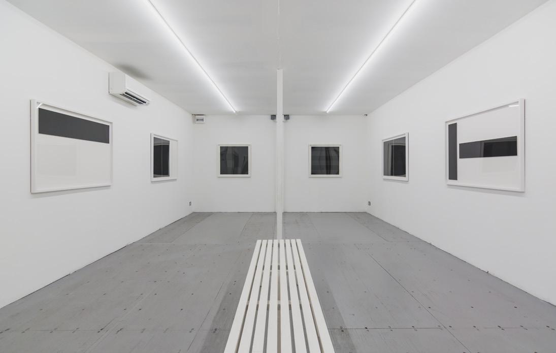
Another aspect of the exhibition was how the works were tailored specifically for the venue. Ho got his assistants to build a scale model of its two galleries for him to resolve the dimensions for the shapes. It also helped him think about the relations of the works with other elements in the galleries built out of containers, such as its beams. Thus, the works in the first gallery are colourful and larger than life to take advantage of its double-volume height and convey a buoyant ambience. In the more enclosed second gallery, the prints were contained in rectilinear white frames and installed in a single file across three walls of the rectangular gallery.
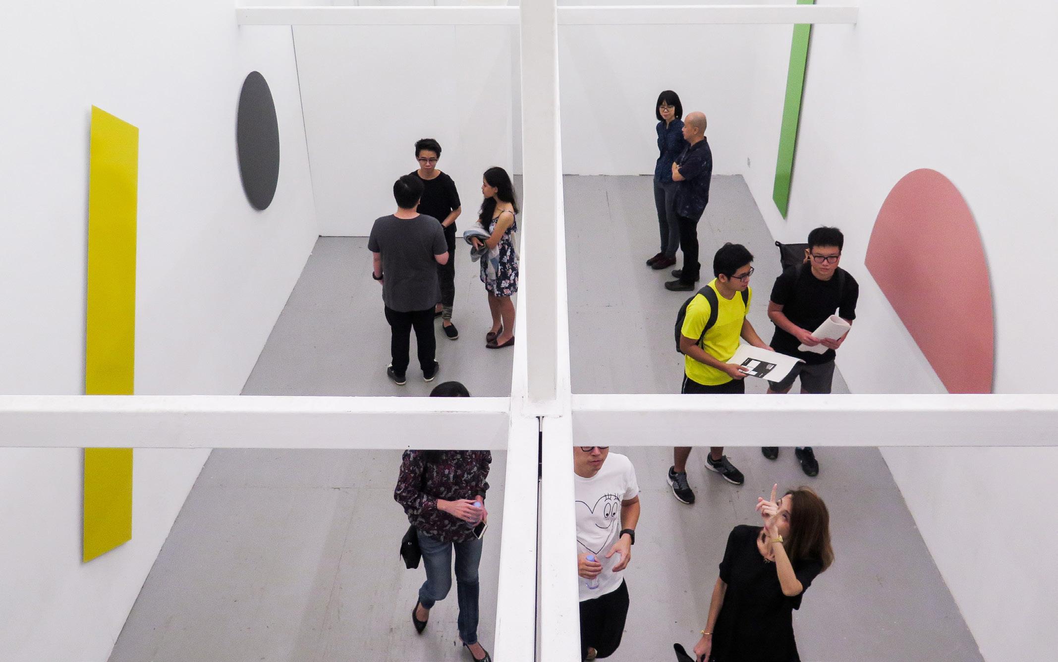
C Works in Gallery 1 of DECK Photography Art Centre, Shapes (1–15), 2015.
D Works in Gallery 2 of DECK Photography Art Centre, Shapes (1–15), 2015.
E Logo design for ipli Achitects, 2015.
F Detail of (Water) Shapes (No.23–27), 2018–2025.
The disciplined layout, complete with a white bench in the centre, generated a space of contemplation (Fig. D).
Both arrangements of works echo modernist graphic design’s use of white space in choreographing elements to create a sense of rhythm and proportion. This is also evident in many designs by Ho. He frequently perceives texts and images as shapes when laying out pages in his book designs, resulting in spreads that push and pull the flat surface of paper into another dimension. In a rebranding for Singapore-based ipli Architects in 2015, Ho strategically tiled seven identical black rectangles to form a seemingly impenetrable abstract sculpture. It is left to the subtle gaps between the shapes to suggest other readings, including the shape of the word “ipli” (Fig. E).
After Shapes (1–15), Ho expanded upon this milestone to a new trajectory in his creative practice when he was invited to participate in the Art in Transit programme in 2018. This initiative by Singapore’s Land Transport Authority seeks to introduce public art into the stations of the country’s expanding mass rapid transit network. Ho developed (Water) Shapes No.23–27, a 93-metrelong site-specific, permanent installation for the forthcoming Sungei Bedok MRT Station that seemingly flows with commuters as they walk along it (Fig. F). In its scale and ambition, the work marked Ho’s growing confidence in employing the visual language and approaches he developed in design for the creation of art too.
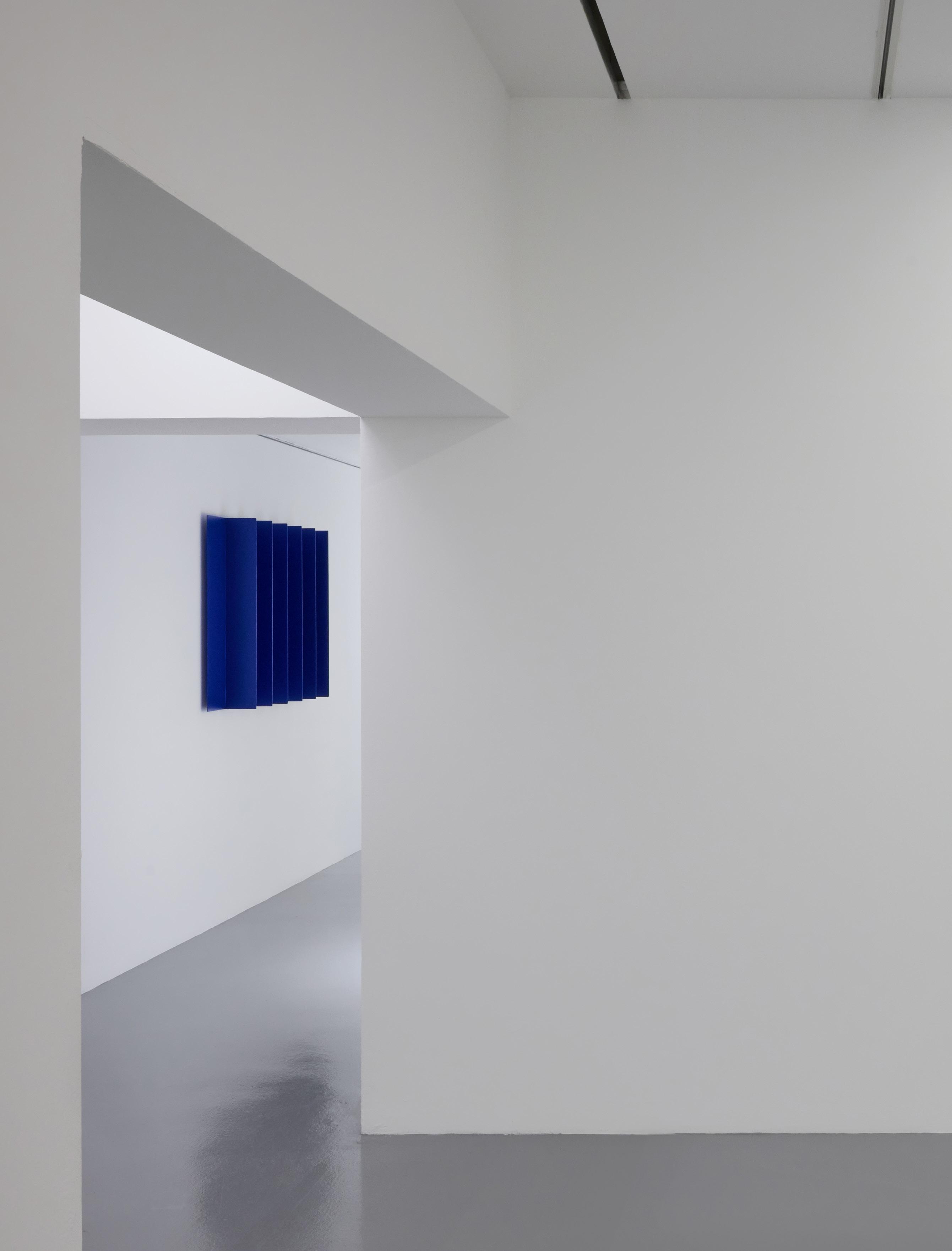
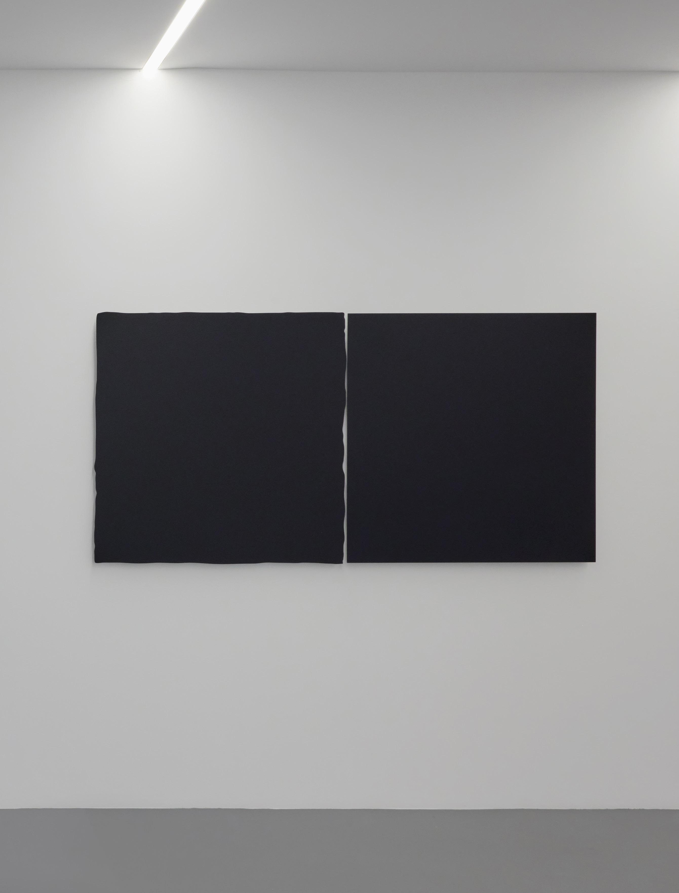
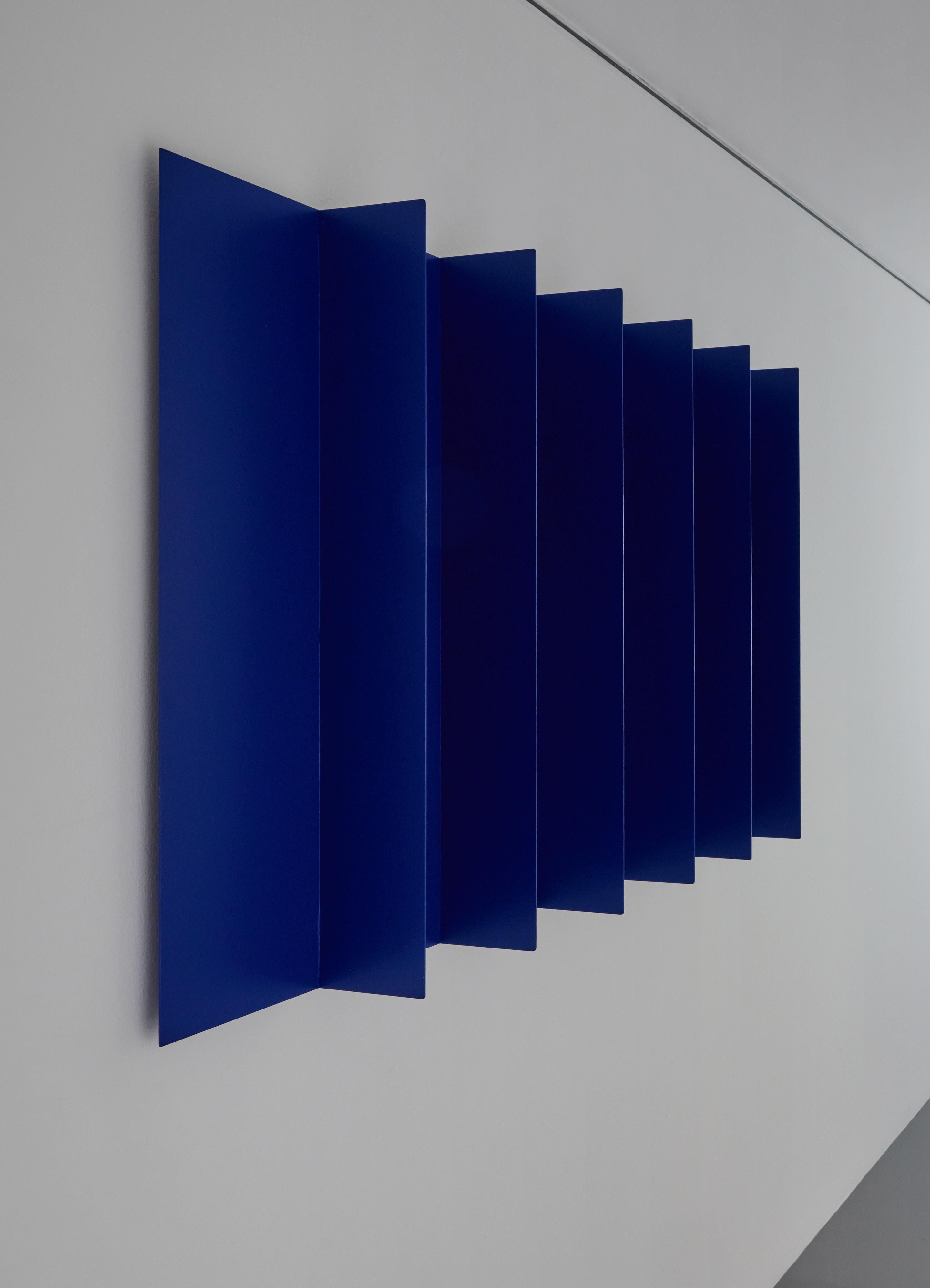
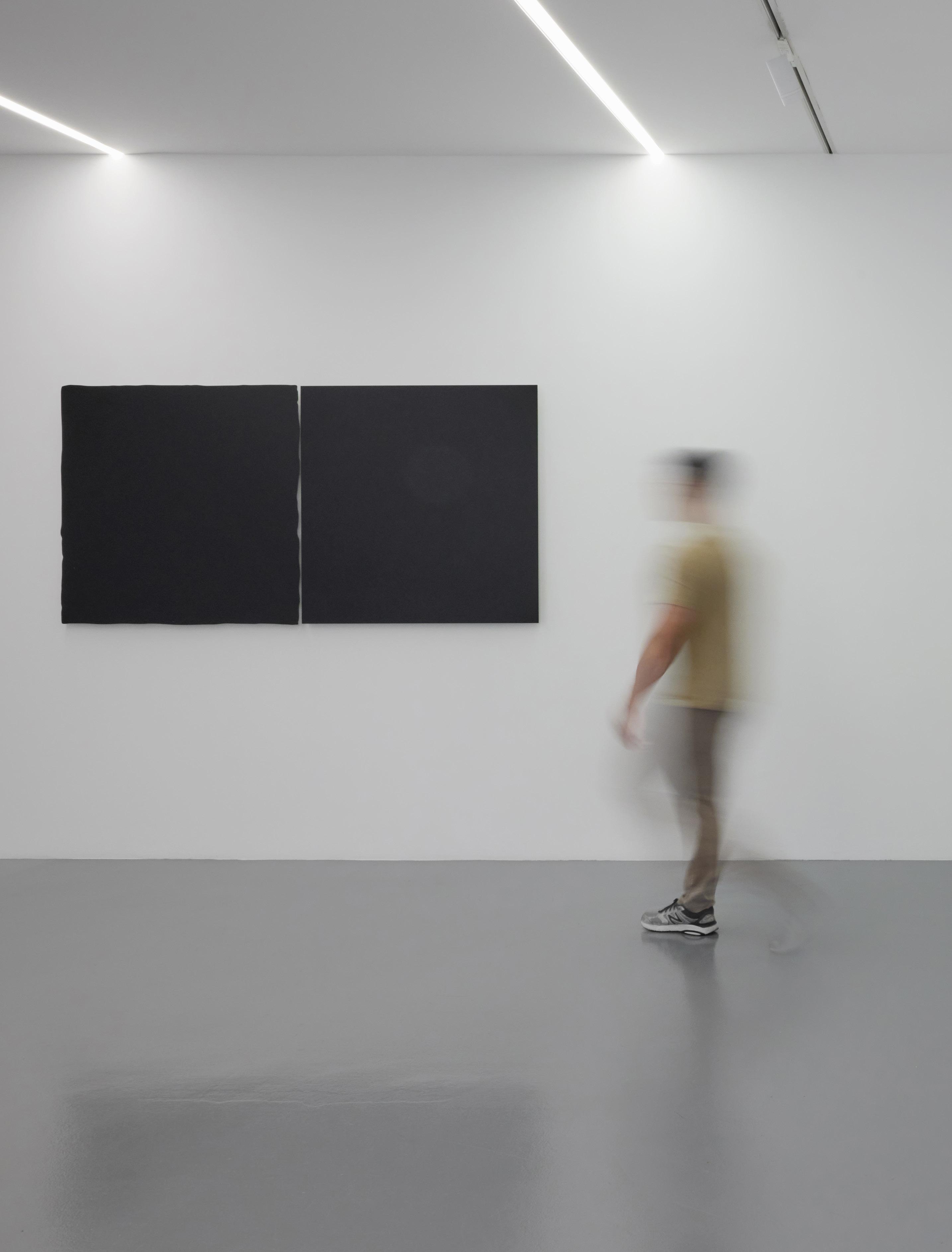
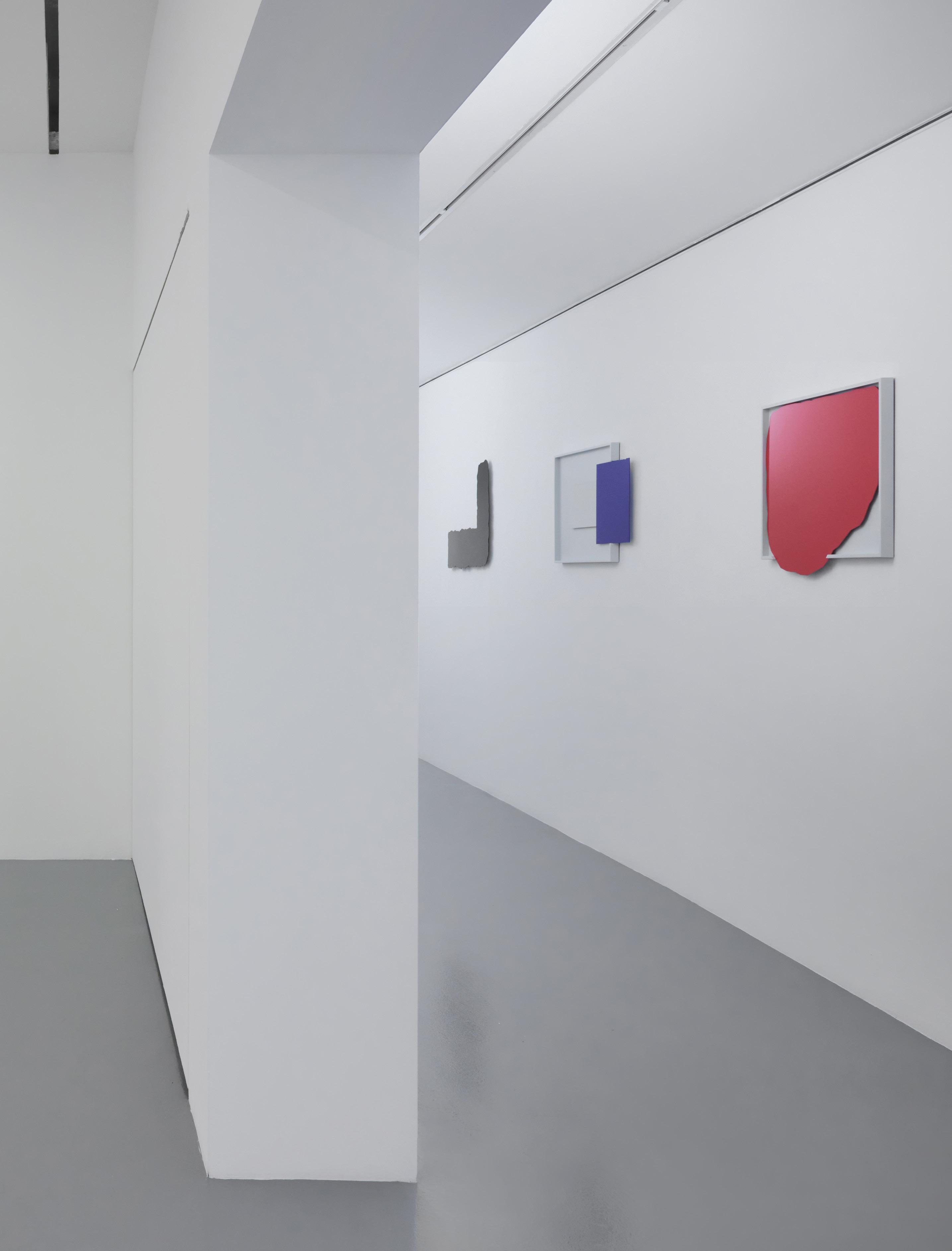
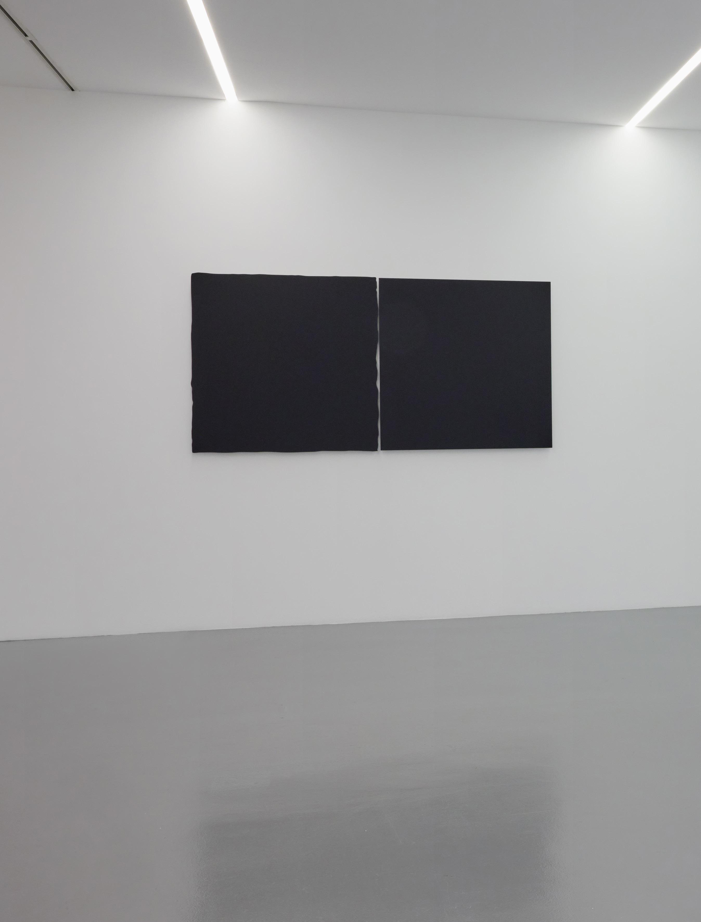
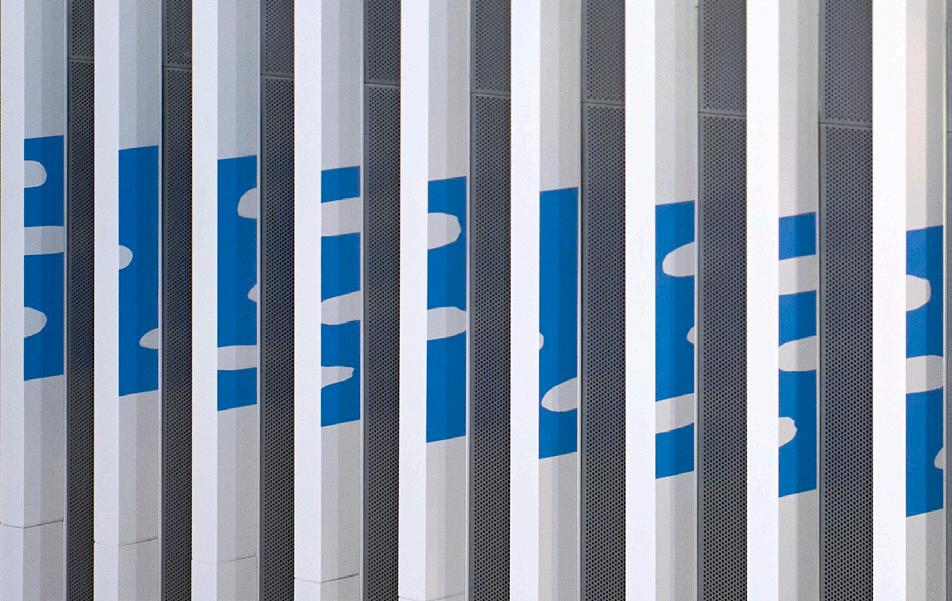
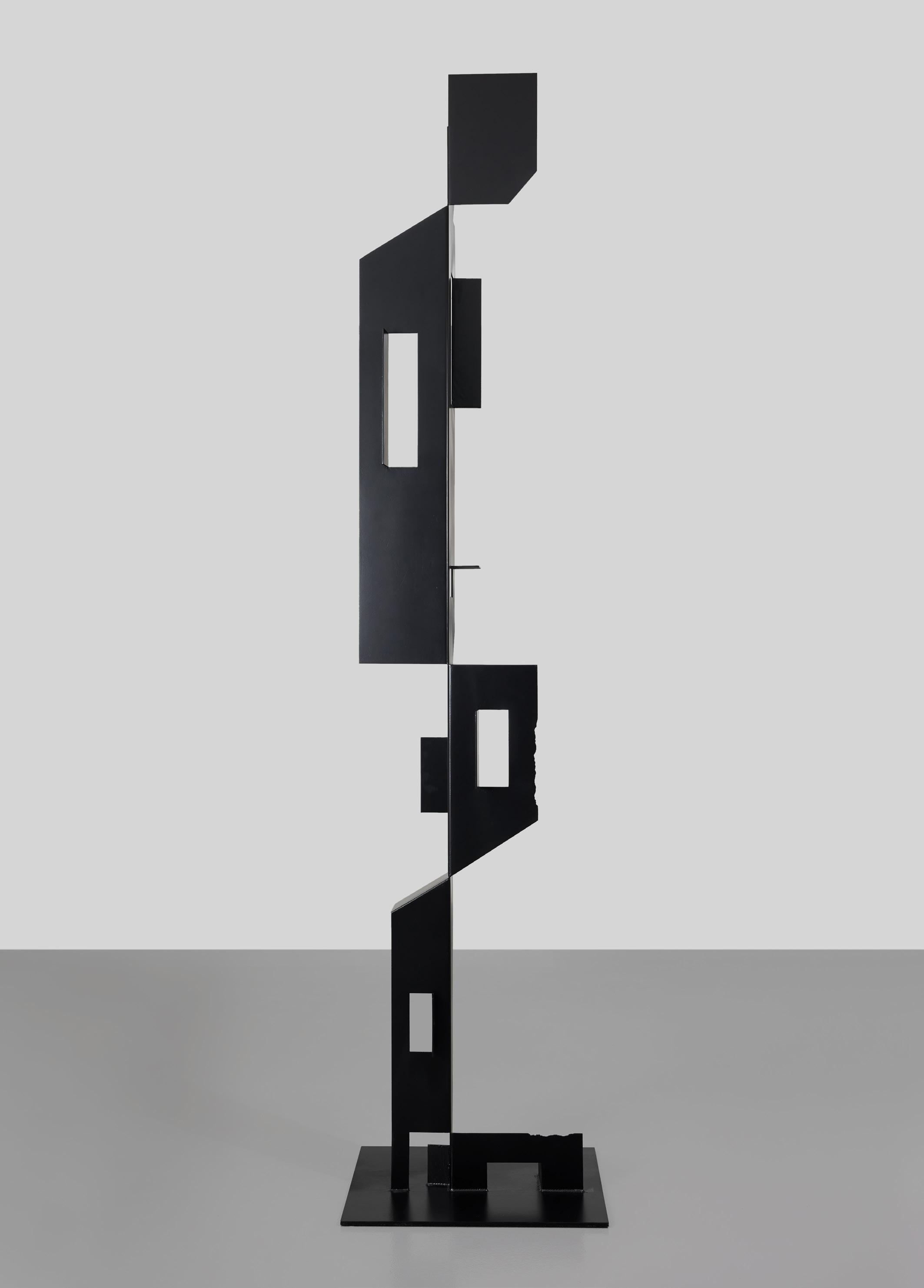
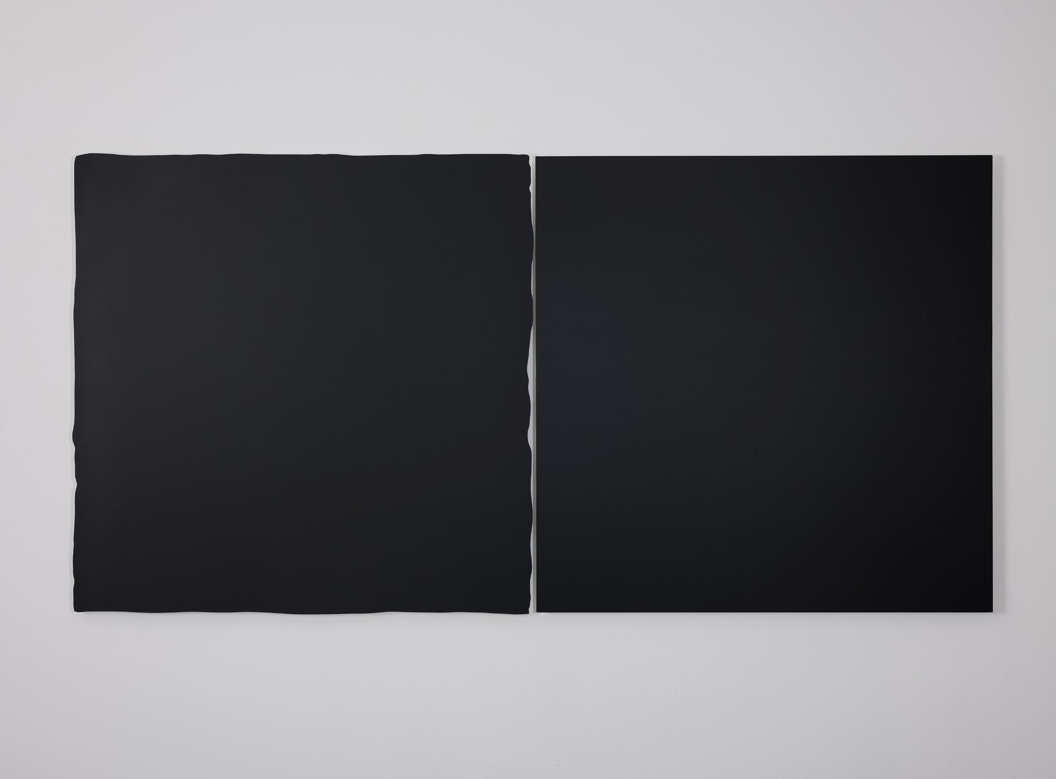
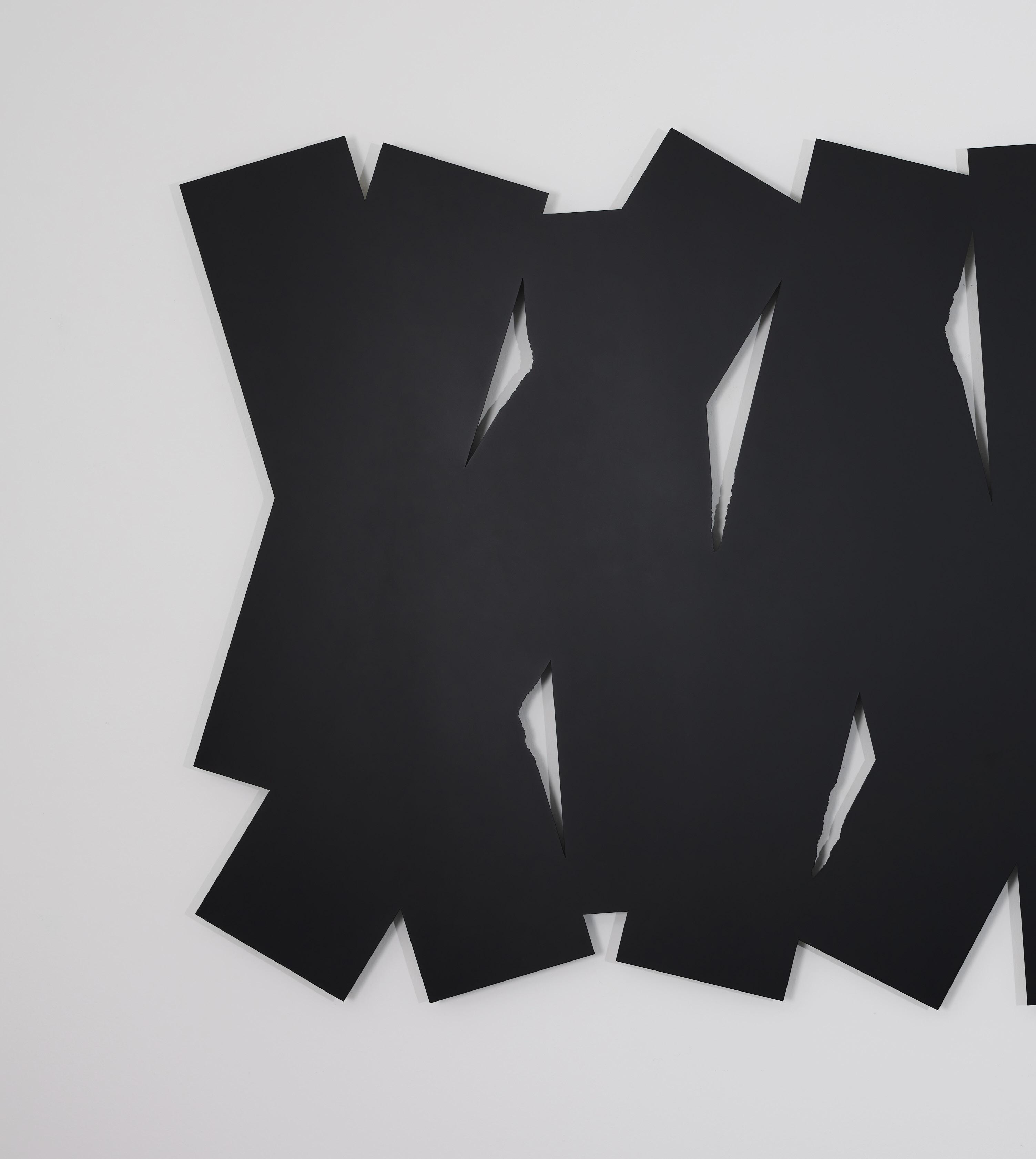
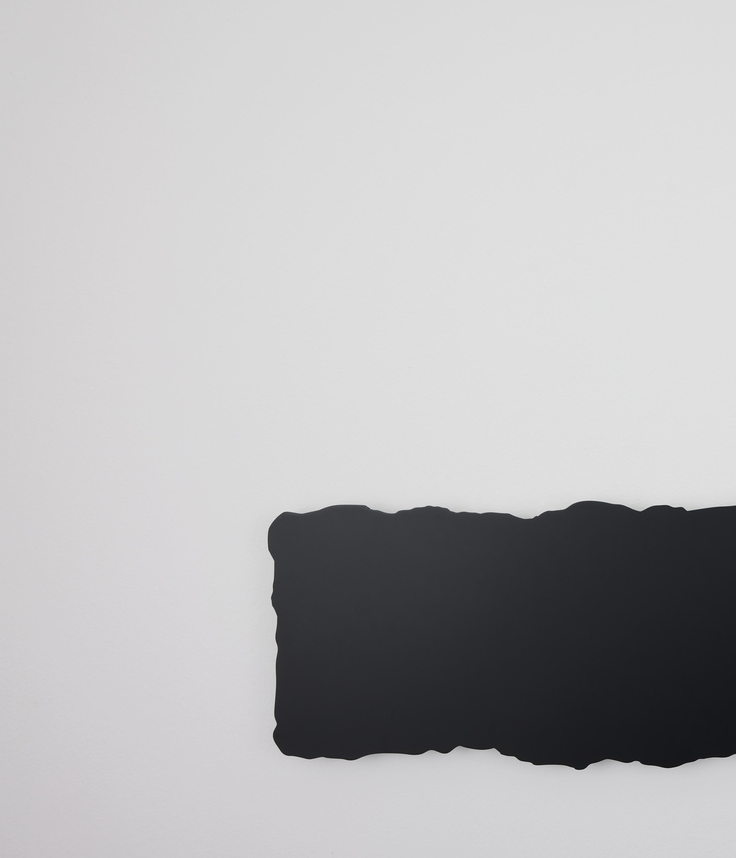
HE WRITES STRAIGHT WITH CROOKED LINES is another chapter in this emerging practice. The works are again composed of forms familiar to Ho. Two black squares juxtaposed side-byside The overlapping of black rectangles to create a sense of dynamic movement. There are also works that play with space and perception. The only freestanding piece in the exhibition is a shapeshifting totem that surprises at every turn. Finally, an installation of precisely spaced-out vertical metal fins generates a rhythmic experience alongside the viewer.
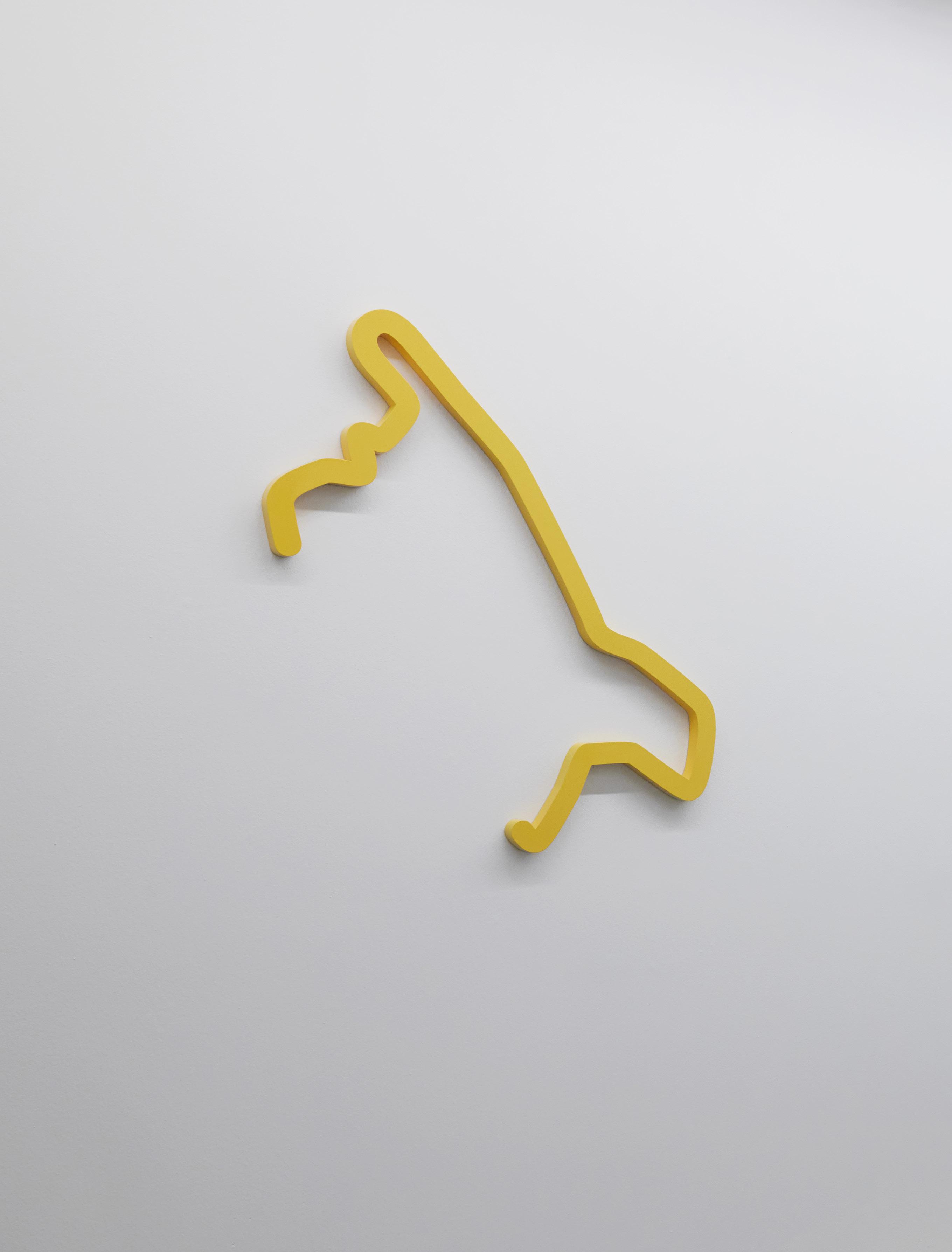
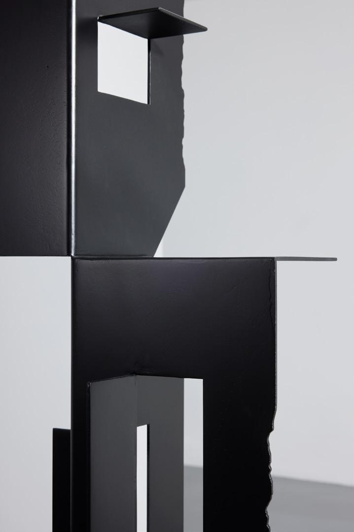
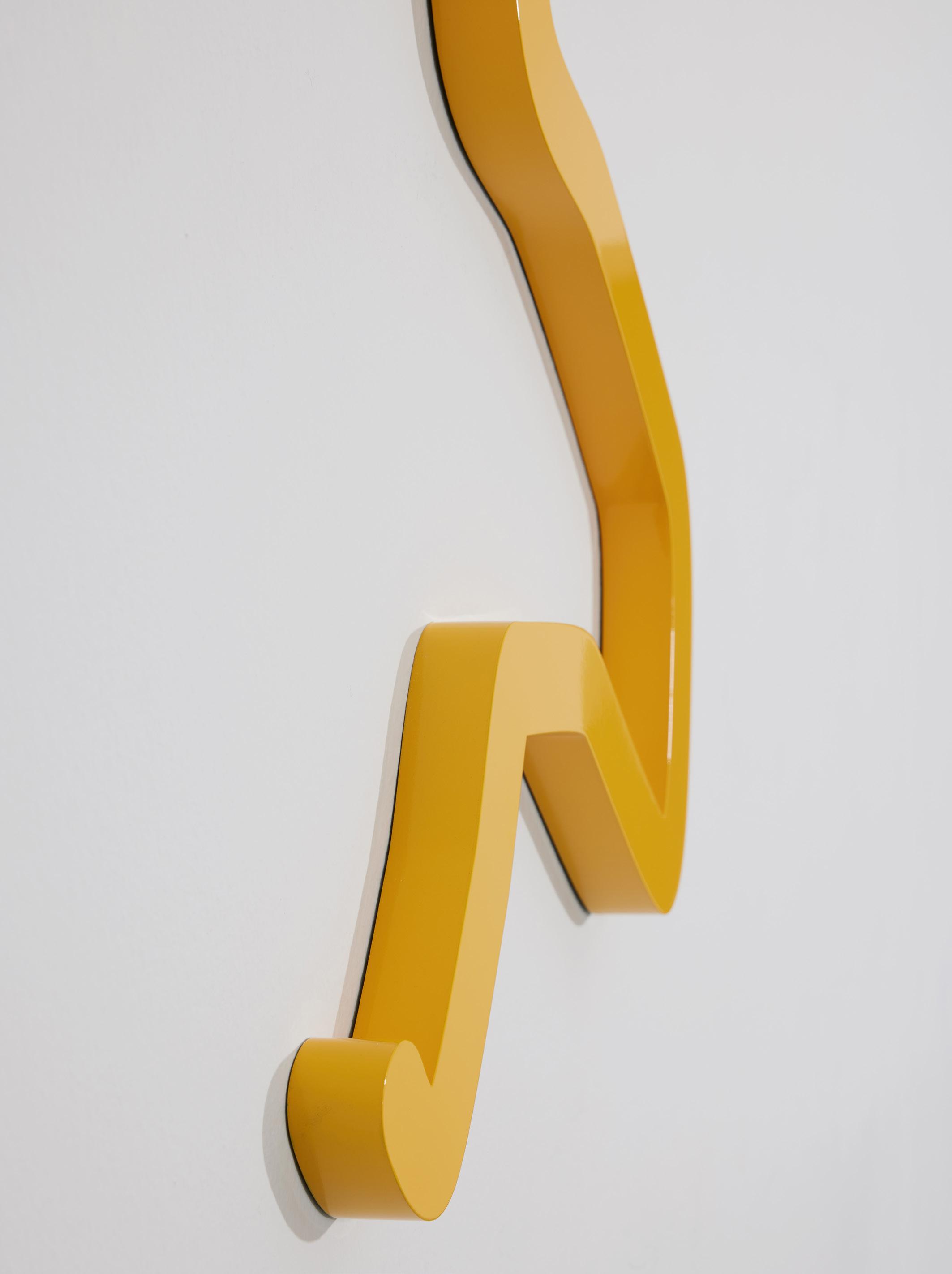
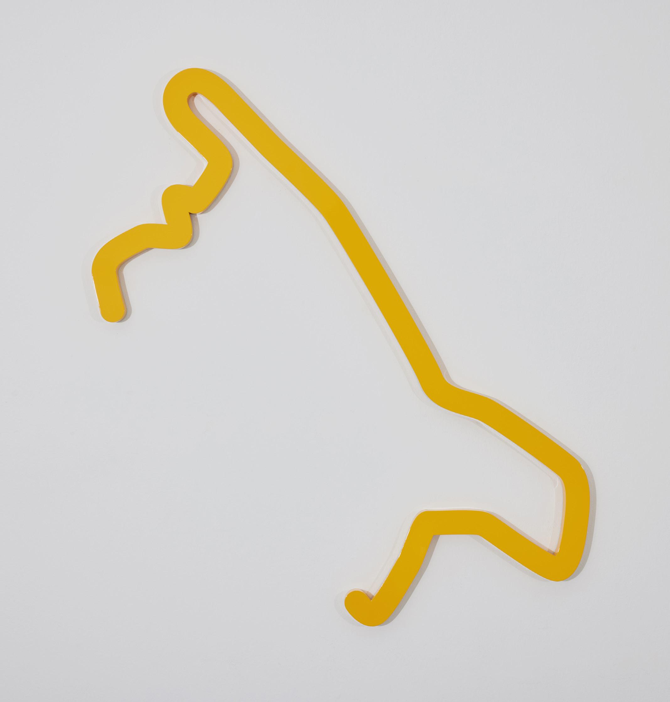
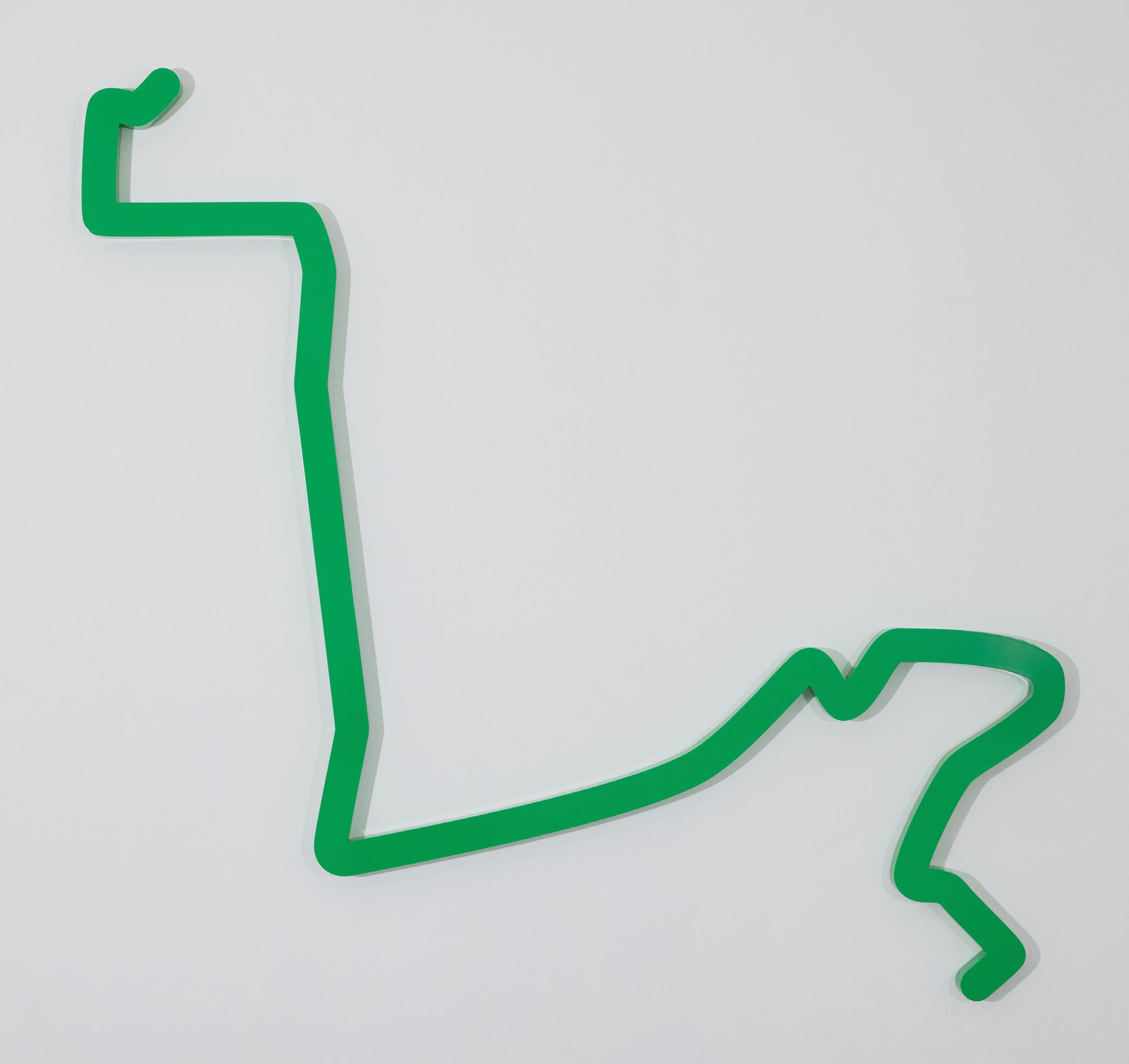
Unlike Ho’s previous artworks, however, the ones in this exhibition are no longer just numbered and devoid of representation. The title of each piece suggests some deeper meaning. Some hint at various emotional states There are those that indicate personal histories too The form of the works speak to this aspect as well. The strict and rigid geometry of previous works has given way to more free form lines drawn by Ho (albeit mediated by a digital device). Then there is the deliberate use of colours to respond to the titles. These aesthetic choices transform the neutral visual language of modernist graphic design into deeply personal artefacts that reflect Ho’s lifelong exploration with its forms. Such subjectivity may seem at odds with Ho’s earlier adoption of modernism. Modernist graphic design after all is built on the belief that there can be a universal language for communication. This, however, was shattered by the assault of postmodernism beginning in the 1970s. By the time Ho encountered modernism in the 1990s, the appeal was less a nostalgia for a visual utopia, but the structured approach it offered to practising design and even life.
Early in his career, Ho also read the writings of Swiss semiotician Ferdinand de Saussure and encountered the works of conceptual artists such as Joseph Kosuth (1945–) and Lawrence Weiner (1942–2021). They helped him recognise the arbitrary relationship between words, images and meanings. During his final year in school, Ho self-initiated a solo exhibition of black and white drawings to investigate this at the now defunct 1’CL2CK Camper shoe shop in Pacific Plaza (Fig. G). Existential Thoughts And Other Parables questioned the biasness of human perception such that even external yardsticks like science or philosophy could not escape the differences in education, experiences and even language. In an accompanying flyer, Ho asked: “[W] hat other forms of human experience can prove to be ideal for all situations of judging existence?”
After starting H55, Ho continued exploring
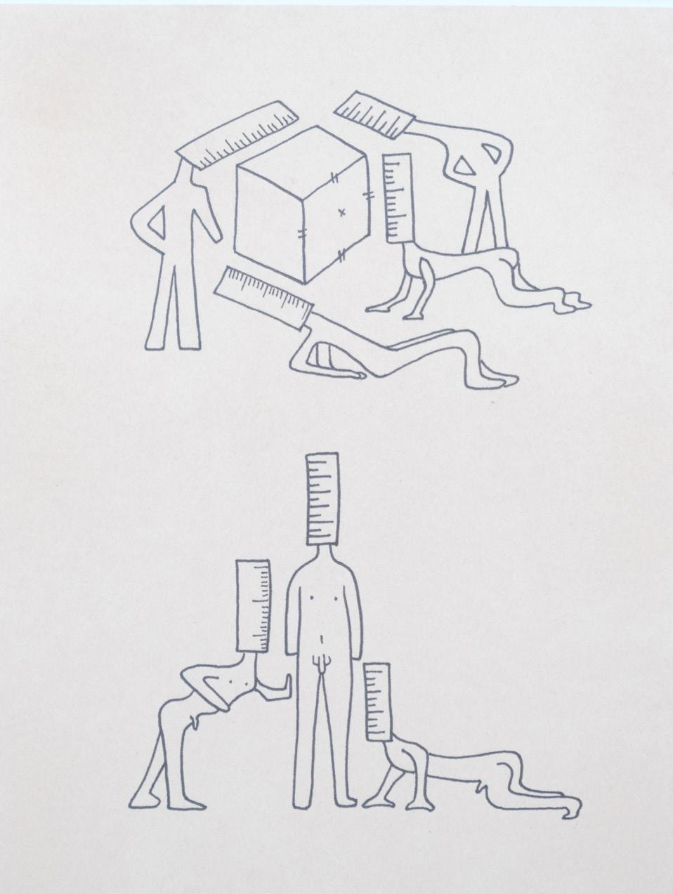
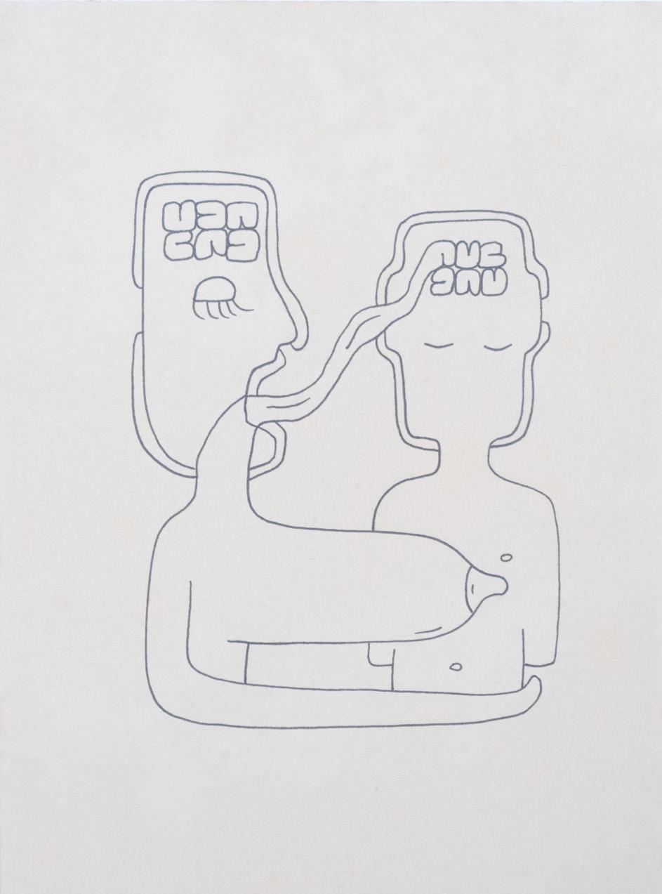
G Drawings from Existential Thoughts And Other Parables, 1997.
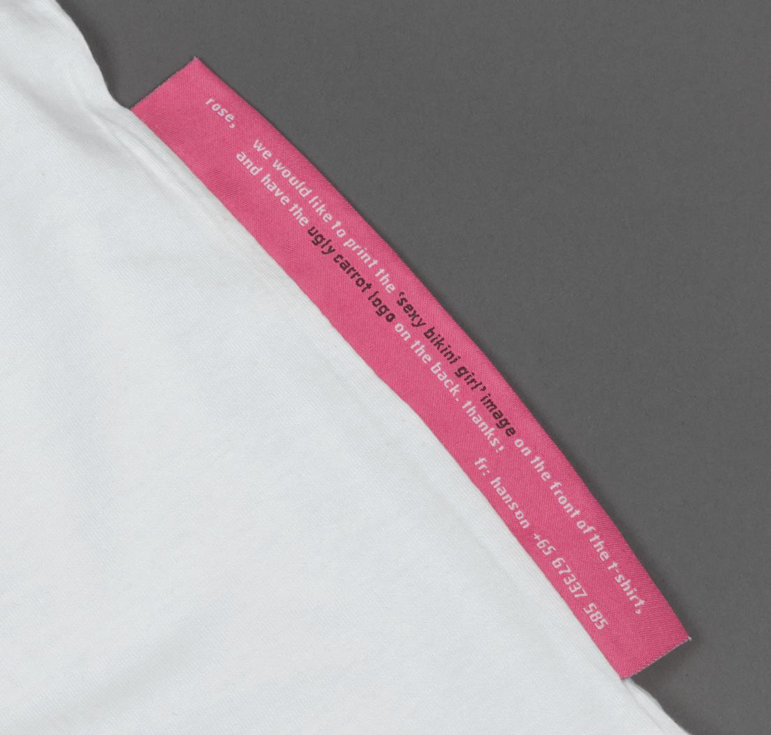
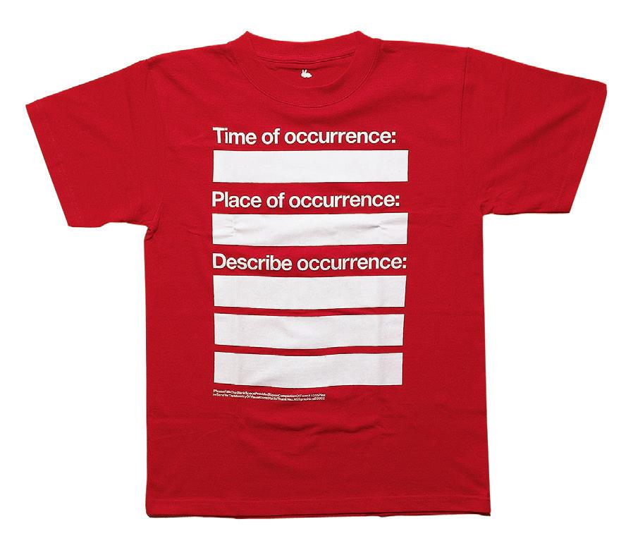
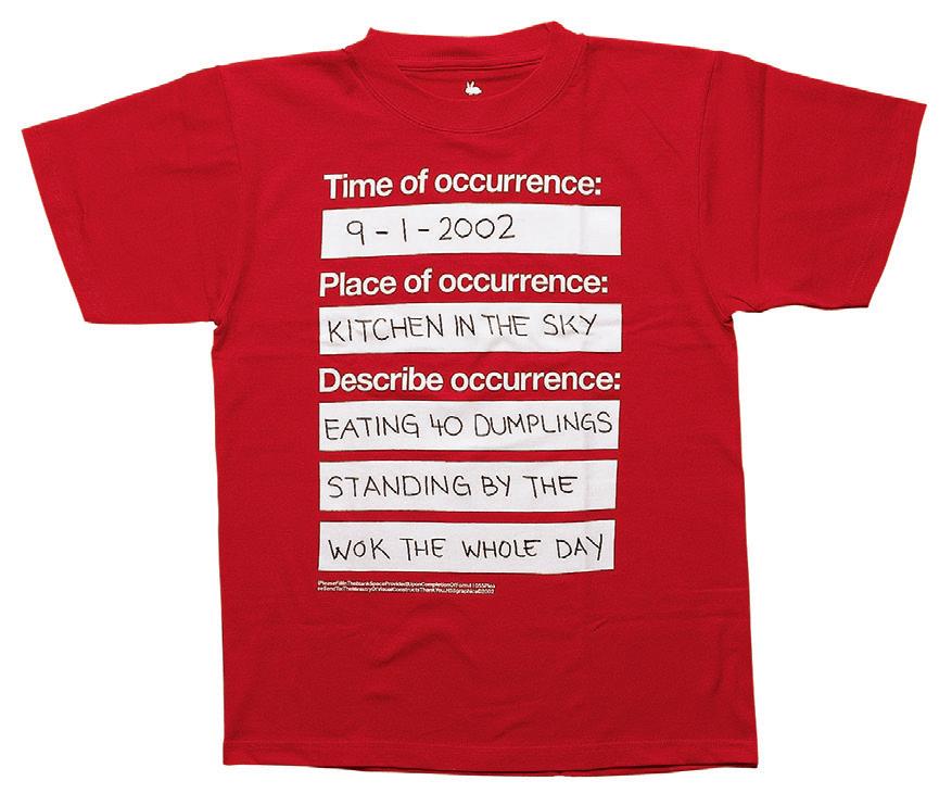
similar questions on the subjectivity of meaning in relation to design practice through self-initiated projects. An early example was the Rabbit brand of publications and wearables. The Bikini Girl T-shirt came with no prints on its white surface except for a large tag on the side embroidered with the instruction: “rose, we would like to print the ‘sexy bikini girl’ image on the front of the t-shirt and have the ugly carrot logo on the back. thanks! fr: hanson +65 67337 585” (Fig. H). Another Rabbit T-shirt was designed with blank boxes for the wearer to recall and record a moment in life with a permanent marker and thereby participating in its design (Fig. I). The Rabbit products subsequently made their way into trend-setting boutiques such as Colette (Paris), +65 Comme des Garçons Guerrilla Store (Singapore) and Dover Street Market (London). They also informed the works of H55, adding a new dimension of embracing openendedness to the practice.5
Ho’s self-initiated projects such as Rabbit are perhaps akin to what design curator Ellen Lupton has described as “the neo-modernist project of personalizing modernist languages” at the Cranbrook Academy of Arts during the 1970s to 1990s.6 Just as students at this American graphic
design programme were encouraged to break the rules of modernist graphic design to explore the meanings of form, Ho’s search for a more lyrical means of expression led him to critically question and develop his own approach to modernist graphic design instead. That he was designing both the form and content of projects can also be understood as part of the trend amongst graphic designers during the 1990s and 2000s to embrace “authorship”. In 1996, the American graphic designer Michael Rock wrote ‘The Designer as Author’ which theorised various models of this emerging practice, including writing and publishing about the subject as well as using design to create “self-referential statements and comparisons” about their lives.7
While Ho’s early self-initiated projects like Rabbit were driven by questions about design, later ones such as Shapes (1–15) became more reflective of Ho’s studio practice. HE WRITES STRAIGHT WITH CROOKED LINES takes it further into the personal and even spiritual realm. The works are shaped by his time of being an independent creative and mediate on the ebb and flow of this life journey.
As Ho writes in his artist statement, the works in this exhibition “began as an exploration of the relationship between Man as both artistic creator and a created being of nature.” This tension—Man as both “the maker and the made,” a human being shaped by forces beyond himself—provides the framework for the artworks. Through them, Ho meditates on life and its twists and turns, reflected in the straight and crooked edges of the works and echoed in the exhibition title.
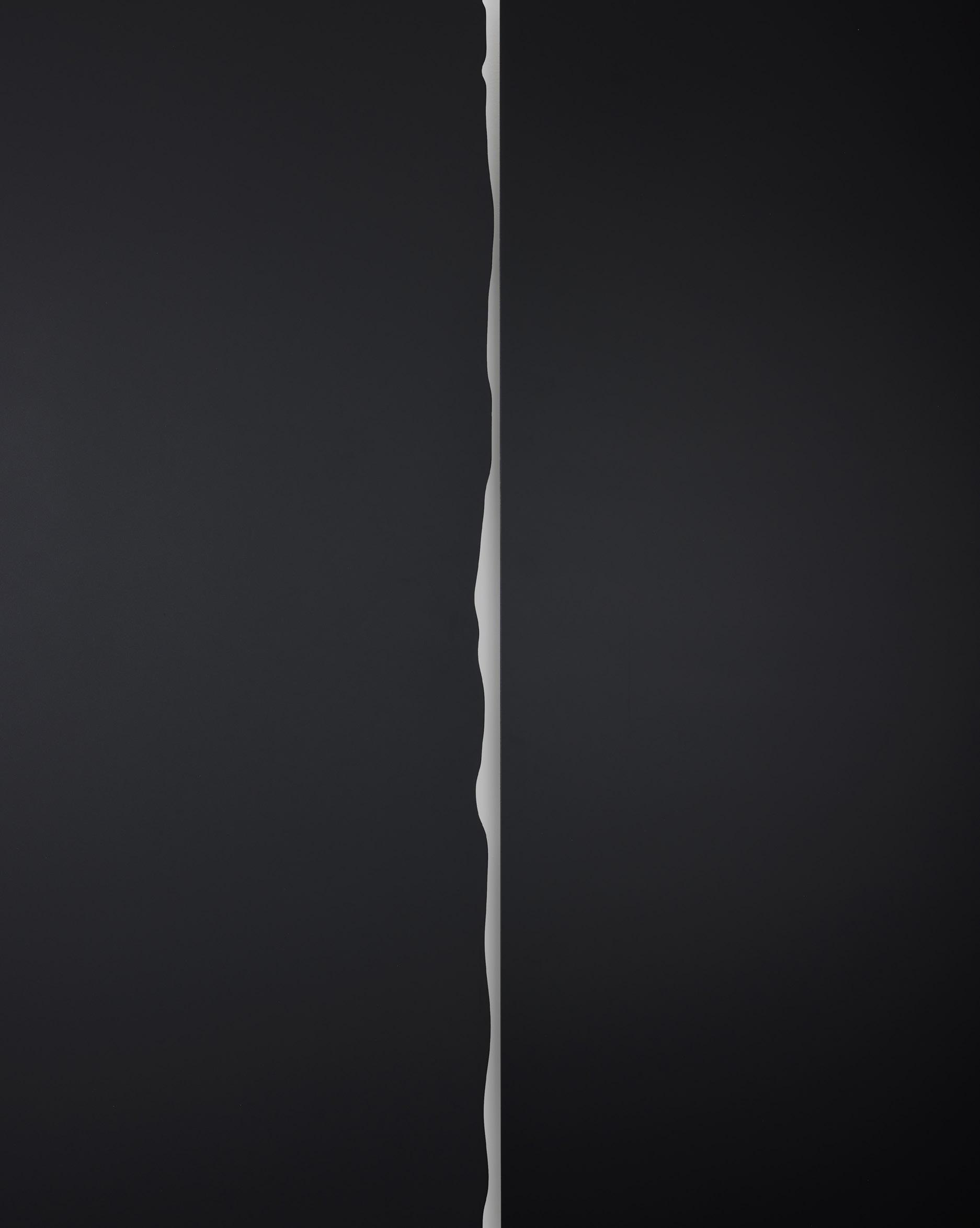
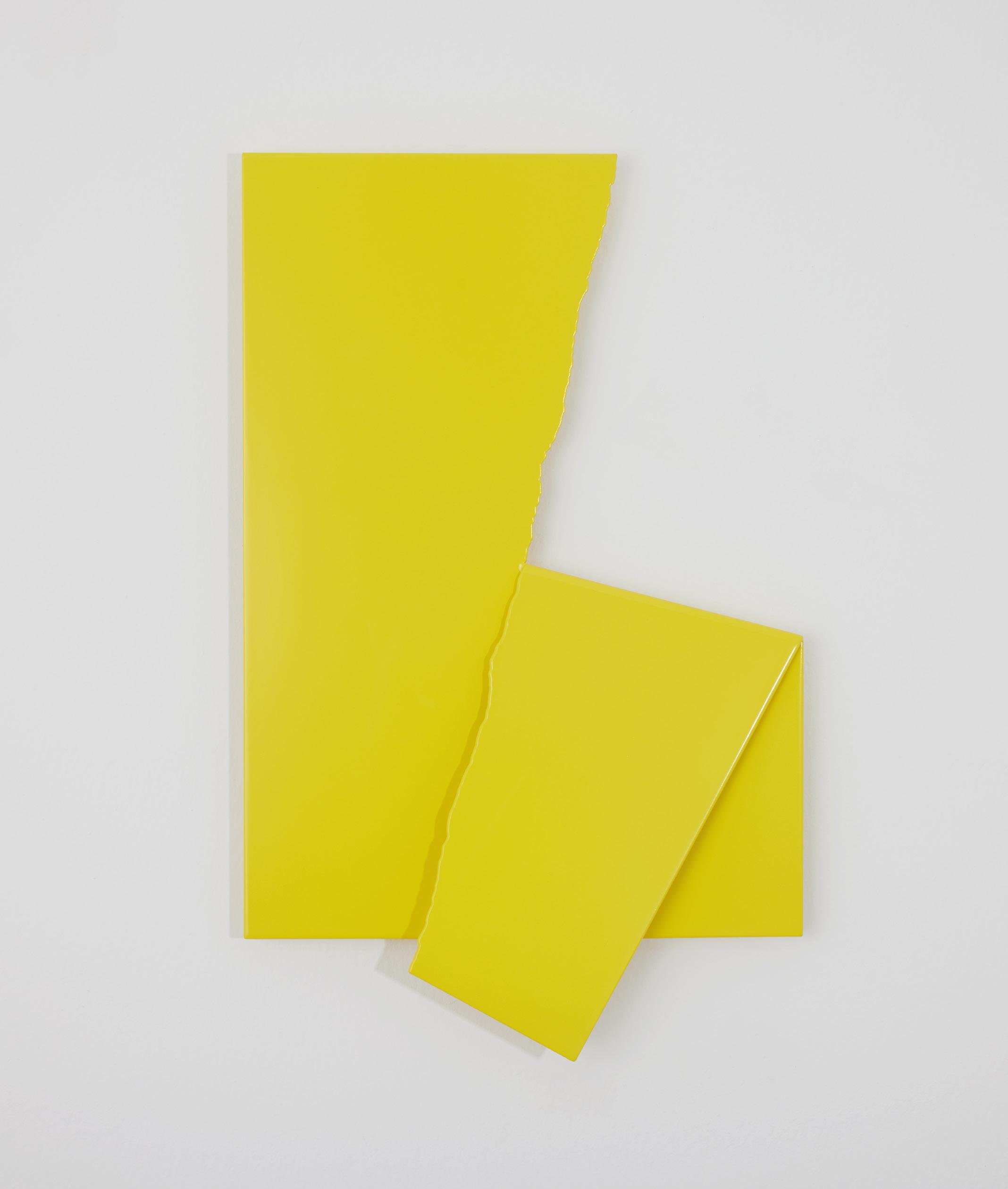
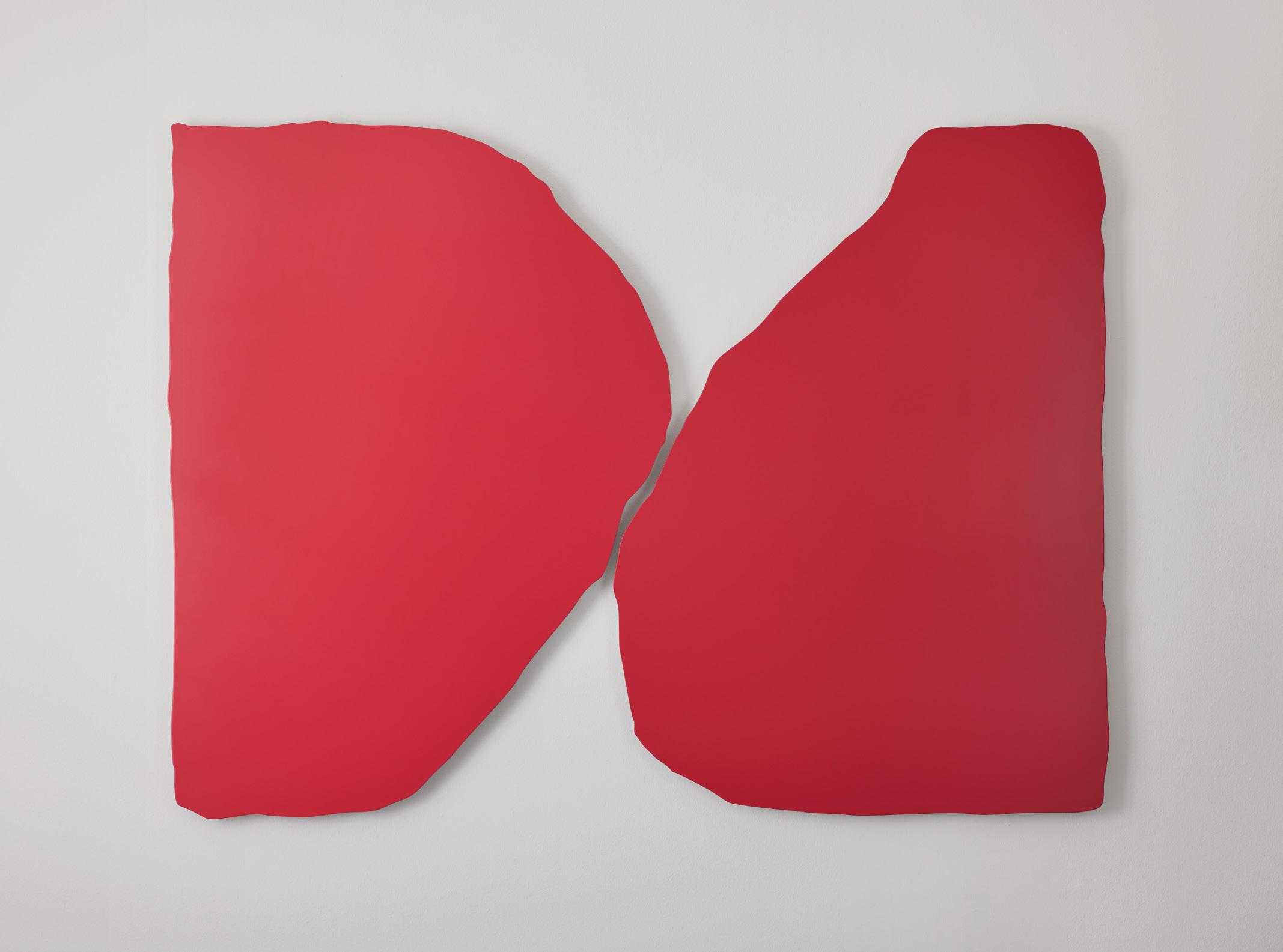
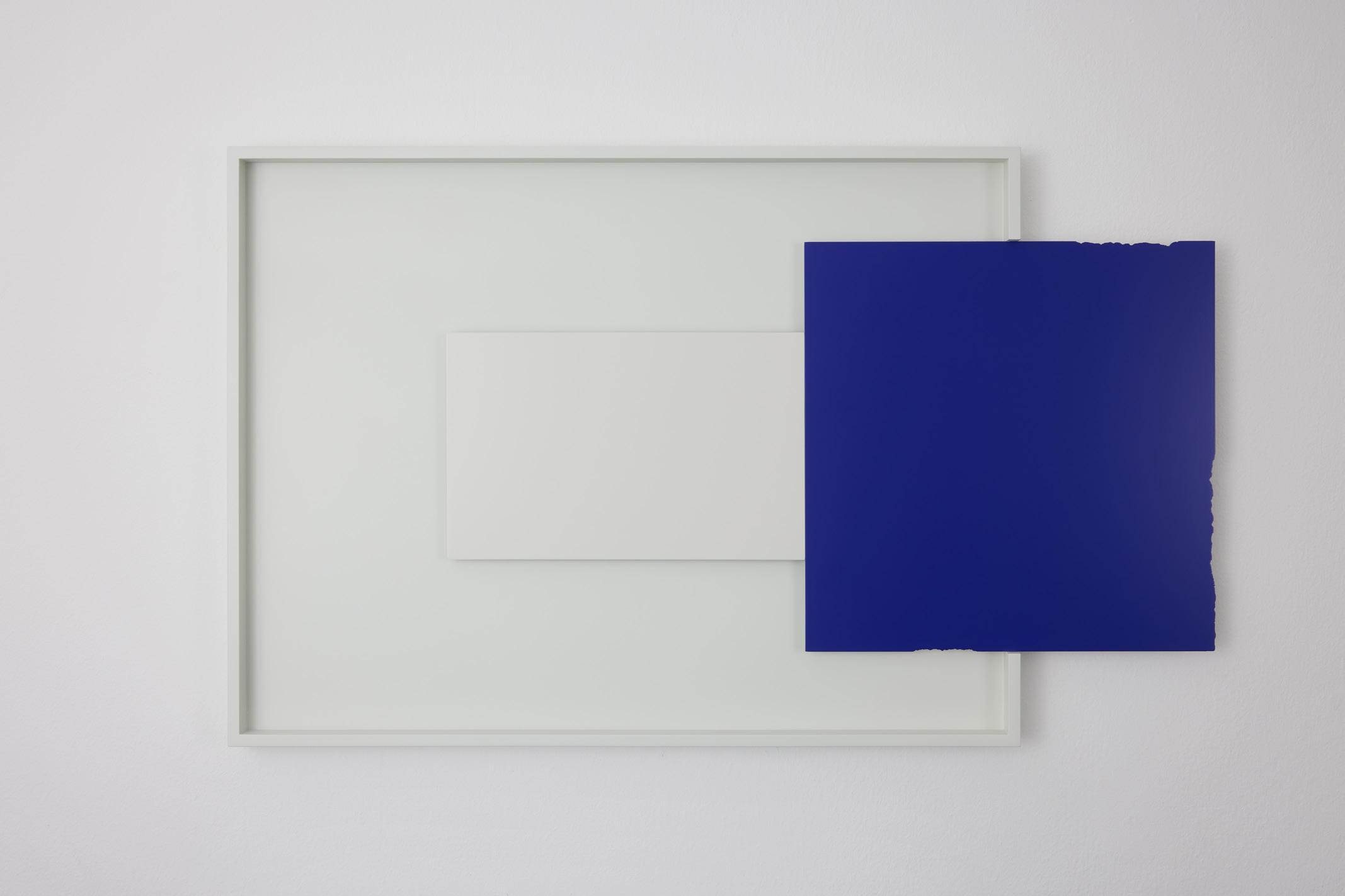
The exhibition aptly opens with NA7URAL HIS7ORY: Something Out Of Something Out Of Nothing (Fig. 2), part of Ho’s ongoing NA7URAL HIS7ORY series inspired by the Book of Genesis Composed of two squarish forms, the work commemorates both the moment of creation and humanity’s enduring desire to exercise its own will. Although it appears as a diptych, Ho wittily proposes it as a triptych through the title. The “third missing piece”—Nothing—exists beyond the physical realm. The work establishes a central concern of the exhibition: the presence of what is absent, and the unseen forces that shape what is visible.
Extending this reflection on creation, Inspirare: From Breath to Breath turns toward the act of procreation. It reminds us of our condition as created beings who are nevertheless co-creators with a higher order. “Inspirare,” derived from the Latin word “to breathe into” or “to blow into”, is
also the etymological root of “inspire,” historically evoking the infusion of life, spirit, or divine thought.
8 Thus, the work occupies a liminal space between origin and continuation, between being formed and forming.
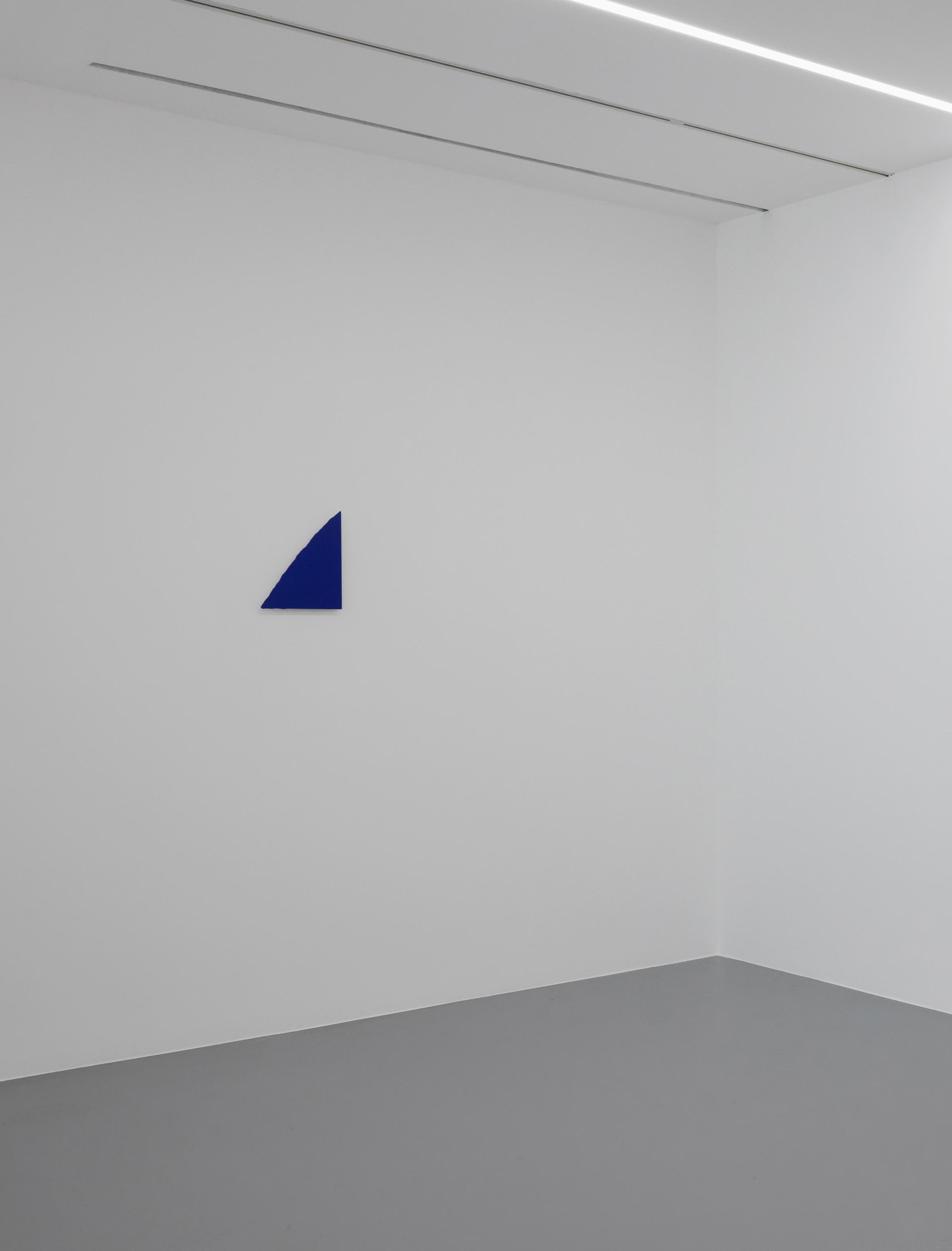
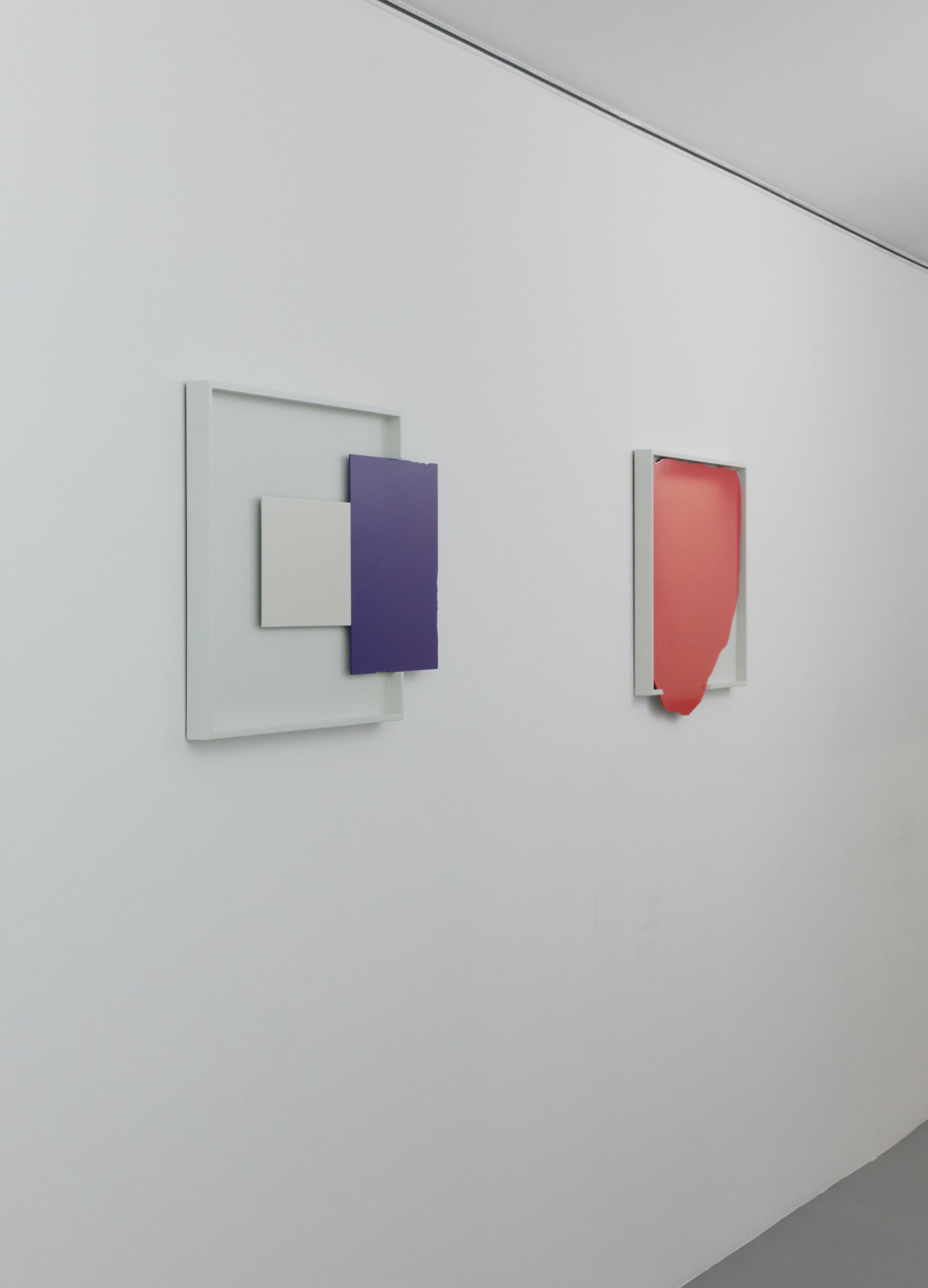
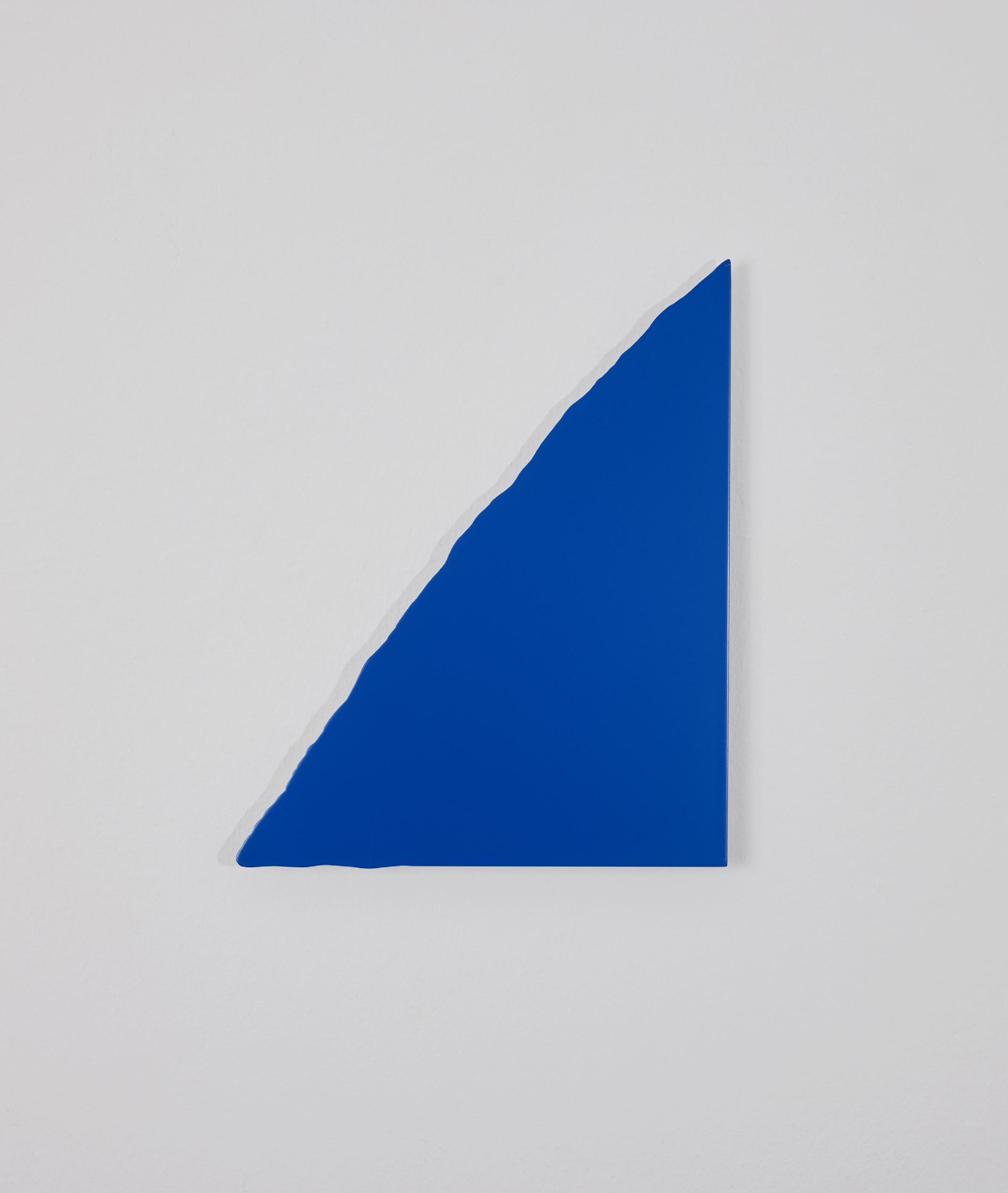
From these foundational gestures, the exhibition expands into more intimate themes of longing, relationship and faith. Works such as The hitcHHiker (96–139, c. 1977–1980), Solace, To Have and To Hold, and NA7URAL HIS7ORY: Constant Leroy (Fig. 10) explore emotional and relational terrains, while others point toward more intangible, otherworldly forces. In Faith, for instance, these ideas are distilled into a solid blue triangle, a form that symbolises humanity’s upward struggle toward divine goodness amidst adversity. Across such works, Ho uses the recurring motif of disrupted or crooked edges to suggest the inevitability of rise and fall, underscoring the inherent vulnerability of human nature.
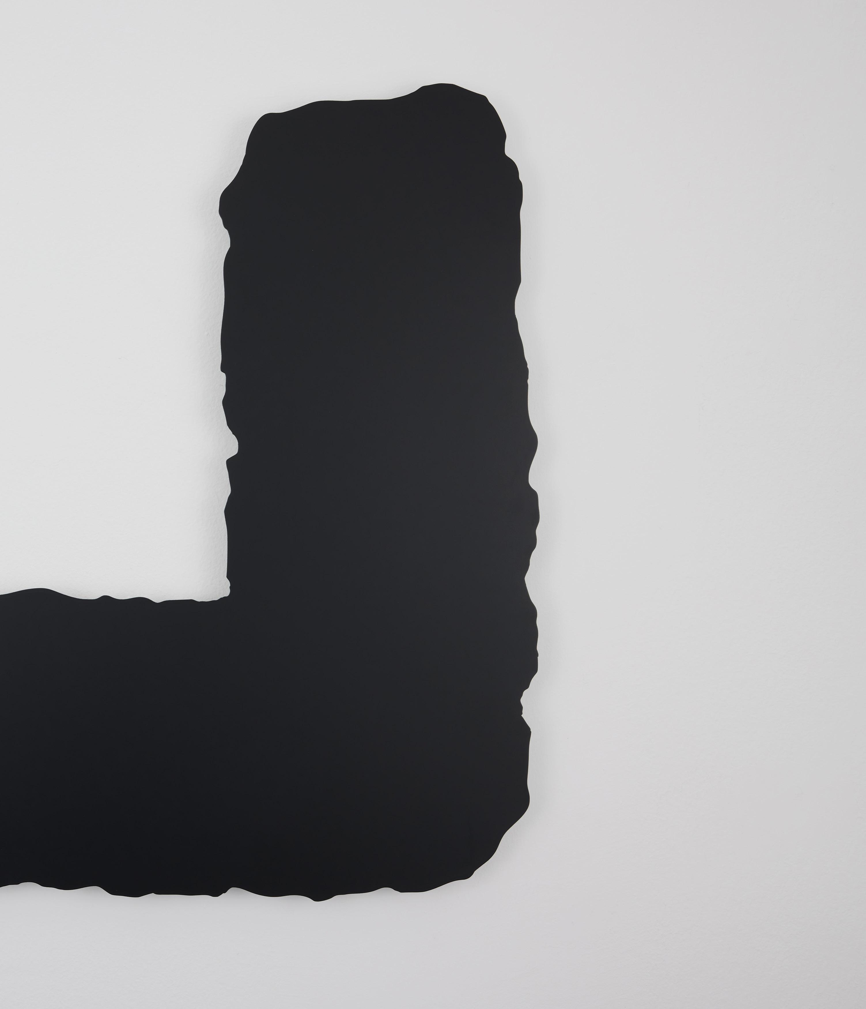
This tension between earthly grounding and spiritual aspiration is further developed in The Horizontal and The Vertical and But Not Like Tonight. The former, in both title and form, draws inspiration from the axes of the Crucifix and serves as a personal reminder of the need to sustain both horizontal (earthly) and vertical (spiritual) relationships. The latter—its title taken from a song by the British electronic band Depeche Mode—extends this reflection through triangular apertures formed by falling black rectangles held in suspension, suggesting that adversity, however unwelcome, may yet open unforeseen paths of growth.
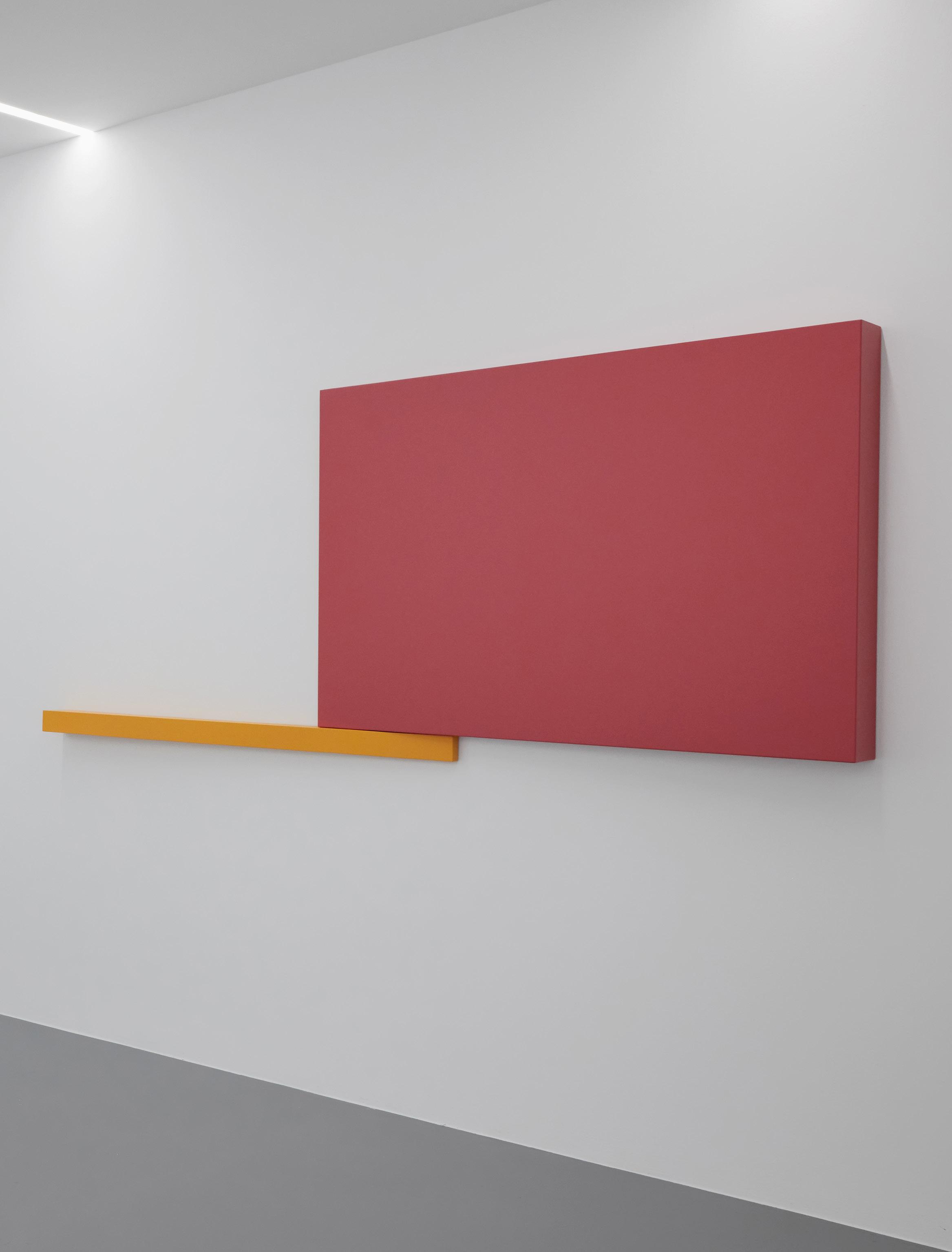
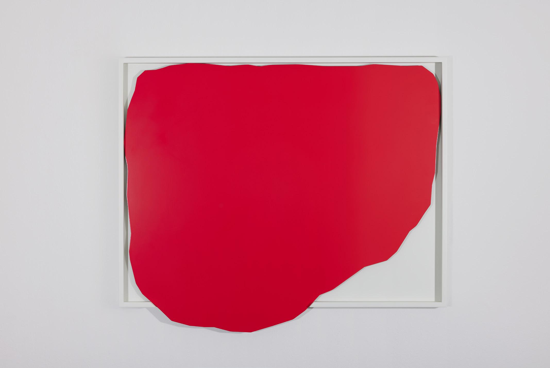
Between constraint and freedom, IN/OF (Blue) and Flow No. 28 unfold as gestures drawn from Ho’s memory of his then-young son, who in kindergarten, enthusiastically coloured beyond the lines. Forms seem to spill past their limits, as if resisting containment and order. IN/OF (Blue) resolves into a more geometric logic, quietly suggestive of subversion and counterculture, while the blood-red Flow No. 28 moves in a more organic manner. Both ask the viewer to follow their traces toward uncharted paths.
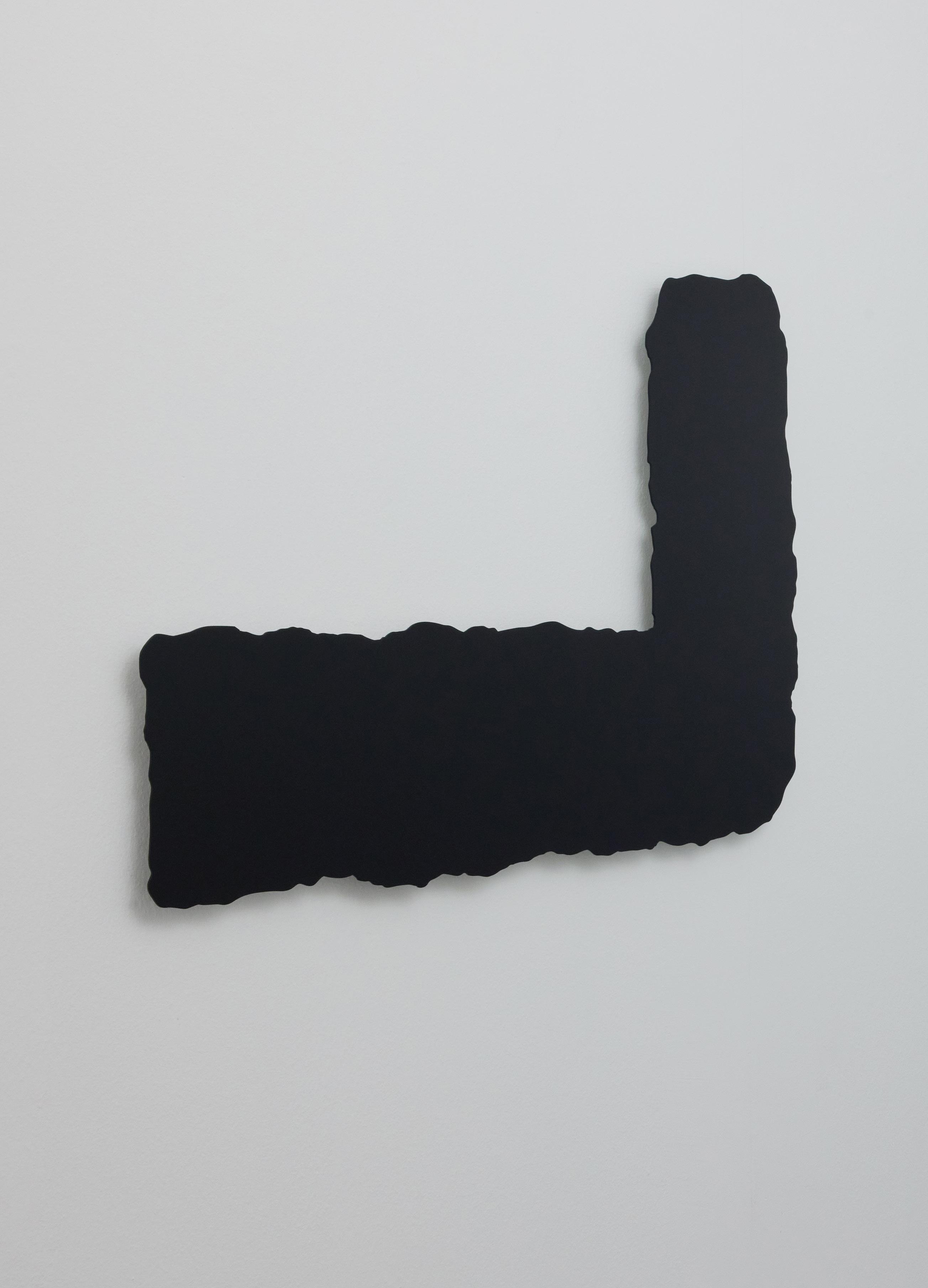
In a similar vein, She Said (He Said) develops this trajectory further. Initially titled “Free Will,” the “torn” composition arose from a remark by Ho’s wife, who expressed her wish for him to live free from constraint. It led him to reflect on the idea of tabula rasa—a beginning from a clean slate—and on the possibility that freedom itself may be something first bestowed upon us. Within the seemingly unsightly tear, a crooked upward line emerges, suggesting that even rupture may hold the promise of something beautiful that is yet to come.
Finally, He Writes Straight With Crooked Lines (139–300–33J, 2004–)—from which the exhibition takes its title—charts an important yet emotionally
painful walk Ho undertook in 2004 that offered him a glimpse of hope for the future. Unlike The hitcHHiker (96–139, c. 1977–1980), the title has no concluding date, suggesting an ongoing journey that extends beyond temporal limits. In this sense, the exhibition can be read as a map of the many paths Ho has travelled over the decades. It is also a compass orienting him toward possible futures.
As Ho continues to revisit the works, he has reflected that the quiet coherence of the crooked edges begins to resolve into straight lines when viewed from a distance. What once appeared fragmented and uncertain reveals, over time, a subtle internal logic—one that is not imposed but gradually recognised. In this shifting perspective, past experiences are neither corrected nor erased, but re-seen as part of an unfolding continuity.
HE WRITES STRAIGHT WITH CROOKED LINES thus ultimately resists closure. Instead of arriving at a final destination, it sustains an openness in which meaning is continuously reconfigured through looking, remembering, and re-looking again.
References
1 In 2014, Ho was also awarded the President*s Design Award Design of the Year for A Guide to the Flora and Fauna of the World, a publication he designed in collaboration with contemporary artist Robert Zhao Renhui.
2 Hanson Ho, Word by Word We Build Ourselves, ed. Justin Zhuang (H Fifty Five (H55), 2015), p. 12.
3 Beryl McAlhone and David Stuart, A Smile in the Mind: Witty Thinking in Graphic Design (Phaidon Press, 1996).
4 Personal interview with Ho on 7 October 2015.
5 Ho, Word by Word We Build Ourselves, p. 35.
6 Ellen Lupton, ‘Visual Dictionary’, in The ABC’s of Triangle, Square, Circle: The Bauhaus and Design Theory (Princeton Architectural Press, 1999).
7 Michael Rock, ‘The Designer as Author’, Eye Magazine, Spring 1996, https://eyemagazine. com/feature/article/the-designer-as-author.
8 See the Book of Genesis 2:7 (New International Version).
Justin Zhuang is an observer of the designed world and its impact on everyday life. Since 2009, the journalism graduate has written about architecture and design in Singapore for publications around the world. He has also authored several books on the subjects, including INDEPENDENCE: The History of Graphic Design in Singapore since the 1960s (2012) and Everyday Modernism: Architecture & Society in Singapore (2022). In 2013, Zhuang was awarded the DesignSingapore Scholarship to pursue a Master of Fine Arts in Design Criticism at the School of Visual Arts in New York City. There he explored how the Third Industrial Revolution was transforming the relationship between piracy and design. Zhuang is also the founder of the Singapore Graphic Archives (graphic.sg), a digital repository of works by the professional design industry. Together with his partner Sheere Ng, he runs In Plain Words (inplainwords.sg), a writing studio and publishing imprint based in Singapore.

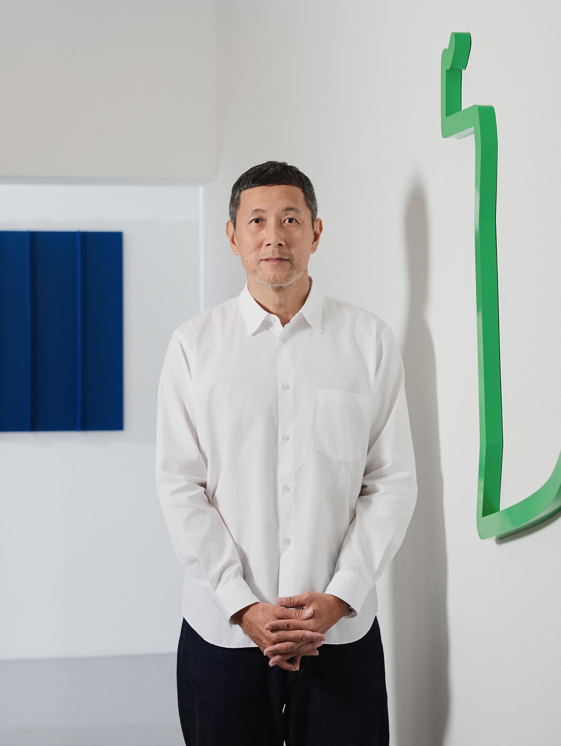
Hanson Ho (b. 1974) occupies a significant position in the history of graphic design in Singapore, with a practice that has substantially influenced the development of the nation’s visual culture. Since founding his studio H55 in 1999, Ho has cultivated a distinctive modernist aesthetic—characterised by understated expression, conceptual rigour and refined precision—that positions design as both a creative act and an intellectual endeavour.
Ho’s artistic practice emerges from the visual language he has developed as a graphic designer. Whether working in two or three dimensions, his approach seeks to endow each idea or material with a spatial, sculptural quality. His work investigates the interplay between abstraction, symbolism, and personal meaning, often engaging with existential and spiritual themes that question the role of the artist as creator. While conventional graphic symbols aim for clarity and universality, Ho’s reductive visual forms diverge from this trajectory, instead cultivating a meditative, ambient sensibility that evokes mood, emotion, and perceptual experience.
Ho’s initial engagement with abstraction was articulated in his solo exhibition Shapes (1–15) (2015) at DECK Photography Art Centre in Singapore. The exhibition presented enlarged geometric forms—ambiguous shapes that Ho regards as physicalised digital artefacts—derived from his studio’s extensive archive of graphic work. In 2018, he began the development of (Water) Shapes No.23–27, a 93-metre-long site-specific, permanent installation for the forthcoming Sungei Bedok MRT Station. The work is designed to change in appearance relative to the viewer’s position, underscoring Ho’s sustained interest in perception and spatial experience.
A two-time recipient of the President*s Design Award—Singapore’s highest honour in design—Ho was recognised as Designer of the Year in 2012 and received Design of the Year in 2014. Since the early stages of his career, he has achieved international recognition, with his graphic work honoured by institutions such as the New York One Show Design, the New York Art Directors Club, Tokyo Type Directors Club, D&AD, and the Creative Circle Awards.
Ho’s contributions have played a pivotal role in shaping Singapore’s visual identity in international contexts. His notable projects include the visual identities for the Singapore Pavilion at various Venice Biennales and Expo 2020 Dubai, as well as for Civic District Singapore, the Lee Kuan Yew World City Prize, and numerous publications for cultural institutions including the National Gallery Singapore, Singapore Art Museum, Asian Civilisations Museum, and prominent artists such as Heman Chong and Robert Zhao Renhui. His early experimental T-shirt label, Rabbit (2001–2007), was launched at Dover Street Market London, Comme des Garçons Guerrilla Store Singapore, and Colette Paris—demonstrating a cross-disciplinary sensibility from the outset.
In addition to his studio practice, Ho has contributed to public art initiatives as a curator for the Land Transport Authority’s (LTA) Art in Transit programme for the Downtown Line, and is currently overseeing the curation of artworks for four stations on the upcoming Cross Island Line. He has also served on juries for design awards including D&AD, the Creative Circle Awards, and the Singapore Good Design Awards.
Hanson Ho
6 June – 25 July 2026 FOST Gallery, Singapore
Essay: Justin Zhuang
Dossier design/exhibition identity: Hanson Ho/H55
Photography: Lavender Chang
FOST Gallery
1 Lock Road
#01-02, Gillman Barracks Singapore 108932 65 6694 3080 info@fostgallery.com www.fostgallery.com
© FOST Private Limited
© All essay / artwork images copyright Hanson Ho © All installation views copyright FOST Gallery
This catalogue is copyright. Apart from any fair dealing for the purposes of private study, research, criticism or review as permitted under the Copyright Act, no part may be reproduced by any process without written permission.