THE BOOK
International Institute for Information Design
Strom Netz Fluss Ellery Studio
International Institute for Information Design
The IIIDaward is a great celebration of what information designers contribute to society. They apply creativity and design thinking to solve complex communication problems, and to improve every aspect of human life.
When we travel, information designers help us find the way. When we buy things, they help us to make informed choices. When we pay tax or claim benefits from government, they explain our rights and responsibilities and make the process run smoothly. They reveal what data means, they help us find information quickly, and they explain how complex systems work. Information designers help us understand healthcare systems and health, and how our pension works. And more.
In spite of all this, most people know too little about information design. The IIIDaward seeks to put that right by showing off our best work.
Veronika Egger President, IIID

Latvia
TV-presenter and Latvian Art Academy
Daniel Fabry / Austria
Carlos Rosa / Portugal
IADE – Faculty of Design Universidade Europeia Lisboa
FH JOANNEUM University of Applied Sciences, Graz
International Institute for Information Design
Ilze Dobele / Latvia
Ilze Dobele / Latvia
Lachenmeier & Darjan Hil
Basel Switzerland “Visualizing Complexity“
Ilze Dobele / Latvia
Latvian journalist, TV-presenter and lecturer at the Latvian Art Academy
Carlos Rosa / Portugal
Carlos Rosa / Portugal
IADE – Faculty of Design Universidade Europeia Lisboa
Latvia
Latvian journalist, TV-presenter and lecturer at the Latvian Art Academy
Carlos Rosa / Portugal
President: Veronika Egger, Austria
Karel van der Waarde / Belgium
Audrius Klimas / Lithuania
Latvian journalist, TV-presenter and lecturer at the Latvian Art Academy
IIID Vice President for Education & Research
IADE – Faculty of Design Universidade Europeia Lisboa
Nicole Lachenmeier & Darjan Hil
Vice Presidents: Karel van der Waarde, Belgium
Lithuanian graphic designer. professor at the Vilnius Art Academy
Martin Fößleitner, Austria
studio superdot in Basel Switzerland authors of “Visualizing Complexity“
Gillian Harvey, Canada
Claudine Jaenichen, USA
Robert Linsky, USA
Alex Tyers, Australia
Carlos Rosa / Portugal
Academy Nicole Lachenmeier & Darjan Hil
more than one category? as many categories
TV-presenter and Latvian Art Academy
IADE – Faculty of Design Universidade Europeia Lisboa Lithuania Academy Nicole Lachenmeier & Darjan Hil
However, each submission individually, and entry fee for each..
van der Waarde / Belgium
IIID Vice President for Education & Research
Karel van der Waarde / Belgium
IIID Vice President for Education & Research
van der Waarde / Belgium
Social Affairs
studio superdot in Basel Switzerland authors of “Visualizing Complexity“
IADE – Faculty of Design Universidade Europeia Lisboa
Past Presidents: Michael Hardt
studio superdot in Basel Switzerland authors of “Visualizing Complexity“
Erik Spiekermann
Projects that have a positive, tangible, impact on a specific population, gender equality and democracy.
should I choose?
category you feel best reflects
Emergency / Safety
Latvia
You can enter the same than one category. please contact us.
Can I submit to more than one category?
Robert O. Swinehart
Clive Richards
Rob Waller
Ensuring hazards are properly identified and avoided, and the consequences when they‘re not.
IIID Vice President for Education & Research
You can submit to as many categories as you like. However, each submission must be entered individually, and you must pay the entry fee for each..
Which category should I choose?
Founder: Peter Simlinger
Carlos Rosa / Portugal
Lachenmeier & Darjan Hil
TV-presenter and Latvian Art Academy
Didactics
Basel Switzerland “Visualizing Complexity“
Can I submit to more than one category? You can submit to as many categories as you like. However, each submission must be entered individually, and you must pay the entry fee for each..
Karel van der Waarde / Belgium
IADE – Faculty of Design Universidade Europeia Lisboa
Whichever category you feel best reflects your submission. You can enter the same project in more than one category. If you are unsure, please contact us.
IIID Vice President for Education & Research
Projects that focus on educational or instructional information design.
Can I submit to more than one category? You can submit to as many categories as you like. However, each submission must be entered individually, and you must pay the entry fee for each..
Which category should I choose?
Products and Services
Lachenmeier & Darjan Hil
design.
Basel Switzerland “Visualizing Complexity“
an information able to fit the most on two pages. Please this enables direct IIIDaward book layout. within the template the questions: challenge? solution? effect? please feel free to use according to your needs, within the grid.
Projects that help make products and services accessible, understandable and beneficial for the users.
than one category? many categories each submission individually, and entry fee for each..
Which category should I choose?
Why a template?
Whichever category you feel best reflects your submission. You can enter the same project in more than one category. If you are unsure, please contact us.
Supporters 2026:
We expect that as an information designer you are able to fit the most important points on two pages. Please use the template, this enables direct production of the IIIDaward book layout.
Whichever category you feel best reflects your submission. You can enter the same project in more than one category. If you are unsure, please contact us.
Karel van der Waarde / Belgium
Why a template?
Editorial Submission related to media, journalism and writing, analogue as digital.
IIID Vice President for Education & Research
Why a template?

Please answer within the template the following questions:
- What was the challenge?
- What was the solution?
- What was the effect?
For your entry please feel free to use the two pages according to your needs, as long you stay within the grid.
Future Concepts
We expect that as an information designer you are able to fit the most important points on two pages. Please use the template, this enables direct production of the IIIDaward book layout. Please answer within the template the following questions:
New and innovative projects.
than one category?
Research
many categories each submission individually, and entry fee for each..
it cost to submit? submitted project, entries in the BA & MA costs of 190,- will the awarded projects in all the BA & MA category. award-Gallery, Book and Tour will be displayed in the awarded submissions will award-book and of the exhibition tour.
- What was the challenge?
Something that makes us wish we had thought of it first!
How much does it cost to submit?
- What was the solution?
We expect that as an information designer you are able to fit the most important points on two pages. Please use the template, this enables direct production of the IIIDaward book layout. Please answer within the template the following questions:
- What was the effect?
- What was the challenge?
- What was the solution?
- What was the effect?

For your entry please feel free to use the two pages according to your needs, as long you stay within the grid.
Methods and tools for information design.
For your entry please feel free to use the two pages according to your needs, as long you stay within the grid.
Bachelors and Masters
How much does it cost to submit?
Thesis by students showing new approaches, methods and research.
How much does it cost to submit?
should I choose? you feel best reflects can enter the same one category. please contact us.
January 31st,
should I choose? you feel best reflects can enter the same one category. please contact us. information able to fit the most two pages. Please this enables direct IIIDaward book layout. within the template the challenge? solution? effect? feel free to use according to your needs, within the grid.
160,- Euro per submitted project, 50,- Euro for entries in the BA & MA category. Awards costs of 190,- will applied only to the awarded projects in all categories except the BA & MA category.


IIIDaward-Gallery, Book and Tour
160,- Euro per submitted project, 50,- Euro for entries in the BA & MA category. Awards costs of 190,- will applied only to the awarded projects in all categories except the BA & MA category.
160,- Euro per submitted project, 50,- Euro for entries in the BA & MA category. Awards costs of 190,- will applied only to the awarded projects in all categories except the BA & MA category.
IIIDaward-Gallery, Book and Tour
IIIDaward-Gallery, Book and Tour

All submissions will be displayed in the online-gallery, awarded submissions will be part of the IIIDaward-book and of the IIIDaward exhibition tour.


All submissions will be displayed in the online-gallery, awarded submissions will be part of the IIIDaward-book and of the IIIDaward exhibition tour.
evaluated on the following criteria: solving procedure: users
cost to submit?
information able to fit the most two pages. Please this enables direct IIIDaward book layout.
All submissions will be displayed in the online-gallery, awarded submissions will be part of the IIIDaward-book and of the IIIDaward exhibition tour.
Jury Meeting
Österreichisches Gesellschaftsund Wirtschaftsmuseum Vienna
Wieckowska / Poland
Academy of Fine Arts and Design Katowice
Tingyi S. Lin / Taiwan
Design Department NTUST Taipei
Evija Kraukle / Latvia
BEDA / Europe designaustria / Vienna
van der Waarde / Belgium
IIID Vice President University of Hasselt
Olivier Arcioli / Germany
New Design University St.Pölten, Austria
Christiane Thenius
Österreichisches Gesellschaftsund Wirtschaftsmuseum Vienna
DEREE-The American College of Greece
Tokyo
Olivier
Deborah Schultheiss
MAKING THE INVISIBLE VISIBLE
In addition to her thoughtful and meaningful choice of topic, which is highly relevant, Deborah demonstrates a very sensitive, innovative, and imaginative approach to information design in her work. Particularly in relation to the medium of the book, she develops compelling forms of rhythm, narration, and dramaturgy by making optimal use of the physical book’s structural characteristics to showcase information. Her experimental approach to information graphics is especially noteworthy. The subtle color gradient from blue to red, which extends throughout the entire book, can initially be read as the book’s structure but simultaneously reveals itself as a information graphic that serves as a visual framework unifying the entire content. The refined manner in which our perception and the accessibility of information are engaged here opens up novel approaches to dealing with complex and abstract content.
The heart icon next to a project indicates that it is a personal favorite (darling) of one of the jury members.
The design of the description of the medieval painting on the wooden ceiling of the Sala Magna at the Palazzo Chiaromonte in Palermo is an extraordinary information design project. The different narratives are based on court scenes and biblical episodes that are hard to understand or interpret.
A combination of analog and digital tools makes these highly complex visual narratives accessible in different ways. It motivates the viewer to look more carefully and explore the stories in a structured manner. It is a great example of the possibility to involve people in appreciating a very complex series of paintings. I wish more historical paintings were made accessible through this approach. It is not only very informative, but also both entertaining as well as thought provoking.
Keiichi
Markus Scheiber PFEIFER HOLZ FACTORY PREMISES
I like this project because of its creative approach to combine modern designs, typically found in office environments, in space with dusty and harsh environment. Although it was technologically complicated to adopt, the project creates an intuitive and simple work process for navigation. I also appreciate the courage to use these artistic expressions that helps not only to safety but also to boost the spirits of the workers. Overall, it is an excellent approach that effectively combines pictograms, colors and wayfinding systems, that makes it a unique and inspiring example of information design.
Tingyi & Anastasia
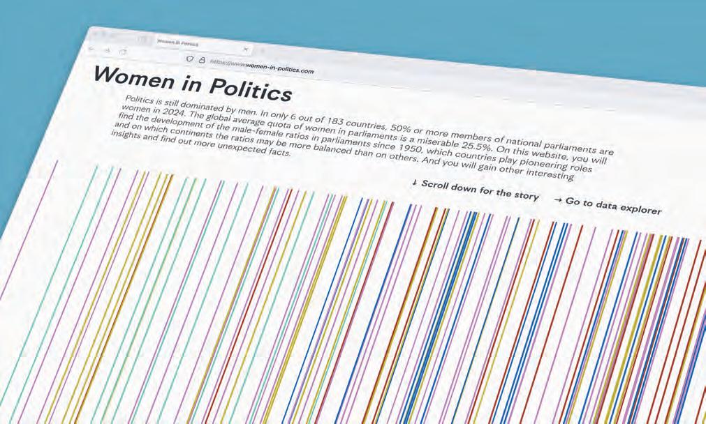
Barbara Hahn, Christine Zimmermann WOMEN IN POLITICS
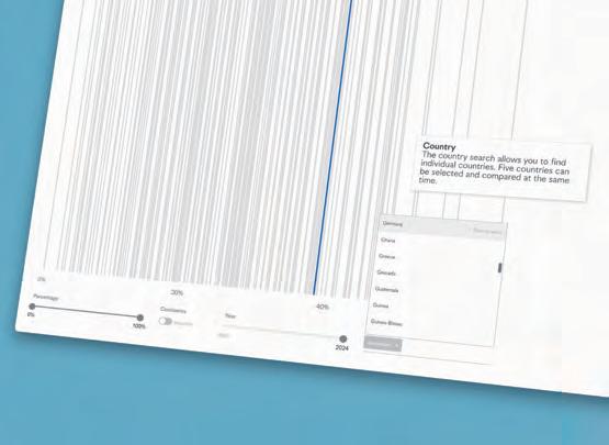
A thoughtfully designed cross-media campaign that compellingly illustrates the evolution of women’s representation in the parliaments of 193 countries since 1950. The scrollytelling website offers an engaging and intuitive platform for interactive data exploration, enabling meaningful comparisons across continents and nations. By transforming decades of gender data into a cohesive multi-sensory experience spanning digital, print, and physical applications, the project demonstrates both conceptual clarity and strong execution. The work stands out for its powerful visual storytelling, successfully translating historical data into an impactful narrative with global relevance.


Christiane Ieva Skuja-Zelca, Marta Smilga JUST
My favourite impressed me with its clarity and practical relevance. The Heat Pump Calculator by Voilà: takes a genuinely complex topic and makes it accessible to a broad audience. What stands out is the way information is revealed step by step, guiding users through a personalized experience without ever overwhelming them. Simple visuals and clear comparisons turn abstract data about costs and emissions into something people can actually act on. A strong example of how good information design can make a real difference in people‘s everyday decisions. Love that you get to fill in the color and interact with all the illustrations. It gives you a really mindful approach to the topic.
Anastasia & Tingyi
Naomi Hinkelmann
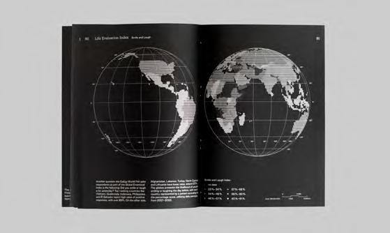
GEOGRAPHY OF HAPPINESS
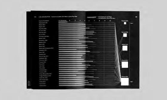
Geography of Happiness presents an excellent exploration of a complex and deeply human subject. The project maintains a polished narrative structure, with exceptional visual execution. A very strong design choice was the use of black and white in a topic mostly associated with vibrant and positive visuals, giving the work depth, and reflective quality, while eliminating emotional biases. The work presents a strong and coherent visual system, with excellent technical execution of typography, data, and effective composition. Ultimately, the work feels thoughtful, engaging, and visually refined.
I like the information booklet „Just in Time. Ways to Spend Time in the Hospital“ because it can be seen in the tradition of Marie Neurath‘s work on children‘s books: targeting children and young people in their everyday life situations, engaging them and making understand what‘s going on around them. The hospital is such an area: children sometimes spend hours and hours there and don‘t understand what‘s behind. Maybe they are anxious or disturbed - at the hospital everything sounds and smells different than usually, there‘re other routines than at home. The project gives children and accompanying adults the possibility to spend the stay at the hospital while learning more about clinic related topics. This interactive tool combines information and play, is inclusively designed and contains a clear icon system that helps children become familiar with hospital procedures.
Afroditi Ju Eun Lee BURNT-OUT TREES ARCHIVE
The Burnt-out Trees Archive stands out for its intuitive and adaptable design, utilizing a ring-bound system that allows the collection to be a „living“ document updated as new wildfire data emerge. The inclusion of red film sheets is a brilliant choice; it moves the reader beyond passive observation, requiring a physical interaction that makes the scale of destruction instantly visible and felt. By replacing traditional abstract charts with the silhouettes of native trees, the project translates cold statistics into a deeply emotional narrative. This simplified visual language, ensures the message is accessible to all ages while magnifying the impact of the loss being documented.
Evija Mao Kudo GRAPHIC 4 SPECIAL NEEDS SCHOOL
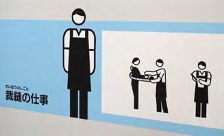
A large-scale information design system that aids learning, stimulates pupils and supports long-term social integration. It‘s interesting how the project turns the whole building into a learning tool — moving through it naturally takes you from concrete cues to abstract thinking, making walking around itself a way of learning. The pictograms don‘t only help with orientation, they also subtly introduce everyday job roles, building meaning over time. A compelling next step could be making the system responsive — evolving based on how students interact with it, turning the space learning from the pupils.

How does the bird say?
Some ideas outlast their original context and quietly travel on. Graziella Tonfoni introduced the metaphor of the Italian espresso as a lens for understanding information design: strong content, well-crafted, as short as necessary, simple in means, sweet in presentation, and enjoyed in public life.
Born in Bologna in 1957, Graziella Tonfoni earned her doctorate in linguistics magna cum laude from the University of Bologna in 1980. She served as a research professor at the Alma Mater Studiorum (University of Bologna) from 1983 to 2015, and held visiting positions at MIT, Harvard University, and the University of Maryland. At the intersection of AI and Information Design, Tonfoni developed a highly original body of work bridging linguistics, cognitive science, and computer science. Her key contributions include:
Writing as a Visual Art (1994): introduced methods for integrating visual markers and layout structures into text communication to enhance readability and cognitive processing.
Information Design: The Knowledge Architect‘s Toolkit (1998): positioned the information designer as a „knowledge architect,“ applying spatial and structural metaphors to the organization of communication.
Visualizing Document Processing (2004, with Lakhmi Jain): presented an AI-driven model for text generation and comprehension, aimed at developing „information engineering“ competencies for knowledge management systems.
Her approach is interdisciplinary: rather than treating information design as a graphic discipline, she consistently frames it as a computational and cognitive challenge — making her work a rare bridge between natural language processing, artificial intelligence, and design theory. In 1984 she received the Minerva Award for outstanding women in science.
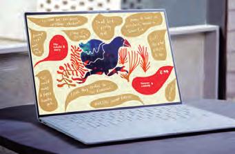
represents the pinnacle of achievement at this year’s edition, recognizing the most outstanding submission among all entries. This prestigious accolade honours exceptional creativity, innovation, and excellence in information design, setting a benchmark for the industry. The recipient of the Grand Prix demonstrates visionary thinking and exceptional execution, embodying the highest standards of the discipline.
What was the challenge?
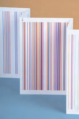
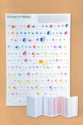
Through powerful data visualisations, we wanted to reveal how women’s representation in the parliaments of 193 countries has changed – and how it has evolved globally since 1950.
What was the solution?
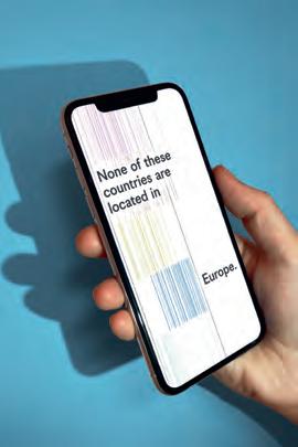
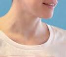
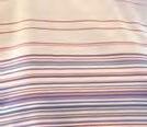
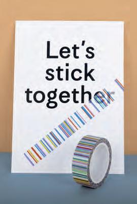
A cross-media campaign brings the data to life visually. The key visual – a grid of lines, each representing the share of women in a country – works across multiple channels. At its core, a scrollytelling website enables interactive exploration of the dataset and comparisons between continents and countries. Teaser animations draw attention on social media. A printed leporello presents the ranking of all countries, while a poster compares the share of women in upper and lower houses of parliament. A T-shirt and washi tape bring the visualisation into the physical world.
What was the effect?
The project transforms decades of gender data into a bold, multi-sensory experience – spanning web, print, and everyday objects. It makes underrepresentation visible in new, memorable ways. Rather than aiming for measurable outcomes, it sparks awareness, reflection, and dialogue about gender equality in politics – across platforms, contexts, and audiences. On International Women’s Day 2025, project materials such as postcards and washi tapes were distributed among 350 women gathered at the Swiss Federal Palace.
Contact:
name: Concept & Design: Barbara Hahn, Sophia Huber, Karin Hugentobler, Irina Lezaic, Alessia Sträuli, Christine Zimmermann (Hahn+Zimmermann); Development: Katja Vock company/organisation: Hahn+Zimmermann website: hahn-zimmermann.ch, katjavock.ch project website: women-in-politics.com




reflects the collective spirit and discerning eye of the IIIDaward jury members. The prize embodies the mood of thoughtful evaluation and appreciation that defined the jury’s work in 2026.
What was the challenge?
Happiness is a universally relevant yet highly subjective and abstract concept. Although extensive data on global wellbeing exists, it is often fragmented, difficult to interpret, or inaccessible to non-experts. The challenge was to translate complex, multi-layered happiness data into clear and meaningful information while preserving emotional and cultural nuances, and to connect global statistical findings with individual perceptions of happiness.
What was the solution?
Geography of Happiness addresses the challenge by combining rigorous research with visual design. Using qualitative insights and quantitative data from sources such as the Gallup World Poll, the World Happiness Report, and the Happiness Research Institute, the publication translates complex data into accessible visual narratives. Twenty-one infographics, maps, and structured visual systems reveal patterns and trends in global and personal wellbeing. A conceptual black-and-white design reduces emotional bias and supports reflection, while editorial texts and an explanatory index guide readers through the material. Design decisions, including fold-out cover pages with personal definitions of happiness, ensure the information is understandable and actionable, bridging global statistics with individual experience.

Contact:
name: Naomi Hinkelmann company/organisation: New Design University [AT] e-mail: hello@naomihinkelmann.com website: naomihinkelmann.com
What was the effect?
Over 120 pages, Geography of Happiness translates complex global and personal wellbeing data into clear visuals and narratives, enabling readers to understand patterns, reflect on their own happiness, and engage in informed discussions. It functions as both an information resource and a tool for awareness, while also improving critical thinking, and dialogue on wellbeing.
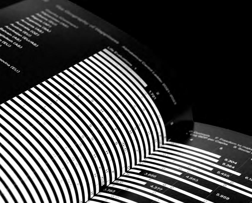
Cantril Ladder visualization showing life satisfaction across 143 countries. Bars represent overall happiness levels, broken down by key contributing factors and ranked relative to the hypothetical baseline country “Dystopia.”
„Data transformed into information empowers people.“
Peter Simlinger founded IIID in 1986 and played a key role in the development of design in Austria and internationally. Together with Willy de Majo, he made IIID an affiliate member of Icograda. As its president he changed the name of the organisation to designaustria.
Among many other pictograms he designed ISO 7001 - TF006 for buses, which can travel in both directions and his wayfinding expertise guides passengers safely within the Austrian Federal Railways (ÖBB) and through the Vienna Airport.
The prize for the project that best embodies Peter Simlinger‘s definition of ID across all categories will be awarded: „Data transformed into high-quality information empowers people to attain their goals.“
Thanks to Peter‘s wife Vera, his family and many friends the Peter Simlinger Prize is endowed with Euro 2,500,- .
What was the challenge?
Civic data is often difficult to find and hard for citizens to interpret. USAFacts, a non-partisan non-profit, bridges this gap by making U.S. government data accessible to support an informed public. As the organization grew, it faced a technical challenge: creating visually consistent, recognizable, and accessible visualizations at scale across disparate teams and media, from web, social media, and video, to formal reports for U.S. Congress.
What was the solution?
We developed a comprehensive data visualization design system that unifies all visualization layers: an AA-compliant color palette for accessibility, typographic hierarchies, and standardized annotation rules. To ensure brand attribution without a logo, we introduced signature “visual markers” – a warm gray background and a signature magenta rule. The system was built for the specific software tools used by product and marketing teams to ensure the guidelines were realistic and implementable.
What was the effect?
Standardizing chart components has streamlined production and reduced custom design work while creating a cohesive, “ownable” look. Evaluative “think-aloud” testing confirmed the standards improved user comprehension and perceived trustworthiness. USAFacts now scales complex data stories, like congressional reports and the Just the Facts video series, faster and more reliably. Ultimately, this ensures the public receives non-partisan data that is accessible, visually elegant, and more timely.
Contact:
name: Chad Hall, Julia Anderson, Holger Kuehnle (Artefact), Devon Savage, Amber Thomas, Erica Morse (USAFacts) company/organisation: Artefact, USAFacts e-mail: chad@artefactgroup.com website: artefactgroup.com / usafacts.org
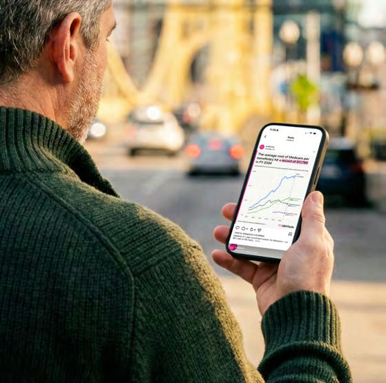
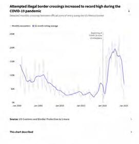
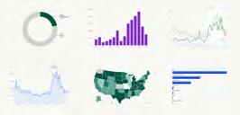
Above: A key change in the system was pulling USAFacts’ core brand color, Magenta, out of the visualization palette. This helps support the concept of USAFacts not being the source of data, but providing context for the data.
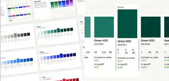
Above: Samples from the 81-page visualization guide. These pages demonstrate the focus on contrast and color vision deficiency to ensure accessibility at the system level.
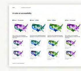
Below: Demonstration of how the palette, axes, and labeling can adapt to different chart types of varying complexity ensuring unity and variety as the system is applied at scale.
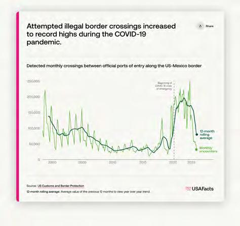
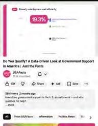
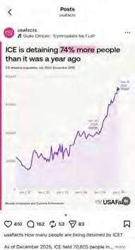
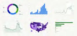
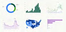
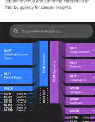

Left: Samples of the system in action across video series, social posts, and interactive web visualizations.

„It is the responsibility of the ‚transformer‘ to understand the data... to decide what is worth transmitting to the public, how to make it understandable... In this sense, the transformer is the ‚trustee of the public‘.“
The inaugural Marie Reidemeister Award, a collaborative initiative between IIID and the Museum of Economics and Social Affairs Vienna (Gesellschafts- und Wirtschaftsmuseum Wien), was launched to recognise outstanding works in Maries understanding of the transformer. Reidemeister was educated as a physicist, mathematician and also had attended art school. She and fellow senior transformer* Friedrich Bauermeister, organized the information into comprehensible formats, in a role that would be described today as a graphic designer. Marie explained the work of the transformer: “From the data given in words and figures, a way has to be found to extract the essential facts and put them into picture form. It is the responsibility of the transformer to understand the data, to get all necessary information from the expert, to decide what is worth transmitting to the public, how to make it understandable, and how to link it with general knowledge or with information already given in other charts. In this sense, the transformer is the trustee of the public. He has to remember the rules and to keep them, adding new variations where advisable, at the same time avoiding unnecessary deviations which would only confuse. He has to produce a rough chart in which many details have been decided: title; arrangement, type number, and color of symbol; caption, etc. It is a blueprint from which the artist works.”
By combining IIID’s global perspective with the Wirtschaftsmuseum’s cultural, educational and civic reach, the Marie Reidemeister Award seeks to elevate design that is informed by evidence and grounded in social responsibility, fostering work that makes life more accessible, dignified and equitable for all.
What was the challenge?
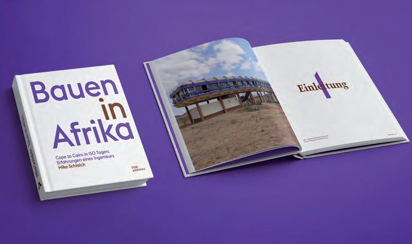
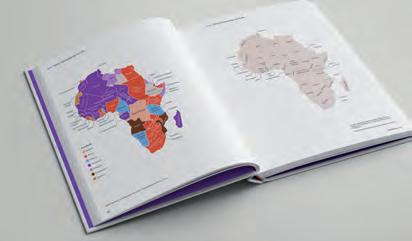
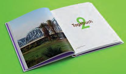
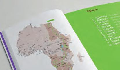
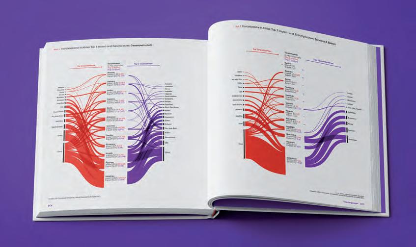
Twelve countries in 150 days: civil engineer Mike Schlaich has embarked on a journey across Africa. His goal: to experience the continent’s roads, railways and bridges –and to learn about civil engineering culture. Schlaich’s observations culminate in seven reflections on the present and future of civil engineering in Africa. These comprehensively researched texts, supported by impressively presented data, were to be translated into a visually informative and appealing book in order to promote engagement with the continent, which will become increasingly important in the coming years.
What was the solution?
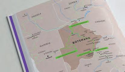
A book with a clear and fresh design. The chapters are structured with bright colours, easy to read, large and bold. This reflects how the author sees the continent and wants it to be portrayed. With information graphics that make it easier to gain an insight into the world of civil engineering. An itinerary that is easy to follow on an attractive map from the Cape to Cairo, with detailed maps showing the daily distances. Bridges that cross the four longest rivers in Africa. Nine Trans-African Highways. The connection between prosperity and infrastructure. Africa with China, Europe and the USA, all this and much more illustrated with data graphics that are a joy to look at, that can be grasped and understood at a glance.
What was the effect?
What makes the book worth reading, apart from its wealth of knowledge, are the extensively researched, highly informative, clearly laid out graphics and the tentative, questioning tone that reveals unconventional thinking on the subject of “Building in Africa”.
The designers of this book were also advisors on the text and content structure of the chapters. They were involved in the selection of images and the choice of meaningful content for the data graphics. We travelled with them once again from the Cape to Cairo, what an adventure!
Contact: Moniteurs info@moniteurs.de www.moniteurs.de
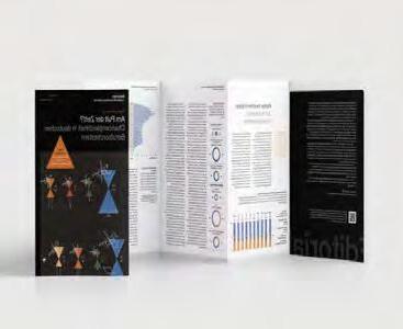

The Editor’s Choice Award recognizes outstanding submissions that may not shine as brightly but possess unique qualities deserving attention. This acknowledgment highlights subtle excellence and innovation that enrich the field of design, like these three projects, which caused long discussions in the jury meeting.
Category: Universal Design Project: Pictogram
What was the challenge?
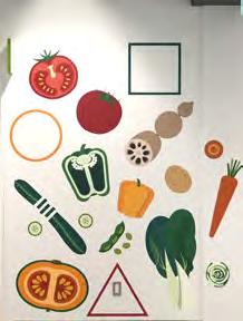
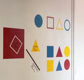
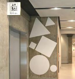
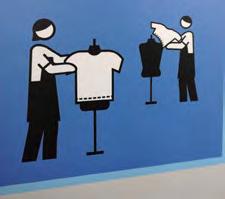
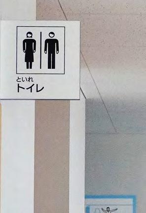
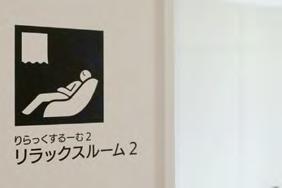
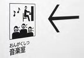
We challenged to design pictograms that are easy to understand regardless of intellectual disabilities and free from gender bias. Designing environmental graphics that can be utilized in the learning of children with intellectual disabilities. These designed for use in learning tailored to the developmental stages of them, through repeated discussions with special needs education teachers.
Bacic Concept for Placement of Environmental Graphics: 1st to 3rd floor according to their level of development, their learning becomes symbolic and abstract
Geometric: circle, triangle, square, etc Quantitative, Cognitive: numbers, etc
What was the solution?
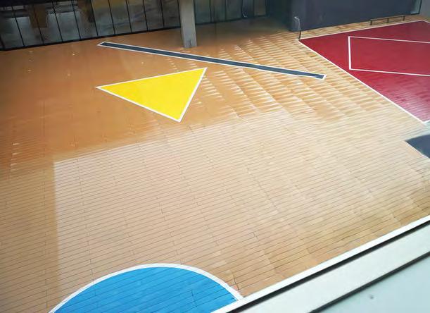
Children with intellectual disabilities learn to recognise pictograms, understand them, and move between classrooms independently. Building the environment where they can “understand and act” to foster self-directed behaviour in social. Environmental graphics have been installed on the school walls and outdoor flooring, creating an environment where children with intellectual disabilities can see, touch and learn through enjoyment outside of lessons. Some of environmental graphics were created based on circles, triangles and squares. This theme was chosen as these shapes relate to learning the corresponding letters. Additionally, we created these focusing on embodied cognition, quantity, and map.
What was the effect?
Promoting independent behaviour in children with intellectual disabilities and contributing to their social functioning after graduation. Outside of classrooms and lesson times, they can learn through play.
Contact: name: Mao Kudo
company/organisation: Kyushu University/ Faculty of Design
e-mail: m-kudo@design.kyushu-u.ac.jp website: https://www.design.kyushu-u. ac.jp/~m-kudo/
EDITOR‘S CHOICE
Project: How can graphic and participatory design support children learning of music?
What was the challenge?
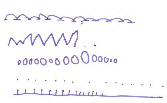
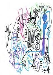
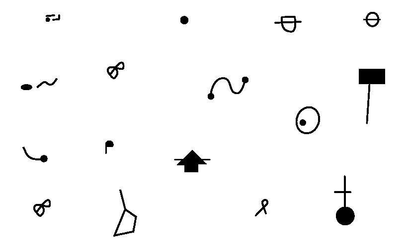
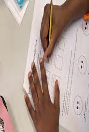
Early music education often relies on standard musical notation, a system that can be difficult for young children to interpret, particularly at the beginning of their learning process. The challenge was therefore to explore whether design could support the basic understanding of music in a way that aligns with children’s (aged 5–7) visual perception of sound (pictures 1 to 5).
What was the solution?
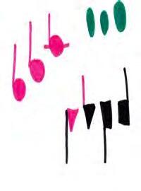
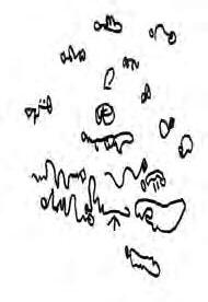
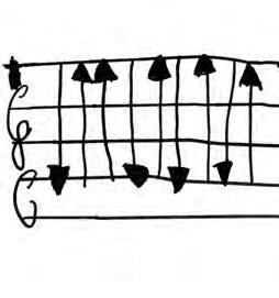
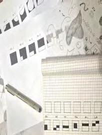
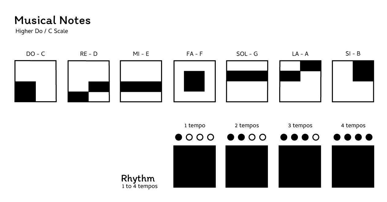
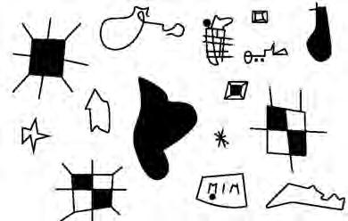
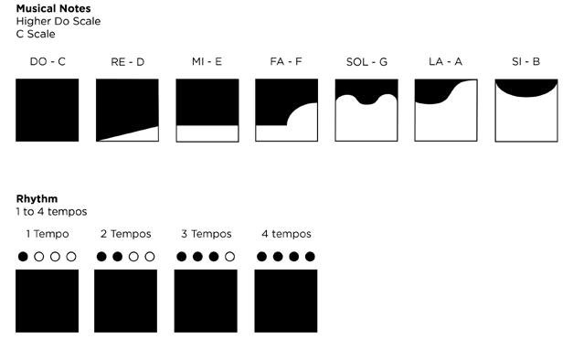
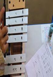
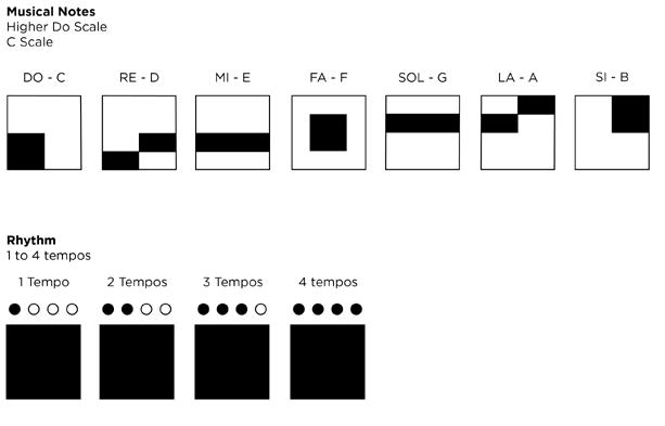
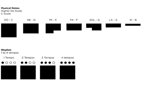
The project adopted a participatory research approach involving children from the first year of primary school. In an initial phase, children were invited to draw their own notations based on the melody of “Twinkle, Twinkle, Little Star”. Their drawings revealed different ways of visually translating sound, which were analysed and grouped into five notation types. These insights informed the design of three alternative notation systems, later tested and refined through A/B comparisons with both children and a group of musicians, to reach the best option (pictures 6, 8 and 9 - drafts; 10 to 12 - Alternative Systems; 13 to 15 - A/B testing). We focused on basic features, such as Do/C Major Scale and Tempo (1 to 4 times).
What was the effect?
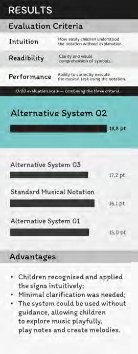
The testing process demonstrated the selected alternative systems enabled children to interpret and engage with musical information more effectively than standard notation in the experimental context. The results suggest that participatory design methods can reveal intuitive visual strategies already used by children and translate them into structured learning tools. More broadly, the project highlights how graphic design can contribute to more accessible and engaging approaches to music education (picture 7 - selected system, and picture 16 - results).
Contact:
Design Supervisor: Carlos Rosa
Graphic/Info Design: Inês P. Antunes
Music Specialist: Flávio de Almeida company/organisation: UNIDCOM/IADE, IADE - Universidade Europeia
e-mail: carlos.rosa@universidadeeuropeia.pt
EDITOR‘S CHOICE
Artificial Intelligence systems are increasingly present in everyday life, yet their internal decision-making remains a black box—opaque even to the most curious non-experts. Despite growing regulatory and societal demand for AI transparency, there is a significant lack of visual explainers designed for audiences without a technical background. To address this, it was necessary to first identify what a nonexpert actually needs to understand about how an AI system makes decisions. These information needs were established as: understanding what data the system receives and how it is defined; understanding how the system interprets that data to reach a decision; understanding what happens when a decision is wrong; understanding how the system learns from that error; and understanding how this process repeats until correct decisions are achieved. The challenge was to make all these processes visible, intelligible, and meaningful, without resorting to mathematical notation, statistical formulas or technical jargon.
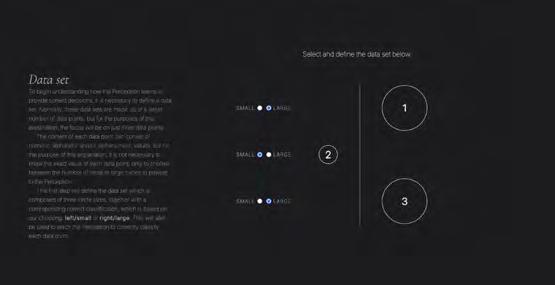
Since modern AI systems are built on networks of artificial neurons, the Perceptron—the model that most closely resembles a single artificial neuron—was chosen as the subject: an entry point for understanding a fundamental building block underlying all modern Machine Learning systems. Based on this AI system, the Perceptron Decision Explainer was developed—an interactive, web-based scrollytelling visualization structured around the previously identified information needs, that enables users to set the rhythm of their own reading, transforming abstract concepts into a perceived understanding experience. Each need is addressed by a dedicated section of the explainer. The data definition need is met by an interactive interface that lets users define their own data set before the explanation begins, creating immediate personal investment. The interpretation and decision needs are addressed through a mechanical sorting analogy: a retractable diagonal line encodes the weighted sum (the Perceptron’s interpretation) and a central vertical line represents the activation function (its decision), with numbered circles representing data points flowing through the system one by one. The error and learning needs are made visible through purposeful color encoding: green for correct decisions, red for incorrect ones and flashing yellow for the learning procedure—applied simultaneously to both the diagonal line and the corresponding data point to make the causal relationship between error and system learning explicit. An interactive iteration histogram allows users to explore and compare the system’s full decision history. All statistical and alphanumeric references were deliberately removed. Anthropomorphized text supports, without replacing, the visualization, making technical concepts relatable without oversimplifying them. This project was developed iteratively across six prior versions, with every decision grounded in the findings of the previous iteration.
Contact:
name: Marco Heleno (supervised by Nuno Correia & Miguel Carvalhais) company/organisation: NOVA LINCS & Faculdade de Ciências e Tecnologia, Universidade NOVA de Lisboa, Portugal (funded by FCT grant PD/BD/150328/2019 and FCT/MCTES NOVA LINCS UIDB/04516/2020)
e-mail: hellomarcoheleno@gmail.com
website: https://marcoheleno.gitlab.io/ projects/perceptrondecisionexplainer/
EDITOR‘S CHOICE
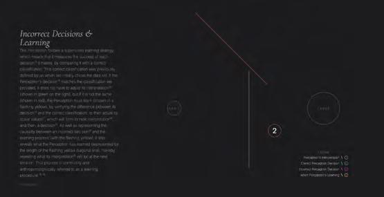
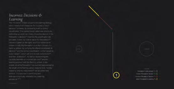
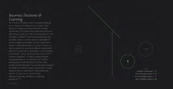
The visualization was validated through semi-structured interviews and Think-Aloud sessions, conducted in three iterative rounds—each with five non-expert participants. The validation sessions were specifically designed to assess whether the previously identified information needs had been successfully met. Results confirmed that all information needs were met, as participants developed a perceived understanding of the Perceptron’s decisionmaking processes. Participants correctly identified the data definition interface and its purpose. They independently interpreted the diagonal line as the system’s decision mechanism. They recognised the red encoding as signalling an error and the yellow as signalling learning. They described the causal link between wrong decisions and the system’s adjustment—one participant articulated it as “he learns from his own mistakes”; another described the full process as “a little journey explaining how artificial intelligence arrives at a correct answer.” After the first validation round, which led to minor interface corrections, two further rounds resulted in no need for additional changes, confirming the solution’s efficiency in explaining the Perceptron’s decision-making process for non-expert audiences.
The Vienna Chamber of Labor in Vienna (AK Wien) launched the Marie Neurath Prize honoring outstanding works in the field of data visualization that inspire political education and societal engagement in Vienna and Austria. https://wien.arbeiterkammer.at/neurath
IIID is pleased about the partnership.
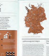
Der Earth Overshoot Day ist jener Tag, an dem die Weltbevölkerung alle natürlichen Ressourcen verbraucht hat, die die Erde innerhalb eines Jahres regenerieren kann. 2022 landet der Earth Overshoot Day am 28. Juli.
Die Menschheit lebt weit über den Ressourcen, die ihr zur Verfügung stehen und das seit Jahrzehnten. Bereits seit den 70er Jahren kann unser Planet die benötigten Ressourcen nicht mehr decken und wir verbrauchen wichtige Rohstoffe der Zukunft. Die Folgen sind ein Überschuss an klimaschädlichen Treibhausgasen und ein massiver Rückgang der Artenvielfalt. Werden Naturgüter knapp, verschärft sich ebenfalls der Wettbewerb um Nahrungsmittel und Energie.1
Berechnet wird der Tag vom Global Footprint Network, indem die Biokapazität des Planeten (die Menge an ökologischen Ressourcen, die die Erde in diesem Jahr erzeugen kann) durch den ökologischen Fußabdruck der Menschheit (den Bedarf der Menschheit für dieses Jahr) dividiert und mit 365 (Tagen) multipliziert wird.2
Verglichen werden der Overshoot Day und das Bruttoinlandsprodukt des jeweiligen Landes im Jahr 2022.
Usbekistan|Okt11 Tunesien|Okt13 Ghana|Okt16 Armenien|Okt31 Albanien|Nov3 Kolumbien|Nov8 Guinea|Nov10 Ägypten|Nov11 Guatemala|Nov14 DominikanischeRepublik|Nov23 Irak|Nov24 Kuba|Nov25 Jordanien |Nov25 Marokko |Nov26
Aserbaidschan|Okt8
Luxemburg hat seine natürlichen Ressourcen bereits am 14. Februar verbraucht und ist gleichzeitig das Land mit dem höchsten Bruttoinlandsprodukt pro Einwohner.:in
Einwohner:in.
Türkei|Jun 22 Argentinien |Jun24 Iran|Jun27 Bolivien|Jul5 Paraguay|Jul8 Serbien|Jul8 Lebanon|Jul14 Panama|Jul17 Tonga|Jul17 weltweit(2022)|Jul28 Brasilien|Aug12 Grenada|Aug16 Mauretanien|Aug18 Namibia|Aug19 CostaRica|Aug25 Ukraine |Aug 27
ebenfalls der Wettbewerb um Nahrungsmittel und Energie.
Berechnet wird der Tag vom Global Footprint Network, indem die Biokapazität des Planeten (die Menge an ökologischen Ressourcen, die die Erde in diesem Jahr erzeugen kann) durch den ökologischen Fußabdruck der Menschheit (den Bedarf der Menschheit für dieses Jahr) dividiert und mit 365 (Tagen) multipliziert wird.2
Verglichen werden der Overshoot Day und das Bruttoinlandsprodukt des jeweiligen Landes im Jahr 2022. Maria Strieder „Der Ast auf dem wir sitzen“ https://www.mariastrieder.com/ CC-BY 4.0
Aserbaidschan|Okt8
Usbekistan|Okt11 Tunesien|Okt13 Ghana|Okt16 Armenien|Okt31 Albanien|Nov3 Kolumbien|Nov8 Guinea|Nov10 Ägypten|Nov11 Guatemala|Nov14 DominikanischeRepublik|Nov23 Irak|Nov24 Kuba|Nov25 Jordanien |Nov25 Marokko |Nov26
Luxemburg hat seine natürlichen Ressourcen bereits am 14. Februar verbraucht und ist gleichzeitig das Land mit dem höchsten Bruttoinlandsprodukt pro Einwohner.:in
Die Länge der Balken Entspricht dem Bruttoinlandsprodukt /pro Einwohner:in) des jeweiligen Landes im Jahr 2022 des jeweiligen Einwohner:in.
|Jun24 Iran|Jun27 Bolivien|Jul5 Paraguay|Jul8 Serbien|Jul8 Lebanon|Jul14 Panama|Jul17 Tonga|Jul17 weltweit(2022)|Jul28 Brasilien|Aug12 Grenada|Aug16 Mauretanien|Aug18 Namibia|Aug19 CostaRica
13 | Kanada Mär 13 | Vereinig te Ara bische Emirate Mär 13| USA Mär14| Estland Mär 15| Belize Mär 15|Kuwait Mär 19|Trinidad/Tobago Mär21|Mongolei Mär23|Australien Mär26|Belgien Mär28|Dänemark Mär31|Finnland Apr1|Lettland Apr3|Schweden Apr6|Österreich Apr7|Litauen Apr8|Singapur Apr12|Tschechien
Apr 12|Niederlande
Apr 12 | Norwegen
Apr 16 | Malta
Apr 18 | Slowenien
Apr 19 | Neuseeland
Apr 19 | Russland
Apr 21 | Bermudas
Die Länge der Balken Entspricht dem Bruttoinlandsprodukt /pro Einwohner:in) des jeweiligen Landes im Jahr 2022 Einwohner:in)
Apr 21| Irland Apr 22|Bhutan Apr27|Kasachstan Apr27|Saudi-Arabien Mai2|Polen Mai4|Deutschland Mai4|Israel Mai5|Frankreich Mai6|Japan Mai7|Portugal Mai12|Belarus Mai12|Spanien Mai13|Schweiz Mai15| Bahama s Mai15|Chile Mai15| Italie
Eliott Ertl „Fast Fashion“
Der Eiffelturm wiegt 10.100 Tonnen.
Ansgar Wolsing https://bydata.github.io/akwien-marie-neurath
Andreas Koop
awards are reserved for the highest distinction, awarded to exemplary work or performance that sets a benchmark for excellence in each category.
Excellent work, indicating a higher standard, recognising outstanding achievement that surpasses basic expectations.
RECOMMENDATION
Standing for projects that fulfill the requirements of the category and denote a commendable level of performance or quality, reflecting solid effort and skill, an output level that serves as a guide for good information design.




Category: Social Affairs
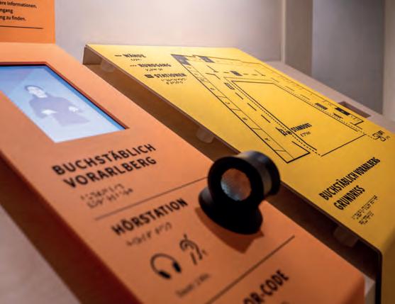
Project: Inclusive Stations at vorarlberg museum
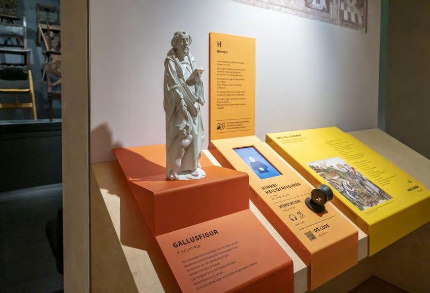
What was the challenge?
Exhibitions often remain inaccessible to people with disabilities due to barriers in communication, sensory engagement, and language complexity. The vorarlberg museum set out to create an inclusive exhibition experience that is understandable, tangible, and accessible to people of all ages and abilities.
What was the solution?
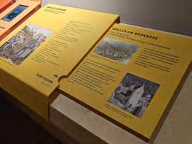
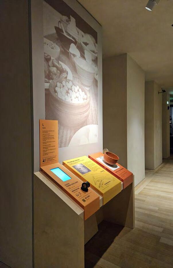
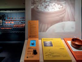
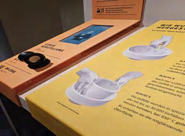
In close collaboration with the vorarlberg museum and disability advocacy organizations, look! design developed four inclusive stations for the permanent exhibition buchstäblich vorarlberg. Two exhibition themes were translated into accessible, multisensory experiences: Saint Gallus (medieval sculpture) and Terra Sigillata (Roman ceramics).
The stations combine raised lettering, Braille, simple-language texts, audio content, sign language videos, and tactile objects. A tactile orientation map communicates the spatial layout of the exhibition
and indicates the locations of the inclusive stations. An accompanying folder in easyto-read language further supports access. Tactile elements make artworks and artifacts physically graspable and easier to understand.
The project was developed together with the Vorarlberg Association for the Blind and Visually Impaired, Mensch zuerst, and the State Centre for the Hearing Impaired, whose input informed both the concept and the final design.
What was the effect?
The inclusive stations brought the museum significantly closer to its goal of becoming “a museum for everyone.” By combining multiple sensory and communication formats, the project reduced barriers to cultural participation and made exhibition content accessible to people with and without disabilities, regardless of age.
Photography: Daniel Furxer (vorarlberg museum), look! design
Contact:
Stefanie Schöffmann look! design office@look-design.at www.look-design.at


What was the challenge?
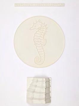
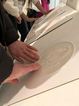
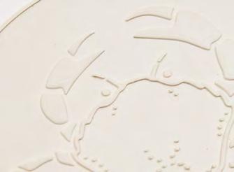
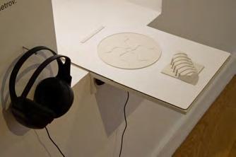
In a digital society, visual language has become a primary means of accessing information. For people with visual impairments—a population that is steadily increasing—equal access to educational information is often limited when content is not designed or presented in accessible formats. While tactile illustrations can be produced in print, high-quality embossed printing remains prohibitively expensive for institutions and largely inaccessible to individuals. The project addresses the lack of high-quality tactile scientific illustrations through an interdisciplinary approach that brings together expertise from biology, education, typhlopedagogy, art, graphic design, illustration, and industrial design.
What was the solution?
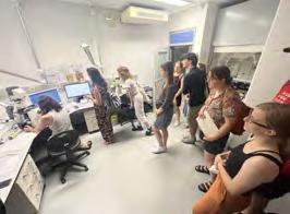
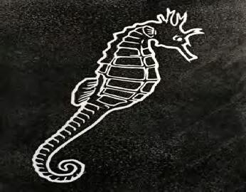
The project began with a small interdisciplinary student group that conducted research on design for blind and partially sighted users and selecting suitable marine organisms. In July 2024, the work intensified during the Kaverljag International Summer School in Pliskovica na Krasu, which featured lectures on marine biology, scientific and inclusive illustration, tactile graphics, assistive technologies, and empathy-based design, alongside excursions to marine research institutions. Through experiential learning guided by a typhlopedagogue, students gained insight into visual impairment, conducted field observations, created analogue and digital sketches, and developed scientific and habitat illustrations. A key stage of the process involved the stylisation and reduction of motifs into black-and-white images, which were later translated into relief prints, while all findings were systematically documented.
Following the summer school, the illustrations were refined for print, anatomically corrected, standardised, and reprinted using linocut techniques. The motifs were
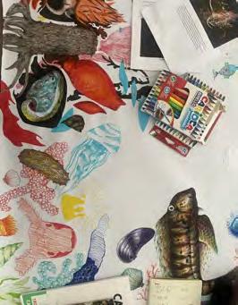
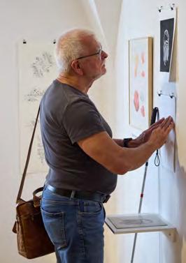
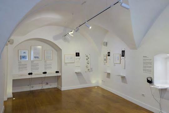
then adapted for 3D printing, with a strong emphasis on anatomical accuracy, resulting in the first 3D tactile prints. In parallel, design recommendations were developed through both theoretical research and practical experimentation. The project concluded with extensive testing through exhibitions between 2024 and 2025 and structured evaluations involving blind and partially sighted users and experts. The results informed final guidelines, published in the bilingual monograph Illustrating the Invisible: Towards an Inclusive Society (2025), which is freely available online:
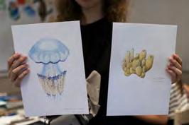
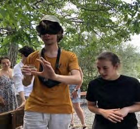
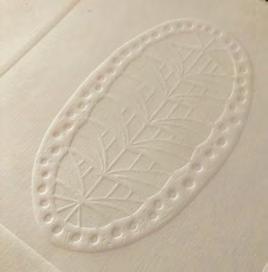
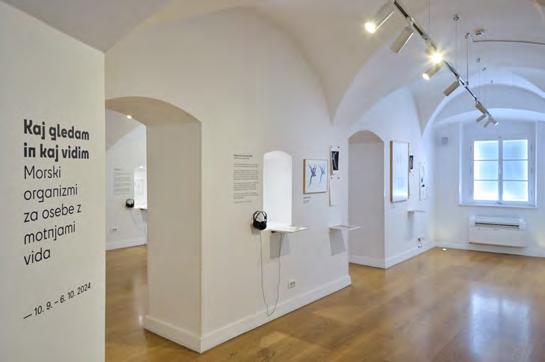
The project fosters interdisciplinary collaboration between art and science, with a strong focus on inclusive design and accessible science communication. It addresses both the general public and policy-makers by promoting social sustainability as a systemic value, raising awareness of inclusive needs, and encouraging empathy and tolerance for diverse abilities. The project will continue through the development of an online collection of tactile scientific illustrations, expanded with new topics from the natural sciences within educational contexts. A publicly accessible database of digital files, accompanied by clear production instructions, will enable printon-demand use, while ongoing updates will ensure the continuous availability of new and relevant content.
Contact:
prof. dr. Petra Černe Oven Academy of Fine Arts and Design University of Ljubljana, Slovenia
e-mail: Petra.CerneOven@aluo.uni-lj.si
website: https://www.aluo.uni-lj.si/en/ raziskovanja/kaverljag-illustration-for-theblind-and-visually-impaired/
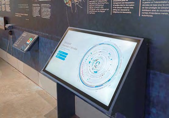
As part of its exhibition on the Qikiqtait region, the Canadian Museum of Nature, in collaboration with the Arctic Eider Society, wanted to show the close links between communities in Northern Canada, wildlife, and seasonal cycles. Traditional knowledge about hunting and gathering was supplemented by new data collected via the community-led app SIKU. Our main challenge was to bring these two sources of information together for each animal and plant species in a single circular visualization that would clearly show the intensity of different harvests throughout the seasons.
Contact:
name: Francis Gagnon company/organisation: Voilà: e-mail: contact@chezvoila.com website: https://chezVoila.com
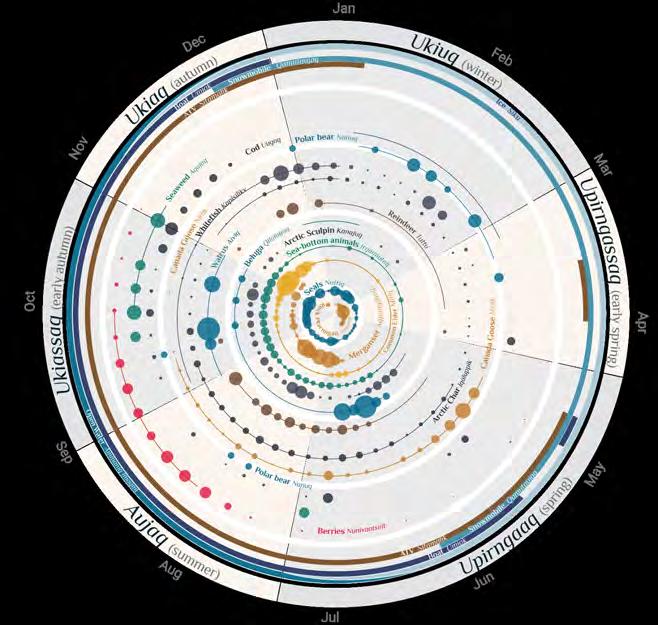
What was the solution?
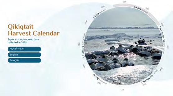
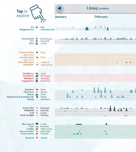
Voilà: designed an interactive, multilingual experience (in Inuktitut, English, and French) centered around a seasonal harvest wheel. The interface design alternates between views of the wheel and short videos illustrating the seasonal activities of Indigenous communities, creating a link between the data and real-life experiences. Users can explore the six seasons present in Inuit culture, access contextual information on climate, wildlife, transportation methods, and deepen their knowledge of specific species. The design emphasizes interaction, storytelling, and progressive discovery, making complex data understandable and accessible.
What was the effect?
The interactive wheel creates a space for learning, dialogue, and cultural transmission. It highlights the knowledge and practices of Inuit communities while valuing their active role in data collection through SIKU. It has also fostered significant engagement from the community, government representatives, academics, and stakeholders around the results of the ongoing project. For museum audiences, the experience is engaging and intuitive, encouraging exploration and interaction rather than passive reading. The project strengthens the social dimension of data visualization by connecting science, culture, and community knowledge.
What was the challenge?
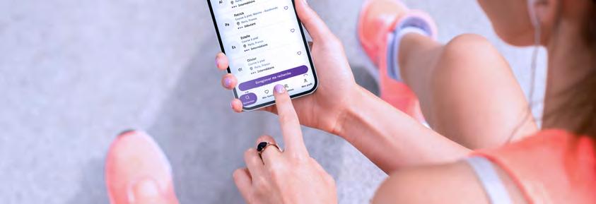
For athletes with visual impairments, practicing sport rarely means practicing alone. Running, cycling, or even walking outdoors generally requires a guide who is trained, available, and willing to accompany them. But finding that person is often the real obstacle.
Local associations do remarkable work, yet they rely heavily on volunteers, operate regionally, and cannot always meet the growing demand. As a result, many visually impaired athletes struggle to access regular training partners, miss opportunities to practice, or feel forced to give up the sport they love.
Our client’s mission is to promote and organize shared sporting activities between people with disabilities (visual or otherwise) and volunteer guides, their service is free and aims to be as easy as possible. Sport is a powerful vector of well being, inclusion and confidence, but this shared experience must become accessible to more people, across all regions and across all sports.
The challenge, therefore, was simple and ambitious:
How can we design a digital tool that makes it easy for visually impaired athletes and sighted guides to find each other, connect, and train together, anytime, anywhere?
What was the solution?
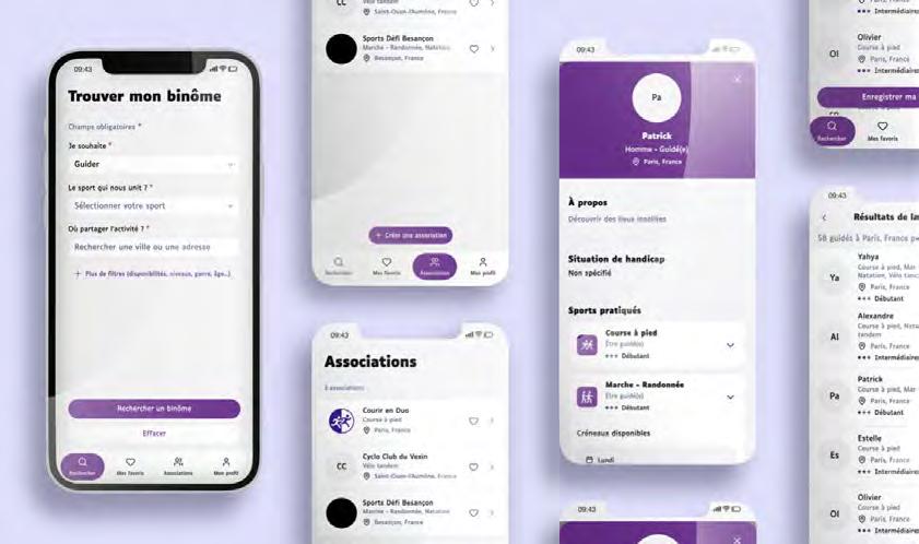
We designed a free mobile application for visually impaired and sighted athletes,
built entirely with and for visually impaired athletes, following a co design approach involving para athletes and associations.
The heart of the experience is a simple but transformative idea:
a matching platform that brings together people who want to practice sport together safely, inclusively, and spontaneously.
To make this possible, we focused on three elements:
1. An accessible, universal interface
Contrast ratios, layouts, and typography were tested and refined with real users to ensure the app remains intuitive for both visually impaired athletes and sighted volunteers.
2. A matching system built around needs and availability
Athletes can specify the sport, location, desired pace, and level of experience. Guides can indicate their availability, guidance level and preferences, making it easy to find a compatible partner.
3. A community built on trust and shared motivation
Profiles, messaging, and activity history help create a transparent environment where athletes feel confident connecting with someone new.
This is not a tool designed to compensate for a limitation. It is a tool designed to facilitate human connection and unlock opportunities.
What was the effect?
For many athletes, the application did more than simplify training logistics: it opened new possibilities to meet partners, practice more regularly, discover new sports, and feel part of a broader community.
Volunteer guides now have a dedicated space to offer their time and enthusiasm. Athletes gain greater access, flexibility, and freedom in planning their sports activities.
Most importantly, the project confirmed a powerful insight: inclusion does not happen through technology alone. It happens through the connections technology makes possible.
By making meaningful connections easier, the platform empowers everyone to rise above the constraints of their circumstances—and sometimes even the limits they believed they had. In this spirit of continuous improvement, BINOMES now aims to enhance the application through AI, particularly voice-based features, to increase accessibility and break down remaining technological barriers.
Contact:
Delivery Manager: Jérémy Dachet
Service Designer: Laurent Chastrusse
UX/UI Designers: Joana Sechaud, Lauriane Granmagnat, Ambre Falco
Company/organisation: ekino
e-mail: joana.sechaud@ekino.com websites: ekino.com
What was the challenge?
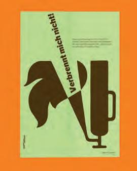
There are so many things that drive you crazy. Things you don’t want to understand and simply can’t leave uncommented. Some things are close to your own profession, others catch your eye (and you notice that those whose profession it is don’t notice them!) because they are simply too absurd, unpleasant or socially, ecologically... insane.
What was the solution?
Unfortunately – or thankfully – you can’t write a book about every topic that touches, fascinates or excites you. But does that mean doing nothing at all?
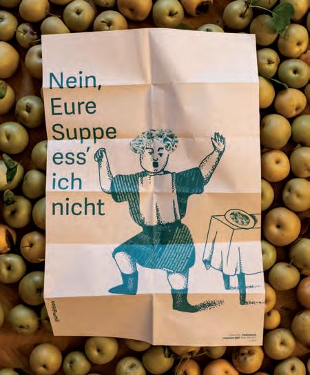
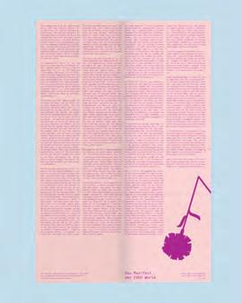
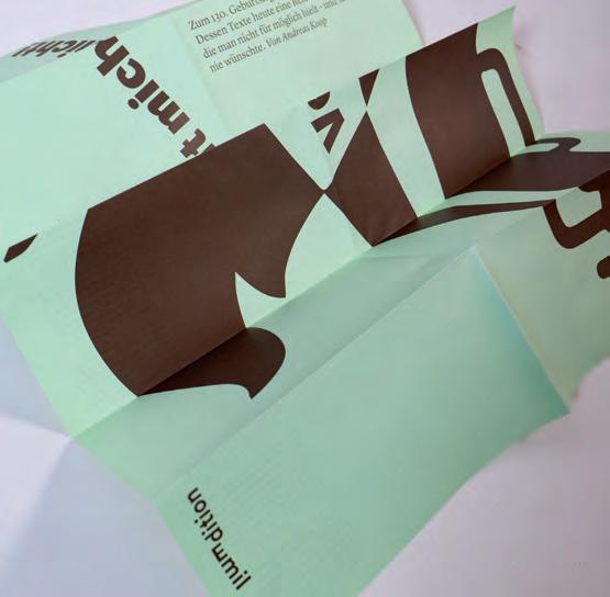
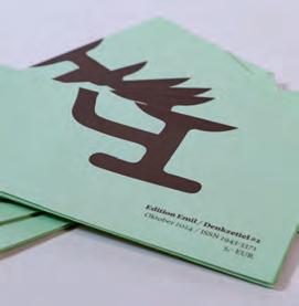
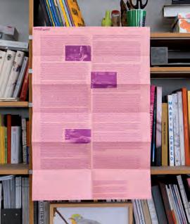
This is how the “Denkzettel” came about, a kind of “text poster” newsletter that offers enough space to formulate a few thoughts in sufficient detail, but also remains manageable enough not to get lost in every detail or have to read three more books on the subject beforehand.
What was the effect?
The effect was resonance. Positive, encouraging, engaging, activating... from many people, colleagues, friends... who felt encouraged, dismayed, frustrated, motivated, sensitised. And so we ensure that “a Denkzettel is still being handed out” time and again.
www.edition-emil.eu
Contact:
name: Andreas Koop
company: designgruppe koop GmbH
e-mail: info@designgruppe-koop.de website: www.designgruppe-koop.de
What was the challenge?
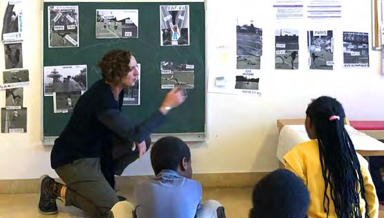
The Olympic Foundation for Culture & Heritage presented 2 options for Olympians and Paralympians to apply to the Paris 2024 Olympian Artist Programme—the creation of a new work, or leading a community outreach activity. The French Olympic Committee identified under-served populations to pair with Olympian Artists through workshops, in an effort to share Olympic values with local residents, and to forge connections between them and The Games. I was selected to lead a series of collage workshops with at-risk youth in the lead-up to The Paris 2024 Games.
What was the solution?
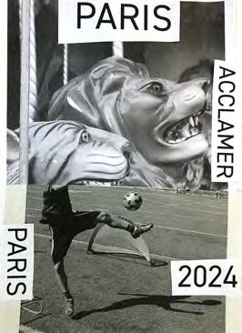
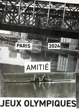
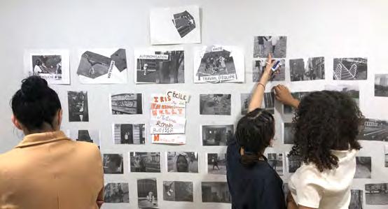
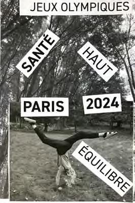
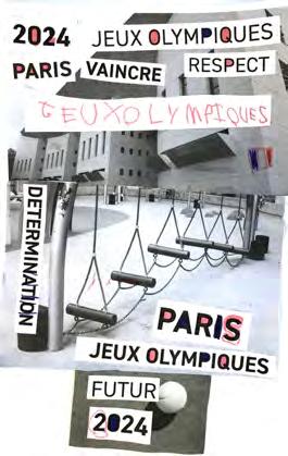
I developed a list of 60 words that captured Olympic qualities and printed them in French and English. I also photographed active children and sport objects and spaces. To complement the US images with familiar ones, I photographed Paris’s 10th and 19th Arrondissements where the children lived. These collected elements made up the collage pieces for youth of different ages in accessible hands-on workshops.
What was the effect?
The children and I ventured on photo safaris—taking more photographs together —while they shared their favorite places and stories of play and friendship. In the collage workshops, we combined type and image to create new messages. Our creative time together allowed us to talk about when we feel our most confident and strong, and the value of teamwork, determination and resilience. We discussed our cultural similarities and differences, and the uniqueness of the Olympics being in their city. We forged friendships and demonstrated that they are a part of the Olympic experience. Each workshop series concluded with a vernissage, showcasing the children’s work and celebrating our time together. The
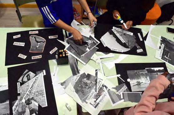
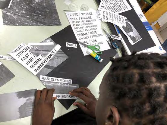
children chose to retain their collages and photographs as keepsakes, documenting our shared experience of cross-cultural collaboration. The children’s centers were given tickets to several Olympic events, where they enjoyed memorable experiences attending as a group, sure of their connection to the special global event.
Contact:
name: Kelly Salchow MacArthur company/organisation: elevate design e-mail: salchow@msu.edu website: elevatedesign.org
What was the challenge?
House of Memory is a project by Fondazione 1563 per l’Arte e la Cultura (Turin) and the National Museum of Italian Judaism and the Shoah – MEIS (Ferrara). The project focuses on preserving the memory of the Shoah, starting from documents kept in the Historical Archive of the Compagnia di San Paolo and the EGELI Fund, which contain detailed records of the confiscation of Jewish assets after the Italian Fascist government enacted the Racial Laws in 1938.
One of the central challenges of the project was to translate archival documentation – often perceived as distant and abstract – into an
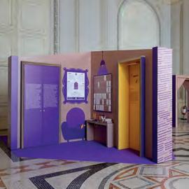
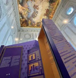
Images of the exhibition setup and details of the interaction elements designed for the visit
experience capable of engaging the public on a personal and emotional level. The concept of the house became a powerful framework for this reflection. The home represents an intimate space of everyday life, and imagining the loss of rooms, objects, and possessions creates a direct connection with the individual stories behind the historical documents.
What was the solution?
The exhibition originated from the House of Memory contest. Participants were invited to develop projects reflecting on inalienable human rights starting from the theme of dispossession. Five proposals were selected and transformed into the concept of the House of Memory.
Ciò che vediamo in questa stanza trae spunto dalle riflessioni dei ragazzi della classe 3BS dell’Istituto “P. Sraffa” di Brescia. Il loro lavoro ha voluto creare un memoriale dove potessero trovare spazio i ricordi delle persecuzioni del passato, insieme al racconto dei traumi del presente. Una casa multiforme, come l’esperienza umana, fatta di momenti di sconforto e di gioia.
Un percorso che ruota attorno al termine “impegno” e parte dalle liste degli oggetti sottratti agli ebrei nel 1938, per interrogarsi sul valore della memoria.
The project therefore sought to encourage reflection on fundamental human rights through a simple but powerful question: how would we feel if we were suddenly forced to give up our possessions?
Su una parete trovano spazio le parole da cui i ragazzi hanno iniziato a ragionare e che hanno portato alla definizione del memoriale, qui presente in una rielaborazione: un armadio le cui ante fanno riferimento alle stanze del progetto originale.
La casa è il luogo in cui ci si può sentire al sicuro e lo spazio dove permettersi il lusso di immaginare e rincorrere le proprie fantasie.
What we can see in this room stems from the thought of the students attending class 3BS of the Istituto “P. Sraffa” in Brescia. Their work is aimed to create a memorial or a space for the memories of past persecutions, alongside with the tales of present day traumas. A house is as multifaceted as human experience, consisting of moments of both discouragement and of joy.
A journey revolving round the term ‘commitment’ starting from the list of objects seized from Jews in 1938, and ending with question on the value and meaning of memory.
The exhibition was structured as a house composed of four rooms. These spaces host the contents proposed by the contest participants, reworked into a coherent and interactive narrative path that also incorporates the archival documents from which the project originated.
Per questo siamo nella stanza dei sogni, dove una finestra si apre per ospitare i nostri desideri.
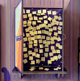
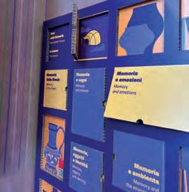
The wall displays the words the youngsters took as a starting point and which led them to define the memorial, shown here as a wardrobe with the rooms of the original project on its doors.
A house, home, is a place where one feels safe, the space where you can have the luxury to imagine and chase fantasies. This is why we are in the room of dreams, where a window opens up onto our wishes.
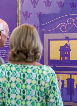
The exhibition was conceived as an itinerant installation. A modular structure made entirely of recyclable materials was designed to be easily transported and reassembled in different locations. The structure echoes the shape of a house in plan. The modules were designed to allow different spatial configurations so that the exhibition could adapt to venues of different sizes.
Each module contributes to the construction of four symbolic rooms – bedroom, study, kitchen, and living room – visually characterized through an illustrated graphic language.
Kitchen and bedroom frontal view.
Detail: one of the illustrated object connected to archive documents
The graphic design integrates the content of the five contest projects while adding an additional layer of communication through illustrated objects taken directly from the historical lists of confiscated properties, accessible through QR codes.
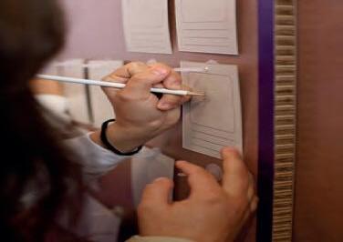
Another key element of the exhibition is physical interaction. Some sections of the installation can be opened and explored by visitors, encouraging active participation and allowing them to leave their own reflections and testimonies as part of the exhibition experience.
The modular and adaptable design allowed the exhibition to travel internationally, reaching different audiences and cultural contexts.
The exhibition has been presented in four different cities: Turin, Madrid, Ferrara, and Gießen. To ensure accessibility for diverse audiences, both digital and printed materials were produced in English, Spanish, and German.
Through its combination of archival research, spatial design, graphic communication, and interactive elements, “House of Memory” succeeded in transforming historical documentation into an engaging public experience, fostering reflection on memory, loss, and the protection of fundamental human rights.
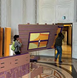



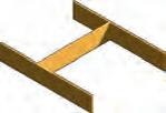
Main and alternative compositions of exhibition modules.

Contact: name: Daniele De Rosa


company/organisation: Alpaca
e-mail: info@alpacaprojects.com website: www.alpacastudio.it


Category: Helthcare
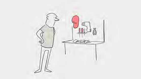
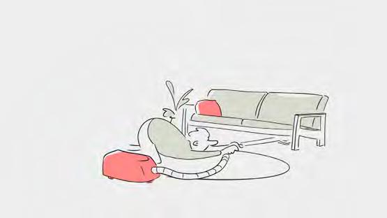
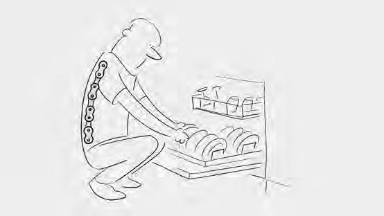
Project: Your back is strong
What was the challenge?
Back pain is a common condition, and many people are afraid to use their back when they have pain because they fear damaging something. The challenge is therefore to understand how you should live with back pain, and not let the pain take over your life.
What was the solution?
We made a film that emphasizes that your back is strong and it is not dangerous to use it even if it is painful. By maintaining the right amount of activity, you can continue to do the things that matter most to you. Chronic back pain seldom has a quick fix, like medications or surgery.
What was the effect?
Visual introduction to back pain, and how to cope with it. It gives a starting point for conversation with health personnel. The Norwegian Health Authority now uses this film on its official webpage www.helsenorge.no as information to the public.
Contact:
name: Randi Hals Hellevik og Alf Inge Hellevik company: Hellevik Studio
e-mail: post@hellevikstudio.no website: www.hellevikstudio.no
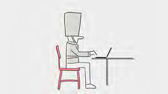
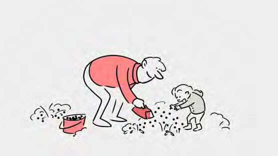
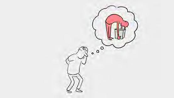

Your back is strong film:
Category: Healthcare
Project: Cancer Risk Thermometer: Co-designed, personalised, and interactive cancer risk decision tool that clarifies long-term genetic risk to support preventive surgery choices
What was the challenge?
Individuals with harmful genetic faults in BRCA1, BRCA 2, or PALB2 face substantially increased lifetime risks of breast and ovarian cancer ( e.g., BRCA1: 72% breast, 44% ovarian ). They must integrate personal risk into values-based, high-stakes choices; preventive medication, contraceptive decisions, intensified screening, or irreversible risk-reducing surgery, and decide if/when to act as risks change with age.
Doing this well requires understanding multiple risk framings: absolute lifetime risk ( 20 – 80 years ), relative risk vs population, and remaining lifetime risk ( current age to 80 years ), plus how interventions shift these trajectories alongside normal life decisions like family planning. Existing static visuals ( icon arrays, standard line charts ) are numerically correct but cognitively demanding, rarely convey age -specific trade-offs, cannot incorporate personalised risks or risk confidence intervals, and do not support easy comparison of scenarios such as timing of surgery.
What was the solution?
A collaboration between the Parkville Familial Cancer Centre ( PFCC ) —Peter MacCallum Cancer Centre, Swinburne University of Technology, and the University of Melbourne produced a rigorous, evidence-backed interactive decision tool. Over 12 months, a multidisciplinary team ( information design, clinical genetics, genetic counselling, implementation science, UX/UI, software engineering ) used co - design and iterative prototyping with patients and clinicians to translate complex risk data into a progressive narrative.
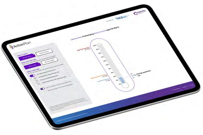
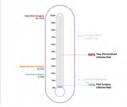
This led to a two - stage metaphor: (1) a Cancer Risk Thermometer showing an individual’s absolute lifetime risk relative to population ranges ( above ) and ( 2 ) a “Smash the glass” interaction that releases risk across ages 20 – 80 years based on annual probabilities ( right ). Overlaying current age makes lived-through vs. remaining risk explicit and shows how surgery changes the remaining curve. The WCAG - aligned tool uses plain language, sliders, and progressive disclosure to minimise cognitive load.
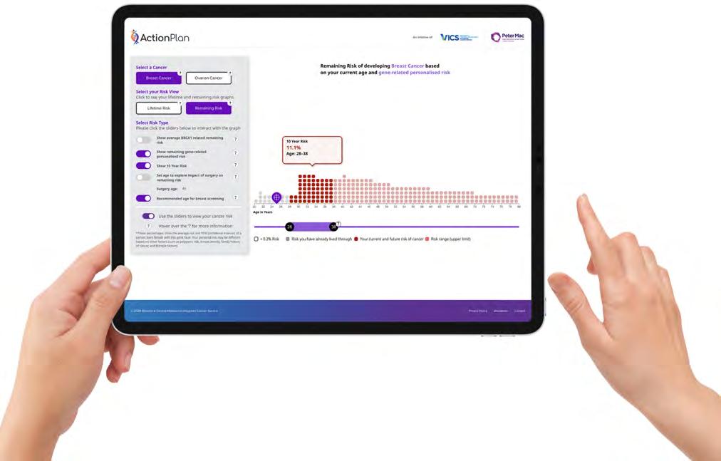
↑ The Remaining Risk view risk is distributed across life the age band slider, users can risk (risk already experienced identify the highest and lowest review remaining risk in 10 year when to commence regular breast and enter the age recommended
← Users can compare their personalised Lifetime Risk with the average risk for other BRCA1/ BRCA 2 carriers (breast and ovarian) the general population risk, and post-risk reducing surgery risk.
To aid understanding of unfamiliar terms, tooltips provide simple, plain language explanations throughout the interface.
The Cancer Risk Thermometer is, to our knowledge, a world - first interactive risk visualisation enabling side - by -side comparisons for BRCA1/ BRCA 2 across both breast and ovarian cancer in a single, coherent interface. Clinicians report it makes decades-long risk accumulation easily comprehensible and clarifies when an intervention matters most, enabling more focused conversations about whether and when to act. Early user feedback has been positive, and the tool is embedded within
the PFCC “Action Plan” national clinical trial workflow. International interest from Erasmus University, Netherlands suggests transferability across settings. Beyond this use case, the approach offers a scalable design pattern: the interaction model can remain stable while underlying clinical models and condition-specific content are replaced, supporting future tools for other hereditary conditions that require nuanced, values-based decisions.
Design team
Dr Shivani Tyagi ² ( Information, UX and UI Design), Associate Professor Alison Trainer¹ ³ ( Genetic Specialist ), Associate Professor Stephanie Best 3 ( Implementation Scientist ), Jack Wheeler ¹ ( Associate Genetic Counsellor ), Dr Abdur Forkan ² ( Machine Learning ), Liam Bradley ² ( Software Engineering ), Professor Louise Keogh ³ ( Sociologist ), Professor Prem Jayaraman ² ( Director, Digital Innovation Lab )
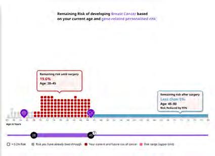
Risk view shows how across life stages. Using users can see their lived experienced to the present), lowest risk periods, 10 year bands, learn regular breast screening, recommended by their
specialist for risk reducing surgery. After entering a recommended surgery age, users can view the degree of risk reduction (right). The age can be reset, allowing exploration of earlier or later surgery to understand how timing changes risk, supporting informed, values aligned decision making.
¹ Parkville Familial Cancer Centre, Peter MacCallum Cancer Centre, ² Swinburne University of Technology ³ University of Melbourne
Funding
The Cancer Risk Thermometer was developed as part of the Action Plan initiative led by Associate Professor Alison Trainer and funded by the National Breast Cancer Foundation, Australia.
Contact
Dr Shivani Tyagi, styagi@ swin.edu.au
Category: Healthcare
Project: Brachial plexus nerve injuries in children
What was the challenge?
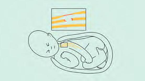
A brachial plexus nerve injury can occur during birth if the baby’s shoulder becomes stuck, leading to damage to the nerves from the neck to the arm. Since the condition is complex and healing takes time, understanding is essential for staying motivated during treatment and training. Oslo University Hospital wanted to provide simple and clear information to children with this condition and their parents.
What was the solution?
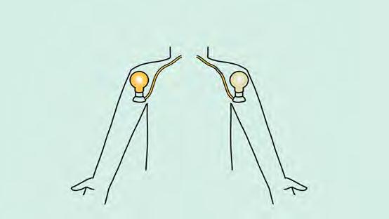
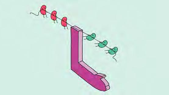
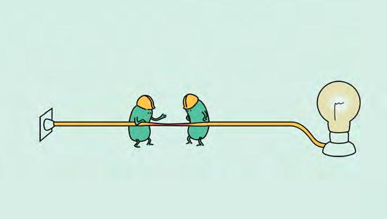
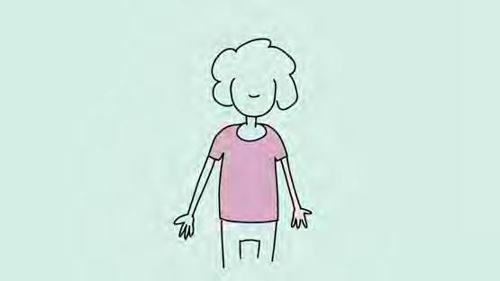
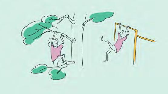
The solution was an animated film that used metaphors to explain what a plexus nerve injury is and how it is treated. By comparing the nerve to an electrical cable, it describes the different kinds of injuries. Then it used the metaphor of a tug-of-war to show how some muscles weaken and need our help.
We wanted the kids to feel empathy for the weaker team and to want to help them, as well as themselves.
What was the effect?
The hospital reported that the film makes it easier for both children and parents to understand the condition and, therefore, to stay motivated during the long training periods.
Contact:
name: Randi Hals Hellevik and Alf Inge Hellevik company: Hellevik Studio e-mail: post@hellevikstudio.no website: www.hellevikstudio.no
Brachial plexus nerve injuries film:
Category: Healthcare
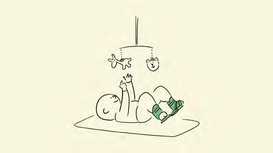
Project: Clubfoot
What was the challenge?
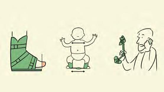
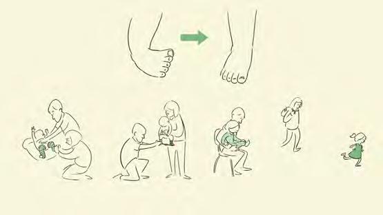
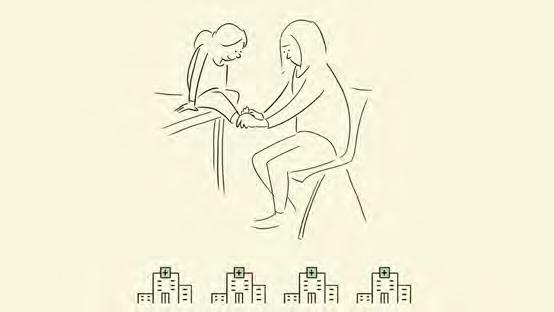
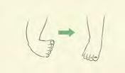
Clubfoot is a condition that affects a few newborn babies. If left untreated, it can result in a foot that doesn’t function properly. However, with the appropriate treatment, the children can develop functioning feet. The challenge is that the treatment will last for many years and will require a significant amount of parent involvement. Parents need to understand this condition and their essential role in the treatment to ensure a successful outcome.
What was the solution?
We created an animated film to explain the condition to parents. It visualizes the treatment principles, details each step, and warns about common pitfalls.
What was the effect?
Oslo University Hospital reports that using this film to prime the parents before starting treatment has made it easier to give tailored information since they have a common basic understanding.
Contact: name: Randi Hals Hellevik and Alf Inge Hellevik
company: Hellevik Studio e-mail: post@hellevikstudio.no website: www.hellevikstudio.no
Category: Universal Design
Category: Healthcare
Project: Suna - a personal heating concept for people with limited mobility
Project: Cancer Risk Thermometer: Co-designed, personalised, and interactive cancer risk decision tool that clarifies long-term genetic risk to support preventive surgery choices
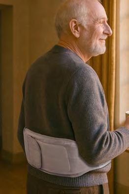
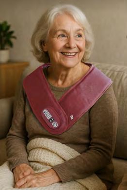
What was the challenge?
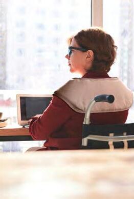
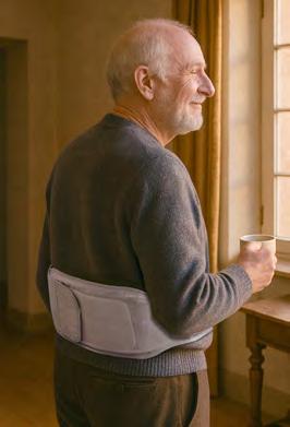
What was the challenge?
Cold is a serious and often overlooked health risk, especially for people with limited mobility, who are more vulnerable to low temperatures and related illnesses. Climate change is expected to increase extreme cold spells, while rising energy costs make it harder to maintain adequate indoor warmth.
Individuals with harmful genetic faults in BRCA1, BRCA 2, or PALB2 face substantially increased lifetime risks of breast and ovarian cancer ( e.g., BRCA1: 72% breast, 44% ovarian ). They must integrate personal risk into values-based, high-stakes choices; preventive medication, contraceptive decisions, intensified screening, or irreversible risk-reducing surgery, and decide if/when to act as risks change with age.
Studies show that body-near heating products, also referred to as personal heating concepts, are particularly effective in improving thermal comfort. However, existing solutions fail to address the specific needs of people with mobility limitations, leaving a gap between technical potential and accessible, safe everyday use.
What was the solution?
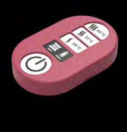
Wearable components: The system consists of a neck warmer and a combined back and abdominal heating belt. Both target body areas that are most effective in improving overall thermal comfort, while ensuring high wearing comfort and minimizing the risk of burns or pressure points.
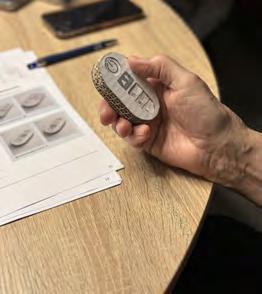
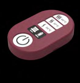
Physical control unit: Designed for accessible interaction, it features large, illuminated buttons, high-contrast labeling, and tactile labels and icons. The module can be easily attached via a plug-in connection, enabling simple and reliable handling.
What was the solution?
The project developed an inclusive personal heating system specifically designed for people with mobility limitations. Based on research, user testing, and iterative design, the solution focuses on accessibility, safety, and intuitive everyday use.
Doing this well requires understanding multiple risk framings: absolute lifetime risk ( 20 – 80 years ), relative risk vs population, and remaining lifetime risk ( current age to 80 years ), plus how interventions shift these trajectories alongside normal life decisions like family planning. Existing static visuals ( icon arrays, standard line charts ) are numerically correct but cognitively demanding, rarely convey age -specific trade-offs, cannot incorporate personalised risks or risk confidence intervals, and do not support easy comparison of scenarios such as timing of surgery.
A collaboration between the Parkville Familial Cancer Centre ( PFCC ) —Peter MacCallum Cancer Centre, Swinburne University of Technology, and the University of Melbourne produced a rigorous, evidence-backed interactive decision tool. Over 12 months, a multidisciplinary team ( information design, clinical genetics, genetic counselling, implementation science, UX/UI, software engineering ) used co - design and iterative prototyping with patients and clinicians to translate complex risk data into a progressive narrative.
This led to a two - stage metaphor: (1) a Cancer Risk Thermometer showing an individual’s absolute lifetime risk relative to population ranges ( above ) and ( 2 ) a “Smash the glass” interaction that releases risk across ages 20 – 80 years based on annual probabilities ( right ). Overlaying current age makes lived-through vs. remaining risk explicit and shows how surgery changes the remaining curve. The WCAG - aligned tool uses plain language, sliders, and progressive disclosure to minimise cognitive load.
↑ The Remaining Risk view risk is distributed across life the age band slider, users can risk (risk already experienced identify the highest and lowest review remaining risk in 10 year when to commence regular and enter the age recommended
Mobile app: An optional app extends the system’s functionality. Its simple structure, large interface elements, and strong color contrasts ensure accessibility. It can be operated without complex gestures and supports assistive technologies such as voice control, while allowing more precise control and safety settings.
Charging and storage: A dedicated charging and storage solution supports ease of handling and seamless integration into everyday routines.
The project demonstrates how body-near heating can improve thermal comfort for people with mobility limitations in a safer and more self-determined way. By focusing on accessibility, intuitive interaction, and safety, it addresses key barriers that existing solutions often overlook, while highlighting the potential to reduce coldrelated health risks and lower reliance on high room temperatures.
Contact: name: Denise Eder
company/organisation: Salzburg University of Applied Sciences
e-mail: deniseeder@gmx.at website: www.fh-salzburg.ac.at
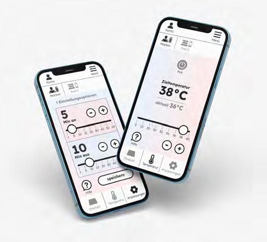
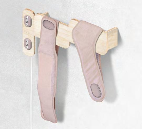
Project: Communicating cancer information comprehensibly: A visual and interactive treatment timeline for AML
What was the challenge?
Cancer affects one in five people during their lifetime. Upon diagnosis, patients receive a flood of complicated, vital medical information and, as has been proven, retain only a fraction of it. A key foundation for this project was the study by Jambor et al. (2025). It demonstrated that pictogram-based timeline visualisations, as shown in Figure 1, significantly improve the understanding of haematological cancer treatments compared to purely verbal information. The study analysed visual recognisability and readability, format comprehension and clinical applicability from patient and clinician perspectives. Building on this evidence, as part of this project, the treatment plan for acute myeloid leukaemia (AML) developed by Jambor et al. (2025) was systematically evaluated for heuristics and accessibility, revealing limitations such as high text density, inconsistent iconography, and suboptimal colour usage.
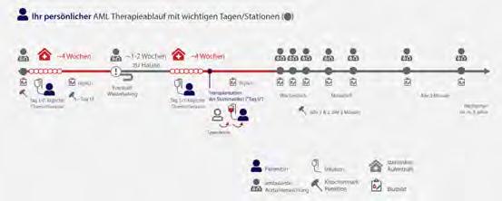
The project applied user experience (UX) principles to improve the comprehensibility of complex oncological treatment information. It focused on investigating whether visual and interactive design elements could make the therapy process clearer and more accessible for potential patients. Using the existing treatment timeline for AML by Jambor et al. (2025), the plan was visually redesigned by restructuring the content, simplifying the language used, ensuring consistent iconography and optimising
Contact:
name: Laura Lackner
company/organisation: Dr. Helena Jambor / University of Applied Sciences of the Grisons, DAViS e-mail: mail@lauralackner.ch / helena.jambor@fhgr.ch website: lauralackner.ch / github.com/helenajambor
the colour coding (see Figure 2). Further an interactive prototype was developed in Figma, adding step-by-step navigation, details-on-demand, progressive disclosure, and adaptive visualisation (see Figure 3–5, link to the interactive prototype). The aim was to guide patients step by step safely through the therapy process. The effect of both approaches on the comprehensibility of oncological treatment information was tested in a two-stage quantitative online study involving 112 participants (betweensubjects comparison).
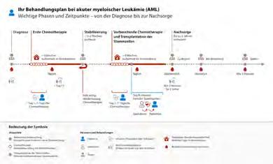
Source: Jambor, H. K., Ketges, J., Otto, A. L., Von Bonin, M., Trautmann-Grill, K., Teipel, R., Middeke, J. M., Uhlig, M., Eichler, M., Pannasch, S., & Bornhäuser, M. (2025). Communicating cancer treatment with pictogram-based timeline visualizations. Journal of the American Medical Informatics Association, 32(3), 480–491. https://doi.org/10.1093/jamia/ocae319
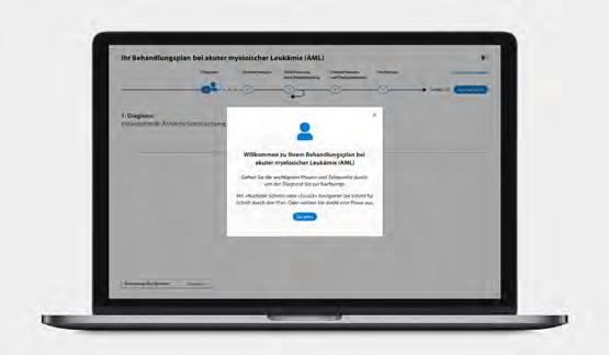
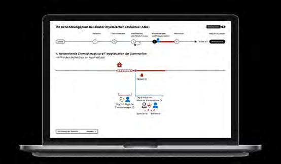
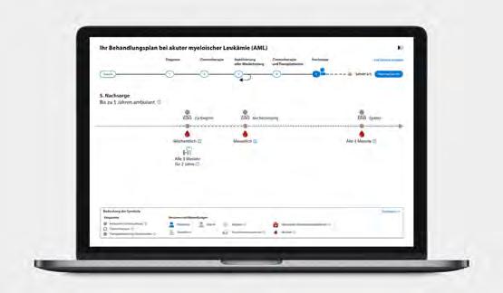
The visual redesign led to a much easierto-understand therapy plan. Participants answered the comprehension questions significantly more accurately and felt significantly more confident in their responses. The perceived quality of the information increased slightly, but not statistically significantly. Compared to the visual redesign, the interactive prototype showed no further increases in comprehensibility, but it provided valuable insights for future iterations.The results demonstrate the potential of visual UX adaptations for accessible oncological communication and highlight the need for research into usercentred design of interactive treatment schedules. The visually revised static plan proved robust and is practical and ready for use in real-world patient communication. Overall, the project shows how UX design can reduce information gaps in oncology and make communication clearer and more supportive for patients and their families.
Verbal information only
Visual timeline (Jambor et al., 2025)
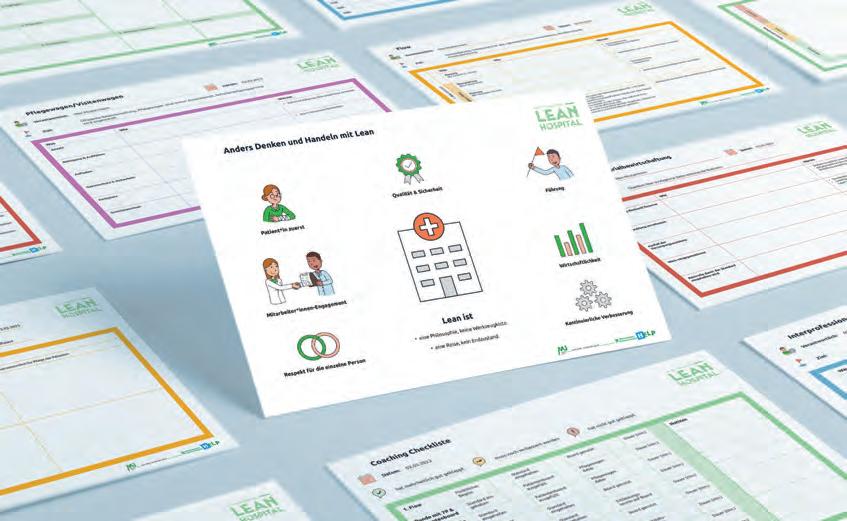
What was the challenge?
The implementation of LEAN Hospital processes required numerous documents, lists, and training materials. At first glance, these materials appeared as dry tables and impersonal statistical evaluations. The challenge was to transform necessary but uninspiring tools into engaging, accessible, and motivating materials for all stakeholders in the hospital environment.
What was the solution?
look! design developed a fresh, approachable design system for LEAN Hospital. Friendly illustrations (by Unter freiem Himmel) guide staff through processes, making complex workflows more understandable. The new visual identity reflects the LEAN philosophy: Logo typography inspired by the tape markings often used in LEAN processes. A fivecolor system assigns clear associations
to different professions (e.g. yellow for nursing, violet for doctors). A dedicated logo variation for the Lean Academy, used in training materials and certificates. A wide range of materials were redesigned, including posters, huddle boards, checklists and handouts.
What was the effect?
The materials evolved from “just work tools” into carriers of the LEAN philosophy, promoting understanding and engagement across all participants. Staff members experience the processes as more approachable and motivating. The design increases clarity, improves communication, and supports cultural change within the hospital. Ultimately, the project contributes to more efficient workflows and greater patient satisfaction.
Photography:Collages with Adobe Stock footage
Multiprofessionell Pflege
Contact: Stefanie Schöffmann look! design in co-operation “Unter freiem Himmel” office@look-design.at www.look-design.at
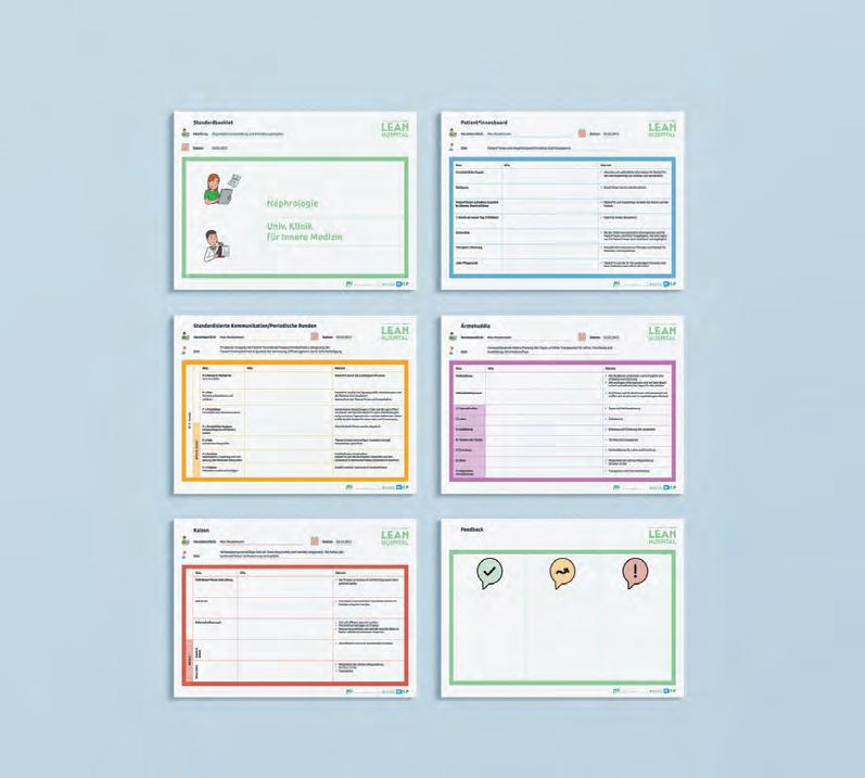
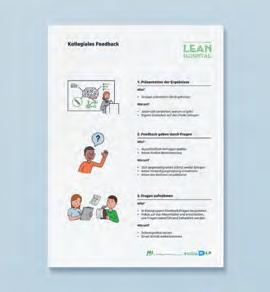
Verlaufsdokumentation
Abteilung:
Datum:
Nephrologie
Univ. Klinik für Innere Medizin
Healthcare
What was the challenge?
Our journal is read by busy doctors who find it challenging to keep up to date with current best practices based on the latest evidence. They need regular insights that are quick and easy to read - which is why we make “visual summary” infographics for them.
What was the solution?
At the start of 2025, The BMJ (British Medical Journal) transitioned from weekly to bi-weekly print issues. We took this chance to increase our output so that we could have a full-page infographic in every issue. It’s challenging to coordinate timelines to make sure that we have enough lead time to make and edit these graphics, but we managed one graphic in every issue in 2025 apart from one - a total of 23 full page graphics (up from 14 and 8 in the previous years).
What was the effect?
Infographics are some of our most popular content - not just in print, but also online and on social media. For example in 2025, 17 of our top 25 Facebook posts with most engagements were infographics - 15 of them full-page education graphics. Similarly, 7 of our top 25 X posts were infographics (out of 2,853 posts).
Our infographics frequently outperform other social media posts. For comparison, our the median values from all of our posts in 2025 were:
• X: 4,053 impressions, 108 engagements • Facebook: 2,116 impressions, 36 engagements
Contact:
name: Will Stahl-Timmins company/organisation: The BMJ e-mail: willstahl@gmail.com website: https://www.behance.net/will-s-t
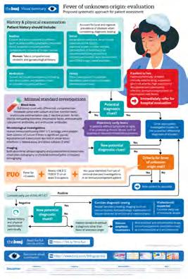
Fever of unknown origin: evaluation
141,394 impressions
1,329 engagements
Facebook:
5,931impressions
253 engagements
@AamirChock
Clear and elaborative
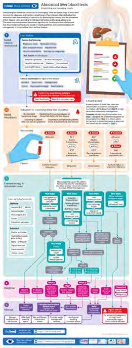
47,174 impressions
5,293 engagements
91,262 impressions
8,002 engagements
@Dr_SalehAlAsiri
Remarkably well done, this fantastic visual summary makes understanding the condition so much easier.
Excellent work by @bmj_latest in delivering such a high-value resource. I only wish something like this had been available when I was a medical student or trainee.
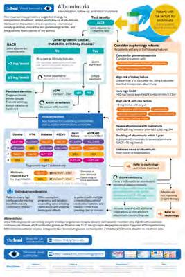
Albuminuria: interpretation, follow-up, and initial treatment X:
71,274 impressions 1,914 engagements
Facebook:
18,096 impressions 1,377 engagements
@jamie_wallis Really good summary
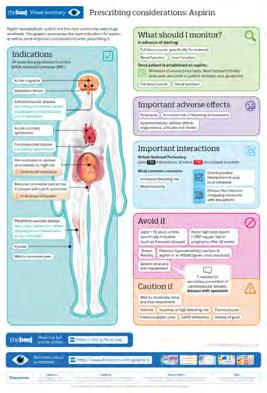
Prescribing considerations: Aspirin X:
22,525 impressions 1,698 engagements
Facebook:
97,553 impressions 6,669 engagements
Mahwash Siddiqui So nice, thanks for sharing
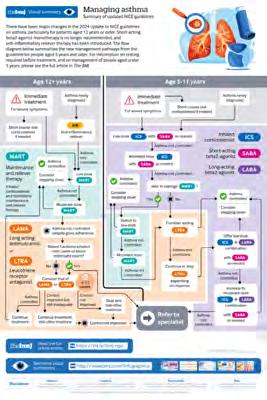
Managing asthma: summary of updated NICE guidelines X:
27,365 impressions 1,100 engagements
Facebook:
56,317 impressions 3,878 engagements
Michael Nuccitelli, Psy.D. Gm and Ty for posting this infographic. I plan to print it out and give to a couple of my patients and our nurses. Respectfully, Dr. Nuccitelli
What was the challenge?
The City Statistics project aimed to make sense of a large, complex dataset from the Swiss Federal Statistical Office, containing over 200 indicators and 446 variables. The main challenge was to uncover meaningful insights and patterns from this raw data and make them understandable for non-technical audiences.
What was the solution?
The solution was a five-day Data Design Sprint with an interdisciplinary team skilled in design thinking, creative coding, and data visualisation. During the sprint, the team explored raw data, developed visual metaphors, sketched ideas, refined concepts, and produced prototypes that turned abstract data into visual stories. By iterating quickly and focusing on the most promising paths, the method made complex data understandable and revealed new perspectives on the dataset.
What was the effect?
As a result, the sprint generated structured overviews, visual sketches, and validated prototypes that revealed previously hidden insights and facilitated deeper understanding of urban statistics. The process created significant added value by transforming raw numbers into visual representations that are informative, engaging, and communicable. It provided clear and actionable knowledge from complex data, laying a foundation for further communication, storytelling, or decision-making.
Contact:
name: Barbara Hahn, Christine Zimmermann, Christian Schneider company/organisation: Hahn+Zimmermann, Data Anatomy
website: hahn-zimmermann.ch, data-anatomy.io


Statistics Entwicklungen




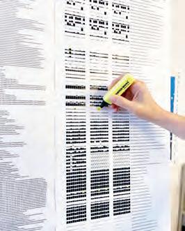
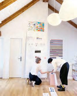
Anteil der Bevölkerung im Alter von 25 bis 64 Jahren mit Tertiärstufe als höchstem Bildungsabschluss (ISCED 5-8) in %, total Anteil der Jugendlichen (18-24-Jährige) ausserhalb des Bildungssystems (in %)
Anteil der bestockten Flächen und Erholungsflächen (in %)
Langzeit-Belastungs-Index
Anzahl Gewaltstraftaten pro 1000 Einwohnerinnen und Einwohner Einbruch- und Einschleichdiebstähle in Wohneinheiten pro 1000 Einwohnerinnen und Einwohner In Strassenverkehrsunfällen schwer verletzte oder getötete Personen pro 10‘000 Einwohnerinnen und Einwohner
Wahlbeteiligung an den nationalen Wahlen und den eidgenössischen Abstimmungen (in %)
Teilzeitanteil unter den Erwerbstätigen (in %),
Category: Wayfinding
What was the challenge?
When we began working on the Lipton Teas and Infusions Global Services Hub in Katowice, the brand was already undergoing a profound transformation. Lipton was redefining itself – shifting from a traditional tea company into a vibrant brand that speaks directly to younger generations. They want to have an office, that will speak the same visual style.
What was the solution?
An aim was to propose a solution that will be a physical picture of the brand’s values. The visual language of the office –including the wayfinding system – draws directly from 3 key sources: the tea brewing process (expressed through gradients), transparency and the colours associated with Lipton’s beverages. Gradients and warm colors are a fundamental design tool throughout the space. They appear not only on walls, but extend seamlessly into furniture, ceilings and environmental graphics. This continuity helps users understand where they are within the office. A distinctive element of the signage system is the information carriers themselves. Their geometric forms have been enhanced through three-dimensionality. Plexiglass “containers” appear as if they were filled with liquid. A set of unique pictograms and illustrations was created specifically for the project. They are inspired by the graphic style used on Lipton’s packaging.
What was the effect?
As a result, the signage becomes more than a functional layer – it transforms into an integral, sensory element of the office interior.
Contact:
company/organisation: Blank Studio e-mail: hello@studioblank.pl website: studioblank.pl
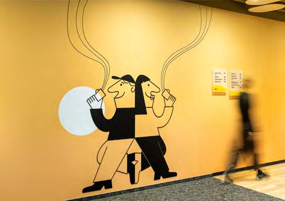
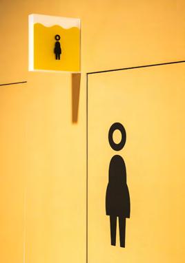
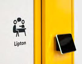
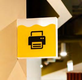
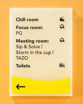
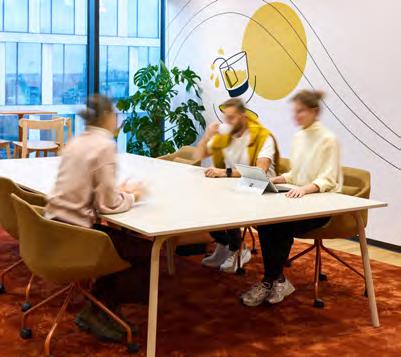
What was the challenge?
In the new building of the kbo Children’s Centre in Munich, the aim was to lower inhibitions, reducing anxieties and alleviate fears before visitors even entered the building. This was the goal and task in the design of the foyer, the waiting and play area, but also in the signage.
What was the solution?
At kbo, children and young people with disabilities, developmental delays and chronic illnesses are treated, cared for and supported. Such physical and mental disabilities are perceived as limitations.
The Japanese poet Kobayashi Issa says that one can accept slowness and limitations as an expression of one’s own possibilities and still not give up on further development. The little snail “Isa” therefore climbs slowly but steadily up Mount Fuji – accompanying the children and young people through the entire building.
What was the effect?
The design of the foyer, the alcoves on the wards and the concept of the guidance system “work” – and yet they achieve much more: materiality, design language, colours which together with the “empathic narrative” creates an atmosphere of wel-come, a gentle friendliness, a warmth that is felt and appreciated by patients and parents alike.
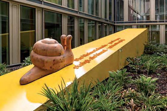
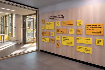
Contact:
name: Andreas Koop
company: designgruppe koop GmbH
e-mail: info@designgruppe-koop.de website: www.designgruppe-koop.de
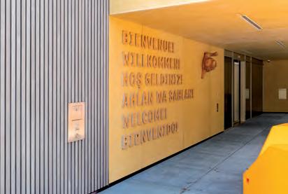
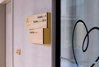
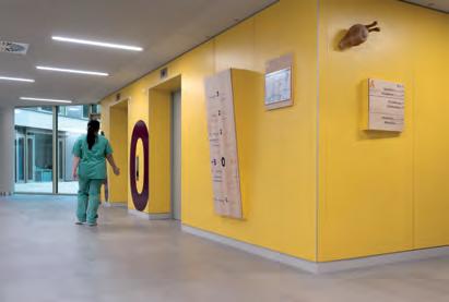
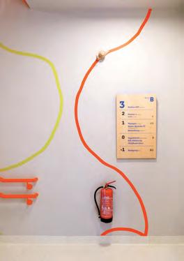
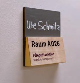
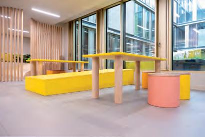
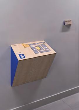
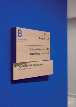
What was the challenge?
Pfeifer Holz is a large wood processing company in Kundl, Tyrol. The plant has developed over many years, with new halls, changed processes and a steadily growing volume of traffic making the site more complex. It became clear that orientation is an essential part of functioning logistics. The result was a wayfinding system that meets these requirements – developed in close cooperation with all parties involved.
What was the solution?
Pfeifer Holz is a complex workplace with narrow paths, high stacks, parallel processes and international drivers. Orientation is achieved through a shared understanding of operational processes. This is based on discussions, site visits and the knowledge of employees. The exchange of all perspectives forms the basis for design decisions.
What was the effect?
Based on intensive analysis, motasdesign developed a guidance system that makes everyday operations noticeably easier. Remote signage, pictogram-based and multilingual information, and a digital and printed site plan all work together. Elements were tested and optimised in a 1:1 test phase on site. The result is a practical system that enables orientation regardless of language or experience, increases safety and functions in the long term.
Anmeldung Beladen 1
registration loading 1
Contact:
name: Markus Scheiber company/organisation: motasdesign e-mail: scheiber@motasdesign.com website: www.motasdesign.com
Anmeldung Entladen 2, 3 registration unloading 2, 3
Warenannahme check-in small parts
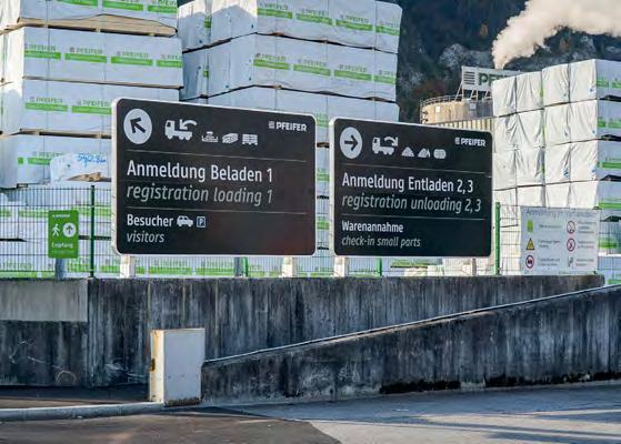
Schublader push loader
Pellets lose loose pellets
Schnittholz & Sackware bagged goods sawn timber &
Restholz residuals
Biomasse biomass
Rundholz logs
Ausfahrtswaage 2 exit scale 2
OF KEIICHI
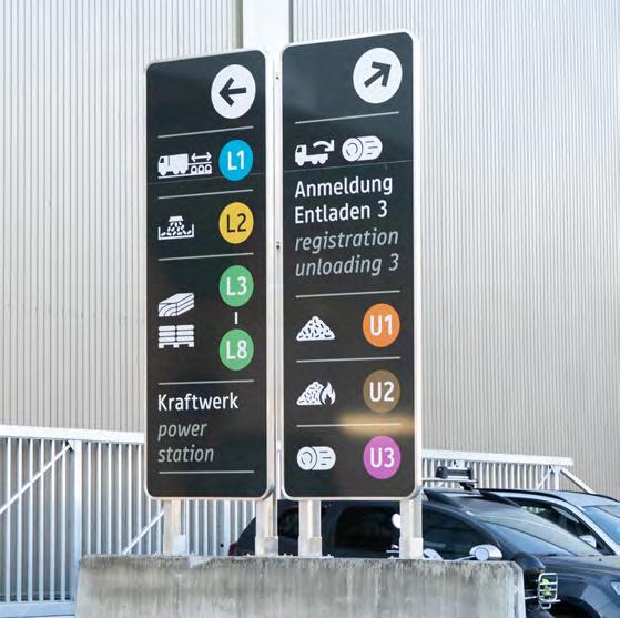
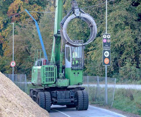
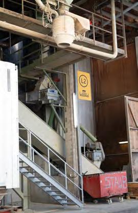
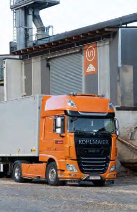
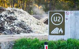
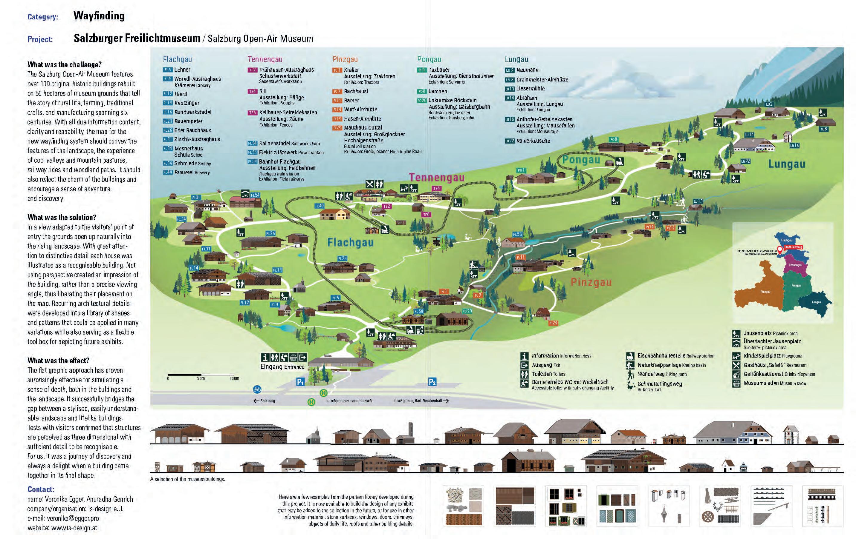
What was the challenge?
The heritage-protected Museum was difficult to navigate for visitors of all ages. It suffered from visual clutter, inconsistent lighting and unclear digital & analog displays. Information was fragmented, not inclusive and the overall visitor journey, from ticket purchase to individual objects, was neither intuitive nor visualy coherent.
What was the solution?
We simplified the visitor experience under the motto ‘reduce and accentuate,‘ removing all non-essential objects to restore clarity in space. Before we introduced our clear wayfinding system based on a new userfriendly naming convention, icon set and colour, the general lighting throughout the museum has been completely overhauled by us to allow the historic architecture to come into its own. Illuminated letters, gobo-projections and illuminated columns were integrated into the listed building in a way that is as unobtrusive as possible, but strong enough to be clearly noticed.
What was the effect?
The museum experience is now significantly more intuitive, accessible and coherent. Visitor flow has improved, especially in high-traffic areas. Soft ambient and accent lighting create a calm and clear legible environment, allowing visitors to better engage with the collections. The result is a seamless journey from entrance to exhibit, combining clarity, functionality and respect for the historic jewel of Vienna’s Ringstrasse architecture. After implementation, staff and visitors responded: ‘It looks so natural, as if it had always been there.’
Contact:
name: Erwin K. Bauer, Sarah Borinato, Michael Herzog, Tobias Mandl company/organisation: buero bauer e-mail: office@buerobauer.com website: www.buerobauer.com
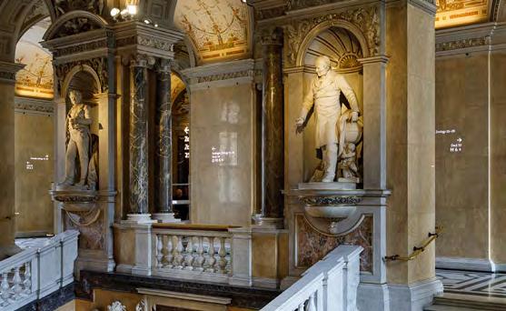
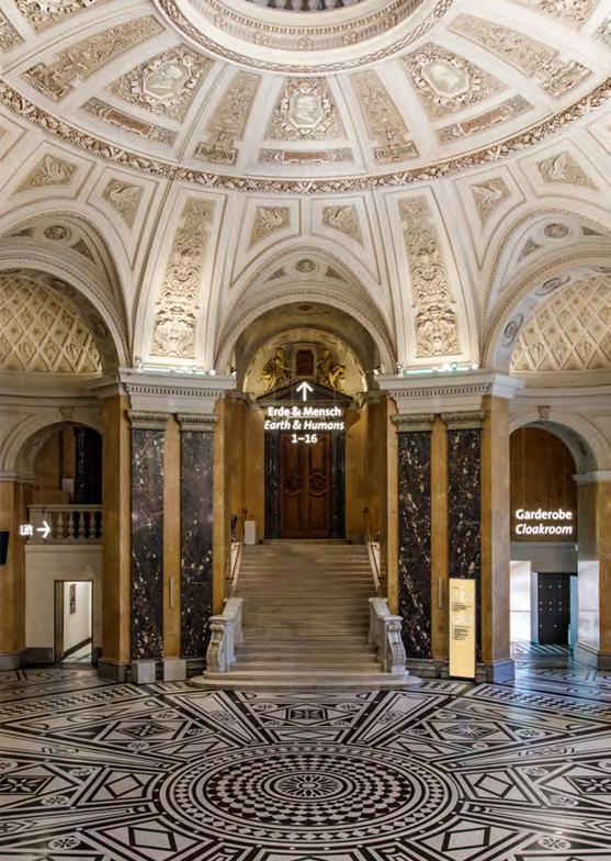
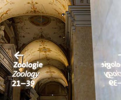
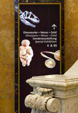
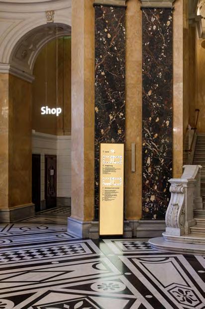
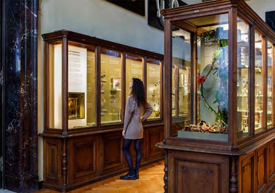
What was the challenge?
Lakeside is a complex of office buildings. It is located in the Mokotow district in Warsaw, Poland. It focuses on the use of a range of solutions in order to have a positive impact on the well-being, overall health, satisfaction and productivity of employees.
What was the solution?
Signage system should harmoniously harmonize with the architecture and interior design in which it will be placed. The main consideration of the wayfinding system, was to choose materials and forms that would fit into the existing design. We opted to borrow from the surrounding site. The geometric forms that appeared were softened by layering the material. These have been balanced by soaring verticals that allude to the rhythms seen especially in the facade design. We created graphics in common areas that build a welcoming atmosphere and make navigation through the complex clear and effortless. By avoiding vivid colors and embracing a restrained, natural palette, the system unifies the interiors and reinforces a sense of calm and professionalism.
What was the effect?
The result is a refined, intuitive wayfinding system that complements Lakeside’s architectural identity and sustainability standards. Ultimately, the wayfinding became more than a directional tool. It acts as an integral part of the spatial experience, supporting well-being, user satisfaction and strengthening the overall character of the complex.
Contact: company/organisation: Blank Studio e-mail: hello@studioblank.pl website: studioblank.pl
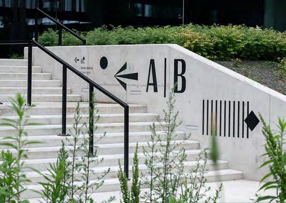
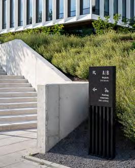
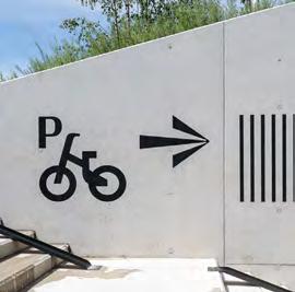
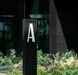
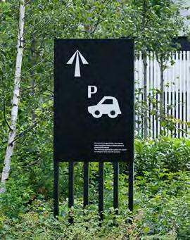
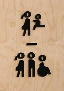
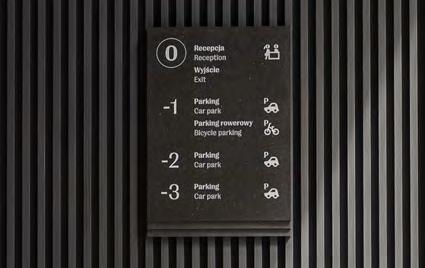
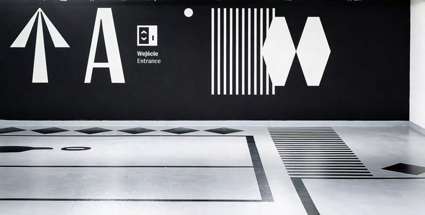
What was the challenge?
In institutions such as hospitals, care facilities, and kindergartens—where cognitive abilities may be limited for various reasons—the emotional level becomes crucial. What remains when seeing, hearing, and recognition begin to fade? How can we offer elderly people greater safety and orientation?
What was the solution?
For Atelier Andrea Gassner, wayfinding systems are more than markings, more than mere spatial orientation. They also offer intuitive guidance that operates on an emotional level.
Through the skin, we are in constant contact with the outside world. In a study involving elderly people—including individuals with dementia and visual impairments— we explored how tactile cues within signage systems could support orientation. The participants came from very diverse backgrounds: former architects and craftsmen, as well as people with visual impairments or cognitive limitations such as dementia. It was fascinating to observe how differently they perceived structures—and where difficulties arose.
Together with the residents, we examined various types of wood, surface finishes, and forms. Based on this study, we developed handrails that support orientation across different floors and building sections. In production, each handrail was handturned and shaped—meter by meter. Through intuitive, sensory perception—supported by written information—people are now able to understand and remember where they are within the building.
What was the effect?
We developed a multisensory wayfinding system that places human connection and emotional engagement at its core. Our work aims to enable elderly people with impairments to gain safety and orientation in space, to continue participating in everyday life, and to experience themselves through sensory perception.
more images and a Video about the Concept (2 min): www.atelierandreagassner.at/en/project/understanding-the-way
Contact:
name: Andrea Gassner company/organisation: Atelier Andrea Gassner
e-mail: ag@atelierandreagassner.at website: www.atelierandreagassner.at
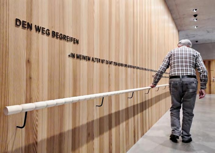
What was the challenge?
The offices of the Icelandic Prime Minister are spread across several buildings clustered in downtown Reykjavík. The oldest was built between 1761 and 1771, while the newest is still in the final design stages. An elegant wayfinding system was needed that could be implemented across all buildings, each with its own architectural character. It also had to respond to greatly varying conditions, from generous wall space to narrow vertical gaps between centuries-old woodwork.
What was the solution?
The system uses two materials, oak and copper, and is based on a modular design that can handle most scenarios. The signs come in two main sizes: one for navigation and one for room identification. This makes the system adaptable and easy to update when changes are needed, while maintaining the confidence and presence of permanent signage that feels as though it has always belonged.
What was the effect?
The result is a simple, elegant, and highly effective wayfinding system that has already been implemented across all current buildings, from the oldest house to the newly renovated meeting room of the Icelandic cabinet.
Though relatively small in size, the signs project a sophisticated presence through their premium materials, solid thickness, and simple, confident design.
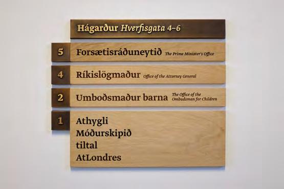
Contact:
name: Hörður Lárusson company/organisation: Kolofon e-mail: hordur@kolofon.is website: www.kolofon.is
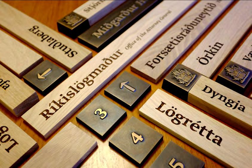
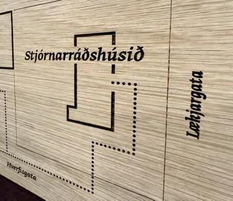
Project:
What was the challenge?
Bunkyo-ku Meika Elementary School and Kindergarten was rebuilt after more than 150 years since its founding. Deeply rooted in the community, the school holds strong memories for local residents. The challenge was to carry this legacy into the new building and express the school’s history in tangible form within the architecture.
What was the solution?
Trees that once grew in the schoolyard were chosen as materials to carry the memory of the place into the new architecture. Cherry, ginkgo, zelkova and cedar trees were reused for the wayfinding system. The logs were processed into wooden elements such as floor numbers, arrows, floor maps and room identification signs. Their natural grain, color and texture were preserved, allowing the signage to serve both as guidance and as a continuation of the school’s history. These elements were carefully integrated into the architecture and placed throughout the building.
Pre-drying process of schoolyard trees, transforming them into wayfinding elements
Contact : name company e-mail website architect : Mitsue Watanabe : mix llc. : mitsue@mixim.jp : www.mixim.jp : AXS SATOW Inc.
What was the e ect?
The project connects past and present in everyday school life. Students navigate the building guided by signage made from the very trees that once grew in their schoolyard. Di erent species and parts of the logs create varied colors and wood grain patterns. These natural expressions bring brightness and rhythm to the learning environment. The wayfinding system links architecture, memory and community.
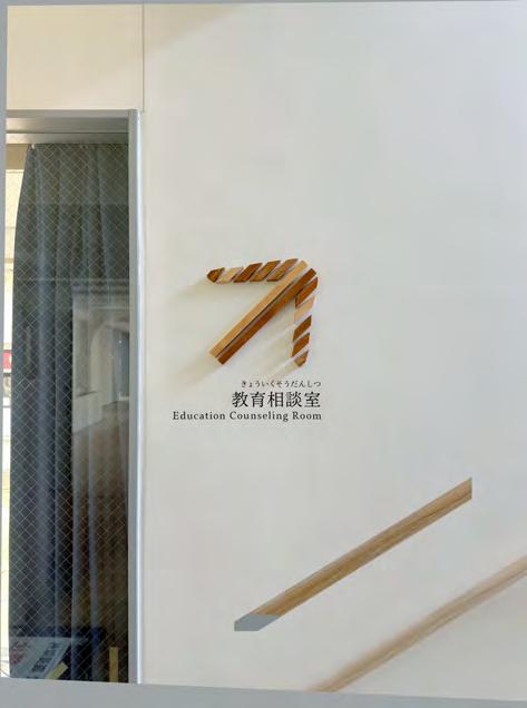
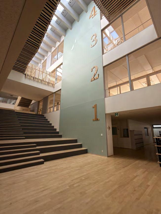
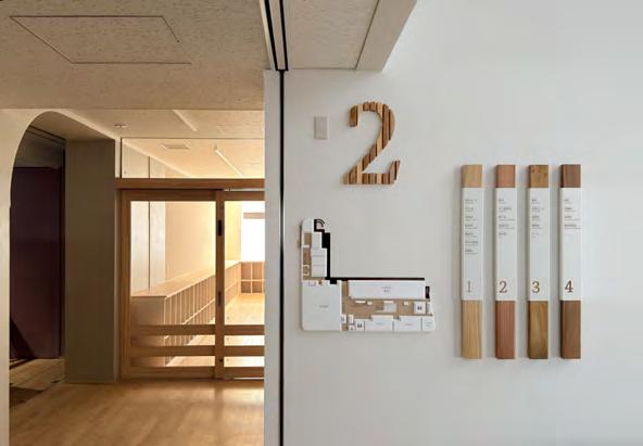
Category: Wayfinding
Project: Betty-Hirsch-Schulzentrum
At the Betty-Hirsch School Center, reliable orientation is essential for independence. The challenge was to design a guidance system that does not rely on vision, but supports different sensory abilities equally. It needed to work for blind, visually impaired and multiple-disabled users as well as for people without impairments—based on universal design. Visual conventions were questioned to ensure clarity, reduce stimuli and support cognitive ease.
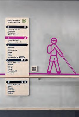
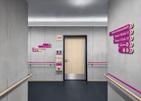
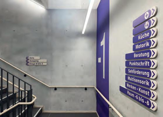
Contact:
name: Angela Kreutz company/organisation: typenraum e-mail: christa.kaesinger@typenraum.com website: www.typenraum.com
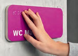
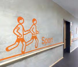
A multi-sensory “Design for All” guidance system was created as part of the architecture. Floors are high-contrast, color-coded; routes follow colored lines and reduced large-scale wall graphics. Four zones—City, Forest, Mountain and Sports—structure the building. Graphics combine text with a simplified icon language based on METACOM symbols. Key elements integrate visual text, Braille and tactile symbols, complemented by haptic modules, sign-language pictograms and QR codes. Materials match existing doors and handrails for coherence.
The system improves wayfinding, autonomy and safety for diverse users. Clear zoning and multi-sensory information reduce cognitive load and strengthen spatial understanding. Integration into the building’s language increases acceptance and quality. Accessibility is implemented as a standard design principle, not an add-on.
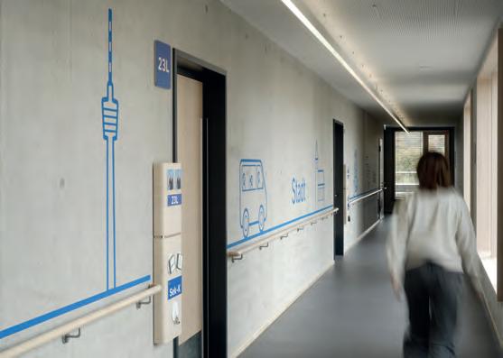
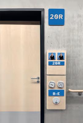
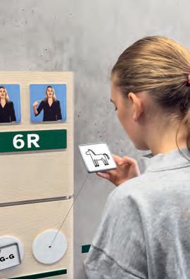
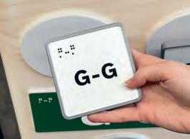
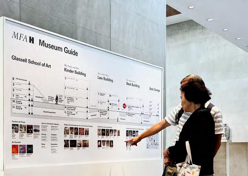
The Museum of Fine Arts, Houston (MFAH), is one of the world’s largest art museums, housing nearly 80,000 works across a vast campus. It comprises gallery buildings, a sculpture garden, an art school, parking garages and event spaces, connected by underground tunnels. Visitors frequently felt disoriented on arrival, struggling to understand how buildings connected and what the museum offered. Many people explored only a fraction of the campus before leaving.
A comprehensive wayfinding system with a striking elevation diagram at its core. The diagram provides visitors with a mental map of the horizontal and vertical organisation of the site, while drawing them in to engage with it by featuring images of art. Working at small and large scale, it appears across 8-foot wall displays, printed guides and digital interfaces.
The system’s clear, restrained design integrates seamlessly with the architecture, maintaining visual calm and allowing art to take precedence. Navigation information is separated from marketing messaging, with digital and printed signage showcasing rotating exhibitions.
The MFAH system has transformed how visitors understand and move through the campus. Diagrams and maps introduce strong visual connections between displays and their location within the museum, allowing people to plan their visit led by art.
Evaluations show a marked improvement in visitor satisfaction with wayfinding, and front-of-house staff report conversations have shifted from wayfinding questions to discussions about art.
Contact:
name: Róisín Tarrant company: Applied Information Group e-mail: info@appliedinformation.group website: www.appliedinformation.group
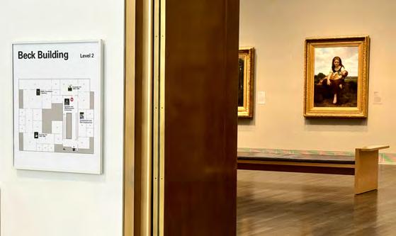
What was the challenge?
The main challenge of this signage project was the University’s decision to unify wayfinding across all of its campuses and buildings. These spaces differ significantly in architecture, period of construction, scale and character. It was therefore necessary to design a flexible system that could function consistently in very diverse environments. At the same time, the signage had to remain neutral and adaptable, supporting each space.
What was the solution?
The first place in which this idea was implemented is The campus of the Silesian University in Cieszyn. The large number of facilities and the complex structure of the campus were conducive to getting lost. It was necessary to develop a wayfinding system to make it easier to navigate the campus. So external maps, internal maps, an extensive wayfinding system and a customised pictogram design system were created. The information system is clearly structured into 3 categories. The first includes information about the main functional spaces of the school, the second focuses on room numbering and the third covers additional facilities such as restrooms or a café. The whole project was also embedded in the university’s existing branding. The project meets the economic criteria of a public institution.
What was the effect?
As a result, we achieved a functional wayfinding system that brings clarity to complex campus. The hierarchy of information allows users to intuitively distinguish between key functional areas, room numbers, and additional facilities.
Contact:
company/organisation: Blank Studio
e-mail: hello@studioblank.pl website: studioblank.pl
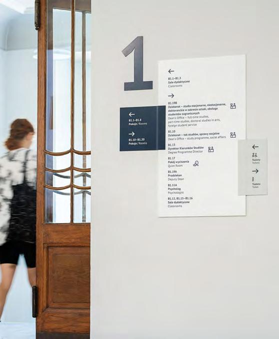
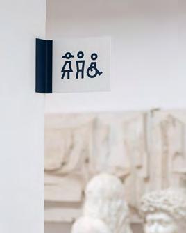
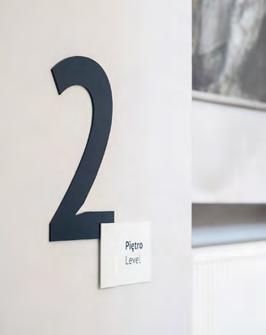
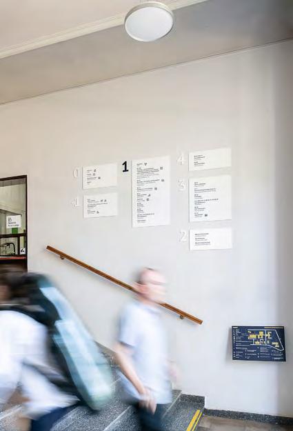
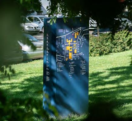
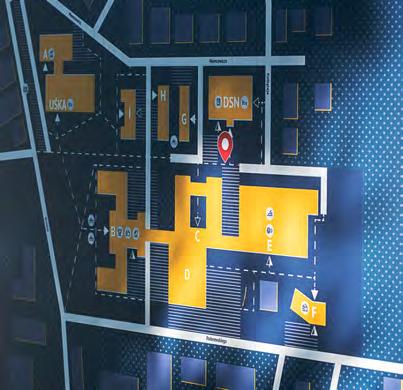
What was the challenge?
The Sofra Resort in Mielno consists of two hotel buildings and a connecting wing housing spa and medical functions. Its complex, multi-level layout required a clear and intuitive wayfinding system that would support efficient navigation while preserving a calm, seaside-inspired atmosphere. What was the solution?
A coherent system based on clearly differentiated zones was introduced. Each part of the complex received a distinct visual and functional code, supported by consistent lettering (A, B, C). Hotel zone A is identified by a wave pattern referencing water, while hotel zone C uses a dot pattern inspired by the texture of sand. The spa and medical zone remains free of graphic patterns and is defined by a uniform, light sandy color palette that emphasizes its quiet, restorative character. Custom pictograms inspired by coastal fauna and shell forms reinforce the local context and holiday mood. Strong typography and clearly visible signage ensure fast orientation, with all information provided in three languages. Outdoor areas, including parking, are fully integrated into the system.
What was the effect?
The wayfinding system significantly improved orientation and overall guest comfort. Clear zoning, distinctive visual codes, and consistent graphics make navigation intuitive and visually pleasing. The unified design strengthens Sofra’s seaside identity and brand image as a modern, guest-focused resort, successfully balancing functionality, aesthetics, and contextual references to the coastal environment.
Contact:
name: Agnieszka Nawrocka, Justyna Kucharczyk, Dajan Wejchert
company/organisation: TUKEJ
e-mail: tukej@tukej.com website: www.tukej.com
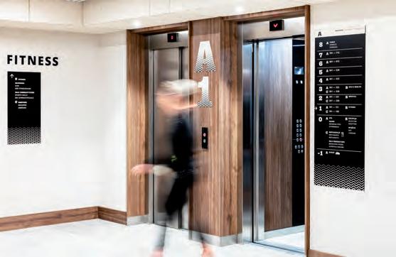
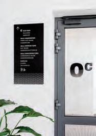
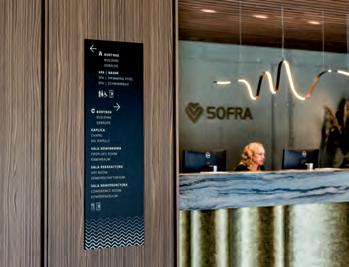
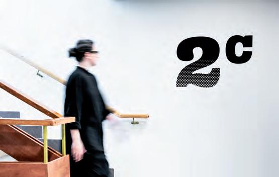
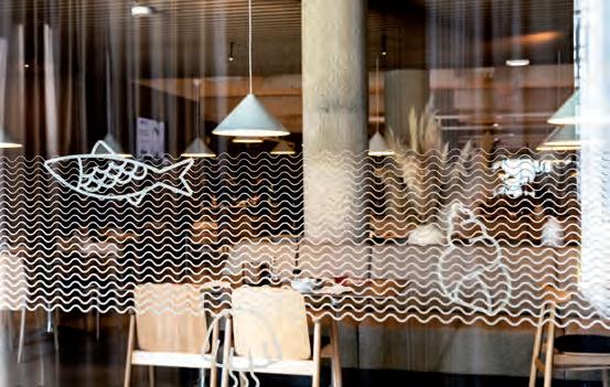
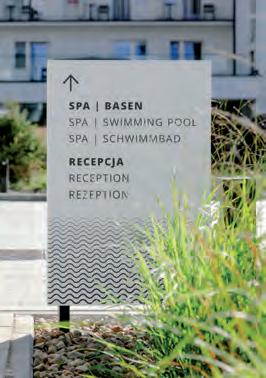
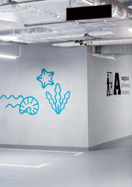
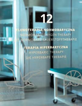
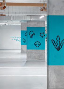
What was the challenge?
The VERTE Hotel is located in the historic Branicki Palace in Warsaw, a landmark renowned for grand staircases, decorative floors, and intricate sculptures. The challenge was to design a wayfinding system that respects the heritage architecture while remaining legible in diverse environments—from dark corridors to bright stairwells and brick-lined basements—and conveys both elegance and historical continuity.
What was the solution?
The system uses lightweight, cut-out letters and symbols in a refined gold tone, carefully selected for readability and contrast across varied backgrounds. Custom pictograms are inspired by the palace’s attica sculptures and other historic figures, creating a visual dialogue between the building’s historic details and a contemporary design language. Floor numbers incorporate sculptural elements such as gryphons, lions, and playful monkeys, reinforcing the site-specific character of the system. Signage extends seamlessly to exterior areas, providing a consistent, cohesive visual language. This approach balances functionality, legibility, and modern design while referencing the building’s heritage.
What was the effect?
The resulting system improves guest orientation and elevates the visitor experience, making navigation intuitive across the complex. Wayfinding becomes a subtle tool of dialogue, where each sign and pictogram connects historical heritage with contemporary visual language, highlighting decorative details while harmoniously combining usability, elegance, and cultural context. with elegance and cultural significance.
Contact:
name: Agnieszka Nawrocka, Justyna Kucharczyk. company/organisation: TUKEJ e-mail: tukej@tukej.com website: www.tukej.com
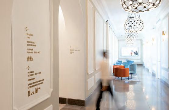
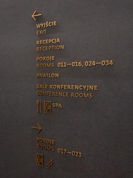

Category: Wayfinding
Project: Wayfinding starts before arrival
Digital Search & Wayfinding System — Medical Center at Klinikum Biberach
What was the challenge?
Large medical centers can be stressful to navigate — especially for first-time visitors and patients in sensitive situations. At the Medical Center at Klinikum Biberach, orientation traditionally started only after entering the building, leading to uncertainty and frequent inquiries at reception.
What was the solution?
A digital search and wayfinding system was developed to support visitors before arrival. Users can locate doctors, departments and services online and understand the building structure in advance. The system follows a consistent logic across all touchpoints – from mobile search to on-site displays –using clear hierarchy, spatial coding and intuitive navigation.
What was the effect?
By shifting wayfinding to the beginning of the visitor journey, the system reduces confusion, improves accessibility and helps patients arrive better prepared. It creates a seamless connection between digital information and indoor guidance.
Contact: Patrick Geiselhardt gg geiselhardt gestaltung pg@geiselhardt-gestaltung.de geiselhardt-gestaltung.de
PRAXEN UND DIENSTLEISTER
AOK GESUNDHEITSKASSE
APOTHEKE
ARBEITSMEDIZIN
CHIRURGIE
FITNESS
APOTHEKE
APOTHEKE AM KLINIKUM ANDREAS RÖDER
T. 07351 / 5068180 info@apotheke-biberach.de
ZUR WEBSITE
ÄRZTE UND DIENSTLEISTER
DR. MED. KONRAD AUMANN
DR. MED. LEONID BASOVSKI
DR. MED. HEIMO BENEKE
DR. MED. CORDES
PATRICK DENZLER
DR. MED. DOBLANZKI
DR. JOCHEN EBLE
DR. THERESA FÖHRENBACH
DR. JOCHEN EBLE
DR. JOCHEN EBLE
DENTASTISCH PRAXIS FÜR ZAHNHEILKUNDE
T. 07351 / 6481 info@dentastisch.de
EBENE 2
DR. THERESA FÖHRENBACH
What was the challenge?
The Technology Park Split is located in a renovated building originally designed as part of a military complex and later transformed into a hub for advanced technologies. Due to the architectural configuration of the building, several functions are positioned on mezzanine levels, making orientation within the 4,252 m² facility demanding. The presence of multiple entrances and intersecting circulation routes further complicates navigation, making detailed spatial analysis a key step in the signage design process.
What was the solution?
The project introduces a visually distinctive signage system based on raster lines and layered structures. Each orientation sign consists of three panels, two of which contain printed line rasters. By carefully spacing the layers, a subtle analog animation effect is created: as users move past the signage, the shift in perspective makes the graphic elements appear animated. The use of translucent red plexiglass also introduces a strong color accent to the predominantly white interior.
What was the effect?
The result is an innovative wayfinding system that combines functionality with a strong visual identity. The modular design allows the system to be easily expanded while maintaining a clear connection to the architecture and technological character of the building.
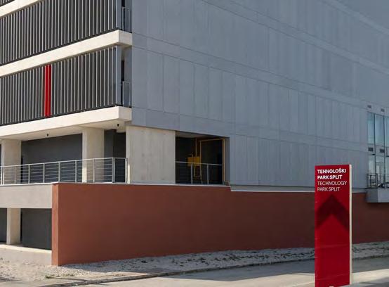
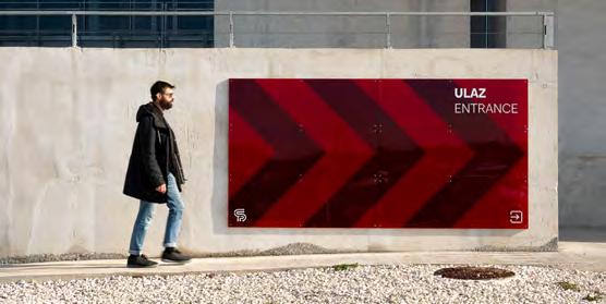
Contact:
name: K. Kazinoti, M. Komenda, A. Bodrozic company: Kazinoti & Komenda Studio
e-mail: alo@kazinotikomenda.com website: kazinotikomenda.com
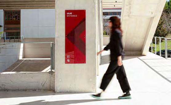
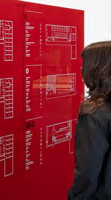
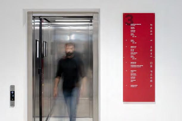
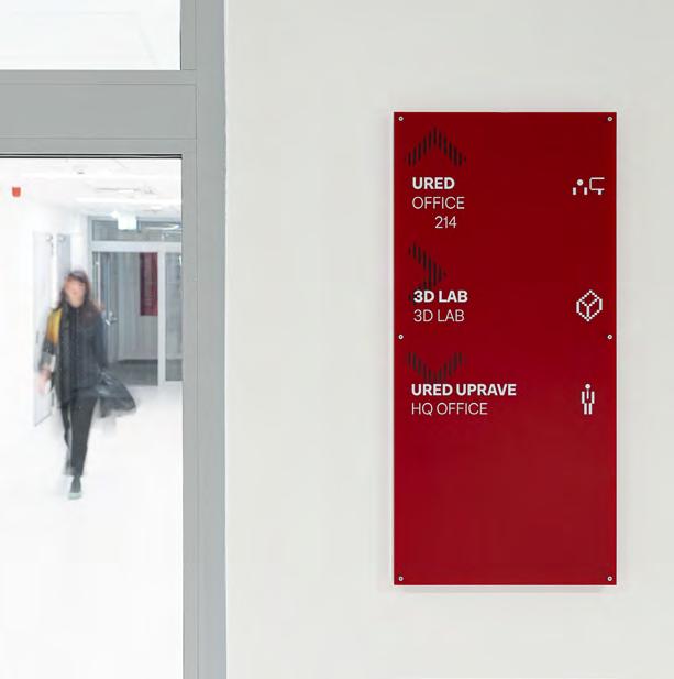
What was the challenge?
The University of Cambridge commissioned Placemarque to create an internal wayfinding strategy for the Ray Dolby Centre, the centrepiece of its renowned physics department where the atom was first split, the double-helix structure of DNA and the electron and electromagnetism were first discovered.
The state-of-the-art centre is truly unique but creates a challenging environment for navigation. Its sheer scale is necessitated by the largescale experiments being carried out. Some labs have no natural light, and the building is segregated into a public access area and a restricted access area. The building layout incorporates a long movement corridor measuring two football pitches in length.
Put all that together, and Placemarque’s challenge was how to make this complex space accessible and understandable for users, with little to no natural navigational cues. Plus, layers of complex naming terminology to decipher.
What was the solution?
Placemarque first had to decipher layers of complex and precise naming terminology, to identify the needs of users and where they’re heading. This culminated in a simplified information hierarchy to make sense of the complexities and a series of simple floorplans to build understanding of the unusual layout and to illustrate routes to key spaces.
Floorplans are clearly and attractively presented using a coherent and logical naming system, simplifying the information to be accessible to all visitors. As for the signs themselves, floorplans were stencilled onto walls directly so as not to distract from the stunning architecture. Other signs were made from birch ply to give an industrial look.

Contact: name: Sophie Campbell company/organisation: Placemarque e-mail: sophie @placemarque.com website: placemarque.com
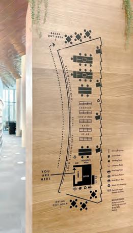
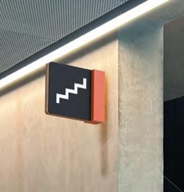
The scheme helps users build a clearer mental map of this complex and disorientating building layout, a welcoming space, encouraging interaction and the exchange of ideas. Ultimately, our work is helping facilitate the next generation of scientists having an impact on the way we’ll live tomorrow.
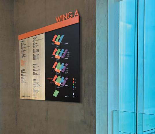
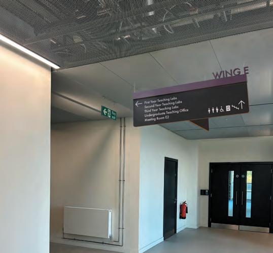
What was the challenge?
Five buildings, a church, park, pond, orangery, a memorial site – parts of a listed Baroque monastery complex that now serves as a conference, education and cultural centre. Guests therefore have some distance to cover. The heterogeneity of the buildings (ranging from Baroque to new construction) and the requested restraint in the historical environment posed a problem. And it had to be implemented in a barrier-free and inclusive manner.
What was the solution?
Consistency in implementation was a central aspect – it had to be able to form its own independent level across all buildings, which in turn had to be “strikingly inconspicuous”. Colour coding was used on all signs, signposts, orientation plans and on the building model. The model and plans are all tactile and also easy to “read” visually. A dark grey with wooden edges blends into the surroundings, discreet but still easily recognisable.
What was the effect?
The first three signage elements on the way from the reception to the room or conference or event venue are particularly helpful: the tactile model makes it clear that you may have to leave a building and where exactly what you are looking for is located. The map makes the corresponding connection obvious. Everything else slots into place.
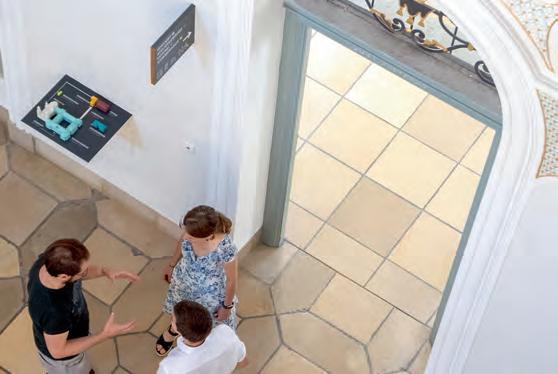
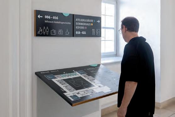
Contact:
name: Andreas Koop
company: designgruppe koop GmbH
e-mail: info@designgruppe-koop.de website: www.designgruppe-koop.de
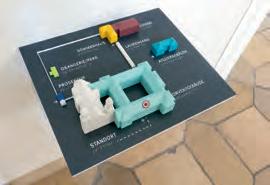
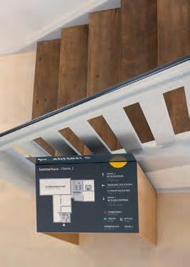
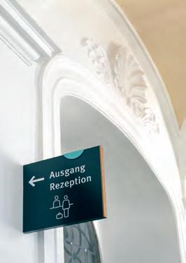
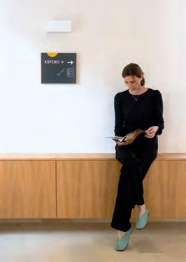
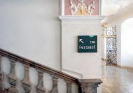
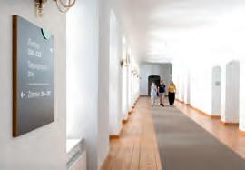
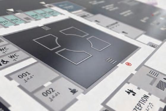
Contact:
name: Anja Bodmer und Jürg Brühlmann company/organisation: Spinform AG e-mail: konzept@spinform.ch website: www.spinform.ch
What was the challenge?
With its new historical building signage, the town of Bremgarten invites visitors to explore the old town and engage with the town’s development. It is not only the buildings that have their own stories to tell; the alleys, squares and streets are also steeped in history. The aim of the new signs is to make this history visible and tangible. Spinform was commissioned to curate and design the new building signage.
What was the solution?
The panels have a uniform structure with the name of the building, its function, chronology, and text with an architectural and historical overview. Via QR code, you can immerse yourself in the history of the building or even «ente» it and explore the representative interior rooms via 3D scans. This makes rooms visible that are closed o the public, such as living rooms, kitchens, courtrooms, etc.
The folded shape of the signs results from the three-dimensional deformation and the desire to avoid having upper edges and lower lines that would interfere with the «crooked» facades. So the angles are 30 degrees instead of 90 degrees. The colours are adapted to the historical colour scheme.
What was the effect?
Based on the signs, Bremgarten Tourism offers eight themed city tours. Topics include the Reuss River as a transport route, the market square, the church district and Habsburg rule. The tours are offered to locals as well as tourists and visitors to Bremgarten. The signs are sought after by property owners, as they have become a «distinction» for the buildings. With these signs, the old town is enhanced to become a living Ecco museum.
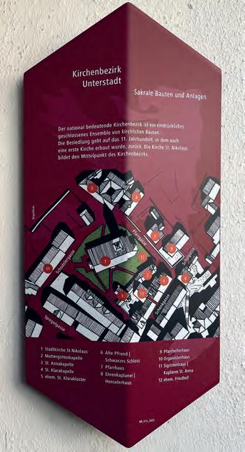
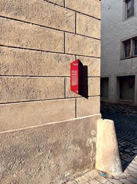
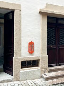
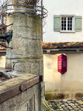
What was the challenge?
The signage for Kindergarten Untervaz was developed for a modern, sustainable building combining kindergarten, daycare and after-school care. The architecture is defined by natural materials. The challenge was to create a functional yet sensitive orientation system that integrates seamlessly into the architecture while reflecting the visual language of children.
What was the solution?
Children were actively involved in the design process. Selected drawings were transformed into reduced symbols that now identify the different groups and spaces. The pictograms are complemented by a clear, rounded typography, creating a contrast between childlike expression and graphic precision. Depending on the surface, the symbols were produced in powder-coated aluminium with a floating effect or as contour-cut foil for glass and wood elements. The main entrance lettering is based on original children’s handwriting, enlarged to create a welcoming statement.
What was the effect?
The concept is warm and identity-forming, offering clear social value by treating children with respect as well as appreciation and enabling them to actively shape their own environment.
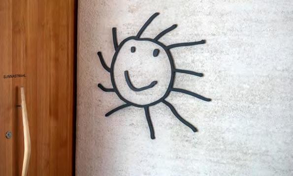
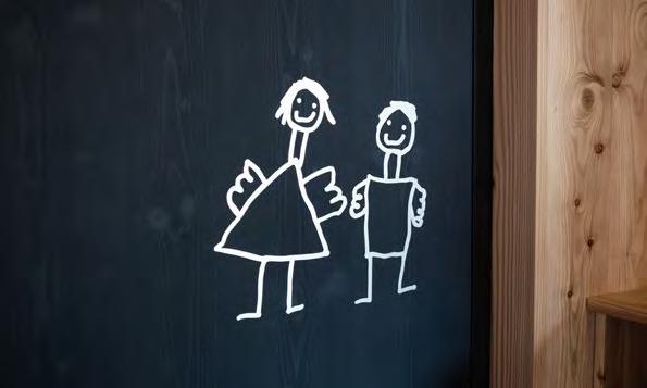
Contact:
name: Sigi Ramoser, Tim Siegel company: Sägenvier DesignKommunikation e-mail: ramoser@saegenvier.at website: www.saegenvier.at
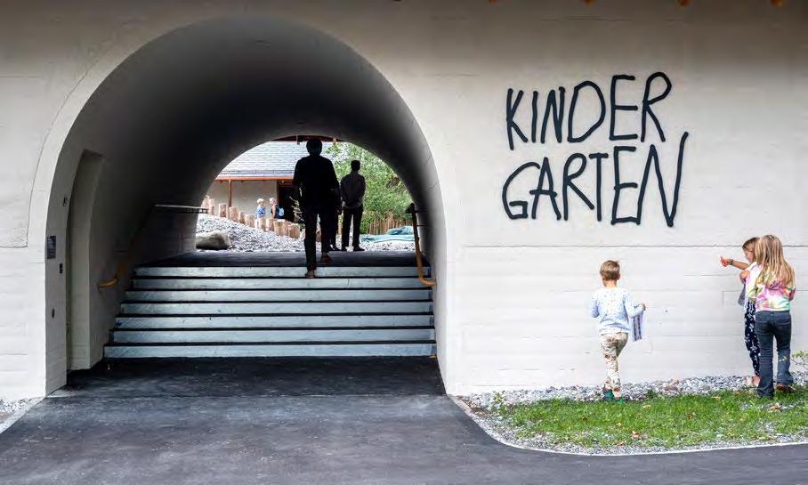
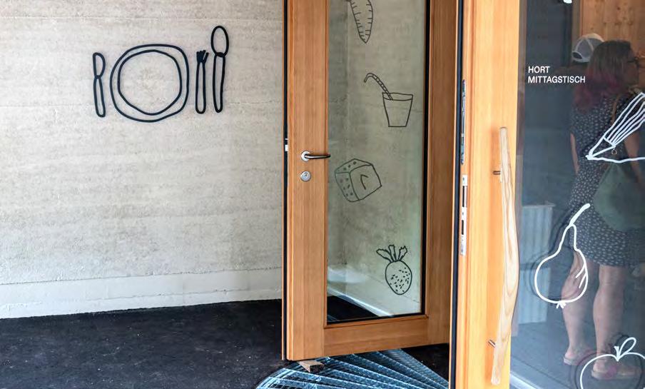
What was the challenge?
The task was to develop a comprehensive pedestrian guidance system for the entire town hall district, including the underground car park, as well as coordinated signage for the new town hall building. The challenge was to create an independent, modular system based on the existing corporate design of the City of Hohenems, that could be flexibly expanded and seamlessly integrated into both historic buildings and contemporary new architecture – while still being perceived as a coherent whole.
What was the solution?
We designed a restrained signage concept with targeted yellow accents referencing the city’s corporate colour. Dynamic typography and layered icons and arrows create clear orientation. The typeface developed by the architects, consisting of vertical bar elements, plays a special role. We reinterpreted it as a graphic pattern for collision protection. Terms from community life such as “engagement” and “connected” were integrated, adding a subtle layer of meaning to the functional components. The system is complemented by large-format arrows, pictograms, floor guides, building and room signage, as well as a full-surface design of the stairwell featuring historical photographs in a dot-grid aesthetic. High-quality materials ensure durability and elegant integration across both old and new structures.
What was the effect?
The result is a functionally clear, confidently designed signage system that provides orientation, creates identity, and effectively supports the architectural quality.
Contact:
name: Sigi Ramoser, Tim Siegel company: Sägenvier DesignKommunikation e-mail: ramoser@saegenvier.at website: www.saegenvier.at
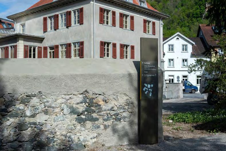
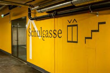
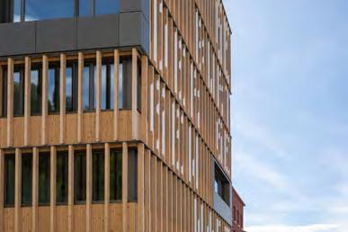
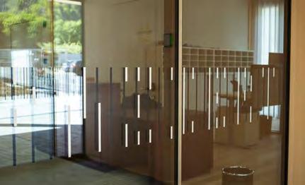
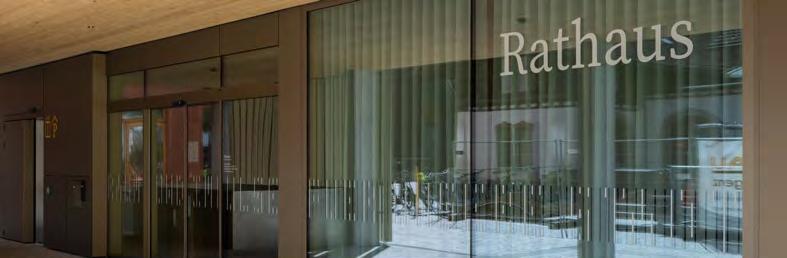
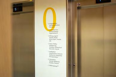
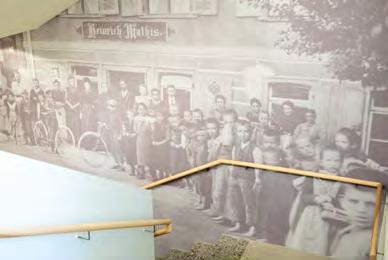
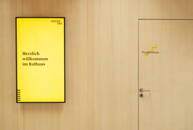
What was the challenge?
Until 2025, ATM (subway, tram and bus transport in Milan) and Trenord (regional railways) used completely different transport maps. The Milano Cortina 2026 Winter Olympics led the Municipality of Milan to adopt a unified diagram, and asked Regione Lombardia to manage the design process.
What was the solution?
A structured methodology incorporating co-design workshops where ATM and Regione Lombardia teams worked to align and expand priorities, informed by international best practices and scientific foundations.
The resulting cartographic solution was developed in two versions – for ATM and Regione Lombardia – each reflecting its organisation’s brand requirements. Beyond ID Matter’s information design specialists, the project engaged a multidisciplinary team of experts – notably Giuseppe Attoma Pepe (Public Transport Strategy) and Maxwell Roberts (Scientific Advisor).
What was the effect?
The final result gives the user the chance to perceive a more integrated transport network in Milan, with coherent information throughout multi-modal
journeys. The process also contemplates a highly innovative digital cartographic platform based on GTFS data, allowing easy updates and smoother information management across transport modes. The unified map represents a significant step forward in both visual communication and institutional collaboration, requiring alignment across organisational cultures, technical standards, and user needs. The result is scalable, data-driven, and grounded in scientific rigour and human-centred design – a system where all these tensions are resolved into a single, coherent user experience.
Contact:
name: Paolo Sancis company: ID Matter (Milan, Italy)
e-mail: paolo.sancis@idmatter.eu website: idmatter.eu
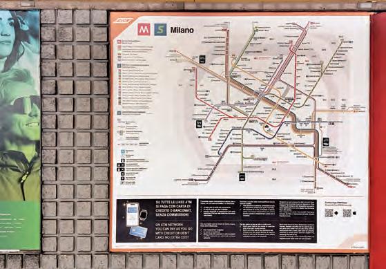
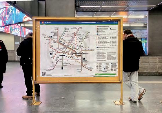
Dubai’s public transport serves 3.5 million residents and over 16 million annual visitors, generating over 800 million trips per year. Across the network, 936 LCD and epaper displays provide essential on-ground passenger information — where journey decisions are made.
The existing display layouts, design, and behaviour did not communicate passenger information effectively. Passengers could not quickly find the information they needed. ETAs were buried in paginated lists of visually similar routes, and constant LTR/RTL language switching caused layout instability. Field research showed that passengers glance at a screen for only 3–5 seconds and expect an immediate answer. Disruptions were poorly communicated; delays and cancellations were not shown, forcing passengers to rely on mobile apps or staff. The inconsistency weakened trust in the displays.
The challenge was to create a unified design system for all 936 displays (LCD and e-paper, static and interactive) from five providers, across multiple sizes, orientations, and contexts, as well as mobile interfaces.
Client
Roads & Transport Authority (RTA) –Public Transport Agency (PTA), Dubai
System Integrator & Lead Energy International
UI/UX Consultant
Papercast Ltd.
Matic Leban - UI/UX/information design
Contact:
Abdelaziz Alhammadi, Roads & Transport Autority (RTA), Dubai e-mail: abdelaziz.alhammadi@rta.ae website: www.rta.ae
What was the solution?
A modular, adaptive information design system grounded in field research, passenger observation, stakeholder interviews, and global benchmarks.
Clear information hierarchy: A three-tier structure (Basic, Important, Enhanced) ensures that the most critical details (upcoming arrivals and disruptions) are always immediately visible.
Transparent trip status: Delays and cancellations are explicitly labelled alongside occupancy and real-time status, enabling confident decision-making.
Consistent visual language: Route labels, occupancy indicators, and operational labels create a recognisable, trust-building experience.
Bilingual layouts: English and Arabic are presented with smooth transitions on LCD screens, minimising content shifting; colour, iconography, and spatial grouping support universal comprehension.
Functional use of colour and motion: Colour signals route identity, while subtle animations highlight imminent departures, page rotation, and bilingual transitions.
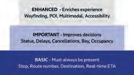
A research-based three-tier hierarchy of user needs (Basic, Important, Enhanced) drives the layout design.
Spatially meaningful components: Route–Bay–Walk-Time labels form a compact pictorial system, complemented by on-route POIs for metro connections, events, and landmarks.
Universal layout framework: All screen types share consistent physical sizing; typography, spacing, and contrast are optimised for each display type.
Mobile interface: QR codes on displays or printed on stops link to a responsive web UI with station- or bay-specific route details.
The project establishes a network-wide passenger information standard for Dubai’s multimodal transport system. A brief glance now reveals departure time, route, bay, occupancy, and disruptions. Clear delay and cancellation labelling builds trust and reduces uncertainty. A unified visual language ensures consistency between physical displays and mobile applications, while standardised layouts improve accessibility for an international audience. Implementation began in 2026 across all 936 displays, creating a long-term foundation for clarity, accessibility, and operational transparency across Dubai’s expanding transport network.










Dynamic layout examples
Layouts dynamically prioritise visibility: key areas stay fixed and magnified, while secondary content rotates across pages. Up to eight upcoming trips can remain permanently visible.


Shelter displays, station displays, bay displays, flagpoles, and interactive displays: each screen type layout was adjusted to ensure elements have the same physical size for readability at a distance. Layouts can be mirrored to adapt to the environment.
Colour-coded route labels with bay and walk time intuitively read as a pictorial language. Walk time indicator is animated when it’s time to head to the departure bay.
Trips are represented with times and status labels. Later trips are visually subdued.
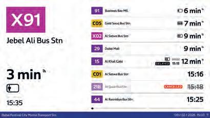
First arrivals are magnified for distance reading; later ones cycle through pages, marked by a sequence of filling progress bars (at the bottom) to indicate rotation.
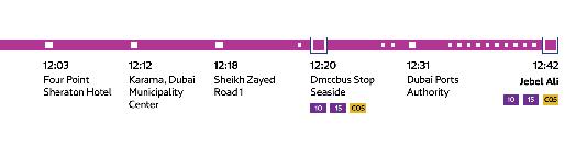

On-route POIs show contextual information: metro connections, events, landmarks, route details, or alerts (above) Mobile interface with location-relevant info (right)

Occupancy levels are simplified into four user-facing states. Additional trip status labels are visually prominent.
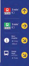

Alerts, ads, or signage occupy part of the screen or cycle with pages, placed left or right depending on context. Wayfinding includes walking directions and live route data.
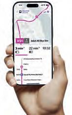
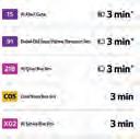
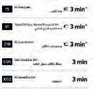
LCDs (left) transition smoothly between English and Arabic, keeping shared content (route, time and status) in place. E-paper (right) shows both languages to reduce refreshes.
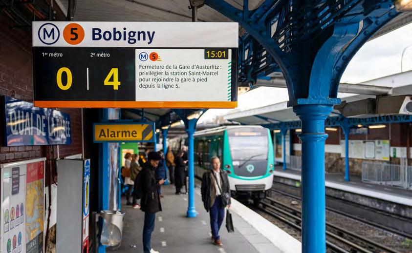
The Platform Information Boards (PIQ) initialy installed across all metro platforms were more than 20 years old. Obsolete and increasingly difficult to maintain, it were incompatible with any system upgrades or the integration of innovative services. With the Paris 2024 Olympic and Paralympic Games approaching, RATP needed to modernize these devices to provide clear, accessible, and consistent passenger information while meeting strict constraints:
- Identical installation location, dimensions, weight, and cabling as the former boards (1200 mm × 550 mm × 180 mm, 53 kg).
- Reuse of the existing mounting systems (light strips, horizontal and vertical suspension brackets).
- Enhanced accessibility, designed in partnership with disability organizations.
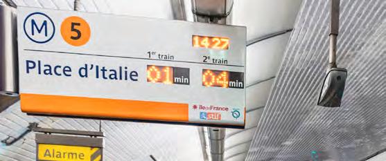
The previous product
- Preservation of the architectural heritage of historical stations.
Rather than slowing down the project, these stringent requirements became a truedriver for innovation. The teams had to rethink the dynamic information device’s design within an extremely constrained environment, while
ensuring full compatibility with existing infrastructure.
They also enabled rapid, large-scale deployment ahead of the Games, and encouraged the optimal use of the available footprint to create a modern, legible product seamlessly integrated into the passenger information environment.
PANAM is a device that merges signage with dynamic passenger information.
PANAM displays:
- Line direction and waiting times for the next two arriving trains.
- Real-time service messages (disruptions, short-turn services, skipped stations, engineering works, etc.).
- Specific indications: train approaching, train at platform, safety messages.
Key features:
- Integrated design: PANAM is not just a screen but a dynamic signage element, reflecting Paris metro’s visual identity of the Paris Metro (enameled plate aesthetics, saturated colors, historical typefaces, and a blend of rounded and rectangular forms).
- Human-centred animation: Smooth transitions that makes information living without compromising readability.
- Optimized accessibility: Larger type, high contrast, and enhanced legibility, widely praised by passengers especially visually impaired users.
- Heritage-conscious design: A solution that respects and enhances historical station environments.
Product design was carried out by Elium Studio, in collaboration with RATP’s Passenger Information Design team and User Studio for motion design.
PANAM was deployed in 242 stations before the Games, with 484 boards installed (an average of 32 per week).
Passengers consistently praise its exceptional readability, particularly visually impaired users.
It modernizes the image of the Paris Metro
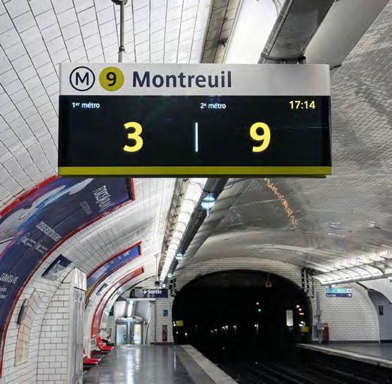
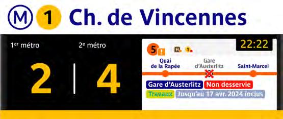
adapts to the operating context by maximizing the display of waiting times whenever messaging is not required.
while respecting its architectural heritage. Feedback highlights clearer information, improved comfort, and better anticipation of service disruptions thanks to dynamic messaging.
Contact: name: Gendrillon Guillaume company/organisation: RATP e-mail:guillaume.gendrillon@ratp.fr
What was the challenge?
Reykjavík Culture Night (Menningarnótt), held each year in mid-August since 1996, is Iceland’s largest festival, drawing around 100,000 people to the city center. Large parts of downtown are closed to traffic, and the city and police encourage visitors to park outside the center and use a free shuttle service.
For Strætó, Reykjavík’s public bus system, this meant adapting regular service for one day, adding a free shuttle route with temporary stops, and solving the biggest challenge: clearing the city center around midnight. After a large outdoor concert and fireworks, most guests needed to be guided from the concert site to a temporary bus hub, where free buses departed for all major neighborhoods.
What was the solution?
A temporary, dedicated signage system was implemented across the city to help guide roughly 100,000 people, about a quarter of Iceland’s population. The system included temporary informational and wayfinding signs, covered regular signs that were incorrect for that day, and directed people clearly through the altered transport network.
What was the effect?
The public was well informed and able to enjoy Culture Night and the free bus service throughout the day. After the fireworks, the city center was cleared smoothly, with people safely guided home and no major incidents reported.
Contact:
name: Hörður Lárusson company/organisation: Kolofon e-mail: hordur@kolofon.is website: www.kolofon.is
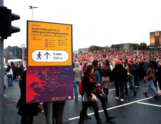
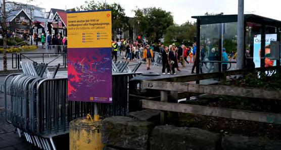
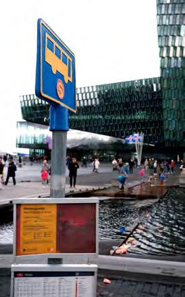
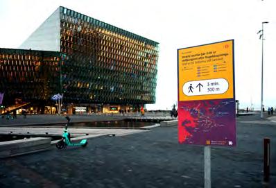
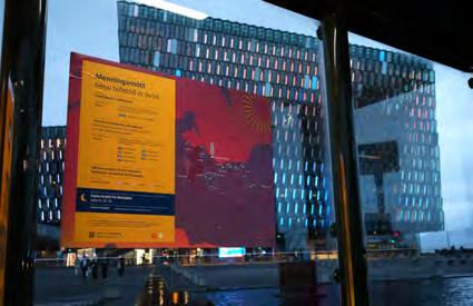
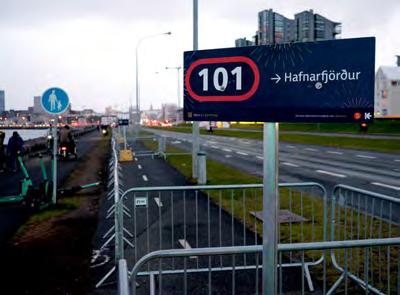
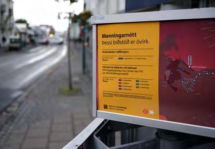
The signage system around KEF, Iceland’s international airport, was in urgent need of renewal. The area still contained remnants of the previous three signage updates. A single, clear wayfinding system was needed for the various car parks and other users, including taxis and buses. Because the entire area is planned for redevelopment in the near future, the system also had to be flexible enough to work with existing signposts wherever possible. In most locations there was no electricity available, making illuminated signs impossible. At the same time, a new parking payment system was being introduced, requiring especially clear information about payment options, time limits, and parking rules.
A modular system was developed with a design language that echoed the indoor wayfinding system while responding to outdoor conditions. Reflective film materials made the signs clearly visible in all weather without illumination. A simple sign structure with bent edges strengthened the panels, allowing for efficient manufacturing while ensuring durability in Icelandic winds. A customized version of the airport’s brand typeface was also created to improve legibility.
The result is a modern, highly flexible signage system that communicates information clearly and allows fast, efficient implementation as the area continues to change.
Contact:
name: Hörður Lárusson company/organisation: Kolofon e-mail: hordur@kolofon.is website: www.kolofon.is
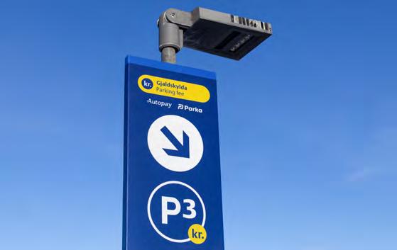

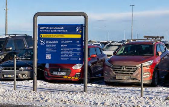
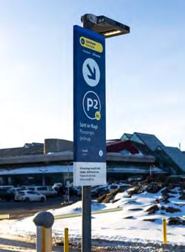
The system’s colors also draw inspiration from the terminal’s interior signage, adapted for outdoor use and maximum legibility in all lighting conditions.
Rounded forms and pictograms were defined and drawn from scratch, based on international standards, while some also incorporate subtle local references. These elements give the system character and a cohesive visual identity, while also improving legibility.
What was the challenge?
Moniteurs developed a new passenger information concept for Steintor station in Hanover. The aim was to improve orientation, facilitate and speed up transfers, and create digital services that harmonize with static signage. Steintor station is a highly frequented transport hub in Hanover’s city center, connecting urban public transport with regional lines.
What was the solution?
Moniteurs optimized wayfinding by consistently positioning elements along passenger flows, creating a logical arrangement of objects and services throughout the travel chain. Additionally, a new, welcoming design language was developed, aligning with ÜSTRA’s current brand identity. The product family and visual appearance were functionally revised and designed for easy comprehension. The project encompassed
both above-ground and underground signage, as well as the design of monitors and maps. The overarching goal was to create a consistently positive experience by optimizing passenger information as a key mobility service. Dynamic and static passenger information seamlessly integrate. Large-scale wayfinding signs at platform entrances and exits are designed in the respective line colors, enabling quick and easy identification of the correct platform. Large-scale wayfinding signs at platform entrances and exits are designed in the respective line colors, enabling quick and easy identification of the correct platform. The new area map is available in dark, light, and e-paper versions. To enhance orientation, platforms are numbered, and exits are labeled with letters. A marked walking radius with distance indications in minutes helps passengers plan their transfer times more efficiently.
What was the effect?
Simplified designs, clear colour schemes and a consistent information grid ensure that information can be absorbed more quickly. For passengers, this means less searching, greater ease of orientation and a more intuitive arrival at every station.
Over 300 passengers evaluated various elements of the new passenger information system. Over 84% rated the new information as “good” or “very good”.
Contact: Moniteurs info@moniteurs.de www.moniteurs.de
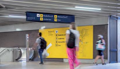
What was the challenge?
People with sensory processing sensitivities may experience difficulties when visiting museums, theaters, and other cultural institutions due to things such as bright lights, sudden noises, or sloping floors. For them, uncertainty about the kinds of stimuli they can expect may lead to cancelling a visit altogether. At the same time, many cultural institutions are seeking ways to make their locations more inclusive without having to make changes to artworks and compromise artistic integrity.
What was the solution?
Together with the Dutch foundation ‘Onbeperkt Genieten’ (which promotes cultural accessibility for people with sensory processing sensitivities) and a group of experts by experience, we co-created a series of symbols and maps. The symbols each represent different kinds of sensory stimuli, such as rooms with flashing light or strong smells. In combination with maps, the symbols help visitors locate different sensory stimuli ahead of time, giving them the freedom to choose whether they want to encounter them or seek alternatives. The symbols also allow cultural institutions to become more accessible without having to make changes to the art itself. To aid adoption, all symbols were made available for free under a Creative Commons licence and can be easily downloaded from a dedicated website (www.prikkelpictogrammen.nl).
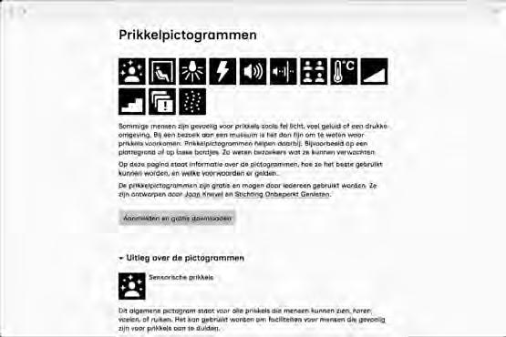
Easy to understand
A website for the project (www.prikkelpictogrammen.nl) contains explanations for each of the symbols alongside tips for applications on signs and maps.
Contact:
Name: Jaap Willem Knevel
Company/organisation: Tokyo Monorail (in collaboration with Stichting Onbeperkt Genieten)
E-mail: studio@tokyomonorail.info Website: www.tokyomonorail.info
The symbols were made in collaboration with experts by experience and the Dutch foundation ‘Onbeperkt Genieten’, which represents people with sensory disabilities.
What was the effect?
The Sensory Symbols have been downloaded and adopted by a large variety of museums and theatres in the Netherlands, including the Kunsthal Rotterdam (as seen on the facing page), National Theatre, AFAS Circustheater, University Museum Utrecht, Van Gogh Museum Mesdag Collection, Hortus Botanicus Amsterdam, and Discovery Museum. Even more importantly however, reactions from visitors have been overwhelmingly positive, praising how the symbols and maps give them access to culture again.
“I really appreciated the floor plan and signs in the galleries. Thank you so much for offering the opportunity to visit the exhibition with low or no sensory stimuli. As a culture lover with sensory overload issues due to Acquired Brain Injury (ABI), I truly appreciate these kinds of outings.”
Ilse Blok, Expert by experience
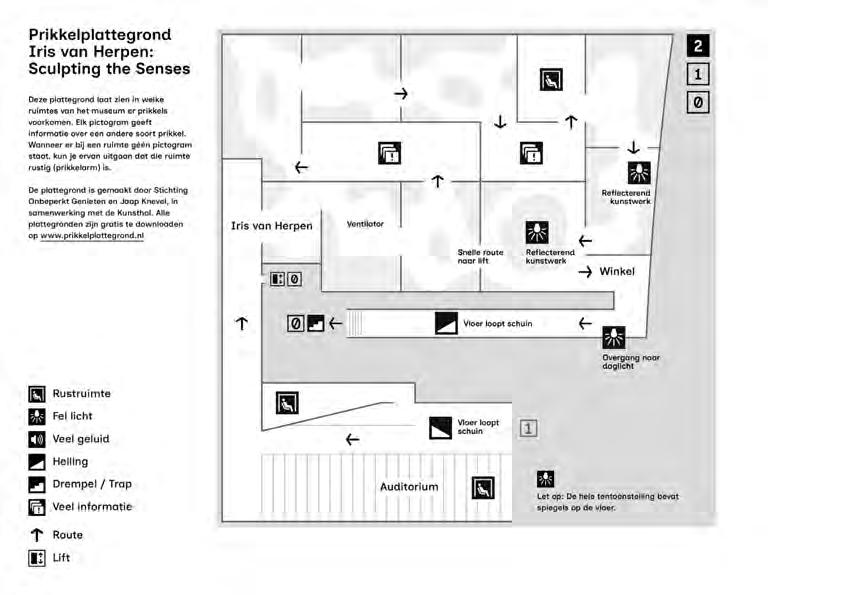
Sensory map
Example of the symbols on a so-called ‘Sensory map’. Each kind of sensory stimulus and its exact location within the building is indicated.
What was the challenge?
The railway station in Buchloe is playing an increasingly important role in rail transport. Following the construction of the new building of the station, the parkand-ride car park was enlarged, bicycle garages were built and the station square was redesigned. What was still missing was a central information point that was accessible and inclusive, displaying locations, directions and POIs.
What was the solution?
The combination of a wheelchair-accessible desk with a tactile map and a highly visible stele for marking and orientation. The application is inclusive because the orientation map is not only tactile but also clearly visible. The lower level of the station was also ‘logically’ arranged lower than the rest.
The desk is like an iceberg: most of it is not visible! It descends into the ground, becoming the foundation, which was also used for the stele in an “L”-shaped design.
What was the effect?
By placing the accessible information element (like at the end of a funnel), everything important is visible from a distance and is perceived as intuitively as it is (actually) incidental. People with visual impairments can find their way to the desk via the floor indicators and can feel everything they need to know.
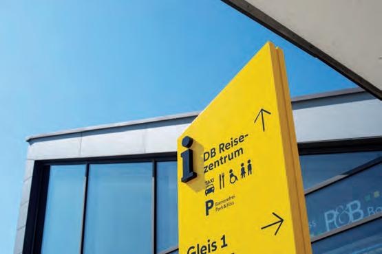
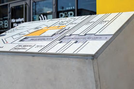
Contact:
name: Andreas Koop
company: designgruppe koop GmbH
e-mail: info@designgruppe-koop.de website: www.designgruppe-koop.de
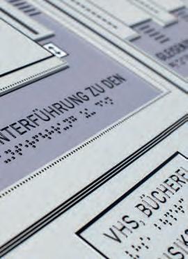
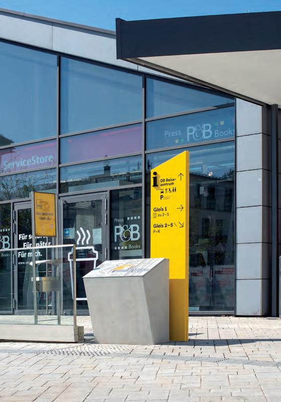
The government needs quality and accessible software, both for internal analysis and to communicate with the population.
This project was born in Mexico in a governmental environment, where the Centre for Research in Geospatial Information Sciences, A.C. (CentroGeo), a federal public research centre, and the National Council of Humanities, Sciences and Technologies (Conahcyt) joined forces to tackle this important challenge.
Software procurement in government typically follows two paths: internal development or the purchase of expensive proprietary licenses. The internal approach faces a recurring challenge: high staff turnover linked to government cycles. Every three to six years, new teams arrive under “urgent” mandates that leave little room for documentation. Consequently, institutional knowledge is lost, and most projects are forced to start from scratch each term.
Regarding the procurement of proprietary licenses, two critical
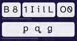
Contact:
name: Yosune Chamizo Alberro
organisation: Independent consultant
e-mail: yosunechamizoalberro@gmail.com
website: linkedin.com/in/yosune-chamizo-alberro
factors emerge. First is the Total Cost of Ownership (TCO); beyond initial fees, the long-term burden of maintaining restrictive licenses drains public resources. Second is technological sovereignty. As the Mexican government pivots toward autonomy and independence, the use of free software components is no longer optional, it is a strategic necessity for the federal public administration to ensure its data and tools remain under national control.
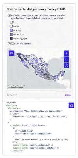

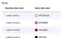
Build a Design and Accessibility System for Research: Sisdai (by its Spanish abbreviation), which was developed by CentroGeo and coordinated by Conahcyt, but open to everyone!; Sisdai addresses the issues of government procurement cycles and licensing through an open design and development system.
Sisdai stems from an interdisciplinary perspective, considering criteria

for accessibility, usability, data visualization, good code practices and user experience. Its structure is based on the atomic design methodology, which proposes that from simple elements -atomscomplex components and functions -organisms- are formed and, in turn, these form functional and robust templates and user interfaces under the same logic to be able to decompose them if necessary.
Sisdai allows the establishment of rules, patterns and practices to ensure the consistency of complex, flexible and constantly evolving digital products.
By using Sisdai you will be able to explore buttons, menus, graphs, maps, and other components that will allow you to develop accessible interfaces. Also, if your native language is not English, you will have the opportunity to access documented code in Spanish! Sisdai libraries are developed using open source technologies, such as the Vue.js Javascript framework, OpenLayers, D3.js and Git.
Sisdai’s mission is rooted in Universal Design: ensuring that digital interfaces are perceivable, navigable, and interactive for as many people as possible. This inclusive approach specifically addresses the needs of diverse user groups: Individuals with visual, hearing, motor, cognitive, or neurological disabilities as well as vulnerable populations like older adults and those with limited digital literacy. To achieve this, we build and maintain Sisdai repositories, libraries, and
documentation under international best practices. Our framework aligns with World Wide Web Consortium (W3C) standards and adheres to the Web Content Accessibility Guidelines (WCAG) version 2.1.
Code libraries are currently available in public Git repositories, and to access the design tools, you can do so through their library in Figma.
What was the effect?
We know that at least six government agencies have used it. But beyond that, Sisdai is on track to achieve its greater goal: as an open and free project, is taking steps towards independence in order to avoid relying on changes in government during each term.
Additionally, in November 2024, Sisdai was honored as a finalist in the II Awards of the Institute of Accessibility for Spain and Latin America in the Digital Accessibility category, reaffirming this project’s
commitment to accessibility and digital inclusion.
The utopian vision for this project was for it to become THE Design System for public administration in Mexico. However, the team was always very aware of the institutional difficulties involved in making this happen, which is why it was developed in an open environment so that the community could embrace it once it was released.
Sisdai is a collaborative project that has brought together wonderful professionals. To find out who they are, visit: sisdai.org
What was the challenge?
Natural disasters frequently occur in Japan, including major earthquakes such as the Great East Japan Earthquake in 2011, which caused massive destruction and resulted in approximately 20,000 deaths due to the tsunami. In recent years, the Japanese government has warned that another large earthquake and tsunami may occur within the next 30 to 40 years, potentially causing up to 300,000 fatalities. The greatest challenge is that no one can predict exactly when it will happen. Therefore, it is essential to share effective knowledge about evacuation and disaster preparedness as soon as possible.
At the same time, with increasing globalisa‑ tion, many people from abroad now visit and live in Japan. They are not necessarily fluent in Japanese, which means that disaster‑related information should be provided not only in Japanese but also through alternative methods that overcome language barriers.
Non‑verbal communication tools such as short films and pictograms have been developed to address this issue and have played important roles. However, additional challenges have been identified: power outages and limited device‑operation skills may hinder the effective use of digital media, and most pictograms can convey only a single message, whereas actual emergency situations often require com‑ municating complex procedures, workflows, and systems.
The three issues—language barriers, the complexity of information, and emergency
Contact:
name:
Takehiro Kiriyama
organisation: Nagoya City University e‑mail: kiriyama@sda.nagoya‑cu.ac.jp
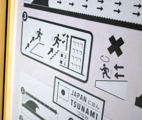
conditions—pose major challenges to ef‑ fective communication. Moreover, people’s everyday assumptions differ according to their cultural and linguistic backgrounds. For example, in the case of ‘Hard‑pressing on the bleeding wound’, nursing textbooks in Japan recommend rinsing the wound with tap water, which is considered hygien‑ ic and safe enough to drink. However, re‑ search has shown that people from regions where tap water is not potable tend to reject this information. This may delay first aid unless they are sufficiently persuaded to understand Japanese standards.
This project aims to create effective information materials that everyone in Japan can access and use to evacuate and prepare for disasters equally.
What was the solution?
In order to represent complex procedures,
workflows, and system concepts without relying on electricity or digital devices that require advanced operational skills, our research team explored a visual design so‑ lution. In the illustration book Wordless Diagrams (Holmes, 2005), simple step‑by‑step diagrams communicate sequential and representational information without using written language. Our team assumed that this style of communication could be ap‑ plied to our context as an effective solution.
It is essential that all people in Japan understand the series of disaster‑prevention and evacuation procedures. Therefore, after conducting research to minimise mean‑ ing gaps caused by cultural and regional differences, we identified points that tend to mislead foreign users and emphasised them by using elements such as the word ‘JAPAN’, icons of the national flag, and bold lines.
After creating several prototypes of the wordless diagrams, our research team conducted two rounds of user testing to examine whether the intended users could accurately understand the visual informa‑ tion without relying on specific languages. At the same time, in order to refine the diagrams as a set of educational materials, we improved the items as follows:
• Production: Fast and low‑cost (B&W photocopying only).
• Usability: Versatile display/distribution; maintenance‑free (no electricity or techni‑ cal requirements).
• Storage: Compact A4 format; easily orga‑ nized in standard files or storage boxes.
Following the user tests, several lessons emerged:
5–10 mins
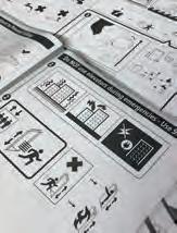
• The prominent “Do Not” signs (X) are effective.
• In order to facilitate certain behaviors, strong visual highlights are preferred.
• Clarifying the causal relationship between images is critical to users’ understanding.
What was the effect?
Five types of diagrams were created and developed as educational materials for emergency situations and disaster‑preven‑ tion education. The topics covered by the diagrams are as follows:
• Press Hard on the Bleeding Wound
• Tsunami Warning — Go to High Ground or Upper Floors!
• Secure Furniture to Prevent Falling
• Cup Feeding in Evacuation Shelters
• Do NOT use elevators during emergencies
– Use Stairs
The diagrams produced in this project must continue to be refined and developed, particularly when parts of the information are found to be misunderstood or to cause confusion among users. An increasing number of people are visiting and living in Japan, which means that cultural and linguistic diversity will become even more pronounced. We therefore intend to keep these educational materials updated and inclusive for everyone who visits or resides in Japan and who may not be familiar with the Japanese language or with disas‑ ter‑prevention and evacuation procedures in this country.
Reference Holmes, N. (2005). Wordless diagrams. New York: Bloomsbury.
What was the challenge?
A team of dedicated experts present 80 maps and infographics that unveil surprising statistics and figures. These visual representations offer a new perspective on the climate crisis, transforming the seemingly abstract into something tangible. The team questions a common assumption: Does an overload of information about the climate necessarily lead to greater knowledge? More often than not, an excess of data can cause confusion, distortions, and the propagation of myths. In such a landscape, it would be naive to believe that discussions about the climate could be driven solely by information. Instead, creativity is essential in navigating the complex data we face. What was the solution?
The Climate Atlas seeks to reframe the greatest and most pressing crisis of our time through new forms, colors, concepts, and, crucially, new images. The atlas not only highlights the forces responsible for this crisis but also explores potential solutions and offers a vision of what a sustainable world could look like.
What was the effect?
The Climate Atlas does not just depict the world as it is but also as it is still in the process of being made. It illustrates who is shaping this world, and through which forces, technologies, and systems change is either being driven or resisted. It challenges the way we discuss the climate, emphasizing the importance of the medium through which the message is conveyed. As the world continues to change, this book offers hope through its ability to break through conventional narratives and illustrate new possibilities.
Contact:
name: Ole Häntzschel company/organisation: Ole Häntzschel e-mail: o@olehaentzschel.com website: olehaentzschel.com
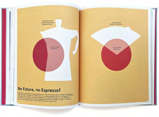
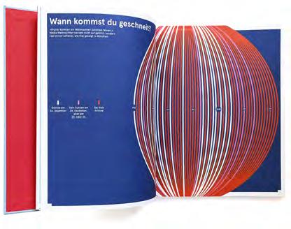
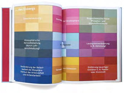
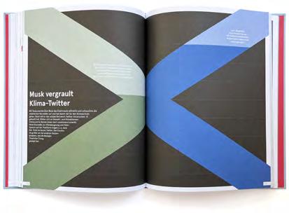
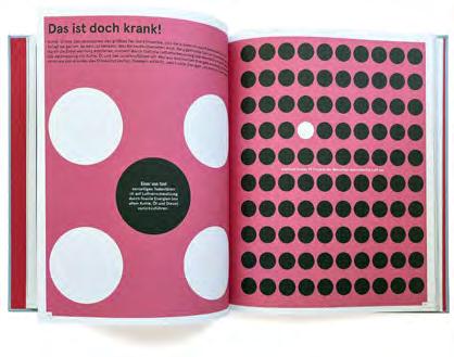
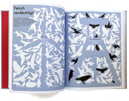
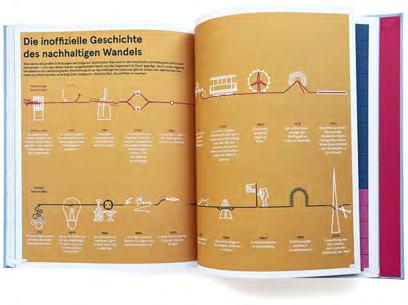
What was the challenge?
What was the challenge?
The University of Michigan Museum of Natural History hosted the exhibition “All The Plastic You Cannot See.” Informed by the university’s science and engineering research, various text-based and hands-on displays shared a body of information about sources and impacts of microplastics. This pervasive issue is in the zeitgeist, yet may not be fully grasped by the general public, or can feel too daunting to face. My challenge—how to visually prompt the leap from viewing data and information to clarity and action. Chemistry faculty and museum staff shared 7 categorized strategies to combat microplastics and 8 microplastic specimens, and asked me to visualize positive directives and memorable messages.
A team of dedicated experts present 80 maps and infographics that unveil surprising statistics and figures. These visual representations offer a new perspective on the climate crisis, transforming the seemingly abstract into something tangible. The team questions a common assumption: Does an overload of information about the climate necessarily lead to greater knowledge? More often than not, an excess of data can cause confusion, distortions, and the propagation of myths. In such a landscape, it would be naive to believe that discussions about the climate could be driven solely by information. Instead, creativity is essential in navigating the complex data we face. What was the solution?
What was the solution?
The Climate Atlas seeks to reframe the greatest and most pressing crisis of our time through new forms, colors, concepts, and, crucially, new images. The atlas not only highlights the forces responsible for this crisis but also explores potential solutions and offers a vision of what a sustainable world could look like.
What was the effect?
A writing process and series of photoshoots (in micro and macro) began to consolidate the information and illustrate the connection between processes/materials and the microplastics they create. Bold “I CAN / I WILL” statements guided children, school groups, and families to rethink accessible ways to adopt sustainable habits for the greater good.
What was the effect?
The poster series was the last component of the exhibition, boiling down the magnitude of information into easy to read and retain proactive prompts, presented in an empowering and optimistic tone. The effect made scientific knowledge and big ideas accessible to the young and lay audiences that visit the museum, while imparting hope.
The Climate Atlas does not just depict the world as it is but also as it is still in the process of being made. It illustrates who is shaping this world, and through which forces, technologies, and systems change is either being driven or resisted. It challenges the way we discuss the climate, emphasizing the importance of the medium through which the message is conveyed. As the world continues to change, this book offers hope through its ability to break through conventional narratives and illustrate new possibilities.
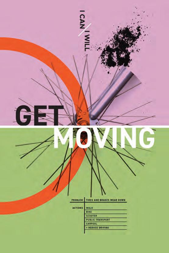
Contact:
Contact:
name: Ole Häntzschel company/organisation: Ole Häntzschel e-mail: o@olehaentzschel.com website: olehaentzschel.com
name: Kelly Salchow MacArthur company/organisation: elevate design e-mail: salchow@msu.edu website: elevatedesign.org

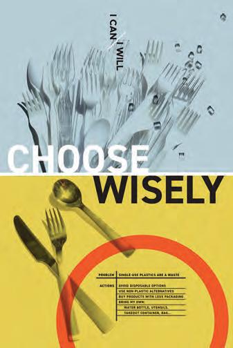
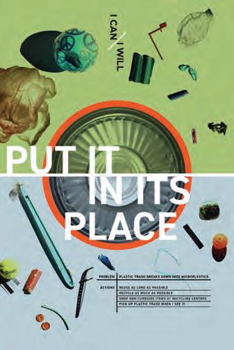
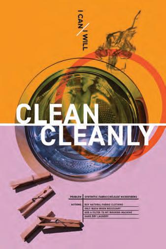
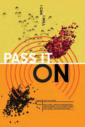
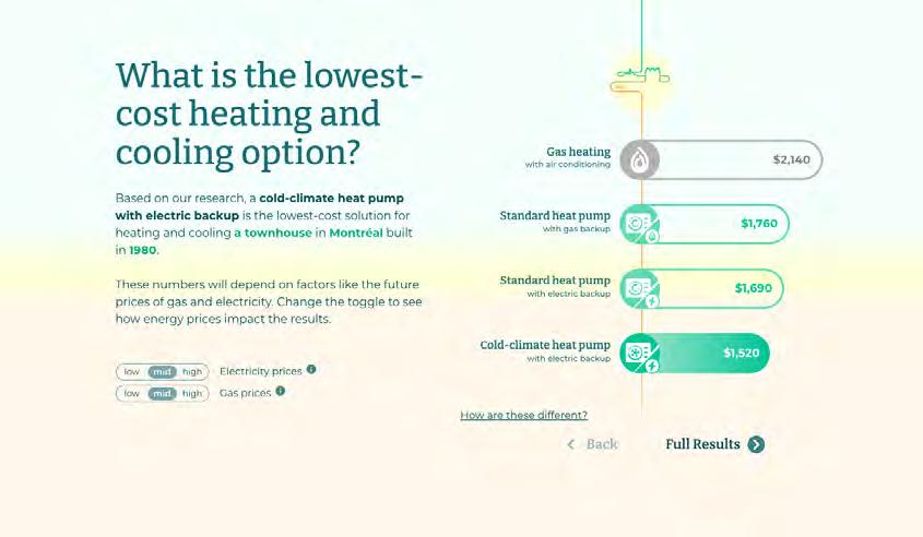
What was the challenge?
In the coming years, heat waves are expected to increase in intensity and frequency in Canada, while winter temperatures will remain very low. This wide temperature range puts pressure on households, who must heat their homes in winter and cool them in summer, often using energy-intensive and polluting systems. Although heat pumps offer a cleaner and more cost-effective alternative, there is still a significant lack of information about them. The Canadian Climate Institute needed to clearly demonstrate their economic and environmental benefits to help people decide whether this solution fits their specific housing situation.
Contact:
name: Francis Gagnon company/organisation: Voilà: e-mail: contact@chezvoila.com website: https://chezVoila.com
What was the solution?
Given the large amount of data involved, Voilà: worked with the Institute to create an accessible, digestible, and didactic online calculation tool. Designed for a consumer audience, it guides users through a playful interactive quiz where they choose a city, building type, and build year. Information is revealed progressively, avoiding data overload while maintaining accuracy. Clear visuals, simple charts, and animated illustrations translate complex data into understandable insights, allowing people to compare heating and cooling options and identify the most suitable solution for their home.
What was the effect?
The calculator empowers consumers to make informed decisions about heating, cooling, and climate impact. By visualizing costs and emissions through a personalized and engaging experience, it plays both an educational and motivational role. Users gain confidence in their choices and help reduce climate pollution in Canada’s building sector. For the Canadian Climate Institute, the tool supports its long-term advisory role, strengthens its reputation as a trusted resource, and helps maintain focus on heat pumps as a cost-effective, low-carbon solution.
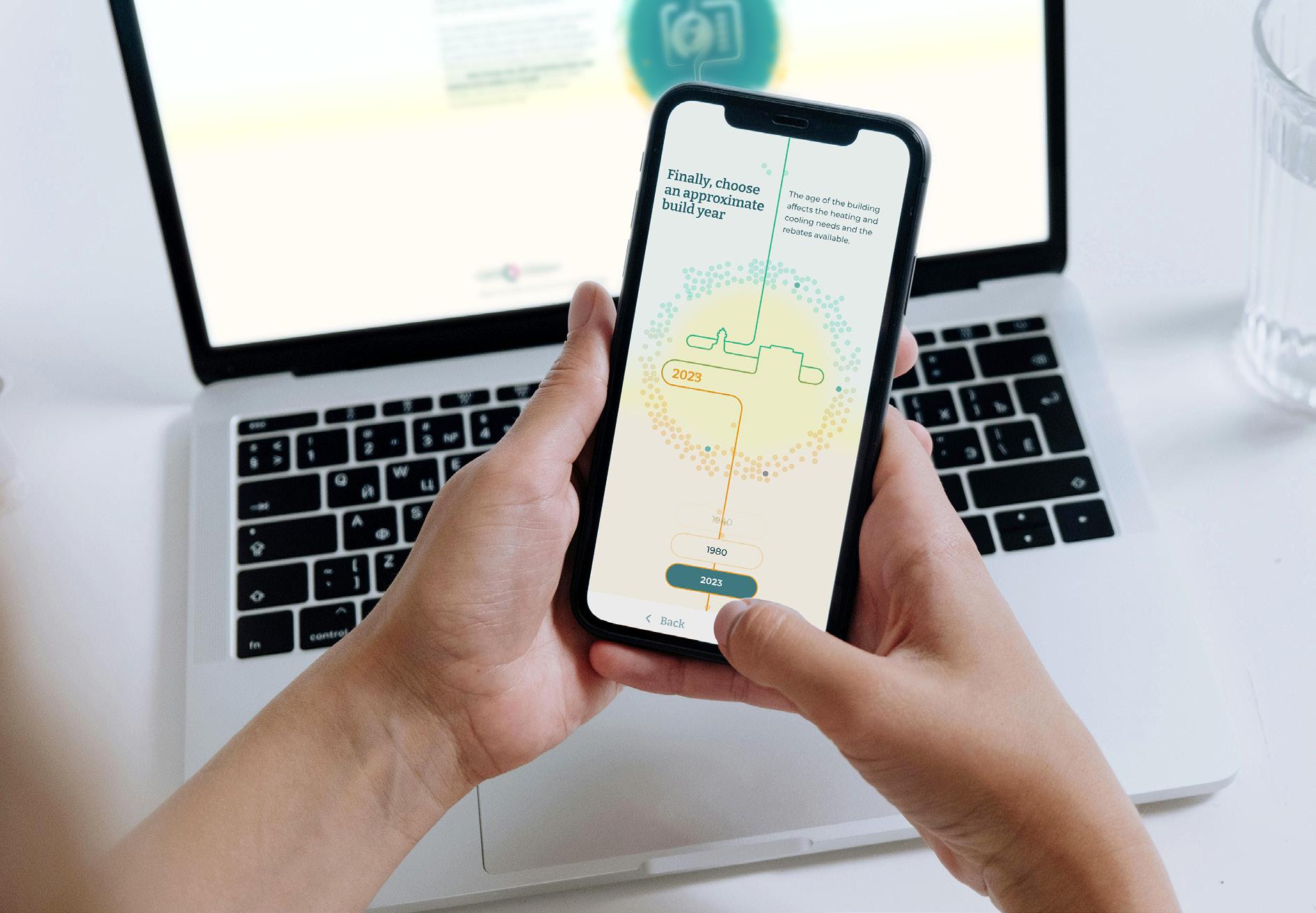
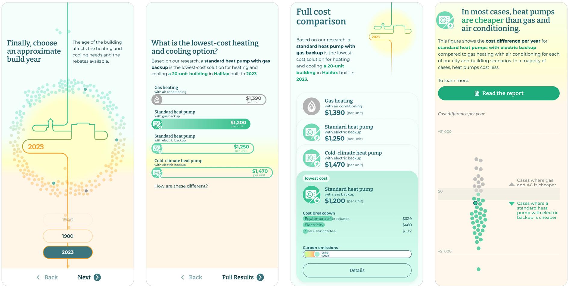
What was the challenge?
Movetia funds exchange, mobility and cooperation projects across all areas of education. The challenge was to make this complex dataset accessible and understandable for a broad audience.
What was the solution?
An interactive online statistics platform enables users to explore funded projects by location, programme and education level. Upon entering the four-language site, visitors are gently introduced through dynamic animations that spark curiosity and invite deeper engagement. The dashboard provides a quick overview of mobility programmes in Switzerland and internationally. Projects and collaborations can be filtered by educational level, allowing users to quickly identify relevant information. When selecting a specific region, users can dive deeper into individual programmes and access detailed information such as duration, type of activity, subject area, education level and participating institutions.
What was the effect?
The platform increases transparency around educational mobility and cooperation for policy makers, education stakeholders, decision makers and the interested public. By managing and updating the data independently, the agency can document its activities, justify funding decisions and strategically plan future programmes.
Contact:
name: Concept & Design: Barbara Hahn, Christine Zimmermann (Hahn+Zimmermann); Development: Christian Schneider (Data Anatomy); Client: Kathrin Müller, Céline Stampfli (Movetia) company/organisation: Hahn+Zimmermann, Data Anatomy, Movetia website: hahn-zimmermann.ch, data-anatomy.io, movetia.ch project website: stat.movetia.ch
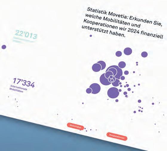
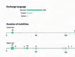
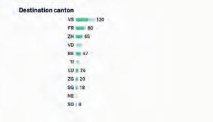
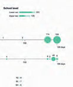

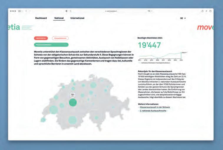
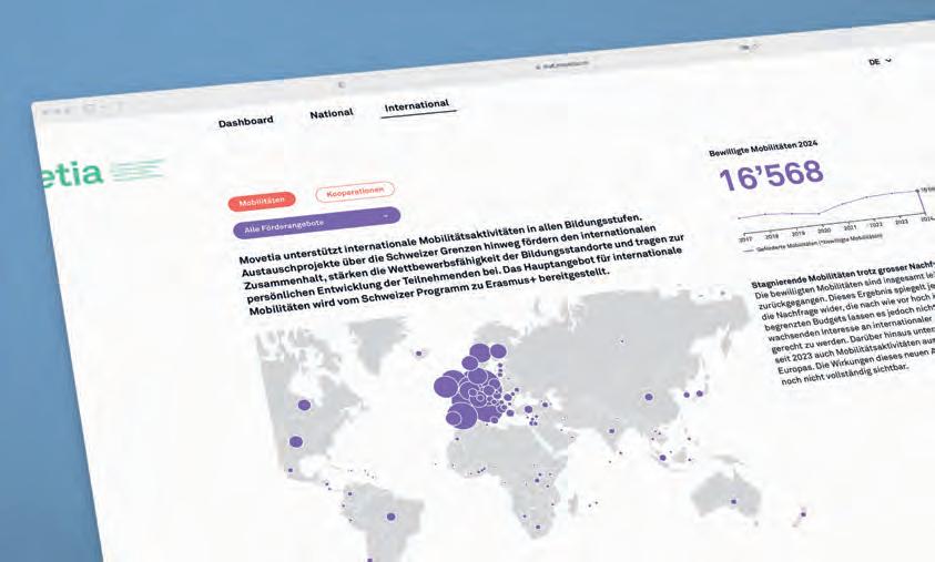
What was the challenge?
The aim of this project was to analyse and compare the designs of 31 Tyrolean tourism businesses. Over the course of a semester, twelve Bachelor’s students from the New Design University St. Pölten systematically examined the visual identities that define the regions, exploring how unity and diversity can be expressed equally in design. The students offered profound insights into the power of design,whose aim is to connect people through recognition.
What was the solution?
To reach their conclusions, the students analysed the logos, colours, shapes, fonts, imagery, language and corporate design manuals of tourism businesses. They investigated where the businesses were similar and where they differed from one another. Various visual analysis methods were employed, including deconstruction, pixelation, ordering and sorting.
What was the effect?
The results of this intensive exploration were presented in various media, including posters, colour swatches and stamps, at the “Visuelle Vermessung” exhibition at the Weissraum Design Centre in Innsbruck, as well as in the accompanying catalogue. Despite similar findings, the studies revealed an enormous range of visual possibilities, with clear distinctions being made.
Students: David Chuda, Sarah Dorfner, Luise Frühbeck, Marcel Gangl, Lisa-Marie Gasparek, Nina Gold, Finn Krimmel, Birgit Meinhard, Annika Niederer, Marie Pemmer, Livia Pigisch, Lea Schadauer.
Lecturers: Olivier Arcioli, Philipp Doringer, Ulrike Pötschke
Contact:
name: Ulrike Pötschke
organisation: New Design University
e-mail: ulrike.poetschke@ndu.ac.at website: ndu.ac.at


< Project of Marie Pemmer analyzing the structures of the websites
Project of Annika Niederer analyzing the colors of the corporate designs
< Project of Marcel Gangl and Livia Pigisch analyzing the colors of the corporate designs
Project of David Chuda analysing > the proportions between word mark, image mark and white space
of Lisa-Marie Gasparek analyzing the typefaces of the corporate designs
< Project of Birgit Meinhard and Sarah Marlene Dorfner analyzing the image language used on the websites


< Project of Nina Gold analyzing the components of the logo shapes
Project of Luise Frühbeck > analyzing the letterforms of the image marks










< Project of Lea Schadauer analyzing the rules of design manuals
Project of Finn Krimmel analyzing the typefaces of the corporate designs
Project: Exhibition “Ant”
What was the challenge?
Create an educational and interactive story about the small insect ant, based on scientific research, classifications, habits, and other information.
What was the solution?
The exhibition is an interactive story about ants in Latvia and around the world, and their diversity and interactions with different living organisms. It presents the results of the latest research on the relationship of ants to other hymenoptera and invites you to take a closer look at the peculiarities of the external anatomical structure of an ant. The design solution of the exhibition is based on three principles: exaggerated contrast and the feeling of big/small (allowing the visitor to feel how small the ant is, while also showing contrastingly large details - the visitor’s experience of being small in a big world), black and white pattern (the ant world is a collection of small parts, sometimes resembling moving patterns), internal organisation, hierarchy, relationships (showing the visitor emotionally the family metaphor). Solutions for design are organic rounded shapes (biophilia approach) and accents in gold (reference to the ant queen’s crown). The exhibition uses a variety of technologies (sensor audio, special lighting solutions, video, tactical games and various surprises for visitors.
What was the effect?
The multi-level storytelling and appropriate information design made this exhibition the most visited exhibition of all time at the Natural History Museum. It was extended several times and was very well enjoyed by children and adults.
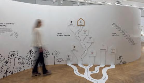
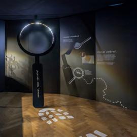
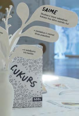
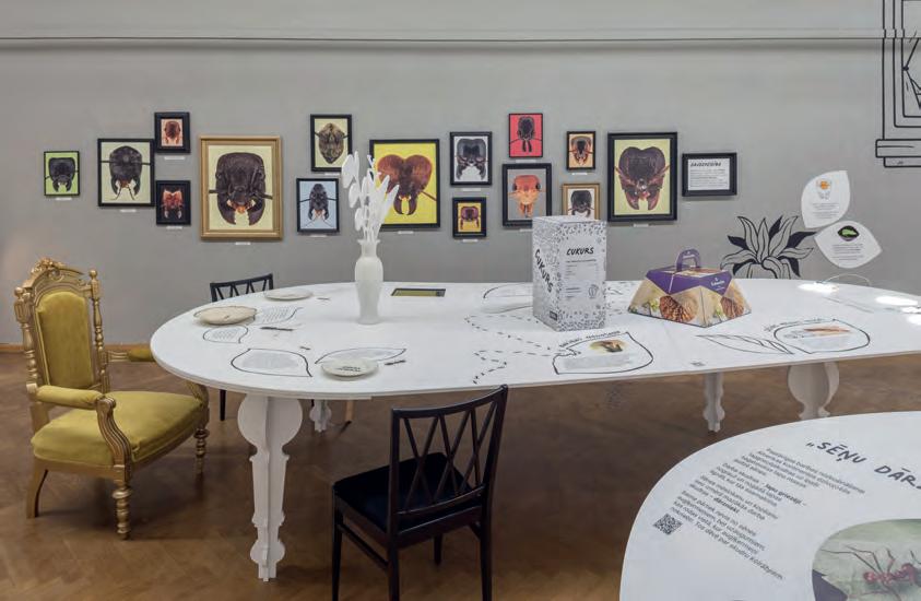
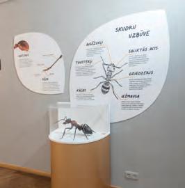
Team: Latvian National Museum of Natural History
Photo: Toms Uljanovs
Exibition design:
Creative agency Raugs
Contact: Gundega Kalendra
Creative agency Raugs raugs@raugs.eu www.raugs.eu
Category: Didactics
What was the challenge?
San Francisco International Airport (SFO) established its Airport Integrated Operations Center (AIOC) in 2025, to support expected growth to 71 million passengers annually (from 54.1m). By co-locating many dispersed departments across the airport campus into a single 22,000 sq. ft. space, the AIOC, is set to deliver, “a consistent and seamless airport experience for our guests” - AIOC Director.
City ID worked with SFO to elevate a customer-centric approach in applying systems thinking and service design to bridge the gap between technical requirements and the guest experience.
What was the solution?
Working with stakeholders, a customer journey map connecting operational processes was identified as a key strategic business tool for daily use in the AIOC. ‘How the work works’ was mapped by integrating airport operations, staff roles, technology infrastructure, and service delivery into a cohesive visual language. The architecture uses distinct typographic and colour-coded hierarchies to signpost different operational layers, ensuring the map remains legible despite its high information density.
The guest experience is connected to operational activity, by vertically aligning journey stages and customer touchpoints with landside and airside processes directly below them. Roles, services and technology can be mapped, and pain points, service targets, and ‘mindful measures’ layered to facilitate operational planning. The AIOC team can also identify enablers, remove barriers and align the perspective of diverse stakeholders.

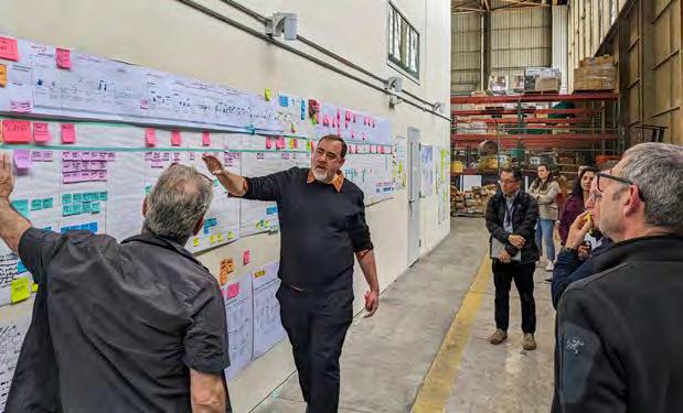
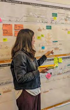
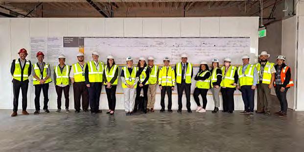
What was the effect?
Situated in a dedicated ‘collaboration space’ within the AIOC main room, a 20ft long high-quality print is positioned as a living tool, continuously updated and leveraged to enact improvement across AIOC operations.
This information design project, informed by extensive stakeholder engagement, has delivered an effective strategic planning tool for directors and management. It facilitates new discussions on integrated operations, creates a shared view of complex 24/7 activity, and supports a shift from operational-centered to customer-centric decision -making. The journey map has also evolved into a large architectural artwork in the AIOC lobby, creating a distinctive welcome and celebration of staff’s role in SFO’s mission.
Contact: name: Lottie Webb company/organisation: City ID e-mail: lottie.webb@cityid.com website: www.cityid.com
Category: Didactics
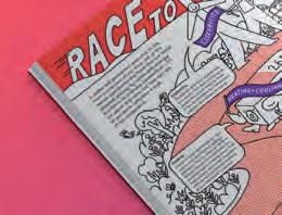
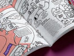













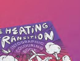
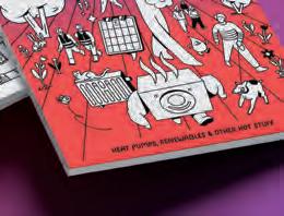







What was the challenge?
Heating represents nearly half of Europe’s energy consumption, yet its decarbonisation remains poorly understood and politically polarised. The topic is technically complex and spans heat pumps, district heating networks, storage systems, buildings and regulatory frameworks. Communication either relies on expert reports that are difficult to access or on simplified campaign narratives that lack nuance. There was no visually compelling, fact based format that could translate this systemic complexity into accessible understanding without losing depth or credibility.
What was the solution?
We developed a 68 page infographic colouring book that combines data visualisation, storytelling and interaction. Across 30 thematic spreads, technical systems, myths and policy contexts are explained
through hand drawn diagrams and clear visual metaphors. By inviting readers to colour infrastructures and data themselves, the book turns information into an active learning process. A recurring character, Pumpi, and a thermochromic print effect make abstract energy flows tangible while remaining scientifically grounded.
The project reframed the heating transition as a shared design challenge instead of a polarising debate. Used in workshops, briefings and stakeholder dialogues, it increased memorability and encouraged discussion. The book shows how information design can foster participatory understanding by combining rigour, clarity and playfulness in an unconventional yet credible format.
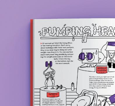
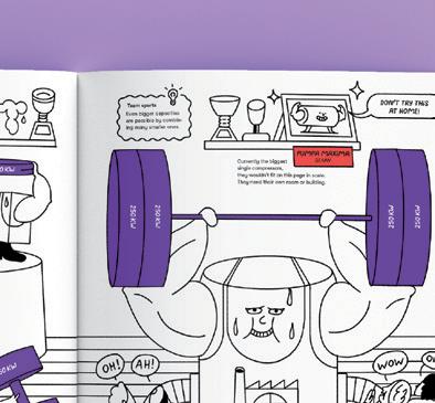
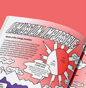
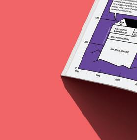
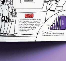
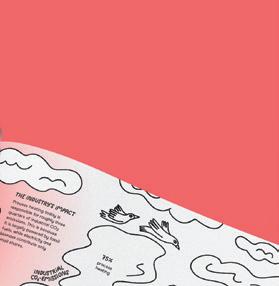
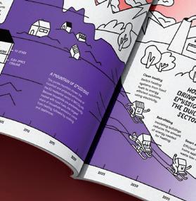


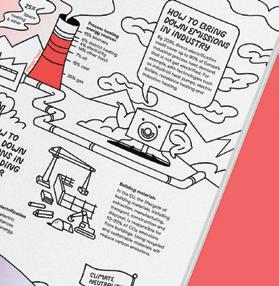


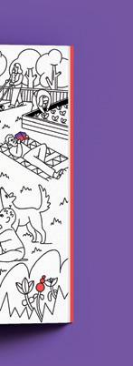

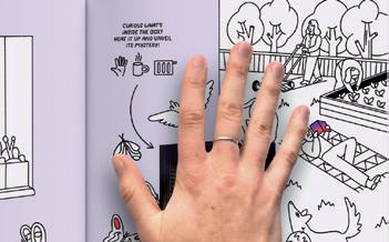
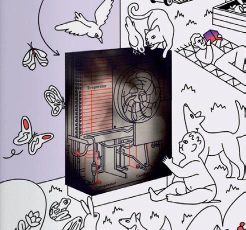
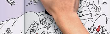

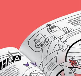
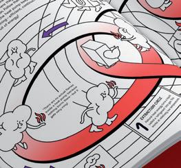

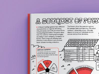
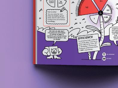
Contact: Ellery Studio info@ellerystudio.com www.ellerystudio.com
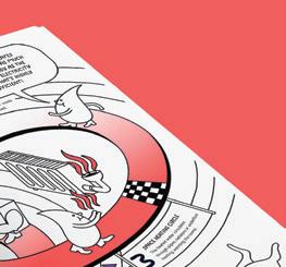
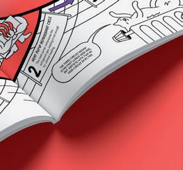


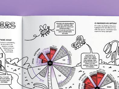
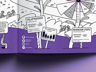

Category: Didactics
What was the challenge?
We were approached by the FT Nikkei UK Ekiden to create a printed running route guide. With a lot of information to present in a limited space, careful placement and hierarchy were needed to guide readers through it – especially considering that a majority of the UK audience did not likely have experience with the race format. Due to the relay-style format of the race, which
ran out and back along the Thames Path, the route map required us to balance the informational needs of two audience types: participants running specific ‘legs’ of the route, and spectators who were interested in the whole event. It was also important to include a nod to Japanese traditional approaches to Ekiden route maps within an existing client brand.
What was the solution?
We began by researching the traditional Japanese Ekiden format, the specific location and logistics of the UK race, and the designs of other sports maps. To visualise the running route, we took the base GPX data of the route and overlaid it on a map, including highlighted pullouts for handover points where more information was required. To ensure clarity of information at different scales, the route lines had to be manually drawn over the base maps.
With the route starting in the East and heading West, we had to make the counter intuitive decision to plot the route and elevation profile from right to left, in alignment with the geographic map. As most graphic visuals and diagrams conventionally read from left to right,
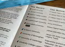
we knew it was important to draw the eye towards the right with a darker colour for the start box and the ‘Key Information’ box in the bottom right corner. We also included small directional arrows alongside the route, with accent colours to differentiate the Westbound and Eastbound legs of the race. These accent colours were intentionally matched with the physical race signage.
Due to the unique format of an Ekiden race, where participants are likely to be only interested in the ‘leg’ they are running, we created a series of minimap leg schematics. These simplified maps were designed at the same scale for easy comparison and contained all the information an individual runner would need. We knew they would not
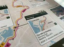
be referred to during the race, so we just highlighted key geographic elements for pre-race analysis, such as handover points, elevation and potential hazards. Considering the needs of spectators, we also included information about local sites, and icons to represent essential services, such as toilets and parking areas.
As a range of communication materials already existed when we joined the Ekiden project halfway through, we also strived to create a design that would be visually cohesive. We carefully reviewed these assets, particularly the website, to determine the colour palette, typography, and layout grids for the map. The result is a cohesive publication that sits comfortably alongside the existing graphic and UK Ekiden marketing materials.
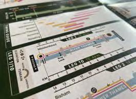
The FT UK Ekiden were very pleased with the outcome, reporting that, on seeing the route guide, various stakeholders commented on how professionally the event had been organised. They also noted that the route guide design helped convey how much work and preparation had gone into the race itself, as well as being a clear and concise way of giving people the information they needed on race day. Following the event, the route guide continues to be a helpful promotional tool for showcasing the event to potential sponsors. The event organisers have also asked us to design the route guide for the UK Ekiden in 2026.
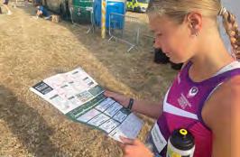
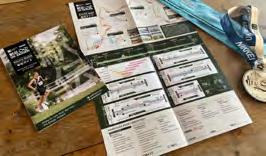
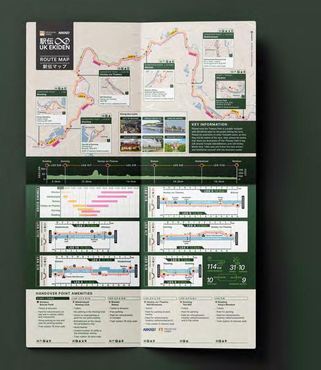
“Designing the UK Ekiden Route Guide presented a uniquely complex challengetranslating a long-distance, multi-leg relay route into something that was not only accurate, but intuitive and engaging for runners, supporters and partners alike.
Contact: name: Abi Buller company/organisation: TDL-Creative e-mail: abi.buller@tdl-creative.com website: https://tdl-creative.com/
The TDL team approached this with real rigour and creativity. They didn’t just map a route; they created a clear visual narrative that made the scale and structure of the Ekiden immediately understandable.
Their ability to balance technical precision with elegant, accessible design was exceptional. The finished guide played a significant role in helping participants confidently navigate the event and contributed meaningfully to the overall professionalism and experience of Year 2. We’re incredibly proud of what was achieved together.”
Anna Dingley, Founder of UK Ekiden
What was the challenge?
A “ventilation drift” is a tunnel used to ventilate a mine – this one is approximately 11 kilometres long. Today, visitors can walk about 70 metres into the tunnel (after which it curves back) and find an interactive exhibition about the Hausham mine. Its history, the techniques used to construct shafts and mine coal, transport, processing, use... all this is shown in an exhibition room (the former machine hall) and approximately 150 metres inside the tunnel. And for laymen – as well as and especially for children – in a playful and interactive way...
What was the solution?
Information units on the most important topics, arranged chronologically and adapted to the form of the tunnel, form the basis. These are supplemented by infographics, photos, animations, exhibits and hands-on objects. To give visitors a sense of the narrowness of a shaft, there are activity stations and an “audio explosion”. The machine hall displays miners’ equipment and tools as well as technical developments.
What was the effect?
Even without advertising, the response has been huge – old and young, experts and novices, people from far away and from the region: the feedback has been consistently positive. The Deisenried ventilation tunnel is valuable for tourism as it is completely weather-independent and can be used all year round. This also applies to people with limited mobility.
Contact:
name: Andreas Koop
company: designgruppe koop GmbH e-mail: info@designgruppe-koop.de website: www.designgruppe-koop.de
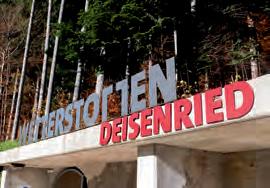
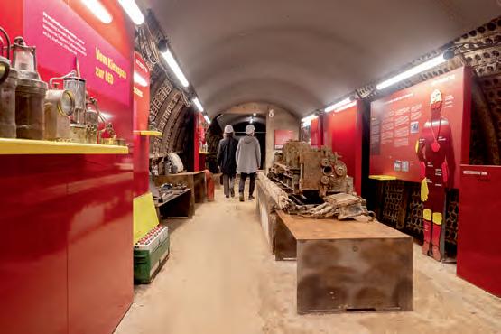
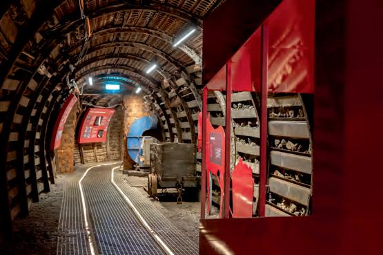
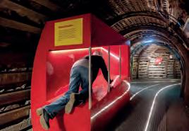
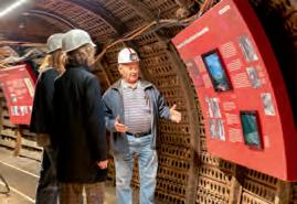
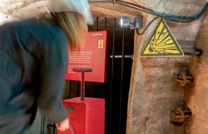
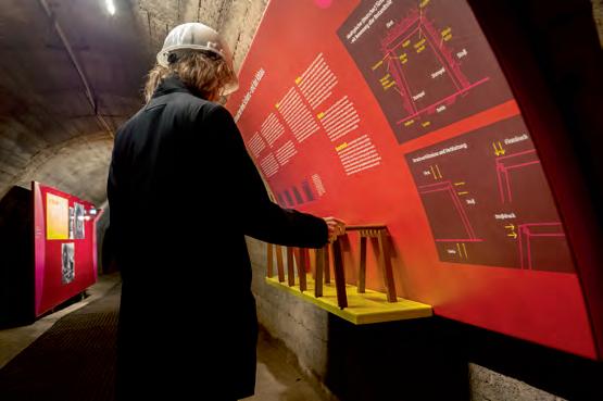
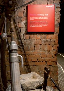
Category: Didactics
Project: Exhibition Graphic Design: “FLiP“ at CoSA
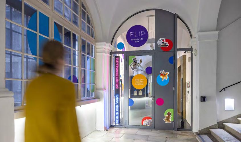
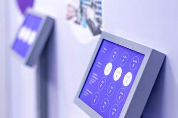
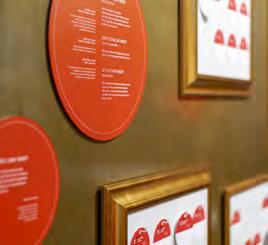
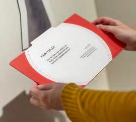
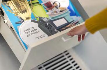
For the FLiP exhibition by Kindermuseum Graz at CoSA in the Joanneum Quarter –with the exhibition design developed by Anika Kronberger and Dominikus Guggenberger – look! design created the exhibition graphics in close collaboration with the exhibition team.
What was the challenge?
How can financial education be made exciting, interactive and relevant for young people? The aim was to translate the abstract topics of money, economy and consumption into an engaging experience that is easy to understand, while bringing together the corporate identities of the main FLiP in Vienna and CoSA within one consistent visual concept.
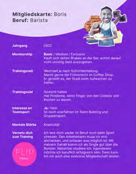
What was the solution?
Across five themed rooms, FLiP makes financial education tangible for young people aged 12+ and adults. The graphic system includes screen designs, object labels, room texts, signage, glass foils, info cards and a bilingual glossary booklet. It combines the visual identities of FLiP and CoSA, while the illustrations were created by unter freiem Himmel.
What was the effect?
Financial literacy becomes both accessible and enjoyable. The graphic design supports orientation, connects the five thematic areas and strengthens the interactive learning experience. As a result, visitors gain a deeper understanding of how money works – in a way that is visual, memorable and emotionally engaging.
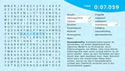
Contact: Stefanie Schöffmann look! design office@look-design.at www.look-design.at
Photography: Salon Deluxe
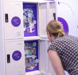
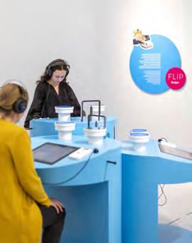
What was the challenge?
Olive cultivation in Istria has a long tradition, although it was not always equally recognized. In recent decades, education and the renewal of olive groves have restored Istria’s place on the world olivegrowing map. The thematic olive park in the town of Fažana, Croatia, was created as a project that combines the region’s rich history and olive-growing tradition with a contemporary interpretation of this precious Mediterranean symbol.
What was the solution?
The concept centers on hands as a symbol of manual work and the human connection to olive cultivation. Stylized, flat-cut hand-shaped signs are placed throughout the park, visually interacting with the olive trees to illustrate activities like picking, gathering, and raking olives, creating a storytelling landscape of traditional olivegrowing practices. A second set of signage targets adult visitors, with hands holding informative panels, while playful signs for children encourage interaction and exploration, making the park a place of learning through play.
What was the effect?
The project transformed the olive grove into an interactive thematic park combining education, play, and cultural interpretation. By integrating storytelling elements into the natural environment, the design enriches the visitor experience while celebrating olive-growing traditions and human craftsmanship. The park raises awareness of the region’s olive heritage and helps educate new generations about the cultural and agricultural significance of the olive tree.
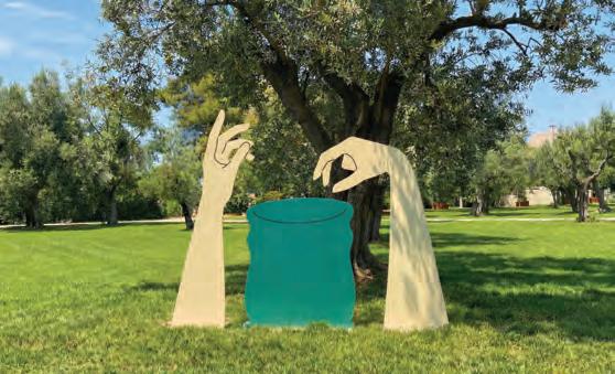
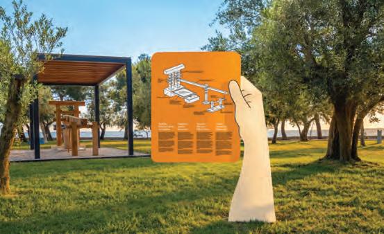
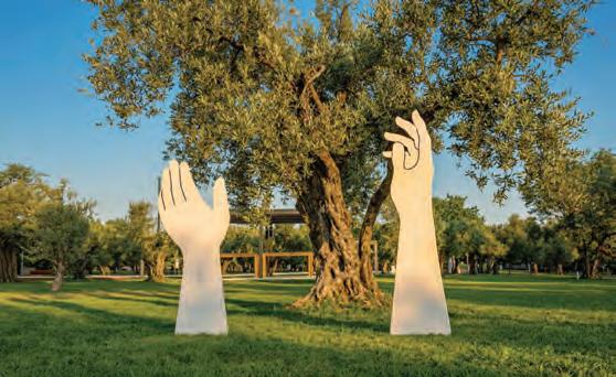
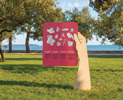
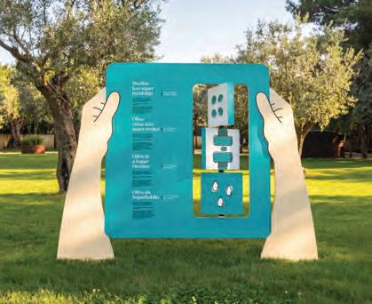
Contact:
name: Anselmo Tumpic, Sara Prenc Opacic, Hena Crnovic, Lucija Kliman, Jelena Kauzlaric, Aleta Brattoni company/organisation: Studio Tumpic/Prenc e-mail: anselmo@tumpic-prenc.hr website: www.tumpic-prenc.hr
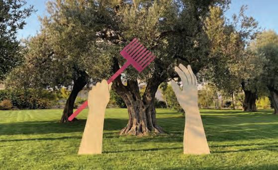
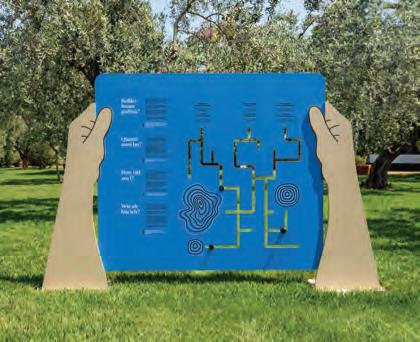
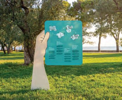
What was the challenge?
Workplace safety is a dramatically topical issue, but one that is often perceived through numbers and statistics that risk remaining abstract. The challenge of the project was to make this reality understandable and perceptible by transforming data, archival documents and technical materials into a narrative accessible to a wide and diverse audience. The exhibition, curated by Giorgio Bigatti (Fondazione ISEC), was created as part of a research project that intertwines historical memory, social responsibility and visual culture, with the aim of restoring the human dimension behind the figures on accidents at work. The project also had to make a complex heritage from industrial archives, institutions and different collections legible, linking prevention, safety communication and workers’ claims. The design challenge was therefore to translate a complex documentary and information heritage into a spatial experience capable of activating awareness, learning and reflection.
What was the solution?
The exhibition translates archival research into an exhibition system that guides visitors through the history of workplace safety in the 20th century. Documents, photographs, manuals, accident prevention signs and work objects are organised along three thematic axes: preventive measures, safety communication and struggles for worker protection. In the spaces of the Fondazione Dalmine, a 1920s building linked to the industrial history of the territory, the exhibition covers approximately 700 m² of installations and archival materials. Installations such as the “Quinta verticale” (Vertical Wall), the “Selva” (Forest), and the “Nuvola” (Cloud) offer different ways of reading and interpreting, combining visual communication, historical documentation and immersive experience. A recurring graphic element, the little man taken from the materials of the FIOM-CGIL metalworkers’ union, runs through the entire exhibition as a “leitmotif” accompanying the visitor. The exhibition system uses modular structures made of recyclable honeycomb cardboard and suspended fabrics, creating a lightweight, flexible display that can be adapted to different contexts.
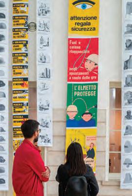
Contact:
name: studio +fortuna
company / organisation: Fondazione Dalmine / curated by Fondazione ISEC
e-mail: paola@piufortuna.it
website: www.fondazionedalmine.org / www.fondazioneisec.it / www.piufortuna.it
photo credit exhibition: Gianfranco Rota / archivio +fortuna
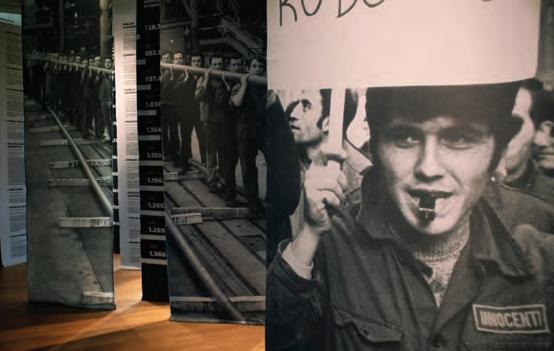
Opened on 4 April 2025 and running until 19 March 2026, the exhibition has transformed archival research into a public experience of knowledge and learning about workplace safety culture. Since 2025, guided tours, workshops and public meetings have strengthened the dialogue between archives, cultural institutions and communities. Educational programmes have been developed for different levels of education, involving over 1,000 students in visits, educational activities and multimedia productions based on the content on display.
The participatory installation the “Nuvola” (Cloud) also allows visitors to contribute documents, images and messages, enriching the collective narrative over time. In-depth meetings have broadened participatory engagement. The widespread public support led to the exhibition being extended for almost a year, confirming the urgency of keeping alive the debate on safety at work as a shared responsibility.
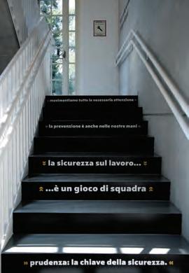
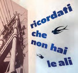
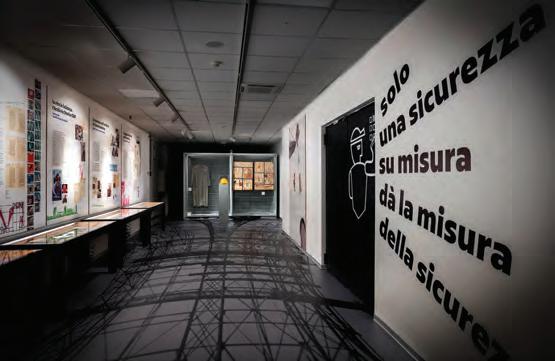
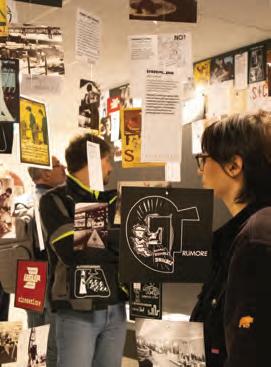
“Be sure to be safe”
“Safety at work… is a team effort”
“Caution: the key to safety”
“Remember, you don’t have wings”
“Only tailor-made safety measures provide the right level of safety”
path to a museum collection”
Explaining how plants, insects, fungi, animals, snails, fossils, and other natural objects enter a museum collection is not simple, for several reasons. There are numerous and varied methods of collection and processing before an object is prepared for cataloguing and storage. The way this process unfolds is technically precise and not inherently entertaining.
The exhibition’s greatest challenge was to present this serious subject in an engaging and accessible way, particularly for a younger audience.
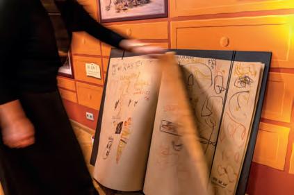
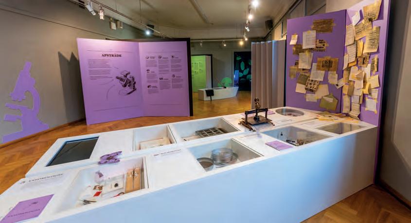
What was the solution?
The solution was developed on two levels: information design and exhibition experience design. The information was grouped and structured into a clear hierarchy comprising three thematic strands — the collection, processing, and storage of natural objects — each further subdivided into more detailed structures. This was implemented through a system of color coding.
Following the research phase, the creative concept was grounded in an activity that has remained unchanged since humans first began to explore the natural world. An indispensable tool of the researcher is the field notebook, in which observations are recorded. The symbolic space of the exhibition lies between the field notebook and the encyclopedia.
The visual concept takes the form of both small and large books (almost like doors), incorporating a fluid shift in scale — for example, certain objects are enlarged, allowing the visitor to become part of the natural world, as well as part of the process of “collecting–processing–forming a collection.”
What was the effect?
The exhibition achieved its aim — the complex and technical process of working with natural objects was realized on multiple levels, engaging both adults and children through diverse forms of interactivity and participation, as well as through the use of humor and emotional empathy. This is evidenced by the flow of visitors and their feedback.
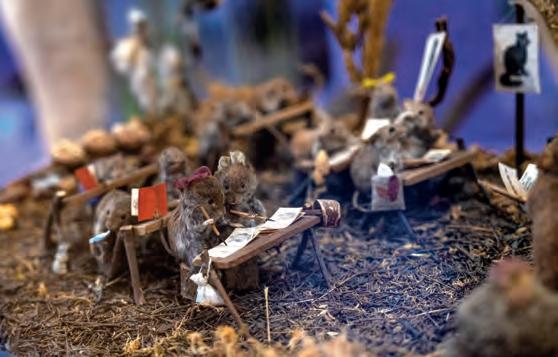
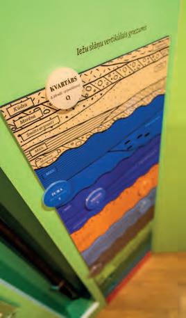
Team: Latvian National Museum of Natural History
Photo: Toms Uljanovs
Exibition design: Creative agency Raugs
Contact: Gundega Kalendra
Creative agency Raugs raugs@raugs.eu www.raugs.eu
What was the challenge?
We were asked to put together an exhibition in Seoul, opening at the large Zaha Hadid-designed cultural center.The theme was “Now is Better” representing a continuation of our long-term project about longterm thinking. Social and traditional media concentrates on events happing in the short term, creating an image of a world out of control, full of scandals and catastrophes. But if you look at the same world from a longer perspective, an entirely different view emerges: Many things important to human beings have developed surprisingly well.I’ve been visiting Seoul throughout the past 30 years and was able to witness the most astonishing transformation from an industrial/polluted place to a shining metropolis and cultural powerhouse.
What was the solution?
In addition to our historic paintings and lenticular prints, we also presented a large outside installation, using 120 air-dancers usually known form gas stations and used car dealerships to create a large bar-chart visualizing the incredible increase in longevity in Korea over the past 120 years, from 26 years to 76 years.
What was the effect?
We had 130,000 visitors inside the exhibition and welcomed a multiple of that to see the outside installation. We reached another large audience through extensive TV, press and online coverage.
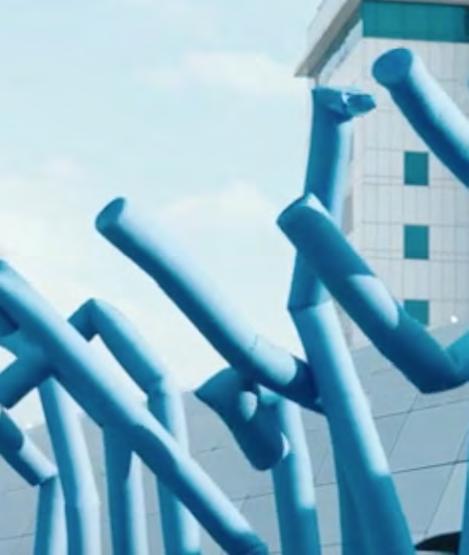
Contact:
name: Stefan Sagmeister company/organisation: Sagmeister Inc. e-mail: stefan@sagmeister.com website: sagmeister.com
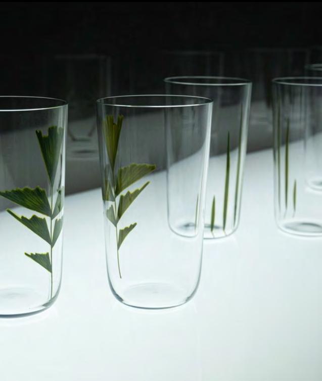
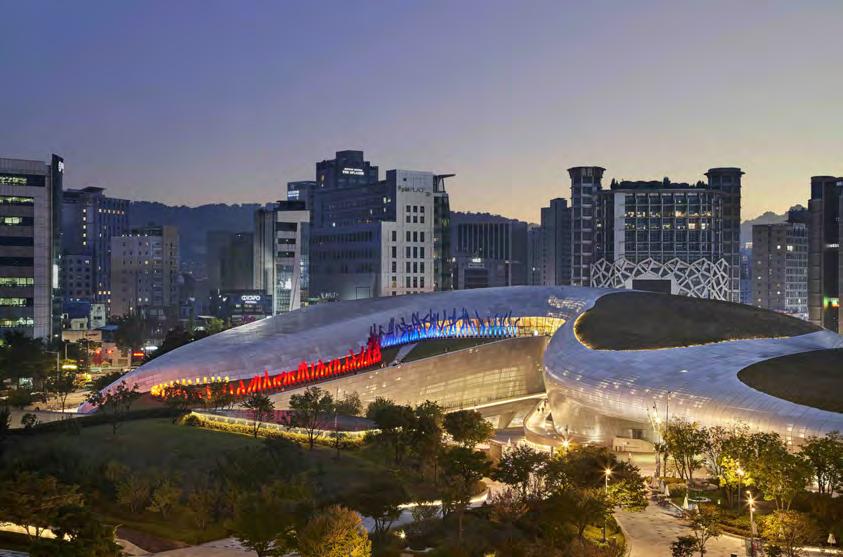
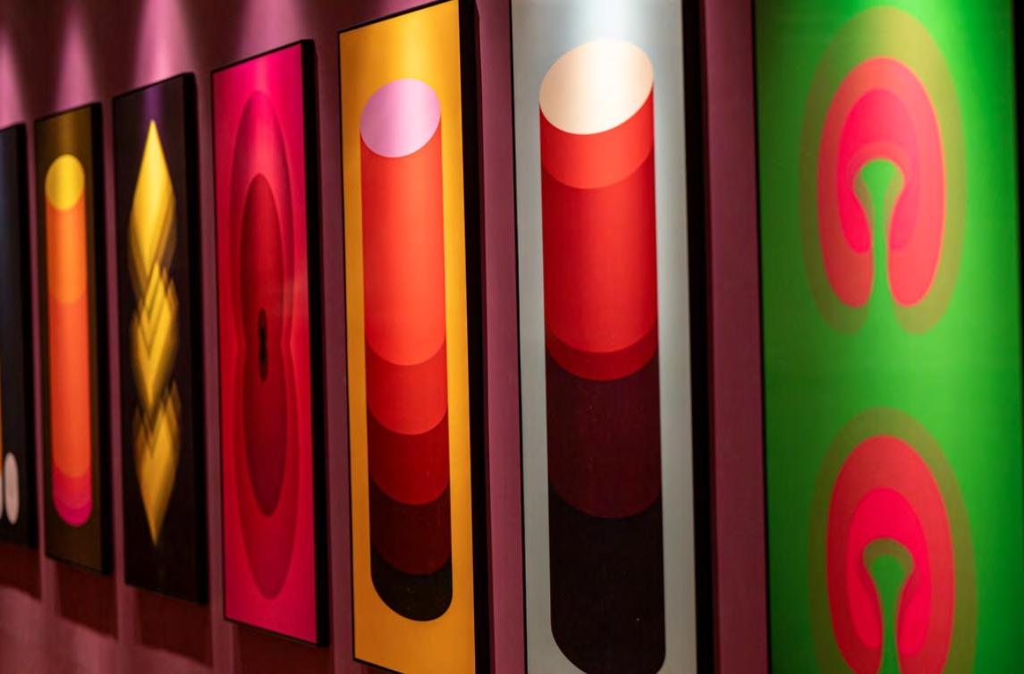
What was the challenge?
Specialised paediatric palliative care programmes can offer support to those affected. The SPhAERA study conducted by the Universities of Zurich and Basel is investigating exactly how these programmes affect the families concerned. The aim of the study is to contribute to the further development of specialised paediatric palliative care. The challenge for us was to present the results of the study to a broad public in an easily readable form appropriate to this sensitive topic.
What was the solution?
Alongside the results, the participants in the study share their personal accounts. We use photo collages to give people space for their individual feelings. The text is strikingly airy, with plenty of white space in the layout. The diagrams are deliberately easy to understand, illustrative and colourful. With a colour palette of orange, magenta, yellow, blue and green tones, we want to celebrate life.
What was the effect?
With this entirely humane design approach and a subtle didactic structure, we were able to present the results of this scientific study in a simple and appealing way. The brochure, which is aimed at families of terminally ill children, doctors, nursing staff and counselling centres, was very well received and supported. This means that the topic of ‘specialised paediatric palliative care’ can be made accessible to a broader audience.
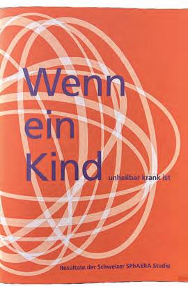
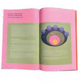
Contact:
name: Anja Bodmer und Jürg Brühlmann company/organisation: Spinform AG e-mail: konzept@spinform.ch website: www.spinform.ch
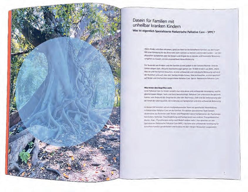
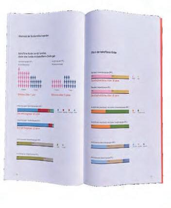
Category: Didactics
Project: NATIONAL PARK WORLDS
Designing Navigable Complexity
The National Park Worlds exhibition presents the complex ecosystems of the Hohe Tauern National Park in the Central Alps of western Austria across more than 1,000 m². Geological processes, biodiversity and human in uence meet very different audiences – from families and school groups to visitors with a strong scienti c interest. The challenge was to structure this spatial and conceptual complexity so that it remains understandable without reducing its scienti c depth.
The exhibition was conceived as a spatial knowledge architecture. Instead of presenting isolated topics, the content is organised as a coherent information system. Space, graphics, objects and media operate as complementary tools of information design. This approach allows visitors to explore the exhibition intuitively while offering deeper levels of understanding for those seeking more detailed insight.
National park as it came into being
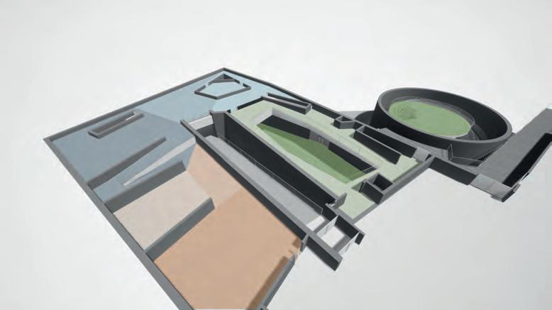
National park as it is
Although the exhibition consists of distinct thematic environments, visitors experience it as a coherent whole. As they move through the spaces, different perspectives on landscape, natural processes and human in uence gradually connect. Understanding develops as visitors move through the exhibition, where individual spaces gradually connect to form a coherent picture of the national park. The spatial structure enables visitors to intuitively navigate complex knowledge.
Contact:
Andreas Zangl zangl.ultd zangl.andreas@aon.at
National park as we shaped it and continue to shape it


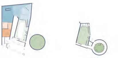
– climate and landscape formation
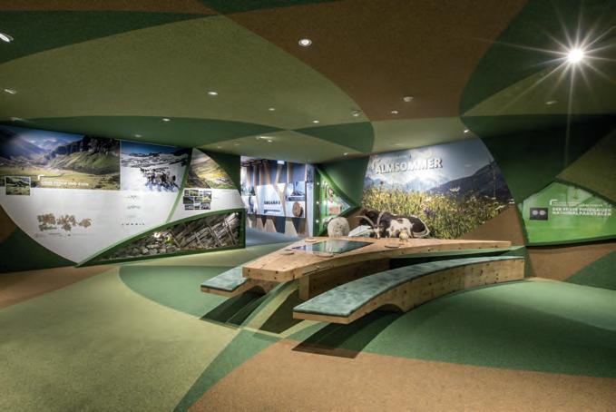
Thematic worlds organise complex knowledge
Spatial information architecture
Graphic surfaces form part of the architecture itself, structuring complex natural processes and guiding visitors through the exhibition.
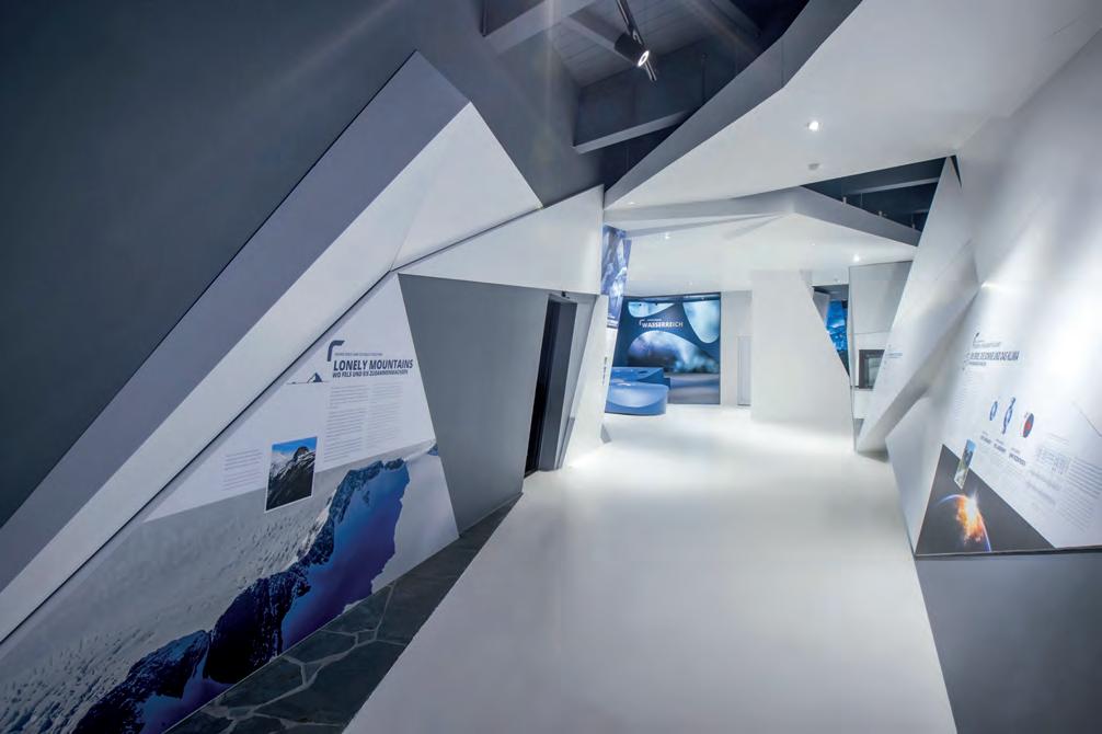
Graphic system
Bold headlines and icons condense complex information. Developing clear symbols for around 50 graphic panels required careful reduction. Supporting graphics remain simple and diagrammatic. The Milankovitch cycles shown here illustrate this approach as one example among many.
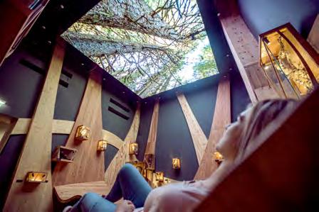
A uctuating relationship
The earth, the sun and the climate
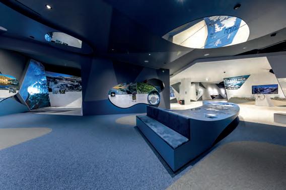
What was the challenge?
The synagogue in Allersheim is the first of its kind an open-air museum in southern Germany. The building was to house a permanent interactive exhibition depicting rural Judaism in Franconia and the life of Rabbi Nathaniel Gabriel Weisbart. There were many topics to cover – most of them with little prior knowledge – in very small rooms and historic buildings.
What was the solution?
Because most things could only be attached to the floor, the information objects were created in the form of Hebrew letters. These contained screens, sliding and rotating elements, information, games ... To consolidate the themes a little, blue was defined as the colour for everything related to religion and red for the lives of the inhabitants and their everyday lives.
We implemented interactive elements, children’s stations, the incorporation of architectural features, digital stations with information about the prayer room and the Jewish community ... an information desk with all the content about the upper floor, which is not easily accessible, on a wheelchair-accessible touch screen ... and even a graphic novel about Rabbi Weisbart.
What was the effect?
People are surprised at where Jewish communities existed throughout the countryside and how and when they dispersed. They are also surprised by the building, which doesn’t look like a synagogue. According to the clients, the presentation informs and moves visitors.
Contact:
name: Andreas Koop
company: designgruppe koop GmbH
e-mail: info@designgruppe-koop.de website: www.designgruppe-koop.de
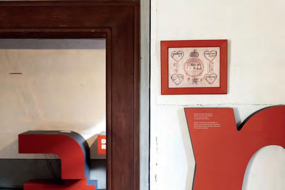
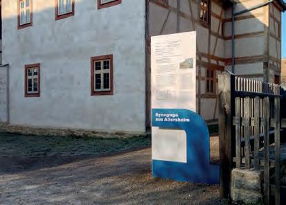
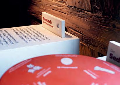
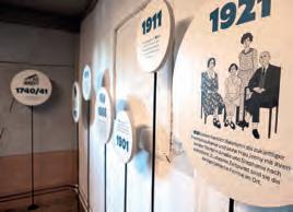
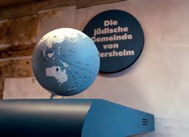
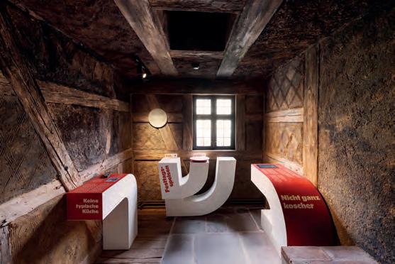
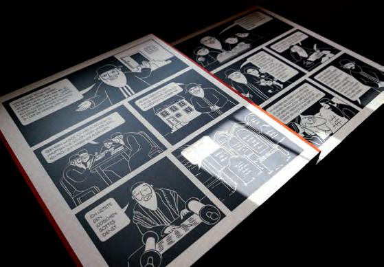
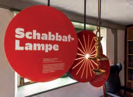
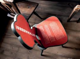
Category: Didactics
Project: Exhibition design “Talking Tacheles”
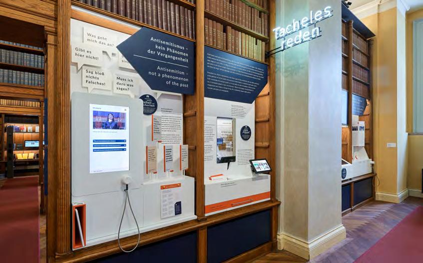
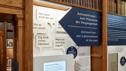
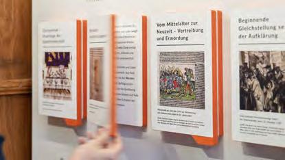
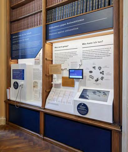
What was the challenge?
The task was to redesign the permanent exhibition “Tacheles reden” in the Parliamentary Library in Vienna – within a highly protected, historical architectural environment and with strict design guidelines from the Austrian Parliament. In addition, the content focuses on the complex topic of antisemitism and its impact on democracy – requiring didactic clarity and sensitivity.
What was the solution?
Based on the didactic exhibition concept by bogner.knoll, look! design developed a friendly and content-appropriate exhibition design. The colour palette (dark blue and vibrant orange) and the polygonal forms were derived from the Parliament’s corporate identity. Various hands-on elements, multi-layered texts and audiovisual stations structure the content into small, easy-tograsp learning units.
What was the effect?
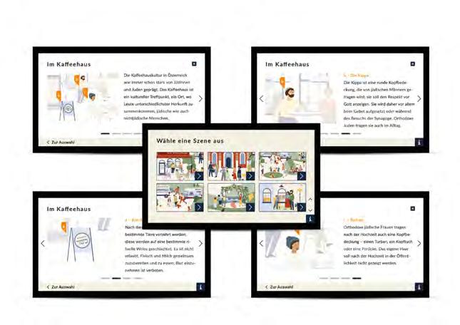
The interplay of architecture, media and design creates an accessible experience that supports understanding, invites deeper engagement, and makes a high-complex social and historical topic tangible. Visitors are guided through an active learning journey – encouraging reflection, dialogue and democratic awareness.
Photography: Christopher Mavric
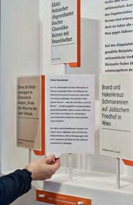
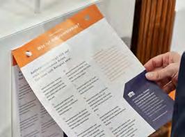
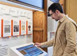
Contact:
Stefanie Schöffmann look! design in co-operation with bogner.knoll, 7reasons, Kris Hofmann office@look-design.at www.look-design.at
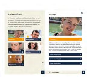
Category: Didactics
Project: Interactive Exhibition
“So wie wir … Bildung bauen!“
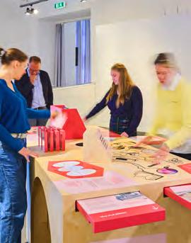
„Wir sind zwei Millionen!“
Im
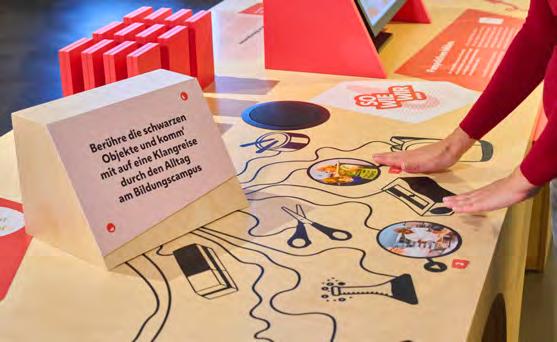
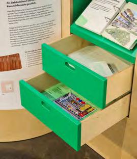
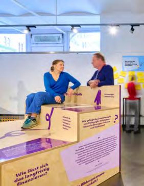
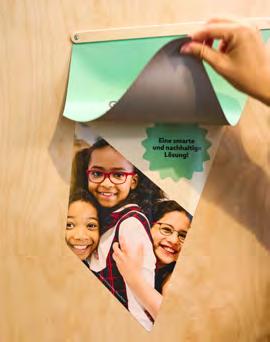
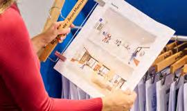
Stadtentwicklung
„Das Ganze ist mehr als die Summe seiner Teile.“



Planungsprozess
Nachhaltigkeit


Projektabwicklung, Architektur & Bau

What was the challenge?
The City of Vienna’s “BIENE” program (Building Educational Facilities) has been setting new standards in educational architecture since 2012. The challenge was to communicate the program’s complexity in a way that is engaging, accessible, and informative for diverse audiences, including children, educators, and experts. The exhibition needed to make educational architecture understandable in a playful, hands-on way while also offering deeper insights for professional visitors.
What was the solution?
look! design developed the interactive exhibition “So wie wir … Bildung bauen!“ based on the idea of building blocks as forms in space. Familiar from early childhood, building blocks create a direct link to learning for the youngest visitors, while their simple geometric forms also reflect the foundations of architecture. Oversized block-like furniture elements structured the exhibition and served as information carriers.
The information design relied on compact, easy-to-digest content and interactive elements that communicated knowledge in both analogue and digital ways. Six thematic stations explained how the
Campus Plus model combines pedagogy, architecture, urban development, and sustainability. Flaps, rotating elements, videos, sound, and personal stories invited visitors to explore the content actively. The exhibition was presented for two months.
What was the effect?
Visitors experienced the BIENE program in a playful, memorable way and gained insight into both the human and technical dimensions of educational building. Children, families, and experts alike could access the topic through different levels of information and interaction. In terms of sustainability, the oversized furniture elements were designed for continued use and have since been reused at different locations beyond the exhibition itself. The project shows how information design can make complex relationships accessible to a broad audience while extending the life cycle of exhibition elements.
Photography: Christopher Mavric
Contact: Stefanie Schöffmann look! design office@look-design.at www.look-design.at

Pädagogik

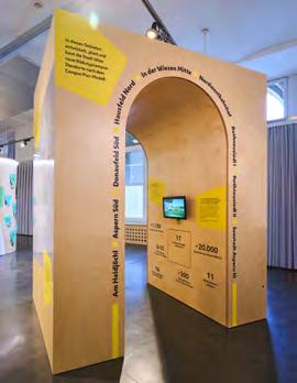
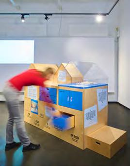
Category: Didactics
What was the challenge?
How can the theme of water in Bad Radkersburg be communicated in a way that creates emotional resonance as well as understanding? The goal was to make water tangible as a defining element of the region and to create added value for tourists through content and spatial design. Instead of confronting visitors with information immediately, the challenge was to let them immerse themselves first and discover historical, cultural, and scientific knowledge in a subtle and accessible way.
What was the solution?
look! design created the spatial installation “Quell des Lebens“, combining immersive scenography with hidden layers of information. Visitors enter a room filled with moving water projections and sound, allowing them to dive into the theme emotionally before discovering further content. A central fountain installation acts as a poetic focal point and evokes water as a source of life and regional identity.
Informative elements are integrated into a pipe installation, where audio stations, flaps, a rotating wheel, and a screen reveal facts about thermal and mineral water, the Parktherme Bad Radkersburg, and the region. Knowledge is not foregrounded, but discovered intuitively in compact and surprising moments.
What was the effect?
The installation turns water into a multisensory experience and offers visitors a memorable encounter with one of Bad Radkersburg’s defining resources. By placing emotion first and information second, it creates curiosity, lowers barriers to learning, and communicates knowledge in an approachable way. Tourists gain a deeper understanding of thermal water and its significance for the region, while the city benefits from a distinctive attraction that combines storytelling, atmosphere, and informal education.
Photography: Christopher Mavric
Contact: Stefanie Schöffmann look! design office@look-design.at www.look-design.at
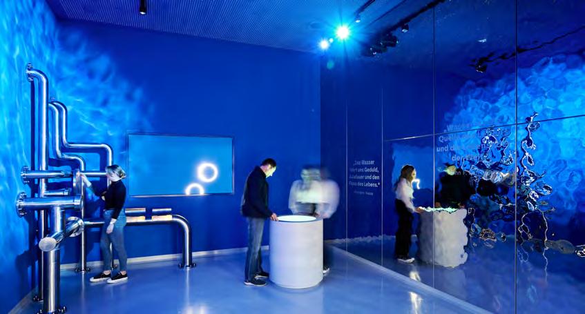
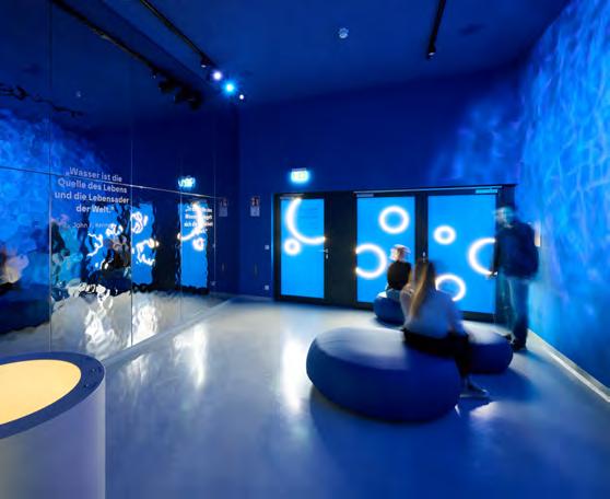
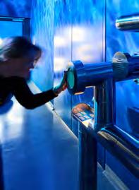
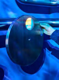
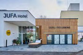
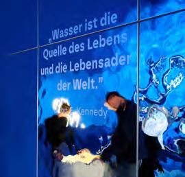
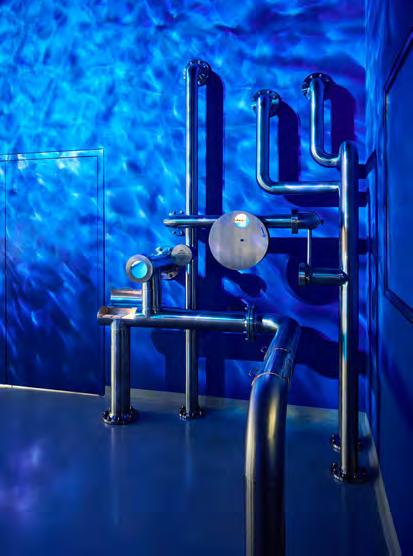
What was the challenge?
The cookbook “The Best Recipes from the Healthy Kitchen of Pension Engel” was designed for guests of a fasting and health hotel who wish to continue healthy cooking after their stay. The project had an extremely limited budget: only a few existing photos were available and professional food photography was not possible. At the same time, the book needed to function in a real kitchen situation — readable at a glance while standing and cooking.
What was the solution?
The design process therefore began with selecting a type size that remains comfortably readable from a standing position. Building on this functional approach, the imagery avoids staged food photography. Instead, AIgenerated images of the raw ingredients visualize the essence of each recipe. These ingredients form a consistent visual language and create a subtle information system: readers immediately recognize what they may already have in their kitchen.
What was the effect?
The result is a visually calm and coherent cookbook that reflects the philosophy of the hotel’s cuisine: clarity, health and simplicity. By emphasizing ingredients rather than plated dishes, the design strengthens these aspects and supports intuitive use. Early feedback suggests that guests appreciate the booklet as a practical companion after their stay, encouraging them to continue healthy cooking at home.
Contact: Christian Mariacher
Atelier Christian Mariacher info@ateliermariacher.at www.ateliermariacher.at
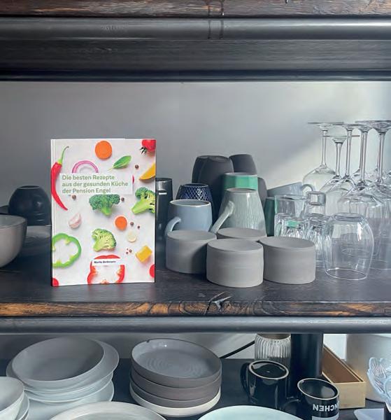




Hauptgerichte
Zutaten
1 Zwiebel
2 TL Kokosöl
1 TL Bockshornklee
2 TL Koriandersamen
1 TL Kümmel
2 TL Kurkuma
1 TL Paprikapulver
2 TL Pfefferkörner
2 TL Senfsamen
1 Knoblauchzehe
2 Karotten
250 g rote Linsen
400 ml Gemüsebrühe
400 ml Kokosmilch


Rote-Linsen-Curry
• Die Zwiebel hacken und in Kokosöl anbraten. Die Gewürze in einem Mörser vermahlen und mit der gehackten Knoblauchzehe zu den Zwiebeln geben. Kurz mit anbraten.
• Die Karotten klein schneiden, und die Linsen gut abspülen. Dann beides mit in die Pfanne geben. Mit Gemüsebrühe und Kokosmilch ablöschen und bei kleiner Hitze ca. 10 Min köcheln lassen. Gelegentlich umrühren. Mit Reis servieren.


Schnelles Tomaten-Curry



Zutaten für 4 Portionen
1 kleiner HokkaidoKürbis (ca. 500 g)
2 Karotten
1 Stange Lauch
250 g Cherry-Tomaten
400 g Tofu
2 Zwiebeln
3 Knoblauchzehen
2 cm Ingwer
400 g (1 Dose) gestückelte Tomaten
400 ml Kokosmilch
200 ml Wasser
je 1 TL Kurkuma, Koriander, Kreuzkümmel, Garam Marsala
100 g Grünkohl Schafskäse






• Den Ofen auf 180° vorheizen.
• Den Kürbis und die Karotten in kleine Stücke und den Lauch in größere Ringe schneiden. Die Cherry-Tomaten halbieren. Den Tofu würfeln. Alles in eine feuerfeste Backform geben.
• Die Zwiebeln halbieren, den Knoblauch pressen, den Ingwer reiben und dann alles in einer Pfanne kurz anbraten. Anschließend zum Gemüse dazugeben. Die gestückelten Tomaten (aus der Dose), die Kokosmilch, das Wasser sowie die Gewürze hinzufügen, und alles gut vermengen.
• Das Ganze im Backofen ca. 40 Min backen. Nach der Hälfte der Zeit einmal umrühren. Nach ca. 30 Min den gezupften Grünkohl und den Schafskäse unterheben. Mit Couscous oder Reis servieren.


What was the challenge?
The exhibition invites visitors to explore the story of Latvia’s statehood and the preservation of independence through local events and personal experiences. It is an exhibition where history is not just a sequence of facts or chronology – it is experienced as a personal journey that connects generations and reminds us of the enduring value of freedom.
The main challenge in developing the exhibition was to create a user experience path that would align closely with the historical content. The goal was to ensure that visitors not only gain knowledge but also emotionally relive the stories of the past – through visual, spatial, and interactive solutions that make historical processes understandable and engaging for a contemporary audience.
What was the solution?
The solution of the exhibition is built around a graphic system that helps visitors navigate the historical narrative and understand the sequence of events. The exhibition also integrates interactive elements that encourage engagement and make historical processes more accessible. Personal memories also play an important role – they allow history to be experienced through individual perspectives, adding emotional depth to the story.
One of the main navigation tools of the exhibition was a series of specially designed panels resembling folded newspapers, symbolically linking visitors to the historical period and its sources of information. Accessibility was also an important consideration – the key themes of the exhibition are available in Braille, ensuring that the story of freedom can be experienced by a wider audience.
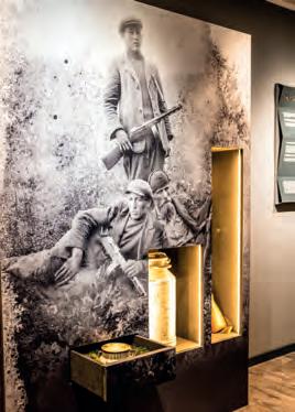
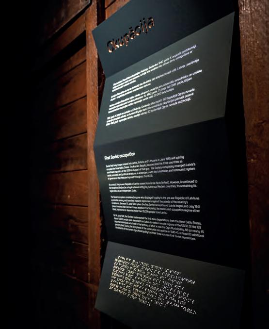
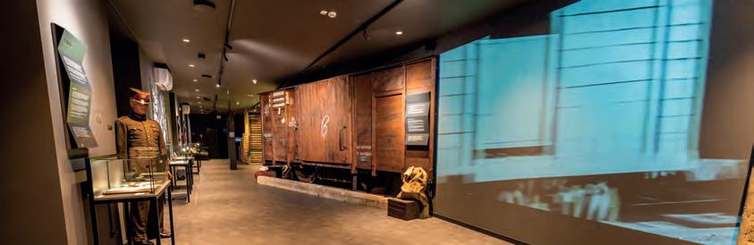
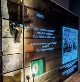
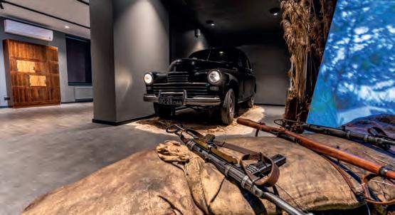
The result of these design solutions was that visitors were able to both understand and empathize with the historical narrative. The combination of a clear visual system, interactive elements, personal memories, and accessible features allowed visitors to engage deeply with the story and experience the journey of freedom on an intellectual and emotional level.
Team:
Ogre History and Art museum
Ogre County Municipality
Historical concept:
Dr.hist. Ritvars Jansons, Mg.hist. Inese Dreimane
Visual concept: Linda Nesko
Project Manager: Kristine Upmane
Photo: Toms Uljanovs
Exibition design: Creative agency Raugs
Contact: Gundega Kalendra
Creative agency Raugs raugs@raugs.eu www.raugs.eu
Category: Didactics
The redesigned Hall 16 at the Natural History Museum Vienna transforms a historic exhibition space into an immersive Ice Age world created especially for children.
What was the challenge?
The project had to integrate a contemporary, child-centered exhibition into a protected historic Gesamtkunstwerk without compromising its architectural integrity. At the same time, complex scientific content needed to be communicated in an accessible, engaging way. Original skeletons were to be presented openly—without glass cases—while still meeting conservation and safety requirements.
What was the solution?
Over two years, an interdisciplinary team of scientists, educators, and architects developed a holistic concept. The hall was transformed into a tundra landscape structured around a central Ice Age campsite with themed areas such as “Cave” and “Hunt.” Freestanding skeletons on specially designed pedestals allow close encounters without barriers. Hands-on stations, audio features, and digital installations—such as animated cave art and a virtual child avatar—combine physical and virtual exploration. Carefully staged lighting, including a campfire evening setting, enhances the immersive atmosphere.
What was the effect?
The 235 m² hall includes 10 audio stations, 7 hands-on exhibits, and 5 digital installations, developed through close interdisciplinary collaboration and custom design solutions over a two-year process.
Contact:
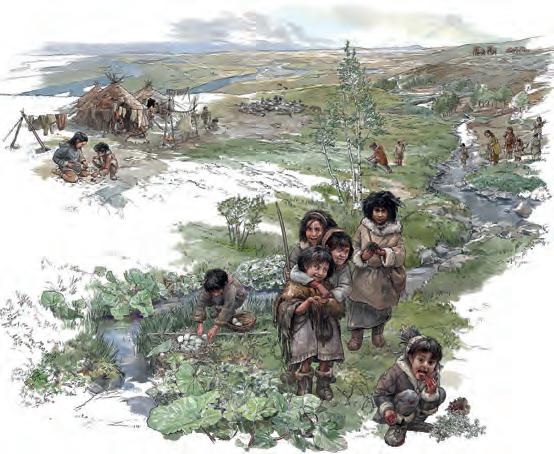
name: Schuberth und Schuberth ZT-GmbH company/organisation: Schuberth und Schuberth ZT-GmbH e-mail: kontakt@schuberthundschuberth.at website: https://www.schuberthundschuberth.at


Text layers:
1. Chapter texts with concise headings and longer texts
2. Object texts with small drawings
3. Special texts for children with icons
All illustrations © bunterhund Illustration KLG
Graphic Design: Fuhrer Visuelle Gestaltung OG
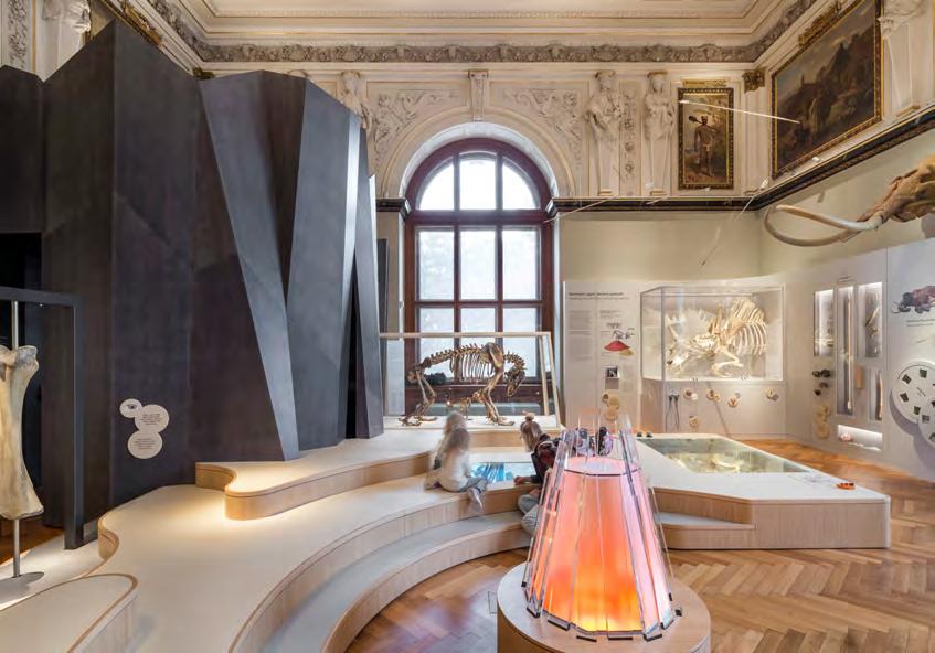

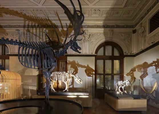
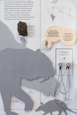
What was the challenge?
In the former sheepfold of the painter Augusto Giacometti in Stampa, the «Kultur Infopoint foundation» commissioned us to curate and design an exhibition on the topic of food production in mountain regions. The interactive exhibition showcases the diversity of food production in mountain regions and illustrates it with short film portraits of producers.
What was the solution?
On the upper floor, the exhibition «A Table in the Mountain Valley» presents foods and dishes that are typical of mountain regions. The people behind the products, who collect, produce and prepare them, are portrayed in films. The films also deal with mountain herbs, fish farming, goat breeding, honey, hotel kitchens. At three tables, visitors can acquire personal knowledge from the screens. The exhibition modules focus on the development of nutrition from hunter-gatherers to soy cutlets, malnutrition and the enrichment of the diet.
What was the effect?
The exhibition is presented in the style of a restaurant dining room: the cheerful colours of the furniture and wall design create a welcoming atmosphere. The windows offer a view of the Alpine landscape and are an integral part of the exhibition. The film portraits are continuously being added to. This creates a resource on food production in the Alpine region that is also of ethnological interest and is being processed for study purposes. Information, research and teaching on food production in the Alps come together here in a small space.
Contact:
name: Anja Bodmer und Jürg Brühlmann company/organisation: Spinform AG e-mail: konzept@spinform.ch website: www.spinform.ch
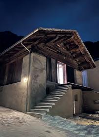
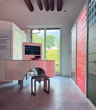
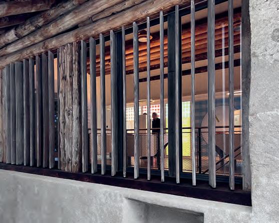
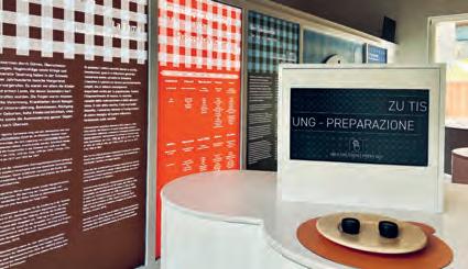
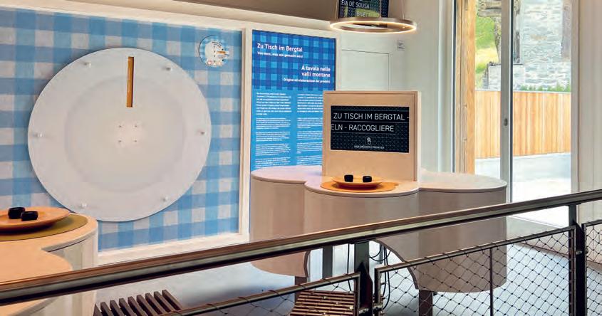
What was the challenge?
The WJP Index (140+ countries) was a fragmented, 200-page portrait document with an excessively heavy file size. With over 160 visualizations—many repetitive—key messages were obscured, making it difficult for users to ascertain critical findings. Legacy color-coding lacked accessibility, and the “print-first” workflow was resourceintensive. This fragmentation between the technical Index and Insights report created high cognitive load, hindering data findability and limiting the Index’s reach in a digital-first policy landscape.
“A research report should have findings in it. That‘s always been something kind of lacking in the Index.“
— Director for the WJP Rule of Law Index
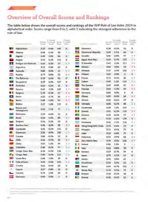
ROL Index & Insights
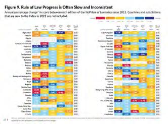
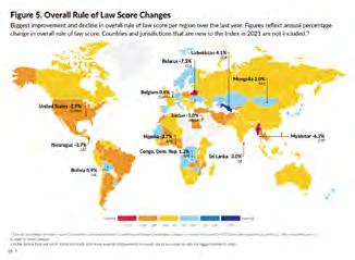
What was the solution?
We transitioned to a user-centric, digital publication. After merged the Index and Insights narrative where “Insights” This new section uses abstract data into memorable 140+ country profiles into to reduce unnecessary we overhauled color logic accessibility, ensuring
What was the effect?
The redesign transformed advocacy tool. Consolidating costs while streamlining “Policy Insights” visualizations for global press briefings presentations. By modularizing created a faster “find-to-action” (downloads have increased).
solution?
a user-centric, landscape-oriented
After stakeholder research, we and Insights report into a unified “Insights” morphed into “Policy Insights.” uses visual metaphors to translate memorable messages. We decoupled profiles into modular, on-demand downloads unnecessary content consumption. Finally, color logic and typography for AA-level ensuring data remains legible for all users.
Contact:
name: Mariana López, Natalia Jardón, Irene Heras organisation: World Justice Project e-mail: design@worldjusticeproject.org website: https://worldjusticeproject.org/rule-of-law-index/
Interviews
Synthesis
Cover Design
2025 ROL Index Redesign
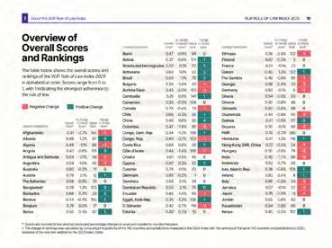
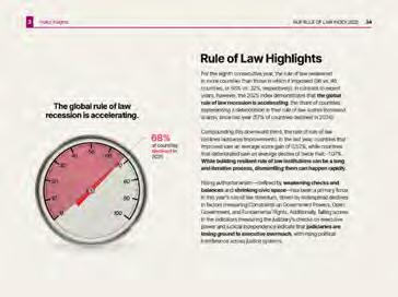
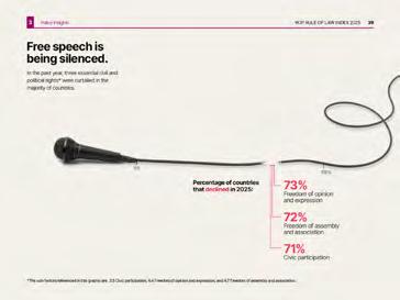
effect?
transformed the Index into a dynamic Consolidating publications cut production streamlining the editorial workflow. The visualizations are now “unbundled” briefings and high-level forums as modularizing country profiles, we “find-to-action” loop for policymakers increased).
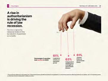
Category: Editorial
What was the challenge?
The challenge was to present the history of the border of Gorizia in the 20th century not only through historical facts, but also through the different experiences of people of various nationalities who lived in the city. At the same time, the book was designed to attract a wider audience by giving a strong role to images and visual storytelling.
What was the solution?
The solution was to design the book as a multimedia and visually driven project that combines different types of content. In this structure, illustrations are used to represent people’s perceptions and personal experiences of historical events, while archival photographs serve as objective documentation of those events. This combination allows the book to present both the historical facts and the different ways people of various nationalities living in Gorizia experienced them.
What was the effect?
The effect was a book that made the complex history of the border of Gorizia in the 20th century more accessible and engaging for a wide audience. The book was presented, read, and discussed on several occasions during GO! 2025 Nova Gorica – Gorizia European Capital of Culture, reaching different groups of readers and participants.
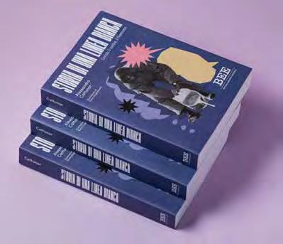
Contact:
name: Elena Guglielmotti company/organisation: Bottega Errante e-mail: elena.guglielmotti@gmail.com website: elenaguglielmotti.design
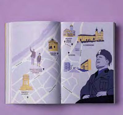
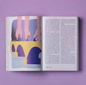
The text above shows the partisans on the bridge of Gorizia who will later be captured by the Nazis.
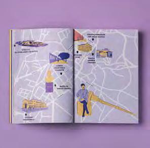
At the beginning of each chapter of the book, there is a different map of Gorizia showing the street names that change with the succession of different governments, and where the areas in which the historical events described in the chapter take place are illustrated.
In the book, the atmospheres and historical events of the era are illustrated through photographs taken from no fewer than 5 regional and private photographic archives, both Italian and Slovenian.
The book also contains sections with the testimonies of people who lived through the historical events, along with links to the related interviews.
What was the challenge?
In order to bring the question of underground gas networks into the public debate, the Canadian Climate Institute decided to publish an analytical report that aims to fill a critical information gap and fight misconceptions that could delay Canada’s climate goals. The challenge was to raise awareness of these energy issues through clear and rigorous communication and to reveal the hidden risks of gas infrastructure so that they could be understood, debated, and incorporated into policy decisions.
What was the solution?
Voilà: worked with the Institute to make this dense and technical subject understandable, without reducing its complexity, by designing a report with an expressive layout and data visualizations. Inspired by heat flows, distribution networks, and urban infrastructure, the visual language uses movement and balance to express transition. A limited color palette, clear visualizations, and full-page graphics enhance readability. To enhance clarity, we’ve introduced various methods of visualizing data, such as hatched box ranges or multiple outcomes for presenting uncertainty ranges.
What was the effect?
Thanks to the combination of data visualisation and graphic design, the report translates the scale, risks, and long-term consequences of continued gas expansion into a narrative that is clearly understandable to policymakers and informed audiences. This report is the first of its kind to outline the best ways to protect consumers as the energy transition in Canada’s building sector accelerates.
Contact:
name: Francis Gagnon
company/organisation: Voilà: e-mail: contact@chezvoila.com website: https://chezVoila.com
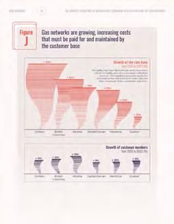
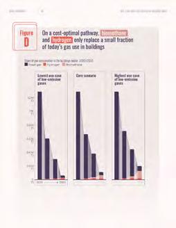
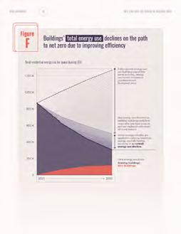
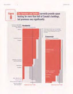
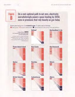
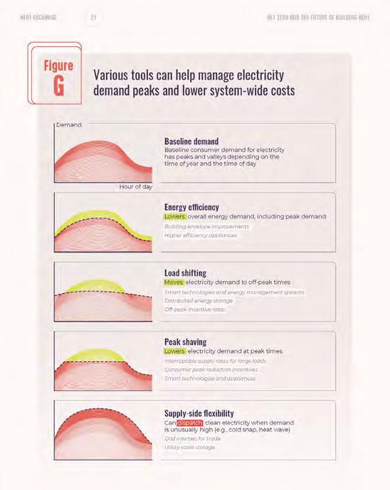
Editorial
What was the challenge?
1970 – 2025. Sport Austria, the magazine of the Austrian Federal Sports Organization (BSO), is discontinued after 55 years. The final issue of “Sport Austria” was published on December 17, 2025. In addition to valuable service information from the Federal Sports Organization, it also featured news from 41 (!) sports federations and umbrella organizations. The first BSO newsletter was published on February 1, 1970. It was carefully typed and photocopied in-house. Over the decades, the publication had various titles – Ö-Sport, Olympia-Sport, Österreich Sport, etc. – and designs. Most recently, the magazine was published four times a year under the title “Sport Austria.” Until 2023, it had a print run of 2,800 copies; after that, it became a digital online publication.
What was the solution?
Over the past 14 years, Elias & Partner designed 59 issues. We were responsible for three editorial design changes. including the important relaunch in 2018 as part of the brand change from BSO to Sport Austria.
We placed great importance on ensuring that the design presented the information in the best possible way, regardless of the type of content. The reading experience should be enjoyable.
The magazine has been a reliable source of information for the Austrian sports community. Sports officials found information on important topics in it: financial support, legislative changes, and sports policy.
Contact:
name: Jochen ELIAS
company/organisation: Elias & Partner KG e-mail: jochen.elias@eliaspartner.at website: https://eliaspartner.at
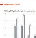
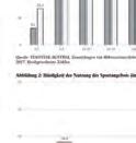
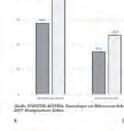





Category: Editorial Project:
What was the challenge?
For most of my career as an educator, information design was not formally taught in the Design Department at Columbia College Chicago where I taught as an associate professor for over 30 years. Like many design programs, we taught students how to use the tools of design and esthetics primarily for branding, communication and marketing purposes.
What was the solution?
Seeing a need for it, I introduced a class called INFO DESIGN in the early 2000s. I taught the class for over 10 years, reaching hundreds of students.
After retiring from teaching, I wrote and designed the book INFO DESIGN THEORY + PRACTICE to show and tell how usercentered design can be a powerful tool for creating knowledge. I am hoping my book reaches a wide audience of design students, teachers and practitioners who may not be familiar with some of the practices of information design.
What was the effect?
In February 2026 I published DESIGN INFO online in digital and print versions. So far, the resonses from my former students has been very positive. I am adding video lectures directly related to the book’s content on my youtube channel this spring.
Contact:
name: Kayt Hartmann company/organisation: 20/20 VISION e-mail: khartwomann@gmail.com website: youtube @hartwomann
Some people think design means how it looks.
But, if you dig deeper, of course, it’s really how it works.
1.2 Aristotle who?
Understanding how a persuasive argument is constructed gives you the power to detect what’s fake and what’s not.

Knowledge is power.
If you understand how information can be used to persuade, you will have the power to detect what’s fake and what’s not. In an era of fake news, designers need to know how to present information credibly.
More than 2000 years after Greek philosopher Aristotle wrote the rules of rhetoric and persuasion, his ideas still have a lot of relevance for our times.
In today’s social media spaces, fear and hate get in the way of logical thinking. Clouding our logic is a popular tactic of conspiracy theorists, who want us to base our judgments and decisions on emotional, not rational responses. And appealing to emotions as a persuasion tactic was exactly what Aristotle, one of the great thinkers in Western history, warned against.
Sample pages
this french press and the instructions for it.
information is the stepby-step organization of instructions about how to operate the french press, using both graphics and text to illustrate the process.
knowledge comes from understanding how this product works, after reading and trying the instructions.
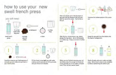
5.5 check the results
Student Georg Vlansky designed a short video about BitCoin. He posted it online, with a link to this survey he designed using Google Docs.
By asking “ How much did you know about bitcoin before the video?” George found that more than 50% of his respondents knew nothing about BitCoin, before they saw his presentation.
After viewing his presentation, over 92% claimed they had learned a little bit or a lot after they saw it. This was solid evidence that the info and the way he presented it was clear and understandable.
Google docs generated the survey results automatically, which is very helpful to analyzing the results.
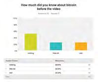
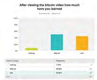
Category: Editorial
What was the challenge?
We were commissioned by World Bank to design a report that could support global engagement on antimicrobial resistance (AMR), which is one of the most urgent health challenges worldwide. The aim was to visualise a long, complex and information-dense report, translating detailed research and policy insight into a format that was accessible and engaging for diverse audiences. Importantly, it needed to equip decision-makers, governments, and partners in over 150 countries with clear, accessible insights to inform actions.
What was the solution?
We created a cohesive visual language to bring clarity, consistency, and continuity to a complex 244-page report. The report spans six chapters and 20 intervention areas across four sectors.
We developed a coherent system of iconography and colour coding for the 20 interventions to facilitate intuitive navigation of the report’s multi-layered content. This established immediate visual recognition alongside the navigation enabling readers to follow thematic threads and access material relevant to their needs. The visual language was applied consistently across the front cover, section openers, scholar margins, tables, and diagrams, ensuring clarity and cohesion throughout. These strategies were designed to support a diverse readership, from senior decision-makers seeking key insights to technical specialists engaging with detailed analysis.
Contact:
name: Abi Buller company/organisation: TDL-Creative
e-mail: abi.buller@tdl-creative.com website: https://tdl-creative.com/
Minimal, purposeful illustrations were developed to represent the human, animal and environmental health systems explored in the report, helping to clarify complex relationships without overwhelming the reader. Highlighted maps were used to ground case studies to their geographic location. These visual anchors supported comprehension and strengthened the narrative connection to the real-world impact.
Following completion of the publication, World Bank requested a PowerPoint version that retained the same visual language and clarity. This required rethinking the layout from portrait to landscape orientation, while preserving hierarchy and consistency. Photography was integrated to add context and visual interest, without distracting from key messages. With significantly less time for audiences to absorb information, each slide featured reduced text, strengthened headlines, and balanced layouts.
Project identification, preparation, and appraisal
Implementation
FAO Laboratory Mapping Tool (LMT)Strategy on AMR and the Prudent Use of Antimicrobials
AWaRe tool
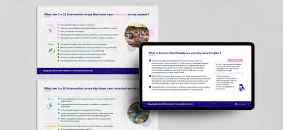
The AWaRe Campaign: “Adopt AWaRe. Handle Antibiotics with Care.”
Antibiotic Prescribing and Resistance: Views from Low- and MiddleIncome Prescribing and Dispensing Professionals
WHO Situation Analysis
Antimicrobial Resistance: A Manual for Developing National Action Plans
Global Analysis and Assessment of Sanitation and Drinking-Water (GLAAS)
AMR Benchmark
WHO Hand Hygiene Self-Assessment Framework, and the WHO Infection Prevention and Control Assessment Framework
Progressive Management Pathway for AMR (FAO-PMP AMR)
WHO AMR Stewardship Programmes in Health-care Facilities and LMICs Toolkit
Global Antimicrobial Resistance and Use Surveillance System (GLASS) and One Health module
FAO Action Plan on Antimicrobial Resistance Country Progress on the Implementation of the Global Action Plan on Antimicrobial Resistance: WHO, FAO, and WOAH Global Tripartite Database
Industry Alliance against AMR Progress Report
Tripartite AMR Country SelfAssessment Survey (TrACSS)
AMR Framework for Action Supported by the IACG FAOSTAT
WHO Competency Framework for Health Workers’ Education and Training on Antimicrobial Resistance
WHO Benchmarks for IHR CapacitiesStrategic Research Agenda: Joint Programming Initiative on Antimicrobial Resistance
Technical Brief on Water, Sanitation, Hygiene (WASH) and Wastewater Management to Prevent Infections and Reduce the Spread of Antimicrobial Resistance (AMR)
The World Bank shared very positive feedback, noting that the clarity of structure and visual consistency resulted in a report that was both informative and accessible. The colour-coded chapters and supporting visuals were particularly valued for helping different audiences quickly navigate through the complex information. The summary report further extended the reach of the work, providing a concise, persuasive tool for communicating the framework for action. Collectively, the outputs strengthened the report’s impact and informed decision-making based on a major global healthcare issue. As of February 2026, the AMR report has been viewed 4,373 times and downloaded 2,393 times (source: Open Knowledge Repository).
Guidelines on Core Components of Infection Prevention and Control Programmes at the National and Acute Health Care Facility Level
FAO Resource Package on Good Hygiene Practices
Completion and evaluation PHASE 1 PHASE 2 PHASE 3 Previous
The 4th Annual WOAH Report on Antimicrobial Agents Intended for Use in Animals
World Antibiotic Awareness Week 2018: Monitoring & Evaluation Report
Africa CDC Antimicrobial Resistance Surveillance Network (AMRSNET)
FAO Surveillance Evaluation Tool
WASH in Health Care Facilities: Global Progress Report 2020
“Antimicrobial resistance (AMR) contributes to millions of deaths worldwide each year, making it one of the most urgent global health challenges we face. However, engaging audiences on the issues and how to make progress is difficult. The design of the AMR report was critical in strengthening communication around an issue that is often perceived as highly technical and inaccessible. The visual approach enabled diverse audiences to identify with the material, reinforcing its relevance across contexts and helping anchor discussions in the real-world impact of AMR and the need for coordinated global action. It also played an important role in supporting our presence at the UN General Assembly High-Level Meeting in 2024, providing a strong, accessible foundation for engagement with governments and partners in more than 150 countries.”
Naomi Rupasinghe, Senior Health Specialist, Europe and Central Asia
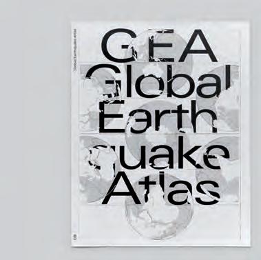
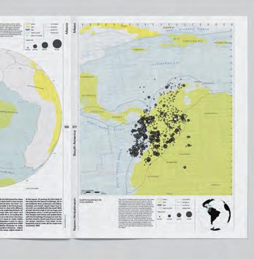
Following the devastating earthquake that struck Turkey and Syria on February 6, 2023, the project set out to explore how earthquake data could be visualized and communicated in a meaningful and responsible way. The challenge was twofold: to contextualize complex seismic data across time and geography through clear visual narratives, and to integrate such a socially and scientifically complex topic within an educational setting focused
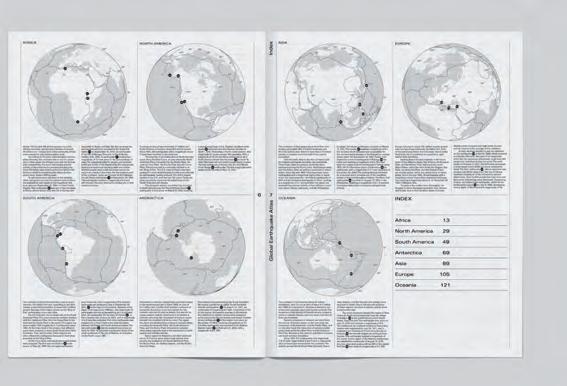
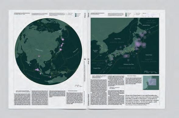
on data visualization. Earthquakes have profound social and environmental impacts, yet public understanding often remains limited to fragmented numbers reported in the news.
The Global Earthquake Atlas, a 136-page tabloid-format publication, provides readers with a structured and accessible perspective on global seismic activity since 1900—from a global overview of tectonic
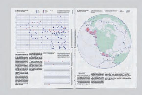
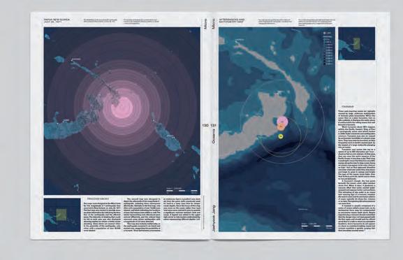
dynamics to regional and event-specific case studies. The atlas brings together a wide range of maps and visualizations organized into eight sections (an introduction and one for each continent), complemented by interviews, contextual texts, and reflections on the design process. A dedicated glossary of scientific terms supports readers in navigating the topic, enabling both introductory reading and selective consultation.
The Global Earthquake Atlas provides an accessible perspective on earthquakes, linking seismic activity to geological conditions, population density, and risk exposure, while offering historical context that allows readers to explore patterns and make comparisons over time. By presenting complex data visually, it fosters broader understanding and general knowledge of seismic activity. At the same time, the course trained students to
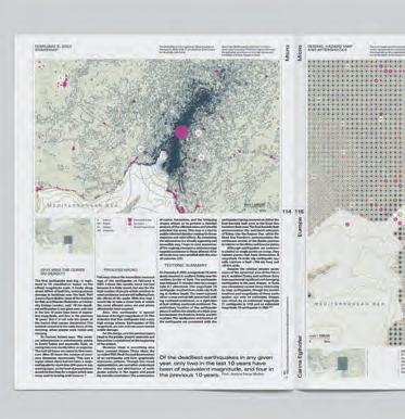
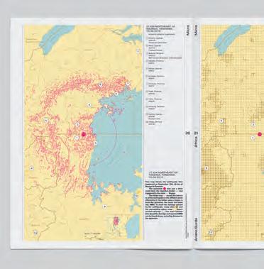
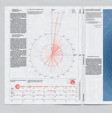
interpret and translate cartographic and geospatial data into clear visual narratives, building confidence in working with complex scientific datasets.
Contact: Enrico Bravi (enrico.bravi@me.com) www.enricobravi.com
Team: N. Bender, R. Deimel. Students: A. Abedini, N. Arthaber, M. Baroni, L. Bauer, A. Burda, A. Danninger, C. Eglhofer, D. Eisele, A. Gramer, K. Groiß, N. Hinkelmann, J. Jang, M. Karl, L. Koudela, K. Krumphuber, A. Luger, K. Mehl, S. Neumann, F. Prassé, C. Rabl, P. Reiser, B. Reisner, M. Renner, K.M. Reyes, M. Schieder, C. Wysoudil.
What was the challenge?
Commissioned by the German newspaper DIE ZEIT for its student magazine ZEIT Campus, the challenge was to communicate a complex, scientifically researched and data-heavy problem that is largely invisible: the long-term danger posed by WWII bombs and munitions lying on the seafloor of the North and Baltic Seas. The topic combines historical, ecological and technological dimensions and required a way to make abstract risks, spatial scale and scientific processes understandable for a broad audience without oversimplifying the data.
What was the solution?
The solution was a layered visual approach combining cartography, schematic illustrations, diagrams and data-driven graphics. Maps provided geographic context, while diagrams and drawings explained technical processes such as detection and recovery using robotic technology. By assigning each visual format a specific role, the project translated complex datasets into a clear and coherent visual narrative.
What was the effect?
The visualizations made an otherwise hidden environmental threat visible and accessible. They helped readers grasp the scale of the problem, understand the scientific efforts involved and recognize the ongoing ecological impact of historical warfare. The project enabled informed engagement with a difficult topic by transforming complex data into an understandable and compelling visual story.
Contact:
name: Philipp Doringer company/organisation: Philipp Doringer e-mail: work@philippdoringer.com website: www.philippdoringer.com
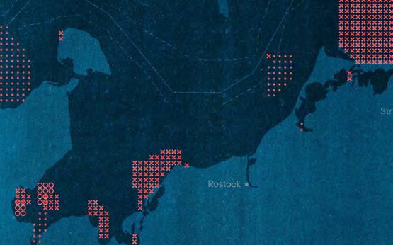
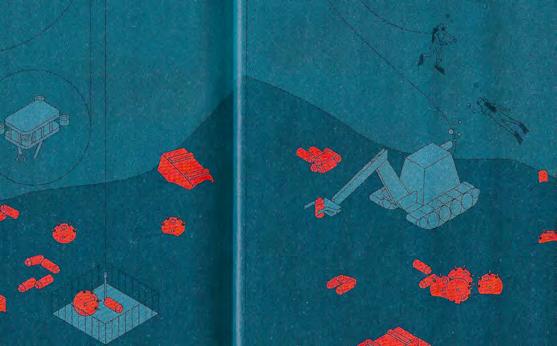
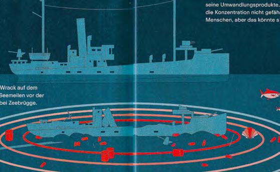
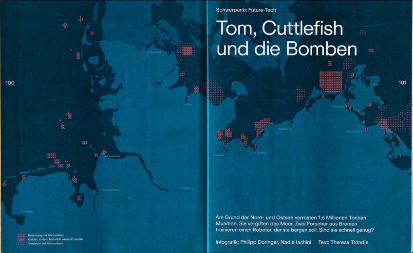
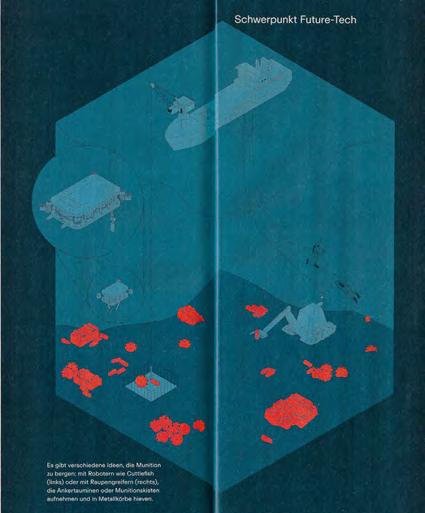
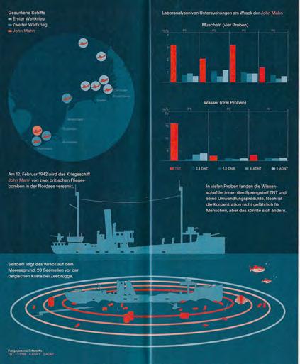
What was the challenge?
Hardly anybody has an idea of the multitude of tests and studies that have been conducted since research on pictograms began. Again and again the work of ISO/TC 145/SC 1, the international committee concerned with standardization of public information symbols, has been neglected even in major design projects. The staff members responsible were not familiar with the fact that such a committee exists and scientific research has been done by this committee and many other organizations in the last 50 years all over the world. Similar deficiencies can be spotted when examining legislation: often pictograms recommended are far from perfect and were selected without any scientific background, ignoring international research on the subject.
What was the solution?
To collect research papers as well as all kinds of pictogram examples in use, study and interpret results, and to publish all relevant data referent by referent. This includes listing alternative terms in use,showing pictogram examples in a standard format for all image contents found, discussing research results, highlighting need for further research, and recommending the best solution, if possible. Furthermore methods to evaluate pictograms are explained, including relevant literature on this subject. This work in progress is published on the website www.pictograms.info and main search engines get informed about all new results and publications.
What was the effect?
Detailed information on pictograms for a huge number of terms is easily accessible now. Pages from this website were accessed by users from far more than hundred countries from almost all continents up to now. Data from the website is used as basis for further research and improvements in pictogram design are on the way.
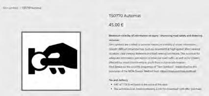
Contact:
name: Christoph Brugger company/organisation: Brugger
e-mail: pictograms.info@gmail.com website: pictograms.info
Example showing a page presenting a subset from an organization including some background information and links
Example of a complete review including discussion of test results, recommendations, and literature
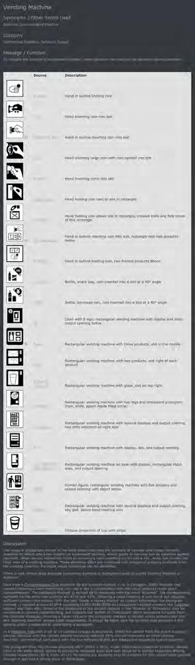
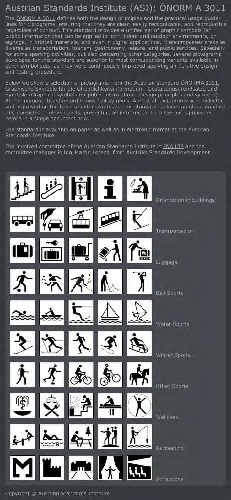
What was the challenge?
In health research, often times the subjects being addressed are a taboo for patients, researchers and/or health practitioners. Although it is a central component of quality of life, the topic of sexual health, especially in connection with older age or chronic disease, is particularly difficult to address. Therefore, our challenge as design researchers was to enable and support communication between stakeholders in research about the topic.
What was the solution?
We created a set of artefacts: 1) Dozens of anatomic illustrations of human genitalia from figurative to abstract, from metaphorical to literal, 2) Cards where people could experiment with spectra to create possible archetypes, from health status to gender expression, and 3) Playful cards which could be tested with research participants who were in a relationship and designed so as to conceal immediate visual associations to sexuality to avoid embarrassment.
What was the effect?
The anatomic illustrations were tested with older adults and prople with chronic diseases. The Archetype cards were tested with designers and engineers involved in designing digital solutions for sexual health. The hints were tested with young adults and finally included in a commecial app which is the first smartphone-delivered sexual health promotion programme that seeks to adapt traditional face-to-face interventions for older adults, people with chronic diseases and their partners.
Contact:
name: Human-Centered Design Team organisation: Fraunhofer Portugal AICOS e-mail: info@fraunhofer.pt website: www.aicos.fraunhofer.pt
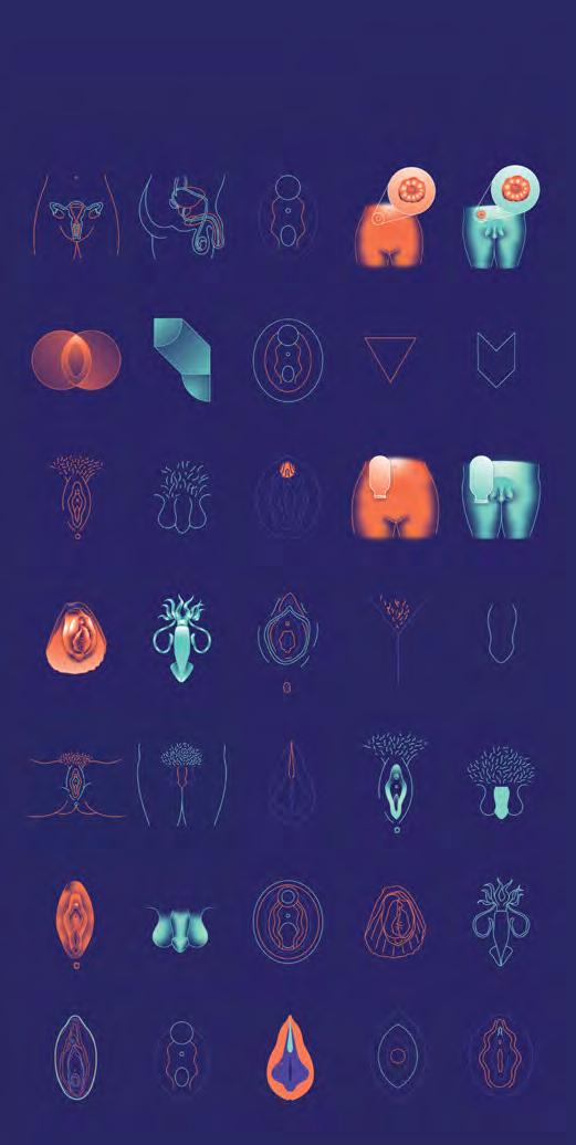
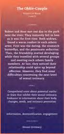
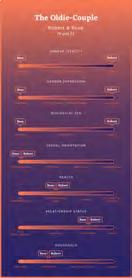
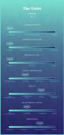
We create archetype cards that helped create fictitious users and dyads, and thus help designers to reflect about whether their design options were serving diverse users.
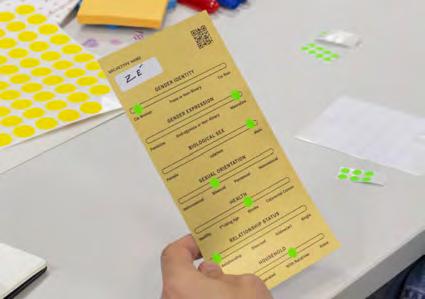
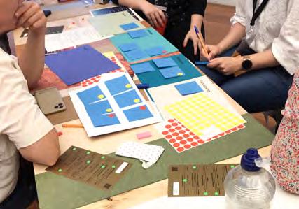
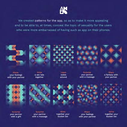
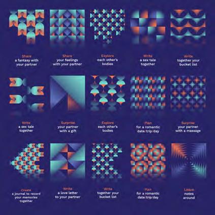
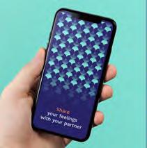
When designing digital technologies, the values of diverse stakeholders are often overlooked or insufficiently integrated into the process. This is critical in healthcare, where misaligned values can negatively affect trust, acceptance, and ultimately the effectiveness of the technology, producing tools that fail to support the needs of both patients and clinicians. The challenge, therefore, was to create a method that makes values explicit, negotiable, and actionable during design.
The solution was Signo, a card-based game developed to elicit, prioritise, and map values in technology design. Signo enables stakeholders to articulate their perspectives in a collaborative, tangible, and flexible way. Its structure—value cards, scenario decks, and a large game board—creates space for open reflection and dialogue. Players can map values onto contexts, explore tensions, and consider trade-offs, ensuring that values remain central throughout ideation, evaluation, and implementation processes.
Play sessions showed that Signo effectively supports reflection on values and their role in technology design. Players collaboratively identified, prioritised, and debated values, often surfacing tensions. The game proved a valuable tool to engage stakeholders in critical reflection, positioning itself as a valuable tool for human-centred technology design.
Contact:
name: Human-Centered Design Team organisation: Fraunhofer Portugal AICOS e-mail: info@fraunhofer.pt website: www.aicos.fraunhofer.pt
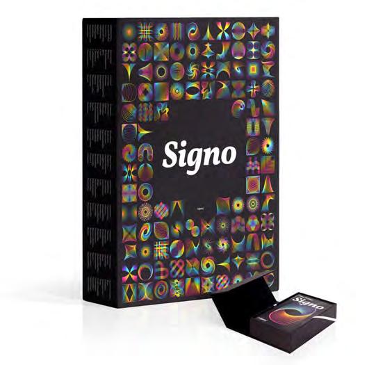
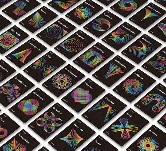
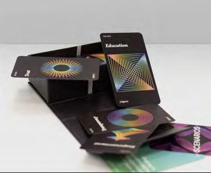
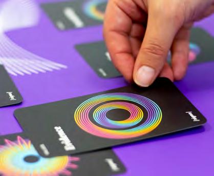
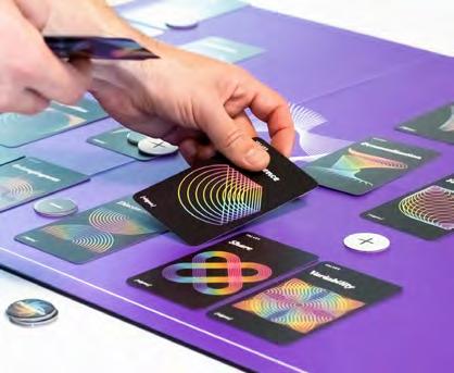
What was the challenge?
The aim of the project was to create a facilitation tool for participatory processes and educational activities on the themes of legality, civic education and urban safety.
The artifact is meant to simulate dynamics typical of mediation activities carried out within communities as a response to the problems that may arise in a city.
An additional challenge of the project was to design a tool with a strong playful component, in order to facilitate its use in different educational contexts, ranging from schools to activities involving adults.
Contact:
name: Daniele De Rosa company/organisation: Alpaca e-mail: info@alpacaprojects.com website: www.alpacastudio.it
What was the solution?
”C’è un problema in città“ (There’s a problem in the city) is a board game that places players in the roles of different types of citizens and representatives of the Public Administration in order to respond to problems that arise turn after turn. What the game aims to highlight is how the administration of a city – and social mediation more broadly – is a matter of balance: a balance that must be maintained while responding to a wide range of situations, citizens’ demands, and topics of discussion.
This multiplicity of situations is represented through a mosaic of expressive, colorful illustrations with an informal tone, designed to engage a diverse audience of users, with particular attention to students between the ages of 11 and 16 who experience the game in schools. The content was carefully evaluated to define realistic situations, and the choice of actions to address the city’s problems was designed in line with the policies on Legality and Urban Safety.
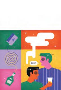
Players take on the role of one of the following groups of citizens: foreign communities, elderly people, young people, shopkeepers, families, associations, and the Public Administration. At each turn, players must confront a problem, such as: noise disturbance, vandalism, drug dealing… The core of the game is the discussion among the different players, who must propose one or more actions they believe are appropriate to address the problem. The player representing the Public Administration makes the final decision based on the discussion with the other players.
Once the design and playtesting phases were completed, the game was produced in 100 copies and followed by a launch and promotion phase. This included an event involving local associations and teachers, which generated widespread interest in using the tool for educational activities. Following this first event, three pilot activities were organized: two aimed at students aged 12 to 14, and a third involving students aged 16 to 17. All activities received positive feedback from the participants and stakeholders involved, and the game was subsequently distributed to several schools in the Emilia-Romagna region.
Associazioni
Giovani
Anziani
Consiglio delle
Comunità straniere
Commercianti
The tool is still in use today in various schools in the area and continues to serve as a facilitation tool in participatory activities organized by the Mediation Center of the Municipality of Ferrara (Italy).
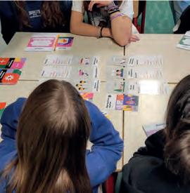
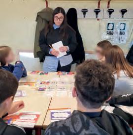
What was the challenge?
Administrators rely on digital systems that gather ever greater quantities of data from us. Those systems have become convoluted and opaque, especially with artificial intelligence plugged in. Even technical experts struggle to keep track of how it all works. Without detailed accounts the public can understand, data systems risk becoming intrusive, manipulative, and errorprone.
Existing graphical notations for mapping systems are not up to the task. Generalpurpose notations are too vague and abstract, leaving much to the imagination. Specialized notations are cryptic, narrowly focused, and difficult to learn. Notations still hold great promise as an accessible visual shorthand. What’s missing is a notation, grounded in information design principles, that can describe data systems vividly to both experts and laypersons.
What was the solution?
SIGILS is new notation for explaining systems that is pictorial, not merely graphical. The word “sigils” refers to icons with magical powers, assembled from smaller symbolic pieces. The acronym SIGILS means: Systems Integrated Graphicalnotation and Icon Library Scheme. SIGILS overcomes the shortcomings of existing notations. How? By combining subjectspecific icons and the most effective graphical devices into a unified scheme.
What graphical devices? What is the criteria for judging effectiveness?
Graphical notations represent systems as networks or stacks. Hundreds of notations were surveyed to produce a codex (called
Contact:
Peter Stoyko
The SystemViz Project peter@stoyko.net www.systemviz.com
ANATOMY) of all the graphical devices currently in use. Only 74 notations were found to have distinctive features, with 69 graphical devices identified (above). Not all of those devices work equally well. An informationdesign framework was created to judge the effectiveness of system visuals (called ESCALADE). Design criteria are grouped into eight topics: Expanse (space), Scale, Cadence (time), Abstraction, Layer, Aggregation, Detail, and Enlivenment (nonstatic media). Chronic shortcomings of existing notations emerged (as summarized in a set of cards: www.systemviz.com/ pcards.pdf). That research informed the design of SIGILS. Successful rules and devices were adopted, modified in ways that mitigate against shortcomings.
What specific devices? What role do icons and subject area play?
Commonalities exist across systems. Yet specific systems are hard to understand using generic imagery. The first implementation of SIGILS is data systems (called Data Architecture SIGILS). That is a challenging subject to visualize because data systems mostly operate behind the scenes in the
form of electronics and computer code. Iconographic conventions and visual metaphors exist in the culture of dataoriented professions. Those had to be formalized and augmented. Moreover, the resulting icon library had to be accessible and work within the confines of notational layouts. That is where the notion of sigils as combinations of symbols becomes relevant.
A basic network diagram is a web of nodes and links, often expressed as labeled boxes and arrowheaded lines. Nodes in SIGILS are dual coded using text and pictorial icons. The intent is to show the thing itself, or at least a representative standin, with text as reinforcement. Nodes can be further supplemented using a standardized set of “node complications.”
That supplementary information is akin to the widgets on a chronograph watch face. Node complications can add nuances (badges, inset symbols), system state (tags, proximate indicator), or context (ground tile). Such devices are compact, with only minor increases in spatial footprint. Consistency of format and placement mean nodes remain tidy and easy to parse.
Three different projections offer visual contrast to differentiate icons. Nodes and tiles are drawn in topdown oblique perspective. Most complications are flat, as are items moving through the system. Largescale facilities are drawn in isometric perspective. With the help of containment devices (brackets and callout boxes), that differentiation makes it easier to show multiple scale on the same diagram.
Guide: www.systemviz.com/sigilsg.pdf RECOMMENDATION
the notation and encourages good diagramming practices. The initial SIGILS release contains more than 300 icons, with more added over time. New sets will be developed for other subject areas (such as energy and water systems). All outputs of the SIGILS project are open source, free for anyone to use and alter.
Links can also have complications (tags, indicators, and labels) to better describe the nature of the influence or flow. These devices can convey sources of stress and friction on a systemic relation, something unavailable in existing notations. They also replace the assortment of line styles, line ends, and other cryptic markings.
Icon colors and dimensions are specified strictly. Node icons have four widths (with leeway for optical adjustment). Sizing constraints accommodate the overlaying of icons to show bundled or paired system parts. Preset color variations enable color coding. A few color sets are reserved for particular functions (above). Adjustments also exist for light and dark backgrounds. Many other features round out the specification of SIGILS. A guide book explains
Prototypes of SIGILS were refined over six years while designing actual data systems. Work sites include the Linux Foundation (US), the Public Health Agency of Canada, and the Canadian Department of National Defence. Much of the future potential comes from enabling digital systems to describe themselves automatically with SIGILS, thanks to information architecture technologies. The notation is described by a globally referenced semantic ontology coded using open standards (RDF/OWL), making it machine readable. Ontological resources are embedded in the metadata of each vector (SVG) icon, with a unified palette of color classes in the body tags. Those features enable inferential reasoning and manipulation through code.
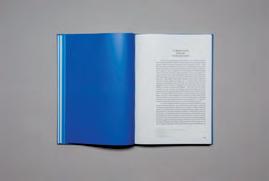
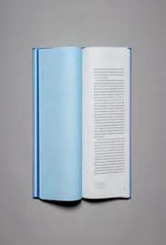
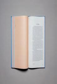
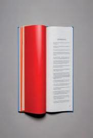
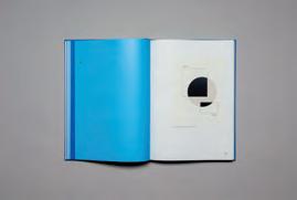
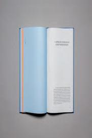
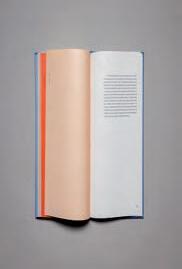
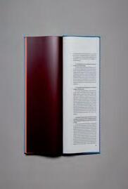
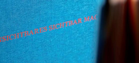
Although the climate crisis dominates headlines, many people still struggle to fully comprehend and envision the reality that our planet is warming day by day. It is less a lack of information than the way in which it is presented and communicated. Accordingly, this master’s thesis explores the field of climate change communication in order to examine its underlying mechanisms and strategies. In particular, it investigates the potential contribution of visual communication and exhibitions to conveying the climate crisis in a more tangible and accessible way.
Brought together in the format of a book, theoretical research and an analysis of a climate change exhibition at the Natural History Museum Vienna are interwoven. Organized into seven chapters, the work explores central considerations when addressing the climate crisis—whether in the media, in art, or within an exhibition. Scientific findings, such as the concept of the “psychological distance”, are translated into infographics, which transport the information in a clear, concentrated form. In combining analytical research with visual interpretation, the work is intended to provide a multi-layered insight into contemporary climate change communication.
The book as a whole is accompanied by a continuous colour gradient: across 122 pages, the changing hues visualise the development of Vienna’s temperature over the past 122 years. This subtle visual intervention unfolds gradually while reading — shifting from light blues to increasingly dark reds.
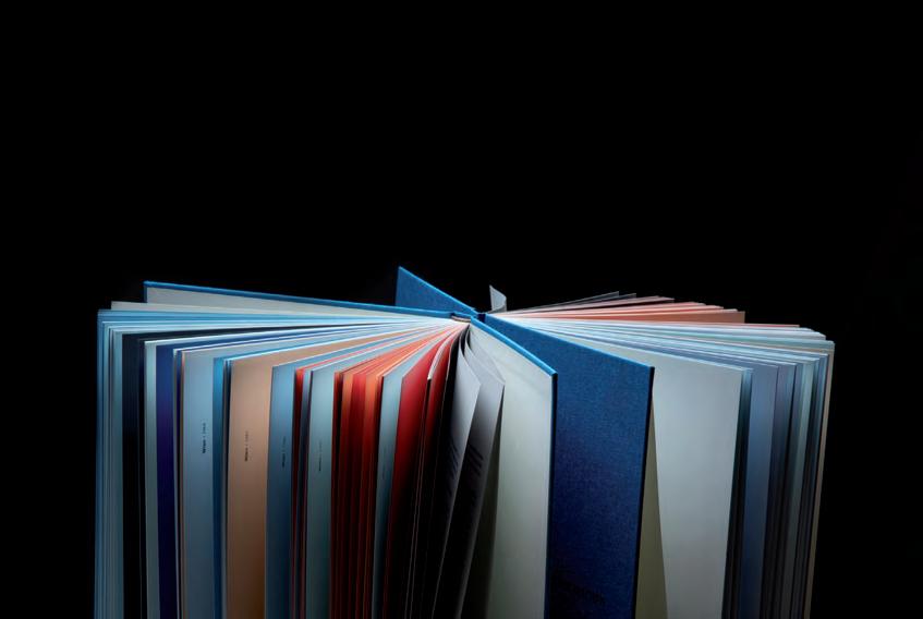
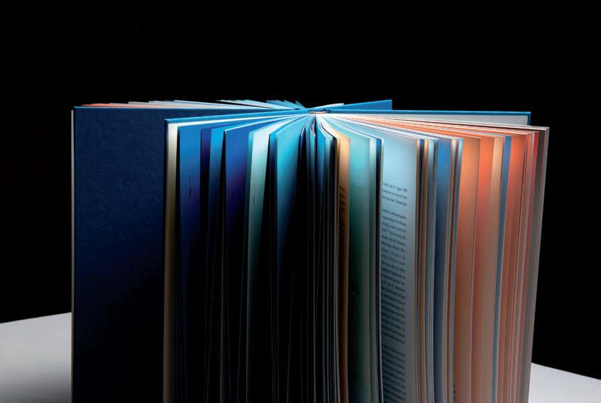
Whether in a conversation with a neighbor or in the conception of an exhibition, it is the subtle nuances in the way information is conveyed that make a big difference. This master’s thesis provides inspiration and insights for communicating the climate crisis in both personal and institutional formats, and demonstrates the importance of visual translations by conveying its message through visual layers itself.
Contact: name: deborah schultheis
university: University of Appl. Arts Vienna e-mail: deborah.schultheis@gmail.com
The earth’s natural carbon sinks have largely stopped working and wildfires have been pointed to as a major problem. Wildfires are another phenomenon that is being exacerbated by climate change: they are becoming more frequent, more intense, and more irregular over time, and the rate at which they are destroying nature will eventually outpace the moment of restoration and normalisation, and we will lose nature. In such times, designers seek to capture greater attention and focus by using the very ordinary medium of books to awaken a sense of urgency in people and convey just how desperate our situation has become.
Focusing on trees, which are both organisms directly affected by wildfires and play a vital role in protecting Earth’s natural environment, was my intention. This book covers the period from 2000 to 2024, when the number of wildfires began increasing exponentially due to rapid climate change. It addresses only wildfires that have reached an uncontrollable state. The trees were matched by comparing their distribution to each area where wildfires occurred.
Each page contains brief information about the wildfires and trees, displayed only in red and green. The red coloured part of the images represents the value of damaged area by area of the region. These percentages are displayed relatively, based on the damage area of each wildfire and the level of detail in the provided information.
In total, I will present 163 wildfires, along with 118 species of trees that are native to the region. I hope this book could convey to you how many more wildfires are happening and how much diversity we are losing.
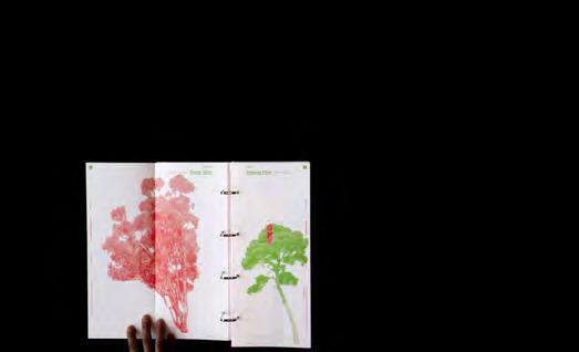
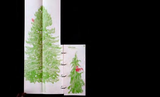
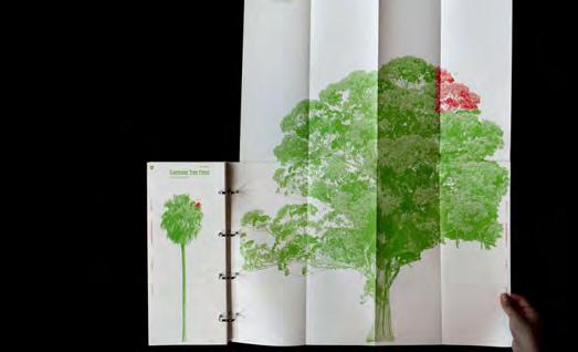
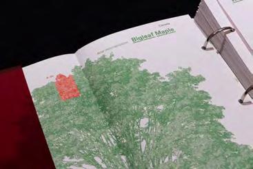
Using the very ordinary medium of books, the project aimed to raise awareness by allowing participants to physically touch and turn each page, experiencing first-hand how enormous natural areas are being lost to wildfires caused by global warming. Through the use of red film sheets, participants could witness parts of nature disappearing with their own movements, creating a tangible sense of loss.
Contact:
name: Ju Eun Lee company/organisation: Udk Berlin e-mail: juliaebs@gmail.com website: jueun-lee.com
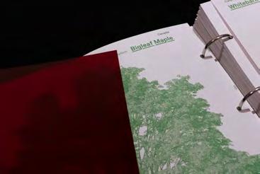
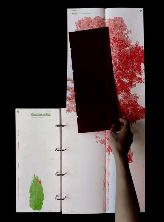
What was the challenge?
What was the challenge?
What was the solution?
What was the effect?
Hospital stays for children often involve long periods of waiting, uncertainty, and limited activities. For many children, the hospital environment is unfamiliar, and not knowing what will happen or how time will pass can increase anxiety and boredom. In the inpatient ward of the Children’s Clinical University Hospital (BKUS), Riga, Latvia, young patients may spend significant time passively. Additionally, children with visual impairments may face difficulties accessing information and activities in the hospital environment.
The project addresses the difficulty of accessing and understanding the painted wooden ceiling of the Sala Magna at Palazzo Chiaromonte in Palermo, a complex cultural artifact characterized by dense iconographic and symbolic content.
Despite its historical and artistic relevance, the richness of its visual narratives makes it difficult for contemporary audiences to interpret and fully appreciate. The challenge was to develop a communication strategy capable of mediating this complexity, making the artwork accessible and readable without simplifying its meanings or replacing the direct experience of the original object.
What was the solution?
A hybrid communication system combining analog and digital tools structured around three phases of the visit: before, during, and after.
Consistent page frame
Editorial materials introduce the historical context, an interactive digital device supports real-time guided exploration of the ceiling, and a multimedia platform allows deeper post-visit navigation. All outputs are unified by a coherent visual identity derived from the artwork.
What was the effect?
High-contrast graphics
The project demonstrates how visual communication design can function as an interpretative interface for complex cultural heritage, improving accessibility and engagement while preserving authenticity. It proposes a replicable model for communicating layered historical content through integrated visual and interactive tools.
Just in Time is an activity and information booklet designed to help children better understand and experience time during their hospital stay. The 64-page publication combines creative tasks, games, and simple explanations about time, senses and daily hospital routines.
The booklet is designed for all children, following universal design principles such as enlarged typography, high contrast, clear pictograms, and a consistent page frame to improve readability and orientation. Accessible worksheets were also developed in Braille, which can be provided when needed to support children with visual impairments.
The materials are designed so that the pages can be printed directly in the hospital (A3 or A4 format) and assembled into the booklet when needed.
By combining information, play, and inclusive design, the booklet helps children understand how time passes in the hospital and offers meaningful ways to spend waiting periods.
The activities support engagement, reduce anxiety, and create a more positive hospital experience for young patients, while also providing parents and hospital staff with a tool to involve children in calm and creative activities.
Contact:
name: Ieva Skuja-Zelca, Marta Smilga organisation: Art Academy of Latvia e-mail: skuja.ieva@gmail.com, martasmilga@icloud.com website: instagram.com/marta.smilga
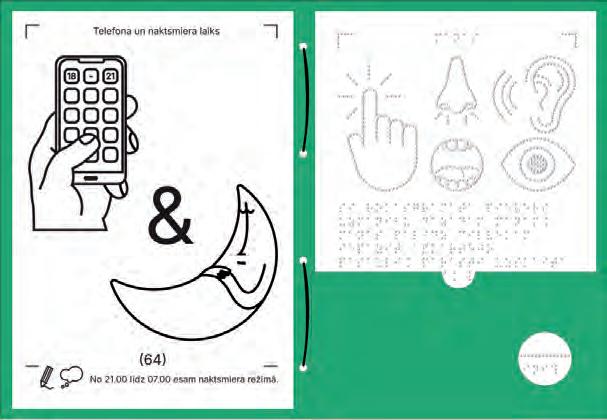


Overview of the booklet’s pages and content.
Example spread about synesthesia — when senses overlap.

Visitors exploring the booklet and tactile worksheets during the project presentation.
Example spread from the daily routine section.
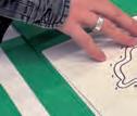
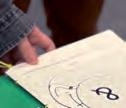
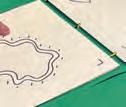


Project: Fair P(l)ay
What was the challenge?
My project Fair P(l)ay was developed shortly before the UEFA Women’s EURO 2025. The goal was to highlight the gender pay gap in professional German soccer. Fair P(l)ay tells the origin story of women’s soccer in Germany and tries to explain why men earn so much more than women and how far away we still are from fair pay. The main challenge was breaking this huge topic down into individual graphics while trying to include as many aspects of discrimination against female soccer players as possible. To understand how we arrived at this point as a society, I needed to explain the history of women’s soccer and the resulting consequences for career prospects and payment. The 32 panels of a football, which I chose as the medium, limited the number of graphics. I also wanted to include stereotypical soccer elements in my graphics, such as playing field markings and the goal net. The colours I used are based on the women’s away kit from 2025.
What was the solution?
The solution was to dedicate 12 panels to the history of women’s soccer, as this is the origin of many problems we still see today. This left space for 10 infographics, each accompanied by an explanatory text. To include as many topics and pieces of information as possible, I worked with exemplary comparisons. I compared salaries between male and female players, sponsors, media representation, and countries to create a diverse overview and make the topic more tangible for the viewer. Soccer elements such as playing field markings could also be included due to their reduced shapes.
Contact:
name: Alina Frey
company/organisation: Technical Augsburg University of applied Sciences e-mail: alina.maja.frey@gmail.com
This project raised awareness of an important topic that is still not discussed often enough. It brought together information about the history of women’s soccer and showed its consequences as well as possible future prospects. The viewer interacts with the object by folding the ball and literally putting the pieces together to see the whole picture. My whole class and my professor were astonished by the still existing differences between male and female players. The form of the object encouraged people to take a closer look and read through all the provided information with interest and playfulness. It motivated them to explore the topic further and reflect on their own attitudes towards women’s soccer, which is especially important because our behaviour has the power to shape tomorrow.
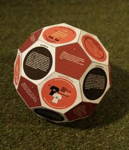
14,3also derSpieleinwieZuschauer,vieleso Zuschauerquo-HöhereDamen.derBundesliga unteranderemMännerfußballdenmachenten attraktiver.Sponsoren ahcs !

ImHerbst2024brachtedieUEFA angelegteUnstoppable,ihreneue,aufsechsJahre FrauenfußballStrategieaufdenWeg,umden nochweitervoranzubringen.EinZielbestehtdarin,denFußballzur meisten allenpraktiziertenSportartfürFrauenundMädchenin AnzahleuropäischenLändernzumachenunddie derreinenProfiligenzuerhöhen.
Ue ab gt i Dngin A ––2024–2030

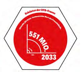
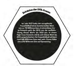
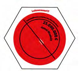
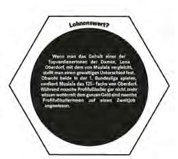
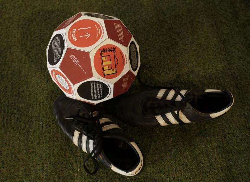
Project: Linzer Grün
What was the challenge?
The project began with a simple observation: in my everyday surroundings, publicly accessible green spaces seem surprisingly scarce. Yet a quick look at satellite imagery and digital maps suggests a different reality—the city of Linz appears far greener from above than it does at street level. Although Linz is considered one of Austria’s greenest cities, with more than half of its area designated as green land, the city center often feels comparatively sparse in visible greenery. This raised the question of whether the perceived lack of green spaces is an actual urban deficit or rather a matter of visibility and perception.
What was the solution?
To analyze the situation, geospatial data from OpenStreetMap was combined with an independent analysis of publicly available satellite imagery. The collected information was translated into a map focusing on the inner city of Linz. By investigating the distribution and accessibility of green spaces in Linz, the relationship between visible, accessible, and hidden greenery becomes understandable. The visualization categorizes green spaces according to type and accessibility. Parks, meadows, forests, and sports fields are represented through different shades of Riso-printed green. In addition, hatching is used to indicate whether a space is publicly accessible, privately owned, or completely inaccessible. By combining these two visual variables, the map contrasts public and private green spaces and reveals how urban greenery is distributed and experienced within the city.
What was the effect?
The map serves as a guide to local urban green spaces, highlighting a selection of publicly accessible areas. It also illustrates how different forms of accessibility influence the experience of green spaces in the city. The visualization points to an important distinction: many green areas within the urban landscape are not publicly owned, yet they still contribute significantly to the city’s environmental and visual quality. Even when they cannot be entered, these spaces shape the perception of greenery in everyday urban life.
Contact: Nina Dür Kunstuniversität Linz BA Grafik Design & Fotografie nina.duer@kunstuni-linz.at
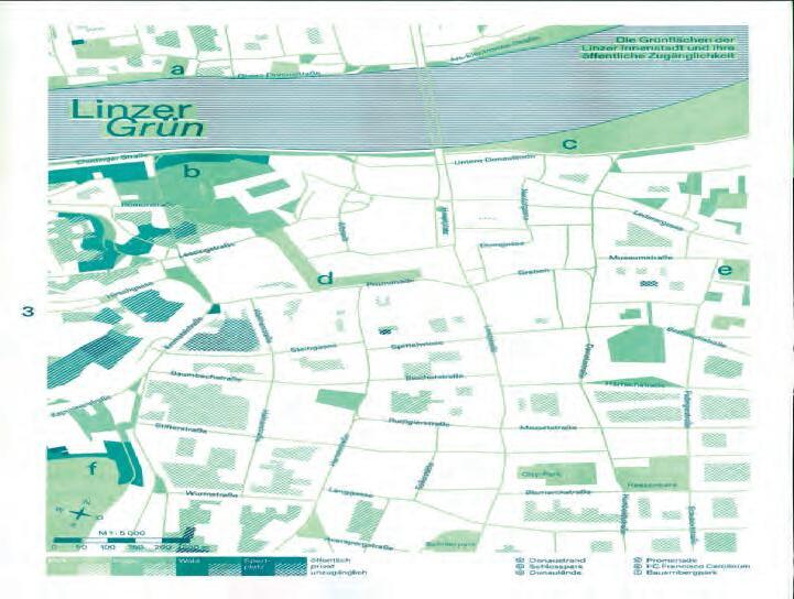
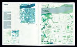
What was the challenge?
The central challenge of the project was twofold. On the one hand, it required locating reliable, precise, and comparable data across a wide range of topics. The process of researching and designing the lexicon therefore constituted a substantial part of the overall work. It was particularly important to me to ensure the accuracy of all information by consulting multiple sources and cross-checking data carefully. On the other hand, the project demanded a coherent design approach that could bring together diverse types of data and integrate them seamlessly into the text. The aim was to embed visual and informational elements in a way that supports the reading ow and enhances understanding, without appearing disconnected or visually
intrusive.

Bevölkerungsdichte
Wie viele Einwohner:innen leben auf einem km2?

What was the solution?
To address these challenges, I developed a systematic design approach that combines tables, text-based graphics, single- and multi-page visualizations, and maps. All graphic elements follow the same structural principles as the main text and are placed within the same type area, ensuring consistency throughout the publication. To create clear visual differentiation while maintaining cohesion, the graphics are set in blue and italics, allowing them to stand out without disrupting the overall design language.
What was the effect?

This approach resulted in a uniform and consistent system in which text and visual elements function as an integrated whole. The maps and data visualizations do not
appear as foreign components but instead complement and enrich the written content. Overall, the book includes 39 infographics and seven maps addressing a variety of topics, such as emigration, education, population density, and birth rates, thereby enhancing both the informational value and the visual coherence of the publication.

Contact:

university: New Design University e-mail: carina@eglhofer.at website: www.instagram.com/design.eglhofer/


































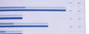
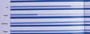











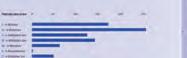








What was the challenge?
The project addresses the difficulty of accessing and understanding the painted wooden ceiling of the Sala Magna at Palazzo Chiaromonte in Palermo, a complex cultural artifact characterized by dense iconographic and symbolic content.
Despite its historical and artistic relevance, the richness of its visual narratives makes it difficult for contemporary audiences to interpret and fully appreciate. The challenge was to develop a communication strategy capable of mediating this complexity, making the artwork accessible and readable without simplifying its meanings or replacing the direct experience of the original object.
What was the solution?
A hybrid communication system combining analog and digital tools structured around three phases of the visit: before, during, and after.
Editorial materials introduce the historical context, an interactive digital device supports real-time guided exploration of the ceiling, and a multimedia platform allows deeper post-visit navigation. All outputs are unified by a coherent visual identity derived from the artwork.
What was the effect?
The project demonstrates how visual communication design can function as an interpretative interface for complex cultural heritage, improving accessibility and engagement while preserving authenticity.
It proposes a replicable model for communicating layered historical content through integrated visual and interactive tools.


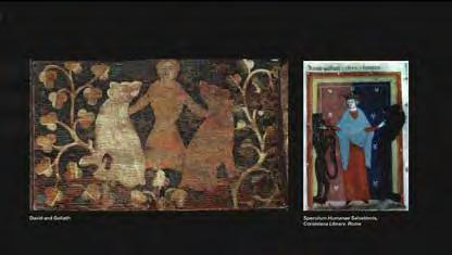
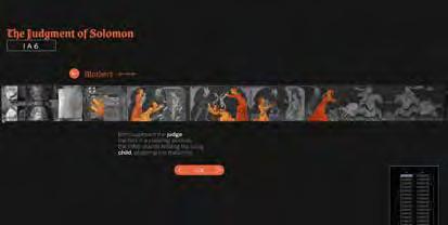


What was the challenge?
The challenge was to translate the complex history of the band Queen and its musical diversity into a clear structure. The band combines a wide variety of genres, personalities and cultural influences—particularly evident in the song Bohemian Rhapsody. At the same time, a large amount of data on albums, songs, tours and social issues had to be visualised in an understandable way. The aim was to find a narrative and creative structure that reflected both the music and the history of the band.
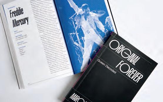
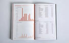
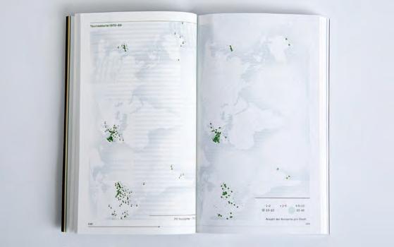
Contact
Marcel Gangl
New Design University [AT] info@marcelgangl.at www.marcelgangl.at
What was the solution?
The result is an information design book whose structure is directly derived from Queen’s song Bohemian Rhapsody. The six musical sections of the song form the basis for six chapters—from ballad to rock finale. Song lyrics become chapter headings and the song’s minute markings determine the page structure. Within this structure, the band’s history, music, band members and cultural themes are told through maps, diagrams and visualisations. In addition, an accompanying website brings the songs to life digitally through creative coding. This book is more than a biography. It is a visual narrative, a tribute to a band that could not be categorised, just like the song that became their greatest legacy.
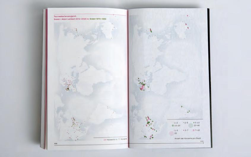
The publication shows how information design can make musical and cultural history accessible in new ways. By transferring the song composition of Bohemian Rhapsody to the structure of a book, an unusual form of storytelling is created that not only explains the content but also brings it to life. Complex connections surrounding the band Queen, from musical developments to cultural influences, are made understandable and comparable through visualisations. The project thus demonstrates how editorial design and data visualisation can work together to convey familiar content from a new perspective and appeal to a wider audience.
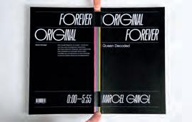
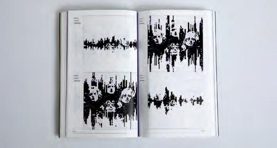
Project: Grauzone
What was the challenge?
The challenge was to present graffiti as a highly controversial topic without reducing it to one point of view. Between art and vandalism, legality and illegality, appropriation and destruction, a field of tension emerges that is socially charged and often judged too quickly. The aim was to make this complexity visible and to give readers an open, differentiated approach to the topic.
What was the solution?
The publication translates these contradictions into a design system based on materiality, typography, layout and data visualisation. Grey, white and transparent paper create layers, overlaps and transitions that make urban space and the fluid boundaries of the topic visually tangible. Rotated and partly difficult-to-read texts activate readers and make friction, uncertainty and changing perspectives directly experienceable. Data visualisations and maps add analytical clarity and make developments, contrasts and relationships within the topic easier to understand.
What was the effect?
The publication changes the way graffiti is read: not as a clear judgment, but as a field of tension between different perspectives. Readers have to move, turn and decode the book, experiencing the contradictions of the topic. At the same time, maps and data visualisations provide orientation and make connections easier to understand. The result is a more intense, conscious and differentiated engagement with graffiti.
Contact:
name: Lisa-Marie Gasparek company/organisation:
New Design University
e-mail: lisa-m@outlook.at website: lgdesign.studio
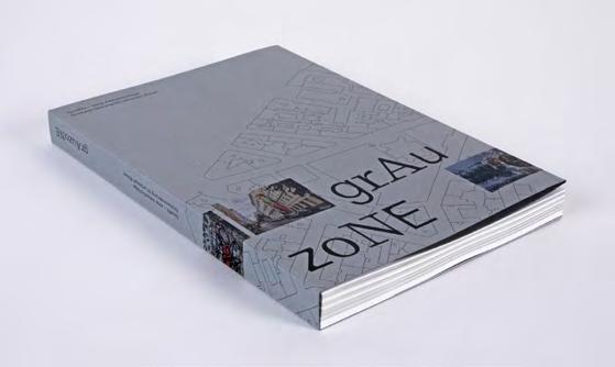
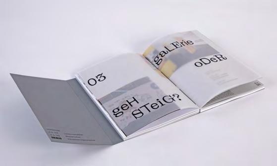
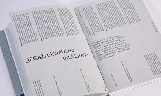
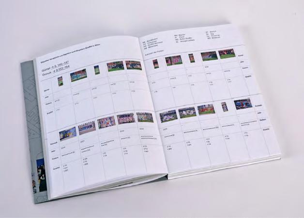
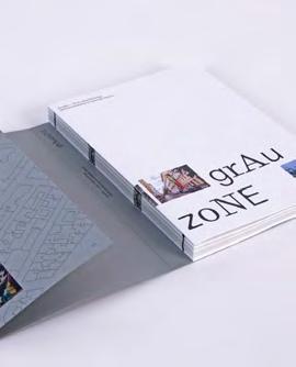
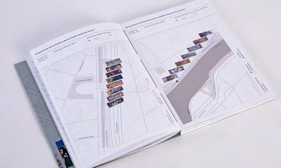
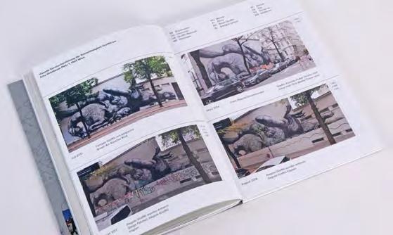
What was the challenge?
What was the challenge?
Hospital stays are long, and for children with visual impairments, many activities simply exclude them. The task was to design something adaptable to different ages and emotional states, without forcing participation or personal expression - yet still allowing room for both. One question guided the project: how can play function when sight, the dominant sense for gathering information, does not participate?
The project addresses the difficulty of accessing and understanding the painted wooden ceiling of the Sala Magna at Palazzo Chiaromonte in Palermo, a complex cultural artifact characterized by dense iconographic and symbolic content.
Despite its historical and artistic relevance, the richness of its visual narratives makes it difficult for contemporary audiences to interpret and fully appreciate. The challenge was to develop a communication strategy capable of mediating this complexity, making the artwork accessible and readable without simplifying its meanings or replacing the direct experience of the original object.
What was the solution?
A hybrid communication system combining analog and digital tools structured around three phases of the visit: before, during, and after.
Editorial materials introduce the historical context, an interactive digital device supports real-time guided exploration of the ceiling, and a multimedia platform allows deeper post-visit navigation. All outputs are unified by a coherent visual identity derived from the artwork.
What was the effect?
The project demonstrates how visual communication design can function as an interpretative interface for complex cultural heritage, improving accessibility and engagement while preserving authenticity.
It proposes a replicable model for communicating layered historical content through integrated visual and interactive tools.
TakTonis (TacTone) is a tactile sound sequencing game. The set includes balls made from different materials - wood, felt, metal and more - each producing a distinct sound when tapped on a surface. One player creates a sound sequence; the others repeat it by ear, without seeing which ball makes which sound. No reading, no screens - just listening, touch, and a little competitive spirit.
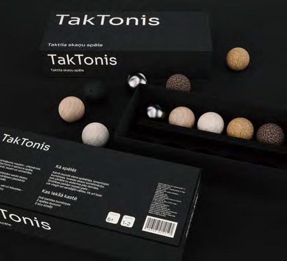
What was the solution?
scan to explore!
Three iterative intervention sessions at the Children’s Clinical University Hospital led to the development of two complementary but clearly distinct activities - one tactile and sound-based, one purely auditory. Sight is deliberately removed and replaced by listening and touch. The black color of the objects reduces visual distraction and symbolically places all participants on equal sensory ground - no one has an advantage that the other cannot access. Beyond being an engaging way to pass time, both games actively strengthen sound perception - a skill that supports spatial orientation for children with visual impairments. For sighted children, playing without vision creates a rare experience of navigating the world as others do, encouraging empathy not through explanation, but through shared conditions.
Skanu Mikroskops (Sound Microscope) is an acoustic deduction game using physical cards and a companion phone app. Each card triggers a close-up recording of an everyday object, transforming something familiar into a puzzle. Listen, guess the source, then shake the phone to hear the answer spoken aloud. Players can also record their own sounds onto blank cards - letting someone else struggle to identify what they captured.
Even the most withdrawn participants began engaging on their own terms. A quiet girl who rarely spoke made her first guess, while a participant who usually dominated found herself genuinely listening instead of talking. Structured play and multisensory exploration quietly dissolved resistance, creating unexpected moments of connection between strangers sharing a difficult place.
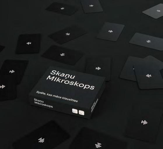
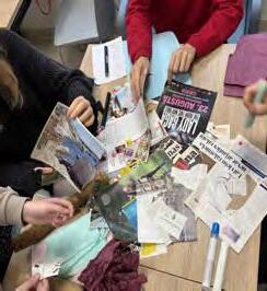
Together, the two activities replace visual information with auditory and tactile exploration, training the senses that guide us when sight cannot - and turning perception itself into play.
Contact: name: Uldis Snikers, Kitija Paula Kirke university: Art Academy of Latvia e-mail: uldis.snikers@gmail.com, kitija.paula11@gmail.com
Category: Bachelor and Masters
What was the challenge?
Women’s hormonal and reproductive experiences in Latvia have long been been silenced, stigmatized, and under‑ represented, both culturally and medically. Post‑Soviet attitudes, limited reproductive education, and the absence of safe spaces for open dialogue have created a discon‑ nect between women’s lived experiences and the knowledge available to them. The challenge was to make these invisible ex‑ periences visible and to create a respectful, inclusive environment where women could share and reflect on their cyclical lives.
What was the solution?
A participatory design process that brought together women from different generations in a co‑creation workshop. Using methods such as storytelling, object‑based sharing, free writing, and collective paper weaving, participants transformed personal and historical materials into a tactile, symbolic archive. The outcome, both a woven paper tapestry and a publication, provided a structured yet intimate way to document and visualize women’s cyclical experiences.
What was the effect?
The project created a meaningful, inter‑ generational space where women could speak openly, be heard, and recognize both shared rhythms and individual nuances in their experiences. By transforming private stories into collective knowledge and reframing the hormonal cycle as a cultural rhythm rather than a hidden burden, participants felt empowered and connected, while the project strengthened community care and broadened dialogue around women’s reproductive health.
Contact:
name: Lote Loreta Luse, Eliza Griva instagram: @loteluse | @elizagriva
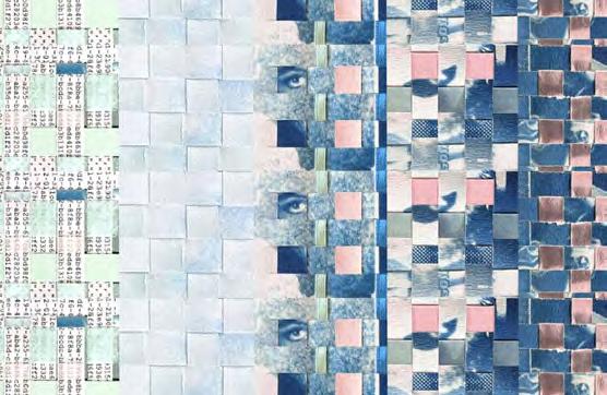
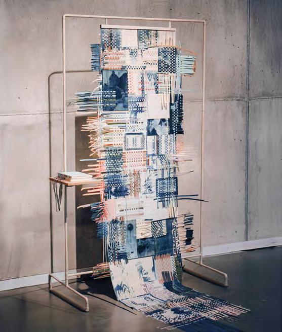
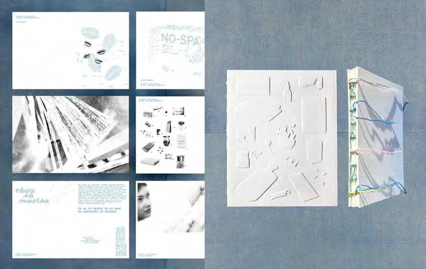
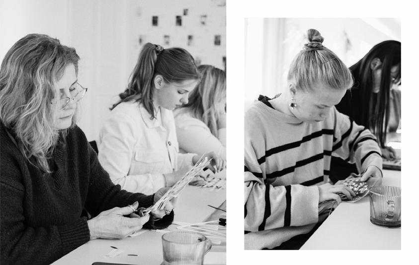
Category: Bachelor and Masters
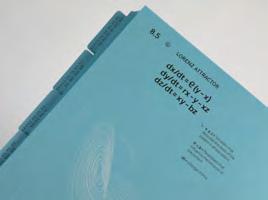
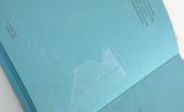
We live in a world that constantly demands clarity, efficiency, and control, yet our reality is shaped by complexity, rapid change and unpredictability. This project explores this contradiction: Why do we strive for order in systems that are inherently unstable? How can abstract scientific ideas like the chaos theory, fractals, and nonlinear dynamics be made emotionally and visually accessible? The project began with a simple, however persistent question: Is chaos truly the opposite of order, or is it a higher form of structure we do not yet fully understand?
A system that does not merely describe the dichotomy between chaos and structure, but performs it. Two media that continuously reference one another, creating a playful loop between analog stability and digital instability.
The printed publication is the embodiment of order: structured, typographically reduced and organized through a self-developed navigation system inspired by mathematical models such as the Lorenz attractor and the Feigenbaum constant. Instead of page numbers, interconnected chapter logic and cross-references create a nonlinear reading experience.
In contrast, the website introduces movement, unpredictability, and participation from the user. Visualizations translate mathematical equations into living, generative forms. Interactive experiments confront users with cognitive overload, shifting typography and destabilized interfaces.
How can a static object express instability and an interactive system embody structure? Is there a clear separation or are they two sides of the same reality?
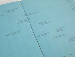
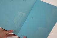
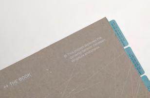
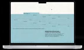
What was the effect?
Readers and users move between control and disruption, clarity and confusion. They recognize how quickly order can dissolve and how naturally the mind attempts to reconstruct it. The project reframes chaos as something generative rather than as destructive. It invites reflection on creativity, perception and the human need to find patterns, even where none seem to exist. The work transforms a theoretical concept into a lived experience, revealing that structure and chaos are not simply opposites, but interdependent forces shaping how we think, create and understand the world.
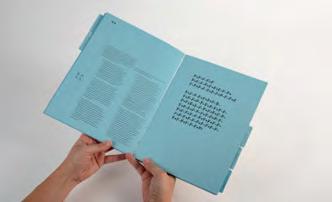
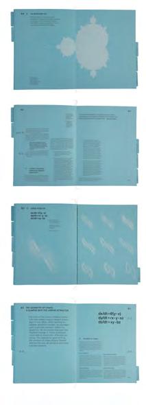
University of Alberta, Edmonton, Canada.
What was the challenge?
Invoices with poor information structure lead to user confusion and frustration, potentially resulting in missing or late payments. The standardized ambulance invoice issued by the Government of British Columbia in Canada follows poor information hierarchy and structure, failing to effectively highlight important information. Accessibility is also poorly considered in the invoice’s typography and colour. The goal of this project was to redesign the ambulance invoice to make important information easier to find, consequently reducing the number of missing or late payments.
What was the solution?
The original ambulance invoice was redesigned in the same 8.5 x 11 inch format, along with creating a back page that provided additional payment information to the user. The final ambulance redesign emphasized a clear hierarchy of information, a descriptive title indicating actionable information, and a use of colour to highlight critical details. Removing unnecessary information and highlighting important information was key to reducing user frustration and improving ease of use.

Front of invoice
Supported
by:
Professor Gillian Harvey
Back of invoice

User testing was done on the original and redesigned invoice to record effectiveness. Users were asked to complete tasks and observed on how easily they found information on each invoice, and general feedback was recorded. Results from user testing are as follows:
• Quantitative information was collected to measure the ease of finding information. Results showed that information was easier to find on the redesigned invoiced compared to the original.
• Information highlighted in colour stood out to users and was easily found on the redesigned invoice. Users described the redesigned invoice as clean and easier to read due to increased legibility of typography.

• Redesigning the hierarchy and adding descriptive titles improved legibility of the typography, resulting in a clearer overall understanding of the invoice.
• The addition of “Need Help?” resource listings increased users confidence and provided reassurance while completing the invoice.
What was the challenge?
What was the challenge?
The project addresses the difficulty of accessing and understanding the painted wooden ceiling of the Sala Magna at Palazzo Chiaromonte in Palermo, a complex cultural artifact characterized by dense iconographic and symbolic content.
Despite its historical and artistic relevance, the richness of its visual narratives makes it difficult for contemporary audiences to interpret and fully appreciate. The challenge was to develop a communication strategy capable of mediating this complexity, making the artwork accessible and readable without simplifying its meanings or replacing the direct experience of the original object.
The project’s challenge was to transform museum orientation from a simple functional tool to an integrated visual and spatial communication system, capable of mediating between visitors, space, and content. The goal was to make the museum more readable and accessible without simplifying its complexity, building a unified visual language, rooted in the institution’s identity and replicable in other cultural contexts
What was the solution?
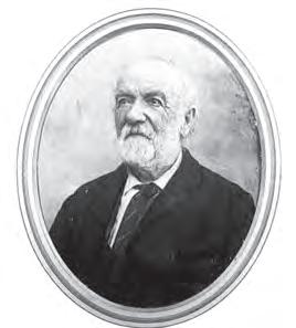
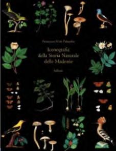
What was the solution?
A hybrid communication system combining analog and digital tools structured around three phases of the visit: before, during, and after.
Editorial materials introduce the historical context, an interactive digital device supports real-time guided exploration of the ceiling, and a multimedia platform allows deeper post-visit navigation. All outputs are unified by a coherent visual identity derived from the artwork.
The solution is built around three key actions - identify, communicate, orient - that together form a cohesive wayfinding system. Francesco Minà Palumbo’s illustrations, simplified into silhouettes, become the visual signature of the system, while the font “Caecilia LT Pro” ensures typographic consistency and readability. Beyond guiding visitors through the space, each signage element also acts as a carrier of cultural content, turning wayfinding into a narrative experience.
What was the effect?
What was the effect?
The project demonstrates how visual communication design can function as an interpretative interface for complex cultural heritage, improving accessibility and engagement while preserving authenticity.
The project proved that a thoughtful wayfinding system can do more than guide visitors — it can enhance the overall experience, reinforce the museum’s identity and deepen its connection to the local territory. The signage becomes part of the museum’s storytelling, making the institution more accessible and engaging for a diverse audience.
It proposes a replicable model for communicating layered historical content through integrated visual and interactive tools.
Contact:
name: Cristina Accardi
organisation: University of Palermo e-mail: cristina.accardi02@unipa.it

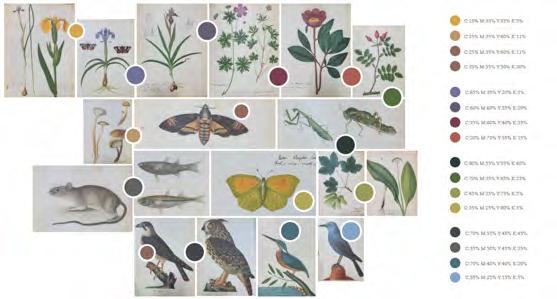

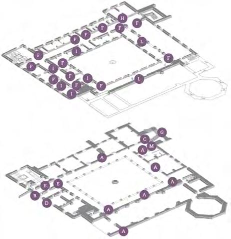
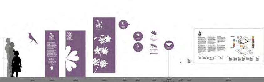
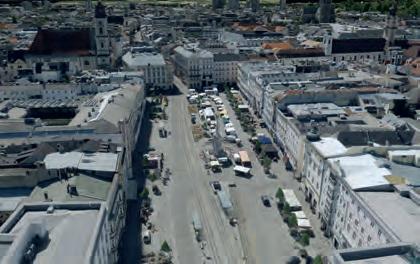
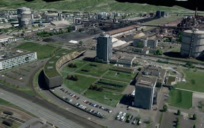
What was the challenge?
Urban environments are often perceived through function rather than feeling. Contemporary mapping tends to reduce cities to logistical abstractions — grayscale networks of streets and coordinates. Yet the lived reality of a city is full of colour, subtle and pervasive, shaping how we move, decide and dwell. This project set out to make that chromatic layer visible in the centre of Linz, asking what happens when we map only colour, and how this might relate to questions of wealth, mental health and quality of life.
What was the solution?
Using the open 3D city model of Linz, captured between 2019 and 2021, the project analysed aerial image textures to extract dominant colours in 50 by 50 metre units. A Python script, developed in collaboration with Paul Himstedt, filtered out all greys and reduced the spectrum to ten major colour categories, identifying the prevailing tone per unit. These values were then translated into a pixel-like printed map, omitting all conventional cartographic features such as streets or landmarks. The resulting poster presents only the chromatic footprint of the area around the main square, arranged on a regular grid at a scale of 1:20 000.
What was the effect?
The outcome is a deliberately reductive surface that invites close reading and comparison rather than quick orientation. By juxtaposing dense “colour hotspots” with large grey-dominated voids (implicitly absent from the map), the work foregrounds how unevenly colour is distributed across the city. When overlaid with external datasets such as income, age structure or tourism intensity, the map can serve as a critical lens on urban planning priorities and everyday lived experience. As a student project, it demonstrates how data-driven mapping can be combined with a poetic, Denis Wood–inspired stance to challenge what we consider worth visualising in the city.
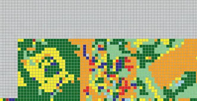
Contact: Louis Bartscherer University of Arts Linz louis.bartscherer@kunstuni-linz.at kunstuni-linz.at/viskom
Category:
What was the challenge?
Children with visual impairments in hospitals have limited leisure activities. They often face fewer opportunities for meaningful, creative leisure time.
The challenge was to create engaging activities for children who are in hospital for long periods of time, with a particular focus on those with visual impairments. Sub-challenge was to engage children with mental disorders and a tendency to self-harm and empower empathy.
What was the effect?
In the interventions we tested our product and got confirmation that our product can be used in other ways, the abstract forms allow the imagination to expand the possibilities of their use. The forms are just sensory interaction tools for building new future experience based on universal design principle. Mask shapes help empathize with blind people and hide physically while opening up psychologically.
We implemented three interventions at the Children's Hospital, where we understood that avoiding objects that can cause self-harm, such as scissors, may also create challenges for persons with visual impairments. Both target groups enjoy tactile experiences with different textured paper.
What was the solution?
Build With Closed Eyes is a product designed for safe and intuitive use. It offers a rich tactile experience, stimulates imagination, and strengthens self-expression. This inclusive creative activity can be experienced on three levels:
Children with mental disorders and tendency to self-harm empathized with blind ones and choosed for blind and visually impaired people friendly forms and textures. Our schablones used during the interventions helped participants begin and fully engage in the creative process. Mask forms and shape templates provide a strong starting point for developing imagination and associations, while our product instructions serve as inspiration rather than strict guidelines.
What was the challenge?
Children with visual impairments in hospitals have limited leisure activities. They often face fewer opportunities for meaningful, creative leisure time.
The challenge was to create engaging activities for children who are in hospital for long periods of time, with a particular focus on those with visual impairments. Sub-challenge was to engage children with mental disorders and a tendency to self-harm and empower empathy.
What was the effect?
We implemented three interventions at the Children's Hospital, where we understood that avoiding objects that can cause self-harm, such as scissors, may also create challenges for persons with visual impairments. Both target groups enjoy tactile experiences with different textured paper.
Category:
Bachelor and Masters
Project: Build with closed eyes
Children with mental disorders and tendency to self-harm empathized with blind ones and choosed for blind and visually impaired people friendly forms and textures. Our schablones used during the interventions helped participants begin and fully engage in the creative process. Mask forms and shape templates provide a strong starting point for developing imagination and associations, while our product instructions serve as inspiration rather than strict guidelines.
In the interventions we tested our product and got confirmation that our product can be used in other ways, the abstract forms allow the imagination to expand the possibilities of their use. The forms are just sensory interaction tools for building new future experience based on universal design principle. Mask shapes help empathize with blind people and hide physically while opening up psychologically.
What was the solution?
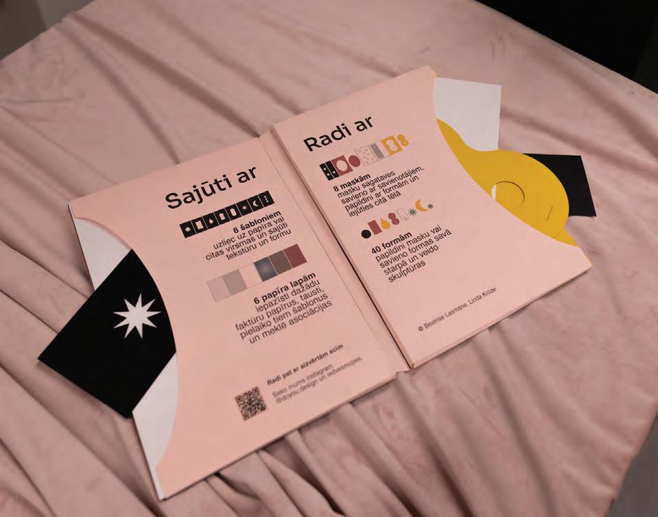
Build With Closed Eyes is a product designed for safe and intuitive use. It offers a rich tactile experience, stimulates imagination, and strengthens self-expression. This inclusive creative activity can be experienced on three levels:
01 Mask forms, that can be improved by adding constructor forms;
02 Constructor forms that can be used for masks and creating 2D and 3D figures;
03 Form shablones can serve for visual framing and for better tactile experience on different textures (design paper).
01 Mask forms, that can be improved by adding constructor forms; 02 Constructor forms that can be used for masks and creating 2D and 3D figures; 03 Form shablones can serve for visual framing and for better tactile experience on different textures (design paper).
All components are made entirely from paper, it ensures safe, sustainable play while fostering creativity through universal design.
Contact:
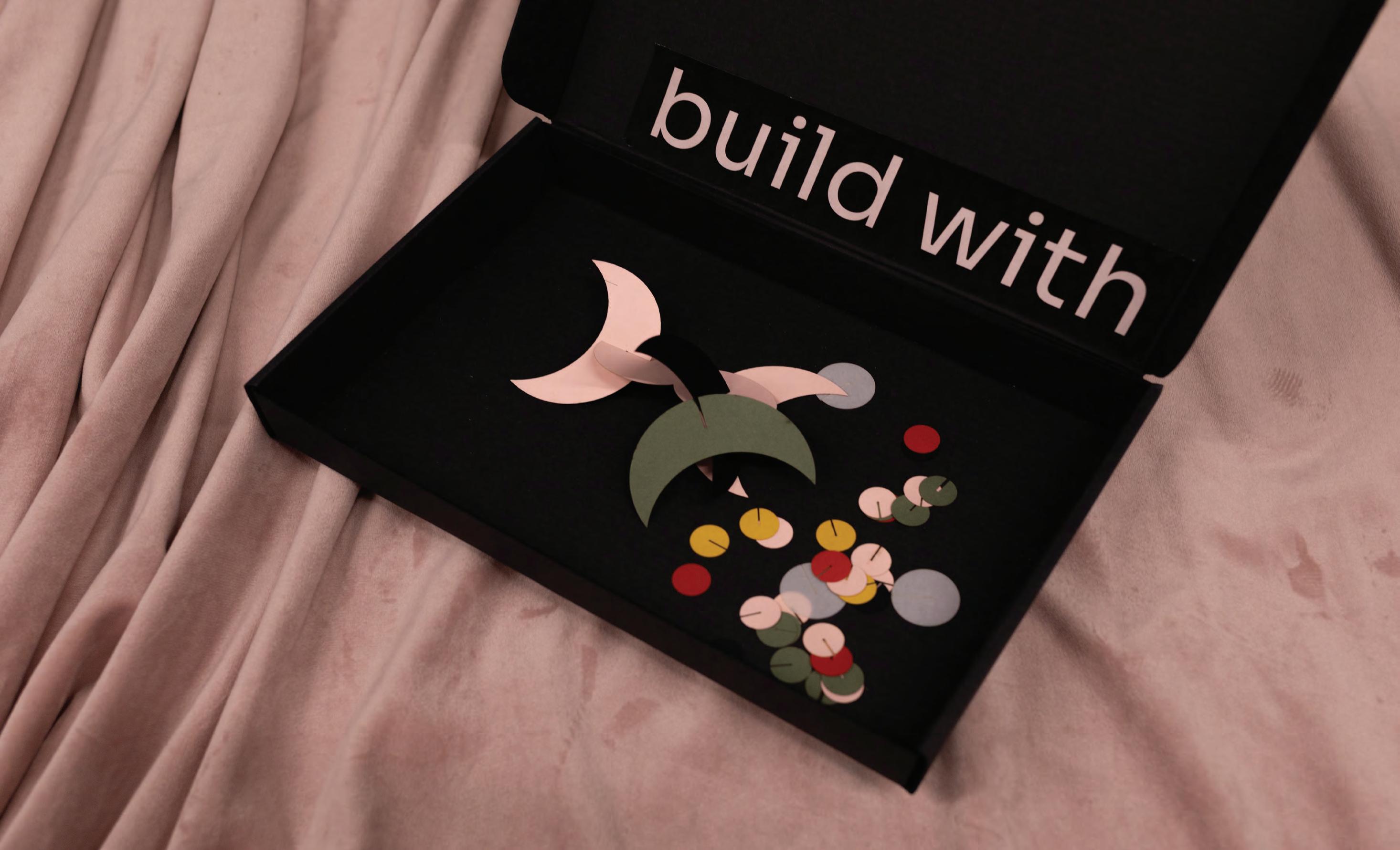
All components are made entirely from paper, it ensures safe, sustainable play while fostering creativity through universal design.
than strict guidelines. Art Academy of Latvia e-mail: hellodoyoudesign@gmail.com website: https://readymag.website/ beatriselasmane/5863486/4/
Contact:
240
Linda Kruze, Beatrise Lasmane
Art Academy of Latvia
e-mail: hellodoyoudesign@gmail.com
website: https://readymag.website/
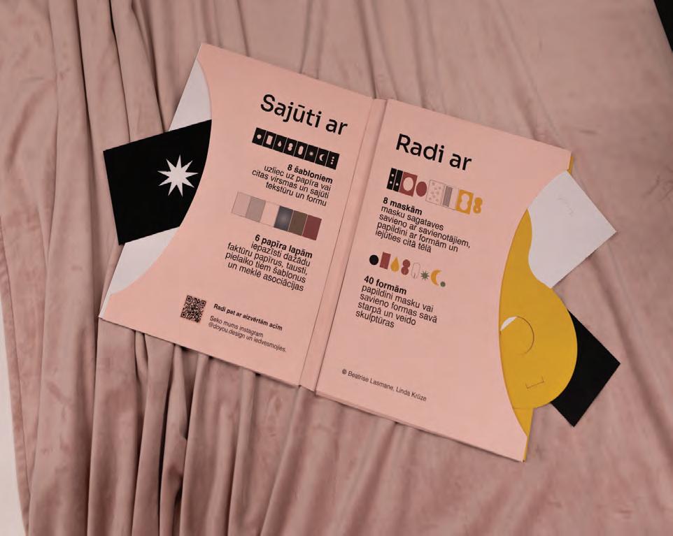
with
Linda Kruze, Beatrise Lasmane
Art Academy of Latvia
e-mail: hellodoyoudesign@gmail.com
website: https://readymag.website/ beatriselasmane/5863486/4/
Category:
Build With Closed Eyes is a product designed for safe and intuitive use. It offers a rich tactile experience, stimulates imagination, and strengthens self-expression.
Bachelor and Masters
Project: Build with closed eyes
Project: Build with closed eyes
This inclusive creative activity can be experienced on three levels:
In the interventions we tested our product and got confirmation that our product can be used in other ways, the abstract forms allow the imagination to expand the possibilities of their use. The forms are just sensory interaction tools for building new future experience based on universal design principle. Mask shapes help empathize with blind people and hide physically while opening up psychologically.
In the interventions we tested our product and got confirmation that our product can be used in other ways, the abstract forms allow the imagination to expand the possibilities of their use. The forms are just sensory interaction tools for building new future experience based on universal design principle. Mask shapes help empathize with blind people and hide physically while opening up psychologically.
01 Mask forms, that can be improved by adding constructor forms;
What was the solution?
What was the solution?
02 Constructor forms that can be used for masks and creating 2D and 3D figures;
Build With Closed Eyes is a product designed for safe and intuitive use. It offers a rich tactile experience, stimulates imagination, and strengthens self-expression. This inclusive creative activity can be experienced on three levels:
Build With Closed Eyes is a product designed for safe and intuitive use. It offers a rich tactile experience, stimulates imagination, and strengthens self-expression. This inclusive creative activity can be experienced on three levels:
-
03 Form shablones can serve for visual framing and for better tactile experience on different textures (design paper). All components are made entirely from paper, it ensures safe, sustainable play while fostering creativity through universal design.
01 Mask forms, that can be improved by adding constructor forms; 02 Constructor forms that can be used for masks and creating 2D and 3D figures; 03 Form shablones can serve for visual framing and for better tactile experience on different textures (design paper).
01 Mask forms, that can be improved by adding constructor forms; 02 Constructor forms that can be used for masks and creating 2D and 3D figures; 03 Form shablones can serve for visual framing and for better tactile experience on different textures (design paper).
All components are made entirely from paper, it ensures safe, sustainable play while fostering creativity through universal design.
All components are made entirely from paper, it ensures safe, sustainable play while fostering creativity through universal design.
Contact:
Contact:
Linda Kruze, Beatrise Lasmane
Linda Kruze, Beatrise Lasmane
Art Academy of Latvia
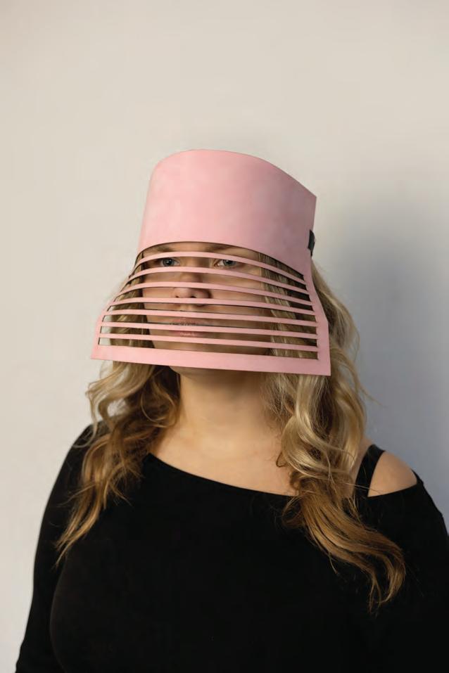
Art Academy of Latvia
e-mail: hellodoyoudesign@gmail.com
e-mail: hellodoyoudesign@gmail.com
website: https://readymag.website/ beatriselasmane/5863486/4/
website: https://readymag.website/ beatriselasmane/5863486/4/
Contact: Linda Kruze, Beatrise Lasmane Art Academy of Latvia e-mail: hellodoyoudesign@gmail.com
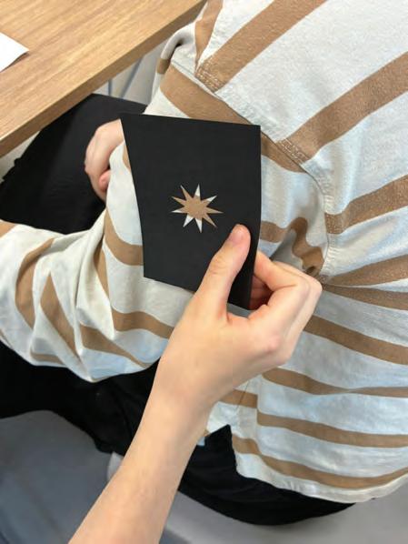
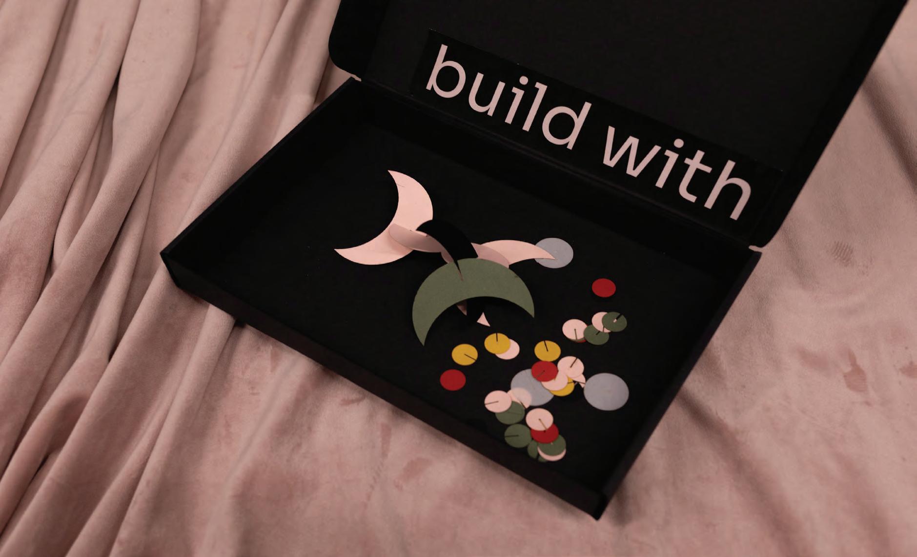
What was the challenge?
The project addresses the difficulty of accessing and understanding the painted wooden ceiling of the Sala Magna at Palazzo Chiaromonte in Palermo, a complex cultural artifact characterized by dense iconographic and symbolic content.
In the context of climate change, one of the underlying challenges is disconnection. Many of us move through our local environments without actually noticing them. Nature becomes background rather than something we actively see and value. The project began with the question: how can design encourage closer attention to the natural world in everyday life?
What was the solution?
Despite its historical and artistic relevance, the richness of its visual narratives makes it difficult for contemporary audiences to interpret and fully appreciate. challenge was to develop a communication strategy capable of mediating this complexity, making the artwork accessible and readable without simplifying its meanings or replacing the direct experience of the original object.
What was the solution?
A hybrid communication system combining analog and digital tools structured around three phases of the visit: before, during, and after.
The solution was the practice itself. Instead of discussing more information about climate change, the project focused on changing the way attention is given to the immediate environment. It introduced a simple method of slow walks and close observation in the author’s hometown, where small natural details and textures were carefully noticed and recorded along with the date, time, and location. This documentation was then translated into paper tiles as a tangible way of presenting the growing archive.
What was the effect?
Editorial materials introduce the historical context, an interactive digital device supports real-time guided exploration of the ceiling, and a multimedia platform allows deeper post-visit navigation. All outputs are unified by a coherent visual identity derived from the artwork.
What was the effect?
The project shifts environmental awareness from abstract global issues to direct local experience. By slowing down and documenting small details, it makes overlooked elements of a familiar place visible and valued. The work encourages a more conscious relationship with local nature and demonstrates that environmental awareness can begin with simple acts of observation.
The project demonstrates how visual communication design can function as an interpretative interface for complex cultural heritage, improving accessibility and engagement while preserving authenticity.
Contact:
name: Eliza Roberta Akite company/organisation: Art Academy of Latvia
It proposes a replicable model for communicating layered historical content through integrated visual and interactive tools.
e-mail: roberta.akite@gmail.com website: https://www.lma.lv/en
Paper tiles documenting observed natural textures, each marked with date, time, and geographic location.
What was the challenge?
Neuschwanstein Castle is Germany’s most famous castle, attracting around 1.4 million visitors every year. Unlike many historic castles, it was never intended to be a political building, but rather a private retreat for Ludwig II of Bavaria, inspired by the operas of Richard Wagner. As part of the application for UNESCO World Heritage status, our challenge was to communicate what makes the castle so unique. The result had to be presented as a single page in the style of the German newspaper ”Die Zeit”, developed within a university course led by Professor Michael Stoll at Augsburgs Faculty of Design.
What was the solution?
The Neuschwanstein Castle is a five story building filled with carefully designed narrative elements. Our concept highlights its architectural and artistic influences through a large analoge watercolor illustration that immerses the reader in its fairy-tale atmosphere. By focusing on three selected rooms, we show how Ludwig II of Bavaria imagined the castle as a world of stories. The rooms are presented in a reduced vector style that guides the reader while providing additional context.
What was the effect?
The graphic provides a clear overview of the castle’s unique character. Detailed yet structured visuals help readers understand the architecture and follow the story more easily. The project was presented at a final review and received very positive feedback from professor and the audience. It was discussed to be published in several newspapers.
Contact: Finn Stanglmeier
Technical University of Applied Sciences Augsburg, Faculty of Design finn.stanglmeier@gmail.com
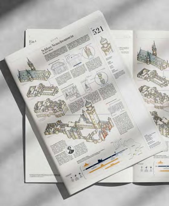

1869 begann König Ludwig II. mit dem Bau von Schloss Neuschwanstein. Inspiriert vom Historismus und mit modernster Technik umgesetzt, erbaute er seinen Traum. Dieser war keine übliche Machtdemonstration, sondern ein privates, von der Außenwelt isoliertes Refugium, in dem Ludwig seiner Obsession für Richard Wagners Opern nachgehen wollte.
Der Sängersaal ohne Gesang
Dachgeschoss
3. Obergeschoss
2. Obergeschoss
1.
Neuschwanstein diente ihm dabei als Kulisse, ein Portal zu seinen Phantasiewelten, das er kaum mit anderen teilte. Heute besuchen rund 1,4 Millionen Menschen jährlich das Schloss. Anhand drei verschiedener Räumen führen wir in dieser Grafik nicht nur durch das bekannte Schloss, sondern auch durch den Kopf seines außergewöhnlichen Bauherren.
Der Sängersaal ist einer der bekanntesten und für Ludwig bedeutendsten Räume des Schlosses. Inspiriert von Wagners Oper Tannhäuser und dem Sängerkrieg auf der Wartburg, ist er eine detailreiche Nachbildung des Festsaals der tatsächlichen Wartburg in Thüringen und übertrifft das Original sogar an Prunk.
Das Schlafzimmer der Liebenden
Das Schlafzimmer gehört zu den detailreichsten Räumen des Schlosses. Die Wandmalereien erzählen die tragische Liebesgeschichte von Tristan und Isolde, während kirchliche Elemente, wie die Glasfenster im Erker, den Raum ergänzen. Trotz der romantischen Thematik, teilte Ludwig sein Bett nie offiziell mit einer anderen Person.
Obwohl der Name fälschlicherweise darauf hindeutet, wurde hier nie Musik aufgeführt. Ludwig inszenierte die Opern stattdessen auswendig in seinem Kopf. Dennoch ließ er eine Bühne errichten, die ausschließlich als szenisches Element diente und keinen praktischen Zweck erfüllte. Sie war somit lediglich Teil der Kulisse.
Wandmalereien, die nahezu jeden Raum zieren, stellen meist Schlüsselszenen aus Wagners Opern dar, greifen jedoch auch kirchliche Motive auf. Wie in der Darstellung oben, verfügen sie über ein hohes Maß an Detail, das zur eindrucksvollen Gestaltung der Räume beiträgt. Viele Malereien mussten täglich an Ludwigs genaue Vorstellungen angepasst werden.
Warum eigentlich Neuschwanstein?
Das ursprünglich als „Neue Burg Hohenschwangau“ geplante Schloss wurde erst später von Ludwig in „Neuschwanstein“ umbenannt. Der neue Name soll vermutlich den Bezug zu Richard Wagners Oper „Lohengrin“ weiter betonen und dem Schloss einen märchenhaften, poetischen Charakter verleihen.

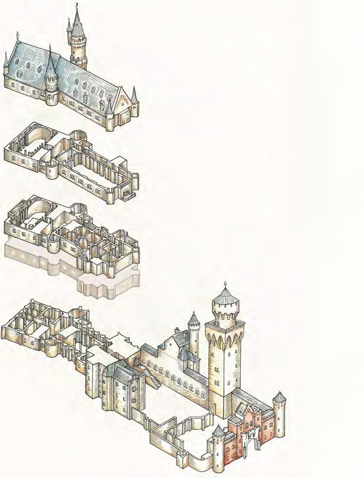
Ludwigs Leben im Überblick Der Märchenkönig Ludwig II., geboren 1845 auf Schloss Nymphenburg, war der älteste Sohn von König Maximilian II. und Königin Marie von Preußen. Mit 18 Jahren bestieg er den bayerischen Thron. Seine Liebe zur Oper und Architektur fand Ausdruck in seinen Schlossbauten wie Neuschwanstein, Linderhof
und Herrenchiemsee, die ihm den Beinamen „Märchenkönig“ einbrachten. Sein exzentrisches Verhalten und die hohen Baukosten führten jedoch zu Konflikten mit Regierung und Adel. 1886 wurde Ludwig für geisteskrank erklärt und entmündigt. Wenige Tage später starb er unter bis heute ungeklärten Umständen im Starnberger See.
Bauzeiten der Schlösser Ludwigs Neben Schloss Neuschwanstein erbaute der Märchenkönig drei weitere Schlösser: Haus am Schachen, Schloss
Die Anzahl an Fenstern, Erkern und Balkonen im Schloss zeigen, dass nicht nur der Raum an sich, sondern auch die Aussicht eine große Rolle für die Inszenierungen spielte. Somit wirkt die Lage des Schlosses am Allgäuer Alpenrand nicht nur von außen, sondern auch von innen einen besonderen Zauber.
Das Wappen der Wittelsbacher ist im Schloss Neuschwanstein häufig zu finden, oft in abgewandelter Form. Dabei wird der bayerische Löwe meist schwanenähnlich dargestellt, was Ludwigs Vorliebe für Schwäne widerspiegelt. Seine Beziehung zu seiner Familie, den Wittelsbachern, war jedoch ambivalent. Obwohl er die Traditionen und das Erbe seiner Dynastie schätzte, distanzierte er sich zunehmend und lebte in der eigenen Traumwelt.
Die Grotte im zweiten Stock
Eine von Ludwigs außergewöhnlichsten Ideen befindet sich, wie der Titel schon verrät, im 2. Obergeschoss des Schlosses. Der mit künstlichem Gestein ausgestattete Gang verbindet nicht nur Arbeitszimmer und Wohnzimmer, sondern dient auch als Visualisierungen der Grotte aus Tannhäuser. Die sogenannte Venusgrotte ist in der Oper ein Ort der Sünde und Lust, in der sich der Protagonist verliert und erst nach einiger Zeit wieder entkommen kann. Passend dazu erwecken die Türen des Grottengangs in geschlossenem Zustand den Eindruck einer unpassierbaren Steinwand und verstärken dabei die Illusion, man würde sich tatsächlich in einem Felsen befinden.
Die Themen der letzten Grafik
520 Erdbeeren
519 Medizin
518
Männerleben
Die aufgeführten Fakten beziehen sich auf Informationen der Bayrischen Schlösserverwaltung und der fachlichen Expertise von Herrn Dr. Wiesneth
GRAFIK: THA, Fakultät für Gestaltung; Antonia Hossinger, Michael Rifert, Finn Stanglmeier, Mara Teichmann
BETREUUNG: Prof. Michael Stoll
FACHLICHE BERATUNG: Bayrische Schlösserverwaltung; Dr.-Ing. Alexander Wiesneth
What was the challenge?
The challenge was to contribute to the protection of the marine ecosystem by recovering discarded fishing nets, which are among the main causes of seabed pollution. So-called ghost nets, abandoned or lost at sea, continue to trap marine wildlife and break down into microplastics, causing long-lasting environmental damage. The project aimed to transform this hazardous waste into a textile resource, maintaining quality standards compatible with the apparel industry and demonstrating the possibility of combining environmental sustainability with production innovation.
What was the solution?
The solution was the development of the Marina fabric, created by bonding fishing nets recovered from the Mediterranean with certified organic cotton. The material was designed through the establishment of a circular supply chain involving fishermen and environmental associations, followed by low-impact sanitization processes and bonding technologies using certified adhesives. The fabric was validated through laboratory tensile tests, which made it possible to verify its mechanical performance and its suitability for applications in the fashion sector. The system was also protected through design registration.
What was the effect?
The project demonstrates the possibility of transforming marine waste into high-value textile resources, reducing environmental impact and proposing a replicable circular economy model that brings together design, sustainability, and production innovation.
Contact:
name: Natalie Rossi
company/organisation:
e-mail: zonarte@natalierossi.it website:
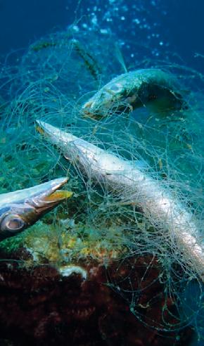
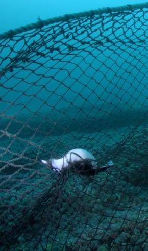

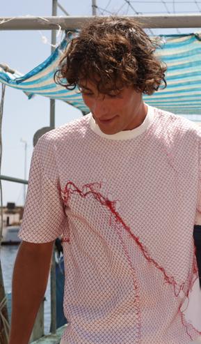
ELASTIC MODULUS
It indicates the initial resistance of the fabric to deformation. This shows us how rigid the material is.
BREAKING STRENGTH
It indicates how much stress it can withstand before breaking.
BREAKING DEFORMATION
It indicates how much the material can stretch before breaking.
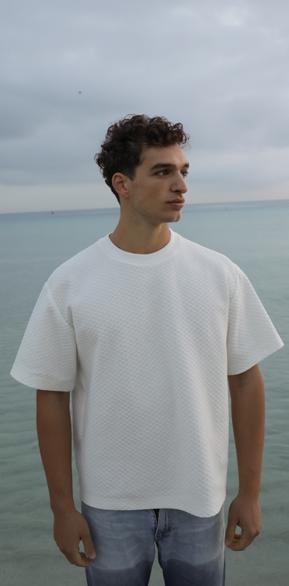
Category:
Project: Bachelors and Masters
Pillbox: a medication scheduling app
What was the challenge?
Pillbox tackles the common problem of medication mismanagement among older adults who struggle with scheduling complex medications, which can lead to missed doses, incorrect timing, and wasted resources, thus increasing overall health risks. Gurwitz et al. (2003) says that “failing to adhere to the proper medication regimen can increase hospitalization and health costs or lead to negative drug effects from over or under dose.”
What was the solution?
Pillbox addresses the problem with an app specifically designed for older adults, allowing patients to schedule their medications while receiving timely notifications. The onboarding process also was designed to address the problem of minimal personalization and non intuitiveness of the onboarding process seen in similar medication scheduling apps. The app is intuitive for older users and simplifies medication tracking and visualization by generating clear schedules while also providing printable versions for both patients and caregivers.
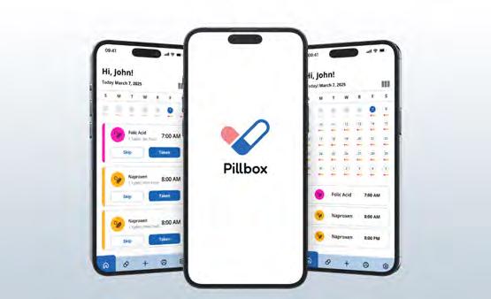

What was the effect?
Through usability testing with healthcare professionals and patients, we discovered that effective medication management apps require precise terminology and pictograms. Our testing revealed that users responded better to certain clinical terms like “dosage” over “strength,” and “administration route” over brand names, leading to more accurate medication tracking. We learned that older adults value both digital and physical options, therefore the printable weekly schedule feature became essential for users who prefer tangible references or for caregivers managing multiple patients. The iterative design process showed us that accessibility goes beyond large fonts and simple layouts; it requires understanding the cognitive and physical challenges of our target demographic to create intuitive interfaces that can reduce medication errors and improve adherence.
Contact:
Edwin Chu, Shreya Ravi, Yania Zhou University of Alberta ehc@ualberta.ca
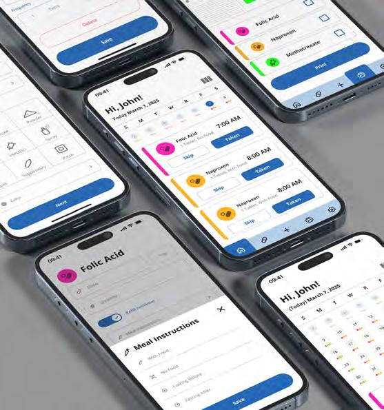
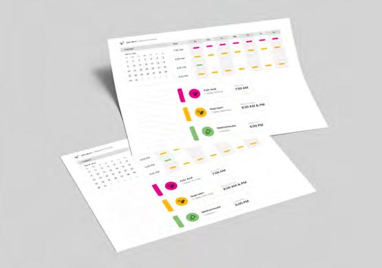
What was the challenge?
Filing a tax return is one of the first formal encounters young adults have with the state. Shortly after turning eighteen, many members of Generation Z must navigate a complex administrative system without preparation. Instead of feeling empowering, this moment is often experienced as confusing and isolating. First-time filers report uncertainty, fear of making mistakes, and reliance on informal support. The challenge was to address structural barriers such as complex language, unclear communication, and an impersonal tone that weakens trust in public institutions.
What was the solution?
Steuerleicht is an onboarding booklet developed as part of my bachelor thesis. It reframes the first tax return as a guided moment of orientation. Through step-by-step explanations, accessible language, and a clear visual structure, it strengthens independent understanding and reduces uncertainty. The booklet complements existing digital systems rather than replacing them.
What was the effect?
Testing with Generation Z users showed increased clarity, confidence, and a more positive perception of the tax process. The project demonstrates how human-centered design can make public services more accessible and strengthen trust between institutions and young citizens.
Contact:
name: Simona Barbarossa company/organisation: Hochschule Luzern e-mail: simona.barbarossa.2001@gmail.com https://hub.hslu.ch/design-film-kunst/katalog/simona-barbarossa/
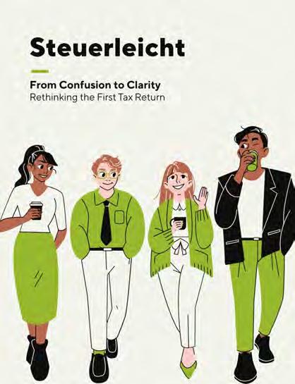
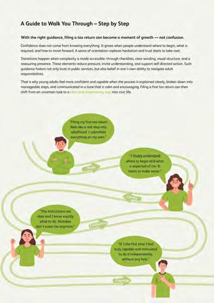
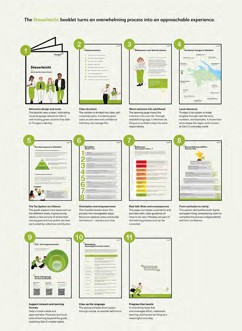
• EDMONTON
• RIGA
• VIENNA ATHENS
• SYDNEY KATOWICE
• TOKYO
• TAIPEI
Thank You for joining the IIIDawards-2026 sharing your expertise and making this award precious. Looking forward to meeting You at the IIIDaward-Tour and welcoming you again in 2029
Wendy Choi-Buttinger - Admin Ylva Larsen - Jurymeeting
Martin Foessleitner-Organizer
IIIDaward 2026 is handled on behalf of IIID by hi-pe.at, 1070 Vienna, Kirchengasse 7, Austria welcome@hi-pe.at ©2026
with some ESC BANGARANGA vibes by DARA
iiidaward.net