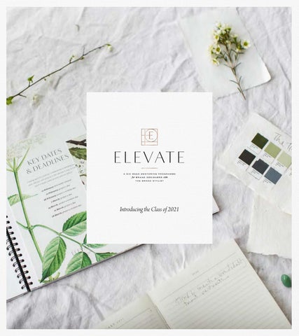
Introducing the Class of 2021
What’s Inside THE STORY
4
DANIELLE ALLING
110
MARION TAN
6
LORNA MORRIS
120
JENNIFER TURNER
17
MELODY TODD
130
ICHIGOCHIE STUDIO
28
CHANDRA CASALI BELL
140
DAWN TERRIZZI
39
KATHA ZANDER
150
I L L A R I A
50
CASS EWERT
160
LUCI BURGESS-FARWELL
60
JADE THOMAS
170
JENNIFFER RIVERA-WARWICK
70
KEELEY REES
180
L I Z G R E C H
80
LUCIE WARD
190
CHLOE CRUMP
90
C H E E R S !
200
JULIA CARTWRIGHT
100
F A Q ’ S
201
thebrand-stylist.com
4
T H E S TO RY
six weeks to elevate Elevate is a unique and exciting mentoring programme for brand designers committed to excellence. Through a carefully curated collection of content, group teachings and most importantly, one to one feedback, each participant has produced three stellar portfolio pieces and crucially, elevated their work, their vision, their process and the potential for their business along the way.
that we’ve been able to elevate at an incredible pace. Each has brought with them a unique level of skill and experience and they finish this class at different levels. There was no prerequisite level for joining and no ‘pass mark’ at the end. Instead, the focus has been on elevating their own work and moving their own unique creativity, vision and skill forwards. By showing up, producing the work and taking on board the feedback,
This is the third Elevate programme I’ve run and it’s
these designers have achieved some incredible things
been a true joy to once again work with a collective
and I’ve created this Journey to celebrate that.
of passionate designers. Some have arrived as experienced brand designers, others have begun from a completely blank slate. All of them have worked hard and achieved exceptional things in a very short space of time. The journey you’ll see charts their progress across three projects from their initial project right through to their final submission. Nine briefs to choose
So let’s say a big Cheers to The Elevate Collective, Class of 2021. Do soak up the creative inspiration on their websites, show them some love on Instagram and put them under consideration for your next branding project. Enjoy!
Fiona
from, three projects to work on and six rounds of
ps. If you’d like to join us for the next programme, you
personalised feedback from me, along with group
can find out more at thebrand-stylist.com/elevate
notes that pick up on key process themes has meant
thebrand-stylist.com
‘thank you for re-igniting my passion for branding and design and for unleashing a new sense of creativity in me. It’s been truly magic.’ CHL O E
6
GE ORGINA
thebrand-stylist.com
M A R I O N TA N
refined and elegant Marion has consistently created some really beautiful work throughout our time together in Elevate. Marion’s vision for Monk’s Wood was utterly stunning and she’s brought that gentle and refined simplicity to every project she’s worked on. It’s worth bearing in mind that each of the projects you see here have been pulled together in just a week - alongside other work and personal commitments. That’s quite a feat! Marion has thrown her all into each and every one of these projects and they’ve been a true delight to review. I’ve loved seeing her develop a more timeless and distinctive style as our work together has progressed and I think you are going to see some really exciting things coming from her over the coming months. M A R I O N TA N . C O M
8
thebrand-stylist.com
10
thebrand-stylist.com
12
thebrand-stylist.com
mood board
Mirroring Tabitha’s delicate edge, the brand identity takes on a delicate and natural approach with a unique edge to it. A balance of plums, pinks, and neutral characterize the color palette to inspire enchantment and creativity. Trailing floral elements mirror Tabitha’s unique approach - organic and stylish at the same time
14
BRAND IDENTITY FOR TABITHA
thebrand-stylist.com
05
color p
Soft peach and feminine hues balanced b aura of the brand while still giving it a
Tabitha’s expertise in her creative field 16
BRAND IDENTITY FOR TABITHA
palette
by a deep plum tone capture the romantic unique edge. This is intended to exude
d, inspiring those who look up to her. thebrand-stylist.com
06
18
thebrand-stylist.com
creative vision
To highlight the carefully considered ingredients and thought put into producing this skincare line, the brand identity will take on a quiet, relaxing, and natural approach. Staying true to their philosophy, the containers and boxes will be made of sustainable materials keeping their natural texture and color. Overall, the brand identity should feel relaxing, considerate, and natural
20
thebrand-stylist.com
22
thebrand-stylist.com
“I realized that the best part about the way you give comments is that you're always doing it in a way that would challenge us and take us a step further. You never dictated what we're supposed to do but you allowed us to preserve our creative freedom so we could rise to our full potential. My work always turns out sooo much better after you guide me. I never knew how much slight tweaks can make such a huge difference!” M ARION
24
TA N
‘I can’t believe we’re on the last project for Elevate! It all went by so quickly, and I honestly still don’t want it to end haha!’ MAR I ON
TA N
thebrand-stylist.com
26
JENNIFER TURNER
warm and engaging A talented copywriter and designer, Jenn brought insight, creativity and clarity from the get-go. I was bowled over by her work for Kinmade in week one and her work continued to inspire and delight each week. Jenn’s work brings a real sense of joy and humanity to this space and I love her distinctive and compelling style - so much so, I’ve already recommended her to a client! She really thinks through her approach and her clarity, vision and ability to articulate a brand well is a beautiful thing. GEM INIB R ANDING.CA
thebrand-stylist.com
WHERE WE STARTED
A decidedly different subscription box, Kinmade is less about what’s inside the box and more about what you make with it— memories shared with the ones you love, your kin. Targeting socially and environmentally minded parents who value intentional living, we knew the brand had to be grounded in humanity and nature— without taking itself too seriously. So, we played to a parent’s sense of nostalgia, curating a warm, vintage aesthetic that connotes the comforts of childhood and days gone by. Grassy green and buttercup yellow contrast a playful pop of pink, while linen and ceramic textures invite us back to a simpler way of life, connected to nature and each other. The overall effect is warm, inviting, comforting and playful, like a good hug on a bad day.
BRAND WORDS
grounding comforting playful
28
30
thebrand-stylist.com
32
thebrand-stylist.com
34
thebrand-stylist.com
36
thebrand-stylist.com
WHERE WE STARTED
From its all-natural, organic ingredients to its non-negotiable take on sustainability, Fira is uncompromising in its standards, but gentle in its approach, sourcing from the earth and crafting every batch by hand with love. We knew a balance needed to be struck between Titania’s high calibre of craftsmanship and her nourishing philosophy on self-care, so we blended natural materials with clean lines and luxe accents for a brand that’s as modest as it is sophisticated and as grounded as it is indulgent, reminding us that everyday routines can become meaningful rituals with intention and self-love. BRAND WORDS
grounded nourishing indulgent
38
thebrand-stylist.com
C O LO U R PA L E T T E
Coloured only by neutral shades, we play to Fira’s earthen ingredients and establish a palette as diverse as the brand’s customers. From refillable amber bottles to luxe gold accents, the palette is both grounded and indulgent, gender-neutral and warm.
AMBER
40
CLAY
PETAL
GOLD
thebrand-stylist.com
“I feel more aware of my unique skillset as a designer, where I can improve, and generally that I’m more capable than I gave myself credit for.” J ENNIFER
42
T UR NER
thebrand-stylist.com
ICHIGOCHIE STUDIO
grounded and emotive Sandra has created some truly polished and gorgeous work throughout the Elevate programme and it’s been so exciting to see how she’s tackled each brief. Reviewing her work for our subscription box project in week one was a real goosebumps moment and was the catalyst for putting her in touch with one of my clients for a rebrand project. I was equally bowled over by her approach to the Folk.Brooklyn project in week two. Sandra’s style is refreshing and exciting and I’m so excited to see where she takes her work after this programme. I’m looking forward to seeing big things! ICHIGOICHIE-STUDIO .CO M
44
thebrand-stylist.com
“sometimes yo know the value until it becom
46
oue ofwilla moment never mes a memory.”
thebrand-stylist.com
48
slow life, handmade and social consciousuness are the words that guided the visuals of the brand. A brand that feels like a gentle hug with earthy tones and a calming and gentle voice. It was important to reflect the personality of the creator, a social worker, champion of gentle living. That is why the brand promotes a slow way of living, a monthly experience to ground and connect families. A new name was chosen: “Shared Stories” a name that reflects the purpose of the brand, sharing stories and moments not only with the family, but also with those in need. The project has a clear niche in mind, and its magic lays within its simple invitations to create quality family time. And my job as a designer was to bring that magic to life through the brand. A brand that will allow these beautiful subscription boxes to bring joy to many families, not only during the pandemic, but long beyond.
thebrand-stylist.com
50
thebrand-stylist.com
52
modern, healthy, inspiring Folk.Brooklyn is more than a shop. It’s a lifestyle, a philosophy, a movement to eat and enjoy natural things to bring color to our lives. The shop focuses on a specific customer. Those who are tired of eating processed foods and want to start living more consciously without giving up style and flair. The brand reflects the quality and modern style that bring the owners, without loosing Brooklyn’s touch. A pleasing contrast between fresh and vintage, modern and traditional, brought together. A brand that breathes its philosophy throughout all its elements, and that aims to send a strong message. Folk.Brooklyn is not meant to be shy. It is meant to be the one that raises the voice to be the leader of a new movement.
thebrand-stylist.com
A poster of one of the shop’s events. 54
A recycled paper cup for the coffee bar.
thebrand-stylist.com
56
GLAMOROUS
PR
REMIUM
thebrand-stylist.com
CLASSIC
58
“I will finish the program with tons of design insights, more confidence, and also new friends” S ANDR A
ALLEGRE
thebrand-stylist.com
‘getting that feedback from you, a professional I admired for so long, gave me a lot of confidence to keep going forward and trusting myself.’ SA NDR A
60
A L L E GR E
thebrand-stylist.com
62
DAWN TERRIZZI
a truly beautiful vision Dawn’s company name translates as ‘beautiful vision’ and she’s certainly showcased her flair and insight for curating utterly beautiful work throughout this process. An experienced interior designer, Dawn was pretty much starting from scratch in terms of brand design and has achived some utterly incredible things in just six weeks. From the get-go, Dawn had the ability to interpret a brief in the most inspirational and elevated way and so we’ve focused our work on giving her a solid foundation of logo design skills to build upon. Her work for Meadowsweet is a brilliant example of just how hard she’s worked and how much flair she has brought to her work in such a short space of time. Delightful. B ELL AVIS IO NE.COM
thebrand-stylist.com
64
thebrand-stylist.com
66
thebrand-stylist.com
68
thebrand-stylist.com
70
thebrand-stylist.com
‘My mind has been racing as I put together my presentation for brief three and how the direction of my work has become so much more clear .. in such a short time I can see how what I do and the way I do it can be of enormous benefit to my clients and my website focus, copy and purpose has come together (in my mind) in a way it never would have had I not taken elevate .. truly truly elevated not just my work, but my whole direction and focus .. I am beyond excited and grateful for what these past few weeks have unfolded and revealed .. truly inspiring .. a huge thank you miss Fiona .. your incredible eye and experience has made such an impact!’ DAW N
72
TERRIZ Z I
thebrand-stylist.com
74
thebrand-stylist.com
76
thebrand-stylist.com
78
thebrand-stylist.com
ILLARIA
an astonishing journey Illaria began Elevate with absolutely no design experience and a two year old in tow! What she has accomplished over the past six weeks is staggering and a real testament to her hard work and commitment to excellence. You can really see the development in Illaria’s work quite markedly throughout these three projects and that’s something that’s really exciting to see. She’s worked hard to learn about typography, balance, space and alignment. She’s brought vision, clarity and intention to her projects and her final work for Tomfoolery shows just how far her design has progressed in such a short space of time. To have achieved all of this alongside everything else she has on her plate is quite something and I know that this is just the start of her design journey. Exciting! @
80
L I N T E R I O R I S TA
MOOD BOARD
BRAND IDENTITY – MAEN-DU
Vers. 1_21
PAGE 7/14
thebrand-stylist.com
82
thebrand-stylist.com
LOGO
84
BRAND IDENTITY – MAEN-DU
Vers. 1_21
•
2 parts stand for body and soul that are simultaneously reinvigorated when staying at Maen-du.
•
Just like a modern TAO symbol
•
The ascending line stands for the Wales mountains and it reminds of the customer‘s journey: his energy goes up and down and then higher thanks to Maen-du.
•
It‘s simple and minimalist, which makes the reproduction very easy, even on sport clothes.
thebrand-stylist.com
PAGE 8/14
COLOUR INS SHIRINI embodies the boldest colours of the Middle-Eastern world: Warm tints that remind of desert sand, spices, dry fruits with a splash of pomegranate juice and exquisite fresh fig pulp. Then gold, which is the trade mark of the Middle-East.
86
PO
thebrand-stylist.com
COLOUR PALETTE
Pomegranate
Gold
Fig
88
Lav
vender
Date
Desert Rose
Hint of red
thebrand-stylist.com
90
thebrand-stylist.com
92
INSPIRING DESIGNS thebrand-stylist.com
94
thebrand-stylist.com
96
thebrand-stylist.com
L U C I B U R G E S S - FA R W E L L
feminine and elegant Working with Luci has been a real joy and I’ve loved seeing her work and her process evolve with each project. What you may or may not be able to see from the pages that follow here is the sheer intention and excellence Luci has poured into her work as the weeks have progressed. We’ve switched up the focus, from doing things fast, to placing an emphasis on creating space for excellence, building in time to refine and reflect and to always come back to the brief. It’s paid off in spades and I have a feeling that Luci’s business is going to go from strength to strength this year. Luci absolutely blew me away with her final submission, which not only nailed the brief, but also was an exquisite piece of design work that would create the distinctive and covetable impact the brief required. E I L E VAT I D E . C O M
98
thebrand-stylist.com
100
Summer Nights warmth, earthy, organic
Kitchen Garden natural, vibrant, alive
Botanicals fresh, clean, inviting
thebrand-stylist.com
102
thebrand-stylist.com
104
thebrand-stylist.com
106
thebrand-stylist.com
EAT WELL, LIVE WELL.
108
thebrand-stylist.com
110
e i l e va t i d e s t
t u d i o,
thebrand-stylist.com
2 02 1
©
112
thebrand-stylist.com
“I just had my first new branding client brand presentation since starting the course and it was approved at first submission. Focussing more on how the brand feels as opposed to how it looks has been a TOTAL game changer and I'm, like, 200% more confident in my abilities and work now.” LUCI
BU R GESS -FARWELL
a l
114
w a y s
s i m p l e ,
n e v e r
o r d i n a r y .
e i l e va t i d e s t u d i o ,
2 0 2 1
©
thebrand-stylist.com
J E N N I F F E R R I V E R A - WA R W I C K
an inspired vision From the get-go, Jenniffer has demonstrated that rare ability to really capture the essence of a brief and translate that into a beautiful and exciting vision. With a plan to leave her demanding corporate career and take her design business full time, we’ve focused our attention on elevating the detail of her design work and making sure that what she executes is as powerful as her wonderful vision! It’s been a true delight to review Jenniffer’s responses to each brief and I’ve loved seeing how she’s approached each project. Where she takes her business next is going to be very exciting! J ENNIFFERWAR WICK .MYPORTFOLIO .CO M
116
S N O W D O N I A
MAEN DU W E L L N E S S
R E T R E A T
W A L E S
A LTE RNATE L OG O Adding the location to this option, to be perfectly recognised for advertising purposes. Colour can be changed
thebrand-stylist.com
BRAND E
DISCONNECT T
C H A LLE
INSPIRA
ENERG
118
ESSENCE
TO R ECONNE CT
E NGING
AT IO NAL
GET IC
thebrand-stylist.com
MA EN DU W A L E S
S N
M
W L
S N O W D O N I A W A L E S
M
W
O PTI
Different alter 120
applied as
in different p social
N A
D
L S
MAEN DU
W E L L N E S S
R E T R E A T
M A E N D U
IONS
rnatives to be appropiate
platforms and media
thebrand-stylist.com
THE MOOD
122
thebrand-stylist.com
124
P I S TAC H I O ROSE PA N N A COT TA TA R T
ORANGE BLOSSOM & ALMOND TORTE
FIG & THYME CHEESECAKE
L AV E N D E R INFUSED PUDDING TA R T
thebrand-stylist.com
roz P I S TAC H I O R O S E 126
PA N N A COT TA TA R T
S H I R I N I
S HI R I N I
S H I R I N I
S H I R I N I P A T I S S E R I E
thebrand-stylist.com
C E L E B R AT E S T H E S W E E T T H I N G S I N L I F E SHIRINI.COM
128
9
DESIGN VISUALS
BRAND IDENTITY FOR MEADOWSWEET
thebrand-stylist.com
meadow B O TA N I C A L
130
S K I N
C A R E
w sweet
E
thebrand-stylist.com
BRAND IDENTITY FOR MEADOWSWEET
We are crafters in the art of botanical skin care
15
132
m s
“Week six! gosh, time flew by, it has been very challenging (especially trying to juggle with my demanding corporate job) but also very exciting and rewarding, it has given me the reassurance that I can do this and quit my day-to-day job.” JENNIFFER
RIVER A-WARWICK
thebrand-stylist.com
LIZ GRECH
the start of an exciting journey! An experienced copywriter and perfumer, Liz was fairly new to brand design and has brought her commercial insights, vision and experience to Elevate in spades. It’s been a real joy to see how Liz has approached each project, often considering the brand story and retail aspects alongside her creative work. We’ve worked together to refine both the execution of the design details and also her process and it’s been so exciting to see how Liz’s work has evolved over the course of the programme. I absolutely loved what Liz did for Meadowsweet, which felt like the perfect marriage between her background and where she plans to take her business next. I am so excited to see how Liz’s work develops from here. T HEBEAU T Y BR ANDER.EU
134
MONK’S WOOD MANOR AMBIENCE
B R A N D P R E S E N TAT IO N C R E AT I S TA D E S I G N
thebrand-stylist.com
fragrances Minis Candle &The Sets Inspired Inspired 1535 1535| |Created Created2021 2021 Inspired 1525 | Created 2021 Candle Fougere label - fern: and the cartons plant are that colour dominates Monk’s taking the Wood botanical in everyicon season. as Monk’s Wood Ambience could introduce special editions such ascoded a A this colour primordial reference. plantexample. with ancient mystery. The first ‘fantasy’ perfume in ‘rare botanicals’ collection asthe in wild orchid modern times (Houbigant’s Fougere Royale, 1882) . The include: old map is a subliminal visual and justaposes with the clean, Themed mini candle sets could modern lifestyle look.Wiltshire name of the River Bybrook which runs Weavern - the local through Castle Combe. The scent is of riverside herbs. wedding & anniversary If you are using natural waxes such as soy and rapeseed, then I advise spring woodland not colouring wax as to the be non andiswould Combe - oldthe English forcolourants a hollow ortend dip in hills.natural The scent of wild knott garden distract from the minimallist, contemporary flowers from the thickets and iris that loveslook. the moisture of the combe. riverside Christmas Vessels Wassail are- aideally winteropaque, scent recalling sandblasted meadwhite and exotic and/orspices green.and named after the Gloucestershire Wassail, a local old English Christmas carol. The old map is of the City of Bath, 1610. Ideally, we find an old Combe map.
136
thebrand-stylist.com
138
thebrand-stylist.com
MOOD • INNOVATIVE • EXCITING • MIDDLE EASTERN “Created by a duo of Middle-eastern chef patissiers, Shirini delivers a mezze of sweet treats to your door”
140
page 4
thebrand-stylist.com
DESIGN inspiration Shirini brand design is inspired by Arabic iconography such as ancient calligraphy with its combination of soft flourishes and also angular diamond shapes. Intricate geometry has dominated Arabic design for centuries and is referenced in the brand design. The design elements are inspired also by 1960s-70s Beirut when it was the Paris of the eastern Mediterranean. The design uses predominantly a burnished pomegranate red, deep pistaccho green, gold and strong sans serif fonts, and icons that recall airline logos of the day.
142
page 5
thebrand-stylist.com
LOGO
144
page 7
Headqua
arters’ signage
thebrand-stylist.com
DESIGN INSPIRATION
Oversize type. Textures and shadows. Minimalist style to reflect simplicity and authenticity. Colour for packaging. Light pinks, green-grey-blues, olive and beige. Amber bottles to protect organic, natural formulations.
146
PAGE 6
thebrand-stylist.com
PAGE 14
148
“the fact the Elevate makes us produce within tight timeframes means we really do move forward in leaps! I felt I’ve come from ground zero, and thinking ‘wouldn’t it be nice to .....’, to a place where I feel confident I can do this!” LIZ
GRECH
thebrand-stylist.com
“I now have the confidence to work in brand design. The course was a full-on deep dive test for me. I also have a far clearer, defined way to approach a branding role.” LIZ
GRECH
PAGE 16
150
thebrand-stylist.com
CHLOE CRUMP
gentle, elegant and feminine Chloe has produced some really beautiful work throughout the course of Elevate and has really pushed herself with each project. She’s really refined her style and with each project she’s submitted, her work has grown and evolved. It’s been wonderful to see a clear style developing with Chloe’s work and I can see this continuing to flourish long after our time together. What she’s created over the pages that follow is a truly exciting evolution from where she is at with her current website and brand and I know that this is just the start of this creative journey for her. Can’t wait to see how everything comes together! CHLOEGEOR GINA .CO .UK
152
Calming
Delicate
Elegant
thebrand-stylist.com
154
thebrand-stylist.com
156
thebrand-stylist.com
158
thebrand-stylist.com
160
“My process now is so much deeper and in tune with the essence of a project. I learnt to push the boundaries when it comes to research and have found a handful of amazing resources that I know I’ll go back to. By listening to you and to myself I feel like I am finding a new level of creativity.” CHLOE
CR U M P
thebrand-stylist.com
162
thebrand-stylist.com
164
thebrand-stylist.com
“My process has been flipped on its head. I have rediscovered ways of being creative that I had lost. I am so much more creative and open-minded now than I was before. I view brand design in a completely different light that excites me and inspires me. I know my new process will aid me so much in all my future projects. From the new levels of research to prioritising clarity and vision before designing, to have fun with sketching and mood-boarding. My process has completely revitalised!” CHLOE
166
CRUMP
thebrand-stylist.com
JULIA CARTWRIGHT
a commitment to elevating If you read The Journey from the 2020 Elevate Collective, Julia’s name will be a familiar one. Famous for being the hardest working and fastest elevating of the 2020 cohort, Julia has once again brought her trademark energy to the party and has elevated her work and her process beyond recognition during the past six weeks. As with last year, the rate of development in Julia’s work is astonishing and not only has she once again refined and elevated her process, she has done the same with her design work and created some utterly stunning presentations. Julia’s Spindleberry project was truly inspired and her work for Folk.Brooklyn exquisitely put together and beautifully envisaged. I know that Julia will go on to embed what she’s learned and continue to push her creative edge and I’m so looking forward to seeing what’s next for her. PR OUDPARROT.CO
168
BRAND ESSENCE
INVIGORATING
CUTTING EDGE
CHALLENGING
A retreat that is INVIGORATING, CUTTING EDGE and CHALLENGING. – The identity is MASCULINE and ENERGETIC not RESTFUL It needs to be BOLD and CONTEMPORARY. A brand that has SUBSTANCE and feels GROUNDED. A WARM INTENSE MUTED colour scheme, with NATURAL TEXTURES. BOLD minimal font complimented by a LIGHTER body font.
DA M AN EN - Y--DGUR A/I G B R/A B NR DASNTDY LSET YGLUEI D GEU I D E
PAGE 7
thebrand-stylist.com
COLOUR & DESIGN DIRECTION
DAN-Y-GRAIG
170
/ BRAND STYLE GUIDE
PAGE 10
COLOUR PALET TE
03 01
MAIN COLOUR #3
ACCENT COLOUR #1
01
02
MAIN COLOUR #1 NEUTRAL COLOUR #2
01 NEUTRAL COLOUR #1
02 MAIN COLOUR #2
DAN-Y-GRAIG
/ BRAND STYLE GUIDE
PAGE 11
thebrand-stylist.com
IDENTITY CONCEPT
DAN-Y-GRAIG
172
/ BRAND STYLE GUIDE
PAGE 12
DAN-Y-GRAIG
/ BRAND STYLE GUIDE
PAGE 13
thebrand-stylist.com
MAIN
FO L K . B R
E AT W E L L L 174
LOGO
R O O K LY N
LIVE WELL thebrand-stylist.com
F O L K . B R O O K LY N E AT W E L L L I V E W E L L
176 F O L K . B R O O K LY N / B R A N D S T Y L E G U I D E
SUB LOGO
thebrand-stylist.com PAGE 14
178
thebrand-stylist.com
BRAND DESIG
A brand that reflects an elevated modern country aesthetic that is still homely and inviting. Drawing from the rich details found in English estates including custom millwork profiles and handcarved masonry details. The design of this stately home is for the comfort of casual elegance with formal and informal rustic elements feeling intimate and welcoming.
180
GN DIRECTION
thebrand-stylist.com
TH
S P IN DLE HOLMBURY ST
182
HE
EBE R RY MARY SURREY
thebrand-stylist.com
I
E B L E D R N RY
SP
THE
HOLMBURY ST MARY SURREY
184
ESENTATION
“A game changer.” J ULIA
CARTWRIGHT
thebrand-stylist.com
DANIELLE ALLING
natural and refined A trained yoga teacher and brand specialist in the wellness space, for Elevate Danielle really challenged herself to break out of her creative comfort zone and work on projects that would allow her to explore her creative style. She has created some truly beautiful pieces of work - her mockups for the fragrance brand in project one were gorgeous and her work for Meadowsweet truly inspired. I’ve loved seeing her really challenge her vision, refine her process and bring a whole new level of flair to her work. She’s planning a new website this summer and I cannot wait to see it. It’s going to be gorgeous! RIT UALM ADE.CO M
186
by Monk’s Wood Manor
Muse of the Vale is refined elegance. It evokes the graceful, delicate botanicals of the hotel gardens and surrounding pastoral valleys. The logo is elegant and quietly understated, with a timeless charm. thebrand-stylist.com 06
DOG ROSE
188
BLUE
EBELL
ANGELICA
thebrand-stylist.com
190
thebrand-stylist.com
TONE & FEEL Beautiful blues of Iranian mosques. Shimmering gold accents. Intense warmth of saffron and figs. Exquisitely decorated geometric patterns crafted with painstaking detail. This is the feel of Shirini.
exciting like the thrill of a new jet-set worthy restaurant
aspirational these are high-end pastries, the kind you've got to travel for
flavorful for a powerful sensory experience with a Middle Eastern twist
192
3
3
thebrand-stylist.com
4
194
“(Elevate) has helped me to step into my creative “power” and really level-up my work. I often feel tied to the style of my past projects, and this course has allowed me to try new things and really run with my own unique style and vision.” DANIELLE
ALLING
thebrand-stylist.com
Subscription boxes feature the signature mosaic pattern in striking colors, prominently featured in embossed gold foil. A stark white stripe along the box creates the feel that the box itself is an exciting gift for the lucky su 196
Upon opening, subscribers will see the bold Persian blue fully coating the i box. Alongside geometric tissue paper and a gold foil sticker, these eleme powerful first impression.
‘It has been absolutely everything I've needed to catapult me forward and re-ignite my passion for design.’ DANIELLE
ALLING
with the logo middle of the ubscriber.
interior of the ents make a
thebrand-stylist.com
03 Primary Logo
Meadowsweet
To celebrate the raw, textured nature of Meadowsweet’s product line, the logo has a subtle rough edge to it, while still maintaining the structure and space to communicate a sense of calm and ease. The tagline speaks to the brand ethos and includes triangle elements for a subtle nod to the trio of body, earth, and soul.
Brand Concept
Proof 2
Concept
9
198
“I love, love, loved the course!! And I am seriously considering making it a yearly investment.” DANIELLE
ALLING
thebrand-stylist.com
200
et
Brand Concept
thebrand-stylist.com
Proof 2
202
weet
Brand Concept
thebrand-stylist.com
Proof 2
LORNA MORRIS
bright and uplifting Lorna is an experienced magazine designer with a passion for brand design and I’ve truly loved working with her to bring this very new and unique approach to her creative process. Brand design requires a very different skillset to graphic design and Lorna has thrown herself fully into this endeavour and created some utterly stunning work throughout the Elevate programme. Seeing Lorna unleash her true creative flair throughout this process has been a joy to behold. Shirini is truly beautiful and her work for Tomfoolery feels so uplifting and colourful - I certainly think she’s found her style! LOR NAM ORRIS.CO .UK
204
VIBE + STYLE
M
thebrand-stylist.com
206
thebrand-stylist.com
THE VIBE
208
O D TH R D A E TH
MAEN DU
/
CR E ATI V E DIR E C TION
R O F T I O S W E I V E H E N I L A N E R
thebrand-stylist.com
V ISUA L INSPIR ATION
210
S
HIRINI
•
CR E ATI V E DIR E C TION
thebrand-stylist.com
DECADENT 212
DESSERTS thebrand-stylist.com
214
“I’ve got to know my own style.” LOR NA
MORRIS
thebrand-stylist.com
216
thebrand-stylist.com
TOM COLLINS
NEGRONI
MOJITO
COSMOPOLITAN
218
thebrand-stylist.com
M E L O DY TO D D
fun and colourful Brand Photographer, Dog Trainer, Marketer... Melody is a woman of many talents and seeing her turn her creativity and energy to brand design has been a really inspirational process. From an almost standing start, Melody has worked tirelessly to massively up her game on the design front and also bring a new level of intention to her work - no easy task. Her final project for Tomfoolery is a wonderful example of just how hard she’s worked throughout this process and a very exciting insight into the vision and insight she’s already bringing to her work. I have a feeling that this is just the start of this creative journey and I am really, really looking forward to seeing more. HELLOM ELODY BR ANDING.CO .UK
220
THE BRAND LOGO
WILD FLO R A
thebrand-stylist.com
B Primary Logo
WILD FLO Alternative Logos
WILD
FLORA
I N S P I R E D BY N AT U
Main Logo: Garamond Pre 222
Strapline: Goldenbrook Li
Body Text: Bodoni 72 Olds
BRAND LOGOS Primary Logo with Strapline
ORA
WILD FLO R A
D
A
URE
INSPIRED BY NATURE
O
An elegant motif of Cow Parsely to symbolise looking through Monk’s Wood Hotel window to the wild flowers and nature found around the grounds and beyond.
BRAND TYPE mier Pro for a modern country style.
ight for a touch of elegance.
style Book for timeless, refined eleganance.
thebrand-stylist.com
WILD FLORA I N S P I R E D BY N AT U R E
The Wild Flora range of fine
The packaging will be strikin and inspiration by nature. Packaging Suggestions:
• Packaging could be eco fr
upon the product type. Or
fragrances versus the woo
• Delicate floral illustration 224
WILD FLORA I N S P I R E D BY N AT U R E
WILD FLORA I N S P I R E D BY N AT U R E
WILD
WILD
WILD
I N S P I R E D BY N AT U R E
I N S P I R E D BY N AT U R E
FLORA
FLORA
FLORA I N S P I R E D BY N AT U R E
THE PRODUCT
e home fragrances will look beautiful in any home.
ng in green and white to match the hotel’s brand identity
riendly and split into white, clear or green glass depending
r the range could be split into white glass for wild flower
odier fragrances in green glass.
ns could be printed on the glass if budget allows. thebrand-stylist.com
R E S TA U RA N T Q U A LITY - IN N OVAT
226
T I O N - INS PI RAT I ON - I NV ENTI V E
thebrand-stylist.com
T H E CO LOURS A blend of sleek black and white with a pop of colours that are symbolic to Middle Eastern culture.
BLACK Luxurious Sophisticated Dynamic
228
BLUE Intelligent Strong Stimulation
PINK Optimistic Positivity Excitement
ORANGE Creativity Passionate Energetic
YELLOW Happiness Self condience Emotion
GREEN Balance Generosity Growth
thebrand-stylist.com
DESIGN MO ODBOAR D
230
“It has certainly been life changing. A rollercoaster as you said it would be. Full of emotions, but it has elevated my thinking, style and dreams. Thank you Fiona for everything.” M ELODY
TODD
thebrand-stylist.com
A H
R C D N
Tomfo COCKT
232
RAFT
ED
oolery AILS
thebrand-stylist.com
234
thebrand-stylist.com
CHANDRA CASALI BELL
grounded and calm From the very beginning, Chandra has produced some truly beautiful work and has consistently inspired us all with her care, attention to detail and flair for presentation. Her work is so thought through and really carefully considered. Chandra has really begun to uncover her own creative style throughout this process and I can see her carving out a truly solid niche for herself as she continues to explore this. It’s a beautiful, thoughtful and thoroughly compelling style. UPAL ADES IGN.CO .UK
236
thebrand-stylist.com
botanical, evocative, elegant 238
MON KS
WOOD
M USE
BRA N D
STYL E
G UIDE
/
1 5
thebrand-stylist.com
240
thebrand-stylist.com
innovative, aspirational, exciting 242
S H I R I N I
M O O D B OA R D
thebrand-stylist.com
B R A N D
I D E N T I T Y
/
0 6
244
This custom pattern was inspired by the ornamental details of a moroccan tile and given a modern twist. The pattern would be used on packaging and print.
thebrand-stylist.com
B R A N D
I D E N T I T Y
/
1 3
246
thebrand-stylist.com
“The biggest impact Elevate has had on my work has been in refining my process and being trained to edit my work at a much more intentional level. But more than this, Fiona has inspired me to connect with the creative heart of brand design which has brought real joy to my work.”
Brand Visio
Based on how we want the
is considerate, natural and re
consideration the brand strategy
style needs to be soothing an botanical illustrations, dappled
will reflect the natural, organic p CHANDR A
CAS ALI-B ELL
The colour palette will evoke
grounded with a deep shade of g
will feel artisanal and have a ha
overall aesthetic will feel natura
with a strong sense of being con
C R E AT IVE
248
D I R ECT I O N
on
e brand to feel, which
estful, and taking into
y and mission – the visual
nd restorative. Imperfect light and floral shadows
products. the natural ingredients,
green and the typography
and-rendered quality. The
al, considerate and calm,
nnected to nature.
M E AD OWS WE E T
/
10
thebrand-stylist.com
250
thebrand-stylist.com
252
thebrand-stylist.com
K AT H A Z A N D E R
beautiful and natural Katha has created some really beautiful pieces of work throughout our time together and I’ve loved seeing her evolve and elevate her process as the programme has progressed. We’ve worked really hard on editing, refining and curating the vision and creating work that directly responds to the brief and the change in quality of work has been truly inspirational. The vision Katha created for Tabitha James was stunning and I know that she now has in place a process that allows her to really respond to a brief with true intention. Her presentation for Meadowsweet was so beautifully considered and I’m really looking forward to seeing these projects in her portfolio alongside her work for her clients! K AT H A Z A N D E R . C O M
254
thebrand-stylist.com
256
Refined · Timeless · Understated · Elegant · Cal
lm · Imperfect · Down to Earth · Simple · Inviting · Thoughtful
thebrand-stylist.com
258
thebrand-stylist.com
260
Understated, Simple Design · White Space · A Sense of Moveme
ent · Watercolour Florals · Textured Paper · Soft Colour Palette
thebrand-stylist.com
262
thebrand-stylist.com
264
A note on illustrations. An organic, natural look to the illustrations is important. The style of renowned botanic artist Margaret Neilson Armstrong would be a perfect fit. The elegance of the watercolour paired with visible pencil marks give her work a beautifully undone, slightly wild look. Gail Jones from Starkeys Lane (UK) and Isabel Mischka (Austria) are two artists whose styles would be a close match. It’s not about asking them to copy Margaret Neilson Armstrong, but to use her work as an inspiration and come up with their own interpretation that’ll fit the brand perfectly. This is by no means a perfect example (as I couldn’t find any illustrations that are a perfect fit), but I hope it illustrates the idea and style. The illustrations would be a supportive brand element whcih can be used on the seed packaging, as well as across a range of digital and analogue media (especially when photographs of Tabitha’s work may not be available or suited to the situation).
thebrand-stylist.com
Simplicity · Understated Design · White Space · Botanical Drawings · Textured Paper · Letter
266
rpress · Muted Colour Palette
thebrand-stylist.com
268
thebrand-stylist.com
270
“Elevate is a one-of-a-kind program. There’s really nothing like it out there and it’s by far the best investment I’ve ever made” K AT H A
ZANDER
thebrand-stylist.com
CASS EWERT
soft and soulful Seeing how Cass’ process has transformed across the weeks has been truly inspirational and I love the thought and care she’s bringing to her brand design projects. Very quickly Cass’s process elevated and became more intentional and that’s had a direct impact on the quality of work she’s produced. Her thinking behind the Tabitha James brand was so carefully thought through and I’ve loved how this has absolutely transformed her work. Cass has been working so hard to elevate her design work and it’s been so good to see the impact of this unfold as the weeks have gone by. I know that this is just the beginning of a journey back into brand design and I cannot wait to see what she does from here! L O V E LY I M P A C T. C O M
272
thebrand-stylist.com
274
THE VISION
gentle, calm, grounded
thebrand-stylist.com
T HE L
it’s all abou
276
This logo features customized connections between letters to reinforce the entire purpose of this brand — the connections you create with your family and nature. The base font includes rounded terminals to keep things gentle, and the ampersand is oversized to bring substance to the logotype.
LOGO
ut connections
The tagline grounds the logotype so it’s not too airy and light, and includes a handwritten script to further reinforce the familiar connection. This logo reflects the gentle nature of the brand, reminding us of the importance of being present and intentional.
thebrand-stylist.com
278
The Vision natural, romantic, wild
thebrand-stylist.com
280
The Logo The Tabitha James logo is a beautifully wild script with custom descender lengths and open loops that give the
“This truly has been an amazing impression Tabitha just scribbled her name on the page. experience. ... I’ve absorbed so much The logotype is strong enough to stand by itself, and the custom clematis illustration is delicate enough not tothis fightprogram.” from you and with the name.
CASS
EWERT
beautiful, stylish, a touch of wild
thebrand-stylist.com
282
Dear Tabitha, We hope you’ve loved every moment of viewing this brand presentation. We’re beyond excited to hear what you think, and can’t wait to help you move your business forwards.
xoxo, Cass
thebrand-stylist.com Photos for this brand presentation borrowed from @floral.by.nature on Instagram.
284
thebrand-stylist.com
286
thebrand-stylist.com
JADE THOMAS
bold and impactful An experienced graphic designer, Jade joined Elevate looking to refine her portfolio and develop her creative style. She’s worked incredibly hard througout this programme to bring more intention, focus and vision to her process and along the way, she’s also been refining and updating her own creative style. Quite a feat in such a short space of time! She’s thrown her passion, commercial experience and insights into each and every project and I have a feeling that the elevating and journey will continue long after the Elevate programme ends. I’m really looking forward to seeing where Jade takes her work over the coming months and years. EAU R OUGE.CO.UK
288
thebrand-stylist.com
contemporary
Chall
bold Rejuvenating
290
inner fire
lenging feel alive
Exhilarating Dramatic
thebrand-stylist.com
292
thebrand-stylist.com
Shirini A pudding and patisserie subscription box Jade Thomas at Eau Rouge Ltd.
294
MOOD B
Aspiratio
Exquisite Exciting
BOARD:
onal
e
thebrand-stylist.com
ays
outh-
hat can
x of
M&M
296
M&M
thebrand-stylist.com
298
TOM FOL ERY
thebrand-stylist.com
TH FI
IN
FO M
300
thebrand-stylist.com
302
C re at e d by Ja d e Th om as, Eau ro u g e Br a n d visua ls fo r Tom fo o lery
‘Fiona’s strategic and emotional insight into brand design is brilliant and we are learning loads - definitely a huge elevation!’ JADE
THO MAS
thebrand-stylist.com
KEELEY REES
natural and romantic Keeley embarked on her Elevate journey with an incredible vision and a hunger to learn! She has wide experience as a creative director but was starting from scratch as a brand designer and has been on a steep learning curve from week one. She has a knack for beautifully capturing the essence of a brief and her visual flair is absolutely stunning. She’s been working incredibly hard on bringing her design and layout skills as far on as possible in an incredibly short space of time and it’s been a true delight to see Keeley’s work grow. I know that she’ll be pouring an incredible amount of energy into developing her design skills post-Elevate and I cannot wait to see how her work evolves over the coming years. KEELEYR EES.COM
304
thebrand-stylist.com
MONK'S WOOD MANOR mood board
306
thebrand-stylist.com
PACKAGING IDEAS
308
thebrand-stylist.com
310
thebrand-stylist.com
312
thebrand-stylist.com
314
thebrand-stylist.com
316
THE SPIND
DLEBERRY
thebrand-stylist.com
318
thebrand-stylist.com
“Thank You. It’s been an incredible experience and I’ve learned so much... I feel like this is just the beginning really.” KEELEY
320
REES
THE SPINDLEBERRY
thebrand-stylist.com
L U C I E WA R D
simple and grounded Collating these pieces together is a truly inspirational reminder of just how much Lucie has elevated and evolved not only her work, but also her design style throughout Elevate. With some brand design experience behind her, Lucie was looking forward to shoring up her offering. What she’s also done here is really brought so much more vision and intention to her process and created a body of work that’s thoroughly compelling and inspirational. I know that her creative flair will continue to flourish with every project she works on - the development of each of these pieces is testament to just how committed she is to that - and I really look forward to following along on her journey. INKSP IKES TUDIO .CO M
322
thebrand-stylist.com
324
thebrand-stylist.com
326
thebrand-stylist.com
328
thebrand-stylist.com
330
thebrand-stylist.com
332
thebrand-stylist.com
334
“It has transformed my process, and my vision for what’s possible REFILLABLE for me...
The bottles used in Wi
I see so much more potential for frosted glass, which pr where I could go now.”oils inside, they are als
here, but bottle lids co LUCIE
WARD
thebrand-stylist.com
336
CHEERS!
here’s to the class of 2021! Here’s to the Elevated Designers Class of 2021! They really have worked so hard at refining and developing the work you see here and I know that for many, the journey has just begun. What these guys have achieved in six short weeks is nothing short of astonishing and I am sure that over the next twelve months many will continue to challenge themselves and continue to grow and evolve their work. One of the things I love about Elevate is that it works at so many levels. For this intake, we had a large cohort of designers starting right at the beginning and you’ll see the transformation in their work very clearly as you look through each project. For the more experienced designers, the elevation happened behind the scenes. It was about kickstarting their creativity, rebuilding their confidence and finessing their process. It was about encouraging them to think bigger, aim higher and put their focus and energy on creating the very best work possible. The next Elevate programme will begin in February 2022 and I’m already really looking forward to welcoming the next collective to the party. Bookings are open now. I do hope you’ll consider joining us, find out more at thebrand-stylist.com/elevate
thebrand-stylist.com
FAQ ’ S
do you recommend these designers? My recommendations for designers are always based on your unique needs as a business, so I don’t unreservedly recommend any designer: even those I work with regularly. To make a recommendation to you, I’d need to work with you one to one. I’d need to understand your business, create a vision for your brand and get to know you as a person. Here, you’ll find a collective of designers who are serious about elevating their own brand design work from their unique starting points. Each has achieved some incredible things and I encourage you to enjoy browsing their websites and following the same guidelines for selecting a designer that I’ve outlined in How to Style your Brand and 40 Brilliant Brand Designers. They’ve created some seriously inspiring work and I’m sure you’ll be seeing lots more of them in the future!
338
“Fiona is a true visionary and expert, who not only supports you wherever you are on your journey, but also shares her expertise and passion for design wholeheartedly. I would recommend anyone who wants to elevate their design or their business to sign up without hesitation. I got my money’s worth in week one!” CHANDR A
CASAL I-BEL L
thebrand-stylist.com
340
a brief background Fiona Humberstone is an exacting Creative Director and commercially minded Brand Consultant, who works with ambitious brands, bringing clarity and vision to every project she works on. Fiona has spent two decades years in the industry: styling brands, creating websites and running workshops. She has owned, grown, sold and run franchises as well as founding, building and selling her own company. She’s the author and publisher of the best selling How to Style your Brand and more recently, Brand Brilliance. Fiona is passionate about empowering entrepreneurs to create incredible brands and runs inspirational online courses, game-changing workshops and highly sought-after retreats. She has a knack for capturing the essence of a business, finding clarity in a contradictory brief and translating commercial goals into visual assets. She is a creative thinker, an innovative marketer and a thought leader. discover more at thebrand-stylist.com.
thebrand-stylist.com