2024 Brand Style Guide
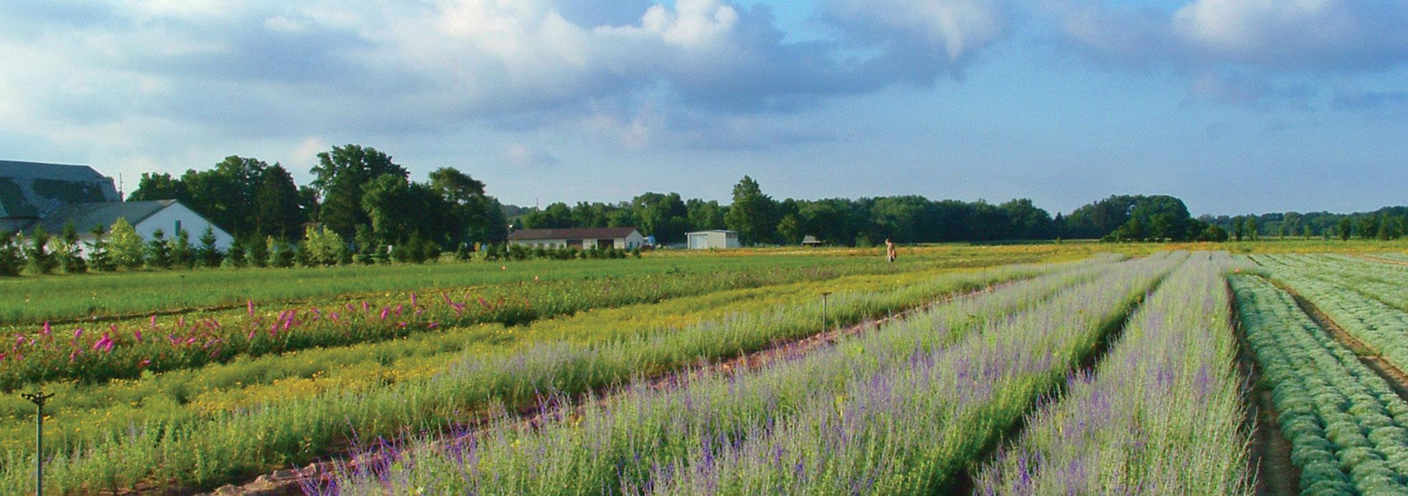
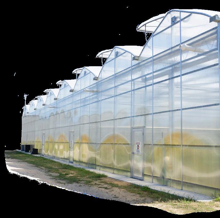
We began in 1957 as a family-owned flower bulb nursery and have continued to be a family-owned company with expanded offerings in the horticulture industry. DeGroot is now proud to also be a Veteran owned business. In 2022, we have begun to focus our brand and have a dedicated style that reflects our company values and goals. Building and maintaining this new look is paramount to keeping our customers familiar with who we are and the quality of service we provide.
NeedScope is a way to differentiate brand positioning by focusing on emotion through psychology. It helps deliver a consistent experience across multiple touch-points. It helps us understand our consumers conscious and unconscious needs, and how to satisfy them.
We’ve used NeedScopes to help position DeGroot as an ‘irresistible’ brand, and used the underlying psychology to strengthen our brand’s identity.
What emotions do we want to invoke when communicating with our end consumers? Who do we want to be as a brand, and can we win in the category?
INDIVIDUALISTIC INTROVERTED
Our customer wants to rediscover the simpler things in life. They take their dream and make it a reality. They aren’t afraid of hard work, and love to be outdoors.
They can see the good in things, and enjoy taking something to make it new and beautiful. They are down-to-earth and like the idea of healthy living and organic food consumption. They take joy in simple pleasures and value nature.
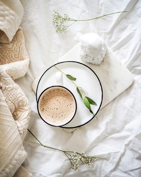
Natural
Rounded and Soft Shapes
Earthy Tones and p astels
Simple Layouts
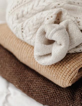
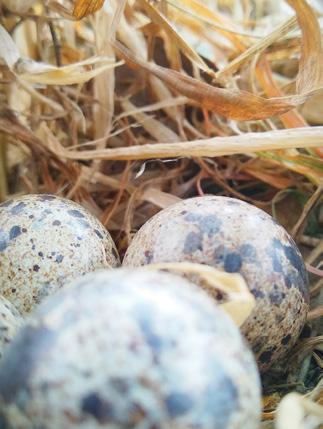
Natural Materials
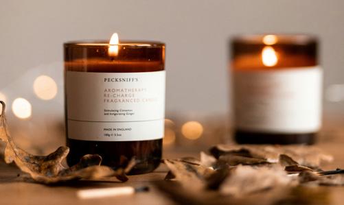
Warm / Cozy Lighting
p ainterly Illustrations
Hand lettering


Brand archetypes create characters based on behavior patterns that instinctively are understood. Using archetypes help create brands that are more recognizable to our target consumers. They help set brands apart from the crowd, and help create memorable moments and feelings to enhance consumer’s brand recognition.
Archetypes focus on the personality traits of our target audiences to create emotional connections with the end consumer.
DeGroot has chosen two character archetypes to focus on to connect with our end consumers. It is suggested to have a 70/30 mix, the 70% being the core archetype, and the remaining 30% being the influencer.
DeGroot’s core archetype is The Innocent. It is a personality with an optimistic outlook on life. They crave safety, but ultimately, they want themselves and everyone else to be happy. Innocents are honest, pure, and have no ill-will towards anyone. They don’t hold grudges and believe everyone has the divine right to be who they truly are. They see inner beauty and tend to see that beauty where others do not.
As a brand, DeGroot wants to help create happiness through nature. It is important that the journey be an easy one to traverse and we aim to help simplify each step along the way with our easy-to-understand messaging and instructions, guided growth and harvest time indicators, and all our products being backed by our guarantee.
Brand Examples:
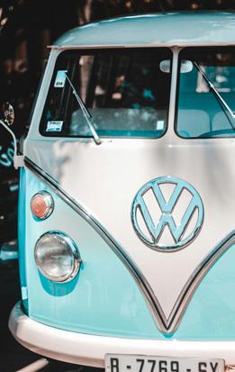




https://www.kayeputnam.com/brandarchetype-innocent/
https://iconicfox.com.au/brandarchetypes/#innocent
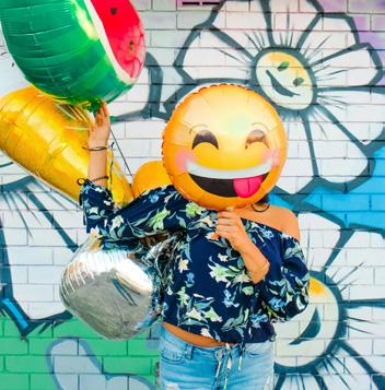
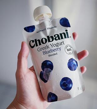



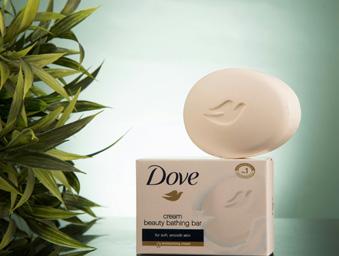
Our influencer archetype is The Magician. This is how we connect with our consumers. This archetype usually does not fit a buyer persona, but appeals to different personas with their ability to take consumers on a transformational journey (such as lost to found, worn out to refreshed, insecurity to security.) They are intelligent and knowledgeable, and turn problems into solutions making dreams come true.
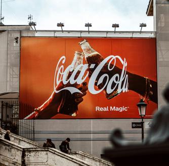
Transformation is a large part of how we leverage The Magician in our brand. We want to guide our consumers to transform their lifestyle by having fresh-grown fruits and vegetables in their own yards, or to transform those yards into a garden oasis for their enjoyment and relaxation. We wish to embrace the wonder of growth and change.
Brand Examples:




READ MORE:
https://www.kayeputnam.com/brandarchetype-magician/
https://iconicfox.com.au/brandarchetypes/#magician






The do’s and don’ts of our logo are fairly simple. It should be easily read, never distorted, and never altered unless approved to do so.
The logo should never be smaller than 0.625" on back and side panels of packaging, and the main logo should stay at 1.125" or larger in width.
The 80% Black logo is used on most materials. In some cases, the full black and white logo is necessary, like when placed over photography for extra contrast.
Specialty use versions of the logos are utilized when printing constraints require us to do so. The 1-Color Black Logo , for instance, is used on the back of cappers where only black ink used. The PMS 341 Logo is used on our Seed p otato bags which are run with the single color at print. .
DON’T USE UNA pp ROVED COLORS
DON’T REMOVE ELEMENTS
DON’T CHANGE O p ACITY
NEVER STRETCH OR DISTORT LOGO MUST BE FULLY VISIBLE
DON’T REARRANGE ELEMENTS

The full DeGroot™ logo must always include the leaf element, but the leaf element may be used without the wordmark in certain instances. These instances can include:
• Over photographs for E-Commerce assets
• When placed in a secondary location on packaging (where a primary logo is also placed)
• On p O p materials where the logo is elsewhere on the display such as packaging or other p O p
• On elements like QR Codes

Drop Shadows / Outer Glows may be applied to the leaf element when placed over photography.
Use in a subtle manner so the shadow/glow is not immediately obvious (see example above.)
This logo goes on any DeGroot p latinum p erformers ® products. p rimarily found on our Spring sleeves and cappers.
This logo goes on all DeGroot product packaging. It should be placed on the back of the package near the guarantee logo.
This logo is placed on all packaging that is covered by the guarantee. It is always accompanied by supporting copy explaining details of the guarantee and is placed with the U p C.
Birds & Wildlife, GMO Free and p lant for p ollinator badges are added to their respective products.
These badges go on all standard packaging to help the consumer plan their gardens according to the bloom times, foliage growth and harvest times for consistent color and product yields all year long.
These icons are almost always accompanied by supportive copy, or a key to delineate what they mean. They are used on packaging and in the catalog.
These icons are used on packaging, emails, or as needed. They should be accompanied by the call-to-action to follow us on social media
BLOOMTIME INDICATOR
CIRCLE ( SLEEVE FRONTS, CA pp ERS )
BLOOMTIME INDICATOR SQUARE ( SLEEVES )

The DeGroot brand colors are warm and inviting. Inspired by nature, these colors are meant to invoke the idea of growth and hard work in the dirt.
They’re meant to make our customers think organically about how our products can fit into their lives, and their gardens.
Primary colors are used as backgrounds, text, and in design elements like dividing lines or in tables.
Secondary Colors are used more sparingly in the same instances as above, in graphic elements where needed, photo tags in the catalog, and in tables.
The Birds & Wildlife color is used as a background replacement for the DeGroot Grey on certain sleeves that are deemed for Birds & Wildlife. This color can also be used sparingly as designs need.
NOTE:
Pantone® Colors are:
Light Green : p MS 359
Dark Green : p MS 341
EARLY WINTER
: 85 M : 50 Y : 35 K : 15 EARLY SUMMER C : 50 M : 10 Y : 8 K : 0
WINTER
WINTER
: 40 M : 15
: 25
MIDSUMMER C : 35 M : 15
: 80
: 0
: 0 LATE SUMMER
: 65 M : 30
: 100 K : 10
SPRING
: 8 M : 50
: 40
: 0 EARLY FALL
: 10
: 28
: 100
: 0
FALL
: 5 M : 75 Y : 85
: 0
SPRING C : 20 M : 35 Y : 8 K : 0 LATE FALL C : 45 M : 92 Y : 28
: 5
These fonts are available on Adobe Fonts for you to download. Additional fonts may be used for instances such as social media, in-house materials and other unique projects with special approval.
https://fonts.adobe.com/fonts/p22-mackinac
https://fonts.adobe.com/fonts/omnes
https://fonts.adobe.com/fonts/shelby
HEADLINES, SUBHEADS, p LANT TY p ES, ETC.
HEADLINES, SUBHEADS, p LANT TY p ES, ETC. ( AS NEEDED )
*Omnes & Omnes Cond. will need special attention to the location of punctuation marks, specifically parenthesis and dashes. They will need to be adjusted to -1 baseline to be more appealing. If you have any questions regarding this, please reach out.
Other weights of this font may also be used with permission or as design needs arise.
HEADLINE ALTS FOR BODY CO p Y / p RESENTATIONS / TABLES
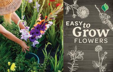
Textures help emphasize the mood of our brand. They are used often throughout packaging and brand presentations. There are two main textures that are used in our primary branding. Other textures may be used , but these two textures are our primary brand textures.
The Wood Texture is used as a base texture on packaging. In most cases it is paired with the DeGroot logo.
The Flower Texture is used primarily in brand presentations as slide backgrounds. It is never used on packaging.

FLOWER TEXTURE - TAN
MULTI p LY BLEND MODE
50% O p ACITY
DG TAN BACKGROUND WOOD
FLOWER TEXTURE - GREEN MULTI p LY BLEND MODE
20% O p ACITY
DG LIGHT GREEN BACKGROUND
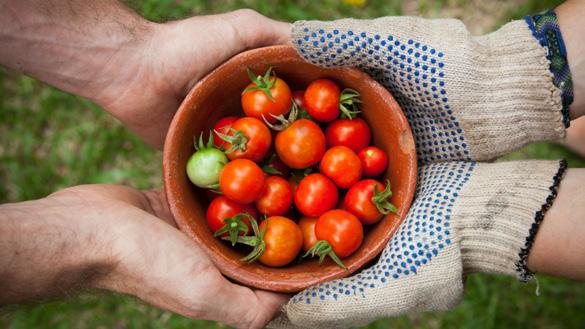
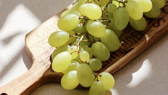
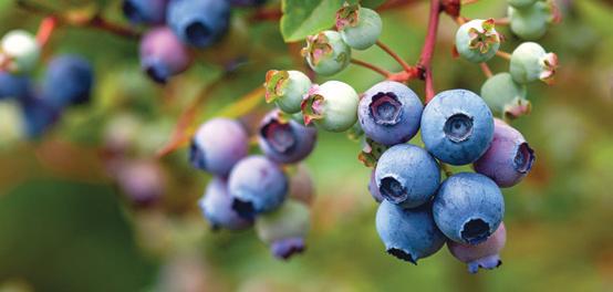
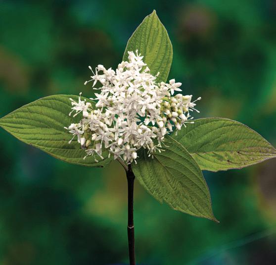
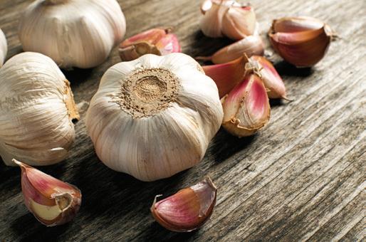
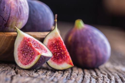
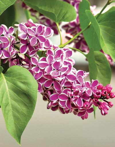
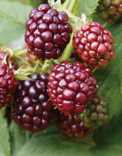
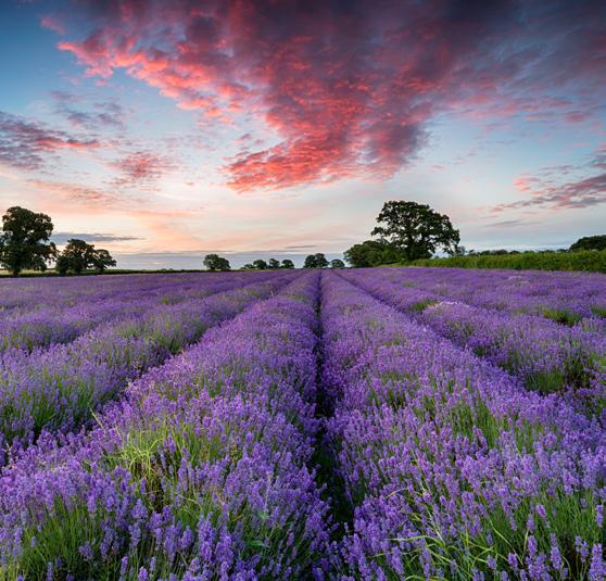
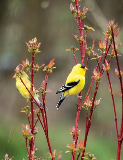
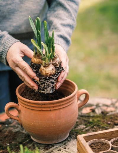
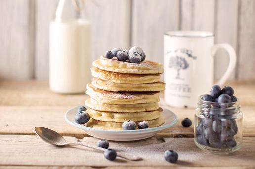
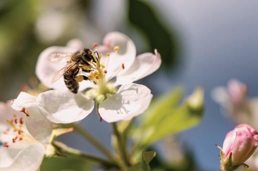
Brightly lit to slightly muted. Shadows present to create soft shapes and mood. Avoid using imagery with harsh sunshine or direct lighting that creates harsh highlights.
Warm in hue, sepia tones with a soothing and natural feel. Images should feel cozy and welcoming.
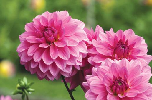
Soft, out of focus backgrounds with product in focus in foreground.
Human element is present, yet not the focus when featuring products. Avoid faces in these cases. When showing landscape imagery or action images, faces are okay.
p rops should be of natural materials like wood or linens, or in natural hues that don’t draw away from product. They should not be high-end or luxurious in nature, and remain down-to-earth and attainable.






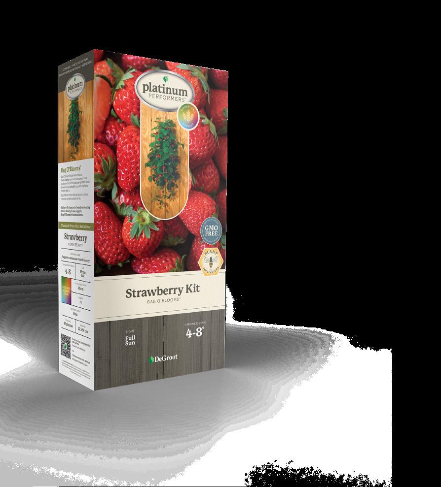
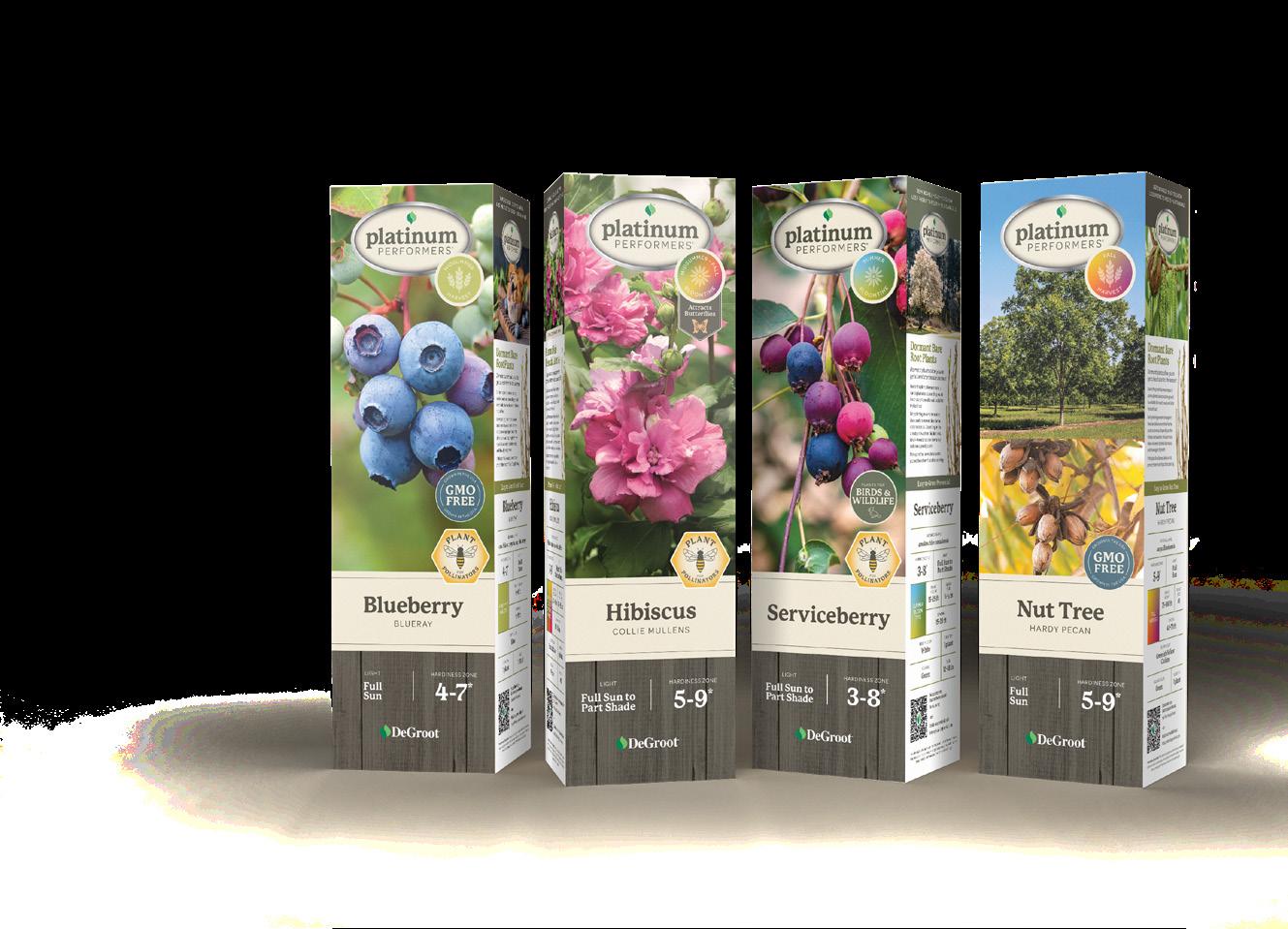
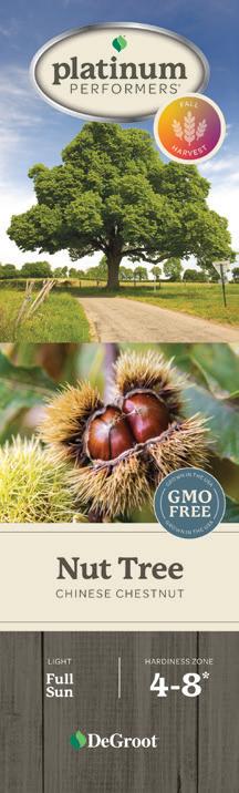
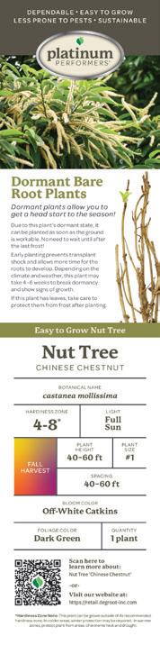
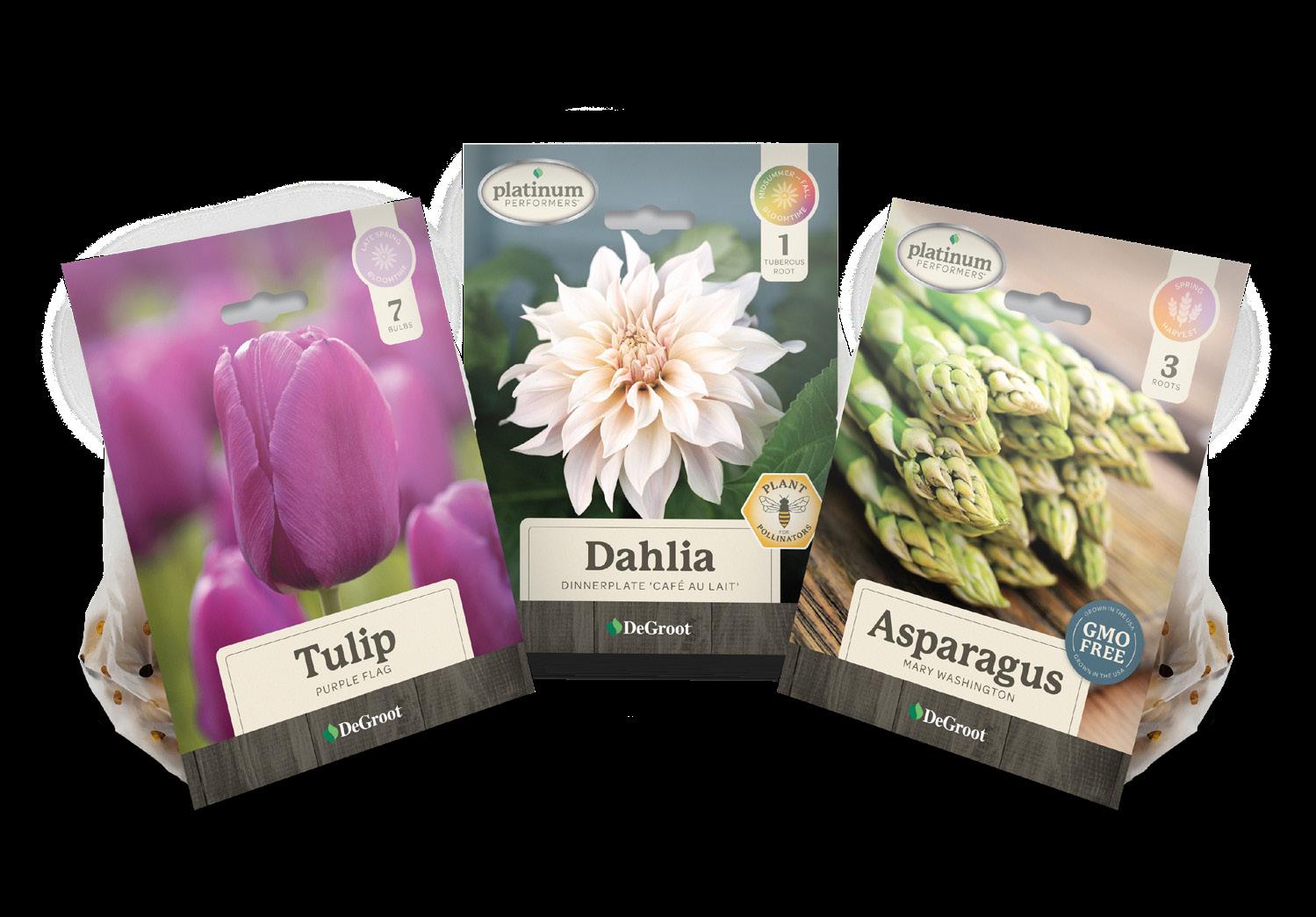
Sleeve front panel elements should be consistent in placement across the full line of products. Some elements are on every package front, and some badges and flags are product specific.
Platinum Performers ® badge is always place at the top of the sleeve in the center.
Bloomtime Indicators sit to the right of the p latinum p erformers ® badge, overlapping and slightly below. In some cases, a flag will come off of the bottom of the indicator for plants that attract hummingbirds and butterflies.
GMO Free, Plant for Pollinators and Birds & Wildlife badges are placed on the right side. p lant for p ollinators should always sit on the bottom, if applicable, and the others to align above it. The badges overlap the product name section slightly.
Plant images should be a single close-up of the plant, with the exception of Nut Trees, which feature two images.
Primary product names are all in the same font size (unless otherwise approved.)
Light, Hardiness Zone and DeGroot logo all sit on the wood background at the very bottom of the sleeve.
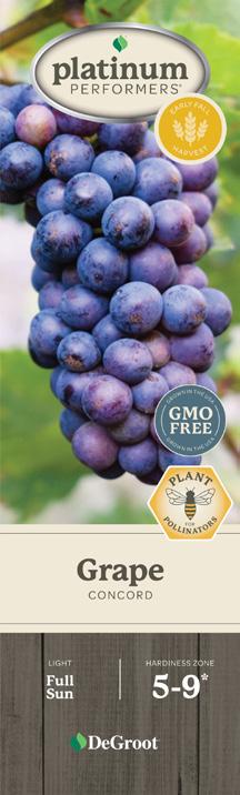
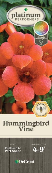
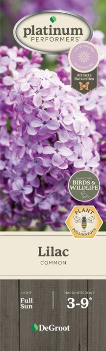
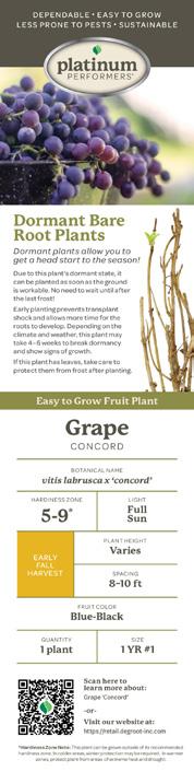
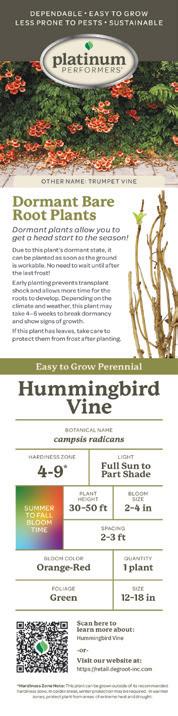
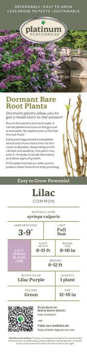
Sleeve side panel elements should be consistent in placement across the full line of products. English copy is placed on the right hand side panel, and the Spanish translations are placed on the left panel.
The colors also stay the same across the full line with the exception of Birds & Wildlife sleeves which replaces the grey and green bars to match the badge.
Platinum Performers ® badge is always place at the top of the sleeve in the center. The p latinum p erformers® benefits listed above the logo.
Lifestyle photos are under the grey bar, and can be full plant images in landscapes or foods made from the product.
Green Dividing Bar copy updates based on the product.
Plant Information sits in a table. The tables vary slightly product to product. Fruits have a smaller Bloomtime Indicator square, and do not feature foliage colors or bloom sizes.
QR Codes and disclaimer copy sit below the plant information, and is in the same location across all sleeve packaging.
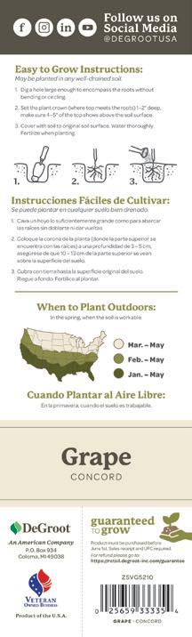
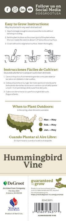
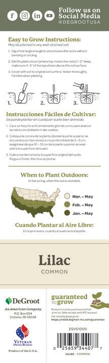
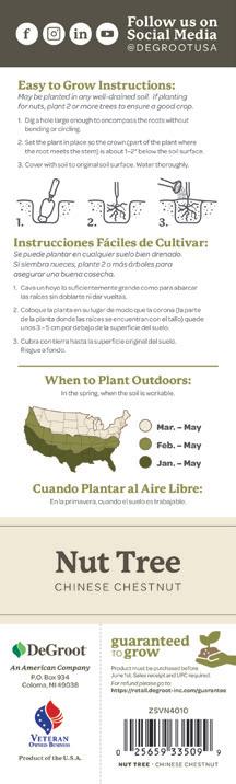
Sleeve back panel elements should be consistent in placement across the full line of products.
Social Media Icons sit in the gray/green bar that extends from the side panels.
Easy To Grow Instructions are directly under the grey/green bar and have illustrations between the English and Spanish translations.
When to Plant Outdoors section sits below a green divider line, the map separates the English and Spanish translations. Sometimes this section varies in height depending on the length of the instructions above.
Primary product names are all in the same font size (unless otherwise approved.)
The DeGroot and Veteran Owned logos stack on the left side of the sleeve back. Underneath the two logos sit the Country of Origin copy.
The Guaranteed to Grow section sits to the right of a dashed line, which is meant to indicate a cut line in the occasion the customer needs to request a refund. For this reason, the Item Number, UPC and Product name sit just below the guarantee.
Capper front panel elements should be consistent in placement across the full line of products. Some elements are on every package front, and some badges and flags are product specific.
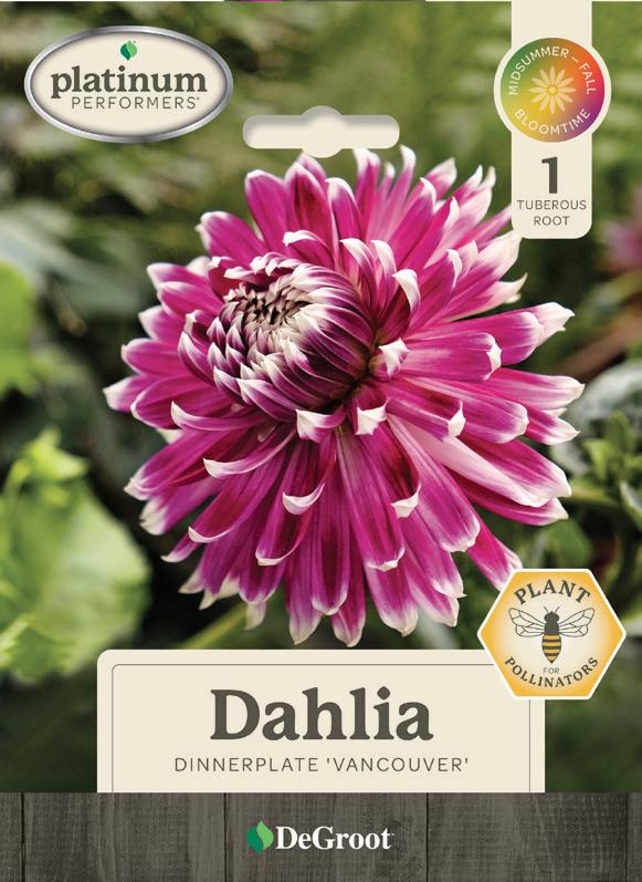
Platinum Performers ® badge is placed at the top left corner of Spring Flower bulb and Vegetable cappers.
Bloomtime Indicators are placed in a flag element that extends from the top right corner.
GMO Free and Plant for Pollinators badges are placed on the top-right side of the product name section.
Plant images should be a single close-up of the plant. Be sure to avoid cutting off the plant with the die cut hole.
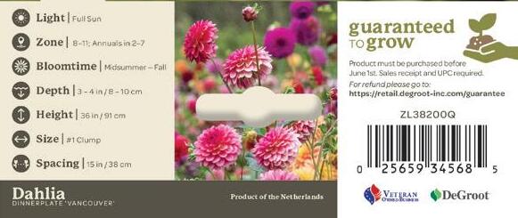
Plant Icons are on the left side of the back flap of the capper. The order should remain consistent. The bloomtime icon should be swapped out with Harvest time or Foliage icons when applicable.
The grey bar along the bottom should have the product name and the country of origin.
The Guaranteed to Grow section with the Item Number, UPC, Veteran Owned Logo and DeGroot logo sit on the right side of the capper’s back flap.
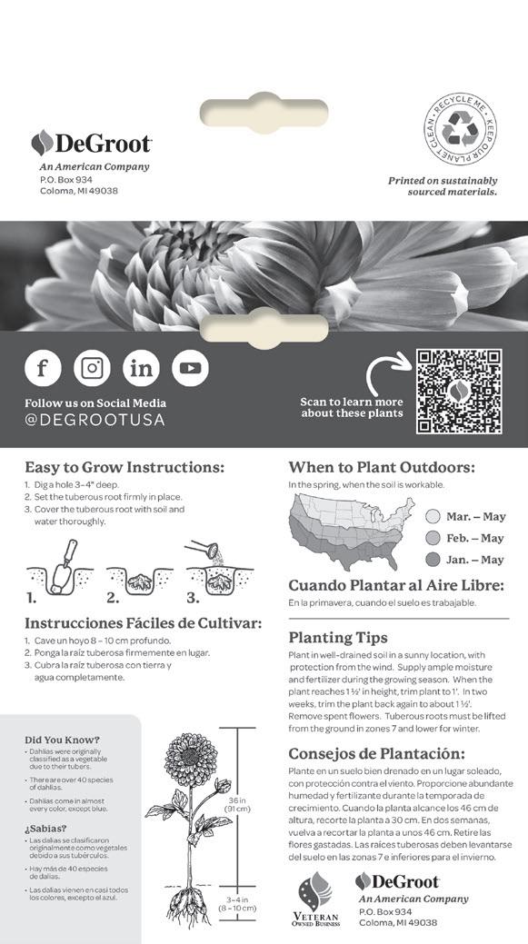
Capper back panel elements should be consistent in placement across the full line of products and should all be in greyscale.
The DeGroot Logo & address is placed on the top flap along with the Recycle icon.
Plant images are a greyscale image of the front photo. Other photos can be used with permission when necessary.
Social Icons and QR Code are placed in a grey bar directly under the plant photo.
Easy To Grow Instructions are always on the left-hand side, with translations, and the appropriate visual illustrations.
The Did You Know? section is on the bottom left, and includes translations.
Dimensions are included to the right of the Did You Know section, and feature an illustration of the plant and its roots.
When to Plant Outdoors and Planting
Tips are always on the right side of the capper back. Always include translations.
The DeGroot logo and address are repeated on the bottom right side, paired with the Veteran Owned logo.
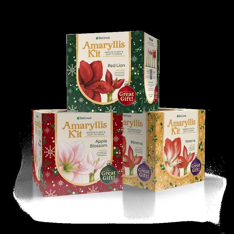
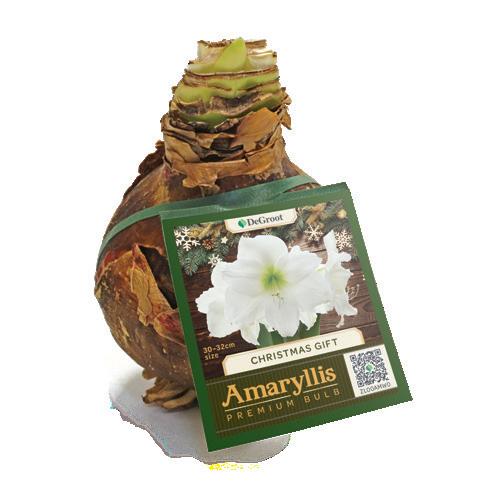
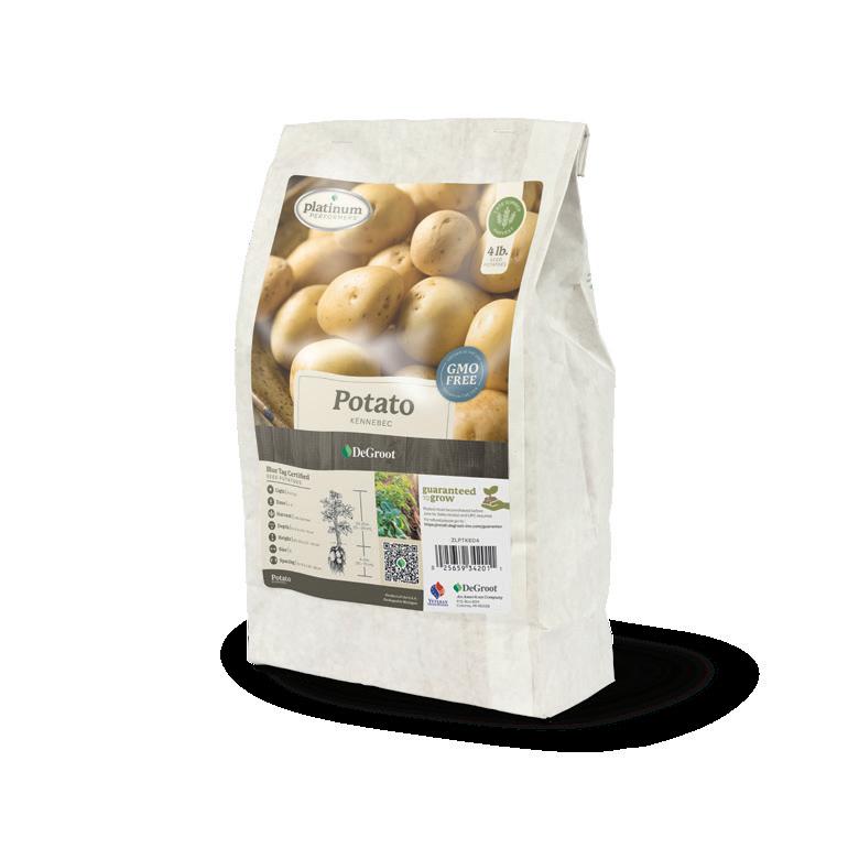
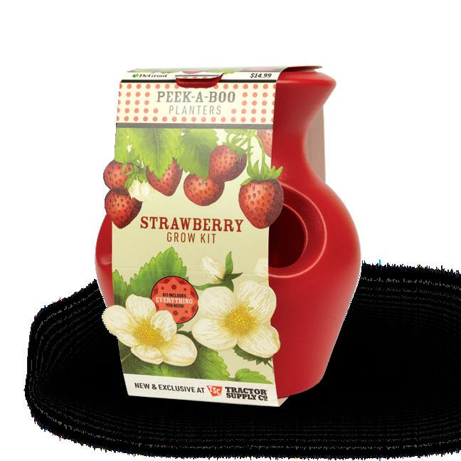
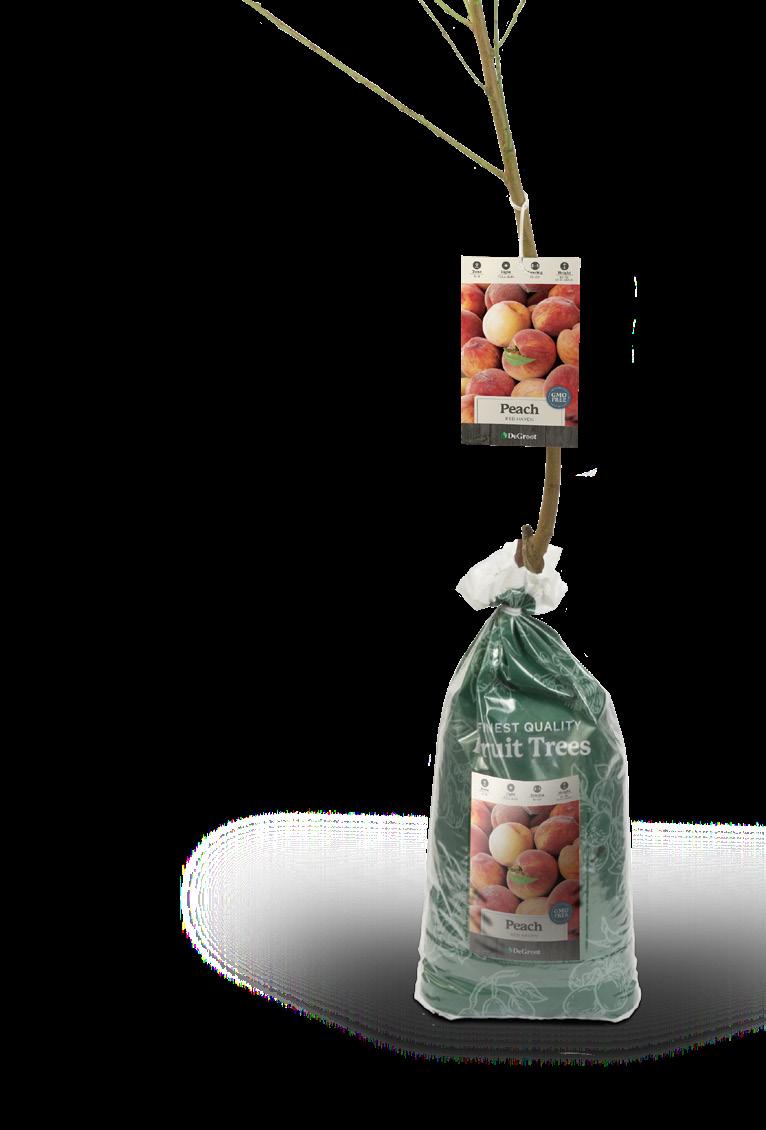
Our p O p is meant to be appealing and inspirational in content. Main copy should be large and legible. Text will stick to the brand colors in this style guide. There is more freedom with colors in the background gradients and colors.
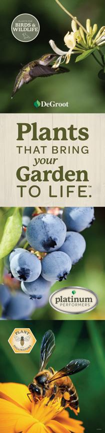
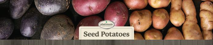
The use of photography is very important, especially on side panels and large rack strips (such as the Seed p otatoes.) Illustrations are encouraged as well, they bring the human element to our products without showing people or faces.
Hands are permitted to be used. We want our customers to picture themselves using our products, so refrain from showing more of the body.
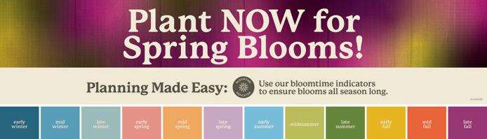
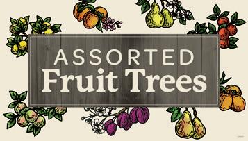
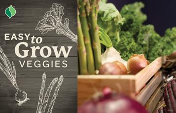
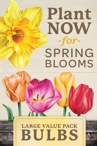
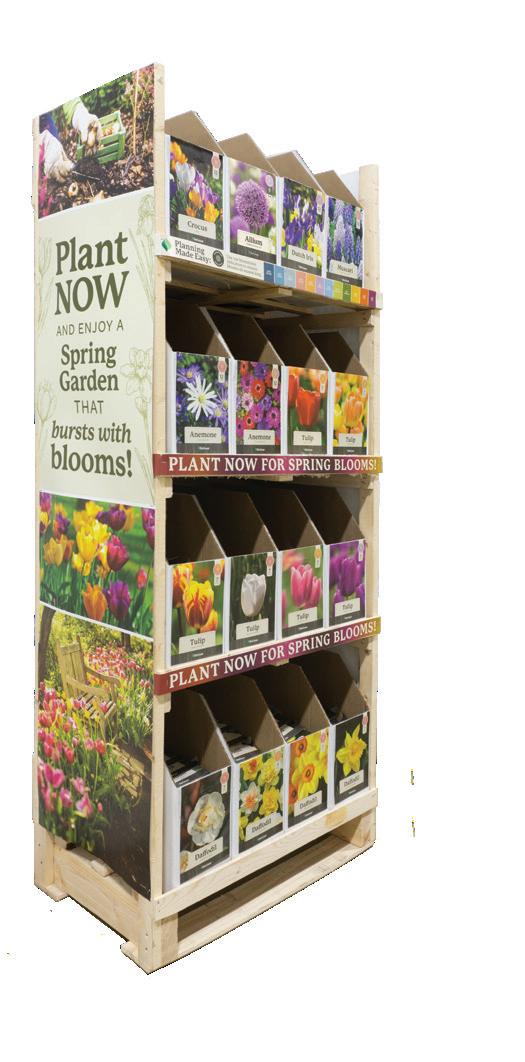
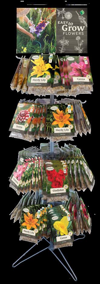
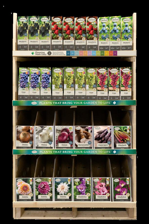
Our displays are where our packaging and p O p meet. They should feel cohesive and be eye-catching.
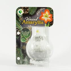
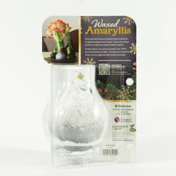
Display photography should be highresolution. The displays need to have the background removed so they can be placed on a multitude of backgrounds, and for web.
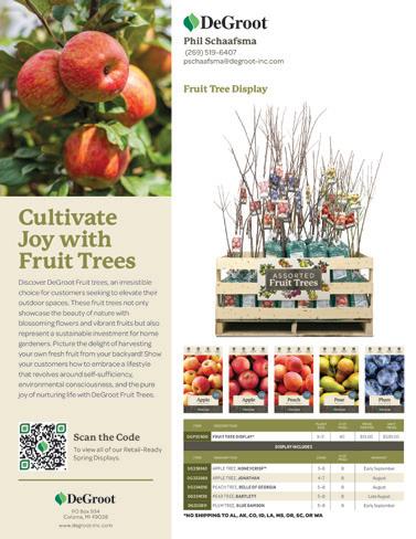
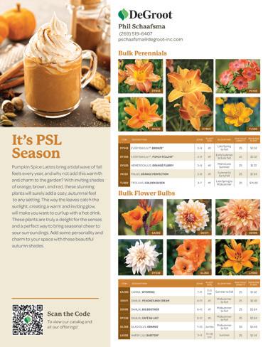
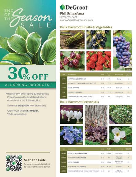
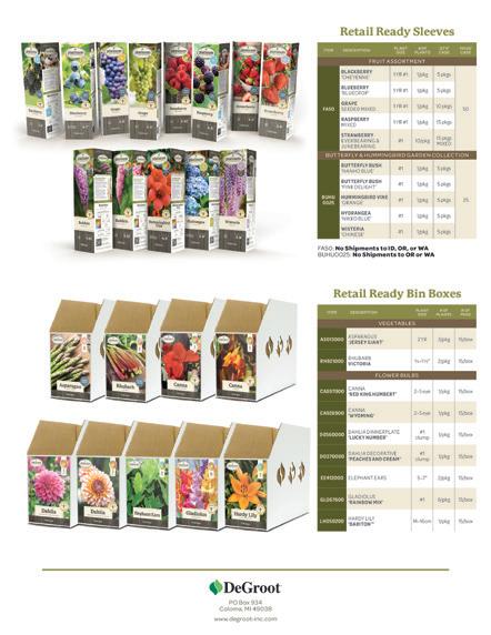
Sell Sheets are created from a set template. The left side of this template is 3.5" wide, has an image at the top, a headline underneath and then supportive body copy. If the sheet is two pages, the bottom logo is moved to the back sheet, and the QR code is moved to below the green line. (See the example on the right.)
On the right side of the sell sheet, there is our logo and Sales contact information. The sales contact section is on its own layer in the template. This layer can be toggled off to save p DFs with vendor logos.
Also on the right, is what is being featured to sell. There is a headline and then images of the products. Under product photos is a table with product information, and in some cases, pricing information.
Sell sheet colors can be altered with permission to suite a theme. The tables and headlines colors are able to be changed. However, the left side panel elements, fonts and type sizes should remain consistent. (See the example on the bottom left.)
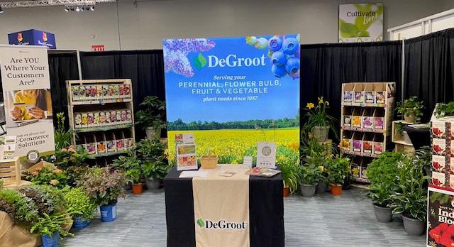
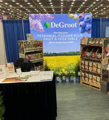
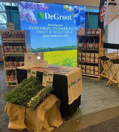
All trade show assets should follow the brand guidelines. Large signage needs to be eye-catching, yet legible from a distance. p ackaging displayed should be the most up-to-date and of high quality to best represent our brand. Flyers, swag, and other handouts should also be the most recent branding and of high quality.
DeGroot Social Media needs range from video, to photography, to images with copy added. Staying on brand is extremely important, so maintaining brand colors when possible is preferred, and typography must remain consistent with brand guidelines (unless otherwise approved.) Adding our logo when possible is ideal.
p hotography should fit our aesthetics. (See pages 22–2.4)
Some exceptions apply with holidays. Christmas/Holiday posts are typically pulled from our Christmas Card artwork and generally have a different feel from the rest of the posts we create.

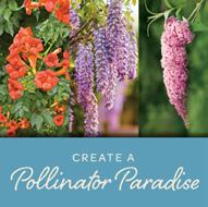


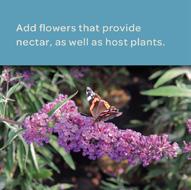






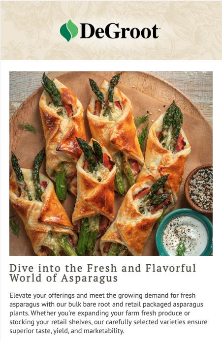
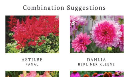
All e-mails need to follow the brand colors and copy outlined on this page.
H1 Headlines are in sentence case and can be either Grey or Green in color.
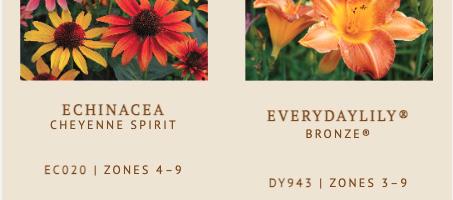
H2 ( p lant Varieties) & H3 ( p lant Names, p art Numbers & Hardiness Zones are to be in all caps and set in the grey color.
Body Copy is to be in sentence case and set in grey.
Buttons need to span the full width of the column,and be in the green color with white copy in all caps.
Main Images & One Column images are 550 pixels wide.
Two Column images are 250 pixels wide.
Some wholesale e-mails are supportive of sell sheets. These e-mails should match the sell sheet colors and can override the brand colors. (See p umpkin Spice, Holiday, Seasonal Sale, etc.) Fonts should remain consistent across the board.
- 20PT, TRACKING : 3
LANT NAME, ZONE, ITEM #SUBHEAD ( H3 )
- 16PT, TRACKING : 3 BODY
BOLD - 14PT, TRACKING : 3
At DeGroot, we have two versions of our website. One for our wholesale customers, and one for our retail customers.
Currently, the website does not adhere to the new branding, but we are aiming to get as much of the imagery set and switched over to match the new brand standards.
The dimensions listed on the right will help keep consistency over all the website assets. All of these assets need to have the proper Alternative Text, Captions and Descriptions for optimal accessibility and SEO search compatibility.
Homepage Slider banner images have flexibility with brand colors, such as the End of Season Sale shown to the right. Usually this will coincide with the sell sheet designs or other assets required. p lease use brand approved fonts unless otherwise approved.
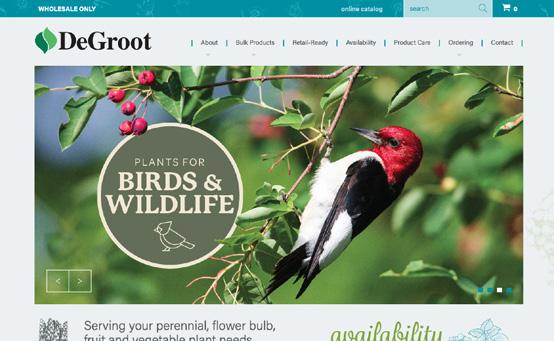
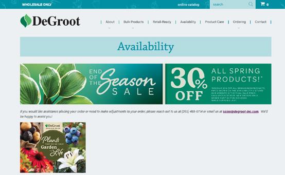
Homepage Slider are 1233 x 602 pixels and must be below 204kb in size. Use the provided template to avoid important information from being covered by the navigation overlays.
p RODUCT p AGES
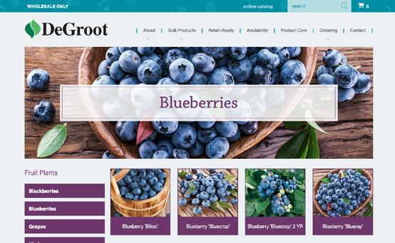
Product Banners are 1233 x 396 pixels and must be below 204kb in size.
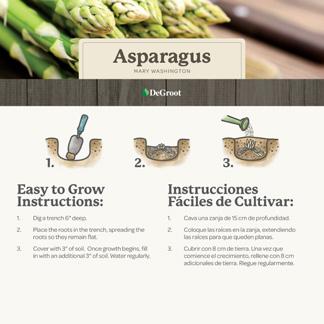
Product Photos are 1000 x 1000 pixels, must be RGB and Saved for Web (72dpi) as a .jpg
Retail Ready Product & Display
Photos are 1000 x 1000 pixels, must be RGB and Saved for Web (72dpi) as a .png file for a transparent background
Specialty Banners, like the Sale Banner
or the Availability page are 1233 x 200 pixels and must be below 204kb in size.
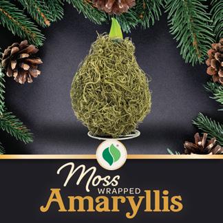
E-commerce assets need to be at least 1950 x 1950 pixels, at 300 DPI.
All of our assets are to be in a square layout for consistency on all platforms.
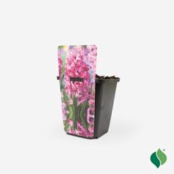
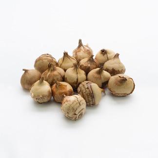
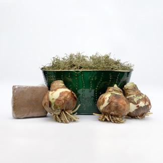
p roducts that have been clipped from their backgrounds are to be placed on an off-white background (#f4f4f4.) Most silo images should be clipped and placed on this color background if time allows.
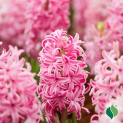
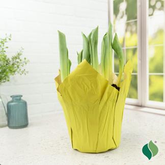
Moving forward, all photography assets that do not have a DeGroot logo need to have a logo added. The leaf logo should be placed in the bottom right corner of these images.
The dimensions of the logo : 0.0627" W x 0.783" H
And should be placed at X: 5.6, Y: 5.51
Outer glow is applied in some cases: White: Screen, Opacity: 27, Noise: 8, Spread: 5, Size:99, Range: 45, Jitter: 22
Open & use the linked image on the right as a template to copy and paste for exact logo placement and size.

All materials printed or products by DeGroot Inc. will follow this version of the Brand Guidelines. This document is to be used as a tool and reference guide to ensure consistency within the brand.
Requests to deviate from these standards must be permitted by the Marketing Manager or Graphic Designer. Any questions about these guidelines may also be directed to these roles as well.