

ID304:
EXPLORATORY PROJECT - MEGAN COE
OCULUS HOUSE
A CELEBRATION OF ANALOG PHOTOGRAPHY
PROJECT OVERVIEW
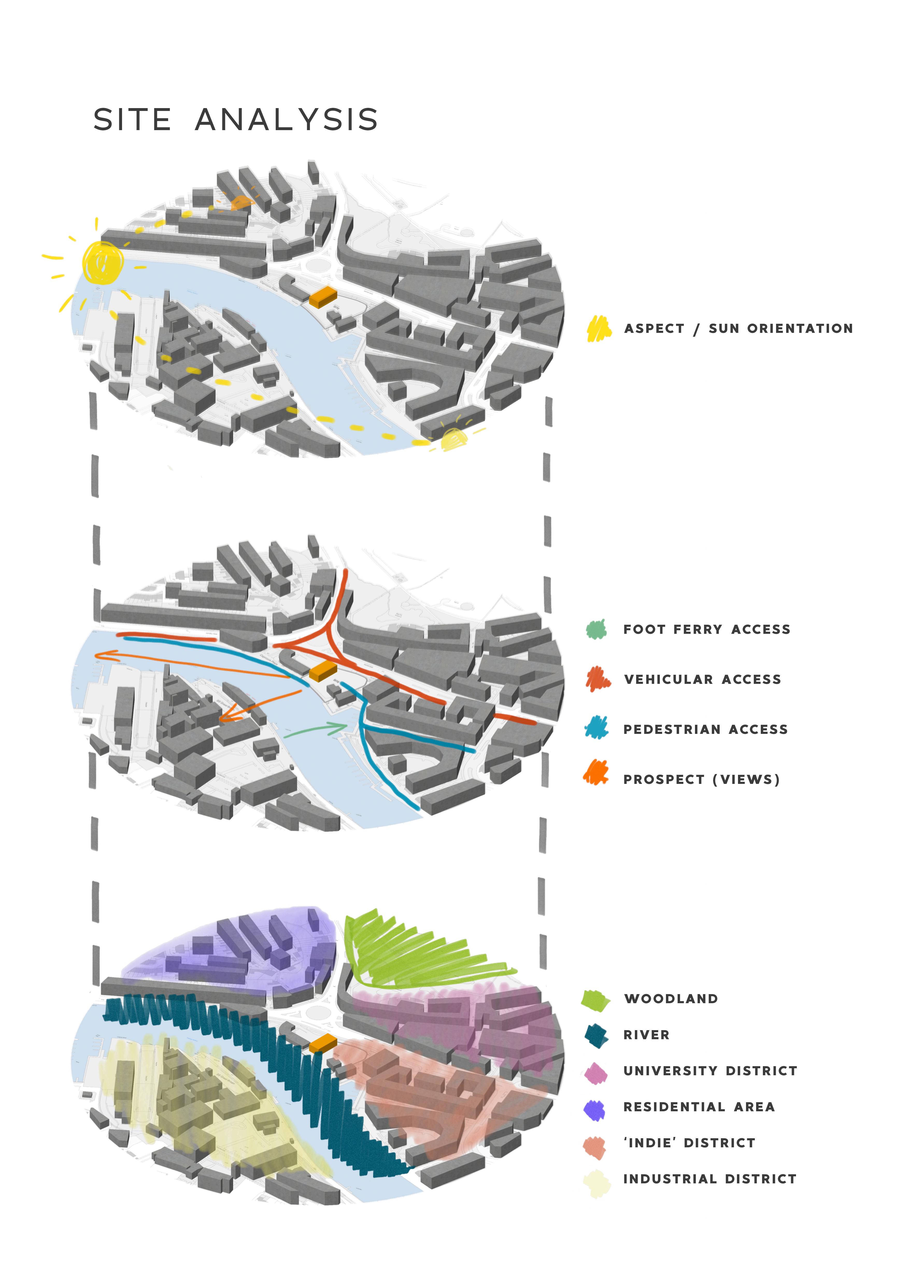
Critical position, exploratory question, brief synopsis, key problems, user analysis, site analysis (inc. original site plans)
DEVELOPED DESIGN SOLUTION
Plans, elevations, sectional elevations, axonometric drawing
STRATEGY OVERVIEW
Research images, concept / spacial planning diagrams, master mood board, architectural prosthesis research, case study inspiration
SPECIFICATION OVERVIEW
Material / colour written statement, master mood board, material choices, colour palette, RCP and lighting specification, furniture layout and specification, sustainability rationale
PROJECT OVERVIEW
Critical position, exploratory question, brief synopsis, user analysis, site analysis
OCULUS HOUSE EXPLORATORY QUESTION:
HOW CAN AN ADAPTIVE REUSE SCHEME BE USED TO RE-COLONISE A SPACE WHILE SUPPORTING AN EXISTING CREATIVE COMMUNITY?
CRITICAL POSITION:
As a designer, I take an architectural response to briefs and enjoy exploring possibilities for adaptive reuse . My primary interest lies within hybrid space; the seamless integration between the inside and outside , particularly within forgotten spaces including remote locations and derelict or historical buildings .
I strive for my design solutions to be experience led. Creating spaces that are user lead is fundamentally important, enhancing a community spirit in cities and bringing those with a shared passion together in an atmospheric environment. My design solutions aim to provide a new purpose to each site, which is fundamentally useful, for instance an educational application. It is important to me that each design scheme allows the user to take something away from their experience, creating a vital relationship between the user and the space .
BRIEF SYNOPSIS:
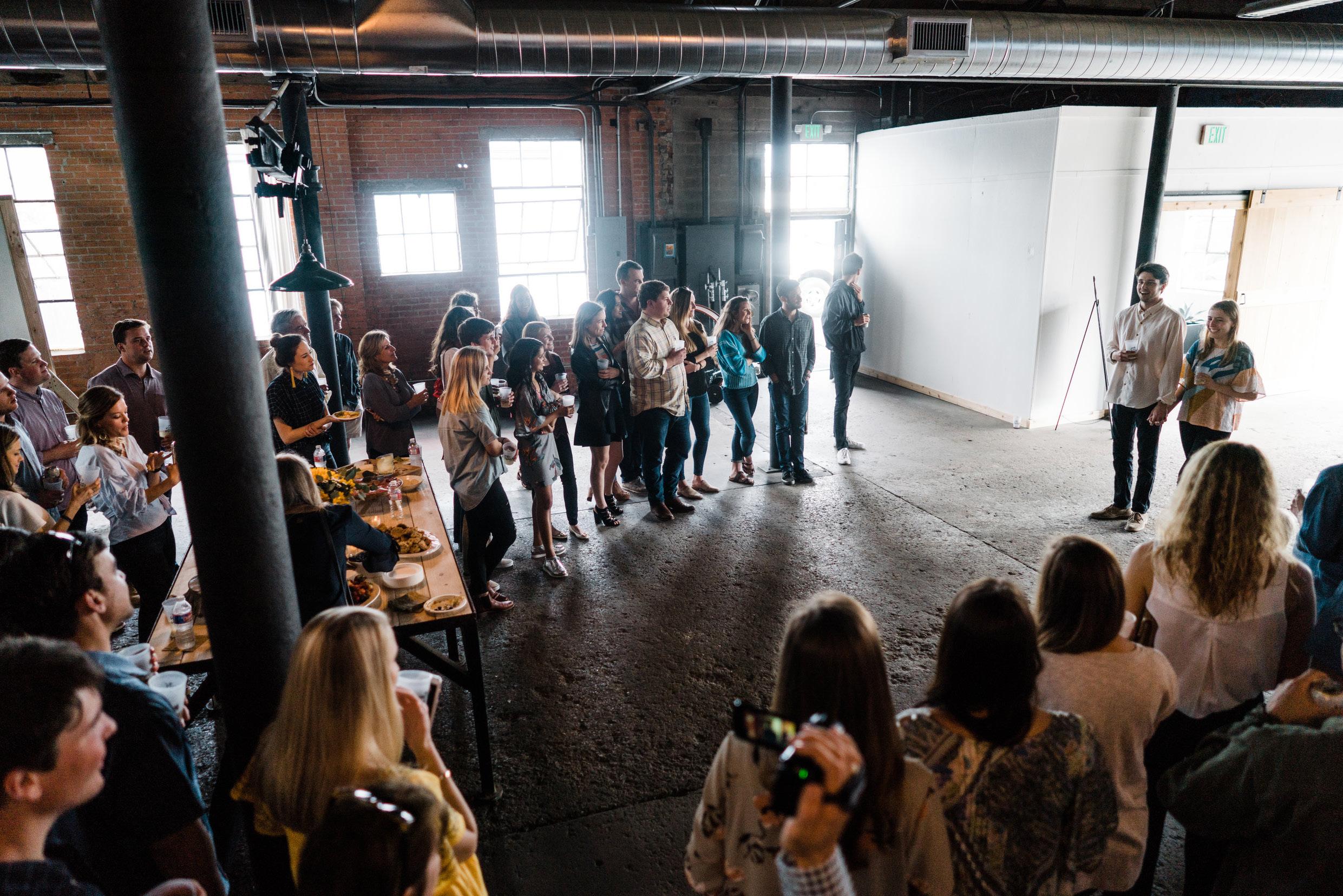
A concept which caters to the existing analog community within Bristol , situated at Canon’s Marsh on Bristol Harbourside. Offering users the facilities to access single or double occupancy darkrooms to process colour & black and white negatives, with the option for tuition and workshops. Open studio space and review space is housed in a relaxed atmosphere, providing the opportunity to share and connect with others. Ultimately the concept is about bringing together members of a creative community within an adaptive reuse scheme, demonstrating the viability and celebrating the use of adaptive reuse schemes as a method of architectural practice.
KEY PROBLEMS TO OVERCOME:
The toughest part of this project has certainly been utilising a structure which has no roof or existing floor levels. It was key to create a scheme, which was sensitive to the host building whilst also meeting the needs of the new user. In response, I think it became a necessary part of the concept to utilise insertions as a building strategy rather conventionally adding a roof and new floors.
“The most important social function of transformation projects: they regenerate localities by creating previously unthought-of facilities, making use of spaces and assimilating them in a different form”
Anguelus Eisinger Urban Historian and Chair of the Metropolitan History and Culture at HafenCity University
(Authors image)
WHY BRISTOL?
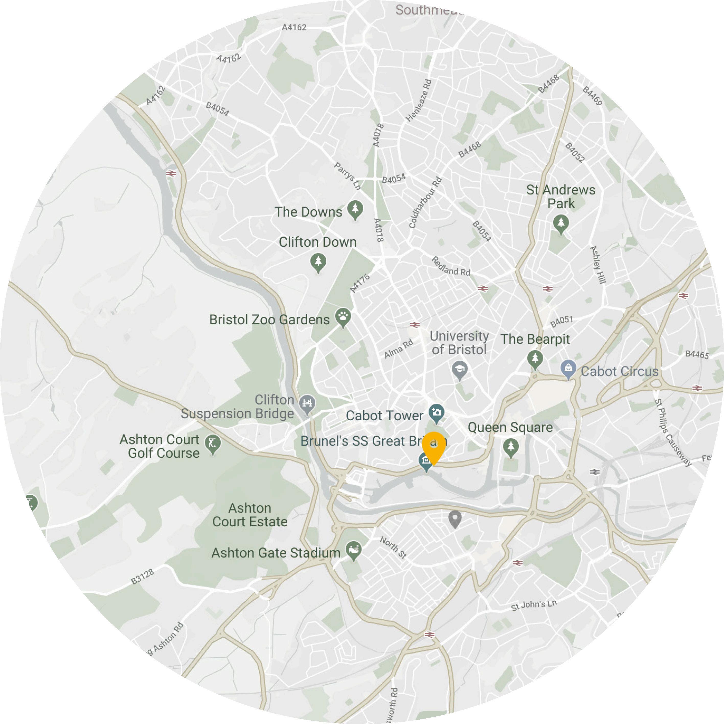
Bristol already has a thriving analog community , therefore, the concept supports an existing local group. This stops locals from feeling like they are being pushed out, while also fulfilling their needs within proximity to their location, meaning they are less likely to be forced to use facilities elsewhere.
In addition to an analog community, Bristol has on of the highest percentages in the UK of individuals working in creative professions , especially at postgraduate level.
There is a clear usefulness for the proposal, since the only current darkroom facilities in the city are private (I.e through educational establishment) or payable through a shop. Bristol, like many other UK cities does not currently have a public darkroom, which offers workshops and other beneficial applications under one roof.
WHY CANON’S MARSH HARBOURSIDE?
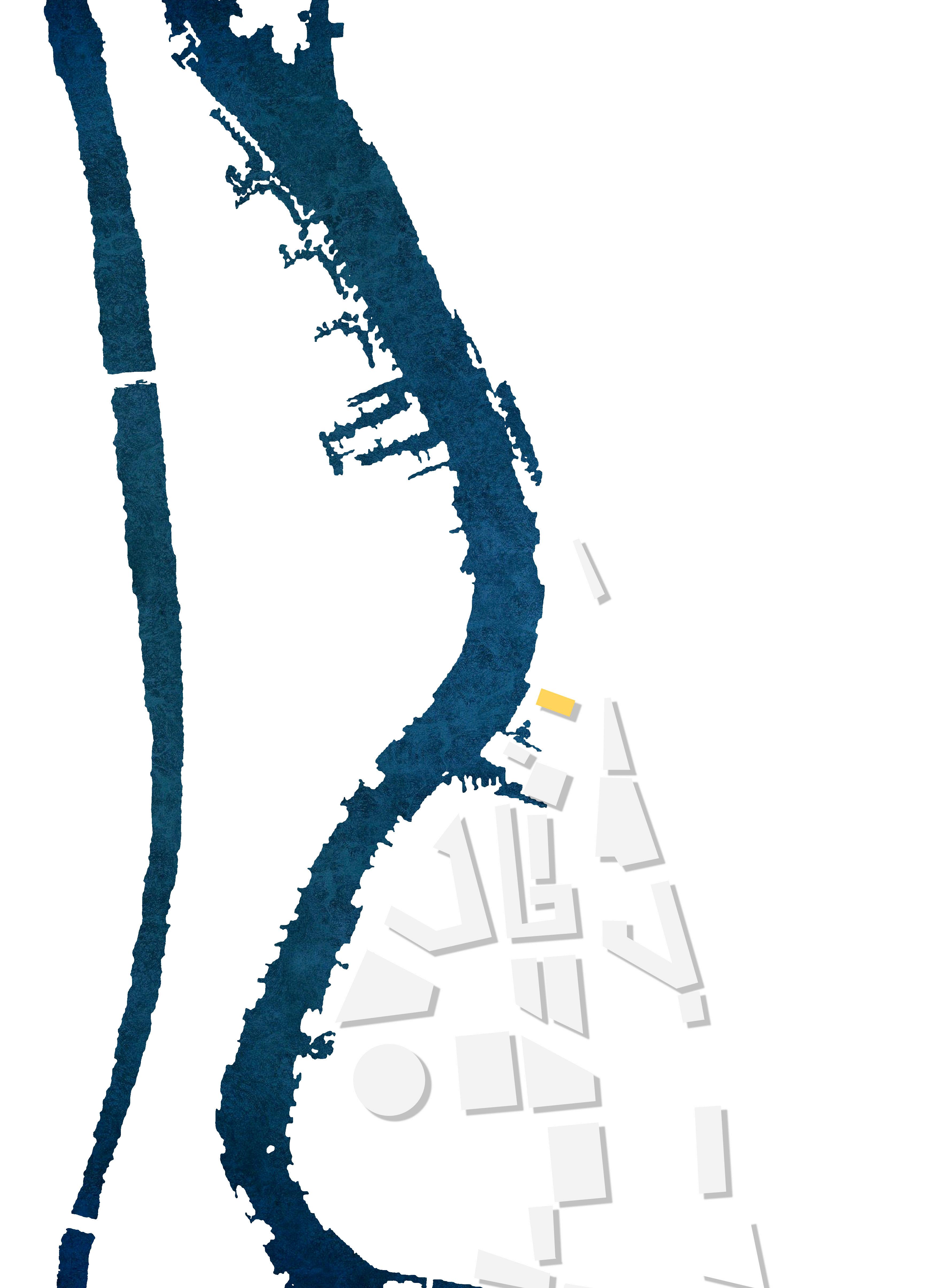
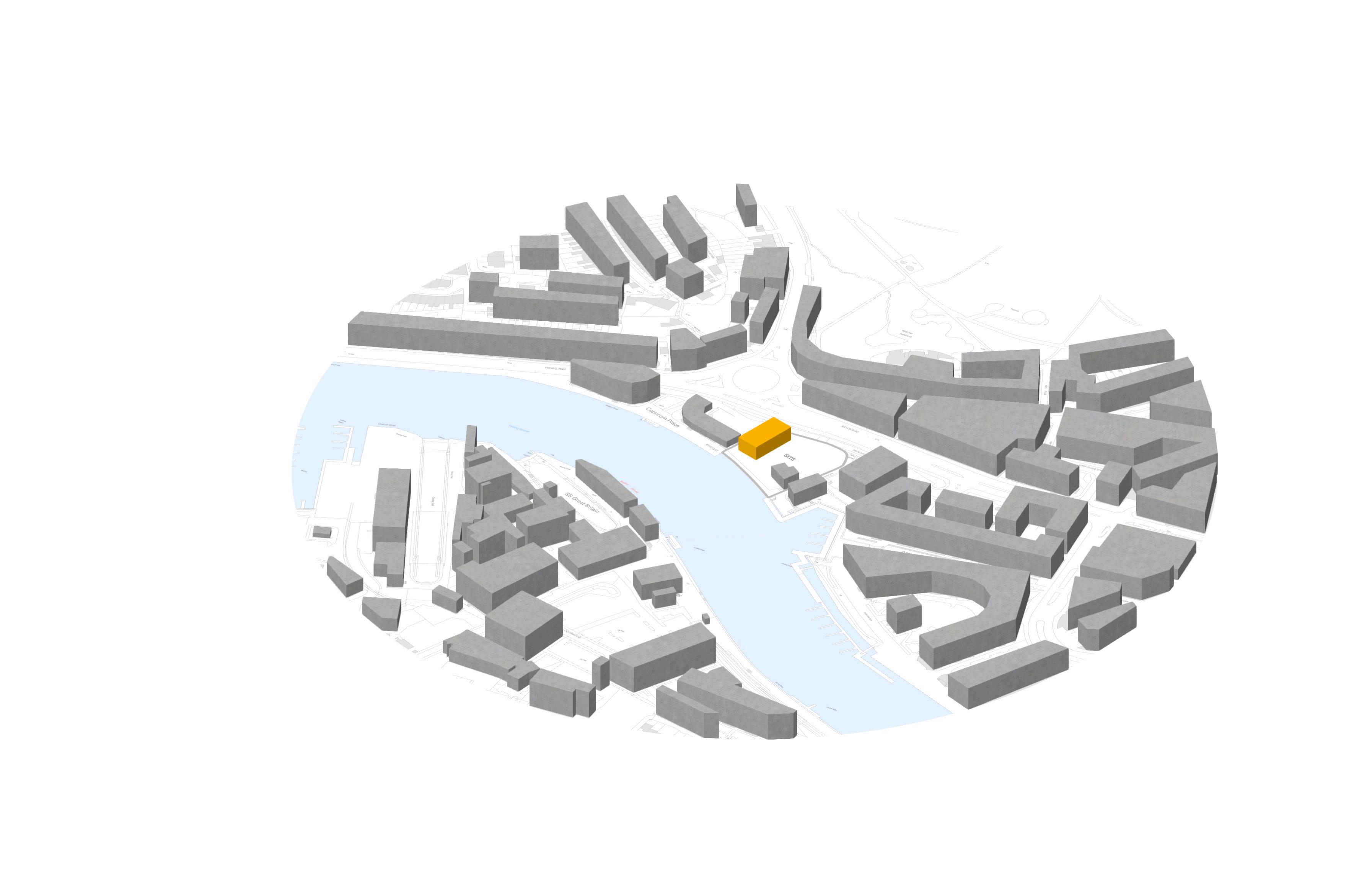
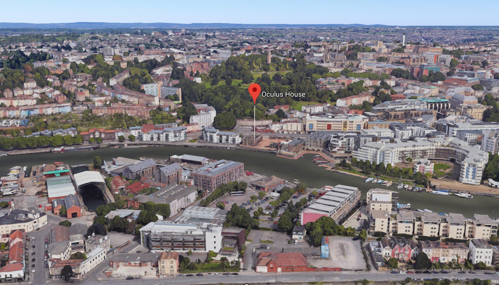
There is a gap in the location of photographic based establishments in the city. One of the most considerable gaps lies on Canon’s Marsh, the last remaining place on the Harbourside to have brownfield sites yet to be redeveloped.
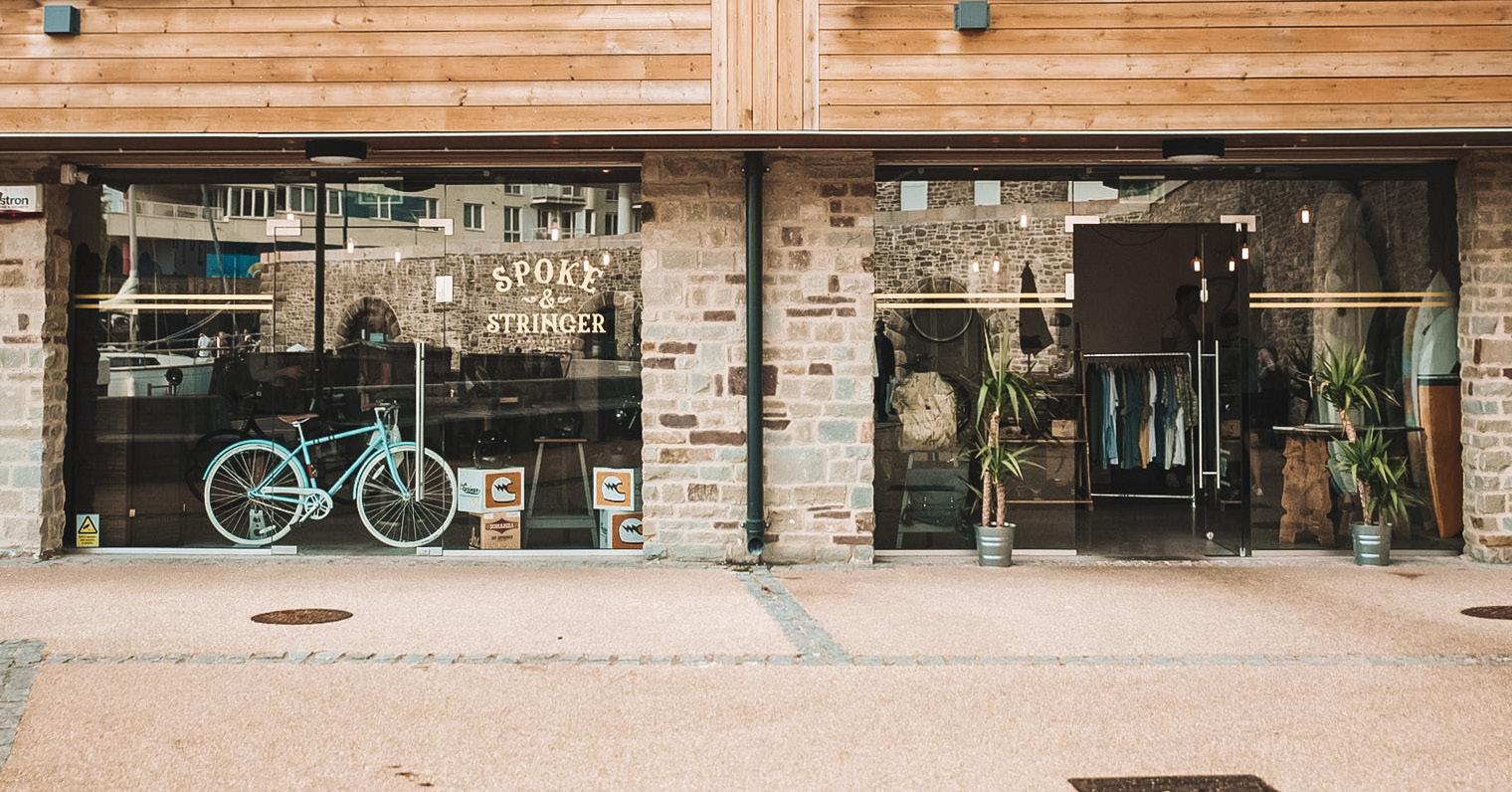
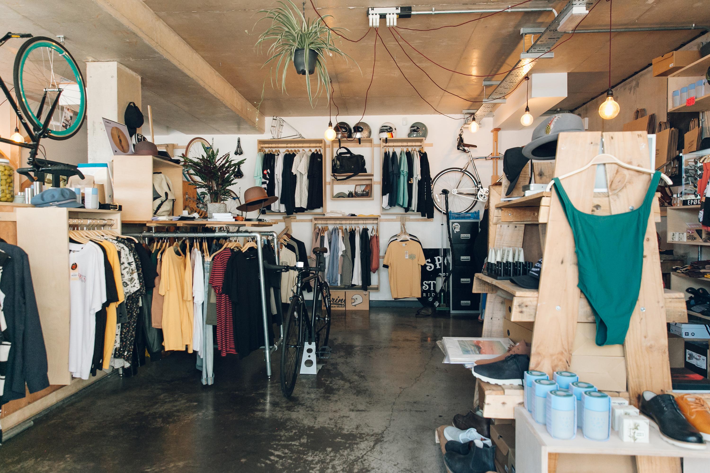
Furthermore, Canon’s Marsh is home to a young audience , with shops and cafés such as the Spoke and Stringer, aimed at a millennial traveller, a likely target market to utilise public darkroom facilities. One possibility of being within close proximity to such places would be to offer mutual
ORIGINAL SITE PLANS & ELEVATIONS
Since the site is under new construction for a 15 apartment residential development, the plans shown are for the new proposed layout. Showing the ground floor apartments and service stair with lift.
For the purposes of this project, I took the site in it’s current condition, which was a shell of a building with no roof or floor levels. The ground floor plan was therefore the most important plan to consider, as it gave me the dimensions of the walls and windows.
In addition this elevation was essential for calculating wall heights to fit with the existing windows.
KEY ATTRIBUTES:
• Original stonework remains in excellent condition
• Circular window and classic archways show character from the time of original construction
• Currently, the site has no roof, meaning there is reasonable grounds for vertical extension.
• The surrounding area and other businesses are in keeping with the proposal topic and attract a similar target audience
KEY ISSUES TO OVERCOME:
• The building is situated on the harbour edge, meaning if there were to be excessive flooding or poor weather, risks are involved
• Currently the building has no roof or floor levels, these will have to be established before other work can continue
• The structure has no roof. In order to be sesative to the original structure and avoid conventional design, no roof should be added, meaning areas of wet / dry will need to be established
INTERVIEW QUOTE:
The primary function of my project is to provide darkroom facilities for people to process their own negatives. Secondary functions include workshops, screenings, talks and events space and a potential retail element. Do you think there is place for the scheme within Bristol?
And is there anything else you would like to see within the scheme?
I think that there is definitely place for the concept, affordable darkroom access would be widely used amongst Bristol photographers, as well as other creative outlets, nowhere currently exists in Bristol that houses all of the above under one roof so I can imagine it would be very popular in such an art orientated city.
INTERVIEW QUOTE:
Shooting film isn’t your full-time job, when do you find the time to shoot? And what occasions inspire you to carry a camera?
Evenings and holidays, nights out too. When the light is good and when my friends look good. I almost never leave the house without a camera
INTERVIEW QUOTE:
JAMES, 24
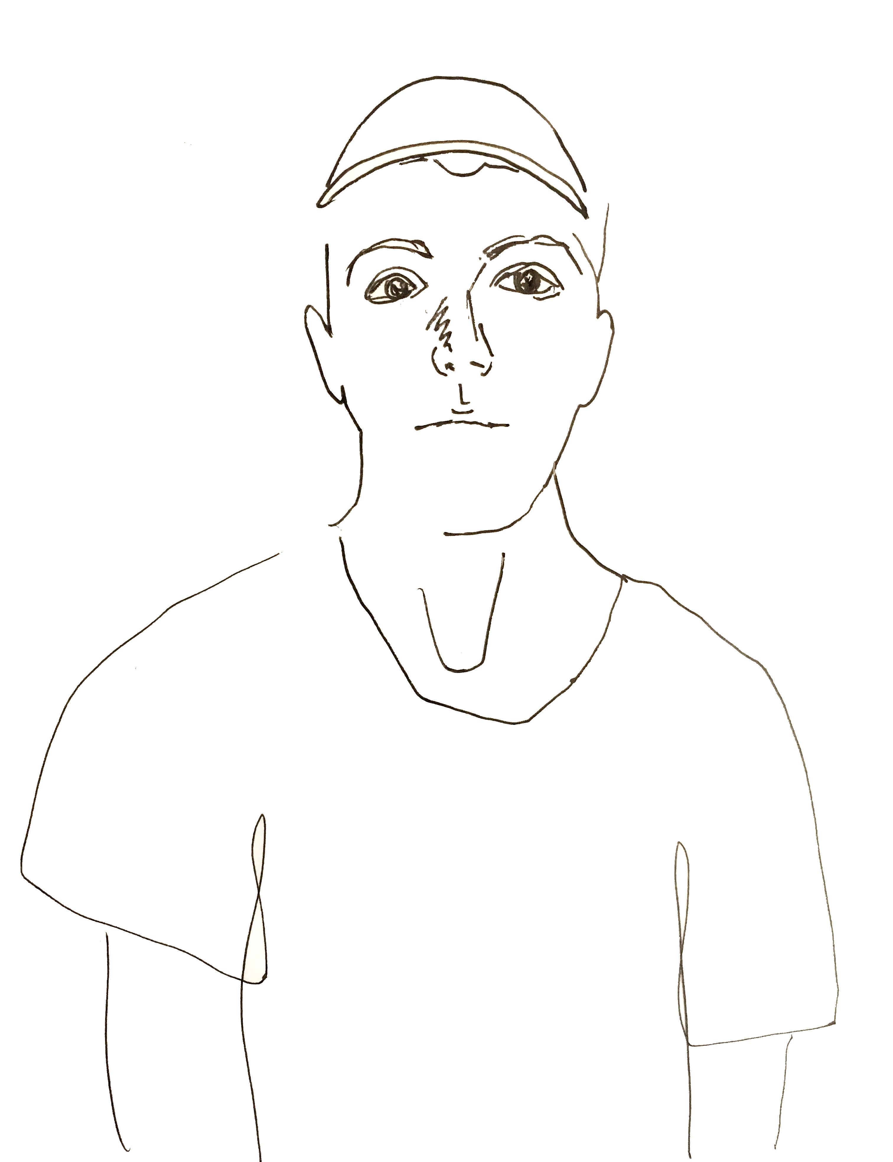
HARRY, 24

I am designing a concept for the exploratory project, that involves housing functions aimed at an analog community. Do you connect with other people that shoot film currently? Through what means?
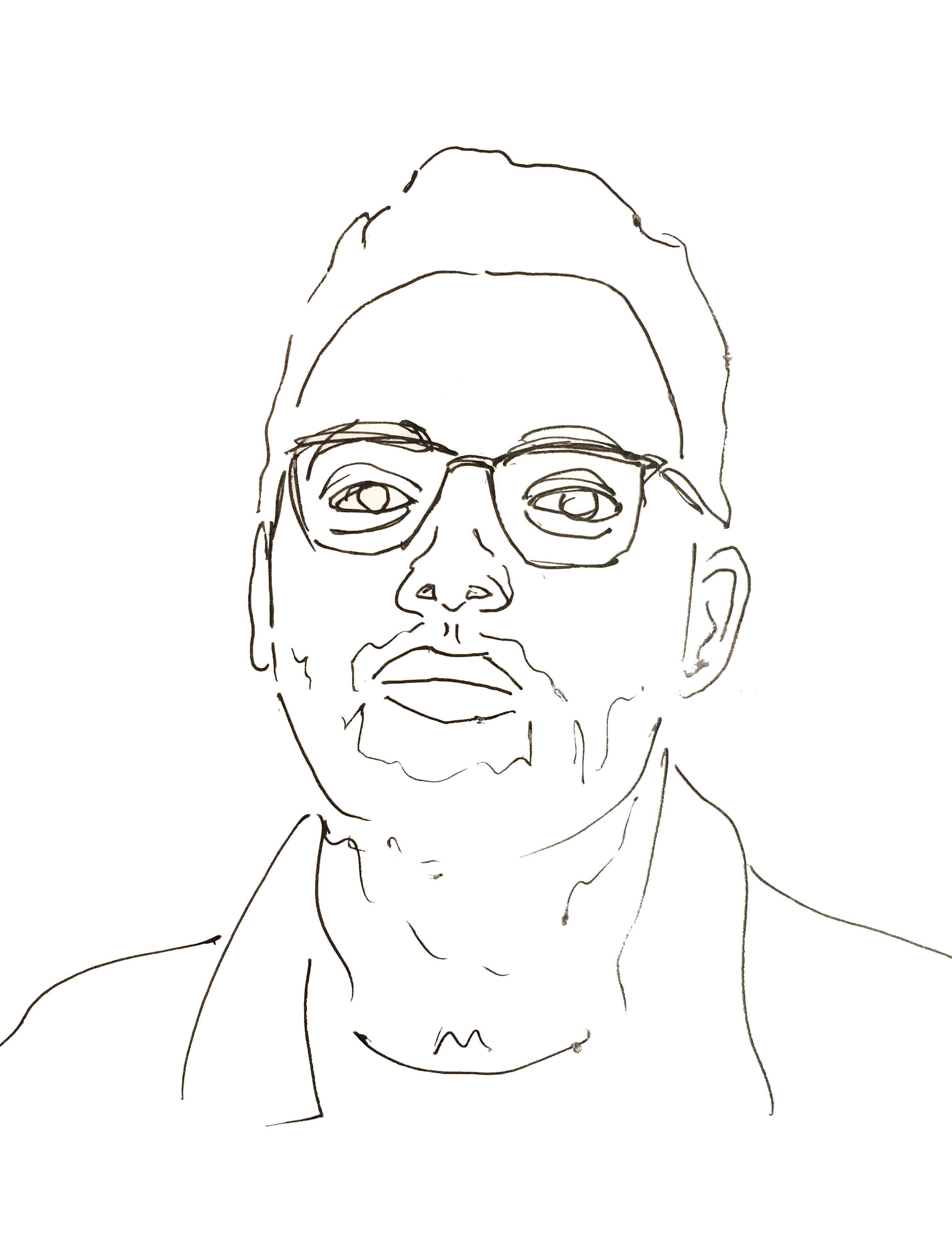
I met other photographers while at university, but more recently I meet other photographers through Instagram because it’s the easiest way to organise shooting with other people and make friends. Instagram is my got to platform, it makes sense, but it’s so difficult to find people in person, it just doesn’t happen.
JACK, 24


WHY IS THE CONCEPT USEFUL?
In a survey conducted for the purposes of this research report, those questioned provided some interesting data, which highlighted a gap in the creative market to provide facilities of use to analog photographers. 0% of those questioned had ever utilised a public darkroom, and therefore either pay for development of process their own film in private facilities.
SURVEY RESULTS:
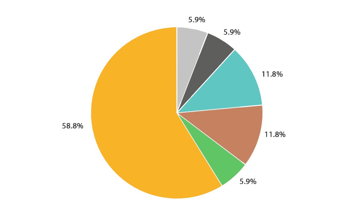
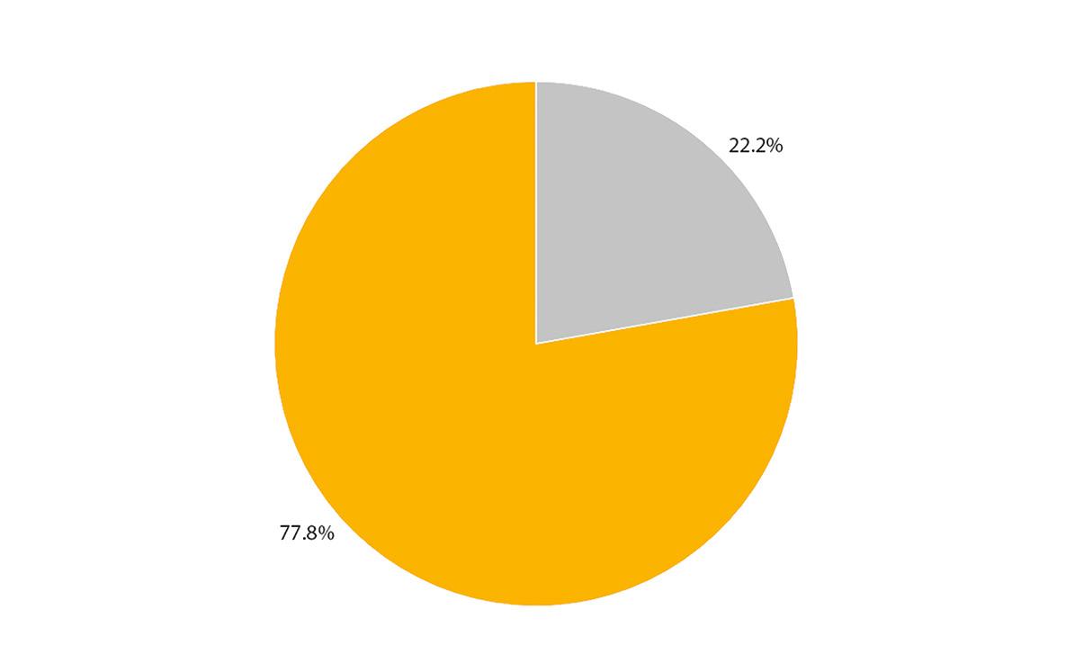
The yellow segment in figure 1 demonstrates that 58.8% of the people questioned pay to have their film developed in store as opposed to developing it themselves. In addition, the yellow in figure 2 shows those who would opt to develop their own film given access to proper instruction and facilities at a reasonable price, indicating the usefulness of the proposal.
Image credit - Fox Darkroom Gallery
HOW IS THE CONCEPT EXPLORATORY?
UNIQUE OPPORTUNITY
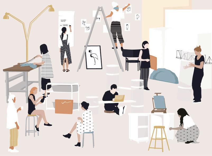
Very few people have the opportunity or the resources to develop film themselves at an affordable price . Of the few darkroom labs that are located within the UK, there are none within Bristol City Centre with public access, showing a gap in the market. These functions don’t exist all under one roof, meaning it will provide a new opportunity for people to come together within the city.
MEMBERSHIP SCHEME
Money has to come from somewhere to fund a community led concept such as this. One method to fairly gain access to all of the facilities would be to introduce a membership scheme. This could exist with tiered levels with appropriate pricing where members could access the facilities included within their band of membership. Having members will naturally create a community atmosphere and allow people to come together within the space.
RETAIL OPPORTUNITY
The amount of people who purchase film in person is also in decline due to the lack of variety and unaffordable prices. A retail opportunity is therefore created with a captive audience in order to create loyalty. This concept would not require staff , a simple contactless payment system would be implemented.
HISTORIC PROCESSES & WORKSHOPS
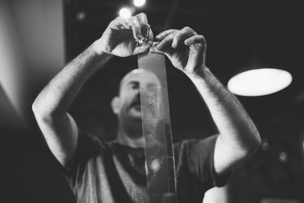
The chance to be in touch with historic photographic processes is an ever rarer and dearer experience for those without the knowledge and experience. It can be intimidating and potentially hazardous to use chemicals for development at home, therefore offering potentially new techniques to even experienced photographers.
Image credit - Toffu content library
STRATEGY OVERVIEW
Research images, concept / spacial planning diagrams, master mood board, architectural prosthesis research, case study inspiration
WHAT IS AN ARCHITECTURAL PROSTHESIS?
CASE STUDY INSPIRATION
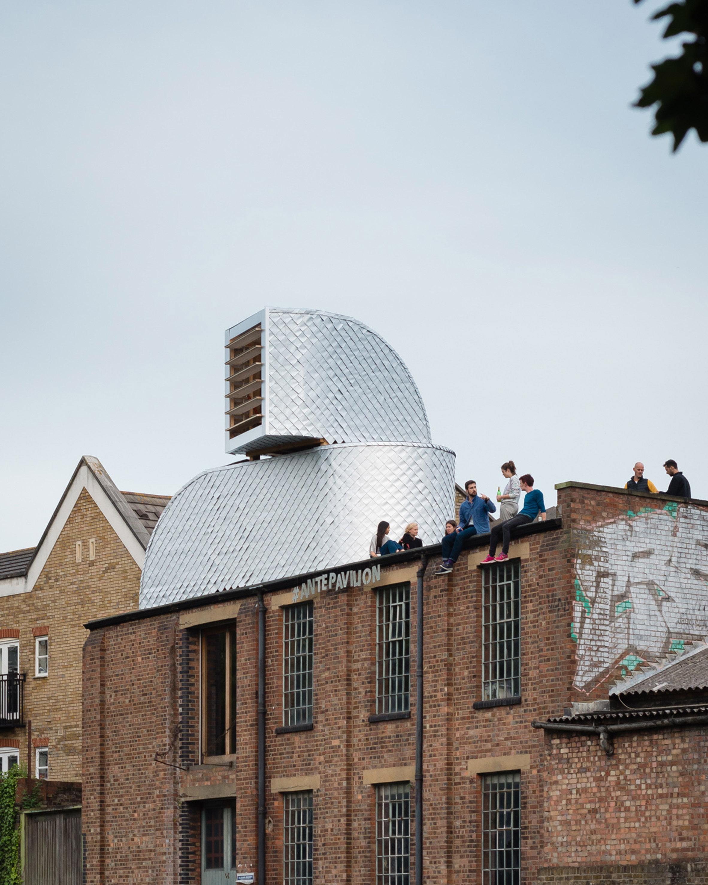
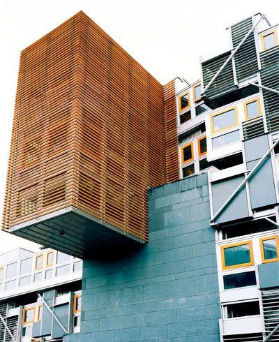
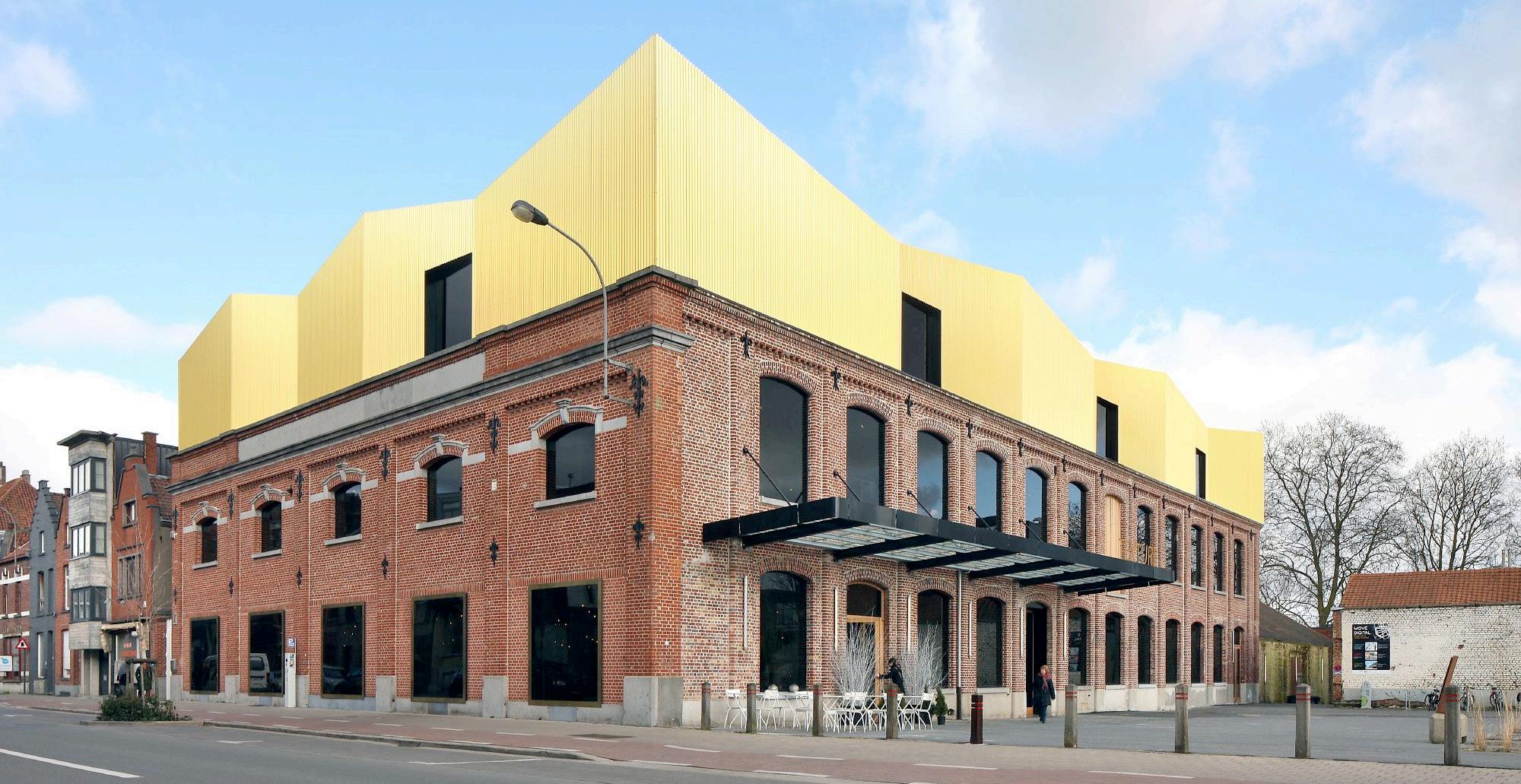
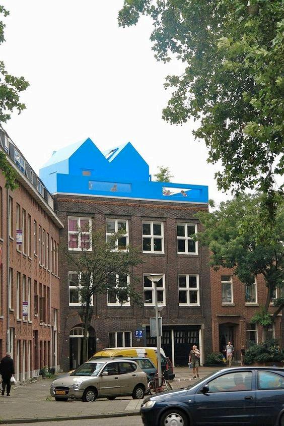
Similar to the concept of parasitical architecture, which is defined by structures that counterpoint the existing building to which they are attached. Prosthetic architecture involves structures that cling on to existing buildings in a parasitic manner, similar to the way limpets or barnacles affix themselves to rocks or insertions which occupy unlikely or unused spaces.
Image credit from left to right - Jim Stephenson for PUP Architects, Unkown for Miralles Tagliabue EMBT, Unknown photographer for noAarchitecten, unknown photographer for MVRDV Architects.
MASTER CONCEPT MOOD BOARD
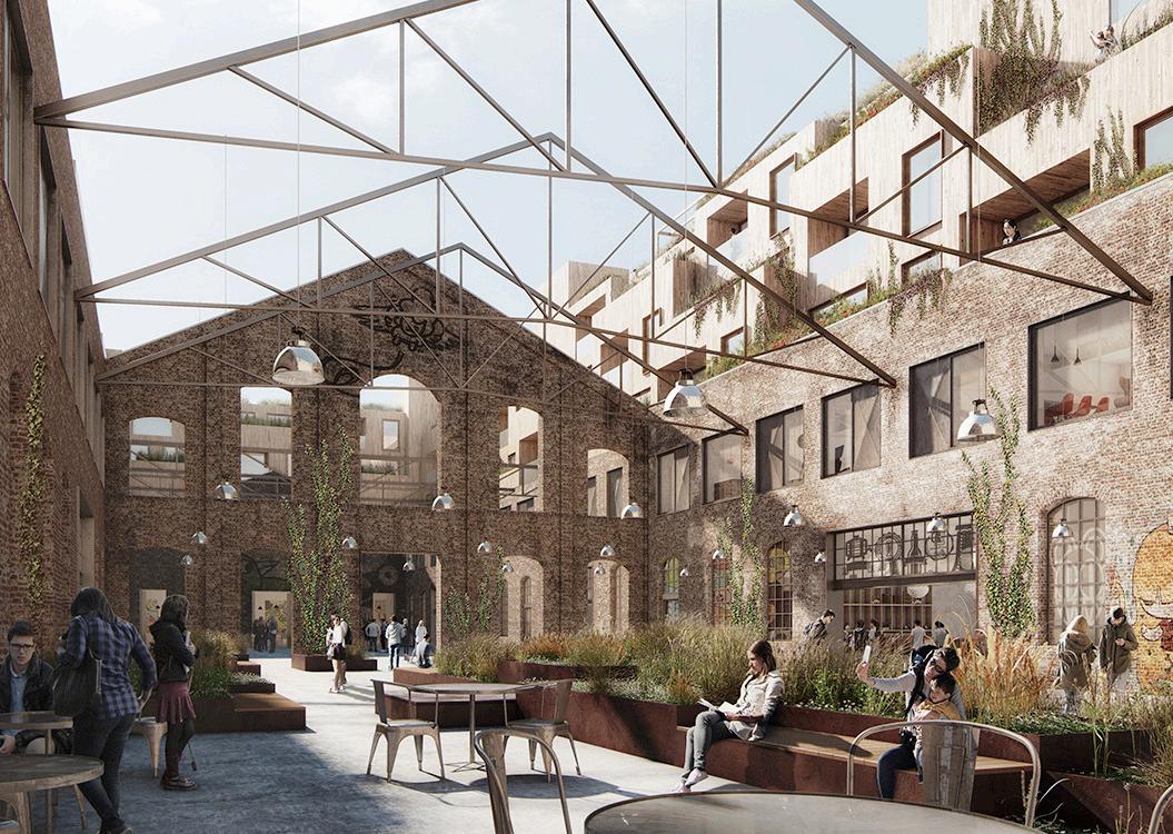
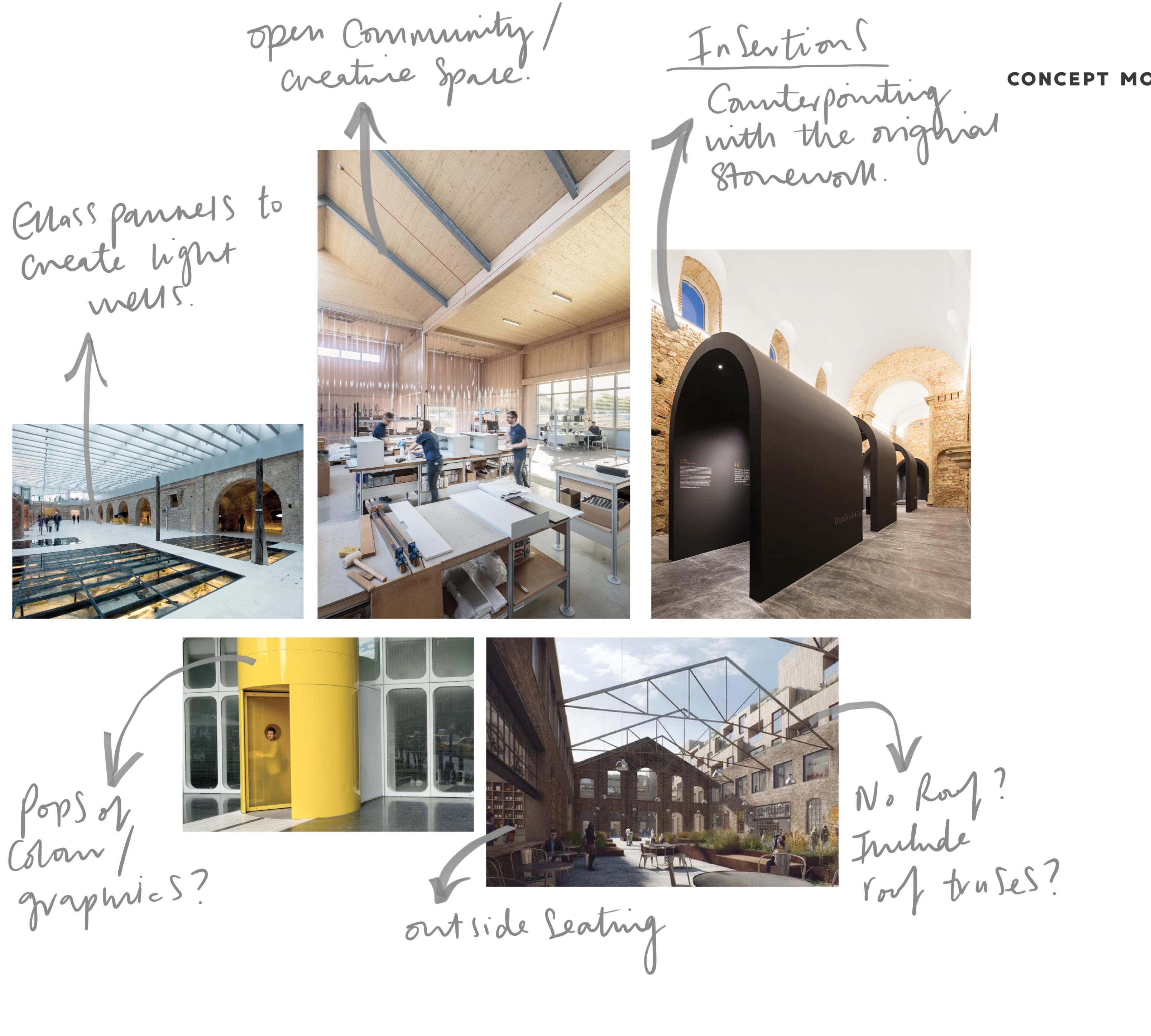
Shown left is my concept mood board. These selected images demonstrate my key moves and illustrate my thinking towards creating a thriving community led space with a consistent architectural language.
1. Glass panels rather than voids , allows light to filter down into the ground floor space while remaining protected from the elements.
2. Community atmosphere . This is vital to the project. I think the furniture layout will be the biggest contributor to how effectively the space is used. A mixture of causal and formal seating in addition to functional spaces will suit every user.
3. Insertions (Architectural prosthetics) . These comprise my boldest architectural move within the project and house the window spaces of my first floor. Black, whilst being functional for a darkroom also counterpoints with the original stone creating an interesting juxtaposition.
4. Pops of colour and graphical elements create an environment suited to a creative community which feels comfortable rather than clinical.
5. Roof truses . These enhance and celebrate the industrial vernacular of the site, whilst also providing a stable platform for an optional roof in the winter months.
Image credit from left to right - B4FS Arquitectos, Vitsoe Furniture, Fernando Guerra | FG+SG, Barry Winiker for the Royal Standard Hotel, Unkown photographer for JAJA Architects.
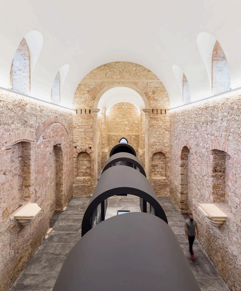
DAMIÃO DE GÓIS
MUSEUM, PORTUGAL 2016/2017, 175M 2
SPACEWORKERS ARCHIETCTS
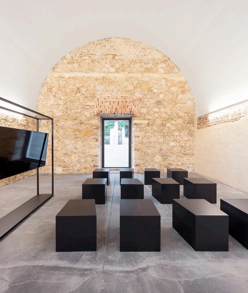
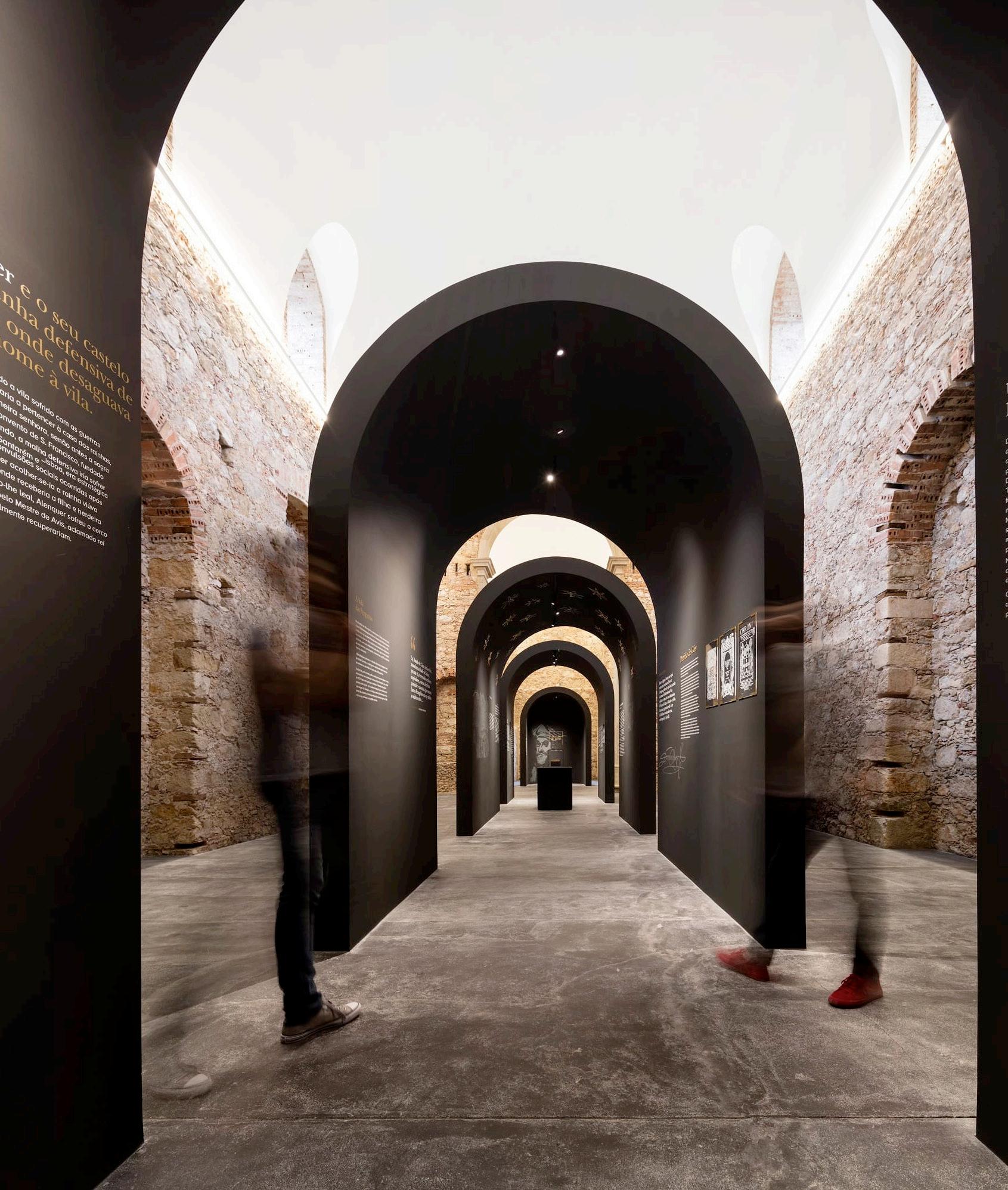
“The intervention focuses on the creation of an exhibition structure, alluding to the life and historical legacy of Damião de Gois, inside an old, restored church in Alenquer. The church, now emptied of this function, is now a “container” space with its own identity, marked by the geometry of its vaulted ceilings and the texture of its brick walls, with great plastic value. The proposal seeks precisely to value the plastic characteristics of space and minimize its impact on pre-existence, respecting the existing, moving away from the walls, seeking a central position in space, assuming a geometry that is familiar to the building , originated by an offset to the shapes of the ceiling and walls, capturing the configuration of the void that exists in a kind of dark colored, fragmented nucleus that receives and organizes the exhibition and the visitors. The exhibition space is assumed as a delicate black element that invites its discovery and that stands out from the remaining chromatism of the existing space, without ever overlapping it but without losing its spatial characteristics”.
Text quoted from the architect - key takings highlighted in bold.
Image credit - Fernando Guerra | FG+SG
CONCEPT DIAGRAMS
LIGHT AND DARK (NOT TO SCALE)
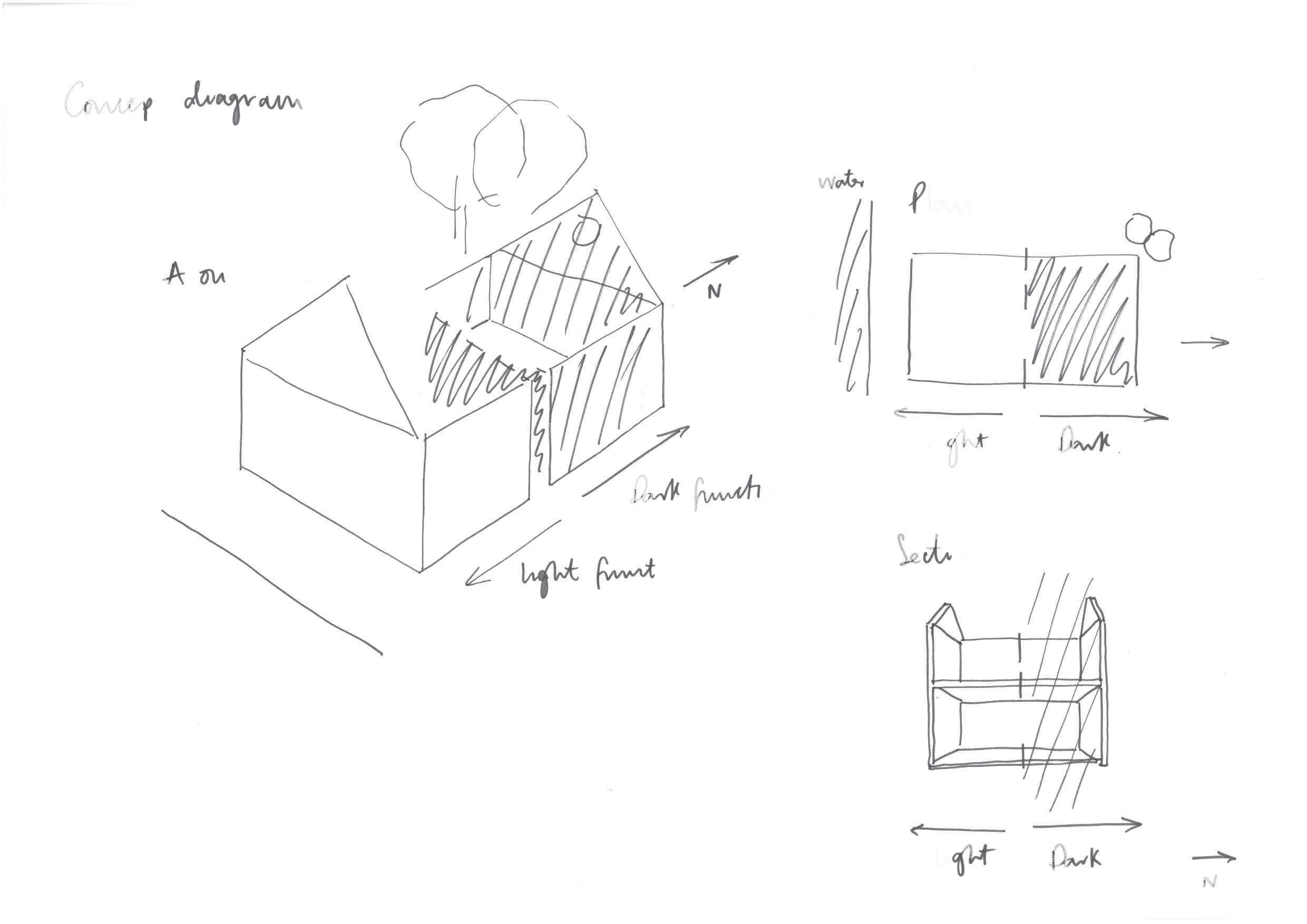
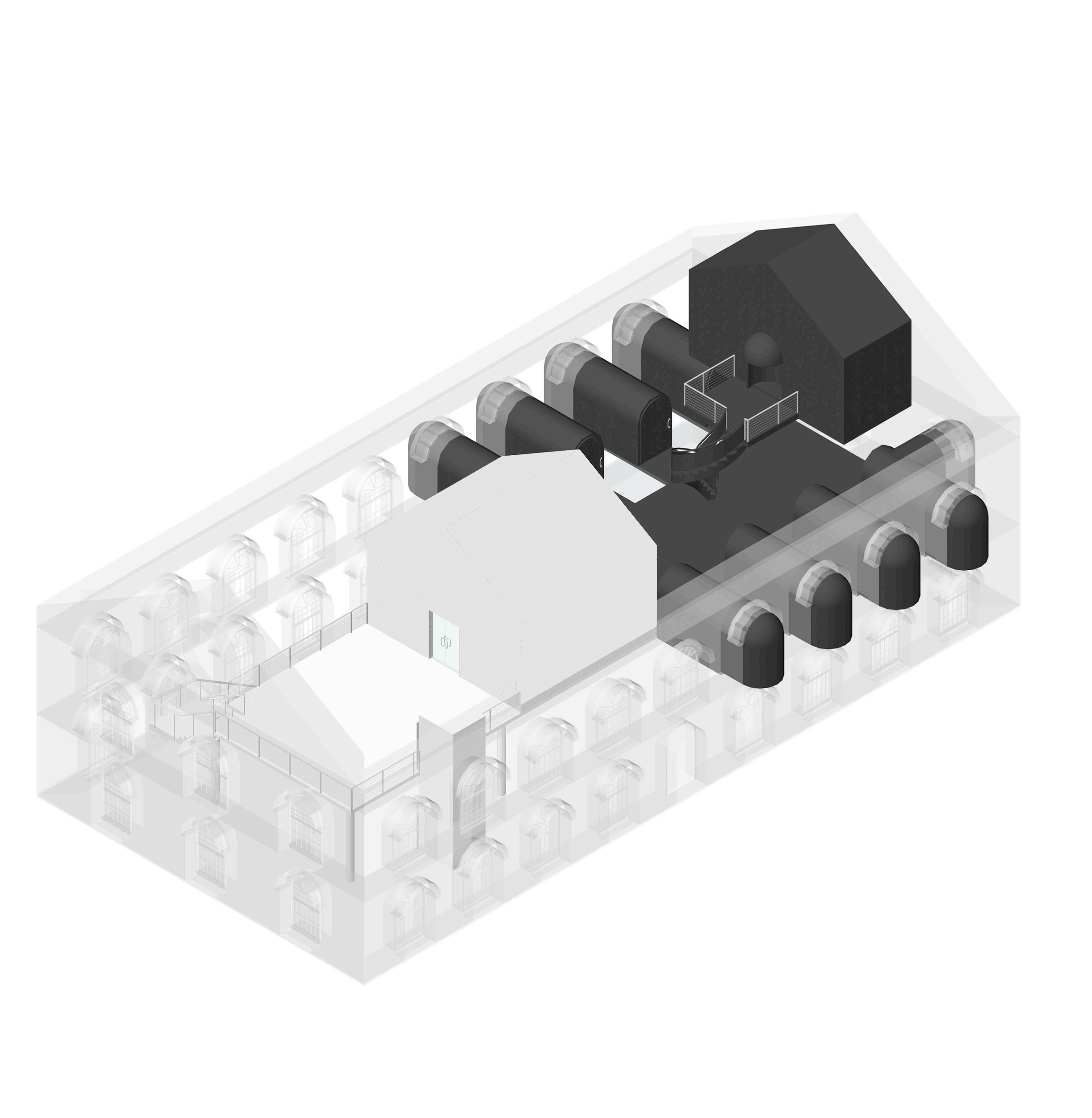
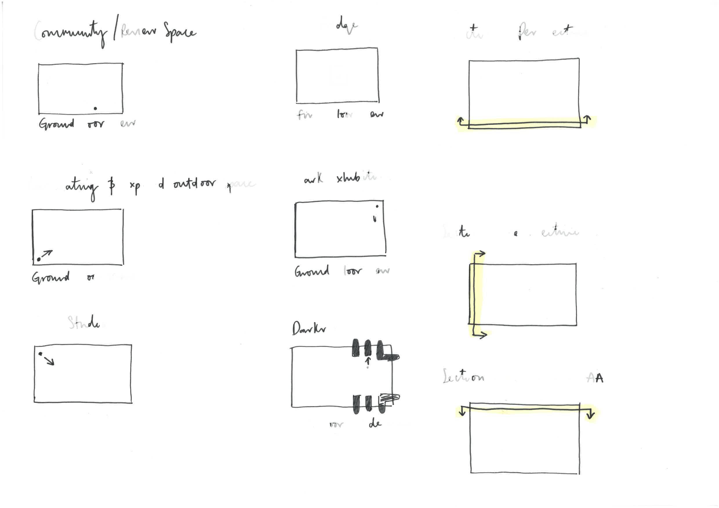
The spacial organisational is based on a line of symmetry that runs through the centre of the building. All functions that require light including studio space and open community areas are based in the south (light) side and dark functions including the darkroom spaces and the exhibition are housed in the North side of
Shown here is a diagram demonstrating the position of the darkrooms, which puncture through the first floor windows, and the tuition darkroom that sits on a
CONCEPT DIAGRAMS CONTINUED
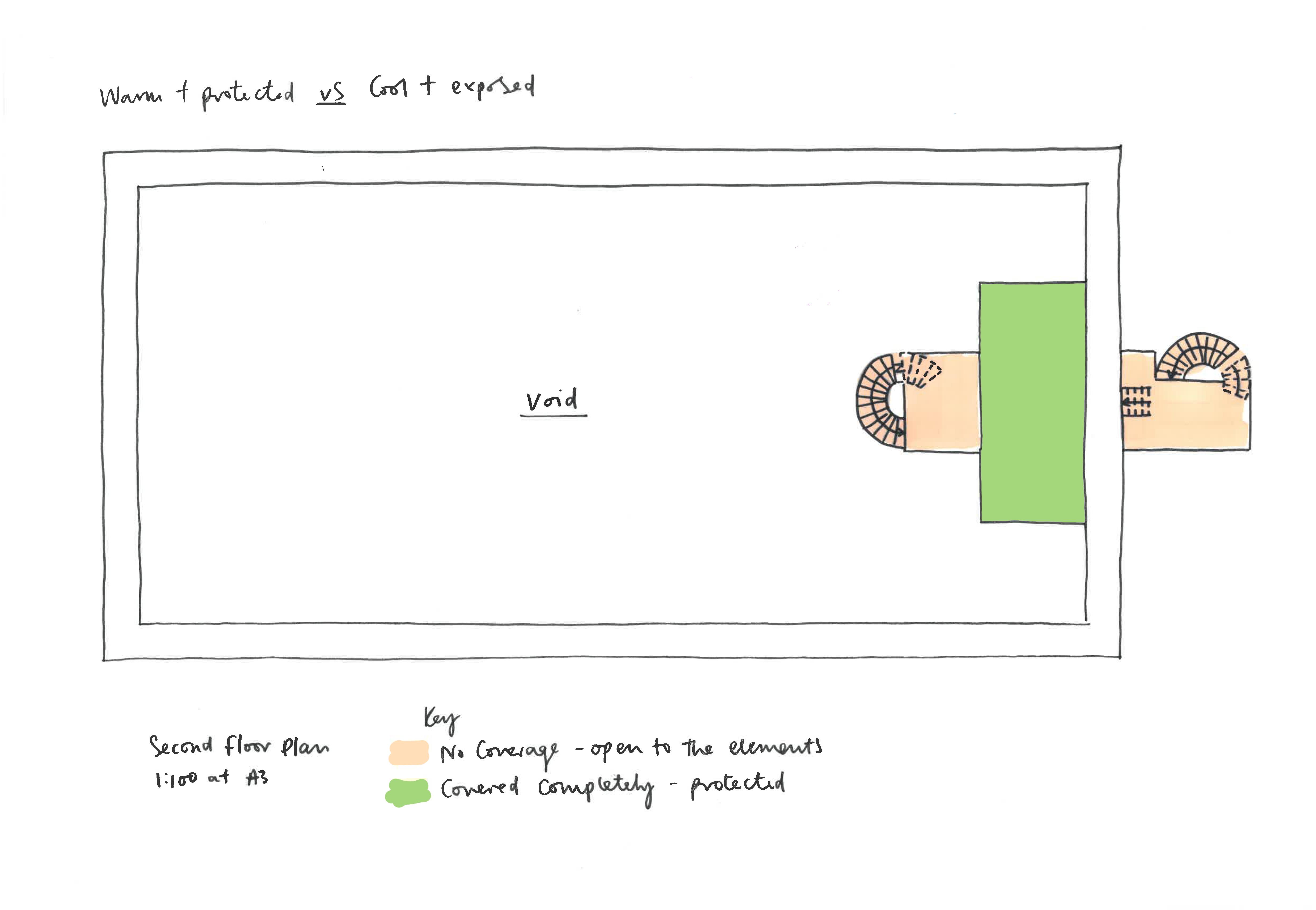
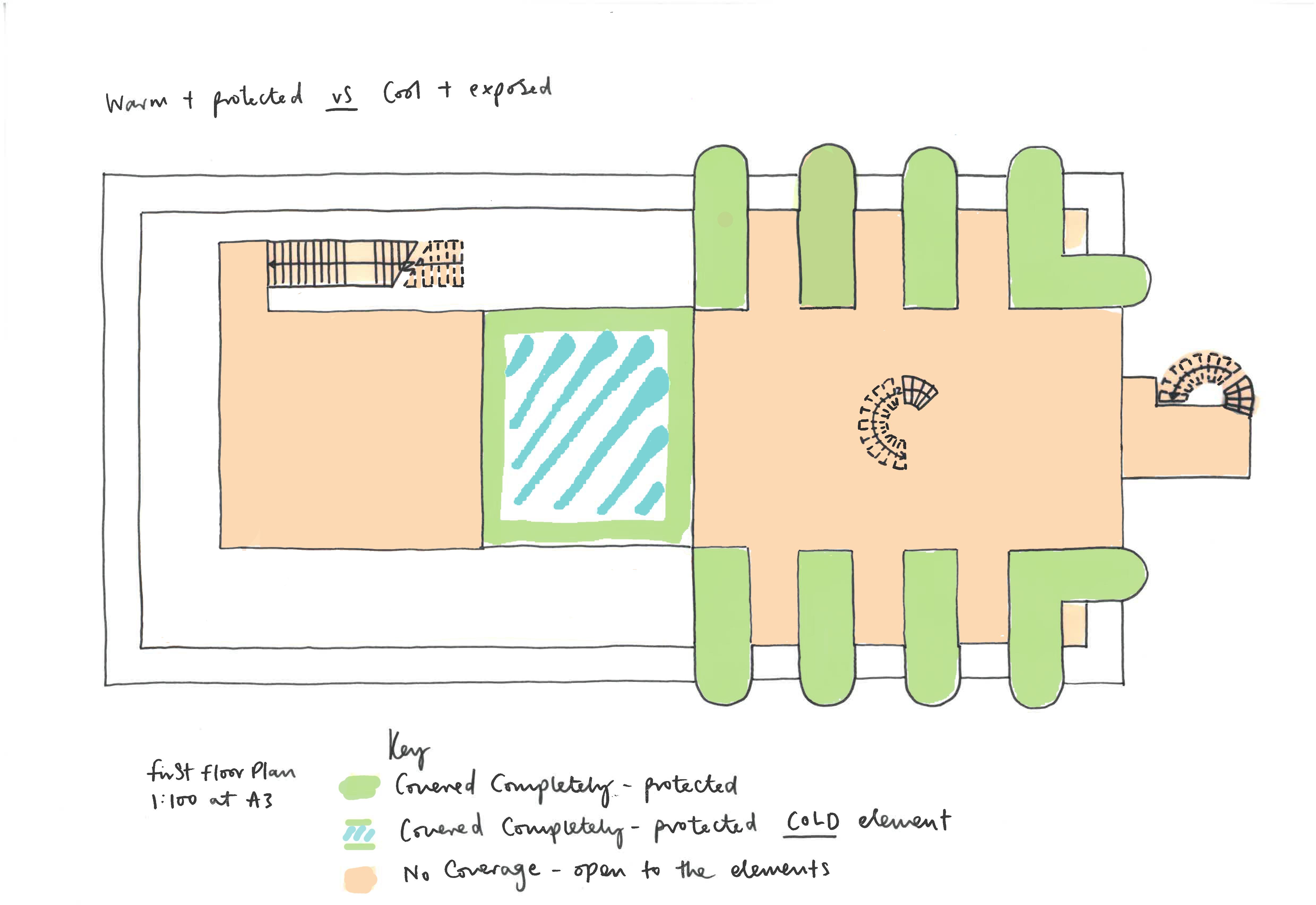
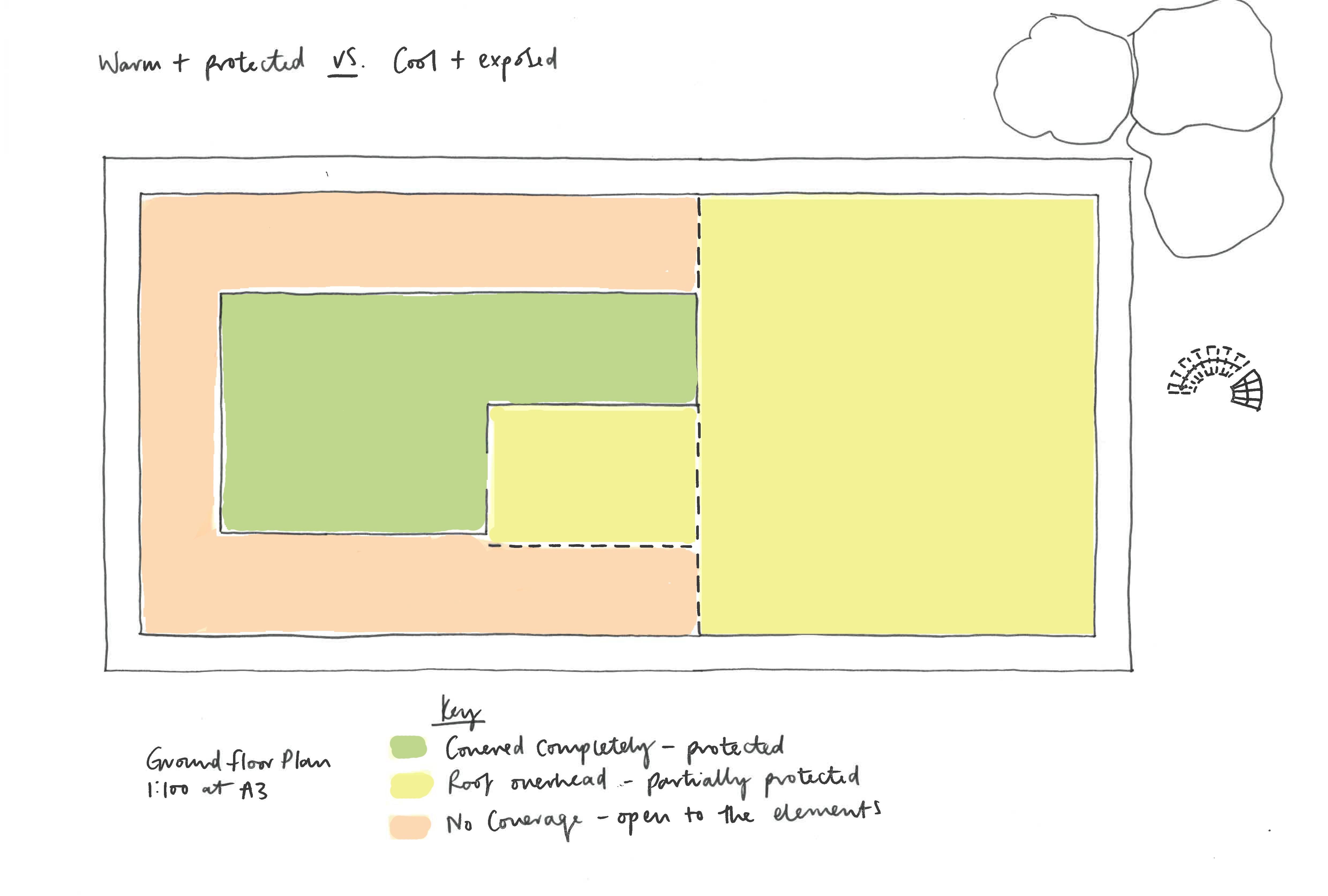
COLD / TEMPERATE (SHOWN RIGHT) (NOT TO SCALE)
In addition to being divided into light / dark the space can also be distinguished into spaces which are protected and those that are open to the elements i.e. cold and temperate areas.
CONCEPT DIAGRAMS CONTINUED
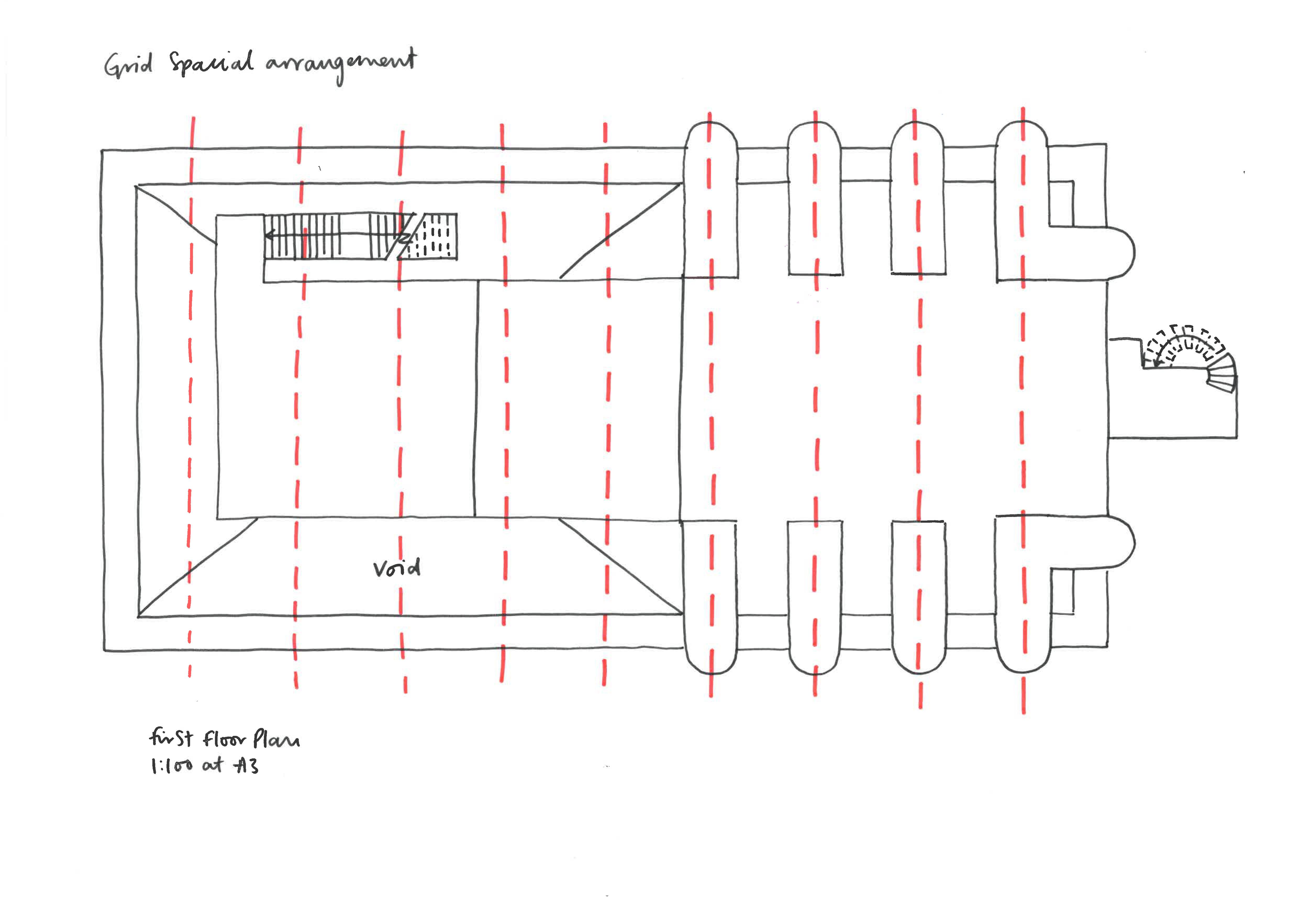
GRID SPACIAL ARRANGEMENT (SHOWN BELOW)
(1:100 AT A3)
The spacial organisational is also based on a pre-existing grid arrangement distinguished by the windows.
DEVELOPED DESIGN SOLUTION
Plans, elevations, sectional elevations, axonometric drawing
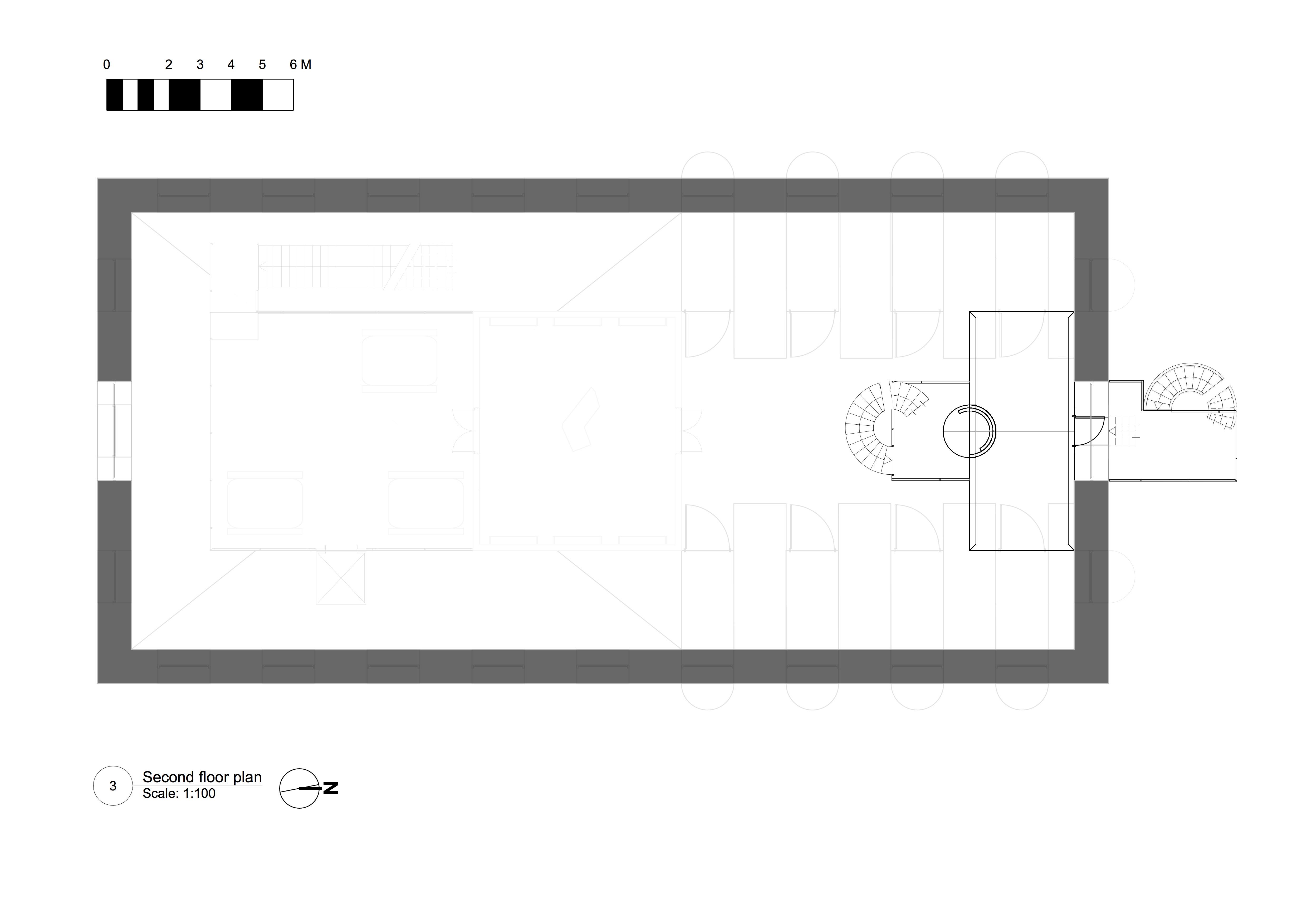



Shown here are renders from Cinema 4D of the building exterior featuring the new additions. The architectural language is parasitic, with the aim to inflict minimum disruption on the existing structure. The darkroom spaces invade the first floor windows, while a mezzanine level stretches lengthways through the space.
FRONT ELEVATION - WEST FACING (1:50 AT A1) MODEL VIEWPOINTS (NOT TO SCALE)

RIGHT ELEVATION - NORTH FACING (1:25 AT A1)
AXONOMETRIC (NOT TO SCALE)
This axonometric has been exploded in an attempt to demonstrate the essential elements to the concept including the new mezzanine level and the fridge.

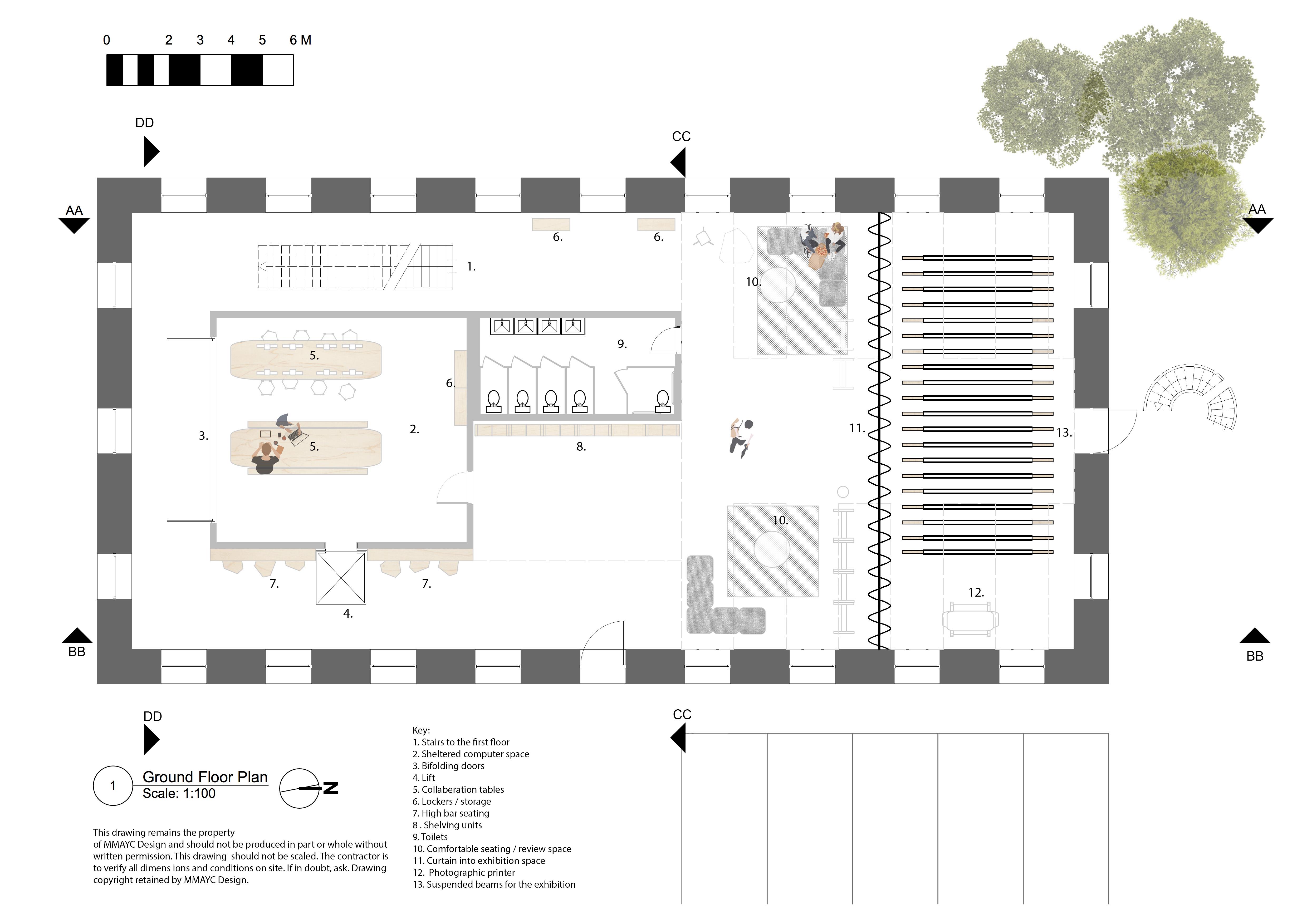
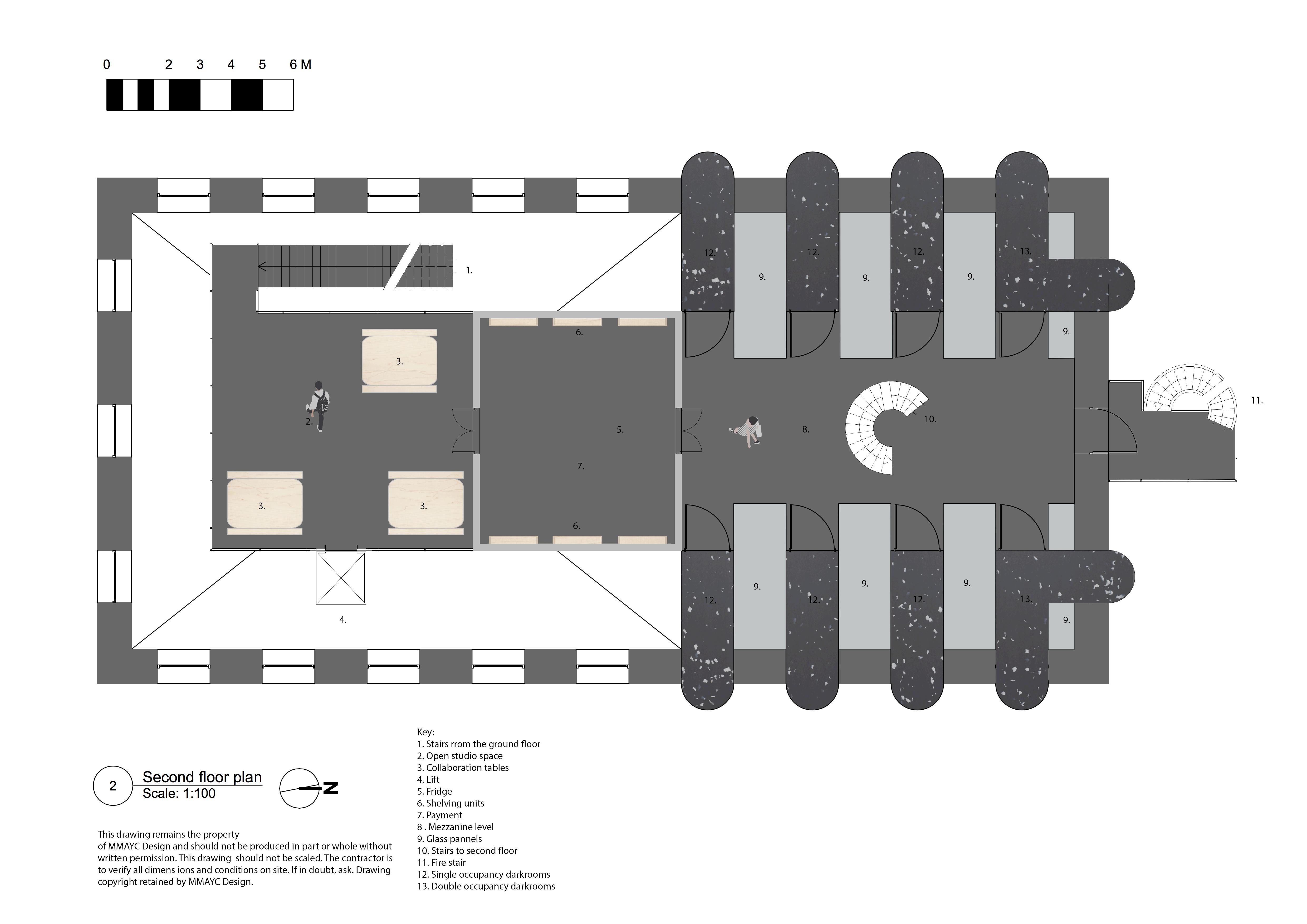
CONTEXT FLOOR PLANS (1:100
AT A3)
This modified set of floor plans demonstrates activity and texture in addition to natural shadows caused within the building
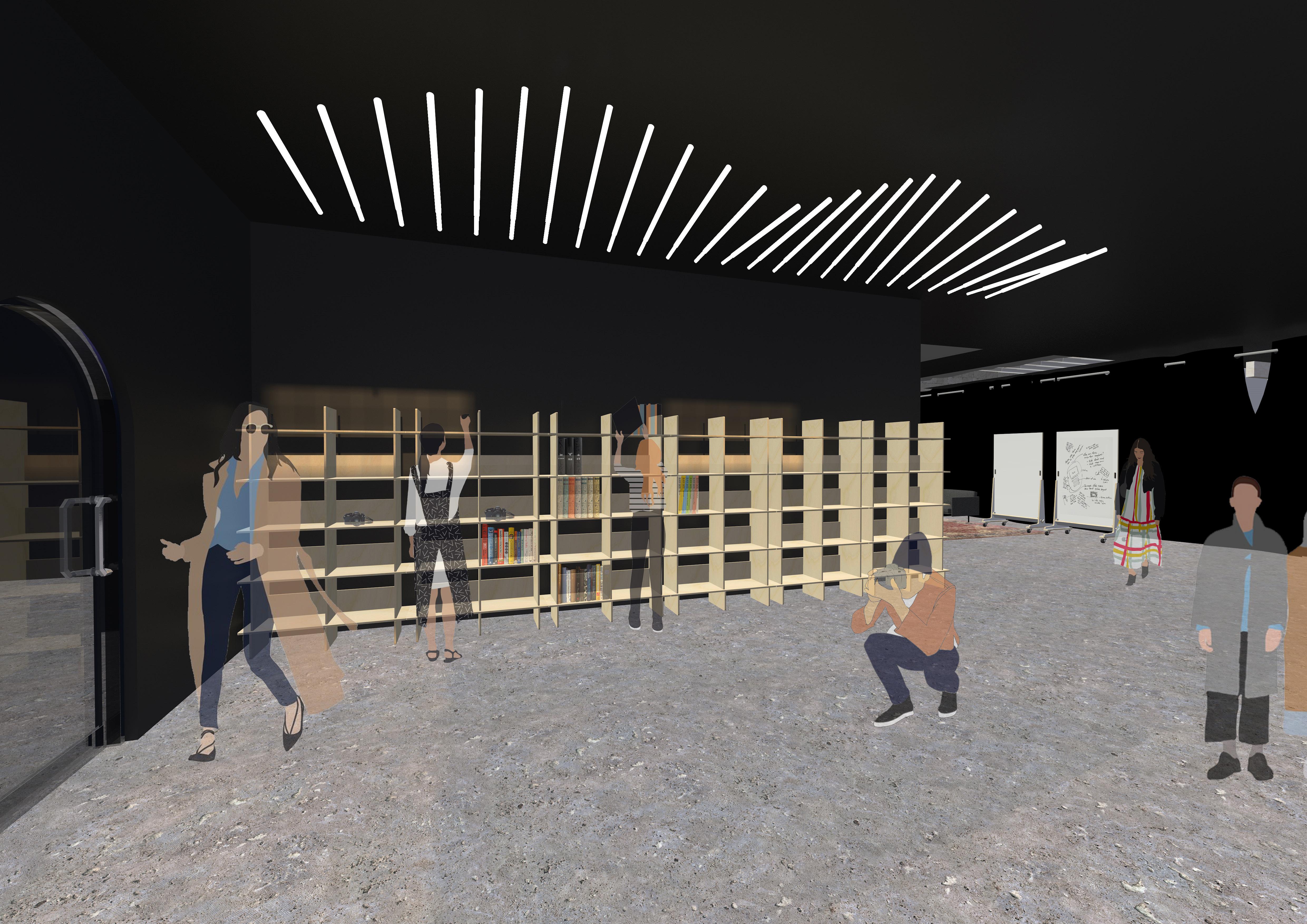
1. ENTRANCE SPACE
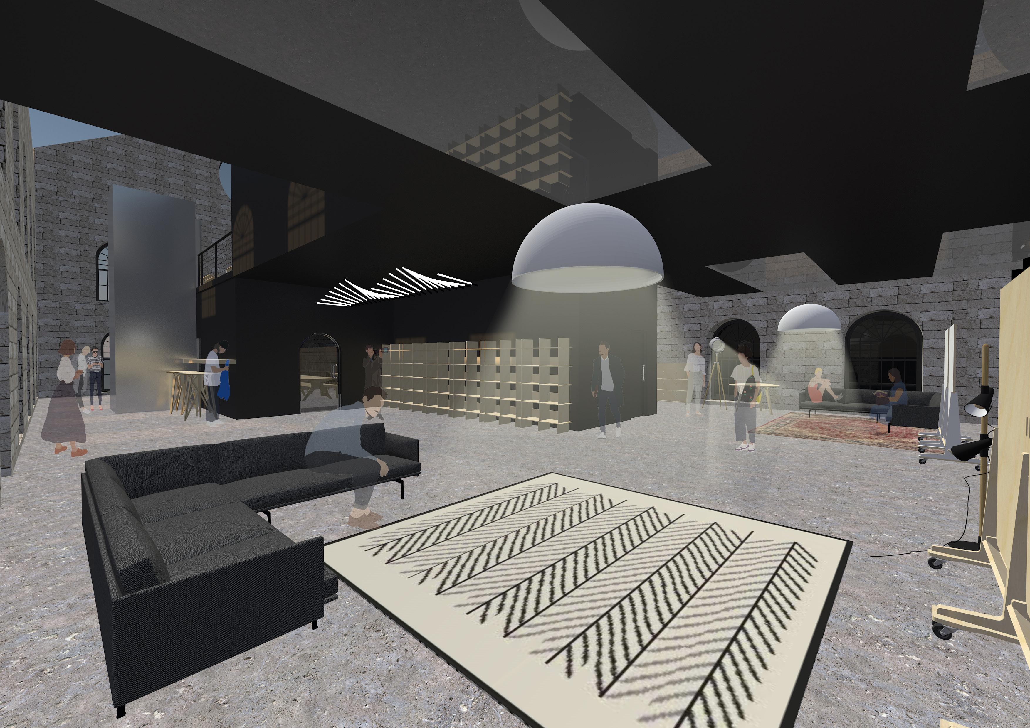
Shown in this visual, the entrance space. Access to the flexible studio on the left hand side, toilets including an accessible WC on the right. On the far right, the curtain to the dark exhibition can be seen and comfortable modular seating elements in either corner. One of the most notable parts of this visual is the Deltalight x OMA XY180 lighting feature above the shelving to create visual interest.
3. FLEXIBLE STUDIO SPACE
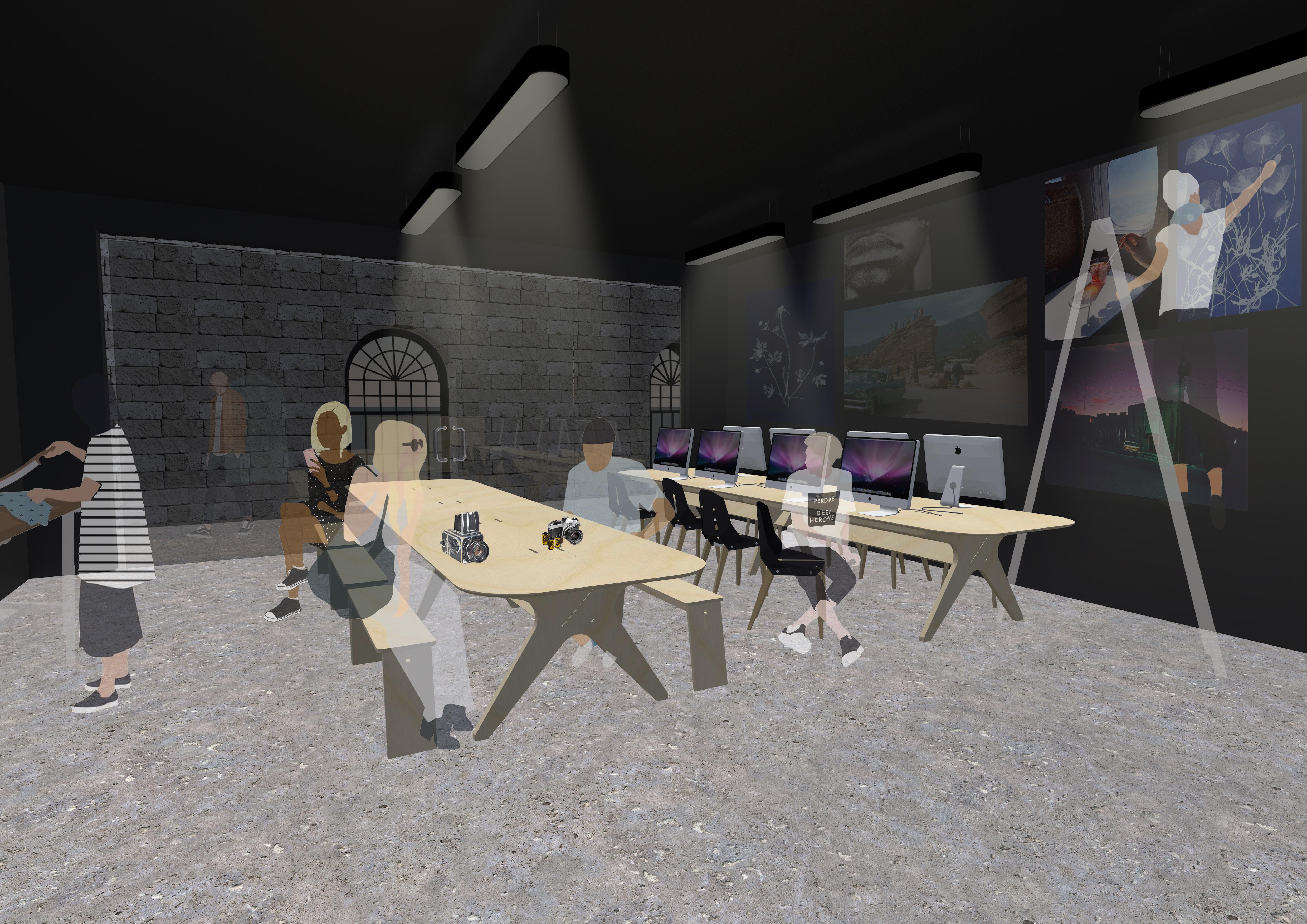
The ground floor is home to an adaptable sheltered studio space. Temporary furniture including long collaboration tables are housed here for mixed purpose. Unlike the studio on the first floor, this one has a permanent roof meaning IMacs can be housed and used here away from the elements. Bi-folding doors provide the option to open and expand this space. Purposefully kept fairly neutral, this space is free for the user to utilise and change to meet their needs.
Talks, screenings and workshops could also be held in this area, giving the potential for evening use and continuous use throughout the day even in quiet periods.
5. OPEN STUDIO
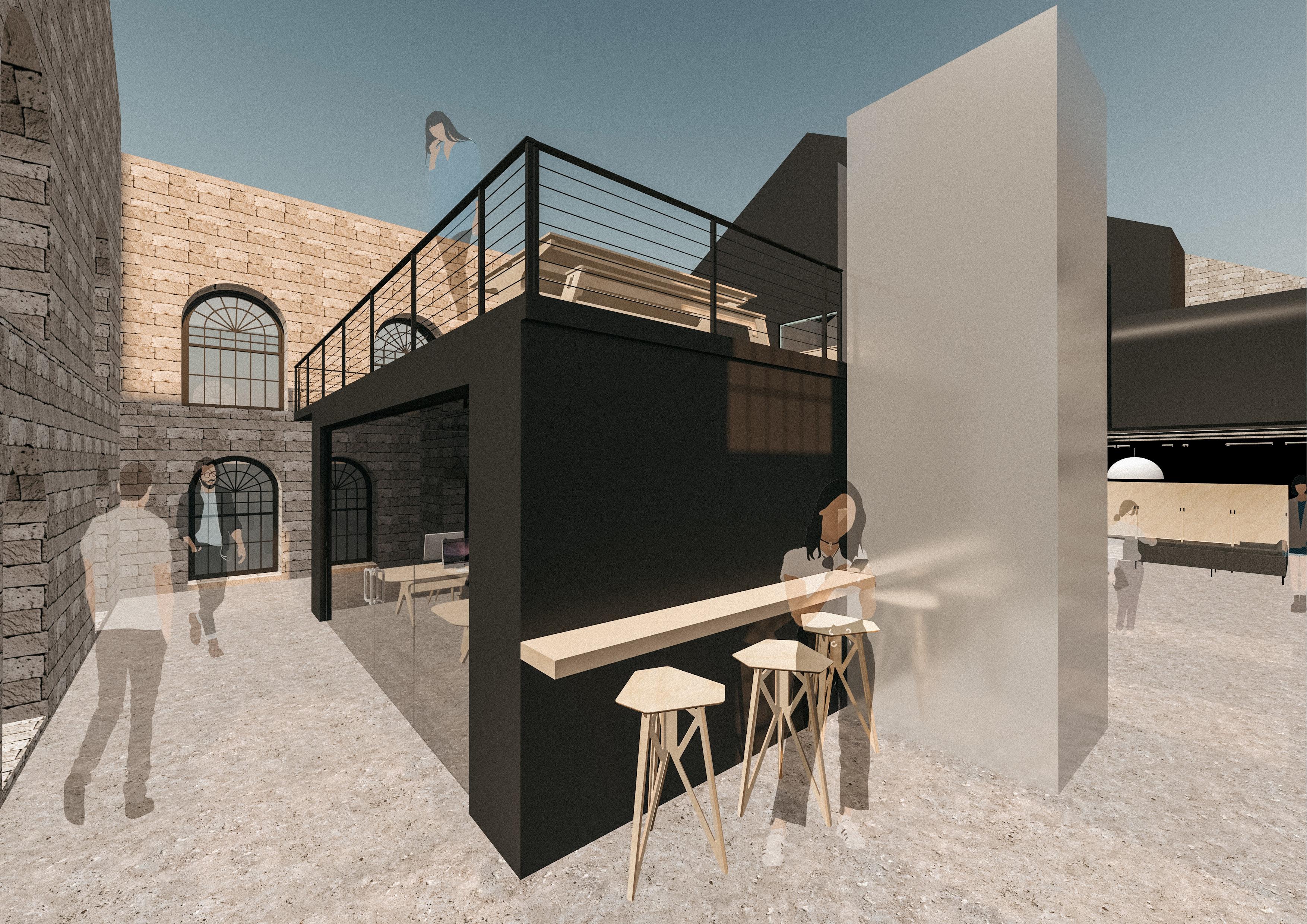
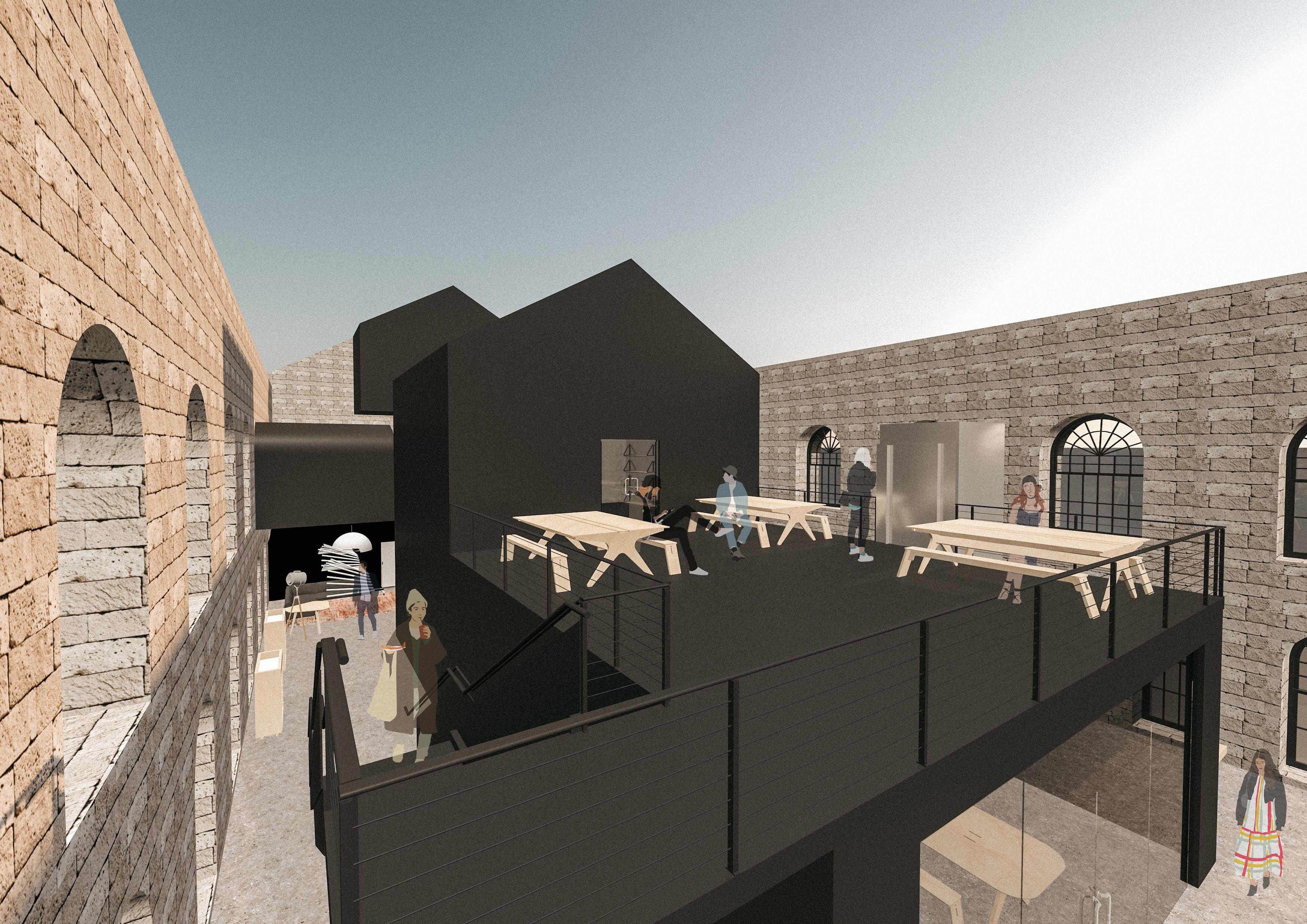
The staircase from the ground floor leads to an open mezzanine level, which houses multi-use studio space. There are long collaboration tables, which can be used for workshops. Circulation is directed then into the ‘Fridge’, seen here with a pitched roof, mimicking the original structure. You can see from the visual that there is no roof covering this part of the concept, meaning that this studio, unlike the one housed on the ground floor is open to the elements.
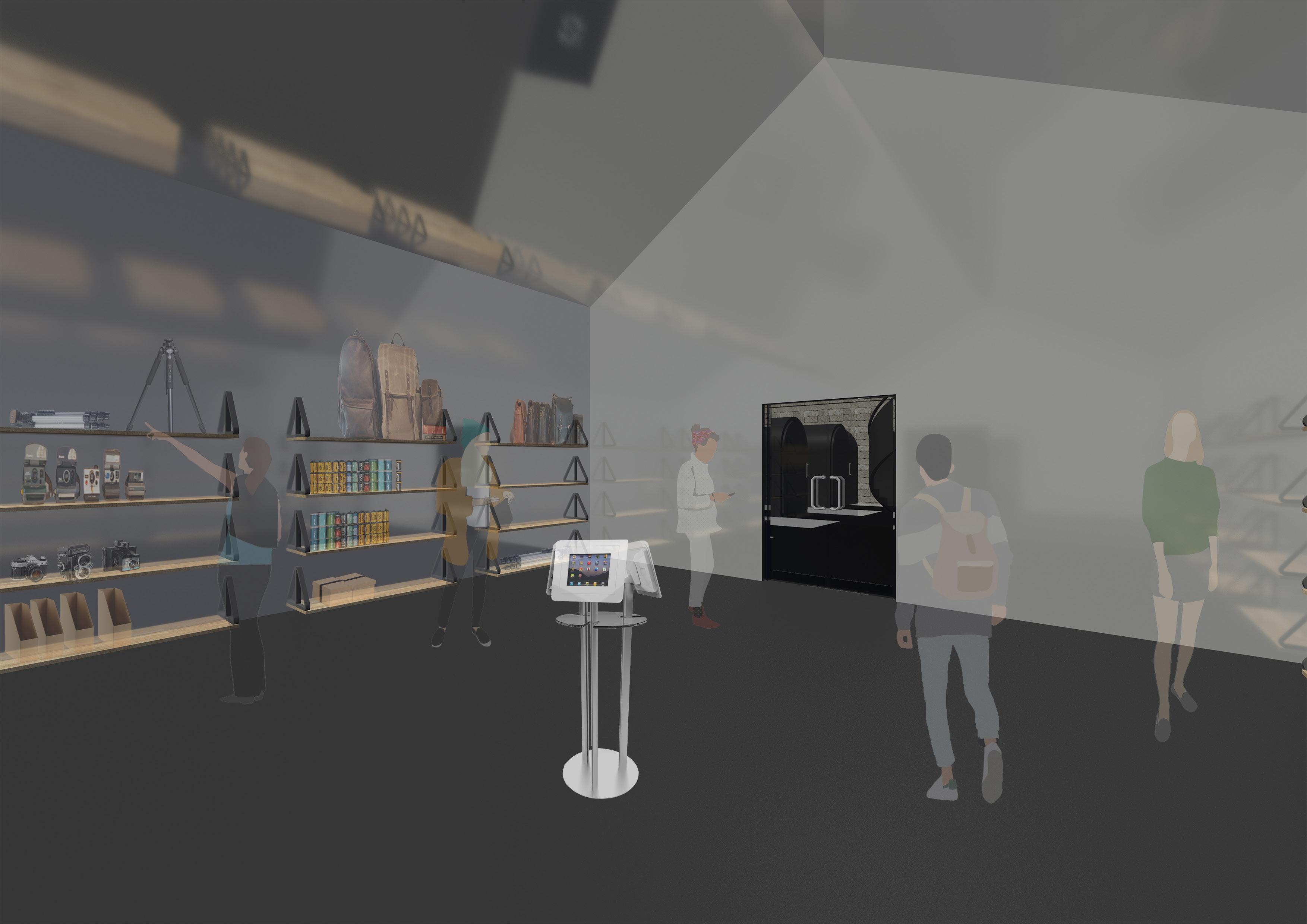
fridge. Double doors therefore seal it off from the mezzanine level on either side. Inside, the walls are a chrome surface, keeping the internal space as cold as possible. Here, film and photographic paper are stored and displayed on simple shelving units for the user to purchase if necessary. This responds to the user feedback, who wanted the opportunity to purchase film in person rather than through online retailers. This concept doesn’t rely on staff and has a simple contactless payment method option to avoid creating a commercialised atmosphere.
The reflective surface in this space would be uneven and random, created using a process utilising chemical infused liquid silver. (Specified in materials)
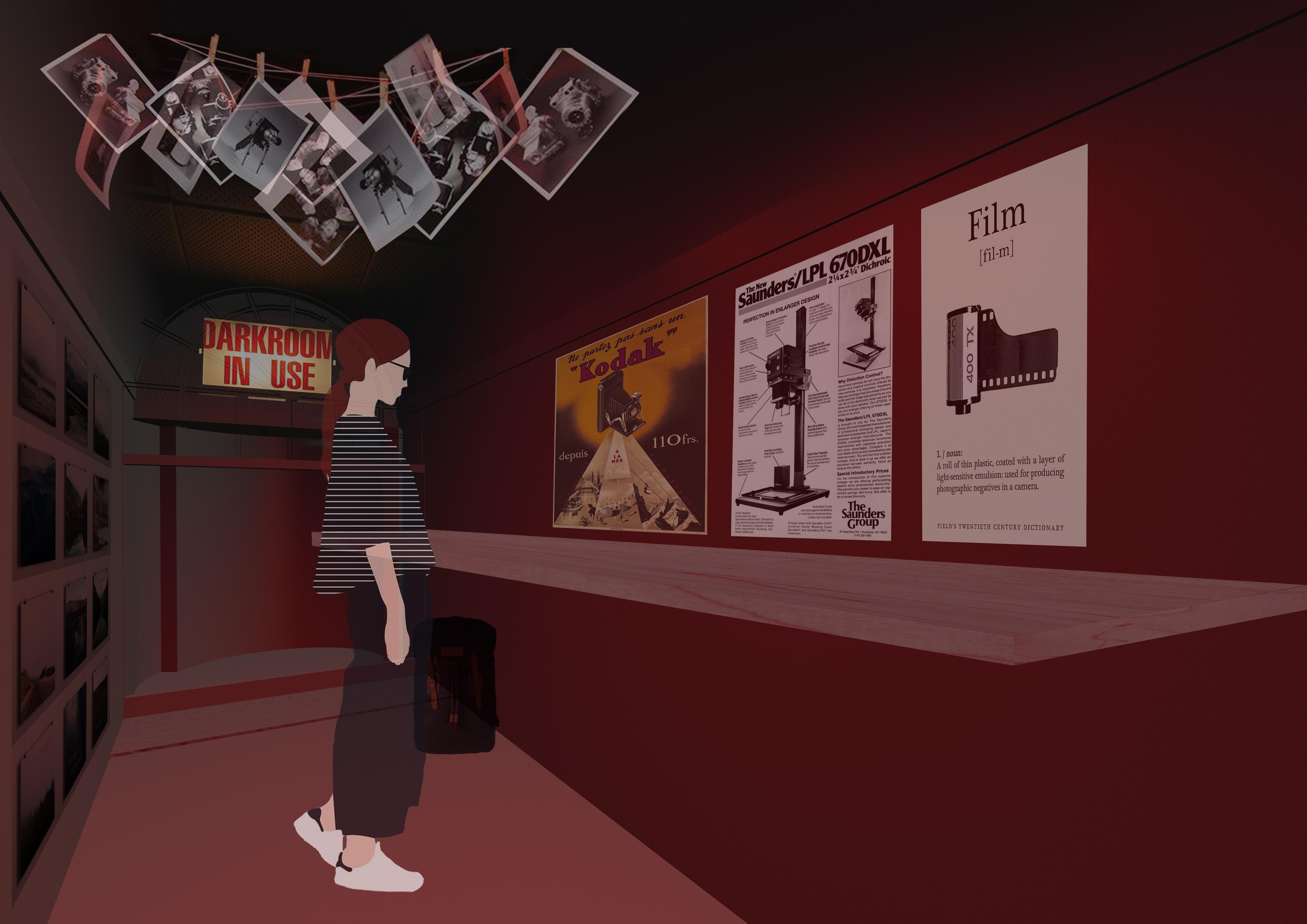
8. ‘DARK’ EXHIBITION
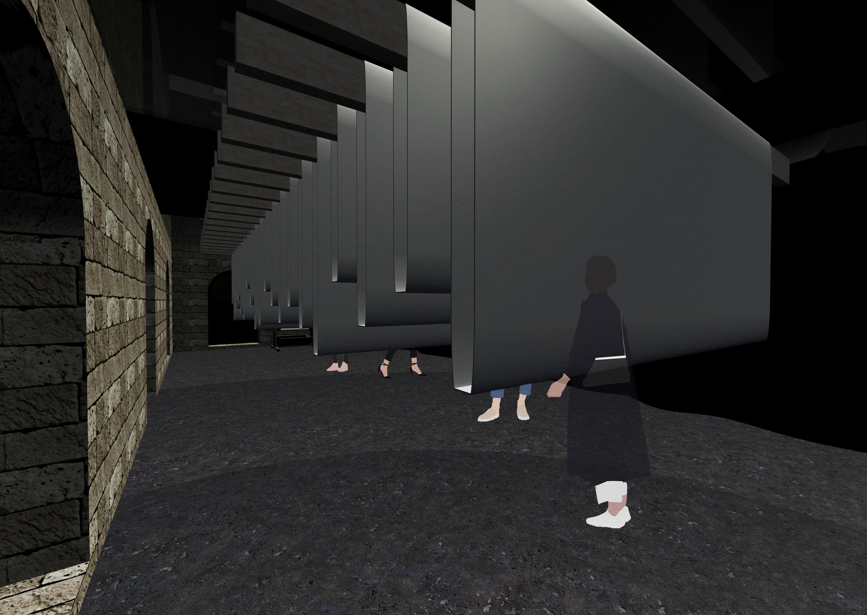
The dark exhibition is primarily comprised of an Epson professional photographic printer placed at one end of the space and 20 suspended wooden beams. The concept behind the exhibition is that every time a user chooses to contribute, their work will be sent to the printer, automatically printing into the space. As more work is added the continuous reel of paper will be passed over and under the beams, where the user can walk in and out of the work to view it. This means that the user doesn’t need to comply to a ‘style’ for their work to be included in the exhibition, adding to the inclusive community feel.
This exhibition space counterpoints traditional exhibitions, not only is the work not displayed in a conventional manner, but the user will view the work primarily in the dark. Windows in the north half of the building are tinted, while a curtain separates this off from the main room, prohibiting light from entering the space. Glass panels create light wells from the first floor, allowing a small amount of controlled light to enter the exhibition. The user will therefore be forced into exploring the exhibition primarily in the dark.
SPECIFICATION OVERVIEW
Material / colour written statement, master mood board, material choices, colour palette, RCP and lighting specification, furniture layout and specification, sustainability rationale
MATERIAL & DESIGN PHILOSOPHY:
EXISTING
The existing walls of the building are made from limestone and are well preserved, so will remain within the proposed design concept. The floor, originally concrete, is damaged and will therefore be replaced with large scale tiles .
PROPOSED
The materiality of the space comes down to harmonising the character of the original structure with the new architectural language . Since many of the functions of the building require complete darkness, black remains a consistent colour throughout the entire concept, which conterpoints the original limestone of Oculus House.
In order to emphasise that dark spaces are being created within the light , a variety of dark materials are being specified for the concept. These materials vary in their durability depending upon the expected footfall. In areas of high traffic Smile plastics are being utilised, whereas simple black paint can be used in low traffic areas.
The mood board shown (right) expresses the atmosphere that I aim to evoke within the concept. Case studies of relaxed office spaces have been used to demonstrate how a balance of comfortable, inviting spaces can be combined with areas of practicality where various functions can be carried out . Patterned rugs and soft furnishings will be combined with relatively plain surfaces for flexibility and wider appeal.
ATMOSPHERE INSPIRATION
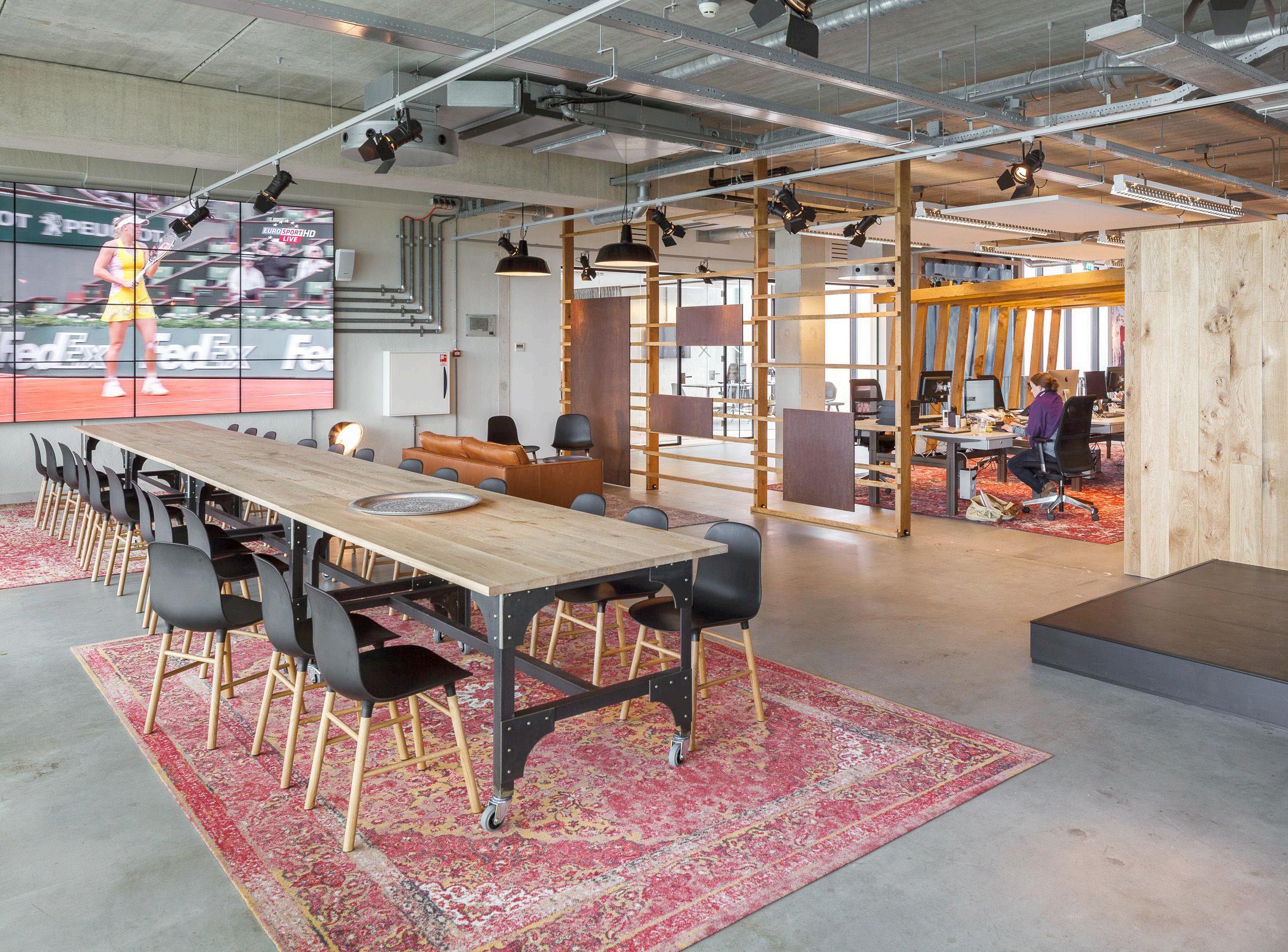
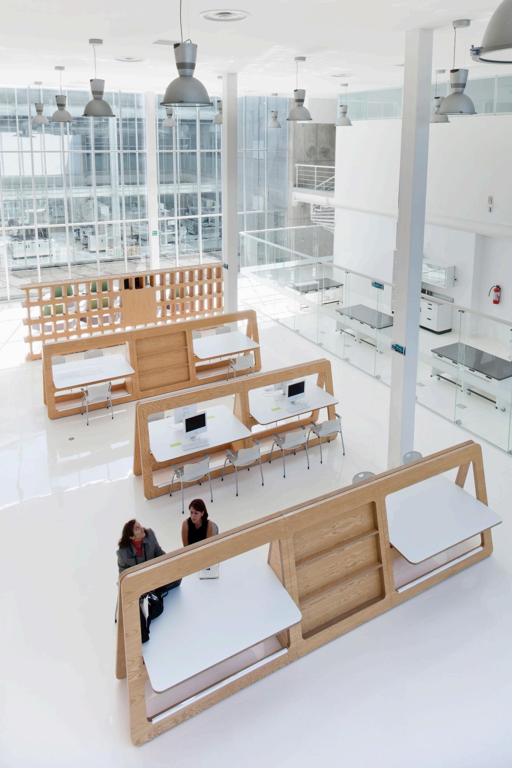
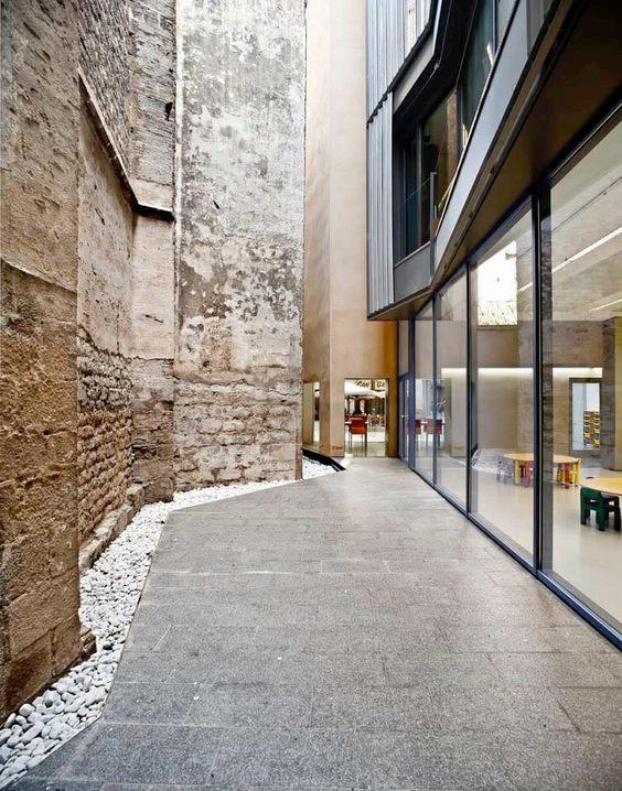
(Image credit from left to right) - D & Z Architechten, Luis Gordoa for TEN Architects, Adrià Goula for Taller 9s Arquitectes.
SPECIFIED MATERIALS & COLOUR PALETTE RATIONALE
1. Pentatonic recycled smartphone glass . This dark tinted glass is used throughout the entire concept is made from 100% recycled glass from disused and smashed smartphones. A sustainable alternative to regular glass, which requires large amounts of energy in it’s production.
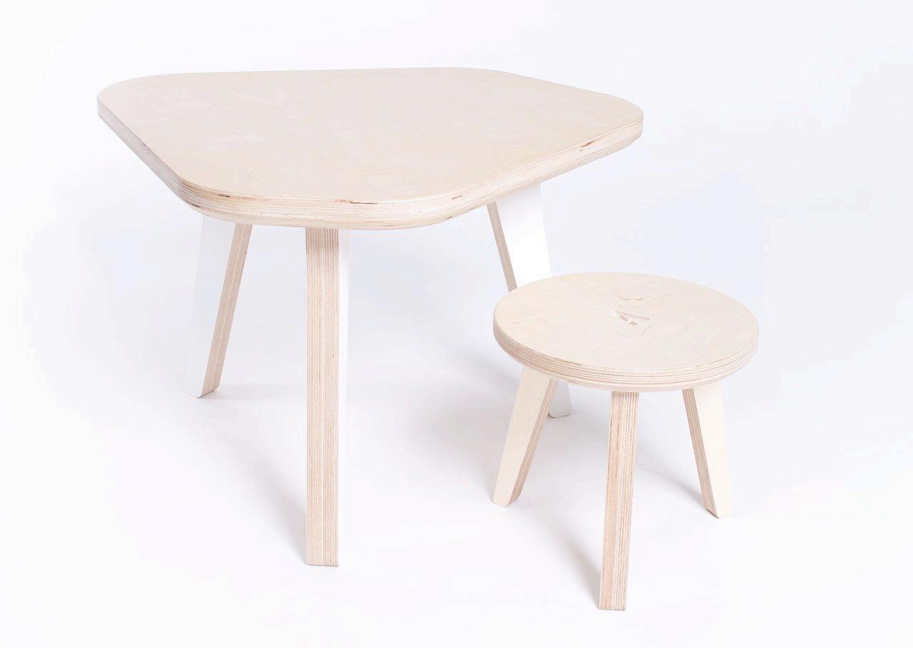
2. Birch plywood - the majority of the furniture and the bespoke pieces, including the high bar seating will be entirely made from locally sourced birch plywood.
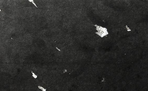
3. Smile Plastics - Charcoal . This material will be used for the darkroom spaces. I needed something that would be lightweight, maluable and opaque. It’s also important that the material doesn’t create an echo / uncomfortable space as the inside of the darkrooms are small. Smile plastics are made from 100% recycled materials and can be moulded into any desired shape. They are the sustainable alternative to leading competitors like Corian.
4. Tiles - The Mezzanine level will be tiled with ‘Zen XL Charcoal’ tiles from Porcelain Superstore UK. Suitable properties for the space include: large in size, anti slip, external frost proof and waterproof.
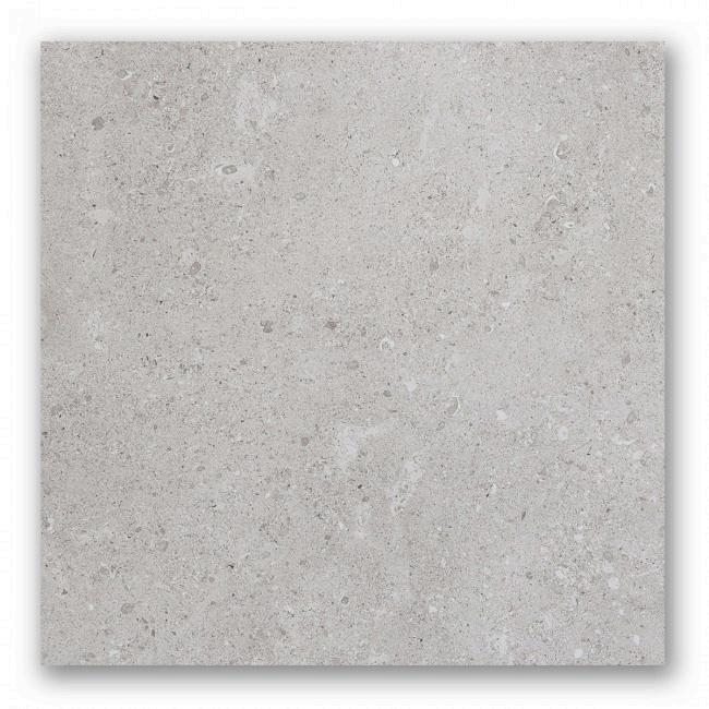
5. Tiles - The ground floor will be tiled with ‘fossil grey’ tiles from Porcelain Superstore UK . These large tiles create an almost seamless effect which has the look of French Limestone one of the most aesthetically appealing stones to cover a large area. Tiles are the most suitable flooring choice over something like vinyl, since the footfall is the greatest, and some of this area will be exposed to the outdoors.
6. Colour palette - The range of colours is bright within the ground floor space, primarily included within soft furnishings to add ‘pops’ of colour to an otherwise primarily black space. One noteable colour is #FAB411 - colour picked from the original Kodak logo, synonymous amongst analog photographers.
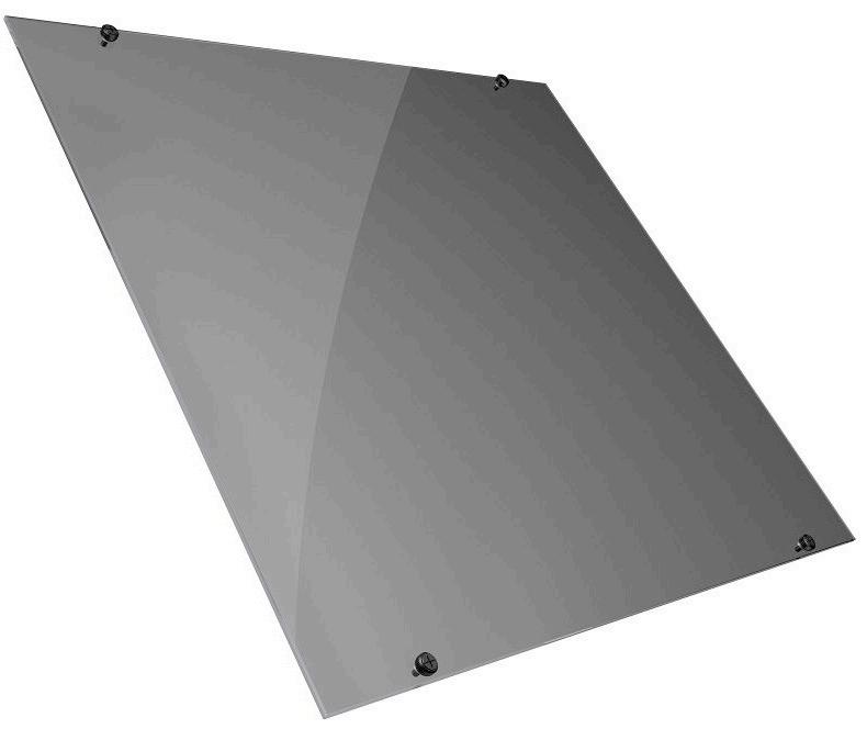


MATERIALITY - CHROME EFFECT
JENNY NORDBERG MIRRORS
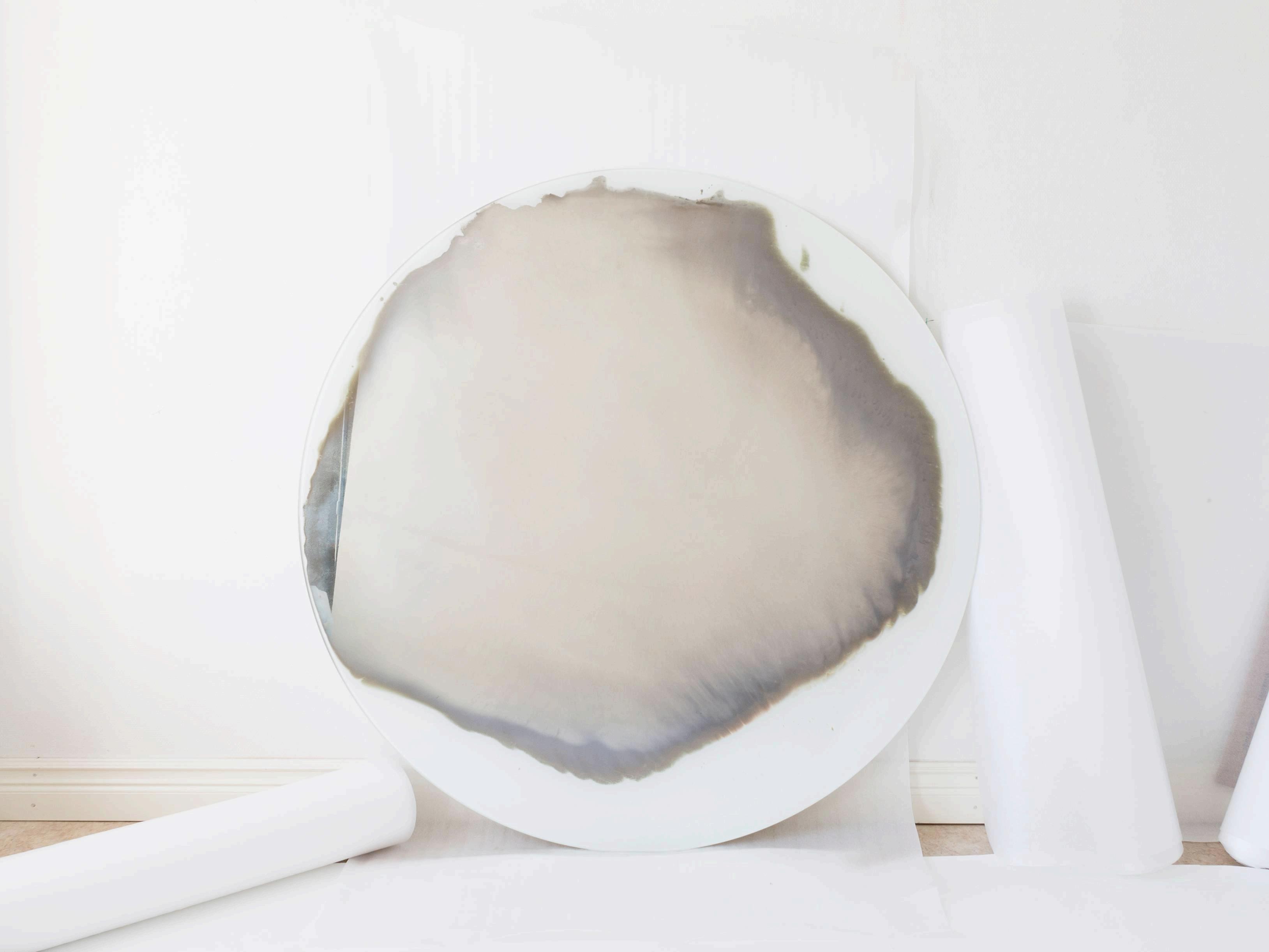
These unique pieces are created using a historic 19th century process utilising chemical infused liquid silver.
Much like photographic developing and silver gelatin photographic prints, Nordberg pours a liquid silver solution onto sheet glass before leaving it to develop. She leaves the liquid to evaporate on the surface of the sheet, allowing the pattern to develop denser in some areas than others, creating depth and three dimensional intrigue.
Rather than utilising simple chrome, I aim to utilise this hands-on technique to create a more visually intriguing space.
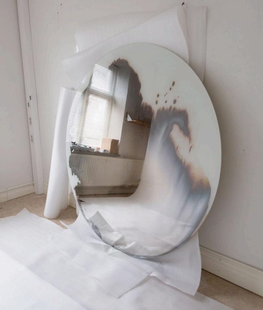
Image credit - Jenny Nordberg
GROUND FLOOR SPECIFICATION
Chrome effect lift using Jenny Nordberg inspired chemical infused silver process
Pentatonic smartphone glass - used for the panels on the mezzanine floor, creating light wells onto the ground floor
Smile plastics - Charcoal. Sustainable durable alternative to Corian.
‘Pooky’ light pendant (shown in lighting rationale)
Original Limestone walls
Pentatonic smartphone Glass - used for the doors into the computer suite and the bifolding door panels
Birch plywood furniture from Opendesk (shown in furniture rationale)
Tile flooring - ‘fossil grey’ French Limestone look tile from porcelain warehouse UK.
Soft furnishings / rugs sourced from French Connection Homeware. Has a young and refreshing aesthetic and is of very high quality.
Modular furniture elements sourced from MARK based in Cornwall. This product has been specified in grey, rather than their trademark green.
LIGHTING RATIONALE
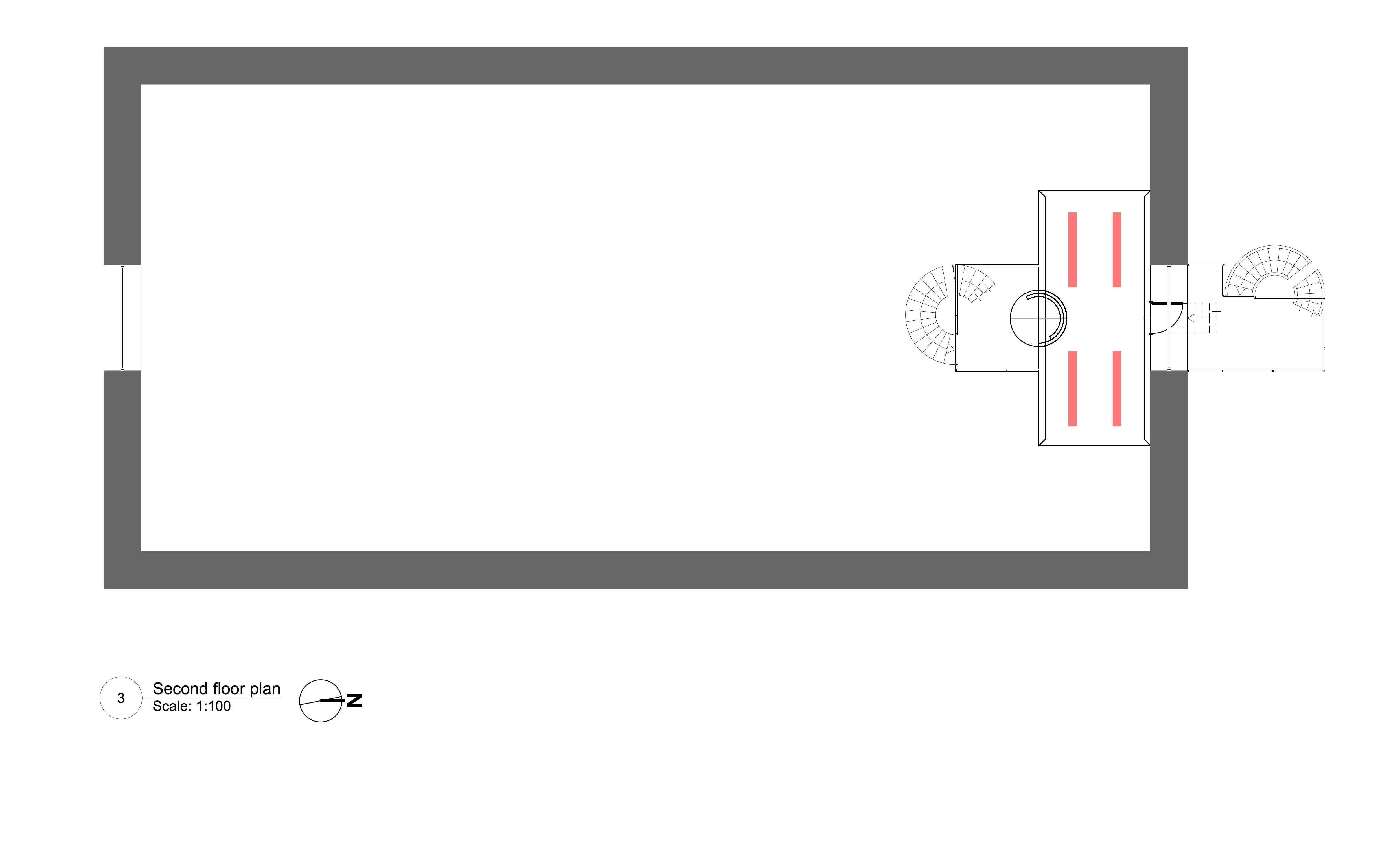
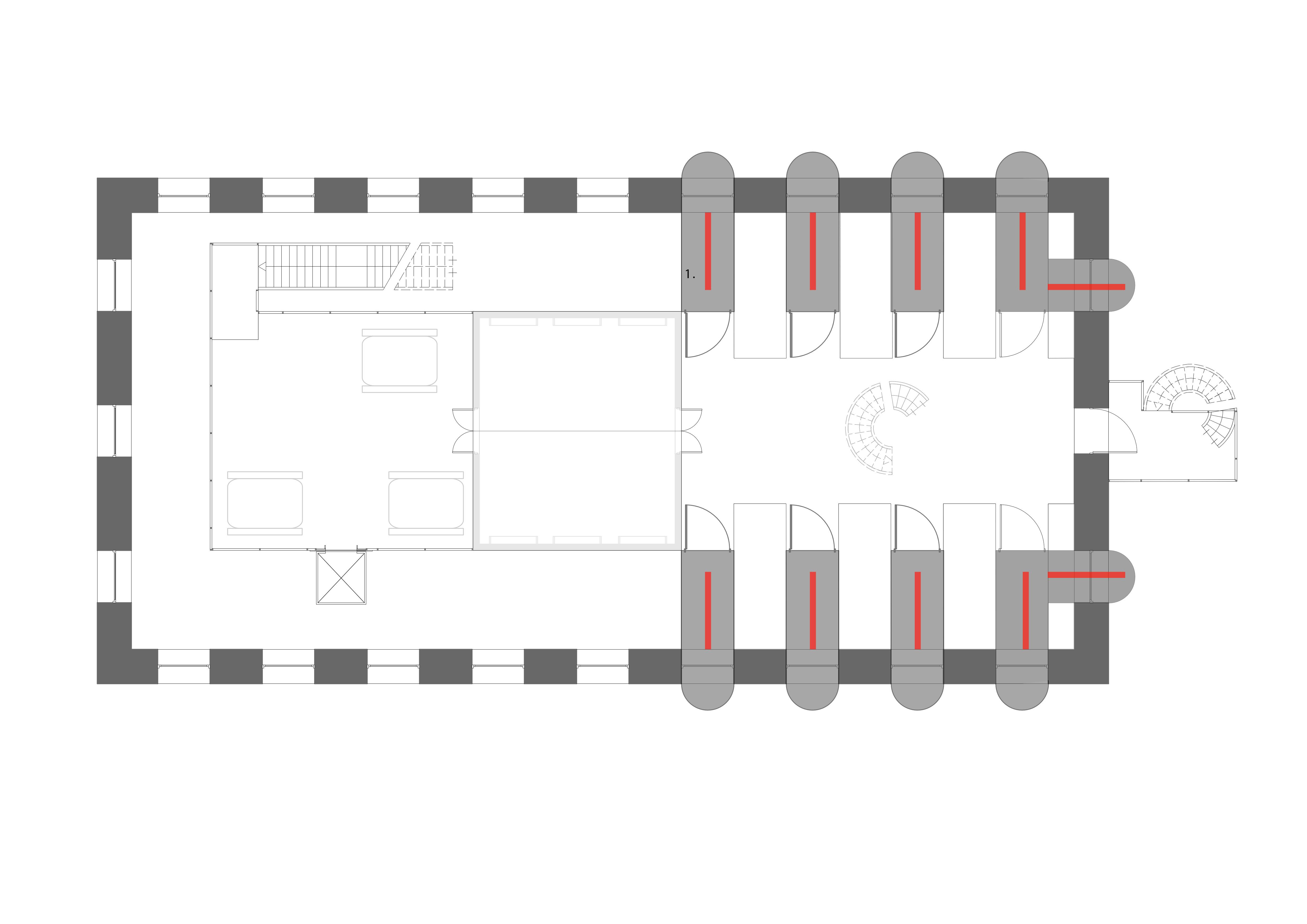
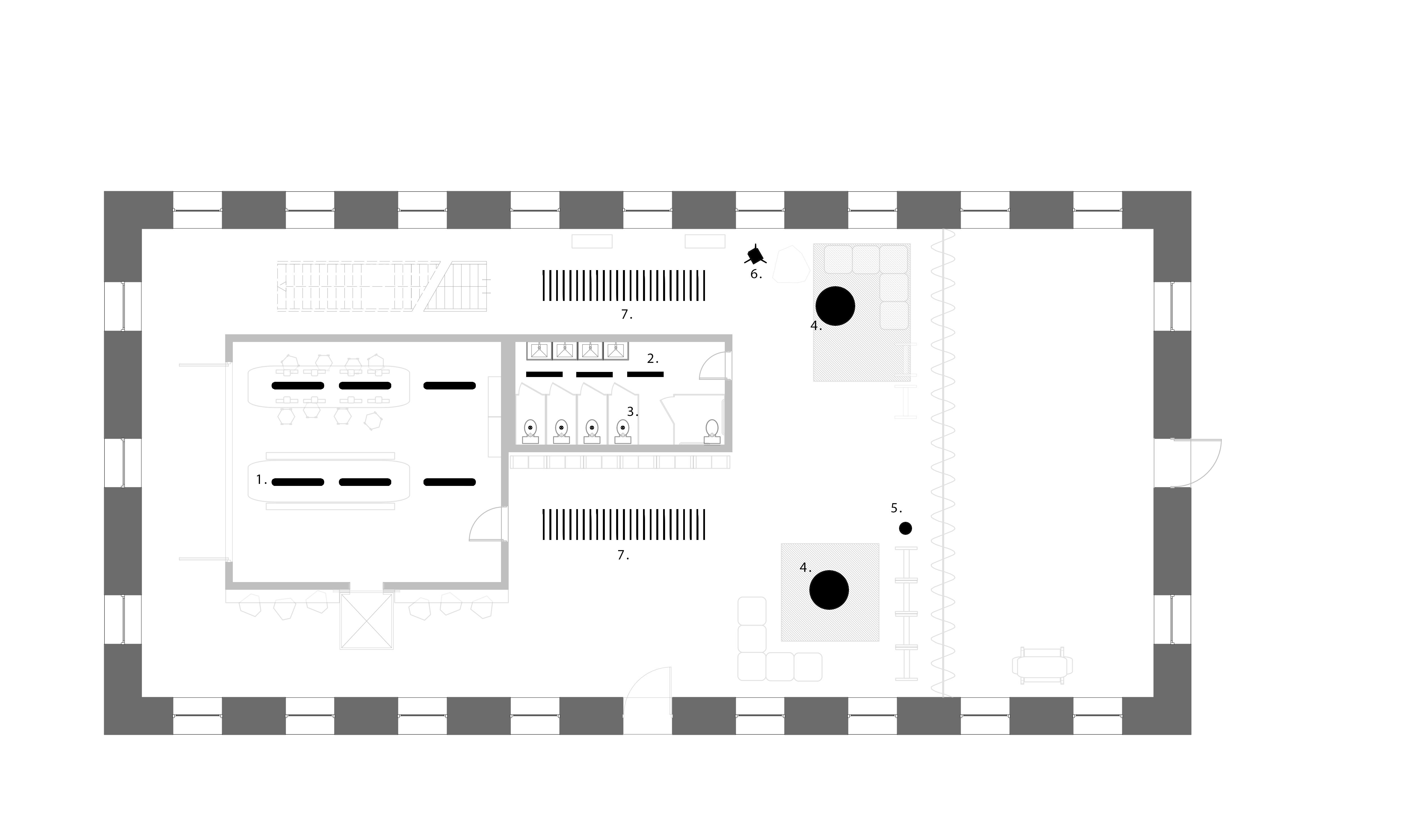
RCP LAYOUT
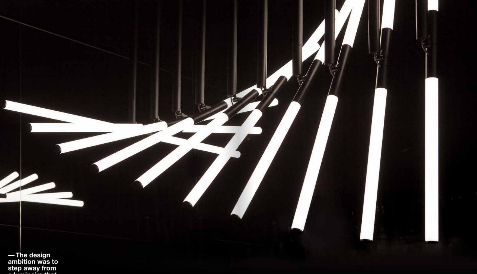
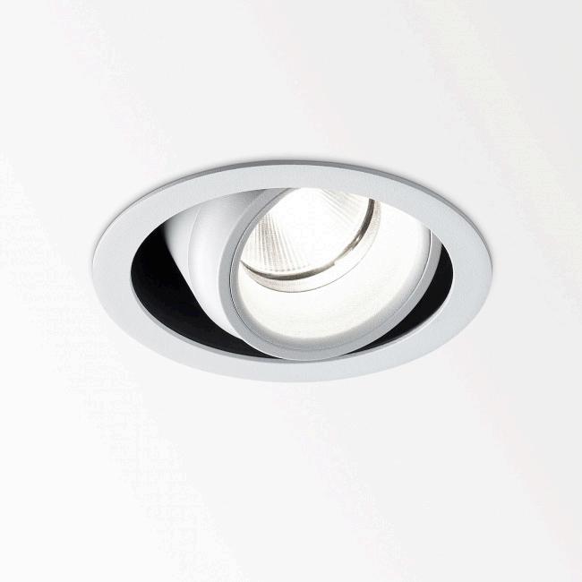
Shown right is my RCP for each floor of the design. The lighting on the Ground floor consists of floor lamps as task lighting in addition to suspended ceiling lights. Suspended ceiling lights are the primary choice throughout the concept due to their functionality and ability to emit plentiful amounts of ambient lighting in the working areas. Specific red safelights are required for all darkroom spaces, which are shown here in red. On the ground floor, I have specified OMA x Delta-light’s XY180 lights to create lighting features above the shelving and on the circulation route to the stairs. This lights have the ability to pivot on a180 degree horizontal axis, meaning the display can be constantly changed.
(Image credit) Delta light
Shown below - Deltalight x OMA XY180 light
LIGHTING SPECIFICATION GROUND FLOOR
1.
Deltalight Supernova SR Suspended ceiling light In BLACK www.deltalight.com/en
x6 units
2.
Deltalight Supernova Suspended ceiling light IN WHITE
www.deltalight.com/en
x3 units
3.
Deltalight PINTOR 63 Spotlight www.deltalight.com/en
https://www.deltalight.com/en/ products/detail/pintor-63-st-br92718-s1-202-401-811-921
x5 units
4.
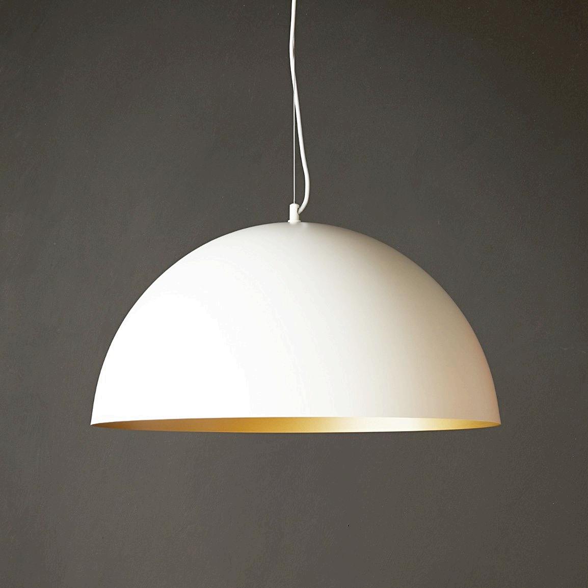
Pooky larger Goodhew Pendant Large pendant light shade 60cm diameter
www.pooky.com
https://www.pooky.com/pendant-lights/larger-goodhew-pendant-in-white-with-a-gold-interior60cms-diameter#.
x2 units
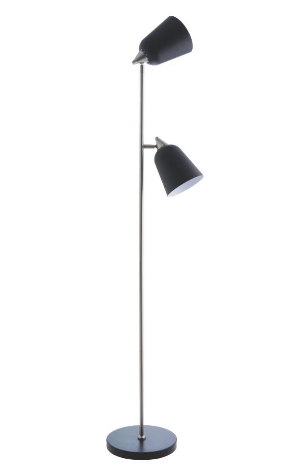
5.
Habitat - black metal double head floor lamp
www.habitat.co.uk
https://www.habitat.co.uk/doubleblack-metal-double-head-floorlamp-339254
x1 unit
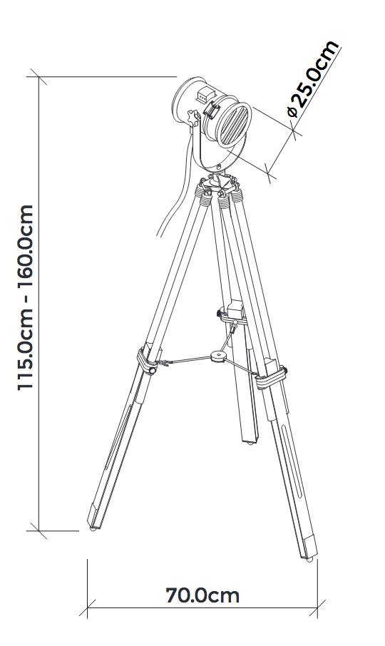
6.
Cora Retro Tripod Floor Lamp in Nickel Tripod floor lamp
www.perchandparrow.com
https://www.perchandparrow. com/lighting/floor-lamps/cora-tripod?utm_source=google%20 shopping&utm_medium=ppc&utm_ campaign=&utm_content=&utm_ term=&gclid=EAIaIQobChMIxv_ XrqL03gIVz7XtCh15Tg9CEAQYBSABEgJHm_D_BwE
x1 unit
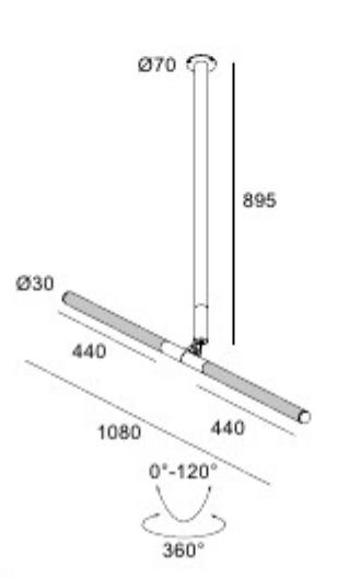
7.
Deltalight x OMA XY180 LED cluster light
www.deltalight.com/en
https://www.deltalight.com/en/ products/light/xy180
x40 units
LIGHTING SPECIFICATION
FIRST & SECOND FLOOR
The majority of the first and second floor space is naturally lit, meaning very little artificial lighting is required. One essential lighting element however is safe-lights for the darkroom spaces.
‘Safe-lights’ are light illumination that will not fog photographic materials during the time period required for normal handling and processing and thus are necessary for the concept.
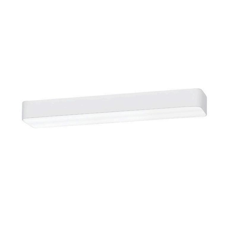
Each single occupancy darkroom space will contain one red tube light, while double occupancy spaces will require two. (Each tube light is 2ft in length)
Darkroom Safe-lights provide an overall and shadow free illumination causing less eye strain and consequently a better working environment.
Red Safe-light Tube 2ft - T8 (BW Printing) 18 Watt
www.theimagingwarehouse.com
https://www.theimagingwarehouse.com/ ProductGrp/000500040008000d
x14 units
£69.95 per unit
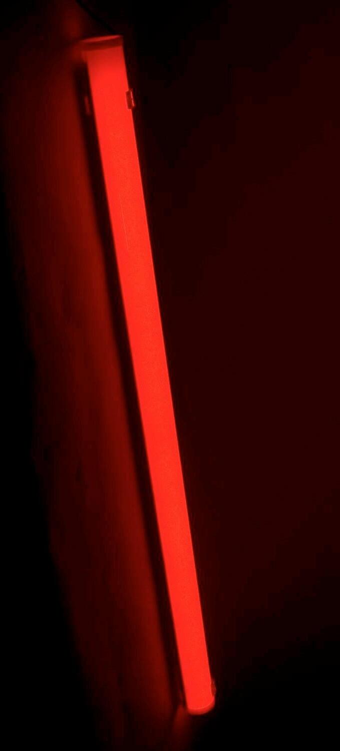
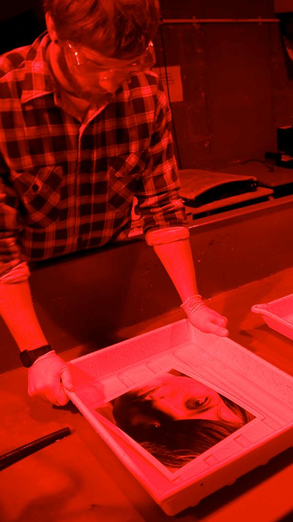
Image credit - The Imaging Warehouse
The Imaging Warehouse
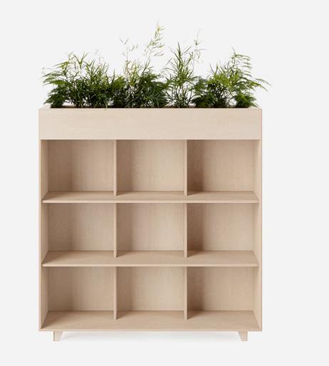
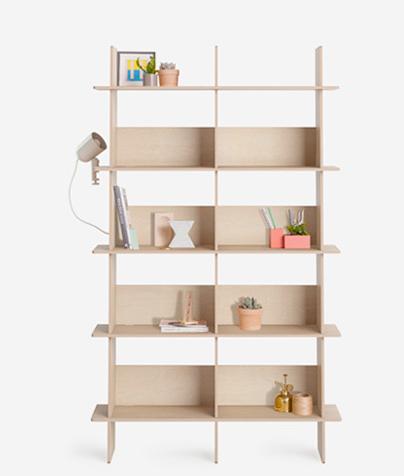
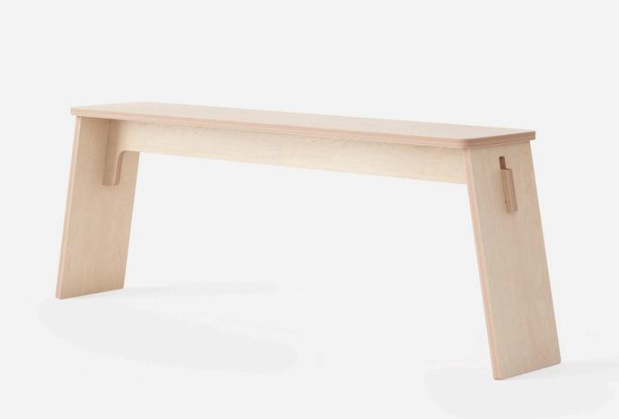
FURNITURE
All of the furniture can be seen on the ground / first floor plans
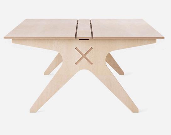
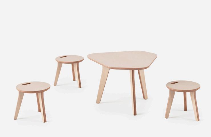
The specified furniture for the concept will primarily be sourced from Opendesk, an online marketplace that hosts independently designed furniture and connects its customers to local makers around the world. Rather than mass manufacturing and shipping worldwide, they’re building a distributed and ethical supply chain through a global maker network. CNC (Computer numeric control) machines are used, which have eliminated the need for large factories or long-distance shipping, and ensure that products are produced only in the numbers required. Everything is cut from birch plywood, a sustainable material, which is grown quickly within the UK. (All pieces shown are included within the design).
Some other pieces of furniture are being sourced from MARK, a Cornish based company that strives for durability and timeless design, leading to sustainable design approach. Their modular furniture elements from the Studioscape range, provide a flexible alternative to fixed seating and provide possibilities for collaberation space as well as a more private arrangement.

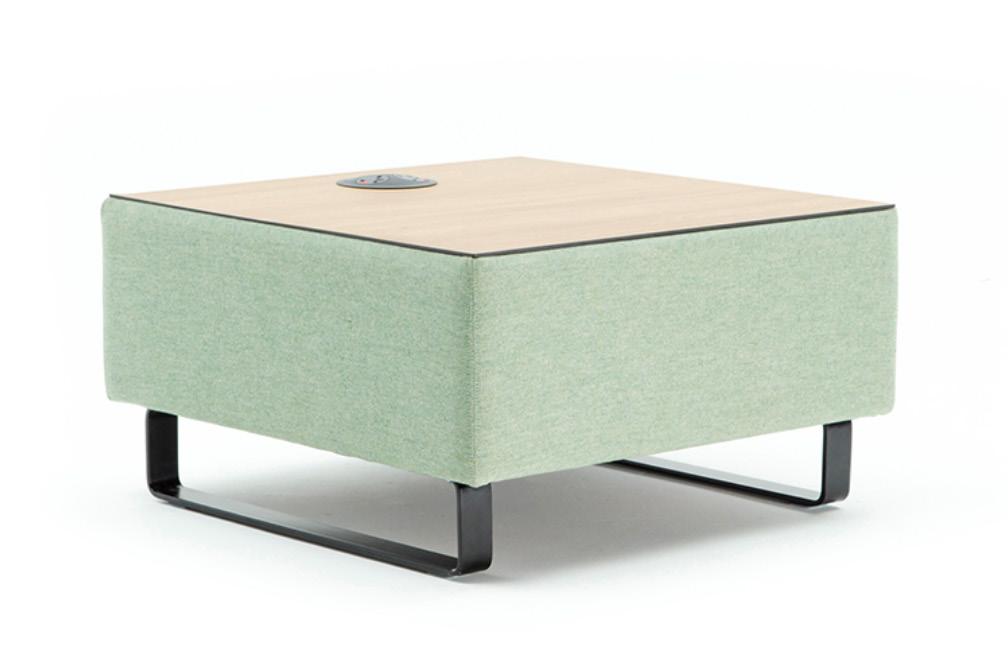
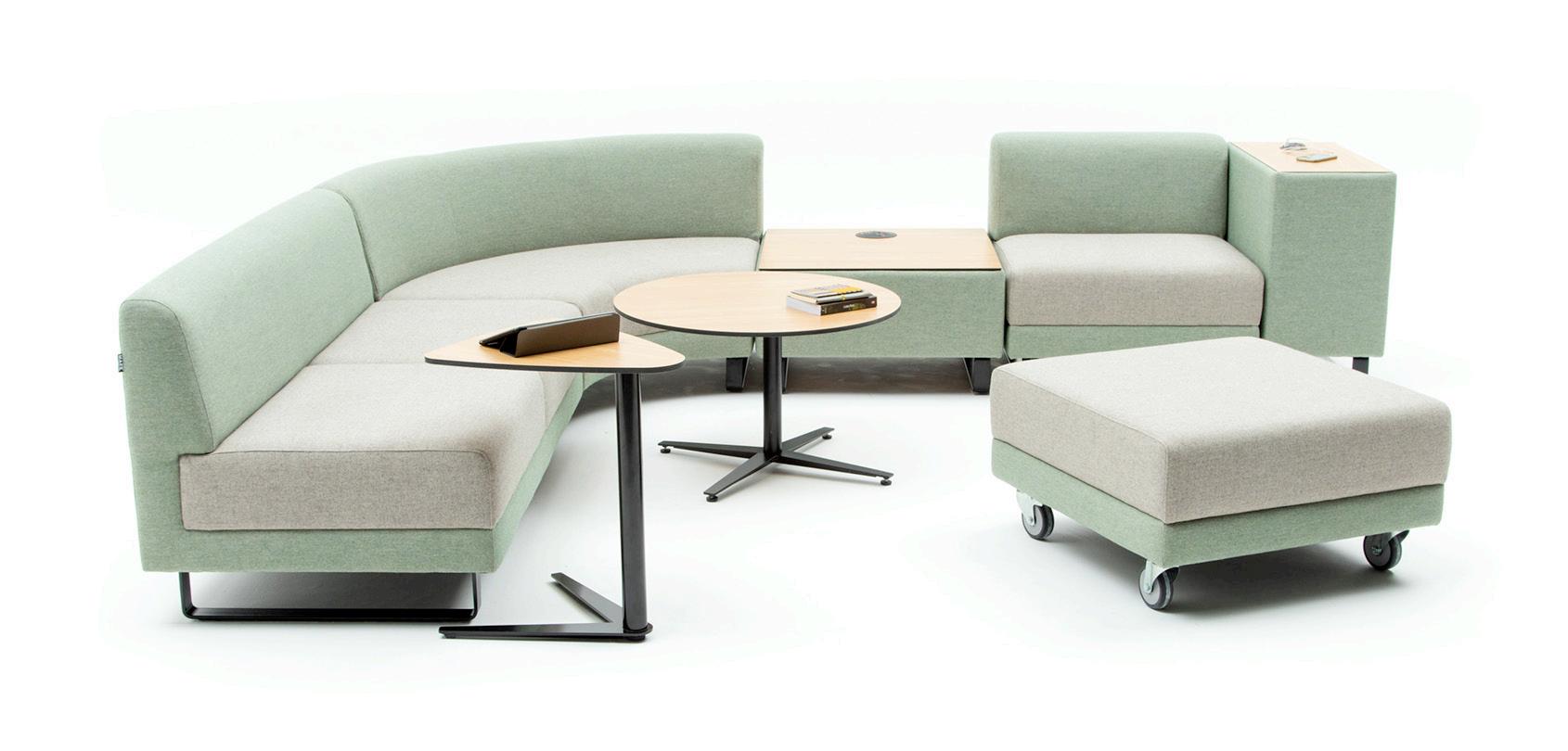
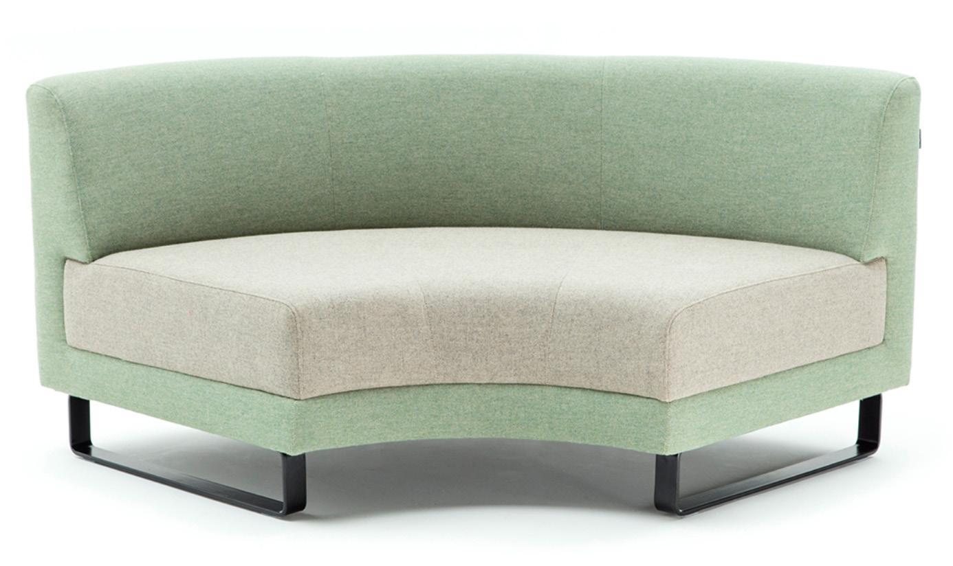
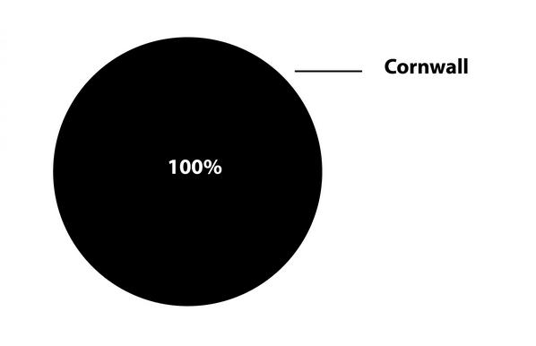
Image credit Opendesk / Mark Product
SUSTAINABILITY RATIONALE
TRANSPORTATION AND PREFABRICATION
As a designer, I inherently understand the need for a sustainable future. Through utilising an adaptive reuse scheme, I am wholeheartedly recycling a structure, which is the most sustainable method of architectural practice. To enhance this decision, my design does not incorporate any new floor levels or a roof, meaning that I am saving from materials that would normally cover extremely large surface areas. My strategy involves a series of insertions, which can be prefabricated and lifted into the structure through the opening, ensuring that construction need not take place on site. This means that their manufacture can take place in a location, which has specialised facilities and processes allowing them to be greener than if a construction team produced them on site.
LIGHTING
The primary function of my space is a series of darkroom spaces, meaning the only light that is installed is a ‘safe’ red light, which can be an LED, one of the most efficient lighting methods. Without a roof, the first and second floors have vast amounts of natural light, and the use of glass panels and voids allows this light to transcend into the ground floor space, reducing the need for some lighting altogether. Any other lighting that is installed will be using LED bulbs provided by
02 05 06 03
FURNITURE AND FITTINGS

The specified furniture for the concept almost entirely comes from Opendesk, an online marketplace that hosts independently designed furniture and connects its customers to local makers around the world. Rather than mass manufacturing and shipping worldwide, they’re building a distributed and ethical supply chain through a global maker network. CNC (Computer numeric control) machines are used, which have eliminated the need for large factories or long-distance shipping, and ensure that products are produced only in the numbers required. Everything is cut from birch plywood, a sustainable material, which is grown quickly within the UK.
GREEN ENERGY FOR HEATING AND COOLING
The ‘Fridge’ an element, which lies at the core of the building, obviously needs a method of power. Rather than using electricity, which in the long term would not be economically or environmentally viable, I plan to use the unfiltered water from Bristol Harbourside to retain its low temperature. Through utilising double layered skins the outer layer ‘sweats’ creating moisture in the gap between, cooling the internal space. Since the water from the Harbouside would never come into contact with people or products, it doesn’t require filtering or purifying, meaning less energy is used in it’s utilisation.
WATER COLLECTION AND CONSUMPTION
Since there are no functions within the buildings that would require the consumption of water, drinking water taps are not necessary. I plan to harvest rainwater for the purposes of flushing toilets and within the bathroom sinks, which can be done with the use of some basic treatment. The rainwater tank can be kept underground with ease to store the water and maintain a steady temperature of around 4 degrees. A water cooler on the other hand, can be provided for those who bring their own reusable water bottle.
AFTER LIFE
Due to a high percentage of the design scheme being prefabricated and lifted in on site, the structure could be dismantled at any point and either reused as an entire entity and transported somewhere else, or the components could be reused individually. This means that almost nothing from the structure will be sent to landfill. To make this concept more viable for transportation and disassembly, all joints should be bolted rather than welded.