Are you ready to immerse yourself in the technical bits behind the South Lodge brand? These guidelines will show you how we bring the South Lodge brand to life, gently dipping your toes into logos, colours, tone of voice and lots more - all to help us deliver a consistent look and feel that’s unmistakably South Lodge. p.s. the wild swim is optional.
Open,
Serene,
Stylish but grounded, Innovative Open,
Serene,
Stylish but grounded, Innovative
BRAND PILLARS XXXXXXXX XXXXXXXX XXXXXXXX XXXXXXXX
PROPOSITION
TERRITORY
PERSONALITY
KEY MESSAGE
PURPOSE
VALUES
Where the natural world and modern expectations live in perfect harmony
Enrichment
Open Stylish but grounded Innovative
Switch off from the everyday and switch on your senses
CREATING HAPPINESS IN AMAZING PLACES
Creating a community of conciousness
Be generous
Challenge the status quo
Team Attention to detail
Creating happiness
Character
PRIMARY: LOCKUP LOGO
WHEN TO USE:
Our lockup logo is our go‑to star of the show. Proudly pairing our emblem with our logotype (the bit that does the polite ‘hello, we’re The Castle Inn’). This is the logo you’ll see popping up most often, especially on anything guests might take home or spot online - think a postcard at reception or a digital ad that sneaks into your scrolling. If we had a ‘number one fan’ badge, this logo would be wearing it. EMBLEM
WHEN TO USE:
Our emblem is the lovely, eye‑catching part of our logo, full of character and adding a little sparkle without needing to say a single word. We use it when it’s already obvious who we are, whether you’re standing right here at The Castle Inn or happily scrolling through our Instagram. It’s our quieter, more elegant way of showing personality without shouting our name on repeat. Think of it as adding a touch of luxury without the big sales pitch, it's a confident little nod that says, ‘You know us… we’re The Castle Inn'.
WHEN TO USE:
Our landscape logo is exactly what it sounds like - a wider, stretched‑out version that fits beautifully wherever our square lockup logo just doesn't cut it. Sometimes the lockup needs a little help to stay clear and legible, and that’s where this one steps in. It may not be our top choice, but it’s a trusty runner‑up, ready to represent The Castle Inn out in the big wide world when the space calls for it.
Minimum size
Let’s keep things easy on the eyes - no one should have to squint to spot our logo. That’s why we have a minimum size for our lockup logo, making sure it always stays clear, comfortable to read and perfectly The Castle Inn.
100px high - digital world
20mm high - physical world
Minimum size
Let’s keep things easy on the eyes - no one should have to squint to spot our logo. That’s why we have a minimum size for our emblem, making sure it always stays clear, comfortable to read and perfectly The Castle Inn.
100px high - digital world
5mm high - physical world
Minimum size
Let’s keep things easy on the eyes - no one should have to squint to spot our logo. That’s why we have a minimum size for our landscape logo, making sure it always stays clear, comfortable to read and perfectly The Castle Inn.
100px high - digital world
15mm high - physical world
LOGO FILE FOMATS AND USAGE
PNG: Perfect for digital use, PNGs feature a transparent background so the logo sits cleanly over any colour or image. Use these for websites, presentations, and social media.
SVG: A scalable vector format built for the web. SVGs can be scaled to any size without losing quality, making them the preferred choice for digital use.
EPS: Sometimes called 'vector' format are used when the highest possible output quality is required: large-format print, signage, or any application where the logo needs to scale up significantly.
Download the logos
LANDSCAPE LOGO
When it comes to choosing which coloured logo goes where, our top priority is making sure everyone can read it easily (and that we stay on the right side of accessibility law). So, we’ve done the homework and picked out which logo colours work happily with each shade in our palette, as well as what to use on other lighter or darker backgrounds, for example on photography or clothing.
To help our logo breathe (we promise it appreciates it), please keep a clear space around it equal to 40% of the logo’s total height. This gives it room to shine without anything crowding or distracting from it. Every now and then, we might bend this rule, for example, teeny tiny places like social media profile icons, where clear space just isn’t practical. If you think you need one of these rare exceptions, just give the Marketing team a shout and we’ll happily help.
When positioning a logo on a new design, use the layout diagram below as a guide - think of it as following a treasure map, but with fewer pirates and more precision! By keeping the alignment and spacing the same, we creating stronger brand recognition and looking sharp along the way.
Placement should always follow the designated grid structure to ensure visual balance and brand consistency. The primary placements are full colour, and the secondary placements are at 50% opacity.
Our hotels collaborate with selected partners to deliver events, workshops, and experiences that enhance our guest offering and our brand values.
These partnerships are an important part of our storytelling and must be represented with care. While we respect and adhere to the visual guidelines of our partners, all collaborations must also maintain the integrity and consistency of the Exclusive Collection brand. Every lock-up and placement should feel part of our visual system, not separate from it.
Partnership logos are always presented as part of an “in partnership with” lock-up. This ensures a clear, unified relationship between our brand and the partner, while keeping hierarchy and alignment consistent across all materials. The partner logo must be displayed in its approved format and colourway, with no alteration, distortion, or additional effects.
Our aim is to present collaborations confidently and coherently, giving equal respect to both brands within a clear and balanced layout.
THE LOCKUP
Use the approved “in partnership with” lock-up, with the partner logo placed directly below and left-aligned. Spacing between the two elements should be half the height of the “in partnership with” text.
& Sizing
The hotel logo appears first in hierarchy, followed by the “in partnership below.
Key Principle: Maintain balance between both brands while keeping the layout unmistakably part of the Exclusive Collection visual identity.
Hotel logo to go here
Headline to go here
SubHeader to go here if needed to go here
Minimum size
Let’s keep things easy on the eyes - no one should have to squint to spot our logo. That’s why we have a minimum size for these logos, making sure they always stay clear and comfortable to read.
100px high - digital world
15mm high - physical world
Partner Logo here
POSITIONING
Typography is central to our visual identity. It expresses the tone of the brand through clarity, warmth, and style. Our system uses two complementary typefaces, each with a distinct role, creating a consistent and accessible typographic structure across all channels.
Apercu is our main brand font it s approachable, modern and easy to read.
Reckless Neue is our secondary font, we use this to inject a bit of character, personality and softness. It s never used for body copy though only in titles, subtitles and standout copy, like a quote.
Clear, consistent typography is essential for both readability and credibility. Strong hierarchy helps guide the reader through information smoothly, reinforcing clarity and confidence across all brand communications.
STRUCTURE:
Fewer type sizes, balanced spacing, and consistent treatment create a recognisable rhythm across layouts. This approach builds trust, improves focus, and maintains a polished, editorial feel.
GUIDANCE:
The size ratio for typography should be a visual decision per use case, allowing the typography room to breathe in each composition. Follow the guidance on sizing, leading, and tracking specifications outlined in this guide to ensure structure and legibility.
Adjustments can be made for custom layouts or longer headlines, as long as the overall hierarchy and proportions remain within the system. Display
Small Print
Light
Leading
0% Tracking
Light
Leading
0% Tracking
Call to Action
Title
Title / TITLE
Title / TITLE
Used for subtitles and standout copy like quotes, introductions and key messaging.
USED FOR LABELLING DOCUMENTS AND INSTRUCTIONS
Body Copy is the larger chunks of text you ll see on the website, in brochures or on posters etc. They always sit below a Title or Subtitle.
There should always be a clear typographic hierarchy to help readers scan, understand, and act quickly. Use variations in size and weight to create structure, applying them with car and consistency.
Avoid overstyling, as it reduces clarity and impact. Each typographic level must feel distinct, with strong contrast to guide the eye and support confident, effortless communication.
Lorem Ipsum is simply dummy text of the printing and typesetting industry.
Lorem Ipsum is simply dummy text of the printing and typesetting industry. Lorem Ipsum has been the industry's standard dummy text ever since the 1500s, when an unknown printer took a galley of type and scrambled it to make a type specimen book.
Lorem Ipsum is simply dummy text of the printing and typesetting industry. Lorem Ipsum has been the industry's standard dummy text ever since the 1500s, when an unknown printer took a galley of type and scrambled it to make a type specimen book.
Lorem Ipsum is simply dummy text of the printing and typesetting industry. Lorem Ipsum has been the industry's standard dummy text ever since the 1500s, when an unknown printer took a galley of type and scrambled it to make a type specimen book.Lorem Ipsum is simply dummy text of the printing and typesetting industry. Lorem Ipsum has been the industry's standard dummy text ever since the 1500s, when an unknown printer took a galley of type and scrambled it to make a type specimen book.
Lorem Ipsum is simply dummy text of the printing and typesetting industry. Lorem Ipsum has been the industry's standard dummy text ever since the 1500s, when an unknown printer took a galley of type and scrambled it to make a type specimen book.Lorem Ipsum is simply dummy text of the printing and typesetting industry. Lorem Ipsum has been the industry's standard dummy text ever since the 1500s, when an unknown printer took a galley of type and scrambled it to make a type specimen book.
06 To book online scan the QR code, or visit thecastleinn@exclusive.co.uk
01249 783030
Castle Combe, Wiltshire SN14 7HN
When it comes to colour, we keep it simple. Colourway options are clear and intentional, ensuring consistency across all applications. On coloured backgrounds, a specified secondary palette colour is used for logos and text to provide contrast, legibility and a cohesive brand expression.
All colour combinations have been carefully selected to ensure accessibility and consistency across both digital and print applications. The smaller boxes indicate which colours, alongside Exclusive Black and White, can be used as pairings. Each combination has been tested and meets AA accessibility standards for both regular and large text, ensuring legibility, visual balance and harmony within the tonal system.
For primary colour backgrounds, we only use racing green or matte black.
Each colour palette is applied in order of priority, with the primary colour, Cotswold Stone, acting as the lead tone for brand recognition and consistency across all touchpoints.
The secondary colour palette support the primary and are used flexibly for detailing, highlights and key moments. These secondary tones are also be paired with individual restaurant identities to create distinction while remaining within the overall brand system.
Matte Black and White anchor the palette, delivering structure, contrast and clarity across all applications.
For uniforms
HEX (#): B29575
RGB: 178, 149, 117
CMYK: 27, 36, 52, 14
COTSWOLD STONE [NEW]
HEX (#): C9B59E
RGB: 201 , 181, 158
CMYK: 22, 26, 37, 5
HEX (#): E0D6C7
RGB: 224, 214, 199
CMYK: 14, 15, 23, 1
HEX (#): 233729
RGB: 35, 55, 41
CMYK: 80, 51, 74, 64
HEX (#): F7F8F3
RGB: 247, 248, 243
CMYK: 4, 1, 6, 0
HEX (#): 282727
RGB: 40, 39, 39
CMYK: 0, 0, 0, 95
HEX (#): FFFFFF
RGB: 255, 255, 255
CMYK: 0, 0, 0, 0
HEX (#): 667369
RGB: 102, 115, 105
CMYK: 59, 38, 51, 26
70% COTSWOLD STONE [NEW]
40% COTSWOLD STONE [NEW] RACING GREEN [NEW]
70% RACING GREEN [NEW]
Patterns are a key part of our brand’s visual language, used to add depth, texture, and recognisable identity across environments and materials. They should always enhance the design, never compete with imagery or typography. We don't always need to use the pattern, there will be many occasions where it'll be over the top = visual clutter!
A few examples of where our pattern works really well are our tray liners, voucher wallets, or the lower sections of exhibition stands.
We tend to lead with the filled pattern but the stroke may be used for a more subtle effect.
The pattern should be cutting either half way through the pattern design or at the end of the repeat.
SOLID PATTERN
Stroke PATTERN
LIME MORTAR ON COTSWOLD STONE COTSWOLD STONE ON LIME MORTAR
LIME MORTAR ON COTSWOLD STONE COTSWOLD STONE ON LIME MORTAR
LIME MORTAR ON RACING GREEN
RACING GREEN ON LIME MORTAR
LIME MORTAR ON RACING GREEN
RACING GREEN ON LIME MORTAR
The sticker is used as an attention‑grabbing visual across our digital advertising and promotional materials. It should always appear in its approved colourway.
At its centre, the sticker may hold the hotel emblem or lockup logo. For more functional applications, such as sales materials, it can also house a simple directional arrow. And when we’ve got something exciting to shout about (think event dates or quick pull‑out messages), the sticker is the perfect place to tuck those in too.
It's your time to check in and find out what we're all about...
It's your time to check in and find out what we're all about...
The sizing for the sticker is not set however it should never be the hero of the design and sits relevant to the headline as shown here.
It's your time to check in and find out what we're all about...
version
version
Lorem Ipsum is simply dummy text.
From £120 per person
version
The following examples demonstrate the sticker in use. The outer copy can be adjusted to align with specific campaign messaging, while the core visual remains consistent.
Stay a little longer
Local charm, exceptional stays Welcome to The Castle Inn
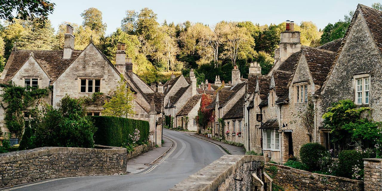
A 12th-century inn with plenty of quirk
A 12th-century inn with plenty of quirk
Local charm, exceptional stays
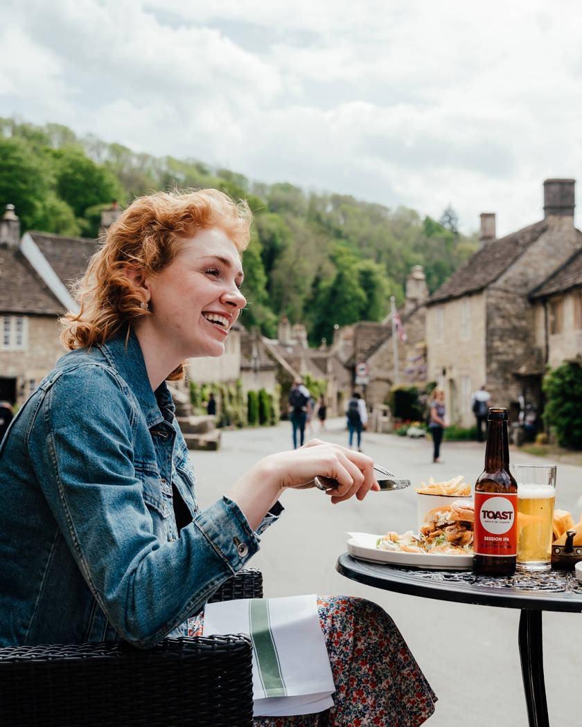
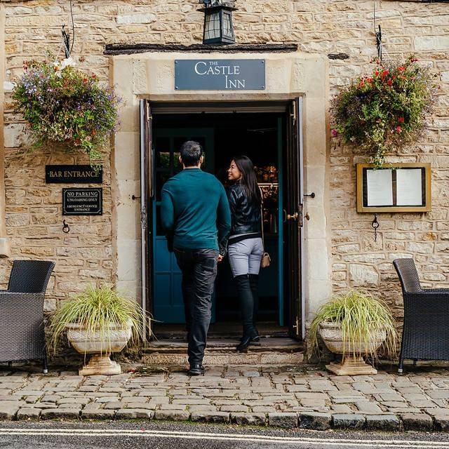
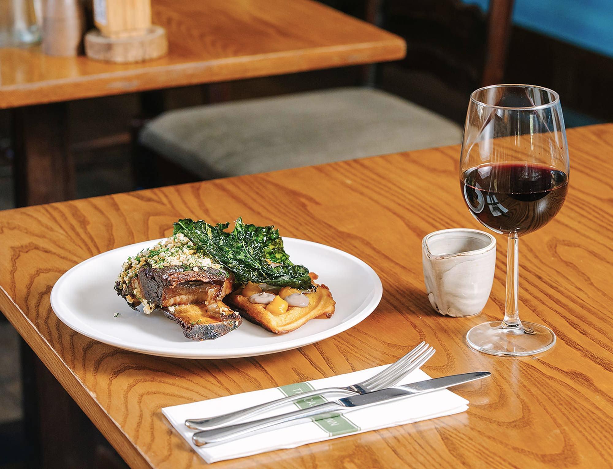
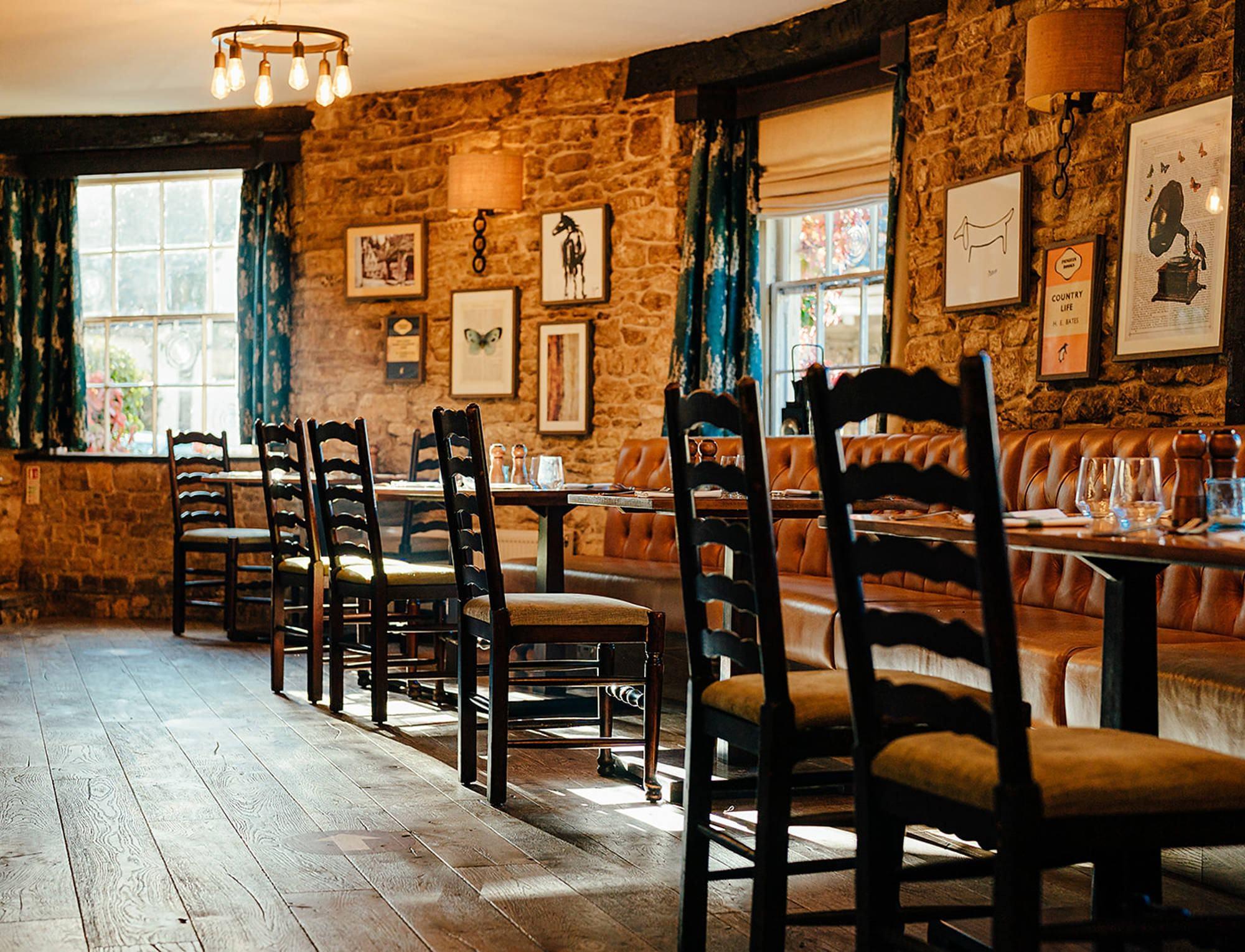
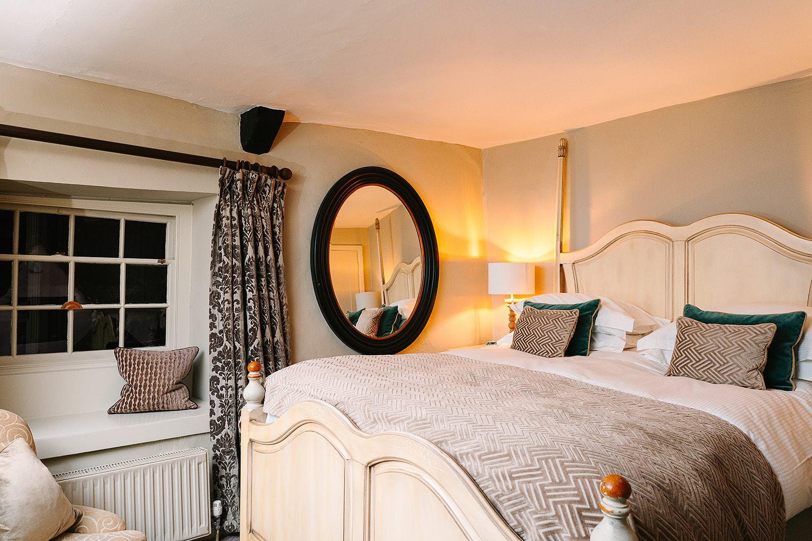
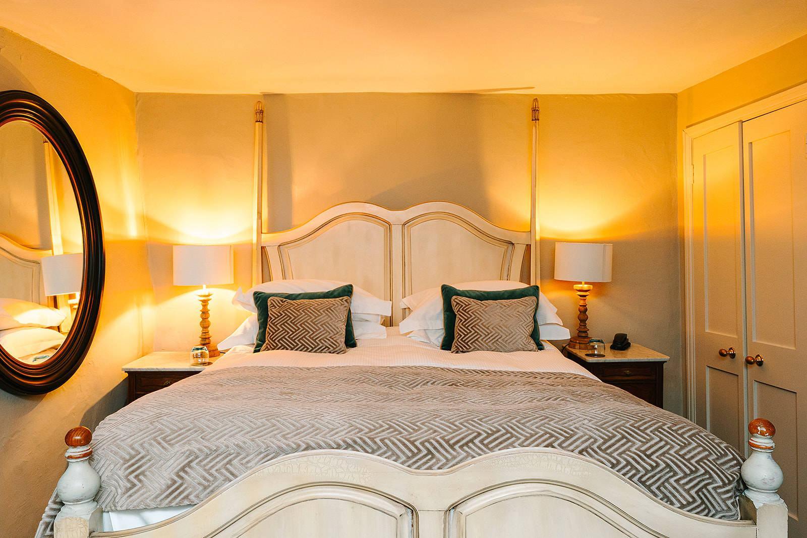
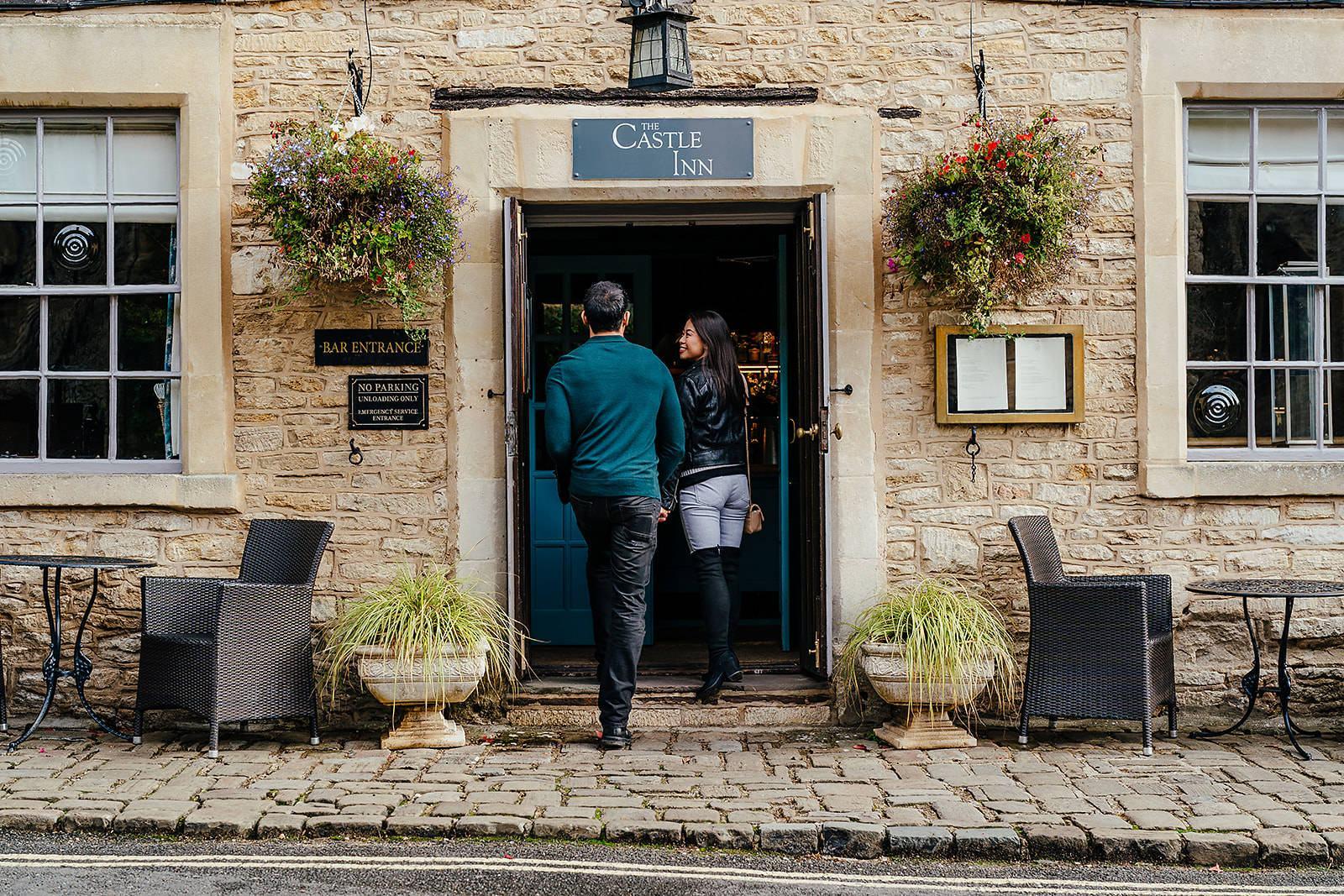
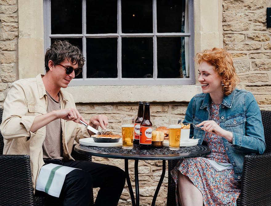
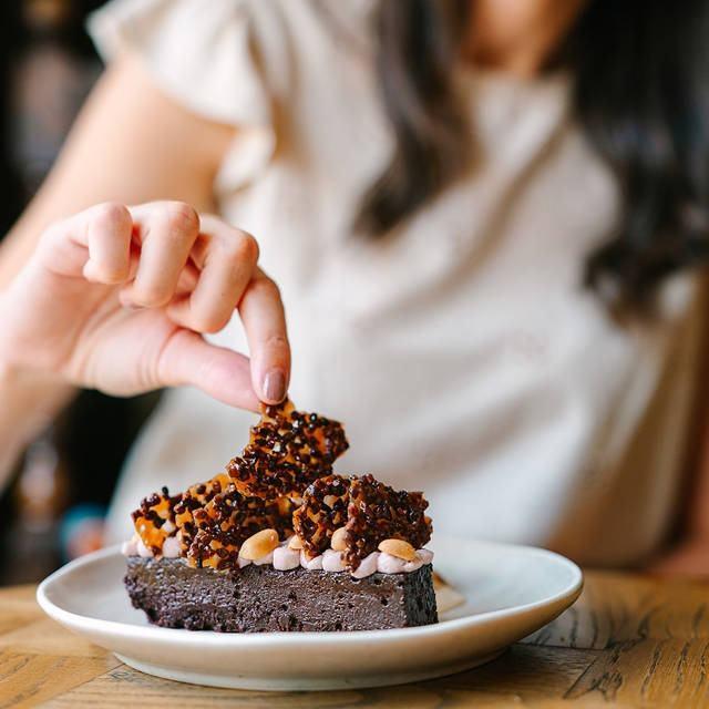
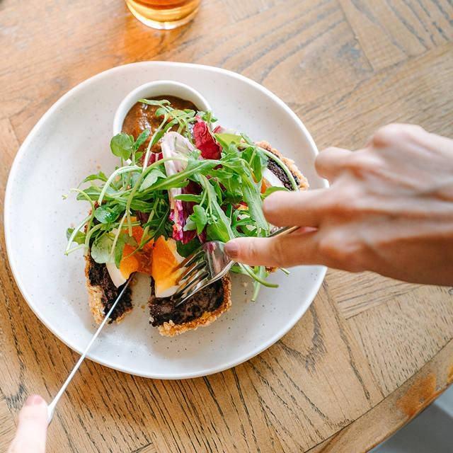
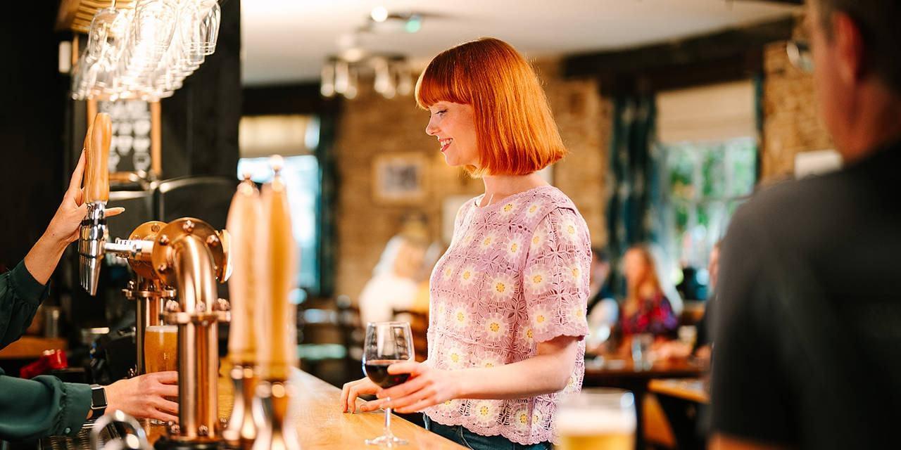
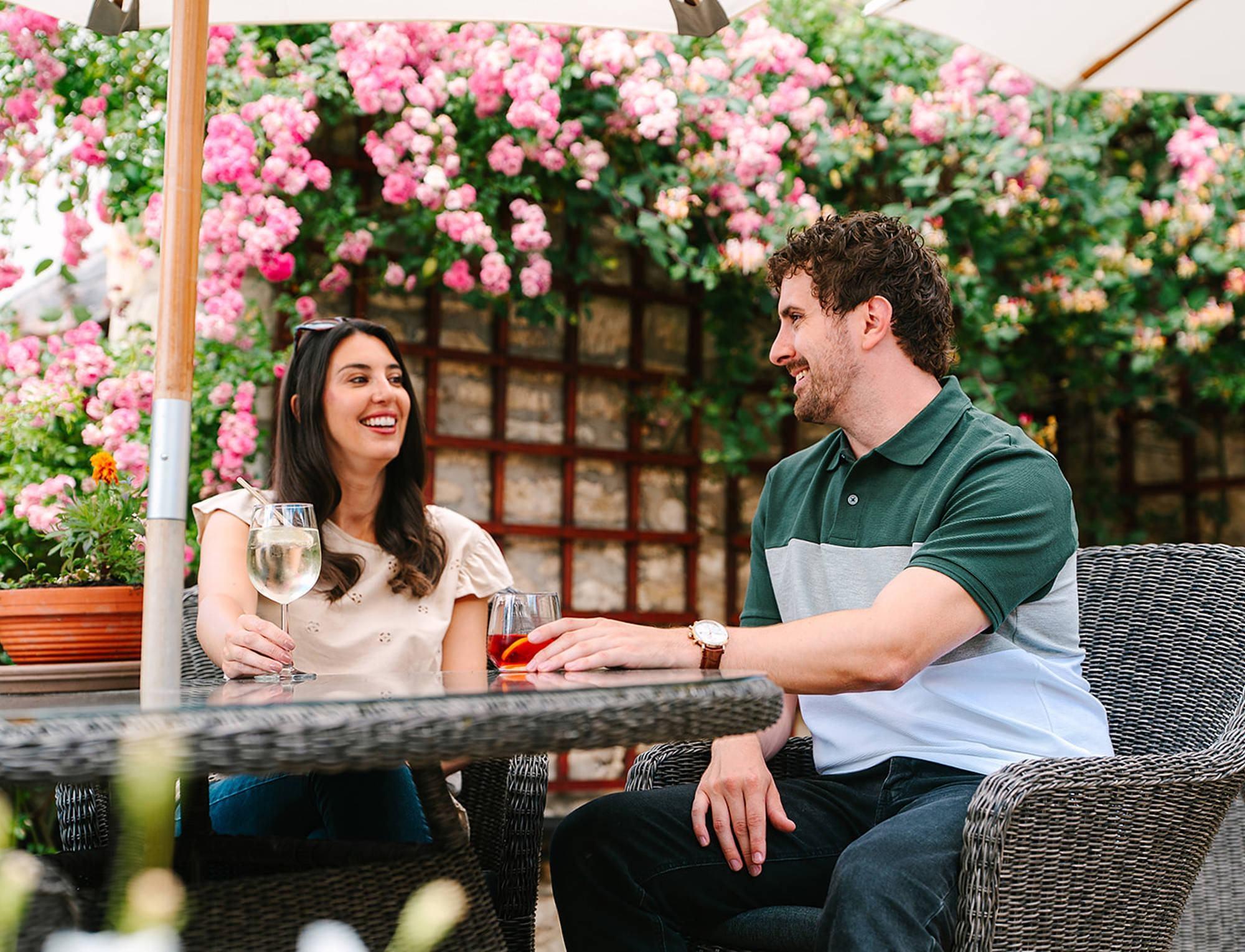
Imagery should capture an authentic, real moment in time using natural lighting, embracing genuine imperfections and natural lens flare rather than staged poses or artificial effects.
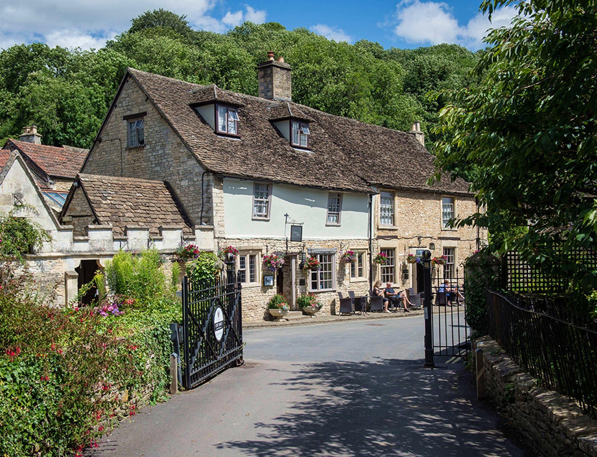
Property & Hero Imagery
When to Use:
Print advertising and editorial placements
Competition materials and promotional campaigns
Brand awareness in luxury travel contexts
When venue recognition is critical
Brochures and sales collateral
Digital campaigns where the property is the product
Characteristics:
Hero architecture and iconic property shots
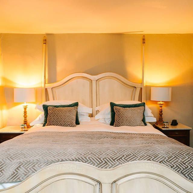
Showcases interiors, amenities, and distinctive features
Clear focal point with strong visual impact
Establishes hotel recognition and brand positioning
Often accompanied by lifestyle or product imagery to tell the full story
Lifestyle Imagery
When to Use:
Digital prospecting and awareness campaigns
Social media content that builds engagement and affinity
Content designed to convey experience over venue
Mobile-first digital applications
Storytelling that emphasizes guest experience
Characteristics:
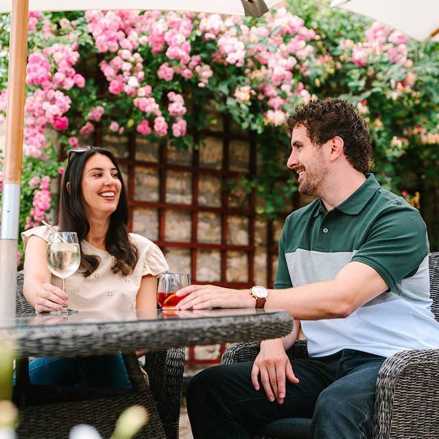
Prioritise people enjoying spaces and authentic moments
Captures the feeling and atmosphere of the experience
Stops the scroll and builds emotional connection
Mobile-first crops with minimal overlays
Focuses on the human element and sense of place
Capturing Moments
Accentuate scale and setting by allowing models to humanise the composition.
Avoid zooming in too close on guests.
Create a sense of wonder and invite the audience to put themselves in the frame.
Guests should not directly acknowledge the camera.
Natural pose and interaction between guests.
Express tone and atmosphere of the experience.
Showing Happiness
Don't rely solely on big smiles.
Express genuine feeling of joy in the moment.
Capture authentic interaction and believable moments.
Natural movement preferred.
Frame to avoid distracting elements.
Reframing
Don't think of the original crop as final.
Reframe to focus on specific moments and build narrative.
Use crop to enhance visual cues (seating, table settings, environment).
Consider off-center composition to create intrigue.
Complementary Colours
Always use imagery with a complementary palette to the design you are creating.
Colour can create emotion, so whilst we like to stick to our brand palette where possible, consider the feeling you're looking to create.
When using multiple images, try to use imagery of the same tone and depth.
Our grids are vital for creating
consistency and structure in all our marketing materials. We use two types of grid
depending on which type of
document we are creating.
The grid is a simple, flexible system that organises visual elements across all platforms. It creates consistency, structure, and brand cohesion, ensuring balanced spacing and alignment.
Grid
SIGHT
Green Rhody pinks Pinks Part of the landscape
Where the natural world and modern expectations live in perfect harmony
Sensory Stimuli
SOUND
Farm Celebrations Calm Water Natural bubbles
EMOTIONS
Calm Serene Relaxed, shoulders drop Indulged, treated
TASTE
Variety New Assiette Healthy
TOUCH
Linie Textured Dark & Light Grainy Naturally imperfect Velvet brushed the wrong way
Triggers & Receptors
MESSAGES
“Perfect blend of old and new Refinement, rugged Spa It s a dog s life Environment Considered
MEMORIES
Country version of looking out to sea Pool view, infinity Spending time on holiday Undisturbed view
View the BrandSensorium stimulus film
SMELL
Floral Grassy Natural Spa Meadow
We're here to give our guests a breath of fresh air – not just with our estates, but with the character and exceptional service at the heart of what we do. We're warm, welcoming, and full of personality. The same goes for how we write and talk to our guests and team members.
Our voice is...
Light-hearted
While we take what we do seriously, we don’t take ourselves too seriously. We’re in the business of making people feel happy. This means in our writing, we leave the overly serious stuff at the door and make our audience feel immediately at ease.
Conversational
We like to get to know our guests, and we do that
through the gift of conversation. When you’re writing,
imagine you’re having a two-way conversation. Aim for
natural and informal.
Humorous
Unlike other luxury hotels and venues, we’re not cold
or soulless. We’re warm, slightly quirky and at times
rebellious, not because we’re trying to be, but because
that’s just who we are. We sprinkle what we’re saying
with wit and use humour that adds meaning to what
we’re already saying.
Respectful
We like to have fun, but we don’t push it too far. We
never offend or make people feel uncomfortable or
unwelcome. In our writing, this means not poking fun
at anyone, their interests, their needs, their culture or
their beliefs. Think about who you’re writing for, the
context and even what’s going on in the world before
you start writing.
Human
We’re people, talking to people. It can be tempting to
go overly formal or pull out a cliché to convey a message
or illustrate an idea. Instead, think about how you’d
speak to someone you know. The idea is for it to feel,
well, normal.
Inclusive
We’re exclusive by name, but not by nature. People
from all walks of life come through our doors. We’re
welcoming, approachable, friendly and make everyone
feel at home. We don’t alienate guests by coming across
as overly fancy or stuffy, or using stereotypical language
that makes assumptions - like only using ‘bride and
groom’ when talking about a couple getting married,
for example.
If our walls could talk...
they probably wouldn't stop
Storytelling is our secret weapon
We’ve got stories that could fill
(many) books. So feel free to
add a little snippet of one to
your communications. Something
unique, that could only happen
at an Exclusive Collection estate
–memorable real-life scenarios
that show just how fabulous we
are. Just don’t overdo it, it should
enhance what you’re already
saying. We don’t want to waffle
on too much and lose our
readers’ attention.
Here are a couple of examples: South Lodge. Where you can take a terrapin to afternoon tea, and no one will bat an eyelid. *Yes, that really happened.
Formal words sounds a bit cold and soulless. That s not us.
Here’s a handy list of formal-to-normal words, so we sound more human.
Top tip, If you wouldn t say it to your friend, it s too formal.
However → But Error → Mistake/Problem Therefore → So View → See/Look Whilst → While Assured → Guaranteed In order to → To Request → Ask Furthermore → And Provide → Give/Tell Instructions → Tips Require → Need An array of → Lots of Assist → Help Glorious → Lovely Loved ones → Favourite people Well loved → Favourite Ensure → Make sure Commence → Start Purchase → Buy/Shop/Send Approximately → About I am → I m Query → Question Can not → Can t Resolve → Fix They will → They ll Obtain → Get We have → We ve Proceed → Carry on I would → I d Apologies → Sorry Is not → Isn t
5 writing tips
Break it up
Structure is important. Break your work up into paragraphs and use sentences of around 20-30 words. This helps create a clear narrative that people can easily navigate. It helps you get your message across too.
Write, then edit
Get all your ideas down, even if you’re not using complete sentences (or real words, sometimes - it happens to the best of us). Then polish, buff and add a little pizzazz. Spelling should always be top notch (we use British English, so that means using spellings like ‘specialise’ over ‘specialize’ and ‘travelling’ over ‘traveling’).
Headings are your best friend
Think about when you read something from a brand. You probably skim, rather than pore over every word, right?
Use headings to convey your message and get our brand personality right in front of our audience’s eyes, so they’ll still get the gist (or more importantly, be intrigued and want to read more). This is especially true for web, when you’re competing with 1000s of other results on Google and your reader’s flipping between 17 different tab
Be clear
In each sentence, pick one message or theme you want someone to understand. Clarity = good. Ambiguity = confusing. (This is where not using jargon or fancy formal words comes into play, too).
Be a rulebreaker
Remember we’re human, so you can bend a few grammar rules if it sounds more natural and still makes sense. Oh, and forget what you learnt in school – you can absolutely start a sentence with ‘and’, ‘but’, ‘or’, ‘so’ and words to that effect.