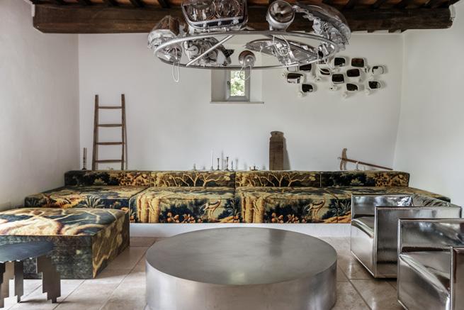
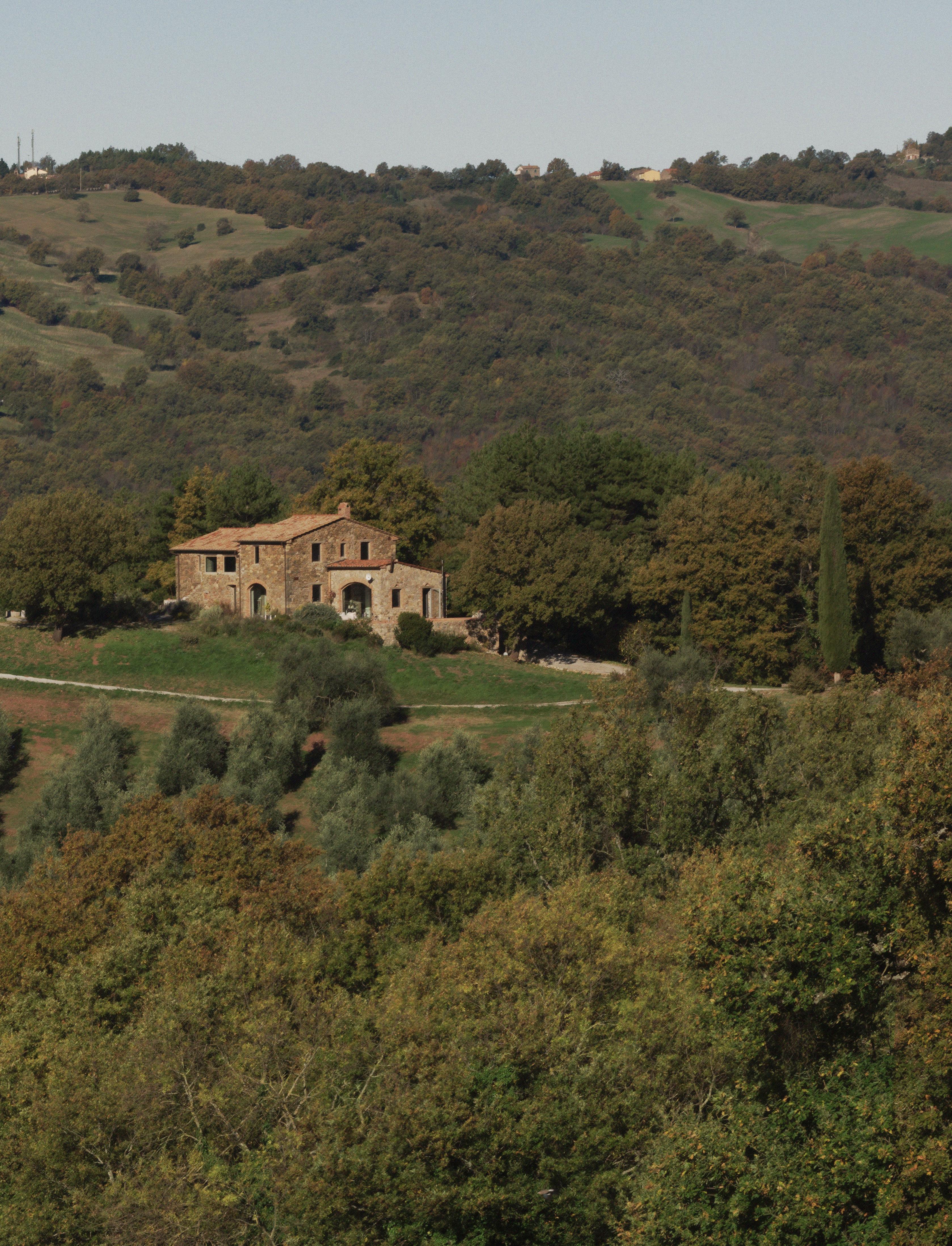
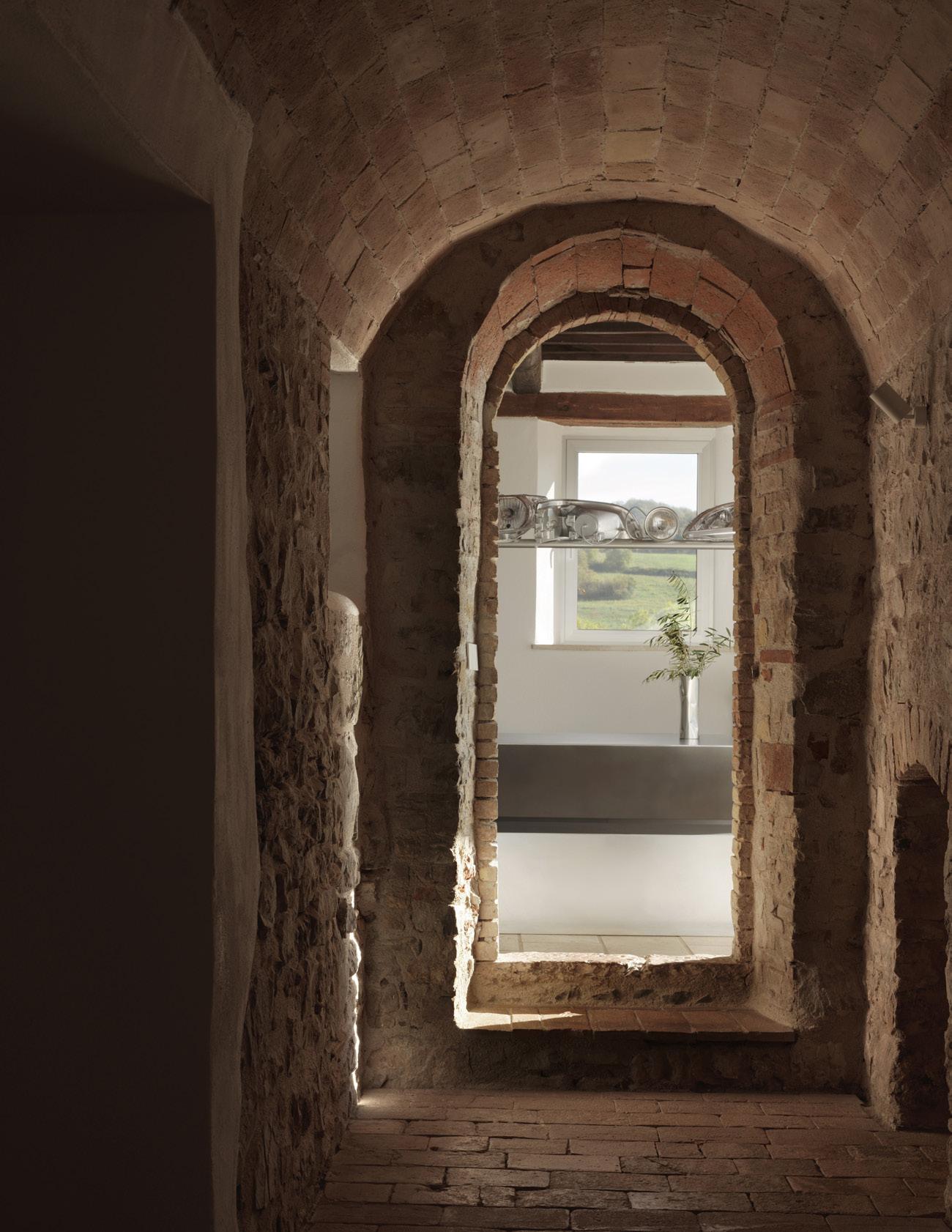
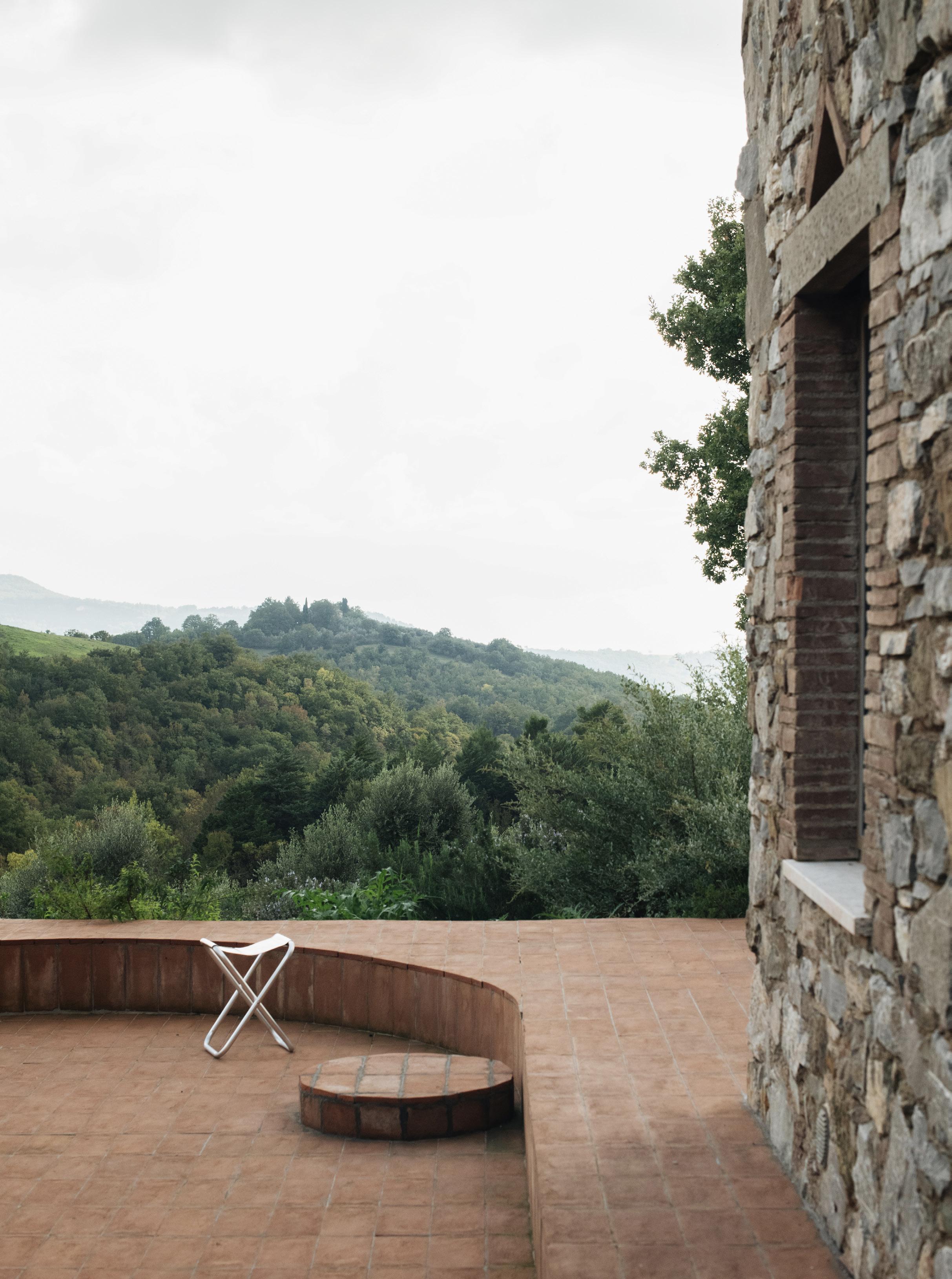
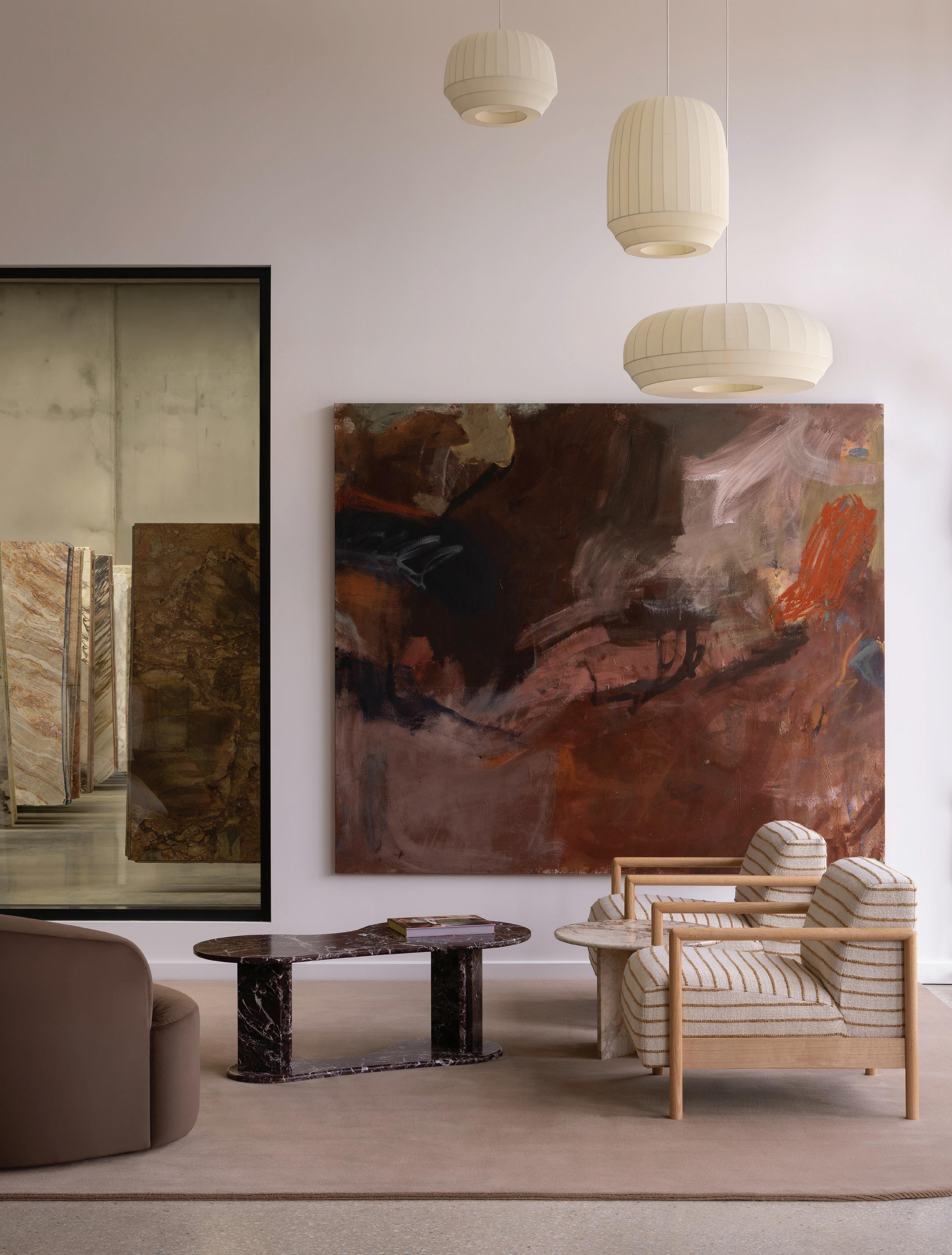
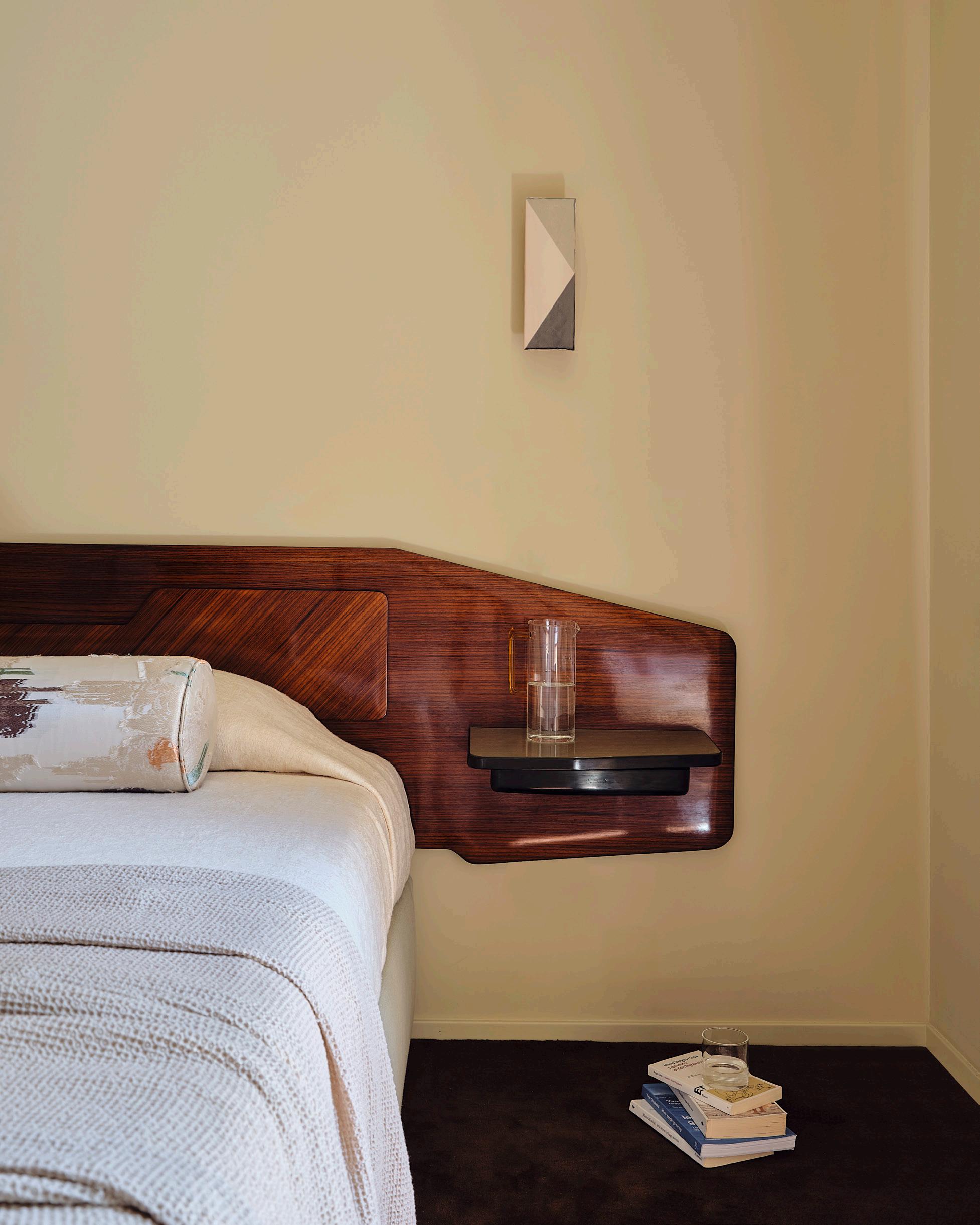
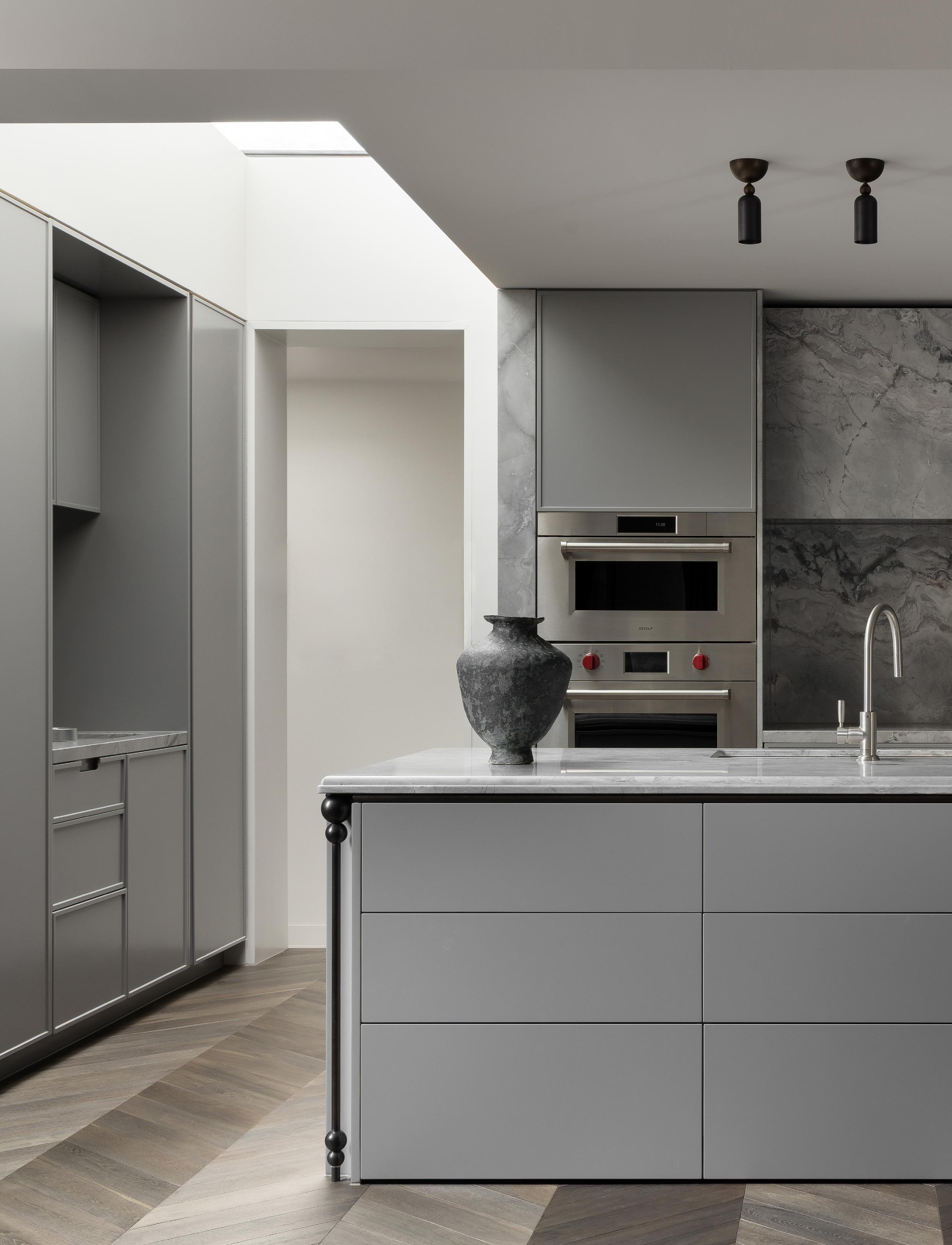
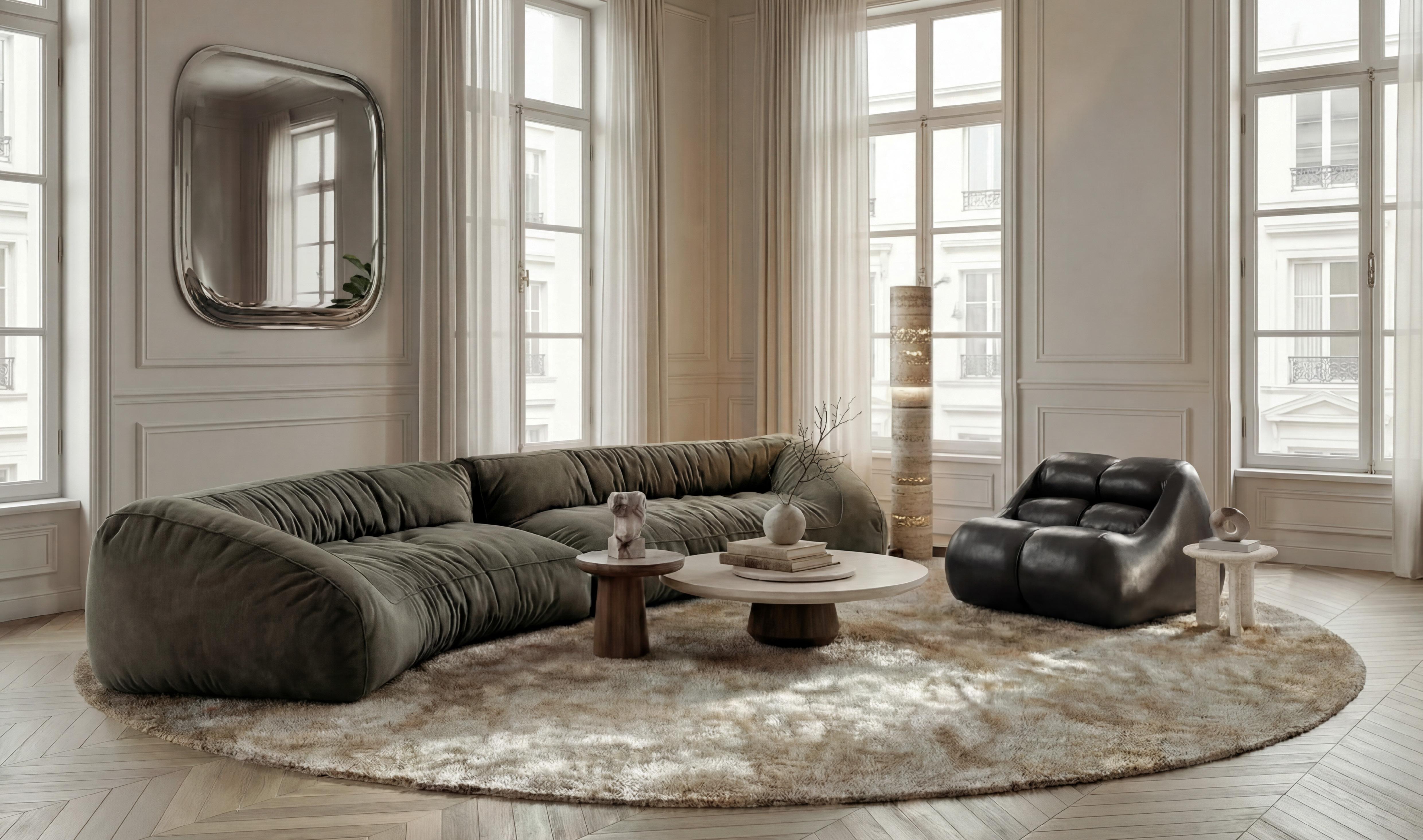
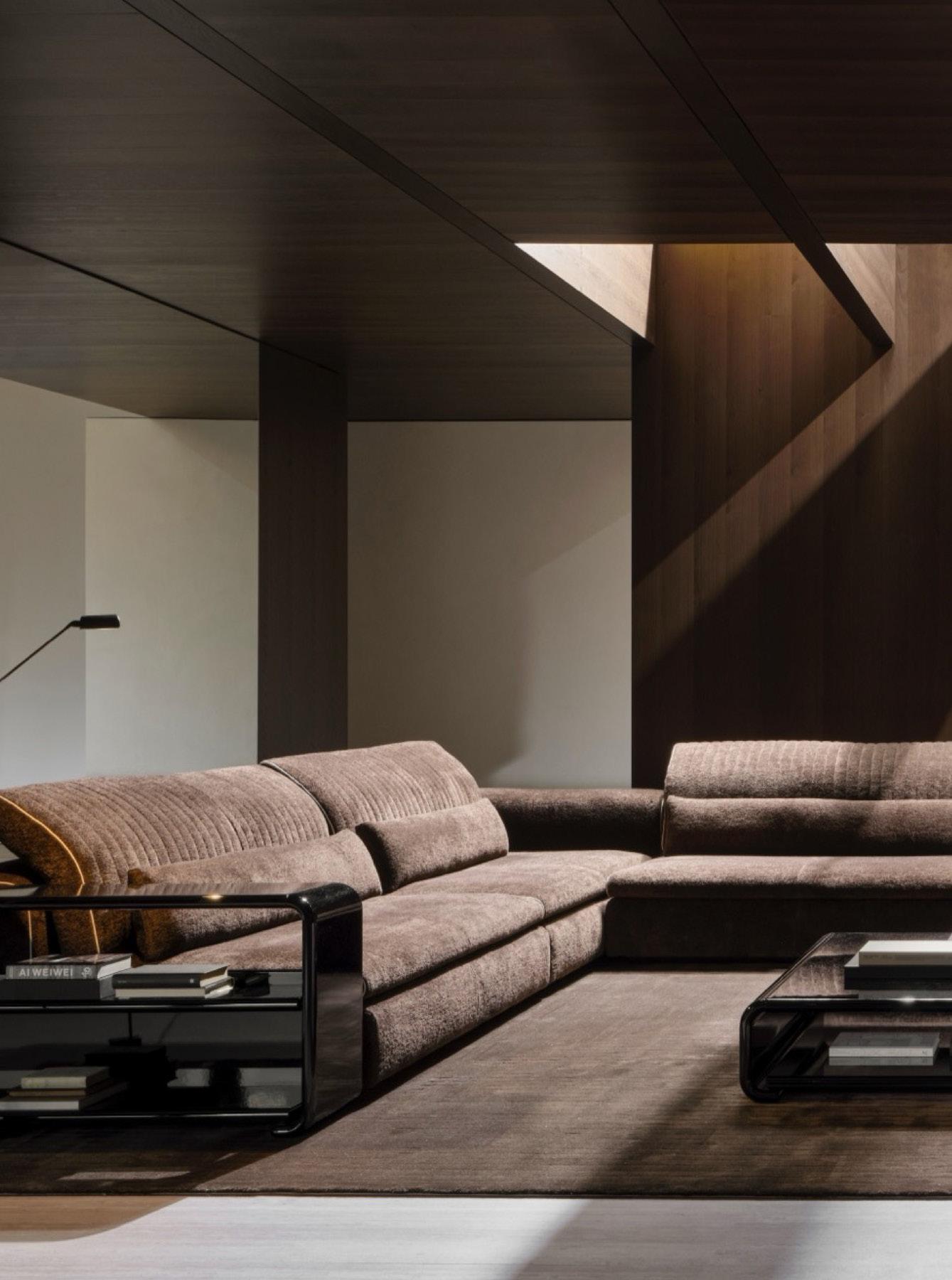
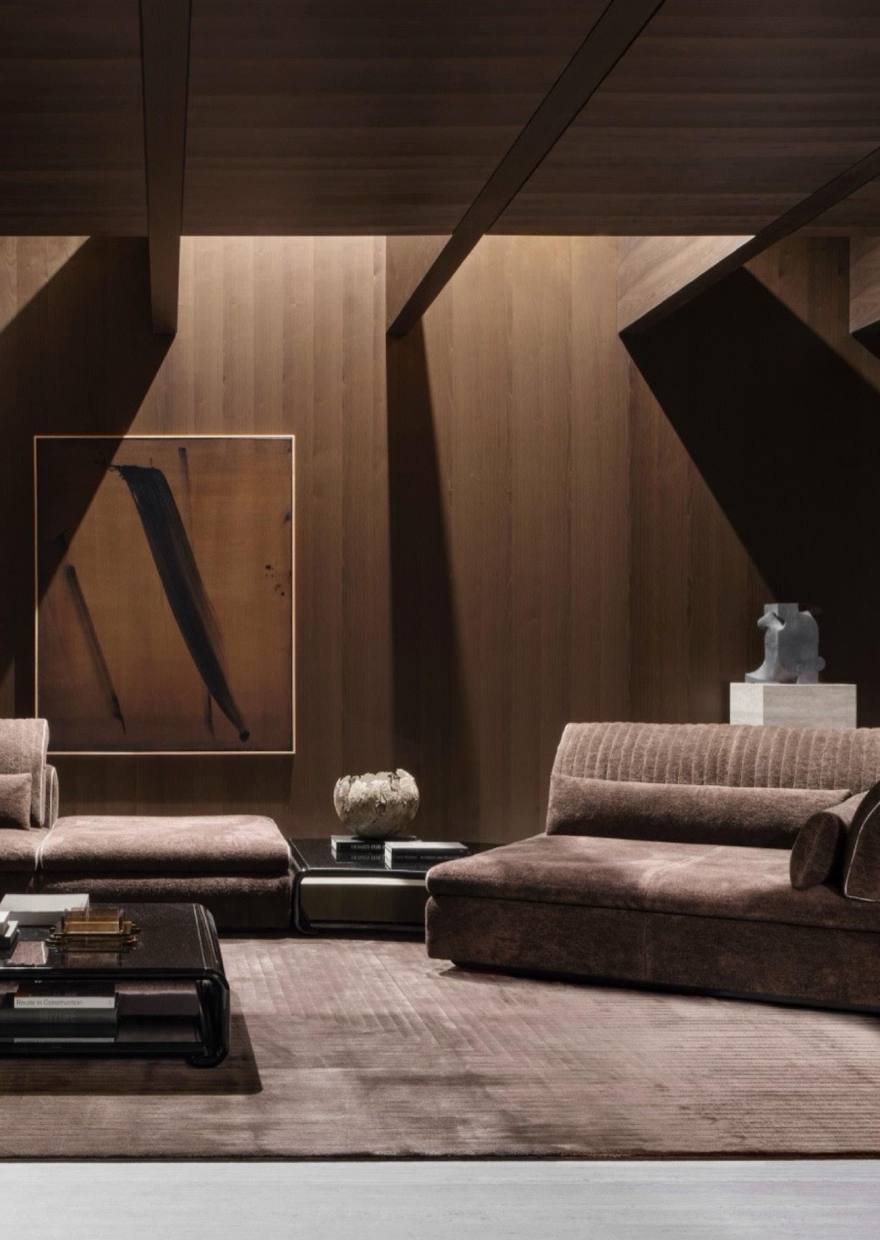
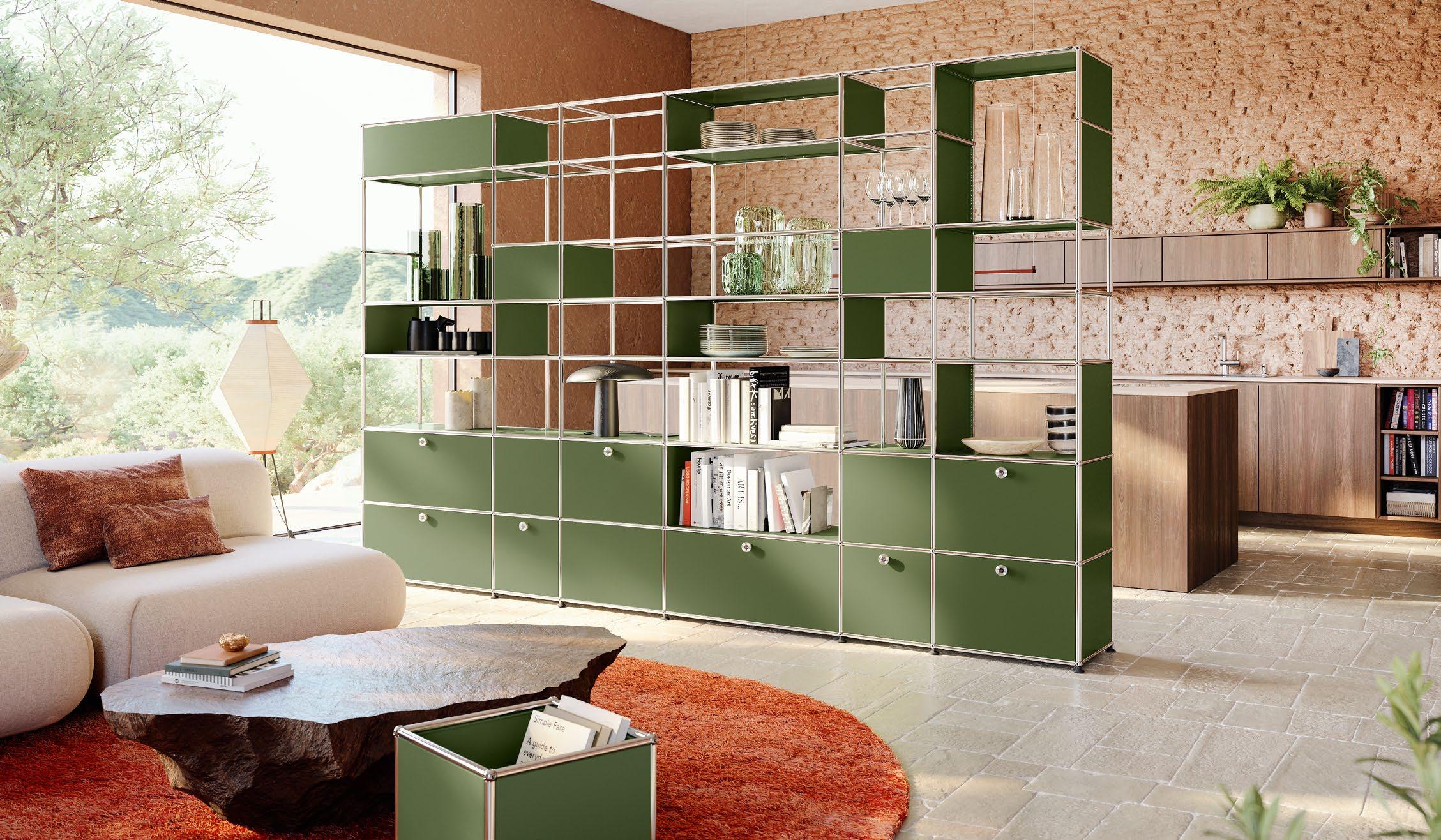
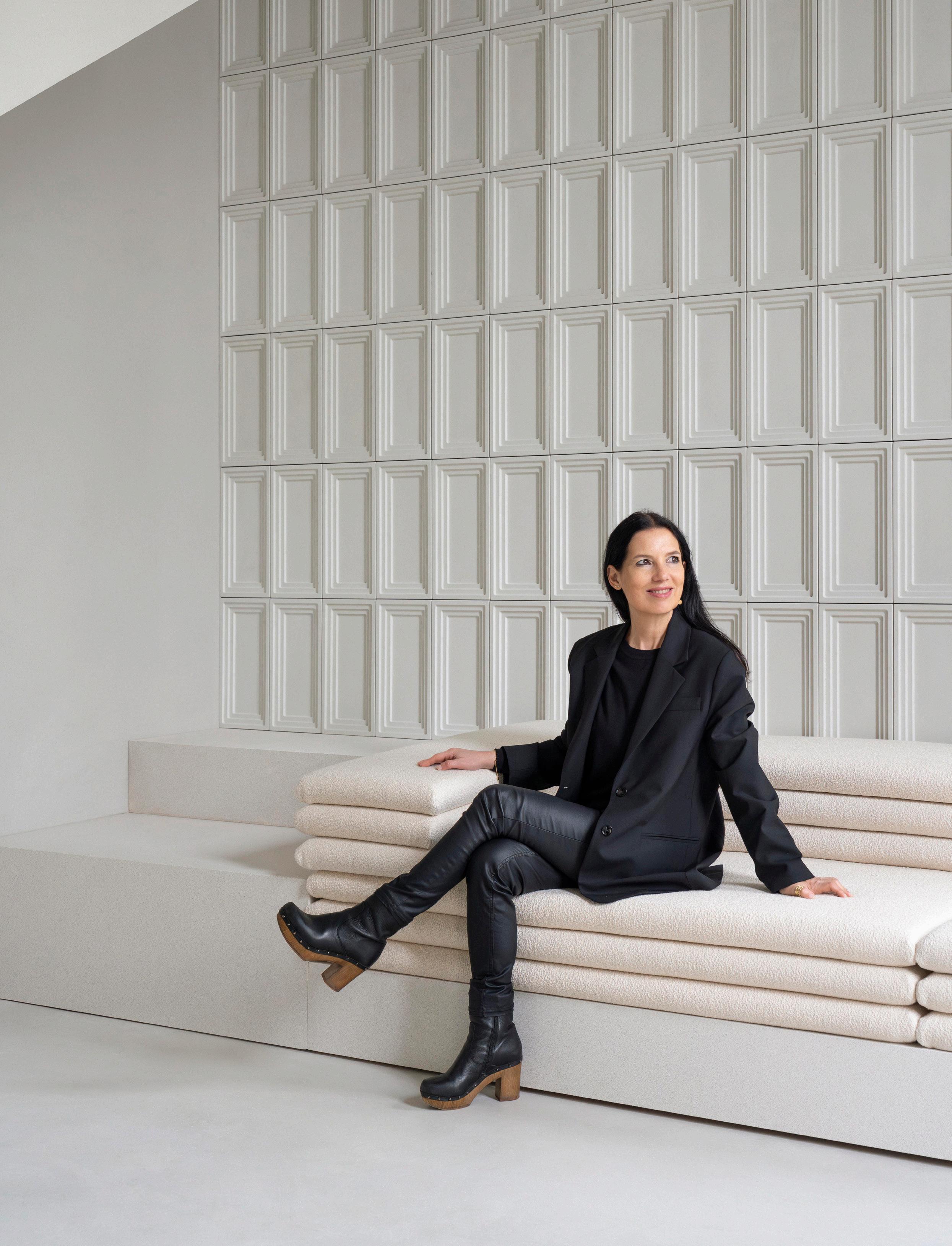
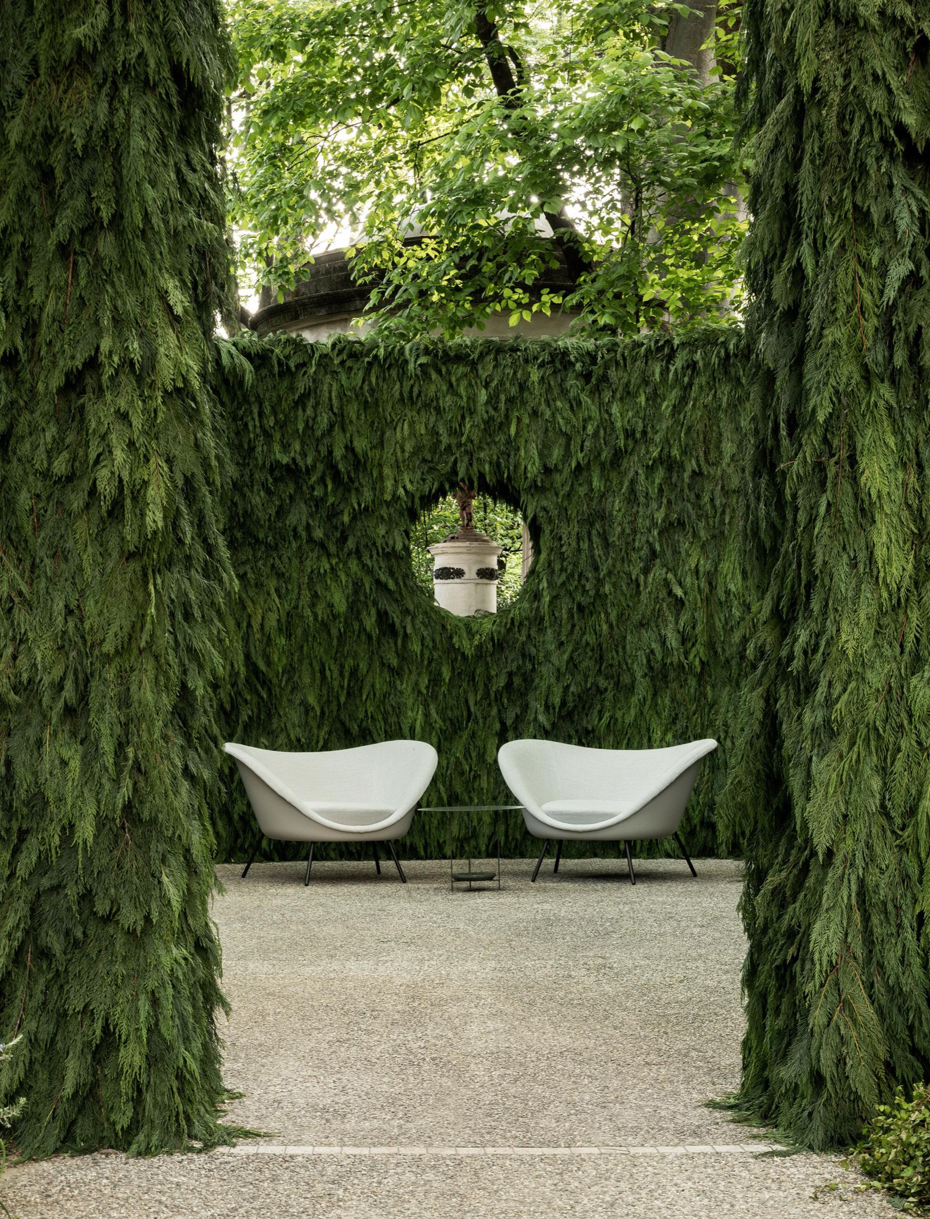
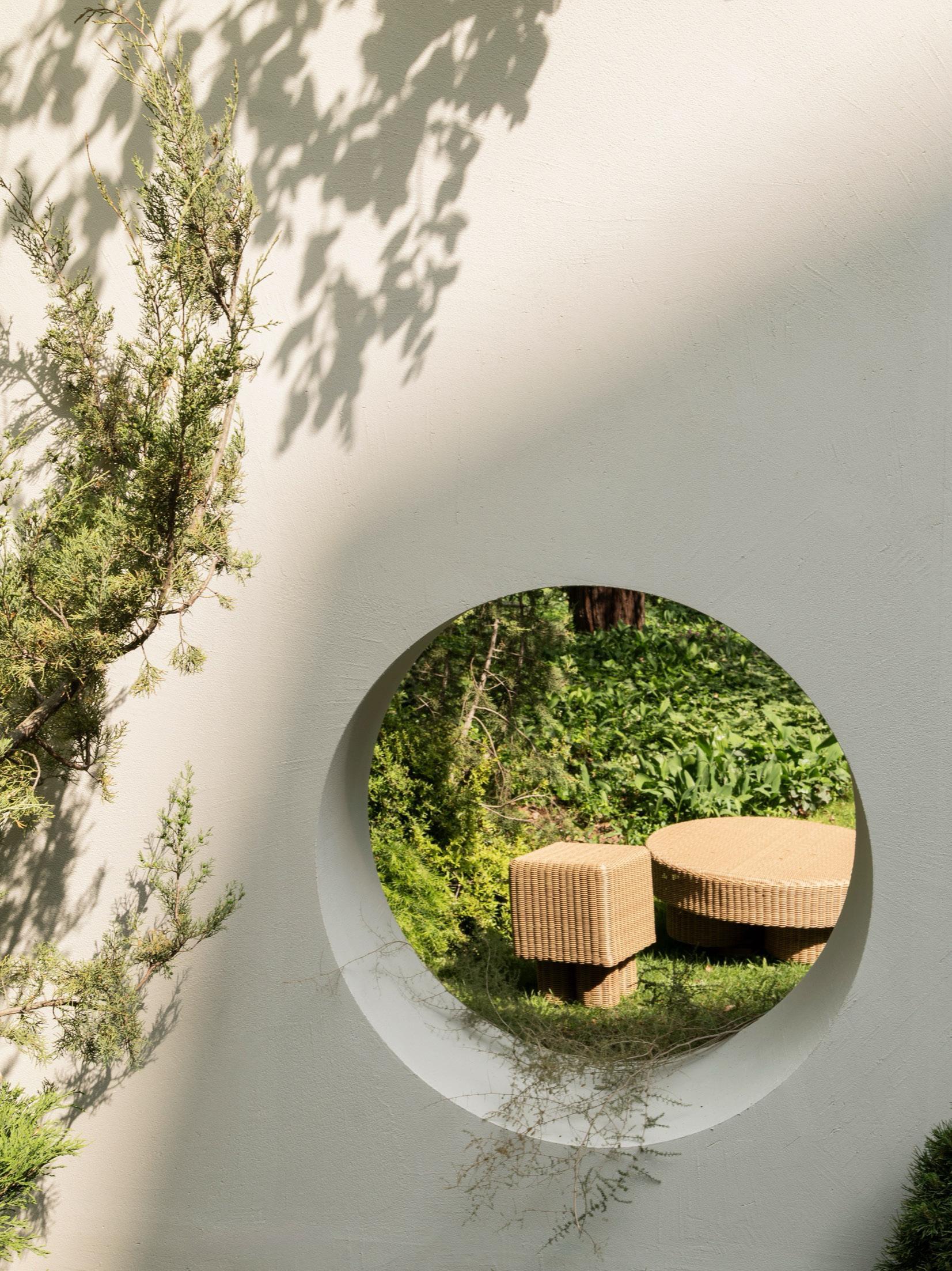
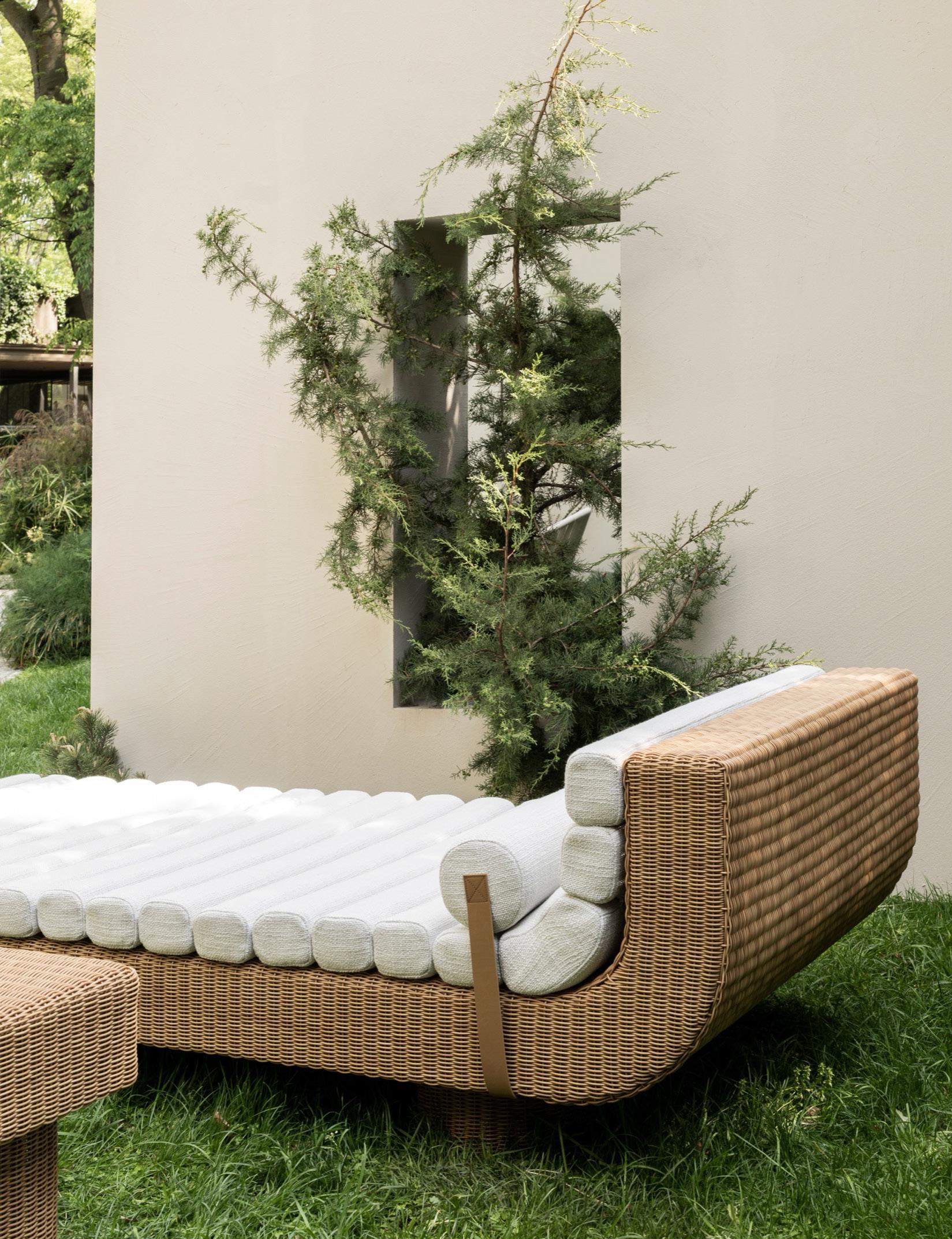
A 17th-century Tuscan farmhouse reborn through gleaming contemporary details.
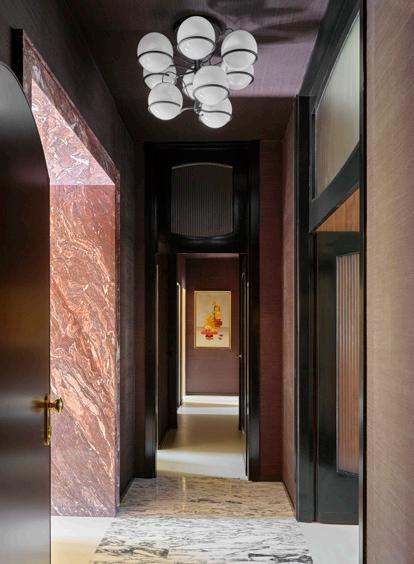
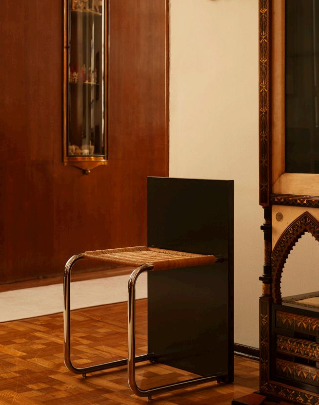
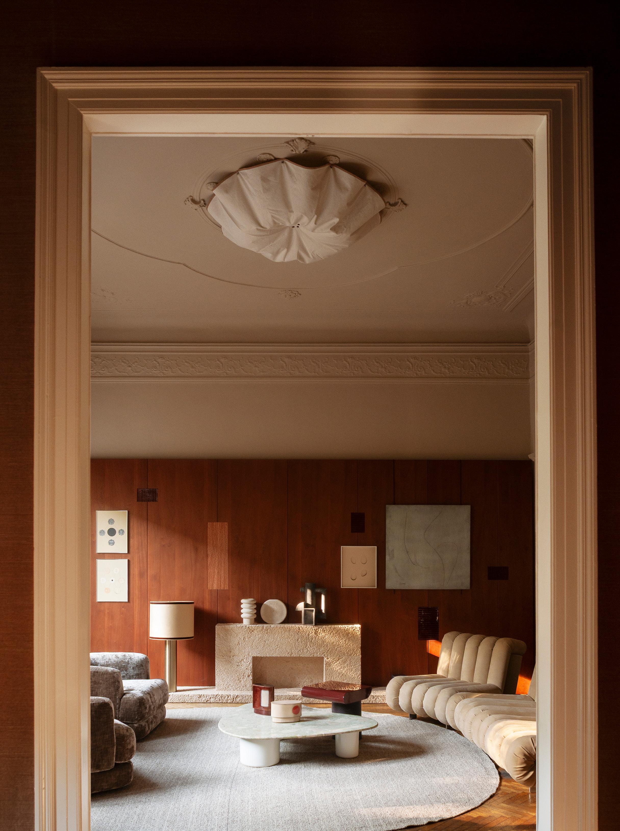
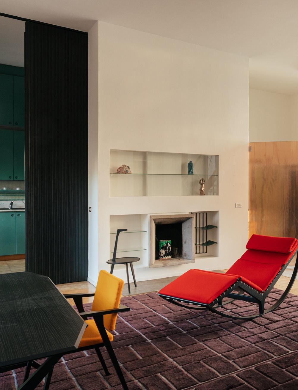
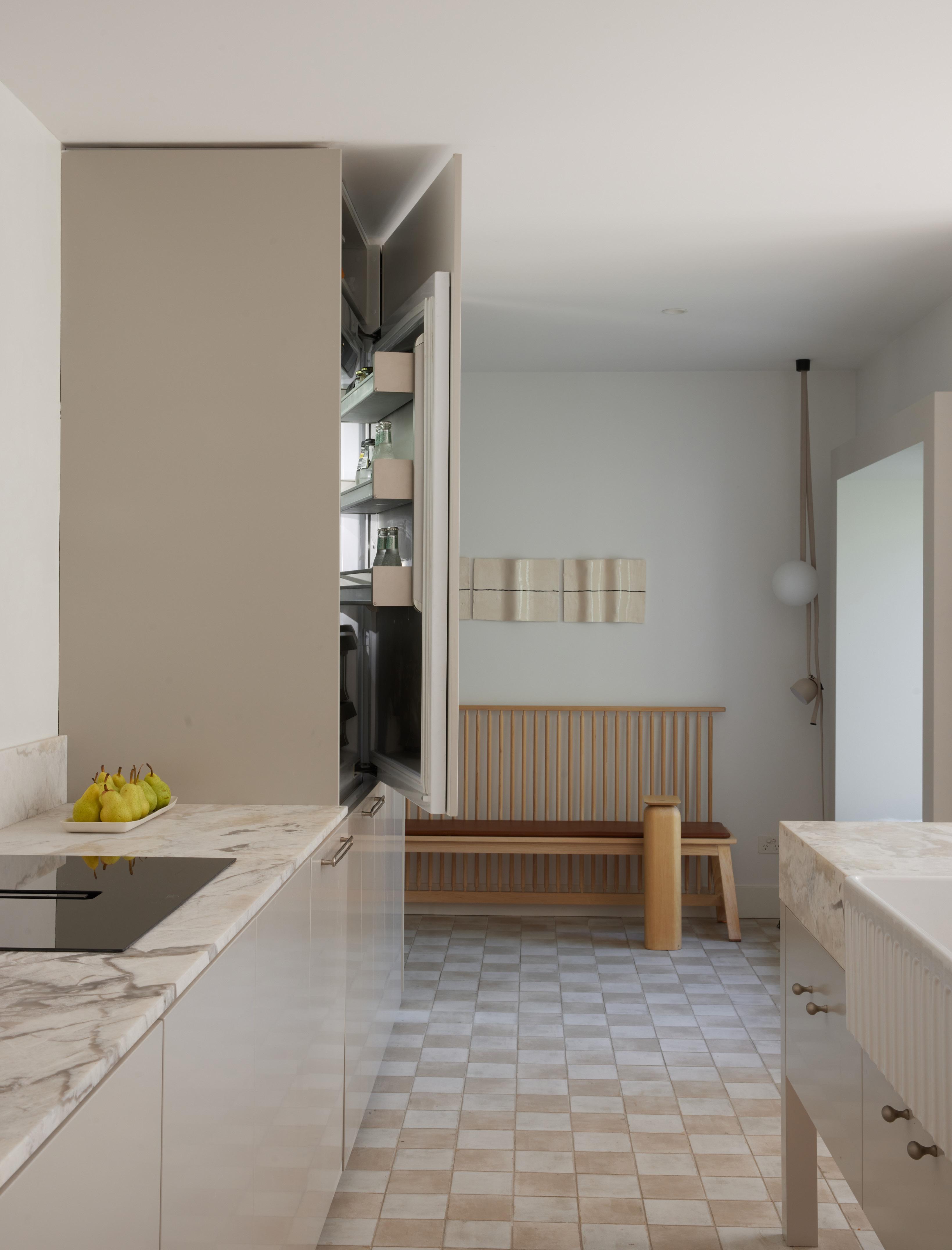
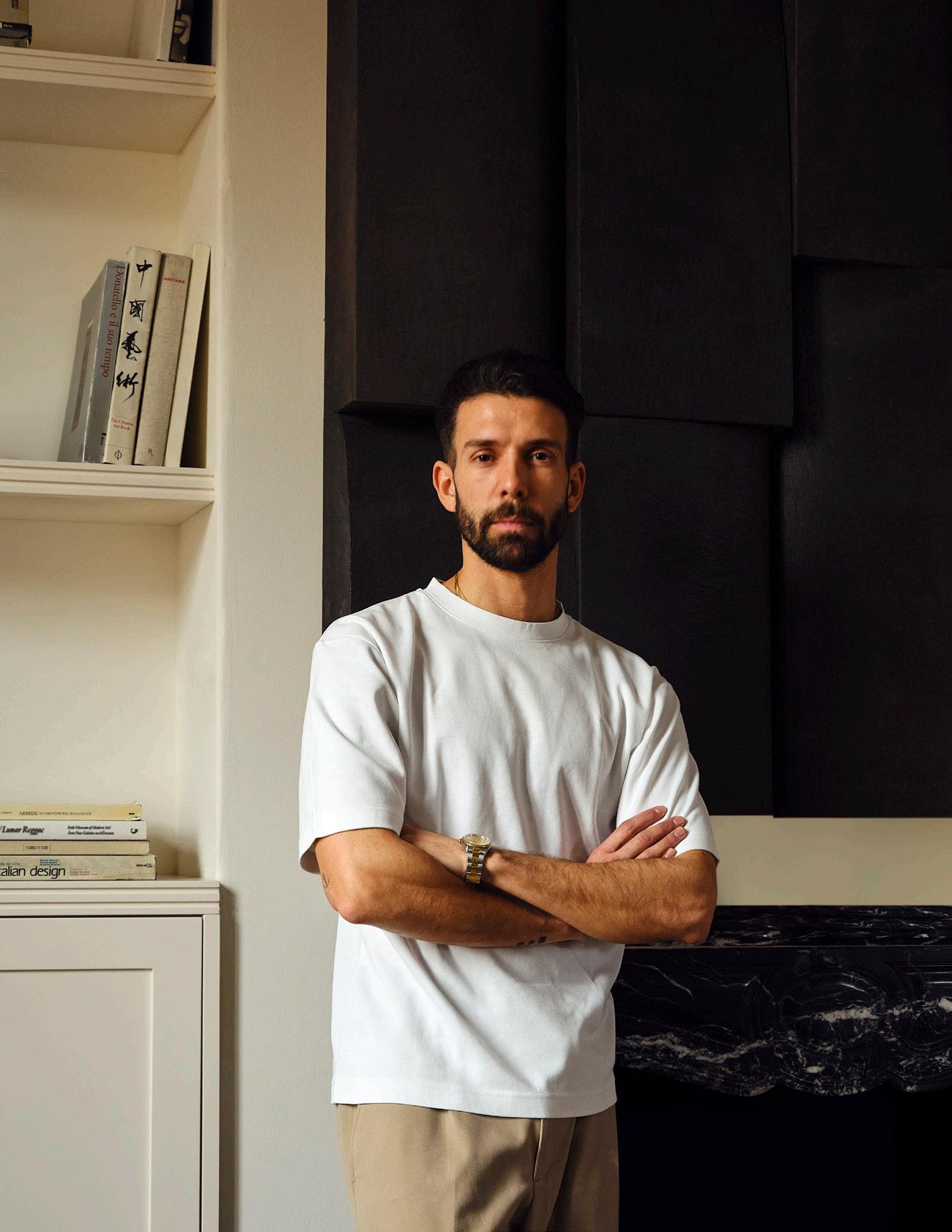
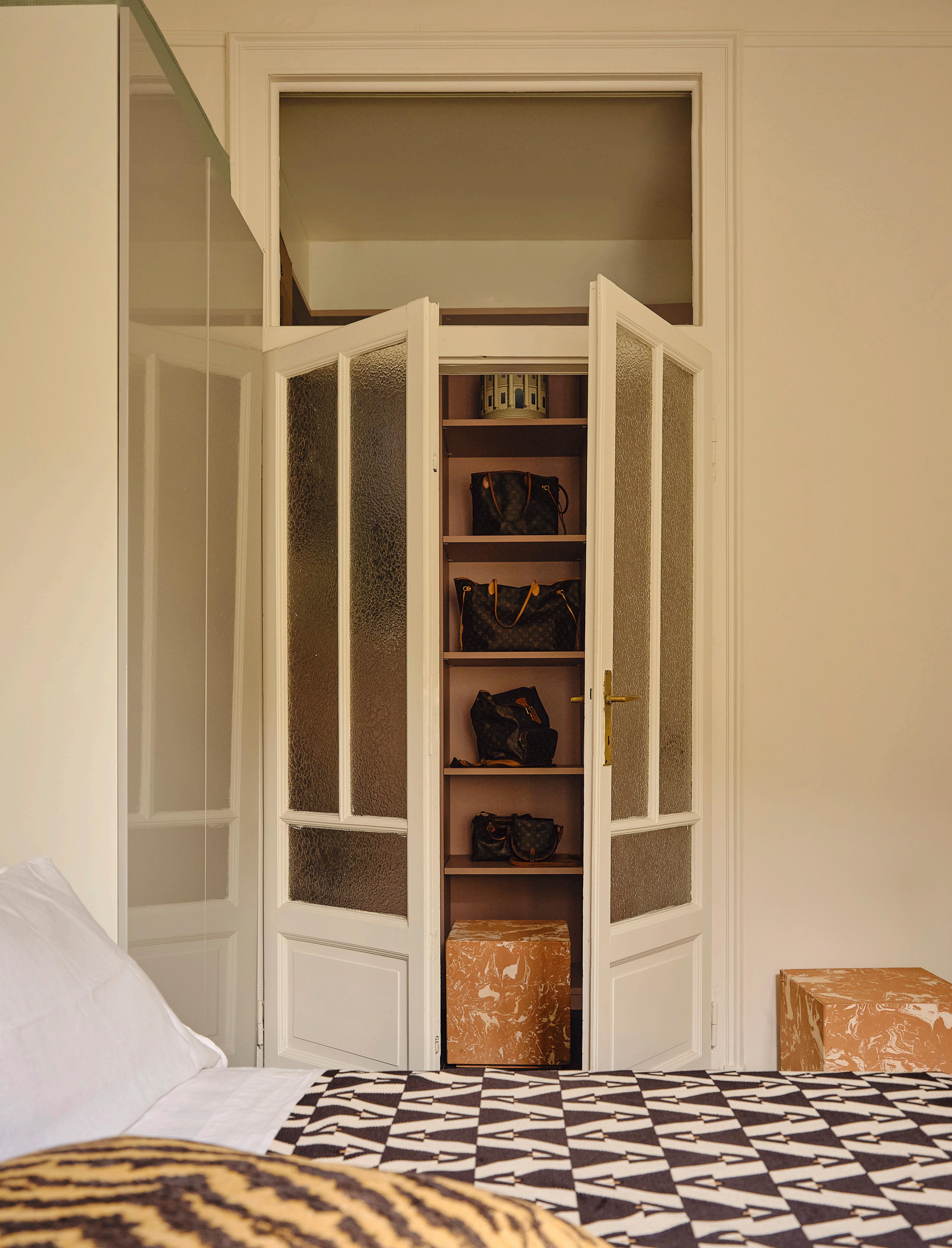
A Milanese apartment is reconceived through an appreciation of craft-led modernism.
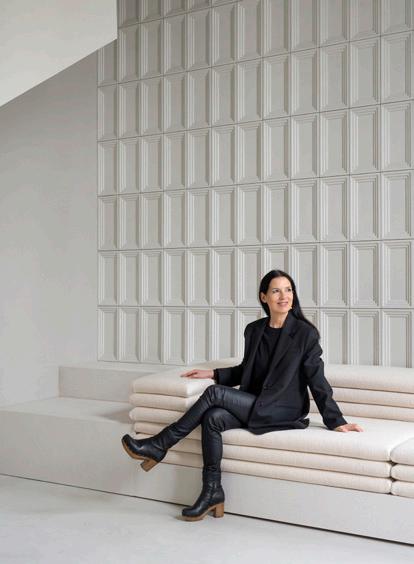
Five designers and duos on the presentations and collaborations that headlined their city during Design Week.
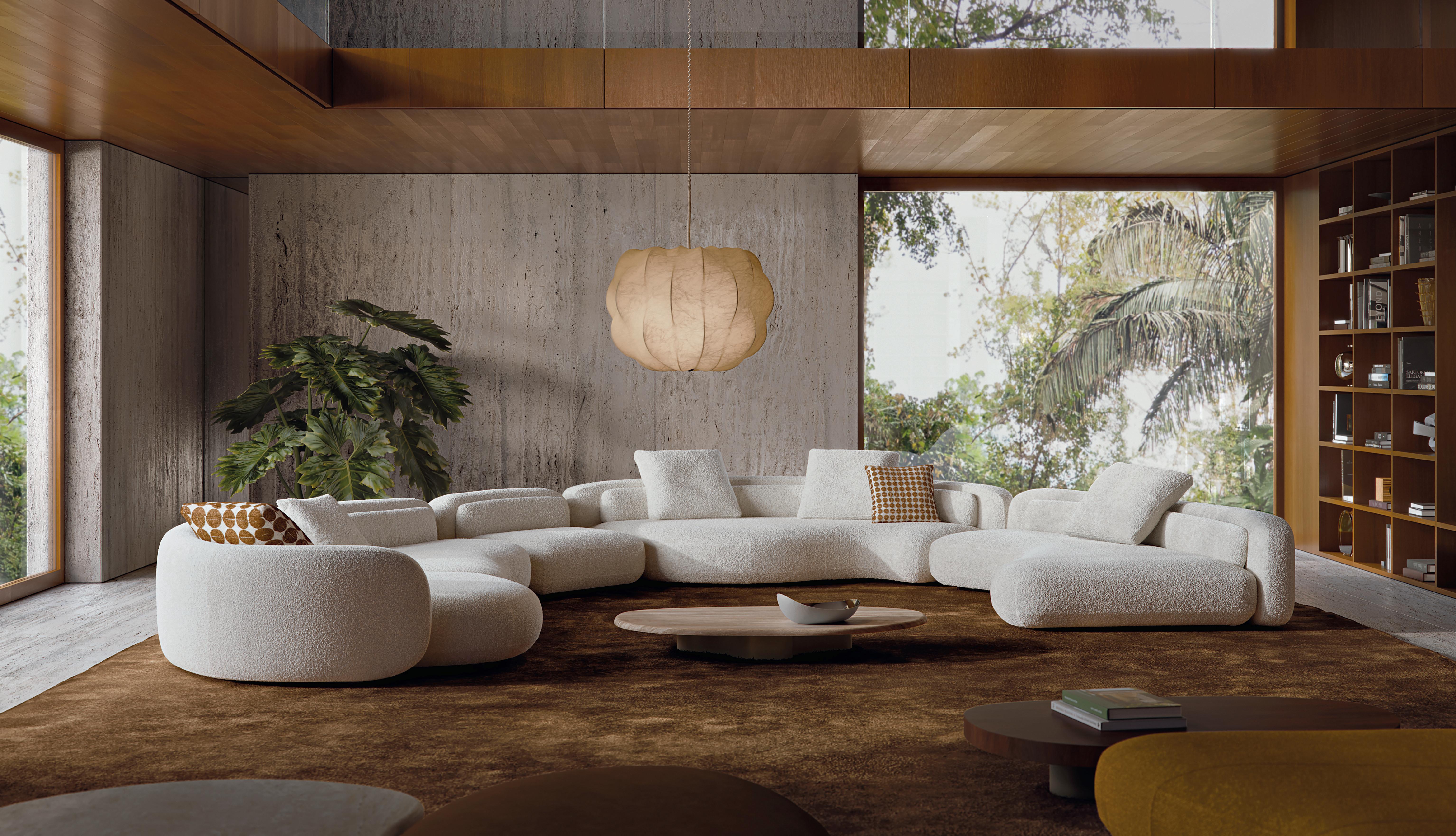
Reporting on the products, spaces and throughline themes from Milan Design Week and Salone del Mobile.Milano 2026.
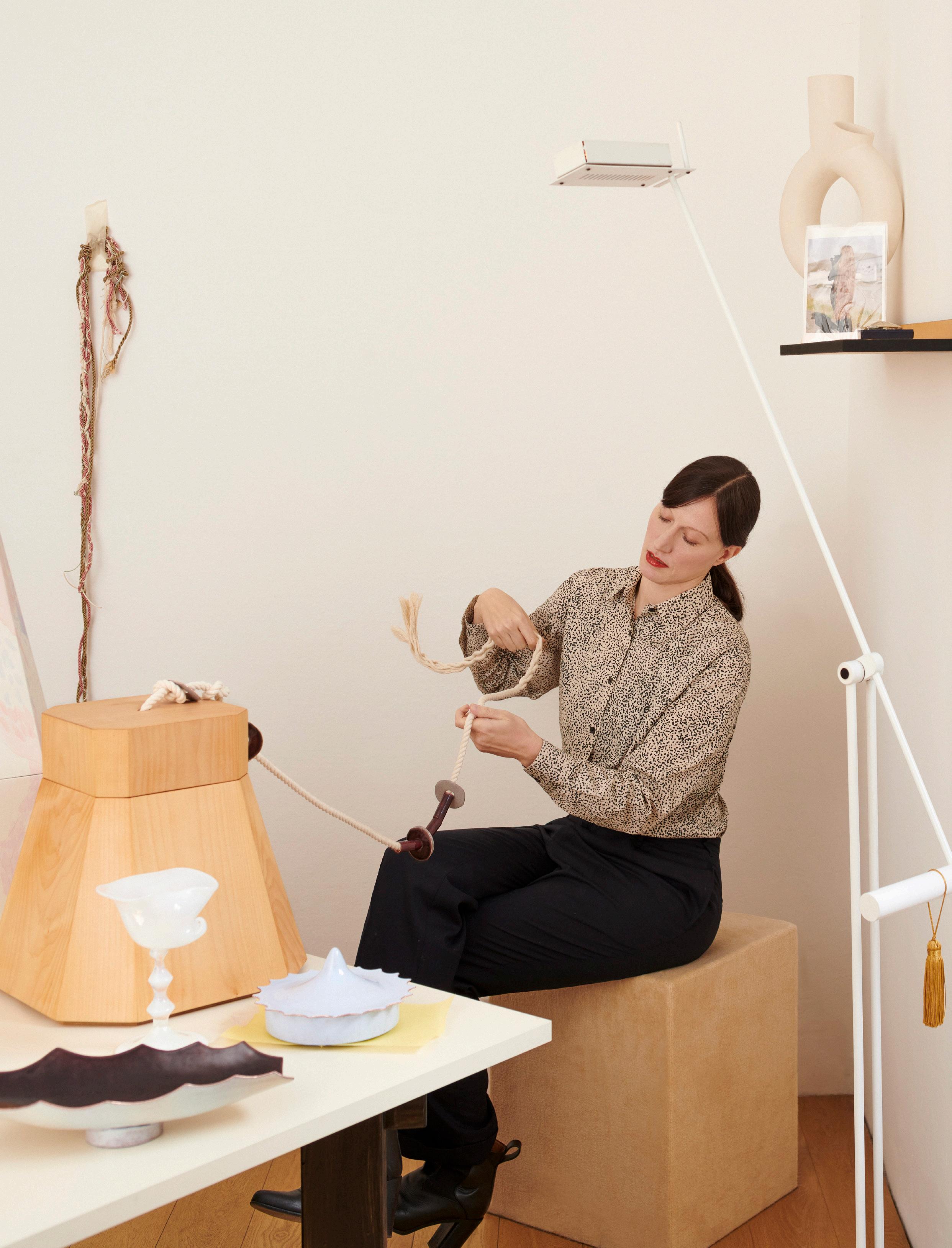
The Italian designer reflects on brand collaborations that oscillate between cinematic concepts and nuanced environments.
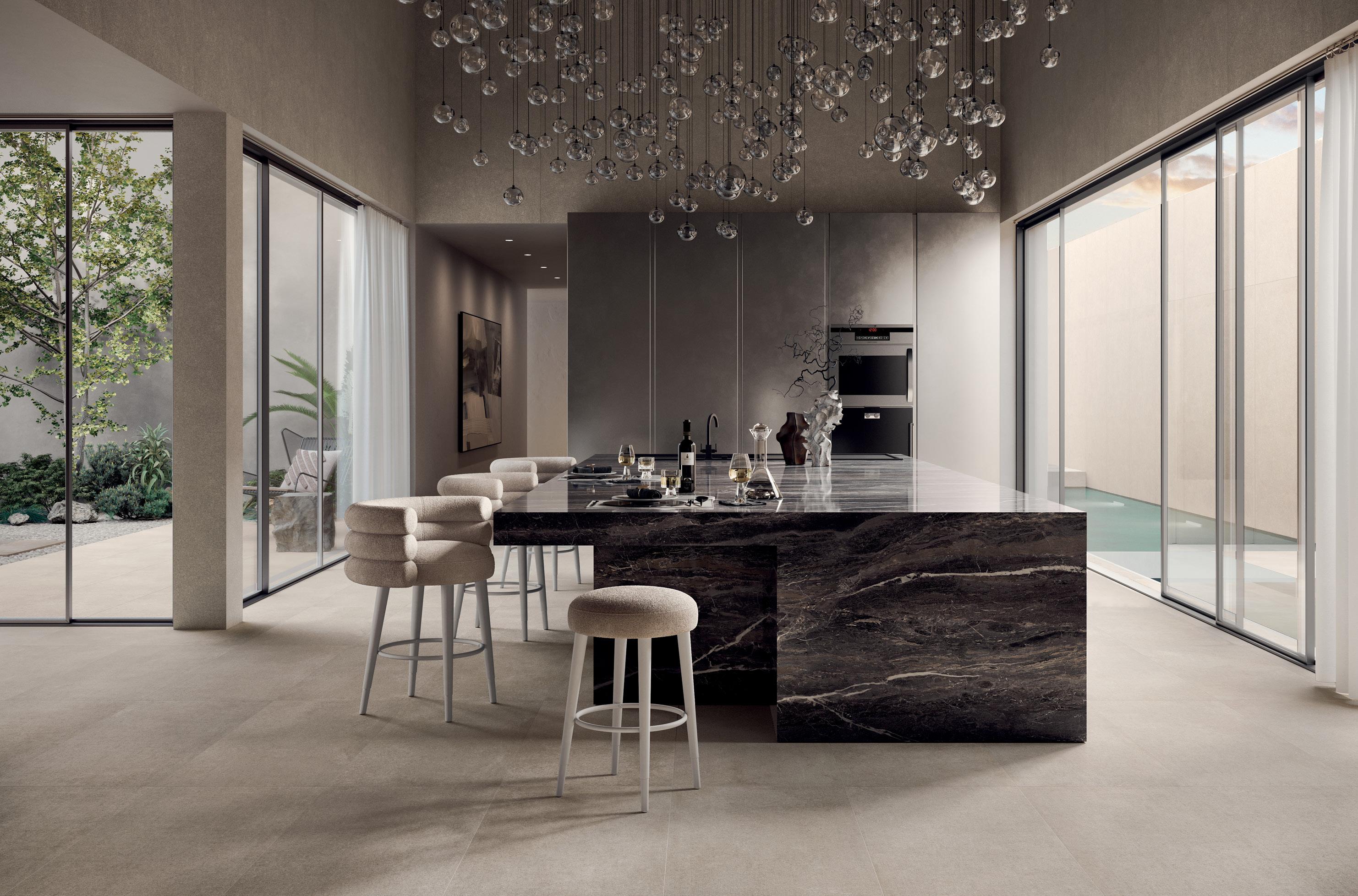
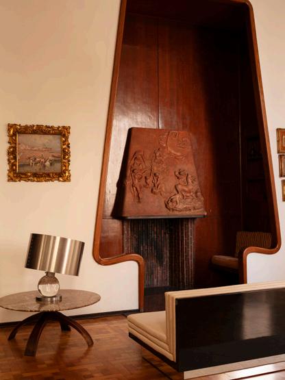
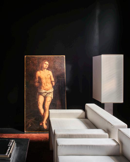
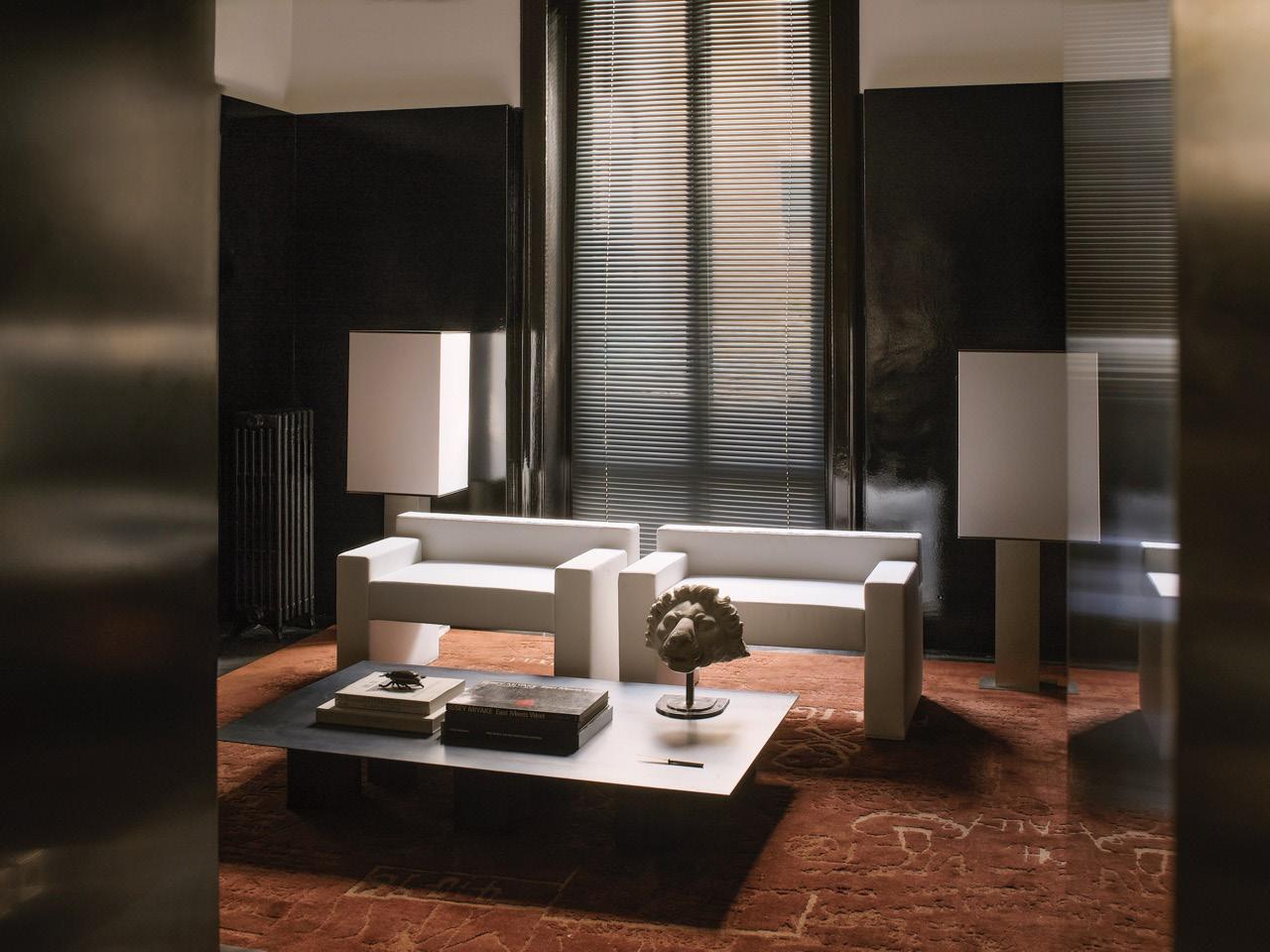
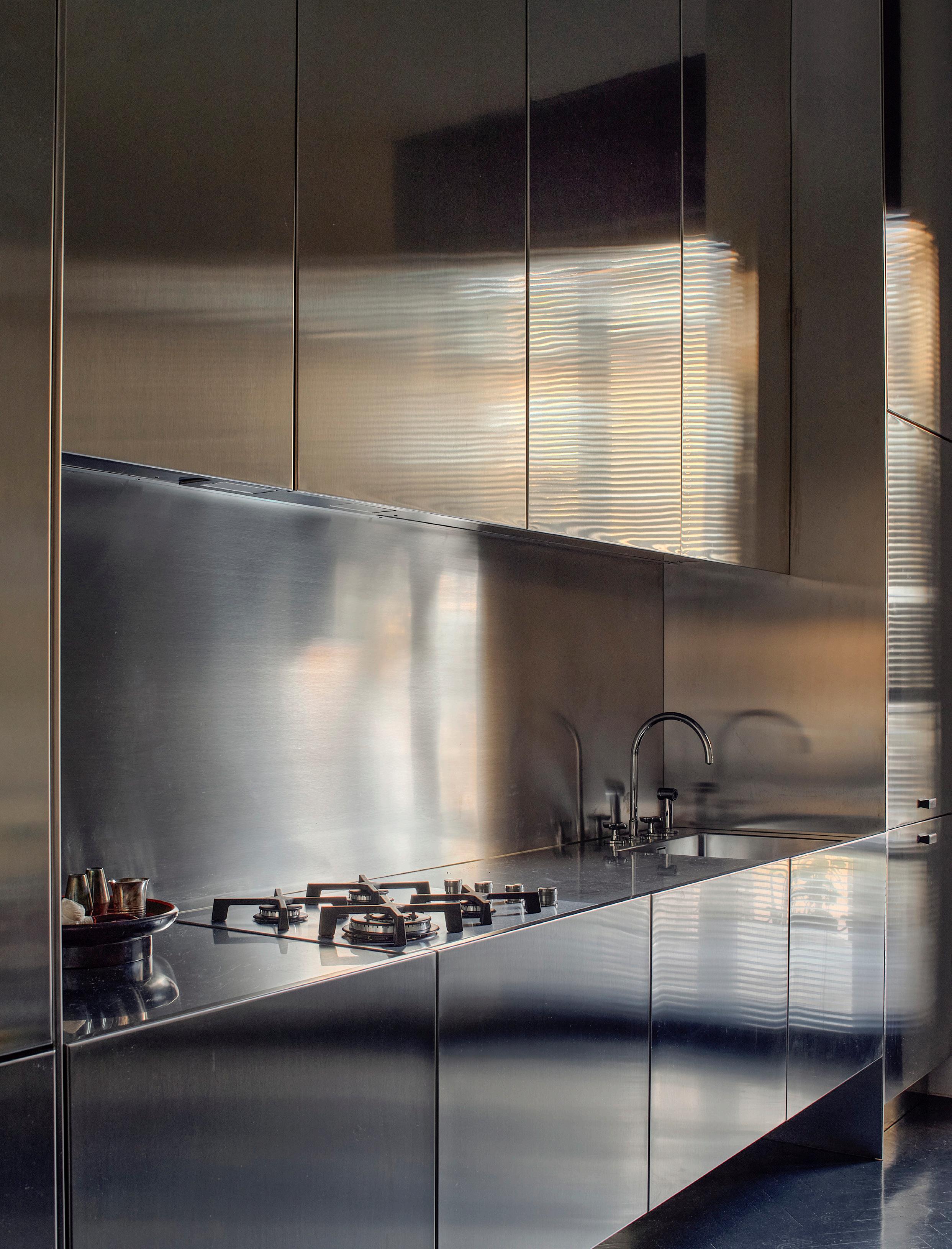
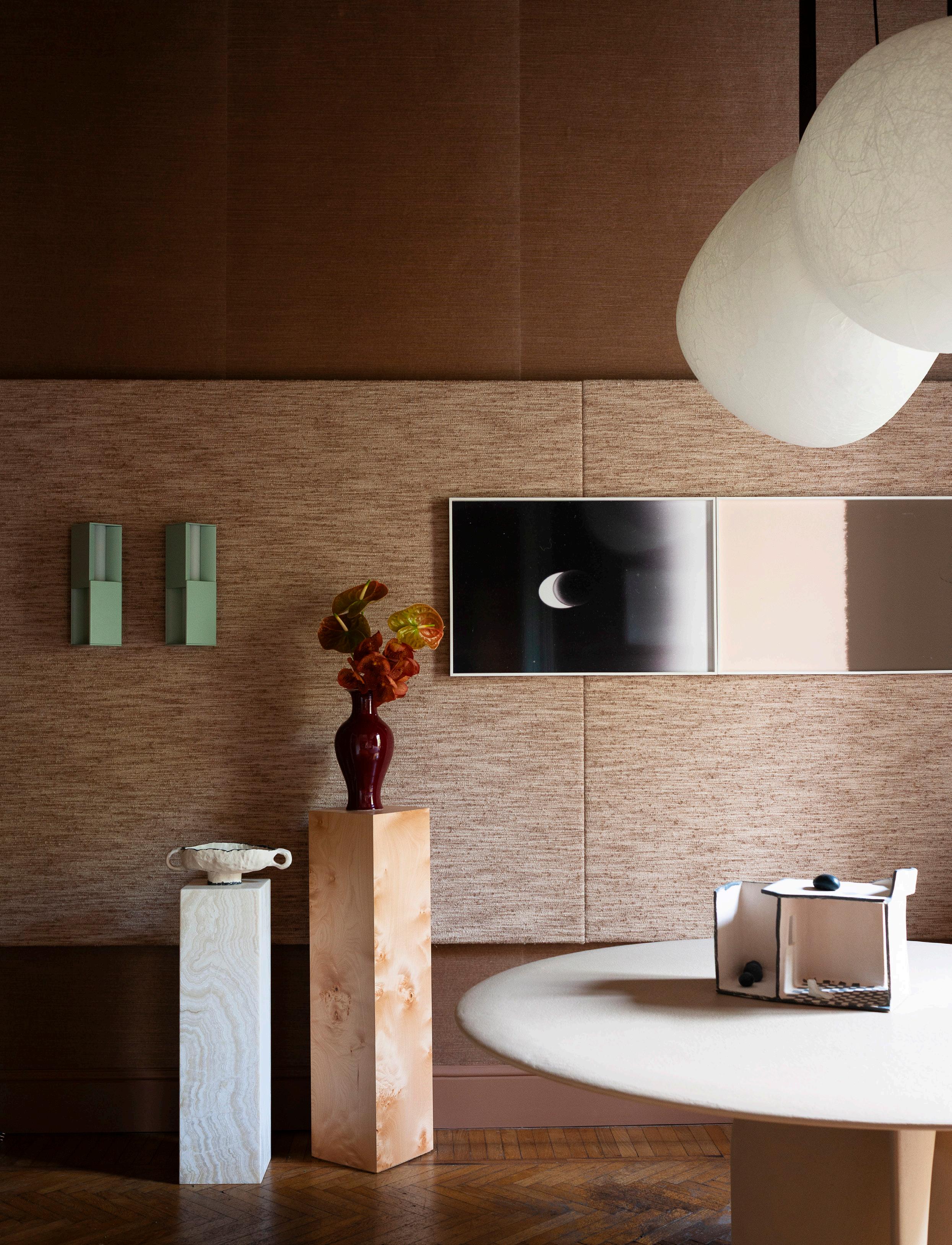
An apartment for a DJ is tuned to a tempo of black gloss, stainless steel and 90s-inspired references.
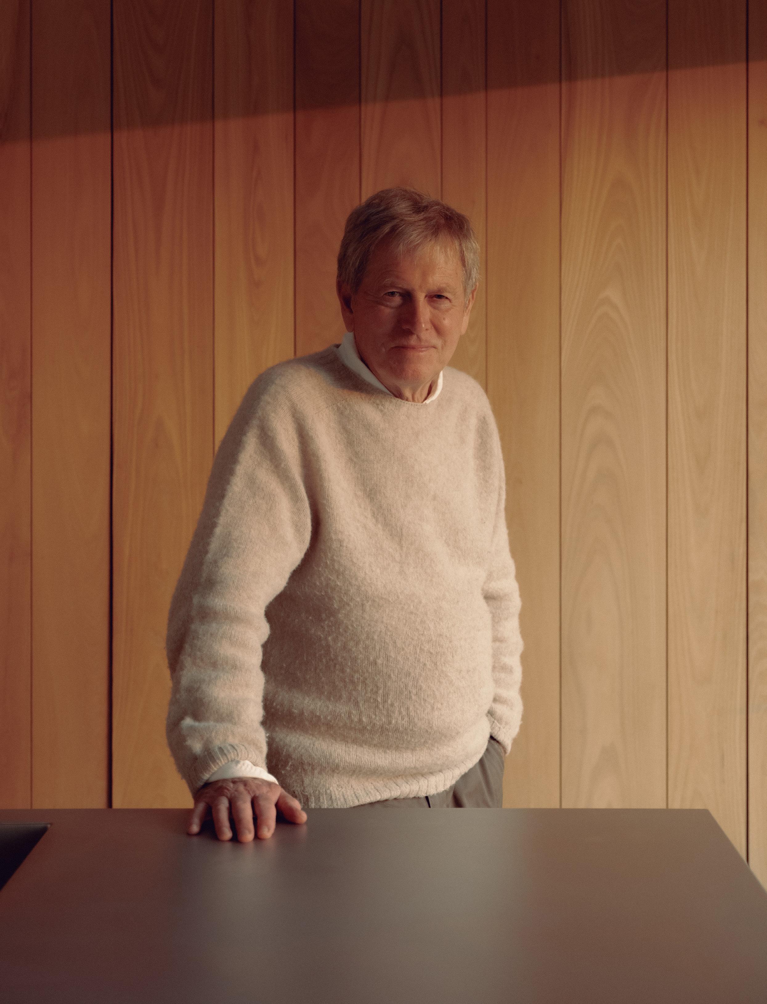
Karen McCartney speaks with internationally acclaimed architect John Pawson from his Notting Hill home.
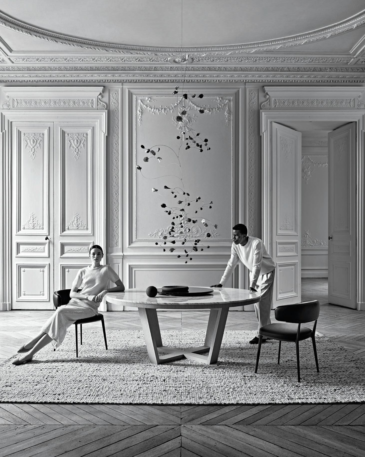
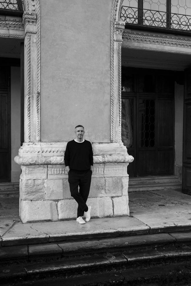
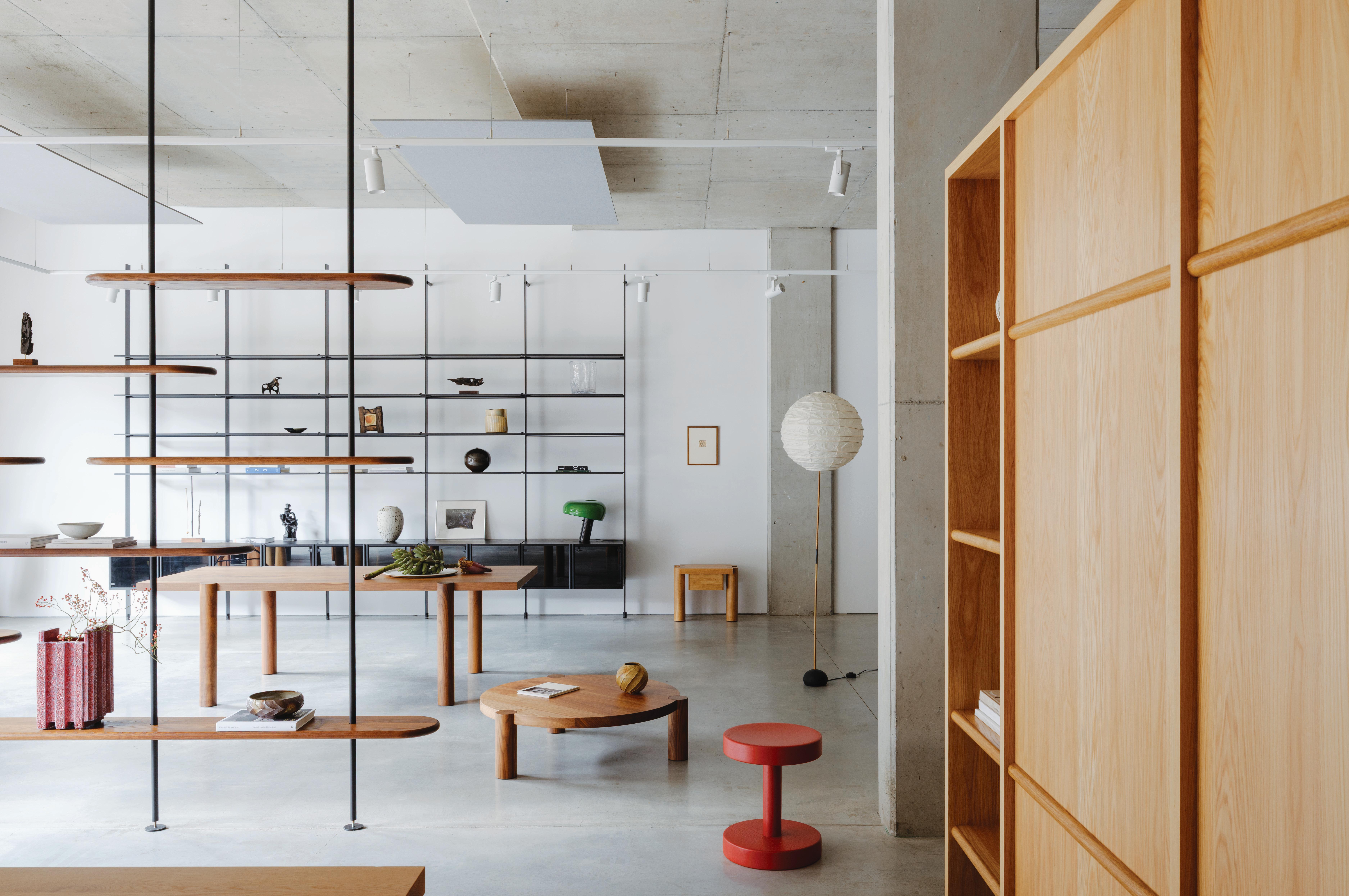
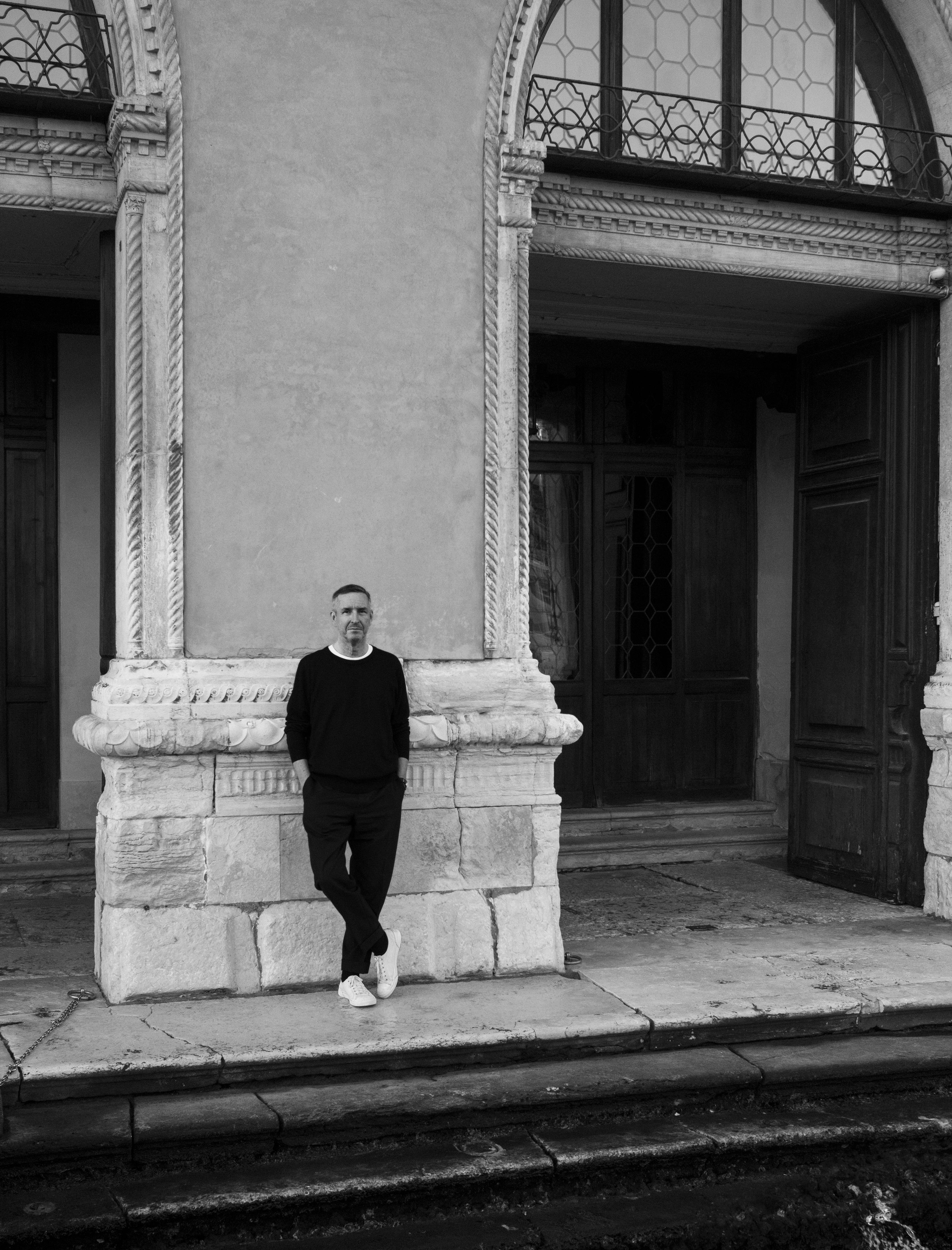
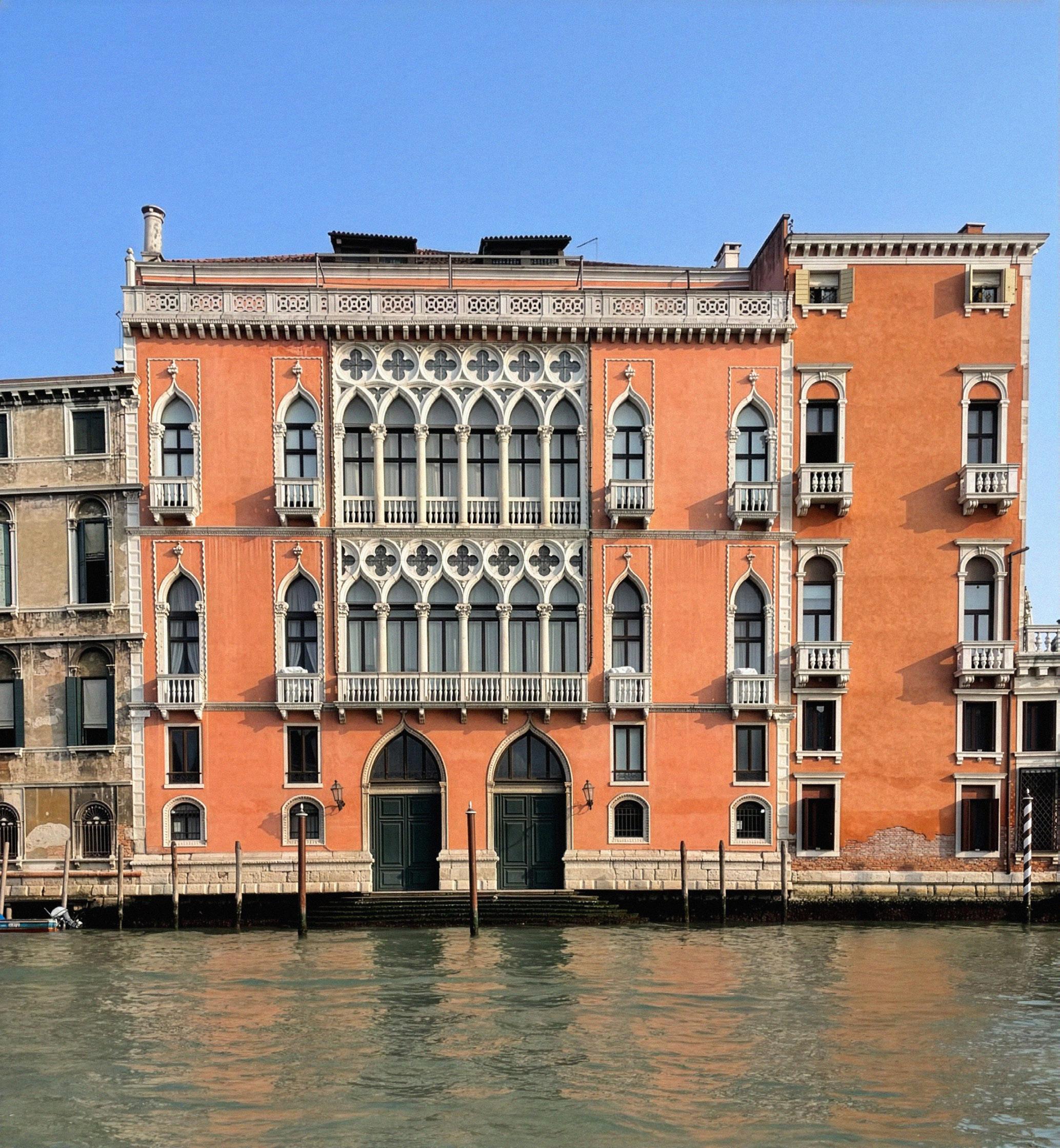
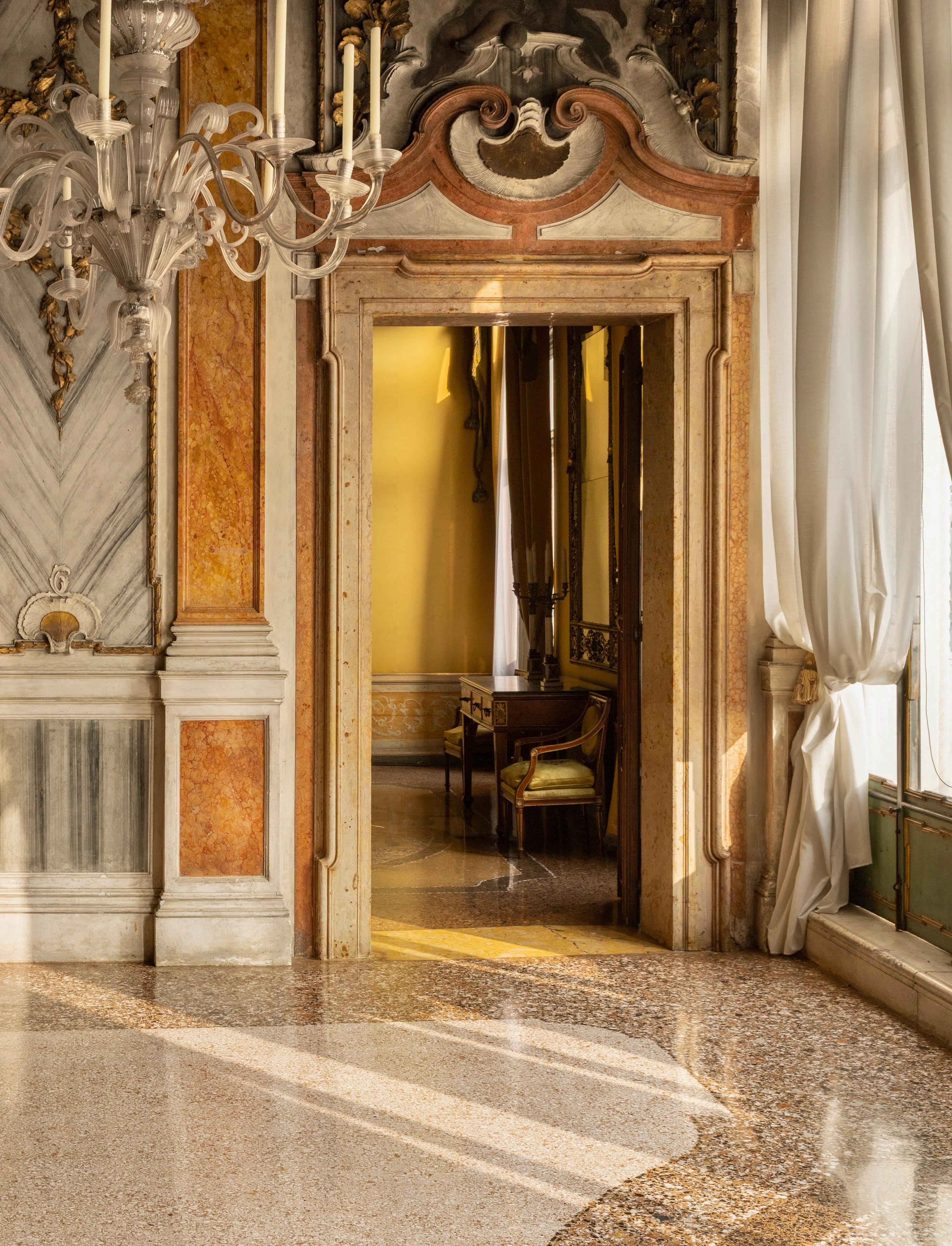
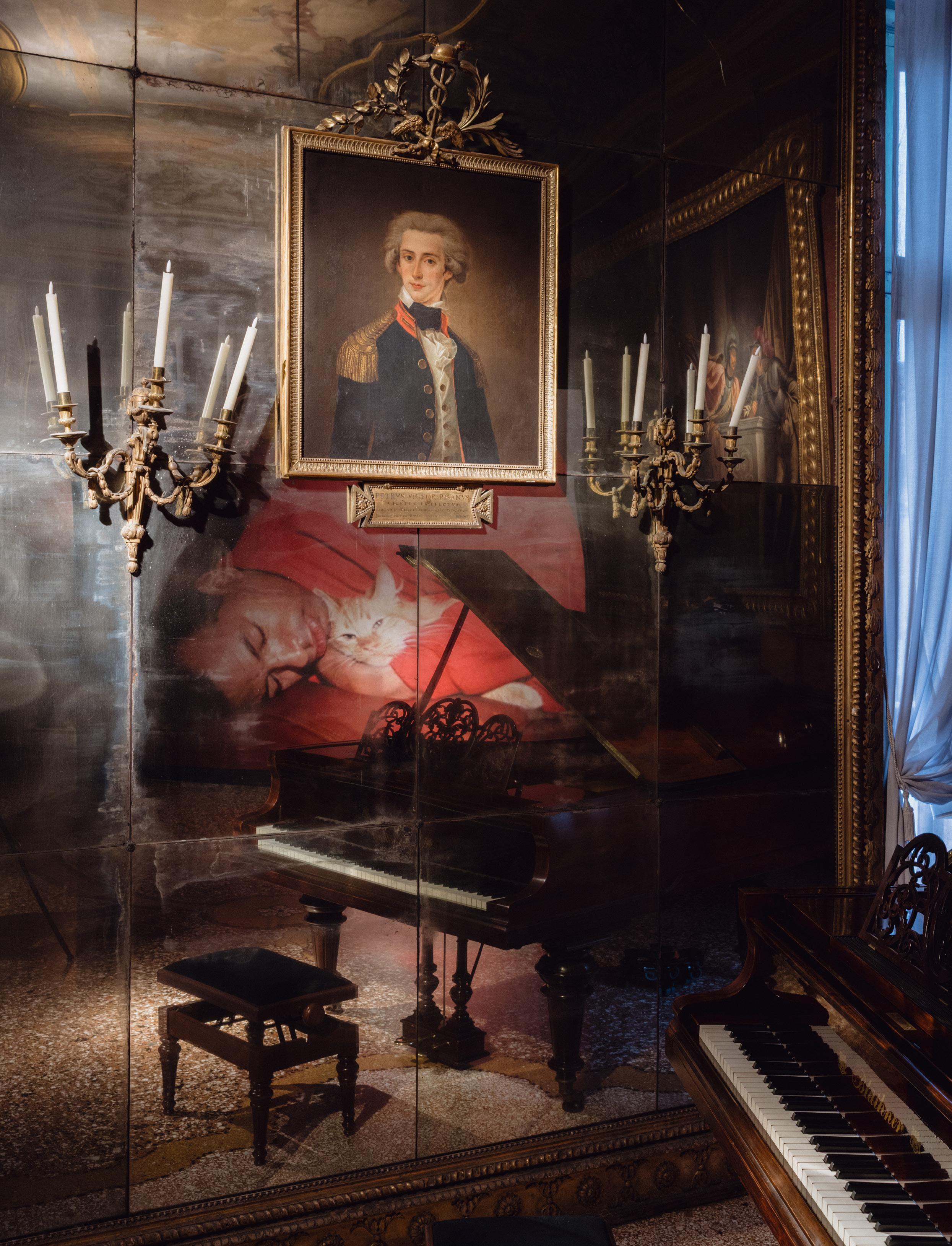
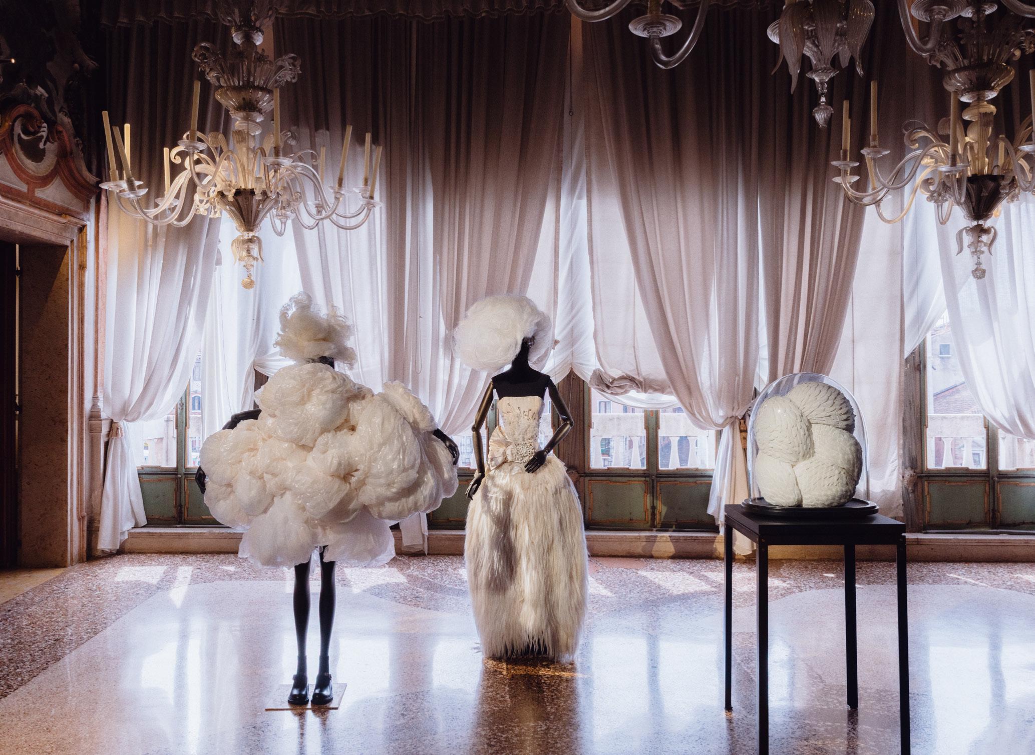
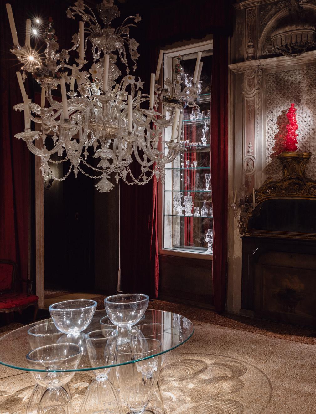
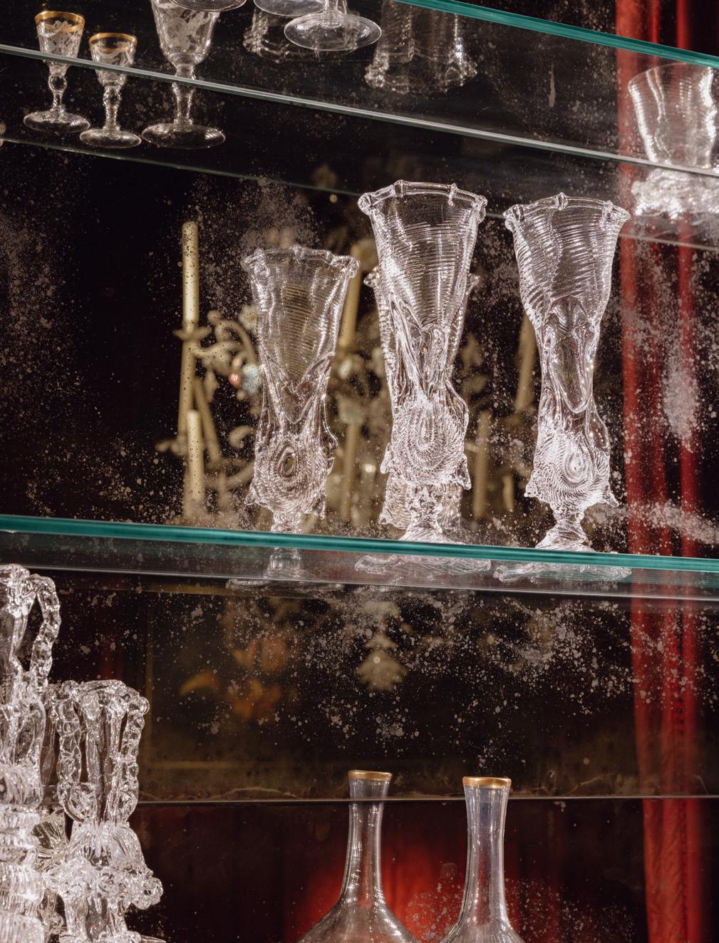
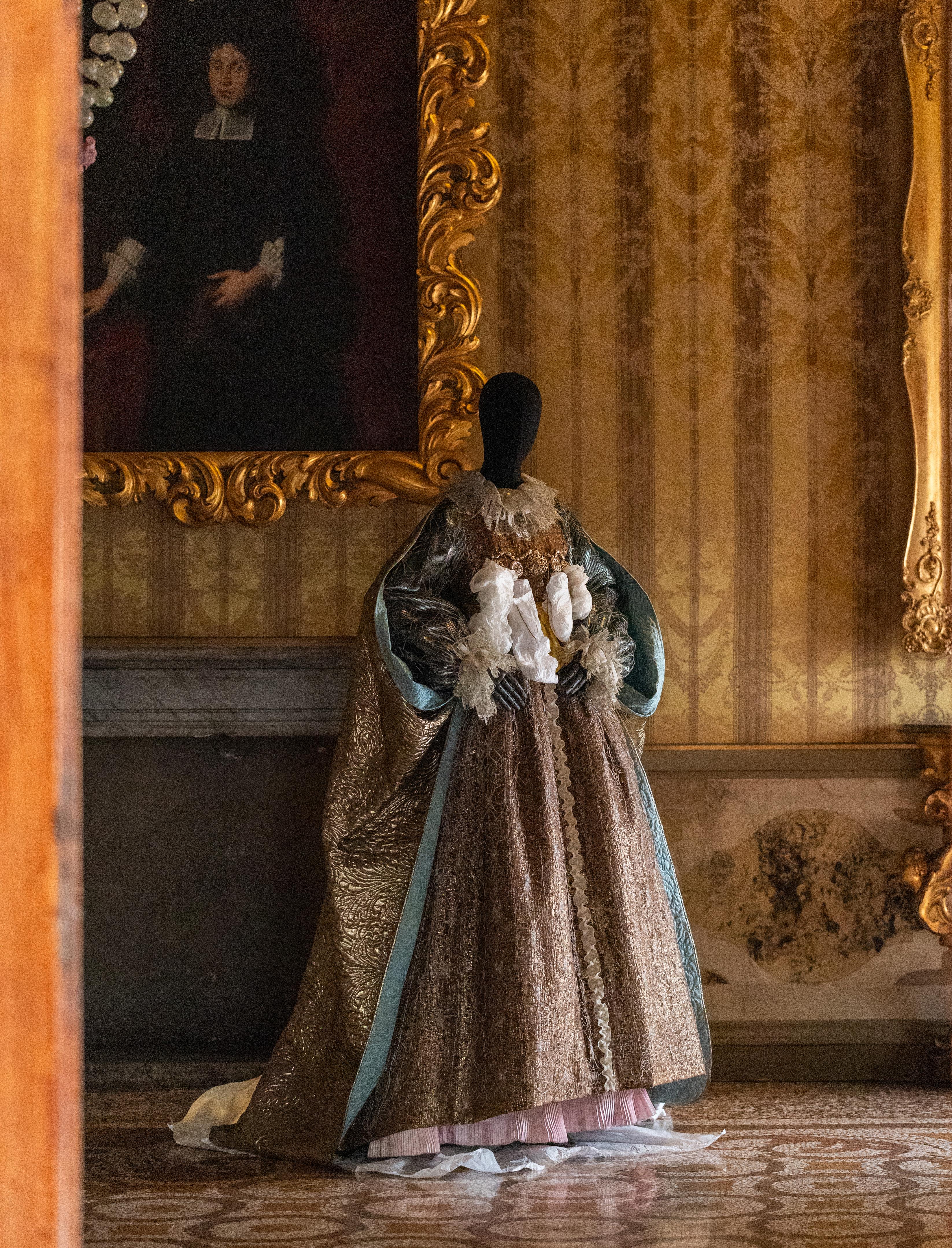
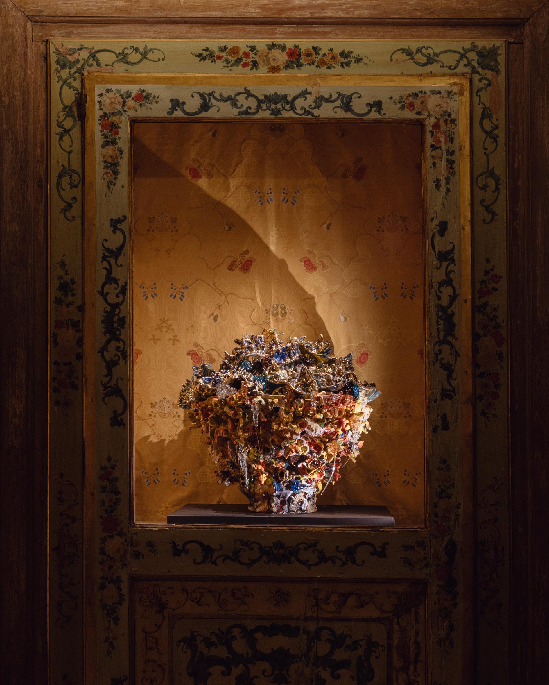
Retracing the inaugural exhibition at the opening of the Fondazione Dries Van Noten in Venice.
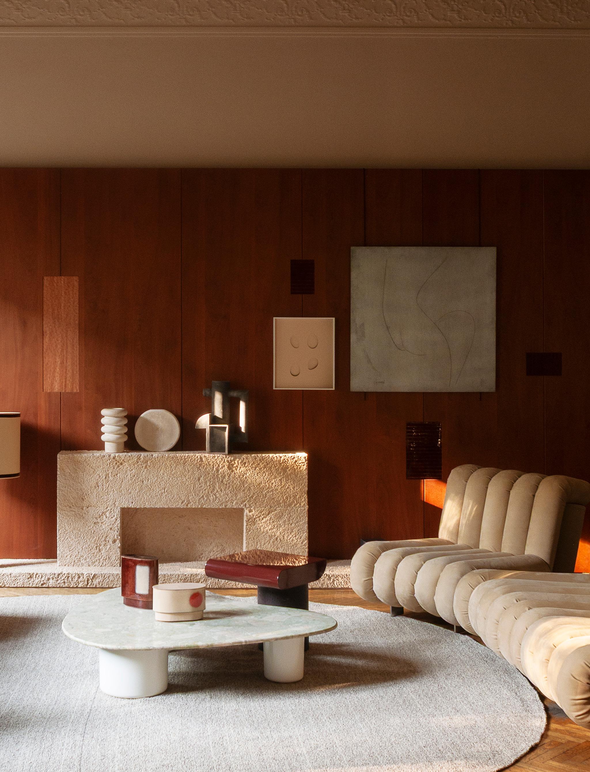
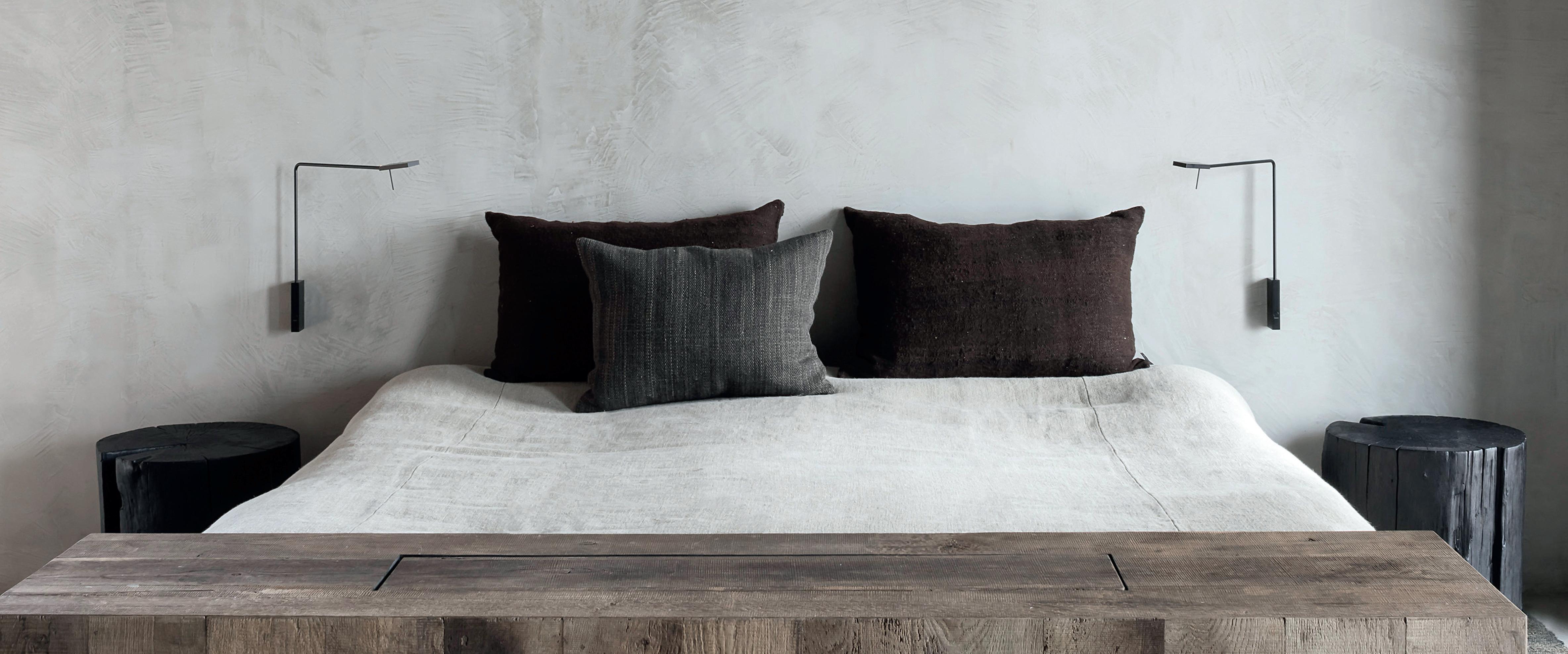
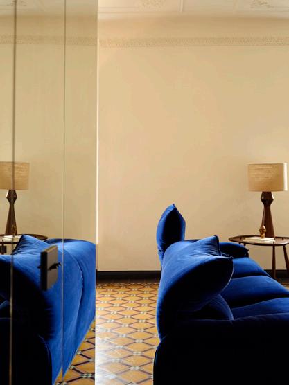
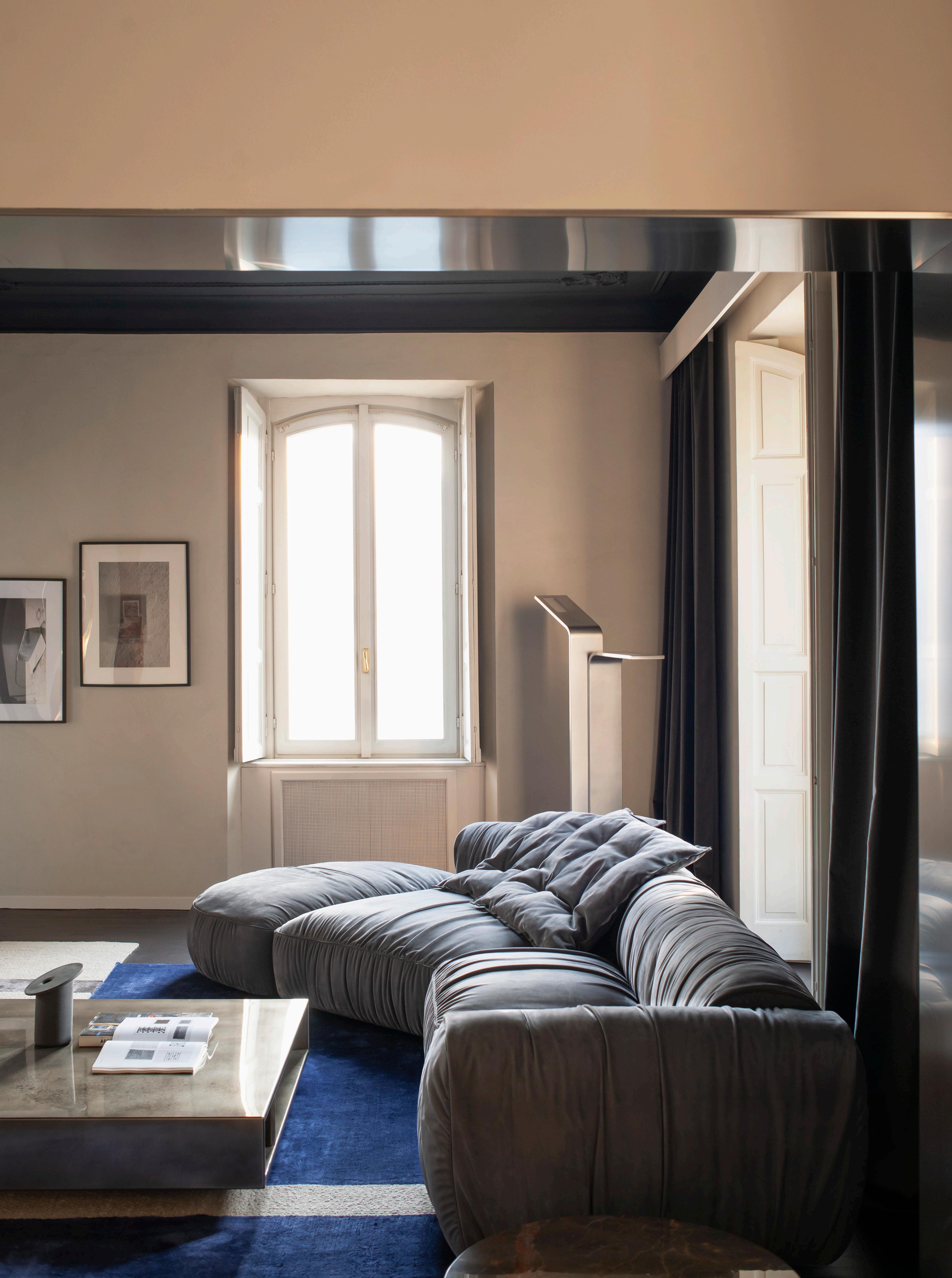
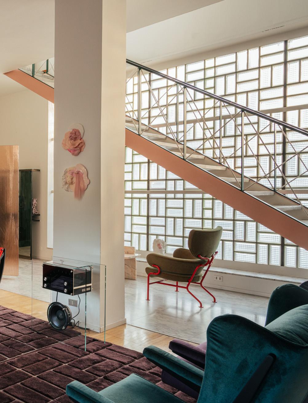
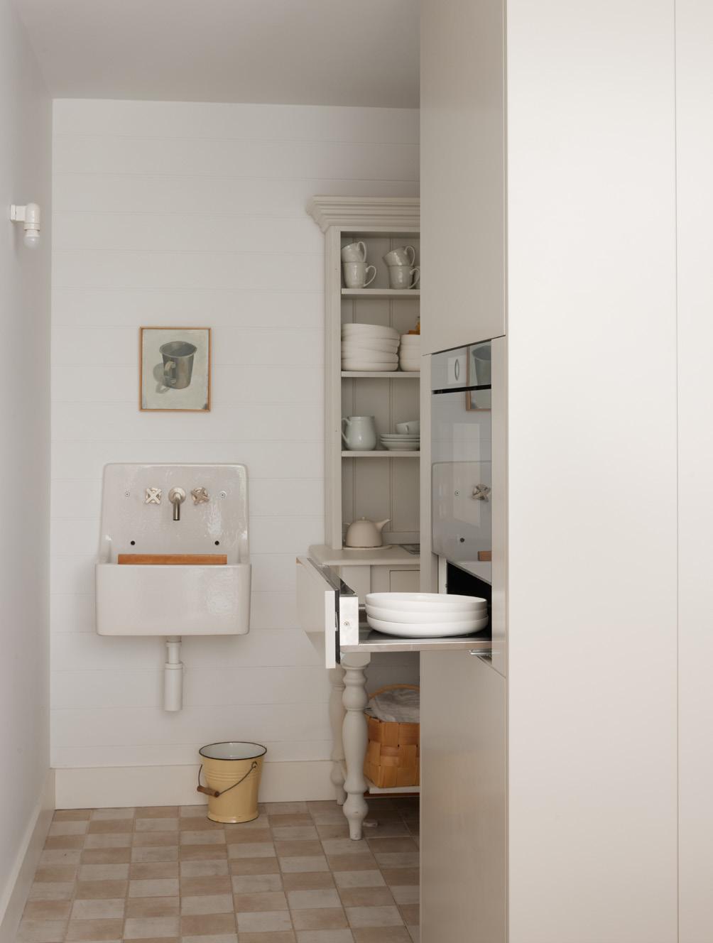
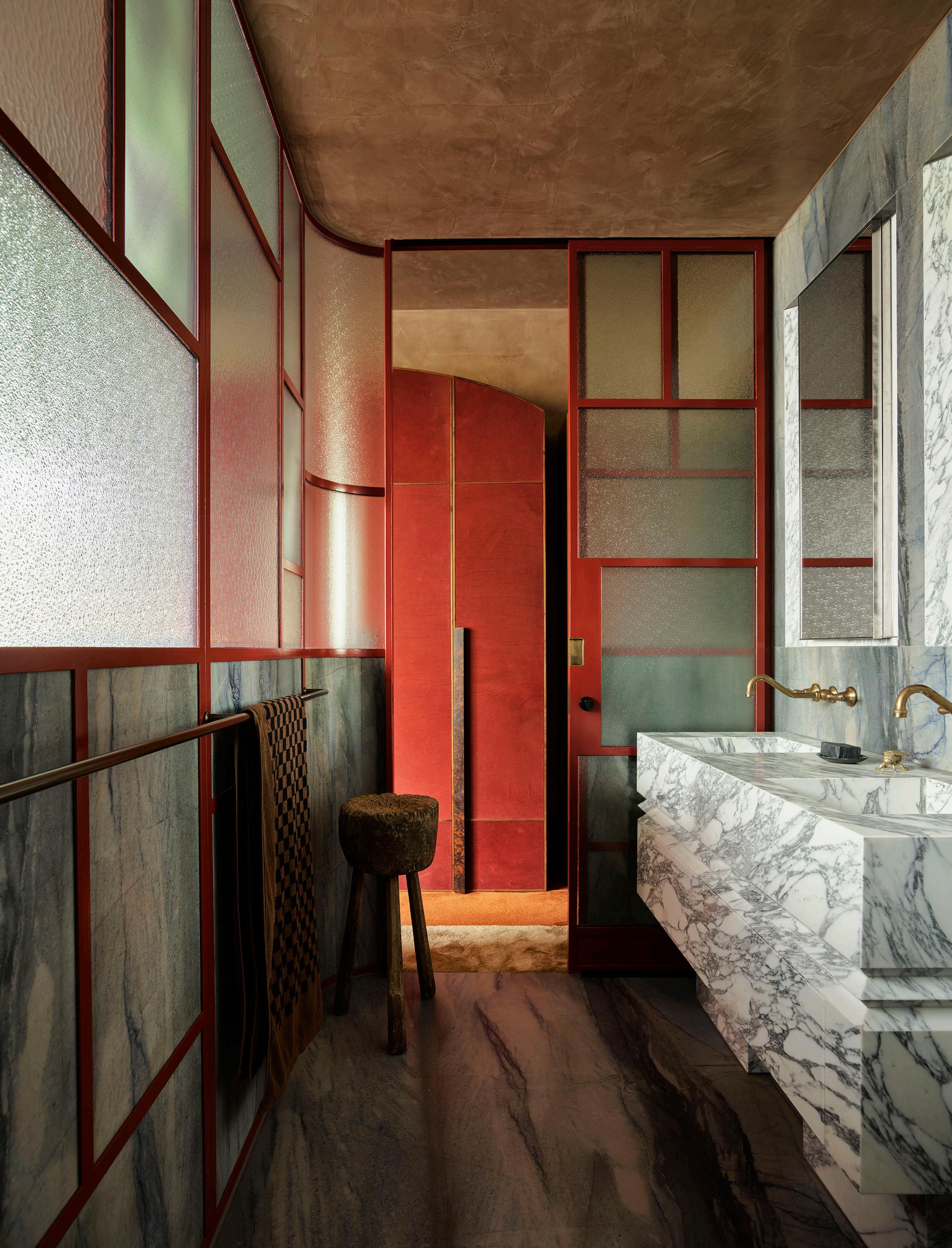
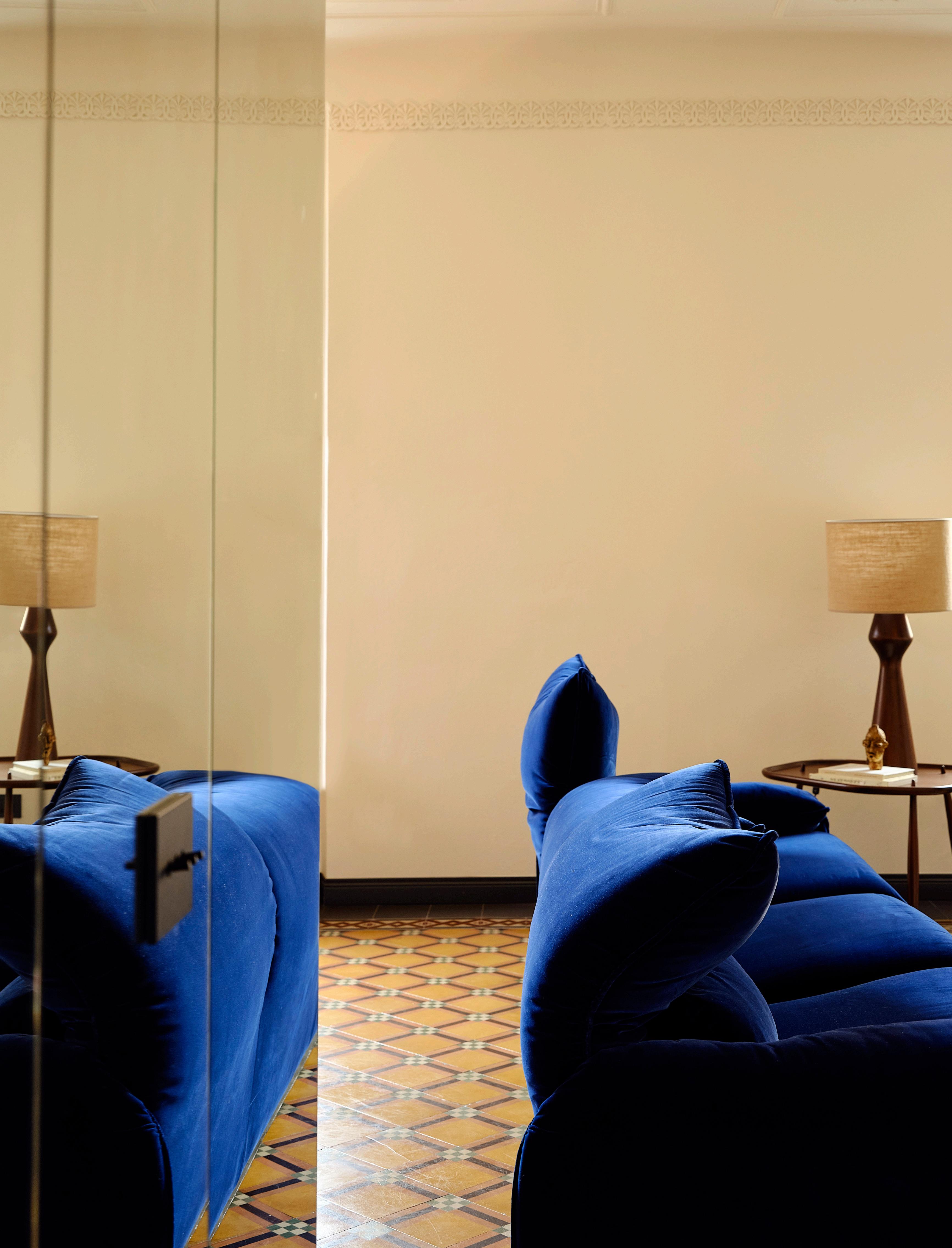
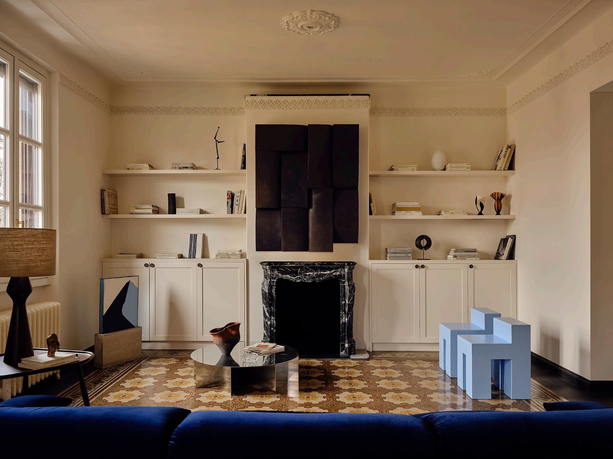
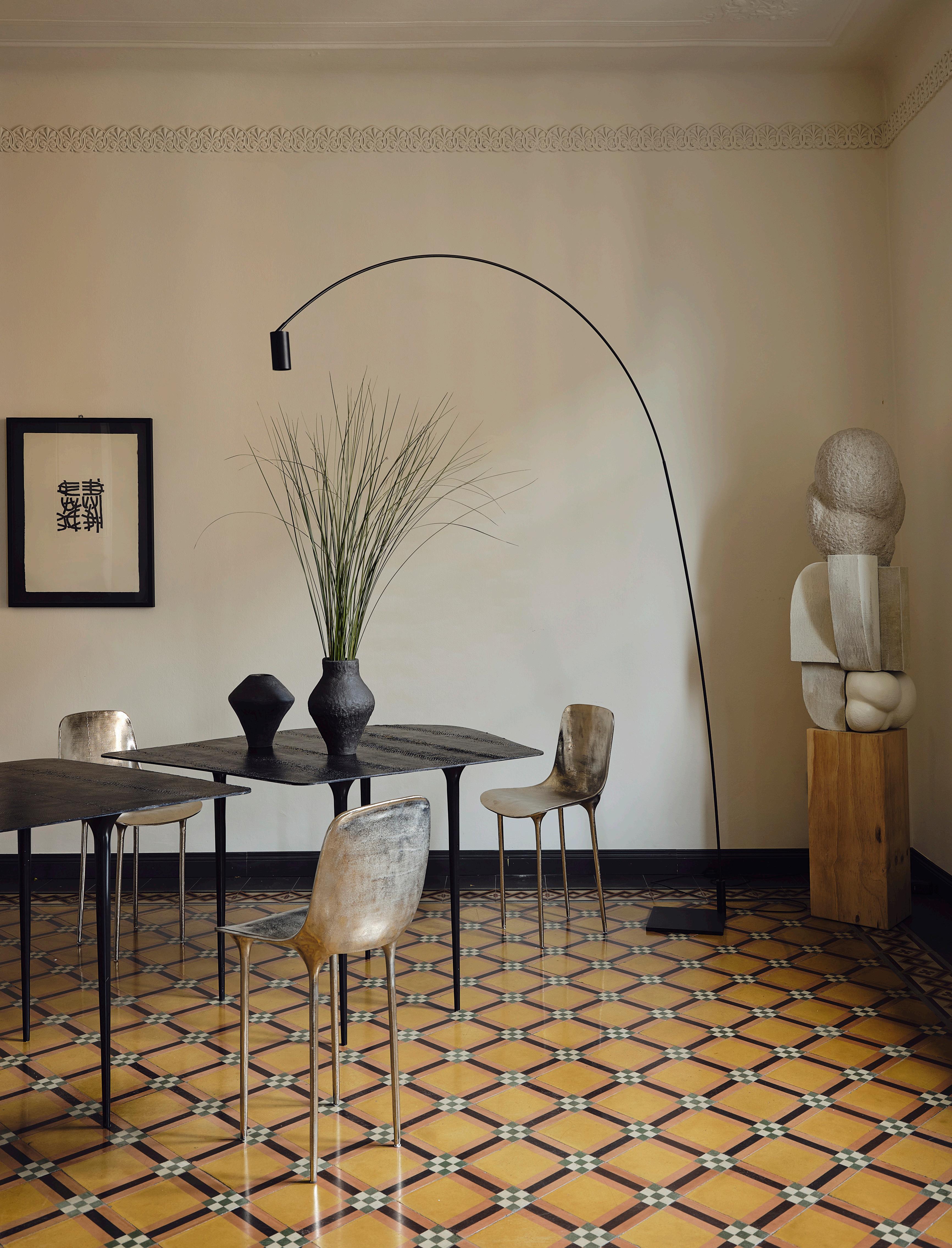
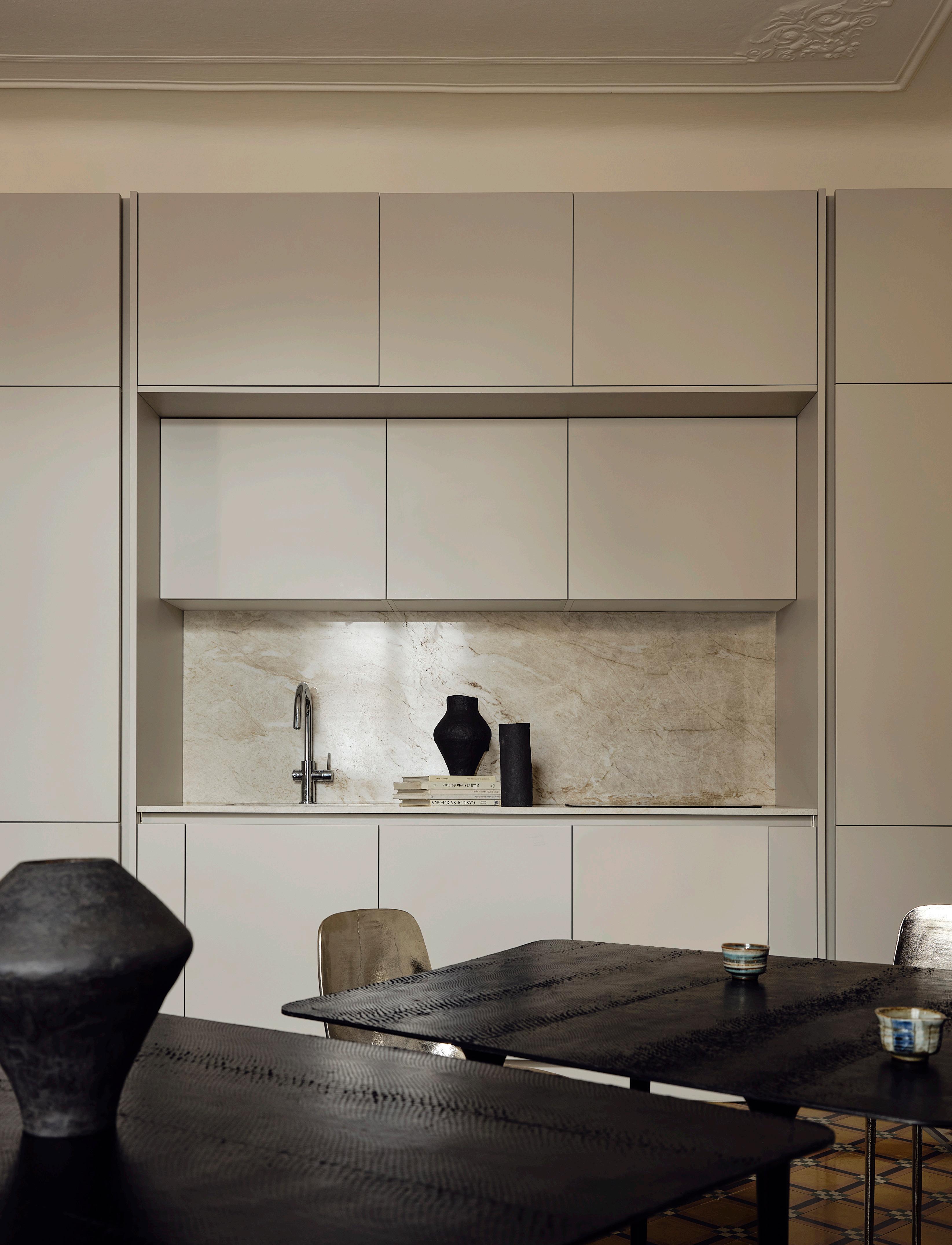
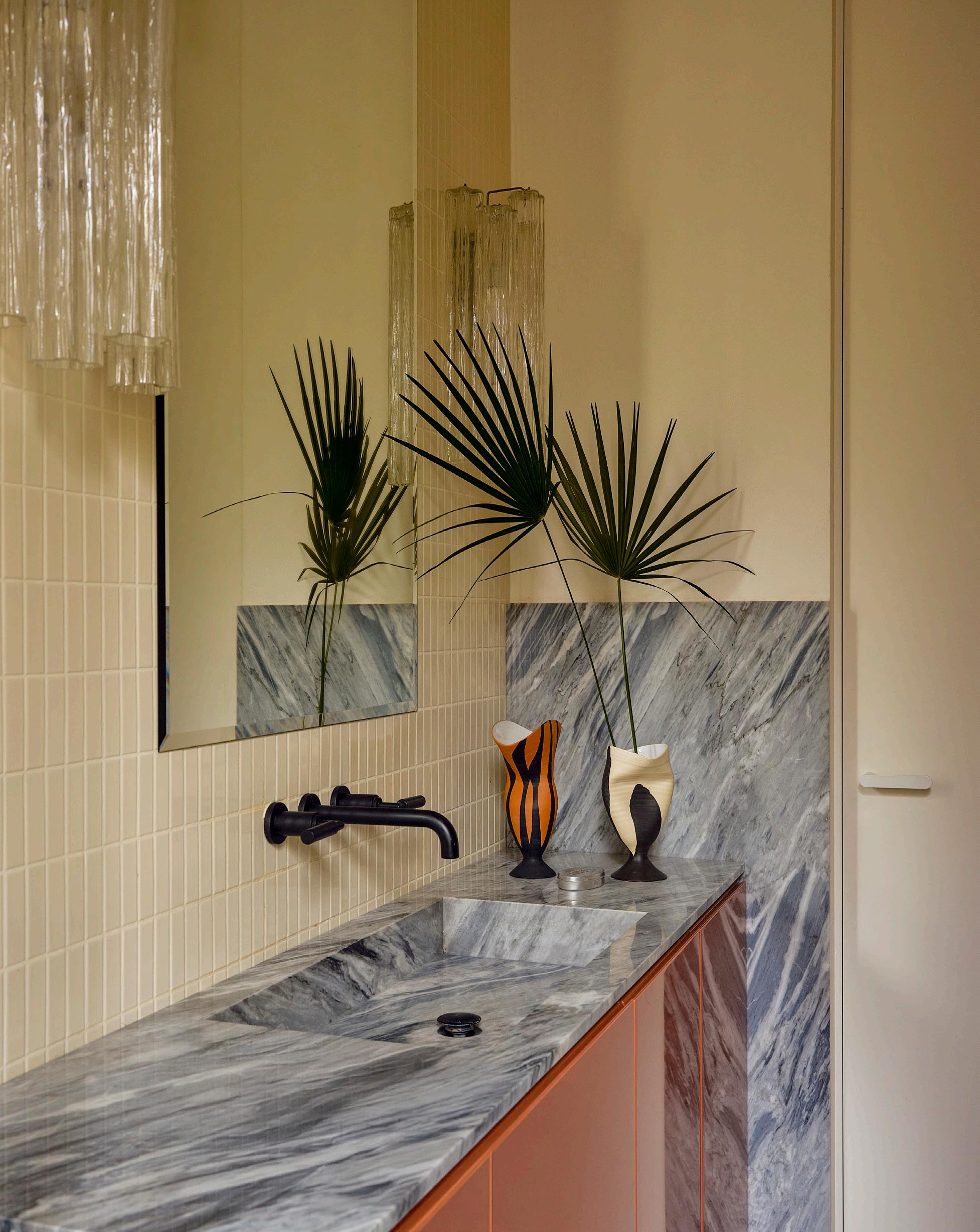
A 1920s Milan apartment lifts and relays its original tiles while reconstructing the spirit of its era.
EDITOR'S LETTER
As we return to our digital format, this issue isn’t what you would typically expect from our Milan or June edition. We’re exploring Milan’s halo effect: the lustre that comes when crowds convene for Milan Design Week and Salone del Mobile.Milano, but also beyond the week and its borders.
Designer Giampiero Tagliaferri puts it perfectly on page 62: Milan lives and breathes “creative contamination”—between what has existed for centuries, its rich interior design tradition and the contemporary. This layering and tension, he adds, are at the heart of Italian design, and the four homes in this issue. We enter a 1920s apartment carved from a former Palazzo and restored by Thomas Zangaro Studio, while in a Tuscan olive grove, a farmhouse comes alive with Crosby Studios’ glinting, industrial details.
Private access to Milan’s homes and design studios, some for the first time, was where the most memorable presentations were held this year, making their way into the 25 highlights, and providing the setting for so many of our designer conversations in this issue.
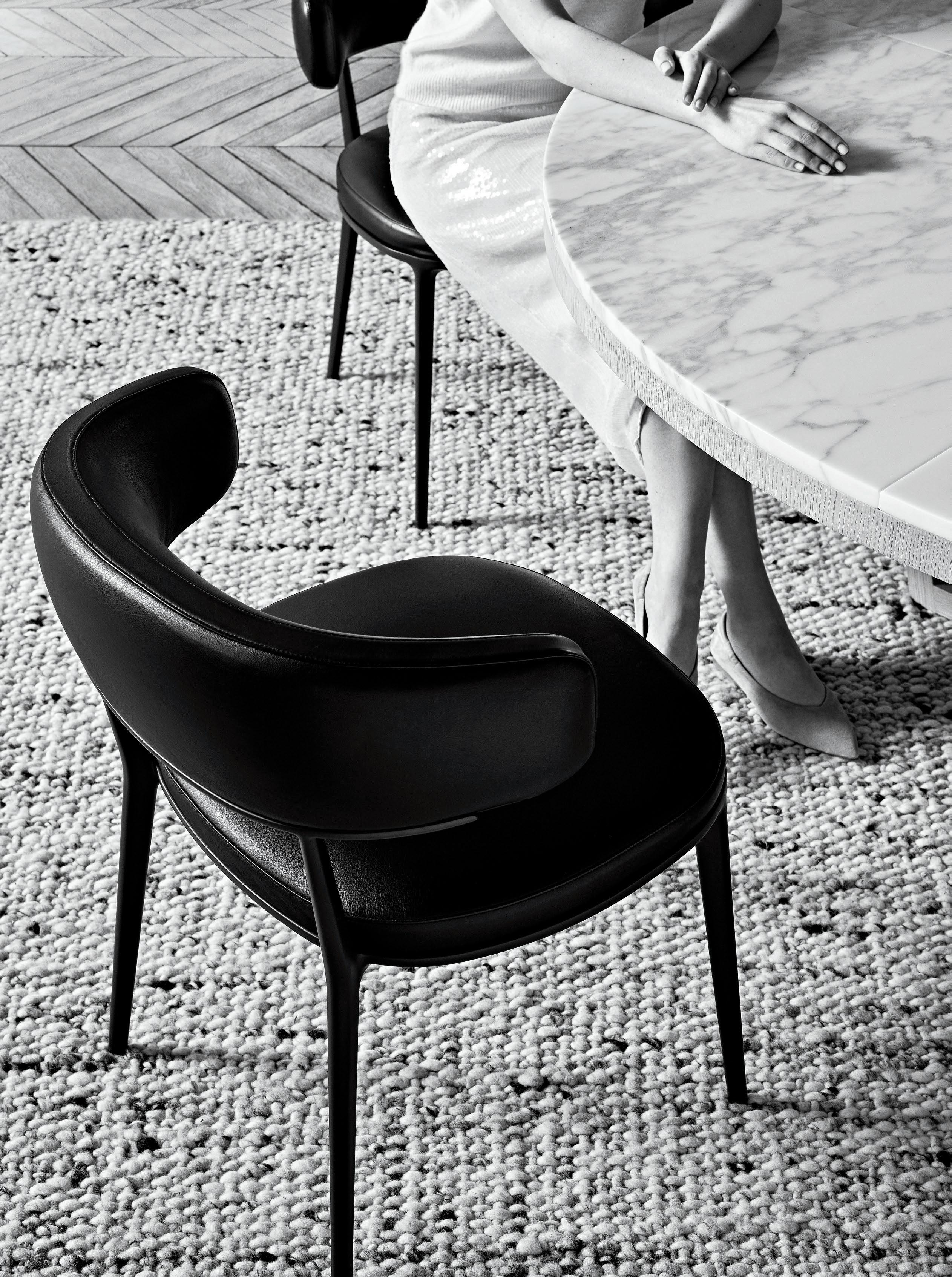
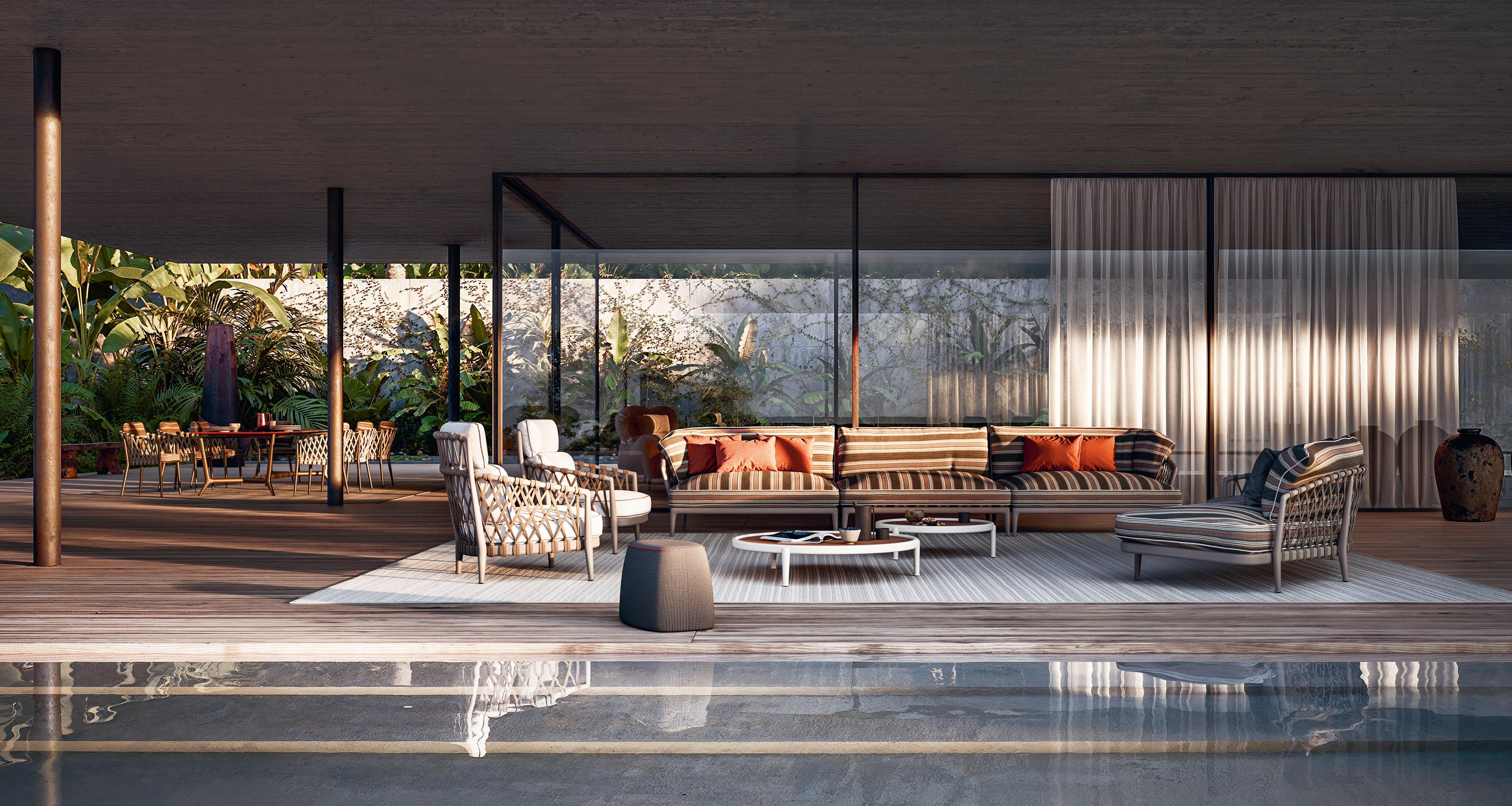
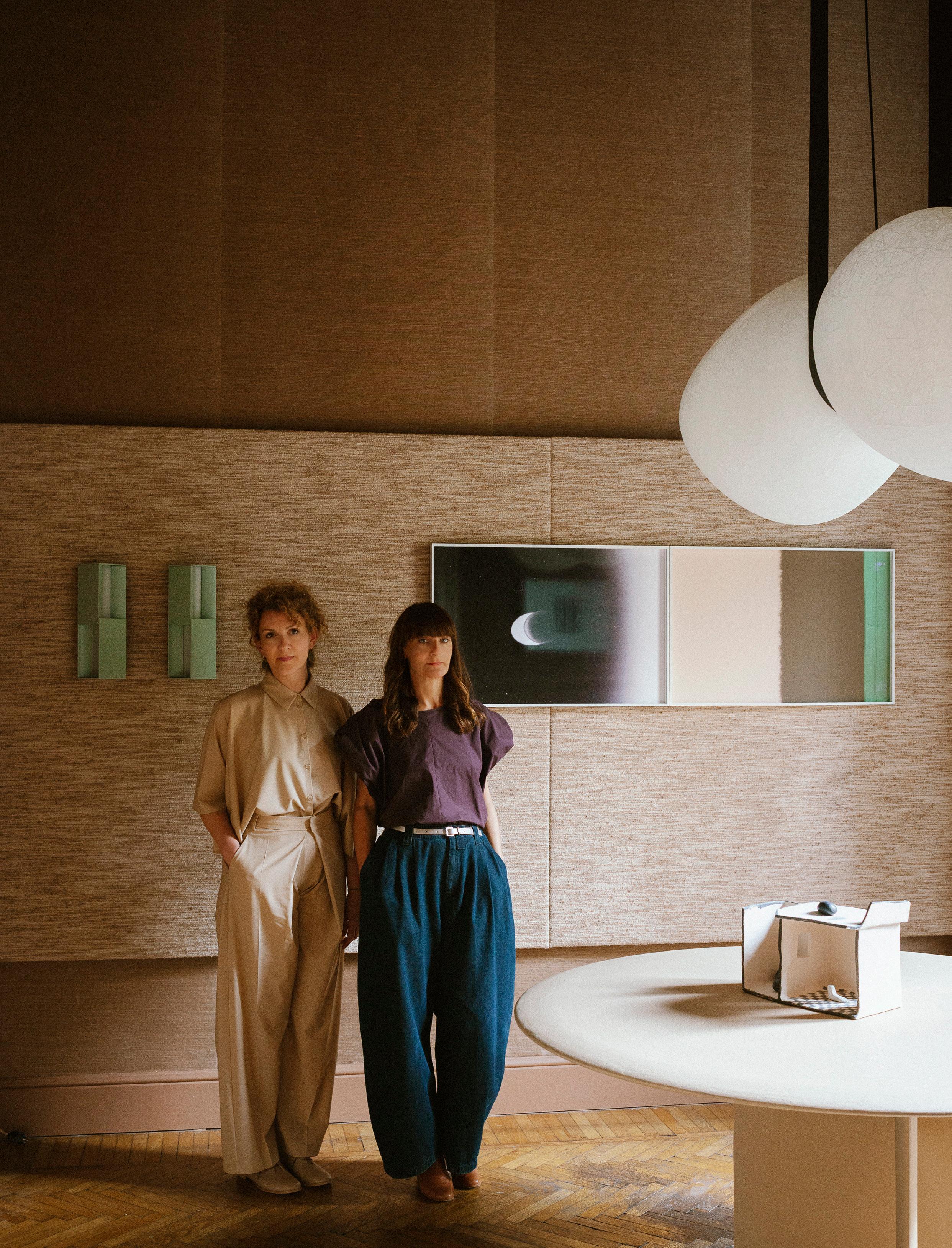
On the cover, Studiopepe grants permission to the designers’ former headquarters, now an exhibition space resembling an apartment, to intimately express a creative prac -
tice spanning 20 years. Fellow Milan-based designer Elisa Ossino reflects on how, across 14 iterations of her work, she invited visitors to stay a little while, initiating an emotional connection to the spaces.
This search for visceral impact leads us to Venice, among the first to see the inaugural exhibition at Fondazione Dries Van Noten in Palazzo Pisani Moretta, The Only True Protest is Beauty. Challenging preconceptions of beauty through craft and what this can do in such a ‘loaded location’, he proved that beauty is anything but passive.
We leave Italy to visit John Pawson at his Notting Hill home for our latest podcast, where Karen McCartney sits down with the architectural designer to understand how he’s mastered reduction in every direction of his career.
It’s on this note that I leave you with my last letter in the editor’s chair. The finale of 26 issues I’ve loved leading alongside our publisher, Miffy Coady, advisor Karen McCartney, and eternal collaborator, Jack Seedsman, and the talented individuals who continue to bring exceptional living to our ever-growing global audience.
As I make my way back to the other side of the world, I look forward to staying in touch and seeing what’s next for this very special magazine.
SOPHIE LEWIS EST LIVING EDITOR @sophielewis_____
CONTRIBUTORS
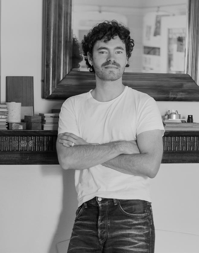
Caitlin Leishman is a design journalist, communications strategist and research translator based in Naarm (Melbourne). A multi-faceted storyteller, Leishman’s diverse portfolio spans the arts, design and science fields. Ever-intrigued by the brilliant minds behind great design, in this issue, she delves into LC Atelier’s precise detailing and collaborations with local artisans that bridge distinctive eras within a renovated Milanese apartment.
SALVATORE PELUSO
WRITER
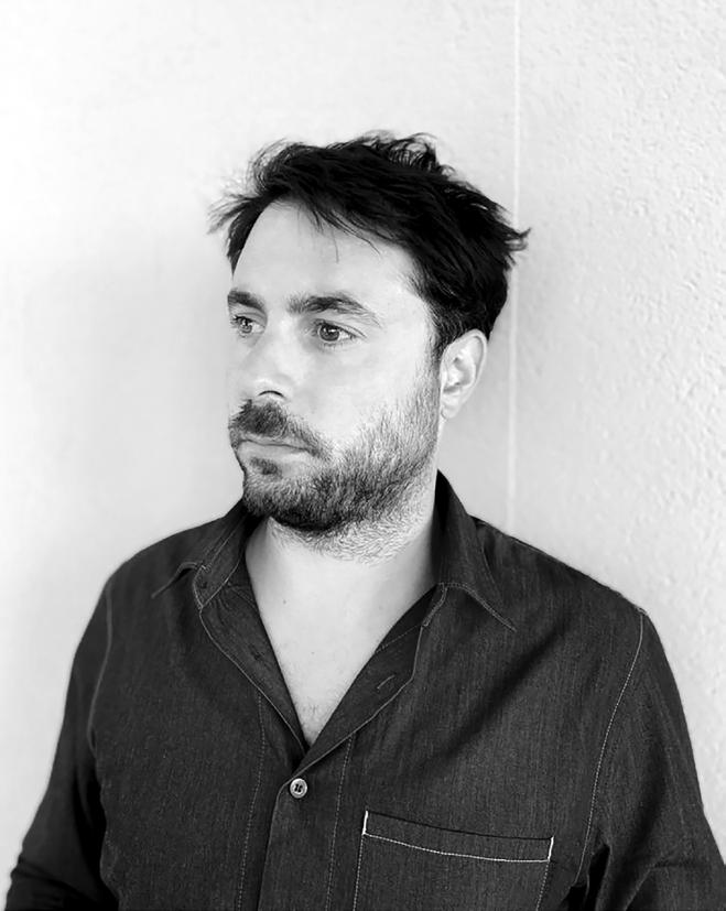
Salvatore Peluso is a Milan-based writer and curator working across architecture, design and craft, with a focus on contemporary culture. Trained as an architect at Politecnico di Milano and ETSAM Madrid, he has been contributing to international and Italian publications since 2016, including Domus, Elle Decor Italia, Lampoon and STIRworld, as well as Salone del Mobile. Milano’s official editorial platform. Peluso interviews designer Thomas Zangaro about how original cement tiles, lifted and relaid, tell a new story within a 1920s Milan apartment renovation.
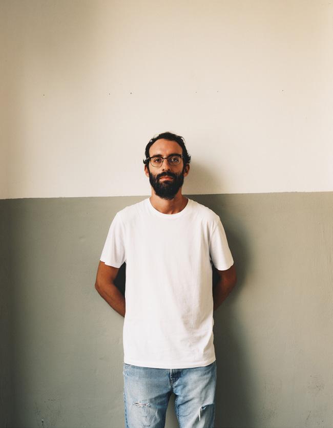
Italian photographer and director Giulio Ghirardi’s work is predominantly focused on architecture, interiors and portraiture. It is rooted in a documentary style, drawing inspiration directly from life to achieve a natural appearance that seems free of artifice. Working in series, he explores spaces and characters through both analog and digital photography. Ghirardi captures three Milanese apartments featured in this issue, each embedded with a history that calls to the city’s cultural design legacy.
CAITLIN LEISHMAN
WRITER
GIULIO GHIRARDI
PHOTOGRAPHER
JACK SEEDSMAN
ART DIRECTOR, AND CURATOR
Jack Seedsman wears both hats as est living’s head of creative and co-founder of his recently established architecture practice, Side Office. The multidisciplinary designer travelled to Milan alongside est editor Sophie Lewis to uncover and distil 25 highlights from this year’s Milan Design Week and Salone del Mobile.Milano. Transporting readers back to the week’s most notable launches and experiences, Seedsman also brings his creative nous and understanding of the voices that define the issue as a whole.
Giulia Taglialatela was born in Naples into a family of intellectuals and art collectors. She spent her formative years between Italy and the United States before studying communication and journalism in Milan. Bringing her extensive travel and cultural understanding to set design, interiors, creative direction and consultancy, Taglialatela’s subjects span fashion, luxury and design. In this issue, she collaborates with designer Thomas Zangaro to compose scenes within a 1920s Milan apartment, evoking the building’s palazzo past.
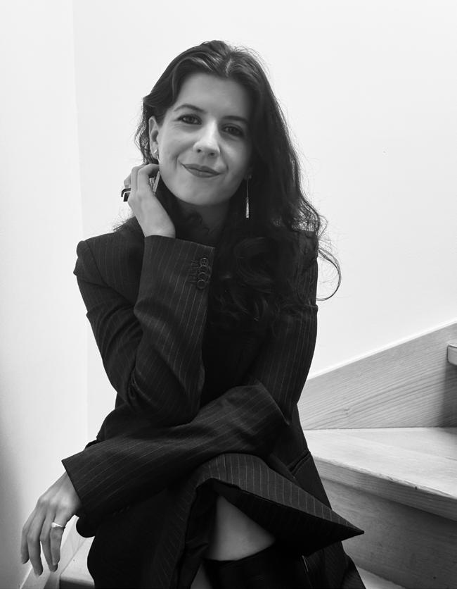
Alexia Petsinis is a journalist and features writer from Melbourne, now based in Milan. With over a decade of experience across the design, arts, culture and fashion sectors, her work spans editorial projects, including monographs, exhibition catalogues and curatorial content. In this issue, Petsinis sits down with five designers and duos—all with bases in Milan—to discuss their standout presentations for the city’s Design Week.
Courtesy of Baxter, Andrea Ferrari, Courtesy of Minotti, Matthew Brookes, Carlotta Manaigo, Giulio Ghirardi, David Raffoul, Paola Pansini
Milan: 25 Highlights From 2026 Specified in the feature
Elisa Ossino
Courtesy of Elisa Ossino Studio, De Padova, Valentina Sommariva, Alberto Strada, Giorgio Possenti
Retro Future
Giulio Ghirardi
This Much I Know Podcast: John Pawson
Dan Preston
In Praise of Beauty
Matteo de Mayda
Tessellated Memory
Giulio Ghirardi
WORDS
Aleesha Callahan, Alexia Petsinis, Caitlin Leishman, Karen McCartney, Salvatore Peluso, Sophie Lewis
Photography Andrea Ferrari ON THE COVER
Design Studiopepe
estliving.com
est living acknowledges the Traditional Owners of the land on which we work, the Wurundjeri Woi Wurrung of the East Kulin Nation. We pay respect to their Elders past, present and emerging.
PHOTOGRAPHY
Alejandro Ramírez Orozco
THE MILAN REEL
Sydney, Melbourne, Brisbane
Kuala Lumpur
Erica design Antonio Citterio
SECOND NATURE
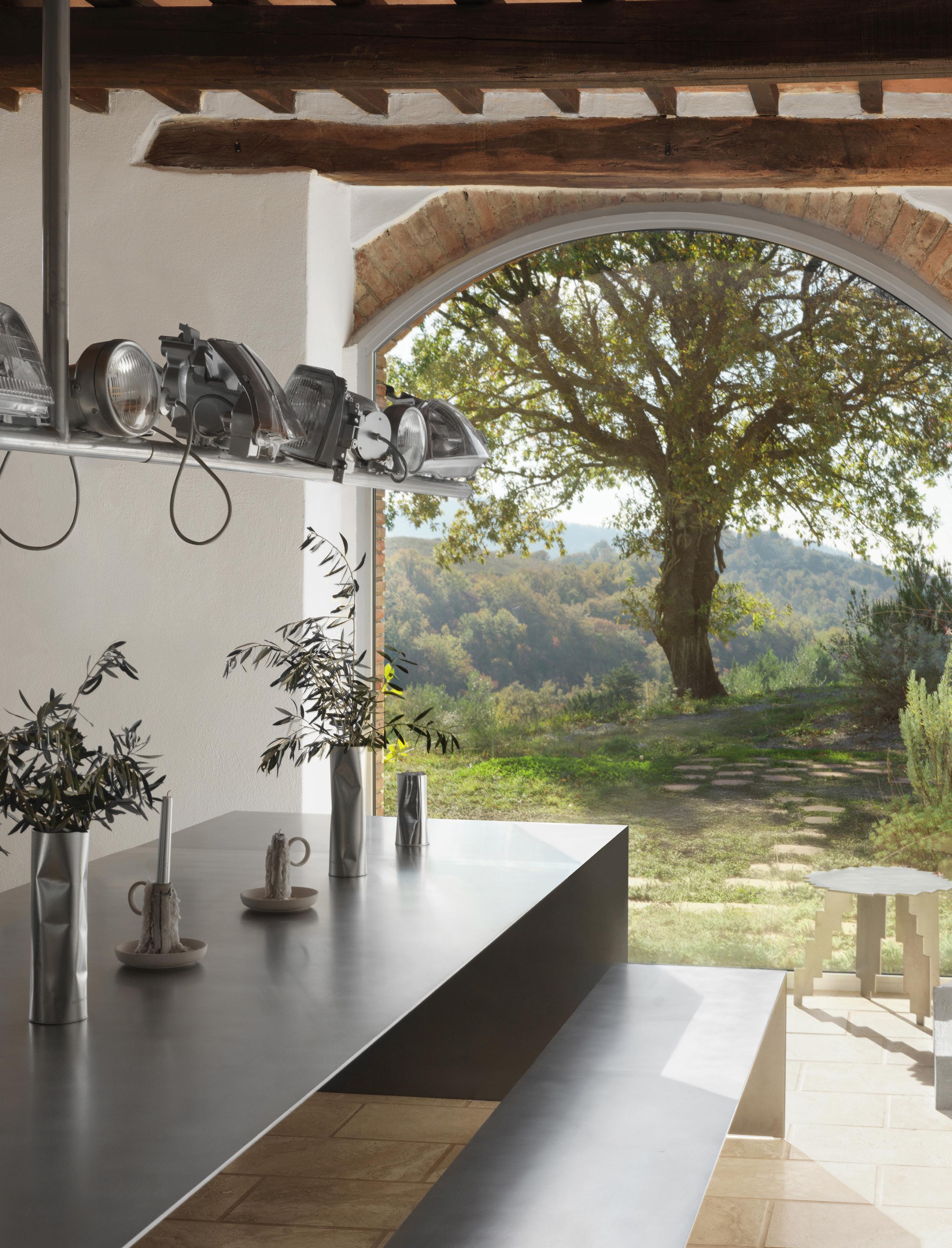
On a wild 130-acre estate outside the medieval village of Roccalbegna, Crosby Studios reimagines a 17thcentury Tuscan farmhouse by illuminating its past and blending it with a contemporary gleam.
LOCATION
TUSCANY, ITALY
PHOTOGRAPHY
INTERIOR DESIGN CROSBY STUDIOS
JENIA FILATOVA AND MATTEO CAPIROLA
LANDSCAPE PLANTING STRATEGIES
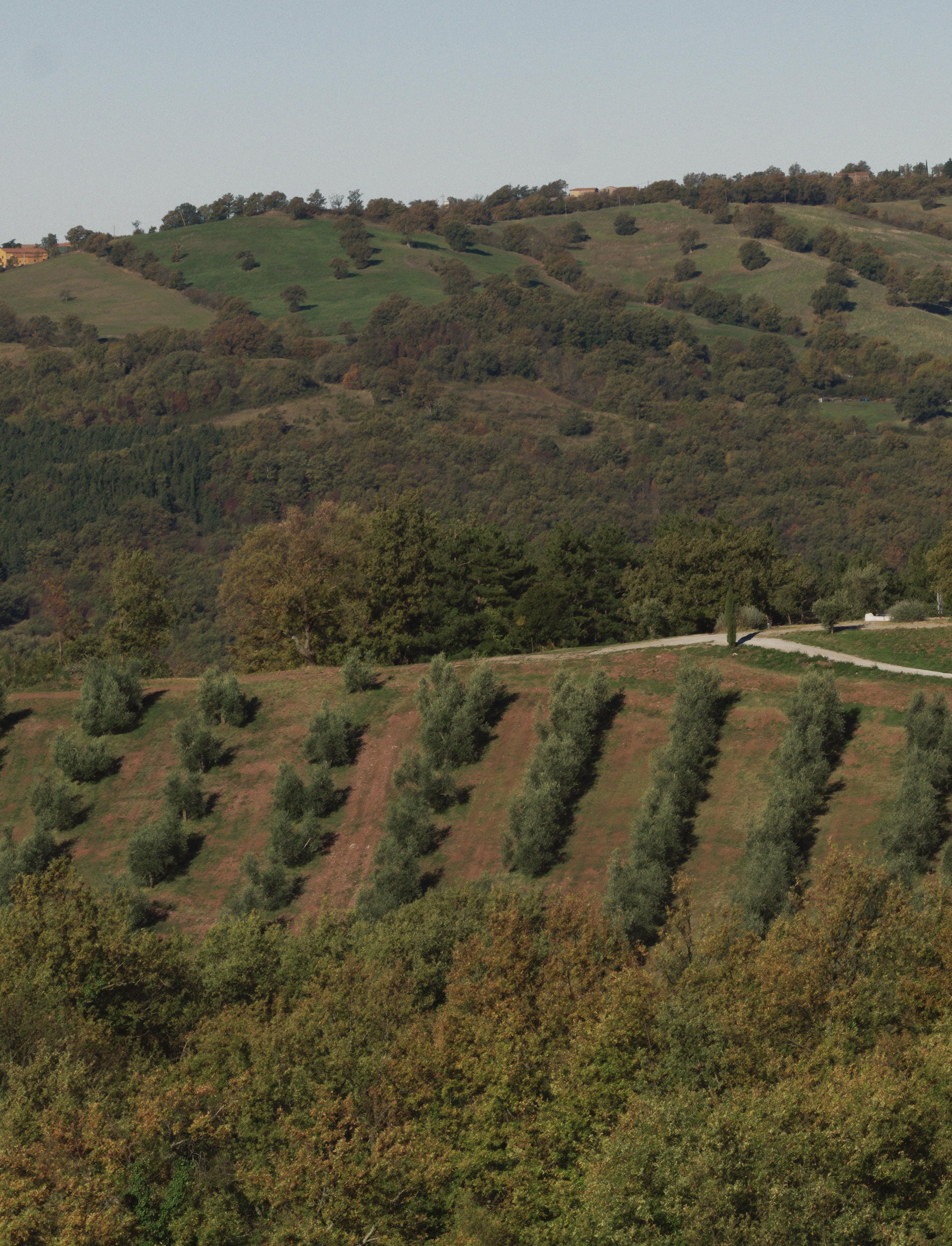
RRuins often come with a particular kind of romance: stories and layers that could never exist without the passage of time. When Tyler Billinger and his partner, Crosby Studios founder Harry Nuriev, came upon a neglected 17th-century farmhouse in southern Italy, the wildness captured their attention. The estate had a rambling olive grove gone feral and crumbling stone walls weathered by centuries of Tuscan sun.
“The location gives us a sense of raw nature, where the outdoor environment feels more present than the home itself,” Nuriev says. “When cleaning the property, you really have to keep in mind that nature is more important than design.”
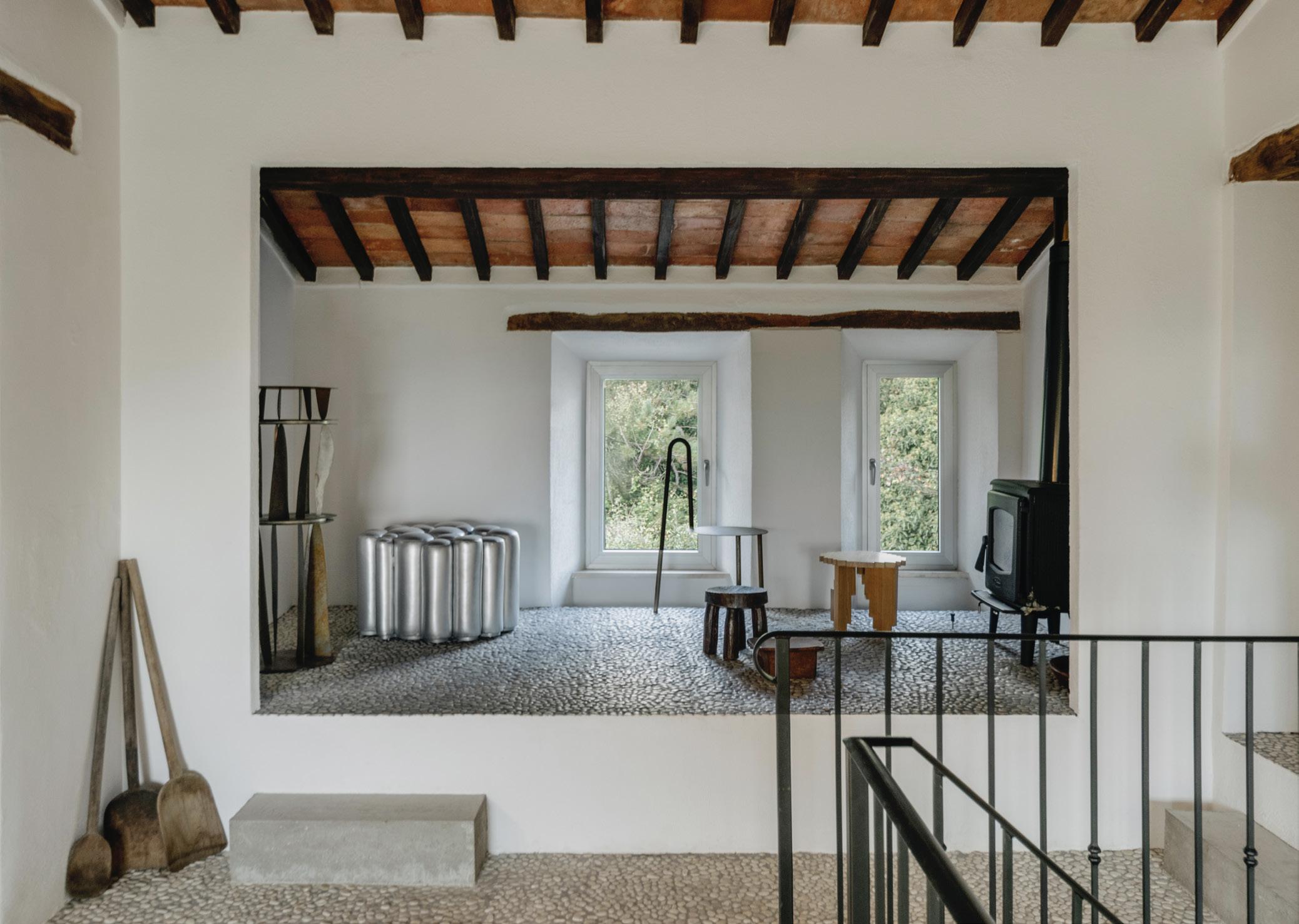
The pair chose to listen to the beauty in the imperfections. The farmhouse’s bones remain intact—rustic wooden ceiling beams,
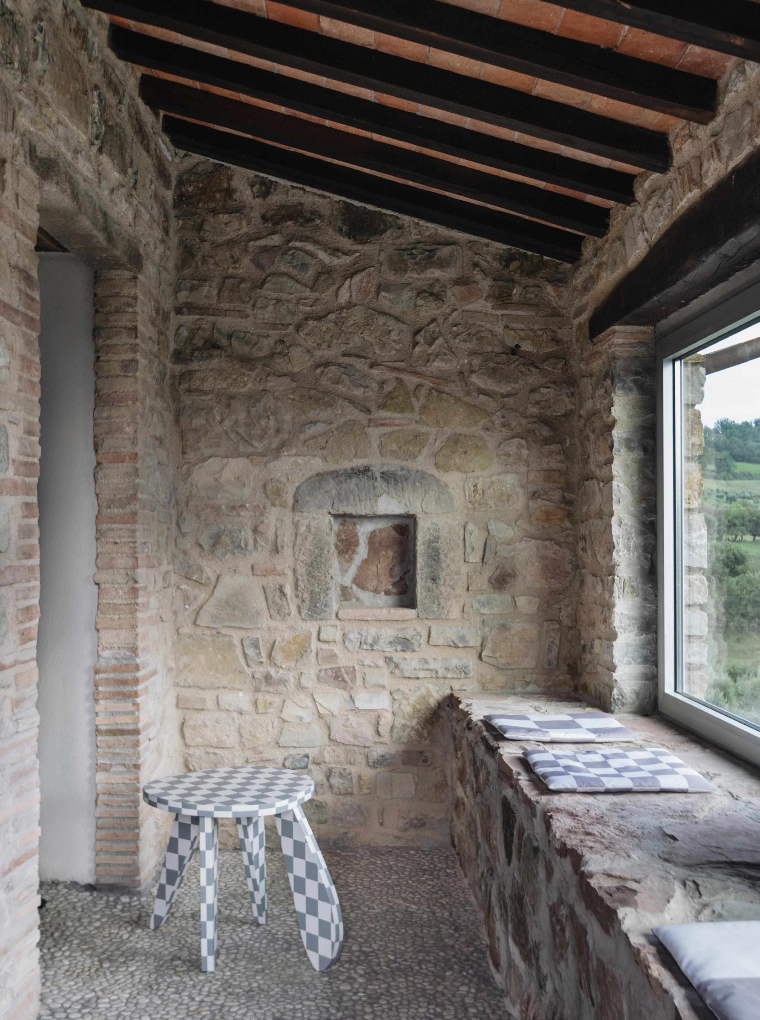
natural travertine underfoot, but Crosby Studios' interventions are brazen provocations. On the second level, hand-laid river stones replace conventional flooring, a show of appreciation to traditional craftsmanship.
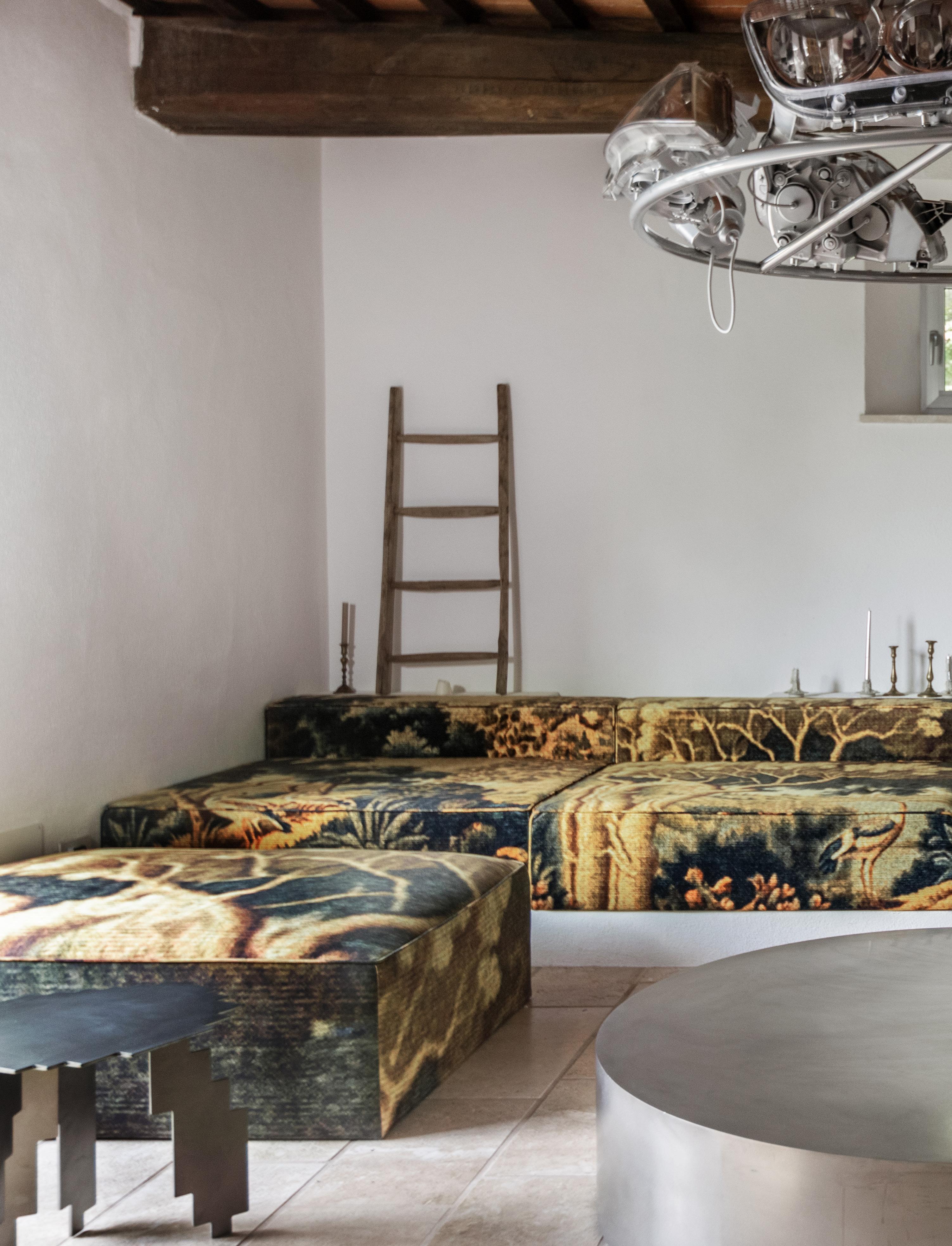
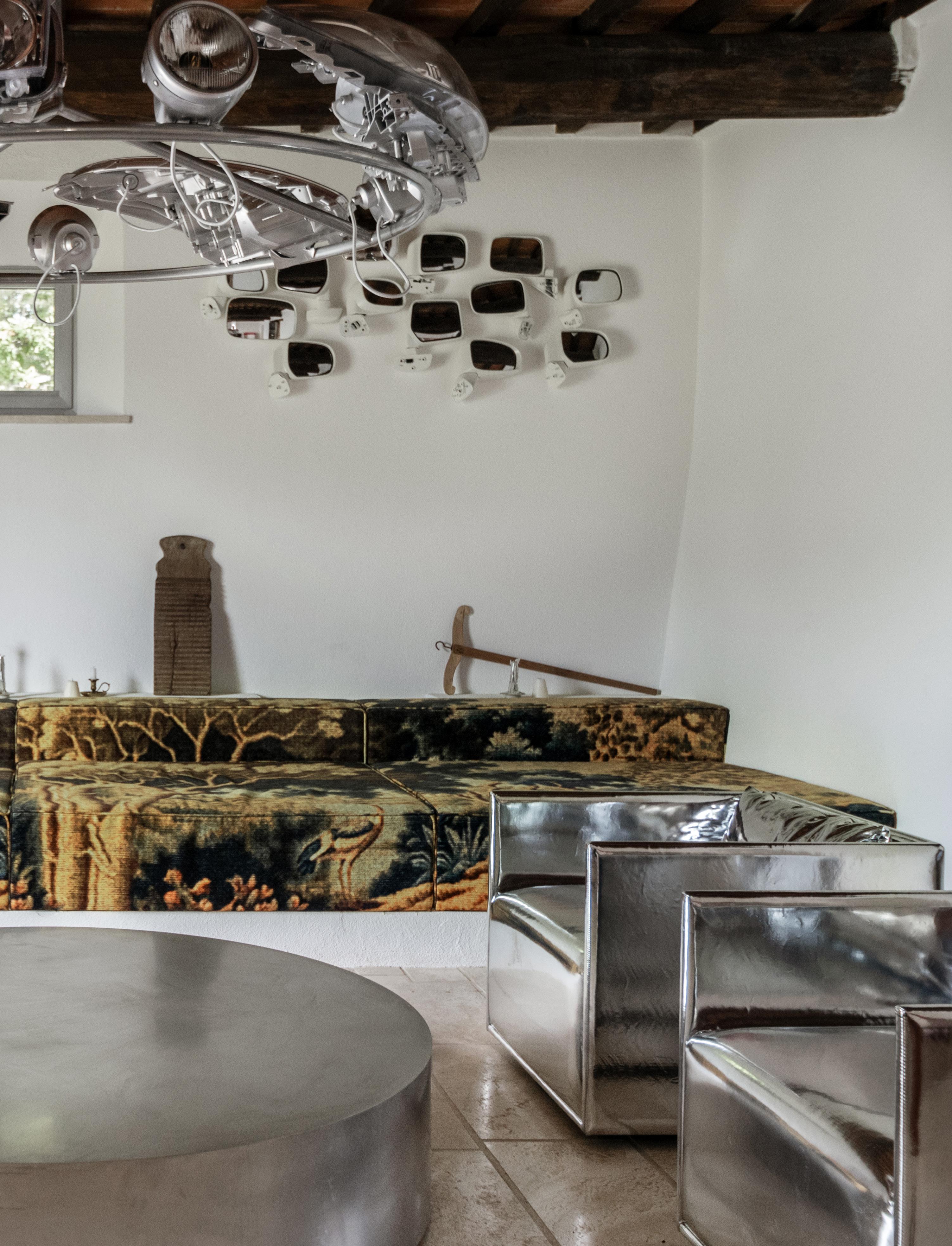
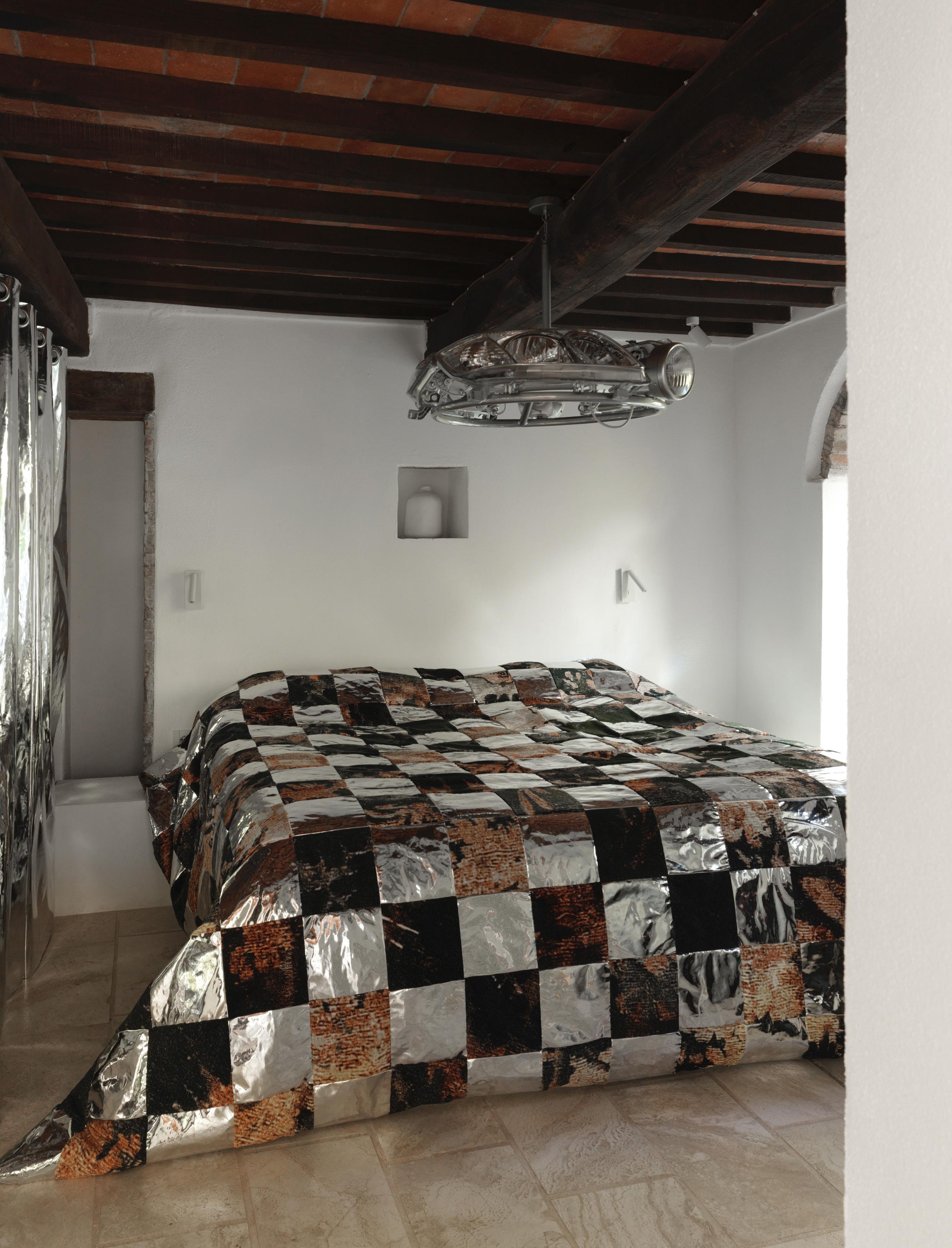
Where things start to feel otherworldly is in the reimagined feature lighting and decorative elements. Industrial and expressive, gutted automotive headlights are reborn as statement chandeliers; rearview mirrors scatter across the walls in shiny constellations.
This is Transformism, Nuriev’s creative manifesto. “Transformism is the act of turning one thing into another—not by denying its origin, but by illuminating it,” he says. Adding that, “The conceptual framework isn’t only about material manipulation—it’s about seeing the potential for new life in an object, whether that be a tattered old sofa or a neglected olive tree.”
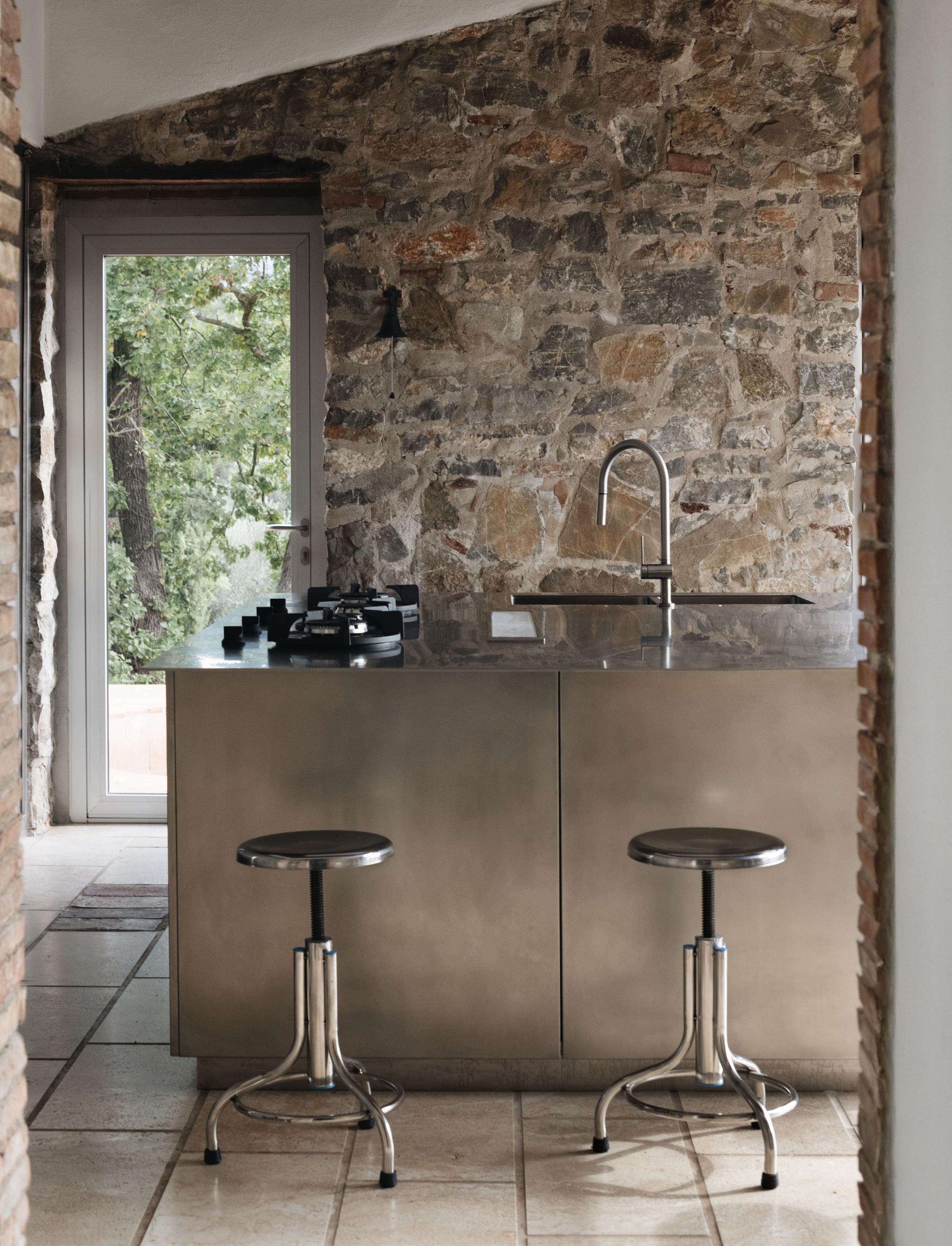
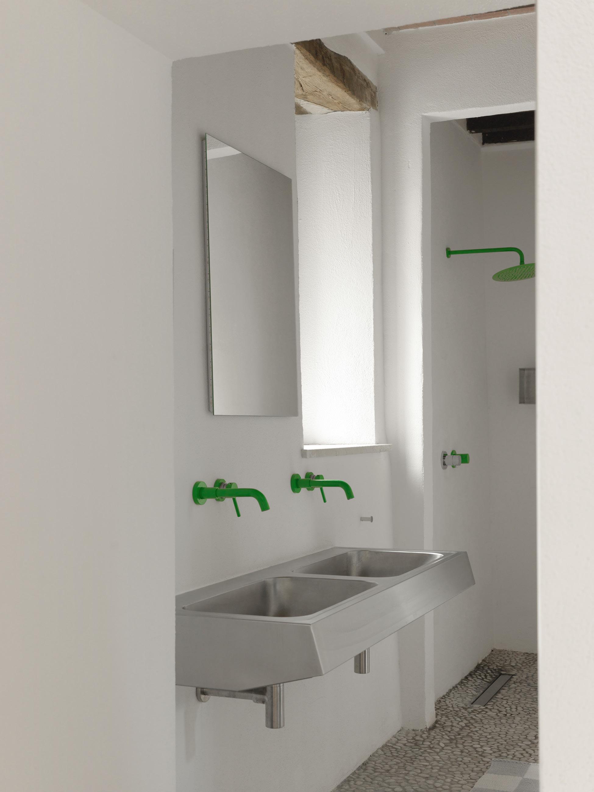
Throughout the farmhouse, the everyday is elevated to the unexpected. A canopy bed in the main bedroom is stitched from 120 repurposed red T-shirts, a patchwork of varying washed-out shades, a hint at their previous, preloved lives. Sturdy stainless steel airport sinks and toilets find second lives in this medieval domestic setting—the epitome of juxtaposition if there ever was.
Opening spread: On the hillside in Roccalbegna, Tuscany, Crosby Studios founder Harry Nuriev and his partner, Tyler Billinger, have renovated the property, breathing life into the olive farm with the launch of La Terra di Neena.
This page: One of the big moves is a 4.2-metre-long dining table—the perfect place for hosting, celebrating and gathering, with views of the sprawling gardens.
This page: Old meets new—Crosby Studios bridges worlds and eras with the farmhouse’s original details, laying the foundation before layering in metallic pieces. A standout is a chandelier made from repurposed car parts, while the sofa and ottoman, the chrome cubic chairs and the cocktail table are also Crosby Studios designed.
The material palette is drawn almost entirely from local texture: wood, stone and the patina of age. All except for the glint of metal and metallic soft furnishings, what Nuriev calls the “Crosby touch”. A 4.2-metre folded stainless-steel dining table holds the fort in the room where harvest dinners unfold. It’s a winking welcome for the traditionally ‘backof-house’ materials brought into the heart of the home.
The interplay of old and new is a measured calculation. Nuriev explains, “We wanted to preserve the traditional character of a farmhouse. It’s essentially a game of not taking away or adding elements, but keeping things as they are.”
Beyond the walls, the land tells its own story of recovery. Working with landscape architect Anna Andreyeva of Planting Strategies, the team cleared and recultivated the
olive fields, pruning the ancient trees back to health.
From this revived land comes the estate’s other purpose: olive oil. The first harvest, gathered with family and friends, was a homecoming for the pair. A reconnection with their Italian roots. It has seen the launch of La Terra di Neena, the pair’s new olive oil and lifestyle brand, named after Billinger’s mother. “Everything came very naturally. We didn't try to impose ourselves on the landscape; we embraced it,” Nuriev notes.
Part farmhouse, part production and agriculture, but truly a gathering place—this home defies easy categorisation. What Nuriev hopes comes through is a feeling, rather than a style: “I want people to feel disconnected with the outside world and tap into a real Tuscan lifestyle, with a bit of a California touch.”
Opposite page: In the kitchen, a sharply detailed stainless-steel island bench with industrial stools works as a functional zone and command centre of the home.
This page: In opposition to farmhouse traditions, the bathroom fittings are distinctly modern, from the green tapware to the stainless-steel double sink and toilet sourced from a business that supplies to public restrooms.
Opposite page: In the bedroom, a checker coverlet and a 2021 headlight ceiling pendant designed by Crosby Studios.
This page: While the bones of the original building—timber beams and stone—have been repaired, new additions speak to craft, including the newly laid stone floor upstairs. Opposite page: Chrome folding stool by Crosby Studios overlooking the restored olive grove and landscape design by Planting Strategies.
MELBOURNE | SYDNEY | GOLD COAST | ADELAIDE | PERTH
FOR THOSE who know
Shaping Infinite Openness . Introducing the Gaggenau Minimalistic series .
The difference is Gaggenau Experience it
IN FINE DETAIL
Place and time are at the heart of this 1960s Milanese apartment redesign, where bespoke additions to its mid-century bones create a simpatico chemistry.
LOCATION
MILAN, ITALY
PHOTOGRAPHY
GIULIO
LLC Atelier founder Lucrezia Calvi’s design ethos is built around the word ‘atelier’—with Old French etymological roots conjuring the wood shavings or ‘astele’ of a carpenter or artist’s workshop. As Calvi attests, ateliers are “a space where visions are cut, stitched and composed.”
It’s no surprise then that this craft-oriented sentiment underscores her renovation of a 1960s Milanese apartment. Sant’Ambrogio, home to a family of three, within a residential district embodying the Lombardy region’s
refinement, offers a refuge above the pulsing city centre.
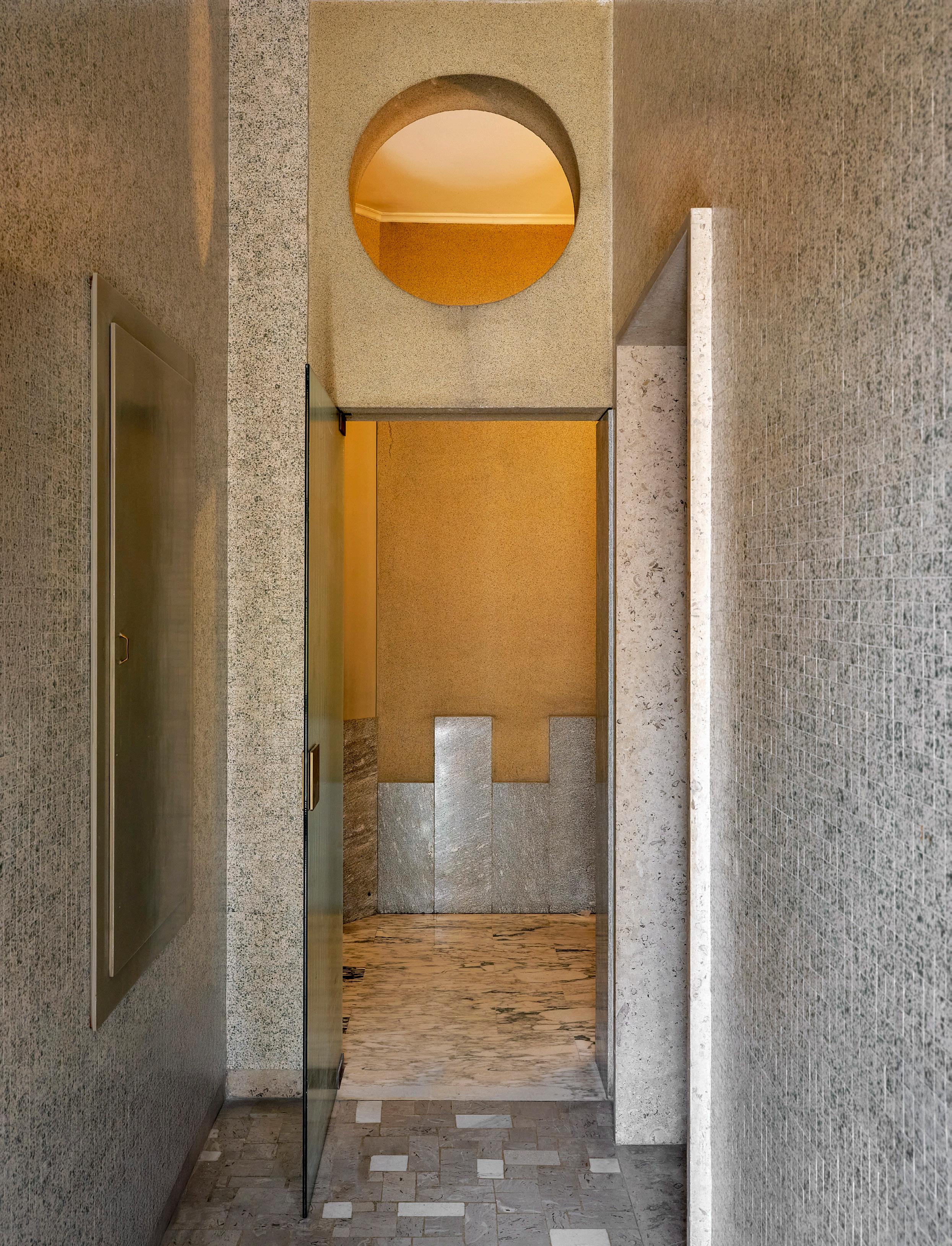
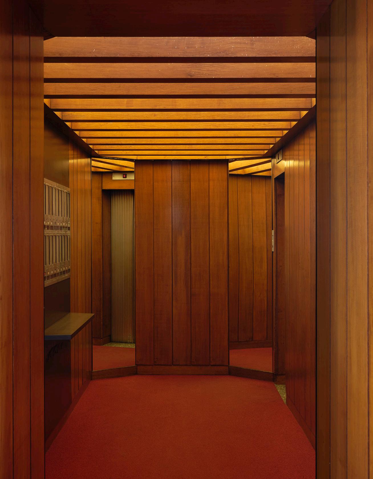
Milanese modernism is felt from the apartment building’s entry through a series of evocative portal-like walkways. A marble corridor of mosaicked, silver-scale tiling under a sun-like oculus feels like moving “through a waterfall of light, materials and colour,” Calvi says. Nearby, a crimson-carpeted, mirrored hall of rich timber panelling sets the mid-century tone.
Inside the apartment, the former interiors were a time-warp—“a bourgeois home that had stopped in the sixties,” Calvi says. “I started by understanding the 1960s building, and I wanted to respect what pre-existed as much as possible,” she adds, in particular, “its Breccia marble-tiled flooring and black-lacquered doors.” A slight layout reconfiguration involved adding a guest powder room. The home now comprises two bedrooms, a studio/guest bedroom, three bathrooms, a kitchen, and an open-plan living and dining space.
Previous spread: A common area on the second floor of the building. Opposite page: The apartment building’s entrance is crimson-carpeted, and a mirrored hall of rich timber panelling rhythmically sets the mid-century tone.
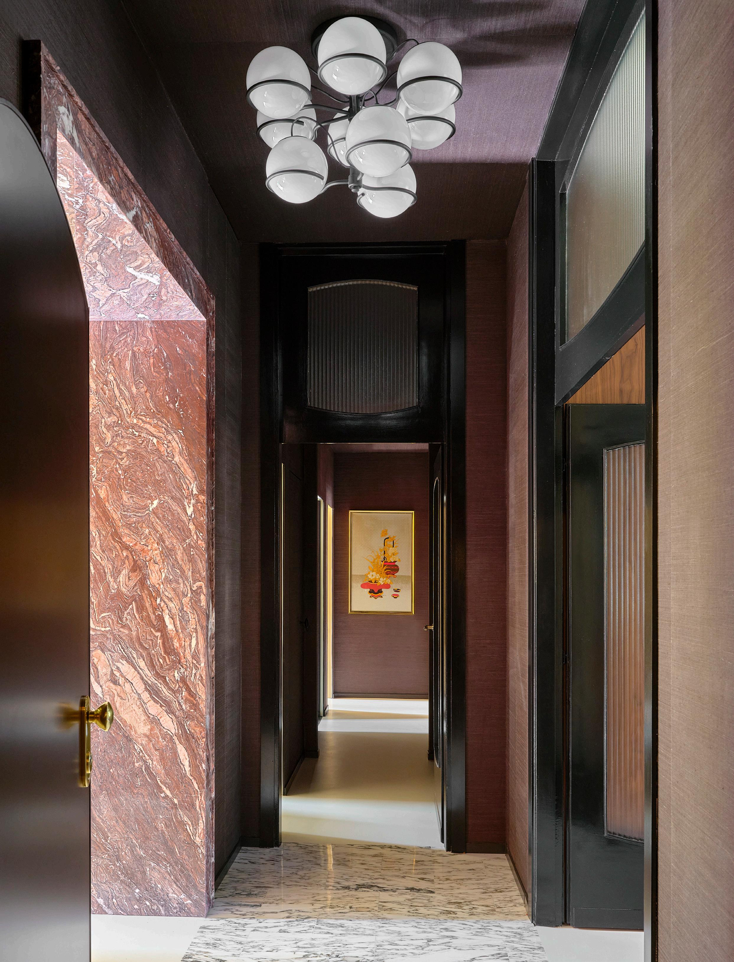
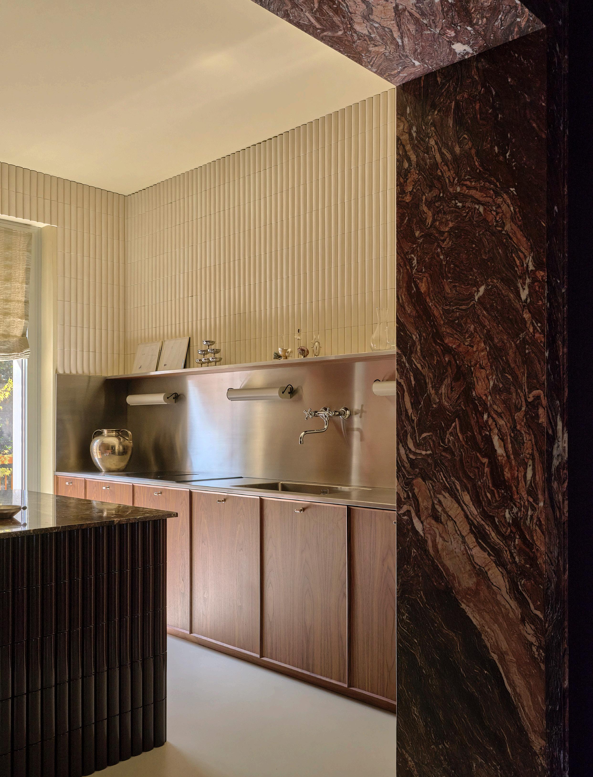
Previous spread: The apartment’s entry features a 1950s Astep 2042/9 chandelier designed by Gino Sarfatti above original arabesque marble. A Cipollino Viola marble archway frames the kitchen, while preserved black-lacquered glass doors continue into the hallway towards a 1960s painting from Triplef Gallery. This spread: Ceramic Kaufmann burgundy tiles clad the island, mirrored by white versions applied ceiling-height, musically like an organ’s pipes. Grains of Canaletto walnut cabinetry complement veinedmarble tactility. A retro nod, Nemo Applique Cylindrique Longue wall lamps by Charlotte Perriand line the stainlesssteel splashback. White resin flooring and sculptural Rubinetterie Stella tapware create contrast.
Now, upon arrival, preserved arabesque marble lines a central corridor—acting like a textural hallway runner, it materially speaks to the Cipollino Viola marble threshold, modernising the kitchen doorway. Original 1960s-era timber doorways and transom windows, with curved, fluted glass insertions, add to the dimensional welcome.
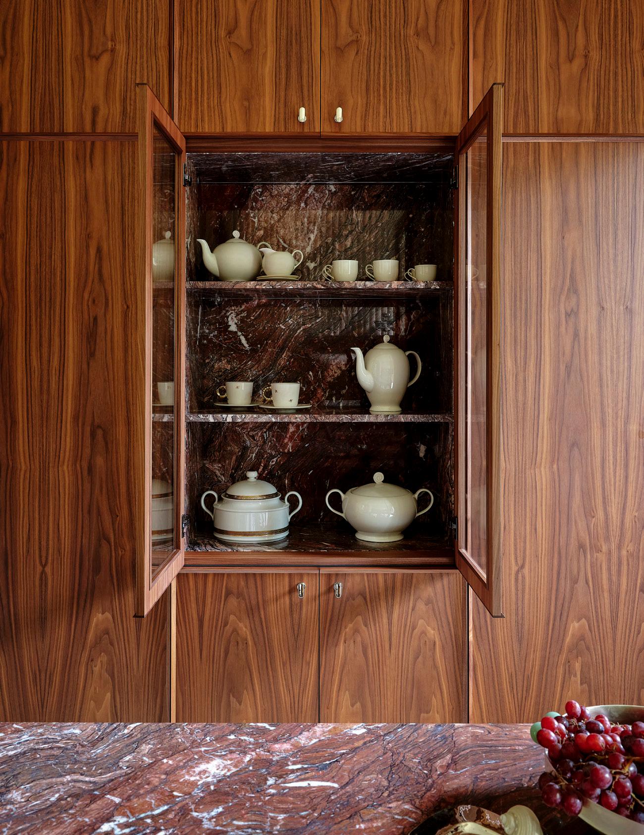
The kitchen is not only an emotive heart but a professional cornerstone, marrying the home to its owners who work in hospitality. A manifestation of the clients’ combined personalities, it “mixes materials that you would find in both a restaurant and a family home,” Calvi says. Cipollino Viola marble continues from the doorway to cloak the central island bench, splashback and embedded shelving within the grainy walnut timber cabinetry. A stainless-steel, satin-finish countertop completes the kitchen’s restaurateur standard.
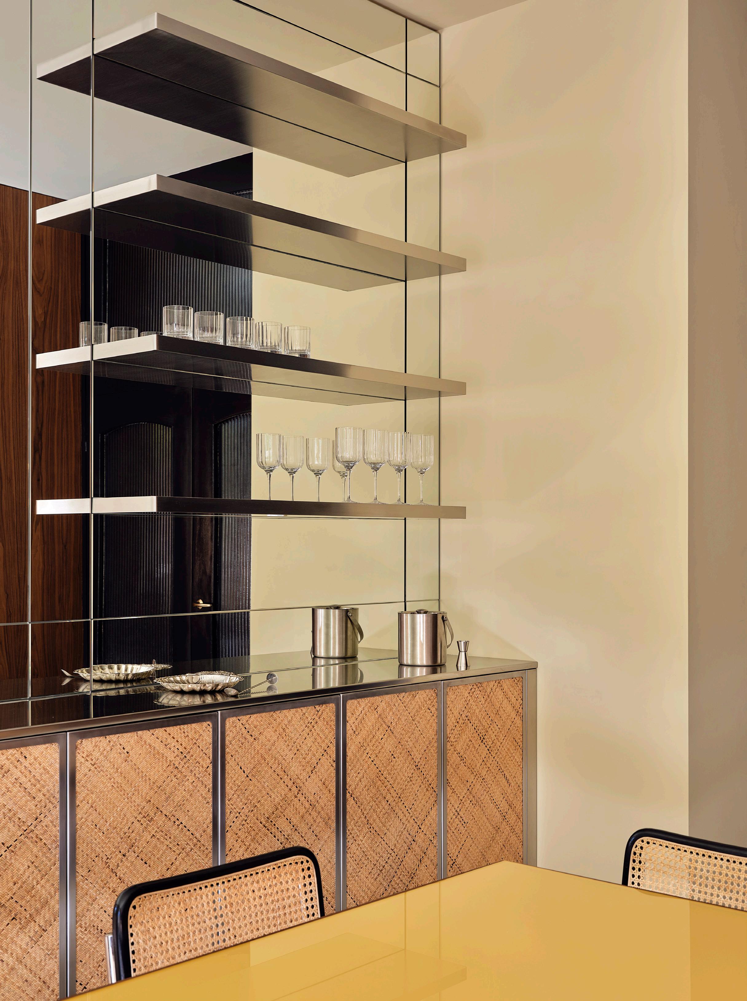
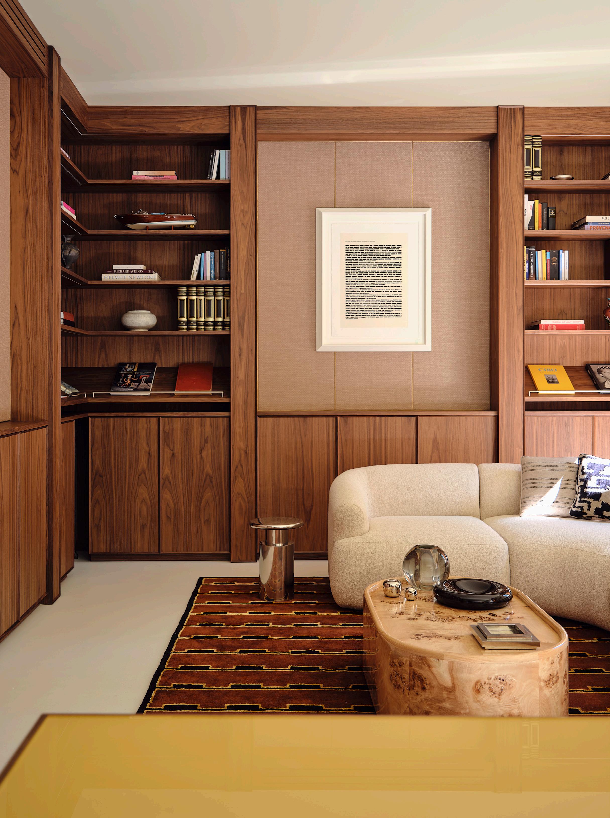
The living and dining space distils the original mid-century aesthetic, accents of Art Deco and a dose of contemporary form. “The entire home was designed and custom-produced, including artisans from Naples, where the family is from,” Calvi says. Here, behind an LC Atelier-designed honey-coloured dining table sits a steel wall unit, also designed by the studio and crafted by Naples-based Papacciuoli Design. “You understand the space is created for people who are in love with beauty,” Calvi says of the custom walnut shelving. “There’s an Emilio Isgrò artwork at the centre of the library, and we built it around that piece.”
Calvi’s approach demonstrates a Milanese eye for design beyond inherent taste—to select, complement or combine; the craft of detailing and balancing distinctive design periods requires painstaking precision.
This page: An LC Atelier-designed dining table is encircled by Knoll Cesca chairs by Marcel Breuer. A custom stainless-steel sideboard, detailed with woven cane, references the material language of Breuer’s iconic seating, linking the bespoke piece to his design canon. Opposite page: Bespoke Canaletto walnut shelving hugs the living room’s walls, specifically designed to house an inset artwork by Emilio Isgrò. Underfoot, a Nordic Knots Gild 02 rug in mid-century burgundy tones mimics the walnut-grained patterning, alongside a contemporary Soho Home coffee table in walnut burl.
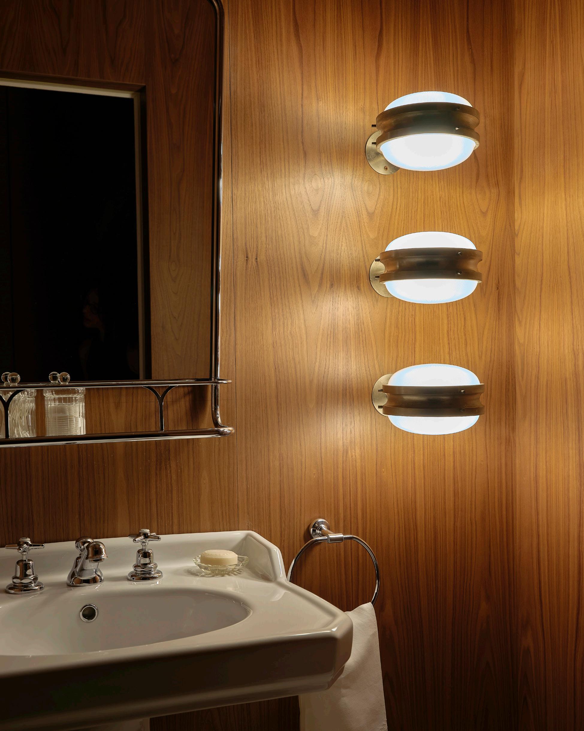
Opposite page: A trio of Gamma wall lights by Sergio Mazza for Artemide, alongside a Devon&Devon Boogie chrome mirror, redolent of retro glamour. This page: In the primary bedroom, a 1960s bed and headboard anchors the space, layered with textiles from C&C Milano, Dedar and Society Limonta. A Violaine d’Harcourt wall sconce introduces a sculptural note, while a Nordic Knots rug and Dedar curtains complete the space.
DAVIDE VERCELLI DESIGN
Davide Vercelli esplora l’interazione con l’acqua attraverso So, un progetto che supera il tradizionale miscelatore, con un controllo preciso di flusso e temperatura. So ha ricevuto tre premi internazionali: Design Plus powered by ISH 2019, Good Design Award 2019 (Giappone) e German Design Award 2020 per Excellent Product Design. Questi riconoscimenti confermano l’impegno di FIMA Carlo Frattini nel combinare design raffinato e innovazione funzionale.
Davide Vercelli explores the interaction with water through SO, a design that goes beyond the traditional mixer, focusing on precise control of flow and temperature. SO has received three international awards: Design Plus powered by ISH 2019, Good Design Award 2019 (Japan), and German Design Award 2020 for Excellent Product Design. These awards reflect FIMA Carlo Frattini’s commitment to combining refined design with functional innovation.
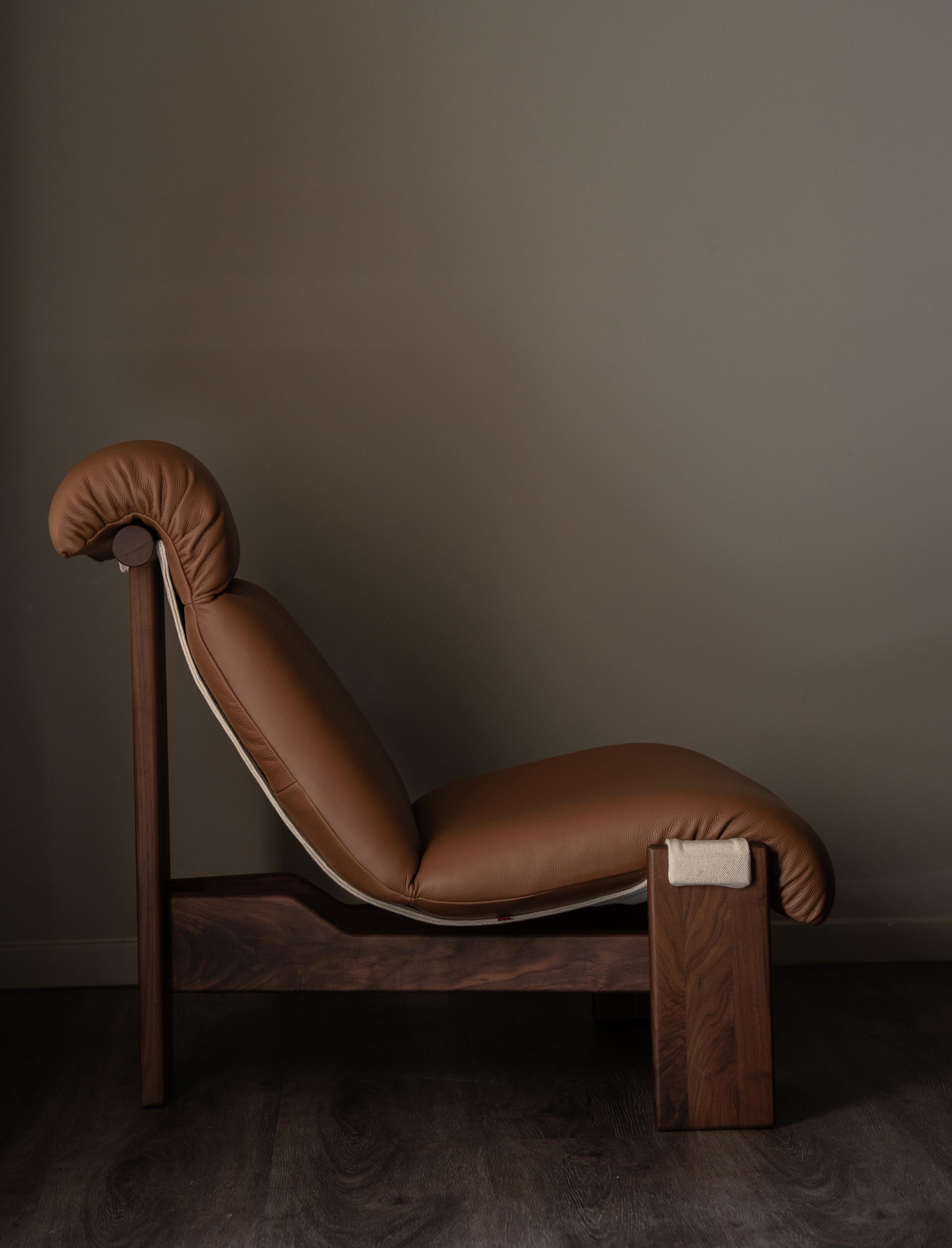
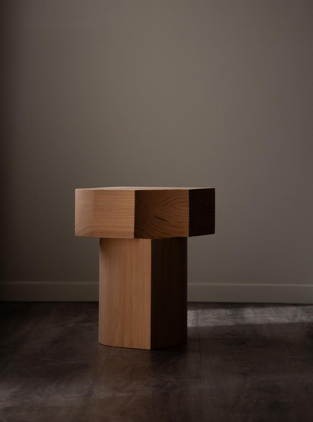
Trovato, meaning “found” in Italian, is an Australian contemporary furniture and homewares brand defined by understated European influence and a relaxed architectural sensibility. Created for design-conscious customers, Trovato offers pieces that are considered, elevated, accessible and inherently liveable.
Spanning a broad range of materials and manufacturing techniques, the collection brings together globally sourced pieces alongside original in-house designs. Shaped by local industry experience and a genuine respect for craftsmanship, each piece is defined by sculptural silhouettes, restrained detailing and an emphasis on material integrity.
Alongside its design focus, Trovato places equal importance on practical lead times, varied price points, strong stock availability and thoughtful everyday functionality. Internationally informed yet grounded in the Australian way of living, Trovato presents a carefully curated collection—thoughtful design that quietly earns its place.
PARTNERSHIP WITH TROVATO
Opposite page: Lento armchair in Walnut. This page: Masso side table / stool in Douglas Fir, Snowman 22 lamp and Lume resin bowl.
Milan-based Australian writer Alexia Petsinis speaks with five designers and duos behind some of the most seminal brand collaborations and presentations at Milan Design Week 2026.
INTERIVIEWS & WORDS
ALEXIA PETSINIS
STUDIOPEPE
LOCATION
VIALE ABRUZZI, 20131 MILANO MI, ITALY
PHOTOGRAPHY
ANDREA FERRARI
Pictured: Studiopepe founders Arianna Lelli Mami and Chiara Di Pinto celebrate 20 years of practice, which they established after graduating from Politecnico di Milano. Pictured in the studio’s former headquarters, set within a Nobilis wallpapered room, the pair stand among their various collaborations: the Baxter Nube Blanca lamp, Rakumba Torre wall lamp and Gallotti&Radice Selce-T table.
To mark 20 years of their international architecture and interior design practice, Studiopepe founders Arianna Lelli Mami and Chiara Di Pinto returned to their original headquarters with an interior installation titled The Intimacy. An ode to creativity as a “lived” experience, the project was a multisensory interior landscape that expressed Studiopepe’s emotionally textured design language.
The Intimacy is Studiopepe’s 2026 Manifesto project. Can you explain the ‘necessity’ that led you to design this project apartment?
ALM: As both designers and interior designers, we like to create spaces that truly live, as opposed to creating sets or showcases. We believe that spaces should be experiences that improve quality of life, incorporating the right colour palettes, materials, textures, lighting, music and other elements to create a cohesive living experience.
In terms of a physical ‘necessity’, we were inspired to design a space with a very different atmosphere from what you experience at Salone: a sanctuary away from the crowds, the hustle and bustle, and the showy design statements. The conceptual necessity was to create a space that encourages people to slow down and reconnect with themselves, a kind of landscape for interior reflection. You said that this project apartment is, above all, a living, transforming expression of Studiopepe’s creativity. How did you bring this space to life?
CDP: We wanted to express the idea of creativity as an invisible yet powerful force in this project, a force that doesn’t announce itself but rather is lived through the character of the space. For example, as designers, we prefer to be understated, using subtle colour palettes and material dialogues to bring a space to life.
The Intimacy features key pieces we have designed for our long-standing partners over the years, including Baxter, Gallotti&Radice, Incalmi and cc-tapis. Each of these pieces is like a window into Studiopepe’s creative universe. They are framed by a harmony of lighting, colour, texture, and even experiences of sound and scent. We wanted to bring people into an authentic continuation of our creative process. This is what makes the space feel alive.
How did you come up with the title The Intimacy for this Manifesto project?
ALM: It captures the idea of creativity being a very intimate process. These rooms have been the spaces where we have lived our creative lives at work during the day for many years. As designers, we believe that creativity is a way to know and understand ourselves better, more intimately. Intimacy, in this sense, is a kind of fil rouge that resonates both physically and conceptually.
Reflecting on the past 20 years, how has the way you work evolved, from your creative process to the scale and complexity of projects?
CDP: Today, we work in a much more structured way, and the project development process is longer and more com-
plex. At the end of the day, though, the spark is always the same. Regardless of whether we’re designing a product, an interior space, or a way for a client to communicate a project, it always starts with a concept that we develop.
Our knowledge has deepened over time, and today we have more people working with us who can help us make better choices in materials, finishes and collaborators for our projects. We are now able to deliver important and challenging projects because Studiopepe has grown into a team of highly skilled designers, developers and producers.
The layering of furniture, art and design objects in The Intimacy is important in achieving this sense of connection and emotion as the experience unfolds. Can you explain more about why you selected some of these pieces?
ALM: Pieces we designed for our partners over the years are like hallmarks in the apartment’s unfolding narrative. These include the Periscopio sofa we created for the highend outdoor furniture brand Exteta, and the sculptural chairs with the classic tubular metal frame we designed for Baxter. Pieces like these represent our design language applied to projects with two important clients with whom we share a strong creative synergy.
Some pieces reflect Studiopepe’s history, like the handmade onyx and travertine vases we created for Bloc Studios, and other personal works, such as ceramics and some of my own collages. These are all important expressions of our studio’s creative life. This selection of objects and furniture also demonstrates our experimental approach to materials and artisanal techniques, which has evolved over the years.
You are celebrating two decades of Studiopepe, which started here in this space on Viale Abruzzi, your former studio headquarters. How did you distil 20 years of your creative practice into this project?
CDP: After 20 years, this space permeates an innate sense of creativity and belonging; belonging in the sense that it reflects our connection to the world of Milanese interiors, which we see as sophisticated, modern and innovative. We didn’t just want to curate all the furniture and objects we have designed in this project. We wanted to showcase our interior design concept, which has evolved over the years.
This means focusing on the use of wood and marble, layered materials and textures, a mix of vintage and modern aesthetics, bespoke pieces, and an ongoing dialogue between design, art and imagery. These are all fundamental elements of our design language.
This page: The apartment-gallery that will remain open year-round, and hosts a selection of gallery and vintage objects, including the 1130 Celestia ceiling lamp by Tobia Scarpa for Flos and Tamburo table lamp from the 1970s. The living space features the Exteta Periscopio sofa, DOOQ Mosaico armchairs, Tacchini Gian coffee table and Pablo vase, Mariantonia Urru x Exteta Villa Borghese rug, Gallotti&Radice Garçon side table and Gian coffee table, a bespoke fireplace by Alimonti Milano and Boiserie crafted by Veragouth + Xilema and Incalmi. Opposite page: The Muuto Coltre modular sofa, cc-tapis Luna Addiction rug, Gallotti&Radice Garçon side table, Pholc Dream Catcher pendant, Tacchini Sophia lamp, Gallotti&Radice Garçon side table, and Bloc Studios Affinità Elettive collection. Set among the studio’s designs are the Tricia lamp by Salvatore Gregorietti for Valenti Luce, and a bespoke piece by Vetreria Bazzanese.
LOCATION
HALL 11, STAND E15–G12–G16–E27–G22, 20017 RHO MI, ITALY
PHOTOGRAPHY
COURTESY OF MINOTTI, MATTHEW BROOKES
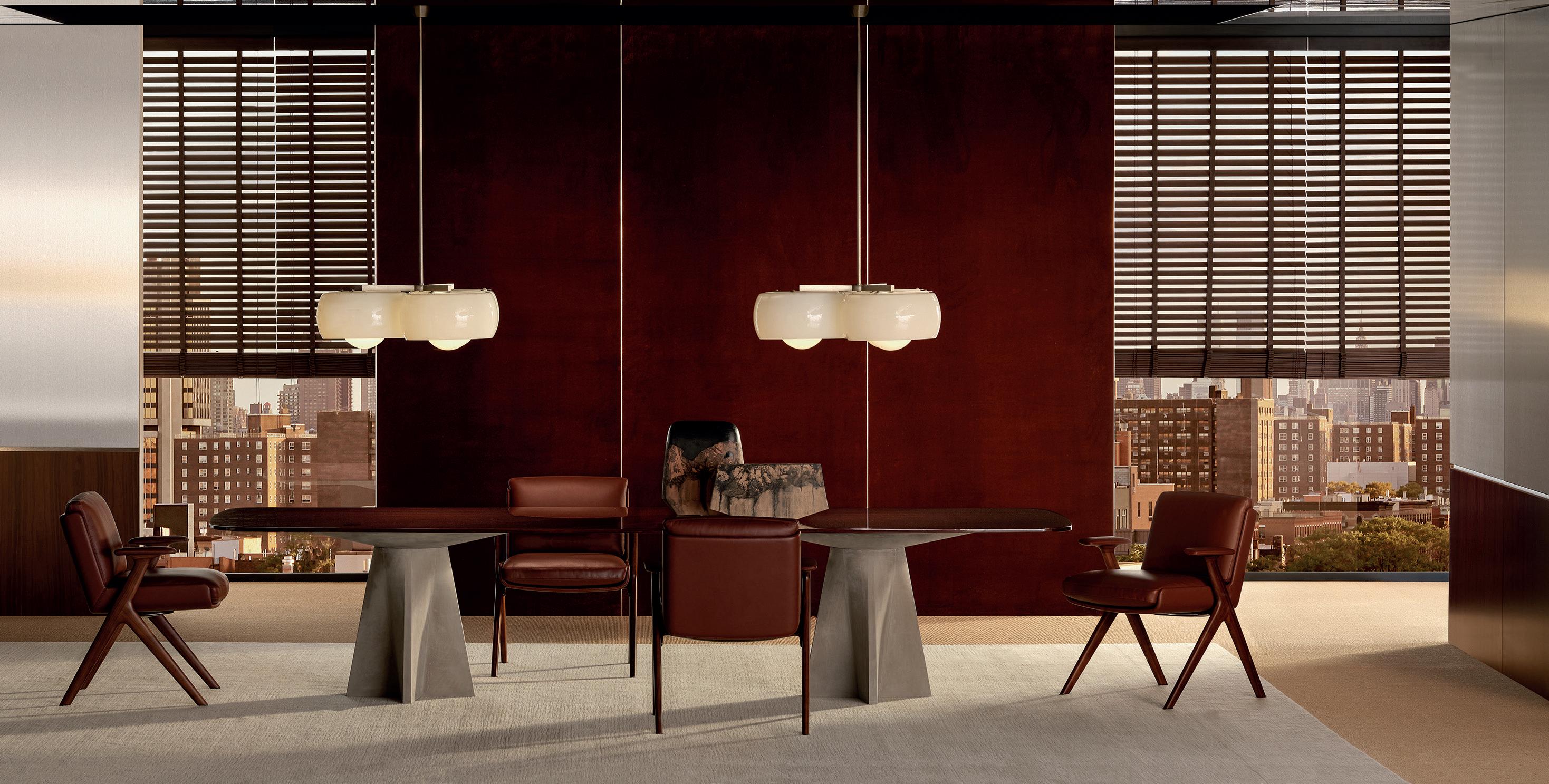
Working between Los Angeles and Milan, designer Giampiero Tagliaferri's cinematic approach to form continues to define his ongoing collaboration with Minotti. Rooted in references to Californian modernism, the visual language of the 1970s and ’90s, and reflections on future ways of living, his latest designs for the Italian company explore the dialogue between structure and softness, restraint and sensuality. Tagliaferri reflects on the unexpected origins of his relationship with Minotti, the architectural thinking behind pieces such as the Orion sofa and Brutalist table, and his belief that furniture should always exist within a broader cultural landscape.
You have been collaborating with Minotti for a few years now. Can you explain how the collaboration began?
GT: My collaboration with Minotti started in 2024, in a very unexpected way. One of the company’s co-CEOs, Renato Minotti (co-CEO with Roberto Minotti), saw a client’s boutique I worked on in Milan. He liked how the space’s design expressed that brand’s ethos and aesthetics. Minotti invited me to their headquarters to have a chat.
I am not a trained architect or a designer in the traditional sense; my background is in branding and creative direction. I spoke with Minotti about their brand in a very honest way; I spoke with the Minotti family about everything, touching on everything from architecture and design to business and creative vision. It was an open, honest conversation, probably not the typical conversation they would have with a designer. At the end of this visit, Renato asked me if I wanted to design something for them.
Minotti initially expected me to come back with a design for something small, like a little table or coffee table. Instead, I came back to them with the design for the Supermoon, the sofa we launched two years ago at Salone. It was a bold first design to show them, but they really loved it. Five months later, it entered Minotti’s collection. Our collaboration really started from there, and it has continued to grow.
The products you designed for Minotti’s 2026 collection—including the Orion sofa, the Brutalist table, and the Doheny bookcase—reference the visual language of the ‘70s and ‘90s in various ways. Can you explain more about how these eras influenced your designs?
GT: I always start my designs from a mood; I imagine situations and atmospheres, like scenes from a movie. Yes, in general, there was a feeling of the ‘70s and ‘90s across my designs, though I never want my pieces to feel nostalgic. When I reference the past, I also make sure my designs remain relevant to today and to how we will live in the future.
In a way, the ‘90s reference explored the early years when Rodolfo Dordoni started collaborating with Minotti the period when he was developing a new and fundamental aesthetic for the company that would endure for years to come. I did not just reference it directly, but tried to capture the atmosphere of the time.
Each product I have designed this season is linked to architecture. I love the ‘70s; there is always a bit of that in my work. When designing the Orion sofa, the ‘70s reference was inspired by the architecture of John Lautner, exploring his use of connected sections, intersections, and trapezoidal shapes in the homes he designed. The Brutalist table, on the other hand, was inspired by Pier Luigi Nervi, a renowned engineer who worked with Gio Ponti and who was considered ‘the poet of concrete’. His application of concrete was very particular; he made a highway structure look elegant. In all, I considered a mix of references across the architectural world at the beginning of Minotti’s time.
Can you take us into the design process and narrative around the Orion sofa in more detail?
GT: I was specifically looking at the incredible homes John Lautner designed in the ‘70s, many of them in California. I really studied the floor plans and rooflines of his houses; you see all these elegant connections and combinations. This inspired me to design a sofa that didn’t necessarily have 90-degree angles, straight lines or curves, but rather, a piece that could create a sense of movement through oblique lines.
I also wanted to highlight this idea of angles and connections coming from different points. I decided to use stitching lines on the sofa, all of which converge at the centre of the piece. The name Orion refers to the constellation, which reflects the idea of connecting points, as the lines of this sofa can be traced. I also didn’t want it to feel too grounded, so I designed a platform beneath it, making it seem as though it’s floating in space.
Minotti described its 2026 collection as showcasing a “freedom of contamination”. How is this idea expressed in your designs?
GT: I think the idea of “contamination” or layering is a tradition of Italian design. Italian design is rooted in our layered approach to culture; if you walk around an Italian city, you see centuries of layers in the architecture around you, for example. Milan is a perfect example of this idea of contamination: you have a building from the 1200s next to one from the ‘70s.
Personally, it is something I always do. I like to explore tensions between materials that normally shouldn't go together, but when you put them together and achieve the perfect balance, they actually work. When you design for a brand like Minotti, this balance is even more important; your design has to symbolise harmony, timelessness and sophistication. For example, the base of the Brutalist table is raw concrete, and one version of the top is rosewood finished with a high-gloss lacquer. This finish gives it an extremely refined, high-end character. This contrast between a raw and refined aesthetic is really striking.
How important is the context around how you present your designs?
GT: I have always believed that it is important to show the product or system in the context that reflects the ethos of the design; the inspiration, the narrative and the world of references that surrounds it. In my collaborations with Minotti, I have consistently created and shown the life-
style around the product. Going back to my first Supermoon sofa in 2024, I designed the locations and contexts for its presentation, imagining the spaces and atmospheres that would immerse people in the product's narrative and lifestyle. Minotti has always really appreciated this.
This year, during Milan Design Week, I designed the whole set for the brand’s booth at Salone del Mobile, which was another extension of our collaboration. It was based on a dialogue between the furniture and visual art. We worked with the renowned Italian gallery Tornabuoni Arte and displayed an incredible curation of post-war Italian art, including works by Fontana, de Chirico and Boetti. Each artwork reflected the product in some way–whether aesthetically, conceptually, or symbolically. People who visited the booth said it felt like stepping into an art exhibition.
How did you observe people engage with your designs from a sensory and experiential perspective?
GT: When designing for Minotti, there is always this component linked to comfort. It is a key part of the product experience; you have to consider form and function equally. I think Minotti is best in class when it comes to this balance of craftsmanship, construction and comfort. When you look at the Orion sofa, it might seem a little intimidating at first; it has very defined angles and low backrests. I think people immediately assume it won't be comfortable. But the moment you sit on it, you are surprised. That is a reaction I noticed in a lot of people. I wanted the look to be strong and aesthetically sleek, but I did not want to compromise on comfort. I think we achieved this balance.
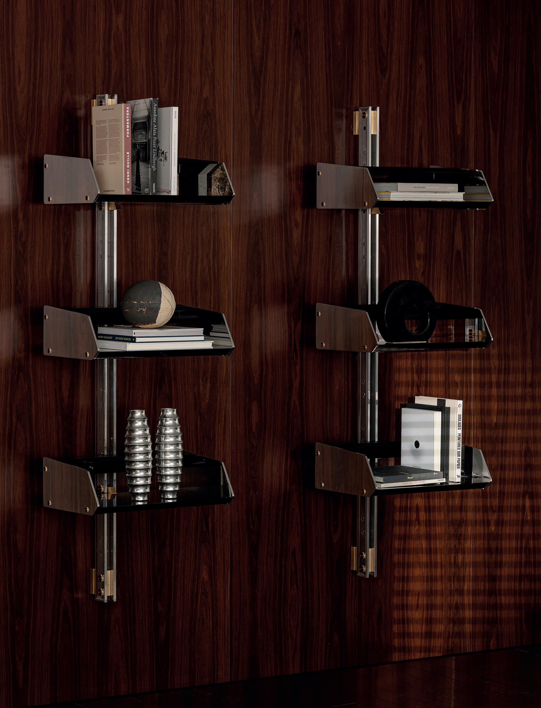
for wall installation or floor placement. Appearing as though suspended, the bookcase features three or four levels supported by machined
with a
This page: Tagliaferri designed the Minotti Doheny extruded aluminium bookcase
solid-brass fixings
bronze finish. Opposite page: For the Minotti Brutalist table, Tagliaferri draws inspiration from the “poet of concrete,” Pier Luigi Nervi, the renowned engineer who collaborated with Gio Ponti. Where concrete is typically concealed, Tagliaferri makes it the focal point through the stargeometry of the table’s base.
VALENTINA CAMERANESI SGROI
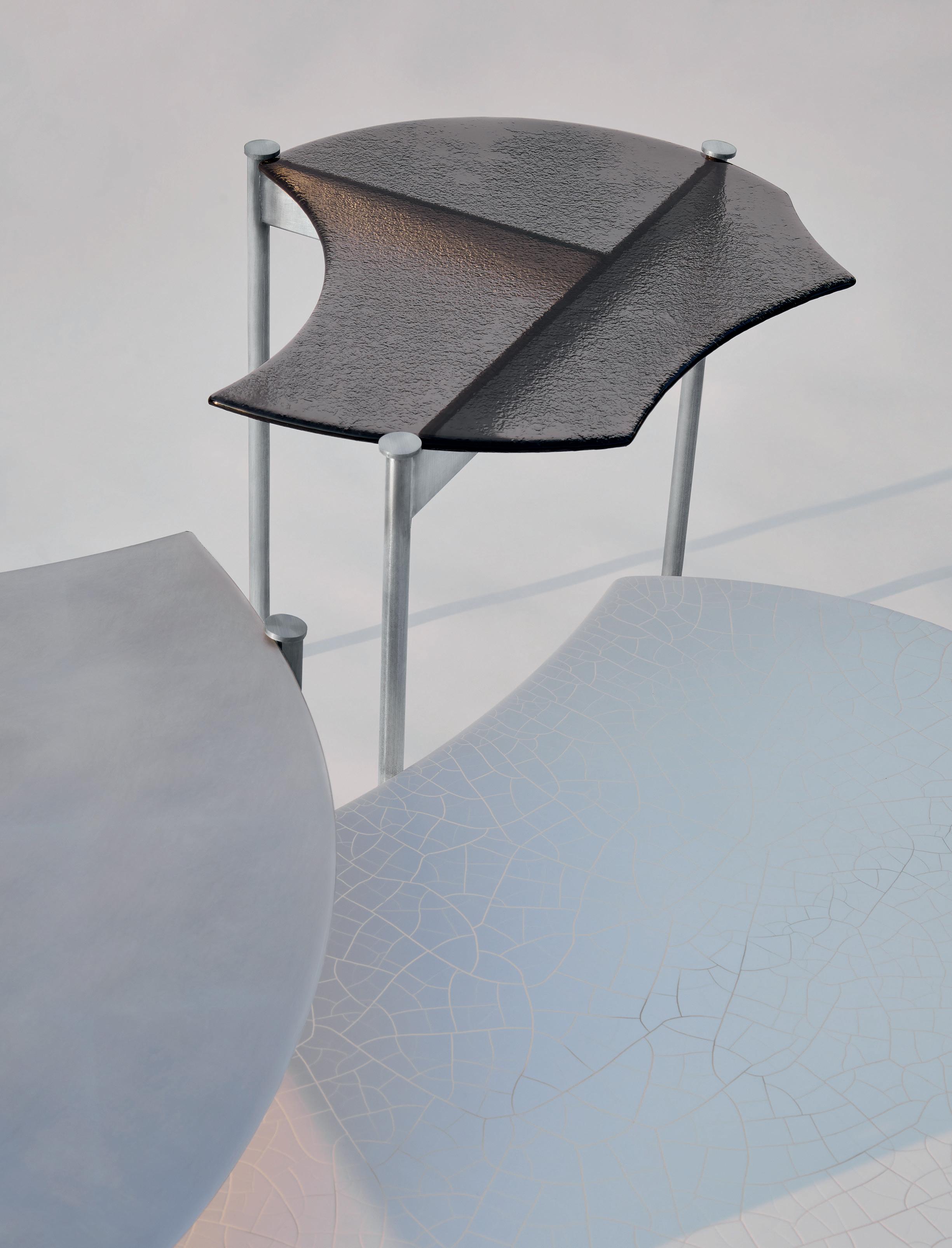
Milan-based independent creative director and designer Valentina Cameranesi Sgroi has always been intrigued by the transformative qualities of glass. Invited by Gallotti&Radice to design a piece for its 70thanniversary exhibition, Tales in Glass, the designer’s Arcipelago side tables combine heritage-inspired elements from the company’s archive with her evocative approach to storytelling through colour, texture and detail.
Your work primarily focuses on object design and visual representation through space and image, though you have worked with glass before. How did this opportunity arise to be part of Gallotti&Radice’s Tales in Glass exhibition?
VCS: Gallotti&Radice was aware of my glasswork on a more intimate scale through the limited-edition commissions, gallery pieces and bespoke commercial projects I have undertaken over the years. I was glad when they invited me to be part of the project. This opportunity was my first foray into designing something to be produced on a larger scale. Having said that, achieving a sense of artisanal integrity was a defining element in the design process. This has always been at the heart of Gallotti&Radice’s approach to working with glass.
You designed three low side tables titled Arcipelago for the project. Can you share some insight into your design process and how Gallotti&Radice’s design heritage influenced your approach?
VCS: Initially, the company shared a presentation with the other designers and me, outlining some of its historical pieces, which continue to serve as reference points and design inspiration for them. This was kind of like a ‘showing of possibilities’ for what we could create: forms, references and techniques to consider in our design process. I explored the type of objects they were already producing, the techniques they were using and the finishes they were applying to the products. From there, I tried to find a way to combine their design language with my own. They didn’t give us a strict brief for this project; it was more about considering the company’s design typologies and techniques. Initially, I sketched many drawings and sent many ideas. I decided to go with a low side table because I like this idea of creating a larger surface that remains simple with just a few structural joins. I really like the fact that Gallotti&Radice don’t glue their glass. They always use mechanical connections to create structure and stability in an object.
What particular forms, elements and techniques from Gallotti&Radice’s archive inspired your design for the Arcipelago tables?
VCS: I observed that some of the company’s pieces from the ’70s and ’80s were quite sharp and daring; there was
a purity about them, especially in the combination of glass and bold metal elements. While I’m not a minimalist designer, I translated this sort of clean ’70s aesthetic to my tables, balancing it with decorative elements and a detailed craquelure surface finish, which gave them character.
Did you have a specific interior, scenario or client in mind when designing the objects?
VCS: I could picture them in a setting with plenty of natural light, which is important for bringing glass objects to life. I imagined them as something you might find in the home of French interior designer Andrée Putman: a clean interior, perhaps with contrasting dark-toned furniture around them. The tables have sharp edges that look a bit dangerous from some angles, or at least give the objects a sense of character. They seem to be constantly moving and changing shape. I’d like to see how people interpret them in different interior spaces.
Did this idea of the tables being in a constant state of motion and interaction inspire the project’s title, Arcipelago?
VCS: It was a particularly cold winter when I started designing them, and I noticed a little frozen pond in the park near my house with fragments of ice across its surface. Glass and ice are so similar in a way. I liked this idea of creating a surface landscape. So the name references this design idea of elements that are connected but not really attached. Generally speaking, the objects you design are often influenced by visual art, history, popular culture and recurring objects in collective memory. Did some of these references inform the design for the Arcipelago tables, too?
VCS: Makeup is an enduring influence and reference point in my work, particularly the sense of desire that is often connected to makeup. My work explores the relationship between design and makeup through shapes, colours, textures and surfaces, considering how these elements combine to create an object people desire. In this project, I enjoyed exploring simple but strong combinations in colour and texture. The tables feature tinted glass and a defining craquelure finish, which adds tactile and aesthetic dimensions. Looking at the three tables together sort of resembles a mix between sugar and makeup.
You have previously worked with glass on several other smaller-scale commissioned objects. Can you explain more about your experience working with the material in this particular project?
VCS: The company sent me catalogues and samples of the glass they use for their collections, but left the choice up to me. I was immediately attracted to the craquelure finish on glass. It reminded me of the finish on some of the ceramics I have created in the past, which felt like a nice evolution, and of an Art Deco object with a precious, intricate skin. It’s like an illusion: it seems solid, but when you look into it, you realise it’s transparent.
I also used silver foil in my tables, which reminds me of something very crafted and artisanal, even antique. It was applied to the objects in small squares by hand, so you still see the outline of the squares.
Following the success of Tales in Glass and the creative relationship you have established with Gallotti&Radice, will your Arcipelago tables now go into production?
VCS: I suppose this is the aim, and it has been part of my ongoing conversations with the company. When we discussed the finish on my design, for example, I was tempted to try something a little more experimental on the table legs. However, given the idea of the object being replicated in a possible future production series, we went with something relatively simple, something welded. I was conscious of the need to refine my design to ensure consistent quality across future editions.
I’m not a traditional designer; I like the idea of designing something that could potentially be accessible to a wider range of clients in the future, an object that opens itself up to more functional uses and interior typologies. Salone del Mobile.Milano is always a bit of a testing ground. While we can’t guarantee the design will be available in stores next winter, our goal is to move it into production.
This page: The Archipelago tables were inspired by a pond near Cameranesi Sgroi’s home, where likening glass to ice led her to fixate on the table’s detailed craquelure surface finish. The tables are deliberately ‘clean’ in appearance, referencing Gallotti&Radice designs from the 70s.
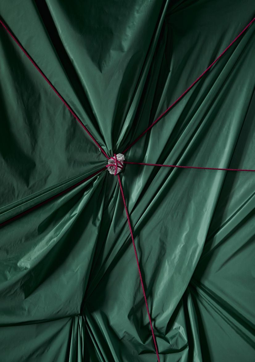
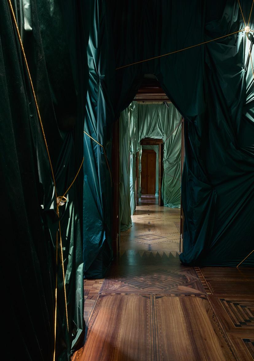
Opposite page: For the brand’s 70th anniversary, Gallotti&Radice invited Paris architect Sophie Dries to create Tales of Glass, an installation inside Palazzo Meli Lupi di Soragna divided into past, present and future. Cameranesi Sgroi’s work featured as part of a female-only cohort commissioned to create Special Editions for the future, shown within a space wrapped in fabric and knotted with reclaimed glass.
DAVID/NICOLAS
LOCATION
VIA S. MAURILIO, 1920123 MILANO MI, ITALY
PHOTOGRAPHY
GIULIO GHIRARDI, DAVID RAFFOUL
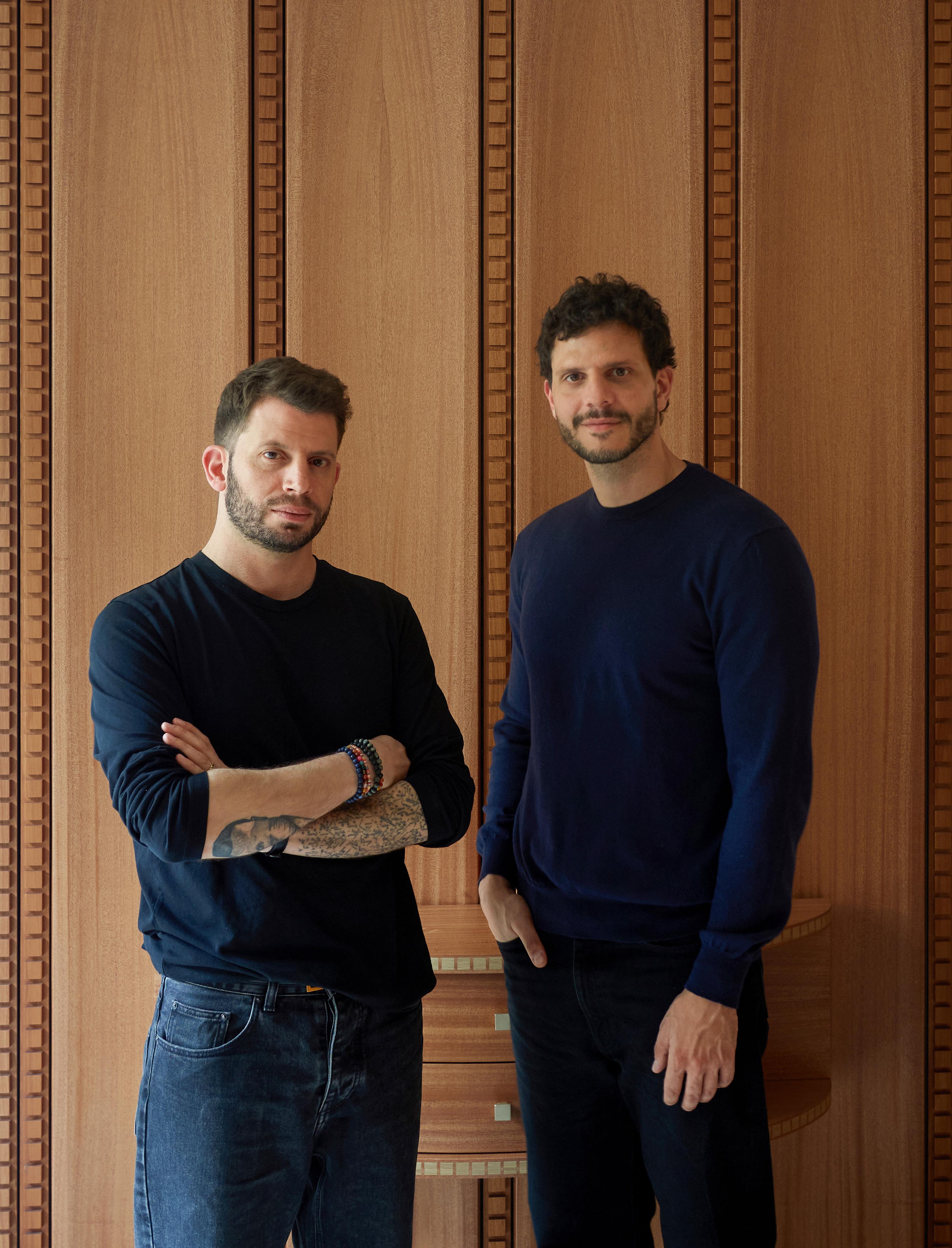
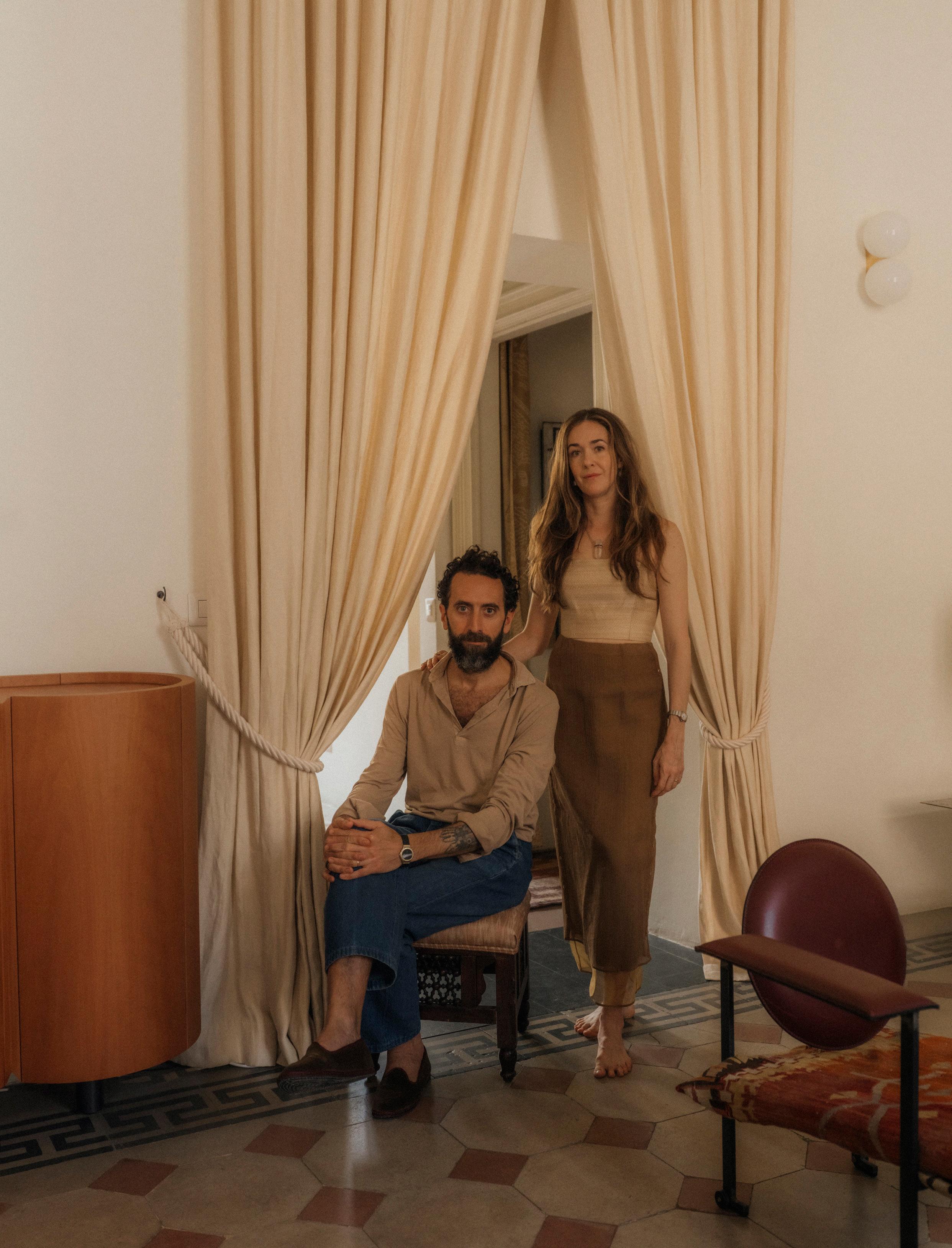
Pictured: david/nicolas, founders David Raffoul and Nicolas Moussallem, in their Milan studio, opened for the first time to reveal the La Boiserie wall system in situ.
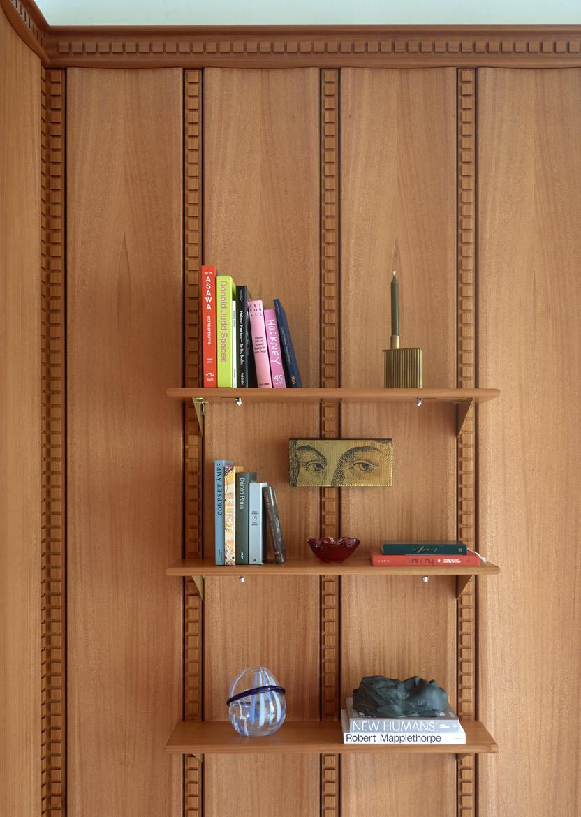
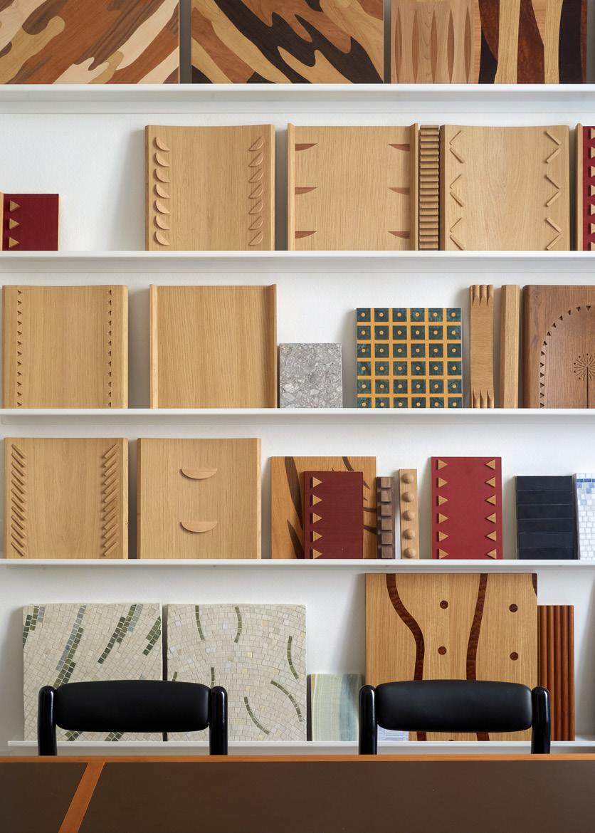
Opening their Milan project space for the first time during Milan Design Week, the international design studio david/nicolas, founded by David Raffoul and Nicolas Moussallem, presented the installation La Boiserie. Equally decorative and functional—a balance the pair has been refining for the past ten years—the artisanally crafted timber-panelling ‘system’ responds to diverse contemporary living spaces and lifestyles. A new chapter in the studio’s material language, La Boiserie reimagines traditional woodwork through a present-day architectural lens.
You shared that La Boiserie represents a new chapter in your material language. How did this concept of a boiserie ‘system’ originate?
DR: We first had the idea when we were working on an interior project in 2014. It was a large intervention in a heritage Parisian apartment, which we had to restore according to its historical character. During this project, we worked with the renowned boiserie craftsman Guillaume Féau, whose archive really impressed us. We had an additional apartment project to complete after this one, which was extremely modern in contrast. In fact, it looked a bit like a hospital, with two large empty walls we had to work with. Boiserie was already on our mind, given the work we had just done, so we were inspired to translate a more contemporary expression of boiserie into this new space.
We decided to explore the idea of verticality. The verticality you see here in La Boiserie is inspired by the architectural proportions of our region. These proportions are very elongated and elegant, with slender panels. Combined with the idea of a customisable product incorporating elements such as inlays and shelving, this was how the concept of a system originated.
So we could say the product was created in direct response to the needs of contemporary living spaces?
NM: Definitely. It was born out of a need to adapt a space in a project we were working on. It was a solution, and I think that’s what is beautiful about it. It responds to how people live today; as spaces change, it adapts accordingly. The product’s design continues to evolve, and it remains a solution for transforming interiors.
For example, we were working on an interior project in Dubai a few years ago, and the residence had these enormous spaces that felt like a football field. We wanted to create a dining room off the living area, but to do so, we needed to establish a stronger sense of intimacy and limit how far the eye travelled through the space. We created a free-standing, floor-to-ceiling boiserie structure in the middle of the living room, with a window-like opening and integrated cupboards. This created a sense of connection
between the spaces while also partitioning them. We have also completed projects in which an entire room—a bar room, for example—was based on our boiserie system. The possibilities are endless.
Can you explain more about how you refined the product’s balance of decoration and functionality?
DR: We started working on boiserie panels in 35cm modules, focusing on sculpting the edges and exploring marquetry techniques. It became an ongoing process of testing and experimentation with patterns and techniques applied to the wood. Alongside this decorative character, we ultimately created a product that lets you completely transform a wall to suit your needs. For example, you can transform a wall into a bookshelf, or customise it for a dining room with suspended shelving or cabinetry. It was this versatility we were looking for: the ability for the system to adapt from the dining room to the reading room, or the living room.
What about the relationship between historical inspiration and architectural innovation?
NM: We have long been fascinated by the materiality of architectural elements—whether in stone or wood—such as the historic French boiseries found in 19th-century churches. There is always a sculptural quality that intrigues us. In the context of the interior projects we mentioned earlier, we wanted to create something more contained and spatially coherent; something versatile in a contemporary setting and transferable from one interior environment to another. From the beginning, we wanted to create something that had both sculptural and functional qualities. When we worked on the first boiserie, our clients were in their late seventies, and it was their first modern home. They didn’t want anything too overwhelming. We saw the boiserie system as a way of engaging with hardwood beyond flat panelling. Over the past 10 years of developing this system, we have continually refined both its decorative effects and the ways it can be assembled architecturally, ensuring versatility.
Can you walk us through the production process for your in-house boiserie?
DR: Most of the boiserie products we create begin with a piece of hardwood. This must be chosen carefully because there are different dimensions and characteristics to consider. For example, the available surface area within the hardwood for carving, sculpting and engraving is limited. We had to find the right sculptors who could work with the material. Initially, we worked with a single craftsman; now we collaborate with three workshops, each specialising in a different stage of the production process. One focuses solely on engraving, while another is dedicated to assembly, for example. We have undertaken extensive research with the production team, and the process has evolved from small-scale production into something much larger. With each new version of the product, we continue refining the system, responding to elements that require adjustment. For example, issues relating to height led to the solution of crowning, while alignment and orientation challenges led us to work with angles.
La Boiserie, the installation at your project space, also represented a dialogue between visual art and architecture. Can you explain more about this?
NM: Presenting artworks, books and objects alongside the boiserie was very important. Without these elements, it’s difficult to fully understand the product or visualise it within an interior environment. You can’t connect with its function. With this presentation, we wanted to convey that regardless of where the product is installed, it takes on a different personality depending on its surroundings. Every client has their own vision for integrating the boiserie into their home.
DR: The presentation featured a curation of artworks from a private collection that didn’t overpower the boiserie or distract from it. Rather, we selected works that complemented the product’s narrative and reflected our own sensibilities. We included a Robert Mapplethorpe photograph—NYC Contemporary Ballet (1980)—on the main wall. The presence of hands within the image is very powerful and symbolic of our work. We also presented a 19th-century religious icon with gold-leaf detailing as a nod to the past; we are continually drawn to the tension between different periods. Another work was De Natura Deorum (2013) by Carlos Aires, a gold-leaf and digital print. The eyes featured in the piece gave the installation a more intimate atmosphere. Together, the works communicated naturally and formed an authentic extension of our creative world.
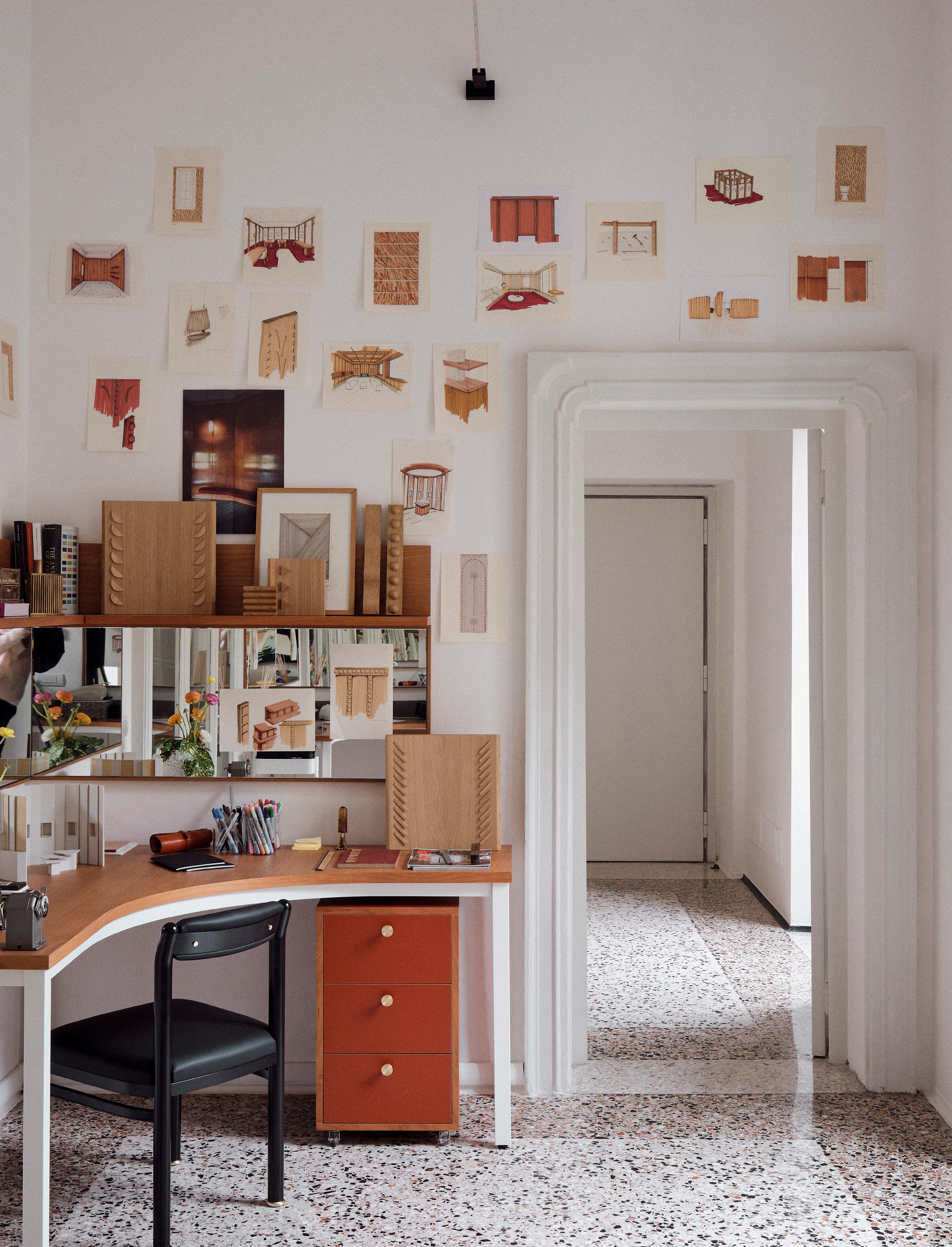
This page: The studio’s installation featured hand-drawn sketches of La Boiserie in situ, alongside conceptual details from the product’s development and the myriad samples on display. Opposite page: Above: Artworks from a private collection featured on the La Boiserie shelves, including a 19th-century religious icon with gold-leaf detailing and Carlos Aires’ De Natura Deorum (2013), a gold-leaf and digital print work focused on the eyes. Below: Developed in 35-centimetre boiserie modules, the system explores sculpted edges and marquetry techniques through an ongoing process of pattern testing and experimentation in timber. Centred on verticality, the tall timber system allows clients to transform walls to suit their needs.
PAOLA NAVONE
LOCATION
LA CASA SUL LAGO, COMO
PHOTOGRAPHY
ANDREA FERRARI
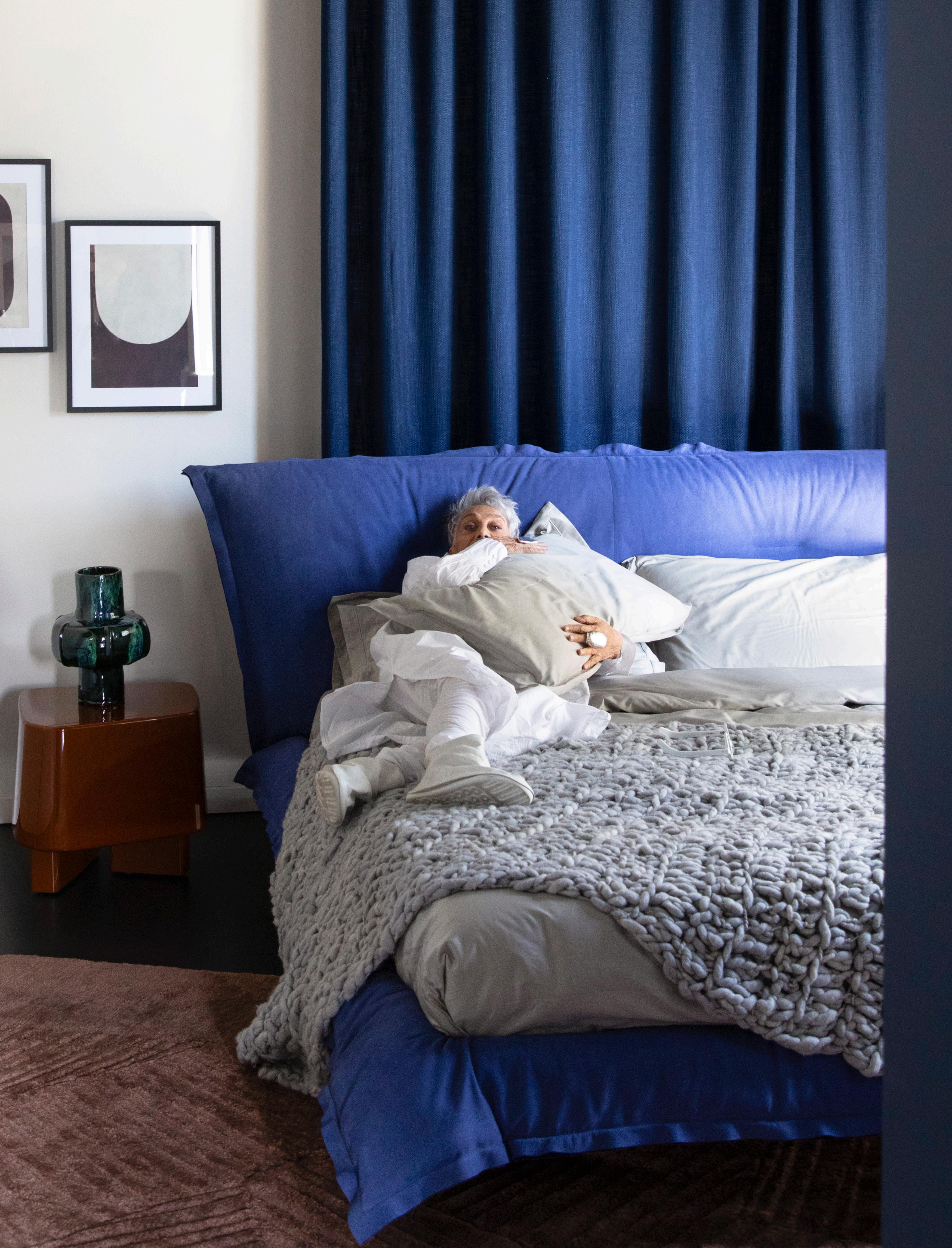
Pictured: Paola Navone on the Ginevra bed. The saturated blue leather with raw-edge stitching speaks to Navone’s palette, inspired by the sky, air and water.
Collaborating with Baxter to design leather furniture collections for more than two decades, Paola Navone has redefined the application and impact of leather in residential living spaces. Navone’s leather sofas, armchairs and beds prioritise comfort without compromising aesthetics, as exemplified by the two new collections she designed for Baxter: the Chicago fabric sofa and Ginevra bed, presented at the Baxter Cinema flagship during Milan Design Week.
Your relationship with Baxter goes back a few decades now. Can you explain how your collaboration commenced in the early days?
PN: I met Paolo and Luigi Bestetti from Baxter 24 years ago. Back then, I was not really a fan of having leather in a personal living environment, in your home. Leather, for me, was a material that belonged in an office or in a Ferrari. I was uncomfortable working with leather at the time. The idea of a leather sofa or armchair seemed strange to me. If I were going to use leather, it had to be as soft as the kind you would feel comfortable wearing on your body, in, say, a leather jacket.
I started to convince Paolo to work with softer materials. I began designing things that were soft, comfortable and cocoon-like. I wanted to go against that harsh, corporate-style furniture that was popular at the time.
After I designed my first collection with Baxter, we began an ongoing collaboration to create soft, comfortable furniture. We have developed a great relationship, and the design process flows easily, with us constantly going back and forth to refine elements such as softness, firmness, texture and colour.
How has your collaboration process with Baxter evolved over the years?
PN: Even after 24 years, designs from the first collections I created with Baxter are still selling very well, like the Chester Moon sofa, for example. Today, we continue this exploration of softness, comfort and simplicity, releasing at least one new collection every year.
This year, we have released two major collections: Chicago, a generous, rounded sofa that feels like a protective embrace, and Ginevra, a bed-and-sofa design with clean lines, raw-edge stitching and soft leather-covered padding. Both collections have been met with great enthusiasm by clients. Admittedly, when I’m designing, I don’t think about what type of bed or sofa will please our clients. I focus on creating an aesthetically refined design that ensures comfort while showcasing Baxter’s world-class expertise
in leather furniture production. When we achieve this balance, the pieces are usually very successful.
Besides sculptural silhouettes and refined aesthetics, what other formal elements influence your design process when working with Baxter?
PN: Definitely tactility. When you sit on these pieces, they have to make you feel comfortable immediately. They have to feel good against your skin and your body. In light of this, the structure and texture of the leather we work with are very important. When it comes to colour, I have my own feelings for certain palettes. Personally, I prefer elemental colours over earthy browns and clay tones. I prefer tones that reflect the sky, air, water, crisp grass and grey clouds. I design the shape of the sofa, armchair or bed, and I tell Baxter’s factory what I want to achieve. They are very skilled at bringing my original design to life. Then we work closely together to refine it. If it’s too soft, for example, we refine the design and create another version. One design could go back and forth 10 to 15 times during this refinement process. It’s a lot of work: dismounting, adjusting and creating another improved version.
How do you create a balance between aesthetic refinement and practicality in your pieces?
PN: To me, practicality means comfort. If I am designing pieces that you need to sit on and sleep in, comfort is the most important thing—more important than aesthetics. But comfort isn’t something you can really design. It’s something you can feel but not measure. It’s an intuitive process that we refine until we get it right.
Baxter and I run many trials and experiments to determine what goes into each piece to achieve maximum softness and comfort. When we do the initial trials, I jump all over the pieces like a dog. I want to make sure I can jump freely and that, no matter where I land on the piece, it’s comfortable. Of course, if I design a table, I think about texture and tactile elements, but for anything you sit or sleep on, comfort is more than 60 per cent of the equation.
Pictured inside Baxter’s La Casa sul Lago, Navone designed the Chicago modular sofa as a protective embrace, generous in its proportions and leather detailing. This year the brand also extended its focus from leather to fabric upholstery.
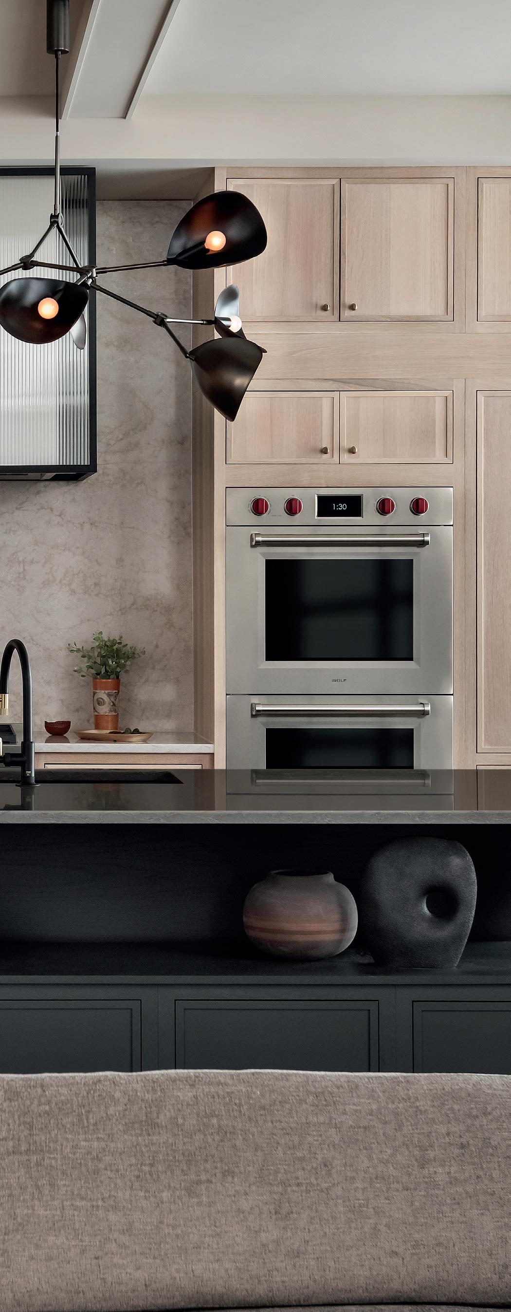
The Sub-Zero 91cm Designer Series column refrigerator and Wolf Professional M Series ovens anchor this Melbourne kitchen by Lucy Bock Design Studio—chosen for their generous capacity, iconic aesthetic and seamless integration into the architectural vision.
SILVER LINING
In Toorak House 2, Lucy Bock Design Studio works at the intersection of Art Deco restoration and contemporary integration. The kitchen forms part of this modern intervention, with bold forms, monolithic surfaces and resolved detailing set against the understated presence of integrated Sub-Zero Wolf appliances.
DESIGN WEEK 2026
For Milan Design Week and Salone del Mobile.Milano 2026, editor Sophie Lewis and head of creative Jack Seedsman spent day and night combing the city for what eclipsed the ordinary at the world’s most attended and talked-about design fair. Lewis puts their edit into words around this year’s foremost themes: process and craft; contemporary voices retelling the story of legacy Italian brands; private access to Milanese studios and homes; and theatrical exhibitions that invited interaction.
WORDS
SOPHIE LEWIS CURATION
JACK SEEDSMAN & SOPHIE LEWIS
1
FONDAZIONE OFFICINE SAFFI LAB x HANNES PEER
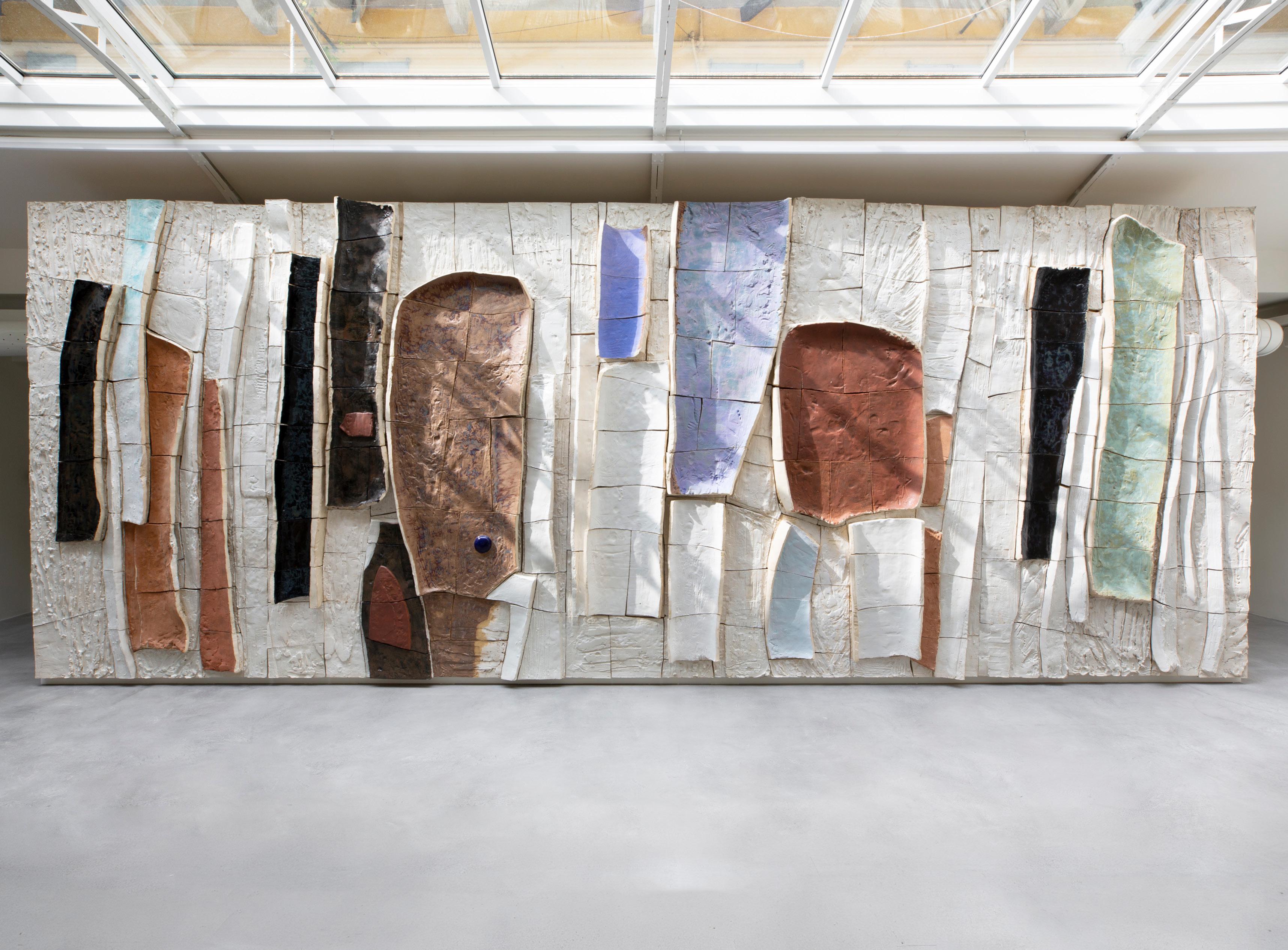
Milan-based architect Hannes Peer teamed up with Fondazione Officine Saffi Lab, dedicated to ceramic production and research, to create Terrain. Described as one of the most ambitious projects in the foundation’s history, Peer set out to expand the architectural possibilities of clay by designing a 40-square-metre ceramic high-relief made from 3.5 tonnes of the material. Looking to the 1960s
and 1970s, when ceramics were embraced not merely as decoration but as building material, he celebrated their sculptural potential through the overlapping, fractured elements that formed a tectonic landscape. A reenactment of the making process unfolded live at Salone Raritas, where ceramists from Fondazione Officine Saffi Lab constructed a version of the monumental wall in real time.
VIA GIOVANNI BATTISTA NICCOLINI, 35A, 20154 MILANO MI, ITALY
HERMÈS
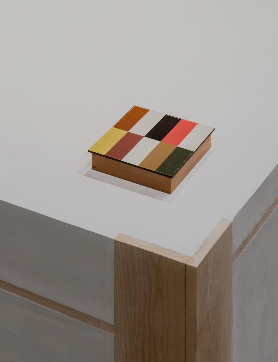
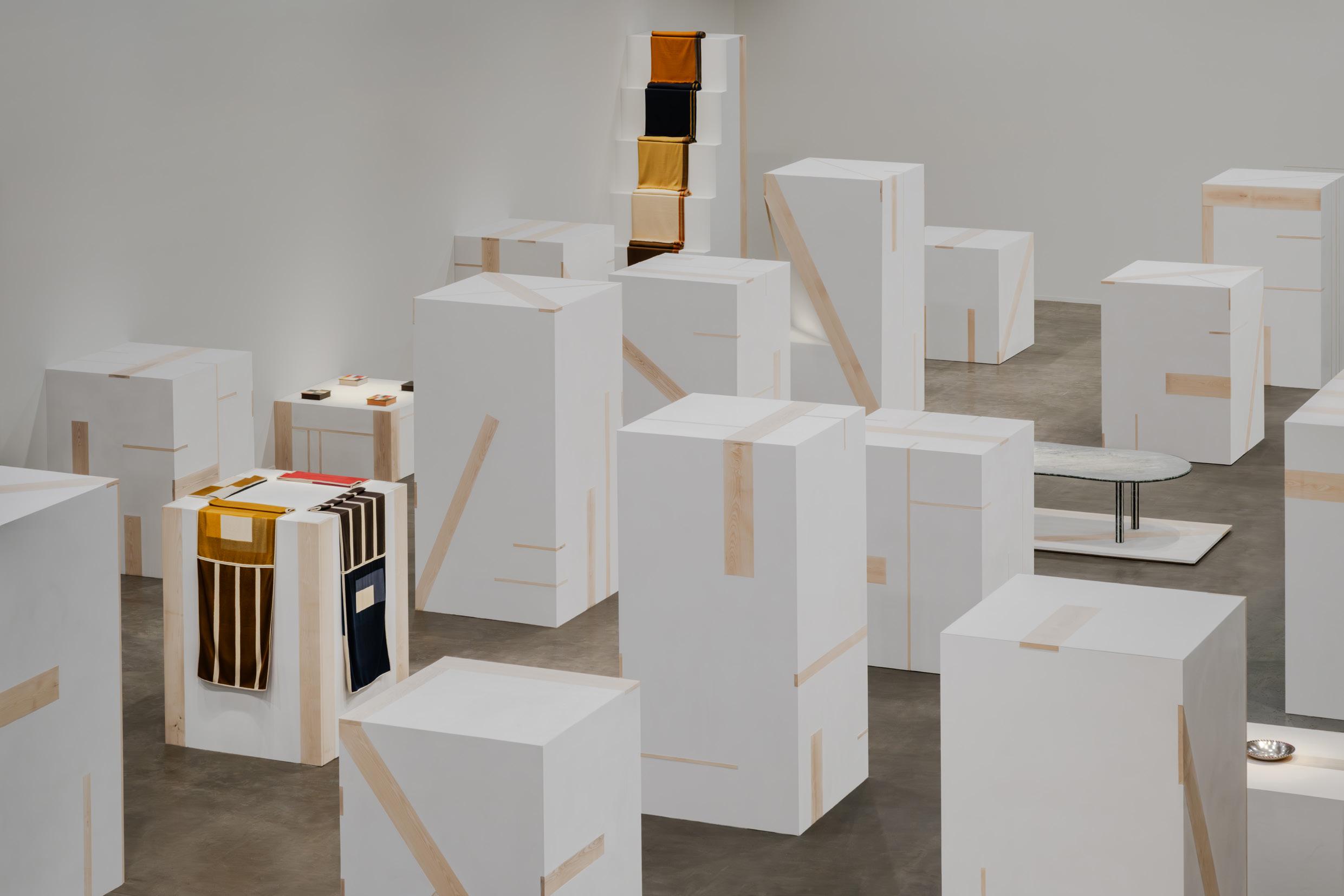
The Hermès Collections for the Home exhibition design was an exercise in essentialism within its La Pelota address in Brera. Led by Hermès home architect and artistic director Charlotte Macaux Perelman, alongside Alexis Fabry, the 15 pieces were arranged across 30 rectangular towers of beech timber and plaster on cement floors, each with handdrawn graphite labels. Called the City of Objects, the setting only made the spectrum of colours more jubilant and the traditional techniques in metal, marble and textiles more captivating. By reducing the number of pieces on display, each had the space to be fully appreciated as a singular entity, allowing visitors to meander freely and spend time—a rarefied Milan experience in and of itself.
VIA PALERMO, 10, 20121 MILANO MI, ITALY
Pictured: Among the 15 pieces on display in the City of Objects, the Piano box is a paean to coloured leather marquetry in Chamkila, Chagrin goatskin, Epsom calfskin, and mahogany, sycamore or cassia wood.
GIUSEPPE PORCELLI
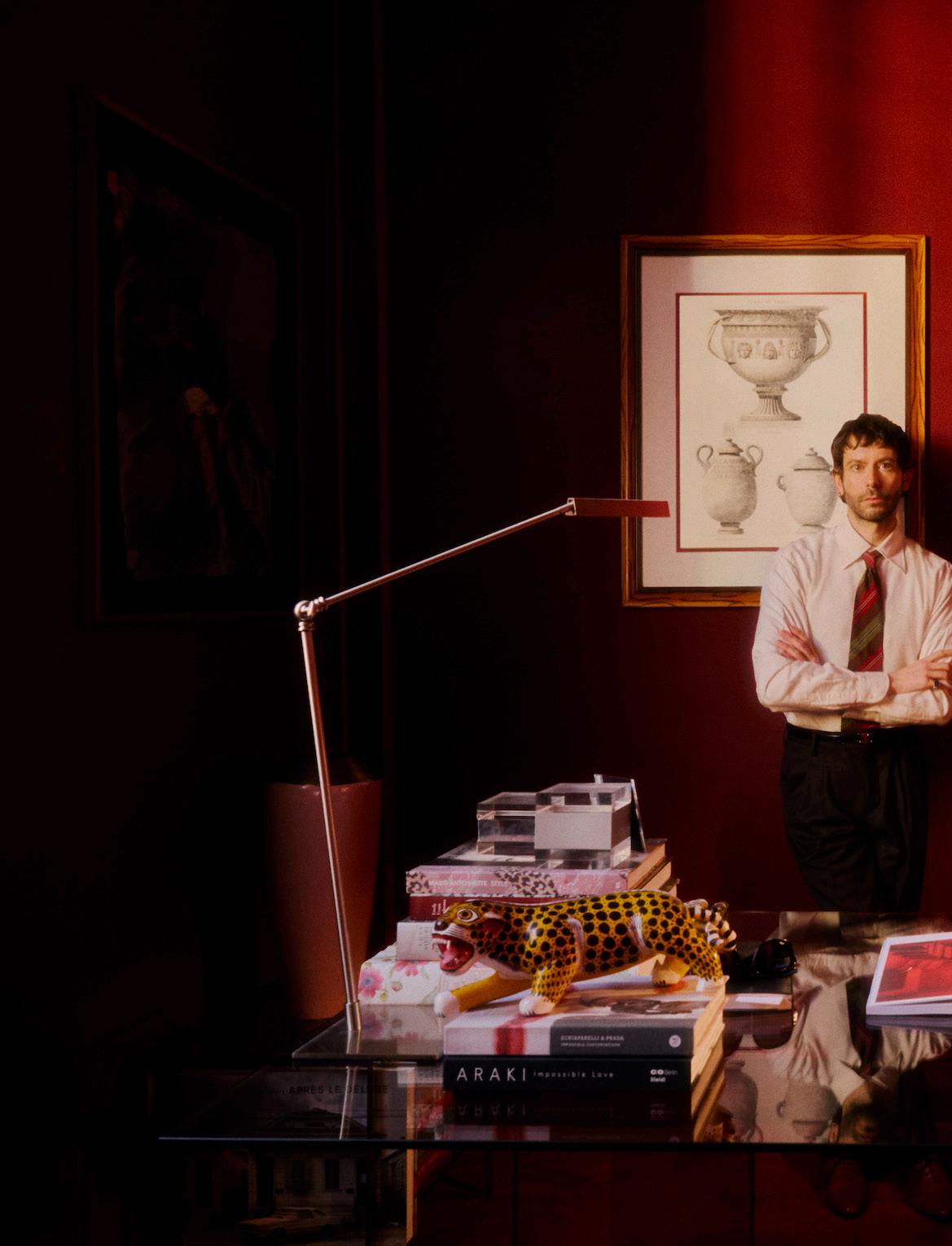
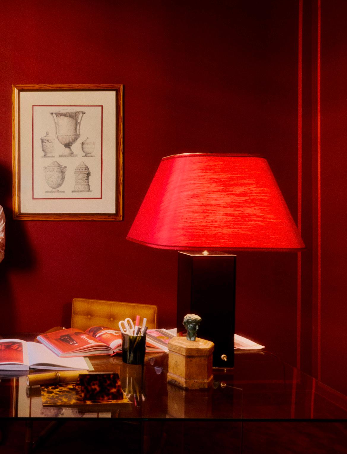
“Red is a colour without compromise,” Milan-based designer Giuseppe Porcelli says, dressed in a silk suit, shirt and tie in the same shade. Known for weaving historical references into maximalist, romantic interiors, Porcelli’s exhibition at his new studio space, Luci Rosse (Red Lights), referenced the redlight district and the colour’s long associations with seduction and love. With scent by Le Labo and a soundtrack to match, the show staged a red-drenched nocturnal environment built around Porcelli’s latest furniture collection, layered with La Maison Pierre Frey’s leopard-print and velvet, gold accents, and tassels.
VIA COMELICO, 320135 MILANO MI, ITALY
Photography Stefan Gifthaller
INTERNI VENOSTA
VIA BIGLI, 2120121 MILANO MI, ITALY
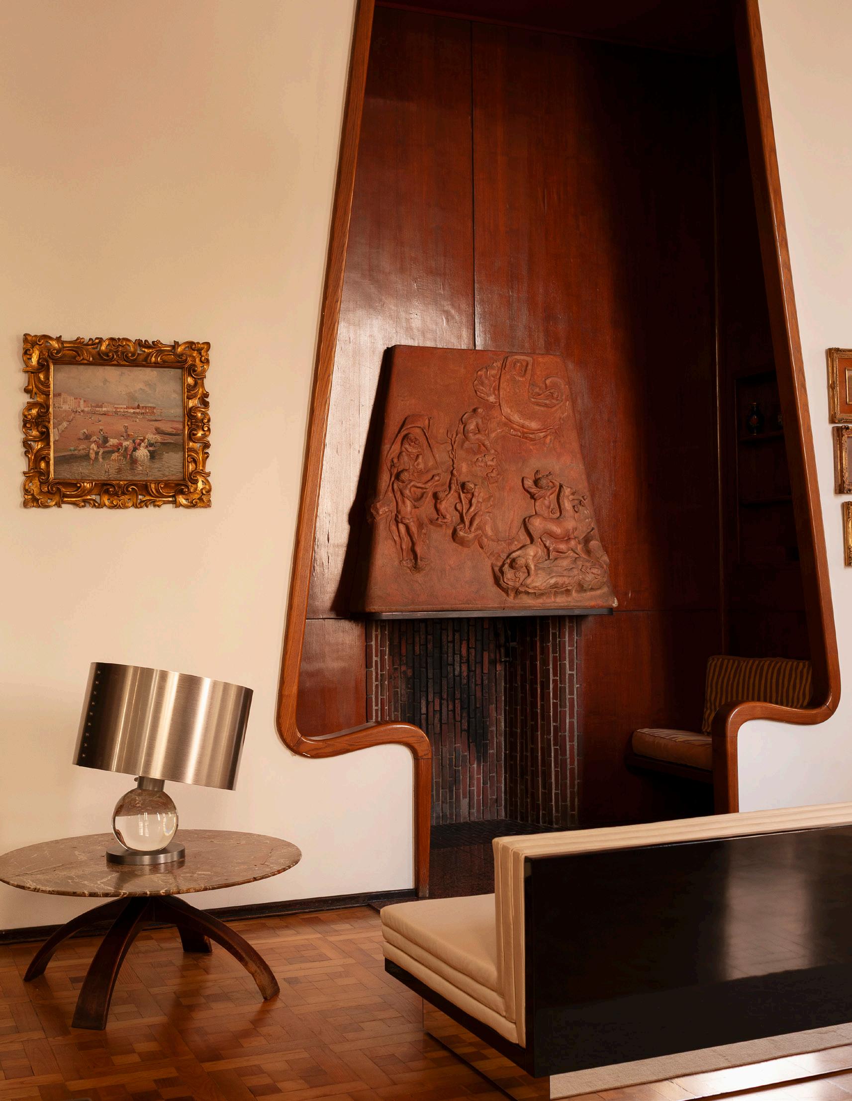
Dimorestudio’s Emiliano Salci and Britt Moran chose an apartment by one of the most enduring influences on their work—mid-20th-century Italian architect Osvaldo Borsani—for the latest iteration of their furniture concept, Interni Venosta. Borsani was just 25 when he designed the apartment, which had remained private until this year. The interior illustrated
how Borsani worked with artists to develop custom elements, such as the built-in seating by the fireplace and the terracotta bas-relief by Italian sculptor Ettore Calvelli. The placement of the new collection of objects, Interno Italiano (Italian Interior), wasn’t competing; it showed how the contemporary held its own in a gentle conversation with the architecture.
The Interni Venosta 23 Lampada Tavolo, with an aluminium lampshade balanced on a glass sphere and polished steel base, and the new 24 Divani sofa sit before the apartment’s most photographed feature.
Pictured:
Photography
This page: Andrea Ferrari
Opposite page: Matteo Verzini
YVES SALOMON EDITIONS
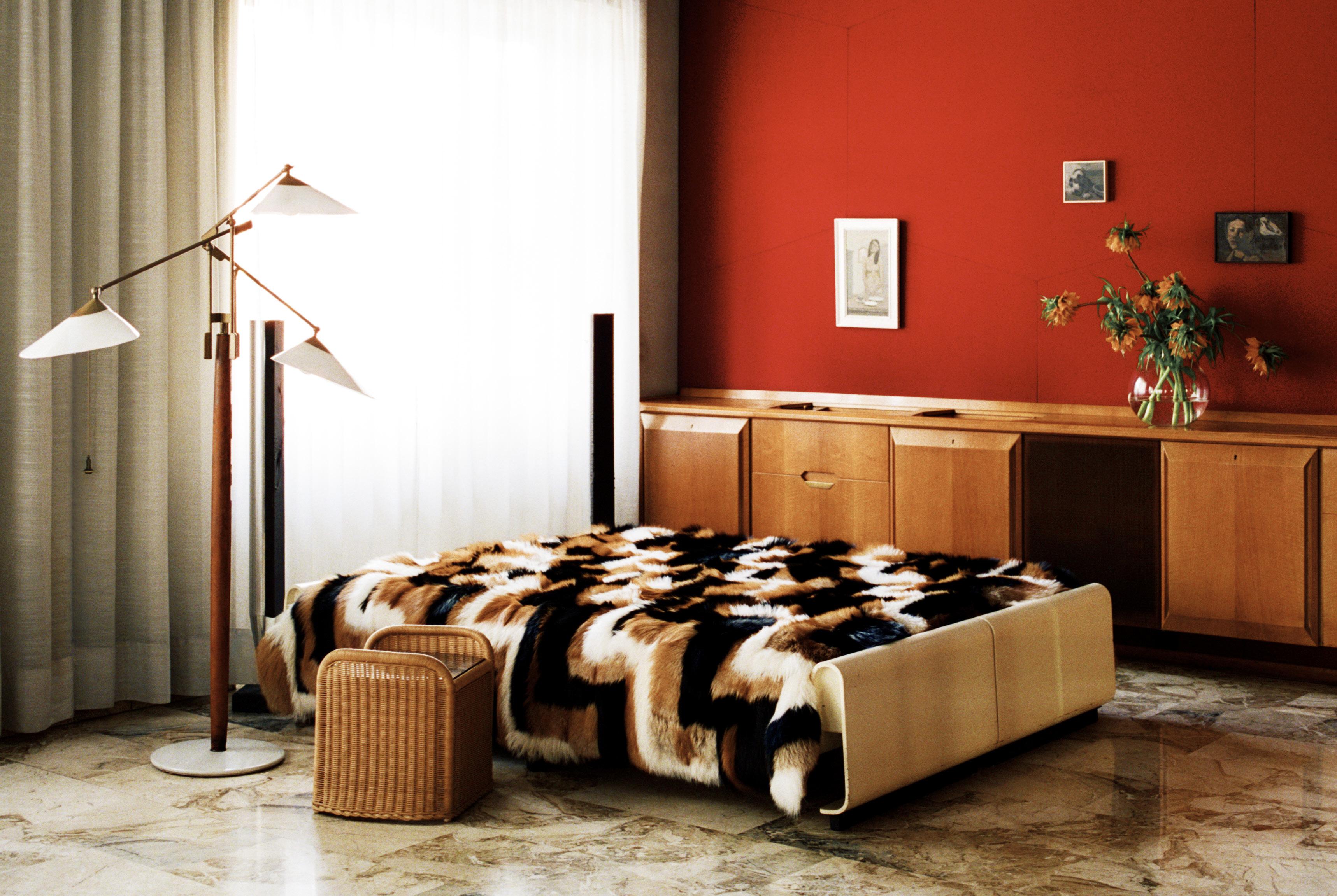
In an apartment designed by one of Gio Ponti’s students, Yves Salomon Editions and North American designer Michael Bargo choreographed an interior around recycled fur quilts and fur-covered vintage furniture by the American greats, including Frank Lloyd Wright and Paul T. Frankl. Titled Kentucky, Paris: An American Private Room, curated and designed by Bargo, the new collection was inspired by civil rights activist Jesse Jackson’s metaphor of America as a quilt, drawing on the country’s quilt traditions and harking back to the designer’s Kentucky roots. At the same time, the apartment incorporated French mid-century craftsmanship, which has become a cornerstone of Bargo’s work. Also used as wall hangings and bed coverings among flowers, books and paintings, the nostalgic-patterned quilts—and the installation itself—looked backwards, in order to look forward.
VIA PIETRO MASCAGNI 22, 20122 MILANO MI, ITALY
Pictured: Conjuring traditional American patterns, the bed is wrapped in a marmot-andfox fur throw, backed with camel cashmere.
x MICHAEL BARGO
AESOP x MARCH STUDIO
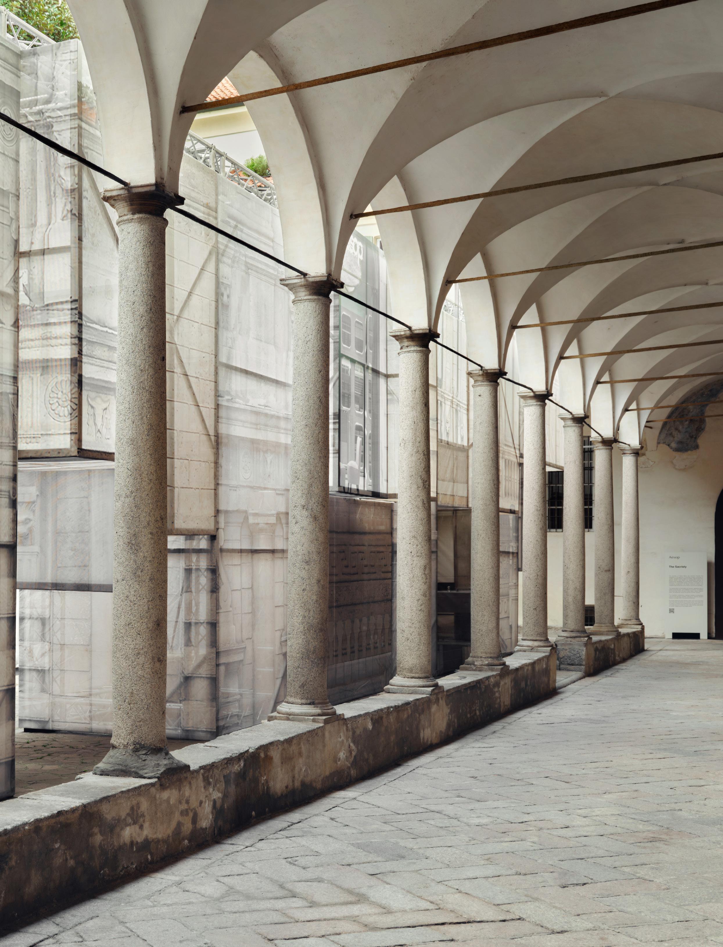
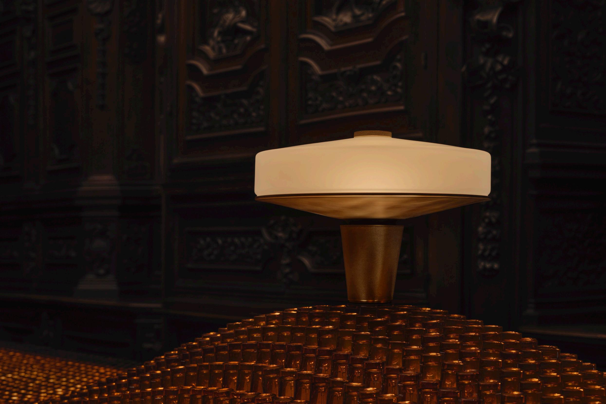
The Factory of Light was Melbournebased March Studio founder Rodney Eggleston’s 23rd collaboration with skincare brand Aesop; an alliance spanning 18 years and stores around the globe. Stationed within the cloister of Santa Maria del Carmine, The Factory of Light was a structure made from scaffolding draped in salvaged trompe l’œil tarpaulins, where the architecture itself and the embedded videos observed the work of human hands wielding light. Moving through to the sacristy of Santa Maria del Carmine, March Studio contemplated the monastic effect of artificial light through an undulating amber sea of 10,826 salvaged fragrance bottles, contouring around Aesop's first foray into lighting: the Aposē collection.
PIAZZA DEL CARMINE, 2, 20121 MILANO MI, ITALY
Photography
Ludovic Balay
Pictured: Made by hand, Aesop's first lighting collection, Aposē, features a brass plinth sandcast in a German family-run foundry, topped with a lightweight shell crafted in Scorzè, northern Italy, from a brass disc. Each iteration is finished with a ‘glass crown’, mouth-blown in Veneto.
CASSINA x LINDE FREYA TANGELDER
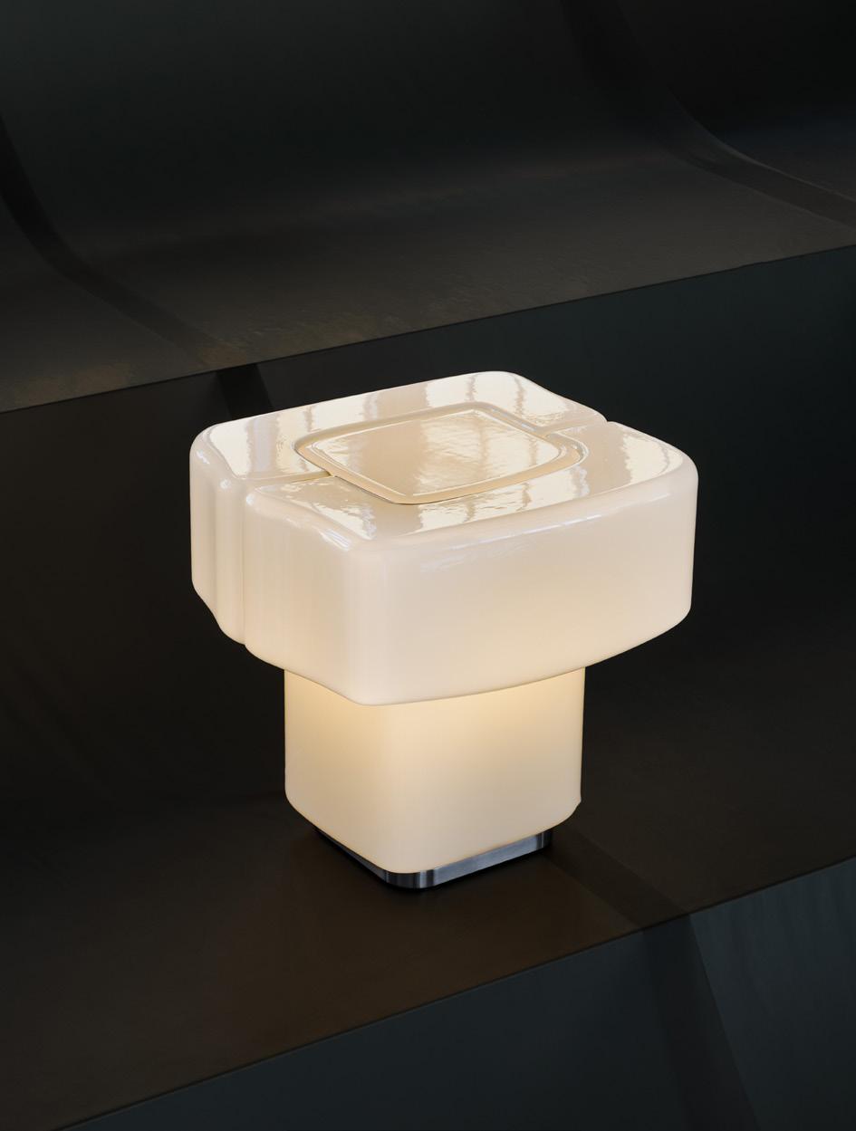
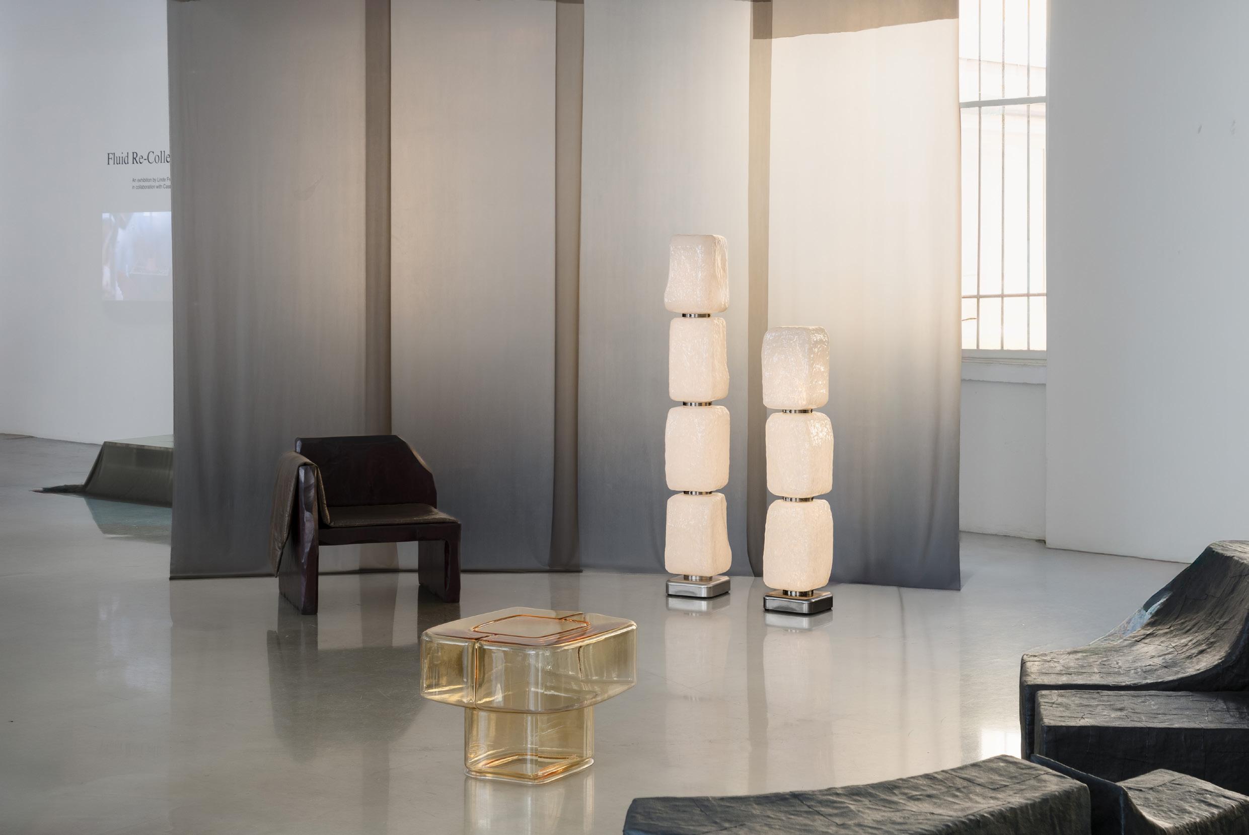
Based in Belgium, Dutch designer Linde Freya Tangelder is always looking for contrast; soft textiles against cold, hard aluminium, or in her latest collaboration presented at 10 Corso Como, between collectable and commercially produced furniture and lighting for Cassina. Titled Fluid Re-Collection, the exhibition reinforced
Tangelder’s process-driven approach, segmented by the same semitransparent foil that covers the walls of her workshop. Pieces were grouped by scale, craft and production techniques, from prototypes to existing collections in the Reworked and Remould series to the new Fluid Joinery light.
CORSO COMO, 10 20154 MILANO MI, ITALY
Pictured: Working with Cassina since 2022, Linde Freya Tangelder introduced the Fluid Joinery light (2026) as an evolution of the Fluid Joinery side table shown last year.
8 VINCENZO DE COTIIS
VIA PRIVATA FRATELLI GABBA, 1A, 20121 MILANO MI, ITALY
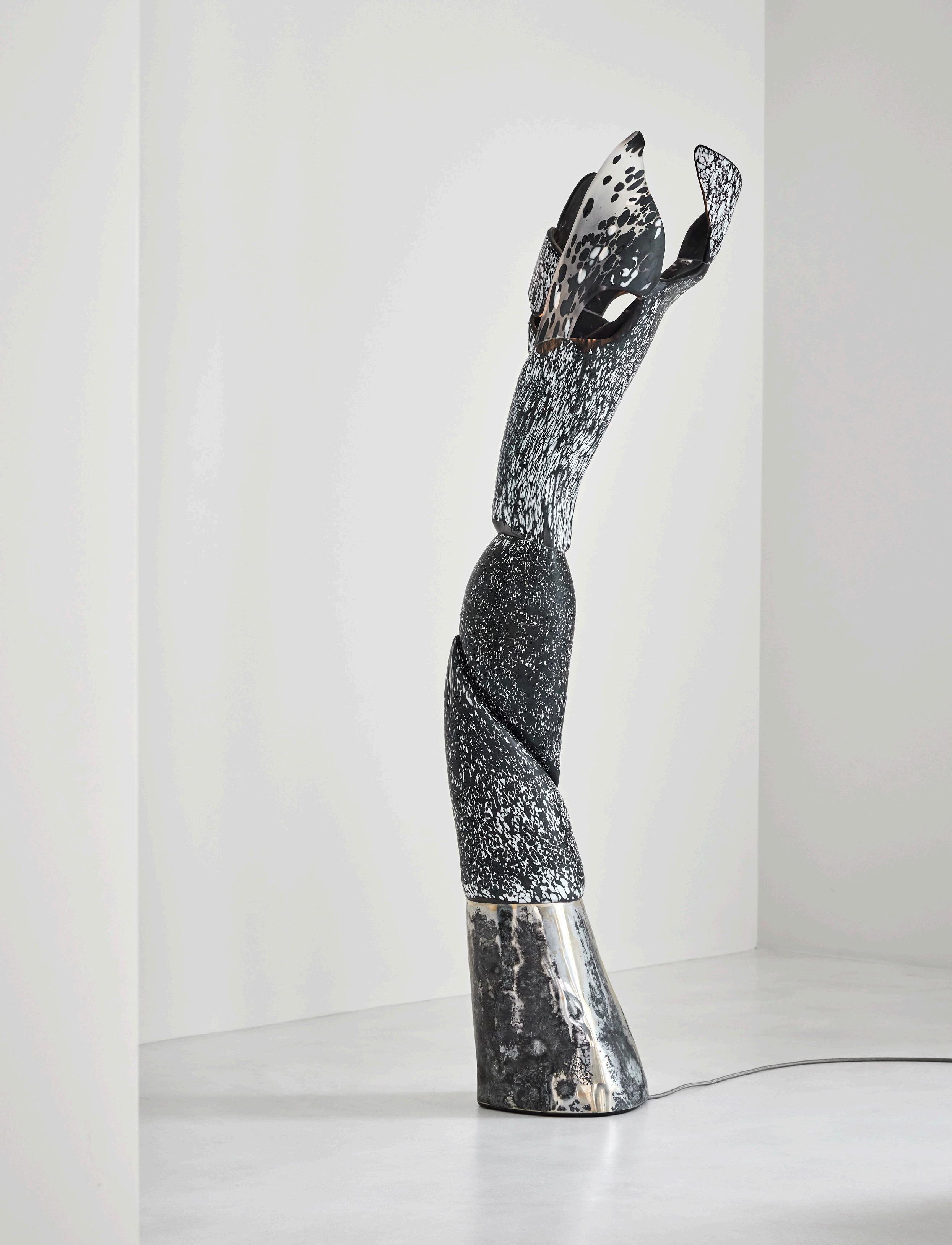
Milanese architect, artist, and interior designer Vincenzo De Cotiis unveiled JE SUIS LA MATIÈRE at his gallery during Design Week. The collection extended his material experimentation and engagement with the idea of the cosmos across collectable sculptures, furniture and lighting. Beginning with a fascination for meteorites, De Cotiis examined the stratification of stone before fusing it with Murano glass, stone and metal, which overlap and conceal one another within each form. Each black-and-white sculpture was conceived as “couleur invisible” to resist immediate recognition, extending the notion of a continuously evolving organism.
Photography
Opposite page: Eline Willaert
This page: Martin Morrell
Pictured: DC2612 by Vincenzo De Cotiis is a lighting sculpture manifesting De Cotiis’ fascination with how matter moves, expands and dissolves.
VISTERIA FOUNDATION x FEDERICA SALA & ANNA MAGA
Photography
This page: Adrien Dirand
Opposite page: Frank Stelitano
Towering over central Milan, Torre Velasca is one of the city’s most recognisable examples of post-war modernism. The 16th floor became the ideal context for the Polish craft and design institute, Visteria Foundation, to reflect on the country’s modernist design scene, in a program titled A Struggle for Beauty. Curated by Federica Sala and Anna Maga, with a site-specific installation by Zofia Wyganowska Studio, the exhibition expressed how Poland sought beauty in ornamentation rather than strict functionalism. Archival Polish modernist furniture and objects were presented as foundational, with reinterpretations by contemporary Polish designers, demonstrating how the legacy remains present in the country’s design consciousness today.
PIAZZA VELASCA, 3/5, 20122 MILANO MI, ITALY
Pictured: Archival Polish modernist furniture and objects included designs by Jan Kurzątkowski, Bohdan Lachert and Teresa Kruszewska, alongside reinterpretations by contemporary Polish designers, such as Tomek Rygalik, Maria Jeglińska-Adamczewska and Maja Ganszyniec.
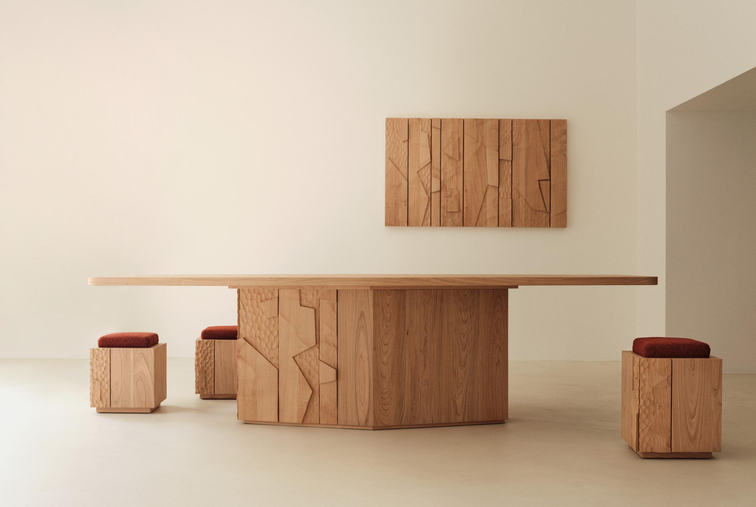
SEM x HANNES PEER
For HARDCORE, the lead installation at the Spotti Milano Porta Venezia showroom, Spotti Edizioni Milano (SEM) presented the CORE furniture collection with longtime collaborator Hannes Peer, foregrounding the beauty of solid timber. The collection considered timber in its most elemental form and how a decorative surface could further accentuate it. Made from solid mahogany, rosewood and cherry, Peer credited modernist designers Pierre Chapo, Leroy Setziol and Jean Touret as inspirations for the treatment of the eight pieces. The dining table’s base featured diamond-shaped, abstracted contours on one side, with the same patterning repeated on the wall hanging and stools, while a pedestal cabinet exaggerated this timberwork with its gouged, three-dimensional geometric forms.
VIALE PIAVE, 27, 20129 MILANO MI, ITALY
Pictured: The CORE collection combines digital designs with the handmade; a carpenter finishes each by hand with beeswax.
11
CASA MILANA x BENI
Above the sea of people on Brera’s Via Palermo, Italian furniture designer Mario Milana and Colombian-American creative Gabriella Campagna welcomed visitors into their 1920s limestone apartment. The couple behind Milanese studio Casa Milana interwove their latest brand collaborations for Beni and Laguna~B, with the studio’s own furniture design, pieces they live with and use day to day. The UNIONE
Photography
Maureen Martinez-Evans
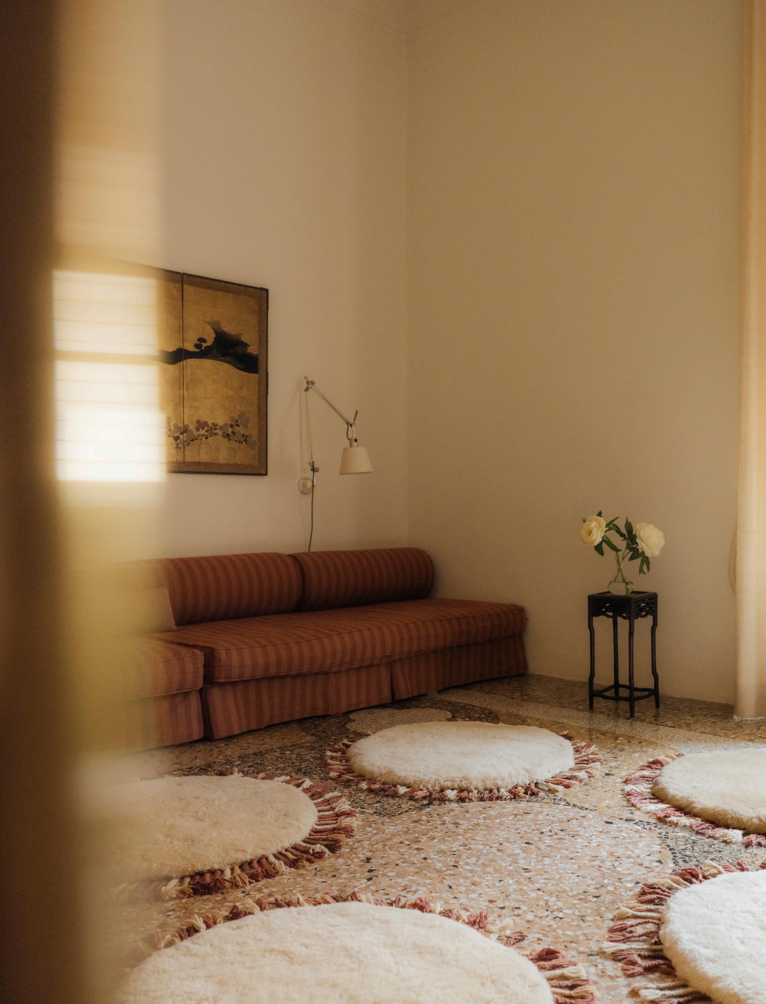
capsule collection of rugs for Beni drew inspiration from the apartment’s terrazzo floors, introducing a new tassel detail to the brand. Within this collection, the dulcet-toned Atlas High Pile rugs and Aho Meditation mats offered a window into Casa Milana’s philosophy: to propound ideas of grounding, slowing down, and gathering on the floor.
VIA PALERMO, 20121 MILANO MI, ITALY
Opposite page: Italian furniture designer Mario Milana and Colombian-American creative Gabriella Campagna in their Brera apartment. This page: The Aho Meditation mat—the first of its kind for Beni, designed in partnership with Casa Milana.
ARTEMEST x CHARLAP HYMAN & HERRERO
VIA GAETANO DONIZETTI,
20122 MILANO MI, ITALY
In its fourth edition, L’Appartamento by Artemest at Palazzo Donizetti asked five international studios to channel the cultural legacies of the Italian cities of Rome, Venice, Florence, Naples and Palermo. International design studio Charlap Hyman & Herrero took on Palermo in the Entertainment Salons, playing to the Southern city’s 19th-century aristocratic salons, in particular the Baroque Palazzo Valguarnera-Gangi.
The palace is known for its ballroom scenes in Luchino Visconti’s 1963 film Il Gattopardo (The Leopard), with the Jaipur Rugs leopard-print Ocelot Wool & Cotton Hand-Knotted rug by Peter d’Ascoli the most explicit reference. Walls were coated in soft mint green, and the scene was fully realised by the furniture, such as the Italian Art Nouveau-style beech chairs by Cugini Lanzani.
48,
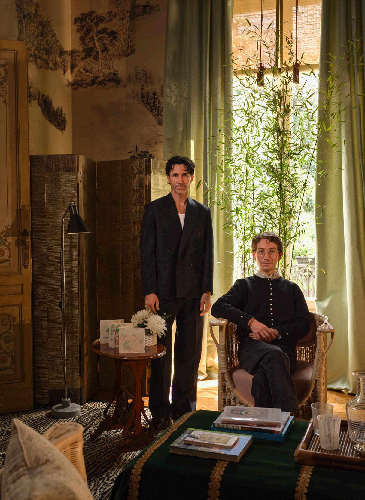
Pictured: The designers are featured with the Angelina rattan with wicker weave armchair by Mila Maurizi, the Ocelot rug by Peter d’Ascoli #1 for Jaipur Rugs, and a French Art Nouveaustyle oval inlaid side table by Émile Gallé for Cugini Lanzani. The space next to the designers featured the Exteta Stringa 1963 outdoor sofa by Gae Aulenti, Bronzetto Jacaranda table lamp and the Molto Collectibles side table.
NILUFAR DEPOT
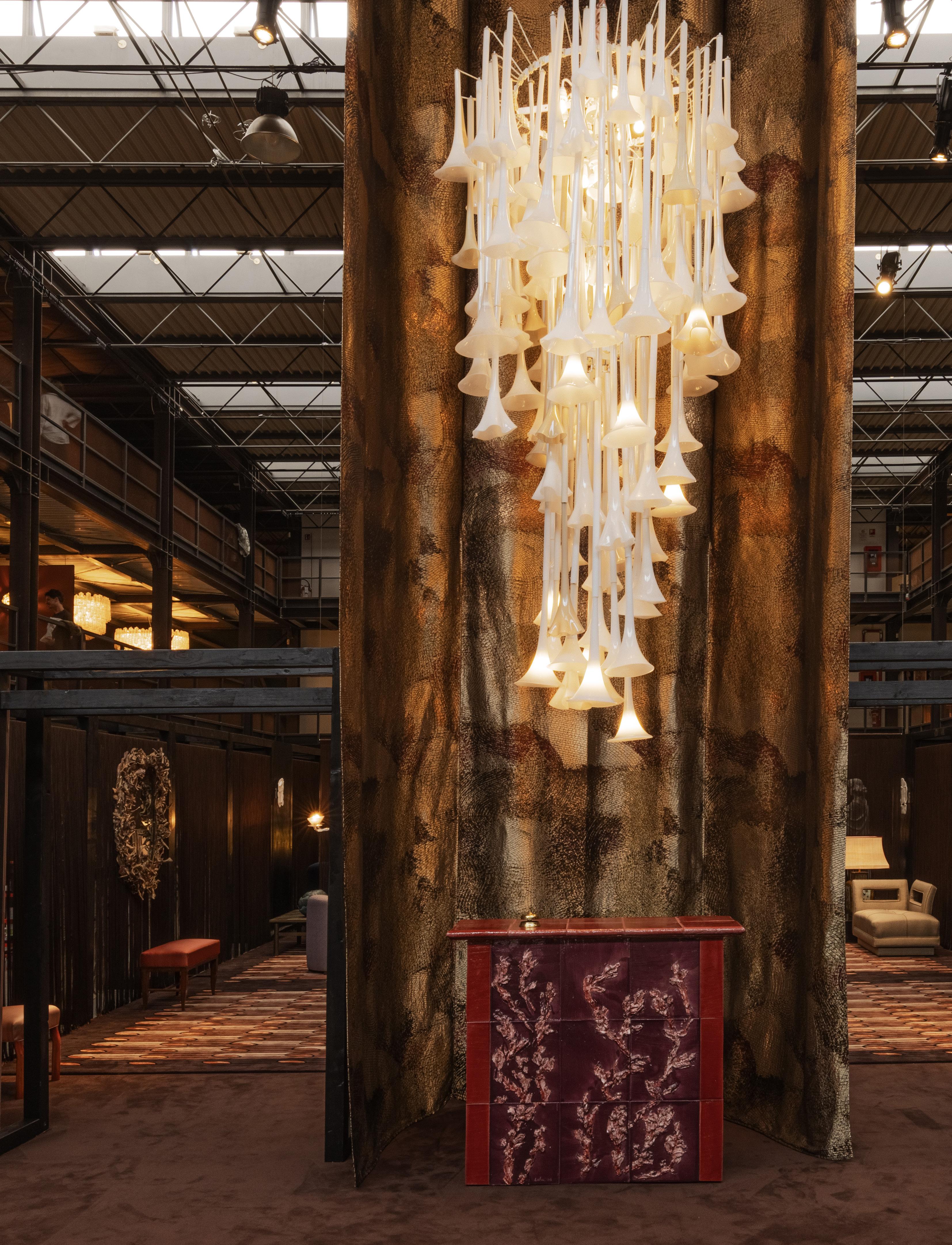
Founder Nina Yashar proved that collectable design can serve as the basis for a fictional hotel concept, The Nilufar Grand Hotel, within her three-tiered venue, Nilufar Depot. A duo in suits at a tiled concierge desk awaited visitors at reception under a transcendent Murano glass chandelier—immediately establishing guests as active participants in the hotel’s story. The main atrium, enclosed by tasselled walls, was designed as a social lobby space: a theatrical blush, plum and aubergine palette, interrupted by navy, smoked glass and ornate metallic lighting and accessories. Guests could peer down into the lobby from each level above, enhancing the themes of observation and interaction. The hotel concept was galvanised by the suites that surrounded the lobby, which included room concepts by david/nicolas, Filippo Carandini and Allegra Hicks.
VIALE PIAVE, 27, 20129 MILANO MI, ITALY
Photography
Opposite page: Manfredi Gioacchini
This page: Alejandro Ramírez Orozco
Photography
Courtesy of B&B Italia
B&B ITALIA x RONAN BOUROULLEC
The
or
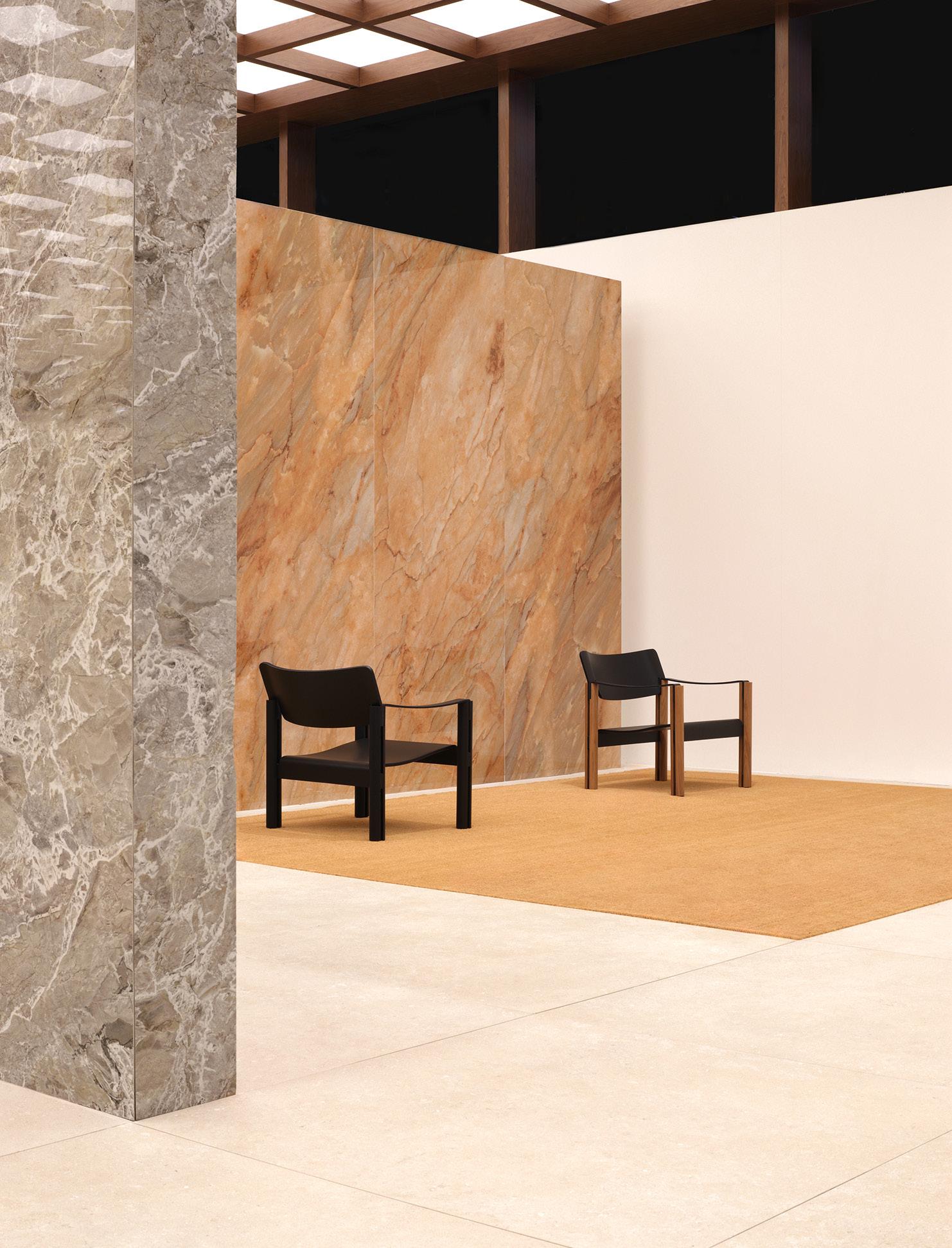
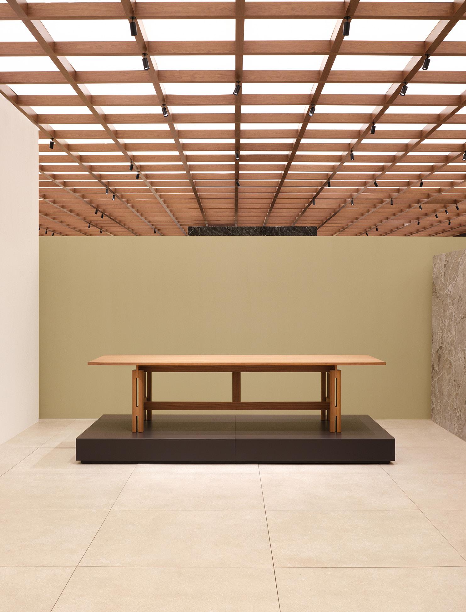
Returning to Salone del Mobile. Milano, after 25 years, could have been headline enough for B&B Italia. Instead, the brand used its return to Fiera Milano Rho to make an architectural statement on how products can be platformed with a suite of first-time collaborations. Designed by FormaFantasma, the booth marked a clarifying shift back to products and their designers as
the fundamental focus, without competing with or functioning as an overarching set. Navigated through marble partitions and coffered lighting, visitors' attention was drawn to standalone debuts such as Ronan Bouroullec’s timber Abaco table. Seen as an architectural system, like the stand itself, the table explored the beauty of precision in construction, with all joints visible.
FIERA MILANO RHO, HALL 9, STAND E03, E11, F02, F06, 20017 RHO MI, ITALY
Pictured: Abaco is the first collection Ronan Bouroullec designed for B&B Italia, who fixated on making the table’s construction—its parts, joints and overall connectivity—central to its identity.
crosspieces and legs are available in all-wood, lacquered
concrete versions. Opposite page: The Abaco armchair features a leather seat, backrest and armrests, connected by the same architectural timber legs.
MARGRAF x HANNES PEER
VIA CERNAIA, 1, 20121 MILANO MI, ITALY
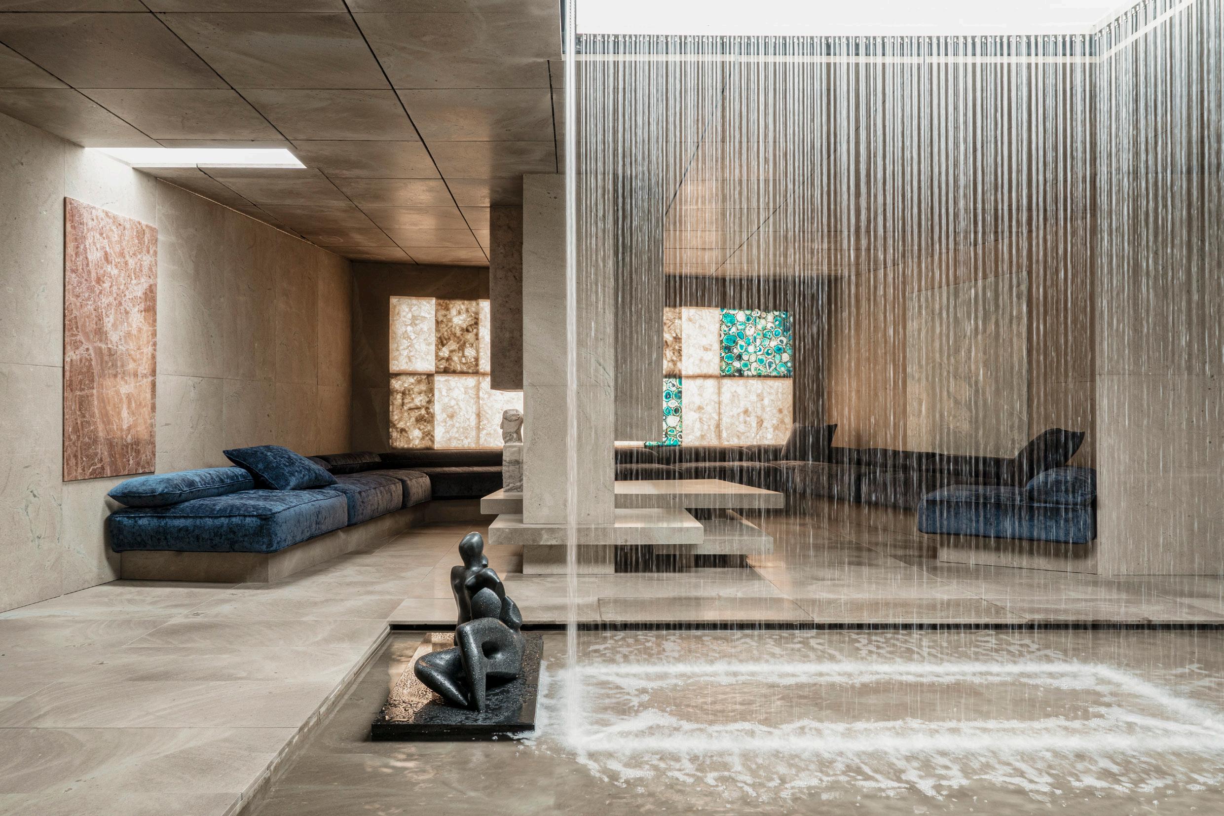
Expanding on Margraf's marble mastery and past collaborations, La Casa Di Marmo by architect Hannes Peer was a house made of marble. Taking visitors beneath the garden of a historic villa at Via Cernaia 1, the domestic space featured walls, floors and built-in furniture of onyx, agate and quartz to create a space for introspection. The sequence was inspired by Le Corbusier’s promenade architecturale as an experiential
journey and by Luis Barragán's treatment of the coloured-stone corridor. It culminated in a central patio where water cascaded into a shallow pool between marble sculptures that abstracted the human form, adjacent to the Nalesso bed and upholstered sofa; textiles were introduced as the only other material, reinforcing marble’s reductive continuity.
MOLTENI&C x VINCENT VAN DUYSEN
In his tenth year, Molteni&C creative director Vincent Van Duysen was behind the new Julian sofa, which occupied the first living space inside Palazzo Molteni beneath a gridded glass ceiling. The chocolate velvet sofa recalled deep seating from the 1970s, subscribing to Van Duysen’s idea that one should move around the sofa like a sculpture. It was shown in just one of
its flexible configurations, composed of chaise longues, daybeds, islands and armrest-coffee table modules. But the design was just as much about the subtleties: contrasting piping that accentuated the sofa’s contours, striped pattern on double-cushioning, gloss-lacquered armrests and an oversized leather-covered tray.
Photography
Opposite page: Courtesy of Margraf Spa
This page: Courtesy of Molteni&C
VIA ALESSANDRO MANZONI, 9, 20121 MILANO MI, ITALY
HAWORTH & CASSINA x PATRICIA URQUIOLA 17
VIA MOGADISCIO, 2/4, 20146 MILANO MI, ITALY
Photography
Within the late 1930s private residence Villa Pestarini, Alcova’s second venue brought visitors into a home never before accessed by the public and the only home designed by architect Franco Albini. Walking into the entrance and living space, you’d be forgiven for thinking the installation by Patricia Urquiola for Haworth & Cassina hadn’t been there all along. That’s because the Veliero bookshelf, Infinito bookshelf, Cicognino side
table, Luisa chair and Tre Pezzi armchair, all designed by Franco Albini, were re-edited by Cassina to belong in the space. Titled Albini in Present Tense, the installation explored interconnectivity and transparency, as visitors moved around the Mokoro rugs that decoded the adjacent glass-block system, and other original pieces that completed the open-plan space.
Piergiorgio Sorgetti
Pictured: Original furniture by Albini was set out in the living space, including the Canapo chaise longue, the three-legged Cicognino side table, a transparent glass Radio in Cristallo, and the Tre Pezzi armchair, reissued by Cassina, under the stairs.
DOOOR x OBJECTS OF COMMON INTEREST
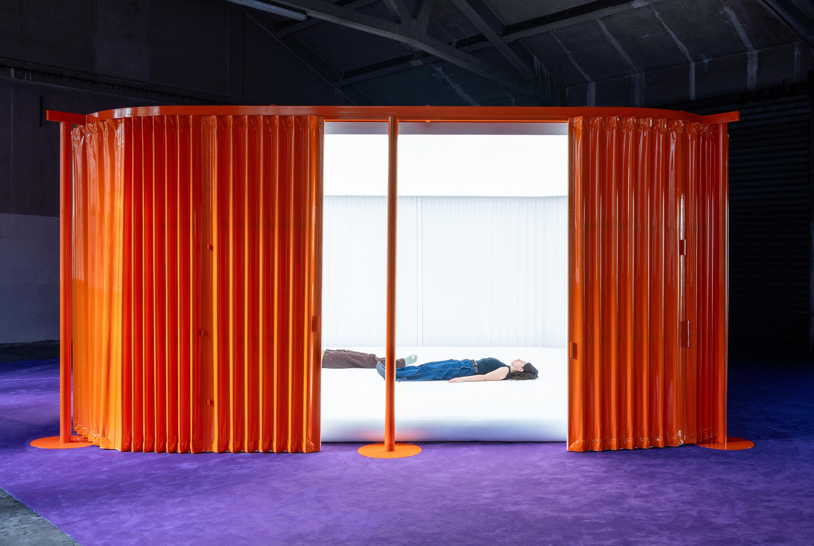
Based in Greece and New York City, the multidisciplinary practice Objects of Common Interest presented Threshold at Alcova Baggio Military Hospital. Working with the Italian brand Dooor, which produces custom-made textile doors, the installation used door dividers to devise the “most minimal act of architecture”. In one of the site’s industrial hangars, the structure’s electric-orange partitions suggested boundaries without enacting them, around an all-white interior illuminated by Studio Atomic lighting. Promoting openness and flexibility across various project types, Threshold proposed that architecture should be soft and malleable, rather than a solid separation.
Photography
This page: Piercarlo Quecchia
Opposite page: Courtesy of Alcova
VIA GIOVANNI LABUS 10, 20147 MILANO MI, ITALY
VIA GIOVANNI LABUS 10, 20147 MILANO MI, ITALY
SPREAD TOKYO 19
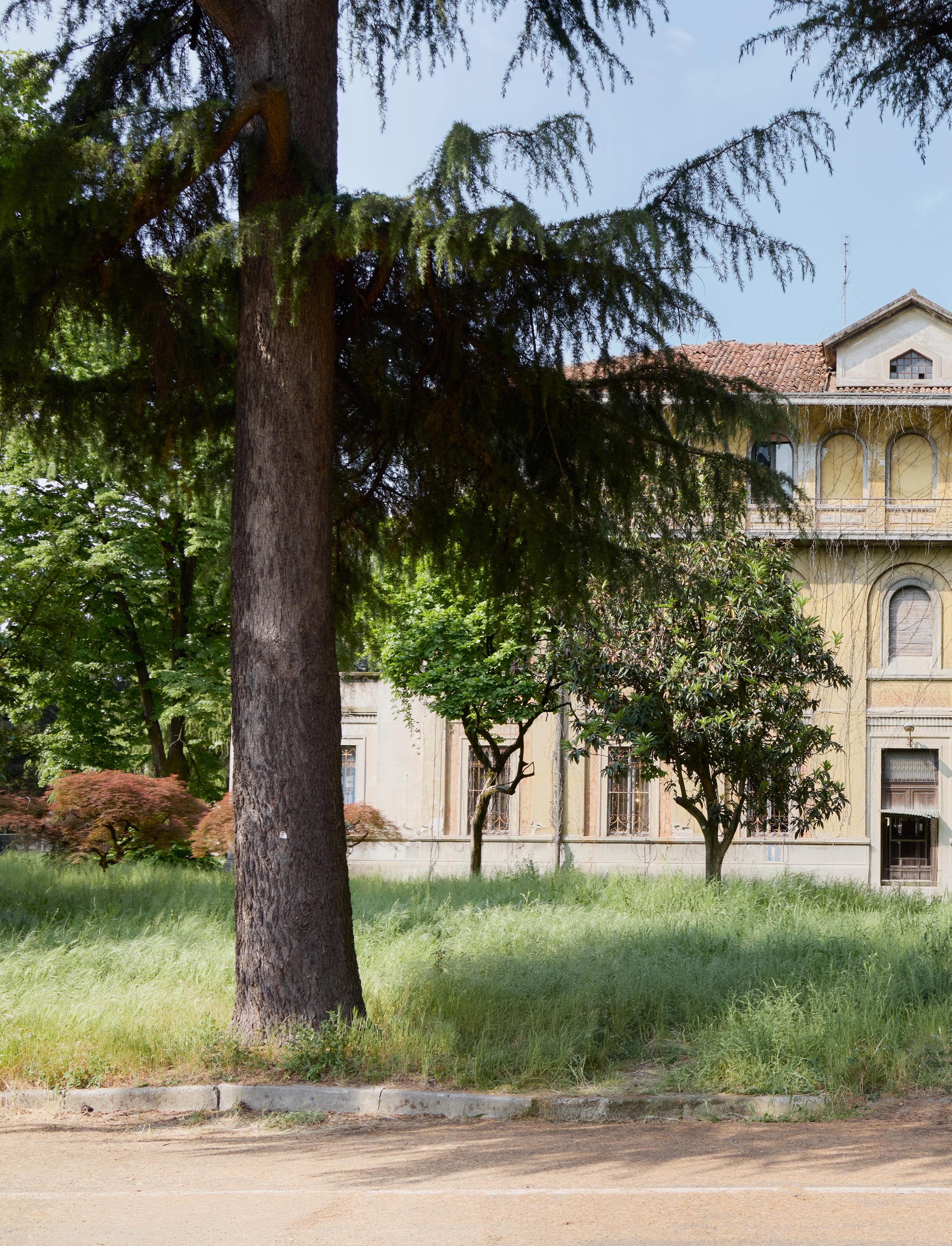
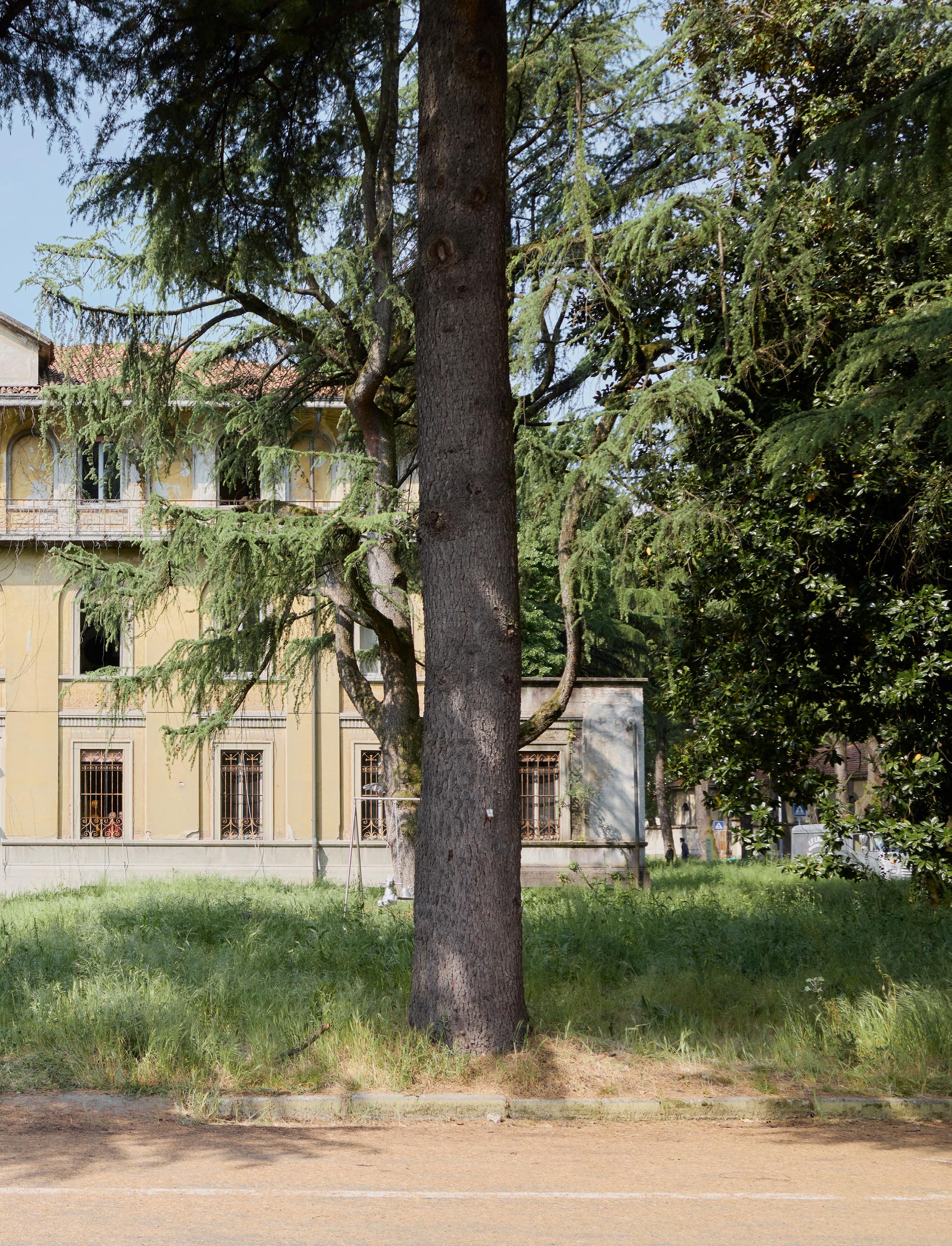
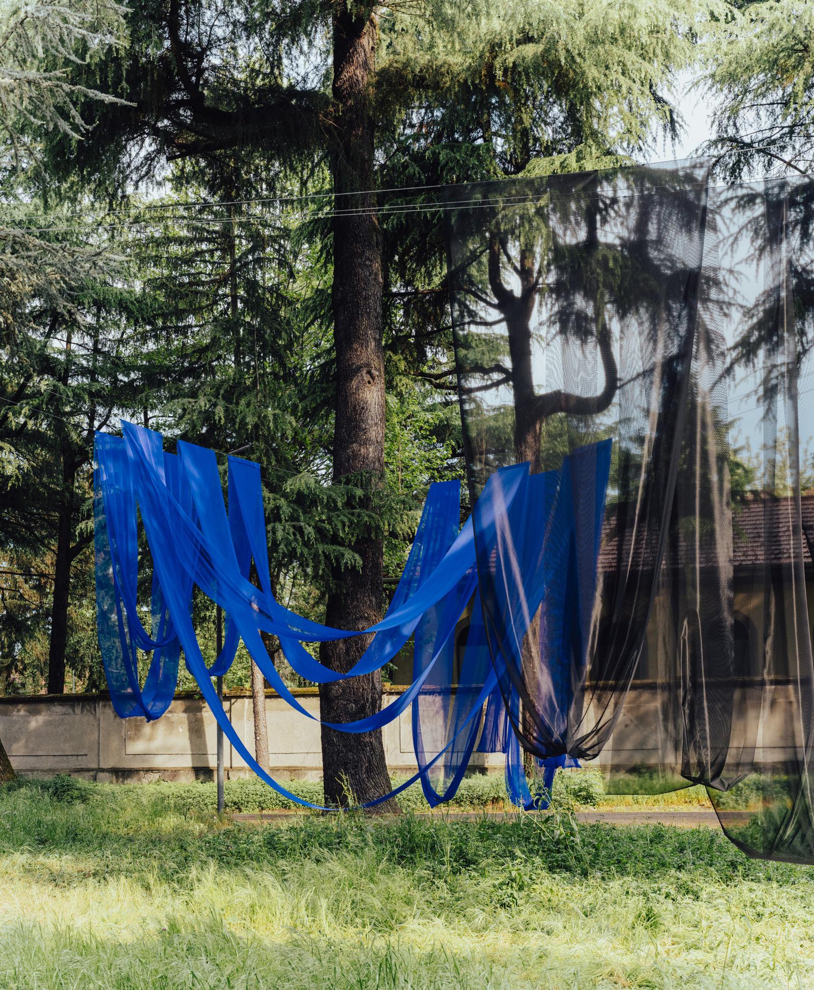
The vine-covered buildings and unkempt grounds of the Baggio Military Hospital were the whimsical mise-en-scène for the Alcova venue, which SPREAD Tokyo capitalised on with their outdoor installation, Coloured Boundaries. Founded by Hirokazu Kobayashi and Haruna Yamada, who combine a background in landscape and graphic design, the studio’s installation was designed to
elicit joy in uncertain times. Beneath the tree canopy, wind-filled fabric billowed at scale across metal wire, in symphonic red and blue, as well as black. In the overgrown grass under these fabric formations, the studio also presented its new Boundary stool and table, designed to reflect both the colour and the surrounding greenery and encourage visitors to engage with the sprawling outdoor spaces.
BAGUETTE STUDIO
This
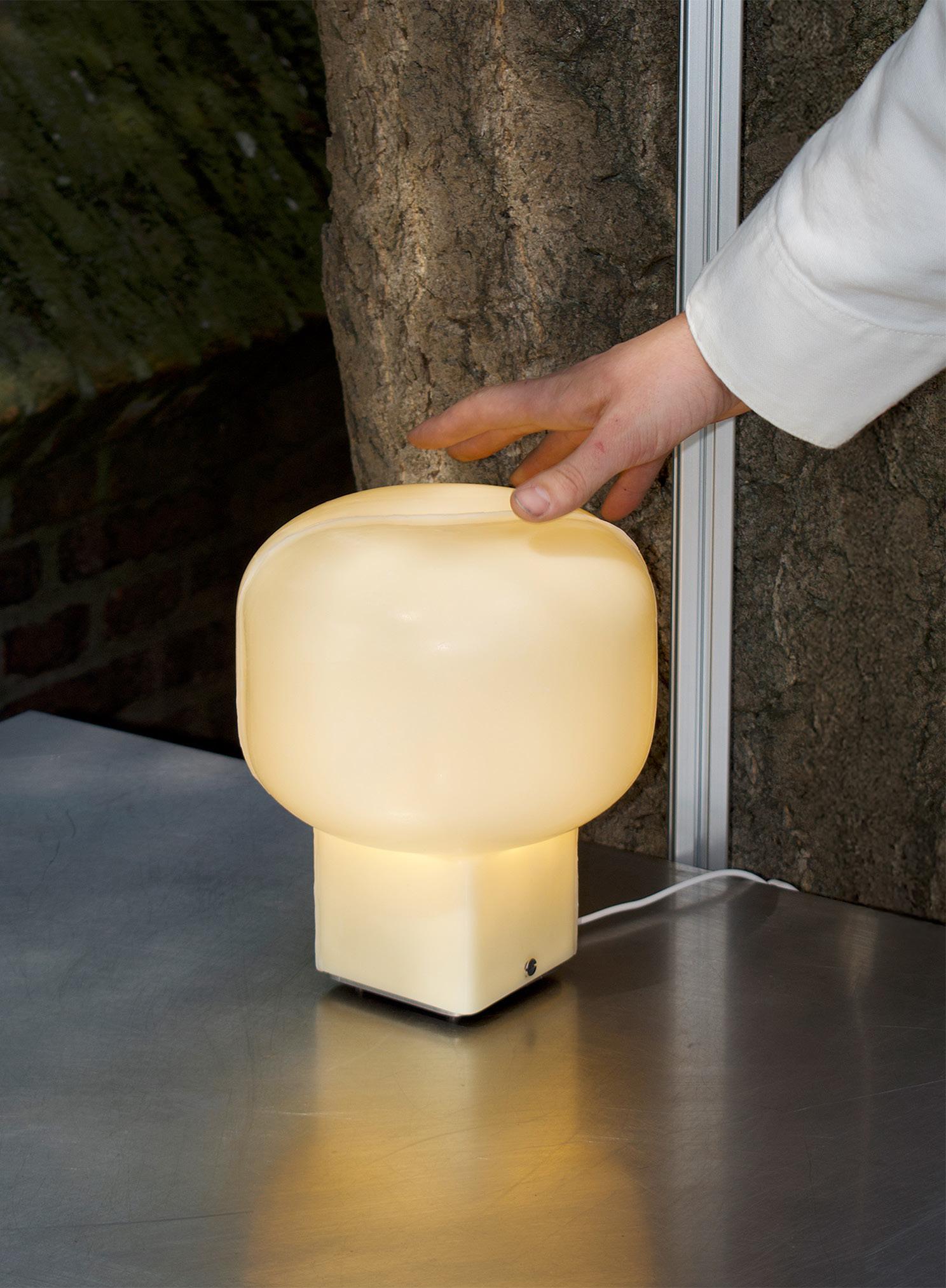
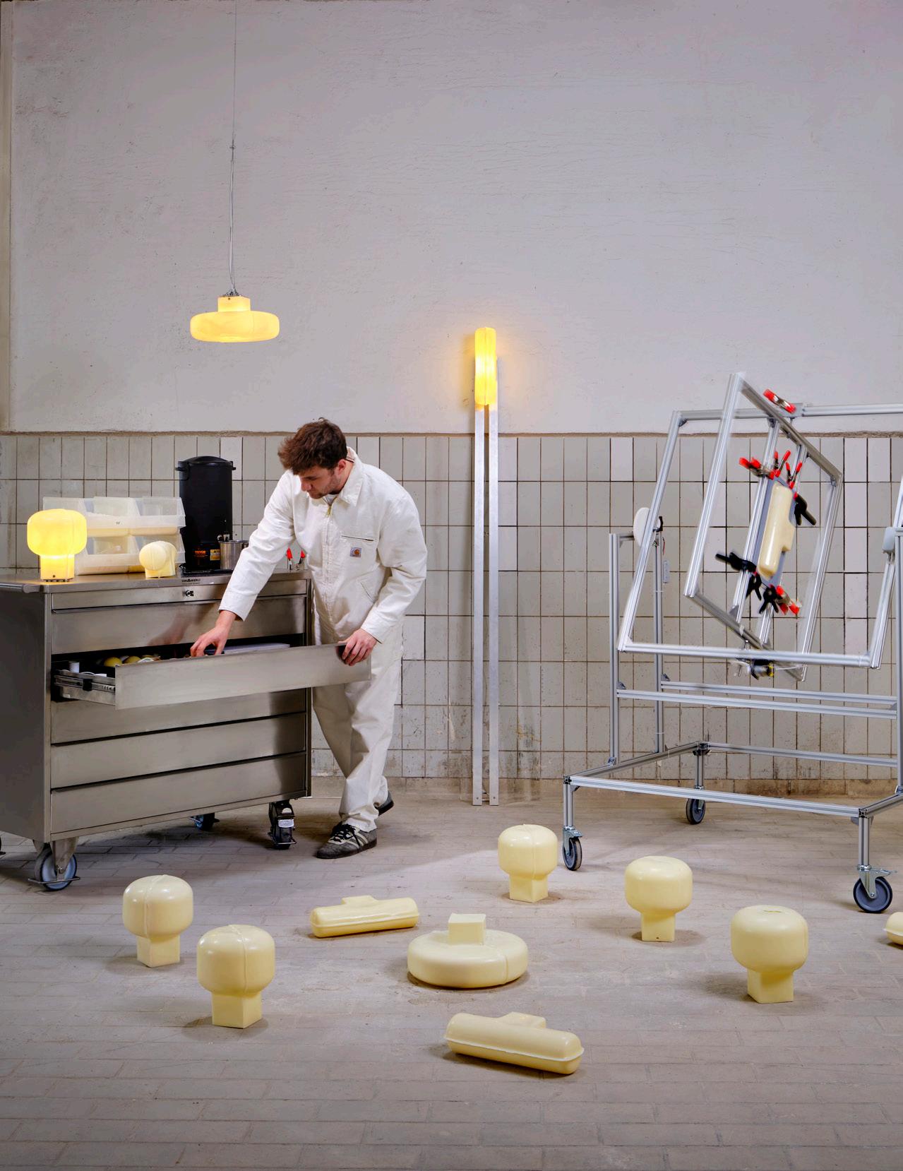
Design Academy Eindhoven took over an entire building within Milan’s weathered 1930s army complex, Baggio Military Hospital, as part of the group exhibition Alcova. The alumni design projects were grouped under Inframezzo, an interactive exhibition that urged a recalibration of consumption. Occupying the ‘Cucina’, Baguette Studio’s workstation
showcased the LABO 1.0 collection, handmade with natural wax on a stainless-steel base, using the industrial rotomoulding technique typically used for plastic. The effect was twofold: transparency around a process that is typically unseen, and a study of how a material such as wax—capable of being remelted without waste—is infinitely transformable.
VIA GIOVANNI LABUS 10, 20147 MILANO MI, ITALY
Pictured: The Le Labo 1.0 collection includes two table lamps, a pendant lamp and a wall lamp with a stainless-steel base and shade from 400 or 800 grams of wax.
Photography
Opposite page: Samuel van Heijningen
page: Ronald Smits & Samuel van Heijningen
21
MUUTO
VIA SOLFERINO, 1120121 MILANO MI, ITALY
Windows ajar, golden afternoon light, chess pieces scattered across the table, half-full glasses and antipasti on the tiled benchtop—stepping into The Art of Belonging inside the Muuto apartment felt as if someone had just stepped out. The six sanguine-toned rooms within the Scandinavian brand’s dedicated Brera space explored how design supports inherently
human, everyday life, with everything conducive to ease and familiarity. The setting ranged from the puffed Coltre modular sofa by Milan-based design duo Studiopepe—its name meaning 'blanket' in Italian and due for release in September 2026—to opportunities for connection, as seen through Maria Bruun’s irregular Re-Norm dining table.
This page: The Fornasetti Palladiana e Arlecchini bar cabinet, Capitello Corinzio and Capitello Jonico chairs, and the Bassorilievo magazine rack.
Photography
Ludovic Balay
FORNASETTI x TUTTO BENE
Fornasetti artistic director Barnaba Fornasetti, son of Piero Fornasetti, approached Milan and London-based Tutto Bene to reconceptualise the three-level Porta Venezia flagship. The sequence of rooms became increasingly intimate as you moved upwards, from gallery to artist’s residence, starting with a concierge desk and a temporary floral residency by Australian creative Simone Gooch, Fornasetti Fiori by Fjura on the ground floor. The first floor was The Living Archive, using museum-like cabinets to display the ceramics and decorative objects. Above, The Apartment’s four domestic rooms included a Stanza Architettura (Architecture Room) with hand-painted walls, floor, and ceiling emulating trompe l’oeil marble, displaying the brand’s new Palladiana e Arlecchini bar cabinet.
VIA SENATO, 220121 MILANO MI, ITALY
23
ROOMS STUDIO
VIA S. SENATORE, 1020122 MILANO MI, ITALY
Georgian multidisciplinary practice
Rooms Studio was the guest design studio for the group show Convey Building, in a five-storey, late-1950s Milanese building. It was here that founders Nata Janberidze and Keti Toloraia conceived Untitled Transformation, in partnership with Ark Journal and Nordic Knots, featuring photography by Adrianna Glaviano from the studio’s recent Tbilisi interiors project. Positing processes
of change through masking, layering and exposing, the studio’s new blackand-red Chess Figures were laid out on the floor and on the long central metal Peeled Back console, around which the whole space revolved. Above, the DIY ceiling lamp was cast in aluminium and draped with a faux-leather textile— the idea of a ‘skin’ clothing metal connecting the Shelves Under Cover and Second Skin chairs.
Pictured: Adrianna Glaviano’s photography showed glimpses of Rooms Studio’s recent Tbilisi interiors project among their furniture and object designs. The Shelves Under Cover by Rooms Studio are made from brushed aluminium covered in a faux-leather textile.
DIMOREGALLERY
VIA S. VITTORE AL TEATRO, 1/3, 20123 MILANO MI, ITALY
Dimorestudio founders Emiliano Salci and Britt Moran aligned the opening of Dimoregallery in a former bank with Design Week—a new building set among the city’s cultural icons, including Piazza degli Affari. Across two floors, the interiors follow the Dimorestudio cadence of curation: vintage and 20th-century art interspersed with the studio’s furniture, fabric and decorative collections under Dimoremilano and
Interni Venosta. Seeking out historic Italian design and reinterpreting it with a contemporary sensibility took on many meanings—from the stone remains of the Teatro Romano, to Italian artists presented in collaboration with Cardi Gallery. The encounter concluded with a safety-deposit vault of ‘silence and steel’ featuring works by Gio Ponti and furnishings by Interni Venosta.
Pictured: A Dimoremilano
Pierre screen, SCRIVANIA RAZIONALISTA table, Interni Venosta lamp and a Gio Ponti prototype table lamp.
Photography
Opposite page: Adrianna Glaviano
This page: Andrea Ferrari
Pictured: The Poliform Shore sofa by Jean-Marie Massaud is encircled by ebony aluminium poles, resembling an ‘urban forest’. The sofa has a wave-like, handwoven rope frame evoking maritime materials, with solid teak feet, and a removable fabric cover.
Photography
Courtesy of Poliform
POLIFORM x STUDIOUTTE
VIA CLERICI, 5, 20121 MILANO MI, ITALY
Palazzo Clerici was home to Poliform’s new collections during Design Week, formerly a Baroque palace redesigned by the Clerici family in the 18th century. Visitors were first led through a hidden garden for the Multitude installation, where lanterns and smoke activated the new outdoor furniture by Jean-Marie Massaud and Emmanuel Gallina. Set among glossy black poles and elevated on individual platforms, the scene was crafted by the masters of mood, Italian multidisciplinary practice, studioutte. Inside, with its frescoed Galleria Grande by Giovanni Battista Tiepolo, New York Studio Yabu Pushelberg debuted the Lanai bed system, whose modular components morph into a sofa on one side and the Aqualuna armchair in black velvet.
making places elegant
QUIET KITCHEN
Interior designer Carole Whiting's own South Melbourne kitchen is a lesson in restraint and a benchmark in what a fully integrated suite of V-ZUG appliances can do for a space when design intent leads the way.
When Melbourne-based interior designer Carole Whiting renovated her own South Melbourne home, every decision was held to the same standard. “It's not just about how a house looks,” she says, “it's about how it feels.” The kitchen that emerged reflects that philosophy; marble benchtops, a checkerboard tile floor, a timber island and a palette of warm neutrals that carries through from the cooking zone to the living area beyond. The appliances, including a full suite of V-ZUG refrigeration and cooking, become the hidden stars.
In the modern kitchen, cooling has shifted from utility to atmosphere, a background presence that plays a defining role in how a space is composed and inhabited. V-ZUG's Supreme Line is built around the notion that refrigeration is not just an appliance, but an extension of design intent.
In Whiting's kitchen, the V6000 90 Supreme sits flush within floorto-ceiling cabinetry, its door panel matched precisely to the surrounding joinery. Grounded in Swiss design thinking, the Supreme Line prioritises
IN PARTNERSHIP WITH V-ZUG
INTERIOR DESIGN STUDIO WHITING
PHOTOGRAPHY
FIONA STOREY WORDS MEGAN RAWSON
clarity, proportion and seamless integration over visual gesture; cooling systems that recede into the architecture rather than interrupt it, allowing materials, light and spatial rhythm to take precedence.
The same restraint carries through the rest of the kitchen. The CombiCookTop V4000 I804 with Integrated Ventilation System disappears into the marble benchtop, its black glass surface reading as part of the stone rather than a separate element. The Combair V4000 60P is tucked into the pantry, and the fully integrated AdoraDish V6000 continues the seamless joinery line uninterrupted. “I like honest, authentic materials,” Whiting says, which is a quality that extends across every V-ZUG specification within the overarching design.
Performance is embedded rather than displayed, in temperature stability, quiet operation and a longevity that suits kitchens designed to last. Together, the appliances behind Whiting’s kitchen articulate a version of the modern kitchen where technology is absorbed into form, and Swiss precision becomes a quiet framework for living.
Carole Whiting’s South Melbourne kitchen, features a fully integrated suite of V-ZUG appliances including the CombiCooler V6000 Supreme—its stainless steel, aluminium and glass elements a nod to Swiss-designed materiality, disappearing seamlessly into the neutral palette of the cabinetry.
INTERVIEW
KAREN MCCARTNEY
Elisa Ossino is a rare creative force. Rooted in art direction and set design, her distinctive aesthetic extends across interiors and product. With a rigorous eye and expansive ambition, she has built Elisa Ossino Studio into a practice working with the world's most significant design brands, moving fluidly between cinematic concepts and nuanced environments.
PHOTOGRAPHY
COURTESY OF ELISA OSSINO STUDIO, DE PADOVA, VALENTINA SOMMARIVA, ALBERTO STRADA, GIORGIO POSSENTI
"Be the Project" was the overarching theme of Fuorisalone 2026. Does this framework align with your thinking?
EO: "Be the Project" suggests a design that moves beyond the notion of a static, fixed space—I find it deeply aligned with my own way of working. I'm interested in conceiving the project as an immersive, mental condition capable of altering perception, and creating new forms of relationship among space, body and attention.
This year saw 14 iterations of your work spanning exhibitions, product design and installations. What are the underlying threads?
EO: Even though the projects take different forms and scales, there is always a continuity of thought. Whether it is an object, an interior or an installation, I am interested in constructing perceptual conditions: spaces capable of slowing the gaze, activating attention and generating an emotional relationship with those who move through them. I often work through subtraction, seeking a tension between rigour and a more sensitive dimension. Light, rhythm, abstraction and materiality are recurring elements. Rather than separate disciplines, I see them as different expressions of the same language.
The Responsive Nature installation for Molteni&C felt like a tour de force; immersion, scenography, an unfolding spatial journey. How did the concept develop?
EO: Responsive Nature emerged from the idea of a nature capable of interacting with architecture, like a living organism. I was interested in constructing a symbiotic condition between design and the vegetal element, in which the boundary between designed space and spontaneous growth became progressively ambiguous. The project unfolds as a journey through different landscapes, each with its own botanical, atmospheric and perceptual identity. Through screens, reflections, and variations in density, the space encourages visitors to slow down and establish a more attentive relationship with their surroundings. The inspiration also comes from archaic representations of gardens, from images of an ancestral and almost mythological nature. The dialogue with the gardeners led me to discover rare and unexpected plant varieties, which became part of the project's sensitive landscape.
At V-ZUG's Table Rituals, the product recedes, and human experience takes centre stage. Is collaboration integral to your creative success?
EO: The most meaningful collaborations always emerge from a shared vision. With V-ZUG, there is a deep affinity in our understanding of domestic space: not as a purely functional container, but as a place capable of generating attention, presence, and the quality of time. In Table Ritu-
als, I wanted to bring attention back to everyday gestures that are often overlooked, restoring to them a renewed perceptual intensity. The table becomes a space of resonance, where preparing, sharing, and being together take on a more conscious dimension. Technology remains present, but it operates discreetly, almost like a silent background presence.
Your work focuses on "building atmospheres", yet what makes them succeed can be elusive. When do you know an installation has achieved the emotional engagement it needs?
EO: I work through abstraction, constructing structures based on rhythm, proportion and light, where material and void define a condition of suspension. I am interested in creating atmospheres that do not impose themselves immediately, but act slowly upon our sensibility—where perception grows sharper, and our relationship with what surrounds us becomes more intense. Rather than producing a spectacular effect, I seek to generate a form of deep attention, almost a suspension of time.
Last year, you were named Archiproducts Designer of the Year. Installations are dismantled while products endure—does your approach shift between them?
EO: My approach remains essentially the same: I am always interested in working on perception and on the relationship between light, materiality, proportion and presence. Installations allow me to experiment with a more immersive and temporary dimension. In objects, this research develops along a dual path: on one side, I simplify the form, bringing it to an almost primordial essence; on the other, I amplify certain elements to achieve strong expressiveness. I am interested in designing objects that are extremely simple yet sculptural, capable of acquiring an almost installation-like presence within space. Space and object are always deeply interconnected, in a continuous process of mutual amplification.
You have new product releases with long-term collaborators De Padova and Amini. How do these pieces balance each brand's identity with your own?
EO: Every collaboration emerges from a balance between different identities. I am interested in entering deeply into a brand's language—its design culture, codes and sensibility—while never renouncing my own research. With De Padova and Amini, a dialogue has developed over time, grounded in a strong affinity of vision. The new products fit within each brand's language while maintaining recurring elements of my work: a focus on proportion, the relationship between rigour and sensitivity, attention to materiality and a tension towards abstraction. I want each object to possess a clear and recognisable presence, without ever becoming self-referential.
Previous page: Portrait of Elisa Ossino courtesy of V-ZUG at the launch of their showing, Table Rituals, where, as Ossino says, “Technology steps back and makes room for humans, for movements and rituals.” She is seated on the Acamante sofa: a minimal execution with an extensive range of compositional possibilities, designed for La Cividina (2025). This page: Responsive Nature, Molteni&C’s Milan Design Week installation for 2026, was conceived by Elisa Ossino Studio as an unfolding journey through different landscapes, each with its own botanical identity. Gio Ponti's iconic chair D.154.2, designed in 1954, is now available in an outdoor version.
This page: The Pantalica range of outdoor furniture (named after a Sicilian UNESCO heritage site) is Ossino’s debut collection for Molteni&C.
This page: The Lantia lamp released this year for De Padova features a softly structured elemental form that, as is often the case with Ossino’s design, is modular and can be calibrated in many ways.
Opposite left: the Ritagli rug for Amini.
Opposite right: an arched detail from the Cristina Rubinetterie showroom in Milan.
The Dieffebi showroom draws on Japanese principles—Honshitsuteki, Ma, Kanso, Wabi-Sabi. Did you enjoy translating these philosophies into spatial form?
EO: I immediately felt a strong affinity with these principles—many of them naturally belong to my own way of thinking about space. I have always been fascinated by Japanese culture: its capacity for abstraction, its understanding of emptiness as an active element, and its idea of discreet, non-ostentatious beauty. Rather than translating these concepts literally, I was interested in constructing a spatial condition capable of evoking that same sensibility—working with rhythm, subtraction, light and materiality, seeking a measured balance between presence and absence. The dialogue between this ancient culture, so attentive to essence, and Western culture, often more focused on a formal idea of space, is extremely interesting to me. Unexpected and contemporary design interpretations can emerge precisely from that tension.
Art and craft are enduring sources of inspiration. What else fuels your creative impulse?
EO: Art and craftsmanship represent two complementary dimensions of design: on one side, abstract thought and conceptual research; on the other, the relationship with material,
gesture and the time of making. I also find art interesting because it reflects the historical moment we are living through—observing it means deciphering tensions, fragilities and needs within contemporary society. For a designer, this is fundamental: design should always try to interpret the present and, in some way, improve quality of life.
I am drawn to how artists, musicians and filmmakers transform an intuition into a language capable of altering perception. At the same time, I continue to find inspiration in the most everyday details: light, landscapes, domestic rituals, and human relationships. The creative process is nourished above all through a constant state of attention toward what surrounds us.
A more layered, multisensory approach seems to be an evolving direction for your studio. What does this bring to the way we engage with design?
EO: We live immersed in a perception increasingly mediated by technology, within an accelerated sense of time that often distances us from the ritual dimension of experience. I am interested in creating spaces that involve perception, time, sound, light and materiality in a more layered way. Under these conditions, our relationship with design becomes more conscious and immersive: perception intensifies, the body regains centrality, and time
itself seems to acquire a different rhythm. I believe this is generating, almost as a reaction, a need to return to a more humanistic vision of design—one in which people, their gestures and quality of life regain a central role.
After the marathon of Milan Design Week, what's next?
EO: I feel the desire to return to a more intimate and reflective dimension—a personal project, something more private, bringing together themes I currently consider most urgent: the relationship between perception and wellbeing, the ritual dimension of living, and the dialogue between materiality, light and space. A free project, capable of becoming a place for research and experimentation. Your home has a more informal, collected sensibility compared to your installations. Is it a place of reset?
EO: Yes. My home is the most intimate reflection of my way of thinking about space, though in a more instinctive dimension—where objects, artworks, books and memories coexist more freely, outside the controlled structure of exhibition projects. Light, atmosphere, proportion and materiality still play a central role. More than a retreat, I think of it as a space for decompression, where perception can regain its balance and everyday rituals can recover a slower, more conscious rhythm.
This page: The Amini Milan showroom was designed by Elisa Ossino Studio, with the collaboration extending into rug designs for the brand. However, shown here is an Amini rug—developed from a sketch— Composizione 1956 by Manlio Rho.
This page and opposite: An example of perfect mise-en-scène for Milan Design Week 2019. Working with Josephine Akvama Hoffmeyer, the creative directors and founders of H+O, this apartment installation, Perfect Darkness, illustrates something of the timeless nature of Elisa’s work, her palette, and her sensibility for placement and objects.
"Whether
it is a museum exhibition, an artistic intervention, or an interior, I always try to create a condition of attention, a suspension that allows the gaze to linger and thought to expand."
— Elisa Ossino
PATTERN PLAY
Tongue & Groove, Australia's foremost producer of solid-engineered European Oak flooring, made its Milan Design Week debut with GridWork; the third chapter in its Co.Lab series, and its second collaboration with British design brand Established & Sons. Conceived once again alongside London-based studio RawEdges, the collection finds a new material conversation in an unlikely source: the ceramic tile.
Nearly two decades of working together has given Established & Sons and Raw-Edges an instinct for repetition and variation, ideas they return to at different scales, in different forms. GridWork continues that dialogue, exploring how pattern can quietly shift the character of European oak, following last year's Wall to Wall collection developed with Tongue & Groove.
The collection takes the geometry of a square grid and renders it in interlocking timber blocks, drawing from modernist ceramic tile layouts to gently challenge what flooring can be. “Flooring has never allowed designers to express their creativity like this,” CEO and founder Tongue & Groove Richard Karsay says. “This new direction allows designers to add a personal touch—playing with colour, pattern, and grain direction. It's about having
fun with flooring and pushing its boundaries.”
Each engineered three-layer oak block is individually hand-stained in a palette of warm neutrals, with fine detailing between pieces recalling the grout lines of a ceramic tile. An innovative connection system allows the blocks to be oriented in multiple directions, inviting designers to compose their own arrangements.
“You have tiles in simple 15 x 15 modernist grids, but not in wood,” co-founder of Raw-Edges Shay Alkalay says. “With ceramic tiles, you see endless imitations of wood. We thought it was about time wood returned the favour. It's one of the simplest designs we've ever done, but there's something bold in that simplicity.”
Pictured: Raw-Edges founders Yael Mer and Shay Alkalay.
KFIVE.COM.AU
FRAME TABLE
Design John Pawson
RETRO FUTURE
In a historic Milanese building, this apartment for a DJ flexes a measured tempo of black gloss, stainless steel and rigorous ‘80sand ‘90s-inspired furnishings.
LOCATION
MILAN, ITALY DESIGN STUDIOUTTE
PHOTOGRAPHY
GIULIO GHIRARDI WORDS CARLI PHILIPS
WWith lashings of stainless steel, lustrous lacquer, opaline glass, concrete, black linen and decorative pony hair, this 70-square-metre apartment sets the stage for a precise furniture fit-out.
Composed of ’90s vintage pieces with an austere, retrofuturistic touch, studioutte co-founders Guglielmo Giagnotti and Patrizio Gola devised a restrained, cohesive envelope. As Giagnotti explains, “in which reflective surfaces expand the perceived space while softer textures keep the atmosphere intimate.”
Occupying a typical Milanese building with original 1900s features—a fragmented layout, small, tiled bathroom and introverted
rooms—Giagnotti and Gola aimed to minimise its heritage details, leaving just an “underlying layer of existing decorative elements” seeking instead to “completely transform it into a contemporary cocoon,” Gola says.
From top to toe, the apartment benefited from an architectural and interior overhaul, including the addition of furniture and decoration. By cracking open its interior belly and reorganising the format, the designers sought to gain as much floor space as possible. To do so, they enlarged the master bathroom with a substantial steel connection between the living room and entrance hall, adding several reflective materials in the bedroom to enhance the sense of openness and space.
Proudly aloof, the apartment’s razor-sharp angles and edges were guided by the client’s brief “to push things as radically as possible … [to] go brutal, but with sophistication,” Gola says.
Rebellious yet reserved, its handsome, techno aesthetic was inspired by the Paris-born owner’s output as a DJ and multidisciplinary creative.
page: studioutte
Opposite
Helga lamps for Poliform flank studioutte Biga armchairs, while a Hypercode rug by Roberto Sironi for cc-tapis sits underneath. A studioutte Objet trouvé coffee table made from blackened iron sits with a sculpture from Brun Fine Art. The walls are finished in glossy spray paint.
This page: On the bespoke studioutte dining table are candlesticks from Brun Fine Art. A Seconda chair by Mario Botta for Alias sits off to the side.
Art and decorative objects played a major role in warming up the masculine canvas, with the addition of a marble lion’s head, a 17th-century classical St. Sebastian, a rice-paper Isamu Noguchi lamp and an antique turtle shell. Artificial lighting comes by way of lowlit lamps while daylight seeps through Venetian blinds in their original frames, casting shadows across the interiors and bouncing off metallic surfaces, cultivating a moody, nighttime atmosphere.
Referencing the sensual minimalism of American designer Ward Bennett and the slinky disco glamour of fashion designer Halston, Giagnotti and Gola also looked to the early works of pioneering female architect
and post-war Italian designer Gae Aulenti for inspiration.
The pair’s objective was to “prioritise clarity and functionality”, a goal they achieved by marrying precision furnishings with muted, colour blocking to help “neutralise the perception of the site” and its compact floorplate. To enhance the spatial depth and emphasise vertical elements, they crafted built-in furniture, inserted narrow, glazed slits into the walls, suspended stainless steel cabinetry, introduced lower-than-standard heights for interventions and furniture, and created continuity between the shiny boiserie panels and glossy floor, “the two surfaces reading as a single reflective, enveloping skin,” Gola adds.
Opposite page: The bed is dressed in a black pony-hide cover. This page: In the bathroom, the vanity is made from Zimbabwe black marble, complemented by a bespoke studioutte mirror.
PHOTOGRAPHY
MATERIAL CONVERSATION
Milan’s historic Neo-Renaissance Casa Manzoni set the scene for Cosentino’s introduction of ĒCLOS during Milan Design Week, the new brand a response to a growing demand for more sustainable surface alternatives.
Engineered through INLAYR technology, ĒCLOS fuses minerals and recycled materials within a zero-crystalline silica composition. Produced through robotic precision and layered decorative processes, each slab holds the depth and variation needed for interior use and design, with heat resistance and durability supporting everyday applications.
At the centre of the installation sat AXIS, a new table collection conceived with British designer Tom Dixon, and engineered by ACTIU. The collection is defined by intersecting aluminium structures, translating Dixon’s industrial approach into a precisely engineered system, with ĒCLOS’ Eclectic Veins range forming the table surfaces.
Across the collection, the new brand ĒCLOS extends the system from the slab to furniture. Its layered composition brings variation across each plane, shifting the material into use without losing its depth or tonal movement. The result places surface and structure in direct relation, where neither reads independently of the other.
IN PARTNERSHIP WITH COSENTINO
Surpass Expectations
even the most elevated
MELBOURNE SHOWROOM , Bank House. 11-19 Bank Place, Melbourne.
SYDNEY SHOWROOM, Foveaux House. 63 Foveaux Street, Surry Hills.
For our podcast series This Much I Know, design commentator Karen McCartney speaks to architects and designers, who’ve gleaned an enormous amount of knowledge and wisdom. In the first of our international episodes, McCartney visits John Pawson at his Notting Hill home for an edifying conversation on his lifelong commitment to reduction, necessity and simplicity in design.
Pawson recalls his upbringing in Yorkshire and early years in Japan, stories of Calvin Klein arriving at his studio to commission the New York City flagship store and monks discovering the same project through his monograph. It’s this unexpected continuity between fashion retail and a Cistercian monastery, the belief that the right clients always seem to find him, and designing to need rather than trend, which continue to form his raison d’être—the lived experience of architecture at every scale.
SUPPORTING PARTNER
PODCAST EDITOR JON
LISTEN NOW ON SPOTIFY AND APPLE PODCASTS
DRIES VAN NOTEN
One of the first to walk through the just-opened Fondazione Dries Van Noten in Venice, editor Sophie Lewis retraces her steps with Belgian fashion designer Dries Van Noten inside the inaugural exhibition, The Only True Protest is Beauty.
PHOTOGRAPHY
IN PRAISE OF BEAUTY
Pictured: Dries Van Noten in front of Palazzo Pisani Moretta on the edge of Venice’s Grand Canal.
Pictured: Palazzo Pisani Moretta is located on the left bank of Venice’s Canale Grande, originally built in the late 15th-century Venetian Gothic Fiorito style, retaining the original six-light Gothic windows on the apricot-coloured façade.
This page: Sala 2 took its lead from the Tiepolo ceiling and the red of the Bevilacqua fabric—a hue echoed in Steven Shearer’s portrait of a sleeping man titled Whiskereed Sentinel (2024). Also reflected in the mirrored wall is the Grand Piano 36437, while an 18th-century Portrait of Pietro Vettor Pisani by an unknown artist hangs above. Opposite page: Comme des Garçons Spring/Summer 2025 headpiece by Julien d’Ys, Christian Lacroix Haute Couture Fall/Winter 2004 Look 37 wig by Fabio Petri, and Kate McGwire’s STIFLE (2008) demonstrate Sala 1’s exploration of beauty that’s found in the tension between lightness and darkness, and the potency of each.
V“Venice has always been a city built on exchange,” Belgian designer Dries Van Noten says of the city’s cultural history, where centuries-old ideas have arrived by water and become something new again. That’s how the artworks reached the Fondazione Dries Van Noten, located inside the Palazzo Pisani Moretta on Venice’s Grand Canal, followed by the first visitors in late April. “So many kinds of knowledge sit side by side—that is an extraordinary inheritance to build from,” he adds.
The lauded fashion designer and founding member of the ‘Antwerp Six’—the iconic ‘80s fashion graduates from the Royal Academy of Fine Arts in Antwerp—opened the cultural non-
profit institution with Patrick Vangheluwe. The pair became the custodians of the late-15thcentury palace in May 2025, originally built in the Venetian Gothic Fiorito style and later Rococo-transformed by the Pisani Moretta family, who acquired it in 1629.
Departing his eponymous brand in mid2024, Van Noten wanted to give back to crafts “because they gave us so much”, conceiving the Fondazione as a place to worship “things made by your hands, your heart and your brain,” he says. The exhibition’s working title was a quote from activist Phil Ochs’s song, written during the Vietnam War: “In such ugly times, the only true protest is beauty.” The quote stuck, and its relevance only grew. “It captures a paradox I have always believed in: that beauty is not passive,” Van Noten says. “It can soothe, yes, but it can also sharpen. It can raise what I sometimes call the unnecessary questions, the ones that disturb complacency and open new ways of thinking.”
The premise was as much about visceral impact as it was about challenging preconceived notions of beauty’s superficiality—an
act of resistance, rather than idealised escape or decoration. “When you place works in conversation with each other and with a space as loaded as the palazzo, something happens that is hard to predict,” Van Noten says. “People pause, look again, feel something shift. That moment of reconsidering what you thought you already understood is where beauty becomes genuinely subversive.”
Arranged on three levels, concepts move fluidly through disciplines according to themes, drawn from the frescoes and artworks in each ‘sala’. In the portego, the exhibition begins with The Blind Leading the Blind #48 by Belgian artist Peter Buggenhout, a fourmetre-high sculpture made from discarded materials that evokes the artist’s belief that aversion is central to the aesthetic experience. Up a flight of stairs in Sala 1, contrast is a direct response to the fresco above, Guarana’s The Victory of Light over Darkness. Steven Shearer’s large-scale photograph of a sleeping girl is unsettling in the way it captures the subject’s vulnerability, juxtaposing tranquillity and tension.
“Of course, fashion had to be important,” Van Noten says as we enter Confrontations, pointing to the tulle tutu, a collaboration with French couturier Christian Lacroix. “I learned so much from Christian. We were never able to show the collection because of COVID,” he recalls. “I felt I owed him something.” He then looked to Comme des Garçons founder Rei Kawakubo, who in 2015 decided she no longer wanted to create for the catwalk. “Two designers, thought processes and ways of working,” he reflects. “The final result is something that makes sense together.”
Confrontations wasn’t complete without a younger voice: “a new way of thinking about fashion, and that’s Ayham Hassan,” Van Noten says. Designing IM-Mortal Magenta: The Color That Doesn’t Exist while studying at Central Saint Martins, London, Palestinian designer Ayham Hassan’s piece is inspired by the iconic Gaza Malawi dress. Magenta-woven motifs of protection demonstrate how ancient handicraft endures amid destruction, terror and violence.
In Leather and White, Lukas Wegwerth’s
ceramics are broken and ‘regrown’ into new objects by man-made crystals, both organic and artificial. Beauty becomes destruction, and destruction liberates the ceramics into a new story. Taking over the palazzo’s chapel alcove in Silver Sanctum, this thread of reinvention sees Ann Carrington weld floral bouquets from aged cutlery. Carrington reinterprets 17th-century Dutch vanitas paintings using one of the few domestic objects to have survived from that time, musing on divinity and our collective mortality.
Van Noten stands beside two jewellery cabinets in Chaos and Order , featuring A Codognato’s Samorodoc bracelet on one side, and insect-made jewels by Hubert Duprat on the other. “Caddisflies are small insects that normally lay their cocoons on the bottom of the sea using sand and shells,” Van Noten explains. “Hubert Duprat created a fake sea with gold, pearls and stones, and the Caddisfly made very organised little jewels—just as beautiful as the human-made.”
At the centre of the music room, Joseph Arzoumanov’s Le’Echiquier des Songes (The
Chessboard of Dreams), which Van Noten first discovered on Instagram, is the only work overtly integrating AI within its artistic codes. Three years in the making, the intricate chess configuration is an ode to the love story of the artist’s grandparents, who met during the Cold War. The king and queen, made of silver, gold, silk and gemstones, are endlessly configured by a mechanical arm, symbolising the fate of their meeting in Leningrad, now Saint Petersburg, Russia.
The exhibition’s final space, Precious Ordinary, spotlights a repurposed timber ladder titled Trompe l’oeil by atelier lachaert dhanis from the palazzo. Adorned by what appears to be dirt or paint, but is crushed and clumped precious stone and ‘prehistoric poo’, atelier lachaert dhanis leaves visitors to discern what’s valuable in time, and what we leave behind. “Beauty is more patient than we usually allow it to be,” Van Noten attests. “The Fondazione is partly an attempt to honour that patience.”
Opposite page: The Bending Light room is a shrine for the mastery of Venetian glassmaking. On one side, goblets and carafes bearing the Pisani Moretta family stamp date back to 1730 and have remained with the palazzo, along with all the original furniture. The antique glassware intermingles with irregular glassworks by Alexander Kirkeby and Japanese artist Ritsue Mishima, and a table by Armand Louis with Wave Murano Glass, made entirely from the material and kaleidoscoping the chandelier’s light across the terrazzo floor. This page: The Fall/Winter 2001 Haute Couture wedding gown by Christian Lacroix features generous lashings of fabric, lace and jewels in the space-themed Chaos and Order, corresponding with the gilded interiors.
“It captures
a paradox
I
have always believed in: that beauty is not passive. It can soothe, yes, but it can also sharpen. It can raise what I sometimes call the unnecessary questions, the ones that disturb complacency and open new ways of thinking.”
—Dries Van Noten
Previous spread: In the 18th century, the palazzo underwent a Rococo transformation, replacing the external Gothic staircase with a grand internal staircase of white marble and Istrian stone and commissioning celestial frescoes throughout. Opposite page: atelier lachaert dhanis' Trompe l’oeil (2026) and Alexander Kirkeby’s Chandelier (2025) sit among chinoiserie decorations depicting exotic scenes and animals, in the darkest and final space of the exhibition. This page: In the palazzo’s former Music Room, behind an 18th-century Venetian lacquered door, New Zealand artist Virginia Leonard’s A Frock Will Hide All Those Sticky Out Bits He Said (2026), produced for the Fondazione, is an ode to Venetian Murano.
PROJECT
PHOTOGRAPHY
DESIGN FLACK STUDIO
ANSON SMART
TERRACE HOUSE
Flack Studio works within a design sensibility that feels instinctively Italian, expressive materiality, saturated colour, and the confident collision of stone, glass and metal. Where many studios translate this language tentatively, Flack leans in, bringing the drama of Italian interiors into an unmistakably Australian maximalist context.
When Melbourne-based founder David Flack specified custom red steel for the Terrace House bathroom, the brief to Steel Window Design was as much about colour as construction. A hand-painted red steel partition wall and door, enclosed in textured glass, is one of the home's most striking details and a bold demonstration of what bespoke fabrication makes possible. As Australia's leading manufacturer of steel windows and doors, Steel Window Design brings over a decade of expertise to projects like this. Led by director James Pridgeon, a team of qualified metal fabricators, many with experience crafting steel across Europe, produces everything custom and to specification.
The saturated red finish, site-painted to specification, transforms the framing from building component into a design statement and commands the room. Proudly Australian-made, using locally sourced steel and manufactured at a solar-powered factory in Victoria, it is craftsmanship that carries aesthetic and ethical weight.
"Textured glass and hand-painted red steel define the boundary between the primary bedroom and ensuite, echoing the custom leather and walnut bedhead—introducing colour, texture, and intimacy," Flack says. Steel Window Design's bespoke fabrication gave that vision its sharpest edge. "Azul Boquira stone, textured glass, and site-painted steel were combined to reflect light, create contrast, and lend durability," Flack says, "ensuring the spaces feel both refined and grounded."
TOUCH POINT
From New York to Copenhagen, Bankston makes a case for hardware as a design decision and takes its collaborative hardware collections to two of the world's most anticipated design festivals.
Bankston has spent the better part of four decades refining a simple idea: that architectural hardware is not a finishing detail, but a design decision. This year, that philosophy takes the Australian-born brand to two of the world's most anticipated design festivals: NYCxDesign in New York and 3daysofdesign in Copenhagen.
In New York, the collaboration took shape as A Manifesto on Touch, an immersive exhibition reframing the role of touch, staged at Colbo on the Lower East Side during NYCxDesign Week. At its heart, the exhibition brought together Bankston's collaborative architectural hardware collections by Sans-Arc, Edition Office, Civilian and YSG Studio, presenting each as a deliberate design object in its own right rather than a functional afterthought. Together, the four collections speak to the breadth of Bankston's collaborative practice; each forming a creative partnership that pushes materiality, form and production in a different direction, and crafted to be experienced in person rather than on screen.
FOR SCALE, the platform founded by critic and editor David Michon brought an additional editorial lens to the exhibition, whose platform has established itself as one of the more discerning voices in design criticism, and his framing of touch as both sensory experience and design language gave the New York presentation a clear point of view—one that resonated well beyond the hardware category.
The partnership continues in Copenhagen this June, where Bankston presents How to Handle at 3daysofdesign, located at Gammel Mønt 2 in the Kongens Nytorv district. The installation builds on the foundation laid in New York and explores what it means to design objects intended to be touched, held and returned to every day, and why that question deserves more considered attention than the industry has traditionally given it.
IN PARTNERSHIP WITH BANKSTON
WORDS MEGAN RAWSON
TESSELLATED MEMORY
In central Milan, a 1920s apartment is restored by lifting its original cement tiles, re-laying them inside a new layout and conceding only one room—a saturated pink wardrobe—to a different century.
TThe tiles came up first, then went back down. Original to the 1922 building, they had to be lifted to make room for a more open plan, and were re-laid in their initial positions, room by room, each pattern preserved: floral in the living room, geometric in the dining area, starshaped in the bedroom. A slim black metal trim now frames each room and hides the services beneath. Most of the apartment was built around this single act of restitution.
The project is the work of Milan-based designer Thomas Zangaro, whose multidisciplinary practice spans interiors, exhibition and product design. Here he was working on the smallest of his typical scales: a corridor-plan apartment in a 1922 palazzo, and
an art collector’s brief that asked for a more open layout without losing what was original to the building.
The ceiling stuccoes have been restored where they survived and reconstructed where they had not, by tracing the decorative motifs of the building’s main entrance hall—the same patterns that ran through the palazzo a century earlier, redrawn upstairs. The brass door knobs are also period-correct, sourced from a specialist supplier of 1920s hardware. The cast-iron radiators are original to the era but not to this apartment; Zangaro’s team found them on the Italian classifieds platform Subito and drove to Liguria to collect them from another 1920s home being dismantled.
“I want to respect the architectural box that hosts us,” Zangaro says. “When parts of that box are no longer there, you can rebuild them—it just takes more research.” The apartment is hung accordingly. A Paul Bik art panel sits above the living room fireplace, framed by built-in shelving; ceramic and stone sculptures are placed room by room. The walls are kept calm and warm—cream, sand, putty—to let the artworks and the original tiles do the visual work.
Opposite page: The original cement tiles in the living room have been lifted, restored and re-laid in their initial positions, accommodating a new layout that joins what were previously two separate rooms. A Maralunga sofa by Vico Magistretti for Cassina sits beneath an artwork by Paul Bik from his Extruded
series. This page: The Atollo table and ML1.2 chairs by Massimiliano
Canvas
Locatelli Editions.
The bathroom takes its references slightly outside the apartment, looking instead to the public swimming pools and gymnasiums of the same period: rounded edges, fixed pendant lamps, cream wall tiles broken by accent tones in deeper hues. The basin is custom-designed, with a grey-veined marble top set above an orange lacquered cabinet—assembled, like much of the joinery, from three different suppliers. It is a working method Zangaro traces back to his training as a product designer rather than as an architect. “It takes three or four sources to arrive at this single piece,” he says. “I would rather do that than buy something off a catalogue that is almost right.”
The kitchen, by contrast, has been pared back to a long counter with minimal storage. The client rarely cooks, and the studio used
the freed wall to give visual weight back to the tiles.
Then there is the walk-in wardrobe. At the client’s request, every surface—walls, shelves, drawers, the inside of the door—has been painted a saturated pink. It is the only room in the apartment that does not refer to the 1920s, and the only one that breaks the project’s archaeological discipline.
“If a home has a strong classical structure, I like to break it with something from a different world,” Zangaro says. “It works the other way, too. If the structure is more contemporary, the rupture comes through vintage pieces.”
The pink room is that rupture, concentrated and contained. The rest of the apartment reads as Zangaro built it: a patient restitution, with a single deliberate departure.
This page: Designer Thomas Zangaro in the Milan apartment. Opposite page: The kitchen has been pared back to a single counter with minimal storage, as the client rarely cooks. Cream cabinetry frames a veined marble splashback and a black tap.
This page: The bathroom references the public swimming pools and gymnasiums of the 1920s. A grey-veined marble vanity sits above an orange lacquered cabinet, paired with cream square wall tiles, black tapware and sculptural glass wall sconces. Ceramic vases by Ceramiche Milesi complete the composition. Opposite page: Bed linen and cushions are made up in fabrics by Schumacher. At the client’s request, every surface in the walk-in wardrobe has been painted a saturated pink.