Australian Designed and Made
skupa.com.au BG.05 15-21 Doody Street Alexandria NSW 2015
EDITOR’S LETTER 10
CONTRIBUTORS 12 — 14
CREDITS 16
SUPER NOVA SKY VILLA 90 This Sydney Harbour penthouse meets its majestic view with rich references and empathetic materials.
THE ART I LIVE WITH 56 Leading a new series, Ronan Sulich unpacks the driving factors in art advisor Kym Elphinstone’s collection.
KITCHEN COMPENDIUM 64
COMMON GROUND 18 A rural Australian home set between forest and sea proves that when trust feeds ambition, beauty is inevitable.
HOLLIE BOWDEN
These 10 kitchens show what’s possible once material convention is set aside.
AN INVITATION TO LOOK AGAIN 110 A new series looks at the spaces curators and creators frequent, with Eryca Green leading the charge at Melbourne’s Lost Profile Gallery.
A SOFTER EDGE
40
120
An interior designer and furniture maker’s North London terrace
This Melbourne home bends its Edwardian bones to the
holds nothing that wasn’t made, given or kept for a reason.
precise contours of current life.
8
HÔTEL BUS PALLADIUM
IS THIS PARADISE?
134
214
A deep dive into Paris’ newly opened Hôtel Bus Palladium
est garden editor William Dangar turns instinct and trust into
traces how a legendary nightclub grew into a hotel.
a garden for his long-standing client and friend
LESSONS IN HOME 188 Anna-Carin McNamara weighs the pull between home and
SEA RANCH
away from a cottage on the Swedish coast.
148
KNOWLEDGE BASE
The reinvention of this Californian icon is the result of
226
permission to play, born of archival research.
In the first of a new series unpacking objects of significance, we round up new book releases, a homage to a furniture icon and materials worth watching.
THE COLOUR OF LIGHT 192 A bespoke Mediterranean holiday home lets its setting dictate every interior colour and texture.
3DAYSOFDESIGN
PARIS BY DAY
164
236
David Harrison reports from Copenhagen’s 3daysofdesign on
Karen McCartney’s annual three days in Paris yield a fresh
the best the fair had to offer.
list of galleries, breakfast spots and vintage sources.
PODCAST 206 est editorial director Karen McCartney speaks with architect Manuel Aires Mateus from his 18th-century Lisbon office.
9
EDITOR'S LETTER Karen McCartney EDITORIAL DIRECTOR
This is my first editor’s letter since signing off at Inside Out magazine in 2010—and it is rather like riding a bicycle. The return to editing feels instinctive, embedded in muscle memory. Not that the intervening years have been without creative output: eight books on design, gardens and architecture (and counting), curated exhibitions, brand direction and a longstanding advisory relationship with est—out of which this role has quietly emerged. And what a treat it is. I get to work with the est team in a more direct and meaningful way, and the fact that former editor Sophie Lewis is now our European correspondent brings both continuity and an important skill set retained within the fold. At first I wondered what I could bring. But as conversations with publisher Miffy Coady and head of creative Jack Seedsman evolved, the answer became clear: simply an intensification of the est lens on people and how they create. Whether interior spaces, objects, art, gardens, buildings, retail environments or hospitality—who makes them? How do they think? What do they care about? And how do they manifest beauty? We’ve drawn out the personal with some interesting pairings of subject and writer. Auctioneer and collector Ronan Sulich cross-examines Kym Elphinstone about her Sydney warehouse art collection, while Eryca Green quizzes Oliver Wilcox and Simon Leah about their remarkable new Melbourne space, Lost Profile Gallery—a showroom, vintage dealer and gallery space rolled into one exquisitely curated retail statement.
10
I couldn’t be more pleased with the range of Australian exclusives, from Super Nova Sky Villa by Daniel Goldberg at State of Craft, a Sydney project I’ve followed closely, to Madeleine Blanchfield Architects’ bucolic idyll Seafarm in rural New South Wales, and Studio Doherty’s Boulevard House—a pitch-perfect visual palette cleanser in its handling of colour, form and materiality. In a new series of personal opinion pieces, Swedish-born designer Anna-Carin McNamara contemplates the nature of her connection to home while staying in the Nordic region; David Harrison reports on 3daysofdesign in Copenhagen. As destination hotels continue to develop distinct personalities, I take a first-hand tour of Studio KO’s Bus Palladium— the five-star reimagining of an iconic Parisian nightspot. And then to Lisbon, as you do, to record a really wonderful podcast with Manuel Aires Mateus (who admits his doubts while we can recognise his genius), a warm and intelligent man who places people at the very centre of what he does. And when, can I ask, did the kitchen become the most expressive room in the home? Sophie Lewis dissects the latest thinking—from the ingenious Italians to the restrained French via local examples of material mixes, colour fields and sculptural form. I cringe when I see “ENJOY!” as a sign-off, but that is my wholehearted sentiment, so it is allowed to stay—just this once.
CONTRIBUTORS LESLEY LAU
ANNA-CARIN MCNAMARA INTERIOR DESIGNER & WRITER
WRITER
Born in Hong Kong and based in London, Lesley Lau is a photographer of interiors and portraiture, drawn equally to how light shapes a room and how surroundings shape a person—an interest carried through her own experience of growing up between two cultures. She balances her editorial and commercial work with two long-term photographic projects—the legacy of the British Empire in Britain today, and one of her great loves, Arsenal Football Club. For this issue, Lau photographs interior designer Hollie Bowden’s North London terrace—the home’s eclectic, collectable charm meeting its match in her sensitive, true-to-life resolution.
Home, for Anna-Carin McNamara, is never just about how it looks. The founder and principal designer of ANNA.CARIN, a boutique interior design studio in Sydney, the Swedish-born designer holds a Master of Arts from the Royal College of Art in London and works as an author and public speaker, distilling her design philosophy into spaces tailored to the rhythms of daily life. Bringing this introspective lens to Issue 62, she contemplates the life and meaning of a home beyond its decoration, writing from a tiny Swedish coastal cottage as she awaits the birth of her grandchild.
Sophie Lewis recently transitioned from est living’s editor to European correspondent, reporting from her London base. The freelance design writer and communications consultant builds on almost a decade with the title and the privilege of getting inside the minds of architecture and design’s foremost thinkers. In this issue, she visits interior designer and vintage collector Hollie Bowden’s North London home, where Bowden walks her through the handcrafted approach she's taken with her partner, fine furniture maker Byron Pritchard. For Kitchen Compendium, Lewis explores how designers push materials toward the experiential and experimental in 10 spaces from around the globe.
PHOTOGRAPHER
12
SOPHIE LEWIS
sophisticated since 1908
CONTRIBUTORS RONAN SULICH
ERYCA GREEN
NICK ROCHOWSKI
Ronan Sulich has built a long and varied career in the Australian and international art world, including 25 years with Christie’s as a specialist and representative, a role he held until March 2020. He now works on a freelance basis for private clients, businesses and local auction houses, carrying into his writing the belief that art is worth buying to live with, not to watch it appreciate. It’s this same belief that he communicates in Kym Elphinstone’s Collecting: Living with Art, and in Issue 62, Sulich leads a new series for est living, taking readers behind the art advisor and advocate’s collection in a one-on-one interview.
For 12 years, Eryca Green ran Melbourne’s Smith Street Bazaar, sharpening an eye for vintage furniture and the stories objects hold— training that now informs her work as a writer and photographer. Her lifelong curiosity about art, design and fashion, along with the objects that make a place feel like home, shapes her instinct and leads to her contribution to this issue. On page 109, she takes us through Lost Profile Gallery in Melbourne; her words are a reminder that it pays to slow down and simply look, a lesson she practises herself, evident in the submission of her original handwritten copy.
Nick Rochowski has been chasing light across interiors and landscapes throughout the UK and beyond for over 20 years. The London-based photographer of interiors, lifestyle and still life is an instinctive yet considered observer, bringing a keen interest in the built and natural environment to every moment he captures. That focus is clear in Issue 62, where he trains his eye on scale and environment in Super Nova Sky Villa by State of Craft, a Sydney harbourside penthouse anchored by its singular response to the view beyond it.
WRITER
14
WRITER
PHOTOGRAPHER
usm.com
Timeless custom furniture, Swiss quality. Evolving with you – for generations. Australia: Anibou – anibou.com.au
Sydney 726 Bourke St. Redfern NSW 2016, 02 9319 0655 Melbourne 3 Newton Street, Cremorne VIC 3121, 03 9416 3671 Perth 1000 Hay Street, Perth WA 6000, 08 9322 2200
New Zealand: ECC – ecc.co.nz
Auckland 39 Nugent St. Grafton 1023, 09 379 9680 Christchurch 145 Victoria Street, Christchurch Central 8013, 03 353 0586 Wellington 61 Thorndon Quay, Pipitea 6021, 04 473 3456
CREDITS PHOTOGRAPHY
WORDS
Editorial Director
Editor's Letter
Anna-Carin McNamara, Aleesha Callahan, Alexandra Gordon,
Karen McCartney
Matt McQuiggan
Emma Adams, Eryca Green, Karen McCartney, Nicole Toma,
Head of Creative
Common Ground
Jack Seedsman
Anson Smart
Garden Editor
Hollie Bowden
Will Dangar
Lesley Lau
ON THE COVER
Head of Brand, Marketing & Creative Activation
The Art I Live With
Architecture, Interior Design & Furniture
Madeleine Murdoch
Dave Wheeler
Madeleine Blanchfield Architects
TEAM
Ronan Sulich, Sophie Lewis, Will Dangar
Editorial Producer
Kitchen Compendium
Styling
Livia Toscano
Inge Prins, Ludovic Balay, Yannick Labrousse, Lillie
Studio Jack Milenkovic
Editorial Partnerships Coordinator Nicole Toma Editorial and Social Media Assistant Alex Atkins Podcast Editor Jon Tjhia Head of Product & Content Imogen Griffiths Commercial Director Kim Carollo Partnerships Coordinator Ava Lansell Head of Finance Carolyn Kurul Managing Director Miffy Coady
Thompson, Carola Ripamonti, Elisa Watson, Anson Smart,
Anson Smart
Super Nova Sky Villa Nick Rochowski An Invitation to Look Again
FIRST LIGHT
Tomas Friml A Softer Edge Sean Fennessy Hôtel Bus Palladium
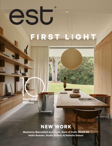
Directional Kitchens
Matthieu Salvaing Sea Ranch
N E W WOR K Madeleine Blanchfield Architects, State of Craft, Studio KO Hollie Bowden, Studio Doherty & Nathalie Deboel
Stephen Kent Johnson 3daysofdesign Specified in feature Lessons in Home Anson Smart, The Colour of Light
CONTACT
Photography
Alice Mesguich, Dave Wheeler
Thomas De Bruyne
We're delighted to feature Madeleine Blanchfield Architects' Seafarm on our cover—a project that captures so much of what est values: honesty of material, a connection to nature and the considered meeting of the classic and the unexpected.
This Much I Know Podcast: Aires Mateus Editorial karen@estliving.com
Is This Paradise?
submissions@estliving.com
Prue Ruscoe
Advertising
Knowladge Base
kim@estliving.com
Inge Prins, Courtesy of Criteria, Anson Smart, Lesley Lau
advertising@estliving.com
16
Matilde Travassos estliving.com
Editors Choice
est living acknowledges the Traditional Owners of the land on which
Publisher
Ludovic Balay, Enrico Costantini, DePasquale + Maffini,
we work, the Wurundjeri Woi Wurrung of the East Kulin Nation. We pay
miffy@estliving.com
Nicolas Mathéus, Matthieu Salvaing
respect to their Elders past, present and emerging.
COMMON
DARKINJUNG COUNTRY/SYDNEY, AUSTRALIA, Architecture, Inte Landscape DANGAR BARIN SMITH, Build ROBERT PLUMB BUILD, Styling STUDI
18
GROUND
erior Design & Furniture MADELEINE BLANCHFIELD ARCHITECTS, IO JACK MILENKOVIC, Photography ANSON SMART, Words KAREN MCCARTNEY
In a cycle where trust fed ambition, and vice versa, this expansive New South Wales property illustrates what is possible when client, architect, builder and landscape designer are totally in sync. Seafarm—the name retained from the original property—is a poetic combination of its elevated rural site and its long views to Copacabana Beach. It is, however, the only thing that remains intact. What began as a brief for alterations and additions slowly and deliberately morphed into something far more significant. While the original 1980s home was in the right spot and oriented the right way, as Madeleine Blanchfield Architects (MBA) began developing plans, limitations emerged. In parallel, the clients and their children began visiting frequently. “While we were in the process of design, they were going up and staying in the old home, and as a result they developed this enormous affinity for the place,” practice director Madeleine Blanchfield says. That shift in sentiment drove a corresponding shift in ambition: rather than renovate, architects and clients arrived at something far more considered—a from-the-ground-up rethink that retained the site’s essential orientation but reimagined everything else. “The land had a way of revealing its own potential,” Blanchfield says. “Its light, its winds, its materials and its rhythms informed every decision.”
20
The design comprises a series of low-lying wings embedded in the natural topography—from above, the mass is masked, and the home reads as a single-storey form. The elegant, elongated living wing faces north with retractable Vitrocsa doors, allowing rooms to open completely to the garden on a still day. “I think it was really important that the home almost disappears when you’re in it,” Blanchfield says. The build was developed in tandem with a garden by Dangar Barin Smith, defined by minimal intervention on the northern elevation to maintain long views to the bushland and the water. To settle the home and pool into the landscape, ornamental grasses of differing but complementary varieties were used at generous scale, forming an informal skirt to the base of the building. A deliberate alternative plays out in the central courtyard, where native and exotic species mix around a pond that introduces movement and the sound of water into the heart of the home, and encourages cross-breezes. “It is experienced as an intimate, light-filled room open to the sky—lush and layered, distinct from the sweeping paddock and bushland views; a world within a world,” Blanchfield says.
This page: Tribù Kos dining table and chairs from Cosh Living are set on gang-sawn Mangrove Mountain buff pavers in pale from Gosford Quarries. A Bonsai and limestone planter from InDesignAu sits on the table, and the bar stools are by Inoda + Sveje from Great Dane Furniture. The large-scale retractable doors by Vitrocsa all but disappear. Opposite page: A Mobile chandelier 3 in natural brass by Michael Anastassiades from Mobilia makes a quiet sculptural form as it hangs above an American white oak table designed by Madeleine Blanchfield Architects (MBA) and made by Cranbrook Workshop. A selection of Peta O’Brien’s Dimples 9, 2023–2025, from Nanda\Hobbs, rests atop the table. The classic and comfortable DC11 chairs in leather are by Japanese and Danish designers Inoda + Sveje, and are sourced from Great Dane Furniture.
21
22
Anchoring the room is a large-scale oil painting, Castle (2022) by Guido Maestri, from Ames Yavuz. The Sengu modular sofa by Patricia Urquiola for Cassina from Mobilia is flanked by the Hase floor lamp by J.T. Kalmar from Great Dane Furniture and a playful custom stool upholstered in Tiger Beat fabric from Dedar. The generous coffee table, designed by MBA, was made locally by Cranbrook Workshop in American white oak.
23
“This project was a very joyful one for our practice—starting with the clients and how they drove the increased ambition and encouraged the creative processes around the expansion of the brief.” Inside, MBA interior designer Amber Lush worked with the client on the furnishings, mixing pieces from an interesting cross-section of international and local brands—Cassina, Edra, Baxter, USM and Vitra sit alongside Australian furniture and lighting by Tom Fereday, Volker Haug Studio and Articolo, with rugs by Armadillo. Among these is a series of MBA custom designs in American white oak, fabricated locally by Cranbrook Workshop: coffee tables, shelving and an impressive dining table with hand-carved pillar legs. “To have such a table made by hand within reach of the site felt like the only right answer for a custom piece of such scale,” Blanchfield says. The visual refinement of the main home finds a counterpoint in the weightiness of the outdoor entertaining areas, fashioned from monumental blocks of local sandstone from Gosford Quarries; they take on a European rusticity in their design application. As the clients grew more invested in the home, they led an initiative for a productive garden—a substantial vegetable patch and an orchard—that became central to how they envisioned using the property.
24
The commitment to activity and wellness is equally thorough. The pool, surrounded by grasses, is positioned to look out toward the coast, while the relocated tennis court sits to the east. Partially concealed within the hillside, a lower ground level accommodates secondary living spaces, a gym beneath an oculus skylight, and an expansive wellness suite incorporating a float tank, sauna and ice bath. If a home is to be judged by the quality of its wellness offering, this one sets a high bar. The project’s sustainability and technology systems are equally ambitious. A geothermal loop drilled to 130 metres provides water-based cooling and heating throughout, supported by a solar and battery installation capable of powering the property for five days without sunlight. “Sustainability is an inherent part of the architectural thinking,” MBA architect Nick Channon says. “The home is made of the land, runs on the sun and the water it catches, and gives back to the bush setting it sits within. That felt like the most honest and genuine way to build here.”
This page: The direct connection to nature is felt as materials segue from inside to out, and large-scale glazing welcomes the view in. Opposite page: The courtyard, landscaped by Dangar Barin Smith, brings nature with its native and exotic species, while a pond introduces the sound of water.
25
This page: A series of rooms pivot off the courtyard, allowing airflow and cross-breezes. Here, the &Tradition Wulff armchair in sheepskin and walnut from Cult takes centre stage on a Beni Rugs design, alongside a custom table designed and made by MBA in an undulating poplar burl form. The Kira side table by Marta Giardini for Gervasoni from Anibou sits beside the Miami Beach sofa by Paola Navone for Baxter from Space Furniture. Looking into the sitting room, the artwork A Dream or Something Like It (2017, 2024) is by Lottie Consalvo from Nanda\Hobbs. The home has a series of through-views, and at night the courtyard is lit to draw out the shadows created by the movement of the water, highlighting the form of the mature crepe myrtle. Opposite page: The view into the main bedroom illustrates the degree to which the home opens up to its outside spaces. An &Tradition Little Petra lounge chair in sheepskin and walnut from In Good Company sits on an Armadillo Agra rug in salmon. A Cultiver Rolfes bedcover in natural completes the textural range of materials.
26
27
28
The perfectly calibrated study with a table and bookshelves designed by MBA and manufactured at Cranbrook Workshop. In the foreground, a teak dining chair by Peter Hvidt and Orla Mølgaard-Nielsen from 506070, while the Källemo Aluminium chairs by Mats Theselius from Great Dane Furniture flank the table. The artwork is All Night Sprinkler (2024), an oil painting by Dane Lovett from Station Gallery, and the Akari 75A pendant by Isamu Noguchi is from Top 3 By Design.
29
This page: An enclosing off-form concrete float tank wall by Brook Douglas sits above glazed Lava tiles in Caviar from Pyrolave, which in turn pairs with Sokeria crazy paving from Artisan Exteriors. Opposite page: Within the setting of the heavily textured Colonnade no.04 rug by Cappelen Dimyr from Tigmi Trading and the rough framing device of Mount White sandstone from Gosford Quarries, the sweep of the Edra Standard sofa by Francesco Binfaré from Space Furniture is inviting and comfortable. A vintage Akari floor light by Isamu Noguchi from 506070 and a Dimples vase by Peta O’Brien are the only accessories needed to complete this family room.
30
31
32
This page: Even when rustic in feel, it is paired with precision. Here, the locally quarried stone works in tandem with a Blackbutt ceiling and a fine stainless-steel kitchen bench, acting as a counterpoint to the sturdy farmhouse table—again designed by MBA and made by Cranbrook Workshop. Opposite page: The outdoor entertaining areas take on a distinctly European vibe, with solid sandstone used to create a generous covered outdoor dining area complete with a pizza oven. A productive garden adds to the sense of home-grown. Following spread: The pool faces the view and is feathered with grasses that catch the light and soften the natural brass balustrade made by Alsop Fabrication. The sun loungers are Burleigh daybeds from Eco Outdoor.
33
34
35
36
Clockwise from top left: Bar stool by Inoda + Sveje for Miyazaki Chair Factory, featured in the kitchen; Akari 75A pendant by Isamu Noguchi for Vitra; Navone Travertine from Granite & Marble Works; American oak; Mount White sandstone from Gosford Quarries; Daphine Terra floor lamp by Tommaso Cimini for Lumina; Mojave Natural rug by Armadillo; Sengu sofa by Patricia Urquiola for Cassina; Aluminium chair by Mats Theselius from Great Dane Furniture; Vivid White paint by Dulux; Mocho stool by Sergio Rodrigues for Espasso; Baby Wall Swing light by Volker Haug.
37
Experience a new chapter in bathroom design
Step into the Reece Bathrooms Rosebery Showroom for inspiration, expert advice and curated experiences designed to bring your next project to life.
reece.com.au/rosebery Reece Bathrooms Rosebery, Sydney NSW
40
An interior designer and furniture maker’s North London terrace, which they share with their three young girls, is a home made by hand, coloured by artistic friends and filled with curious and unpretentious ‘bits’ kept over the years. Interior designer Hollie Bowden and fine furniture maker Byron Pritchard found their “doer-upper” in North London five years ago—a six-bedroom Victorian terrace barely touched since the 1960s. They spent the first year and a half restoring the interiors, which Pritchard did mostly himself. “The shell wallpaper was quite amazing,” Bowden says, looking at a photo of the original bedroom, “but once you realise the house isn’t insulated—these things have to go.” The final alterations were made after the couple moved in with their twin girls, before their family became five. “You can make impractical decisions that you wouldn’t do in someone else’s house,” Bowden says. “I hoped for it to feel a bit DIY and with my background in set design and fashion, to have flair.” Deciding against the typical London side return, the couple removed a wall so the kitchen and dining area could be entered from either side of the stairs. One leads to the farmhouse dining table and chairs, and the other to a step-down landing—a corner of the kitchen entrance designed as a dresser. Pritchard crafted the parchment-yellow timber and Corian galley kitchen, which Bowden matched with diamond-laid, old quarry floor tiles. “I’m usually drawn to a folky way of joinery,” she says. “But this house and small space—a Shaker-style kitchen is what it needs.” The designer has always been interested in placement, pointing to the kitchen’s open shelving, and “putting things together that shouldn’t really go together,” she says. There’s a delicate flower-like sculpture by Emma Witter, next to a model Prouvé chair, and a hand-illustrated paper plate by one of her daughters. “The house is alive with all of the girls’ objects too,” she adds. Straying from the neatness of her typical style, the home—like her gallery of vintage furniture and peculiar finds—explores the way Bowden perceives spaces through objects. Pieces accumulated while renting were brought out of storage, like the prints by German painter Max Ernst above the dining bench, while nearby, a work by British sculptor Ivor Abrahams hangs above the larder in a Perspex box frame, a “little bit broken”. “I’m happy if something is broken, because I can say, ‘Well we can’t sell it anyway’,” she says with a grin.
LONDON, ENGLAND, Design HOLLIE BOWDEN, Photography LESLEY LAU, Words SOPHIE LEWIS
42
Previous page: An upholstered sofa and Nordic Knots rugs in a complementary olive tone sit atop the original Victorian floorboards, left untreated. The walls are Sap Green by Farrow & Ball, also used on the front door and colour-blocked across the radiators. “It actually makes the room a lot darker,” Bowden says, “but it just looks so nice.” The room encircles the sycamore coffee table by Pritchard, with a Bijou (2024) sculpture by Timothée Humbert sitting nearby. This spread: Entering the living space, there’s a vintage Rover chair by Ron Arad. “I’m just interested in people with a point of view,” Bowden says, “as much as I’m interested in important design pieces.” Elsewhere, a vintage urn fireguard and a lampshade drawn on with ‘little people’ by one of Bowden’s girls. “That’s what sets this house apart,” she says. “It’s unpolished.”
43
44
This page: Hollie Bowden, photographed by Suzannah Pettigrew. Opposite page: In the dining space, a Tomotom dining table and chairs designed by Bernard Holdaway in 1965, a clay-on-card and mud hand-print work by Richard Long and a custom oak cabinet by Pritchard, its shelf edges emulating a trunk and housing a record player and some of Bowden’s rare book collection.
45
“I don’t want to be so precious. We have so much bonkers stuff which is impossible to keep nice with my kids. But they’re also my things; what am I going to do with them if they’re not mixed in?” Double doors open out to the rear cottage garden designed by friends Amabel Barraclough and Tom Dawson from Butterrow. “I wanted drama, quickly,” Bowden says about the mature planting, inspired by a trip to Mexico. The outdoor area is soon to feature her most recent purchase: two giant concrete green-and-yellow dinosaur sculptures. “I have this idea of a hot tub with the dinosaurs around them,” she explains. “I like to mix funny and serious.” While the interiors are mostly coated in an off-white, Bowden has created zones of colour—like the downstairs living room, drenched in a mossy green and layered with an olive velvet-upholstered sofa and rugs. The space centres around Pritchard’s hand-gouged sycamore coffee table, one of a few custom furnishings he designed for the home. The stairs are covered in old Swedish runners that change pattern on each floor. On the landing, Bowden calls out the wall art on display: a nymph drawing, an old American poster, a wooden Bigfoot from LA and a “little Keith Vaughan which I love”. The collection culminates in a pair of fluted columns by French-Canadian cabinetmaker Louis Pistoni. “The gallery didn’t want to let go of them,” she says proudly. Three of the six bedrooms have been converted, one into the main
46
bathroom—the home’s ‘wow’ moment—with its wine-red Balineum-tiled walls, floor and shower enclosure that look out to the garden. It’s just as decorated by the designer’s ‘bits’, including a painting the artist Aster Guinness did for Bowden’s birthday. “I wanted to build a story around my friends, and I think it really means something to the girls,” she reflects. In the dressing room, she muses on her “insane shopping habit”, pulling a khaki coat—a “museum piece” by fashion designer Bill Gibb—from the industrial rails. Hand-painted florals stretch across the ceiling of her twin daughters’ bedroom, where even the Barbie dolls are part of Bowden’s curatorial world. “We spend hours putting them in different outfits,” she says, holding one in hand-knitted flares. It’s a window into her own childhood—her mother had cupboards full of fabric, and her father would frequent antique shops for his garden. Bowden laughs that “the girls have just had to fit in with my way”, but that’s also why the home feels like a departure from her usual work. “I wanted there to be imperfections, and it’s shown a side to me that feels really quite true,” she says, eyes lit up by the idea of doing it all again.
This page: Max Ernst prints that had been kept in storage for years are featured above the vintage farmhouse table, chairs and bench by an unknown maker. The pressedglass pendant shades are from 1960s East Germany and the ’80s wall sconces are also unattributed. By the deep larder, which Bowden praises for its kitchen storage, hangs For a Time for a Season (1971) by Ivor Abrahams. The old quarry floor tiles match the original living room hearth. Opposite page: The kitchen was one of the last areas to be designed and built by Pritchard. The cabinetry and shelving are painted in Oak Apple by Little Greene—the same shade used for the staircase and doors. The benchtop is Corian with a custom stepped edge by Pritchard. Kitchen splashback tiles are by artist and friend Joe Sweeney, and open shelving ensures an uninterrupted sightline to the garden.
47
48
“This is such a sunny room,” Bowden says about the main bedroom, where Pritchard designed and made the bed. It’s where the family bunks in together for movie nights. Bowden worked with Gaby Gatacre and decorative specialists Rag Arts to design the fireplace and the ceiling border. The wiggly tallboy and the early 20th-century Austrian mirror are among her favourite pieces in the home. A pair of bronze 1980s sconces feature in the alcoves, and below one of the lights hangs a work by Paula Rego. A framed piece by Jean Cocteau sits on the mantelpiece, and an animal-print chest at the end of the bed is used to store the girls’ paintings. The throw is by Jess Maybury. All of the bedrooms feature Tim Page carpets.
49
50
Wine-red Balineum tiles clad the walls, floor and shower enclosure, which looks out to the garden. A Makonde fertility carving is hung above the bath, with a 1920s hooked rug over its edge. The shower curtain is made from a 1960s fabric Bowden kept for some time.
51
52
This page: The front entrance leads to the rear kitchen and dining space on either side of the stairs, which Bowden and Pritchard opened up instead of creating the typical side return. A custom curved timber shelf by Pritchard features in the foreground, and the stairs are carpeted with old Swedish runners that change pattern on each floor. Opposite page: In the girls’ bathroom, a constellation of hand-detailed tiles. “Some of the tiles are quite constructive, quite architectural,” Bowden says, pointing to her favourite, a whale. Fixtures are by The Water Monopoly.
53
56
THE ART I LIVE WITH In a new series for est, Ronan Sulich explores the impetus behind the collection of art advisor and advocate Kym Elphinstone.
Photography DAVE WHEELER
This page: The space-altering fluidity of Coen Young’s thickly layered silver nitrate work does, but doesn’t, mirror reality. Acquired from 1301SW. Opposite page: Elphinstone in her study with a ceramic pot by Anna Parsons on the sandstone niche and a woven painting by Tia Ansell. Acquired from Suite Gallery, NZ.
57
Have the houses you’ve lived in shaped your choice of art and the art you want to live with? KE: Living in this house, with its history as a commercial building and resulting floorplan, has opened up enormous possibilities in the way we hang and live with art. Large open-plan living areas, with few internal walls, means we can see multiple works at once in a way that wasn’t possible in a Victorian terrace. It has encouraged a level of experimentation, to consider how different works communicate and engage with each other, their visual conversation across a room. We’ve also been able to play with scale, with impactful paintings by Mark Maurangi Carrol and Marion Abraham. Then there are the surfaces: we have some beautiful heritage sandstone walls that invite more conscious, longer-term placements and it is remarkable how differently an artwork reads when hung on something other than a white wall. How do you choose what you want to live with? KE: It has to be something that I love—either a purely visceral reaction or perhaps influenced by a personal relationship with an artist or a gallery. It is also about the dialogue between all the elements of a home: the layering of furniture, design pieces, books and the garden—with art being integral to that mix. Occasionally though, I choose to live with work that I am challenged by, which I will place in our home as an experiment to see how that response evolves. Maybe it grows into a much-loved work or continues to challenge— either way the experiment uncovers your own biases and helps expand your understanding. I am also conscious of how art can shape how a room feels. Whether a work acts as a talking point or invites contemplation; whether it is the hero piece or sits in complement to the overall scheme; whether it supports the intended use of the space. There are many layers to consider. 58
The grand scale and gestural brushwork of Marion Abraham’s oil paintings, from a series of seven depicting a continuous scene (opposite), evoke the Old Masters, but remain totally of the moment, while another of Abraham’s paintings hangs on the wall in front of an anamorphic bronze skull by Louis Pratt (above). Abraham’s works were acquired from Sullivan+Strumpf.
59
This page: There’s an engaging dialogue between the artist’s method and the materiality of the house that is amplified by Elphinstone’s casual placement of Mark Maurangi Carrol’s painting, which rests against the sandstone wall. Acquired from Nasha Gallery. Opposite page: A ceramic vessel by Virginia Leonard. Acquired from Martin Browne Contemporary.
60
How often do you rehang your paintings and why? KE: I love a rehang and will often rotate work around the house to explore the domino effect that ensues. Just because you hang a painting on a wall doesn’t mean that it has to live there for the next 20 years. It is always an interesting exercise to reshuffle a collection around the home to see how artworks respond to different contexts. Whether it is the fall of natural light, sightlines from different rooms, or conversations with nearby works, relocating an artwork can entirely change how you experience it. How important is going to art galleries and fairs, dealers, other collectors’ homes and getting to know artists as a way of informing your own collecting? KE: Educating your eye and expanding your aesthetic starts with immersing yourself in museums, exhibitions, art fairs and galleries. Seeing a broad range of work across different eras and practices will inevitably inform what you are drawn to and what you might want to live with. Other collectors are also an excellent source of inspiration. A great collection will often speak uniquely of its owners and can reveal new artists or approaches to installation. Engaging with artists is equally important and well worth leaning into. When you understand an artist’s process, references and intentions, you develop a much deeper relationship with the work itself. It may draw you in deeper, or you may find your response shifts entirely. Either way, getting to know the artist adds a meaningful layer to collecting. Read more about Kym Elphinstone’s home in her book Collecting: Living with Art, published by Thames & Hudson Australia.
61
Discover More www.everysurfacetellsastory.com.au Melbourne | Sydney | Brisbane | Adelaide
Every Surface Tells A Story.
64
Proudly supported by
65
MATERIAL IS THE MESSAGE IN EACH OF THESE 10 KITCHENS, AS ARCHITECTS AND DESIGNERS EXPLORE LESS CONVENTIONAL SURFACES, TREATMENTS AND DETAILS TO TELL A HOME’S STORY, RIGHT FROM THE HEART.
Words SOPHIE LEWIS 66
Project H22 Architecture Svobodová Blaha Photography Matej Hakár
67
SEEING GREEN CONCEPT
A nautical-inspired design aboard the largest private residential yacht, The World.
MATERIALITY
Fibreglass, Moroccan Zellige Tiles San Francisco-based Studio AHEAD’s client wanted to experience the world from one place: a private yacht rarely docked for more than three days during the design process. Onyx was the initial choice for the kitchen, but its slab size and weight restricted the sculptural vision, so the studio looked to 1950s Italy, when fibreglass was introduced on boats. Keeping the material’s natural colour, Studio AHEAD worked with VAVA Objects to realise a complete fibreglass kitchen. “It’s the full sculptural effect, and far more appropriate,” co-founder Elena Dendiberia says. All appliances lie behind the soft-edged, sea-green surface, while Moroccan zellige tiles resemble sea glass in varying shades—a tonal palette that lets the rounded forms speak loudest.
68
1
Design Studio AHEAD Photography Inge Prins
69
2 BOTANICAL BRUSHSTROKES CONCEPT
A hand-painted homage to old Italian villas for an artistic Paris family.
MATERIALITY
Patinated Bronze, Natural Stone French designer Joséphine Fossey traces what the hand creates and leaves behind in this renovated Paris kitchen. A mossy greenpainted mural cloaks the top of the space like a tree canopy above the island, inspired by the client’s love for the garden frescoes at Villa Livia in Italy. The mural sets the mood, deepened by the wall and island cabinetry in bronze—a living material that develops a mottled, painterly patina over time. Clean lines and a mirrored splashback accentuate the cabinetry’s finish, matched with the bronze tapware and the volcanic veining of the stone benchtop, and contrasted by the creamy stone floors.
Location Paris, France Design Joséphine Fossey Photography Ludovic Balay
70
71
3 BACK STORY CONCEPT
Lashings of green collide in a kitchen once home to Parisian artists’ studios.
MATERIALITY Corian, Oak Originally designed by French architect Pierre Patout, the Art Deco façade of this Paris building only hints at its creative history. Some of the era’s most famed artists worked from its ground floor, under a glass roof and steel bay windows overlooking the wild Petite Ceinture. In this nowcontemporary space, architect Martin Masse has positioned the kitchen at the rear—its grass-green Corian island, splashback and olive oak cabinetry mirroring the view. Masse says the palette lifts from Serge Poliakoff’s abstract paintings, together with the orange-stained underbench cabinetry. The Braquenié x Pierre Frey upholstered dining bench keeps the work area hidden, just like the wavy handrail on the adjacent dusty-green staircase.
Location Paris, France Design Martin Masse Photography Yannick Labrousse
72
73
MILANESE MANNERS CONCEPT
European hospitality and an Italian icon inflect the revival of a Melbourne heritage home.
MATERIALITY
Stone, Brass, Timber, Polished Plaster It didn’t take much convincing for Melbourne designer Georgina Jeffries to conjure a European sensibility in reconceiving an Edwardian home for a family of four. The brass-studded, stone-tiled splashback reinterprets the work of Italian architect Piero Portaluppi, its stone repeated on the benchtop and island base. The timber sash wrapping the island, designed to feel like furniture, references European bar tables with a local twist—the BUOY stools by Dutoit Studio. The Lacanche cooker and vintage Double Diabolo wall lamps evoke French culinary tradition, while the terrazzo flooring and lime plaster speak to the idea that materials should be felt as much as seen. Functional elements stay out of view behind a sliding door to the pantry.
74
4
Location Wurundjeri Woi Wurrung and Bunurong Country/Melbourne, Australia Design Georgina Jeffries Photography Lillie Thompson
75
Location Paris, France Design Cyrus Ardalan Photography Ludovic Balay
76
ON DECK CONCEPT
A DJ’s apartment, reminiscent of a ship’s prow, becomes a point of departure for its kitchen.
MATERIALITY
Stainless Steel, Mosaic Tiles “The idea was never to reproduce the interior of a boat, but rather to use its logic: compactness and carefully integrated elements,” architect Cyrus Ardalan says about the 70-square-metre apartment he designed for a Paris-based DJ. It’s the underlying logic in the kitchen, where the stainless-steel island with its continuous rounded edge riffs off the circular stained plywood openings in the living area. A glass-paste mosaic arch conceals pipes and structural elements at the entry, framing the stainless-steel joinery and the reddishbrown tiled wall that the space shares with the bathroom. The two were designed as a single hygiene block, the tiles following the wall around to become the bathroom’s singular surface.
5
77
6 ETERNAL SUMMER CONCEPT
A corner kitchen built on the idea of “microarchitecture”, in a bid not to disturb the old.
MATERIALITY
Stainless Steel, Timber Turin-based studio Marcante-Testa was asked to revive a 300-square-metre home in the medieval town of Saluzzo, in Italy’s Piedmont region. Mainly a summer home for its previous residents, its “freer summer spirit” led to an unfettered approach to eras and references, but with a “1960s lens”. The kitchen lies in the main salon, with its original doors and frescoed ceilings intact. It’s divided from the dining area by a steel screen the studio termed a “microarchitecture”—creating a volume within a volume—with curtains that slide to reveal views of the terrace and garden. The sun-yellow corner kitchen features walls painted to dado height, stainless-steel benchtops and the same terrazzo floors seen throughout.
Location Saluzzo, Italy Design Marcante-Testa Photography Carola Ripamonti
78
79
Location Wurundjeri Woi Wurrung and Bunurong Country/Melbourne, Australia Design Travis Walton Architecture and Interior Design Photography Elisa Watson
80
HIGH RELIEF CONCEPT
A Melbourne penthouse kitchen favours a mid-century layout to stand as a space in its own right.
MATERIALITY
Stainless Steel, Signorino Avocatus Quartzite In revisiting a 20-year-old Melbourne penthouse, Travis Walton Architecture resisted the open-plan kitchen. The architecture studio took a more mid-century route, as a continuous peninsula bar top wraps toward the living zone on one side, and a servery window opens to the dining room on the other. Brought closer to natural light and the city skyline than in the original layout, the kitchen creates material relief in between these two spaces, with linished stainless steel as the “perfect break”, catching and diffusing light. The material’s cleanness pairs with Avocatus quartzite from Signorino, carving colour into the space.
7
81
GLASS FROM THE PAST CONCEPT
A Melbourne home’s kitchen borrows Pierre Chareau’s glass-block blueprint and industrial palette.
MATERIALITY
Breccia Capraia Stone, Terrazzo, Walnut Timber, Enamel Glass, Brown Granite, Brass Renovating a heritage-listed, 1930s home in Melbourne could have confined Flack Studio’s design, but principal David Flack found a way to create a home within a home. Much like Pierre Chareau’s Maison de Verre in Paris, Flack introduced a south-facing glass-block extension to direct light and screen off surrounding apartments. Tucked under a curve that cuts through the doubleheight space, the kitchen sees Chareau’s influence in its gridded black steel framing, the Breccia Capraia stone benchtop and splashback, patinated brass hood and island base and the butcher’s block walnut top. The green terrazzo floor is bordered by granite and glass tiles, and vintage pieces include works by Italian greats, such as Osvaldo Borsani’s Tecno breakfast table and the 1992 Vico Magistretti wicker armchairs.
82
8
Location Wurundjeri Woi Wurrung and Bunurong Country/Melbourne, Australia Design Flack Studio Photography Anson Smart
83
9 CRÈME-EN-SCÈNE CONCEPT
A reflective, cream-coloured space for a ground-floor apartment lacking in light.
MATERIALITY
Matt Lacquer, Polished Stainless Steel, Lava Stone A Paris kitchen’s ground-floor location was both its greatest strength and constraint for local design studio Atelier MKD. Every element had to favour natural light and be organised around the window, treated like a painting. A mirrored splashback reflects the light and foliage back into the space, coaxed by the subtle sheen of the matt-lacquered cabinetry. The ivory palette continues from where the living space left off, emphasised by the island’s softened corners and bullnose edging. Stainless steel balances the curves and cream with its slickness— tracing a fine line of light that underlines the different volumes. Along with the glazed lava stone, it was also used as a benchtop, for the cabinetry pulls and as a thin shelf for objects and art.
84
Location Paris, France Design Atelier MKD Photography Alice Mesguich
85
86
Location Gadigal Country/Sydney, Australia Design Esoteriko Styling Studio Jack Milenkovic Photography Dave Wheeler
ROCK FORMATION CONCEPT
Designed for a family that loves to cook, a Sydney kitchen takes shape from the sandstone cliffs below.
MATERIALITY
Stainless Steel, Travertine, American Walnut Veneer The idea began as a displaced boulder of local sandstone. “Located within eyeshot of Bronte’s rugged sandstone cliffs, we wanted the vista to jump inside,” Esoteriko founder Anna Trefely says—as if the island had washed up onto shore. Designed for serious cooks, the kitchen wasn’t to be too precious, but it needed to perform, so the team turned to travertine, which is harder and less porous than sandstone. One side is craggy, lifted whole from an exposed quarry face rather than cut, and the other is polished. It took many samples to find the right 316 marine-grade stainless-steel benchtop with an orbital-sanded finish; the matt finish deters smears and fingerprints. Everything else hides behind floor-toceiling walnut-veneer joinery, spliced by open shelving.
10
87
Discover More www.everysurfacetellsastory.com.au Melbourne | Sydney | Brisbane | Adelaide
Every Surface Tells A Story.
SUPER NOVA SKY VILLA A penthouse of scale and prestige at One Sydney Harbour finds itself anchored by a strong, persuasive materiality in direct response to the natural beauty found in its harbour setting.
GADIGAL COUNTRY/SYDNEY, AUSTRALIA, Interior Design STATE OF CRAFT, Architecture RENZO PIANO BUILDING WORKSHOP, Styling STUDIO JACK MILENKOVIC, Photography NICK ROCHOWSKI, Words KAREN MCCARTNEY 90
When your practice is called State of Craft, there is a promise inherent in the name—and occasionally a project comes along that allows its full, glorious expression. Daniel Goldberg, founder of the multidisciplinary design studio with offices in London, Ottawa and Sydney, works at the intersection of architecture and interior design, and found that opportunity with the commission for the penthouse at One Sydney Harbour. It took a while—12 years, in fact— but the result is a Gesamtkunstwerk, the German term for a total work of art. Goldberg shaped the floor plan, created the interior shell, and furnished it with custom and commissioned pieces, rare finds, curated art, bespoke rugs, ceramics and glassware. At 900 square metres, it is an enormous space, and yet there is intimacy and intrigue, awe, craft and a singular engagement with place. Goldberg had worked with architect Renzo Piano’s office before—on The Shard and Shard Place in London—and understood the particular complexities of these sky-high penthouses before turning his attention to this Lendlease development. “It’s always been on our drafting table—be it London, New York or Sydney—these big penthouses on top of fully glazed residential towers. We call them lighthouses. You get the sense of complete openness, the desirable 360-degree views, but they are not always conducive to creating warm, welcoming residential interiors,” Goldberg says. Gone are the days of the hermetically sealed penthouse. This sky villa is calibrated to engage with the elements rather than resist them: winter gardens, a rooftop pool deck and intermediate climate zones encourage the experience of rain, mist and ocean air. “Renzo works from the outside in,” Goldberg explains. “We work from the inside out.” Piano’s engineering—the breathable façades, the double-skin construction, the ability to open the building to the sky—profoundly influenced how the interiors were conceived.
92
This page: The great room is anchored by Flexform Groundpiece sofas with bespoke ocean-green resin tables by Netherlands-based German artisan Lukas Cober. The Brazilian Cubo armchairs—a 1970s design—are by Jorge Zalszupin and sourced via Espasso. Stools and coral-inspired vessels are by French artisan Coralie Bonnet. The ombré rug was designed by State of Craft and made by Tibet Sydney, and the large-scale artwork is Ochre over Teal by Gabriel Bødker, courtesy of Richeldis Fine Art. Opposite page: A glass door with bespoke bronze fretwork filters the light and offers a first glimpse of what is beyond.
93
94
Framing the view is the strategic positioning of the six-metre cast-glass dining table with hammered copper bases, designed by State of Craft and manufactured in Oakland, California by Christison Lewis Inc. The hand-knotted silk rug, designed by State of Craft and made by Tibet Sydney, has a subtle ripple effect. The Kana dining chairs by Vonnegut/Kraft sit under the fumed and stained oak coffered ceiling. On the wall is Untitled by Jakob Gasteiger, courtesy of Richeldis Fine Art.
95
“For us, the scratch test was, if the interiors are felt as a subtle presence, then that’s enough; they don’t need to shout. The choice of finishes, the colours, and how light or dark certain rooms are, is in response to that view.” Goldberg has long been preoccupied with the essence of place, and this philosophy allowed for a deep exploration of what Sydney actually means. “It is one of the most beautiful and scenic harbour cities in the world. When you’ve got such an incredible view—thunderstorms rolling in, the sunrise, cockatoos below—it brings such a sense of freedom and beauty that the last thing we wanted was for the interiors to fight against it.” The result is a study in the way context can inform design decisions through a subtle rhythm of tones and textures that pick up and reinterpret natural cues. Glass is cast to modulate its surface and mimic water; rugs carry a ripple motif; a custom light sculpture echoes a sea creature; materials glow and shimmer as light moves across them through the day. It is a far cry from the literal cause-and-effect of sea equals blue and other seaside tropes—rather, in passing through the creative lens of State of Craft, something much more considered and enduring is expressed. With the core scheme largely defined by the architecture, arriving at a final floor plan was an exercise in sustained analysis. “We studied thousands of configurations—the perfect location for the kitchen, how to orient the dining area to enjoy the evening sun, the sun angles throughout
96
the day and year, the relationship between private and public spaces,” Goldberg says. A clear diagram eventually emerged for this two-storey penthouse: 8.5-metre double-height spaces anchor the east and west ends, flanking a central box that contains the kitchen and main dining area responding to the blade columns of the façade grid. “You get views all the way through from east to west, and the full panoramic sweep to the north. The entertainment spaces follow in the centre of the floor plate, and as you progress west and then south into a second wing, the spaces become progressively more private—bedrooms for family and guests, a family room, all accessed through a private art corridor.” Rather than moving from one space to the next in a single unbroken sweep, the sequence creates variety through compression and release. The private lift lobby draws you through before opening into the double-height living room beyond. Glimpses of harbour and hints of what lies ahead encourage a choreographed sense of discovery—whether it is the view itself or a shift in identity, from the expansive to the contained: a whiskey room, a tea room, an artwork that causes pause.
Opposite page: Sliding timber doors with a bronze inlay of the Sydney Basin enable the kitchen to be exposed or shut away. The muted palette continues through the use of tan leather on the Luigi Caccia Dominioni-designed Catilina bar stools for Azucena. This page: The whiskey room is a more intimate space with the warm rust tones in the Warren Platner armchairs for Knoll and the rug from Tibet Sydney. The walls—clad in titanium-toned travertine—and the coffered ceiling create a sense of enclosure.
97
This page: The introduction of the double-height tea room was at the request of the client. Working with local artisan Tim Noone, State of Craft designed a cherrywood and brass tea ceremony table and paired it with the PP56 Chinese chairs by Hans J. Wegner from PP Møbler. A lacquered cabinet set into the wall allows for a display of ceramics. Opposite page: A timber-clad art corridor allows for the display of specific objects. Shown here on a plinth designed by Studio Jack Milenkovic is a sculpture by Marcie O’Neill titled Tangible Dreamscape Narrative 2 (2025). Centred on a light disc mimicking a natural skylight, the composition speaks to a sense of restraint and calm.
98
99
The materiality of the penthouse is one of its greatest strengths. Titanium-grey Italian travertine lines the interior walls; coffered ceilings in darkened oak add depth overhead; layers of muted metals and lacquers build richness and depth at every turn. An element of theatre arrives in the form of sliding kitchen doors inlaid with an undulating brass outline of the Sydney Basin—retractable at the press of a button. Opposite, the six-metre cast-glass dining table, made in three sections by San Francisco specialists, shimmers with a green tint that reads as distinctly oceanic. The art was never an afterthought. Working with Richeldis Fine Art—a Barcelona-based practice specialising in emerging and overlooked talent—Goldberg integrated approximately 50 works by more than 25 artists, with a strong presence of Australian talent. Nothing here is cookie-cutter or predictable: the selection sits in a minimal and abstract register, chosen to inhabit rather than decorate the spaces, often informing fabric and finish decisions in return. What impresses most about this penthouse is the deft way the planning creates flow; light and views are captured without lazy capitulation to the impact they make, and a muted palette anchors the spaces while layering in a furniture mix drawn from different traditions and periods— Danish, Brazilian, Italian—to deliver a state of balance, beauty and, of course, craft.
100
This page: The family dining setting features Flair O’ dining chairs by Monica Armani from B&B Italia and a travertine dining table by Casa Bianco, while a plaster pendant by In Common With hangs overhead. The rug is again by Tibet Sydney, and above is the dramatic Untitled AIR painting (Gold) (2017) by artist Ryan Hoffman, courtesy of Richeldis Fine Art. Opposite page: State of Craft founder Daniel Goldberg in the family living room.
101
102
This page: This sitting room is part of the generous primary suite furnished with upholstered pieces by Christophe Delcourt, such as the CLE chair positioned at the desk and the POP modular sofa to the right. The side table is the BZippy Double Tier Cloud. Opposite page: The highly expressive Cipollino marble from Tuscany is a pleasing contrast to the simple timber that surrounds it.
103
This page: In the primary bedroom, the bed has been designed by State of Craft, as has the rug from Tibet Sydney. The sculptural ON lounge armchair by Oscar Niemeyer, reissued by Etel and sourced from Espasso, sits beside The Space Between by artist Nancy Constandelia, courtesy of Richeldis Fine Art. Details include the ceramic bedside lamp by Ceramicah. Opposite page: The bath, as part of a large en suite space, was designed by State of Craft, and is fashioned in onyx.
104
105
››
106
This page: The small powder room illustrates how spaces, large or small, detailed or expansive, sit alongside one another with complete ease. Opposite page: The pool is designed with a tone-on-tone of differing materials to create a place of serenity and a ‘Keteleeri’ Chinese juniper cloud tree, serving to pull nature into the space—its reflection giving a poetic touch to the setting.
107
AUSTRALIA BY DEDECE 263 LIVERPOOL STREET - DARLINGHURST - SYDNEY - T. 02 9360 2722 2 DALE STREET - CREMORNE - MELBOURNE - T. 03 9650 9600 INFO@DEDECE.COM
BÉZIER DESIGN MARCIO KOGAN / STUDIO MK27 MINOTTI.COM
110
AN INVITATION TO LOOK AGAIN
A new series looks at curators and creators—people who are moving the dial in terms of how we experience art, objects and interiors. Here, Eryca Green responds to the magic that is Lost Profile Gallery in Melbourne’s Brunswick.
WURUNDJERI WOI WURRUNG COUNTRY/MELBOURNE, AUSTRALIA, Interior Design NICKOLAS GURTLER OFFICE, Styling OLIVER WILCOX, Photography TOMAS FRIML, Words ERYCA GREEN 111
112
Clockwise from left in Lost Profile Gallery’s main showroom: A Stabile standing mirror designed by Lost Profile Studio, Surveillance, Aegis, Covenant and Altus pendants, all from Lost Profile Studio. On the wall, Supernatural #6 by Simon Leah. An Altus Hall table by Lost Profile Studio, a Bruny North herringbone screen by Simon Leah and Poltronova black armchairs. A carved timber Linenfold chair by Oliver Wilcox, clawfoot coffee tables by Lost Profile Studio and a Wittmann grey leather sofa.
113
114
In the interests of full disclosure, I write this from a very personal and therefore inherently biased point of view. I am unashamedly in love with Lost Profile Gallery. I was in Italy when the gallery first came to my attention through Instagram. Melbourne Design Week 2026 was on, and I was following from afar, torn between FOMO and the obvious joys of being in Rome. Looking through the 100 Chairs images, I came across Oliver Wilcox’s utterly unique, perfectly executed and unashamedly beautiful offering. I had known of Oliver predominantly as a lighting designer, so this chair was as unexpected as it was romantic. It stopped me in my tracks. I subsequently discovered a gallery that seems to exist somewhere between showroom, gallery, vintage store and cabinet of curiosities. Oliver describes himself as “debilitatingly creative”, and Lost Profile feels like the physical manifestation of that condition. His travels and experiences have informed the space, from Oliver Gustav’s restrained yet emotive spaces to Blackman Cruz in Los Angeles, a former gay nightclub where Lindsey Adelman lights sat alongside historic artefacts. The unique visual narrative blew him away. At Lost Profile, nothing feels too neatly categorised. Oliver’s lights coexist with art, vintage objects and curiosities. Some pieces are expensive, others surprisingly accessible. The point, for Oliver, is that everyone who walks through the door has value, whether they buy something or not. There is a longer game at play: a young student might be inspired by something they encounter, or a future designer might one day find a place for one of Oliver’s high-end lights. For me, this brings to mind the Caravaggio paintings I was seeing in Rome. You don’t need to own a Caravaggio to have a relationship with it. To be inspired by it. You stand in front of it, you look, you absorb something, and you carry that experience away with you. I think beautiful design can work in exactly the same way. Even the name Lost Profile has its own poetry. In 2014, while travelling through Europe with partner Simon, Oliver discovered an old portrait at the Paris flea market. The woman had her back turned, her face hidden. The gallerist explained that the technique was known as profil perdu, or ‘lost profile’. Oliver loved the idea of saying more with less. At a time when he was questioning whether he wanted to be an artist, product designer, interior designer or vintage furniture dealer, he realised he didn’t have to choose. Lost Profile could contain all of it. The in-gallery experience is curated by Simon Leah, a highly accomplished artist in his own right; he is also the perfect host. His deep and sympathetic understanding of Oliver’s vision makes him uniquely able to bring the story of the gallery to life. There is warmth and generosity in the way he welcomes you in, and an obvious pleasure in sharing the vision that he is quick to tell you is purely Oliver’s. However, Simon’s work, including his beautifully crafted screens and multimedia works, can be viewed in the gallery space. Lost Profile Gallery is an invitation. To pay attention. To notice details. To slow down. To look again. To find poetry in the everyday. I, for one, am very happy to accept this invitation.
Opposite page: Simon Leah (left) and Oliver Wilcox (right) stand inside the Lost Profile Gallery underneath the studio’s Sentimental pendant lights. In between them is Leah’s Bruny North herringbone screen. The black Italian 1980s dining set sits alongside an Art Deco cabinet; the stone bird sculpture and pink glass bowl are vintage finds from Tasmania; the mirror is antique, sourced from a flea market in Catania, Sicily.
115
116
This page: The view from the Dawn Room. The Bruny South herringbone screen by Simon Leah is below a Covenant onyx capsule pendant by Lost Profile Studio. A Renaissance oil painting sourced from a flea market in Palermo, Sicily, fitted with an aluminium frame by Lost Profile Studio, is fixed alongside. A vintage ceramic head sculpture sourced at the Chelsea Flea Market in New York City sits atop an antiqued Circus plinth by Martyn Thompson Studio, beside a chair by Pietro Costantini. Opposite page: A collection of mid-century nude sculptures from Japan sit on vintage metal plinths from India in the gallery corridor. Remnant wall sconces in sand-cast aluminium by Lost Profile Studio line the end of the corridor.
117
ADVERTORIAL
Designing for Landscape and Light The Australian landscape has always offered an unusually specific palette—from the sunwarmed dunes of Central Australia to the rich depth of Uluru’s natural ochre. For Laminex, it has always been less about inspiration and more about translation. What happens when colour is considered in relation to the landscape and light of the place where it will be used? Raw Spotted Gum TrueScale™, pictured in the bookcase, captures the characteristic grain of crown-cut Queensland Spotted Gum in a cool red tone with pale yellow highlights, while Nullarbor Drift tacks on a pink-toned brown reminiscent of the arid plains of its namesake. Colour Collection 2027 is Laminex’s most direct expression yet. Learn more in our deep dive on estliving.com
@laminexau
laminex.com.au
Image COURTESY OF LAMINEX
120
A SOFTER EDGE
At Boulevard House, Studio Doherty and Peter Barton Architects have opened up a once inward-oriented living area towards garden and sky, with colour and texture threaded throughout to modulate each and every space. WURUNDJERI WOI WURRUNG COUNTRY/MELBOURNE, AUSTRALIA, Design STUDIO DOHERTY, Architecture PETER BARTON ARCHITECTS, Build PROLIFICA, Styling BEA & CO, Photography SEAN FENNESSY, Words ALEESHA CALLAHAN
Households, much like people, are in a constant state of flux. Expanding then shrinking, daily habits and needs shifting subtly with the seasons. Very often a home’s awkwardness is just accepted as it is—the occupants finding ways to adapt their lives around its rigid structure. For the residents of Boulevard House, however, the time came to reshape their home to the exact contours of how they live. An Edwardian home in Melbourne’s East Camberwell, it had served them beautifully when the kids were young. But with four growing children, the family of six faced a new chapter of teenagerhood and a need for independence. The Edwardian sits within a strict heritage overlay, its street-facing form protected. Peter Barton Architects was engaged first and briefed to add bedrooms upstairs as a zone for the kids to inhabit, with only minimal changes downstairs and, importantly, keeping within the heritage requirements. “The tricky part was that everything we did architecturally could not be seen from the street. We brought a layered approach, dispersing the hip and gables and hiding volume behind the existing roof form so it doesn’t just appear like a two-storey addition behind a single-storey,” founder and director Peter Barton explains. Studio Doherty was then brought in to lead the interiors, and the home’s potential surfaced, morphing from a light-touch into a full interior redesign. “We did some initial sketches of the back living area and how we thought it could work,” Studio Doherty director Mardi Doherty says on how the project kicked off. The first move was to relocate the kitchen along the full length of the southern wall, so cooking and washing up unfold in full view of the pool and garden. Expansive, floor-to-ceiling windows draw open toward the sky.
122
This page: The downstairs billiards room lacked seating and life. To make it more of a place to relax, Studio Doherty designed a built-in banquette for lounging in a fun Letters fabric from Kvadrat Maharam, and introduced a dirty blush tone to the ceiling—Pink Earth by Dulux—with a thick wool Swisse Klasse carpet from Halcyon Lake underfoot. Artworks, including Deliverance by Brett Anthony Moore from Curatorial+Co., and an abstract piece by Loom Rugs, add a sense of colour and frivolity. Opposite page: The entryway is grand, with original details, mouldings and doors maintained and refreshed. A butter-yellow custom console by Thomas Lentini riffs on the Edwardian details, accompanied by an Annie Paxton mirror for the last-minute checks before stepping out the door.
123
The kitchen has been reoriented, allowing ample room for an informal dining spot on the kitchen island in Vernice quartzite from CDK Stone, where timber Homage bar stools by Note Design Studio for Ariake from Apato bring the right amount of geometry to the rounded end. Pieces with their own personality are injected nearby, including Lamdelabra by Georgia Harvey and the Vallam seat by Melvin Josy. The coved ceiling discreetly hides services and lighting, with the curves repeating elsewhere, including the Bon Bon wall lamps by Helle Mardahl. Central to the brief was to integrate muted hues, and the seafoam pearlescent tiles match the shape and pattern of the fireplace nearby, albeit in opposing colours.
124
125
“We drew colour inspiration from the leadlight. In fact, in the main bedroom, the windows were hidden behind white timber shutters, so revealing them gave us a beautiful reference.” At its centre sits a capacious island bench, its rounded end an inviting place to perch. For a family that gathers often—pizza nights, standing breakfasts—its form and location allow whoever’s cooking to feel part of the conversation, rather than marooned behind a hard edge. A key part of the brief was ensuring this cavernous kitchen, dining and living area felt cosy and inviting. Soaring 4.5 metre ceilings in the heritage part of the house dip into a transition zone before opening back up to over three metres in the main living quarters. To instil that sense of warmth, a textured paint cocoons the ceiling, several shades darker than the walls. The ceiling is also gently coved, concealing air conditioning and lighting. This coved motif finds its counterpart at the ground plane, where custom joinery scoops up from the floor—the curved base adding a softening effect. Colour throughout is playful yet muted, never loud enough to overwhelm, yet still daring in spirit. Seaside turquoise, aquamarine and dirty blush tones anchor the palette, enlivened every so often with a hit of red— the rim of a wall sconce, a wavy bathroom mirror, the bulbous handles on the custom joinery. “We drew colour inspiration from the leadlight. In fact, in the main bedroom, the windows were hidden behind white timber shutters, so revealing them gave us a beautiful reference, along with the tiles in the original fireplaces,” Doherty explains.
126
One of the more significant transformations is the main bedroom suite. A generous bay window anchors the space. A new northern window lets light spill onto the bed, matched so faithfully to the home’s mouldings that it reads as original. What was once a child’s bedroom next door is now a walk-in wardrobe and en suite. And in here, Doherty’s adeptness at listening and interpreting a client’s needs is materialised with the insertion of a discreet side exit. A small gesture which lets an early-morning cycling habit proceed without disturbing anyone in the process. Artwork throughout blends pieces from the family’s existing collection with newer acquisitions. “They had some interesting artworks to start with, and we love using people’s art collections as a bit of a starting point for our projects,” Doherty notes. In the entry, a cacophony of saturated hues resolves into a diffused shimmer, courtesy of a striking piece by Drez from Magma Galleries—a first hint of the design delights within. The changes at Boulevard House are extensive—rooms have been added, walls removed, volumes completely reimagined, an entire rear elevation rethought. But the real achievement is something quieter: an appreciation for the quotidian. An after-school snack at the island, a new study routine, a resplendent billiards room to hang out in with friends. It’s a home that was outgrown, now recalibrated with a streak of adventurousness.
This page: Counterbalancing the tall ceilings, Studio Doherty added subtle softness through the repetition of the scooped joinery elements. Curved at the base, the gentle form is paired with Riverstone Pull handles from Noble Elements, made in a custom fiery red. Opposite page: One of the most important requests from the homeowners was the inclusion of a fireplace. Its position in the corner allows for lounging on the Mason L-Shape sofa from Arthur G or the Bloomy armchair by Patricia Urquiola for Moroso while looking out the window at the same time. The brave, deep-red handmade zellige tiles from Tiles of Ezra inject colour.
127
128
This page: The main en suite now inhabits what was an adjacent bedroom, linked through a walk-in wardrobe. The intention for this room is one of tranquillity, which is realised through the layering of aquatic blues. Handmade zellige tiles express a checkerboard pattern and a patchwork of depths. The handmade wall light by In Common With features a red rim, harking back to the red details dotted throughout the home, accompanied by the Ukiran Star Flower vases from Tantri Mustika Ceramics. Opposite page: The main bedroom also underwent a reorientation, with a custom bedhead and built-in side lights delivering a layered, subdued atmosphere.
129
This page: The downstairs bathroom is considered the ‘bath’ room, with a large freestanding bath as the centrepiece. While the palette is understated and neutral in tone, the wavy full-length mirror is a reminder not to be afraid of colour; its waves meet with the Cors wall lamp by Arturo Álvarez from Mobilia. Opposite page: The study is situated in the heritage part of the home, with the original pressed-metal ceiling in beautiful condition. The same curved joinery form repeats here, made in a light timber palette. Slightly darker elements are introduced in this space, including an Afghan Bohemia rug from Cadrys, alongside a Flamingo 1530 pendant designed by Antoni Arola for Vibia from Koda Lighting. The smudgy black hues emanating from the artwork by Jeff Makin tie it all together.
130
131
MELBOURNE | SYDNEY | GOLD COAST | ADELAIDE | PERTH Natural Stone: Havana Dolomite. Architecture, Interiors & Landscape by Tina Kosta Studio. Photography: Jas Higgins.
Timeless natural beauty For over 40 years, CDK Stone has been sourcing the most beautiful natural stone on the planet. Through our extensive travels and unparalleled standards, CDK Stone has continued to discover unique natural stones that propel Australian design. Our superb range of marble, travertine, quartzite, limestone, granite and other exotic stones showcase individuality and natural beauty.
Learn more at cdkstone.com.au
HÔTEL
BUS
Bus Palladium—an iconic Paris nightclub in Pigalle grows up to define 21st-century hospitality under the direction of Studio KO.
PARIS, FRANCE, Architecture & Interior Design STUDIO KO, Curation CAROLINE DE MAIGRET, Photography MATTHIEU SALVING, Words KAREN MCCARTNEY 134
PALLADIUM
135
If you like your hotels to come with a glamorous, celebrity-rich backstory, the recently opened Bus Palladium in Pigalle is just that. It has risen, phoenix-like, from the eponymous nightclub, launched by young dancer James Arch and christened as an it-venue in the mid-1960s by Salvador Dalí and his wife Gala—accompanied, naturally, by a black panther on a leash. Its cult status confirmed, Jane Birkin summed up the atmosphere perfectly: “I see it as a mental laboratory. One of those places where an artist immediately feels inspired without quite knowing why.” It is this spirit that forms the conceptual backbone of the new space, with hotel artistic director Caroline de Maigret—former model, Chanel ambassador and co-author of the bestseller How To Be Parisian Wherever You Are—taking the reins on mood and music in what has become a five-star hotel with 35 rooms and suites, a bar, a restaurant, a rooftop and, in the basement, the legendary club. de Maigret has also designed the uniforms—mustard corduroy features heavily, echoing the curtains in some of the suites. At the same time, her four exclusive playlists play on wooden Ojas speakers in every room and the scent of sandalwood, cashmere and copper, which she developed, is omnipresent. Beyond its pedigree, the site presented a compelling development opportunity for hotel group Chapitre Six and building owner Christian Casmèze. A rare two-storey building at 6 Rue Pierre Fontaine—what Karl Fournier and Olivier Marty of Studio KO describe as “a gap tooth in a row of taller constructions”—allowed them to excavate deeper and build higher. From across the street, the façade reads as almost mute—perhaps that of a stylish government office—the only giveaway the name in red neon. On closer inspection, this minimalist sandblasted surface is engraved with what the architects describe as “discreet geometric motifs, inherited from the vocabulary of the original building.”
136
Previous spread: The Dalí Suite, with its magnificent vintage de Sede DS-600 Snake sofa, offers flexible use with a bed that disappears into mirrored cabinetry. This page: Drawing music through the hotel, this DJ box—curated with vinyl records—takes centre stage on the ground floor. Opposite page: The original neon sign links the site’s past life to its current five-star hotel iteration.
137
138
This page: Former model and Chanel ambassador Caroline de Maigret has curated the mood of the hotel—the sensory experience—from staff uniforms to scent and playlists of her own creation. Opposite page, top to bottom: The original spirit was defined by founder James Arch as “a wild mix: kids from the suburbs, beatniks and people from the smart Paris neighbourhoods”—image courtesy of James Arch. The glamour of the past is reflected in the current bathroom scheme of marble, light and mirror.
139
This page: The rooms manage to navigate between the cinematic and the comfortable with built-in upholstered seating, art, lighting and bottle-filled cabinetry encouraging time to be spent in the room as much as in the restaurant, club and surrounding area of Pigalle. Opposite page, bottom: Cork is used extensively for its acoustic properties as much as its ’70s design appeal.
140
Karl Fournier and Olivier Marty of Studio KO—who designed the Musée Yves Saint Laurent in Marrakech and renovated the interior of the legendary Château Marmont in Los Angeles— sought to “make a place connected to its DNA, imbued with a certain impertinence.”
141
The quiet exterior does not prepare you—intentionally—for the theatre within. An explosion of colour, texture and lighting effects channels ’60s and ’70s cool, augmented by a DJ booth with walls of vinyl records. An intimate bar faces the street; a restaurant run by chef Valentin Amine Raffali burrows into the brutalist core of the ground floor; a psychedelic crystal-motif carpet and sweeping deep-red velvet curtains complete the cinematic experience. Studio KO’s signature style is dialled up throughout—a mix of vintage, objets trouvés, exquisitely upholstered banquettes, off-form concrete and walls of warm cork—in a play of hard and soft, warm and cool, with newly specified and expertly sourced pieces by vintage hunter Antoine Billore. L’Œil de KO, Studio KO’s art gallery, ensures no two rooms are alike, with unexpected finds placed in transparent cubes that serve as bedside tables. Among the range of rooms and suites, it is the Dalí Suite that best exemplifies the hotel’s ethos. Designed as a multi-functional space, the suite has a bed that folds back into mirrored cabinetry, allowing the room to serve as a fashion showroom—as it did during Paris Fashion Week—or, with the modular de Sede DS-600 Snake sofa pushed aside, as a private dining room. A showstopper, certainly, though all rooms are treated with the same curatorial care. And then there is the club—open Thursday to Saturday, complete with disco ball and kilim-motif carpet lining the walls, one of several substantial measures to contain sound within the space. The programming, by artistic director Lionel Bensemoun, is unscripted and varied, and hotel guests have priority access. A rooftop bar with views over the zinc rooftops of Paris to Sacré-Cœur is still in planning—to complete the experience of a Paris legend that has been reanimated and its rock-and-roll spirit retained.
142
This page: An iconic Pipistrello table lamp in black, designed by Gae Aulenti in 1965 for Martinelli Luce, illuminates a wellstocked bar ready for any cocktail mix you care to imagine. Opposite page: The en suite bathrooms mix zellige tiles with ribbed glass to produce a soft, shimmery effect.
143
144
This page: The subterranean club has been soundproofed and upgraded with a visual mix of brutalist concrete, shimmery brushed stainless steel and a kilimstyle carpet running over the floor and creeping up the walls. Opposite page: The disco ball, stage and innate sense of theatre encourage cultural programming by club artistic director Lionel Bensemoun. “A generous place for mixing generations, styles and worlds,” he notes.
145
Noble, natural & strong. Celebrate the beauty of natural European oak with our finely engineered, sustainable boards. Crafted from three layers of solid timber and designed to last a lifetime, their unmatched size and strength empowers you with the freedom to realise your creative vision.
Sydney . Melbourne . Brisbane . Adelaide . New Zealand . New York
Three layers of solid oak
tongueandgroove.com.au
148
Striking a balance between reverence for the past and a focus on the future, Commune Design took a deep dive into the archives of Sea Ranch—a Californian icon—and discovered permission to play. Commune Design principal Roman Alonso, who undertook the renovation of these homes in the famous Sea Ranch enclave, understood the project from the outset. “For generations of architects and designers, Sea Ranch occupied an almost unreal space in the collective imagination, becoming a pilgrimage site for many.” Stepping lightly across the coastal terrain, the 10 original rough-sawn redwood buildings had proposed a different version of Modernism—one that spoke to the vernacular of the area, to gabled roofs and exposed timber, to the clapboard cabins of the logging village that occupied the site a century earlier. Working with the owners and Turnbull Griffin Haesloop Architects—a successor practice to the original—Commune began by bringing the two units back into conversation with one another and restore a shared architectural language. “We studied archival material and original details to understand not only how the buildings were made, but why certain decisions had been made,” he says. Commune had always looked to Sea Ranch as a touchstone, a project it returned to repeatedly for inspiration, and so initially its reverential approach presented a custodial challenge—to conserve and intervene as little as possible. A sense of release came during the research stage, when it learned that the architecture was “adaptive, economical, and often improvisational”. The foundation was simple: locally available materials relating to place and context. Boards were cut with chainsaws, old-growth redwood intermingled with more common Douglas fir planks, and plywood was likely sourced from a hardware store. Nothing was overly precious. “It reminded us that the original designers were responding to a place, working with what they had, and solving problems as they arose. That spirit became our guide,” Alonso says. “It got us out of our heads and reminded us to be designers, builders and problem solvers again.”
SONOMA COUNTY, USA, Architecture TURNBULL GRIFFIN HAESLOOP ARCHITECTS, Design COMMUNE DESIGN Photography STEPHEN KENT JOHNSON, Words EMMA ADAMS
Previous page: Commune took the bold approach of moving away from the original all-timber interior and used colour to delineate internal forms. This spread: Originally designed by MLTW Architects and landscape architect Lawrence Halprin in the 1960s, Sea Ranch responds to its natural surrounds, following the terrain in a vernacular style that used local timbers.
150
151
“The palette came from Lawrence Halprin’s original landscape plans, and the colours were tested directly on wood because the grain fundamentally changes how paint is perceived.” Much of the work to this point focused on bringing the units up to contemporary standards as invisibly as possible. Colour then became a way to redraw focus, to differentiate and update the interiors. “When redwood covers every surface, it can obscure the legibility of form and compete with the very architectural moves it is meant to articulate,” Alonso notes. Interior structures such as the bunk room became natural markers for delineating form through colour and revealing it anew. “The clients weren’t looking for a vacation home they would visit once or twice a year. They wanted a place they could escape to often—a retreat that felt removed from city life but was still close enough to become part of their regular routine,” Alonso says. Conversations centred on how they wanted to live: being inside and outside, cooking, eating, playing, sleeping, spending time with family and friends. “Those everyday rituals became the foundation for the project.”
152
Supporting connection to place while accommodating everything that comes with family life meant thinking carefully about all of it—from the overall organisation of spaces to where a single utensil would live. “We wanted each element to feel purposeful, making daily life a little more intuitive and effortless. It needed to function beautifully and continue to be a source of joy and peace for the family.” After some time living there, the clients revealed they had started looking at their primary residence differently, noticing all the everyday objects that lacked a natural place to land. In a way, living at Sea Ranch had changed how they thought about home itself. For Commune, Alonso says, working on the project felt like a “philosophical homecoming”. By drawing focus to the original structure through contrast, the spaces feel personal and relaxed, maintaining the original thinking and its continuous connection to landscape while imbuing it with a spirit of renewal.
This page: Maximising the double height of the dining space, a Japanese Kojima Shoten lantern hangs above an Eero Saarinen Tulip table surrounded by cheerful red CH24 Wishbone dining chairs by Hans J. Wegner. Opposite page: Modernist selections align with original built-in furniture and the sympathetic additions by Commune.
153
154
This page: A bedroom loft features a plaid rug—part of Commune’s collection for Christopher Farr—with a vibrant bedspread by Adam Pogue and a blue-andbiscuit-coloured gingham blanket by Marina Contro, both for Commune. A utilitarian canvas shade is repurposed as a canopy, creating a sense of nostalgia akin to an overnight stay in a wooded cabin or camping in nature. Opposite page: Rusticity is balanced by tailored, upholstered pieces alongside an iconic Eames lounge chair and a UF4-L5 Akari floor lamp by Isamu Noguchi.
155
This page: A custom daybed and bookcase paired with a sculpted coffee table by California-based artist Dan John Anderson continue the Sea Ranch tradition of interiors by contemporary makers. Opposite page: To connect the two units—each with kitchen, living and dining areas that are retained in the plan—a timber door at the end of a catwalk has been added. Here, the studio painted an arrow in the style of supergraphics artist Barbara Stauffacher Solomon in a respectful nod to the original graphics.
156
157
158
This page: In the second dining area, Model 3236 dining chairs by Børge Mogensen for Fredericia sit around the table, while a pendant by Adam Pogue hangs above. Opposite page: Painted surfaces reveal a series of spaces that are intended to read as furniture-like forms under a continuous gabled roof.
159
160
Clockwise from top: CH24 Wishbone chair in Soft Falu by Hans J. Wegner, re-edition by Ilse Crawford for Carl Hansen & Søn; Abstract Paintings by Steven Johanknecht from Commune Design Shop; Plaid rug by Commune Design for Christopher Farr; Damson limewash paint by Bauwerk; Hush Pine by Laminex; Eames lounge chair and ottoman in Walnut by Charles and Ray Eames for Herman Miller, upholstered in Checker by Alexander Girard for Maharam; Akari UF4-L8 floor lamp by Isamu Noguchi for Vitra; Wooden Doll, Mother & Child Fish by Alexander Girard for Vitra; floor cushion by Adam Pogue for Commune Design Shop; Eames Turned stool in Walnut, Shape A by Charles and Ray Eames for Herman Miller.
161
164
3DAYSOFDESIGN 165
Photography Jakob Faurvig
166
DAVID HARRISON REPORTS ON WHAT MATTERED MOST AT COPENHAGEN’S 3DAYSOFDESIGN. Slotting neatly between Milan’s Salone del Mobile and the London Design Festival, 3daysofdesign has gained considerable momentum since its launch in 2013. Its appeal begins with timing—Copenhagen in June offers the possibility of sunshine, and a city built for walking and cycling makes navigating the events between districts a genuine pleasure. Scale matters too: manageable rather than overwhelming, it retains an intimacy that the major fairs can’t achieve. Underlying it all is Denmark’s extraordinary design heritage. With a large number of brands founded between 50 and 100 years ago, old-school quality is a given—and that historical milieu has given rise to a wave of younger global success stories: &Tradition, HAY, Muuto, New Works and Bolia among them. Proximity to Germany and the rest of Scandinavia and adds a further drawcard for exhibitors. This year saw 560 exhibitors across eight districts—a 40% jump on the previous year—with Italian brands notably prominent alongside participants from the US, Japan, Korea and Australia. Whether its intimate feel survives the growth remains to be seen, but for now the design world is fully on board.
Previous spread: The façade of Thorvaldsens Museum, where the press tour assembled. Opposite page: The ground-floor rooms of Denmark’s very first public museum, which opened in 1848, celebrating the Neoclassical work of Danish-Icelandic sculptor Bertel Thorvaldsen.
167
PIAZZA INTERIORE ALPI x GAMFRATESI
GamFratesi founders, Italian Enrico Fratesi and Dane Stine Gam, bring an irresistible quality to their work that somehow blends the flair of Italian style with the simplicity of Danish design language. For Piazza Interiore, inspiration was taken from the metaphysical paintings of Giorgio de Chirico, and worked into a site-specific installation full of archetypal shapes, sunlight and sharp shadows made entirely from ALPI wood. The surreal 2D landscapes used colour and grain patterns to create buildings, floors, doors and windows that flowed through interconnecting rooms, and played with one’s perception of space, form and light. Photography Federico Cedrone
168
169
LATITUDE
CURATED BY CLAIRE DELMAR Interior stylist turned curator Claire Delmar brought the work of more than 40 designers to Copenhagen to showcase some of her favourite Australian artists and makers that populate many of her interior projects and styling work. Ranging from ceramics and glass to sculpture, furniture and art, LATITUDE showed one-off and limited-edition pieces impeccably styled by Delmar in a beautiful apartment overlooking Copenhagen’s Kastellet (Citadel) and its surrounding parklands. With an emphasis on art rather than industry, the exhibition provided a fresh new perspective on Australian creativity.
Photography Alicia Taylor
170
MATERIA x MATER
Danish brand Mater and exhibition curators Project Materia approached nine artists, designers and studios to create one object each using the recycled and upcycled material Matek. Made from coffee shells, sawdust and recycled plastic, the material can be moulded, turned or cut and assembled. Photographed at Rudolph Tegners Museum and Statue Park surrounded by classical marble sculptures, the new designs create a powerful dialogue. Shown are the Parsifal screen by Cathrine Raben Davidsen, Space Invader side table by Filippo Andrighetto and Stria candleholders by Sophie Dries. Photography Adam Katz Sinding
171
QUIET GRANDEUR AUDO COPENHAGEN
While Audo Copenhagen is predominantly known as a contemporary furniture company and released several new designs by Norm Architects, Laura Lange and Atelier Axo, the brand recognises the importance of Flemming Lassen’s Tired Man Chair (1935) in the lexicon of Danish design, and part of its 3daysofdesign show within the sublime Audo House (the brand’s boutique hotel) was dedicated to it. Usually purchased in wool bouclé or sheepskin to deliver the designer’s wish that it be “as warm and snug as a polar bear cub in the arms of its mother”, the chair reacts very positively to other fabrics, from florals to velvets and stripes. Photography Courtesy of Audo
172
OTHER CIRCLE MARC PHILLIPS RUGS
American company Marc Phillips Rugs displayed its Field Studies rugs as part of other circle, a curated design destination a little outside the city centre that brought 78 brands from 17 countries together in a warehouse setting. The event presented everything from finished products from established companies such as Petite Friture and Muuto to prototypes by young studios and artists. Field Studies I in Maize made from allo, hemp, silk and wool (left), Field Studies II (right) in Barley—hence the hay bale seating. Photography Courtesy of Marc Phillips Rugs
173
TRITON
GRIEGST x ROYAL COPENHAGEN In 1976, the prestigious porcelain house Royal Copenhagen invited jeweller Arje Griegst to design a tableware collection that encapsulated his baroque sensibility. Konkylie (Conch Shell) was the result, and while technically difficult to realise, the ocean-inspired tableware was produced until the ’90s. Fifty years on, Royal Copenhagen has reissued the collection under the more universal name of Triton. 1kg Studio designed the installation—a cube of shelves displaying hundreds of earthy-coloured moulds punctuated by just a few glazed examples of Triton in three new colours.
174
Photography Courtesy of Royal Copenhagen
MUUTO To celebrate 20 years of exploring new directions in Scandinavian design, Muuto presented events at its multi-storey headquarters and showroom in Østergade and at other circle, a recent addition to the 3daysofdesign landscape. As part of this celebration, Muuto offered the first of its collectable Limited Edition objects: Spacon’s Close to Heart chair in a unique heartshaped extruded aluminium and Lise Vester’s Inner View Object, a highly reflective polished Murano glass form. Each object is a limited edition of 150 pieces. Photography Courtesy of Muuto
UKURANT MAKES ROOM The perfect antidote to the assumption that 3daysofdesign is all about heritage brands, Ukurant delivered its fifth incarnation in the massive former factory Fabrikken for Art & Design, in an area south of Christianshavn. The exhibition of 26 young designers and studios curated by Lærke Ryom, Kamma Rosa Schytte, Josefine Krabbe Munck and Kasper Kyster was a showcase for exciting new ideas freed from the commercial filter of industrial production. It provided a platform where experimental, forward-thinking approaches to materials, production and craftsmanship can be entirely embraced. Photography Maya Matsuura
175
176
FREDERICIA: A CHRONICLE OF DANISH DESIGN After a stint at the Triennale di Milano earlier this year, the exhibition Fredericia: A Chronicle of Danish Design was presented at its spiritual home in Copenhagen to mark the brand’s 125th year. It offers a rare look at historic pieces from the archive to show the depth and history of the company—from its roots producing designs by mid-century greats Børge Mogensen, Hans J. Wegner and pioneering female designer Nanna Ditzel to contemporary pieces by Cecilie Manz, Barber Osgerby and Jasper Morrison. Shown below is a drawer of original drawings, maquettes and notebooks by Nanna Ditzel and the Mogens Koch MK bookcase system used as a room divider. Upholstered in a particular shade of pale blue that is a signature tone for Fredericia, the 2024 Jota sofa by Jasper Morrison (opposite) took pride of place as the exhibition segued from its heritage designs to its more recent releases. The brand has been highly selective about which contemporary designers it chooses to work with, and Morrison is a perfect fit with his ongoing refinement of design archetypes—the embodiment of Danish design philosophy.
Photography Courtesy of Fredericia
177
EMISFERI CARROUSEL MUTINA x NOTE x RONAN BOUROULLEC
Making its 3daysofdesign debut, Italian ceramics specialist Mutina announced its collaboration with Swedish design practice Note with the launch of Emisferi, a modular brick system. Not only did Note design the bricks, but it also curated the installation and displayed it within its own satellite studio space in central Copenhagen. To top it off, Mutina released Carrousel by Ronan Bouroullec, a new series of vases that further extends the Mutina Editions collection.
Photography Peter Vinther
178
NOCTURNE
FLOS X KONSTANTIN GRCIC
Celebrating his new collection of lamps for Flos, Grcic reworked his launch exhibition from Salone del Mobile for the decorative white space of Martin Asbæk Gallery in central Copenhagen. The scenography, inspired by Stanley Kubrick’s 2001: A Space Odyssey, presents a surreal world of iconic designer pieces by Castiglioni, Prouve, Thonet and others, all reduced to semi-transparent images on Perspex hovering above a luminous grid of white acrylic. Grcic’s Nocturne lights populate this world with a softness and purity of light delivered through delicate borosilicate glass. Photography Martyn Solyst
THE DEVIATION IS IN THE DETAIL HOUSE OF FINN JUHL
A new exhibition at House of Finn Juhl, The Deviation is in the Detail, draws upon a quote from the celebrated Danish designer who expresses how subtle, unexpected details can elevate furniture from the purely functional to usable works of art. The exhibition by architectural duo Mentze Ottenstein incorporates paintings and sculpture by three artists of the Finn Juhl era: Sonja Ferlov Mancoba, Vilhelm Lundstrøm and Sigurjón Ólafsson. A gridwork of cherrywood and a simple brick floor form the essence of a room in which to contemplate the extraordinary details in each of these iconic furniture pieces. Photography Courtesy of House of Finn Juhl
179
THE DRAWING ROOM SECOLO x TABLEAU
Teaming up with renowned Danish design studio Tableau, who seamlessly moves between floral craftsmanship and product design, Italian brand Secolo installed its pieces in the Tableau Gallery. Dubbed The Drawing Room, the installation featured a “blind drawing technique” plastered on individual sheets of paper to form a delicately monochrome yet tactile backdrop to the brand’s modern furniture forms. Shown are the Residual 01 floor lamp, Trace Island sofa and Pingu side table.
Photography Enok Holsegård
180
MEDITATIONS IN AN EMERGENCY NEW WORKS
Utilising several floors of its headquarters to showcase its growing catalogue—just a stone’s throw from the Danish Design Museum—Danish brand New Works set the scene right from the start with an ode to its popular Kizu table lamp. The grouping of clean white lamps on plinths, surrounded by decorative walls and an imposing staircase, shows how New Works pieces transcend their contemporary origins. Designed by Lars Tornøe in 2015, the lamp pushes solid marble and delicate acrylic together in one form. Photography Courtesy of New Works
181
In a beautifully calm corner of a large exhibition space at Oslo Plads in the Østerbro area of Copenhagen, Milanese designers studioutte presented their new Dedalo collection for cc-tapis. Cross-pollinating architectural motifs, geometry and textile craftsmanship, the collection is highly expressive while tightly controlled by a four-tone palette of brown, ivory, mustard and black. With three distinct weave constructions—Hydra, Cardo and Cnosso—the designers were able to explore different ways to express a knotted surface through repeating patterns and grids, utilising handloom techniques, knotted constructions and hand-embroidered details.
DEDALO
CC-TAPIS x STUDIOUTTE
Photography Eline Willaert
182
THE MOMENT IS NAU
Showing for the second year running, Australian brand NAU launched several new products, including the Soft Spot lounge chair—shown here in a playful windowpane check, with the bright yellow fabric perfectly referencing a neighbouring building. Soft Spot was designed by the label’s creative director Adam Goodrum, who also presented a collection of geometric glass lights. The NAU apartment set up for 3daysofdesign in Store Regnegade 12 will be kept on as the brand’s European showroom for the remainder of the year. Photography Courtesy of NAU
183
COMPOSED MATTER
SØULD x NORM ARCHITECTS x SUMUM x MOTARASU Curated by Norm Architects, Composed Matter quietly explored the use of Søuld’s eelgrass acoustic panels across architecture and objects highlighted by the warmth of Motarasu’s washi paper lights. The raw material washes up on the Danish island of Læsø, where it was traditionally collected and used as a roofing material as early as the 17th century. With subtle colour and textural variations, the panels of compressed dried eelgrass not only offer tactility and a beautifully natural appearance, but also capture carbon, and are naturally fire-retardant and insect-resistant. Photography Courtesy of Søuld
184
A MOVING PRESENCE DYNAUDIO x NORM ARCHITECTS x KARIMOKU CASE
Danish high-end speaker company Dynaudio worked with Norm Architects to renovate its flagship showroom in the heart of Copenhagen for 3daysofdesign. A strong Japanese aesthetic permeated the exhibition A Moving Presence. Karimoku Case supplied furniture and produced several new audio systems, transforming the tech-heavy approach found in most audio showrooms to a highly crafted one with an emphasis on natural materials and simplicity. The central staircase of massive timbers was softened by a wave-like ceiling sculpture and acoustic panels from recycled wool offcuts.
Photography Karl Tranberg
185
ADVERTORIAL
Aura House Framed by Tactile Materiality Japanese handmade tiles line the guest en suite, their tactile composition complemented by ABI Interiors’ Thin bench-mounted spout, Elysian bench-mounted minimal mixer and round 250mm shower head in tumbled aged brass. The naturally aged finish lends a softened, burnished quality to the fittings, reinforcing the warmth and material richness of the space. Aura is a home that makes its presence felt more than seen. Which is, director and designer Reece Keil suggests, the whole point. “Nothing is intended to dominate; instead, the home, landscape, light, texture and outlook work together to create a calm and cohesive environment.” Explore Aura House on estliving.com
@abiinteriors
abiinteriors.com.au
Design REECE KEIL DESIGN Construction KAMBER Photography COURTESY OF ABI INTERIORS
Interior designer Anna-Carin McNamara, photographed by Anson Smart.
188
LESSONS IN HOME Swedish-born, Sydney-based interior designer Anna-Carin McNamara contemplates the life and meaning of a home, beyond its decoration, as she waits for the birth of her grandchild in a tiny Swedish coastal cottage.
Words ANNA-CARIN MCNAMARA 189
W
hen you close the front door of my childhood home in the south of Sweden, it makes a sound. A solid ‘thunk’, low and final, a door built to keep the wind and the snow and the cold on the other side of it. I have heard that sound my whole life and never once heard it as only a sound. It is my mother going out to the garden to cut flowers. It is my father crossing to the barn to tinker with his tractor. It is all of us coming back in, stamping the weather off our feet, sitting down together for fika or an early dinner. A house tells you what it is before you have seen anything at all. Not through how it looks, but through something you feel at the threshold, in the first second, before a single thought arrives. I have felt it on a small island in the Stockholm archipelago, in a home that belongs to James and Joanna, the parents of my daughter’s husband George. You cannot drive or walk there. You reach it by dinghy, across the water, which means that everything that has ever made that house a home was carried out to the island by hand. Twenty five summers, and a few brutal winters, of building and mending and tending a place that does not make itself easy to tend. You feel all of it the moment you step ashore. George and his brother Tom spent every childhood summer out there, and when George was about eight, he prayed, genuinely prayed, for one summer at a resort instead—somewhere with a buffet and a pool and no to-do list. He is 33 now, and he would not trade a single one of those summers. He has become a tinkerer himself, forever mending and improving and carrying things across the water by hand. The urge to make a place yours turns out to be something you inherit like a language, and you can resist it for an entire childhood and still grow up to speak it fluently. In 1995, I left Sweden and made my home in Sydney, about as far from a snow-sealed door as it is possible to get. No forest on the doorstep, no barn, no garden to cross in the cold. When you open my door, there is a scent—incense from Stockholm mixed with washing powder and the aftershave my partner Lance wears—and soft light. A completely different accent, saying the same thing. Somebody lives here. Somebody is expected. I am writing this from a rented cottage near the island, taken so we can be close but not underfoot while we wait for our first grandchild to arrive. When I walked in, I thought, “Well, it is small, it is basic, it is higgledy-piggledy. Spectacular views though.” That was five days ago. Since then I have moved a couple of pieces of furniture, borrowed a teapot from Joanna, set my own Arabia cup beside it, put a little Fleur du Mal on the sheets and started a life here. Coffee at six, yoga, tea with breakfast, reading, writing, the flute in the afternoon. I now call it my little home away from home, and I mean it entirely. It would be very satisfying to conclude that this is what 40 years of interior design practice buys you—an ability to walk into anywhere and make it yours by Thursday. But it is not true, because if you put me in this same cottage alone, with nobody nearby and nobody coming, it would not have the same resonance. Which sends me back to the door. It was never the door. A ‘thunk’ is only a sound. What I was hearing, every time, was the presence and the life of the house—my mother in the garden, my father in the barn, all of us at the table. The door was simply the thing that told me they were there. And the island was never 25 summers of mending. It was 25 summers of making somewhere for people to come to. Home and away has almost nothing to do with distance. It has to do with ‘tending’—the act of care and attention, thoughtfulness and focus. Hence ‘tending’ is what love looks like when you aim it at a room. A grandchild is coming to a family of people who cannot leave a place alone. They will inherit the language whether we teach it to them or not, and one summer they will pray for a resort, and 30 years later they will be carrying something across the water by hand. In the meantime, there is a borrowed teapot on the bench, my own cup beside it, and the flute in the afternoon. And a dinghy ride away, someone is about to arrive.
Opposite page: The barn at McNamara’s family home in Småland, where she grew up in rural Sweden, contrasts with her apartment in Sydney’s Elizabeth Bay. Both are connected by scent, soft light and a sense of expectation. Photography, top to bottom: Lance Kelleher, Justin Alexander.
190
“The tending is what love looks like when you aim it at a room.” – Anna-Carin McNamara
“Home and away has almost nothing to do with distance. It has to do with ‘tending’—the act of care and attention, thoughtfulness and focus. Hence ‘tending’ is what love looks like when you aim it at a room.”
191
The Colou
A holiday home has been crafted to reflect the Mediterranean landscape of its coastal setting, drawing on the tones and textures that surround it.
SAINT-RAPHAËL, FRANCE, Design NATHALIE DEBOEL, Photography THOMAS DE BRUYNE, Words ALEXANDRA GORDON
ur of Light
193
“The colours of the sea and the red cliffs, the Mediterranean light, local materials and the relaxed rhythm of coastal living all influenced the design,” Belgian designer Nathalie Deboel explains. This is completely understandable given the property is perched atop rugged cliffs overlooking the Côte d’Azur coastline. “The New Riviera House”, as coined by Deboel, is a contemporary interpretation of Mediterranean living, where understated luxury, natural materials and a strong connection to the surrounding landscape come together. This light-filled home takes the designer in a new direction. “A villa on the French Riviera naturally tells a different story than a townhouse in Brussels or a beach house in Knokke,” Deboel says. Having collaborated with the owners on several homes worldwide, this home shares the same language as previous projects; however, her signature style is modified by the striking outlook and sunny palette. “Ultimately, the house is designed to evoke a feeling rather than make a statement: a place that feels joyful, effortless and deeply connected to the sea,” she explains. Over the two-year process, Deboel worked in conjunction with an architect on the 416-square-metre home, which spans three levels. “There was already a strong mutual understanding of the desired atmosphere,” she says. “The owners value our attention to detail, our respect for craftsmanship and natural materials, and our belief that true luxury lies in quality, balance and authenticity rather than excess.” The custom-designed kitchen and integrated joinery are reflective of her studio’s warm, minimalist approach.
194
A rhythmic relief artwork by French artist Daniel Buren spans the wall, and a vintage armchair from Morentz Gallery add interest to the tonal living room. A pair of sofas, bought in Paris, are upholstered in a Pierre Frey fabric, and sit on top of a natural jute rug, referencing the home’s relaxed, coastal setting.
195
196
An Alexander Calder hanging sculpture is positioned above the kitchen island. At one end of the bench is a FRAMA stool 01 and at the other a Look At Me table lamp by Bela Silva for Serax stands tall. On the custom microcement coffee table are a Le Mûrier Vallauris vase and a Pierre Casenove bowl.
197
“For this home, it was equally important that the interiors would honour the exceptional setting and create a seamless connection between architecture, landscape and daily life.” The interiors were conceived to embrace the outlook. “We deliberately worked with restrained materials, soft colours and carefully composed spaces, allowing the eye to move naturally between inside and outside.” Large openings ensure the surrounding landscape plays a starring role in the interiors. This is particularly evident in the dining room, which is centred on an oversized window overlooking the ocean. Contemporary artworks and objects, chosen in consultation with the owners, introduce subtle tones and individuality, elevating the spaces with their graphic presence. The finishes were carefully curated to enhance the setting. “The warm mineral tones of the cliffs, the Mediterranean vegetation, the changing reflections of the sea and the softness of the southern light inspired our palette of natural materials and muted colours,” Deboel recalls. Pale blues, gentle greens and sandy yellows are combined with oak and handcrafted finishes, creating interiors that feel at once uplifting and enduring. “Every finish was selected to reinforce the connection with the Mediterranean landscape and to age beautifully over time,” she says of the natural wood, stone and linen used throughout.
198
The layout strikes the balance between openness and intimacy. “The home was designed to combine generous communal areas with private spaces, allowing family life and entertainment to coexist naturally,” Deboel explains. At ground level, the open-plan kitchen, dining and living area flow into one another while still functioning independently when needed. Five bedrooms with en suites are scattered across all three levels, while a home office, gym, cinema and laundry complete the picture. “Whether the home is filled with family and friends or occupied by just two people, it always feels warm, comfortable and perfectly scaled,” Deboel says. This is a holiday home, not a primary residence for the family of four, and the design reflects this. Whimsical touches such as the Dumas+Limbach palm sconce in the living room and the palm lamp in the bedroom reinforce the holiday atmosphere, while outside, the blue-and-white seating emulates a coastal resort. “It was designed to be a place where they can completely disconnect from everyday life and enjoy time together throughout the year,” Deboel says. The spaces are resolved but not cluttered, understated yet playful, affording just the right level of comfort for the occupants year-round. They have been expertly executed and calibrated to enhance the experience of the beautiful natural setting.
This page: The soft light of sea and sky is directly reflected in the interiors’ palette. Opposite page: In the dining room, a Doppio table by Heerenhuis is framed by custom-painted vintage chairs, while Navy stripes by Lawrence Calver, made from stitched cotton, largely covers the wall above. A Counterbalance lamp by J.J.M. Hoogervorst for Anvia and decorative ceramics sourced by the designer complete the picture.
199
200
This page: The bathroom features a custom vanity, while twin inset mirrors reflect the surrounding foliage. Opposite page: A Deboel-designed bedside table with inbuilt shelving and a continuous sweep of inky-blue zellige tiles displays carefully curated curios in the primary bedroom.
201
This page: A white-toned bathroom combines a circular mirror with a custom vanity by Deboel. Opposite page: A vintage desk is coupled with an original Mario López Torres palm lamp to bring whimsy to the corner of the bedroom that overlooks the Mediterranean.
202
203
MANUEL AIRES MATEUS For our podcast series This Much I Know, est living editorial director Karen McCartney speaks with architects and designers who’ve gleaned an enormous amount of knowledge and wisdom. In the second of our international episodes, McCartney visits Manuel Aires Mateus in his 18thcentury Lisbon office, where he talks about his creative family roots, the value of doubt, and how light and shadow contribute to the experience of a building. Aires Mateus’s philosophy produces architecture of remarkable clarity: elemental, sculptural and grounded as the work moves between new builds and heritage structures, residential homes, art centres and architecture faculties—always finding an effortless clarity of contemporary expression. Opposite page: Manuel Aires Mateus, photographed by Matilde Travassos.
206
Listen Now 207
208
This page & opposite page: The off-form concrete Mori House in Victoria’s Mount Martha by Aires Mateus, MA&Co and Neometro presents characteristic Aires Mateus concepts in terms of spatial division and external expression. Photographed by Brook James. Following spread: A house facing Lake Alqueva in Monsaraz, Portugal, with its sculptural form creating a covered courtyard. Photographed by Rui Cardoso, courtesy of Silent Living.
Listen Now 209
210
Listen Now 211
Sydney, Melbourne, Brisbane
B&B Italia Outdoor - Sydney
Singapore, Kuala Lumpur
85 Commonwealth St, Surry Hills
spacefurniture.com.au
Erica design Antonio Citterio
bebitalia.com
IS THIS PARADISE? William Dangar, of Sydney landscape practice Dangar Barin Smith, and our resident garden editor, shares a personal project where joy, trust and creative instinct have produced a garden of immense natural beauty.
GARIGAL COUNTRY/SYDNEY, AUSTRALIA LANDSCAPE DESIGN DANGAR BARIN SMITH PHOTOGRAPHY PRUE RUSCOE
214
WORDS WILLIAM DANGAR
216
I
have worked on thousands of projects in my 30-year career; however, few have been as enjoyable as this Palm Beach project, which was completed at the end of 2023. Maria and Stephen Girdis are friends as well as clients, and we’d collaborated before, so we already knew how each of us liked to work. When given the opportunity, I am best deployed with a roll of butter paper and a black Artline pen, not constrained by the limitations that more precise and detailed plans create. This garden’s strengths result from being allowed to design this way—enjoying the complete trust of Maria and Stephen. The site sits on an incredibly steep parcel of land that faces west overlooking Sydney’s Pittwater. This aspect, along with the site’s protection from all prevailing winds (other than infrequent westerlies), creates a microclimate that enables the plant combinations to be verdant and floral, with Mediterranean cues echoing the clients’ heritage. The project was created in stages over several years. The brief was to create a series of garden spaces that surround the pool and the dwelling below. On summer afternoons, the site can be oppressively hot, so it was imperative to find areas in the garden that were shaded while retaining filtered views over the water. From the brief, we created a series of sketches identifying how the levels would work and connect. These simple drawings also served to identify the mature tree locations. The builders, directed by Maria and Stephen, then shaped the spaces and built the stairs and walls where required. Once completed, we installed the mature trees via barge from the harbour and crane from the road above. (Quite an undertaking). On completion of this stage of works, we began a round of sketches identifying all the other planting combinations. We walked the site and visited surrounding sites to refine our planting palettes. Due to the staged nature of the project, we worked on each smaller area as they became available during construction. This approach was creatively beneficial as it enabled me not to get overwhelmed by the task of trying to have all the answers for this large project all at once. The final stage of the process was the setting out of all the smaller plants, where further adjustments were made at my discretion to ensure the garden felt balanced. This allows for the fine-tuning of the planting and tends to be an intuitive response to the site and the architecture within it. What has been interesting about this project is how we have been able to further refine our process as a practice. It has become a case study in how to achieve the best for the site and the client, further strengthening our ability to steward clients toward this way of working—less formal, more iterative. It is creatively invigorating for me personally and shows that in trusting the process and having the luxury of time, clients can achieve remarkable outcomes.
Previous spread: Mature Canary date palms were craned into the site for scale and shade. The pool area is framed with flowering plants suited to the coastal location, including hydrangea, society garlic, European fan palms and frangipani. Opposite page: Bougainvillea ‘Magnifica Traillii’ frames a small seating nook surrounded by lavender and trailing rosemary.
217
“Repeat clients are always so much easier to work with as there is no need to navigate any complexities that come with a new relationship. When you have also formed a friendship, as I have with Maria and Stephen over 15 years, it makes the process even more enjoyable. We all have enthusiastic senses of humour, and during the process we were able to have lots of laughs while creating a beautiful and enduring landscape.” – William Dangar
A large sandstone wall is softened with willow trees, salvia, miscanthus and New Zealand flax. Frangipani trees were used extensively throughout the garden, with dwarf date and sago palms offering texture and scale. Pictured are William Dangar and his long-standing friend and client, Maria Girdis.
218
219
220
Opposite page: The client’s favourite bougainvillea ‘Magnifica Traillii’ was used to soften the edges of the pool structure. Agave, ginger and banana provide lowmaintenance fillers down the stairs to the lower levels. This page: Below the pool, the clients added an informal entertaining space. Layered planting immerses the building in green, with a striking pandanus used as a feature tree—perfect for the salty conditions.
221
222
“Working with Will over the years has been an enjoyable experience. It was fun being part of the journey. He is passionate about getting the right outcomes for us and has a real vision for how gardens will look in the years to come. The landscape looks great from day one, but its beauty really reveals itself over time. Through it all, our friendship has matured right alongside the gardens.” – Maria Girdis
223
HO US E OF BRA NDS
Visit www.winnings.com.au or Winnings Redfern Flagship Showroom at 18 Danks St, Waterloo NSW 2017.
A custom cabinet featured in The World, designed by Studio AHEAD, with a custom artwork panel by artist John Gnorski. In the foreground, a Fish Bone Chair from Bruises Gallery. Photography by Inge Prins.
226
KNOWLEDGE BASE
1.
2.
3.
Some buildings outlast their makers, others take on a life beyond the ideas that moulded them, and some only get their due years later. These three books return to the places, architects and ideas that have lingered beyond their inception. The Sea Ranch, edited by Jennifer Dunlop Fletcher and Joseph Becker, returns to the Californian community that fused ‘60s West Coast modernism with a 16-kilometre stretch of rugged Northern Californian coastline in ways the architecture world is still processing. Paul Couch, Field Studies drags one of Australia’s most significant residential architects out of six decades of self-imposed obscurity, delineating each project through a triptych of hand drawings, a written essay and an image study. Riverside Modern documents Studley Park’s concentration of mid-century Melbourne houses formed by a cluster of visionary architects in the decade following World War II, forever altering the landscape of Melbourne modernism. 227
KNOWLEDGE BASE
ASTURIAS ROCKING ARMCHAIR In the first of a new series exploring objects of significance in depth, we begin with a chair whose inspiration feels more relevant now than when it was made: the Asturias Rocking armchair by Brazilian architect and designer Carlos Motta. Driven by intuition and an appreciation for nature, Motta was scavenging reclaimed timber and turning it into furniture long before sustainability became a design manifesto. Channelling a 1970s rustic chic informed by Brazil’s great modernists, his Asturias Rocking armchair comes in sturdy reclaimed hardwood and handcrafted carpentry—and manages to feel like it belongs equally on a concrete modernist terrace and a Brazilian farmhouse veranda. Created in 2001, and now part of the permanent collection of the Museum of Design and Fashion in Lisbon, it has long been a favourite of the design cognoscenti—but its elemental appeal and honesty of construction are now catching the eye of a broader audience. 228
This brutalist classic is available in Itauba timber (ideal for indoor or outdoor use, which silvers to a natural patina over time) or Peroba timber which is strictly for indoors, from Criteria. Photography Courtesy Criteria Collection
229
Photography Anson Smart
230
1.
2.
3.
4.
5.
6.
7.
8.
9.
Bricks add texture, colour and form to partitions, screens and façades. 1. Bloc, designed by Ronan and Erwan Bouroullec for Mutina; 2. Void Brick, designed by Snøhetta for Fornace Brioni; 3. Cone White Breeze Block from Melbourne Brick; 4. Castello Porcelain Breeze Block from Instyle Ceramics; 5. Emisferi, designed by Note Design Studio for Mutina; 6. Kite Breeze, designed by Adam Goodrum for Brickworks; 7. Lattice Breeze Block by Austral Masonry; 8. Estartit ceramic screen block by Ceràmica Ferrés.
231
KNOWLEDGE BASE
1.
2.
3.
4.
5.
6.
7.
8.
9.
Tiles—where colour, pattern and even three-dimensionality bring a strong sense of character and whimsy to a space. 1. Crisscross Tile, designed by India Mahdavi for A.A. Danto; 2. Faces & Figures Ears Glossy Tile, designed by Faye Toogood for Mutina; 3. Solid Glazed Tiles in Bright Yellow by Made a Mano; 4. Arute Mosaic Kohsuta in Wine by Artedomus; 5. Homage to the Square in Sage by Mutina and the Albers Foundation; 6. Lohas Patterned Tile in Bahia Blue; 7. Maison Decor Mix by Signorino; 8. Vixel Mosaic in M.8 by Artedomus; 9. Mansaa in Mimosa, from the Sister collection by Studio Ashby for Bert & May.
232
Photography Lesley Lau
233
Photography Anson Smart
234
KNOWLEDGE BASE
1.
2.
3.
4.
5.
6.
7.
8.
9.
Selected for their expressive colour, veining and luminosity, these marbles, quartzites and granites make their presence felt. 1. Corazio Dolomite from Artedomus; 2. Matera Marble from CDK Stone; 3. Arabescato Vagli Marble from Granite Works; 4. Green Onyx from Signorino; 5. Arabella Quartzite from CDK Stone; 6. Orange Onyx from Signorino; 7. Silver Cloud Cross Cut Granite from Signorino; 8. Metaurus Granite from Artedomus; 9. Acacia from CDK Stone.
235
SPECIAL FEATURE
PARIS BY DAY
Each year we spend three days in Paris—revisiting old favourites (you know who you are, Paul Bert Serpette) while always folding in something new. There is invariably an art exhibition worth visiting at the Bourse de Commerce, with its excellent on-site dining at La Halle aux Grains, and Rue des Martyrs in the 9th arrondissement remains a foodie paradise. Here are some other tried-and-tested recommendations.
Street View
New Wave Benjamin Desprez of Desprez Breheret Gallery is confident when it comes to his rarefied selections—both pedigree 20th-century vintage and contemporary pieces. “We set the trend; we are the wave,” he says. Pieces by Charlotte Perriand, Joseph Savina and Ingo Maurer set the scene with contemporary creators Kalou Dubus (whose glossy Agora ceramic modular coffee table and Noallies and Helene Brutalist sconces are shown here). Desprez works with founding partner Helene Breheret. The gallery was set up 20 years ago, and it continues to be front of mind for serious collectors. galerie-desprez-breheret.com
Pictured: Karen McCartney and David Harrison. Photography by Enrico Costantini.
Take a tour of Rue de Mallet-Stevens in the 16th arrondissement (1927), named after the architect who was commissioned to design the residential buildings by banker Daniel Dreyfus, who owned the land. Only seven metres wide and 77 metres long (ending in a cul-de-sac), it is a public street, and when we visited, an artist was drawing this building—an important work of the Modern Movement. Robert Mallet-Stevens lived in number 12, where he also had his architectural office. Rue Mallet-Stevens, 75016, Paris, France
236
Apartment Therapy As a self-confessed property nerd, I can’t help but fantasise about living everywhere I visit (well, most places), and so when in Paris, I turn to real estate website architecturedecollection. fr for inspiration. It never lets me down, as this reworked 65-square-meter apartment by architect Cyrus Ardalan in a 1966 residential building in Paris’ 11th arrondissement illustrates.
Baked Goods
Modern History
Vintage Life
Just opened, the Hôtel des Peintres, 38 Rue de Bruxelles, in the 9th arrondissement, is a 17-room hotel steeped in the artistic milieu of the area. Its latest iteration has been realised through the artistic direction of Antoine Fontaine (a superb set designer) who is a master of conceiving atmosphere over decoration, and architect Agathe Chabolle (who worked on the revamp of the Chateau Marmont in L.A. with Studio KO) to bring structure and spatial clarity. Together they have developed an ambience that feels embedded and embodied rather than new. The surprise bonus is a secret open-air garden at the centre of the house—a rare, peaceful sanctuary. hoteldespeintres.fr
Rose Bakery—46 rue des Martyrs, in the 9th arrondissement—is our breakfast destination of choice due to the great coffee, casual but attentive service and fantastic range of baked goods. With a philosophy of simple cuisine, entirely homemade and organic where possible, AngloFrench couple Rose and Jean-Charles Carrarini now have several Parisian outlets. One we are keen to try (pictured) is located in the greenhouse overlooking the garden at the Musée de la Vie Romantique, 16 Rue Chaptal, also in the 9th arrondissement. rosebakery.fr
Celebrating its 80th birthday this September, Paul Bert Serpette is the globally recognised destination for vintage shopping (Kelly Wearstler was filming content when we were there). We have been going for many years, buying for ourselves, for friends and clients, and the joy is in talking to the dealers, learning about the pedigree of certain pieces and sourcing everything from ceramics to garden sculptures, shelving and artworks. It isn’t necessarily a place for bargains—prices are keenly calibrated—and freight to Australia can be eye-watering, so best to get a quote before committing. Pictured is stand Galerie Phare, which is always beautifully put together. paulbert-serpette.com
237