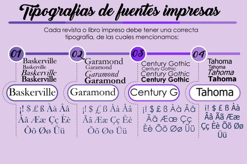
Tipografías de fuentes impresas Cada revista o libro impreso debe tener una correcta tipografía, de las cuales mencionamos:
01
02
Baskerville Baskerville
Baskerville
Garamond Garamond Garamond Garamond
Garamond
¡! $ £ ß Àà Ââ Ãã Ææ Çç Èè Õõ Øø Üü
03
Century Gothic Century Gothic
Century Gothic Century Gothic
Century G
¡! $ £ ß Àà Ââ Ãã Ææ Çç Èè Õõ Øø Üü
04
Tahoma Tahoma
Tahoma
Tahoma
¡! $ £ ß Àà Ââ ¡! $ £ ß Àà Ââ Ãã Ææ Ãã Ææ Çç Èè Õõ Øø Üü Çç Èè Õõ Øø Üü