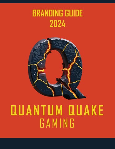
BRANDING GUIDE 2024
QUANTUM QUAKE GAMING
TABLE OF CONTENTS QUANTUM QUAKE GAMING
OUR MISSION
02
LOGO
03
COLOR GUIDE
05
TYPOGRAPHY
06
PHOTOGRAPHY
07
PATTERNS
08
DO / DO NOT USE
09
PACKAGING
10
01
OUR MISSION At Quantum Quake Gaming, we redefine the gaming experience by seamlessly merging innovation, style, and performance. As a leading provider of gaming accessories, we are committed to enhancing every gamer's journey with cutting-edge gear that goes beyond expectations.
Mission Statement:
Empowering gamers to conquer virtual realms with unparalleled precision and style.
Vision:
To be the catalyst for a new era of gaming, where every move is an adventure and every victory is a testament to the extraordinary.
Core Values:
Innovation: Pioneering next-level gaming technology. Quality: Uncompromising standards for durability and performance. Style: Infusing gaming gear with a touch of personality. Community: Fostering a global network of passionate gamers.
Why Choose Quantum Quake Gaming:
Futuristic Designs: Elevate your setup with accessories that reflect your unique gaming personality. Precision Engineering: Immerse yourself in games with unmatched accuracy and responsiveness. Gaming Ecosystem: A comprehensive range of accessories designed to seamlessly integrate and enhance your gaming experience. Step into the future of gaming with Quantum Quake Gaming – where every click, every move, and every victory matters.
02
LOGO
PRIMARY LOGO
QUANTUM QUAKE GAMING
QUANTUM QUAKE GAMING
Logo Psychology: The Quantum Quake Gaming logo is a visual embodiment of the brand's essence and commitment to revolutionizing the gaming experience. The prominent letter Q, crafted from the contrasting elements of lava and stone, symbolizes the dynamic fusion of heat and solidity in the gaming world. The choice of lava represents the intense, passionate energy that gamers bring to their play, while the stone signifies the foundation of strength and stability. This duality encapsulates the thrill and resilience required in the gaming realm. The Agency FB font was chosen for its sleek and modern aesthetic, complementing the Q's bold presence. The overall design speaks to the brand's promise of delivering gaming accessories that seamlessly blend innovation, style, and performance. It invites gamers into a realm where their every move is as powerful and fluid as molten lava and as enduring as stone.
ALTERNATE HORIZONTAL LOGO
QUANTUM QUAKE GAMING
QUANTUM QUAKE GAMING
03
LOGO
TYPOGRAPHY:
In crafting the visual identity of Quantum Quake Gaming, the choice of Agency FB for the typography is a deliberate decision to convey a sense of modernity, edginess, and intensity. The clean lines and bold strokes of Agency FB give the brand a contemporary aesthetic, aligning seamlessly with the cutting-edge nature of gaming technology. The font's geometric shapes and sharp angles evoke a dynamic energy, mirroring the fast-paced and thrilling world of gaming. It not only enhances readability but also adds a touch of sophistication to the brand's messaging. Agency FB captures the essence of Quantum Quake Gaming, where every letter embodies the precision and vigor that defines our commitment to revolutionizing the gaming experience.
Aa Bb Cc Dd Ee Ff Gg Hh Ii Jj Kk Ll Mm Nn Oo Pp Qq Rr Ss Tt Uu Vv Ww Xx Yy Zz 0123456789
SPACING:
Q
QUANTUM QUAKE Q
Q
GAMING
QUANTUM QUAKE
Q
Q
Q
Maintaining a harmonious visual balance is paramount in the Quantum Quake Gaming branding, extending even to the spacing around our iconic logo. The space surrounding the logo has been meticulously designed to be equivalent to the height of the distinctive letter Q in the chosen Agency FB font. This deliberate choice ensures a sense of uniformity and precision, reinforcing the brand's commitment to delivering gaming accessories with the same level of accuracy and attention to detail. The generous padding around the logo not only enhances its visibility but also allows it to command attention without feeling crowded. This thoughtful approach to spacing contributes to the overall cohesion and impact of the Quantum Quake Gaming brand, creating a visual language that resonates with the dynamic and polished nature of our gaming accessories.
Q
Q
Aa Bb Cc Dd Ee Ff Gg Hh Ii Jj Kk Ll Mm Nn Oo Pp Qq Rr Ss Tt Uu Vv Ww Xx Yy Zz 0123456789
GAMING
04
COLOR
PRIMARY COLOR PALETTE
Quantum Quake Gaming's distinctive color palette has been thoughtfully curated to evoke a sense of innovation, energy, and visual appeal. The dark grey-blue serves as the primary hue, symbolizing stability and sophistication. Complemented by a slightly lighter shade, this gradient adds depth and dimension, subtly infusing a modern and sleek aesthetic. The vibrant orange and bold yellow accents inject a burst of dynamism, creating a striking contrast that mirrors the excitement and intensity of the gaming world. This carefully chosen color scheme not only reflects the brand's commitment to cutting-edge technology but also ensures a visually engaging and memorable experience for the gaming community.
C=88 M=74 Y=54 K=64
C=82 M=66 Y=45 K=32
C=11 M=90 Y=100 K=2
C=7 M=11 Y=95 K=0
R:19 G:34 B:48
R:53 G:71 B:90
R:211 G:64 B:39
R:242 G:214 B:35
HEX #132230
HEX #35475A
HEX #D34027
HEX #F2D623
GRADIENT PALETTE
ACCESSIBILITY
HEADLINE ONLY TEXT OR HEADLINE TEXT OR HEADLINE
TEXT OR HEADLINE TEXT OR HEADLINE
HEADLINE ONLY HEADLINE ONLY TEXT OR HEADLINE
HEADLINE ONLY TEXT OR HEADLINE TEXT OR HEADLINE
05
TYPOGRAPHY Agency FB Bold (Headlines and Sub-headlines): The Agency FB Bold version serves as the bold and commanding voice of Quantum Quake Gaming. Its strong and impactful strokes are tailored for headlines and sub-headlines, allowing the brand's messaging to resonate with authority. Whether introducing new products or making bold statements, the Agency FB Bold font adds a touch of intensity and prominence, ensuring that key messages are not just read but experienced. Utilize this font variation to captivate attention and reinforce the brand's commitment to innovation and cutting-edge gaming experiences.
Agency FB Regular (Body Copy): For the body copy of Quantum Quake Gaming's communications, the Agency FB Regular font takes center stage. With its clean lines and balanced proportions, the Regular version ensures optimal readability without sacrificing the brand's modern and sophisticated aesthetic. This font variation is perfect for conveying detailed information, narratives, and creating a seamless reading experience. Employ Agency FB Regular for newsletters, product descriptions, and any content where clarity and elegance are paramount. The consistent use of this font across body copy establishes a cohesive and professional brand voice.
Aa Bb Cc Dd Ee Ff Gg Hh Ii Jj Kk Ll Mm Nn Oo Pp Qq Rr Ss Tt Uu Vv Ww Xx Yy Zz 0123456789
Aa Bb Cc Dd Ee Ff Gg Hh Ii Jj Kk Ll Mm Nn Oo Pp Qq Rr Ss Tt Uu Vv Ww Xx Yy Zz 0123456789
Ensuring Readability and Accessibility: When selecting text colors for Quantum Quake Gaming's visual materials, we prioritize not only aesthetics but also readability and accessibility. For guidance on choosing text colors that ensure legibility and align with accessibility standards, please refer to the dedicated section in our color guide. This valuable resource provides insights and recommendations to guarantee that your chosen text hues maintain optimal contrast, making information easily readable for all users. Quantum Quake Gaming is committed to creating an inclusive and user-friendly visual experience, and the accessibility section is your go-to reference to achieve just that.
06
PHOTOGRAPHY
07
PATTERNS PATTERNS AND TEXTURES Embark on a visual journey through Quantum Quake Gaming's design language, where technology and sleek aesthetics converge in a seamless dance. Our patterns draw inspiration from the elemental forces of gaming, featuring intricate designs reminiscent of lava flows and the solidity of stone. These elements, rendered in a contemporary flat illustrative style, add a touch of modernity to the brand's visual identity. The infusion of RGB-inspired patterns further amplifies the dynamic and vibrant nature of Quantum Quake Gaming. The flame design that graces the background of this guide serves as a testament to the brand's commitment to pushing boundaries and igniting the passion within the gaming community. Explore these patterns to evoke the essence of innovation, intensity, and the ever-evolving landscape of gaming.
PATTERNS MAY VARY DEPENDING ON PRODUCT AND USE
08
DO/DO NOT USE DO USE THE FOLLOWING:
The text only logo is intended only for use on dark / black backgrounds where the full color Q logo cannot be used. The use of the text only logo should be limited to only those situations where the color of the ground where the logo will be applied is limited to a color that will not work well with the Q logo. Text only logo can be used in either white or the Quantum Yellow as applicable. Ensure accessibility when selecting the color for the text only logo use.
QUANTUM QUAKE GAMING
QUANTUM QUAKE GAMING
DO NOT USE THE FOLLOWING:
Do not stretch the logo to make taller or wider. Logo must be resized proportionally if size needs to be adjusted. Do not use the color logo on a black or similarly dark background. If logo must be used on a black or similarly dark background, use the text only logo seen above.
QUANTUM QUAKE GAMING
QUANTUM QUAKE GAMING
09
QUANTUM QUAKE
GAMING
GAMING
QUANTUM CORE KEYBOARD
QUANTUM CORE KEYBOARD
GAMING
QUANTUM QUAKE
QUANTUM CORE KEYBOARD
QUANTUM QUAKE
QUANTUM CORE KEYBOARD
PACKAGING
10
QUANTUM QUAKE GAMING
Quantum Quake Gaming www.quantumquake.com Phone: 1-234-567-7890 Info@quantumquake.com