3 minute read
HOME + GARDEN
SpringInto Color
STORY & PHOTOS BY LIVING RIGHT DESIGNS
Advertisement
Pantone is the standard language for colors. It is a Matching System and is the standardization system that assists in color matching and identification. It is comprised of 1,867 solid colors. People in different locations can refer to the same color by knowing only the number that identifies it in the Pantone System. This helps manufacturers and others to avoid mistakes like color deviation between the design and the finished product. As long as a factory has the right Pantone number for the color of your product, they can be sure about whether or not the color will match your specification.
Since color scientists point to the significance and impact our environmental hues have on our well-being, Pantone’s 2021 Colors of the year announcement is an opportune moment to look at where and how one might want to use its selection(s). This year Pantone has unveiled not one, but two hues for its Color of the Year: the neutral Ultimate Gray (Pantone 175104) and energetic yellow Illuminating (Pantone 13-0647). Yellow is the color of the mind and the intellect. Ultimate Gray is a timeless neutral that provides a foundation in interiors. The two colors compliment each other beautifully, and one can expect to see the combination throughout the fashion, beauty, and interior design industries in the new year.
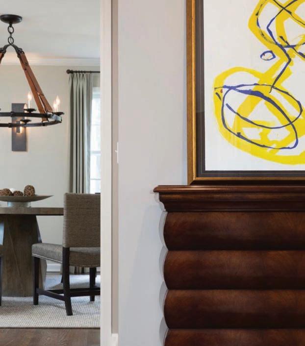
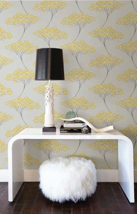
To work this duo into your own home, try a few of these ideas for incorporating Pantone’s 2021 colors of the year, both indoors and out. Perfect for painted walls, wall paper or upholstered furniture, Illuminating yellow adds a dash of brightness and energy when used on accent furniture, wall decor, accessories like pillows and arrangements, wallpaper, outdoor spaces or even a front door.
BEFORE


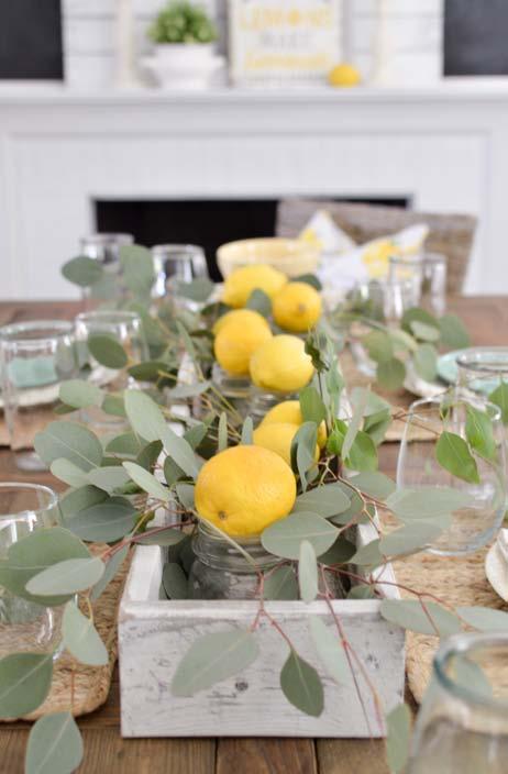
Color trends come and go, so one of the best ways to incorporate them is with accessories that can easily and inexpensively be switched with the times. Pillows, area rugs, throw blankets, wall art, and other accessories offer a simple way to try out Pantone’s colors of the year without going all-in on new furniture or wall paint right away. Layering in yellow accessories to add charm to a neutral kitchen is a great way to see how it will characterize the space. Start with a base of gray on cabinets, walls, or countertops then introduce yellow in smaller ways. These colorful accents can be as simple as illuminating yellow décor displayed on open shelves, a vessel of lemons on the counter, or a touch of yellow in a floral arrangement. Set a welcoming tone from the street by having a bright, happy yellow painted front door. The optimistic and uplifting color stands out particularly well against exteriors with gray siding or roofing materials. It is a wonderful spot to showcase a stunning color because it’s typically applied with paint, making it quite easy and inexpensive to change in the future.
Take Pantone’s 2021 colors outside for an inviting patio, porch, or deck. Create a neutral foundation with gray patio furniture, then accessorize with yellow pillows, lanterns, patio rug and other bright accents. Of course, bright yellow foliage is always a great way to bring color into any area.


