11 minute read
Early Learning Disparities in Hillsborough County


INTRODUCTION
Advertisement

Over the past year, the ELCHC has been studying the early education landscape of the county, through work titled “Early Education Disparities in Hillsborough County.” This work was undertaken with the help of the reseach team at the University of Florida Anita Zucker Center for Excellence in Early Childhood Studies. The impetus for this work was a revision to Rule 6M-4.741, F.A.C., which became effective in May 2020. This revision increased the contract minimum threshold composite score that providers must achieve in order to be a part of the School Readiness program. This minimum score to contract increased from a 2.51 to a 3.50 in the 20202021 year and to a 4.0 in the 2021-2022 year. An exception the 2020-2021 threshold was given to existing providers who scored between a 3.00 and 3.49. If a provider scored between a 3.0 and a 3.99 in the 2020-2021 year, they will be placed on a quality improvement plan. As of February 2021, this rule is being revised by the Office of Early Learning.
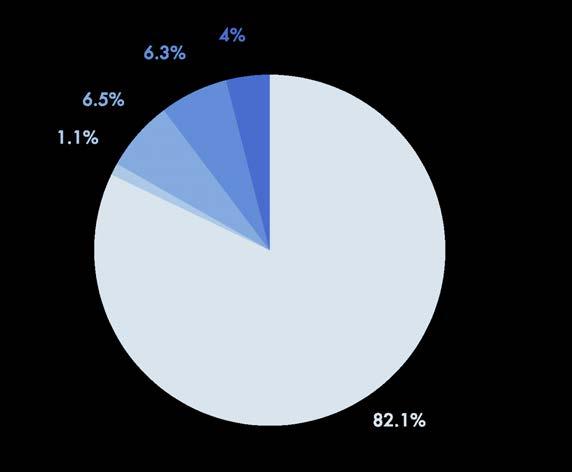
Composite scores can change on a daily basis as providers receive their annual observations. However, based on current numbers, the ELCHC has approximately 88 providers below a 3.5 and 116 below a 4.0 — affecting a potential 2,731 children or 6,464 children, respectively. It would also negatively impact child care employment. With so many providers potentially falling below the minimum threshold, the ELCHC was concerned that the rule change could create “child care deserts” for School Readiness families as well as disrupt the continuity of care for at-risk children.
To look further into the needs of our community both related to the rule change and other areas of need, the ELCHC entered into an agreement with the University of Florida to collaborate on an analysis. Lead Research Scientist Herman Knopf analyzed School Readiness providers at all composite CLASS score levels along with other socioeconomic demographics.
The ELCHC and UF teams’ research results are highlighted in the following tables, maps and graphs with the purpose of informing the ELCHC leadership team of the potential impacts of increased contract score requirements and guide discussion on what, if any, accommodations should be made to maintain or increase access to child care services throughout Hillsborough County. In addition, ELCHC staff developed an additional series of maps to overlay socioeconomic conditions in Hillsborough County to more clearly show the communities in the county which will be hit the hardest from the restriction of access to early learning programs.
SUMMARY
The Classroom Assessment Scoring System (CLASS) tool by Teachstone was chosen by the state to assess programs. CLASS measures the quality of teacher-child interactions, including emotional and behavioral support, engaged support for learning, classroom organization, and instructional support for children ages birth to Kindergarten entry. CLASS observations are conducted in half of the classrooms of each age group (Infant/Toddler/Preschool). A Composite Score is given to each provider. Scores can range between a 1.00 and a 7.00.
READING THE FLICCA MAPS
The follow sets of maps represent multiple Florida Index of Child Care Access (FLICCA) data points in one map. The colors represent different scenarios in Hillsborough County:
Scenario 1 (S1) —Positive Selection and Positive Infrastructure Given the School Readiness (SR) care available to parents, a greater proportion of parents are choosing high quality care. There are a greater number of high quality child care slots than there are children receiving subsidies in these areas. This is the preferred scenario.
Scenario 2 (S2) —Negative Selection and Positive Infrastructure Given the SR care available to parents, a greater proportion of parents are choosing low quality care There are a greater number of high quality child care slots than there are children receiving subsidies. This indicates a need to improve parent selection.
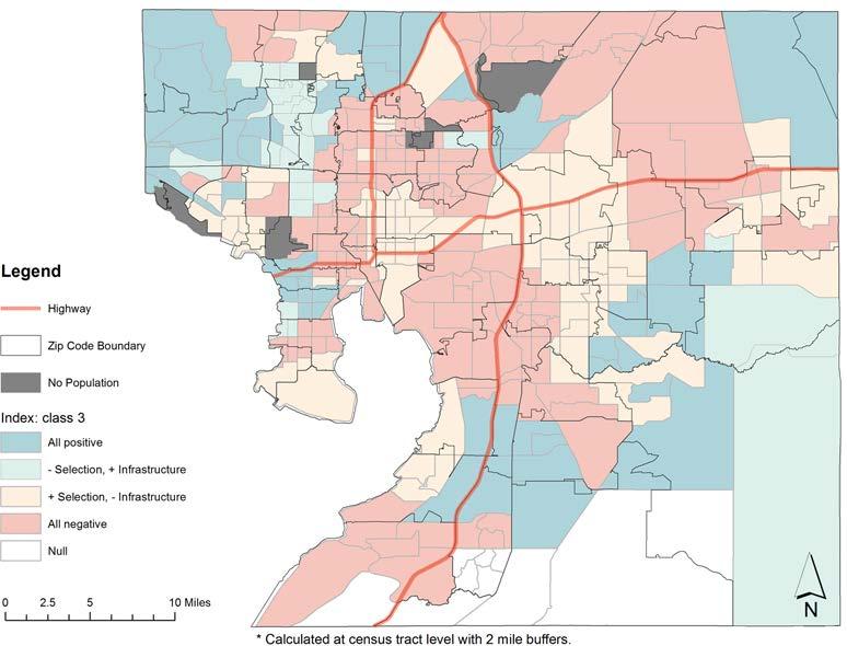
Scenario 3 (S3) —Positive Selection and Negative Infrastructure Given the SR care available to parents, a greater proportion of parents are choosing to use high quality care However, there are a greater number of children receiving subsidies than there are high quality slots. This indicates a need for more high quality slots.
Scenario 4 (S4) —Negative Selection and Negative Infrastructure Given the SR care available to parents, a greater proportion of parents are choosing low quality care. There are a greater number of children receiving subsidies than there are high quality child care slots. This indicates a need for more high quality slots and a need to improve parent selection.


This map shows the distribution of High Quality (HQ) and Low Quality (LQ) providers using CLASS Scores of 4.0 as the threshold for quality overlayed with the physical locations of child care providers plotted using a detailed legend. Quality sites are plotted in blue, while lower quality sites plotted in orange. Stars represent child care sites that serve a large proportion of school readiness children compared to the number of private pay children served; specifically, greater than or equal to 60% school readiness children. Circles represent child care sites that serve less than to 60% school readiness children. When it comes to capacity of quality child care slots for school readiness families, blue stars representing high quality/high utilization sites would be ideal.
Map 1: Distribution of HQ/LQ Providers & Index (Score >=4.0)

Map created by the research team at the University of Florida Anita Zucker Center for Excellence in Early Childhood Studies
S1
Preferred scenario
Need to improve parent selection Need for more high quality slots
Need for more high quality slots and a need to improve parent selection.

S2 S3

S4
Maps 2 and 3 show the geographic distribution of High Quality (HQ) and Low Quality (LQ) providers within Hillsborough County. The FLICCA Matrix helps illustrate that when the quality threshold moves from a 3.50 to a 4.00 CLASS Composite Score, the infrastructure of high-quality child care in the county significantly declines. Areas that were once dark and light teal (S1 & S2) representing a preferred scenario for quality infrastructure, turn into yellow and pink (S3 & S4) which indicates a need for more high-quality slots. Areas of light teal and pink (S2 & S4) also indicate a need to improve parent selection of high quality child care programs.
Map 2: Hillsborough FLICCA*, Score >= 3.5
Map 3: Hillsborough FLICCA*, Score >= 4.0
S1
S2
S3

S4
Preferred scenario
Need to improve parent selection Need for more high quality slots Need for more high quality slots and a need to improve parent selection.
Maps created by the research team at the University of Florida Anita Zucker Center for Excellence in Early Childhood Studies
These maps show the percentage of children enrolled in high quality child care services at CLASS Score 3.5 (Map 4) and 4.0 (Map 5) within each Census Tract in Hillsborough County that are paying a differential at price higher than the median price in Hillsborough County. By differential, we mean the cost difference between the private pay rate and the rate paid for the subsidized School Readiness services. The maps show parents are paying a higher differential in certain geographical areas of the county regardless of the high-quality infrastructure in the region. The market rate for child care services in certain geographical areas in the county are the driving force behind private pay rates.
Map 4: Percent** of SR Children that Pay Differential & Price Above/Equal Median (Score >= 3.5)
Map 5: Percent** of SR Children that Pay Differential & Price Above/Equal Median (Score >= 4.0)
S1
S2
S3
S4
Preferred scenario
Need to improve parent selection Need for more high quality slots Need for more high quality slots and a need to improve parent selection.

Maps created by the research team at the University of Florida Anita Zucker Center for Excellence in Early Childhood Studies ELCHC Community Needs Assessment 2021 | Page

POVERTY AND CHILD CARE IN HILLSBOROUGH COUNTY Poverty + Kindergarten Readiness Rates
Map 6 illustrates poverty rates in Hillsborough County overlaid with VPK Providers and their performance based on the VPK Program Provider Kindergarten Readiness Rate. Specifically, the darker the shade of blue, the higher poverty rate of children under 18 years of age (2018 American Community Survey, U.S. Census Bureau). Each plot on the map represents a VPK provider, the color of the plot & the adjacent number represents the provider’s performance on their Readiness Rate for the 18-19 program year, which is a rating up to 100. The darker shades of orange to red are the lower performing VPK providers. The Readiness Rate given to VPK Providers is based on how VPK students perform on two measures: • The Florida Kindergarten Readiness Screener, which is currently the Renaissance Star Early Literacy assessment during the first 30 days of Kindergarten • The VPK Assessment to show learning gains which is administered at the beginning & end of VPK by the teacher (accounts for up to 10% of the rate) • The minimum rate is set at 60% by the Office of Early Learning. Providers under this rate are considered low performing providers.
Takeaways:
Notice how the higher poverty areas, typically have lower performing providers. This is a trend that is also reflected with public schools and their 3rd-grade reading levels. This data shows the opportunity gap that children from disadvantaged families experience in Hillsborough County, specifically when it comes to access to quality VPK child care providers. Investing in more resources and instructional support for VPK programs in higher poverty area could potential help minimize this gap.
Map 6: Poverty and Kindergarten Readiness Rates

Map 7 illustrates poverty rates in Hillsborough County overlaid with School Readiness providers and their performance based on how they performed on observations using the CLASS tool by Teachstone. This tool measures the quality of teacher-child interactions, including emotional and behavioral support, engaged support for learning, classroom organization, and instructional support for children ages birth to Kindergarten entry. CLASS observations are conducted in half of the classrooms of each age group (Infant/ Toddler/Preschool). A Composite Score is given to each provider. Scores can range between a 1.00 and a 7.00. Each plot on the map represents a School Readiness provider, the color of the plot & the adjacent number represents the provider’s Composite Score (most recent score as of March 2020). The darker shades of orange to red are the lower performing School Readiness providers. Poverty is represented by the shades of blue: the darker the shade of blue, the higher poverty rate of children under 18 years of age (2018 American Community Survey, U.S. Census Bureau).
Takeaways: Unlike the map of VPK Providers with Readiness Rates, this shows that low performing School Readiness Providers are dispersed across different levels of poverty. This might be because the demographic of children/families served is much different in School Readiness compared to VPK. While VPK is free for all Hillsborough 4-year old children, most families who are eligible to receive School Readiness have a household income is below 200% of the Federal Poverty Level or below 85% of the State Median Income. Additionally, there is a fundamental difference in the tool that is used to measure performance– Readiness Rates are determined by child outcomes, and CLASS is determined by teacher-child interactions.
Map 7: Poverty + CLASS Scores

CONCLUSION

As our state moves forward in introducing initiatives that aim to improve the readiness of a child entering kindergarten, raising the standards without creating foundational quality will negatively impact the access that families have to affordable quality child care. There is an urgency to increase the quality without impacting the capacity to serve working families that need child care options. This analysis shows that well-intended changes aiming to increase the quality of early childhood may come at a cost to capacity. Without child care options, our county will see a decline in the local economy. As we move forward with assisting providers with increasing quality, using data to make these decisions is a priority.
A Closer Look
To view Maps 1-7 in more detail, scan the QR code with your smart phone or follow the link below.
https://www.elchc.org/wp-content/uploads/2021/02/2021CNAMaps.pdf