5 minute read
Brand Story

by AmPhil

Strengthening Civil Society
Communities flourish when people join together to work for good. Such “voluntary associations” are the lifeblood of civil society, and they imbue our lives with meaning.
Advertisement
But voluntary associations require money. And that requires clear goals, effective strategy, and— because they are not-for-profit—fundraising. When people don’t give or raise money well, this meaningful work withers.
Since 2009, American Philanthropic has helped nonprofit organizations grow and flourish with practical guidance, strategic analysis, and no-nonsense consultation.
Rather than peddling secret methods or promising fast results, American Philanthropic helps nonprofits raise money by doing the right things the right way, consistently over time. And we help donors identify and support the work that matters.
It’s work that asks the hard questions. That uses the best tools for the job. That finds the best way to bring people together, voluntarily.
When your aim is to work for good, you owe it to yourself to work smart, as well as hard.
Voice
Your general attitude towards the world.
CALMING, CLARIFYING, ENCOURAGING
American Philanthropic approaches its clients with a wealth of knowledge, practical experience, and highly qualified team members.
That is, they operate with a high level of competence… and without sounding know-it-all, or condescending, their voice should convey this status.
When team members speak, they’re calm, collected, knowledgeable… but they’re not in it just to tell you what you want to hear.
As an imaginary character, American Philanthropic would speak with a deep, warm voice, the kind that pulls people back to reality and common sense while encouraging them to launch forward. Not just friendly, it’s a voice that’s encouraging, truthful, and life-endowing.
This knowing, reassuring intelligence would lend itself to elegance and directness. By the way they speak, American Philanthropic signals that they understand the nonprofit world. They’ve been there, themselves and they’re glad to help.
Tone
If voice is the attitude an author has towards the world as a whole, then tone is the attitude that the author has towards the little corner of the world they’re talking about right now. Your tone expresses how you feel towards whatever you’re writing about today.
CURIOUS, FRIENDLY, ENLIVENING
Rather than overeager, or falsely sincere, American Philanthropic’s tone toward their corner of the world would be curious, friendly, and convivial... an elegant, socially intelligent balance of consideration for others, warmth, and humor.
From the way they speak, write and interact, they lift the mood and enliven the conversation.
Their tone would also convey some of the liveliness, humor, and camaraderie the team enjoys amongst itself and among those they work with. From clever anecdotes to thoughtful questions and crackling laughter, this is a tone that draws you in, welcomes you, and leaves you smiling.
Mood
When you write, the mood is how you make your reader feel about your topic. Do you want them to feel romantic? Do you want them to laugh?
RELAXED, ASSURED, AND INTRIGUED
American Philanthropic woos its audience by imparting a mood that’s calm, assuring… but crackling with intrigue and interest.
Those reading, listening, or conversing with team members will feel calmed and welcomed, and they’ll know right off the bat that they’ve come to the right place. They’ll sense intelligence, warmth, wisdom, attentiveness. They’re in good hands… and that’s assuring.
But after quickly sensing a wealth of experience, and seeing superb metrics and practical steps that make sense for their nonprofit, they’ll be hooked.
With solid data, sage advice and a warm handshake from some of the most talented, experienced people in nonprofit consultancy, American Philanthropic’s clients will feel assured and confident. They’ll be delighted in knowing that they’ve got the best guide they could possibly have.
In many cases, American Philanthropic’s history, experience, and unique appreciation of western tradition will pique their client’s interest, intrigue them, and give them a taste of something they’d like to know more about.
American Philanthropic stands for values that don’t always run with the herd… especially when major companies and institutions all over are embracing polarizing political stances as a way to simply run with the herd.
Logo WITH TAGLINE
Colors
TYPOGRAPHY ICONS
PHOTO GUIDELINES
Usage
Over Dark
USE LIGHT BRAND COLORS
Monogram
OVER LIGHT OR DARK
Minimum Width
STANDARD: .75 INCH
WITH TAGLINE: 1 INCH
Pattern
Use to give open space or background colors more depth and interest
Minimum Clearance
ONE “P” IN ALL DIRECTIONS
Logo Restrictions DO NOT ALTER PROP ORTIONS, COLORIZE WITH OFF-BRAND COLORS, USE WITH LOW CONTRAST, ADD A DROP SHADOW, OR ATTEMPT TO RE-CREATE
AmPhil
Note: To achieve this look in InDesign, place vector AmPhil Oak Tree, choose fill color, then direct-select tree and adjust “Inner Shadow” effect settings as needed. Lower tree opacity to achieve desired look.
Brand Colors
This is AmPhil’s brand color palette, to be used in all digital and print applications.
Values
AmPhil Black
H: 555649
R: 85, 86, 73
C: 61, 52, 66, 35
PANTONE 418 C
AmPhil White
H: f7f8f9
R: 247, 248, 249
C: 2, 1, 1, 0
PANTONE 663 C
Porcini Taupe
H: 8a7e76
R: 138, 126, 118
C: 46, 45, 49, 9
PANTONE 408 C
Marble Cream
H: e3e1da
R: 227, 225, 218
C: 10, 8, 12, 0
WARM GRAY 1 C
Cherry Red
H: a23c3c
R: 162, 60, 60
C: 26, 87, 76, 18
PANTONE 704 C
Faded Navy
H: 50686e
R: 80, 104, 110
C: 71, 48, 47, 19
PANTONE 431 C
Colonel Yellow
H: cea33c
Primary Accents
R: 206, 163, 60
C: 20, 34, 91, 1
PANTONE 110 C
Secondary
Autumn Rust
H: ac6e53
R: 172, 110, 83
C: 28, 60, 70, 10
PANTONE 7591 C
Potomac Green
H: 797f55
R: 121, 127, 85
C: 50, 35, 73, 18
PANTONE 7749 C
Note: Primary colors should always be dominant when choosing a color palette. Avoid the use of too many accent colors. See sample palettes on the following page.
Sample Color Palettes
Note: Do not create a palette without primary colors, with accent colors as dominant, or using all accents in a single palette.
Brand Typography
Use these brand fonts when they are available. Revert to the following page otherwise.
Aa AA Aa
SOFIA PRO REGULAR ALL CAPS - SUBTITLES + META
Haboro Serif Norm Regular - Body
Alternate Typography
Use these alternate fonts when brand fonts are not available.
Header Font is Garamond Bold
SUBTITLE + META FONT IS HELVETICA REGULAR ALL CAPS
Body font is Garamond, which is a very safe font to use across most applications and programs, including email clients, web applications, and more. This is the combo to use for most web and email platforms. Use this set if brand fonts are unavailable. If this set is unavailable, see below.
Typography Sizing
Header Font is Times New Roman Bold
SUBTITLE + META FONT IS ARIAL REGULAR ALL CAPS
Body font is Times New Roman, which is a very safe font to use across most applications and programs, including email clients, web applications, and more. This is the combo to use when all other options are unavailable.
Lorem Ipsum
Earciet Demodictibus
Volut restrum dolescietur, oditium ut accaboris quaspis endit, aut vel ipid ut quia voluptatate eatur?
Il il iunt hictum endit, quatet quas et expelectur, tem in nia secte ipsam volectem. Feressit ex exeruptur aut occumentias es dollupt asperiam:
• Dollupt ateniscid quaecto exceperferum et aut ab in num est, ent.
• Ique con nimilicabo. Nam essitati blaut voluptam nobis restium fugitiae nestota pa sam.
Lorem Ipsum
Volut restrum dolescietur, oditium ut accaboris quaspis endit, aut vel ipid ut quia?
Earciet Demodict
Il il iunt hictum endit, quatet quas et.
Dollupt ateniscid
Feressit ex exeruptur aut occumentias es.
Nam Essitati
Blaut voluptam nobis restium fugitiae nestota.
Ique
Con Nimilicabo
Nam essitati blaut voluptam nobis restium.
NISQUIDEBIS DITAM
Soloreptae re, sit atature hendant impores.
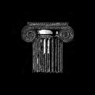
Icons
AmPhil’s iconography should look hand-drawn and demonstrate depth and richness, without being overly detailed. Sample icons and sketch style are shown below.
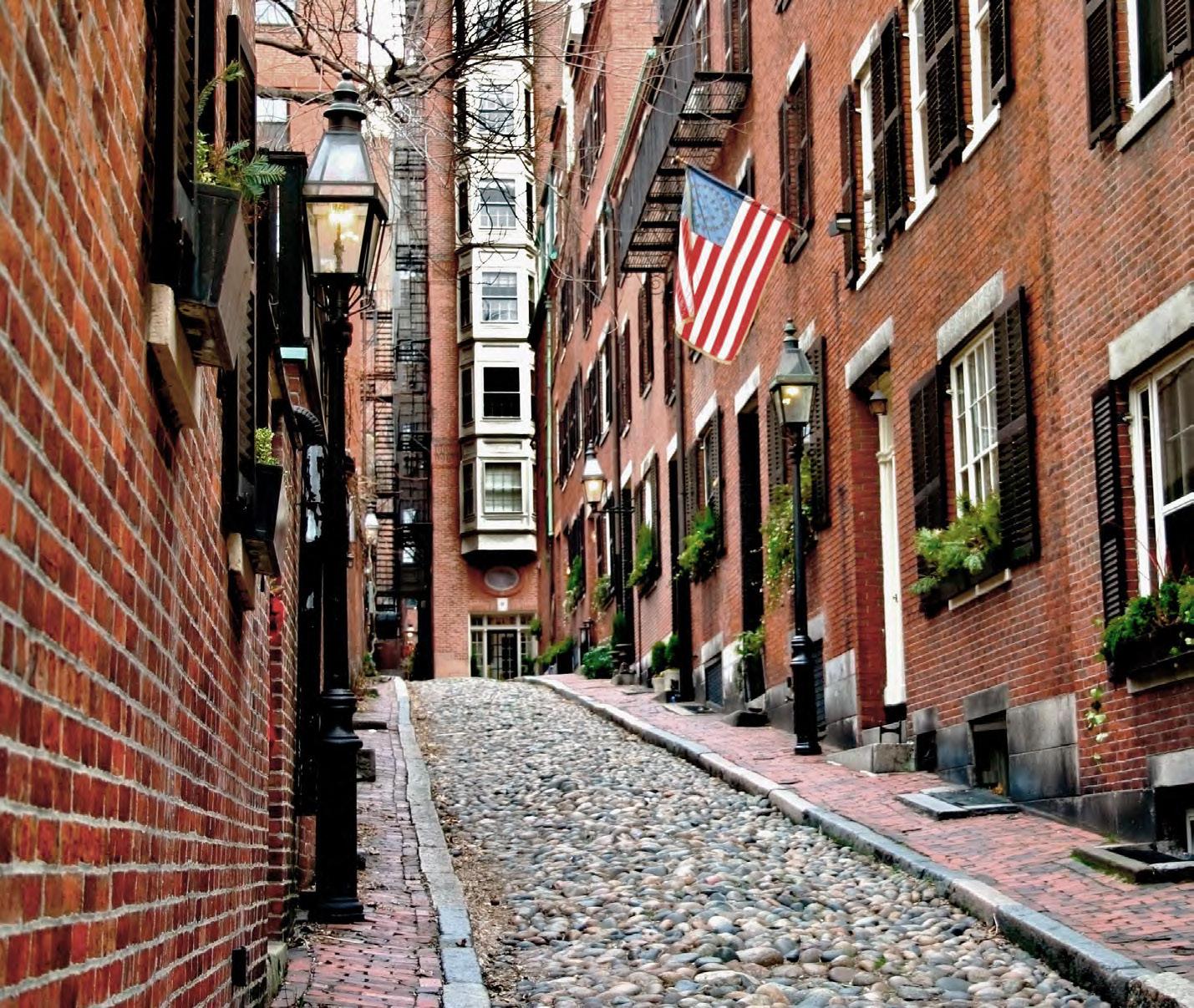
Photography Guidelines
AmPhil’s photography should give off a classical elegance, with slightly muted colors and lower contrast.