SANIA MEIH
Graphic Designer
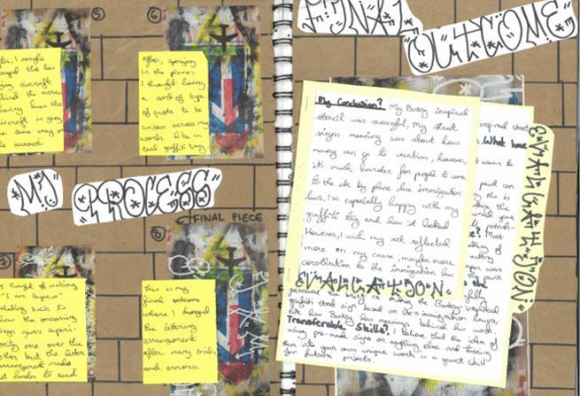
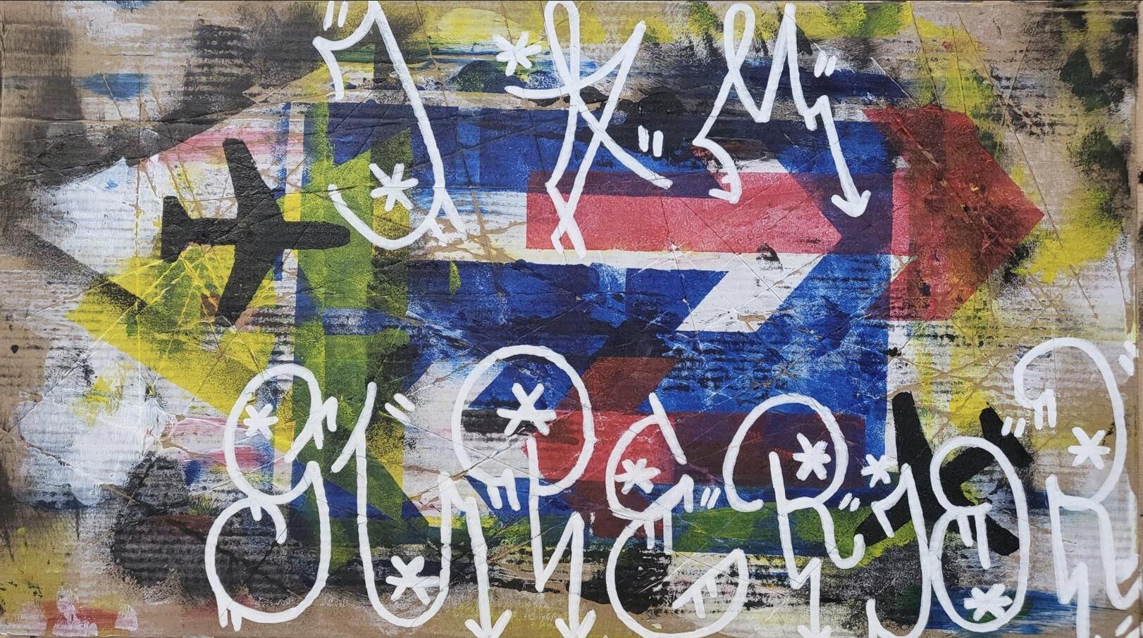

For this project, I created a Banksy-inspired street art stencil centered on road signs. Using a "Right of Way" sign, I aimed to highlight immigration issues, specifically, the struggle many face in accessing the UK, contrasted with how easily some travel back to their home countries for vacations. This project improved my stenciling skills and taught me how to express powerful messages through design.
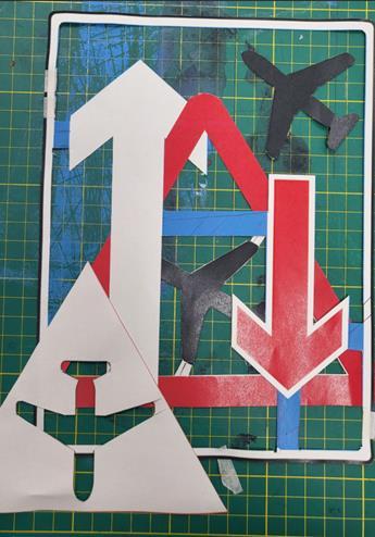
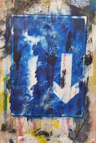
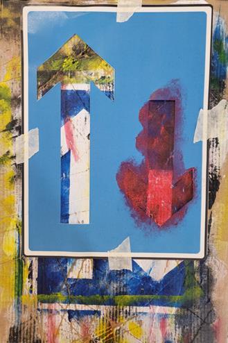
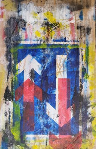
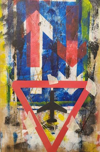
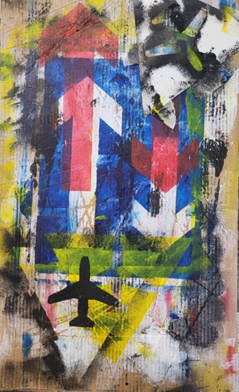
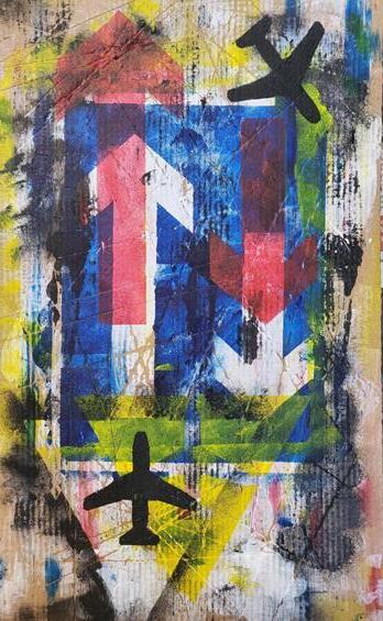
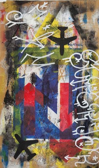
This project allowed me to focus on traditional, hands-on skills instead of digital ones, showcasing my creativity through stenciling. Typography played a key role in conveying the message, blending elements of street art I found online and in real life into a unique style. It made me realise how much I enjoy creating meaningful designs that highlight social issues.
Packaging Design
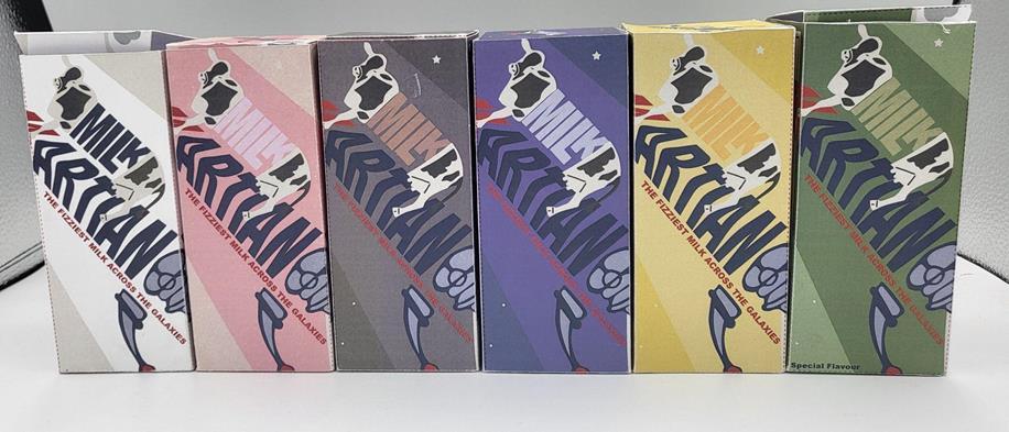
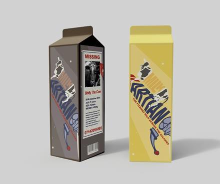
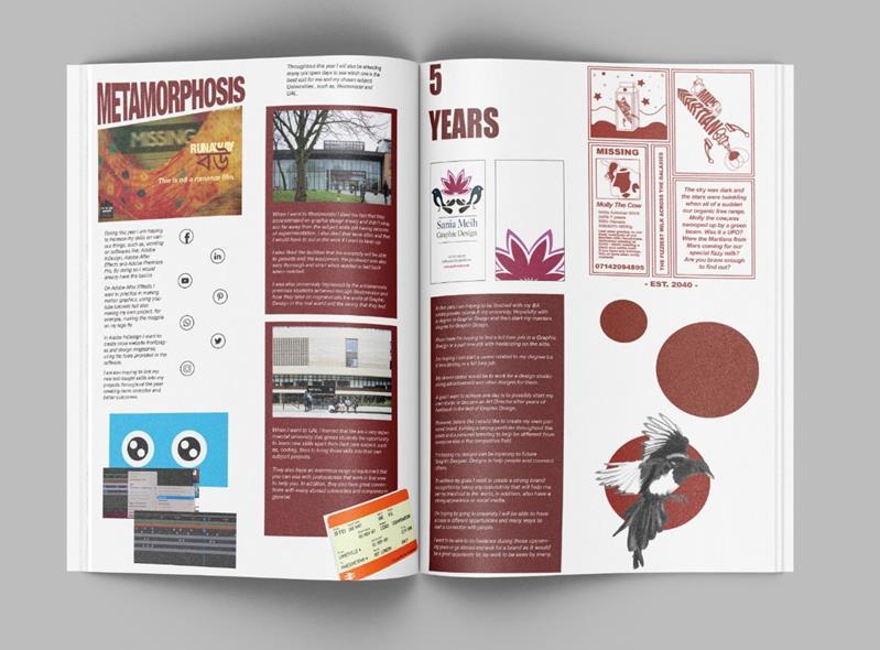
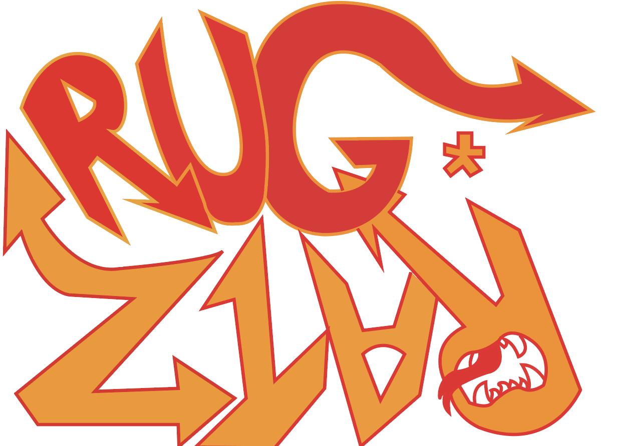
For my first project, I designed packaging for a fizzy milk drink, aiming to create a fun, familyfriendly carton that would appeal to younger audiences. After experimenting with logos and visuals, I finalised a design in Adobe Illustrator and developed different versions based on various flavours. Choosing the right colour palette was challenging as I wanted the colours to complement each other without clashing. Despite this, I’m proud of the variety of designs I created, which not only enhanced the product’s appeal but also improved my Adobe Illustrator skills.
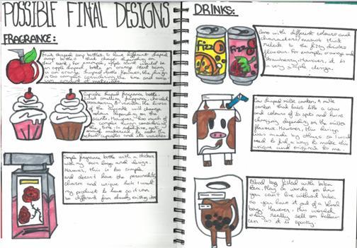
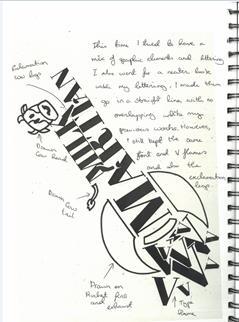
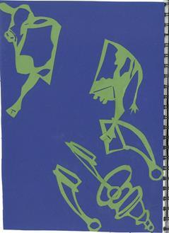
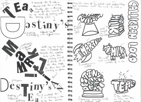
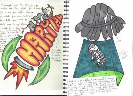
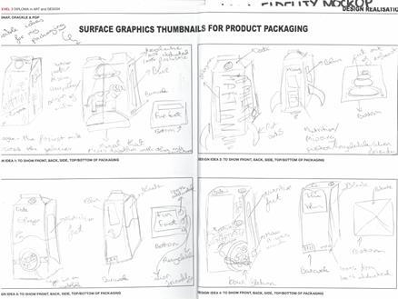
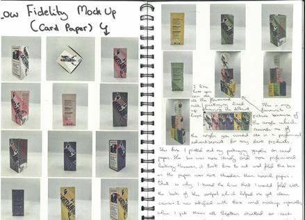
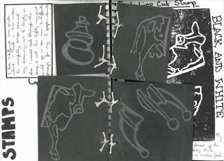
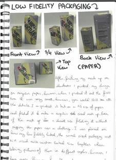
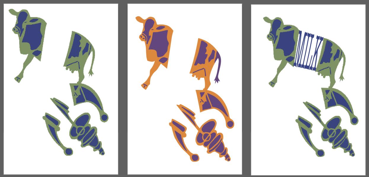
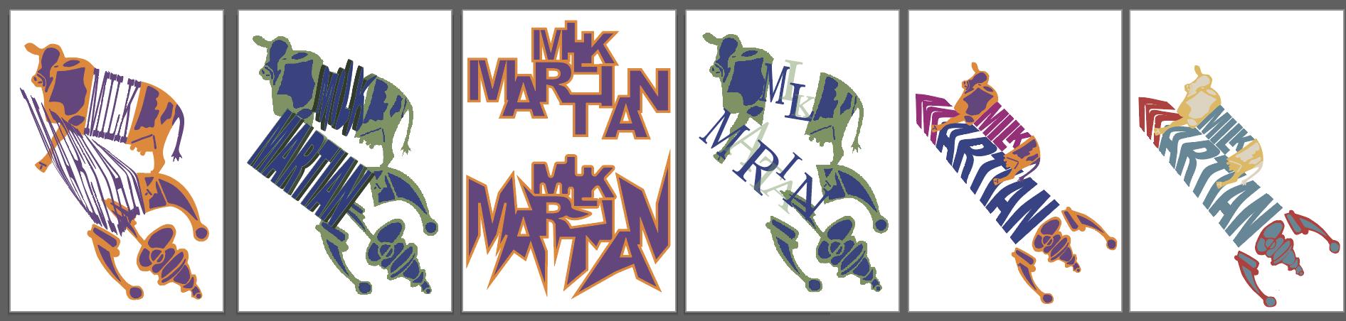
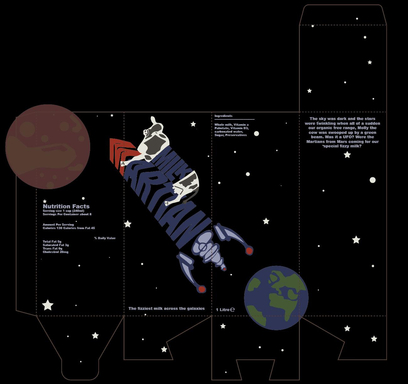
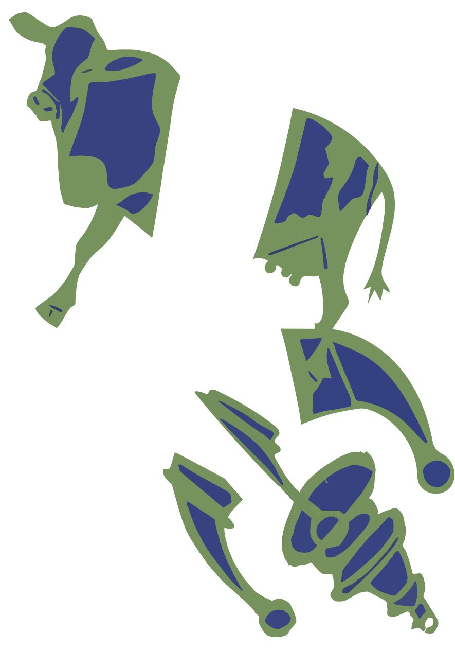
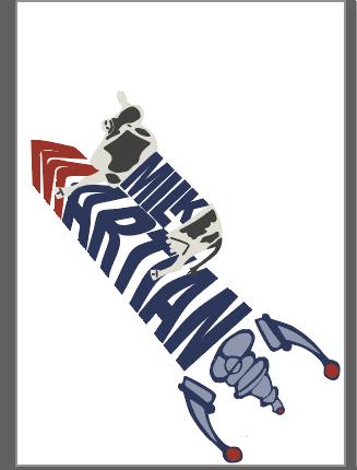
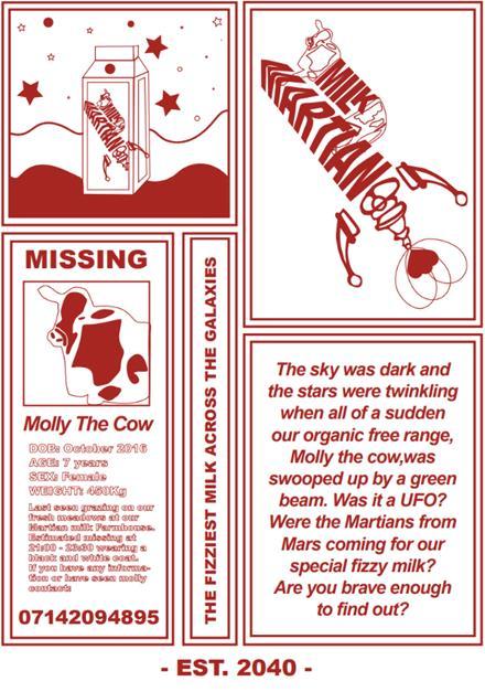
For this project, I designed a unique milk carton for the quirky concept of fizzy milk. I experimented with logos using stenciling, lino cutting, and sketching before refining the design in Adobe Illustrator. Initially aimed at kids with bold graphics, I shifted to a subtler style, using a colour palette to match milk flavours—green for matcha, pink for strawberry.
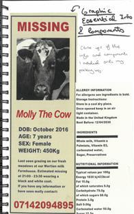
I chose bold, readable typography and added a playful “missing cow” poster, inspired by old milk cartons, imagining a cow abducted by aliens. In the future, I’d explore creative carton shapes and adjust colours to enhance contrast and readability.
Advertisement
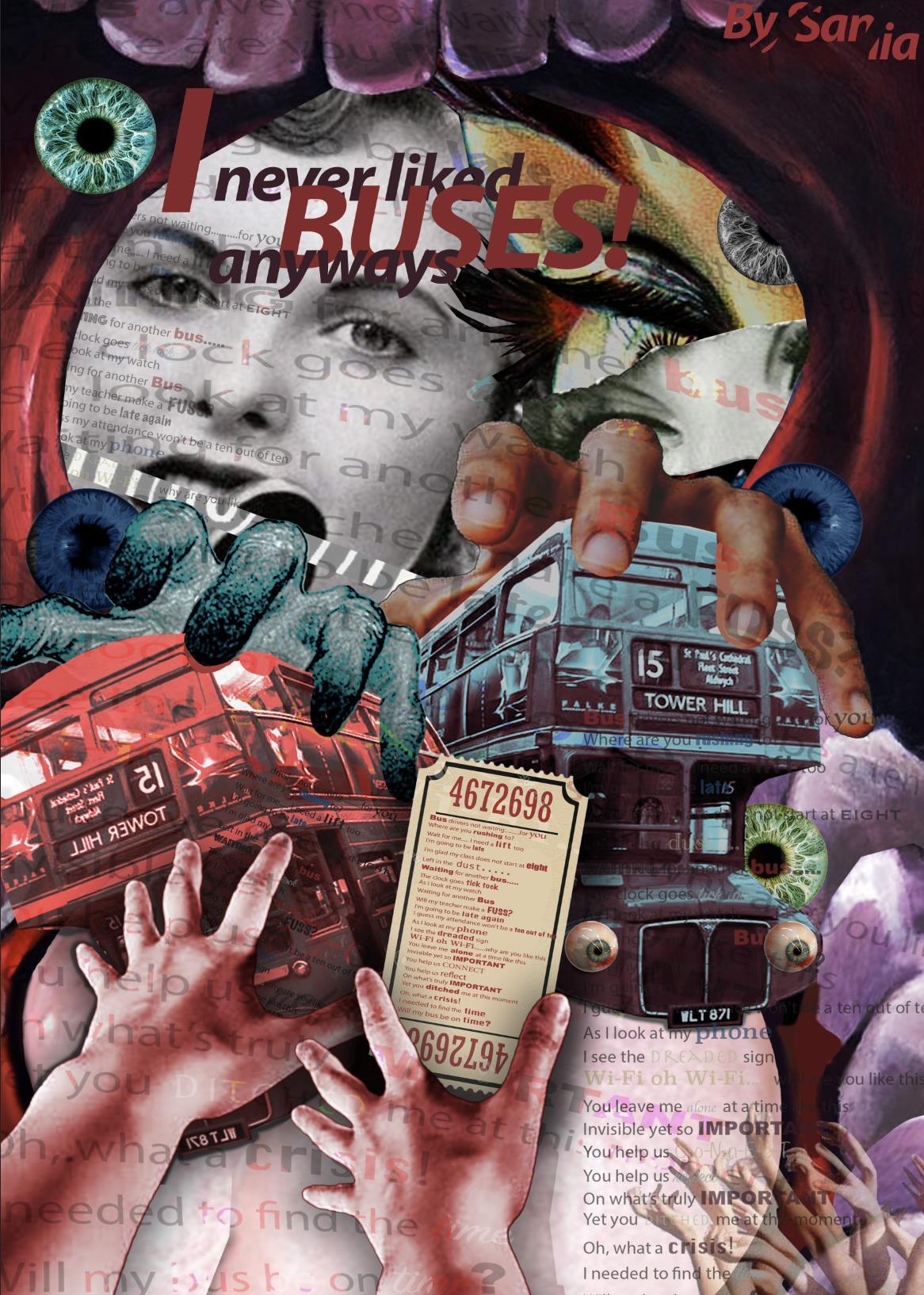
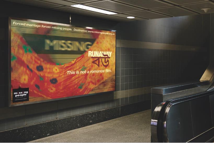
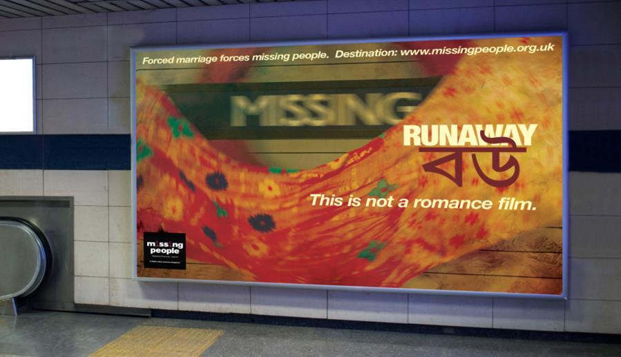
For this project, I created an advertisement highlighting arranged child marriage in Bangladesh, incorporating the theme of metamorphosis. Centered on vibrant fabrics, I photographed and merged images in Photoshop, finalizing the typography and layout in Illustrator.
The main challenges were capturing dynamic fabric shots and selecting typography colors that complemented the fabrics. Through this process, I learned photoshoot basics and the impact of typography in connecting with audiences. This meaningful project, which reflects my passion for awareness-driven design, earned me a spot on the Creative Conscience competition shortlist.
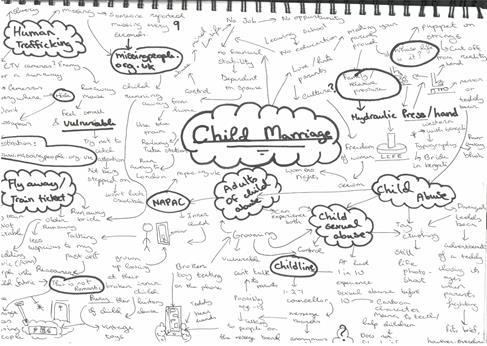
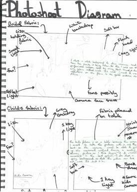
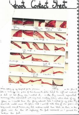
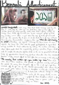
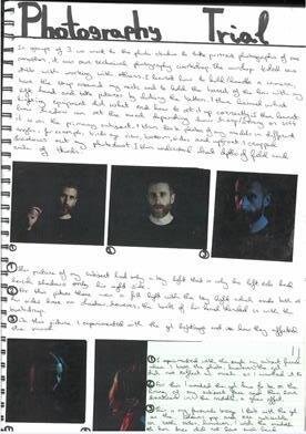
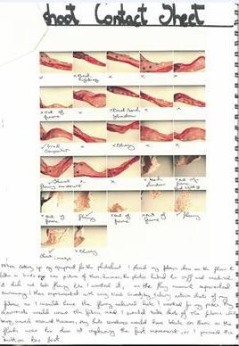
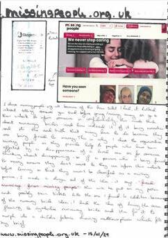
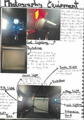
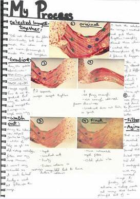
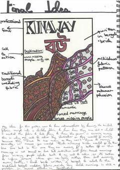
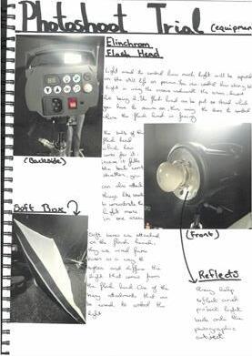
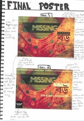
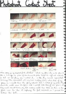
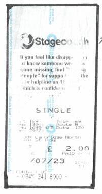
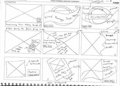
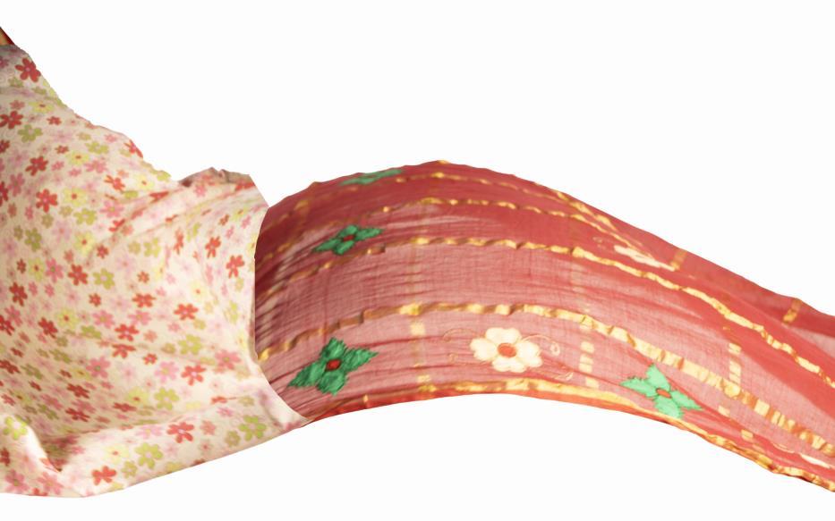
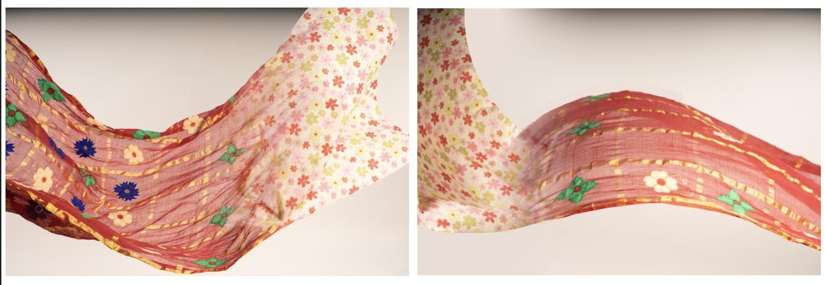
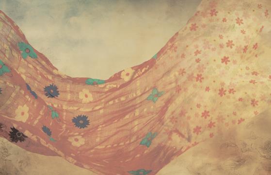
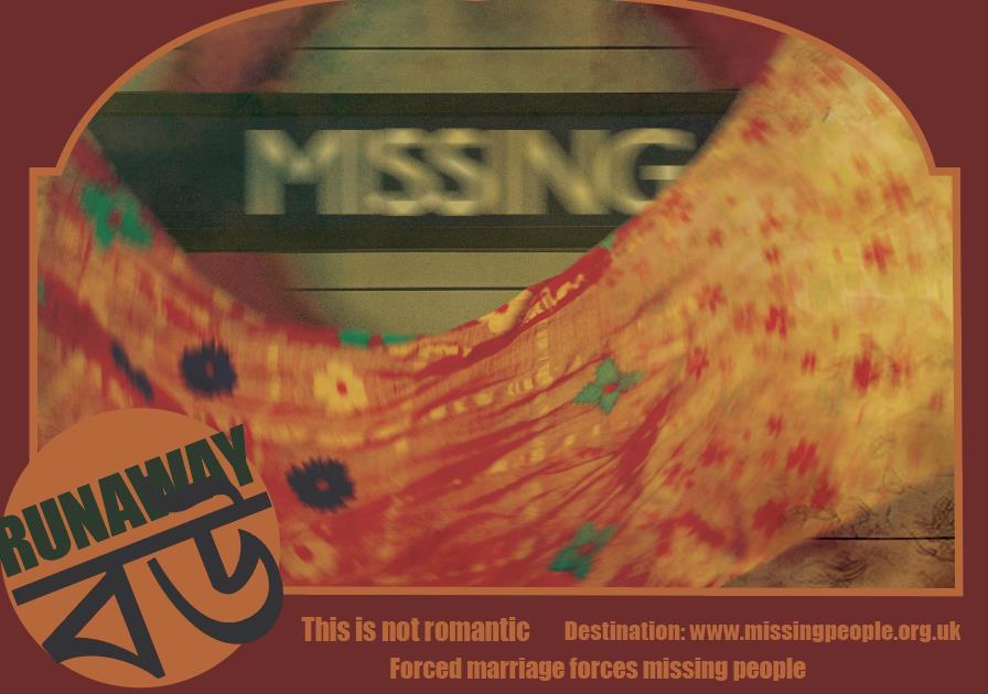
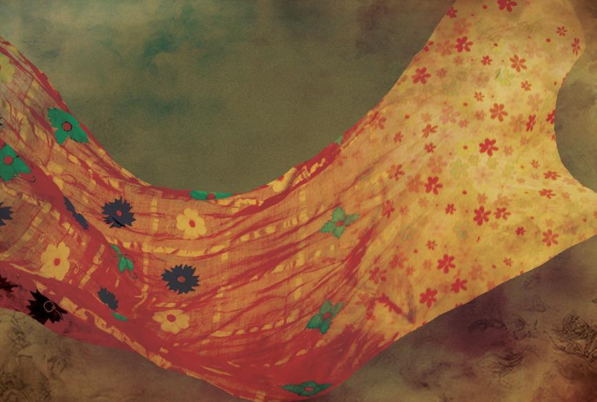
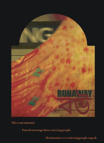
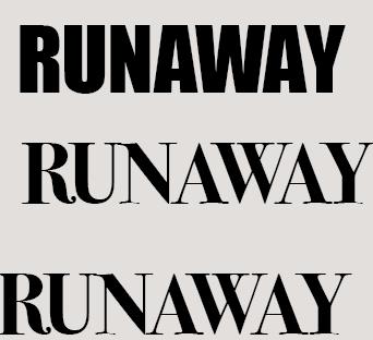
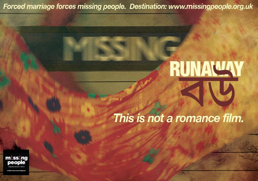
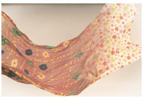
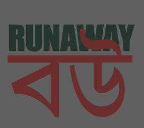
I created an advertisement addressing child marriage in Bangladesh, inspired by a TfL ticket with a missing persons helpline. My "Runaway Bride" concept symbolized a child’s transformation into a bride by merging children’s fabric with a Bengali bridal saree. After a dynamic photoshoot, I used Photoshop to blend images and added a Bollywood-inspired filter for a cinematic feel.
The design featured a TfL sign reading "Missing" and "Bride" in Bengali to connect with non-English speakers. Inspired by old Bollywood posters, the simple layout highlighted the issue’s harsh reality. Revisions would focus on making the children’s fabric more recognizable and adding multilingual text.
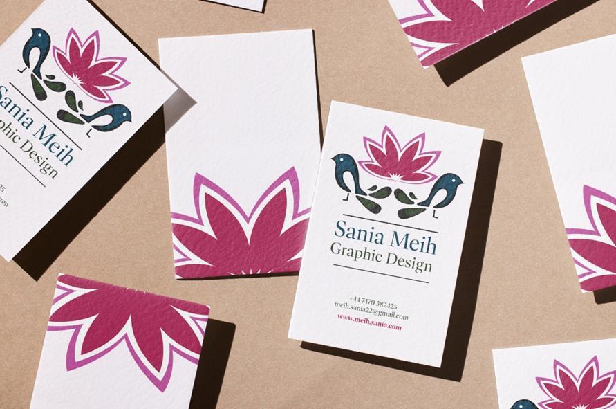
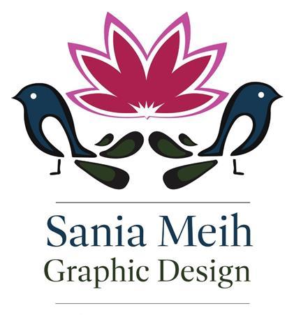
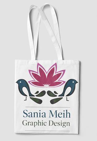
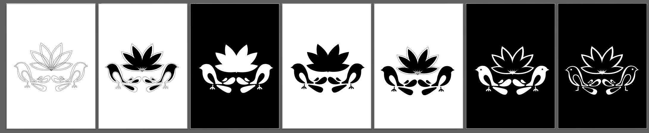
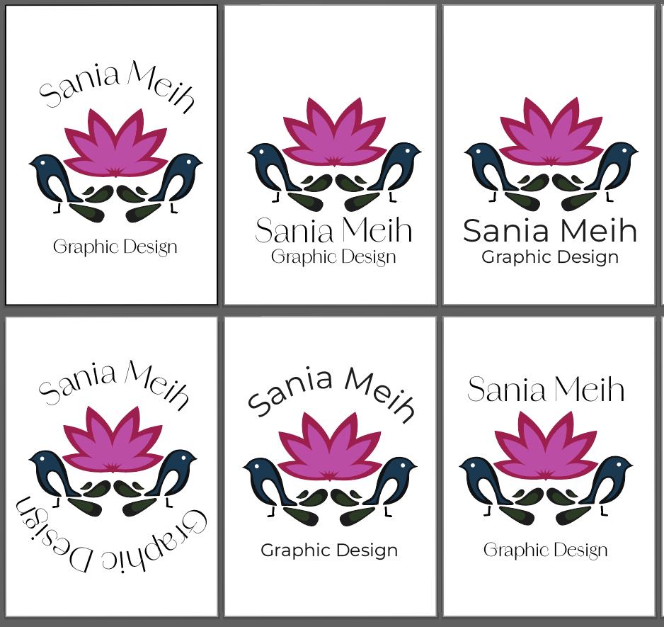
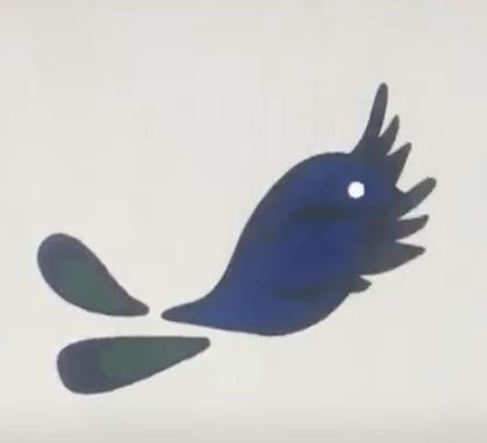
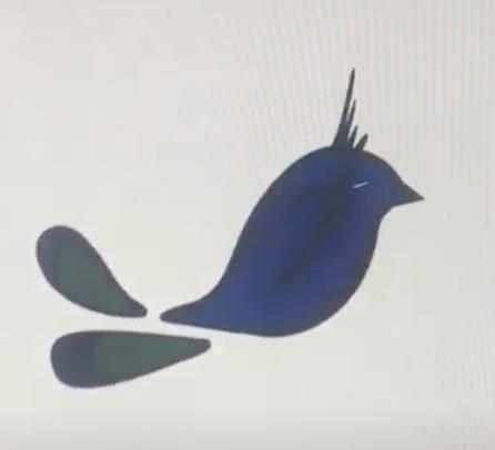
For this project, I designed a personal logo for future branding, aiming for something both professional and meaningful. I drew inspiration from the magpie and water lily, the national bird and flower of my parents' home country. The challenge was incorporating these elements in a way that felt sophisticated and not childish. Through peer feedback and multiple sketches, I refined my design in Adobe Illustrator. This process taught me the importance of experimentation, personal branding fundamentals, and the value of feedback.
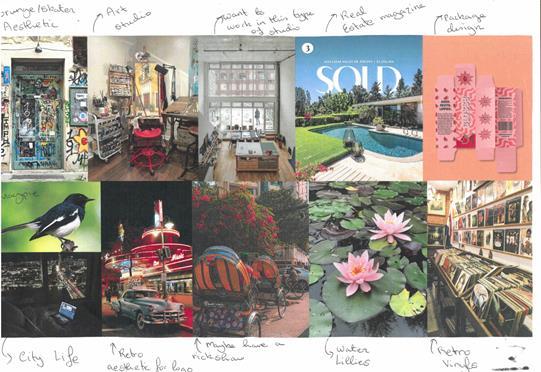
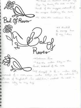
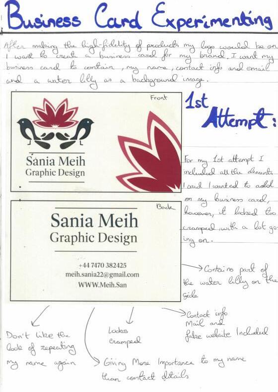
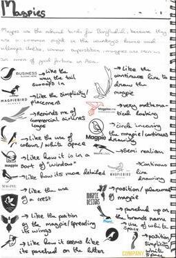
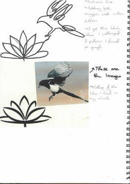
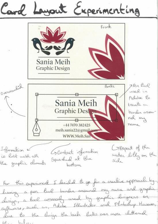
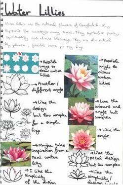
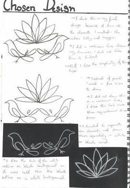
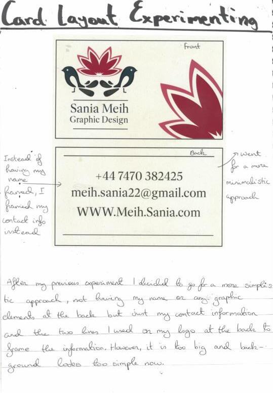
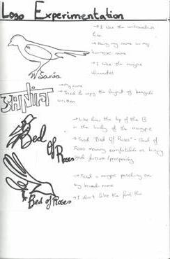
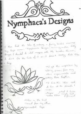
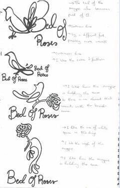
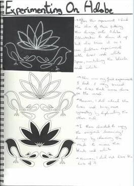
My logo, featuring a magpie and water lily from my parents' home country, reflects my heritage. Through experimentation and feedback, I refined the design for simplicity and scalability across items like mugs and business cards. This project highlighted the importance of adaptability in logo design.
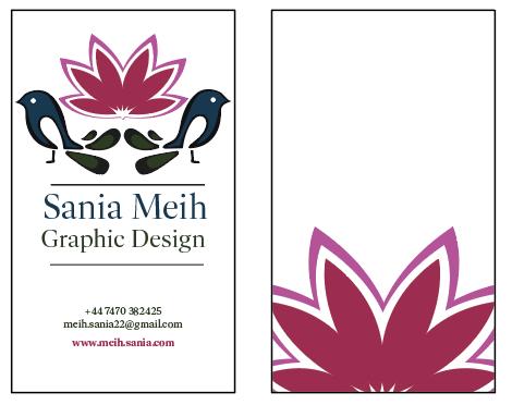
My Final Design for my Business Card. Instead of a typical horizontal card, my design is for a vertical business card.
Motion Graphics
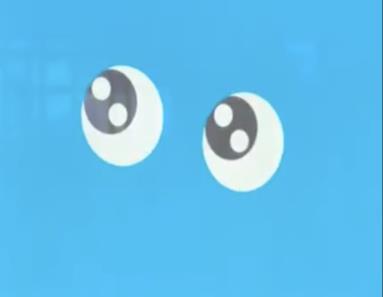
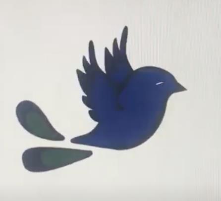
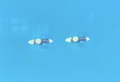
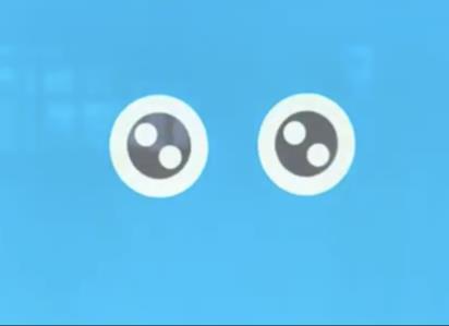
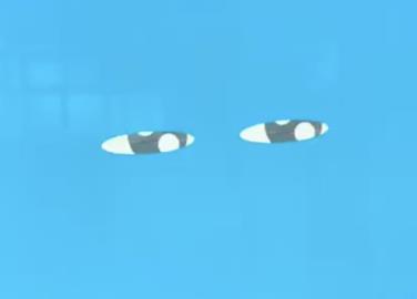
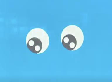
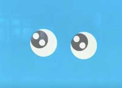
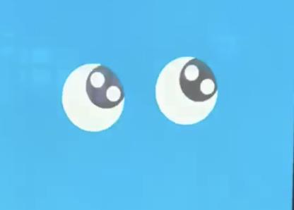
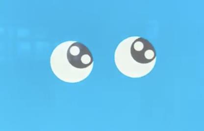
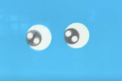
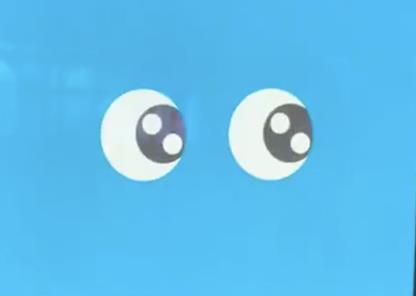
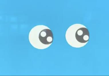
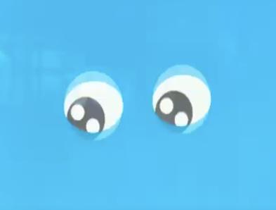
For this self-initiated project, I aimed to familiarize myself with Adobe After Effects. Using YouTube tutorials and self-learning, I created moving images, starting with a pair of cartoonish eyes that blinked, shifted side to side, and moved across the screen. I designed the eyes in Illustrator, layered them, and animated them in After Effects, following a step-by-step process that I’m proud of.
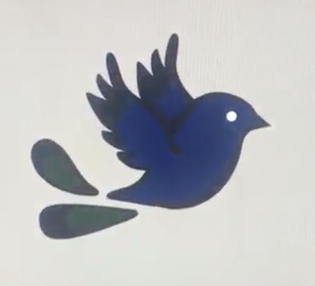
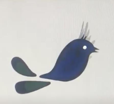
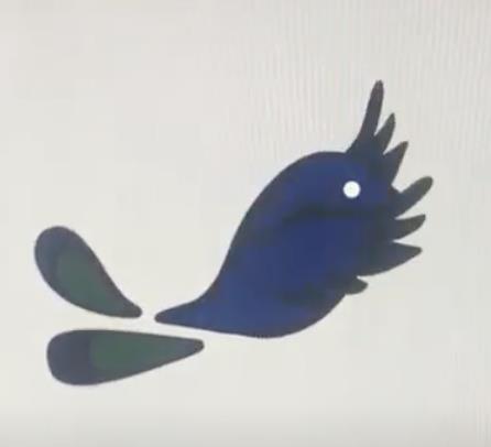
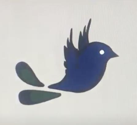
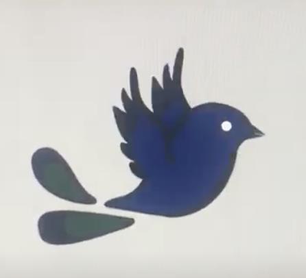
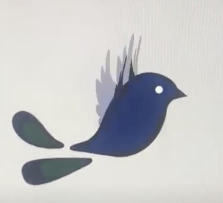
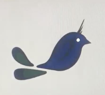
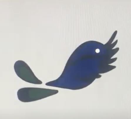
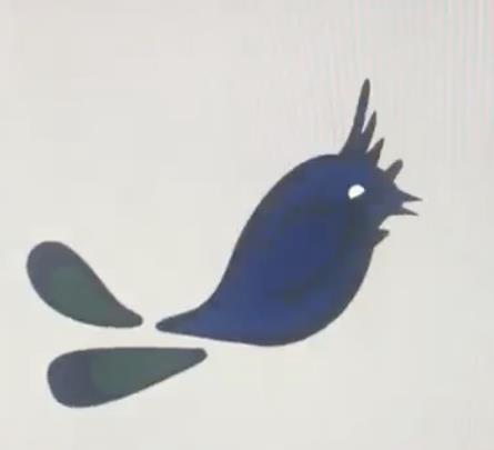
For my second experiment, I animated a motion graphic of my logo, featuring a magpie. Unlike the tutorial, I had to adapt steps to suit my design, including slowing the bird's wing movements to match a magpie’s natural flight.
This project taught me valuable motion graphics skills, a growing trend in the design world, and boosted my confidence in After Effects.
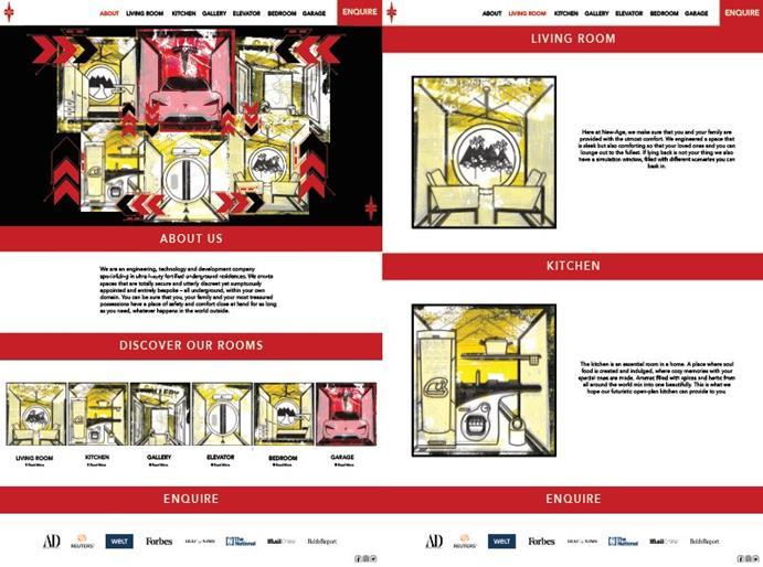
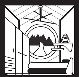
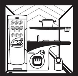
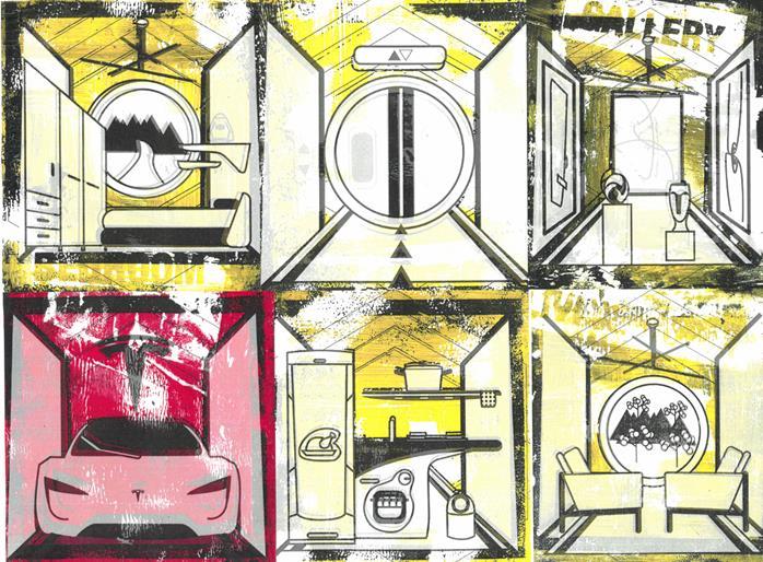
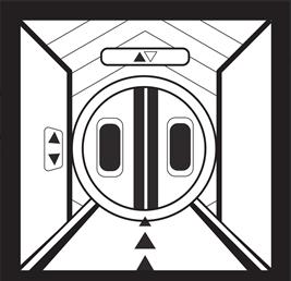

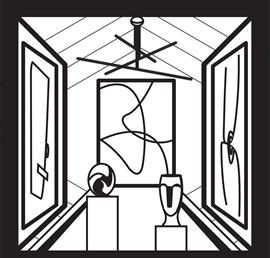
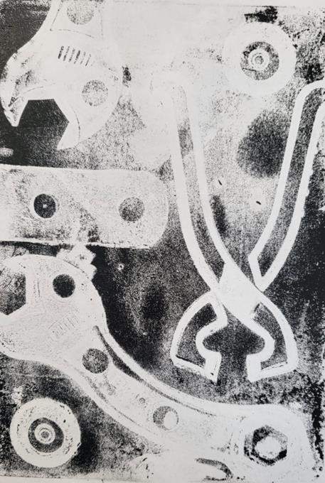
In this mini-project, I honed my gelli printing skills and learned Adobe InDesign basics.
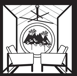
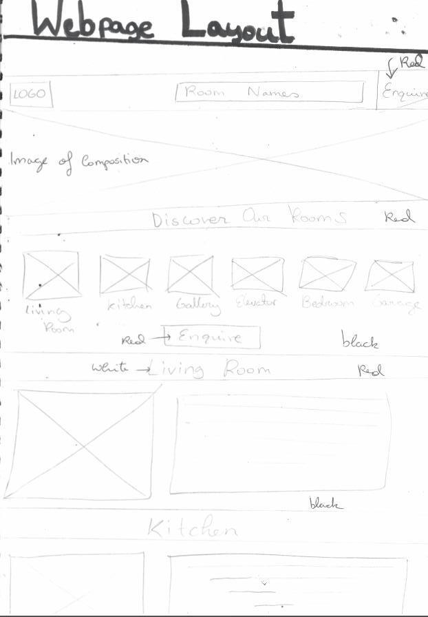
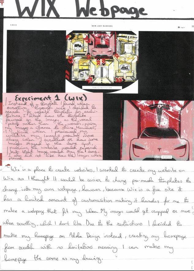
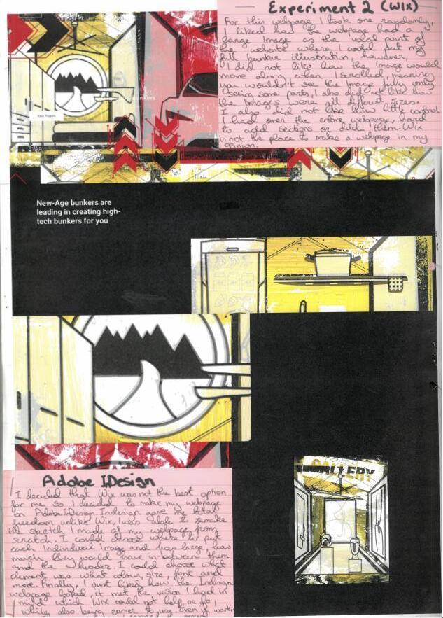
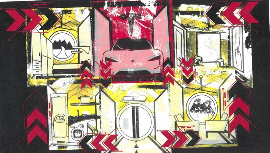
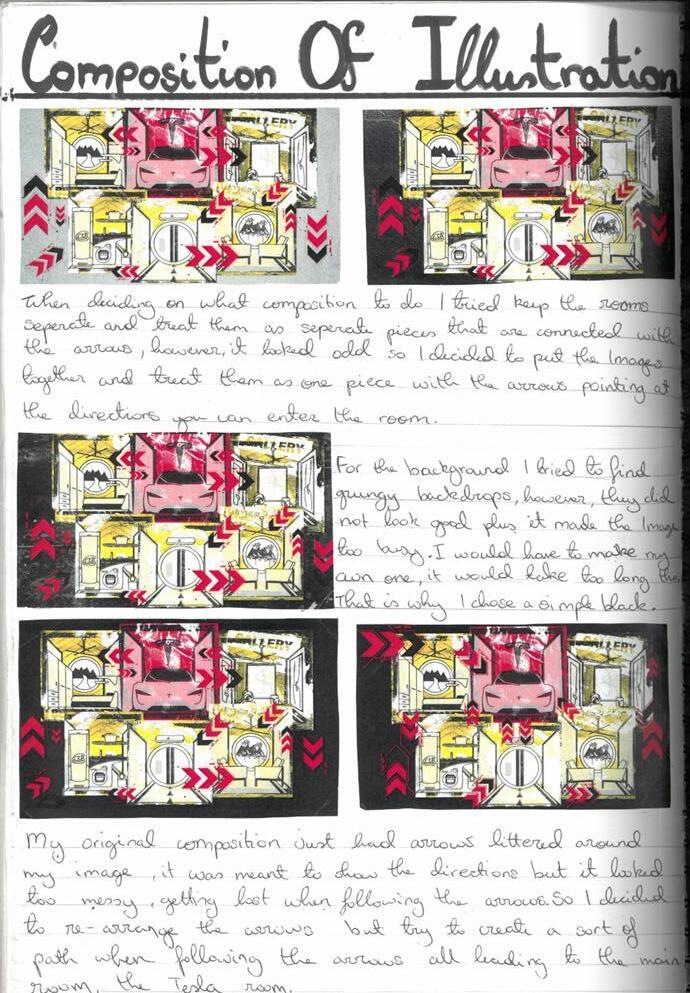
Inspired by Elon Musk, I designed sci-fi rooms in Illustrator, printed them on shiny paper, and layered acrylic paint and typography through gelli printing. After editing the best prints in Photoshop, I refined compositions in Illustrator, adding sci-fi arrows to link the rooms, and used InDesign to mock up a futuristic home website.
The main challenges were perfecting gelli prints and learning website design in InDesign. This project enhanced both hands-on and digital skills, valuable for future work.
3D Model Making
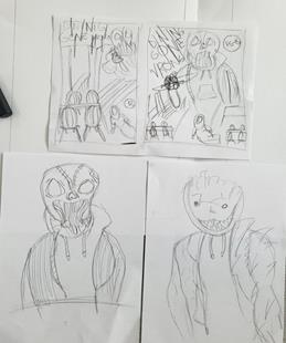
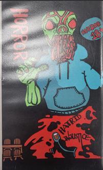
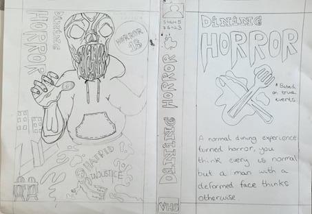
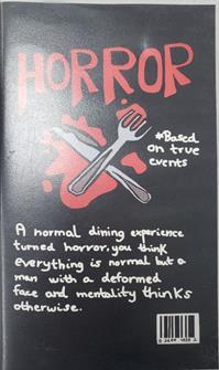
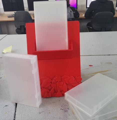
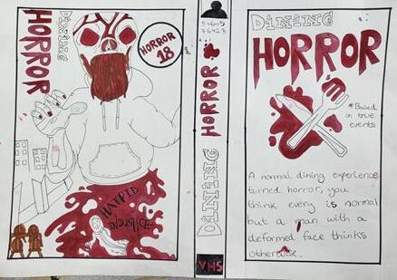
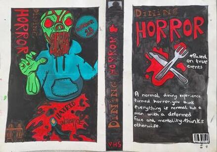
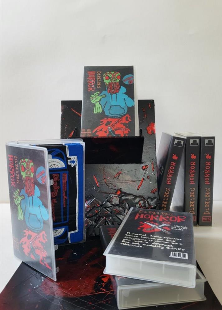
For this project, I created a piece to promote an "event" focused on raising awareness about a social issue. Drawing inspiration from old VHS tapes and the horror game studio Puppet Combo, I designed a concept for a horror game based on a true story of religious injustice. My goal was to convey the message in a way that was impactful but not overly distressing.
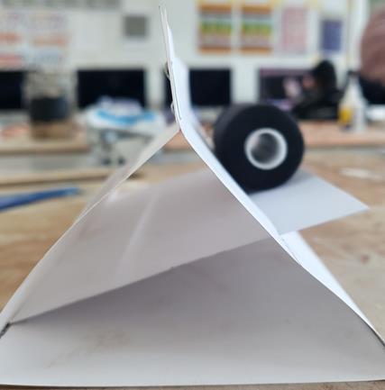
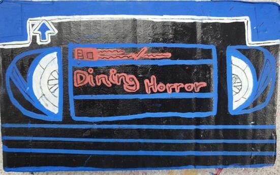
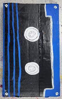
This project pushed me out of my comfort zone, emphasising traditional skills like model-making over digital ones. I crafted a VHS tape, its cover, and a display shelf to bring the concept to life. It taught me valuable hands-on techniques and inspired me to explore more possible projects that combine traditional craftsmanship with digital design.
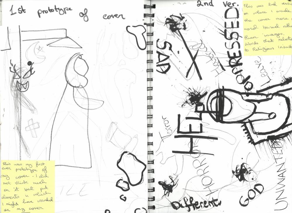
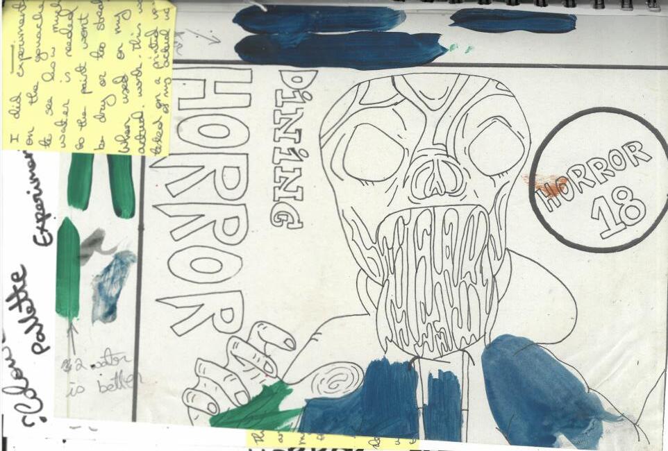
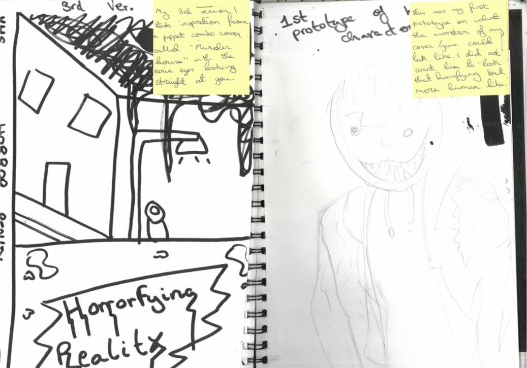
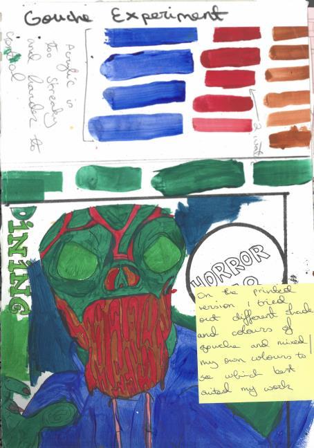
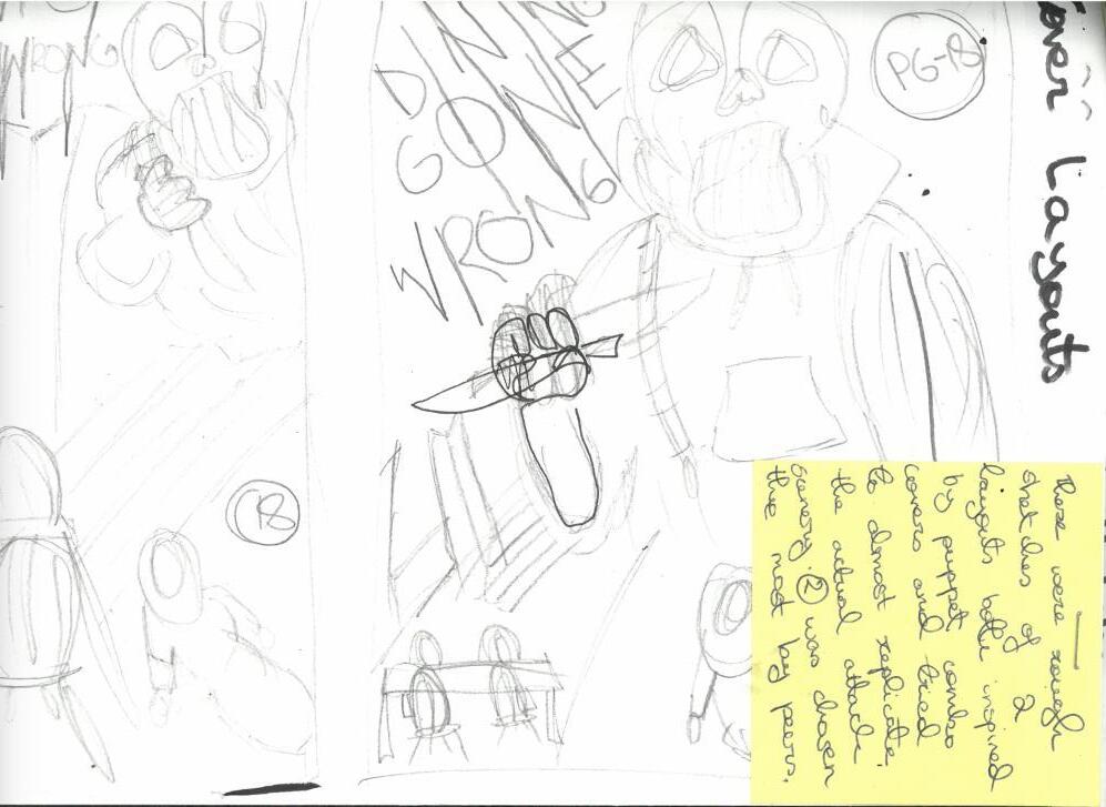
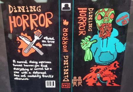
I created a VHS cover addressing religious injustice, inspired by Puppet Combo’s horror aesthetics. Based on real CCTV footage, I painted the cover in gouache, traced it in Illustrator, and included key details like the perpetrator’s blue hoodie.
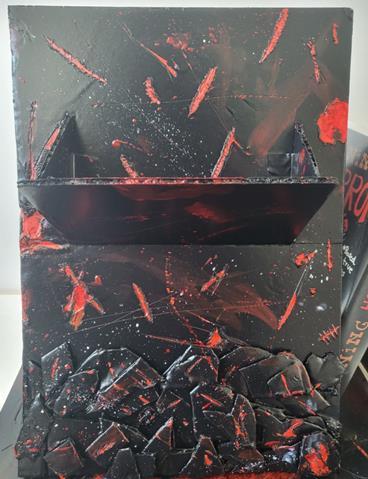
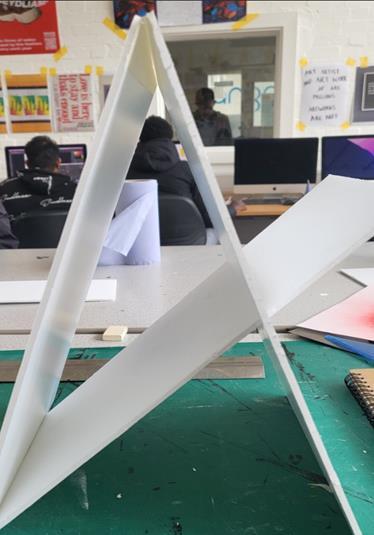
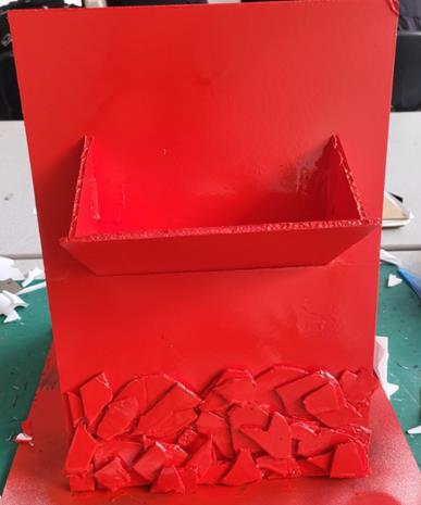
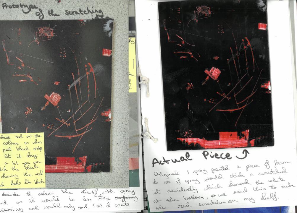
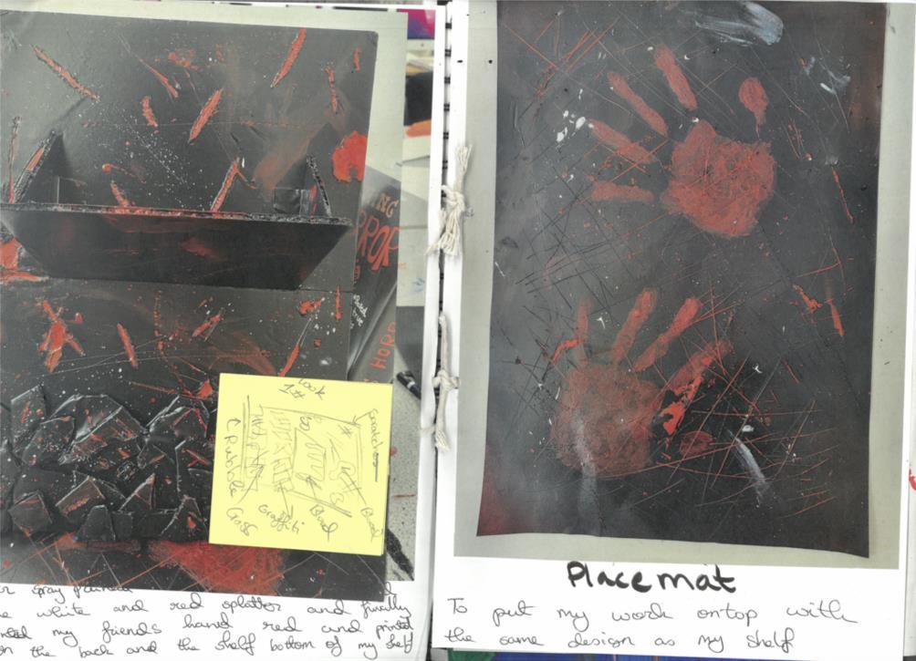
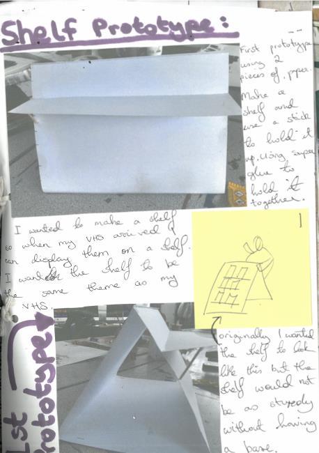
To present it, I built a foam-board display shelf, spraypainted it red and black, and scraped it to mimic bleeding streaks. I added a mat and a cardboard VHS tape. Next time, I’d use a real VHS tape, strengthen the shelf, and include a call-to-action for victim support.