3 minute read
Shape Up: Character Design in E-Learning


How can animated movies and comics convey meaning and emotion in a single frame, whilst your entire elearning course struggles to capture the imagination of learners? Instructional Designer, Sam Harold, is here to save the day...
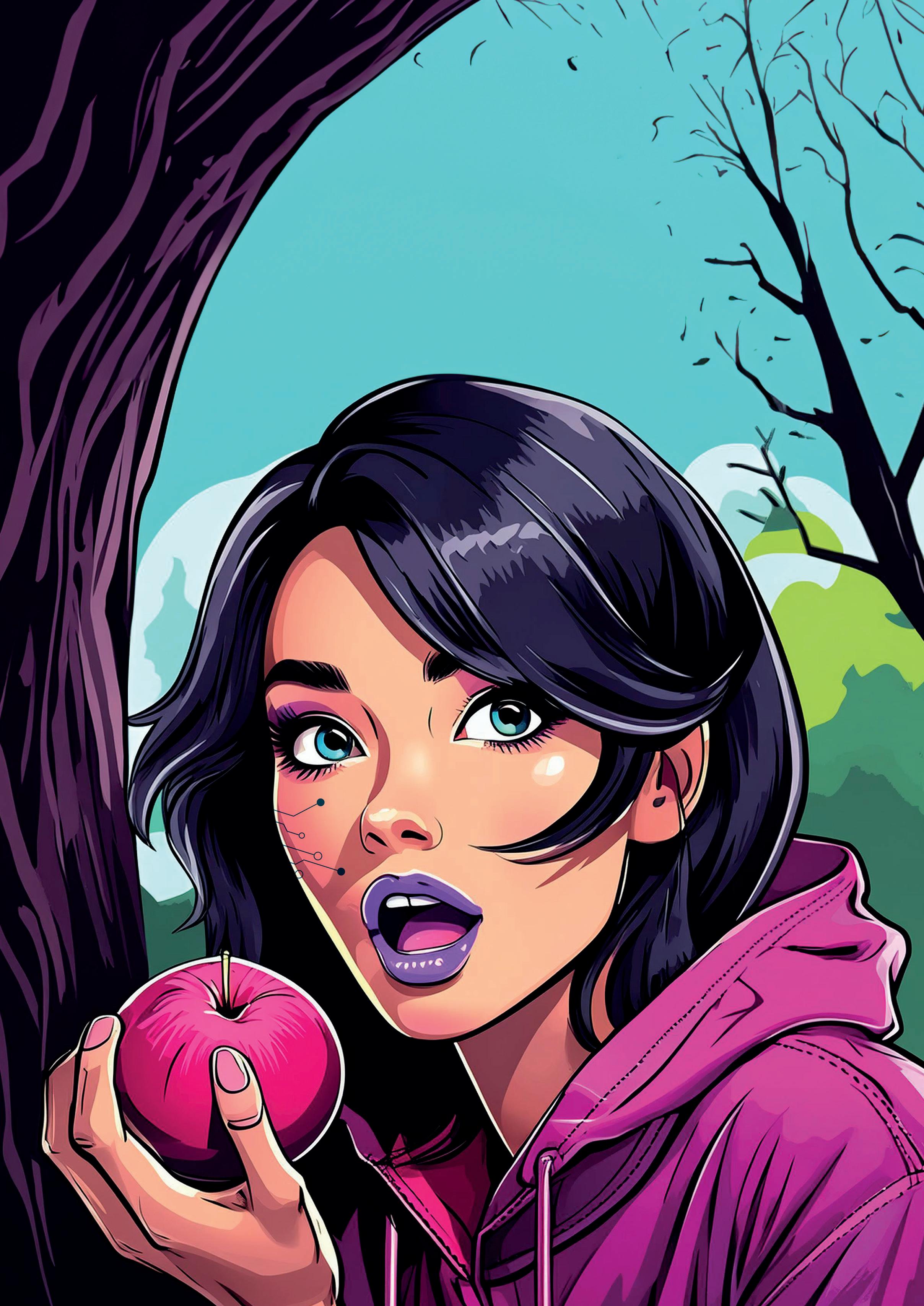
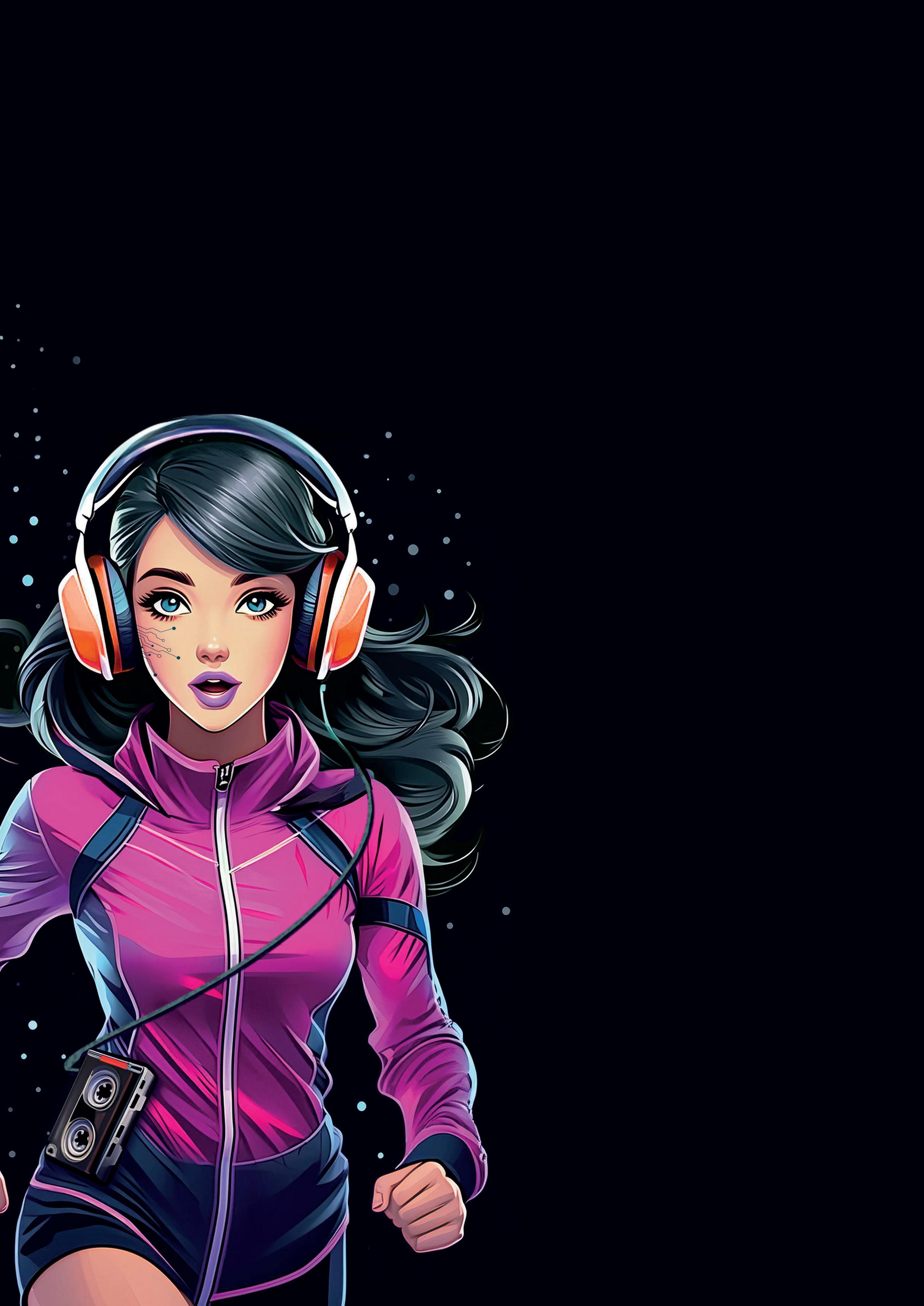
Let’s start with something we’ve all experienced. You know that feeling when you’re watching a great animated movie? The characters just leap off the screen. They’re fun, they’re memorable, and you get who they are right away. It’s like magic, but there’s actually some serious know-how behind it.
Now, here’s a question for you: have you ever tried to create characters like that for your own learning projects? Maybe you’ve used mascots to make things more personal and relatable. But if you’re anything like me, you might’ve found that your creations don’t quite measure up to those lovable cartoon characters we see on TV. Don’t worry, though – you’re not alone, and there’s a good reason for it.
It all comes down to how our brains process what we see. We’re constantly scanning for visual shortcuts to make sense of the world around us. It’s like our brain’s way of dealing with all the information bombarding us every day. The clever folks who design characters? They’ve figured out how to use this to their advantage. There’s this neat trick called “Shape language” that big animation studios use. It’s all about using different shapes to convey personality traits. Sounds simple, right? But it’s incredibly powerful when you know how to use it.
Take a strong hero type, like Superman. Character designers might give him a square jaw and broad shoulders. Maybe even square fists. All those squares? They’re saying “Hey, this guy’s solid and dependable.” It’s a visual shorthand that our brains pick up on, even if we’re not consciously aware of it.
But here’s where it gets really interesting – it’s not just about one shape. Mix it up, and you can add layers to a character. Let’s look at Batman. He’s got those strong, square elements too, but throw in some sharp angles – like his pointed ears or the edges of his cape – and suddenly your hero’s got an edge to them. Those triangles suggest danger and unpredictability. Cool, huh?
On the flip side, think about Mickey Mouse. He’s all circles, from his ears down to his shoes. That makes him feel friendly and approachable. There’s a reason why so many cartoon characters aimed at kids use lots of round shapes – it’s comforting and non-threatening.
Now, you might be thinking, “This is all great for cartoons, but how does it apply to my work?”
Well, that’s the exciting part. These principles aren’t just for Hollywood – they can be super useful in creating engaging learning experiences too.
Next time you’re working on characters for your learning projects, why not borrow a page from the animator’s playbook? Start by thinking about the key traits of your character. Are they meant to be authoritative? Friendly? A bit mischievous? Then, play around with different shapes to convey those traits.
For instance, if you’re creating a mentor character to guide learners through a course, you might use a mix of squares for reliability and circles for approachability. Or if you’re designing a character to represent common mistakes or pitfalls, you could use more angular shapes to subtly communicate “caution.”
The beauty of this approach is that it works on a subconscious level. Your learners don’t need to consciously recognise the shapes – their brains will pick up on these cues automatically. This can help make your characters more engaging and memorable, which in turn can make your learning materials more effective.