
6 minute read
Formatting Text

Headings
Body Text
Advertisement
Hyperlinks
Headings
Headings provide context for the body content and allows you to divide the content into sections. Begin each page, section, and subsection with a heading that encapsulates all the topics within the same part. All headings must be in bold Roboto font.
Headings must be in bold Roboto font, follow the capitalization rules for headings, and generally should not have punctuation. In some cases, such as on help pages, you can phrase headings in a conventional question format to convey a friendly, helpful tone.

The heading follow capitalization and punctuation rules.
The heading follows appropriate question formatting for help page headings.
The nouns in the heading are not capitalized.
An ellipsis is not appropriate punctuation for headings.
Page Headings
Page headings are the web page titles that describe the page's content. Begin each page with a page heading on a relevant background image. All page headings should use consistent font and graphics that adhere to the style guidelines.
Heading Text Formatting
Alignment: center
Highlighting: bold
Font Colour: #ffffff
Heading Background Formatting
Image Size: 1920 x 594 px
Fade: 55%
Body Headings
Divide the body text on each page into sections using body headings. Heading 1s are large, bolded section titles and Heading 2s are slightly smaller, bolded subsection titles (see Figure 5.2). Use these body headings to chunk information for users to better understand the content.
Heading 1
Heading 2s
General Examples of Headings
Heading 1s and 2s are structured appropriately and distinguished through font size.
The first section on the page does not begin with a Heading 1.

Body Text
Body text is the text content on web pages that do not include headings. All body text should use Roboto font in consistent size and style, except for highlighted text.
To keep our content simple and enhance readability, keep paragraph lengths below five sentences and include no more than three paragraphs in each section or subsection. Use a light grey divider between each section, but not between the subsections.
Highlighting
Highlighting techniques involve using a different font style in the body text to draw attention to important information. To highlight your chosen text, use the regular body font in bold. Do not use other styles such as underlines, italics, or asterisks. Use highlighting sparingly and only highlight a few keywords in the sentence to avoid overwhelming the user.
The highlighting emphasizes important information using the appropriate style.
The highlighting does not use the appropriate style. Do not use underlines.
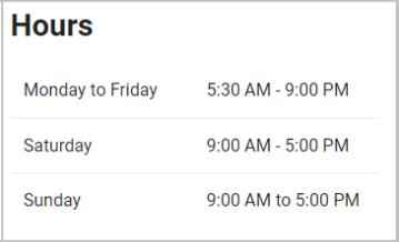
Indentation
Indentation is a text chunking technique that distinguishes key information from the supporting information. Use indentation to emphasize information such as operating hours and mailing addresses.
Introduce indented text with a sentence fragment that ends in a colon, then create a new paragraph for the indented text itself. Indent the text a half inch inwards and use consistent body text formatting.
Effective indentation distinguishes the mailing address and office hours clearly. The introductory texts are succinct and descriptive.
General Examples of Body Text Formatting

Proper use of section dividers chunk the information effectively. Highlighting and indentation draw attention to appropriate texts.
General Examples of Body Text Formatting

Excessive highlighting and lack of section dividers make the page content difficult to follow.
The body font is inconsistent and does not achieve any stylistic effect.
Hyperlinks
Hyperlinks are clickable elements that lead to other pages. They provide a quick route to external resources without cramming too much information on the page.
Use hyperlinks to connect additional resources, such as: emails addresses web pages documents forms
Integrate the hyperlink labels into the body text instead of displaying direct link addresses, with email addresses being the only exception.
Examples:
The hyperlink is not integrated into the body text with an appropriate label. Hyperlinks are integrated well in a list format.

Lists
Lists present a collection of related items in a chunked format. Use bulleted lists for unordered items and numbered lists for sequential items.
Introduce lists with a heading, complete sentence, or a sentence fragment that ends in a colon, then create a new paragraph for the list. Each list must have at least two items. Write each list item using the same part of speech (e.g., all noun phrases, all verb phrases) and use parallel structure. List content can contain hyperlinks to relevant pages.
The list has an appropriate introduction and the items are structured consistently.
The list should use bullet points instead of numbering, as the list items do not have a chronological order.


The list heading should not end in a colon. List items have different lengths and structures.
The list has no heading or introductory text. The context is unclear and the structure of each item is inconsistent.
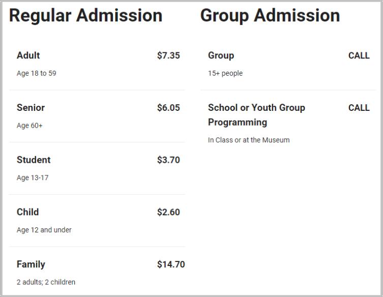
Tables
Use a two-column table to organize content lists where each item has corresponding description. You can use tables for topics such as operating hours, price lists, etc.
Each table occupies its own section with a Heading one, and consists of two or more rows. If necessary, use a header row at the top of the table to clarify the category titles of each column.
Do: add background colours or vertical lines to the table use standard body text formatting in the table's body text use a plain white background and separate each list item with a light grey divider incorporate hyperlinks to any relevant pages use bulleted lists on the right column if there is more than one item
Do Not: bold the body text use a bulleted list in the left column
The table content is organized and straightforward.
The text size and font is consistent and only headings are bolded.
Multiple Heading 1s, lack of a header row, and inconsistent bolding of the body text make the table difficult to follow.
6
Visual Elements
In this Chapter:
Buttons
Images
Embedded Media
Icon Boxes
Drop-Down Boxes
Buttons
Buttons are clickable graphic elements that link users to additional content. They highlight quick routes to more information and can stand alone from other page content. Add buttons after the main body text for users to navigate to additional pages or resources.
All buttons use the sea blue colour outlined in Chapter 1 - Colour Palette, and use a rectangular background with rounded corners. The button labels use body text font in white, and the background size follows the length of the label. The label text is a verb phrase that describes the action the user wants to perform when they click the button.
Some label text examples include:
Read RZone Policy View Award Conditions
Report a Problem Contact Us
The button is placed appropriately after the body text and the label clearly states the action the button performs.
The labels do not clearly communicate the actions the buttons. They are missing the action verb.
Images
Images provide visual contexts for topics such as locations and maps. Position the image in line with the body text immediately under the Heading 1 of its corresponding section. Add an italicized, center-aligned caption underneath the image to describe its content.
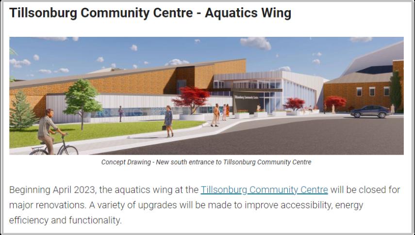
The image is well-placed, clearly described, and supports the relevant content.
The image is too small and does not appear in line with the text. The image appears outside the relevant section and lacks captioning.


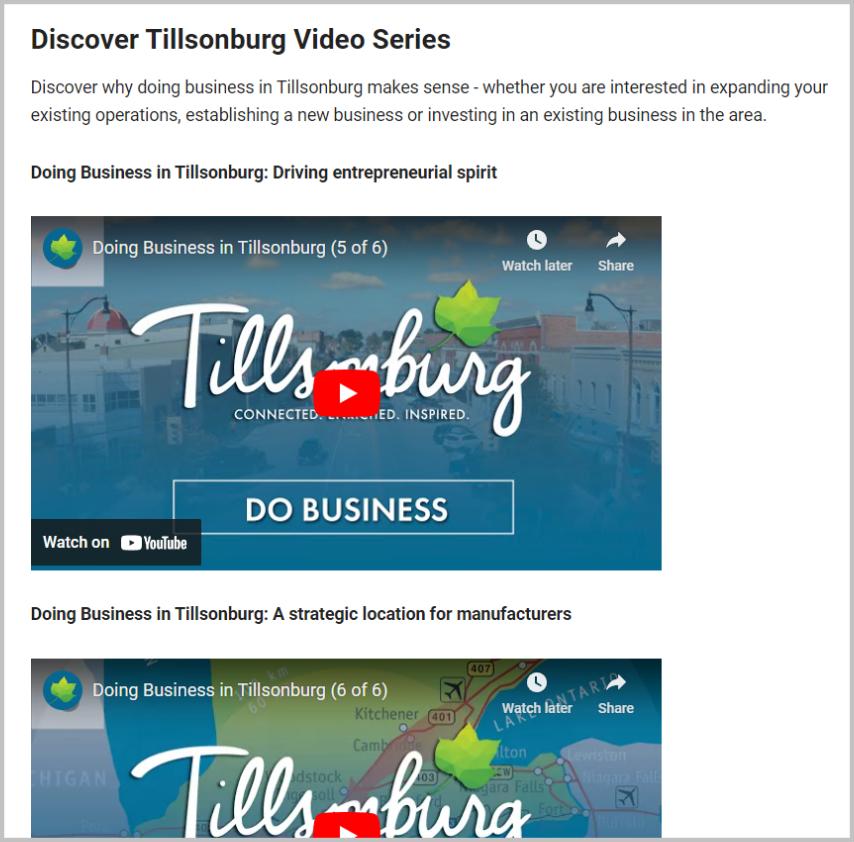
Embedded Media
Embedded media includes externally hosted videos, maps, or weather tools that users can interact with without leaving the page they are on. Add an embedded media link to provide more information about the section content or create an interactive user experience.

The embedded media should occupy its own section or subsection with a descriptive Heading 1 or Heading 2, respectively.
The embedded map begins its own section apart from other page content, and has an appropriate Heading 1 title.
The videos are grouped under an appropriate section and each occupy their own subsections. The video occupies its own section and has an appropriate Heading 1.

Icon Boxes
Icon boxes are graphic containers that present clickable links with an image or icon that lead to other content pages. They are helpful for displaying hyperlinked categories in a visually distinct manner.

Contents of an icon box include:
A light blue rectangular background.
A clickable image or dark blue icon.
A clickable, hyperlinked label in bold text.
A brief line of body text description (optional).
Icon boxes occupy their own sections with an appropriate Heading 1 and appear in a three-column grid layout. Icon boxes in the same section cover related topics and have consistent graphics, text style, and properties.
Do:
Use brief phrases to label and describe the linked content page. Use consistent visuals and structures among icon boxes in the same set.

Do Not:
Use colours or background shapes that are not within the guidelines. Add buttons instead of using hyperlinked labels.

The boxes occupy their own section and have consistent formatting.
The icons and labels are the wrong colour and not hyperlinked to the content page. Do not use buttons in places of hyperlinks on icon boxes.
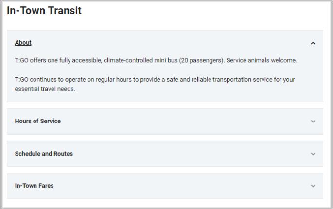
Drop-Down Boxes
Drop-down boxes are a list of items that expand to display additional information when the user clicks on them. They are useful for presenting multiple sections of content in a minimalistic way.
Content you can present with drop-down boxes include:
Help topics
Information categories
Policies
Address lists
Drop-down boxes can occupy their own section with a Heading 1, or support an existing section with relevant content. Each set consists of three or more items, each with a label in bold that introduces the body content within.
Do:
Use a plain white background and separate each list item with a light grey divider. Use standard body text in the drop-down content. Use consistent structure in the labels of each item.
Do Not:
Add background colours to the boxes. Place unrelated items in the same set of dropdown boxes.
Use different fonts or styling that are not outlined in the guidelines.
Each item is clearly labelled and provides additional content for the relevant section.

The background colour and dividers do not follow styling guidelines.
