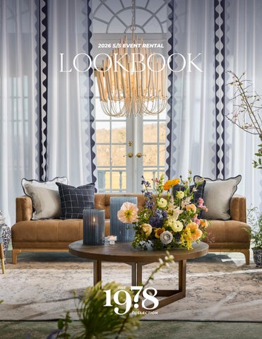
LOOKBOOK
A LETTER FROM THE CREATIVE DIRECTOR
For our 2026 Spring/Summer Lookbook, we approached design as a process of layering. Pairing bold color theory with thoughtful restraint, mixing pattern with negative space, and allowing texture to create depth. Fabric sets the tone, but the magic happens in how it interacts with everything around it: tabletop, furniture, lighting, florals, and the architecture of the room itself.
Throughout these pages you’ll see pieces that are brand new to our collection alongside items that have lived in our inventory for years - but shown in entirely new ways. That duality is one of our favorite parts of design. A familiar chair takes on a different character when paired with a new patterned cushion. A traditional charger feels modern against an unexpected textile. A sofa becomes a study in upholstery with custom pillows or layered with a new accent chair within a lounge.
For 2026 events, we’re seeing palettes that move with intention: sun-washed yellows, deep wines, botanical greens, soft pastels, and moments of contrast that bring an entire table to life. Color theory isn’t just about matching shades; it’s about building rhythm within a space, allowing hues to echo across materials and objects until a room feels cohesive without ever feeling predictable.
We’re able to design and pull from a deep inventory of linens, tabletop, furniture, bars, and custom fabric work and layer them deliberately until a look emerges that feels both elevated and effortless. What you’ll see in this lookbook are not just individual pieces, but complete compositions.
We hope these pages spark ideas, encourage experimentation, and show just how many possibilities exist when you design with The 1978 Collection.
2026 S/S
DREAM TEAM
VENUE:
PHOTOGRAPHY:
STYLIST:
CONTENT CREATOR:
RENTALS+DESIGN:
FLORALS:
FOX CHAPEL GOLF CLUB
ADAM MILLIRON
ANA KELLY FOOD STYLING
PRESENTLY SOCIAL
THE 1978 COLLECTION
COMPASS ROSE
CROCUS SAUVAGE
DORMONT FLORIST
HONEY BUNCH BOUQUETS
SAPPHIRE & LACE
STUDIO FLEURAISON
SUGAR FLOWERS AND LEAVES
THE FLORAL TOUCH
BLUE SERIF
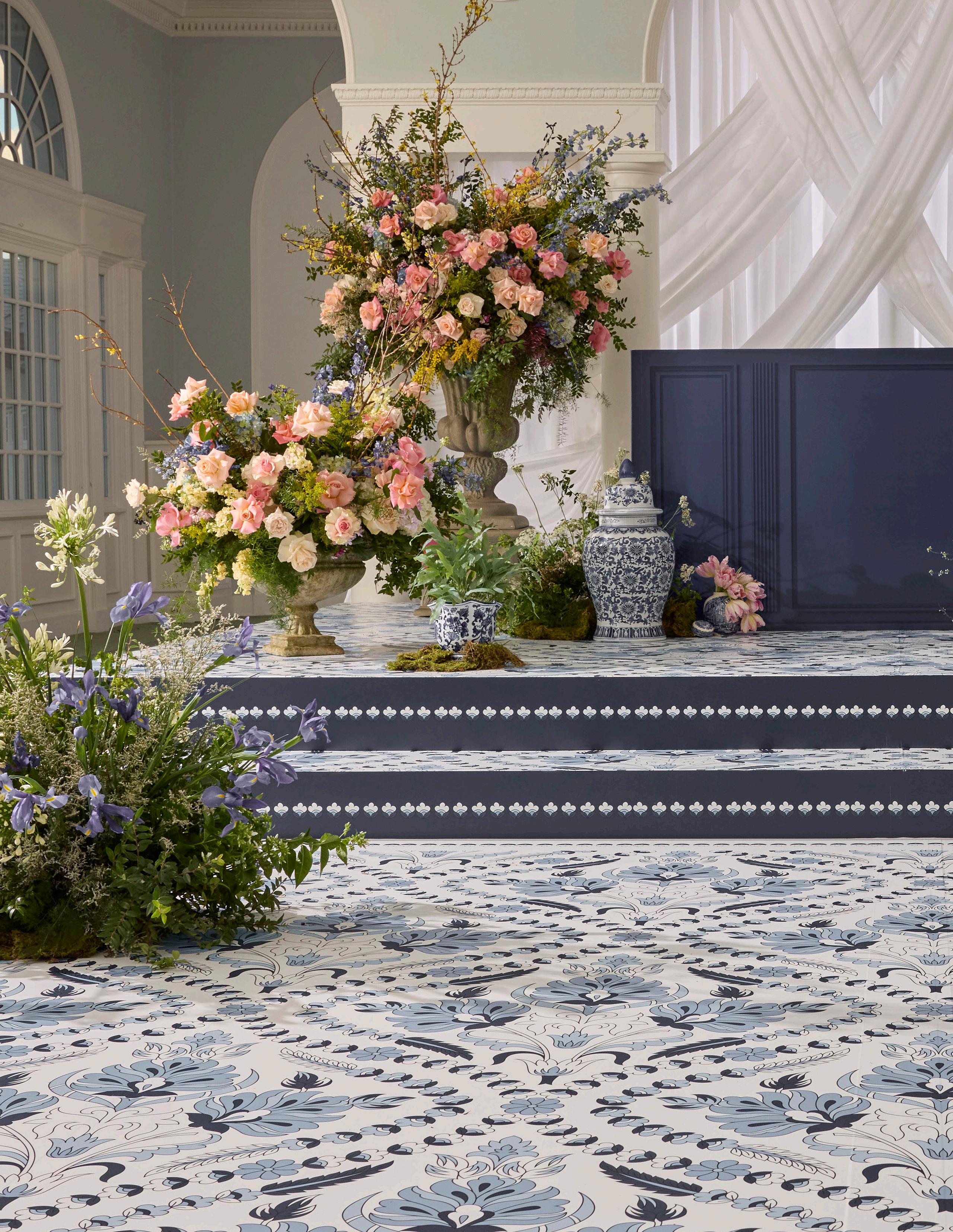
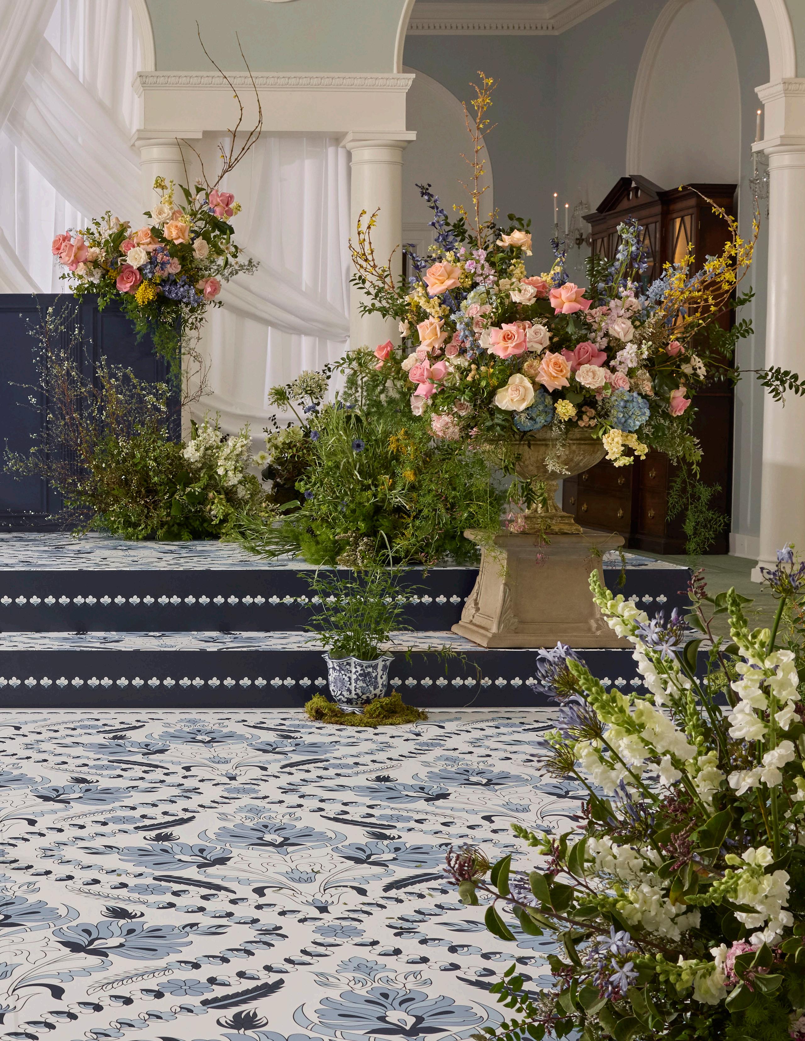
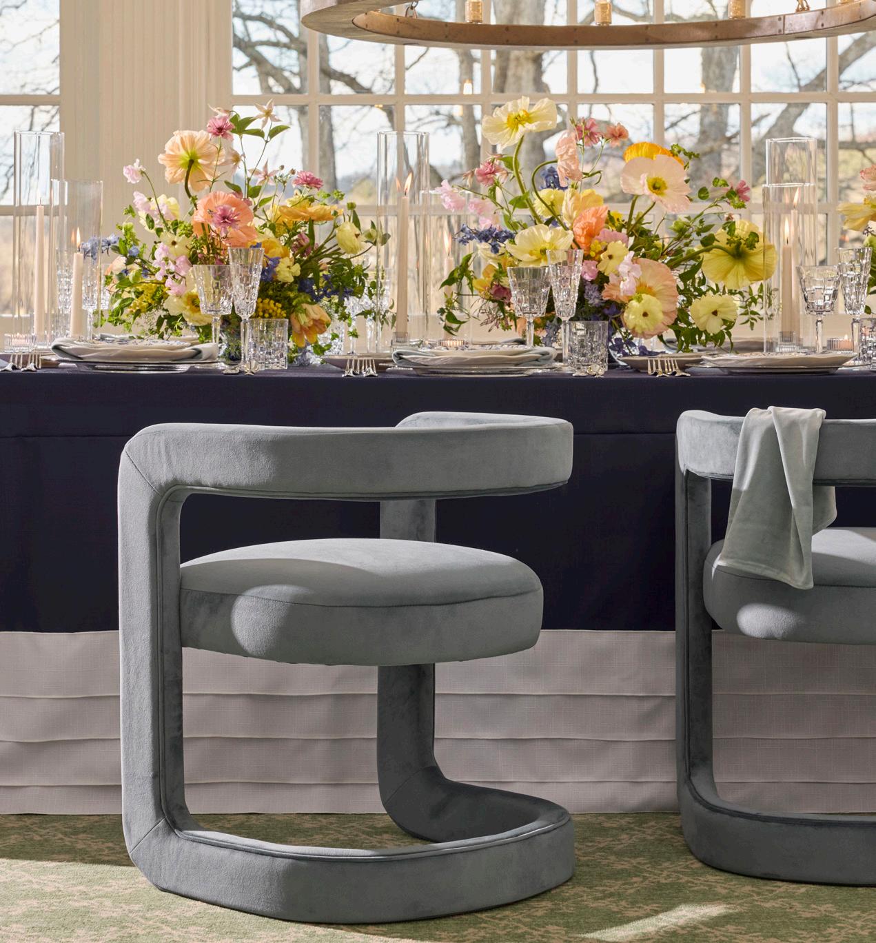
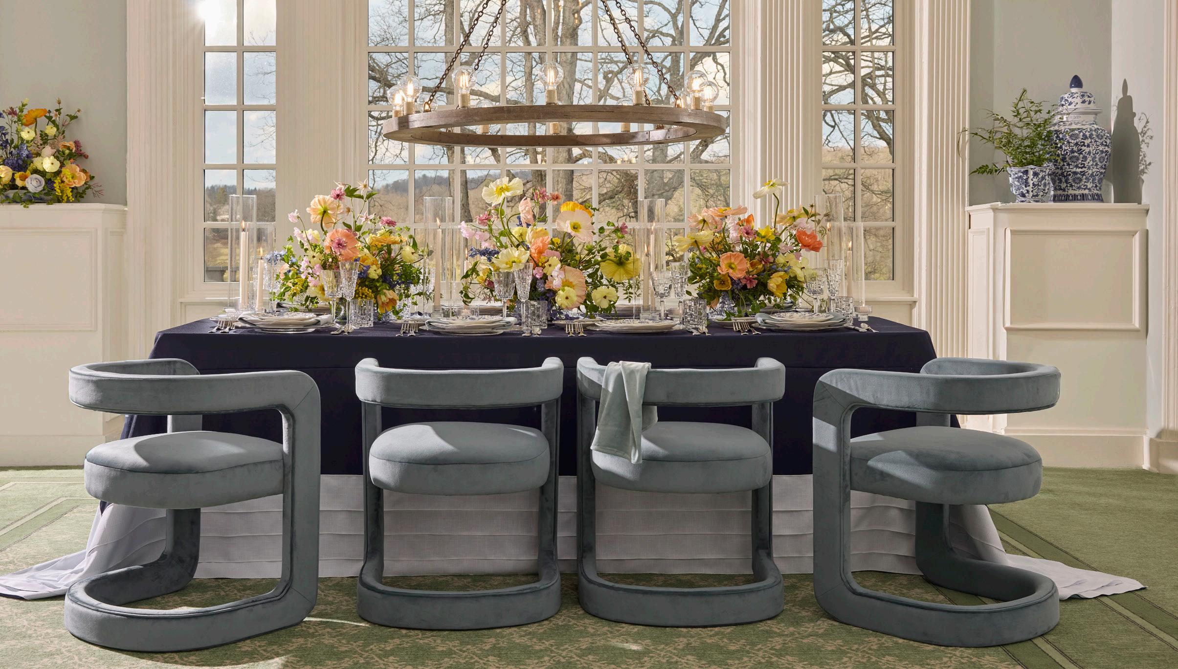
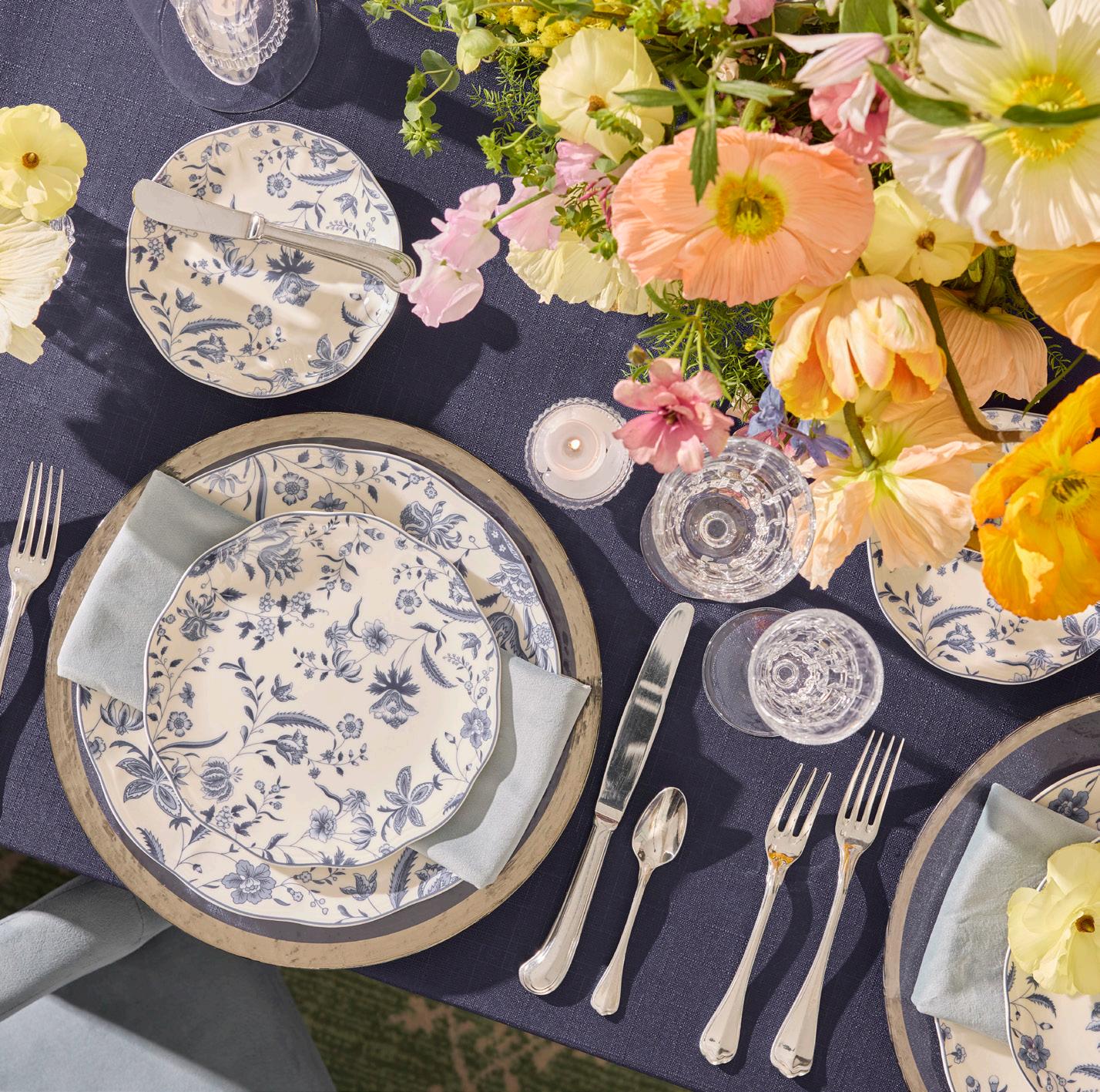
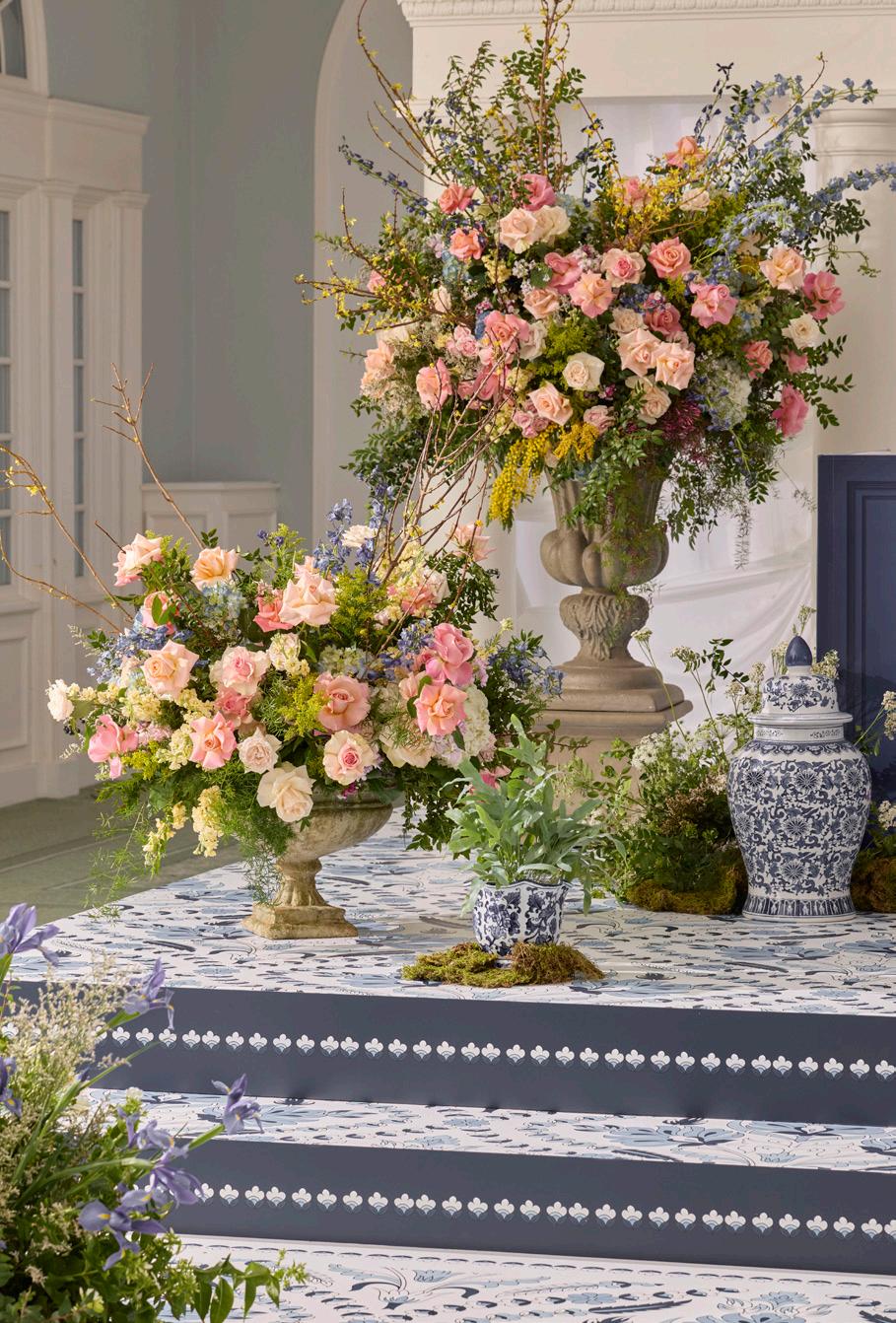
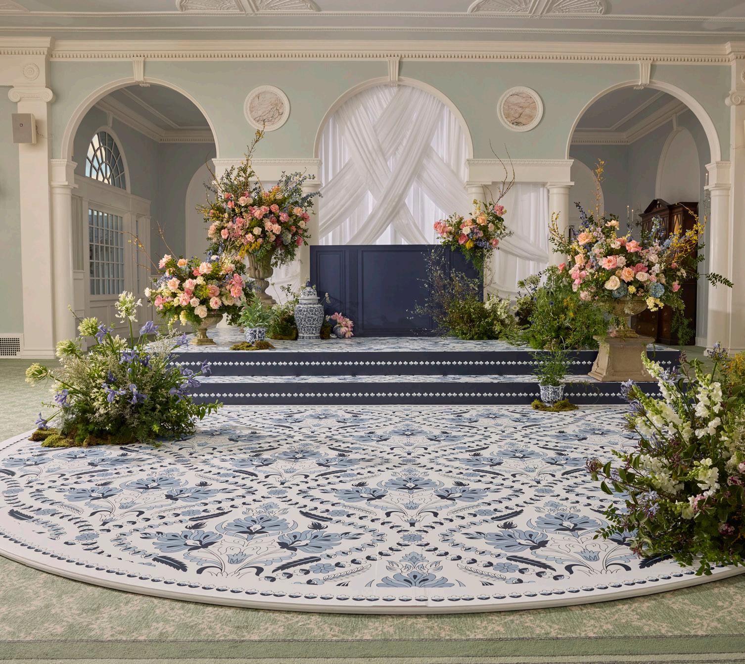
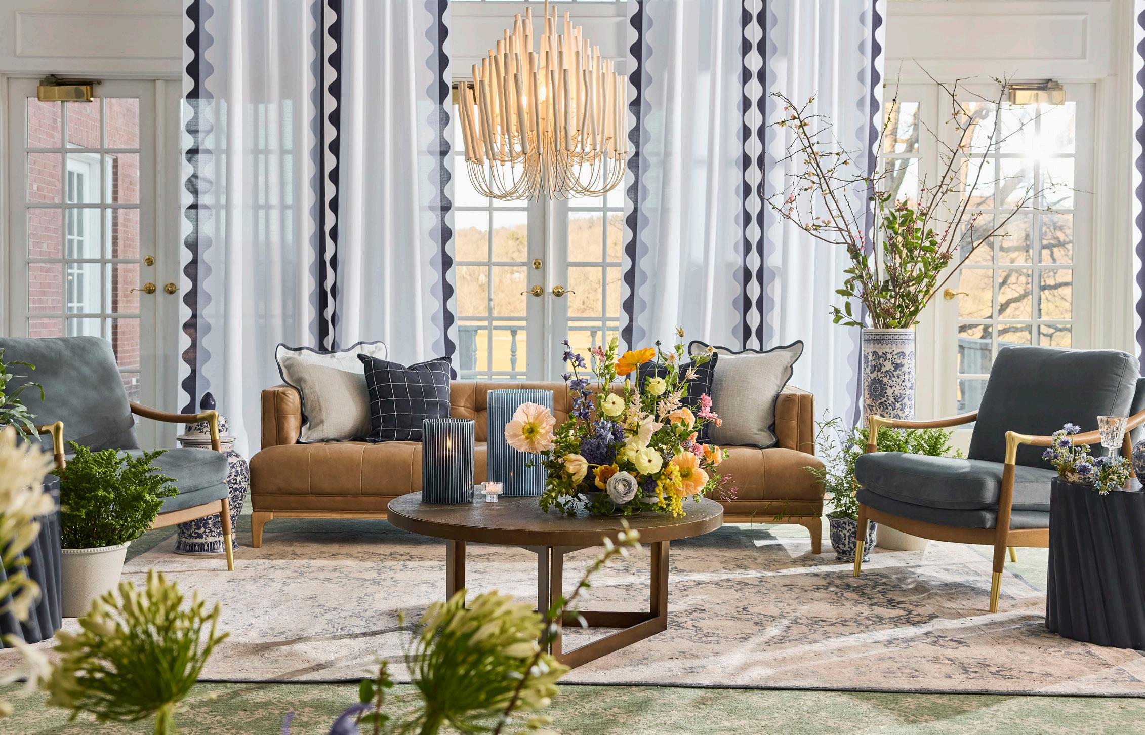
A sophisticated blend of rich navy, crisp whites, and intricate blue patterns evokes the charm of heirloom porcelain. Layered textures and tailored elements give the look a sense of timeless harmony with a fresh, modern polish.
BLUE SERIF
LINEN
Navy Blue Panama Cascade
NAPKIN
Storm Velvet
DISHWARE
Silver Alpine Charger
Eleanor Indigo
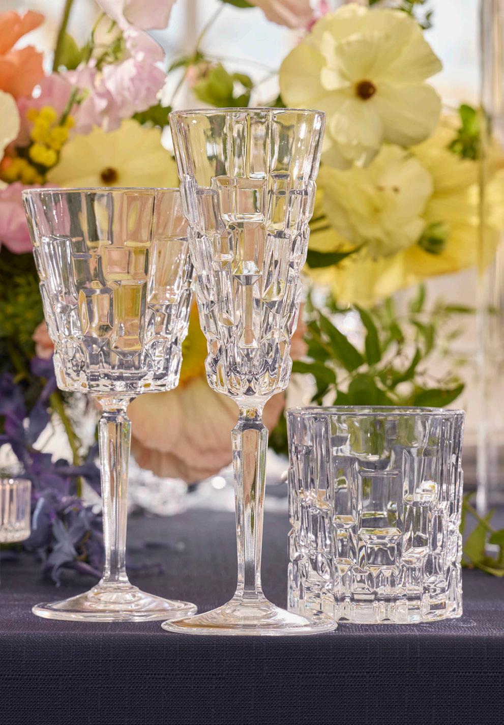
GLASSWARE
Etna
FLATWARE
San Marco
CHAIR
Winslow Cadet Blue
LIGHTING
Geoffrey Chandelier
FLORALS
Crocus Sauvage
EXPERT INSIGHTS
Crocus Sauvage - Florist
What signature details do you find yourself returning to?
I’m always drawn back to designs that feel alive — arrangements where stems reach outward, branches curve naturally, and delicate blooms drift through layers of texture. I love florals that feel grounded and tactile, balancing soft, garden-inspired movement with thoughtful structure so the design feels both elegant and slightly untamed.
My inspiration often comes from nature, art, travel, and historic spaces. Because of that, I think about florals as part of a larger composition rather than something that exists on its own. The vessels, linens, and dishes are just as important as the flowersthemselves — they establish the tone and atmosphere. My arrangements build on those elements, responding to their materials, colors, and textures to create a cohesive, immersive environment.
While the work may appear organic and effortless, it is always deeply intentional. Every stem, every layer of texture, and every detail is carefully considered so the design feels romantic, artful, and harmonious within the space it inhabits — creating the kind of quiet magic that makes an event feel truly unforgettable.

EXPERT INSIGHTS
Adam Milliron - Photographer
What are you immediately assessing when you walk into a shoot space?
The first thing I assess is the light: Where it’s coming from, how it’s moving through the room, and what it’s touching.
Before I look at the styling or the layout, I’m studying the direction, quality, and color of the light. Is it soft or harsh? Is it bouncing off walls or cutting across the space? Where will it create dimension, and where will it flatten things?
If you understand the light immediately, you know where the photograph wants to happen. Everything else like camera placement, styling adjustments, even the timing of the shot follows after.
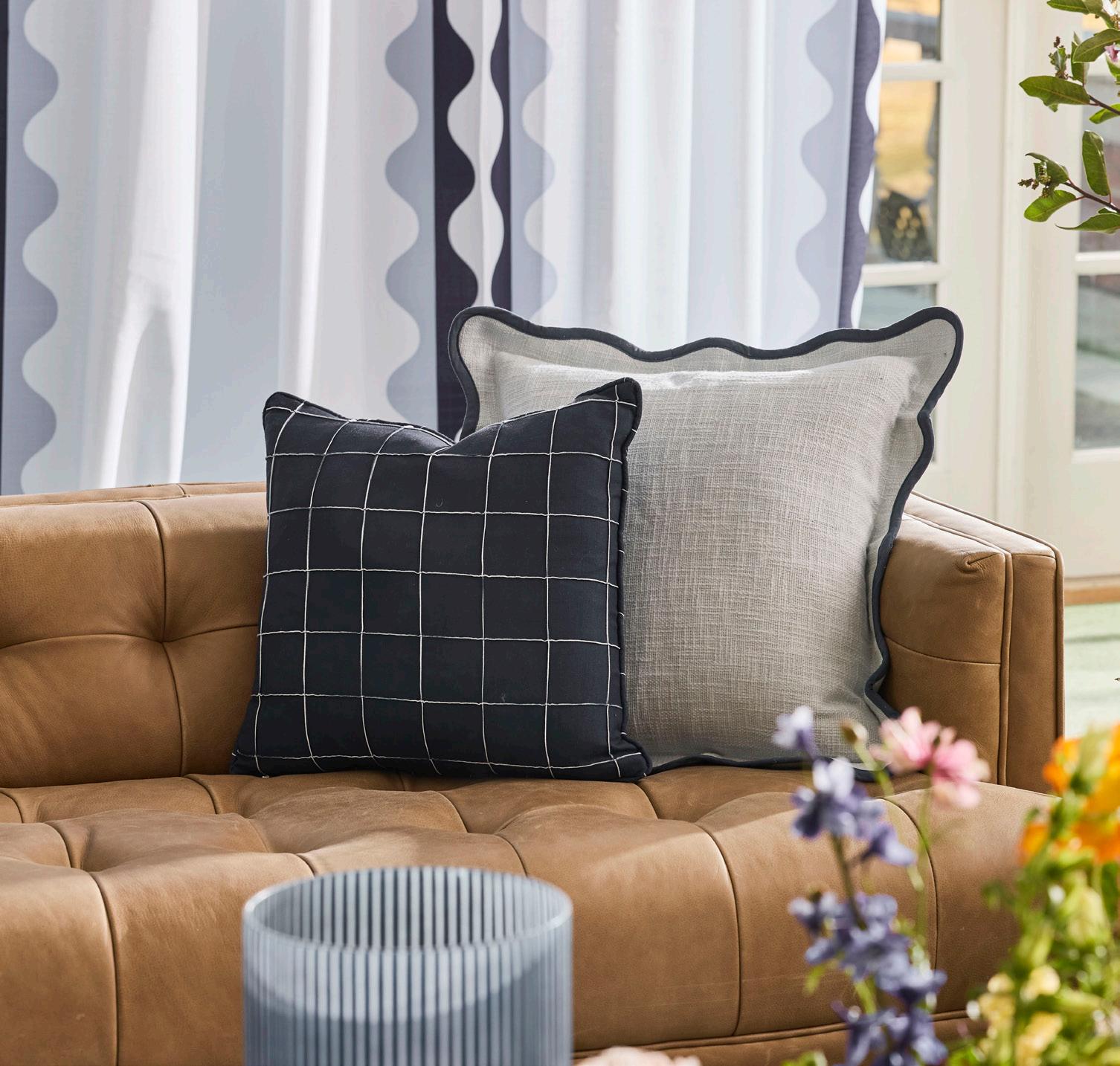
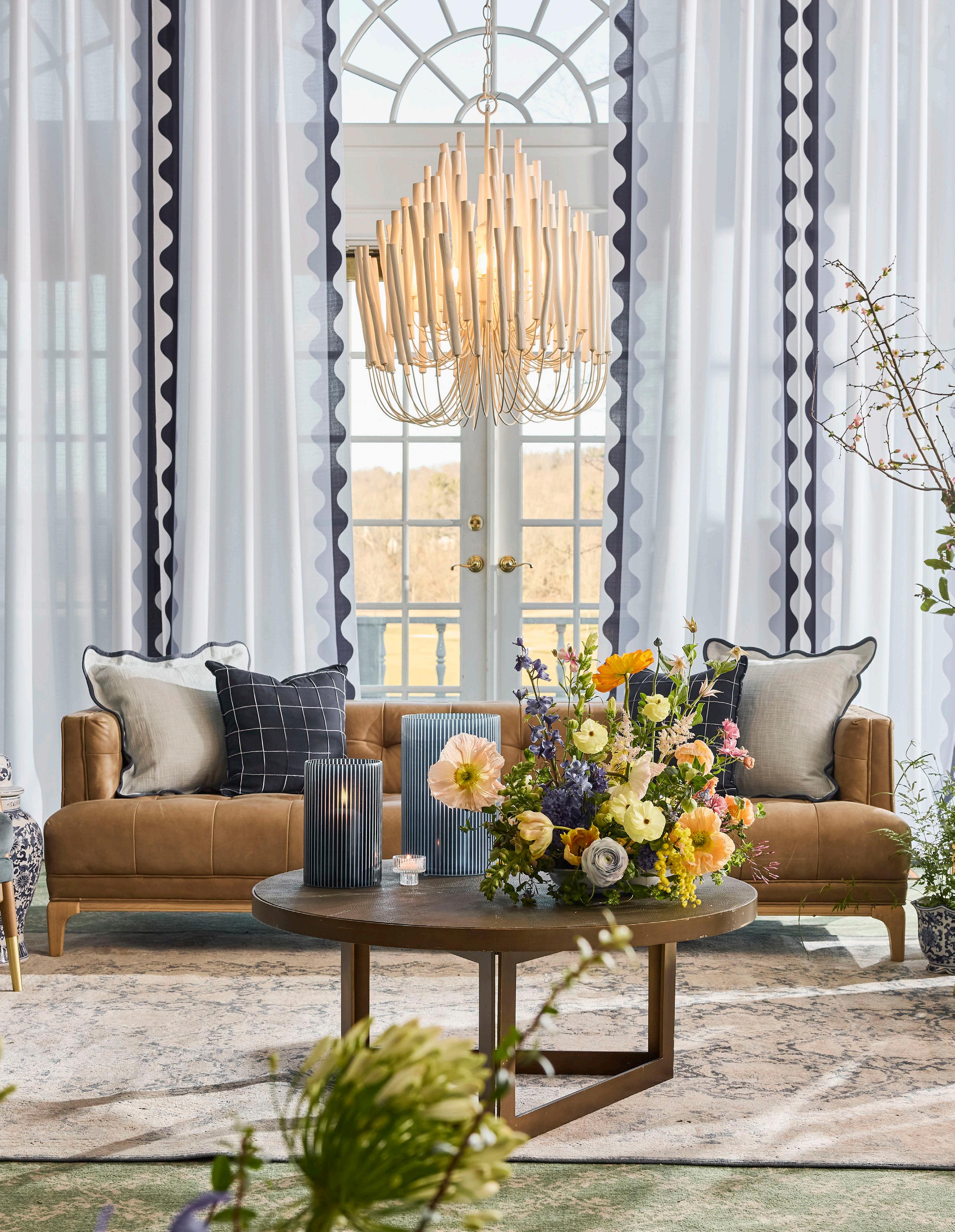
BLUE SERIF
SOFA
Dylan Palermo Drift
CHAIR
Langford Cadet Blue
TABLES
Blue Spiral Drum Shagreen
LIGHTING
Tiered Tapers Chandelier
PILLOWS
Cadet Blue Wave
Hitch Tamilia Blue
RUG
Malta Navy
STAGE
16’x12’ Grand Step Stage w/ Full Custom Wrap
6’ DJ Surround w/Custom Printing
DANCE FLOOR
16’ Arch Dance Floor w/ Custom Printing
DRAPERY
Custom Printed Lola Navy Blue Wave
FLORALS
Crocus Sauvage
THE ART OF TOILE
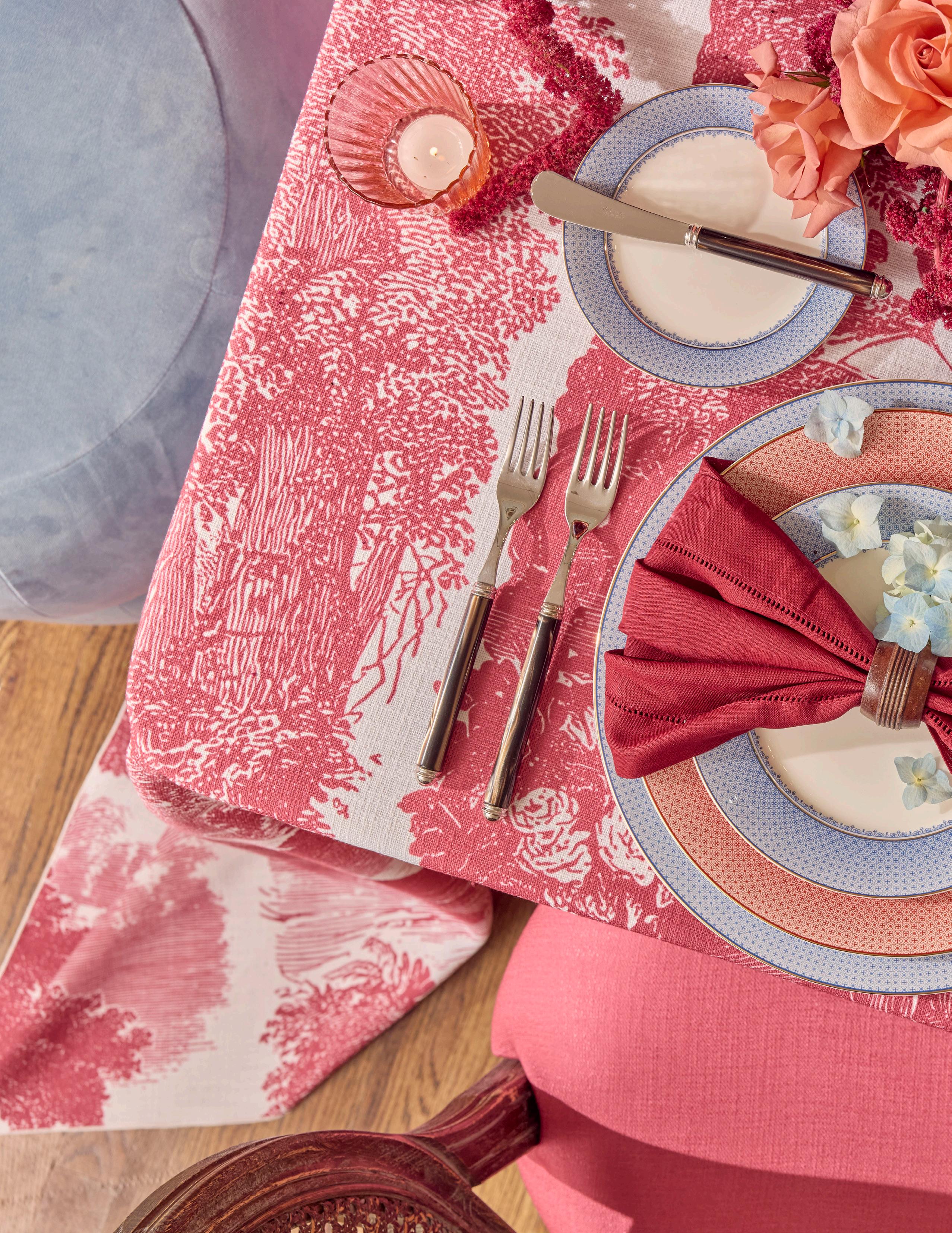
ART TOILE
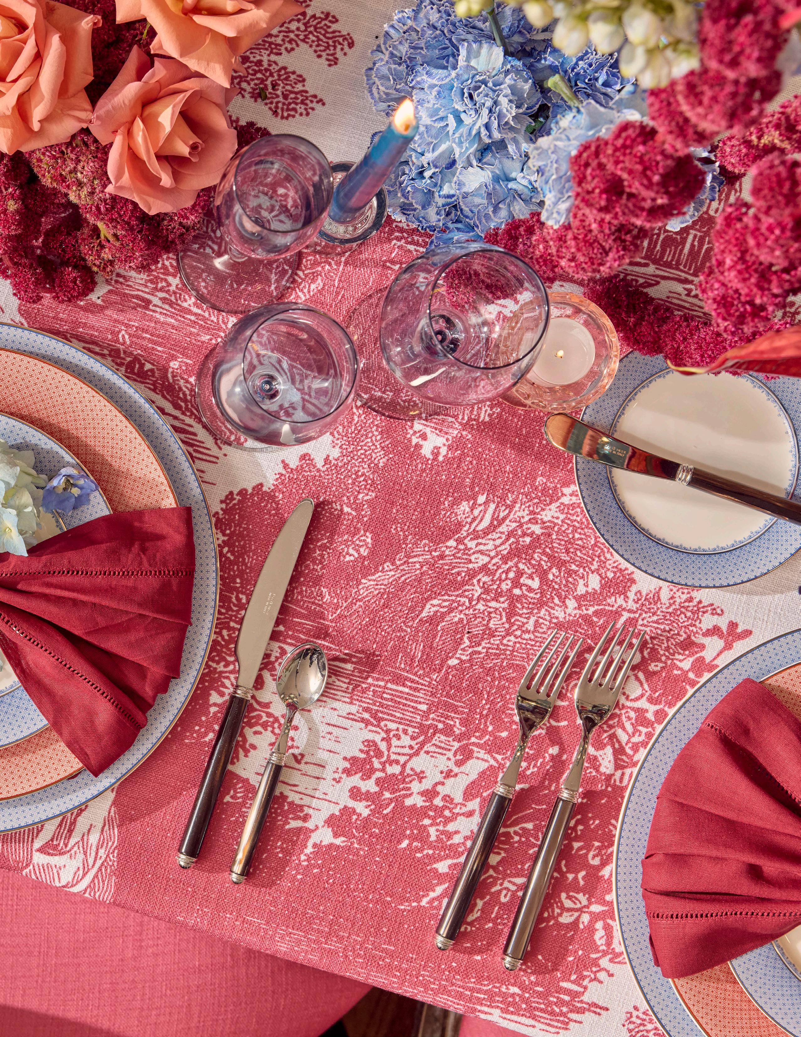
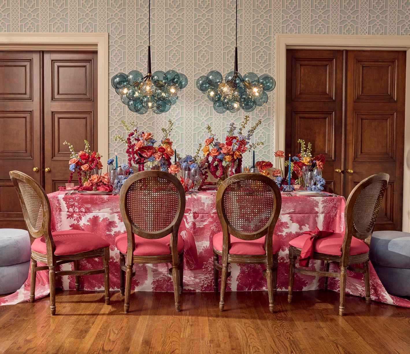
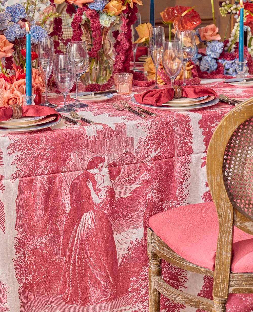
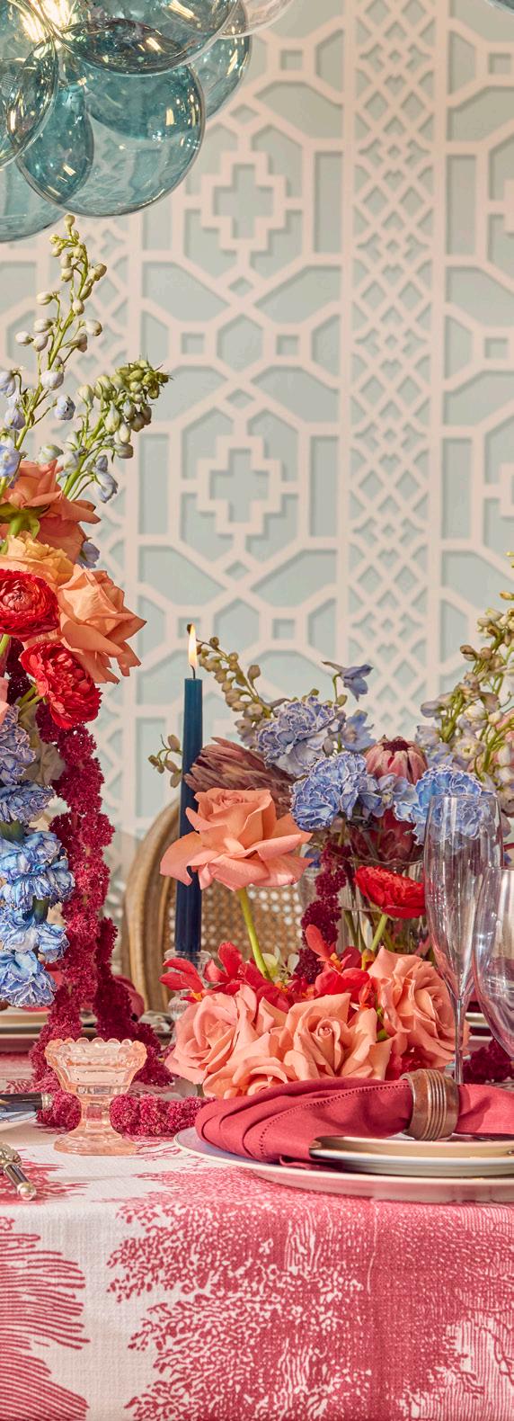
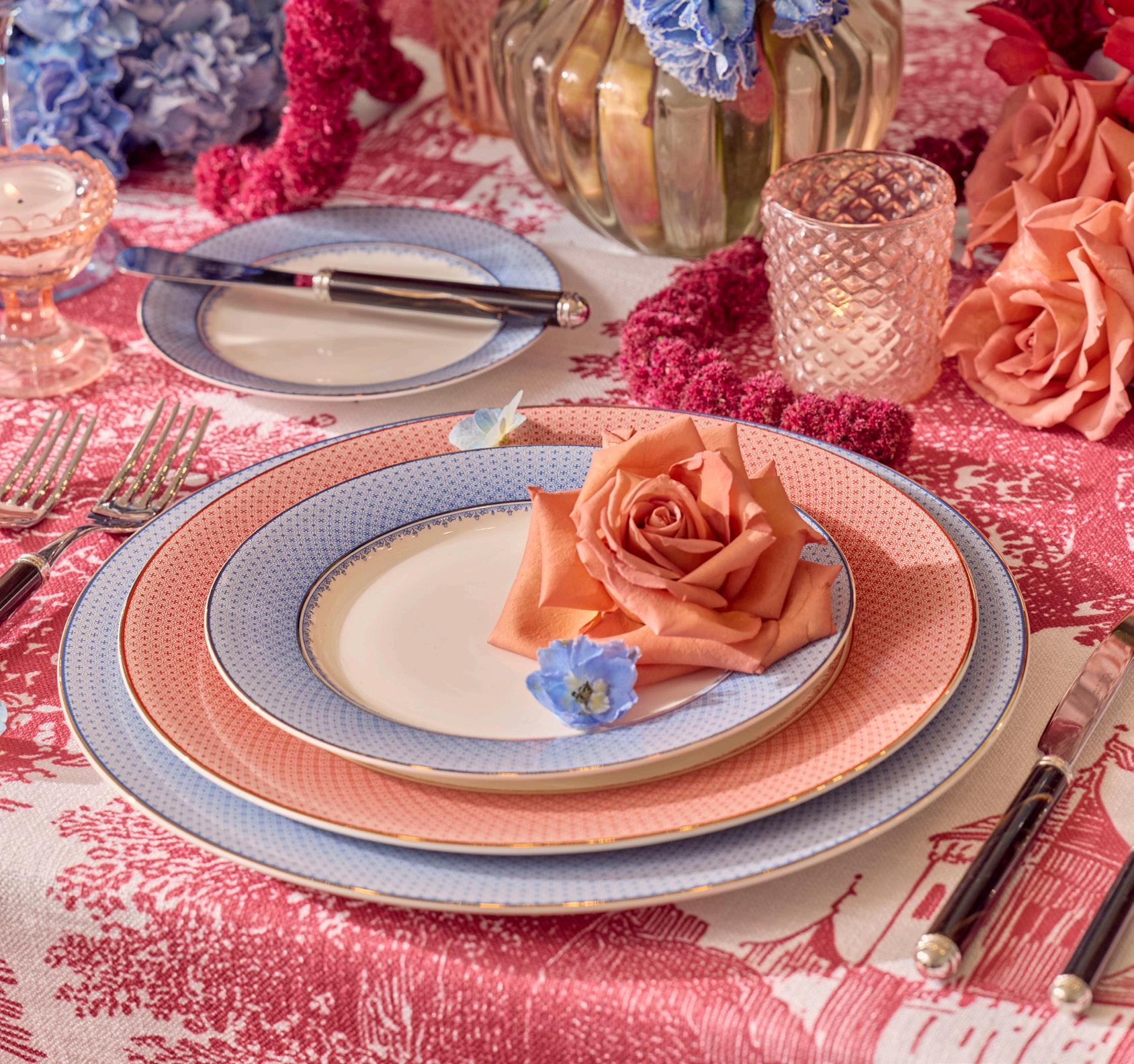
Soft powder blues and bold rose hues create a delicate, storybook palette. Classic toile patterns and plush textures add depth and charm, capturing a graceful blend of French inspired grandeur.
TOILE
THE ART OF
LINEN
Lovers Berry Toile
NAPKIN
Burgundy Hemstitch
Dark Wood Napkin Ring
DISHWARE
Vienna Indigo
Vienna Rose
GLASSWARE
Aurora Indigo
FLATWARE
Idis Tiger’s Eye
SEATING
Cane Back Louis w/Custom
Printed Berry Panama Pad
Yo-Yo Blue Velvet Puff Ottoman
LIGHTING
Robin’s Egg Chandelier
FLORALS
Sapphire & Lace
EXPERT INSIGHTS
Sapphire & Lace - Florist
How do you create dimension without overwhelming the table?
Dimension comes from thoughtful layering, not more décor. Mixing heights, textures and candlelight adds visual interest, while repeating similar florals or vessels keeps the design cohesive. That balance allows the table to feel full and intentional without crowding the guest experience.
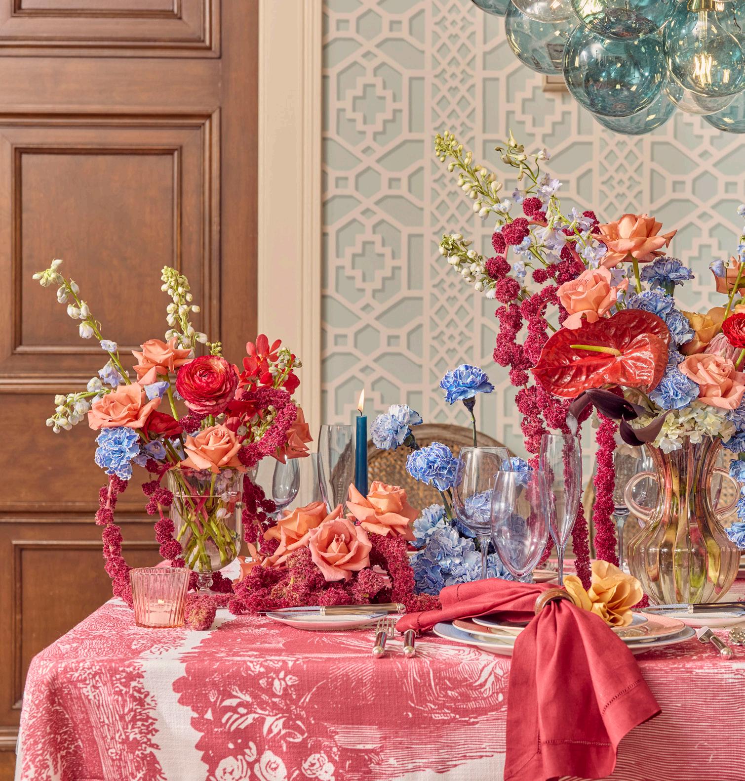
ENGLISH INTERLUDE
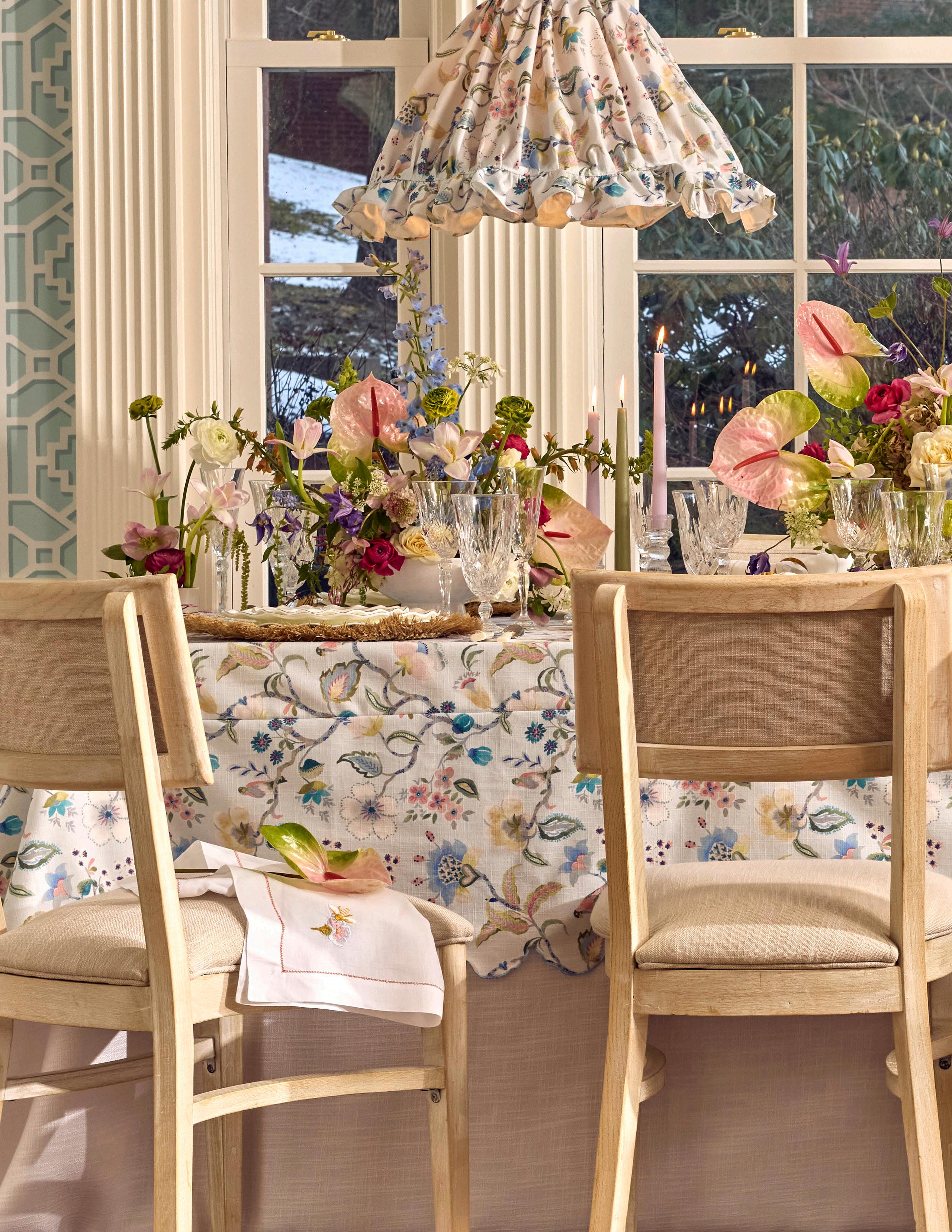
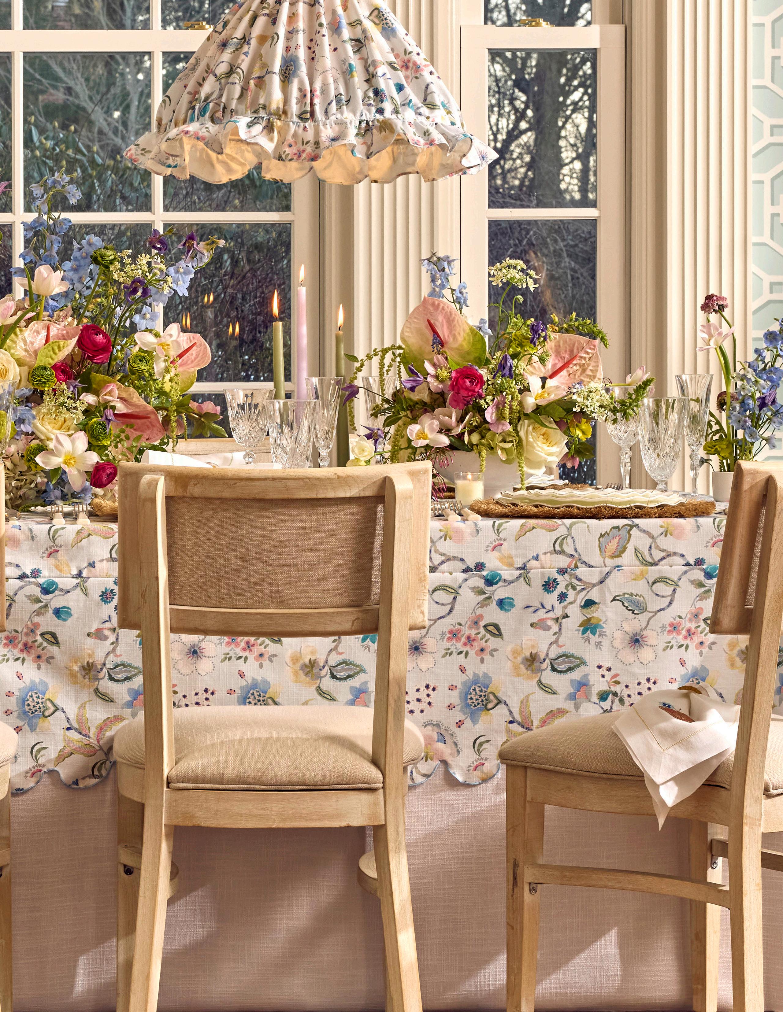
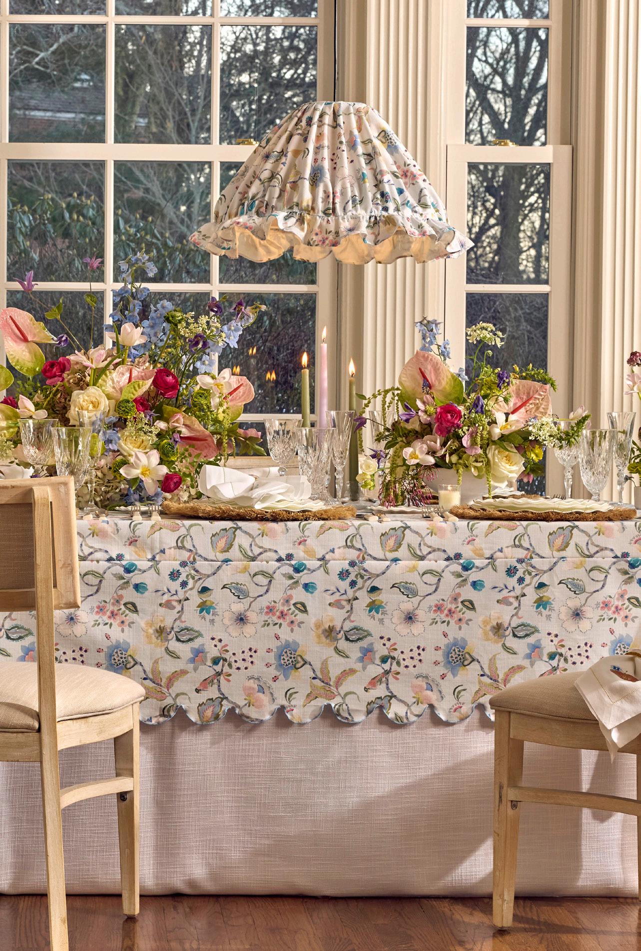
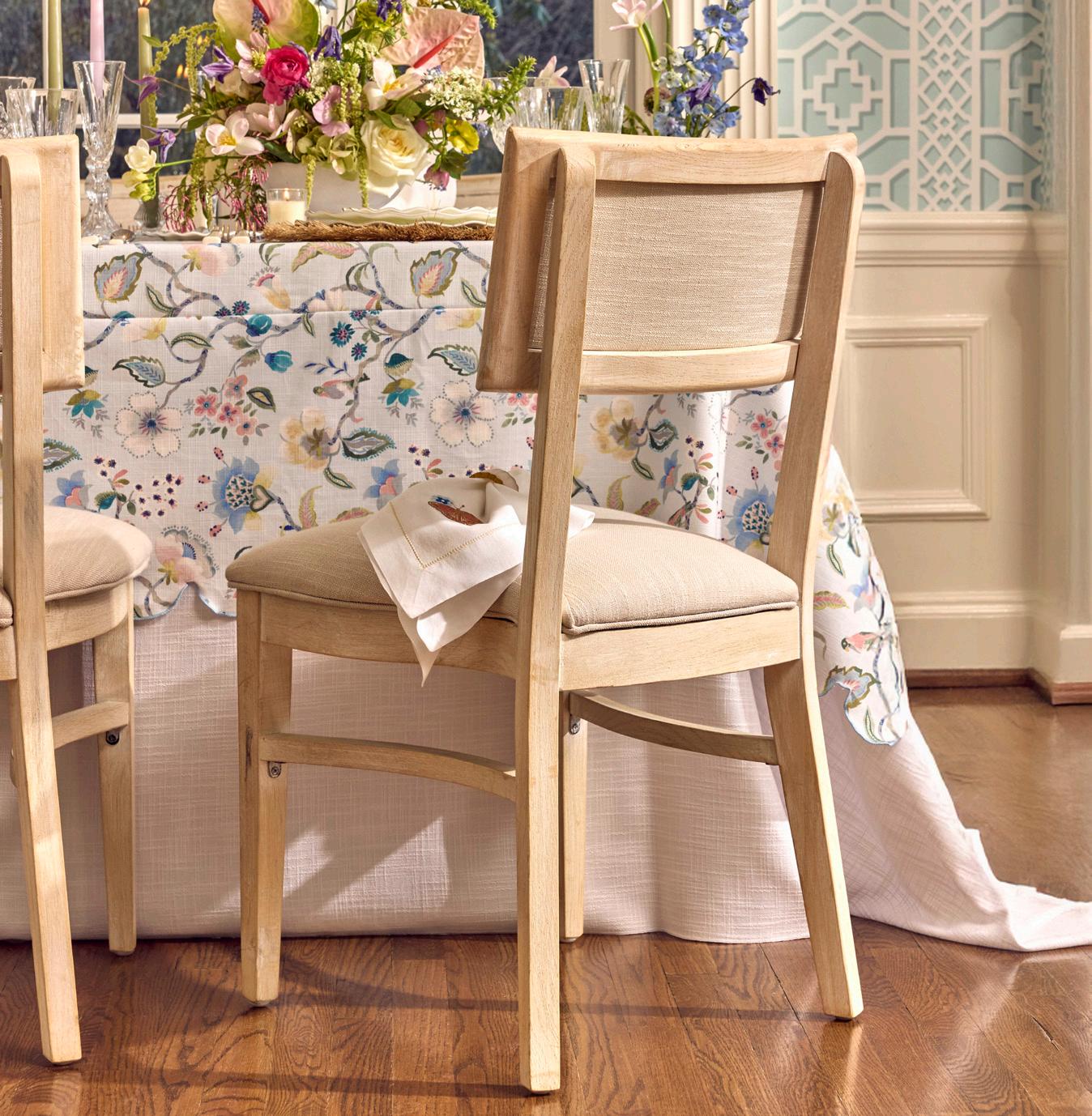
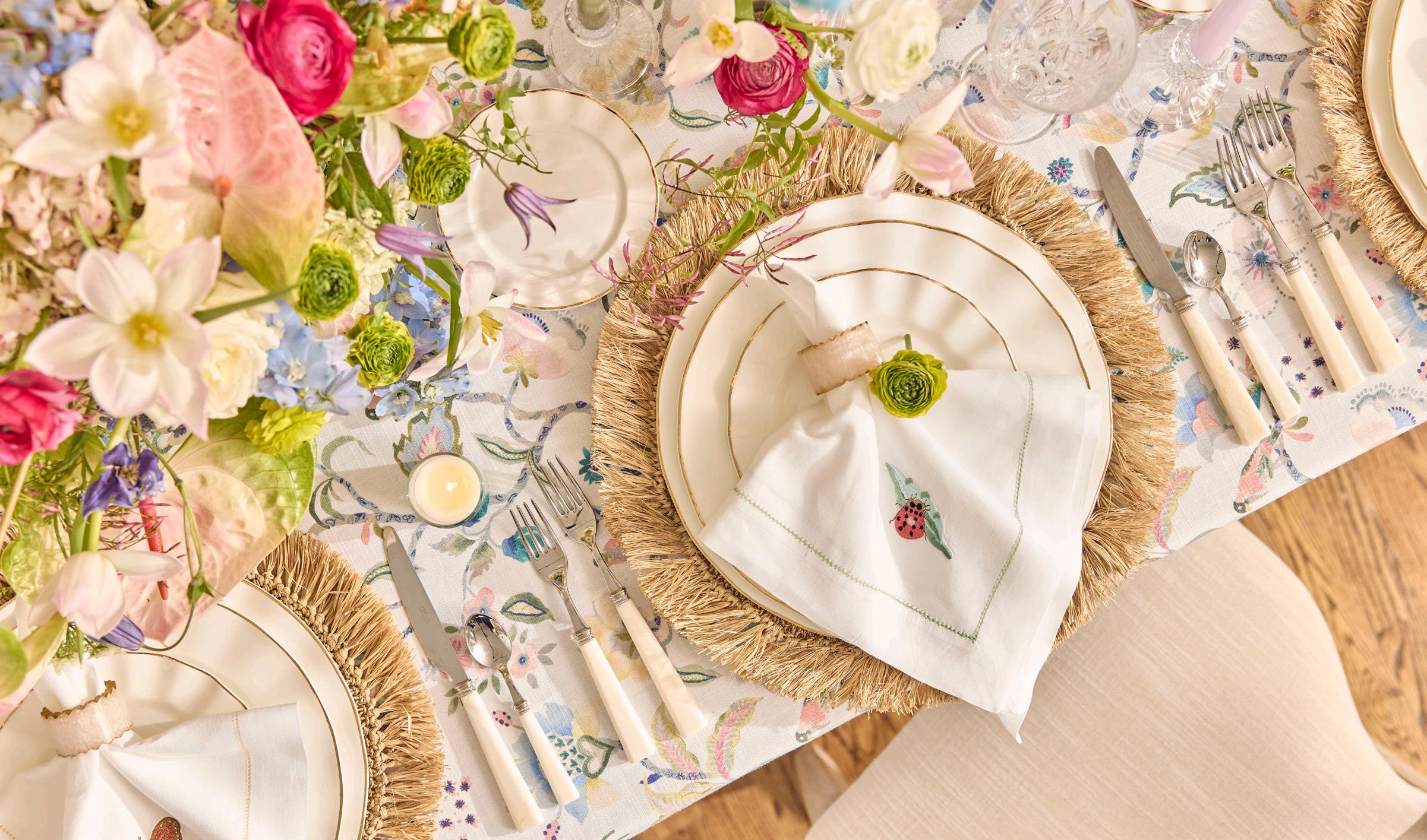
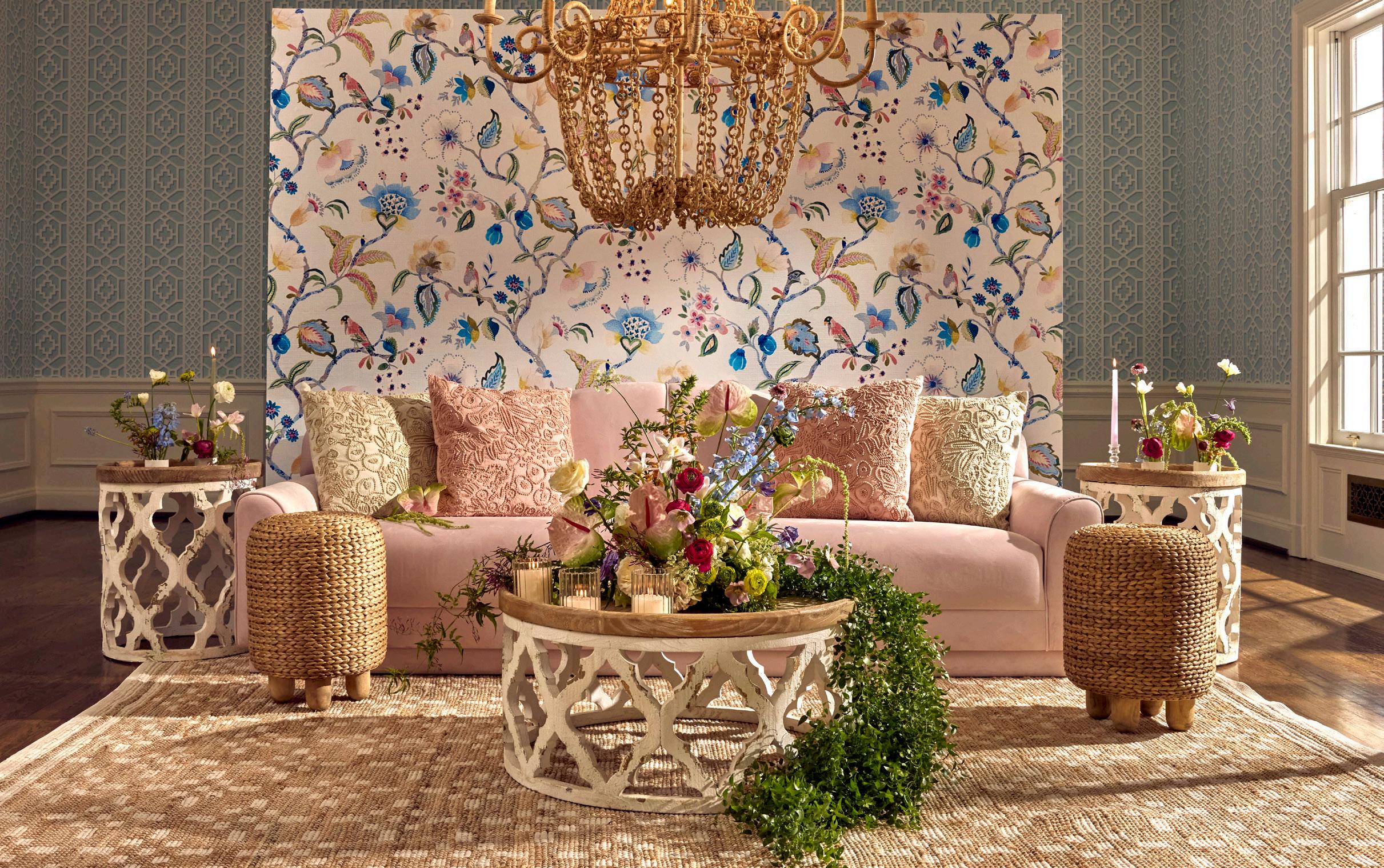
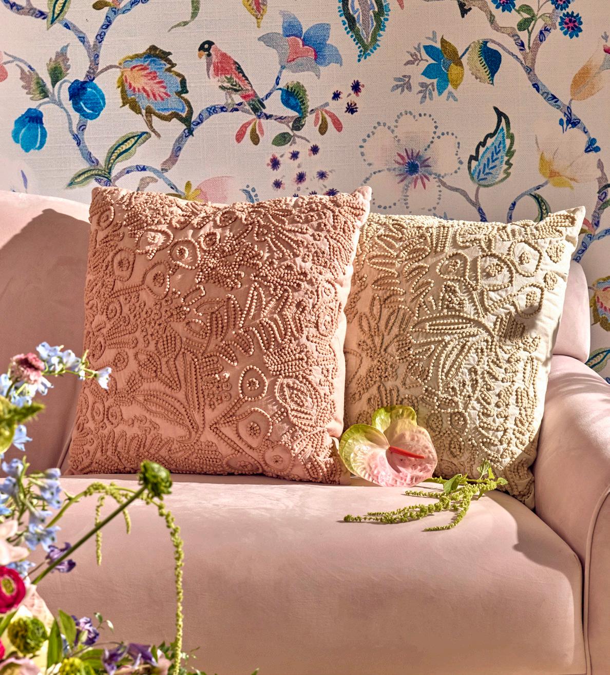
Delicate florals in soft blues and pastels create a fresh, garden-inspired feel. Paired with warm accents and layered textures, the look balances grace, elegance, and a touch of whimsy.
ENGLISH INTERLUDE
ENGLISH INTERLUDE
LINEN
Winifred Ice Scalloped Topper w/White Panama Undercloth
NAPKIN
Insect Hemstitch (Butterfly/Ladybug/Dragonfly/Bee)
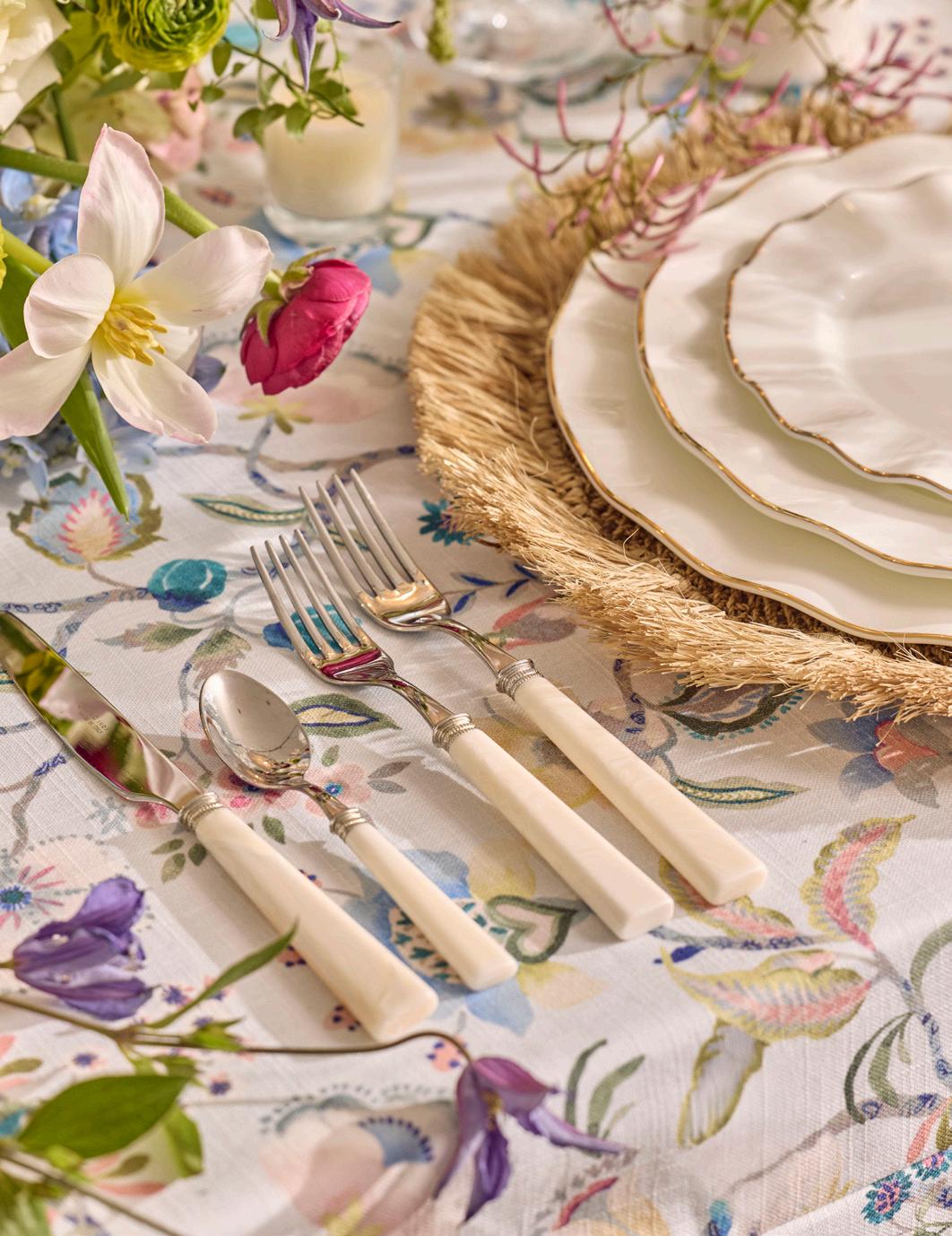
Ivory Geode Napkin Ring
DISHWARE
Sisal Boho Charger Mat
Greta Gold
Garda Horn GLASSWARE Melodia
FLATWARE
CHAIR
Francis
LIGHTING
Custom Winifred Ice Fabric Shade
FLORALS
Dormont Florist
EXPERT INSIGHTS
Dormont Florist - Florist
What’s the most common on-site challenge you face, and how do you solve it?
Sometimes when we arrive on site for an installation or set up, we find we’ve been given the wrong details - maybe it’s how we’re meant to attach a swag to a sign, maybe it’s the wrong specs of an on-site arch. But the key to all of our set ups is to expect the unexpected! We always pack supplies for a plan B & bring extra materials, just in case.
EXPERT INSIGHTS
Ana Kelly Food Styling - Stylist
What small detail makes the biggest impact in your opinion?
On set, the difference between something that looks styled and something that looks designed is rarely a major piece, it’s the quiet layers. A folded linen with a deliberate drape, a charger peeking just beyond the plate, a chair pulled an inch closer to the table, a texture that catches light at the right angle. Those subtle decisions create depth, movement, and richness in the frame.
ENGLISH INTERLUDE
SOFA
Bianca
OTTOMANS
Basin Pouf
TABLES
Asher Accent
Asher Coffee
LIGHTING
Tangiers Shades Amalfi Chandelier
PILLOWS
Embroidered Rose Tapestry
Embroidered Ivory Tapestry
RUG
Judy Natural
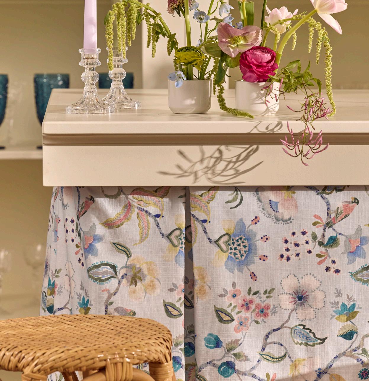
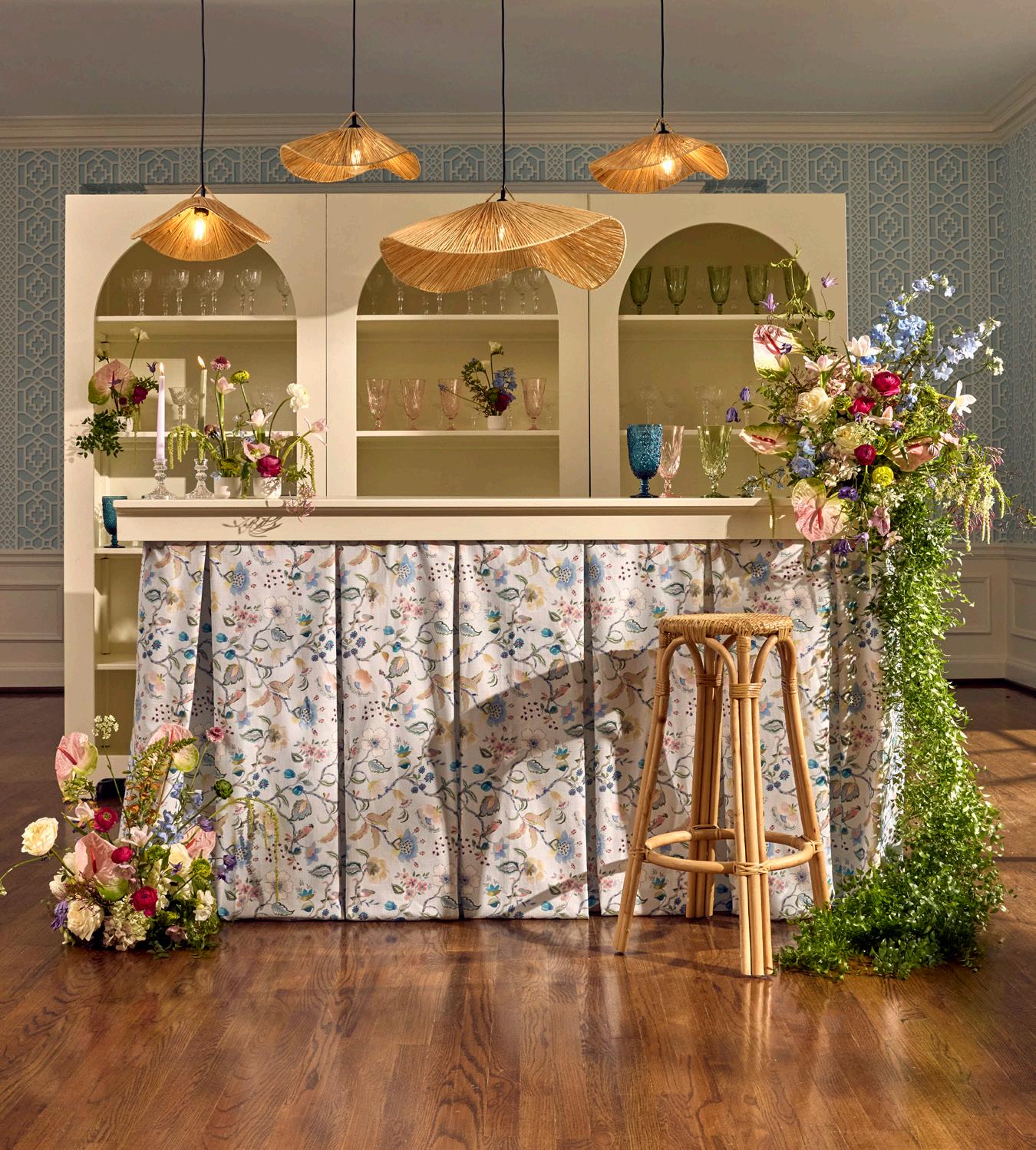
BAR
Laila Fabric Bar w/Custom
Winifred Ice Fabric Bar Skirt
Archer Barback w/ Custom Printing
BARWARE
Melodia
FLORALS
Dormont Florist
SUNDAY CAFE
SUNDAY
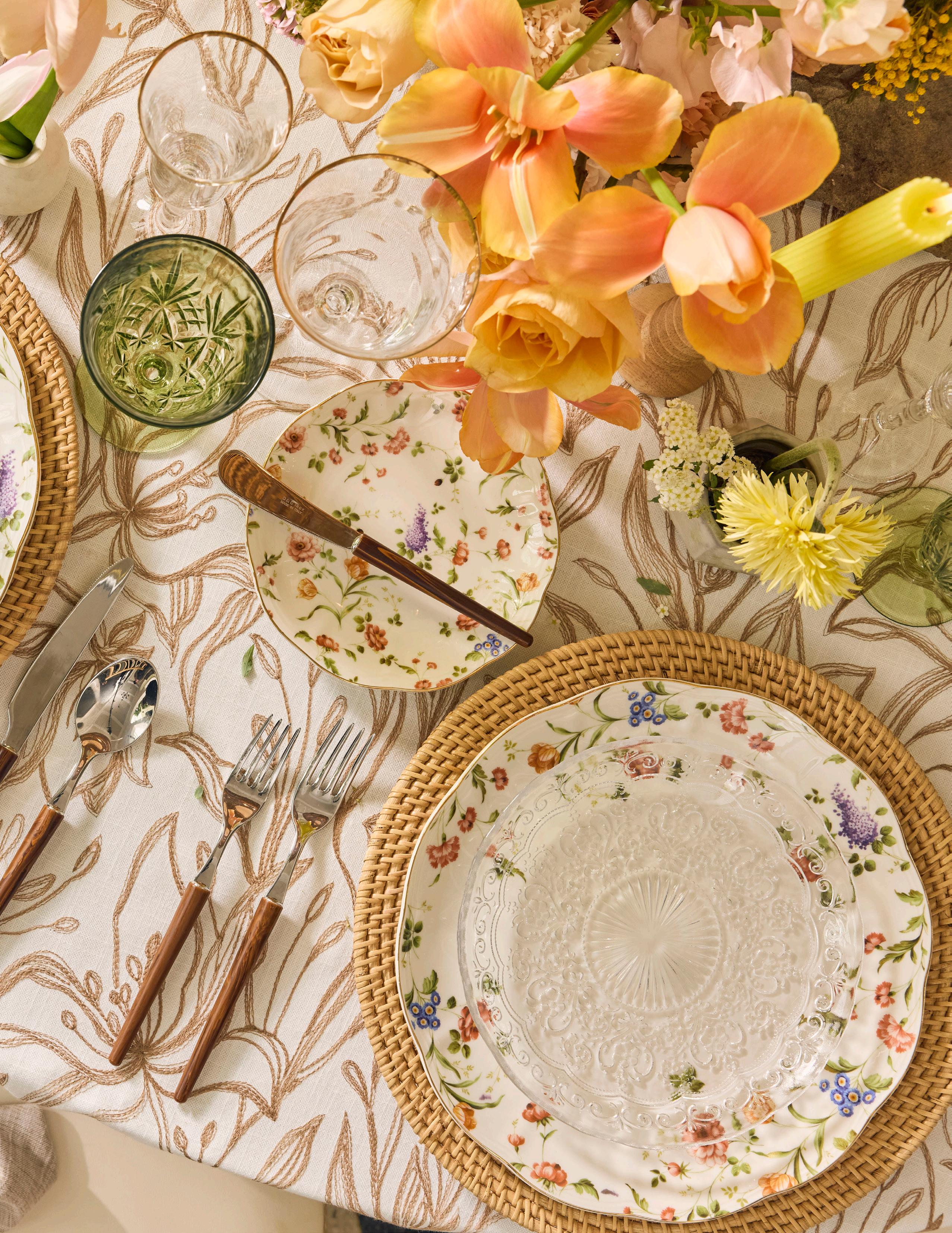
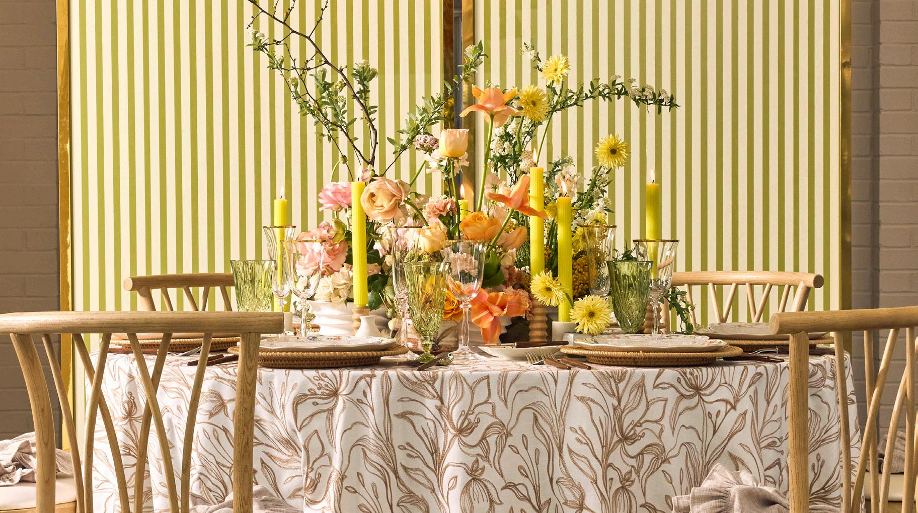
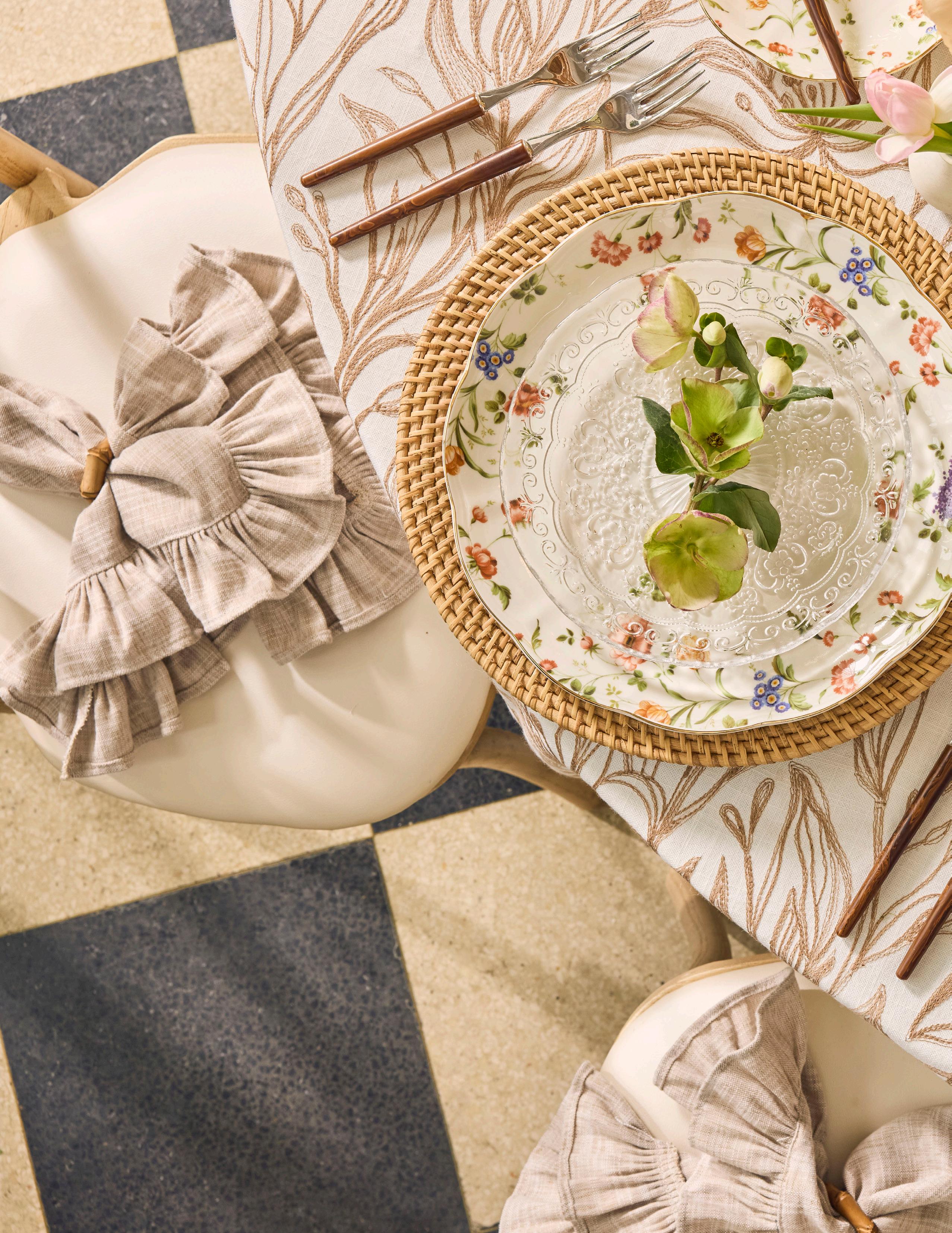
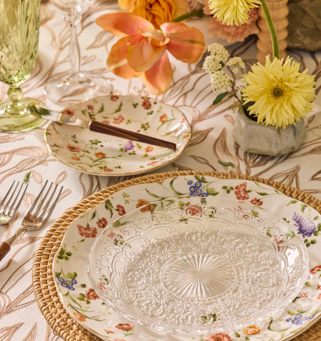
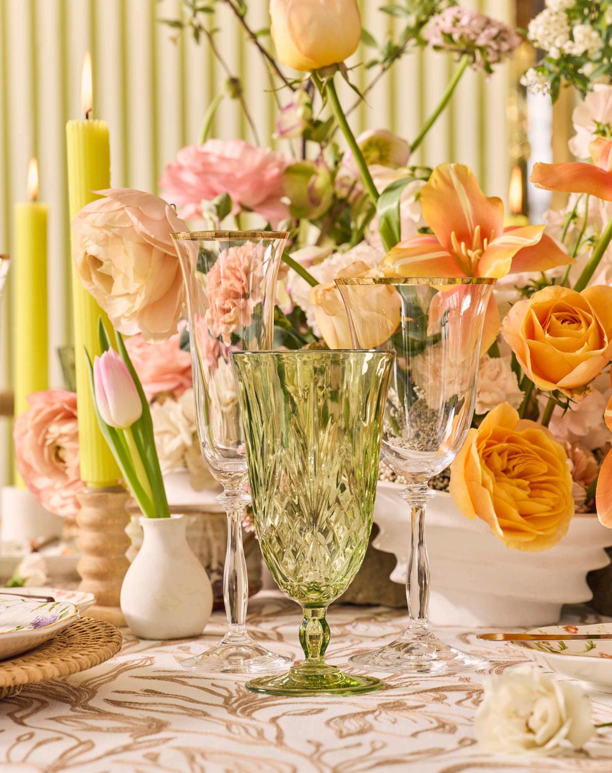
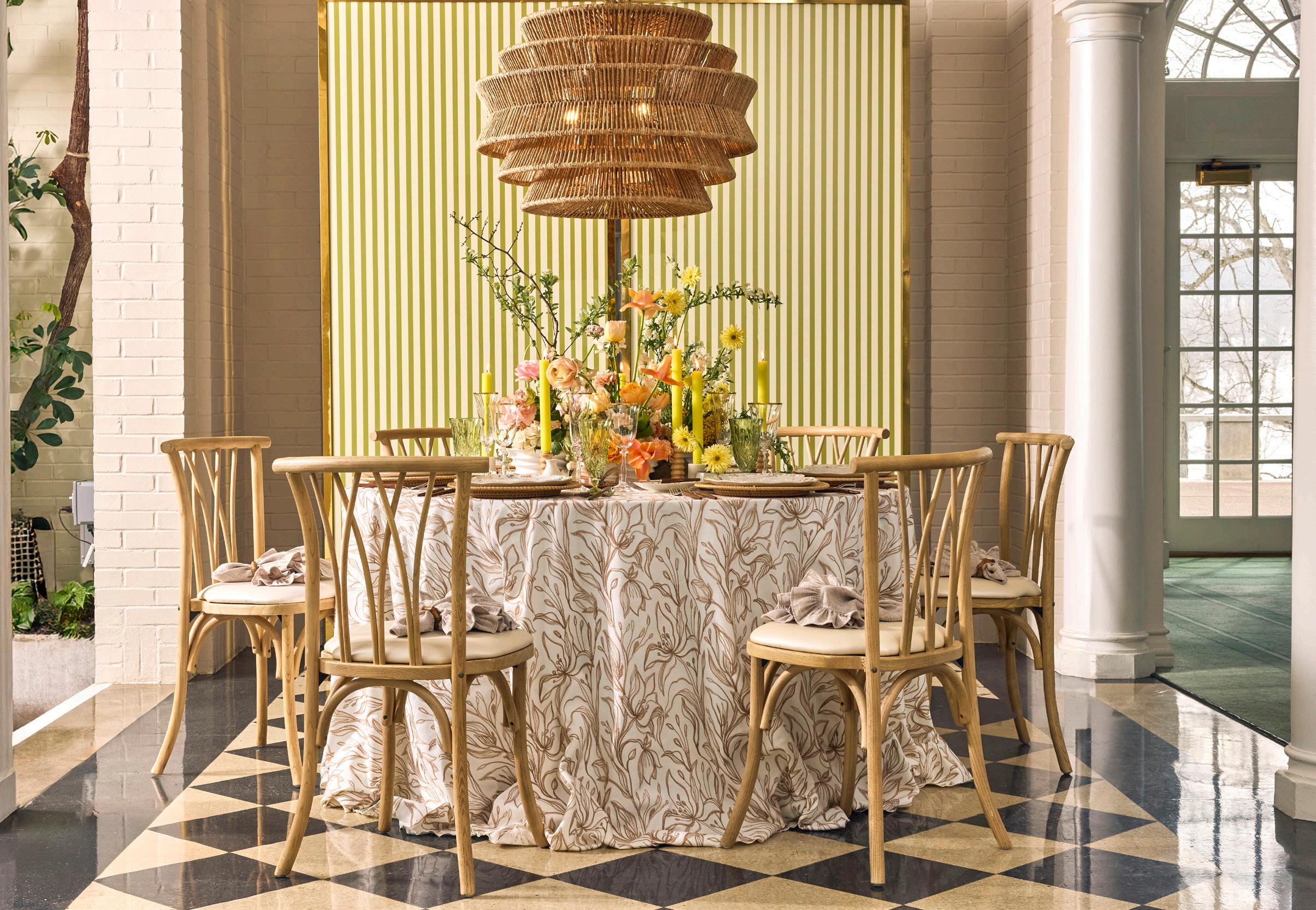
A palette of warm neutrals, gentle greens, and organic patterns creates a setting that feels fresh and natural. Textural layers and golden accents bring a subtle richness while maintaining an airy, effortless feel.
SUNDAY CAFE
LINEN
Lotus Flax
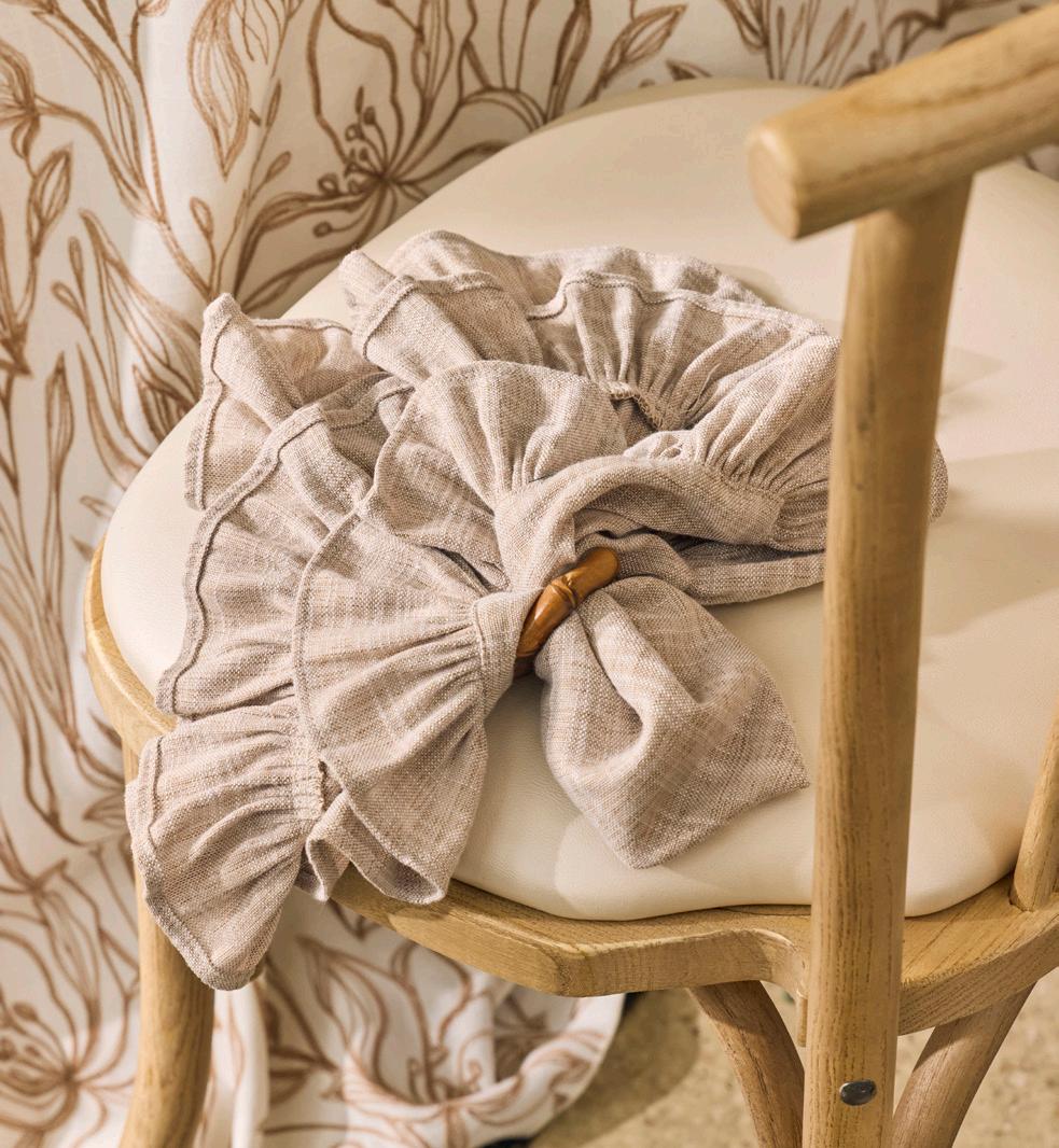
NAPKIN
Barcelona Ruffle Bamboo Napkin Ring
DISHWARE
Rattan Natural Honey Charger Ashleigh Marie Clear
GLASSWARE
Grace Gold Melodia Moss
FLATWARE
Stiletto Burl Wood
CHAIR Willow
LIGHTING
Antigua Chandelier
BACKDROP
Gold Barclay Divider w/Custom Printing
FLORALS
Studio Fleuraison
EXPERT INSIGHTS
Studio Fleuraison - Florist
What adjustments do you make once you see florals through the lens?
Seeing florals through the lens often leads me to increase the spacing between different parts of the design, as the photo flattens the 3D nature of floral design. Increasing space and making sure each focal bloom is clearly visible in its own space is how I ensure the three dimensionality still shows up in the photo!
IVORY AND INK
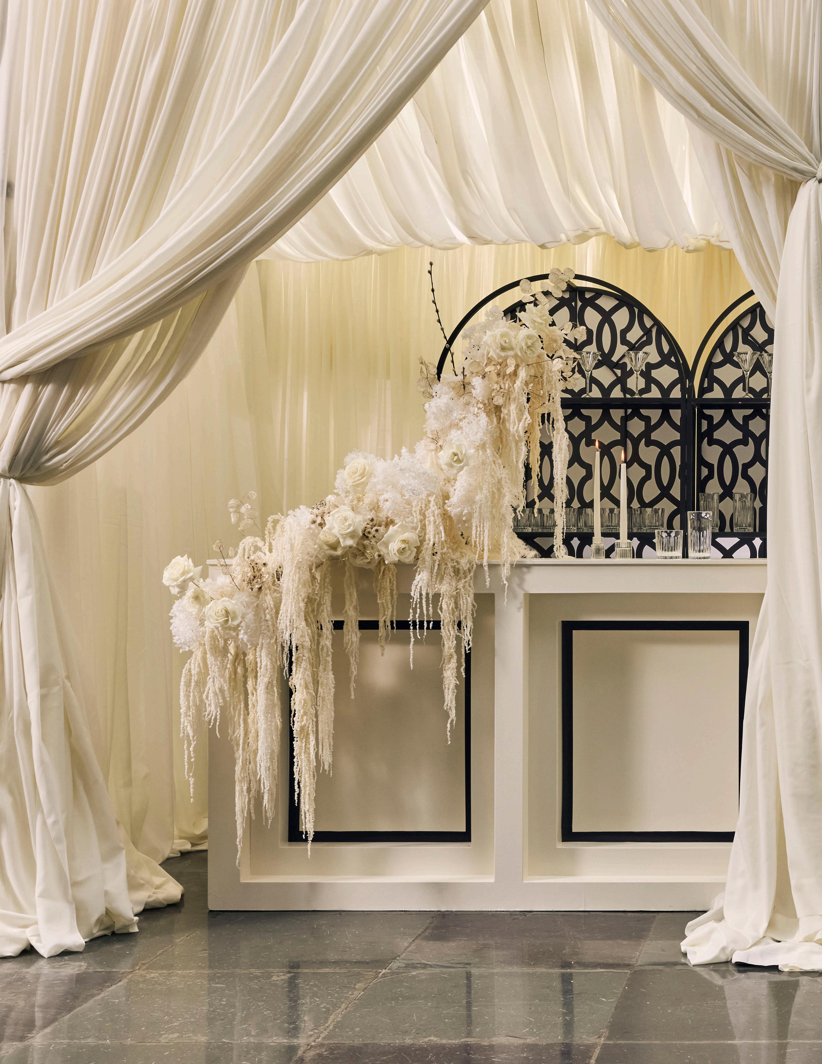
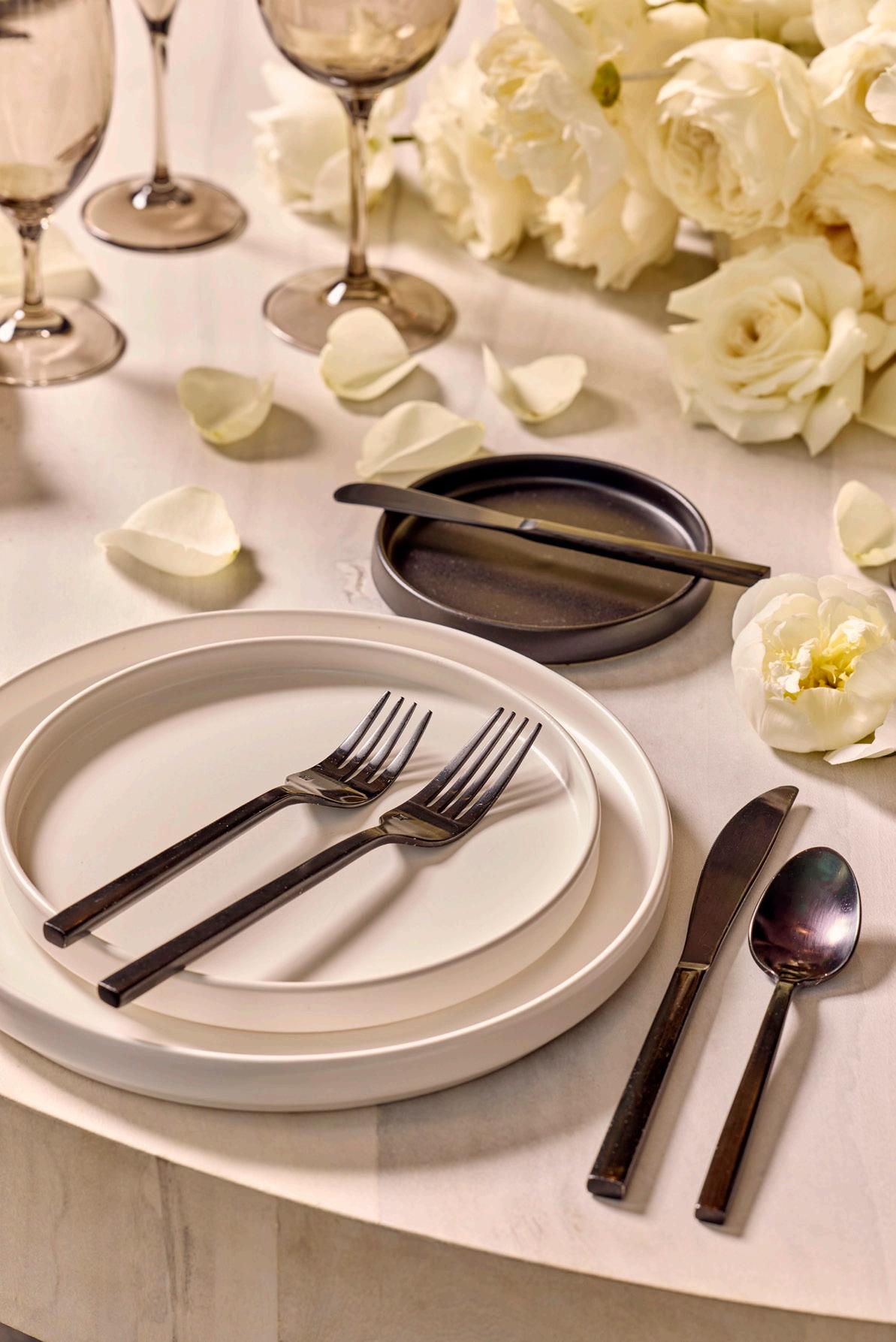
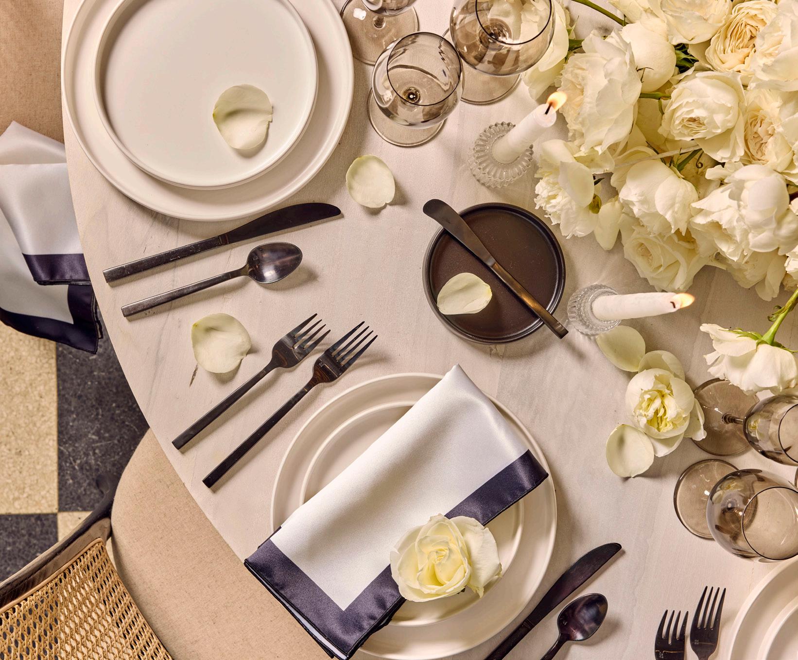
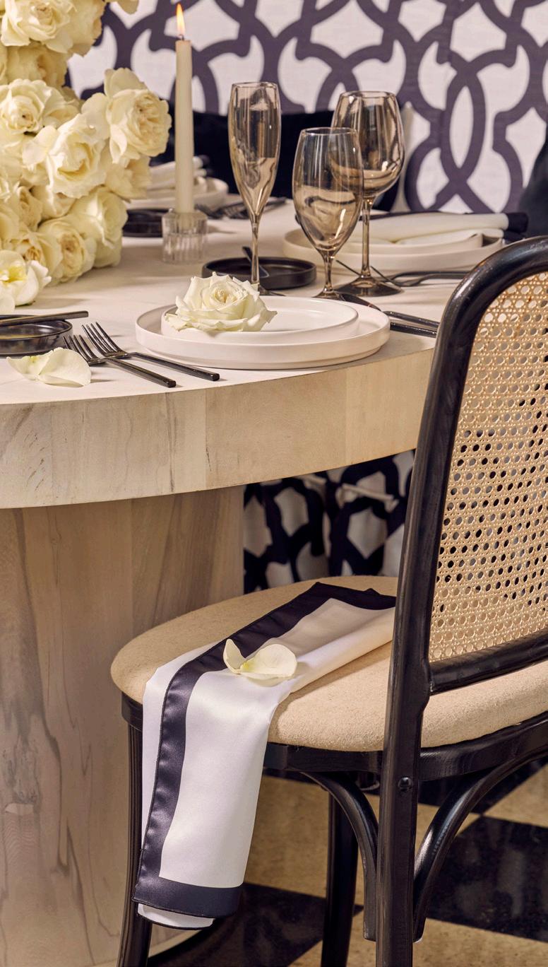
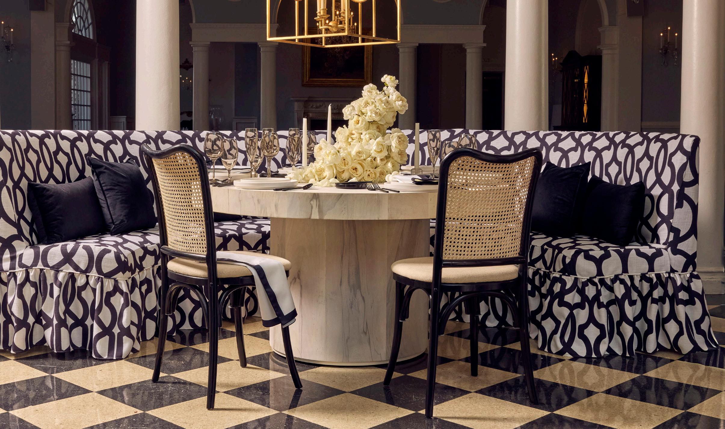
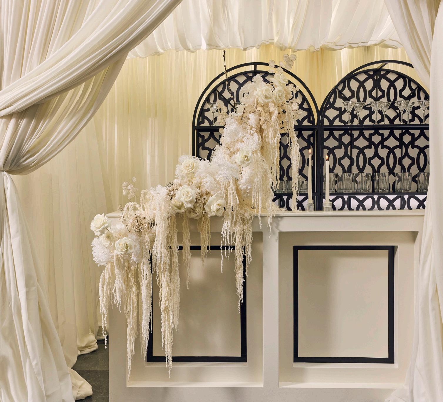
A dramatic mix of soft neutrals and deep black accents creates a look that feels both refined and alluring. Rich textures and strong contrast bring a sense of depth, mood, and effortless glamour.
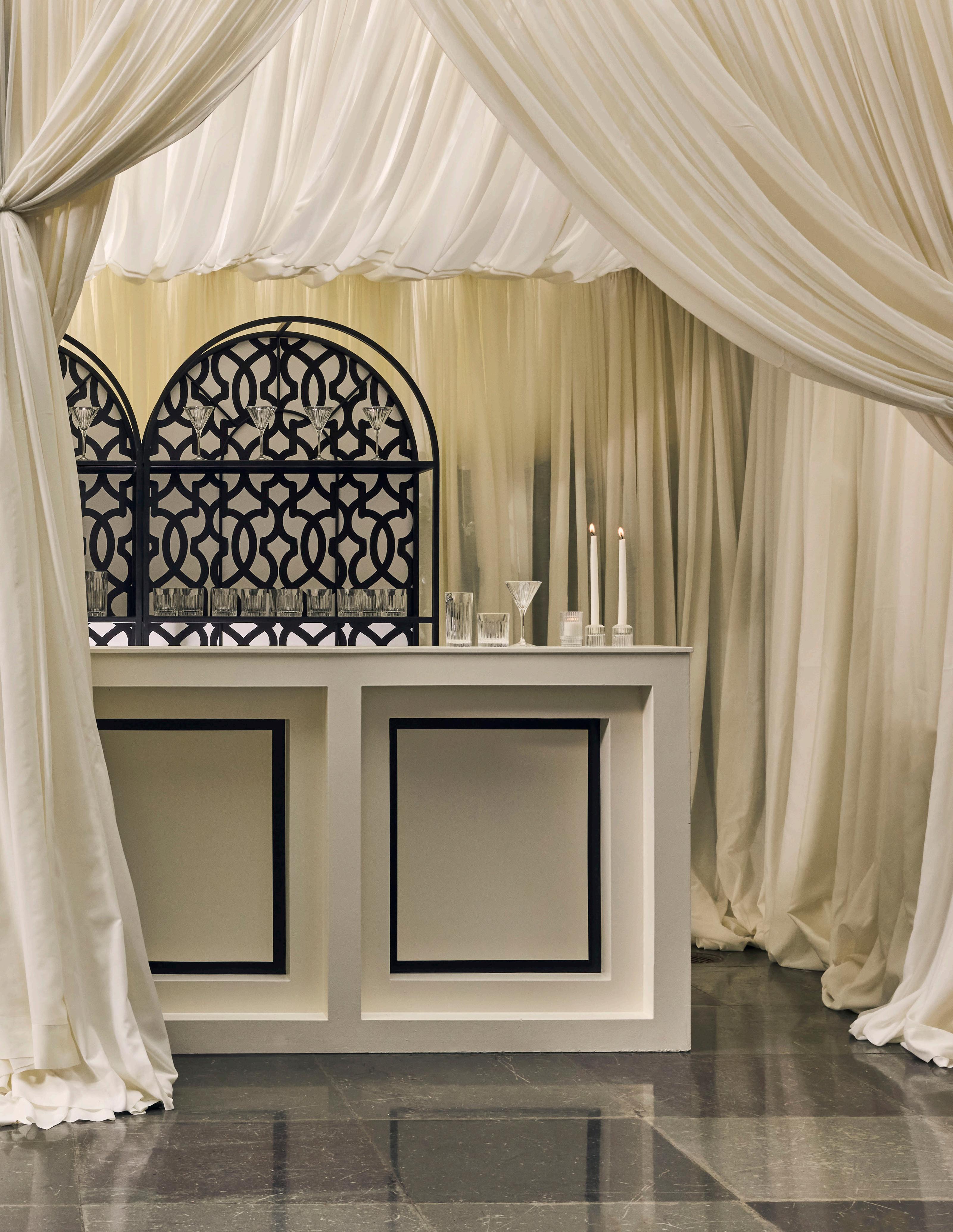
INK
IVORY AND INK
TABLE Aspen Drum
NAPKIN
Ivory Satin w/Custom Printed Black Trim
DISHWARE
Kaleb Cotton Kaleb Onyx
Arezzo Black GLASSWARE Aurora Smoke
FLATWARE
SEATING
Waldorf Curved Banquette w/Custom Printed Onyx Lattice Slipcover Emma
LIGHTING
Gramercy Chandelier
PILLOWS
Black Velvet Square
Black Velvet Lumbar
FLORALS
Honey Bunch Bouquets
EXPERT INSIGHTS
Honey Bunch Bouquets - Florist
What’s the most time-intensive part of creating arrangements for a styled shoot?
The most time-intensive part of creating arrangements for a styled shoot actually happens in the studio. The day-of installation goes surprisingly quickly! In the studio, I focus on building the overall shape of the design - thinking about dimensionality, blending colors, and creating a cohesive look. When I arrive on set, it becomes about refining the details. I shift between macro and micro adjustments by scaling elements in real time and modifying bloom placement to capture that picture-perfect moment.
EXPERT INSIGHTS
Presently Social - Content Creator
How do you balance candid moments with polished visuals?
For me, it’s all about staying present to what’s naturally unfolding. I approach shoots the same way I approach wedding days, with a creative eye and a documentary mindset. The polished visuals show the design, and the candid moments show the heart behind it. When the two meet, you’re not just documenting the finished product, but telling the full story of the people and creativity that brought it to life.
IVORY AND INK
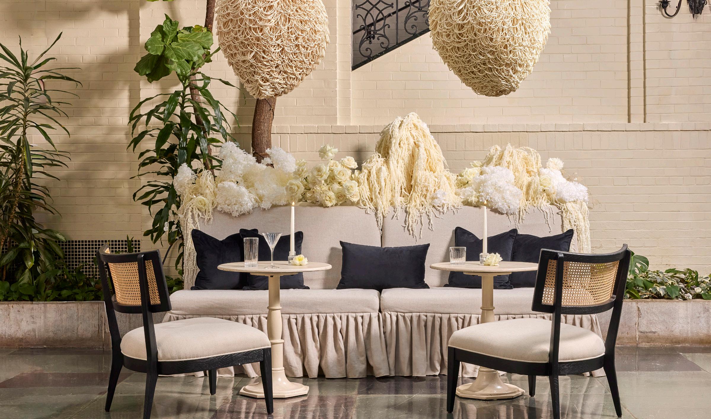
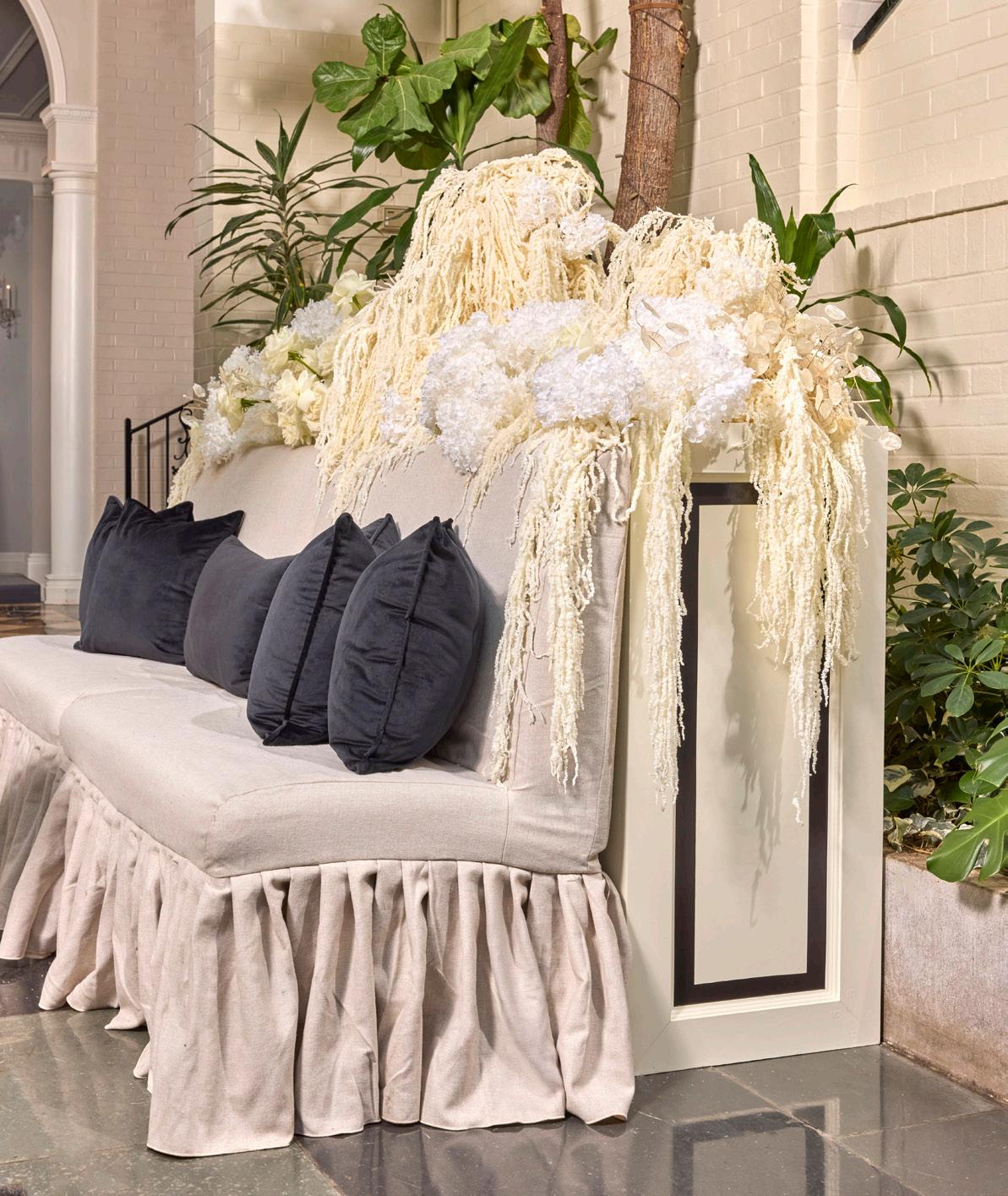
BANQUETTE
Waldorf Straight Banquette w/Flax Slipcover
Sofa Boxes w/Custom Printing
CHAIR
Britt
TABLE
Lucy Cafe
LIGHTING
Finley Chandelier
PILLOWS
Black Velvet Square
Black Velvet Lumbar
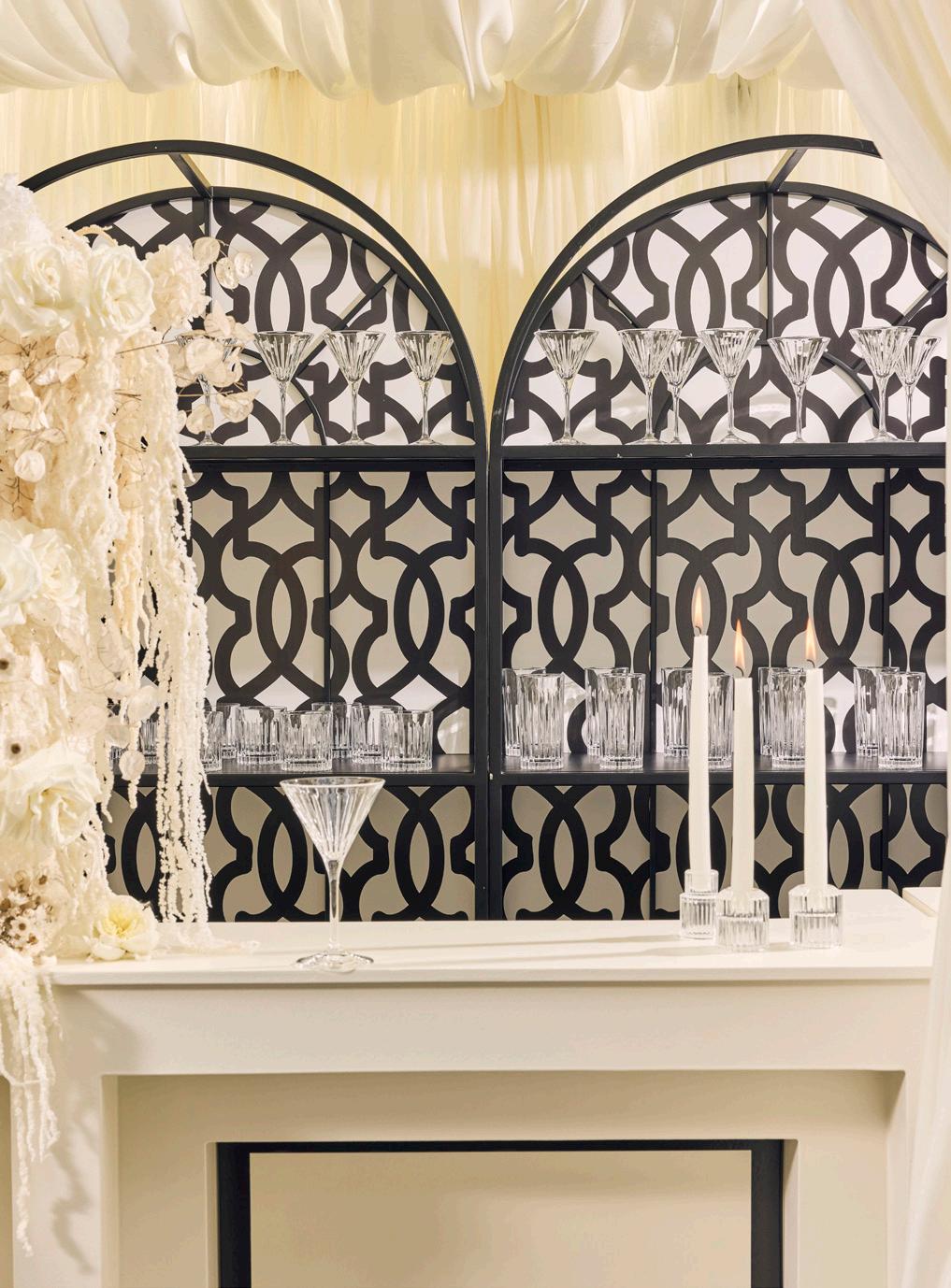
BAR
Harlow Cube Bar w/ Custom Printing
Alcove Bar Back w/Custom Printed Backing
BARWARE
Timeless
DRAPERY
Ivory Batiste
FLORALS
Honey Bunch Bouquets
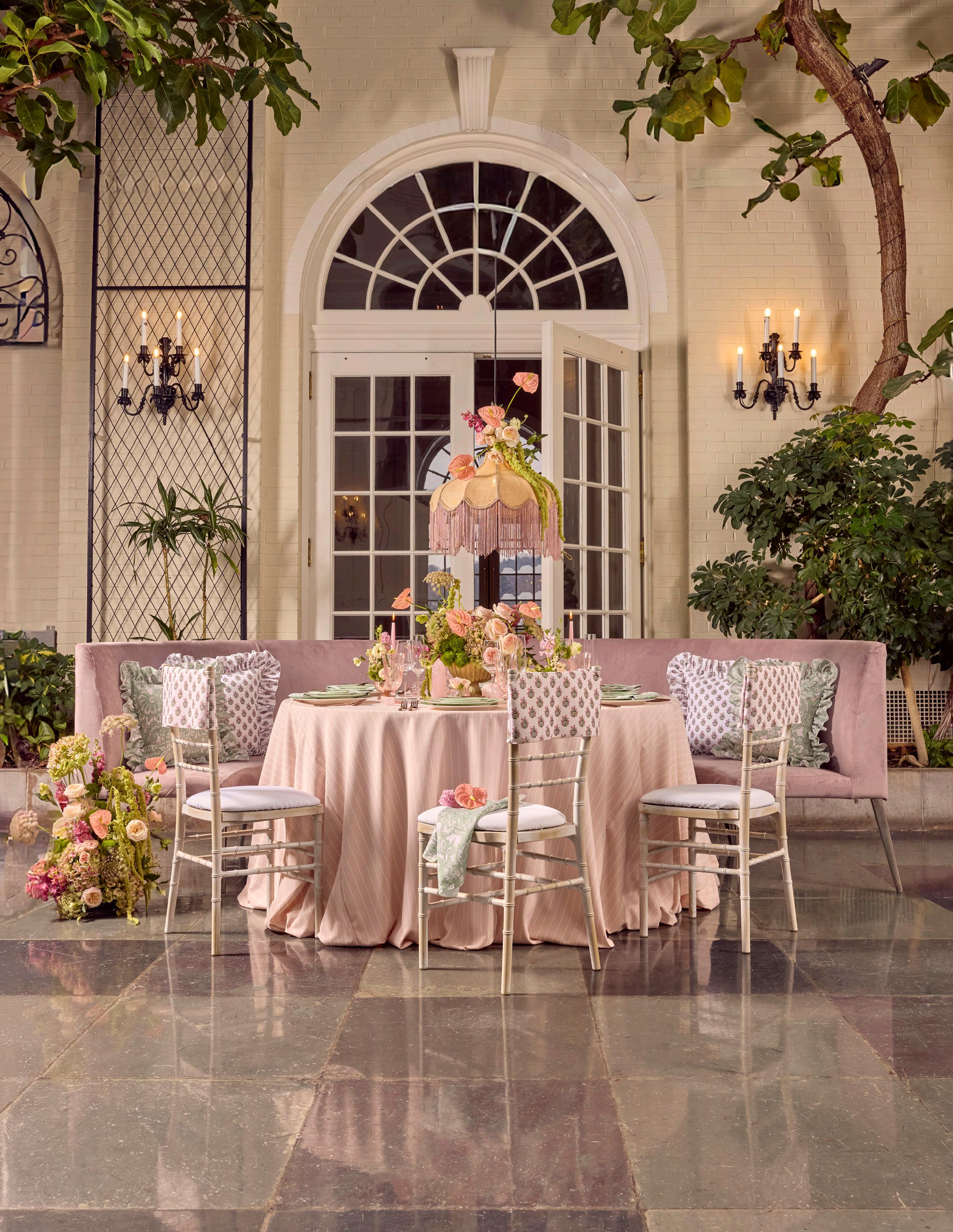
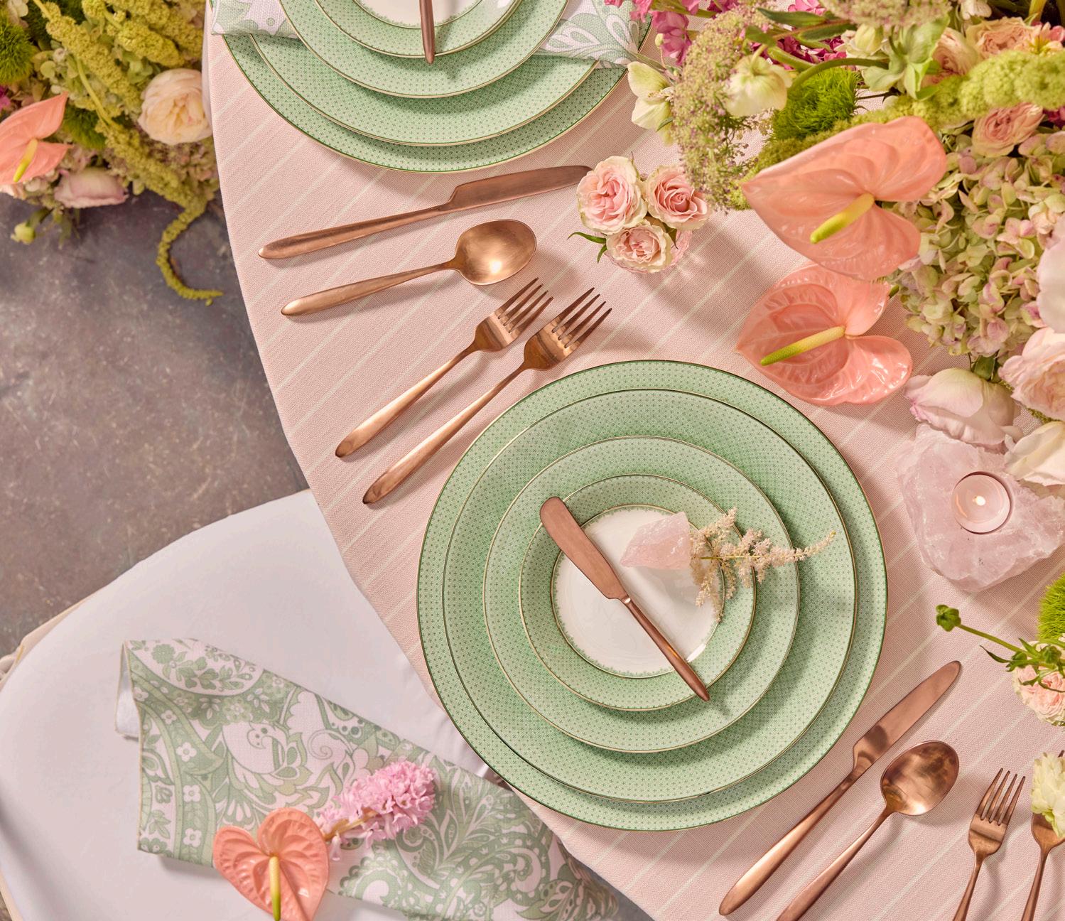
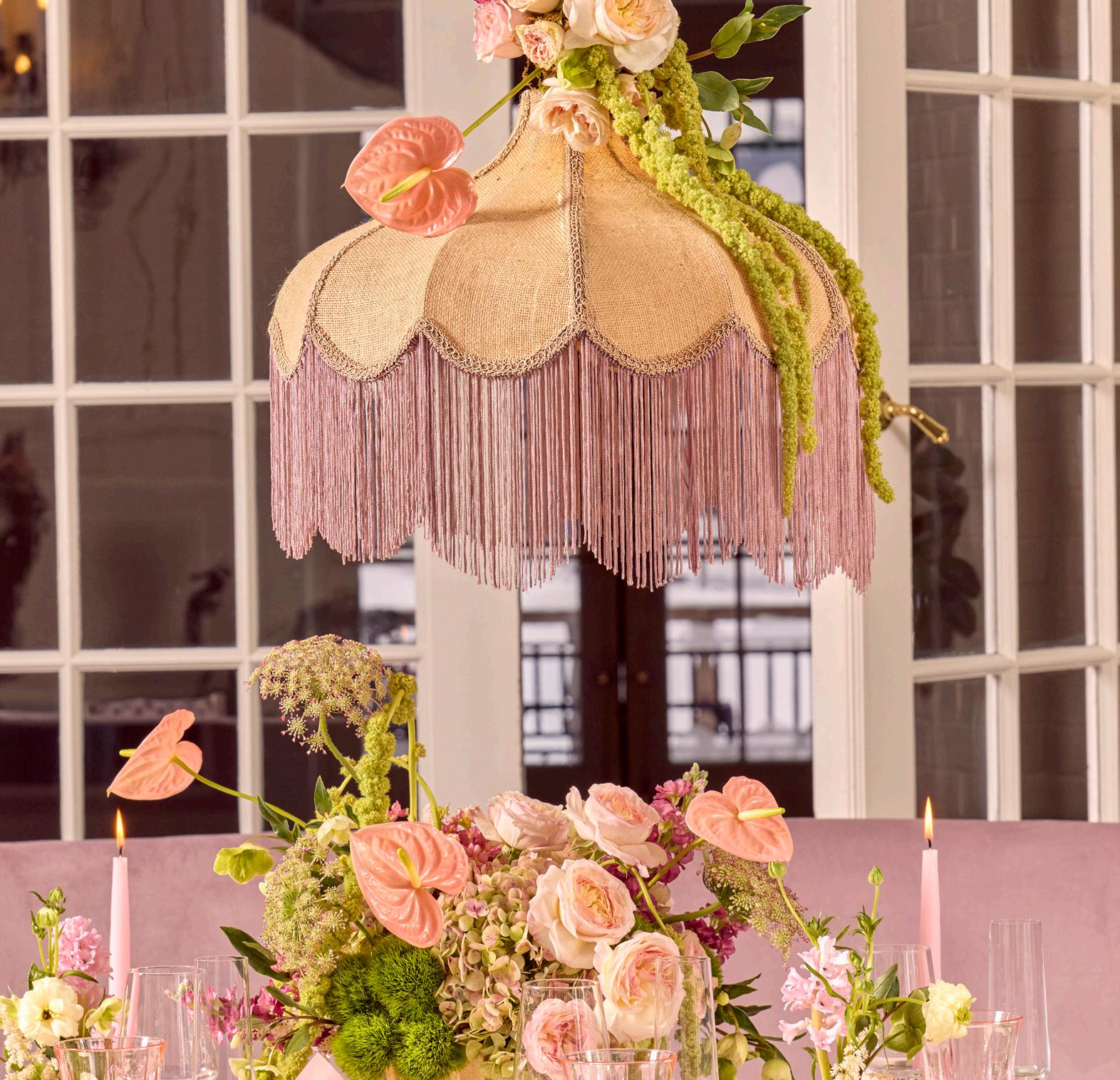
ROSE AND LEAF
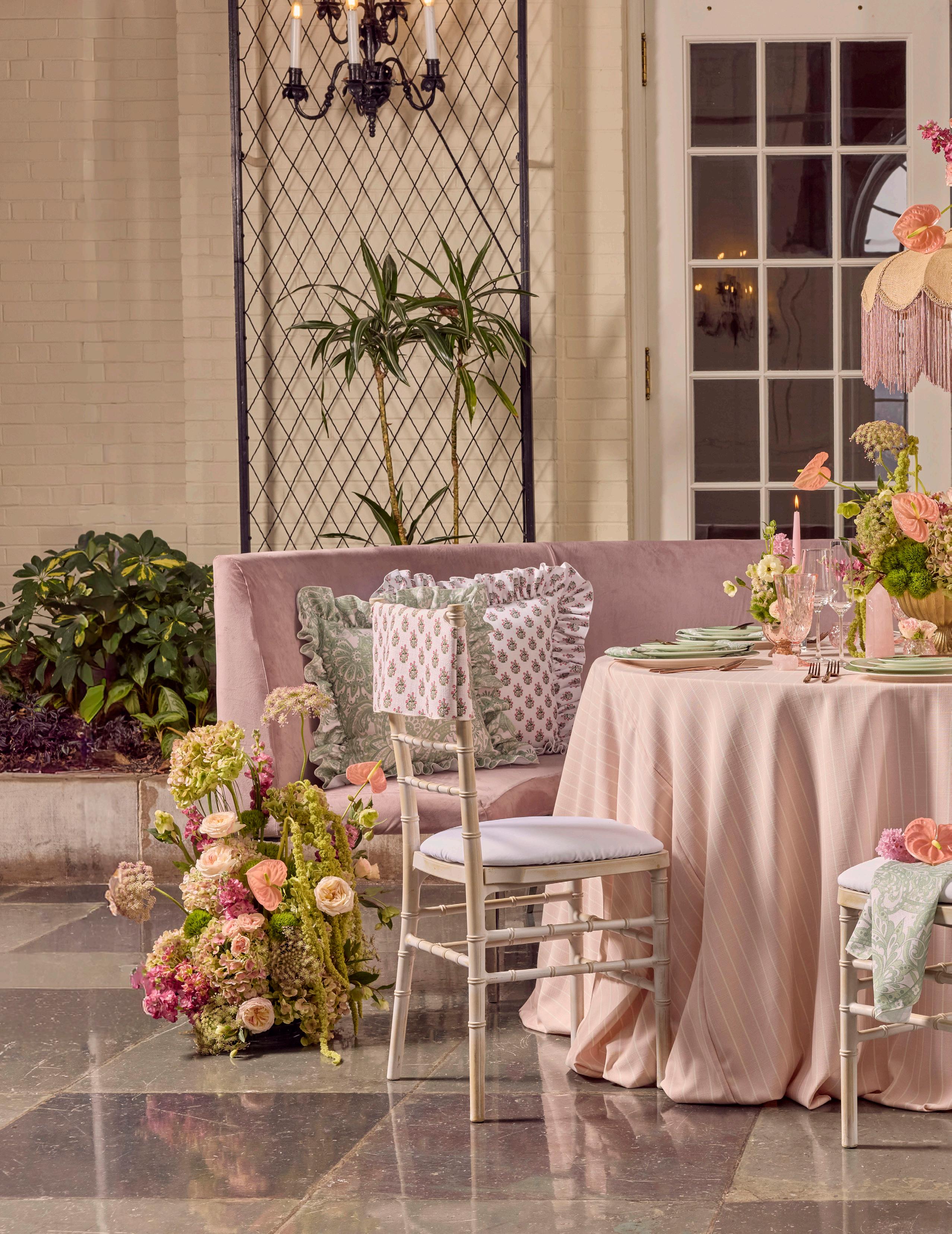
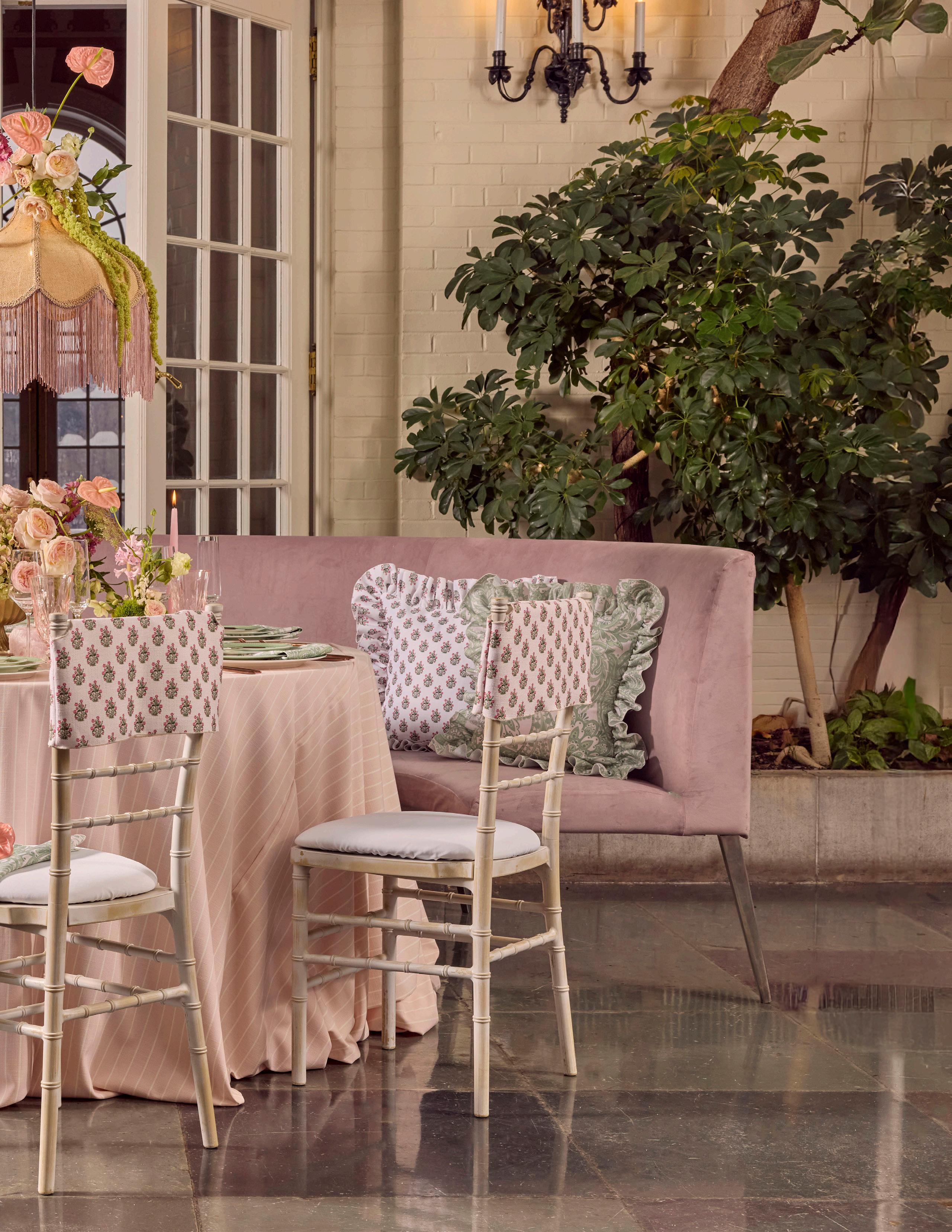
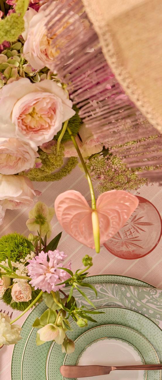
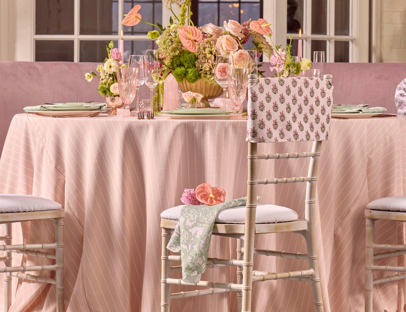
Muted pink hues paired with soft green accents create a fresh, floral-inspired palette. The combination of subtle textures and elegant details gives the look a light, romantic atmosphere.
LEAF
ROSE AND LEAF
LINEN
Blush Rhett Stripe
NAPKIN
Custom Printed Mint Paisley
DISHWARE
Vienna Juniper
GLASSWARE Pure
Melodia Blush
FLATWARE
Muse Copper
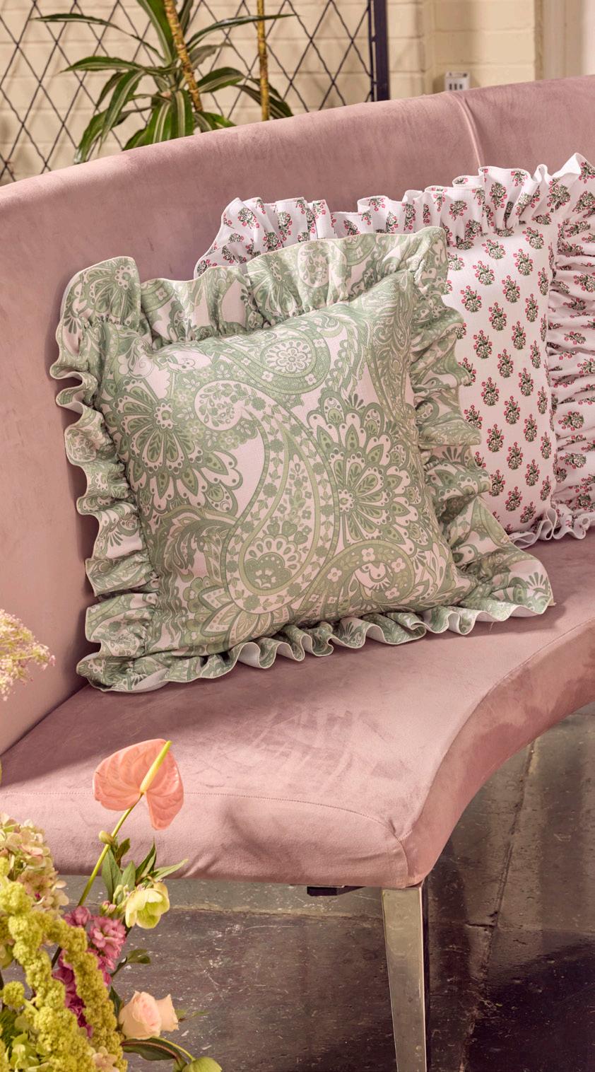
SEATING
Waldorf Curved Banquette w/Dusty Rose Velvet Slipcover
Stonewash Chiavari w/Custom Pink Posy Block Floral Chair Topper
LIGHTING
Buchanan Chandelier
PILLOWS
Custom Printed Mint Paisley
Custom Printed Pink Posey Block Floral
FLORALS
The Floral Touch
EXPERT INSIGHTS
The Floral Touch - Florist
How do you decide which blooms will be focal versus supporting?
To start off, I categorize my flowers into 3 groups: focal flowers, supporting flowers (also known as filler or mass flowers) and line flowers. Focal flowers typically draw the viewers eye because they are dominant visually. The supporting flowers tend to enhance the focal flowers and are smaller. I like to call these fillers - as they tend to fill in the background space. The line flowers elevate the height of an arrangement as well as steering its outline and direction. After following this three group structure, my arrangements typically are well balanced, and have a nice harmonious flow.
I decide on which flowers I am going to put into these roles by first understanding the style, color palette and overall aesthetic of the event I am designing for. Once I have that vision, I visually map out which flowers will best uniquely enhance and elevate the arrangements. I always use a combination of varieties so that the shapes, colors, and textures compliment one another. Blending these elements allows my arrangements to feel balanced, dynamic and visually interesting while still reflecting the overall theme of the event.
MERLOT RESERVE
MERLOT RESERVE
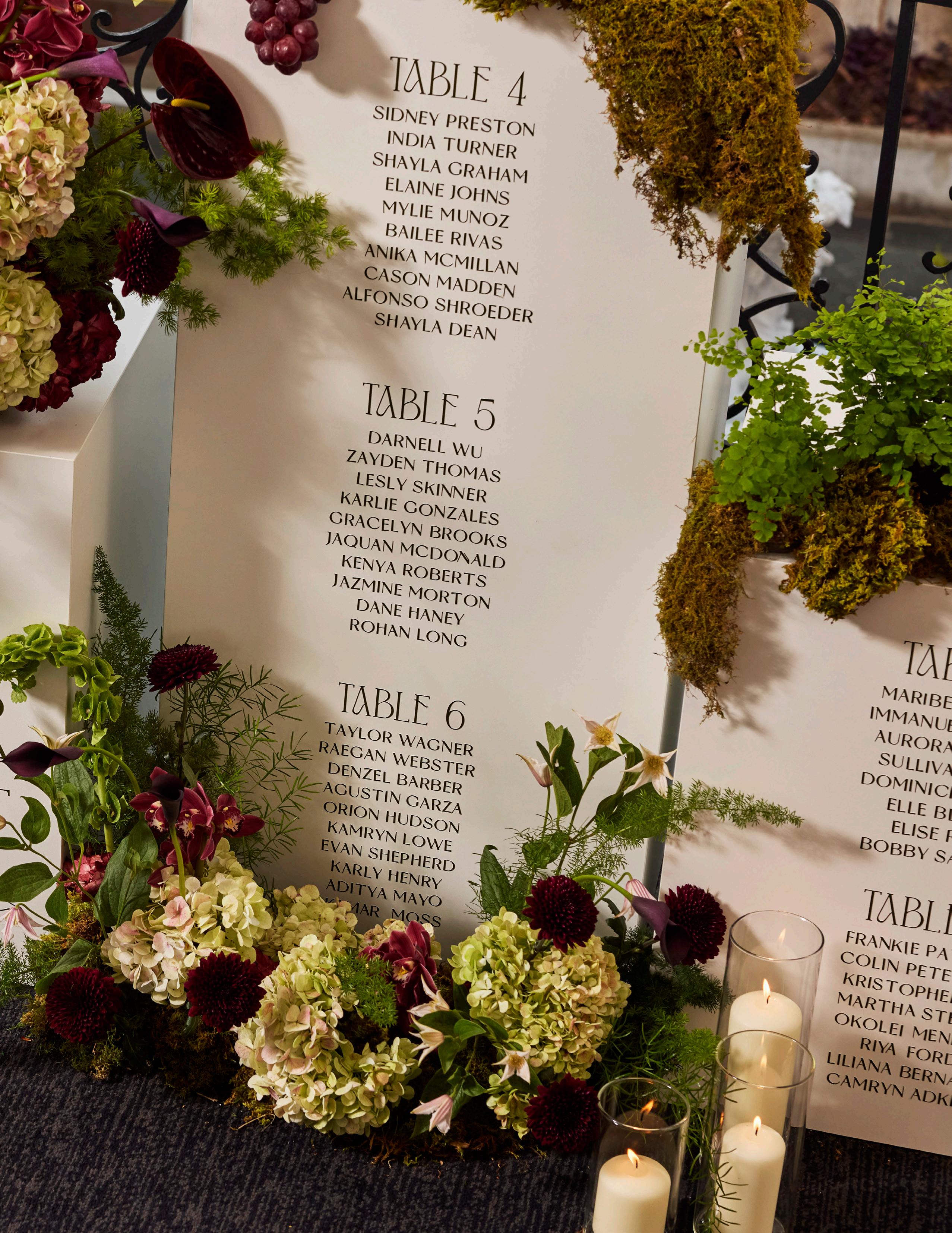
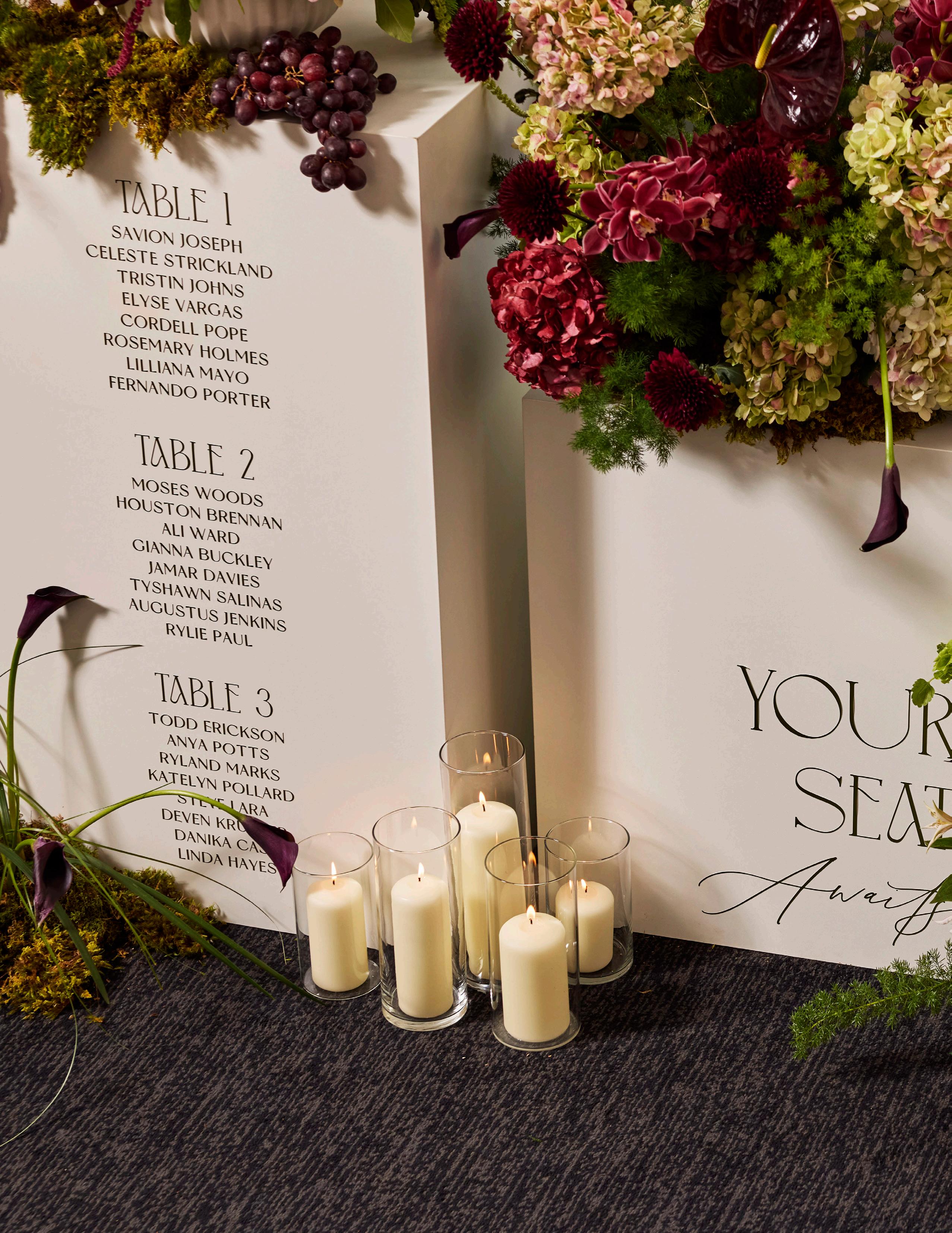
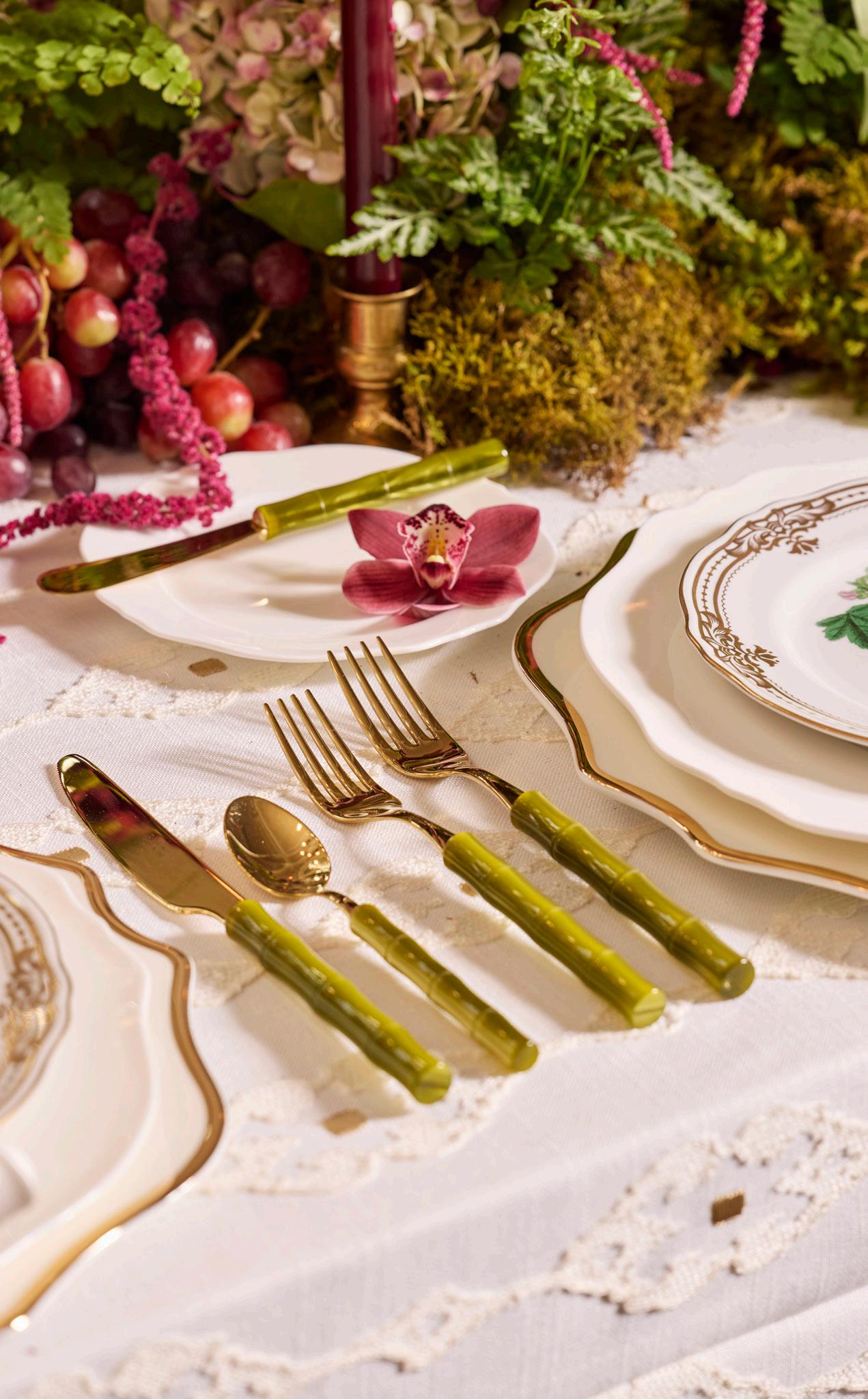
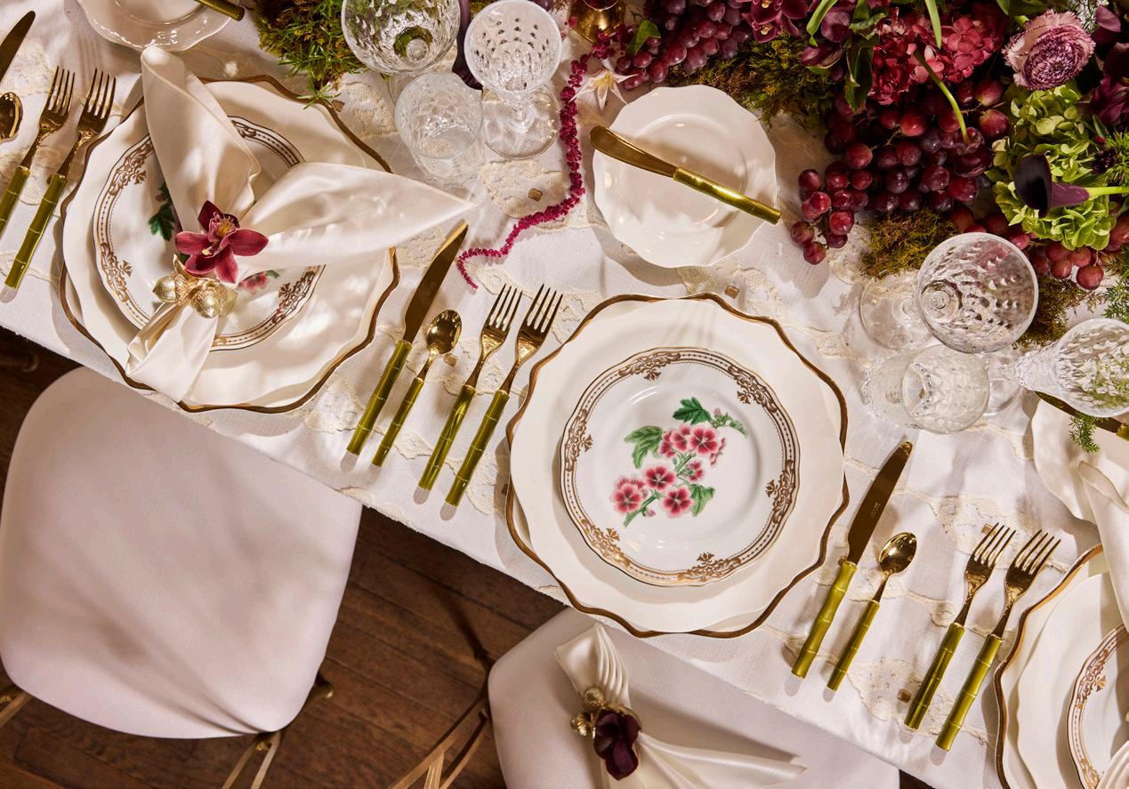
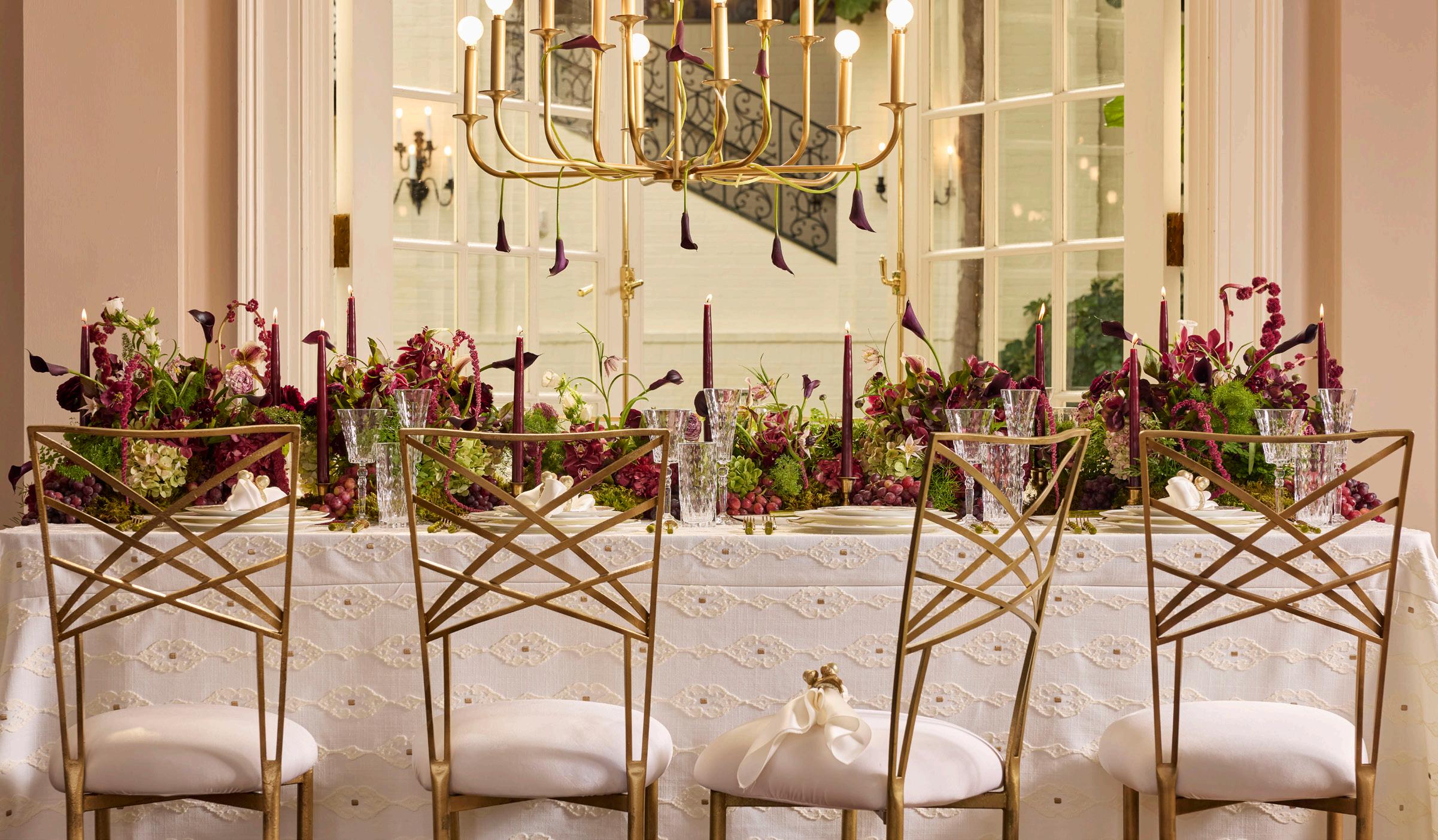
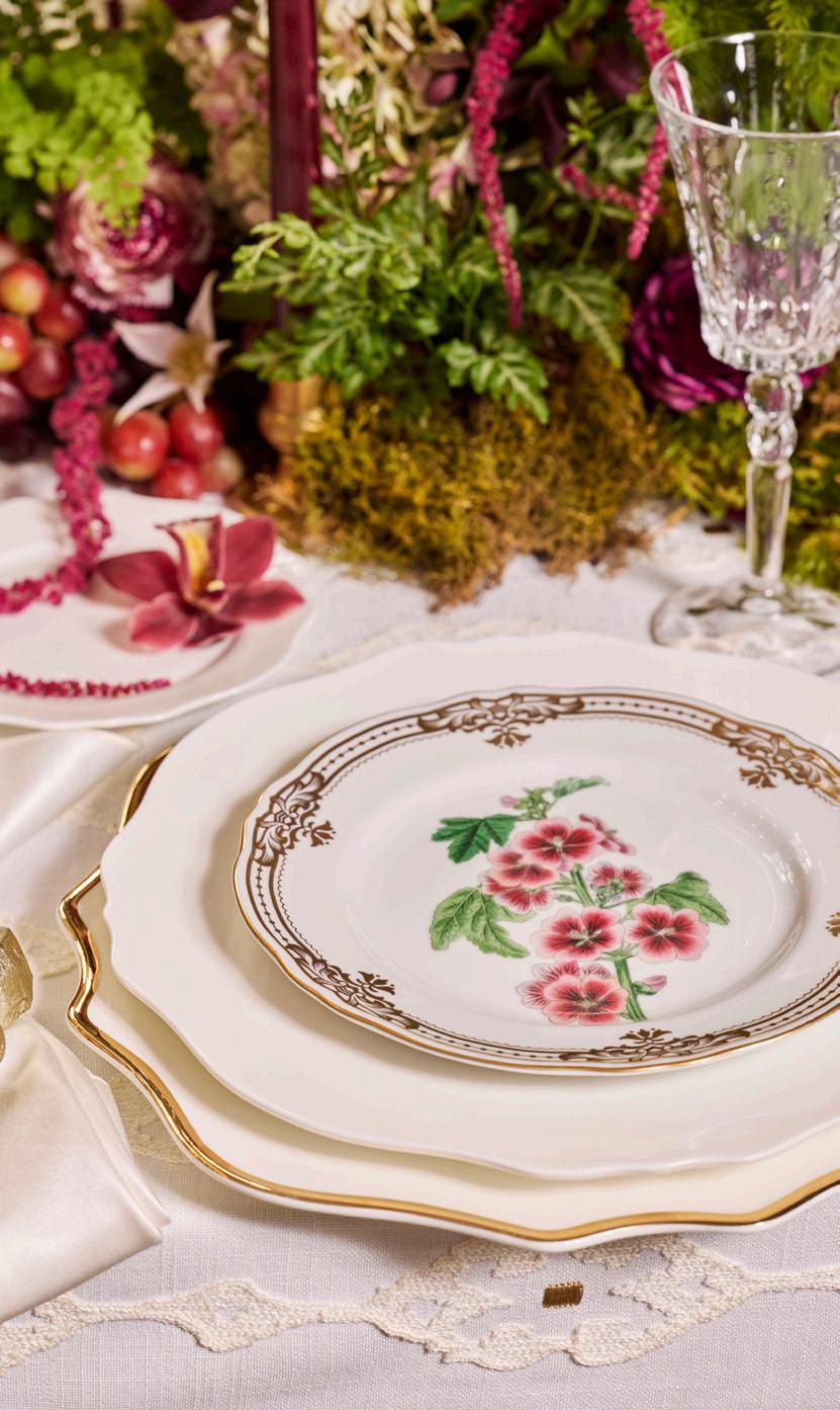
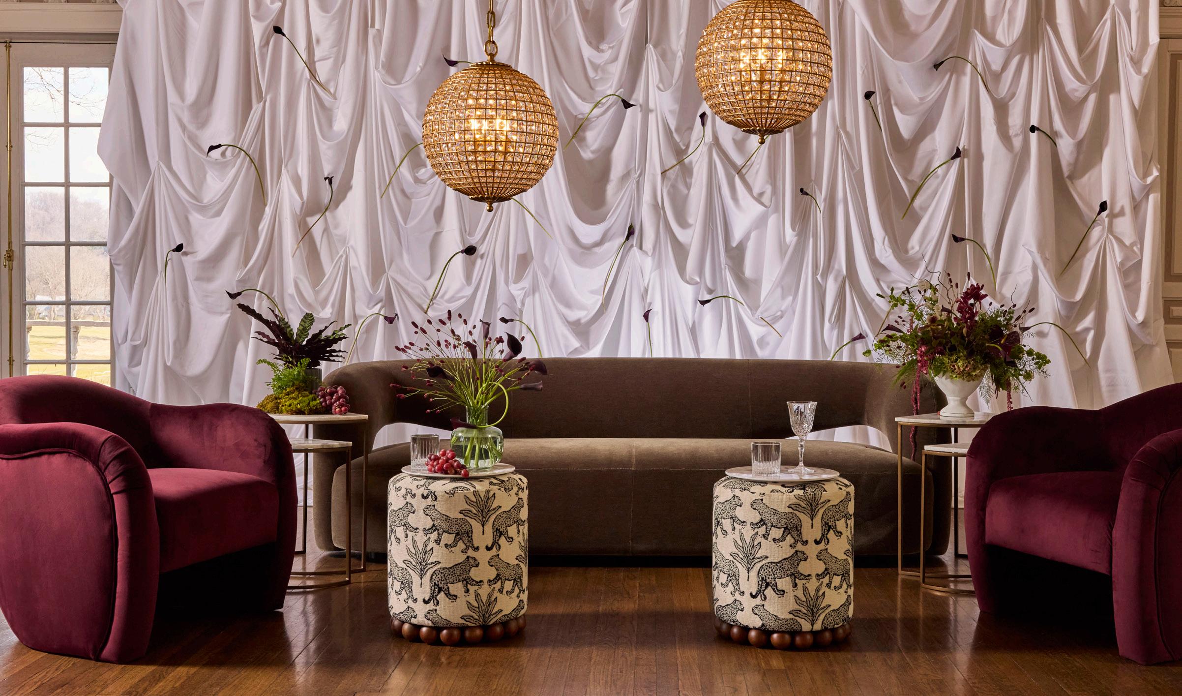
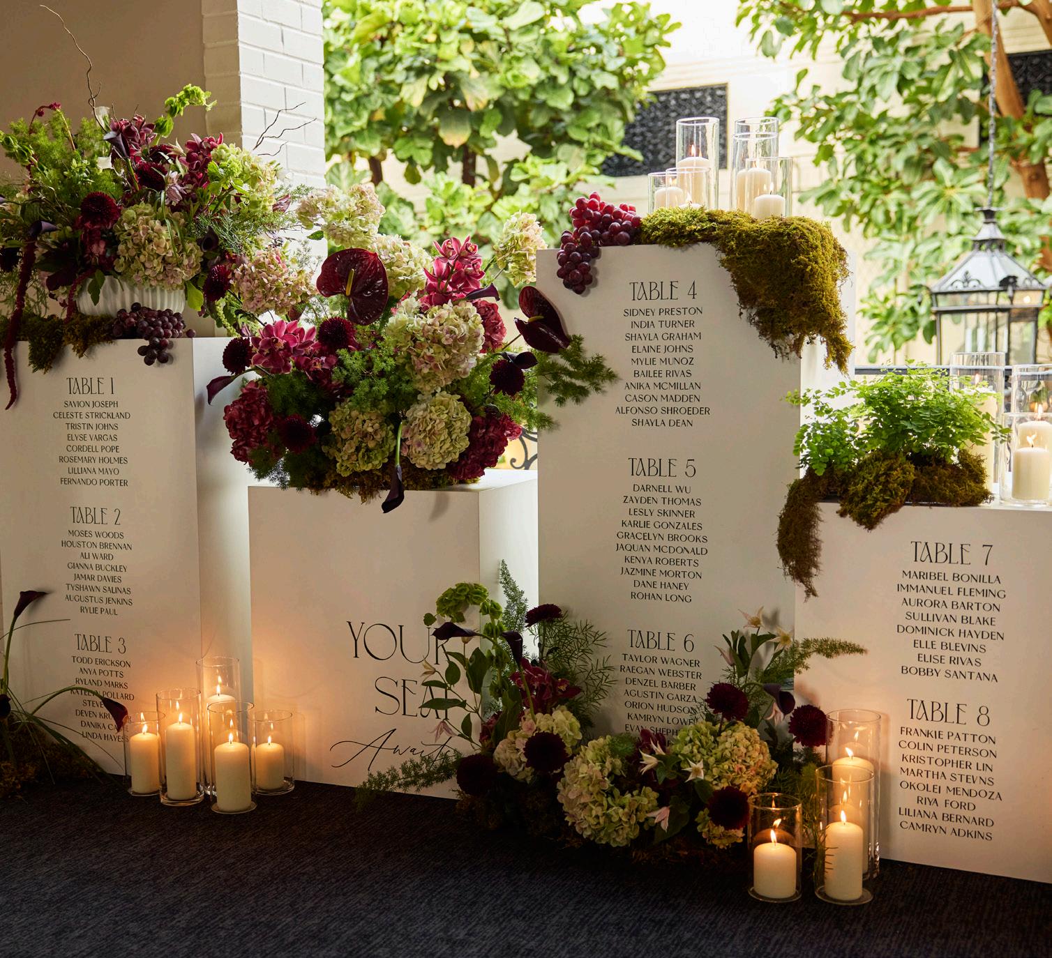
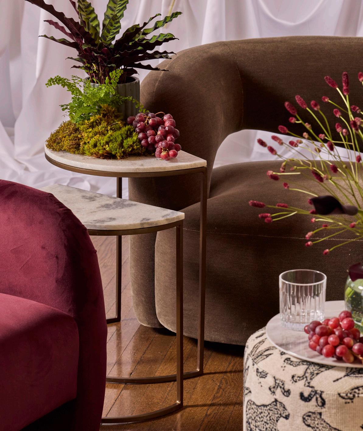
Creamy neutrals and deep burgundy tones create a striking yet romantic contrast. Gold accents and soft textures add warmth and richness, resulting in a look that feels both elegant and inviting.
MERLOT RESERVE
LINEN
Vision Embroidery
Ivory Satin
Gold Acorn Napkin Ring
DISHWARE
Trieste Gold Charger
Magnolia
Botanical Pink
GLASSWARE
Marliyn
FLATWARE
Bamboo Gold Olive
CHAIR
Chameleon Gold
LIGHTING
Breck Chandelier
FLORALS
Compass Rose NAPKIN
EXPERT INSIGHTS
Compass Rose - Florist
How do you use texture in florals to complement tabletop elements?
I draw inspiration from the tablescape to guide the floral items I’ll use in my designs. Texture in floral design goes beyond how the elements physically feel, it’s about creating something visually interesting that makes people wonder what it actually feels like. By using an eclectic mixture of flowers and incorporating unconventional materials such as moss, fresh fruit, and potted plant foliage, this range of textures complements various tablescape accents. Within my designs, complements can also come in the form of contrast— for example, light and smooth neutral linens and place settings contrasted by a vibrant or moody color palette of flowers with a variety of foliage types. Thoughtfully layering these unique elements forms depth and cohesion, allowing the floral arrangements to feel like a natural extension of the table setting rather than a separate decoration.
EXPERT INSIGHTS
Fox Chapel Golf Club - Venue
What new trends are you seeing couples/clients gravitate toward in your space?
For a private club like Fox Chapel Golf Club, couples tend to gravitate toward classic, timeless moments rather than leaning heavily into current trends. Our events feel elevated, experiential, and highly personalized, while still respecting the elegance of a traditional setting.
Most of our clients are looking to create a personalized experience—something that feels uniquely theirs and creates a one-of-a-kind moment for their guests. We often see custom design elements incorporated throughout the event, including monograms, personalized details, and elevated rentals that help transform the space and make it feel truly special.
It is always fun to watch our clients take a space we see every day and completely reimagine it to reflect their own vision. No two events ever look or feel the same, and to me that is something you simply can’t create just anywhere.
MERLOT RESERVE
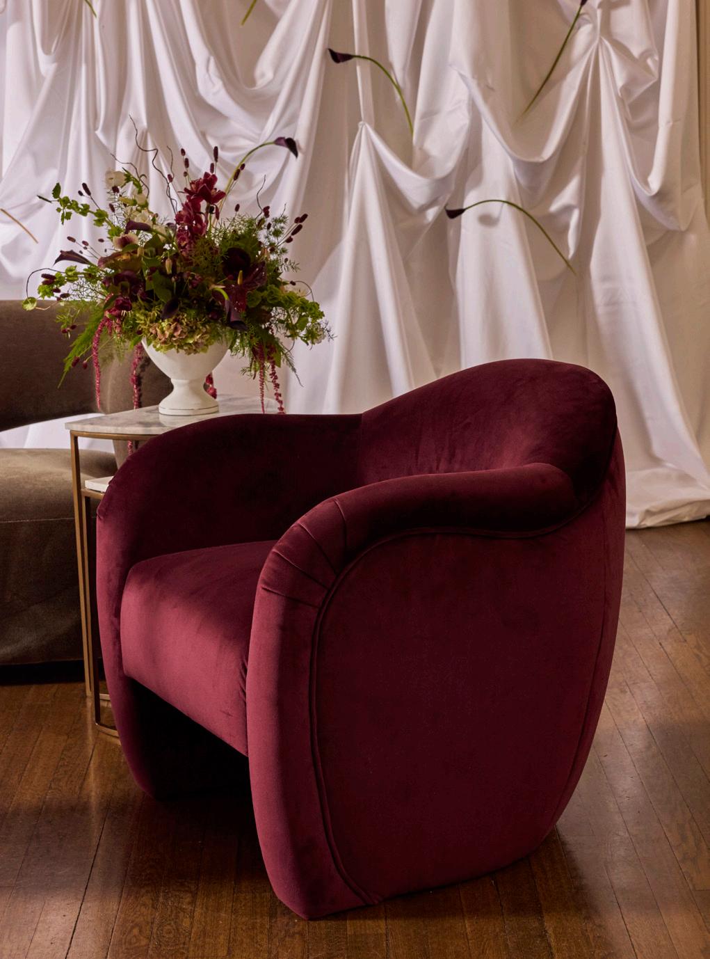
SOFA
Mazie Olive
CHAIR
TABLES
Ane Nesting
OTTOMAN
Dex Cream Leopard w/Marble Tray
CHANDELIER
Renwick Small Spheres
DECOR
Gallery Pedestals w/ Custom Seating Chart
DRAPERY
White Satin
FLORALS
Compass Rose
Compose Mulberry
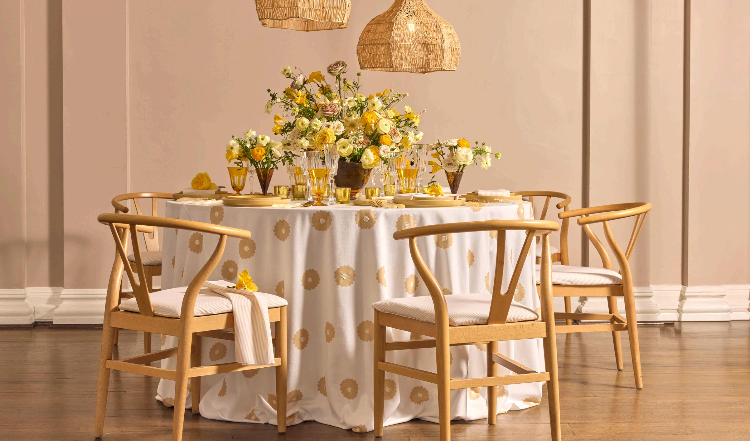
LINEN DAYBREAK
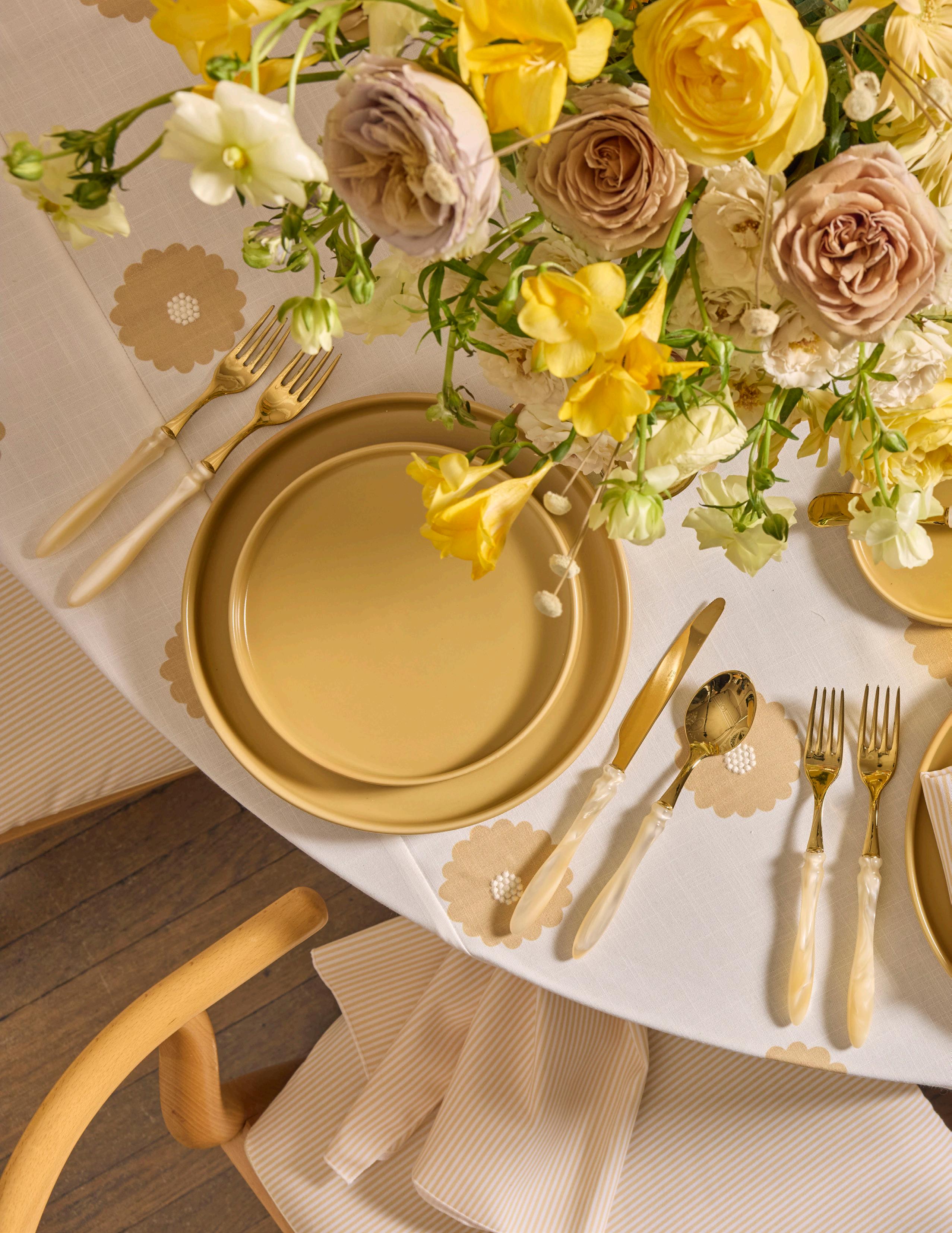
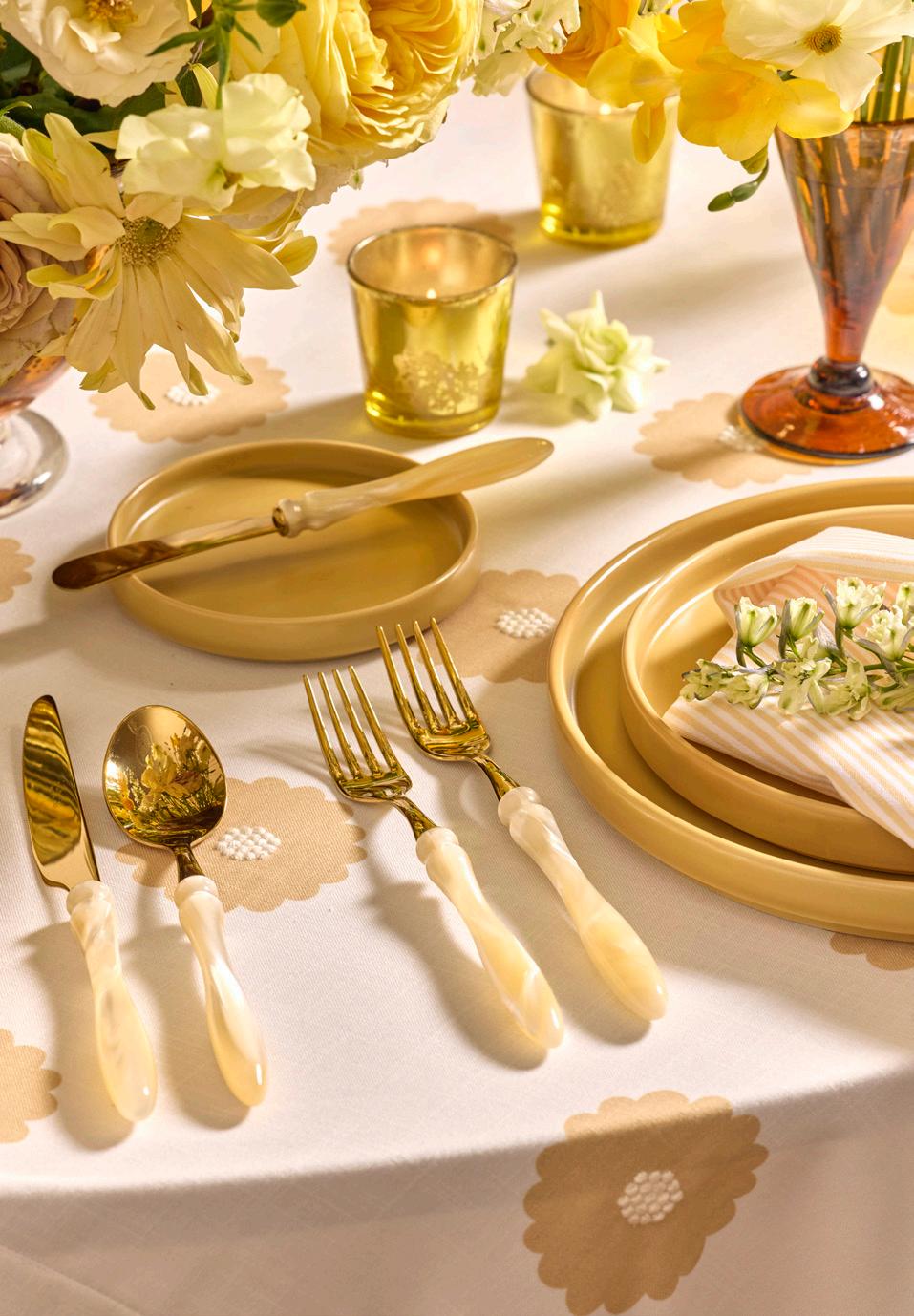
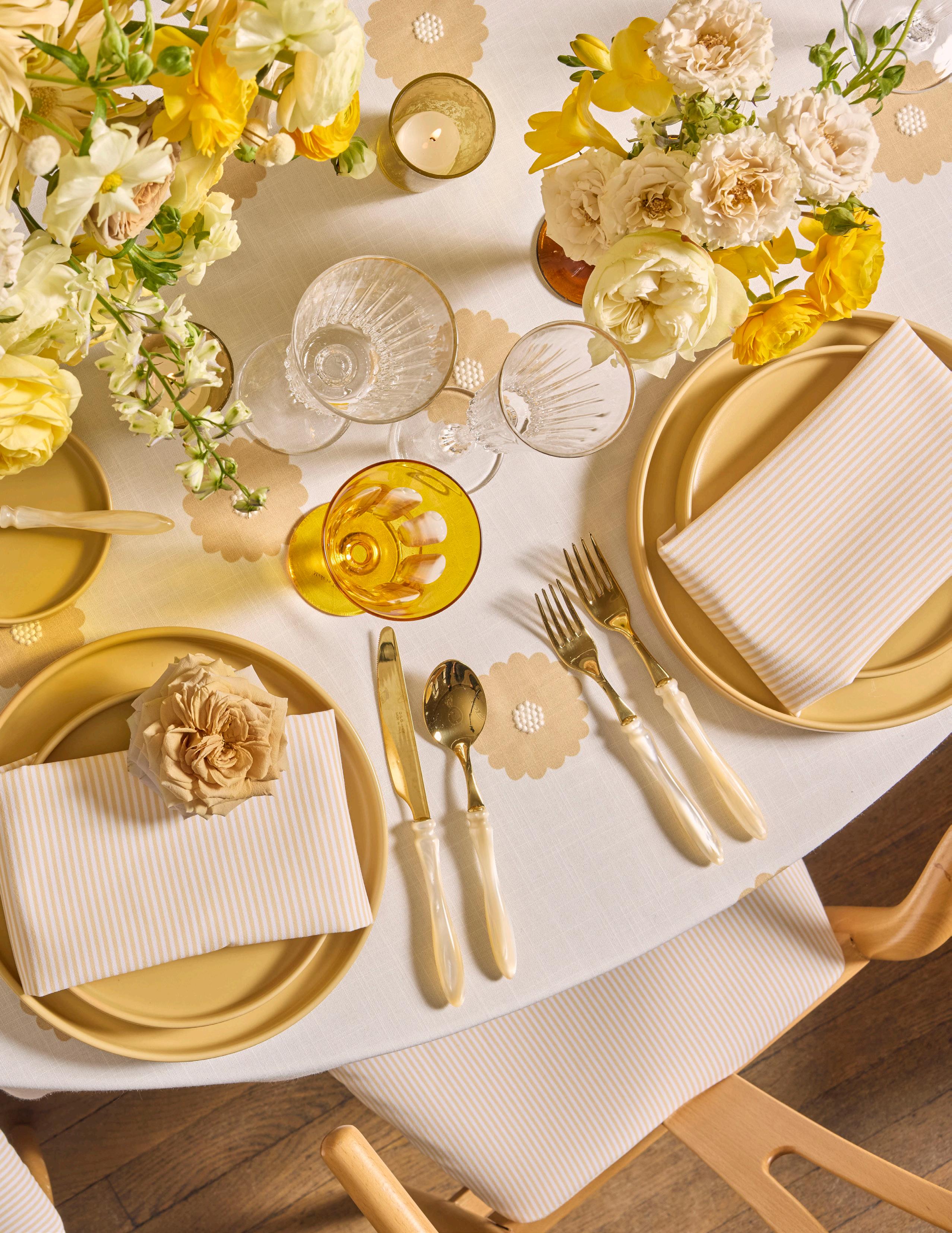
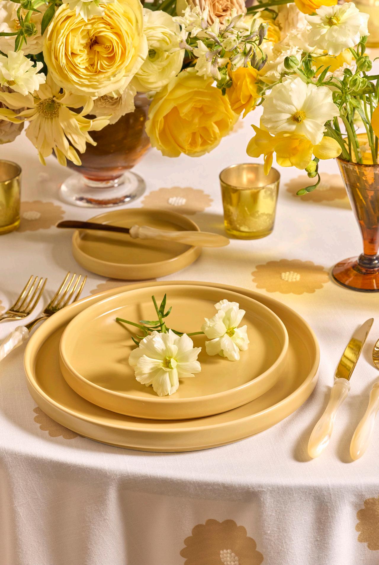
Inspired by warm sunlight, this palette blends glowing yellow tones with soft ivory and natural textures. The result is a look that feels bright, relaxed, and full of personality.
DAYBREAK
LINEN
DAYBREAK
LINEN
Cornsilk Dasiy Dot
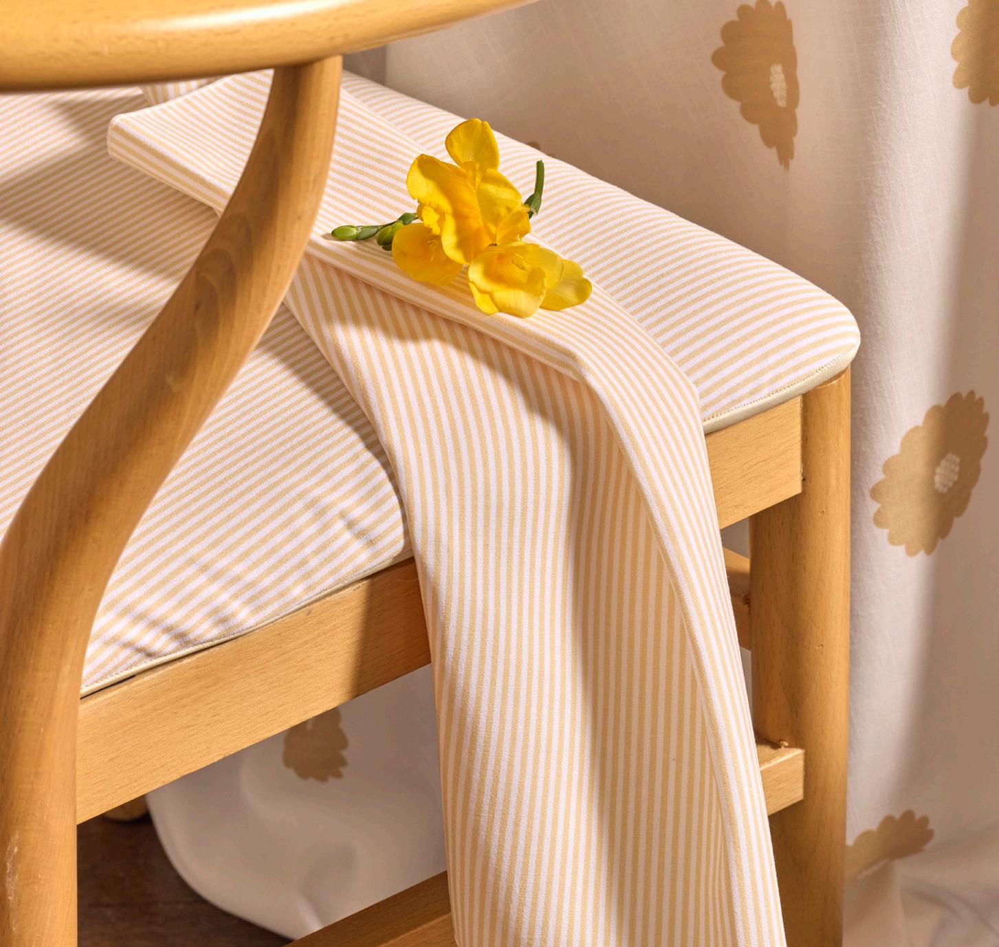
Custom Printed Honey Ticking
DISHWARE
Kaleb Honey
GLASSWARE
Timeless Gold
Tulip Ginger
FLATWARE
Elba Champagne Pearl
CHAIR
Wishbone w/Custom Printed
Honey Ticking Pad
LIGHTING
Marrakesh Shades
FLORALS
Sugar Flowers and Leaves NAPKIN
EXPERT INSIGHTS
Sugar Flowers and Leaves - Florist
What does the morning of an event or shoot look like for you?
The morning of an event is quiet but electric. It starts with coffee and music in the studio. We double check every bloom, carefully pack the cars and truck, and walk through the timeline one more time. Months of conversations, sketches, and planning are about to turn into something real. There is always a mix of calm focus and butterflies. It’s our favorite kind of adrenaline and happiness for something to come to life after months of planning.