CRISPY
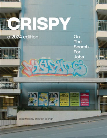
a 2024 edition.
a portfolio by christian keenan
On The Search For Jobs
4
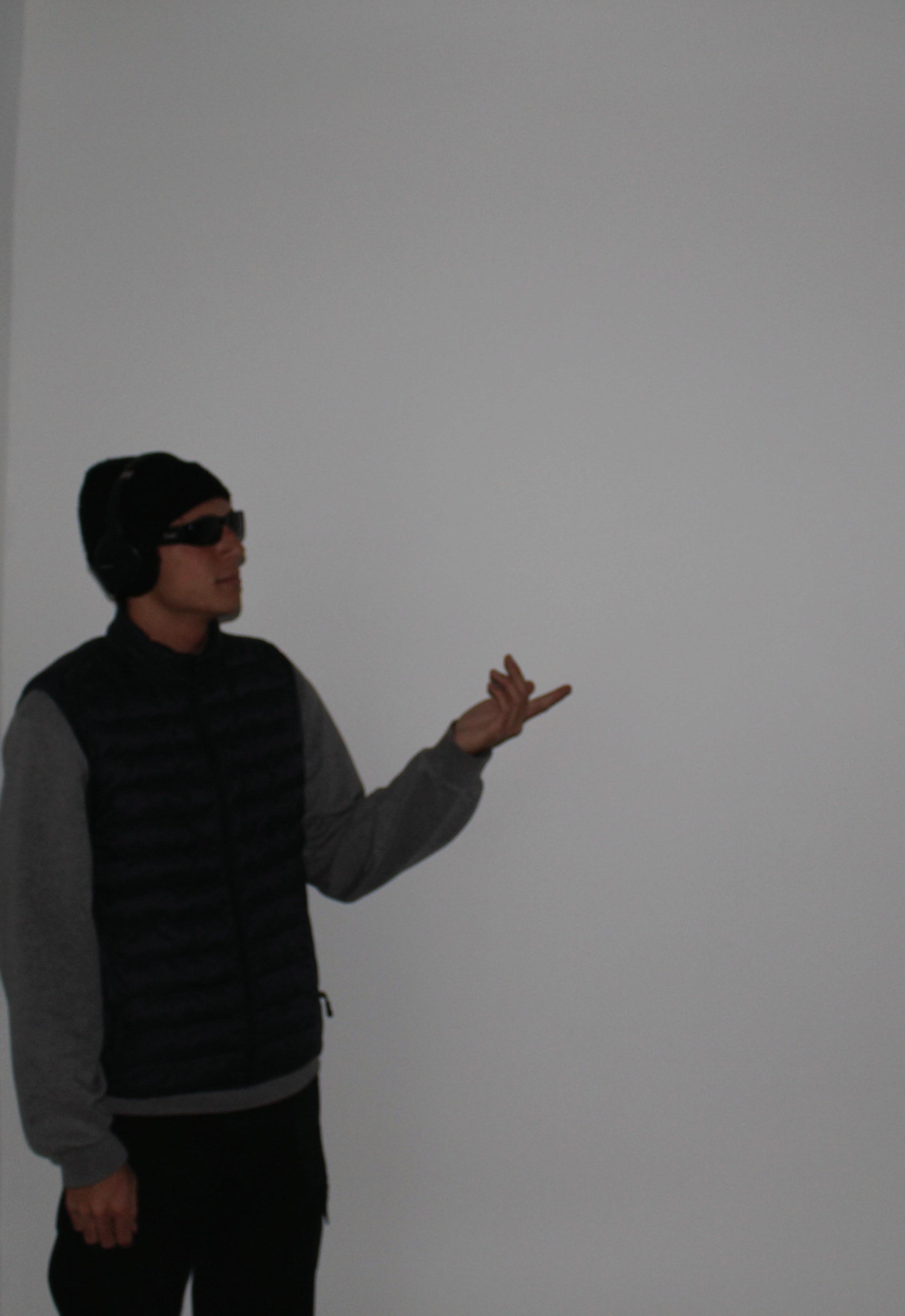
Photographed by: Troy Thomas
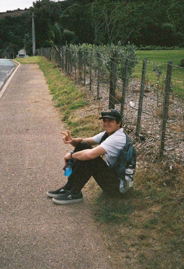
Photographed
5
My name is Christian Keenan, but some people call me “crispy.”
by: Kelsey Keenan
TABLE OF CONTENTS
INTRO
1. SCHOOL PROJECTS
2. PROFESSIONAL WORK
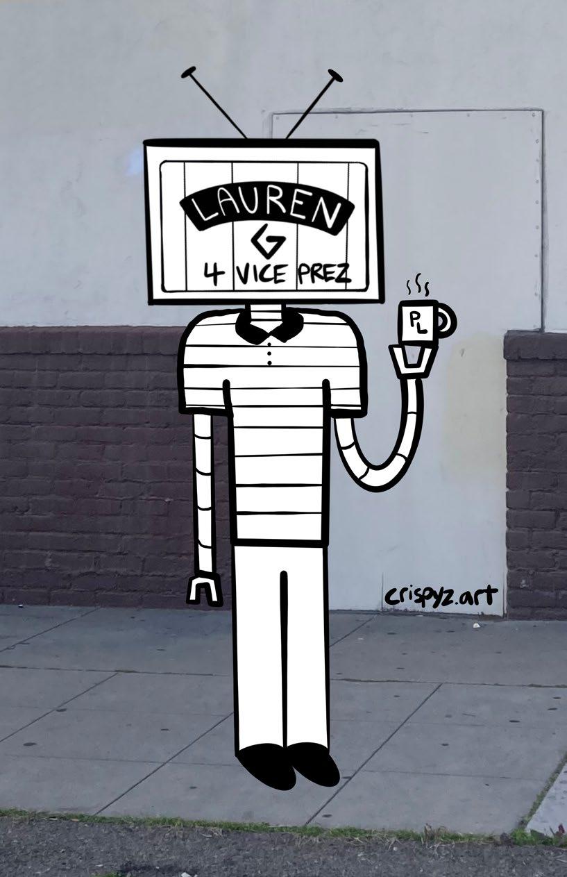
3. VARIOUS DOODLES
4. BUSINESS STATIONERY
5. YOUTUBE CHANNEL
6
7
Hi,
ABOUT ME:
I am Christian Keenan, a graphic designer and illustrator from Huntington Beach, CA. I am known as “Crispy” by my peers. In my free time, I enjoy illustration, gaming, filming, surfing, and camping. Much of my creative inspiration derives itself from sci-fi cinematography like Back To The Future as well as cartoons like Adventure Time & Rick and Morty. Illustration is my way of interpreting the world in a comical, lighthearted, and playful style. I hope it will bring joy and inspire others in life and my professional career.
Fun Fact:
I enjoy the simplicity of breakfast diners such as Dennys, Pancake House, or Hof’s Hut in Seal Beach as a means to slow down and reflect on life.
CHRISTIAN KEENAN
8
T R A V E L E R SUR FER EDI TOR GAMER CRISPY G R A P H I C DESIGNER FILMER OCTOBER I L S R T R L U T A O CAFF EINE USER HIKER DOO DLER ANIMATOR DRIVER OF A VOLKSWAGEN GOLF IRISH & FILI PINO CHRISTIAN COMPETITOR 20 00 714 K E ENA N |R E SEY | HEAD PHONES CLASSIC ROCK Photographed by: Kelsey Keenan 9
CHAPTER 01: SCHOOL PROJECTS
10
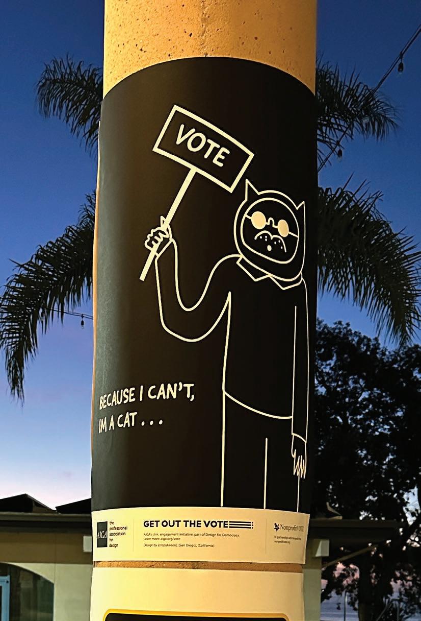
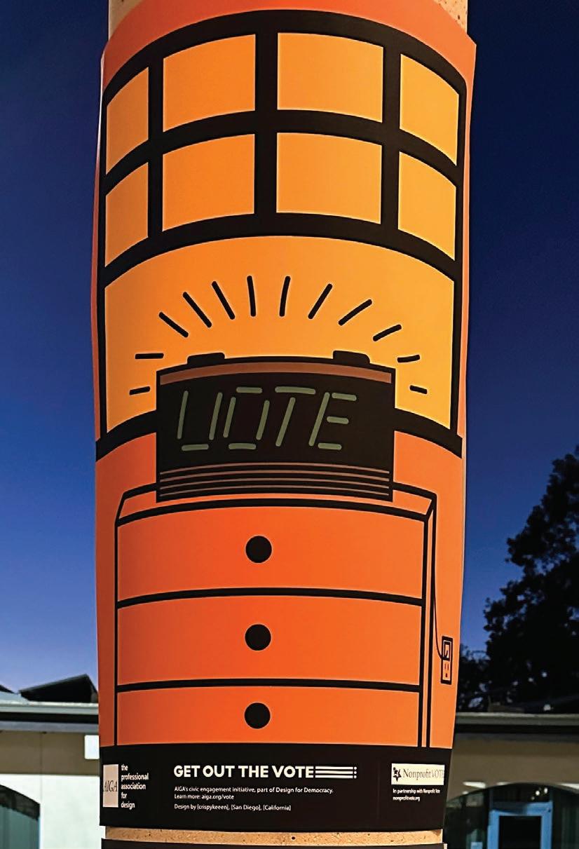
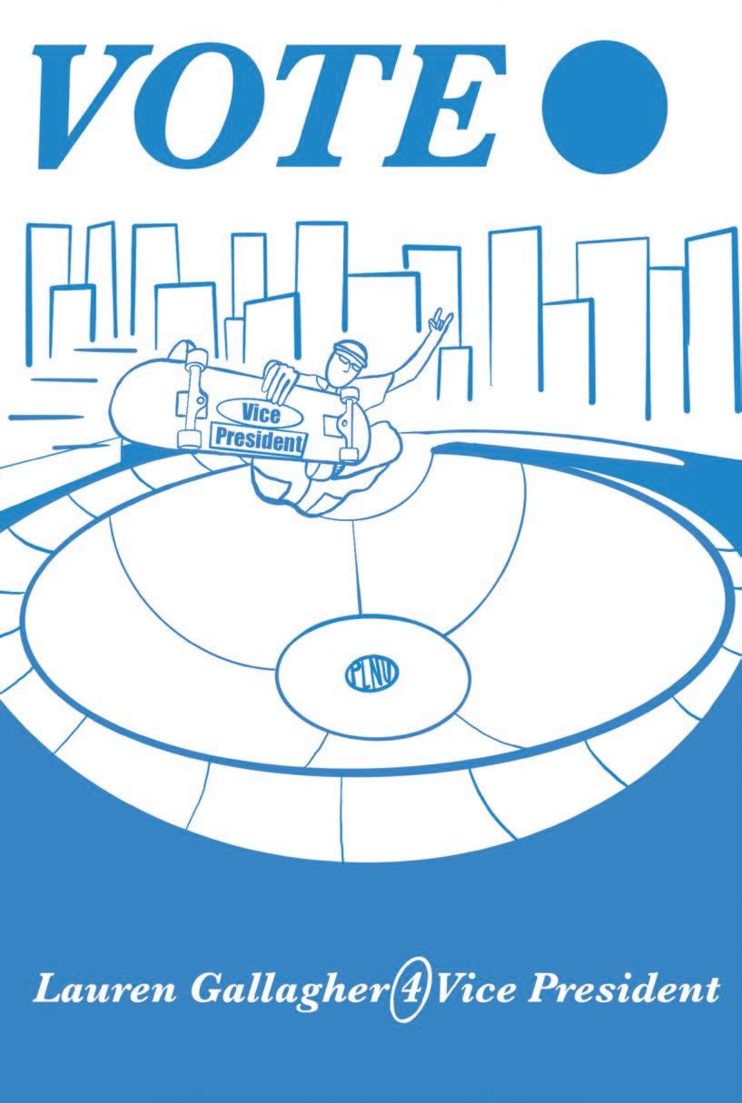
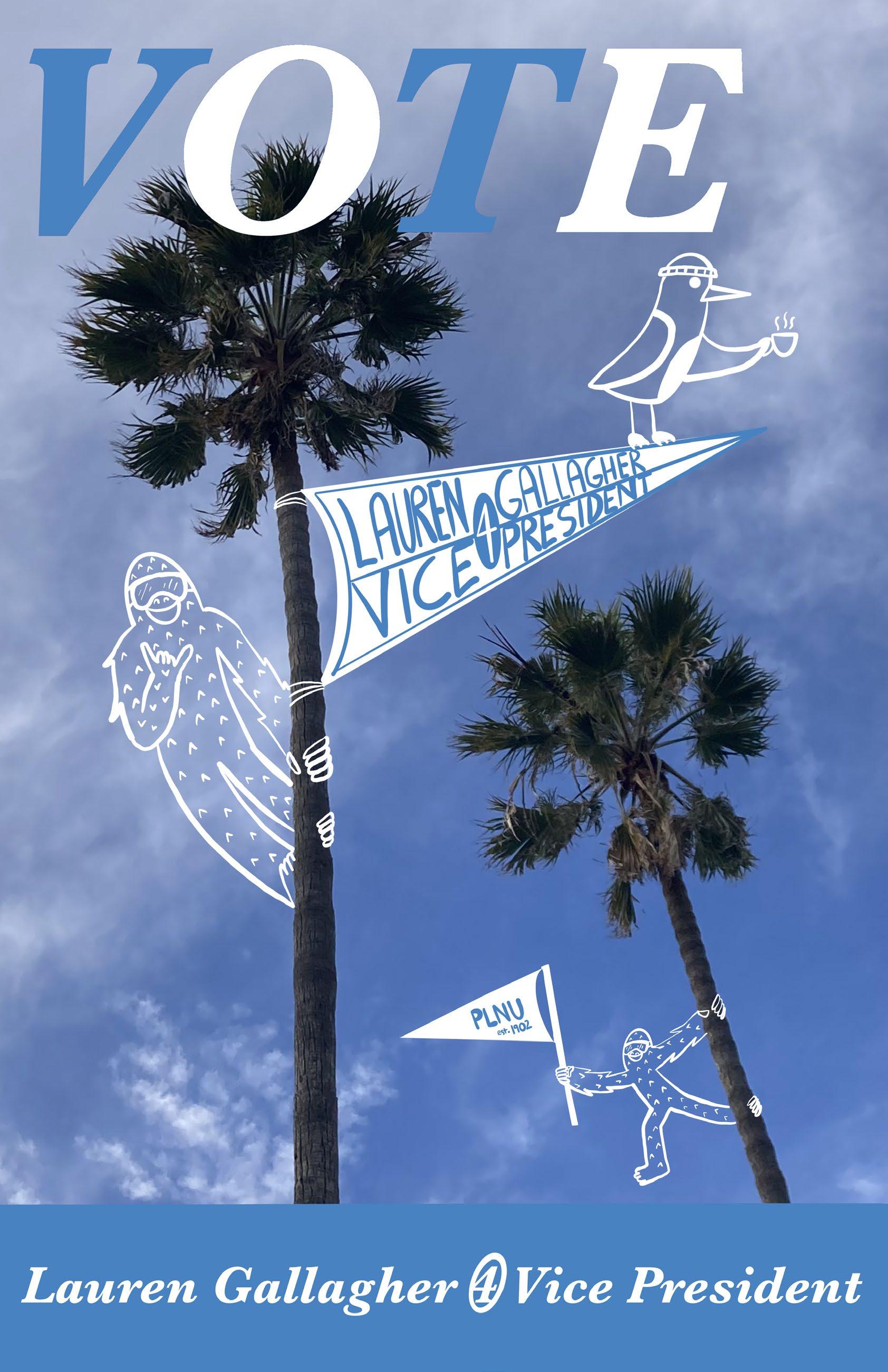
A.I.G.A. GET OUT THE VOTE POSTERS
These posters were apart of our Typography class in which we reminded our fellow college students to vote. I went with a simpler approach that brought humor and warmth to the political environment.
Top Poster: Inspired by “Guy with A Sign.” Made to generate humor, but also remind people that we are only ones capable to make political change.
Bottom Poster: Inspired by old clocks of the 70’s & 80’s, this poster emphasized the idea of a new day and why now is the time to vote.
Made in Adobe Illustrator
11
CHRISTIAN KEENAN
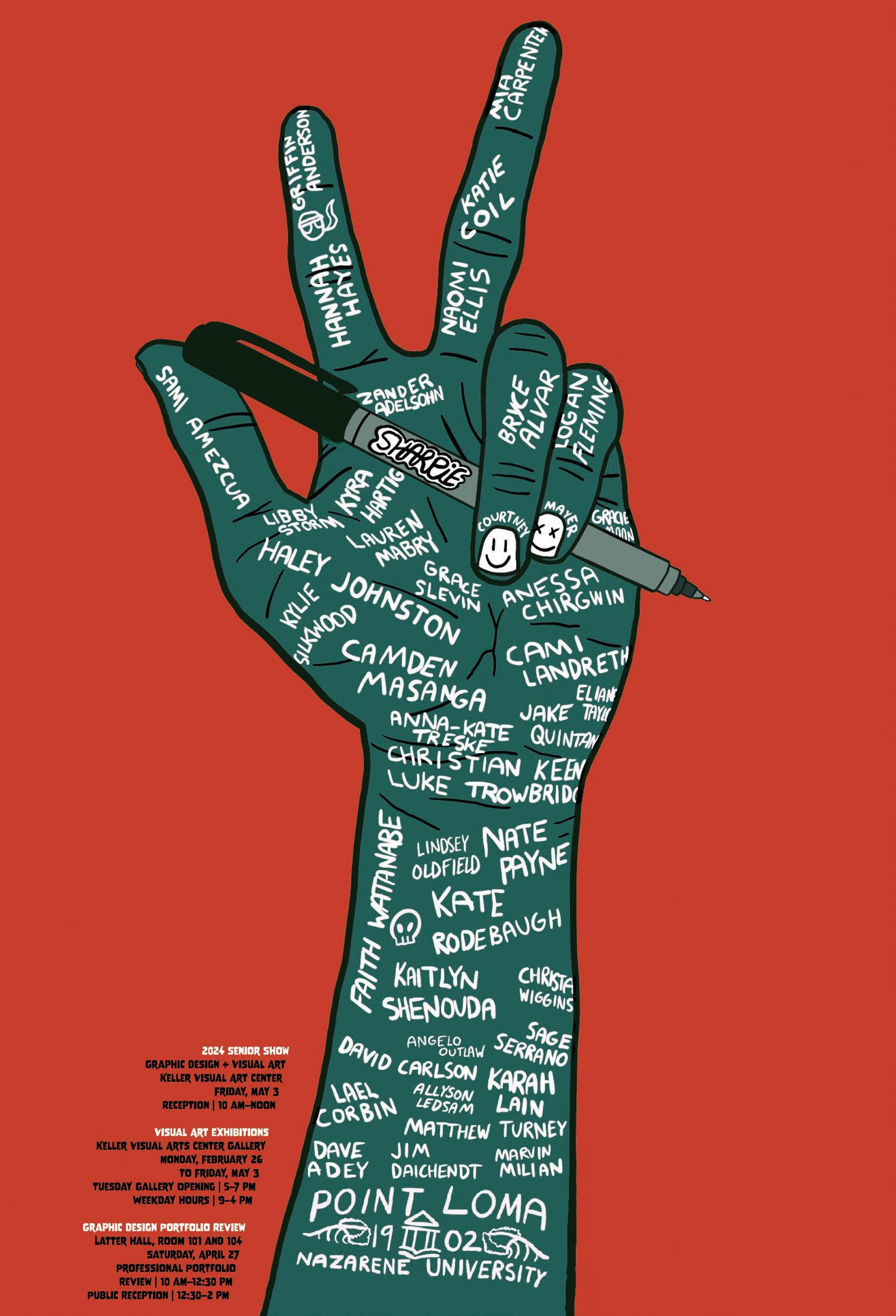
SENIOR SHOW POSTER
My poster representing the PLNU Class of 2024.
Featuring the names of every graduate in the art department as well as giving credit to the professors that helped us along the way.
Made in procreate and refined in Adobe InDesign.
12
SCHOOL WORK 13
RESTAURANT REBRANDING
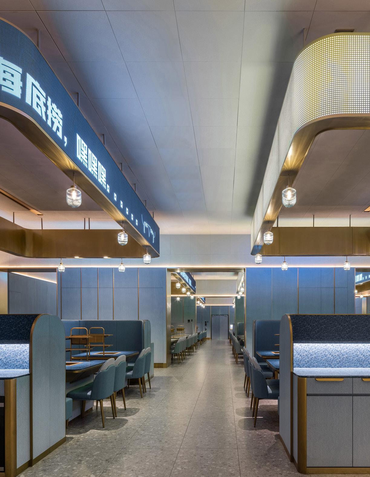
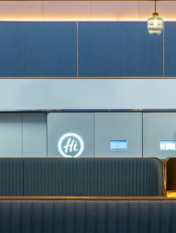
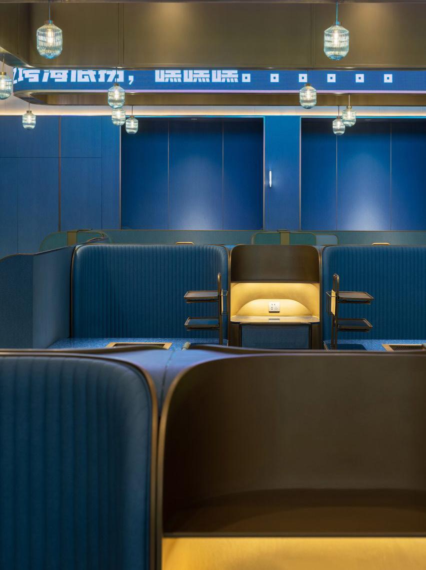
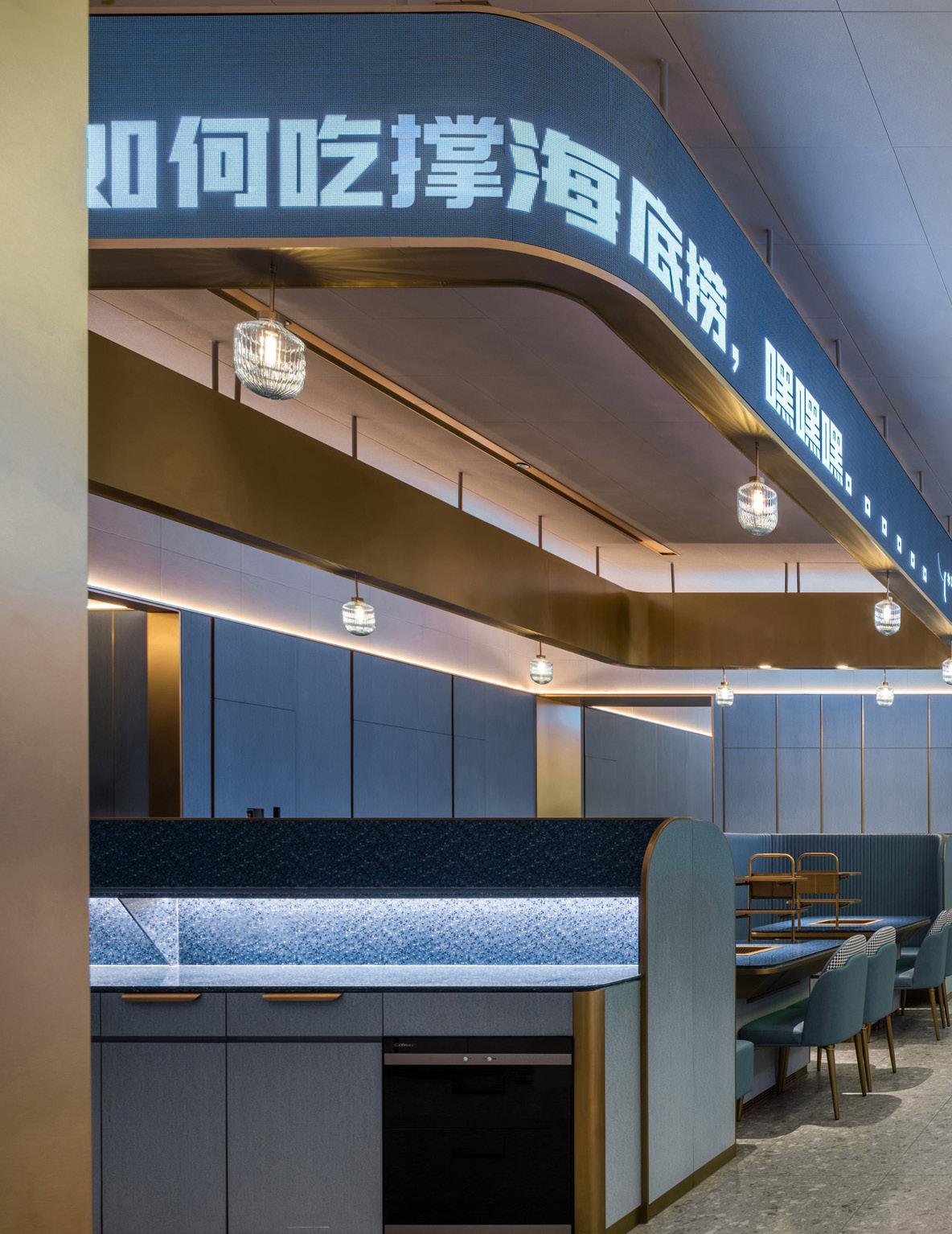
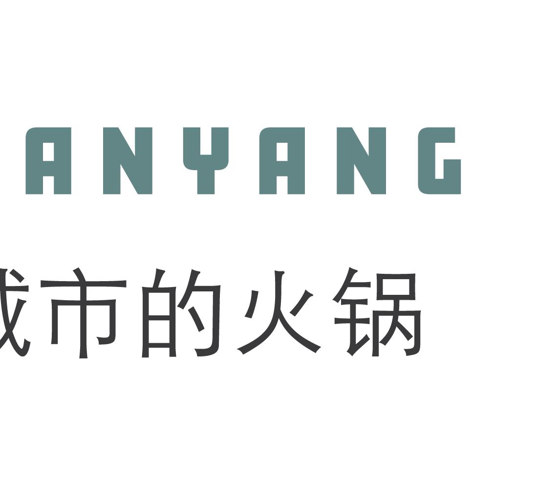
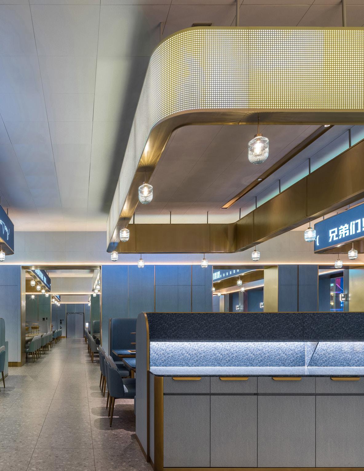
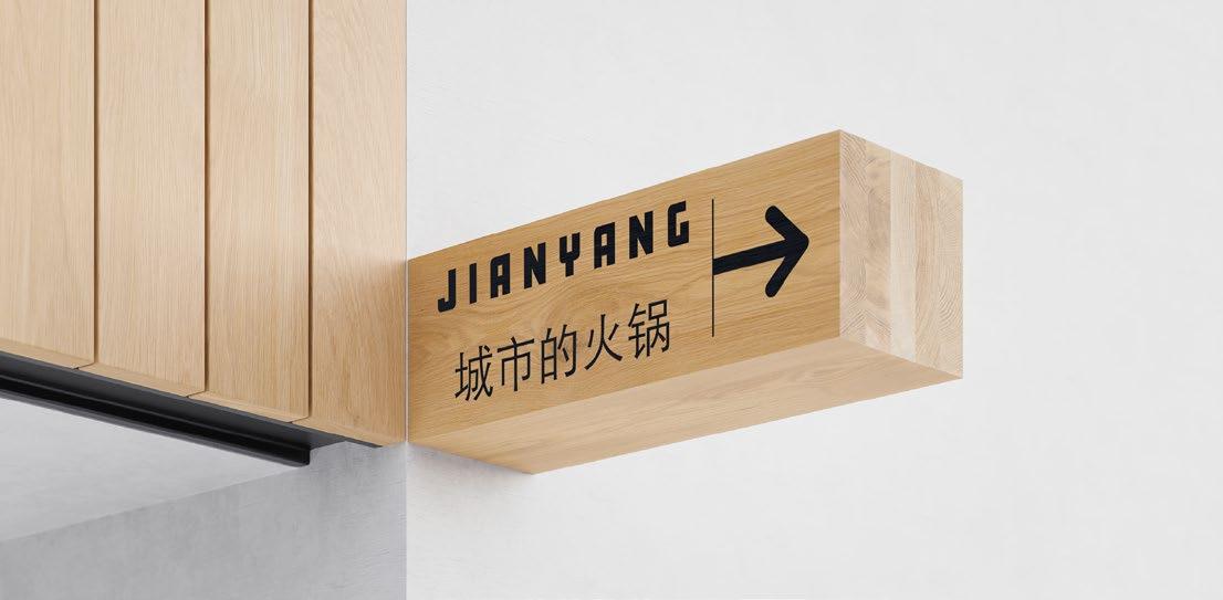
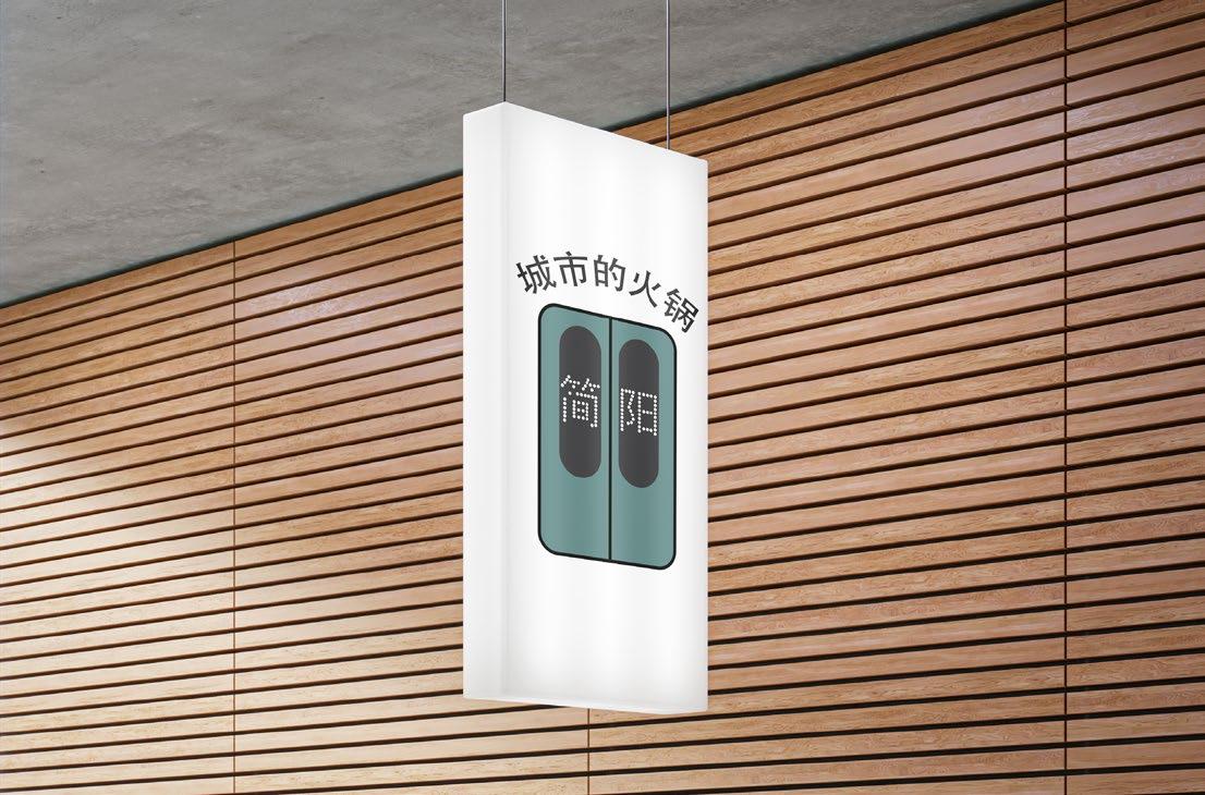
The restaurant I decided to rebrand was a Hotpot chain in China called Haidilao Hotpot. I decided to rename it Jianyang, based off the city the hotpot idea originated from.
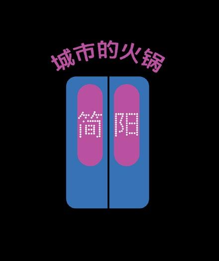
I created a logo that resembled train car doors symbolizing speed and movement of the expanding hotpot chain. It was also made to match their newly renovated location that seemed to differ from their primary brand color of red.


logo must have space to breathe, with rules con cerning spacing and margins. It should not be cramped or overshadowed by other visual distractions. The logo clear space equals the CAP height of letter “X” around all edges of the logo, which should be free from other graphics and interference.
The Jianyang logo may be resized as necessary. However, it should follow these minimum size requirements to ensure that it is still readable, even when scaled to smaller dimensions. 21
PRINT SIZE
maintain the integrity of the primary lockup in print, a minimum width of 1.5 inches has been set. The height should be proportional.
DIGITAL SIZE
maintain the integrity of the primary lockup in digital, a minimum width of 108 pixels has been set. The height should be proportional. 22 CHRISTIAN KEENAN 14
CLEAR SPACE Our
SIZE PARAMETERS
MINIMUM
To
MINIMUM
To

SCHOOL WORK 15
JIANYANG BRAND MANUAL 2023


PRIMARY LOGO 17 LOGOTYPE 18 BRAND IDENTITY SIGNATURE 19 20 CHRISTIAN KEENAN 16
UNACCEPTABLE USES
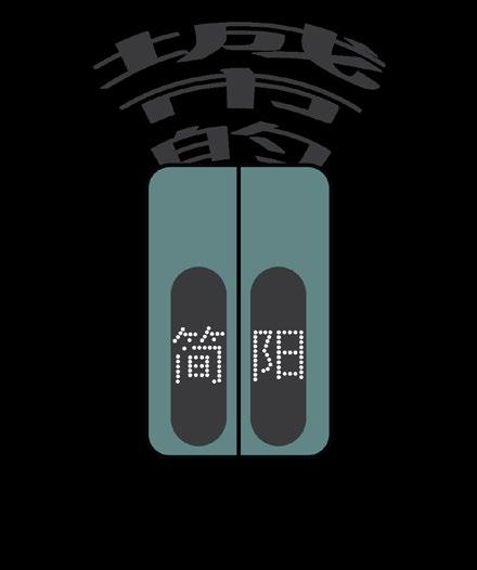
The consistent and correct application of the Jianyang signature is essential. Always follow the standards presented in these guidelines. The examples on this page illustrate some of the unacceptable uses of the restaurant signature.
01 Never alter the logo with colors outside the brand manual.
PRIMARY COLOR SELECTION:
JIANYANG GREEN #618584
SECONDARY COLOR SELECTION:
JIANYANG GREY #3a3a3c
TERTIARY COLOR SELECTION:
JIANYANG WHITE #ffffff
This project taught me how to create and stick to a brand guideline. How to demonstrate consistency in design and follow design rules for a harmonic output.
24
27
02 Never move the logo elements out of place or distort the text in any way.
SCHOOL WORK INTERIOR 58 17
CHAPTER 02: THE ART DEPARTMENT
18
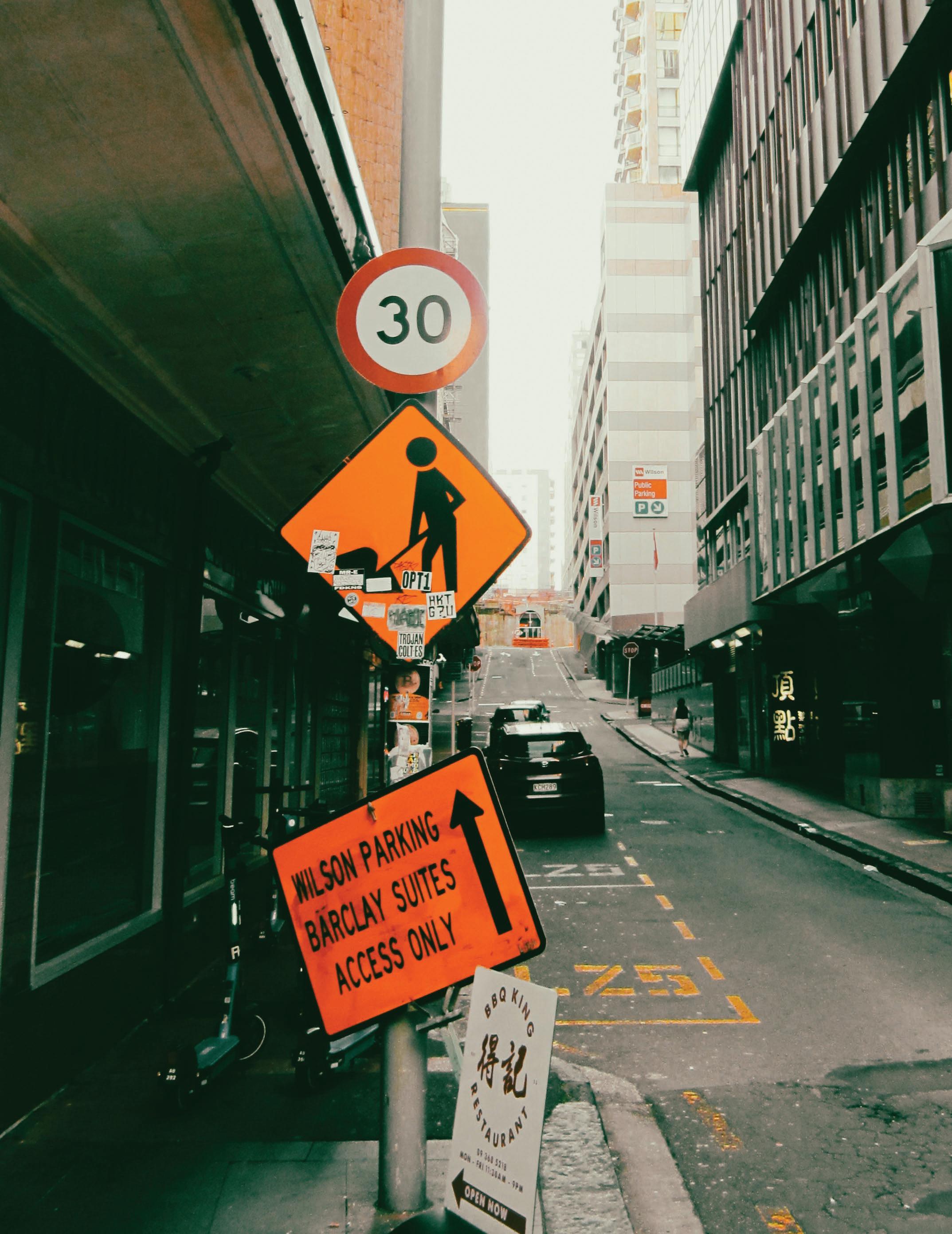
A job that taught me . . .
1. How to maintain a gallery.
2. How a vinyl can make signs and stickers
3. The importance of a clean workspace.
4. How to operate basic tools
5. That trial and error is ok.
6. How to finish the busy work.
7. That kindness goes a long way
8. Your art is as good as the time you put into it.
19
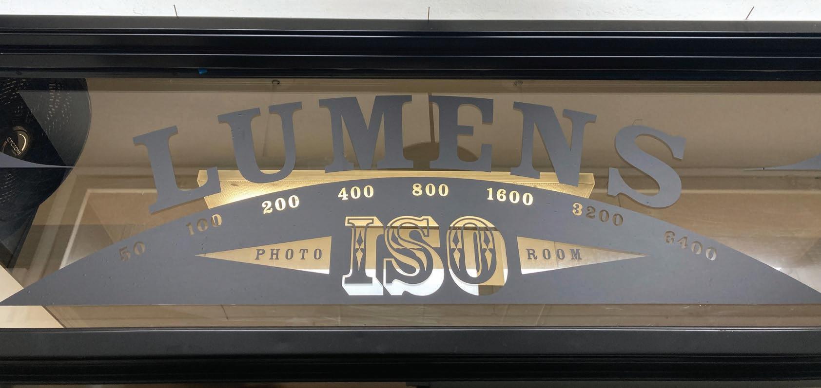
VINYL SIGNAGE
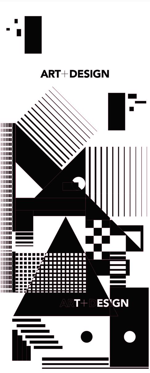
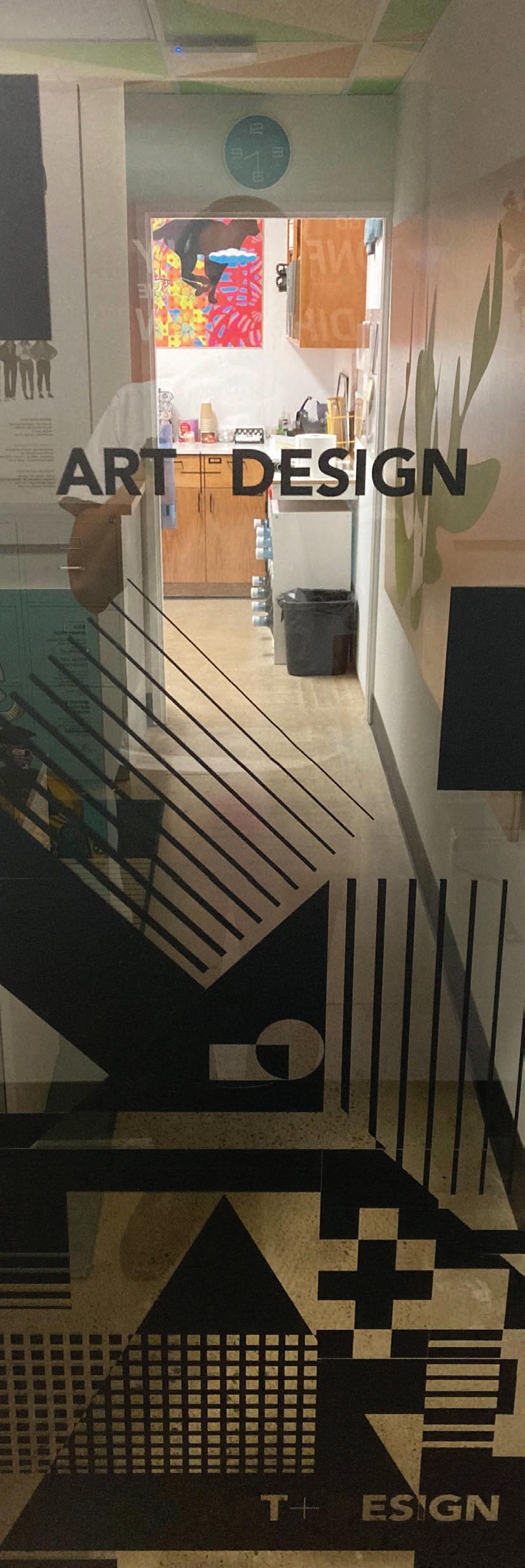
Some vinyl signed doors I created while working for the PLNU Art Department.
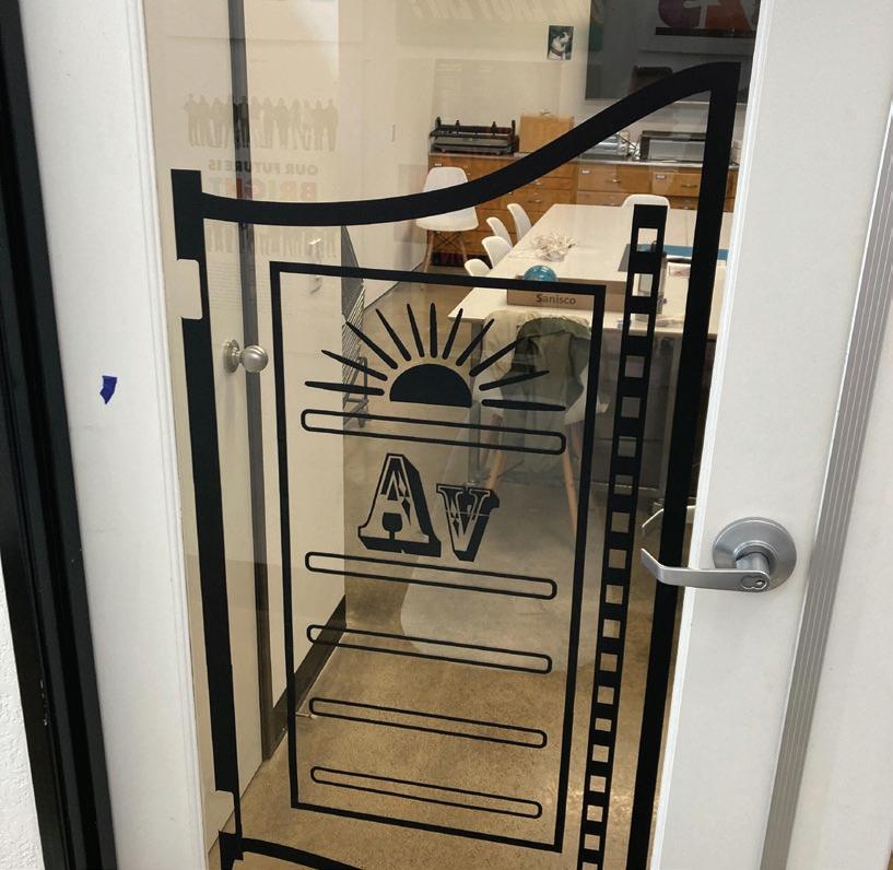
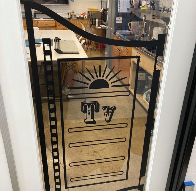
Each design was made in Illustrator and cut out on our very own vinyl cutter, then transferred onto the glass in one to two sheets.
First photo is of the main office door and the next page is a saloon style signage done for the photo classroom.
 CHRISTIAN KEENAN
20

Signage done for the photo & dark room space. Western inspired with photo history from Professor Lael Corbin.
PROFESSIONAL WORK
21
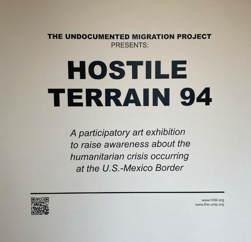
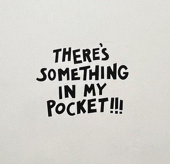 CHRISTIAN KEENAN Gallery Show Vinyl:
22
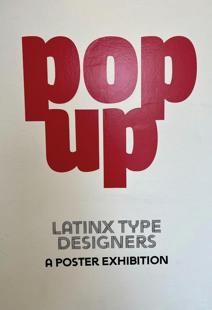
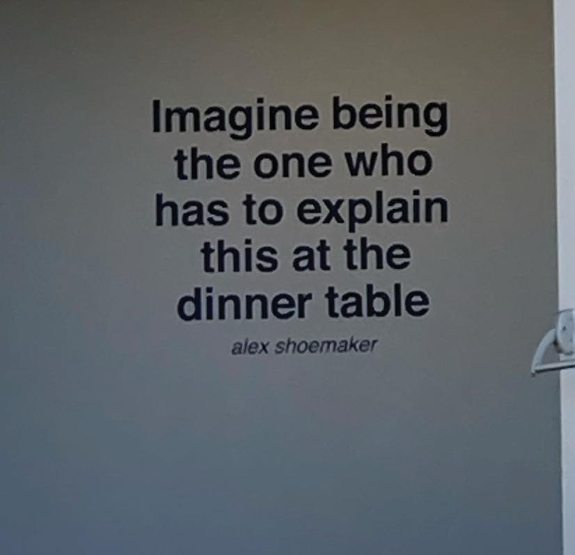
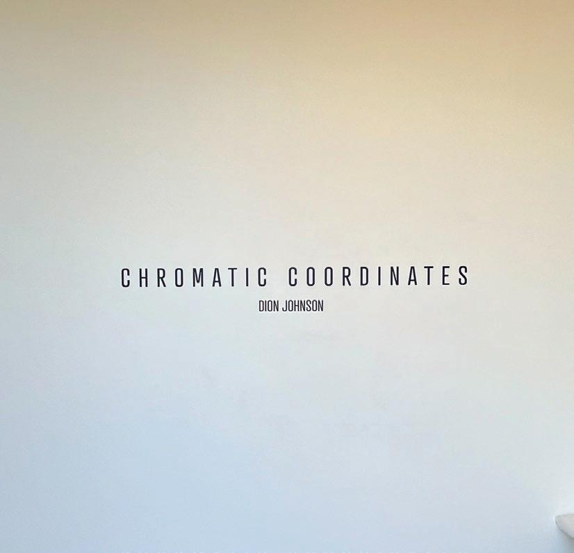
Left to right: C. Mayer, Dion Johnson, Alex Shoemaker, .U.M.P, and Kyra Hartigan.
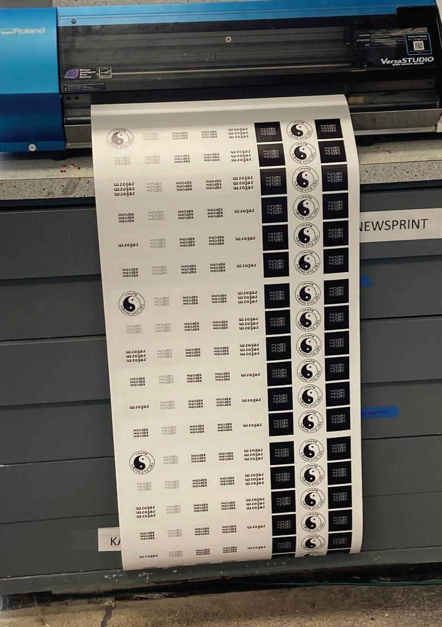
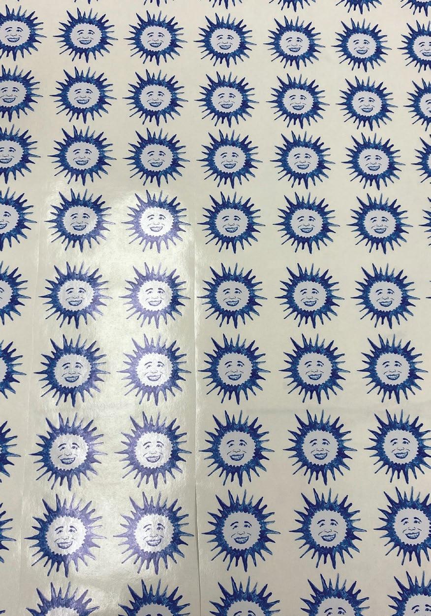
Most of the orders I got working in the art department were for stickers. This allowed me to collaborate with friends and students at my college to make their sticker designs for surf premieres, local farmers markets, and for upcoming artists. Other vinyl jobs completed were related to senior art shows and usually took the form of wall signage and artists statements displayed in the entrance of their shows.
PROFESSIONAL WORK
23
Sticker design by Cameron Winkelman & Noah Kawaguchi (top left). Sticker design by Lauren McCandless (top right).
MAILERS & INSTAGRAM ADS
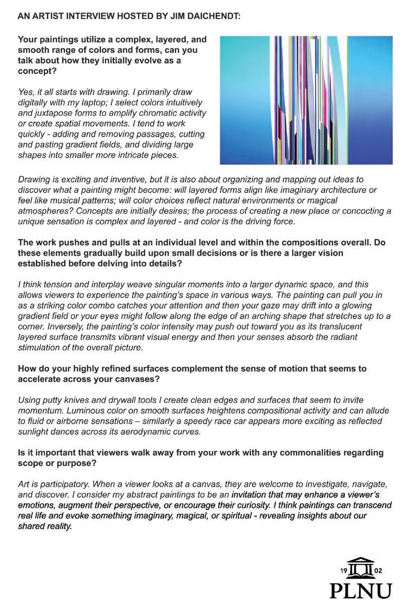
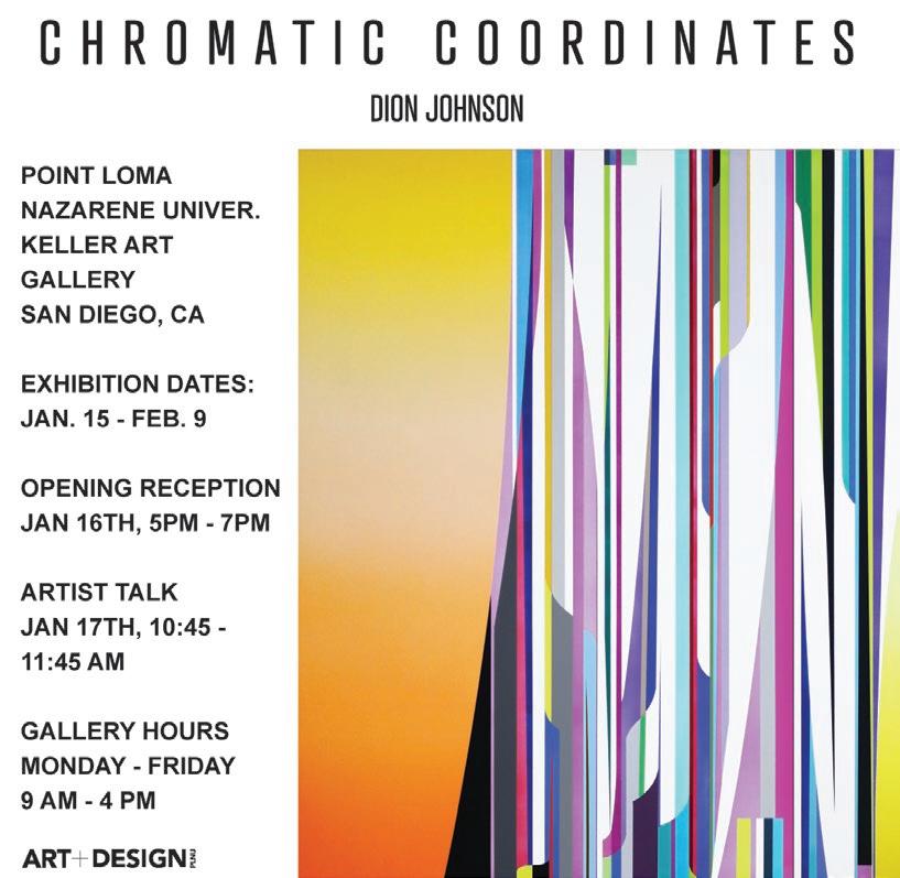
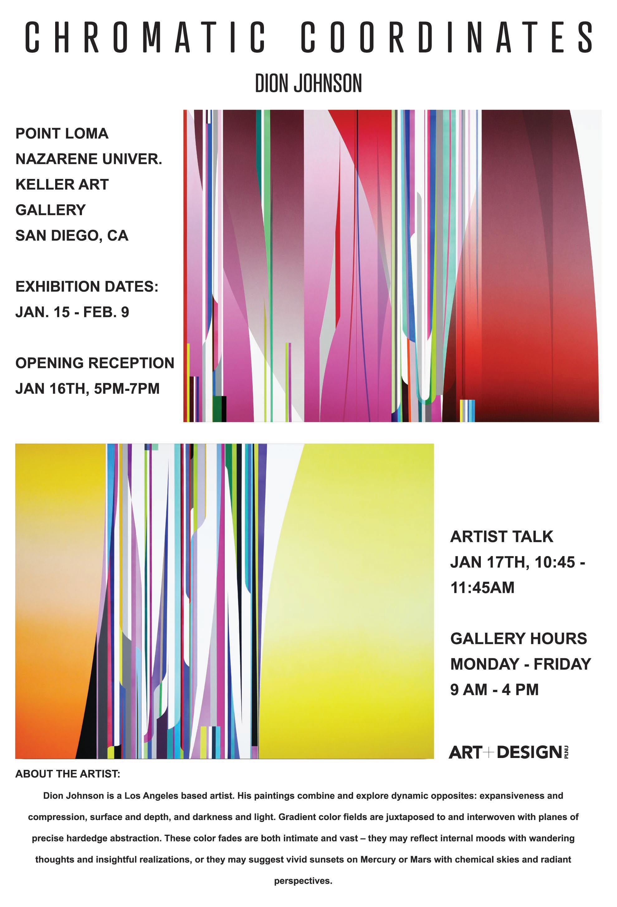
I got to design the mailer and Instagram post for a professional show featuring Dion Johnson in Keller Gallery located on PLNU’s campus.
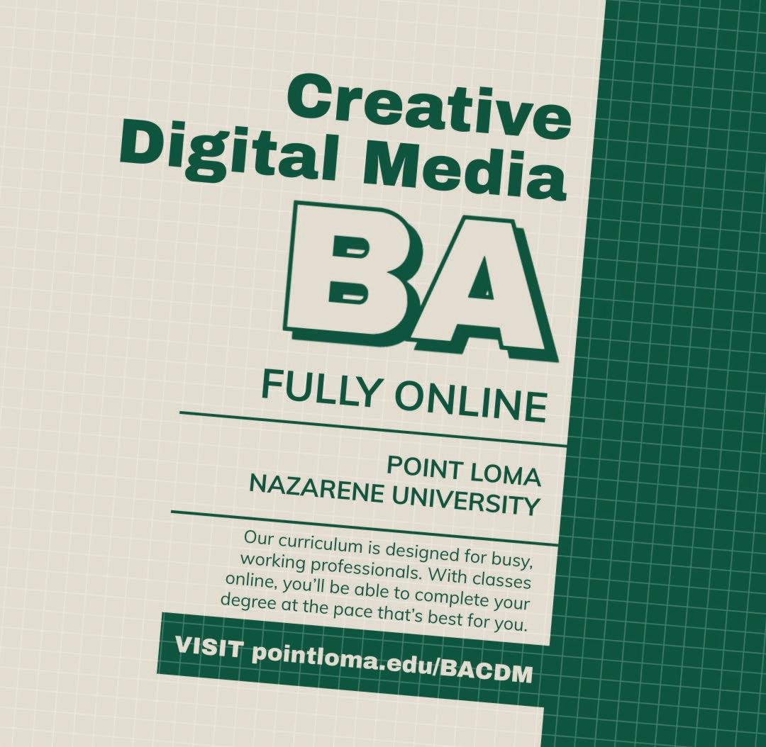
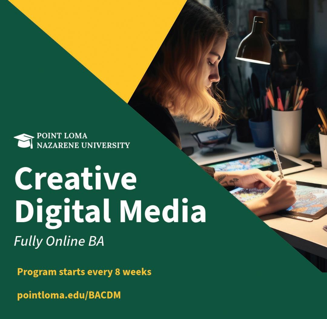
Other Instagram ads I created were for PLNU’s Art Department. I utilized Adobe Express for quick marketing and many of the helpful templates existing on that platform.
 CHRISTIAN KEENAN
24
PROFESSIONAL WORK 25
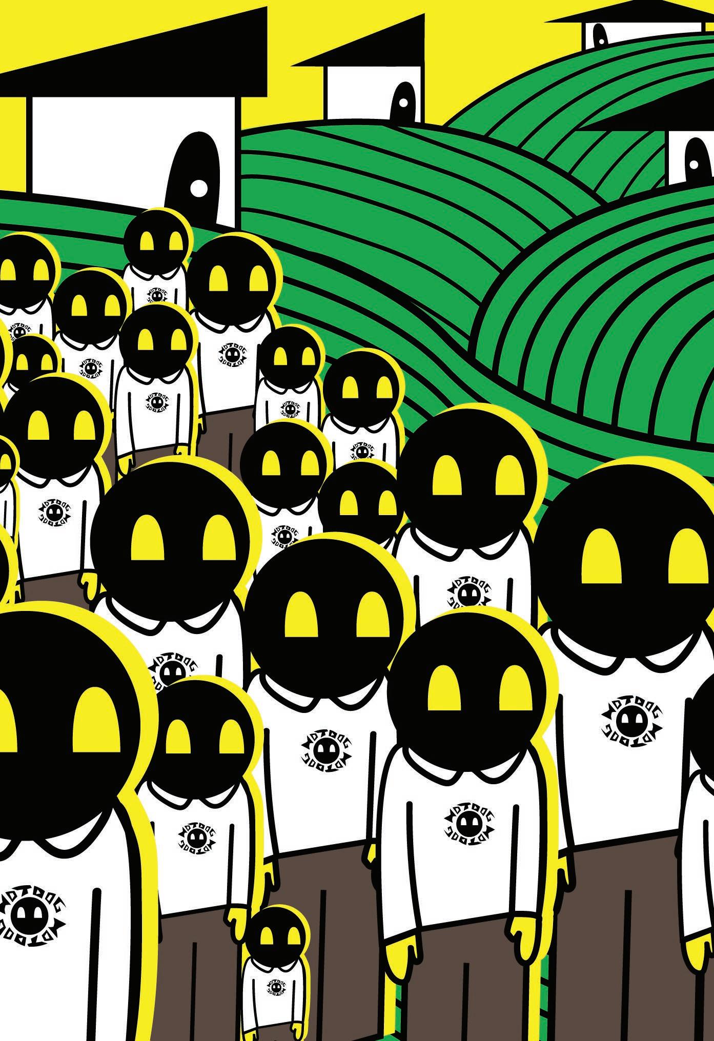
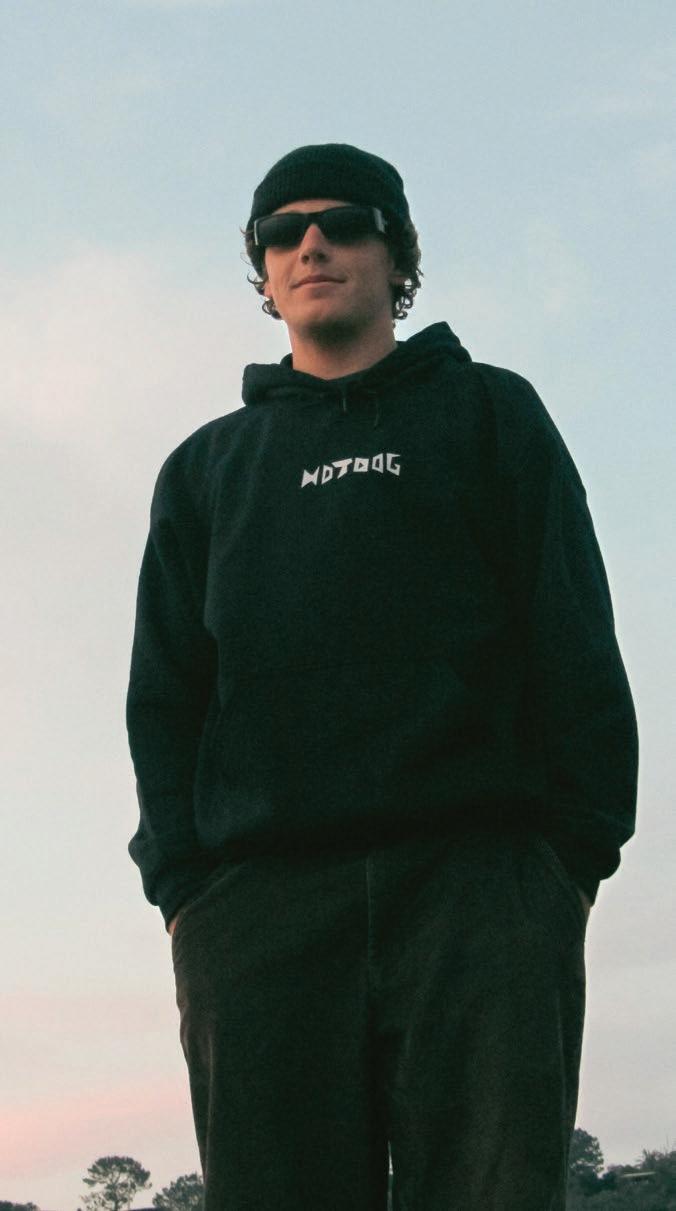
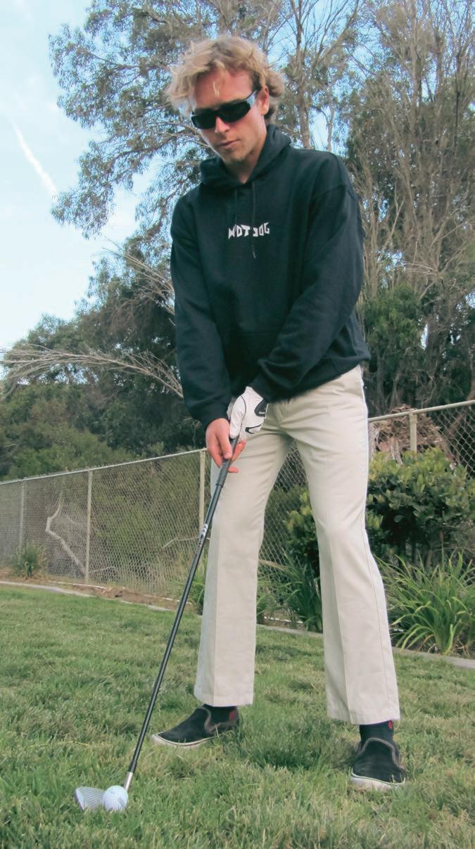
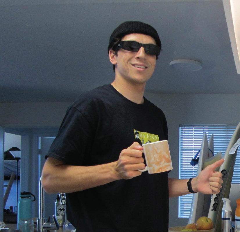
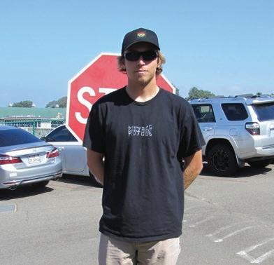
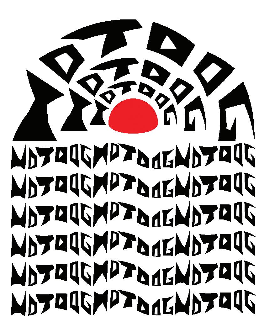
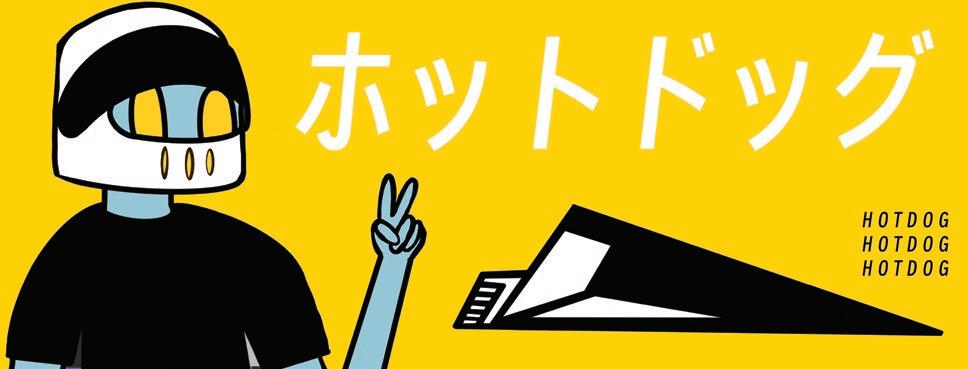
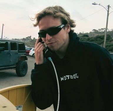
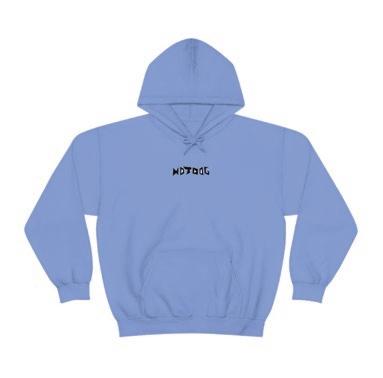
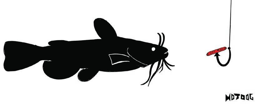
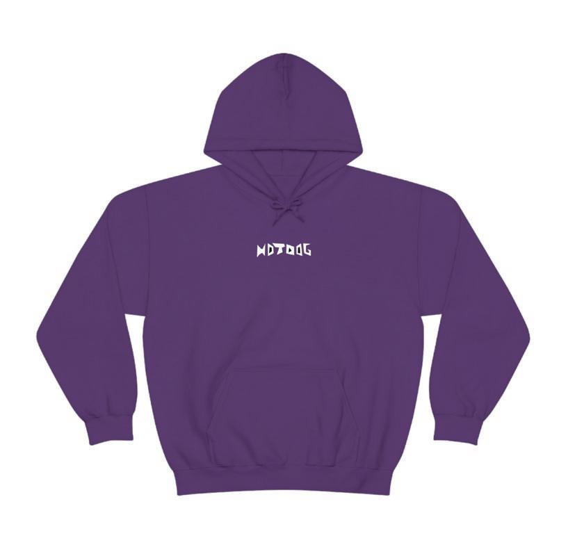
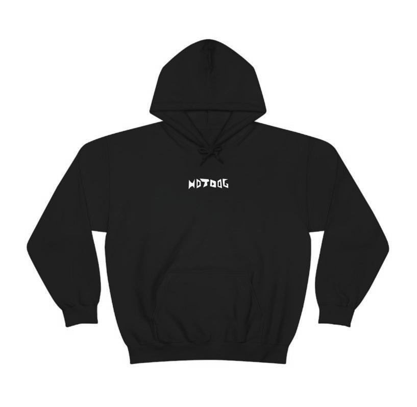
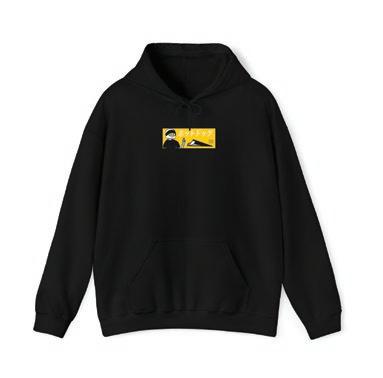
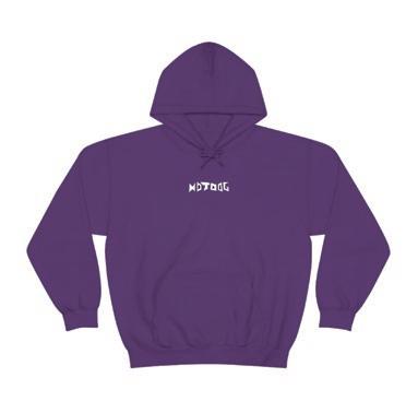
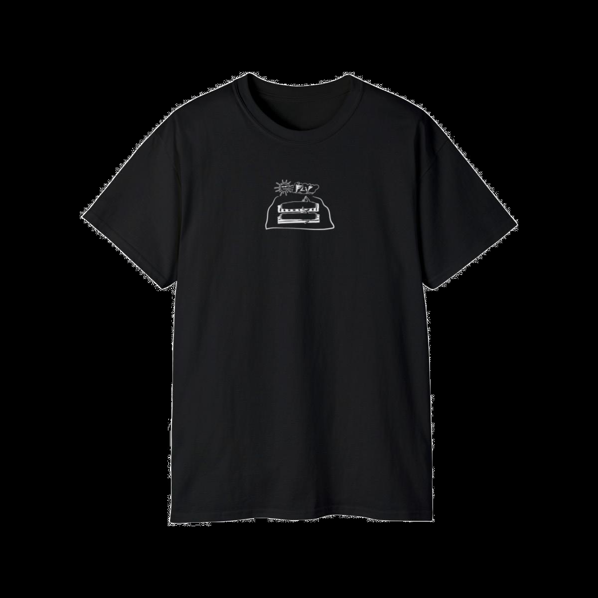
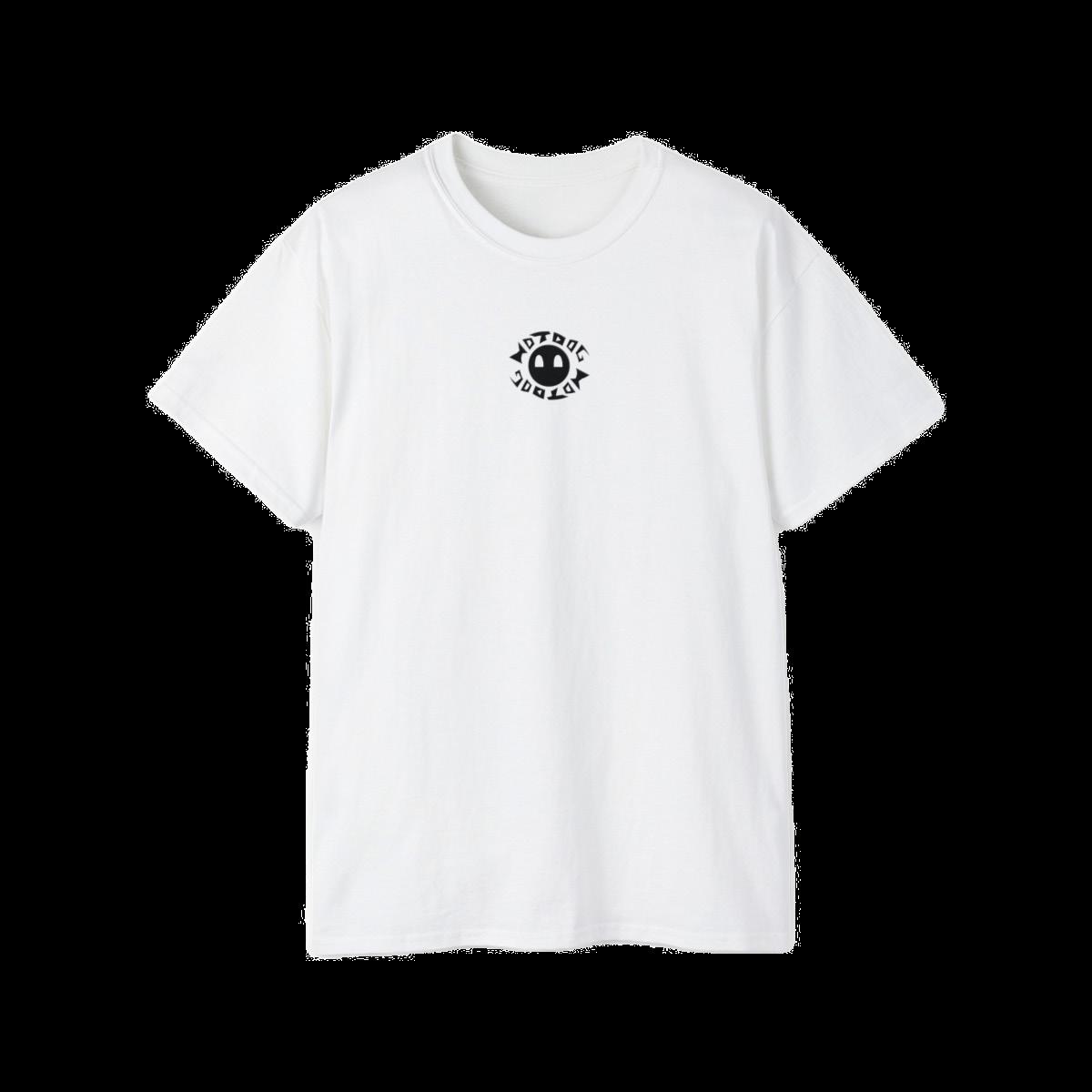
HOTDOG BRANDING
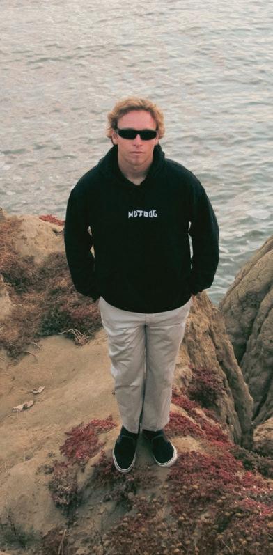
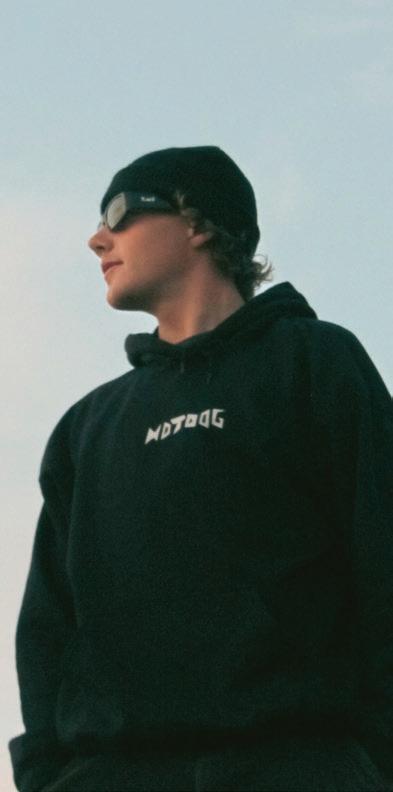
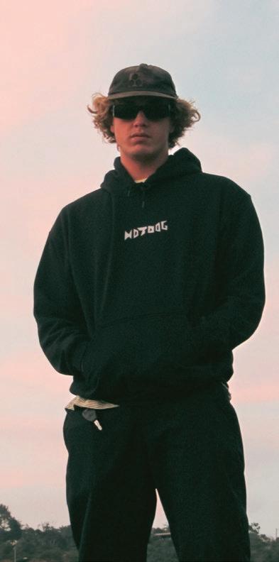
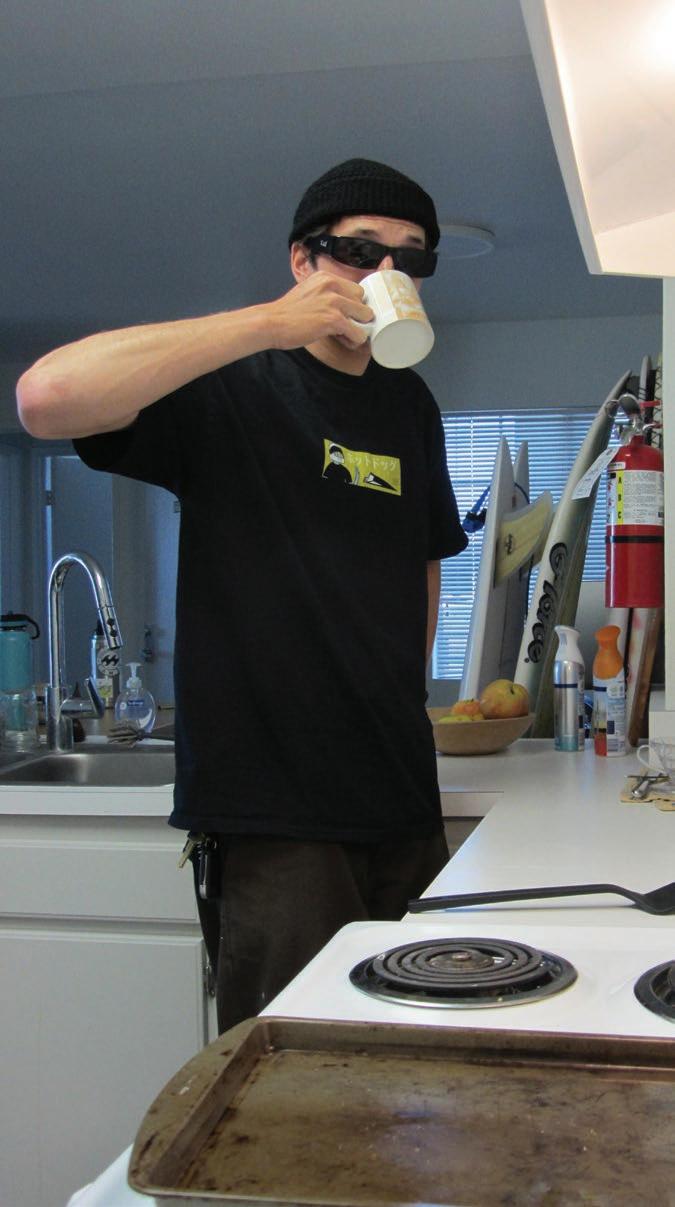
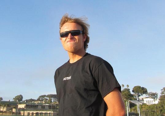
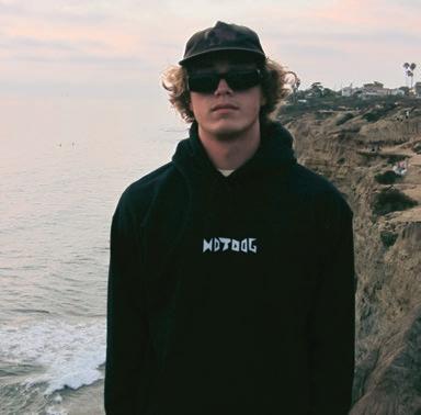
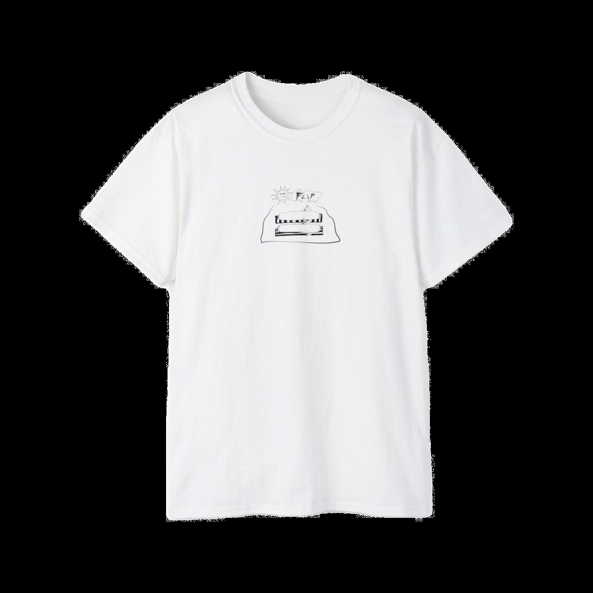
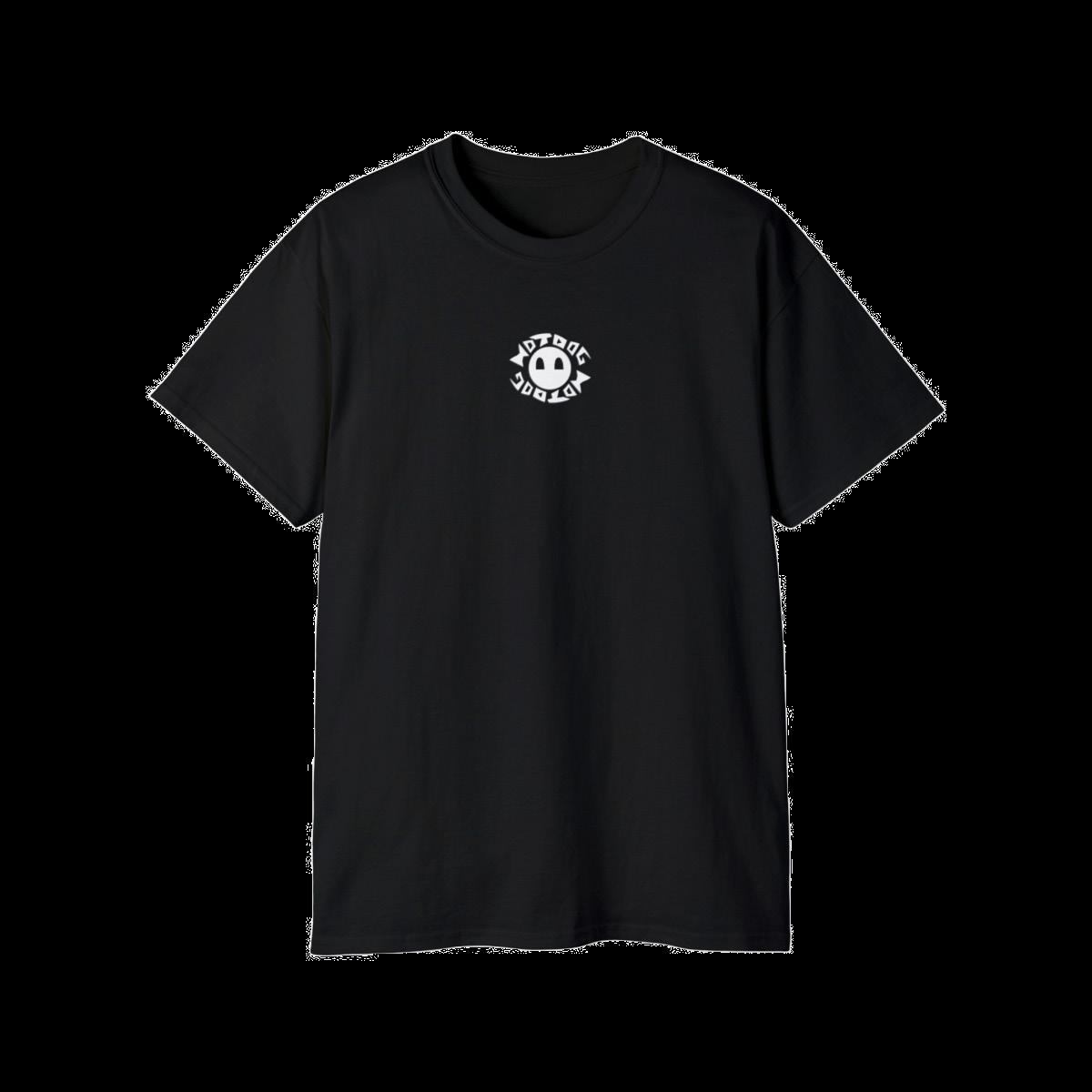
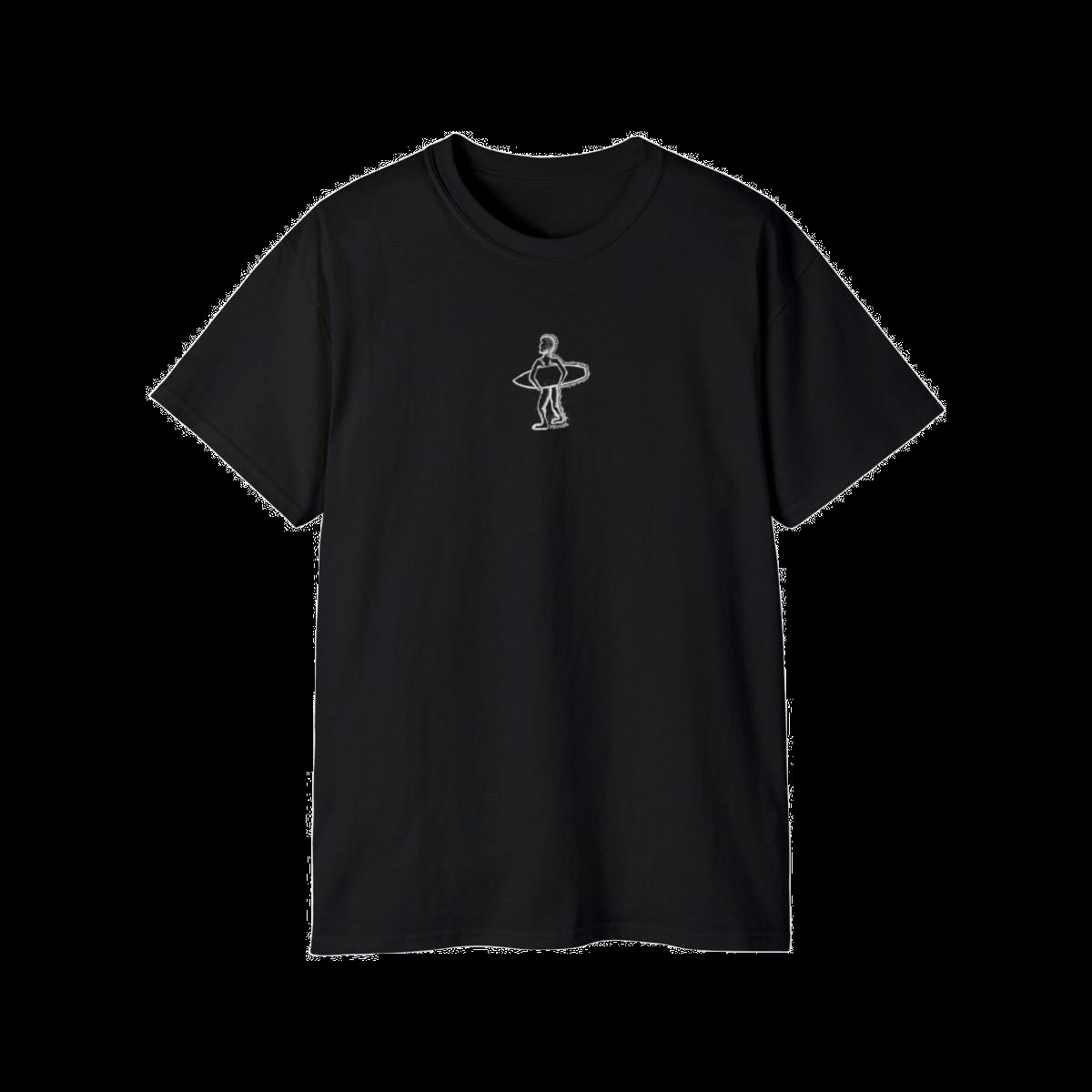
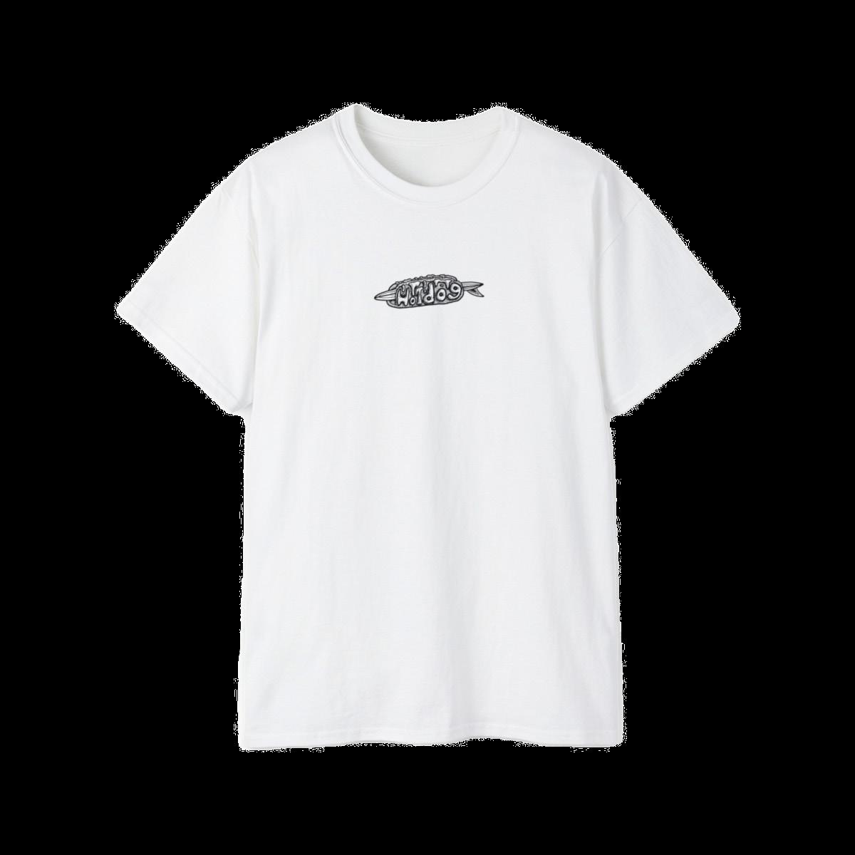
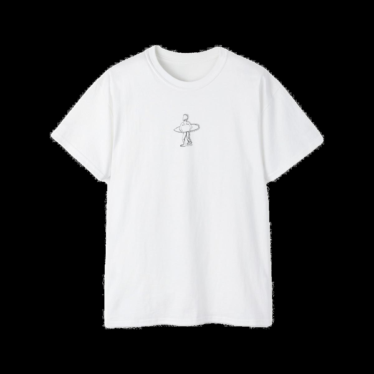
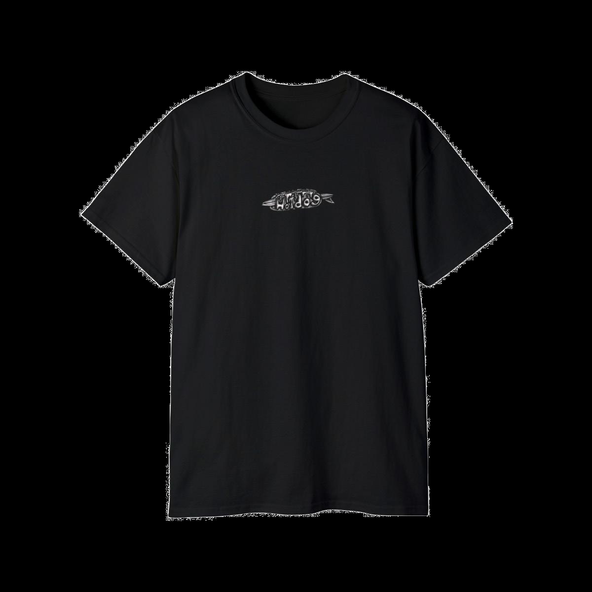
In the summer of 2023, I joined my friend and roommate Zander Adelsohn to help design for his startup brand called “Hotdog.”
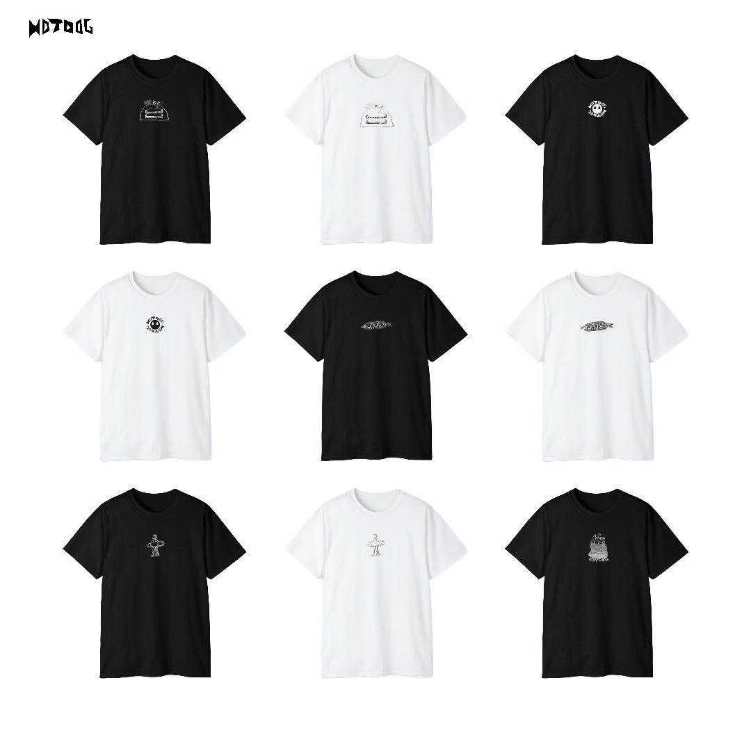
We created t-shirt and hoodie designs that were sent to a manufacturer in Florida for printing. Our sales and products were all tracked through the services of Shopify and Printify.
In our later experience we learned the cheaper alternative of screen printing in our art facilities and were able to increase production of products to sell at our college farmer’s market.
With busy schedules, low funding,and the future ahead, Hotdog was put on hold. The learning experience obtained was something I’ll never take for granted and always be thankful for.
 CHRISTIAN KEENAN
28


PROFESSIONAL WORK 29
MARKETING
Most of our marketing was done on Instagram by Zander. We made fun commercials and merch posts occasionally using generated mockups on Printify and inputting them into masking programs such as Adobe Express. Much of the brand was spread around campus through word of mouth or by stickers we would place in frequently populated areas.
30
CHRISTIAN KEENAN


31
CHAPTER 03: MORE DOODLES THAN NOTES
32
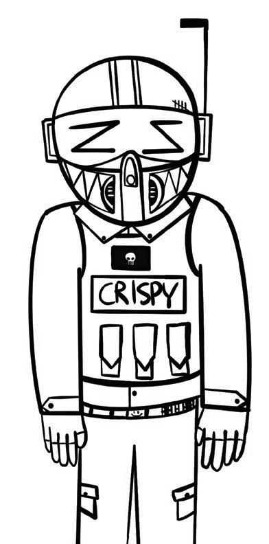
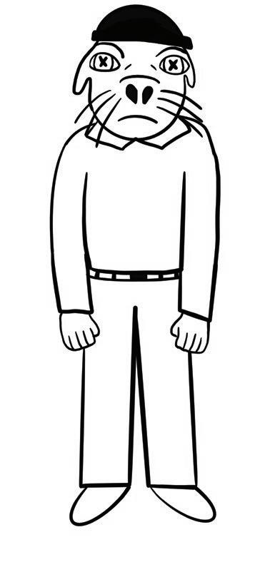
WHY DOODLE?
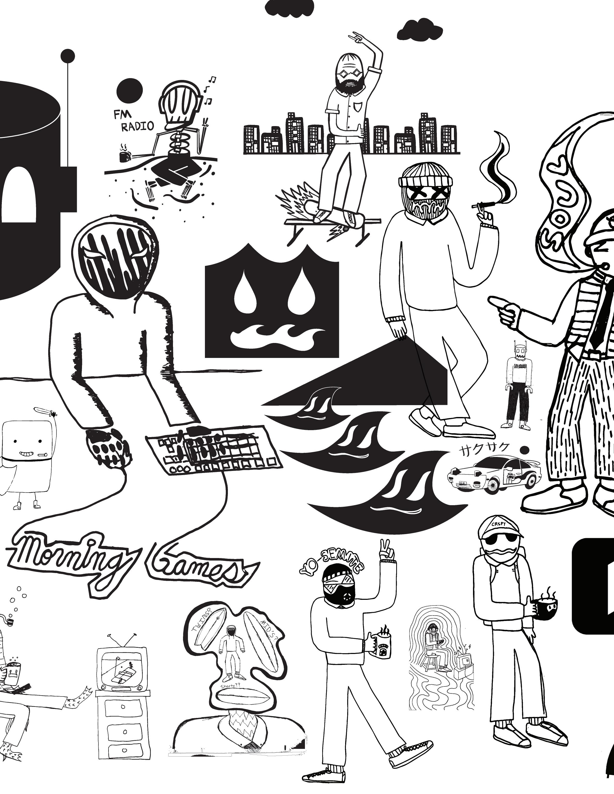
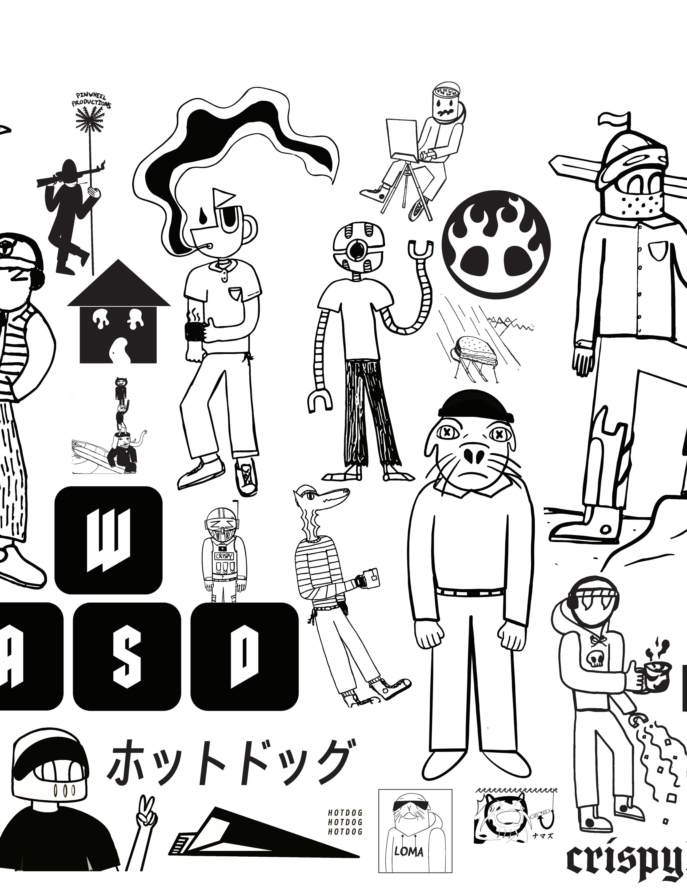
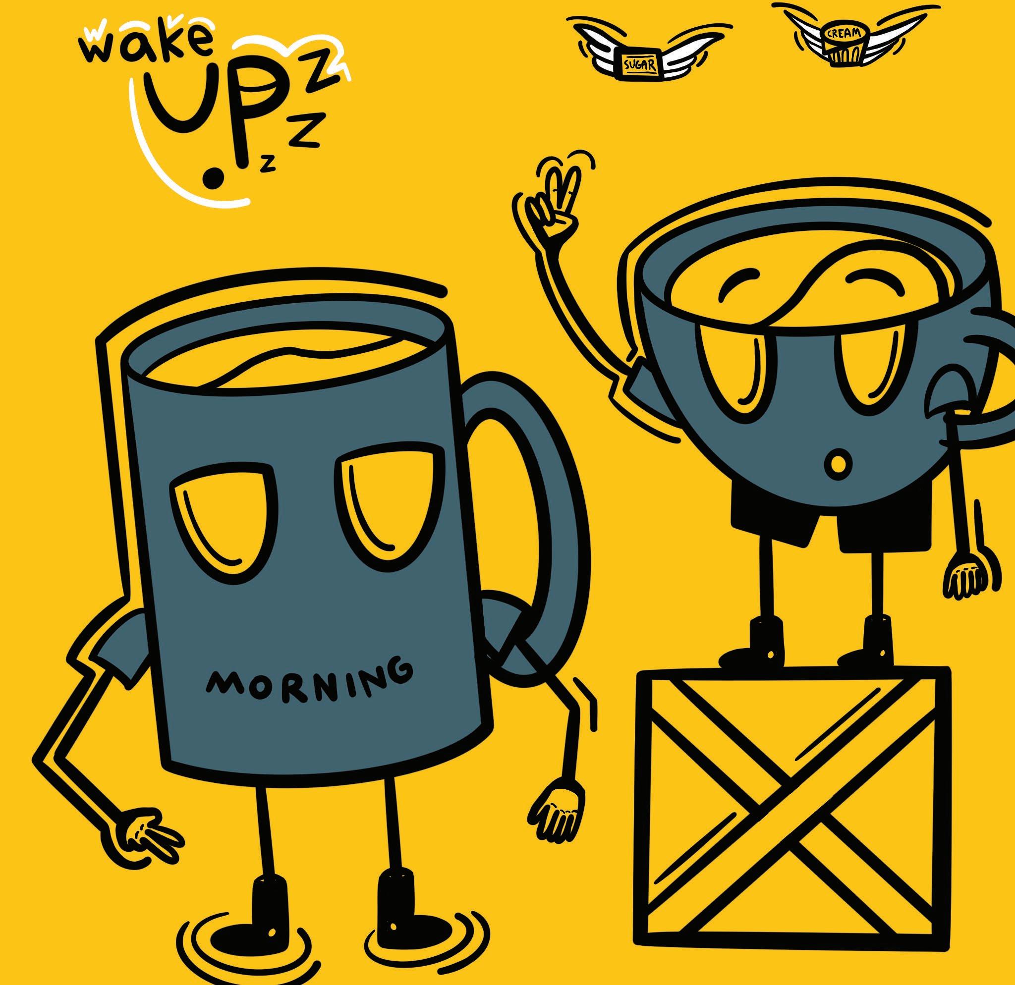
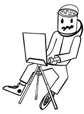
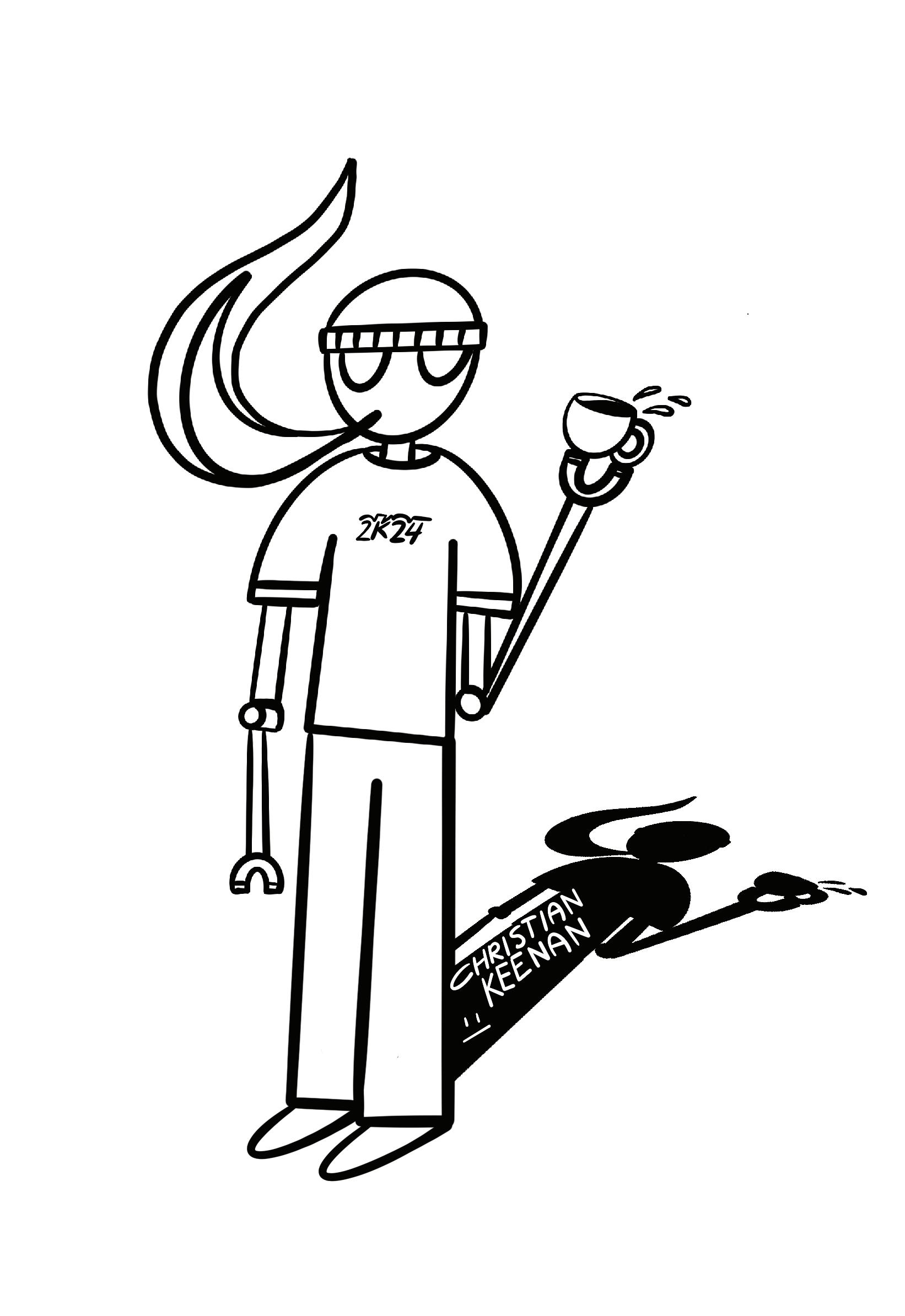
Doodling in class or while in church has always made me focus better on the content at hand. It seems mindless and let’s me take in more information audibly as well as physically.
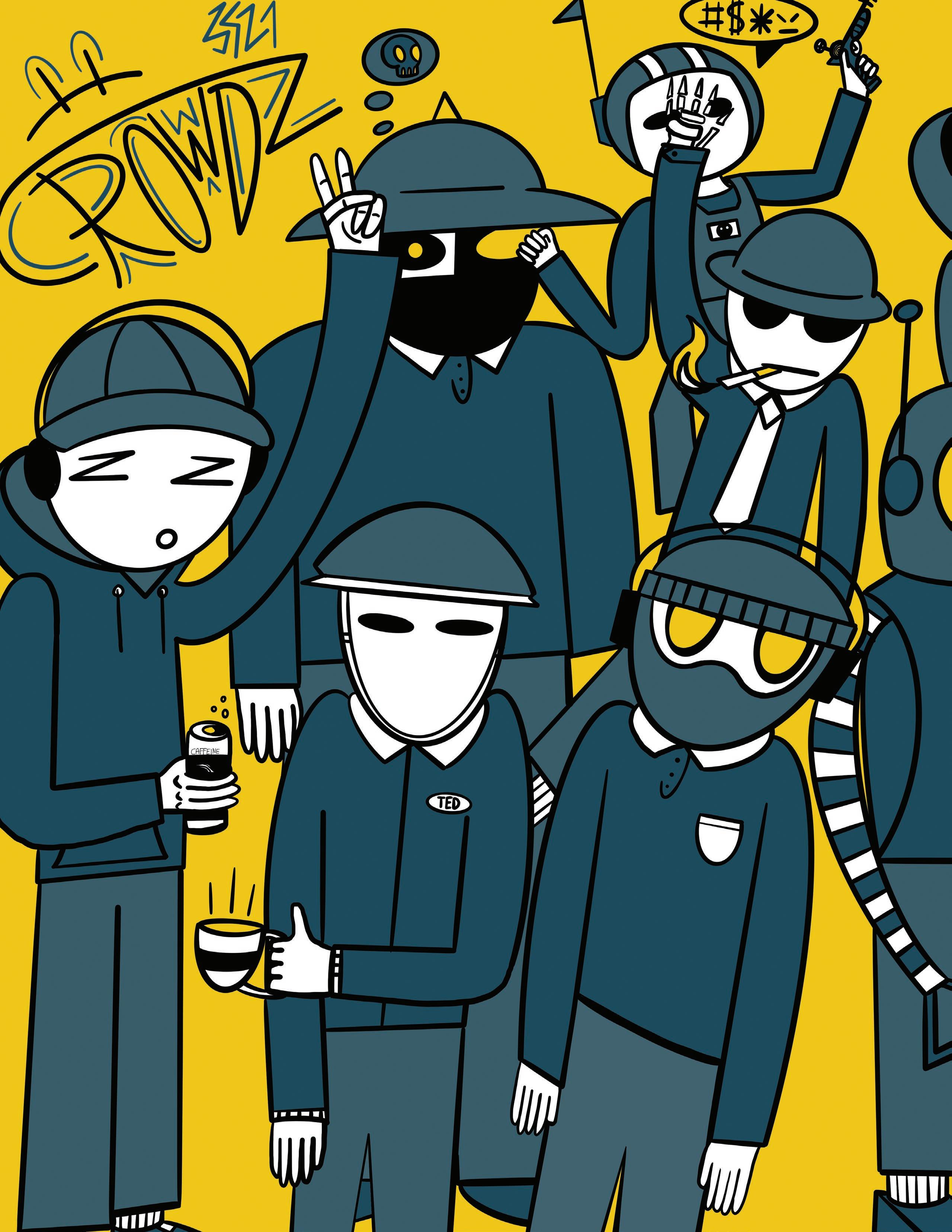
It’s a process that has helped me develop and find my style of art. All the characters I draw are often outward expressions of myself at
different times in my life. It could be interpreted as an escape from the physical world or a way to represent the objects around me.
Doodling lets me dream and be apart of worlds that seem unattainable through means of fiction or current circumstances.
33
34
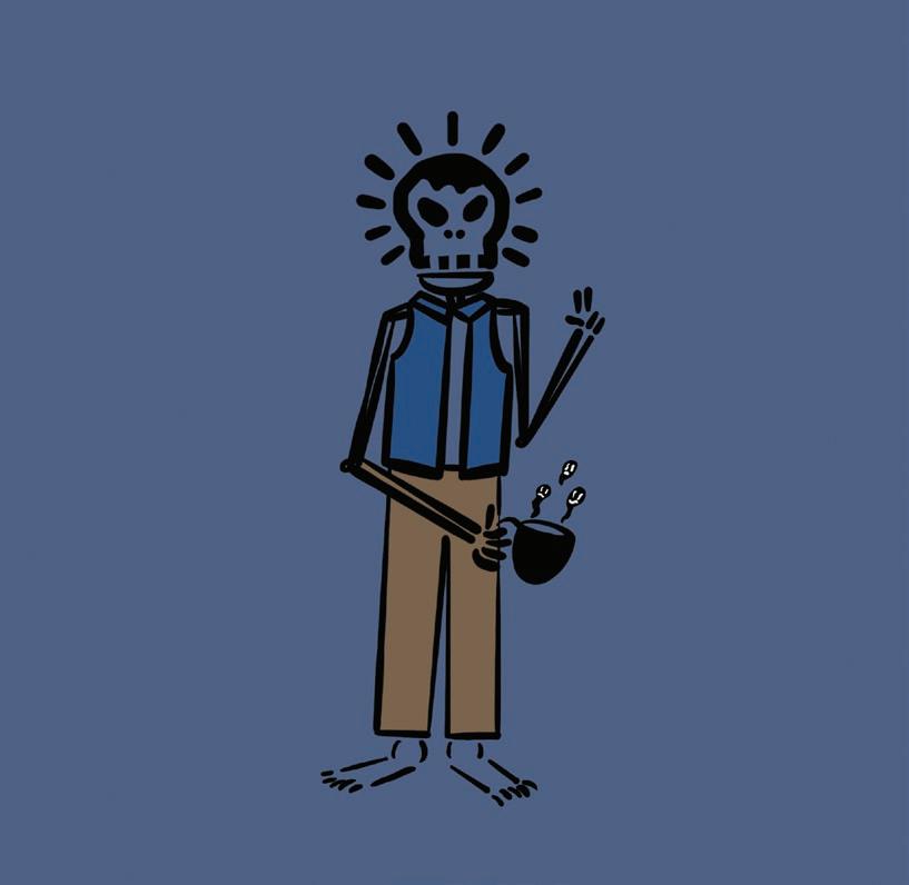
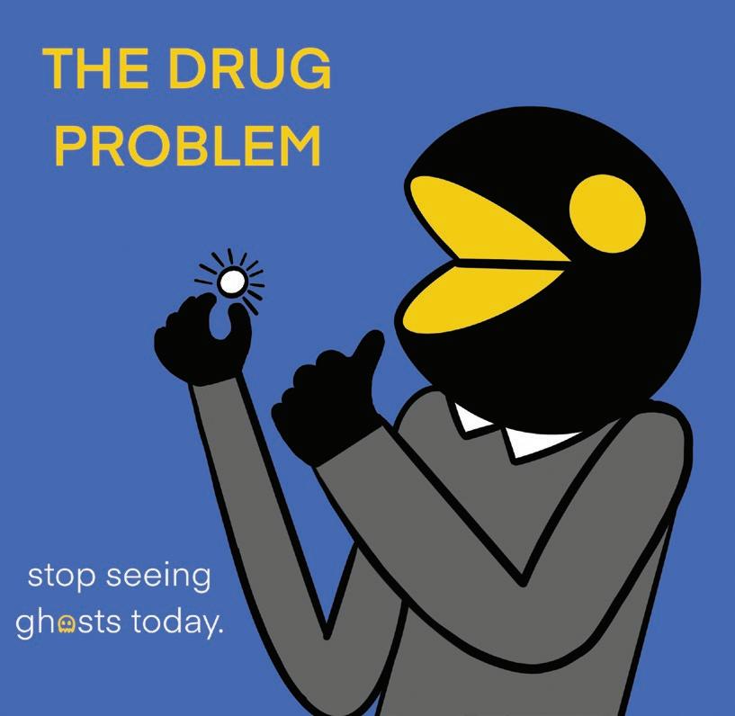
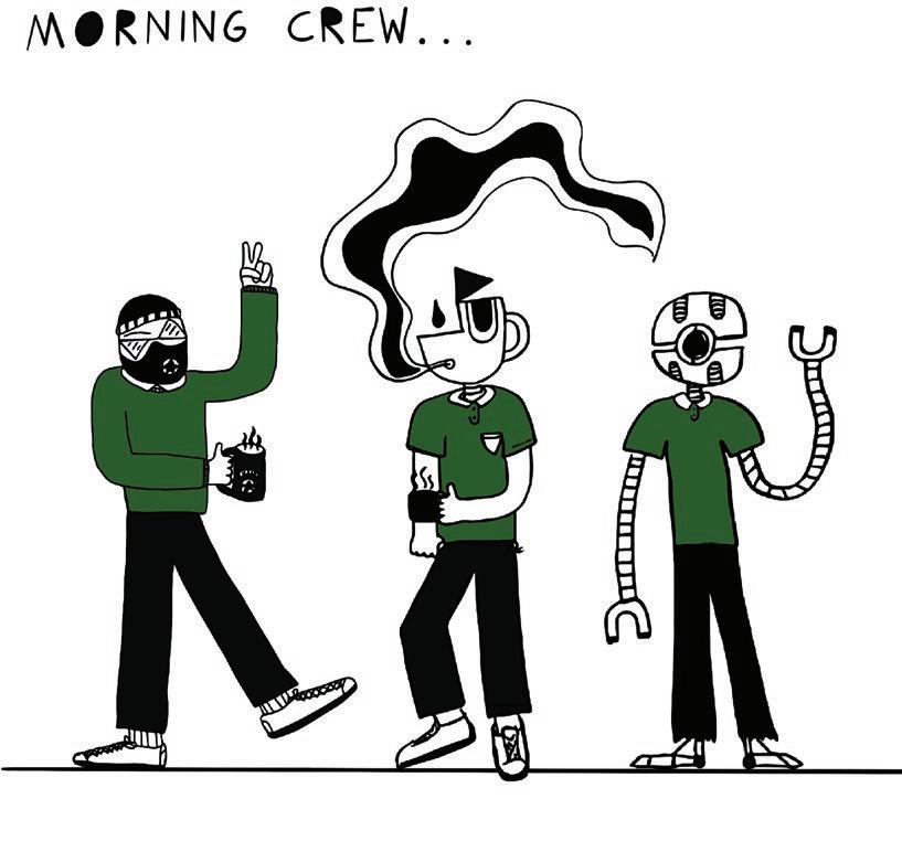
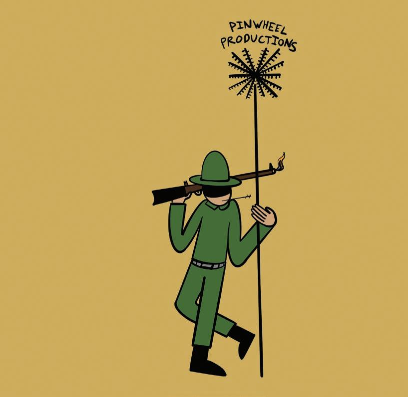
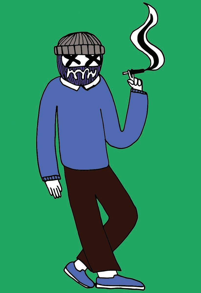
A lot of my drawings are sketched out physically in notebooks and then image traced or redrawn in Illustrator and ProCreate.
35
DOODLES
36
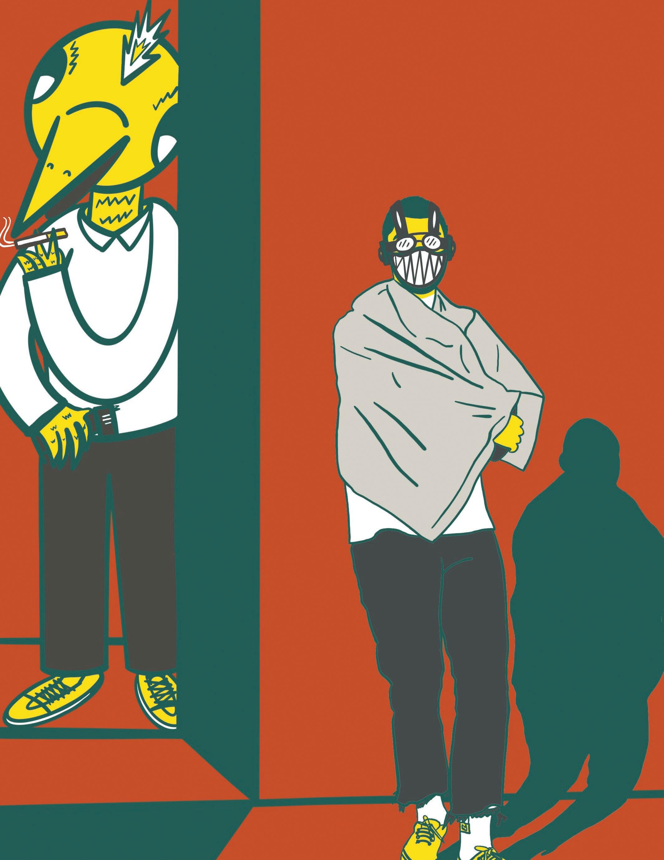
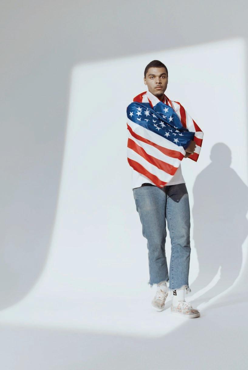
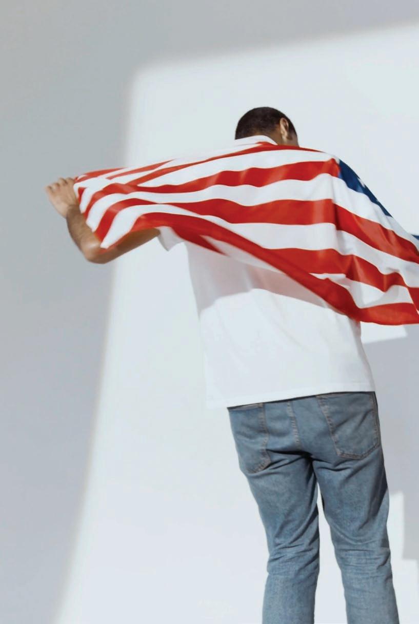
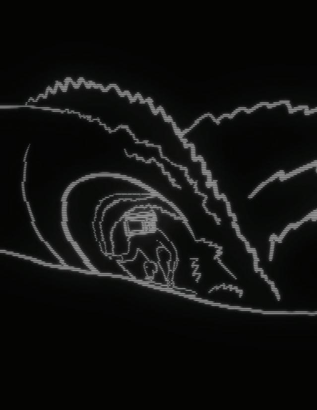
The left illustration was made in procreate for my Illustration II class. We were each given two frames from a video sequence and told to animate them to make an art collaged video.
The reference image is shown to the right along with the second frame sequence.

37
DOODLES
38
39 DOODLES
CHAPTER 04: THE BUSINESS STATIONERY
40
41
42
CHRISTIAN KEENAN
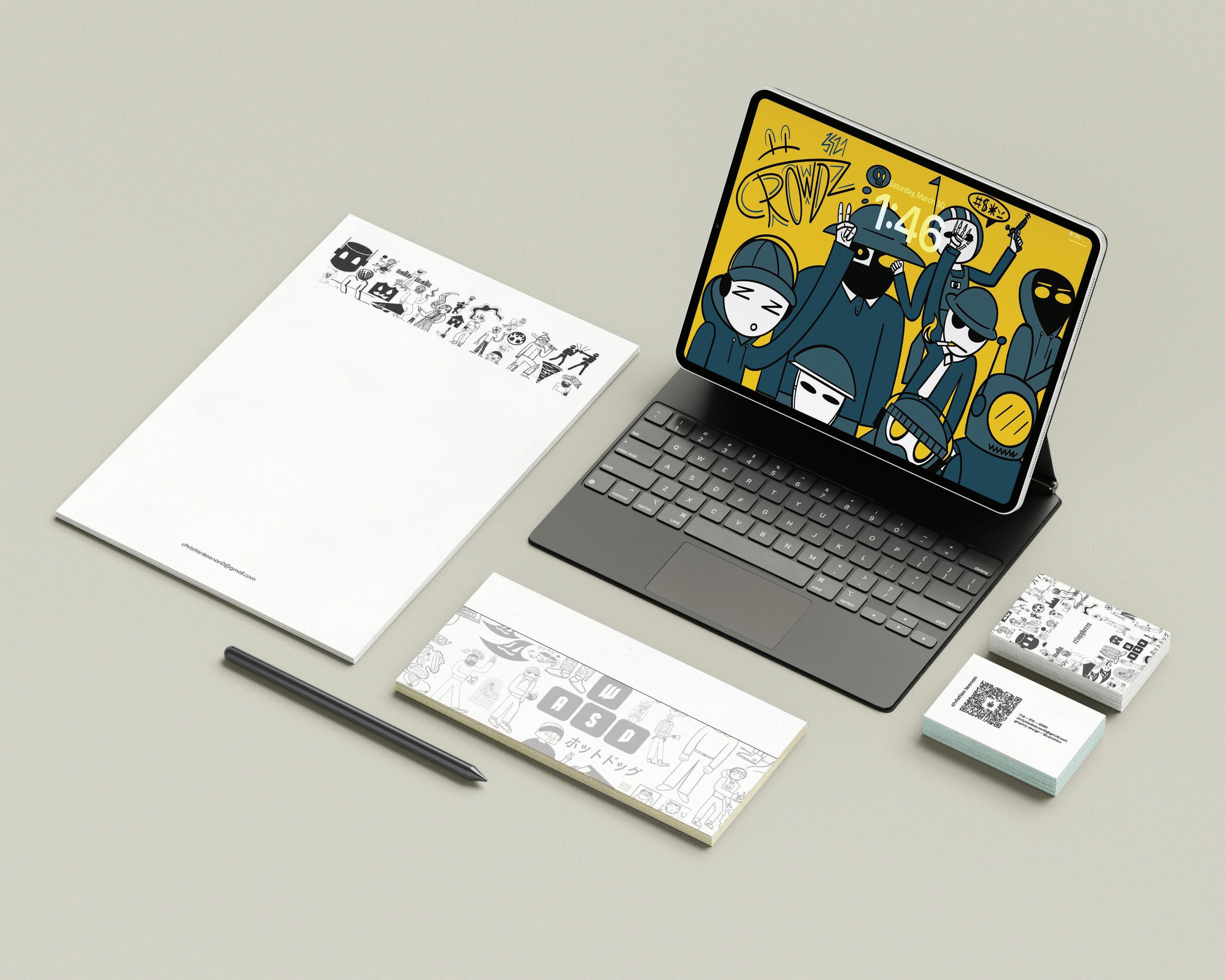
STATIONERY
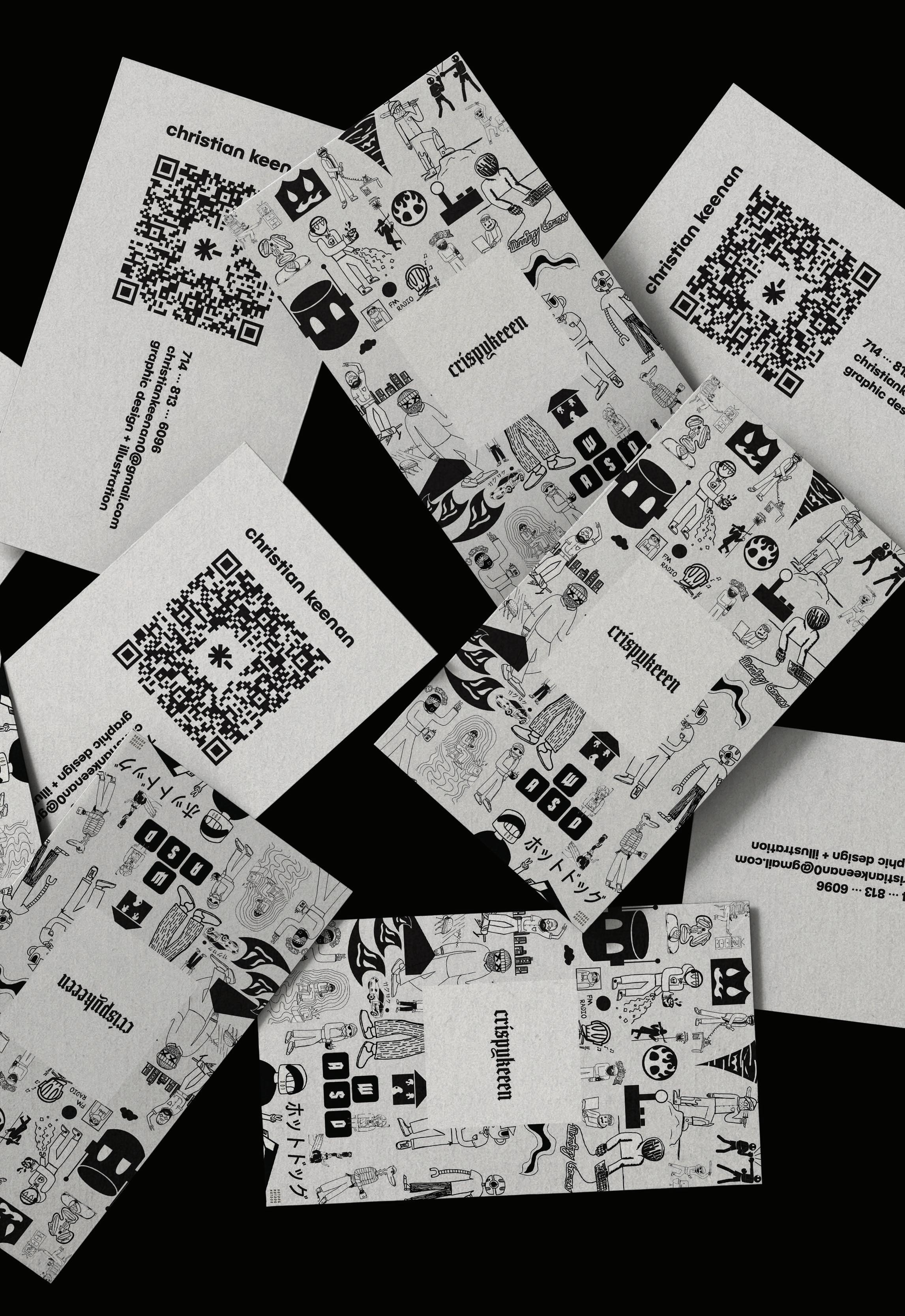
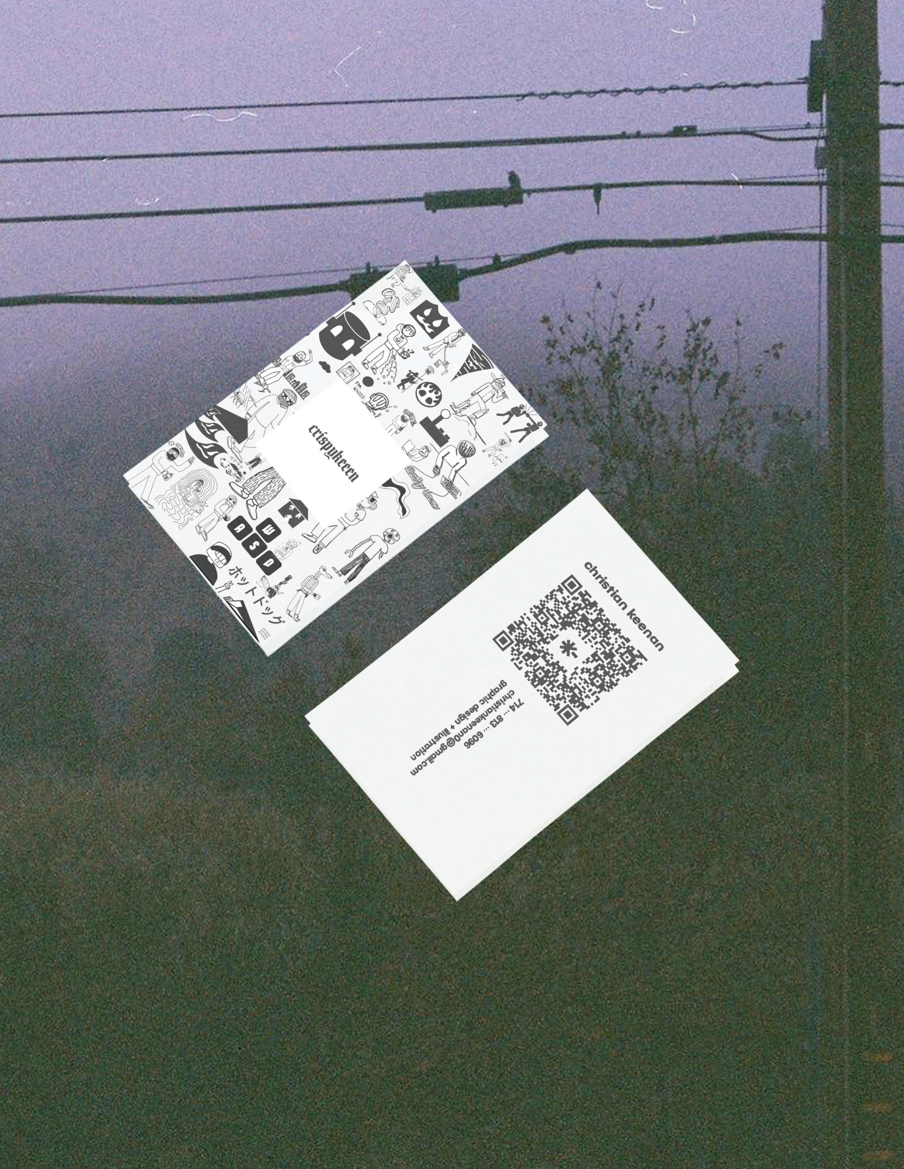
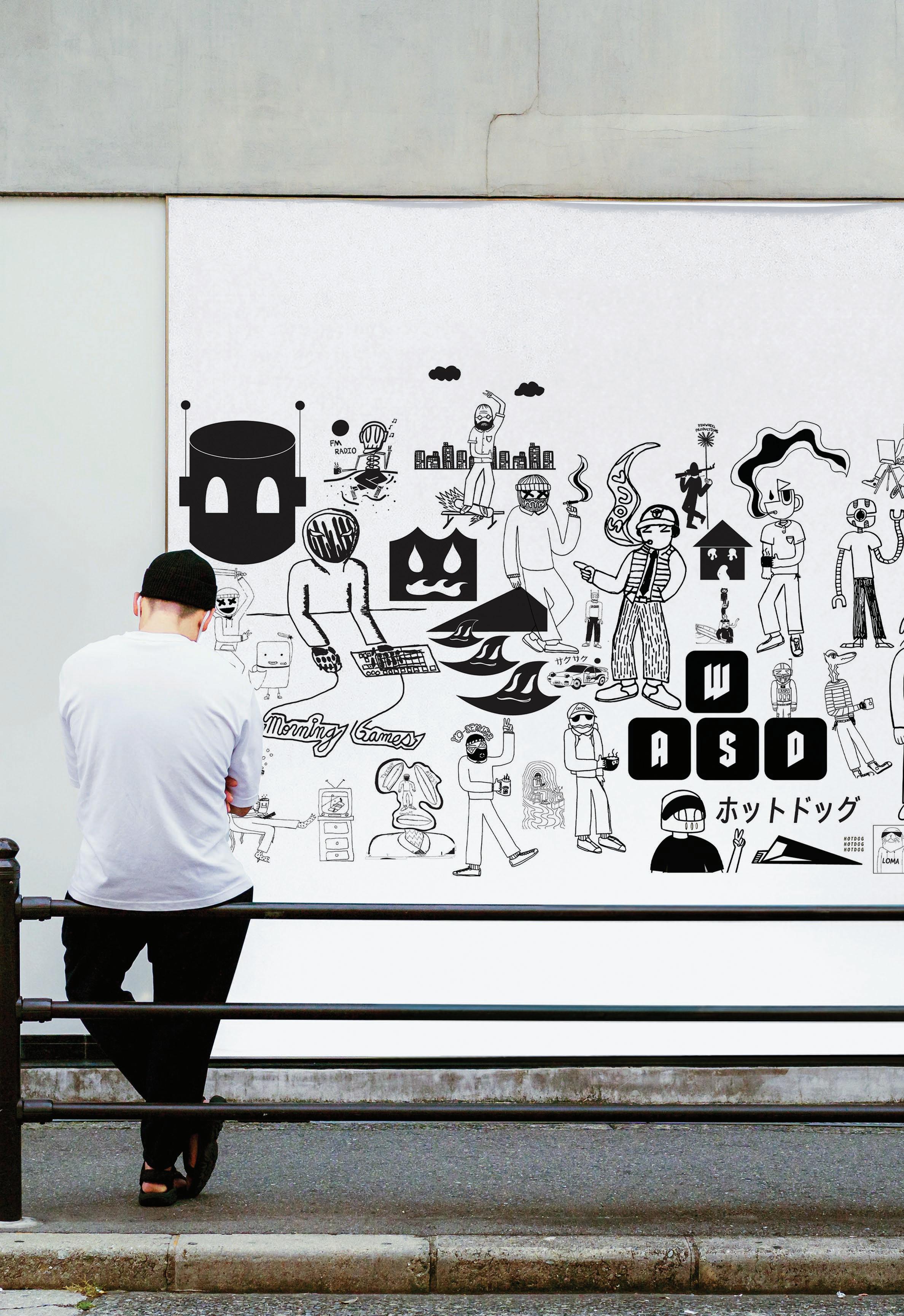
I wanted to create stationery that stood out in an illustrative style, but also conveyed bits of professionalism in order to be hired and contacted efficiently.
Here is an overview of my main paper stationery (left), back of my envelopes (bottom), and business cards (right).
43
44
CHAPTER 05: THE YT CHANNEL Photographed by: Zander Adelsohn
45

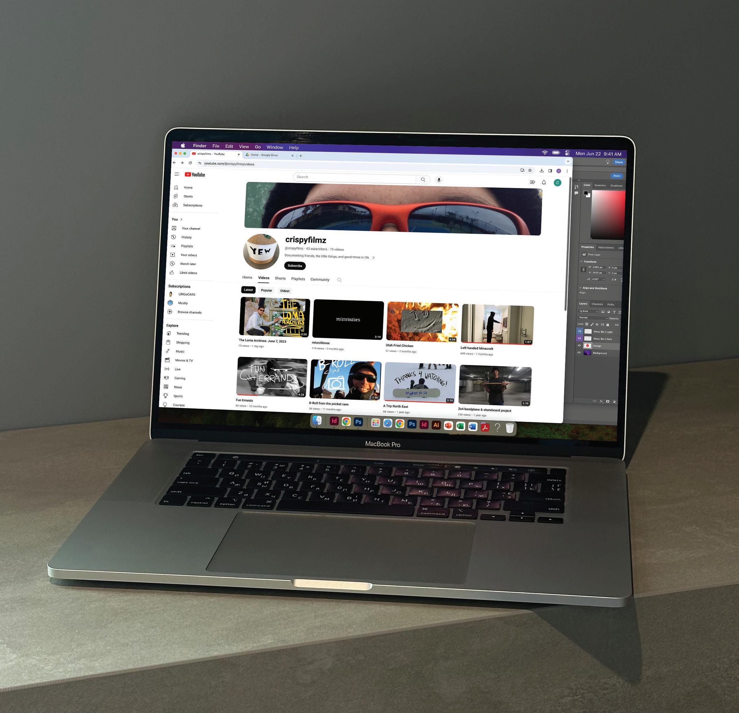
CRISPYFILMZ ON YOUTUBE
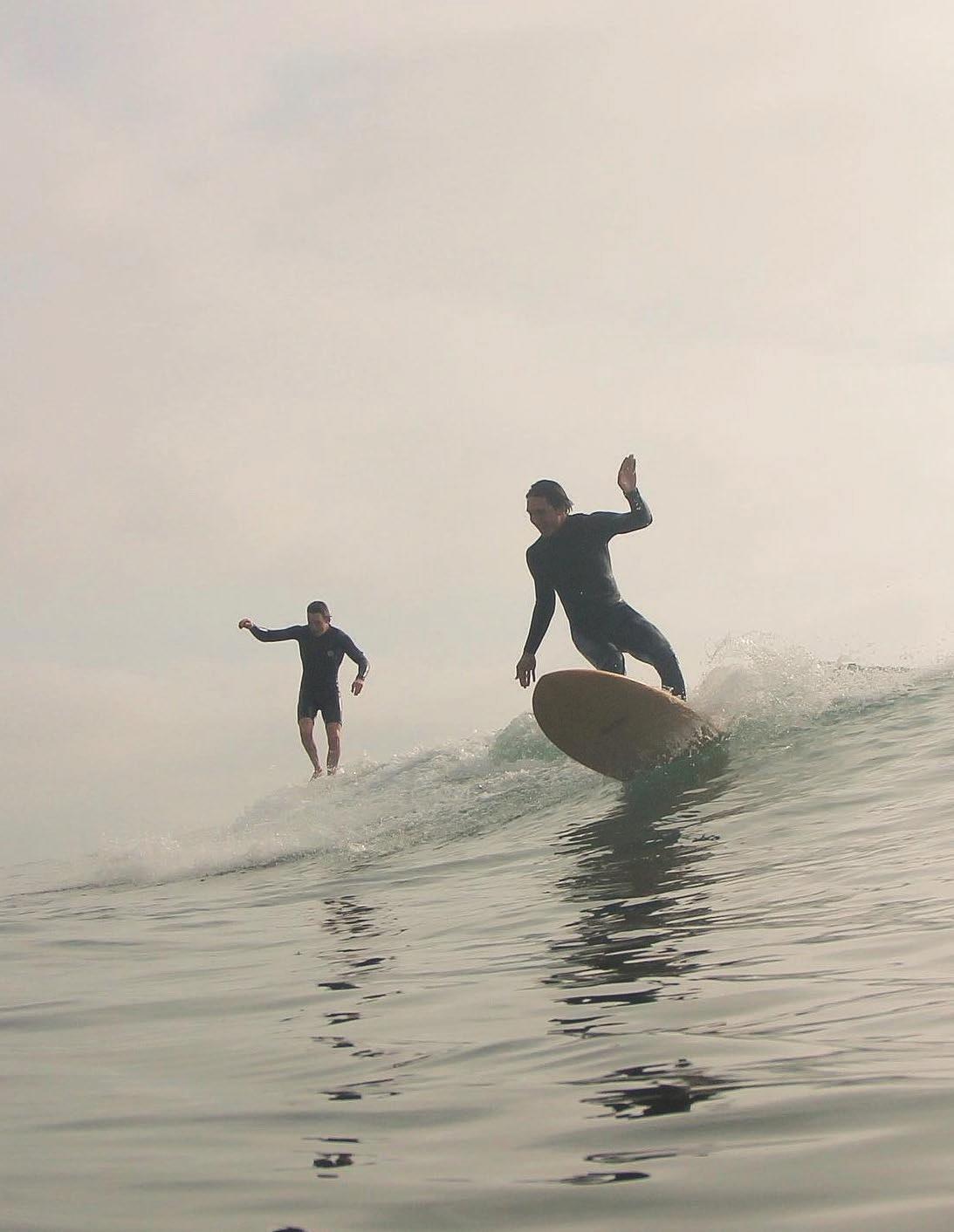
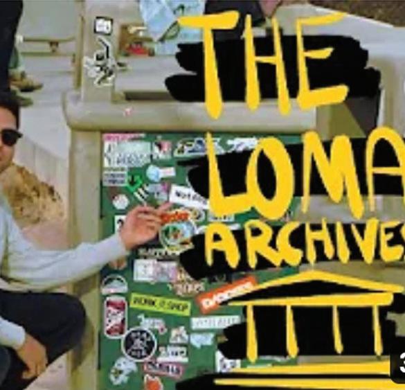
In my free time, I like to make video edits and post them on YouTube. They mostly consist of surfing, my friends, and trips I’ve documented over the years. It is a fun interest I have picked up and can usually work on for hours at a time. I began much of my editing in IMovie and have now transitioned to Adobe products like Premiere Pro, Premiere Rush, & recently Adobe After Effects.
CHRISTIAN KEENAN
46
YOUTUBE 47
DESIGNER
Christian Keenan
PRINTER
BLURB PAPER
Matte-Velvet Finish
BINDING Magazine
TYPEFACES
BC Novatica CYR - Bold
Century Gothic Pro - Regular
Gala - Medium
OTHER
Business Card by Tipo
Scattered Business Card by Creatoom.com
Stationery by Squarespace
Poster by Made and Marked Goods
Laptop by Yuzu
48