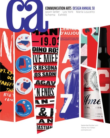
COMMUNICATION ARTS DESIGN ANNUAL 58
Jason Seiler Los York Maria Louceiro Schema Exhibit
BYU DEPARTMENT OF THEATRE AND MEDIA ARTS YOUNG COMPANY
CYRANO BASED ON THE BOOK BY
EDMOND ROSTAND
ADAPTED FOR THE STAGE BY
JO ROETS
PRODUCED WITH SPECIAL ARRANGEMENT WITH PLAYS FOR YOUNG AUDIENCES
September/October 2017 Twenty-Four Dollars commarts.com
at-edge.com /
FIND YOUR NEXT ASSIGNMENT PHOTOGRAPHER.
atedge WHERE VISIONARIES UNITE.
Noel Barnhurst PH O T O G RA PH Y / MO T I O N www.noelbarnhurst.com
SEPTEMBER/OCTOBER 2017 VOLUME 59, NUMBER 4
COMMUNICATION ARTS ��
��
�� FEATURES
DESIGN ANNUAL
38 Maria Louceiro
79 92 95 104 107 107 110 114 120 120 123 139 151 156 168 174 178 182 193
by Monica Kass Rogers A hazy, dreamlike atmosphere permeates the work of this Berlin-based photographer.
46 Schema
by Valerie Gregory In Seattle, Washington, a data visualization design firm brings clarity and creativity to its sometimes-inscrutable discipline.
COVER
Source images (from left): Poster for Brigham Young University Department of Theatre and Media Arts, p. 79; college voter registration stickers for Google, p. 116; poster for Armando Records, p. 87; poster for Centre du Théâtre d’Aujourd’hui, p. 83; poster for 20 Monroe Live, p. 81; packaging for AnheuserBusch InBev, Budweiser, p. 102; packaging for Mas Pagès, p. 99.
��
54 Jason Seiler
by Jenn McKee The artful caricatures of this Chicago-based illustrator reveal inner truths.
62 Los York
by Julie Prendiville Roux This hybrid production company and ad agency pushes the boundaries of its campaigns into new territories.
70 Exhibit
by Jean A. Coyne The latest and best in visual communication from here and abroad.
Posters Annual Reports Packaging Letterheads Institutional Brochures Product/Service Brochures Catalogs Miscellaneous Company Literature Trademarks Identity Programs Integrated Branding Programs Books Editorial Environmental Graphics Public Service Motion Graphics Miscellaneous Self-Promotion Student Work
FRESH Editor/Designer Patrick Coyne Executive Editor Jean A. Coyne Managing Editor Michael Coyne
202
200
Jacobia Dahm This Berlin-based photographer transforms preconceptions through her portraiture.
Alphabet This Manchester- and Leeds-based design firm applies big concepts to detailed work.
Associate Editor Esther Oh
204
Dom Civiello A Boston-based illustrator’s careful approach enables his images to say the most with the least.
COLUMNS 12
14
16
21
24
28
206 208 211 212
Book Reviews Index to Design Annual 58 Directory Overheard
Design Culture Wendy Richmond calls for us to experience the tactile qualities of art.
Design Issues Caitlin Dover showcases how some US designers have responded to the political climate.
Advertising You don’t need superpowers to be an advertising superhero, Ernie Schenck asserts.
Typography Rachel Elnar investigates the strengths and weaknesses of five superfamilies.
Business Edo van Dijk and Paul Woods detail how design firms need to adapt to stay relevant.
Insights Digital anthropologist Caroline Sinders discusses how we can make online spaces safer.
32
Creativity Experiential marketing events attract new creative talent, as Claire Sykes reports.
DEPARTMENTS 8 10 30 36
Editor’s Column Contributors Favorites Web Watch
Volume 59, Number 4 commarts.com COMMUNICATION arts (ISSN 0010-3519) is published six times a year (January/February, March/April, May/June, July/August, September/October, November/ December) by Coyne & Blanchard, Inc., 110 Constitution Drive, Menlo Park, CA 94025-1107. Periodicals Postage Paid at Menlo Park, CA, and at additional mailing offices.
Copyright 2017 by Coyne & Blanchard, Inc. All pieces reproduced in this issue are under prior copyright by the creators or by the contractual arrangements with their clients. Nothing shown may be reproduced in any form without obtaining the permission of the creators and any other person or company who may have copyright ownership. SUBScRIBER SERVICES: Subscription: 1 year, $53; in Canada, $70; all other countries, $110. All payments in US dollars, Canadian GST: 127848620.
Direct all inquiries, address changes, subscription orders, etc., to: Web: commarts.com E-mail: subscription@commarts .com Phone: 800-688-1971 (US/Canada) Phone: 215-788-5481 (International) Fax: 215-788-6887 Mail: COMMUNICATION arts PO Box 2013 Langhorne, PA 19047 Please allow six weeks for changes.
EDITORIAL AND BUSINESS OFFICE: 110 Constitution Drive Menlo Park, CA 94025-1107 Phone: 650-326-6040 Fax: 650-326-1648 E-mail: ca@commarts.com POSTMASTER: Send changes of address to: Communication Arts PO Box 2013 Langhorne, PA 19047 Canada Post: Publications Mail Agreement #40612608 Canada Returns to be sent to: IMEX Global Solutions, LLC PO Box 25542 London, ON N6C 6B2
Editor At Large Anne Telford Art Directors/Designers Director/Designer Jessica Reichard Shantanu Salgaonkar Jessica Reichard Production Manager/Competition CoordinatorManager/Competition Production Lauren Coyne Coordinator Lauren Coyne Print Producer DanielProducer Print Sambrano Daniel Sambrano Design/Production Associate Joni Rivas Design/Production Associate Joni Rivas Production Assistant/Customer Service Representative Production Assistant/Customer Khader Yanni Service Representative Khader Yanni Archivist Nancy Clark Lewis Archivist Nancy Clark Lewis Software Engineers Jiping Hu Engineers Software Srividhya Jiping Hu Gopalakrishnan Srividhya Gopalakrishnan Technology Administrator Michael HoytAdministrator Technology Michael Hoyt Advertising Director Dirk Moeller Director Advertising Dirk Moeller Circulation Director Perry Fotos Director Circulation Perry Fotos Accounting Lois Vega Accounting Lois Vega Contributing Editors Sam McMillan Editors Contributing Wendy Sam McMillan Richmond Ernie Schenck Wendy Richmond Ernie Schenck Founder Richard Coyne (1926–1990) Founder Richard Coyne (1926–1990)
Like us on Facebook facebook.com/communicationarts Follow us on Google+ plus.google.com/+commarts Follow us on Instagram instagram.com/communicationarts Follow us on Pinterest pinterest.com/camag Follow us on Twitter twitter.com/commarts
THINK CLASSIC COLORS
®
LET THE PAPER BE THE STARAND ELICIT JUST THE RIGHT RESPONSE. FROM IMPERIAL RED TO COOL GRAY, EXCITING NEW CLASSIC® COLORS WILL FULFILL ALL YOUR COMMUNICATION NEEDSAND EMOTIONAL CRAVINGS. SO BE SMART. BE HEARD. BE COLORFUL. AND ALWAYS START WITH A POINT OF HUE.
• NEW COLORS Imperial Red Cobalt Military Aubergine Cool Gray
NEENAHPAPER.COM/CLASSIC #THINKCLASSIC
Cadet Gray Chambray Bare White
CCRRE EAA T TE EDD BBY Y
Stocksy is an cooperative raising Stocksy is cooperative raising the bar Stocksy is artist-owned an artist-owned artist-owned cooperative raising the bar Stocksy is an an artist-owned cooperative raising thethe barbar — industry’s expectations — the industry’s expectations — — and and the industry’s expectations — — and and thethe industry’s expectations — — of photography video. of photography and video. of stock stock photography and video. of stock stock photography andand video. SSC T C K SSTTO K C O M TO O CYY K..SS C OM M O C KS S CYY O..C MO
BY RESPECT
EDITOR’S COLUMN
Patrick Coyne
T
he 151 projects selected for this year’s Design Annual reflect the changes in the type of design work being produced today. The integrated branding, environmental and motion graphics categories saw a greater number of submissions this year. The number of entries submitted to the packaging, trademark and company literature categories declined. For the first time in 58 years, not a single annual report for a publicly traded company was chosen to be included in the Design Annual. “It was a joy to see a high level of design throughout all of the entries,” juror Bobby Martin says. “The work was smart and well crafted. I left feeling encouraged about the future of design.”
“It seems now, more than ever, Canada is showing how encouragement, kindness and compassion are what make a country—and design—great.” “I think I’ve found another reason to move to Canada besides our current political climate,” adds Burns. When I asked the jurors about their biggest disappointment with the entries, the most frequent response was about the lack of originality. “I was taken aback by the sheer volume of entries in the packaging category, but I was dismayed by the sameness of the approach in
“Two things struck me,” says juror Dan Olson. “First, the incredible attention to detail that seemed to span all categories of work. Second, the high level of creative problem solving that addressed difficult marketplace challenges. I found both to be inspiring.”
the spirits and craft beer entries,” says Burns. “While being
“A number of the entries returned to a deeply layered, physically and typographically rich approach that has been absent for years,” says juror Christine Celic Strohl. “There were lots of considered details to explore in all categories.”
“I do appreciate that creating original work is tremendously
“I was stunned by some of the elaborate finishing on a few of the printed entries—sometimes appropriate, sometimes not,” juror Roy Burns says. “Who’s paying for these extravagant print jobs, and where can I find them?” “Spending a weekend with other design nerds and 4,000-plus entries was completely inspiring,” says juror Monique Gamache. “The moments of surprise and pleasure when you get to see how the problem is getting solved reminded me that design truly can change the world—or simply adjust the way I think about something.” I asked the jurors what they found most surprising about the entries. “It’s no surprise that the work coming out of Canada is exceptional, but I was 8
surprised by the volume of entries sent from there,” says Martin.
Design Annual 2017
precisely designed and well crafted, much of it was reliant on firmly entrenched tropes. Whether that’s a reflection of client or consumer expectations or the thinking itself, I’m not sure.” difficult—I struggle with it myself—but there was a lot of work that just felt the same,” adds Gamache.
ROY BURNS III is design director at Lewis Communications, a multidisciplinary branding agency with offices across the southeastern United States. Previously, Burns was an art director at SapientRazorfish in New York City and was design director at Stoltze Design in Boston. His work has been recognized by the Academy of Television Arts & Sciences, AIGA, the Art Directors Club of New York, Brand New, Communication Arts, the Dieline, Graphis, HOW, Print and the Type Directors Club, and his posters have appeared in multiple books and publications. Burns lives with his wife and two children in Birmingham, Alabama.
MONIQUE GAMACHE is design director and partner at WAX, one of western Canada’s most-awarded creative agencies. Gamache has always been drawn to telling stories through design. Distilling the complexity of a company or brand into simple, cohesive and effective work with a consistent voice is Gamache’s strength. She proudly heads a multifaceted, talented design team, whose working philosophy is to speak softly, but wield a big idea. Her work has been recognized by the Art Directors Club of New York, Cannes, Communication Arts, D&AD, the One Show and the Type Directors Club.
Photographs by Steve Castillo
I asked the jurors which business, cultural and social developments might alter the role of design in the future.
“We are seeing more colleagues exploring their own interests, creating their own businesses and championing their own causes, which makes me
“We live in a world increasingly overwhelmed with data, which can be an important tool for strategic decision making,” Olson says. “Yet data rarely illuminates what can be or unleashes the power of human potential. Designers must take data to heart and use it to inspire their ability to define the future.”
excited for the future,” says Strohl. “While the lines between disciplines are blurring and converging, design will always play a vital role if it stays true to its core purpose: clarifying those things that would otherwise be difficult to understand,” Olson says. “The marriage of insights and imagi-
“I’m sure we’ll see how design can amplify the voices of those feeling targeted by this administration, as well as those taking action to support the country’s well-being,” says Martin.
nation in moving from the complicated to the simple—that is the
Lastly, the jurors predicted future directions the design field might take.
A minimum of three out of five votes was required for a project to
“The optimist in me thinks that design is getting more integrated, more competitive and more imperative,” says Martin.
grateful appreciation to our jurors for their conscientious efforts
BOBBY C. MARTIN JR. is a founding partner of OCD | The Original Champions of Design, which has offices in New York City and Oklahoma City. Prior to founding the branding and design agency with Jennifer Kinon in 2010, Martin led a Nokia internal design team in London and also served as design director of the New York City venue Jazz at Lincoln Center. He is a member of the Type Directors Club’s board of directors and previously served on the board of AIGA/NY from 2006 through 2008. Martin graduated from Virginia Commonwealth University and earned an MFA from the School of Visual Arts, where he is also on the faculty.
ultimate goal of all great design. And that skill set has never been more important or needed.” be awarded in this year’s competition. I would like to extend our in selecting our 58th Design Annual. ca
DAN OLSON is the founder and creative director of Studio MPLS in Minneapolis, Minnesota. With more than 30 years of industry experience, he has been responsible for some of the most highly awarded and widely recognized design work in the world, including global initiatives for brands like BMW, Coca-Cola and Sony. Prior to founding Studio MPLS in 2009, Olson was a creative director at Duffy & Partners and an associate creative director at Fallon. A true Northerner, Olson is a lifelong resident of Minneapolis and enjoys spending time at his Lake Superior cabin with his dog, Tom.
CHRISTINE CELIC STROHL is a cofounder and principal of Strohl, a San Francisco– based firm specializing in brand identity design and development. She uses her degrees in graphic design and psychology to combine thoughtful visual design with an empathetic approach to consumer experiences. Formerly a senior art director at New York City–based Mucca Design, Strohl has been nominated for three James Beard Foundation awards for her restaurant graphics, and her work has been recognized by AIGA, the Art Directors Club of New York, Communication Arts and the Type Directors Club.
Communication Arts | commarts.com
9
CONTRIBUTORS Features
Valerie Gregory (fusionmedia@telus.net) writes about design, film and the performing arts. Based in Vancouver, Canada, her byline has appeared in Canadian Screenwriter, The Globe and Mail and Salon.com. She teaches new media and business communication at Emily Carr University of Art and Design and the British Columbia Institute of Technology. In this issue, Gregory uncovers how Seattlebased Schema is creating the future of data visualization. Jenn McKee (criticaljenn@gmail.com) is a Michigan-based freelance writer and editor. Previously a staff arts and entertainment reporter for the Ann Arbor News, she now writes for publications such as the Detroit Free Press and Michigan Alumnus magazine and works as an assistant editor for the literary magazine Great Lakes Review. In this issue, McKee travels to Chicago to talk with illustrator Jason Seiler. Monica Kass Rogers writes and photographs from her home base in Evanston, Illinois. She’s a letterpress printer who creates ephemera at Little Blue Press. She also cohosts the Pig & Weasel, an arts incubator and house concert series. In this issue, Rogers profiles Berlin-based photographer Maria Louceiro. Julie Prendiville Roux, cofounder of Los Angeles–based creative agency Handmade Productions (handmadeca.com), has been writing for Communication Arts since 1987. In this issue, Prendiville Roux showcases the work of the agency/production company hybrid Los York.
Columns
Caitlin Dover (twitter.com/caitlindover) is a writer and an editor based in New York City. She has held editorial positions at BMW Guggenheim Lab and Print and has taught at the Pratt Institute. In this issue’s Design
Issues column, Dover highlights how US designers are applying their talents to political causes. Rachel Elnar is a designer, a writer and a cofounder of TypeEd (type-ed.com), which helps graphic designers with grids and hierarchies and with choosing typefaces. In this issue’s Typography column, Elnar investigates the powers of five typographic “superfamilies,” testing their strengths and weaknesses. Wendy Richmond (wendyrichmond.com) is a visual artist, a writer and an educator whose work explores public privacy, personal technology and creativity. She serves on BRIC’s Artists Advisory Council and the MacDowell Fellows Executive Committee. Her latest book is Art Without Compromise* (Allworth Press). In this issue’s Design Culture column, Richmond explores art through an underrated sense: touch. Ernie Schenck (ernieschenckcreative.prosite. com) is a freelance writer, creative director and regular contributor to Communication Arts’ Advertising column. He is an Emmy finalist, a three-time Kelly nominee, and a perennial award winner at Cannes, the CLIOs, D&AD, the FWAs and the One Show. In this issue’s Advertising column, Schenck introduces us to Rubberman, the superhero that may save ad agencies. Claire Sykes (sykeswrites.com) is a freelance writer based in Portland, Oregon. Within the visual arts, she writes regularly for Communication Arts, Photographer’s Forum magazine and the American Photographic Artists’ website; her byline has also appeared in Applied Arts, HOW and Photo District News. In this issue’s Creativity column, Sykes details how experiential events can foster creative relationships between firms and individuals.
Edo van Dijk is a cofounder of global brand experience agency Edenspiekermann. After training as a graphic designer and as an industrial designer, he began working at BRS Premsela Vonk, which later merged into Eden Design & Communication, a leading design agency in the Netherlands. Today, van Dijk is an award-winning creative director at Edenspiekermann’s Singapore office and speaks on various international stages. In this issue’s Business column, van Dijk weighs in on how design agencies need to embrace change. Paul Woods is an award-winning designer, illustrator and writer working as chief creative officer at Edenspiekermann. He has created work for brands such as Google, Morgan Stanley, Red Bull and Time Incorporated. Woods writes about the future of design and technology for Communication Arts, Fast Company and Net magazine. He will be releasing his first book, Doing Great Work Without Being an Asshole, in 2018. In this issue’s Business column, Woods weighs in on how design agencies need to embrace change.
Book Reviews
Carey Dunne (careymdunne@gmail.com) is a Brooklyn-based writer whose work has appeared in many magazines and online publications, including Brooklyn Magazine, Fast Company and Time Out. Ruth Hagopian (ruth.hagopian@gmail.com) is a freelance writer and editor whose profiles of designers, photographers and artists have appeared in Create, Digital Graphics and Print magazines.
Correction
In the 2017 July/August issue, on page 76, Shaun Fenn should have been credited as the photographer for the Westin print ad.
Pictured contributors wrote features and columns: Valerie Gregory, Jenn McKee, Monica Kass Rogers, Julie Prendiville Roux, Caitlin Dover, Rachel Elnar, Wendy Richmond, Ernie Schenck, Claire Sykes, Edo van Dijk, Paul Woods. 10
Design Annual 2017
DESIGN CULTURE
Wendy Richmond
Please Touch
K
orean-born artist Lee Ufan is best known for his commanding land-art installations and sculptures made of steel and stone. But I fell in love with a small slab of clay that hung on a white wall at the Pace Gallery. It was flat and mostly empty, except for the imprint of Lee’s thumb pushing into its surface. I didn’t touch the art, nor did I witness its making. But when I looked at the piece, I felt it all: the speed at which his thumb had moved; the softness—and resistance—of the clay; its slight warmth and later coldness; the slab’s weight when he picked it up to inspect it. I started using clay to create sculptures a few months ago, and I’ve been immersed in an exploration of pressing and squishing. I assumed that I was affected by Lee’s piece because I was so newly infatuated with the medium. But now, as I view art exhibits that range from drawing to video to multimedia, I have the same reaction: I’m aware of feeling the artworks as well as seeing them. My back feels the burden of the tire in Robert Rauschenberg’s Monogram. My arm feels the flicking of paint in Jackson Pollock’s One: Number 31, 1950. In other words, Lee’s small, but distinctly physical gesture triggered a wake-up call to my sense of touch. As visual artists, we have a finely tuned sense of sight. We value it above all other senses. But if we consider the sense of touch, we start to realize that it has an equally powerful—but often neglected —role in how we respond to art. Think about it: everything we see is informed by what we consciously and unconsciously recognize about touch. We look at a silk scarf, and we know that it glides smoothly across a bare arm, but catches on Velcro. A raw carrot resists; a baked potato gives way. But in our contemplation of art, we typically focus on—and stop short at—the visual. Our language refers to patterns, forms and colors. Our sense of touch in our encounters with art is undernourished and undervalued. What a loss! There are lots of places to lay the blame for our negligence. First, we could argue that sculpture deserves tactile consideration, but not painting, photography or other 2-D works of art. This led me to think about a camera obscura photograph by Abelardo Morell. It features an upside-down projection of the Santa Maria della Salute church on the bedroom wall in a Venetian palazzo. I saw the photograph
12
Design Annual 2017
after I had spent a summer in Venice. My room there was not in a palazzo, but its view included a portion of that church, and its furnishings were of a similar period. I’ve always described the photograph with a purely visual vocabulary: the sharply focused church, a bouquet of bright pink flowers, ornate frames around pictures and mirrors. Now when I look at the image, I imagine the feel of its contents: The hard terrazzo floor is cool to the feet on a hot and humid day. The dresser drawers scrape when they are pulled open. The frames are heavy and accumulate dust in their crevasses. We could also blame our contemporary society and culture. All day long, we navigate our lives with our fingertips tapping and sliding over glass. You may have seen the diagram called a cortical homunculus. It explains the areas of our bodies’ greatest sensitivity using exaggerated depictions of parts of the human figure. For example, the hands are huge compared with the torso and legs. It’s ironic: our magnificent capacity of discerning our world through our fingers has been relegated to a slick surface of nothingness. And, of course, museums and galleries don’t allow us to touch the art. The reasons are obvious and sensible: physical contact threatens the works’ longevity and preservation. But it’s enlightening to note the history of museums, and visitors’ urge, and even expectation, to handle items. In her book The Deepest Sense: A Cultural History of Touch, Constance Classen discusses the sense of touch from diverse perspectives, including religion, sex, war and medicine. In the section “Touch in the Museum,” she writes, “In 1786, German traveler Sophie von La Roche wrote of her visit to the British Museum, ‘Nor could I restrain my desire to touch the ashes of an urn on which a female figure was being mourned. I felt it gently, with great feeling. … I pressed the grain of dust between my fingers tenderly, just as her best friend might have once grasped her hand.’” Later in the book, Classen quotes the 18th-century philosopher Denis Diderot: “Of all the senses, the eye [is] the most superficial … [and] touch the most profound and the most philosophical.” The next time you look at art, try to see what it feels like. ca ©2017 W. Richmond
ADVERTISING
Ernie Schenck
What Would Rubberman Do?
H
e’s not as mighty as Superman. No way can he run as fast as the Flash. He can’t pull somebody out of a black hole like Wonder Woman. And he for damn sure isn’t likely to be showing up in the Justice League anytime soon. But if you’re in advertising and you’re worried about remaining relevant in a business that’s going through more upheaval than Mount St. Helens on a bad day, Rubberman is your hero. I know. Never heard of him, right? Well, unless you’re a student of the comic book universe, how would you have? As far as superheroes go, being able to stretch your body like Gumby doesn’t seem like much of a power. But you’d be amazed at what this kind of flexibility can accomplish. Bad guys firing bullets at you? Turn yourself into a rubber ball and bounce away. Little kid falling from a 50-story building? Nothing like 500-foot-long arms to save the day. The problem with creatives is that very few of us are any good at stretching. And that’s dangerous. Because unless you can assimilate cultural and societal change, massive and unrelenting shifts in technology, and the redefining of what advertising even is, you are creative toast. But not if you’re Rubberman. Gain the power to shape yourself into anything, and you stay ahead of the creativity curve. Fail or refuse and you get trampled. You become invisible. You die. Metaphorically speaking. For fifteen years, Mark Monteiro was chairman and chief creative officer at DDB Los Angeles. In that time, he turned DDB into one of the most highly awarded agencies in the world. But the clock was ticking. Monteiro was getting older. Reality would eventually catch up with him, and all the creative awards in the world couldn’t change that. But there’s one thing that could change: Monteiro himself.
“There are so many creatives that aren’t willing to check their ego,” he says. “They’re still living in 1980. They want to live in the past, but it’s just a completely different world out there right now.” Most people at David&Goliath would tell you that ever since he joined the agency eight years ago, Monteiro has proven himself to 14
Design Annual 2017
be Rubberman incarnate, changing how he sees the work and his role in it and how he manages to so seamlessly channel his vast creative talent and experience into shapes no one would expect from a 60-year-old creative. And before you finish that eye roll, let me point out that he was the force behind the Melissa McCarthy spot for Kia that most observers would agree killed it at Super Bowl LI. But lest we think the specter of creative relevance is something that hovers only over older creatives, make no mistake. Fledgling creatives can find themselves looking over their shoulders, too. Not long ago, I met a young creative director in London. I’ll call her Cathy. Ad school grad from Hyper Island. Stints at several A-list shops in the United States. In any other industry, Cathy would just be coming into her own. A baby, really. Her whole career ahead of her. Not in the agency Cathy works for, though. Always, it was something. A new social play. A piece of tech nobody saw coming. She’d never admit it to her colleagues, but every day, she felt like she was falling behind. Slowly, but surely becoming irrelevant. At 35. The kicker? “I was named one of the most creative young people in advertising,” Cathy says. “There were stories about me everywhere you looked. I could do no wrong.” But believe that, and your ideas and opinions on the work can get pretty rigid pretty fast. “You know what they say about heights, right? Never look down. In this business, it’s never look back,” Cathy cautions. “Even if what you thought was cool work a few years ago, it’s ancient history now. And if you choose to live back there, you’re finished.” You can own Cannes. You can crush the One Show. You can show up so many times in the back of the Communication Arts Annual, it makes your head hurt. But unless you’re willing to reinvent yourself, to shape-shift so easily it puts a werewolf to shame, to keep up with culture, movies, music, fashion, to get out in front of technology, to embrace the ever-changing creative canvas instead of lamenting it—unless you can do all of that, unless you can be Rubberman, your tank of relevance is going to run out a lot sooner than you ever would have imagined. ca
BUSINESS
Paul Woods and Edo van Dijk
Where Does the Design Agency Go from Here?
W
e’ve all heard the whispers in the rumor mill — the agency model is in trouble. Many are painting a bleak picture of an industry in decline. There is a rise of client-side inhouse teams. Ad dollars are shifting away from traditional creative while the agencies operate under outdated compensation models. Are the rumors merely scaremongering for headlines or is the agency model in real trouble? And if the latter, is the design agency next on the chopping block?
Troubled times for ad agencies Over the past 20 years, agencies—in particular, ad and media shops— have faced a rapidly changing landscape. Scott Galloway, professor of marketing at New York University’s Stern School of Business, coined the term the Four Horsemen to refer to Amazon, Apple, Facebook and Google: the four companies who, in many ways, have taken over the reins of traditional media and the advertising industry. To put their growth into perspective, the Four Horsemen together grew by 20 percent in 2016 while the US economy as a whole grew by just 2 percent. It’s no wonder that ad execs are worried. In addition to the rise of tech giants, several other key factors have affected agencies in recent years: 1. The number of in-house ‘agencies’ grew. In the United States, the Association of National Advertisers reported a 58 percent growth of in-house teams between 2008 and 2013. The catalyst was the global economic recession—after all, it is usually cheaper to localize, translate and distribute material from within an operation. In-house production has also become much easier, thanks to technological evolution. High-quality print, video and other visual content can be produced with fairly simple, cost-effective hardware and software. For many types of execution and maintenance work, agencies are just not needed anymore. 16
Design Annual 2017
2. The compensation model became outdated. In the Mad Men era, advertising agencies worked within a commissionbased compensation model. Very lucrative indeed, but unsustainable in the long run. Brand owners wised up in the 1980s and gradually forced their agencies into a flat-fee model, often based on the number of people assigned to an account. As the digital revolution caused advertising to become ever more fragmented and complicated, a saturated market of agencies began pitching against each other for the same amount of finite work, adding another source of downward pressure on agency remuneration. 3. Agencies don’t know how to calculate their added value. For many years, ad agencies avoided the analytics business. Instead, creativity, awards and the bottom line reigned supreme. As Michael Farmer, author of Madison Avenue Manslaughter: An Inside View of Fee-Cutting Clients, Profit-Hungry Owners and Declining Ad Agencies, puts it: “Agencies continue to cling to the notion that clients want creativity and service. What clients really want is shareholder value.” Agency executives have largely been deaf to the economics of their contributions. But in the 1990s, shareholder value became a driver of management consulting success and, at the same time, of the marginalization of ad agencies. 4. The best talent is moving elsewhere. The creative agency, once the only game in town for the best and brightest talent, is losing its allure, supplanted by the bright lights of Silicon Valley. Tech companies like the Four Horsemen often offer better salaries, more flexible working hours and a plethora of other perks that even the biggest agencies find impossible to compete with.
Are design agencies next? A quick glance reveals clear parallels between the issues facing design and ad agencies. On one end of the spectrum, the rising power of
BUSINESS procurement departments and tendering processes put in place to drive down costs has resulted in a decline in loyalty and excessive amounts of free pitching. Design work goes increasingly to in-house design departments whose costs are less visible to procurement. Shrinking design budgets have led to fierce competition between agencies and ad hoc teams of freelancers. Design agencies whose focus has been executional work are struggling to survive. On the other end of the spectrum, management consultants are snapping up strategic design agencies. Adaptive Path became the in-house design team of Capital One; Accenture absorbed Fjord; PwC bought Fluid; McKinsey & Company incorporated Agiliti and LUNAR; IBM bought Germany’s ecx.io and US-based Resource/ Ammirati; and Deloitte devoured Aqua Media, Banyan Branch, Doblin, Flow Interactive, 2nd Road and Ubermind, to name a few. These mergers and acquisitions make it more and more difficult for independent design firms to pitch and win projects from Fortune 500 companies.
What can design agencies do? The big question is, how can design agencies adapt and, more important, retain relevance as leaders in their field? Is the design agency model the best way to deliver great work that solves real problems? Based on the experience garnered from our positions at Edenspiekermann, we certainly believe so, but it takes a very different type of agency to do that. What does this “modern” agency look like, and how can it avoid the same fate as the ad and media shops? 1. Design is no longer just about design. Design doesn’t mean making visual solutions. Digital doesn’t mean being a web monkey, producing only websites and apps. Such developments as the rise of artificial intelligence, screenless design and accessibility to great website-building tools like Squarespace mean that the agency that interprets digital design as “making websites and apps” is going to be out of business—and soon. To provide relevant design solutions, the modern agency needs to have business consultancy, copywriting, technology and analytics capabilities under one roof, and most important, these capabilities have to work together—not in silos. 2. Play well with in-house teams … Given the growth—and indeed, the quality—of in-house design teams, integrating with them is critical. In a lot of cases, these teams outstrip agencies in terms of talent and skill. In our experience, some of the most fruitful partnerships (and best work) have come about when there is little to no divide between the client-side design team and us. We work in the same space, brainstorm together and split the workload evenly. 3. … but don’t forget why the client hired you in the first place. Although it’s important to collaborate with in-house teams, don’t forget or undersell the unique value your agency can bring to a business. An agency can provide fresh thinking and consultancy services because it is removed from the day-to-day politics that in-house teams are often burdened with. 18
Design Annual 2017
4. Invest in continuous self-evaluation. How do we add to our client’s bottom line? By making our work accountable and giving insight to the potential results of our efforts. We can do this only if we track the results of projects and share them with our clients. And we need to start doing this when we begin a project—not when we finish it. 5. Consider making the resulting insights drivers of your future business success. Keenan Beasley of New York–based agency BLKBOX has an interesting and smart solution: “We work with direct key performance indicator compensation,” he says. “If we don’t hit the benchmark, we get x dollars as a fee. If we hit this feasible benchmark, we get x and y dollars. If we hit this other, much higher benchmark, we get z. That way everyone is incentivized for higher return on investment. Of course, clients have to be willing to play the game.” 6. Consider time versus deliverables. Buying time—meaning days multiplied by people—remains an important way to define deliverables that change over time, especially in Agile methodology processes in which projects are long term and outcomes are undefined. But for projects with concrete deliverables, emphasizing hours over deliverables as the main yardstick can often clutter the relationship with noise and negotiation fuss. Time needs to be considered on a case-by-case basis, and when negotiating a contract, ask yourself if prioritizing hours is the best way to deliver value and solve the design problem at hand. 7. Lean and flat is the name of the game. Design teams at tech companies are self-organized and efficient. By contrast, large agencies still suffer from organizational bloat: layers of account directors, creative directors, managing directors and dozens of other who-the-#@$!-cares directors. The modern agency needs to operate like a research and development lab rather than like the old ad shops. It needs to be lean and efficient: flat in hierarchy and fueled by smart generalists who can manage themselves, their work and others. People can use methodologies such as Agile, Kanban and Scrum to self-manage—it’s no surprise that such tools are on the rise in forward-thinking agencies.
The new design agency model With the increased presence of design competencies in technology and consultancy firms, the shape of the industry has already shifted past the point of no return. Although uncertainty abounds for the design agency, the current landscape is also filled with opportunity for those who adapt. Agencies must fundamentally rethink their organizational structures in order to stay relevant. Forget the sexy branding agency you fawned over your whole career; the tech and consultancy players are your real competitors, and they are damn good. The modern agency needs to be more than a design or creative shop. In order to stay relevant—and provide true value to its clients— it needs to be much more: a research and development lab, a technology partner, a consultant, a sparring peer for in-house teams, and everything in between. Above all, it needs to be a trusted partner who offers fresh insights and counsel to organizations and businesses, which are also finding their feet in a digital-first world. ca
DESIGN ISSUES
Caitlin Dover
Resistance in Design
Three posters created by Baltimore-based illustrator Hayley Thornton-Kennedy from user-submitted slogans. These posters were carried at women’s marches around the world. Hayley Thornton-Kennedy, illustrator.
B
y the time this column is published, nearly a year will have passed since November 9, 2016. As I write this in May, time and the rapidly changing political news have already affected our experience and understanding of the election. For those of us who describe ourselves as liberal or progressive, there has been space to evaluate how we responded to this pivotal event. Did the election act as a wake-up call? Was it a moment for self-interrogation? Or a time to redouble efforts already long under way to work toward a more open, engaged and inclusive society? As I discovered when I spoke to designers and illustrators across the country, the responses have been complex and varied. Immediately following the election, there was an outpouring of personal work from designers and illustrators decrying the new president and supporting the people, values and institutions they saw threatened. Baltimore-based illustrator Hayley ThorntonKennedy recalls, “When the Women’s March on Washington was announced, I knew I needed to participate and create something that had a clear message of feminine strength and resistance to carry in DC.” She posted an open call on Facebook and Instagram, inviting people to send their slogans for use on a series of posters. The resulting designs—boldly colored images of strong female figures, with texts like “Viva La Mujer” (Long Live Women) and “Activism into Action”—were carried in marches from Los Angeles to Barcelona. Also in January, Ross MacDonald created an image—the Statue of Liberty’s torch with a wall rising around it, and the word Resist—in response to the president’s travel ban. The Connecticut-based illustrator had very personal reasons for responding. “I’m an immigrant, married to an
American, and our kids are both foreign adoptees,” he explains. “Despite the fact that they are both American citizens, they kept asking me if they would be deported if Trump was elected.” MacDonald ran his image by Steven Heller to ensure its originality and gain some constructive criticism, then “cut the block and handset the wood and metal type” on the day the president signed the order. As he began printing, he heard reports of demonstrators flooding the airports. “I felt like I was no longer just alone in my workshop, cranking the press handle, printing a personal piece, but was instead a tiny part of the spontaneous reaction and pushback,” he recalls. Again working with Heller, he later made a new image with the torch held aloft and the word Welcome; the School of Visual Arts used the piece on posters and buttons to communicate its support of its foreign students. Many creatives made products to fuel donations to chosen organizations. One of these, a tote bag made by Power and Light Press, a five-woman shop in Silver City, New Mexico, went viral. Just before Christmas, Power and Light’s Kyle Durrie “was trying to figure out a creative way … to use my voice and skills to actually [cause] some kind of change, however small.” She sketched out the concept for a black-and-white tote with the phrase, “I went to Planned Parenthood and all I got was,” followed by a comprehensive list of services the organization provides. “I figured we’d maybe sell a hundred,” she says. But two days after initially posting the tote on Instagram, Power and Light made another post: “You guys are amazing. … We will be making a donation of $20k [sic] to Planned Parenthood today.” As of this writing, they’ve raised $80,000. Communication Arts | commarts.com
21
DESIGN ISSUES
Two postcards from Brooklyn-based designer Jen Wang raised money for the Black Lives Matter organization (upper left) and helped send a not-so-subtle message to congresspeople (lower left). Jen Wang, designer. On the right, a selection of posters from Minneapolis-based designer Melanie Stovall’s AIGA event.
22
Minneapolis designers Holly Robbins and Jennifer O’Brien chose the American Civil Liberties Union (ACLU) as the beneficiary of the Signs of Resistance Protest Sign Show that they held in late April. O’Brien says, “It was important to us to select a nonpartisan organization dedicated to bettering the nation for everyone.” The 33 visual artists who participated in the event created a wide range of approaches. “When I wandered into the room, I realized that for many of the guests, this was their first exposure to the ACLU,” says Carol Stoddart of the ACLU’s Minnesota chapter. “That was a success.” So was the approximately $8,000 raised that evening.
began selling postcards featuring a stylized eye against a magenta background. “I wanted people to not so subtly let their elected officials know they will be held accountable,” she explains. Proceeds of her postcard project go to the Immigrant Defense Fund. Sales of a poster she created before the election, with “Black Lives Matter” rendered in dramatic metallic lettering, will support the Black Lives Matter movement. She describes the poster as “an exercise in subverting expectations of what protest art looks like—to show not necessarily a hard-edged political bent, but to convey the beauty of the movement and what they are trying to accomplish.”
Other recent projects have hinged on collaborations with fellow creatives. When Los Angeles studio Use All Five created Artifax (artifax.us), a web-based platform that enables users to send artworks to their representatives in support of the National Endowment for the Arts (NEA), it reached out to a diverse group of artists. “Not just designers, and not just people with one type of life experience,” explains Use All Five’s chief executive officer and cofounder Levi Brooks. “We’re not living in a country of only white people or only straight people or only able-bodied people; it’s important that the submission pool reflect that.” The resulting pieces range from the direct, such as artist Rachel Eulena Williams’s contribution that proclaims “Save the NEA!” to the abstract, such as artist Andrew Thomas Huang’s drawing that evokes arteries and roots.
Soon after the election, Lindsay Ballant, Baltimore-based art director for The Baffler, who had previously designed a series of black-and-white pins with progressive messages, produced “Call Your Congressmen” and “Call Your Reps” buttons. Ballant is donating her proceeds to a range of organizations corresponding to the buttons’ messages, including Democracy for America and Jobs with Justice. With buttons that read “A Living Wage” and “We Are All Workers,” she aims to draw attention to labor issues. “After the election, there were many stories and roundup posts listing organizations … where people could offer their support,” Ballant says. “But none of them were addressing labor rights. That was astounding to me considering… we just had an election where economic anxiety was front and center.”
Use All Five was hardly alone in encouraging people to reach out to representatives. In February, Brooklyn-based designer Jen Wang set up an Instagram account and store titled Dangerous Objects and
Ballant is among the creatives who engaged in political discussions long before the election. The introduction to her online store, Goods for Revolution, urges visitors to “ask uncomfortable questions and
Design Annual 2017
Three buttons from Lindsay Ballant, the Baltimore-based art director for The Baffler (left). Lindsay Ballant, designer. Carol Stoddart (right), director of development of the American Civil Liberties Union’s Minneapolis chapter, raises awareness on her organization’s activities at Minneapolis-based designers Jennifer O’Brien and Holly Robbins’s Signs of Resistance Protest Sign Show.
have uncomfortable discussions.” “Many designers refrain from talking politics because, I imagine, they don’t want to be seen as polarizing or divisive,” she reflects. “But now that the status quo is, by default, offensive and controversial, you see more people speaking out.” Robbins, who has “always been an activist,” notes that her local community in Minneapolis “is strongly engaged with social, cultural and political issues. But I think this election surprised a lot of people who weren’t paying much attention to politics.” Minneapolis-based designer Melanie Stovall has felt both appreciation and frustration when it comes to how creatives have responded, postelection, to important social issues. In early 2017, Stovall organized a lecture series on diversity in design, followed by a poster show focused on identity. The lecture series featured visual artists of various backgrounds, with the dual goals of moving people to “look outside [their] networks to find diverse talent and also to get the creatives involved in social justice onto AIGA committees.” She says, “The election heightened people’s awareness of racial issues, and that affected how they viewed what we were trying to do. Before the election, when I brought up our lack of diversity, I was met with comments like, ‘Well, it is Minnesota.’ But during the election, some of those same individuals were asking questions about how to address access issues in our field.” Still, people often failed to understand that her motivation for the event went far beyond the election. “People assumed that [the show] was because of current events,” she explains, “but it actually came out of my own personal frustration over the past few years.
I was in several discussions where I was the only person of color in the room trying to argue that [design’s] lack of diversity stems from a lack of representation and that there were a lot of people of color working in our field.” Cleveland-based designer Jacinda Walker, chair of the AIGA’s Diversity & Inclusion Task Force, also points to the ongoing work that she and others are doing. “I have been advocating and working with young designers in my community for years before this administration began,” she notes. The main effect of the new administration, she says, has been to “reinforce the need and urgency for marginalized and underrepresented creatives to unite and get involved to make their voices heard.” But Walker adds, “I actually think that the administration opened up individuals who may not have spoken up before [to] see the need in speaking up now and asking to hear more about how designers can help more in the social justice spaces.” Walker’s words may point the way for creatives considering their roles in the months and years ahead. This politically fraught time has highlighted two prevailing threads of design activism: expression and service. Both have merit, but it’s possible that in service, there lies a more sustainable opportunity to help bring about change. “Find people and organizations that are already doing what you’re interested in and support them,” urges Stovall. Says Wang, “Let organizers and activists who have laid all the groundwork and talked to their communities lead the charge. We are there to help push out the messaging.” ca Communication Arts | commarts.com
23
TYPOGRAPHY
Rachel Elnan
The Heroic Powers and the Weaknesses of Superfamilies
B
efore you begin to lay out a page, you must choose a few fonts and create a hierarchy system. That’s no small feat. Choosing fonts for basic hierarchy requires you to research possibilities, decide on classifications, compare x-heights, estimate character widths and so on. And if you’re like me and under a deadline to get something to the client asap, spending this kind of time on one step is not always possible. But I remembered hearing of font “superfamilies” and that using them can shave time off this task because the similarities within each family make working with its fonts a no-brainer, eliminating time-consuming guesswork. Wanting to test this theory, I begin my research the way most naïve people do, by asking complete strangers on Twitter. My query was, “What are your favorite superfamilies?” And of course, I received replies with images of the Incredibles and the Obamas. Perhaps I should have been more specific.
Typeface superfamilies are those in which the fonts in a family fall into many classifications. And, much like the Incredibles and the Obamas, every member of a superfamily has similar DNA—resulting in related letterform structures with corresponding characteristics—but different functions. Because of the way these families are designed, we can assume that their members will instantly complement one another and create beautiful functional type palettes. But is it true? Are superfamilies the true superheroes of type pairing? For guidance, I turn to Michael Stinson, my business partner and the resident typographer at our Los Angeles–based studio, Ramp Creative. I ask him if all superfamily fonts have the ability to harmonize in any situation and help me design faster. He begins, “Well, it depends.” That’s his typical response for most of my typography questions. “It depends on what you’re trying to do.” 24
Design Annual 2017
Wanting to quickly build a mental go-to list of typefaces, I recruit Stinson for forensic research. Together, we choose five typeface superfamilies designed with varying personalities. My mission: to discover the superpowers and weaknesses of each superfamily and the kind of reading each is suited to—skimming, scanning or studying. Stinson gets to work, setting a column of type with a system of hierarchy for each of the five typefaces. In each column, he flows in body copy at ten-point size and builds his hierarchy to the top of the page with run-in subheads, subheads and headers. He typesets both serif and sans serif fonts into four columns and reserves a remaining column for mixed fonts to analyze pairing performance. Astonished at his process, I ask him, “When you are setting up these pages, what are you looking for?” “I’m test-driving typefaces,” he explains. When evaluating typefaces, it is best to create a system that emulates the hierarchy required for the design and then replicate it with different typefaces for comparison. Typesetting pages in Adobe InDesign enables him to make observations on the font’s performance in letter spacing, numeral handling and glyph offerings. He prints and lays fifteen tabloid sheets on the floor. “Let’s start with these,” he says, pulling aside two sheets, each printed with five serifs and five sans serifs set in regular weights. Right off the bat, I notice differences in overall color, apparent size and line spacing, although they have all been set with the same type size and leading. “You can really see the size differences in the typefaces this way,” he says, pointing to the end of each column to show me that the lengths of the paragraphs correlate to character widths. “The narrower the characters and spacing, the more content you can fit on the page.” We compare the following five superfamilies: Quatro, Kairos, Heron, Tisa and Slate.
TYPOGRAPHY
Michael Stinson, creative director at Ramp Creative, lays out pages typeset with superfamilies to compare and evaluate how they perform.
“[Quatro] is a large typeface,” Stinson says. “Both in x-height and character width. But the character spacing is compressed.” Mark Caneso, founder of the digital type foundry ps.Type, designed Quatro. He tells me, “The Quatro family is designed with construction principles that attempt to find the balance between machine and hand.” He adds that he originally drew it only in Ultra Black. When designer Elliot Jay Stocks requested to use the font for the identity of a web conference, Caneso expanded the family to include a range of weights. Superpowers: Quatro’s sans serif has more weights and is lighter in color than its slab serif counterpart. There are seventeen sans serif fonts and ten slab serif fonts, and because the weights vary so much, the family can create distinctive looks. There are also nice subtle differences on the ear on the lowercase g and the belly of the lowercase a. Weaknesses: Quatro’s design is really big, making it difficult to use at small sizes. In addition, the characters are so wide that copy set in Quatro takes up a lot of space, and no condensed versions were designed, so it is best used with large pages. Reading best suited for: Scanning. Quatro has so much personality that it’s hard to skim. And because it doesn’t work well at small sizes, it’s not suitable for studying. 26
Design Annual 2017
“If versatility translates to the number of fonts,” says Stinson, “you can create thousands of combinations with Kairos. The serif counterpart alone has sixteen condensed weights and sixteen extended weights, and there are 100 weights in the whole family.” Monotype designer Terrance Weinzierl, who created Kairos, says that Kairos Pro would be best classified as a slab serif and that Kairos Sans would be a “square” sans. “I think they are both better suited for headlines and subheads,” he remarks, “but can work for short texts.” Stinson agrees. Superpowers: Kairos exudes a lot of personality, so it lends itself well to large sizes. It has delightful characteristics, like the crossbar at the apex on the capital A. The contrasts between serif and sans serif are slight, so Kairos is perfect for understated combinations. Weaknesses: Kairos has generous default character spacing, so it produces rivers of white in blocks of text. Not that it won’t perform well in body copy, but it will take more work to make it look even. Also, the apertures are closed, so it is difficult to read at small sizes. Reading best suited for: Skimming. The high x-height makes it easy to skim at large sizes.
The Tisa superfamily, distributed by FontFont, was Miklavčič’s attempt to create a low-contrast typeface with contemporary, yet humanist characteristics. “Due to its low stroke contrast and relatively large x-height, it was primarily meant for magazines and other demanding reproduction conditions,” Miklavčič tells me. Superpowers: Default old-style numerals. Stinson loves that caps and small-caps commands instantly change numbers to either lining or old style. The 28 fonts in the family will cover most hierarchy needs. Tisa has some personality, but not so much that it interferes with readability. Open apertures make it easy to read at small sizes.
“Heron is very upright and narrow,” Stinson remarks. “It doesn’t take a lot of room, so it’s perfect for what it was designed for: editorial use.”
Weaknesses: There are no condensed weights, so it won’t work in tight spaces. Reading best suited for: Studying. Flow it all in with this one.
Cyrus Highsmith from Occupant Fonts designed Heron Sans for Men’s Health after it was commissioned by art director Joe Heroun. “We were going for sort of a license plate style,” Highsmith explains. “Since it was only used for headlines on the cover, it worked well.” “It’s still kind of clunky and utilitarian,” Highsmith admits, “… but the lighter weights can be used pretty well at text sizes too.” Superpowers: Heron is narrow and great for small spaces, and you can set type nicely in a narrow-measure column. It has lots of visual variety, with 40 styles and weights available, including condensed and extended. Weaknesses: With its dark color and narrow build, Heron is not our first pick for lengthy reading. The default character spacing is a little tight, and in body copy, it may need to be opened up. Reading best suited for: Scanning. There are enough details for easy character recognition, but its slender profile makes it slightly difficult to read in body copy.
“Slate is another one I’d use for body copy,” Stinson reveals. “It’d be good for magazines with its varied weights in combination with the slab serif.” Slate is a neogrotesque sans serif typeface designed by Rod McDonald for Monotype. With the Canadian National Institute for the Blind, McDonald was involved on a research project that focused on maximizing the legibility of characters and readability of text. The Slate family, designed for maximum legibility for both print and screen, was the result. He designed the slab serif counterpart, Egyptian Slate, two years later. Superpowers: Highly legible, even with a small x-height. Slate’s condensed weights make it a great face for editorial use.
“Tisa is the only one of these five that is really designed for reading,” Stinson mentions. “With default old-style numerals and even spacing, it is perfect for body copy.” Tisa’s designer, Mitja Miklavčič, founder of Studio Mitja Miklavčič, says that although his inspiration was nineteenth-century wood-type printing, he decided to “make a contemporary version that could be used in digital and printed media.”
Weaknesses: The expression is faint between weights—you can’t get too crazy with this family. Beware of the single-story g in regular, in case you’re seeking two stories for maximum readability. Reading best suited for: Studying. After picking up all the prints off the floor, I am satisfied with our findings. The theory is correct: superfamilies are easy to pair. But Stinson is right, too; depending on how much content is being typeset, not all families will work for every situation. Every superhero family will have its strengths and vulnerabilities, but each one also offers something unique. And depending on what you’re designing, you may just find a typeface hero that will save the day. ca Communication Arts | commarts.com
27
INSIGHTS Caroline Sinders Blocking the Bad Eggs
“Generally, I’m not in one space for too long,” Caroline Sinders once tweeted—the exception being the Internet. It’s within spaces like Twitter that the former user researcher for IBM Watson zooms in her ethnographic lens on online harassment, brainstorming how platforms can better help their users avoid vitriol. As a fellow with BuzzFeed’s Open Lab for Journalism, Technology, and the Arts and nonprofit studio Eyebeam, Sinders has been uncovering possibilities that lie in machine learning combined with better-designed policies. Recently, the designer, artist and activist added another title to her Twitter bio: online harassment researcher at the Wikimedia Foundation. As she turns her research into reality, rest assured that Sinders has always upheld privacy. In Dark Patterns, the web-based virtual reality experience she created with developer Mani Nilchiani, Sinders imagines what a surveillance state full of connected devices might feel like and what the future of protest can be. —Esther Oh How does a site’s or an app’s design affect its users’ vulnerability to online harassment? Twitter is actually a perfect example. The design of its privacy only allows for users to exist as either public or private—a very binary setting. But harassment isn’t binary. Harassment is contextual, and it can also be literal. Harassment can come from someone a user knows intimately, someone she or he has never met, [or] an entire group of strangers tracking her or his movements online. Does going private actually solve or mitigate harassment? Drawing specifically from my work studying Gamergate [controversy surrounding diversification in video games; a harassment campaign using the hashtag #GamerGate targeted several women in the video game industry]—having spoken to more than 40 victims of Gamergate and also to participants in Gamergate—it’s an emotional negotiation for victims to go private after being attacked. They feel like they are giving up something to be safe and that they are misusing the product because being on the private setting doesn’t feel like the default experience in Twitter. So going private because you were attacked, not because you want to be private, hurts users. It forces them to think, “Did I lose? Someone forced me to do this.” Additionally, Gamergate would see users going private as a victory, that the victims they were harassing couldn’t handle their questions, and thus, they were right in attacking them. 28
Design Annual 2017
Additionally, language is so rarely public or private. Our social interactions are varied and nonbinary. I’ve presented a lot on this idea of attaching privacy at the tweet level instead of just having overreaching privacy settings. Blocking hashtags—which Twitter only started allowing last year—does help, but not in all cases, since not all harassment stems from harassment campaigns.
You’ve spoken about the need to design consent. What does consent look like in digital design? From a practical standpoint, consent looks like privacy settings that users can slightly adjust or tailor. Instead of algorithmically blocking egg accounts [throwaway handles—often created by trolls—that use the default Twitter profile picture], what if I, as a user, could say, “No accounts under x age” or “No accounts with less than x followers”? What if users could say, “Make this tweet only viewable if I’m signed into Twitter” or “Make [my Twitter account] searchable only on Twitter”? Because so much of what we “say” online is written and then becomes content, the ethos behind designing consent into conversational spaces comes from how private or public users are and how accessible their content is, as well as how much control users have over how their content is accessed and shared.
Are there any best design practices you would recommend to user experience designers who want to mitigate online harassment in their own work?
During my design exposition class in New York University’s Interactive Telecommunications Program, writer Clay Shirky would have us work through an idea and present it. Then he would ask us, “Now, what could possibly go wrong?” and we … would have to think of every single way our products could be misused. Ask yourself: What could possibly go wrong? How can my designs hurt protestors or limit protest? Or how can my design hurt a domestic violence victim? Online protestors need a platform and protection from the state, but domestic violence victims need state intervention and protection from people they know. Now, what about a victim who may not need state intervention, but also may not know her or his abuser at all? How does that change what you design? Remember that a massive part of communication design is policy: How is your policy dictated through design? What is the pipeline for reporting threatening behavior? What can users do beyond reporting something? Talk to a variety of users of different races, different genders, different age ranges—and those with different threat models. Also, get well acquainted with threat models.
In 2016, Microsoft released a chatbot, named Tay, on Twitter. Shortly after, the company had to shut down Tay because Twitter users had coaxed the bot into echoing their offensive messages. Do you think Microsoft should have done anything differently in light of what happened?
So, yes, Microsoft should have done a lot differently. It should have created blacklists of words; it should have had a social team in place to monitor, guide and shift responses away from harmful things; it should have outlined what it considers harmful or offensive and what to do if Tay says something harmful. Bots can accidentally harm, and it’s up to their creators to mitigate that.
What are the ethical issues you grapple with as someone who works in machine learning? Often with machine learning, we don’t know what the results will be until we have the results. We have to think about harm before we launch so we can properly run quality assurance and adjust—that’s so helpful. There’s need for more data to adjust, but we don’t want to create a system that is a panopticon. It’s figuring out that balance right now, since we’re in such a nascent stage for machine-learning product design. ca
ACCOUNT FOR ALL THE WORK YOU’VE DONE, NOT JUST SOME OF IT.
Tay is a great example of something that seems to work on one platform, but doesn’t work on the platform of implementation. Tay actually would have been a really great chatbot if it had been embedded on a stand-alone website. But it was implemented
on Twitter, and all the flaws of that platform weren’t taken into consideration. Social media spaces are such a different kind of space than a product or company site. Tay’s stakeholders should have looked at some examples of social media advertising campaigns going awry. I usually suggest looking at Charmin; it ran a campaign about toilet paper, and people responded about their butts. Which is funny! But think how easily social campaigns can get hijacked. The difference with Tay is that Tay was running autonomously, so a person wasn’t writing the responses. So then, was a person monitoring Tay in real time? If you’re launching anything on a social network, you have to be monitoring it in real time, as anyone who’s worked on social advertising teams will tell you.
Time tracking, project management, and reporting for creative groups who always want to be sure their time - and money - don't go missing. Get a FREE DEMO today at functionfox.com/demo
Communication Arts | commarts.com
29
Five Designers Share Their Treasured Finds RACHEL BEEN
DANA ARNETT
Fascinating direction: We have an innovative program at Google called Artists and Machine Intelligence, which brings together fine artists, architects, musicians and engineers to collaborate and push the boundaries of domain experts influencing machine learning. More automated works that relate to this type of collaboration—films such as Oscar Sharp and Ross Goodwin’s sci-fi short “Sunspring” (thereforefilms.com/sunspring) and pop music written by machines, like the song “Daddy’s Car”— represent an interesting experiment in creating culture through the collection of semisubjective data.
Must-read: Well, it’s not a book—it’s a podcast. The Design of Business | The Business of Design, hosted by Jessica Helfand and Michael Bierut, is a must-listen. It’s the conversation that should be a book!
Google New York, NY, and San Francisco, CA
VSA Partners Chicago, IL
One to watch: For the last couple of years, I’ve been closely following everything that director Chris Milk has been doing. He’s the cofounder of virtual reality (VR) technology company Within and its sister production company, Here Be Dragons, and they’re using technology to define VR as a new medium for experiential storytelling. If you haven’t seen his work, check out the interactive video “The Wilderness Downtown,” the crowd-sourced music video “The Johnny Cash Project” and the interactive installation The Treachery of Sanctuary. He’s brilliantly redefining the meaning of narrative experience.
Mind-blowing design: I love the smart-fabric design that’s happening. The biometric work being done out of the MIT Media Lab—such as bioLogic, a synthetic skin that reacts to body heat and sweat—is an interesting take on dynamic responses to biometric needs. And the intelligence that is moving into the consumer realm, such as Google’s Project Jacquard, exemplifies how apparel companies will introduce much smarter garments in the near future.
Delightful design: Anything and everything designed by Paula Scher. You’ll grin with envy and joy when you watch her episode on Netflix’s documentary series Abstract: The Art of Design.
© Sunspring, an End Cue production
End-of-day reward: An ice-cold Hamm’s beer on my patio, of course. “You can take the boy out of the country …”
30
Design Annual 2017
GABBY LORD
JOSE CANALES
YAH-LENG YU
Independent Designer Berlin, Germany
Canales & Co. Austin, TX
Foreign Policy Design Group Singapore
Emerging talent: Cassie Byrnes, a relatively recent grad, has started a textile-based lifestyle label called Variety Hour. The colors and patterns are so beautiful that I want to buy everything!
Creative fuel: If it’s illustration heavy, which a lot of our projects are, we look through children’s books, old sportsman field guides, South American and Mexican art, vintage matchbooks, cigarette papers, and, always, old beer cans.
Following: The studios Spassky Fischer (Paris), Vrints-Kolsteren (Antwerp) and Querida (Barcelona) and the designer Ward Heirwegh (Antwerp). I love how they use clean typography to create eye-catching work that feels very refreshing.
Helpful software: Bench Accounting has really streamlined our bookkeeping process and made it easier to keep track of how we’re doing with profitability. Harvest has also helped us be aware of how we’re tracking on projects with respect to budgets and timelines. And Gusto has made payroll and human resources much easier. None of these things are creative, but what I do is creative, and the more time I spent on all of these tasks took away from creating.
Required reading: Pulp: A Short Biography of the Banished Book, Vol. I of V, by artist Shubigi Rao—a beautiful book designed by Benson Chong and Felix Sng, young designers in Singapore. Design by wangzhihong.com: A Selection of Book Designs 2001–2016—I am a great fan of Wang Zhi-Hong’s work; he is an awesome graphic designer from Taiwan who specializes in books. The Gourmand is one of my favorite magazines. I also love the online magazine Sight Unseen; fashion brand COS’s magazine; and Bedford Press’s Civic City Cahier book series, which is just all type—simple and beautiful! Of course, you can’t miss out on Brand Guide: Singapore Edition. We are planning a new edition soon (thebrandguide.com).
Studio mainstay: Colored paper. I draw on it, fold it up, cut it and photograph objects on top of it. It’s so versatile! Paper is also great for creating mockups of publications, signage, packaging—you name it. Never underestimate the power of mocking up things with paper! Smile-inducing work: Design with a great idea at the core will always tip me over, even if the execution isn’t perfect. I’m also a sucker for anything super colorful and large scale, and I have been swooning over the graphic and environmental work that Valencia, Spain–based studio Masquespacio has been doing. Splurges: Hardware, software and, occasionally, I’ll add avocado to my burrito if I’m feeling especially reckless with finances.
Favorite analog tool: When we have the time, linoleum cuts. They never get old to me. The character and imperfections that come out of every print are always satisfying. There’s something about taking forever on a piece of art and finally finishing it that feels really good.
Communication Arts | commarts.com
31
CREATIVITY
Claire Sykes
© Daniel Cole
© Ian J. Whitmore
An Experience to Remember
Events at Design Week Portland (left) help designers network by showing off their creativity. Other events can facilitate discussions about improving local communities through design—such as this presentation (right) on the Green Loop, a proposed urban park in Portland, Oregon.
T
he buzz of the crowd fills the 6,000 square feet of a former print shop in Portland, Oregon’s trendy Pearl District. Some 400 guests mingle and view huge portraits of young female gymnasts hung from the ceiling, and on the walls, those of swimmers, bowlers, a jazz drummer, a slam poet and others, all muscling their physical, imaginative and mental might. Videos of these same athletes and artists flash from screens translucent and double-sided, huge and curved. The 20 Spirit of Sport concepts, each paired with a written narrative, urged the crowd to interact with them during the one-night-only event in spring 2017. For the fifth time since 2010, Swanson Studio celebrated its creative brilliance, collaborative advantage and community camaraderie in the event it calls “20�2.”
Since the first 20�2 event, held in 2010, Swanson and his studio’s other two photographers, Tyler Ashlock and Paul Wegman, have dreamed up 20 test concepts nearly every year, pushing their creative passions against a self-imposed two-month deadline (hence the name). They did it on their own terms, their own time, their own dime—all to fuel their inspiration. Each year, they stretched their photography, editing and, eventually, film skills, doing work that was true to themselves, not for any client. Unlike the other 20�2 events, their most recent had a six-month deadline, since, for the first time, it included mostly pro bono collaborations with 23 designers, photographers, editors and writers from around the region and beyond.
“Experiential marketing is social and encourages a sense of community,” says Marcus Swanson, owner of the 25-year-old Swanson Studio. “It’s more about sharing than showing ourselves off and selling.”
A couple of months before the last 20�2, sixteen portraits of the gymnasts and a slow-motion triptych video of them, looping like a musical round, were displayed in Wieden+Kennedy’s lobby as its
“The 20�2 event was a huge driving force for people,” says Swanson. “To be part of something greater and share that with the community 20�2 is one of several experiential marketing events that Pacific elevated the creative and marketing opportunities for them, too. It Northwest–based creatives have held in recent years. And given the was incredibly humbling for us that people put such energy into it many benefits of such events, the photography and design industries and took Projects shown from Communication Arts Interactive Annual 22 time out of their lives and work.” could use more of them. Aaron Allen was one such collaborator. Then a group creative director Experiential marketing takes place only in the physical world. So do at Portland-based ad agency Wieden+Kennedy, he brought to 20�2 in-person exhibitions and presentations, but unlike other real-life his vision for a shoot featuring girl gymnasts, his fourteen-year-old experiences, experiential marketing encourages people to actively daughter among them, and volunteered as creative director for engage their senses in a dialogue with a company’s brand, feel the project. “I got to get my creative juices flowing,” says Allen, now inspired by the intellectual and emotional experience of it—and group creative lead at Google Brand Studio in Portland. “And I love remember it. From participatory street action to spectator sports to the process of working with someone, sharing ideas and getting to art-making gatherings to open studios’ interactive displays, the a place that neither of us would’ve found on our own.” options are endless.
32
Design Annual 2017
2018 DEADLINE: OCTOBER 6, 2017 INTERACTIVE COMPETITION Judged by the who’s who in interactive media, the competition winners will be published in the 2018 Interactive Annual, both in print and digital editions, and on the Communication Arts website, assuring a prominent place on the industry’s premier stage.
Each winning entrant will also receive a personalized Award of Excellence, milled from solid aluminum.
CALL FOR ENTRIES
ENTER ONLINE NOW
COMMARTS.COM/COMPETITION/2018-INTERACTIVE
Projects shown from Communication Arts Interactive Annual 23
For the headquarters for 2014 Design Week Portland (left), Portland, Oregon–based fabrication company Escape Collective built geodesic domes in Pioneer Square. On the right, an attendee of 2017 Design Week Portland reads about the Green Loop.
own experiential marketing event. A balance beam placed in front of the video—and rising barely off the floor—welcomed people to wobble along its mere four-inch width. Nearly 100 visitors passed through the ad agency’s doors that night, and for another two weeks, the exhibit stayed open to the public in the evenings. Hal Curtis, creative director at Wieden+Kennedy, contributed to the editorial process of Swanson’s 20�2 film “Providence Run,” which follows an early morning runner through the streets of Portland. And assistant editors at Wieden+Kennedy’s editing house, Joint, cut and produced the film’s visual effects, color and sound—all for free. “Creativity for creativity’s sake,” says Curtis. “Everyone involved in the project wanted to be involved.” As for media technology company satis&fy, its chief operating officer Dirk Vennemann was thrilled when Swanson asked them to take part in 20�2. Headquartered in Frankfurt, Germany, with nine branches (two in the United States, in Portland and Brooklyn), satis&fy transforms events with the latest in scenic design and room-in-room experiences. It did all that for 20�2 by using the newest laser projectors and double-sided, flexible, organic light-emitting diode screens—again, for free. “It was an opportunity to showcase how an experiential marketing collaboration between two partners who are great at what they do can result in something even greater,” says Vennemann. “Experiential marketing can create stronger bonds between clients and our brand by immersing them in unexpected and inspiring experiences. It’s about emotions.” 34
Design Annual 2017
For his studio’s many clients who came to the 20�2 event, Swanson says this: “I hope they saw our determination to do what we love and our commitment to challenge ourselves, persevere, perform and achieve.” And for other eventgoers? “It was about being part of the connective tissue of the community, that collective spirit. Hopefully, seeing the sheer joy and the pure, positive energy in the act of creating would spread more seeds of creativity.” Nemo Design, a Portland studio that helped conceive and edit the 20�2 video of three generations of bowlers, has hosted its own experiential marketing events. The PDX Pinewood Classic derby race in 2012 benefited Mercy Corps Northwest, the regional entrepreneurial-aid arm of the international humanitarian aid and development organization. Nemo invited local designers to build and race eight-inch woodblock cars for the event, which attracted about 200 people. In November 2016, the company involved designers again— this time for the national Pabst Blue Ribbon Art Can contest. “Experiential marketing events like these enhance the reputation of the company hosting them,” says Jeff Bartel, principal at Nemo. “But not necessarily in a way that directly translates to sales.” Stanley Hainsworth agrees. “You don’t always get immediate work; it’s more about increasing awareness,” says the chief creative officer at design firm Tether in Seattle, which created the identity and collateral for 20�2 and collaborated on shoots. “Experiential marketing builds the halo around your brand.” The event that Tether held during the holidays in 2015 and 2016 sure did, putting into action the firm’s tagline, “We are the stories we
© Ian J. Whitmore
© Marshall Birnbaum
CREATIVITY
The winners of Portland-based Nemo Design’s PDX Pinewood Classic pose for the camera (left). The event gave designers an opportunity to be creative with pinewood derby–style car designs—and have fun with the event’s photo booth (center). Participants lined up to race their cars in the derby (right).
tell.” The firm built a giant red wooden mug and set it up a block from its office, in Pioneer Square’s Occidental Park. Anyone could enter the Cocoa Confessional to “reveal her or his deepest holiday secrets: the good, the bad and the ugly sweaters,” as the event’s website reads. Inside, a video camera recorded participants—if they wanted—and social media took care of the rest. Everyone enjoyed free hot cocoa, including the homeless, many of whom live in the area. With them in mind, Tether rallied surrounding businesses to help collect coats and other warm clothing to give to those in need at the following year’s Cocoa Confessional. It’s just one of the many community fundraising, art and music events Tether has done, “all to interact with our creativity and encourage creativity in others,” says Hainsworth. Tsilli Pines, digital creative director of FINE, in Portland, is host of CreativeMornings Portland, a global breakfast lecture series. Out of this same vein of creatives banding together came the first Design Week Portland, in 2012, of which she is director. From fashion design and graphic design to architecture and urban planning, Design Week Portland features interactive events, open houses, installations, speakers and near-constant conversations about the ever-evolving state of design in the city. This year, the event drew more than 300 people. “We don’t actually think of these primarily as marketing events,” says Pines. “They’re community events that contribute to the ferment of the city. Business and marketing happens, along with civic work, creative connections, and other commercial and noncommercial
activities.” For FINE, during Design Week, “we reconnect with clients, meet new people who may be future collaborators and generally raise our profile within the city,” she says. “The benefits for attendees range from learning something that can inform their practice to getting a new job.” And everyone feels more connected to the design community. Pines attributes the success of CreativeMornings and Design Week—in fact, of any experiential marketing event—to this: “First and foremost, you have to think of the value to attendees,” she says. “What can you provide that’s helpful or enriching? If you’re thinking about your own objectives ahead of the public you’re engaging, your math is wrong.” For Swanson, it all adds up to a focus on others “instead of ourselves,” as he puts it. “This is not only the most effective way to go, in terms of relationship building, but also it feels the most wholesome. Holding other people’s stories up is pure of heart and authentic. The results are far more powerful when we do something with others, for others.” That’s why Swanson and satis&fy aim to take the 20�2 event to other cities—possibly Seattle, Brooklyn, Amsterdam and Frankfurt—“so we can continue the richness of the experience,” Swanson says. “I’m wanting the wind to pick up and blow those seeds of creativity into other places, where they can take hold and continue to spread.” When they do, they’ll also help spread the value of experiential marketing. Whether it’s a single firm’s one-nighter or a citywide weeklong series, photography studios, graphic design studios, collaborators and other creatives won’t be the only ones who benefit. Entire communities will, too. ca Communication Arts | commarts.com
35
Smithsonian Center for Folklife and Cultural Heritage From its headquarters in Washington, DC, the Smithsonian Center for Folklife and Cultural Heritage (CFCH) records and preserves the cultural heritage of the world; it also promotes it to the public through the record label Smithsonian Folkways as well as the Smithsonian Folklife Festival. When redesigning all three websites, Bostonbased design agency Visual Dialogue recognized the need for a consistent brand that would unite the center with its divisions. As the CFCH’s site (folklife.si.edu) evolved into something similar to a digital magazine throughout its design process, Visual Dialogue implemented a design strategy that focused on typography with a strong hierarchy of webfonts. Modular components and a flexible grid system enable the center to update its site with a variety
of content while keeping it visually consistent, whether it’s putting forth stories on food or music, arts or culture. A streamlined search bar at the top of the page facilitates navigation, and social media capabilities enable visitors to share inspiring stories on their personal accounts. Visual Dialogue built the site in CSS, HTML and JavaScript, utilizing the Gulp toolkit to keep the navigation and CSS files in sync across all three sites. —Michael Coyne Anna Juhász/Fritz Klaetke/Aiden Symes, designers; Fritz Klaetke, design director; Luke Hatfield/Sandy Wang, developers; Toby Dodds, technology director; Michael Mason, director; Visual Dialogue, project design and development; Smithsonian Center for Folklife and Cultural Heritage, client.
Logo-a-go-go
Past perfect
Combine a picture with a thought into a symbol, and you’ve got a logo. Do it right, and you create a mark that enables consumers to recognize a company and its products at a glance. Today, a logo is an essential part of any organization’s brand identity. Logobook (logobook.com) collects thousands of logos, arranges them by category and cross-references each to identify others that are similar. It’s an indispensible reference for any logo designer.
The ’60s of Australian graphic design are back. So are the ’70s, ’80s and ’90s, thanks to the efforts of Melbourne-based designer Dominic Hofstede, who has assembled an online archive at recollection.com.au that documents the evolution and maturation of graphic design in Australia. Scholarly essays, articles, biographies and hundreds of examples showcase the work and preserve the heritage of an industry coming of age. —Sam McMillan
Paper cuts Print is not dead; it just smells funny. For designers who specify print jobs, the PaperSizes website (papersizes.io) is an invaluable resource, providing 250 different paper stock sizes across international standards in millimeters and inches. Ledger, Tabloid, Foolscap, Quarto, Half Letter… for those who don’t know their Besselheim from their Lady Grey, PaperSizes will help you and your printer get on the same page. 36
Design Annual 2017
EVERY ISSUE OF COMMUNICATION ARTS NOW AVAILABLE FOR DIGITAL DOWNLOAD!
GET ALL THE INSPIRATION YOU NEED: STORE.COMMARTS.COM/SINGLE-COPY The most comprehensive history of visual communication. More than 400 issues—from 1959 to today—are now available to inspire you.
Paprika Stuart Hamilton House Industries Unconventional Advertising Kinetic Singapore Melinda Beck Exhibit
March/April 2007 Eight Dollars www.commarts.com
MICHAEL OSBORNE McGARRAH JESSEE TRONIC STUDIO JAMES DAY CHRISTIAN NORTHEAST EXHIBIT TYPOGRAPHY ANNUAL 1
HERMAN MILLER MILTON GLASER TV GRAPHICS INTERNATIONAL COVERAGE MONSTER TYPE TIM MANTOANI EXHIBIT 50TH ANNIVERSARY ISSUE A N N I V E R S A R Y
JANUARY/FEBRUARY 2011
MARCH/APRIL 2009
creative excellence
TYPOGRAPHY ANNUAL 1 MICHAEL OSBORNE McGARRAH JESSEE TRONIC STUDIO JAMES DAY CHRISTIAN NORTHEAST EXHIBIT
50TH ANNIVERSARY ISSUE HERMAN MILLER MILTON GLASER TV GRAPHICS INTERNATIONAL COVERAGE MONSTER TYPE TIM MANTOANI EXHIBIT
years of
COMMUNICATION ARTS
COMMUNICATION ARTS
March/April 2009 Twenty-Four Dollars www.commarts.com
March/April 2012 www.commarts.com
COMMUNICATION ARTS PHOTOGRAPHY ANNUAL 53
Nicoletta Ceccoli National Film Board of Canada Droga 5 Chen Design Associates Exhibit
378
367
5 0 TH
January/February 2011 Twenty-Four Dollars www.commarts.com
BY MONICA KASS ROGERS
M
aria Louceiro sits in a tiny café on Bergmannstrasse in Berlin’s Kreuzberg borough with two cameras tucked in her white leather purse. Her dark curly hair is twirled in a loose knot and the blonde faux-fur coat she wears nearly swallows her small frame. I sit, too, as Louceiro tells me what brought her here from Portugal—the electronic/techno music scene and a design job with new classical music app IDAGIO. She talks about her first impressions of Berlin, how each street seems a universe unto itself, the mysterious neighborhoods full of the echoes of history. That, and the portrait shoot she is about to do as a favor for a friend. The subjects are late, but the coffee is hot. So it’s all good. Our cups empty, we head out to the street corner, where we meet them: striking Serbian musicians Lidija Andonov and Laslo Antal, who perform as electro pop duo Sixth June. The musicians’ long legs take them up a steep hill to the top of Viktoriapark at an impossible pace. The path weaves, and Louceiro hurries past straggly bushes, graffiti-covered park benches, lost-looking dog walkers. Up top, the musicians wait: black coats on black shirts on black pants, perfect smiles and perfect hair. Louceiro starts shooting, quietly chatting and finding the natural moments to capture between her subjects’ poses. She takes out a little piece of broken glass saved from a shattered picture frame. Holding that in front of the lens, Louceiro shoots some more, gradually drawing the musicians into an avenue of trees, up the stairs to a monument and into a wild, mess-making wind where any remnant of stiff poses blows away.
“I really don’t like to photograph people when they are posing, … when they are aware of the camera, because they are showing part of themselves, but hiding something else,” Louceiro confides later. “I think that’s what drew me to photographing musicians during shows. They are so focused on making music that they’re not thinking of the camera. The expression of the
music is in their bodies, their faces, their presence. It’s just for me to communicate that in my pictures.” Communicate that, she does—and much more. In the three years that Louceiro has been shooting music photos as a freelance photographer for clients like the online magazine Pitchfork, Red Bull Music Academy and VICE Media, she has altered the music-photo landscape into a dreamscape of pastel colors and shifting moods. “I first found Maria in 2013 when we were looking for a photographer to shoot the NOS Primavera Sound festival in Porto [Portugal],” recalls Erik Sanchez, former photo editor for Pitchfork Media and current photo editor for Lucasfilm. “I was awestruck by her point of view, how refreshing and way, way different it was from the straightforward, journalistic approach everyone else was taking with music photos.” When Sanchez suggested hiring Louceiro for the shoot, some editors worried that people might not recognize the artists or that her heavy abstraction would be too much. But in the end, the photos were game changers for Pitchfork. “They were just beautiful, with such unique color, texture and light,” says Sanchez. “Publishing them really shook things up, making our magazine more cutting-edge. Plus, Maria’s photos definitely inspired a lot of other photographers to be more experimental.” Trying to describe her work is “a personal thing, probably different for each person,” says Alexis Sevenier, founder of Paris-based ORA Artist Management and manager of Swedish band Cult of Luna. Sevenier flew Louceiro to Stockholm to shoot the final performance of the band’s 2016 tour. “But for me? There is a strong nostalgic feeling to the images. She translates perfectly the essence of what a band is live, but she adds something more. It’s like when you hear music and it creates a feeling and images in your mind. When you look at Maria’s work, you’re not just looking at the picture in front of you—it’s like a portal that takes you somewhere else, to
Right: “Images for Swedish metal band Cult of Luna’s live album Years in a Day and DVD of the performance, used for the booklet on both print and digital versions. I flew from Portugal to Sweden for the concert; being able to collaborate with the lighting designer Alexis Sevenier made the work easier.” Alexis Sevenier, lighting designer; Cult of Luna, client. 38
Design Annual 2017
Communication Arts | commarts.com
3
MARIA LOUCEIRO more. That’s very rare, for a photographer to have the ability to do that with an image.”
© Débora Maia
This transcendent, ethereal moodiness characterizes all of Louceiro’s work: the cover for Dead Neanderthals’ album Craters; the live shot of Caro Tanghe, lead vocalist for Oathbreaker, a metal/ hardcore/punk band from Ghent, Belgium; even the portrait of Berlin-based DJ and producer Joe Seaton, aka Call Super, for a Pitchfork feature. Preparing for shoots, Louceiro does what she can to learn about each band or musician, listening to their music and reading. “I look for the little idiosyncrasies, how they move, how they position their hands—little quirks,” she says. “But so often, there’s no time to really get to know them, so I find it’s best to just go with my gut and watch for the best moment to catch them off guard.” Whether she’s shooting portraits for magazines or shows for social media, Louceiro blurs lines. “When I’m shooting concerts, I’m actually trying to make it seem like the photograph wasn’t taken at a concert, as if it’s truly a candid portrait of just the artist. The stage doesn’t matter. The gear doesn’t matter. In fact, if I can eliminate all that, that’s perfect.” And when shooting a portrait? “I like to create an ambience that has a painterly feeling—that makes it something more than just a headshot.” If the work seems more mature than what you’d expect from a just-out-of-art-school practitioner, it is. Louceiro took awhile to find her path, initially sidestepping photography and even a career in art. “As a child, I was always drawing or painting,” she recalls. “But when it came time for college, the painting wasn’t flowing. And my parents didn’t want me to starve, so they suggested I do something else.” Her choice? Mining engineering. Louceiro laughs. “I know that sounds odd now, but then it seemed practical.” Getting an engineering degree was as challenging as it sounds. “It was really difficult—I’m not naturally a good student—but I was determined to finish.” With the diploma in hand, Louceiro told her parents she would be miserable as an engineer and went back to school
for a degree in communication design. Along the way, she took photography—and dropped it. “It was a disappointment,” she says. “I wanted to learn analog, and [the school] only taught digital photography. Also, the focus was always on technical perfection, not the story and philosophy behind the photos or trying the experimental things I wanted to do.” But she went back to it. Teaching herself techniques, Louceiro liked the spontaneity and flaws of lomography—a colorful, blurry style inspired by the Lomo LC-A film camera—and created photographs with a variety of digital and analog equipment as well as with a toy camera she got at a supermarket as a little girl. At the same time, Louceiro’s passion for classical and post-rock music propelled her to shows and concerts in Porto. Shooting post-rock shows had an added appeal: “I’m naturally shy and a little introverted, and I didn’t own a lot of equipment, so [these] shows were perfect for me. I didn’t have to go up and ask people if I could photograph them, and I didn’t have to bring lighting.” Going home after the shows to read music magazines, Louceiro was surprised by how similar so much of the photography seemed. “The pictures were all the same,” she says. “I started thinking, ‘There must be a new way I can portray musicians.’” Thinking of the shadowy, misty landscapes in films by her favorite Russian director, Andrei Tarkovsky, and of the collages and paintings she loved, Louceiro’s style emerged. She started shooting through little found objects—a cup, a prism, a plastic ring—to blur, distort and refract. She layered digital photos of musicians with analog shots of textures she had taken. The more Maria shot at shows, the more music promoters noticed, befriending her, posting her pictures and introducing her to others in the industry. “Maria sent me her photos after every show, and we used to put them online at our website and social media,” says André Mendes, Porto-based music promoter and founder of Amplificasom. Eventually, the shy girl who didn’t want to talk was making backstage visits, getting to know the musicians she was photographing. “That was a big shift for me,” says Louceiro. “I don’t think it made me take more risks with my photography, but it really built my confidence and belief in what and how I was shooting.” “I always felt she had something special,” Mendes continues. “But it wasn’t until after Amplifest 2013 [Amplificasom’s annual festival] that I saw with my own eyes: Maria had found her own way. She found her own language. She’s one of the best photographers out there.”
Right: “Musician Mike Hadreas, known as Perfume Genius; shot during the Primavera Sound music festival in Barcelona for Pitchfork. This was taken backstage on a windy day. I approached Mike in person rather than via e-mail as I usually do, and I expected him to not want to do the photo shoot. During the quick shoot, there was a fraction of a second when I captured his fragile, sweet personality. He is indeed a canary.” Erik Sanchez, creative director; Pitchfork, client. “Promotional press photo for Portuguese electronic music duo :papercutz taken at the Jardim Botânico do Porto (Botanical Garden of Porto) in Portugal.” :papercutz, client. 40
Design Annual 2017
Communication Arts | commarts.com
41
42
Design Annual 2017
MARIA LOUCEIRO “Maria is an excellent photographer with an eye for detail, a professional demeanor and an enviable flair for composition,” agrees Kim Kelly, editor of Noisey, VICE Media’s music channel. “She’s also got tons of great connections in the rock/heavy metal music business, so she gets killer access.” Relocating to Berlin this year has been another big shift for Louceiro. “I knew there was a good music scene here, and I’ve been shooting every week, which is what I hoped for,” she says. As she sets up a studio in Berlin, Louceiro also hopes to do more vinyl and CD covers and return to some of the early work she did, blending Lomography with digital photography and collage. She also hopes to further the evolution of music photography in portraiture. “I’ve been doing a lot more portraits rather than live shows, which is challenging in a good way,” she says. “In press shots, you traditionally have to just show the musician’s face and can’t be as experimental. But I think that’s changing. Now it can be about finding a balance between showing the artist and finding a creative way to make a visual association with the music, bringing ambiance into the photo. That’s what I like to do.” ca
Left: “Taken at the Japanese band MONO’s concert at Hard Club in Porto, Portugal. I’ve always been a huge fan of MONO and got the chance not only to meet the band members, but also to have dinner with them. The lighting at MONO’s shows can be somewhat challenging, so I was lucky to get this shot. I used a diffraction filter in front of the camera in order to achieve that dreamy look.” André Mendes, art director; Amplificasom, client. “Shot at black metal band Oathbreaker’s concert in Berlin, Germany. Though the venue itself was quite dark, the show’s lighting was nice. I felt very inspired by how the light rested softly on vocalist Caro Tanghe and how it mixed with the fog. It felt like a poetic and soothing moment in the midst of such aggressive sounds—aggressive in a good way!” Oathbreaker, client. This page: “Portrait of electronic musician Drippin taken during Sónar, an annual electronic music festival in Barcelona. We shot this backstage— which wasn’t very appealing—in ten minutes, because Drippin didn’t have much time. I decided a close-up shot would be the best option.” Johannes Ammler, photo editor; Red Bull Music Academy, client. “The Finnish band Grave Pleasures, shot during Amplifest, Amplificasom’s music festival in Porto. The show’s lighting was incredible, so I was able to work easily. I used mirrors and prisms to reflect the light and achieve a special ambiance in the photo.” André Mendes, art director; Amplificasom, client.
Communication Arts | commarts.com
43
MARIA LOUCEIRO This page: Images taken during Amplifest in Porto for Noisey, VIce’s music channel. Kim Kelly, art director; VICE, client. Right: “Portrait of musician Call Super taken on my flat’s rooftop in Berlin.” Noelle Roth, art director; Pitchfork, client. Caroline Hjelt, one half of Swedish electronic duo Icona Pop, shot during the 2014 Way Out West festival in Gothenburg, Sweden. “This was my first international commission for Pitchfork—and a challenging one. Due to the festival’s multiple venues, my first day was chaotic, and I didn’t get much work done, but I caught up quickly, and, thanks to the help of Pitchfork’s photo editor Erik Sanchez, shooting the rest of the festival went on track. This is the photo essay that I’m most proud of.” Erik Sanchez, photo editor; Pitchfork, client.
44
Design Annual 2017
Communication Arts | commarts.com
45
SCHEMA BY VALERIE GREGORY
S
pending a day at Schema’s comfortably funky office is like finding the smartest kids on campus and hanging out with them until your brain hurts. As a collegial creativity buzzes in the background, computer screens dazzle with colorful pixelated visuals, and a big white wall dominates the room. Used for data projections, it represents the team’s shared intentions. Founded in 2012, the Seattle-based data visualization and design company is now at the forefront of using data to propel research in areas as diverse as biotech, journalism, education and quantified-self applications that can drive behavior change in fields like life science and finance. Most view data as somewhat cold and intimidating, but Schema founder and principal Christian Marc Schmidt thinks of data as a way to tell stories and share knowledge. “It’s about the experience,” he says. “You can craft really compelling and human experience through the lens of data.” With design degrees from Parsons School of Design and Yale University, and an ironically self-described “superpower” for combining design and programming, Schmidt started writing code when he was eleven and hasn’t stopped since. “I think I’ve always had a right brain/left brain approach to design, and what has always interested me is the interplay between data and the expressive potential of design and aesthetics,” he says. “It sparked my interest in creating these interactive programs that are human centered and explore the difference between perception and reality.”
Having worked as a senior-level designer at Microsoft and an associate partner at Pentagram in New York City— which included working with Lisa Strausfeld, an industry leader in data visualization—Schmidt founded Schema in his tiny living room, with Sergei Larionov as the first designer on the team. “The driving factor was that data visualization had matured to a point that … it could create real-world experiences,” Schmidt explains. “There weren’t a lot of other companies doing the work, but I saw there was a strong demand for it.” Despite a small team of eleven designers and software engineers, Schema has gone from one success to another with clients ranging from the educational reading platform Actively Learn to the Airbus Experience Center in Washington, DC, to the hip-hop duo OutKast. Schmidt is clear that Schema’s “high-level mission” is to disseminate knowledge and turn that information into action. “At the risk of sounding grandiose, the idea is that Schema exists in order to confront the issues of our day, which is ultimately what inspires us,” he says. “It is a strong ethos on the team and within the company. People have told me that Schema has a style, which I don’t believe is true. It’s more of a relentless pursuit of simplicity to get at the essence of something. If there’s anything that defines us, it’s the visual outcome of that.” For Larionov, now design director at Schema, the company’s competitive advantage lies in its standardized creative process and the type of work it does, along with, as Larionov puts it, “the conceptual, intellectual, technical and design rigor that we stand for. We have authorship, and we develop platforms for discussion or discourse so that the client has a central repository for their knowledge. We hope that clients come to us because of our quirky perspective on issues, but the real value comes from what they say—or feel—and get at the end of the project.”
Build, evaluate and discover
Fresh off a science and design presentation at South by Southwest with biotech giant Amgen, Schmidt exudes a boyish energy, giving credence to Larionov’s description of him as a “machine that keeps on going.” He’s excited about the potential for breakthroughs in curing disease through big-molecule scientific research—research that Schema helped to identify and visualize. The company created Insight, a tool to enable Amgen scientists to visualize large molecules that take up to fifteen years to develop, molecules that are used to create or administer medicines for diseases like Parkinson’s and cancer.
Right: “We collaborated with the Center for American Politics and Public Policy at the University of Washington to create Legislative Explorer, an interactive data visualization that enables people to explore the US Congress’s patterns of lawmaking over the span of 40 years. The visualization shows the big picture of US lawmaking by aggregating every bill and resolution and following the progress of each from introduction to outcome. In addition, specific bills and resolutions can be filtered by topic, committee, chamber, party and congressional sponsor.” Sergei Larionov, designer; Christian Marc Schmidt, executive creative director; Nicholas Stramp/John D. Wilkerson, University of Washington, clients. 46
Design Annual 2017
Communication Arts | commarts.com
47
© Jonathan Vanderweit
SCHEMA
“Insight is one of the highlights of my career thus far,” says Schmidt. “A biotech explosion has taken place where we’re moving from small molecules to large molecular structures, and that is a game changer. By scaling up that much, you need new tools to make sense of the data and to evaluate the potency of each molecule. What Insight does is visualize all the data in a single place and give scientists the ability to make decisions in a fraction of the time—from months of work down to seconds—to draw insights from the data.” The process used to create Insight is a prototype for any project Schema takes on, he explains. The design team started in meetings with scientists and product developers across Amgen, getting different perspectives to pull out the main perceptions and use cases. They simultaneously brainstormed with management, conducted surveys of analogous teams to find relevant applications to provide key views of the application, created sketches that were rendered in lowfidelity design mock-ups and worked on the code, ensuring that the design and programming processes were integrated. By the time Schema started showing the prototype to scientists, the design team could incorporate feedback into several iterations that improved the project and moved it into a minimum viable product. “In the end, it comes down to learning—an oscillation between ‘make’ and ‘learn’ that lies at the heart of our process,” reflects Schmidt. “It’s cyclical and iterative: build, evaluate and discover.” Schema recently introduced a sister company called Arrays, the platform upon which Insight is built. Arrays gives Schema’s
clients as well as the public an opportunity to create and easily maintain their data online. It’s been compared with Tableau Software, another Seattle-based data visualization agency. “It’s a great company, but we’re approaching the problem from a design perspective, thinking more about stories people want to tell and giving them the tools to drive insights from data,” says Schmidt, adding that Schema’s human-centered design approach offers greater opportunities for feedback. Arrays has been making the rounds of web conferences, and several organizations are piloting it at the time of this writing. Another Schema project was the reinvention of Bloomberg View and the creation of Bloomberg Gadfly, a mobile-first website that uses dynamic charts and interactive data visualizations to offer audiences fast commentary. The clean and intuitive interface can be easily shared on social media. “We wanted mobile first to look elegant, but cutting-edge,” says Timothy L. O’Brien, executive editor of Bloomberg View and Gadfly. “Presenting interactive data in a mobile environment is challenging … [Christian is] just superb, a very unusual designer not just in that he understands how important design is, but because he’s so intellectually curious and gifted. He’s invested in his clients’ own goals and doesn’t trample those while still being able to design thoughtfully. He doesn’t lose the magic.”
Data for the greater good Aside from monster projects for clients with big budgets, Schema is committed to data visualization that informs and educates the public about key issues such as the government and investigative journalism. Legislative Explorer was one such project. An interactive data visualization that explores patterns of how bills become law in the US Congress, Legislative Explorer can be searched and filtered according to topic, gender, committee, chamber, party and congressional sponsor. The challenge was making such an abstract, complex process so simple that viewers could almost touch it. Schema literally mapped the floors of the House of Representatives and the Senate to do it. “It was like diving into a martini glass, going from the general to the incredibly specific,” recalls Larionov, who played
This page: From left to right: John Teske, Andre Lindquist, Justine Harris, Jeff Paletta, Sergei Larionov, Christian Marc Schmidt, Susanna Ng, Maitland McConnell, Raj Makker. Right: “The New York City– and Shanghai-based architecture firm Ennead Architects has designed many acclaimed projects, from the Brooklyn Museum to the Rose Center for Earth and Space at the American Museum of Natural History. We partnered with New York City–based design firm Small Stuff to redesign Ennead’s website. A series of immersive films, created by Chicago-based filmmaking collaborative Spirit of Space, puts Ennead’s work front and center.” Daphne Hsu/Jonny Sikov, designers; Dinah Fried/Joe Marianek, Small Stuff/Jayme Yen, Schema, creative directors; Christian Marc Schmidt, executive creative director; Aleks Dawson/Lindsay DeCarlo/Susan Strauss, Ennead, clients. “SandDance is a browser-based data visualization platform that helps users find insights and tell stories. Spearheaded by Steven Drucker, principal researcher on Microsoft Research’s Visualization and Interaction Team, the tool visualizes individual particles that represent every record within a dataset, giving users control over the information through a dynamic, customizable user interface optimized for both conventional desktops and touchscreens. We worked with Microsoft Research to refine the interface’s design by balancing control and customization with a fluid, intuitive user experience.” Ryan Diaz/ Daphne Hsu, designers; Christian Marc Schmidt, executive creative director; Steven M. Drucker/Roland Fernandez, Microsoft Research, clients. 48
Design Annual 2017
Communication Arts | commarts.com
49
50
Design Annual 2017
SCHEMA a major role in the project. “To me, it highlights what we’re good at—the content, the format, the conceptual framing, the collaboration with the experts in the field that made the project really interesting.” Catching Tigers and Flies was another project with a journalistic twist: tracking corruption in China. Schema worked with ChinaFile, the online publication of the Asia Society’s Center on U.S.-China Relations, to make an interactive data visualization showing officials who had been identified as corrupt using data from the Chinese government and its official media. “The hope was that the public would access it and journalists would also use the tool to identify patterns among the people that were being targeted,” says Susan Jakes, the editor of ChinaFile. Updated weekly, the data drills down to details such as how many mistresses an official has and how much money they took and if officials are a big “tiger” or a small “fly.” The company is already working on another project for ChinaFile that will act as an information hub for foreign nongovernmental organizations (NGOs) in China now that the government has passed a law to systemically regulate them. “When we began working on the NGO site, [Schema] did an 80-slide research project to find a website we might use as a model,” recalls Jakes. “We were blown away. There is so much intellect and dynamism that it’s a total pleasure to collaborate with such incredibly thoughtful, talented and decent people.”
Left: “Bloomberg Gadfly is a new fast-commentary platform that tracks global corporate and financial events. The mobile-first website’s pareddown, intuitive interface incorporates dynamic charts and data visualizations to put Gadfly at the forefront of rapid journalism. We designed the site as a single newsfeed; the articles expand inline to keep users from having to navigate between multiple pages. Data visualizations are displayed in the page margins as well as within the articles.” Ryan Diaz/Jonny Sikov, designers; Jayme Yen, creative director; Christian Marc Schmidt, executive creative director; David Harding, Bloomberg Media, and Timothy L. O’Brien/ David Shipley, Bloomberg Gadfly and Bloomberg View, clients. “Pioneered by General Electric (GE), Digital Twin is an innovative technology for the Industrial Internet, building digital models of machines to allow for real-time monitoring and to enable entirely new business and service scenarios. Humans, too, will have digital twins, for the purpose of improving their health. GE turned to Schema to create an interactive simulation that conveys the concept of digital twins and lets people explore how the technology can create a better future for us all.” Hart Boyd, designer; Jonny Ashcroft, Factory North, senior designer; Jayme Yen, creative director; Christian Marc Schmidt, executive creative director; Ian Gilman, senior developer; Ande La Monica, GE, client. This page: “We created a new website for Seattle’s Henry Art Gallery, the only museum dedicated to contemporary art in the Pacific Northwest. The site’s mobile-first, content-centric design highlights current and past exhibits and reduces levels of hierarchy, thereby giving visitors direct and immediate access.” Ryan Diaz/Sergei Larionov, designers; Christian Marc Schmidt, executive creative director; Ian Gilman, senior developer; Emily Beauprey/Paul Jovanovic, developers; Daphne Hsu/Dana Van Nest/Jayme Yen, Henry Art Gallery, clients. Communication Arts | commarts.com
51
SCHEMA Schema is also exploring potential projects based on quantified self, a burgeoning trend that uses data to motivate people to manage their health, finances and transportation. Now that the format the data take is less important than what users do by being able to see the data, the use cases matter more than they did in the past. “We’re passionate about quantified self,” says Schmidt. “It’s the most mainstream example of productized visualization, … a way to reach your goals and become a healthier, better human being. The future of data visualization will be more actionable products and services and the ability to verify and visualize decision making.” Whatever the future holds, Schema has every intention of leading the way. ca
This page: “The Seattle-based nonprofit ARCADE publishes a magazine of the same name that brings together voices from the design disciplines and the arts. We designed the magazine’s 33rd volume; for the first issue, Christian Marc Schmidt acted as the feature editor and contributed ‘Data Culture,’ an essay on the impact of data in culture and the arts that showcased visionaries like Laura Kurgan, Ryoji Ikeda and Ben Rubin.” Ryan Diaz/ Daphne Hsu, designers; Jayme Yen, creative director; Christian Marc Schmidt, executive creative director; Erin Kendig/Kelly Rodriguez, ARCADE, clients. Right: “The advisory company Rhodium Group specializes in policy, quantitative economic tools, and firsthand research and analysis of global trends. The US-China FDI Project, a long-term research initiative, provides greater transparency of the flow of foreign direct investment (FDI) between China and the United States. Using data logged from 1990 through 2015, we created both an interactive report and a print report that raises the public’s awareness on such historical trends.” Ryan Diaz/Raj Makker, designers; Jayme Yen, creative director; Christian Marc Schmidt, executive creative director; Ian Gilman, senior developer; Susanna Ng, developer; Cassie Gao/ Thilo Hanemann, Rhodium Group, clients. “The Airbus Experience Center in Washington, DC, shows the Airbus Group’s impact on the US aerospace and defense industries through a series of interactive, multimedia exhibitions. Collaborating with design firm Hornall Anderson, we designed and created the software for the immersive Briefing Room media installation, where visitors begin their experience. By interacting with a large touch table, people can display dynamic content on a 30foot curved projection wall.” Chelsea Xavier, Hornall Anderson, interactive designer; Mark Buchalter/Kevi Louis-Johnson, Hornall Anderson, design directors; Ricki Pasinelli, Hornall Anderson, group creative director; Leviathan, developer; Christian Marc Schmidt, director; Avidex Industries, LLC, sound engineer; Tim Halloran, Hornall Anderson, digital video producer; JLL, project manager; Abby Katzman/Amy Sigmar, Hornall Anderson, project directors; Glover Park Group, consultant; Xbitz, Inc., fabricator; rand* construction corporation/VOA Architecture Associates Incorporated, architects; Schema, project design and development; Hornall Anderson, design firm; Rick McGivern/Elizabeth Wier, Airbus Group, clients.
52
Design Annual 2017
Communication Arts | commarts.com
53
JASON SEILER
I
n illustrator and caricaturist Jason Seiler’s North Chicago apartment, there’s little to no separation between family and art.
Seiler’s tidy in-home studio—a white-walled den that branches off from the living room—is decorated with a large portrait painted by his wife, Jackie (who’s expecting the couple’s first child in the fall); a couple of paintings and a duck stamp by his award-winning wildlife painter father, Larry; a mounted fox that was a Christmas gift from his younger brother, Jeremy, who only recently began dabbling in taxidermy as a hobby (yet he has already won statewide awards in Wisconsin); a crayon drawing of Supergirl, created by one of Seiler’s two daughters (aged ten and thirteen) from his first marriage; and some of his own favorite projects, including covers from magazines and newspapers like the New York Observer, The Weekly Standard and Time that take up every inch of the room’s folding closet doors. Seiler—who wears a newsboy cap, often smokes a pipe when walking around his Rogers Park neighborhood and sports a number of tattoos—embraces the collision of art and family in his life now. But as a young, small-town Wisconsin kid who couldn’t stop sketching, he was driven to forge a space for himself, by himself.
“My dad is an amazing artist, and everyone assumes that I learned from him, but I blew him off,” says Seiler. “To be honest, I don’t think I wanted him to teach me anything. My dad won Wildlife Artist of the Year in 1985, and as a kid, that was always hanging over me. [Because of] my dad, … whenever students would have to draw things at school, I expected that mine would be the one that was going to
BY JENN MCKEE end up on display. And when it didn’t, I took it personally. I would go in my room and draw for hours and hours and hours and hours. My dad didn’t teach me, but because my dad was who he was, it was like I had to be a good artist, too. Otherwise, it’s going to be embarrassing.” But art was also a refuge for Seiler, from an early age. He spent time at the local library researching sharks, putting together a detailed sketchbook with more than 350 species— and executing an award-winning shark wood carving at age twelve. He began experimenting with caricature at age ten because, as he says, “that’s how I saw people.” By his sophomore year in high school, Seiler had already earned his first commission—from his high school principal, who, after seeing Seiler’s caricature of his history teacher, burst out laughing and offered to pay him to draw portraits of nine retiring teachers. After finishing high school, Seiler moved to Chicago, where he played guitar in touring punk bands, married his first wife, Kathryn, and worked for an inner-city missionary group, which led to contributing art and design work to the group’s magazine, Cornerstone. Strictly a pencil-and-paper illustrator at the time, Seiler had begun paying close attention to the illustrations being published in mainstream magazines. “I was like, ‘I want to be better than them, because if I’m better than them, and they’re getting work, then I’ll for sure get work,’” he says. But Seiler’s ambition and raw talent could only get him so far. To play in the big leagues, he knew he needed to learn to paint. And when Kathryn went into prelabor with their first daughter, Seiler experienced a whopping dose of newparent clarity.
Right: “For the January 28, 2013, cover of The Weekly Standard; meant to parody the film The Treasure of the Sierra Madre. I had only two days to complete the cover, so to save time, I suggested that I paint it mostly monochromatic, which also fit the style of the spoof quite well.” Philip Chalk, art director; The Weekly Standard, client. 54
Design Annual 2017
JASON SEILER
© Jacqueline Seiler
“I was in the apartment, starting to freak out,” Seiler recalls. “Like, ‘Oh, my gosh. I’m a failure. I’m a joke. I want to make it in the world as an illustrator, and I can’t even paint. I need to either quit or figure something out quickly, because how am I supposed to support this family?’” But instead of quitting, he decided he was going to do his first painting right then. “I got paints out and found a picture of Owen Wilson, and Kathryn comes out of the bathroom— it was false labor—and she said, ‘What are you doing?’ And I was like, ‘I’m painting!’ She ended up having our daughter that night, so every year on my daughter’s birthday, it’s kind of like my birthday, too. Because that’s the exact moment that I decided, ‘I’m really taking this seriously now.’” Experimenting with watercolors and acrylics, Seiler developed quickly as a painter. But the mainstream magazine world still proved elusive. Seiler couldn’t seem to figure out how to break through—until he spotted an issue of Cracked magazine on a newsstand. “The art was just terrible,” Seiler recalls. “So I had this light bulb idea. I wrote Cracked magazine, and I said, ‘I just saw your last issue. … To be honest, everything was pretty bad, and maybe I can help make it better.’ I wasn’t trying to be insulting, but I was thinking, ‘I need to just go for it.’ The art director wrote me back and said, ‘I’m the one that did the cover. … But you’re right. I’m not even an artist. I’m just trying to keep this thing going. How would you like the next cover?’ So I got the next two covers and a bunch of inside stuff. And what I did was pretty crappy at the time, too. But then I got this idea: I’m going to write all these crappylooking magazines because none of the big magazines are going to respond to me—I don’t have anything to show. So I went to Barnes & Noble or Borders, found a bunch of cheap black-and-white magazines, got their information and wrote them all, saying, ‘Here’s my work.’ And I started getting work for these terrible mags for [almost] no pay.” During this time, Seiler also studied fine art illustration
part time for two years at the American Academy of Art, in Chicago. According to him, classes in public speaking and anatomy proved to be the most useful, but his teachers kept asking why he was in school instead of simply working, as did a few magazine art directors he met on a trip to New York. This gave Seiler the confidence to aim for the next level when he was assigned a Napoleon Dynamite–themed cover for religious satire magazine The Door. “Before this, I hadn’t put as much thought into my work,” says Seiler. “I thought if I used too much referencing, that was cheating. The idea for the cover was to have Napoleon Dynamite, Christ-like, with milk and tater tots instead of wine and bread. I thought, ‘This is a great idea visually.’ I decided that I was going to pretend that this is a cover for Mad or Time … and that I was being paid three to five thousand dollars.” He painted his best cover yet and “never worked for that magazine again,” says Seiler. “I think [the creative team] kind of felt badly. They were like, ‘Holy cow, this is worth way more than $200.’ But the crazy thing was, with this job, that attitude changed everything. … The next job I got after this was Time, and then after that, Golf Magazine and Sports Illustrated. It just started happening.” Not long after Seiler’s professional fortunes went on the upswing and he transitioned to digital painting to take on more quick-deadline jobs, his first marriage ended. But the illustrator eventually found new love with Jackie through a mutual musician friend, negotiated shared custody of his two daughters and achieved a career goal without quite realizing it: in 2013, he landed not just the cover of Time, but the coveted Person of the Year cover. It featured Pope Francis. “Illustrators can be marvelously talented, but still utterly unable to capture the way someone looks,” says Phillip Chalk, design director of The Weekly Standard, one of Seiler’s biggest clients. “Jason makes it look easy. Because his style is so labor-intensive, he is at his best with relatively stark, straightforward projects.” For commercial assignments, that style involves applying traditional painting methods and sensibilities while using digital tools and drawing inspiration from fine art. But as Seiler notes, his caricatures look remarkably grounded and real, whereas his portraiture is more self-consciously showy in its artistry.
Right: “Another two-day turnaround for The Weekly Standard. Marco Rubio is really into hip-hop, so the magazine wanted to show him as the hip-hop candidate rolling up to the White House. Done before Trump was the official nominee.” Philip Chalk, art director; The Weekly Standard, client. “Portrait for an obituary issue of Der Spiegel. I was commissioned months before Nelson Mandela passed away because Der Spiegel knew it could happen at any time and wanted to be ready for it.” Suze Barrett, art director; Der Spiegel, client. “Michael Douglas; one of three illustrations for a Golf Digest article about the Augusta National Golf Club in Augusta, Georgia, and the famous people who have been there.” Ken DeLago, art director; Golf Digest, client. 56
Design Annual 2017
Communication Arts | commarts.com
57
58
Design Annual 2017
JASON SEILER “Caricature is a very tricky thing to do, and Jason’s years of experience with it inform what he does when he’s approaching a more ‘straight’ rendering of a person,” says Sam Viviano, art director for Mad. Seiler recently contributed a Mad cover featuring Donald, Melania and Ivanka Trump that was modeled on the National Lampoon’s Vacation movie poster. “Similarly, a straight portrait can oftentimes be kind of lifeless, but Jason’s able to bring the sparkle that often comes out of a caricature into a straight portrait.” For personal projects—like the large Johnny Cash painting that was propped on an easel in his studio—Seiler returns to traditional painting tools and leaves digital behind; however, doing anything but digital for commercial work, which often has a one- or two-day deadline, simply doesn’t make sense. And although doing political caricatures can sometimes be dangerous, polarizing work—Seiler has received threats, hate mail and a package he forwarded to the FBI that turned out to be mixed nuts—he wishes publications across the board would be braver about what they’re willing to publish. “People are too sensitive nowadays,” said Seiler. “You’re missing the whole point of caricature. Caricature is not supposed to be mean. It’s taking something and telling the truth in an exaggerated way, and it can be powerful.” Though Seiler is now one of the most sought-after and celebrated commercial illustrators in the business, he’s
Left: “Cover for the Miami New Times. The brief asked for record producer Scott Storch sitting on a throne, so I painted my version of that.” Miami New Times, client. Personal work. “The face of George Lucas is one of my favorite faces to paint, and acrylic is one of my favorite mediums to work with traditionally. This painting of George Lucas’s face is acrylic on linen.” “One of four illustrations for an article about a political bill. I used zombies to illustrate the bill itself, and I used myself as the model for the zombie.” Joannah Ralston, art director; Milken Institute Review, client. This page: “A full-page Trump-themed parody for Mad’s Top 20 Dumbest People of the Year issue. Based on the poster for the film National Lampoon’s Vacation.” Ryan Flanders/Sam Viviano, art directors; MAD Magazine, client. Personal work. “Based on characters that I had seen at Hot Doug’s, a now-closed hot dog joint here in Chicago.”
Communication Arts | commarts.com
59
JASON SEILER always looking for new opportunities. He has recently been teaching art students online through Schoolism; he’s working with a major movie studio on character development, sketching ideas for future movie projects; and he hopes to one day put together a show of his work, since his name now likely carries enough weight to be a draw. “Earlier in my career, I wasn’t really into fine art or that world, the gallery stuff, because I grew up with a starving artist as a father,” Seiler says. “The fine art thing is not easy. I saw how hard my dad worked, and galleries sometimes take 70 percent. I saw my dad doing amazing paintings and not getting paid for them, so I always kind of felt drawn toward commercial.” For now, though, another intersection of art and family lies immediately ahead for Seiler: he has to set up a new workspace in the apartment because his current studio will soon be repurposed as the new baby’s room. ca
This page: Personal work. “Leonardo DiCaprio; for my portfolio, to give art directors an idea of how fun a spot illustration can be.” “Pope Francis for Time’s 2013 Person of the Year cover.” D.W. Pine, art director; Time, client. Right: “Actors Mark Ruffalo and John Malkovich for the cover of the New York Observer.” Lauren Draper, art director; New York Observer, client. Personal work. “I heard that Johnny Depp is afraid of clowns and decided to illustrate an image depicting just that.”
60
Design Annual 2017
61
LOS YORK W By Julie Prendiville Roux
hen Seth Epstein and Dexton Deboree set out to buy waning Los Angeles–based design company Stardust, they hardly knew each other and they had only 24 hours in which to pull off the purchase. At the twelfth hour, the deal appeared to be falling apart, so they took a leap. And they ended up buying not only the Los Angeles office, but also the New York annex. There were no endless meetings, mapping out pros and cons. No itemized lists of financials and year-over-year numbers. They didn’t have the assurance of years of working together, seeing each other through fat times and thin. Hardly a recipe for success. Although both had been working off and on as freelancers for Stardust, they’d collaborated on only one or two projects— Deboree as executive producer/managing director and Epstein as creative director. But that was the extent of their relationship. When Stardust began to falter and was in danger of closing, Deboree and Epstein decided to try to buy it. “There’s the way you think it’s supposed to go, and then there’s the way it goes,” Epstein says with a laugh. “Dex and I had to come together and align within 24 hours. When the whole thing was going to collapse, we made it happen in a way that was magical and unpredictable. We got to work, and we couldn’t overanalyze it. We have this thing now. We had both been around a fair amount of time. We got together for 30 days after work and started the envisioning process.”
“While it was a really big risk, I think the alternative was as much of a risk and downside as well,” says Deboree. “We realized, wait a second. The model of traditional advertising
is so broken down. We wanted to start something from scratch. A brand called Ahnu contacted us and said, ‘We don’t have any money, but we have a great brand. We need something from soup to nuts. Do you think you can do that?’ And that was the spark. It was our first ‘aha’ moment when we did a project taking a new kind of lean approach.” Now, more than four years in, Los York is thriving, having transformed the Stardust discipline from design to content generation and execution, using practices as impulsive and intuitive as the firm’s beginnings. Stocked with creatives, producers and a roster of directors, its method is a paradigm that’s working. One big switch from the traditional: for a company whose clients include Apple, BMW, Nike/Jordan, Samsung, Sonos, Wilson Sporting Goods Company and ad agencies, Los York has surprisingly few layers of personnel. Like none. Still based in Los Angeles and New York (hence the name, although that’s not the whole story), Los York’s staffers hold hyphenated titles: senior account director–executive producer. Creative director–director of photography–editor. They run lean, fast and often without exact parameters for a project, which will usually be seen on TV and in digital and social spaces. “A traditional ad agency is like a Navy warship. Tons of people, hard to turn,” Epstein says. “We’re the Navy SEALS. We need it done, we need it done quietly and we need to know it will work. We really get to the heart of it.” The agency does 80 percent of its projects directly with clients, and 20 percent through ad agencies. Back to the name: “Los York” has more meaning than just the two cities it resides in. “Seth and I had this idea that creative has its own ZIP code,” Deboree explains. “So we started batting this idea back and forth: Instead of it being that we physically have an office in Los Angeles and New York, what if, as a creative, you’re a citizen of a creative world, you’re part of a community? Global nomads for the arts. The dimension where great ideas arrive.” When Nike’s Jordan Brand first reached out to Los York, Deboree seemed a perfect fit to concept and direct. In this world of hyphenates, he’s a heady one: jock-producerdirector-filmmaker-poet. Who better to understand the science and art of the highly gifted athlete? Michael Jordan, also a hyphenate, epitomized the athlete-entrepreneur. The huge hit Air Jordan had debuted in 1984. Not one to simply lend his famous handle, Jordan was vocal about the design of the shoe and its subsequent variations. In late 1997, Nike officially launched the Jordan Brand.
Captions supplied by Los York. Right: “Slang” :60 A montage of lifestyle imagery accented with chartreuse, the brand color of the sneaker and street wear vending app Slang. “Slang needed to rebrand itself to stand out to drive adoption and downloads. We redesigned its identity mark and created this visceral launch film, which worked wonders.” Andrew Smart, creative director; Wildchild, editorial manager; Win Bates, producer; Santino Sladavic, executive producer; Slang, client. 62
Design Annual 2017
Communication Arts | commarts.com
63
LOS YORK a full-length documentary he wrote, partnering with Nike and the Jordan Brand.
© Miko Lim
As Jordan Brand’s global director of advertising, Desmond Marzette has worked with Los York for three years. “It was already agency of record for digital. Right away, I saw [the team’s] agility. I consider them collaborative partners. They’re able to quickly consume a brief, ideate and pick up a camera. They work in about a third of the time as other agencies, and they do it enthusiastically and professionally.”
Right from the start, Deboree and the brand melded. “I was in a Jordan [Brand] meeting,” he recalls, “and they asked me to stay afterward. They wanted to know if I would write a short film about Jordan and Bugs Bunny. Why they asked me is completely bizarre. They had no idea that I spent all of my time off writing, that before I directed, I had worked as a producer as my day job, but what I really wanted to do was write and make films.” Back when Deboree was a journalist, he wrote day and night—paycheck by day and his own work by night. “All that writing was too much,” he says. “I wanted to focus only on my own stuff. So I looked for a job in production. A friend got me into Rock Paper Scissors as a production assistant. I got to see the work of David Fincher, Spike Jonze—there was this creative force, and I could feel it. They wanted me to be an editor. I talked them into letting me produce. I wanted to learn how to produce my own writing.” So this request from Jordan was welcome—but also scary. “They told me what they were thinking, what they wanted the short to do, and I left for my plane home. By the time I landed, I had the script. I sent it, and they liked it. It was called ‘Hare Jordan.’ Three months later, they asked me to come to a recording session at Warner Brothers. I got there and found out I was supposed to direct the talent for the script I had written.” So besides writing and directing digital films and social and experiential projects for Jordan Brand and Los York’s other clients, Deboree was now co-directing
One of Los York’s earliest projects came from WeChat, the text- and voice-messaging app headquartered in China. “They came to us and said, ‘We have a product and a soccer star,’” Epstein remembers. “Any time companies like this want to introduce a new product, they think they should show people the number of pixels and the type of processors. But, in fact, the majority are buying a brand because they want to belong to the tribe.” So Los York used the app to showcase personal aspects of the lives of two celebrity soccer players, Brazilian Neymar da Silva Santos Jr. (known as Neymar) and Argentinian Lionel Messi, both of whom play for Barcelona. The WeChat campaigns, directed by Epstein, showed Neymar talking about signing a contract with Barcelona and being halfway around the world from his friends, and Messi’s campaign was about his newborn. The results were two soccer stars having genial, fun interactions on the international text and call platform. They were, at once, relevant and engaging—and all the while, they delivered straight-up product demos. Epstein, who had worked in traditional advertising and had founded the motion graphics company FUEL, had never directed celebrity athletes. He sought advice from a photographer friend known for working with luminaries. “He said, ‘First of all, they’re there to do a job,’” Epstein remembers. “‘Time is always short, and they want to know that you know what you’re doing. Introduce yourself with “What time do you need to leave? I will get you out of here on time.”’ And something I’ve noticed in working with all the athletes I’ve worked with—they relish pushing it. They have this work ethic of thriving when they’re called to do what they do. We love to surround ourselves with people like them, people who are world class.”
This page: Cofounders Dexton Deboree and Seth Epstein. Right: “Fly ’89” :50 “A graphic-centric film that launched Jordan Fly ’89, a Jordan Brand shoe.” Jordan Fly ’89 sneakers float in an abstract white space, along with several icons reminiscent of the year 1989, including a boom box, a cassette tape and an old Motorola cell phone. Serge Kirsanov, creative director; Sam Cividanis, animation; Nick Thomas, producer; Martha Smith, executive producer; Nike, Jordan Brand, client. “Melo M12” :90 “Our full content campaign launched the twelfth iteration of Jordan Brand’s Jordan Melo M12 shoe and was the most successful campaign in the shoe’s history—without any paid TV media. This digital video was the hero film that we pushed on Facebook, YouTube and Jordan.com; the entire suite of social, digital and retail design materials was born out of and played off this film.” Adam Petrofsky, Rock Paper Scissors, editor; Dexton Deboree, director; Martha Smith, executive producer; Nike, Jordan Brand, client. 64
Design Annual 2017
Communication Arts | commarts.com
65
66
Design Annual 2017
LOS YORK Many projects at Los York have moving finish lines. A job might come in as a social campaign, but by the time the Los York team conceives and envisions what could happen, the job has expanded to a digital film, an experiential installation and who knows what else. Group account director and executive producer Susan Lee, who heads up Los York’s New York office, explains, “Budgets need to be split up all different ways. The budget has to be smaller, but the creative still has to be amazing. Everything’s changing. Now, with all the ways people are digesting content, the model has changed completely.” “In the fall, we did a campaign for Tictail, a Swedish e-commerce platform,” adds Adam Flanagan, creative director in the New York office. “We shot in New York, Paris and Stockholm. Tictail wanted to do a lot with the budget. Here’s where Los York really works. We were able to create a campaign and do a lot more than a traditional agency.” “Our clients are a broad range,” says creative director Serge Kirsanov, also at the New York office “But the ask is always: ‘Can you expand this into social, experiential? What else can you do to the idea to make it more relevant in the culture?’ So we ask ourselves: How do we investigate and elevate the brand? Our ideas are not going to be constrained by boundaries. Our clients understand that, and they expect it. We are all aligned in our taste and what we want to make. We’re constantly learning. Everything is a learning process for us. I think that’s how we stay young.” ca
Left: “Featuring a three-sided LED basketball court made up of more than 889 panels and 10 million individual LED pixels, this immersive game enabled participants to step into Michael Jordan’s shoes and relive a few of his greatest ‘last shots.’ The experiential ad garnered Cannes, Clio and Emmy awards, plus a host of other awards.” Sean Dougherty, creative director; Sean Sullivan, producer; Martha Smith, executive producer; Nike, Jordan Brand, client. “Eclipse Chukka” :30 “Mixed-media film for the launch of the Jordan Eclipse Chukka, a new, imaginative Jordan Brand shoe.” Visual metaphors, created with 3-D animation, help illustrate the capabilities of the shoe, including a flock of birds representing its light weight and a downy feather to emphasize its comfort. Serge Kirsanov, creative director; Ryan Delk, editor; Nick Thomas, producer; Martha Smith, executive producer; Nike, Jordan Brand, client. This page: “Racing at Heart” :30 “Honda vehicles morph into their race-car precursors in this cinematic TV and print campaign created with Santa Monica–based ad agency RPA. By capturing the cars as they transform, the campaign highlights the spirit of racing within every Honda model.” Ergin Kuke, creative director; Seth Epstein, executive creative director; Santino Sladavic, executive producer; Atomic Fiction, visual effects company; RPA, ad agency; Honda, client.
Communication Arts | commarts.com
67
LOS YORK This page: “Hello Moto” :60 This TV spot introduces the Moto Z Droid by showcasing its features through the technology inside it, including its speaker, camera and display. Seth Epstein, creative director; Zeitguised, animation; Neil Van Harte, producer; Sue Lee, executive producer; Motorola, client. Right: “Pure” :30 “For the launch of a limited edition black-and-white series of Sonos PLAY:1 wireless speakers, we created a fully graphic pop art–inspired online spot that pulses with the background music.” Angela Ko, art director; Aaron Frebowitz, animation; Melina Osornio, producer; Santino Sladavic, executive producer; Sonos, client. “Playground” 2:00 “Jordan Brand and Los York created the ultimate love letter to the playground featuring a wide range of hot kicks, the latest apparel across multiple categories and a rich celebration of summertime vibes. This two-minute anthem film introduces a comprehensive campaign with social, digital, website and retail content assets.” Serge Kirsanov/Dave Ruiz, art directors; Dexton Deboree/Desmond Marzette, writers; Dexton Deboree, creative director/executive creative director/director; Leo Scott, Cartel, editor; James Laxton, director of photography; Tom Poole, Company 3, colorist; Sam Cividanis/Byron Slaybaugh, animation; Matt Miller, LIME Studios, sound engineer; Statik Selektah, music; Chris Palladino, line producer; Martha Smith, executive producer; Nick Thomas, post-production producer; Nike, Jordan Brand, client.
68
Design Annual 2017
Communication Arts | commarts.com
69
© Caroga/Estudio Tampiquito
1
70
Design Annual 2017
2
1
Winter Milk identity “If you find yourself in any of the sixteen Winter Milk locations throughout Monterrey, Mexico, clear an hour in your schedule and tuck into an ice cream cone, milkshake or frappe. The ice cream shop chain called on Anagrama to update its identity and portray its lactose products as fresh and natural. By employing different typefaces, Anagrama was able to custom-make a compendium of logos for the brand collateral and store interiors. The studio also used a contrasting color palette to vibrant effect.” Anagrama (Monterrey, Mexico), design firm; Winter Milk, client.
2
ARTE IDs “The public Franco-German television network ARTE doesn’t skimp on content. Since 1991, it has stood for cultural diversity and multilingualism and dreamed of becoming the continent’s leading culture channel. Today, it broadcasts its programs to 25.7 million Europeans a month. But while ARTE’s programming was growing in breadth and diversity, its broadcasting identifications (IDS) weren’t keeping up. Inspired by the observation that ARTE curates and gathers all of Europe’s culture in one place, United Kingdom–based branding agencies The Partners and Lambie-Nairn developed the idea of ARTE as Europe’s literal cultural magnet, then employed this magnet in broadcasts. One twelve-second brand ID, for example, begins with an outline of a European map formed from water drops and stars that are pulled together—as if by a magnetic force—to form the ARTE logo. Category IDs continue the trend. In one sequence representing the fiction strand of ARTE’s programming, a script’s letters are pulled off the page to gather around the network logo. In contrast, the four-second stings cut out before any objects can reach the logo. To reflect the magnetic tension underpinning every movement, Bristol, United Kingdom–based sound design agency Echoic Audio imbued each spot with subtle sound beds. The final animations are diverse, yet cohesive, using touches of wit, charm and warmth to draw the eyes in.” Cécile Chavepayre, ARTE/Stuart Radford, creative directors; Jonathan Brodie, designer; Kevin Lan/Katie Morgan, design; Graeme Haig, Lambie-Nairn, design director; Nathan Bayliss/Joe Maker/Julien Pietri/ James Pykett, Lambie-Nairn, animators; Echoic Audio, sound design; Sam Evans, strategist; Suzanne Neal, planner; Joanna Brock/Found Studio, producer; The Partners (London, United Kingdom), design firm; Lambie-Nairn, ad agency; ARTE, client.
We’re looking for new, outstanding collateral, packaging, print ads, television commercials, direct mail, books and exhibits. For submission details, visit: commarts.com/submissions.
Communication Arts | commarts.com
71
EXHIBIT 1
Well identity “Located in the center of Helsinki, Well knows what it’s about. As soon as you step inside the vegetarian café, the words ‘Well, here’s our menu’ introduce you to the available refreshments, from butter coffee to tea. If you have trouble deciding, another wall graphic proclaims the organic coffee to be ‘well made.’ Such copywriting is just one of the many charming winks that local studio Bond Creative Agency ran with as it began designing a complete customer experience—from visual to digital to spatial—for Well. Inspired by the café’s name, Bond modeled a wave-like element after the circular pattern one sees when looking down a water well. It became the core of Well’s identity, used throughout printed materials and the physical space. The final visual identity ties nicely into the café’s daily communication and advertising, all offering such a cheery ‘Well-come!’ that it’s no wonder Well has since become a regular stop for many.” Christofer Goertz, art director; Toni Hurme, graphic designer; Aleksi Hautamäki, design; Erik Bertell, typographer; Merja Ikäläinen, producer; Bond Creative Agency (Helsinki, Finland), design firm; HYY Yhtymä, client.
2
Quikrete print ad “For more than 20 years, Quikrete has been America’s best-selling concrete, offering the simple benefit of fast setting. Atlanta, Georgia–based ad agency Fitzgerald & Co dramatized that speed when creating a series of print ads for the stalwart concrete brand. By showing a bridge, a water tower and a fountain being built in the time it takes to pass by, the ads distilled the essence of ‘quikness’ on the pages of trade newspapers and on out-ofhome ads, capturing the spirit of the brand in a brisk one-two punch of visuals.” Rolando Cordova/Gian Carlo Lanfranco, art directors/writers/creative directors; Mitch Bennett/Wes Whitener, executive creative directors; Noel Cottrell, chief creative officer; Nowals, retoucher/digital imaging; Fitzgerald & Co (Atlanta, GA), ad agency; Quikrete, client.
3
SommierCenter print ad “Anyone who’s ever endured a restless night knows how hard it is to function the next day. But to raise awareness of just how much risk you expose yourself to when you drive on little to no sleep, SommierCenter, a Brazilian mattress store chain, enlisted Buenos Aires, Argentina–based ad agency Mercado McCann to create a series of print ads. Each ad shows the effects of driving tired by featuring an optical illusion made from roads, encouraging viewers to get some shut-eye so they don’t have to navigate such kaleidoscopic routes in real life.” Nicolás Massimino/Nicolás Ochoa, creative directors; Darío Rial/Diego Tuya, executive creative directors; Mercado McCann (Buenos Aires, Argentina), ad agency; SommierCenter, client.
72
Design Annual 2017
1
2
3
Communication Arts | commarts.com
73
© Daniel Freytag/Blair Porter
1
2
74
Design Annual 2017
EXHIBIT
3
1
Laurence King Publishing game designs “Laurence King Publishing released two vintage games. The first, Rock, Paper, Scissors, Bomb, reprises the popular children’s playground pastime as a card game for two—with the added violence of a bomb that destroys all other cards; the second, Dazzleship Battleships, repurposes the classic travel game Battleship as a World War I naval battle. Taking visual cues from history, Angus Hyland and his Pentagram team evoked the camouflage used by the Allied naval forces during World War I, combining starkly colored stripes and curves with distorted perspectives to create confusing optical illusions. These complex geometrical patterns are used throughout Dazzleship Battleships, from the game’s box to its accompanying booklet, which explains the history of the camouflage.” Mads Berg/Maria Hamer, designers; Angus Hyland, creative director; Mads Berg/Andrew Davidson, illustrators; Pentagram (London, United Kingdom), design firm; Laurence King Publishing, publisher/client.
2
Inveralmond Brewery packaging “Inveralmond Brewery produces new beers every season. Wanting to visually unify the annually changing beers within its core range, the brewery turned to Freytag Anderson for a rebrand. First on the Glasgow, Scotland–based studio’s mind was ensuring that the new design elements could be applied across all future products, adapting to the seasonal range, bar equipment and merchandise as required; the studio also wanted to reestablish the brewery’s authenticity and values. Freytag Anderson modernized the brewery’s logo without abandoning its origin or the brewery’s history. To tap into the nostalgia of Scotland, the studio then commissioned illustrations from Skye, Scotland–based watercolorist Peter McDermott. With the newly branded core range off the production line, the brewery’s seasonal range will soon follow.” Peter McDermott, illustrator; Render Studio Ltd., digital imaging; Freytag Anderson (Glasgow, United Kingdom), design firm; The Inveralmond Brewery Limited, client.
3
Samsung billboard “When commuters arrived for their bus in Israel, it was business as usual. Even the ads adorning the bus stop were typical fare. One billboard for a premium watch brand named Frontier featured a man striking a generic pose next to the tagline ‘The time is now’—not the kind of ad that makes you look twice. But the unsuspecting commuters found it impossible to look away when the billboard came to life. Courtesy of Leo Burnett Israel, this digital billboard advertised the sleek aesthetics of the Samsung Gear S3 Frontier by directly engaging with those waiting nearby. The model in the billboard listened for the perfect chance to drop in on a conversation; and as he spoke with surprised commuters about Samsung’s new smartwatch, the Samsung Gear S3 on his wrist also came to life.” Meital Miller, art director; Oren Ben-Naim, writer; Ami Alush, executive creative director; Limor Michaeli, project director; Menny Zarhia, producer; Sapir Aharoni/Inna Tubin, project managers; Leo Burnett (Bnei Brak, Israel), ad agency; Samsung, client. Communication Arts | commarts.com
75
EXHIBIT 1
1
Powerball print ad “Powerball’s multimillion jackpots can change anyone’s life in just one play. You’ll find the highest prizes available in Puerto Rico, with jackpots often reaching hundreds of millions of dollars. To incite more people to try their hands at the game, Powerball launched Millionaire Animals, a campaign that provoked people to play by showcasing real-life animals that are richer than they are. When designing the campaign’s print ads, Guaynabo-based ad agency DDB Puerto Rico employed the simple graphic resource of scale to make ordinary people feel overwhelmed by the immense wealth of these millionaire animals. The agency created three infographic-like illustrations that hit upon just the right use of scale, form and color to give the audience a precise sense of the enormity of the wealth gap between them and, say, Blackie, the world’s richest cat.” Mario Salgado, art director/illustrator; Fernando Rosario, writer; Luis Figueroa, senior design director; Fernando Rosario/Mario Salgado, associate creative directors; Leslie Robles, group creative director; Enrique Renta, chief creative officer; DDB Latina (Guaynabo, Puerto Rico), ad agency; Powerball, client.
2
Greenpeace print ad “It hurts to imagine children playing in the filth tossed into the streets and waterways, but as consumerism spreads across Africa, so does the epidemic of trash and garbage. Namibia-based ad agency Advantage Y&R and Greenpeace Africa decided to make art from the ugliness to help Africans take a fresh look at the budding crisis. Local artists Petrus Shiimi and Saima Iita were tasked with designing and creating African masks from such garbage as empty containers, wires and plastic bags. Three masks were chosen to be photographed, each held by a Namibian child as the mask’s vibrant colors pop against a black background. The bottom of each print reads, ‘Trash shouldn’t define our culture.’ Toufic Beyhum, creative director at Advantage Y&R, says the campaign linked the exploding crisis with the continent’s most precious inhabitants. ‘We photographed the masks worn by children to create a specific visual: the effect of pollution and waste on Africa’s future generations,’ Beyhum says. ‘If littering is not reined in, if attitudes toward waste and recycling are not changed now, trash will choke our continent. It will pollute our future.’ Launched in early April with an exhibition of the photographs at a Namibian gallery, the campaign has since been displayed in posters, publications and presentations nationwide. It will continue to be shared throughout the continent by Greenpeace Africa to help avert the rise of pollution.” Carl Gough, writer; Toufic Beyhum, creative director; Graham Lang, chief creative officer; Shawn van Eeden, photographer; Saima Iita/Petrus Shiimi, artists; Advantage Y&R (Windhoek, Namibia), ad agency; Greenpeace, client.
76
Design Annual 2017
2
“
There was a lot of really strong work. With the current overarching thread being a little bit of everything, it made me wonder what can possibly come next.” Christine Celic Strohl
“
DESIGN 2017 ANNUAL
The interactive displays were particularly interesting. The ability to create multimedia interactions that both educate and motivate is especially powerful.” Dan Olson
1
BYU DEPARTMENT OF THEATRE AND MEDIA ARTS
BYU DEPARTMENT OF THEATRE AND MEDIA ARTS
BYU DEPARTMENT OF THEATRE AND MEDIA ARTS
CHARIOTS OF FIRE STAGE ADATPTATION BY
MIKE BARTLETT
THE IMPORTANCE OF BEING EARNEST
TRAVESTIES BY TOM STOPPARD “TRAVISTIES” IS PRESENTED BY SPECIAL ARRANGEMENT WITH SAMUEL FRENCH, INC.
BY OSCAR WILDE
BASED ON THE ENIGMA PRODUCTIONS LIMITED MOTION PICTURE BY ARRANGEMENT WITH TWENTIETH CENTURY FOX FILM CORPORATION AND ALLIED STARS S.A. PANAMA SCREENPLAY BY
COLIN WELLAND DIRECTED BY
TIM THRELFALL CHOREOGRAPHED BY
BECKY WRIGHT PHILLIPS
BYU DEPARTMENT OF THEATRE AND MEDIA ARTS
BYU DEPARTMENT OF THEATRE AND MEDIA ARTS YOUNG COMPANY
THE CRUCIBLE
EDMOND ROSTAND
CYRANO BY ARTHUR MILLER “THE CRUCIBLE” IS PRESENTED BY SPECIAL ARRANGEMENT WITH DRAMATISTS PLAY SERVICE, INC., NEW YORK.
78
Design Annual 2017
BASED ON THE BOOK BY
ADAPTED FOR THE STAGE BY
JO ROETS
PRODUCED WITH SPECIAL ARRANGEMENT WITH PLAYS FOR YOUNG AUDIENCES
2
POSTERS 1 (series) Andrew Galloway, designer Nick Mendoza, art director BYU Arts Creative (Provo, UT), design firm Brigham Young University Department of Theatre and Media Arts, client “The Brigham Young University Department of Theatre and Media Arts presents a variety of drama, comedy and musical theater productions each year. We produced posters to inform patrons and the university community of the new season’s productions.” Various sizes, 4-color, digital printing.
2 (series) Andrew Passas, designer Mooren Bofill, design director Niall Kelly, creative director Stephen Jurisic/Angus Tucker, executive creative directors Erin Feldman, producer john st. (Toronto, Canada), design Carly Fleischmann, client “Carly Fleischmann is a 21-year-old woman with severe nonverbal autism. To show others that people with autism are capable of amazing achievements, Fleischmann set out to become the world’s first nonverbal talk show host. She named the show Speechless with Carly Fleischmann, reflecting the viewer’s reaction as much as her own condition. She communicates by typing, so to showcase her unique interview process, we based the branding for Speechless on an impression of the keyboard strokes she makes in order to verbalize the show’s name.”
Communication Arts | commarts.com
79
1
80
Design Annual 2017
POSTERS 1 (series) Martin Dupuis, art director Charles Gagnon, creative director Massimiliano di Lauro, illustrator Les Évadés (Montréal, Canada), design firm Cinéma du Parc, client “Cinéma du Parc prides itself on screening the best selection of midnight movies. To create posters for the small, independently run movie theater, we picked scenes from various films that show two characters interacting in atypical combinations. We then surrounded these scenes with objects from each film and displayed a favorite quote from the film to provide context.” 24 × 36.
2 Jacob Rosenburg, designer James Adamé/Gary Pascoe, creative directors Commonwealth//McCann (Detroit, MI), design 20 Monroe Live, client “Inspired by the band Rammstein’s song ‘Amerika,’ the illustration visually depicts how an immigrant might feel arriving to America in 2017.” 12½ × 19, 3-color, silkscreen.
2
Communication Arts | commarts.com
81
1
82
Design Annual 2017
POSTERS 1 (series) Alix Neyvoz, art director Shawn Bedford/Lisa Tremblay, creative directors Christian Blais, photographer Gauthier|Designers (Montréal, Canada), design firm Centre du Théâtre d’Aujourd’hui, client “Five posters from a series of ten feature a new look for the Centre du Théâtre d’Aujourd’hui. The concept showcases heroes and antiheroes—portraits of individuals and communities resisting the system.” 48 × 72, 4-color, offset.
2 ARSONAL/FX Networks, designers ARSONAL/Keath Moon, FX Networks, art directors ARSONAL/Stephanie Gibbons/Todd Heughens, FX Networks, creative directors ARSONAL (Culver City, CA), photographer/illustrator/design firm FX Networks, client “To create key art that integrated the same homespun kitsch of Fargo’s past two seasons’ campaigns with elements of danger and crime, we used stamp-themed art that enabled us to incorporate interesting images within the stamps themselves. Each stamp references an element from this season’s unique storyline in order to engage the audience to examine the stamps for clues as to what’s coming next.”
2
Communication Arts | commarts.com
83
1
84
Design Annual 2017
2
POSTERS 1 (series) Paz Ulloa (Curridabat, Costa Rica), design/art director/illustrator Las Robertas, client “Powerful flowers grow and change all around, reflecting the 1960s and 1970s with a new groove, just as the band Las Robertas does. Inspired by its latest album, Waves of the New, this limited edition poster series promoted the band’s Summer 2017 Eurotour.” 24 × 36 and 11 × 17, Giclée print on specialty velvet paper.
2 Michael Braley, designer/creative director/illustrator Kate Davis, project director Braley Design (Lexington, KY), design firm The People’s Music School, client “The People’s Music School is the only completely free music school serving children in the Chicago metropolitan area. This limited edition poster commemorates and celebrates the school’s 40th anniversary.” 18 × 24, 3-color (black plus 2 PMS), silkscreen.
3 Stéphane Monnet, designer/art director Monnet Design (Toronto, Canada), design firm Polaris Music Prize, client “Poster celebrating Jessy Lanza’s album Oh No, one of ten albums shortlisted for the 2016 Polaris Music Prize. Within the type, we incorporated switches inspired by those found on the Roland SH-101, a synthesizer used to create the album’s unique sound.”
3
Communication Arts | commarts.com
85
1
86
Design Annual 2017
POSTERS 1 (series) Nicolås Galeano/Nathalia Jaramillo/Felipe Osorio/Silvana Perdomo/ Diego Roa, designers Julian Jaramillo/Oliver Siegenthaler, art directors Paula Martinez, writer Siegenthaler & Co. (Bogotá, Colombia), design firm Armando Records, client “We designed a single marquee under which Armando Records’ extensive brand system could organize its many entertainment offerings and express them differently every time. This is especially evident in its artist lineup posters; in producing one every week, we gave ourselves a creative challenge of starting new and creating something unique. As time constraints and artist bookings were always in flux, we had little or no time to commission illustrations, so we had to use our typographic skills.” 39¾ × 27½, 4-color, digital.
Communication Arts | commarts.com
87
1
88
Design Annual 2017
POSTERS 1 (series) Steven Lao, designer Aaron Padin, design director Jessica Toye, art director/writer Greg Erdelyi, executive creative director Brent Choi, chief creative officer Ray Cruz, Cruz Type Design, typographer Jake Lavenberg/Victor Sima, WFT Productions LLC, developers Halle Biggar, MetaVision Media/Mike Manzi, Kargo Media/ Nicholas Puglisi, GroupM/Joseph Tam, MetaVision Media, managers of media services Catalina Condon, project manager Andrew Magrini, strategist J. Walter Thompson New York (New York, NY), design Erika Hobbs/Alan Miller/Darragh Worland, News Literacy Project, clients “The nonpartisan organization News Literacy Project works with educators to teach kids how to sort fact from fiction in the age of fake news. Our sideways font was designed to remind readers to dig deeper into headlines and to look for hidden angles before sharing potentially false stories. The time it takes to decipher the font mirrors the critical eye that young readers should apply to everything they read in the digital era.” 18 × 24, 1-color, black, offset printing.
2 Dominic Liu/Laura Soper, designers Jeffrey Da Silva/Tom Koukodimos, executive creative directors Andrew Ennals/Meaghan Nicol/Zachary Radford, writers Nigel McGinn, editor Sid Lee (Toronto, Canada), design Fuel Transport, client “In the crowded logistics industry, Fuel Transport needed to stand out, to break away from the pack with a significant differentiator. For Fuel, that differentiator is intelligent transport: creative problem solving, adaptability and flexibility. In an industry obsessed with speed and size, Fuel can stand apart as the brand that values brains over brawn.” 18 × 24, 1-color.
2 Toronto 2425 Matheson Blvd E Mississauga ON, L4W 5K4
Fuel_posters_R4.indd 13
Montreal 2480 rue Senkus Lasalle QC, H8N 2X9
2017-06-14 5:10 PM
Communication Arts | commarts.com
89
1
90
Design Annual 2017
POSTERS 1 (series) Kitty Chan/Gianluca Crudele, Brand Union, senior designers Stratos Efstathiou/Vivian Lam, Ogilvy & Mather Hong Kong, art directors Mike Pearson, Ogilvy & Mather Hong Kong/Andy Reynolds, Brand Union, creative directors Reed Collins, Ogilvy & Mather Hong Kong, chief creative officer Lucy McNally, photographer/video director Vincent Wong, Brand Union, illustrator Craig Mason, Ogilvy & Mather Hong Kong, interactive designer Karis Cheng, Brand Union/Angus Chow, Ogilvy & Mather Hong Kong/ Chloe Yung, Ogilvy & Mather Hong Kong, strategists Ogilvy & Mather Hong Kong, ad agency Brand Union (New York, NY), design firm Amnesty International, client “Hong Kong’s whistleblowers, journalists and booksellers are being silenced, so Amnesty International is putting the spotlight back on Article 27 of the Basic Law, which protects the freedom of expression of Hong Kong residents. To raise awareness, we launched a bookstore where visitors could contribute to the cause for just HK$27. Five controversial posters—each redacted to reveal scenes that made local headlines—illustrated the stories of those who are fighting for their freedom of expression.” 16½ × 23½, 4-color, digital.
2 Samia Jacintho/Gustavo Piqueira, designers Gustavo Piqueira, art director Casa Rex (São Paulo, Brazil), design firm Escola Viva, client
2
“Poster for the exhibition of work created by high school students from Escola Viva. It depicts two rigid shapes exploding into vigorous organic brushstrokes when they meet, reflecting the event’s theme: how we construct our identities in encounters with others.” 12 × 16½, 4-color, digital.
Communication Arts | commarts.com
91
1
POSTERS 1 (series) Martin Dupuis, art director Charles Gagnon, creative director Cristian Robles, illustrator Les Évadés (Montréal, Canada), design firm Satay Brothers, client “The independently owned Montréal restaurant Satay Brothers is run by two brothers who are influenced by their mom’s Southeast Asian cooking. In accordance with the heavy use of monsters and other creatures in Asian mythologies, an illustrator used reference images of the restaurant’s dishes to make menu monsters looming over Satay Brothers’ two locations.” 18 × 26, 3-color, silkscreen.
ANNUAL REPORTS 2 Mariela Hsu, art director Pum Lefebure, chief creative officer Jake Lefebure, project director Design Army (Washington, DC), design firm Human Rights Campaign, client “The typical annual report is a booklet filled with financial summaries that rarely grabs the attention of donors. That risk couldn’t be taken in today’s political environment, so we reimagined the annual report of the Human Rights Campaign (HRC). As a nod to its grassroots beginnings and as a vehicle for impactful headlines, we created an oversized newspaper. Spreads feature clean layouts and captivating messages, demanding to be shared. The inexpensive, bold report drives the HRC’s 1.5 million members to fight for equal rights.” 32 pages, 12¼ × 22, 1-color, unbound.
92
Design Annual 2017
2
Communication Arts | commarts.com
93
1
94
Design Annual 2017
2
ANNUAL REPORTS 1 Christian Woltman, designer Roger Frank, creative director Paul Sobota, photographer Little Jacket (Cleveland, OH), design firm Open Doors Academy, client “The French phrase bon à tirer, or ‘good to shoot,’ is used in the print industry to indicate when a work is ready to print. Creators sign off on printer’s proofs to indicate their approval of the finished product. The signatures you see are from the ten Open Doors Academy scholars who participated in creating this year’s annual report.” 56 pages, 8 × 10, 4-color plus PMS Red 032 and PMS Metallic 875, perfect bound.
2 René Clément, art director Louis Gagnon, creative director Paprika (Montréal, Canada), illustrator/design firm Pierre Elliott Trudeau Foundation, client “Paprika created a 108-page annual report focusing on critical reflection and the Pierre Elliot Trudeau Foundation’s commitment to the advancement of human sciences. Each section is illustrated with line art, representing the communication between the foundation and the reader. The colorful illustrations soften the austere subject matter.” 108 pages, 8½ × 11, 4-color, perfect bound, English and French versions in tête-bêche (head to tail); financial section is printed on pink paper.
Communication Arts | commarts.com
95
1
96
Design Annual 2017
2
PACKAGING 1 (series) Lokesh Padmashali, design director Ashutosh Karkhanis/Mangesh Rane, creative directors Vatsala Bisen, writer Open Strategy & Design (Mumbai, India), design firm OPIUM Eyewear, client
3
“OPIUM Eyewear encapsulates what you want it to be. Its new brand philosophy celebrates ‘glass half empty’ as the empty canvas that brings our uniqueness alive. Inspired by OPIUM’s new brand mark—a half-filled circle—the packaging merges two unrelated objects or people together to form a whole new image. The packaging became the lens through which we can bring our uniqueness alive.”
2 (series) Brett Stabler/Luke Thompson, designers Sean Thomas, creative director Jones Knowles Ritchie (London, United Kingdom), design firm Domino’s Pizza Group Ltd, client “Over the years, Domino’s packaging had become overloaded with generic messaging that had little impact on consumers. Our task was to make Domino’s the definitive article once more by redesigning its UK delivery boxes. Knowing that 96 percent of all Domino’s pizzas are sold in pairs, we made the brand’s iconic red-and-blue domino logo pivotal to the design, using the brand’s pizza combo deal as a canvas to bring it to life. The result was one red box and one blue box—a bold, brave and simple packaging design.”
3 Nathan A. Weaver, designer/illustrator Fieldtrip (Louisville, KY), design firm Alex Tinker, Parlour, client
4
“Having recently opened a location on the Indiana side of the Big Four Bridge, Parlour asked for a pizza box with its logo on it. But the fourteenby-fourteen-inch blank cardboard box seemed like a canvas fit for more than just a logo. It was the perfect opportunity to show off the Parlour experience visually and pay homage to the historic town and house it’s located in, all while creating something that patrons would enjoy seeing in their refrigerators.”
4 (series) Alex Bakker/Pamela Rounis, designers Joel Holtby, art director Lisa Nakamura, associate creative director Mike Dubrick/Ian Grais/Joel Holtby/Chris Staples/Aaron Starkman, creative directors Mike Dubrick, writer Pamela Rounis, illustrator Jan Day, studio artist Narine Artinian, producer Rethink (Toronto, Canada), design Molson Canadian, client “For Canadians, local pride and national pride go hand in hand. Molson Canadian wanted to celebrate that local love, so we created 60 individually designed custom hometown cans that share Canadians’ pride for cities big and small across the country.”
Communication Arts | commarts.com
97
1
2
4
98
Design Annual 2017
3
5
6
PACKAGING 1 (series) Mike McQuade, McQuade, Inc., designer Scott English/Victor LaPorte, Scott & Victor LLC, creative directors Scott & Victor LLC (Mount Prospect, IL), design firm Peter Rahal, Chicago Bar Company LLC, client “Two guys had been looking all over for a 100 percent whole-food, high-protein, great-tasting, BS-free protein bar and couldn’t find one. So they created one of their own: RXBAR. Following their ‘No B.S.’ stake in the ground—and considering the saturation of the protein bar category—we made the bold move of taking the ingredients list that typically lives on the back of the package in small type and celebrating it as the cover art.”
2 Oriol Piferrer, designer La Fonda Gràfica (Girona, Spain), design firm Mas Pagès, client “This limited edition Mas Pagès table wine serves as a tribute to Walt Whitman’s poem ‘O Captain! My Captain!’ A textile captain armband, applied to the wine bottle, hides the label with the poem, which was popularized in the movie Dead Poets Society. Sometimes we should make a toast to those who, at some point in our lives, have been a guide, a landmark, a symbol, a leader or an example.”
3 (series) Kevin Roberson, designer Swig Studio (San Francisco, CA), design firm 3 Badge Beverage Corp., client “The beverage name Bozal, a Spanish word that means ‘untamed,’ refers to the wild species of agave grown in the outer regions of the Mexican states of Oaxaca and Guerrero. We created a series of rustic ceramic bottles that hint at the clay copitas, or ‘drams,’ traditionally used for drinking mescal.”
4 Stranger & Stranger (San Francisco, CA), designer/design firm Summer Isle Spirits, client “Honoring a secret ceremony that sparked the Haitian Revolution, Boukman Botanical Rhum has a social mission.”
5 Nick Brue/Matt Erickson, designers Alan Colvin, creative director Cue (Minneapolis, MN), design firm Brown-Forman, client “Jack Daniel’s Distillery, the oldest registered distillery in the United States, turned 150 in 2016. To help mark this anniversary, Cue created a commemorative identity. An extended system incorporates familiar iconic elements, refined to apply to special packaging. A crafted box houses a superpremium expression of Jack Daniel’s Tennessee Whiskey. It tells the story of the distillery and of the special liquid inside, matured in the most special barrel houses on Coy Hill.”
6 (series) Petra Cuschieri, designer Mooren Bofill, design director Niall Kelly, creative director Stephen Jurisic/Angus Tucker, executive creative directors john st. (Toronto, Canada), design The Goods, client “Based in Toronto, the Goods offers nourishing prepared foods, from soups and salads to sauces and smoothies. This concept uses color and proportion to celebrate the beautiful whole ingredients found in the Goods’ food. With ingredients listed and color blocked according to their ratios, the design system speaks to the Goods’ innovative nature and its simple, authentic approach to food.” Communication Arts | commarts.com
99
1
PACKAGING 1 (series) Christina Berglund/Ross Bruggink, designers Dan Olson, creative director Brent Schoepf, photographer Studio MPLS (Minneapolis, MN), design firm Brown-Forman, client “Commissioned by Woodford Reserve to reinforce its position as a global industry leader in brand and packaging design, Studio MPLS evolved Woodford Reserve’s brand identity and redesigned the packaging for its portfolio of products.”
2 Rusty Hill, photographer Clove St. Press, production Chad Michael Studio (Dallas, TX), design firm Hopes & Dreams Co., client “Hopes & Dreams is a company built on trial and failure. The founders initially built their own distillery, but due to lack of experience and sheer fate, they ended up accidentally burning it down. They eventually sourced someone else to create their bourbon, and they own that fact. Hopes & Dreams is not a product that promises a handcrafted, small-batch spirit. They simply promise that it’s ‘old enough’ and ‘good… enough.’”
3 Victor Melendez, designer/illustrator Jennifer Quotson/Toki Wolf, creative directors Stephanie Vandenack, writer Starbucks Global Creative Studio (Seattle, WA), design Starbucks, client “The jaguar is one of the most iconic animals in Chiapas, Mexico. Drawn in a very loose style, the illustration mimics the wild character of this majestic cat. The background of the bag is filled with different plants— including coffee leaves—that represent the beautifully dense and lush Chiapas rain forest.”
4 Michael Hester, designer/creative director Dave Stevenson, illustrator Pavement (Oakland, CA), design firm Cooperstown Distillery, client “When Cooperstown Distillery created Cooper’s Classic American Whiskey, it was deemed the finest product to come from the distillery’s line of spirits. The branding of the whiskey needed to reflect the company’s deep appreciation for American history and more than a passing admiration for local author James Fenimore Cooper. The name pays homage to the author, and the gold-embossed lettering, indigo blue background and classic design on each individually numbered bottle speaks to American craftsmanship at its highest levels.”
5 John Bergin, art director John Bergin/Emma Bergin/Kyle Lambert, illustrators Lakeshore Records (Beverly Hills, CA), design firm Netflix, client “The album design captures the 1980s aesthetic of the show Stranger Things, characterized by hand-drawn artwork, glowing graphic elements and quintessential fonts of the decade. Heavy use of black and empty space were employed to heighten the feeling of isolation and danger experienced by the show’s protagonist, Eleven, while she was lost in the Upside Down. Smokey, textured vinyl also recalls the dark alternate dimension.”
100
Design Annual 2017
2
3
4
5
Communication Arts | commarts.com
101
1
PACKAGING 1 (series) Steve Sandstrom/Trevor Thrap, designers Steve Sandstrom, creative director Robin Olson, project manager Sandstrom Partners (Portland, OR), design firm Full Sail Brewing Company, client “Session is a popular craft brand created by Full Sail Brewing in Hood River, Oregon. For the brewery’s new Mexican-style lager, we substituted the Session logo script with ‘Sesión,’ applied a bright rainbow ink effect along with woodblock typography inspired by vintage Mexican street posters and created a bottle label with a crown that reads ‘¡Hola!’ The packaging includes a six-pack carrier, a twelve-pack carton and a 24-count corrugated case that can be stacked in various alternating patterns to create bright, festive instore displays.”
2 PepsiCo Design & Innovation (New York, NY), design PepsiCo, client “This limited edition can for Shanghai Fashion Week Spring/ Summer 2017 celebrates the collaboration between the fashion world and Pepsi’s ‘Live for Now’ spirit. Evocative of fresh summer retreats, palm and other tropical leaves are set on the periphery of a pinkish flesh-toned background. The leaves part to reveal the Pepsi logo, encapsulating the spring and summer vibe and placing Pepsi at the intersection of fashion, lifestyle and the everyday.”
3 Stranger & Stranger (San Francisco, CA), designer/design firm Isle of Harris Distillers Ltd., client “The first offering from the first community distillery on the Isle of Harris influenced by the people, the place—quite rugged and dramatic—and the tweed, the design reflects the subtle colors of the landscape. Gin with Harris botanicals!”
4 Kevin Reeves, designer Kevin Reeves/David Schuemann, creative directors CF Napa Brand Design (Napa, CA), design firm Polaner Selections, client “Our design was inspired by the lush textures of this wine and by the client’s desire for the label to feel like modern artwork. Its highly textural, organic lines represent the rows of the vineyard, with a single red line representing red wine.”
5 (series) Augustus Cook/Daniel D’Arcy/Paul Sieka, designers Tosh Hall, creative director Jen Chandler, writer Martin Wonnacott, photographer Ian Brignell, illustrator Jones Knowles Ritchie (New York, NY), design firm Courtney Dugan, Anheuser-Busch InBev, Budweiser, client “There are few brands that conjure an image of Americana quite like Budweiser. Summer 2016 was the most American summer ever: the buildup to a presidential election, human achievement redefined at the Olympics in Rio, the US men’s national soccer team winning the hearts of the nation at the Copa America Centenario. It was a time when our national identity was debated, reevaluated and celebrated. Ultimately, this America packaging was about making an impossible-to-ignore statement: to literally hold America in your hand.” 102
Design Annual 2017
2
3
4
5
Communication Arts | commarts.com
103
PACKAGING
1
1 (series) Drew Lakin/Alana Lyons, designers Christian Helms, creative director Michael Graham/Christian Helms/Mike Woolf, writers Helms Workshop (Austin, TX), design firm Austin Beerworks, client “Seasonal beers are a refreshing opportunity for brewers to experiment and have fun with recipes and naming. We translated beer fans’ excitement and the brewery’s lighthearted personality into a packaging system that’s equally fun and engaging, with a few winks thrown in for good measure.”
2 (series) Sébastien Bisson, designer/creative director Annie Ouellet/Ellen Teitelbaum, writers Jerome Mireault, illustrator Polygraphe (Montréal, Canada), design firm Domaine Lafrance, client “We took on the challenge of developing a vermouth that would simultaneously acknowledge the history of the drink and appeal to today’s consumers. We represented the product’s emblem in a paint-by-numbers-style landscape, echoing a bygone era while revealing its playful personality.”
3 Daniel Dörnemann/Greg Tate, designers
2
Daniel Dörnemann, creative director loyalkaspar (New York, NY), design firm C41/Pete Sillen, clients Vinyl/DVD release of Peter Sillen’s documentary I Am Secretly an Important Man, a portrait of Seattle poet Steven Jesse Bernstein.
4 (series) Jay Fletcher/Erle Howard, designers John Makowski, art director/creative director Erle Howard, illustrator Harvey (Sparks, MD), design firm Tessemae’s Fresh Food Company, client “Tessemae’s amazing fresh-food line was struggling to stand out on grocery store shelves. To better connect with consumers, we refreshed its identity, developing a dramatically refined logomark and a series of fun, impactful illustrations that reflect the brand’s playful spirit and its mission to ‘Simplify Food. Amplify Life.’”
3 5 Anthony O’Sullivan, designer Anthony O’Sullivan/Kelly O’Sullivan, art directors Mar Hernández, illustrator Influx Creative (Encounter Bay, Australia), design firm LOBO Cider, client “The small-batch, limited-release, handcrafted Australian Apple Brandy is the pinnacle of boutique cider maker LOBO’s craft. Double distilled from LOBO’s apple cider, the creation is a sophisticated, elegant and balanced spirit. The package evokes LOBO’s search for the unobtainable: the ‘golden apple,’ or crafting perfection.”
LETTERHEADS 6 (series) Andrew Littmann (Westminster, CO), designer David Jones, Nomad Hill, client “Nomad Hill is a tour operator that takes great care in designing life-changing experiences for every traveler. I developed an iconic brand system with a midcentury aesthetic to evoke the romantic feeling of travel during the 1950s and 1960s, establishing Nomad Hill as a brand that embraces the future without throwing away the past.” 104
Design Annual 2017
5 4
6
Communication Arts | commarts.com
105
1
106
Design Annual 2017
2
INSTITUTIONAL BROCHURES 1 Man Wai Wong, designer/art director Lisa Greenberg, creative director Ryan Crouchman, group creative director Judy John, chief creative officer Steve Persico, writer Arash Moallemi/Mike Tijoe, photographers Simon Tuckett, retoucher Nadia Dunn/Carly Price, producers Brent Nelsen, strategist Maura Kelly/Allison Litzinger, strategy Leo Burnett Toronto (Toronto, Canada), design Museum of Contemporary Art, client “Toronto’s Museum of Contemporary Art (MOCA) is getting a new home. To raise funds, a limited edition ‘Call for Support’ was created for 100 high-net-worth individuals. The 100 books were hand lettered by an artist in the future home of MOCA. The message was simple: each individual’s donation will play an important part in the bigger vision.” 24 pages, 10¾ × 15, 4-color, painted covers, elastic binding.
PRODUCT/SERVICE BROCHURES 2 David Boivin, designer Anthony Verge, art director/illustrator Jacques de Varennes, creative director Julie Pichette, production designer lg2 (Québec, Canada), design Théâtre Périscope, client “Théâtre Périscope has stood out for more than 30 years as the ideal venue for projects that want to shine brightly, and its 32nd season looks every bit as promising. The visuals for the 2017–2018 season were created to surprise, shock and tell stories, and the simplistic shapes and vibrant ink selections found throughout the lineup capture imagination in living color.”
Communication Arts | commarts.com
107
1
PRODUCT/SERVICE BROCHURES 1 Daniel Robitaille, art director Louis Gagnon, creative director Paprika (Montréal, Canada), design firm Dr. Mireille Faucher, client “Inside the ‘VIP toolbox’ of collateral marketing material that Paprika created for Dr. Mireille Faucher, one can find, among other things, a brochure of services, a free consultation bookmark and forms to be completed by referring dentists. The toolbox not only promotes Dr. Faucher’s services with other dentists so that they can refer patients to her—e.g., reference tools for dental and oral surgery—but also publicizes her expertise and professionalism with patients.”
2 Tim Cronin/Jenny Moran/Scott Thares, designers Scott Thares, creative director Lauren Krysti, photographer Tim Cronin, photo-illustrator Helen Quinn, stylist Ann Merrill, production Wink (Minneapolis, MN), design firm Thymes, client “Thymes is a founding brand in botanical, fragranced bath and body products. This catalog features its new, fresh and blooming fragrances, its exquisite packaging, and its gifts to celebrate any occasion. We focused the front and back cover photography on hinting at the brand’s ombré color range of packaging and designs, reflecting the surprise and delight of this year’s Thymes products.” 54 pages, 8 × 10, 4-color UV printed text and cover, perfect bound, printed by Bolger.
108
Design Annual 2017
2
Communication Arts | commarts.com
109
1
CATALOGS 1 Amy Pastre, designer Amy Pastre/Courtney Rowson, creative directors Lindsey Harris Shorter, photographer SDCO Partners (Charleston, SC), design firm Adam Fetsch, Formatical, client “Formatical is a product matchmaker for retailers. Representing product lines and makers across the United States, Formatical enables buyers to completely customize their orders across multiple product lines. The smaller saddlestitched piece communicates Formatical’s brand message, whereas the larger pieces highlight each of the product lines it represents. Each catalog includes a brand piece as well as a customized selection of product line inserts, and the complete catalog is housed in a clear foil-stamped bag.” 6 pages, plus 5 trifold product line pieces, 6 × 8, 8½ × 10½, 3½ × 5, 4-color, blind emboss, white foil, saddle stitched.
2 Katherine Hughes/Prin Limphongpand, designers Clifford Stoltze, art director Stoltze Design (Boston, MA), design firm Davis Museum at Wellesley College, client “Published as a companion to The Game Worlds of Jason Rohrer, an exhibition that documents the seventeen art games designed by Rohrer. We worked with the artist and the curators to leverage the book’s physical properties, much as the games reflect the distinct media in which they were designed. As a result, the book has French-fold pages with hidden maps on the inner surfaces and the lush, low-fi quality of many of Rohrer’s works.” 196 pages, 6¼ × 9, 4-color, perfect-bound French-fold pages, co-cure UV printing on uncoated paper.
110
Design Annual 2017
2
Communication Arts | commarts.com
111
1
CATALOGS 1 Katherine Hughes, designer Clifford Stoltze, art director Stoltze Design (Boston, MA), design firm Davis Museum at Wellesley College, client “We worked with the curators at Wellesley College’s Davis Museum to create a companion publication for the Charlotte Brooks at LOOK, 1951–1971 exhibit. The oversized magazine-style catalog references the format, typography and layouts of Look magazine, incorporating original story title treatments. By contrasting Brooks’s uncropped, original photographs and contact sheets with thumbnails of the magazine layouts, the design shows Brooks at the vanguard of her generation, curtailed to fit into a general interest magazine.” 44 pages, 11 × 14; cover: black plus 2 PMS; interior: 2 blacks for more depth in photography; saddle stitched.
2 Ola Kapusto, Sotheby’s/Elisa Maezono, Franklyn, art directors Sandra Burch, Sotheby’s/Michael Freimuth, Franklyn, creative directors Kelsey Leonard, Sotheby’s, writer David Galperin, Sotheby’s, editor Amy Cappellazzo/David Goodman, Sotheby’s, directors Julia Stein, Sotheby’s/Ashley Van Belle, Franklyn, project managers Franklyn, design firm Sotheby’s (New York, NY), client “To highlight the star of Sotheby’s Contemporary Art sale, Jean-Michel Basquiat’s Untitled, 1982, we created a monumental promotional piece—a zine-inspired newspaper using 1980s type. Vending machines distributed the newspaper, which incorporated gritty, contextual photography for an expressive, raw and enticing effect. The Basquiat sold for $110.5 million—the highest amount paid at auction for a work by an American artist.” 40 pages, 17 × 22¾, 4-color on newsprint, folded, unbound.
112
Design Annual 2017
2
Communication Arts | commarts.com
113
1
CATALOGS 1 Yoon-Young Chai/Jesse Kidwell/Abbott Miller, designers Abbott Miller, art director Bravado Publishing, production company Pentagram (New York, NY), design firm International Entertainment Productions/The Rolling Stones, clients “Exhibitionism: The Rolling Stones explores the legacy of the Rolling Stones, who have continually reinvented themselves as musicians, performers and cultural icons for more than five decades. This accompanying book documents the materials in the exhibition, providing an in-depth look at the band and its impact. Its design builds on the graphic language of the exhibition, with title typography set in Druk to help create a context for the band’s ’60s origins.” 272 pages, 9½ × 12½, 6-color, 3-part binding; Smyth-sewn, painted edges, foil stamped.
MISCELLANEOUS COMPANY LITERATURE 2 James Sholly/Jon Sholly, designers Benjamin Blevins/Janneane Blevins, writers Manuja Waldia, illustrator Commercial Artisan (Indianapolis, IN), design firm PRINTtEXT, client “Functional, playful, modern and engaging, the INDPLS GUIDE is a curated look at the best dining, attractions and activities Indianapolis has to offer.” 92 pages, 57/8 × 7¾, 3 separate paper stocks utilized 6 different combinations of 10 PMS colors in the various signatures, perfect bound.
114
Design Annual 2017
2
Communication Arts | commarts.com
115
1
MISCELLANEOUS COMPANY LITERATURE 1 David Ball, designer Shannon Doyle/LeRoy Parker, creative directors Shannon Doyle/Felicia Glatz, writers Karja Obreiter, production designer Fulcrum Communications Group (Calgary, Canada), design firm Calgary Society of Independent Filmmakers, client “For the 25-year retrospective of the $100 Film Festival, a festival celebrating 8-mm and 16-mm films, we honored the tactile nature of celluloid with acetate sheets that mimic the experience of one frame of film giving way to the next, revealing the words retrospective and memory. Film stills and typography convey a sense of movement and time lapse through added grain, manipulation and distortion.” 52 pages, 6½ × 9¼, black plus fluorescent PMS, acetate sheets, Chicago screw binding.
2 (series) ITAL/C (Los Angeles, CA), design firm Google, client “Leading up to the 2016 presidential election, Google made a strong push for voter registration among college students. We designed more than 500 unique, culturally relevant stickers that were distributed across college campuses nationwide. Some of these designs were also animated into short looping GIFs that could be typed as emojis on the GBoard, Google’s keyboard, using a mobile device. The goal was to make voting look cool and to give millennials something to brag about after registering to vote—and voting.”
3 (series) Beryl Kwan, art director Lio Yeung, creative director Kaon Chan, photographer Young & Innocent, design firm Hong Kong Trade Development Council (Hong Kong), client “Fashion Speaks! was the theme of the Hong Kong Young Fashion Designers’ Contest 2016. A magazine-style show program, composed of three booklets, was produced not only to record the facts and details of the contest, but also to capture facets of Hong Kong’s lifestyle and culture through the eyes of its fashion gurus and young designers.” Book A: 118 pages, 9½ × 14½, perfect bound; Book B: 38 pages, 9 × 6�, saddle stitched; Book C: 36 pages, 9 × 6�, saddle stitched.
116
Design Annual 2017
2
3
A CLOSE LOOK AT RACHEL POON’S COLLECTION REVEALS IMPECCABLE DETAIL AND METHODICAL ACCURACY AT WORK. FELTING TECHNIQUES AND FABRICS OF VARYING THICKNESS ARE SET AGAINST RICH, SOLID COLOURS, CONVEYING A SENSE OF NATURE. THE ITEMS ALSO FEATURE THE MESMERISING PATTERNS ON PLANTS AS SEEN UNDER A MICROSCOPE. THE VOLUMINOUS SILHOUETTE REINFORCES THE FREE-SPIRIT NATURE, WHILE THE SHEER, EXTENDED PANELS ON THE BOTTOM HALF OF EACH PIECE INJECT A SENSE OF EARTHY STILLNESS.
Communication Arts | commarts.com
117
1
MISCELLANEOUS COMPANY LITERATURE 1 Guillaume Beaulieu/Zorani Sanabria, art directors MamboMambo (Québec, Canada), design firm La Bande Vidéo, client “Impulsion/Impulse is the Pan-Canadian Media Arts Summit’s professional event presented by La Bande Vidéo with the support of the Independent Media Arts Alliance and the Québec City media arts centers Antitube, Avatar and Spira. The branding for the event features independent artists’ works made with electromagnetic and mechanical impulses —light and images, waves and sounds. Branding agency MamboMambo developed a graphic vector system to investigate and reveal reality—how media artists trigger various impulses that transform our view of the world.” 80 pages, 8 × 10; 4-color cover; 1-color interior; perfect bound.
2 Katelyn Peterson, designer Michael Vanderbyl, creative director Vanderbyl Design (San Francisco, CA), design firm Luna Textiles, client Luna Textiles brand book. 180 pages, 6 × 8.
3 James Provenza, senior designer Jennifer Sonderby, design director Bosco Hernández, art director Clara Sankey, editor San Francisco Museum of Modern Art Design Studio (San Francisco, CA), design team San Francisco Museum of Modern Art, client “The invitation for the San Francisco Museum of Modern Art’s fundraising event celebrates the museum’s first year in its new building. It employed ‘scanimation,’ a technique that uses a striped acetate overlay to give the illusion of movement—like a video without a screen. This design was inspired by the format of the event, which activated the entire museum with surprising art experiences.”
118
Design Annual 2017
2
3
Communication Arts | commarts.com
119
1
2
5
3
4
6
7
TRADEMARKS 1 Joey Nees/Derek Prevatt, designers Marion Powers, design director Travis Tatum, creative director David Webb, illustrator Tatum Design (Birmingham, AL), design firm Mode Maison, client “The online furniture company Mode Maison brings handpicked collections of rare finds from around the world directly to consumers. Logotype designs rule the high-end furniture market, so we set Mode Maison apart with a symbolic logo that artfully portrays inspiration from exotic places. Together, the bird and hand reflect Mode Maison’s process of delivering the most exclusive furniture labels straight to customers’ doorsteps.”
2 Justin McCoy, designer Hawkeye Communications (Houston, TX), design firm Bee Educated, client
4 Justine Braisted/Michael Gericke, designers Michael Gericke, art director Pentagram (New York, NY), design firm Green Bay Packers, client “The civic park Titletown District lies on about 34 acres directly adjacent to Lambeau Field, the legendary home of the Green Bay Packers. This symbol embeds an iconic field goal post within Titletown’s bold, double-T initials.”
5 Jeffrey Wolverton, designer Barrett Fry, art director DJ Stout, creative director Pentagram (Austin, TX), design firm Oregon State University, client “The redesign of the academic identity of Oregon State University (OSU) took cues from the heraldic crest featured on one side of Oregon’s two-sided state flag and from the image of a beaver—OSU’s mascot and the state’s official animal—featured on the other side. OSU’s new, simplified shield references the university’s four major grants—land, sea, space and sun—and gives the academic side of the Corvallis-based institution its own version of the beloved beaver symbol.”
“The Texas nonprofit Bee Educated educates youth about the vital role that bees play in the sustainability of natural ecosystems, native plant communities and agricultural crops. Bee Educated approached Hawkeye Communications to design an identity that would not only speak to its educational vision moving forward, but 6 Brian McAdams, designer/creative director also represent bees as essential tools in the Melissa Gonzalez, production well-being of the Texas environment.” O&H Brand Design (Dallas, TX), design firm Arts Mission, client 3 Jeff Matz, designer “An old abandoned church in the Dallas neighborLure Design (Orlando, FL), design firm hood of Oak Cliff was given new life as Arts DoveCote Brasserie, client Mission Oak Cliff, an arts education center and “DoveCote is a modern homage to the classic artist coworking space. The A and M of the logo French brasserie, and we wanted its logo to not only read as a pencil, symbolizing the arts reflect that.” and education, but also reference the iconic arches and steeple of the church’s architecture.” 120
Design Annual 2017
7 Joanna Durkalec (New York, NY), designer Rescue Dogs Match, client “The nonprofit Rescue Dogs Match saves dogs from difficult situations, matching them with happy new homes. It needed an identity that represents its cause in an emotionally compelling way. The solution was to create a visual of a dog that is also a puzzle piece, symbolizing the missing piece of your family.”
IDENTITY PROGRAMS 8 Bhakti Garach, designer Lokesh Padmashali, design director Ashutosh Karkhanis/Mangesh Rane, creative directors Vatsala Bisen, writer Open Strategy & Design (Mumbai, India), design firm Mumbai Press Club, client “As the gatekeeper for fearless reporting, the Mumbai Press Club celebrates the best in journalism. To organically bring alive its world, we succinctly captured its history, philosophy and stance with a brand catalog in the shape and tone of a newspaper. Each aspect of the brand is written in the style of a newspaper article and the layout is fashioned after a newspaper. The catalog provides an immersive way for the reader to understand the Mumbai Press Club in a manner true to its origins.”
8
Communication Arts | commarts.com
121
1
2
122
Design Annual 2017
IDENTITY PROGRAMS 1 Thomas Strand, photographer Little (Minneapolis, MN), design firm Pallas Textiles, client “Pallas Textiles knew it could dramatically grow its business by growing its brand. An extensive discovery and design process revealed the central idea of craft. Little created a museum-quality framework for Pallas to communicate its story and inspire audience members to think about its products differently. Little’s redesign of Pallas’s packaging, collateral, labeling, business systems, and internal and external communications enabled the brand to claim a unique position in the market and drive its growth.”
INTEGRATED BRANDING PROGRAMS 2 (series) Cody Ackors, designer Rob Baird, chief creative officer Krystle Loyland, project director Zach Tavel, associate producer Katie Stoller, producer Preacher (Austin, TX), design firm David Lynch Foundation, client “We were asked to help with the brand design, voice and experience of David Lynch’s first-ever Festival of Disruption. Lynch himself curated the music and arts festival. Using his handwriting as the core of the identity, we built out a dynamic design system to honor his distinct worldview. Our work drove site design, social media content, collateral, signage and experiential design, as well as all of the motion and title designs for the interstitial films throughout the festival. We also designed limited edition merchandise and posters, as well as a massively Instagrammed billboard outside the Ace Hotel in Los Angeles stating, ‘THE INDIVIDUAL IS COSMIC.’”
Communication Arts | commarts.com
123
INTEGRATED BRANDING PROGRAMS 1 (series) Sarah Dewlin/Badal Patel/Sarah Schiesser, designers Tosh Hall, creative director Sarah Dewlin, illustrator Jones Knowles Ritchie (New York, NY), design firm Dana’s Bakery, client “In 2012, Dana Loia turned her macaron-making side business into a full-time endeavor with one vision as her driving force: to inject the traditional French macaron with sparks of good ol’ American flavor. To honor Loia as a creative force in the otherwise traditional world of bakeries, we captured her pioneering spirit through a new visual identity that leverages the beautiful juxtaposition between her French training and irreverent American creations.”
124
Design Annual 2017
1
Communication Arts | commarts.com
125
1
INTEGRATED BRANDING PROGRAMS 1 (series) Rob Alexander/Will Ecke/Brittany Waldner, designers Rob Alexander/Jill Robertson/Jason Schulte, creative directors Dave Eggers/Jill Robertson, writers Mimi Chau/Dominique Mao, production artists Reva Parness/Cindy Wu, project managers Interstice Architects/Jonas Kellner/MKThink, architects Gensler/Office (San Francisco, CA), design firms 826 Valencia, client “826 Valencia, the world’s most creative nonprofit writing and tutoring center for kids, opened a new location in San Francisco’s Tenderloin neighborhood. The center is fronted by King Carl’s Emporium, a store for explorers and adventurers of all kinds, where a world-traveling royal puffer fish sells strange wares he brings back from his trips. When our team first met with 826 cofounder Dave Eggers to help create the concept’s visual identity, experience and products, he told us to ‘make it weird.’ That’s the magic of 826. Weird is what engages kids and sparks their imagination.”
126
Design Annual 2017
Communication Arts | commarts.com
127
1
INTEGRATED BRANDING PROGRAMS 1 (series) Sophine Lim/Mathieu Stemmelen/Amy Yu Gray, designers James Provenza, senior designer Jennifer Sonderby, design director Bosco Hernández, art director Carrie Taffel, project manager San Francisco Museum of Modern Art Design Studio (San Francisco, CA), design team San Francisco Museum of Modern Art, client “The San Francisco Museum of Modern Art created a new visual identity as part of its preparations for the opening of its new museum. Like its expansion, the museum’s new visual identity was inspired by the surrounding hills and the water and fog of the San Francisco Bay. The expanding and contracting logo, the custom typeface, and the graphic patterns that make up the new identity are designed to be porous, open and welcoming, reflecting the values and experience of the museum.”
128
Design Annual 2017
Communication Arts | commarts.com
129
1
INTEGRATED BRANDING PROGRAMS 1 (series) Anthony Verge, art director Jacques de Varennes, creative director Sylvain Grégoire/Marc Rivest, production artists lg2 (Québec, Canada), design Orchestre Symphonique de Québec, client “This new brand identity platform, including all the promotional pieces, reflects the Orchestre Symphonique de Québec’s unique experience: lively, timeless and bursting.”
130
Design Annual 2017
Communication Arts | commarts.com
131
1
INTEGRATED BRANDING PROGRAMS 1 (series) Élise Cropsal, designer Zachary Bautista, art director Claude Auchu/Chris Hirsch/Nellie Kim, creative directors Ariel Riske, writer lg2 (Toronto, Canada), design Rethink Breast Cancer, client “For years, campaigns have spoken about the prevention and detection of breast cancer. But what do you say to a woman who has just been diagnosed? During our discussions with more than 500 women, we heard how flowers and mind-numbing optimism don’t help and how they were sick of being treated like a ‘sick person.’ So we created the Give-a-Care Collection, the first line of products for women with breast cancer that actually understands women with breast cancer. Each product in the collection—for example, lemon candies that mask the metallic taste of chemo—treats physical and emotional side effects while bridging the communication gap.”
132
Design Annual 2017
Communication Arts | commarts.com
133
1
134
Design Annual 2017
INTEGRATED BRANDING PROGRAMS 1 (series) Jenny Hung/Hamish Smyth/Andrea Trabucco-Campos, designers Michael Bierut/Luke Hayman, art directors Tess McCann/Ryan Smith, project managers Pentagram (New York, NY), design firm Mastercard, client “Mastercard launched an evolution of its brand identity, featuring a new mark that highlights the connectivity and seamlessness of Mastercard and its payment systems. The identity brings simplicity and clarity with an increased emphasis on the brand’s interlocking circles and is optimized for use in digital contexts. The new logo represents both the company and its full suite of products and services, creating a single brand system for the entire organization as well as its existing and future products. The entire identity is built using the core elements in the logo: geometry and color.”
Communication Arts | commarts.com
135
1
136
Design Annual 2017
INTEGRATED BRANDING PROGRAMS 1 (series) Zion Wu, designer Kieran Mistry, associate designer Alex Dalmau, senior designer Hannah Radford, design manager Anthony Donovan, group creative director Emma Stone, director Minh Hoang/Isaac Martin, developers Max Delplanque, project director, design Kate West, producer Catriona Burgess/Jeanne Ogilvie, strategists Maria Briganti/Yvonne Tong, exhibit design Frost*collective (Redfern, Australia), design firm Nubo, client “Nubo is a new concept in children’s play spaces—the first of its kind in Australia. It steers away from the typical play center clichés of bright colors, plastic toys and computer screens to offer children a quality play experience that adds value to their interactions. Parents and children can interact in Nubo’s beautiful, clean and well-designed space, which promotes a sense of ‘pure play.’ Built around best practices for early childhood education, Nubo supports both play and educational growth through exploration and connection.”
Communication Arts | commarts.com
137
1
138
Design Annual 2017
2
INTEGRATED BRANDING PROGRAMS 1 (series) Mike Mason, Character, designer Matt Carvalho, Character, design director Paul Miller, Character, creative director Carissa Justice, Character, writer Jonathan Corriveau, Giant Void, 3-D animator Daniel Isaksson, North Kingdom, developer Ulrika Höjgård, North Kingdom/Gretchen Klotz, Character, project managers Gina Gutierrez, Character, strategist Character (San Francisco, CA), design firm Fahri Diner/Adam Hotchkiss, Plume Design, Inc., clients “Plume’s team of industry heavyweights has abandoned the router once and for all to set a new standard for awesome Wi-Fi. We helped Plume frame the product as a simple solution that actively adapts to the people, devices and habits within a home. By reinforcing adaptability and leading with benefits, as opposed to features, we drove home Plume’s true promise—an unconditional connection.”
BOOKS 2 Maxime Rheault, designer Criterium (Québec, Canada), design firm Renaud Philippe, photographer/client “In his book Impermanence, photographer Renaud Philippe documents the progressive flooding of Bangkok, Thailand.” 88 pages, 8 × 10, 1-color, lay-flat bound, tip-in gold paper insert.
Communication Arts | commarts.com
139
1
BOOKS 1 ITAL/C (Los Angeles, CA), design firm 826LA, client “The students of Ánimo Venice Charter High School wrote the short stories collected in Each Little Leaf, by nonprofit 826LA.” 284 pages, 7 × 9, perfect bound, die cut cover.
2 Gabriele Wilson, designer Richard Ljoenes, creative director Richard M. Isackes/Karen L. Maness, writers Gabriele Wilson Design, design firm Regan Arts (New York, NY), client “By Richard M. Isackes and Karen L. Maness, The Art of the Hollywood Backdrop offers a definitive behind-the-scenes look at one of Hollywood’s most closely guarded secrets: painted backdrops and the scenic artists who created them for the big screen. This is a rich, undiscovered history, replete with competing art departments, dynastic scenic families, and origins stretching back to the films of Charlie Chaplin, Mary Astor, Douglas Fairbanks, Greta Garbo, Georges Méliès and Mack Sennett.” 352 pages, 11 × 14, 4-color, cloth-bound printed cover and slipcase.
140
Design Annual 2017
2
Communication Arts | commarts.com
141
1
142
Design Annual 2017
2
BOOKS 1 Madeleine Corson, creative director Myn Adess, editor Doris Ober, editorial manager Krista McCandless, illustrator Lilyana Bone, design manager Jamie Kirby, production designer Madeleine Corson Design (San Francisco, CA), design team Black Mountain Circle/Neighbors & Friends/Point Reyes Books, publishers “The grassroots literary and arts journal West Marin Review, which is entirely published by volunteers, celebrates reading, writing and the pursuit of art. The journal features the work of emerging talent alongside seasoned authors, poets and artists. Their many voices and shared experiences enrich our understanding of the world and enhance our ability to communicate across cultural divides. Noreen Rei Fukumori created the cover art for Volume Seven.” 140 pages, 7 × 10, 4-color, perfect bound.
2 Alain Hu, hufax arts, art director
3
Fei Hu, hufax arts, senior designer Rain Ho, China University of Technology/Di Hu, hufax arts, graphic designers Fat-Tseung Wu, hufax arts, senior design director Fa-Hsiang Hu, hufax arts, creative director/ executive creative director Daphne Liu, hufax arts, writer Natasha Liao, Ding Ding, editorial manager Gayle Wang, Ding Ding, executive editor Jing-Yu Yang, China University of Technology, typographer hufax arts (New Taipei City, Taiwan), design firm Yun Liu, Ding Ding, publisher Ding Ding, client “Cover of Xing Shu, by Yun Liu. Xingshu is a semicursive style of traditional Chinese calligraphy. Modeled after flowing Chinese calligraphy, the design concept gradually evolved into dismantling Chinese characters and using a hot-press printing treatment.”
3 Andy Babbitz (Los Angeles, CA), art director/ illustrator/client “Cover art for Wax Twin, by Andy Babbitz, which tells the story of a world almost identical to ours, but just a bit off. The cover captures the spirit and title of the work with a head casting that’s a wax copy of itself. The custom typeface is based on Brandon Grotesque.”
Communication Arts | commarts.com
143
1
BOOKS 1 Rob Alexander, designer/illustrator Danielle Deschenes, Clarkson Potter, art director Rob Alexander/Jill Robertson, creative directors Lindley Boegehold/Jay Sacher, Clarkson Potter, editors Luisa Francavilla, Clarkson Potter, production manager Heather Beck, production artist Office (San Francisco, CA), design firm Clarkson Potter, publisher Wee Society, client “A fill-in journal designed to help kids capture nearly everything that’s uniquely rad about them, Me: A Compendium, by Wee Society, asks kids to draw or write about a bunch of interesting things—what their hair looks like, what their band names would be, what they’d bring to outer space, and how they feel about lightning, lizards and pickles. There also may or may not be a place for supersecret stuff inside the book jacket. To help spark kids’ imaginations, design firm Office wrote, illustrated and designed the book in partnership with Wee Society.” 96 pages, 6½ × 9, case bound, 4-color.
2 ITAL/C (Los Angeles, CA), design firm Indoek, client “Surf Shacks: An Eclectic Compilation of Creative Surfers’ Homes from Coast to Coast and Overseas, edited by surf-centric blog Indoek, features surfers’ homes across the country and overseas.” 288 pages, 10 × 11, hard bound, linen-wrapped cover, mixed matte paper stock on the interior spreads.
144
Design Annual 2017
2
Communication Arts | commarts.com
145
1
146
Design Annual 2017
2
BOOKS 1 Will Staehle, designer/illustrator Tania del Rio, writer Quirk Books (Philadelphia, PA), client “As the second Warren the 13th adventure begins, Warren and his celebrated walking hotel are ferrying guests on tours of the countryside. But when an unexpected breakdown leads everyone into a dangerous forest, Warren comes face-to-face with a sinister look-alike, in Warren the 13th and the Whispering Woods.” 240 pages, 7½ × 8½, 2-color, square backed section sewn, foil stamped cover.
2 Xiaoxi Sun (Beijing, China), designer Shanghai People’s Publishing House, client “A special Chinese edition of Carl Sagan’s Murmurs of Earth: The Voyager Interstellar Record, which tells the story of the Voyager Golden Record.” 180 pages, 9� × 9�, 4-color, saddle stitched, adhesive binding, die cut, stamping, UV coating.
Communication Arts | commarts.com
147
1
BOOKS 1 Mo Guang Ping, designer Liu Songtai, writer Dongdi Design (Dongguan, China), design firm Sun Yat-Sen University Press, client “The Archives of Agricultural, by Liu Songtai, is a book about local Dongguan agriculture from the 1950s through the 1970s. I designed a sealed slipcase to reflect the precious archives and to create interactivity.” 526 pages, 67/8 × 95/8, 4-color plus PMS black, perfect bound, die cut, hot stamping, paste paper and stamp.
2 Paul Kepple/Max Vandenberg, designers Paul Kepple, art director Mark Frost, writer James Melia, Flatiron Books, editor Colin Dickerman, Flatiron Books, executive editor Vincent Stanley, Flatiron Books, production manager Headcase Design (Philadelphia, PA), design firm Flatiron Books, publisher “The Secret History of Twin Peaks by Mark Frost, cocreator of the cult TV series, expands on the mythology created by the show’s original run and acts as a primer for the revival series. The text is written as if the book is a found dossier that has been studied and annotated by the FBI. The clear spot-gloss pattern on the jacket hints at the web of mystery that surrounds the town of Twin Peaks. To create a surreal look, the book was printed in 4-color with unusual PMS colors, including neon green and cherry red.” 368 pages, 7¾ × 9½, jacket printed front and back, 3 pigment stamps on case.
148
Design Annual 2017
2
Communication Arts | commarts.com
149
1
2
150
Design Annual 2017
3
EDITORIAL 1 Cameron McKague, designer Claire Dawson/Fidel Peña, creative directors Underline Studio (Toronto, Canada), design firm Prefix Photo, client “A magazine that presents contemporary Canadian photography in an international context, Prefix Photo included the essay ‘Scandalous Images, Divine Light: Photography and the Aesthetics of Scanography,’ which provides a brief history of scanning technology in art and visual culture and situates scanography within the matrix of state-sponsored surveillance.”
2 Nancy Campbell/Trevett McCandliss, designers/creative directors Kristin Young, editor Zoe Adlersberg, photographer Mariah Walker, stylist Earnshaw’s (New York, NY), client “For this opening magazine spread for a fashion story featuring infant clothing, we showed the nurturing side of men, hiring male models to interact with the babies. The typography features a variety of letterforms that we altered and ornamented.”
3 Daphnée Brisson-Cardin, designer Émilie Deshaies (Montréal, Canada), art director Claire Gaillard/Stephanie Verge, writers Kelly Jacob, photographer Lez Spread the Word, client “The Montréal-based queer magazine LSTW (Lez Spread the Word) broadens access to LGBTQ+ communities through art, culture and politics. It celebrates role models, promotes diversity and shines a spotlight on pan-Canadian lesbian culture.” 232 pages, 6½ × 9½, 4-color, perfect bound, canvas lamination on the cover.
Communication Arts | commarts.com
151
1
152
Design Annual 2017
EDITORIAL 1 Marco Molteni/Margherita Monguzzi, creative directors jekyll & hyde (Milan, Italy), design firm Corraini Edizioni, client “To mark our 20th anniversary, rather than celebrating our past, we decided to investigate our future. Within the pages of Un Sedicesimo, a magazine by art gallery and publisher Corraini Edizioni, we gathered some typographic experiments on the possibility and impossibility of predicting the future. This is a collection of prophecies from people both ancient and modern tackling various topics.” 16 pages, 9¼ × 6½, 4-color, saddle stitched.
Communication Arts | commarts.com
153
1
154
Design Annual 2017
EDITORIAL 1 James Provenza, senior designer Jennifer Sonderby, design director Bosco Hernández, art director Clara Sankey, editor Magnolia Molcan, editorial manager Dana Goldberg, executive editor Antonio Campos, content coordinator San Francisco Museum of Modern Art Design Studio (San Francisco, CA), design team San Francisco Museum of Modern Art, client “The San Francisco Museum of Modern Art’s member magazine provides in-depth, behind-thescenes content to its members.” 30 pages with cover, 9 × 12¼, 4-color plus 1 PMS, saddle stitched.
Communication Arts | commarts.com
155
ENVIRONMENTAL GRAPHICS 1 Brankica Harvey/Eddie Opara, designers Pedro Mendes, senior designer Brankica Harvey, art director Eddie Opara, principal Pentagram (New York, NY), design firm Pace Development, client “Located in the heart of Bangkok’s central business district, the 77-story high-rise MahaNakhon was designed with a pixelated façade that makes it appear to be dissolving into the skyline. An extensive program of environmental graphics was designed for the building, including digital installations for its retail component, CUBE. LED displays cover CUBE’s square, ten-story façade. This screen is divided into monospaces, designed to create and organize all content systematically. We created a custom typeface and icons for the monospaces, where letters can expand or contract in size, depending on the scale.”
2 Justin Kowalczuk, designer Howard Poon, art director Eva Polis, creative director Bluefish, photographer Debbie Shinehoft, production manager Jordan Mair, project manager Martha Jamieson, strategist DDB Canada (Edmonton, Canada), design ICE District, client “To capture the energy of the mixed-use sports and entertainment ICE District, we created a permanent installation for its first tower. Although this creation may look like an abstract expression, it utilizes Ombrae, a new medium that simulates motion as pedestrians walk by, to portray a hockey player taking a slap shot.”
3 (series) Arutza Rico Onzaga, designer/creative director/typography Andrés Duplat, art director/producer Lucho Mariño, photographer Fabián Aristizabal, architect Arutza Rico Onzaga (Bogotá, Colombia)/PNGLAB.co, design firms José Miguel Carreira/Carolina Puerto/Antonio Puerto, AutoMundial S.A., clients “To celebrate 100 years of AutoMundial, our studio created a project involving art and technology. The center of the trade show booth is based on the design of tire treads inspired by the flowers of the Virgin of Carmen, the patron saint of truck drivers. Each flower contains a letter of the word protégeme, ‘protect me,’ which is a prayer of drivers.”
4 Nathan Tabor, IDL Worldwide, lead designer Oona Stern, Nickelodeon, art director Chris Groll, Nickelodeon, creative direction Sergio Cuan, Nickelodeon, group creative director Cole Wilson, photographer Noah Twining, IDL Worldwide, production manager Stavit Young, Nickelodeon, project manager Heather Rush, Nickelodeon, producer IDL Worldwide, fabricator Housing Works, Design on a Dime/Nickelodeon (New York, NY), clients “For Housing Works’ 2017 Design on a Dime event, we imagined a Nickelodeon superfan’s dream lounge. Taking inspiration from our iconic 1990s properties like The Ren & Stimpy Show, Rugrats and Hey Arnold! as well as our trademark slime, we created custombuilt furnishings that were sold to benefit Housing Works’ mission of ending AIDS and homelessness.” 156
Design Annual 2017
1
2
3
4
Communication Arts | commarts.com
157
1
158
Design Annual 2017
2
ENVIRONMENTAL GRAPHICS 1 (series) Anthony Chelvanathan, designer/art director/ illustrator Robin Osmond, graphic designer Lisa Greenberg, creative director Anthony Chelvanathan/Steve Persico, group creative directors Judy John, chief creative officer Steve Persico, writer David Nakata, editor Arash Moallemi, photographer Jonathan Lajoie, video director Grayson Matthews, music Gord Cathmoir/Anne Peck/Alexandra Postans/ Carly Price, producers Franca Piacente, executive producer Tahir Ahmad/Brent Nelsen, strategists Allison Litzinger/Rebecca Simon, strategy Papertec Inc./Printed By Somerset/Trade Graphics By Design Inc., production companies Leo Burnett, Toronto (Toronto, Canada), design IKEA Canada, client “To show people that getting creative in the kitchen can be deliciously easy, we created the IKEA Cook This Page Parchment Paper Recipe Series. During the IKEA kitchen event, IKEA stores across Canada offered the recipe posters to people to take home and get inspired. Printed on parchment cooking paper, the posters let people fill in the blanks with ingredients, roll a poster, cook and eat! The ingredient blanks were measured to help people determine how much sauce or seasoning to add. Illustrations were inspired by the food, and each recipe incorporated IKEA food and kitchen items.”
2 (series) David Blumberg/Roy Burns III/Andrew Thomson, designers Roy Burns III, design director Spencer Till, chief creative officer Larry Norris, principal Anthony Guin, production artist Leigh Ann Motley, producer Fravert Services/Option Signs/Skidmore Signs, fabricators Lewis Communications (Birmingham, AL), agency/ client “Last year, Lewis Communications relocated to a renovated midcentury building in the heart of downtown Birmingham. The need for branded signage and intuitive wayfinding dovetailed with the opportunity to more fully implement a developing brand identity. The design team employed production and fabrication techniques and specified materials that honored the era of the building. A flagpole, original to the former bank building, provided Lewis with the perfect opportunity to announce itself to its new neighbors and generate excitement for its employees.”
Communication Arts | commarts.com
159
1
ENVIRONMENTAL GRAPHICS 1 (series) Peter Fishel/David Hard, designers Michael Vanderbyl, creative director Vanderbyl Design (San Francisco, CA), design firm Teknion, client “Teknion, a Toronto-based manufacturer of office furniture, has opened its first showroom in downtown Los Angeles. Designed to effectively present Teknion’s diverse product offerings, this warm, welcoming space also reflects the changing character of the contemporary workplace and reinforces the Teknion brand.”
2 Brian McAdams, creative director Brian Owens, executive creative director Gratuitous Sets, producer O&H Brand Design (Dallas, TX), design firm Fat Straws Bubble Tea Co., client “When Fat Straws Bubble Tea Co. was given fresh new branding, the centerpiece of the new store design was a custom sign made entirely of the brand’s signature fat straws—6,000 to be exact. Smile—a call to action that’s impossible to resist—was the perfect word to represent a happy, fun-loving brand. The result is a popular selfie magnet and a colorful piece of wall art.”
3 Ciara Cordasco, designer Lashonne Duncan-Kellar, art director John Marotta/Jeovanni Rodriguez/Christopher Rogalski, photographers JetBlue (Long Island City, NY), design/client “Blueprint is JetBlue’s first special livery painted to honor its Embraer E190 aircraft. The see-through design draws on both the technical and fanciful aspects of air travel. Plane-spotting enthusiasts are encouraged to give the overhead bins, underseat storage areas and luggage holds a closer look to see if they can spot the nearly 50 items these Blueprint customers are traveling with.”
4 Ashford Stamper, graphic designer Katy Fischer, creative director Eric Thoelke, chief creative officer TOKY (St. Louis, MO), design firm Firecracker Pizza & Beer, client “Firecracker Pizza & Beer is a lo-fi, beer-forward restaurant. This mural embodies its playful, energetic brand. Inspired by vintage firecracker labels, the mural echoes the pizzeria’s punk rock vibe with playful copy and illustrations.”
160
Design Annual 2017
2
3
4
161
1
162
Design Annual 2017
ENVIRONMENTAL GRAPHICS 1 (series) Bryan Bindloss/Adam Brodsley/Jon Hioki, designers Adam Brodsley, art director Adam Brodsley/Eric Heiman, creative directors Rachel Swaby, writer Joe Fletcher, photographer Josh Cochran, illustrator Erin Kemp, project manager Lake Flato, architect Brett Terpeluk, Studio Terpeluk, exhibit design Volume Inc. (San Francisco, CA), design firm Boy Scouts of America, client “In the mountains of West Virginia, the Scott Visitor Center at the Summit Bechtel Family National Scout Reserve is the point of entry to a 10,000-acre high adventure camp. The exhibits orient visitors to the site and create an engaging experience that honors the 100-year history of the Boy Scouts of America while demonstrating the organization’s value to today’s youth.”
Communication Arts | commarts.com
163
1
ENVIRONMENTAL GRAPHICS 1 (series) Adobe Labs/BBI Engineering/David Bertman Designs/Second Story, part of SapientRazorfish (Portland, OR), design firms San Francisco Museum of Modern Art, client “As part of its massive three-year renovation, the San Francisco Museum of Modern Art (SFMOMA) aspired to do more with its seminal photography pieces than just display them—it wanted to encourage visual literacy among its visitors. Our team collaborated with the museum to create the Photography Interpretive Gallery, a self-directed, activity-based space that inspires visitors to dive more deeply into SFMOMA’s collection and develop new perspectives on the photographs they see and take every day.”
2 (series) Sarah Adams/Yoon-Young Chai/Tiziana Falchi/Jesse Kidwell/ Abbott Miller/William Russell, designers Abbott Miller/William Russell, art directors Pentagram (New York, NY), design firm iEC Productions/The Rolling Stones, clients “For more than five decades, the members of the Rolling Stones have continually reinvented themselves as musicians, performers and cultural icons, transforming music, art, fashion and popular culture in the process. This amazing legacy is explored in Exhibitionism: The Rolling Stones, the most comprehensive insight into the legendary rock group’s career to date. Environments, objects, media and sound are synthesized in the exhibit to create a dramatic experience that captures the revolutionary spirit of the Stones.”
164
Design Annual 2017
2
Communication Arts | commarts.com
165
1
ENVIRONMENTAL GRAPHICS 1 Ayumi Ashley, Mission Film & Design, designer Mike Mazza, Salesforce, lead designer Tim Digulla/Emmett Feldman, art directors Marc Melzer, design and editorial director Lauren Millar, Fusion CI Studios, executive creative director John Zissimos, Salesforce, chief creative officer Joshua Brott/Ethan Indorf, directors of photography Beau Bouverat, Salesforce, director Alexi Alexaieff, 3-D artist Vlad Spears, interactive creative director Anton Heestand/Harvey Moon/Matthew Ragan/Mike Walczyk, interactive developers Jim Ellis/Mark V. Stasiuk, Fusion CI Studios, technology directors Ari Ali, senior media producer Taylor Hilficker, Salesforce/J. Sayaka, producers Nick Lynch/Katie Rinki, Salesforce, executive producers Peter Sapienza, strategy Obscura Digital, agency Salesforce (San Francisco, CA), client “Located in the lobby of Salesforce West in San Francisco, Pixelscape is the largest LED screen in the city—100 feet long. Projected experiences include a water wall, the California redwoods and a flowing river. Based on actual fluid dynamics, the water wall creates a sensation of pure energy as the water cascades over the elevator bays. The California redwoods, shot at scale, give onlookers the sense of peering through a forest as ferns sway gently in the breeze.”
2 (series) Bluecadet (Philadelphia, PA), design firm Museum of the American Revolution, client “The relationship between Bluecadet and the Museum of the American Revolution began in 2009, when the museum was just in ideation stage. The partnership started modestly, with Bluecadet creating a logo and website. But the website soon led to an iPad app, and we have worked together ever since. Recently, Bluecadet helped the museum use objects and their histories to illuminate the story of the American Revolution, developing several digital interactive experiences that enable visitors to appreciate history in new ways.”
166
Design Annual 2017
© Dan King
2
Communication Arts | commarts.com
167
1
PUBLIC SERVICE 1 Robert Finkel (Auburn, AL), designer/art director Brooks Barrow/Sheri Schumacher, writers Liesa Cole/Ashley Kickliter/Elliot Knight/ Jared Ragland/Mark Sandlin/Curtis Shannon/ Peter Stanglmayr, photographers Alabama Workshop[s], client “Created for artisans and workshop participants, the Alabama Workshop[s] Toolkit provides insight into how craft artisans in Alabama conduct workshops. This network of workshops promotes cultural craft heritage, innovative cottage industries and exemplary handmade works across rural and urban communities. The regionally and nationally recognized artisans featured in the guide work with a range of materials, including textiles, stone, metal, glass, clay and found objects.” 64 pages, 7⅛ × 10¼, 4-color on newsprint, saddle-stitch binding, silver metallic letterpress cover.
2 (series) Gabe Usadel, design director Steve Hahn/Scott Larson, creative directors Tereasa Surratt, group creative director David Hernandez, executive creative director Joe Sciarrotta, chief creative officer Ogilvy & Mather (Chicago, IL), design Illinois Humanities Council, client “Having nominated architect Jeanne Gang as the 2017 recipient of its Public Humanities Award, the Illinois Humanities Council needed to sell 400 tickets to its award luncheon. We developed the Solar Blueprints poster series to raise awareness for the event and encourage people to purchase seats to attend and support the humanities while celebrating Gang’s remarkable, conversationstarting architecture and the urban design firm she founded.”
3 (series) Jess Carter, art director Kate Thorneloe, writer Matt Hassell/Laura Kim, creative directors David Quach, photographer KBS Canada (Toronto, Canada), design Innocence Canada, client “Innocence Canada has helped exonerate 21 people who spent a combined 190 years in prison for crimes they didn’t commit. To show the human side of wrongful conviction in the organization’s logo, we brought these 21 people to the brand’s forefront. Each brushstroke in the logo was created by the exoneree it represents. The resulting tally marks—iconic of time behind bars—now represent freedom, and their number will continue to grow with every new exoneration.”
168
Design Annual 2017
2
3
Communication Arts | commarts.com
169
1
2
170
Design Annual 2017
3
PUBLIC SERVICE 1 Eric Seymour, designer Trent Burton/Monique Gamache, creative directors Chris Lihou, writer James Barry, director of photography Dale Pidlisny, technologist Ramble Films, production company WAX (Calgary, Canada), design Calgary Society for Persons with Disabilities, client “No one should tell you what you are and are not capable of, but sadly, that often happens to people living with disabilities. So when the Calgary Society for Persons with Disabilities (CSPD) asked us to design its 2016 annual report, we decided to flip the script by putting the creation of the annual report in the hands of the people the CSPD represents.”
2 Michael Murray, designer Caroline Sierra-Bornais, art director Claudia Kloc, writer Matt Hassell/Laura Kim, creative directors David Quach, photographer KBS Canada (Toronto, Canada), design Innocence Canada, client “Twenty-one Canadians have spent a combined 190 years in prison for crimes they did not commit, and we needed to bring these lost years into perspective. So we worked with Ron Dalton, an exoneree who spent nine years in prison, and used the photos his family took while he was incarcerated to create Exposing Innocence, an installation that used the power of missed memories to visualize time lost in prison.”
3 (series) Anne-Marie Clermont, designer/illustrator Daniel Cartier/Marie-Pier Daigle, graphic designers Barbara Jacques, creative director Antoine Bécotte, chief creative officer Andréanne Lessard, project manager Mira Zaharijevic, project director Cossette (Montréal, Canada), design Marie-Vincent Foundation, client “Aiming to build a world without sexual violence, the Marie-Vincent Foundation plays a crucial role in prevention and awareness by focusing on equality. Just as children are at the center of its services, the brand’s emblem, Marvin the Bear, remains at the heart of the foundation’s new logotype and imagery. The new identity draws from the previous logo, appearing on colorful paper with imagery composed of paper-cut style illustrations inspired by kids’ collages. With colorful illustrations and an updated logotype, the foundation’s new identity engages people and fills them with hope.”
Communication Arts | commarts.com
171
1
PUBLIC SERVICE 1 Lia MacLeod, art director Mike Dubrick/Ian Grais/Joel Holtby/Dre Labre/Brendan Quinn/ Chris Staples/Aaron Starkman, creative directors Karine Doucet/Krista Raspor, writers Matthew Kett, editor Leah Gregg, content coordinator Jesse Louttit, director of photography Andrew Norton, director Julian Rudd, sound engineer Steve Lam, developer Cem Ozkilicci, production artist Alter Ego, production Narine Artinian/Vanessa Birze/Catherine Dumas/ Jason Friedman/Todd Harrsion/Kyle Hicks/Kailee Nowosad, producers Lexy Kavluk/Emily Torontow, executive producers School Editing/Untitled Films/Vapor Music Group, production companies Rethink (Toronto, Canada), design Starlight Children’s Foundation Canada, client “Teens express themselves through fashion, but they can’t do that in Canadian hospitals, where standard-issue gowns are mandatory. So we teamed up with top designers to create hospital gowns that teens actually want to wear, because we understand the impact that happiness can have on our health. We dubbed the initiative: WARD + ROBES. Our goal was to empower hospitalized teens and bring them a much-needed sense of individuality.”
2 Amanda Hodges, designer Mark Brown/Jeff Martin, writers Sarah Lees/Catherine Whitney, curators Scott Stulen, director Philbrook Museum of Art (Tulsa, OK), design/client “To capture the milieu of the 1930s, the setting for all of the images in the Philbrook Museum of Art’s exhibition Lusha Nelson Photographs: Celebrity, the Forgotten Man and 1930s America, we printed 10,000 broadsheet newspapers on a traditional local web press. For the twelve black-and-white pages, museum staff created multiple sections and original content based on the photographs in the exhibition, with outside contributions of editorial cartoons and some archival materials. The newspapers, which served as a design element, a promotional takeaway item and an in-gallery guide, were also dropped off at coffee shops, street corners and other high traffic areas throughout Tulsa.”
172
Design Annual 2017
2
12
THe
EXTRA! EXTRA!
Globe
SOCIETY
Get Your Phil, While It’s Hot!
Vol. I … No. 1
TULSA, OKLAHOMA, FEBRUARY 5–MAY 7, 2017
PHILBROOK MUSEUM OF ART established 1939
special exhibition edition
12 PAGES
FEBRUARY 5 through MAY 7, 2017
This exhibition was originated by Philbrook Museum of Art.
Related Events CONVERSATION Found: Lusha Nelson Photographs Sunday, February 5 2 – 3 p.m. Moderated by Rich Fisher, host of StudioTulsa, Philbrook curators and Director Scott Stulen will share the story of how Philbrook acquired this lost archive as well as discuss their ongoing research project to tell Lusha Nelson’s story. This opening weekend event features insights from special guest Karen Paul Stern, Lusha Nelson’s granddaughter, who traveled to Tulsa from Maryland for this world-premiere. Included with Museum admission
***
Nearly lost to history ***
Rediscovered by Philbrook (the caller) endeavored to organize, research, and responsibly place the collection. She contacted Philbrook to ask professional advice. Philbrook Chief Curator Catherine Whitney responded by making initial visits to see the massive collection, which occupied the better part of two rooms. Whitney discussed possible assessment and placement options with the owner, noting the quality and sheer size of the collection. After the visit, Whitney found it hard to get the black-and-white images of famous American icons of 1930s film, fashion, and sports out of her mind. She kept envisioning future exhibitions of the material. Something had to be done. The Museum’s then-director, Rand Suffolk, joined Whitney on her next visit. After seeing the materials, Suffolk caught the same Lusha bug. The two quickly started making research calls to museum colleagues at the George Eastman Museum in Rochester, N.Y., and the Amon Carter Museum of American Art in Fort Worth, Texas, seeking appraisal and conservation advice on this forgotten artist, who, at the time, didn’t even have his
THIRD THURSDAY Photo Interactive Thursday, Feb. 16 5:30 – 8 p.m. Selfie, Polaroid, or old-fashioned studio camera … we all want that fabulous photo. In this interactive evening, take a look at the new exhibition Lusha Nelson Photographs: Celebrity, the Forgotten Man, and 1930s America, and then experiment with photo methods and projects to create your own work of art. Enjoy music, light bites, and a cash bar in an evening of photo fun. Included with Museum admission
own Wikipedia page and whose work was barely represented in American museums. After further assessment, Suffolk and Whitney recommended purchase of the collection to the Philbrook Executive Committee in Fall 2015, with Suffolk pleased to add this large, historic collection to the holdings as one of his last big accomplishments, before leaving to head up the High Museum of Art in Atlanta. Meanwhile, with board approval and assistance from Dr. Sarah Lees, Ruth G. Hardman Curator of European Art at Philbrook, plans were made to re-introduce the lost artist’s work. Lusha Nelson Photographs: Celebrity, the Forgotten Man and 1930s America, is the first-ever, one-person retrospective of this prominent fashion, portrait and documentary photographer who ran in celebrated photography circles during his day, but whose legacy was essentially “consigned to a photographic footnote,” in the words of another reporter. Nelson’s work, once described by a prominent Vanity Fair historian as “a kind of watershed of the history of the medium,” is finally getting its due.
Arias & Art Sunday, Feb. 19 1 – 2 p.m. Tulsa Opera Young Artists bring the 1930s and the special exhibition Lusha Nelson Photographs to life with performances of songs from the era. Experience the music with the Young Artists and explore the artwork with Susan Green, Museum Educator. Included with Museum admission
Lusha Nelson, 1931
6
Oscar Party Sunday, Feb. 26 Details to come
GALLERY TALK Lusha Nelson Photographs: Celebrity, the Forgotten Man, and 1930s America Wednesday, Mar. 8 Noon – 1 p.m. Catherine Whitney, Chief Curator and Curator of American Art, and Sarah Lees, Ruth G. Hardman Curator of European Art. Included with Museum admission PHILBROOK 101 SERIES “Photographic Memory” Monday, Mar. 27, 5:30 – 7 p.m. Curators Sienna Brown & Catherine Whitney explore works by Wendy Red Star & Lusha Nelson. Philbrook 101 is exclusive to Members at the Supporter ($250) level and above. THIRD THURSDAY Vogue and Vanity Fair: Photography Goes ModernThursday, Apr. 20 5:30 – 8 p.m. Shawn Waldron, archivist, curator, and former Senior Director of Archives and Records at Condé Nast. Included with Museum admission Tours Docent-guided tours available for all ages upon request throughout the run of the exhibition. Philbrook Second Saturdays Second Saturday of the month 10 a.m. – 4 p.m. Bring out the inner artist in each member of the family and experience Philbrook in a whole new way! Each Second Saturday is designed to explore one big idea through family-friendly art activities, tours, scavenger hunts, and more. Free
Mrs. Walter Ferguson wore black with gold and Mrs. Norman Hulings in black with white trimMyMuseum mings with Mr. Hulings … All day. Every day. Mrs. Olaf LaCour Olsen in a Sign up and get a free art tool pale green dinner gown embroikit. Each month you’ll receive a dered with gold sequins was endifferent art supply and art card joying the organ concert…Mr. to help you explore a new piece and Mrs. Alec Dade stood nearby of art in the museum or gardens. … Free Mr. and Mrs. Frank Billingslea were admiring the various exhibFamily Studio Saturdays its … Mrs. Billingslea wore black Each Saturday of the month velvet with a white lace bodice… (excluding Second Saturday) Mrs. Lulu M. Billingslea chatted Drop in 12:30 pm – 3:30 pm with Mrs. Pauline Parrish, in Each month, Family Studio black … Mrs. Allen W. Hamill wore Saturdays explores one big idea through art, making art in the light blue…Mrs. Marshall Brown studios, and exploring in the gal- was there with friends … Mrs. Hugh Ownby looked leries. Both studio and gallery activities are specially designed dashing in a black velvet ensemto engage families with chil- ble with a black hat topped with dren in creative thinking, idea black and red ostrich feathers … Mrs. Ralph B. Pringle looked exploration, and collaboration. Projects and activities change most attractive in a black crepe monthly. All materials provided. gown with a beaded yoke … Mr. and Mrs. Franklin Bernsen Included with Museum admission dashed about taking in all the exhibits and Mr. and Mrs. Howard Philbrook Homeschool Art Berkey, arriving late, greeted Learn about artists, their lives many of their friends who were and techniques as you experi- leaving…Mrs. Berkey wore a red ence highlights of Philbrook Mu- gown with a jacket encrusted seum of Art’s collections from with gold beads and sequins … around the world. Homeschool Mrs. Paul Reed wore a gown of students enjoy a rich museum black lace and Mrs. A.L. Farmer gallery experience and create was also in black with a brilliant their own works of art. Each age dip at the neck and fringe edging appropriate class includes an ex- the short sleeves and short train. ploration of art in the galleries Long distance honors went to and creating art in the studios. Mrs. J.F. Alsup of Honolulu, who $10.00 per student, Philbrook is visiting her brother, France Members only. Paris, and Mrs. Paris…She looked very attractive in an olive-green Art Focus crepe, princess-styled and Third Tuesday of the Month trimmed in gold sequins …Mrs. 10 a.m. – Noon Alsup got a big thrill out of the opening although she couldn’t In this program for individ- exactly say she came to Tulsa just uals with early-stage dementia, for the event…After all, Hawaii is memory loss, or Alzheimer’s a pretty long way off … disease and their care partners, participants explore the galleries with Philbrook educators and create related works of art in the studios. Held on the third TuesContinued from page 10 day of every month, the program
–House Beautiful, June 2016
R
ooted in the beauty and architecture of an early 20th century historic home gifted by the Phillips family in 1938, Philbrook Museum of Art has grown to become one of the preeminent art museums in the central United States. Highlights of the Museum’s permanent collection include Renaissance and Baroque paintings from the Kress Foundation, one of the greatest surveys of Native American art anywhere, and growing modern and contemporary collections. The Philbrook main campus spans 25 acres of grounds and formal gardens, and features an historic home built in 1927, as well as a modern museum complex featuring a shop, restaurant, and . The satellite location in downtown Tulsa showcases the Philbrook modern, contemporary and Native American art collections, as well as the Eugene B. Adkins Collection and Study Center of Native American art.
Peter Lorre, 1935
Lusha in His Own Words A letter written by Lusha Nelson from the Philbrook archives
‘One Wild, Restless Dream’: The man behind the photos. Story on page 3.
Born June 19, 1907 in the beautiful city of Riga, which at that time belonged to Russia. My childhood was one wild restless dream. My individuality began to assert itself at the fairy tale
age, and has since made me pay with hard physical labor for every thought this self-assertion brought me. Have lived in America long enough to be able to admire its grandeur with deep feelings, and find myself actually liking mince pie with cheese — but still detesting the art of chewing gum. Am moved deeply by all that is simple — simplicity in art, people, and living itself; and find the simple life an experience. Some of my pet aversions are period furniture, Baroque, the
Victorian age, and Hollywood motion pictures. Have become an ardent reader of Vanity Fair since the first publication of one of my photographs. Believe that Vanity Fair should raise the price since my photographs have been added to the issues. My next aim in life is to become some day a good enough photographer to be able to meander through Central Park with a donkey and photograph adults, especially society people, seated on a donkey’s back.
INSIDE TOWN: Mrs. DeHaven injured in crash NELSON: The man behind the lens FASHION: Closets…or padded cells? SPORTS: Louis vs. Schmeling, the rematch
GALA!: Thousands attend Philbrook opening
Page 10
HOROSCOPE: Reading the stars
Page 11
SHOW: Lusha Nelson plans 14-week run
Page 12
THE GLOBE
Men on a Bench, c. 1933–35
urch e Ch 5 giat Colle 1933–3 the , c. with ound gr aza, r Pl the Fore elle ckef olas in Ro 30 t Nich Sain
Page 5 Page 8 Page 9
TULSA, OKLAHOMA, FEBRUARY 5 through MAY 7, 2017
View over the Rooftops, c. 1933–35
Page 2 Page 3 Page 4
MOVIES: Arthur Cooper in Mr. Deeds RESTAURANTS: Luncheon at La Villa
Tuesday–Sunday 10 a.m.–5 p.m. Thursday open until 8 p.m. Closed Mondays and major holidays.
Wednesday–Saturday 11 a.m.–6 p.m. Sunday, Noon–5 p.m. Closed Mondays, Tuesdays and major holidays.
2727 South Rockford Road Tulsa, OK 74114
116 East M.B. Brady Street Tulsa, OK 74103
General Admission, $9 Seniors, $7 Children 17 and younger, Free Unlimited free admission with Museum membership, starting at just $55
philbrook.org 918.749.7941
(I) am moved deeply by all that is simple — simplicity in art, people, and living itself; and find the simple life an experience. –LUSHA NELSON
THE END
General Admission, $7 Seniors, $5 Children 17 and younger, Free Unlimited free admission with Museum membership, starting at just $55 #philbrook #photos
Luks, Gari Melchers, Maurice Prendergast, Albert P. Ryder, John Singer Sargent, Gilbert Stuart, Abbott H. Thayer, J.H. Twachtman, James A. McNeill Whistler, and Alexander Wyant. The exhibition of American etchings in gallery B on second floor is of the same high quality as the painting exhibition. One of the most outstanding, “Eight Bells” by Winslow Homer, is a gift to Philbrook from Frederick Keppel and company of New York. The other etchings are by Otto Bacher, Mary Cassatt, F.S. Church, Frank Duveneck, George O. (Pop) Hart, Childe Hassam, Thomas R. Manley, C. Mielatz, M. Nimmo Moran, Peter Moran, Stephen Parrish, Joseph Pennell, Charles A. Platt, James D. Smillie, John H. Twachtman, J. Alden Weir, James A. McNeill Whistler, Henry White. An etching press and illustrations of print media add to the interest of the exhibition. Tulsa artists represented at the opening of Philbrook art: Evelyn Parsons Allen, Bess Brown, Erma Lee Bagley, Francis Beede, Gimalee Burton, Madge Gibbons, Marjorie K. Britton, Edith Cox, Cherry Dennis, Minnie Kennedy Dollard, Rose Davis, Daniel Eickenfeld, Bernard F. Fehlman, Mildred George, Gertrude House, Mimi Hammond, Rubena Huff, Frank von der Lancken, Roger K. Lane, Clifford
Sidewalk Show, 1937
TULSA, OKLAHOMA, FEBRUARY 5 through MAY 7, 2017
philbrook.org
THE GLOBE
MacCoy, Nola Jean Martin, Noretha L. Pope, Laurence Platt, Gennie Rudd, Mae Allyn Schupback, Mary Shecut Sease, Lydia Beede Todd, Dorothy Weber, Edgar A. Albin, Lucile Spire Bruner, Beullah Engle, G.S. Gilmore, Audrey Lugan, Giulia von der Lancken, Mary Lindley, Rachel Lilystrand, Sue Martlin, Mary McCray, Laura Patterson, Edna Reminton, Lucile Roane and Joyce Schiveley. On the second floor a French room recognizes the influence on our history of colonists from France. The demonstration exhibitions are “The University of the Arts,” “Stages of Development of European Painting,” “Five Landscape Interpretations” and “The Evolution of Painting Materials.” The four cases of the Indian room present “Crafts of the Historic Southwest Tribes,” “A Special Exhibit from the Spiro Mound,” and “An Exhibit Representing the Five Civilized Tribes,” the latter loaned by Bacone college. The display of these objects is both more attractive and more instructive than such exhibits usually are. The historical room shows a group of objects of interest from Oklahoma history, lent by Mrs. Walter Ferguson. For the exhibition of contemporary Indian painting the art center has drawn from artists, collectors, Bacone college, the Santa Fe gallery, and its own collection. The artists are: Spencer Asah, James Auchlah, K. Attocknie, Acee Blue Eagle, Wood- Nelson on Board a Ship (detail), 1936–37 row Crumbo, Chief Flying Eagle, Cecil Dick, Franklin Gritts, Jack Hokeah, Allan Houser, Stephen Mopope, Cecil Murdock, Bougetah Smoky, Monroe Tsatoke, L. Riddles, Willard Stone and Joe Morris. The art department of the Tulsa public schools has provided an excellent exhibition of its students work.
ART
is presented in partnership with the Alzheimer’s Association. Free
The most beautiful place in Oklahoma.
Lusha Nelson Fast Facts BORN: Luscha Katznelson, June 19, 1907 HOMETOWN: Riga, Latvia, Russian Empire DIED: May 4, 1938 (New York City) NATIONALITY: Latvian-American SPOUSE: Irene Seplow (married March 30, 1932) OCCUPATION: Artist, photographer ODD JOB: Sous chef, Trojan Lake Lodge, Catskill Mountains, New York FIRST PHOTOGRAPH: 1928-30 EMPLOYMENT: Condé Nast Publications FIRST EXHIBITION: National Alliance of Art and Industry and the Photographic Illustrators (30 Rockefeller Plaza, 1934) CAMERAS: Graflex, Leica, large-format view cameras
Mrs. Edward Campbell Lawson was in dark blue with fuchsia touches and she carried a silver fox cape…Harry Morlang of Dallas was seen strolling about … Mrs. J. Kib Brooks looked attractive in pink lace with a corsage of gardenias … Mrs. James H. Gardner wore a gown of American beauty crepe trimmed with gold and Miss Dorothy McBirney, with Jim McManmon, wore a black velvet dinner dress with touches of white lace … Dr. and Mrs. Marvin Henley were admiring the French room exhibit…Mrs. Henley wore a sheer black gown with an allover print of pastel figures…The Russell Hunts and the Andrew Tarkingtons stopped for a word together…Mr. and Mrs. William Deal made their way through the crowd … Dr. Scudder Mekeel, director of anthropology at the Santa Fe Museum, chatted with Mr. and Mrs. A.B. Butler …
CELEBRITY, THE FORGOTTEN MAN, AND 1930S AMERICA
Treasure trove of photographs
When the call came in, it was different. Not the usual story often heard by museum curators, of an unknown, inherited painting hanging on grandma’s wall or one that came over from Europe after the war. This call had something special: an artist’s name, a large number of objects, and connections to famous magazines. “Close to a thousand prints and negatives by a Vanity Fair photographer,” the caller said. The voice on the other end of the phone belonged to a Philbrook member who had retired and moved to Tulsa to care for a relative. She had spent two years researching a treasure trove of historic photographs and magazine clippings in her possession—material belonging to a forgotten 1930s photographer named Lusha Nelson. The caller’s late husband, also a photographer and media professional, had purchased the contents of an estate while living in Brooklyn in 1983 from Nelson’s only daughter, Alice. A file cabinet and many boxes of historic material remained with the new owners for the better part of 30 years, largely untouched. When the husband passed, his wife
Continued from page 10
LUSHA NELSON PHOTOGRAPHS
FOUND!
DOZENS OF RARE & U N I Q U E I M AG E S
TULSA, OKLAHOMA, FEBRUARY 5 through MAY 7, 2017
FREE! FAST!
Queensboro Bridge, c. 1934
7 Women in Silhouette, c. 1933–35
of
Mannahatta BY WA LT W H I T M A N
I was asking for something specific and perfect for my city, Whereupon lo! upsprang the aboriginal name. Now I see what there is in a name, a word, liquid, sane, unruly, musical, self-sufficient, I see that the word of my city is that word from of old, Because I see that word nested in nests of water-bays, superb, Rich, hemm’d thick all around with sailships and steamships, an island sixteen miles long, solid-founded, Numberless crowded streets, high growths of iron, slender, strong, light, splendidly uprising toward clear skies, Tides swift and ample, well-loved by me, toward sundown, The flowing sea-currents, the little islands, larger adjoining islands, the heights, the villas, The countless masts, the white shore-steamers, the lighters, the ferry-boats, the black sea-steamers well-model’d, The down-town streets, the jobbers’ houses of business, the houses of business of the ship-merchants and moneybrokers, the river-streets, Immigrants arriving, fifteen or twenty thousand in a week, The carts hauling goods, the manly race of drivers of horses, the brown-faced sailors, The summer air, the bright sun shining, and the sailing clouds aloft, The winter snows, the sleigh-bells, the broken ice in the river, passing along up or down with the flood-tide or ebb-tide, The mechanics of the city, the masters, well-form’d, beautiful-faced, looking you straight in the eyes, Trottoirs throng’d, vehicles, Broadway, the women, the shops and shows, A million people--manners free and superb--open voices-hospitality--the most courageous and friendly young men, City of hurried and sparkling waters! city of spires and masts! City nested in bays! my city!
ld
ui rB
in
5 –3 33 19 c. g,
sle ry
Ch
The Daily News Building, c. 1933–35
Men Leaning against a Wall, c. 1933
Crowd Viewed from Above, c. 1933–35
Center Theatre, Sixth Avenue and 49th Street, c. 1935
Roxy Theater Marquee, 1935
Communication Arts | commarts.com
173
PUBLIC SERVICE 1 Gustavo Dorietto/Bruno Mazzotti/Dean Paradise, creative directors Max Geraldo, executive creative director Liz Taylor, chief creative officer Seamus Hehir/Steve Immer, editors Roman Mendez, motion graphic designer Eduardo Borges, illustrator Greg Olsen, retoucher Ben Flaherty, director Morgan Bates/Michael Chesta/Erik Christianson/John Skibicki, developers Mamo Arima, project manager John Bleeden/Katie Roach/Jared Stachowitz/Lindsay Tyler, executive producers Duck Pond/Lord + Thomas, production companies FCB Chicago (Chicago, IL), ad agency Illinois Council Against Handgun Violence, client “Teddy bear manufacturers are required to follow incredibly strict safety regulations—unless, of course, the teddy bear is designed as a gun. Introducing Teddy Gun. Created to shine a light on the nonsensical lack of government oversight on the US gun industry, Teddy Gun became a tragic, ironic and powerful symbol of the nonregulation that contributes to the senseless deaths of more than 30,000 people per year. We used Teddy Gun to ignite a groundswell of outrage and political pressure for common-sense gun laws.”
MOTION GRAPHICS 2 Mario Stipinovich, creative director William Arnold, director Devan Maura Saber, producer Mill+ (New York, NY), production company OFFF Festival, client “OFFF by Night 2016” 3:30 “With an open brief, director William Arnold drew inspiration from bright colors and graphic patterns to create a truly mesmerizing image sequence. Throughout the process, we had one basic rule: animate everything in 3-D, but render it out with flat colors. In order to do this, we pushed the software in new, unusual ways, including using particle simulations, procedural shaders and orthographic cameras. We then took this 3-D animation and paired it with grid-based typography and a limited color palette. The resulting effect is playful and straightforward, yet simultaneously too complex for the human mind to create without the help of powerful 3-D software.”
3 Rupert Burton, art director Jon Noorlander, creative director John Likens, director Ivan Girard, visual effects artist Adrienne Mitchell, producer Angela Lupo, senior producer Stuart Robinson, executive producer Method Studios (Santa Monica, CA), production company HBO, client “When writer and director Steven Zaillian approached Method Studios’ design team to pitch on the main title sequence for his HBO miniseries The Night Of, we couldn’t have been more excited. Our mission was to set the audience up for the dark and dangerous journey it was about to be immersed in. To achieve our unique aesthetic, we shot original New York City photography, incorporated strong images from the show itself, and then utilized various techniques in photogrammetry, dynamic simulations and projection mapping.” 174
Design Annual 2017
1
2
3
Communication Arts | commarts.com
175
1
2
176
Design Annual 2017
3
MOTION GRAPHICS 1 John Likens, art director Jon Noorlander, creative director JSTJR, programmer Ohad Bracha, animation Sonny Moore, Skrillex, music Rupert Burton, director Vraja Parra, visual effects artist Tomas Slancik, visual effects supervisor Adrienne Mitchell, producer Diplo Co., Ltd./Junior Blender, music producers Method Studios (Santa Monica, CA), production company Association of Independent Commercial Producers/Major Lazer/RSA Films, clients “2016 AICP Sponsor Reel—Director’s Cut” 2:45 “To create a film to open the AICP (Association of Independent Commercial Producers) Show, which celebrates the art of commercials, Method Studios developed 50 texture effects and custom algorithms to execute dancing avatars created with procedural art. The film was recut to a new track and posted online, where it garnered more than 100 million views and significant media coverage.”
2 Maxx Burman/Henry DeLeon/Jeff Han/Paul Kim/Felix Soletic, designers Shamus Johnson, lighting designer Lance Slaton, storyboard artist Yongsub Song, animator Raoul Marks, lead animator Ken Bishop/Josh Dyer/Jessica Hurst/Rie Ito/Mike Kash/ Jose Limon/Dustin Mellum/Joe Paniagua, 3-D artists Dan Alexandru/David Do, researchers Patrick Clair, director Kirk Shintani, visual effects supervisor Ben Foster, producer Jennifer Sofio Hall, executive producer Carol Salek, post-production supervisor Kim Christensen, head of production Elastic (Santa Monica, CA), animation company HBO, client “The epic series Westworld combines iconic vistas of the Wild West with an unsettling story of soulful robots, industrial vice, exploitation and artificial intelligence. Each scene reveals the robotic ‘hosts’ as individuals concealing the same creativity, passion and ambition as the human engineers that created them.”
3 Leanne Dare, creative director Andrew Chiou/Lynn Cho/Peggy Oei, designers Ekin Aklin/David Do/Steven Do/Jeffrey Jeong/Frank Lin/ Dan Meehan/Peter Murphy/Michael Relth/Kenneth Robin, animators Enid Dalkoff, compositor Lauren Dellara, editor Chris Riley, online editor Paul Yacono, colorist Danny Hirsch, associate producer Jenny Bright, senior producer Linda Carlson/Patrick Nugent/Jennifer Sofio Hall/Angus Wall, executive producers Jamie McBriety, post-production producer Kim Christensen, head of production Elastic (Santa Monica, CA), production company Netflix, client “The documentary 13th takes an in-depth look at the US prison system and how it reveals its nation’s history of racial inequality. The film is named for the constitutional amendment that abolished slavery—with the exception of punishment for crime. We crafted an organic narrative that connects race and oppression through the US criminal justice system.” Communication Arts | commarts.com
177
1
2
178
Design Annual 2017
3
MOTION GRAPHICS 1 Kara Coyle, associate creative director Amy Gozalka, creative director David Hernandez/Liz Taylor, executive creative directors Joe Sciarrotta, chief creative officer Cass Vanini, Park Pictures, editor Dan Konopka/Timothy Nordwind/Andy Ross, OK Go, music composers Damian Kulash, OK Go, director Kelly Kirby, Park Pictures, special effects director Max Arevuo/Janna Reddig, planners Pat Frazier, Park Pictures, producer Annie Larimer, senior producer Jackie Kelman Bisbee/Justin Pollock, Park Pictures, executive producers Gayle McCormick, executive agency producer Annie Gray/Philip Puleo/Katie Quinn/Paige Robinson, project managers John Skeffington, Artjail, head of production Ogilvy & Mather (Chicago, IL), design Morton Salt, client “The One Moment” 4:15 “Tasked with transforming an ‘outdated’ salt brand into one relevant among millennials, Morton Salt and rock band OK Go’s unlikely partnership resulted in a 4.2-second music video that reveals more than four minutes of mesmerizing wonder. It instantly went viral, ensuring the Morton Salt brand was seen by millions of people.”
2 Dominic Liu/Laura Soper, designers Andrew Ennals/Meaghan Nichol/Zachary Radford, writers Jeffrey Da Silva/Tom Koukodimos, executive creative directors Nigel McGinn, editor Sid Lee (Toronto, Canada), design Fuel Transport, client “Fuel Transport” :50 “Inspired by the container, the core building block of transportation, Fuel Transport’s logo features a simple bracket that acts as a container that speaks to flexibility, adaptability and complex problem solving. We focused brand communication on the idea of solving everyday problems by applying the benefits of logistics.”
MISCELLANEOUS 3 (series)
4
Deborah Osborne/Andrew Ross, designers Marcus James, design director Catharine Brandy, design manager Andrew Ross, creative director/illustrator Osborne Ross (London, United Kingdom), design firm Royal Mail, client “To encourage children to write more letters, we created a series of creatures whose hands, feet or tails fold around the edge of an envelope or postcard. All the stamps follow technical constraints regarding size, positioning, colors and mail-sorting systems.”
4 Jeff Watkins, designer Lisa Greenberg/Jeff Watkins, art directors Lisa Greenberg, creative director Ryan Crouchman, group creative director Judy John, chief creative officer Arash Moallemi, photographer Webnews Printing Inc., production company Leo Burnett, Toronto (Toronto, Canada), design Smith Restaurant + Bar, client “The new ever-changing newspaper menu showcases brunch items the way you like them; from fresh to extra-toasted bread, we shot the full range of possibilities. Bon appetit!” Communication Arts | commarts.com
179
1 I NEED A DRINK An unofficial and mostly useless but hopefully somewhat entertaining guide to finding your next libation.
What’s your current mood?
MISCELLANEOUS
WELCOME TO YOUR BAR, MY BAR, R.BAR.
@ r h o u s e b al t i mo r e
FEELIN’ GOOD
COCKTAILS
BEER
SEASONAL
1 (series) Angelina Rybak, designer Jason Mannix/Lindsay Mannix/Gavin Wade, creative directors Polygraph Creative (Washington, DC), design firm R. House, client “R. Bar, the house bar of a 350-seat food hall in downtown Baltimore, needed a brand independent of the hall’s overarching brand, R. House. We developed a clean aesthetic with contemporary typography and created a suite of menus that project the playful, welcoming spirit of the bar.”
3 0 1 W 2 9 t h S t , B a l t i mo r e , M D 2 1 2 1 1
CANS & BOTTLES
DRAFT
SOOTHING ORCHARDS
8
LADY REMINGTON
11
UNION ANTHEM 5% abv
6
BELL’S WINTER WHITE ALE 5% abv
7
CALVERT CREAM ALE 5% abv
6
12
UNION MIRACLE WEIZENBOCK 7.7% abv
8
DIAMONDBACK OATMEAL PALE ALE 5.5% abv
7
MY, MAI, MIE
13
LE BRUN ORGANIC CIDRE
11
SEXY TIME COCKTAIL
7
UNION BARREL-AGED CHESSIE 750mL, 9.8% abv
26
NO
YES
Does that matter?
Do you have kids?
YES
NO
HEARTS + DAGGERS
Did you recently go through a breakup?
A shot (bartender’s choice) and the check.
NO
WHITE
DRAFT
GLS / BTL
CARMEN WAVE SERIES LEFT WAVE SAUVIGNON BLANC
9 / 31
THREE THIEVES CHARDONNAY
9 / 31
Is that a yam in your pocket or are you just happy to see me? Old Bourbon, Sweet Potato Brown Sugar Syrup, Black Walnut Bitters, Orange Peel Garnish
MONT GRAVET COTES DE GASCOGNE BLANC
9 / 31
MARTIN CODAX ALBARIÑO
11 / 40
BOTTLED
Pear, passion fruit & apple with bright acidity
13 / 45
SPICED CRANBERRY COLLINS
5
A little bit of this, a little bit of that.
10
SWEET OL’ TIME
11
Ouch.
NO
YES
Who did the dumping?
STARVING (HANGRY)
We feel ya. Get an Amaro. Sip and savor.
What are you waiting for? Grab a bite.
ME
MY EX
Are you here alone?
Look at all the other fish in the sea with a glass of rosé in hand.
Bright citrus, green apple, herbal essences
NO
YES
Order a round of shots, pick your poison.
You need a Boilermaker, stat.
10
BOLLIG LEHNERT RIESLING
APPLE MILK PUNCH
11
SPARKLING
All I need are some tasty waves, a cool buzz, and I’m fine. Gin, Caperitif, Lemon, Lime, Rosemary Syrup
Own it. A glass of white is just what you need.
14 / 49
LA MATEO RIOJA
9 / 31
BENZIGER MERLOT
10 / 36
SECATEURS SHIRAZ BLEND
13 / 45
IMPRACTICAL
THE SHOW CABERNET SAUVIGNON
11 / 40
Might there be dancing in your immediate future?
Dry plum, sage, spiced notes
DRESSED TO IMPRESS
A DISCRETE ELASTIC WAISTBAND
A JERSEY
SERIOUSLY? I JUST WANT A DRINK
Looking sharp. Footwear?
Are you pregnant?
Fan or player?
Ok, ok. Will you be instagramming your drink?
;)
Red berry fruit, hint of sweetness
Dried black cherries, jammy preserves, toasty vanilla, spicy oak flavors
NO
SENSIBLE
DOMAINE NOTRE DAME DE COUSIGNAC, LUBERON ROSÉ
JEAN PIERRE BRUT
9 / 31
Floral, strawberry, mint, medium-bodied
TREVERI SPARKLING GEWURTZTRAMINER
11 / 43
SAKE
8 / 29
MICHEL BRIDAY CREMANT
15 / 58
Light & round, subtle & silky
BTL
KUROSAWA JUNMAI KIMOTO 300mL
25
Muted, spicy aromas of banana spice cookie, coconut custard, green pineapple husk
MIZBASHO GINJO 300mL
27
Rounded fruit aroma of spice pear, pistachio oil, cantaloupe
FAN
DUH.
PLAYER
Is your signature valuable?
NO
HOPE SO
YES
NO
NO
YES
Loosen up with a draft cocktail.
Ask your bartender for a fun mocktail suggestion.
We can make a convincing vodka-cranminus-thevodka.
Buy the team a round of Bohs to celebrate.
Your bartender requests a selfie.
Nice. We like your style.
WE’RE COMMITTED.
Ah, puppy love. Share a bottled cocktail (two straws... or one).
Love makes the world go round. Two Old Fashioned’s, coming right up.
You’ve got room to grow—have a dark beer.
Flip a coin.
Are you a local? YES
I HAVE FOOD IN MY FRIDGE OLDER THAN THIS RELATIONSHIP.
Cheer on the home team with a can you’ve never tried before.
NO
I JUST WANT A DRINK!
Order a seasonal cocktail and watch the ‘likes’ roll in.
Keep it classy with a champagne.
So, how long have you two known each other?
Citrus & floral notes, fresh cream, bread dough aromas
YES
Congrats. Does your partner know?
You’re sophisticated and smart. Have a glass of red.
ROSÉ
Zingy lemon & tangerine, honey, stone fruit
Smooth. Crisp. Unexpected. Like that $20 you found in your coat. Brandy, Apple Cider, Lime, Cinnamon Syrup
What are you wearing?
GLS / BTL
PAUL CLUVER ELGIN PINOT NOIR
Dark fruit, spice, plum notes
Dry finish, ripe & luscious, crowd-pleaser
FIZZY TIMES AT R.HOUSE HIGH
RED
Have a hearty wheat beer to fill your belly.
POSSIBLY...
LITERALLY JUST NETFLIX
Earthy almond, cranberry, pomegranate
Vibrant, fresh, grapefruit, gooseberry
With:
VODKA , GIN, OR RUM
YES
How’s your appetite?
FULL (FOOD BABY)
Boozy brunch cocktails all around.
NETFLIX & CHILL
WINE
14
Love hurts. Floral, candid, opulent. Grappa, Amaro, Strawberry Jam, Lemon, Candied Lemon Wheel Garnish
DEFINE ‘LOCAL’
Welcome to Remington. Try a beer from local Union Craft Brewing.
HEADS
TAILS
Order the beer on tap that you are closest to.
Order the first cocktail on the list.
All prices include tax. 1 8 % g r a t u i t y wi l l b e a d d e d t o t a b s l e f t o p e n .
COCK TAI L A N ATOM Y A not-so-educational brunch booze diagram series.
Y O U R B R U N C H , O U R B A R , R . B A R - U N C H.
@rho us e bal ti mo re Anatomy of a Cocktail No. 1
Anatomy of a Cocktail No. 2
SEASONAL SHANDY
T H E B U B B LY G O - T O
Recovery Pickme-up
Group photo insistence
Generous social media like-giving
Excessive humblebragging
Last night’s TV binge recap
COCK T A I L S
WINE
SEASONAL
WHITE
SANGRIA ROSÉ
8
PRIDE OF I-83
10
BLOODY MARY
10
Rosé, Apple Spice Kombucha, Simple, Seasonal Fruit Voice volume control loss
Gin, Ginger Apple Liqueur, Lemon, Simple, Bubbles
Rationale for extravagant online purchase
House Bloody mix with your choice: Vodka, Mezcal, Tequila, or Gin
REMOSA
8
Amaro, Orange Juice, Bubbles
BOH SHANDY Anatomy of a Cocktail No. 3
Strawberry Jam, Lemon, Simple, Natty Boh
Anatomy of a Cocktail No. 4
S U N D AY S A N G R I A
B OI L E R M A K E R
9 / 31
THREE THIEVES CHARDONNAY
9 / 31
Vibrant, fresh, grapefruit, gooseberry
Bright citrus, green apple, herbal essences
SPARKLING
Profound but unsolicited relationship advice-giving Genius start-up ideation
7
JEAN PIERRE BRUT
AGAVE Altos Reposado Altos Silver El Jimador El Silencio Espadin Ilegal Joven Siembra Azul Reposado Vida Anejo
BOURBON 12 11 7 10 14 14 16
APERTIF & DIGESTIF Amargo Vallet Aperol Averna Baska Snaps Braulio Amaro Campari Capertif Cocchi Americano Cocchi Rosa Cocchi Doppo Amaro Contratto Fernet Fernet Branca Fernet Vallet Green Chartreuse Killepitsch Bitters Montanaro Dry Vermouth Montanaro Sweet Vermouth Montenegro Pernod Ramazzotti
8
Crown Royal Evan Williams Black Hillrock Solera Aged Makers Mark Old Grand-Dad 114 Old Forester 80 One Eight Untitled No. 3 Weller 90 Proof Wild Turkey 101 Woodford Reserve Woodford 2016 Master’s Collection
DOMAINE NOTRE DAME DE COUSIGNAC, LUBERON ROSÉ Floral, strawberry, mint, medium-bodied
RUM 10 7 20 12 12 8 17 8 9 13 22
Cockspur Spiced Don Q White El Dorado 12yr El Dorado 3 yr Goslings Black Seal Lemon Hart Overproof Mt. Gay Black Barrel Old Line Navy Strength Plantation Pineapple Pusser British Navy Rhum Clement Select Barrel Ron Abulo 12yr
VODKA 7 7 12 8 9
8
BRANDY & CACHACA
12 12 11 12 11
RYE
9 7 7 8 9 8
Novo Fogo Aged Novo Fogo Silver Maison Rouge VSOP Martell Blue Swift VSOP
10
Milla Grappa Rujero Singani Saint Vivant Armagnac
13
10 9 12 10 12
8 12 7
GIN
7 7 8 10 7
Salmiaki Dala Fernet Sibona Vecchia Amaro del Capo
10
Yellow Chartreuse Zucca
Barr Hill Beefeater Bluecoat BWC Shot Tower
9 10
17
Redemption Rye 9yr Rittenhouse Sagamore Sazerac 6yr WhistlePig 10yr WhistlePig Old World WhistlePig Boss Hog
19
9 12 14 10 12 9 14 25 65
SCOTCH
12 10
7 12
Plymouth
10
10 12
8
JAPANESE WHISKEY Hibiki Harmony Nikka Whiskey Coffey Grain Nikka Whiskey Coffey Malt The Yamazaki Whiskey Single Malt 12yr
Angels Envy Rye Bulleit One Eight Rock Creek Rye Pikesville 110
10
Dorthy Parker Hayman’s Old Tom Hendricks
8
17 14 14 16
11 12 9 7
WHISKEY
12
9 12
12
12
7 8
Belvedere Lone Wolf Malt Vodka St. George Citrus Tito’s Vdka 6100
Ardbeg 10 Auchentoshen Threewood Balvenie 12yr
15
Balvenie 14 Caribbean Cask Bruichladdie Classic Laddie Dewars Lagavulin 16yr
16
17 18 16 11 16
Brothership New Liberty Jack Daniels Jameson Black Barrel Lyon Beerskey Redbreast 12yr Tullamore Dew
14 10 12 10 14 10
7
CALVERT CREAM ALE 5% abv
6
UNION MIRACLE WEIZENBOCK 7.7% abv
8
Stylish and refreshing wheat ale
CANS & BOTTLES 11 / 43
NATTY BOH 4.28% abv
3
TECATE MEXICAN LAGER 4.5% abv
4
UNION DUCKPIN 5.5% abv
6
BREWER’S ART CHOPTANK’D 4.0% abv
7
Oh boy, what a beer!
¡Olé!
Our favorite pale ale
14 / 49
Earthy almond, cranberry, pomegranate
Straight up. Neat. On the rocks. With a mixer. With a twist. Single. Double. Shaken. Stirred. Chilled. (Extra) Dirty. Whatever today calls for, we’ll hook you up. Cheers!
6
BELL’S WINTER WHITE ALE 5% abv
All-American classic golden ale
9 / 31
Citrus & floral notes, fresh cream, bread dough aromas
PAUL CLUVER ELGIN PINOT NOIR
Rest-of-day activity planning
UNION ANTHEM 5% abv
Strong, dark wheat beer
RED + ROSÉ
Bliss
DRAFT
Award-winning American cream ale
Delightful, spice & exotic fruit aromas
Ambitious vacationplanning
301 W 29t h S t , B a l t i m o r e , M D 2 1 2 11
BEER GLS / BTL
CARMEN WAVE SERIES LEFT WAVE SAUVIGNON BLANC
TREVERI SPARKLING GEWURTZTRAMINER
R A I S E Y OU R S PI RI T S
Design Annual 2017
...One last call for alcohol....
Do you have plans after this?
Nevermind
180
YES
Maybe stick with coffee, look for the roosters.
12
Ay papi. Sweet, salty, adventurous. Mezcal, Montenegro, Banana Cordial, Balsamic Syrup, Spearmint Bitters, Flamed Banana
2 (series)
“To support the 2017 Women’s March on Washington, a tipping point for women to organize and exercise their political power, Brooklyn-based studio Dome created a series of eighteen protest posters that any marcher could download and print from march.domecollective.com for free. Sister marches circulated these signs through social media, garnering more than 9,000 downloads and 73,000 views within the first week of the site’s launch. Photo sightings of both printed and handmade versions of the signs poured in from marches around the world, from London to Sydney to Washington, DC.”
BREWER’S ART CHOPTANK’D 4.0% abv
NO
Fruity aromas, medium body, crisp
Delightful, spice & exotic fruit aromas
Lynn Kiang, designer/creative director Katie Lee, art director Craig Wen, technologist Dome (Brooklyn, NY), design firm
6
Baltimore’s legendary barleywine
Nutty, creamy American Pale Ale
Johnny Gill approved. Seasonal twist on a tiki classic. Light rum, Dark Rum, Lime, Housemade Apple-Orange Liqueur
4
UNION DUCKPIN 5.5% abv
Crisp saison with honeysuckle and grapefruit
Strong, dark wheat beer
Chivalry at its best! Nice and smooth, fall in a glass. Rye, Lemon, Orange, Maple Syrup
TECATE MEXICAN LAGER 4.5% abv
Is it the weekend?
Our favorite pale ale
Award-winning American cream ale
CHARMING GENTLEMAN
3
¡Olé!
Stylish and refreshing wheat ale
Ms. Remington, if you’re nasty. Bold, clean, brilliant. Campari, Gin, Hibiscus Syrup, Lime Bitters, Topped with Sparkling Wine, Hibiscus Flower Garnish
NATTY BOH 4.28% abv
Did you get fired today? CLOSING TIME
LATE ENOUGH...
Oh boy, what a beer!
All-American classic golden ale
Skip the shrink, here is your liquid therapy. Crisp and refreshing. Vodka, Pear Syrup, Ginger Juice, Lemon
I COULD USE A PICK-ME-UP
What time is it? BEFORE NOON
Crisp saison with honeysuckle and grapefruit
8 / 29
2
DONALD
TRUMP
NOT THIS PUSSY
Communication Arts | commarts.com
181
1
MISCELLANEOUS 1 Dennis Fuentes, graphic designer Scott Shymko, art director Neil McOstrich, chief creative officer Dave Delnea/Vicky Lam, photographers NYB Media Inc., digital video producer Deb Flippance, producer Westside Studio, production company Cleansheet Communications (Toronto, Canada), design Canadian Tire, client “Athletes wearing logos are nothing new. To celebrate Canadian Tire’s sponsorship of Canada’s national teams, we turned that notion on its head by inviting Canadian Olympic and Paralympic athletes to help create a logo using red paint, blank canvases and equipment from their respective sports. These sports imprints were combined to form a maple leaf—Canada’s national emblem—to symbolize not only a team, but also a country coming together through play.”
SELF-PROMOTION 2 Erik Johnson, designer Charles S. Anderson, art director David Plunkert, Spur Design, illustrator Charles S. Anderson Design Co. (Minneapolis, MN), design firm French Paper Company, client “Charles S. Anderson Design collaborated with artist, illustrator and designer David Plunkert on this collection of 36 posters from fifteen years of his ongoing work for the Baltimore Theatre Project. The posters demonstrate Plunkert’s mastery of his craft, even as he explores new stylistic directions each season. The book utilizes a variety of French papers and printing techniques; plus, an unusual bindery approach accentuates Plunkert’s experimental design approach and diverse aesthetic.” 44 pages, 4½ × 6¼, 4-color plus 1 PMS, perfect bound; most pages are double-booked card-weight pages with a perforated edge and gutter; 4-panel wraparound cover includes a thumbnail production guide to the posters within the book.
182
Design Annual 2017
2
Communication Arts | commarts.com
183
1
SELF-PROMOTION 1 Xavier Cerrilla, designer Winnie Li, art director Scott Taylor, creative director Mike Winder, writer Sylvia Sukop, editor Juan Posada, photographer Ellie Eisner, production manager Audrey Krauss, production ArtCenter College of Design (Pasadena, CA), client “Designed for prospective undergraduate and graduate students, ArtCenter’s two-volume Viewbook emphasizes subjective experience, juxtaposing student work with the school’s Southern California environment. Semitransparent stock suggests both interdisciplinarity and the region’s unique quality of light. Unusual features include Smyth-sewn Swiss binding, enabling each volume to open flat and reveal an image ‘waterfall’ on the exposed spines, and a subtle prismatic color shift from page to page in the admissions sections.” Undergraduate: 192 pages, graduate: 112 pages; 6½ × 9¼, 4-color plus 1 PMS, translucent uncoated stock with gloss-coated plate sections; clear foil on covers.
2 Jennifer Marchese, designer Regina Puno, art director Scott Buschkuhl, creative director Hinterland Design (New York, NY), design firm School of Visual Arts, client “For the School of Visual Arts Senior Library, the most important goal was to highlight the students’ work and make it sing. By conceptually expanding on the Choose Your Own Adventure children’s book series, the design has no true beginning, middle and end. The experience is nonlinear, just like design thinking and a designer’s education, life after education and career.” 728 pages, 7¾ × 11 × 2�, 4-color plus 1 PMS; fore-edge painting: 1 PMS plus clear foil cover.
184
Design Annual 2017
2
Communication Arts | commarts.com
185
1
2
186
Design Annual 2017
3
SELF-PROMOTION 1 (series) Jovaney Hollingsworth, designer Charles S. Anderson, art director Charles S. Anderson Design Co. (Minneapolis, MN), design firm French Paper Company, client “One of French Paper Company’s richest grades, French Construction features eighteen paper colors, each an ideal foundation for sophisticated package design. The colored papers put structural integrity to work while maintaining solid good looks, inside and out, in weights up to 140 lb. The French Paper packaging posters accentuate this idea, celebrating uses of popular packaging graphically, with exquisite gold foil printing on dark French Construction hues. Printed by McIntosh Embossing, Inc.”
2 (series) Joe Ross, designer Mark Gallo, creative director Matt Bachmann, writer Traina Design (San Diego, CA), client “Every year we challenge ourselves by creating a custom holiday gift that we send to clients. Tea has broad appeal, but the market is dominated by mass-produced, generic products. So we started KETL Tea Company, our own tea brand that exudes authenticity, craftsmanship and quality. For months, we were steeped in the tea’s sourcing, naming, messaging, designing and packaging. And we drank a lot of tea.”
3 Mike Andersen/Patchara Charoensiri/Brett Newman, designers/illustrators Dora Drimalas/Caleb Kozlowski, creative directors Hybrid Design (San Francisco, CA), design firm Christopher Harrold/Bart Robinson, Mohawk Fine Papers, Inc., clients “Issue eleven of the Mohawk Maker Quarterly investigates the circuitous paths the creatives take to get from point A to point B. An in-process character pervades every tactile characteristic of the issue, from the sketchbook-inspired size and paper to the rough-hewn edge of the trim to the binding. Process notes throughout the publication flesh out the story of how it came to be.” 80 pages, 8¼ × 10¾, open Smyth-sewn binding with multicolor thread.
Communication Arts | commarts.com
187
1
SELF-PROMOTION 1 Mike Andersen/Patchara Charoensiri/Brett Newman, designers Dora Drimalas/Caleb Kozlowski, creative directors Mike Andersen/Patchara Charoensiri/Lennard Kok/ Brett Newman, illustrators Hybrid Design (San Francisco, CA), design firm Christopher Harrold/Bart Robinson, Mohawk Fine Papers, Inc., clients “A collection of five folded posters encased in a folder, issue ten of the Mohawk Maker Quarterly expresses the power and contradictions inherent in one of the most compelling forces driving creativity: beauty. From the wonder of the natural environment to the complete rejection of the concept, this issue embraces the power of beauty writ large.” 9¼ × 121/4; folder: Strathmore Wove, Charcoal Gray 100-lb.; cover, holographic foil, die-cut edge detail.
188
Design Annual 2017
Communication Arts | commarts.com
189
1
SELF-PROMOTION 1 Claire Dawson/Fidel Pẽna, creative directors Underline Studio (Toronto, Canada), design firm Advertising & Design Club of Canada, client “In November 2016, the Advertising & Design Club of Canada hosted Design New York in Toronto. Guest speaker and curator Paula Scher, creative director at Pentagram New York, selected work from six of New York’s top studios. Underline Studio developed a typographic poster that represents New York as a condensed, crazy city full of energy and elegance.”
2 Mark Fox/Angie Wang, designers Design is Play (San Francisco, CA), design firm/client “Trump 24K Gold-Plated is an unauthorized presidential campaign poster for Donald J. Trump. Composed of four T monograms, the poster uses the visual tension between foreground and background to reveal the metaphoric negative spaces created by Trump’s divisive rhetoric. We continue to sell this poster to raise money for the American Civil Liberties Union and Planned Parenthood.” 18¾ × 22½, foil stamped and embossed by Oscar Printing Company, San Francisco.
3 (series) Eric Seymour, designer Monique Gamache, creative director WAX (Calgary, Canada), design Veritiv Canada, client “Veritiv Canada’s annual uVU Awards feature the best in Canadian design and print work. Challenged with creating a unique promotional kit, we decided to speak directly to designers’ affinity for craft. Paying homage to the DIY culture of the 1990s, we used handmade techniques—including photocopied type, markers and spray-paint on Veritiv’s rarest papers—to produce collateral that truly separates the exhibit and award show from the rest.” 76 pages, 9½ × 111/4; cover: 2 blacks plus white foil; inside pages: 4-color plus UV inks; short sheets: 1-color, perfect bound.
190
Design Annual 2017
2
3
Communication Arts | commarts.com
191
1
2
192
Design Annual 2017
3
SELF-PROMOTION 1 Erik Johnson, designer/illustrator Charles S. Anderson, art director Charles S. Anderson Design Co. (Minneapolis, MN), design firm French Paper Company, client “French Paper Company’s DIY selfie beard promotes Kraft-Tone, the brand’s new artisanal paper line of hearty, wood-fiber sheets in twelve perfect colors. The beard provides people of all ages, genders and occupations the opportunity to sport a few years’ growth, like the journeymen of our new economy.”
STUDENT WORK 2 (series) Hsuan-Yun Huang, designer Thomas McNulty, instructor Academy of Art University (San Francisco, CA), school “To provoke people’s curiosity for High Water Brewing Company’s flavored beers, I created illustrations to portray the process of craft beer making. Each label was designed with colors and illustrations unique to the flavor, making the brand stand out in the premium beer market.” © Hsuan-Yun Huang
3 (series) Hsuan-Yun Huang, designer Thomas McNulty, instructor Academy of Art University (San Francisco, CA), school “Designed specifically as puzzles for Alzheimer’s patients, these bottles use contrasting colors and memorable subjects— such as geometric elements—to help them memorize their medications. Patients try to match the geometric elements with the corresponding forms on the wood board. This type of activity helps to maintain motor skills and spatial thinking ability. It is suitable for people with Alzheimer’s as well as adults with disabilities and visual impairments.” © Hsuan-Yun Huang
Communication Arts | commarts.com
193
1
194
Design Annual 2017
2
STUDENT WORK 1 (series) Miles Barretto, designer E Roon Kang, instructor Parsons School of Design (New York, NY), school “In an era of fast-paced globalization and corporate internalization, there has been a rise of homogeneous spaces, which anthropologist Marc Augé refers to as nonplaces. To further investigate this topic, I created and distributed a series of interactive booklets that asked users to recontextualize visual associations commonly found within these nonplaces through stickers. The responses were collected and archived in a website, which shows the overall recontextualization. The result counteracts the lack of identity, history and interaction in a supermodern world.” © Miles Barretto
2 (series) Ze Wang, designer Jason Gottlieb/Ellen Lupton, instructors Maryland Institute College of Art (Baltimore, MD), school “For the Maryland Institute College of Art’s Imaginary Museum project, I conceptualized the Museum of Vision Loss through identity design. The museum invites visitors to experience the condition of blindness in order to understand vision loss and inspire them to appreciate all their senses.” © Ze Wang
Communication Arts | commarts.com
195
1
STUDENT WORK 1 (series) Sarah Hinman, designer Andrea Herstowski/Linda Talleur, instructors University of Kansas (Kansas City, KS), school “The Italia poster series maps my experience studying abroad in Italy. I spent time studying typography, printmaking and paper making in Cornuda, Fabriano and Milan, and each poster features one of these three locations.” 17¾ × 12. © Sarah Hinman
2 Leonardo Santamaria, art director/graphic designer/ illustrator Ann Field/Clive Piercy/Paul Rogers, instructors ArtCenter College of Design (Pasadena, CA), school “Year after year in Southern California, the gloomy overcast skies of the weather phenomenon June Gloom result in increased rates of seasonal depression. A book named after the weather pattern offers an illustrated compilation of some of the worst events to happen in Los Angeles during the month of June. Over the past century, the city has borne witness to such events as the Zoot Suit Riots, the assassination of Robert F. Kennedy and the beginning of the AIDS epidemic in the United States.” © Leonardo Santamaria
196
Design Annual 2017
2
Communication Arts | commarts.com
197
1
STUDENT WORK 1 Dorian Lebherz/Daniel Titz, designers Martin Schmid, instructor Filmakademie Baden-Württemberg (Ludwigsburg, Germany), school “ABC of Death” :45 “‘ABC of Death’ was created at the Filmakademie Baden-Württemberg. Due to limited funds, our biggest challenge was creating the world of the cursed village. We wanted the overall look to be British, which is nearly impossible to find in southern Germany. An old cemetery, production design and CG helped to create the look of the final spot.” © Dorian Lebherz/Daniel Titz
2 Collin Garcia, designer Nagesh Shinde, instructor University of Wisconsin–Stout (Menomonie, WI), school “The University of Wisconsin–Stout’s 2017 graphic design exhibition was titled Undoing Design: A Deposition, evoking how we as designers must look at the framework of everyday things and how we interact with them to enrich our lifestyles. Understanding how these experiences are made gives us a new perspective for finding fresh ideas and methodologies to solve complex problems.” © Collin Garcia
3 (series) David Nguyen, designer Andrew Byrom, instructor California State University (Long Beach, CA), school “From the table of contents to the cover page, I redesigned the Los Angeles Times to make the newspaper more convenient to read in inconvenient environments while keeping a compact size.” © David Nguyen
198
Design Annual 2017
2
3
Communication Arts | commarts.com
199
1
FRESH ALPHABET
Founded by designers Sam Lane, Sebastian Needler and Abbas Mushtaq, Alphabet uses its intelligence and dedication to create work that captures the vibrancy of the brand it represents—no matter the application. “We love brands, and we especially love concepts,” says Mushtaq. “What fascinates us is taking a big idea and applying it to media the size of a business card and the size of a building.” The design firm’s flexibility also extends to its style, since it prioritizes solutions that effectively communicate the brand message over design that follows a specific look. “We don’t try to apply our own biases and prejudices to design or believe that a clean, concise solution has to literally be clean and concise,” Mushtaq elaborates. “Design just needs to do its job for the right people in the right way.” It’s this all-encompassing ethic and contemporary energy that draw clients like the Manchester-based teahouse Cha.ology and Extrajet airlines to Alphabet. “We’re a young design team made up of millennials, and we don’t shy away from that,” Mushtaq says. “It enables us to work with like-minded clients and understand their target audiences—we’re often part of it!” madebyalphabet.com
200
Design Annual 2017
2
3
4
1. “Born from a love of home cooking, TIQLD, a range of Indian spice blends, takes you on a culinary adventure of nature’s delightful flavors.” TIQLD, client. 2. “METRIN skincare products have been nourishing and protecting skin since 1932. Our brand refresh appeals to a new generation while retaining METRIN’s heritage.” METRIN, client. 3. A proposed rebrand for the British Independent Film Festival. “Through bold color and a very British, copy-led campaign, we created an identity with a standout personality and attitude.” 4. “The Wigan Little Theatre is an intimate venue located in the heart of England. We wanted to inject life and playfulness into the identity to attract a whole new generation of theatergoers.” Wigan Little Theatre, client.
Communication Arts | commarts.com
201
1
FRESH JACOBIA DAHM
Changing people’s perceptions is a lofty goal, but one that Jacobia Dahm achieves elegantly through her photography. As a graduate of the International Center of Photography’s documentary photography program, she applies a photojournalistic kind of pragmatic thinking to the question: What policies need changing? “When you think about it, photographs that change the world, our perceptions or even our public policies are remarkable because they rarely give us new information about a situation—even if we think they do,” she explains. “Instead, the photographs connect our senses to the information and make it possible to understand things for the first time.” The empathy that Dahm brings to her work imbues each photograph with both aesthetic and social value, putting the humanness of her subjects at each image’s forefront. How does she do it? “I’ve found ways of asking difficult questions in a straightforward manner, and the surprising result is that people are happy to share their answers,” she says. “I am amazed at every time how people open their lives up to me; it’s an incredible privilege.” jacobiadahm.com
202
Design Annual 2017
2
3
4
5
6
1. “Paula Sieja-Dubynski reads a Polish children’s book to her son, Elias. The Berlin-based family is bilingual: Elias speaks Polish with his mother and German with his father.” Carla Rosorious, art buyer; GEO, client. 2. “Theo, left, and Max, right, play at a light table. Their school follows the Reggio Emilia approach to education, which encourages children to investigate their environment.” Carla Rosorious, art buyer; GEO, client. 3. “James Ortiz, an actor and the creator of the off-Broadway play The Woodsman.” Ashley Smestad Vélez, art director; The Village Voice, client. 4. “Anna Fox Rochinski and Shane Butler of the Boston-based indie rock band Quilt.” Ashley Smestad Vélez, art director; The Village Voice, client. 5. Personal work. The photographer’s son poses for a portrait. 6. Personal work. “A series that investigates people’s gestures and expressions at moments when they forget they’re being photographed— they are entirely themselves.”
Communication Arts | commarts.com
203
1
FRESH DOM CIVIELLO © Caitlin Mavilia
When Dom Civiello graduated from high school, he initially wanted to join the army, but couldn’t due to medical reasons. “I started asking questions about what type of education I wanted to pursue,” Civiello says. “I had always had an interest in drawing, but I had never considered it as a career path.” But when he eventually found himself at the Massachusetts College of Art and Design, he began exploring different fields of illustration and incorporating design and multimedia processes into his work. “My illustration style is about combining traditional techniques that are very messy and experiential with digital techniques that are more rigid and precise,” he says. “Because of this, my work can have a natural variety of textures, while still keeping the overall image focused on the narrative at hand.” Civiello’s processes go hand in hand with his sense of design to create images that speak volumes with the least amount of details. His work often has stories to tell. His favorite project, June 6, 1944, is a series of illustrations that recounts D-Day from the perspective of World War II soldiers. domciviello.com
204
Design Annual 2017
2
4
3
5
6
1. Personal work. “During the early morning hours of D-Day, Sam Gibbons parachutes somewhere into the French countryside.” 2. Personal work. “Echo Island is a far off place, full of strangely colored animals and other odd anomalies. The island radiates mystery, magic and wonder, captivating all adventurous spirits.” 3. “From The Art of Illustrated Maps: A Complete Guide to Creative Mapmaking’s History, Process and Inspiration, this illustration depicts the order of steps marooned people should take if they find themselves stranded on a tropical island.” John Roman, art director/writer; HOW Books, client. 4. “Portrait of celebrity Jenny McCarthy for Timothy Caulfield’s book, The Vaccination Picture, which discusses the impact of celebrity commentary, opinion and ideology on the public’s perception of vaccinations.” Sean Caulfield, art director; Timothy Caulfield, writer; Penguin Random House Canada/ University of Alberta, clients. 5. Personal work. “An exploration of the ideas and advances in technology that strive to seamlessly integrate it with the human experience.” 6. Personal work. “At about 09:15 hours on D-Day, John Burkhalter lands on Omaha Beach. As he advances forward, mortar shells explode nearby, hurtling men into the air like leaves into the wind.”
Communication Arts | commarts.com
205
See Red Women’s Workshop:
Paula Scher: Works
Feminist Posters 1974–1990 By Jess Baines, Susan Mackie, Anne Robinson and Prudence Stevenson
Edited by Tony Brook and Adrian Shaughnessy 520 pages, softcover, £65 Published by Unit Editions uniteditions.com
“Paula Scher is the most influential woman graphic designer on the planet,” design critic Ellen Lupton remarks in the documentary series Abstract: The Art of Design. For evidence, look no further than Paula Scher: Works, a dazzling 520-page monograph from Unit Editions. The retrospective of the Pentagram partner’s five-decade-long career showcases Scher’s kinetic graphic voice and knack for combining “the commercial with the artistic; the pragmatic with the visionary; the smart with the emotive,” as coeditor Adrian Shaughnessy writes. Three hundred featured projects range from album covers designed by a 24-year-old Scher for Bob Dylan and Bruce Springsteen to brand identities for the Museum of Modern Art and CitiBank. With vintage family photos, pointillistic map paintings, activist work and interviews, you have a dimensional portrait of the awesomely prolific individual behind graphics that many Americans see daily. Perhaps the most personal work featured is The Truth Behind the Overused Publicity Photo (Circa 1985), a 1992 self-portrait made for the AIGA. Covering Scher’s smiling face is a handlettered timeline of adolescent embarrassments (e.g., “1964: Acne,” “1965: Bad SAT Score”). It’s a reminder that although Scher may be the “most influential woman graphic designer” and few people have done more to elevate women in the design world, she’s also human. And Works emphasizes her resistance to being typecast as a feminist mouthpiece. When an audience member 015 at a conference asked how it felt “to be the only woman on stage,” she replied: “Difficult and strange. But it’s even more difficult being short.” —Carey Dunne 01
single dominant Scher style. Today her commercial work exudes a flawless polish and the mature patina of professional accomplishment. Over a long career she has largely avoided the trap of easy visual puns: back when ‘smile-in-the-mind’ graphics were dominant (roughly the 70s), she took another path – the path of graphic explicitness. Not that her work lacks humour, far from it, but it is the humour of a good stand-up, rather than the turgid wit of a graphic designer staining to raise a laugh with a tiresome visual pun. In recent work, she is less likely to resort to the quirky bricolage that characterised her early work; even in her fifth decade of professional life, the eclecticism and refusal to repeat herself is still present, as is a willingness to utilise new modes and techniques of expression such as the algorithm-based identity for The New School (pages 212–223). Where most designers of her age have settled into the comfortable repetition of past triumphs, Scher refuses to hit the repeat button on her career. Sometimes her fingerprints are stronger in the intention of the work, or in the way she has torqued a design brief into something larger and richer than its original form, than they are in the visual form of the work. Sometimes you must consider the unseen wiring to find the Scher-ness. Her work for Microsoft Windows 8 (pages 184–187) is a good example of this. The result is unusually cool and restrained for Scher, yet the thinking and the rationale is unmistakably hers. Millions of people have been exposed to her five decades’ worth of graphic production. She has designed album covers that have entered the popular imagination (Boston, page 071) and posters that have become collector’s items (Elvis Costello, page 066). She has enhanced the daily lives of many with her vivid environmental graphics for schools, cultural institutions and civic authorities (pages 234–301), produced logos for global corporations (pages 232–233), and created a still-growing graphic legacy that has few equals in the contemporary scene. And latterly, she has acquired a reputation as a gallery artist with her densely configured and highly idiosyncratic maps (pages 365–391). Her impact extends beyond the production of her work. She is a tireless evangelist for Pentagram – the studio of which she has been a partner since 1991. She sits on committees and boards. She has won industry medals and accolades galore, and has been an active and effective leader of national and international design organisations.
A sometimes contrarian voice Paula Scher was an active participant in the design discourse that flared up across the international design scene in the 80s and 90s. She wrote influential texts and contributed to celebrated public debates that challenged the prevailing wisdom in American graphic design. Yet she was never predictable. No side could claim her as their own: not the anti-
050
01 Two spreads from Paula Scher authored pamphlet, Useless Information, a ‘graphic diatribe’ on the information age, 1998.
commercial radicals; not the design authorship advocates; not the out-and-out commercial professionals. She had a presence in all camps, but an allegiance to none. Typical of her unwillingness to be corralled into taking sides is her attitude to feminism. Few people have done more than Scher to raise the status of women in graphic design. Yet she is not a textbook feminist. Too individualistic to toe any ideological party line, she is an exemplar of genderless practice. She challenges formulaic feminist thinking as swiftly as she challenges male self-entitlement. When she started work in the 70s, Scher was the recipient of male workplace oppression. Even with her acceptance in 1991 into the Pentagram family (at the time of joining she was the studio’s only female partner), she had to contend with male egotism. Yet victimhood is never her adopted stance. An instinctual combativeness means that she is a voice for individual rebellion rather than collective action. This has meant, however, that she has disappointed some feminists. You can see why this might be the case in a reply she once gave at a conference to the question ‘How does it feel to be the only woman on the stage?’. Scher replied: ‘It feels difficult and strange, but it’s even more difficult being short.’ If we had to find a motto for Scher – one that sums up her personal ethos – it would be a statement uttered in the interview that follows this introduction: ‘I’m just not comfortable with prescribed group behavior.’ There are those who regret her loss to the feminist cause, just as there are others – this writer included – who think that the ongoing graphic design discourse has been weakened by her reluctance to continue to write about the pressing subjects of the moment. Her essays, mostly written in the 90s for the AIGA Journal, are powerful polemics, and contributed greatly to the notion that designers can be design’s ablest and most informed critics. But as she says elsewhere in this book: ‘The writing I do now usually ends up in talks. There was the talk I gave at the Brand New Conference, where I criticized Brand New for their instantaneous reviews – but those are the sort of things I still have passion about. In the 80s it might have been a written article. But, I don’t want to be a writer on blogs or even magazines because I don’t have the energy to accomplish delivering essays on time. I am lazy writer.’ And of acourse you had now entered an all-male world – Scher may have retreated from herdid position as a writer what problems that bring? of critical and opinionated texts, their but she retains sharp I found method of acommunication to be just awful. They seemed to play games with each other. They were not open about things. And there was the British supremacy thing which I just didn’t get. No one was ever direct. There’d be a problem and Theo Crosby would say, ‘Oh cover it up, just cover it up, we don’t want to talk about it.’ And I would say, well that’s how you get the Middle East. I loved Alan Fletcher, he was very nice to me. But it was rough. I would go to meetings and I would be one woman with 15 men. I remember thinking, this is ridiculous, what am I doing here? I felt like that a lot of the time. Then there was my work for The Public Theater. I presented it for the first time in 1994 and David Hillman hated it. John McConnell didn’t think much of it either. After I presented it, nobody would talk to me because I had committed typographic blasphemy. All of my British partners got up and left the room without saying a word to me.
You mentioned the ‘British thing’ – can you elaborate on that? When I first went to London, I would see the V&A identity, or I would see Boots or The Guardian, etc, all designed by Pentagram, London. It felt like the company I had joined owned the town. That wasn’t the case in New York – although it is now. But back then I thought that the London office looked at New York like some sort of outpost of the Empire.
28
28 PS at the beginning of her Pentagram career. Photograph taken by Richard Frank for the book Graphic Design: New York: The Work of Thirty-Nine Great Design Firms from the City That Put Graphic Design on the Map by D.K. Holland. Rockport, 1992. 29 First mailer for The Public Theater, 1994, after PS had redesigned the identity.
206
Design Annual 2017
You must have come quite close to quitting. Did you consider you’d made a mistake? I felt so isolated; I didn’t know what to do. I was in my early 40s, had no children and most of my women friends were juggling careers and babies and I was trying to exist and compete with 15 men. It was quite horrible, initially. But, I needed to work. First I paid off my Koppel & Scher business debts. I couldn’t see myself going back and starting another company. Then I started getting projects at Pentagram that were the right projects. Did clients change their perception of you now that you were at Pentagram? Totally. Pentagram made them more comfortable. I was no longer a woman alone in business. I did jobs at Pentagram that I wouldn’t have gotten on my own, even if I had gotten the phone call for them. I designed an identity for the American Museum of Natural History and I had never designed for a museum before. I had gotten the call because I had designed the Bard Graduate Center for Decorative Arts identity and that client referred me to the American Museum of Natural History. The Bard project was a Koppel & Scher project, but I would never have gotten the museum project without the scale of Pentagram. At that point, Pentagram had not designed any cultural identities in New York. I went to the interview with my partner Michael Gericke. We showed two projects from London and the Bard project. Later that year, Janet Froelich, the art director of The New York Times Magazine, asked me to redesign the magazine, which I did. And then I got a call from The Public Theater. I would have
051
gotten the call at Koppel & Scher, but I won it at Pentagram. The Public Theater changed everything. Those three projects – the American Museum of Natural History, The New York Times Magazine, and The Public Theater meant that suddenly I could do anything. When did your partners eventually acknowledge the rising star in their midst? I don’t know that Pentagram partners ever actually do that. But the initial critical acclaim for The Public Theater was so extraordinary that the internal London criticism was quelled – later, David Hillman made jokes about it. It won every award and accolade, and it was loud and visible. When I talk to people about careers, the most important thing in terms of a reputation builder isn’t just what you’ve designed, it’s what you’ve designed plus visibility, plus scale. And The Public Theater had visibility and scale. It was all over New York City. I started designing for The Public Theater in 1994, and the hit tap rap musical, Bring in ’da Noise, Bring in ’da Funk opened in 1996. It was a really short two-year period when the thing just exploded. And it was everywhere. Designers copied it. It became a style that, for a time, won everyone over. And it was strongly identified with New York City.
Pentagram – The Years of Growth Did Pentagram change when the original partners left? Alan Fletcher left the partnership a year after I joined. Several years later Mervyn Kurlansky left and Theo died. Peter Saville had joined a year before me and left a year and a half later. David Pocknell had joined in London and left the same year that Theo died. In New York, Colin Forbes retired at 65 and Peter Harrison retired at 60. I had moved into the New York office in 1991 at 212 Fifth Avenue and we were there for three and a half years. Then in 1994 we moved a few doors down to 204 Fifth Avenue, which is the building we’re currently in, and which we owned and have now sold (as of this writing we are planning a move to a much bigger space). We purchased it in 1998, and by then, the outer perception of Pentagram New York was based on the personalities and work of the partners – Woody, Michael Bierut, Jim Biber, and Michael Gericke, who was building a very significant environmental graphics practice, and me. In 1999, Abbott Miller joined the New York office, and Lisa Strausfeld joined in 2002. The office felt more equal. Five of us had joined more or less around the same time. We were peers. It didn’t feel like there was an old guard, except when you went to London. But the London office was changing as well, with three new partners who came at once – the architect, Lorenzo Apicella, and the graphic designers, Angus Hyland and Fernando Gutiérrez. But you felt the difference between the old generation and the new. In New York, we became known for institutional identities, mostly in New York, but elsewhere as well, and for some big
29
The posters in this engaging collection tell the story of See Red, the London-based women’s workshop that fought for liberation with silkscreen prints. The book is both a history of the passionate organization and a colorful portfolio of original art confronting racism, abortion rights and domestic equality—just for starters. Designed by an allvolunteer staff, the compelling images were often hand-drawn or used photo techniques from the 1970s and 1980s with grit and humor. See Red will appeal to readers who are curious about the issues and events of women’s liberation and how a small collective produced political posters that could transform society. 184 pages, softcover, $39.95, Four Corners Books. —Ruth Hagopian
Art Record Covers By Francesco Spampinato
This coffee-table book is a unique anthology of artists’ album covers, spanning more than six decades. More than 500 covers—back when musicians only had a twelve-by-twelve-inch space in which to advertise their vision— show cultural trends, art movements, arcs of influence, inspiration, and the meteoric rise and fall of artists like Jean-Michel Basquiat. Salvador Dali’s collaboration with Jackie Gleason on his album Lonesome Echo is but one of many fascinating examples of the enduring relationship between art and music. Serious music buffs will appreciate the fact sheets that accompany each album cover. Interviews with Shepard Fairey, Raymond Pettibon, Kim Gordon and others present valuable insights for artists and musicians alike. 448 pages, hardbound, $69.99, Taschen. —Anne Telford
Symbols: A Handbook for Seeing By Mark Fox and Angie Wang 256 pages, softcover, $40 Published by The Monacelli Press monacellipress.coml
It’s time to replace the image of the Nazi swastika seared in my brain with the spiritual swastika, a thousand-year-old sacred symbol. The beauty of its form is unchanged, but its power to represent evil in the last century has contaminated its use. A symbol’s multiple meanings expanded by time and diverse cultures inspire further interpretations, like the intriguing cover design of Symbols, by Mark Fox and Angie Wang. The title’s silver-and-black typography plays off a full-page embossed symbol that combines four ancient icons in a fresh, new way.
featuring Jack Nicholson maniacally grinning through the splintered door in The Shining. Fox and Wang are collaborators at Design is Play, a studio in San Francisco, and Symbols showcases Fox’s mastery of logos and Wang’s mastery of typography. The book’s elegant design and intelligent wit create an enjoyable reading experience. With so many examples, an index helps readers find work by the artist of their choosing, including Maya Lin, Leni Riefenstahl and Ed “Big Daddy” Roth. —R.H.
Organized by chapters that group symbols into nature, animate, human, manmade and abstract, the text is designed to be easily referenced. Readers can progress chronologically or cross ancient and modern worlds by jumping to symbols of lightning, spiders, teeth and spirals. The authors have selected more than 400 examples, including both historical and pop-culture references. For example, the door/gate symbol presents both an entrance to a sixteenth-century Shinto shrine in Japan and a movie poster
The Designer’s Dictionary of Color By Sean Adams 256 pages, hardbound, $24.95 Published by Abrams abramsbooks.com
Kudos to Adams for his crisp writing and his impeccable eye: the images he selects to represent the best use of each color are clever and appropriate. For black, Adams shows a striking poster by Michael Bierut to encourage water conservation: a close-up of Janet Leigh’s face in the famous Psycho shower scene rendered in halftone dots urging the viewer to “cut your shower short.” Brilliant. —A.T.
Jessica Helfand’s insightful foreword sets the tone for this useful and engaging treatise on color, perhaps the most potent weapon in a designer’s arsenal. Yes, color is subjective and emotional—your favorite may not appeal to everyone—but historical, social and cultural associations can inform color choices. Sean Adams organizes color into chapters on warm, cool, neutral and specialty colors. Each color in The Designer’s Dictionary of Color is accompanied by representative examples from design history showing its successful applications. Each is also mined for its cultural meanings. The descriptions are astute and succinct and even offer ideas for pitching particular colors to clients. In a nice design touch, page edges are lined in the color of each chapter, so you can flip to the right chapter for quick reference during a meeting and while doing research. Palette variations present a range of complementary colors and invite experimentation. Communication Arts | commarts.com
207
INDEX TO DESIGN ANNUAL 58
a
Academy of Art University 193 Ackors, Cody 123 Adamé, James 81 Adams, Sarah 164 Adess, Myn 143 Adlersberg, Zoe 151 Adobe Labs 164 Advertising & Design Club of Canada 190 Ahmad, Tahir 159 Aklin, Ekin 177 Alabama Workshop[s] 168 Alexaieff, Alexi 166 Alexander, Rob 126, 144 Alexandru, Dan 177 Ali, Ari 166 Alter Ego 172 Amnesty International 91 Andersen, Mike 187, 188 Anderson, Charles S. 182, 187, 193 Charles S. Anderson Design Co. 182, 187, 193 Anheuser-Busch InBev, Budweiser 102 Arevuo, Max 179 Arima, Mamo 174 Aristizabal, Fabián 156 Armando Records 87 Arnold, William 174 ARSONAL 83 ArtCenter College of Design 184, 196 Artinian, Narine 97, 172 Artjail 179 Arts Mission 120 Ashley, Ayumi 166 Association of Independent Commercial Producers 177 Auchu, Claude 132 Austin Beerworks 104 AutoMundial S.A. 156
b
Babbitz, Andy 143 Bachmann, Matt 187 Baird, Rob 123 Bakker, Alex 97 Ball, David 116 Barretto, Miles 195 Barrow, Brooks 168 Barry, James 171 Bates, Morgan 174 Bautista, Zachary 132 BBI Engineering 164 Beaulieu, Guillaume 118 Beck, Heather 144 Bécotte, Antoine 171 Bedford, Shawn 83 Bee Educated 120 Bergin, Emma 100 Bergin, John 100 Berglund, Christina 100 David Bertman Designs 164 Bierut, Michael 135 Biggar, Halle 89 Bindloss, Bryan 163 Birze, Vanessa 172 Bisen, Vatsala 97, 120 Bishop, Ken 177
208
Design Annual 2017
Bisson, Sébastien 104 Black Mountain Circle 143 Blais, Christian 83 Bleeden, John 174 Blevins, Benjamin 114 Blevins, Janneane 114 Bluecadet 166 Bluefish Studios 156 Blumberg, David 159 Boegehold, Lindley 144 Bofill, Mooren 79, 99 Boivin, David 107 Bone, Lilyana 143 Borges, Eduardo 174 Bouverat, Beau 166 Boy Scouts of America 163 Bracha, Ohad 177 Braisted, Justine 120 Braley Design 85 Braley, Michael 85 Brand Union 91 Brandy, Catharine 179 Bravado Publishing 114 Briganti, Maria 137 Bright, Jenny 177 Brignell, Ian 102 Brisson-Cardin, Daphnée 151 Brodsley, Adam 163 Brott, Joshua 166 Brown, Mark 172 Brown-Forman 99, 100 Brue, Nick 99 Bruggink, Ross 100 Burch, Sandra 112 Burgess, Catriona 137 Burman, Maxx 177 Leo Burnett, Toronto 107, 159, 179 Burns III, Roy 159 Burton, Rupert 174, 177 Burton, Trent 171 Buschkuhl, Scott 184 Byrom, Andrew 198 BYU Arts Creative 79 BYU Department of Theatre and Media Arts 79
c
Chai, Yoon-Young 114, 164 Chan, Kaon 116 Chan, Kitty 91 Chandler, Jen 102 Character 139 Charoensiri, Patchara 187, 188 Chau, Mimi 126 Chelvanathan, Anthony 159 Cheng, Karis 91 Chesta, Michael 174 Chicago Bar Company LLC. 99 China University of Technology 143 Chiou, Andrew 177 Cho, Lynn 177 Choi, Brent 89 Chow, Angus 91 Christensen, Kim 177 Christianson, Erik 174 Cinéma du Parc 81 Clair, Patrick 177 Cleansheet Communications 182 Clément, René 95 Clermont, Anne-Marie 171 Clove St. Press 100 Cochran, Josh 163 Cole, Liesa 168 Collins, Reed 91 Colvin, Alan 99 Commercial Artisan 114 Commonwealth//McCann 81 Condon, Catalina 89 Cook, Augustus 102 Cooperstown Distillery 100 Cordasco, Ciara 160 Corraini Edizioni 153 Corriveau, Jonathan 139 Corson, Madeleine 143 Madeleine Corson Design 143 Cossette 171 Coyle, Kara 179 Criterium 139 Cronin, Tim 108 Cropsal, Élise 132 Crouchman, Ryan 107, 179 Crudele, Gianluca 91 Cruz, Ray 89 Cruz Type Design 89 Cuan, Sergio 156 Cue 99 Cuschieri, Petra 99
de Varennes, Jacques 107, 130 del Rio, Tania 147 DeLeon, Henry 177 Dellara, Lauren 177 Delnea, Dave 182 Delplanque, Max 137 Deschenes, Danielle 144 Deshaies, Émilie 151 Design Army 92 Design is Play 190 Dewlin, Sarah 124 di Lauro, Massimiliano 81 Dickerman, Colin 148 Digulla, Tim 166 Diner, Fahri 139 Ding Ding 143 Diplo Co., Ltd. 177 Do, David 177 Do, Steven 177 Domaine Lafrance 104 Dome 180 Domino’s Pizza Group Ltd 97 Dongdi Design 148 Donovan, Anthony 137 Dorietto, Gustavo 174 Dörnemann, Daniel 104 Doucet, Karine 172 DoveCote Brasserie 120 Doyle, Shannon 116 Drimalas, Dora 187, 188 Dubrick, Mike 97, 172 Duck Pond 174 Dugan, Courtney 102 Dumas, Catherine 172 Duncan-Kellar, Lashonne 160 Dunn, Nadia 107 Duplat, Andrés 156 Dupuis, Martin 81, 92 Durkalec, Joanna 120 Dyer, Josh 177
g
e
Calgary Society for Persons with Disabilities 171 Calgary Society of Independent Filmmakers 116 California State University 198 Campbell, Nancy 151 Campos, Antonio 155 Canadian Tire 182 Cappellazzo, Amy 112 Carlson, Linda 177 Carreira, José Miguel 156 Carter, Jess 168 Cartier, Daniel 171 Carvalho, Matt 139 Casa Rex 91 Cathmoir, Gord 159 Centre du Théâtre d’Aujourd’hui 83 Cerrilla, Xavier 184 CF Napa Brand Design 102 C41 104
d
D’Arcy, Daniel 102 Da Silva, Jeffrey 89, 179 Daigle, Marie-Pier 171 Dalkoff, Enid 177 Dalmau, Alex 137 Dana’s Bakery 124 Dare, Leanne 177 Davis, Kate 85 Davis Museum at Wellesley College 110, 112 Dawson, Claire 151, 190 Day, Jan 97 DDB Canada 156
Filmakademie BadenWürttemberg 198 Finkel, Robert 168 Firecracker Pizza & Beer 160 Fischer, Katy 160 Fishel, Peter 160 Flaherty, Ben 174 Flatiron Books 148 Fleischmann, Carly 79 Fletcher, Jay 104 Fletcher, Joe 163 Flippance, Deb 182 Formatical 110 Foster, Ben 177 Fox, Mark 190 Francavilla, Luisa 144 Frank, Roger 95 Franklyn 112 Fravert Services 159 Frazier, Pat 179 Freimuth, Michael 112 French Paper Company 182, 187, 193 Friedman, Jason 172 Frost, Mark 148 Frost*collective 137 Fry, Barrett 120 Fuel Transport 89, 179 Fuentes, Dennis 182 Fulcrum Communications Group 116 Full Sail Brewing Company 102 Fusion CI Studios 166 FX Networks 83
Earnshaw’s 151 Ecke, Will 126 Efstathiou, Stratos 91 Eggers, Dave 126 826 Valencia 126 826LA 140 Eisner, Ellie 184 Elastic 177 Ellis, Jim 166 English, Scott 99 Ennals, Andrew 89, 179 Erdelyi, Greg 89 Erickson, Matt 99 Escola Viva 91
f
Falchi, Tiziana 164 Fat Straws Bubble Tea Co. 160 Faucher, Dr. Mireille 108 FCB Chicago 174 Feldman, Emmett 166 Feldman, Erin 79 Fetsch, Adam 110 Field, Ann 196 Fieldtrip 97
Gagnon, Charles 81, 92 Gagnon, Louis 95, 108 Gaillard, Claire 151 Galeano, Nicolås 87 Gallo, Mark 187 Galloway, Andrew 79 Galperin, David 112 Gamache, Monique 171, 190 Garach, Bhakti 120 Garcia, Collin 198 Gauthier|Designers 83 Gensler 126 Geraldo, Max 174 Gericke, Michael 120 Giant Void 139 Gibbons, Stephanie 83 Girard, Ivan 174 Glatz, Felicia 116 Goldberg, Dana 155 Gonzalez, Melissa 120 Goodman, David 112 The Goods 99 Google 116 Gottlieb, Jason 195 Gozalka, Amy 179 Graham, Michael 104 Grais, Ian 97, 172 Gratuitous Sets 160 Gray, Annie 179 Grayson Matthews 159 Green Bay Packers 120 Greenberg, Lisa 107, 159, 179 Gregg, Leah 172 Grégoire, Sylvain 130
Groll, Chris 156 GroupM 89 Guang Ping, Mo 148 Guin, Anthony 159 Gutierrez, Gina 139
h
Hahn, Steve 168 Hall, Tosh 102, 124 Han, Jeff 177 Hard, David 160 Harrold, Christopher 187, 188 Harrsion, Todd 172 Harvey 104 Harvey, Brankica 156 Hassell, Matt 168, 171 Hawkeye Communications 120 Hayman, Luke 135 HBO 174, 177 Headcase Design 148 Heestand, Anton 166 Hehir, Seamus 174 Heiman, Eric 163 Helms, Christian 104 Helms Workshop 104 Hernandez, Bosco 118, 128, 155 Hernandez, David 168, 179 Hernández, Mar 104 Herstowski, Andrea 196 Hester, Michael 100 Heughens, Todd 83 Hicks, Kyle 172 Hilficker, Taylor 166 Hill, Rusty 100 Hinman, Sarah 196 Hinterland Design 184 Hioki, Jon 163 Hirsch, Chris 132 Hirsch, Danny 177 Ho, Rain 143 Hoang, Minh 137 Hobbs, Erika 89 Hodges, Amanda 172 Höjgård, Ulrika 139 Hollingsworth, Jovaney 187 Holtby, Joel 97, 172 Hong Kong Trade Development Council 116 Hopes & Dreams Co. 100 Hotchkiss, Adam 139 R.House 180 Housing Works, Design on a Dime 156 Howard, Erle 104 Hsu, Mariela 92 Hu, Alain 143 Hu, Di 143 Hu, Fa-Hsiang 143 Hu, Fei 143 Huang, Hsuan-Yun 193 hufax arts 143 Hughes, Katherine 110, 112 Human Rights Campaign 92 Hung, Jenny 135 Hurst, Jessica 177 Hybrid Design 187, 188
Illinois Council Against Handgun Violence 174 Illinois Humanities Council 168 Immer, Steve 174 Indoek 144 Indorf, Ethan 166 Influx Creative 104 Innocence Canada 168, 171 International Entertainment Productions 114, 164 Interstice Architects 126 Isackes, Richard M. 140 Isaksson, Daniel 139 Isle of Harris Distillers Ltd. 102 ITAL/C 116, 140, 144 Ito, Rie 177
j
Jacintho, Samia 91 Jacob, Kelly 151 Jacques, Barbara 171 James, Marcus 179 Jamieson, Martha 156 Jaramillo, Julian 87 Jaramillo, Nathalia 87 jekyll & hyde 153 Jeong, Jeffrey 177 JetBlue 160 John, Judy 107, 159, 179 john st. 79, 99 Johnson, Erik 182, 193 Johnson, Shamus 177 Jones, David 104 Jones Knowles Ritchie 97, 102, 124 JSTJR 177 Junior Blender 177 Jurisic, Stephen 79, 99 Justice, Carissa 139
k
i
ICE District 156 IDL Worldwide 156 IKEA Canada 159
Kang, E Roon 195 University of Kansas 196 Kapusto, Ola 112 Kargo 89 Karkhanis, Ashutosh 97, 120 Kash, Mike 177 Kavluk, Lexy 172 KBS Canada 168, 171 Kellner, Jonas 126 Kelly, Maura 107 Kelly, Niall 79, 99 Kelman Bisbee, Jackie 179 Kemp, Erin 163 Kepple, Paul 148 Kett, Matthew 172 Kiang, Lynn 180 Kickliter, Ashley 168 Kidwell, Jesse 114, 164 Kim, Laura 168, 171 Kim, Nellie 132 Kim, Paul 177 Kirby, Jamie 143 Kirby, Kelly 179 Kloc, Claudia 171 Klotz, Gretchen 139 Knight, Elliot 168 Kok, Lennard 188 Konopka, Dan 179 Koukodimos, Tom 89, 179 Kowalczuk, Justin 156 Kozlowski, Caleb 187, 188
Krauss, Audrey 184 Krysti, Lauren 108 Kulash, Damian 179 Kwan, Beryl 116
l
La Bande Vidéo 118 La Fonda Gràfica 99 Labre, Dre 172 Lajoie, Jonathan 159 Lake|Flato Architects 163 Lakeshore Records 100 Lakin, Drew 104 Lam, Steve 172 Lam, Vicky 182 Lam, Vivian 91 Lambert, Kyle 100 Lao, Steve 89 LaPorte, Victor 99 Larimer, Annie 179 Larson, Scott 168 Las Robertas 85 Lavenberg, Jake 89 Lebherz, Dorian 198 Lee, Katie 180 Lees, Sarah 172 Lefebure, Jake 92 Lefebure, Pum 92 Leonard, Kelsey 112 Les Évadés 81, 92 Lessard, Andréanne 171 Lewis Communications 159 Lez Spread the Word 151 lg2 107, 130, 132 Li, Winnie 184 Liao, Natasha 143 Lihou, Chris 171 Likens, John 174, 177 Lim, Sophine 128 Limon, Jose 177 Limphongpand, Prin 110 Lin, Frank 177 Little 123 Little Jacket 95 Littmann, Andrew 104 Litzinger, Allison 107, 159 Liu, Daphne 143 Liu, Dominic 89, 179 Liu, Yun 143 Ljoenes, Richard 140 LOBO Cider 104 Lord + Thomas 174 Louttit, Jesse 172 loyalkaspar 104 Loyland, Krystle 123 Luna Textiles 118 Lupo, Angela 174 Lupton, Ellen 195 Lure Design 120 David Lynch Foundation 123 Lynch, Nick 166 Lyons, Alana 104
m
MacLeod, Lia 172 Maezono, Elisa 112 Magrini, Andrew 89 Mair, Jordan 156 Major Lazer 177 Makowski, John 104 MamboMambo 118 Maness, Karen L. 140 Mannix, Jason 180
Mannix, Lindsay 180 Manzi, Mike 89 Mao, Dominique 126 Marchese, Jennifer 184 Marie-Vincent Foundation 171 Mariño, Lucho 156 Marks, Raoul 177 Marotta, John 160 Martin, Isaac 137 Martin, Jeff 172 Martinez, Paula 87 Maryland Institute College of Art 195 Mas Pagès Golf 99 Mason, Craig 91 Mason, Mike 139 Mastercard 135 Matz, Jeff 120 Maura Saber, Devan 174 Mazza, Mike 166 Mazzotti, Bruno 174 McAdams, Brian 120, 160 McBriety, Jamie 177 McCandless, Krista 143 McCandliss, Trevett 151 McCann, Tess 135 McCormick, Gayle 179 McCoy, Justin 120 McGinn, Nigel 89, 179 McKague, Cameron 151 McNally, Lucy 91 McNulty, Thomas 193 McOstrich, Neil 182 McQuade Inc. 99 McQuade, Mike 99 Meehan, Dan 177 Melendez, Victor 100 Melia, James 148 Mellum, Dustin 177 Melzer, Marc 166 Mendes, Pedro 156 Mendez, Roman 174 Mendoza, Nick 79 Merrill, Ann 108 MetaVision Media 89 Method Studios 174, 177 Chad Michael Studio 100 Mill+ 174 Millar, Lauren 166 Miller, Abbott 114, 164 Miller, Alan 89 Miller, Paul 139 Mireault, Jerome 104 Mission Film & Design 166 Mistry, Kieran 137 Mitchell, Adrienne 174, 177 MKThink 126 Moallemi, Arash 107, 159, 179 Mode Maison 120 Mohawk Fine Papers, Inc. 187, 188 Molcan, Magnolia 155 Molson Canadian 97 Molteni, Marco 153 Monguzzi, Margherita 153 Monnet Design 85 Monnet, Stéphane 85 Moon, Harvey 166 Moon, Keath 83 Moore, Sonny 177 Moran, Jenny 108 Morton Salt 179 Motley, Leigh Ann 159 Mumbai Press Club 120
Murphy, Peter 177 Murray, Michael 171 Museum of Contemporary Art 107 Museum of the American Revolution 166
n
Nakamura, Lisa 97 Nakata, David 159 Nees, Joey 120 Neighbors & Friends 143 Nelsen, Brent 107, 159 Netflix 100, 177 Newman, Brett 187, 188 News Literacy Project 89 Neyvoz, Alix 83 Nguyen, David 198 Nichol, Meaghan 179 Nickelodeon 156 Nicol, Meaghan 89 Nomad Hill 104 Noorlander, Jon 174, 177 Nordwind, Timothy 179 Norris, Larry 159 North Kingdom 139 Norton, Andrew 172 Nowosad, Kailee 172 Nubo 137 Nugent, Patrick 177 NYB Media Inc. 182
o
O&H Brand Design 120, 160 O’Sullivan, Anthony 104 O’Sullivan, Kelly 104 Ober, Doris 143 Obreiter, Karja 116 Obscura Digital 166 Oei, Peggy 177 OFFF Festival 174 Office 126, 144 Ogilvie, Jeanne 137 Ogilvy & Mather Chicago 168, 179 Ogilvy & Mather Hong Kong 91 OK Go 179 Olsen, Greg 174 Olson, Dan 100 Olson, Robin 102 Opara, Eddie 156 Open Doors Academy 95 Open Strategy & Design 97, 120 OPIUM Eyewear 97 Option Signs 159 Orchestre Symphonique de Québec 130 Oregon State University 120 Osborne, Deborah 179 Osborne Ross 179 Osmond, Robin 159 Osorio, Felipe 87 Ouellet, Annie 104 Owens, Brian 160 Ozkilicci, Cem 172
p
Pace Development 156 Padin, Aaron 89 Padmashali, Lokesh 97, 120 Pallas Textiles 123
Communication Arts | commarts.com
209
INDEX TO DESIGN ANNUAL 58 Paniagua, Joe 177 Papertec Inc. 159 Paprika 95, 108 Paradise, Dean 174 Park Pictures 179 Parker, LeRoy 116 Parlour Pizza 97 Parness, Reva 126 Parra, Vraja 177 Parsons School of Design 195 Pascoe, Gary 81 Passas, Andrew 79 Pastre, Amy 110 Patel, Badal 124 Pavement 100 Pearson, Mike 91 Peck, Anne 159 Peña, Fidel 151, 190 Pentagram 114, 120, 135, 156, 164 The People’s Music School 85 PepsiCo 102 PepsiCo Design & Innovation 102 Perdomo, Silvana 87 Persico, Steve 107, 159 Peterson, Katelyn 118 Philbrook Museum of Art 172 Philippe, Renaud 139 Piacente, Franca 159 Pichette, Julie 107 Pidlisny, Dale 171 Piercy, Clive 196 Piferrer, Oriol 99 Piqueira, Gustavo 91 Plume Design, Inc. 139 Plunkert, David 182 PNGLAB.co 156 Point Reyes Books 143 Polaner Selections 102 Polaris Music Prize 85 Polis, Eva 156 Pollock, Justin 179 Polygraph Creative 180 Polygraphe 104 Poon, Howard 156 Posada, Juan 184 Postans, Alexandra 159 Clarkson Potter 144 Powers, Marion 120 Preacher 123 Prefix Photo 151 Prevatt, Derek 120 Price, Carly 107, 159 Printed By Somerset 159 PRINTtEXT 114 Provenza, James 118, 128, 155 Puerto, Antonio 156 Puerto, Carolina 156 Puglisi, Nicholas 89 Puleo, Philip 179 Puno, Regina 184
q
Quach, David 168, 171 Quinn, Brendan 172 Quinn, Helen 108 Quinn, Katie 179 Quirk Books 147 Quotson, Jennifer 100
210
Design Annual 2017
r
Radford, Hannah 137 Radford, Zachary 89, 179 Ragan, Matthew 166 Ragland, Jared 168 Rahal, Peter 99 Ramble Films 171 Rane, Mangesh 97, 120 Raspor, Krista 172 Reddig, Janna 179 Reeves, Kevin 102 Regan Arts 140 Relth, Michael 177 Rescue Dogs Match 120 Rethink 97, 172 Rethink Breast Cancer 132 Reynolds, Andy 91 Rheault, Maxime 139 Rico Onzaga, Arutza 156 Riley, Chris 177 Rinki, Katie 166 Riske, Ariel 132 Rivest, Marc 130 Roa, Diego 87 Roach, Katie 174 Roberson, Kevin 99 Robertson, Jill 126, 144 Robin, Kenneth 177 Robinson, Bart 187, 188 Robinson, Paige 179 Robinson, Stuart 174 Robitaille, Daniel 108 Robles, Cristian 92 Rodriguez, Jeovanni 160 Rogalski, Christopher 160 Rogers, Paul 196 The Rolling Stones 114, 164 Rosenburg, Jacob 81 Ross, Andrew 179 Ross, Andy 179 Ross, Joe 187 Rounis, Pamela 97 Rowson, Courtney 110 Royal Mail 179 RSA Films 177 Rudd, Julian 172 Rush, Heather 156 Russell, William 164 Rybak, Angelina 180
s
Sacher, Jay 144 Salek, Carol 177 Salesforce 166 San Francisco Museum of Modern Art 118, 128, 155, 164 San Francisco Museum of Modern Art Design Studio 118, 128, 155 Sanabria, Zorani 118 Sandlin, Mark 168 Sandstrom Partners 102 Sandstrom, Steve 102 Sankey, Clara 118, 155 Santamaria, Leonardo 196 Sapienza, Peter 166 Satay Brothers 92 Sayaka, J. 166 Schiesser, Sarah 124 Schmid, Martin 198 Schoepf, Brent 100 School Editing 172 School of Visual Arts 184 Schuemann, David 102
Schulte, Jason 126 Schumacher, Sheri 168 Sciarrotta, Joe 168, 179 Scott & Victor LLC 99 SDCO Partners 110 Second Story, part of SapientRazorfish 164 Seymour, Eric 171, 190 Shanghai People’s Publishing House 147 Shannon, Curtis 168 Shinde, Nagesh 198 Shinehoft, Debbie 156 Shintani, Kirk 177 Sholly, James 114 Sholly, Jon 114 Shorter, Lindsey Harris 110 Shymko, Scott 182 Sid Lee 89, 179 Siegenthaler & Co. 87 Siegenthaler, Oliver 87 Sieka, Paul 102 Sierra-Bornais, Caroline 171 Sillen, Pete 104 Sima, Victor 89 Simon, Rebecca 159 Skeffington, John 179 Skibicki, John 174 Skidmore Signs 159 Skrillex 177 Slancik, Tomas 177 Slaton, Lance 177 Smith Restaurant + Bar 179 Smith, Ryan 135 Smyth, Hamish 135 Sobota, Paul 95 Sofio Hall, Jennifer 177 Soletic, Felix 177 Sonderby, Jennifer 118, 128, 155 Song, Yongsub 177 Songtai, Liu 148 Soper, Laura 89, 179 Sotheby’s 112 Spears, Vlad 166 Spur Design 182 Stabler, Brett 97 Stachowitz, Jared 174 Staehle, Will 147 Stamper, Ashford 160 Stanglmayr, Peter 168 Stanley, Vincent 148 Staples, Chris 97, 172 Starbucks 100 Starbucks Global Creative Studio 100 Starkman, Aaron 97, 172 Starlight Children’s Foundation Canada 172 Stasiuk, Mark V. 166 Stein, Julia 112 Stemmelen, Mathieu 128 Stern, Oona 156 Stevenson, Dave 100 Stipinovich, Mario 174 Stoller, Katie 123 Stoltze, Clifford 110, 112 Stoltze Design 110, 112 Stone, Emma 137 Stout, DJ 120 Strand, Thomas 123 Stranger & Stranger 99, 102 Studio MPLS 100
Vanini, Cass 179 Vapor Music Group 172 Verge, Anthony 107, 130 Verge, Stephanie 151 Veritiv Canada 190 Volume Inc. 163
Studio Terpeluk 163 Stulen, Scott 172 Sukop, Sylvia 184 Summer Isle Spirits 99 Sun, Xiaoxi 147 Sun Yat-Sen University Press 148 Surratt, Tereasa 168 Swaby, Rachel 163 Swig Studio 99
t
w
Tabor, Nathan 156 Taffel, Carrie 128 Talleur, Linda 196 Tam, Joseph 89 Tate, Greg 104 Tatum Design 120 Tatum, Travis 120 Tavel, Zach 123 Taylor, Liz 174, 179 Taylor, Scott 184 Teitelbaum, Ellen 104 Teknion 160 Terpeluk, Brett 163 Tessemae’s Fresh Food Company 104 Thares, Scott 108 Théâtre Périscope 107 Thoelke, Eric 160 Thomas, Sean 97 J. Walter Thompson New York 89 Thompson, Luke 97 Thomson, Andrew 159 Thorneloe, Kate 168 Thrap, Trevor 102 3 Badge Beverage Corp. 99 Thymes 108 Tijoe, Mike 107 Till, Spencer 159 Tinker, Alex 97 Titz, Daniel 198 TOKY 160 Tong, Yvonne 137 Torontow, Emily 172 Toye, Jessica 89 Trabucco-Campos, Andrea 135 Trade Graphics By Design Inc. 159 Traina Design 187 Tremblay, Lisa 83 Pierre Elliott Trudeau Foundation 95 Tucker, Angus 79, 99 Tuckett, Simon 107 20 Monroe Live 81 Twining, Noah 156 Tyler, Lindsay 174
Wade, Gavin 180 Walczyk, Mike 166 Waldia, Manuja 114 Waldner, Brittany 126 Walker, Mariah 151 Wall, Angus 177 Wang, Angie 190 Wang, Gayle 143 Wang, Ze 195 Watkins, Jeff 179 WAX 171, 190 Weaver, Nathan A. 97 Webb, David 120 Webnews Printing Inc. 179 Wee Society 144 Wen, Craig 180 West, Kate 137 Westside Studio 182 WFT Productions LLC 89 Whitney, Catherine 172 Wilson, Cole 156 Wilson, Gabriele 140 Gabriele Wilson Design 140 Winder, Mike 184 Wink 108 University of Wisconsin-Stout 198 Wolf, Toki 100 Woltman, Christian 95 Wolverton, Jeffrey 120 Wong, Man Wai 107 Wong, Vincent 91 Wonnacott, Martin 102 Woolf, Mike 104 Worland, Darragh 89 Wu, Cindy 126 Wu, Fat-Tseung 143 Wu, Zion 137
y
u v
Ulloa, Paz 85 Underline Studio 151, 190 Untitled Films 172 Usadel, Gabe 168
Van Belle, Ashley 112 Vandenack, Stephanie 100 Vandenberg, Max 148 Vanderbyl Design 118, 160 Vanderbyl, Michael 118, 160
Yacono, Paul 177 Yang, Jing-Yu 143 Yeung, Lio 116 Young & Innocent 116 Young, Kristin 151 Young, Stavit 156 Yu Gray, Amy 128 Yung, Chloe 91
z
Zaharijevic, Mira 171 Zissimos, John 166
Editor’s Note Every effort has been made to ensure that the credits comply with information supplied to us. If, for any reason, a misspelling, omission or other error has occurred, notify us within 30 days and we will be able to issue corrected award certificates.
DIRECTORY Featured in this issue Los York losyork.tv Maria Louceiro marialouceiro.com Schema schemadesign.com Jason Seiler jasonseiler.com Exhibit Advantage Y&R Namibia yr.com Anagrama anagrama.com Bond Creative Agency bond.fi Leo Burnett Israel leoburnett.com DDB Puerto Rico ddb.com/pr
How to Reach Us Communication Arts 110 Constitution Drive Menlo Park, CA 94025-1107 (650) 326-6040 (650) 326-1648 fax commarts.com E-mail: ca@commarts.com advertising@commarts.com competition@commarts.com customerservice@commarts .com dealer@commarts.com editorial@commarts.com letters@commarts.com Social: facebook.com/ communicationarts google.com/+commarts instagram.com/ communicationarts pinterest.com/camag twitter.com/commarts
Freytag Anderson freytaganderson.com
Submitting Work commarts.com/submissions No responsibility will be assumed for unsolicited editorial contributions.
Mercado McCann mercadomccann.com
Writer’s Guidelines commarts.com/write-us
Fitzgerald & Co fitzco.com
The Partners London the-partners.com Pentagram pentagram.com Fresh Alphabet madebyalphabet.com Dom Civiello domciviello.com Jacobia Dahm jacobiadahm.com
Subscriptions commarts.com subscription@commarts.com (800) 688-1971 US/Canada; (215) 788-5481 outside the US and Canada. Subscription Rates US: one year $53; two years $99. Canada: one year $70 (US); two years $129, includes GST #127848620. International: one year $110 (US); two years $199.
Send change of address notification at least 45 days prior to effective date; include both old label and new address. Send subscription orders and address changes to: Communication Arts PO Box 2013 Langhorne, PA 19047 Toll Free (US/Canada) (800) 688-1971 Phone (International) (215) 788-5481 (215) 788-6887 fax
Typography Typotheque’s Greta Sans Compressed, Condensed, Extended and Standard (designed by Peter Biľak and Nikola Djurek).
Retail Sales To carry Communication Arts in your store, call Perry Fotos at (650) 326-6040 or e-mail dealer@commarts.com. Single Issues January/February Typography Annual March/April Interactive Annual May/June Illustration Annual July/August Photography Annual September/October Design Annual November/December Advertising Annual
Software Adobe InDesign for page layout; Microsoft Word for word processing; Adobe Photoshop for scanning and positioning images.
$24 $24 $24 $24 $24 $24
California residents, add 9% sales tax. Canadian residents, add 6% GST. All orders: add $5 (US) per issue; outside US add $6 (US) per issue, for shipping.
Printer Schumann Printers, Inc. 701 S Main Street Fall River, WI 53932 (920) 484-3348 Paper West Linn, Sonoma Gloss 80 lb. Cover Verso Paper, Influence Gloss 70 lb. Text Advertiser’s Index An Event Apart C3 AtEdge C2 Epson C4 FunctionFox 29 Hoefler & Co. 25 theispot 11, 13, 15, 17 Neenah 5 Stocksy 6 YUPO 19 Call for Entries Interactive 2018
33
Hardware Apple 27-inch iMac computers running on a Windows network; Dell LCD monitors; HP LaserJet 8100 laser printer; Xerox Phaser 7760 color laser printer.
Communication Arts | commarts.com
211
“ CREATION at-edge.com / IS NOT NEUTRAL.” FIND YOUR Jessica Helfand, Diógenes Brito, NEXT ASSIGNMENT via Twitter via 2016 AIGA Design Conference “If the tinfoil pattern on the burrito emoji is ‘a cause for great debate,’ we’re all doomed.”
PHOTOGRAPHER. There’s a lot going on,
“POLITICS IS RIPE TO BE DISRUPTED BY DESIGN. THE TIME IS NOW.” Lisa Kay Solomon, via Medium
“
I know, but we have got to stop putting things on baby pink backgrounds and calling it art direction.”
Kara Haupt, via Twitter
“ M A K E A M E R I C A G R A D I E N T AG A I N ™” Dan Cederholm, via Twitter
“Should designers use Sketch? Should designers use Photoshop? Should designers code? Should designers just shut up and get on with it?”
atedge
Orman Clark, via Twitter WHERE VISIONARIES UNITE.
“According to the third law of thermodynamics, you will never see the typo until you export the print-ready PDF.” Noel Barnhurst
Jennifer Hood, via Twitter
PH O T O G RA PH Y / MO T I O N www.noelbarnhurst.com
A
QUICK! WHO IS MOST RESPONSIBLE FOR A WEBSITE’S SUCCESS?
HERE WE GO WITH ANOTHER RIDICULOUS
AEA FOLD-IN
THE DESIGNER
THE CREATIVE DIRECTOR
THE CONTENT STRATEGIST
THE DEVELOPER
THE USABILITY EXPERT THE SEO EXPERT THE CLIENT Upcoming in 2017: San Francisco October 30–November 1 Denver December 11–13
THE COPYWRITER THE PROJECT MANAGER
Seattle April 2–4
To learn this truth of web design, simply fold the page as in this diagram.
THE MARKETING DIRECTOR
DISCOVER THE HIDDEN SECRETS of great design at An Event Apart—three days of design, code, and content for web designers and front-end developers.
In 2018:
B FOLD OVER SO “A” MEETS “B”
Save $100 on any 2- or 3-day AEA event with code AEACA17.
We’re the design conference that brought you the responsive design revolution, taught you to design mobile-first, and is leading the charge to adopt CSS Grid and create revolutionary new web layouts.
Boston June 25–27 Chicago August 27–29
For details on our San Francisco and Denver shows, plus 30+ hours of free educational videos, visit aneventapart.com/ca.
Orlando October 8–10 And more to come! The full 2018 schedule will be announced in October.
A
B FOLD OVER SO “A” MEETS “B”