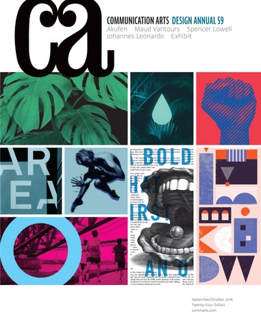
COMMUNICATION ARTS DESIGN ANNUAL 59
Akufen Maud Vantours Spencer Lowell Johannes Leonardo Exhibit
September/October 2018 Twenty-Four Dollars commarts.com
SEPTEMBER/OCTOBER 2018
VOLUME 60, NUMBER 4
COMMUNICATION ARTS ��
��
��
COVER
Source images (clockwise from top left): poster series for Teatro Nacional Cervantes, p. 76; packaging for LAST 9, p. 71; handbook for the American Civil Liberties Union, p. 153; integrated branding for the 2018 installment of Kansas City Design Week, p. 130; poster series for the Lyric Opera of Chicago, p. 78; integrated branding for Je cours QC, p. 118; integrated branding for AREA Real Estate Advisors, p. 115; poster series for the Joffrey Ballet, p. 83.
��
FEATURES
DESIGN ANNUAL
22 Maud Vantours
62 75 84 87 88 90 92 94 95 96 132 137 139 145 148 151 153 159
by Yolanda Zappaterra This Parisian artist gives paper the hautecouture treatment, transforming a familiar material into striking masterpieces.
30 Akufen
by Chris Daniels The self-described punks at this Montréal studio are breaking the mold of bland web design.
38 Spencer Lowell
by Anne Telford In illuminating the art of science, a Los Angeles– based photographer gives us glimpses at what lies ahead.
46 Johannes Leonardo
by Ellen Shapiro A New York ad agency orchestrates campaigns that help brands be seen, heard and known.
54 Exhibit
The latest and best in visual communication from here and abroad.
Packaging Posters Annual Reports Institutional Brochures Letterheads Catalogs; Product/Service Brochures Miscellaneous Company Literature Trademarks Identity Programs Integrated Branding Programs Environmental Graphics Editorial Books Motion Graphics Public Service Miscellaneous Self-Promotion Student Work
FRESH Editor/Designer Patrick Coyne Executive Editor Jean A. Coyne Managing Editor Esther Oh
172
Ramona Ring With inspiration gleaned from her travels, an illustrator conjures up dreamy scenes awash in soft colors.
174
Jean-François Seguin This Toronto-based photographer grounds innovative concepts in a methodical workflow.
Associate Editor Michelle Yee
176
Everyday Practice In South Korea, three designers have pooled their strengths to create a versatile studio.
Editor At Large Anne Telford Art Director/Designer Joni Rivas Production Director Lauren Coyne Design/Production Associate Isabel Bagsik
COLUMNS 12
Design Culture Wendy Richmond pays homage to an essential space that belongs to us all—the library.
178
Education Scott Kirkwood discovers why mentoring is a win-win for both mentor and mentee.
14
Advertising Creative constraints are inevitable. As Ernie Schenck writes, that’s precisely why we must find freedom in them.
182
Typography Dan Reynolds reveals the wealth of opportunities that blackletter provides typographers and designers.
16
Design Issues Carly Ayres engages five designers in a round-table-style discussion about design ethics.
188
Insights In a Q&A, design anthropologist Dr. Dori Tunstall explains how she’s decolonizing design education.
Software Engineers Jiping Hu Srividhya Gopalakrishnan Technology Administrator Michael Hoyt Advertising/Circulation Director Dirk Moeller Accounting Lois Vega Contributing Editors Sam McMillan Wendy Richmond Ernie Schenck
Editor’s Column Contributors/Directory Favorites Book Reviews Index to Design Annual 59 Overheard
Volume 60, Number 4 commarts.com COMMUNICATION arts (ISSN 0010-3519) is published six times a year (January/February, March/April, May/June, July/August, September/October, November/ December) by Coyne & Blanchard, Inc., 110 Constitution Drive, Menlo Park, CA 94025-1107. Periodicals Postage Paid at Menlo Park, CA, and at additional mailing offices.
Competition Coordinator/ Administrative Assistant Rachel Whitaker Archivist Nancy Clark Lewis
DEPARTMENTS 8 10 186 190 192 196
Production Assistant/Customer Service Representative Khader Yanni
Copyright 2018 by Coyne & Blanchard, Inc. All pieces reproduced in this issue are under prior copyright by the creators or by the contractual arrangements with their clients. Nothing shown may be reproduced in any form without obtaining the permission of the creators and any other person or company who may have copyright ownership. SUBScRIBER SERVICES: Subscription: 1 year, $53; in Canada, $70; all other countries, $110. All payments in US dollars, Canadian GST: 127848620.
Founder Richard Coyne (1926–1990)
Direct all inquiries, address changes, subscription orders, etc., to: Web: commarts.com E-mail: subscription@commarts .com Phone: 800-688-1971 (US/Canada) Phone: 215-788-5481 (International) Fax: 215-788-6887 Mail: COMMUNICATION arts PO Box 2013 Langhorne, PA 19047 Please allow six weeks for changes. EDITORIAL AND BUSINESS OFFICE: 110 Constitution Drive Menlo Park, CA 94025-1107
Phone: 650-326-6040 Fax: 650-326-1648 E-mail: ca@commarts.com POSTMASTER: Send changes of address to: Communication Arts PO Box 2013 Langhorne, PA 19047 Canada Post: Publications Mail Agreement #40612608 Canada Returns to be sent to: IMEX Global Solutions, LLC PO Box 25542 London, ON N6C 6B2
Like us on Facebook facebook.com/communicationarts Follow us on Google+ plus.google.com/+commarts Follow us on Instagram instagram.com/communicationarts Follow us on Pinterest pinterest.com/camag Follow us on Twitter twitter.com/commarts
STEVEN NOBLE ON THEISPOT.COM/SNOBLE WOODCUTS ENGRAVING SCRATCHBOARD
© Daredevil Brewing Co.
© Big Grove Brewery
© Mosh
© Natural American Foods
© The Bird Restaurant
© Parkside 23
MEADE SHOW AWARD
© Cognac Monnet
ROSEY AWARDS
LURZER’S 200 BEST ILLUSTRATORS
NATIONAL ADDY AWARD
DISCOVER AN EXCLUSIVE DISCOVER AN EXCLUSIVE COLLECTION OF STOCK COLLECTION OF STOCK PHOTOS + FOOTAGE PHOTOS + FOOTAGE
STOCKSY.COM
erutcip gnihtemos er o m
EDITOR’S COLUMN
Patrick Coyne
T
his year’s winning entries feature a substantial increase in international representation. Last year’s Design Annual included work from fourteen countries; this year, there are selections from twenty countries, including Argentina, Lithuania and Sweden. While the continuing decline in the number of winning collateral-based projects was not unexpected, we were surprised that the jury chose 20 integrated branding programs for inclusion in this year’s Annual—the most we’ve ever seen in a Design Annual.
“I was really impressed with the strength of the integrated branding programs,” juror Lindsay Mannix says. “There were some wonderful examples of brands extrapolating an identity beyond its mark and walking that line between maintaining consistency and creating genuine visual interest.” “I was surprised at the number of really solid student entries,” says juror Stéphane Monnet. “There was a lot of smart thinking and exceptional execution.” “I enjoyed the stamps art directed by Antonio Alcalá,” juror Rafael Esquer says. “I applaud the United States Postal Service for embracing new technologies. For instance, the Total Eclipse of the Sun stamp is the first US stamp to use thermochromic ink, which reacts to the heat of your touch.” “I think the winners of this year’s competition are all excellent and look great as a collection,” juror Christopher Simmons says. “While they certainly demonstrate a superior command of the craft, overall, they reflect the current state of design—which I would describe as less visually adventurous than in past years.” “The beverage category is in an exciting place,” Mannix says. “Beer, in particular, seems to be breaking out of some of its stale conventions that have held for so long. Beer cans are the new poster.” Simmons disagrees. “Just about everything we saw in that category was beautiful and seductive, but seemed to fall back on an already familiar visual language,” he says. 8
Design Annual 2018
Any dialogue about creativity inevitably includes a discussion about the pervasiveness of visual trends. “It was very interesting to see how trends affect so much of the work,” says juror Dawn Hancock. “With easy access to gobs of inspiration on every device we own, it’s hard not to be influenced.” “I did notice a fair amount of trend-driven work,” says Monnet. “The dependence on inspiration from the same sources often results in predictable, cookie-cutter work. The bright side of that is that anything original and innovative really stands out!” “A lot of the work looked like it was rehashing trends we have seen before,” Esquer says. “From the sterile Helvetica Swiss style of the ’50s to the op art aesthetics of the ’60s to the grunge look from the ’90s. Art deco seemed to be the ‘go-to’ design solution for most hospitality entries.” In addition to asking the jury about this year’s entries, I asked them for their thoughts on how the industry is evolving. “In the 25 years I’ve been working in this industry, I’ve seen a massive swing towards doing work that impacts people in positive ways,”
RAFAEL ESQUER, a native of the Sonora desert of México, was educated in México City and Los Angeles. Since 2004, Esquer has operated Alfalfa Studio in New York. His work in communication design won the National Design Award from the Cooper Hewitt, Smithsonian Design Museum in 2004, and has been shown at the Museum of Modern Art and the Museum of Arts and Design in New York. His work is also included in several other museums’ collections, including the Olympic Museum in Switzerland. In 2007, art-book publisher Taschen named Esquer among the world’s 100 most influential graphic designers working today.
DAWN HANCOCK is a troublemaker, a bleeding heart, a designer by trade and a do-gooder by choice. She started Firebelly in 1999 in Chicago, Illinois. Since then, she’s been diligent about hiring passionate people, seeking out fearless allies and taking on projects with the potential to change the world—or at least her local community. While she’s kept the design studio intentionally small, Hancock has kept on hustling to expand Firebelly’s reach and impact. Over the years, she’s founded a communitybased nonprofit, an education incubator, a ten-day design bootcamp and a curated showcase of typographic all-stars.
Photographs by Steve Castillo
Hancock says. “Most corporations are changing to adapt, and I expect this to continue and eventually be the way businesses are run.”
“More designers are becoming entrepreneurs and content creators,” says Esquer. “The field of design has great potential to influence the world in more ways than the purely visual.”
“Social media will continue to impact design,” says Mannix. “It’s definitely increasing the general public’s appreciation for and understanding of design, but also the commoditization of it. We’re all trying to stand out in a landscape that’s measured in fractions of a second, which can leave thoughtful work that requires time and depth, well… I don’t know where.”
“Human-centered design is certainly a buzzworthy phrase that even small nonprofits are beginning to ask for—even if they don’t quite know what it means,” says Hancock. “While it’s not the mainstream approach for most design firms, especially small ones, I do believe it is the future.”
“Today, design has all but lost its advocacy for being considered a cultural force; instead, its value is defined almost exclusively in commercial terms,” Simmons says. “Design has become more recursive in its influences and more accountable to measurable financial returns, and less respected for its intrinsic cultural, aesthetic and expressive value.” So, how might design increase its prestige?
LINDSAY MANNIX is cofounder and creative director of Polygraph, a Washington, DC–based firm specializing in graphic, environmental and product design for local and national brands. An industrial designer by trade, Mannix spent her early career developing products and brands in New York before starting Polygraph in 2010. She has worked with a wide range of clients, including Tumi, Unilever, the United Nations Foundation and the U.S. Green Building Council. Her work has been recognized by the Art Directors Club of New York, Communication Arts, Graphis, Print and the Type Directors Club.
“We’ll inevitably have to evolve and expand our skills, as we’ve done in the past, or risk becoming obsolete,” Monnet says. “Here’s hoping designers don’t get replaced by creative artificial intelligence.” A minimum of three out of five votes was required for a project to be awarded in this year’s competition. I would like to extend our grateful appreciation to our jurors for their conscientious efforts in selecting our 59th Design Annual. ca
STÉPHANE MONNET is the president and creative director of Monnet Design, based in Toronto, Canada. He is also the president of the Advertising & Design Club of Canada (ADCC), has guest lectured at OCAD University and sits on Humber College’s graphic design advisory committee. Monnet Design is a previous recipient of the ADCC’s coveted Design Studio of the Year award. Monnet has received numerous awards from design publications and organizations, including ADCC, AIGA, Applied Arts, Communication Arts, Graphis, HOW, the National Magazine Awards and the Type Directors Club.
CHRISTOPHER SIMMONS is a designer and principal of the San Francisco design office MINE. His clients include scientific visionaries, best-selling authors, arts institutions, multinational corporations, restaurateurs, cannabis startups and the president of the United States (but not the current one). Simmons speaks on design issues for colleges and professional associations. His work has been exhibited in museums and galleries, including the Hiroshima City Museum of Contemporary Art and the Smithsonian Institution. He is the author of four books, coaches Little League and is a Scout leader.
Communication Arts | commarts.com
9
CONTRIBUTORS/DIRECTORY Features
Toronto-based Chris Daniels (chris@chrisdaniels.ca) writes about advertising, marketing and visual communications for publications such as Applied Arts and Marketing. For this issue, he visits Akufen, a Montréal studio that’s upending the internet—one interactive experience at a time. Ellen Shapiro (visualanguage.net) is a graphic designer and writer based in Irvington, New York. Author of The Graphic Designer’s Guide to Clients (Allworth Press) and more than 200 magazine articles and posts about design, illustration, photography and visual culture around the world, she has been contributing to Communication Arts since 1991. In this issue, she profiles Johannes Leonardo, a New York ad agency that’s helping brands connect to their tribes. Yolanda Zappaterra (yolandazappaterra.wordpress.com) is a London, United Kingdom–based writer and blogger. She writes about architecture, design, fine art, photography, food and travel for a range of European publications—including Time Out and Blueprint—and has published many books on architecture, editorial design and illustration. For this issue, Zappaterra travels to Paris, France, and discovers the colorful, paper-filled world of Maud Vantours.
Columns
Carly Ayres is a writer and partner at HAWRAF (hawraf.com), a design and technology design studio that engages people in new and interesting ways. She has given voices to Fortune 500 companies and chatbots alike, and writes on design, technology, their intersection and its impacts. In the Design Issues column, she asks five designers for their thoughts on design ethics. Scott Kirkwood (scottkirkwood.work) is a freelance copywriter and creative director focused on nonprofits and “do-gooder” brands. Based in Denver, Colorado, he is a frequent contributor to AIGA and Adobe Create magazine. In this issue’s Education column, Kirkwood shows how mentoring has changed—and why it remains as important as ever. Dan Reynolds (typeoff.de) is an American type designer and design historian living in Berlin, Germany. He works at LucasFonts GmbH and is a PhD candidate at the Braunschweig University of Art. In this issue’s Typography column, Reynolds extols blackletter’s rich history and expressive forms. Wendy Richmond (wendyrichmond.com) is a visual artist, a writer and an educator. Richmond serves on BRIC’s Artists Advisory Council and the MacDowell Fellows Executive Committee. In this issue’s Design Culture column, Richmond muses on the role of the library today. Ernie Schenck (ernieschenck.myportfolio.com) is a freelance writer and creative director. Schenck is an Emmy finalist, a three-time Kelly nominee, and an award winner at Cannes, the Clios, D&AD, the FWAs and the One Show. In the Advertising column, Schenck encourages creatives to make like MacGyver.
Book Reviews
Denise Bosler (bosler.com) is an award-winning graphic designer, illustrator, author and a professor of communication design at Kutztown University of Pennsylvania. Michael Coyne (mcoyne90@gmail.com) is a freelance writer. Having previously worked for Communication Arts, he now plans on attending graduate school for a master’s degree in creative writing. Ruth Hagopian (ruth.hagopian@gmail.com) is a freelance writer and editor whose profiles of designers, photographers and artists have appeared in Create, Digital Graphics and Print magazines. She was also a publisher of Online Design magazine and a partner in Visual Strategies, a San Francisco–based design firm. 10
Design Annual 2018
Featured in this issue Akufen akufen.ca Johannes Leonardo johannesleonardo.com Spencer Lowell spencerlowell.com Maud Vantours maudvantours.com
Exhibit Carter Wong carterwongdesign.com FCB Inferno fcbinferno.com Garbett Design garbett.com.au McCann Health Brazil mccannhealth.com Not To Scale LA nottoscale.tv David Plunkert davidplunkert.com Re re.agency Solve solve-ideas.com Studio Dumbar — Part of Dept studiodumbar.com J. Walter Thompson Casablanca jwt.com/casablanca
Fresh Everyday Practice everyday-practice.com Ramona Ring ramonaring.com Jean-François Seguin jeanfrancoisseguin.com
Advertiser’s Index Adobe MAX AtEdge Creative Hotlist theispot.com Stocksy Workbook YUPO
189 C4 181 C2, 5, 11, 13, 15, 17, 21, C3 6 180 19
Call for Entries Interactive 2019
Submitting Work commarts.com/submissions
Writer’s Guidelines commarts.com/write-us No responsibility will be assumed for unsolicited editorial contributions.
183
featuring Salzman International Illustration VIEW PORTFOLIOS
IVAN CANU
JUAN BERNABEU
theispot.com/icanu
theispot.com/jbernabeu
PREMIUM STOCK
NEWS
search
FEDERICO GASTALDI
theispot.com/fgastaldi
JOEY GUIDONE
theispot.com/jguidone
DESIGN CULTURE
Wendy Richmond
Every Library is Your Library
I
love to spend time in libraries, whether I’m at home or traveling. One of my favorites is the Bass Harbor Memorial Library in northern Maine: a historic two-room brick building with comfy chairs and a cozy fireplace. Another is the Boston Public Library, whose central branch, in Copley Square, spans an entire city block. These libraries sound like opposites, but they share the qualities that I look for. They provide an atmosphere that is conducive to reading, thinking, exploring and daydreaming. They are free and open to members of any community, with educational programs for kids and adults. There’s accessible technology in a clean and safe space. The librarians are respectful of odd requests, eager to track down something obscure or out of print. Delivering all these resources is a tall order, whether a library is big or small. But that’s just the tip of the iceberg. Because it is open to all, a public library must accommodate everyone without knowing who might come through its doors. A library can’t anticipate the filters that each of us brings—filters of age, gender, race, religion, education, geography, politics and more. But it must be cognizant of these filters because the only way we can feel comfortable and accepted is if we are seen as individuals. The best example I know of a library that embraces this ambition is the Jefferson Market Library (JML), a Greenwich Village branch of the New York Public Library. The building—a Victorian Gothic gem— was originally a courthouse, completed in 1877. A new, permanent installation by artist Mark John Smith, titled The Reading Room 2017, honors the library’s 50th anniversary. During a two-year residency, Smith, commissioned by JML’s manager Frank Collerius, designed and implemented the massive installation that covers the walls of the second-floor reading room: a 360degree, three-story-high print consisting of archival material from patrons’ written correspondence dating back to the library’s opening. Fragments of patrons’ signatures and handwritten notes—from children’s scrawls to grown-ups’ cursive script—were scanned at a resolution of 64,000 ppi, showing vibrant details, like smudges and fingerprints. The giant letters run sideways up each wall, above the shelves of books. To read them, you turn your head—the same way you do when you peruse the spines of books lined up on a shelf. Smith’s design employs the upward movement of the soaring and imposing architecture, but uses the personal words to make the room warm and inviting.
12
Design Annual 2018
When you see the phrases on the wall, you immediately notice that each begins with I. “I had the guts to listen” “I’m one of the lucky” “I will not lose another book” “I see you’re holding a lecture on” “I am out of work and cannot afford to buy” Smith explains, “As a viewer, in your mind, you are the ‘I.’” In a communal space that caters to the public, the individual is illuminated. The library’s responsibility to the individual was also addressed downstairs in JML’s lobby, in a temporary installation by artist Ann Messner titled the free library and other histories. It included a 20page tabloid, available free to the public, that cites more than 100 references dating from 1833 through 2017 regarding issues such as censorship, privacy and segregation. Entries range from acts of Congress to Supreme Court rulings to resolutions adopted by the American Library Association—all pertaining to the library’s role in serving individual citizens, regardless of who they are, what they seek or where they come from. One of the entries refers to John Grimes, the main character in James Baldwin’s 1953 semiautobiographical novel Go Tell It on the Mountain. In the novel, Baldwin describes John’s encounter with the main branch of the New York Public Library: “ … a building filled with books and unimaginably vast, and which he had never yet dared to enter. He might, he knew, for he was a member of the branch in Harlem and was entitled to take books from any library in the city. But he had never gone in because the building was so big that it must be full of corridors and marble steps, in the maze of which he would be lost and never find the book he wanted. And then everyone, all the white people inside, would know that he was not used to great buildings, or to many books, and they would look at him with pity.” We could stop there, knowing that even though the library had its doors open, ready in its mission to serve anyone, it could not control the realities and perceptions that held John back. But keep reading: “He would enter on another day, when he had read all the books uptown, an achievement that would, he felt, lend him the poise to enter any building in the world.” ca © 2018 W. Richmond
premium stock illustration collections VIEW PORTFOLIOS
PREMIUM STOCK
MICHAEL AUSTIN
theispot.com/stock/maustin
JING JING TSONG
DAVE CUTLER
theispot.com/stock/cutler
KEN ORVIDAS
NEWS
search
theispot.com/stock/jjtsong
theispot.com/stock/korvidas
ADVERTISING
Ernie Schenck
The MacGyver School For Handcuffed Creatives onsider the plight of the poor creative. There you are, all full of piss and vinegar, ready to connect dots that have never been connected, eager to conjure things that have never been conjured, ideas caroming around in that magnificent mind of yours like atoms gone insane, when boom. There it is. The wall. The box. Whatever you want to call it. However you want to think of it. The reality of creativity is far from the freewheeling thing we’d like it to be. Very far. The cold reality is that every great idea that ever was, is or ever will be is the result of the human imagination being forced to work around limitations.
MacGyver would have wasted a nanosecond griping about his reality. I don’t think you would have heard him commiserating in the break room about how great a business advertising would be if it weren’t for those damn clients. I don’t think he would have cried in his beer or thrown in his towel or whatever it is that most of us do when we feel like we’re in a very tight pair of creative handcuffs. Instead, here’s what would have happened: MacGyver would have seen those handcuffs as opportunities. He would have found a way to use each and every one of those constraints as a doorway to something amazing. Just like he found a way to defuse a thermonuclear bomb with a paper clip, he would have found a way to defuse the whole client/focus group/evil-destroyerof-dreams minefield with the advertising equivalent of a stick of chewing gum.
The cold reality is that every great idea that ever was, is or ever will be is the result of the human imagination being forced to work around limitations. You might have heard of a TV show called MacGyver. MacGyver was a kind of troubleshooter who worked for a sketchy organization called the Phoenix Foundation. Every week, MacGyver would find himself in some kind of impossible situation. Trapped at the bottom of an old mine shaft. A nuclear bomb counting down. Something. What’s cool is that MacGyver always came up with some kind of creative solution to escape whatever mess he was in using nothing but whatever odds and ends he could scrape together. A beer can, a paper clip and a wad of gum. A pocketknife, a shoelace and a cereal box. It didn’t matter how big the obstacle was. MacGyver found a creative way around it by playing the hand he was dealt. Let’s pretend MacGyver had been about a guy who works in the creative department of an advertising agency. Like any creative, MacGyver is pummeled by a hailstorm of constraints every day. Do this but not that. Don’t use humor. Do something with a celebrity. Don’t shoot in black and white. Don’t do that saturated color thing. Keep the logo on screen the whole 30 seconds. The copy is too short. The copy is too long. Here’s what I don’t think would have happened: I don’t think 14
Design Annual 2018
Steve Simpson and Tracy Wong know all about creative constraints. Way back in the predawn of civilization, there was a casual dining brand called Chevys. Its big thing was that it made its food fresh every day. Its other big thing was that it had a budget the size of a jalapeño. For a lot of us, even today, this would have been Mission Impossible on steroids. Simpson and Wong didn’t see it that way. Instead, they grabbed a video camera, got up every day at the crack of dawn and went out into the streets of San Francisco, where they would ask real people if they were aware that Chevys made its food fresh every day. After getting some surprisingly funny answers, they would rush back to the office and edit the film so the finished spots could air that same night on TV. Brilliant. Now it’s your turn. Pick a game. Any game. Let’s say it’s chess. Go ahead and play just like you normally would. Then try this: Take away your two knights, and play again. You’ll probably get killed at first. But try it a few times, and you start to think around the missing knights. Great. Now try taking away your bishops. Harder, right? But not impossible by any means once you retrain your mind to accept your limitations. You have two choices as a creative. You can spend your career mired down in what could have been if only… or you can roll with reality and channel your inner MacGyver. What’s it going to be? ca
discover the world’s best illustrators VIEW PORTFOLIOS
PATRICK WELSH
JIM SPIECE
theispot.com/pwelsh
theispot.com/stock/jspiece
PREMIUM STOCK
NEWS
search
STEVEN SALERNO
theispot.com/ssalerno
COCO MASUDA
theispot.com/masuda
DESIGN ISSUES
Carly Ayres
Move Slow and Fix Things
F
or years, designers have been fighting to get a seat at the table. Now, with the advent of chief creative officers, vice presidents of design and heads of experience, it would seem as if we’ve made it. Congratulations, everyone. We did it. Yet, as we’ve watched designers go toe to toe with engineers in demanding the same salary packages and sway over product roadmaps, we’ve also watched the leader of Facebook testify before Congress for subverting data privacy laws. We’ve seen communities protesting Airbnb for fueling housing shortages and increased property prices. And we’ve read about the inventor of the popup apologizing for one of the internet’s earliest sins. The very companies that have championed design, it would seem, have negatively disrupted their users’ lives in their quest to disrupt the market. In the age of design-led companies, how complicit are designers in the actions of the companies that they work for? What questions should today’s designers be asking themselves? To explore this complex topic, I turned to designers working for various organizations—design firms, a health service app, a product investment company and an e-commerce platform—for their thoughts on design ethics. Mike, it seems appropriate to begin this conversation with a quote from your essay “A Designer’s Code of Ethics,” where you write, “Every human being on this planet is obligated to do our best to leave this planet in better shape than we found it. Designers don’t get to opt out.”
MIKE MONTEIRO, design director and co-owner, Mule Design Studio (San Francisco, CA) If we take a look at what designers are doing and map it to any other profession, ethically, we fail. If a doctor is wrongfully prescribing medication, they lose their license to practice. Any designer who touched Greyball [the software tool used by ride-hailing service Uber to deceive and evade authorities] should have lost their license to design, same as any designer on Twitter’s Trust & Safety team who hasn’t dealt with the platform’s harassment issue. These designers are facing real, dangerous problems, and they’re not solving them. 16
Design Annual 2018
So, what is the responsibility of a designer?
CAT NOONE, chief executive officer, Iris Health, Inc. (Princeton, NJ) We can’t say that all designers should be held responsible for everything—but the designers working directly on stuff? Hell yeah. We’re human and we make mistakes, but, at the end of the day, we have a responsibility to be hyperaware of who we are designing for and the implications that come with that.
RAVI VASAVAN, senior designer, Koto (London, United Kingdom) Even as a deaf designer myself, I forget things. I work within the standards of our industry. I follow patterns and habits. I’m fortunate that I have the awareness of my own experience, which helps, but not always. If your job is to focus on accessibility, yes, you’re accountable to that problem. But designers in general? They can’t think of everything. Other stakeholders share that responsibility. In action, what does enacting agency within these companies look like? Monteiro: So, let’s say I work at Acme Mega Corp, and my boss wants me to use a dark pattern that tricks users into giving us their email. As a designer, I need to look at the end goal and evaluate whether that’s an ethically responsible thing to do. Our job is to represent the people who aren’t in the room. So, I say, “No, I’m not going to implement this.” No designer will implement this. That’s where we as an industry need to be.
BO REN, founder, product consultant and investor, The Product Fund
(New York, NY)
Most companies want to do the right thing but feel pressure from investors to focus on what’s shiny. My role as a product manager is to help companies think about how today’s decisions will achieve a goal ten years from now.
discover the world’s best illustrators VIEW PORTFOLIOS
PREMIUM STOCK
NEWS
search
DANIEL PELAVIN
theispot.com/dpelavin
MATT MANLEY
theispot.com/mmanley
BEN PERINI
theispot.com/bperini
JON VALK
theispot.com/jvalk
DESIGN ISSUES How can we make the case for putting users before profits?
CATT SMALL, product designer, Etsy (New York, NY) I think a lot about which metrics we monitor to determine a product’s success, and how sentiment factors into that. Tools like © Gianna Rovelli the Net Promoter Score quantitatively measure sentiment. If sentiment is declining over time, that’s a sign that people won’t always tolerate something, even if it’s profitable now. Ren: We’ve reached a point where we only have one measuring stick for what success looks like. I worry that if we myopically focus on growth, we will build products that aren’t good for humanity in the long run. If you’re optimizing for people to spend more time with your product, you’re not thinking about whether that time spent is good for them. It’s something I struggle with when advising startups that don’t want to growth hack, but feel like there is no alternative that would prove their success to investors. What questions should designers be asking themselves? Small: Does this need to be made? Why am I making it? Is the point of it just to create another source of ad revenue, or is it to actually improve people’s lives? What could go wrong? What are the things that we need to study more and research? Noone: Am I doing everything I can to actually improve my craft? Did I focus on the foundation of the house before trying to hang pictures on the wall? Is this something I shipped for the sake of saying that I shipped something? The world doesn’t need wrong answers in record time. Vasavan: It’s a mixture of design and engineering. It’s easy to ship something, but how will it evolve to meet future needs? Who will update it as information changes? There are designs that work for the deaf, as if by accident. Train stations have text marquees reading out changes—because train stations are noisy places. Accessibility is currently not about what I can read or what others see. It’s wheelchair ramps and elevators. We have a long way to go when it comes to serving people with differing auditory and visual abilities. Do you see designers as complicit in the conduct of the companies they operate within? Monteiro: Very, very complicit. All the stuff that Facebook does, all the stuff that Twitter does has to go through a designer at some point. About half of the designers I’ve talked to argue that they’re just a pair of hands doing what they were told to do. With that kind of attitude, I’m not surprised that we’re where we are today. Small: Designers are one of the few people who can be held accountable. They’re not the ones setting business goals, but they have the ability to push back and choose not to participate. They can ask questions that inspire leadership to go in another direction. 18
Design Annual 2018
It’s a situation where if everyone just does their job and doesn’t ask why, we end up in terrible situations. Noone: A design team isn’t just a team full of designers. Everyone plays a role in seeing that something serves its purpose without causing harm. Grindr [shared] users’ HIV status [information] to [two third-party software vendors]. That wasn’t a designer’s fault. That was sheer negligence and incompetence. That was leadership allowing data that should’ve been protected to be tied to basic information that was then [shared]. The question is whether those mistakes were intentional. If the designer did see it, as we often do, and willingly pushed it forward—you bet they’re complicit. So, should design be a licensed profession? Monteiro: Recently, I started talking about how maybe we need to be licensed as a craft. The work we do can have serious repercussions, so perhaps we should be trained in how to do it. You would never go to an unlicensed doctor or dentist. Small: I don’t know if the right thing is to license people. Design education needs to do better at providing designers with ethical standpoints. We’re taught that we’re changing the world—not about how things have gone wrong. We need to make sure that we are having these conversations as often as possible and learning to be comfortable with being uncomfortable. Ren: Until we all can agree as an industry and as a community of builders what good and ethical looks like, I don’t think you can create a licensing system and revoke that when someone violates it. Like Catt said, I think that education is key. People have to start thinking about emotional, cognitive and ethical intelligence as tangible, valued skills. What do you hope for the future? Vasavan: I’m optimistic. In the last few years, more and more products have subtitles. YouTube’s autogenerated captions are slowly improving. I remember when they were awful. Now, only one word in every ten is wrong. I was in Sydney recently and almost every street post had a sign with the street name in Braille. I hope accessible visual systems can move forward at the same rate. Small: Technology creators tend to have a rosy-eyed view of the world, assuming people will only use their platforms for delight. But, as Sara Wachter-Boettcher frequently talks about, people love to find terrible things to do with wonderful platforms. The more you can prepare for that, the better off the platform is going to be. More policies should be vetted by marginalized people. Black children are not a protected class on Facebook, but White men are. How can these [policies] harm people? Who are they protecting? It’s clear that we’ve gotten to where we are by not asking those questions enough. Ren: I hope that we as an industry can shift our focus to hard problems with hard timelines. I see so many smart people working on purportedly sexy products, while there are some very basic building blocks of humanity that need attention. I want to see the next generation tackling problems that feel broken and impossible because they’re equipped to do so. ca
MAUD VANTOURS BY YOLANDA ZAPPATERRA
Every surface is covered with eye-popping textures, patterns and forms. There are meticulous 2-D cutouts. Huge pieces comprised of tiny overlapping triangles in every conceivable color. Contoured spiral collages that look like explosions of rainbows. Five-foot-high totem poles whose ribbons of bright multicolored layers call to mind giant Chinese lanterns. And a pink, purple and turquoise abstract piece featuring hundreds of different-sized hexagonal layers built up to look like a door grille. Almost all these pieces are exclusively the work of a craftswoman who went to art school because she liked to draw from an early age. “I was really good at it, and my goal was to find a job where I could do it all day long,” Vantours says. She recalls how skilled her mother was with fabric and patchwork quilting, and her father building her a little wooden cabin in their family home. “While not artists, they were definitely makers, and creative, which I think is what pushed me into the art world,” she says. Once she got to the Duperré School of Applied Arts in Paris, via textile design and with the help of a teaching ethos rooted less in technical knowledge and more “in
helping us find our strengths and encouraging us to find our own ways of expressing ourselves,” Vantours soon began working with paper. “Why paper? Actually, I have no idea! I think it was unconscious—from the very start at college, it just felt natural to me to use paper,” she says. “Transforming it into something extraordinary by adding volume, patterns and light to it is something I love. And, of course, its versatility, qualities, colors, weights and accessibility allow for endless possibilities.” She began by making wallpaper—“not just printing, but using cutting and other techniques; experimenting and playing so that I knew the strengths and possibilities of the materials, and how to use them,” she says. These early projects received great feedback from not only her college tutors, but also brands. In January 2010, at the prestigious trade fair MAISON&OBJET, her work proved so popular that she won the young artist award and found her first client, Musée de La Poste, making the leap from wallpaper to paper art. Projects for Cartier and Lancôme soon followed. To date, less than ten years after graduating from college, Vantours has worked with adidas, Lancôme, Christian Louboutin and TAG Heuer; the fashion houses Giorgio Armani, Issey Miyake and Yves Saint Laurent; and the major French cultural institutions Cité de l’Architecture & du Patrimoine and Cité des Sciences et de l’Industrie. By painstakingly shaping, cutting, layering and folding exquisite 3-D creations, she has provided the basis for ad campaigns, store displays, packaging, T-shirt designs and more. Standouts include her poppies for Kenzo’s Flowers by Kenzo perfume. A sumptuous Christmas feast laid out for Moët
Right: “Triangles is a personal artwork. I folded loads of differently colored pieces of paper to create a giant gradient. This artwork was more about technique—how to use hundreds of folded pieces of paper and connect them together with color. The goal of this artwork was to create a giant color gradient. Colors guide me; I never know what will be the result.” 22
Design Annual 2018
© Maud Vantours
E
lla Fitzgerald may have loved it, but on this early spring day in the 20th arrondissement, the leaden gray sky throws down sheets of rain that strip the workaday area of all color and light, making Paris distinctly unloveable. Fortunately for me, I’m outside the studio of award-winning French illustrator, designer and art director Maud Vantours. Stepping into her large workspace is like going from Dorothy’s monochrome Kansas to Technicolor Oz, with a smattering of psychedelic landscapes reminiscent of 1960s album covers thrown in.
MAUD VANTOURS
© Rebecka Oftedal
Hennessy at the brand’s store in Paris’s Charles de Gaulle airport. A flower display for jeweller Chaumet in London (to tie in with the Chelsea Flower Show), for which Vantours created hydrangeas made up of hundreds of thousands of petals. And an ethereal interior design project for perfumier Guerlain, which saw the Champs Elysées store invaded by a flowing “poetic aerial plant.” For all her projects, the idea, which Vantours describes as “the world I want to develop,” begins with a small pencil sketch or a digital layout. Sections or patterns are numbered, and the layer heights are determined. After that comes color: “This is where I decide whether the piece will be monochrome, gradient or multicolored. It can take me hours or even days to find the perfect color palette,” she says. With colors finalized and the elements printed out, the cutting begins, followed by the insertion of tiny foam layers to build up the piece. Her 3-D geometric personal projects are inspired by sources as wide-ranging as Incan patterns, Miami architecture and European roof tiles. Other influences and inspirations include the Bauhaus school, African prints, Russian patterns and the work of Frida Kahlo (“for her colors”) and Belgian illustrator, painter and printmaker Pierre-Joseph Redouté (“for his botanical illustrations”). For Gap’s REMIX Project 2015, for which she designed one of eleven limited edition artists’ T-shirts, she revealed (in a book Gap published to coincide with the project) that she “reimagined the brand logotype within a multicolored and multilayered paper sculpture design that mimics the patterns of waves, mountains and wind-blown clouds.” But she seeks
and finds inspiration everywhere. On a trip to Cuba, “the peeling, overlapping layers of paint on Havana’s colorful colonial buildings led to my researching areas like accumulation and superimposition, which in turn led to my fascination with building layer upon layer until a flat structure becomes a 3-D design,” she says. Is turning something flat into something three-dimensional a little piece of magic that resonates with all of us? “Definitely,” says Vantours. “I think my projects give people surprises—a different way of reading something. It changes their perspective. They think they know what it is; but then, when they come closer or read it more carefully, they see it’s not what they thought it was at all. This was very true with the Moët Hennessy feast and in particular its lobster, which people believed was real until they came closer.” “We’re bombarded with so many images every day that it’s easy to just not notice them or forget them as soon as you’ve seen them, but things like the Moët feast stay with you because they make you look twice. I think projects like that delight people. And I really like it when that happens and when people ask me lots of questions about the work. Because the material is something that’s so familiar to everyone, we all have experiences and memories related to it—some people might tell me they remember doing origami or collage, and that they might take it up again. It’s such fun to have that kind of dialogue with people and talk about those shared experiences.” Having honed her skills with paper the hard way—by cutting out thousands upon thousands of pieces of paper to different sizes and depths in order to create her trompe l’œil 2-D patterns, or spending days figuring out how to create the patterns that would turn a flat lobster into a 3-D one— Vantours is now turning more and more to mechanization. “All my sculptural pieces used to be handmade, but in the last few months, I’ve been using a machine more, simply because it’s more efficient. I know some people will say, ‘That isn’t handmade,’ or, ‘It’s not an artist’s work anymore,’ but I’m not sure I agree with that. One piece produced using the machine will deliver exactly the same end result as a hand-cut piece,” says Vantours. While I’m reminded of the late great
Right: Hicavelinca. “To promote four new colors of Curious Skin paper for paper manufacturer Arjowiggins Creative Papers, I developed a giant mask, which was exhibited at the creative packaging trade show Luxe Pack Monaco in 2012.” Maud Vantours, art director; Arjowiggins, client. “Landscape is a personal artwork mixing graphic design, colors and three dimensions. It’s like a landscape—a horizon, with mountains and clouds within the shape of the positive piece of paper and its negative. Like all my personal artworks, it’s more about technique. I do research, and when I find something interesting, I add colors and see what happens.” “Spirales is a personal artwork developed with a particular technique—I used thousands of paper pieces in a circular way.”
24
Design Annual 2018
Communication Arts | commarts.com
25
© Maud Vantours
© Maud Vantours
© Jonathan Icher
26
Design Annual 2018
© Maud Vantours
© Maud Vantours
MAUD VANTOURS Dick Bruna, who used to draw his outlines for children’s character Miffy by hand using a brush and ink because he believed this was the only way to achieve what he called “lines with a ‘heartbeat,’” I feel that such a sweet sentiment doesn’t apply in Vantours’s case. The heart of her work doesn’t lie in the act of cutting paper by hand, but rather in the desire to create something magical. And aside from the cutting, there is still a lot of handiwork to be done, like ensuring that all the colors are right. This a task that Vantours particularly relishes because, as she explained in the Gap REMIX book, “you can change the entire tone of a color combination just by switching or adding a single element, so it’s like a game you play or a story you tell. The only color I don’t use is black. I prefer to use colors that are more emotional than black. Sometimes there may be some ‘fake black,’ like dark blue or dark green, but never pure black.” For Vantours, it’s in such areas that the work really comes alive—as well as in the ongoing development of paper as a material. “Because paper is such a trendy material now, manufacturers are keen to develop more colors and weights. They know that what designers can produce with it is the difference between fleeting images we see all day long and quickly forget, and something we can hold in our hands and want to keep. The graphic design on a great paper invitation might be the same as a virtual invitation, but it’s the physical reality and touchability that makes it so special.” That, and the ability of artists like Vantours to apply so much passion, love and joie de vivre to creating something special. When I leave her studio, the sun has come out, and the 20th arrondissement looks like a different world. A multicolored, multilayered Maud Vantours world. ca
Left: “For the launch of the new ZX Flux shoe, I developed a design that I divided onto different layers of paper. I hand cut every layer independently and then assembled them. Because the ZX Flux shoe is customizable—you can print any available graphics you want on the shoes with an app—I showed lots of different traditional patterns, like pied de poule (houndstooth), and combined them to create a composition. The picture of this artwork was used in magazine advertising by adidas.” Maud Vantours, designer; Aimko, ad agency; adidas, client. This page: “The idea for this project was to take pictures of products, print them and then work on the prints in 3-D. Each 3-D work was guided by the DNA of the fashion brand. For example, I used weaving for Bottega Veneta and squares to symbolize the Chanel quilting.” Charles Helleu, photographer; Maud Vantours, set designer; SKP Magazine, client.
Communication Arts | commarts.com
27
MAUD VANTOURS This page: “The theme for this photographic series was ‘Blooming Odyssey.’ I developed contemporary and poetic landscapes with geometric shapes and roses.” Maud Vantours, set designer; SKP Magazine, client. Right: Paris. “For my personal series Paper Cities, I included six cities: Bombay, Moscow, New York City, Paris, Tokyo and Timbuktu. For each, I worked on a typographic artwork inspired by the city, which I developed into layers to create an animated GIF.”
© Kanji Ishii
© Kanji Ishii
Personal work. “Flora is a paper artwork developed as contemporary botanical research.”
28
Design Annual 2018
© Maud Vantours © Maud Vantours
Communication Arts | commarts.com
29
about the project that stopped everywhere from Germany to Tokyo, where it organized a Dada-Data hackathon. Dada-Data also includes an online “antimuseum;” an extension called Dada Block that replaces internet ads with Dada slogans; and a series of interactive exercises. One of the exercises has only become timelier in recent months; it urges people to “break free from” GAFA, aka the giants of the internet. “Because Google dominates knowledge, Amazon controls merchandise, Facebook keeps tabs, and Apple takes all,” reads the Dada-Data website, where visitors can link their mobile device to a marionette on the screen. (Dada artists also dabbled in experimental theater.)
BY CHRIS DANIELS
N
o project in its eclectic portfolio represents the self-described “punks of the internet” at Akufen better than Dada-Data, a digital documentary launched in 2016 around the 100th anniversary of the art movement known as Dada.
Dada arose after World War I as an artistic assault against the national politics and conventional thinking that the disillusioned artists of the movement blamed in part for the war. In a display of aesthetic anarchy, they rearranged images and texts from newspapers, magazines and advertisements to create collages and photomontages. The visual barrage critiqued modern industrialization, including the rise of new technologies even as the artists benefited from advances in photography. Québec filmmakers and writers Anita Hugi and David Dufresne wanted to create the first documentary in 50 years to celebrate the movement and tapped Montréalbased Akufen for the multilingual, video-free project. Akufen creative director and partner Bruno Choinière says, “We asked ourselves, ‘If those artists were living today, how would they use the technology available to them? And if they were speaking to our audience, what would they say?’” What the creative and web development studio answered with has won Akufen a slew of awards, including a Lovie Award, and taken the studio on a recent speaking tour
As they manipulate the marionette, users scroll through a collage of images—like a rotting apple, falling “like” icons, and quotes from the founders of the tech companies that now come off as disturbing and disingenuous. Eventually, the puppet is freed from all four strings, which represent the internet giants. “Long live the open net,” the Dada-Data site declares in victory. Choinière admits “we felt a little awkward” about taking aim at the internet goliaths, since a collage Akufen made for Dada-Data uses Instagram, which is owned by Facebook. But he notes that Akufen pushed the content through via a fake account of one of its developers, as getting Instagram to approve its API was taking too long. “In a way, we hacked into Instagram,” he says. “We haven’t sold out—we’re still punks.”
Arrested development “Grown kids” is another way the Akufen partners describe their team, even though the company was incorporated eleven years ago and has a staff of 40. Indeed, there are signs of arrested development in the studio’s 6,000-square-foot office in an old textile and toy company warehouse: Tucked in a back corner of the office are a couple of beanbag chairs and a TV tethered to retro gaming consoles (Nintendo GameCube, Nintendo 64 and Xbox). An office corner is piled with random clutter. A foosball table stands in the middle of the office. And pet dogs roam freely. This is the only working environment Choinière has known. The son of an ex–art director mom, Sylvie, and fashion photographer Pierre (who has shot campaigns for the likes of Christian Dior and Chevignon over his distinguished career), he’s always had a visual sensibility. “As a kid, I was always trying to go on shoots with my dad,” Choinière says. “Not to see beautiful women, but to see him work with beautiful women and beautiful men.”
Captions supplied by Akufen. Right: “Dada-Data is a digital documentary consisting of interactive exercises, six DADA Hacktions and a web antimuseum called the DADA-Dépôt. Dada-Data was launched on the 100th anniversary of the Dada movement. Complete with modern narration, collage and hypertext style—as well as connected to Twitter and Instagram—Dada-Data is a live tribute. It is viral, vibrant and self-destructive, full of obstacles and ridicule, and yet fully anchored in our century just as Dada was when in a war against its own time.” Anita Hugi/David Dufresne, clients.
30
Design Annual 2018
Communication Arts | commarts.com
31
AKUFEN would track the “loading” progress to 100 percent—but it would never get there, dropping back to 0 percent following the sound of a urinal flushing. Viewers had to search around to find the navigation menu.
© Akufen
Soon, the industry in Montréal was buzzing about Akufen.
While at his CEGEP—an acronym for Collège d’enseignement général et professionnel, Québec’s post-secondary college system—he caught the attention of Guillaume Braun during a portfolio night for design students in 2007. Braun had been an interactive designer at Montréal-based ad agency Sid Lee, which counted Cirque du Soleil among its clients. Braun hadn’t been looking to start an agency. But he needed a structure to help handle all the freelance work he was getting and “to do what I loved without having to report to anyone else.” Choinière was the first hire Braun made and Akufen’s first employee. “Bruno wasn’t a star; his portfolio was OK, but not crazy. He had an eye for interactivity, and that is what caught my attention,” recalls Braun. “Rare was the designer at the time with digital-native reflexes, especially from designers straight out of school. After our first meeting, I knew we would get along pretty well, and we have been together ever since.” “He told me, ‘I am going to teach you everything that I know,’” Choinière recalls of being hired. “It was more like the start of a friendship rather than a job.” Before Akufen became a direct competitor to Montréal ad agencies, it did freelance projects for them, back when agencies saw web work as a sidebar and outsourced it. In between that and goofing around, Akufen focused its exuberance into its own website. Visitors to the first incarnation were greeted with a homepage of its then five staffers (girls and boys) side-by-side at urinals, seemingly relieving themselves simultaneously. A bar across the middle of the screen
Among those who heard the chatter was Hugues Sweeney, head of French-language interactive media production for the National Film Board (NFB) of Canada. Sweeney had been tasked with reinventing the interactive documentary. He hired Akufen to create the web-doc A Journal of Insomnia, which was released in 2013. Akufen is now working on an interactive doc for NFB called Streamers that examines game streaming culture. The studio also works with documentary filmmakers at the NFB to build online companion pieces to their films. This includes a geolocation web project for 2011’s The Hole Story that immerses the user in the mining cycle. Akufen also created an interactive graphic novel for The Wanted 18. The 2014 stop-motion animation film tells the real-life tale of the Israeli army’s pursuit of eighteen cows that were smuggled in by residents of a Palestinian town to start a small local dairy. Preposterously, the cows had been declared “a threat to the national security of the state of Israel.” Sweeney says Akufen is “an interesting mix of absolute chaos and absolute order. Their creative process can feel quite chaotic at times—the atmosphere at their office, their process in terms of always taking the least expected path. Even their sense of humor is totally absurd. But they deliver quality production on time and always put in double the effort than expected.” “Akufen is more than they think they are,” Sweeney adds. “They’ve often said that they’re content packagers rather than content people. But the interaction that people have with web design or an interactive element is part of the content. I feel like we’re getting back to the good ol’ days of ‘the medium is the message.’” The storytellers behind Dada-Data also rave about Akufen. “I am amazed and enchanted by their talent and fast pace in executing,” says Dufresne, who has since collaborated with the studio on phonestories.me, which features mobile reality-based stories that he developed. “Akufen always challenged our ideas and pushed our desire for the project even further than we imagined,” Hugi adds.
Right: “Coup de coeur francophone is a music festival showcasing Francophone artists in more than 45 cities across Canada. Akufen created the entire graphics environment for the festival, from the website to the posters to the design of the program to the festival’s social networks, branding and TV commercials. The identity highlights the festival’s main goal—to help Francophone artists shine throughout the country—while being dynamic enough to reach all target audiences.” Coup de coeur francophone, client. “Grosse Lanterne is a three-day music festival that takes place in the forest. The agency developed the festival’s identity across print and a new website. The challenge was to distinguish Grosse Lanterne from other festivals taking place during the same period while capturing the attention of the regulars. The identity also emphasizes the festival’s fun side.” Grosse Lanterne, client.
32
Design Annual 2018
Communication Arts | commarts.com
33
34
Design Annual 2018
AKUFEN Corporate work On a visit to the Akufen office, a large map of downtown London is sprawled out on a table. Replicas of English paraphernalia, including a John Lennon–signed photograph of the Beatles, are pinned to the walls. The agency is in the midst of developing a mobile-device-activated augmented reality experience for an exhibition about London for the Musée de la civilisation in Québec City. Choinière believes that Akufen’s success has to do with its highly collaborative nature. “A lot of studios think that the creatives and designers are the ones who conceptualize, and the developers are the doers. That is the biggest mistake,” he says. “When you put the minds of the developer and the creative together, that is when the magic happens. Only this way do we come up with all the possibilities for a project. Dada-Data is an example of something that everyone in the studio helped conceptualize.” Not every Akufen client is a cultural institution or an arts figure. Corporate clients have included hockey equipment manufacturer CCM and Raymond Chabot Grant Thornton (RCGT), the largest independent accounting firm in Québec. For the latter, the shop redesigned the firm’s website, creating intuitive navigational pathways based on whether the visitor is a small business owner or the vice president of a big company. “A lot of people wouldn’t think we’d be behind the RCGT site; but for us, it presented the same exercise as some
Left: “POSSIBLES is a project that creates exchanges on modern issues. Twelve major themes related to sustainable development were identified, and, over the course of a year, artists and collectives in Montréal were invited to share their interpretations of these themes in their own way— theater, visual arts, performance art, film—with the support of a creative partner. The online platform is an interactive retrospective of those artworks. Our goal was to encourage discovery through an exploratory navigation with the lines.” LA SERRE — arts vivants, client. “Curious Critters gathers young adventurers from all around the world on a mission to help scientists discover new, mysterious creatures. The user embarks on a journey on a 3-D planet to meet all the creatures found to date. The project revolves around three apps, a website and an interactive book. The decision to use transmedia storytelling [telling a single story across multiple platforms and formats] was linked to its engagingness and multidimensionality. Across the project’s various forms, children have multiple points of entry and multiple levels of storytelling, which helps them acquire knowledge about the creatures and their habitats.” La boîte à pitons, client. This page: “Akufen created an interactive graphic novel based on the animated documentary film The Wanted 18, a story of eighteen cows that reflects one of the strangest chapters in the history of the IsraeliPalestinian conflict. The mobile app offers a collection of content and games.” Intuitive Pictures, client.
Communication Arts | commarts.com
35
AKUFEN of the really creative things we do,” says Akufen’s new business lead and partner Eric Hamelin, who joined the company in 2008 from Cirque du Soleil, where he was in charge of licensing. “It is about how we can showcase a product and service in the most innovative way on a site. And what we often do is take what we’ve developed on really creative projects and apply it to our more corporate work.” So don’t expect the team at Akufen to try and “grow up” anytime soon. They like exactly who they are and the unique position they’ve carved for themselves in the marketplace. “It’s a funny place,” says Choinière. “We’re one of the biggest web studios in Montréal, but one of the smallest ad agencies pitching against those bigger firms for projects. It works for us.” ca
This page: “In Space Advisor, the interactive experience for the documentary film Beyond Earth: The Beginning of NewSpace, the user can explore space in an immersive 3-D experience. Before doing so, users have to qualify to get their space passport by passing challenges that test their knowledge and dexterity.” Intuitive Pictures, client. Right: “Beer brand Boréale was stuck between the growth of craft beers and the dominance of major breweries. To increase the notoriety of Boréale’s rich history and deep values, a communication strategy using solely digital content was elaborated. It took many shapes: minidocumentaries featuring Québécois enthusiasts and entrepreneurs with similar values as Boréale, photo essays with emerging artists to demonstrate the brand’s involvement in Québécois culture, and so much more. All this was brought together on a dedicated section of the site named The Boréale Culture.” Les Brasseurs du Nord, client. “Gentriville is an interactive experience made for the documentary Quartiers sous tension (Neighborhoods tension). The user experience of Gentriville, based on the concept of books in which you are the hero, is built as the user makes choices. The user’s movements are shown on a map of seven neighborhoods representing different sides of gentrification. The discovery of the neighborhood map is based on each of the user’s interactions with a questionnaire component; the combination of answers is unique, so it can be repeated as often as desired. While exploring, the user changes not only neighborhoods, but also the state of mind. Each neighborhood reports results from other users’ visits to the website, which enables comparison of the differences in the public’s perception of gentrification. This realizes a kind of live survey that reframes the user’s perception of the topic.” Emmanuelle Walter/Marie Sterlin, writers; InformAction/RadioCanada, clients.
36
Design Annual 2018
Communication Arts | commarts.com
37
“NOT ALL THOSE WHO WANDER ARE LOST.” —J. R. R. TOLKIEN
BY ANNE TELFORD
T
he fascinating intersection between science and art is explored in colorful depth in Spencer Lowell’s photographs. These two realms are key to his work. If you want conclusive proof, look no further than his knuckles: spelled out across his right hand are the letters CMYK, and on the left, E = mc2. Tattooed amino acids extend up one forearm, and the other is a dense canvas of delicate white constellations on top of solid black ink. He is a man who wears his passions on his sleeve, and whose aesthetic vision emerges out of symmetrical, clean images of complex subjects. Lowell’s work has appeared in the pages of Fortune, the New York Times Magazine, Politico, Popular Science, TIME and WIRED. Our initial interview date was pushed back because he received a last-minute assignment from the New York Times Magazine to fly to Kaua‘i and hike through an unmarked rainforest in pursuit of a critically endangered bird called an ‘Akikiki. When we finally meet, it’s in his temporary small office space in the Echo Park neighborhood of Los Angeles, down the block from Shepard Fairey’s studio and a thriving coffeehouse. The walls are covered with rows of vivid color prints as he is currently editing down his prodigious body of work into a curated book. He lives nearby with his wife and two young sons, where he is converting the garage into a home studio. Born and raised in Los Angeles, Lowell has developed his career over the last decade, from a somewhat unfocused start. He got his first job at age twelve, when his father put him to work at his home security business. By sixteen, he had cycled through retail, corporate and food jobs, and knew he didn’t want to work within any of those industries.
“As far back as I can remember, I was always taking things apart. I wanted to understand how things worked from the inside out. I didn’t know it as it was happening, but in retrospect, that is what a lot of my work is about,” says Lowell. “When I was a kid, it was a telephone or a TV remote or the VCR. Unfortunately for my parents, I would rarely put anything back together. Luckily, you don’t have to put things back together to understand how they work. “I grew up in the ’80s, so the Space Shuttle program was very prevalent in my upbringing. I even went to a bootleg space camp called AstroCamp—not the one at Kennedy Space Center that I wanted to go to,” he says. Despite his fascination with science, it never occurred to Lowell to pursue it through academics. His career trajectory began with a teen job in a one-hour photo lab. Working in the lab whet his appetite to learn more about what proved to be a perfect fit for a science-minded kid—photography. After a year at the photo lab, he moved up to Studio City Camera Exchange. “It was a magical place; I still have dreams about being there,” he says. “[It was] started by a Swiss immigrant. Everyone who worked there was passionate about photography. I got the job in order to get more money; but there, I was exposed to actual photography. That’s where I got the bug for it. I didn’t know it at the time, but that void that lies between science and art kind of fits photography perfectly because it’s a creative and a technical process. Once that happened, when I was seventeen, it was obvious that photography was what I was supposed to be doing.” At the same time, his sister was modeling a lot, and Lowell started getting assignments to photograph models on the
Right: Personal project. “When I heard that the space shuttle Endeavour would be moved through the streets of Los Angeles to the California Science Center, I knew I wanted to shoot it from above. I researched the route the shuttle would take, and when the day came, I chartered a helicopter, which had its doors off as it banked so I could shoot straight down. I wanted to draw attention to the irony of a spaceship that won’t ever go back to space.” 38
Design Annual 2018
SPENCER LOWELL weekends. Then he got hired at the A&I film lab in Hollywood, during a time when everyone was still shooting film; he worked his way up at that company, becoming the manager of its Santa Monica lab at age 21. © Kathy Ryan
Although his early lab jobs sparked his interest in photography, he learned to refine and hone his vision at Pasadena’s ArtCenter College of Design, where printer Anthony Zepeda urged him to photograph the things he liked. That inspired him to do something with the universe. He downloaded images of nebulae from the Hubble Space Telescope and made platinum/palladium prints. He equated the creation of art with the creation of matter and printed them as negatives. ArtCenter alumnus Dan Goods, the “visual strategist” for NASA’s Jet Propulsion Laboratory (JPL), fortuitously attended Lowell’s graduate show. In addition to his own photographs, Lowell included the platinum/palladium nebula prints, which resonated with Goods. They had a great conversation about art and science, and Lowell was invited to a tour of JPL. Not long after that, he was offered a job. “I spent my first few months out of college photographing labs, hardware and scientists up at JPL,” he explains. While working there, he also began to photograph its buildout of the Mars rover Curiosity for a personal series, following the project all the way to its dramatic launch. Discover, TIME and WIRED picked up these images, jump-starting his freelance career. These days, the majority of Lowell’s assignments take him out of Los Angeles. “Seventy-five percent is flying to some random place with relatively obscure information about the subject and putting something together,” he says.
Ryan Mellody, creative director for the IBM brand in New York City, says, “Spencer is among our list of go-to photographers because, first, he is truly passionate about technology and how mankind impacts the world—that shows through his body of work and also bubbles up through any conversation you have with him. Second, he consistently captures a crisp and scientific view of the world at work. Technically, that’s achieved through a mastery of composition, alignment, focus depth and value structures, but there is also his subjective eye, which sees and responds to such frames.” Lowell’s work is reminiscent of the collaborative duo Bernd and Hilla Becher, German conceptual artists and photographers who frequently organized their work in grids. It is industrial in nature yet somehow poetic. “Putting things into a grid the way they did and basically sterilizing the subject matter allows the viewer to look at the imagery without thinking about the photographer, which is something I always strive to do with my own work,” he says. “I don’t want people to think about me when they’re looking at the picture; I want them to think about what’s in the picture. My job as a photographer is to lay out the subject matter as clearly and legibly as possible.” His photographic influences skew to the classical. “Mitch Epstein has always been one of my favorites; obviously also Andreas Gursky. I’ve always gravitated more toward the German photographers—Thomas Demand, Thomas Struth— because of the formal qualities of their image making,” Lowell says. “My all-time favorite photographer is Irving Penn. For me, the hardest question to answer is when people ask what kind of photographer I am. I like that it’s hard to answer. That’s something I admired about Penn and most of my favorite photographers. I strive to have an aesthetic that can be applied to many different types of subjects; it allows me to not get bored. With Penn, he could be shooting a tribe in the Amazon or a vegetable—it’s about having a vision and applying that vision.” Like Penn, Lowell’s also garnered a reputation for versatility. “Consistency and scale is necessary for a large company like ours,” says Mellody. “I can direct any of our organizations
Right: “For an article about the Port of Los Angeles and the police force that patrols it. I set out to create images that give a sense of the massive size of the port in order to illustrate how large of a job it is to patrol it. For this image, the best vantage point was from a bridge without a sidewalk, so my assistant drove very slowly across the bridge with the hazard lights on, and I shot out of the sunroof. The only interesting thing that happened was that we didn’t get arrested.” Steven Banks, design director; Amy Feitelberg, photography director; Los Angeles, client. “For an article about the first steps NASA is taking to send people to Mars. The Orion spacecraft is the first manned spacecraft NASA has built in decades. At the time, this was the only Orion capsule in existence, and I needed to shoot it for the story. The only way to get access was to agree for Lockheed Martin, which was contracted by NASA to build the capsule, to review all the images. Because I was shooting flight hardware at the Kennedy Space Center, I had no control over anything other than my camera position and the exposure. I backed up as far as I could, centering the capsule and framing it with the giant doors. I got the image. What Lockheed didn’t tell us until after the shoot was that it had to send all the images to its headquarters to review them; I had no choice but to agree. Ultimately, Lockheed kept all my raw files and only sent me medium-res jpegs, which is technically theft, but I wasn’t going to take them to court.” Thomas Payne, photography director; Popular Science, client. 40
Design Annual 2018
Communication Arts | commarts.com
41
42
Design Annual 2018
SPENCER LOWELL or agencies to him and know they’ll get a great result, whether that’s him and an assistant shooting a single portrait or a crew of 20 people shooting over a week’s time.” Lowell is always open to a challenge, like when he recently documented the ruins of Fukushima for WIRED (and was prompted to get his will and trust together). “He is the perfect photographer to send to remote, environmentally challenging locations because he is able to quickly suss up the situation and adapt to any environment, especially when it comes to nature- and science-related subjects,” says Amy Kellner, photo editor at the New York Times Magazine. “He learned scuba diving for one of our assignments even though he said he had a fear of being underwater. And then he just went ahead and did it and ended up taking amazing underwater photos. He is exceptionally versatile—he can deliver great portraits, documentary shots and still lifes with equal skill.”
Left: “In 2012, I made a short film for video channel Nowness about a ship named Tara that travels the world, studying the effects of climate change on the oceans. For every mission that Tara embarks on, artists are invited for residencies to help spread the message of the research. In 2014, I was invited to be a resident artist as Tara studied plastic pollution in the Mediterranean Sea. I lived on the ship for two weeks and didn’t have much else to do other than shoot, so I was there whenever anything was happening. So much of what we understand about the world is the result of scientific research; however, we rarely get to see the process behind that research. I took this as an opportunity to document the process.” Tara Expeditions Foundation, client. This page: “IBM was launching a new server called the IBM POWER9, and they flew me to Austin in 2017 to shoot the server and its components. Ryan Mellody, the creative director on this project, had the idea to shoot the server blown apart to showcase its featured components. Working with a local prop stylist in Austin named Adam Fortner, we built layers of glass shelves and put each component on its own layer to get the perfect perspective. Then we shot each layer, from the top to the bottom. The smaller components, such as screws and wires, were hung with string. My retoucher, Taisya Kuzmenko, masked out each layer and added shadows; but other than that, everything lined up perfectly. Seeing the final setup—all these computer parts on a precarious tower of glass—was pretty interesting. Thankfully, it didn’t collapse.” Ryan Mellody, creative director; Adam Fortner, prop stylist; Taisya Kuzmenko, retoucher; Kenneth Hartmann, project manager; IBM, client. “This image of the Mark II robot was taken in 2016 for an article about the company MegaBots, which makes giant fighting robots. I wanted to show the scale of the robot and that it’s piloted, and having [MegaBots cofounder] Matt Oehrlein climbing out of the cockpit accomplished both of those goals. We shot the robot outside, in front of a brick wall that came about halfway up the body of the robot, and then masked it out in post and dropped the shadow in. We used the sunlight as our key light and then filled the shadows with a strobe.” Anais Maroon, photography director; The Wall Street Journal, The Future of Everything, client. Communication Arts | commarts.com
43
SPENCER LOWELL “One of my favorite Spencer stories is from when we sent him to the Svalbard Global Seed Vault in a remote Arctic archipelago between Norway and the North Pole,” Kellner says. “The first night he went to shoot the vault, he was chased by a polar bear. It didn’t stop him though. He went right back the next night.” Whether he is photographing a Mars rover, the literal ends of the earth or one of the last northern white rhinoceroses, Lowell applies the same aesthetic vision, memorializing each subject for now and for the future. “When I look at my work as a whole, I almost feel like an anthropologist,” he says. “Except instead of studying past civilizations, I’m just studying our civilization.” ca
This page: “Taken in 2017 in Google’s quantum computing lab in Goleta, California, for an article about Google’s quantum computer and quantum computing in general. Quantum computing has to take place in a very cold environment, so when the computers are running, they’re in metal tubes that aren’t that interesting. We decided to shoot the computer out of the capsule; we used the hands of the technician for scale and also because working on the computers is done by hand. To show that it’s a new technology emerging from the darkness, we draped a black background behind the computer, rim lit it with two striplights and then filled the front of the computer with a softbox.” Anais Maroon, photography director; The Wall Street Journal, The Future of Everything, client. Bottom this page and top right: “Taken in Huntsville, Alabama, in 2016 for an article about United Launch Alliance, which is a joint rocket-building venture between Lockheed Martin and Boeing, and the competition with newer companies like SpaceX. My goal was to show the scale of the rockets as well as the scale of the space. I took this image of a technician and the face of a fuel tank (bottom this page) with my camera on a tripod and exposed for the ambient light while my assistant held a strobe with a gel to match the fluorescent lights. To get this image of the final assembly space (top right), I shot from a ladder in order to be eye level with the rockets so they lead you through the left and right sides of the frame.” Armin Harris, photo editor; Mia J. Diehl, photography director; Fortune, client. “This image of a modified space shuttle engine being used to produce clean energy was taken in Bakersfield, California, in 2014 for an article about the large-scale flaring of natural gas in North Dakota and clean energy solutions for flaring. The engine was housed in a small, dark room, so in order to make it look clean and inviting, I lit it with bright light to open up the space and highlight the materiality of the metal.” Lauren Winfield, photography director; Bloomberg Markets, client.
44
Design Annual 2018
Communication Arts | commarts.com
45
JOHANNES LEONARDO The agency that’s not in the business of selling stuff BY ELLEN SHAPIRO
o, they’re not Johannes Brahms and Leonardo da Vinci. They’re today’s equivalents—in the agency biz.
business, including being named number four on Ad Age’s 2018 A-List.
Founded in 2007 by two Saatchi & Saatchi alums—Jan Jacobs, born and raised in South Africa, and Leo Premutico, an Aussie expat—who were joined by Italian-born creative director Ferdinando Verderi, Johannes Leonardo is now a $26-million plus agency with its own light-filled floor in a classic cast-iron building in Manhattan’s NoHo district. There, 125 creatives and account people—more than half foreign-born, and 65 percent women—are committed to disrupting the status quo and grabbing attention on behalf of their clients, which include adidas, Amazon, the Bezos Family Foundation, the Bleacher Report, Chanel, Google, MassMutual and the New York City Football Club.
Like many legends, this one has a birth story. Jacobs and Premutico, who first met at Saatchi & Saatchi’s London office, worked together in Saatchi’s New York office for two and a half years before deciding to start a business together. On day one, they had a client list numbering exactly zero.
“We went into business because we felt the big agencies weren’t changing fast enough to keep up with the consumer,” says Premutico. “We wanted to start a new paradigm in which the consumer is part of the creative community, sharing and reinterpreting our work on social media.” “Everybody warned us not to do it,” adds Jacobs. “So of course we did.” “Our philosophy is ‘the consumer is the medium,’” Premutico says. “Our work gives people something valuable to think about, talk about. What can we put out there that’s compelling and believable?” he asks rhetorically. “What’s the argument that will connect the brand with the consumer?” By answering those questions with bravery and originality, Johannes Leonardo has won every major award in the
“What are we going to do?” they recall asking each other. The not-so-obvious answer: “Let’s do a page covered in lips.” They made a video of disembodied lips talking about the new kind of creative community they envisioned: “We harness the energy of the masses by creating ideas that acknowledge them as the medium, not just the destination… That way, millions of people are empowered to promote your brand … So that the brand has the freedom to express itself and the security to take risks.” A press release was sent out. There was a flattering story in Ad Age. Nevertheless, the phone did not ring. So they went knocking on doors. Not just any doors, but those at the executive suites at Coca-Cola, Google and TED. It didn’t hurt that the “Talking Stain” commercial that their team at Saatchi & Saatchi New York made for Procter & Gamble’s Tide to Go stain-remover pen had just won a Silver Lion at Cannes, was voted a people’s favorite Super Bowl XLII ad, and helped get Saatchi & Saatchi New York named Agency of the Year and Procter & Gamble named Advertiser of the Year at Cannes. When the executive suite doors opened, the story that Jacobs and Premutico told was simple: “Hey, we heard you
Captions supplied by Johannes Leonardo. Right: “Original Is Never Finished 2018” 1:30 “Following up on the success of the 2017 campaign Original Is Never Finished, this 2018 campaign inspired creators to break free of repetition in order to prove a new creative philosophy, and it motivated young creators to ‘Keep Pushin’’ on against the status quo. The Unfinished Campaign—a campaign built entirely on loops, a campaign without end—amassed more than 31 million YouTube views in the first month and continues to grow.” adidas Originals, client. 46
Design Annual 2018
Communication Arts | commarts.com
47
JOHANNES LEONARDO The result in this case: Pangea Day’s annual number of YouTube views exceeded eight million. Lots of new work followed. For Nomis, a line of Australian football boots (or as we Americans call them, soccer shoes), Johannes Leonardo’s “Damn Boots” commercial cleverly traces the evolution of a blister caused by wearing the wrong shoe from getting injuries to losing confidence and games to losing sponsorships, contracts and, ultimately, a young hopeful’s dreams. The result for Johannes Leonardo: Clios and Gold Lions for best film and best use of music.
might be looking for a new agency. We want to show you the future of advertising.” The strategy worked. The fledgling agency’s first client was Chris Anderson, the magazine and website impresario who was transforming the TED franchise from a California-based annual conference into a global force with TEDx talks all over the world. Johannes Leonardo’s first assignment was for Pangea Day, an initiative by Jehane Noujaim, the Egyptian American documentary filmmaker who won a 2006 TED Prize by positing that world peace could be brought about if people in different countries watched short films about each other’s lives and cultures. Inspired by the Pangea concept—that the continents had been one big landmass before they’d been divided by tectonic shift—Johannes Leonardo landed a contract for a series of spots in which the choirs of various nations sing the national anthems of other countries (i.e., France sings the United States of America, Japan sings Turkey, Kenya sings India). “This, Johannes Leonardo’s first piece of work, generated millions of views with no media spend,” Premutico says. “But we couldn’t have done it alone. We are the creative strategists—the nucleus of a much broader community, including production companies and music people.” That, of course, is the hallmark of big-agency work, startup or not. A typical 30-second spot requires a million-dollar budget and the services of the agency and the actors and musicians—as well as a director, a cinematographer, a costume designer, a composer, executive producers, production designers, crews in several locations, editors, sound mixers…
“Since the early days of Johannes Leonardo, we’ve treated music as a message in itself,” says Verderi. “Our founding philosophy—that the consumer is the medium—means that we put forth ideas that communicate on a deep emotional level. Music is the most shared type of content, and a message is much more powerful when it’s delivered by a piece of music. Whether we compose original lyrics or reappropriate iconic tracks, we let the music speak for itself.” “Over the next few years, major pieces of business rolled in,” Jacobs says. One of them was for adidas. Johannes Leonardo is in its fifth year as adidas Originals’ agency of record. Its adidas Originals commercial starring Snoop Dogg rapping, with a remix of Frank Sinatra’s “My Way,” aired during the 2017 Grammy Awards show, dominating the brand’s resultant social media. Part of adidas Originals’ Original Is Never Finished campaign, the spot demonstrates that even the most overused cliché—a song covered by almost everybody— can be reimagined and appreciated by a new generation, just like a classic shoe that’s been around forever. The layered, often dark and blurry visuals show Snoop at the soundboard, kids in masks dancing under elevated tracks and occasional glimpses of shoes. Why, one might ask, do the complex, highly produced images flash by so quickly, cut to give the viewer barely a second to register them when there’s so much to see in each frame? “We give people reasons to come back and see the ad again and again,” Jacobs says. “That’s one of our ways of respecting the audience. Consumers share and comment on everything we do. When we listen to them, we learn that every time they come back, they get more out of it.” The press and competition judges are listening (and watching) too. Matt Edwards and Wes Phelan, creative directors
This page: From left to right: Leo Premutico, chief creative officer and cofounder, and Jan Jacobs, chief executive officer and cofounder. Right: “Original Is Never Finished 3” 1:30 “Original Is Never Finished marked Johannes Leonardo’s third year in partnership with adidas Originals. The brand that has reinterpreted its own classics to become the world’s most successful sneaker brand inspired creative people the world over to release the shackles and do the same. With a radical reinterpretation of the much-used track ‘My Way,’ popularized by Frank Sinatra, the film proves that if you push something far enough, it becomes original again.” adidas Originals, client. “Damn Boots” 2:17 “Johannes Leonardo’s first-ever campaign for Australian soccer boot company Nomis.” Nomis, client. 48
Design Annual 2018
Communication Arts | commarts.com
49
50
Design Annual 2018
JOHANNES LEONARDO on the adidas account at Johannes Leonardo, have amassed an impressive pile of Lions and Clios. “We want to do the greatest work we can,” they assert. Both thrive on the excitement of being in the center of advertising and culture in New York and working with stars and influencers like Pharrell Williams, Rita Ora, David Beckham and Snoop Dogg, who all have contracts with adidas. “Every adidas shoe has a different personality, from athleisure to high fashion, from back-to-essentials and functional styles to cool kicks for urban kids,” says Edwards. He explains that it’s never boring to work on this one account—they’re always creating different tactics for each shoe. For example, last year Johannes Leonardo did a stealth video that hinted a certain shoe would be sold from garbage bags on 57th Street. People lined up around the block before dawn. At Johannes Leonardo, even a category some creatives might find mundane, like life insurance, gets reimagined. For MassMutual, Emily Wilcox’s account planning team undertook a two-month-long research process, during which they interviewed many different stakeholders to find out how they relate to insurance. The campaign that resulted, Live Mutual, puts forth the idea that insurance is for living now, and not just for providing benefits to survivors. Megan Piro’s communications strategy group determined how the campaign would roll out, which was during “big TV moments” when they’d get “millions of eyeballs” to view scenes of people giving each other a hand with things big and small, like helping someone fix a bike or change a light
Left: “For adidas Originals’ first collaboration with high fashion’s enfant terrible Alexander Wang, we upended the fashion world by turning to its greatest enemy—the black market. Co-opting the business models of this illicit world, the collection rejected the shelves and instead took to the streets. It was sold out of the backs of trucks in the most populated fashion epicenters of New York City, in nondescript black trash bags. A reinvention of the fashion drop, in a radical way.” adidas Originals/ Alexander Wang, clients. “For season two of the adidas Originals x Alexander Wang collaboration, we took inspiration from the collection’s two inspirations, cycling and rave cultures, by tapping into the only community that brought them together—New York City dealers. A chatbot with all the mannerisms of an anonymous dealer took orders from consumers. Then, the retail model, which so often relies on manufactured hype, was subverted completely as bike messengers flooded the streets and dealt product directly to consumers’ doors. No lines. No displays. No stores. Only texts.” adidas Originals/Alexander Wang, clients. This page: “The Unsung” 2:00 “As a divisive year drew to a close, we brought to life a truth at the heart of the MassMutual brand: people are looking out for one another all around us. We uncovered stories overshadowed by the political rancor, global conflict and natural disasters of 2017, and when everyone else was reflecting on the agonizing year that was, we reframed it—with our own take on a year-in-review film that featured real people who had been there for each other, coming together through the song ‘I’ll Stand by You.’” MassMutual, client. Communication Arts | commarts.com
51
JOHANNES LEONARDO bulb. There is no “sell”—no call to action. Instead, the campaign is a subtle educational process that seeks to build understanding and goodwill. “Our special sauce is to take consumers on a journey they will remember for years,” says Piro. “The idea of living mutually is inherent to human nature,” adds Kasia Canning, creative director on the MassMutual account. “If you give to others, they will help you. Our Adopt-a-Runner initiative [for MassMutual] during the New York City Marathon is an example. With posters along the marathon route and a social media sign-up, we got hundreds of New Yorkers to show up and cheer for a runner from another city or country.” The campaign built an emotional connection to the brand—and drummed up news coverage. “We are not in service of selling stuff,” says Premutico. “We are in the service of reflecting and changing culture. We’re making brands relevant to people’s lives and giving them bigger and more important roles than just [providing] things to buy.” ca
This page: “Every tennis match starts with the same two words: ‘quiet, please.’ This campaign challenged that. While umpires on the courts were asking people to be quiet, Johannes Leonardo’s campaign took over the streets and did the exact opposite—it gave New York a platform to speak up.” adidas Originals, client. Right: “Up Your Game” :60 “Johannes Leonardo repositioned sports website Bleacher Report with ‘Up Your Game,’ a bold statement declaring not just a new sports platform, but the future of sports culture reporting. It speaks about how you have to get what happens off the court—the culture—to get what happens on it. The film featured no sports highlights. Instead, it was packed full of cultural references, icons and Easter eggs, challenging our audience on whether they get the game or they don’t.” Bleacher Report, client. “The agency’s work for Google led to Demo Slam, a campaign that truly used the consumer as the medium to promote the full suite of Google innovations. One of the inaugural user-generated content campaigns, it did not feature a logo.” Google, client.
52
Design Annual 2018
Communication Arts | commarts.com
53
1
54
Design Annual 2018
2 1
Rey’s Place identity Rey’s Place is a new Filipino restaurant located on two floors in Sydney’s vibrant Darlinghurst neighborhood. “We knew that Rey’s Place needed to keep both levels of the building full to keep the doors open, which meant telling both halves of the story in order to reach both sides of the culinary divide,” says Ali Ozden, design director of Potts Point, Australia–based design firm Re, which designed the identity program. Its two-part/two-story solution includes two versions of a custom typeface based on Filipino calligraphy, a two-tone color palette and portraits that pair fine diners with unruly guests. “Creating a typeface from scratch pushed us into an unfamiliar territory,” Ozden says. “We learned a lot during this process and developed a newfound respect for type designers.” Michael Pickering, senior writer; Harry Tuckwell, designer; Ali Ozden, design director; Nick Lawrence, photographer; Mark Williams, production artist; Justine Stuckey, project manager; Re (Potts Point, Australia), design firm; Jonathan Bayad, Rey’s Place, client.
2
Jeugdfonds Sport & Cultuur identity Jeugdsportfonds (Youth Sport Foundation) and Jeugdcultuurfonds (Youth Culture Foundation) recently merged into one organization that provides funding for children in poor circumstances to participate in sports clubs and cultural activities. “The identity fits the attitude of the Jeugdfonds—stimulating the potential of children rather than focusing on their problems,” say design firm Studio Dumbar, based in Rotterdam, The Netherlands. “When we first started sketching, we began with motion. We were inspired by a bouncing ball, which captures the energy of the organization. It was also important to ensure that the identity can be used by people with different skill sets. Therefore, the identity had to be flexible so that it will be recognizable however it is used.” Studio Dumbar — Part of Dept (Rotterdam, The Netherlands), design firm; Jeugdfonds Sport & Cultuur, client.
We’re looking for new, outstanding collateral, packaging, print ads, television commercials, direct mail, books and exhibits. For submission details, visit: commarts.com/submissions.
Communication Arts | commarts.com
55
EXHIBIT
1
CareerTrackers Advantage cards CareerTrackers is an Australian nonprofit that develops professional career pathways and internship programs for Indigenous university students and links them with private-sector employers. The aim of the Advantage report was to share data on some of the extraordinary results that CareerTrackers is achieving. “We wanted to complement and present the data in a way that was engaging but not distracting,” says designer Paul Garbett of Sydney, Australia–based Garbett Design. “We proposed the idea of a set of cards, which we felt would both be interactive and appeal to students who might not get that excited by a brochure or a PDF. As part of the development process, we studied the colors and graphic quality of Indigenous mark making in Australia. We set out to create something that felt ‘of Australia’ but also new. Visually, the result is strong, but it was its effectiveness and the way it resonated with its audiences that surpassed our expectations.” Danielle de Andrade/Paul Garbett, designers; Garbett Design (Sydney, Australia), design firm; Michael Combs, CareerTrackers, client.
2
United States Postal Service STEM Education stamps Baltimore, Maryland–based designer and illustrator David Plunkert was commissioned to illustrate a series of US Forever postage stamps celebrating science, technology, engineering and mathematics (STEM) education. “Each stamp features a collage illustration with a face, symbols, drawings, letters and numbers, representing the complexity and overlapping nature of the four STEM disciplines,” says Plunkert. The interplay between transparent objects, textures and color fields was influenced by examples of currency found around the world. “While each stamp can stand on its own, the four stamps spell out STEM when placed in a line,” he says. “I think Antonio Alcalá’s light touch with the typography helps hold the four stamps together as a consistent package. There’s also a patriotic component to the overall look that informs viewers that the stamps are specifically US STEM oriented.” Antonio Alcalá, Studio A, art director/designer; David Plunkert (Baltimore, MD), illustrator; Studio A, design firm; United States Postal Service, client.
3
Indian Motorcycle print ad Indian Motorcycle launched a new brand campaign, created by Minneapolis, Minnesota–based Solve. “Indian Motorcycle had been marketing its brand primarily on a product-by-product basis,” says Sean Smith, Solve’s executive creative director. “Our goal with the Set the Standard campaign was to shift to marketing with an overall brand message—one that would resonate on a more emotional level with our target audience, including both seasoned riders familiar with the brand and young riders being introduced to it for the first time. Our approach was to celebrate the values Indian shares with its audience, delivered with an aesthetic that evokes the craft it puts into its motorcycles. With help from design firm Good Fortune Collective, we created an entirely new look and feel for the brand without changing any of the core elements. We used its existing fonts and color palette to create the new tagline lockups, the 1901 mark and a modern approach to its typography.” Solve (Minneapolis, MN), creative director/ad agency; Good Fortune Collective, design firm; Jenny Nack/Reid Wilson, Indian Motorcycle, clients.
56
Design Annual 2018
1
2
3
Communication Arts | commarts.com
57
1
2
58
Design Annual 2018
EXHIBIT
3
1
Kit Kat print ad Though chocolate wafer brand Kit Kat is not as popular in Tunisia as it is in other parts of the world, like everywhere else, people in Tunisia feel overworked, stressed and in desperate need of a break. “Our thinking had to highlight Kit Kat’s unique proposition in an interesting way—something that would be visually stimulating, yet brutally simple,” say Hazem Kaddour, managing director, and Mohamed Oudaha, creative director at J. Walter Thompson Casablanca. “From the very start, we did not want to take people through a journey or a longwinded story or anything too complicated—the simpler, the better. Speed has often been illustrated using the photographic techniques of stop motion and long exposure, but never has it been treated like this.” Ayoub Boukdir, writer; Amine Radi Benjelloun, associate creative director; Mohamed Oudaha, creative director; Franco Farzad, graphic designer; Hazem Kaddour, project director; Thomas François/Marc Paeps, photographers; Chiraz Ben Saïd Dardouri, project manager; J. Walter Thompson Casablanca (Casablanca, Morocco), ad agency; Monia Maaref, Nestlé Tunisie Distribution, client.
2
TicketyBrew packaging Since launching with a core range of three beers in 2013, TicketyBrew has expanded to include more than 35 flavors. Splitting the portfolio into a core range of eleven beers and a limited editions range of approximately 26 more unusual flavors gave the brand the flexibility to grow. “The introduction of the numbering system and the simplified messaging on the core range helped the consumer navigate the full range more easily,” say London, United Kingdom–based design firm Carter Wong. “We also added complexity to the limited editions range with the introduction of four patterns that can be used as a template to roll out additional varieties as they are produced.” Emily Thackrah, designer; Martyn Garrod, creative director; Sarah Turner, project director; Roger Jones, production designer; Carter Wong (London, United Kingdom), design firm; TicketyBrew, client.
3
ASICS short film “A Shot at the Title” 1:15 This short film tells the story of how the inspiration derived from octopus tentacles in a home-cooked salad helped ASICS founder Kihachiro Onitsuka make his first basketball shoe a success. “The challenge was to create a visual style that would recall classic Japanese watercolors and illustrations, and bring it to life with animated sequences,” says Marco Galmacci, a director and animator at Hello, Savants!, an Amsterdam-based creative collective. “We researched traditional and modern Japanese visual culture before we started illustrating. After building a solid structure for the animated elements and setting the rhythm of the animation, we added coloring and inserted the inked transitions, which defined the style of the film. This film represents our ability to blend different techniques together into one look, creating a style that is both fresh and unique.” Joe Hagel/Michael Sison, associate creative directors; Richard Hickey/Dwayne Koh, executive creative directors; Lime Studios/Piecelock 70 Inc., sound design; Hello, Savants!, director; Katrina Lofaro/Dan Paquin, producers; Holly Otto, senior producer; Richard Bendetti/Dan O’Rourke, executive producers; Not To Scale LA (Los Angeles, CA), production company; Saatchi & Saatchi LA, ad agency; ASICS, client. Communication Arts | commarts.com
59
EXHIBIT 1
1
Project Literacy print ad Illiteracy affects almost one billion adults worldwide, but it’s a hidden problem as those affected go to great lengths to hide their inability to read. Simple situations, like reading medicine instructions or a greeting card from a loved one, become heartbreaking daily challenges. This provocative campaign aimed to show the scale of the issue and enable literate people to see the world differently by framing illiteracy in a way they can relate to. “We brought this problem to life using the one thing our audience takes for granted— the ability to read,” say Austin Hamilton, senior copywriter, and Jessica Giles, senior art director at FCB Inferno in London, United Kingdom. “We heavily researched the design of each item so it would look true to its original packaging. Our goal was to create an image that would appear completely normal at a glance. Then, when the viewer reads the words, an entirely new meaning is revealed, showing how many daily activities we take for granted by being literate.” Jessica Giles, senior art director; Austin Hamilton, senior writer; Owen Lee, chief creative officer; Joe Giacomet, photographer; Bridie Scriven, senior producer; Helena Georghiou/Charlie Griffith, project managers; Julie Lagan, strategy; COY! Communications, production company; FCB Inferno (London, United Kingdom), ad agency; Project Literacy, client.
2
Hospital Moinhos de Vento print ad According to the Brazilian Association of Organ Transplantation, Brazil’s percentage of potential organ donors is lower than most other countries’. In addition, for every eight potential organ donors, only one person would effectively become a donor. Hospital Moinhos de Vento, based in Porto Alegre, Brazil, wanted to change organ donor statistics with this ad campaign, which reimagined human organs—an eye, a heart and kidneys (shown)—as Fabergé eggs, showcasing their value and beauty with artistic flair. “Some people looking at the ads might not necessarily think they carry something extremely valuable, but our goal was to make the message as clear as we could,” says Bruno Abner Rebelo, creative director at McCann Health Brazil. “With illustrations by Lightfarm Brazil, we highlighted how priceless these organs are for those who receive them.” Daniel Machado/Thiago Silva, art directors; Monica Tritone, writer; Marcelo Segovia, designer; Bruno Abner Rebelo, creative director; Lightfarm Brazil, illustration; McCann Health Brazil (São Paulo, Brazil), ad agency; Hospital Moinhos de Vento, client.
60
Design Annual 2018
2
“
We were really looking for design that was either pushing beyond the trends or creating the best versions of them.” —Lindsay Mannix
“
DESIGN 2018 ANNUAL
Most of the entries were competent; some were good, few were great and very, very few were extraordinary.” —Rafael Esquer
1
PACKAGING 1 (series) PepsiCo Design & Innovation (New York, NY), design firm PepsiCo, client “7UP Lemon Lemon is a premium sparkling lemonade. Referencing 7UP’s rich lemon-lime heritage with a fresh and contemporary style, the visual language recalls the vintage world of lemonade with whimsical and modern design elements. The bright palette reflects the colors of real fruit, and the bold stripes create a sense of flow and movement, which helps the packaging pop.”
2 Noah Armstrong (Brooklyn, NY), designer No Fine Print Wine Co., client “No Fine Print Wine Co.’s flagship offering is a bold and fruity cabernet created for wide appeal. It needed a label that would reflect No Fine Print’s creative spirit and stand out amid other bottles. I came up with a typographic solution inspired by children’s drawings and the ‘No Parking’ signs crudely spray-painted on garage doors around New York City. Like No Fine Print, both are direct, honest and beautiful in their lack of preciousness.”
3 (series) Carrie Binney/Christa Compomizzo-Ruiz, designers Jeffrey Pelo, creative director Thorina Rose, illustrator Cost Plus World Market (Alameda, CA), client “The background design of the packaging for this line of privatelabel tortilla chips was loosely inspired by the embroidery created by the indigenous Otomí people of Mexico. Shapes and motifs were influenced by cave paintings in the Mexican Plateau area that date back hundreds of years. The strong use of color helps connote each flavor and results in a modern, cultural tone.”
4 (series) Heather Clark Lynn, senior designer Brian McAdams, creative director Melissa Gonzalez, production O&H Brand Design (Dallas, TX), design firm Ranger Creek Brewing & Distilling, client “To commemorate San Antonio’s 300th anniversary, Ranger Creek Brewing & Distilling released a special-edition beer paying homage to the city’s history. The can artwork was designed in the style of papel picado—the Mexican folk art of paper cut into elaborate designs—and peppered with elements of San Antonio lore and history.”
5 (series) João R. Saúde, designer Rita Rivotti/Pedro Roque, creative directors Rita Rivotti Wine Branding & Design (Lisbon, Portugal), design firm Wine Attitude Lda, client “The assignment was to develop an image for a range of unique and rare wines. These wines are signed by a young oenologist whose main objective is to recover rare grapes and wine styles that have fallen into disuse in Portugal. For that, he travels the country lés-a-lés, which means ‘from one end to the other.’”
62
Design Annual 2018
2
3
4
5
Communication Arts | commarts.com
63
1
5
64
Design Annual 2018
2
3
4
PACKAGING 1 Noah Armstrong (Brooklyn, NY), designer No Fine Print Wine Co., client “No Fine Print Wine Co.’s premium offering, Fine Print, is all about balancing the traditional and honest with the creative and unexpected. I chose a literal interpretation and printed the name Fine Print directly on top of a scanned portion of one of the craziest pieces of mail I’ve ever received, about Missouri, dentists and apocalyptic horses. It’s likely to be the least-fine fine print you’ll ever read. Very good wine, though.”
2 Michael Hester, designer/creative director Julie Wildman, calligrapher Pavement (Oakland, CA), design firm Novaolo Wines, client “Conceptually, Novaolo is a wine about obscured identities. Its name pays homage to the two matriarchs of the winemaker’s Polish and Sicilian families. Through marriage, both matriarchs lost their maiden surnames—Novaolo is quite literally a combination of those two names. To visualize this concept through an unexpected execution, sophisticated calligraphy was combined with a label die cut in the shape of a notebook page. The end result is a wine that stands apart with originality and unrefined simplicity.”
3 Chany Lagueux/Maxime Rheault, art directors Criterium (Québec, Canada), design firm Distillerie de Québec, client “Cap Diamant (Cape Diamond) is the name of the promontory on which Québec City is located. The lines on the vodka’s label refer to the cut of a diamond and the ancient trade routes that converged through Québec.”
4 Stranger & Stranger (New York, NY), design firm Italspirits Ltd., client “When a product is described as being based on a century-old Italian recipe that was the drink of kings—and its ingredients are all grown, harvested and expertly crafted in Italy—then, visually, it needs to say ‘a sip of Italy.’ Salute!”
5 (series) Scott Steele, art director/illustrator Kurt Beaudoin, creative director Chantelle Maris, production artist Joseph Di Fabio, project manager Jordan Mair, project director Ric Williams, strategy ZGM Modern Marketing Partners (Edmonton, Canada), agency Honest Dumplings, client “Food packaging lies. From the photos to the ingredients to the promises of 100 percent this and 100 percent that, there’s deception everywhere. But Honest Dumplings didn’t need dishonesty to sell its product. The quality and flavor of its dumplings is outstanding— honestly. It just needed a brand that would take its product from the farmers markets into the grocery stores.”
Communication Arts | commarts.com
65
2 1
4
© Alex Blouin
3
5
66
Design Annual 2018
6
PACKAGING 1 (series) Jennifer Morla/Reymundo Perez III, designers Jennifer Morla, creative director Morla Design (San Francisco, CA), design firm Thomas Keller Restaurant Group, client “Michelin-starred chef Thomas Keller teamed up with Italian olive oil maker Armando Manni to produce K+M chocolate. Prior to Morla Design’s involvement, the brand was simply marketed as K+M. We recognized that Keller’s name is the brand’s equity and incorporated it into the typographic lockup. Black, white and black-and-white palettes identify the chocolate types: Dark, Milk and Dark Milk.”
2 (series) Sam Carroll, designer Adam Giles/Ian McLean, creative directors Scott Perry, writer Clare Curtis, illustrator Interabang (London, United Kingdom), design firm GREK, client “GREK, a new tea company that imports herbs from Greece, wanted to reflect its pursuit of perfection in its packaging. We took inspiration from the geometric tiles found on the Greek islands that GREK’s cofounder used to visit as a child. The tiles’ representation of perfection, clarity and simplicity became flavor signposts for the tea packs.”
3 (series) Olivier Laporte, designer/art director Justin Lortie, creative director Jolin Masson, production designer Sarah Di Domenico, strategy Wedge (Montréal, Canada), design firm Charles Boissonneau, Menaud, client “Drav is a super quality beer offered at a democratic price for the young and free. Wedge was asked to build a brand around this feeling.”
4 Anthony O’Sullivan, designer/art director Kelly O’Sullivan, creative director Mar Hernández, illustrator Influx Creative (Encounter Bay, Australia), design firm Lobo Cider, client “LOBO Djinn is a handcrafted, double-distilled orchard gin. A djinn, pronounced like gin, is a mystical shape-shifting spirit from Arabian mythology, which was anglicized as a genie. Looking through the die cut in the front label reveals the LOBO spirit trapped inside the bottle, tempting us to release it.”
5 (series) Sevkán Ariburnu, designer/creative director Sergio Ävila, photographer Äcreb Studio (Barcelona, Spain), design firm Garage Beer Co., client “For monthly can releases, we designed the cans as magazine covers, providing a space for the brand to take a stand on current affairs.”
6 (series) Angel Rybak, designer Jason Mannix/Lindsay Mannix/Gavin Wade, art directors Polygraph (Washington, DC), design firm Belleville, client “Named for a Parisian neighborhood, Belleville is a bakery located in Portland, Maine. We chose to develop a brand that is bold yet sparse, with minimal elements and a black-and-white palette. Finding the duplicate letters of Belleville redundant, we reduced the name down to its charmingly phonetic abbreviation—BLVL.” Communication Arts | commarts.com
67
1
PACKAGING 1 (series) Jim Baldwin, art director Jim Baldwin/Tim Wood, creative directors Tim Wood, writer The Richards Group (Dallas, TX), design firm Crazy Water, client “This new design tips its cap to Crazy Water’s rich history of providing natural goodness since 1881.”
2 Shaobin Lin (Shantou, China), creative director Haiyang Song, client “Song Chinese cuisine restaurant’s brand is based on the culture of the Song dynasty, an era of Chinese history. A gift box for the restaurant has moon cakes and tea inside. The lid of the box has minimalist versions of the cranes from the artwork Auspicious Cranes, and a circle cutout reveals copper-colored cardboard, which looks like a full moon. On the side of box are embossed elements inspired by Along the River During the Qingming Festival and other landscape paintings, telling the story of the Song dynasty.”
3 Ellen Voorheis (Burlington, VT), designer/creative director/illustrator Paper Castles, client “Record sleeve design and illustration for Acceptionalism, by the indie rock band Paper Castles. The record is about dealing with the grandiosity of existence. The design is a play on conventional ideas of what it means to be exceptional versus the stark unknown we inescapably throw ourselves into.”
4 Little & Company (Minneapolis, MN), design firm Fair State Brewing Cooperative, client “Frisbee aficionados know that bending the rules can result in a ‘spirit foul’ disqualification, and with this ultrahazy IPA, Fair State Brewing Cooperative and Modern Times Beer certainly put a twist on traditional brewing techniques.”
5 (series) Caroline Blanchette, art director Martin Tremblay, photo editor Ruth Aslett/Douglas Schneider, illustration Diane Simard, 3-D artist Philippe Melanon, production designer Manon Pelletier, project director Jimmy Berthelet, strategy JJM Graphic, production service company Stand MTL Inc. (Montréal, Canada), design firm Simon Brisebois/Frédérique Delagrave/Marie-Michele Lessard, General Mills Canada, clients “Yogurt brand Liberté has been available in Canadian grocery stores since long before the organic movement became what it is today. Now that the brand is being introduced in markets all over the world, we made sure that consumers both old and new would understand the brand’s quality and deliciousness in a fraction of a second.” 68
Design Annual 2018
2
3
4
5
Communication Arts | commarts.com
69
1
2
70
3
Design Annual 2018
4
PACKAGING 1 (series) Marius Gedgaudas/Jon Ritt, designers Tricia Ting, art director Chris Halas/Tricia Ting, creative directors Chris Halas, writer Chris “Coop” Cooper, illustrator INNOCEAN Worldwide (Huntington Beach, CA), design Federal-Mogul Motorparts, client “For more than 100 years, Champion has been known for spark plugs, most notably in motorsports. This new packaging builds an iconic colorway and design system that communicates the Champion brand across a range of products.”
2 Luisa Rheinlander, designer/creative director Malcolm Lindsay, illustrator Manifesto Design (Perth, Australia), design firm St Leger Wines, client “Each bespoke bottle of Le Marais Natural Sweet dessert wine is encased in an embellished cylindrical box that opens to reveal an illustration referencing the floral notes and fruit flavors of the wine. This wine style was coveted in eighteenth-century French royal courts, so the design pays homage to the elaborate ornamentation of that time.”
3 Robert Bazaev (Vladikavkaz, Russian Federation), designer LAST 9, client “LAST 9 produces conceptual music compilations. The cover artwork and LP packaging for Tropical Lighthouse, the fifteenth compilation of a series, were inspired by the tunes and sounds of a tropical forest. The vinyl’s red A-side and turquoise B-side contain different musical tones, and the user can get each side’s corresponding mood.”
4 (series)
5
Leslie Olson/Brent Schoepf, designers Dan Olson, creative director Studio MPLS (Minneapolis, MN), design firm Fika Coffee, client “Fika Coffee is a coffee roastery in Lutsen, Minnesota. After we redesigned its brand identity and other visual brand elements, we developed a packaging system with illustrations that capture the Swedish sentiment of fika—making time to share a cup of coffee—for which the brand is named.”
5 Oriol Piferrer Saló, La Fonda Gràfica (Girona, Spain), designer/creative director No a la MAT, client “Ratafia Corriols, a limited edition liqueur, was made from medicinal herbs and green walnuts harvested from the Guilleries. The liqueur is part of an initiative that seeks to make visible the wealth and natural values of this territory, in contrast to the extra-highvoltage power lines (MATs) imposed by the state. Sales of this liqueur will help fund actions supporting the development of a new energy model.” Communication Arts | commarts.com
71
1
PACKAGING 1 Zara Moore, designer Laura Scott, creative director Studio Scott (San Francisco, CA), design firm Equator Coffees LLC, client
© Akaash Saini
“The Equator brand name boldly wraps around the bright red bag like the equator line circles the Earth, prompting you to rotate the bag to reveal Equator’s story. The tiger— whose habitats are coffee-growing regions along the equator line, and the iconic symbol for Equator—confidently roams between the letterforms. The bags are printed on an innovative biodegradable film made with nearly 100-percent renewable resources.”
2 Jeff Harrison, designer Bryan Collins/Jeff Harrison/Rob Sweetman, creative directors Kate Roland, writer Armando Veve, illustrator Matt McGarva, project manager Ninette Aves, producer Scot Keith, strategy One Twenty Three West (Vancouver, Canada), agency Windfall Cider, client
2
“Vancouver-based cidery Windfall turns traditional cider on its head by combining oldworld techniques and unique ingredients. The illustrations are filled with symbols of luck—and cider making—for consumers to get lost in, reflecting the company’s experimentation with flavors and the luck of finding a new cider to love.”
3 Tobias Hall (Essex, United Kingdom), designer/typographer/illustrator Christoph Stolberg, creative director Pearse McCabe, strategy McCabe Brands, agency Carlsberg Group, Sinebrychoff, client “London, United Kingdom–based multidisciplinary consultancy McCabe Brands asked Tobias Hall to design and illustrate a label for Salaperäinen Paroni, a gin and grapefruit mixer from Finnish drinks brand Sinebrychoff. The English translation for Salaperäinen Paroni is ‘Mysterious Baron,’ and it was Hall’s job to bring that character to life in feline form, as well as create the accompanying Paroni lettering and general label design. The label was applied to both 11.2-ounce cans and glass bottles.”
4 (series) Hani Abusamra/Dave Anderson/Sarah Arnett/Rob Bailey/Margaux Carpentier/Jordan Andrew Carter/Guy Catling/Billy Clark/Valero Doval/Mr Gordo/Louise Lockhart/Rob Lowe aka Supermundane/Caroline Magnère/Sarah Wickings, illustrators & SMITH (London, United Kingdom), design firm Liberty London, client “Last year, we worked with the department store Liberty London to brand its first range of food, containing more than fifty products from fifteen independent, United Kingdom–based suppliers. We commissioned a select group of artists to create one-off artwork for each product. We were keen to showcase each supplier’s story while ensuring that each design also had a bit of ‘weird and wonderful’ about it.”
5 (series) Garrett Owen, designer/art director/writer Garrett Owen/Philip Smith, creative directors Julie Ramirez, illustrator RBMM (Dallas, TX), design firm Bleshoux Brewing Co., client “Bleshoux Brewing Co. is dedicated to developing fresh and unexpected beers that follow old-school, time-tested production methods. This dichotomy, in addition to Bleshoux’s ‘brewed with delicate force’ mantra, inspired the bold yet refined approach to the design, which takes gritty, old-world imagery and pairs it with a modern touch of color. The packaging system is comprised of a series of labels that are hand applied to singleuse crowler cans.” Blanks Printing & Imaging, Inc., printer. 72
Design Annual 2018
3
4
5
Communication Arts | commarts.com
73
1
74
Design Annual 2018
POSTERS 1 (series) Chelsea Palmer, designer Sean Carter, creative director Rosie Gopaul/Sherry Jang/Andrew Schick/Benjamin Stone/Tony Yu, illustrators Carter Hales Design Lab Inc. (Vancouver, Canada), design firm Vancouver Writers Fest, client “The task was to create a poster communicating the variety of writers who would be presenting at the 2017 Vancouver Writers Fest. Six posters were designed to express the diversity of each guest’s experience and how the written and spoken word makes one reimagine her or his world. All six custom illustrations are based on themes and books found at the 2017 festival.”
2 Kelcey Gray, designer Katy Fischer/Eric Thoelke, creative directors Geoff Story, photographer TOKY Branding + Design (Saint Louis, MO), design firm Saint Louis Fashion Fund, client “Creative Process is a speaker series sponsored by the Saint Louis Fashion Fund to promote cross-disciplinary collaboration. Artists in industries ranging from fashion and art to architecture and performance come together to share successful projects and pitch ideas. TOKY Branding + Design photographed designer and fashion incubator member Charles Smith II and used the image behind hand-drawn letters inspired by apparel construction.” 24 × 36, 4-color, digital.
2
Communication Arts | commarts.com
75
1
POSTERS 1 Sérgio Correia/Elias Marques, creative directors TINA - This Is Not America (Senhora da Hora, Portugal), design firm Portuguese Society of Biomechanics, client “The Portuguese Society of Biomechanics (PSB) Congress gathers researchers together every two years with the goal of encouraging, disseminating and supporting the biomechanics research undertaken in Portugal and worldwide. The event’s visual identity evokes the wolf, a living symbol of the region where the 2019 PSB Congress will take place. The main illustration combines three visual representations of a wolf’s mechanical system—a scientific engraving, the skeleton structure and a walking cycle schema—emphasizing structure and movement and appealing for a semiotics interpretation.” 27 × 39, 4-color, silkscreen.
2 Alex Boland/Peter Kosciolek, designers Jeffrey Da Silva/Tom Koukodimos, executive creative directors Gabrielle Makarewicz, writer Sid Lee (Toronto, Canada), agency Canadian Olympic Committee, client “The Canadian Olympic Committee wanted to launch a new brand platform for PyeongChang 2018. After years of positioning Team Canada as being defined by our climate and geography, we set out to show how the Olympic virtues are the same virtues Canada is known for. Our poster infinitely repeats ‘virtue is victory is virtue’ to demonstrate how Canadian athletes—as symbols of honor, selflessness and bravery—have already achieved victory, regardless of the medal count.”
3 (series) Martín Gorricho, designer/art director/illustrator Mauricio Cáceres, photographer Gorricho Diseño (Ciudad Autónoma de Buenos Aires, Argentina), design firm Teatro Nacional Cervantes, client “The national stage and comedy theater of Argentina, Teatro Nacional Cervantes, used to have an image of great prestige, but also one of great solemnity. The new management had the intention of transforming it into a place of action, challenge and risk. A new type of visual communication was therefore necessary, and the theater commissioned Gorricho Diseño to design a new brand and all the posters for the theater’s plays. These posters were displayed all around the city of Buenos Aires.” 43¼ × 58¼, 4-color.
76
Design Annual 2018
2
3
Communication Arts | commarts.com
77
1
POSTERS 1 (series) Steve Hahn/Gabe Usadel, designers Hital Pandya, art director Joe Sciarrotta, creative director Mark Bruker/Luissandro Del Gobbo, writers Ogilvy (Chicago, IL), design Lyric Opera of Chicago, client “How do you make the Lyric Opera of Chicago more interesting to a younger market? Just tell them the truth: Opera isn’t old and stodgy. It’s full of intrigue and suspense—and it’s often grotesquely violent. What’s not to like? These posters educate their audience in an informative and humorous way.”
78
Design Annual 2018
Communication Arts | commarts.com
79
1
POSTERS 1 Michael Byzewski, designer Josh Budd/Cory Eisentraut/Ari Elkouby/David Federico, creative directors Jessie Lau, photographer Aesthetic Apparatus/J. Walter Thompson Canada (Toronto, Canada), design firms Full Tilt Cycle, client “We crafted a one-of-a-kind poster made out of dissolvable laundry detergent strips. The paper didn’t exist, so we partnered with a producer of eco-friendly, ultraconcentrated detergent to specially produce it. The poster is made up of preperforated strips that could be placed in the washing machine with sweat-stained postworkout clothes. Special color-safe, dissolvable inks were used to screen print the poster so clothes wouldn’t be ruined by the detergent strips. The ink itself had to be anhydrous and contain less than 7 percent liquid in order to not dissolve the poster during the printing process.” 20 × 25, 4-color dissolvable anhydrous ink, silkscreen, dissolvable detergent paper, perforated in 2 × 5 strips.
2 Marc Ferrino, designer Jennifer Boomer, photographer 828 Design (Austin, TX), design firm Beto O’Rourke, client “This poster was designed to support Beto O’Rourke, the Democratic nominee running for the US Senate in Texas in 2018. The event was a sandlot baseball game, where O’Rourke not only played, but also spoke on a small wooden stage to an enthusiastic crowd. A stump speech at a county fair, a throwback to a bygone era—that was the design inspiration. A simple two-color, screen-printed piece stripped down to the most basic elements: our candidate, our star and our state.” 20 × 26.
3 (series) David Plunkert, designer/illustrator Spur Design (Baltimore, MD), design firm Theatre Project, client “Series of four posters for the 2017–2018 season of performances at the Theatre Project in Baltimore.” 14 × 23, 2 PMS, offset printed on French Dur-O-Tone Newsprint Aged 80 lb. cover.
80
Design Annual 2018
2
3
Communication Arts | commarts.com
81
1 Displacements _ People Designing for the Refugee Crisis
Housing Action: Innovating for Affordable Living
AIANY Global Dialogues April 26, 2018 6:00 – 8:00 PM Center for Architecture 536 LaGuardia Place New York, NY 10012 1.5 CES credits available
Speakers Brad Hargreaves Founder, Common Hana Kassem Principal, Kohn Pedersen Fox Jinhee Park Founder, Single Speed Design
AIA | NY Global Dialogues February 23, 2017 6:30 – 8:30 PM Center for Architecture 536 LaGuardia Place New York, NY 10012
Sean Anderson Associate Curator, Department of Architecture and Design, Museum of Modern Art
Design: W&CO
Speakers Alexander Aleinikoff Former Deputy High Commissioner, Office of United Nations High Commissioner for Refugees
Moderator Fred Harris Managing Director, Jonathan Rose Companies
Alfredo Brillembourg Founder and Partner, Urban-Think Tank
DESIGN: W&CO
Moderator Farzana Gandhi Chair, Department of Architecture, New York Institute of Technology
Event Co-Chairs Merica May Jensen DS+R Jaclyn Jung KPF
Global Dialogue Chairs Elie Gamburg Director, KPF Ben Gilmartin Partner, DS+R
2 AIA NY Global Dialogues January 11, 2018 6:00 – 8:00 PM Center for Architecture 536 LaGuardia Place New York, NY 10012
Speakers J. Meejin Yoon Head of the Department of Architecture, MIT
The Final Event of the Global Dialogues ‘Displacements’ Series
Moderator Mabel O Wilson Professor, Columbia GSAPP; Co-Director, Global Africa Lab
Michelle Addington Dean of The University of Texas at Austin School of Architecture Erika Hinrichs Chairperson of Undergraduate Architecture, Pratt Institute Patrice Derrington Director of the Center for Urban Real Estate (CURE), Columbia University GSAPP
Global Dialogue Chairs Elie Gamburg Director, KPF Ben Gilmartin Partner, DS+R
1.5 CES credits available
Event Chair Hana Kassem Principal, KPF
Design: W&CO
82
Design Annual 2018
Center for Architecture 536 LaGuardia Place New York, NY 10012
Speakers Douglas Hocking Partner, Kohn Pedersen Fox Soo K. Chan Founder, SCDA Architects Bertram Beissel Von Gymnich Director, Ateliers Jean Nouvel Chris Cooper Director, SOM
Ben Gilmartin Partner, DS+R
Satoshi Toyoda Partner, Rafael Vinoly Architects
1.5 CES credits available
Neil Thelen Founder, Thelen Design Group Associate, DS+R Moderator Eric Howeler Principal, Howeler + Yoon Architecture Author , “Skyscraper: Vertical Now”
1.5 CES credits available
Leaning Out V: Women in Academic Leadership Now
October 4, 2017 6:00 – 8:00 PM
Global Dialogue Chairs Elie Gamburg Director, KPF
Eliza Montgomery Designer, Ennead Robert Pietrusko Assistant Professor of Landscape Architecture and Architecture, Harvard Graduate School of Design
AIA NY Global Dialogues
Displacements _ Capital
POSTERS 1 (series) Vijay Mathews, designer W&CO (Brooklyn, NY), design firm AIA New York Global Dialogues Committee, client “The Global Dialogues Committee is AIA New York’s vehicle to orchestrate exchange of programs, exhibitions and other means of sharing information. To support that mission, Brooklyn-based studio W&CO has been creating a series of posters to accompany the committee’s various lectures.” 24 × 36, 1-color, digital.
2 (series) Steve Hahn, designer Silas Helm/Tereasa Surratt, art directors Joe Sciarrotta, creative director Pam Fraser, writer Sandro Miller, photographer Ogilvy (Chicago, IL), design Joffrey Ballet, client “The Joffrey Ballet is a world-class, Chicago-based dance company. We created a brand awareness campaign that highlights the beauty and elegance of movement. Bold black-and-white photographs capture the dancers’ simplistic elegance, and the blue overlay adds a layer of energy and fervor. The copy was crafted to flow forward and backward, suggesting a sense of never-ending movement.”
Communication Arts | commarts.com
83
1
ANNUAL REPORTS 1 Dermot Jiang, designer/illustrator Philip Smith, art director Jeff Barfoot, creative director Lindsey Phaup, principal RBMM (Dallas, TX), design firm AT&T Performing Arts Center, client “This year’s annual report focused on highlighting the vital role that the AT&T Performing Arts Center plays in Dallas’s arts and cultural community. To convey this, we designed an oversized, zine-inspired format and filled it with bold custom type and illustrations, as well as clippings, photographs, quotes and memories from the previous year that underscore the community story and show a different side of the center to its supporters.” 56 pages, 10½ × 15, PMS Hexachrome Orange and PMS 267, folded.
2 Joe Letchford, designer Sucha Becky, art director Pum Lefebure, creative director Jake Lefebure, project manager Design Army (Washington, DC), design firm Human Rights Campaign, client “For the Human Rights Campaign (HRC)’s 2017 annual report, the decision was made to ‘strip’ back the fullcolor, glossy publications of prior years. Instead, we designed a large-format magazine. We simplified by using only two colors—HRC’s brand color with crisp black—and printing on newsprint. We made typography the primary vehicle of storytelling. Every spread strengthens the central message—‘unite, resist and enlist’—and the type was modified, elongated and stretched to reflect the tension between the activist and the new administration. The piece is visually striking and dynamic; but more importantly, it energizes the reader to do ‘more.’” 32 pages, 12½ × 22, black plus 1 PMS, folded.
84
Design Annual 2018
2
Communication Arts | commarts.com
85
1
86
Design Annual 2018
2
ANNUAL REPORTS 1 Vanessa Eckstein/Jaclyn Hudson, designers Marta Cutler/Vanessa Eckstein, creative directors Blok Design (Toronto, Canada), design firm Toronto International Film Festival, client “This 2016 annual report is a love letter to cinema and an ode to one of the world’s most renowned and respected cinematic organizations. To capture the core of what makes Toronto International Film Festival (TIFF) so unique, we paired bold verbs with unexpected concepts. This poetic tribute inspired the rest of the design, which eschews conventional format. By embracing the beauty and language of film, it creates a cinematic experience that amplifies TIFF’s mission to transform how we see the world, through film.” 52 pages, 9½ × 13�, 4-color plus 1 PMS, cover: black plus 1 PMS, saddle stitched.
INSTITUTIONAL BROCHURES 2 Adnan Huseinovic, designer Adnan Huseinovic/Howard Poon, art directors Eva Polis, creative director Lisa Austin/Krystin Royan, writers Chez Gertrud, illustrator Debbie Shinehoft, production manager Dale Spychka, production artist Danna Beatty/Jenny Black, project managers Alana Williams, project director DDB Canada (Edmonton, Canada), agency Edmonton International Airport, client “2016 was a challenging year for the Edmonton International Airport. With the economy in recession, air travel took a significant hit. Bold illustrations help tell the story of how the airport maintained a positive outlook and rose above adverse economic conditions.” 104 pages, 7 × 11, perfect bound, die-cut slipcase.
Communication Arts | commarts.com
87
INSTITUTIONAL BROCHURES 1 Morgan Stephens, designer Ingred Sidie/Michelle Sonderegger, creative directors Claire Harrison, writer Forester Michael, photographer Design Ranch (Kansas City, MO), design firm Women’s Foundation, client “The Women’s Foundation came to us in need of a bold look to help it target a younger, more diverse audience for its 25th anniversary gala. Inspired by posters from the women’s suffrage movement, we gave the campaign a striking look, complete with fluorescent ink, impactful typography and portraits of prominent individuals who are dedicated to change. A tabloid-style brochure highlighting past successes—as well as the organization’s future goals—made for a memorable keepsake for attendees.” 16 pages, 14 × 18, black plus PMS 806 fluorescent pink and PMS 7520, collated signatures.
LETTERHEADS 2 (series) Ray Lau Kin-hei, art director Tomorrow Design Office (Kowloon, Hong Kong), design firm Office of the Hon Kenneth Leung, client “Office of the Hon Kenneth Leung regularly issues letters on different aspects—like social issues, laws and accounting—so the design of the stationery plays an important role in bringing out the identity and scope of vision for his office. We used many keywords that represent the ideology of the Office as the supporting typography. In the hopes of creating an interaction between design and function, we applied different combinations of words on the design.”
3 (series) Andrew Cha/Vanessa Eckstein/Jaclyn Hudson/Steven Tachauer, designers Marta Cutler/Vanessa Eckstein, creative directors Blok Design (Toronto, Canada), design firm Modern Recreation, client “New coffee subscription company Modern Recreation is not only a purveyor of coffee from some of the best roasters, but also a singular portal into a world where authenticity, spontaneity and individualism reign supreme over artifice, pretense and mass culture. Beginning with the bold wordmark, the identity serves as a window into Modern Recreation’s philosophy of living. Photography mirrors the attitude of a brand that doesn’t tolerate BS, while language, color and pattern unite to evoke the off-beat journey of discovery that awaits subscribers.” 88
Design Annual 2018
1
2
3
Communication Arts | commarts.com
89
1
PRODUCT/SERVICE BROCHURES 1 Zoe Chisholm, senior designer Ryan Gravito/Dylan Staniul, creative directors Josh Dunford, principal Michael Slobodian, photographer Burnkit (Vancouver, Canada), design firm Ballet BC, client “Ballet BC is a long-standing and highly respected pillar of the British Columbia performing arts community. With a contemporary style and approach, the company is continually seeking to innovate and challenge the notions of ballet as an art form. The 2017–2018 season brochure for Ballet BC makes use of striking close-cropped photography, full-bleed color floods and bold typography—all within an established oversized format—to bring energy to the new season.” 12 pages, 11½ × 16, black plus 4 PMS, folded.
CATALOGS 2 Cameron McKague, designer Claire Dawson/Fidel Peña, creative directors Sarah Robayo Sheridan, writer Underline Studio (Toronto, Canada), design firm Oakville Galleries, client “Artist Les Levine is widely acknowledged as the founder of media art, having pioneered new categories—such as disposable art, media sculpture and software art— during the late 1960s. For the Oakville Galleries exhibit of Levine’s work, Transmedia, we designed and produced a catalog that draws on the artist’s experimentations with different forms of media. The catalog incorporates several production techniques, each referencing aspects of Levine’s art, including reflective silver ink, plastic paper, a bellyband and tip-ins.” 196 pages, 6¾ × 9, 4-color plus 5 PMS, metallic PMS on cover, perfect bound.
90
Design Annual 2018
2
Communication Arts | commarts.com
91
CATALOGS 1 Brad Bartlett/Elaine Suh Bartlett, designers Brad Bartlett, creative director William Fox/JoAnne Northrup, writers JoAnne Northrup, editor Jay Kim/Jon Nishida, illustrators Rainer Arnold, production manager Amy Oppio, project manager Hirmer Publishers, publisher Brad Bartlett Design (Pasadena, CA), design firm Nevada Museum of Art, client “Unsettled features contemporary artworks that explore the ongoing legacies of colonialism, cultural tensions and conflict in the greater West, a superregion that stretches from Alaska to Patagonia. The cover typography reflects the region’s cultural and geological instability, and its gold foil stamping refers to the region’s rich natural resources and contentious history of preciousmetal extraction. A reverse spine wraps around the fore edge of the book, exposing its binding and suggesting an unfinished—or ‘unsettled’—quality. The book also includes a ‘scented’ page.” 224 pages, 9½ × 12¼, scented page, reverse-spine binding, gold foil-stamped cover.
MISCELLANEOUS COMPANY LITERATURE 2 Jacob Rosenburg, designer James Adamé, design director James O’Briant, associate creative director Gary Pascoe, chief creative officer Jerry Burton/Travis Bye/Greg Heaney, writers Joseph Cornelia/Bryan Durco/Chris Everhart/Rebecca Keast/John Knoerl/Scott Maletz/Alex Sheldon, artists Steven Lyons, production Commonwealth//McCann (Detroit, MI), agency Live Nation/Saint Andrew’s Hall/The Fillmore Detroit, clients “Rock is at Detroit’s very core as a hardworking, harddriving metropolis known for making America move. Venues like the Fillmore Detroit and Saint Andrew’s Hall have been essential to Detroit Rock City. The posters in this book reflect a spiritual connection between a band and the essence of a city. They use iconic Detroit symbology and metaphors to make a penetrating, graphic statement about their city.” 104 pages, 4-color plus black and metallic gold screen-printed cover, black rubber band binding with 3-D printed guitar pick.
92
Design Annual 2018
1
2
Communication Arts | commarts.com
93
1
3
2
4
6
5
7
8
9
TRADEMARKS 1 Matt Goad, art director/creative director GoadAbode, Inc. (Oklahoma City, OK), design firm Oklahoma Humanities, client “Our logo conveys the conversations featured on BrainBox, ‘a podcast for your noggin.’”
2 Adam Goldberg, designer Adam Goldberg/Monika Kehrer, creative directors TRÜF (Santa Monica, CA), design firm Soren West, client “Soren West’s brand identity is as unique and as playful as its roster of artists, starting with an artistic S monogram made out of quarter circles. Shapes from the logo are always moving and create a ‘messy modernism’ visual style for endless patternmaking and animation possibilities.”
3 Joey Nees, senior designer Marion Powers, design director Travis Tatum, executive creative director Tatum Design (Birmingham, AL), design firm Alosant, client “The startup Alosant has created an app to help communities connect with their residents. The mark was inspired by the idea that communities are built on relationships, and relationships are built on communication. Two speech bubbles form a lowercase a, which also reinforces the company’s name in a playful manner.” 94
Design Annual 2018
4 Eddy Davies, senior designer Chris Flack, design director Adrien Taylor, writer Strategy Creative (Christchurch, New Zealand), design firm Simon Apperley, client “A reflecting logo and a reflecting name. Okko produces premium camera lens filters—lenses for life.”
5 Amy Feiman, designer Amy Feiman Graphic Design (Denver, CO), design firm FUEL architects, client “FUEL architects, located in Denver, Colorado, is a source of sustenance for the built environment.”
6 Alexandra Walker, designer Tammy Dayton, creative director Moth Design (Boston, MA), design firm Bose Fellows, client “The Bose Fellows program, named in honor of MIT professor Amar G. Bose, provides grants to MIT faculty for original, risky research projects that are unfundable via traditional channels.”
7 Jim Hinman, designer/art director Chimera Design (Minneapolis, MN), design firm Lufthund, client “For Lufthund, an animal transport company.”
8 Louis Chapdelaine/Anne-Marie Clermont, art directors Barbara Jacques, creative director Linda Dawe/Richard Rochette-Villeneuve, writers Isabelle Beauchemin/Charlotte Fabre/Lorraine Grouvel, project managers Ève-Marie Boutet, project director Nathalie Houde/Sophie-Annick Vallée, strategy Cossette (Montréal, Canada), ad agency Humanity & Inclusion, client “Challenge: find a culturally appropriate name and campaign that would be adopted by more than 60 countries. Insight: the nongovernmental organization’s key stakeholders commonly refer to Handicap International as HI. Solution: replace the definition of this acronym. In 2018, Handicap International became Humanity & Inclusion.”
9 Benjamin Schirmer, designer Daniel Teame, strategist Essen International (Stockholm, Sweden), design firm Unomaly, client “Unomaly is a Swedish startup with a revolutionary data-monitoring product. Based on machine learning, it learns what’s normal and reacts to what’s not. We needed to design an identity as progressive as the product itself.”
1
IDENTITY PROGRAMS 1 Jenny Sheth, designer Ashutosh Karkhanis, art director/creative director Vatsala Bisen, writer Open Strategy & Design (Mumbai, India) design firm GVK Botanical Gardens, client “GVK, an Indian conglomerate, creates splendid green zones around its developments. We gave one its own identity as GVK Botanical Gardens. Our logo, inspired by the tree of life, represents a natural harbor amid concrete jungles. The manual reads and looks like a botanical journal. Drawing parallels between natural phenomena and the identity system, it seamlessly merges the philosophy of sustainability and the nitty-gritty of the identity.”
Communication Arts | commarts.com
95
1
IDENTITY PROGRAMS 1 Leo Porto/Camille Sauvé, designers Benjamin Crick, creative director Tom Elia, writer COLLINS (New York, NY), design firm Alex Center/Sue Kim, vitaminwater, clients “We were asked by vitaminwater to help it reimagine its brand with a new strategy and visual language— one inspired by the vibrancy of the product itself. This book is the exclamation point at the end of that process. Part history, part strategy and part guideline, it is told in vitaminwater’s unmistakable cheeky voice, using the vivid and optimistic visual identity we created. It rejoices in vitaminwater’s past and plots a road map for its future.” 304 pages, 12 × 8�, 4-color plus 3–4 PMS covers, perfect bound, screen-printed acetate jacket, gatefold color chart, color edge printed.
INTEGRATED BRANDING PROGRAMS 2 (series) Teresa Tam, designer Mooren Bofill, design director Jackie Goshgarian, studio artist Andrew LaGrave, producer Emily Bain/Jay Fleming, strategists john st. (Toronto, Canada), agency Alcon, client “With the leading portfolio of daily contact lenses in-market, Alcon delivers on its mission to help Canadians see and experience more of the world around them. However, it was struggling to differentiate itself visually in the competitive market. To create an overarching visual identity that achieved unity among Alcon’s existing subbrands, we stripped back the colors and focused on eye-catching iconography and simplified type. The approachable font created a humanistic, lifestyle-focused brand in a clinical and unemotional category.”
96
Design Annual 2018
© Hamin Lee
2
Communication Arts | commarts.com
97
1
98
Design Annual 2018
INTEGRATED BRANDING PROGRAMS 1 (series) Dan Hennessy/Michael McCaughley, designers Ian Searcy, Rice Architecture, art director Jennifer Kinon/Bobby C. Martin Jr., creative directors The Original Champions of Design (New York, NY), design firm Rice Architecture, client “‘Rice Architecture is a think tank—a container for possibilities,’ says dean Sarah Whiting. Her vision is that Rice University School of Architecture be a meeting point of discourse, theory and practice. The Original Champions of Design developed an identity system and website based on a circular grid meant to organize the page and give a laser-like focus to the most important content.”
Communication Arts | commarts.com
99
1
INTEGRATED BRANDING PROGRAMS 1 (series) Fabio Caselli, designer/creative director/typographer Joseph Fortebraccio, photographer Lilian Widdershoven, associate project manager Francesca Casati, strategist Caselli Strategic Design (Mendrisio, Switzerland), design firm Ente Turistico del Luganese, client “Branding for the region of Lugano. Situated in the south of Switzerland, Lugano represents a very atypical destination—palm trees, olive oil, and Mediterranean weather and cuisine can all be found in a safe and efficient Swiss environment. The brand essence that emerged from this context is ‘differently Swiss,’ which was translated in an alteration of the Swiss flag to form the letter L, for Lugano. In order to display all that the region has to offer, a specific font was designed for each category, giving the letter L a different connotation each time.”
100
Design Annual 2018
Communication Arts | commarts.com
101
1
102
Design Annual 2018
INTEGRATED BRANDING PROGRAMS 1 (series) Alex Bakker/Alex Fleming/Dustin Gamble/Jake Lim/Pamela Rounis/Hans Thiessen, designers Alex Bakker/Jake Lim/Pamela Rounis/Hans Thiessen, art directors Ian Grais/Chris Staples/Hans Thiessen, creative directors John Eresman, writer Megan O’Connor/Leigh O’Neill, editors Alex Bakker/Carmela Cammisuli/Dustin Gamble/Jake Lim/ Pamela Rounis/Hans Thiessen, illustrators Jonathon Cesar/Jan Day/Tom Pettapiece, studio artists Titmouse, animation Hanna Chen/Ken Malley, developers Carla Olson/Sarah Vingoe, broadcast producers Kerry Bhangu/Sharon Craig/Todd Harrison/Sarah Lee, producers Leah Gregg, strategist The Pixel Shop/Wave Productions, production companies Rethink (Toronto, Canada), agency Association of Registered Graphic Designers, client “In 2017, the DesignThinkers conference doubled in size, bringing speakers together from an even more diverse range of disciplines. To express this shift, it needed an identity that could showcase infinite perspectives in a unified way. Our design solution? The eye, an iconic static logo that became a symbol for the common thread between all visual designers. The eye also came to life by tying the theme of ‘perspectives’ into social animations and user-created content.”
Communication Arts | commarts.com
103
1
INTEGRATED BRANDING PROGRAMS 1 (series) Francis Dakin-Côté/Jean-Constant Guigue, designers Studio Nord Est, motion graphic designer Stéphany Martel Rousseau, design director Sébastien Boulanger, creative director LM Chabot/Nik Mirus, photographers L’ÉLOI, production artist Sebastien Hotte, producer Hugo Savoie, strategy GRDN (Québec, Canada), design firm Vert Cannabis, client “A new identity for Vert Cannabis, a high-end cannabis producer based in Québec. In order to communicate the coexistence of the medical and the recreational nature of cannabis, our main challenge was to change perceptions of a product in an emerging industry with few benchmarks. In association with integrated production house L’ÉLOI, we developed an evocative universe resulting from a collective interpretation of the product.”
104
Design Annual 2018
Communication Arts | commarts.com
105
1
INTEGRATED BRANDING PROGRAMS 1 (series) David Nguyen, design director Karin Soukup, creative director Matt Luckhurst, chief creative officer Kris Wong, animator Shea Jackson, producer COLLINS (San Francisco, CA), design firm Exploratorium, client “The Exploratorium is a public learning laboratory in San Francisco that invites visitors to explore the world and their own perception through hands-on science and art. COLLINS was invited to reimagine After Dark, its popular, adults-only Thursday night event series. Drawing from research done in the Exploratorium’s remarkable archives, the campaign leverages ideas of altered perception through op-art influences and thought-provoking language. The work upends expectations, asking viewers to look closer, question their perception and see for themselves. Both sophisticated and mind-bending, it sets the tone for the immersive, provocative experience of After Dark and the independent, critical thought it inspires.”
106
Design Annual 2018
Communication Arts | commarts.com
107
1
INTEGRATED BRANDING PROGRAMS 1 (series) Vanessa Eckstein/Steven Tachauer/Judy Zheng, designers Vanessa Eckstein, creative director Blok Design (Toronto, Canada), design firm Center for the Study of Political Graphics, client “The struggle against injustice is one of humanity’s oldest and greatest ongoing endeavors. It takes many forms, but one of the most powerful and immediate is the political poster. The Center for the Study of Political Graphics (CSPG) was founded on the belief that keeping these stories and voices alive is of vital importance. For CSPG’s identity, we needed to honor its role in society as both a catalyst and a chronicler of political posters. The identity reflects CSPG’s soulfulness as a fighter for human rights, yet leaves room for the posters themselves to shine.”
108
Design Annual 2018
Communication Arts | commarts.com
109
1
110
Design Annual 2018
INTEGRATED BRANDING PROGRAMS 1 (series) CJ Draper/Catherine Wyatt/Izgi Yapici/Jennifer Yung, designers Cyrus Blais, senior designer Robert Medkeff, design director Tosh Hall, executive creative director Jennifer Chandler/Willie Miesmer, writers Justin Sottile-Jackson, editor Spencer Charles/Kelly Thorn, typographers Jean-Pierre Le Roux, illustrator Grace Dawson, director Rosina Pang-Cordero, production Willie Miesmer, strategy Jones Knowles Ritchie (New York, NY), design firm Hippo Technologies, LLC, client “The prescription management process in the United States is complicated and frustrating. From a lack of transparency in drug prices to unpleasant pharmacy interactions, the process is disorganized and highly inconvenient. Hippo is a new health care app that is here to change just that— with a bold and fun visual identity system that disrupts the sterile space of health care technology and launches the brand as the one simple destination to ‘fill better.’”
Communication Arts | commarts.com
111
1
INTEGRATED BRANDING PROGRAMS 1 (series) Jan Šabach, designer/creative director Code Switch (Northampton, MA), design firm Beach Soccer Czech Republic, client “I wanted to capture the fun that is the world of beach soccer—the music, the cheerleaders and the whole atmosphere of the games. A bold, playful animated typographic logo and an identity based on a typeface specifically designed for sports felt like good ideas. The letters themselves became the players kicking the o around. The color palette, which is the same as the Czech flag’s, contrasts with traditional beachsoccer event backgrounds. I’m happy that Beach Soccer Czech’s leadership decided to go with this industry-unusual solution.”
112
Design Annual 2018
Communication Arts | commarts.com
113
1
114
Design Annual 2018
INTEGRATED BRANDING PROGRAMS 1 (series) Morgan Stephens, designer Ingred Sidie/Michelle Sonderegger, creative directors Claire Harrison, writer Kenny Johnson, photographer Design Ranch (Kansas City, MO), design firm AREA Real Estate Advisors, client “When RED Brokerage needed a new name and look, it turned to Design Ranch for help. Our process led us to the name AREA Real Estate Advisors, which not only contains an acronym for the firm’s full name, but also speaks to AREA’s ability to connect people to the best spaces and increase value creatively. We took the brand from boring to bold with a kinetic logo, a language system and graphics that all highlight the firm’s dynamic and multifaceted approach. A library of dramatic imagery featuring abstract crops of some of AREA’s properties completed the brand overhaul.”
Communication Arts | commarts.com
115
1
INTEGRATED BRANDING PROGRAMS 1 (series) Matthew Flute/Stéphane Monnet/Emma Wright/Lisa Zych, designers Stéphane Monnet, creative director Monnet Design (Toronto, Canada), design firm Inside Out LGBT Film Festival, client “A complete rebrand of Canada’s largest—and North America’s third largest—LGBTQ film festival, using the iconic rainbow in an innovative and dynamic way, with its elements shifted, rotated and placed in countless different configurations.”
116
Design Annual 2018
Communication Arts | commarts.com
117
1
INTEGRATED BRANDING PROGRAMS 1 (series) Mira Moscatel Gauthier, art director Jacques de Varennes, creative director Benoit Brühmüller, photographer Marc Rivest, retoucher David Boivin/Marc Rivest, studio artists Julie Pichette, production manager/project manager lg2 (Québec, Canada), agency Gestev, client “Je cours QC invites runners of all abilities to push their limits in a series of events that feel like parties. The new iconography uses triangles, half circles, parallelograms and squares to represent the different featured types of running—marathon, stairs, downhill, trail— and bright colors to illustrate the blending of physical exertion and festive atmosphere, enabling the brand’s image to find its second wind and take its rightful place ahead of the pack.”
2 (series) CJ Draper/Jennifer Yung, designers Cyrus Blais, senior designer/art director Tosh Hall, executive creative director Justin Sottile-Jackson, editor Ian Brignell, typographer David Farrell/Jack Jeffries, photographers Simon Verrill, retoucher Grace Dawson/Sara Hyman, directors David Farrell, production manager Miguel Altagracia, production Grace Dawson/Rosina Pang-Cordero, producers Daniel D’Arcy, strategy Jones Knowles Ritchie (New York, NY), design firm DREAM, client “DREAM started in 1991 as two baseball diamonds in an abandoned lot in Harlem, New York City. In 2008, the DREAM Charter School opened, and by 2016, it wanted to expand beyond New York City, but needed a new identity to reflect its ambitions. From the naming to the identity to the uniforms, we reenvisioned a dream that was fit for the future. With a new identity based around the home plate, we created a system that allows for flexibility, reflecting the expansive nature of children’s imaginations.”
118
Design Annual 2018
2
Communication Arts | commarts.com
119
1
120
Design Annual 2018
INTEGRATED BRANDING PROGRAMS 1 (series) Mark St. Romain, designer Lisa Simeone, creative director Natalie Phillips, director Simeone Deary Design Group (Chicago, IL), design firm Gensler/Las Vegas Sands Corporation, clients “Created and designed by Simeone Deary Design Group under a consulting agreement with Gensler, this beauty draws breath from her fictitious namesake, Rosina, a Prohibition-era Sicilian socialite with a penchant for the good life. Tasked with creating a brand that stands out within a busy casino floor, the designers modeled their narrative to reflect their muse’s lifestyle. Equal parts charming and seductive, coy and vivacious, Rosina encapsulates opulence. ‘Press for Champagne’ buttons, secretive correspondence vehicles, engraved metal cases, postcards of Rosina’s travels as check presenters— every sumptuous detail is reflective of items with which she would surround herself.”
Communication Arts | commarts.com
121
1
122
Design Annual 2018
INTEGRATED BRANDING PROGRAMS 1 (series) VICELAND Marketing + Creative (Brooklyn, NY)/Gretel, design firms VICELAND, client “VICELAND is a TV channel. Our content speaks for itself. Our design system serves the picture—to enhance, punctuate and set it off. We elevate the vernacular, the basic and the plain. We don’t chase trends. Typography is exclusively black and white, and our font is Helvetica. Our personality comes from being direct, simple, descriptive and succinct. When we speak, we speak plainly. We inform. And we are human.”
Communication Arts | commarts.com
123
1
INTEGRATED BRANDING PROGRAMS 1 (series) Andy Baron/Adam Howard/Amelia Irwin/Nicole Jordan/Drew Stocker/Robert Williams/Gaston Yagmourian, designers Naomie Ross, motion graphic designer Josh Michels/Liisa Turan-Walters, design managers Andy Baron, creative director Sarah Moffat, executive creative director Bruce Duckworth/David Turner, chief creative officers Colin Corcoran, writer Ian Brignell, typographer Marion Luttenberger, photographer Marissa Fisher/Anna Keville Joyce, stylists Buck, animation Piotr Woronkowicz, industrial designer Jeff Ensslen, production artist Michael Scelza/Craig Snelgrove, production directors Jessica Gullo/Edward Sturtevant, producers Michelle Farhang/Kate Wierman, project managers Susie Kang Poteet/Wyeth Whiting, project directors Turner Duckworth (London, United Kingdom/New York, NY/San Francisco, CA), design firm Subway, client “The world of fast food and quick-service restaurants has evolved, and so have consumers. Our brief was to create a relevant, inspiring expression of the Subway brand through the refinement of core visual assets, the creation of new ones and a cohesive visual identity system. The iconic new system was brought to life across all touchpoints and has inspired new designs for menus, the website, the app, social media, digital ordering and environmental design of the restaurants.”
2 (series) Richard Bélanger, art director/creative director Richard Rochette-Villeneuve, writer Andréanne Lessard/Axelle Nau, project managers Mira Zaharijevic, project director Sophie-Annick Vallée, strategy Cossette (Montréal, Canada), agency MTELUS, client “MTELUS is a new brand identity for the Montréal concert venue Métropolis. Created as part of a partnership between the venue’s owner and the Canadian telecommunications company TELUS, this M is a tribute to performing arts and is inspired by the profound energy of music. Preserving the venue’s iconic character while being inextricably linked to the TELUS brand, it evokes the glory of a spectacle and the moment when a concert experience sends a shiver down the spine of everyone there.”
124
Design Annual 2018
2
Communication Arts | commarts.com
125
1
126
Design Annual 2018
INTEGRATED BRANDING PROGRAMS 1 (series) Ashford Stamper, designer Katy Fischer, creative director Eric Thoelke, executive creative director TOKY Branding + Design (Saint Louis, MO), design firm Firecracker Pizza & Beer, client “Firecracker Pizza & Beer is a celebration of lo-fi—and maybe even lowbrow—American attitude. Serving damn fine pizza, with exciting and unexpected ingredients but without the pretense. TOKY Branding + Design was tasked with creating a brand that would position Firecracker as an innovative and bold standout in the pizzeria/bar landscape. Inspired by the client’s affinity for vintage firework packaging, the identity blends lo-fi aesthetics and fiery copywriting to separate Firecracker from the pack.”
Communication Arts | commarts.com
127
1
128
Design Annual 2018
INTEGRATED BRANDING PROGRAMS 1 (series) Ifat Grinbaum/Shir Parchef, designers Hadar Beer, senior designer Keren Rachmin, art director Saar Friedman/Eyal Katz, chief creative officers Doron Sery, photographer Moran Kastiel/Inbal Sabag, project managers Mor Yativ Peled, general manager Galia Teri, producer Open (Tel Aviv, Israel), design firm Ariel Adiram/Naomi Fortis/Itay Mautner, Jerusalem Season of Culture, clients “When one thinks of the holy city of Jerusalem, there are many preconceived associations. Mekudeshet, a two-week-long arts and music festival, was created to shift the perception of the city by bridging Islam, Christianity and Judaism. To translate the depth of the event into a brand identity, we GPS-tracked diverse residents, or ‘boundary dissolvers,’ as they walked throughout the city. We then blended those paths on a map to create an innovative brand identity and endless frames of graphic language to choose from to communicate our message.”
Communication Arts | commarts.com
129
1
INTEGRATED BRANDING PROGRAMS 1 (series) Jacelyn Hejtmanek, art director/illustrator Jon Kowing, creative director Tyler Adams/Matthew Stacks, writers Michael Armstrong, motion graphic designer Brian Yates, photographer Elijah Kleinsmith, interactive developer Beth Wheeler, production manager Pat Schwatken, production artist Karin Jones, project manager Sullivan Higdon & Sink (Kansas City, MO), design firm Kansas City Design Week, client “For one week in April, Kansas City’s design community comes together to celebrate creativity. This is Kansas City Design Week (KCDW), a series of workshops, talks and events that highlight the impact of design on our city and the world. The branding for the 2018 installment of KCDW chose the city itself as the inspiration and hero. Abstract illustrations of Kansas City’s most recognizable landmarks served as symbols for the events while educating and reminding our audience about the city’s rich history of design, art and architecture.”
130
Design Annual 2018
Communication Arts | commarts.com
131
1
ENVIRONMENTAL GRAPHICS 1 (series) Sarah Conant/Tayler Culligan/Hannah Lovell/Benji Peck/Laura Walks, designers Randi Talbott, design manager Benji Peck, creative director Dryden Architecture and Design, architect I Saw The Sign/Sideshow Sign Co., fabricators Peck & Company (Nashville, TN), design firm Makeready/Noelle, clients “Noelle, an experiential hotel in Nashville, was built in 1930 and reopened in 2017. We were tasked with connecting the story of Nashville’s past to the present day with branding and wayfinding. Using the building’s art deco roots as inspiration, we layered custom numerals, monograms and other motifs into the design. An inlaid brass line directs guests throughout the space and becomes a symbol for this continuous narrative. From the ‘cowfolk’ to the great blue heron, we assembled a cast of characters that tell a story of the city—past, present and future.”
2 (series) Shuyao Bian/Fritz Klaetke/Anthony Pham/Aiden Symes, designers Fritz Klaetke, design director Cey Adams/Andrew Bablo, Steez Design/Percy Fortini-Wright/Hoxxoh/Imagine/Marka27/Vyal One/ Douglas Weathersby, Environmental Services, artists Dan Adams/Marie Law Adams, Landing Studio, architects Visual Dialogue (Boston, MA), design firm National Development, client
© Caroline Allison/Brett Warren
“Underground at Ink Block is a new urban park situated under the I-93 expressway, activating what had been a no-man’sland between Boston’s South End and South Boston neighborhoods. Visual Dialogue created the branding, the 170-foot-long entrance mural and the 22 miles of ‘wayfinding’ stripes leading visitors through the park. The eight-acre parcel—by architecture firm Landing Studio—features walls created by noted street artists, including Cey Adams, Percy Fortini-Wright, Hoxxoh, Imagine, Marka27 and Vyal One.”
132
Design Annual 2018
2
Communication Arts | commarts.com
133
1
ENVIRONMENTAL GRAPHICS 1 (series) Yiyang Hei/Jie Huang/Feifei Miu/Qiang Wang/Chaoqi Xian/Zhizhou Ye, graphic designers Qiang Wang, art director Yiyang Hei, creative director Zhijuan Huang, writer Guangyuan Zhao, video director Yiyang Hei/Jun Ma/Qiang Wang/Wenwen Wu, exhibit design SenseTeam (Shenzhen, China), design firm Antalis, client “We curated an art tour exhibition installation. Fragment became the unit of time. We set different exhibition themes and designed three forms of flow to integrate with the bookstore environment.”
2 (series) Adam Johnson, creative director Xtra Shiny (Adelaide, Australia), design firm Springfield Butchers, client “Naturally sourced materials and classic building techniques were combined to create a branded space that acknowledges the timeless nature of the local butcher. Featuring sandstone walls, reclaimed spotted gum timber, vintage Polish industrial lighting and custom metal-cast signage, the branded components are right at home with the accompanying space. The logo, signage, interior design and other branded elements were created by Xtra Shiny to work seamlessly as a whole.”
3 (series) Dave Currie, designer Joe Anderson, creative director KNOCK, inc. (Minneapolis, MN), design firm Handsome Cycles, client
© Shaobo Wang
“A mobile pop-up shop that’s equal parts utility and design, the Handsome Cycles container was a memorable large-scale execution built for the long haul. Making the trip from Minneapolis down to Miami, Florida, for an Art Basel appearance, Handsome got to interact with customers beyond delivery and better serve cyclists with an innovative experience. The container carried Handsome models, parts and apparel so the entire business could operate à la carte for any brand of rider. With a simple and bold design, the container was a welcoming statement inside and out.”
134
Design Annual 2018
2
3
Communication Arts | commarts.com
135
1
2
136
Design Annual 2018
EDITORIAL 1 Fred Woodward, design director John Muñoz, art director Peter Hapak, photographer GQ (New York, NY), client “‘The Long Solo Flight of Harrison Ford’ is an in-depth portrait of Harrison Ford and the cover story for our October 2017 issue.”
2 Jennifer Kinon/Bobby C. Martin Jr., The Original Champions of Design, designers Paul Spella, The Atlantic, art director Katie Martin, The Atlantic, associate art director David Somerville, The Atlantic, creative director The Original Champions of Design (New York, NY), design firm The Atlantic, client “In 2018, the Atlantic published a special issue to mark the 50th anniversary of Martin Luther King Jr.’s assassination. The Original Champions of Design fueled the typographically driven issue with historic and metaphoric meaning inspired by extensive visual research.” 100 pages, 7¾ × 10½, 4-color plus PMS 873 metallic gold, perfect bound.
Communication Arts | commarts.com
137
1
138
Design Annual 2018
2
BOOKS 1 Fredrik Averin (Portland, OR), designer/art director/ creative director/typographer Chris Riley, writer Jade Wieting, producer Analog, publisher Studioriley, client “In 1967, Marshall McLuhan published The Medium is the Massage: An Inventory of Effects, his era-defining examination of mass media and its global impact. On its 50th anniversary, Chris Riley began a new conversation: Media was a top-down endeavor dominated by Western values and corporations. Now it is a flat network in which all can participate. How do we create trust and collaboration in a seemingly fragmented world?” 234 pages, 4¾ × 7, 4-color plus 1 PMS, perfect bound in French fold covers, slipcase.
2 Miglė Rudaitytė-Černiauskienė, design Algė Ramanauskienė, writer Jurgita JaČėnaitė/Jenn Virskus, editors Sarune Kajiete, Sarune Zurba Photography, photographer Boy Creative Studio (Vilnius, Lithuania), design firm Drasida Žemaitė, Dvi Tylos, publisher Sigitas Žemaitis, Sweet Root, client “Proud of Lithuania: A Fairy Tale by Sweet Root is about the meaning of the true Lithuanian dinner—one which is full of Lithuanian emotion and is inspired by our nature cycles. It’s a wish to remember and rediscover the unique seasons of our country and their changing ingredients. This flavorful fairy tale isn’t intended to be your practical guide in the kitchen; its goal is to bring back pride in who we truly are.” 344 pages, 8¼ × 11�, 4-color plus 1 PMS, hardcover.
Communication Arts | commarts.com
139
1
BOOKS 1 Rob Alexander, designer/illustrator Rob Alexander/Jill Robertson, creative directors Jill Robertson, writer Lindley Boegehold, Clarkson Potter, editor Heather Beck/Dominique Mao, production artists Office: Jason Schulte Design (San Francisco, CA), design firm Clarkson Potter, publisher Wee Society, client “Go! My Adventure Journal was written, illustrated and designed by Office for kids products brand Wee Society. Kids can bring this journal on their next adventure to create the best-ever souvenir. It’s filled with a bunch of thought starters to capture important stuff, like experiencing new things and meeting interesting people. There are adventure badges to earn, postcards to send, and places to keep photos and other treasures. It’s pretty much guaranteed to make the trip even more memorable.” 66 pages, 6½ × 9, case bound, 4-color.
2 Paul Kepple/Max Vandenberg, designers Paul Kepple, art director Justin Duerr, writer Josh O’Neill, Beehive Books, executive editor Herbert Crowley, illustrator Headcase Design (Philadelphia, PA), design firm Beehive Books, publisher “The Temple of Silence: Forgotten Works and Worlds of Herbert Crowley, by Justin Duerr, is a monograph of the art of Herbert Crowley, an innovator at the dawn of comics and a defining figure of the early twentiethcentury American avant-garde, who has since been erased from history. For the slipcase and title page, we created elaborate mandalas that incorporate some of Crowley’s motifs and characters, reflecting the complex and intricate nature of his work.” 144 pages, 11 × 17, hardcover, two-tiered layered slipcase with a die-cut window and black and gold foil, black edge staining.
140
Design Annual 2018
2
Communication Arts | commarts.com
141
1
142
Design Annual 2018
2
BOOKS 1 Ramon Prat Homs, Actar Publishers, graphic design Siena Scarff, Siena Scarff Design (Cambridge, MA), creative direction Daniel Ibañez/Clare Lyster/Charles Waldheim/Mason White, editors Actar Publishers, publisher “Third Coast Atlas: Prelude to a Plan describes the conditions for urbanization across the Great Lakes region. It assembles a multilayered, empirical description of urbanization processes within the drainage basins of the five Great Lakes and the Saint Lawrence River.” 352 pages, 11¾ × 13¾, hardcover.
2 Coralie Bickford-Smith (London, United Kingdom), designer/illustrator Jim Stoddart, art director Particular Books, client “The Worm and the Bird, by Coralie Bickford-Smith, is an intricately designed, illustrated story that explores our preoccupation with the everyday.” 64 pages, 7 × 10, 4 PMS, sewn binding, clothbound.
Communication Arts | commarts.com
143
1
2
144
Design Annual 2018
3
BOOKS 1 Yan-Ting Chen (Keelung City, Taiwan), designer National Taiwan University of Science and Technology Department of Architecture, client “Readers can design their own ‘rubber alphabets’ to represent new ideas and concepts. Based on three-by-three grid parameters, the book cover is part of the ‘archi-typography’ demonstrating that with simple join and connection, beautiful new rubber types and geometric shapes can be achieved.”
MOTION GRAPHICS 2 (series) Joel Bowers/Lee Riley, art directors Joseph Katool, writer Paulie Dery, creative director Joel Bowers, illustrator Lia Alberti, program manager Joel Bowers/Anne Calandre/Matt Dernlan/Chris Lohouse, animation Marmoset/Mesh Kimono, sound design Kerri Brown, researcher UBER (San Francisco, CA), production company/client “Scott’s Story” :60, “Ray’s Story” :60 “Stories from the Road is an animated series of stories told by real-life UBER riders and drivers. In episode one, Scott, a rider from Los Angeles, starts with an overnight business trip in Vegas when his night takes an unexpected turn. In episode two, Ray picks up a mom, daughter and grandma in his karaoke car, but has no idea that his love for music is about to take them on a trip through time.”
3 Brent Barson (Springville, UT), creative director/designer/animator Megan Eckersley/Josh Greaves/Lindsay Greaves/Connor King/ Angela Meteer/Tyler Chase Watson, contributing artists Micah Dahl Anderson, music composer Motion Design Education Summit, client “MODE (Motion Design Education Summit)” 2:09 “The most primitive way for us to communicate, describe and teach motion design is to move our hands or perform movements with our bodies. This opening title sequence, which kicked off the 2017 Motion Design Education Summit, is a study of motion design education and communication with body movement. The combination of live-action footage, motion capture and computer graphics imagery illuminates the complicated and sometimes baffling relationship between motion design creators and their tools.”
Communication Arts | commarts.com
145
1
MOTION GRAPHICS 1 (series) Marion Bordeyne/Rafael Mayani/Eric Pautz, art directors/illustrators Jay Grandin, creative director Henrique Barone/Sitji Chou/Conor Whelan, animators Hammadi Faouzi/Nicholas Ferreira/Jay Grandin/Anne-Lou Graoww/Shawn Hight/Matt James/Diego Maclean/Salvador Padilla/Taylor Peters/Junyi Xiao, animation Cory Philpott/Teresa Toews, producers Giant Ant (Vancouver, Canada), director Spotify, client “Silence = Death—Pt.1” :50, “Silence = Death—Pt.2” :60, “5-4— Pt.1” :50, “5-4—Pt.2” :60, “Bathroom Bans—Pt.1” :50, “Bathroom Bans—Pt.2” :50 “This series highlights some of the most important milestones in the LGBTQ movement, from the Reagan Era to Gavin Grimm. Taking cues from their chosen illustration aesthetic, we created these fun and informative videos that will live within Spotify’s curated Pride Playlists.”
146
Design Annual 2018
Communication Arts | commarts.com
147
1
PUBLIC SERVICE 1 (series) Shelby Hipol, senior designer Sarah Glover, associate creative director Gabriel Jardim/Guto Monteiro, creative directors Silmo Bonomi, group creative director Harsh Kapadia, executive creative director Debbi Vandeven/Mike Wente, chief creative officers Adrian Grenier/Henry Pincus, principals Point Break Foundation, content coordinator Francisco de Deus, photographer Daniel Klock, retoucher Fuze Image/Daryl McGregor, contributing artists Daryl McGregor, stylist Dune Ives/Rosie O’Connor, directors Freddie Wise, production manager Tamara Lund, producer Emy Kane/Emma Riley, strategists Jonny Hough/Cynthia Lin/Julia Mooradian/Emily Shardlow, project managers VML (Kansas City, MO), ad agency Lonely Whale, client “Between eight and twelve million metric tons of plastic waste enters our oceans each year. At the current rate, scientists project that by 2025, plastic will begin to outnumber fish at a ratio of one to three. To bring this issue to life with a sense of urgency, we collected toxic debris from different parts of the world and created a visual representation of what plastic pollution truly is: a ticking time bomb.”
2 Jaehyuk Choi/Erin Knott/Hyphen-Labs/Ramiro Silva, designers Hung Vinh, lead designer Dane Canada/Allie Salzman, art directors Cinzia Crociani/Amy Ditchman/Meg Farquhar/Alejandro Juli/Michael Shirley, creative directors Andrés Ordóñez, chief creative officer Brynna Aylward/Lucy Butka/Angela Williams, writers Sean Berringer/Casey Cobler/Liz Deegan/Bryan Simpson, editors Tucker Walsh, director Sarah Krohn, sound designer Mike Bodge, technologist Brian Cooper/Kendall Fash/Camila Hummel/Daniel Kuypers/Shobin Mathew/Mitch Monzon/John Pratt/Matt Scoville, production Blue Smith, project manager Flare BBDO/m ss ng p eces/The Mill, production companies Ketchum/PHD, agencies Energy BBDO (Chicago, IL), ad agency National Safety Council, client “To humanize the opioid crisis in the United States, the National Safety Council (NSC) created Prescribed to Death, a memorial that features 22,000 pills, each engraved with the face of a victim who died from a prescription opioid overdose in 2015. A new pill was added every 24 minutes, dramatizing how often a person dies of a prescription opioid overdose in the United States. NSC provoked action by sending warn-me labels—free insurance-card stickers to prompt conversation with medical professionals—to small businesses, large corporations and doctors nationwide.”
148
Design Annual 2018
2
Communication Arts | commarts.com
149
1
150
Design Annual 2018
2
PUBLIC SERVICE 1 (series) Julien Hébert, art director Louis Gagnon, creative director Paprika (Montréal, Canada), design firm Musée d’art contemporain de Montréal, client “This immersive exhibition explores Leonard Cohen’s life and art. It presents the impact of his oeuvre through a series of multidisciplinary works and multimedia installations commissioned by the Montréal Museum of Contemporary Art. Our challenge was to create a platform that represented Cohen’s poetical aesthetic in a contemporary way. Thus, we chose a disconcertingly neutral image—Cohen appears alone, serious and elegant, lost in the middle of nowhere—and combined it with modern compositions and typography. As such, it would be easy to use and would remain simple across all print and digital applications.”
2 Michael Braley, designer/creative director Braley Design (Lexington, KY), design firm Pando Populus, client “Six faith communities across Los Angeles City Council District 5 came together to change the game on water and power efficiency. A collaboration between nonprofit organization Pando Populus and the Los Angeles United Methodist Urban Foundation was made possible by the Los Angeles Department of Water and Power in association with Los Angeles City Councilmember Paul Koretz.” 24 × 36, 2-color, silkscreen.
MISCELLANEOUS 3 Antonio Alcalá, Studio A, designer/art director 3
William J. Gicker, United States Postal Service, creative director Fred Espenak, photographer United States Postal Service (Washington, DC), client “The goal was to create a stamp to celebrate the 2017 total solar eclipse. The designer combined existing photographs of an eclipse and the moon with a printing process using temperature-sensitive ink. Placing a finger over the black disc on the stamp causes the ink to change from black to clear to reveal the moon, the object causing the eclipse. The reverse side of the pane shows the path of the eclipse and times it appears in various locations. The first US stamp of its kind, it proved popular across the spectrum, from school-aged children to veteran scientists.”
Communication Arts | commarts.com
151
1
2
152
Design Annual 2018
3
MISCELLANEOUS 1 Mike Ryan, Journey Group, designer Greg Breeding, Journey Group, art director William J. Gicker, United States Postal Service, creative director Daniel Nyari, illustrator United States Postal Service (Washington, DC), client “The objective was to create a novel and playful stamp pane to celebrate America’s love of sports. The design team chose round stamps with colorful, stylized illustrations of sports balls. The challenge was to find an effect that would give each ball its own textured feel. During the printing process, select areas of each stamp were given a special coating, creating certain textures: a baseball’s stitching; a golf ball’s dimples; a tennis ball’s seams; a soccer ball’s and volleyball’s textured panels; and different raised patterns for a football, basketball and kickball. The intended audience includes sports fans, stamp collectors and mail users.”
2 ACLU Creative Team, designer ACLU Editorial Team, writer ACLU Communications Team, design firm American Civil Liberties Union (New York, NY), client “This handbook was created by the American Civil Liberties Union (ACLU) to help people understand and protect their rights and react effectively when their rights are under threat. ‘No civil liberties battle is ever finally won,’ Roger Baldwin, a founder of the ACLU, was fond of saying. The only way to ensure the battle is never lost is for the people to know their rights.” 70 pages, 4 × 6, 3 PMS, perfect bound.
SELF-PROMOTION 3 Brian Azer, designer Brian Azer/Brendan Tapley, art directors Clif Stoltze/Brendan Tapley, creative directors Timothy Davis/Thurston-Lighty, Ltd./Ron Wagner, writers Sam Angel, photographer Stoltze Design (Boston, MA), design firm Watkins College of Art, client “Taking its cue from editorial design, this lookbook tells the story of Watkins College of Art through feature stories and a dynamic, highly visual design, showcasing the students and their work as well as the Nashville environment. Using a well-curated set of typefaces, this bold visual approach accommodates the rich variety of content with a flexible layout—and complements our responsive website redesign for the college.” 62 pages, 9� × 11�, 4-color plus 1 PMS, perfect bound.
Communication Arts | commarts.com
153
1
SELF-PROMOTION 1 (series) Feng Sha (Suzhou, China), designer/creative director School of Design of Jiangnan University, client “This series of posters uses the initial letters of the English names of the three countries—China, Italy, Ecuador—in combination with the concept of ‘wind’ as inspiration. The poster design work, created under different cultural backgrounds, has gathered together with the ‘wind.’ The change of the curve represents the flow and spread of the ‘wind,’ and the ‘wind’ of the different forms of blending and staggering represent the collisions and exchanges between different cultures.” 27� × 39�, 4-color, digital.
2 Johannes Prein/Elisabeth Weber, ELLIJOT, designers Kristin Koopmann, writer EyeCandy Berlin/Luisa Hanika, EyeCandy Artists, photographers ELLIJOT (Nuremberg, Germany), design firm/client “For chemistry meetings, we wanted to have an outstanding print product that summarizes our qualities and shows what we can do best for our clients. We created a brochure explaining our branding and design services. Bold and colorful illustrations communicate our methodology—open, brave and fun. Our claim—‘do it once do it right’—also applied to the making of the brochure when it took two weeks for the colors to dry; but in return, we got this wonderful cloudy color surface.” 28 pages, 6½ × 9¼, 4-color plus 2 HKS, pamphlet binding, foil embossing.
154
Design Annual 2018
2
Communication Arts | commarts.com
155
1
156
Design Annual 2018
2
SELF-PROMOTION 1 Pathorn Buddhari/Ninad Kale/Magdiel Ortiz, designers Pum Lefebure, creative director Jake Lefebure, project manager Design Army (Washington, DC), design firm Maryland Institute College of Art, client “Commotion is the Maryland Institute College of Art (MICA)’s semiannual magazine about the college’s graduate programs. To take readers through the creative journey, we created visually exciting and compelling layouts, with bright pops of color, dynamic typography and custom illustrations. The publication increased engagement and graduate enrollment. However, what we are most proud of is how Commotion seamlessly connects disparate groups to create a strong MICA experience and network that extends well beyond the college years.” 44 pages, 9 × 12¾, 4-color plus 1 PMS, perfect bound.
2 Ryan Raschbaum, art director Liz Burnett, creative director Mitchell Ditto, writer Dick Patrick, photographer The Matchbox Studio (Dallas, TX), design firm Dick Patrick Studios, client “Patsy is a promotional piece for Dallas-based photographer Dick Patrick. It is a case-bound photo journal recounting the life, food and writings of his mother.” 80 pages, 6 × 9, 4-color plus metallic PMS, blue gloss pigment foil, case bound, cloth cover, Smyth sewn, Neenah CLASSIC Techweave.
Communication Arts | commarts.com
157
1
2
158
Design Annual 2018
3
SELF-PROMOTION 1 (series) Fidel Peña, designer Claire Dawson/Fidel Peña, creative directors Paul Weeks, photographer Underline Studio (Toronto, Canada), design firm/client “Four posters that commemorate the victims of massacres that took place in El Salvador. Each poster uses poetry, drawings and photography to confront some of the worst massacres in the country’s history. The project was launched with a Kickstarter campaign to raise money for Pro-Búsqueda, a Salvadoran human rights association that searches for children who disappeared during the civil war.” 19� × 27½, 4-color, digital.
2 Oliver Siegenthaler, designer Siegenthaler &Co (Bogotá, Colombia), design firm Tipos Libres, client “DeHache is a design festival in Querétaro, México. For its 21st edition, the festival wanted to renew itself and make its comeback as the 2.1 version. We highlighted DH2.1 by tangling up the line within the type.” 27 × 39, 2-color, silkscreen on uncoated paper.
3 Virgil Scott, designer/writer 4
Studio 204 (Arlington, TX), design firm/client “This poster was created in support of students and teachers for the March for Our Lives that took place on March 24, 2018, in Dallas, Texas. As an educator, it is my opinion that arming teachers is not the solution.” 30 × 40, 2-color, printed on a 1960 Charles Brand etching press. The bullet holes were applied at a local target range by a teacher with a .38 Special.
STUDENT WORK 4 Marina Menéndez-Pidal, designer Randall Sexton, instructor San José State University (San José, CA), school “The challenge was to create a poster that provides a detailed understanding of a designer. The final poster depicts an in-depth description of Dutch book designer Irma Boom, her design philosophy and her work. The poster is oriented so that one sees the large books first and later zooms in on the small details of the books. All of the books mold together in the poster, creating a multifaceted view of Boom and her work.” 24 × 30, 4-color, inkjet. © Marina Menéndez-Pidal
Communication Arts | commarts.com
159
1
160
Design Annual 2018
2
STUDENT WORK 1 Matheus de Souza Viana, designer Leonardo de Oliveira Gomes, instructor Universidade Federal de Minas Gerais (Belo Horizonte, Brazil), school “Malungo is a newspaper with the purpose of stimulating thoughts about design against racism. The cover layout was designed using classic typography with metal type. The content of the first edition features only Black women, but this was not made explicit because it has to be seen as natural.” 16 pages, 10¾ × 15¾, 4-color, rotary. © Matheus de Souza Viana
2 (series) Alma Kamal, designer Hamda Al Naimi, illustrator Carolina de Bartolo, instructor Academy of Art University (San Francisco, CA), school “The internet has changed our reading habits to be nonlinear, but the physical book retains its traditional, linear form. The publication STET promotes physical books through fragmented, nonlinear reading.” © Hamda Al Naimi/Alma Kamal
Communication Arts | commarts.com
161
1
3
162
Design Annual 2018
2
STUDENT WORK 1 Cooper H. Weinstein, designer David Beck/John Norman, instructors Texas A&M University-Commerce (Commerce, TX), school “In creating a logo for a government agency, I knew that I had to simplify it so that it could be easily read while imparting authority. I chose an eagle to represent both wildlife and the United States. I manipulated the feathers of the wings to create a tree in the negative space, which is representative of the forests and is a nod to the iconic pine tree that is associated with the US Forest Service.” © Cooper H. Weinstein
2 Katie Tynes, designer Hank Richardson, instructor Miami Ad School @ Portfolio Center (Atlanta, GA), school “This logo is a modern take on the running of the bulls tradition in Pamplona, Spain. The event is both dangerous and passionate, with people and bulls in fierce competition for dominance as they race toward the circular bullring.” © Katie Tynes
3 (series) Emily Charniga, designer Mark Willie, instructor Drexel University (Philadelphia, PA), school “Extinct, a poster series, highlights species facing the threat of extinction. Each poster contains information in a format that visually promotes the message. My poster design system includes collage, data visualization and illustrations. These posters were my final project at Drexel University and were part of my senior thesis in the graphic design program.” 24 × 36, 4-color, digital. © Emily Charniga
Communication Arts | commarts.com
163
STUDENT WORK 1 (series) Yi Jun Lin, designer Ariel Grey, instructor Academy of Art University (San Francisco, CA), school “The brief was to design a recipe book around a single ingredient. My approach was to create a series of three books about eggs for the adventurous eater, presented in the form of a field guide, complete with richly set type and vintage-style illustrations. The books describe various types of eggs from the farm, the ocean and the wild, including where they can be found and how to eat them.” 146 pages, three books, 8½ × 11, digital, perfect bound with hard cover uplift. © Yi Jun Lin
164
Design Annual 2018
1
Communication Arts | commarts.com
165
1
166
Design Annual 2018
2
STUDENT WORK 1 (series) Hao-Wei Du/Jia-Rong Liu, designers Ken-Tsai Lee, instructor National Taiwan University of Science and Technology (Taipei City, Taiwan), school “We set ‘everlasting’ as the theme for the 2017 Taiwan International Festival of Arts. To interest people in blending into this arts festival, we used several square patterns as symbols corresponding to dancers and black and white piano keys. These patterns can be viewed as music notes and will change with the music. For example, the musical term ‘ff molto rit.’ can be performed and incarnated as dancing postures with these patterns. We used cloth to create different patterns and generate the beauty of ‘everlasting’ and ‘eternity.’” © Hao-Wei Du/Jia-Rong Liu
2 (series) HyeRi Hyun, designer Courtney Gooch/Paula Scher, instructors School of Visual Arts (New York, NY), school “Fahrenheit Press is a publishing company that focuses on crime fiction. The concept for the identity came from the idea that crimes go against the law of society. I turned a few letters upside down to represent this idea, and I used yellow to mimic crime tape. For the type treatment, I borrowed elements from criminal reports; but in order to give it a modern feel, I replaced the usual typewriter fonts with Space Mono, which I used with Akzidenz Grotesk Bold.” © HyeRi Hyun
Communication Arts | commarts.com
167
1
168
Design Annual 2018
2
STUDENT WORK 1 Leah Fessler/Ozzie Gong/Brittany Heyen/Cate Hummel/ Sohyun Kim/Suge Lim/Erika Loret de Mola/Emily Lynn/ Melvin Melendez/Juliany Nakazato/Rachel Pickus/Kathy Powell/Esther Tang/Alyssa Vogt/Charlee Walker/Haley Walker/Monica Wilner, designers Brock Landrum, instructor University of Illinois at Urbana-Champaign (Champaign, IL), school “Ninth Letter is a collaborative class at the University of Illinois at Urbana-Champaign where students work during the semester to create an entire literary journal from copy received from the English department. The journal is professionally published and distributed. This issue’s theme was ‘Transition.’ The imagery and design elements were inspired by the changes that we go through that aren’t always pleasant. It also draws on feelings of loss and disintegration that happen over periods of our lives.” 240 pages, 7 × 10, black plus 1 PMS, perfect bound, awards section printed on Reich SHINE paper. © Leah Fessler/Ozzie Gong/Brittany Heyen/Cate Hummel/ Sohyun Kim/Suge Lim/Erika Loret de Mola/Emily Lynn/Melvin Melendez/Juliany Nakazato/Rachel Pickus/Kathy Powell/ Esther Tang/Alyssa Vogt/Charlee Walker/Haley Walker/ Monica Wilner
2 Celina Oh, designer Michael Osborne, instructor Academy of Art University (San Francisco, CA), school “Problem: create a toy that is made out of wood, has 25 pieces and is named Cinco Cinco. Solution: Cinco Cinco is a learning tool for children and a creativity inducer for the young at heart. Use them to stack, build or teach—the possibilities are endless. This wooden box set includes 25 blocks and five numbers, made on a five-by-five grid; the number of colored shapes on each block is equal to the number on the block. For example, a block with the number 1 on it has one red shape. This project was inspired by Montessori education, a method of teaching based on self-directed activity, hands-on learning and collaborative play.”
© Dustin Soriano
© Celina Oh
Communication Arts | commarts.com
169
1
STUDENT WORK 1 (series) Hyejung Ko, designer Clinton Carlson, instructor University of North Texas (Denton, TX), school “For this project, I was assigned to rebrand the website for Elvis Presley’s Graceland mansion. I decided to create an authentic brand identity for Elvis Presley and the website in a contemporary style. Restricting myself to a three-color palette, black-and-white photography and three typefaces, I brought the nostalgia and romance that fans have for Elvis Presley to the identity.” © Hyejung Ko
2 (series) Marta Bañón/Sofía Gahn, designers Marina Ferraz, instructor Miami Ad School (New York, NY), school “We redesigned the PyeongChang 2018 logo to relate it more to winter and South Korea. We combined and incorporated the sky symbol, Olympic colors and the weight of the lines from the South Korean flag. To flesh out our rebrand, we created pictograms for the Olympic events and designed a ticket.” © Marta Bañón/Sofía Gahn
3 (series) Stephanie Yueyang Wang, designer Robert E. Petrick, instructor School of the Art Institute of Chicago (Chicago, IL), school “A cohesive identity system for Women Employed, a Chicago-based nonprofit organization empowering working women and aspiring girls. The trademark uses a simple geometric shape to portray progression. It employs pink to indicate the female gender proudly. The simple mark and bold color ensure that the logo will be distinguishable and easily identified at public events and rallies. The mark is also an obscured combination of the nonprofit’s initials, W and E. Together, WE refers to unity and the organization’s bond and determination.” © Stephanie Yueyang Wang
170
Design Annual 2018
2
3
Communication Arts | commarts.com
171
1
FRESH RAMONA RING v
Rooted in her childhood love of drawing worlds where humans, flora and fauna interact, Ramona Ring illustrates lush scenery that readers can wander through. Her pastel-hued creations are perfect for clients seeking a touch of dreaminess and a dash of surrealism in their publications. Take the series about designer beds she created for ZEITmagazin, where she tucked each bed into a whimsical dreamscape. “My illustrations depict an emotional atmosphere through the colors and compositions rather than an idea that is right in your face,” she says. While Ring creates worlds on the printed page, she eagerly explores them in real life. “Whether it’s seeing the colorful visuals of India or wandering through the lushness of Alaska, traveling sparks my desire to create and to explore the diverse directions of my realms of creativity,” says Ring, who is currently based in Hamburg, Germany. What’s next for this globetrotting artist? “My next destination will likely be Panama.” ramonaring.com
172
Design Annual 2018
2
4
3
5
1. “From a series of eight illustrations about designer beds.” Mirko Borsche/Milena Carstens, art directors; ZEITmagazin, client. 2. “Portrait of singer-songwriter Matthew E. White.” Klaus Kalaß, art director; Rolling Stone Germany, client. 3. “About customer loyalty and personalization at Marriott hotels.” Julia Knetzer, art director; Fast Company, client. 4. “About holobionts [a host and all its microbial symbionts], centering on the theme that ‘we are an ecosystem.’” Yara van der Velden, art director; De Correspondent, client. 5. “About the decreasing number of female scientists in medical research.” Michael Mrak, art director; Scientific American, client.
Communication Arts | commarts.com
173
1
FRESH JEANFRANÇOIS SEGUIN
In his past career, Jean-François Seguin worked in the corporate world by day, honing his photography skills on the side. When he became a full-time photographer upon graduating from Dawson College’s commercial photography program, he already had the methodical workflow needed to engineer innovative concepts. “I do a lot of research before shooting a campaign or project in order to make sure we are doing something a little different from what has been done—unless instructed otherwise,” the Toronto-based photographer says. His series for sailing school École de Voile Deux-Montagnes is a prime example. In the images, child sailors glide against a light background, their daydreams trailing alongside them as shadows. As for Seguin’s own dream for the future, “I would love to shoot for brands that command respect and admiration,” he says. jeanfrancoisseguin.com
© Erin Beveridge
174
Design Annual 2018
2
3
4
5
1. “Part of an advertising campaign for one of Canada’s best sailing schools, École de Voile Deux-Montagnes. The images focus on the inside of a child’s mind while she or he is sailing.” Freja Claesson, art director; Jean-François Seguin, creative director/photographer; Club de Voile Deux-Montagnes, client. 2. “Part of an advertising campaign to promote Canadian sailors.” Freja Claesson, art director; Jean-François Seguin, creative director/photographer; Sailing Canada, client. 3. “Part of an advertising campaign to promote the services of the new firm Melbox, which specializes in sensory marketing.” Melanie Bergeron, art director; Jean-François Seguin, creative director/photographer; Melbox, ad agency/client. 4. “Part of an environmental awareness campaign directed towards kids in elementary schools in the Toronto, Canada, area.” William Abranson, art director; Mirjam Sanderud, creative director; Monica Ricci, writer; Toronto Environmental Alliance, client. 5. “Personal project directed towards young adults that tells the story of a violinist struggling between fame and freedom.”
Communication Arts | commarts.com
175
1 1
FRESH EVERYDAY PRACTICE
A few years after Joonho Kwon, Kyung-chul Kim and Eojin Kim graduated from Chung-Ang University in the early 2000s, the three designers regrouped and decided to start their own studio. “Though there are thousands of quality design practices working for commercial industries, it was not easy to find well-organized designs for our everyday lives,” the Seoul-based cofounders explain. “With that in mind, we named our design studio Everyday Practice.” Though they have different design specialties—Joonho enjoys making materials by hand, Kyung-chul’s specialty is multimedia and web design, and Eojin is adept at vector graphics—their collaborative projects are the stronger for it. In 2017, the trio displayed a selection of their self-initiated projects—from posters to books to web projects—in a solo exhibition called Ways of Practice. “It’s our proudest moment because we were able to confirm our firm’s direction through this opportunity,” they say. everyday-practice.com
176
Design Annual 2018
2
4
3
5
1. “Environmental graphics for Kim Chung-Up Meets Le Corbusier: Memories of 35 rue de Sèvres, Paris, an exhibit at the Kim Chung-Up Architecture Museum in Anyang, South Korea.” Eojin Kim, art director; Kim Chung-Up Architecture Museum, client. 2. “Poster for Art Busan, an international art fair held at the Busan Exhibition and Convention Center.” In Choi/Chung Hun Lee, designers; Eojin Kim, creative director; Artshow Busan Association, Inc., client. 3. “Poster for Common Front, Affectively, an exhibition held at the Nam June Paik Art Center in Yongin, South Korea.” Eojin Kim, designer; Nam June Paik Art Center, client. 4. “The posters for Craft Week 2018 feature detailed typography and reflect the characteristics of craft.” In Choi/Sooyoung Jang/Riwon Kim, designers; Joonho Kwon, creative director; Korea Craft & Design Foundation, client. 5. “Poster for the 15th Seoul Eco Film Festival. The theme of the festival was ‘ECO NOW,’ which focused on children living with environmental problems.” Sooyoung Jang/Chung Hun Lee/Doyoon Lee, designers; Joonho Kwon, creative director; Green Fund, client.
Communication Arts | commarts.com
177
EDUCATION
Scott Kirkwood
Someone to Watch Over You
From your bookshelves to your bookmarks, the collective wisdom of the world’s top designers is never far away. So why on Earth would anyone need a mentor?
As part of the AIGA DC Mentoring Speaker Series, Cecilia Cortes-Earle (left) shares and talks about her work with a high school graphic design class located in northern Virginia. Designers (right) who participated in the 2016 season of SHINE, AIGA DC’s four-month-long mentoring program.
B
ack in the ’50s and ’60s—well before the computer age— graphic design was a trade. And just like apprentices in welding, carpentry and plumbing, designers spent years looking over the shoulder of a master to learn the necessary skills, like paste-up, typesetting and hand lettering. Landing a job required patience, dedication and schlepping a hefty leather portfolio to dozens of offices.
Hill. Blackman was hoping to find a mentor who could help her learn more about the city’s design community, so she reached out to the local AIGA chapter, which paired her with senior-level designer Liz Rose Chmela. The relationship flourished: the two met every week or two, had deep conversations about managing supervisors and shaping portfolios, attended design talks, and visited new coffee shops to vent about their workdays.
No more. Now you can find the world’s best creative work on Ad Age, Awwwards, Behance, Dribbble and Pinterest. You can download Adobe Creative Suite and learn all its tricks and shortcuts by watching tutorials on lynda.com, Skillshare and YouTube. You might even get a job on the strength of your social-media presence.
“Many times in my career, I’ve worked for a manager who wasn’t a designer, so having a mentor helped me learn how to communicate with a team of developers, how to ask my boss for resources and what to do if I’m not feeling challenged,” says Blackman. “With a mentor, you can openly have those conversations without feeling like they’re going to jeopardize your career, because there’s an expectation that [a mentor relationship] is a safe space.”
So why do graphic designers still need mentors? Two reasons come to mind. First off, design is all about people: your job requires you to sell ideas to clients and coworkers, overcome the occasional unsupportive supervisor, and tackle plenty of interpersonal challenges that aren’t easily explained in books or online forums. Second, you can’t overestimate the benefit of having someone in your corner, especially if you’re a freelancer. Even if you’re a full-time employee looking to take on more responsibility and jump ship in a year or two, you may run into a boss who would rather focus on your strengths and minimize turnover. Enter the mentor.
Going formal When Chelsae Blackman returned to Washington, DC, after earning her degree from the University of Michigan, she quickly found a job as the sole web designer at a small political tech firm on Capitol 178
Design Annual 2018
When Blackman left that first job to transition into user experience (UX) design, she eagerly volunteered to become a mentor herself. “Even though I wasn’t a senior-level designer with ten years under my belt, I felt like I had enough experience to help someone just coming out of school or someone who was self-taught and just transitioning into the career,” she says. Blackman learned how to critique someone’s work in a meaningful way, and the art of the difficult conversation, prompted by a mentee who was consistently late for their appointments. “Honestly, I’m not sure how well the message was received [by that mentee], but it was a great opportunity for me to speak up and point out unprofessional behaviors that aren’t acceptable,” she says. “Having those honest discussions is really important, and it helps me practice what I preach.”
SHINE founders Kerri Sarembock and Dian Holton (left) at the finale event wrapping up the program’s 2016 season. SHINE mentee Holly and her mentor, Billy—both worked for environmental organizations at the time—present their Design for Good project (right).
Blackman’s experience is one of many success stories due in large part to the efforts of Dian Holton, who has led the mentoring program for AIGA’s Washington, DC, chapter for seven years. Every January, dozens of junior- and senior-level designers fill out short, detailed questionnaires to facilitate the matchmaking process. Over the course of four months, as many as 40 designers meet as a larger group three times, and in pairs every week or so. The ultimate goal is to foster a relationship that goes beyond simple cheerleading. “Mentors should be able to help with networking, acting as a champion and advocating for their mentees, but they should also play devil’s advocate when they need to,” says Holton. “A good mentor won’t always say, ‘Oh, you’re so great!’ They’ll be able to explain why a project isn’t really working, or ask difficult questions when it’s time to make an important decision. You need to be supportive but also be realistic about what that mentee might need.” A formalized program offers structure for any potential mentors or mentees entering unfamiliar territory, but meaningful mentoring relationships can also start organically. As the head of his own small design shop in New Jersey, Rob Jelinski met freelancers through friends and networking events, and he regularly sought out their help to expand the impact of his own agency; in time, he started looking for opportunities to mentor the younger designers who crossed his path. Jelinski recognizes that mentoring is a two-way street, so he looks for young designers with plenty of raw talent, and he hopes they admire his work too. If he and a potential mentee don’t click in terms of personality or design aesthetic, he’s happy to offer occasional advice or even provide career-coaching services for a small fee, but he reserves the mentoring relationship for one or two designers at a time. Once he’s established that mentoring relationship, Jelinski devotes 30 to 60 minutes to each designer every week, with the hope of eventually inviting them to do paid work through his agency, fostering an even deeper engagement. “For me, the most rewarding thing is when the light bulb turns on,” says Jelinski, “like when they finally understand how to price a project so that it’s always profitable or when they say, ‘I just got
a new anchor client, and I wouldn’t have had the confidence to do it if it weren’t for the advice that you shared.’”
Going digital Online mentoring platforms provide the obvious advantage of serving designers in regions that lack a strong design community. But the greatest strength of these “long-distance relationship” generators is their ability to help match people on dozens of criteria. Want advice from a UX designer who dabbles in illustration and nonprofit advocacy? You’ll have a good chance of finding such a designer at a site like Designed.org, which offers more than 300 mentors, like Australian product designer Kat Bak, who wants to help members of the LGBTQIA community, and Italian-born Luca Orio, a product designer at Netflix who would like to share his immigration story with other designers looking to move to the United States. Designed.org is the brainchild of David Simpson, a Boston area– based UX designer who saw a gaping need that had to be filled. “For UX design and product design, everyone will tell you there is no single path,” he says. “We keep hearing that tech jobs are going through the roof—talk to any product-design team in Boston, and they’ll tell you they’re way understaffed—but no one’s helping the next generation [come up through the ranks].” The response has been positive. Simpson says nearly 2,000 people have joined the online community, and the site averages 75 new sign-ups a week. In addition to helping designers find long-term mentoring relationships, Simpson would also like to assist those in search of quick answers to one-off questions. “We keep hearing over and over, ‘I don’t have anyone to talk to,’ so we’re looking at ways to connect people who just want to bounce an idea off of someone, or who need help negotiating a salary or stock options at a startup,” Simpson says. “You can’t always get answers from YouTube or Google—sometimes you need to talk to someone who’s done it firsthand.”
Looking inward In spite of very legitimate concerns about seeking mentorship from your own supervisor—justifiable concerns about being too forthcoming and conflicting interests around salary and promotions— with the right boss, it just might be ideal. When Judy Kirpich Communication Arts | commarts.com
179
EDUCATION launched design agency Grafik in Virginia in 1978, she made mentoring a primary goal—one she continues to pursue, even though she retired in 2015. “Mentoring is part of our professional responsibility, period,” she says. “Most agency owners don’t really want to give away the keys to the kingdom because they’re afraid people are going to leave with their proprietary info, but I always felt that design requires a combination of right-brain and left-brain skills to be successful, and most schools only teach one side of it.” At Grafik, Kirpich offered to meet any member of her staff for breakfast outside the office to discuss big-picture topics, like professional development, going so far as to open her books to those interested in budgeting and finance. Plenty of her employees went on to start their own agencies, essentially becoming competitors, but she considered each one a success. Kirpich has even helped her employees present their best case for a raise—though it meant cutting into her own long-term profit. “Young men would come into my office and have no problem asking for money, and women in the same position wouldn’t ask for the same salary,” she says. “You might say that was a great opportunity for me [to save money], but I started my agency as a feminist, so that approach didn’t get me where I wanted to go.” “If I’ve mentored people in [just] one area, it’s how to run a humane organization that isn’t solely focused on profit,” says Kirpich. “Money was never as important to me as the day-to-day experience and the people, and so much of mentoring is about sharing those values, discussing how you make decisions and what’s most important in life.” ca
WORKBOOK
180
Design Annual 2018
From high school students to seasoned professionals, designers of all career levels can go to aiga.org/ chapter-mentorship-programs to find mentorship programs run by AIGA chapters around the United States.
MentorOla
On Mentorola.com, mentees can filter by “skills, years of experience and even languages spoken” to find the right mentor, many of whom are product or UX designers. Registering as a mentor is free, and mentees can try out the online platform during a free seven-day trial period.
Mentees and mentors can sign up for Designed.org for free. On top of its global mentoring network, the online platform also plans on offering additional resources, such as a list of design events and a catalog of design podcasts.
FIND YOUR PERF ECT JOB AT
CREATIVE HOTLIST CREATIVE HOTLIST, THE CAREER SITE FROM COMMUNICATION ARTS MAGAZINE, HAS MORE JOB LISTINGS IN GRAPHIC DESIGN, ADVERTISING AND NEW MEDIA THAN ANY OTHER CREATIVE SERVICES SITE.
Sign up for a FREE account and with a single click, send your Cover Letter, Resume and Links to Work Samples every time you apply to a Creative Hotlist job.
CHIEF MARKETING
DIRECTOR OF
OFFICER
USER EXPERIENCE
SENIOR UX
ARCHIT ECT
VISUAL DESIGNER
PACKAGE DESIGNER
CREATIVE
DESIGN
DIRECTOR
PHOTO STYLIST
STRATEGIC STORYTELLER
JAVASCRIPT
DEVELOPER
The Communication Arts Career Site
MOBILE DESIGN
DIRECTOR
BRAND
STRATEGIST
COPYWRITER VISIT WWW.CREATIVEHOTLIST.COM TODAY AND FIND YOUR PERFECT JOB.
TYPOGRAPHY
Dan Reynolds
Blackletter Today
Written by Milan, Italy–based calligrapher and graphic designer Luca Barcellona.
I
t was my first love,” Luca Barcellona says. Hailing from Milan, Barcellona embraces a variety of writing styles in his calligraphic practice, but the “love” he is talking about is not roman or italic letterforms, but blackletter. “The first time I understood the potential of blackletter was when I was a graffiti writer,” he says. “I was attracted by the strength of gothic letterforms because of their expressive contrast.”
Since blackletter predates the invention of European printing, it is not surprising that blackletter is still popular with calligraphers and letterers. This is true both for experienced practitioners, like John Stevens and Julian Waters, as well for their younger colleagues, like Giuseppe Salerno and Barcellona, who is probably the calligrapher to have made the most expressive uses of blackletter in the past decade. But blackletter today is an area of experimentation and expression for more than just calligraphers. What is blackletter’s appeal? According to Barcellona, “roman capitals written with a flat brush are the most difficult letters to do. Textura and Fraktur—two widespread styles of blackletter—give me a good base to experiment with personal styles.” Blackletter capitals have a wider range than roman capitals in terms of the diversity of forms they can take. They can be ornate and almost abstract when used alone. Or, when combined with lowercase letters in passages of text intended to be read, rather than merely gazed at, they can be subdued. Blackletter is instantly different from more-common typeface styles; it brings an ornamental quality to work it is used in. While blackletter is not the appropriate choice for every design application, it has so much more potential to offer graphic designers than the advertising campaign headlines and posters it is normally used for today. The history of blackletter stretches back about a thousand years, having originated as handwriting styles in manuscript production. 182
Design Annual 2018
The first books printed in Europe by Johannes Gutenberg and his mid-fifteenth-century contemporaries mimicked the appearance of manuscripts, using blackletters. For its 42-line Bible, the typeface Gutenberg’s workshop developed was a Textura, the style of blackletter then used for handwritten liturgical books. Many of the different varieties of blackletter that have since become common were codified during the first century of European printing. In addition to Textura, the most common blackletter styles to be developed eventually became known as Fraktur, Rotunda and Bastarda. While printing was still relatively new in Europe, German printers developed a variety of Bastarda called Schwabacher. The style proved so popular that it has likely overshadowed all other Bastardas ever since. For hundreds of years, blackletter was used alongside roman and italic fonts in book printing. After the Protestant Reformation, blackletter became more common in Protestant-dominant northern Europe, while roman was more popular in countries with large Catholic populations, like France and Italy. By the twentieth century, typographers and printers in most Western countries had settled on roman type styles for almost every kind of text—many authors and printers preferred roman letters for the printing of Latin and most other non-German vernacular languages. Roman type was also embraced by the Italian humanists, and later in scientific and Enlightenment-era printing. The German-speaking parts of Europe were an exception; even during the early twentieth century, more than half of all books printed in these countries were composed in blackletter. Almost every newspaper too. Yet, starting after World War II, these countries followed the others in relegating blackletter to decorative purposes in traditional areas of design, like beer labels and newspaper nameplates. In Austria, Germany and Switzerland today, you’ll see almost no German-
DEADLINE: OCTOBER 5, 2018 2019 INTERACTIVE COMPETITION Judged by the who’s who in interactive media, the competition winners will be published in the 2019 Interactive Annual, both in print and digital editions, and on the Communication Arts website, assuring a prominent place on the industry’s premier stage.
CALL FOR ENTRIES
Each winning entrant will also receive a personalized Award of Excellence, milled from solid aluminum.
ENTER ONLINE NOW
COMMARTS.COM/COMPETITION/2019-INTERACTIVE
Projects shown from Communication Arts 2018 Interactive Annual
TYPOGRAPHY language books or newspapers composed in blackletter type, and only a handful of websites set their body copy in blackletter. In light of this, one might expect blackletter to have become a purely historical footnote in typographic history by now. But this is not the case. Already in the 1990s, during the early years of digital graphic design, font makers were creating new blackletter fonts and digitizing historical designs. Those manufacturers included both larger companies, like FontFont and Linotype, as well as smaller foundries, like Emigre. Since the 2000s, though, almost all of the new blackletter typefaces have been published by small type foundries and independent type designers. One individual who has made a great contribution to digital blackletter type is Czech designer František Štorm, founder of Storm Type Foundry in Prague. Although most of his foundry’s releases have been workhorse serif and sans serif families, it has also published six blackletters: Coroner, Dracula, Monarchia, Moyenage, Plagwitz and Wittingau. Štorm’s Monarchia is designed in a letter style that was quite familiar to German readers a century ago, but is not common today—Fraktur. Monarchia is Štorm’s 2005 revival of Frühling, a typeface completed by influential German type designer and calligrapher Rudolf Koch (1876–1934) in 1914. In his designs, Koch often combined elements of Fraktur and Schwabacher, distilling them through his broad-nib writing into something new. Frühling, on the other hand—named after the German word for the spring season—is decidedly a Fraktur. As Paul Shaw writes in Revival Type: Digital Typefaces Inspired by the Past, “it proves that blackletter can be light and delicate.” With Monarchia, Štorm has captured the vitality and beauty of Koch’s original typeface. Štorm’s largest change was to the form of the lowercase a, which he made double story instead of single story, bringing it more in line with the shapes used in most serif and sans serif typefaces. Coroner is Štorm’s most recent blackletter release, having been published in 2018, although it is actually based on an older design he created for phototypesetting in the 1980s. Coroner is part Fraktur, part unique creation. Its capitals are authentic Fraktur-style letters, while some of its lowercases are hybrid designs, featuring Fraktur forms on the tops and roman serif forms on the bottoms. This is most visible in the lowercase h, i, l, m and n. A comparison of Coroner’s lowercase b, h, k and l with those of Monarchia is apt; the ascenders of these letters in each of the fonts are forked, a hallmark of the Fraktur style.
Above, S and Rotunda are set in Espinosa Nova Rotunda, designed by Cristóbal Henestrosa of the Mexican type foundry Estudio CH; it is a revival of historical Rotunda fonts that were used by the Spanish in sixteenth-century Mexico. Below, Textura is set in Netherlands-based type designer trio Underware’s Fakir Black, a contemporary Textura. Next, Fraktur is set in German type designer Ralph M. Unger’s revival of Zentenar Bold, a Fraktur originally designed by F. H. Ernst Schneidler for the Bauer Type Foundry, which published the typeface in 1936. Bastarda and CHR are both set in Givry, a French Renaissance–style Bastarda designed by Tom Grace and published by TypeTogether. 184
Design Annual 2018
Above, Blackpool and Restaurant & hotels showcase two styles from the Moyenage family, designed by František Štorm, founder of Storm Type Foundry in Prague. Moyenage offers a total of 25 fonts—five weights, each in five different widths. To the right is a red F set in Štorm’s Coroner typeface. At the bottom left is London, United Kingdom–based designer Miles Newlyn’s Sabbath Black, published by Emigre.
Moyenage is named after the French term for the Middle Ages— appropriately, since Moyenage is a new interpretation of the Textura style, and Texturas themselves originated in medieval France, alongside gothic architecture and gothic styles in the decorative arts. The lowercase letters in Moyenage are more within the bounds of the classic Textura canon than its capitals, some of which are completely new creations. For example, unlike the capital H, the capital K doesn’t have a roof stroke. The capital P looks like a capital R without its diagonal stroke, instead of having a much larger bowl and descending stem, as a traditional Textura face would. Meanwhile, the lowercase x is more abstract than it would be in roman type, and the z is double story. Of the capital letters’ design, Štorm explains that their “Latin script elements keep the modern reader in mind and strive for better legibility.” Štorm published Moyenage in 2008, about two years after the Netherlands-based type designer trio Underware released its Fakir family. Like Moyenage, Fakir is not a strict reinterpretation of any specific blackletter style. Instead, its design draws from typographic history as well as its designers’ ideas about how blackletter should look today. Even more than Moyenage, Fakir includes modernized forms for many letters of the alphabet. In German, one of the terms for blackletter is gebrochene Schrift, which literally means “broken type.” Fakir takes that description to heart. Parts of letters that would be curved in roman type are broken in Fakir. Instead of being circular or ovular in shape, the letter o, for instance, is built out of six different line segments in Fakir’s five body-text-sized fonts and eight different line segments in Fakir’s five display fonts, which results in letterforms that appear to undulate. As the o shows, Fakir’s text fonts are stricter Texturas
than its display fonts, which are more creative interpretations of what contemporary “broken scripts” might look like. That the Fakir family’s newly created letterforms are neither medieval nor traditional in appearance, but still manage to feel like they belong inside the broad tent of Textura forms designed over the past thousand years, is quite an achievement. Not only are Fakir’s letters at home within the Textura style, but they are also very legible in running text. To prove this, in 2010, Underware published a book that was completely set in the typeface—Ruud Linssen’s Book of war, mortification and love. The 96-page book is quite different from the manuscripts and historical tomes that come to mind when one thinks of blackletter. Its eight-and-a-half-inch-tall pages are smaller than the pages of most medieval books, and the letters of the body copy, set in Fakir Text Regular, are much lighter than the pen-written forms of blackletter used in the Middle Ages. The term blackletter, after all, may have originated because its letterforms were so dark. But just like Monarchia’s and Moyenage’s lighter weights, the pages of Linssen’s book prove that blackletter needn’t be heavy or stuffy. Underware’s publication did not lead to a restoration of blackletter typefaces being used for book composition, nor was that the designers’ intention. Nevertheless, the book is a strong proof of concept that typeface designers who tackle blackletter today often create font families with the same level of innovation given to other products. Yet, well-designed fonts are no good if they are not used. I appeal to more designers to try these fonts out. Then we can see what blackletter might look like tomorrow. ca Communication Arts | commarts.com
185
Five Designers Share Their Treasured Finds ELLEN BRUSS
LACI JORDAN
Splurge-worthy investment: We just bought the Epson SureColor P6000 printer so we can do test sizes for signage. It is as large as a workstation, so I am glad that our office, which is in a former warehouse, has plenty of space. It is a great printer, and with premium paper, we might just open a print shop.
The design field’s challenges: The lack of representation of people of color and women in high-level positions pushes me to work harder, be twice as good as my peers and act as a voice for underrepresented people in the industry.
EBD Denver, CO
Inspiring project: There’s a new prefab housing project in London called Cube Haus that our friend, architect David Adjaye, is involved with. The designs are beautiful, and it has led me to Faye Toogood, a multitalented designer who looks at things the same way we do at EBD. She tries out different materials, and her work has a lot of variety. Creative fuel: We do work for an organization called the Biennial of the Americas, which has introduced us to the culture and art coming out of Mexico, which is on fire right now. There’s colonial spirit with a modern sensibility. Stress reliever: My two daschunds, Hermann and Gus. They remind me to wag my tail.
186
Design Annual 2018
So Laci Like Los Angeles, CA
Astonishing design: Stage designer Es Devlin’s work continues to blow my mind. She worked on U2’s 2018 eXPERIENCE + iNNOCENCE tour, which included an augmented reality experience via the U2 eXPERIENCE app. But Devlin’s work transcends concerts as she’s created mind-blowing experiences for various platforms ranging from theater to opera. Dream collaborators: I’m drawn to people who specialize in ideation and tend to work across multiple disciplines. My dream client is Rihanna—for obvious reasons—and I would also like to work with Willo Perron, Todd Tourso, Ciarra Pardo and Jessica Walsh. All of them have the ability to work continuously in various areas of design, from graphic design to interior design.
JEFFERSON PERKY
NICOLE JACEK
KELLY KOMP
Perky Bros Nashville, TN
Wieden+Kennedy Portland, OR
Multiple, Inc. Chicago, IL
Handy tools: Type Sample (typesample.com) is a really cool widget for testing webfonts. Onym (onym.co) is another cool website we discovered that helps ground us with great naming resources.
Go-to planning tools: Since I’m involved in almost every project at Wieden+Kennedy, it would be impossible to keep track of projects and teams without some form of organization. Google Slides and Google Docs are must-haves for me, as well as the project management app Basecamp. I’m also a huge fan of Inbox by Gmail and Google calendar.
Creative exploration: We splurge on knowledge and inspiration. My partners and I organize and host the annual Cusp Conference at the Museum of Contemporary Art in Chicago. A conference about “the design of everything,” Cusp is a twoday gathering of thinkers, innovators, creators, visionaries and explorers from the arts, sciences, technology, business and design. It’s about getting people out of the world they know and immersing them in a flood of ideas that ultimately help break down barriers and connect unknown dots.
Trusty reminder: I read Tibor Kalman, Perverse Optimist, edited by Peter Hall and Michael Bierut, right after design school. I still keep it right beside my computer in case I ever need a little extra courage. Background research: We joke that it feels like we have to read through the whole internet before each project starts. But, over the last couple of years, we’ve made it a priority to visit physical sites and meet clients face-to-face before beginning a project. A lot of our inspiration has come from people, buildings and the environment. Guilty pleasure: Expensive fonts. I spend way too much money on type—especially when I work late. For the love of God, never leave me alone with a laptop, my wallet and a glass of wine after midnight.
Energy boosters: Noreen Morioka, my cohead of design. She keeps feeding me vitamins. Also, meditating every morning is keeping me pretty much afloat. I’m using the Headspace app for that. Required reading: Kim Scott’s book Radical Candor: Be a Kick-Ass Boss Without Losing Your Humanity. Unexpected influencers: Chief executive officers and chief marketing officers, particularly at companies in Silicon Valley. Design has to answer to business needs in order to be successful or even matter.
Must-read book: Don Norman’s revised and expanded edition of The Design of Everyday Things. Commuting necessity: Podcasts. I have an eclectic roster on rotation during my weekly commute: American History Tellers, DH Unplugged, The Herd with Colin Cowherd, No Agenda, Radiolab, Waking Up and WTF with Marc Maron. I must mention that I have to spend roughly two hours in the car about five days a week.
Communication Arts | commarts.com
187
INSIGHTS Dori Tunstall Respectful Design
Dr. Elizabeth “Dori” Tunstall is igniting conversations in the realm of academia and beyond. Armed with degrees in anthropology from Stanford University and Bryn Mawr College, she merges design, cultural insights and critical theory as a design anthropologist. Equal parts academic and advocate, Tunstall explores how design can foster inclusion, respect and the values of different cultures. Not one to shy away from thorny topics, she’s written and spoken about everything from respectful design to misappropriation in the fields of arts and design to decolonizing design education. Her career as an educator spans the globe; previously, she taught at the University of Illinois at Chicago and at Swinburne University of Technology in Australia. In 2016, she was appointed the dean of the faculty of design at OCAD University in Toronto, Canada, becoming the first Black dean of a design faculty—anywhere in the world. —Esther Oh
© Keke of Revelled In Radiance
When and how did you find your passion for design anthropology? Since before I could remember, I have been deeply interested in how and why people think. All throughout high school and university, teachers could expect my response to the readings to be a written essay one week, a comic strip the next week and an abstract drawing the following week.
When I met Ken Anderson, a principal researcher at Intel, in the early 2000s and heard him refer to himself as a design anthropologist, I found the words to describe what I had been doing when I created a puppet show for my third-year undergraduate project and based the design of each chapter of my PhD on local Ethiopian vernacular aesthetics. Design anthropology is about how design translates values into tangible experiences. I was passionate about design anthropology before I knew what both terms meant. What has been the greatest challenge of decolonizing OCAD University’s design curriculum, and how are you solving this? I am the first Black dean of a design faculty anywhere in the world. Thus, my biggest challenge is helping the design field understand what that means in terms of my relationship to the design curriculum as a colonizing force in my community as well as other communities around the world. 188
Design Annual 2018
As a dean, I help codesign the conditions of possibility in my faculty. In order to demonstrate what is possible at OCAD University, I have to use my own experiences working through what a decolonized curriculum can feel like to marginalized faculty and students. For example, it is possible to hire Indigenous faculty; I did that work at Swinburne University of Technology in Melbourne, Australia. It is possible to create a collective vision for the faculty based on respectful design; I did that work with the Cultures-Based Innovation group, which is focused on using old ways of knowing to drive innovation processes that directly benefit communities. The important part is that you tangibly demonstrate what is possible so people can believe and act with confidence in their abilities to contribute. What responses have you gotten from other design educators and educational institutions or the design industry at large? When I present what we are doing with respectful design and decolonization to designers in the United States and Europe, the word I hear is inspirational. In some cases, I have made design educators cry because they did not believe that there is a place that is changing their faculty, curriculum and understanding of what design is in ways they could only hope. The design industry at large is interested because at least North American design industries have a serious problem with diversity and inclusion. If North American design industries want to stay
relevant to a majority of people, they will need to figure out how to decolonize. More so, because of the greater ecological distress and social inequality that represents the failure of design’s promises, the industry will have to find ways of thinking about itself separate from the “modernist project,” in which progress means the extraction of resources without replenishment and the oppression of people to extract their land and labor. What’s a project you were proud to work on? The work I am doing through OCAD University’s Black Youth Design Initiative. We are cocreating an intergenerational platform of care work within the Black design community in Toronto. This platform serves to develop design competency within Black communities as a guard against anti-Black racism. It also uses design’s confidence-building power to help a larger number of people imagine something and make it tangible and real— and thus impactful to them. Racism erodes Black people’s belief in their ability to do this because there is always a voice in the system or an individual telling you, “No, you can’t do that.” We are setting up programs of “Blackreach” mentorship and a four-
Adobe MAX The Creativity Conference October 15–17, 2018, Los Angeles, CA
week summer design intensive for Black youth. We are starting a portfolio project where we develop guidelines on diverse Black design aesthetics to be used in portfolio preparation and review so that Black youth are not excluded from design schools or jobs because their portfolios do not live up to “modernist” standards. We are setting up entrepreneurship opportunities that place Black youth in Black design businesses so they get mentorship on how to operate as a Black person in the design field. This is all part of decolonizing design
These design hotshots and more are speaking at MAX. Join us to get inspired, learn skills, and connect with the world’s top creatives. MAX includes dedicated Graphic, Web, & UX Design and Illustration & Creative Imaging tracks and over 300 hands-on courses.
because it allows for ways in which Black design aesthetics have a pipeline and a place of belonging in design. What’s the one thing you wish more designers did when starting a new project? Consider the many ways that their project might cause harm. In the Indian religion Jainism, there is the principle of ahimsa, which means to not do injury or harm. What is fascinating is that ahimsa is afforded to all levels of sensed beings, from one-sensed microorganisms to five-sensed humans. Imagine how much more
Tad Carpenter Designer, illustrator
Tina Roth Eisenberg Designer
Pum Lefebre Art Director
innovative design projects would be if approached from the principle of ahimsa. What new processes and techniques would we develop that feeds microorganisms instead of killing them? What research would we conduct to ensure that our projects do not harm other people? Imagine how impactful the remaking of the world would be if everything was codesigned with a principle of ahimsa. What’s your favorite part of working at OCAD? Toronto is one of the most diverse cities in the world. That diversity is represented in
Communication Arts readers save $400 on a full conference pass. Use promo code M18PCA when you register. Learn more at adobe.com/go/maxcommarts
our student body, which is minority majority. The opportunity to decolonize our curriculum is possible because my faculty members care deeply. They are willing to step outside of their comfort zones to engage in the decolonization process if it means that they mitigate the harm they would do to our diverse students. So I leave work tired but blissfully happy because I know every day that, collectively, OCAD University is trying to do the good work of caring deeply. We will make mistakes and muck it up, but we will continue to change in
© 2018 Adobe. All rights reserved. Adobe and the Adobe logo are either registered trademarks or trademarks of Adobe Systems Incorporated in the United States and/or other countries.
ways that make all our students feel as if they belong in design. ca Communication Arts | commarts.com
189
Designing Disability
History of Graphic Design Vol. 1, 1890-1959 By Jens Müller; edited by Julius Wiedemann 480 pages, hardcover, $70 Published by Taschen taschen.com
Graphic design history is such a massive subject that author Jens Müller said, “When Taschen approached me with the idea of producing a general book on the international history of graphic design, it seemed like a virtually impossible task.” Yet, the beauty, breadth and depth of History of Graphic Design: Vol. 1, 1890–1959 makes Müller’s work look completely effortless. This image-heavy resource sets itself apart from similar books through the sheer volume of historical design artifacts presented. With more than 2,200 images representing 40 countries, it serves as a visual wonderland of inspiring design, typography, illustration and innovation of bygone days. While the classics are duly represented, there are enough lesser-known treasures that even the biggest design history buff will discover something new. The book is divided by decade, beginning with a brief introduction of the era and a timeline that weaves cultural, political, social and historical events in with key design milestones. Design is often a response to society, so this approach helps relate context to the beautifully organized content. Each individual year, from 1890 to 1959, features its own miniature annual review, replete with images, design tidbits, quotes, and text about relevant designers, movements and products. The author could have had more detailed text—Bauhaus only gets four sentences, and Saul Bass gets a scant two—but the plethora of visuals more than compensates for the brief studies. This book is an indispensible addition to any design collection. I’m looking forward to Volume 2. —Denise Bosler
Symbols, Space, and Society By Elizabeth Guffey
Access for the disabled has vastly improved since 1956, when activist Hugo Deffner was honored with the Handicapped American of the Year award but couldn’t ascend the stairs, open the door or get to the stage in his wheelchair. Designing Disability examines the movement for barrier-free architecture and explores the complex issues surrounding the wheelchair graphic known as the International Symbol of Access (ISA). Author Elizabeth Guffey includes the history and challenges of the disability rights movement, such as the early conflict between the European ask-for-help approach and the American self-help stance. By following how designers transformed the ISA from a passive to an active symbol, Guffey shows that the relationship between disability and design can recognize and empower the disabled and change the environment. 240 pages, softcover, $26.95, Bloomsbury Academic. —Ruth Hagopian
Signs of Resistance
A Visual History of Protest in America By Bonnie Siegler
The signs of resistance, as Bonnie Siegler shows us in her precise selection of historical and recent images, can be many things. They can be sashes worn by suffragettes or a staged die-in or an illustration of a president giving wind to a white hood. They can declare “I Am a Man” or “End Bad Breath” or “Your Body is a Battleground.” They can be as iconic as Rosie the Riveter and Uncle Sam or as anonymous as one pink pussy hat amongst thousands. Inspired by a popular 140-image conference presentation she gave in 2017, Siegler created Signs of Resistance to commemorate, to look forward and, above all, to resist. 240 pages, softcover, $17.95, Artisan. —Esther Oh 190
Design Annual 2018
W.A. Dwiggins A Life in Design By Bruce Kennett 496 pages, hardcover, $95 Published by Letterform Archive shop.letterformarchive.org
The cover photo of William Addison Dwiggins with his shock of hair and mischievous smile suggests an artist whose wit and playful spirit characterized much of his life’s work. Dwiggins was a prolific graphic designer, a puppeteer, and a writer of fiction, fantasy and critiques on the graphic arts. Primarily known for his typography, including the typefaces Metro and Caledonia, he also designed Electra, published in 1935 and digitally revived for this book by typographer Jim Parkinson.
striking today. During his last two decades, Dwiggins focused on typefaces, books and hand-carved marionettes for the theater group he cofounded to present his original plays. Written and designed by Bruce Kennett, this book includes more than 1,200 illustrations grouped by locations where Dwiggins lived, studied and worked. A warm and witty portrait emerges, and the inclusion of comments Dwiggins noted on his numerous sketches provides welcome insight into his creative process. Despite a chronic struggle with severe diabetes, Dwiggins was an innovator and one of the most influential designers of the early twentieth century. His prodigious output, as Steven Heller writes in the foreword, was “the work of three lifetimes.” —R.H.
Dwiggins was a highly inventive and technical virtuoso who created graphics by day and constructed his studio, furniture and tools in his spare time. In demand by publishers Random House and Knopf, his type work and designs helped produce more than 300 titles. In addition, his illustrations employing pen-and-ink line work, stippling patterns, and stencils of bold shapes and colors remain visually
Muriel Cooper By David Reinfurt and Robert Wiesenberger 240 pages, hardcover, $60 Published by The MIT Press mitpress.mit.edu
It’s difficult not to get immediately galvanized by Muriel Cooper, the legendary designer and educator at the Massachusetts Institute of Technology (MIT). In Muriel Cooper, authors David Reinfurt and Robert Wiesenberger showcase Cooper’s equally inspiring work and life within two indepth essays on the designer’s print and digital works—complete with statements from the designer herself—and a heartfelt foreword by information architect Lisa Strausfeld that reflects on Cooper’s legacy and character. “Muriel had a liberating disregard for a number of protocols embedded in her time and place,” writes Strausfeld. And it’s true—Cooper not only helped bring design to digital arenas, but also created her own academic station in a time when most women were discouraged from doing so.
a trail in real-time reproduction with computers and information design in the late ’70s to early ’80s; Reinfurt also details how the Visible Language Workshop evolved beyond print, paving the way for digital design. The book also presents a wealth of Cooper’s prints, computer graphics and manifestos on the designer’s responsibility in the digital realm. As the authors declare in the introduction, “this book is intended, then, not as an archive but as a sourcebook for future production.” —Michael Coyne
Reinfurt and Wiesenberger further list Cooper’s innovations through their essays. In “Hard Copy,” Wiesenberger explores how Cooper’s early life influenced her—notably her time working with designer and artist György Kepes—and how her Visible Language Workshop at MIT reestablished the connection between designer and process. “Soft Copy,” Reinfurt’s essay, demonstrates how Cooper blazed Communication Arts | commarts.com
191
INDEX TO DESIGN ANNUAL 59
a
Abusamra, Hani 72 Academy of Art University 161, 164, 169 ACLU Communications Team 153 ACLU Creative Team 153 ACLU Editorial Team 153 Äcreb Studio 67 Actar Publishers 143 Adamé, James 92 Adams, Cey 132 Adams, Dan 132 Adams, Marie Law 132 Adams, Tyler 130 Adiram, Ariel 129 Aesthetic Apparatus 80 AIA New York Global Dialogues Committee 83 Al Naimi, Hamda 161 Alberti, Lia 145 Alcalá, Antonio 151 Alcon 96 Alexander, Rob 140 Alosant 94 Altagracia, Miguel 118 American Civil Liberties Union 153 Analog 139 & SMITH 72 Anderson, Dave 72 Anderson, Joe 134 Angel, Sam 153 Antalis 134 Apperley, Simon 94 AREA Real Estate Advisors 115 Ariburnu, Sevkán 67 Armstrong, Michael 130 Armstrong, Noah 62, 65 Arnett, Sarah 72 Arnold, Rainer 92 Aslett, Ruth 68 Association of Registered Graphic Designers 103 AT&T Performing Arts Center 84 The Atlantic 137 Austin, Lisa 87 Averin, Fredrik 139 Aves, Ninette 72 Ävila, Sergio 67 Aylward, Brynna 148 Azer, Brian 153
b
Bablo, Andrew 132 Bailey, Rob 72 Bain, Emily 96 Bakker, Alex 103 Baldwin, Jim 68 Ballet BC 90 Bañón, Marta 170 Barfoot, Jeff 84 Baron, Andy 124 Barone, Henrique 146 Barson, Brent 145 Bartlett, Brad 92 Brad Bartlett Design 92 Bazaev, Robert 71 Beach Soccer Czech Republic Beatty, Danna 87 Beauchemin, Isabelle 94 Beaudoin, Kurt 65 Beck, David 163 Beck, Heather 140 Becky, Sucha 84 Beehive Books 140 Beer, Hadar 129 Bélanger, Richard 124
192
Design Annual 2018
112
Belleville 67 Berringer, Sean 148 Berthelet, Jimmy 68 Bhangu, Kerry 103 Bian, Shuyao 132 Bickford-Smith, Coralie 143 Binney, Carrie 62 Bisen, Vatsala 95 Black, Jenny 87 Blais, Cyrus 111, 118 Blanchette, Caroline 68 Bleshoux Brewing Co. 72 Blok Design 87, 88, 108 Bodge, Mike 148 Boegehold, Lindley 140 Bofill, Mooren 96 Boissonneau, Charles 67 Boivin, David 118 Boland, Alex 76 Bonomi, Silmo 148 Boomer, Jennifer 80 Bordeyne, Marion 146 Bose Fellows 94 Boulanger, Sébastien 104 Boutet, Ève-Marie 94 Bowers, Joel 145 Boy Creative Studio 139 Braley Design 151 Braley, Michael 151 Breeding, Greg 153 Brignell, Ian 118, 124 Brisebois, Simon 68 Brown, Kerri 145 Brühmüller, Benoit 118 Bruker, Mark 78 Buck 124 Budd, Josh 80 Buddhari, Pathorn 157 Burnett, Liz 157 Burnkit 90 Burton, Jerry 92 Butka, Lucy 148 Bye, Travis 92 Byzewski, Michael 80
c
Cáceres, Mauricio 76 Calandre, Anne 145 Cammisuli, Carmela 103 Canada, Dane 148 Canadian Olympic Committee 76 Carlsberg Group, Sinebrychoff 72 Carlson, Clinton 170 Carpentier, Margaux 72 Carroll, Sam 67 Carter Hales Design Lab Inc. 75 Carter, Jordan Andrew 72 Carter, Sean 75 Casati, Francesca 100 Caselli, Fabio 100 Caselli Strategic Design 100 Catling, Guy 72 Center, Alex 96 Center for the Study of Political Graphics 108 Cesar, Jonathon 103 Cha, Andrew 88 Chabot, LM 104 Chandler, Jennifer 111 Chapdelaine, Louis 94 Charles, Spencer 111 Charniga, Emily 163 Chen, Hanna 103 Chen, Yan-Ting 145 Lyric Opera of Chicago 78
School of the Art Institute of Chicago 170 Chimera Design 94 Chisholm, Zoe 90 Choi, Jaehyuk 148 Chou, Sitji 146 Clark, Billy 72 Clark Lynn, Heather 62 Clarkson Potter 140 Clermont, Anne-Marie 94 Cobler, Casey 148 Code Switch 112 COLLINS 96, 106 Collins, Bryan 72 Commonwealth//McCann 92 Compomizzo-Ruiz, Christa 62 Conant, Sarah 132 Cooper, Brian 148 Cooper, Chris “Coop” 71 Corcoran, Colin 124 Cornelia, Joseph 92 Correia, Sérgio 76 Cossette 94, 124 Cost Plus World Market 62 Craig, Sharon 103 Crazy Water 68 Crick, Benjamin 96 Criterium 65 Crociani, Cinzia 148 Crowley, Herbert 140 Culligan, Tayler 132 Currie, Dave 134 Curtis, Clare 67 Cutler, Marta 87, 88
d
Da Silva, Jeffrey 76 Dahl Anderson, Micah 145 Dakin-Côté, Francis 104 D’Arcy, Daniel 118 Davies, Eddy 94 Davis, Timothy 153 Dawe, Linda 94 Dawson, Claire 90, 159 Dawson, Grace 111, 118 Day, Jan 103 Dayton, Tammy 94 DDB Canada 87 de Bartolo, Carolina 161 de Deus, Francisco 148 de Varennes, Jacques 118 Deegan, Liz 148 Del Gobbo, Luissandro 78 Delagrave, Frédérique 68 Dernlan, Matt 145 Dery, Paulie 145 Design Army 84, 157 Design Ranch 88, 115 Di Domenico, Sarah 67 Distillerie de Québec 65 Ditchman, Amy 148 Ditto, Mitchell 157 Doval, Valero 72 Draper, CJ 111, 118 DREAM 118 Drexel University 163 Dryden Architecture and Design Du, Hao-Wei 167 Duckworth, Bruce 124 Duerr, Justin 140 Dunford, Josh 90 Durco, Bryan 92 Dvi Tylos 139
e
Eckersley, Megan 145 Eckstein, Vanessa 87, 88, 108 Edmonton International Airport 87 828 Design 80 Eisentraut, Cory 80 Elia, Tom 96 Elkouby, Ari 80 ELLIJOT 154 Energy BBDO 148 Ensslen, Jeff 124 Ente Turistico del Luganese 100 Environmental Services 132 Equator Coffees LLC 72 Eresman, John 103 Espenak, Fred 151 Essen International 94 Everhart, Chris 92 Exploratorium 106 EyeCandy Artists 154 EyeCandy Berlin 154
f
Fabio, Joseph Di 65 Fabre, Charlotte 94 Fair State Brewing Cooperative 68 Faouzi, Hammadi 146 Farhang, Michelle 124 Farquhar, Meg 148 Farrell, David 118 Fash, Kendall 148 Federal-Mogul Motorparts 71 Federico, David 80 Feiman, Amy 94 Amy Feiman Graphic Design 94 Ferraz, Marina 170 Ferreira, Nicholas 146 Ferrino, Marc 80 Fessler, Leah 169 Fika Coffee 71 The Fillmore Detroit 92 Firecracker Pizza & Beer 127 Fischer, Katy 75, 127 Fisher, Marissa 124 Flack, Chris 94 Flare BBDO 148 Fleming, Alex 103 Fleming, Jay 96 Flute, Matthew 116 Fortebraccio, Joseph 100 Fortini-Wright, Percy 132 Fortis, Naomi 129 Fox, William 92 Fraser, Pam 83 Friedman, Saar 129 FUEL architects 94 Full Tilt Cycle 80 Fuze Image 148
g 132
Gagnon, Louis 151 Gahn, Sofía 170 Gamble, Dustin 103 Garage Beer Co. 67 Gedgaudas, Marius 71 General Mills Canada 68 Gensler 121 Gertrud, Chez 87 Gestev 118 Giant Ant 146 Gicker, William J. 151, 153 Giles, Adam 67 Glover, Sarah 148 Goad, Matt 94 GoadAbode, Inc. 94 Goldberg, Adam 94
Gomes, Leonardo de Oliveira Gong, Ozzie 169 Gonzalez, Melissa 62 Gooch, Courtney 167 Gopaul, Rosie 75 Gordo, Mr 72 Gorricho Diseño 76 Gorricho, Martín 76 Goshgarian, Jackie 96 GQ 137 Grais, Ian 103 Grandin, Jay 146 Graoww, Anne-Lou 146 Gravito, Ryan 90 Gray, Kelcey 75 GRDN 104 Greaves, Josh 145 Greaves, Lindsay 145 Gregg, Leah 103 GREK 67 Grenier, Adrian 148 Gretel 123 Grey, Ariel 164 Grinbaum, Ifat 129 Grouvel, Lorraine 94 Guigue, Jean-Constant 104 Gullo, Jessica 124 GVK Botanical Gardens 95
161
h
Hahn, Steve 78, 83 Haiyang Song 68 Halas, Chris 71 Hall, Tobias 72 Hall, Tosh 111, 118 Handsome Cycles 134 Hanika, Luisa 154 Hapak, Peter 137 Harrison, Claire 88, 115 Harrison, Jeff 72 Harrison, Todd 103 Headcase Design 140 Heaney, Greg 92 Hébert, Julien 151 Hei, Yiyang 134 Hejtmanek, Jacelyn 130 Helm, Silas 83 Hennessy, Dan 99 Hernández, Mar 67 Hester, Michael 65 Heyen, Brittany 169 Hight, Shawn 146 Hinman, Jim 94 Hipol, Shelby 148 Hippo Technologies, LLC 111 Hirmer Publishers 92 Honest Dumplings 65 Hotte, Sebastien 104 Houde, Nathalie 94 Hough, Jonny 148 Howard, Adam 124 Hoxxoh 132 Huang, Jie 134 Huang, Zhijuan 134 Hudson, Jaclyn 87, 88 Human Rights Campaign 84 Humanity & Inclusion 94 Hummel, Camila 148 Hummel, Cate 169 Huseinovic, Adnan 87 Hyman, Sara 118 Hyphen-Labs 148 Hyun, HyeRi 167
i
I Saw The Sign 132 Ibañez, Daniel 143 University of Illinois at UrbanaChampaign 169 Imagine 132 Influx Creative 67 INNOCEAN Worldwide 71 Inside Out LGBT Film Festival 116
lg2 118 Liberty London 72 Lim, Jake 103 Lim, Suge 169 Lin, Cynthia 148 Lin, Shaobin 68 Lin, Yi Jun 164 Lindsay, Malcolm 71 Lippert, Mike 62 Little & Company 68 Liu, Jia-Rong 167 Live Nation 92 Lobo Cider 67 Lockhart, Louise 72 Lohouse, Chris 145 Lonely Whale 148 Loret de Mola, Erika 169 Lortie, Justin 67 Lovell, Hannah 132 Lowe aka Supermundane, Rob Luckhurst, Matt 106 Lufthund 94 Lund, Tamara 148 Luttenberger, Marion 124 Lynn, Emily 169 Lyons, Steven 92 Lyster, Clare 143
Interabang 67 Irwin, Amelia 124 Italspirits Ltd. 65 Ives, Dune 148
j
Jačėnaitė, Jurgita 139 Jackson, Shea 106 Jacques, Barbara 94 James, Matt 146 Jang, Sherry 75 Jardim, Gabriel 148 Jeffries, Jack 118 Jerusalem Season of Culture 129 Jiang, Dermot 84 JJM Graphic 68 Joffrey Ballet 83 john st. 96 Johnson, Adam 134 Johnson, Kenny 115 Jones, Karin 130 Jones Knowles Ritchie 111, 118 Jordan, Nicole 124 Journey Group 153 Juli, Alejandro 148
k
Kajiete, Sarune 139 Kale, Ninad 157 Kamal, Alma 161 Kane, Emy 148 Kansas City Design Week 130 Kapadia, Harsh 148 Karkhanis, Ashutosh 95 Kastiel, Moran 129 Katool, Joseph 145 Katz, Eyal 129 Keast, Rebecca 92 Kehrer, Monika 94 Keith, Scot 72 Thomas Keller Restaurant Group Kepple, Paul 140 Ketchum 148 Keville Joyce, Anna 124 Kim, Jay 92 Kim, Sohyun 169 Kim, Sue 96 King, Connor 145 Kinon, Jennifer 99, 137 Klaetke, Fritz 132 Kleinsmith, Elijah 130 Klock, Daniel 148 KNOCK, inc. 134 Knoerl, John 92 Knott, Erin 148 Ko, Hyejung 170 Koopmann, Kristin 154 Kosciolek, Peter 76 Koukodimos, Tom 76 Kowing, Jon 130 Krohn, Sarah 148 Kuypers, Daniel 148
l
La Fonda Gràfica 71 LaGrave, Andrew 96 Lagueux, Chany 65 Landing Studio 132 Landrum, Brock 169 Laporte, Olivier 67 Las Vegas Sands Corporation LAST 9 71 Lau, Jessie 80 Lau Kin-hei, Ray 88 Le Roux, Jean-Pierre 111 Lee, Ken-Tsai 167 Lee, Sarah 103 Lefebure, Jake 84, 157 Lefebure, Pum 84, 157 L’ÉLOI 104 Lessard, Andréanne 124 Lessard, Marie-Michele 68 Letchford, Joe 84
121
m 67
Monnet Design 116 Monnet, Stéphane 116 Monteiro, Guto 148 Monzon, Mitch 148 Mooradian, Julia 148 Moore, Zara 72 Morla Design 67 Morla, Jennifer 67 Moscatel Gauthier, Mira 118 Moth Design 94 Motion Design Education Summit 145 MTELUS 124 Muñoz, John 137 Musée d’art contemporain de Montréal 151
72
m ss ng p eces 148 Ma, Jun 134 Maclean, Diego 146 Magnère, Caroline 72 Mair, Jordan 65 Makarewicz, Gabrielle 76 Makeready 132 Maletz, Scott 92 Malley, Ken 103 Manifesto Design 71 Mannix, Jason 67 Mannix, Lindsay 67 Mao, Dominique 140 Maris, Chantelle 65 Marka27 132 Marmoset 145 Marques, Elias 76 Martel Rousseau, Stéphany 104 Martin Jr., Bobby C. 99, 137 Martin, Katie 137 Maryland Institute College of Art 157 Masson, Jolin 67 The Matchbox Studio 157 Mathew, Shobin 148 Mathews, Vijay 83 Mautner, Itay 129 Mayani, Rafael 146 McAdams, Brian 62 McCabe Brands 72 McCabe, Pearse 72 McCaughley, Michael 99 McGarva, Matt 72 McGregor, Daryl 148 McKague, Cameron 90 McLean, Ian 67 Medkeff, Robert 111 Melanon, Philippe 68 Melendez, Melvin 169 Menaud 67 Menéndez-Pidal, Marina 159 Mesh Kimono 145 Meteer, Angela 145 Miami Ad School 170 Miami Ad School @ Portfolio Center 163 Michael, Forester 88 Michels, Josh 124 Miesmer, Willie 111 The Mill 148 Miller, Sandro 83 Mirus, Nik 104 Miu, Feifei 134 Modern Recreation 88 Moffat, Sarah 124
n
Nakazato, Juliany 169 National Development 132 National Safety Council 148 Nau, Axelle 124 Nees, Joey 94 Nevada Museum of Art 92 Nguyen, David 106 Nishida, Jon 92 No a la MAT 71 No Fine Print Wine Co. 62, 65 Noelle 132 Norman, John 163 Northrup, JoAnne 92 Novaolo Wines 65 Nyari, Daniel 153
o
O&H Brand Design 62 Oakville Galleries 90 O’Briant, James 92 O’Connor, Megan 103 O’Connor, Rosie 148 Office of the Hon Kenneth Leung 88 Office: Jason Schulte Design 140 Ogilvy 78, 83 Oh, Celina 169 Oklahoma Humanities 94 Olson, Carla 103 Olson, Dan 71 Olson, Leslie 71 One Twenty Three West 72 O’Neill, Josh 140 O’Neill, Leigh 103 Open 129 Open Strategy & Design 95 Oppio, Amy 92 Ordóñez, Andrés 148 The Original Champions of Design 99, 137 O’Rourke, Beto 80 Ortiz, Magdiel 157 Osborne, Michael 169 O’Sullivan, Anthony 67 O’Sullivan, Kelly 67 Owen, Garrett 72
p
Padilla, Salvador 146 Palmer, Chelsea 75 Pando Populus 151 Pandya, Hital 78 Pang-Cordero, Rosina 111, 118 Paper Castles 68 Paprika 151 Parchef, Shir 129 Particular Books 143 Pascoe, Gary 92 Patrick, Dick 157 Dick Patrick Studios 157 Pautz, Eric 146 Pavement 65 Peck & Company 132 Peck, Benji 132 Peled, Mor Yativ 129 Pelletier, Manon 68 Pelo, Jeffrey 62
Communication Arts | commarts.com
193
INDEX TO DESIGN ANNUAL 59 Peña, Fidel 90, 159 PepsiCo 62 PepsiCo Design & Innovation 62 Perez III, Reymundo 67 Perry, Scott 67 Peters, Taylor 146 Petrick, Robert E. 170 Pettapiece, Tom 103 Pham, Anthony 132 Phaup, Lindsey 84 PHD 148 Phillips, Natalie 121 Philpott, Cory 146 Pichette, Julie 118 Pickus, Rachel 169 Piferrer Saló, Oriol 71 Pincus, Henry 148 The Pixel Shop 103 Plunkert, David 80 Point Break Foundation 148 Polis, Eva 87 Polygraph 67 Poon, Howard 87 Porto, Leo 96 Portuguese Society of Biomechanics 76 Poteet, Susie Kang 124 Powell, Kathy 169 Powers, Marion 94 Prat Homs, Ramon 143 Pratt, John 148 Prein, Johannes 154
r
Rachmin, Keren 129 Ramanauskienė, Algė 139 Ramirez, Julie 72 Ranger Creek Brewing & Distilling 62 Raschbaum, Ryan 157 RBMM 72, 84 Rethink 103 Rheault, Maxime 65 Rheinlander, Luisa 71 Rice Architecture 99 The Richards Group 68 Richardson, Hank 163 Riley, Chris 139 Riley, Emma 148 Riley, Lee 145 Ritt, Jon 71 Rivest, Marc 118 Rivotti, Rita 62 Rita Rivotti Wine Branding & Design 62 Robayo Sheridan, Sarah 90 Robertson, Jill 140 Rochette-Villeneuve, Richard 94, 124 Roland, Kate 72 Roque, Pedro 62 Rose, Thorina 62 Rosenburg, Jacob 92 Ross, Naomie 124 Rounis, Pamela 103 Royan, Krystin 87 Rudaitytė-Černiauskienė, Miglė 139 Ryan, Mike 153 Rybak, Angel 67
s
Šabach, Jan 112 Sabag, Inbal 129 Saint Andrew’s Hall 92 Saint Louis Fashion Fund Salzman, Allie 148 San José State University Saúde, João R. 62 Sauvé, Camille 96 Savoie, Hugo 104
194
Design Annual 2018
75 159
Scarff, Siena 143 Siena Scarff Design 143 Scelza, Michael 124 Scher, Paula 167 Schick, Andrew 75 Schirmer, Benjamin 94 Schneider, Douglas 68 Schoepf, Brent 71 School of Design of Jiangnan University 154 School of Visual Arts 167 Schwatken, Pat 130 Sciarrotta, Joe 78, 83 Scott, Laura 72 Scott, Virgil 159 Scoville, Matt 148 Searcy, Ian 99 SenseTeam 134 Sery, Doron 129 Sexton, Randall 159 Sha, Feng 154 Shardlow, Emily 148 Sheldon, Alex 92 Sheth, Jenny 95 Shinehoft, Debbie 87 Shirley, Michael 148 Sid Lee 76 Sideshow Sign Co. 132 Sidie, Ingred 88, 115 Siegenthaler &Co 159 Siegenthaler, Oliver 159 Silva, Ramiro 148 Simard, Diane 68 Simeone Deary Design Group 121 Simeone, Lisa 121 Simpson, Bryan 148 Slobodian, Michael 90 Smith, Blue 148 Smith, Philip 72, 84 Snelgrove, Craig 124 Somerville, David 137 Sonderegger, Michelle 88, 115 Sottile-Jackson, Justin 111, 118 Soukup, Karin 106 Spella, Paul 137 Spotify 146 Springfield Butchers 134 Spur Design 80 Spychka, Dale 87 St Leger Wines 71 St. Romain, Mark 121 Stacks, Matthew 130 Stamper, Ashford 127 Stand MTL Inc. 68 Staniul, Dylan 90 Staples, Chris 103 Steele, Scott 65 Steez Design 132 Stephens, Morgan 88, 115 Stocker, Drew 124 Stoddart, Jim 143 Stolberg, Christoph 72 Stoltze, Clif 153 Stoltze Design 153 Stone, Benjamin 75 Story, Geoff 75 Stranger & Stranger 65 Strategy Creative 94 Studio A 151 Studio MPLS 71 Studio Nord Est 104 Studio Scott 72 Studio 204 159 Studioriley 139 Sturtevant, Edward 124 Subway 124 Suh Bartlett, Elaine 92 Sullivan Higdon & Sink 130
Surratt, Tereasa 83 Sweet Root 139 Sweetman, Rob 72 Symes, Aiden 132
t
Tachauer, Steven 88, 108 National Taiwan University of Science and Technology 167 National Taiwan University of Science and Technology Department of Architecture 145 Talbott, Randi 132 Tam, Teresa 96 Tang, Esther 169 Tapley, Brendan 153 Tatum Design 94 Tatum, Travis 94 Taylor, Adrien 94 Teame, Daniel 94 Teatro Nacional Cervantes 76 Teri, Galia 129 Texas A&M University-Commerce 163 University of North Texas 170 Theatre Project 80 Thiessen, Hans 103 Thoelke, Eric 75, 127 J. Walter Thompson Canada 80 Thorn, Kelly 111 Thurston-Lighty, Ltd. 153 TINA - This Is Not America 76 Ting, Tricia 71 Tipos Libres 159 Titmouse 103 Toews, Teresa 146 TOKY Branding + Design 75, 127 Tomorrow Design Office 88 Toronto International Film Festival 87 Tremblay, Martin 68 TRÜF 94 Turan-Walters, Liisa 124 Turner, David 124 Turner Duckworth 124 Tynes, Katie 163
u
UBER 145 Underline Studio 90, 159 United States Postal Service 151, 153 Universidade Federal de Minas Gerais 161 Unomaly 94 Usadel, Gabe 78
v
Vallée, Sophie-Annick 94, 124 Vancouver Writers Fest 75 Vandenberg, Max 140 Vandeven, Debbi 148 Verrill, Simon 118 Vert Cannabis 104 Veve, Armando 72 Viana, Matheus de Souza 161 VICELAND 123 VICELAND Marketing + Creative 123 Vingoe, Sarah 103 Vinh, Hung 148 Virskus, Jenn 139 Visual Dialogue 132 vitaminwater 96 VML 148 Vogt, Alyssa 169 Voorheis, Ellen 68 Vyal One 132
w
W&CO 83 Wade, Gavin Wagner, Ron
67 153
Waldheim, Charles 143 Walker, Alexandra 94 Walker, Charlee 169 Walker, Haley 169 Walks, Laura 132 Walsh, Tucker 148 Wang, Qiang 134 Wang, Stephanie Yueyang 170 Watkins College of Art 153 Watson, Tyler Chase 145 Wave Productions 103 Weathersby, Douglas 132 Weber, Elisabeth 154 Wedge 67 Wee Society 140 Weeks, Paul 159 Weinstein, Cooper H. 163 Wente, Mike 148 Wepplo, Mike 62 West, Soren 94 Wheeler, Beth 130 Whelan, Conor 146 White, Mason 143 Whiting, Wyeth 124 Wickings, Sarah 72 Widdershoven, Lilian 100 Wierman, Kate 124 Wieting, Jade 139 Wildman, Julie 65 Williams, Alana 87 Williams, Angela 148 Williams, Ric 65 Williams, Robert 124 Willie, Mark 163 Wilner, Monica 169 Windfall Cider 72 Wine Attitude Lda 62 Wise, Freddie 148 Women’s Foundation 88 Wong, Kris 106 Wood, Tim 68 Woodward, Fred 137 Woronkowicz, Piotr 124 Wright, Emma 116 Wu, Wenwen 134 Wyatt, Catherine 111
x y
Xian, Chaoqi 134 Xiao, Junyi 146 Xtra Shiny 134 Yagmourian, Gaston 124 Yapici, Izgi 111 Yates, Brian 130 Ye, Zhizhou 134 Yu, Tony 75 Yung, Jennifer 111, 118
z
Zaharijevic, Mira 124 Žemaitė, Drasida 139 Žemaitis, Sigitas 139 ZGM Modern Marketing Partners Zhao, Guangyuan 134 Zheng, Judy 108 Sarune Zurba Photography 139 Zych, Lisa 116
65
Editor’s Note Every effort has been made to ensure that the credits comply with information supplied to us. If, for any reason, a misspelling, omission or other error has occurred, notify us within 30 days and we will be able to issue corrected award certificates.
EVERY ISSUE OF COMMUNICATION ARTS NOW AVAILABLE FOR DIGITAL DOWNLOAD!
GET ALL THE INSPIRATION YOU NEED: STORE.COMMARTS.COM/SINGLE-COPY The most comprehensive history of visual communication. More than 400 issues—from 1959 to today—are now available to inspire you.
Paprika Stuart Hamilton House Industries Unconventional Advertising Kinetic Singapore Melinda Beck Exhibit
March/April 2007 Eight Dollars www.commarts.com
MICHAEL OSBORNE McGARRAH JESSEE TRONIC STUDIO JAMES DAY CHRISTIAN NORTHEAST EXHIBIT TYPOGRAPHY ANNUAL 1
HERMAN MILLER MILTON GLASER TV GRAPHICS INTERNATIONAL COVERAGE MONSTER TYPE TIM MANTOANI EXHIBIT 50TH ANNIVERSARY ISSUE A N N I V E R S A R Y
JANUARY/FEBRUARY 2011
MARCH/APRIL 2009
creative excellence
TYPOGRAPHY ANNUAL 1 MICHAEL OSBORNE McGARRAH JESSEE TRONIC STUDIO JAMES DAY CHRISTIAN NORTHEAST EXHIBIT
50TH ANNIVERSARY ISSUE HERMAN MILLER MILTON GLASER TV GRAPHICS INTERNATIONAL COVERAGE MONSTER TYPE TIM MANTOANI EXHIBIT
years of
COMMUNICATION ARTS
COMMUNICATION ARTS
March/April 2009 Twenty-Four Dollars www.commarts.com
March/April 2012 www.commarts.com
COMMUNICATION ARTS PHOTOGRAPHY ANNUAL 53
Nicoletta Ceccoli National Film Board of Canada Droga 5 Chen Design Associates Exhibit
378
367
5 0 TH
January/February 2011 Twenty-Four Dollars www.commarts.com
“Even failure has become a buzzword. Failure.™” Jessica Helfand, via The Resonance Test
“‘Instant Slack response’ should go in my skills list.”
Karin Fong, via Design Observer
communication and half communication.” Maxim Leyzerovich, via Twitter
“First comes
INSIGHT; next comes
UNDERSTANDING;
Lu Yu, via Twitter
“I would hate to be trapped in the sureness of my own thoughts.”
“Design is half
“Solve the problem. Don’t decorate.” DJ Stout, via Print
then
INNOVATION.” Catharin Eure, via Brandingmag
“I am for a design that’s like vanilla ice cream— simple and sweet, plain without being austere.” Frank Chimero, via frankchimero.com
DAVIDE BONAZZI ILLUSTRATION
Represented by Salzman International on
theispot.com/dbonazzi
at-edge.com /
FIND YOUR NEXT ASSIGNMENT PHOTOGRAPHER.
atedge
Photograp hy / Mot io n:
Rep r e s e nt e d b y :
Annabelle Breakey
Marianne Campbell Associates
WHERE VISIONARIES UNITE.
annabellebreakey.com
mariannecampbell.com