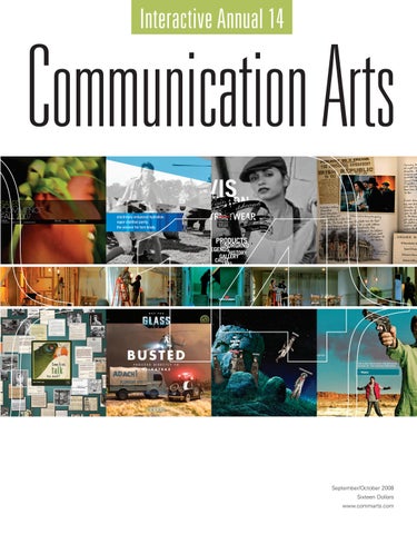
Interactive Annual 14
September/October 2008 Sixteen Dollars www.commarts.com
atedge where visionaries unite
AtEdge connects the world’s most talented assignment photographers with the most active and influential art directors. Your best ideas deserve more than stock.
photographer
represented by
Andy Anderson
Heather Elder heatherelder.com 415 285 7709
andyandersonphoto.com
at-edge.com 800 876 6425
September/October 2008
Volume 50, Number 5
features
40
49
60
68
40 Howard Schatz
49 Living on the Edge
60 Red Nose Studio
By Anne Telford Surprise and delight are hallmarks of this New York City-based photographer.
By Robert L. Peters, FGDC Visual communication design in New Zealand.
By Matthew Porter This 3-D illustrator mixes rich imagination and homegrown engineering to craft a world of make-believe.
68 mono
78 Exhibit
By Tiffany Meyers A Minneapolis agency that stands for simplicity.
By Jean A. Coyne The latest and best in visual communication from here and abroad.
2008 interactive annual 90
Introduction
92
Advertising
118
Entertainment
128
Experimental/ Virtual Community
132
Information Design
152
Self-Promotion
Cover: Cover: Top row (from left): Four Seasons Private Residences Bora Bora, p. 96; Glacéau, p. 102; Vision Streetwear, p. 116; The Adventures of Young Indiana Jones, p. 118. Middle row: HBO Voyeur, p. 122. Bottom row (from left): The National Archives Experience—Digital Vaults, p. 142; Get the Glass!, p. 100; RED Universe, p. 160; Breaking Bad, p. 120.
Editor and Designer Patrick Coyne
fresh
Executive Editor Jean A. Coyne Managing Editor Rebecca Bedrossian Technology Editor Sue Garibaldi
164 Jay Taylor
This U.K.-based illustrator blends social commentary, stationery and a bit of humor in his work.
166 John Fulton
Less is more for this Savannah, Georgia-based photographer.
168 Catherine Lepage
A Montréal designer keeps her work playful and surprising.
Editor At Large Anne Telford Designer/Art Director Tricia Seibold Peterson Creative Consultant Bonnie Smetts
columns
Production Director Scott Perry
14 Design Issues
Laurie Rosenwald advocates making mistakes on purpose.
30 Emerging Media
Joe Shepter explores the riddle of advertising on social networking sites.
170 Advertising
Ernie Schenck cautions that envy is a seductive thing.
24 Design Culture
Wendy Richmond expands her visual awareness through sound.
34 Business
Tad Crawford discusses two new Orphan Works bills.
26 Environment
Sustainability: Nike puts its best foot forward, by Sam McMillan.
163 Web Watch
An unconventional Web site for an avant-garde architecture school, and three online destinations.
172 Typography
Associate Production Director Ron Niewald Production Traffic Coordinator Nancy Hagemann Web Developers James Hawley Kena Karia Gary Wium Technology Administrator Michael Hoyt Customer Service Representative Kaitlin Kushner
Thomas Phinney on text, glyphs and OpenType.
Production Assistant/Customer Service Representative Khader Yanni
departments 8
Editor’s Column
12
Contributors
178
Book Reviews
180
Resources
186
Directory
190
Index to Interactive Annual 14
Volume 50, Number 5 www.commarts.com COMMUNICATION ARTS, (ISSN 0010-3519) is published eight times a year (January/ February, March/April, May/ June, July Photography Annual, August Photography Annual, September/ October Interactive Annual, November Design Annual, December Advertising Annual) by Coyne & Blanchard, Inc., 110 Constitution Drive, Menlo Park, CA 94025-1107. Periodicals Postage Paid at Menlo Park, CA and at additional mailing offices.
Copyright 2008 by Coyne & Blanchard, Inc. All pieces reproduced in this issue are under prior copyright by the creators or by the contractual arrangements with their clients. Nothing shown may be reproduced in any form without obtaining the permission of the creators and any other person or company who may have copyright ownership. SUBSCRIBER SERVICES: Subscription: 1 year, $53; in Canada, $70; All other countries, $110. All payments in U.S. dollars, Canadian GST: 127848620.
General Manager Jeff Stafford Advertising Director Valerie Halaby Circulation Director Perry Fotos Office Administrator Stacey Meisner
Direct all inquiries, address changes, subscription orders, etc., to: Web: www.commarts.com E-mail: subscription@commarts.com Phone: 800-688-1971; 850-682-7644 Fax: 303-661-1181 Mail: COMMUNICATION ARTS P.O. Box 51785 Boulder, CO, 80322-1785 Please allow six weeks for changes. EDITORIAL AND BUSINESS OFFICE: 110 Constitution Drive, Menlo Park, CA 94025-1107. Phone: 650-326-6040 Fax: 650-326-1648 E-mail: ca@commarts.com
POSTMASTER: Send changes of address to: COMMUNICATION ARTS P.O. Box 51785 Boulder, CO 80328-1785 Canada Post: Publications Mail Agreement #40612608 Canada Returns to be sent to: Bleuchip International P.O. Box 25542 London, ON N6C 6B2
Controller Linda Tenefrancia Contributing Editors DK Holland, Design Issues; Wendy Richmond, Design Culture; Ernie Schenck, Advertising Founder Richard Coyne (1926–1990)
Your studio, revealed. This image was art directed, styled and produced by your Photography Director, Melanie Francis. The concept belongs to your Digital Director, Jeff Legare, who also handled the digital heavy lifting. Your people shooter, Eric Sahrmann, captured the individual shots. To learn more about your studio and how creative realization can bring your concepts to life call Jim Armetta or Bill Prena at 312-829-0001, or visit us at www.thinkalter.com. c g i
•
d i g i t a l
i m a g i n g
•
p h o t o g r a p h y
brad baby,
i had that dream again... the one where i wake up screaming...
but i’m not me... i’m you! weird, huh? i wonder if it’s from taking those sleeping pills with vodka? Ya know, you should write a book about yourself while under house arrest. hype
it up — a long island pill pusher just won’t sell. ...become badass gang member ...become a badassa gang member
who who turns turns into into aa hot hot brunette brunette dominatrix dominatrix after a sex change thailand. after a sex change in in thailand. now, that’s a movie of the week! hey, did you try gluing rhinestones on the ankle monitor? i think it would be a nice touch.
talk soon,
konnectdesign.com | t.weiss
hayley
elizabeth p ojé + associates re p resent...
......... berg. ..................cahill ............... deford................ faye.......
.... ......garcia ....................... gor don ........................ hamilton .........
......... konkal..................leach ............. .... p earson ............. regnier....
...... sar p a............... schmidt ................ shindov................. unger.
elizabeth p oje.com la | 310 556 1439 nyc | 212 222 2921
editor’s column
Patrick Coyne
D
espite challenging economic conditions, we saw a
Trends or fads
9.7 percent increase in entries this year. In looking
Video remains the most recognizable trend and also one of
over the 2,250 submissions, the general consensus
the most visible targets of criticism. “We’ve all seen the surfeit
from the judges was that this was not a year of innovation
of videos online that are a translation of the 30-second spot
but of maturation and increasing usefulness. “While it hasn’t
and now all of a sudden have become the 90-second spot,
been the most creative year from a design perspective, it
while not really embracing or understanding all that inter-
has been incredibly valuable to us as designers. It’s given us
active can be,” Emery said. Gabrielle Weinman, group
a year of data, of watching people use Facebook, MySpace
creative director of Los Angeles-based Ignited, did find a few
and Flickr and on and on, and that will only make next year
examples of interactive video. “Once I made a few choices,
that much more exciting,” said Liz Danzico, information
I was rewarded with a video that was put together on the fly
“There has been a real shift from creating artifacts to creating frameworks, where people can actually create their own stuff.” —Liz Danzico
architect/usability analyst/
and personalized for me based on my choices. That’s a really
editor at Happy Cog in
great way to use the medium,” she said.
New York. “Overall production values are up but innovation is down,” said Michael Lebowitz, CEO of
Another area of praise and criticism was user-generated content. “Some of the more inspiring entries I saw were projects that included user participation, inviting people to either submit their thoughts through audio or video,”
New York City-based Big
Weinman said. “It became a much richer experience than if
Spaceship. “Maybe we’ve
I had just arrived at the site to view content. I even saw a
become a little obsessed
few things that were good for the planet, good for humanity
with rising to the level of
as a result of people participating on a Web site. You can’t
quality of television and
say that about a lot of media.”
film and lost track of the essential differentiation of the medium.”
“It takes a lot of faith for a company to allow its audience to rank and rate its products,” said Marable. “But it also builds a lot of trust to say, ‘We value your opinion and realize our
When asked what com-
job is to provide really good services and products—and let
pelled them to vote for
us know if we’re not doing that.’”
a project, the judges responses were mixed.
“A good project is one that is beautiful, friendly and intuitive, but what makes something great is pairing that with a function or experience where you feel like you’ve gained something,” said Toria Emery, associate creative director at San Francisco-based Goodby, Silverstein & Partners.
“To their credit, a lot of people are trying to involve the user, and that’s a very noble effort,” Danzico said. “However, a lot of what I saw fell short because people were doing it without even thinking about the value. Everything is customizable— ’Build Your Own Snowman’ and ‘Design Your Own Photocam.’ I don’t think that users see value in customizing something just because they can.” Emery added, “Now it’s time for
“There were entries that really did deliver on expectations,
everybody to sit back and think about smart ways to
and then elevated it up a notch,” said Bart Marable, founder
involve the user.”
of Austin, Texas-based Terra Incognita. “It’s that X factor that
8
is very difficult to quantify because those that do it well are
Beyond the browser
unique.” Britt Miura, principal of Menlo Park, California-
In discussing the future of interactivity, several judges
based Miura Design, wasn’t so much looking for perfection,
expressed excitement about moving away from the traditional
but innovation. “I really want to reward people for doing
browser window. “One of the trends that I see is the ongoing
innovative stuff with technology. Even if they don’t get it
push to blur the distinction between screen-based and real-
right, and there are usability problems, at least it influences
world experiences,” said Marable “There is a tendency to
other people to riff off of it and come up with something
want to think of them as being separate, but they aren’t. One
better,” he said.
is communication intermediated through an interface online
Interactive Annual 2008
editor’s column or as an interface that helps facilitate real-world meetings.
in Japan were authored this way,” McVey added. “It’s a
It’s all really about communication.”
classic example of the users taking a technology and using it
“The page metaphor is dead and people are finally under-
in a way that no one ever imagined they would.”
standing what to do now that we don’t have pages,” Danzico
So why isn’t that innovation happening here? “One of the
said. “The idea of getting beyond the browser is really taking
biggest challenges is that our phone companies are fighting
shape too.”
for territory, which means they all have walled gardens and
“Look at iTunes. That’s a great example of something that
they don’t make it easy for consumers to communicate with
forgets the browser,” said Jon McVey, executive creative
one another,” Weinman said. “This puts a burden on those
“Having new input mechanisms opens up more natural interaction than a keyboard or mouse.” —Britt Miura
director at Seattle-based
who are providing content because they have to create it on
ZAAZ. “It’s an application
so many different platforms, which gets expensive.”
but it works just like any other Web site—pulls in
Developing the development team
data and goes and finds
As projects become more extensive and expensive, the idea
stuff for you. It just treats
of a single designer/programmer has become an anomaly
it more like an application.
rather than the norm. “You can’t do it all on the Web
You’ll see more of that in
anymore,” McVey said. “To be truly effective, you need a
a couple of years.”
collaborative team. We have social media experts, behavioral
“I definitely see a transition
experts and user-interface experts—we just have to figure
to widgets, things on your
out how they all work together.”
desktop where you just need a little bit of status or information that you want to check up on and you don’t want to go to a full Web site,” Miura said. “It’s
integrated way with UX, IA people and developers and programmers,” Emery added. “People just haven’t figured out how to be more than the sum of the parts. It’s still a bit of an assembly line.”
really powerful to have little pieces of functionality that can
McVey also suggested that more innovative projects will
move all over the place and create contextual value to
require a restructuring on the corporate/client side as well.
wherever they’re being placed and used,” Lebowitz added.
“Typically you have a head of e-commerce and a head of
“They adapt more naturally to your behavior, or you can
brands. They’re both involved in a project, yet they both have
adapt them more naturally to your behavior.”
different objectives that don’t always match up. What we
“It’ll be very useful for advertisers because their brands will
really need is one person who leads digital at a significant
be perceived as useful and they will be on desktops for
level, a chief digital officer if you will. I keep harping back to
people to see every day, versus a Web site that you only
Apple but if you look at the success of iTunes, it reinvented
seek out on an occasional basis,” Weinman said. “But, you
an entire industry and you know there wasn’t a separate
have to be relevant in order for somebody to want to put a
e-commerce objective and a separate brand objective. The
widget on their desktop.”
interface was as revolutionary as the business model. They
Mobile platforms Every recent competition has included discussion about the potential of mobile technology, and yet it remains an elusive possibility. “I’m very envious of folks in Europe and in Asia because mobile is so much more advanced than it is here in
10
“Art directors and copywriters are not yet working in an
were both integral to each other. That’s what it takes to do something category changing.” Any other advice on creating more innovative work? “I think the most exciting thing for somebody entering the field is to really try to understand where to fill in the gaps in terms of
the States,” Weinman said. “In Japan, they now refer to
where products aren’t reaching audiences,” Danzico said.
their cell phone as their hub because they use it to scan and
“And just have fun, because that’s where the best ideas tend
get into their health club or ATM machine. At work, they
to come from.”
scan and get a Coca-Cola. Occasionally they use it to make
“Everybody has to embrace the fact that we can’t depend
a phone call and send an e-mail as well. One of the top-
on a captive audience any longer. You have to give to get
rated sitcoms in Asia a few years ago was only available via
now,” Lebowitz said. “As soon as we realize that we have to
mobile phone.”
give something of value in order to get back good will and
“Who’d have thought that kids in Japan would write novels
affinity, we’ll see much more interesting work produced as
on cell phones and yet five of the top ten bestselling books
a result.” CA
Interactive Annual 2008
™
Introducing PANTONE® Goe uncoated Let your ideas flourish with the revolutionary new PANTONE Goe System, now available on uncoated stock. With 2,058 new colors available in Pantone’s world-famous guide format, as well as adhesive-backed chips, you can let your inspiration grow wild. And with the included color-creation software, the Goe System allows you to cultivate your colors like never before.
2,058 Goe colors – FREE!
Get the Goe coated and uncoated digital libraries for your Adobe® Creative Suite® applications for free! Download the Goe digital libraries today at pantone.com/goefree. Limited-time offer – ends October 31, 2008. PANTONE® and other Pantone, Inc. trademarks are the property of Pantone, Inc. Adobe and Creative Suite are either registered trademarks or trademarks of Adobe Systems Incorporated in the United States and/or other countries. Pantone, Inc. is a wholly owned subsidiary of X-Rite, Incorporated. © Pantone, Inc., 2008. All rights reserved.
contributors
Features
Studio in Greenfield, Indiana.
loner, a rebel and, yes, an illus-
Wendy Richmond is the
Tiffany Meyers is a Chicago-
He also contributed to the
trator/designer. Do you have an
recipient of a National
based freelance writer. Her
Resources column.
unlimited budget for daring?
Endowment for the Arts grant
Well neither did Ogilvy, J.
and a Rockefeller Foundation
articles about business and visual culture have appeared in
Columns
Walter Thompson, Nike, The
residency in Italy. Her award-
publications such as Surface,
Tad Crawford is the publisher
Sundance Channel, Bravo, MTV,
winning photographs have
the Chicago Tribune, HOW,
for Allworth Press, and author
Apple, IKEA, the New Yorker or
been exhibited internationally.
Metropolis, American PHOTO,
of Legal Guide for the Visual
the New York Times. Neverthe-
Richmond’s regular column,
PINK and Advertising Age.
Artist, the Business and Legal
less, they managed to unleash
Design Culture, has appeared
Meyers profiled mono, an
Forms series for creative pro-
the mighty power that is
in CA since 1984.
agency based in Minneapolis.
fessionals, The Secret Life of
rosenworld. Rosenwald is the
Money and The Money Mentor:
author of New York Notebook
A Tale of Finding Financial
(Chronicle Books), and to name
Freedom (Allworth Press). He
but just a few: red, yellow, green,
wrote the Business column.
blue (Blue Apple) and her latest
Robert L. Peters, FGDC, is a founding principal of Circle, an international design consultancy based in Winnipeg, Canada. He is a former president of the
Sam McMillan is a San
International Council of Graphic
Francisco Bay Area-based writer,
Design Associations (Icograda),
teacher and producer of inter-
and author of Worldwide
active multimedia projects for a
Identity (Rockport Publishers).
number of production houses.
Here he shares his observations
A regular contributor to Web
about design in New Zealand.
Watch and Resources, he also
Peters has previously contri-
wrote the Environment column.
buted feature articles on Russia,
all the wrong people have selfesteem (Bloomsbury). Her top secret “How To Make Mistakes on Purpose” workshop has been taught at the AIGA national conference, Art Center, SVA, RISD, MICA and to HRH Prince Carl
vice president and creative director at Hill|Holliday in Boston and is the author of The Houdini Solution: Put Creativity and Innovation To Work by Thinking Inside The Box. He wrote the Advertising column.
Book Reviews Angelynn Grant is a Boston-
Philip, Duke of Värmland,
based graphic designer, writer
which makes her a kungliga
and educator. She taught at
Thomas Phinney has been
hovleverantör, or supplier to the
Rhode Island School of Design,
Japan, Brazil, China and Cuba,
doing digital typography since
Swedish royal court. Rosenwald
the Art Institute of Boston,
as well as congress reports
the 1980s and has been part of
wrote the Design Issues column,
Simmons College and MIT. In
from Portugal, Uruguay,
Adobe’s type team since
edited by DK Holland.
addition, she is the host of a jazz
Australia, Korea and Denmark.
1997—currently as product
Matthew Porter is a writer,
manager for fonts and global
critic and creative consultant
typography. He has an MS in
who lives in his hometown,
printing from RIT and an MBA
Atlanta, Georgia. His company
from UC Berkeley. Phinney
Joe Shepter is a California-
program on MIT radio, WMBR.
based freelance writer
Ruth Hagopian writes about
specializing in travel and
art and design. Formerly a
interactive media. He has
partner of a San Francisco
worked with Adobe, Oracle,
design firm, she is the editor
Whirlpool and Coca-Cola,
of PaperSpecs, an online paper
is PorterWrite Design Consulting.
wrote the Typography column.
Porter interviewed 3-D illustrator
Laurie Rosenwald is sole
among others. Shepter wrote
database for designers and
Chris Sickels of Red Nose
proprietor of rosenworld, a
the Emerging Media column.
printers.
The pictured contributors wrote features in this issue: Tiffany Meyers, Robert L. Peters and Matthew Porter.
12
Ernie Schenck is executive
Interactive Annual 2008
Series Of Unintended Consequences #08
“I pride myself on the details. I can’t believe my paper slipped by.”
Your choice of paper says a lot about you and speaks for your clients as well. As the leading North American producer of high quality coated paper, NewPage is committed to ethical practices and environmental conservation. While paper may seem like paper regardless of the source, can you be so sure? Some Asian suppliers are not as committed to these values – issues such as unsustainable logging practices, excessive transportation, and questionable air and water controls are right below the surface of their paper. The paper you choose tells a story. Wouldn’t you rather trust that your choice reflects your good judgment and the values of your clients?
Find out how PaperTellsAStory.com
design issues
Laurie Rosenwald
How to Make Mistakes on Purpose What to Do When It’s Too Late to Go Walking in the Woods, Get Burrs Stuck on Your Pants and Invent Velcro All Over Again
T
he only way to cure my hiccups is to offer me twenty bucks to hiccup again. Then I can’t do it. Performance anxiety. I teach a workshop called “How to Make Mistakes on Purpose.” It has to do with how not trying works better than trying. I have a fear of the blank page. A fear of the pressure to be “creative” on demand. Starting with a “mistake” saves me from starting out with a nothing.
For instance, in my latest book, all the wrong people have self-esteem (Bloomsbury), I used a bit of paper for the girl’s dress on the cover from a scrap I had photographed two years earlier, which I had seen on the desk of a friend. It was not destined for anything in particular. I go around doing things like that. Working this way, I can ask, “What could this be?” instead of “Oh no! What am I going to do? I’m a fraud! I can’t even draw! Who am I trying to fool?” It’s a psychological thing. I don’t focus on a problem to solve it. I do something careless, pointless, opposite, random. Something that has nothing to do with what you’re doing or wanting. What we do in my workshop is top secret. I ask everyone who has done it (over one thousand by this time) to swear omertà, the Mafia code of silence. I have taught it at the best design schools, like risd, sva, Parsons, Art Center, mica and many others. I have taught it at Starbucks and in Stockholm, London and even Des Moines. 14
Interactive Annual 2008
I taught it to 200 people at the aiga 2007 “Next” Conference in Denver and to two very bourgeois Belgian ladies in my New York loft. It’s definitely not just for designers! Anybody can do it. I have some impressive testimonials and details on my site, rosenworld.com, if you are interested. But not too many. Because I refuse to explain what happens in that room. The workshop is about surprise, so it must be one. Ideally, those who take part know absolutely nothing about it, and just show up in a room with no expectations. I’m certainly not the first to believe in mistakes. The Situationists, Fluxus, Jean Arp, Jackson Pollock, Sigmund Freud and countless others did. But because it’s so hard to “fool” oneself, to get away from all that routine problem-solving, I built a workshop around mistakes to help people make them on purpose. Because I needed it myself. We all watch YouTube and drink red wine and cappuccinos and join Facebook and grow basil and download Amy Winehouse. We listen to npr and watch hbo on tv or play dvds. We’ve cut down on the blts. We’re feeling guilty about suvs. They’re just not pc! We join aiga and subscribe to ca and live in the usa. We have a pc! Or a Mac! We have Google and Illustrator and Photoshop and InDesign and After Effects and GarageBand and Flash. We’re skilled, too! We know how to do things! We can make things look good!
2 3 1
2 0 1
8 0
ed -manag rights y-free royalt tion ip subscr s.com rimage jupite
er. t i p u j ink tion to our h t . r e bigg r boundless imadgeiansa at large ... k n i h t t you find i connec y and ager ive im exclus
design issues
“What’s wrong with that?,” you ask. Everything. Because when you get good at something, you repeat it. As a designer, you can keep your promises to your clients, because you know what things will look like before you make them. After all, it’s satisfying to know the result will be right, be professional. Unfortunately, just because we’ve shared so many of these universal tastes and experiences, it will also be very boring. No surprises. If I’m not surprising myself, no wonder I’m boring you. We are all a product of our times. After all, Michelangelo and da Vinci shared the same technology, and enjoyed the culture of their time. Well, I am here to tell you that computer programs are not only more powerful than a pencil or a chisel, they are profoundly, fatally different: a chisel can slip, and a pencil is only as skilled as the person holding it. It is said that when the Pope asked Michelangelo for proof of his talent, the artist responded by drawing a perfect circle. Computers can do things I can’t. Like draw perfect circles, for
example. I have a machine do it for me. It is easy to operate this machine. Computers don’t make mistakes. Given the same commands these machines yield identical results, no matter who presses the button. Because of them, things not only look alike and sound alike, they are alike. Why? Because your computer is never going to say, out of left field, the clear blue sky, and for no reason at all, “Cashew” or “Olympia Dukakis” or “Bolivia.” Or “Trask, Radio! Trask, Radio!” Huh? What am I talking about? In the film Working Girl (directed by Mike Nichols, screenplay by Kevin Wade), Melanie Griffith plays Tess, a low-level, Staten Island secretary. Her boss is Katharine Parker, a big shot bitch played by Sigourney Weaver. Tess sees an item on corporate giant Trask in Forbes, and then two completely unrelated items in “Suzy,” the gossip column in the New York Post: Trask’s daughter’s photo and an item on Bobby Stein, the radio talk show guy.
FontShop: Collected Works FontShop.com sports the best online sampling in the business, but we know that some type was meant to be seen on paper. That’s why no font retailer publishes more printed specimens than FontShop. Typographic expertise, no computer required.
romo enter p a9 fc code re t and ou k c e h c at % off save 10 er d your or
FontBook
Made with FontFont
FontBooklet no 1
1,700 pages, containing 32,000 fonts from 90 foundries, catalogued and cross-referenced for your convenience.
352 full-color pages showcasing the history and influence of the award-winning foundry.
Our staff ’s favorite typefaces, in handy flickbook format. Get your free copy when you register at FontShop.com.
© 2008 fsi FontShop International | FontShop.com | font used: ff Unit™ Rounded (FontFont)
16
Interactive Annual 2008
design issues
“So I started to think, ‘Trask, radio…Trask, radio.’” And the result is the brilliant business deal around which the movie revolves. Tess wasn’t trying. Reading gossip columns is fun. It’s easy and lazy! Here we see a perfect example of the way our minds work best, if we let them play. She didn’t sit down and “think” up a great business strategy. She was doing what she enjoyed, and had the light-bulb-on-head moment we all long for. When Tess’s boss Katharine claims she came up with the big idea, she is challenged by Trask. “The impulse. What led you to put the two together?” She responds, “Well, you know, I would have to check my files. I can’t recall exactly the, um…”
The World is Our Canvas any surface. any shape.
Interactive Installations - Immersive Environments Digital Media - Augmented Reality www.obscuradigital.com
© 2008 Obscura Digital, Inc.
Trask then says to Katharine, “Miss Parker, if I were you…I’d go to your office and take a long, last look around…” Interviewed in 2007 by Malcolm Gladwell, brilliant author of Blink, at The New Yorker Festival, Dr. Safi Bahcall of Synta Pharmaceuticals says that in 2005, the six largest pharmaceutical companies spent a total of 20 billion dollars on research and development. The number of fda-approved drugs resulting from all this? Zero. In his opinion, this is the outcome of Big Pharma’s habit of stifling real innovation by not allowing for mistakes to happen. These huge companies are so well organized, there is no place for the serendipity that led to aspirin, and thousands of other helpful drugs, at a time when the unintentional was still possible. Everyone has a job to do. They are looking for certain results. I guess they find them. What a snore. No, I’m not suggesting we unlearn how to play the piano, speak French, tie a slip knot, make risotto or drive. Nor do I think we should stop using computers, or reject all those fantastic programs. I’m just saying this: It’s not just a matter of accepting or learning from our mistakes. We all know that mistakes can be good, and that many things were invented that way: Velcro and Post-it Notes and Saccharine and Viagra; the sandwich, radar and Silly Putty; moveable type, Ivory Soap, penicillin and, most important, Pringles. Cool, right? That’s why I don’t want to just accept my mistakes. I want to make mistakes on purpose. I want to stop trying to be good at things and “come up with” good ideas and be “creative.” I don’t want to “think” of solutions to problems that probably aren’t important anyway. There’s enough stuff in the world, but that’s another essay. No! I don’t want to try to “think outside the box.” I hate
18
Interactive Annual 2008
design issues
that expression, except when I yell at my cats when they think outside the box. I want to trip over the box. The box that I put there on purpose to trip over, but then I forgot I put there, so I really did trip over it. It has to be real. I need to fool myself.
way to the airport to go live in France and, like an idiot (I’m a native New Yorker), left all of my worldly possessions in a van parked outside my building. Then I went to the corner deli for a coffee. Of course it was all stolen. I had my ticket, though, so I flew to Europe without even a toothbrush.
It can be a dot, a blob, an object, a word. The important thing is that the “mistake” is not carefully chosen. It must be found, and not created with the intention to use it in any particular way. I taught at the School of Visual Arts on and off for 28 years. For one of my class exercises, I’d collect random things and put them in a paper bag. Things like a broken balloon, a Q-tip, a corn flake, a birthday cake candle, a nail. The last bit of soap, a rubber band, a battery, a button, a raisin, a bit of paper. I asked the students to grab an item from the bag, blindly. I then asked them to write down things that the item suggested to them, where they could move forward. In my workshop, the magic words are, again, “What could this be?” not “What should I design?” For instance, the Q-tip could be a new kind of barbell. Obviously. But I’m sneaky! I switched these ideas around, so that the soap could become a barbell. The wrong point of departure often creates an epiphany.
I don’t advocate trying to get robbed, but I’m glad that it happened. Feeling lightheaded, I sat down in first class and drank free champagne, even though I had an economy ticket. When I got there I bought strange vintage clothes I would never ordinarily wear that led to an unwise, but interesting, romance. Love is often a fun mistake.
It’s true these ideas may not often “succeed.” They may have no practical application whatsoever. So what? I feel strongly that many schools focus too much on careers, anyway. Focus, again. School is a place to experiment, right? You have plenty of time to feel trapped and stifled at 41, but at 21 it’s a crime. It’s good to keep in mind that “Web Design” didn’t exist as a major when I was at school, but I know a lot of successful Web designers. What is the point in being so vocation-oriented, if the vocations haven’t yet been invented? All the best musicians went to art school. The Beatles, the Talking Heads, the Rolling Stones. Among my accomplished friends, it turns out that Comparative Literature students make great architects, and the best illustrators dropped out of law school.
We describe a magician doing a trick. The audience is intently focused on his sleight of hand. A card is produced from…where? The place where we weren’t looking. Misdirection. If we could focus on the real action, the magic would disappear. In another story, a woman goes to a party. She is single, and at once notices an attractive man standing by the bar. She would like to get to know him. But wait. Why is this When you lovely woman single, anyway? Because she’s never get good at had good luck with men! She’s always attracted to something, good-looking guys who turn you repeat it. out to be selfish, narcissistic creeps. Fortunately, she’s just seen the “The Opposite” episode of Seinfeld in which George succeeds wildly by doing the exact opposite of what he usually does. A bit from that episode: Jerry: “Well here’s your chance to try the opposite. Instead of tuna salad and being intimidated by women, chicken salad and going right up to them.”
I also made a book without any computer. Naturally, it’s called How to Make Mistakes on Purpose. I co-wrote and designed it with Norman Hathaway.
George then goes right up to a pretty blonde, introducing himself this way: “My name is George. I’m unemployed and I live with my parents.”
Everything we did went in the book, no matter how much I hated Norman’s drawings, or he hated mine, every ugly collage—no editing allowed. It’s not about trying to be bad, like using your left hand if you’re a rightie. It’s about putting yourself in an unusual situation where chaos and accidents happen, things go wrong and your control freak is awol. Our watchwords were fast and sloppy.
It works! Back to our single lady. She sees a rather ordinary looking man, standing just to the left of the handsome guy. She hadn’t noticed him before. She goes up to the man and says “Hello.” He’s pleasantly surprised. This never happens to him! They chat. They flirt. He’s witty, charming and a good listener.
In this book, we tell some stories. Like the time I was on my
I had to draw a canary for my children’s book, and to name
He turns out to be Mr. Right.
Communication Arts
21
design issues but just a few: red, yellow, green, blue (Blue Apple). It was 2007, so like everyone else in the world I went to Google Images and pressed a button and out popped one thousand canaries. I could easily draw one. After all, I am a professional illustrator! I’m pretty good! But I didn’t. I took a piece of blank paper on my desk that looked like this:
and I stuck an eyeball and a beak and some legs on it, and put the word canary in six hundred point Akzidenz Grotesk Bold under it, and you’d better believe it’s a goddamn canary!
It didn’t look like a canary I would have drawn; it didn’t look like any canary I’d ever seen, yet it was a canary. I was surprised. It had this power. The power of the wrong thing.
and I chose a random shape that looked nothing like a canary;
When I was supposed to do the Mistakes workshop on the radio, the producer asked me how my theory would work for non-visual problem-solvers. I said, “Imagine you’re a radio inter viewer. You could ask somebody, ‘How long have you done this?’ or ‘Who are you dating?’ or, most dreadful of all, ‘Where do you get your ideas?’” But maybe instead, you could try opening a random page in a book. I picked up a novel on my desk as I said this, and I’m doing this again right now as I write this essay. The top, right-hand page starts with this: “Looking straight at the blackboard, acutely aware of those sitting…” So, suppose you asked the person, “Can you learn this in school?” or “Are you self-conscious or confident? Do you look directly at the audience?”
and I colored it yellow in the computer;
Perhaps they are questions you might not otherwise have asked. Try going for the first thing you grab, not the best thing. The other thing. In other words: “When I’m not near the girl I love, I love the girl I’m near.”1 Not the right question or T-shirt or material or color or software program or lipstick or ingredient or paragraph. Read the book you’d never read, but it’s lying there. Start thinking quantity, not quality. Think anything but quality. If you try to be good, it will probably be bad. If you stop trying at all, it might be good. Or possibly dreadful! But if you are surprised, I will be, and that’s very good! CA Editor’s note: Many popular Design Issues essays are available in the book of the same name, edited by me and co-published by CA and Allworth Press. —DK Holland 1
22
Interactive Annual 2008
E.Y. Harburg, song lyric from Finian’s Rainbow, 1947. (Incidentally, he was my godfather.)
Be a Leader in New Media at Academy of Art University academy of art university alumni/student
Known internationally as a pioneer in art educa- After graduation, Academy of Art University stution, Academy of Art University strives to be at
dents have an edge in the job market. Computer
the forefront of the digital revolution. In response clockwise
Arts New Media School and Digital Arts and
to the emerging technological landscape, Academy
Kiki Ho, Julie Huang, J.R. Fabito
Communications alumni have gone on to work at
of Art University offers two groundbreaking
the most renowned new media companies in the
majors: Digital Arts and Communications (DIG)
world.
and Computer Arts New Media.
This year, students from the Graduate School of
The School of Digital Arts and Communications
Computer Arts New Media swept the top three
(DIG) at Academy of Art University is one of a
awards at the prestigious Space-Time International
few select programs in the nation that offers BFA
Student Interactive Competition and Exhibition
degree training in Usability or User Experience. at SIGGRAPH 2008. This is the 5th straight year The curriculum integrates traditional art skills with new technologies and platforms.
an Academy student won the top award. Established in 1929, the Academy of Art University
The School of Computer Arts New Media pro- offers accredited AA, BFA, M.Arch and MFA provides students with a comprehensive, multi-disci- grams in 14 areas of art and design. plined education in digital art, design and production. The department emphasizes comprehensive training in industry-standard digital tools to prepare students for real-world careers.
To learn more about the School of Computer Arts New Media or the School of Digital Art and Communications at Academy of Art University visit www.academyart.edu or call 1.800.544.2787.
1.800.544.2787 | www.academyart.edu Accredited member WASC, NASAD, Council for Interior Design Accreditation (BFA-IAD), NAAB (M-ARCH)
design culture
Wendy Richmond
Sound Seeing
E
very now and then I need to get a new perspective on the way I see. Over the years, I’ve learned to expand my visual awareness by exploring different disciplines. For example, when I work with a dancer, I see how stillness is as essential as movement. When I work with a playwright, I see how pictures are formed in the mind’s eye. So I decided to take a course at the Museum of Modern Art in New York called “Soundwalk Studio: Making Environmental Sound Art.” I was attracted by this line in the course description: “By focusing on the soundscape in which we are immersed, we can find new appreciation of our surroundings and discover a palette of material Being from which to create art.”
surrounded by a tapestry of sight and sound helps me to concentrate.
As I read it, I thought, “If I looked at my environment through sound, how would it change the way I see?”
Frankly, I had no idea what I meant by that, other than that I wanted to shake up my visual language. I told the instructor, Spencer Kiser, my intention, and that I would be using a video camera as my recording device, because I wanted to pay attention to sound, and let the image surprise me later. As in most schooling, what we learn during the time in class is most valuable for what it opens up to us outside of class. A small reference can be a spark that grows into a full investigation. For me, it was a quote by John Cage from The Future of Music: Credo that Kiser read to us the first evening. “Wherever we are, what we hear is mostly noise. When we ignore it, it disturbs us. When we listen to it, we find it fascinating.” That night, walking home, I saw a garbage truck and heard its louder-than-usual accompaniment. Normally I would switch to another block. Instead, I decided to shoot. The truck was loading the noisiest possible trash: shards, scraps and entire pieces of steel and aluminum ducts. The sound was ear splitting, but not just because of the decibel level. It actually seemed dangerous in texture and shape: hard, sharp, heavy. As I concentrated on the sound, the visual elements 24
Interactive Annual 2008
became more potent. It was not just visual, it was visceral. A few days later, I experienced another everyday event in a new way. Like many people, I go to cafés to think, write, ponder a problem or a project. Being surrounded by a tapestry of sight and sound helps me to concentrate. But when my café-mates talk too loud, especially on cell phones, I get annoyed at their intrusion into my private space. This time, instead of trying to ignore a cell-phone conversation right next to me, I listened intently without looking at the caller. In fact, I copied down every word. The following is just a tiny piece of my transcript: “She’s really stressed, y’know. It’s heart attackish. She should never have had that kid. Yeah. Well, she doesn’t work, yeah… So many clothes don’t fit me. I didn’t eat that whole pasta thing by the way. I just had a few bites of it before I went to bed. Oh, I know, I was so starving I took some crackers…So last night when I got home I had salsa which is no calories whatsoever, and I ate about ten spoons of salsa and no chips...No this isn’t Saltines, they were the elongated square ones, you know. I found a recipe, remember I was telling you about, bean based, ground beef and a bunch of bacon, I forget, I don’t even bake it. I baked it once and it came out dry. I can Xerox it for you. You put—I wanna say they’re red beans. It really comes out good. Hello? Hello? Yeah, yeah, I heard it…Y’know, I wanna go get fresh fruit, I can’t keep eating out like this.” When I finally looked up from my notebook, I was surprised to see a slender, elegant young woman. As I took in every visual element—her earrings, hairstyle, shoes, cell phone—I realized that I was constructing a portrait of contemporary life. This twenty-minute episode was, for me, a cultural artifact, a small gem. I found it to be, as John Cage said, fascinating. Does this mean that I will now consider all deafening city sounds as music, or inane cell-phone conversations as creative fodder? I doubt it. But these exercises have given me another layer of seeing. I now have, in my creative library, one more color in my palette, one more shade in my tonal range, one more point in my sensory iq. I’m a little bit richer, and I like that kind of bank account. CA © 2008 W. Richmond
Now there are 2 ways to get your iStock fix: Subscribe to continuous creativity or buy carefree Pay-as you-go credits just like you always have. Introducing annual Subscriptions as low as: 10 CR/DAY
96
$
/m o
iStockphoto.com
30 CR/DAY
274
$
/m o
60 CR/DAY
521
$
/m o
environment
Sam McMillan
Sustainability
Nike Puts Its Best Foot Forward
S
ustainability. Buzzword. Movement. Call to action. Degree program. Design manifesto. Sustainability is no longer a personal virtue, but a corporate one, with a direct impact on the bottom line. Four years ago, aiga’s seminal Compostmodern conference on sustainability took place with a handful of designers in attendance. This year, 600 concerned designers and business leaders packed Compostmodern San Francisco. In less than a year, The Designers Accord, a coalition of committed designers, engineers and companies working to create positive environmental impact added more than 100,000 members, representing 100 countries. Corporations are getting the message, too. And they are not waiting for politicians to lead. Businesses as diverse and powerful as Wal-Mart, General Electric and Duke Energy are all jumping on the sustainability bandwagon. In an attempt to balance profits with the planet, these businesses are making significant contributions that go beyond mere greenwashing. Perhaps no other company, with as large a manufacturing footprint or outsized claim on consumer consciousness, understands this better than Nike. With household names like Michael Jordan and Tiger Woods as celebrity endorsers, subsidiaries including Converse and Hurley, annual sales of $16 billion (60 percent of which come from outside the U.S.) and 300,000 shareholders, the company is poised to become the poster child for corporate sustainability efforts worldwide. Oh, and did I mention the Olympics? So when Nike develops a product design program called Considered that marries innovation, performance and sustainability, then instills that program through their entire company, it’s time to pay attention.
“The great thing about this movement,” Considered general manager Lorrie Vogel says, “is that it is lead from the top— by ceo Mark Parker—and from the bottom, by front-line designers. Designers come from a visionary standpoint. They see what’s happening on the planet, recognize the problem and want to change it.” The dna of Considered, according to Vogel, is woven deep into the fabric of Nike. “In 1998 Nike began looking at its corporate footprint,” Vogel says. “We knew we had to reduce the impact of our manufacturing processes. As a company, we recognized we could no longer exist the way we were currently doing business. Sustainability became one of our core competencies.” Considered goes for the gold Nike knew it had to change. But how? Faced with enormous challenges, and a mandate to change everything, “It’s easy for a design team to freeze,” Vogel explains. What do they work on first? How can they make an impact? Vogel, a former toy designer who cut her chops on the Speak & Spell for Texas Instruments, stepped in with the Considered Index, a set of metrics that helped her design team understand the company’s goals, and provided guidelines on how to meet them. Vogel points out that Considered is more than a line of shoes. At Nike, it’s a company-wide “ethos” and is used to create products that use fewer toxics, produce less waste and include more earth-friendly materials. This ethos requires a new way for designers to think about their products. Sustainable design demands what Vogel calls “system thinkers,” which means that designers can no longer design a product in isolation. Vogel, who oversees a group of chemists, researchers, engineers and designers on the Considered team, explains,
The Nike Trash Talk is the result of designers confronting the “here and now” question of how to recycle waste product from the factory floor into a high-performing athletic shoe.
26
Interactive Annual 2008
Oil Well For Sale as low as $49
3.1 million images - the best collection on the web www.fotosearch.com
environment “They have to think holistically and look at the overall lifecycle of product design.” Sustainability designers must understand the implications of the manufacturing process, the types of materials they source, their origin and their environmental impact, the packaging materials, energy implications of shipping and warehousing, and finally the impact of their products as they outlive their usefulness and enter the waste stream. First Considered set up three levels of sustainability, called Bronze, Silver and Gold, and supplied a set of metrics on how to achieve them. Points are awarded for designs that reduce the use of toxic materials, use environmentally-preferred materials and reduce waste. By 2011, not only does Nike want to be carbon neutral, it wants every footwear product they make to achieve Bronze status. Nike has committed to meeting bronze standards for apparel by 2015, and all equipment by 2020. To achieve Bronze status, designers must increase the use of environmentally-preferred materials by 20 percent, reduce waste by 17 percent and eliminate 95 percent of the volatile organic compounds (voc) used in the manufacturing process. To achieve Considered status, products at Nike have to meet even higher Silver or Gold requirements. Vogel made sure designers knew what metrics to work on by creating sustainability scorecards for each product. The scorecard is distributed early in the process, where it serves as a teaching tool, so
Nike’s PreCool Vest uses Nike Grind, the recycled waste from old athletic shoes. While the vest is more sustainable, its main purpose was to keep athletes cooler for longer in the heat of Beijing.
designers can see the impact of their choices and make changes to raise their scores. Each product is measured according to waste, materials and vocs. Materials that score high are recycled polyester, bamboo (used in garments), nylon and the use of at least five-percent organic cotton. The change in the design culture was almost instantaneous, Vogel says. In 1995, an average pair of shoes at Nike contained 340 grams of vocs. Today, Nike uses less than sixteen grams of voc per pair of shoes. “Suddenly designers are looking at their products with an eye on the scorecard, wondering, ‘How did I score on waste?’” One measure of the impact Considered is making at Nike: Tinker Hatfield, who is to shoe designers what Mick Jagger is to the Rolling Stones, signed on to design the new Nike Air Jordan xx3 flagship basketball shoe under the Considered banner. “The Air Jordan xx3 informs everything the company does,” Vogel says. “To have Tinker Hatfield engaged has a huge effect on Nike company-wide. People pay attention when the shoe you manufacture to have the highest level of performance is a Considered Gold product.” The Air Jordan xx3, which replaces synthetic adhesives with a system of interlocking panels, uses a water-based bonding process that allows the carbon fiber plate to be attached without the use of solventbased cements. The shoe is so sophisticated it required the design of new machines to produce it. Purifying the waste stream: from recycling to downcycling To keep products out of landfills, Nike found an innovative
28
Interactive Annual 2008
keeping products out of landfills. The Considered design team took waste recovery a step further. “When we looked at waste streams,” Vogel says, “our designers learned that two of the biggest contributors were leather and synthetic leather.” At Nike, that’s significant. Every year, Nike produces enough scrap waste to fill a train of boxcars stretching from Portland to Seattle. The Considered team decided to turn the waste scraps into a shoe. A prominent zigzag stitch on the shoe’s upper that attaches synthetic and real leather scraps proclaims its genesis on the factory floor. The mid-sole uses scrap-ground foam from factory production, while the outsole uses environmentally preferred rubber selected for its low-toxin makeup. Steve Nash, the nba all-star known for his commitment to social and environmental causes, endorsed it, and the Nike Trash Talk hit the court in February 2008. Medal event: the race goes to the Swift Last month while athletes raced for medals in Beijing, corporations competed just as intensely for public exposure and product placement. Nike products at the Olympics took center stage, adorning the athletes of 22 Chinese sports federations. Twenty-four percent of all products Nike made for the Beijing Olympics came from the Considered line. The showstoppers were the Nike PreCool Vest, a futuristic-looking garment packed with ice that cools muscles before competition, a line of innovative footwear using lightweight, super strong “flywire” technology, and their streamlined Swift suits. For the first time, Nike Swift performance apparel was Considered. Nike Swift was specially designed for events such as track and field, swimming and cycling, where aerodynamic drag on clothing can make the difference between standing atop the podium or finishing out of the running. Made entirely from recycled polyester, Swift garments include polyester yarns reclaimed from soda bottles, post-consumer uniforms, post-industrial fiber and fabric scrap. Nike’s Swift apparel for the Olympic track and field and rowing teams is not only made from 100 percent recycled polyester, it is Nike’s best performing Swift suit to date. The Air Jordan XX3 set a new Nike benchmark for premium performance footwear married with sustainable product design.
way to “downcycle” worn out running shoes. Since 1990, their Reuse-A-Shoe program has placed collection bins at Nike stores, where old sneakers are dropped off, shipped to processing centers in Oregon and Belgium, and ground up for reuse as sport courts and running track surfaces. Nike calls the effort Nike Grind, and instead of millions of shoes ending up in a landfill, Nike Grind and its playing court-paving partners have turned more than 21 million pairs of athletic shoes into more than 265 sport courts around the world. Turning old sneakers into new playing fields is one way of
Vogel says, “I love the fact that plastic water bottles that once ended up in a landfill are now part of our Considered Swift suits.” According to Nike, using recycled polyester for their Considered program has diverted 20,700 pounds of polyester waste from landfills. Just as importantly, Considered Swift actually works. The new design reduced drag by seven percent over previous Nike apparel worn at the Athens Olympics. Athletes wearing Swift suits have posted 76 medals and 25 world records. That fact underscores Nike’s commitment to the no-compromise ethos of Considered. These are high-performance goods, designed for athletes who compete at the pinnacle of sport, for the good of the planet and for consumers who like to feel good about what they buy. There are no trade-offs. When the fastest athletic apparel on the planet is made from recycled products, we’re all winners. CA Communication Arts
29
emerging media
Joe Shepter
Social Networks Where Advertisers Fear to Tread
A
dvertisers who target young people ought to be burning scented candles on altars dedicated to social networking sites. For years, they’ve had to chase kids around hundreds of cable channels, but they now know exactly where they are. According to a recent study by The Conference Board, 57 percent of all U.S. teens visit sites like MySpace at least once a day.
underage keg party in the Des Moines metro area. “Essentially [user pages] are big, long scrolling lists of text, and whenever you’ve got that, advertisers question if that’s where they should be,” says Conor Brady, executive creative director of Organic. “But it’s also where their customers are.”
The lay of the land Cracking the riddle of social networks probably begins with understanding how simple they are. The sites don’t do much except provide “A couple of things have happened a suite of communication online in the last few years,” says tools, such as chat, messaging, Todd Purgason, creative director of Juxt Interactive. e-mail, blogging and image “Kids are surfing less and congregating in places posting. Usually they require Cherry Coke SpaceMaker by Juxt Interactive. more. Nowadays, their primary activity is to go a user to create a profile. onto MySpace.” They then allow that user to connect with existing friends But something is very wrong. The eyeballs are there, but and meet new ones with similar interests. the ads aren’t working. Social networks have struggled to “You have to look at social networks as a kind of plumbing,” grow revenue. Their click-through rates are anemic even by says Eric Karjaluoto of Smashlab, which has created the the Web’s remarkably anemic standards. It’s gotten so bad social network MakeFive. “It’s not rocket science.” that a Wall Street Journal blogger recently concluded that no one has figured out how to advertise effectively on Some of the networks, like Bebo, MySpace and Facebook, social networks. provide a general environment for keeping in touch with friends. Others cater to specific interests. Shutterbugs can The sites can partly blame themselves for doing such a good log on to Flickr, while budding filmmakers can post their job. Kids love connecting with their pals so much that they latest oeuvres to YouTube. Career builders have LinkedIn and ignore the blandishments of new breakfast travelers can post blogs on wayn (Where Are You Now). If cereals waving at them from the margins of you have an extraordinarily elevated sense of self-importance, a page. Compounding the problem, many you can even use Twitter to post minute-by-minute updates companies are reluctant to join this chaotic of everything you do all day long. (Just ate a bag of Cape world. Sites like MySpace and Facebook Cod Potato Chips, now I’m watching SpongeBob. What’s rely on users to generate pages, most of up, people?) which display all the artistry of a well-inked Pee-Chee folder. Brands that advertise on these sites run the risk of having their beloved logos turn up on a page made by a twenty year old named The Jakenator, who posts in-depth reviews of every 30
Interactive Annual 2008
Unfortunately, providing these services costs money, and the people who invest in the networks and those who advertise on them are seeing very meager returns. (Or, in Twitterspeak: Just checked our revenue numbers, now I’m drinking a double martini. What’s up, people?)
GO
BEYON D Truer moments. Fresher perspectives. Deeper meaning. Captured by the world’s best photographers. Royalty-free available.
Stock that lives up to your best ideas.
NATIONALGEOGRAPHICSTOCK.COM
emerging media Home pages and applications So what can you do to gather those elusive eyeballs? Social networks provide several options. The cheapest one is to create your own brand home page. Such a strategy works well for companies or ventures that have a built-in fan base, including bands, restaurants, movie companies and well-loved consumer products. Unfortunately, if you don’t have that kind of pull, your home page won’t generate much interest. Worse still, Jeep campaign created by Organic: Boostin’ Nuts on Facebook and Uncharted on MySpace. it can turn into a disaster if a disgruntled customer logs on and plasters “You Suck” messages all over it. The hybrid strategy Faced with those odds, some advertisers in the space are As a result, many interactive agencies are careful about which turning to hybrid campaigns that combine traditional Web clients they introduce to a network. “Consumer brands are advertising with social-network functionality. “Social media completely embracing what customers are saying about ties into traditional strategies and doesn’t replace them,” says them,” says Brady. “But those types of brands skew younger. Karjaluoto. “It’s just another layer that we’re introducing.” Beyond that, I don’t think other brands are getting into this kind of experience.” A good example of this approach is Organic’s comprehensive Of course, many social networks allow banner and Google AdWord placements, though the click-through rates from individual pages are dreadful. A more interesting possibility is offered by both MySpace and Facebook: application development. In this scenario, third-party developers create small, branded widgets that users can add to their pages if they like.
social networking campaign for Jeep. It combined a traditional minisite, a Facebook game and a Flickr page for users to post pictures of themselves and their vehicles. The strategy was low cost and well subscribed. Users found it fun to post photos of themselves and their Jeeps on the top of suicidallysteep mountains.
“With online advertising, it’s all volunteer-based,” says Purgason. “In our space, [consumers] do participate if you provide them something valuable, whether that’s information or engagement. With social marketing, it’s the same thing.”
Another—and perhaps more expensive—option is to partner directly with a social network. Juxt Interactive, for example, launched a successful Cherry Coke campaign in conjunction with MySpace. It provided users with a sophisticated design tool that produced cherry-flavored pages. Users could vote on which one they liked best, and the winner took over the MySpace home page for a day. From a brand standpoint, the concept allowed Coke to retain reasonable control over look and feel of the pages, while embracing the chaos of a social network. At the same time, users got a chance to make themselves famous, at least for a day.
Overall, these applications have proved a mixed bag. When done well, they can create traction—a good game is always a good game, whether on a social network or not. For every success story, however, there are plenty of failures. On Facebook alone there are tens of thousands of applications. Even good ones only garner a small number of users, and some fall amazingly flat. The Diet Pepsi Forever Young Trivia application on Facebook has six active users, and it’s reasonably fun. Coke Malaysia’s Euro 2008 application offers good functionality, but it had only eight users at the Smashlab’s social network: Makefive.com. height of the tournament. 32
Interactive Annual 2008
The future What does it all add up to? Social networking sites remain a tough place to do business, but they aren’t going away. Their traffic numbers—especially among older users—are only rising. Many of them are also testing or refining behavioral targeting systems that supposedly place ads that are relevant to the user seeing them. Sooner or later, something has to give. Until then, ad agencies and their clients can comfort themselves by remembering the dreadful returns they saw in the early days of the Web. That eventually worked out, and this probably will too. Luckily, optimism has never been in short supply on the Net. CA
BULLDOG: 1727741 BY ISSELEE BACKGROUND: 14024051 BY ROMAY ROYALTY-FREE STOCK PHOTOGRAPHY COMMUNITY
More than 1,800,000 high-quality, royalty-free images. Special Offer: 20% Off 20 Credits* www.stockxpert.com/promo/pup
$1 $2 $3 $5 $10 $15 ea
x small
400 x 300
ea
small
800 x 600
ea
medium
1600 x 1200
ea
large
2400 x 1800
ea
x large
3500 x 2400
©2008 Jupiterimages Corporation. *Expires November 15, 2008.
xx large
4900 x 3300
ea
business
Tad Crawford
Orphan Works Bills Introduced
B
ills have been introduced in the United States House of Representatives and Senate to address the status of so-called “orphan” works. The bills differ in significant ways from one another and from the orphan works bill that was introduced in 2006 in the 109th Congress. With respect to the bill introduced in the 109th Congress (H.R. 5439) I wrote in Communication Arts (Design Annual, 2006) that, “In fact, the Orphan Works bill is simply an appealing description for what should be called free use or, less politely, theft. Everyone roots for an orphan to be adopted, but what if we called the bill the Protection of Copyright Theft Act?…The potential magnitude of the unrecompensed taking of creative work is staggering.” The leading trade groups for visual creators opposed the bill and it died a well-deserved death. The legislative background The fate of the bills in the 110th Congress is not so clear. In particular, the House bill (H.R. 5889) sponsored by Representative Howard L. Berman of California has adopted a number of provisions to safeguard copyright owners while the Senate bill (S. 2913) tracks closely with the House bill introduced in 2006 and opposed by the community of artists. The 2006 House bill (H.R. 5439) allowed the use of a work without permission if the user has “performed and documented a reasonably diligent search in good faith to locate the owner of the infringed copyright.” If the search does not locate the owner of the copyright, then the user may proceed to use the work. Even though this use is technically an infringement, the penalties for the infringement are minimal or nonexistent. Should a copyright owner discover such an infringement, the owner can only obtain “reasonable compensation” and the infringement can continue. In addition, the owner is not allowed to seek damages, cost or attorney’s fees, which the owner would normally be allowed to seek in a copyright infringement suit if the work has been registered prior to the infringement. Should the infringement be “without any purpose of direct or indirect commercial advantage and primarily for a charitable, religious, scholarly, or educational purpose,” and the usage ceases after the copyright owner complains, then the owner would not even have the right to ask for reasonable compensation.
34
Interactive Annual 2008
One central problem of H.R. 5439 is the requirement that a potential user conduct a “reasonably diligent search.” This required searching the “records of the Copyright Office” as well as other sources to find information as to copyright ownership. Since only the tiniest fraction of copyright-protected works of visual art are registered with the Copyright Office and no other source even remotely approaches being definitive with respect to owners’ identities, any “reasonably diligent search” will probably not find the copyright owner of a work. The new Senate bill The Judiciary Committee has reported S. 2913 to the Senate for further action. In the course of the Committee’s deliberations, the original bill was replaced by a bill that closely resembled the 2006 House bill. Under the bill’s provisions, an infringer is not subject to penalties if before using the work the infringer performed in good faith a “reasonably diligent search” but could not find the copyright owner. With respect to what is a reasonably diligent search, the Register of Copyrights will issue best practices with respect to searching relevant records of the Copyright Office, private databases and online databases as well as the use of technology tools and expert assistance. In addition, the use has to give whatever attribution is possible with respect to the work. Monetary compensation is limited to “reasonable compensation” based on what a “willing buyer and a willing seller would have agreed with respect to the infringing use of the work immediately before the infringing work began.” The Senate bill differs from the 2006 House bill by adding to the “educational, religious, or charitable” exemption from liability, the requirement that the infringer be, “a nonprofit education institution, museum, library, archives, or a public broadcasting entity…or any of such entities’ employees…” Another new requirement is that any usage pursuant to the Senate bill would have to include a mark indicating this in a form that would be prescribed by the Register of Copyrights. In addition, “useful articles” containing pictorial, graphic or sculptural works are excluded from being considered orphan works. These are small concessions that improve the bill from the viewpoint of creators but go nowhere near far enough to make the bill acceptable for copyright creators.
The new House bill From the creators’ viewpoint, the new bill introduced in the House (H.R. 5889) contains positive features missing from the Senate bill. The key improvement is a requirement that infringers file a Notice of Use with the Register of Copyrights before using a work. Such a Notice of Use would include the following information: (1) the type of work; (2) a description of the work; (3) a summary of the search for the copyright owner; (4) the owner, author, title or other identifying information to the extent that the infringer knows any of this; (5) a certification that the search was done in good faith; and (6) the infringer’s name and how the infringer will use the work. The notices would be kept in an archive and made available pursuant to regulations that would be adopted by the Copyright Office. This archive would presumably allow creators and their organizations to police the types of usage taking place, although the bill is not clear on this point and it is possible that the archive would be “dark” (i.e., with access not allowed to the public) as opposed to transparent. It’s quite important that the archive be transparent, since its most important potential use is to allow copyright owners to search for usage of their works. If it is transparent, it will be far better than entrusting infringers to search but placing no affirmative requirement on them to make a public record of the use. Since infringers should be going to the trouble to search, the requirement that a Notice of Use be filed seems like a small burden compared to the benefit of coming within the protection proposed by the concept of orphan works. The new House bill would echo the Senate bill’s requirement that a mark specified by the Register of Copyrights accompany any use of an orphan work. It would also exclude from protection as an orphan work any use of art in a “useful article that is offered for sale or other distribution to the public.” The Register of Copyrights would also create a process to certify electronic databases that could then be used for the “diligent search” for the copyright owner that must be made by the infringer. For “pictorial, graphic, and sculptural works” the effective date under the new House bill would be the earlier of: (1) when the Copyright Office certifies at least two “separate, comprehensive, electronic databases,” or (2) January 1, 2013. The Senate bill also has a certification process for databases, but with a lower standard as to what the databases are to contain. What to do? The House bill’s improvements in terms of protections for creators have created a dilemma for creators’ organizations. If this is close to the best bill possible from the creators’ point Communication Arts
35
business of view, should their organizations support it? The answer turns on a subtlety. If this “favorable” bill is not enacted, is it likely that a much worse bill will be enacted in the future? If so, perhaps creators’ organizations support this bill despite being basically against the concept of orphan works. Vic Perlman, general counsel and managing director of the American Society of Media Photographers (asmp), argues that, “Everyone else wants an orphan works amendment, except for several groups of individual creators: Museums, libraries, individuals, the Copyright Office, lawmakers, public interest groups—they all want it.” Not only is support for the measure widespread among large users, but Perlman foresees the likelihood that a much less favorable version of the bill will eventually be enacted if the current House bill does not become law. “As of now,” he says, “we know that Rep. Howard Berman [who sponsored the new House bill] will be moving out of the chair of the House Subcommittee on Courts, the Internet and Intellectual Property. It is not certain who will take his place, but whoever it is, his successor will not be starting out with the same kind of photographerfriendly track record as Chairman Berman.”
H OW ID E AS B E CO M E REALITY
KNOWLEDGE I M A G I N AT I O N EXECUTION PA S S I O N
specialty printing
w w w. d i c k s o n s . co m · 8 0 0 . 2 4 1 . 4 8 1 1 For more information: email ca@dicksons.com Worldwide Member: Luxury Marketing Council
36
Interactive Annual 2008
The difficulty with this analysis is that creators are called on to support a bill for pragmatic reasons that they instinctually oppose. And what if the supposition that a worse bill will eventually pass is incorrect? Could creators and their organizations be persuaded to support a measure that would never have passed in any form? On the other hand, what if the House bill isn’t enacted and, later, a more onerous bill does become law? Will we keep our purity by never supporting orphan works but suffer the undocumented infringement that such a law would allow? The long and winding road Of course, enactment of any bill requires its movement through numerous steps. In both the House and the Senate, the bills have to be voted out of committee and approved by the full chamber. Then there is a Conference Committee between the House and Senate to reconcile differences between their respective versions of the bill. While the asmp would support the current House version of the bill, that support might very well be withdrawn if the bill is changed to lessen the protections for creators. As Perlman points out, “The odds of any bill coming out of Conference Committee looking the same as it did when it went in are pretty small. However, we don’t know how hard the respective sides will want to fight to keep their differences in the final version or how successful they will be. When you add in the timing factor, there is real uncertainty as to whether the bills will ever get as far as Conference Committee.” On balance, it’s likely that the good provisions for creators won’t survive the legislative process, so that in the end all the creators’ organizations will be able to join together in opposing the compromise bill that emerges. But if the House bill goes through the process relatively unchanged, the calculations will become far more difficult. Should such a bill be supported from the fear that otherwise the future may hold something worse? Should it be opposed despite the risk that the future may hold something worse? Personally, I think opposition is the best course. If the bill is going to be enacted, to oppose it may also limit its negative aspects. But I understand the realpolitik view, and the process ahead will be an interesting one. CA Author’s note: This article was written several months before the publication of this issue of Communication Arts. For readers who would like to check on the current status of the orphan works bills, the Library of Congress maintains a Web site called Thomas that tracks the movement of federal legislation. Readers can go to www. thomas.loc.gov and search under “orphan works” to find out what is happening with respect to both the House and the Senate versions of the bill.
H
z t a h c S d r a w o
Surp
t h g i l e D rise and
by Anne Telford
W
hether he is photographing and interviewing the 100 most important people in boxing to better understand the sport, conducting complicated motion studies, or photographing a dahlia a day from a planting bed built for the project, New York photographer Howard Schatz gives each project his total concentration and energy. A list of the subjects he has photographed extensively includes athletes, models creating ethereal underwater images, actors, pregnant women, newborns, flowers, dancers contorting their bodies into knots, nudes, redheads...you get the picture. “People often suggest new project ideas to me, but that never works,” Schatz says. “In order for me to work fervently and unceasingly on a project, the passion for the subject and the work must come from deep inside.” His passion has not diminished through two distinctly separate careers, and long residence on both coasts. Surprise and delight: these two emotions reside at the heart of Schatz’s photography, and they are the two words that he uses to describe what he continuously seeks in his work and his life. Passion took him from a career as a noted retina specialist and clinical professor at the University of California at San Francisco, to a two-decade plus career as an editorial and advertising photographer who has also produced seventeen books. He began shooting photographs in earnest in 1987 while still a physician. “One of the medical books I authored as a physician had 800 pages and 1,200 photographs and I knew every one of those photographs,” he explains. “I think I have a basic ability to retain and recall images and that’s one reason why photography fits me so well.” Every Saturday for 50 weekends, he photographed homeless people in San Francisco, and Chronicle Books published the
results in Homeless: Portraits of Americans in Hard Times. His work garnered museum shows and press attention. He grew increasingly interested in photography and the photographic world began to respond more and more to his work; in fall 1995 his wife, Beverly Ornstein, suggested a one-year sabbatical from medicine to do photography full-time in New York. The positive reception he received there for his fine art work spurred him on to make a permanent move after a few years. “In photography, in a way it’s a lot about making mistakes— leaving yourself open to things happening,” Schatz says. “In medicine, when taking care of patients, especially those with serious retinal problems, you’ve got to get it right. You have to do it perfectly; your patient risks the loss of an eye not doing it perfectly. “It’s about knowing everything you can possibly know, participating in every kind of conference, symposium and interchange of knowledge, and reading scientific literature and having journal clubs so that when you have a patient, you feel that although there are other experts and specialists, there’s no one better,” he explains. “Photography is about being a little nuts. There’s a technical part, we set things up so that everything, the resolution, exposure, the composition, is going to be exact, perfect. And then we have to see where it goes and what happens.” The sharing of information and work, something regularly done in the medical world, where the goal is to provide the best, most efficacious treatment for a patient is different than in the equally ego-driven world of photography, where sources and techniques are usually kept pretty close to the vest. Schatz set about to change that: In January 1996, he began hosting a group of photographers the third Wednesday of every month, where
Right: “This image of Carlos Delgado was made for our fourteenth book Athlete (HarperCollins Publishers, 2002). By necessity most sports images are made with long lenses. Being interested in the musculoskeletal system of each athlete as it related to function, I photographed with wide lenses from a close distance. At the same time I worked hard to make graphically beautiful and iconic images that spoke of each sport.”
40
Interactive Annual 2008
Communication Arts
41
Howard Schatz
Howard and Beverly met in 1986 through a mutual friend. They have the easy camaraderie of a long-married, and still blissfully happy, couple. “We have a loving relationship. We go to sleep giggling,” Schatz confesses. Beverly runs the business, allowing Howard to concentrate on the work. At different times in our nearly day-long interview, each of them take me aside to express their admiration for the other: Howard lauds Beverly for her intelligence and business acumen; Beverly comments on Howard’s professional accomplishments as a physician. When asked if she has any problems with her husband photographing so many gorgeous naked women, she laughs and replies, “No, I love photography. It’s all about the pictures.” The Schatz/Ornstein studio occupies a comfortable, spacious floor in a SoHo corner building, flanked by fashion boutiques. There is a reception area, a temperature-controlled room for the President of Pixels, Rich Romgnoli, who does most of the post-production work, a library/lunch room, Beverly’s office and a neatly appointed bathroom/dressing room. An impressive display of magazine covers threatens to take over one wall. Down a long hallway and around a corner is a large studio with a ladder in the middle. Schatz can often be found at the top of the ladder shooting dancers from above or dropping balls for his stroboscopic photo studies. He has turned into a 21st century Eadweard Muybridge, photographing athletes and dropped objects, with painstaking attention to documenting the reactions of movement. Schatz has received international acclaim for his original and extraordinary work underwater. Three major coffee table books of his underwater imagery have been published,
WaterDance, Pool Light and most recently H2O (November 2007). And, for a fourth volume, Body Type, he used two principal dancers from the San Francisco Ballet to develop a complete alphabet underwater. His dreamy underwater images have segued effortlessly into campaigns for a range of services and products from spas, lingerie and skin care to hair care and high-end bath fixtures. The realm of underwater photography led Schatz into directing film both in and out of the water with television commercials for the mgm Grand Spa, the Brizo Division of Delta Faucets, Barely There and McDonald’s among others. © Howard Schatz
they would informally show new work, invite other photographers to show theirs, and discuss. These gatherings grew into a vital salon that is still taking place, although now hosting duties are shared at various studios.
Water and theatricality came together in perfect harmony at Cirque Du Soleil’s “O” where the cast performs in, on and above water in a special theater at the Bellagio Hotel in Las Vegas. “One of the thrills of my life was to shoot ‘O’,” Schatz relates of the opportunity he had to work with the Canadian troupe. He photographed a number of live performances from every possible angle including from 80 feet directly over the stage/pool. Then, he spent two days directing the troupe in order to make action images and portraits with his own special vision. The images were published in a 25-page magazine feature. Whether he is photographing extraordinary performers, the raunchy Folsom Street Fair in San Francisco, populated by leather and chain-clad revelers, or documenting a group of New York children who come to the studio periodically to have their portraits made, and to write down their thoughts in journals safely locked away (and never read!), Schatz is non-judgmental and non-threatening. He appears genuinely interested in nearly everything, and his demeanor is more like a favorite uncle than a noted portrait photographer with a regular monthly feature in Vanity Fair. Making portraits is a bit like directing, but Schatz has taken it to a new level with his book In Character, featuring a “who’s who” of thespians
Right: Schatz rents a space at the annual San Francisco Folsom Street Fair and builds an outdoor studio for his own personal exploration project called Diverse American Tribe. “The diversity of human expression through costume, make-up, pose and idiosyncrasy makes for a fantastical dream. David Falk did his own styling and make-up, painting teeth across his lips.” Salmon Surprise Peony from Schatz’s fifteenth book Botanica (Bulfinch Press, 2005). “I researched and looked, carefully, at every artistic rendering of flowers and botanical material that I could find. As well, I bought and thoroughly studied 50 books of flower paintings and photographs. I wanted to find my own way, compose something original and beautiful. I think that it is essential to be a scholar of one’s field of endeavor. For imagery one must have and continue to build a vast visual data bank. For this image, I pulled off all the flat petals on the outer 80 percent of the peony which revealed the set of beautiful, thin underdeveloped petals, pistils and stamen as well as early-forming seed pods.” Underwater Study #1. “I worked underwater for six months attempting to solve the tremendously daunting problems of resolution, composition, clarity, color, ocular comfort, temperature, water chemistry and lighting. I made careful notes so that I wouldn’t repeat mistakes and to find solutions to each problem. When I felt I had solved the primary series of technical difficulties, I called my friend, Katita Waldo, a prima ballerina with the San Francisco Ballet and asked, ‘Katita, can you swim?’ This was the first image I made that first day of shooting for the underwater series. It was eventually published in WaterDance by Graphis Press in 1995, the first of three monographs (WaterDance, Pool Light and H2O) of images made in, under and around the water using dancers, models and athletes.”
42
Interactive Annual 2008
Communication Arts
43
44
Interactive Annual 2008
Howard Schatz acting out scenarios that he jots down on index cards. The book inspired a Vanity Fair editor to commission him to photograph particular actors and extend that body of portraits. So far he has photographed 150 actors. “It’s really interesting to see how they develop a part; how creative they are. And you know, all art is like that. Writing is like that. You can tell two writers, ‘these are the facts, express it,’ and it will come out differently. And photographers, how they see differently; it’s really wonderful,” he concludes. Working with the greatest actors of our age might be enough for some but Schatz is never one to rest on the laurels of his last achievement. He’s been fortunate to combine commercial and fine art work so seamlessly. “You could say Howard is a veteran of the photographic/ art community, but I’m sure he’d prefer being referred to as its student,” says bbh New York creative director Craig Smith, who has worked with Schatz on ads for Vaseline. “I walk into Schatz’s beautiful studio the first thing I see is Beverly Ornstein’s beaming face, the second is Howard, buzzing as he emerges from one of his creative hideouts, where, from what I can gather he has the time of his life testing new hunches and exploring the unknown in the hope of being ‘surprised.’ He would say that being surprised on a shoot is what it’s all about and what keeps him coming back for more.” Carla Frank, founding design director of O, The Oprah Magazine, who has worked with Schatz on various editorial projects, agrees. She calls him a force of nature. “Whenever I’ve worked with Howard, I realize the joy I’ve felt during my most creative moments, happily immersed in a space where there is no time, only positive, exploratory productivity. “Howard’s energy and talent can go anywhere. Up, down, to and fro, above ground and underwater. All the while,
Left: Paloma Herrera. Made for Schatz’s book Passion and Line (Graphis Press, 1998) exploring dancers from dozens of professional companies in New York City. “I love dance and dancers are absolutely the best photographic subjects. They not only have grace, but control of every muscle. And, they can take instruction and direction. There is no experience quite as thrilling and fulfilling as working with a great dancer to make something miraculous.” Beauty Study #1007. “I spent some additional time making beauty images while working on a fashion story called, ‘Eccentric New York,’ for Victim magazine.” This page: Michael Douglas: “I shoot a monthly feature for Vanity Fair magazine titled ‘In Character,’ with editor David Kamp. At the end of each shoot, I take time to make portraits for my own artistic pursuit.” Nude Study #1015. Cover of Schatz’s twelfth book Nude Body Nude (HarperCollins Publishers, 2000). “This book was the result of my three-year search and study of the human body; the subjects were dancers and fashion models.” Communication Arts
45
Howard Schatz looking at people, places and things through Schatz-filtered insight. Like his intellect and curiosity, his body of work [is] only constrained by the physical limits of living on this planet at this particular time,” Frank says. At every shoot, whatever the assignment, he takes one frame of the subject, laughing. He currently has over 1,000 such photographs. This mania for documenting each shoot with detailed notes and sketches, and a final happy, laughing image, defines both his attention to detail and his pleasure in the sheer process of creation. Unlike Ferlinghetti, Howard Schatz is not “...awaiting for a rebirth of wonder,” he’s living it every day. Schatz quotes John Kenneth Galbraith, “A page a day is a book in a year.” That resolute determination to fill each day with a variety of creative projects, be they paid or selfgenerated, demonstrates that surprise and delight is more than wish fulfillment, it is the key to understanding the man, and his body of work. He confesses, “I hope I live a long time, because I have so many things I want to do.” CA
This page: BodyKnot #205. From Schatz’s eleventh book, Body Knots (Rizzoli Books, 2000). “In this ‘body knot’ I choreographed two dancers as they intertwined their bodies and were directed not to move as a gallon of room-temperature chocolate syrup (72 degrees— which is cold) was poured over them. I can still hear their squeals when I look at the image.” “Print ad for Finlandia Vodka. The goal was to make an image that combined sensuality, fantasy, a sense of the surreal and the feel of ice and water.” Mike Hughes, creative director; The Martin Agency, ad agency. Right: Zebra. “If you make it fun, and genuinely appreciate the performances made for the camera (applaud, laugh, ooh and aah, sincerely, honestly), they will give you everything they’ve got. The performers in the Cirque du Soleil show ‘O’ did just that.” Dominique Lemieux, designer; Cirque du Soleil, creative director; Zink Magazine, client. Liquid Light Study #1032. “I use my studio frequently as a research lab to ‘surprise and delight,’ i.e., to find new ways of seeing and new things to see. This image came from a series of experiments using fluorescent materials and specific light wavelengths to ‘excite’ and alter the color of the material.” “Fight Study. I was asked to make images of mixed martial arts for Men’s Fitness magazine. In a day-long exploration and preparation for that shoot, I made this image.”
46
Interactive Annual 2008
Communication Arts
47
by Robert L. Peters, fgdc
New Zealand LIVING ON THE EDGE VISUAL COMMUNICATION DESIGN IN
To foreigners, New Zealand is an exotically bucolic, clean green land of extraordinary natural beauty—a pristine playground-destination for thrill-seekers, and a place apart from the rest of the world—a view effectively reinforced by the tourism slogan “100% Pure New Zealand.”
T
o the country’s quietly self-reliant inhabitants, New Zealand offers a peaceful, friendly, egalitarian and multicultural haven for individualists who find themselves surrounded by a moat known as the Pacific Ocean. Blessed with a temperate climate, the island nation enjoys a relaxed lifestyle imbued with a love of the outdoors and the waters surrounding it, and an enviable quality of life.
form of whalers, sealers and (inevitably) missionaries. Ensuing decades followed a similar pattern as those of other “new world” colonizations, with the indigenous Maori being gradually diminished and marginalized (by means of social, economic and cultural imperialism—many succumbed to European diseases such as influenza and measles, others were decimated by bloody inter-tribal warfare following the acquisition of traded muskets).
Less known abroad (under the radar, some might quip) is the wellspring of talent, innovation and design prowess emerging from the nz creative community—it’s at the forefront of this wave that the candidly fresh and vibrant vernacular of New Zealand’s visual communication design finds itself.
In 1840, Maori chieftains entered into a compact with Britain’s Queen Victoria, the Treaty of Waitangi (considered New Zealand’s founding document), in which they ceded sovereignty while allegedly retaining territorial rights and tribal autonomy. This opened the door to the first organized colonial settlement (40,000 British migrants arrived over the next 20 years by dent of a paid passage). The 1860s South Island gold rush brought more migrants including more English, Scots, Irish and Chinese, and a series of land wars ended with the virtual defeat of the native Maori (and with the confiscation of 95 percent of their traditional lands).
Ancient history? Not here… Though legend has it that New Zealand was fished from the sea, geologists tell us that the landmass separated from Antarctica around the mid-Jurassic, some 170 million years ago. Hominid history records this amazing land as the last on earth to be discovered by human beings, leading to its contemporary claim as “the youngest country on earth.” Polynesian Maori first landed in what they called Aotearoa (literally “Land of the Long White Cloud”) in voyaging canoes as early as 800 A.D., settling throughout the fertile land, and surviving by farming and hunting. The first European to lay eyes on New Zealand (in 1642, thinking it might be the southern tip of Argentina) was the lost Dutch explorer Abel Tasman. Over a century passed before the over-achieving Brit cartographer James Cook circumnavigated the islands, triggering the first influx of Euro migrants in the
In 1893, New Zealand became the first nation in the modern world to grant women the right to vote (that same year also saw election of the first female mayor anywhere in the British Empire). In 1907, the country became an independent Dominion; then a fully independent parliamentary democracy in 1947. Life is good, mate! Today’s Kiwis are (mostly) happy, (generally) energetic, well educated, healthy (with publicly funded health and disability services for those who aren’t) and working (unemployment is
Right: Design Speaks Louder (self-promotional booklet). Henrik Drescher, illustrator; Studio Alexander, design firm/client. “Vaka Moana” exhibition (environmental graphics). Arch MacDonnell, design director; Inhouse Design Group, design firm; Auckland Museum, client.
48
Interactive Annual 2008
Communication Arts
49
New Zealand
a low 3.5 percent). They enjoy a rising standard of living as part of a modern, prosperous economy (and a gdp per capita comparable to Southern Europe). New Zealand has a wide range of renewable energy options, with most of today’s electricity generated by hydropower. A liberal media arena and stable political environment (Prime Minister Helen Clark’s Labour Party has been in power since 1999) contribute to the open, balanced society Kiwis have come to expect. The past twenty years have seen the country transformed from one of the world’s most productive agricultural producers into a more industrialized, free market economy that competes globally (with strong trade links to Australia, the U.S., China, Japan and Europe). Tourism has overtaken agriculture as the main source of foreign exchange, though agriculture is still an economic mainstay (dairy products, lamb and mutton, grains, fruits, vegetables, textiles and fish). The manufacturing sector is growing, and many have their eyes on recent successes in the film industry (the popularity of The Lord of the Rings and the The Last Samurai have brought New Zealand’s spectacular glacier-carved mountains, steaming volcanoes, deeply indented fiords and lush rainforests to the eyes of the world). The country extends more than 1,600 kilometers (1,000 miles) along its main axis, with over 15,000 kilometers (9,400 miles) of coast-line, and with North and South Islands separated by the windy Cook Strait. With a total land area of 268,680 square
kilometers (103,738 square miles), New Zealand is similar in shape and size to Great Britain (about equal in size to Japan or California). Yet, with a population of only 4.2 million, it is one of the world’s least crowded countries. (This fact is accentuated by the estimated twenty percent living overseas— remarkably, the same-sized Diaspora as Australia with its population of twenty million—thanks in no small part to the droves of young Kiwis leaving to gain their “oe,” or overseas experience). Urban & urbane Close to 80 percent of New Zealanders are ethnically European (collectively they are known as Pakeha) indigenous Maori account for 14 percent, and the rest have roots in Asia and elsewhere. Three of four New Zealanders live in urban areas of 10,000 or more, with half concentrated in the largest four cities—Auckland (1.26 million), Wellington (373,400), Hamilton (188,000) on the North Island and Christchurch (372,500) on the South Island. Known as the City of Sails and blessed with a spectacular harbor setting, Pacific-lapped Auckland is New Zealand’s business center, and is ranked with the best cities in the world. At only a third its size, Wellington competes with Auckland by means of a serious dedication to the arts, a thriving café and entertainment scene and a magnificent harbor of its own (framed by wooden Victorian buildings terraced up steep
This page: Radio New Zealand (corporate identity). Philip Andrew, design director; Clemenger BBDO Wellington, design firm. Moriori typeface development. Charlie Ward, design director; Kris Sowersby, type designer; DNA, design firm; Hokotehi Moriori Trust, client.
50
Interactive Annual 2008
hills). As New Zealand’s capital it also houses the parliament and significant national treasures. Christchurch, long known for its agribusiness and manufacturing prowess (including technology-based successes, of late), is the jumping-off point for tourism on the South Island—a gateway to mountains, ocean beaches, rivers and lakes. Kiwis, All Blacks & bungee jumping Found only in New Zealand, the kiwi (New Zealand’s unofficial yet endearing national emblem) is a chicken-sized, nocturnal, flightless bird with hair-like feathers and a long, slender bill. Modern New Zealanders often refer to themselves as Kiwis—and on the stock exchange, the New Zealand Dollar is “the kiwi” as well. Best-known abroad, Kiwi is the abbreviated name for the delicious kiwifruit (though actually Chinese, kiwifruit was successfully introduced to New Zealand over a century ago, taking on the eponymous name when enterprising New Zealand farmers began propagating the fruit intensively for export). Kiwis (the human kind) are known abroad for their independent thinking, principles and gutsy attitude. Exemplary of this is the anti-nuclear stance the country has held since the mid1980s (when it famously banned nuclear-powered or nucleararmed vessels from its waters, much to the chagrin of the U.S.). More recently, Ms. Clark’s government’s opposition to the invasion of Iraq raised further tensions with the U.S., a major trading partner.
Like their Aussie cousins across the Tasman Sea (with whom they compete fiercely), Kiwis are sports-crazy—particularly when it comes to the (unofficial) national sport and their national rugby team, the All Blacks. Well-known for their intimidating pre-game performance of the haka (a traditional Maori war dance challenge), the All Blacks boast the best win-to-loss record of any national squad, fueling the national obsession with their prowess. Other popular sports largely reflect New Zealand’s British colonial heritage, such as cricket, football, netball, golf, tennis and rowing. As one might expect, Kiwis are prolific in water sports, particularly yachting and sailing. Of late, the country has become known as a destination for extreme sports and adventure tourism—fueled in part by the popularity of the world’s first commercial bungee-jumping site at Queenstown. Kiwiana, No. 8 Wire & Tall Poppies Some consider Kiwiana (“the weird and wonderful quirky things” from years gone by) to be a key contributor to New Zealand’s national identity—though many designers blanch at that suggestion to be sure. Major Kiwiana icons include the ubiquitous Gumboot (rubber boot, essential for herding sheep in muddy terrain—these days sheep outnumber people by a mere twelve to one, down from a former twenty per New Zealander), Buzzy Bee pull-along toys (the little striped ones whose wings rotate with a clicking noise when pulled), paua-
This page: Kiwi card (self-promotion). Studio Alexander, design firm/client. New Zealand All Blacks (identity). Dave Clark, designer; Dave Clark Design Associates, design firm; New Zealand All Blacks Rugby, client. Communication Arts
51
New Zealand shell ashtrays (a close relative of abalone, paua is used by Maori for eyes in creature carvings) and the Edmonds Cookery Book or Kiwi culinary bible (published by the makers of Edmonds Sure to Rise Baking Powder—it’s said that more copies have been sold of this than any other book in New Zealand). Another enduring characteristic of Kiwi identity (some of course decry the cliché) is the country’s rational, practical design tradition of “down-to-earth ingenuity, self-sufficiency, and adaptability”—also known as classic Kiwi diy or the No. 8 Wire attitude (with reference to the inventive use of farmers’ fencing wire of that popular gauge). Necessity is the mother of invention, is it not? Several designers I talked with referenced this leitmotif of an engineering-led culture in which function is often paramount to aesthetic. Though there is certainly no shortage when it comes to successful Kiwi designers and inventors (e.g., the disposable syringe, electric fence, Hamilton Jet Boat, bungee jumping…), few of these creative achievers are known by name, almost none are known abroad, and there are no famous Kiwi design superstars. This may have something to do with Tall Poppy Syndrome, a prevalent egalitarian social attitude that tends to level those whose achievements would elevate them above their peers (refreshingly different from the “star system,” as seen in other countries, where accomplishment and success are typically rewarded with exalted status and flaunted fame). The late Sir Edmund Hillary (a shy beekeeper who became the world’s best-known New Zealander with the first successful summiting of Mount Everest in 1953) may best typify both Kiwi drive and modesty through his own understated words: “In some ways I believe I epitomize the average New Zealander: I have modest abilities, I combine these with a good deal of determination, and I rather like to succeed.” Design thrives Kiwi designers benefit from the multidisciplinary Designers Institute of New Zealand (dinz), with its mission to have professional designers valued and rewarded for the contribution they make to the economic, cultural and social growth of New Zealand. dinz encourages the development of professional skills, brings together the different design disciplines and works to improve design standards; it is recognized as the official voice of design, lobbies on behalf of designers and has contributed significantly to the increasing profile that design enjoys. ProDesign (the official magazine of the dinz) is a handsome, eclectic, bi-monthly publication that reflects the
interdependence of spatial, product and graphic design in the country. Better by Design, an assertive design integration initiative of New Zealand Trade and Enterprise, aims to help nz companies make world-class design a bigger differentiator for their products and services in export markets by means of helping companies use design effectively (through needs and opportunity assessment, funding, workshops, as well as through designer matchmaking and showcasing of design leadership and success stories). Post-secondary design programs graduate an estimated 500 fresh visual communication designers each year, and the portfolios I saw were impressive. In addition to the graduate work I witnessed at the Wanganui School of Design, I made a brief visit to the The University of Auckland and in Wellington I had the chance to take in the grad show at Massey University’s College of Creative Arts. Korus galore Due to New Zealand’s geographical and historical isolation from the rest of the world, most of the flora and fauna is unique to the country—descended from Gondwanan wildlife or arriving later by flight, swimming or being carried across the sea. None is more distinctive than the ponga fern that grows wild in moist bush areas throughout the country; its koru (the spiraled “birth of a ponga” or unfolding of the tree fern frond) has long formed a central archetype of Maori art and visual expression, seen in chiseled moko (tattoos) and elaborately spiraled patterning (carving of kowhaiwhai in rafters of meeting houses, for example). The ubiquitous koru and silver fern have evolved from being Maori cultural icons to become de facto national symbols (as seen in the identities of Air New Zealand, countless national ministries and hundreds of commercial companies and brands)— stereotyping that is frustrating at times for Kiwi graphic designers. Tanya Roberson, a master’s student at Wanganui, offers a plausible explanation for the fern’s popularity: “Because most people in New Zealand today are familiar with the positive meanings of the koru (nurturing, growth, peace, tranquility), when a designer adapts this into a new branding system, the audience automatically associates with these positive meanings… by so doing, they tap into the power of its pre-existing memeplex.” As another designer put it to me: “The fern is our visual shorthand, and this becomes a cliché for foreigners.”
Right: B_E_E product packaging. Making sustainability sexy—eco-friendly products in “flirtatious talking bottles” that reinforce popular perceptions of clean and green. Helena Wills, designer; Geoff Suvalko, design director; designworks, design firm. MASH (beer posters and packaging). Shine, design firm; Lion Nathan, client. TheNewDowse brand (gallery identity and signage). The hot pink identity is augmented by the “squiggle mark,” representing creative spark. Margie Pyle/Paul Johnson, designers; Sven Baker, design director; designworks, design firm.
52
Interactive Annual 2008
Communication Arts
53
54
Interactive Annual 2008
New Zealand Many Maori see this as usurpation—the issue of exploitation of cultural and spiritual iconography and tradition-based arts specifically (and the misuse and misappropriation of traditional knowledge and intellectual property more generally) has been a growing point of contention. Though the (traditionally disadvantaged) Maori have experienced a cultural resurgence in recent decades, the price of greater visibility has been increased misappropriation, both at home and internationally (and not just tied to the worldwide popularity of tattooing). Some of the best-known abuses include Danish toymaker Lego’s Bionicle product line introduction in 2001 (exploiting Maori imagery, folklore and language), the cigarette company that blatantly branded its product “Maori,” and Jean Paul Gaultier’s recent use of Ta Moko and Maori symbolism in a fashion show. Vicki Campbell, a design instructor of Maori descent teaching in Wanganui, is involved in “to koru or not to koru…,” research investigating the appropriation and misappropriation of cultural imagery and traditional knowledge by non-indigenous designers, and is registered as an interested party in a Waitangi Tribunal Claim (wai262—The indigenous flora and fauna and cultural intellectual property claim), looking at the ip and copyright of Maori traditional knowledge, practices and art forms. “In July 2007, the Ministry of Economic Development released ‘Te Mana Taumaru Matauranga: Intellectual Property Guide for Maori Organisations and Communities,’ a comprehensive document that covers intellectual property issues that encompass some of the issues brought to task in the Waitangi claim.” In her view, “New Zealand is now the (global) forerunner for intellectual property related to traditional knowledge.” Uniquely apart = edgy New Zealand has always found itself “uniquely apart” and handicapped as the most distant from the world’s economic heartlands. But the gripe of (sometimes literally) being left off the world’s map is today being reframed as a unique point of positioning. Mark Weldon, ceo of nzx (New Zealand Stock Exchange), has put it this way: “Every world needs an edge. This is New Zealand’s position on our planet…the most innovative and generative place in any system. The action is at the margins, where there is freedom to create—away from the orthodoxy of the centre.” He champions an edgier attitude, and suggests that
Left: Formway launch pack (elements from brand palette and promotional packaging for the LIFE chair developed for the innovative furniture designer/ manufacturer). Aaron McKirdy, designer; Sven Baker, design director; designworks, design firm; Formway, client. Not Our Future (posters from anti-smoking campaign featuring New Zealand celebrities). Neil Pardington, design director; Base Two, design firm; Health Sponsorship Council, client. This page: Huni (identity and packaging). A Kiwi skincare brand based on the core ingredient of Manuka honey. A distinctive typeface, logo, pattern and tactile honeycomb-reminiscent packaging enhance customer experience. Tana Mitchell/ Sarah Callesen/Leone Murphy/Emma Kaniuk, designers; Geoff Suvalko, design director; designworks, design firm; Comvita, client. Auckland Chamber Orchestra (poster series). Clem Devine, designer; Dean Poole, design director; Alt, design firm; Auckland Chamber Orchestra, client. Communication Arts
55
56
Interactive Annual 2008
New Zealand “…ideas from New Zealand have advanced the world in many profound ways, but until now we have not had the metaphor and language to harness our unique global position…The world needs us precisely because we are its edge. We need to embrace our edge positioning and revel in it.” A style of its own Since the 1970s, New Zealand talent has become ever more visible on the world stage, evidenced by an outpouring of creativity from writers, filmmakers, artists, craftspeople, musicians, and designers (among others). Though until the 1980s, much of New Zealand’s design may have been heavily influenced by international trends, and many designers admit that they’ve had to look outward to survive. By the mid-1990s, original new ground was being broken along with a growing feeling of confidence in being Kiwi, and with designers using indigenous, Maori and Pacific Island images and materials in their work. Through the numerous conversations and exchanges I’ve had with some of nz’s top designers, I felt a tangible sense of patriotism, a pride of place and a reverence for what sets Kiwi designers apart. “New Zealand has really changed since the turn of the millennium. We have a new-found belief in our own ability—we have smart people here who are not tethered by traditional thinking,” explained one Wellington designer. As another put it, “We can now be world-class from here.” Wellingtonian type-designer Kris Sowersby: “Design has grown up a lot in recent years, there is definite influence from Pacific Islandom.” And, Lucien Law of Shine in Auckland: “There’s an overall newfound New Zealandness pride (in music, fashion, art, etc.), no longer the ‘cultural cringe.’” On the issue of uniqueness: “There’s much more of a national identity here than in Australia,” stated one ex-pat Aussie designer I met in Wellington. “New Zealand design has (always had) a style of its own. Living at the bottom of the world allows a unique perspective; and our style was developed before computers came along,” explains Rex Turnbull, a Maori designer, now living in Sydney, and creative director of LINO.
Admittedly it’s painting with a big brush to try to define what makes nz communication design distinctive within the limitations of this article. It seems clear that being isolated from the rest of the world has been a major factor (in the past, at least), and that eclecticism, multiculturalism and a growing pride around unique, indigenous Kiwi traits and Maori culture play an increasing role, as does the close proximity nz designers have to nature and the environment. In addition, I observed that nz design is often less slick than what is seen elsewhere and imbued with a raw, edgy, energy and (often) notable for an irreverent sense of playfulness. Len Cheeseman of Parkview Motorcamp, a “farmer’s market of creativity,” concurs: “New Zealand has a lot of really good designers starting to strut their stuff, and quality has really stepped up.” Neil Pardington of Base Two in Wellington (of mixed indigenous/immigrant heritage): “We define ourselves by our cultural uniqueness and diversity. On the one hand, we have the indigenous Maori culture, and Pacific Island cultures that are unique to New Zealand and the Pacific region. On the other we have ‘Pakeha’ culture, or the immigrant cultures. This mix…creates a level of cultural complexity that drives our creative culture. As artists and designers (like artists and designers everywhere), we take inspiration from what is happening worldwide, but we also look inward. As a nation with many immigrants we have strong connections back to the so-called ‘old world’ cultures. However, I believe there are very distinct New Zealand sensibilities that are informed by Maori and Pacific cultures.” “You got me thinking about the ‘values’ in much of our advertising and communication in New Zealand today,” continues Pardington. “It’s probably here, rather than in more formal design considerations, that the real impact of our bi-cultural/ multi-cultural society is seen. Here ideas such as whanau (family), waiora (health/spirit), whakapapa (genealogy), and whenua (the land) are key values that are seen played out in advertising, communication and design—perhaps even a little too often.”
Left: Generation Island (interactive Web site including a game to teach school students about the impact and consequences of various power generation options). Karyn Brice/Emily Loghnan, designers; Click Suite, design firm; Meridian Energy Limited, client. Eagle’s Complete Trees and Shrubs of New Zealand. Neil Pardington/Robin Sivewright, designers; Audrey Eagle, writer/illustrator; Base Two, design firm; Te Papa Press, client. Writer’s Block (self-promotional launch piece to market creative writing). The Pond, design firm/client. Giacometti Shadows (shadows drawn or created around the central city to promote a sculptural exhibition). Guy Pask/Douglas Maclean, design directors; Strategy Design and Advertising, design firm; Christchurch Art Gallery, client. This page: Howard Wright (mark for designer, maker and marketer of hospital beds and stretchers). Studio Alexander, design firm. Communication Arts
57
New Zealand
“Give it a go!” My question, “What do nz designers do best?” also raised some interesting responses. Creative director Jef Wong of designworks, Auckland: “Being small, we can’t afford to be specialists; we can do everything and we just get on with it! As a young nation, we don’t have any baggage in terms of how we approach design and creativity…it’s a case of if you don’t know the rules they are easier to break.” Fraser Gardyne of gardyneholt design partners, Auckland, concurs: “Being a small nation…and in some ways sitting in the shadow of Australia, we are by nature a bit competitive and think we are the equal of or better than anyone else. Certainly Australians. Of course this isn’t true, but it’s important we believe it!… We hate being pigeonholed. We’re adaptable.” Reuben Woods of Woods Creative in Papamoa: “We’ll give anything a go! We don’t have the big budgets international designers have to work with on a project, so we have to make the most
of what we have.” Yet another designer replied: “There’s no fat in the creative industries here…We have to be going hellbent for leather all the time—and that makes us resourceful.” There’s no question that the future looks bright for designers in this land with its long history of understatement. New Zealand is entering the world stage with innovative gusto— my advice: keep your eyes on the Kiwis! CA Editor’s note: Robert L. Peters visited New Zealand in November 2007 as an external moderator at the Wanganui School of Design. In conjunction with dinz, he also visited design offices and gave talks in Auckland and Wellington. Peters would like to express thanks to the numerous Kiwi designers who contributed their viewpoints and work for this article, with special acknowledgement to Professor Hazel Gamec (Wanganui) and to Cathy Veninga, ceo of dinz, for their collaboration, assistance and support (many of the works shown here are from recent dinz award shows).
This page: Britomart Brand Book. Tana Mitchell/Emma Kaniuk, designers; Geoff Suvalko, design director; designworks, design firm; Bluewater, client. New Zealand New Thinking Calendar. Dean Poole, design director; Alt, design firm; New Zealand Trade and Enterprise, client. Right: Mac’s Beer (identity, packaging, brewbars). The redesign of the much-loved but tired New Zealand Mac’s brand “changed how people look at beer” with its maverick attitude, playful personality and nod to an eclectic past. Len Cheeseman/Ken Double/John Fisher/Stephen Cicala/Eileen Schwab/ Alex Gallacher/Amanda Oliver/Andy Salisbury/Craig Speakman-Oktober, creatives/designers; Lucien Law, design director; Shine, design firm; Lion Nathan, client. Wellington Writers Walk. From a series of fifteen large-scale, three-dimensional concrete text sculptures honoring significant New Zealand writers who have strong associations with Wellington. “Sited along the city’s urban waterfront, each sculpture is positioned unexpectedly: suspended in water, lying on grass, even on the rocks, as if detritus washed up by the sea.” Catherine Griffiths, designer; Jason Busch/Bruce Connew, photographers; City of Wellington, client.
58
Interactive Annual 2008
Communication Arts
59
[
by Matthew Porter
]
Another Man’s
TREASURE
S
~ Chris Sickels of Red Nose Studio ~
ome years ago an art director warned Chris Sickels, “Chris, if you aren’t careful you’re going to become known only for drawing people who have red noses.” Sickels thought to himself, “Well, why not? Good a name as any.” Red nose, green nose, blue nose, no nose. Who knows and who cares? Sickels work is sensational—a richly textured, finely crafted, multidisciplinary blend that demonstrates stupendous imaginative power. Smiling, soft-spoken, Sickels is a slender guy of 34, who wears a floppy fishing hat and round spectacles. He has a “gee whiz” air about him that gives him great charm. He’s aware of his own gifts, but he is more amazed by the potential of everyday objects and other people’s trash—trash he turns to treasure. Sickels might be the most carbon-neutral designer in America. Sickels works above his garage behind the Greenfield, Indiana, home he shares with his wife Jennifer and his doe-eyed children, Owen (three) and Ava (one). His blind, diabetic, eleven-yearold dog Corwin noses about the cluttered studio trying to avoid the hundreds of witches, Santas, bad boys, good boys, space men, pallbearers, rabbits, pumpkins, spaceships, trains... and all the stuff that goes into making them. Sickels is working on a set-up for a Norwegian dishwasher manufacturer. All his talents are on display: Drunk and slovenly lads spill across a living room set watching a televised soccer match. The remains of a party, food, soiled rugs and beer spills, surround them. Every detail is handcrafted, from the leaves on the floor to the silhouetted trees outside the living room window. The red-faced fans wear hand-stitched jerseys with imaginary soccer club logos. They quaff beer from mugs made from the plastic tops of hairspray bottles. The soiled plates are cut from the bottoms of those little tubs from fast food restaurants usually filled with Technicolor dipping sauces. The wallpaper is hand drawn. The sofa and television are fashioned from paint, cardboard and fabric. That’s just half of it. When everything is built, art directed and set, Sickels lights it and photographs. Rarely does he use Photoshop and then only to retouch an image, not to fabricate objects or set backgrounds.
The work that goes into these fantastic tableaus cannot be overstated. People who see the final product (a photograph!) are impressed. To see the work in progress simply boggles the mind. I now know his secret: He’s like one of those manyhanded Hindu gods, a Swiss Army Knife Ganesha, shape-shifting into an Indiana country boy when encountering mere humans. Non-dairy options Heading dead east on us hwy 40 towards Lynn, the town where Sickels grew up on his family dairy farm, we pass through one small town after another, most featuring shuttered shops and deserted streets. The landscape is broad, wide and flat. The swirling gray clouds and starched wind add to a sense of desolate, melancholy beauty. At his dad’s place (now a struggling horse farm), Sickels shows me around. A big John Deere 4320 hulks nearby. He points to his grandparents’ former farmhouse in the distance. A mile or more in another direction, he points to his great uncle’s farmhouse. All young boys and girls in the area were expected to spend their summers helping out on the farm in some capacity. At summer’s end, they’d get paid with a calf they had cared for since birth. The calf was then primped, combed and taken to the county 4-H fair for auction. It was at one of these annual events that Chris Sickels met Jennifer, carrying a five-gallon bucket of water to her calf in the stall across from his. “I asked a friend, ‘Who’s that cute guy over there,’” remembers Jennifer, “and she said, ‘Aw, that’s just ole Chris, don’t bother with him.’ But I did.” In 1984, also when Sickels was ten, a fire destroyed the dairy barn. A day later, the surviving cows were driven by horseback a mile down the road to his great uncle’s farm to be auctioned off. “It was like someone in the family had died,” Sickels recalls. A family tradition certainly had. “My dad did not want me to get stuck on the farm,” he says. “He wanted me to have some options besides dairy farming and cattle raising. He knew it was hard and he knew it was threatened by modern industrial farms.” His parents
Right: Full-page feature for the Fall Shoe Guide in Runner’s World. “I was drawn to the descriptions of the new shoes, which sounded like they were so technologically advanced that the shoe would work harder than the runner wearing them. The cockpit is made from a vintage electric shoe dryer designed to slip into your shoe and be plugged in—a major safety hazard if you ask me.” Kory Kennedy, art director.
60
Interactive Annual 2008
Red Nose Studio encouraged him to develop other skills—drawing was one of them.
After art school, Sickels snagged a few freelance jobs, but still worried about how he would make a living. In the summer of ’96 while working for the Contemporary Art Center of Cincinnati, he helped set up an exhibition for renowned artist Tim Hawkinson. “The guy sculpted a bird out of his own fingernail clippings,” said Sickels. Growing up, he was taught early that nothing was wasted on the farm. Not a part. Not a bucket. Not a bent nail. A seed was planted in his mind. Out to Los Angeles With Jennifer earning a decent wage as an occupational therapist and Sickels scraping by with his museum work and few illustration jobs, life was good. He began to build a network of friends in Cincinnati, including art director Amy Hawk and editor Megan Lane Patrick at HOW magazine and noted designer Lori Siebert. “Tommy Rueff was another friend and stop-motion collaborator who had a huge impact on my art,” he said. “He took pity on me and gave me any work he could, from stuffing promotional material to creating props for photo shoots that nobody else wanted to work on.” Sickels knew he had to go elsewhere to achieve a new level. Two friends, Bryan Konietzko and Brian Krueger, had both landed big jobs at separate animation studios in Los Angeles, which got him dreaming about new horizons. “Bryan Konietzko talked me into staying with him for two weeks to do a trial run at Film Roman, an animation studio that was producing a show for Warner Brothers called Mission Hill. I then got an offer to be a prop designer, but we weren’t quite ready to pack up and move 2,600 miles.” A few months later, Sickels began work on another pitch with Brian Krueger called Human Beans that had captured the interest of Disney. “I built an entire set with characters
Human Beans never got picked up, and Sickels spent a lot of time schlepping his portfolio around town, with little to show for it. One day he visited a puppet maker’s studio near his apartment. “The owner told me I shouldn’t even be showing my puppets because they were so crude and unrefined.” But a more insightful man liked what he saw, pulled Sickels aside and suggested that he take his models to the Chiodo Brothers, known in Hollywood for special effects and everything from stop motion to severed limbs. © Owen Sickels
High school teacher Teri Martin also offered early encouragement. She took him to portfolio reviews near and far. Sickels entered the Art Academy of Cincinnati in 1992. He graduated and married Jennifer in 1996.
that were shot for the pitch bible. With the excitement around Human Beans and the earlier offer from Film Roman, L.A. was hard to resist.”
“When I showed my stuff there, the production manager I was meeting with nodded off,” Sickels remembers. One of the Chiodo secretaries saw the samples left behind, destined for the garbage can, and called them to the attention of Stephen Chiodo. He called Sickels in to see him and offered him an apprenticeship. Sickels took it and created “Innards,” a prototype of what would become his hyper-realistic, madmagic world of make-do and make believe. “I made nothing, but I learned a lot. And I built my portfolio,” recalls Sickels. “Then my illustration work began to pick up some steam, too.” Finally, in 2002 Nickelodeon gave Sickels his big chance: a job offer to work as a character designer on a new show called Invader Zim at salary of $60,000 per year. “I was told I would work 60-hour weeks. There would be no time for my illustration work.” Sickels turned Nickelodeon down. Jennifer recalls, “I thought, ‘That’s it. Why stay in L.A. now?’” No place like home They came home, settling in Greenfield, 25 miles east of Indianapolis and not far from their families. The couple bought the brown, one-story Victorian with a little garden and red garage/studio, where they live now. I ask Sickels where he gets the inspiration for his characters. Just then, a chunky gal in full leather passes by aboard a pink Vespa. Her lips are painted black.
This page: “Taken by my three-year-old son Owen, who often helps when I take the final shot of my pieces.” Right: Two spreads from The Look Book by Chris Sickels. Ann saw a woman who had been to the mall. “The Shopping Goddess was one of the hardest characters in the book to ‘get right,’ until I decided to flip through a few personal sketchbooks and found one of my Wal-Mart character-studies that fit her perfectly; Ian saw a man who had been mauled: Editor Amy Schell had some reservations (with good reason) about a particular spread in the book—the one prior to this image of a man beating his pet dog. This spread, with the same pet and owner, was my justification.” Grace Ring, designer; Megan Lane Patrick, senior editor; Greg Nock, production coordinator; HOW books, publisher.
62
Interactive Annual 2008
Communication Arts
63
64
Interactive Annual 2008
Red Nose Studio “Well, as you see, Greenfield has loads of character,” he replies. “I sometimes take a bench by the checkout stand at Wal-Mart so I can sketch folks. Wal-Mart is one of the most unguarded, realistic places on earth. There are people wearing sweatpants and glittered T-shirts, talking on their cell phones while swatting their children. They don’t care what they look like and they don’t hide who they are.” Back in the studio, Sickels takes a call from his hardworking rep Chrystal Falcioni of Magnet Reps. She has a project offer from a Finnish company and sends him the art director’s sketches of a guy with scissor hands helping “cut” the ties of old technology. In another sketch, the guy’s ladder hands help someone down from their tower prison. The metaphors are clichéd but Sickels can take such mundane concepts and make them fantastic. And “Scissor Hands?” These guys think they’ve found the Poor Man’s Tim Burton. I mention this to him. “Yeah, I know. I get that a lot and I’m always trying to get beyond it,” he says with good-natured resignation. “Whenever the brief says ‘there is room for interpretation of these drawings, I am very leery.” He pauses and asks, “So what do you think? Should I take this job?” For a second I think how wild it would be for professionals to equate my work with Tim Burton’s, then offer: “Well, if the pay is right and the job offers artistic freedom, you’re probably fine. Besides, the deadline’s so tight the art director doesn’t have the time to screw it up.” He accepts the assignment.
Left: “Freezing retirement plans. Uninspiring content has huge potential with a creative director who trusts the illustrator and doesn’t underestimate the sophistication of the viewer. I can’t thank SooJin enough for her ability to do just that.” SooJin Buzelli, creative director; PlanSponsor magazine, client. “This is number two of three in a campaign for a line of high-end dishwashers by ASKO Norway. The concept: A dishwasher built to handle the mess the day after ‘guys night.’ Normally props play a supporting role in my work, but this series called for the props to be in the spotlight. The silverware was hand-cut out of a thin sheet of aluminum, the foaming beer is Gorilla Glue and the pancake syrup is amber shellac.” Hans Martin Rønneseth/André Koot, art directors/writers; Torgrim Nærland, assistant art director; Lasse Polmar, account director; Vibeke Wiedswang, account manager; SMFB, ad agency; Espen Vik, ASKO Norway, client. This page: “This was for an article on one theory about how so many Americans were fooled into supporting the war. When I mentioned to Nick (the art director) that I wasn’t sure how I could visually solve this, because the content had so many layers, we talked it through and got down to the core. Less is more.” Nick Jehlen, art director; The Progressive magazine, client. “Elemi, the first in an ongoing personal series of useless toys. I need to make more time to play!” Communication Arts
65
66
Interactive Annual 2008
Red Nose Studio Driving back to the airport, I think about the fact that I saw Sickels working on two jobs, one from Norway, the other from Finland, all in the span of 36 hours. Burbank? Please. Greenfield has a Wal-Mart and a Ponderosa Steakhouse. Days later I call Sickels to ask how the Scissor Hands job is coming along. He sighs, “I’ve been dealing with some pickier-than-expected Finns. Something must have gotten lost in translation when it came to ‘there is plenty of room for artistic expression’ and ‘you can figure out things as you please.’ I should have trusted my gut and passed. Ah, the curse of hindsight...I’m sure it will work out fine. Usually, if I keep saying this, it does.” It did. The ads are out in Europe already. They are unmistakably Sickels. Life in Greenfield is sweet. You can walk to Town Square for a sandwich. You can watch your children grow up in the backyard. You can swing on a porch with the light of your life at night. And your work appears in newspapers and magazines all over Europe. Life’s lessons learned: Rule number one: Trust your gut. Rule number two: Put life, family and dog above all. Rule number three: Say “no” to soul-stealing jobs based in Burbank. CA
Left: “This was one in a series of five images for a national campaign to build awareness of the growing viability of advertising in newspapers, both traditionally and online. This guy needed to be a consumer of information in all conceivable ways—both known and futuristic. I get a kick out of taking old stuff and using it in a way that shows it off in a hi-tech way. His backpack is an old radio tube and his monocle is made from an old clarinet key and a lens carved from my old spectacles.” Adam Stockton, art director; Mark Brye, designer; Ken Hines, writer; Mike Hughes, creative director; Christopher Grimes, art producer; Christine Branin, account management; Jenny Schoenherr, print producer; Earl Cox, strategic planner; The Martin Agency, ad agency; Newspaper Association of America, client. “A wraparound cover for an issue on brand loyalty and consumer loyalty. What says it better than an overachieving dog that has come back with a whole tree instead of just a stick? The other sketch (that didn’t fly) was of a dog chasing a hearse carrying his owner’s coffin.” Grayson Cardinell, art director; Celeste Hofley, creative director; Campbell Ewald, ad agency; Deliver magazine, USPS, client. “The Red Thread Project.” The journey of life comes full circle in this story of a spool and the quest to recover his life’s thread.” Red Nose Studio, art director/animation; Darienne Hetherman, music; Aaron Arendt, sound designer; Jennifer Sickels, producer. This page: “‘Innards’ is a concept for an episodic TV show that follows the life of a rebellious, nonconforming piece of undigested food that refuses to be absorbed into the dysfunctional system inside a decrepit human body. This short shows our anti-hero, Chunk, at one of his temp jobs mindlessly stamping boxes when he breaks into a rant about ‘If a man is what he believes in, I must be nothing... imagination is my final refuge for anything that is truly authentic, everything else is an illusion.’ When his sidekick, Miller, who seems to be listening intently, shifts his body weight and farts, exclaiming ‘Chunk! Listen, listen this...That was not an illusion!,’ it completely undermines everything Chunk has just theorized.” Red Nose Studio, art director; Brian Krueger, writer/voice talent; Stephen Chiodo/Chris Warren, directors of photography; Kent Burton, animation; Chris Roth, editor; Andras Wahorn, music composer/sound design; Stephen Chiodo, director; Ben Goldman, special effects director; Stephen Chiodo/Red Nose Studio, producers; Edward Chiodo, Chiodo Bros. Productions Inc./Brian Krueger/ Chris Sickels, executive producers; Richard Ramazinski, post production producer; Brian Krueger/Red Nose Studio, development partners. Communication Arts
67
F
or the partners at mono, it was never a matter of if, but when. As far back as 1994, when Chris Lange and Michael Hart formed their creative partnership at Cevette & Company in Minneapolis, they kicked around the idea of launching their own agency—a dream they maintained as their partnership moved to Mullen and then Carmichael Lynch. At the latter, they met account executive Jim Scott, who would soon become their co-founding partner. The trio continued talking—comparing notes about how they’d run a shop when the time came and, equally important, how they wouldn’t.
“There seemed to be a lot of hierarchy at the more traditional agencies,” says Lange. “We spent a lot of time trying to sell our ideas internally even before we got to the client. We wanted to create something different. We wanted to build a structure that was as stripped down and free of layers as possible.” Lange and Hart were group creative directors at Fallon, Minneapolis, having added an Emmy and a Cannes Media Grand Prix to their already voluminous awards collection, when they got the chance. Sesame Workshop, producer of Sesame Street, called the creative team, which had previously worked on a side project for the brand. Were they interested in taking on more work? “I remember thinking, ‘This is it,’” says Lange. “‘This is the defining moment. If we’re not going to do this now, then we’re probably never going to do it.’”
mono by Tiffany Meyers
It was, he adds, an easy decision. In January 2004, the three partners founded mono. Today, mono’s 23 employees are somewhat cramped in the office—a light and airy, renovated warehouse—by press time, they’ll have moved to a vastly larger space. Plus, there’s the trailer. In a pinch, the vintage Airstream, parked on the grass in a side yard, provides an additional meeting area. It sits next to a plastic flamingo, which Lange painted “mono blue,” the agency’s signature color. But it’s more than just extra space. The backyard motor home commemorates an agency milestone: Airstream was the first account mono won after Sesame Street. Today, the agency’s roster includes Discovery Networks, TurboChef, Newman’s Own, pbs, OfficeMax, Harvard Business School, Herman Miller and Apple, while recognition has come from the Clios, the Webby Awards, The One Show, Cannes, I.D. magazine, Communication Arts and more. That heavy-hitting list stems from mono’s unwillingness to compromise. The partners made an early decision to turn down clients who didn’t share their appetite for great work. Talking to the three co-founders about those early days, it quickly becomes clear they’d have built their client roster judiciously under any circumstances, but their capacity to do so increased dramatically when, four months after launching, mdc Partners acquired a minority ownership stake in mono. Another milestone came early in the agency’s life, when mono won the usa Network account in a pitch against StrawberryFrog, Modernista! and taxi. “They asked for some great tv,” says Hart, who, with Lange, uses the title of creative director. “We said, ‘You need more than that.’” At the time, media buyers were struggling to see the relevance of the network—a hodgepodge of programming that ranged from the tv series Monk to wrestling and second-run movies. mono was the agency on all projects shown and provided the caption information. Right: “Though not the iconic bullet shape of their trailers, the Westfalia Airstream somehow manages to pack a kitchen, full bath and sleeping for four in a vehicle only slightly larger than a minivan. Knowing our target was pressed for quality time with their family, we helped position the product as the perfect family getaway vehicle. Ads and calendars were reorganized and designed so that weekends took up 90 percent of the space; everything we created was built around the singular idea of ‘Every year comes with 52 weekends. Make the most of them.’” Getty Images, photography. Print ad for Custom Chrome. “With nearly 350,000 Harleys coming out of Milwaukee each year, the promise of being a truly independent soul seems to ring more and more hollow each year. Custom Chrome, on the other hand, offers riders the chance to design, part by part, their own individual bike. Our campaign celebrated this with a simple idea and tagline—1 of 1.” David Perry, photographer.
68
Interactive Annual 2008
WAY I SEE IT, YOU CAN RIDE SOMETHING THAT SAYS,“THIS IS MY BIKE.” OR YOU CAN RIDE SOMETHING THAT SAYS,“THIS IS NOT YOUR BIKE.”
©2005 CUSTOM CHROME
Give the ol’ one-finger salute to everything stock, everything unimaginative, everything that even dares to suggest “me too.” Introducing Custom Chrome Motorcycles. Here’s your chance to build a custom bike from the ground up. With several different models to start from, you can build the bike that’s unmistakably yours. We give you the parts. You give it the soul. Call 1-800-729-3332 for the dealer nearest you or visit customchrome.com.
Communication Arts
69
mono
Launched in 2005, mono’s “Characters Welcome” campaign celebrates those eccentrics, like Monk, tv’s only detective with ocd—shown in one commercial at the grocery store, neuroses on hilarious display. The agency also recognized an opportunity to engage the U.S.A. itself as a distinctly character-driven nation. Before YouTube became a household name, mono worked with interactive firm Hello Design to launch usa Network’s showusyourcharacter.com. More than 20,000 people registered to upload and view videos of the characters who populate America (think ventriloquist beauty queen, naked cowboy). “It became clear that we could make this brand stand for something,” says Lange. “Not only from a marketing standpoint but in a way that changed their view of new programming and unified all its initiatives. And when you get to that point, brands can be extraordinarily successful.” After one year, Characters Welcome achieved an aided awareness of 75 percent, besting competitor tbs and its “Very Funny” line by a two-to-one margin. The idea of standing for something comes up often at mono, and not just in terms of client problems. “Agencies are notorious for standing for nothing,” says T. Scott Major, interactive creative director. “Most don’t stand for anything other than what the leader at the time thinks great creative is about. Do they think great creative is art? Do they think it’s strategic? Some leaders don’t know what they think, so they jump from trend to trend. But mono stands for a philosophy. We say that we’re going to stand for simplicity—in our ideas and in the way we work.”
That shows up everywhere, even in mono’s color, which is process blue. According to one agency rule, mono’s creative briefs must fit on one page—and you can’t fudge the margins. There are also drastically fewer meetings here. In part, that’s because the issues that would be addressed around a conference table instead get hashed out at “the wall,” a simple bank of glass panes—and the most important feature of agency life. © John Swanson
During presentations, mono often throws up a slide that encapsulates its working philosophy: The future belongs to the simpleminded. “If we say that our strength is to help brands simplify,” says Scott, managing partner, “then this is exactly the kind of problem we want to solve.” From the patchwork of programming, mono extracted a powerful common thread: All of the network’s seemingly unrelated entertainment options center on characters— distinct, quirky, square-peg-in-round-hole characters.
As they work, creatives hang their concepts on the wall for their colleagues to view, providing a constant stream of feedback. People leave notes: Why not do it this way? Impromptu meetings form. No one wastes time in pursuit of mediocre concepts. And others, inspired by the outside perspective, see new possibilities in ideas they’d otherwise have abandoned. As a result, everyone—not just a few exalted creative leaders— feels a sense of ownership in the creative product. It’s not that mono is a commune of ideas. There’s no voting or consensustaking. But the wall helps flatten layers and eliminate the territorial secrecy that impedes innovation in many agencies, where creatives hole up for weeks before unveiling concepts to a group of account people they’re prepared to fight. Making it still tougher to work in silos is the structure of mono teams—usually composed of an art director, writer, interactive director, designer and planner or strategist. “It allows us to be truly media neutral,” says Hart. “Because that group of people will push around ideas in a way that a team of just a writer and art director couldn’t.” He’s quick to add that mono’s not opposed to a good, old-fashioned 30-second spot or magazine spread when appropriate: “But the playing field is much wider now. What we’re saying is that we want to be brilliant everywhere.” And mono’s diverse body of work bears that out. The agency produces not just traditional advertising for Sesame Workshop, but extremely popular content for Sesame Street, a series of opening segments called “Word on the Street.” When Sesame Workshop launched its first “Word on the Street” podcast, it became the iTunes number-one video download in one week.
This page: mono. Front row (from left): T. Scott Major, Jolene Lew, Erika Schumacher; Second row (from left): Troy Longie, Ellen Gospodarek, Heather Burnikel, Chris Lange, Michael Hart, Jim Scott, Julie Vessel, Kelly Munson; Third row (from left): Travis Olson, Jackie Polzin, Peter Huxmann, Erin Keeley, Larry Olson, John Blackburn, Jim Landry, Riley Kane; Missing: Paula Biondich. Right: Blu Dot poster, downloadable clock and print ads. “Blu Dot makes beautiful and inventive modern furniture, yet the company is not well known. We thought the best way to rectify that would be to create a free product that could be passed along digitally. Enter the Blu Dot Desktop Clock. We shot 720 different images to correspond to each minute of the day (1047 and 1139 were the hardest to find), and then created an application allowing it to run off a computer’s system clock. The clock was released via a short film, Seven Twenty, on Daylight Savings day. To date, over 30,000 clocks have been downloaded and ‘Blu Dot Clock’ remains the #1 search term for Blu Dot. Sales have been growing at over a 30 percent clip, as well.” Dan Monick (red chair)/mono (clocks/Polaroids)/Chris Sheehan (rocking chair), photographers.
70
Interactive Annual 2008
Four continents, twelve cities, seven hundred and twenty images. Download the clock at bludot.com
o’clock
WajYdi#Xdb
;^cY i]Z 7JII:G8JE gdX`Zg VcY i]Z gZhi d[ djg cZl XdaaZXi^dc Vi WajYdi#Xdb dg XVaa &#-%%#.*,#&-)) [dg V gZiV^aZg cZVg ndj#
<gdje i]ZgVen YdZhcÉi ]VkZ id WZ hd YZegZhh^c\#
<ddY YZh^\c ^h \ddY! l]ZgZkZg ^i bVn WZ [djcY#
Communication Arts
71
72
Interactive Annual 2008
mono The partners are loath to label their shop. When pressed, however, they say they could live with branding agency. The fact that people have a hard time figuring out what to call mono (Is it an ad agency? A design firm?) makes the co-founders, die-hard media agnostics all three of them, very happy. The design community is certainly paying attention; two judges at the 2008 aiga Minnesota Design Show selected mono entries as personal favorites. And when mono launched monoface, a digital New Year’s greeting, blogs lit up with chatter about the cool, new interactive agency in Minneapolis. The microsite allows users to change the individual features of a photographed face—mixing a mustachioed mouth, for instance, with an otherwise female visage—creating about 750,000 magnificently freaky combinations. Sent initially to about 500 people, it spread fast—shutting down mono’s server in three days. [See page 156.] Digital pundits also lauded mono’s viral game for General Mills, “Food fight,” which drove traffic to the health information site EatBetterAmerica.com, a General Mills brand that mono built from the ground up. The game’s object: Hurl food at one of three opponents, who return the favor while talking some downright crazy smack and splattering virtual sauce across your screen. For all the play, mono did serious work to position the brand strategically, helping General Mills see the value of distributing information without pushing product or loading up the site with logos. That earned more consumer respect than a hard-sell ever could. In the end, the project says as much about mono’s branding expertise as it does about its interactive capacities. In a modern media landscape, when an agency’s success depends on its ability to solve brand problems across an ever-changing range of media platforms, mono is positioned for growth. The partners don’t have a precise size in mind, but one thing’s for sure: As mono expands, the wall will continue to shape the way ideas get produced. In fact, it will be the most prominent architectural feature in the new office—sitting in the middle of the space so that all foot traffic flows past it. “It’s a matter of putting the ideas at the center of the agency,” says Hart, “literally and figuratively—and making sure we keep them there.” CA
Left: Public Radio International letterhead. “This alternative voice—the one that takes risks, supports new talent and finds the fresh perspective—was tired of playing under the shadow of NPR and turned to us to develop a new identity and brand campaign. ‘Hear a different voice’ is about championing the otherwise unheard. Thrilled with that work, they asked us to create the identity for one of their new shows. Hosted by comedian and Rhodes Scholar Faith Salie, PRI’s Fair Game reviews the day’s news, entertainment stories, politics, taking on any and all subjects. Through perforated stationery and business cards shaped like playing chips to ball-maze CD mailers, we brought to life the notion that all topics are Fair Game’s playthings.” mono, illustration. This page: “Part of the PBS mission has always been to create programming that inspires viewers to do and ‘be more.’ This TV spot is about just that—utilizing a Jack Johnson and Ben Harper song and a twist on a simple, but age-old technique.” “Two Hands” :60 Music: “With My Own Two Hands,” by Jack Johnson and Ben Harper, under and throughout. (Open on an animated Curious George. He reaches into a box and pulls out a white ball. It bounces away from him as the song starts. The ball continues on through a series of scenes, not only bouncing along the lyrics like a sing along, but also interacting in the scenes themselves. It gets splattered with paint by Jackson Pollock, goes underwater, gets waterlogged, and even counted by Sesame Street’s The Count before resolving into the PBS logo) Dave Henegar, Butcher Editorial, editor; Doug Pray, Oil Factory, director; Sight Effects, visual effects company. Communication Arts
73
74
Interactive Annual 2008
mono Left: Flexcar brochure, outdoor board and wild postings. “Car sharing is a simple idea. We like those. Our challenge was to convince people unfamiliar with the idea that it was not just simple, but smart. We took our argument to the streets comparing the costs per hour of owning a new car vs. a Flexcar.” “Sesame Workshop is one of the great nonprofits of our time. They’ve done so much for children and they were our first client. When asked to help re-energize Sesame Street with new content, we jumped at the chance. We helped create a new segment, ‘Word On The Street,’ and introduced a new Muppet—Murray. In all, we’ve helped create 52 different segments.” “Glockenspiel” :30 (Open on Murray) Murray: Hi, I’m Murray from Sesame Street, and I’m looking for the Word on the Street. Murray: What’s the Word on the Street? Man: Glockenspiel. Murray: What’s a glockenspiel? Man: It’s an instrument you play with mallets. Policeman: Kinda’ like a xylophone. Young girl: It has metal bars. Murray: Do they all have a different sound? Woman: That’s right! Watch (playing glockenspiel). Murray: Keep listening for the word, glockenspiel, today on Sesame Street. Young girl: Glockenspiel. Murray (off camera): That’s the Word on the Street. (on-camera singing) Glockenspiel. (Murray playing glockenspiel with woman) Chad Nelson, Schnitt/Charley Schwartz, Schnitt, editors; Modern Music, music company; Koyalee Chanda, Inner Dog Productions, director; mono, development partner.
This page: TV spot for USA Network’s Monk. “When you’re obsessive-compulsive, like Monk, things ‘out of order’ bother you. We figured a grocery store, with all those shelves of food—and expiration dates—would be especially troubling.” “Groceries” :60 (Open inside a grocery store with Monk shopping. His cart is half filled. He’s inspecting a jar very closely before putting it into his cart. Cut to him at packaged meats pawing through a bunch of packages. Quick cuts of him continuing to inspect and put products in his cart. Cut to him rolling his cart to the checkout stand) Checker: You all set, here? Monk: Umm, yeah, here’s the thing….these items are all past their expiration dates. (Monk leaves the cart and walks out of the store empty-handed. A sigh of relief for a job well done) Title Card: the obsessive-compulsive detective. Title Card: here’s to the characters. (USA logo) Title Card: characters welcome. Joaquin Baca Assay, director of photography; Steve Prestemon/Tom Scherma, Cosmo Street, editors; Stimmung, music company; Brian Aldrich, Omaha Pictures, director; Company 3/ Riot!, post production companies. USA Network Web site. “A big part of the idea of ‘Characters Welcome’ was to celebrate not just the on-air characters, but also the characters all around us. Our invitation to viewers made them feel like part of the brand idea and helped www. usanetwork.com move from a schedule-driven site to a true entertainment destination.” mono, project creator; hello design, site design and development.
www.showusyourcharacter.com
Communication Arts
75
mono This page: “Wanting to move beyond the stuffy world of lab coats, Science Channel came to us to help develop a new brand voice and direction for their channel. ‘Question Everything’ is based on the premise that the true engine of science and innovation is the act of asking questions. To introduce the idea, we took vintage science textbooks and overprinted on them, in a way that further underscored the idea that nothing we ‘know’ is immune to being challenged and questioned.” “Knowing Science Channel’s on-air environment would say more about their brand than any commercial, we created a series of animated interstitials, each one highlighted a new discovery— knowledge that leads to even more questions.” “Optimists” :25 Music: under and throughout. (Open on a single orange cube. It animates, unfolding new cubes and a series of supers. The animation resolves into a single cube again, and the Science Channel logo appears) Thornberg & Forester, production company. Right: Eat Better America Web site, game and outdoor boards. “We all know we should eat healthier, but damn, it’s hard. Not to mention confusing. One day eggs are bad for you, and the next they’re good. Navigating through it all has become pretty tough. And pretty boring. From the ground up, we helped create a whole new brand for General Mills, eatbetteramerica. From designing the Web site to off- and online campaigns and the creation of a virtual food fight (with healthy food, of course), we tried to make eating healthier not only simpler, but more enjoyable.” Daddy (game), programmer; Hello Design (Web site)/mono (Web site), project design and development; General Mills, client.
76
Interactive Annual 2008
www.eatbetteramerica.com
Communication Arts
77
1
78
Interactive Annual 2008
E
2
EXHIBIT
1
Paris 1900 exhibition
“This project grew out of my collaboration with the Québec National Museum of Fine Arts on several other exhibitions over the last few years,” explained designer Sophie Lafortune. “My main concern in designing the graphics was that they complement but not detract from the collections of the Petit Palais from Paris. I looked at the collections and was inspired by their superb architectural details. They moved me to design the arabesque patterns of the exhibit’s text and its unifying signature. The graphics harmonize with the 3-d design of the exhibit, its colors, the materials comprising the pedestals, the picture rail and the architectural character of the rooms. The response has been extremely positive.” Sophie Lafortune, art director; Denis Allison, Quebéc National Museum of fine Arts, 3-D designer; Martin Dufour, production designer; Klaxon Publicite (Québec, Canada), design firm. 2
Jesca Hoop music video
“I was asked by Duck Studios/rw Media to write a music video treatment for ‘Money’ by Jesca Hoop,” said Richard Borge. “Jesca wanted to show how money affects people for better or worse, which is depicted through a handful of short animations. The Mary Poppins costume was her idea and is based on the fact that she had previously been a nanny for Tom Waits, and people still tend to know her as such.”
“Money” 4:13 (Open with a shot of driving through various neighborhoods, seeing homes and cars belonging to people of various means, from having almost nothing to living in mansions. When the lyrics start, the camera lands on a TV sitting in a beat-up, littered yard. A tight shot of Jesca flickers onto the screen as she makes the initial declaration, ‘Money makes the world go round, money will make you change your sound.’ Pull back from the tight shot and see Jesca now standing on a pyramid (like the one on a dollar bill). Camera flies around the back of the TV and all the corporate hands manipulate her as she sings. A wide shot reveals that it is actually a world of pyramids. The camera lingers on many animation/performances, such as a dog doing tricks to get a treat, Jesca cutting a cupcake out of herself, a line of racing mechanical toys and ships being tossed around in a sea of money. Throughout the song, there is a constant slipping between surreal animation and live action. The live action is of Jesca singing and of the neighborhood shots. Gradually, the neighborhoods become more luxurious and decadent, until they reach a point of absurdity. As the song winds down, we return to the old TV where it all began. The screen flickers then slowly goes dark) David Morrison, director of photography; Richard Borge (Brooklyn, NY), illustrator/ animator/director; Jesca Hoop, music; Sony/ Bryan Younce, music companies; Stephanie Daniel, stylist; Daniel Ridgers, line producer; Mark Medernach/Randi Wilens, executive producers; Duck Studios, production company, Sony Music, client.
We’re looking for new, outstanding collateral, packaging, print ads, television commercials, direct mail, shopping bags, CD covers, books and exhibits. For submission details, visit www.commarts.com/submissions.
Communication Arts
79
1
2
3 Adam Brown Grower Liaison Officer It’s all about terroir to Adam. To this viticulturist, a clump of Barossa dirt is a rich repository of future potential. Which is just as well, because in his working life with those who grow grapes for Penfolds, he spends a lot of time talking about dirt — how to improve it and how to leave well-enough alone. And, just as Adam listens to his growers, so he encourages them to listen to their land.
To the focussed. To those who do things for love not money. 160 years of winemaking.
80
Interactive Annual 2008
exhibit
4
1
Mission Bean Coffee packaging
3
Penfolds Wines ad
“Mission Bean Coffee Company in One ad from a campaign for premium winemaker, Penfolds Wines in South Lincoln, Nebraska, is the newest venture Australia. Agency creative director Colin of the People’s City Mission,” said art Watts said, “The print campaign was director Ron Sack. “Founded in May of designed to reinvigorate the brand 2008, all proceeds from the sales among younger drinkers, so the support the work of the People’s City creative team headed to Penfolds Mission. With every purchase of wineries to find subjects to appear in Mission Bean Coffee, you not only get the ads. Our research revealed the to enjoy the rich flavor of some of the fascinating people who worked for the world’s finest coffees, you also get the winery. They were all very passionate satisfaction of helping to provide and they all felt they were on this essential services, and hope, to many course to create amazing wines.” less fortunate individuals and families Daniel Stephens, art director; Jane Caro, writer; in the community. The coffee bags Jon Love (Newtown, Australia), photographer; feature hand-written excerpts from Jack Watts Currie, ad agency. actual letters written by people who have received assistance from the 4 Sprint animated Web film Mission. As the copy notes, it truly is “What to do when you are stranded in ‘Great Coffee for the Greater Good.’” the woods and there’s imminent danger of a bear appearing from out of James Strange, art director; Jim Watson, nowhere? You use your Sprint Nextel writer; Carter Weitz, creative director; Ron Sack, typographer; James Strange, illustrator; phone to call for help,” Superfad’s Gayle Adams, production designer; Bailey executive producer Kevin Batten said. Lauerman (Lincoln, NE), ad agency. “Our intent was to illustrate situations using the traditional information 2 Essence T-shirt graphics in a engaging new way. The “Originally created for BlueGreen: Blue main creative challenge was to find the Skies Green Earth, an environmental right balance between style and mood. awareness exhibition at the Venice There needed to be the right amount Contemporary Gallery in Venice, of tech/info feel but also be storyCalifornia, the concept behind this driven to maintain their personal feel design began with the relationship and keep the viewer engaged.” between nature and the inner-workings of the human body,” explained Courtney Küntz. “The similarities between the appearance of the lifesustaining function of a tree’s architecture and the human circulatory system are unmistakable. The response has been overwhelmingly positive, perhaps because the visual message doesn’t point a finger but rather introduces a broader idea of what it means to live in harmony with nature. Screen-printed by hand on organic, cotton T-shirts, the design interacts with the wearer, as the heart closely mimics the correct size and placement on the body.”
Rudi Anggono, Goodby, Silverstein & Partners/ Shane Fleming, Goodby, Silverstein & Partners/ Will Johnson, Superfad/Kevin Lau, Superfad, art directors; Larry Corwin, Goodby, Silverstein & Partners/Will Elliott, Goodby, Silverstein & Partners, writers; Paul Stechschulte, Goodby, Silverstein & Partners, associate creative director; Christian Haas, Goodby, Silverstein & Partners/Justin Leibow, Superfad/Franklin Tipton, Goodby, Silverstein & Partners, creative directors; Rich Silverstein, Goodby, Silverstein & Partners, chief creative officer; Andy Kim, Superfad/Ergin Kuke, Superfad/Ian Mankowski, Superfad/Dylan Spears, Superfad/Glen Suhy, Superfad, animators; Danielle Hazan, Superfad, producer; Rob Sondik, Goodby, Silverstein & Partners, agency producer; Kevin Batten, Superfad/Josh Reynolds, Goodby, Silverstein & Partners, executive producers; Superfad, production company (Culver City, CA); Goodby, Silverstein & Partners, ad agency.
Courtney Küntz (Arcadia, CA), designer. Communication Arts
81
exhibit 1
1
Ugly Mug Coffee Co. ad
“In a premium coffee category, the name Ugly Mug stands out. Our job was to deliver on the personality and promise of the name,” said writer Bryan Judkins. “We created the voice of a coffee roaster with an attitude, willing to offer opinions on any subject relating to coffee. The highly verbal, somewhat over-caffeinated essays capture the feel of this Memphis-based company.” Associate creative director/art director Trevor Williams added, “We chose Yee-Haw Industries because we felt that the hand-craftedness of letterpress was key to creating a signature graphic tone. In the end, the client ended up thanking us for ‘letting them be who they are.’” Yee-Haw Industries, designer; Bryan Judkins, associate creative director; Charlie Hopper, creative director; Harold Lee Miller/Gary Sparks, photographers; Tom Denari, senior brand strategist; Margit Fawbush/Christian Mehall, strategy; Young & Laramore (Indianapolis, IN), ad agency. 2
Tigo poster
“Our brief: To produce a campaign that would take the sting out of the client’s main competitor’s (mtn) sponsorship of the Africa Cup of Nations (Africa’s premier footballing event), which kicked off in Accra, Ghana, in January 2008,” said art director Kwang Lee. “The campaign had to cut through the competition’s dominance across all media channels, and convey Tigo as a supporter of the national team without detracting from the company’s image as a fresh, innovative and forwardthinking telecommunications provider. Our challenge was to get the Ghanaian public, who are fiercely patriotic, to feel Tigo was one of them.” Liviu Drangu/Kwang Lee, art directors; Liviu Drangu/Rashid Tenga, writers; Liviu Drangu, creative director; Kwang Lee/Rashid Tenga, group creative directors; Amit Ashar, photographer; Creative Eye Africa (Dar es Salaam, Tanzania), ad agency; Tigo Ghana, client. 3
Canino magazine spreads
Barcelona, a mascota [pet]-mecca, is located in the Catalonia region of Spain, where six out of ten residents have pets. Executive creative director Corey Olin constructed a bi-annual book that contradicts the pet market’s cutie-pie identity. “I wanted an irresistible product, young and utterly urban, with pages that would inspire artists and urbanites to further recognize the cultural value of our animals. One of Canino magazine’s missions is to create a pure pet-friendly city, of top boutiques, hotels and cafés united through their furry friendlies.” Rupert Eden/Till Krautkrämer/Corina Landa/José Morraja, photographers; Arianna Neri (Barcelona, Spain), publisher.
82
Interactive Annual 2008
2
3
Communication Arts
83
exhibit 1
Oakland A’s TV spot
1
Geordie Stephens, art director; Harry Cocciolo, writer; Paul Curtin, Eleven Inc., creative director; Adam Beckman, director of photography; Kevin Zimmerman, The Whitehouse, editor; Fefo DeSouza, Vendetta Post, online editor; The Whitehouse, editorial company; Rob Lopez, Hum, music; Dan Hart, Hum, sound designer; Jeff Payne, Eleven Sound, audio mixer; Harry Cocciolo, Tool of North America/Geordie Stephens, Tool of North America, directors; Clark Muller, Riot, Telecine colorist; Jeff Tanner, line producer; Jamie Frank, production designer; Gail Butler, The Whitehouse, producer; Robyn Wilkinson, Eleven Inc., agency producer; Brian Latt, Tool of North America/Jennifer Siegel, Tool of North America, executive producers; Tool of North America (Santa Monica, CA), production company; Eleven Inc., ad agency.
“For development of this new tv campaign promoting the Oakland A’s, their ad agency, San Francisco-based Eleven Inc., partnered with us,” said Jennifer Siegel, Tool executive producer. “Eleven developed the strategy and led the fully integrated communications program which included tv, digital and print. To incorporate real players in the spots, the campaign was shot in Phoenix, Arizona, during spring training.” Eleven’s president Courtney Buechert noted, “This campaign will remind those who know the team, and those who may not, that this year’s players 2 Greenville Literacy campaign have the traits that have defined great “This campaign was created to generate teams through the years—commitment, book donations for our client’s annual excitement, passion and fun. Baseball at book sale to raise money for literacy its best and purest.” programs,” said associate creative “The Wilkins” :30 (Open on the backyard of Bill and Nadine Wilkins, a nice couple in their 70s. They are sitting in chairs outside their pool, having some iced tea) Nadine: They’re such nice boys. Bill: Oh they’re good boys. (Cut to a baseball game being played in a cul-de-sac with Oakland A’s players and neighborhood kids) Nadine: They’re so good with the kids in the neighborhood. We don’t get to the games very often. (Cut to the players teaching the kids to hold bats, while the kids try teaching the Oakland player about their skills. Cut back to Bill) Bill: We don’t get to watch too often. Nadine: We’re homebodies. But we still feel the thrill of the game. Bill: Right. SFX: Crack of a bat. (A bunch of kids are yelling from a distance, as if there was a big hit) Nadine: Bill! Bill! Get your glove! Quick! (Bill grabs his glove, puts it on and attempts to catch a fly ball from the game. Cut to a wide shot of the Wilkins’s backyard, revealing dozens of baseballs from the neighborhood games. The incoming ball hits the grill behind Mr. Wilkins, as he misses yet another pop fly. Cut to Suzuki as he celebrates his homerun. The disappointed pitcher, a neighborhood boy, throws his glove down as Coach Geren comes in to relieve him) SFX: Organ baseball music. Title: The boys are back. Logo and tag: A’s. 100% baseball.
84
Interactive Annual 2008
director Stephen Childress. “Most people have books lying around their homes that go unread, so we made it our task to remind people that they had books available to donate. We created an ambient campaign that turned ordinary objects into symbolic reminders of the unread books. We turned stairwells into giant stacks of books, the side of a parking garage into a giant bookshelf and Post-it note packets into miniature novels by fitting them with tiny book jackets (then placed them in popular restaurants). Each execution had the phrase ‘Have any books lying around?’ with instructions about where to donate. The response: Almost 100,000 books donated and $115,000 revenue at the sale.” Stephen Brown/Barry Godfrey, art directors; John McDermott, creative director; the bounce agency (Greenville, SC), ad agency; Greenville Literacy Association, client.
2
Communication Arts
85
exhibit 1
National City Bank TV spot
“When we pitched and won National City Bank last summer, we knew banking was a category with many pain points,” said creative director Reid Holmes. “And yet our research showed that National City had some real zealots. They were doing things most banks weren’t. ‘Caring about doing what’s right for customers’ is their company mission statement. And in many ways they were living that mission. So our idea was to feature banking customers—most all these days are universally cynical about banks— reacting to a bank that is actually doing something good for them, something in their best interest. The idea was to play off that dissonance and tension.”
1
2
Hermès accessory illustrations
“I was asked by Hermès (Paris) to illustrate its spring/summer line of fashion accessories. Brushed-line drawings are reproduced on heavy paper folios, folded and tucked one inside another, unbound. My handpainted calligraphy alone identifies each item. The dossier was sent to a prestigious group of fashion editors, with an invitation to a special event. My agent, Philippe Arnaud, showed Hermès art director Éric Jouzeau my hand-painted books. He liked what he saw and gave me the job. Further, he gave me the luxury of drawing during the month of August—while everyone in France is on vacation—a generous lead-time for someone used to tight American deadlines. I love working for the French because they are equally appreciative of a lush brushed line and a severe black-and-white, pen-andink drawing. And of course, I loved drawing such elegant items. My only problem was—you guessed it—envy.”
“Balance Alert” :30 (Open on a conversation between a customer, Lois, and a banker) Lois: (Confused) Avoid? Wait, you... (Anticipates the answer) Banker: (Patiently trying again) So with the balance alert, you set up your own balance, and then we e-mail you if you hit that balance. Lois: (Still confused) Why? (Cut wide to reveal National City branch Ward Schumaker (San Francisco, CA), illustrator. interior) Banker: Well, to protect you from unauthorized 3 Clutter Bear Records identity activities and…help you avoid fees. “Clutter Bear Records, a small Lois: Oh right…fees…knew that was comin’. independent record label, needed Banker: No. No…this helps you avoid fees. Lois: Right, but what’s the fee to avoid the fee? a stationery system for their daily Banker: (Speechless) business and promotional activities,” Lois: Just tell me…how much? said art director Brian Danaher. Banker: Nothing. (Fade to camera card) “Since the label was brand new it was Camera card: It’s not just banking. It’s people important that the materials appear who actually look out for you. credible and speak to its artistic Lois (VO): Really? integrity. After originally planning to Banker (VO): Yes. Camera card: It’s not just banking. It’s National print the stationery conventionally, we City. decided that letterpress was a better fit Lois (VO): This is a bank, right? with the label’s vision and attention Banker: Yeah. Carla Zillmer, art director; Ian Simpson, writer; Jonathan Hoffman, chief creative officer; Charlie Schwartz, editor; Schnitt Edit, editorial company; Sean Ehringer, director; Evan Petty, agency producer; Tool of North America, production company; Campbell Mithun (Minneapolis, MN), ad agency.
to detail. Mail labels were applied to a variety of envelopes and packages allowing the client a flexible solution for their mailing needs. The system was instrumental in helping Clutter Bear establish their brand in the industry.” Brian Danaher (St. Paul, MN), designer/ illustrator; Clutter Bear Records, client.
86
Interactive Annual 2008
2
3
Communication Arts
87
exhibit 1
1
Smyth Jewelers out-of-home
“Smyth Jewelers tapped us to go beyond traditional media in order to reach younger couples thinking about tying the knot,” said art director David Wassell. “These ‘interactive coasters,’ also designed to work as ring-sizers, were placed in bars and restaurants. Not only did the coasters get noticed, women were observed placing their fingers through the various holes, while holding the coaster up to show their embarrassed boyfriends.” John Patterson, writer/creative director; MGH Advertising (Owings Mills, MD), ad agency. 2
Kelty print ad
“Kelty was looking to a new ‘frontcountry’ lifestyle product line to fuel its next step forward,” said art director Kyle Toyama, “a product line that brings new functions and focus to the Kelty legacy. So how does one go about educating an audience about a new type of product? Well, we opted to take a cue from good ol’ mother nature.” Jared Plemons, writer; Brantley Payne, creative director; Glass McClure (Sacramento, CA), ad agency. 3
Plazm magazine
“To hell with the new, so begins the newest issue of Plazm, the Pacific Northwest’s art, culture and design magazine. Plazm #29 delves into our culture’s collective memory—questioning what’s worth remembering,” said art director Joshua Berger. “I think this quote from the editorial statement captures it: The new is so twentieth century. We want wisdom, not information. We want to explore old music, old books and old photographs, figure out what we care about, and preserve it for those who come later. We want to walk backward into the future.” Sarah Gottesdiener, writer; Drew Marshall, designer; Tiffany Lee Brown/Jon Raymond, editors; Storm Tharp, contributing artist; Plazm (Portland, OR), design/client.
88
Interactive Annual 2008
2
3
Communication Arts
89
14
Interactive Annual “It was a year of building core competency in understanding how users interact with interactive media.”
Video continues to be a dominant theme in this year’s 35 winning entries. We saw several innovative uses, including transitions, backgrounds and even a few customized paths, but it is still primarily used to passively deliver content. We also saw many projects taking advantage of the Web’s social culture by incorporating user-generated content. While the judges gave kudos to companies for inviting the customer into the process, many questioned how often it was actually appropriate. Several judges also observed the movement away from browser window dominance by citing widgets, mobile apps, and even expanding banner ads that are practically micro-sites. For the first time, not only did we receive entries for mobile, but two are winners.
— Liz Danzico
Liz Danzico is equal parts information architect, usability analyst and editor. With nearly ten years of experience as a user-experience profesmation useful, usable,
Evaluating this year’s
and delightful for Web
2,250 submissions
sites of all shapes and
required a ten-week
sizes. Danzico has orga-
Toria Emery, associate
commitment by our
nized information for
creative director at San
jurors, who reviewed
retail, publishing, media
Francisco-based Goodby,
the projects in their
and entertainment, non-
Silverstein & Partners
offices prior to finals.
profit and financial ser-
has dabbled in nearly
Bundles of disk-based
vices Web sites. She is
every variety of
entries and lists of URLs
the information architect
advertising, from
were sent to the jurors
for Happy Cog in New
traditional to design to
every two weeks for
digital and has also done
evaluation. Finals were
tours of duty at AKQA
held in our offices using
and Hal Riney &
multiple workstations
Partners. While she
with a T-1 networked
fondly recalls the GIF
connection to evaluate
banner days of
Web-based entries.
yesteryear, she is most
Disk-based entries
drawn to creating digital
were delivered over our
experiences—the more
networked-based NAS
immersive, the better. In
server. Selection for this
fact, she spent the past
year’s annual required
York, where she also does
year as creative director
a minimum of four out
independent consulting;
of an experience that
of seven votes. Judges
editor for Rosenfeld
blurred the lines between
were not permitted to
Media, a publisher of
reality and fiction, and
vote on projects with
user-experience books;
encouraged mass
which they were directly
editor-in-chief for A Brief
collaboration on a global
involved; Tricia Seibold
Message (200 words or
scale. Her passport is
Peterson, our designer/
less about design); a
still recovering.
art director, voted in
board member of AIGA/
their stead.
New York; and an advi-
The winning projects,
sory board member of
along with video clips of
the Information
the jurors, can be viewed
Architecture Institute.
commarts.com). Interactive Annual 2008
—Toria Emery
sional, she makes infor-
on our Web site (www.
90
“Surrounding people with a brand in a way that doesn’t feel like advertising is a really positive direction for advertising.”
“One of the trends that I see is the ongoing push to blur the distinction between a screen-based experience and a real-world experience”
Bart Marable has been telling interactive stories since discovering HyperCard in 1989. In 1995 he founded Austin, Texas-based Terra Incognita, a design studio specializing in
—Bart Marble
interactive media for museums. In 2008, Terra Michael Lebowitz
Incognita joined Cortina
Jon McVey, executive
Britt Miura is principal
founded New York
Productions, where
creative director at
of Menlo Park, California-
City-based digital cre-
Marable is now senior
Seattle-based ZAAZ,
based Miura Design,
ative agency Big
interactive designer.
has over eighteen
a studio specializing
Spaceship in 2000 and
He has led the design
years of experience
in interface design.
serves as the CEO. A
of dozens of projects
in brand strategy and
He has over a decade
founding board mem-
for clients such as the
its application across
of experience holding
ber of SoDA (Society of
Smithsonian, National
varying media. He’s
lead designer positions
Digital Agencies),
Geographic, Library of
worked in design,
at Silicon Graphics,
Lebowitz is also a
Congress, Lucasfilm and
advertising and
Netscape, Alias,
member of AIGA’s
interactive agencies in
Discreet, Adobe and
Gabrielle Weinman,
Visionary Design
London, Hong Kong,
Apple. His forward-
group creative director
Council and the
Tokyo and the U.S. In
looking and innovative
of independent Los
International Academy
addition to his extensive
designs have received
Angeles agency Ignited,
of Digital Arts &
design portfolio, he also
numerous awards and
denies the rumor that
Sciences. He is a fre-
holds a U.S. patent for
patents and are used
she once had the vanity
quent juror for creative
a unique packaging
daily by consumers and
license plate, “HTTP
awards and has lec-
design. Born and
creative professionals.
COLON.” However,
tured and led seminars
educated in England,
it is entirely true that
on creativity, emerging
McVey graduated from
she was an interactive
trends and the role of
Lancashire University
frontierswoman before
entertainment in digi-
J. Paul Getty Museum
with a First Class Honors
the Web was won.
tal engagement. The
and his work has won
Degree in graphic
Previously, as a founding
company has garnered
awards from nearly every
design and his work
member of Team One’s
many accolades for its
major industry com-
has been recognized by
interactive division, she
work, including One
petition, including two
Communication Arts,
lead groundbreaking
Show, Clio, Webby,
Webby Awards. Marable
Print, How and the
interactive and
Cannes Lion awards
earned a master’s degree
Japanese Typographic
relationship marketing
and more FWAs than
in history from Louisiana
Association.
work for Lexus and The
any other firm (it was
State University and lives
Ritz-Carlton, winning a
also the first American
in Austin with his wife
bevy of Clios, One Show
agency inducted into
and son.
pencils and Cannes
its Hall of Fame).
CyberLions. In her free time, she likes to
“I’m really hopeful that people start to recognize that the browser ultimately is not the end of what we’re doing, that it’s going to change and that we’ve taken it for granted for too long.”
interface with the great outdoors.
—Michael Lebowitz
Communication Arts
91
interactive annual 14: advertising
Amy “A TV spot that extends to meaningful Web personalization? Hooray! TV commercials are not dead after all— and the smart ones are getting more relevant.” —Gabrielle Weinman
Overview: This latest viral film from the Dove Self-Esteem Fund creates dialogue around the subjects of beauty and self-esteem. Designed as something of a love letter to girls, it attempts to get them to see themselves as others view them—not flawed and imperfect, but beautiful the way they are. It revolves around a boy waiting outside a girl’s house, and calling her name for hours hoping she’ll come out. The user’s ability to personalize the spot by changing the name the boy is calling makes it interactive.
• The film was conceived and shot over a period of four months. • The boy calling out the name was filmed with wide shots so dubbing was easy. • Hundreds of names were recorded in different languages to give it international appeal.
92
Interactive Annual 2008
“The Dove self-esteem campaign rolls on, with this poignant reminder that girls are just too damn hard on themselves.” —Toria Emery
Comments by Tim Piper: What was the most challenging aspect of the project? “Perfecting the technology
with so many different companies working on different aspects of the spot. Ogilvy supplied a 1.2gb uncompressed QuickTime file to 58 Ninety, who was handling the backend programming for Dove. They built the host site that included ‘Amy’ in its film gallery, along with other Dove films, where they played as streaming video.” How did your relationship with the client evolve over the course of the project? “Our relationship with the client has
continued to evolve. Last year’s ‘Evolution’ spot served as the flashpoint for this campaign for real beauty. It was always the client’s intent to not just provoke but engage the audience with this new round of films. In the end they deserve as much of the credit for making the film as interactive as it was and creating interest in the campaign from a much younger audience.”
Janet Kestin/Nancy Vonk, chief creative officers Mike Kirkland/Tim Piper, art directors/writers Michelle Czukar, Panic & Bob, editor Jeff McDougall, Worldwide Productions, producer Brenda Surminski, executive producer Marc Laliberte-Else, photographer Crush, animator Vapor Music, sound designer Ogilvy & Mather (Toronto, Canada), project design and development Worldwide Productions, design firm Geoff Craig, Unilever Canada/Alison Leung, Unilever Canada, clients Communication Arts
93
interactive annual 14: advertising
DoubleClick: ThreeQuestions “Incredibly clean and usable without sacrificing personality.“ —Michael Lebowitz
Overview: In 1996, DoubleClick pioneered third-party
ad serving. After more than ten years of exponential growth, the company wanted to demonstrate that it’s still the industry frontrunner. This simple, streamlined, interactive, interview series aligns the company with other industry innovators, while reminding visitors that DoubleClick is the leader. It’s not the seamless video that makes the site such a success, but the interview questions, keywords and supplemental content that provide the context for each speaker’s thoughts, making it all unfailingly easy to follow and comprehend. • The site launched with three video interviews and now includes eight, with continued room to expand. • The file structure is a mere two levels and each new interview adds only four videos, one small video for the nav, three images and two xml files to drive content.
94
Interactive Annual 2008
www.doubleclick.com/nervecenter
“Interviewing business bigwigs online is nothing new. What is new is making the content relevant, more easily scanned and categorized— basically, giving users speedy access to what they care about.” —Toria Emery
Comments by Suellen Schlievert: How did time constraints affect your final solution?
“In many ways the entire project was born of a time constraint. The client initially requested a redesign of DoubleClick.com to unveil at the ad:tech conference. We knew we didn’t have enough time to develop the experience we envisioned, before the huge industry event. Instead, we proposed a microsite that not only featured innovators talking about the industry, but that was itself an innovative experience and would encapsulate their recent ‘nerve center of digital marketing’ position.” Did you learn anything new during the process?
“Everyone’s using video now, but the rich video features we included on this site truly set it apart. We’d done a number of video projects in the past, but this was the first time we chaptered video components through Flash and gave the user complete control over the experience. During it, we learned some vital lessons about shooting and editing video, as well as optimizing it for the Web. In fact, the project paved the way for several subsequent interactive video projects in our office. What’s really cool is that even though we produced a handful of videos to get the site rolling, we also developed a style guide and an intuitive file structure so that DoubleClick’s in-house team could add to and maintain the site. Because of this system, they’ve been making updates, adding several new clips since the site launched.” Ginny Golden, art director Suellen Schlievert, writer Justin Miller, lead designer Dave Prukop, Flash programmer Laura Breines, project manager Third Story Films, digital video producer Rick Fulgencio, quality assurance AKQA (Washington, DC), project design and development Lynn Tornabene, DoubleClick/Carrie Beth Wood, DoubleClick, clients Communication Arts
95
interactive annual 14: advertising
Four Seasons Private Residences Bora Bora “An impressive balance of experience and information. So appealing.” —Michael Lebowitz
Overview: Situated between the South Pacific and a tranquil lagoon, fifteen private residences, inspired by local tropical architecture and built to the exacting standards of the Four Seasons, offer the ultimate in luxurious living. The homes present a rare ownership opportunity in one of the world’s most exotic locations; and this unconventional Web site reflects the unique nature of the real estate offering. Rich, full-screen video simultaneously focuses on the unparalleled natural surroundings and engages potential purchasers seeking privacy, security and a slower pace.
• Development took twelve people four months. • The goal was to sell the fifteen private residences for ten to fifteen million dollars each. • The site contains a 39-image gallery, 19 short videos, 17 3-d rendered images, 6 sketches and 8 floor plans.
96
Interactive Annual 2008
www.ownborabora.com
“Fast-loading, full-screen video of Bora Bora, beautiful sound design and an intuitive navigation is the next best thing to being there.” —Gabrielle Weinman
Comments by George Giampuranis: Did you learn anything new during the process? “The Web
site, which is a valuable tool for the sales team, was part of a targeted promotional campaign. Interestingly, the final direction of the site is quite different from what was first planned. We knew we wanted to showcase Bora Bora with beauty and lifestyle imagery and sound but there was much more ‘marketese’ build into the original design. “After viewing the hd footage and photography from the shoot, we stripped away everything that to us was overdesigned and let the imagery do the work. The site offers very little distinction between the design (the container for the video) and the content. Mingled so well, the site’s a truly authentic and experiential offering that entices people to find out more about the project. “Our design strategy paid off handsomely: Between July 1 and February 28, 68,000 unique visitors experienced the site. Considering there are only fifteen residences for sale, the results have been way beyond expectations.”
George Giampuranis, creative director Philippe Meunier, chief creative officer Dave Roberts, art director Tony Babinsky/Geneviève Cardinal/ Daniela Roberts, writers Hue Web studio, programmer Christian Ayotte, Flash programmer Valérie Picard, graphic designer Jordi Ventura, information architect Frame, editor Claudia Roy, producer Christina Reinards/Mathieu Therrien/Annie Verrier, project managers Lightroom, video director Apollo, music composer Boogie Studio, sound designer Sid Lee (Montréal, Canada), project design and development/ad agency Thierry Barbion, TB Promotion, client Communication Arts
97
interactive annual 14: advertising
Get It Straight “iPhone gyro technology for your tool belt. All self-respecting, tech-geek, handymen need this widget now.” —Gabrielle Weinman
Overview: As an innovator in electrical tools for home handymen, Bosch is always looking for new ways to bring the claim Technik fürs Leben [Technology for Life] alive. This downloadable spirit level application for Apple laptops and mobile phones gives users the opportunity to precisely align anything, anywhere. The promotional application, focused on handymen, technology freaks, engineers and do-it-yourself enthusiasts, was offered as a free download to make all iBooks, PowerBooks, MacBooks—and the iPhone and iPod touch—into spirit levels.
• Development time was six months from concept to launch and programming took about a month of that time. • The link was passed around only by word-ofmouth; within the first two months, the application was downloaded 829 times from www.bosch-do-it.de.
98
Interactive Annual 2008
“A smart little application that perfectly positions the Bosch brand, and puts it where it can be seen and used every day.” —Toria Emery
“The hardware-oriented programming on the range of Apple notebooks and the implementation of Java Web Start, a framework that allows Java-applications to be started directly from the Internet, were challenging tasks that required constant learning during the production process. Unlike Java applets, Web Start applications do not run inside browsers. “We sometimes encountered inaccuracies in the usage of the balance, which was mostly due to the fact that we didn’t have all the model revisions of the laptops with integrated motion sensors available to test the software application. In order to avoid that problem, we integrated a calibration function into the application, enabling the user to adjust the metering precision of the computer’s spirit level.” Comments by Patrick Schwab: What was the most challenging aspect of the project?
“We used Processing, an open-source programming language based on Java. The most difficult task was getting extended information about the client system (e.g., the angle of inclination of the laptop). The connection between Java and the individual platforms is provided by the Java Native Interface (jni); by using it, the Java Virtual Machine can access platform-specific functions. “The core feature of the application takes advantage of the built-in motion sensor—Apple’s patent-pending, motionbased hardware and data-protection system used in their notebook computer systems. Unfortunately no two products, even those using the same motion sensor, necessarily work the same every time. Eliminating mistakes was an ongoing process; problems with older models (e.g., PowerBook, MacBook) showed up again and again.
Matthias Kubitz/Holger Oehrlich/Michael Zoelch, creative directors Matthias Kubitz, writer Yael Bar-Zeev/Sean Heber/Oliver Mueller/Patrick Schwab, programmers Patrick Schwab, graphic designer Robert Jedam, editor Andrea Conradt/Stefanie Daenzler/Mirja Rudau, project managers Jung von Matt AG (Stuttgart, Germany), project design and development/ad agency Dr. Annette Becker, Robert Bosch GmbH, client Communication Arts
99
interactive annual 14: advertising
Get the Glass! “Clever and exceptionally well-executed. The use of stop-motion animation really was a great choice.” —Bart Marable
Overview: This groundbreaking game—the cornerstone of the Get the Glass campaign—aims to increase milk consumption in California. In the meantime, it makes it crazy fun to learn the benefits of drinking it. Innovative in both style and execution, the site combines numerous videos, 3-d components and details that make it special, interesting and beautiful. Although some standard, global navigation cues exist, allowing users to view the tv spots and explore the world of the game, in the style of traditional board-game play, the navigation is contingent on user behavior.
• Roughly 25 people from gs&p and 10 from North Kingdom worked on the site for 6 months. • Players sent to “Milkatraz,” can ask a friend help them to escape. • The campaign consisted of tv, print, out-of-home and banner ad support for this online presence.
100
Interactive Annual 2008
www.gettheglass.com
“With a striking balance of intrigue, adventure and interactivity, visitors can live-out what’s been in their imaginations as board-game players. Proving that milk trivia can be breathtaking, the designers have reset the bar for interactivity online.” —Liz Danzico
Comments by Heather Wischmann: What was the most challenging aspect of the project? “Developing the amount of content and the rules of game play were major feats and keeping milk top-of-mind was always a challenge, but by far our greatest obstacle was creating the characters. The 3-d characters were the most critical aspects of the game; not only did they need to be based on the talent that was selected for the tv spots, but we had the least amount of time to develop them. In addition, we were trying to execute an innovative style (combining 3-d and video), so the level of complexity was extremely high. Overall, this entire concept demanded a new approach to execution—although, we’re not quite sure whether that actually made it easier or more difficult.” How did time constraints affect your final solution? “In order to really finesse the final
product and make it special, we decided to do a phased launch. We led with the largest portion of the game and added a few final touches within weeks after the initial launch.” What would you do differently if you could start the project over?
“We certainly learned new and successful ways to collaborate with a development partner, and our relationship with the California Milk Processor Board has been further strengthened by their trust in our strategy and creative development. But, if we had it to do over, we’d re- and co-locate both the gs&p and North Kingdom teams throughout development of the entire project.” Will McGinness/Pat McKay/Feh Tarty, creative directors Ronny Northrop, associate creative director Jeff Goodby, executive creative director Mike Geiger, director interactive production Jorge Calleja/Brian Gunderson/Katie McCarthy/ Jessica Shank, art directors Paul Charney/Katie McCarthy/Jessica Shank, writers Michael Damiani, broadcast producer Kelsie Van Deman, interactive producer Heather Wischmann, executive interactive producer Asya Soloian, creative coordinator Ashley Weber, account manager Martha Jurzynski, account director North Kingdom, project design and development Goodby, Silverstein & Partners (San Francisco, CA), ad agency Communication Arts
101
interactive annual 14: advertising
Glacéau “Proving that beverages can be interpreted as objects of beauty, this site engages users in endless explorations, irreverent interactions and pleasing movement.” —Liz Danzico
Overview: Glacéau “improves” on Mother Nature by adding vitamins, electrolytes and flavor to plain water. Through a smart design and imaginative interface, the site provides visitors with an energized, humorous place where they can explore every bottle, flavor, vitamin and boost of energy. With a swirling product helix, three-dimensional bottles shown large enough to read, vibrant color and clever copy that consistently mimics what’s found on the packaging, Glacéau aptly captures the personality of each and every product in the line.
• The site was created in six months by a ten-person creative team. • Programming was ActionScript 2, the 3-d work was created in Cinema 4D, and After Effects was used for some animation and output of 3-d spins.
102
Interactive Annual 2008
www.glaceau.com
“The simplicity and fluidity of the design make this the best product site I’ve seen all year. The only disconnect is the inclusion of celebrities.” —Jon McVey
Comments by Big Spaceship: What was the most challenging aspect of the project? “We were exploring fairly new ground when we began working with Glacéau (at the time, we’d only collaborated with one other beverage industry client). In retrospect, we think it was our fresh, bright-eyed perspective that ultimately worked to our advantage.
“The brand was already well-established when this project got underway. Its packaging was easily identified and its fans were dedicated. However, its offline personality was not evident online. Our biggest challenge was to evolve the brand in the digital landscape. It meant encapsulating the product’s humor and functionality in a way that aligned with its existing character. “Glacéau had a wealth of imagery and content at its fingertips. The trick was to use it to communicate in a way that was intuitive, convenient and visually appealing. The packaging was already doing its job engaging the audience in an educational, entertaining way, we just needed to figure out how to abstractly represent the vitamins, minerals, fruits and herbs used to create these unique products. We decided to present Glacéau’s waters from the standpoint of both art and science. “With so many flavors and so much to say about each one, the scale of the project was huge—each flavor page contained anywhere from 25 to 100 moving objects at any given moment. Needless to say, we learned how to be thrifty when it came to vector and animation usage. “Our strategy paid off. We not only made science approachable, we made it entertaining. At the same time, we redefined how beverages are communicated and depicted online.”
Big Spaceship (Brooklyn, NY), project design and development Glacéau, client Communication Arts
103
interactive annual 14: advertising
Honda Build Your Ride “The customization interface was wellconsidered, but what really put this one over the top was the printing feature.” —Bart Marable
Overview: Technology has become a vital component of auto shows and this project for Honda once again reinvents the experience. Consisting of a 47-inch touchscreen (and a printer), it allows visitors to view the entire Honda vehicle lineup or customize a Honda Civic si. The customization process involves three simple steps: create it, view it in a dynamic 3-d rendering, print a foldable version. Although an “infinite” number of designs are possible through various color and decal combinations, the beauty of the project is that it keeps the reward within reach enticing visitors to continue interacting with the brand.
• Development time was eight weeks. • One of nine integrated interactive storytelling units for Honda’s booth at the four major U.S. auto shows. • Enabling visitors to post designs to a community site is in development.
“Gives customers a way to interact with the space and take something memorable home with them.” —Liz Danzico
104
Interactive Annual 2008
Comments by Nikolai Cornell: What was the most challenging aspect of the project?
“So much stuff is given away at these shows. We wanted to create something unique to the environment but that people would actually ‘use.’ Giving people the ability to print a foldable version of a car they’d designed was not only cool, but something that had never been done. Now we know why. “Although the time frame was short and the project was part of a huge effort, without a doubt the most difficult aspect of it— primarily due to the number of users—was getting the cars to print accurately and reliably on foldable die-cut paper. “Absolutely key to the success of this project was creating the design for an origami, with the fewest possible folds, that actually looked like a Honda Civic si. After more than twenty variations, senior project designer Soo Lee came up with a template that could print and be ‘built’ with the fewest number of folds. We thought the hard part was over, but it was time to find a printer. Julien Le Bas, creative director Sebastian Bettencourt/Nikolai Cornell, interface designers Ben Myers, graphic designer Art Cole/Soo Lee, design directors Martha Caust/Allison McCarthy, producers George P. Johnson (North Easton, MA), project design and development Odopod, design firm Honda North America, client
“Since the printer had to be small enough to fit into a specific space, we were forced to go with a consumer product. This created an entirely new set of problems— finding paper that wouldn’t jam and was a weight that we could have pre-perforated—most of them regarding quality. Since we could only print 72 dpi from the screen, we pre-printed a bunch of the finer details and then perforated the paper. “The first show of the four-show circuit presented some printing technology kinks that needed to be ironed out. Among them was the realization that unless the feeder was lined up very exactly it wouldn’t print correctly. We ended up jury-rigging the printer, securing the paper feeder with tape and adding a wooden riser block so that the perforations would line up every time. It was a rustic solution but it worked. “We developed a strong understanding of the link between virtual (3-d model) and real tangible objects (paper model). Although some information is compromised along the transfer (details of the shape, colors, reflections), we isolated the elements necessary to bring across and create a clear link. “In the end, if we had it to do again, we’d collaborate with a printing specialist to develop a reliable custom printing solution.”
Communication Arts
105
interactive annual 14: advertising
Hyundai—Think About It “A clean and concise presentation of intense infographics.” —Britt Miura
Overview: By 2007, Hyundai’s image was sorely lacking. This site, which other carmakers would be smart to emulate, is helping to change public perception. With stories about the quality, reliability and safety of Hyundai’s cars, a fluid navigation interface that mimics the nonlinear path of the creative process and interactive content capsules that make the driest of research delightfully engaging, it launches people beyond their prejudices. By highlighting safety technologies and defining the company’s higher level view of the world, it conveys the wideranging thought that Hyundai brings to designing cars.
• The site contains 32 information capsules, 1 audio piece, 8 interactive components and 6 videos. • Three weeks after launch there was a 400 percent increase in unique visitors. • Hyundai has had consistently higher shopper counts despite a twelve percent decline in the car market.
106
Interactive Annual 2008
www.thinkaboutit.com
“It’s refreshing to see technical car facts delivered, with great attention to detail, in an understandable, relatable way. The only drawback for me was that it got a little 3-D happy.” —Jon McVey
Comments by John Park: How did time constraints affect your final solution? “In an era
where overnight sometimes isn’t fast enough, the timing of this project was still unusually tight, involving a large quantity of content coupled with a unique 3-d navigation and environment. Working simultaneously with two other vendors (which presented some brutal scheduling problems), we began concepting at the beginning of August and launched at the end of September. Luckily, we were able to work around most constraints by phasingin content updates to the site in the months following the launch.” How did this project compare with others you’ve worked on in the past? “The topics weren’t new for us, but talking with disarming honesty about what’s important in a car was new for the industry—and consumers. Looking back, though, one ‘small’ thing about this project stands out: The request for a fully integrated campaign that would change the way consumers think about Hyundais, in two months. A great many sites are built around a single product or service; ThinkAboutIt.com was built around an entire company and its philosophy. As a result, the project stands out for the sheer breadth and quantity of information and content. The wide range of interactive experiences alone, also offered a chance to invent in numerous dimensions—which, as everyone knows, is both a blessing and a curse.”
Will McGinness/Mark Wenneker/Jim Elliott, creative directors Jeff Goodby, executive creative director Mike Geiger, director interactive production Mike Coyne, art director John Park, writer Carey Head/Syed Naqvi, executive interactive producers Julia Palleschi/Janine Kanamori, account managers Perfect Fools/Transistor Studios, project design and development Goodby, Silverstein & Partners (San Francisco, CA), ad agency Communication Arts
107
interactive annual 14: advertising
Malteser Typo-Crash banner ad “A clever design that ends up surprising viewers with a serious message.” —Bart Marable
Overview: Every ninth traffic fatality is caused by drunk-
driving and most accidents are caused by young drivers under the influence of alcohol; those that don’t result in death, often lead to serious injury. This typographic banner, for Germany’s Malteser Ambulance Service, is a striking, interactive appeal to twenty-somethings to not drink and drive. To evoke public awareness, increase preventative behavior and direct users to the issues discussed on malteser.de, young adults are confronted with the physical risks of drinking and driving—by typefaces borrowed from the labels of their favorite drinks. • The banner ran on online-platforms promoting nightlife, public parties and music events. • Click rates on www.malteser.de during the promotion were sixteen percent higher than in the previous months.
108
Interactive Annual 2008
“The unexpected intersection of typography and slot machines is oddly compelling. And the repeated use of powerful nomenclature with simple interactions makes the message stunningly clear.” —Liz Danzico
Comments by Christian Mommertz and Dr. Stephan Vogel: Is the audience you were targeting a particularly difficult one to reach?
“Yes. Teenagers are increasingly difficult to target through traditional media channels such as press, radio or tv. So, there was indeed a need to come up with a new and contemporary campaign on drinking and driving, particularly with regard to young drivers. “It was our intention to communicate with the target audience in an environment with a close link to the issue itself. By creating an interactive banner to run on Web pages covering nightlife, parties and music events, we hoped to create awareness and preventative behavior with young people before they went out for the evening. “The banner was part of an integrated campaign that went beyond traditional ads in newspapers and entertainment guides. A regional spot was screened on video portals and distributed virally, give-away postcards were dispensed in cafés and bars, urinal posters in bars and discos featured images from the ad, as did billboards in parking lots close to popular nightspots.
“When we look at other international campaigns against drunk driving, our campaign really stands out. And the success of it confirms that not all ‘Don’t Drink and Drive’ warnings need to show gruesome images, crash scenes and casualties to create awareness. Instead, a surprisingly creative and striking format can have the same effect in a way that’s more in-tune with the zeitgeist of young people today.”
Christian Mommertz, creative director/art director/project design and development Dr. Stephan Vogel, executive creative director/writer Dr. Ulf Schmidt/Uwe Jakob, creative consultants Dirk Neugebauer, Flash programmer Daniel de Leuw, art support Jo Bacherl, photographer Sabrina Belger/Sabina Hesse/Andrea Trott, typographers Lars Kellner, Sinus AV Studio/Toni Maniscalco, Sinus AV Studio, sound designers Ogilvy & Mather Frankfurt (Frankfurt, Germany), project design and development/ad agency Malteser Hilfsdienst Frankfurt, client Communication Arts
109
interactive annual 14: advertising
NikeiD Studio “Impressive consistency between online and off, brings the experience of customization into the physical world.” —Liz Danzico
Overview: In a notable reversal, NikeiD Studio takes the highly-successful NikeiD online experience, that enables customers to design and customize Nike shoes and products, and translates it for Niketown stores in New York and London. The look-and-feel is high-end boutique with personal design consultants who help customers create perfect products with design options and exclusive materials not available online. Interactive tools and digital displays immerse the customers in the brand and bring the virtual experience to life, and a credit-card-like takeaway, featuring a high-resolution image of their design and details of the colors and materials, helps them to bide the time between designing and receiving the products.
• Development time was approximately eleven months. • Built in Flash client side with an atg backend utilizing Nanonation kiosk software and Scene7 dynamic image creation. • A digital appointment system in the waiting area displayed designs as they were being created and signaled customers next in line.
110
Interactive Annual 2008
“Incredibly ambitious. An amazing integration of multiple digital touchpoints that empowers creativity and gives control to its audience while looking beyond the browser.” —Michael Lebowitz
Comments by Robert Rassmussen and Daniel Jurow: How did this project compare with others you’ve worked on in the past?
“NikeiD was created as a digital experience. So even though we were bringing it into a physical environment, we deliberately set out to keep it inherently digital. We asked ourselves, ‘How do we transfer the energy of NikeiD into retail?’ and ‘How do we make this as fun as possible?’ Additionally, we wanted to maintain the community aspect of the experience, so seeing lots of designs from lots of different users in the signage was important.
“We found a software-controlled capacitive foil that can sense touch through more than an inch of glass. We painstakingly put up the film only to discover that it wouldn’t calibrate properly. After getting a very precise laser guide to measure the glass, we realized it was nearly ½ inch over tolerance. The vendor flew out to help set it up and, after carefully grounding the device and fine-tuning the sensitivity, the screen reacted to touch as if the glass weren’t there at all.
“We’d done a lot of retail installation work, but never with such unexpected challenges. For instance, we decided to create a touchscreen experience; it was an impressive obstacle. It needed to work through tinted, coated, 1.5 inchthick bulletproof glass, yet feel as immediate as an iPhone in your hand.
“The window touchscreens highlighted the online community of users, featuring designs created in real-time from around the world, along with information on when and where they were designed. This inspired passersby to create designs themselves. After completing them, people could e-mail their creations or go inside Niketown to finish and purchase them.”
Heather Amuny, Nike/Natalie Lam/Byron Merritt, Nike/Jill Nussbaum, creative directors John Jones/Robert Rasmussen/Winston Thomas, executive creative directors Nick Law, chief creative officer David Alcorn, art director Shinhyun Kang/Minki Park/Michael Reger, senior visual designers Phil Latcholia, writer Mike Klodginski, senior interaction designer Bob Hoffman, senior software engineer Patrick Fitzgerald, technical lead Chuck Genco/Michael McLoughlin/Ivan Safrin/Steve Warren, Flash developers Nick Coronges, technology director Laura Pence/Reginald Ross, After Effects designers Chad Yapyapan, animation designer Kirill Yeretsky, associate CG supervisor Kimberly Chandler/Talli Pinhasi, associate producers Eric Wertanen, senior producer Daniel Jurow/Sean Lyons, executive producers Tiffany Paul, Nike, global digital creative producer August Yang, quality assurance R/GA (New York, NY), project design and development Nike, client Communication Arts
111
interactive annual 14: advertising
Nike Skateboarding “One of my favorite projects of the year. Feels like the future of editorial. It’s not a translation, but a reinvention that stays true to the medium.” —Michael Lebowitz
Overview: Nike entered the skateboarding arena in 2002 with skate shoes, during the same year it introduced a Web audience to its new brand. Following in the footsteps of the second, this third incarnation of the popular Nike site is packed with fresh and relevant content, an appropriately reactive navigation, an urban aesthetic, easy to access video elements and a customizable design and cms that enables the in-house team at Nike to do more than add new content.
• Colors, backgrounds and type can be switched up as often as new sneakers drop. • A satellite image mashup shows every Nike skate store at its exact latitude and longitude.
112
Interactive Annual 2008
www.nikeskateboarding.com
“A clean blend of interface and imagery that spotlights the content.” —Britt Miura
Comments by Tim Barber: How did your relationship with the client evolve over the course of the project? “The guys at Nike Skateboarding
are amazing. Working with them means that you’re always looking ahead and charging up the next hill. Because the creative and technical challenges change as they grow, during our six-year relationship we’ve set an entirely new online strategy every two years. “Six years ago, when we started working with them, Nike Skateboarding hadn’t released a product. There were no guarantees and the skateboarding community still had to size them up. Now they’ve earned the respect of the industry and we wanted to offer skaters more than before—a look on the inside. “Skateboarding is all about action and motion. We built the new site in Flash for its great interactivity but designed it for speed—to be responsive and fast-rendering like html. The focus is mostly on great content making the site useful for both skaters and Nike. The visual language of the old site is still there; what’s new is an experience that is always fresh and packed with the latest everything: news, kicks and team happenings.”
Tim Barber/Jacquie Moss, creative directors Damon Nelson, art director Kevin Imamura, writer Anna Brown/Mike Creighton/Ammon Haggerty/Boris Pique/Taylor Wright, developers Geoff Dowd/Joel Franke/Giselle Guerrero/Mark Hegarty/Josh Lowman/Mike Wood, graphic designers Ellen Hobbs, producer Scott Runcorn, animator Richard Devine/Adam Glazier, sound designers Odopod (San Francisco, CA), project design and development Nike, client Communication Arts
113
interactive annual 14: advertising
Nike Zoom Mobile “Nike brings trainers and elite athletes to wherever your workout takes you. This idea is spot on. Genius.” —Gabrielle Weinman
Overview: Speed, a desirous performance trait, cuts across nearly every sport and gives competitive athletes physical and mental advantages during gameplay. Targeted toward competitive teenage athletes, Nike Zoom Mobile is a utilitarian mobile experience that delivers the “Nike Zoom = Quick” and “Quick is Deadly” brand promise through a series of 200+ training videos by professional athletes. The multi-sport experience aims to inspire trainees and improve their game through expert advice and demo drills; and, of course, since “quick” is the main benefit of Nike’s Zoom technology, users are also educated about the advantages of the products.
• A team of twelve completed the program in six weeks. • xslt was used to transform xml feeds into xhtml; server side Java code was used for the handset detection algorithms. • More than 700 pages are optimized across 900 U.S. mobile devices.
114
Interactive Annual 2008
“An impressive delivery of training information that inspires and instructs users wherever they are.” —Britt Miura
Comments by Richard Ting: Were there any specific demands that made the project easier or harder? “We approached this project with the intention of providing a valuable training service to consumers in places where the tutorials made the most sense—in the gym, at the track and on the field. Mobile was an ideal medium; it gave customers access to the complete experience from the Web site, with the added benefit of bringing the training videos with them wherever they go.
“Before this project, most mobile marketing initiatives were sparse microsites with short lifespans and limited consumer value. As an alternative, we created a long-standing resource for Nike’s Zoom consumers that would live on in perpetuity. To my knowledge, this is one of the largest and deepest branded mobile sites in the world. “This was the first Nike mobile site that dynamically streamed videos to handsets. Since the experience was launching via mobile, there were limitations on the download speeds of some U.S. carrier networks. As a result, the visuals were designed and compressed to accommodate slower download rates. The training videos were also concepted, art directed, edited and compressed with mobile in mind (e.g., less panning of the camera, more close-ups and shorter video lengths).
Joseph Cartman, creative director Richard Ting, executive creative director David Hyung, art director Andres Jimenez/Yu-Ming Wu, interaction designers Sunny Nan/Michael Piccuirro, mobile programmers Noel Billing, technology director Grace Chia, visual designer Jim Therkalsen, copy director Reshma Taufiq, executive producer Can Misirlioglu, video director R/GA (New York, NY), project design and development Nike, client
“If we had to do it all over again, we probably would have recommended a mobile media buy. The Zoom mobile site is rich with content and a valuable training tool, but discovery of content on mobile devices is still a challenge. A mobile media push might have significantly spiked traffic.”
Communication Arts
115
interactive annual 14: advertising
Vision Streetwear “A great layering of video and graphics that works perfectly for this brand (and I love the pink paint-drip loader).” —Jon McVey
Overview: This resurrection of marquee skate brand, Vision Streetwear, brings to life the culture and history of the brand through full-screen, content-rich video and a unique product presentation. The style is suitably urban, the camera angles appropriately unpolished and the copy purposefully minimal. All-in-all, it’s a unique way of showcasing the products, and the culture, that offers immediate recognition for brand loyalists and an immersive experience for newcomers.
• For users with slower connections, a pre-loader dynamically culls cultural data and presents it with every mouse click. • Development time was a disturbingly short four weeks. • Background video consists of in-motion product shots of whichever shoe is being viewed.
116
Interactive Annual 2008
www.visionstreetwear.com
“This site uses video in a way that feels true and authentic rather than forced and extraneous, and it does a good job of capturing the history, spirit and aesthetic of boarding culture.” —Toria Emery
Comments by Ian Coyle and David Snyder: How did your relationship with the client affect the course of the project? “To
say it’s rare for a client to name David Carson as an inspiration is an understatement—we work in an interactive world, and type design is often the last thing on a client’s mind. However, Vision Streetwear was an iconic brand when Carson pioneered his typographic style with Transworld Skateboarding and Ray Gun, so this site pays tribute to that aesthetic.” How did time constraints affect your final solution?
“While skating around the office for inspiration, we got the idea to film all of the products, seeding in footage of each shoe in its ‘natural’ (on skateboards, around town) environment. Before we ran
with it, though, we needed to prove that the concept was viable. So on the only dry patch of road outside our office (it had snowed a foot the previous day) we took some test shots, running behind each skater to see how it would work. The footage looked rad, gritty and raw. The graininess of the shots actually worked, and we went with it. “Because there was a foot of snow on the ground in Denver, we loaded up a duffel bag with 20 pairs of shoes and headed to Vegas for 48 hours. We stuck to the alleys and the seedier sides of Vegas, all the while trying to keep things a little less than perfect. The imperfections and the lowbudget, homegrown-style blended well with the aesthetic we were creating. In the end, we created something genuinely original.”
Jeffrey Buice/Ian Coyle, creative directors Aaron Ray/David Snyder, art directors Codin Pangell, programmer Ian Coyle, Flash programmer Matt FaJohn/Bryon Taylor, project managers FL2 (Denver, CO), project design and development Collective Licensing International, client Communication Arts
117
interactive annual 14: entertainment
The Adventures of Young Indiana Jones “A great balance of narrative and timelines for navigating history.” —Britt Miura
Overview: Included with the dvd release of George
Lucas’s 1992 tv series, in which the young explorer crosses paths with dozens of historical figures from the early 20th century, this interactive experience is brought to life with text, images, video and audio. By referencing major world events, a timeline provides the context for the character interactions depicted in the show. An illustrated journal offers an alternative, more personalized view of the dynamic times through the eyes of the young Indiana Jones character. The contrast presents an entertaining and educational look at the early events of the past century. • The project, an extensive collaboration between the client and the developer, took approximately nine months. • True to George Lucas’s wishes, the content has been incorporated into lesson plans by teachers across the country.
118
Interactive Annual 2008
“A lot of entertainment-related sites are just skin deep—a trailer, a couple of downloads, some kind of viral component—but this experience bucks the trend with thoughtful, multilayered content that allows users to learn some interesting (and important) things.” —Toria Emery
Comments by Bart Marable: What was the most challenging aspect of the project?
“One of the main obstacles was that it combined two different types of history. One type, referred to as ‘factual history,’ told the real-life stories of major personalities and events from the time period; the other, what we called the ‘fictional history,’ conveyed the stories of Indiana Jones’s adventures. Our challenge was to combine these two very different types of ‘histories’ into a singular experience. “Our solution offered two main elements: The factual history was explored using an interactive timeline and map where visitors could explore major events, people and topics profiled using clips from the documentaries and photographs of the real-life subjects. The fictional history was portrayed through Indy’s journal with a much more personal point of view. Handwritten entries and illustrations were combined with production stills of the television programs to convey the character’s spirit of adventure.
Bart Marable, creative director Denise Hammett/Angie Marable/David Schneider/Paula Willard/ Summer Wilson, writers Bart Marable/Travis Rimel, interface designers Mark Baltzegar/Travis Rimel, Flash programmers Tyler Ham, database programmer Paula Willard, producer David Schneider, Lucasfilm, executive producer Barbara Gibson, illustrator Steven Mullins/Travis Rimel, animators Michelle Andrews, production manager Angela Pan, production artist Terra Incognita Productions (Austin, TX), project design and development Lucasfilm, client
“The connection between the two experiences provides a bridge between the story and the history—hopefully encouraging visitors to follow the links to learn more about what interests them.”
Communication Arts
119
interactive annual 14: entertainment
Breaking Bad “Simple and mysterious with a lovely sense of exploration and discovery.” —Michael Lebowitz
Overview: To build buzz for the premiere of Breaking Bad, a new series on amc from Vince Gilligan, this frantic, non-linear video journey is filled with seemingly random scenes and weird iconic images—from a gas mask and walkie-talkie to a scrambled license plate and a handgun. Together they give visitors an idea of the erratic pace of the show and decisively define why its title is based on a slang term meaning to let loose or go wild.
• The entire experience was created in eight weeks. • A large outdoor and tv media buy launched simultaneously and drove traffic to the site.
120
Interactive Annual 2008
“A quirky, dark and mysterious experience.” —Bart Marable
Comments by mono: Is the audience you were targeting a particularly difficult one to reach? “With the short attention span of most tv watchers, we decided to launch only 2.5 weeks before the pilot aired. We really wanted to keep the show top of mind. In that short amount of time, we had over 100,000 site hits and were posted on hundreds of blogs. Most of those bloggers became even more intrigued by the show after experiencing our site, which is exactly what we set out to do.
“We told a story—as random and weird as it was. We also captured the rawness of the series by shooting everything on camera to capture every little scratch and imperfection. Most importantly, we walked away from traditional methods of creating a trailer or show teaser and embraced a more experimental, more experiential approach. Part interactive trailer, part dream sequence, part moral dilemma, the site was designed to leave the audience with more questions than answers. And it did. And isn’t that what any good television series should do?”
mono, creative direction unit9, Flash programmer mono (Minneapolis, MN)/unit9, project design and development AMC, client Communication Arts
121
interactive annual 14: entertainment
HBO Voyeur “An excellent mix of technology and theme that’s completely engrossing with many slices and saccades.” —Britt Miura
Overview: Part of an online and billboard campaign developed by ad agency bbdo to promote hbo programming, this alluring, video-driven site is proof that ordinary lives are, in fact, extraordinary. The nighttime view of eight well-lit apartments and four stairwells with choreographed films of the people living inside is dramatic, entertaining and intriguing. It’s an enticing urban panorama complete with a pair of binoculars drawn into focus that enables visitors to get uncomfortably close to the twelve voyeuristic tales without ever emerging from the shadows. Exactly what the cable network stands for—in an entirely original format.
• Some characters from the building had MySpace pages, others business Web sites. • The site, mobile content and MySpace pages rolledout simultaneously. • A beta version of Flash 9 was used so visitors could view and zoom-in on several stories at once.
122
Interactive Annual 2008
www.hbovoyeur.com
“The slow pace of this site rewards the attentive viewer; it seemingly shouldn’t work in the fast-paced world of the Web—and yet, it succeeds brilliantly.” —Bart Marable
Comments by Big Spaceship: How did this project compare with others you’ve worked on in the past? “Every project we work on begins with
a story. This time, the story had already been told—and filmed. Because the majority of the audience for the project would be online, where the full stories were revealed, additional films and content were created for the Web. Our challenge was to take the video and showcase it online in a gateway experience that, while strong enough to stand alone, ultimately functioned as an exhibition of the rich material. “Serving as the main conduit for the experience, we needed to draw the audience into the intimate surroundings. Working with a considerable amount of footage, we seamlessly combined the video and audio, layering in a near-hidden navigation to craft an especially covert atmosphere. In essence, it was a translation of a real-world experience into a similar paradigm online. The campaign unfolded in a unique way: hbo and OnDemand teasers built awareness, while a public event generated buzz by projecting the video onto a Lower East Side building.
hbo
Big Spaceship (Brooklyn, NY), project design and development BBDO, ad agency HBO, client
“Key to this project was an approach that centered on collaboration. As hbo and bbdo were producing the film, we were concurrently designing the interactive concept. The success of the project is ultimately the result of the communication between the teams.” Communication Arts
123
interactive annual 14: entertainment
NewsBreaker Live “Finally something new and interesting happening at the movie theater. I’d love to see what Steven Spielberg or George Lucas would do with this high-tech, usergenerated gadgetry.” —Gabrielle Weinman
Overview: In the summer of 2007, moviegoers were introduced to a new form of branded entertainment: crowd gaming. Based on the online version of the game created for msnbc.com, it was dubbed NewsBreaker Live and played like “Breakout” but with human bodies at the controls and rss-fed headlines from msnbc.com. A motion sensor detected the collective motion of the audience and a computer with WiFi and a digital projector turned it into a group of human joysticks, working together to capture headlines as they fell from destroyed game bricks. The game transformed the passive waiting for a movie to begin into an unforgettable, interactive experience.
• The game traveled for three months from Los Angeles to Philadelphia to New York and was shown on five screens at a time before summer blockbusters releases. • After the Los Angeles premiere, a survey of 300 people found that 93 percent of them wanted more games like it.
“What a fun and interactive group experience! One hundred times better than ads for popcorn and candy.” —Bart Marable
124
Interactive Annual 2008
Comments by Matt Ferrin and Sam Mazur: Was the topic/subject of the project a new one for you?
“We always hope that every advertising idea we ever sell has never been done before within the medium. But, when you create the medium itself, it takes things to an entirely new level. Motioncontrolled, cooperative interaction had never been used before as a branded entertainment platform and NewsBreaker Live and its online version were the first rss-fed news games. “Doing something that has never been done, with a new technology, in a new environment and a huge audience is a risk. Everything needed to be perfect. “Cinema audiences are overwhelmed by similar-looking visual clutter and when they get into the theater, they’re subjected to boring ads and sponsored trivia that don’t provide any true entertainment value. Yet they are completely captive. We saw it as a huge opportunity. Since the idea of body motion was a new enough concept we Matt Ferrin/Sam Mazur, creative directors/art directors/writers Marty Cooke, chief creative officer Brand Experience Lab/David Polinchock, technology directors Ronit Mevorach, project manager SS+K (New York, NY), project design and development/ad agency Catherine Captain/MSNBC.com, clients
decided to keep things simple; we chose a classic game to make it easy for everyone in the audience to understand and participate. “When you write a great print ad, you don’t get to witness a person’s reaction to it. If you make a tv commercial, it’s unlikely that you’ll ever see someone respond to it. With NewsBreaker Live, we literally saw thousands of strangers jumping out of their seats, laughing and cheering. With some audiences, the electricity in the theater approached the frenzy of a sporting event. As ad people, it was the closest we’d ever gotten to feeling like rock stars.” What was the most challenging aspect of the project?
“The project was one part of a small-budget marketing campaign for msnbc.com—their first ever—and contained paid tv, print and Web advertising supplemented by newsinfused digital components. NewsBreaker Live was its riskiest component. Although it was a first, we had a hunch that if it worked and we could get the word out, it would pay-off in spades. For a company with a limited marketing budget that had never done any prior advertising, buyingin to this idea was a leap of faith—a high-risk, high-reward investment.”
Communication Arts
125
interactive annual 14: entertainment
Paper Critters “At once perfectly charming and wildly addictive, this site gives everyone equal opportunity to craft beautiful objects.” —Liz Danzico
Overview: This application allows visitors to design,
customize and share paper craft toys through an online interface. Because the toys can be built, the experience straddles the digital and analog worlds. Visitors can also share the interactive experience by using the application to save and collect creations or by e-mailing Paper Critter movies or embedding them into a different site. It’s an application that functions equally well as an arts-andcrafts project for children and as a tool for rockstar artists to design awesome toys. • Development took one person twelve months. • Fully customizable 3-d paper models. • Contains more than 15,000 publicly viewable user submissions.
126
Interactive Annual 2008
www.papercritters.com
“From concept to language there is a playfulness that is irresistible and yet the interface is still so simple and intuitive; and clicking ‘print’ makes your fake 3-D character real.” —Jon McVey
How did the intended audience affect your solution? “Having this idea
Comments by Ruperto Fabito, Jr.: What was the most challenging aspect of the project? “One of the most
challenging aspects was designing the set paper toy for the application because it had to translate well in both digital and analog forms. Digitally, it had to work well with the twodimensional nature of the site’s ‘Toy Creator’ and also within the technical limitations of Flash Player 9. Additionally, the final paper model had to accurately replicate the digital version without being too complex to fold and put together in the analog world. My final solution became a box-like figure where users can design on each of five different sides in a flat view and preview the final product in 3-d. The simplicity of the model allows effortless folding and a 3-d gallery where visitors can see and interact with up to twenty user-created toys at a time.”
reach a wide target audience was a daunting task. It had to be easy enough for novice toy creators, and extensible enough for a more advanced user to do something amazing. A collection of tools, such as a freehand marker, a shape creator, a library of stencils classified by style, and the ability to upload an image, creates as much potential for customization as possible.” Was there anything specific that made the project easier or harder? “I’ve designed and developed small sites and
worked on large-scale Web applications with large groups, but I’ve never done something of this scale on my own. In addition to designing the user-experience, user-interface, graphics and sound, I had to learn ActionScript 3 and familiarize myself with object-oriented programming concepts. Consequently, the entire process of creating Paper Critters became a huge learning experience for me on project design and development.”
Ruperto Fabito, Jr. (South San Francisco, CA), art director/ interface designer/developer/ graphic designer/3-D designer/ information architect/sound designer/project design and development Academy of Art University, client Communication Arts
127
interactive annual 14: experimental/virtual community
Being Not Truthful “Playful, human and surprising—a simple experiment that helps us rethink the way we interact.” —Jon McVey
Overview: This interactive projection was first installed at the Austrian Cultural Forum in New York. Part of a larger exhibit showcasing displaced Austrian talent, the project continues a dialogue that Stefan Sagmeister began with the “Things I’ve Learned In My Life” series that developed from his personal diary entries. A sentence is woven into a projected, virtual spider’s web. As viewers pass by, wherever their reflections come into contact with the web it rips it apart. Time and again it reconstructs itself in exactly the same way a spider would rebuild its web.
• Viewers interact with their entire bodies and ultimately become part of the exhibit. • The administrator can control dozens of factors such as elasticity, gravity and brightness which greatly affect the experience and interaction with the web.
128
Interactive Annual 2008
“One of the most impressive accomplishments I saw while judging. Incredibly simple and infinitely complex. The kind of work you instantly wish you’d created yourself.” —Michael Lebowitz
Comments by Sagmeister, Inc.: What was the most challenging aspect of the project? “This project is one among a growing number in which we had an enormous amount of freedom. Interestingly, it was the wideopen brief that proved to be most difficult.
“The sentence, ‘Being not truthful works against me’ was part of a list from a diary; like most aphorisms it requires habitual commitment. One might also sense controversy in this statement and question not only the idea of ‘truth,’ but also the value of making truthfulness a rule. Both the exposure and the need to constantly work on such a position are the subject of this interactive picture. “Ultimately the project’s fragile construction serves as a metaphor for the vulnerability of the maxim and the effort to perpetuate it. In a sense, it is physically questioned by everyone who passes by and thus damages it. For the viewer, this first active confrontation incites an engagement with the content of the statement.” Did you use any technology that you hadn’t used before? “The
technological setup consists mainly of an Intel Mac (with a custom software application written in C++) connected to a Webcam (iSight) and a video projector. The camera tracks the viewers and the software integrates this video input into the simulated physics of a virtual spider’s web. The projector displays the web together with a representation of the viewer.”
Ralph Ammer/Stefan Sagmeister, creative directors Ralph Ammer, programmer Matthias Ernstberger, graphic designer Sagmeister, Inc. (New York, NY), project design and development Austrian Cultural Forum, client Communication Arts
129
interactive annual 14: experimental/virtual community
TED.com: Ideas Worth Spreading “Like a case-study in the best UX design, it’s so smart, so intuitive and so understated. What’s more, it utterly fulfills the promise of the Web by democratizing otherwise inaccessible content.” —Toria Emery
Overview: ted is an invitation-only event where leading
thinkers gather for inspiration and insight. Never intended as a way to promote the conference, in 2006, ted began posting the talks from its conference to the site; they proved so popular that later the same year it was redesigned to be a better showcase. In addition to a graphically-rich and intuitive interface, it boasts a first-of-its-kind video player that allows large-screen playback, automatic adjustment for bandwidth, an adjective-based ratings system and chapter-marking technology that allows skip-aheads to key moments. • The site receives more than three million visits and six million page views each month. • Currently there are 225 videos, 200+ speaker bios and 2,000+ images on the site. • There are approximately 100,000 registered users and roughly 90,000 of them have profile pages.
130
Interactive Annual 2008
www.ted.com
“Bringing a contemporary sensibility to what could otherwise be a dry video archive, TED offers ways of navigating through the content using community preferences as a revealing filter to explore. Breathtaking in every way. —Liz Danzico
Comments by June Cohen: What was the most challenging aspect of the project? “Perhaps
our biggest challenge was straddling two audiences. The primary audience for the new site was people who had never heard of ted, and in all likelihood would never attend. But we also had to serve our core audience of ted attendees—‘insiders’ who were being asked (in a way) to share their secrets with the world. So we were in the curious position of trying to promote and hide the conference at the same time. “This ‘creative tension,’ between a small, elite, insider audience at the conference and a broad, inclusive online audience, really came to define ted.com. It affects the features we added, the language we use, the imagery we choose…everything. It also affected the design in a fundamental way. In order to reach the widest possible audience, the site June Cohen, TED/Chris Anderson, TED, creative directors David Lipkin, chief creative officer Robert Murdock, art director Bruce Bell, lead designer Christopher Berry/Bertrand Fan/Karl Norling/Christian Omania, programmers Austin Hunter/Peterson Onori, Flash programmers George Riley, TED, technology director Anna Hirte/Milena Sadee, graphic designers Phi-Hong Ha, information architect Emily McManus, TED, editor Stefanie Yaeger, project manager Jason Wishnow, TED, video director Kevin Kwan, Kevin Kwan Projects, photo editor Marla Mitchnick, TED, video editor Michael Glass, TED, production manager Christine Beck, quality assurance Method (San Francisco, CA), project design and development TED Conferences, client
needed to be approachable, friendly and utterly intuitive. At the same time, we needed to provide the technical leadership and visual delight that people expect from ted. So we were striving to create something that was both strikingly innovative
and utterly intuitive. And those goals, needless to say, can be at odds.” How did this project compare with others you’ve worked on? “One of my greatest fears in developing ted.com was that we would repeat the mistakes I made on another very high-profile launch for a similar brand. In 1997 (almost exactly ten years earlier), I led a high-profile redesign of HotWired.com—the sister site to Wired magazine. We were on the front-page of the paper, the sides of buses—the works. Like ted.com, the redesign featured a dynamic and visual home page. It was beautiful and creative, and everyone loved it—but no one could actually use it. Within six weeks, we had to revise it completely. From that, I learned to really pay attention to usability and to question the wisdom of innovation for innovation’s sake. With ted.com, we were extremely careful about where we chose to innovate and where we stuck with standards.” Communication Arts
131
interactive annual 14: information design
America’s Favorite Architecture “The insight and openness this project embodies is a model for how to successfully and simply connect and empower people in the digital space.” —Michael Lebowitz
Overview: Designed along with an interactive kiosk and exhibit, for the 150th anniversary of the American Institute of Architects (aia), this information-rich gallery of architectural landmarks couples breathtaking images with concise information. To choose the work, the aia conducted a poll asking participants to cite twenty of their favorite structures in fifteen predetermined categories. The diverse selection of buildings, bridges, monuments and memorials represent some of the best of America’s architectural heritage.
• The main interaction paradigm is a panoramic, horizontal scrolling image gallery. • The dynamic navigation structure works well for the large number of diverse, dissimilarly-sized images. • Two layers for Google Earth enable users to fly-through virtual, 3-d models of the landmarks.
132
Interactive Annual 2008
www.favoritearchitecture.org
“The Guggenheim Museum vs. Disney Hall? I never thought about it that way and that’s exactly what I liked about the idea—and it doesn’t hurt that the interface is gorgeous and intuitive.” —Gabrielle Weinman
Comments by Jonathan Alger: What was the most challenging aspect of the project? “We conceived the site as a hybrid Web/
kiosk solution, which meant we had to create a highbandwidth location-based application that would meet the needs of both online and onsite users without compromising the usability or interaction models for either group. “While kiosks are normally optimized for specific hardware and software, Web sites have to work on a variety of platforms. Additionally our kiosks rely on at least a nominal wireless Internet connection—which hasn’t been as reliable as planned as the exhibit travels around. “From a programming standpoint, by far the most difficult and frustrating challenge was dealing with Internet Explorer. It has unique standards for embedding content, but offers scant documentation to guide developers. We were fortunate to get valuable guidance from the Flash developers at Adobe.” How did time constraints affect your final solution? “Due
Jonathan Alger, creative director/exhibit designer Maya Kopytman, art director Maya Gorton, interaction designer Diego Bauducco, programmer Garry Mason/Jeff Washington, technical support Emanuela Frigerio, graphic designer Sybil Barnes/Janet Rumbarger, editors Robin L. Hon/Andrew Brodie Smith, producers Helene Dreiling, executive producer Pam Jacobson, project manager Carol M. Highsmith, photographer Scott Finkelstein/Daniel Fouad/Graig Gephart/James Hicks, production artists James Chu, researcher C&G Partners LLC (New York, NY) , project design and development The American Institute of Architects (AIA), client
to an extremely short development time frame (an intense six weeks form concept to launch) we had to design and code on the fly, constantly feeding each activity. “Interestingly, the time constraints created a process so agile and iterative that it led to a variety of creative solutions that might have not materialized in the more structured environment we normally follow in Web development. Actually, some of our original ideas did not materialize simply because of time limitations (we’re hoping someday to be able to add them back in). “If we had it to do over again, we’d ask our client to give us the assignment six months earlier. Not only would it have given us more time to sleep at night during the project, it would have let aia add in more content about the buildings, the architects and the organization.” Communication Arts
133
interactive annual 14: information design
GE Corporate Web Site “For such an extensive corporate site, the overall experience is elegantly simple.” —Bart Marable
Overview: This global, corporate Web presence for ge
reaches a huge audience (investors, journalists, customers and employees) and features an impressive amount of product and service information and historical content. It’s a rare corporate site that manages to showcase itself and emphasize its global reach, while making content easily accessible to a diverse audience. For the user simply researching a microwave, to the investor looking for shareholder information, it’s a new and improved site for a worldwide company that conveys the brand promise: “What we imagine, we can make happen.” • The site is also the foundation for the 65+ corporate country sites that utilize similar architecture, design and technology. • After a nine-month development, the site launched on June 1, 2007.
134
Interactive Annual 2008
www.ge.com
“It’s refreshing to see a big corporate site handled with a level of restraint and design consistency that is so often missing.” —Jon McVey
Comments by Monique TeSelle: How did this project compare with others you’ve worked on in the past?
“One of the big differences for us and our approach to this project is that in addition to being ge’s ‘digital brand stewards,’ we’re also an integral part of their internal team. We didn’t just redesign ge.com, we’re actively refining the experience and strengthening their brand messages on a regular basis. “With a company as large and diverse as ge, the site has to be many things to many people—it’s both a businessto-business site and a portal for consumers and has to provide inspiration to employees and recruits. And we have to get every different user to their destination. But with this redesign, we also had a really great opportunity to showcase the backbone of the brand—the businesses. By telling the stories of all of the businesses—the technology, the processes, the people—we would be telling the brand story, that ge is working to solve some of the world’s biggest problems.
“So, we redesigned the site to be more in line with what users were looking for, rather than how the company was structured, and removed outdated content in favor of rich content. With interactivity, video, audio and exploratory storytelling, we gave a global public face to the company, a newsworthy angle to its innovation and brought the voice of its employees to the audience. “In order for us to tell these great stories, it’s really important for the team to understand the company. We have a team e-mail list and trade urls constantly—a mention on Wired, that cnbc interview with Jeff Immelt, something an analyst said about the stock. We all actively monitor what is going on with their business. One of our techs mentioned recently that when he went for an mri, the first thing he did was look for the ge logo on the machine. It’s exactly this sort of understanding and dedication that builds trust with our clients and helps us all do great work.”
Monique TeSelle, creative director Ranee Chung/Radis Jensethawat/Yoo Jung Kim/Sean Lee, art directors Eric Allhusen/Kyle Crouse/Katie Kinsella, GE/Ryan Rowe, technical leads Colin Olan/Erika Wei, developers James Blomberg, GE/Ed Hicks, technology directors J.F. Grossen/Jody Hankinson/Michael Jefferson, information architects Kris Konno, executive producer Josh Levin, project manager Samir Patel, video director frog design (New York, NY), project design and development Joe Klicsu, GE/Simon Langford, GE/Erik Manley, GE/Jen Walsh, GE, clients Communication Arts
135
interactive annual 14: information design
The Limud Tables for the Museum at Eldridge Street “Displays great attention to the level of detail and interaction required for an engaging educational experience.” —Britt Miura
Overview: The Limud Tables are a pair of interactive tables for the Museum at Eldridge Street in Manhattan. The museum, housed in the Eldridge Street Synagogue, was the first great house of worship built on the Lower East Side by Eastern European Jews. Taking their name from the Yiddish word for learning, the Limud Tables educate visitors about the synagogue and the historical community. Each is comprised of two components: a custom-designed wooden table and a large-format lcd display.
• Written in C++/Opengl with proprietary interactive graphics libraries to implement sensing and display systems. • A custom semantic wiki stores the project’s 100 media elements • Jonah Zuckerman, of CityJoinery, handcrafted the tables to exact specs.
136
Interactive Annual 2008
“Engaging and elegant, a wonderful blend of interactive design and historic architecture.” —Bart Marable
for us to complete the project in an unusually tight time frame (just under four months). We were able to work through design issues very quickly because it was easy for the museum staff to stop by our office to view software prototypes and we were able to go by the building with a measuring tape whenever necessary.” How did your relationship with the client evolve over the course of the project? “Not only was the museum
Comments by Phillip Tiongson: What was the most challenging aspect of the project? “The simple fact
that the museum is still a functioning house of worship put tight constraints on when we could work inside the building and when construction could take place. Many Jewish holidays occur in October and November, and during those precious days before opening, only the congregation was allowed inside. All of the interactives had to be designed so that they could be made ‘invisible’ during days of worship. At the start of the project, we made a conscious design decision to make the interactives look attractive even when ‘off.’”
responsible for providing all of the content, but it helped create the information architecture. We actually became involved with the staff about two years before the project began. In the fall of 2005, when restoration plans were underway, the museum expressed an interest in using interactivity to help tell the story of the synagogue. From that time, we consulted with them regularly to make sure that the infrastructure would be put into place to support interactivity when they were ready to begin. The project ‘formally’ began in July 2007 with the mandate to have the interactives ready for the reopening December 1.”
Did the proximity of the “client” help during development?
“The museum is about a fifteen-minute walk from our office. The fact that they were ‘local’ made it possible
Jared Schiffman/Phillip Tiongson, creative directors Josh Fisher/Jeffrey LeBlanc, programmers Yaron Koren, database programmer Kate Blackwell, graphic designer Jonathan Seagull, 3-D designer Martha Jackson, producer Jonah Zuckerman, CityJoinery, contributing artist Potion (New York, NY), project design and development Museum at Eldridge Street, client Communication Arts
137
interactive annual 14: information design
MoMA: Georges Seurat—The Drawings “Allows for an almost tactile experience of Seurat’s work.” —Michael Lebowitz
Overview: This site brings the content from a touch-
screen kiosk to the Web. moma’s kiosk enabled museum goers to virtually explore Seurat’s four surviving sketchbooks, offering a close-up and complete exploration of the artist’s thought process and the evolution of his ideas. The site not only complements the themes of the exhibition, it grants access to a worldwide audience. It’s a beautifully choreographed collection of delicate treasures in an intuitive interface that gracefully reveals Seurat’s work and invites users to marvel and explore at will. • A key obstacle in the development was not a technical one: The sketchbooks had various public and private owners and the delivered assets varied greatly. • The site and kiosk were built in Flash, ActionScript and xml, pulling in files and data and creating a modular framework for the varying art assets to flow in and be choreographed. • The project took a team of ten just over two months.
138
Interactive Annual 2008
www.moma.org/exhibitions/2007/seurat/seurat.html
“In some ways, Web sites dedicated to museum exhibits have it easy—interesting subjects and great visuals are inherent. Nevertheless, this site stood-out by serving-up information in ways that could only be done online and did it in a clean, intuitive way.” —Toria Emery
Comments by Ralph Lucci: Did you learn anything new during the process? “In
general, projects relating to art history (all of moma’s projects) offer us an opportunity to learn and have fun within a noble realm. These exhibits give us incredible insight into these artists and represent an extremely satisfying cause. “We had to create a tone about the interface that made it appealing while not overpowering the work itself. The audience was as vast as can be imagined, from youngsters and seniors to tech-neophytes and savvy-citizens. “The most challenging aspect of this project concerned decisions about how to present and interact with the ‘work.’ Some critics argue that Seurat’s sketchbooks shouldn’t be exhibited at all because they represent intimate work that may never have been intended for public viewing. Others wanted to be able to flip the pages, revolve and zoom. “Much of the complexity of this project surrounded the manipulation and presentation of high-resolution digital scans of each sketchbook, which varied so greatly in source and treatment that alignment and transition became intensively laborious and detailed.”
Ralph Lucci, creative director Daniel Hovey, technical lead Nick Keppol, graphic designer Anthony Armendariz, design director Christopher Harrington, information architect Al Johnsen, project manager Behavior Design (New York, NY), project design and development MoMA, client Communication Arts
139
interactive annual 14: information design
Montréal en 12 lieux “Though slow to load, there’s no denying that this content-rich site makes Montréal seem like one of the most interesting cities on the planet.” —Toria Emery
Overview: This documentation and exploration of urban life in Montréal is an immersive experience based on twelve, familiar Montréal hot spots. With three ways to navigate (Learn, Watch and Participate), the site digs deep into the city’s psyche by going behind the scenes of places people see but never really pay attention to, to discover ordinary people who do extraordinary things. Whether a corner store, the Modern Art Museum or the Mont Royal, it’s part of a genuine, current portrait of Montréal.
• The site received 82,000 visits during the first 2 months. • Companion to a television show called MTL12—that divides Montréal into twelve mythic representations of the city. • This project provided instant international recognition in the Web development community.
140
Interactive Annual 2008
www.mtl12.com
“This is an almost dizzying mix of video, stop-frame animation and graphics, but it is so well-delivered and so unique that you just can’t help but keep exploring.” —Jon McVey
Comments by Vianney Tremblay : Is the audience you were targeting a particularly difficult one to reach? “The show aired on tv5, a French Canadian television station that’s part of the tv5 Group—the third largest network after mtv and cnn. Since the general audience for tv5 is a bit older, the goal was to attract a new (mainly 24- to 35-year-old), trendsetting crowd to the network. It worked. The majority of the audience for both the show and the site was comprised of adults and young adults mostly from cities. Our success attracting the audience we were looking for online was due in part to the fact that we
were not only careful to recreate the feel of the show, but to take it one step further and offer an added experience.” What would you do differently if you could start the project Nicolas St-Cyr/Jean-Christophe Yacono, creative directors Stéphane Wagner, art director Florence Duburg/Catherine Perreault-Lessard/Steve Proulx/ Marie-Josée Richard, writers Hadrien David, technical lead Fardeen Ghulam, programmer Thomas Duquet/Brice Tokarz, graphic designers Gabriel Poirier-Galarneau, 3-D designer Philippe Lamarre/Vianney Tremblay, producers Sylvain Dumais, photographer Franck Desvernes, director Plaster, music composer Jean-Sébastien Roux, sound designer TOXA/Urbania (Montréal, Canada), project design and development/clients
over? “Because there was no ‘actual’ client on the account it was difficult to put a stop to our brainstorming sessions. And, since we were our own bosses, it was even more of a challenge to put a stop to our creative juices and make final decisions. In the end, we think it affected the outcome of the project because we might have pushed the integration and programming portion further had we spent less time planning and more time developing. From the start, we wanted to push the envelope, and we did do that, just not as far as we would have liked. Next time, we’ll spend less time on brainstorms and save more time for development.” Communication Arts
141
interactive annual 14: information design
The National Archives Experience— Digital Vaults “A wonderful exploratory interface on top of a sophisticated application. Great functionality and highly approachable.” —Michael Lebowitz
Overview: The National Archives and Records Administration (nara) is an independent agency of the federal government charged with preserving government and historical records and increasing public access to them. This portal into the heart of the National Archives puts visual records front and center. It features a recordcentric collection—a single record is the focus and all similarly tagged records spiral out around it—that guides visitors along pathways of connected documents, photographs and media. The stories change based on the unexpected ways that visitors browse and explore the collection.
• For a year-and-a-half, ten studio members worked on the concept, design and development. • Currently, the site contains over 1,200 records. • Created in php/Symfony and Flash cs3/Flex, the backend uses an Oracle database.
142
Interactive Annual 2008
www.digitalvaults.org
“A great balance of serendipitous sifting and searching of the national archives.” —Britt Miura
Comments by Brad Johnson and Jennifer Young: What was the most challenging aspect of the project? “The motivation
behind the navigation interface was to create a visual concept that was far removed from a traditional drill-down, taxonomical solution, one that would reward people’s curiosity and endorse the notion that you don’t have to be looking for something specific and that it is ok to just explore. We knew that we wanted to avoid anything resembling a conventional search engine or list. We also didn’t want it to be complex and applicationlike. And, we wanted to keep the experience as intuitive and natural to the user as possible and for the user to learn how to use the site instinctually.
initially wanted to group records around the center randomly. But after some experimentation and modeling, we landed on a variation on the phyllotaxis spiral (the elegant spiral formation in which sunflowers and pinecones grow) that proved to be a simple and flexible lattice on which to organize our records. “Through iterative concepting and wireframing, we found a way to present the tag-based navigation for the site. On the simplest level, records that share more tags are visually available in a way that privileges them. On a more complex level, visitors can further shape the visualization by filtering the collection by tags, time and media type. Visitors can also narrow results by choosing which tags are active in a persistent menu. And, to navigate a large record set, a ‘throttle’ control allows easy movement forward and backward through the web of records.”
“The biggest challenge was to bring form and structure to something so unconventional. We Brad Johnson, creative director Christian Bannister/Dave Rau, designers Jeremy Brown/Michael Godfrey/ Thomas Wester, programmers Jennifer Young, producer Erica Dillon/Melissa Paugh, production assistants Julie Beeler, studio director Erica Dillon/Melissa Paugh, quality assurance Second Story Interactive Studios (Portland, OR), project design and development Suzanne Adamko, Center for the National Archives Experience/ Thora Colot, Foundation for the National Archives/Franck Cordes, Foundation for the National Archives/Marvin Pinkert, Center for the National Archives Experience, clients Communication Arts
143
interactive annual 14: information design
The National World War One Museum: Great War Tables “Proof that interactivity and visual storytelling can bring even the driest subjects to life.” —Jon McVey
Overview: In 2006 the National World War I Museum
opened in Kansas City, Missouri, in commemoration of those who served in the first World War. At the core of the 30,000-square-foot building are two 26-foot-long interactive tables that give visitors the opportunity to delve deeper into the strategic and technological aspects of the war. Visitors can watch archival video footage, browse photographic collections and learn on their own about military technologies or participate in 24-person group interactive challenges that parallel the military, political and civilian aspects of the global conflict. • The tables were developed over a year by a team of fifteen. • Light pens are used as the cursors to make selections on the illuminated tables. • Created in Flash, the tables use C# wrappers to drive and sync video content.
144
Interactive Annual 2008
“Encouraging user-generated content by creating a personalized memorial makes this trip to the history museum an enlightening experience.” —Gabrielle Weinman
Comments by Jennifer Young and Christian Bannister: What was the most challenging aspect of the project?
“Just as there are challenges unique to designing site-specific interactive media (as compared to online media), groupbased interactives have their own unique set of challenges. But, the challenge of developing an activity for twelve unique interfaces that engage with each other for over fifteen minutes was immense. “We had to account for varying completion durations for different visitors, as well as scenarios with different numbers of visitors (from 2 to 24). We had to make each zone compelling whether the table was full or half empty, and we had to alternate between full-table storytelling sections and activity sections. “When we originally designed the individual mode of the table, we thought each of the twelve interface zones Brad Johnson, creative director Lisa Berndt/James Lide, writers Kemp Atwood, lead designer Christian Bannister/Martin Linde/Kieran Lynn, designers Matt Arnold/Thomas Wester, technical leads Christian Bannister/Kieran Lynn, developers Thomas Wester, lead programmer Zach Archer/Matt Arnold/Seb Chevrel, programmers Matt Arnold, 3-D designer Martin Linde/Ryan Rothermel/Alphonse Swinehart, motion graphics Loren Van Wiel, mapping artist Jason Wells, sound engineer Julie Beeler, studio director Jennifer Young, producer Christian Sabyan/Shane Farrell, production assistants James Lide/Jennifer Young, researchers Potion, interactive table designer Electrosonic Incorporated, audiovisual system Donna Lawrence Productions, audiovisual production SH Acoustics, acoustic consultant Ralph Appelbaum and Associates, exhibition designer Second Story Interactive Studios (Portland, OR), project design and development The National World War One Museum, client
would have the same options: Visitors would be able to access all of the different activities from wherever they sat. The challenge was how to effectively advertise for all the different activities within the interface. “When we played with different types of attract sequences we began thinking, ‘Why not utilize the expansive table to do this?’ Both table surfaces are filled with unique content; visitors can make choices about what they want to do by looking around. There’s a bonus: It promotes more interaction between people. The tables are proving to be a great way to provide the interaction audiences crave while preserving the social context of a museum experience.” Did you learn anything new during the process? “We
learned a lot about how to orient and size videos around a table, how to direct discreet audio to different zones without headphones and how to accommodate visitors in wheelchairs. By far our biggest lesson was the importance of early prototyping and user testing. The more you invest in creating a prototype that’s as close as possible to the real thing, the fewer surprises you’ll have when you install.”
Communication Arts
145
interactive annual 14: information design
Try Drugs “An enormously effective presentation that enables visitors to see through the eyes of a drug user.” —Bart Marable
Overview: With situations fueled by both alcohol and peer-pressure, whether or not to try drugs is a question for which most young people are ill-prepared. Intended for Internet-using teens and pre-teens, this site conveys the loss of control that accompanies being under the influence. In a very unique way, it allows visitors to virtually experience drugs and ultimately decide for themselves how they will answer when asked if they want to try them.
• The Norwegian and translated English versions combined had over 200,000 unique visits in under 10 weeks. • Since launch more than 360,000 people have visited the site. • It’s won multiple awards in Norway and picked up a bronze Cyber Lion at Cannes.
146
Interactive Annual 2008
www.trydrugs.net
“Going against every guideline for good usability and interface design, the site is an unparalleled success at helping visitors understand at least part of the drug-taking experience. Section to section, visitors become part of the content. Engaging and successful.” —Liz Danzico
Comments by Sverre Stabel: What was the most challenging aspect of the project?
“When Kitchen approached us in February on behalf of the department of alcohol and drugs issues at the Municipality of Oslo, the brief was: ‘How can we get young people to make up their minds about trying drugs before getting the actual offer?’ “Our solution was to give people the option of trying drugs virtually. We opted for a clean and simple interface combined with video, distorted music and sound effects (the snorting in the cocaine section was recorded in a bathroom to get just the right sound). Since we wanted to create an authentic experience without moralizing, prior to launch, we tested the site on drug addicts.” Did you use applications in ways that you hadn’t before? “To scare people
and convey a loss of control, we look up every visitor’s ip address and use the names registered in the global whois database, in a fake system dialog box (which also contains the Norwegian Police logo) that says illegal activities have been registered. Even though tracking an ip address is a simple process, it ended up being one of the site’s strongest scare tactics.”
Mathias Friis/Anne Gravingen, Kitchen Reklamebyrå, art directors Tom Rainer Thuv, Kitchen Reklamebyrå, associate art director Bendik Romstad, Kitchen Reklamebyrå, writer Sverre Stabel, programmer Mikael Eriksson, executive producer Malin Oredsson, Kitchen Reklamebyrå, project manager Rune Roalsvig, Kitchen Reklamebyrå, executive director MediaFront (Oslo, Norway), project design and development Kitchen Reklamebyrå, ad agency Uteseksjonen, client Communication Arts
147
interactive annual 14: information design
What Are You Wondering? “A lovely and useful manifestation of the March of Dimes mission statement.” —Toria Emery
Overview: Dedicated to the health of all babies, the March of Dimes wanted to reestablish itself as the authoritative source of information about pre-pregnancy, pregnancy and baby care—and at the same time, express the profound sense of wonder about new life. The site comes to life through a series of continuously playing baby videos behind an intuitive, navigable wall of questions about pregnancy and newborn care. Each question links to a related article, immediately conveying the organization’s wealth of knowledge and in-depth research.
• Part of a rebranding campaign; broadcast, print and interactive media drove visitors to the site. • The initial download is less than 30k. • Development time was three months.
148
Interactive Annual 2008
www.whatareyouwondering.com
“Clever compositing intermixes the joy and complexity of this theme in a brilliant way.” —Britt Miura
Comments by Scott Brown: Is the audience you were targeting a particularly difficult one to reach? “Pregnant women and new moms naturally have a lot of questions. We used that to the site’s advantage.
“The March of Dimes brand position is ‘the wonder of babies.’ Since the site needed to be a fundamental expression of that statement, our first challenge was to come up with a concept that would elicit a sense of wonder from the user. This idea was a new one. Our ongoing criteria for accomplishing it: when a user visits the site, we wanted them to think, ‘Wow, babies are amazing.’ “Once we settled on the concept, the next challenge was to keep the execution as simple as the original idea. We decided to run a full-screen video behind the site content. “The site is built out of questions. A search field asks the question, ‘What are you wondering?’ and places the answers within a much larger context of a seemingly endless list of queries about parenthood. Correspondingly, it’s a launching pad to hundreds of pages of content. And, while the baby videos are great to look at, it’s these questions and the content they link to that make the site relevant.”
Scott Brown, creative director Brian Brooker, executive creative director Scott Brown/Celeste Lindell, writers Josh Okun, lead designer Michael Chatten, technical lead Brad Huhmann, programmer Rick Terrill/Gary Yavicoli, Flash programmers Scott Finnerty, technology director Lexi Torpey, graphic designer Mary Clark/Rafael Mojica, information architects Travis Schlitter, video director Barkley (Kansas City, MO), project design and development March of Dimes, client Communication Arts
149
interactive annual 14: information design
Wind4D “An easy read on an immense amount of data that reports details and patterns in a clever and concise way.” —Britt Miura
Overview: A weather instrument for observing forecasted
wind, wave, temperature and cloud cover over the Northeast United States, in three-hour time increments. Intended for wind sports enthusiasts—kitesurfers and windsurfers—who rely on detailed forecasts to decide when to hit the beach and what equipment to bring along, it combines a map and calendar into an interactive interface. While the paradigm is by no means new, rarely is it implemented so well that users can slice and interact with data in convenient and intuitive ways. • The project took one person, two months. • On the front end is Flash, xml and html; on the backend, perl Scripts. • A sequence of 56 images loads progressively.
150
Interactive Annual 2008
www.wind4d.com
“The most beautiful and functional Web chart I’ve seen in awhile. It makes basic wind patterns fascinating. Not something you read everyday.” —Gabrielle Weinman
Comments by Amit Schechter: Was the topic of this project a new one for you? “I came up with the
concept for Wind4D a few months after learning to kitesurf. Like any avid wind rider, I began following wind forecasts religiously. It got me thinking (actually complaining) about the shortcomings inherent in the user interfaces of meteorological Web services. There was ton of useful data, but the sites lacked interfaces that optimally synthesized it.” How did time constraints affect your final solution? “I had never developed a weather
application, but had been designing data visualizations (financial, architectural and geographical) and Flash applications for eight years. I initially began development
just for fun, with just a few basic ideas and without time constraints or a clearly defined end goal.” How did the content evolve over the course of the project? “The first
release included only wind maps (i.e., no overlaid temperatures and waves data). The positive feedback I received from it was encouragement enough to continue developing. After the second release, which included the addition of a chart with extra weather metrics, the user base really began to solidify. Links to the application began showing up on various kitesurfing forums, which signified that my user interface was indeed a desired improvement over the uis of existing online forecasting services.”
Amit Schechter (New York, NY), interface designer/Flash programmer/ project design and development/client Communication Arts
151
interactive annual 14: self-promotion
Jam3media v.2 “Jam3media had the good sense to create a quick-loading, non-self-indulgent site that allows users to look through its work quickly and intuitively.” —Toria Emery
Overview: This showcase for a Toronto-based interactive studio, specializing in producing Flash and databasedriven sites, can’t help but attract the attention of designers, Flash coders and creative directors. Looking for a non-standard way of viewing work led to the creation of a funky, tile-shuffle interface concept of portfolio pieces and client names—correspondingly, the Tetris concept was born.
• An html version keeps Jam3media at the top of Web search results. • php loads one 60kb mosaic image instead of 100+ .5kb files. • The tile shuffle in The Team spells a name then creates a photo. • The site’s received 60,000 unique views and 455,000 page views.
152
Interactive Annual 2008
www.jam3media.com
“A fun and fluid fat-bit representation of their work.” —Britt Miura
Comments by Adrian Belina: What was the most challenging aspect of this project? “Our
initial challenges were met during concepting. We all know that when you love what you do, it resonates in your work; we also know that impressing fellow multimedia enthusiasts is a daunting task. That said, we really had only handful of requirements: the first was to come up with a concept that wasn’t just pretty but showed off our creativity and technical skills; second, we wanted to ensure that we could build it in a month so client work wouldn’t be disrupted; and third it had to be scalable and dynamic.” Did you learn anything new
another Flash application to author the font data representing all characters. There were initial concerns with the server loading the 100+ portfolio tiles (each under 1k); it ignored serving the small files randomly and consistently stalled in the loading phase. We created a workaround solution using php to create one giant mosaic jpeg and had Flash dynamically slice the tiles for us.” What would you do differently if you could start the project over? “We’re extremely pleased with our site, but if
we had to do it again, we’d do it entirely differently—so we could come up with something equally innovative.”
during the process? “Part of
development involved creating our own font, so we created
Adrian Belina, creative director Mark McQuillan, technical lead/ database programmer Denis Kartashevskiy, developer Pablo Vio, design director Jam3media (Toronto, Canada), project design and development/client Communication Arts
153
interactive annual 14: self-promotion
JLern Design “Using dimensional space to navigate layers of content is intuitive and the z-space in the execution works nicely.” —Gabrielle Weinman
Overview: Justin Lerner is a designer, animator and programmer who looks at every project as an opportunity to do something new. He also likes to make things move. Bored by about 95 percent of what he sees online, he not only wanted to demonstrate his talents and drive his freelance business, he wanted to engage his visitors. The target audience is anyone looking to create a unique interactive presence on the Web—and everyone else.
• The project took one person two months. • Vector graphics became distorted when zooming in; the only way to keep design elements clean was to use all font-based graphics. • Since launch, the site’s received around 60,000 hits.
154
Interactive Annual 2008
www.jlern.com
“The combination of stunning typography, unexpected information design and compelling motion have made me rethink how we structure information design online.” —Liz Danzico
Comments by Justin Lerner: What was the most challenging aspect of the project?
“The biggest challenge was creating a site that was unique and engaging—and not discouraging to use. I know some people aren’t interested in playing with Flash sites, so I needed to make it user friendly, while still maintaining the integrity of an innovative Flash piece. “The navigation is the driving force. I thought long and hard about how to approach navigation in a way that felt new and interesting. I asked the question: What if the site didn’t have separate pages, but instead every page actually existed at once? This spawned the idea of a large arrangement of all my content. I also thought about how sites always show content straight on, and I wanted to break the habit by allowing the content to be viewed from various angles. The physical content is secondary. The site experience is meant to engage viewers first, and if/when they’re interested in learning more about my expertise, they can read up on it.
“I receive e-mails from around the world telling me they love it and asking me how I did it. It has definitely done its job in driving business, as I receive many job inquiries that start out with a compliment to my site.”
Justin Lerner (Philadelphia, PA), project design and development/client Communication Arts
155
interactive annual 14: self-promotion
monoface “A simple idea executed really well. Provokes a reaction with every click.” —Jon McVey
Overview: When Minneapolis agency mono began thinking about a holiday card that was a bit “different,” they had no idea that this is what they would end-up with. Using the faces of the agency’s fifteen employees and exchanging features, they created newer, stranger (some might call them disturbing) visages. It’s a clickable, seemingly endless mashup and a fluid, engaging presentation—supplemented by a scrollable gallery of images (for anyone who doesn’t have the time, or energy to shuffle for themselves) and a downloadable screensaver version.
• The site consists of 759,375 different faces. • Within a month of launch monoface tracked over 20 million page views. • The site is currently being used as a teaching tool in a high school math class.
156
Interactive Annual 2008
www.mono-1.com/monoface
“A simple, fun idea executed brilliantly. I’m a fan. I’ve had this as my screensaver for awhile.” —Gabrielle Weinman
Comments by mono: What was the most challenging aspect of the project?
“Our goal was simple, but also a bit of a conundrum: How could we do a holiday card without doing a holiday card? You know, a take-off on the family photo where the whole company gathers for a single photograph. Being big believers in simplicity, the idea of one face to represent all seemed to us the perfect solution. “While the idea was simple, the execution wasn’t. To create the desired effect of seamlessly merging different faces meant a photo shoot that was more like a math problem— and hours and hours of retouching. At the end of all that complexity, though, developing the site seemed utterly simple. “We had about one month to produce the project from beginning to end. Not a lot of time. We dedicated five people to the project including our talented programmer Jim Park and an equally talented, and patient, photographer. (Without their passion we never would have pulled it off.)”
Jim Park, Jalcide Interactive, Flash programmer Stephanie Rau, Rau Barber, photographer mono (Minneapolis, MN), project design and development/client Communication Arts
157
interactive annual 14: self-promotion
The New Firstborn “Simple, elegant, fast and full of great content. What more could you ask for from an agency site?” —Jon McVey
Overview: In its first five years of business, Firstborn
redesigned its site every year—not only to maintain a fresh look but as an outlet to experiment with the latest technologies and forward-thinking designs. As its portfolio grew, a more usable and practical design followed that lasted five solid years. During its tenth year, having completed more than 400 projects, Firstborn redesigned its site again. With a huge content management system, a relatively flat hierarchy, intelligent cross-linking and a visual design that accommodates large screens, the current incarnation of the site features 100+ pieces, with a framework that allows for another 100+ to be added. • Taking 5 months to complete, the number of internal hours equated to almost $600,000. • Each of the 115 projects have an average of 6 screenshots each (690 screenshots). • The black of the background is actually 90 percent black so the contrast is less harsh.
158
Interactive Annual 2008
www.firstbornmultimedia.com
“Elegant, surprising and clever, this self-promotional site uses striking images and bold typography to showcase work. Unselfconscious, yet meticulous, it allows the work to speak for itself.” —Liz Danzico
Comments by Dan LaCivita and Michael Ferdman: What would you do differently if you could start the project over? “I’m not sure that we’d do a whole lot that much differently. If—and that’s a big ‘if ’—we had the luxury, we would put a few more programmers on it to help speed it along and add in some more features, which we’ve now saved for Phase II. But, given the fact that there are 40 of us, it makes it hard to put a larger team on it since we also obviously need to keep people working on billable work.
“It definitely took a lot of hours, but it is a long-term investment. Before this version of our site, the previous site had been up for five years. It had face-lifts, but it stood the test of time from both design and development points of view. (We hope the same will hold true for this new version.) “This was also an opportunity to create a cms with new features that we can build upon for our clients in the future. So while it cost a lot of money to create, the idea was not only to build a new site, but to also develop products and properties that we could eventually monetize. The cms will be coined fbadmin while the new search functionality, internal to the Flash application (rolling out in Phase II), will be offered as fbsearch.”
Joon Yong Park, executive creative director Aaron Pollick, art director Ethan Farber, writer Gicheol Lee, Flash programmer Robert Forras, database programmer Francis Turmel, technology director Kevin Arthur, editor Avery Holden, project manager Tim Nolan, photographer Dan LaCivita, executive director Michael Ferdman, managing director/partner Wes Adams, quality assurance Elizabeth Collins/Su Jung Kim/Michael Sanctobin/Jennifer Xin, contributing artists Firstborn (New York, NY), project design and development/client Communication Arts
159
interactive annual 14: self-promotion
RED Universe “RED Universe is delightfully unexpected, beautiful and fun.” —Michael Lebowitz
Overview: Founded in 1999, red Interactive Agency is an award-winning studio. red Universe is its official corporate site; thanks to its interactive potential and cemetery-like landscape, it’s a daily stopping point for thousands. An important aspect of red’s corporate culture involves expanding the possibilities of rich online experiences and enhancing the way people interact on the Web. Accordingly, visitors to the studio’s site communicate and interact in a unique, real-time environment where their avatars can run, fly, chat, dance and punch each other.
• red Universe logged over 1,000,000 visitors during its first year—with no marketing dollars. • The average time spent on the site is ten minutes; many users spend multiple hours. • The site’s been linked to so often that Google searches for “red” returns red Interactive in the top ten out of 1,230,000,000 search returns.
160
Interactive Annual 2008
www.ff0000.com
“A mesmerizing and immersive world to explore; the attention to subtle design details really pays off.” —Bart Marable
Comments by Jared Kroff (creative director, Salt Lake City): Did you learn anything new during the development process? “I can
say, right off, that building and launching this rich, engaging multi-user environment was an experience like no other. “A few years ago, at Flash in the Can, I attended a talk by Colin Moock where he was presenting his Unity application. I was intrigued by his suggestion that browsing the Internet was an unnaturally solitary experience and eventually began brainstorming with co-workers about multi-user experiences. “Development began in our ‘spare’ time, but it didn’t take long to put together a prototype where users could see each other and walk through an environment. It wasn’t exactly real time and only supported a handful of users, but it was amusing. Because we’d exhausted our budget of zero dollars and found it difficult to focus on anything else while the project was around, we eventually shelved it. “A year-and-a-half went by. As luck would have it, our office was assigned to build our new portfolio site. We pitched our prototype to ceo Brian Lovell as an option. A few days later we were again developing what would become known as ‘The Universe.’ (Man, Brian is such a sucker.)
“During the course of development, we learned a lot about building multi-user environments. We learned even more about approaching creative challenges in general and that perhaps the best thing we had going was that this project was audacious from the start—mostly because we had no idea what we were doing. We challenged ourselves more than the technology, and consequently our creativity was unfettered by ignorance of the multiple limitations. “As the Universe expands, much of its future will be determined by its visitors. Personally, I would like to see it adapt to include more complex forms of interaction or repurposed for a client project. As it stands, it remains the most ridiculous project I have yet to participate in, and probably my favorite.”
RED Interactive Agency (Santa Monica, CA), project design and development/client Communication Arts
161
WHY YOU SHOULD USE FSC-CERTIFIED PAPER AND ENVELOPES
[
]
You probably figure that a product labeled as recycled or sustainable is good for the environment and you may be right. But there’s a right way and wrong way to do everything. Do you know the difference?
WHEN A TREE FALLS IN AN FSC FOREST…WE HEAR IT And so do the people and hundreds of interdependent animal and plant species that depend on the forest to live and grow. FSC certification means much more than a tree being planted for each one that is cut down or that the paper has recycled content. When you use FSC-certified paper and envelopes, good forest management means that many things other than trees and recycled content are considered. Besides making sure that these guys have a nice place to live, FSC-certified products benefit us all as they are processed for market. Here are the“bear”facts… FSC CONSIDERATIONS INCLUDE: ■ Threatened and endangered species
■ Set-asides, reserves, and
]
representative ecosystems
■ Chemical use and disposal
■ Use of lesser known species
■ Aquatic and riparian areas
■ Special cultural sites
■ Non-threatened wildlife
■ Worker safety
■ Sensitive sites and high
■ Compliance with state, federal,
conservation value forests
Ask all of your suppliers to become FSC-certified.
and international law
So, let’s do the math. Tree planting, good. FSC-certified forest management, better. Protection of wildlife and their habitats, good. Protection in an FSC-certified forest, better. Recycled paper and envelopes, good. FSC-certified paper and envelopes, better. FSC…the correct answer. To learn more, please go to
www.fscus.org and www.rainforest-alliance.org.
Thisadadwas wassponsored sponsoredbybythe thefollowing followingFSC FSCcertificate certificateholders holderstotopromote promotethe theuse useofofFSC-certified FSC-certifiedpaper paper&&envelopes: envelopes: This
SW-COC-1000
SW-COC-934 SW-COC-934
SW-COC-000668
SCS-COC-00673
SW-COC-1706
SW-COC-551 SCS-COC-00673
SW-COC-1706
SW-COC-885
SW-COC-551 SW-COC-1724
By buying products with an FSC label you are supporting the growth of responsible forest management worldwide. FSC is the global benchmark for responsible forest management. SW-COC-1706 ©1996 Forest Stewardship Council A.C.
Web Watch prominently on the front-page (and made available via an RSS feed) to relay information about upcoming lectures and exhibits that are regularly occurring
Southern California Institute of Architecture
on campus. For students there’s also a course structure for all degree programs, that provides not only descriptions but cross-linking to instructors and relevant work. A Work section showcases hundreds of projects from SCI-Arc
The Web site for SCI-Arc (www.sciarc.edu), an independent,
faculty, alumni and students.
avant-garde architecture school in downtown Los Angeles,
The navigation is simple and flexible so that SCI-Arc can add, edit
embodies its vibrant atmosphere.
and remove primary and secondary sections as needed. Although
So much more than a typical .edu, it’s a gallery-like presentation
clear and seamless throughout the site, the navigation is most
that houses a 30-year historical archive of SCI-Arc’s rich, full-
notable in Work where it keeps visitor-focus solely on the galleries.
length video lectures and exhibitions given by world-renowned
Once a subject is launched, projects are accessible through a
architects, designers and writers. A cool black-and-white interface,
minimal, yet intuitive, interface layer that expands with a curtain-
complemented by the mindful addition of a single color used
like effect, offering up a vertically scrolling group of images only
throughout the site (to signify content selection on rollovers and
when necessary.
click throughs), creates a not-overly-somber, film-noir look that’s
Developed in PHP and MySQL, the front end utilizes Flash and HTML.
appropriate for the artistic, vanguard reputation of the school.
Video content is presented in Flash, but live streaming of lecture
In addition to housing an impressive collection of lectures by lumi-
events requires the Windows Media Player. —Sue Garibaldi
naries such as Norman Klein, John Maeda, Rudolph Schindler and
David Lai/Hiro Niwa, creative directors; Ron Thompson, design director; KunChe Lu/Midori Yamanaka, lead designers; Hugo Zhu, tech lead; Jason Tyler, Flash programmer; Jessica Shao/Brian Johnson, programmers; Anna Simonse, project lead; Hello Design (www.hellodesign.com), site design and development.
Eric Owen Moss, one of the primary goals for the site was to make it useful for the bloggers, alumni and architects who actively link to it. With that in mind, a news and events section was placed
Connect the dots
Top of the charts
Call to inter-action
Neural networks, social
Displays of quantitative information—from
Interaction
networks, pattern
a simple line graph to a Sankey Diagram—
designers have
networks, transportation
come to vivid life at www.infodesign
a site to call
networks…all are
patterns.com, the online component of
home—www.
arrayed in dazzling
Christian Behrens’s Master‘s thesis at
ixda.org. It’s the
display at www.visualcomplexity.com/vc.
Potsdam University of
online gathering
The site is a tour de force of visualization
Applied Sciences. A
place of the
techniques that use color, shape, line,
pattern browser enables
Interaction Design Association, a nonprofit
pattern and hierarchy to communicate
viewers to search for more
professional organization that evangelizes
intricate relationships that tease order
than 55 types of charts and graphs. Each
the discipline of interaction design in
from chaos. Visually complex and
is accompanied by an illustrated fact sheet
industry and academia. The site provides a
graphically beautiful, the 600 examples
that explains usage, rationale and principles
place to get questions answered by a
presented here make the leap from
of construction. The inclusion of real-
community of professionals, reach
data to information, and in the process
world examples, coupled with the ability
consensus on best practices, research new
approach a cross between science fiction
to click through to original source material,
tools and keep up with advances in design
fresh
1
2
Jay Taylor
3
Location: Staffordshire, United Kingdom,
and www.scribblejay.co.uk. Duration: I have been working as a full-
time illustrator for just under two years. Staff: Just me, my agent Anna Goodson
Management (www.agoodson.com) and my imaginary friends. Education: btec National Diploma
in graphic design; ba with honors in illustration. Cultural Influences: I’m interested in people and all the messes we get ourselves into. Social issues play a big part in my work. I’m also heavily influenced by comedy. As un-arty and mainstream as it may sound, I’m a big fan of shows like South Park and Family Guy. Laughing makes me want to draw. Environment: I work in front of a huge
window, looking out over miles of fields. Seventy-five percent of my desk is taken up with gadgets, stationery and cups of tea, while a small corner is left open for drawing. Normally, there’s a lot of Tom Waits coming from my stereo. Philosophy: Just do it!
4
5
6
1 Personal work. “From a series of images based on various social issues: human rights.” 2 Personal work. “From a series of images based on various social issues: gambling.” 3 Personal work. “For an article about doctors warning their OAP (old-age pensioners) patients about the dangers of having sex, as it may be detrimental to their health.” 4 Personal work. “I hate to see obese children. Whose fault is it? Why are they being raised on crap food?” 7
5 Personal work. “Binge drinking is out of control in the U.K. and young women are thought to be overtaking young men as the main culprits.” 6 “Leona Helmsley dies and leaves a large portion of her fortune to her beloved pooch.” Laura Renga, art director; BusinessWeek, client. 7 “For a feature on Heart-Shaped Box, the first novel by Joe Hill, son of Stephen King.” Sarah Morley, art director; The Independent, client. 8 “Image from an exhibition on the theme ‘Failure.’”
8
fresh
1
© Jeremiah Hull
John Fulton
Location: Savannah, Georgia, and www.
johnfultonphotography.com.
2
Duration: About two years. Staff: Me, two partners with whom I collaborate on architectural work at www.atticfirearchitecture.com and my rep, Blake Pearson of Visu Artists (www. visuartists.com). Education: ba from Brooks Institute of
Photography. Much of my education was garnered while retouching at FatCat Digital under Kate Chase and Adam Moore. During my tenure there, I had the privilege of learning from photographers Jim Erickson, Eric Almås and Mark Holthusen, who all had an impact on my creative and technical development. Cultural Influences: Places between places, Jan van Eyck, Courvoisier, exploring the city astride my scooter, Joseph Campbell, Post-its, philosophy and its requisite frustrations, growing up in the Rocky Mountains, anything on npr especially Radio Lab and This American Life, politics, late nights and early mornings, Amphigorey, Barnes & Noble magazines with a coffee, solitude, being lost with my camera, my wife, texture, England, arts other than photography and antique portraits of people who’ve been gone for a long time. Environment: I work on the second story
of a 100-year-old building on the busiest street in Savannah, with fourteen-foot ceilings, wood floors, antique chandeliers and giant windows that make for wonderful natural light. The world unfolding outside provides respite from any office tedium, as does exploring the 166
Interactive Annual 2008
3 5
4
Parisian import store below and strolling through the city squares. It’s pretty romantic for an office. Philosophy: There’s a narrative element
in most of my images. Not complete stories, but curious little moments, like catching just a few minutes from the middle of a movie. The most provocative work inspires as many questions as answers. Retouching also plays a strong role in much of my work and allows for a broader spectrum of creativity. Approaching a shoot, no matter how planned out, I always try to allow for discoveries and stories to unfold in unexpected ways.
5
6
1 Personal work. “A lonely trucker captured on Antelope Island in the middle of the Great Salt Lake. This desolate place couldn’t have been anything but barren and beautiful.” 2 “An unplanned moment evolved while shooting activities around the client’s resort. It’s always great working with people you click with so things can unfold on their own.” Michele Delman, director of marketing; Exclusive Resorts, client. 3 “Detail captured while shooting the local flavor and sights around the client’s properties.” Michele Delman, director of marketing; Exclusive Resorts, client. 4 Personal work. “Inspired by a trip to New York and an old man who loved his car.”
7
5 Out of Gas, self-promotion image. 6 Personal work. “I’m consistently drawn to stark elements I find on empty roads and in parking lots.” 7 “A drab building found just off Venice Beach sculpted into this forlorn scene.” Selfpromotion. 8 “A lumbering evening train shot for a series exploring the American West Coast.” Selfpromotion. 8
Communication Arts
167
fresh
1
2
© Simon Rivest
Catherine Lepage
Location: Montréal, Canada, and www. catherinelepage.com.
3
Duration: I left my job as an art director
three years ago to become a freelance designer and illustrator. Staff: I work alone, sometimes at home, and other times at a friend’s design firm when I’m tired of the solitude! Education: I studied graphic design in Québec City and went to Strasbourg, France, to study illustration for one year. Cultural Influences: Everyday living— color, people, music, nature... Philosophy: It might sound cliché, but
I challenge myself to push limits and always try to explore new paths.
4 5
168
Interactive Annual 2008
5
1 “A poster for live shows featuring teams of musicians asked to improvise short songs on specific themes. The audience never knows what’s going to happen.” Catherine Lepage, designer; Mathieu Doyon, photographer; Philippe Venne, Soirées de musique fraîche, client. 2 “Pépé is a singer/songwriter and this poster promotes his album, 100% boeuf.” Catherine Lepage, designer; Christian Noël, Batchef/ Pépé, clients. 3 “An illustrated journal of depression, created by mixing photography, illustration and hand-written type.” Catherine Lepage, designer/illustrator/writer; Mécanique générale, publisher. 4 “Spread for a collective book, for which writers and illustrators were asked to share their vision of the first 10 years of the 2000s.” Catherine Lepage, illustrator/writer; Nicolas Langelier, curator; la pastèque, publisher.
6
5 “For this remix CD, we made packaging that can be remixed by flipping the card on the cover to change Pierre Lapointe’s head.” Catherine Lepage/Simon Rivest, designers; Mathieu Doyon, photographer; Catherine Lepage, illustrator; Mathieu Houde, Audiogram, client. 6 “Picardie is a gourmet bakery and grocery. I worked with Little Red Riding Hood imagery to express the European tradition; the wolf is hidden, to add a little edge.” Catherine Lepage, designer; Camil Lacroix, Picardie/ Richard Noël, clients. 7 “This is a vinyl cover for singer/songwriter Pierre Lapointe. The suspended ceiling in the forest is an installation by the art trio BGL.” Catherine Lepage/Simon Rivest, designers; Doyon Rivest, photographer; BGL, contributing artist; Mathieu Houde, Audiogram, client.
7
Communication Arts
169
advertising
Ernie Schenck
If Only I Could Sleep with Mick Jagger
T
here’s a story the columnist and author, Bob Greene, tells about a groupie chick from the early days of rock ’n’ roll. It turns out this young woman had set a lofty goal for herself. Not to become the next Tina Turner or Grace Slick or Janis Joplin. No, this was even loftier. This particular young roadie’s ambition in life was to sleep with Mick Jagger. Truth be told, she had in fact slept with a lot of rock stars. Some she liked. Others, not so much. But at least she could say she’d had sex with one heck of a lot of musicians. And every morning, she would wake up and she would think, well, that was cool. That was To reach the fine. But he’s no Mick Jagger. And then one day, she found herself actually hanging around with the Rolling Stones. One thing led to another and, you guessed it, she did sleep with Mick. Finally, she’d made it. She’d reached the mountaintop. A roll in the sack with Mick himself. And when it was over, she thought, well, that was cool. That was fine. But he’s no Mick Jagger.
top, if only we could get there, we tell ourselves, life would be perfect.
That’s the thing about mountaintops. When we’re at the bottom looking up, they seem so much higher. So much closer to the sun. Surely, we think, if we could ever find our way to the top, the world from up there must seem so mindbuckling. Every blue a thousand times bluer. Every breath of air so much sharper. To reach the top, if only we could get there, we tell ourselves, life would be perfect. And then some of us do and we find out that life up there isn’t always better than life down here. Envy is a seductive thing. We sit in our cubicles in Bismarck or Tallahassee or Wichita Falls and we flip through the pages of Communication Arts and we see all that great work and we think, I could do that. I know I could. I just never get the chance. I work in a place that doesn’t get it. I work for clients who don’t get it. While I’m sitting here listening to some 25-year-old suit with plastic 170
Interactive Annual 2008
hair and preternaturally white teeth explain why she doesn’t think the client will go for running their logo in the top left corner, some lucky bastard in Portland or Miami or New York is having the time of his life. Getting rich. Getting famous. If only I could get there. If only I could sleep with Mick Jagger.
A guy I know is North American creative director for what most of us would probably consider a very cool, albeit very big, advertising agency. This is a talented person. He has won more awards than any decent human being should be allowed. This is also a powerful person. His creative dominion is massive. He flies first class. He wears expensive Japanese suits. He dines in five-star restaurants at least twice a week and races a tricked out Porsche Cayman on the weekends. So is he happy? “The pressure is staggering. People think this is what it’s all about. You think, it’s different at the top. You get to call the shots. You get to have a real impact on the work. And you do. But like anything else, the rush of that wears off. You know what doesn’t though? The pressure. That never lets up. It eats at you. You think, why am I doing this? Why am I killing myself? It’s advertising for God’s sake. It’s not like at the end of the day, you’re going to find a cure for cancer and people are going to say, ‘He did that.’” We all want to do inspired, amazing work. We all want to move up the ladder. We all want to be adored at Cannes. Idolized at The One Show. See our names emblazoned on the pages of Communication Arts and Lürzer’s. Get the big glass office. Get the big promotion. Get the big everything. Feel the grin on our face the first day we pull out of the Audi dealership in our new R8. All that’s cool. All that’s fine. But if one day, while you’re waiting in South Africa to board your flight to Tokyo and you get a text from your daughter saying that she did great in her ballet recital and don’t worry mommy took some pictures for you, don’t be surprised if you find yourself asking the question: Why did I sleep with Mick Jagger? CA Editor’s note: Ernie Schenck is author of The Houdini Solution: Put Creativity and Innovation To Work by Thinking Inside The Box. Check out his blog at http://eschenck.typepad.com.
typography
Thomas Phinney
Text and Glyphs in OpenType A Philosophical Tutorial
A
s fonts become more sophisticated, and application software uses them in more complicated ways, what causes the display of specific glyphs has been obscured. Even articles by well-known typographers can get it wrong. But knowledge is power, and understanding the process allows you to better control the result—and maybe, sometimes, worry less.
codepoint in your text—a codepoint that would mean something entirely different in a regular Western font, which would be a problem if you ever changed fonts for that text.
In the “old days” of the 1990s, graphic designers mostly used Type 1 (PostScript) fonts, and though things were much worse, they were simple. A Type 1 font contains a maximum of 256 encoded characters. If type designers wanted to give you alternate glyphs in Type 1, they had to use existing character slots: either by replacing some standard characters, or making separate fonts for the alternate characters.
An “Expert Set” font: unrelated ligatures replace the letters V–Z.
If the glyphs in a particular Type 1 font didn’t map cleanly to the standard characters of the iso-Adobe character set, then the glyphs would be placed in the numbered slots or codepoints normally used by something else. For example, the additional f-ligature glyphs (ff, ffi and ffl) in Adobe Expert Set fonts used the codepoints usually assigned to the characters X, Y and Z. This meant that for the word “office” set with an “ffi” ligature, the underlying text would end up as oYce. Using the Expert Set font for the Y plus the Regular font for the other letters would make the word look like “office” even though the underlying text characters were quite different. Heaven help you if you wanted to spell check this, or selected the whole paragraph and switched it to a different font, or copied the text into e-mail, or searched for the word “office,” or…well, you get the idea. If you needed pre-built fractions for ⅓, special symbols or Russian, the answers were similar: Change to a separate font and use a special chart to know what keys to strike to get a character 172
Interactive Annual 2008
This FontLab screenshot shows which characters in the Latin Extended-B range of Unicode are supported by Hypatia Sans Pro Bold.
Things have gotten better with OpenType. Ligatures just appear as you type, and for the most part, designers don’t have to worry about it. If you want extra fractions, swash alternates or small caps, you can get all those things in one well-chosen font, accessing them via formatting. Similarly, support for Hungarian, Greek and Russian can be had in a single font and accessed by changing language keyboards or using the Glyph Panel found in Adobe’s Creative Suite (or the Quark, Mac os or Windows equivalent). If you want to know what can still go wrong, yet how it all works anyway, read on. At the heart of the OpenType font format lies the difference between characters and glyphs. A character is the abstract idea of a letter or symbol, which has its own unique codepoint in the Unicode text encoding standard. That Unicode codepoint
Myth No. 5
“Subscription collections have too many usage restrictions.”
The fact is, Photos.com offers unlimited access to more than 360,000 high-resolution, professionally shot photos and they are all royalty-free. Even after your subscription ends you needn’t worry about existing campaigns that use Photos.com images. You never pay additional royalty fees for downloaded Photos.com content. Ever. That’s right – better value, no royalties and no more low-res comps. Show your clients you mean business.
[
SPECIAL OFFER... 1-year subscription only $399.95* www.photos.com/promo/clouds *Save $100! regular price $499.95 - Offer expires November 15, 2008. ©2008 Jupiterimages Corporation.
Professional Stock Photography by Subscription
How do yo u do it?
]
typography may or may not be occupied in a given OpenType font, but it is reserved for that character and only that character (for example, the euro character is at Unicode U+20AC, capital “A” is U+0041 and the Cyrillic capital “Be” is U+0411). OpenType and Unicode are not synonymous, but all OpenType fonts have a Unicode encoding. A glyph is a specific instantiation of that character in a given font, with a specific appearance. Sometimes a single character has several different representations in a font. A typeface might offer a regular cap A, a small cap A and a swash A—all of which are one character (cap “A,” U+0041), but three different glyphs. One of these would be the default glyph directly associated with that Unicode codepoint, while the others would be alternates or variants. In a most extreme example, Poetica Std offers 57 different ampersands: one character but 57 glyphs. (In Adobe-speak, a Standard western font is anything that lacks central European language support, regardless of how many typographic goodies it has.) Contrariwise, a font might have a “Th” ligature, which is one glyph, but two characters (the “T” and the “h”), or an
“offi” ligature, which is again one glyph, but four characters (“o-f-f-i”). Most of the time when you’re working within an OpenType text model, your application (such as QuarkXPress or Adobe InDesign or Illustrator) deals with characters rather than glyphs. The underlying text that gets operated on by the application (spell-checked or copied or what-have-you) is the stream of characters. When it comes to display, the application automatically does the additional processing and transformations to decide what glyphs to display for that character-based text stream, based on what layout features are “on” for that text. Say, for example, you enter “o-f-f-i-c-e” and you have standard ligatures on. The application asks its text engine to tell it what glyphs to display for that text stream with ligatures on. One font might not have any ligatures, another might have just the “fi” ligature, and a third might have an “offi” ligature. How many and which glyphs you see is entirely font-dependent. Yet the underlying text is unchanged by the question of which glyphs come out the other end.
Let’s Meet in New York!
The Altman Building, Oct. 29th, 2008 Picturehouse events are a convenient, fun and FREE way to catch up with the latest and greatest in stock imagery. Come meet representatives from the largest agencies to niche archives from around the globe. Network with peers and enjoy free refreshments and chances to win fabulous prizes! Register now or find out more at: www.picturehouse-us.com/CA Or consult our online directory to find a supplier today: www.imagesources.org/search
Register to attend at: www.picturehouse-us.com/CA
This event is exclusively for professional picture buyers. The organizers reserve the right to restrict admission.
174
Interactive Annual 2008
FRESH NEVER GETS OLD
pHOTO by GLENN GLaSSER / # pSC000169397
PhotoShelter has found a better approach to stock photography. We’re crushing old industry standards by treating photographers fairly. That’s why 37,000 photographers from 130 countries are gathered here to provide the most fresh, diverse and authentic image offering available today. We’re changing the image marketplace for good.
photoshelter.com/fresh
typography All of which is a very long-winded way of saying “Unicode characters + OpenType layout = glyphs” or in design terms “text + formatting = display.” The beauty of this is that whenever you search, copy and paste, change fonts or do other operations, the application is going back to that underlying text. Then it reapplies the formatting to determine what glyphs to display. So as long as everything goes according to plan, your underlying text remains intact. So, what can go wrong with this idyllic picture of text processing? Well, first off, the Unicode situation is a bit more complicated than first presented here, thanks to three features of Unicode: compatibility with legacy encodings, canonical equivalence and the existence of the Private Use Area.
equivalence correctly. Therefore, if you’re not sure about where the text might be going, it’s better to have the most common representation of the underlying text—in this example that would mean to have the separate letters f and i, and get the ligature via formatting, rather than having a hardcoded “fi” ligature in your text. But what do you do when the application doesn’t support this fancy OpenType formatting functionality? The answer is, it depends. If you’re doing text entry in something like ms Word, and will be doing final layout in something else (such as Adobe InDesign, or QuarkXPress 7 or later), then the best thing is to do the final formatting steps in the second application. If you need to do as much as possible in Word, you can use character and paragraph styles, and then apply the appropriate formatting in the matching style in InDesign/QuarkXPress, so the right thing will happen on text import.
One of the underlying principles of Unicode is that it must be compatible with all the older standards for text If something like Microsoft Word is encoding that preceded it. If some your final output software, and it preexisting encoding made a doesn’t support OpenType formatting, distinction between two characters how can you access alternate glyphs or or had a slot for something, Unicode ligatures? In such cases, your best option must do so as well. This rule is to access the desired glyph directly by supersedes some other principles an appropriate Unicode value, which about things like not encoding you can get to by means of the os X ligatures. So, left to its own devices, Character Palette or Windows Character Unicode would not have encoded Inserting an encoded ligature with the Windows Map accessory. For glyphs that have the five basic f-ligatures. But because Character Map (top) and with the OS X Character standard Unicode codepoints, in they were encoded in existing Palette (bottom). applications which support Unicode, encoding standards (the “fi” and “fl” this is easy enough. The “fi” ligature, if ligatures are even part of the basic present, should be encoded at U+FB00, for example. Foreign MacRoman encoding), they have Unicode slots U+FB00 language characters and math symbols all have their own through U+FB04. special blocks in Unicode as well. You just need a font that Now, to try to help with this, Unicode then goes on to say supports the characters you need. that the “fi” ligature codepoint at U+FB01 is canonically equivalent to the separate letters f and i. This means that in theory, a Unicode-compliant application should treat text exactly the same whether it encounters separate codepoints for the letters f and i (with or without ligature formatting on), or the single codepoint for the “fi” ligature. But Unicode compliance is not an all-or-nothing deal, so there can be Unicode applications out there that don’t handle canonical 176
Interactive Annual 2008
But what about ligatures or alternates that don’t have standard Unicodes? Well, in some fonts, they will be accessible via the Unicode Private Use Area (pua), a special section of Unicode where the codepoints are not assigned to anything in particular. The most commonly seen pua codepoints are in the range E000-F8FF. Some fonts will take all the glyphs that don’t have legitimate Unicode values and assign them pua values.
So, a “Th” ligature might be at U+E017. Some vendors have staked out some sections of the pua for specific purposes, but these can overlap or vary; for example, some pua codepoints used semiconsistently by Adobe overlap with those used by Star Trek fans for Klingon. It’s important to note that some fonts don’t assign pua Unicodes to alternate glyphs at all; the newest OpenType fonts from Adobe don’t use pua codepoints for alternates and ligatures, Adobe Garamond Pro in FontLab, showing and Microsoft’s have the beginning of the Private Use Area. The never done so. By using font developers decided to encode titling an application that is alternates here, as well as swashes, unusual ligatures and other alternate glyphs. not OpenType savvy,
the unencoded glyphs in those fonts are practically inaccessible. There is no workaround short of modifying the font with dedicated font editor software—which is time-consuming, often expensive and usually not allowed by your license for the font software anyway. Even if it does work, using these pua values to access special glyphs should be a last resort. The meaning of a given pua codepoint will vary from one font vendor to another, possibly from one font family to another, and sometimes even between fonts in the same family or different versions of the same font! You will be able to search for or replace such a glyph only if you use the pua codepoint in your search text. pua values will baffle spell-check, and make a mess of plain text. However, they at least give you a way of getting special glyphs displayed in applications that are Unicode savvy, but don’t yet do fancy OpenType typography. Newly armed with this knowledge of the character/glyph model, you can go out and conquer glyphs, regardless of your application! CA
From Angst to Zen…
LEFT: ROGER VAN DER WEYDEN. DETAIL FROM THE LAST JUDGMENT, 1434. PHOTO: ERICH LESSING/ART RESOURCE, NY RIGHT: AKSHOBYA BUDDHA. TIBET, 13TH C. PHOTO: THE NEWARK MUSEUM/ART RESOURCE, NY
…Art Resource has the art you need. www.artres.com Communication Arts
177
book reviews
solving, “In Iran, graphic design is held in high esteem as a fine art.” Originality and the personal touch are valued over trends. “Iranian designers are very privileged to be born into a threethousand-year-old civilization,” he says, “but face the challenge of creating something new that is formed by so much history.” The work in this section feels new, young and exciting. Many of the pieces show what can be done with just black-and-white,
Arabesque
hand-drawn text and traditional calligraphy (with a twist). On the
Graphic Design from the Arab World and Persia
Techno music festival offers the visual equivalent of script set
Edited by Ben Wittner, Sascha Thoma and Nicolas Bourquin 192 pages, hardcover, $65 includes companion CD-ROM Published by Die Gestalten Verlag www.gestalten.com www.arabesque-graphics.com
to a techno beat. Zeynab Izadyar’s CD cover designs are very charming. Script letters play hide-and-seek in a woodland photo or like cute puffy toys in primary hues. Although the region has embraced digital technology to develop state-of-the-art broadcasting networks, digital Arabic type design is only now starting to flourish. Iranian designer Iman Raad points out that movable type was invented for Latin typography that is
Globalization places designers at a crossroads: strive for standardi-
based on letters, while Arabic and Persian typography is based
zation and commonality or preserve localization and cultural diversity.
on words. The advent of OpenType, which allows contextual
With the Talib Project and its resultant Arabesque, authors Wittner
substitutions, and Unicode, which allows a single font to contain
and Thoma of the German studio eps51 along with Bourquin, a
many thousands of characters, has made it possible to digitize
Berlin-based filmmaker and independent publisher, explore the
the complex traditional calligraphic scripts and create new fonts
positive effects of globalization on contemporary Arabic design
that contain visually compatible Latin and Arabic characters. The
and Latin/Arabic type design. Because Islamic faith prohibits figurative art, design and illustration have traditionally leaned toward the calligraphic, flat and symbolic. Although calligraphy still plays a dominant role in logos, poster designs and even graffiti, the designers featured in Arabesque, many still in their twenties, are trying new things. Examples here include Wissam Shawkat and Diana Hawatmeh’s vibrant and very new millennium looking wall graphics for the Dubai International Financial Centre and Julien Breton’s tour-de-force Light calligraphy—more impressive than even Picasso drawing with a flashlight.
178
other hand, Hariri’s eye-catching poster design for the Tehran
book celebrates the amazing success of the Khatt Foundation’s Typographic Matchmaking Project where Arabic letters are designed to match existing type designs, for example Pascal Zoghbi’s match to Martin Majoor’s Seria and Lara Assouad Khoury’s match to Fred Smeijers’s Fresco. The final two chapters of Arabesque feature logotypes and bilingual or cross-cultural graphic designs, the latter showcasing some truly adventurous work. There’s Rania Baltagi’s evocative black, blue and white title sequence for a Dubai television show, Tarek Atrissi Design’s work for MTV Arabia, Koeweiden Postma’s lively identity for the Marhaba center for Islamic art and culture in
Packed with images, Arabesque also features several thought-
Amsterdam, Peyman Pourhosein’s unbelievably intricate and fun
provoking interviews. Toronto/Tehran-based designer Behrouz
poster designs and on top of all that, a CD containing Wittner and
Hariri explains that while Canadian design is more problem-
Thoma’s Arabic-inspired Latin typeface Talib. —Angelynn Grant
Interactive Annual 2008
Recommended Reading Forecast Nozone X Edited by Nicholas Blechman
The latest installment of Nozone, the political graphic design comic, tackles our climatechanging future. Some observations spark amusement, others a sense of doom. Forecasters include Erik T. Johnson, Paula Scher, John Hersey and many others. 168 pages, softcover, $24.95, Princeton Architectural Press.
The Art of Romance
Jan van Toorn Critical Practice By Rick Poynor 240 pages, softcover, $67 Published by 010 Publishers www.010publishers.com
Jan van Toorn refuses to exploit beauty or refinement to persuade viewers to engage in his ideas. Using photomontage, experimental type and a juxtaposition of images, his intent is to confront and inform while redirecting design from its traditional role servicing advertising and public relations. He won’t seduce but author Rick Poynor does, by presenting a third of the Dutch graphic designer’s work and a chance to connect viscerally with the graphics before offering crucial insight into van Toorn’s multiple meanings.
Harlequin Mills & Boon Cover Designs
Influenced by Bertolt Brecht and Jean-Luc Godard, van Toorn quotes Godard on
By Joanna Bowring and Margaret O’Brien
reality of that reflection.” They each believed in revealing the structure of their art to
Thousands of titles, each with its own unique jacket art, have been published by this 100-year-old company. Chronologically arranged as full-color plates, the covers illustrate the changing, and enduring, idea of romance. 288 pages, softcover, $25, Prestel Publishing.
Over & Over
a purely typographic page that reads, “Art is not the reflection of reality, it is the expose their role as the shaper of the communication. Van Toorn often indicates his presence on the page through informal markings or photo alterations, such as his 1972–73 calendar for the printing firm Mart.Spruijt. Instead of professional models, he used head shots of his friends and neighbors at angles, overlaid with type to subvert the style of slick magazine layouts. One of the most interesting sections of Poynor’s fluid essay is the dialogue between van Toorn and designer and critic Wim Crouwel, who challenged van Toorn’s theories, going so far as to critique and redesign his work. Museum posters by Crouwel and van Toorn placed side-by-side show how van Toorn’s ideas departed
A Catalog of HandDrawn Patterns
from contemporary mainstream design in 1971. Instead of Crouwel’s refined modern
By Mike Perry
collection and the total price paid for their work. Innovative and challenging, Critical
A follow-up of sorts to Hand Job: A Catalog of Type, Over & Over explores the magic of patterns drawn by hand with more than 250 examples by 50 designers. 256 pages, softcover, $35, Princeton Architectural Press.
typography, van Toorn composes a list of the famous artists in the museum’s Practice assembles four decades of work by this teacher, intellectual and maverick who encouraged the public to consider the real aims and motives of the messages and measure them against their own experiences of the world. —Ruth Hagopian
Blek le Rat Getting Through the Walls By Sybille Prou and King Adz
Street artists are rising to fame (and fortune, a Banksy piece recently fetched over $400,000 in an online auction) decades after the movement began. One of the originals is Blek le Rat, an elusive figure who began stenciling Paris 27 years ago. His stencils from small rats to life-size figures often provoke social awareness. 128 pages, softcover, $22.95, Thames & Hudson Inc. . Communication Arts
179
Art With Heart After the success of both Chill & Spill and
mobile
resources Oodles of Doodles (both previously mentioned in CA), Art with Heart of Seattle began looking for ways to meet the needs of other children through their artfully created therapeutic books. Through research, organizers discovered that the siblings of seriously ill or special needs children were often overlooked. They surveyed siblings of all ages to learn more about their feelings and reactions.
Listen in on the go Jott Feeds is a new mobile service from Jott.com that lets you listen to RSS feeds from a cell phone. Combining personal news feeds with the convenience of a music player, Jott makes
The stories they heard were revealing: Said one eleven-year-old girl, “I don’t think it’s fair. Why
Twitter feeds, Facebook
does my sister have to be sick with cancer? I wish there was no such thing as cancer. I have to
status updates, TechCrunch,
be extra careful with germs. I have to stay at my grandparents’ a lot and can’t go some places
Lifehacker, Mashable! and
that might expose my sister to infection. It’s hard to plan things when you don’t know how she
Yahoo! News available on
will be.”
your mobile phone, simply
The group then compiled therapies, translated them into kid-friendly language and asked 47 illustrators (many with children’s book or game experience) to make the project visuallycompelling so kids could find a safe place to express themselves amidst their difficulties and uncertainty. The book is filled with drawing and coloring activities, with age-appropriate short questions and answers. The title, Magnificent Marvelous Me, reflects the deep-seated need for a child to matter, and to voice their own importance in the family. Readers can purchase books on behalf of their favorite children’s hospitals to help. For information, contact Art with Heart at http://artwithheart.org. —Matthew Porter
Secrets of top designers revealed How do you take your work from “How?” to “Wow!” That question is answered on Will Sherwood’s new blog, Success Secrets of the Graphic Design Superstars at www.willsherwood. com. The blog captures Sherwood’s love affair with design as he interviews well-known designers Milton Glaser, Debbie Millman, Ivan Chermayeff and others on their influences, how they started their businesses, and how they manage to stay passionate about what they do day-in and day-out. Each interview is amply illustrated with sample projects that showcase the designer’s best work.
by calling (866) JOTT123 and saying “Jott Feeds” at the prompt. Up to 50 additional featured feeds are preconfigured and can be added at the click of button. Jott technology converts text to audio, then makes it available at Jott’s toll-free phone number, with no downloads required. It’s easy for publishers to stay connected with their mobile customers. A Jott Feeds badge, which can be added to a publisher’s Web site, enables readers to stay engaged with material as it gets updated simply by calling the Jott toll-free number and saying the name
Case closed Protect your Mac laptop and new iPhone with handcrafted, luxury leather cases from Sena. Two new lines specially designed for Apple’s MacBook Air and 3G iPhone feature style, functionality, protection and mobility without the nerdiness factor. Form-fitting cases are handmade in Europe from Napa leather. And the new Sena LeatherSkin case for MacBook Air pulls off the neat trick of letting you use your laptop without removing it from the case. For more information, visit www. senacases.com. —Sam McMillan
180
Interactive Annual 2008
of the service. For more information, visit jott.com/ jott/feeds.html. —S.M.
Press 1 to publish
type
resources
New media demands new works and the mobile phone is no exception. In Japan, novels written on cell phone keyboards have been published in print and have become best sellers. QuillPill now lets users in America publish their works of literature from cell phones—in tiny, bite-sized chunks—to cell phones. Limited to posts of 140 characters, writers (and readers) with short attention spans can thumb type and read diary posts, poems and the great American mobile novel. Submissions can be posted via cell phone, PC and even from a Wii. Start typing at www.quillpill.com.
Real-time reviews Apeer is a media exchange
House of cards
application that enables
The deck is stacked in
users to review photos,
your favor at P22.com, the
videos and audio in real
independent type foundry.
time via an ordinary
Recently P22 invited
Internet connection.
designers to create cards
That means everyone on
for a regulation deck of 52
a production team can
standard playing cards.
instantly, simultaneously
The result is a delightful,
share and review work,
surprising, inventive take on
and add comments using a
an artifact ripe for creative
chat tool, or use the built-in
reimagining. Card decks are
voice commentary mode.
free with orders over $100
Users must first register
or available for purchase for
with apeer, then connect
$10 each (plus shipping). It’s
via a private apeer session. Once the team is logged in, a designer can simply drag-and-drop
all aces at www.p22.com/
JPEG comps, a video file, a music clip or a PDF, and the file will instantly materialize in a
products/deck08.html.
window shared by all team members. Team members can control the files and manipulate the
(A nifty bit of Shockwave,
work in an instantaneous creative dialog. For more information, visit www.apeer.com.
Flash and JavaScript interface programming provides drag-
Fine art photography online
and-drop functionality that’s
Asmutis.com is an online art
Shown above: Eight of spades— card and IHOF Operina font designed by James Greishaber; seven of diamonds—card designed by Colin Kahn with the font P22 Constructivist.
gallery currently featuring the work of photographers Tim Bieber, Tom Maday, Laurie Rubin, Chris DeFord, Charles Shotwell and Steve Liska. Photos are printed on archival paper, using archival ink © Laurie Rubin
and signed by the artist and
182
Interactive Annual 2008
available for purchase at www. asmutis.com.
worth checking out in its own right.) —S.M.
calendar Paper on the Web
october
Neenah Paper just launched
Design Camp 2008/AIGA Minnesota Grand View Lodge Nisswa, Minnesota www.minnesota.aiga.org
their redesigned site at www.neenahpaper. com. It features an eco-
3–5
calculator and Neenah
4–5
Green, an explanation of
5-D: The Future of Immersive Design Film/ TV/Animation/Interactive/ Environment CSU Carpenter Performing Arts Center Long Beach, California www.5dconference.com
the company’s commitment to third-party green certifications, and a section on digital papers. Resources include information on designing contest forms,
october 16–november 26
working with postal
28th Annual Exhibition of “The Original Art” Celebrating the Fine Art of Children’s Book Illustrators Society of Illustrators, Gallery 1, 2 New York, New York www.societyillustrators.org
regulations and a Paper 101 overview. Online tools feature a Metric Calculator and a paper selector that enables browsers to shop for Neenah brands by product number, brand and color.
It’s in the bag In 2007, more than 4 billion gallons of water were sold in individual 12 oz. plastic bottles made from PET (polyethylene terephthalate), which comes from natural gas and petroleum. Only 23 percent were recycled. The rest ended up in landfills. Modern Arts Packaging, a designer and manufacturer of high-end shopping bags and packaging solutions for retailers the likes of Armani, Gucci and Chanel, aims to change that with
16–19 ANA “The Masters of Marketing” Association of National Advertisers The Ritz-Carlton Orlando Grande Lakes Orlando, Florida www.ana.net/annual2008 october 20–december 13
a line of environmentally-friendly, reusable PET bags. Made from 100 percent post-consumer reclaimed water and soda bottles, PET shopping bags are intended to last up to one year of extended use, and can incorporate eye-catching graphics, configured in a variety of shapes. Retailers and designers interested in profits and the planet can get more information at www.shoppingbags.com.
What’s the big idea? Veer taps the power of community with a new site at http:// ideas.veer.com, a place to post portfolios, engage in conversation with other creatives and get inspired by cutting-edge work using Veer’s design assets.
April Greiman: Does It Make Sense? The Masters Series Award and Exhibition School of Visual Arts New York, New York www.schoolofvisualarts.edu/events 23–25 Gain: AIGA Business and Design Conference The Roosevelt Hotel New York, New York www.aiga.org/gain-conference-2008 27–29 Design Thinkers Conference Association of Registered Graphic Designers of Ontario (RGD Ontario) Toronto, Ontario, Canada www.designthinkers.com
By posting their ideas and links in a Veer Ideas profile, members can browse designers of interest, exchange ideas on best practices, and share design tips and techniques. —S.M.
Copy must be received three months prior to the publication date. Please include a contact, phone number and address. Communication Arts
183
directory Featured in this issue Design in New Zealand Better by Design www.betterbydesign.org.nz Designers Institute of New Zealand www.dinz.org.nz DINZ “Best Design Awards” www.bestawards.co.nz Wanganui School of Design http://wsd.ac.nz mono 2902 Garfield Avenue S Minneapolis, MN 55408 (612) 822-4135 eschumacher@mono-1.com www.mono-1.com Red Nose Studio 509 S State Street Greenfield, IN 46140 (317) 313-1252 rednosestudio@mac.com www.rednosestudio.com Represented by Magnet Reps (866) 390-5656 art@magnetreps.com www.magnetreps.com Howard Schatz Schatz/Ornstein Studio 435 W Broadway New York, NY 10012 (212) 334-6667 (212) 334-6669 fax bjo@schatzornstein.com howardschatz@howardschatz .com www.howardschatz.com Exhibit Bailey Lauerman 1248 O Street, Ste 900 Lincoln, NE 68508 (402) 479-0255 (402) 475-5115 fax rsack@baileylauerman.com cweitz@baileylauerman.com www.baileylauerman.com Richard Borge 130 Jackson Street, #1D Brooklyn, NY 11211 (917) 494-4567 contact@richardborge.com www.richardborge.com bounce 201 Riverplace, Ste 400 Greenville, SC 29601 (864) 351-2748 stephen.childress@ thebounceagency.com www.thebounceagency.com
184
Interactive Annual 2008
Campbell Mithun 222 S 9th Street Minneapolis, MN 55402 (612) 347-1646 rholmes@cmithun.com Canino magazine Call Princessa 53, Primero 3B Barcelona, 08003 Spain +34 (61) 898-1503 info@caninomagazine.com www.caninomagazine.com Creative Eye Plot 195 Kimweri Avenue, Msasani PO Box 105278 Dar es Salaam Tanzania, United Republic of +255 (71) 550-3603 +255 (22) 260-2583 fax kwang@ceafrica.com www.ceafrica.com Brian Danaher bdanaher25@comcast.net www.briandanaher.com Glass McClure 2700 J Street, 2nd Fl Sacramento, CA 95816 (916) 448-6956 (916) 448-2049 fax kyle@glassmcclure.com www.glassmcclure.com Klaxon Publicite 1425 rue de Longueuil Québec, QC G1S 2G2 Canada (418) 527-6091 klaxonpublicite@videotron.ca www.klaxonpublicite.com Courtney Küntz Designs (805) 455-3673 (805) 455-3673 fax ckdesigns1@gmail.com www.ckdesigns1.com Jon Love 17 Federation Road, Level 1 Newtown, 2042 NSW Australia +61 (2) 9519-9350 jon@jonlove.com www.jonlove.com Represented by Deborah Brown & Associates 300 E 85th Street New York, NY 10028 (212) 772-9335 debby@debbybrown.com www.debbybrown.com MGH 100 Painters Mill Road, Ste 600 Owings Mills, MD 21117 (410) 902-5050 dwassell@mghadvertising .com www.mghus.com
Plazm PO Box 2863 Portland, OR 97208 (503) 528-8000 josh@plazm.com www.plazm.com Ward Schumaker 630 Pennsylvania Avenue San Francisco, CA 94107 (415) 648-8058 ward@warddraw.com www.warddraw.com Superfad 9543 Culver Boulevard, Ste 200 Culver City, CA 90232 (310) 566-1330 www.superfad.com Tool of North America 2210 Broadway Santa Monica, CA 90404 (310) 453-9244 shannon@toolofna.com www.toolofna.com Young & Laramore 407 Fulton Street Indianapolis, IN 46202 (317) 264-8000 www.yandl.com Fresh John Fulton 516 E Charlton Lane Savannah, GA 31401 (805) 637-1043 john@johnfultonphotography .com www.johnfultonphotography .com Represented by Visu Artists (305) 397-8922 blake@visuartists.com www.visuartists.com Catherine Lepage 7333 Berri Montréal, QC H2R 2G6 Canada (514) 824-8211 catlepage@videotron.ca www.catherinelepage.com Jay Taylor Illustration Longcroft Brick Kiln Lane, Brocton Stafford, ST17 0TA United Kingdom +44 (784) 551-7349 jaytaylor@scribblejay.co.uk www.scribblejay.co.uk Represented by Anna Goodson Management 38-10 Place du Commerce Québec, H3E 1T8 Canada (514) 482-0488 info@agoodson.com www.agoodson.com
Interactive Annual 14 AKQA 1055 Thomas Jefferson Street NW, Ste 680 Washington, DC 20007 (202) 551-9900 (202) 551-9930 fax info@akqa.com www.akqa.com Barkley 1740 Main Street Kansas City, MO 64108 (816) 842-1500 www.barkleyus.com
Goodby, Silverstein & Partners 720 California Street San Francisco, CA 94108 (415) 392-0669 (415) 788-4303 fax creative_services@gspsf.com www.goodbysilverstein.com Jam3media 29 Fraser Avenue, Unit 6 Toronto, ON M6K 1Y7 Canada (416) 531-5263 (416) 532-5263 fax info@jam3media.com www.jam3media.com
Behavior Design 40 W 27th Street, Ste 401 New York, NY 10001 (212) 532-4002 (212) 532-4090 fax info@behaviordesign.com www.behaviordesign.com
JLern Design 130 Arch Street, Apt 305 Philadelphia, PA 19106 (732) 642-7971 justin@jlern.com www.jlern.com
Big Spaceship 45 Main Street, #716 Brooklyn, NY 11201 (718) 222-0281 (718) 971-1062 fax info@bigspaceship.com
George P. Johnson 50 Oliver Street, Ste A North Easton, MA 02356 (508) 230-0955 (508) 230-5696 fax www.gpj.com
C+G Partners 116 E 16th Street, Fl 10 New York, NY 10003 (212) 532-4460 info@cgpartnersllc.com www.cgpartnersllc.com
Jung von Matt AG Eberhardstrasse 69-71 Stuttgart, 70173 Germany +49 (711) 248-9840 +49 (711) 248-9844 fax neckar@jvm.de www.jvm.de
Ruperto Fabito, Jr. 72 Amberwood Circle S. San Francisco, CA 94080 (650) 867-7581 jr.fabito@gmail.com www.jrfabito.com Firstborn 630 9th Avenue, Ste 910 New York, NY 10036 (212) 581-1100 (212) 765-7605 fax info@firstbornmultimedia.com www.firstbornmultimedia.com FL2 2040 Larimer Street, Fl 2 Denver, CO 80205 (303) 534-1968 (303) 845-6360 fax www.fl-2.com frog design 325 Hudson Street, 7th Fl New York, NY 10013 (212) 965-9700 (212) 965-9779 fax business@frogdesign.com www.frogdesign.com
MediaFront AS Gjerderumsvei 16 Oslo, 0484 Norway +47 (22) 989-170 post@mediafront.no www.mediafront.no Method Inc 972 Mission Street, Fl 2 San Francisco, CA 94103 (415) 901-6300 (415) 901-6310 fax inquiries@method.com www.method.com mono 2902 Garfield Avenue S Minneapolis, MN 55408 (612) 822-4135 www.mono-1.com Odopod 292 Ivy Street, Ste A San Francisco, CA 94102 (415) 436-9980 (415) 436-9984 fax hello@odopod.com www.odopod.com
call for entries
interactive competition enter the most prestigious competition for interactive design
* INSTALLATIONS * WEB SITES
* KIOSKS
deadline:
12.15.08
* MOBILE
Introduce your work to the world. Enter Communication Arts magazine’s 15th Interactive Competition. Judged by the latest who’s who in interactive media, the jury’s selections will be published in the 2009 Interactive Annual and on the Communication Arts Web site, assuring a prominent place on the industry’s premier stage.
Say Hello World and Enter Now at
commarts.com/competitions Winning projects shown from Interactive Annual 14, Communication Arts September/October 2008.
directory Ogilvy & Mather 33 Yonge Street Toronto, ON M5E 1X6 Canada (416) 367-3573 (416) 367-8962 fax www.ogilvy.com Ogilvy & Mather Frankfurt Darmstaedter Landstrasse 112 Frankfurt, 60598 Germany www.ogilvy.de Potion 265 Canal Street, Ste 604 New York, NY 10013 (718) 388-5263 (212) 898-0122 fax info@potiondesign.com www.potiondesign.com R/GA 350 W 39th Street New York, NY 10018 (212) 946-4000 (212) 946-4010 fax web@rga.com www.rga.com RED Interactive Agency 3420 Ocean Park Boulevard, Ste 3080 Santa Monica, CA 90405 (310) 399-4242 (310) 399-4244 fax contact@ff0000.com www.ff0000.com Sagmeister, Inc. 222 W 14th Street New York, NY 10011 (212) 647-1789 (212) 647-1788 fax info@sagmeister.com www.sagmeister.com Amit Schechter 77 Allen Street, Apt 4B New York, NY 10002 (917) 568-5551 amit@meetamit.com www.meetamit.com Second Story Interactive Studios 714 N Fremont Street, #200 Portland, OR 97227 (503) 827-7155 www.secondstory.com Sid Lee 75 Queen Street, Ste 1400 Montréal, QC H3C 2N6 Canada (514) 282-2200 (514) 282-0499 fax www.sidlee.com SS&K 88 Pine Street, 30th Fl New York, NY 10005 (212) 274-9500 (212) 274-9598 fax www.ssk.com
186
Interactive Annual 2008
TED Conference LLC 55 Vandam Street, 16th Fl New York, NY 10013 (212) 346-9333 (212) 227-6397 fax www.ted.com Terra Incognita 101 W 6th Street, Ste 330 Austin, TX 78703 (512) 499-1588 (512) 499-8967 fax www.terraincognita.com TOXA 3708 Boulevard St. Laurent Montréal, QC H2X 2V4 Canada (514) 989-9500 (514) 989-8085 fax info@toxa.com www.toxa.com Transistor Studios 636 Broadway, Ste 1200 New York, NY 10012 (212) 405-5090 (212) 405-5091 fax www.transistorstudios.com
columns Advertising Ernie Schenck Ernies2000@cox.net Business Tad Crawford Allworth Press www.allworth.com Design Culture Wendy Richmond wendy@wrichmond.com Design Issues Laurie Rosenwald www.rosenworld.com Emerging Media Joe Shepter shepter@gmail.com Environment Sam McMillan sam@wordstrong.com Typography Thomas Phinney tphinney@adobe.com http://blogs.adobe.com/ typblography Resources Sam McMillan sam@wordstrong.com www.wordstrong.com Matthew Porter PorterWrite Consulting matt@porterwrite.com www.porterwrite.com
How to Reach CA Communication Arts 110 Constitution Drive Menlo Park, CA 94025-1107 (650) 326-6040 (650) 326-1648 fax www.commarts.com e-mail: ca@commarts.com advertising@commarts.com clubs@commarts.com dealer@commarts.com editorial@commarts.com letters@commarts.com competition@commarts.com subscription@commarts.com Submitting Work www.commarts.com/ submissions No responsibility will be assumed for unsolicited editorial contributions. All press releases must be received at least three months prior to the issue release date. Please send press releases on Books, Materials, Literature and Technology, to Rebecca Bedrossian, managing editor. Send press releases on Clubs, Conferences, Seminars, new hires, promotions, address changes, etc., to Jean Coyne, executive editor. While we don’t have a column that deals specifically with new hires, promotions and address changes, we do want to be notified to update our database. Subscriptions www.commarts.com subscription@commarts.com (800) 688-1971 U.S./Canada; (850) 682-7644 outside the U.S. and Canada. Subscription Rates U.S.: one year $53; two years $99. Canada: one year $70 (U.S.); two years $129. Includes GST #127848620. International: one year $110 (U.S.); two years $199. Send change of address notification at least 45 days prior to effective date, include both old label and new address. Send subscription orders and address changes to: Communication Arts PO Box 51785 Boulder, CO 80322-1785
Retail Sales To carry Communication Arts in your store, call Perry Fotos at (650) 326-6040 or e-mail dealer@commarts.com Single Issues January/February March/April May/June July Illustration Annual August Photography Annual September/October Interactive Annual November Design Annual December Advertising Annual
$8 $8 $8 $16 $16 $16 $24 $24
California residents, add 8.25% sales tax. Canadian residents, add 6% GST. All orders: add $4 (U.S.) per issue, outside U.S. add $5 (U.S.), per issue for shipping. Hardware Apple Macintosh G5 computers running on a Windows network; Sony Trinitron CRT and Dell LCD monitors; Agfa Duoscan 2000XL scanner; HP LaserJet 8100 laser printer; Xerox Phaser 7760 color laser printer. Software Adobe InDesign for page layout, Microsoft Word for word processing and Adobe Photoshop for scanning and positioning images. Typography Adobe Garamond Adobe Garamond Expert (Robert Slimbach) Linotype Univers (Adrian Frutiger/ Linotype staff) Printer Anderson Lithograph Cenveo West Los Angeles, San Francisco, Portland, Seattle (800) 727-5846 ext. 350 Paper Jefferson Gloss 80 lb. Cover West Linn Paper Sonoma 80 lb. Web Gloss Book Mailing Carton Gene Goodwillie Co. 1820 N 30th Melrose Park, IL 60160 (708) 345-3339 (708) 345-3395 fax
Prepress Prepress Assembly, Inc. 80 Langton Street San Francisco, CA 94103 (415) 621-8970 (415) 621-3105 fax Advertiser’s Index Academy of Art University 23 Alter 5 Art Resource 177 AtEdge C2 David Bravo Photography 28 Capstrat 171 Clipart deSIGN 39 Dell C3 Dickson’s Printing 36 Domtar 19 Erickson Productions C4 FontShop 16 Forest Stewardship Council 162 Fotolia 9 Fotosearch 27 Hoefler & Frere-Jones 181 iStockPhoto 25 Jupiter Images 15 National Geograhic Image Collection 31 Neenah Paper 37 NewPage Paper 13 Obscura Digital 18 Pantone 11 Photos.com 173 PhotoShelter 175 Picturehouse 174 Elizabeth Pojé 6 Portfolio Center 35 Shutterstock 17 SMART Papers 192 Stockxpert 33 Call for Entries Interactive 2009 PhotoCards Erik Almås Pete Barrett Keith Brofsky Darren Elwood George Fulton Buck Holzemer Vance Jacobs Deborah Jones Paolo Marchesi Harold Lee Miller Patrick Nichols Scott Ritenour David Sacks Rainer Stratmann Mark Tucker Nick Vedros
185
Back Issues
available online at www.commarts.com
March/April 2008
May/June 2008
July 2008 Illustration Annual
August 2008 Photography Annual
© 2008 Aesthetic Apparatus
© 2008 Hugh D'Andrade
© 2008 Robert Pogson
Single Issues July 2005 $16 2005 Illustration Annual; Fresh: Sarajo Frieden; Dan Goldberg; Fusebox Brand Communications August 2005 $16 2005 Photography Annual; Fresh: Deanna Staffo; Troika Design Group; Dylan Coulter September/October 2005 $16 Target; Michelle Chang; Sandro; Japan; Exhibit; Interactive Annual 11; Fresh: Tim Tomkinson; Thayer Allyson Gowdy; iamalwayshungry November 2005 $24 2005 Design Annual; Fresh: Don Kilpatrick III; João Canziani; Principle December 2005 $24 2005 Advertising Annual; Fresh: Catalina Estrada; Mark Gilbert; Giampietro+Smith January/February 2006 $8 The 14th Colorado International Invitational Poster Exhibition; William Huber; Hambly & Woolley; Loren Long; OBIE Awards; Color Predictions; Pioneers: Jack Roberts; Exhibit; Fresh: David Carmack; Zela Lobb; Spunk Design Machine
Visit www.commarts.com for a complete list of back issues
March/April 2006 $8 Sandstrom Design; Holly Lindem; Venables Bell & Partners; Brian Cronin; Fifty years of the Society of Graphic Designers of Canada; Motion Theory; Exhibit; Fresh: Jason Greenberg; Joe Toreno; Think Tank 3 May/June 2006 $8 Tom Brown Art+Design; Diana Koenigsberg; tda advertising & design; Cuba Sí; Edel Rodriguez; Packaging; Exhibit; Fresh: Gina & Matt; Eva Kolenko; Method Art + Design July 2006 $16 2006 Illustration Annual; Fresh: Penelope Dullaghan; Jamie Kripke; The Heads of State September/October 2006
$16
Metro Design Studio; James Bennett; zig; Jock McDonald; Exhibit; Interactive Annual 12; Fresh: Bob Dob; Walter Whitman; superbüro January/February 2007 $8 Haley Johnson; Jim Fiscus; The Barbarian Group; Color Predictions; BBH/NY; Jeffrey Decoster; Pioneers: Henry Wolf; Exhibit; Fresh: Jacob Thomas; Randal Ford; Mogollon
March/April 2007 $8 Paprika; Stuart Hamilton; House Industries; Unconventional Advertising; Kinetic Singapore; Melinda Beck; Exhibit; Fresh: Emily Twomey; Eric Tucker; Subplot Design Inc.
December 2007 $24 2007 Advertising Annual; Fresh: Linda Zacks; Gennan Shippen; Underline Studios January/February 2008 $8 The 15th Colorado International Invitational Poster Exhibition; Kyoko Hamada; Turner Duckworth; Josh Cochran; Bailey Lauerman; Big Spaceship; Exhibit; Fresh: Gwenda Kaczor; David Turner; Samia Saleem
May/June 2007 $8 HendersonBromsteadArt; Laurie Frankel; Rethink; Daniel Adel; Interactive Installations; Visual Typography; Exhibit; Fresh: Hannah Stouffer; Patrick Fraser; SoCity
March/April 2008 $8 blok design; StrawberryFrog; Bryce Duffy; Sterling Hundley; EVB; Environmental Graphic Design; Exhibit; Fresh: Jessica Hische; Andy Batt; Exopolis
July 2007 $16 2007 Illustration Annual; Fresh: Alberto Vázquez; Erica Shires; Shilo August 2007 $16 2007 Photography Annual; Fresh: Kate Quinby; Carlos Tarrats; 10am September/October 2007
May/June 2008 $8 Westside Studio; Eulda; Yuko Shimizu; Aesthetic Apparatus; Online Advertising; 2008 Olympic Games; Exhibit; Fresh: Kim Rosen; Rod McLean; 72andSunny
$16
Design Down Under; Shino Arihara; Modernista!; Swanson Studio; Exhibit; Interactive Annual 13; Fresh: Alex Prager; dress code; Nate Williams
July 2008 $16 2008 Illustration Annual; Fresh: Mutt Ink; Eric Kiel; WAX
November 2007 $24 2007 Design Annual; Fresh: Alberto Cerriteño; Sara Remington; Tronic
August 2008 $16 2008 Photography Annual; Fresh: Jan Feindt; Tara Donne; Ferroconcrete
Package Deals Interactive Annuals Sep/Oct 2003, 2004
$24
Design Annuals November 2003, 2004
$36
Advertising Annuals December 2002, 2003
$36
Illustration Annuals July 2003, 2004
$24
Photography Annuals
$24
August 2003, 2004
You can order back issues of Communication Arts online at www.commarts.com, by phone at (800) 258-9111 in the U.S. and Canada or (650) 326-6040 in all other countries, or by mail using the form at left. All orders must be accompanied by payment. For shipping within the U.S., please add $5 (U.S.) per issue. All other countries, please add $6 (U.S.) per issue. California residents, please add 8.25% sales tax. Canadian residents, please add 6% GST. Allow up to three weeks to receive your order. International orders 4–6 weeks. All back issues are subject to availability, we will refund your money on any issues that may have sold out. For an up-to-date listing of available issues, please visit www.commarts.com.
index to the interactive annual
a
Academy of Art University 126 Adamko, Suzanne 142 Adams, Wes 158 AKQA 94 Alcorn, David 110 Alger, Jonathan 132 Allhusen, Eric 134 AMC 120 The American Institute of Architects 132 Ammer, Ralph 128 Amuny, Heather 110 Anderson, Chris 130 Andrews, Michelle 118 Apollo 96 Ralph Appelbaum and Associates 144 Archer, Zach 144 Armendariz, Anthony 138 Arnold, Matt 144 Arthur, Kevin 158 Atwood, Kemp 144 Austrian Cultural Forum 128 Ayotte, Christian 96
b
Babinsky, Tony
Big Spaceship 102, 122 Billing, Noel 114 Blackwell, Kate 136 Blomberg, James 134 Boogie Studio 96 Robert Bosch GmbH 98 Brand Experience Lab 124 Breines, Laura 94 Brooker, Brian 148 Brown, Anna 112 Brown, Jeremy 142 Brown, Scott 148 Buice, Jeffrey 116
c
96 Bacherl, Jo 108 Baltzegar, Mark 118 Bannister, Christian 142, 144 Bar-Zeev, Yael 98 Barber, Tim 112 Barbion, Thierry 96 Barkley 148 Barnes, Sybil 132 Bauducco, Diego 132 BBDO 122 Beck, Christine 130 Becker, Dr. Annette 98 Beeler, Julie 142, 144 Behavior Design 138 Belger, Sabrina 108 Belina, Adrian 152 Bell, Bruce 130 Berndt, Lisa 144 Berry, Christopher 130 Bettencourt, Sebastian 104
Electrosonic Incorporated 144 Elliott, Jim 106 Eriksson, Mikael 146 Ernstberger, Matthias 128
f
Fabito, Jr., Ruperto 126 FaJohn, Matt 116 Fan, Bertrand 130 Farber, Ethan 158 Farrell, Shane 144 Ferdman, Michael 158 Ferrin, Matt 124 Finkelstein, Scott 132 Finnerty, Scott 148 Firstborn 158 Fisher, Josh 136 Fitzgerald, Patrick 110 FL2 116 Forras, Robert 158 Fouad, Daniel 132 Foundation for the National Archives 142 Frame 96 Franke, Joel 112 Frigerio, Emanuela 132 Friis, Mathias 146 frog design 134 Fulgencio, Rick 94
g
Daenzler, Stefanie 98 Damiani, Michael 100
Interactive Annual 2008
e
C&G Partners LLC 132 Calleja, Jorge 100 Captain, Catherine 124 Cardinal, Geneviève 96 Cartman, Joseph 114 Caust, Martha 104 Center for the National Archives Experience 142 Chandler, Kimberly 110 Charney, Paul 100 Chatten, Michael 148 Chevrel, Seb 144 Chia, Grace 114 Chu, James 132 Chung, Ranee 134 City Joinery 136 Clark, Mary 148 Cohen, June 130 Cole, Art 104 Collective Licensing International 116 Collins, Elizabeth 158 Colot, Thora 142 Conradt, Andrea 98 Cooke, Marty 124 Cordes, Franck 142 Cornell, Nikolai 104 Coronges, Nick 110 Coyle, Ian 116 Coyne, Mike 106 Craig, Geoff 92 Creighton, Mike 112 Crouse, Kyle 134 Crush 92 Czukar, Michelle 92
d 190
David, Hadrien 140 de Leuw, Daniel 108 Desvernes, Franck 140 Devine, Richard 112 Dillon, Erica 142 DoubleClick 94 Dowd, Geoff 112 Dreiling, Helene 132 Duburg, Florence 140 Dumais, Sylvain 140 Duquet, Thomas 140
GE 134 Geiger, Mike 100, 106 Genco, Chuck 110 Gephart, Graig 132 Ghulam, Fardeen 140 Giampuranis, George 96 Gibson, Barbara 118
Glacéau 102 Glass, Michael 130 Glazier, Adam 112 Godfrey, Michael 142 Golden, Ginny 94 Goodby, Jeff 100, 106 Goodby, Silverstein & Partners 100, 106 Gorton, Maya 132 Gravingen, Anne 146 Grossen, J.F. 134 Guerrero, Giselle 112 Gunderson, Brian 100
h
Ha, Phi-Hong 130 Haggerty, Ammon 112 Ham, Tyler 118 Hammett, Denise 118 Hankinson, Jody 134 Harrington, Christopher 138 HBO 122 Head, Carey 106 Heber, Sean 98 Hegarty, Mark 112 Hesse, Sabina 108 Hicks, Ed 134 Hicks, James 132 Highsmith, Carol M. 132 Hirte, Anna 130 Hobbs, Ellen 112 Hoffman, Bob 110 Holden, Avery 158 Hon, Robin L. 132 Honda North America 104 Hovey, Daniel 138 Hue Web Studio 96 Huhmann, Brad 148 Hunter, Austin 130 Hyung, David 114
i j
Imamura, Kevin
112
Jackson, Martha 136 Jacobson, Pam 132 Jakob, Uwe 108 Jalcide Interactive 156 Jam3media 152 Jedam, Robert 98
Jefferson, Michael 134 Jensethawat, Radis 134 Jimenez, Andres 114 Johnsen, Al 138 Johnson, Brad 142, 144 George P. Johnson 104 Jones, John 110 Jung von Matt AG 98 Jurow, Daniel 110 Jurzynski, Martha 100
k
Kanamori, Janine 106 Kang, Shinhyun 110 Kartashevskiy, Denis 152 Kellner, Lars 108 Keppol, Nick 138 Kestin, Janet 92 Kim, Su Jung 158 Kim, Yoo Jung 134 Kinsella, Katie 134 Kirkland, Mike 92 Kitchen Reklamebyrå 146 Klicsu, Joe 134 Klodginski, Mike 110 Konno, Kris 134 Kopytman, Maya 132 Koren, Yaron 136 Kubitz, Matthias 98 Kwan, Kevin 130 Kevin Kwan Projects 130
l
LaCivita, Dan 158 Laliberte-Else, Marc 92 Lam, Natalie 110 Lamarre, Philippe 140 Langford, Simon 134 Latcholia, Phil 110 Law, Nick 110 Donna Lawrence Productions 144 Le Bas, Julien 104 LeBlanc, Jeffrey 136 Lee, Gicheol 158 Lee, Sean 134 Lee, Soo 104 Lerner, Justin 154 Leung, Alison 92 Levin, Josh 134
Lide, James 144 Lightroom 96 Linde, Martin 144 Lindell, Celeste 148 Lipkin, David 130 Lowman, Josh 112 Lucasfilm 118 Lucci, Ralph 138 Lynn, Kieran 144 Lyons, Sean 110
m
Malteser Hilfsdienst Frankfurt 108 Maniscalco, Toni 108 Manley, Erik 134 Marable, Angie 118 Marable, Bart 118 March of Dimes 148 Mason, Garry 132 Mazur, Sam 124 McCarthy, Allison 104 McCarthy, Katie 100 McDougall, Jeff 92 McGinness, Will 100, 106 McKay, Pat 100 McLoughlin, Michael 110 McManus, Emily 130 McQuillan, Mark 152 MediaFront 146 Merritt, Byron 110 Method 130 Meunier, Philippe 96 Mevorach, Ronit 124 Miller, Justin 94 Misirlioglu, Can 114 Mitchnick, Marla 130 Mojica, Rafael 148 MoMA 138 Mommertz, Christian 108 mono 120, 156 Moss, Jacquie 112 MSNBC.com 124 Mueller, Oliver 98 Mullins, Steven 118 Murdock, Robert 130 Museum at Eldridge Street 136 Myers, Ben 104
n
Nan, Sunny 114 Naqvi, Syed 106 The National World War One Museum 144 Nelson, Damon 112 Neugebauer, Dirk 108 Nike 110, 112, 114 Nolan, Tim 158 Norling, Karl 130 North Kingdom 100 Northrop, Ronny 100 Nussbaum, Jill 110
o
Odopod 104, 112 Oehrlich, Holger 98 Ogilvy & Mather 92 Ogilvy & Mather Frankfurt 108 Okun, Josh 148 Olan, Colin 134 Omania, Christian 130 Onori, Peterson 130 Oredsson, Malin 146
p
Palleschi, Julia 106 Pan, Angela 118 Pangell, Codin 116 Panic & Bob 92 Park, Jim 156 Park, John 106 Park, Joon Yong 158 Park, Minki 110 Patel, Samir 134 Paugh, Melissa 142 Paul, Tiffany 110 Pence, Laura 110 Perfect Fools 106 Perreault-Lessard, Catherine 140 Picard, Valérie 96 Piccuirro, Michael 114 Pinhasi, Talli 110 Pinkert, Marvin 142 Piper, Tim 92 Pique, Boris 112
Plaster 140 Poirier-Galarneau, Gabriel 140 Polinchock, David 124 Pollick, Aaron 158 Potion 136, 144 Proulx, Steve 140 Prukop, Dave 94
r
R/GA 110, 114 Rainer Thuv, Tom 146 Rasmussen, Robert 110 Rau Barber 156 Rau, Dave 142 Rau, Stephanie 156 Ray, Aaron 116 RED Interactive Agency 160 Reger, Michael 110 Reinards, Christina 96 Richard, Marie-Josée 140 Riley, George 130 Rimel, Travis 118 Roalsvig, Rune 146 Roberts, Daniela 96 Roberts, Dave 96 Romstad, Bendik 146 Ross, Reginald 110 Rothermel, Ryan 144 Roux, Jean-Sébastien 140 Rowe, Ryan 134 Roy, Claudia 96 Rudau, Mirja 98 Rumbarger, Janet 132 Runcorn, Scott 112
s
Sabyan, Christian 144 Sadee, Milena 130 Safrin, Ivan 110 Sagmeister Inc. 128 Sagmeister, Stefan 128 Sanctobin, Michael 158 Schechter, Amit 150 Schiffman, Jared 136 Schlievert, Suellen 94 Schlitter, Travis 148 Schmidt, Dr. Ulf 108 Schneider, David 118 Schwab, Patrick 98 Seagull, Jonathan 136 Second Story Interactive Studios 142, 144
w
SH Acoustics 144 Shank, Jessica 100 Sid Lee 96 Sinus AV Studio 108 Smith, Andrew Brodie 132 Snyder, David 116 Soloian, Asya 100 SS+K 124 St-Cyr, Nicolas 140 Stabel, Sverre 146 Surminski, Brenda 92 Swinehart, Alphonse 144
t
Tarty, Feh 100 Taufiq, Reshma 114 Taylor, Bryon 116 TB Promotion 96 TED Conferences 130 Terra Incognita Productions 118 Terrill, Rick 148 TeSelle, Monique 134 Therkalsen, Jim 114 Therrien, Mathieu 96 Third Story Films 94 Thomas, Winston 110 Ting, Richard 114 Tiongson, Phillip 136 Tokarz, Brice 140 Tornabene, Lynn 94 Torpey, Lexi 148 TOXA 140 Transistor Studios 106 Tremblay, Vianney 140 Trott, Andrea 108 Turmel, Francis 158
u
Unilever Canada 92 unit9 120 Urbania 140 Uteseksjonen 146
v
Van Deman, Kelsie 100 Van Wiel, Loren 144 Vapor Music 92 Ventura, Jordi 96 Verrier, Annie 96 Vio, Pablo 152 Vogel, Dr. Stephan 108 Vonk, Nancy 92
Wagner, Stéphane 140 Walsh, Jen 134 Warren, Steve 110 Washington, Jeff 132 Weber, Ashley 100 Wei, Erika 134 Wells, Jason 144 Wenneker, Mark 106 Wertanen, Eric 110 Wester, Thomas 142, 144 Willard, Paula 118 Wilson, Summer 118 Wischmann, Heather 100 Wishnow, Jason 130 Wood, Carrie Beth 94 Wood, Mike 112 Worldwide Productions 92 Wright, Taylor 112 Wu, Yu-Ming 114
x y
Xin, Jennifer
158
Yacono, Jean-Christophe 140 Yaeger, Stefanie 130 Yang, August 110 Yapyapan, Chad 110 Yavicoli, Gary 148 Yeretsky, Kirill 110 Young, Jennifer 142, 144
z
Zoelch, Michael 98 Zuckerman, Jonah 136
Editor’s Note Every effort has been made to ensure that the credits comply with information supplied to us. If, for any reason, a misspelling, omission or other error has occurred, notify us within 30 days and we will be able to issue corrected award certificates.
Communication Arts
191
How Sweet It Is!
KromekoteCollection Simply the world’s finest printing surface.
Reserve your all new Kromekote Collection swatchbook today at www.smartpapers.com/kromekotecollection. ®
Dell recommends Windows Vista® Business.
EXECUTE IDEAS FASTER THAN THEY CAN BE KILLED Dell™ Precision™ Workstation T5400 Starting at:
3559
$
Order Code: BWCMHGQ Price includes 24" Flat Panel Monitor Adobe® Creative Suite® 3 Design Premium: An additional $1800
Long hours, tight deadlines, trying to make fresh and different look fresh and different. For the most infuriatingly demanding projects, rely on Dell™ Precision™ Workstations and Adobe® Creative Suite® 3 Design Premium. The combination of a high-performance graphics card, a flat panel monitor, and premium software can help you turn every creative challenge into effective, efficient communication. And for people in search of the big idea, that’s very, very big.
Let Dell work harder for you. Call 866.535.3355 or visit DELL.COM/CS3 Dell recommends Adobe® software with Dell™ Precision™ Workstations. Call: M-F 7a-8p Sat 8a-5p, CT Offers subject to change, not combinable with all other offers. Taxes, shipping, handling and other fees apply. U.S. Dell Small Business new purchases only. LIMIT 5 DISCOUNTED OR PROMOTIONAL ITEMS PER CUSTOMER. Dell reserves right to cancel orders arising from pricing or other errors. Microsoft and Windows are trademarks or registered trademarks of Microsoft Corporation in the United States and/or other countries. Adobe, the Adobe logo, Creative Suite are either registered trademarks or trademarks of Adobe Systems Incorporated in the United States and/or other countries.