At home in the garden Jack Avedisian has agreen thumb. Here at the shop Jack's thumb is green, mauve, yellow, orange, purple and every other color you can think Of. .Jack Avedisian, like all our fine craftsmen, has a sure touch with color. It is the skill of these men alone that enables us to turn out PETERSON Color Laboratory, Inc., 10 East 39 St., N.Y. 16, N.Y.· ORegon 9-7360 superior dye transfer and color control work.
The Magazine of the Communication Arts • Volume 6-Number 5 • Sept/Oct 1964 809 San Antonio Road • Palo Alto, California • Phone (415) 326-6040
Richard Coyne, editor/ art director
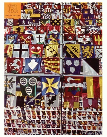
Cover photograph by Byron Ferris
George Opperman, associate art director Wendy Gross, editorial assistant
8 The time and the place
Jay McKendry, typographer R. Bickford, associate typographer Robert Blanchard, publisher
10 Club news, exhibitions 51 Herb Rosenthal
Jerome G. Steimle, president
60 Artfrom New Guinea Gale Osborne, circulation Judy Graham, circulation David Powell, mailing service
CA Magazine is published bi-monthly by Coyne Bt Blanchard, Inc. , 809 San Antonio Road, Palo Alto, California . Subscrip· tion rates: U. S. A. and possessions, one year, $12 ; two years, $22; three years, $30. Foreign, one year, $14 ; two years, $26; three years, $36. Single issues : $2 each . ® Coyne & Blanchard , Inc., 1964. All rights reserved . Trademark registered . Second -class postage paid at Palo Alto , California . Postmaster: Please send 3579 to 809 San Antonio Road, Palo Alto, California, 94303. Change of Address : Notification should be sent to CA, 809 San Antonio Road, Palo Alto, California, at least 30 days prior to effective date . Send both new and old address . If possible, use imprint from CA mailing envelope for old address. Editorial Correspondence : No responsibility is assumed by the editors or publisher for unsolicited contributions. Manu scripts or other material should be accompanied by selfaddressed , stamped envelope. Advertising Correspondence : Requests for information or other correspondence concerning advertising may be addressed to the Advertising Department , CA Magazine, 809 San Antonio Rd., Palo Alto , California . Phone (415) 323-0221
66 Pete Max/ Daly & Max 74 The floating studio 78 Aspen Design Conference 84 Glad Hand Press festival 89 Graphics of a Swiss town 91 Exhibit 99 Print that matters 102 On the board 106 Materials, available literature 109 Index to advertisers
Two big decisions in a draftman's life His technical training can't help him in choosing his wife. While a lady's dimensions may be a factor, his emotional involvements do not yield to scientific measurements. But in choosing his drawing pencil he can be objective. And he should be,. for he will live with it, too, for a long, long time. Every test he can think of will prove that only A.W.FABER'S CASTELL #9000 checks out with absolute "slide rule" accuracy. CASTELL'S 20 degrees, 88 to
demand. It is outstanding in uniformity, in low rate of wear, exceptional point strength and in number of high quality prints. Shouldn't you get acquainted with your second lifetime mate? All good Dealers carry CASTELL Now is a good time to call him. If you prefer to try before you buy, simply fill out the coupon and attach it to your company letterhead. A. W. FABERCASTELL will send you samples of the degrees you use in your daily work. Okay? Do it today.
lOH, are milled by the exclusive Microlet process and held to rigid grading standards which were pioneered by A.W.FABER. No degree is permitted to encroach partially into the next one for the sake of showing an illusory blackness. Today, next month, next year CASTELL will deposit opaque lines of even density with sharper definition and complete absence of "spread" or feathering at the edges. CASTELL combines features draftsmen desire and repro rooms
A. w.FABER-CASTELL Pencil Co., Inc., 41-47 Dickerson Street, Newark 3, New Jersey
r-------------------------------------------------------1I
I
Please send me a sample each of Castell #9000 Drawing Pencils in_ _ _ _ __
I I 1
COMPANY
l
MY NAME IS
CITY
___ degrees for testing purposes.
TITL ADDRESS ZONE
STAT
l
I I c1
L-------------------------------------------------------~
Current As sets,
Cash Receivables Inv ntories, at lowe or market .t' Prepaid t' Pen,$ T otal C l'el:lt A.$
52 , 353 , 1)00 _ 1, 328 , 000 se ts 107, 944 ,
D 000 educt • Cur.r e Li . Por tion abllities: ong-term d du w ithin eb A One Year ccounts PAyable And 1' ~ao•. 000 ac rued e"Penses Ace rued taxes 24, 336; 00$ Total Cu r:rent Lia-bil't· _§, 8U, 000 Work ing Ca.J?ital t leS 564, 000
tk
I
I
Lon<>-T , erm Rece ·
Deposits
b .tva les and
lnv stmel;lt in and t=>- . • ...~c elvables
Land, Buildin s a nd Equ.i g ' Machinery c>rkt.nt>- s::rne~t, at cost 1'\6.. . ~>~P.ttal and .,..wrer -n.11Set
]~80, 0.§"
583. ooo 2.817, ooo
Deduct_
Long.. rrn d h Det e t - Note Z red fede r al i xes . 1lcorne
Some annual reports look as though they'd been printed on the back of an envelope Sometimes it's practically that bad. Which is unfor-
Before you start anything, let us send you Oxford's
tunate because an annual report reflects the image of
fact-filled booklet which surveys the annual reports
the company it represents. Poor presentation, poor
of 750 corporations. There's just one string attached.
impression. It's as simple as that. The next time you have a say in planning an annual
The Oxford Survey is directed to people who prepare, design or print annual reports. Send us the last annual
report, speak up in favor of a paper that flatters de-
report you worked on and receive the new19640xford
sign, typography, illustrations, and company image. Mention Oxford. It guarantees you're beginning with
Survey just published. It will be a useful reference when you take on your
the best, and that gives you a long head start.
next annual report assignment.
OXFORD PAPER COMPANY, 230 PARK AVENUE, NEW YORK, N.Y. 10017 • BOSTON • CHICAGO
Printing Papers for Books, Magazines, Commercial Printing, Business Forms and Packaging
LASTING IMPRESSIONS BEGIN WITH
OXFORD
PAPERS Olt
© 1964 Oxford Paper Company
WHO PUTS A
t{ AC,\• IN YOUR TYPE?
GRRRR ... YOU KNOW ... MONSEN! CHICAGO: 644-1223 LOS ANGELES: Rl7-6191
THE RENOWNED COUNT ZEPPELIN WILL MAKE AN ASCENT IN HIS AIRSHIP
tillll RerJDINQ TniS IN1JITtiTION tiRe IN1JITeD TO 1JieW TniS DtiRINQ Pem THE COUNT WILL RISE TO THE DIZZYING HEIGHT OF 1000 FEET, MAKE A RIGHT TURN AND CIRCLE THE STATUE OF LffiERTY. HE WILL THEN RETURN TO HIS STARTING POINT AND GENTLY DESCEND TO EARTH.
--·---4q((A COLLECTION WILL BE TAKEN FOR THE NEEDY)b,)::-·--
A LOOK AT THE LIGHT SIDE of the Kimberly Opaque line* will show you instantly that here is a postagesaving paper with prestige appearance. It can trim dollars off your mailing costs, without reducing the quality of the printed piece. And this is important: Kimberly Opaque is heavy enough to run at high-press speeds, without the problems often faced with "lightweight" sheets. It has the opacity and feel of many papers twice its weight.
~ Your franchised Kimberly-Clark Business Pape~s distributor has a new demonstration folder.
It's called ·"A Look at the Light Side." Ask him for it. It could help lighten the load on your postage budget. * Kimberl y Opaque is available in # 40, # 50 , # 6 0, # 70 , #80 and #100 weights . Matching Kimb erly Opaqu e Co ver in # 6 5 and # 80 . Smooth Ve llum , English and Venetian finishes .
KIMBERLY-CLARK CORP. NEENAH, WISCONSIN THIS IS KI MBERlY OPAOUF OFFSFT # 40 FNr.IISH FINI~
hlcl n th most popular Illustration board In Am rlcafam u lnce 1868 for Its clepenclablllty In . praCtically all mediums, particularly water color. At all art suppliers In 22 x 30" 30x40" 20x 30". Single or
DouiJfe Jltlclc
Charles T. Bainbridge's Sons 12 Cumberland Street Br~oklyn
1, N. Y.
The Time and the Place Berkeley Film Quarterly, published by the University of California Press, has announced a competition for film poster design. Any resident of the U.S. can enter, and designs can advertise any film of the past, pre ent, or future-features, animation, documentaries, experimental, etc. A United Artists Prizr of $300 and a Brandon Films Prize of $125 are slated, with additional prizes still being negotiated. Deadline for the competition is January 15, 1965. Flyers giving rules and instructions are available from the University of California Press, Berkeley 4, California.
Art-0-Graph projector makes
Los Angeles "Civil War Centennial," an exhibition of documents, photographs and objects relating to the Civil War, will open November 24 at the Los Angeles County Museum, and will remain on view through February 14.
photostats, too!
Art-0-Graph "1000" ~~-~ti:o~;J~~t[;n~ 1~ dTan~aert~;~
with auxiliary lens. Finger-tip control. Counterbalanced. Tessar-type lens. Flip-back copy pressure plate.
Art-0-Graph "800" 1
~~i~f~rtJ.~iJi~dor t~~~~~~c~~e~
Takes same size copy; same lighting system as ModellOOO. 8 diameters enlargement toreduction. Takes no floor space.
New York New Statmaker accessory converts any Model 1000 Art-0-Graph to a complete photostat machine in one minute! Makes photostats up to 5time enlargement or reduction, (maximum size 11" x 14") in line, tone, or screened, for reproduction, keyline, or layouts. Prints cost only pennies, less than 20¢ for an 11" x 14"! No darkroom required! New Artopositive paper makes prints directly from original without negative. Paper supply is an 11-inch-wide by 350foot roll in magazine. Paper is exposed and developed in light-proof chamber of the Statmaker. You work in normal room light. Monobath development-Exposed print is developed for about 2 minutes, removed from the Statmaker, rinsed and dried. For screen prints, special 8 x 10 easel with contact screen is laid over the projected image. You can prepare complete artwork for one-shot by the plate camera: no expensive halftone negatives required! QUICK SWITCH! Takes only one minute to place the Statmaker in position and attach bellows. Another minute puts it back on the shelf and your Art-0Graph is ready for regular studio use. Write for Statmaker folder. Shows how to cu-t costs, save time! Art-0-Graph literature included.
a ArtO·Graph Inc. <:::::===:> H.nl!\~
... Dept. CA1, 529 S. Seventh St., Minneapolis, Minnesota 55415
~········--
8
A one-man exhibitim;1 of the graphics of Professor Fritz Eichenberg, Director of Pratt Graphic Art Center, will be shown at Cornell University's Willard Straight Hall through November 26. Gallery 303, a fourth in the Young Designers series, through December 23, featuring Everett Aison, Frank Attardi, Tom Huestis, Joan Stoliar and Roger Zimmerman.
The Mead Library of Ideas is calling for entries to an exhibition of announcements: holiday, birth, exhibition, etc. Judges will be Paul Davis; David Enoch of Eisenman & Enoch; Christos Gianakos of Ancona-Gianakos. Deadline is December 1. Submit entries to Mead Library of Ideas, c/ o Seasonal Announcements, 200 Park Avenue, New York, New York 10017. An exhibition of prints by AI Blaustein and Andrew Stasik will be featured at the Pratt Graphic Art Center, 831 Broadway, through November 20.
Pittsburgh The Carnegie Institute Museum of Art is showing the 1964 Pittsburgh International Exhibition of Contemporary Paintings and Sculpture through January 10, 1965.
BERGSTROM PAPER COMPANY NEENAH, WISCONSIN
---------------------Please send me THOR Offset Paper samples. I am also interested in: 0 IBSEN® Book Papers 0 ODIN® Office Printing Papers 0 Safety Papers Name _____________________________ Title _____________________________ Company___________________________ Address ___________________________ City___________________ State________
~~
Paper for Printing, Publishing, Converting, Banking and Office Communications.
Club News Atlanta The Professional Artists Association of Atlanta has elected the following officers for the coming year: Willard C. Wallace, Dye and Wallace Studio, president; Bob Hamill, 1st vice president; Keats Petree, 2nd vice president; Duff Sutton, treasurer; and Mrs. Cynthia Sutton, secretary.
Light* Light Italic* Medium*
Bold Extrabold Light Condensed
Medium Condensed Bold Condensed Medium Extended Medium Ext. Italic and the newest addition :
Bold Extended
Just acquired ... the 11th in the Folio series stocked by Bauer Alphabets for those designers who realize the value of a consistently well-designed sans serif family. Folio is not a mixture of miscellaneous old faces , revived and renamed ; but a scholarly approach to enhance today's typographic trends. •also available on lntertype from 6 to 12 pt.
For spec ime n sheets write to:
Bauer Alphabets , Inc. 305 E. 45t h Street New York , N.Y.1 00 17 MU 6-1761/2/ 3
10
ATA Ferd A. Laile, William Patrick Co., Inc., Newark, New Jersey, has been re-elected president of Advertising Typographers Association of America, Inc. Also re-elected were William E. Trevett, Cooper & Beatty Ltd., Toronto, vice president; and Arthur S. Overbay, Jr., Typographic Service Company, Indianapolis, treasurer. ASID The American Society of Industrial Designers' officers for the coming year are: Don Dailey, Don Dailey & Associates, Evansville, Indiana, president; Clarence F. Graser, director of ID for Westinghouse, Columbus, Ohio, vice president; George Payne, Bedford Hills, New York, vice president; Nathaniel Becker, Becker and Becker Associates, New York City, secretary; and Richard Hollerith, Jr., manager of ID, Monroe Calculating Machine Company, Orange, New Jersey, treasurer. Boston The Boston Art Directors Club awarded its Golden "T" Square to Lee LeBlanc for his outstanding contribution to the field of Art Direction in the New England area during the past year. Mr. LeBlanc is the creative director of the Arnold Advertising Agency. Former winner George Campbell congratulates LeBlanc.
'
-~..
• r-
.. -=-
' ., --== -=..... --= -=
l t-+-1: '
....
Q
-
-
n
MEASURES UP WITH NEW
--
BRILLIANT COATINGS STRONGER BASE STOCK GREATER PRINTING VERSATILITY- PLUS A NEW LOWER PRICE!
- --
Make it a rule to use
for brighter new
dimensions in creative printing and design
CURRENCY COVER offers the brightest new perspective for creative design and printing of anniversary promotions, annual reports, catalogs, brochures and special presentations. Its Gold/ White or Silver/White duplex combination features a supersmooth, low-lustre metallic coating that prints readily by letterpress, offset or silk screen with standard fast-drying inks. As you can note, this side features Apco's new bright blue-white coating for sparkling printing definition of typography and finescreen halftone illustrations. Take full measure of CURRENCY COVER'S new stronger base stock and super-smooth, uniform finishes. Benefit too, by its new lower price. Sample Portfolio and details on mill stock sizes and weights available upon request.
APPLETON COATED PAPER CO. APPLETON
LITHOG RAP H E D ON 23 X 3 5 - 248 M
I
SILVER AND WHITE CURRENCY COVER
I
2-COLOR OFFSET PRESS
•
WISCONSIN
I SHEET SIZE 23 X 35 I
2 COLORS PLUS WHITE ( RUN TWICE )
I
3600 IMPRESSIONS PER HOUR
Club News (continued)
Dallas Newly elected officers of the Dallas/ Fort Worth Art Directors Club are: Tom Young, Keitz & Herndon, Inc., Dallas, president; Mike Windsor, Jack T. Holmes Associates, Fort Worth, vice president; Dave Davy, Creative Freelance Associates, Dallas, secretary; Jack Unruh, Portfolio, Dallas, treasurer. The second annual series of seminarpanels on advertising art will again be conducted by members of the Advertising Artists Association of Dallas and the Dallas/ Fort Worth Art Directors Club. "Project Two" will visit at least nine Southwestern colleges and universities. Panelists of each seminar will include an art director, designer, illustrator, and a film designer or fashion illustrator.
how to drive your typographer
Denver The Art Directors Club of Denver's newly elected officers are: Ken Wilmot, KLZ, president; Dick Garret, Campbell-Mithun, 1st vice president; Glen Cuerden, Advertising Design, 2nd vice president; Dennis N ewstead, Ernie Brame Typecrafters, treasurer; Barbara Jezek, Denver Dry Goods Co., secretary; Jerry Ellis, executive secretary / treasurer.
New Jersey Donald R. Mayer, vice president and general manager of Reach, McClinton & Co. , has been elected president of the Advertising Club of New Jersey for the 1964- 65 term. Officers serving with him are Joseph Liebman, senior vice president; John H. Connolly and George P . Slockbower, vice presidents; Walter N. Hovland, treasurer, Calvin Louderbach, secretary.
Give him no leeway. Defy him to make suggestions. Keep him in the dark about your objectives. And don't forget to make every job a rush job. If he hasn't cracked by then, you may not be dealing with a professional typographer after all! + For a real "pro" puts his skill and sensitivity, taste and judgment into every job he sets. His pride in a job well done makes him do it. From your standpoint, these are the extras that make any type (even ATF type) look better. + So keepYour typographer happy. You'll be happier, too. Be kind to him ... you need him (and so do we) just as he needs you. American Type Founders, Type Division, 200 Elmora Avenue, Elizabeth, New Jersey 07207. ATF furnishes specimen materials to art directors, designers and artists directly from the foundry in Elizabeth. For quick service, A TF supplies typographers through a network of Authorized Dealers carrying substantial stocks of genuine, quality A TF foundry type.
~~
·~
;
-.
Phoenix The Art Directors Club of Phoenix begins their current season with the following slate of officers: Forrest E. Lane, Arizona Public Service Co., president; Roy Head, 1st vice president; Judd Brown, 2nd vice president; Jack Cedar, corresponding secretary; Virgil Hubert, recording secretary; Bill Baldwin, treasurer. 17
Club News (continued)
Typography 64 The sixth exhibition of Canadian typographic design, organized jointly by the Society of Typographic Designers of Canada and Rolland Paper Company Limited, hung 218 pieces chosen from a record number of 2,272 entries. The juries: books- Robert Reid, Arnold Rockman and John Gibson; printing in commerce - Rolf Harder, Brian Patterson and Dr. Martin Kemper; magazines and newspapers- Paula Fiala, Chris Yaneff and George Beaupre; experimentalChris Y aneff and Arnold Rockman. The seven award winners are shown here.
J""' ".
Pt
' "'"'· ,.. , . _ . ..,. •
... 'I t J1V ~'dol• r.'WI'O''*"'•
M~l' I• llt"<'t
.. -
,
.
M • ,, .... .......
-P~•
• •
.s·;•,J-•
4<
t
· · --
.... i
14 • •I•
.!:§~'§:
......,. .k .-.....~
~f=~ ~~ ?:~i~ ~~~~:ic::::;::
deux truites rouges, Morrice, Picasso, Ia matiere revelatrice
Ne"!'spapers and magazines Gilles Robert, designer, Montreal La Presse, client Experimental typography Gerhardt Doerrie, designer
L J.i l l 1 • 1. Ll..U l. 1 11 Ll 1.1. J.1j__ 1 Ll.J.~ .ll. 1 .L 11. l-11.1.11 .1.1.1.1. . L.LJ.J 1 .LJ..l.J l .l..Lll -
Ll
TTTTTTTTTTT"TTT
lll.l.l.l.l.l.l.l.1l.J..ll.l.
r T T T TT TTTTl TT
TTTTTl T TTT TTTTl T T T TT TT Tl T T T TTTTTl T TT T'"TTl T T T TTTTTl T T T TT TTTTl T TT TTTTTl TTTTTTl T TT7l T T TTTTTTTl T - TT Tl T TT 1 T TT T TT' T T TTTl I T TTl I T T -TTT1 TT~
I
T I
18
0
-
-1 I
-
T -
T
T
- T'l T TT T I T1
T
T
Tl
T T -1 I I 1
~---
1
beautifully designed blocks are cut from rich grained hardwood with a natural finish, or brightly painted colors. Each set includes a blue print inspirational work sheet showing modular design approaches. For children of all ages. Approved by educators and psychologists. $5.00
child psychologists. Used in U.S. Schools. Each set contains 100 felt shapes, one felt play board, and a fully illustrated instruction folder. V $5.00
Creative Play Activity Series Artists have an appreciation for good design- an axiom which no reader of CA will refute. Examine the illustrations on this page and you will be impressed by the good design, superb packaging and well conceived products, all created by Eugene deChristopher. He believes that the most exciting toy you can give a child is one that sparks the imagination. Each of the six items illustrated will open a world of creative exploration for young and old alike. You may order your sets by using the convenient order form on this page. We at Princeton Educational Toys, Inc. are proud to introduce our distinctive creative activity series.
·:;Chris-Cuts Drawing Kit Creative play activity For the young Artist who wants to experiment with basic shapes and then translate these forms into pictures on paper. This set includes over 40 brightly colored pieces of felt cut in basic shapes, a box of professional chalk (dust proof, non-toxic) ample supply of drawing paper, board and an instruction manual. Chris-Cuts help you bring your mental pictures to reality. If you have never drawn a realistic clown before, you'll find it easier to draw from your Chris-Cuts designs created by you! For children and adults of all ages. V $5.00
The butterfly design expressed graphically, was executed by two basic shapes from the Wood Print Set, an oval and a circle. Many fabulous butterflies can be made in just this way. The train illustration was done with a variety of shapes carefree abandon.
Standard Set Hours of creative play activity with forty pieces of brightly colored felt cut in geometric shapes with a large red felt background for a play surface.
Chris-Cuts Deluxe Set Creative play activity Chris-Cut deluxe set is a toyand it is also a unique art medium. Even if you are not handy with pencils and paint, ChrisCuts let you "draw" pictures with its nearly 100 brightly colored felt pieces. You can arrange and re-arrange Chris-Cuts in an infinite variety of forms to create anything from animals to funny clowns to abstract designs. Chris-Cuts help you bring your mental pictures to reality. Approved by educators and
Candy Color Cubes Painted wood blocks Exciting new building blocks to stimulate the imagination of the young child . 2" x 2" x 2" cubes with delicious colored geometric shapes printed on white background, all non-toxic. Enclosed is a work sheet showing the endless possibilities of design patterns. As the blocks are stacked they take on the appearance of 3-D pop art. Candy Color Cubes are a vocabulary of shapes easily understood by the young child. Ages 3 to 5 years $5.00
Arkitek Blocks ~ Made of durable hardwood Future young architects can create interlocking forms of endless varieties of skyscrapers; modular housing designs, floor plans and layouts of buildings for an entire city. Professional architects will also find these blocks useful in simulating layout planning. It is reputed that the world renowned architect, Frank Lloyd Wright, often experimented with a basic set of children's blocks for his imaginative structures and that a particular set he possessed as a boy gave him his initial motivation to become an architect. Spark the child's imagination and have him live the role of an architect. These
Wood Printing Set L_ End grain hardwood shapes A completely new technique adapting the ancient oriental art of woodcut printing. A first in wood printing sets for children and adults. With an assortment of basic shapes cut from the end grain of beautiful hardwood, the young artist and adult merely dips the block surface into paint medium provided then prints with blocks onto paper or fabric. This set provides an exciting experience of creative pleasure. An instruction book describes the various techniques in printing. The set contains: 20 pes. of wood blocks, 6 jars of real artist colors, 6 pans for color mixing, ample supply of printing paper, fully illustrated instruction manual, water color brush. $12.00
·••
... .
:
A child can create an endless variety of animals, faces and abstract designs- all from one attractively packaged set of Chris-Cuts. The inside of the box becomes a framed picture to hang in a child's room. Perfect toy for ages 3 years to 12 years. $3.00
. . ..
Make your check or money order payable to: Princeton Educational Toys, Inc., 194 Nassau St., Princeton, N.J. Quantity Description Wt Amount Wood Print Set 7 lbs. Arkitek Blocks 5lbs: Candy Color Cubes 4 lbs. Chris-Cuts Deluxe 2lbs. Chris-Cuts Standard 2 lbs. Chris-Cuts Drawing Kit 2lbs. Shipping and handling, 25c per lb. Total remittance NAME - -- - - - - - -- - - - - -- - - - - ADDRESS - - - - -- - - - - - - - - - - - -- -CITY _ __ __ _ _ _ _ _ _ _ STATE _ __ __ _ _ __
Club News (continued)
La medecine dans l'art
Merrell
Emile Zola The naturalist novel Edited with an introduction by Maxwell Geismar an Emulation Book
TYPOGRAPHY '64 (continued)
'fhe visual craft of William Golden, a retrospective exhi bition of his work for CBS, O.;tober 29 to November 9, Monday llirougb fl-iday, 10.30 am to 5.:'JOpm Cooper & Beatty, Limited, type eraftsmen. 401 Wellington Street West. 4th floor
Printing for commerce Ernst Roch , designer, Montreal R.B.T. Printing & Litho Co. Ltd ., printer Wm . S. Merrell Co., client Printing for commerce Allan Fleming, designer, Toronto Gilchrist-Wright Ltd., printer Cooper & Beatty Ltd., client Books Heiner Hegemann, designer, Pointe Claire, Quebec Harpell 's Press, printer Harvest House, client
20
hop y f rt
ird c lorP
(Turn page)
It's free!
Our illustration may look like a three, or even a four color job. Actually, we've done it with just two impressions-red and green on French Cream stock. Admittedly, we've gone all out to give you a particularly dramatic example. But the point is, Atlantic Pastel Offset gives you an extra color dimension to work with, at no extra cost. Just give your imagination free rein, and see how easily you can achieve striking multi-color effects. And how easily you can get extra mileage from your printing dollars. Atlantic Pastel Offset has a smooth, well-closed surface that assures you of clean, predictable results. And it is available in six like-sided shades. Ask your Eastern Franchised Merchant for samples of Atlantic Pastel Offset in Suede and Deep Etch finishes . Or write us direct-on your business letterhead, please.
~ ATLANTIC PASTEL OFFSET EASTERN FINE PAPER AND PULP DIVISION· STANDARD PACKAGING CORP. · BANGOR, MAINE
How it was done: To achieve the multi-color effect on the reverse side of this page with only two impressions, a color transparency was taken of a sandpaper block on which three colored pencils had been sharpened. (One of the pencils was white, to permit the color of the stock to show through.) Two-color separations were made from the artwork. Red and green 1nks were used to print by offset on Eastern's Atlantic Pastel Offset, French Cream, Basis 70, Suede finish. Other colors: Mistie Blue, Smokie Gray, Ocean Green, Dustie Pink, Daffodil Yellow, Suede or Deep- Etch finish.
Club News (continued)
ESTERBROOK'S
.\fc.·u.murrhu'•~ ~umbu >. !'Jo"tmbc-r l•.>G 1 A m.l.~ILJnt of nC"A CanildJ<&n Ltcn.ture \tom·s h\ B•;a.ncs VanOrden and FreducJamt:son Pf'IC'mo; h, •r«""-ltt' Hernn~ .
M•tl1;ad lc-iM: .. k, M1chat:l ~·l,l!cr . JohnTotJ.;II.tbu<' Thu 1ssue mdudts 4} p«ms by Goufned Bcnn for the f1m ume 1n Lnghsh. tn.nJb.trJ h\ M1chael f.cbKL.
NEW EXTRAFINE FELT-RITER,. Uses galore! Perfect for sketches, thumbnails, fine layout let· tering, and notations.
TYPOGRAPHY '64 (continued)
Printing for commerce Rolf Harder, designer, Dorval, Quebec Bourguignon Printing Ltd., printer Ampak Ltd., client Student - Rolland Gold Medal Book cover Paul Stephens
Smooth and clean to use ... no smearing, no dusting, no fix· ing. Lines are sharp, but will not bleed through paper. Lasts far longer! Esterbrook's new Felt-Riter lasts at least twice as long as any other brand, and its thin , thin line stays thin because the extra-fine point wears evenly. Available in eight water colors, easily identified by the color of the barrel. You'll be glad you tried them! 49¢ retail
8~®
Camden, New Jersey OB!Ol
FLO-MASTER • FELT-RITER • MARKERS
23
611SSilDdD
(gles-siin-do) smooth; in a gliding manner; a sliding movement for the purpose of blending tones. In both worldly and ethereal realms the harp holds classic significance. Musically it is the heart of all stringed instruments and is in itself a distinguished symphonic performer. A harp glissando in a score evokes a smooth welling of tonal change
SYMPHONY OF TONE
LITHOFECT OFFSET ENAMEL
80 LB. BASIS
that courses through the entire aural spectrum - gathering among deep pedal tones to dart chromatically through the intermediaries, finally aspiring to the bell-like sound frequencies that hover just under the upper threshold of perception. Such a full tonal range in printing can be achieved with Lithofect offset enamel, surface-designed to create a veritable glissando of
color impressions. Glissando aptly describes another important Lithofect offset characteristic smooth runability. By assuring both full-scale color reproduction and dependable runability, Lithofeet offset enamel can help you create a profitable Symphony of Tone in printing.
SYMPHONY OF TONE
'~-;i' "
Club News (continued)
Omaha The Omaha Artists/Art Directors Club received over 400 submissions to their 8th annual exhibition. The jury singled out the two Best of Show and 12 award winners shown. Judges: Morton Goldsholl of Goldsholl & Associates; George Guido of Needham, Louis & Brorby; Art Paul of Playboy Magazine. Show chairman was Pat Sendt of Bozell and 1a cobs, Inc.
This part makes ice crescents. It makes ice crescents all day. And all night. It never stops making ice crescents.
] Best of Show Poster Bill Fries, art director/designer Brian Kennedy, photographer Bozell & Jacobs, agency Mutual of Omaha, client Best of Show 3 dimensional model Rod Morse, art director Howard Shoemaker, artist/ designer Ayres & Associates, agency
. IIIIII Of course, it pauses when the bin' s full. It holds up to 108 tee crescents at once and. as soon as you put som.e tn tour 1ce tea (or whatev f), 1l starts maktag more_ You·JI ne"Ver havf" to t,u or ~pi:' messy 1ce tray:r. Jgtun RCA "'..:htflpool's Ice Mag•c Retogerator does all the work for you You co, f,nd RCA V'oh•rlpool's fee Magtc Refflhera1or at 6e\tAppl!onco T~ey"re back on Ben sona16054 Molotory. Proce• st art as low os $288 88 woth !rode BE ST APPLIANCE
26
Magazine art Richard Von Frankenberg, art director Howard Shoemaker, artist H.C.F. Porsche KG., client Newspaper ad Pat Sindt, art director I designer Walter Griffith, photographer Bozell & Jacobs, agency Sidles, client
WhatS sky blue on one side & "'bite on the other?
It's also Autumn Red on one side Sand Buff on one side Golden Yellow on one side Stone Gray on one side Tree Green on one side And what gives you the effect of two-color printing at a one-color printing cost? Strathmore Cover Duplex. Obviously. But while this saving is a good reason for using Strathmore Cover Duplex, it's only the first in a long list. There's the color itself. If s in the paper, not on it. Result : no danger of streaks or hickies, however large the color area. What's more, the surface has real paper character. With color on just one side, you have white where you want it, and color where it can be used best. You also have the nice surprise of starting with white paper and going to color, or going from color to white. All without the second impression.
& white on the other
And all the Strathmore Cover Duplex colors can be matched in Strathmore Cover. Unlike other duplex papers, Strathmore Cover Duplex is a solid sheet, not two sheets pasted together. That makes a difference in the way it handles on the press. It also means you can get as fancy as you like- die cuts, embossing, trick folds. These are a few of the good reasons for choosing Strathmore Cover Duplex. Want more'? Unlimited design possibilities with this versatile paper. We've sketched a few examples of how it has been used -why not try your hand at it'? If you come up with a particularly intriguing solution to a problem, send us a sample . We like learning new ways to use our papers.
STRATHMORE COVER D UPLEX, Basis 80, is available in the colors listed above and, as you see it here, in Sky BluejWhite. STRATHMORE COVER, Basis 65 and 65/2-sheet, is available in Stucco Ivory, Autumn R ed, Tree Green, Sand Buff, Oak Brown, Golden Yellow , Sky Blue, Cornflower Blue, Imperial Blue, Stone Gray, Sultana Scarlet and Raven Black; Snow White in Cover Basis 50, 65,80 and 65 j2-sheet .
STRATHMORE PAPER COMPANY Paper is part of the picture/ West Springfield, Massachmetts
'~'~'
Club News (continued)
..
This ch~d will never learn to read
---------------------------------------------eeeee eeeee eeeee
eeeee eeeee
-- ee
Water Colors become as plastic as oils with
New WEBER
TRADE MARK
PAINTING MEDIUM
1" x 6" tube, 95¢
Use WEBER AQUA/GEL right from the tube with water colors, Designers' mat water colors from tubes or jars, and most tempera water colors, to get fine oil color effects or superior opaque and transparent washes on most any surface. You can use WEBER AQUA/GEL, mixed in sufficient quantity, with oil colors and thin with clear water only. This mixture saves much clean-up time in classroom or studio since only water is required. When used with water colors, AQUA/ GEL will dry insoluble to water. Normal drying time is maintained with water or oil color mixes. OMAHA (continued) Newspaper ad Pat Sindt, art director/ designer United Community Service, client Christmas card Joe Van Hosen, art/ designer I client Newspaper ad Pat Sindt, art director/ designer Brian Kennedy, photographer Bozell & Jacobs, agency Blue Flame Gas Association , client
However you use WEBER AQUA/GEL, pleasant, buttery brush response is assured. Color is more luminous and brilliant for color values show practically no change from wet to dry stage. Try AQUA/GEL soon!
F. ~EBER CO. Philadelphia 23, Pa. MAKERS OF FINE ARTISTS' COLORS AND MATERIALS SINCE 1853
29
Club News (continued)
pru:•'1.ltn_
You'll be glad you tho,;c Gas Heat when it's !imP for Central ,\ir
Newspaper ad Pat Sindt. art director/ designer Ken Willmarth , artist Bozell & Jacobs , agency Peoples Natural Gas, client
.\ Fn·•· tiil\ frmu th<• Fi!;,l :\alionalllnnk. For Safe, Sustained Diuresis Without Electrolyte Imbalance
OMAHA (continued) Magazine ad Rod Morse, art director Howard Shoemaker, artis t/ designer Ayres & Associates , agency Carvel Inc., client Newspaper ad Pat Sindt, Bill Fries, art directors / des igners Ken Willmarth , artist Walter Griffith, photographer Bozell & Jacobs, agency First National Bank, client Newspaper ad Pat Sindt, art director / designer Howard LeVant, photographer Bozell & Jacobs, agency Blue Flame Gas Association , cl ient Newspaper ad Bill Fries, art director/ designer Brian Kennedy, photographer Bozell & Jacobs, agency Storz Brewing Co. , client
30
Betsy Ross House. Philadelphia, Pennsylvania
*
Apoeticjorm in which con ecutiv words commence with the same consonant.
Your proposal printed on
PA
CHK
P
RC
T
E
presells your prospect with the proposition that a persuasive profit potential is present in an unpedestrian pre entation! It may take more than word and picture to effi ctively sell a proauct. Th right paper can help lend import ce to what you ay. And the right paper is of PARCHKIN Printing Parchment. Cri p. Rich feeling. With a look of stability. And an intere ting te ture that ad s a unique new dimension. P RCHKI can lend beauty, individuality and permanence to any importan mes age. Greeting cards acquire a ntimental touch when you use PARC KI tt rhea , busine card , menu , diplo a and rtifica s of award look a ecial and importa the me ge they bear. And br hure , annual port or other busines me ages communi ate wi quali y and authori y. Why ake a chance that words and picture ar enough? Sel ct PA CHKI infng Parchment for your next m age ... and b u e.
50-line r en from Four-color proce repro water olor art. Titl , 30 pt. atin Wide. ubhead title, 14 pt. Craw Modern Bold. ubhead, 12 pt. Ca Ion Bold alic. ody ype 10 p . Century c ool ok. This piece printed in four-col r pro iby i hography on a 2 color Miehle o. 49, x 49 pre , on archkin od 55-4. OUR FLAG ha in pired many a poetic expre ion ... none is so stirring and pirited as th "Starpangled Banner" by Franci Scott Key, hich was to become the national anthem of the United St t s in 1931.
P INTED IN FOUR COLO
BY OF
TE
0
BRISTOL, PA. e NE
p
c
YORK, N. Y. e P
T P
P
R CO.
IDG , ILL. e SU NYVALE, C L F.
For a reproduction of The Betsy Ro House, suitable for framing, write to u on your busine letterhead. ET 0
PARCH IN
jtiNT I NC P ARCHM
T CODE 55-4.
Club News (continued)
A GOOD START The Important Part of
GOOD ART!
...... AS IN HORSE RACING Sl,~CCI{rl'\' IS ~ \ I JCSlt \~1)
() PR(), r ll)l·~ I;()})' '1 '( )l-~
~1
Securily 1s our Business (
'"f:;rf... U
Good artwork requires a good start. With a surface having a perfect affinity for pencil, pen or brush, Hurlock 's illustration Board provides the finest surface for almost any technique . Ask for #1029 single thickness , , , or #1030 double thickness .. . at leading dealers .
HURLOCK BROS. CO.,
INC.
OFFICE AND PLANT 3436-38 Market St., Philadelphia 4 , Pa,
OMAHA (continued) Poster Dick Sullivan, Frank Ervin, art directors Helen Neutzner, designer Jim Braddy, photographer Bozell & Jacobs , agency United of Omaha, client Magazine ad Helen Neutzner, art director I designer Brian Kennedy, photographer Bozell & Jacobs, agency Nebraska Consolidated Mills, client
With Liquitex, the designer and illustrator can achieve effects-and speed of handling-not obtainable with any other colors or media. Liquitex Colors are EXCEPTIONALLY BRILLIANT-almost luminous-used as either opaques or transparent glazes. Use them on any surface, even on plastics, with no advance ground preparation. They dry quickly and are IMMEDIATELY WATERPROOF. The work needs no special surface treatment to protect it from handling. Liquitex Colors thin with water or with Liquitex Medium. NO NEW TECHNICS need be learned but whole new fields may be explored through the great versatility of Liquitex. FOR FREE TECHNICAL BOOKLET, COLOR CARD AND PRICE LIST, WRITE:
PERMANENT PIGMENTS, INC. 2708 HIGHLAND AVENUE CINCINNATI 12, OHIO
33
Club News (continued)
~r==~t--;;~,:::;, -~~•ht~~ ':',:~~,:::~:.~: ttl..on bool~n Wff;t'oiM Mt:tf-«pf~UnOIII'ft3:Mho<n _.1til,. 11~,.,.1~111
\Oif~r'IC"/8tUt.l<.eofll.fl\dlhe
ut~~rtor'fl4.~b~l~~:!l!J.Mflll~(lllt'"lf'ltl\ rtw:~~~J\,Il;
too ot cefbr l'ln .,.,~, ~ .OI'"«t,ul. Flitly ~cr'bed 1ft~' I:IO!!Io; N "'On~ ~~ f':l ~4'f~fllllf(ltl .. Yow\ ltw 1"'1 a•\•na.
rASH/AN KOOAK COMPANY Rxhf.>!trr.NY IM·50
dek'
Rochester On a date coinciding with their 14th anniversary, the Rochester Art Directors Club presented awards for the lOth Annual Exhibition at the Rochester Memorial Art Gallery. Two special awards and 12 gold medals were given for the pieces shown here. Jurors were: Otto Storch, Art Director of McCall's Magazine; Onofrio Paccione of Leber, Katz, Paccione; Donald A. Elmslie, Advertising Di play Manager for Eatman Kodak Co. Co-Chairmen of the xhibition were jack A. Tetamore of Carey Studios, Inc. , and Toby Thompson of E. S. & ]. Art, Inc.
Best of Show Seth Fagerstrom / Sal Sinare, art directors M. Kaner, photographer Rumrill, agency Kodak, client
•
Booklet/ direct mail, 3 or more colors Toby Thompson, art director / designer E S & J Art, agency Rochester Art Directors Club, client Poster Herb Kopper, art director Herb Kopper/ Bill Sabia, designers E S & J Art, agency Xerox, client
The Kremlin in Moscow
The Making of a President
Sponsored by XEROX
Sponsored by XEROX
fn respons• to nat onal accbum tor th s rnemorab e one~hour tour of tht gUttering h••dq\lart•B or Czarl$t ~mprrtl" and wortd Commun am X•rox 1 aga.n prlvl1eged
to -pres•nt th s NU-color program.
34
"Text is for Texture" Number nine in a series of pen sketches of historic homes and early American buildings by the well-known artist, Caroline Williams . .....___ I' -~..
11
--- - - - -
---
Beckett Text With matching cover. matching envelopes
History abounds in New York City's storied old Fraunces Tavern-a gracious home in Colonial days . . . a Revolutionary headquarters where patriots charted the course of rebellion ... the scene of one of America's most historic moments . . . a center of ante-bellum night life ... and a present-day national shrine. The story of Fraunces Tavern began quietly enough in 1719. In that year the building was erected by Stephen de lancey, a wealthy New York merchant, as a residence for his wife and family. After his death it passed on to his descendants. In the mid-1700's, however, the building was purchased by one Samuel Fraunces, innkeeper. Under his management Fraunces Tavern became legendary for its fine Madeira wine-and its fabled "long Room" gained a reputation for grand entertainment that was unsurpassed among the members of Colonial New York society. But revolt was in the air, and in 1774 the Sons of liberty and the Vigilance Committee met at the inn to plan a party of another kind-the little-known but highly effective "New York Tea Party," similar to the one held by their Boston compatriots the year before. War, occupation by the redcoats and liberation came in quick succession, and one British warship banging away at the city inspired the lines: "Scarce a broadside was ended 'till another began/ By Jove! it was nothing but Fire away Flannagan!/ Some thought him saluting his Sally's and Nancy's! Till he drove a round shot through the roof of Sam Francis." A high point in the tavern's, and the nation's, history occurred on Thursday, December 4, 1783. That was the day of Washington's Farewell to His Officers. An emotional and memorable scene took place in the tavern's long Room as the sturdy old Commander-in-Chief said goodbye to his fellows-at-arms before retiring to his beloved Mount Vernon retreat.
In the years that followed, Fraunces Tavern flourished. Three fires caused serious damage in 1832, 1837 and 1852-but each time the inn was rebuilt and continued to serve as a meeting place for many of the leading civic groups of the day. The society of the Sons of the Revolution was organized at the tavern in 1878, and in 1904 the old structure was purchased by the Sons of the Revolution in the State of New York. Shortly thereafter, the society restored the old mansion to the original state in which the "great farewell" took place. Today, enjoying a mellow old age of nearly 250 years, Fraunces Tavern is Manhattan's oldest building. It stands at the corner of Broad and Pearl Streets-a national shrine, of which it has been said: "Man's fame, so often evanescent, Links here with thoughts and things that last; And all the bri~ht and teeming present Thrill with the great and glorious past."
& Artist's view shows Fraunees Tavern as it appeared in George Washington's day. Two stories and an attic roof were added to the structure after a fire damaged the inn in 1832.
b This historic "long Room" was the scene of General Washington's farewell to the officers of the Continental Army, December 4, 1783. Fraunces Tavern is currently the headquarters of the Sons of the Revolution in the State of New York.
Beckett Text
THE BECKETT PAPER COMPANY • Makers of Good Paper in Hamilton, Ohio, Since 1848
Beckett Text Distributors ALABAMA Graham Paper Company ... . .......... Birmingham Sloan Paper Company ............. . .. Birmingham Sloan Paper Company ... . ..... . ........ Huntsville ARIZONA Butler Paper Company ..... . ............. Phoenix Graham Paper Company .... . ... . . ... .. . .. Phoenix Graham Paper Company ..... . .. .. ... . .... Tucson ARKANSAS Roach Paper Company .. . ............. . Little Rock Western Paper Company .. . .. . . . .. .. ... Little Rock CALIFORNIA Butler Paper Company . .... .... . . . . ... los Angeles Butler Paper Company ............... .. San Diego Butler Paper Company .. . ..... .. .... San Francisco COLORADO Butler Paper Company ...... . .... .. ....... Denver Graham Paper Company ............... . .. Denver Butler Paper Company .... . ............... Pueblo CONNECTICUT Carter Rice Storrs & Bement, Inc.. .. . ..... . Hartford Henry Lindenmeyr & Sons ... . .......... . . Hartford Carter Rice Storrs & Bement, Inc....... . New Haven DISTRICT OF COLUMBIA The Barton, Duer & Koch Paper Company Stanford Paper Company FLORIDA Virginia Paper Company ............ . .. Jacksonville E. C. Palmer & Company ....... . ... . ...... Miami E. C. Palmer & Company ...... . ........... Tampa GEORGIA Sloan Paper Company .... .. .. . ........... Atlanta ILLINOIS J. W. Butler Paper Company .. . . . ......... Chicago Graham Paper Company . . . . . . . . . . ..... . . Chicago James White Paper Company .............. Chicago J. W. Butler Paper Company ................ Peoria INDIANA Butler Paper Company . ...... . ........ . Evansville C. P. lesh Paper Company .............. Evansville Butler Paper Company ...... . .......... Ft. Wayne The Central Ohio Paper Company ....... Indianapolis The Chatfield Paper Corporation ........ Indianapolis P. lesh Paper Company ...... . ..... Indianapolis Butler Paper Company . . ......... . .... Terre Haute
c:
IOWA J. W. Butler Paper Company . . . . . . . . . Cedar Rapids Midwestern Paper Company . . . . . . . . Cedar Rapids Midwestern Paper Company ........... . Des Moines Weber Paper Company ............ . .. . .. Dubuque Midwestern Paper Company .. . . . ........ Sioux City
I
KANSAS Butler Paper Company . . . . ..... . ..... . ... Wichita Graham Paper Company ....... . ... . ...... Wichita KENTUCKY Graham Paper Company ................ louisville louisville Paper & Mfg. Co. . . . . . . ..... louisville Rowland Paper Company . . ...... louisville LOUISIANA Butler Paper Company. . . . . . .. New Orleans Graham Paper Company . . . ... New Orleans Western Paper Company ......... . ..... Shreveport MAINE Carter Rice Storrs & Bement, Inc ......... . . Augusta MARYLAND The Barton, Duer & Koch Paper Co ........ Baltimore Stanford Paper Company ................ Baltimore MASSACHUSETTS Carter Rice Storrs & Bement, Inc............ Boston Lindenmeyr Paper Co., Inc.. . . . ....... Boston Carter Rice Storrs & Bement, Inc ... ...... Springfield Carter Rice Storrs & Bement, Inc. . . .. . ... Worcester
MICHIGAN Butler Paper Company . ................. . . Detroit The Union Paper & Twine Company .......... Detroit Central Michigan Paper Company . . . . . . Grand Rapids The Union Paper & Twine Company . . ....... Jackson MINNESOTA Duluth Paper & Specialties Company ........ Duluth Butler Paper Company ... . .... . . .. .. . . Minneapolis Graham Paper Company .............. Minneapolis Inter-City Paper Company ............. Minneapolis Paper Supply Company . . . .......... Minneapolis Inter-City Paper Company ... . ... . ...... . . st. Paul MISSISSIPPI Graham Paper Company .................. Jackson MISSOURI Butler Paper Company ............ . .. . Kansas City Graham Paper Company ............... Kansas City Midwestern Paper Company ............ Kansas City Butler Paper Company .................. st. louis Graham Paper Company . . ............... St. louis Butler Paper Company ...... . .... . .... Springfield MONTANA Western Paper Company .... ..... . . . ... ... Billings Yellowstone Paper Company . . . . . . ...... . . Billings Ward Thompson Paper Company ............. Butte NEBRASKA Western Paper Company .. . ... . .... . .. . .. . lincoln Field Paper Company ............. . .... . . Omaha NEW JERSEY lindenmeyr Schlosser Co .................. Newark Bulkley Dunton Linde lathrop, Inc.... East Rutherford NEW MEXICO Butler Paper Company ......... . ..... Albuquerque Graham Paper Company . . . .. ......... Albuquerque NEW YORK The Hudson Valley Paper Company .......... Albany The Alling & Cory Company . . . . . . .. Buffalo The Union Paper & Twine Company ...... . .. Buffalo The Alling & Cory Company, Miller & Wright Paper Co .. . ....... New York City Andrews-Nelson-Whitehead, Inc...... . New York City Bulkley Dunton Linde lathrop, Inc..... New York City Lindenmeyr Schlosser Co.. . ... . ...... New York City Marquardt & Company, Inc. . . . . New York City The Alling & Cory Company . . ............ Rochester The Alling & Cory Company ..... . ........ Syracuse Troy Paper Corporation ........ . ... . ..... . .. Troy The Alling & Cory Company ................. Utica NORTH CAROLINA Dillard Paper Company ........... . ..... . Charlotte Dillard Paper Company ....... . ........ Greensboro Dillard Paper Company ........... . ....... Raleigh Dillard Paper Company . . .......•...... Wilmington Dillard Paper Company . . . . . . ..... Winston-Salem NORTH DAKOTA Western Paper Company ......... . ......... Fargo OHIO The Central Ohio Paper Company ........... . Akron The Union Paper & Twine Company . . ...... Akron The Chatfield Paper Corporation ......... Cincinnati Cordage of Cincinnati . . . . . . . Cincinnati The Diem & Wing Paper Company ........ Cincinnati The Whitaker Paper Company . . . Cincinnati The Central Ohio Paper Company ......... Cleveland The Union Paper & Twine Company ....... Cleveland The Central Ohio Paper Company ......... Columbus The Central Ohio Paper Company ........... Dayton Cordage of Dayton . . . . . . . . . . . . . . . Dayton The Central Ohio Paper Company . . . Toledo OKLAHOMA Graham Paper Company . . . . . . . . .. Oklahoma City Western Paper Company ............ Oklahoma City Beene Paper Company . . . . . . ... . ...... Tulsa Tayloe Paper Company . . Tulsa OREGON Fraser Paper Company .................. Portland West Coast Paper Company .............. Portland
This is BECKETT TEXT, Aqua, Laid finish, 70 lb.
PENNSYLVANIA Garrett-Buchanan Company . .. . . .. ....... Allentown lehigh Valley Paper Corporation ........ . . Allentown The Alling & Cory Company . . . .......... Harrisburg Bock Paper Company ................ . . Harrisburg Garrett-Buchanan Company ... . . . . . . . . . .. lancaster Garrett-Buchanan Company .......... . Philadelphia Schuylkill-Hartung Paper Company ...... Philadelphia J. l. N. Smythe Company . ... . ... . .... Philadelphia D. l. Ward Company .... . ...... . ..... Philadelphia The Alling & Cory Company . .. .......... Pittsburgh The Chatfield & Woods Co. of Pa ......... Pittsburgh Garrett-Buchanan Company ...... ..... . ... Reading Elm Paper Company ...... . ...... . ...... Scranton RHODE ISLAND Carter Rice Storrs & Bement, Inc.. . . ..... Pawtucket SOUTH CAROLINA Dillard Paper Company .. . ........ . ..... Columbia Dillard Paper Company ...... . . . ... . .. .. Greenville SOUTH DAKOTA The Paper Company ....... . .......... . Sioux Falls TENNESSEE Graham Paper Company . .... . ....... . Chattanooga Sloan Paper Company .. . ........ . .. . . Chattanooga Cordage of Knoxville ......... . ........ . . Knoxville Graham Paper Company .............. . .. Knoxville Graham Paper Company ...... . . .. . . ... . . Memphis Graham Paper Company ................. Nashville TEXAS Graham Paper Company ..... . .... . . .. . .. Amarillo Butler Paper Company . ... . ..... . ...... . .. Dallas Grafiam Paper Company . . .. . .. . ......... . . Dallas Graham Paper Company .. . .... . .......... El Paso Butler Paper Company ................. Ft. Worth Graham Paper Company . .... . . . ........ Ft. Worth Butler Paper Company ............. . ..... Houston Graham Paper Company ................. Houston Graham Paper Company . ................ lubbock Graham Paper Company ... . ...... . Midland-Odessa Graham Paper Company .............. San Antonio UTAH Western Paper Company . ............ Salt lake City VIRGINIA Virginia Paper Company ................ Richmond WASHINGTON West Coast Paper Company ................ Seattle McGinnis Independent Paper Co.. ......... Spokane Spokane Papers, Inc .............. . ..... . Spokane Allied Paper Company ... . .. . ............ . Tacoma WEST VIRGINIA Copco Papers, Inc ................... . . Charleston Cordage of Huntington ................ Huntington WISCONSIN Steen-Macek Paper Company ..... . ...... Green Bay Bouer Paper Company .... . .... . ..•.... Milwaukee Butler Paper Company ................. Milwaukee EXPORT AGENTS: Bulkley, Dunton, S.A. .. . ......... . .. New York City Bulkley, Dunton Company (Far East) ... New York City Castex Paper Export Co ....... . .. . ... New York City Champion Paper Corporation, S.A. . .... New York City Hemisphere Paper Company .......... New York City Silleb, Inc.............. . .......... New York City Pamco, Inc........................ San Francisco CANADIAN AGENTS: Mid-West Paper, ltd ... Calgary and Edmonton, Alberta Coast Paper, ltd .............. . .. Vancouver, B. C. Mid-West Paper, ltd ........... Winnipeg, Manitoba Barber-Ellis of Canada, ltd ......... london, Ontario Monarch Papers, ltd . ............. Ottawa, Ontario Monarch Papers, ltd.............. Toronto, Ontario Whyte-Hooke Papers, ltd..... . ..... Toronto, Ontario T. B. little & Corbeil ............. Montreal, Quebec Mid-West Paper, ltd. Regina & Saskatoon, Saskatchewan
PRINTED IN U. S. A.
Club News (continued)
Leaders
From Within
•
XEROX
••••••••• ••••••••• ••••••••• •••••••••• •••••••
ROCHESTER (continued) The Ailing & Cory Award Best use of paper Peter Oestreich, art director/ designer Peter Oestreich , agency Hoffman Printing, client Booklet/ direct mail, 2 color Herb Kopper, art director I designer Robert Hart Printing, agency Xerox, client Magazine ad, full color Seth Fagerstrom, art director Kodak Staff and Bert Stern, photographer Rumrill , agency Kodak, client
. \ l(<>od ali-t o11nd <nlor Iii Ill ,fl<>ttld he ahlc· to rquod11n· the c!t·ltc.tlt· """' of an e\(·tJiug 'tlll\t't.
Audio visual sl'ides Ron Ketchum / Dick Lubey, art directors / designers Kilborn Studios, agency Kodak, client are.".lr 'ho11ld lt<t\l' tit<• ,,l,tftt,· to JX'ttetrah' OJX.'Il.ltunlll(\11, ,Jtadu\\' 111 ,, -.oflh
IIJitlt<t't"f. h;Hk-ltl(lllt'<f \tl'llt'. It ,ftould t.tkl 111 \tntk· the l11glt t·onu·a,t Jncl exltTIIlt'tlttrk -.hadO\\ 't 't() 11\.Ciitl in IC\rahn.~ ICX1\llr.
It 'ltottld t,,. ,h.u p t'tl<>ttJdt to littd till' detail of
a vill; lgt· '( <'ll(' .md tlu: reflection" tll<H it· in w;:tt('l.
,\ good all-t·ollttd
color film that doe' all nf the,<· thing'
39
Club News (continued)
from here on Grumbacher craft and care make the difference
Only the naturally curved, multiple-tip bristles from a narrow strip on the back of the wild hog or boar are used in making Grumbacher 'professional quality' white bristle oil painting brushes. 0 By interlocking the natural curve of these bristles to face inward, the expert brushmaker constructs painting tools which retain their shape for the most strenuous painting requirements. 0 Set in rustproof, nickel plated ferrules, securely fastened to long polished hardwood handles, these brushes in brights, flats, rounds or filberts, will give long-lasting service for every painting style.
n
Filbert
Bright
Round
Flat
BRUSHES • COLORS • ARTISTS' MATERIAL
~J!..'!l!!.l!1q_ftf.ll
40
from here on Grumbacher craft and care make the difference
Only the perfect, unbroken hairs from the tail of the Red Tartar Marten (Kolinsky) are used in making Grumbacher 197 and Rubens® 187 pure red sable water color brushes. 0 The hair is carefully cleaned and dressed by an exclusive Grumbacher process, sorted to length and painstakingly dressed to eliminate broken, 'wild' or turned hairs. The hair is hand-cupped tg point, hand tied and 'set' in rustproof, nickel plated, seamless ferrules and securely triplecrimped to carefully balanced, black, polished albata handles. 0 The finished brush has a distinctive 'golden halo' of perfect hairs at its split-proof point and has the snap and control demanded by the exacting professional.
ROCHESTER (continued) Black and white photography Ray Miller, photographer Joe Deklerow, art director REM Photos , agency Rochester Art Directors Club, client Annual report Harvey Sibley, art director I designer Darcy, Bush & Osborne, agency Taylor Wine Co. , cl ient
4
In
8
12
BRUSHES • COLORS • ARTISTS' MATERIAL
~'!M.!!.~f.!!.fll
Experimental Dick Lubey, illustrator 41
Club News (continued)
KODAK INTERNATIONAL REVIEW
Roch.:ster Institute of Technology
I96-f •J 965
ROCHESTER (continued) Institutional house organ / magazine Douglas Baker I Ron Esposito, art directors / designers Rumrill, agency Kodak, client Catalog Robert Wright, art director/ designer Case-Hoyt Corp., agency Rochester Institute of Technology, client
42
Letterhead / trademark Bruce Thon, art director Harry Bliss, designer Studio 5, agency I client Sales presentation unit Dick Williams , art director George Miron, designer Kilborn Studios, agency Xerox, client
RISING LINE MARQUE
THE PAPER r:p,HAT SPEAKS FOR ITSELF
Memorable Impression for all correspond -
RISING LINE MARQUE 25% Cotton Fiber*Content
ence and advertising communications_
Sheet Stock-in Antique Ivory, Aqua Blue, Petal Pink, Colonial Green, Dove Gray, White.
Line Marque sets the standard for an " old
500
1000
Sheets 20
Sheets
Substance 20
world " laid antique finish _ Five distinctive
Size 17 X 22 34 X 22
pastel shades plus white offering exceptional cleanliness and uniformity ___ ideally
500
Substance 24
suited for every reproduction process _
Size 17 X 22 34 X 22
And Line Marque costs no more than
40 80 1000
40 Sheets 24
Sheets
48 96
48
Second dimension denotes grain direction
ord i nary 25% Cotton Fiber Bond papers.
500-sheet Ream Boxes of Rising Line Marque (8 V2 x 11) are exceedingly popular as a fine convenience. Available in White and all colors, Sub. 20 and 24. Also supplied in Junior Cartons of ten Reams each .
f
Write for samples and the name of the Rising merchant nearest you. RISING PAPER COMPANY , HOUSATONIC, MASSACHUSETTS 012311 MAK E RS OF RISING PARCHMENT ( 100%
CF*
WRITING)
BRISTOL
•
PLATINUM
PAPER
AND
VELLUM , BRISTOL , TEXT AND COVER
o
BOND)
o
RISING BOND AND
OPAQUE
BOND (25%
CF)
o
WINSTED
TECHNICAL PAPERS
o
TANGLEWOOD TEXT AND COVER
( 25%
WEDDING
AND
CF)
BRISTOL
PRINTED ON RISING ' S LINE MARQUE, PETAL PINK, SUBSTANCE 20
o
o
LINE
o
MARQUE ( 25%
WINSTED
CF
G L O- BRITE
PHOTO- LITE TRANSLUCENT .
Club News (continued)
Professional Photographers of California The 12th annual Western States Convention of the Professional Photographers of California featured an exhibition of fifty prints selected from more than 1,000 entries submitted. Judges were: Jack Wall ace, executive editor of the San Francisco Examiner; Ed Hamilton, art director of Johnson & Lewis; Paul Johnson, editor, Lane Book Co. (Sunset ) ; Philip Hiaring, public relations representative of the Wine Institute. A selection of the trophy winners is shown.
Experimental, color Robert H. Rolofson Jr. Industrial, b & w Gary Kious Open, b & w R. S. Yoshimura
45
Club News (continued)
PPC (continued) Portrait, b & w Ted Sirlin Commercial , b & w George Selland Open, color Alice Smith Experimental , b & w Robert H. Rolofson Jr.
46
The "perfect 36" of the lettering field? The choice of 36 different points that Speedball gives you! Speedball not only offers the widest variety of lettering combinations-5 styles and 36 points plus 4 steel brushesbut gives you two different ways to use them. For quick, effective lettering in the field with uninterrupted speed, use the "no dip- no drip" pushbutton Auto-feed. Clips to the pocket like a fountain pen. Use it at drawing board too- or if you prefer, insert your Speedball points in a regular wooden holder. Either way- specify Speedball Pens for drawings that earn immediate approval! Comprehensive lettering chart on request, for only 10¢ in stamps. Write: Hunt ufacturing Co., Camden I, New Jersey
comes in as many sizes and shapes?
SPEEDBALl!
When it comes to the tools of their trade, highly romantic artist can be purely practical. To cut a caper (or a type-proof, stencil or silhouette) they want the perfect partner on their drawing board ... one who can follow any twist or turn, whirl or curve, Shown: X-acto artist kn i fe #1 w1th #11 blade, 60¢
no matter how fancy. That's why artists-in-theknow choose surgically-sharp, super-safe X-acto knives. If you're still using razor blades, cut out. Make a date to see the entire economical X-acto line at better art supply stores everywhere, or write to: X- ACTO® PRECISION TOOLS, INC. 48-41 Van Dam St., Dept . M-1, L.l. C. 1, N.Y.
47
Order your copy of the CA-64 Annual nowsave $2 by sending your check before the Nov. 25th publication date. CA-64 will be a handsome case-bound book featuring 300 selections from 15,000 entries ... a permanent reference of best work done between July 1963 and June 1964.
CA Magazine 809 San Antonio Road, Palo Alto, California Please enter my prepublication order for _ _ copies of the CA-64 Annual at $13 each. Enclosed is my remittance for$ _ _ __
California residents add 4% for sales tax
Study this reproduction carefully. Then turn the page
Carl Fischer/Hasselblad/135mm. lens/f.22/50th. This insert printed by Offset Lithography: 221/2 x 28¥2. Basis 67lb.
Both sides of this insert prove you can deliver brilliant reproduction when you recommend Springhiii®Vellum Bristol Why pay a premium for outstanding reproduction? Read these facts and save. Springhill Vellum Bristol has many of the virtues of far more expensive sheets. It's bright white, has good opacity and a distinctive finish, and prints well. Yet it has the prime virtue of being economical. Inexpensive to buy, inexpensive to run. " A real workhorse"
The key to the success of this sheet is the word balance. This sheet holds colors at the surface so that they remain brilliant. It also has enough porosity to permit fast press runs. This combination helps reduce costly stops and starts, wash-ups and press downtime. Its drying qualities allow for higher skid loads (offsetting is not a problem), faster handling, cutting, folding and delivery. Another major economy is the actual cost of this stock. Springhill Vellum Bristol is remarkable for its bulk vs. weight ratio. It's a high bulk sheet that pound for pound gives you a lot of yardage for your money. This means that you can use Springhill
@
IN
Vellum Bristol in place of more expensive antique finish cover papers. That's why so many printers call it "a real workhorse." One more way you save money
One fine economy: Springhill Vellum Bristol has a reputation for troublefree runs. It has the necessary dimensional stability to reduce shrinkage and wrinkling problems - one reason why this sheet holds register so well. The water in the offset process does not seriously affect stability. Important facts for printers
Springhill Vellum Bristol is more alike on the wire and felt sides than most other vellums. In addition, this sheet is produced under strict quality control measures that help avoid the dust and lint that cause hickies. I-P uses only 100 per cent bleached sulphate pulps to make Springhill Vellum Bristol. I-P's bleaching process gives a valuable color-fastness to the sheet. The sized surface holds deep,
solid colors, as well as adding depth and warmth to halftones. 6 colors - 5 sizes
You can order Springhill Vellum Bristol in bright white, ivory, blue, pink, gray, canary and green. There are five stock sizes, including a new 23 x 35" size for offset presses and an 8% x 11" cut size (white only). For final proof of the value of this sheet, look at these facts. Printed 6 up at 5500 IPH. Delivery skid loaded 3000 deep. Sheets cut and packed for delivery 12 hours after press run. Contact your I-P merchant now for samples of Springhill Vellum Bristol. "Impressions of Mankind"- a series from International Paper that shows how the unique talents of the photographer, engraver, printer and papermaker combine to overcome the exacting problems of reproducing the human face.
!.~O~SI~-~!.t2.~.~N~YOR':.'/~,!:7E R
Herb Rosenthal MASTER PLANNER THROUGH DESIGN The manner of the man is low-keyed, calm, gently forceful. His offices are in a shabby beige warehouse in an undistinguished section of Los Angeles. His projects are vast. They intimately involve the emotions and education and pleasure of thousands of people; millions of dollars; acres of land. Herb Rosenthal, well-recognized for his graphics and exhibition work, has emerged high in a new and exciting field- Master Planning. Primary works in progress are the 1967 Montreal World's Fair, the Air Force Museum in Dayton, the California State Fair, a recreation center on Lake Mead, graphics for Northpark Shopping Center, Dallas, tourist reception center for Universal Studios. Master planning? Rosenthal defines it as being similar to city planning by Mickey Mulligan Twohy
except the criteria are not just dollars and density per square foot but also the degree and kind of emotions experienced by an individual with a given eye level. It's an organization of experiences and structures within a given space. Involved are land use, circulation of people, sizes and functions of buildings and the attempt to set content. The application of master planning of Fairs in Rosenthal hands will leave anyone who hued, puffed and struggled through the endless hiking and hodgepodge of the New York World's Fair heaving euphoric sighs of anticipated pleasure. The Montreal Fair will be built in areas related to the St. Lawrence River, three islands and a riverside pier. Two major portions will be devoted to industrial and national exhibits, one to habitat and Rosenthal's province- the
amusement-recreation center. Within Rosenthal's pleasure island will be four distinct locales. The environment will be pleasant, relaxing, interesting. And, there will be short walks between long rides. Starting point will be the arrival and transportation island. There'll be an old Canadian harbor with grog shops, seafood restaurants, souvenir stands. There will be a hanky-tonk gangway. A children's world. The fairgoer will ride, not walk to each of these varied environments. And, what a way to go! By air, on a skyride. Overland, via the Minirail, a miniature monorail. Best bet- by boat. Rosenthal's eyes gleam as he describes his "grabber." Plans call for the boats to leave every 20 seconds handling 7,000 people per hour. During the 20 to 25 minute voyage, passengers will shoot the rapids, slide down waterfalls, glide 51
Rosenthal
through tunnels where films will be shown, drift through an old Canadian village, float through an apple orchard -who knows what all. The who-knows-what-all is most important in successful master planning. The plan must suggest themes and concepts with exciting possibilities yet be fluid or loose enough so as to be readily adaptable to any number of varied commercial firms or concessionaires. They're the ones to be sold, the ones who'll utilize the atmosphere, sell their wares, make the almighty buck. The Montreal Fair project has been in the shop four months and won't be completed for another two. It's development involves various groups. One is the client, the Canadian government and the city of Montreal and their Fair Commission- a large staff of topdrawer architects, designers, planners. Another and very important element is Economics Research Associates. Headed by the ebullient Harrison Price, this 55-man Los Angeles organization has specialized in recreation economics. Collaborating with Rosenthal they've worked the dollars and cents aspects in amusements for the Seattle World's Fair and the California State Fair. They study the local market, the excursion market, the tourist 52
market to determine who is the customer, where he will come from, how much he will spend. ERA studies are extensive and exact. They estimated total attendance for the Seattle Fair within a few thousand. Their research gives the Master Planner a frame of reference in the form of a feasibility study. This precedes the design study. Rosenthal wouldn't begin to attack the problems of master planning without this guide or control to help determine capacities. Creativity alone won't do it. There is a steady feedback and exchange between Rosenthal and ERA in achieving the final cents-able and aesthetic solution. Instead of the traditional artist vs. researcher antagonism, the two enjoy genuine rapport. According to Price, "Herb's concerned with showmanship. He's a great guy to work with, not one of those walking messiahs whose ideas are sacrosanct and he doesn't feel that any proposed variation of his plans would impinge upon or impugn his creativity." Price is in a good position to judge, for he's worked with Disneyland, MCA, Marineland and a host of other blue chip amusement empires. Most projects take from three to nine months to complete. His staff of ten includes design assistants, model build-
ers, draftsmen, a writer-researcher, a secretary. Almost all, including Rosenthal, are photographers. Space in his converted warehouse is broken down into a graphics area, planning area, project area and a model area. Each job begins with research. Information thus gained is converted into an exhibition or visual projection and is placed on a wall for study. Facts and data become the vocabulary of design. Relationships and patterns begin to emerge as the projection is studied. Gradually a form and philosophy evolve. Rosenthal is in full agreement with Louis Kahn on the design process; wherein during said process every artist has a dream of what the project shall be like and that every decision thereafter chips away at the original dream. The successful designer is the one who manages to hold on to as much of the original dream as possible. Highly articulate and imaginative, Rosenthal leans heavily on the use of models throughout the entire design process. Crude cardboard ones at first, sophisticated forms and materials as the design progresses. Photographs and drawings intervene but the last drawings are made from the finished model and not vice versa. Client presentation is complex and its form is determined by client need. In most cases the people Rosenthal deals with are not the final decisionmakers. For example, the Montreal Fair Commission must satisfy their government and then use the Rosenthal presentation as a tool to create interest, publicity, sales, etc. , for the Fair. This means that client needs in terms
Top right : preliminary study model of the recreation area, Canad ian Fair (Expo 67) in Montreal Exh ibit pav il ion and vend ing kiosk studies for Century 21, Seattle
Rosenthal
of further salesmanship must be determined will in advance. This known, the materials prepared for the final presentation can include scale models, drawings and photos, a traveling exhibition, a fully scripted slide show, brochures, publicity packages, posters. Fees could pose a problem but they're worked out satisfactorily with an initial retainer plus fees for time and materials. "I give a client a not-toexceed figure but somehow we always seem to exceed it, rather like the architect who said I had an unlimited budget and I managed to top it," this admission made with a grin that combined the cheerful with the rueful. Agreements are written- a contract, a purchase order, or even a letter. Most work comes into the shop on the basis of invitational competitions. From an impressive field in the Seattle World's Fair, he was chosen Primary Exhibition Designer. Teamed with Economics Research Associates, Rosenthal was awarded the California State Fair commission. As always, the other names involved were big ones, e.g. Edward Stone and Stanford Research Institute. In the case of the Air Force Museum, architectural competition involved Yamasaki, Becket, Warnecke and in Exhibition Design George Nelson and Walter Darwin Teague. Rosenthal and Kevin Roche of the Office of Eero Saarinen & Associates emerged as the winning combination.
Faulty fairs and other opinions "It would be hard to duplicate the failure of the New York World's Fair. From my standpoint we've had to examine the whole question of an amusement area in light of the New York experience. The amusement area there was successful neither in drawing crowds nor drawing money. Is this a trend? The failure there showed that industrial exhibits are taking and skillfully using entertainment techniques previously associated with amusement areas. Yale's Vincent Scully aptly called them, 'industrial tunnels of 54
love'. The Fair visitors found better amusement facilities in the industrial areas than they found in the amusement areas. There was not the vitality of a honkytonky atmosphere nor the dignity of any sort of cultural offering. It was dull. The reasons for the failure, I'm sure, were the laissez-faire quality of the Fair plus the lack of planning and the actual suspicion on the part of management toward planning. My conclusion is that with industrial exhibits becoming more amusement-like, any Fair amusement area per se must take on a different quality in order to compete. "Another traditional Fair concept that should be reevaluated, I think, is transportation. In most fairs one walks great distances to get to small areas or pavilions and in these are~s one rides. For example, the General Motors, Ford, Pepsi and U.S. Pavilions in New York. Mass transportation can be turned to the advantage of the Fair simply by providing the same mass transportation between major areas. This is what we are attempting to do in Montreal.
On Seattle "In Seattle we had management sympathetic to planning and a primary architect, Paul Thiry, who was strong, respected and forceful. The use of land was good but the actual buildings and exhibits were disappointing. There should have been avenues of intimate activities, e.g. foreign craftsmen hammering brass, throwing clay, weaving rugs- all on a small and intimate scale. These should have been placed along boulevards leading to the giant, major buildings. Management was of high 1evel with determination to maintain aesthetic integrity but outside factors served to break down good intentions. For example: private industry preempted plans, New York had just announced its Fair and Century 21 had the tremendous job of selling its geographically isolated self against the metropolis of the nation. Then, too,
there was a severe rece sian. All of these factors influenced the final appearance. Yet, it was successful in that it attracted people and it made money.
On exhibition design "From my point of view, the exhibit designer is a blend of graphic artist and architect. Generally speaking, graphics make a better starting point than industrial design. Certainly this has been my experience. And I've found it true in my three years of teaching Exhibition Design at the Art Center here-the graphics students did markedly better than the industrial design students. I know that traditionally exhibition design has been the special bailiwick of industrial designer, yet by the very nature of his training he is more concerned with form than with content. I think this applies to architects, too, though there are always exceptions- Charles Eames, George Nelson, Alexander Girard are all architects, but very importantly, they all think in terms of graphic content as well as three dimensional form. A graphic designer is primarily involved in projecting ideas and is more concerned with content than his industrial design counterpart: He thinks in terms of ideas to which people will respond." Rosenthal has had his own shop since 1958. For five years before that, he was head of graphics for Welton Beckett & Associates. There he designed everything from numbers on building facades to entire exhibitions, including the successful American Pavilion in the 1958 Tokyo Fair. His earlier experience includes: cultural attache for the U.S. State Department in Ankara doing exhibition designs through the Middle East; free lance graphics; art director for various New York exhibition firms; working with Jean Carlu, French poster and exhibition designer; assistant to Will Burtin. Rosenthal graduated from Pratt and also studied architecture nights for two years at Columbia.
IBM exh I'b'1t and Century 21 S symbol details f ' eattle or
55
Rosenthal
California State Fair The Rosenthal master plan for the Fair was recently and overwhelmingly passed by both houses of the State Legislature. On this 650 acre project, the first hurdle Economics Research Associates faced was convincing the State committee that what was needed was not an architect but an exhibit designer concerned with content and structure, rather than structure alone. ERA set up an office in Sacramento, state capital and fair site. Rosenthal spent at least two months there. The aim was to make the Fair meaningful in contemporary terms. It had in the past emphasized preserves and pigs instead of recognizing the great industrial growth of California in electronics, air, etc. The entire concept had to be taken out of the 19th century and presented in mid-20th Century terms and environment. Rosenthal was convinced that content, what people see and experience, was the payload. Instead of an abstract plan of buildings, walkways and fountains, he started from the inside. Research indicated what buildings and exhibits were needed. The needs known, they were then taken and organized into specifics. Eight huge theme buildings to house art, industry, agriculture, etc., were designed and related to the over-all environment desired. Future Fairgoers, for example, won't view cows and sheep nose to nose, tanbark underfoot. In tead livestock will be housed in a graceful air-conditioned pavilion, the hoofed creatures below and the viewers on elevated walkways above. Phase One will involve 22 million dollars, when completed an estimated ten years and 35 million will be spent. Once new Fair management is organized, actual work will proceed with Rosenthal to be retained as Design Consultant to the State of California.
Air Force Museum-Wright Patterson Field, Dayton, Ohio Architects, the Office of Era Saarinen & Associates. Exhibition Planning, Herb Rosenthal. It's an eight acre concrete canopy with only four supports, hung like a bridge, similar to the Dulles Airport in Washington. Rosenthal's concept originally was a huge circle, later modified for hard and real architectural reasons to a gigantic wedge. The spectacular emerges from a tunnel at the narrow end of the wedge into a Wright Brothers Museum. From this. starting point one moves out into an ever-rising and broadening area. The ascending slope makes it possible to look back on the ever -developing aircraft age but, because of the slope, not ahead. The past is there to see but not the future. The gradual increase in width accommodates the scope of each era: World War I, the Mid-Years and their technological development, the tremendous increase in craft of World War II. At
the highest level and the wide end of the wedge is the Space Age Museum. Pathways are indicated for traffic flow but there are no rooms as in the usual museum. Rooms or galleries fragment information; here the attempt is to keep relationships always visible and in ascending order. The Museum is under the aegis of a private foundation which later this year will launch the project and on completion the Museum will be turned over to the Air Force and to the public.
57
Rosenthal
Traveling modular exhibit for technical engineering firm Trademark for Northpark Shopping Center, Dallas IBM exhibit, computer applications area, New York World's Fair Right: symbolic signs for Canyon Village, Yellowstone Nat'l Park Menu cover, The Corsican Restaurant Synchronized turning color towers for Fuller Paint, designed by Saul Bass and Herb Rosenthal
58
,.ri-lE CORSICAN
oit. uous pouuez (diner com me un Empereur)
59
Arts from the Sepik River, Ne\V Guinea by RALPH C. ALTMAN
Lecturer, Department of Art Curator, Ethnic Collections, University of California, Los Angeles
New Guinea. next to Greenland the largest island on the globe, produced a greater variety of sculpture in the round and in relief, of painting and architecture, of manifold objects which were both utilitarian and works of art than any other island in the South Pacific. The imagery of its indigenous peoples, their canons of proportions, their choice of colors, differed as profoundly from the academic artistic tenets of the Western world of the 19th century as African Negro Arts did. In addition, they created objects with a wide range of textural and other artistic values by the use of heterogeneous media, singly or in combination: bark, wood and feathers; rattan, seed and shell; clay, bone and hair. This facet of New Guinea and some other Pacific Island Arts gave impetus to our exploration of and experimentation with new materials when, in the course of Europe's artistic revolution, western eyes became perceptive of the aesthetic values of the arts of alien (non-Western, non-Oriental ) cultures. The greatest diversity and quantity of art forms was produced by the tribes along the course of New Guinea's largest river, the Sepik, and along its many tributaries in the Northeast of the island. The objects here illustrated exemplify a few of the many distinct styles of specific tribal groups or more or less circumscribed regions within this area. Sculptures in wood from the Middle and Lower Sepik are more often truly three-dimensional (conceived in the full round ) , than those from other regions. Here too, one encounters shapes which incorporate negative space as an element of the design in a more successful, exciting manner than elsewhere in the Sepik area. The W ashkuk hill villages near the upper reaches of the river have a strong style of their own with entirely different modes of abstraction. The head shown at right is typical in its reduction to a rather simple design formula . Large planes are set off against one another without subtleties in modelling or surface finish, creating harsh, dynamic contrasts. Below the projecting forehead the sharp nose and massive eyes rise from the recessed, fiat, facial plane. The sculptor followed a basic schema of representation, variations of which one can see in the "primitive" arts of a great many areas of the world; but here in the W ashkuk country, it has been used to create apparitions of a particularly haunting expressiveness. The Maprik region lies to the north of the Central Sepik. No other area of the island produced arts equally 60
rich in color. The native palette included black, white, several shades of red, and yellow ochres. In addition, the people seized eagerly upon imported commercial dyes (washblue, green, pink, etc.) during the last decade, mostly with results which seem detrimental to the aesthetic quality of their work. Statuary, sculpture in the round, tends to be more rigidly conventionalized, thematically and conceptually, and lacking the dynamic, three-dimensional qualities of many works of Lower and Middle Sepik artists. The main contribution to our own world of art by the Maprik people appears to be sculpture in low relief, which is exceedingly varied. Some impress us for the formal beauty of their hieratic design, others for the lively juxtaposition of different shapes in balanced asymmetry. No generalizing statement could possibly convey an idea of the wealth of manifold arts the Sepik peoples have created during the past hundred years. With few exceptions, the works of earlier generations will always remain obscure : New Guinea artists used almost exclusively wood and other materials which rapidly decay in tropical climates. New Guinea arts as we know them were so intimately connected with all phases of New Guinea native life that they were not viable once indigenous cultures collapsed under the steam roller-onslaught of Western civilization. They are dead or dying. Most of the recent products we have seen impress occasionally as rather skillful replicas of former traditions but, more commonly, as lifeless caricatures of earlier forms which are now dictated by the needs of the decorator of a South Sea bar rather than by the conviction of people to whom art was an integral part of daily life. 1. Spirit heads in this dramatically expressive style were meant to protect and decorate houses in the Washkuk Hills country near the Upper Sepik. This example is said to be over 60 years old . Height: 17 inches. Marvin Schwartz Collection. 2. Maprik sculpture in the round and in relief served mainly cult and religious purposes. Both were regarded as containers of supernatural forces of benefit to man. Many expressed the creative power of mythological ancestors who were shown together with totem ic birds or other spirits in the shape of an imals. Height : 5 feet, 10 inches. Rod Dyer Collection. PHOTOGRAPHS BY WERNER STEGEMEYER
NEW GUINEA ART
3
4
6
5
62
3 - 5. Wooden hooks served to suspend bundles of food or other objects away from the ground, from rats and vermin. Some are plain, some are transformed into magnificent works of sculpture. Two of the three pieces from the central Sepik area display beak-like extensions of the nose or upper lip, characteristic of a regional style in the representation of supernatural beings. 3. Height: 26 inches. Ethnic Collections, University of California, Los Angeles. 4. Height : 27 inches. Marvin Schwartz Collection. 5. Height: 16 inches. Marty Martin Mandelblatt Collection. 6. Suspension hooks, which are works of sculpture, were to be found in the Maprik style area too. The figures conform in style with the cult statues. The human body tends to be abstracted to a geometric pattern of strongly articulated parts. Bilateral symmetry and emphasis on the frontal view are the rule . Height: 4 feet. George Whiteman Collection.
8
9
7. Maprik peoples, so proficient in manifold wood carving, used basket work almost exclusively in the manu facture of their sacred ritual masks. The majority suggest a bird's head, fantastically stylized. Height: 17 inches. Marvin Schwartz Collection. 8. Maprik masks impersonate supernatural spirits who control the growth and fertility of the earth, especially of the yams, the staple food of this area. This mask shows the beautifully patterned surface before it is coated with clay and painted. When worn, the masks are decorated with leaves, fruit, flowers and feathers. Height: 20 inches. Rod Oyer Collection. 9. Sculpture in basketry, practiced in many regions of New Guinea, was possibly a mode of artistic expression of great antiquity. The long-nosed style of painted rattan masks was characteristic of the Middle Sepik (Black Water River). Length : 3 feet. Ethnic Collections, University of California, Los Angeles.
63
NEW GUINEA ART
10
10. Man's dance headdress is a work of lacy wood sculpture in low relief. It is tied to the back of the head to stand up like a Spanish comb. Height: 28 inches. Cyril Schnieder Collection. 11. Kamanggabi figure in a style of wood sculpture which is characterized by a system of opposing hooks and voids, the specialty of the Karawari River people of the Middle Sepik region. These sculptures may reach more than human height. Regarded as imbued with the supernatural power of a specific deity, a Kamanggabi was kept in the sanctuary of the clan who owned it. It protected crops and promoted success in war and hunt. Height: 4 feet. 12. Wooden, flat bird in its monumental simplicity typifies totemic emblems which the Maprik men used to attach to the front of their ceremonial houses. Height: 2 feet, 10 inches. Rod Dyer Collection.
64
Peter Max by ART FRANKLIN
Several months ago, when Peter Max was awarded his 48th · medal (in less than two years) for illustration, typography and design, a magazine article was quick to describe him as "the Boy Wonder of the Visual Creative Arts." Peter's wry comment, when his wife showed him the article, may be a much more revealing definition of his complex dynamism. Chuckled Peter, "I must be the oldest boy wonder in the world ... I'm twenty-six!" In addition to an avalanche of awards, Peter Max, along with his associate, Tom Daly, has been singled out by critics as being among the top artists responsible for reincarnating the turn-of-the-century's nostalgic Art Nouveau in the Graphic Arts. The romantic new direction in graphic design was given considerable impetus, according to Print, by the unique October exhibition co-produced by Peter Max and the renowned historian, Dr. Otto Bettmann, to commemorate twenty-five years of Dr. Bettmann's work with the graphic arts community at the Bettmann Archive in New York City. Peter made up the catalogue and coordinating promotion, and created five panopticon designs which also served as illustrations for the 25,000 posters announcing the show. Even alongside such establsihed talents as Tony Palladino, Ivan Chermayeff and Henry Wolf, Peter's panopticons ... created with cheek in tongue and both feet firmly planted in midair ... made a noise heard 'round the Visual Arts world. When Horizon Magazine announced it was scheduling an eight-page color survey of the Max Museum of panoptical hallucinations in its spring issue, the betting odds on Madison Avenue·were ten-to-one that the newest boy-wonderon-the-block was about to swallow his lofty promise and take unto himself the traditional spoils of war . .. the rehabilitated Rolls Royce, the drafty duplex garage, a front table in the back of P. ]. Clarke's, and a heart attack at thirtyfive. In real life that plot has made more comebacks than the Merry Widow. However, the legend of Peter Max seems likely to have a happier ending. Bombarded by manufacturers who are jumping on the Art Nouveau bandwagon, Peter has ignored the fat advances being waved under his flamboyant mustache. Instead, he has preferred to parlay his own brand of uniqueness "inwards," resulting in a longer, deeper and 66
broader, self-examination of the motivational currents
underneath his work ... an odyssey which up to now has been more the business of the serious artist than the trademark of the hack advertising genius. One of the fruitions of his painful research is his first one-man fine arts show early in 1965. Peter has promised that the Max Museum will be peopled by as motley a crew as ever careened through the hallowed halls of classic phantasmagoria. One enthusiastic previewer has even accused Peter of lampooning the negativity of the nouveau avant garde by including it at the bottom of his bag of effects. "Richard Rodgers should have collaborated with Do toyevsky instead of Oscar Hammerstein," shrugs Peter, without explaining the explanation. "What needs cold reality more than musical comedy?" Peter's lack of enthusiasm for the artist who strains to be different instead of unique is shared by another philosopher, William Saroyan . . . whom Peter hopes will be available to compose prose that communicates his deadpanopticons. "Saroyan told Walter Winchell that avant-garde meant 'not finished yet', and I knew he was my man!" For a warmer glimpse of Peter Max beneath his titfor-tattitude towards Life and Art ("People kill themselves trying to find a cure for loneliness when it is loneliness that is the cure for people" ), you should know that he was born in Berlin, Germany, of Polish parents and they shifted his roots to Shanghai when he was one year old. He spent his next ten years growing up in the residential section of Honkew, running with the Chinese street kids and sharing faint echoes of Europe with the sons and daughters of White Russians, and refugees from Germany and Austria. At an age when the average ten-year-old's deadlier neuroses are being inspired by innocent rejections from playmates and busy parents, Peter was hiding in cellars each day at noontime and again from ten to midnight every evening while several hundred B-19s flew their daily bombing mission over Shanghai. Since that time he has lived in Haifa and Pari , and arrived in the U.S. in 1953, attending, in rapid succession, the Art Students League, the Pratt Graphic Art C nter and the School of Visual Arts.
Can the artist remain inflexible? "What I liked most about my kaleidoscope effects in the Bettmann Archive exhibition," admits Max, "was the symmetry and butterfly patterns of color that repeated and repeated themselves. By duplicating that statement over and over again, I could get the effect I wanted ... projecting an over-all mood with a repetition of statements within one graphic design." However, for his one-man fine arts show early in 1965, there is a newer, older Peter Max, who has traveled a little deeper and broader into his sense of humor, and who has found the courage to communicate the hope and beauty which also flourish in the swampland of contemporary negativity. Confesses Peter: "the repetition of a statement over and over again within one graphic design is no longer enough. The artist who wants to fascinate as well as entertain his audience must keep adding to the story line in his design in exactly the same manner that a conscientious playwrite advances his story from a beginning, to a middle and to an end." It could well be that 1965 becomes the year in which Peter Max meets the severest test of his head-on collision with fame and success. The "Boy Wonder of the Visual Creative Arts" has been drafted to design the Art Directors Club of New York's 44th Annual Exhibition "Call for Entries" ... one of the real plums of the year. Over thirtythousand of the world's foremost art directors will be pasting Max' deadpanopticons on their bulletin boards. In addition, he has been tapped to judge the Society of Illustrators of New York annual show. In the wings are two dozen of the top creative art and art news magazines who have already scheduled profiles, which document both in pictures and dialogue the Maxist Philosophy of Peter Max. But no summary of Peter Max is complete without a report on his associate, Tom Daly. "Tom lives in a Hans Christian Anderson-Charles Dickens kind of world," characterizes Peter, "but his world is considerably more charming than it is grim. That castle in which he lives across the Hudson River in Fort Lee ... built by a German baron who spied on American forces during World War I ... is like a drawing by Tom Daly. Tom is one of the finest artists alive." 68
Facing page : column heads for Madison Ave Handbook Pages from the New York ADC call for entries brochure Spread for Royal Publications Illustration for Argosy Magazine
E."rHINGYOUl.l,..MRS(l.WTVfS!CILAOYSfAC[ wtlliNCoUPWHHCOOl OCAOPI.N CONtEMPT AND THCN BF!£U:fNG INfO A M ll TW<.l AND 1- HAll N'IN UlU Bt:fOR[ Th£ S £U 1WJ. SLAMS I"' TO Tlil IUt Of Jh( bUilOI...C. "NHAf
z;:Et~:~~0~~~{2ft~¥f~J. PR06A8lV NEV£R 'MD( IT TO YOUR 'Sef([(N(IHI(P
ITWASTH((f\IDOfTH£
OfflC( lH(.f"t.AC[ AS ll.llRO'I' CAU.tD IT.N'tDNOQt.ltSl O:ASII.(O ITIS[V(N 1- UTT\.l DUFICULT TO R( t.<(l.IISUt HOW IT lOOt\.[0 II.AS IT SQUAR£. NfCTANGU LAII, OC1AGONAL1 HJ.RO lO MM.[ OUl TH[ W.ll.l.l$ lHHI)U(oH THt CtCAR[TI( Ml4SIM AAD Fl.OAliNG Br£H fOAM 8 l11 VOU COUlDf([L THlM SO THE P!.J,C( ~
SHAHV .Y.OSMAIJ.., A STUOV IN PUll'fG.._t"oURA.""DUt.SWE.P'I
69
Peter Max art
70
Q a Advertising
Left: illustration for McCall's Album cover for Verve Portfolio art by Tom Daly Right: book covers Album cover for Riverside Album cover for Verve
72
~
95c
The Laurel Dickens
BV CHARLES DICKENS Edited and introduced by Edgar Johnson
HS
57 C)
HORACE WALPOLE
THE CASTLE OF OTRANTO With the Classic Introduction by Sir Walter Scott and a New Introduction by Marvin Mudrick
73
a conversion as masterful as it is extensive, Walter Landor I NAssociates, and its affiliated Institute for Design Analysis, made &
an old San Francisco Bay ferryboat into a floating office and studio. For approximately one month the seventy-five or so members of the staff have been going about their duties while adjusting themselves to the implausible thought, "I work on a boat." There is no doubt that the Klamath is a boat, no matter what alterations have been made. For one thing, the smokestack is still there and, when one sees the Klamath from a distance, it is the unmistakeable silhouette of a double-ender ferry. Entrance is made over a gangplank to what the staff is learning to call the stern. Work boats and tugs chug in and out from neighboring piers and a not unpleasant swell reinforces the realization that "I work on a boat." San Francisco Bay tides average a five- to six-foot rise and fall , and, when the tide changes, the Klamath's motion is most noticeable. The atmosphere is an appealing blend of old and new in architectural details. The lighting is a good example of this mixture. ln some areas, fine old fixtures with exposed filament lamps have been chosen. In the studio areas, and in the modern supermarket laboratory, the best modern lighting is in use. Alexis Tellis supervised the reconstruction for the Landor organization. Morton Rader of Chan Rader Associates, Architects, was consultant. This took six months to add the partitions, ceilings, heating, air conditioning, plumbing, lighting, telephones and intercoms , and to restore the Klamath's best features as well as adding some glamour that the old girl never really had. Since she is a boat, special problems of maintenance had to be considered, even though the hull is steel. Preservative paints were used and electronics have been employed to make a lot of dry-docking unnecessary. Some of the machinery that made the old Klamath go still remains aboard, but most has been removed including the propellor. The Klamath was one of the last of San Francisco Bay ferryboats in service. Originally plying the San Francisco to Sausalito run, she later operated between Richmond and San Quentin. The network of bridges that now span the Bay obsoleted the function and the charm of her kind. One by one they were beached or towed to other parts of the world. The old Ferry Building, a San Francisco landmark close by the present moorage of the Klamath, now houses the International Club and restaurant and importers' offices. When Walter Landor found the Klamath was available, he saw a unique but functional studio with 22,000 square feet of usable space. To him it was the logical extension to his existing offices at Pier 5 and he· did not hesitate. San Francisco city and port officials responded by turning out for the gala recommissioning exercises and the San Francisco design fraternity recently gave her its stamp of approval when Open Ship was held. All in all, the Klamath makes a very effective working place. As Landor expressed it, "We felt that the imaginations and spirits of our group would be stimulated by a studio that is beautiful and imaginative as well as functional." 74
The
ELAMATH
SHIP OF THE SAN FRANCISCO BAY FERRY FLEET. LENGTH, 234 FEET. CAPACITY, 78 AUTOMOBILES AND 1000 PERSONS. SPEED, 13 KNOTS.
December 27, 1924-This day commences with full complement of Master and Ordinary Seamen aboard. Christening ceremony performed at appointed hour. Side lights exh ibited from sunset to sunrise. November 1, 1938-This day commences as Klamath joins Richmond San Raphael ferry line. Crew var iously employed at their trades. Evening port made at Point San Quentin. July 2, 1944-Heavy westerly swell developed during the morn ing hours. 4 :23 p.m., Klamath proceeding under all prudent steam when U. S. Navy submarine crossed her bow, the same being rammed by the Klamath. Damage light to both vesse ls; passengers and crew excitable. September 1, 1956--Kiamath commences her retirement. All flags struck. July 9, 1964- This day commences with crew in disarray. Recommiss ion ing ceremony at appointed hour. The Old Man comes aboard and sets sa il for tr iumphant return to the Ferry Building. Cargo becomes slightly wet en route , but all flags are flying.
PHOTOGRAPH BY CHARLES WECKLER
SALOON DECK
Insert Still Photography Photography
Companionway -
~~~v·~~-- - - - - - INSTITUTE FO
Supermarket Laboratory
MAIN DECK
Symposium Area - --
HOLD
Deck plans of the Klamath. A circular ladder in the bow area connects the two decks, the hold-which offers a great amount of storage space-and an upper or mezzanine deck, on the wheelhouse level, that houses a Mu seum of Packaging Antiquities. Gas, water and electricity are provided from the pier by flexible cable. Top right : Partially reconverted and reconditioned , the Klamath was recommissioned and towed from the Bethlehem Shipbuilding yards to the Ferry building for finishing work . The original passenger stairway midships was removed and a grand stairway from the main to saloon deck was installed near the stern. Here , as in many other parts of the ship, excellent use has been made of native western
76
woods, redwood and Douglas fir, which have been left in natural color. Middle: Architectural coordinator Alexis Tell is reta ined much of the original sh ip structure showing, as here in this office area. The sk ipper steps to the gangplank to welcome viistors aboard . The smokestack, truncated at the saloon deck level, provides a startling resonance to the voices of people passing underneath . Bottom : The captain's cabin has been converted to an office for Waltor Landor. The main conference room is completely equipped for audio-visual showings. Drapes drop automatically at the touch of a switch.
z
< .., a::
IJJ ~
<
(/) (/)
IJJ ~
..,< a::
IJJ
1-
IJ..I
a.. >-
CD (/)
:r: a.. < a::
(.!)
0 0
1-
:r: a..
DESIGN '64: DIRECTIONS AND DILEMMAS
ELIOT NOYES offered two key words, freedom and restraint, for the discussions as he opened the 14th International Design Conference at Aspen: "There have been times in certain countries when people have widely shared a point of view about the goals and values of their lives and society. When widely enough shared, this point of view has resulted in a unified and appropriate expression in the design of architecture and objects of daily life. This common attitude has in fact been a beneficial discipline and restraint imposed on the designer by his society. "Today, in most countries, no such unifying discipline exists. Designers seem to feel a complete freedom from these disciplines, and this has resulted in widely divergent design directions in most fields. As a result, such restraints as exist may be more related to technical or economic factors than to design or social values." It was an unusual conference. First, it snowed Sunday night and the conferees, dressed for the typical Aspen summer, awoke to a blanket of white and a chilly Monday morning in the tent. By noon the snow was gone and weather was usual- warm, dry and clear; and the roads were dusty again. by Wednesday. Second, this conference was more closely attuned to real problems and decisions of designers. Electric toothbrushes were mentioned as often as bombs. Consideration was given to the morality and responsibility in such things as designing the defective, ugly and even hazardous products for today's market, and architectural design for an individual site with utter disregard for the surroundings and influences. For the first time, a major portion of thr responsibility for the state of today's design was laid on the
designers, not just on unenlightened management and an adolescent public. Writer Ralph Caplan, onetime editor of Industrial Design, introduced another key word into the conference. Criticism, or rather the abysmal lack of it, became a major theme. A group of writers and representatives of the press drafted an appeal to magazine and newspaper editors for public criticism of design. This was superseded by an all-encompassing resolution, endorsed by a majority of the 650 conferees and later ratified by the board, that called for the elimination of "physically dangerous, psychologically harassing and aesthetically offensive from our designed environment" - through relaxing the restrictive rules of design organizations, contribution of knowledge by the designers, lifting of implicit legal and economic sanctions by manufacturers, and providing of a forum for public criticism by the mass-media. Excerpts from speakers' remarks:
Ralph Caplan Writer and consultant
"One kind of restraint from which designers are curiously free is the force of critical scrutiny. There is almost no public design criticism at all, except in architecture. Every novelist, every playwright, every composer, and musician, every painter, actor, prizefighter, film maker, every chef, offers his work with the knowledge that it may be praised, blamed or analyzed. But when a manufacturer throws yet another refrigerator into the stream of economic life, he is assured of exemption from aesthetic critical comment. Any number of journals may report the product's availbility- often in the same terms in which the manufacturer reports itbut no one reviews it.
Caplan
"To whatever extent design is an art, the designer cannot afford to be protected from the kind of judgments, however fallible, evoked by any other public art. Nor can the public afford to have the look of things brought to its attention only with the annual shock of seeing a coffee maker in a museum. If we are to have public awareness of design, then we need popular design critics and reviewers. I am aware of the dangers and injustices. I am particularly aware that one certain consequence of popular design criticism would be the greatest wave of bad writing since the development of the inter-office memorandum. We must must risk it. "Perhaps the set of design restraints most conspicuous by their absence are those that were once imposed naturally by the fact that a product was a tangible, cherished thing, and the designer a man who made such things. Today, what a designer designs may be a system or part of a system, or a marketing program, or a feasibility study, or an identity program in which the subject identified is so nebulous that all 79
ASPEN (cont.)
form is arbitrary. And if it is a product, its character may be imparted as much by advertising as by the design solution. "Most people are destined to be the un-proud nonpossessors of objects whose chief substance is that of the transient symbol. Our Puritan fear of the love of things turns out to have been groundless after all, for we do not love things or even posses them : they pass through our lives as barium passes through the digestive tract, unassimilated, their function merely to flash signals along the way. "This escape from the object is, of course, part of a general indifference to essence. Not long ago the dairy industry was advised not to sell butter on the basis of its nourishment (which can be better supplied synthetically ) or its flavor (which most Americans at least have lost the ability to discern ), but to sell it instead on the basis of the status it confers upon the user, In other words, the proof of the pudding is now in the buying, and this has been carried so far that it can hardly be parodied. No satirist is so wildly imaginative that his art is not endangered by the prospect of seeing his words become flesh, or at least polypropylene, at the hands of some manufacturer. The most caustic indictments have become proud claims. A long time ago Lewis Mumford wrote that 'In a society· that knows no other ideals, spending becomes the chief source of delight; finally it amounts to a social duty.' What an outrageous exaggeration that must have seemed at the time, to those at whom it was aimed. Yet today, you can hardly pick up a business magazine without finding similar statements made by the man Mumford was attacking. By this time, granted, the Vance Packards have moved in for the kill . But it is phony kill, in which no one is even wounded, or meant to be, because a book like The Waste Makers is designed and manufactured from the same motives, with the same values as any clock radio or electric can opener. "With the disappearance of interest in the product itself, the designer is burdened with considerable freedom of form, and naturally seeks the re80
straints within which he can work. He is certain to find some, and their effect is palpable. A variety of nondesign considerations ranging from the client's investment in tooling to the material supplier's investment in advertising restrict even the best designers. "But most products are not designed by the best designers. Faced with the restrictions of budget and technology, the less gifted designer, lacking the talent and imagination to succeed against these restraints, looks for others - not in order to frame the creative task, but to find security. The result is a spate of products whose function is wholly obscured by forms, whose resemblance cuts across generic lines. It used to be an unkind joke to look at a product and ask 'What is it? ' Now it is likely to be a sincere question. In time, all products may be variations of the same basic housing module, so that just as only the label tells whether a number 2 can contains peaches or beans, so only the self-adhesive MylarVinyl nameplate will tell whether the object one is plugging in is a slide projector or a hair dryer. "Clearly we cannot return to the good old days, and there is evidence that they were not all that good anyway. So long as the designer practices in a world that finds process more rewarding than product, the process will be largely what he spends his energy on. "The most elegant design solution of our time is not the molded plywood chair or the Barcelona chair or the Olivetti portable or the zipper or the chapel at Ronchamp. The most elegant design solution of our time is the sit-in. Achieved with a stunning economy of means, and a complete understanding of the function intended and the resources available, it is a form beautifully suited to its urgent task. The civil rights movement has been going on for a long time. But not until men like Bayard Rustin and Martin Luther King forged Ghandian techniques into a highly sophisticated mechanism of justice did the problem seem even capable of solution.
"The designer's task is normally less urgent. Still, if designed environment is as important as we all ay it is, then it may be time for designers to begin thinking of strategy and tactic ."
Bern bach
William Bernbach President, Doyle Dane Bernbach, Inc.
"Some time ago, in an interview, one of our great artists said some people mistake neatness for art. With his usual genius he brought to life for me, with one stroke of his brush, the danger in design. The danger is a worship of technique, a preciousness, a preoccupation with good looks. What I fear, and often see, in an overconcern with design, is a bloodlessness. "The purpose of an ad is to persuade people to buy your product. The persuasion is in the idea and the words. And anything, however expert, that slickly detracts from that idea and those words is, for my money, bad design. "Eighty-five per cent of all ads today don't get looked at. This statistic was just revealed in a study made by the four A's. The study was conducted by the advertising industry to fi nd out what the public thought of advertising. We were worried about whether or not the public loved us. Our problem is that they don't even hate us. The sad thing is that business is spending so
much time and money on making adverti ing boring, and we're achieving thi boredom with such great American efficiency." " ... I have seen the first hand development of some of our industry's greatest art directors. The pattern is always the same. In the early stages, they were preoccupied with designand their work was self-conscious and pretentiou . Then they became concerned with the object of their design. They tudied it; they analyzed it; they looked for ways to improve it. And then they searched for a way to put it down simply, believably, so that nothing would come b tween that product and the reader of the ad."
and it is not just the discipline set by economy or by the component manufacturers . It is also an artistic or ethical discipline inherited from that dedicated avant-garde of the '20s and '30 : the Bauhaus and ClAM, the old, discredited Rationalists. The present professional level lives on ideas from the avant-garde; and the calamity threatening us now is what happens when the avant-garde has no formal thought to pass down to the profesional level. What happens is that all the less established and more ambitious professionals turn to facile visual effects, which then inbreed, and have appalling issue."
Ivan Chermayeff
Robin Boyd
Chermayeff & Geismar Associates
Partner, Romberg & Boyd, Melbourne
"At the professional level, that is, in the workaday world of a million conscientious, uninspired practioners all over the world- the level of the advertising pages rather than the editorial pages of the architectural magazinesat this solid level there exists a remarkable worldwide consistency of unoffending gray curtain walls in fairly clean-cut shapes arranged a a rea onably effective diagram of the functional program. "Some sort of a di cipline must be operating to produce this con istency,
Boyd
"Unfortunately, many designers and architect and industrial d igners suffer, or make others suffer, from the dangerou illusion that they are artists. "De ign comes from a combination of intelligence and artistic ability. The de igner in any area of activity i not primarily a creative artist. He is a creative person and, in fact, may even by some rare coincidence, be an artist. Artists are rare, however, even rarer than designers. Of all the people who call themselve designers, very few are de igners; and very, very few, indeed, are artists. "We are too concerned with stylenot enough with function. A designer is someone who should solve problems, rather than expound some particular point of view or style. He is a borrower, co-ordinator, assimilator, juggler, and collector of material, knowledge and thought from the past and present, from other designers, from technology and from himself. His style and individuality come from the consistency of his own attitudes an approach to the expression and communication of a problem. It is the devotion of the de igner to the task of fully understanding the problem and then expressing those ideas which come from thi search in its appropriate form that make him a professional.
Chermayeff
" ... There is a large body of designers, clients and consumers who don't really care very much about very much. The joy and pleasure of doing a good job for its own sake has not been discovered by enough people."
Richard Latham President, Latham- Tyler-Jensen, Inc.
"It is time for us here in the USA to grow up. We have long since outlived the adolescence of our machineindustrial society, and I believe we look to many other parts of the world (other cultures) very much like a balding teenager, totally engrossed in playing with our 'adult toys.' "Our machines (toys) themselves reflect this in a gross and grating way, in our needs to be amused for constant change, in our very tolerance for the act of smashing our toys in a fit of juvenile temper (I refer you to the endless junkyards). To a large segment of the world, we wear our artifacts very much like junk jewelry on an over-decorated prostitute. We are no longer pioneering in a great and glorious new revolution which can provide the means to end poverty, but rather sitting at a table loaded with twice as much food as can be eaten, having taken a little bite out of everything, and not quite knowing what to do with all the goodies that are left over. "Possibly the words 'grow up' aren't appropiate- maybe 'sober up' would 81
ASPEN (cont.)
be a better way to describe what has to happen before we can begin to understand this thing 'the machine' and this culture of 'industrialization' for what it really is- an invention of man, intended to make him better off physically so he will have the time to become better off emotionally as a man! "I might only add that the pressures to stop playing with our toys- and turn our attention to the human beings
than a civilized industrial culture. Possibly there are many who would feel these observations too harsh and not in keeping with our national image of 'The Peace Corps,' 'The March of Dimes,' and 'Graceful Living.' "If so, I would recommend a long walk through Harlem in New York City- and then the 'World's Fair'Disneyland East. After these two experiences we would be in a better position to discuss the problem."
Dexter Masters Consultant, author, editor
Latham
and human needs they were intended to serve- are getting dangerously over limits. "The problem exists not just in the underdeveloped areas of the world which ask us for philosophy and get a handbook on the care and maintenance of a refrigerator, but right at home where the pretense that the right to the affluence of materialism is a satisfactory substitute for personal liberty, equality and dignity. I have recently heard some people in our society say, 'We cannot wait!' It occurs to me that a large segment of the population of this country is so pre-occupied with watching television, or so worried about the health and well being of their data calculators that they are not listening. " I know that they are not looking, otherwise our landscape would not be so ugly, our cities would not be dirty, and our scenery would not be overpopulated with useless, stylish junk more appropiate to a carnival side show 82
"For some years, as director of Consumers Union and editor of Consumer Reports, I manned an interesting observation post overlooking one sector of American design. We bought at random (and tested comparatively ) products of all kinds- automobiles, travel irons, shoes, diapers, refrigerators, seat belts, fishing rods, and a few hundred other things. We often have had a dozen or two dozen or even thre dozen competing brands of such products- washing machines, for instance, or cameras-sitting together in our laboratories during the tests- or automobiles standing side by side at our test track. I think it is probably true that nowhere else in the country can one see all together in one place at one time so many different brands of a given product. We were thus provided with, among other things, a kind of showcase of the output of ~signers; and some years ago we used t6 prevail on Eliot Noyes to come in from time to time and ponder the showing and write up for our readers what he thought about what he saw. Then Eliot got too busy. We couldn't get another designer to do the criticizing. ASID does not approve of designers criticizing the work of other designers. "This was important information for our readers, along with the test findings, because we reported things of a sort that the manufacturers of the products did not regularly provide. Indeed, it saddens me to say that manufacturers regularly conceal much from
our readers, who are among their buyers, and the product design is as often as not a means of the concealment. It is concealment of a sort, of course, to streamline as though for aerodynamic efficiency such a product as a can opener, or to pretend that a television set, a complex mechanism known only to this country, is a piece of French Provincial furniture. But I do not mean this sort of thing, of which there is a great deal, and all of it depressing. My concern here and now is with corruption in designing that has the effect of economically cheating the buyer or endangering his health, and insulting him as a fellow human being. "A gas range that has a control panel made of plastic and so positioned that the heat of the range's burners can melt it is an economic cheat in the sense in which I mean to use the term. It is bad design and it is corrupt design because it sets out to cozen the buyer with the look of efficiency and it ends up exploiting him. Why was one of the ranges tested by Consumers Union designed that way? "An electric skillet with neat little handles that cannot be held without making the fingers touch hot metal is a stupid design, and the well-known product of which this was true was down-rated because of the fact. But an electric toothbrush that sets up a lethal shock hazard under reasonable conditions of use is something worse than stupid, and I am happy to report that our findings concerning this eventually led to getting the toothbrush off the market. The answer to why it was put on the market in the first place, I suppose, is that it was an example of old-fashioned weekday designing, or designing for sale, or designing by a designer who was not very much concerned with survival values, at least on an individual scale. Designing for sale is one of the forces that work on designers, and one which can put us all in jeopardy, on the broadest scale, when we are indifferent to it. "The best definition I have encountered of designing for sale is one contained, by implication, in a statement
made a few years ago by the manager of an airplane company's Pilotless Aircraft Division. 'When we first started to work on missiles,' he said, 'we thought they would be a breeze compared to airplanes. We said, in effect, here's a product that's expendable, that lasts only a few minutes, so we can forget the rigid quality control of the airplane business and make missiles quick and cheesy, cheap and dirty, like a mass-produced consumer product.' "As a consumer, I consider this aggressive. Nor do I like the casual way in which the whip is cracked, as though no other notion is possible any more. Is it that bad? Well, last year, of 32 automobiles bought for testing by Consumers Union, 31 broke down or needed repairs of one sort or another- some minor, some major, but all needed to
seduction into rape. The designer, to whatever extent he bears responsibility for all this, and certainly he shares importantly in it, is diminishing the moral and besmirching the useful and beautiful. A gas range that has a tendency to devour itself may not be a calamity, but the thinking behind it is akin to the thinking that precedes calamity. A toxic emanation is a toxic emanation, and the indifferent or contemptuous product designer is not likely to harbor the thoughts that can help us when he turns to larger matters. "There is simply ceasing to be room, in a world apporaching six billion people all a few hours from each other, for the divisive act at any level of life. Here certainly is one of the dilemmas that designers face, recognizable in microcosm in the narrow world of man's goods. I trust that any such dilemma can and will be explored with due regard for both the restraints and the freedoms that apply, and relative to the former I submit the following for your consideration. "Anything that does not serve the slowly emerging unity of those who live on the one known populated planet is now false, is truly absurd, and will be continued to our peril."
Louis Dorfsman Director of Design, CBS
Masters
keep the cars running- before they had been driven 2000 mile . The 32nd car went almost 5000 mile before it broke down. "What a ridiculous record! The contempt and the hostility or indifference contained in such a record are, in my view, quite serious and precisely what we can no longer afford. Too much shoddy gets to market. Too many tricks and gadgets are u ed to seduce the buyer; and too many bad de igns and too much bad workman hip turn the
"Traditionally, the market place has been less interested in improving popular taste than in catering to it. The artist can stand aside from the market place altogether, or he can ask himself: 'Where vulgarity is profitable, why strive for excellence?' "For many artists, the question seems to answer itself and to offer rationalization for the easy exploitation of popular taste with no restraints other than those imposed by considerations of profit. "But strangely enough the question is no longer invariably rhetorical. The reason why it is not lies in one of the most exciting cultural developments of our time; namely, the efforts being made by many giants of the market
Dorfsman
place to bring the mercantile world and the world of excellent art and design into league with one another. Their efforts are not expressions of pure altruism. They act from considerations of enlightened self-interest. They discovered that the narrow utilitarianism that dominated the market place for generations and shaped our artifacts and our human relations was, in the long run, economically inefficient because it was socially inefficient. Ugliness is a bad environment for work efficiency; vulgarity corrupts and limits the imagination; bad taste in art leads easily to bad taste in other realms of value. "If the corporation offers the designer and architect heady new opportunities, it also burdens them with responsibilities so great that they could easily lead to paralysis of the will and the imagination. Such opportunities, if cornered and seized with both hands, are nothing less than the freedom to create a new aesthetic environment. When stakes are high, so is the risk. The artist is on his own, with few or none of the restraints which he might later invoke to explain failure. " ... I believe firmly that the public is educable, that it reaches out instinctively for what is worthy and beautiful. Given our unprecedented opportunities, we will have no one to blame but ourselves if we fail to create a public that will understand, support and celebrate the designers' achievements." 83
T
HE FIRST SATURDAY in August is circled in red on the calendars of many creative-type persons in the New Yark/ Connecticut area. This is the date- the annual Glad Hand Press Graphic Arts Festival and Exhibition and a social highlight of the summer season. Over two hundred guests trampled the crab grass that passes for a lawn in the back yard of the Joneses. The majority of this refined gathering allowed themselves the indulgence of getting gentilely smashed while viewing the fifty-one specimens that the press had produced during the year (fiscal). Meanwhile, in front, Officers Lombardo and Bucuzzi struggled to keep the peace, sooth irate neighbors with blocked driveways, and cope with the chaotic problem of one hundred and forty cars in a short, dead-end street. Included in the guest list were such prominent artists and designers as: Joseph Low, Lou Dorfsman, Erik Nitsche, Robert Fawcett, Mort Rubinstein, Allen Hurlburt, Fred Hausman, John Murello, Gene Federico, james Flora, Sam Antiput, Charles Heston, Herb Lubalin, Dick Hendler, Irving Werbin, Acy Lehman, Bill Strosahl, John jamison, Mo Lebowitz, John Peter, Dick Powers, Bob Sutter, Toby Moss, etcetera, etcetera. The host, and Proprietor of the Glad Hand Press, Bob jones, is art director of RCA Victor Records during the week. The hostess, Kay, is described by her husband as "one of the world's greatest appreciators." And she would have to be, for the Press is a dominant factor in the living at 77 Rachelle Avenue, Stamford. "What started as a modest little hobby," they said, "has now grown to be a big, expensive hobby." The garage pressroom (reinforced floor) is equipped
with an Adams Iron Acorn Press, circa 1810, an 8 x 12 C & P, a Caxton Card Press and a 12 x 18 1904 Golding Press. In the cases are 400 different type faces and 200 wood engravings, some cut as early as 1700. The mark of the Glad Hand Press, a hand with a jester's cuff and broad smile in the palm, is evident everywhere, including plaster and bronz ca tings, a wire sculpture, a pebble mosaic in the concrete stoop, and ven woven into a rug hanging on the wall. All are gifts from friends and admirers of the Proprietor. Annual output of the Press is about 60 items (held down this year by jones' involvement in the Visual Communications Conference, Design '64. ) Much of this is for charitable and civic purposes; e.g., High Ridge Methodist Church, St. Andrews Parish, Stamford Jewish Center, Stamford Catholic High School, Boy Scouts, Hart School PTA, the Stamford Mental Health Association. Bob never takes a job that any organization would pay a local professional printer to do. The balance of the production- for his own and his friend's amusement- is liberally splashed with a salty humor. One of jones' projects, in the 50's, was propaganda for his Bull Moose Party dedicated to the repeal of the 19th amendment. A handbill stated: "THEY'RE GAINING ON US! The Census of 1910 showed that for every ten men in the United States there were nine women. THEN CAME WOMEN'S SUFFRAGE. The Census of 1950 showed that for every ten men in the United States there were eleven women .... "They're planning to keep just enough of us for BREEDING PURPOSES. And what make YOU think you'll be one of the lucky ones?"
SHOW OF HANDS lktn ( .. an•Uon•()l\aprc:t..'Ofo..-k,l.)dagnedaodl-o&n'"l:db,
T UB L:'l.ll'l· rT AM~Rt CAN \JtTI SI
~[R JOHN DE POL
A salute to John DePol from Bob Jones who is loyal, trustworthy, obedient and a dirty old man
Selections from the lOth exhibition IIIHCI \IJliA DI' IU:.SS DOI:.S A ll ~I .,OS OP PRI;"'TI:'ol(i , ,.,j,.,~....t
..
M~<t~•-"'-Wl.-.1 •_.~
.,lt_IIJMH!wf~I .......
U.-/flaJ
....
Bottom right: the host , an elderly Ben Casey whose sneakers were clean when the day started
;l '
I
'.]•'·, ,
JI
.
'
'
,.
We are hoping to see you at the Tenth Annual Glad Hand Press Graphic Arts Festival and Exhibition. Saturday, August First, from Four p.m. The occasion will be celebrated in the back-yard at Seventy-Seven Rachelle A venue, Stamford, Connecticut. As is the custom there will be snacks and booze. Clean sneakers and please, Ladies, roll up your stockings, the Journal of CA will be reporting and photographing the Gala.
BLOOD BAN K WI LL CO. DLCI A
BLOOD DRAWING 2:45PM lJ rll1 · 30P\t
W DNES OAY,
RCII MXI f08l00\H'VO-\II ' \
Fric... Oa Oar Ship list
lw.
WELCOME ABOARD Ope• /IDol l+t'-t.avttchi•g fbr~4' Of 1'1Je.fklop
~
f•t
A•
ilM·HY.R
~
•jtht~ .....
" A\11 Kl( A , E.._GLL"
luucll Sip Yarc! ;o~ /bJJ Spri•l l(oatl Al~tltiria, llirs.i•ta
hu ..:&tid Ill til .kr IIXftllxfl. I 1 htr hnr' }h.p~o.J hh:
t 7 lcr 1.-N«~.,...
crow
.,...
II:D&4nlbQn•:th
81
1\iol!k.ot,
tbc,....ato~·"'ll
More selections from the lOth exhibition
A Flowe11 ~}tow ,.,,.,,~,,~§' froturm~ \ utitJtlt' JII•IIltt,-•iJI()J'!"it·ltnt!;~
•..flllff' I ..,,Hflltlf#gt" ." 'irlt.W
2pmh,<lpm Fntl3\
Autust 28 tlt lOam lu ~prn Satur•la)
Autuit 2~tlt I,_Hifii•H f¥,
#'ltllftN>U ,.., .,.,..
HJ<JI <'HEt•;H .fl 1<.'.\ ''1'!;
86
.atboel.luac:dtoU.C•VW
twr "m) ,..,... toll.h tile '~) oi P** Md pown GM; lw:r u.k
..ndaorqcmh
ll lf. POl DHII)(,Ft:\ IWHI CI.lll
••th Iter li-.WtJ
fret, htr \ ldihiJ*<:n tNJ,bty. Ita- \f,.'tlu
tcndc:rk.atldol•
.fOI'tbc
~·aw.r, W-,c:aa.cd.
rc-,kecpfwrtr.aft:fro.allfou!bata.
Conside.. pape... Used with itnaVination, its powe.. to
advertise~
characterize~
is incalculable. We offe.. the wo..ld's la..vest selection of cotntne..cial p ..intinV pape..s. And we can help you use thetn with v ..eat itnaVination. Champion Papel"s . .. @ 1964 The Paper Division of Champion Papers Inc., Knightsbridge/Hamilton, Ohio
Consider Chatnpion Papers envelope papers. Besides beinf superbly
foldable~
they are colorful~ too. White and over 15 attention -fettinf colors. Get your cotntnunications read first when the envelopes are tnade with our papers. Champion Pape..s
.®
This is Champion Papers Foldur<l KrafV32 lb.
Graphic art of a Swiss town "The administrative authorities need an abundance of printed matter and graphic work for both internal and external requirements. Apart from their very varied purposes, these means of imparting information should also bear witness to the lively spirit of both the authority and the community they serve. Where necessary, of course, they must express their official character- but in a way that is restrained and in good taste. Wherever the official aspect is not paramount, they should also arouse the recipient's approval. There have been times in which official publications were masterpieces of the printer's art and others in which they were perfect examples of bad taste. Today we are trying to give both the modest and representative printed matter of our city an outward appearance that is satisfying from the aesthetic as well as the objective point of view and also in harmony with the contemporary feeling for form so that it brings credit to Zurich. Emil Landolt Stadtprasident von Zurich The above statement by Zurich's mayor is the preface to a handsome new book, Graphic art of a Swiss town, published by ABC Druckerei-Verlags AG, Zurich. The book, designed by Walter Bangerter SWB and authored by Bangerter and Armin Tschanen, displays a magnificent collection of graphic arts- symbols, forms, maps, catalogs, brochures, textbooks, posters- produced for the city of Zurich. In showing these examples the book also demonstrates the wide range of activities, both educational and cultural, in which the municipal government is involoved. Parallel texts in French, German and English accompany the reproductions. Graphic art of a Swiss town is distributed in the U.S. by Hastings House, Publishers, 151 East 50th Street, New York 10022. Price: $15.
3
4
5
6
8
Coats of arms, though they lost their importance long ago, have been preserved as characteristic symbols of cantons, towns and districts as demonstrated in the display of city flags on CA's cover. Various artists have given the coat of arms of the town of Zurich pleasing modern forms in recent years; and have created appropiate signs for the individual administrative departments. (1) Official coat of arms of Zurich; (2) Town seal; (3) Arms of the College of Applied Arts; (4) Sign of the Zurich Youth Centre Association; (5) Sign of the Municipal Medical Service for X-ray centre publicity; (6) Sign of Gfellergut Reform School; (7) Sign of the Vocational Guidance Centre, apprentices' competition; (8) Sign of the Vocational Guidance Centre.
89
Grafik Arts Graphic art einer graphiques of a Schweizer d'une Swiss Stadt ville town suisse
Spreads from the book. Top: publications for the educational system; a brochure commemorating the 70th anniversary of the workshop for cabinet makers in the Technical School; brochure explaining the work in the special classes for handicapped children; brochure from the school committee to the parents of school -age children. Below: publicity material for the Official Tourist Office Zurich. "Three birds" on the visitors' literature wallet is the sign of the Tourist Office.
rtL ..,.. ... ,.,,,,,. . ..t.Oo ....
ov.-..
0..1Aft·-•~jlllln .... t-'*,..61>f'!utn,.,w.., .. ,.
.-... liii.Mfl
G """''l><·-·.,.,•ot.S••""'•""- ..'"
;~~!~~~.~~~f~!~£ """"\l"illh•ltl'l
If
1-flo(loOlt<~ lro'l)boof IU
' , ... tti.!1JI<"'t
"o.... SGoli><•·~t.t·w•nrArSI'~li.L<t~ .. $.;t. ...... l""lilt>1 • 06tfifJ'II J•r..h"'I!fl il•fltl;tiNtot-i•ul"'"··f'IGhiiM .. It<ll .. llt•11JI "" <ljjt So• ,.. .........
"'*' 0. tl•<4• ~ ~·· •••
.... "....,.<•~· ~h s.: .....~.~,. .... ~'"' lilf ~::;;w;;; ~ · · ~··
90
..- ,..,.. ~
HIGHLIGHTS OF
NATIONAL TYPE FACE DESIGN COMPETITION SPONSORED BY VISUAL GRAPHICS CORPORATION MANUFACTURER OF PHOTOGRAPHIC TYPESETTING EQUIPMENT AND PRODUCER OF FILM TYPE FONTS MIAMI, FLORIDA/ NEW YORK, NEW YORK
FIRST PRIZE ... ..... ...... ........ .. ..... $1,000 SECOND PRIZE . ... .. .. ... .. .... 500 THIRD PRIZE ... .. ... . 250 12 ADDITIONAL PRIZES OF $100 EACH PLUS Royalty contracts providing 25% of gross sales of award winning designs on film to more than 1000 present owners of the Photo Typositor.
1. Open to all students and professionals in the U.S.A. 2. No entry fees. 3. Submit as many type designs as you wish. 4. Designs must be original work. 5. Entries must be complete alphabets for display purposes-drawn to stipulate~ size and specifications. 6. Entries must be submitted or postmarked on or before January 31, 1965. 7. Judges for the first competition are Lucian Bernhard, Alvin Eisenman, Paul Rand and Bradbury Thompson. 8. Winning entries will be produced on film bearing name and photograph of designer. 9. Non-winning alphabets may also be subject to negotiation for purchase by Visual Graphics Corporation.
J P,
10. Award winning alphabets will be exhibited to the public in Visual Graphics Gallery in New York. 11. Transportation and hotel accommodations supplied to first three winners. 12. Entries not chosen for awards may be re-submitted at any subsequent competition . 13. For entry blanks and general information, write National Type Face Design Competition Committee of Visual Graphics Corporation 305 East 46th Street New York, N.Y. 10017. 14. Deadline for the first competition, January 31, 1965. 15. Next competition to be announced in Spring of 1965. JUDGES: Arnold Bank, Lester Beall, Lucian Bernhard, Will Burtin, Louis Dorfsman, Alvin Eisenman, Robert Jones, Herb Lubalin, Paul Rand, Klaus Schmidt, Bradbury Thompson, Carl Zahn
$1234-567890¢ TYPE FACE
DESIGN ~ PISTILLI ROMAN BY JOHN PISTILLI
I POSTER DESIGN: HERB LUBALIN
EXHIBIT
Gustaaf Thie$
92
Photography
It's that time of- year again- to be creative for Christmas. Here are three from our files, all with a photographic approach. Left, top: Jacques Richez, Rhode-St-Genese, Belgium. Left, bottom: Gustaaf Thies, Los Angeles. Right: Onofrio Paccione, Lieber Katz Paccione, N.Y.
93
EXHIBIT
~Eo\~ FOR SALE HERE.
94
---
7h!te:J ~ 01te Freeman & Gossage, the imaginative and offbeat agency that popularized Irish Coffee, put Beethoven, Brahms and Bach on sweatshirts and pink air into automobile tires- has come up with two new items. Seed posters from the 1890's, recently unearthed in the archives of the Ferry-Morse Seed Company, have been faithfully reproduced in color and are being offered for $5 for a set of three 12}1" x 24" prints.
.
FLD-I\IIASTER . .. for sketches like this one by Chet Thompson . For layouts and illustrations, too . Gives effects resembling ink. pencil. charcoal and brush . Valve -cont rolled ink flow . 5 interchangeable felt tips . From $3.00. Write for free booklet about Flo-master techniques
Six of the original Imagerie D'Epinal constructions that have delighted the French since Jean-Charles Pellerin founded his atelier in 1796 have also been reproduced and made into a calendar at $6 each plus 50¢ for postage, etc. The construction can be framed, or the models assembled per instructions. To market these, the agency formed a new division called "Intrinsics," which is a logical enough name if you think like Freeman & Gossage. The address is 451 Pacific, San Francisco 11. F & G is also promoting another product, Dean Swift snuff, a worthy revival from the Age of Elegance, in assorted beautifully designed packages.
bG.~
CAMDEN 1. NEW JERSEY
TRY ESTERBROOK MARKERS, TOO!
stand up for
vour RIGHTS!
TEST HI-ART yourself
Don't get shoved aside while others find out about Hi-Art Illustration Board before you do.
Stand up for your rights. Send for Hi-Art samples and test kit now.
95
EXHIBIT
Carson-Paripan Ltd. is the result of a merger of two paint manufacturing companies, using the brand name Ultralux. Faced with the necessity of exploiting the two familiar names and the brand name, the agency, Service Advertising Co. Ltd. turned the problem into the graphic solution- utilizing large, dark gray type on a white background. In contrast to the austerity of gray on white, the types of paint- primer, undercoat, gloss, eggshell fiat and emulsion- are named in vertical and horizontal type and in a large circle on a color -coded basis. Art director : Allan Carter; designer : John Harrison.
What is it? "It's our brand new high speed, heavy duty, reliable, economical, easy to use, precision made, colorful, accurate, 25 x 38, two color offset press!" it says under the flap. Designed by Jon Aron, Trinka us, Aron & Wayman, for The Milford Press.
96
You've built a better product. Now present it in a better way with imagination, flair, color - and the public will beat a path to your door. But be sure to use a good printer and let him use a good paper. This is Cameo Dull, made by S. o·. Warren Company, Boston.
Don't let anybody change your way of presenting a better mousetrapjust to save money. There's always a cheaper way to do anything. But the less you pay for ideas, photography, printing and paper the less you · get In quality. In results. In profit So fight for what you know is right
Print that Matters
Here is a Free Reference Book about
Graphis Annual '64/65 International Yearbook of Advertising Art Walter Herdeg, editor Hastings House Publ is hers , Inc., U.S. distributors 151 East 50th Street, New York 22, N. Y. $16.00
The 13th edition of the Graphis Annual carries 943 selected works, many shown in color, and is broken down into six sections ranging from posters, advertisements, packaging, direct mail and television to trademarks and calendars. Pieces are fully credited in English, French and German and the book is indexed as to art directors, designers, illustrators, agencies, studios and advertisers. 230 pages, including advertising.
ENVELOPES For Art Directors, Designers
& Commercial Artists ~------------~'~ ENVELOPE DIE MANUAL A COMPLETE USTING OF OLD COLONY INYELON DIES IY SIZE AND IY CLASSIFICATION
WNHI QUAlifY " tiADffiONAI.
C
J
OLD COlONY ENVELOPE COMf'ANY WllfftllD, MAISAC"UNnt
Our Envelope Die Manual was originally published for printers and paper merchants. Some of our designer friends suggested that we also make it available to the design area of the graphic arts at large. Our friends liked the Manual. Perhaps you will too.
You'll find a wealth of useful information in this compact, 96-page, pocket-sized manual.
FACTS ABOUT OLD COLONY'S ENVELOPE DIE MANUAL
Lore and Lure of Outer Space by Ernst and Johanna Lehner Tudor Publ ishing Company, publishers 221 Park Avenue South , New York, N. Y.
$7.95
Two of the world's foremost collectors of pictorial symbols have gathered over 300 rare woodcuts and engravings from old manuscripts and early printed books illustrating the myths, legends, beliefs and pre-scientific theories of the sun, moon, planets, stars and constellations. This includes Medieval and Oriental zodiacs; depictions of the planetary gods and legendary figures of the constellations; representations of cosmic myths; astrological symbols and fancies ; depictions of the Four Elements, the Seven Planets, the Ptolemaic U niverse and other antique conceptions. The text is a compendium of cosmic fable and romance, covering celestial
0 LISTS 800 DIES by their shortest dimension-from 1~8 x 2~1G inches to 12 x 151h inches -including style flap, description and general classification. 0 SHOWS STANDARD and miscellaneous sizes by classification: Announcement envelopes- (square and pointed flap). Booklet and Open End envelopes. Commercial and official Business Corre-
ENVELOPE COMPANY WESTFIELD, MASSACHUSETTS
JUST ASK
spondence envelopes-and many others of special designs for special uses. 0 SHOWS 150 WINDOW styles-their sizes and dimensions - many of them illustrated. 0 GIVES INFORMATION about custom made envelopes, hand-folding, embossing, artificial deckling, printing and other envelope lore. Envelope makers to the wholesale paper trade since 1920. Official converters for Beckett, Brown Company, Chemical , Eastern , Hammermill, Mead, Mohawk, Rising , Sorg, Strathmore, Valley and Warren.
To : Old Colony Envelope Company, Westfield, Mass. Please send me a free copy of your Envelope Die Manual.
- no charge or obligation just mail
coupon:
Street Address State
Zip
99
Print that matters (cont.)
"They laughed when we said
myths of all times and places, the lore of astrologers from Chaldean times to the Renaissance, and the beliefs of the early astronomers. All illustrations are in line and individual items may be reproduced copyright free. 196 pages.
But when the job was delivered ... (below is customer quote )
"Our order of 52 words, an extra negative and print - including our quantity discount actually cost us less than 59c a word. ($30.53 total) The job was delivered ne:\'t nwrning - sharp, clean and accurate. We saved over $98.00 on this order by using Lettergraphics over our former photo lettering service. To say the least- we're sold"
Our client saved over 3 times the cost oi his order! We average a new client every day. Why don't you be our new client tomorrow?
LETTERGRAPHICS OFFERS THE FINEST IN PHOTO LETTERING, WORLD WIDE ! Check these features of our new Spec Book: 1. Over 800 styles and sizes of Scripts, Casuals, Novelty, and Modern Faces are shown in FULL ALPHABETS- Plus over 1200 styles and sizes in 1 line showings. 2. Ring Binder allows 'Lift out' of each sheet for direct tracing or sjzing in a lucy. 3. Examples are shown of each style for 'feel' and 'color'. 4. Pica scales, complete index, Tab Sections, Ornaments and Distortion Sections are just a few of the extras. 5. Save 1OO's of man hrs. a year in layout time. Plus save 100% to 500% on the cost of finished headline copy. (Most styles only 60c;70c a word) 6. 'AirSpecial' overnight service- anywhere in the country. 7. New styles and sizes are added each month. Send for your Spec Book today. It will save you 100 times the purchase price of $20., which is credited in full after $50. in orders. If it's not everything you expect, return within 10 days for full refund! Send $15. with order (save bill & post.) or send P.O. for $20. I or send for free literature. Out of U.S. add 10% I check pay in U.S. funds
J&U~£~UIDW@~ 6107 W. Washington Blvd. Culver City, Calif. UPton 0-9327 • VErmont 7-1316
1010
VERSATILE SIGN PEN by
60~
a word''
NEW~
?~
The Copywriter by John E. Matthews John E. Matthews Ltd., publisher 268 Cumnor Avenue, Glen Ellyn , Illinois
$5.16
Mr. Matthews has taken obvious delight in writing the book, backing his sometimes hard-hitting comments with 20 years experience. His style is lucid, simple and entertaining. The 55 chapters between "Re: Viewpoint" and "And So to Bed" touch every conceivable angle of copywriting. Headings such as "Typewriters in Different Type Agencies, " "Drink Big," "Goalongwithism," "The Full Blush of Evening, " "The Cannibal Complex, " "Agencies From Hot to Pot," "Parasites, " and "Memorandumbs" make good reading all by themselves. Whatever faults Mr. Matthews has found with his profession, his ending sentence says: "One final thing I relearned from these pages. This is a great business. For all its faults, for all its evils, for all its charlatans, it's a great business." 180 pages.
$8.50
The volume is a comprehensive guide addressed chiefly to students, teachers, professionals and serious amateurs. It includes many of Hogarth's own drawings, reproduced from the books, magazines and newspapers where they first appeared. The text is written in an easy, informal manner and describes all of the major subjects: drawing landscapes; drawing architecture and the city; drawing industry; drawing portraits and personalities; pictorial journalism; illustrations for advertising, magazines and newspapers. The introduction is by Ronald Searle. Over 100 illustrations. 160 pages.
•
•
Nothing else like it-a brush pen combining the hard touch of a ball point with the soft feel of a lettering brush .
• Can be used on every kind of paper or board- ink never shows through.
Creative Pencil Drawing by Paul Hogarth Watson-Gupti II Pub I ications , Inc., pub I ishers 165 W. 46th Street, New York, N. Y. 10036
Suggested Retail in California
•
Ideal for sketching, layouts, writing, addressing pen -dozens of uses.
•
Holds large supply of ink. Available in 3 colors: Blue, Black, and Red. SOLD THROUGH ART & STATIONARY SUPPLY DEALERS .
Dealer inquiries invited on company letterhead.
•
EXCLUSIVE AGENT
VASUTOMO&CO. DEPT CA·l. 24 CALIFORNIA ST . SAN FRANCISCO . CALIF 94111
,•.. I
Any subject, product or texture is expertly handled by the Weber Process Fine Line I Rendering, produced photographically from continuous tone originals for reproduction on news-stock or coated paper in letterpress, lithography or silk screen in one or more colors. MARTIN J. WEBER STUDIO
~
>7> MADOSON AVENUE, NEW YORK
NEW MASTERS·· · · STATEMENT OF OWNERSHIP, MANAGEMENT, CIRCULATION, ETC. Requ ired by the Act of Congress of August 24, 1912, as amended by the Acts of Marc h 3, 1933, July 2, 1946, and June 11, 1960 (74 Stat. 208, Title 39, United States Code , Sect ion 233) of CA Magazine, published bi-monthly at Palo Alto, Cal if. , for September/ October, 1964. 1. The names and addresses of the publisher, ed itor, managing editor, and business manager are : Publisher, R. M. Blanchard, Pah> Alto, Cal if .; Ed itor, R. S. Coyne , Palo Alto, Calif .; Managing Editor, none; Bus iness Manager, J. G. Steimle , Menlo Park, Calif. 2. The owner is : Coyne & Blanchard , Inc., 809 San Antonio Road, Palo Alto , Calif. The names and addresses of stockho lders owning or holding 1 percent or more of total amount of stock are : Richard S. Coyne, 3033 Price Ct. , Palo Alto, Calif.; Robert M. Blanchard, 360 Leland Ave. , Palo Alto, Calif.; Frank Chambers, 2700 Pacific Ave., San Francisco, Ca lif .; Mau r ice G. Hanafin , 64 Rebecca Lane, Atherton, Calif.; Joseph F. Pickering, 3954 Ne lson Ct. , Palo Alto, Calif.; Norman R. Anderson , 19700 Farwell Ave., Saratoga , Cal if .; Robert 0 . Candee , 2 Grove Ct., Portola Valley, Calif.; Bernard C. Gardner & Ruth A. Gardner, 667 Paco Drive , Los Altos, Calif.; Robert S. Symons, 290 Surrey Pl. , Los Altos, Calif.; Lynn R. Hildebrand & Jeanne C. Hildebrand, 4147 Franden Ct. , Palo Alto, Calif.; Emil B. Pardee, 1012 Ponderosa Dr., Zephyr Cove, Nev.; Wm . H. Arbogast, 788 Lorna Verde Ave ., Palo Alto, Calif. ; Paul J. Crabille, 3607 Country Club Dr., Redwood City, Calif.; Chester Johnson, 317 Westridge Ave., Portola Va l ley, Calif. 3. The known bond holders , mortgagees, and other security holders own ing or holding 1 percent or more of total amount of bonds, mortgages or other securities are : None. 4. Paragraphs 2 and 3 include in cases where the stockholder or security holder appears upon the books of the company as trustee or in any other f iduc iary relation , the name of the person or corporation for whom su ch trustee is acting ; also the statements in the two paragraphs show the affiant' s full knowledge and belief as to the circumstances and conditions under wh ich stockholders and security holders who do not appear upon the books of the company as trustees, hold stock and securities in a capacity other than that of a bona fide owner. 5. The average number of copies of each issue of this publication sold or distri buted , through the mails or otherwise , to paid subscribers during the 12 months preceding the date shown above was 10,607 . J. G. Steimle, Business Manager.
YOUR KEY TO GREATER FREEDOM OF EXPRESSION HERE'S WHY revolutionary NEW MASTERS ARTISTS' COLORS offer you total expression extend your painting vocabulary without changing your painting technique. The exclusive New Masters Acrylic Vinyl Copolymer formula is the only painting medium available to you today that offers so many distinct advantages . . . it is being acclaimed by professional and amateur artists everywhere! • high viscosity • thins with water • con· trolled drying • permanent flexibility • visible color tubes • certified p ure pigments • film clarity • strength and adhesion.
NEW MASTERS ART DIVISI ON /CALIFORNIA PROD UCTS CO RP. 169 Waverly St., Cambridge, Mass. SEND FOR PRESENTATION SERIES :: 102 · SPECIAL PRICE! K IT CON TA I N S
8 • 2 oz. tubes ARTIST COLORS
2 • 2 oz. squeeze bottles GLOSS AND MATTE MEDIUMS
Retail val. $10.15
Send check or money order for $9.65 to NEW MASTERS ART DIVISION/ CALIFORNIA PRODUCTS CORP. 169 waverly Street, Cambridge, Mass. CA
NAME_ _ _ _ _ _ _ _ _ _ _ _964 _ STREET_ _ _ _ _ _ _ _ _ _ _ __ CITY ZONE _ __ STATE, _ _ _ _ _ _ _ _ _ _ _ __
OR BRING COUPON TO YOUR ART MATERIALS DEALER
101
On the board The cover photograph by Byron Ferris is a display of city flags (1 ) in the Swiss National Exhibition (Expo '64 ) at Lausanne. The exhibition has drawn little notice in the U.S. press, has been overpowered internationally by the tremendous flood of publicity for the New York World's Fair. Unfortunately, this lack of spotlight has been a major factor in Expo '64 being something less than financially successful. "It's a one-nation fair prepared by the Swiss primarily for their own people," Ferris reports, "a kind of once every twenty-five years national stock-taking. Everything is on a small scale, but a very favorable contrast in taste and viewercomfort to the New York fair." (2)
Tinguely sculpture on entrance esplanade.
(3)
The Swiss Way pavilion with monorail transport reflected in the water.
(4)
"Vigilant Switzerland" exhibit threatens a passing tourist.
(5)
"The Joy of Living" building with information kiosks.
(6)
"Exchange of Goods and Services" pavilion with plastic roof structure.
(7)
Lake pavilion, restaurants and boat tours.
2
3
102
4
5
6
7
103
On the board (cont.)
8
9
10
11
12
13
104
(8)
Display of Swiss packaging.
(9)
"The Art of Living" building. Architect Max Bill's insistance that all of the sculpture in the central display be painted gold was controversial, but it gave a unity to the exhibit.
(10)
Plastic sheet construction.
(11)
Rock and water sculpture in "The Swiss Way" connecting gallery.
(12)
"History of the Cities" display.
(13)
"Mountains" pavilion in the Swiss Way sector.
On the board (cont.) His Excellency Miguel Garcia de Saez, Commissioner General for Spain at the New York World's Fair, received the Salmagundi Art Achievement Award for the Pavilion of Spain. This was a first-time tribute in the category of Functional Design. The club makes one award a year for the most outstanding contribution in the following categories: Painting, Sculpture, Water Color, the Graphic Arts, the Performing Arts, and Functional Design. In announcing the award, President Francis Vandeveer Kughler stated, "The Salmagundi Club has always been in the forefront as arbiters of good taste. In the past, people didn't know very much about art, but they presumably knew what they liked. Today everybody professes to know something about art, but they don't know what they like. We, representing the oldest art club in the United States, know something about art and indeed know what we like. It is this knowledge and this exemplification of good taste we hope to see expressed in this latest Salmagundi Art Achievement Award." The latest time capsule is meant to last for 5,000 years, to give some future civilization an understanding of ours. Vance Jonson's photograph of the Westinghouse Time Capsule facsimile at the New York Fair was taken five days after opening.
ON!: OF
so EAGLE
BRILLIANT COLORS PENCIL
COMPANY
Headquarters : Danbury, Connecticut
-
105
Increase . your earnLngs with less work!
LUCYGRAF Whichever you pref er, a shorter work week or more take home pay, or both, Lucygraf makes it possible and practical. Larger art departments add the full production of another man without the overhead! Save billable time scaling layouts, illustrations, photographs, lettering and logos, keyline strip-ins (no stats needed ), as well as visualizing reductions or blow-ups and direct tracing to scale from three dimensional objects. You save at least one half the price you would pay for comparable equipment because only Lucygraf has been able to maintain through the years a sell direct policy (no dealers). No other "luci" offers the simplicity, the speed or the razor-sharp performance of Lucygraf. E very unit is sold with an unconditional 30 day money-back gua-r·antee and shipped immediately u pon receipt of order! SPECIFICATIONS LENS, Wollensak Raptar F4 .5 (Same lens as in un its costing $300 .00 more and up.); EIGHT DIAMETERS scaling range ; FOCAL PLATE 18" x 24" ; COPY BOARD 17"x 23 "; CABLE CONTROLS of vinyl steel strand; HOOD, grey viny l; DIMENSIONS, 42 " height to focal plate , floor area 2 6 " x 24"; CABINET of heavy ply construction finished in neutral beige .
$198°
0
M ODEL A (As shown above) Complete, ready to operate.
_... F ull payment with orde1· .......... $198.00 We will ship prepaid in U.S.A. PAYMENT PLAN ... $100.00 payment with order. B alance in two equal monthly payments (60 days). Send bank ref. Shipped F. 0. B. Los Angeles.
In California, add 4% Sales Tax
LUCYGRAF MANUFACTURING COMPANY Dept. J, 3268 Motor A venu e Los Angeles 34, Calif., UPton 0-0071
106
Materials 3M Brand Spra-Ment A fast-drying, colorless, heat and waterresistant, high solid content spray adhesive that can be used to make either temporary or permanent bonds. Usable with a wide range of materials. 3M Company, Retail Tape and Gift Wrap Division, 2501 Hudson Road, St. Paul, Minnesota 55119. Mars-700 Point-Section Pens A complete pen for every line width. Pens are of hardened stainless steel, hand-ground and polished. The barrel serves to lock ink cartridge into place. Barrels, caps and points are colorcoded for line-width identification. Individual pens or sets of 3, 4, or 7 pens available at art stores. ]. S. Staedtler Inc., Dept. 22, P .O. Box 68, Montville, New Jersey 07045. Prestape Opaque, transparent, and Day-Glo pressure-sensitive tapes available in 16 colors and in sizes ranging from 1/ 64" to 2" wide. Each roll is packaged in a polyethelyne bag. For further information and free samples, write Prestape Inc., 136 West 21st Street, New York, New York 10011. Shiva Acrylic Set Introductory set includes 12 roll-up tubes of cadmium yellow light, cadmium red scarlet, alizarin crimson, ultramarine blue deep, Shiva blue deep, Shiva green, yellow ochre, burnt sienna, burnt umber, ferrous black, ferrous violet and titanium white. $3.75 at art stores or $4.00 (including postage) from Shiva Artist's Colors, lOth and Monroe Streets, Paducah, Kentucky. Anco No. 600 Claywood Modeling Stand A 12" square, rotating, water-repellant tabletop with an equipment drawer for use in clay-modeling and other crafts. At art stores or write Anco Wood Specialties, 71-08 80th Street, Glendale 27, New York. White Opaque Magic Marker A waterproof, quick - drying felt - tip marking instrument. Marks on a variety of surfaces including metal, wood, cloth, leather, plastic, glass, paper. 77c at art dealers, refills at 39c. Speedry Chemical Products, Inc., 84-00 73rd Avenue, Glendale 27, New York.
PICTURE FRAME for museums and penny pinchers*
adjustable Braquettes frame all sizes of Pictures, even biggest Travel Posters, instantly. Use each one over-and-over, save framing cost each time. Smarter, more practical than ordinary frames, Braquettes are used by finest museums. Available in beautiful lucite, or durable stainless steel.$2.00 ea . At better Art Shops or post free from
BraqueHe, INC.,.Dept. c. A •• LENox, MAss.
Faculty of practic i ng professionals. Majors: Advertising Design, Illustration, Packaging, Fashion Illustration, Product and Transportation Des ign, TV Art Direct ion, Pa inting, Photography. Bachelor's Degree . Accred ited by Western Assoc iation of Schools &. Colleges. Intensive professional program augmented by General Education. Co-educational. Founded in 1930. Year-round study. Admission: February, June, September. Write Frank Arthur , 5353 West Third Street, Los Angeles 5, California.
ART CENTER
SCHOOL
CONTACT SCREENS • Magenta • Gray • Pre-angled • Straight-Line • Wavy Line • Concentric Circle • Mezzotint • Pebble-grain • Sizes: 8 x I 0 to 29 x 39 in (pre-angled) • Rulings: 32 to 250 lines • Gravure Copy • Re-Sereener Fiilters: For eliminating moire Write for descriptive literature .
CAPROCK DEVELOPMENTS 165 Broadway, N. Y. 6
REctor 2-4028
)f@QIJ[f ~00~~
~ro~[p[L~~
FROM THE L...-----------'
Cl~P lOOK
Of LIIE ART
~~~~~~~~~~
WILL BE
MAILED IN A PLAIN*WRAPPER Even your best friends won 't know you produce those award-winning ads & printed pieces with the aid of America's top " clip art" service. Write now. No obligation-no salesmen.
*
c::::======:::::J
HARRY VOLK JR
ART STUDIO 51 GRAPHIC ARTS BUILDING PLEASANTVILLE, N.J. 08232
Art and Drafting Table
Board tilts from oo to goo and adjusts from desk height at 29" to standing position at 46". Base is heavy tubular steel, aluminum footrest, with plastic, self-leveling feet. A steel tray is provided for pencil and pen storage. $69.95 with choice of three top sizes: 30x40, 24x36, 31x42. Paxton Equipment, 7401 South Pulaski, Chicago, Illinois 60629.
Transparent Drawing Inks Free-flowing, fast-drying, non-clogging inks suitable for use on paper, cloth or film. Eight waterproof colors are provided plus an opaque, pigmented, non-waterproof white. Available in plastic bottles from 3/4 to 32 ounces or in pre-filled cartridges to fit the interchangeable drawing point sections of any Koh-I-Noor technical fountain pen. At art dealers. Koh-I-Noor Inc., 100 North St., Bloomsbury, N. ]. Neatacks Graphi-Pak Reusable 1" plastic squares with adhesive on both sides for mounting rubber plates, mounting guides, hanging job tickets, mounting plates on wood, etc. Also available in 5"x5" sheets. $2 per pack. Neatape Corp., 457 West Broadway, New York, New York.
Higgins "Blue" Pen Cleaner A penetrating, liquid, pen and instrument detergent that removes encrusted ink. Each 6 oz. jar contains a plastic retrieving tray which sinks to the bottom of the jar when pens are placed on it and which may be pulled to the surface by its plastic stem. 75c at art stores. Higgins Ink Company, 271 Ninth Street, Brooklyn, New York.
Literature for your files A request on your letterhead to the following companies will bring you the literature described ... free, unless otherwise noted.
"Envelope Selector Wall Chart" . . . available as a hanging poster or a pocket-size accordian folder. The latter includes a cross-index by sizes making it easy to determine which envelope styles are available to fit a particular size requirement. Sales Promotion Dept., United States Envelope, 21 Cypress Street, Springfield, Mass. 01101. "Thinpaque" ... a sample kit of 30 lb. and 35 lb. lightweight, white, opaque papers that will print equally well on offset or letterpress. Allied Paper Corporation, Kalamazoo, Michigan. 107
YOU'Vf GOTTO Sf[ IT TO BfllfVf IT
Literature (cont.) "Colored Paper Guide" ... a subscription service offering an original, looseleaf bound set of all currently available colored papers on the market. Each sheet is identified and keyed to indexes. The service includes constant updating as new sheets or lines are added or discontinued. For further information and literature write The Colored Paper Guide, 42 Court Street, Taunton, Mass.
~ry transfer letterin~ you just RUB ~own! WRIT[ fOR YOUR fRff SAMPlf "Instant Lettering" dry transfer letters are printed on a special transparent plastic carrier sheet. Rubbing over a letter releases it from the carrier sheet and adheres it to whatever surface you are working on. The result is professional lettering that looks like the finest printing. Letters transfer to almost any surface including wood, glass, metal, film and leather and are ideal for drawings, layouts, mechanicals, overlays, charts, signs, displays, models, packages, presentations, etc. "Instant Lettering" sheets are available in over 50 different type styles and in sizes ranging from B point to 3 inch display letters. All sheets are available black and white. Many are also available in red, yellow, blue or gold. "Instant Lettering" offers you over 900 different sheets allowing you to choose just the right style, size and color for your specific lettering requirements. Write for free sample and complete type chart.
ARTHUR BROWN &BRO., INC. ~~E:~R~~ v~~~~
IDDINGS DEEP
COLORS
"The Plan" ... a plastic bound presentation discussing and offering solutions to numerous corporate paper-handling problems. General Binding Corporation, 1101 Skokie Blvd., Northbrook, Illinois 60062. "ACS Flex-A-Tape" . . . a full-color folder describing self -sticking, easily curvable tapes with a non-reflective surface, in widths from 1/32" to 1" available in seven colors, for use in printed circuit art, graphs, maps, etc. ACS Tapes, 217 California Street, Newton 58, Massachusetts. "Hand book of Envelope Art I de as" ... a 16-page booklet based on the company's experience and ideas contributed by customers, discussing various techniques, economies, and practical solutions to problems. American Envelope Company, 3100 West Grand Avenue, Chicago, Illinois 60622. "Quillo Catalog" . .. a 56-page catalog containing 177 different and unusual hand-lettered alphabets available on transparent self -adhesive acetate with permanent releasing backing sheets. A free sample is included. Advertising Aids, 424 Washington Avenue North, Minneapolis, Minnesota.
This is Rik Shaw 1
ENLARGEMENTS We make any size you need. These are 3 of the 181 photographic services we produce. Full story in new glossary. Write:
RIK SHAW ASSOCIATES, LTD./250 WEST 57 ST./ NYC 19/ PLAZA 7-3988
108
"Beckett Brilliant Opaque" ... a sample book with 27 swatches of book and coverweights including 17 different finishes. At Beckett merchants or The Beckett Paper Co., Hamilton, Ohio. "Gold Layout Kit" ... information and materials that aid an artist in testing the value and effectiveness of five shades of gold and one of silver directly on a comprehensive. Included is information on the reproduction of metallic colors by lithography. Panorama Press Inc., 461 Eighth Avenue, New York, New York 10001. "Lights, Camera, Action" ... a die-cut brochure introducing samples of eight new colors available in Snow-weave Cover and Text, overprinted with colored inks. At Peninsular merchants or Peninsular Paper Co., Ypsilanti, Michigan. "Foundry Vnivers Type" ... a new 32page specimen booklet showing all weights and sizes of the 20-member Univers family. Includes a 7-page section on "Foundry Univers in Use," a comprehensive idea-starter for application from job work to display composition. At ATF dealers or the Type Division, American Type Founders, 200 Elmora Avenue, Elizabeth, New Jersey 07207. "Foil Carton Manual" ... a comprehensive study of aluminum foil board cartons for packaging. The 12-page booklet answers many questions on the uses of foil, printing, scoring, die-cutting and packing completed cartons. Anaconda Aluminum Co., P.O. Box 1654, Louisville, Kentucky 40201. "Mead Typo/graphics" ... a 40-page brochure showing numerous examples of unusual headlines, use of text as a design element, repetition, putting the product in the headline, etc. Included are nine printing ink charts showing effects of colored inks, and their screened percentages, on colored papers. At Mead Paper merchants or Mead Papers, Talbott Tower, Dayton 2, Ohio. "Stock Photograph Catalog" .. . a new 60-page edition featuring a comprehensive selection of stock photos and including a variety of odd and unusual objects. H . Armstrong Roberts, 4203 Locust Street, Philadelphia 4, Pa.
Index to advertisers
IUtuuJ
RUBY LITH· AMBERLITH THE MOST VERSATILE KNIFE-CUT FILMS USED IN THE GRAPHIC ARTS INDUSTRY!
A " Must" for Overlays, Windows, Lithography, Engraving, Screen Process WRITE TODAY on your letterhead for free techn ical brochure and samples.
ULAND GRAPHIC ARTS SUPPLIES, INC. 610 Dean St., Brooklyn, New York, 11238, U.S.A. Cable Address: "Uianofilm" In Europe: ULANO A.G. Untere, He.slibachstrasse No. 22 Kusnacht, Zurich, Switzerland
PRODUCTION AIDS M~ n y thous•nds in use by e nthusiu tic customers .. . ART STUDIOS, AD AG ENCIES, ART & AD DEPTS., IND USTRIAL & ENGINEERING PROD UCTION, RESEARCH PROJECTS. Send $1 .50 for sample Job-N-Velope with Job Ticket. Money back guarantee. free brochure.
for lhe particular arlisl
HN D FOR CA U LOG
Number 52 331 SOUTH PEORIA ST., CHICAGO 7, ILLINOIS
American Type Founders ................................ 17 Amsterdam Continental Types .................... C-3 Appleton Coated Paper Company ............ 15, 16 Art Center School ........................................ 106 Art-0-Graph, Inc . .............................................. 8 Charles T. Bainbridge's Sons ............................ 7 Bauer Alphabets, Inc . .................................... 10 The Beckett Paper Company ........ 35, 36, 37, 38 Bergstrom Paper Company .............................. 9 Braquette, Inc . .............................................. 106 Arthur Brown & Bro., Inc . ............................ 108 California Products Corp . ............................ 101 Caprock Developments ................................ 106 Champion Papers Inc . .............................. 87, 88 Crescent Cardboard Company .................... 105 Eagle Pencil Company ................ 103, 105, 107 Esterbrook Pen Company ........................ 23, 95 A. W. Faber-Castell Pencil Company .............. 2 M. Grumbacher, Inc . ................................ 40, 41 C. Howard Hunt Pen Company ........................ 47 Hurlock Bros. Company, Inc . ........................ 33 Iddings Paint Company ................................ 108 International Paper Company ................ 49, 50 Job-N-Velope Company ................................ 109 Kimberly-Clark Corporation ............ 5, 6, 24, 25 Lettergraphics .................................... 100, 109 Lucygraf Manufacturing Company ................ 106 Mask-0-Neg .................................................. 109 3M Company ................................ 11, 12, 13, 14 Monsen Typographers ...................................... 4 National Card, Mat & Board Co . .................... 95 Old Colony Envelope Company ...................... 99 Oxford Paper Company .................................... 3 C. A. Parshall Inc . ........................................ C-4 Paterson Parchment Paper Company ...... 31, 32 Permanent Pigments, Inc . .............................. 33 Peterson Color Labs .................................... C-2 Potlatch Forests, Inc . .................................... C-4 Princeton Educational Toys ............................ 19 Rik Shaw Associates, Ltd . ............................ 108 Rising Paper Company ............................ 43, 44 Standard Packaging Corp . ........................ 21 , 22 Steig Products .............................................. 109 Strathmore Paper Company .................... 27, 28 Thayer & Chandler Inc . ................................ 109 Ulano Graphic Arts Supplies, Inc . ................ 109 Visual Graphic Corporation ..................... :...... 93 Harry Volk Jr. Art Studio ............................ 107 S. D. Warren Company ............................ 97, 98 F. Weber Company .......................................... 29 Martin J. Weber Studio ................................ 101 Winsor & Newton Inc . .................................. 107 X-Acto Precision Tools, Inc ........................... 47 Yasutomo & Company .................................. 100 0
Australian A/ D's now have available the finest of Lettergraphics styles, together with the complete range of lettering & photo services from Dollings & Associates For our U.S. A/ D's, Lettergraphics offers new styles from its' affiliate Australian studio. Shown below are 2 of these new releases now available in our 'Ring Binder' Spec Book.
RADIUS· raDiUS in CAPS I lower case
and HLTUIIDHTU . COPS ~.
OUAORANT SLIM CAPS Drawn by Mike Skalicky of Dollings & Assoc.
LETTERGRAPHICS OFFERS THE FINEST IN PHOTO LETTERING, WORLD WIDE ! Check these features of our new Spec Book: 1. Over 800 styles and sizes of Scripts, Casuals, Novelty, and Modern Faces are shown in FULL ALPHABETS- Plus over 1200 styles and sizes in 1 line showings. 2. Ring Binder allows 'Lift out' of each sheet for direct tracing or sizing in a lucy. 3. Examples are shown of each style for 'feel ' and 'color'. 4. Pica scales, complete index, Tab Sections, Ornaments and Distortion Sections are just a few of the extras. 5. Save 100's of man hrs. a year in layout time. Plus save 100% to 500% on the cost of finished headline copy. (Most styles only 60c;70c a word) 6. 'Air· Special' overnight service- anywhere in the country. 7. New styles and sizes are added each month. Send for your Spec Book today. It will save you 100 times the purchase price of $20., which is credited in full after $50. in orders. If it's not everything you expect, -return within 10 days for full refund! Send $15. with order (save bill & post.) or send P.O. for $20. I or send for free literature. Out of U.S. •dd 10% I
oh:wrnm~ernw
Address advertising cor r espondence to Pu blisher, CA Magazine 809 San Antonio Road Palo Alto, California Phone: 415-323-0221 109