The Journal of C
The Journal of Commercial Art is published monthly by Coyne & Blanchard, Inc. at 809 San Antonio Road, Palo Alto, California. Subscription rates : U. S. A., possessions and Canada1single copy, $1.50, one year, $12.00; Pan American, one year, $14.00 ; foreign, one year, $18.00. Copyright 1959 by Co"yne & Blanchard, Inc. *Trademark registered. Second· class postage paid at Palo Alto , California. Postmaster: Please send 3579 to 809 San Antonio Road, Palo Alto, California. Change of Address : Notification should be sent to The Journal of Commercial Art, 809 San Antonio Road, Palo Alto, California, at least 45 days prior to effect date. Send both new and old address . If possible , use imprint from CA mailing envelope for old address. Editorial Correspondence : No responsibility is assumed by the editors or publisher for unsolicited contributions. Manuscripts or other material should be accompanied by self· addressed, stamped envelope . Advertising Correspondence: Requests for information or other correspondence concerning advertising may be ad· dressed to David Hartman, Advertising Manager, The Journal of Commercial Art, 15 W. 44th Street, New York 36 , N. Y., or to Advertising Department, The Journal of Commercial Art, 8q9 San Antonio Road , Palo Alto, California.
l Art • Volume 1 • Number 2 • September 1959
2
Editorial: commercial art and provinciality
3
Letters to the editor
5
Markets: Seattle, as a place to live
9
Markets: Part 2-commercial art in Seattle
16
Personalities: Seattle's Ted Rand and Mits Katayama
20
Photography: the words and pictures of Ruth Bernhard
24
Special Feature: the story behind N. Y' s new subway map
26
Production: how to use windows for lithography
29
Color: regular color-guide chart, red-yellow-black
33
Special Feature: "The Awkward Age," part 2
37
Typography: nomenclature
40
Humor: Stan Fine on how not to get an assignment
42
Exhibit: reproductions of current and choice
56
Special Feature: motivational research rears its head
57
Materials: artists' materials ''work-tested'' by CA
59
Finish: spot drawings, the bread-and-butter business
63
Morgue: buses
69
Creativity: Aspen '59-part 2, opinions
72
On the Board: shop talk, advertisers index CA, September '59
'
Editorial
The Concept
in which we substantiate one ofthe basic reasons for CA 's existence
Robert Blanchard, publisher Richard Coyne, art director Jack Herrick, editor
The Graphics Glen Burroughs, litho cameraman Ralph Hudgins, assistant art director Jay McKendry, typographer Bert Bryce, associate typographer Clarence Philbrook, lithographer Henri Luyckx, associate lithographer Sam Wylie, production manager
We wondered at times whether we were placing a little too much emphasis on our theory that commercial art is extremely provincial. After all, talent is talent. Thinking artists in Seattle don't stop thinking when they move to San Francisco or New York or vice versa. Faced with the same problem, you'd solve it the same whether the view out your window was Puget Sound or a Shell Gasoline station. If you can design "good," you can do it whether it's raining or snowing. But on our recent trip to Seattle for this month's feature story in the Markets department, we confirmed our original theory. Commercial art is very provincial.
Contributing Editors William Condit, Denver 2
Wendell Davenport, Honolulu Susan Karstrom , Chicago Tobias Moss, New York James Peck, Seattle Harold Quiram, Dallas Irwin Caplan , humor editor Graphis 3, photography editors Almonte Bailey, Jack Fields and Bill Hewitt
Advertising David Hartman, advertising manager
The Office Joan Buechner, circulation Van Whitman, assistant to the publ isher Jan Williams, circulation/ advertising
The reason: commercial art (or fine art, or music or most examples of expression) is provincial because people think like the place they think in. Carried to the logical extreme, this is why the West is different from the East, why Seattle is different than San Francisco or Los Angeles, why one studio in Seattle is different than the one next door (with the same view of Puget Sound). The commercial art eminating from a given town is the sum total of the influences on the artist - the people who surround him, the feeling and heritages of the city, the cultural and geographic influences, the availability of recreation and the lack of it. The list is inexhaustible. We became convinced of another theory, too, in Seattle. That artists in the "provinces" are keenly interested in what's being done outside their sphere of influence. Whether this is just curiosity, justification, or the need of inspiration, it corroborates one of our basic tenets ... that CA will be the link between the East, West, North and South ... that CA will be the showcase of the commercial art that is so provincially American.
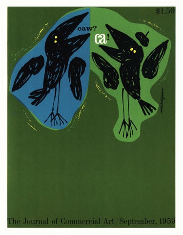
The Cover Mits Katayama
CA, September '59
m
LETTERS TO THE EDITOR
This is a precision instrument designed and developed by
72 pages to file?
Aspen '59
Sirs: Just finished looking through your first issue of CA. Everything very professional, interesting and useful. One thing though; by the time I got to the last page, the magazine fell apart. My sympathy, Joseph Szeghy Art Director Stanley Greeting Cards Dayton, Ohio
Dear Mr. Blanchard: Congratulations on the first issue of your new publication. We have read the magazine from cover to cover and are delighted with it. May you have every success in this new venture.
• Gentlemen: I have just seen and read Volume 1, Number 1 of your bright new magazine. I like it (even though the cover did fall off almost immediately) ... was wondering, prior to seeing your first issue, what we really needed two such publications for. Well if you can keep coming up with this sort of material, you should have little trouble in the duplication department. Good luck to you and your new entry to the field of ( ) Art J oumals. Yours truly, Russ Coventry Russ Coventry /Layout & Design Chicago, Illinois
• Gentlemen: Kudos ... nothing like it has ever been published in the art world! It's fresh, unpretentious, yet profound; superb in format, layout and reproduction ... unstuffy stuff ... all of its 70 pages was a stimulant for the mind and a pleasure for the eye ... even carried away by your confidence in the future of CA with your statement on page 70, " ... make a mental note to look at CA's anniversary issue in August 1960." My only complaint, the binding completely disintegrated ... all I have left is a bunch of folios ... and me a collector of charter issues! Edwin C. Hirschoff Art-0-Graph Division of }. A. Engel, Inc. Minneapolis, Minnesota '--v---"
EDITOR'S NOTE: Although our perfect binding is suited to removal of pages for permanent reference (Morgue, Color, etc.) we didn't intend for the whole 72 pages to come out. We're testing: different glue, cloth, cambric and the bindery foreman's patience. We'll be happy to make good for all charter issue collectors!
We appreciated your fine coverage of the Ninth International Design Conference in Aspen. Sincerely, Hy Hoffman Kimberly-Clark Corp. Neenah, Wisconsin
commercial artistsdesigners, retouchers, illustrators, letterers-for themselves!
exacting demand
•
for perfect
Gentlemen: I can't recall when a trade or professional magazine has given me the satisfaction I've derived from your first issue.
shape, point, balance, snap. Delta's "Jewel" is
Do you think you can keep it at this level?
a thing of
The only "nothing" element in your content was the Aspen report-a precious little bubble of pretentious oxygen other magazines have over-played also. Sincerely, Martin Speckter Martin Speckter Associates New York, N.Y.
beauty, from the perfect head to the distinctive gold tip-and a real ioy to use.
'--v---"
EDITOR'S NOTE: Hy Hoffman (Publicity Chairman of this year's Conference) will be pleased ... and Martin Speckter (not listed on this year's Aspen roster) might be, with our view of Aspen from the other side of the mike on page 69. Our dealers write ... We knew it! Just keep up the pace you've set and you'll have thousands of commercial artists behind you, anxiously waiting for each issue. Our sincere congratulations on a great start. Sincerely, Stan Obermiller palette shop Milwaukee, Wisconsin
delta's "iewel"® finest red sable water color brushes
• SOLD OUT IN ONE ORDER. PLEASE RUSH BALANCE OF COPIES TO SATISFY DEMAND. A. I. FREIDMAN
•
Sirs: Down to four copies from original shipment. How many more should we get? Philadelphia Art Supply
• CA, September '59
Write today for your free copy of "Illustration, Retouching, Lettering with the Red Sable Water Color Brush."
I MI 6f
brush mfg. corp.
122 south columbus ave., mount vernon, n. y.
3
Letters to the Editor (cont'd.)
BE quick roughs, tio ns, labeling job (and drawing funny hes on posters). Tr· ev on ex
Some famous artists' comments ... ... like all first issues of anything-it does reflect a slight touch of self-consciousnessthis is normal. I will be watching further issues for consistency and- information.
erse end for ing length for se and handling. te boxed set
Albert Dorne, President Famous Artists Schools Westport, Connecticut
• ... this first issue is certainly exciting, and from the slant of it, your nearest competitor is probably "Print." The only constructive suggestion I can make is to keep up the standard you have set in the first issue.
V E LLOW-'-'AC K E T
MARKERS • • ••••••• • • ••••••••••••••••• another fine product/rom
A. LANGNICKEL, INC.
·
11 5 W est 31st Street, N . Y .C. 1 manufacturers of th e world's fin est brushes
4
E. A. Adams, Director The Art Center School Los Angeles, California
• ... Walter Landor has asked me to let you know how delighted we all are here with your newly born publication. Issue Number 1 augers well for the future. Saul Taishoff Walter Landor and Associates San Francisco, California
• . . . it's plain to see right now it's going to be a long, long wait between issues of CA. Your first copy was terrific!
FOR OVER 33 YEARS
QUALITY in POSTER COLORS
Walt Boscamp Walt Boscamp Advertising Art & Design Stevens Point, Wisconsin
•
er~~~~~ • OPAQUE
1 White (Spect.) 65 Navy 14 Poster White 70 YellowGreen (Spect. ) 18 Gray (Spect. ) 71 Emerald Green 20 Black (Spect.) 72 Green (Spect. ) 24 Poster Black 73 Dark Green 30 Light Yellow 74 Extra Dark Green 31 Yellow ( Spect.) 75 Blue Green (Spect.) 32 Dark Yellow *76 Olive Green 40 YellowOrange (Spect.) 77 Holly Green 78 Cyprus Green 42 Orange (Spect.) 43 Red Orange (Spect. ) 80 Lavender *44 Flesh 81 Light Magenta 50 Blazing ( Light) Red 82 Red Violet (Spect. ) 51 Vermillion 83 Violet (Spect.) 52 Red ( Spect.) 84 Blue Violet (Spect.) 53 Crimson Red 90 Yellow Ochre 54 Dark Red 91 Brown (Spect. ) 56 Brilliant Red 92 Burnt Sienna *57 Pink 93 Burnt Umber 58 Maroon 94 Vandyke Brown 60 Light Blue 95 Raw Umber 61 Turquoise Blue 97 Raw Sienna 62 Blue (Spect.) Deluxe Gold 63 Ultramarine Blue Deluxe Silver 64 Prussian Blue *Three New Shades
-
Makers of Fine Artists' Materials
l.CH aRT COLOR CO
3 1 W EST 21ST STREET, NEW YORK 10, N.Y .
... the book looks great, and the story ("Complacency ... the real menace) comes off very well. Our only suggestion ... keep up the fine work. Hank Ketcham Carmel Valley, California
• Some famous editors' comments ... ... from arr overall standpoint, I think the package is extremely well done. The editorial content is good and the layouts are appealing. The printing is superior, which, of course, it should be. However, from a makeup standpoint, I think you could improve the publication if you were to keep the advertising in the back of the book and not sprinkle it throughout. This has a tendency to be rather confusing to reader-and advertiser. Mechanically, the binding on my copy was not permanent; two 16 page forms were pretty loose. While this would be desirable if the
CA, September '59
section were the Morgue, it isn't particularly appealing if it is another part of the book. However, we all have growing pains and I am certain you can pinpoint many areas of improvement. Larry Eisinger Editor-in-Chief Fawcett Books NewYork, N.Y.
•
. .. from what I know about artists, I would think one of the biggest jobs is to make it interesting enough to impel their readership of a considerable amount of copy.Theiroffice routine, lack of desks, and I think a tendency not to do much reading during the working day, certainly doesn't encourage their spending a lot of time at work on this type of publication-in my humble opinion. L. W. Lane, Jr. Vice President, Lane Publishing Co. (Sunset) Menlo Park, California
•
... Any Vol. 1, No. 1 is normally one great, big, unavoidable mistake. The first issues of New Yorker, Look and Business Week on my rack bear slight resemblance to these magazines as we know them now. So I think CA deserves considerable credit for looking like it had been running for awhile-as it must have been in somebody's head . ... if the Aspen bit is a little esoteric, the duotone section is as useful as a foot-rule to anyone carpentering a booklet, and faced with the need for samples to explain aims to those whose project-okays are necessary. . . . just remember when you are dealing with professionals, you have to assure them you know the difference between leeks and onions. I think your title is good. People accept the "commercial artist" as honorable and inclusive of just about everyone who doesn't paint by walking on the ceiling in his bare feet. Perry Githens Consulting Editor Westport, Connecticut
•
... am looking forward to your annual issue of August 1960, to which you refer as casually as I do to tomorrow's report of the ball games. One senses permanency here-and trust you have sufficient pablum and Starlac on hand, so that you can condense 11 times more in your first year the same energy, enthusiasm and bustling good humor that have gone into the first issue. Please, though, won't you minimize one usage: creativity. Ramsey Oppenheim West Coast Editor Printing Magazine
•
MARKETS SEATTLE-the first in a series about places to work. On the following fourteen pages: the city, the influences, the art business and the people.
5
Seattle is water, hundreds of square miles ofit-top: Lake Washington's famous Floating Bridge, a mile-long roadway that literally floats on cement pontoons.
Seattle is also tradition-bottom: the old, cast iron Victorian pavilion in Pioneer Square. The artists love the place, and the tourists look at it agape, not knowing whether or not to exclaim.
PHOTOS BY FRED MILKIE
CA , September '59
Markets (continued)
"Mount Rainier is out!"a repeated expression ofthe natives when the skies are clear and its snow-capped peak is seen above the horizon 85 miles away. This view, looking across Elliot Bay toward the harbor of Seattle, proves that in almost any direction you look ...
Seattle is Beauty by
J im P eck
Miller, Mackay, Hoeck and Hartung's Art DirectorCA 's Contributing Editor, introduces our Seattle story with a bit of the background on the cultural and environmental influences on the artists who live here. 6
Years ago when I pulled up stakes from various cities in the East and Midwest to work in the Northwest, I read Ormand and Victoria Case's book, ((The Magic Mountains." Many times the authors used the word ((mysterious" to describe this area consisting of the Straits of Juan de Fuca, Puget Sound, the green Olympic and Cascade Mountains, the lakes and rivers and the wonderful and unending vistas of the great volcanic peaks: Baker, Rainier, Adams, St. Helens, Hood. During the past twelve years I've seen all these places. And even though they are now as familiar to me, and all Northwesterners, as the back of our hand, they still hold an aura of ((mystery" for they are part of the ever-changing beauty that is Seattle. But Seattle has no corner on beauty. What is the difference between doing layouts here and in any other place surrounded by pretty country? The difference is imperceptible, but it's there. It's in the very shell of air about us and in the spirit, sights and sounds of man and nature that surround us. And perhaps the biggest difference is that we artists use our land. We get out. We see it- we look at it. Week-ends are free and joyful, we pell-mell out of our offices and distribute ourselves over the landscape like open-mouthed tourists because, so help us, we live in a famous vacationland. A half-hour drive on Highway 10, going east, will find us in forests. Deep forests. Another half hour will bring us to the top of Snoqualmie Pass with ski lifts galore and the summer solitude of fern-lined trails in the woods. Still going east, in another half hour we will have left fir and hemlock-covered mountains and be descending into the fierce, pre-historic plateaus of the desert-like coulees and
the Columbia River basin. Hot as the hinges of hell in summer, but kind as your mother in springtime and fall . Going west, we can take ferries to the Olympic Peninsula, cross it for 75 miles and two traffic lights, and then go clam digging on the shores of the Pacific Ocean. Boating enthusiasts can almost go in any direction, and probably have the greatest sailing in the United States: Puget Sound, San Juan Islands, through the (Canadian ) Gulf Islands into the primeval regions of British Columbia with their deep fjords cutting deep into the Coastal Range. And as for fishing and hunting! 'Nuff said. We are, as you can see, arrogantly proud of our countryside. To compare Seattle would be merely to put our prejudices in a relative frame of reference. But if we are to take New Yorker magazine's caricature of a typical Suburbanite as a ((for instance," we are not. We drive home, usually in about 10-20 minutes. If we really want to get way out in the country, it takes a full half-hour. We mow our lawns, but cutting grass, pruning roses and leaning over the back fence are not weekend-consuming pastimes. During the 3-4 months of the season (JuneSeptember) we do the bare necessities around the house and spend every minute enjoying our surroundings. Let's be honest, though. We have our faults. For instance, our cities and towns just ((growed." Our city fathers, like most, lacked sensitivity as far as the future and visual impact are concerned. Of all the cities in the U.S., Seattle is endowed with a rarely beautiful topographical panorama; tall beautifully formed hills descending into lakes, river valleys and the gray-blue, wonderful Puget
CA, S eptember '59
7
Sound. All very fine, but-we have less parks than any city our size in the nation. Worse yet, Seattle's citizens voted down an appropriation for city parks in the last election. We have not been as diligent in attracting industry as other growing western cities. In fact, there is even some smugness on the part of the business leaders. But for a good reason- Northwesterners are sitting on a gold mine. Not a literal gold mine, but power. Water power. Room for expansion. A wonderful place to lure workers. And some day eastern industrialists are going to discover the relatively virgin Northwest and, in spite of unhappy freight rates and a few ((off season" weather drawbacks, there is going to be a boom to turn your head. But back to today's Seattle. Quite a bit of individuality exists in our Fine Arts. We proudly remind you of two Seattle giants in the world of art: Morris Graves and Mark Toby- both of whom possess an insight very likely bred by our unusual land. You may well remember, too, these names: Guy Anderson, Kenneth Callahan, James Fitzgerald and Margaret Tomkins. None of them are weekend painters, and to our envy and delight they are all doing quite well.
~
MT. BAKER 10,750 FT.
~
A
~
t.:
--~
OLYMPIC
VJ d>o.. ~PENINSULA
/f•\'
~~
~MP
~~ ~
Aesthetically, another field rises to the unique-residential architecture. The pseudo-period, the split-levels, the tri-levels designed and built by contractors, are present here too. However, scattered about the city and suburbs young architects have nicely dropped in position works of art that will likely become part of our proud heritage. Started in the late thirties and continued since the War, contemporary home architecture has blossomed and CA, S eptember '59
M~
,c
/'-
N s,./7',.....,
--0~
""' ~
MT. RAINIER~ 14.400 FT.
//1~,
8
Seattle, like any other area, has its own symbols which appear frequently in commercial art. Boats of all kinds are popular because you'll see everything from speedboats to ocean-going freighters. It is also the last stronghold offerries. The "rooster tail" from the speeding hydroplanes has become a Seattle trade mark of sorts. The fishing boat above was done by Doug Sandland. The Buddha below, by Bob Wandesforde, is another frequently occurring assignment-falls into the same group as salmon, totem poles, tall evergreens, mountains and power transmission towers.
brought fame to its designers. In more than one case, sensitive artist-designers have added to and developed their own homes into a magnificently different atmosphere that intrigues and delights. You see them among the trees, around the shores of our lakes or nestled on the steep hillsides with their endless vistas! The Japanese, with their fine, oriental restraint have undoubtedly influenced our architecture. Arthur Drexler's book, ((The Architecture of Japan" will illustrate the direction the architects are going. This, plus their own contemporary schooling, has resulted in some of the most honest and rewarding architectural art form since the New England farmhouse. Other cultures in Seattle are worth mentioning, too: the University of Washington perched, beside the Lake Washington Ship Canal, lends stature and dignity to the town. It has a good art department, is famous for its departments of Fisheries, Architecture, Far East and Drama. Professor Glen Hughes, head of its Drama department, invented the modern theatre-in-round now sweeping the world; he's an active civic leader generating ideas among the other civic leaders. There are two good museums in the city. The Henry Gallery on the University of Washington's campus and Volunteer Park's Seattle Art Museum. Visiting artists will usually find a good cross-section of current local talent at the Henry Gallery. The larger Seattle Art Museum, in a sense, specializes in its great oriental collections. These have been acquired almost single-handedly by Dr. Richard E. Fuller, an important and enormously respected art patron in the community. We have a good symphony orchestra and we enthusiastically attend all the traveling New York shows and concerts. Our big whoop-de-do of the year is held in August. It's built around the famous hydroplane races on Lake Washington and is appropriately called the Seattle Seafair. A-borning on top of Capitol Hill, an older residential community in the center of town, is a little group of artistic ((contemporary shops and galleries." A ten or fifteen minute walk near the intersection of Olive Way and Broadway North will take you past windows displaying: woven materials; imported furniture; handsome exhibitions of pottery, sculpture, and paintings; jewelry artisans - all nestled among barber shops, valve grinds and motorcycles. Although Seattle is one hundred years old, it has a <<new" feeling. It is brash, culture-conscious and thriving. Among its half-million population it has more than the normal share of natives - and those who enter from the <<outside" soon assume the earmarks of a third-generation Northwesterner. The colossus of the city and its economic base is Boeing Airplane Company. It employs 75,000 people including over 500 artists. It spraw ls over the south end of the city and it can't help but identify itself with only the present and the dazzle of the future. Boeing has brought to Seattle the laborer, the whitecollared man, the artisan and the physicist. These people have mingled with the natives and have helped to give Seattle a bigger, broader picture. And with its earthshrinking 707, Boeing has brought the whole world a little closer to Seattle. It has helped us all to associate ourselves, too, with ((the dazzle of the future."
CA, September '59
MARKETS: PARTS 2
-~~,, -JD.ercial Art in.
Seattle
its background, the people in it, the work they do and the money they get paid for doing it
--
Cover for Seattle's Tenth Annual Exhibition of Advertising Artphotograph by' T. R. Matthiesen
l'lw 1 ~·1•.t.AJ..o'i",.*""' "'"'i)llfl,..t<~I ...... J,,-dllf>l~ar4j,l
"'I 00, I'~Utot~ ~~~~ l'too""' M ·~I
w.....l! .. t ..ol\.bt.WJtoola•'!...-iij•,.,.
>lluliot<oito"'l<tf<'j,>\11-<)lolo
rn ... ~·""'""'"''ll!i<"-'' lillt•·I!MP•1f'Mr
il\mdf,,,_.~.kodl.l•<~•d.,,...,q..t
CA, September '59
J
Markets (continued)
10
Once he gets in a building, goes to an office and sits down at his drawing board, the commercial artist in Seattle is not too different from his counterparts all over the U. S. True, he didn't have to get up at the crack of dawn, catch a train, and battle his way to his board ..In fact his drive through the countryside and around or over Seattle's lakes probably puts him in a better frame of mind to start the day than most of his brothers-at-the-board. If one could draw a profile of the ((typical Seattle commercial artist"- he generally loves his city, loves his Northwest fishing, hunting or boating weekends and in spite of what they say, probably couldn't be bought away from it. He is gregarious and expresses himself almost as well away from the board as he does on it. We have a faint notion he is still an individual. He affects a casual, unpressured attitude, is seen in a natty sport shirt as often as a tie (not true of the Art Directors, they still uphold a bit of the decorum). We gather, too, that his individuality carries to the extent of occasionally pinning back the ears of the A.D.s. He distributes himself among at least two fraternal art societies, he votes, and is a good provider. He is active in civic affairs and is very conscious of the behind-the-scenes political and ((big business" shenanigans going on about him. He has designed street signs for free, has created ads and billboards for local do-good organizations and is inimicably resistant to unionizing even though he serves the advertising business by long hours. He is aware of his own shortcomings, wants to do bigger and better things and is a little frustrated at the lack of accounts that offer him his full vent. Yet, he's proud of his own work and that of his local contemporaries, is convinced that Seattle commercial art has become a little lost in all the razzle-dazzle of Los Angeles and the ((little New York" aura of San Francisco. But that is an attempt to make one commercial artist out of all the commercial artists in Seattle. And they are certainly not so typical they can be put into one prototype. To get a better idea of the lot of the commercial artist in Seattle, let's take a look at the business of commercial art. First-the accounts. To a great extent the life blood of most commercial artists flows from the big, ((national" and regional accounts through the agency to his desk. Add to this the active retailing accounts, the banks, power companies and the business he picks up through the printers, and you have the commercial art business. Looking at Seattle in this light, the pickings are rather slim. You can find more art business on a industry-lined street in most mid-western towns than you'll find in the states of Idaho, Oregon and Washington combined! Specifically, in the Seattle-Tacoma area (30 miles apart) the most noticeable ((national" accounts are: Boeing Airplane Company-Bardahl Oil-
Weyerhauser Timber Co. - General Insurance Co. - M.D. Tissues- Washington State Apple Commission-Douglas Fir Plywood Association ... The regional accounts (mostly in the Northwest and Pacific Coast states) consist of: Rainier Beer-Olympia Beer- Western Hotels, Inc. Brown and Haley candy- West Coast Airlines. Add to these the usual number of utilities, department stores (Bon Marche and Frederick and Nelson), bread companies, banks and dairies, and you can see what the Seattle commercial artist is working with. It is significant that all the above accounts are handled by only a half dozen ((large" agencies. Their average billing is about three million. The individual Seattle agency, still in the ((large" category, averages about twenty people and employs two or three art directors. Most agencies employ none, rely heavily on the art studios for their design, layout, and finish art. Doing the lion's share of the advertising business in the area are these agencies: Frederick E. Baker and Associates (handle the Boeing account in conjunction with Calkins and Holden) Botsford, Constantine and Gardner-Bozell and JacobsCole and Weber- Miller, Mackay, Hoeck and Hartung - Pacific National. Seattle's three largest art services average about eight men (only two of them have ((girl Fridays" who buy the beer and coffee, do paste-ups, answer the phone and keep books). Even though the phone book's Yellow Pages show 49 listings under ((Artists," only about four studios provide enough hands for wide diversification and fast service. There are many free lancers, whose specializations contribute much to good art and to whom the art directors turn for much work. However, in this kind of art economy, nobody can afford to be a fine-line specialist. Most designers do layouts and illustrations when needed. There are probably a couple of lettering specialists in town but they, too, take on work outside their speciality. This is not because Seattle is not ((grown up" to specialization, nor sophisticated enough to recognize it. It's due to the plain fact of the art business being what it is in Seattle -plus, what we think is also true; they like to do other things for the sake of meeting challenges. At a glance this might appear to be a rather bleak picture of commercial art- relatively few big accounts, and apparently more than enough artists to handle what there is. In fact, Seattle's advertising is busy, comparatively fruitful, and is adequately geared for a nice balance between supply and demand. The town would like more business, more industry and more commercial activity. The artists agree with the town. At this point in the article we should do well to get down to some basics- or as they say in the job-hunting
CA, September '59
In an attempt to attach some faces to the names you' ll see in the Seattle Markets story, we took the usual shown-at-the-luncheon-picture above. Starting at front left: Bob Matthiesen, Roy Miller, H arry Bonath, Irwin Cap lan, Dick Coyne, J ack H errick, Jim Peck, L es Shaw, Fred Milkie, Niles K elley and B ill Werrbach.
Marlow H artung, missing from the luncheon, but certainly not from the list of major contributors to the commercial art cause in Seattle. Executive A D of Miller, Mackay, H oeck and H artung, he is an active civic leader and volunteer. H is story-boarding f or B ardahl won him the top award in N SA D a few years back. H e's currently working on the next World's Fair, "Century 21" to be held in Seattle in 1961.
profession: ((Enough about fringe benefits and the challenge of the future- What does the job pay?" Drawing a conclusion from the aforementioned generalized facts, you could come up with the answer that salaries are probably lower in Seattle- but you make up for it in scenery, and a more gracious type of living. The answer is correct. Taking into account that most replies to our questions about money were couched in exaggerations or debunkings (depending upon the desired effect), we've come up with some conclusions of our own: $6,000 - $7,500/ year ... the younger artists both on salary and free lancers-this includes the bulk of the artists at Boeing, whose incomes, however, are augmented with overtime pay during ((panic" programs. $7,500-$10,000/ year ... the older pros in town - includes some free lancers, mostly studio men and the bulk of the art directors. $10,000- 20,000/ year ... the nationally known ((name" artists, and the remaining art directors. over $20,000/ year ... mainly artists-turned-businessmen, studio owners, agency executives, etc. Summing it up - one Seattleite told of reading a help-wanted ad in the New York Times for ((qualified men for $50,000 per year" ; went home, didn't speak to wife or children, and then headed for the ski-tow a half hour away. In speaking of the employment opportunities, the commercial artists in Seattle try not to appear as though they were not looking for young, or even old, real talent. Several of the level-headed art directors came forth with a kind of statement of policy, to wit: if you are footloose in another part of the country and would like to come out to the Northwest with the object of job seeking, you'll find a warm welcome. However, the better part of modesty should find you summing yourself up as being a top-flight CA, Sep tember '59
11
designer, top-hole illustrator,or a top, bigtime art director. The better part of discretion recommends a pretty fancy grubstake that will keep you at least six months. They have a nice thing going up there in Seattle, and it appears as though they want to keep it that way. In all honesty we get a little of the impression that after they had finished raving about the beauty, the sports and the fun they have, the artists were a mite fearful that CA's story would result in a flood of gray-flanneled, portfoliototing bodies descending upon them like the blight. Thus, they toned down their enthusiasm a bit when it came to paraphrasing Horace Greeley's famous recruiting poster copy to ugo Northwest, young man." To get a true perspective of any industry or profession in any town, you should know the people in it. Better yet, you should live with them awhile and talk to them about their profession. We had to cram our ccgetting to know everybody" into six days and one group lunch. From what we could learn from the people personally and about them from each other- we herewith present an introduction to the people you'd know if you worked in Seattle:
Markets (continued)
*
Ac'me (ak'me) n.[Gr. akme point, primeJ The top or highest point ... as, the acme of perfection.-Syn. see SUMMIT.
Ac'me (ak'me) n. [Gr. akme point, primeJ The top or highest point ... as, the acme of perfection. Syn. see SUM HT.
12
ACM
*
A Ne!W HIGHER STANDARD Of" AOVI!RTISING TYPOGRAPHY. LITHOGRAPHY AND PR I NTI NG
Fred Walsh not only did a thorough job of restyling Acme Press' corporate logo, but used the various stages of its evolvement as a teaser campaign. The cards shown above were mailed at weekly intervals- the new corporate image finally emerging in the third mailing. It is being used on everything from stationery to an architectural face-lifting of the front of the plant. R. T. Matthiesen, Inc., was the studio.
Harry Bonath, one of the old-timers among the city's outnumbering newcomers, has steadfastly, from the old days, guided the first large art service through perilous waters into a top-flight organization. " Gus" Swanberg is his top illustrator- both men are fine painters. Bill Werrbach heads Studio Art, is a good designer and administrator and is creating a studio business which is the envy of all others. One of the partners in the same operation is the capable Rudy Bundas, illustrator, who settled here right after the War. Douglas Bennett, rating rather well among the cognoscenti, operates an interior design studio, and rarely designs in the graphic medium - but when he does, sparks fly. Years ago he won one of this country's top awards for wood sculpture. Nick Kritikos, another designer is responsible for some of the finest publication and business reports in the .city and is an eminent award winner in Seattle's annual advertising art shows. Another studio owner is Bob Matthiesen, who might be considered an old-timer (almost anybody who started to work in Seattle right after the war is termed an ecOidTimer" even though he might still be in his spry thirties), is famous for his graphic design and lettering. His able side kick Fred Walsh, very much worth noting, has already been a contributor to CA. Bob Morgan well deserves his enviable rating in town as a free lance retoucher. He is a recent·newcomer from New York bringing with him ability and a practiced know-how. Doug Murray, AD and vice-president of Botsford, Constantine and Gardner, emigrated from Chicago, taught at Cornish School, and then rose to fame when he joined BC&G only a comparatively few years ago. Cole and Weber's Niles K elly is often admitted by other AD's to be the busiest man in town. Artists like him because he seems to allow considerable freedom- his many prizes substantiate that fact. A delight to their fellow artists are two cartoonists, ccCap" Caplan and Bob Cram. Irwin Caplan has long been a Post contributor with his ccFamous Last Words"
CA, September '59
Even tho it is still two years away, the artists in Seattle are already working on the forthcoming World's Fair-Century 21. The theme-"Man in Space." And the logo says it-the ancient arrowed orb symbol stands for the planet Mars in astronomy symbology, for "male" in Botany and Zoology. Miller, Mackay, Hoeck and Hartung's Hartung was the AD, gave the design assignment to R. T. Matthiesen In Seattle-you have to be able to draw: boats, fish, mountains, trees and totem poles. George Tanagi and Charles Swanberg got them all in on this decorative map for American Printing and L itho. Co.
which is now syndicated among the nation's newspapers, is now Cartoon Editor for CA. Bob Cram has few cartooning peers. The two of them make a fine pair in the Seattle Art Directors Society's clam bakes. Also among cartoonists, last but not least, is Fred Marshall. He works for the Post-Intelligencer and if there were ever a popularity contest among the artists, Fred would apparently win hands down. He directs and plays the part of a clown in the artists' Annual Extravaganza. He is an excellent draftsman as well as a fine watercolorist. Two photographers in town seem to enjoy most of the commercial business. Art Hupy, a newcomer, has been doing work among the photographic free lancers and is well worth watching. Art did the pictures for last month's CA coverage of Aspen. Fred Milkie has one of the largest photographic studios on the Coast and certainly one of the busiest. The ((atmosphere" shots of Seattle in this story were taken by Fred. Seattle's three biggest printing firms are: Craftsman Press, Farwest Printing and Lithographing Company and Metropolitan Press & Western. L es Shaw, who is called the ((Gray Fox" among his salesmen, is one of the members of the firm of Farwest and is particularly noteworthy for his interest in both the Fine and Graphic arts. The names of Jim Pettit and Al Adan are necessary for any review of the Graphic Arts. Both are typographers (Deers Press and Acme Press, respectively). The two do the bulk of fine typesetting for the trade. Another man, Frank McCaffery, has the reputation for bringing fine printing to the Northwest. Fine printing appears to have established some deep roots. There are two, rollicking, happy, sometimes heady advertising art associations in town- both fraternal. The Puget Sound Group of Northwest Painters consists mostly of graphics men who like to paint. It is known for its Annual Extravaganza with a minstrel-like show and an auction of the members paintings. The main purpose of
the auction and the group seems to be a kind of selfperpetuating good time. The Seattle Art Directors Society, early affiliated and chartered with the NSAD, is the strongest group of its kind in the Northwest and possibly the Pacific Coast. The membership list goes over a hundred, and the smallest monthly meeting seldom falls below fifty. Reproductions from its Tenth Annual exhibit are scattered through these pages. We found a wonderful feeling of camaraderie among the artists in town. The kind of ((comaraderie" that goes beyond just being in the same business with the same problems, but goes into the next stage-where everyone insults each other and enjoys it. They rise together in indignation when threatened from without and welcome the small trickle of newcomers from the schools or outlands. They work together on community jobs, compete strongly for commercial jobs. And, as a group, they are distinctive in one very noticeable area-most of them like to do fine art and many are excellent craftsmen. Jim Peck, our own contributing editor, in all modesty, has done some very fine paintings and has held his own among his fellow commercial artists in his share of prizes and exhibits. Commercial Art in Seattle is growing. But more important, it is maturing. Part of the growth is coming from within, with the soon-to-come supply of young artists from Burnley art school now under the direction of former free lance illustrator, Jess Cauthorn. Part of the growth is coming from the emigrant artists who forsake a little income for a lot of outdoors and bring with them new talent and ideas. But most of the growth is coming from the inner spark that glows in the artists already in Seattle. (Editor's Note: In reality there are two ''worlds'' of commercial art in Seattle: one is the "downtown world" covered in the previous pages-the other is the " w orld" that exists within Boeing Airplane Company. Because of its size and importance in the market, Boeing has been treated as a story within a story on the following two pages.)
CA. September '59
13
Markets (continued)
A much-used and reproduced watercolor done by John McDonald of the Presentation Unit art staff -the 500 artists at Boeing cover the complete range of commercial art from design to illustration.
BOEING ... a market within a market 14
A irview of Boeing's Seattle facilities-just one of the many, sprawling plants located on Seattle's south side of town. This view shows Boeing Field, administrative, testing and some manufacturing buildings.
At the latest count Boeing employs over 500 artists. To put this number in perspective-it probably represents one-third the total number of artists employed in the combined states of Washington, Oregon and Idaho with parts of Montana and Nevada thrown in! Somehow we envisioned all 500 in one big room with row after row of boards and all completely automated with one artist only pasting up the letter «s," for example. Not so. In our brief tour we never saw more than 10-15 artists working in one area, and it looked just like any art studio or art department with funny pictures on the walls. We learned the bulk of the 500 are technical artists and are fairly evenly distributed among the hundreds of departments and divisions that constitute the Boeing empire. Even within the same building there will be two or three art departments, and more often than not, the artist in one department is unaware of what is being done in another. Department heads do get together, however, and are even active in the Seattle Art Directors Society. Although the well-trodden path is to Boeing, occasionally an artist will forsake the regimentation (badges, lunch hours, whistles, etc.) and head back to town. From what we could determine on our six-hour visit, the artists at Boeing practically cover the whole gamut of commercial art with the exception, perhaps, of designing outdoor boards and magazine ads (Baker and Calkins CA, September '59
and Holden do the media advertising). In addition to the several external and internal publications, artists work on interior and exterior designs for the 707 jet, service manuals, displays, literature, films, and a wide variety of advertising agency-type presentation material for the Transport (Commercial 707s) Division. Rather than try to bring back the ''big picture," we confined ourselves to the Presentation Unit of the Sales Department. Felix Moitoret, the head of the department, has been with Boeing since 1949 starting as an industrial engineer. Back in the "old days" most sales presentations were confined to the military. Felix, because of art background and training, became more and more involved until he formed a separate department to prepare for the sales effort going into the 707s. Today he has seven artists ( including designers and illustrators), three writers and two film specialists. The tailor-made presentations are used by the sales department to sell the 707 to airline executives, board members and those concerned with the purchase of airplanes. There being only two major suppliers in the jet aircraft business, and a single sales unit being in the five to six million dollar bracket, expense is not a major factor in preparing a presentation. As noted above, this department closely resembles the new business group in a large agency. They use the same basic ingredients - slides, flip charts, flannel board, etc.- have the same frustrating time limits with the same kind of panic buttons. Once the presentation is personally
15
Boeing's Presentation Unit prepares sales ''pitches'' that would stand up against most advertising agency presentations -use everything from flip charts to color slides; example below.
Originally commanded by Queen Victoria for her own use, and since recognized as the world's finest water color brushes. Made by craftsmen for the craftsman : commercial artist-illustratorretoucher - eng rover. 902 Broadway, New York 10, N. Y. Canadian Agents: THE HUGHES & OWENS CO., LTD. Head office: MONTREAL Cal ifornia Distributors: THE SCHWABACHER·FREY CO., SAN FRANCISCO See your local dealer!
CA, September '59
Markets (continued)
An illustration from one ofthe many external house organs published by Boeingthis one for the Transport Division (commercial 707s ), has 20 pages, is printed in four-colors. The little "plus" sign is color-keyed to the copy.
made, it is usually adapted to a presentation book to leave with those who make the decisions. These books take on elaborateness seldom seen on Madison Avenue, however, and because they are done in such small quantities, the unit costs are really impressive. The artists who work with Felix have come to Boeing either from ((downtown" or through Boeing's effective national recruiting program. They can usually make more money than they can in town, have pressure periods with
long hours of overtime (for which they are paid). The work this particular group is doing is challenging and certainly not drab; is typical of work being done in agencies and studios all over the U.S. But then we were only talking about the work of seven artists; this leaves something over 493. We are convinced it would take a week just to locate them all, and are secretly convinced that ((lost" among the group are four or five enterprising souls doing free lance work! •
16
An example ofthe work done in Boeing's Presentation Unit for the Sales Department. This 13" x 1314 • four-color brochure (cover shown) is typical of the all-out effort made to tell the Boeing story to airline executives.
Una IIlvitacioi1 ala Unea Aeropostal Venezolana .... para 8f'r la mas IIIOdt!rna Hnea aerea LaLinoamerieana, al ofreeer equipo de· reaeei()n en las Americas y Europa t'n el aiio pn)ximo.
CA. September '59
PERSONALITIES taking our cue from Seattle's Tenth Ad1.1ertising Awards Banquet, we have singled out two artists in town who appear to be "the ones to watch"Mits Katayama and Ted Rand
now ... higher interest with ... absolute safety!
Mits Katayama Getting Mits Katayama to talk about Mits Katayama is not easy. Getting him to talk about his work is a little easier, and it isn't until you get into generalities like design, approach, color, and ideas that Mits begins to warm up. He's shy, self-effacing, never critical of another artist's work, and very critical of his own efforts. He enjoyed doing (and likes) the cover of this issue, mainly because it incorporated the two things he likes to do best- design and decorative illustration. Mits is a native Northwesterner. His commercial art schooling was confined to Edison Vocational School in Seattle and after his early training in the sign business, he did paste-ups and mechanicals for local printers. His rise to notoriety began after he joined an art service (Studio Art). With about ten years beside a tabouret behind him, he is now considered top-flight in and out of Seattle.
interest, compounded! effective July 1st Your savings account with Peoples now earns more, and you also enjoy all these plus features:
***
availability: money the moment you want to withdraw it.
compound interest: interest on interest, compounded each 6 months. Deposits by the 10th earn for the full month!
*** safety: all accounts carry full Government FDIC insurance. convenience: deposit or withdraw by mail, plus one-stop banking for any of 23 services, from checking to Trust service, at any of Peoples 26 friendly offices. For carefree tomorrows, start saving today, at this higher rate of return, at the Peoples office nearest you. Complete information on your first visit-drop in today!
PEOPLES NATIONA L -
*** deposits made by July 10 BANK~ OF WASHINGTON
earn 3% interest from July 11
waw•a""· o . 1. c
Listen to Nard J ones, "Northwest Narratives"- KXA- 7:30 e. m.-Daily
CA , September '59
In his earlier days Mits specialized in decorative cartoons, mainly because he felt it would take too much work to become equipped to be a full-fledged illustrator. Mits has gradually pulled away from decorative cartooning and would now like to concentrate as much as possible on design. Mits makes what appears to be a conscious effort not to be influenced. He has no idols, does not religiously thumb through the annuals and <<wouldn't give office space to a one-drawer cardboard file for scrap art." He attributes this attitude as much to laziness as any conscious effort not to be influenced. Being interested in what he's doing now rather than what he's done in the past, Mits' offerings consist of our cover and the quarter-page newspaper ad at right-he did the design and art through the Baker agency.
17
m
Personalities (continued)
18
CA, September '59
Ted Rand Seated on the other side of the wall at Graphic Studio is Ted Rand. One of the country's most able fashion artistsparticularly prized by Seattle's Frederick & Nelson department store - Ted is moving slowly away from his forte of fashion into general illustration. A man who thoroughly enjoys drawing, Ted is largely self-taught. He studied part time in Cornish School. He has been AD for F&N and Best women's apparel store, spent some time in New York with Conde Nast. He has traveled to Europe and Bali on painting trips. Naturally Ted is busy. He is on several advisory boards of industry, sits in on a group of artists and architects called Allied Arts, and is active on committees for Seattle's "Century 21" World's Fair. Perhaps of all the artists in Seattle, Rand's work is the most widely seen outside the town. He's still doing fashion, but his magazine and advertising illustration assignments come from all over the U.S. Like most Seattle artists, Ted paints for fun - gets a kick from doing new things. His most recent "kick" -painting the design for Seattle's street corner trash bins!
CA. September '59
His original ''claim to fame,'' fashion work, occupies less and less of Rand's time these days . .. above, his latest for Pendleton Woolen Mills. Also representative of his current work-a black and white sketch and our black and white reproduction of a recent color illustration.
19
/
20
Graphis 3
" ... it is a strange thing today-you must have 35mm-you must go out and catch things, and they use a word of violence, 'To shoot.' This thing to me-Photography-is a matter of concentration and philosophy. I must communicate with a blade of grass to show its magnificence. I cannot do this by shooting at it!" CA. S eptember '59
ca.
PHOTOGRAPHY
" ... photography is a great mystery, the black magic of the 20th Century, and is a fantastic thing ... we explore the order of things, the world of the artist.'' Graphis 3 spend the afternoon in San Francisco and bring back ...
The words and pictures of Ruth Bernhard
" ... I experience light Just as much when I add it as when I find it in nature .. . it is exciting to mould the subJ·ect and light together . .. I work with it; light is my substance ... when I feel strongly about something, I want to cover it with light, and this has a glow of light.'' 21
'' . .. the idea came so naturally . .. when you ask, 'How did you think of it' . .. I can only say, this is the only way I could have done it. '' CA, September '59
Photography (continued)
'' ... too many photographers chatter in their photographs, few have anything to say, few have feelings to express their medium.''
It is significant that Ruth Bernhard ((never puts titles on pictures so people can feel them like music" -yet reproducing her pictures alone would reveal but a small fragment of her total personality. Although the mechanical curse on photography still lingers in the trade, it is fading to reveal a fine art form with thinking people working in a creative medium. Ruth Bernhard is an artist-photographer who lives her art and teaches its philosophy. She started ccin the business" doing food photography for a magzine. The somewhat disinterested approach taken by her contemporaries became a stimulus. She felt there must be something more to photography, took her first $90 and bought her own camera. Today Miss Bernhard's business card reads, ((That which you love, lovingly photographed." And she applies this creed to every picture she takes whether it be a subject she has chosen or a commercial picture. Although she doesn't specialize, she prefers working for craftsmen, particularly people who bring her things they have created.
22
CA. September '59
Miss Bernhard was born to the world of graphics and advertising, her father being Lucian Bernhard whose type design is famous the world over. Ruth Bernhard is a truly sensitive person and her great perceptivity prevails in every picture she takes. A friend of the famous Edward Weston since 1935, she was so impressed with great photographer's work, she didn't touch her own camera for a full year. When she speaks of photography and her own work C( ... I am delighted with my good pictures as if someone else made them.") her eyes shine and her thoughts soar. Her soft accent and love of order (quote in the introduction) are both German. She expresses this love of order in her fondness for nature subjects and expresses it, (( ... when I create order in a picture it is because I desire order. I want to feel that I'm part of this order and have no doubts about it. I am certain that a tree has no doubt about how to be a tree. I feel we have lost this certainty. I seek this integration through my work." We see here the working thought, the philosophy that is a side of photography so often hidden behind the mechanical front.
23
'' ... in every picture there are as many pictures in it as there are people who see it. ''
'' ... Edward Weston asked what I had done during the year_ . .. I said, 'Very little' . .. he asked if I had done this ... I said, 'Yes' ... he said, 'Then you have done enough.'" CA, September '59
m
SPECIAL FEATURE
/
r
..,
OFFICIAL
.... __
NEW YORK CITY SUBWAY MAP AND STATION GUIDE
-------IMT
/
..,.._..., ~
\..
~~Cm;:A.T......,..t-,.._
TrW':IJw"-II'C)•IIMf .. Jttt••trrw
=..~~~=-~ TrwwN!.,_IIMTtDINOio~
NEW YORK CITY TRANS IT AUTHORITY 370JayStre«, 8fOOklynl , NwwYotk
Charte. L Patt'"""' Chairman
£. VincentCurtayne- Joseph£. 0 'Gfady 0
LOST PROPERTY OFFICE 370Jkt51rMI, Broolllynl, HewYofk(Subo.aytotiCOUtM ......), ~f'tltt WltriRC* from ,Jay Street {Bon!u&h Hall) Station, IND.
Open UlO AM to 4:45PM Mondtyto Sitll.lfday, Inclusive.
CA, September '59
lilT
:::.::::-....r.-;:: (..::..)
Slopomodoby.
24
tHO
l.Niondbrondloo:
F,. _ _ _
,....~- · ~!·
-= --
(lqiNII . . . . . . . . . . . .
HoW: 6th AYeftiMI, MaMaltlln, • offid.all1 calM "Av.nw o4 tM Amerk.u ... ~. O, ISI5t, ,._'tln.CII~Tf'lo!ltl1Autlloril.w.Dhilf*llly0tor..
Sekw.-,.._..
~
WHEN IS A MAP NOT A MAP? Astoria Line
George Salomon's simplified diagrammatic treatm ent of New York's complicated subway system answers the question and brings order ou t of confusion.
New York's subway system consists of 238 route miles and 486 stations all packed into a relatively small space. Among its complications: 5 stations all named tt23rd St." and 6 different lines converging on 13 stations in the half-mile square center of town! Most cartographers and designers would probably cringe at the assignment of redesigning the system's map. But George Salomon, a typographic designer with Parsons and Nathan, Inc., asked for the job! Two years after he was awarded the contract by the Transit Authority, Salomon finished the schematic map shown at left. Its many improvements and innovations are shown in the comparison at right. The essence: orient a map to what the passenger sees. The underground passenger sees no landmarks, is unaware of curves or the varying distances between stops. He takes his bearings solely from train designations and the names of the stations. The same theory has been applied to airline route maps-can also be used in plant and office location maps and store directories. Or, according to Salomon, ttin any problem dealing with orientation or what I like to call twhat is where'."
Ctosstown4 Queens Lines; forest Hills line
Opet•ted Mon.- FI·i. - 6 AM - SPH only_
25
The same area has been enlarged in the comparison ofthe "old" and the "new" at right above. Salomon's schematic map shows only what the subway traveler wants and needs to know. CA. September '59
PRODUCTION
The first in a series of semi-technical articles devoted to the many facets of production. The purpose- to improve communications (thus the quality of the end product)- to make life easier for you and the graphic arts people you work with-and finally to keep you abreast of the new techniques. A good place to start ...
WINDOWS for lithography + A window is fundamentally a means of communication. It is used on the paste-up to indicate to the lithographer's stripper that ((something goes here." It's purpose is to allow photos or art to be handled separately by the camera. This, in turn, allows for reduction or enlargement of original art to meet the requirements of the layout. When photographed by the litho camera, the window leaves a blank space on the negative. After the artwork is photographed to the exact size of the window it is stripped into a blank space with tape. The resulting combination of paste-up and stripped-in art or photos becomes the flat which is turned over to the platemaker. 26
---+
The technique of ruling a line around a box and painting in the box to form a window has been replaced by more efficient methods. Red acetate has now become the universally accepted material. It is transparent to the eye so the artist can see what he is doing and it is opaque to the camera to assure a perfectly clear window being formed on the negative. It is available in two forms: as a dyed red acetate, or as a red coating applied to the acetate. Several popular brands have a waxed coating applied to the back of the acetate so they can be burnished into position. When selecting any coated acetate, be careful there are no pinholes which will allow light or white paper to show through. The camera will pick up these pinholes and pepper the filmed window with black dots. With the advent of double-coated pressure sensitive tape, a fast, simple technique has evolved. Tape is applied inside the window area and an oversized piece of red acetate is laid over it and trimmed to size. For this technique, the acetate should be heavy enough to lie flat so that it will not buckle or wrinkle.
®pg6 Line art with color overlay . Two of the register marks also act as keylines . Code letter and page number will appear on the film negative .
~KEY Window for the art above . Keylines fix position, code letter allows stripper fast orientation . Small windows are for register marks .
Studnite, a red-coated acetate used in lithography, is an excellent overlay material. It is heavy enough to lie flat and the red coating can be cut and peeled off to form windows. A few basic rules apply to all windows: they should be 1 OOo/o opaque to the camera, lie flat, have sharply cut edges, be properly aligned to the copy and cut to the right size. It is important to write your communications on the paste-up so they will appear on the film. Instructions, keylines and register marks (for alignment and color registration) should be legible, brief and close to the window CA. September '59
Negative of the window ( as stripper sees it ). Without small windows, register marks would be covered .
•
•
Window for a square halftone . Code letter is for orientation . Small windows allow stripper to see crop marks .
Window prepared with air brush splatter to create vignette for the photo . Many special effects can be achieved with textures or reverses in the window .
itself. Write in black or red (blue will not photograph). Do not write on the red acetate window or underneath it - it won' t appear on the film. When all the separate units of art, photos, overlays and paste-ups of a typical brochure go to camera and are converted to negative film, they then go to the stripper. He has to make sense from a lot of pieces and here is where proper marking can help him with his ((jigsaw puzzle." Whenever two or more pieces of film have to be registered or positioned, the stripper must depend on a window provided by the paste-up. If there is none he must make one by using chemicals, scraping away the black emulsion, or cutting out a piece of film.
27
After positioning and registering are done, clear areas and markings that should not print are easily covered. This is done by using a material that will not allow light to pass, usually paper, tape or liquid opaque.
GLOSSARY OF
-.
..
Type should not be pasted too close to a window . The thickness of the stripped -in piece of film will not allow the top line of copy to be in perfect contact with the plate . The resulting distortion can be seen in the top line of this legend .
TERMS
Brown line ... photographic print made from a flat and used for checking purposes . Also blueline, silverprint, velox. Crop-marks ... markings used to designate the exact area of a picture to be reproduced. Dummy ... mock-up of finished piece made by the artist and used for referral by those involved.
Mechanical screens ... a halftone dot pattern on film of predetermined value made mechanically. Usually indicated in percentages of tone value. Opaque .. . 1. unable to allow the passage of light, the opposite of transparent. 2. a red or black pigment in a solution and used to cover small light holes in negatives.
Emulsion ... the coating on film which has been light-sensitized.
Open up ... allowing more light to pass through an area by making an image less opapue.
Flat ... a properly positioned assembly of negatives or positives on goldenrod paper or acetate for exposure in contact with lightsensitized press plates.
Overlay ... a separate sheet, usually acetate, placed over and in register to a basic drawing or paste-up. Used primarily to separate colors.
Halftone ... a printing surface with tone values and details represented by a pattern of evenly spaced dots of various sizes and shapes, the smaller dots in light areas, the larger dots in dark areas.
Register marks .. . lines or crosses ruled on original copy to facilitate the registration of films, plates and printing. Also crossmarks.
Imposition ... the attaching of negatives or positives to a flat in their proper arrangement.
Separated art ... art prepared on overlays, each one representing one color or mechanical screen of a color. Silhouetting ... opaquing out the background of a subject on halftone negatives. Also outlining, blocking out.
Keylines ... guidelines used in preparing copy or art to help position or register films on flats. Line copy ... any art that can be reproduced without using a screen.
Stripping ... the method used in positioning individual negatives into one negative unit or flat.
Mechanical ... assembling copy ready for the camera. Also known as paste-up.
Vignette ... a piece of art or photo with the background fading out to nothing.
CA, September '59
Production (continued)
28
R= RED
Y= YELLOW
Numbers denote percentage of co lor. Si ngle letters denote 100%.
B= BLACK
The Color department illustration on the opposite page is a good example of the use of windows. It was produced with one black and white line drawing and the overlay shown above (on the actual job, the callouts shown were on a tissue overlay) . The first step was a tight color comprehensive. Next came the finished black and white drawing, then the overlay. The color compand the color chart (pages 30-31) were then compared visually. The combinations of color and percentages required were determined and written on the tissue overlay. The art then went to camera where one shot was made of the line drawing and three identical shots were
made of the overlay. The stripper opaqued the overlay negatives to get a window for each color. He then followed the percentage instructions on the tissue overlay and stripped in the proper mechanical screens. There were a few instances (such as inside the buildings), where the stripper went to positive. This gave him windows for black screens that would be mechanically perfect rather than have the artist create a separate set of windows. Since he had already established the proper angle for each color, there was no moire problem. Inasmuch as the artist was able to work closely with the stripper, he had an opportunity to check the films in positive, read the dots, and be sure all colors were in register.
CA , Sep tember '59
~ COLOR
CA 's regular color gt4ide with demonstrations and applications. For permanent reference, pull these four pages directly from the magazine. This month an additional triple-tone chart has been added to the guide to show a broader range and use of colors available.
This month's color guide illustration uses the basic colors shown on the next three pages. It was designed by CA's Ralph Hudgins to demonstrate the visual selection of colors from the chart and the method by which the chart can be used in production. The step-by-step details and the story of how Ralph employed the overlay art to act as a window for his color effects is told on the facing page. White spaces and black lines were used intentionally to simplify the problem of stripping in mechanical screens.
The basic format of the Color department continues on page 32 with the new triple-tone chart and photographic duotones of each color with black. A special note about the yellow and black duotone-to avoid a slightly bilious green effect, it is shown as a negative-positive (reverse) duotone. The highlights in the black halftone appear as solids in the yellow, and deep blacks contain very little yellow. A complete production story on the use of duotones will appear in a forthcoming issue.
29
CA, September '59
10%
20%
10%
30%
10%
30%
30%
40%
DUOTONES 50%
70%
100%
70%
100%
10
30
50
DUOTONES
10
30
50
70
100
CA, September '59
90%
a
DUOTONES . 100%
10%
10
:~r~ ~ :: t
~~:r--~
~
~
"~~~
~
30
50
TRIPLE TONES 10%
10 %
BLACK
3 0 %
10%
10%
BLACK
BLACK
10
30
50
70
100
CA COLOR CHART COPYRIGHT 19S9 BY THE JOURNAL OF COMMERCIAL ART
•
PRINTED
CA, September '59
BY LITHOGRAPHY USING ISO-LINE LEVY SCREEN .
TRIPLE TONES 10%
10% BLACK
30% BLACK
10 % BLACK
10
30
50
70
100
32
Red and black normal du otone. Bill Arbogast, photographer.
Yellow and black negative-positive duotone. Glen Burroughs, photographer. CA. September '59
m
SPECIAL FEATURE
THE AWKWARD
AGE by Angus Babcock
This 133-line halftone on uncoated paper probably drew attention and excited admiration because it was one of only four in the entire ad section. Besides, it was from a photograph; therefore an honest representation.
In the same issue, this clean-cut wood engraving shows sharp detail. This type of work is still used in catalogs of scientific instruments, but is probably done on scratchboard. Mail order catalogs up to fairly recent times were illustrated with this type of wood engraving and I have heard that scratchboard was invented to duplicate the style.
A chronicle of the early days of commercial art by one of its practitioners. A bit of nostalgia for those who remember the '20s, a delightful glimpse into the past for those who were drawing with chalk on blackboards at the time.
The Roaring Twenties gave rise to more myths and fables than the Civil War. Bathtub gin was really made in dishpans and mostly served therefrom. The ((blind pigs," at least around Chicago, had both eyes and doors wide open. The eye that appeared in the slot in the speak-easy door might be blue, brown or more often, bloodshot. And you didn't speak easy. You had to yell to be heard above the background bedlam. Commercial art had a few myths of its own. One of the biggest (other than the one about big pay and short hours) was believing halftone reproductions would have any resemblance to the original art. There was a continuous cry of anguish coming from the distended throats of commercial artists and photographers looking with disbelief upon the engraver's proofs. I've always held to two theories about this: the ((roar" of the Twenties came mostly from these artists viewing their proofs; engravers hired deaf mutes to deliver them. One just never knew when he sent a sparkling wash illustration or a crisp photograph off to the engraver just what sort of smog scene might come back. Looking back now I guess there were several contributing reasons for this awkward age of halftones. Perhaps one of the biggest was the lack of craftsmen. A few engravers had the hand tools of their occupational forbears but knew not how to use them. With those sharp little gadgets, some of which were quite complicated, the previous generation of engravers could produce a creditable halftone on wood or metal without benefit of screen or acid. I think another reason might have been a bit of resentment on the part of the engravers toward the screen halftone as a mechanical ((invasion" of their trade. And, in going back through old magazines to trace the development of the halftone, I discovered what might be the most important reason-advertising itself was just coming into its own! Early copies of magazines show a definite indication that the ads were treated as a ((necessary evil," were given the bones from the editorial repast. For example, starting in 1890, The Century Illustrated Magazine devoted fourteen pages in the front and sixty-six in the back to advertising. And, I mean devoted. They were packed together like sardines in an unsanforized can. The significant indicator, however, is that the editorial matter is printed on nice, coated, white stock. The eighty pages of advertising were reproduced on what was left over from the meat market. In the advertising section there were 183 wood engravings, 20 line zincs and 4 halftones. Three of the ads are from photographs and one from a wash. Very little tooling or hand work was done on the advertising halftones. The editorial illustrations were superbly executed wood engravings interspersed with a few good zinc line drawings. Conclusion-nobody trusted halftones yet for the editorial, and nobody tried to improve the ones in the ad section. Six years later in Harper's New Monthly Magazine a trend was beginning to develop. In sixty-four pages of advertising there were: 45 halftones, 51 wood engravings CA, September '59
33
34
and 33 line zincs. Some outlining and a bit of half-hearted hand tooling had improved a few of the halftones in the ad sections. However, within the magazine there were only three wood engravings. The balance of the illustrations were well-executed halftones with a few zincs. More conclusions-in six years the halftone had been adopted. And the engravers' artists had done a magnificent job of tooling life into them-BUT -only in the editorial section! Just who the artists were is hard to 9-etermine. The masthead reveals no artist or art department. Who hired whom to do what? Was there any arbitrary division between those who worked on the editorial matter and those who worked on the advertising illustration, either on the magazine or at the engraver? What was the relationship between the artist who did the original and the engraver who interpreted his work? Were they speaking? Who got the most pay, the artist who did the originals or the engraver who transposed his wash, gauche or oils into beautiful interpretive lines on a piece of wood with the help of a photographic image? Why did those shoddy halftones inspire more of the same? Something to ponder in the development of our 150- and 300-line modern-day screen halftones. And the real ((ponder" to most of us is how we ever got this far? The commercial artist of the Twenties even had it worse. While the emphasis on advertising was changing (the depression and the evolution of the agency could be contributing factors), the halftones were not. What engraver-artists were around were few and far between. But did I hear someone say today's commercial artists are not always deliriously happy when they see their halftones, either? In an effort to ease the pain, then, let's take a look at whatof we speak when we say the Twenties were probably the Awkward Age.
McClelland Barclay's Fisher Body Girl was a popular figure in the Twenties. Barclay used powerful contrasts to get strong halftones. Note that some skillful hand tooling has added luminosity to the figure.
This 1896 pen and ink and wash illustration was brought to life with excellent interpretation by the engraver. The artist, of course, was no slouch.
CA, September '59
Special Feature (continued)
~ounlain dimbing-Qnother glorious sport at
Glacler~t!e?. al Park
~~1!5W~~~-g
NEW ORIENTAL LIMITEil
fE:?-:S.::~~. ~ ~~~t.~:E~
Artist Whitelaw probably wrote a note to the engraver, "How about a little tooling around the gal's head?" He got it. It makes no sense. Probably when the engraver got that multiple scratcher in his hand his feet turned cold. He stopped, dead. His grandfather would have lit up this art like a crystal chandelier.
Prince, a first rate story illustrator and commercial artist, got a pretty raw deal from the engravers. The outlining on the negative is indifferent. Tooling is limited to the spokes ofthe bicycle, the edge ofthe dime novel and the cop's badge. The engraver started to work on the stop sign and gave up. The durable Dodge, which had brakes, looks pretty unkempt. CA, September '59
35
Straight co the land of gold led the Overland Trail of'49
E xperienced commercial artists advised me, during the Twenties, ''Best way to be sure of a good halftone reproduction is to use a modified poster style-strong lights and darks, not much middle tone. If it looks too posterish, soften the edges, but not too much. '' This artist composed his picture for strong contrast. Yet, the few engraved lines in the flame and the stopped-out stars have given this halftone a lift.
36
Chevrolet had been using some honestand deadly-photographs in which the car was overwhelmed by scenery before this ad came out. Recalling the trend, I believe the background was lightly airbrushed and retouched. The vignetting obviously was done on the negative. It may be that the car was subjected to some deep etching after stopping out the background. This was probably considered a pretty successful job.
CA, September '59
m
TVPOGRAPHV
If you must deal with copywriters and editors, it is helpf u l to talk their language a little. H erewith the langu age of typography ... from Alterations/ Corr ections to Wrong Font.
TYPE HIGH
SHOULDER
.918"
-SET ( WIDTH ) -
NICK
The stru cture and anatomy of foundry type
Nomenclature ... from A toW
37
A/C (alterations/corrections) A change in the copy after the type has been set, authorized corrections to be added to the job cost.
Alphabet length Length of a lower case alphabet in any size of a type face.
Body Type Type commonly used for the text matter.
Caps Short for capital letters.
Caption Copy set above a photo, table or art, often mistakenly confused with a legend set below.
Case A drawer with many compartments used to hold hand-set type, spaces, quads or other type setting materials.
Copy Manuscript which is to be set in type.
Copy-fitting The process of character-counting copy to estimate the space required in a desired type size. CA , Se ptember '59
Legend
Typography (continued)
Descriptive matter set below an illustration or photo.
Display Type
Letter Spacing
Type used for headings and titles.
Adding space between letters and words to equal a specified measure or to make the spacing flow more evenly.
EM (space or quad ) A lineal measure equal to the type size being used, i.e., for 10 point type it is a space 10 points long. Often mistakenly confused with a pica.
Ligature Two or more letters cast on the same piece of type or body. i.e. fl, ffi, ffi, ff.
EN <nutt)
Line Gauge
One half of an Em space.
A rule used for measuring the length of lines or the depth of a form.
Flush All lines of type aligning at a margin. Flush left: setting to left-hand margin and letting right-hand run ragged. Flush right: setting to right-hand margin. Flush left and right: setting to specific margins and justifying each line.
Linotype A keyboard-operated typesetting machine invented by Oscar Mergenthaler. After arrangement and spacing of the letter molds (matrices), the entire line is cast as one piece of metal (slug).
Folio A page number ... if at the bottom of the page, a drop folio.
Lower Case
Font
Small or non-capitalized letters. Indicated as "I c" in copy marking.
Complete assortment of type, including caps, lower case, punctuations and ligatures, of a specific type face and size.
Ludlow
Foundry Type
A machine for casting slugs from hand-assembled matrices. Mainly used in display sizes of 18 point and larger.
Type cast as individual letters for hand-set composition.
Makeup Galley
Arranging type, illustrations, etc., according to layout.
A metal tray used to hold type.
Modern (type style)
38
Gothic
Letters with strong shadings, thin hairlines and fine, straight serifs. i.e. BODONI Book
Letters without serifs and of a relatively even weight. i.e., ALTERNATE GOTHIC
Monotype Glassine
A composing machine invented by Tolbert Lanston. A ribbon of paper, perforated on a keyboard, operates a casting machine. Letters are cast one at a time and arranged in lines automatically spaced to the proper length.
A type proof pulled on a transparent material to aid in checking positioning.
Heading The title, set in larger type than the body copy.
Old Style (type style)
Indention
Letters with comparatively strong features of fairly uniform thickness lacking in thin hairlines. i.e. CASLON Old Style
Setting a line of type short of the left margin, usually to designate a paragraph.
Pica
lntertype
A standard unit of type measure. Equal to 12 points or approximately one-sixth of an inch.
A slug-casting machine similar to the Linotype but by a different manufacturer. Matrices for the two machines are interchangeable. See Linotype.
Point A unit of measure equal to 0.013837 inch, or approximately one seventy-second of an inch.
Italic A slanting letter used for emphasis when setting roman type or in display, i.e., CENTURY Expanded Italic
Justifying Adding or subtracting space in a line of type to equal a specified measure.
Proof A galley or rough proof along with a tissue or glassine is pulled first for proofreading, and the tissue is used for checking layouts. A "Repro" proof is pulled after all corrections, both typographical and layout-wise, have been made.
Leading
River
Adding space between lines of type to equal a given depth or to make the type more readable.
An appearance of white space running down through the lines of type, often caused by too many widely spaced words.
CA. S eptember '59
Roman (type style) A serifed type. i.e. CENTURY Schoolbook
Rule A strip of brass or type metal, type high. Made in different widths, and used for lines in tabular work.
Run Around Type set to run around an illustration or box.
Sans Serif (type style) Letters without serifs and of uniform thickness. i.e. Venus.
Script Perfect register overlays and masks on acetate, vinyl, glass and glass tracing cloth.
Type used to simulate handwriting. i.e. c!lti.ttt1n
Serif A short line coming out from the main stroke of a letter.
-.../ Transparent-"see through'' for accurate register.
Set The horizontal dimension of type. It is generally expressed as "condensed" or "extended."
Small Caps Small capital letters which are usually the height of the lower case. Indicated as "sc." i.e. with SMALL CAPS
Solid A term referring to body type which has no leading between the lines other than that on the shoulder of the type.
Spacing
39
"Spacing" means lateral spacing between words, sentences, or columns and paragraph indentions. (Vertical spacing between lines is called line spacing or leading.)
Style Rules used in matters of punctuation, capitalization, spelling, quotes, indention, etc., which may vary according to organizational policy.
Swash Letters Any letters of unusual character introduced into a font of type for ornamental purposes.
Smoothness that wins the top honors!
Text One of the first types cast, supposed to imitate hand lettering of years gone by. i.e. QClots5ttr ~txt
Leading artists everywhere are hailing BAINBRIDGE #172 ILLUSTRATION as the finest surface board on the market. Especially effective for pen-and-ink and watercolor. Try it today!
Type High Exactly as high as type (0.9186 of an inch). A height attained on mounted engravings.
Type Sizes The designation of type by points refers to the vertical size of the piece of metal on which the type face is cast and has no definite reference to the size of the type face itself.
Approved for use with Fluorographic Process.
Widow A short line, one or two words, ending a paragraph. Avoided when possible by changes in copy or spacing.
• Illustration Boards • Drawing Boards • Mounting Boards • Show Card Board • Mat Boards
Wrong Font
CHARLES T. BAINBRIDGE'S SONS
A type of a different size or face from that being used.
12 Cumberland St., Brooklyn 5, N. Y. CA , September '59
m
HUMOR
How not to get an assignment by ...
40
"Hi!"
((That's right, sir, my name is David Stone Martin and I just graduated from art school."
((Er, yes, to be truthful, I did lift the idea somewhat from the Art Directors' Annual But, I expanded it to the point where ... " CA, September '59
(Tll bring in one finish and that's all. I'm not one of these beginners running back and forth with corrections to suit some fussy client."
((Now that's a water color and that's an ink job and this one is ... "
41
((Now don't file my card away and forget about it for five years like the former stupid art director!"
((Before I show you my portfolio, I want your promise you won't swipe any of my designs." CA, September '59
AUSTRALIA
• 2
a
QANTAS
EXHIBIT Fourteen pages of current and choice. The key word being «choice" because the pieces shown here are a result of our solicitation for ''the things you liked doing, and still liked when they were fiinished." If commercial art is provincial, then Exhibit is an attempt to tour the «provinces" and see what's being done, by whom.
The Qantas travel poster was created in the "provinces"-Sydney, Australia. One of a series by Qantas' own display department, it was reproduced by lithography and silk screen. Max Colemen, Director of the Qantas' Display Department was the art director. Harry Roger did the awardwinning artwork. ~
43
The Southern California chapter of the National Industrial Advertising Association asked Carson I Roberts I Inc., to ''create an invitation to their annual awards competition that would connote the character of the competition.'' The finished piece is 7" x 28", accordion folded to 7" x 7". Opened, it reads vertically.
CA, September '59
Exh ibit CO Incorporated H . REEVE ANGEL & " IFTON , NEW JERSEY 9 BRIDEWELL PLACE, CL 1101 pRescott 3-5800 FTONNEWJERSEY ONDON CABLE : REEVEPAP ~L~EEVE ANGEL & co., L TO., L
Tia
Associate company
.
reeve angel
H . REEVE ANGEL & CO. Incorporated 9 BRIDEWELL PLACE CLIFTON, NEW JERSEY 201 PRescott 3-5800
Sales representatives for the National Appliance Company
The companyH. Reeve Angel & Co., Inc., manufacturers and distrilYutors of filter papers, drawing papers and laboratory equipment.
reeve angel
H. REEVE ANGEL & Incorporated
co.
9 BRIDEWELL PLACE CLIFTON, NEW JERSEY 1101 PRescott 3-5800
44
The problem-strengthen identity of parent company in each of the three areas of enterprise; to retain dignity and reliability of old, established firm, and at the same time pro}ect a feeling of a contemporary, progressive business. The solution-a basic trademark (the company wants to be known as Reeve Angel), and a circle to carry the distinguishing elements that differentiate the three divisions. The ''ra'' and Reeve Angel are green, the circles gray, the type black. The problem solvers- Eckstein- Stone, Inc., of New York whose own letterhead (fingerprints in green and red, type in black) also makes an interesting impression.
reeve angel Whatman and Reeve Angel filter papers
H . REEVE ANGEL & CO. Incorporated 9 BRIDEWELL PLACE CLIFTON, NEW JERSEY 1101 PRescott 3-5800
Whatman and Reeve Angel draw ing products
MUrrayhill 7-1636
Graphic Design
reeve angel
24 West 45 Street , New York 36 , N.Y.
Eckstein-Stone i nc .
ENGINE ERS REACH THE SUMMI T AT LINK AVIATION
The career-climb is easier ... and there's more room at the top . .. at Link Aviation's Research & Development Laboratory at Palo Alto. The professional atmosphere here is built on policies which give engineering talent room to expand- reward it when it does. Added advantages include excellent salaries, outstanding insurance and retirement plans, company-paid tuition for advanced college study, and ideal living conditions in a charming residential community. Link now has staff openings for ambitious engineers with experience in: digital or analog computers, optical systems, electronic and electromechanical packaging, radar simulators, and Raise the level of your career. Contact Link at once.
Write to Mr. U. A. Larko Link Aviation, Inc., P. 0 . Box 1318 Palo Alto, California
The materials with which an engineer constructs his future are the knowledge, skill, ingenuity, and energy he can apply to complex technical challenges. At Link, these challenges are numerous and interesting, and the rewards for accomplishment are tangible and prompt.
LINK AVIATION. INC. A subsidiary of General Precision Equipment Corporation
ENGINEERS BUILD
''The frantic, competitive search for engineers necessitates an unusual, eye-catching approach, especially in the ad-laden trade magazines.'' Shown are two in a series of recruiting ads done for Link Aviation by their agency, Gaynor & Ducas, Inc. of Beverl!y Hills, California. Richard Citron, account executive and copywriter, states the problem above. Graphics were handled by Advertising Designers, Inc.; Lou Frimkess, art director; Ed Kysar, designer; Ovid Neale, photographer.
CA. September '69
BETTER CAREERS
AT LINK AVIATION
That's why outstanding engineers find Link the place to build a successful , satisfying career. Achievement is recognized, salaries are high, benefit programs are generous, advancedstudy tuition is paid by Link and the working and living climate is ideal in upstate New York's year-' round vacationland. Opportunities exist for you at Link if your experience places you at an intermediate or senior level in any of these fields: • analog computers • radar simulators • optical systems • digital computers • electronic packaging • automatic checkout equipment If you want to build a better future for yourself and your family, look to Link for unmatched opportunity. The time is now! Get in touch today with Mr. A. A. Darrah Link Aviation, Inc., Binghamton, New York.
Exhibit
46
CA. September '59
Bob Runyan of Art Direction (Los Angeles advertising design studio) tells his own story behind the Hughes Aircraft, twelve-page missile brochure. The cover and three and one half pages are shown.
''The basic problems of attracting the readership of the space-age scientist are about the same as the teen-age bubble gum chewer, only a bit more refined. To wit: what's the best way to reach him? "The space-age scientist is a sophisticate in the true sense of the word; his tastes are esoteric. He's probably got at least two degrees in science and quite often, three. He's not really an intellectual snob, but if you don't approach him on his own level, he might not see you coming. In short, he's 'pretty far out.' "And that's exactly where the Editorial and Production Services of Hughes Aircraft Public Relations and Advertising went, as they most often do, to reach him . .. 'far out.' Layout had to be crisp, well organized and balanced. This to appeal to the scientist's own sense of orderliness and symmetric design. The illustrations-reproductions of original engravings of engineering designs and mathematical abstracts, created by master scientists of the Renaissance-are htis link with the past of his erudite profession. They have a personal meaning to him. And, finally, the loose-leaf insert with its brief, stimulating exposition of the engravings is a precise finishing touch any scientist would appreciate. "Was the brochure effective? Perhaps the scientist's own criteria provides the best answer: it did what it was designed to do."
CA. September '59
47
Exhibit This is one way to get to the other side of the earth. But starting Friday there's another, faster way to get Down Under. It's by Qantas 707 Jet ... the world's first jet to woosh its way across the Pacific. Starts out in San Francisco. Stops for breath in Honolulu. Then zoom! Straightaway to Sydney. And back againevery single week.
Whether you call it offbeat, avoiding the obvious, or taking a unique approach, the absence of an airplane in an airline ad is different. John Connor, creative director of Cunningham and Walsh, puts it this way, "We're letting other carriers show pictures of the plane (Boeing's 707) we're flyingwe're showing what we do with it." The series consists of four ads, run in various sizes up to %-pages in newspapers and full-bleed pages in three magazines. John Flack, art director; Larry Rehag of Logan and Carey Studio, artist; Fred Manley, copy supervisor.
Each way, it saves you over half a day of flying. Years of shoveling, too. Want the facts? Better yet, tickets 7 Any travel agent will gladly dig them up.
48
~
Australia's round-the-world luxury airline 350 Post Street San Francisco Phone: YUkon 2-3670
~
UPJ'ohn introduced a new product to physicians with this direct mail brochure by the agency, Sudler and Hennessey, Inc., New York. Art director, Herb Lubalin. Printing, UpJ'ohn' s own printing department by offset. Size, 714" x 8%". Colors, blue and black. CA, September '59
LAST YEAR WE
FORECAST OUR FUTURE
OUR FIRST ANNUAL REPORT, issued a year ago, we set down
certain facts about the Institute, -the general background of relationships between science and the achievement of national objectives, why the Institute was necessary, how it was formed and by whom, and what its original motivations were. We went on to state the general policies by which we would pursue our work, and laid down a broadstroke program of labors to be performed. We now review the accomplishments of this past year, reading into the record such developments as have occurred in our concept, certain events of the year that seem to be proleptic to the future courses of the Institute, and changes in organizational structure and staff that have taken place during the year. The original purpose of the Insticute,-to create machinery for putting a segment of the nation's intellectual resources more effectively at the disposal of the national security effort- has not changed. We have been able to broaden our base somewhat, and pursue our objectives on more fronts, and in so doing we believe we have made some solid demonstrations of the soundness of the original concept.
The complete story behind the Noah's Ark theme in this annual report for the Institute for Defense Analyses is truly fascinating. Space not permitting here, we will give it the full treatment in our Annual Report feature story in the December issue. Suffice to say that Robert L. Steinle was director of design and production for IDA. Ed Kysar and Edd Smith of Advertising Designers, Los Angeles, did the illustrations and the typography. Lithography by Jeffries Banknote Co., of Los Angeles. The second color is blue, which we have shown in gray.
49
ANY YEAR CAN BRING THE
NEXT
BIG
YEAR WE ENTER NEW
CHALLENGE
FIELI)S
CA, September '59
50
To prove our point about "still liking a piece after it's finished and been around ... '' Bruce Montgomery of Graphic Design Associates, San Francisco, submitted this 8Vz" x 11" cover for the 1958 Monterey Jazz Festival. Bruce was art director and designer; printing by Herald Printers and Publishers, Monterey. CA. September '59
FRED MINTZ ADVERTISING DESIGN • 6208 W. OLYMPIC BLVD. LOS ANGELES 48, CALIF.
In answer to your comments-therei&_ more to this business than big, beautiful ads and 4-color brochures. Herewith our agreement in the form of: Fred Mintz' own logo and a label he did for a Los Angeles furniture store; an envelope design by Robert Wesley, Sarasota; an announcement card by Ralph Creasman, Chicago. This still doesn't cover the gamut, and we'd like to see more of your favorites, big and small. Send them to Exhibit, CA, 809 San Antonio Rd., Palo Alto, California.
ESIGNERS
GUILD
51
'
OFF FOR 11THE CONTINENT" .Aup~~ 111 A1t0111er 1t01ice tc>Mr~I nnm .. . IWpfl c--
CA, September '59
DE7-6630
Well done, Nautilus We were proud to be aboa rd for your historic voyage through the Northwest Passage .. . proud that our Inertial Navigation System helped to make possible this cruise through the uncharted waters beneath the Polar ice. This system was the outcome of our 12 years of research and development in t he inertial navigation field. The results of your voyage and that of your sister submarine, USS Skate, are helping us advance the art to even higher standards of precision. From t his wi ll come the extremely accurate and reliable systems we are building for the first of the Navy's new generation of atompowered submarines armed with the Polaris missile. Autonetlcs r7f>. ~UVIHO lHI NAt iON•$ lfollfiUT "UT Oo-Mr. Coli-•.., • AO... ,_ol_"'_""_"'....,,.., '"" ~
Exhi bit
One of the more tastefuUy done of the current crop of ads ''tieing in'' with military accomplishments and publicly congratulating a customer. Bertram Gader of BBDO' s Los Angeles office was the art director, Tak Nakamura was the artist. Black and white for newspapers, 1380 lines.
52
~EAPOOB... One of a series of direct mail pieces (all on allergens) done for Parke, Davis by The L. W. Frohlich agency in New York. The continuity was carried by: format, size (8¥2 x 11), cover stock used and art style. Type face changed in each. Series also med in trade ads. Copy by Hdnk Shijren, design and illustration by Norman Gorbaty under the art direction of Kenneth Lavey. Offset lithography on 80 lb. vellum cover, by Parish Press.
DELIGHT PUB MO~T FOLKS... BOT ALLERGEN~ PUB ~OME CA. September '59
Sometime we'd like to see a show or exhibit devoted exclusively to change-of-address announcements. This variation ''on a theme'' would provide a unique view into exactly how the same problem was solved by a variety of people. In this announcement, the type is yellow and orange, overprinting a black halftone. The people at Douglas D. Simon Advertising, Inc., are now at 200 East 42nd Street, New York. Gene Federico was the art director.
53
FOR THEM ...
BENADRYL Rllti h iJ;ta •J linlc-olnt illpa~mnc.lic.:
gives fast , com prehensive relief \\'two the otltt•rg:K' pJtient htu tn•wlttingh jngt')tcd
an offf'ndmg food. thr: antihil:tamim action
of IIEN~DIIYL >ap1dl) block. tht• •llrrgic rnt"Cluua~m producin~ gu.stroitlle!tt.lnal spnsm. At r..he ame lime, it£ antbpasmodic
action provid<·~ W(·I('Onu! rfhd from coliclr.." p<~in, from fl3tLSea. :md from vomiting- BENADRYL also
pmmptl)'· controls the cutanrous manifc~1.n.tions (pruritus, urticari11, edema) o.nd rcsp1rntory rell(.1iOns "7"1. . . . . . . . ...... . . . . . . . . . . . . . .. . (cory7.a, dyspnea) so often as>Odated with food allergy. In so~ patienu. the UM! ot BE AIH\YJ.. a~ a pmphylnctic mt"UUl"C will prc"ent alli-rbric r<"lllliOfi.\
when a knou.n food aHerge·n cannot be avoided. B£1\ADI!iYL uvdu ....hlt'lofl.lo! (cb jllo("nhvdrtouhx h)'drod,lt•r(k-. P•r\cr·l)J.I.r1!1 i.. a"'&ilab&to ln 11 uriely tof Ultrocni~M~t fvnn.t inclold!T•C
JCAPliiUl.A. 50 me. n~~o:h, LVS£ALS. Ml me, 'Wlth t.-ph«<ri~ 'ulf.tt~, !:.5 Jl.lf:; C.~uks.:25tll~ tJM:h, Ehnr,10mg.prr4 tc and £ ..(PL£l~ ·· -;o IRJ ea<'h, fflt" ckl..;a)'t'd ;tt1.lun. For ptu~nh.:t.JI thr-rapy, A£NADR\'L uydrUC"hl.nf~ fTJ;fll·~'lM..S.,'
10 ini[ P" IX' , and N'W An1puukJ. 50 Nl· pt..'f ('C.
CA. September '59
Exhibit
54
Excerpts from a very interesting presentation piece by NBC's own staff for their Nightline radio program. So interesting, infact, that the full story ''behind the scenes'' has a page of its own following (page 56 ). Suffice to say here- the problem was to graphically evoke the same mood as the copy and motivational research was used to make sure it did!
Vital
CA. September '59
IN FORM Y L NIGHTLINE has an injimnul sound, a sound that says, "/,isten . .. this is between friend:;. This is betwee11
you and NIGHTLINE and (·ompanionable people."
NIGHTLINE catches folks in unscheduled moments. Listeners hear people like themselves reacting to varied emergencies that can and do crop up during a normal working day .. . like the Chicago policeman who accidentally fell over a half million dollars worth of heroin .. . like the department store executive who received a credit claim 29 years old . .. like the telephone operator who had to get an open line to Moscow - for a special broadcast on a Russian-censored topic. Things like that happen every day ... maybe tomorrow to you. And this approach - capturing unscheduled moments - is not restricted to the John and Jane Does. You also get to meet Personalities - as themselves. NIGHTLINE listens in on personalities at home, at play, as well as at work. Often the singer sings, the actor acts, the performer performs . .. but always on an impromptu basis. On NIGHTLINE you meet with a host of public figures for strictly informal intervals ... adding a congenial overtone to NIGHTLINE'S Distinctive Sound.
• • •• •
Humorous
1 . . . .i'
iiiet.--...--CA, September '59
Thoughtful
m
SPECIAL FEATURE
NBC'S NIGHTLINE PRESENTATION To-agencies and potential advertisers Purpose-sell participation on the show Advertising Manager- Martin Sam it Art Director/ Designer/ Artist- Walter Van Bellen (see On The Board-page 72) Copy- Carl Abrams Production- Ed Antonielli Size-10 x 10 Stock-16 text pages, Mohawk 65-pound Superfine cover; cover, 120-pound Mohawk mounted to text Color-four What's Unusual . .. 56
Tuneful
... THEY RESEARCHED IT TO MAKE SURE THE ART EVOKED THE SAME MOODS AS THE COPY!
Shown above and on the previous two pages are five of the six umood qualities" apparently evoked by NBC's Nightline program CPersonal" was omitted due to space problems). Art Director Van Bellen was given the assignment to graphically represent the six via ttabstract art." Up to now this is a typical, all-in-a-day's-work job. But, Martin Samit wanted to make sure the art told the same story, really evoked the «same mood qualities" the copy speaks about. So when the artist (Van Bellen) had finished working up the designs to fit the concept, a motivational research project tested them. (Mr. Samit does not elaborate on who was researched; we would like to believe it was other artists.) As a result of the survey, three different sets of designs were created before ttthe artistic, research and promotion requirements were met." And what did designer Van Bellen have to say about all these research goings-on? Officially, in the letter accompanying the presentation piece-he said, uwe had our little encounters ... but it turned out very successful ... It might even open a new field for contemporary artists." Apparently Martin Samit is still not too sure whether the idea came across. In the above letter he's ttinterested in your reactions." And so is CA. So with his permission we'll act as a clearing house for your reactions to: 1) the contributions to be made by motivational research, 2) whether the art did carry the copy mood, and 3) whether Walter Van Bellen had his tongue in cheek. CA, September '59
m
MATERIALS
CA 's work-tested review of both new and existing m aterials available to the ar tist. Whenever possible, the actual product was tested by ''ou tside'' arti sts as well as CA's own artists. Prices are m anufacturer's recommended prices and may vary geographically.
57
LUXO COMBINATION LAMP A combination fluorescent and incandescent stu dio lamp. CA's comments ...
A versatile, well-designed well-constructed lamp that can be easily adjusted to spotlight detailed work, flood the entire drawing board, or be directed in such a way as to eliminate objectionable shadows. The circular, fluorescent tube and the incandescent bulb have their own switches so they can be used separately or in combination. As shown in the illustration, by taping on a piece of heavy white plastic, the lamp makes an excellent ((light table" for studying transparencies, halftones or continuous-tone negatives. Adjusted to a horizontal position, it can be used for tracing art work. Your dealer has information as to color, brackets, bases and stands that are available. The price on the lamp • is $39.95.
Riefler is the standard for quality drawing instruments in technical and scientific fields. Now, newly designed, packed in a handsome metal case, guaranteed for life ... these superb instruments are available to today's artist-craftsman. Write for nearest dealer.
Gramercy Guild Group 116 Broad Street, New York 4, N. Y.
SET #G8AP
CA. September '59
Materials (continued)
For better work ... for quality·true color and rich· ness on the brush ... try SARGENT TEMPERA POSTER COLORS next time. At all art supply stores.
AMERICAN ARTISTS' COLOR WORKS, Inc. 200 F1fth Avenue, New York 10, N. Y. Laboratories & Plant : Hazleton, Pa.
A ~AE~OlP FAjBJLE0 the one about ... the stealthy art director
58
Oncet there was an art director in an agency with lots of names who wanted to "get ahead" and be a vice president ... he subscribed to The Journal of Commercial Art to learn more and be inspired. But to make sure he got hold of CA first every month, he had to come to the office an hour early. One day he was caught grabbing the only copy of CA. Today he is vice president, because the person who caught him was the president, and he admired art directors who came to work early.
DR. PH. MARTIN'S LIQUID WATER COLORS Concentrated transparent water colors.
really looks good and feels right. Industrial designer Frank Umholtz of Long Beach, California conceived it and the Russell Harrington Cutlery Company manufacture it. Because the blade can be slanted through an arc of 90° and secured at any slant by an adjustable knob, an accurate bevel or straight edge can be cut. The wedge at the front acts as a sighting device when cutting to straight lines or curves. By setting the blade slightly below the thickness of the board to be cut, one push will do the trick. By setting it slightly above the thickness, the board can be scored. Packaged in an attractive, hinged box, it comes with 5 cutlery steel • blades and sells for $4.95.
CA's comments ...
When working with colors, it's always a pleasure to have a complete range available. There are 66 in Dr. Martin's two sets. One set of 38, Ccsynchromatic transparent") is used for flat washes. The other set of 28 Ccradiant concentrated"), are brilliant colors with such descriptive names as persimmon, cyclamen, mahogany. Pencil marks can be erased after painting without affecting the colors. India ink can be covered without blurring any lines. The colors can be diluted with water, blended with each other, or used as is with pens, brushes, airbrushes on most any drawing surface. The set of 28 ccradiant" colors in% oz. dropper bottles sells for $15 or 55c each. The 38 ccsynch" set, sans drop• pers sells for $15 or SOc each.
Moral ... Unless you want to be a vice president, get your private, very own copy of CA and sleep late.
CEL-TESTED MIXING WHITE A white opaque paint for plastics. CA's comments ...
A white, water-soluble paint that can be brushed, ruled, or airbrushed on any plastic surface. It lays flat, doesn't crawl and dries rapidly. Made by Grumbacher, it comes in 2 oz. jars that sell for $1.25. Larger sizes are also available. • Correction: the price tag on the Scotch Brand tape dispenser mentioned in the August issue should have been $1.25 instead of $1.44. •
"BEST·ITST" never wrinkles - curls - shrinks. Excess rubs off deon. FOR THE GRAPHIC ARTS A MUST A size for every purpose. Sold by Stationery, Artist Supply and Photographic Dealrrs everywhere. UNION RUIIER & ASBESTOS CO. TRENTON, N.J.
MAKES PASTING A PLEASURE
MATERIALS PHOTOGRAPHY , BILL ARBOGAST
DEXTER MAT CUTTER CA's comments ...
In addition to doing a fine job of cutting mats, this is an artist's tool that CA, September '59
Manufacturers wishing their materials tested by CA should send the actual product or contact: Materials Editor, The Journal of Commercial Art, 809 San Antonio Road, Palo Alto, California.
m
FINISH
Phases, trends and even fads come and go in this business but the black and white drawing goes onforever. As a "spot" or full illustration, it will always represent one of the most important elements of commercial art. On these next four pages are some good examples.
BOB WANDESFORDE , SEATTLE
59
FRANKLIN McMAHON, CHICAGO
EARL THOLLANDER , SAN FRANCISCO
GEORGE McVICKER, CHICAGO
CA, September '59
Finish (continued)
WALTER VAN SELLEN , NEW YORK
60
HAROLD QUIRAM , DALLAS
STAN FRAYDAS , BALDWIN , L . I.
GEORGE M . SUYEOKA . CHICAGO
CA, September '59
JIM SMITH , SEATTLE
~
- ~r•
~·,
y
.J -"'
~- - ·
61
~~
·~ ~~ ) LLOYD CHASE, LOS ANGELES
RIC ESTRADA . MIDDLETOWN . N . Y.
CHARLES SWANBERG, SEATTLE
CA, September '59
Fin ish (conti nu ed)
VI FOGLE URETZ , CHICAGO
PHOEBE MOORE, CHICAGO
62
EVERETT McNEAR , CHICAGO
CA, September '59
Everybody helped make this one possible. Our thanks to: Continental Trailways Bus System, Dallas; Crown Coach Corp., Los Angeles; Divco- Wayne Corp., Richmond, Indiana; Fifth Avenue Coach Lines, Inc., New York; The Flxible Co., Loudonville, Ohio; The Greyhound Corp., San Francisco and Chicago; Mack Trucks, Inc., Plainfield, N.J.; Mercedes-Benz Sales, Inc., South Bend Indiana; National City Lines, Inc., Chicago.
Circa-1921
63
Circa-1927
Circa-1915
Circa-1920
Circa-1925
Circa-1907
Circa-1939 CA, September '59
64
CA, September '59
65
CA, September '59
66
CA. September •59
67
CA, September '59
68
CA. September '59
(3. CREATIVITY Last month we took a look at the Ninth International Design Conference at Aspen from the communicators' side of the microphone. Through Art Hupy' s pictures and brief quotes from the panelists, we tried to convey the feeling of what was said at Aspen. The theme ofthe conference was ''CommunicationsThe image speaks." It was divided into three "cycles": The Image Emerges, The Printed Image and, The Film Image. This month, to find out how well the image came across to the people who sat on the other side ofthe microphones, CA asked several conferees for their opinions. These are reprinted on the following pages. We also asked Susan Karstrom Keig (our Chicago Contributing Editor, and an active participant in this year's conference) for her behind-the-scenes comments. With Ted Rand supplying the on-the-spot sketches, we hope w e conveyed a little ofthefeeling you get from the big, bright tent on Aspen's meadows. Because we believe, too, that this is a ''thinking man's business'' and Aspen's tent serves a vital function as the starting point for a great deal of this thinking.
ASPEN '59 ... what came through? 69
Jack Roberts Carson/ Roberts I Inc. Los Angeles, California Regional Chairman
Miss Lee Ferrara Montgomery Ward Chicago, Rlinois Graphic Designer
Writing about the International Design Conference has always tended to make me a little nervous in the vicinity of my Olivetti. Phrases come to mind like ((coming-togrips-with-problems," ((striving-toward-better-understanding," and of course, the cloud nine clincher, ((the role of the designer in a Free Society." That sort of thing.
... five exc1t1ng days! ... so many personalities from so many directions with so many ideas, yet a tremendously personal experience ... listening in the quiet of the great tent, a feeling of intimacy ever prevalent. .. agreeing or disagreeing at will at the lively seminars ... conversing openly and freely on a subject so pertinent to everyday living ... As one educator said, ((Why can't we build functional images for people." Designers, working too close to a problem; often arrive at a solution that is no solution at all-too complex, overworked. I liked Dr. Vichniac's story of the artist who in 10 minutes painted a beautiful rooster before the anxious king who had waited 7 years and was about to behead the poor man. ((Why," said the king, ((did you not do this 7 years ago?" At which time the artist promptly escorted the king to his home, filled with sketches and studies of roosters-7 years work! In any design the arrangement of order and color and shapes are the way they are because of the knowledge, experience, and character of the designer. Designers need an airing out occasionally... the conference is a perfect place ... it's like taking an atomic vitamin pill! •
I confess, these stereo-semantics are enough to make one stop and think ... which is precisely the intent of the conference. I don't really believe thinking has gone out of style (filtered advertising notwithstanding). Consequently, I thoroughly enjoyed the 9th IDCA effort, the films and film panel particularly. Lord forbid, it should be called a Thinking-Man's Conference; it is, and was, a unique conference concept, calculated (through its split-seminar structure), to invite participation, comment and controversy. The beauty of Aspen and its mountain-locked locale imparts an island-like isolation which embraces the conferees and serves to encourage the unscheduled smallhour discussions, which, naturally, are the best part. Best, too, because the magnet of Aspen draws wonderfully interesting people from far places and rare places ... meeting them, and being with them, is always a most rewarding experience.
•
CA. September '59
Creativity (continued) Arthur Babbitt Quartet Films, Inc. Hollywood, California Animation Director, President
(Til now, Aspen had meant a pleasant week in a gorgeous setting. A sort of non-religious retreat-where the agonies of earning a living were temporarily forgotten. I was grateful for the bits of information-the witty comments -the masterful summations and I left Aspen-relaxed but uninspired.
W. M. de Majo, MBE FSIA London, England Consultant Designer
This year's conference has just about wrecked me. I've been prodded-informed-stimulated-dared and agitated. I've come away disturbed and eager. I am glad to have attended the 9th International Design Conference in Aspen as it was, to my mind, one of the most stimulating and successful to date. The conference theme was particularly interesting but at times I wondered whether any one of the three cycles was not subject matter enough for a whole conference. I was interested to note how at certain stages, the conferees managed to ((change directions" and discuss items obviously more interesting or more enjoyed by them. We seem to have spent considerable time listening and talking about 2 main subjects: 70
1) the moral responsibility of the designer-at what point should the designer enforce his moral convictions or at what point of his career can he afford to live up to his moral standards? 2) the power and impact of the film image. I felt sympathetic to Professor Lancelot Hogben's plea, ((Why won't anyone discuss the written image?" To me, without any doubt, the highlight of the conference was the 3d cycle. Dr. Cohen-Seat's elegant discourse, followed by his exceptional film experiments; Dr.Vichniac's outstanding enthusiasm and brilliant verbal and visual explorations into a new world; Norman McLaren's always fascinating films and Jerry Schnitzer's clear and enlightening ((insides" on how to keep ones artistic integrity even in the world of commercial films, left an unforgetable impression. Another outstanding speaker was Abram Games and it was good to see that there was one designer who believed that a designer should not only ube seen but also be heard." Games certainly showed his masterly skill in both directions. The visual material presented was a great improvement over previous years, both in quantity and quality and the, if anything, over large selection of movies, certainly kept one stimulated and busy, no doubt to the detriment of the local bars and night clubs, where on previous conferences some of the most fascinating theories were developed and discussed.
If there is any criticism of the 9th IDCA, it is perhaps that we were kept just a little too busy on official programme items and that there was not quite enough time for getting together with many of the interesting people who attended this most successful conference. •
Common sense-the pressure of time and an acute awareness of my lack of talent- keep telling me to lie down and forget it all but I can't. For me-there were two highlights-a revelation and one disappointment at the conference. The film vignettes and questions posed by Dr. Cohen-Seat and the remarks of Dr.Vichniac pertaining to his hopes for the establishment of industry or government sponsored film programs of stature-opened new worlds for me. That designers were concerned with matters more vital than budgets or deadlines-was the revelation. That the lofty sentiments expressed were not translated into action is my disappointment. •
Dr. Wayne E. Champion San Jose State College San Jose, California Associate Professor, Industrial Design
Since the year prior to Aspen '59 was spent as cirriculum committee chairman for industrial design, I was well aware that people spoke. Morton Goldsholl's challenging theme, (The Image speaks' helped clarify the meaning of Mr. Bertoia's attendance (Aspen '55) when he himself spoke so very little, permitting his constructions, standing in the sun under the tent flap, to convey their lasting and vivid impression to all who were present. My friends have seen more of my notes than I have, but, for my impression of Aspen, I need not refer to my notes. The images of the men who spoke at Aspen have a permanence and clarity which of course I cannot convey with a few words. Each spoke his ideas, his thoughts, his questions and challenges; each communicated his own image. Widely differing though they were, each was well worth consideration. As the conference progressed, a question recurred with increasing emphasis. Is the designer (commercial, industrial, architectural) a (skilled craftsman' carrying out the tasks given him by those who employ him, or is he a (member of a profession' taking personal responsibility for the effect upon society of each article he designs? Each of us acts on one assumption or the other. •
CA, September '59
faces, conversations, the unusual environment of a former silver mining town in the Rockies, and an excitement generated by the interchange of stimulating ideas-a feeling very difficult to describe.
Marshall H. Lane Atlanta, Georgia Art Director, Coca Cola SORRY TRAVEL PREVENTED REPLY. EACH CONFERENCE HAS BEEN A REAL INSPIRATION AND HAS GIVEN ME A FRESH APPROACH TO MY WORK AND THE MANY PROBLEMS OF GOOD COMMUNICATIONS. IT ALSO ENABLES ONE TO KEEP IN TOUCH WITH THE TOP PEOPLE IN THE PROFESSION AND THE SUBJECTS DISCUSSED OPEN NEW AVENUES FOR THOUGHT.
• A mold Rockman Longmans/Green & Co. Toronto, Canada Book Designer
It is difficult to describe the effect of a conference like Aspen on the individual designer. Somebody remarked at this year's conference that the best way to characterize Aspen was to describe it as a sort of designer's revival meeting. The comment contained a hidden barb, perhaps, but nevertheless I think it is an apt description. Most of us who are practicing designers work out our problems in relative isolation. But the Design Conference at Aspen helps to give us a sense of community and shared aspiration with our fellow designers. Many people I talked with at this year's conference thought that it was the finest one they had attended. I think that Roman Vichniac, Abram Games and Bruce MacKenzie were the most stimulating speakers. You will notice that two of these men are not practicing designers in the usual sense of the term, but I think that is why they were so valuable. Another strong feature of this year's conference were the exhibits. I don't quite understand how the conference got along without well displayed visual material before. This year's display was excellent, but I do wish that it had been more professionally mounted. The films were a strong feature and were very stimulating, but I do think they required an introduction and a more emphatic link to the proceedings during the day.
• what is "aspen" ... the behind-the-scenes story by Mrs. Susan Karstrom Keig Arrangements Chairman, Designer, Morton Goldsholl Design Associates, Chicago
((Aspen," as the International Design Conference is familiarly known, is now almost an institution ... after being held for nine continuous years in Aspen, Colorado. For those who attended this last one, it is still a melee of
Yet this intangible feeling is the very thing that draws many back, and inspires many more. What is uAspen," who plans it, how does it run, how did it happen to start? Behind its uniqueness is a group of dedicated people, mostly Mid-westerners, and more recently an equally large group from the West Coast. Its self-perpetuation came about because of the urgent need of the members to participate in a forum for the study of design in its larger concept-as one of the important distinguishing features of our civilization -a social and cultural technique as well as a technological one. The story behind Aspen is rather an amazing one. Generated by the stimulus of Container Corporation of America and especially by its Board Chairman, Walter Paepcke, Aspen has stood for an idealogy most of us realize is lacking from our daily existence. Perhaps this has been the inspiration that has given the impetus to make it truly international and help bridge the gaps in communication between industry and design, between designer and designer, and between peoples. This year's conference produced the most comprehensive visual complements yet seen. Millie Goldsholl's evening film program touched practically every film source both here and abroad, from commercial documentaries, and experimental-to the films and slides supplementing the speakers' viewpoints. Adding visual stimulation to the ulmage Speaks" theme were displays by Leroy Winbush. These included representative works from the speakers and such individual and intriguing exhibits as the one produced and erected by the students from the Institute of Design, Illinois Institute of Technology, under the direction of Gordon Martin, professor of visual design and typography. Titled uLetters in Living," this exhibit told the story of letter forms, their design possibilities and the communication problems imposed on letters. Last minute details were the keynote of the behindthe-scenes activities. Leroy Winbush chasing down display shipments, and prevailing on the local lumber yard to open up on Sunday. Months and months of planning by both Morton Goldsholl, 1959 Program Chairman, and Herb Pinzke, Executive Committee Chairman, had resolved most of the ubig" problems (travel arrangements, speakers' papers, foreign language translations, etc.), but the breakfast meetings were still needed to handle current problems. Jack Roberts and Gordon Lippincott used the conference to make plans for next year-to spread the word of Aspen and gain corporate support for its continuance. R. Hunter Middleton was busy taking copious notes in preparation to writing and publishing a book on this conference. Rhodes Patterson was everywhere shooting movies to bring up to date his film version of the story of Aspen. But these are only a few of the many, many people that make Aspen possible. New faces will appear next year, new ideas will continue to flow. This is why Aspen continues to grow in size, membership and most important, in its value to our life today.
CA, September '59
•
71
m
ON THE BOARD
Meet two CHAMPIONS · who always WIN!
TOOTH FINISH
HI-ART ILLUSTRATION BOARD Just two numbers selected from the complete line of Hi-Art Illustration Board . Hi-Art offers you the highest quality, consistently, with rigid adherence to specifications obvious in each board you select. When you choose art materials start with the best board you can buy-START WITH HI-ART
(( ... everything has a beginning. My beginning was the necessity of earning a living. My parents caught me putting mustaches on advertisements and decided I had talent. So off I went to Pratt, received my diploma which I immediately ruined by attempting to antique it with coffee. Then the following jobs: Eastern Air Lines, Gibbs and Cox, OWl, Mutual Broadcasting, NBC. The AD club was kind enough to give me medals for design, art and photography. I reciprocated by joining. I discovered working on one job for a good number of years made me a pretty dull boy-so I decided to do some free lancing. I'm still a dull boy, but my income has increased. I organized a small group of specialists which I promptly named Van Bell en Associates. We like to come up with fresh, unique solutions for people who have 'tired advertising.' Conclusion: wife, twin girls, home and a 35-foot schooner."
. .. Walter Van Bellen (see Nightline Presentation Story, page 56)
•
You'll soon start seeing examples in CA of work from two growing commercial art markets- Hawaii and Denver. Wen dell Davenport, free lance designer and Art Director for A. D. Starr in Honolulu will report activities from the islands. William H. Condit, President of Condit Advertising Art, will keep readers informed on what's ((hot" in the mile-high city.
•
72
•
FINEST SINGLE UNIT
ART PROJECTOR and VISUALIZER and
Paul Peter Piech, F. I. A. L., writes from London asking for help in collecting ((specimens of advertising design and direct mail design" for an exhibition of American advertising to be held in London in December. Deadline for material to reach Mr. Piech is October. Address: 156 Kingshill Drive, Kenten, Middlesex, London.
•
It's always been our intention that the Morgue and Color departments would be ((pull-out" reference pages for permanent filing. To make it easier we've redesigned the format so both are complete signatures - can be pulled completely out of the magazme without disturbing the other pages.
•
Los Angeles' Art Center School repeated its 1954 accomplishment by being chosen the ((leading art school in the U.S." in a survey taken by the National Society of Art Directors.
•
The Composing Room, Inc., in New York City, is sponsoring an illustrated demonstration of the ten parts in the making of ((The Book of Ecclesiastes." Designed and directed by Lester Douglas and printed by Judd & Detweiler of Washington D.C. The exhibit can be seen at Gallery 303 until September 30th .
•
Index to advertisers American Artists' Color Works, Inc .
58
National Card, Mat and Board Co .. . 72
Charles T. Bainbridge's Sons . . . . 39
Rich Art Color Co . . . . . . . . . . .
Crescent Cardboard Company . .. . 57
Shiva Artist's Colors . .. . . . . . . 37
Delta Brush Mfg. Corp.
Trace·Rite Sales Cotporation
. . . . . . .
3
4
. ... 72
Gramercy Guild Group . . . . . .. . 57
Union Rubber & Asbestos Co ... . . 58
M. Grumbacher, Inc . . . . . . . . . . 39
Winsor & Newton, Inc .. . . . . . .. 15
A. Langnickle, Inc. . . . . . . . . . . 4
CA. September '59