• • The lis·t 18 groWing
The list being the retail art material dealers who are authorized to sell CA subscriptions and single copies.
Acme S ign & Poster
Drafting Materials
Baton RouKe, Louisiana
Detroit, Michigan
Applied Art Supply
Henry Eagleton
Akron, Ohio
Norfolk, Virginia
A. & E. Equipment
East Side Art Center
Oklahoma City, Oklahoma
Indianapolis, Indiana
Art Mart
Fred Elquest & Son
Sanlu ·Art Supply
New York
ity
Lance's
Seattle Art & Photo Supply
Seattle, Washington
Clayton, Missouri
Phoenix, Arizona
Cincinnati, Ohio
Artsign Materials
Federal Supply
Lee's Art Shop
Sheldons Art & Drafting Supplie.s
Minneapolis, Minnesota
Washington, D. C.
New York City
Chicago, Illinois
The Art Studios
Fine Art Studio
Leslie's Art Supplies
The Skylight
Pawtucket, Rhode Island
Holyoke, N!assachusells
Los Angeles, California
Pale Alto, California
B . K . Elliott
The Flax Company
Leslie's Art Supplies
A. & B. Smith
Cleveland, Ohio
Chicago, Illinois
Santa Barbara, California
Pitt burgh, Pennsylvania
R. Barry Art Supplies
M. Flax
Lewis Artist Supply
George Smith Artists' Materials
Sarasota, Florida
Los Angeles, California
Detroit, Michigan
Boston, Massachusetts
AI .J. Bader Company
Sam Flax
Lowman & Hanford
Spellco Paint & Art
St. Louis, Missouri
New Ym·k City
Seallle, Washington
Stamford, pmnectie:ut
Bell Reproduction Company
Flax's
Makielski Art Shop
Spivak Art Supply
Fort Worth, T exas
San Francisco, California
South Bend, bJdiana
Denver, Colorado Standard Blue Print
Binder's
Flax- Sacramento
M . M. Marty
Atlanta, Georgia
Sacramento, California
Los Angeles, California
Omaha, Nebraska
Block Artists Materials
A. I. Friedman
Ken McCallister
S. Steinhauel' & Son
Providence, Rhode Island
N ew York City
Dayton, Ohio
Brooklyn, New York
Boise Blue Print
E. H . & A. C. Friedrichs
H. R. Meininger
The T -Square
Boise, Idaho
N ew York City
Denver, Colorado
Peoria, Illinois
Arthur Brown & Bro.
General Office Supply
Multicraft
Texas Art Supply
New York City
Orlando, Florida
Cleveland, Ohio
Houston , Texas
The Brudno Art Supply Co.
H. R. Giger
Geo. F . Muth
University Art
Palo AlJo, California
Chicago, Illinois
Boston, Massachusells
Washington, D. C.
Buffalo Graphic Arts
The .J. K. Gill Company
Nashville Stationery
University Book Exchange
Ruffalo, New York
Portland, Oregon
Nashville, T ennessee
Norman, Oklahoma
California Artist Materials
Glasner Art Supply
Near-North Guild
University Book Store
Los Angeles, California
New York City
Chicago, Illinois
Champaign, Illinois
Capitol City Blue Print
Graphic Artist Supply
Nickerson and Hills
Andersoh Artist Supply
Topeka, Kansas
Hartford, Conn ecticut
Waltham, Massachusells
Gmnd Rapids, Michigan
Carbondale Printing & Supply
Graphic Arts
Norton ' s Art Supplies
Artist and Display Supply
Carbondale, Pennsylvania
Sp1·ingfield, Massachusetts
New Orleans, Louisiana
Milwaukee, Wisconsin
Central Art Service
Graphic Arts Supply
Palette Shop
Arts & Crafts Supply
Baltimore, Maryland
Lancaster, Pennsylvania
Utica, N ew Yo1·k
M£lwaukee, Wisconsin
Central Stationery & Art
H . T. Hall
Pasadena Artist Supplies
Boin Arts & Crafts
~Vest Hartford, Conn ecticut
Charleston, W est Virginia
Pasadena, California
Morristown, N ew J ersey
Concord Artists' Materials
Hatfield's Color Shop
Paula Art Shop
Drafting Materials
New Yo rk City
Boston, Massachusells
Orlando, Florida
Newark, New Jersey
Conlin Company
H. T. Herbert
Philadelphia Art Supply
Grand Central Artists ' Material
Bridgeport, Connecticut
Long Island City, N ew York
Philadelphia, Pennsylvania
New York City
Corpus Art Supply
Hinkle's Book Store
Philip ' s Art Supplies
Langell's
Corpus Christi, Tex as
Winston-Salem, North Carolina
San Francisco, California
Albuquerque, New M exico
Eugene A. Cox
Hillhouse
Pomeroy Art Supplies
Michaels Artist Supply
Norristow n, Pennsylvania
Sunnyvale, California
Hollywood, California
Hollywood, California
Crane-Gallo Artist Supplies
Holliday's Art Supplies
R. & D. Price
Miller Blue Print
N ew York City
Wichitc., Kansas
Jackson, Mississippi
Austin, Tex as Ohio Art Materials Company
Richard Critchett
Hyatt' s Graphic Supply
Produmart
Portland, Oregon
Buffalo, N ew York
Owensboro, K entucky
Clev eland, Ohio
Cross County Art Center
Institute Arti sts' Materials
Reddi-Rents
Shoob's
Modesto, California
Yonkers, New York
Brooklyn, New York
Jacksonville, Florida
Bert L. Daily
Arthur .Johnson
San Diego Engineers' Supply
H. H. Sullivan
Dayton, Ohio
Fresno, California
San Diego, California ·
Rochester, New York
Dixie Art Supplies
Koenig Art Shop
San .Jose Paint and Wallpaper
N ew Orlean s, Louisiana
Bridgeport, Connecticut
San Jose, California
Art • Volume 1 • Number 3 • October 1959
The Jour
Editmial: tJ ~of policy
5
Photography: th£ l1ig picture, a trm towards . .. ?
12
PhotQgra,:pky (CDfltinued): sonw retndtal8
13
Creativity/ Fi'llliBk: txYy to tool, felt cut-outs as an art medium
19
Chris Out cu~, some working examples
The Journal of Commercial Art is published monthly by Coyne & Blanchard, Inc. at 809 San Antonio Road, Palo Alto, California. Subscription rates: U. S. A., possessions and Canada, single copy, $1.50, one year, $12.00; Pan American, one year, $14.00; foreign, one year, $18.00. Copyright 1959 by Coyne & Blanchard , Inc. *Trademark registered. Secondclass postage paid at Palo Alto, California. Postmaster: Please send 3579 to 809 San Antonio Road, Palo Alto, California.
27
Color: regula'l" color-guide chart, sienna-green-black
31
Productinn: duotnnes, production techniques and examples
Change of Address: Notification should be sent to The Journal of Commercial Art, 809 sa·n Antonio Road, Palo Alto, California, at least 45 days prior to effect date. Senct both new and old address. If possible, use imprint from CA mailing envelope for old address.
37
Morgue: scientific laboratory equipment
43
Markets: job of an AD in a medium-sized manufacturing firm
46
ExhWit: reproductions of current and choice
60
Special Feature: exhibit, 1882 version
62
Materials: artists' materials "work-tested" by CA
64
Humor: rrwtivational research as seen by John Norment
66
On the Board: shop talk, advertisers index
Editorial Correspondence : No responsibility is assumed by the editors or publisher for unsolicited contributions. Manuscripts or other material should be accompanied by selfaddressed, stamped envelope. Advertising Correspondence : Requests for information or other correspondence concerning advertising may be addressed to David Hartman, Advertising Manager, The Journal of Commercial Art, 15 W. 44th Street, New York 36, N.Y., or to Advertising Department, The Journal of Commercial Art, 809 San Antonio Road, Palo Alto, California.
•
Editorial
Richard Coyne, art director
CA has now been (tin business" just long enough for people to ask ... just what is your editorial policy ... what are you for or against ... just where do you fit in the commercial art picture?
Jack Herrick, editor
Taking them in order:
The Concept Robert Blanchard, publisher
The Graphics Glen Burroughs, litho cameraman Ralph Hudgins, assistant art director
Our Editorial Policy is quite simple ... help make commercial art better. It is based on two things: 1) a somewhat startling fact, and 2) a bit of philosophy.
Jay McKendry, typographer Bert Bryce, associate typographer Clarence Philbrook, lithographer Henri Luyckx, associate lithographer Sam Wylie, production manager
Contributing Editors William Condit, Denver
2
Wendell Davenport, Honolulu Susan Karstrom, Chicago Tobias Moss, New York James Peck, Seattle Harold Quiram, Dallas Irwin Caplan, humor editor Graphis 3, photography editors Almonte Bailey, Jack Fields and Bill Hewitt
The Fact: by virtue of sheer exposure, commercial art exerts more influence on the cultural and esthetic standards of our country than fine art. One ad placed in L if e, Look, Saturday Evening Post and R eader's D igest is seen by more people than visit all the art museums in the U.S. in 25 years! More people see the art on one billboard in a month than see all the fine art books in a year! The Philosophy: the American people are always ready for something a little better ... and giving them that something is not only an obligation, but Progress. We are for: everything and anything that will help the commercial artist keep pace with this Progress. We are against: the things that don't. We like to believe we fit into the picture right from the beginning. That through every phase of the creation and production of commercial art, there is always the need for more knowledge, more understanding and more inspiration. CA hopes to provide all three.
Advertising David Hartman, advertising manager
The Office Joan Buechner, circulation Van Whitman, assistant to the publisher Jan Williams, circulation / advertising
The Cover Eugene de Christopher
CA. October '59
~
--
LETTERS TO THE EDITOR
.
.
- .
i ... ; _-;. :"'
.J-
,_..
•
- -
.._
-
spoil yourself a little!
r ... -...
•
-
_.....
·---·.: -
.
-
.
-
::-_
-
..
. . ._
.
::--T
...
Empathy! Just finished the first issue, and before it left my hot little hands I sighed, "At last somebody has." Great book, good material, excellent presentation. Hats off to "The Graphics." Of course, the rest of the staff deserves some praise, also. I can appreciate the trials gone through producing your intelligent infant. .. we put out a 100 to 150 page Ag Journal every month with a staff of ten. Again, CONGRATULATIONS, we've been waiting a long time for CA. My subscription will be forthcoming. Bob Lemke Art Director (The whole art staff) The Quarter Horse Journal Amarillo, Texas
3
EDITOR'S NOTE : Our hats are, in turn, ojfto Bob Lemke-150 pages every month!
But, what about the next issue? I think the first issue was a failure. As far as I'm concerned there was very little information or idea material that is helpful to me as a commercial artist. You can tell them that I'm buying just on the hope that they will improve the magazine and make it into something that will not only interest, but be of some help to professional artists. More illustrations, more samples of current work by other artists. Just so many pages full of type is very dull. George L. Currier Orlando, Florida
• I have just completed my reading of the "first of the first" and cannot help feeling this publication is too good to last. However, my subscription will be forthcoming and will continue as long as you maintain the high standard of this excellent journal. It is refreshing to come across a completely adult approach to a subject I have hitherto found presented to the public as well as to the trade on an eighth grade level.
THIS IS COMMERCIAL ART? It is in Russia. It's a soap wrapper, in fact. And in November you'll see more Russian "commercial art" brought back by Earl Thollander during his 18-day visit behind the curtain ... plus, some on-the-spot sketches by Thollander of what he saw during both his guided and "unguided" tour. Next month, too, you'll go on a visit to Al Parker's studio get "to know" one of America's most famous illustrators . Next month and every month - there's something you've always wanted to see and learn about in CA, America's newest and fastest growing publication created expressly for you.
Subscribe now-$12 a year use Subscription Order blank on page 26.
CA . October '59
Letters to the Editor (continued) With the exception of page 37, the captions of which are an insult to the handling of the subject matter, I have no criticisms.
BeY•rOw Art Tea
Thank you for the compliment of presenting advertising to us in an intelligent and thoughtful manner. Rex W. Martin Process Arts Corporation Culver City, California
If'S IASIIR rHAN YOU JHINKI at sbowa howtouaegutdellnee to proportion anrage female head. An in· D struction ha8 been almpllfled same way in our
famous home study course. Now you can learn commei'Clal art, cartoonlng, lettering, faablon, TV, etc .... right at bome, 1n spare time. No previous Art training needed. You start with almple fundamental8 - progreas rapidly through personalized, step-by-step lnstructlon. Soon be your own boea. Or earn good money as staff art1st for advertlalng agency, newapaper mapz&ne, etc. Even earn while you leam.Two 22-piec• art autftts given ••• at NO EXTRA COST. CourH co.fl o~tfy . 2fH a day. PUI 1001( telJa about Ule ~
tlea In Art aa a profeaaloa or hollllr; desc:rtbea famou low-can W8A Coarae in cletall; al80 teDI ot aacce. of oar atuclenta. Bend for It TOIDAY. Ho cod or obllptlon. No ..a.mao wW call upoo
"'-" r. A~'J~~.~ ......_
~ ~-::.:..
r-;-..hi:;.:w::.-;,-;..------..
I ltuctlo 19510. ................, N. Y. I I1 obll•attoo. tn.S:d~.-.., ..-man -pr=u..DIW -~-~ I wm eaJJ em me. 1
=-tw
~ Name ....... '{Pi.Ue Priitt'CieUJi') .....Ace ....
-----.--------------- ------ ------~
FOR OVER 38 YEARS
QUA ITY in POSTER
COLORS
~~ ~~~~/~r;:·>
•
Deadly?
• OPAQUE 70 YeUowGreen(Spec:t.) 71 Emerald Green
~~ g~~nG~~~ct.)
30 light Yellow 74 Extra Dark Green 31 Yellow (Spect. ) 75 Blue Green (Spect.) 32 Dark Yellow *76 Olive Green 40 YellowOrange(Spect. ) 71 Holly Green 42 Oranae (Spect.) 78 Cyprus Green 43 Red Orange (Spect. ) 80 Lavender *44 Flesh 81 Light Magenta 50 Blazing (Light) Red 82 Red Violet (Spect .) 51 Vermillion 83 Violet (Spec:t. ) 52 Red (Spect.) 84 Blue Violet (Spect.l 53 Crimson Red 90 Yellow Ochre 54 Dark Red 91 Brown (Spect.) 56 Brilliant Red 92 Burnt Sienna 93 Burnt Umber *57 Pink 58 Maroon 94 Vandyke Brown 60 Light Blue 95 Raw Umber 61 Turquoise Blue 97 Raw Sienna 62 Blue (Spect.) Deluxe Rich Gold 63 Ultramarine Blue Deluxe Pale Gold 64 Prussian Blue D~tluxe Silver 65 Navy *Four New Shades
Makers of Fine Artists' Materials
lalmtrm£0RQ)
-.------------- --- ---- -- -- - .. - -31 WEST 21ST STREET, NEW YORK 10, N . Y.
EDITOR'S NOTE: CA will forsake the usual finder's fee in helping Mr. Steig to locate a "small, intelligent agency."
•
It may be deadly to say this since current avant-gardists deplore its use, but you have an excellent morgue. Wish you would do one on fabrics and drapes. Enclosed you will find my endorsement of your magazine. Peggy Joy New York City
• I have received your first issue, read it and found quite a few pointers in the text and reproductions. At this time I have only one serious suggestion: in the Morgue section please don't silhouette the halftones ... Thank you. Looking forward to next issue. James Weaver Commercial Art Binghamton, New York ~
asor~~~k~ 1 White (Spect.) 14 Poster White 18 Gray (Spect.)
EDITOR'S NOTE: To Mr. Currier, Mr. Martin and all others who have written wondering what the future holds -please see inside back cover.
:
L;;~--~~·~~·~;~~~~:~J
4
~
top
IIAWINO
In any case, am considering 12, %-page ads. Can you suggest a small, intelligent agency that would be willing to work with a small, finicky, but rational, account? (For the last few years, virtually all of our ad budget has gone into brochures, and we haven't used an agency.) Arthur Steig Steig Products Lakewood, New Jersey
EDITOR'S NOTE: Reader Joy's comments have been put into the Morgue idea file-any more suggestions for forthcoming issues? Thus far we have scheduled trees, construction equipment, chairs andfeet. We hope reader Weaver was happy with the square halftones used in the September issue.
• Finder's Fee? CA looks very promising. Have only one criticism to make: in my opinion good design is not design that obscures meaning.. .In some instances your magazine is clever without being clear. This kind of super-sophistication titillates but then repels . . . strains the mind instead of freeing it for understanding. But as a beginning, on the whole, very goodand the editors have good taste which shows through the occasionally excess cleverness. Maybe your writers should make some suggestions to your artists ... in terms of promoting clarity. CA, October '59
Our apologies to Ruth Bernhard for reproducing her ve<ry beautiful photograph of two leaves upside down, shown above. According to Miss Bernhard the picture was taken to be shown as below.
(a PHOTOGRAPHY CA 's Photography Editors herald the arrival of the full-page plwto-picture advertisement and do a little tongue-incheeking on it's possible effects.
IAt JOUrMif go Mercedes-Benz and enter an entirely new world of motoring where every trip is transportation to driving pleasures you had not dreamed of. This proud insignia, the three-pointed star, is borne by every MercedesBenz. It proclaims a degree of qual ity, engineering and good taste unmatched on the roads of the world . K ings, potentates, princes, diplomats and connoisseurs have motored behind the three -pointed star. You can, too l ~ ~ e.na CW'I lnclllde MdaM. c:on...ettlblea. and aports cars. Prlc:u
ran04 from about 13,300 to 111,000. Alk )'OUr Mercedel- 8en1
0..., for • demonstr• llo n.
Mercedea-. .na Salee, Inc. ( A Sub~idiary of Studebllker· Ptlckard Corporation)
THE BIG PICTURE ... if it's a trend ... where does the art director, designer, copy writer and illustrator fit in the big picture?
By Graphis 3
As photographers, we are naturally prejudiced. We feel the evolvement of big-picture advertising is a natural consequence of photography itself coming into its own. And, looking back, you can trace this development very easily. The photograph has become a bigger and bigger element in the ad until today it is finally assuming its rightful proportion! The reasons for its importance are many. And going by the philosophers' theory that if your premise is true, your conclusion is likely
CA. October '59
Photography (continued)
...
---- -.........,. __ .,.. __ .., ...
. . --..-. . . .--...- -...... _..... ... ... loo_ ... ..... .... ..,..,..,_ _._ - -...-,....._._...,.. .
-
-
.
~
RCA Electron lee lntrocluc-• the tub. of tomorrow
... ...- ..- -
~ ~-- · -·-w;.. ~.-
-...---......--,.... ... _,. .................... ......... ---.-.---"'"' _.:.\
6
om.-
The way a company can keep on succeedingastheyearsgoby istokup adiu.ti1tg its vision to changing needs.
It's National Jell-O-At-Its-Sundae-Best Week!
:::::=:~~2_~:::,..;:-·
».Q.IIIt_.,..,-'looilo _ _ _ 1
_,
JELL-O '---.J
--
.. ..
1
""-....~"·~
\\'hy Dilll ?
CA. October '59
to be true, also- herewith some of our premises surrounding the current trend toward full-page, photo-picture advertisements: 1. Pictures stop page-thumbers-catch their attention. Big pictures demand less from the reader, let him get the «whole story" in a hurry.
2. People read pictures. A photograph catches the readers' imaginations, let them project themselves into the situation shown- and naturally, into the product shown. 3. Photographs say «real life" to viewers. This realism increases the scope and power of the photo-picture. 4. Today there is a saturation of competent photographers who can take the big picture and tell a story with it. This pool of talent is necessary to provide a continuous flow of fine pictures. Rather than being detrimental, this over-supply of photo talent has boosted the photo-picture up to frontline advertising.
lt•-• ··· .U..-n,_,.,.._,,,.......,u,_,.o...,._.. ... ..,..,.,cliWrr• e.. freJ'c•..,..,_•M.,_._.._...., ......,.w. O.... .,_, ,...,.,_,..ua.w,;_, ti - - UJ••IWI&.w.
o.r,..,...,..,... ..... ...
-~ ~Nft,W... /
Buy a new home ... life's happiest investment
5. Full-page photo-pictures are commanding the important budgets. Starting sometime about the first of the ~~Modess ... because" series, the big picture and minimum copy trend came to life. Today we list the biggest space buyers among the prominent users. And, there appears to be no limit to the range of products that lend themselves to this popular technique. Indeed, a search through some current business and trade publications show the big picture coming into its own here, too.
7
6. A competent photographer is an ~~idea man," too. He's more than a skilled technician or mechanic. Given more of the story-the basic objectives, the feeling, the ~~message," etc.- he can tell a convincing story to the readers. One of the main reasons being that he has two materials that are almost inexhaustible in their supply: imagination and light. Assuming these six premises to be true-or at least well founded, the conclusion could be that this trend in full-page photo-pictures is almost eliminating the need for a full-fledged creative team of copy writer, art director, designer or layout man and certainly the illustrator. Perhaps the imaginative photographer is all these rolled into one, and the big picture is giving him a chance at last to express his true abilities.
FORD~HUNDERBIRD '59
Editor's Note: lfyoufollow Graphis 3's "evolution ofthe big picture" theory to its conclusion, you end up with two things; 1) a full-page advertisement that is nothing but a photograph; 2) a lot of unemployed people who used to make their living creating advertising. We've asked a few of these people for their reactions, and naturally would like to hear yours, too.
'Ihe car eve':1ione u.;oulcl lov e -to ou.;n I
CA. October '59
Photography (cont'd) Jack Keeler Vice President and Head Art Director, Harris-Harlan-Wood, Division of Fwtcher Richards, Calkins & Holden, Inc.
8
Well, the Photography Editors review some interesting points about what has now become an old subject. Maybe the best thing to do is examine their (!premises" one by one and find our areas of agreement and/ or disagreement. Premise #1- Yep. Premise #2-Sure. Premise #3- Of course. Premise #4-How's that again? Premise #5-Some budgets. Premise #6-All creative people should be. It would seem that we agree on most areas. In truth, these «premises" are sort of uhome and mother" points. Everybody's for them. However, I fail to see how even complete agreement with these (!premises" would suggest that the agency creative team should go the way of the pterodactyl. So perhaps a short essay is in order. It seems to me that the photographers miss the central idea. A good photograph is part of an ad. An ad is part of a campaign. The
campaign is part of the copy platform. The copy platform is part of the basic marketing strategy. The photographer, as a creative technician, does not establish the marketing strategy nor the copy platform, although he can and should contribute to the campaign. Advertising thinking comes before advertising doing. So it seems to me the photographers have sort of gotten the thing wrong end to. Something like looking through the lens backward. And no good photographer takes pix that way. It would certainly be nice if agency art directors could phone a photographer and have all advertising troubles magically solved. I am sure all agency copy writers, account men, marketing men, etc., will agree. By the way, we use a good bit of photography in our shop. We believe in it. And we'll certainly be happy to meet and interview a representative sample of the (!saturation of competent photographers who can take the big picture and tell a story with it." Herewith my few remarks concerning the upcoming article by Graphis 3.
CREATIVE FLIGHT
John W. Connor Vice PresidBnt and Creative Director, Cunningham & Walsh Inc.
uoh, come off it, Graphis 3. Every great ad must start with an idea. And the idea is almost invariably a product of a good copy writer working with a good art director. ((In fact, look behind each of the ads used to illustrate this story and
you'll find a professional team of writers and art directors. Careful! They may rise up and hire Norman Rockwell." I hope you don't think this too flip -but I really can't see treating their viewpoint more seriously.
Herb Briggs Arl Direcfur, Young & Rubicam
The author of these remarks seems to be in favor of abolishing the conventional system without understanding it. His general observations are more or less true, but they lead to strange conclusions. It is the role of the agency group, however it may be constituted, to understand the basic nature and problems ofan account, and to recommend logical solutions. Sometimes the problems are obvious, usually they are not. This puts a particularly heavy burden on the writ-
er. When (!big pictures" are a logical solution, a writer who thinks visually is the photographer's best friend, and the rarest type in advertising today. Ideas are common. Advertising ideas are rare. And a simple, relevant advertising idea expressed in a big simple picture is the rarest of all. Writer and art director together perform the basic function of concept whereas the photographer usually is not equipped by specific knowledge, experience or inclination to accomplish this end. (continued) CA, October '59
... always enhanced by Atlantic Pastel Offset here Mistie Blue. Dynamic printing effects ... an extra color with no extra presswork. Six distinctive shades, with matching cover stock. Send for free artist's sketch pad.
ATLANTIC EASTERN P'IIIE PAHR AIID PULP DI'IISIOII STANnARD PACitAGIIIG CORPORAYIOII • BANGOR. MAlliE
This is EASTERN's Atlantic Pastel Offset, Mistie Blue, Basis 70, Suede Finish. For extra copies write to Eastern Fine Paper and Pulp Division, Standard Packaging Corporation, Bangor, Maine. Other colors: French Cream, Ocean Green, Dustie Pink, Smokie Gray, Daffodil Yellow.
Photography (cont'd)
Mac Lawrence Advertising Manager, Spinco Division, Beckman Instruments
And, judging from the success of the all-copy ads, you could similarly conclude that photography in advertising is on its way out. Realistically, of course, you have to decide what your ads are trying to achieve, then select the right skills and materials. There is no doubt that
many very effective ads are all or dominant photo ads, but there are just as many, or more, where photographs can't tell the story. I would, for example, happily have any photographer produce an allphoto ad for us which effectively promotes a machine for whirling sub-
microscopic particles in a cell in a rotor in a steel chamber in a metal box. It would save us an awful lot of copy writing. Actually, it seems to me that the designer is a much more important member of the team, for he has all the graphic techniques at his command.
Seriously, when Graphis 3 asks for more of ((the basic objectives, the feeling, the message," to help tell a convincing story, they are talking about the creative team of copy writer and art director. It is this team that develops the message and the manner in which it can be most effectively presented. This might be audio, or audio/
visual, or only visual. The photographer offers his talents in one of these areas only. And as in any other field, the supply of talent is limited even if the supply of photographers isn't.
Louis J. Rolle Vice President, BBDO
I'm all for Graphis 3's theory. Following it along, we could stop teaching the written language and spelling in schools and greatly cut down on the cost of educating our children. Perhaps we could eliminate the written language altogether and adopt a picture language like the Chinese!
Say, I wonder why LIFE hasn't fired its copy staff who write the captions for their photographers?
11
H. F. Griswold Director of Advertising, Hawaiian Pineapple Company, Limited (Dole)
I have read your manuscript of uThe Big Picture- If It's a Trend -etc.," and would like to comment on the generalizations inherent in it. The specifics, or premises, if you like, are obviously subjective. To comment on them would invite childish arguments not unlike the ((Yes, you are- No, I am not" debates that end in the depth of futility simply because neither debater is intestinally fortified to abandon repetitious phrases and hit his opponent smack-dab in the chops. Along with being safer-generalizations are more gentlemanly, and I am sure that you would like to maintain a gentlemanly aura in this exchange of letters. As one who has authorized many a ubig picture ad" as well as usmall picture ads, little art ads, and big art ads," I will claim the right to dispute the conclusions arrived at in your article. Understand that I am not against photographers or photographs, but any creative director who is worth his salt must not become so preoccupied
with one medium of expression that he excludes all others. What would the photographer do without copy themes, interpretation of advertisement objectives, pre-camera ad composition, etc.? Likewise what would a creative director do if all freedom of ad art selection were to be taken from him? The answer is apparent. Our advertisements would lose their spontaniety and their creative spark. They would become mechanical, and ((mechanics" would be the only people eligible to work in our field. Many photographers are excellent technicians and do a wonderful job of interpreting advertising needs. But, the photographer in advertising who feels he no longer needs the friendly catalyst that keeps him on track to tell him about things like eye travel to the object that is being sold, or need for lighting that will reproduce in either letterpress or roto publications, will soon retire to his ·garret, and his stroh lights will be his only company-certainly he will not have client-type visitors. CA. October '59
In conclusion, I should like to ask all photographers a question. There have been a considerable number of cake companies advertising heavily recently in preparation for their fall selling drives. Do you photographers recall the ads ... beautiful four-color reproductions of cakes of assorted sizes and shapes ... lovely to look at and appetite-appeal in every swirl of creamy frosting? What cake mix company ran the advertisement that you now have in mind? Are you sure? Rather than uX" company-was it uy" company, or perhaps uz" company? Big pictures are great-in their place. If you were one of the creative companies, wouldn't you strive for the original? Maybe a wee bit of art work and excellent selling copy would make your product ((different" in the consumer's mind, and if it is a good difference it would sell your product and not your competitor's at the point of sale. Interesting, isn't it?
m CREATIVITY/FIN ISH
Chris Cuts -little pieces of felt that teach art to children-now turn up on the lecture platform, TV screen and designer's board with some interesting results.
12
TOY
to
BY C. M. CLARK
Eugene de Christopher: creator of Chris Cuts- TV personality-idol of thousands of children-graphic designerstill has as much fun with his little felt cut-outs as the children (and artists) who use them as a new creative expression.
Some of the same reasoning that makes Chris Cuts ideal for teaching art to children, also makes them a new and intriguing commercial art medium. To the children who are encumbered by the normal art media, these little pieces of colored felt offer complete freedom of expression, eliminate the classification of art as a visual aid to memory. To the artist, Chris Cuts offer an almost infinite variety of shapes and colors that can be arranged and rearranged to create everything from a basic layout to a logotype or label design. Chris, whose early interest in art began in his father's sculptural studio, believes every child has some innate creative ability. ((Ask a child to draw something and he backs away," Chris states, ~<but interest him in shapes and forms and soon he's making designs of his own." The evolution of the felt Chris Cuts began in physical therapy classes Chris conducted for children. He started with cardboard cut-outs, switched to felt when he realized the children had trouble picking up the cardboard. He then went one step further and had the children translate their felt <~drawings" onto paper with pencil or crayons. With this two-step method, children who balked at the idea of drawing a castle or clown from memory, started out with CA, October '59
Chris had an idea for a bi llboard, u sed standard f elt cut-ou ts from his childrens' kit to make the original visualization. Using acetate or glass to smooth out the bumps, a tr acing was m ade of the f elt shapes. The tracing was then transf erred to colored paper, some minor changes in shape and color were made, and the finis hed art f or the billboard is the r esu lt.
This four -color ad f or A rmour wasfirst done with cut-outs. Chris then translated f elt to paper and worked to a bigger scale u sing actual props. Agency, Tatham-Laird, Inc. art director , Bernard T. A nastasia.
TOOL abstract shapes and then progressed rapidly to the more realistic animals, people and inanimate objects. Transferring their 2-dimensional creations to linear drawings was easier, more fun. According to Chris, every child lives in a world of imagery which is far more real than the world of appearances. Given the means (color, paper, clay, blocks, etc.), the child will express these images of his inner or mental life with complete freedom. Given the assignment to ((draw something," he immediately feels compelled to adhere to convention, must go through the hard mental process of first remembering what a horse looks like, then translating it on paper. If he is given free rein to express his world of imagery, the child will use color, make gestures, consider masses in relation to each other and to the available space in short, exercise his esthetic faculty. Applying most of these principles to the problem of the designer is easy. Faced with a problem and an expanse of white paper, the designer usually has to have some idea of what he's going to do before he starts, has to mentally visualize what he's going to put on the paper. With his felt cut-outs, Chris finds he doesn't need to form any preconceptions that might kill off happy accidents and CA, October '59
loaf while you SqVe with Armour ...
13
Creativity (cont' d)
One of the biggest assets in u sing Chris' f elt cut-outs is pu r e speed. To demonstrate, Chris star ted with a blan k piece off elt (above) an d in 12 seconds had com pleted the "pictu r e."
14
spontaneous ideas. With even the basic cut-outs (those irreduceable, old standbys: the circle, the square or rectangle, the triangle and the ellipse), you find that each small step from beginning to end depends on what has happened before and will determine what comes after. This is an orderly sequence of events, not an attempt to imagine everything at once in advance. And, all the while you have a running check on what is happening. With Chris Cuts you're not staring at a blank piece of paper, but a blank piece of felt. One piece, dropped at random starts the growth process. By this simple act, relationships are necessarily established between the two forms. A counter form is produced which has qualities and relationships of its own, and each color is modified by the presence of the other. Every new piece added changes every relationship previously established in one way or another- perhaps slightly, perhaps totally. If this change interrupts or interferes with the growing design, it can be moved or replaced with another piece that does not interrupt the flow. And, each movement, change or addition creates new tensions which strike the designer's eye and challenges his imagination to do something about it. "In this way the designer is making use of a creative principle that was already old when the amoeba was invented," Chris notes, (( but he's doing it with great spontaneity and speed and with practically no physical effort at all, which greatly appeals to me." Needless to say, if what is taking shape on the felt is not good, very little time and effort is lost if you simply dump the whole works back in the box and start over. The application of the felt cut-outs as a commercial art medium did not emerge until Chris had spent about twenty years with his "toy." During most of this time Chris used his cut-outs mainly for physical therapy work and art instruction for children. In 1951, after ten years as CA, October '59
a graphic designer in New York, he came to California and decided to "do something" with his idea. The first Chris Cuts were packaged in plastic bags and sold in department and toy stores. Daytime TV in San Francisco was coming into its own and children's shows were in demand. The need for a promotional media and adapting his art instruction course to a children's show was a natural combination and Chris became a TV "personality." In three years Chris Cuts had grown big enough to become the sponsor for Chris' TV program and Chris used the show to teach art and give some hard sell to his product. The success in San Francisco led to a financial backing, which in turn led to an advertising agency and the decision to go national on TV if they could reproduce the San Francisco results. Chicago was picked as the next test market and Chris and his talented wife Rosalie set up shop at WG N -TV and then on WNBQ. It wasn't until 1956 when he was negotiating a national network show that Chris started to use his toy as a tool. While in Chicago he contacted theW rig ley people and the Leo Burnett agency (for Kellogg) with some ideas for outdoor boards and magazine advertisements, did a whole series using the felt cut-outs as well as paper adaptations (for 3-D effects). Shown on these pages are a few reproductions of these and other campaigns. In his design work Chris expands the Chris Cuts idea by applying one of his eight pairs of scissors to bits of almost anything he can cut with them. But through-out the process of clipping, testing and selecting that goes on during a design project, he sticks pretty close to the basic forms of his toy kit. He has augmented these with a set of Free Form cut-outs and a set consisting of rectangles and squares. Chris also finds his method useful as a starting point for designs that will end up in entirely different mediums. CA, October '59
15
Whenever two or more cut-outs are placed on a background something happens! The shapes can become ingredients for a design or layout-photographs, copy blocks, etc. Or, the patterns formed by the shapes become design elements. Shapes can be moved to create new elements; colors can be changed to create a new mood. The speed and flexibility in moving the pieces eliminates the need for erasing or starting over common to linear sketches.
16
Pattern and design effects can be obtained two ways1) the design itself; 2) cutting windows in paper or felt and placing these over the design. Above: a symmetrical design and the results of circular and rectangular windows placed over it. Below: a random design and two window patterns.
CA, October '59
Creativity (cont'd.)
One of the series of Wrigley billboards by Chris, utilizing the actual felt cut-outs as the final medium. Working with Wrigley Art Director Otis Sheppard, Chris started only with an idea for a train and the package. The loose feeling ''just happened'' in the course of moving and shifting. The final art was done with the felt pasted to illustration board (for strength) and each piece placed on different thicknesses of balsa wood to get the depth.
Always beginning with the relationships of masses, he may work toward the ultimate use of negative areas only, or of lines formed by edges and the intersection of edges; details may be added or the art may be combined with photography or other techniques. When laying out an ad (he very rarely works anymore with anything but his cut-outs), Chris eschews the deceptive thumbnail and works full size whenever possible using only simple masses until the feel of the ad has been established. He then traces this off on tissue using a layer of acetate to smooth out the bumpy surfaces. Only then does he carry on with conventional layout methods. One of the earliest lessons Chris learned in working with his scissors and hunks of felt or paper was: don't throw the by-product away-scraps are shapes, too, and very handy. He frequently uses them as masks, framing only part of the design to see what happens. Something always does. For example, this turned out to be a great way of discovering repeat patterns for fabric and wallpaper design, for dredging up trademark designs. Because it is the very nature of a Chris Cuts figure to be made up of a number of moveable parts, and because the felt parts cling to each other even on an almost vertical surface, Chris has applied his basic techniques to stopmotion TV animation. The process works in reverse, however- things that are supposed to materialize (creating a character) are first built up complete then torn apart bit-by-bit until the desired nothingness is achieved, a certain number of frames being exposed at each step. The film direction is then reversed, the result-a funny Chris Cuts character takes shape before your eyes. Parts can be moved to simulate action, expressions can be changed and the characters can even be made to talk.
It's almost impossible to talk to Chris about Chris Cuts without his opening a box and starting to work. He has become so used to talking with these little pieces of felt (like a woman using her hands), he becomes almost inarticulate without them. His enthusiasm and interest in the many uses of his felt friends is almost as boundless as the variety of shapes he comes up with while talking (~< ... oops, look at that one ... now there's one I've never seen before ... look what happens when you move this one ... "). He has yet to get tired of ~<playing" with them, indeed, discovers something new every time he opens a box. In presenting Chris Cuts to designers, Chris' biggest obstacle has been to get them to think of the cut-outs as a medium, not necessarily an end-product. Chris has translated his felt designs to paper, aluminum foil, and Bourges paper with interesting results, has used his cut-outs to design letterheads, corporate logos, package designs and of course, complete advertisements. With his TV program now on film, the toys being distributed nationally by a toy firm and a multitude of legal problems solved, Chris is now concentrating on the many other uses of his felt cut-outs. Chris is working on fabric and wallpaper designs using the felt cut-out characters for children's rooms and abstract designs for the rest of the house. He has three other uses for Chris Cuts that are still in the development stage and four other toy ideas. All of which paints a picture of the man who has taken a very basic and simple idea and turned it into: 1) a physical therapy idea; 2) a wonderful new fun-way for children to learn how to draw; 3) a new art medium for commercial artists-and 4) fun for himself every time he • uses it!
CA. October '59
17
Creativity (cont'd.)
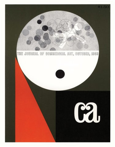
Chris' assignment for this month's cover was «design a cover with your cut-outs that says Commercial Art." Again, starting with nothing but an idea, Chris started placing pieces of felt on his board. The only concept he had at this time was that commercial art is a creative «thing" in the mind of the artist. Letting his imagination direct his hands, Chris started dropping pieces of felt down on a circle that was the mind. The «little man" and the smaller circles are the things that were going on in the mind of the artist. The triangle formed the body and another circle formed the eye of the artist. Utilizing the back cover to continue his story of the creation of an idea, it was natural for all the ideas in the mind to <<spill out." The thread? «It just seemed to need it," says Chris, «maybe because there has to be a thread to hold everything together, to add flow to the whole thing." The result-a cover that tells a story not only of commercial art and creativity, but how these little pieces of felt can be used as a quick, visual means of transferring ideas into reality. Whether the cut-outs are used as finished art or merely a starting point, they offer the artist an interesting new medium for designing everything from ads to logos to displays.
cover design
18
1
These three elements were created in felt and then used one, two or three times each as burns for a photogram. A piece of thread completed the art for ''the mind.''
3
CA, October '59
Just to give you an idea .. . . . . of what can be done with Chris Cuts, we asked Chris' permission to: 1) reproduce some of his basic shapes in color so you could cut them out and experiment yourselfand 2) make the complete kits available at a special price for CA readers. Naturally, his answer was an emphatic ~~yes." So, on the next six pages you'll find Chris' felt friends reproduced, ready to cut out and ~~play" with. On page 26 is the information needed to order complete kits.
Go ahead, try them
CA, October '59
19
Creati'vity (cont'd.)
20
CA, October '59
21
CA, October '59
24
CA. October '59
25
CA, October '59
With Chris' special permission ... CA readers can order Chris Cuts kits at a $1.00 savings: 26
# 1 Regular Chris Cuts kit (shown above) with 40 cut-outs and 11V2 x 14V2 felt background piece. Retail price: $3.00 Special price to CA readers: $2 .00
# 2 Chris Cuts and Drawing Kit-contains the 40 basic cut-outs plus: chalk, water color set, colored cut-out paper, 20-page coloring book. Retail price: $4.00 Special price to CA readers: $3 .00 Whether you order one of the kits for your own useor as an art aid for your children-use the inserted order blank. Enclose card ·and cash, check, or money order in an envelope addressed to CA.
Incidentally-also inserted is an order blank for another value-12 issues of CA for $12-fill it in now to make sure you continue getting America's newest magazine of art, design and graphics created expressly for today's professional artists!
CA, October '59
t--.
Cil
1
- --------------------- - - - -+ - --I
I
c::
~
~
~
Q)
c:: (.!)
~
Q)
c::
BUSINESS REPLY MAIL
NO POSTAGE STAMP NECESSARY IF MAILED IN UNITED STATES
POSTAGE WILL BE PAID BY-
The Journal of Commercial Art 809 San Antonio Road Palo Alto, California
FIRST CLASS
PALO ALTO
PERMIT NO. 12
CALIFORNIA
3
c1-t
Ul
(":) ~.
~
(JQ
~
~
p)
I
~
<:--. <:--.
~
~
~
(t)
Ul
s·
0H-, Ul 0
ff ....... ~
(t)
::r n0 n-
1-t p) ~
.......
Ul Ul
c(t) s· c(t) Ul
0 ~ n-
()
(t)
....
p_.
(t) Ul Ul (t)
1-t
p_. p_.
p)
(t)
~
0
~
~
<: (t)
(t)
~
~
p)
0....
~
p)
p_.
p) 1-t
()
0
'-<
1-t
::r (t) n::r (t)
~
~
0
'-<
1-t
0 ~
(t)
0
1-t
(t)
p_. 0 1-t p_. H-,
c .......
n-
~
0
Ul (t)
()
p) 1-t
~
t:tJ
~
p)
p) Ul
1-t
0
r
~
p)
C)
p)
0
~
p_.
(t)
()
n-
£::8
~~
~
~
cn- 0c 1-t ~ np;· ()c 6 Ul 1-t n- c p;· .. (t) n- p) (t) 6 Ul
p;·
p)
C)
U)
~
(t)
~
.......
p)
n-
'='"
() (t)
1-t .......
~
P
0 . ZONE _ _ STATE
P . 0 . ZONE _ _ STATE
PHONE
n-
Ul
1-t
p;-'
6 c c
~
(t)
(JQ
#':;
1----l Ul
.......
1-t p) p;· 0 ~ ::r .. p_. 1-t (t)
~~
p;·
(t) ()
~
Please start my subscription with t h e _ M o N T H - issue.
- - - - - - - - - - - - - - - - - - - - - - - - - - Sf GNATU R E - - - - - - - - - - - - - - - - -
--OTHER-------------------------------
0 RETAILING 0 PUBLISHING 0 FREE LANCE 0 SCHOOL 0 DISPLAY
TYPE OF BUSINESS
0 ADMINISTRATOR 0 ADVERTISING AGENCY 0 ART DIRECTOR 0 ART STUDIO 0 DESIGNER 0 MFR.-CONSUMER 0 PRODUCTION 0 MF'R , •INDUSTRIAL 0 ADVERTISING MANAGER 0 GRAPHICS-PRINTING, ETC.
TITLE OR OCCUPATION
0 ILLUSTRATOR 0 TECHNICAL 0 CARTOON ·ANIMATION 0 LAYOUT
ARTIST
In order to give you better service, please furnish us with as much information as possible.
CITY
ADDRESS
NAME
Send bill to : 0 check here if same as above
CITY
ADDRESS
NAME
Mail to:
PLEASE PRINT
cn-
()
.A
1\) 1-t 0 Ul ::r p) ....... ....... 1-t p;· Ul
~ 0
n-
(t)
(t) ()
~
U)
()
~
~
Gentlemen: Please enter my subscription to CA for 1 year (12 issues) at $12. 0 Check enclosed
Ul
n-
u;. (JQ
n-
~
p) 1-t
p_.
p)
~
~
p)
~
0
<: p)
a-R... I ~ c 1----l dQ" tv
p) 1-t
~n-
(t) (t' p_.'-< Ul Ul ....... ~ 0
0
1-t
~
t\j 0)
1-t
(t)
p_.
p)
1-t
(t)
~
0
.. . . . -
I
I
I
Ul
..
(JQ
s·
1-t
0
1-t
(t)
p_.
0
~
p)
()
<: . Ul
Ul p)
0
0
1----l
p)
ffl
REMINDER: ENCLOSE CASH. MONEY ORDER OR CHECK
____ Chris Cuts and Drawing Kit #2 @ $3.00 each
_ _ _ Regular Chris Cuts Kit #1 @ $2.00 each
I would like to try the real thing, though (or give it to my children to play with)-please send me:
Chris-you've got a good idea here ...
CITY ________________________________ ZONE - - - - - STATE - - - - - - - - - - - - - - - - - - - - - - - - - - - - - - - -
ADDRESS _____________________________________________________________________________
NAME(PLEASEPRINT) _________________________________________________________________
••
0
Ia
-•
0•
•
A
~
..,.
~ ~-
\/;)
9
~
<:::""+-
~
(a COLOR CA's regular Color Guide with demonstrations and applications. For permanent reference, pull these four pages directly from the magazine. This month's demonstration is concerned with the choice of a second color.
27
Adding 50% black creates a third color
Solid green combined with black tints
Screen tints of a dark or grayed color have a drab and often colorless effect like the squares shown at the right.
If middle-toned colors are selected, like the green and sienna shown above, they will hold their color effect through the various tints and still give the dark-toned ranges when combined with black tints. When planning a layout it is not advisable to call for fine lines or small type in the dark colors. Since these dark colors come from screen combinations, perfect register on the press becomes a problem.
CA. October '59
Solid green
Green tints
40%
30%
2 0 %
10%
".
50%
.. ·. .· ~ ~d-t .~"
DUOTONES 10%
3 0 %
10%
30%
50%
100%
10
30
50
DUOTONES 50%
10
30
50
"< ~:~:~··.>. ' _· • "':,J
~ ~ J ~.'.
~ : ~)J·~
70
100
CA. October '59
100%
so
70~ %~--....
,..----'6 0%
DUOTONES 10%
100%
30%
10
30
50
TRIPLE TONES 10%
10% BLACK
30% BLACK
30%
10% BLACK
10
30
50
70
100
CA COLOR CHART COPYRIGHT 1959 BY THE JOURNAL OF COMMERCIAL ART
•
PRINTED
CA, October '59
BY L I THOGRAPHY USING 150-LINE LEVY SCREEN .
TRIPLE TONES 10%
30%
10% BLACK
10
30
50
70
100
30
Normal duotone photographs. Russell Illig, Photographer.
CA. October '59
(a PRODUCTION Duotones are an excellent way to demonstrate the use of our Color Guide each month- so, before we get too far, let's take a close look at ...
DU
ES
Technically, a duotone is the printing of any combination of the tones of two colors. By common usage a duotone has become synonymous with the process of reproducing a black and white photograph in two colors. Or in the words of the sales manager,(( .. .let's run the picture in two colors and get some snap in it!" There are three ways to get this effect. One is to print a solid of the second color (usually light) and then print the halftone in black over the color. By using this overprinting method, the
second color comes through where there is a minimum dot pattern in the halftone (highlight areas in the photograph). Although a considerable amount of contrast is lost when this method is used, a two-color effect is achieved. There are times when this is desirable; when the picture is be printed as a rectangle (square-cut halftone) and the background is lacking in tonal values. A similar effect is achieved with a negativepositive duotone (see example on next page) which has a less mechanical feeling. 31
GLOSSARY OF TERMS Contrast ... the presence of strong highlights and shadows in a picture. Dot formation ... halftone dots arranged in such a way that accurate translation of detail and tone values are possible. Flash ... a term used by the cameraman indicating an additional camera exposure in halftone work for the purpose of strengthening the shadow dots. Halftone ... a printing surface with tone values and details represented by a pattern of evenly spaced dots of various sizes and shapes, the smaller dots in light areas, the larger dots in dark areas. Halftone screen (on glass) ... two glass plates cemented together, each having a series of etched, parallel lines crossing each other at right angles and leaving transparent openings between the intersecting lines. Typical screens have from 65 to 150 lines per inch. Halftone screen (on film) ... commonly called a magenta contact screen. The crossed-line effect is on one piece of film instead of glass. Highlight dots ... small dots on a halftone negative representing the lightest or whitest area of a photograph or piece of art. Mechanical screen tints ... halftone dot pattern of uniform size prepared mechanically and inserted by the stripper as indicated on the copy.
Middletone ... any tone intermediate between the highlights and shadows of a photograph or printed reproduction. Moire... undesirable patterns in multicolor halftone printing caused by incorrect screen angles or misregister of the color impressions during printing. Process camera ... a camera with a highly corrected photographic lens especially adapted for sharp definition and having an accurately calibrated reduction and magnification scale. Used for line, halftone and process color photography. Screen angle ... the angle at which the halftone screen or halftoned copy is placed to avoid displeasing dot patterns in reproduction. Black halftones are usually shot at 45° from horizontal to assure regular dot patterns on the edges of a square-cut halftone. Deviation from this angle causes the saw-tooth effect sometimes seen on the edge of a halftone reproduction. Shadow ... a general term for the darker areas of the photograph, the halftone negative, or the printed reproduction. Tint ... a tone (strength) of a solid color. Tone ... the harmonious effect of light and shadows in photographs or art.
CA. October '59
P roduction (cont'd)
Duotones are shot differently than a normal single-color halftone (left). The black duotone shot is open (lighter) in the dark areas to let color come through and gain maximum shadow detail. The color shot (center) is stronger than the normal halftone to achieve maximum highlight detail. Insets show magnified dot patterns of the same area for comparison .
-·.'•••.... -.. • •• •• • • • ••••• ••• • •••••• •• •••: ••• ••• •• • •• •• I
•••
..
32
.-
••• • •• ••••••••• • ••••••••••••• •ce•••• ••• ••• ••• • ••••••••••••• ••••••••• ••••••• ••••
The other two ways are true duo tones; the result of printing the halftone dots in both colors. Method 1- is done completely with the process camera. The black and white photograph is shot first at the usual 45 o screen angle for the black. The same photograph is then shot for the color negative at a 75 ° angle. This 30° differential is necessary to eliminate any moire~ These two shots will be made differently by the cameraman to achieve maximum shadow and highlight detail and increase the effect of the second color. Method 2-is done by making one shot with the process camera for the black halftone. The duotone effect is achieved by printing this black halftone over a mechanical screen (for the color) angled at the critical 30° mentioned above.
Magnified view of dot patterns in a duotone showing screen angles of black (45°) and a color (75°) and their relative positions when printed. Deviation from this critical 30° relationship will cause moire'patterns as demonstrated below.
300
20°
There is one fundamental requirement «to get the most out of a duotone." The original art or photograph should have a complete range of values with good contrast, strong shadows, full middletones and white highlights. Lack of contrast or a predominance of middletones will result in a flat-looking duotone. It will appear monochromatic in a third color resulting from the combination of the screens of black and the second color; i.e., brown from orange and black. Some of the examples of the various kinds of duotones and their advantages (accentuating an area in a photograph, for example) are shown on these pages.
10°
so
Not shown are examples of the wrong selection of colors resulting in displeasing effects. One of the functions of the Color Guide is to help you eliminate these undesirable combinations and select desirable ones.
•
CA. October '59
Partial-duotones where the color is used to accent an area or specific shape.
PHOTOGRAPHS COURTESY RUSSELL ILLIG
33
Four of the treatments described in the article-for comparison. (1) Upper left: halftone over a solid color. (2) Lower left: negative-positive duotone. The color is printed from a positive instead of negative halftone. Highlight areas print almost solid in the color and dark areas have very little color. (3) Upper right: camera duo tone. (4) Lower right: black halftone and <>nechanical screen tint of the color. CA, October '59
34
HOW TO CHANGE ALEOPARD'S SPOTS!
When it comes to colored paper, why assume "the leopard can't change his spots"? Don't be bound by the white paper habit ... color printing on white paper is good, but color on colored paper is much more effective, especially for increasing direct mail returns. Allied's New And Different Colorcraft Line of papers, matching envelopes, reply cards, and ink recommendations is specifically designed to get results. It's distinctive Impulse and Influence colors have been styled and researched by Faber Birren, noted color authority, to stimulate action ... to create a mood ... to get more direct mail returns! Impulse colors are bright and vibrant. They incite reader-action and response. Colorcraft Impulse was
created for mass market direct mail selling where big returns are desired. Influence colors are subtle, yet appealing. They're styled to create an impression or mood ... to create a feeling of prestige, of richness. Colorcraft Influence stimulates a favorable mental reaction about the product and company. Remember, this is an age of color. Everywhere, everyone is breaking the white habit ... in appliances , in bedding and linens, in soaps, in all areas. Why not in paper, too? Make your direct mail more attention-getting, more effective. Use Allied's New Colorcraft Impulse and Influence Colored Paper Line.
Write or call Allied today for full details on how to "change your leopard's spots" with Colorcraft •.. the only color researched paper. Impulse Colors: Flame Pink • Sulphur Yellow • Pumpkin • Summer Green • Indigo Influence Colors: Sandstone • Rosewood • Smoketone Blue • Aspen Green • Buckskin Paper Stock-both bond and uncoated offset grades in popular sizes and weights. Envelopes-in all colors. Card & Cover Stock-in Sulphur Yellow, Pumpkin and Flame Pink only-125 lb. Inks-recommended Colorcraft text and accent colors available from IPI by formula.
ALLIED PAPER CORPORATION Kalamazoo, Michigan
m
MORGUE
For this month's collection of laboratory apparatus, our thanks to Braun-Knecht-Heiman Co., Central Scientific Company of California, E. I. Du Pont de Nemours & Co., The Chemstrand Corporation, Standard Oil Company of California, and Western Scientific Apparatus. Other photographs for CA: Bill Arbogast, Russell Illig.
37
CA, October '59
38
CA, October '59
39
CA, October '59
40
CA, October '59
41
CA, October '59
42
CA, October '59
(a MARKETS Beginning-A series of job descriptions based on survey, some research and personal observations. Number 1 . ..
Your job as an art director with a medium-sized manufacturing company
Introduction: Rather than relay statistics and figures to you, we've taken the facts available and created a hypothetical company and situation that is typical of what you'd run into as an art director with a ((medium-sized" manufacturing firm. The conditions, would, of course, change with geography, product and management, but this will give you a fairly accurate picture.
else wanted! Actually, the range is quite broad, but in order of frequency noted, includes: - designing, illustrating, supervising photography, ordering type, paste-up (mechanicals) and supervising printing of all literature, brochures, annual reports, 43
Your Company: does an annual volume in the 4-6
II
million-dollar-a-year range-employs 15-20 people in the main office (where you work)-could be in the industrial section of town, but more recently is found in the suburbs -manufactures and sells all over the U.S. with three to four salesmen on the road and 40-50 jobber/ distributors handling the line and selling it in turn to the ultimate user.
' , HI-ART'
The Management: consists of a president (usually a major stockholder), a vice president of sales and marketing (who many times also has responsibility for advertising and promotion) and in about 75% of the cases, an advertising manager. The Advertising Agency: is a medium-sized local or regional agency-if the product manufactured is a consumer product with a resultant larger advertising budget, you could be working with a national agency-the agency is only concerned with media, does mostly trade and business publication advertising- before the company had their own internal art department (you), the agency also did the promotional and collateral material on a fee basis -the agency might have been the one to suggest hiring you-you will work with them occasionally, particularly coordinating media and promotional campaigns.
ILLUSTRATION BOARD Available For All Media
~----------------------------
I I
1
Gentlemen: Send free samples checked above
I
Name ___________________________________
J I
Company·---------------------------------
I
1
I I
I
The Budget: for all advertising including space, literature, point-of-sale, trade show exhibits and all sales promotional aids, ranges from 1- 3% of gross sales volume-gives you an average of $25-30,000 a year to produce and buy the things you create.
Try these superb surfaces 0 Wash Drawings-Dry Brush ......... .. # 69 0 Pen and Ink. Pencil or Charcoal. ...... #61 0 Plate Finish for fine Pen and Ink ...... #27
Address•------------------------- - - - - - - - City•___________________ state:_____________
I I I I
NATIONAL CARD, MAT and BOARD CO.
Your Functions, Duties, Responsibilities: include everything they hired you for and another six jobs nobody CA. October '59
4318 Carroll Avenue, Chicago 24, Illinois Also los Angeles and Peterborough, Ont ., Canada
Markets (cont'd)
catalog sheets, assorted sales and technical literature. -working with, or becoming the purchasing agent for most of the printed material you design and illustrate. - doing illustrations for multilithed or mimeographed sales promotion flyers to salesmen, jobbers, dealers, etc. - designing cartons, labels and packages. -designing the company's trade show booth (exhibit). -creating cooperative newspaper advertisements for matting and sending to jobbers and/ or dealers. -designing letterheads, which in turn might lead to a new company logo. - if you have the talent and the company does their own product research and development, you may also get involved in a little industrial designing or at least have a voice in the styling, color, etc. -the usual miscellaneous jobs ... designing company (and management) Christmas cards (but this way you can gang-run your own, too!), making signs for the company picnic, material for sales conventions and some presentation art for the stockholders' meeting. 44
You'll Learn: more about production and reproduction processes because you will be dealing directly with the suppliers-you'll become acquainted with paper, how to buy it, what kinds to use for different purposes-you'll get
Originally commanded by Queen Victoria for her own use, and since recognized as the world's finest water color brushes. Made by craftsmen for the craftsman: commercial artist-illustratorretoucher- eng rover.
902 Broadway, New York 10, N.Y. Canadian Agents: THE HUGHES & OWENS CO., LTD. Head office: MONTREAL California Distributors: THE SCHWABACHER·FREY CO., SAN FRANCISCO See your local dealer!
CA, October '59
Markets (cont'd)
involved with the ((corporate image" as it is affected by a typographic style you select and influence-you'll also learn how to work with a budget, and consequently how to compromise and make ingenuity a substitute for money!
Big-league artists and upand-coming students alike make Bainbridge Board the nation's top choice, because Bainbridge has what it takes to get the results. Bainbridge care in every step of manufacture, plus vigilant and rigid inspection, insures you the standard of perfection your artwork deserves.
In short, you are the art department: designer, art director, illustrator, mechanical and production artist, and purchasing agent all rolled into one. With an advertising manager on the management staff, you'll probably have less purchasing to do and less details, and most important, somebody else who ((talks your language."
The Salary : here, the range is almost as broad as the the duties; went from $4800 to $8500 per year. Safest conclusion to be drawn: if you have three to five years' experience, expect to make 10-15% less than a comparable job in an agency or studio; if you're just out of art school, the salary might be a bit better than the bottom job in a studio or agency.
Since 1868 famous for high quality
The Advantages: variety-no ((bull-pen" rat-race-secu-
At all art supply stores in most popular sizes
rity-the distinction of being the only artist on the payroll (maybe this should go under disadvantages?)-a-betterthan-average chance of getting pay increases commensurate with your output-a broader, more comprehensive understanding of the problems of manufacturing and marketing-a chance to find out jNst what you like (and have the talent) to do best.
•
• Illustration Boards • Drawing Boards Mounting Boards • Show Card Board • Mat Boards
CHARLES T. BAINBRIDGE'S SONS, 12 Cumberland St., B'klyn 5, N.Y.
45
The Disadvantages: being classified by personnel as a draftsman and having to adhere to this salary scale-being somewhat isolated from other artists and even advertising people who ((talk your language" (you can always keep your membership in the Ad club or N SAD)-having a real educational job to do with management (unless there is an advertising manager to act as translator and buffer); this includes the concept of what an art director is and usually does; the problem of educating them to deadlines, proofs, brownlines, and the world of graphic arts- growth (in salary and stature) directly tied to the size of the advertising budget-the monotony of dealing with the same product every day (this could be alleviated if the company had a product line).
General Conclusions: for the younger artist trying to gain experience (fast), the medium-sized company art director job offers a wonderful opportunity to do a little of everything; lack of immediate supervision can be an asset as well as a liability. To the art director who's had ((enough" of the big-city hustle and bustle, wants to work closer to home, wants fewer pressures and is willing to take less money in turn, the company art director job has many advantages-although this is not intended to mean that it is a rest home, a place to retire, or a haven for artists who couldn't ((make the grade" in the city!
•
PATE MASKIN
I K
.../ Perfect register overlays and masks on acetate, vinyl, glass and glass tracing cloth.
-v' Transparent-"see through" for accurate register. ~ Photographs black for
line cuts. ~For pen, brush, ruling
pen, airbrush.
M. GBUMBJI.CBEB, inc. CA, October '59
EXHIBIT One of the frustrations of our business is that most times the audience who view our work rarely appreciate the thought, time and effort that went into it. This is why we have shows and exhibits for those in the business who do appreciate what you've done and why. This is also why we devote 20% of CA every month to examples of your work and the "story" behind it. To make sure your ''favorites" are seen by an appreciative audience, too- send them to CA 's Exhibit.
46
Picking up CA 's appeal from the first issue for material for the Exhibit Department, Bob A mft in Chicago submitted the enclosed example with a one-word memo- " H ere." Following up on this terse presentation of his design for a box to house five vocabulary improvement records, we discovered Bob was both art director and designer, used a photograph of a page from the dictionary as the theme, and has had one-man and group showings of his work all over the country since 1938. The album box was reproduced by lithography, the photograph was by John Chapman, the client Tony Batko.
CA, October '59
exceeding
NAS 710 proc.lll
According to the creators of this full page trade ad for Helipot potentiometers (and with apologies to Gertrude Stein) ... ''a potentiometer is a pot is a pot . .. this one has a tough disdain for environmental punishment ... a jaded audience of sophisticated engineers had to be shocked into awareness of the product's attributes." A clever blending of type and photography was used to tell the story at a glance. Those responsible: Lou Frimkess, art director-Ed Kysar, designerOvid Neale, photographer.
name your punishment ... and you'll find the Helipot Series T all-metal single-turn precision potentiometer can take it! Name your linearity, to ±0.20% ... your
47
resistance, from 650 to 100,000 ohms ... up to 5 ganged sections and 9 taps per section ... servo or bushing mount, with bearings front and rear for perfect alignment. Put them all together, in the T's new cup-type housing, and you'll
Beckm a n• /Hell pot" Helipot Division of
I
I
Beckman Instruments, Inc. Fullerton, California Engineering representatives in 28 cities
have the best-value miniature you can design into your system! For the full T- Pot Story, whistle for data file G112. potentiometers: dials: delay lines :expanded scale meters: rotating components: breadboard parts
CA 's Humor Editor, Irwin Caplan makes his first appearance outside the ''funny pages" of CAin this series of experimental ca1'toons whose main purpose for being here is they are fun to look at!
CA, October '59
Exhibit
ELl LILLY AND COMPANY
~~,? .Li.'...:l.·~ ~~~hl': PMAIC.Iv'.\~-1>• ~ .,0•'·
A , ....
Ell LIU.Y AND COMPANY 1!1..01•\' \1-:tCI Lit
U
'
o\.
- ::~:~!:::.:-,:-=:::.;.~-1\
U!.l.t~M'<IP'........ l ... , _ . "-'
,1QIIH-c ......t"\•J'OII•
48
I ndianapolia 6, lndiaM / ME 6-1111
To help tell the story of their paper and the part it plays in the communications of a company, Howard Paper Company has prepared a series of case histories about companies they serve. Above, reduced approximately 50o/o, is the case history brochure on the Eli Lilly pharmaceutical firm. At left, reproductions of early Lilly letterheads and invoice forms dating back to 1876. At right, the current letterhead. The only commercial Howard adds is about the stock used for the brochure-in this case Howard Bond, linen finish. Dan Smith of Kircher, Helton & Collett was the art director, Bru ce Beck did the design, and the piece was printed by Printing Service Co . in Dayton, Ohio.
CA, October '59
The days of using the "help wanted" columns of the newspaper to recruit personnel are almost gone, particularly if you're looking for Ph.D.s to work on a missile development program. At this level you go "all out" with 36-page brochures like this one used by Lockheed's Missile Systems Division. Conceived and written by Lockheed's recruitment agency, Hal Stebbins of Los A ngeles, the brochure tells the big picture story of w hat is happening at Lockheed that w ould interest a Ph. D. The nine design elements at right give a broad concept of what Lockheed is doing-left to right, top to bottom: Concept, Design, Development, Electronics, Chemistry/ Physics, Computors, Testin g, Manufacturing, Flight. The same design units were repeated throughout the brochure to key the message. Below: a two-page spread telling the Concept story. Agency Art Director Jack Vibber did the design for the brochure, the symbolic designs and posed for the picture below. Working closely with K. R. Kiddoo of Lockheed, Mike Corcoran of Stebbins did the copy.
•
49
ADVANCED MISSILE AND SPACE TECHNOLOGY
The Missile Systems Division is engaged in all6elds of missile and space
technology - from concept to operatton. Some of the Diviston's major activities are highlighted in the follow· ingpages ... One of the most challenging areas is in advanced systems research. Here future programs are explored, requirements established, preliminary design and analysis performed and uperimental models buih. Proposals also originate here for the design of new systems for immediate and long term development. Scientists in this area extrapolate from the present state of the art applications as far as a decade or more away . Important research ill> conducted in nucleonics. Studies embrace nuclear weapons, hydrodynamics, opacity, thermal and nuclear radiation. Also under investigation are: reactor physics, includ ing criticality, shielding and heat transfer ; theoretical research in nuclear, atomic and molecular physics; expe rimental research in low energy nuclear physics, including fast neutron physics, nuclear reactHlns and radiation physics. A special materials research laboratory affords opportuni ty for high and low temperature studies, metallographic research, gas-reaction ex-
Panolthe[);viVofi"•Sl,SOO,OOOadvancedcomputcr
A iahl lcientisucli.cu.SiinathtltNCtun.l
c~nte:r. Equipment includes the latest in hip-speed dleital
upect1 of tolar ailin.a-JPKe tn.~J with
and analot computers, includinJ 2 U11ivac. I lOlA mode.IL
theafdoftolarndiatK»npre.aure-oneof thc:manyfar-reachiqLock.heedstudia..
19
CA. October ' 59
Exhibit
Waimea (ll'y-moy'..A) For the wide.. apectacular panorama it affocds, Waimea U nyon and Fallt on Kauai bland it known u "Knai'1 own Crand Canyon." 0
* * In the
:·~n:·p~t::b:::::A:WI";:!:,4I~ :~·~~o!". 1d;;~:r-.~l~~ 1
itofrenmoreuu.bletpace than lont:er.eonventional-typealltionwacon.. lttBoor,completely tunnel-freefromfronttN.Itotlilpte.itunique. Wilhtheteadvtnta&es..itc:uiH'Veequa]ly well aa=-,.. ntry cnalxr,uc:a rl()canier, ua"ctmper" orua"commuter." ***S~
50
The "dream cars" on these pages were inspired by the "dream living · of Hawaii, are part of the collection of five designed by Kaiser's Industrial Design Division to suggest ways in which aluminum may be used in both functional and decorative applications. They were reproduced in an elaborate, 21,.-page presentation brochure (137fs" x 16%" page size) produced by lithography on Carrara cover stock, to inspire Detroit's designers. The brochure itself was somewhat of a "dream job," too-an extensive budget, plenty of space, premium paper, full use of color, optimum amount of copy with a soft-sell approach. Add to these ''dream ingredients'' the talents of a top-flight art director (Herb B1·iggs of Young & Rubicam's San Francisco office) and illustrator (Earl Thollander), and the excellent production and reproduction facilities of Kaiser Graphics and you have everything you need (except enough time!). The double page spread at top was the format used for each car. The illustrations and cars at right were excerpted from spreads.
CA. October '59
utility U achieved throuch a novel am.ncement of driver' a teat. encine and drive line uniuall in front . Thefouroraia-qlinder-oppoted.air.eooledaJuminum eftline it loc::ateddirectly beneath the drive~"' I .e.t.almo.t at ftoor bel. With front -wheel drive, thitftl(ine-drive-wheda atKmbly becomes a replaceable "truck" unit. FrontKOOp ooolt encine : uhawtlou.ven are kated. to the rea r of the front wbc!d. 1t The 8oor it nw.de from dcn-etailinc a1uminum r.x tnWoru with vinyl weu ttriJ». and pmnill infinite ,..riety poe.ition. and con6prationt ... awivelbw::ket-u,conventiona.lorlide~nll, fold•way beda.plu..cabineta.etc..
* *
of_,
,_........ ,... .........
.......... ~
....... .... ,,Jt-........ .. ....._,........__,., ~
..... .,...,_ .... .........,.....,__. Aw...._..,.__,._...,........,
~w...._,-.,....,_...,...,.......,
.
__,_....._ .... .., ............. ,.....
~~~~- ~,_.-,_.
Even a ftyin1 bridae could be incl~ ! Or,lkMw deNp penniu r~opid chanpover to umpina or carao vehM:le. * **In the roof. two five-foot alidina ct.•leelioM move rmrward (ander· RN.th the top) to open the dnver'a aec:ttoft. Find roo( pand t. ah&~inum theet wilh lonp. tudinally emboewd ttiii'Minl nba. Catt aluminum center tupport !Grml riJid tlruc:ture with esu.ded aluminum front and retr .upport and ..de r~oilt. Body trim-ribbed aluminum theet app!tquet - fnt•res bn.Jht-fintthed ah&minum on rib crata. color in the ~ Onvu's controls are mounted totUher on a cut control housina bolted to fr~ome and 8oor.
***
51
Exhibit
52
These spot drawings by Lombard C. Jones (N.Y.) were received too late to get into last month's collection -were too interesting to hold until we do another collection. If this Jones were one of the Joneses we had to "keep up with," it would be practically impossible; i.e., executive editor, The New Yorker; associate editor, Scribner's; art director, House Beautiful and Architectural Record; illustrator for Fortune, Mademoiselle, The Lamp and several books; consulting designer for Standard Oil of New Jersey, International Petroleum Co ., General Electric and others.
,.
CA, October '59
This full page ad for Wall Street Jou'rnal is another example of the ''big picture'' trend. This time, however, the "picture" was a pencil and wash illustration by Chicago's Phoebe Moore. Tom Gorey is the art director for the Morton Salt account at Needham, Louis and Brorby.
53
Morton opens new salt source today! *
Morton's new mine at FAIRPO RT, O H IO, now offen a convenient source of rock salt for the indus· trial East and Midwest. The Fairport Mine is situated on 600 acres of land on Lake Erie, 29 miles eas~ of Cleveland. The Grand River forms the eastern boundary of the Morton property. This strategic new location can furnish high gfade rock salt by boat to all Great L'lkes poris and by rail and truck to inland cwtomen. 4 years' work-500 tons of sal t per hour Morton began work at Fairport in 1955. Once the site had been cleared, construction work was carried on around the clock, six days a week. Shafts have been sunk to a depth of 2000 feet. When operation reaches ultimate capacity the mine will produce 500 tons of salt every working hour.
Now, 15 salt sources to serve Industry With the completion of Fairport, Morton now has 15 salt sources-mines, wells and solar ponds-that span America and reach into Canada and the Bahamas. As the only nationwide salt company, Morton has the facilities to produce and deliver the kind of salt you need, regardless of your size or location. Morton also has the most complete salt research laboratory in the world. S,alt problems your Morton salesman personally can't solve can be referred to the research laboratory for quick, thorough analysis. This service help alone may be worth thousands of doiJars to you every year.
If you would likt mort information about ordering rock salt from MorUm's ruw Fairport Mine or ordering any grade of salt from any olhtr Morton source, write today:
CA, October '59
A Salt sources
X Sales Offices
e Warehouses
M>«Jma~~T ~ INDUSTRIAL DIVISION
Oept . 0000, 1 10No . Wecker D rtwe,Chla~gei,III . ,Te4 : flf.I:IOO
~
Exhibit
TERRIFI NEW -PART P
RAi\1
u stock tba when ou need it!
54
The colors, style and design ofthis broadside were intriguing enough, but then when we learned it was a dealer piece, we really became interested. Why? Because it is further proof that rather sophisticated art and design can be used to sell a rather unsophisticated audience a completely unsophisticated product, TBA (service station parlance for Tires, Batteries and Accessories). McCann Erickson's Cleveland office handles the Sohio account, art director on this broadside was Clark Robinson. Dick Loader of Pitt Studios in Cleveland did the designing and art. The piece won an award in a national lithographer's show, was a merit winner in current Cleveland AD Exhibition.
CA. October '59
your 1958 t s were good-your '59 sales can be there'll be more cars on the road, a greater need to fix them up, and more money to on them
and be ready to sell
CA, October '59
55
Exh ibit
by two great and grow1ng newspaper s -
THE SAN DIEGO UN I ON I EVEN ING TR IBUN E
"'
" TheR me e f of Truth"
15 " Hometow n" Newsp ape rs cover•n&
Served by t he COPLEY Wash•naton Bureau and lh e COPLEY News Se rviCe . REPR ES EN TED NA TIONALLY BY WEST- HOL LIDAY CO , INC.
HIT ·THEM ~~~::~~~~~::~:~::w~:~::~:~."~Ew~s~-~ wHER 25"' OF THE PEOPLE IN THE GREATER LOS ANGELES
"HOMETOWN" MARKET LIVE IN COMMUNITIES SERVED BY TH E SE COPLEY "HOMETOWN" NEWSPAPERS:
in Greater Los Angeles .
GLENDALE NEWS - PRESS MONROVIA NEWS - POST
E :~~T=E::~ :~~:.:~:~E YKNIY CE
THE
LIVE
EVE~:TNH: :~~:;OF TRUTH" COPLEY
NEWSPAPERS
1 S "HOM ETOWt'" NEWSPAPERS COVERING
GREATER
LOS
ANGElES
-SPRINGFIELD. ILLINOIS - NORTHERN ILLIN O IS-AND
SAN DIEGO. CALIFORNI A . SERVED BY THE COPLEY
WASHINGTON BUREAU AND THE COPLEY NEWS SERVICE REPRESENTED
NATION ALLY
BY
WEST HOLLIDAY CO .
INC
56
The problem- create impact and attract attention in an annual statistical directory loaded with competitive ads. Solution-place several small space ads with a ''family resemblance. '' Each of these small space ads tells a story about a Copley newspaper (there are 15 in the chain). Barnes Chase Company in San Diego is the agency, Leonard Parker is the art director, Paul Seaman did the designs.
I
----
THE SAN DIEGO UNION
~IJI•••••)., 11111111111
RANKS 25TH AMONG ALL THE NATION'S NEWSPAPERS IN TOTAL COLOR LINAGE.
991 ,250 LINES OF R.O.P.
I
THE SAN DIEGO UNION EVENING tRIBUNE We have prepared a 29-minute sound
will be happy to arrange a special screen ing for you ... or provo de a pront for you to show at your own conven ience . No charge ,
Northern Illinois- Springfield, Illino is
r )
~
CA. October '59
- and Greater Los Ange les
. Served by the COPLEY
Washongton Bureau and the COPLEY News Servoce REPRESENTED NATIONALLY BY WEST-HOLLIDAY CO , INC.
These days everybody appears to be trying ''to attract the attention of rocket and missile engineers." This photograph by Ernest Braun was the basis for an ad for Grove Valve and R egulator Company; was used to get across an ''imaginative engineering'' story about Grove valves . Ray Ward, art director for L. C. Cole in San Francisco did the design for the trade ad; comments, " ... we wanted to impress the readers ... by taking the usual industrial photograph illustration just one step beyond. ''
57
The Cleveland Art Directors Club's Eleventh Annual Exhibition is now in the midst of being judged (see photos in On the Board this month) . The Awards Luncheon is October 19. The cover for the entry invitation is shown here as designed by Richard Blakemore, art director of Pitt Stu dios. King Beach was the photographer, Bohme & Blinkmann did the typography, Bedford Lithograph did the printing.
CA. October '59
Exhibit
Having long admired the design and particularly the covers of Industrial Design and Interiors (both Whitney publications), it was interesting to learn they are both done in the same studio. Jim Ward and Arnold Saks (Ward & Saks, N.Y.) are the art directors, respectively, for I. D. and Interiors, do the covers themselves. Shown below : Sak's September cover for Interiors - opposite page: Ward's cover and lead-story for the June I. D. Coming, a cover for CAin December by Saks andj or Ward.
58
CA, October '59
Desio n and architecture : a narrowing gap
a new series
59
1. . . ~ ---'" ~ ··~·~-· -·~ .......". . . Ta the enriAMr, Yotldlnr I• a aeparate branch of aclence wllicb mak• l*'ibll tbe jolalq of metall b7 f111~n; to tM dulper Ilia a meau to aa ,._vital factor In unifJII\I' MCtioM&DdfOIIIblalnrpe.rttlntoaplanDedobject. OfaU the futenlnrmetboda, jolnaachle,·ed br ,..eldJnr era the mo~tbhMIInr-tbefun.lnfaet, be"lr,..,.abii. "ConM
quent17, atHqth In the joint ltaelf It one of the main ..,tronrpolatt"ofthllrMtbodof unlfrlnrP'Irta.andtlndlnr 'lrl)"l to lmprvve the atrt.n.ua and pNVent the jolatt from an1 poulbll brukdow!l b7 cracklq orcon"Wion hN bftn a malaeoncemofthe•ekllnrenw!n..r. For the dalrnv, ,,,,.,,. iathjol~tt Ja,ofc:ourM,anattrlbuteln flt"Orof • ·ekllnr, but tiM method aiM hold• a d•lrn cbok. whkh hu partkular lnterat for him : he can cone.! a 11"tld or M canuHitto•llp r l\"eaproductltt"looll." Weldlnrla•n•J:ctllt:ntmMMforachle'·lqeelnrle-plconttruction-thatla,ltlapoulblatotnclup .rlthaprodlltt .rhoM body has th •t~n~h and appu.ranee of • •lar lepl«:lunltb)' "hldlnr" tbl"..lchd ... mt.Wtklldjolntlun M flnl•hed to matth tht but JMtalt 10 thlt tht jol11.t1 attu• alb' dllappu.r. But, u witb tbt Mi.. aJMl &amet Win ( ... J)l,.tllfor jolnt Ia EarM.ehal r l, th • ·aid tan bleoml partofthttotalatructure, tM"took"oflhlobJ.et.Sucb uamplet, Ia ..-hkb the: labrkatlon method blcomel ltMif s dftlpfactor,arerar..lniDOittuuwhtn•·•ldi~lapart
of product manutactun, it accomplltha tht neeeu&I'J Job ofauachlnrknobl,handla,rlrna.ete.,andbondlnrteetlou of almll• r •nd-b.r tht u11 of braJ.iq-dlulmUu mattriala. \Vtldlnr I• uttd for • - aucb purJJOM In mllllont of bfi. •rar•. food and ehlmkal eontalnen. eooldq uttntlla. p~W IIInYIINis,ltructuraleompontnll,proeaaequlpment,alr· e.raftandautomobllemanufacture,etr. AnrletJoffactondettrmlnethrhoiceofwtldlnrovtr othtrfuttnlr~~t.rbnlqu-.lnla rp-quntlttbod.JeoiUitM.I(:·
CA. October '59
tlontwhtn t bouauda of futanlnr joint• •~ nMded (In the Xuh bod.r on pa,. N abcMit 1000 ...lda _,. mack) and when automatk: wtldlnr MtUPian part of a rapid mua productioniiM,ff'iiiiO!IIIilldlclah.. faetor. Waldlnr otran a hirh dtr raaofadapta/Jflif/1 to ulatlq fabrkaUon ted... niqu• 11 a rault of tha man.r ty'pll of anllabh equlp-t, l'll'flnl' from man1111l to fully automatk. Wttdld joint• an /,.k· PrN/andmalleufe ...lt for\'MMli hrotanded for r u or liquid. RtPrd"- of tht numbtr or tht eompkxlt.r of part.. •·eWlq rl.ll produre a • i•llt-pkn n~~•trwdioll. In 1pplkatlons whtrt maJQ' • ·•Ids an ne«<ed, tbll -thod alto ""ultlll!.""rall.uf,Atrrchcrtlolt. Jolntseanbemadalaall t)-pgofMctlonawltboutrulnlnrthen~~toNrofthtMCtkla al~noO\'trlapplnrllneedld,andjolnttlnutNmel.rtltirl:
ortti-llmetal.whkhwouklbel·ti'Jdll!kultwlthm~~thanltal
futtnera.pAMntnoprobt.m.•·htn,....kMd, lnproductmanufacture,,..·lkllnrlt ,.neraliJ'tmP'-)'aclto ad,·ant.,...-Mn arQ'Ofthfll factorsarae.rudaleon~kkra· tlont. Whtntblyareaot,otht-riiMthocbmlrhtpronab.ttar rhoin. A• ....111 be dikuued tatar, • ·•ldlnr Ia a rMUJ and tlrM-tOMumlnr operat ion unleM It Ia ineo.,oratld u a a autornatk proeua on tM UMmbl)' line. Xona but tM moN tomplu equlpmant Mtupa ~ - pa,. 61 t an rapabla of multfplaopaniiOD,andtMin,•tttmtntforturhequlpmtDt ltfartoo l'ru.tforeva:ntht-ordlnal')"ma.N·produr.dlttm. Kurboftht-ttandard,..-.Jdlnrtqulp-ntptrmltlat!Qht operatortoworkoncmepitnatathneon)J, aadthlatlme la r unbeptnalttldonl)'"'htn•·eldjoiataaretheoo.IJ jolnttfl*thltwiDmtttthtfattmlnrrequln-allofa job. Thertaneutalnprodurtl (urs, trurkbodi..,tanb. eoi!M maktn., aome fun~.ltul't, ete. t In whkb tM joints art: eltMraornan.rormuttbeaoatronl' tbatwtkliQ(&Anotbe dltpanaed.wlth, andtbetpproprlttawa&dln.rmethodmu•tbe lneo.,ontf!d •·lthln tMu:latlqprod~KtkMr.Mtup.
No
TR 'VELLING 'GENTS
are employed by 'l.'DE AB'r AMATEUR. All p~rsons A A wishing to subscribe should send the money directly to the publisher, or pay U to some local dealer or established agent whom they know to be personaUy responsible. The public is part.icularl,- warned againMt pretended agent• who have beea •wtndling the people of' :Kansas (Jity, (Jouncil Blum., Denver, and other Wellt~rn eltles.
60
No.4 .TE RMS OF SUBSCRIPTION:
FOUR DOI...LARS A Y E AR (INCLUDING POSTAGE~
SINGLB COPIBS, THIRTY-FIV E
CBNTS .
MONTAGUE MARKS, EDITOR AND . PUBLISHER. Publication Office, No. 23 Union Square, New York.
CA, October '59
SPECIAL FEATURE • • • • •
Exhibit of the Fast
s o m e not-so-current, but still· choice examples of commercial art (circa 1880) with what might have been the "story" behind them.
A WEEKLY PAPER, IJevottd to Art, Artists, and tluir Frimds. Published E very Saturday. THit STUDIO contains a weekly epitome of Art News,
~~tt~~~!r~~u~~~ha~~ ~:!~b~~~t a':rC::J,C~de:~~i!~:~h~;
of opinions upon subjects of special interest to Artists, ac0
coTh:'fii~! ~~~b:~uoft~~sR §T~D~~a~1iiib~ ~Z::J~~ontain
articles on "The Tariff Question," •• Art Clubs," Letters
~f)~~~~n[t!l~· ~~~K !':~ Jh~~te~~~~:.sg~~f~~:in I~:.~~~~! :ss~~iEd0!c~~~? w~s~~o:r!~eg~!n~~t,:{io~:n~ cia~;:~h!%~n!~~~:.::
artists. Several important articl~ are now in press a nd in
(above) One thing about being an engraver in the '80s-you could really cut loose on your own ads! In this one, the problem of leftover space at the ends (a slip-up by the media buyer?) was adroitly solved on the theory that some people do look at magazines sideways.
pr~~a~~~o; ~~eT~:~~L~U~~~~~y PAPER DltVOTitD TO
AR! BNTIRRLV IN Nxw YORK. Specimen copies on appli-
catton,
Subscription Rates, $3 per Year. THE STUDIO COMPANY, 52 East 1t3d Street, New York.
(above) This one set us back a littlejudging from the copy, "The Studio" magazine had the same idea as CA, 77 years ago! In fact, if you look closely, you'll even see a resemblance between CA 's logo and the overlapping circles in the engraving showing the editorial staff of "The Studio." Note, too, the provocative title of a forthcoming article, "The Clever vs. Serious in Art." We can assume from this, that they had the same problems with clients in those days, too.
In 1882 a cover design for a magazine was a one-shot affair. Rather than waste money creating a new cover each month, the publisher had them put everything they had into the first cover and ran it every month. In terms of "telling a story," this cover really does! The Art Amateur covered the whole realm of fine art for the home hobbiest from tapestries to ceramics with some flower arranging thrown in. Judging from the warning at the top of the cover, one thing we can be grateful for is thus far we haven't run into anyone bootlegging subscriptions to CA .
(at left) " ... our problem, create an ad that really told the story of our new electric lights and showed off our new camera stand . .. we used the cherubs because the artist could draw them better than people and also to keep the weight down so the revolving camera stand wouldn't tip . . . the flower was left over from the last portrait sitting and we felt it gave a nice feeling to the ad. '' (Editor's note: }udging from the legend copy, after dark they shoot upstairs, maybe?) Fotografs taken on the ground floor from morning until night, at 233 BROADWAY, N~t w YoRK, BY ELECTRIC LIGHT. Opp. New Post-Office, bet. Barclay St. and Park P l. Branch of W. KURTZ, Madison Square Studio,
KURTZ (at right) The problem-create a device that could be used in small-space ads to attract attention. The solution-put the type in white in a black box! Somehow we get the impression that in all the excitement of creating a new ''stopper'' device, they overlooked the main copy block. Or, maybe this was the 1882 version of soft sell.
ASK FOR
DIXON'S AMERICAN
Graphite Pencils S-Soft. S M-Soft Medium. M-Medium. H --Hard. V H - Very H ard.
Jos. Dixon Crucible Co., JERSEY CITY, N. J.
CA, October '59
61
{a MATERIALS "lEST-TEST" never wrinkles - curls - shrinks. Excess rubs off deon. fOR THE GRAPHIC ARTS A MUST A size for every purpose. Sold by Stationery, Artist Supply and Photographic Dealrrs everywhere. UNION RUIIU & ASIUTOS CO. TRENTON, N. J .
CA 's work-tested review of both new and existing materials available to the artist. Whenever possible, the actual product was tested by "outside" artists as well as CA's own artists. Prices may vary geographically.
Editor's Note: this month we are introducing a new feature inCA's Materials Department-a ((What-To-Look-For ... " series on art materials, supplies and services. The purpose, to give you the kind of information you need to compare and evaluate the various types of materials on the market.
MAKES PASTING A PLEASURE
A ~AE~®P ~A~LE000 the one about ... the two-sided ad manager Oncet there was an ad manager who finally convinced Management he could save money and produce better work if he had his own Art Department.
62
The first problem he had was explaining to the Art Department what Management was trying to do. He solved this easily by making notes on the Organization Chart. The second problem he had was explaining to Management what the Art Department was trying to do. The Art Department solved this by letting him read their copy of CA every month.
Moral ... If you are working for only a one-sided Ad Manager, make sure he subscribes to CA so he can explain what you're doing to Management and make them happy and get big raises for you.
For better work . . . for quality-true color and richness on the brush ... try SAilGENT TEMPEilA POSTEll COLOilS next time. At all art supply stores.
AMERICAN ARTISTS' COLOR WORKS, Inc. 200 f1fth Avenue. New York 10. N. Y. Laboratones & Plant. Hazleton. Pa.
This issue we inaugurate the series with a table listing brands of whites, blacks and grays used for retouching and spotting photographs. Comingpaints, chalks, inks, brushes, paper, boards, etc. CONTAINER
BRAND
GRAYS
Albalin (Winsor & Newton)
tube *x2Y2
Catalina
jars 1, 2, 4, 8, 16 oz.
6 neutral
Craftint
jars 1, 2, 8 oz . tubes *· 1 *oz . jars 1, 2, 8 oz .
7 cool 7 warm
tube *x3 jars 1, 4, 8 oz. cakes in pans
6 neutral
Grumbacher
tube *x3Ye
6 cool 6 warm
Hoff's
tube Y2 oz. jars 3A, 2 oz .
5 cool 5 warm
paint on plastic sheets
"Bri lliant"
" Super black"
"Super white 37"
Ivory
" Gamma white " ( no cakes )
" Gamma black " matte, glossy
" Retouch white "
" Retouch black"
"Highlig ht" Fluorescent
jar 1 oz .
Kodak Spotting Colors
BLACK
Process white
Gamma Range ( Grumbacher)
Kemart
WHITE
White
sepia
Black
luma
bottle 1 oz .
Marabu
cakes in pans
6 cool 6 warm
White ( in tubes )
Matte, Glossy
Miller's
tube 4" jars 1, 2, 4 oz .
7 cool 7 warm
" Brush white "
" Brush black" ivory, lamp, glossy
Nonpareil
tube Y2 oz . jars 6 oz .
5 neutral
" Intense white"
" Intense black "
Nutran
bottle 2 oz .
neutral aniline dye
Permo
tube Y2 oz. jars 1 oz ., 8 oz .
" Permo white"
" Permo black"
Permogray
tube Y2 oz. jar 8 oz .
5 cool
Pro (Steig)
jar 1 oz.
6 neutral
" Pro white"
" Pro black "
"Bleed-Proof"
5 warm
dropper bottle 1 oz .
" Pro white" (waterproof)
Reproduction White (F. Weber)
jar 4 oz.
" Process white "
Ruhl
tube Y2 oz .
5 neutral
Spotone
bottle Y2 oz.
cool warm neutral
Steig
tube 1 Y2 oz . jar 2 oz .
Sumi (black)
Chinese ink stick and stone block
Talens
tube Va x 4 tubes Y2X 3, * x 4 tube *x4 tube Y2X2
CA. October '59
" Graphic white"
" Video black" Transparent black
5 neutral " Hi -white " Lamp black reddish, brownish, blackish
The following is a list of special retouching solutions: Colorflex (Steig)-A few drops mixed with paints prevent chipping or crawling on glossy surfaces. 1 oz. plastic bottle. Gamma Print Cleaner-Cleans surface dirt and grease from photographs. Small round cakes. Gum Arabic-! part gum mixed with 4 parts water can be sprayed on to glossy prints to dull the shine or prepare the surface for airbrushing. Nonpareil Solution-A transparent, permanent coating which can be rubbed or airbrushed on a photographic print. 12 oz. bottle. Permo Non-Chip Thinner-Prevents chipping or crawling on glossy surfaces. 2 oz. dropper bottle.
63
NEVA-BLOT Triangles, F r ench curves, and straight edges. CA's comments
o
o o
The edges on these clear plastic triangles and curves have been undercut so that ruled ink lines won't smear or feather. The triangles have single-cut, frosted edges and are available in 30°/ 60° and 45° angles from 4" to 14". The French curves and ship's curves have double-cut edges and are available in all the standard sizes. Straight edges are available with both single-cut and double-cut edges from 12" to 24" long. Prices and further information available from M. M. Marty, Inc., 2507 West 7th Street, Los Angeles 57, California.
The price of the Luxo Combination lamp discussed in the September issue should have been $29.45. The $39.95 price tag was for their lamp with a magnifier attachment.
MATERIALS PHOTOGRAPHY ,
BI LL ARBOGAST
F or further inf ormation concernilng this departmen t, write to: Materials Editor, The Journal of Commercial Art 809 San A n tonio Road, Palo Alto, California.
CA. October '59
(a HUMOR Motivational Research, or depth interviewing, is getting to be a "big thing" in the advertising business. It has been defined by some as a combination Gallup Poll and Kinsey Report. It has also been described by artists as a ''pain in the neck.'' John Norment takes a look atM. R. and comes up with the question ...
RT
lENT
0 64
"I do a relaxing, equalitarian type of drawing specifically slanted and ideally suited for depth advertising arrowed directly at the heart of Mrs. Middle Majority."
"An advertising agency has offered us $7,000,000 for the use of the laboratory to film cigarette commercials."
"Motivational research is an irrelevant horse-fly. I'm the client, dammit, and I want a picture of a pretty girl in all my advertising." CA, October '59
... And so I picked up my hat and said,
((If the Research Department wants dogs in every ad, let them draw them!"
(Tm afraid that still isn't quite it, Bob. Actually, what we need is a simple drawing that will spontaneously influence the consumer's perception of the close relationship between himself and Krunchy- Wunchie Breakfast Bombs." 65
The Art Depa~tment is complaining that you've researched the ((verve" right out of their last set of comps for ((Ajax Jacks."
((I have a sneaky suspicion that you're trying to imply that your agency's motivational analyst is more dynamic in depth than my agency's motivational analyst!" CA. October '59
(3 ON THE BOARD Shown are two pictures taken during the screening and sorting of entries in the Eleventh Annual Cleveland Art Directors Club's Exhibition. One of these days we would like to go deeper into this phase of an exhibition to do a story on some of the pure logistics of putting on a show. For example - the amount of space needed to lay the entries out for viewing (a gymnasium?) -who keeps track of the envelopes, cover letters, cartons -the matter of postage to get material to and from the judging-the man hours involved in preparing entries for submission (and how these man hours are accounted for on time charts) -how the judges' personal preferences (like for blue, white space, Gothic type and bold logos) play a part in the judging.
•
Richard Blakemore, chairman of The Eleventh Exhibition, busy sorting some of the 1600 entries at the Cleveland Institute of Art.
66
Question-of-the-month: ((Where is my September issue?" Variations: ((Where is my August issue? " ((Where is my October issue?" ((Just when does CA come out? " Answer (in terms you've used for clients and advertising managers ) : Our schedule is for final art to be finished the third Friday of the month preceding finished books- paste-up and camera during the third and fourth weeks, printing started on some forms the third, others the fourth week- bindery, the first week of the publication month - shipment to subscri hers between the 9th and 12th of publication month- scheduled arrival of magazines at subscriber's address, the 15th to 18th of the publication month. In short- our schedule is planned to get CA to you in the middle of the publication month (October issueOctober 16). If you don't receive by the middle of the month: 1) make sure nobody has ((borrowed" it before it reached your desk. 2) make sure it isn't under a pile of rejected layouts. 3) please be a little more patient- it's coming!
•
James N. Hastings (left), Henry Wolf (center) and Carl S. Harris (right) make final decisions on magazine entries. Photo, Glen Zahn-Cleveland Press CA. October •59
Behind every story there's usually another story. The story behind our all-out feature on Chris-Cuts this issue started very innocently as a social call. As noted in the story, Chris is never without a box of felt cut-outs and the first thing we knew our desk was covered with circles, squares and triangles as Chris was illustrating a point. The story really began when we casually picked up a red square, put a yellow triangle on it. .. and before
Save hundreds of dollars an nuaII y with Horn ung's EARLY ADVERTISING ART. Largest, most comprehensive high-quality collection of advertising art.
67
Why spend hundreds of dollars (at $15 and up per permission) at professiona l arch ives for period illustrations, or unusual alphabets, or ornamental initials? All you have to do is use Hornung's HANDBOOK OF EARLY ADVERTISING ART, the largest, most comprehensive collection of copyright-free early advertising art ever published. As thousands of art directors know, it contains over 6,000 different and unusual period items, each of which can be used ENTIRELY FREE- without permission, without payment, without credit lines. When you buy a set, you buy with it full permission to use individual items. The amount of beautiful and useful material th is set contains is so large that we can list only a small fraction of its contents. Volume One, the Pictorial volume, is jammed full of easily reproducible, line material : more than 100 hands, pointing, holding placards, cigars, etc.; more than 75 eagles; more than 300 trade cuts illustrating just about all trades, from bootmaking to dentistry; calendar cuts; comic figureselephants bearing placards; horses- by the score; allegorical figures -l iberty, justice, ops, America, etc.; busy pictorial industrial scenes; old fash ioned tra ins; 19 portraits of Washington, Jefferson, etc.; Indians; mortised cuts- and more than 1500 other illustrations. Vo lume Two, the Typographical Volume, is packed full of material which you can use as whole words, or to build up words. 67 full alphabets of most useful unusual faces: no duplication of standard faces! Over 275 different Barnum and Gothic faces; 630 specimens of ornamental faces, ranging from 10 pt to 300; over 200 ornamental scrolls, pictorial scrolls, panels, cartouches, frames, borders. Altogether some 2000 immediately useable items. Use th is set to impart quaintness, period effects, eye-catching novelty to your space advertising, direct mail, package art, point of purchase art. Art directors in the following media are among the thousands who use Hornung: Time, Life, New Yorker, Printers' Ink, N. Y. Times, Kenyon & Eckhart Agency, R. H. Donnelley, J. W. Thompson Agency, Dupont,
Random House, Westminster records, Victor, U. S. Govt. Printing Office, Case Paper Co., etc. Use this set once and it pays for itself! "Remarkably high standards," BRITISH PRINTER. "Typographical specimens particularly interesting," PRINTERS' INK. "A rich contribution, " GRAPHIS. "Full of quaint art and typo," DMAA NEWSLETTER. HANDBOOK OF EARLY ADVERTISING ART, C. P. Hornung. 3rd, enlarged edition. Vol. I, Pictorial, over 2,000 illustrations. 292pp. 9 x 12. Clothbound, $10.00. Vol. II, Typographical, over 4,000 specimens, 318pp. 9 x 12. Clothbound, $10.00. Two volume set, only $18.50.
-------------------Dept. 256, Dover Publications, Inc. 180 Varick St., New York 14, N.Y.
Please send me HORNUNG'S HANDBOOK OF EARLY ADVERTISING ART.
0 Volume I: PICTORIAL $10.00 0 Volume II : TYPOGRAPHICAL $10.00 0 2 volume set $18.50 I am enclosing $....... .... .. in full payment. Payment in full must accompany all orders except those from libraries or public institutions, who may be billed. PLEASE PRJ NT
Name ..
.... .. ... ..... . .
Address ....................... ... City..... . .... ..... Zone ..
....... State ..
GUARANTEE: Satisfaction guaranteed. All books returnable within 10 days for full refund.
--------------------·
CA, October '59
On the Board (cont'd)
we knew it, there were four people gathered around each dropping little pieces of felt on our ((project" with comments: ((why don't you move the red one and drop a yellow circle there" ... ((if you put the black rectangle over there you'd have a good logo for a chemical company." And there was the story. A quick change of format (Al Parker obviously appreciated the two weeks delay putting him in November) and .the ((Toy to Tool" story was our feature for October!
•
68
Last month we had a special feature on NBC Radio's Nightline presentation folder-told how the art was given the motivational research approach to determine whether the ((art evoked the same mood as the copy." We even asked readers to comment. At this writing we've had several comments -some for and some against. One of the most interesting came from Bob Wilson (Jefferson City, Mo.) who got a ((message" from the art, but it had nothing at all to do with the Nightline show. Speaking in the world of the artist, reader Wilson's captions for Walter Van Bellen's illustrations are:
INFORMAL
TUNEFUL
"Has anybody seen the art director?"
"Marbles and loss thereof... "
• Index to advertisers Allied Paper Corp. . . . . . . . . . 34, 35, 36 American Artists' Color Works, Inc. . . . 62 THOUGHTFUL
Charles T. Bainbridge's Sons . . . . . . . 45
''Just set them there, I'll look at them later. ''
Crescent Cardboard Company . . . . . . 3 Dover Publications, Inc. . . . . . . . . . . 67 Eastern Fine Paper & Pulp Division (Standard Packaging Corp.) ... 8, 9, 10 M. Grumbacher, Inc. . . . . . . . . . . . . 45 National Card, Mat , . rloard Co. . .. 43 Rich Art Color Co. . . . . . . . . . . . . . 4 Shiva Artist's Colors . . . . . . . . . . . . 63 Union Rubber & Asbestos Co. . . . . . . 62 Washington School of Art . . . . . . . . 4 Winsor & Newton, Inc. . . . . . . . . . . 44
VITAL
HUMOROUS
"I'm right here, what dya want?"
''I have here a few samples . .. '' CA, October '59
Advertising Correspondence: David Hartman, Advertising Manager, The Journal of Commercial Art, 15 West 44th St., New York, N.Y.; or Advertising Department, The Journal of Commercial Art, 809 San Antonio Rd., Palo Alto, Calif.