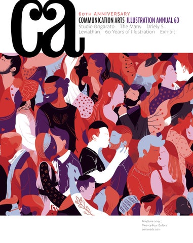
6 0 T H A N N I V E R SA RY
COMMUNICATION ARTS ILLUSTRATION ANNUAL 60
Studio Ongarato The Many Driely S. Leviathan 60 Years of Illustration Exhibit
May/June 2019 Twenty-Four Dollars commarts.com
MAY/JUNE 2019 VOLUME 61, NUMBER 2
COMMUNICATION ARTS ��
FEATURES
��
36 Driely S.
by Dzana Tsomondo In New York City, a photographer pauses in her meteoric rise to share her art and story.
44 The Many
by Julie Prendiville Roux This Santa Monica ad agency spins tricky briefs into campaigns fit for modern audiences.
52 Leviathan
by Monica Kass Rogers Fueled by its expertise in interactive installations, an experiential agency in Chicago is bringing art into physical spaces.
COVER
World of Kiss, by Jaye Kang, p. 164.
�� 60 Studio Ongarato
by Tonya Turner This Australia-based design firm whets its work on fine art and culture, proving that elegance looks better with a sharp edge.
68 Exhibit
The latest and best in visual communication from here and abroad.
75 60 Years of Illustration
A sampling of work and commentary by some of the illustrators who have been featured in the pages of Communication Arts.
��
ILLUSTRATION ANNUAL 83 99 126 147 151 157 163 166 181
Advertising Books Editorial For Sale Institutional Animation Self-Promotion Unpublished Student Work
FRESH Editor/Designer Patrick Coyne Executive Editor Jean A. Coyne Managing Editor Esther Oh
198
Rachel Wada This Vancouver-based illustrator has translated her multicultural background into a style all her own.
200
Sonia Sabnani In Valencia, Spain, a photographer choreographs lively scenes for fashion and commercial brands.
202
Supple Studio The founder of this design studio in Bath, United Kingdom, has perfected the recipe for substantial work.
Editor At Large Anne Telford Art Director/Designer Joni Rivas Production Director Lauren Coyne
COLUMNS 10
Design Culture Wendy Richmond questions whether our visual taste is set in stone.
20
Associate Editor Michelle Yee
Emerging Media Sam McMillan says hi to bot design and conversational user interfaces.
12
Creativity In a written piece and an illustrated board game, Jaleen Grove tells the story of illustration.
26
Typography Angela Riechers reports on the challenges and opportunities of multiscript type design.
Design/Production Associate Isabel Bagsik
18
Advertising The only thing scarier than a killer idea is the scarcity of them, Ernie Schenck writes.
Production Assistant/Customer Service Representative Khader Yanni
32
Archivist Nancy Clark Lewis
Insights In a Q&A, sociologist James I. Bowie discusses his ongoing research on trends in logo design.
Competition Coordinator/ Administrative Assistant Rachel Whitaker
Software Engineer Srividhya Gopalakrishnan Technology Administrator Michael Hoyt Advertising/Circulation Director Dirk Moeller
DEPARTMENTS 6 8 34 204 206 210
Accounting Cesar Queirolo
Editor’s Column Contributors/Directory Favorites Book Reviews Index to Illustration Annual 60 Overheard
Volume 61, Number 2 commarts.com COMMUNICATION arts (ISSN 0010-3519) is published six times a year (January/February, March/April, May/June, July/August, September/October, November/ December) by Coyne & Blanchard, Inc., 110 Constitution Drive, Menlo Park, CA 94025-1107. Periodicals Postage Paid at Menlo Park, CA, and at additional mailing offices.
Copyright 2019 by Coyne & Blanchard, Inc. All pieces reproduced in this issue are under prior copyright by the creators or by the contractual arrangements with their clients. Nothing shown may be reproduced in any form without obtaining the permission of the creators and any other person or company who may have copyright ownership. SUBScRIBER SERVICES: Subscription: 1 year, $53; in Canada, $70; all other countries, $110. All payments in US dollars, Canadian GST: 127848620.
Contributing Editors Sam McMillan Wendy Richmond Ernie Schenck Founder Richard Coyne (1926–1990)
Direct all inquiries, address changes, subscription orders, etc., to: Web: commarts.com E-mail: subscription@commarts .com Phone: 800-688-1971 (US/Canada) Phone: 215-788-5481 (International) Fax: 215-788-6887 Mail: COMMUNICATION arts PO Box 2013 Langhorne, PA 19047 Please allow six weeks for changes.
EDITORIAL AND BUSINESS OFFICE: 110 Constitution Drive Menlo Park, CA 94025-1107 Phone: 650-326-6040 Fax: 650-326-1648 E-mail: ca@commarts.com POSTMASTER: Send changes of address to: Communication Arts PO Box 2013 Langhorne, PA 19047 Canada Post: Publications Mail Agreement #40612608 Canada Returns to be sent to: IMEX Global Solutions, LLC PO Box 25542 London, ON N6C 6B2
Like us on Facebook facebook.com/communicationarts Follow us on Instagram instagram.com/communicationarts Follow us on Pinterest pinterest.com/camag Follow our RSS feed commarts.com/feed Follow us on Twitter twitter.com/commarts
EDITOR’S COLUMN
Patrick Coyne
A
s in previous years, submissions to this year’s Illustration Competition reflect the current issues facing humanity and how visual communicators respond to them.
“While some really strong work was very simplistic, I found there to be a ton of microdetailed illustration styles,” says Meadus. “It made for some eye-catching, thought-provoking and beautiful images.”
“It’s so interesting to see the thoughts of the world distilled down like this, and the topics that came to the forefront,” says juror Danielle Carnito.
“It was refreshing to see progressive tech companies embracing illustration as a means of brand expression,” says Mattson. “The engaging use of illustration transformed an often cold perception into something approachable and relatable.”
“You could see distinct artistic reactions to the feelings of anxiety, fear and lack of control,” juror Ty Mattson says. “I found the visual sentiments from the illustrations to be extremely compelling translated through different mediums. The act of taking heavy themes and turning them into beauty that evokes an emotional response is such an intriguing process.” “After absorbing so many intense visuals over the two days of judging, it was a relief to have the occasional pop of humor in the entries,” says Carnito. “It’s a good reminder that serious topics can be approached with humor, if done correctly, and still be completely effective in communicating.” Several jurors commented on the strength of the student work. “There was a lot of amazing work in the student category,” juror Rina Kushnir says. “A lot of student pieces were not only technically advanced but also had very strong emotional impact.” “I was amazed by the wonderful student work that was on par with seasoned professionals’,” says Mattson. “The fresh and raw talent was exciting. There was such a strong sense of empowerment and strong female representation.” “The quality of the student work was the most pleasant surprise,” juror Mike Meadus says. “I suspect we’ll see a few illustrators who didn’t quite make the cut this year in future pages of CA.” Other observations about this year’s entries encompassed both form and usage. 6
Illustration Annual 2019
I asked the jurors about their biggest disappointments with the entries. “I saw brilliant originality in both the professional and student categories, but was discouraged at times by waves of stylistic imitators,” juror Brian Stauffer says. “Of course it is natural to see trends move through a given moment in the field, but it is worth a mention that originality is so much more powerful than the well-trodden.” “Sloppy work that showed poor execution,” says Carnito. “The craft of a piece is just as important as the idea—both elements need to work together to create a successful piece. I’d also be
DANIELLE CARNITO is the trade art director for Lerner Publishing Group, an independent children’s book publisher in Minneapolis, Minnesota. She started her career in advertising, then moved north and changed careers to book publishing. In the past few years, Carnito has focused more on picture books, aiming to bring a new level of appreciation and diversity to that genre. She has had the honor of working with many illustrators, including R. Gregory Christie, Jaime Kim, Victo Ngai, Sean Qualls and Selina Alko. Carnito holds a BFA in graphic design from Drake University, and when not making books in Minneapolis, she enjoys traveling to places with mountains.
RINA KUSHNIR is a New York–based art director and graphic designer, currently working as an art director at The New Yorker. She was previously an associate art director at WIRED, where her work was recognized by the Society of Publication Designers. Earlier, she worked as a designer at Condé Nast’s Portfolio, Pentagram and C&G Partners. She earned a Bachelor of Music degree in piano performance from the University of Colorado Boulder, and a Bachelor of Fine Art in graphic design from the School of Visual Arts in New York City. On her own time, she paints leaves she collects in her Brooklyn neighborhood, meticulously studying them and adding dots of oil paint, punched holes and patterns.
Photographs by Steve Castillo
happy to see less or no gendernormative color coding. Pink has so many other good uses than signifying ‘female.’”
“Through social media, artists now have the lowest barrier between them and an audience,” Stauffer says. “How they turn that access into a profit center is by generating their own content and products that they offer directly. I’m not sure what those forms are, but I’m sure young creatives are working on those as we speak.”
When asked about future directions for the field of illustration, the discussion revolved around the positive and negative aspects of social media. “I think more people see illustration each day now more than ever, but I think their awareness of what illustration is has never been lower,” Stauffer says. “Social media has been a great equalizer for fresh artists to access the marketplace, but it comes with the tendency for artists to accept lower fees.” “Visual creators have a voice, reaching so many people instantly with all of the various visual platforms out there,” says Carnito. “Please use that voice responsibly.”
TY MATTSON is the founder and creative director of Mattson Creative, a Southern California–based branding agency specializing in illustrative design for the entertainment and licensed consumer products industries. He leads a design team whose award-winning work can be seen for clients including Apple, Coca-Cola, Disney, FAO Schwarz, IKEA, Target and Universal Studios. His work has appeared in numerous professional publications and has been recognized for excellence by the leading design competitions, including Communication Arts and the One Show. Mattson studied design at the University of Michigan at Ann Arbor. He is a former Jungle Cruise skipper and a current bulldog owner.
“In my experience, profit is a result of following your passion,” says Mattson. “I recommend you commission yourself before anything else. Your dream project is the one that starts with the investment in you.” A minimum of four out of five votes was required for a project to be awarded in this year’s competition. I would like to extend our grateful appreciation to our jurors for their conscientious efforts in selecting our 60th Illustration Annual. ca
MIKE MEADUS was born in St. John’s, Newfoundland, and made his way to Calgary at the tender age of nineteen to start his creative career. He took a position at McCann Canada in 2003. He quickly worked his way into the role of vice president, creative director, and during his thirteen-year tenure there, he led the agency to become Alberta’s most creatively awarded. He left McCann in 2016 to run his own studio, Meadus Design. His work has been recognized by the Advertising & Design Club of Canada, Applied Arts, the Art Directors Club of New York, Cannes, the Clios, Communication Arts, D&AD, Graphis, the London International Awards and the One Show.
BRIAN STAUFFER’s illustrations have appeared on the covers and pages of more than 300 publications worldwide, including Esquire, GQ, the New York Times, The New Yorker, O, The Oprah Magazine, Rolling Stone, TIME, the Village Voice and The Washington Post. Stauffer’s work has received awards from AIGA, the Art Directors Club of New York, the Association of Alternative Newsmedia, Communication Arts, Graphis, the Promax Awards, the Society of Illustrators, the Society for News Design and the Society of Publication Designers. In 2004, Stauffer’s “Worry” cover for The Nation was named the 26th of the top 40 covers of the past 40 years by the American Society of Magazine Editors.
Communication Arts | commarts.com
7
CONTRIBUTORS
DIRECTORY
Features
Featured in this issue
Monica Kass Rogers (monicakassrogers.com) writes and photographs from her home base in Evanston, Illinois. A letterpress printer who creates ephemera at Little Blue Press, she also cohosts the Pig & Weasel, an arts incubator and house concert series. In this issue, Rogers pro�les Leviathan, a Chicago-based specialized creative agency that’s establishing new trails in the landscape of interactive experiences.
Leviathan lvthn.com The Many themany.com Driely S. drielys.com Studio Ongarato studioongarato.com.au
Julie Prendiville Roux is cofounder of Handmade (handmadeca.com), a full-service creative agency based in Los Angeles. Alongside her work in advertising, she is a screenwriter and author. In this issue, she pro�les The Many, a Santa Monica–based ad agency that’s fluent in modern culture.
Brand Brothers brandbrothers.fr Commonwealth//McCann cw-mccann.com Design Bridge designbridge.com
Dzana Tsomondo (dzanatsomondo@gmail.com) is a freelance writer living and working in New York City. His work has appeared in a variety of publications, from Photo District News to Cool’eh Magazine. For this issue, he interviewed Driely S., a New York–based Brazilian photographer who’s forging a career on her own terms.
Frente frente.cc
Tonya Turner (tonyaturner.com.au/about/) likes words—especially writing them. She has worked as a journalist in newspapers across Australia and is now based in Brisbane, writing about design, architecture, home interiors, food, the arts and travel. For this issue, Turner visited the Melbourne headquarters of Studio Ongarato, a global design �rm working on the razor’s edge between culture, art and design.
McCann Panamá mccann.com.pa
Columns
Sonia Sabnani soniasabnani.com Supple Studio supplestudio.com Rachel Wada rachelwada.com
An associate editor of the recently published History of Illustration (Fairchild Books/ Bloomsbury, 2018), Dr. Jaleen Grove is assistant professor in Illustration at the Rhode Island School of Design. In this issue’s Creativity column, she invites readers to explore the past, present and future of illustration in both a written piece and an illustrated game. Sam McMillan (wordstrong.com) is a San Francisco Bay Area–based writer and brand strategist, and regular contributor to Communication Arts. In this issue’s Emerging Media column, McMillan explores what fluency in design for conversational commerce looks like. Wendy Richmond (wendyrichmond.com) is a visual artist, a writer and an educator whose work explores public privacy, personal technology and creativity. Her latest book is Art Without Compromise* (Allworth Press). In her Design Culture column, she sees visual taste in a new light. Angela Riechers is department chair of Graphic Design at the University of the Arts in Philadelphia. She is an educator, art director and writer whose work focuses primarily on the intersection of typography, graphic design and visual culture. In this issue’s Typography column, Riechers reveals why designing typefaces for global scripts is so challenging—and so important. Ernie Schenck (ernieschenck.myportfolio.com) is a freelance writer and a creative director. He is an Emmy finalist, a three-time Kelly nominee, and an award winner at Cannes, the Clios, D&AD, the FWAs and the One Show. In the Advertising column, Schenck encourages advertising creatives to have no fear for the killer idea.
Book Reviews In 2008, Amy Ng founded Pikaland, an online resource for freelance illustrators that sparks thoughts on creativity, illustration and entrepreneurship. Based in Kuala Lumpur, Malaysia, she guest lectures at the One Academy of Communication Design and teaches her own six-week class, Work/Art/Play, via pikaland.com. 8
Exhibit
Illustration Annual 2019
Karmarama karmarama.com Les Évadés lesevades.com Lobster lobsterstudio.tv Post Typography posttypography.com Rethink rethinkcanada.com
Fresh Advertiser’s Index Academy of Art 5 Commarts Daily 19 Creative Hotlist 21 theispot 9, 11, 13, 15, 27, 29, 31, C3 Ken Jacobsen Illustration 33 Jon Krause 23 Serbin Creative Inc. C4 Sharp Type C2
Call for Entries Design/Advertising 2019
25
Writer’s Guidelines commarts.com/write-us No responsibility will be assumed for unsolicited editorial contributions.
Corrections In the 2019 March/April issue, on page 144, Jason Karley should have been listed as creative director; Marco Monteiro as senior art director; Anh-Thu Le as an executive producer; Armando Samuels as senior writer; and Erika Buder as associate producer on the Play the City project. On page 86, Jeff Sheets should have been listed as one of the instructors on both the Gold’s Gym and Tinder projects in Jake Peterson’s Student Showcase feature.
discover the world's best illustrators VIEW PORTFOLIOS
PREMIUM STOCK
NEWS
search
PATRICK WELSH
theispot.com/pwelsh
DALE STEPHANOS
theispot.com/stephanos
DOUGLAS RUGH
theispot.com/drugh
MIKE TOFANELLI
theispot.com/mtofanelli
DESIGN CULTURE
Wendy Richmond
Twin Art Histories
W
hy does the eye love what it loves? How is visual taste formed? How deeply entrenched is it?
For most artists, it’s a mystery why we gravitate to one style of art over another—why we use vibrant colors, or work only in black and white; why we favor abstraction versus realism; why we strive for simplicity or relish the baroque. There are a million influences, from our earliest exposure to art, to our education through institutions, to osmosis through contemporary culture. There are styles and aesthetics that we absorb, and, consciously or not, tend to mimic. They feel “right.” Our inclinations develop, we trust them and we move forward with our work. But recently, I’ve been questioning that trust. Taking a closer look at my visual tendencies, I’m surprised by what I’ve discovered about how they were formed, particularly when it comes to art history.
A few years ago, I started working in sculpture. Early in my process, I began visiting the vast galleries of ancient Greek and Roman antiquity at the Metropolitan Museum of Art in New York. The main, barrel-vaulted gallery is filled with gleaming white marble figures, all bathed in natural light. Here were the statues I’d studied in Art History 101—rock stars of antiquity, all within inches of me. I visited the galleries repeatedly; the sculptures’ power and allure, already embedded in my consciousness, gained an even stronger foothold. Then I came across an article in the October 29, 2018, issue of The New Yorker titled “Color Blind.” In it, writer Margaret Talbot describes the well-known but persistently ignored truth about Greek and Roman marble figures: most were originally painted in their entirety, and the colors were bright. In fact, based on historical documentation, along with technologies capable of identifying remaining pigments, the presence of color is now indisputable. Polychromy—the painting of objects in various hues—in ancient sculpture was first discovered by those who performed the earliest excavations in the cities surrounding Mount Vesuvius. But most of what has been excavated over the years has appeared to be devoid of color. Because of its exposure to the elements, the paint chipped off, and in many cases, the remaining traces of color were washed away as restorers and excavators eagerly cleaned what had been unearthed. As Talbot writes, “In the nineteen-thirties, restorers at the British Museum polished the Elgin marbles”—a collection of sculptures from Athens—“… until they were as white and shiny as pearls.” The researcher Vinzenz Brinkmann, who has been studying polychromy since the 1980s, has used technology to determine original 10
Illustration Annual 2019
colors. Talbot writes that in the 1990s, he and his wife, Ulrike KochBrinkmann, began re-creating sculptures in plaster, resulting in a touring exhibition titled Gods in Color. Talbot refers to a statue on view: “A Trojan archer, from approximately 500 B.C., wears tight pants with a harlequin pattern that is as boldly colored as Missoni leggings.” As I read the article, I recollected studies revealing antiquity’s colorful past that I had heard about but somehow forgotten. I had absorbed the myth—perpetuated for reasons that range from ignorance to malice—that the sculpture of Greek and Roman antiquity was pure white. I was curious to learn more, so I bought the catalog that coincided with Gods in Color’s recent showing at the Legion of Honor museum in San Francisco. The beautifully produced hardcover is filled with reproductions of what sculptures might have looked like. The “old,” i.e., classical, white versions are shown alongside the color reproductions. It is jarring. The colors feel garish, the faces cartoon-like. I suddenly pictured the bright gallery at the Metropolitan Museum of Art, no longer full of gleaming white figures but instead transformed, full of these vividly painted sculptures. It seemed impossible to erase my gut reaction of disapproval. What happens when we revisit history and identify a mistake in how our aesthetic vision was formed? Do we stop and recalibrate? Are we able to undo what has been ingrained? Is it possible to retrain our eye, and intercept prejudgments? On the radio program On the Media in 2015, Brooke Gladstone interviewed the writer John Keene about his collection of stories and novellas, Counternarratives. Keene remarks, “I was very interested in histories that are totally hidden, totally buried, totally obscured.” He tells Gladstone, “History never happens in isolation. Every story has a twin.” Though Keene was talking about race and slavery, his words can be applied to any historical narrative. The question of how we acquire visual taste is not a superficial one. The aesthetics that we learn matter. When we are trained to see what is “right”—what is beautiful and tasteful and classical—anything else can seem less worthy, or worse, repugnant. When one history dominates, it obscures and even erases the others. If I had been exposed to different histories, would I be a different artist? ca © 2019 W. Richmond
premium stock illustration collections VIEW PORTFOLIOS
MICHAEL AUSTIN
theispot.com/stock/maustin
MARIA CARLUCCIO
theispot.com/stock/mcarluccio
PREMIUM STOCK
NEWS
search
JING JING TSONG
theispot.com/stock/jjtsong
JIM SPIECE
theispot.com/stock/jspiece
CREATIVITY
Jaleen Grove
Present and Future Adventures in Illustration ometimes the story of the past 60 years of illustration sounds like a fairy tale. Once upon a time, the illustrator was as happy as a king. Then the publishing castle was besieged by television and photography, spelling the demise of leading magazines. From the 1970s to the 2010s, our cast-out hero got lost in three economic swamps and the woods of technological revolution. Although some brave new art forms appeared, the general plot was one of perpetual jeopardy as illustration on the whole lost cachet. Values, aesthetics, skills and markets shifted so drastically that the “death” of illustration was seriously debated circa 1999. The wolf was at the door. Then, with the millennium, there was a comeback, thanks to the illustrator’s phoenix-like superpowers of reincarnation. Since 2005, the industry has been alive with far more diverse aesthetics, ideas and makers than it has ever had. Does the illustrator live happily ever after? We’ll see. Let’s at least discern some of the issues that will impact the story to come.
Respect One of illustrators’ longest-standing complaints persists: that designers and art directors don’t include them in the creative process enough, treating them instead as a “wrist” or a stylist. Now there’s a twist on that. “One thing I’m noticing is that more and more people are talking about ‘collaborations’ as a method of working,” opines veteran illustrator Anita Kunz. “I don’t believe any great art has ever been made by committee. Can you imagine someone telling Ralph Steadman or Sue Coe or Pablo Picasso, ‘Well, what if you did this instead?’” On the other hand, “there has been a major change in the wider perception of ‘illustration’ in the field of children’s books,” says Martin Salisbury, a United Kingdom–based children’s book illustrator and historian. “The traditional notion of illustration’s role as subordinate to the written word has gradually been replaced or widened by an awareness of visual storytelling and visual authorship. The new picture book makers—such as Jon Klassen, Oliver Jeffers, Kitty Crowther and Beatrice Alemagna—are helping to evolve a hybrid literary-visual art form that pushes word-image relationships ever further,” he explains. Indeed, illustrator and activist Sarah McIntyre has made some inroads coaxing publishers, award committees and journalists to credit and promote illustrators the same way they do writers through the #PicturesMeanBusiness campaign. Unfortunately, the pay has not kept up with inflation. Furthermore, observes Whitney Sherman, illustrator and director of the MFA in Illustration Practice at Maryland Institute College of Art, “I had to drop certain editorial clients because of the onerous contracts 12
Illustration Annual 2019
asking for all-rights.” Money is no longer the measure of success that it was in 1959. “I think success is measured by an illustrator’s ability to navigate our saturated visual world with a unique voice,” illustrator Armando Veve says. “Highly visible projects like magazine covers and ad campaigns are still respected pinnacles. They provide platforms for illustrators to present influential images that provoke and embed themselves in the audience’s minds.” To attain this level, however, Veve knows it takes “strong art directors who commission work that challenges audiences’ expectations, illustrators who exceed art directors’ expectations, and an audience with a curiosity to stop and look.” But, as Susan Doyle, head of the Illustration department at the Rhode Island School of Design, points out, “audiences have less and less patience to decode a dense image. The closest we come to a sort of national critical consumption of culture is rating the commercials on the day after the Super Bowl.” Common visual literacy is a tall order, given the cutbacks in grade school art education in the United Kingdom and United States. Why is creativity so undervalued? “The only way to appreciate the visual and to respect visual learners is to put an emphasis on art,” Sherman says. “The focus on STEM subjects needs to include art and become STEAM—A for art.”
Diversity and representation Yet, a major threat to illustration’s potential and social relevance is the rising cost of tuition—more than $50,000 USD a year at top schools. Expensive education means that many graduates come from well-heeled backgrounds, with a potential disadvantage for truly understanding the circumstances of most people’s lives—lives they shall be called upon to portray. Meanwhile, those with wider economic class experience but massive debt will have to play it safer creatively and as entrepreneurs. In another vein, an amazing gender shift has occurred in classrooms over the last 30 years—they are now filled with women. Why are so few young men entering the profession? We need balance. Regardless, faculty members, award winners, “big names” and those who get paid best still tend to be men. Hard questions need to be asked about the best strategies to combat lingering sexism when even the esteemed American Illustration inadvertently marginalized women by intentionally minimizing the size and placement of women’s art in the pages of its American Illustration 37 annual, in an honorable but flawed attempt to conceptually highlight the gender wage gap. Who should draw the picture? In the past, due to systemic inequity, male Caucasians were the default. Now, the authenticity of the illustrator’s personal experience with the illustrated topic matters,
featuring Salzman International Illustration VIEW PORTFOLIOS
MIRKO CRESTA
theispot.com/mcresta
GIULIO BONASERA
theispot.com/gbonasera
PREMIUM STOCK
CHIARA ZARMATI
IVAN CANU
NEWS
search
theispot.com/czarmati
theispot.com/icanu
CREATIVITY because so often, well-meaning illustrators who have had no personal experience with immigration, rape, racism, genderquestioning, mental illness or another topic where disempowerment is a factor have obliviously bungled it with depictions that survivors find insulting or unhelpful, or that do not illuminate the issue at hand. Many mindful art directors also wish to extend opportunities to marginalized creators in order to present a range of perspectives and to promote equity. Hence the success of the Women Who Draw directory (womenwhodraw.com), which enables clients to filter by race, location, sexual orientation and religion. Still, there’s a long way to go. According to the US Census Bureau in 2018, 13.4 percent of Americans identified as Black or African American, and 18.1 percent as Hispanic or Latino. But the Cooperative Children’s Book Center at the University of Wisconsin-Madison’s School of Education finds that of the children’s books distributed in the United States during 2013–2017, books concerning African Americans and Blacks made up only 6.81 percent, and books concerning Hispanics and Latinos made up 3.45 percent. These figures are scarcely up from 2008–2012. More balance is apparent in the international children’s book scene. Salisbury reports that there has been “a long-overdue opening up of the market to foreign-language picture books … from Europe, the Far East, Middle East and South America thanks to independent publishers such as Flying Eye, Tate, Thames & Hudson and Enchanted Lion. The large conglomerates have of course followed.” Salisbury also notes that China had a strong showing at the 2018 Bologna Children’s Book Fair, and that “the Chinese government’s new guidelines that a greater percentage of their children’s books be created by indigenous Chinese artists will have a considerable impact too.”
New technology Virtual reality (VR) is on everyone’s minds these days, but Veve wonders if it will stay “a very niche market with limited accessibility,” compared to the enthusiastic adoption of digital tablets, for instance. On the other hand, digital artist Sparth is optimistic about “super intuitive ‘next-gen’ 3-D apps, like Blender, that allow you to better express your creativity without the hassle of conventional modelers and renderers; and prototyping and modeling in VR, Oculus or HTC Vive with Gravity Sketch or Quill.” “We are already seeing a trend towards VR headsets that artists use at their desks,” Sparth says, but “the main challenge is to know how to blend everything together without losing your own style. … 3-D models by essence rarely have the emotion of a brush stroke or a color choice. In other words, what needs to exist is more apps and software that can perfectly blend 2-D and 3-D into a unique creative approach that will fit the artist’s conveyed emotions and specific art styles.” Data visualization is also becoming very influential. In a world increasingly flooded with data yet starved for trustworthy infor14
Illustration Annual 2019
mation, visual representations of data sets, such as those by the Guardian’s Mona Chalabi and the New York Times’ graphics department, may help the public critically consume quantitative findings. Data literacy and visual literacy need to be supported in public education, however, so that these powerful tools of persuasion are neither abused nor blithely accepted. Meanwhile, the traditional book is far from dead. “Six or seven years ago, publishers got in a terrible spin about picture book ‘apps’ replacing the physical book,” says Salisbury. “But the physical book is proving to be extremely resilient … As some of us predicted— apologies for gloating—the book needed to become more beautiful as an object to be owned and cherished. Our bookshops are now alive with wonderful displays of beautifully designed and produced big books that are awash with embossing, debossing and lamination.”
The illustrator of the future Barbara Nessim, who pioneered digital fine art and illustration starting in 1982, reminds us, “It wasn’t until 1996 when there was no doubt that computers were not a ‘fad,’ as most people thought. But they were here to stay! Big time!” When asked what wisdom today’s illustrators can take from the past when they face the next “death” of illustration, Nessim replies, “Change can be your friend. I see opportunity when I come across an issue. I try to understand the other side and see how I can work with the issue.” “The best strategy is to be well prepared for whatever course a career may take,” Kunz says. “That may now mean having a more general knowledge of the different aspects of the field rather than being a specialist. It’s no longer an effective strategy to do only one thing.” Veve concurs: “Twenty-first century illustration is a more cross-disciplinary practice. Today, an illustrator can take on many roles at the same time.” Gary Baseman, for example, has created an animated television show, produced vinyl toys and handbags, and exhibited as a fine artist in museums and galleries. Octogenarian concept artist Syd Mead, who started out rendering futuristic cars, later worked in film and then theme park design, and is now developing augmented reality. Doyle notes that “illustrators are and will more often be initiating and guiding content … broadcast media is a beast that needs to be fed. No interesting story goes unnoticed.” Both skill and ideas will continue to count. Sparth sees the illustrator of the future as “a jack-of-all-trades, but also an expert perfectly juggling with multiple apps in 2-D, 3-D and VR,” while Salisbury predicts the future illustrator will have “greater control and authorship, and greater confidence to tackle social, environmental and political issues in nondidactic, poetic ways that can enrich young minds.” What is the ultimate moral of the story of illustration from 1959 to 2019? Illustration should no longer be defined as a trade or a thing. Rather, as Sherman says, “Illustration is a mind-set, where anything is a potential tool.” ca
discover the world's best illustrators VIEW PORTFOLIOS
PREMIUM STOCK
MONICA LONCOLA
theispot.com/mloncola
JULIA BRECKENREID
KEN ORVIDAS
theispot.com/stock/korvidas
NICOLE KAUFMAN
NEWS
search
theispot.com/jbreckenreid
theispot.com/nkaufman
16
Illustration Annual 2019
Communication Arts | commarts.com
17
ADVERTISING
Ernie Schenck
Which Creative Are You, Michael Myers or Pee-wee Herman?
T
here used to be this thing agencies would tell their clients when they’d get all freaked out by an idea: “If it scares you, that’s good.” The philosophy being that truly great creative doesn’t look like truly pedestrian creative. There’s nothing scary about work that speaks in a voice so soft you can barely hear it. But, great work, well, this is something out of the Texas Chainsaw Massacre. It’s so different, so off the rails, the very thought of it is enough to make a CMO scream in her sleep.
power, you can feel its breath on your neck. I miss those ideas.
Sadly, these days, with so many agencies clinging to their relevance for dear life, few are willing to stick their necks out like this. For sure, there are a few badass shops out there, those few-andfar-between renegades that still have the audacity to stand for something, that still have the chutzpah to tell a prospect, “Look, this is who we are. This is the work we do. If you’re uncomfortable with it, if it makes your skin go cold, we should end the meeting now.”
maybe we are too.
I live not far from Newport, Rhode Island. As you might know, we have some mind-popping mansions here. What the likes of the Vanderbilts and the Astors called cottages. You’ve probably never heard of Doris Duke. Doris was a very wealthy woman. She lived
I miss the danger in them. It would be so easy to blame the client. And why wouldn’t it? Never has there been a time when clients were more afraid to come out from under the covers. It would be so easy for creatives to say, “There he is, that frightened little rabbit! He’s the one! He’s the one that killed Freddy and Michael and Pennywise!” It would be so easy. But if clients are scared witless to look under the bed, Once, we were monsters. Tearing through the soft underbelly of mediocrity without hesitation. No challenge frightened us. No creative obstacle stood in our way. And, oh man, the work that came out the other side—it trampled everything in its path. But something has changed. The monsters aren’t as many anymore. They’ve turned into something kinder. Gentler. More willing to go along to get along. Less Michael Myers and more Pee-wee Herman. Less Predator and more Mister Rogers. (And while I loved the man, if Fred Rogers were an advertising creative right now, I would
There’s nothing scary about work that speaks in a voice so soft you can barely hear it. But, great work, well, this is something out of the Texas Chainsaw Massacre.
personally burn him at the stake.) I know it’s hard. I know how difficult it is to stand defiant. To keep your fangs sharp. To look mediocrity in the eye and chew its head off. But to become Pee-wee Herman now is to give up on greatness, now and
in one of those cottages. It’s called Rough Point. The property is
maybe for all time. Killer ideas matter. They’re the only thing
surrounded by an iron fence. Bolted to the front gate is a sign.
that’s ever mattered. It might not seem like it anymore. It might
It says, “WARNING. GUARD DOGS. DO NOT ENTER WITHOUT PROTEC-
seem like the coin of the realm now is data. Numbers. Analytics.
TIVE HEADGEAR.”
They want you to think this is how you move the needle now. Ideas
I know it’s only a sign. But it’s a pretty scary ad, too. A dangerous ad.
are a vestige. Ideas are secondary. But this is a delusion. A slight of
How many dangerous ads have you seen lately? How many danger-
hand whose only purpose is to wring the beast out of you once
ous ideas? The kind of ideas that dare CMOs to open the door and
and for all. And if you let it, it will. If you let it, the fire will go
let them in. The kind that could just as easily bite a client’s head
out. The creative ferocity you once knew will fade into a whimper.
off as they could make her look like a genius. I don’t see that kind
So, tell me.
of creative anymore. Scary creative. Freddy Krueger creative. Scarier than Michael Myers, Pennywise and the Blair Witch combined. My friends, I speak of a level of thinking so disruptive in its creative 18
Illustration Annual 2019
Are you Michael Myers? Or are you Pee-wee Herman? ca
Communication Arts Daily OUR DAILY EMAIL NEWSLETTER
WHAT YOU NEED TO
STAY INSPIRED Communication Arts Daily
Designed to keep you up-to-date on the hottest design, advertising and web projects, our newsletter also links to the most thought-provoking articles we’ve found on the web. Delivered to your inbox every business day, this quick read is just what you need to stay informed and inspired.
SIGN UP IS EASY AND FREE commarts.com/newsletter
EMERGING MEDIA
Sam McMillan
Use Your Words
Designing the future of conversational commerce
San Francisco Bay Area–based Botanic Technologies created the bespectacled animated avatar for Andi (left). Built with Skype on its bot platform, Andi helps job candidates train for interviews by asking them common questions via voice or a text-only chatbot mode. Using Microsoft Cognitive Services on the back end, the system not only recognizes what users say, but also their emotions, based on indicators like vocal cues. The Guru (right), a conversational avatar built for app- and web-based wellness platform iWithin, talks with mobile app users via voice, offering advice to help them meditate, relax, diet and sleep better.
T
here’s a new paradigm coming that will change the way we use computers, and it’s as old as humanity itself. It’s the human voice. Instead of typing or tapping onto a screen, people will speak to a conversational agent, or to put it simply, a bot. And these bots have already begun introducing themselves to us. Far beyond just saying “hello,” they’re driving a sea change in computing, variously called conversational commerce or voiceenabled computing. Connected to powerful artificial intelligence (AI) systems, mediated by conversational user interfaces (CUIs) and visualized by everything from avatars to a glowing ring of light, the current generation of bots is empowered to act on our behalf as assistants and advisors. CUIs represent the next step in computing’s evolutionary chain because within their DNA is the most natural means of interaction we’ve ever had—conversation. According to a 2014 Fast Company article, computer scientist Andrew Ng predicted that “at least 50 percent of all searches” would be done by voice or images in five years. As commerce shifts toward using CUIs, there’s enormous promise for brands that recognize the potential and get in now. “The analogy we use at Seed Vault,” says Nathan Shedroff, chief executive officer of the Singapore-based company, “is: ‘This is the web circa 1996, and everything you know about commerce is about to change.’ We are at the same inflection point with conversational interfaces.”
20
Illustration Annual 2019
Most brands don’t have the resources to build this technology internally. The problem with this, as Shedroff sees it, is that if a brand like BMW or Bang & Olufsen wants to incorporate a conversational interface, it has nowhere to go besides Amazon, Google, Microsoft, Samsung or Apple, whose virtual assistants—Alexa, Google Assistant, Cortana, Bixby and Siri, respectively—have become a part of everyday chatter. “You can buy a Bang & Olufsen speaker system and ask it to turn up the volume,” Shedroff says, “but first you have to say, ‘Hey, Alexa,’ or ‘OK Google.’ So, where does that leave Bang & Olufsen? Brands will wake up and realize they are about to lose their connection to their customers, and with it, their brand value.” That’s where Seed Vault comes in. Shedroff and his team started Seed Vault as an independent, open-source bot marketplace and an alternative to hegemonic control of conversational commerce. Developers can code a conversational interface from any component they find in the Seed Vault bot store. “There will be off-the-shelf bots you can license, make a modification to and start using immediately,” Shedroff explains of what Seed Vault will eventually offer. “And there will be more bot components and services, such as dialog scripts for a customer service bot, translations for health-care bots and 3-D avatars that can be licensed for any conversational chatbot.” For brands that are just beginning to explore conversational commerce—which, these days, is most brands—Charles Cadbury, founder of London-based SayItNow, explains that there’s a three-
FIND YOUR PERF ECT JOB AT
CREATIVE HOTLIST CREATIVE HOTLIST, THE CAREER SITE FROM COMMUNICATION ARTS MAGAZINE, HAS MORE JOB LISTINGS IN GRAPHIC DESIGN, ADVERTISING AND NEW MEDIA THAN ANY OTHER CREATIVE SERVICES SITE.
Sign up for a FREE account and with a single click, send your Cover Letter, Resume and Links to Work Samples every time you apply to a Creative Hotlist job.
CHIEF MARKETING
DIRECTOR OF
OFFICER
USER EXPERIENCE
SENIOR UX
ARCHIT ECT
VISUAL DESIGNER
PACKAGE DESIGNER
CREATIVE
DESIGN
DIRECTOR
PHOTO STYLIST
STRATEGIC STORYTELLER
JAVASCRIPT
DEVELOPER
The Communication Arts Career Site
MOBILE DESIGN
DIRECTOR
BRAND
STRATEGIST
COPYWRITER VISIT WWW.CREATIVEHOTLIST.COM TODAY AND FIND YOUR PERFECT JOB.
EMERGING MEDIA
A concept that London-based SayItNow made for a financial services software provider. SayItNow crafted a conversation that uses menu options to focus the direction of the conversation. It can also handle free text inputs, in this case, to help the user find an accountant.
step plan for deepening user engagement and adoption of CUIs. “First, build trust using simple, mundane services like news. Over time, end users develop enough confidence to do more complicated transactions, such as making a booking or a purchase.” Next comes personalization through interactions. “Every interaction enriches the [AI’s] view of the individual over time and enables brands to create channels of one-to-one communication across SMS and Facebook Messenger,” he says. Eventually, we get to activation. “In this phase, an AI can craft conversations that lead to action,” Cadbury says. For example, after booking you a train trip, a bot could recommend renting a car at the station. To help brands reach this conversational promised land, Cadbury and Sander Siezen, vice president of product development at SayItNow, offer half-day conversational bot design workshops. As Siezen explains, “We work with clients to find out their goal, construct a persona of the end user, then figure out what they will say, and how the system might guide them along the ‘golden path’ of where we want to get to.” The result is a conversational flowchart that proceeds from user story to intent. “Our goal is to create a conversational map with many routes,” Siezen says. “From an AI perspective, it’s a maze. And one of the things AIs do best is navigating mazes.” 22
Illustration Annual 2019
Angie Terrell, director of design at Big Nerd Ranch, an Atlanta-based app development and training company that helped Amazon develop its Alexa Skills Kit, suggests that designers who are creating voice-driven capabilities for Alexa first “understand the constraints and guidelines of the platform. It’s like going to a new city. You know how generally to navigate, but how does this city do it?” When it comes to CUIs, Terrell explains that “Alexa is looking for an intent”—that is, what the user wants to accomplish. Say, for example, someone wants to book a flight using Alexa. A designer must design Alexa to respond to a range of intents, from no intent (for example, “Hey Alexa… ”) to partial intent (“Hey Alexa, book me a flight”) to full intent, where the system can do exactly what the user asks (“Hey Alexa, book me a flight to London on Virgin this Saturday”). To ensure Alexa can accomplish its goals, Terrell says that CUI designers “have to design a script based on the intents and build to it. It’s like preparing your design for the happy path and the error path. That involves all the things we do as UX designers, but you are doing that with language.” Terrell advises that designers be as specific as possible with the options they provide the user. Instead of asking, “Would you like fries and salad with that?” she counsels, “The system should ask, ‘Which side would you like, French fries or a salad?’ Designers have
JON KRAUSE ILLUSTRATION jk@jonkrause.com
www.jonkrause.com
@jon_krause_art
EMERGING MEDIA to write scripts for Alexa that make the choices distinct. It’s subtle, but critical to the success of the experience,” she says. “Then user-test the hell out of it.” Designers proficient in everything from information architecture to linguistics to UX testing will help fuel conversational commerce’s long haul. Traditional skills such as storyboarding, character illustration and 3-D design will also come in handy as avatars are designed to serve as the front end of bots. And according to Cadbury at SayItNow, there’s a growing demand for playwrights, poets and screenwriters to script the conversational pathways between users and their bots. A quick scan of Apple’s job postings for Siri developers includes job titles for “memories engineer,” “domains understanding” and “text-to-speech scientist.”
Botanic Technologies is currently working on Jackie, a humanoid template for both clients and Botanic’s testing. It sits in a webpage, and its design can be edited in real time.
HOW BOTS WORK A simple explanation
Ask a simple question, get a simple answer. That’s the promise of bots like Siri, Cortana, Bixby and Google Assistant. But there’s nothing simple about it. Ask “What’s the weather in San Francisco?” and behind the scenes, some extremely sophisticated technology goes to work. For the bot to understand you, it invokes an API service call to perform automated speech recognition. (API stands for application programming interface, a set of protocols used to build and interact with software.) The bot listens to what you say and finds the answer for “What’s the weather in San Francisco?” Then it uses a natural language processing API to look for intent. In other words, the bot queries an AI system, “What did the user just ask me?” Next, it connects to a weather service API and finds the data to answer that question. In this case: “Partly cloudy.” To transform the data into speech, the bot invokes a text-to-speech API service call. Finally, you hear the answer: “It’s partly cloudy in San Francisco.” All told, the bot sits between the user and at least five separate API service calls.
24
Illustration Annual 2019
“Bots are archetypal and cultural,” says Mark Stephen Meadows, chief executive officer of San Francisco Bay Area–based Botanic Technologies. A financial assistant for adults will look different than a bot for a kid managing her asthma. That’s why, after the golden path from user intent to the bot’s completion of the task has been efficiently mapped out, Meadows says that Botanic “builds a design spec that determines personality, appearance, and what the bot says and how it says it.” To make certain the bot looks like how it acts and sounds, Botanic builds a personality matrix, drafts a bio, writes a backstory for the bot and then puts out a casting call for an actor to provide the voice for the bot. When it comes to visual and character design, the process is similar to creating a character for an animated film. Character concepts are illustrations that show the bot in a series of positions, reacting to a variety of emotions from the user. “We can change skin tone, texture and movement, and tune shading and lighting design,” Meadows says. Then, using .ACTR, a 3-D presentation standard for avatars, developers at Botanic generate real-time animations from natural language generation models that connect gesture, emotion, action and speech into an on-screen representation of a personal digital assistant. Meadows says visual design for a bot doesn’t have to be complex. “In visualizing a bot, if you have two dots on the face of a bot, you are 90 percent of the way there. If you want to establish trust, design a face for your bot. The visual appearance of a bot not only demystifies the AI; it also provides a visual component of the personality. We spend a tremendous amount of time designing the personality for a bot because no one wants to speak with a robotic robot.” Despite the billions of dollars Apple has spent on Siri, and the thousands of hours to program it, it’s still hard to have a decent conversation with it. (Sorely lacking, too, is a general code of ethics to try to prevent such issues as breaches of user privacy and racist bots.) But, as breakthroughs such as Google Duplex, a human-sounding phone bot, show, machines learn really fast. Today, single-purpose bots can understand our focused, transactional intents. It’s only a matter of time before bots understand them all. Until then, bots will continue to listen and suggest actions from our phones, wearables, appliances and cars. Serving as the front end for powerful AI systems, bots listen, speak and recommend. And we speak right back in an interaction so seamless that marketers are actually using the word delightful to describe the relationship between us and bots. For once, they might be using the word accurately. ca
DESIGN &
ADVERTISING 2019 COMPETITIONS FINAL DEADLINE: MAY 17, 2019 Promote your talent by entering our highly respected juried competitions in graphic design and advertising. If selected, your award-winning work will be meticulously reproduced in the 2019 Design and Advertising Annuals and on the Communication Arts website, assuring you maximum exposure to our international audience. Each winning entrant will also receive a personalized Award of Excellence, milled from solid aluminum.
ENTER ONLINE NOW COMMARTS.COM/COMPETITIONS
TYPOGRAPHY
Angela Riechers
Multilingual Scripts
This booklet showcases Graphik Arabic, designed by Wael Morcos and Khajag Apelian and released by Commercial Type in 2017. Graphik, which had been designed by Christian Schwartz and released in 2009, was expanded to support Greek and Cyrillic in 2015. The foundry writes on its site: “In the Latin, Greek and Cyrillic alphabets, Graphik neatly straddles the line between the round bowls of a geometric sans, and the structures and proportions of a European grotesk. Similarly, Graphik Arabic combines the simplified strokes of a grotesque with the structure and proportion of a fluid Naskh script.”
O
ver the past ten years, a remarkable number of typefaces for global scripts joined the thousands of Latin-based fonts on the market. Despite the wide variety of world languages and writing systems these fonts represent, the skill set required to generate them is universal to all type design practice: a feel for balance and relative proportion, and how those can be played with to give a design a particular character; an understanding of what needs to happen to shapes as they get heavier or lighter, wider or narrower, larger or smaller; and a knowledge of the existing idioms or genres of style. The latter can be the most difficult to acquire when working outside one’s native writing system—it’s easy for a beginner to see interesting shapes in a script but not understand how they belong to specific styles that can’t be combined without producing a frankenfont. Although it isn’t necessary to speak or read a language in order to design a typeface for it, some uncomfortable cross-cultural generalizations can result when designers do not understand linguistic nuance and context. Type designers need to be wary of attempting to use Latin typeforms as the starting point for developing fonts in global non-Latin languages. Sensitivity to the history and culture of a country, its traditions and politics, and the main uses of its written output—to carry the word of God? to sell things? to advance knowledge and education?—is needed to design a beautiful, functional typeface in any language. Internationally renowned typographer and Typotheque founder Peter Bil’ak says, “A typeface can be daring and experimental in its
26
Illustration Annual 2019
Latin version but conventional and subdued in the non-Latin one, as the localization designer was just trying not to make mistakes rather than capture the essence of the original idea. It’s the same as working with literary translations—knowing the rules and grammar doesn’t guarantee a unique artistic expression.” Misha Beletsky, president of the Typophiles professional organization and art director of Abbeville Press, says, “In Hebrew, one tiny protrusion on the right makes a כinto a ב. A leg that is slightly taller makes a הinto a ח. A slightly shorter descender makes a ןinto a ו. God is in the details!” Wael Morcos, principal of his own Brooklynbased graphic design studio and co-creator of an Arabic version of Mike Abbink’s typeface Brando, is working on a soon-to-be-released Arabic version of Commercial Type’s Lyon family. Morcos used his knowledge of the Naskh letterforms to create the roman style and then borrowed from the Persian Nastaliq characters for the slant and proportions used in the italic—even though italics don’t exist in traditional Arabic. His thorough understanding of the language’s history enabled him to adapt existing styles to create new forms. When nonnative designers develop scripts in other languages than their own, collaborating on a team with people from the appropriate demographic yields the most authentic results. In producing the Typotheque Hebrew program, a comprehensive selection of 21 full typeface families and more than 200 individual fonts that was launched in 2017, Bil’ak conferred with Israeli designers for guidance and feedback. Aaron Bell, principal of Seattle-based Saja Typeworks, says, “A native reader of a given script has an inherent
FEDERICO GASTALDI ILLUSTRATION
theispot.com/fgastaldi
Portfolio Represented by Salzman International on
TYPOGRAPHY
The left image shows Indian and Latin script typefaces from Tiro Typeworks, coordinated proportionally to work together, but with each script maintaining its individual character. The Indian script typefaces are Tiro Tamil, Tiro Sanskrit, Tiro Gurmukhi, Tiro Telugu, Tiro Kannada and Tiro Bangla; the Latin is a common subset that is included in each of the Indian fonts. In the top right image, from left to right, are letters set in Lava Kannada, designed by Ramakrishna Saiteja; Lava Devanagari, designed by Parimal Parmar; Lava Latin, designed by Peter Bil’ak; and Lava Telugu, designed by Saiteja. Below, from top to bottom, are the words Charminar, set in Lava Telugu; Route, set in Lava Kannada; and Gokarna, set in Lava Devanagari.
eye for what looks ‘right’ and what is ‘readable’ and ‘appropriate.’ Depending on the availability of resources and opportunities, it can take a nonnative designer quite some time to develop a similar sensibility. To accelerate the process, I’ve found it beneficial to collaborate with native designers who can identify areas of improvement in my work and help train my eye.” This is something that designers will need to keep in mind as the market for global scripts continues to grow at a steady clip. Cyrillic and Greek have been routinely available as companion fonts to many Latin typeface families for several years now, and much of the new demand for global typefaces centers around Southeast Asia, China, Japan and the Persian Gulf region, where cosmopolitan cities support flourishing design markets eager for better fonts. Corporations with a global presence, such as Uber, Airbnb and Bloomberg, also realize the importance of developing culturally specific fonts as part of their strategies to reach a wider, more sophisticated customer base. Toshi Omagari, a typeface designer at Monotype, has developed four typefaces for Google and Monotype’s collaborative Noto project, which comprises open-source fonts supporting 800 languages and 100 scripts. He says, “Japan is one of the most vibrant and active markets, not only because there are big brands there, but also individual designers thirsty for new type designs and the means to license them. The country has a type community that is large and competitive enough to be called an industry, as well as a collection of small to large foundries.” The legacy of colonialism—with its imposed viewpoint equating Western culture with desirable modernity and superiority, and degrading local cultures as backwards and inferior—plays a part in 28
Illustration Annual 2019
inhibiting global script development. Ksenya Samarskaya, a multilingual typeface designer and principal of Brooklyn-based design firm Samarskaya & Partners, says, “Type design has a Eurocentric problem that it’s been slow to shed. We should be listening to divergent opinions, experimenting and inviting more people from different regions and languages into the field as active collaborators.” Across India, where English is a universal spoken and written language, there has been little impetus to develop authentic, high-quality local typefaces. The country has 29 states, each with its own language, and 22 official scripts. Up till now, the few available fonts were poorly crafted, opening up the opportunity for designers to create typefaces for use in newspapers, where demand for local language editions remains strong. Ramakrishna Saiteja, a type designer from India, created the Coorg Kannada Family for use in Indian newspapers and collaborated with Bil’ak on Telugu and Kannada companions to Typotheque’s Lava font. He says, “These two scripts are similar in their written structure, but there are many small differences which can easily become lost in the details. For example, Kannada has a head stroke almost like Devanagari that connects every character. Telugu characters don’t connect; the head stroke is in the form of a tick mark. Their origins are from the same script, but they eventually evolved into two different languages and later into different scripts.” Religion plays a part in the slow development of type systems for certain languages; for instance, Hebrew was confined to biblical and Talmudic scholarship for two thousand years. “Hebrew script has been employed for a variety of languages spoken by the Jewish diaspora, most notably by Yiddish and Ladino,” says Beletsky. “As a result, its various typographic styles carry a strong associative
STEVEN NOBLE ON THEISPOT.COM/SNOBLE WOODCUTS ENGRAVING SCRATCHBOARD
© Daredevil Brewing Co.
© Big Grove Brewery
© Natural American Foods
© The Bird Restaurant
© 2018 Darwin Brands
MEADE SHOW AWARD
© Jordano's Pacific Beverage
ROSEY AWARDS
LURZER’S 200 BEST ILLUSTRATORS
NATIONAL ADDY AWARD
TYPOGRAPHY
Brando Arabic, designed by Wael Morcos and Khajag Apelian, was released by Bold Monday in 2019. Based on the conventions of the Naskh script, Morcos and Apelian interpreted the refined, contemporary elegance of the Latin version of Brando and Brando Sans, designed by Mike Abbink.
connection to a specific use: either religious and scholarly or contemporary secular Hebrew, or another language altogether such as Yiddish. A designer of Hebrew type needs to be mindful of and sensitive to the cultural baggage that each style carries.” Similarly, there are relatively few Arabic typefaces in the world today because of Arabic calligraphy’s origins as divine communication. When the printing press was invented by Gutenberg in the fifteenth century, people trying to import presses into the Middle East a couple of decades later were met with forceful resistance from the Ottoman Empire, which forbade this heretical mechanization of the holy script. Adapting systems designed for creating type in modular, nonconnected Latin letterforms to the complex, flowing, connected Arabic script remains an obstacle in digital technology. “There’s a whole class of Arabic script styles that are practically impossible to render accurately in the layout model used by OpenType because of the complexity of contextual spatial relationships involved,” says John Hudson, type designer and cofounder of Canadian foundry Tiro Typeworks. According to Kristyan Sarkis, a Lebanese-born, Netherlands-based graphic and type designer (also a cofounder and managing partner at TPTQ Arabic type foundry), “Unlike Latin, Arabic cannot be written by drawing letters inside adjacent boxes. Nowadays, it’s not necessarily an obstacle because even in metal type—which is essentially letterforms occupying a series of individual boxes—it’s possible to create beautiful Arabic type by working around the box structure.” ACE, an advanced digital type composition engine developed by Dutch linguist and typeface designer Thomas Milo at DecoType, recombines Arabic letterforms into ligatures derived from the original calligraphy to work around systems originally designed to accommodate the nonlinked characters of Latin alphabets. Although the technology dates to 1982, 30
Illustration Annual 2019
it still isn’t widely available, and needs to be adopted by bigger organizations—think Adobe, Apple and Google—before designers can use it with Adobe InDesign and other Creative Suite applications. “Corporations need to create intuitive software—the currency of our industry—to make multilingual support features readily available. At present, we still have to download a very specific version of InDesign that supports Arabic, and then dig into four or five levels of menus to use it,” says Morcos. There’s improvement, although things are happening slowly; for instance, the font-developing app Glyphs preloads the existing infrastructure of Arabic, so when a designer starts to build a character, the app automatically generates part of it. Education can be part of the solution too. Omagari says, “As an industry, we need to do a better job of sharing our type design knowledge and experience. We should be doing more type classes, lectures and workshops with a focus not only on type design, but also on helping designers appreciate the value of type.” All designers can benefit from the unique learning opportunities encountered by multilingual type designers—for instance, by looking at their native writing systems more analytically as a matter of routine. Reflecting on design practice in multilingual contexts is not a luxury; it is a basic necessity in a field that so directly affects communication possibilities across the world. Despite the immediate visual impact of images, they will always be open to interpretation and manipulation; text is still the primary method for perpetuating civilization. Apart from the satisfaction for designers of launching a new era of multilingual typefaces, the social benefits of their work are even greater. Text is a unifying force across national and linguistic borders; in any language, it’s what holds the world together. ca
DAVIDE BONAZZI ILLUSTRATION
theispot.com/dbonazzi
Portfolio + Stock Collection Represented by Salzman International on
INSIGHTS James I. Bowie The Sociology of Logos
They may be called static logos, but you know better if you frequent Emblemetric. On this website, static logos are revealed for what they truly are—dynamic symbols of business and culture. The site takes a holistic view of trends in logo design. Take a post published in 2018, which shares that “technological advances” helped spur a growth in “the use of rainbow colors in logos.” Or read a post from 2016, and you’ll learn of “an explosion” of US cannabis leaf logos in the wake of a burgeoning industry. Such nuggets of insight stretch back to 2012, when sociologist James I. Bowie founded Emblemetric, continuing the line of questioning first posed in his PhD dissertation on patterns in trademark design. Beyond his research, he serves as coordinator for the Laboratory for Applied Social Research at Northern Arizona University, where he also teaches classes on research methods, culture, organizations and design. His writing on design has appeared in Slate and Texas Monthly, and he contributes to Design Observer’s Observed newsfeed. To Bowie, logos are signs of the times. —Esther Oh How did you first become interested in logo design? In graduate school in the late nineties, I was interested in studying the sociology of culture and the sociology of organizations, and I realized that logos sat squarely at the intersection of those two fields. How, I wondered, does a large, bureaucratic organization come up with a symbolic identity for itself? The swooshy dot-com company logos of the time particularly inspired my interest. Why were there so many of them, and why did they look so similar to one another if the point of logo design was to help your organization stand out? When I discovered that the government assigned numeric codes to the graphical content of logos in order to facilitate trademark searching, I was able to co-opt and analyze Uncle Sam’s data in order to answer these questions in my PhD dissertation. I continue to write about trends in logo design at my website, Emblemetric. How has your training and experience as a sociologist impacted how you approach design? As a sociologist, I think I view the world of design slightly differently than many designers might. To under32
Illustration Annual 2019
stand the reality of trends in logo design, you can’t just look at the pretty online portfolio sites, where accomplished designers have uploaded their best work. You also have to consider the terrible car repair shop logo, which, although it was drawn by the owner’s nephew in exchange for a few oil changes, is seen by thousands of people driving by each day. What are some resources that you use to research trends and patterns in logo design? The United States Patent and Trademark Office’s Trademark Electronic Search System and the World Intellectual Property Organization’s Global Brand Database are two websites that offer treasure troves of data on millions of logos, without which my research would be impossible. What are some growing trends in logo design? A couple of interesting long-term trends in US logos have emerged since the terrorist attacks of September 11, 2001. Hearts and skulls have appeared much more frequently in American trademarks, perhaps reflecting the nation’s desires for healing and vengeance, respectively. A more trivial recent trend is the use of “Est.”—for “Established”—in many hipster logos. Slapping “Est. 2015” on a craft brewery logo is perhaps
meant to give it an old-timey feel, but the irony is that “Est.” logos are used more commonly today than during their previous high point, in the 1910s. In studying trends and patterns in logo design, what have you learned about branding? The marketing textbooks will tell you that branding, particularly when it comes to logo design, is all about differentiation. But my research shows that, quantitatively, logos within the same industry look more similar to one another than they do to logos from other industries, even if you’re only considering their use of abstract, nonpictorial design elements. I think this means that an important branding function of logos—maybe even more important than differentiation—is to confer a sense of legitimacy on a company or product by conforming to the design norms within its industry or field. What allows a logo to have cultural staying power? Ultimately, a logo’s fate is tethered to the company or product it represents. If it can survive its infancy without being ripped to shreds by a social media mob, a logo can go along for the ride with the fortunes of the company, gaining or changing meaning over the years. Coca-Cola’s script logo was rather commonplace for its time, but the popularity of the product allowed the design to outlive its contemporaries, making it seem unique today.
if your car is at least 25 years old. But really, that 1991 Toyota Camry is no more “historic” than some toilet paper logo from 2003 is “iconic.” What gave rise to personal brands? We’ve always had personal brands, in the form of reputations, and our faces have served as our logos, I suppose. Today, our careers are becoming increasingly fluid. We can no longer depend on lifelong employment in a single organization, and it seems like everyone has a side hustle, so personal brands are more important than ever. Your social media avatar is your logo, so pick a good one. What advice do you have for a designer who’s rebranding a company? A logo and its associated branding should try to strike a balance between familiarity and novelty. As unsexy as it sounds, the design has to conform to some extent to the visual expectations people hold in their minds for logos in its particular industry. The trick, I think, is to bend the rules just enough to make the logo interesting and memorable. It’s like naming a child: If you call your daughter Discothèque, it’s probably not going to go well, but you don’t want her to be one of five Olivias in her kindergarten class, either. I don’t know, how about Holly? That’s a nice name, I think. ca
Few logos, though, age well without an occasional facelift, and even the Coke logo has seen a couple of nips and tucks. Sometimes, a bigger change is needed in order to keep the logo afloat. Apple’s original logo, an elaborate illustration featuring Isaac Newton, was just too weird and inappropriate for the computer industry. Its replacement, the rainbow-striped apple symbol, was less odd but still quite quirky. As Apple matured, so did its logo, adopting a sober monochrome. Changes like this produce some initial discomfort, but the world tends to quickly forget the previous mark, and life goes on. Many youngsters today are no more cognizant of Apple’s rainbow past than they are of Drake’s time on Degrassi. The staying power of logos in general remains strong, I believe. Branding gurus have been pronouncing the imminent death of the static logo for at least a couple of decades, but I still see the darned things everywhere I look. The logo may be frequently pooh-poohed as merely the tip of the branding iceberg, but, as the British designer Sir John Sorrell noted, “Iceberg tips are actually rather important because they’re the things you can see.” What word do you try to avoid when discussing the results of your research? Iconic. This fine word has sadly had its meaning diluted through overuse. These days, any logo that’s merely familiar, recognizable or just plain old gets labeled as iconic. It reminds me of how, here in Arizona, you can get a special “Historic Vehicle” license plate Communication Arts | commarts.com
33
Five Illustrators Share Their Treasured Finds ANDREA PIPPINS
JEN BARTEL
Stockholm, Sweden
Minneapolis, MN
Binge reading: My favorite graphic novel of the year so far is Bloom by Kevin Panetta and Savanna Ganucheau, published by First Second. I received an advance copy, and I couldn’t put it down—devoured the entire thing in a day.
Ones to watch: Loveis Wise, who just upon graduating from art school was commissioned to create cover art for The New Yorker. Her career is exploding. Erin Robinson of Brooklyn Dolly created a beautiful series of illustrations for The Washington Post for a feature about Obama’s legacy. She’s been doing amazing work for years, but with her recent pivot into editorial illustration, I’m excited to see where her path takes her next. I also enjoy the work of Hanna Barczyk.
Thoughtful hiring: Especially with politics being in the state it is in 2019, we need to really take care to hire folks who are capable of the sensitivity required to tell the more difficult stories that are being told today. Historically, illustration as a field has been accessible almost exclusively to the already affluent—many of whom were straight, White, cis men—and when you consider how imagery can frame a story or an article in an instant, I think it’s become increasingly important to hire people who are equipped to properly frame the narrative.
Timeless archives: I use the digital collections of the Library of Congress for references if I have to do a historical portrait or scene. Browsing around the digital archives of other institutions, like the Victoria and Albert Museum, the Smithsonian Institutions and the New York Public Library, also provides wonderful inspiration and image references.
Amazing work: Seosamh and Anka’s ’80s sci-fi webcomic SUPERPOSE.
Community: I’ve been a part of the Women Who Draw network since it originally launched in 2016, and it has given my work a lot of exposure. I think it’s a great resource for art directors and editors looking to find new-to-them talent.
Emerging talents: I’m currently loving the work of Pris Bampoh, who is a Londonbased illustrator, as well as Choo, an Australia-based Chinese Indonesian illustrator extraordinaire.
© The New York Public Library/Max Touhey Photography
Guilty pleasure: Mochi ice cream. I always have some in the freezer.
34
Illustration Annual 2019
ELEANOR DAVIS
STANLEY CHOW
ROMAN MURADOV
Athens, GA
Manchester, United Kingdom
San Francisco, CA
Inspirational reads: The Argonauts by Maggie Nelson, Arbitrary Stupid Goal by Tamara Shopsin and Did You See Me? by Sophia Foster-Dimino.
Creative fuel: I’ll generally have a podcast playing in the background in the afternoon. Kermode and Mayo’s Film Review and The Totally Football Show are my staples, and I seek out other podcasts that talk about film, TV and football (soccer) because these are the things I find myself thinking about on a regular basis. I also listen to Arrest All Mimics, which features interviews with notable figures within creative industries.
Reading list: Interior by Thomas Clerc, a 352-page-long description of the author’s Parisian apartment. Also, Fox by Dubravka Ugrešić, T Singer by Dag Solstad and Some Trick: Thirteen Stories by Helen DeWitt.
Must-see show: The new animated series on Netflix called Carmen Sandiego. The characters and backgrounds are beautifully illustrated, and the design and art direction of the show is by Kevin Dart. The show has a very retro feel, and it’s easy on the eyes.
Quirky habit: Writing little stand-up bits that I don’t have the guts to actually try out, so I walk for hours telling myself jokes, which is not as bleak as it may sound.
Game changer: The democratizing effect of social media is already affecting the creators and the media I follow. Without traditional gatekeepers, I’m seeing more work by people of color, women and queer folks than I ever have before—and the work is often more politically outspoken. All of illustration will grow and change in response to this democratization. Diversity is the opposite of myopia and sterility. Diversity brings us closer to truth, while any art period or movement made by only one kind of person—for instance, only White men— is inherently untrue. So, that’s something I’m extremely excited and grateful for. I like truth. As artists, I think it might be our main job. Mind-blowing work: Jillian Tamaki’s work— especially the sketches she posts on Instagram—not only because they are mindblowing, but also because, somehow, her work has managed to be mind-blowing throughout the entire course of her career.
Important part of the job: The hardest thing to say to a potential client is, “No, I’m not interested in working on this project.” I feel a sense of guilt whenever I say no. I just don’t want to let anyone down. But it’s reached a point where I have to turn down pretty much 80 to 90 percent of the enquiries that I receive.
Go-to planning tool: I use Notion for everything—this may sound biased because I do all of the app’s illustrations, but it’s genuinely excellent and far more versatile than other tools.
In good company: I like Molly Fairhurst, Tsuchika Nishimura, Disa Wallander, Yoon-hee Lee, Olivia Kim, Emi Ueoka, Lily Snowden-Fine, Max Litvinov and Anna Haifisch—their work already feels timeless. Dream collaborator: MUJI, so I could get all the nice design-y things—ideally, a full MUJI house that would replace my sad, little room, along with all my roommates.
Communication Arts | commarts.com
35
EYES WIDE SHUT BY DZANA TSOMONDO
N
ew York–based Brazilian photographer Driely S. is a lot of things—skilled artist, irreverent truth-teller, meteoric star—but she is not an easy woman to interview. From the beginning, Driely was wary and elusive, repeatedly stipulating that she would not answer any questions about her famous clients. She was insistent that she wanted to talk about her craft and not about Beyoncé or Kanye West. Eventually, perhaps convinced that it was truly her story we were after, Driely acquiesced, with a caveat; we would meet at the Stanley Kubrick exhibit at the Museum of the City of New York. By the time I walked up to her on the steps of the museum in Manhattan’s Upper East Side, I wasn’t sure what to expect, but it was not the engaging and disarmingly unguarded woman who greeted me. Flashing a mischievous smile, Driely said that she had been expecting an “old White guy” in a way that suggested something between surprise and relief.
“I’m just so bored by fashion right now; it just doesn’t make any sense with all of the things going on, trying to sell people shit that they don’t need for the money they don’t have,” Driely says, “but I still appreciate fashion as an art form and seeing a designer do real, real art... really make a statement.” It’s my first time in this museum, bright with sunlight and excited children on its lower levels, but quiet and intimate on the top floor. It doesn’t take long for Driely to explain her aversion to doing interviews; she is nothing if not frank. “I feel like I am put in this box where it isn’t about me; it’s about the [celebrities] I work for, and it’s frustrating at times,” Driely says. “I feel like I have done enough work with enough people that it is as much an honor for them to work with me as it is for me to work with them.” We wander into the Kubrick exhibit, which centers on his work as a teenaged staff photographer for Look magazine in the mid to late 1940s. It’s all thematic photo spreads— street photography meets soft photojournalism, which one can’t help but retroactively view through the lens of the filmmaker to be. Driely puts words to it, talking about his composition, that nascent Kubrickianism. It surprises me when she says that seeing where Kubrick started gives her a lot of hope. After all, she is pretty far from schlepping a beat; in fact, she skipped most of that stuff and went straight to being an industry wunderkind. As I will soon learn, Driely S. is not a woman who thinks about ceilings.
Right: Street photo taken in Johannesburg, South Africa, in 2018. 36
Illustration Annual 2019
DRIELY S.
© Carmen Chan
Driely was born and raised in Rio de Janeiro, Brazil, where her parents ran a small video rental store out of their garage. She grew up fascinated with movies, devouring just about everything that passed through their modest shop. I begin to realize that we are not at this Kubrick exhibit by accident when Driely talks about watching A Clockwork Orange as a fourteen-year-old. “It left a big impression on me. I didn’t quite understand what I was watching, but I knew it was unlike anything I had seen before, and it ended up being a gateway drug to all the other weird stuff. A Clockwork Orange led me to El Topo and The Holy Mountain, and Jodorowsky is still my favorite director.” Driely’s first job was at a theater in Rio that screened old films, and she immersed herself in “the weird stuff”— Bergman, Godard, Tarkovsky. For a precocious child who often felt like she didn’t fit in, the movies were both an escape and an inspiration. She would steal away with her father’s movie camera and let her imagination run. Her working-class parents were a bit baffled by their artsy daughter but generally indulged her, and even when they didn’t, she found a way. In school, there were a few sharp-eyed teachers who took note of a particularly inquisitive and creative child and encouraged her; one in particular stands out. He gifted a teenage Driely her first camera, a handheld Pentax, and gave her access to a darkroom at a time when she could afford neither. Driely moved to the United States in 2010, spurred by a dispute with her father and emboldened by the stream of Brazilians she knew who were making the same journey. Still, everything she knew about America had been gleaned from television shows like Friends, so a rude awakening was in order. Instead of quickly finding her way to New York City, she was stranded out in Suffolk County, Long Island. Instead of working in a bookstore or coffee shop, she cleaned houses in Long Island and worked taxing shifts at Stony Brook
Hospital. Instead of her plan of enrolling in college, she took ESL classes through a local high school equivalency program. In addition to her language courses, Driely decided to round out her course load with a photography class. Granted, it was a long way from her dreams of film school, but she thought it would at least help her sharpen techniques that she would need once she made it there. This would prove to be a fateful decision; suddenly, she had access to a darkroom, paper and film for free. Driely would catch the train into the city, shoot as much as she could and then catch a train all the way back to Suffolk County. Memories of that six-hour round trip stick with her—the thrill of a day shooting in Manhattan and the crushing loneliness of not having any friends, nor the language skills to make any. “I remember feeling so stupid, that I would have had a better chance at being taken seriously in my country. I went from being this bright, young kid in Brazil to just another immigrant,” Driely says. Her first real photography gig was assisting a wedding photographer. He eventually helped her get a job at a wedding studio in Manhattan, which bored her to tears but provided valuable managerial experience. Desperate for something to sink her teeth into, she dove into the burgeoning world of fashion blogs, landing an internship at Racked. Suddenly, between shooting every fashion show she could and managing photographers at a busy wedding studio, Driely was basically living on the Long Island Rail Road. The fashion blogosphere was still young, and Driely realized she could become a publication’s defacto staff photographer simply by anticipating their needs and pitching the editors, again and again. Whether it was the enchanting Brazilian accent or her abundant charisma, Driely was consistently able to turn a little access into a lot, working her way backstage and into creative directors’ phones with equal aplomb. “It’s a really small industry, in the sense that everyone knows everyone, so if you are on the radar of [someone influential], chances are you are on the radar of everyone else in their circle,” she says. “I busted my ass, but I also got lucky in that once I got this little opening, I made the best out of it.” Driely recently withdrew from social media, even removing Instagram from her phone. She didn’t put any sort of time limit on “going dark,” but mused about the importance of trying new things and challenging herself without worrying about an audience at the same time. “I probably wouldn’t have a career if it was not for Instagram,” Driely says. “It’s where a lot of people found my work and
Right: Singer, songwriter and producer King Princess for Spotify. Actor Kyle MacLachlan. Fashion and accessories designer Recho Omondi, photographed in Bed-Stuy, Brooklyn, in 2018. 38
Illustration Annual 2019
39
40
Illustration Annual 2019
DRIELY S. still find my work. I understand its importance in my career, but it’s not a game I want to play right now. I am bored by it.” We leave the museum and wander through the park as the sun starts to creep into the trees, winking through the autumn leaves. We laugh about the improbability of her journey, in a scant four years, and share stories that won’t find their way to print anytime soon. When asked her advice for young photographers, Driely’s response is immediate. “Always be shooting. A lot of my assignments come from my personal work,” Driely says. “Your best stuff always comes from the things you are passionate about, and people can tell.” For Driely, everything she shoots grows from a very personal place. Equally important is that she herself is constantly evolving, planting and tending gardens only to unexpectedly plough them over before complacency can take root. “When I first started, it was a very ‘along-for-the-ride’ documentary style, but nowadays I am much more in control. I have a lot more confidence, and I know how to get what I want out of what I am shooting,” Driely says matter-of-factly. “I’ve learned to trust my instincts and tune out the noise.” It is an integral skill, especially for a young woman in her industry. Almost paradoxically, a commercial photographer has to be able to adapt and change direction on a dime. Sometimes you are promised three hours to do a shoot, but then the interviewer annoys your subject, and all of a sudden, your subject is only willing to give you 45 grumpy minutes. Or a manager is determined to keep a client from doing anything even slightly outside the box, and insists on vetting any shoot ideas beforehand. Driely learned a long time ago to have a plan, but to keep the details close to her chest. To be prepared to battle for her ideas, but to leave plenty of room for improvisation because few things ever go according to plan. She believes in commitment, in pushing to excel in any task once she has bent her hand to it. She abhors the disposable content she sees permeating every corner of modern life, the shiny images that you forget about the minute you turn the page or scroll down. “I have had my issues with editors because if something isn’t right, I won’t deliver. I take a lot of pride in putting work out that is true to me and true to the artists I am working with.”
Left: Poetic Terrorism, 2018. This page: Filmmaker Jim Jarmusch. For fashion label Pyer Moss.
Communication Arts | commarts.com
41
DRIELY S. We have walked all the way west by now, and the sun has slipped away, leaving us at the beginning of one of those great fall nights. We talk about film as we meander towards a shared train line, and I can’t help but ask how long it will be before she is making movies herself. It was her first love, after all, and it doesn’t take much to see how much passion she still has for the art form. Driely somehow agrees with my assessment and demurs at the same time, her only certainty being that nothing is certain besides change. “I think what keeps me going is I get bored really easily. As soon as I get done with one thing, I am looking for the next thing,” Driely says, “and the people I work with have the same mentality. They are the best, but they are still thinking ten steps ahead.” ca
This page: Bradford Cox of the rock band Deerhunter, photographed in Marfa, Texas. Model Alton Mason. Right: Model Milena Ioanna. Pharrell, photographed in India.
42
Illustration Annual 2019
Communication Arts | commarts.com
43
H
aving landed in Santa Monica, California, by way of Sydney, New York, London, San Juan, Paris and other far-flung locations, the creative personnel of fullservice agency The Many bring myriad cultural touchpoints to their art and craft. What doesn’t get lost in translation is a seamless collaboration style. Christian Jacobsen, cofounder and strategy and business partner, had the idea for the agency, formerly called Mistress, in the mid-2000s. His thought was to fill a need he recognized as increasingly pressing: advertising was evolving quickly, with new media and formats, and many traditional agencies simply didn’t have the bandwidth to deliver in this foreign landscape. He envisioned an agency which wouldn’t require long-term agreements or agency of record contracts—one that would offer its services on a project basis. Hence the name Mistress—not a client’s main agency, but a side resource. It would be a creative and production agency that delivers beyond the usual broadcast TV, radio, print and out-of-home. Jacobsen, who was at the New York office of Kastner & Partners at the time, was working with Jens Stoelken, who was managing director. The two were servicing Red Bull together. Jacobsen shared his idea with Stoelken, who bought into it. Jacobsen had previously worked with creative team Damien Eley and Scott Harris at Ogilvy in New York. The pair was now working in London, at Mother. He reached out to Eley and Harris and ran the idea by them. Jacobsen also reached out to a freelance designer he and Stoelken worked with at Kastner & Partners, Blake Marquis. The five partners formed Mistress in 2009, during the great economic downturn—at first glance, not a great idea. But it was the perfect landscape in which to offer a different model—one which would be less layered, less expensive and offer streamlined timelines.
Jacobsen’s vision paid off, with initial projects coming from ESPN, Mattel and Vita Coco. Mistress’s roster expanded to include American Apparel, Disney, Netflix and Red Bull, to name a few. Besides creative, account services, strategy and the usual compendium of services, Mistress built a fullservice design studio in-house, run by Marquis, which creates everything from packaging to logo design to animation and films. An in-house content development production studio was added as well. With the rallying cry “We exist to address the fundamental, unmet needs of advertising,” the agency is fulfilling its promise to act as a kind of SWAT team for special initiatives, like experiential and live events. Its approach to creating and executing social media campaigns has yielded measurably excellent results for its clients, and Eley says the day has come where social should just be considered media, straight up. “It’s absolutely a key piece to any advertiser’s plan— it’s not fringe anymore,” he says. Because the founders and staffers come with heavyweight, traditional-format résumés and reels of TV, print, radio and the usual, they often find themselves in new business pitches for mainstream campaigns too. And, increasingly, they’re winning accounts where they are the agency of record, rendering their original name a bit obsolete. Eley says, “The name Mistress was no longer really the definition of our brand. It had been that way for four or five years.” Earlier this year, the agency embraced its new normal and changed its name to The Many. Whether referring to the number of nationalities at the agency, its diverse client roster or the disparate projects it navigates, The Many captures the agency’s spirit and culture. With staff numbering ten in the earliest days, it has now reached around 80, and there are plans to grow. In the agency’s ten years, it’s been named Ad Age Small Agency of
Captions supplied by The Many. Right: “Shortly after President Trump first proposed his 2017 travel ban, America was beginning to seem like a most unwelcome place. During this culturally relevant moment, Discover Los Angeles and The Many tackled Washington’s misrepresentation with a powerful message of inclusion, assuring the world that Los Angeles was still the welcoming place it had always been. With the help of hundreds of Angeleno volunteers, The Many created a human-powered billboard visible to incoming international flights touching down at Los Angeles International Airport. The message was simple: in Los Angeles, ‘Everyone is Welcome.’” Celine Faledam/Rachel Guest, associate creative directors; Damien Eley, executive creative director; Rob Henry, editor; Dave Horowitz, production manager; Iman Forde, project director; Bastard/m ss ng p eces, production companies; Discover Los Angeles, client. 44
Illustration Annual 2019
THE MANY New York and San Francisco; from London and other places—everyone’s got all the markets we focus on in their backgrounds,” he says. “A built-in focus group. That really helped us craft our messaging.”
the Year three times, in 2011, 2014 and 2018. Eley, Harris and Marquis set the tone for the creative and design teams. “We’ve worked in enough environments to know how [staffers] want to be treated,” says Harris. In 2017, Amir Haque became a business strategy partner, adding valuable services to The Many’s offerings: media expertise and data analytics. Now, the agency itself measures results and holds itself accountable, tweaking where necessary and scaling where there’s success. Basically, it was a merger of two agencies: Haque’s Supermoon and Mistress—both successful, both numbering under 40 staffers, and both named an Ad Age Small Agency of the Year. “Even though we were located in Los Angeles and were around the same size, we had never pitched against each other,” Haque says. “That showed how complementary our agencies were.” While Supermoon focused on resultsoriented goals, employing more traditional creative—mostly TV—Mistress’s approach leaned toward the untraditional and even the eccentric, according to Haque. The blending of the two proved a winning combination. “As results and data have become more and more measurable, the industry has overcorrected,” Haque posits. “They miss a tremendous opportunity to have even bigger results with less expected work that may not be immediately measurable—they’re missing the journey they could be taking. They don’t know how to set a longer, more meaningful path.” John Boudouvas, vice president, marketing of the Los Angeles Tourism & Convention Board, the city’s official marketing organization that’s also known as Discover Los Angeles, found a useful side benefit to hiring The Many. “The first time I met the team, they were Brazilian; Australian by way of
Discover Los Angeles already has an in-house creative department, so The Many’s project-based model works well for it, with The Many conceiving and executing special initiatives. In 2017, after the Trump administration proposed the first travel ban, client and agency took a stand, positioning Los Angeles as a haven for travelers and immigrants. Discover Los Angeles created the Everyone is Welcome initiative, and The Many added on to it, devising a plan where travelers flying into Los Angeles International Airport would see hundreds of volunteers holding up signs on the ground that, all spelled out, would say Welcome in either Arabic, Spanish, Chinese or English, coordinated to the origin of flights coming in. It was a massive undertaking that took months to plan. Iman Forde, The Many’s director of project management, says, “There were many, many moving parts. For example, what if our cameramen were on the wrong side of the plane for landing? But it all worked out.” Qdoba Mexican Eats, whose brand promise is superior taste, freshly made, is known for its queso, a concoction made of soft cheese and chili flakes. A web search will yield many recipes, and apparently, it’s a thing to either master authentically or ruin. When Chipotle came into the queso game with scads of marketing dollars, The Many took advantage of Qdoba’s fans’ love of their queso. With a small budget but a giant platform, the agency created the campaign #TheirWordsNotOurs and brought thousands of fans’ Tweets to life with GIFs and illustrations. Here are a few samples, and these are verbatim: I wish it was acceptable for Qdoba’s queso to be my significant other. About 99% sure qdoba queso is actually from heaven Would give all my limbs to have a lifetime supply of chips & queso from Qdoba “We saw all the posts and thought, ‘We can do something here,’” says The Many creative director Lixaida Lorenzo. “We went to Qdoba with the insight and turned around the work in three weeks.”
This page: From left to right: Blake Marquis, Sam Farfsing, Damien Eley, Celine Faledam, Rachel Guest, Scott Harris and Lixaida Lorenzo. Right: “With more than one hundred beverages, and endless combinations, the Coca-Cola Freestyle machine embraces consumers’ individuality. That self-expression inspired The Many’s global campaign for the megabrand, inviting millennials to choose the soft drinks that best speak to them. To push through the clutter of the saturated digital world, The Many used a vibrant visual identity and an Instagram influencer partnership to bring Coca-Cola Freestyle’s visual identity and brand positioning to life.” Megan Nakazawa, art director; Em Frederick, writer; Lixaida Lorenzo, creative director; Scott Harris, executive creative director; Humble/Postal, production companies; Coca-Cola, client. “To announce the return of VH1’s Dating Naked, The Many celebrated naked love by shooting some very brave couples—straight and gay, young and old, svelte and full-figured—jumping in their bare skin at 1,000 frames per second. For an added dose of nakedness, the agency launched the mostly-safe-forwork slow-motion film on National Nude Day.” Celine Faledam/Rachel Guest, associate creative directors; Damien Eley, executive creative director; Alex Clewell, project manager; Bastard, production company; VH1, client. 46
Illustration Annual 2019
Communication Arts | commarts.com
47
48
Illustration Annual 2019
THE MANY Then The Many noticed something else: Twitter was blowing up against Chipotle’s recipe—guests were less than crazy about the concoction. Here’s just one post: Chipotle queso tastes likes milk & cardboard had a baby Guests were downright making fun of it. So, The Many created GIFs to react to and comment on the Chipotle posts—not snarky, but more of a disappointed and charming vibe. The feeling was likable and engaging versus divisive, which was smart, and reflective of the brand. Within 24 hours, #TheirWordsNotOurs made more than 13.4 million Twitter impressions, 3.5 million media views and more than 90 thousand engagements. Qdoba creative director Grant Knapp says, “The Many’s model is both familiar, borrowing the things that work from big agency structures, but different, as their size allows them to stay nimble and move quickly, a really important trait for my business.” Threaded throughout The Many's culture is autonomy. For example, after associate creative directors Celine Faledam and Rachel Guest attended a conference and learned that nearly 90 percent of children have been exposed to hard-
Left: “Los Angeles is not just a city. It’s also a magical backdrop of endless skies, urban beauty, and grit and glamour, which conjures up feelings every bit as special and unique as the city’s physical attractions. To entice travelers to see Los Angeles through a different lens—and move away from a conventional tourist ‘checklist’ approach—The Many used visual metaphors to share ‘that L.A. feeling’ with the world. One of the agency’s most notable activations came to life in the thick of a New York City winter, through a bright and colorful Union Station billboard takeover, reminding chilly commuters of the vacation they could be enjoying in the City of Angels.” Jorge Andrade, designer; Sam Farfsing, design director; Celine Faledam/Rachel Guest, associate creative directors; Damien Eley, executive creative director; Christian Jacobsen, strategy; Iman Forde, project director; ARTPRODUCT, production company; Discover Los Angeles, client. “To introduce and build awareness for Netflix’s original series Narcos, The Many set out to build a comprehensive social campaign to bring the show to life online. From eye-catching designs to real-time responses around cultural moments, the agency created a groundbreaking social experience that resonated with fans from around the world, garnering top reach and engagement across Facebook, Twitter and Instagram.” Megan Nakazawa, art director; Em Frederick/Adam Wagner, writers; Jorge Andrade/Brian Rigazzi, designers; Dave Averdick, interactive designer; Sam Farfsing, design director; Damien Eley/Scott Harris/Blake Marquis, executive creative directors; Christian Jacobsen, strategy; McKenna Koon/Lee Roth, strategists; Trevor Paperny, producer; Zsuszi Simon, project manager; Emily Brackett, project director; Netflix, client. This page: “Chambord, the French raspberry liqueur, had a petite problem in the United States. People hadn’t heard of it or knew what to do with it. The Brown-Forman brand asked The Many for help reaching its core consumers: millennial women. With visual imagery that is as beautiful as it is educating, the agency extended the brand’s whimsical persona of odd luxury into the social space through its ‘Because No Reason’ campaign.” Jorge Andrade/Curtis Ida, designers; Celine Faledam/Rachel Guest, associate creative directors; Scott Harris, executive creative director; Berna Dikicioglu, project manager; Chambord, client. Communication Arts | commarts.com
49
THE MANY core porn by age eleven, most often by accident through social media platforms and the internet, they approached Eley and Harris with the idea to create an awareness campaign directed at parents. The two partners said yes, immediately. Eley says, “We told them they could have all the time and resources they needed, including production.” Harris adds, “They would come to us with work and say, ‘Do you want to see this?’ and we would say, ‘We trust you.’” Their passion project turned into PSA campaign Give the Talk. Faledam says, “We wanted to communicate to parents to give the talk to their children. If you’re not having the talk, porn stars are going to do the talking for you.” To capture the idea, they hired real porn star Monique Alexander for TV and digital spots. The star and her costars appear to be getting ready for a scene, and Alexander sets up the problem, ending with, “We don’t want to be your child’s role model. We think you’re far more qualified to teach your children the facts of life. Yes, it’s going to be uncomfortable. Awkward. But if you don’t, we’ll be their only lesson.” It’s a clever way in to deliver a powerful message. Day to day varies wildly at The Many. Because they are not bound by convention, those who work at the agency could be wiring up tiny animatronic owls wearing terry-cloth robes, filming naked actors for a reality show or shipping truckloads of avocados to a client’s competitor for a social stunt. Many scenarios for an agency aptly named. ca
This page: “The Many got its start transforming Mattel’s legacy toy brand into a modern entertainment property. By leveraging content along with traditional advertising, The Many spread Hot Wheels’ global brand messaging to a larger audience than just the core young boy, making the brand relevant to the entire family. The campaigns were brought to life with high-profile world-record vehicle stunts, a television show, merchandising, a web series and new toy lines for the existing base.” Elisa Tan, art director; Shelley Chidley/Guy Helm, writers; Damien Eley/Scott Harris/Blake Marquis, executive creative directors; Christian Jacobsen, strategy; Bandito Brothers, production company; Hot Wheels, client. Right: “For more than a decade, Qdoba single-handedly owned the queso space without any major challengers. But when its biggest competitor launched a new queso of its own, The Many tapped into organic conversations on social media to create #TheirWordsNotOurs, a new kind of trolling campaign where consumers’ opinions about the competition were used as a foil to demonstrate positive sentiment around our own brand.” Elizabeth Levin, art director; Adam Wagner, writer; Lixaida Lorenzo, creative director; Scott Harris, executive creative director; Christian Jacobsen, strategy; Kristin “KB” Busk, strategist; Ryan Duggan/Moises Jimenez, animators; Jack Zegarski, producer; Berna Dikicioglu, project manager; Bastard, production company; Qdoba Mexican Eats, client. 50
Illustration Annual 2019
Communication Arts | commarts.com
51
BY MONICA KASS ROGERS
W
alking into the third-floor Chicago loft that is Leviathan’s creative central, there is a hole in the wall the size of an elephant. Cofounder and chief creative officer Jason White is apologetic, explaining that construction for the company’s expansion is underway. Acquired by Irvine, California–based design consultancy Envoy in early 2018, Leviathan is enlarging both space and manpower. But there’s something enticing about that jagged hole with its tangle of exposed pipes and fluff, slats and wiring. As if you’d walked into the alchemist’s laboratory to find the spellbook open, cauldron half filled, improbable ingredients scattered about. As if—if you poked around in the guts of that wall, you’d get a rare view, a glimpse of the method behind the magic Leviathan makes. And who wouldn’t want that?
ing studio, use both existing and real-time data to create informative visuals that invite interaction from both corporate staff and employees attending McDonald’s training facility, Hamburger University.
Since its founding in 2010, specialized creative agency Leviathan has been pushing the limits of what software can do, blazing trails into the Wild West of spatially interactive experiences, using digital media to design displays that have never been done before.
In fact, digitally interactive art will be part of a new airport project the studio recently landed that integrates 3-D motion capture with real-time graphics platforms to respond to the movements of passersby.
“It’s all terra incognita,” says White, “because every time we build a new custom installation, you actually need to build custom software for it, and then custom design the user interface for that.” Examples abound: The massive 3,000-square-foot living art sculpture that undulates through the lobby of 150 North Riverside, an office tower designed by architecture firm Goettsch Partners, beams a Leviathan-conceived kaleidoscope of imagery on 89 thin, towering glass LED displays, a combination of generative digital content that—with help from data visualization, new artist submissions and its own fulltime curator—changes constantly and never repeats. The soaring generative art canopy over 900 North Michigan’s swank shops blooms with Leviathan-generated and -curated visuals. And interactive displays throughout McDonald’s new corporate headquarters, just blocks from Leviathan’s expand-
Leviathan expertise has shaped branded environments (experience centers, innovation labs and company headquarters), which make up nearly half of the company’s work. It has delighted visitors at themed entertainment venues (parks, museums and visitor centers) that represent another fifth of projects. As well, there are live events (trade shows, product launches and activations) and retail experiences (shopping centers, big-box outlets and pop-up stores). Plus, there is the growing category of public spaces (open lobbies, airports and transit centers).
Of course, there are no wizards in the walls: Leviathan’s magic is mindspun, computer generated by a team of 30-plus creatives. But as White and cofounder and chief executive officer Chad Hutson talk about the worlds they’ve created and hope to create, there is an energy of discovery, playfulness and anything-is-possible positivity that is transcendently youthful. “When we started Leviathan, we wanted to create with non-traditional-format media—to go where film, video and motion graphics hadn’t yet gone,” says Hutson. “Yes,” agrees White. “We all had heavy backgrounds in film and video, making Super Bowl commercials, short films, etcetera, and creating motion graphics since the beginning. But we knew we could go further, taking the high-level video we were producing and putting it in different places. The vision was to keep pulling it out of the TV format and to steer it all toward interactivity.”
Captions supplied by Leviathan. Right: “150 Media Stream, a stunning video canvas of more than 3,000 square feet, serves as a dynamic digital sculpture for tenants and visitors alike. This innovative permanent installation features commissioned works by both established and budding artists from around the globe, delivering an ever-evolving content library. The generative algorithms preclude excessive repetition of artworks to heighten originality and relevance for seasonal, monthly, weekly, daily and even real-time content.” Leviathan/McCann Systems, developers; Waveplant, composer; Goettsch Partners, architect; Digital Kitchen/Goettsch Partners/McCann Systems, project design and development; Riverside Investment & Development Company, client. 52
Illustration Annual 2019
Hutson, who has a background in audio engineering and project management and previously owned a video company called eatdrink, had started to get into interactive work. He shared White’s vision, as did a third partner, Matt Daly, who has since moved on to join Walt Disney Imagineering as manager of show software development. Late one night in 2009, the three talked about the future they envisioned and “what we all felt passionate about,” says Hutson. Dubbing their new business Leviathan, a moniker they felt captured the essence of “the wild creative spirit within,” the team stepped forward. “We started with just six people,” Hutson recalls. “In the beginning, we bootstrapped everything based on the video work, but we quickly started chasing down all opportunities.” A plum opportunity came in 2011, when Leviathan took on the challenge of creating performance visuals for electronic artist Amon Tobin, who was touring to support his Ninja Tune record label release. “That project happened at just the right time,” says Hutson. “When we got the call to build the system for Tobin’s show, we consciously made a very risky decision to go all in on this, in pure hope that this would give us the opportunity to show the world what we could do,” says White. Creating the visuals alone took three months. Leviathan artists created animated content for album tracks. For the show, programmers aligned projection mapped content onto Tobin’s stage set of stacked white cubes. Then, a live 3-D camera feed of Tobin—distorted with effects—was projected onto the cubes over prerendered animation.
© Paul Elledge
© Paul Elledge
LEVIATHAN The results were all Leviathan had hoped for. “We got amazing press… WIRED… LA Times… Fast Company,” says White. “This thing just blew up. Before we knew it, we were getting calls from all over the place to do projection mapping. We did it for John Deere tractors. We got calls to projection map the moon. Even got calls to projection map bar mitzvahs,” White says with a laugh. In the years since, Leviathan has become known as the go-to for alternate formats and emerging technology. About half of the company’s work is generative, using both existing data (maps of things like ocean currents, wind patterns and even airline flight paths, plus photographs and video) and real-time data (such as the movement of people) to create visuals that evolve over time. The majority of the work is also digitally interactive, and quite a few of the public-space projects and themed entertainment projects include integrated 3-D motion capture with other real-time graphics platforms, such as video game engines. “We tend to utilize multiple large displays that tie into one system, creating unique digital environments where all of the displays feel interconnected,” White says. “It’s best when we design our layouts to have a variation in size so that we can tell compelling stories within spaces. There’s an element of the unexpected that pulls visitors in.” Perhaps the best recent example of this is the work Leviathan did at McDonald’s new corporate headquarters. “We had a whole host of information we wanted to display throughout the building,” says David Vilkama, McDonald’s senior director of design and development. “Everything from items as simple as welcome boards to details promoting corporate initiatives to profiles on donors of the Ronald McDonald House.” “Leviathan was one of the few firms we interviewed that took a holistic approach to communicate all of this,” Vilkama continues. “They challenged us to consider everything, from what we wanted visitors to take away from the displays to what our overall strategy should be. Rather than look at each display as a separate entity, they looked at this as a sum of all of the parts.”
This page: Founders Jason White, chief creative officer, and Chad Hutson, chief executive officer. Right: “The digital media experience at 900 North Michigan Shops, dubbed ‘The Canopy,’ is a large-scale art installation featuring curated artists’ work from all over the globe. The Canopy consists of ten stunning LED ceiling displays spanning the entire length of the building’s interior, complementing sophisticated retail tenants such as Gucci, Max Mara and lululemon. Leviathan was called upon to curate and create an ongoing collection of engaging media that transforms the environment and elevates the customer’s shopping experience through surreal atmospheres.” The Mill, colorist; Waveplant, composer; 900 North Michigan, client. “To remain a forward-thinking organization and retain in-demand talent, McDonald’s has made the bold decision to move its global headquarters from the suburbs into Chicago’s burgeoning West Loop. This new home is indeed a smart one, with digital engagements designed throughout by the team at Leviathan. Many of its eight floors house multiple interactive walls, educational stations, and personalized experiences for guests and employees alike. Content remains dynamic through an intuitive content management system and various data feeds, combining curation and automation for facility managers.” Envoy/nVoid, programmers; Agency 123/Leviathan, agencies; McDonald’s, client. 54
Illustration Annual 2019
Communication Arts | commarts.com
55
56
Illustration Annual 2019
LEVIATHAN Leviathan worked with McDonald’s to shape the desired display content into multiple interactive walls, educational stations and personalized experiences located throughout the building’s eight floors. To make things easier for facility managers to operate, Leviathan also created an intuitive content management system, with various data feeds that enable curation and automation. Overall, Vilkama says McDonald’s was impressed with Leviathan’s ability to help stretch its thinking. “They helped us look at things from different viewpoints,” he says, “with the end result that the displays are more playful, more interactive, more fun and entertaining—for our visitors, but also for us as corporate employees, for our restaurant crew and for Hamburger University attendees.” Whatever the project, Leviathan often has to deal with technological limitations as it tries new things. “When it comes to real-time, generative visuals, we sometimes have to compromise fidelity to accommodate computing limits for what can be processed in real time,” says Hutson. But with technology advancing so rapidly, Leviathan is already dreaming up new possibilities—projects it can approach more fully since being acquired by Envoy. “We previously lacked the operational resources of a large company, not to mention capital,” says Hutson. “Now we
Left: “When global aerospace leader Airbus began designing its new Experience Center to engage and educate its customers, it recognized a clear need for sophisticated design and future-forward technology to be heavily integrated with the environment. Leviathan was brought on board to build a unique interactive experience, highlighting the company’s flagship products via sculptural projection mapping and using an intuitive touch interface for system control. The visual narrative was continued throughout the facility with multiple large-format content installations also created by the Leviathan team.” Xibitz, fabricator; VOA Associates, architect; Hornall Anderson/Leviathan, agencies; Airbus, client. “To generate more awareness of its brand, tech giant Jabil developed Blue Sky Center, a 100,000-square-foot innovation and design center that highlights its innovations through products and experiences. One such experience created by Leviathan: a physical diorama paired with interactive digital content. Achieved using projection mapping, the installation was conceived as an in-the-round virtual civic planner that would demonstrate the interconnected aspects of a future city. Multiple tablets were added to display supplemental material and allow control of various internet-of-things content scenarios.” Jabil/Radius Innovation & Development, clients. This page: “Leviathan’s Metamorphosis is an audiovisual odyssey that extracts brilliant color data from masterpieces of the past century to create an entirely new experience of art. Employing newly developed coding techniques, Leviathan dissects a curated selection of paintings into abstract digital forms. The generative visuals, which are set rhythmically to a composed ambient soundscape, evolve through time and space—transforming the unique LED canvas at Dolby Gallery into an immersive, meditative experience.” Waveplant, composer; Dolby Laboratories, client. Communication Arts | commarts.com
57
LEVIATHAN have the ability to fix holes in the operation and to bring on the additional staff we’ve needed to scale up for new projects.” Among the advancements Leviathan is most excited about: virtual reality, “and 3-D game engines along with that,” says Hutson. “We’re increasingly using virtual reality as a tool to visualize our large-scale installations within architectural spaces, both in the concept phase and through design reviews.” Also exciting? Projected augmented reality—advances in computer vision hardware that make it possible for almost anyone to scan a room and project graphics instantaneously. “It’s going to enable artists to push ideas into spatial reality,” says White. “Which is, of course, where Leviathan wants to go.” ca
This page: “Esteemed electronic musician Amon Tobin’s greatest success to date is the unique live performance of his seventh studio album, ISAM. Upon the show’s premiere in 2011, the subsequent tour went on to mesmerize audiences, sell out venues worldwide and garner phenomenal press, then doubled in scale the following year and repeated the same feat. Leviathan and Xitelabs were key creative and engineering partners from the start, helping to create one of the most talked-about entertainment experiences in the genre’s history.” Vita Motus, set designer; Xitelabs, director; Leviathan/Xitelabs, animation/project design and development; Amon Tobin/Ninja Tune, clients. Right: “Nike’s global sportswear team challenged Leviathan to get the right people talking about—and testing out—the brand’s new winter line of SneakerBoots and Tech Pack Aeroloft jackets. Launched in Shanghai, the event—dubbed Test Stride—invited media and VIP influencers to experience both lines’ weatherproof benefits, firsthand. Conceived and produced by Leviathan, multiple high-tech product displays guided participants to the core attraction: a 170-foot-long interactive obstacle course, complete with jagged terrain, a flooded street and a barricaded alley. This competitive event used human motion to trigger visuals and tracked participants’ scores in real time, while an automatic photo-capture feature displayed their victories across a vivid 30-footwide display.” Volvox Labs, programmer; Chicago Scenic Studios, set designer; Waveplant, composer; Layuetsai, fabricator; Nike, client. “Together with Mirror Show Management, Leviathan helped display PepsiCo’s proprietary analytics through a series of informative digital engagements at the annual NACS Show. To convey how analytics help drive product innovation, retailers were able to pick up radio-frequency identification tagged products that, when physically engaged, showed valuable attributes in vibrant fashion. A large projection mapped display and easy-to-understand touch interface enabled guests to comb through PepsiCo’s vast geolocation data to understand brand engagement on the path to purchase. The complexity of product display planograms was distilled down to impactful digital displays that ultimately demonstrated the payoff for the brand’s customers.” Mirror Show Management, exhibition developer; Leviathan/Mirror Show Management, agencies; PepsiCo, client. 58
Illustration Annual 2019
Communication Arts | commarts.com
59
BY TONYA TURNER
Art and culture are part of the fabric of this multidisciplinary studio. It’s also the main reason why Ongarato and Goren decided to move back to Prahran. “Where we were at the time was a bit soulless. There’s a more eclectic energy here. There are crazies and stuff,” Goren says. It’s an environment that matches the studio’s broader ethos to embrace the bold, daring and sometimes confrontational. Known as risk-takers in the design landscape and the answer for big corporations looking to do something different, Studio Ongarato has largely built its reputation on the back of its
For the luxurious Jackalope Hotel on Australia’s Mornington Peninsula, the studio commissioned Australian artist Emily Floyd, who created a twenty-three-foot-tall sculpture of the mythical creature to stand at the hotel’s entrance. Selected works by controversial Australian photographer Bill Henson were incorporated at Melbourne residential development 85 Spring Street. The studio has a long-standing relationship with Henson, most famously known for his nudes of young teens, going back to their 1997 campaign for fashion house Scanlan Theodore featuring an adolescent with her nipple exposed. Never one to shy away from the complexities and taboos of fine art, the studio curated works by Japanese photographer Nobuyoshi Araki, primarily known for his works exploring eroticism and bondage, for Kisumé restaurant in Melbourne. “We’ve always had a very open-table way of creating,” Ongarato says. “Collaboration can be seen as a form of contamination because you have to let go and there’s always a point of risk. But without risk, you can’t really create something new.” Studio Ongarato’s expressive, sophisticated and edgy work with a wide range of local and international clients is what prompted Louis Li, director of Jackalope Hotel, to give its team a call. “I was looking for a studio with a high level of cultural awareness whose designs can stand out in every market. Their work gave me the confidence that the studio has experience in many fields, and with their comprehensive abilities, they can nail any challenge,” Li says. Referencing Jackalope’s vineyard location with a narrative-led approach based on the theme of “alchemy,” the studio developed the brand identity, wayfinding signage and art curation,
Captions supplied by Studio Ongarato. Right: “In tribute to the transformative nature of its namesake—and to the site’s core business of viticulture—Studio Ongarato developed a site narrative for Jackalope based on the concept of alchemy. A metaphor for winemaking, this is explored and expressed throughout the hotel. The project scope included brand identity, venue identities, collateral, conceptual site narrative, experiential design, art curation and commissioning, environmental graphics and styling, lighting design, installation design, wayfinding and signage.” Emily Floyd/Andrew Hazewinkel/Kate Robertson/Rolf Sachs, artists; Carr Design, architect/interior design; Jackalope Hotels, client. 60
Illustration Annual 2019
© Mark Roper
Their studio, located in one of Melbourne’s most creatively charged inner-city suburbs, Prahran, is their third. Towering public housing flats sit across the road from their incognito warehouse. Farther down is the famous Chapel Street strip and its connecting side roads leading to markets, theaters, cafés, nightclubs, bazaars, art colleges, circus schools, fashion boutiques, thrift stores and food providores, all steeped in history. After twelve years in another trendy Melbourne suburb, the pair decided to return about ten years ago to where it all began for the company formerly known as Fabio Ongarato Design.
early and ongoing collaborations with contemporary artists, writers, illustrators, architects and cultural organizations.
all other photos © Sharyn Cairns
F
abio Ongarato and Ronnen Goren are Melbourne boys “from different sides of the track.” They say this together in unison, in the way only old friends can— with a knowing look and a hearty laugh. As creative director and head of strategy respectively of Studio Ongarato, their newly named Australian design firm, the pair have been in business together for 26 years. Working globally, with offices in Hong Kong and Dubai, their multi-award-winning studio has seen them become luminaries of Australian design, challenging the conventions of branding, wayfinding and placemaking.
STUDIO ONGARATO including a custom-made lighting installation for the hotel restaurant that pays homage to fermentation with its dense, bubbling cloud of suspended glass bulbs. Other hotels stroked with the brush of Studio Ongarato’s narrativeled approach include the five-star W Hotels in Brisbane, Shanghai and Hong Kong and the artistic QT Hotels across Australia. “We’ve never seen something as just a logo; we always see things more filmic than that,” Ongarato says. “The most interesting brands are the ones that have more layers to them. We don’t look for the obvious; we look for the things that make it interesting, and then we really amplify those points. We always did it naturally, but now we know how to use it as part of our strategy.” It’s a strategy that has helped shape many leading brands and organizations, including Aesop, Medibank and the Australian Centre for Contemporary Art. In 2017 alone, the studio won no less than twelve awards, including being recognized as the Australian Graphic Design Association’s Studio of the Year, and, in recent years, it has grown to a staff of 30. Marita Burke, creative director of Mecca Cosmetica, says Studio Ongarato stands out from other design studios for its comprehensive approach to brand immersion. “They simply won’t start any [design] work until every question in their minds has been answered, and that can be a lot of questions,” Burke says. “Fab is the deep thinker and Ronnen is the deep inquisitor, and that creates perfect alchemy. You have Ronnen asking all the right questions, allowing Fab to internalize it all, take it all in and then create the magic. They both add so much value without crossing over each other.”
Born to Italian migrants, Ongarato grew up in the workingclass suburb of Oak Park, northwest of Melbourne. “I do fight back,” he says with Danny Zuko charm. A talented artist from an early age, his parents engaged a tutor to help develop his skill. “I always had creative tendencies, and I could paint all the paintings when I was five. I was pretty full on,” Ongarato says. His father hails from Venice, and his mother from farther north of Italy. “Mum’s very creative. Dad, no. But they were both surrounded by art and culture, so it’s something they tried to instill as much as they could,” he says. After discovering Joy Division’s debut album, Unknown Pleasures, featuring Peter Saville’s iconic album artwork of black-and-white radio waves, he knew he’d found his calling. “I didn’t know if I wanted to be an architect or a fashion designer or stick to fine art. It wasn’t until that moment where you pick up a record and go, ‘This is it; this is the nexus between communication and art.’ You become this pivotal person who communicates so many things, and music led me into that,” he says. Ongarato went on to study visual communication at RMIT University, where Goren also completed his degree in architecture. He’d grown up in the “Jewish ghetto” of upper-class Brighton East in the first and only pink house on the street. “My mum was a frustrated architect and always very creative,” Goren says. His dad migrated from Israel, and his mother’s background was European; together, his parents established fashion labels sold in stores on Chapel Street. A friend would come to recommend Ongarato to Goren for an exhibition on postwar Jewish architecture he was working on, and before long, they decided to team up. Working from the stockroom of a contemporary art gallery amid paintings by upcoming artists, they immersed themselves in their environment and designed catalogs, books and publications. Work in fashion closely followed. It was during a recession that they carved out a niche for themselves, standing as an alternative to the big branding studios of the time. “We were a new generation that wanted a sense of independence. I think we had a slightly different view and approach to things that was much less graphic design and more culturally diverse,” Goren says. Along with contemporary art, music, fashion and photography, the pair shared a love for the Bauhaus movement as well as what Charles and Ray
This page: Studio founders Ronnen Goren (seated) and Fabio Ongarato (standing). Right: “For W Brisbane hotel, Studio Ongarato took inspiration from the historical, social and physical context of Brisbane, as well as the W brand DNA, in order to build the thematic framework for the hotel narrative and experience. The result was an interplay of multifaceted ideas that electrify—a naturemeets-tribal-pop hybrid personality. The project scope included brand narrative, art direction, environmental graphics, installations and signage.” Nic Graham & Associates, interior design; W Brisbane, client. “The W Shanghai hotel narrative theme, ‘Captivating Contrasts,’ was influenced by the uniquely Shanghainese culture of haipai, which explores the art of bringing together the East and West. Layering vibrant interpretations of historical, physical and social context into the fabric of the hotel’s experience enables the hotel to at once draw upon and give back to the city. The project scope included environmental design, styling, custom interior installations and art consultancy.” Assume Vivid Astro Focus/Coozie, artists; SOM Architects, architect; GA Design, interior design; W Shanghai, client. 62
Illustration Annual 2019
© Justin Alexander © Dirk Weiblen
Communication Arts | commarts.com
63
© Mark Roper
64
Illustration Annual 2019
© Anna Pogossova
© Sean Fennessy
STUDIO ONGARATO Eames stood for. “They designed everything from films to furniture and everything in between. They saw design as problem solving but also storytelling,” Goren says. For Ongarato, images by German Australian photographer Helmut Newton highlighted the art of tension in creating memorable works, while the 1970 film Il Conformista by Italian director Bernardo Bertolucci became a reference point he would come back to again and again. “It taught me about art direction, light, cinematography, and it’s inspired me through nearly half the shoots I’ve done,” Ongarato says. Alexie Glass-Kantor, executive director of Artspace, has worked with the studio for fifteen years on various curatorial projects. “When I’m doing big, risky projects that require different kinds of design, they’re my go-to people,” she says. Robert Buckingham of MPavilion says the pair have created an extraordinary business by understanding the value of difference, the power of taste and the importance of beauty. “They design like architects and filmmakers; they manipulate space, create perfectly framed scenes and choreograph imagery. And, while naturally drawn to elegance, they are prepared to subvert their innate good taste to achieve more-unusual results,” Buckingham says. Far from parochial, the studio has always had an international sensibility. “They judge themselves in a global context and have always sought to work with the best photographers
Left: “The campaign for 85 Spring St positions the building as a ‘total work of art,’ inspired by the German philosophy Gesamtkunstwerk, reflecting the design integrity of the project. The concept was personified through a series of portraits—Spring, Time, Melbourne and Building—with each portrait layered to create a unique part of the story and developed through curation, collaborations and commissions. The project scope included strategy, identity, art direction, publication, collateral and campaign. Various artists courtesy of the NGV Collection, and archival material courtesy of the State Library Victoria.” Michael Shmith, writer; Lauren Bamford, photographer; Mikhail Roderick, illustrator; Bill Henson, artist; Coco and Maximilian, video director; Bates Smart, architect; 85 Spring Street, client.
© Andrew Cowen
“Challenged to break the conventions of a typical Japanese dining experience, the studio developed a holistic, highly immersive brand identity built around the concept of duality. Marrying the precision of traditional Japanese dining to the bolder, sexier Western dining vernacular, Kisumé reveals itself through a succession of intriguing juxtapositions and unexpected twists. The project scope included brand strategy, naming, brand identity, collateral, website, art curation and commissioning, and signage. Mark Douglass served as glassmaker on the project.” Nobuyoshi Araki/Polly Borland, artists; Wood Marsh Architecture, architect/interior design; Kisumé, client. This page: “Studio Ongarato continues to shape the way that Mecca, Australia’s preeminent in-store and online beauty destination, is experienced at every touchpoint. Crafted to interconnect yet hold distinct appeal to its constituent markets, its brand hierarchy originates from ‘a world of beauty.’ The project scope included identity, campaign, packaging, signage and environmental design.” Duncan Killick, photography; Mecca, client. Communication Arts | commarts.com
65
and illustrators from all over the world. Their incredible knowledge and interest in art and design make them much more sophisticated than most designers.” Although they have no plans to leave anytime soon, Ongarato and Goren have made moves to ensure the longevity of the studio. Three staff members have been appointed to a new leadership team, prompting the name change. The story goes that Ongarato registered the original business name while Goren was still partying. “It never should’ve been just me,” Ongarato says. Anyone who says the old name now has to put money in the “F” jar as Studio Ongarato prepares for the next exciting chapter and embraces the unknown future of design. ca
This page: “Dedicated to commissioning bold temporary pavilions by leading architects, the MPavilion is a portal for creative collaboration and community engagement. The event identity was designed to conceptually resemble ‘a receptacle of many things’—ideas, people and collaborations.” MPavilion, client. “As brand custodian, Studio Ongarato partnered with dynamic Artspace initiative 52 ARTISTS 52 ACTIONS. The project engaged 52 artists and collectives to communicate important local and international concerns in unique, physical locations across Asia. These ‘actions’ were then shared with global audiences on Instagram and online. The website served as a feed and repository for artists and actions while simultaneously mapping the development of the project over the year. The project scope included brand identity and acting as brand custodian.” 52 Artists, artist; Artspace, client. Right: “QT Perth charts a story arc that mirrors that of the city itself, from elemental mining town to hotbed of ’80s-inspired excess. The resulting concept for the hotel, Future Glam, merges a modern, future-forward approach with the allure of the unknown. The project scope included site narrative, art direction, venue identities and environmental graphics.” Nic Graham & Associates, interior design; QT Perth, client. “To reinvigorate the Evisu brand, Studio Ongarato introduced a culture of collaboration, with subversive thinking across all brand expressions. Studio Ongarato brought together contemporary collaborators who challenged conventions and brought new verve to this contemporary Japanese denim brand. The project scope included art direction, advertising and environmental graphics.” Charlie Engman/Terry Richardson/ Scott Trindle, photographers; Evisu, client. 66
Illustration Annual 2019
© Rory Gardiner
STUDIO ONGARATO
© Dion Robeson
Communication Arts | commarts.com
67
1
1
Chevrolet TV commercial “Tailgates” :30 Chevrolet has been building trucks for 100 years and wanted to acknowledge Chevy’s rich history while letting American truck buyers know that the all-new Silverado is special. “By showing decade after decade of the Chevrolet Silverado, we reinforced its dependability—all leading up to the modernday, more advanced version of the truck,” say chief creative officer Gary Pascoe, creative director Gary Wise and associate creative director Scott Lenfestey at Detroit-based Commonwealth//McCann. “Because we were looking at the truck through different decades, we wanted each scene to look authentic to the time period. We didn’t want this to be done through post-production. So, we researched and tracked down the different film stocks and cameras that matched each specific era.” Scott Lenfestey, associate creative director; Gary Wise, creative director; Bob Guisgand/Duffy Patten, executive creative directors; Gary Pascoe, chief creative officer; Rupert Sanders, Morton Jankel Zander, Inc, director; Alejo Santos, MPC, editor; Laurie Boccaccio, Morton Jankel Zander, Inc/Sebastian Leda/Samantha Machado, MPC, producers; Karena Ajamian, MPC/Adam Van Dyke, Commonwealth// McCann, senior producers; Kelly Balagna, Commonwealth//McCann/ Kate Leahy, Morton Jankel Zander, Inc/Paul Renusch, Commonwealth//McCann/Lexi Stearn, MPC, executive producers; Voytek Orlik, project manager; Morton Jankel Zander, Inc, production company; MPC, post-production company; Commonwealth//McCann (Detroit, MI), ad agency; Jamie Barbour/Julie Bittersohl/Cara Dudek/Paul Edwards/Jane Hussar/Hugh Milne/Sandor Piszar/Mark Sobczynski, Chevrolet, clients.
2
Paul Beuscher identity Paul Beuscher is the largest and oldest music store in Paris. “When the brand contacted us, the initial request was to build new brand guidelines based on a logo created via a crowdsourcing site,” says Johan Debit, cofounder and creative director of Paris, France–based Brand Brothers. “It was necessary to convince management to start from a blank page—no small task for a 170-year-old family business. Our work focused on a few principles: capitalizing on a mythical name rather than musical symbolism; avoiding classical and unsurprising representations of the music world; and thinking of the new branding as a visual, rich, practical and rational toolbox. Being subtle was clearly the objective—people usually only notice the eighth note hidden in the P with a second glance.” Johan Debit, creative director; Brand Brothers (Paris, France), design firm; Paul Beuscher, client.
We’re looking for new, outstanding collateral, packaging, print ads, television commercials, direct mail, books and exhibits. For submission details, visit: commarts.com/submissions.
68
Illustration Annual 2019
2
Communication Arts | commarts.com
69
EXHIBIT 1
Interaction 20 design conference trailer To announce the location of its Interaction 20 event, to be held in Milan, Italy, in February 2020, the Interaction Design Association approached Sofia, Bulgaria–based animation studio Lobster to create a trailer to show at this year’s event. “We wanted to intertwine iconic Italian designs, and famous symbols of the city of Milan, with the concept of interaction and the next event’s topic, ‘a new dawn,’” say Lobster’s cofounders, Fausto Montanari and Nikolay Ivanov. “In the animation, we’ve incorporated famous buildings and items, such as the Milano Centrale Railway Station, the Torre Velasca, the Bosco Verticale (Vertical Forest) and the Eclisse lamp, originally designed by the Italian designer Vico Magistretti back in 1965. In almost every graphic, there are hidden small quotes about Italian design.” Fausto Montanari, art director; Teodor Hristov/Nikolay Ivanov/Petko Modev, animation; Fabrizio Martini, Rocket Audio, special effects director; Fabrizio Martini, music; Lobster (Sofia, Bulgaria), production company; Interaction Design Association, client.
2
Caleño packaging Caleño is a new nonalcoholic spirit created by entrepreneur Ellie Webb for people who don’t want to drink alcohol but still want to enjoy a drink in a social situation. “Our challenge was to create a vibrant brand world for Caleño that celebrates its Colombian roots and supports the brand’s belief that you don’t need to drink alcohol to be spontaneous and have fun,” says Design Bridge design director Hayley Barrett. “Ellie’s vision was rooted in her Colombian heritage, and we paid special attention to the city of Cali, famed for its salsa dancing. We were particularly drawn to the dynamic character of Huitaca—a free-spirited goddess of arts, dance and music in pre-Colombian culture. She became a focal point of the design, dancing energetically around the bottle in a billowing dress of bright, colorful patterns inspired by traditional Incan textiles.” Caroline Slade, writer; Melissa Preston, senior designer; Hayley Barrett, design director; Asa Cook, creative director; Andrew Hudson, typographer; Alexandra Farkas, project director; Charlie Davis/Jake Maguire, illustrators; David Clabon/Julia Thompson, production managers; Molly Thornberry, project manager; Design Bridge (London, United Kingdom), design firm; Ellie Webb, Caleño, client.
3
Berlitz Canada print ads Berlitz Canada wanted a provincial campaign in Québec to invite French-speaking professionals to learn and perfect their English. “In Québec, Francophones who don’t speak English have difficulty interacting in business situations. It can even block them in the development of their careers,” say writer Vanessa Harbec and art director Mathieu Lacombe of Rethink’s Montréal office. “We set out to show that you’re missing out when you don’t speak the language. The trickiest part was conveying the context, the concept and the brand benefits in single snapshots. We wanted something clever enough to grasp curiosity and interest, yet simple enough that the majority of our targets would get the benefit of learning English and be inclined to act. We are really proud of the way photographer Simon Duhamel and his team from Consulat brought the concept to a higher level.” Mathieu Lacombe/Maxime Sauté, art directors; Xavier Blais/Andrew Chhour/Vanessa Harbec, writers; Ian Grais/Nicolas Quintal/Chris Staples, creative directors; Simon Duhamel, Consulat, photographer; Pénélope St-Cyr Robitaille, retoucher; Rethink (Montréal, Canada), ad agency; Berlitz Canada, client.
70
Illustration Annual 2019
1
2
3
Communication Arts | commarts.com
71
1
2
72
Illustration Annual 2019
EXHIBIT
3
1
Beyond Video identity Beyond Video is a nonprofit video rental store aiming to create a new model for video rental in the age of streaming. In addition to providing access to an extraordinary movie library, Beyond Video wants to build a community of film enthusiasts and expand Baltimore’s film horizons. “Our design takes inspiration from the familiar icons of VCR and DVD controls as well as the counterculture origins of the video store,” says Post Typography principal Bruce Willen. “The identity remixes familiar symbols—play, pause, stop, skip and record—into playful patterns and psychedelic-punk graphics. We wanted to do justice to both the store’s counterculture roots and its twenty-first-century, subscription-based business model. The black-and-white color palette also makes the identity easy for the volunteer staff to implement on a small budget.” Nolen Strals/Bruce Willen, art directors/creative directors; Kacie Mills/ Christian Mortlock/Zack Vabolis, designers; Bruce Willen, photographer; Greg Gannon/Carol Paist, fabricators; Post Typography (Baltimore, MD), design firm; Beyond Video, client.
2
British Army OOH posters The British Army’s latest recruitment campaign looks at the contextual challenges faced in army recruitment. Seventy-two percent of young people describe themselves as ambitious, but feel undervalued and stuck in a cycle of unrewarding jobs. “This generation of 18- to 24year-olds gets a lot of bad press. They are constantly berated in the media with a barrage of derogatory terms and dismissed as a lost cause,” says London, United Kingdom–based ad agency Karmarama. “As a modern and progressive employer, the British Army sees a generation full of potential—capable, talented and keen to make a difference. Our thought-provoking new work shows how the Army sees beyond the common misconceptions of young people, identifying their potential and offering them a chance to belong in a team doing work that really matters.” Zach Speight, art director; Harriet Wiltshire, writer; Simon Wakeman, design director; James Rooke/Imogen Tazzyman, creative directors; Adam Kean, executive creative director; Nik Studzinski, chief creative officer; Jake Green, photographer; HelloVon, illustrator; Cydney Chadwick, producer; Rebecca Hunter, agency producer; Rhonwen Lally/Matthew Waksman, strategy; Karmarama (London, United Kingdom), ad agency; Gordon Lee, Capita for the British Army, client.
3
L’Échange posters Secondhand bookstore L’Échange wanted to reach people interested in literature and book culture. The solution, from Montréal, Canada– based ad agency Les Évadés, is a series of posters that follows a simple idea: take characters from one book and place them in the background of another book. “The list of classic books is extensive, but finding the right ones that could be easily decoded to fit the idea was surprisingly limited,” says Les Évadés art director Martin Dupuis. “Some, like Harry Potter and the Lord of the Rings, could have worked but were too closely linked to movies. Backgrounds were trickier to find than characters, and sometimes the same book had a great character and a great background. Alice’s famous tea party table and Don Quixote’s windmills could have worked, but ultimately, the little blonde girl in a blue dress and the old man on a horse were too iconic to pass up.” Martin Dupuis, art director; Charles Gagnon, creative director; Andrea Ucini, illustrator; Les Évadés (Montréal, Canada), ad agency; L’Échange, client. Communication Arts | commarts.com
73
EXHIBIT 1
1
Sabor da Fazenda packaging Sabor da Fazenda (Flavor of the farm) is a line of dairy products designed for people who want to remember the taste of milk taken directly from the farm without giving up the safety and hygiene of pasteurized milk. “The visual concept uses the illustration of a glass milk bottle, cows, birds and ancient milk cans, along with illustrations of farm elements,” says Lajeado, Brazil, design firm Frente. “These illustrations were used as a pattern inspired by the visual of an old-fashioned tablecloth, also a reference to the ancient and traditional way of making dairy products. The studio always seeks to bring contributions to visual culture and artistic language in its projects, which in this case was challenging because the client, Dália Alimentos, is a traditional company, and conservative in the visual aspects of its products. Public acceptance and also recognition in the field of design make us very happy.” Diovani Cadore/Marina Müller, designers; Rodrigo Brod/Vagner Zarpellon, senior designers; Toyz Propaganda, ad agency; Frente (Lajeado, Brazil), design firm; Dália Alimentos, client.
2
MarViva print ad The MarViva Foundation, which works actively on ocean protection in Panama, Colombia and Costa Rica, sponsored an awareness campaign about the damage that plastic causes to the environment. “Our thinking was: If a plastic straw takes about 500 years to decompose, what other milestones take the same amount of time?” says Omar Polo, chief creative officer of McCann Panamá. “We used plastic straws as timelines in which we placed historical events and technological advances that took 500 years, exactly the same amount of time that a plastic straw takes to decompose. The more we achieved an editorial press and classic look, the more powerful our artwork would be. We were happy with the positive impact generated in Panama, where the debate is heated, and having international recognition is always satisfying. The MarViva Foundation team shared the campaign with its partners abroad and made it even bigger. Working with a client who is completely committed to the environment made everything easier in terms of finding the means to reach more people.” Ernesto Lara, art director; Julio Flores, writer; Aziel Laws, designer; Luciano Carrizo, creative director; Omar Polo, chief creative officer; Othmell Rodriguez, production manager; Ernesto Lara/ Indhira Mendoza, producers; Débora Ruiz, project manager; Craft, production company; McCann Panamá (Panama City, Panama), ad agency; Magdalena Velázquez, Marviva Panamá, client.
74
Illustration Annual 2019
2
“To me, illustration is only a sometime part of visual communication. Illustration can be fine art, and fine art can be illustration. Illustration can be typography. Illustration can be photography. Illustration can be almost anything.” —Charles Schorre, 1967
Years of Illustration Al Parker Cover for The Journal of Commercial Art, 1959
“Can the marvel of the handwrought and artist-generated really be replaced by science or pseudoscience, working alone or in concert with the camera? Look around. It’s already happening.” —Daniel Schwartz, 1968
1959
Milton Glaser Record album insert poster for Columbia Records, 1967
“I am opposed to all those who manage to survive in illustration without having an idea of their own— the imitators. Almost every month, we have a comment from someone on a trend. A trend is almost always a stream of imitation.” —Austin Briggs, 1961 Betty Brader-Ashley Joseph Magnin print ad, 1961
Arnold Varga Ad for Joseph Horne Co., 1966
1968
Over the last 60 years, we’ve profiled 416 illustrators in Communication Arts and featured thousands more in our Illustration Annuals. On the following pages is work and commentary from just a few of those talented individuals. While styles and techniques have evolved, many of the illustrators’ comments are still relevant today.
Franklin McMahon Detail of title painting for the film The World of Vatican II, 1968
Communication Arts | commarts.com
75
“An artist should be a part of his time and relate to his society. It’s historically valuable, like the work of Hogarth, Daumier and Toulouse-Lautrec.”
60 YEARS OF ILLUSTRATION
—Alan Cober, 1975
Teresa Woodward Illustration of Los Angeles for a Westinghouse brochure, 1969
Jerry Pinkney S.D. Warren Paper promotion, 1975
James McMullan Poster for the Imperial Theatre, 1977 Mark English Brochure cover for Decision Dynamics, 1977
“The thing is to find something surprising and different in every assignment. There are some people who always surprise you, and that’s why you continue to look at their work.” —Robert Weaver, 1978
1969
—Robert Heindel, 1977
76
Illustration Annual 2019
Paul Davis Poster for the New York Shakespeare Festival, 1978
1978
“All kids are interested in drawing. You go into any kindergarten, first or second grade, and the level of creativity is astounding, but it gets killed somewhere in the process of growing up.”
“Style is nothing more than your own special neurosis surfacing on job after job.” —David Wilcox, 1980 “Remember the question you’ll have to ask yourself with every finished illustration: Would this be just as effective if photographed instead of drawn? If so, you blew it.” —Dick Brown, 1981
Robert Peak Apocalypse Now movie poster for United Artists, 1979
Marshall Arisman Editorial image for Omni, 1982
Heather Cooper Poster for the Stratford Festival, 1983
Kinuko Craft For article “The Education of Reggie Smith” for Playboy, 1985
“I enjoy illustration because it reaches a lot of people. What other age had this? The printed image has changed the way we live.” —Carol Wald, 1982
1988
1979
Brad Holland For Shel Silverstein poem “The Perfect High” for Playboy, 1980
Communication Arts | commarts.com
77
60 YEARS OF ILLUSTRATION
“It’s nice when an art director can get you to do something even you didn’t know you could do.” —Melissa Grimes, 1989
Gregory Manchess Promotional greeting card, 1995
Bernie Fuchs Greeting card for Peaceable Kingdom Press, 1998
Joe Ciardiello Musician Stanley Turrentine for Jazziz, 1994
“Stamps are like tiny icons. Only one person can look at them at a time. That’s what I like about them.” —Michael J. Deas, 1998
Nancy Stahl Mercury Printing brochure, 1997
Cathleen Toelke Cecilene shopping bag, 1992
“Illustration is a distilled idea. It is the most primitive form of communication.”
78
Illustration Annual 2019
1998
1989
—Anthony Russo, 1989
“You have to be aware of what’s been done before, what’s good—and why—and then you have to develop your own style. If you copy someone else, you’re not understanding who you are.” —Barbara Nessim, 2001
“I like art directors who are smart, who know about politics and are interested in what’s going on in the world and help you make a statement.”
Gérard DuBois For a Bloomberg Wealth Manager article on how to find an escape route from the trap of corporate stock options, 2002
—Steve Brodner, 2004 Edel Rodriguez TIME cover image for an article about the new Chinese economy, 2006
Tim O’Brien Portrait of Olympic track and field champion Marion Jones for TIME, 2001
Melinda Beck Full-page Target ad for the special advertising section in The New Yorker, 2006
—Marc Burckhardt, 2005
2008
1999
Jody Hewgill Arena stage poster for How I Learned to Drive, 1999
“Handmade things give us a touchstone—and sense of humanity—in what can sometimes feel like a very alienating modern culture.”
Communication Arts | commarts.com
79
60 YEARS OF ILLUSTRATION
“As an artist, I just don’t see any other choice but to describe all the uncomfortable, ambiguous and messy things in the world, as well as the things that are good and beautiful.” —John Hendrix, 2009 Yuko Shimizu Wraparound cover for The Beautiful and the Grotesque, a collection of short stories by Japanese writer Ryunosuke Akutagawa, 2010
“I adore technology, but when I create a piece of art, I like touching it, holding it. There’s a tactile quality that I can’t seem to shake.” —Scott Bakal, 2015 Ellen Weinstein For “The Unbelievers,” a look at African American atheists and how they feel excluded from the community, for the New York Times, 2012
Victo Ngai For Tor.com short story “A Cup of Salt Tears” by Isabel Yap, about a strange and bittersweet romance, 2015
80
Chris Buzelli Cover of The University of Chicago Magazine for the article “The Evolution of Fairy Tales,” 2013
Illustration Annual 2019
—Jillian Tamaki, 2011
2018
2009
David Plunkert Baltimore Theatre Project poster, 2012
“A lot of comic artists do illustration because it’s more lucrative, but they don’t actually like doing illustration because you’re at the mercy of somebody else. I actually do love doing illustration.”
“
I was very happy to see a lot of incredible work and surprised to see a lot of new illustrators.” —Rina Kushnir
“
ILLUSTRATION 2019 ANNUAL
The strength of the best student work this year was outstanding, showing skill and good thinking.” —Danielle Carnito
1
2
82
Illustration Annual 2019
3
ADVERTISING 1 Cinyee Chiu, illustrator Asian Classics Input Project, client “Package design for a cylinder coin bank. A hand planting the seed on top is like putting coins into the box.” 11⅛ × 7, digital.
2 Tyler Gross, illustrator Jarrod Stanley, art director Doubleday & Cartwright, ad agency Red Bull Radio, client “Artwork for Fireside Chat, a Red Bull Radio talk show, to be used on web and mobile platforms.” Digital.
3 Burton Durand, illustrator Christiaan Mader/Sickbay, clients Artwork for Christiaan Mader’s Repeat Offender single release party. “Digital artwork was used on a poster, social media share graphics and an event cover photo.”
4 Francesco Zorzi, illustrator MACMA, client
4
“The illustration was used for all the visual elements related to the 2018 Sguardi sul Reale film festival. Its main use has been for the poster. Other versions were designed for different uses, including booklets, flyers and miniposters.” Digital.
Communication Arts | commarts.com
83
1
84
Illustration Annual 2019
ADVERTISING 1 (series) Brian Danaher, illustrator Kris Lindquist, creative director Little & Company, design firm Guthrie Theater, client “This collective of showstopping art was used to promote a season’s worth of productions for the Guthrie Theater: The Great Leap, As You Like It, Cyrano de Bergerac, Noises Off and Metamorphoses. The art was produced digitally to allow for a variety of executions, including digital advertisements, postcards, playbills, posters, broadcast and out of home.”
2 Cristian Fowlie, illustrator/designer Hey Ocean!, client “The illustration was used on posters and T-shirts for Canadian band Hey Ocean!’s hometown concert at the Vogue Theatre.” Digital.
2
Communication Arts | commarts.com
85
ADVERTISING
1
1 Emiliano Ponzi, illustrator Francesco Giai Via, art director Annecy Cinéma Italien, client “Illustration used as a poster, as street billboards and on walls during the 2018 Annecy Cinéma Italien festival, hosted by the city of Annecy, France.” 27½ × 39�, digital.
2 Peter DeHart, illustrator Makemade, design firm Southern Screen, client “Promotional poster illustration for the 2018 Southern Screen Festival in Lafayette, Louisiana.” Digital.
3 (series) Marisol Ortega, illustrator Ryan Sonderegger, designer Nathaniel Cooper, creative director Ingred Sidie, executive creative director Design Ranch, design firm Unicorn Theatre, client “Poster series used to promote the Unicorn Theatre’s 2018 lineup.” Linocut, ink, digital.
2
86
Illustration Annual 2019
3
Communication Arts | commarts.com
87
1
88
Illustration Annual 2019
ADVERTISING 1 (series) Sonia Pulido, illustrator Sonia Pulido/Júlia Solans/Workship Studio, art directors Workship Studio, designer Barcelona City Council, client “The Barcelona City Council commissioned me for the complete campaign visuals for La Mercè 2018 festivities: a main poster and nineteen complementary posters for the different locations and themes. The campaign had to transmit the idea of a popular celebration, feminine empowerment, diversity, optimism, openness and solidarity—values related to the city of Barcelona.” 35½ × 47¼, digital.
2 Brian Danaher, illustrator/art director/designer Guided by Voices, client Gig poster for the band Guided by Voices. “Few things in life go together as well as Guided By Voices and beer.” 18 × 24, 4-color screen print on dark blue stock.
2
Communication Arts | commarts.com
89
1
3
90
Illustration Annual 2019
2
4
ADVERTISING 1 Maria Corte Maidagan, illustrator Giuseppe Morabito, art director la Repubblica, client Promotional image published in the newspaper la Repubblica for a book collection set in New York City. 7� × 9�, digital.
2 Sonia Alins, illustrator Hiromi Uzaki, art director Shohei Ito, designer Yasuhisa Nito, creative director Tomoko Shima, producer Dentsu, ad agency Noritz Corporation, client An allegorical representation of Japanese bath culture commissioned by Japanese agency Dentsu. “Ofuro (Japanese bath) is a tradition unique to the country’s culture. However, young people who enjoy relaxing with ofuro have been decreasing nowadays. Ofurobu—operated by Noritz, a water heater manufacturer—is a website that encourages young people to rediscover the value of ofuro through their perspective—250 young writers all over Japan are posting their articles via SNS. Dentsu created this poster for a conference with these writers, in order to ‘visually’ express the value and attraction of ofuro: warmth, comfort and gracefulness.” 29½ × 35½, ink, watercolor and colored pencil on paper and polypropylene.
3 Weitong Mai, illustrator Nicola Gu, art director NetEase, client “Poster illustration for NetEase Smart Tech for online content use.” 21� × 10�, digital.
4 (series) Luke Bott, illustrator Ty Mattson, creative director Mattson Creative, design firm Coca-Cola, client “Each year, Fanta releases a series of limited edition soda cans to celebrate Halloween. We were thrilled to partner with Coca-Cola Design to create this year’s campaign. The result is a deliciously wicked assortment of bottles, cans and multipacks that stylishly capture the spine-tingling spirit of the season.”
Communication Arts | commarts.com
91
1
ADVERTISING 1 (series) Andrew Beckman, illustrator/designer Superhuman, ad agency Barely Brothers Records, client “Barely Brothers Records is a vinyl record store in Saint Paul, Minnesota. To celebrate five years of business, Barely Brothers teamed up with Superhuman for a cohesive brand update built around a series of hand-drawn illustrations and animations that were loosely inspired by 1970s classic rock album jackets and psychedelic posters. The brand’s mascot evolved from one bear into two twin bears to serve as a mnemonic for the pronunciation of the store’s name. Bear fur and fuzz textures were also utilized in the typography, line work and patterns.” Various sizes.
92
Illustration Annual 2019
Communication Arts | commarts.com
93
1
ADVERTISING 1 Melinda Beck, illustrator/art director A is For, client “A poster for Broadway Acts for Women, an event that raises funds for access to reproductive health.” 16 × 20, digital.
2 (series) Olaf Hajek, illustrator Stef Bakker/Carsten Klein, art directors REB Projects, client “The illustrations are used as banners in front of a renovation site of a Grachten building in Amsterdam. The artwork tells the story of the house and its heritage of the Golden Age in the Netherlands.” Three panels, 19¾ × 20½, acrylic paint on wooden board.
3 (series) Yuko Shimizu, illustrator Ivette Ramos/Steve Vance, art directors Rhino Entertainment, client “Double-sided jacket illustrations for the Grateful Dead’s limited edition EP: ‘Let Me Sing Your Blues Away’ and ‘Here Comes Sunshine.’” Ink, digital.
2
94
Illustration Annual 2019
3
Communication Arts | commarts.com
95
1
2
3
96
Illustration Annual 2019
4
ADVERTISING 1 Carlos Zamora, CARTEL, illustrator Ellie Balk, Cherokee Station Business Association, client “This poster was used as the branding for the biggest Latin festival in the region, with approximately 47,000 people in attendance. It was featured all over town to promote the event in advance and was adapted for stage banners, social media and street decor during the festival.” Digital.
2 Carole Hénaff, illustrator Nacho Padilla, art director Madrid City Hall, client Poster for the Carnival of Madrid. “The carnival represents a period that is out of order—a festivity created to abolish the established order and thereby release ballast. The Madrid City Hall wanted the image to symbolize that dilution of borders: between the ‘I’ and the ‘us,’ between order and disorder, between the established and the free. The fish shape is a nod to the traditional ‘Burial of the Sardine.’ It was applied to different media, such as posters, flags, banners, roll up, brochures, masks and animation.” 46½ × 68½, digital.
3 Patrik Svensson, illustrator Nancy Rosenberg, art director Destination Canada, client
5
“Illustration for consumer ads to encourage people to go visit Canada— in this case, Vancouver Island.” 16� × 9¾, mixed media.
4 Malika Favre, illustrator Dan Cantelon, art director Marc Levesque, writer Rasna Jaswal, designer Dan Cantelon/Marc Levesque, associate creative directors Alexis Bronstorph/Kelsey Horne, executive creative directors Joan Digba/Cherie O’Connor/Dennis Soler, producers TAXI, ad agency Louis Bellingham/Adrienne Clarke/Goodwin Gibson, United Way, clients “Canadians don’t realize that social issues like domestic violence, poverty and homelessness exist in their communities. Because of that, these issues are being ignored. So we created the brightest color in the world, in partnership with Pantone, and called it Unignorable. We then used our color to visualize each of these social issues with minimalist design. This artwork was used as print ads, wild postings, billboards and transit shelters.”
5 Carlo Giambarresi, illustrator Mirko Ariu, art director Sa Ruga, client “This poster for the Sa Ruga festival has been created to be reversible, so the white and the black guy could be supporting or being supported reciprocally! It is an invitation to think about equality, humanity and courage in these difficult times, when xenophobia and racism seem to be so dangerously popular again. The image was used for the poster in several sizes and other smaller formats, like flyers.” Digital.
Communication Arts | commarts.com
97
1
98
Illustration Annual 2019
BOOKS 1 (series) Brian Rea, illustrator/designer Bridget Watson Payne, editor Chronicle Books, client “Death Wins a Goldfish: Reflections from a Grim Reaper’s Yearlong Sabbatical by Brian Rea. Death is told by his HR department at Death Incorporated that if he doesn’t take his vacation days, he will lose them—so he takes a yearlong sabbatical and explores the human existence. This written and illustrated journal follows Death’s adventures and existential thoughts while spending time amongst the living. From online dating to sky diving to reading the obituaries, this book is a reminder for anyone who works too hard, to work less and live slowly.” Various sizes, pencil, brush and ink, digital.
2 Mark Smith, illustrator Sheri Gee, art director The Folio Society, client Interior image for Miss Pym Disposes, a period crime novel by Josephine Tey. “Bestselling author Lucy Pym is initially thrilled to be invited to lecture at Leys Physical Training College. However, a tragic accident in the gymnasium reveals a darker side to the school, and unexpectedly, Miss Pym finds she must draw on her psychological expertise to trace who, of all these wholesome girls, has violence on their mind.” 6 × 9, ink, digital.
2
Communication Arts | commarts.com
99
1
2
100
Illustration Annual 2019
BOOKS 1 Ran Zheng, illustrator Yi Wang, editor Yueting He, designer Guomai, publisher “The Story of Doctor Dolittle was written by Hugh Lofting and tells the story of Doctor Dolittle, who learns to talk to animals, and his journey to Africa. This book was published in China in October 2018.” 13� × 8¼, digital.
2 (series) Anna Balbusso/Elena Balbusso, illustrators Raquel Allion, art director The Folio Society, publisher “A multivolume edition of Atlas Shrugged by Ayn Rand for the Folio Society. The story includes elements of science fiction, mystery and romance. Each volume contains a series of images that combine cityscapes, industry and 1930s glamour. We chose an aesthetic close to the Hollywood movies of the ’30s and ’40s. Our artistic references are the Bauhaus, Russian constructivism and Italian futurism.” 10 × 14, gouache, pencil, pen, digital.
Communication Arts | commarts.com
101
1
BOOKS 1 (series) Nathalie Dion, illustrator France Leduc, art director Éditions D’eux, client “Debout! (Wake up!), written by Michaël Escoffier, is about a mother trying to convince her son to get out of bed to go explore the world.” Various sizes, watercolor, digital.
102
Illustration Annual 2019
Communication Arts | commarts.com
103
1
104
Illustration Annual 2019
BOOKS 1 (series) Victo Ngai, illustrator Sheri Gee, art director The Folio Society, client “The Kama Sutra of Vātsyāyana, translated by Sir Richard Burton and F.F. Arbuthnot, is a new collector’s edition of one of the world’s greatest literary legacies. This 2,000-year-old manual of virtuous living, courtship and pleasure affords an intimate glimpse into Hindu culture. Limited to 750 numbered copies, clothbound, gold tone gilded and each sent with a print signed by Victo Ngai.” Various sizes, mixed media.
Communication Arts | commarts.com
105
1
BOOKS 1 (series) André Letria, illustrator José Jorge Letria, writer Pato Lógico Edições, client “A Guerra (A War) has neither arms nor legs, still less wings. It has neither father nor mother, nor home nor affection. It is so sad, ugly and old; and has gone insane so many times... It doesn’t know how to tell stories, and it never learned any poem by heart. Yet, it is able to rip craters bigger than those on the moon’s surface. In a world full of pitfalls, this book reminds us that war always comes softly and camouflaged.” 19¾ × 15¾.
106
Illustration Annual 2019
Communication Arts | commarts.com
107
1
BOOKS 1 (series) Daniela Iride Murgia, illustrator Giuliana Fanti, art director Edizioni Corsare, client “Una foglia (A leaf) by Silvia Vecchini. A leaf observes life from the top of its branch. One day, the leaf takes courage and lets itself fall, thus beginning its journey through the city. It ends up on the window of a tram, between the spokes of a wheel, in the hands of a child. Lifted by the wind, it will continue to fly. The life of this leaf, which does not end when it falls from a tree, wants to be a metaphor for life that is continuously transformed.” Various sizes, crayons, cut paper.
108
Illustration Annual 2019
Communication Arts | commarts.com
109
1
110
Illustration Annual 2019
BOOKS 1 (series) Chiara Ghigliazza, illustrator XxY studio, art director/designer Corriere della Sera/Iperborea, clients “Covers for a series of eighteen novels by Northern European authors. Popular Music from Vittula by Mikael Niemi; The House of the Mosque by Kader Abdolah; Compartment No. 6 by Rosa Liksom; Long John Silver by Björn Larsson; and Naïve. Super by Erlend Loe.” 11½ × 16½, digital.
2 Fabio Consoli, illustrator Sara Pellegrino, art director Lago Film Fest, client “This lazy giraffe who scares the weekenders to get their food was part of the collective book Bestiario Criptozoologico Lacustre, where different illustrators drew imaginary animals.” 7¾ × 11¾, digital.
2
Communication Arts | commarts.com
111
1
BOOKS 1 (series) Ugur Altun, illustrator Hüseyin Vatan, art director Özge Bahar Sunar, writer Burcu Ünsal, editor Baha Sönmez, editor in chief SEV Yayincilik, publisher Redhouse Kidz, client “Dancing with the Rain by Özge Bahar Sunar is a touching tale about a magical character and a hearing-impaired little girl who loves dancing to the sound of raindrops.” 17 × 11, mixed medium, monoprint, digital.
112
Illustration Annual 2019
Communication Arts | commarts.com
113
1
114
Illustration Annual 2019
BOOKS 1 (series) Alessandra Criseo, illustrator/art director/client “Personal project initially born as a tool for the artist’s self-discovery, and now a published book. The pieces are comments on the artist’s life—some are questions, others statements of understanding or just hard truths. The book deals with universal subjects, such as the concept of home, belonging, mortality, memory, self-conflict and simply life as a human being.” Various sizes, ink, acrylic and Copic markers on Bristol board.
2 Gérard DuBois, illustrator Jean-François Saada, art director Éditions Gallimard, Folio classique, client
2
“Cover for French classic Poil de carotte by Jules Renard. Published in 1894, it is about a redheaded boy who is bullied by his family. Intended for young readers, the new edition was published in 2018.” 8¾ × 12¾, acrylic, digital.
Communication Arts | commarts.com
115
1
116
Illustration Annual 2019
BOOKS 1 (series) Anna Balbusso/Elena Balbusso, illustrators Raquel Allion, art director The Folio Society, publisher “A multivolume edition of Atlas Shrugged by Ayn Rand for the Folio Society. The story includes elements of science fiction, mystery and romance. Each volume contains a series of images that combine cityscapes, industry and 1930s glamour. We chose an aesthetic close to the Hollywood movies of the ’30s and ’40s. Our artistic references are the Bauhaus, Russian constructivism and Italian futurism.” 10 × 14, gouache, pencil, pen, digital.
2 Patrycja Podkościelny, illustrator/art director Powergraph Publishing House, client “Book cover design and illustration for Dumanowski, written by Wit Szostak. Published in 2018 as the second book in a trilogy, it tells the story of a fictional Polish national hero in an alternate history setting. The cover depicts the last tribute given to the champion of the people.” 5⅛ × 8�, pencil, ink, digital.
2
Communication Arts | commarts.com
117
1
BOOKS 1 (series) Red Nose Studio, illustrator Lee Wade, art director Anne Schwartz, editor Schwartz & Wade, client “Elvis Is King!, a new picture book illustrated by Red Nose Studio and written by Jonah Winter, is an extraordinary visual telling of the King of Rock ‘n’ Roll’s rise to a Technicolor life. Published on January 8, 2019, which would have been Elvis’s 84th birthday.” Various sizes, wire, foam, fabric, polymer clay, cardboard, paper, found objects.
118
Illustration Annual 2019
Communication Arts | commarts.com
119
1
120
Illustration Annual 2019
BOOKS 1 (series) Francesco Bongiorni, illustrator Marco Zung, designer Bompiani, client “Atlas of the Mysterious Places of Italy focuses on forgotten and hidden parts of Italy. Illustrator and researcher Francesco Bongiorni and writer Massimo Polidoro worked intensively on this collection of magical places, mysterious legends and unexplained facts.” 7� × 10�, digital.
2 Fatinha Ramos, illustrator Dalilla Hermans/Veerle Moureau, clients “Brown Girl Magic by Dalilla Hermans is about a girl who suffers from bullying because of her hair and skin color, and the process of finding out how magical she is because of that.” 15 × 11¾, mixed media.
2
Communication Arts | commarts.com
121
1
122
Illustration Annual 2019
BOOKS 1 (series) Michelle Thies, illustrator Jim Drobka, designer Getty Publications, design firm/client “Cleo and Cornelius: A Tale of Two Cities and Two Kitties by Elizabeth Nicholson, Janine Pibal and Nick Geller. Courageous Cleo and couch potato Cornelius live in ancient Egypt, where cats lie around all day, being pampered like gods and goddesses. One day, Cornelius accidentally boards a boat headed to the faraway city of Rome, and Cleo sets off on a quest to find him. Free to explore and find fun, Cleo and Cornelius race chariots, play games, perform in a theater and more. Will they ever return to Egypt?” Various sizes, acrylic, watercolor, graphite, digital.
Communication Arts | commarts.com
123
1
BOOKS 1 (series) John Hendrix, illustrator Chad Beckerman, art director Abrams, Amulet Books, client “The Faithful Spy: Dietrich Bonhoeffer and the Plot to Kill Hitler was written and illustrated by John Hendrix. It tells the story of Dietrich Bonhoeffer, a German pastor and theologian who witnessed his beloved homeland slide into hatred in advance of World War II. Moved to act by the injustice around him, he defies his beliefs in pacifism and joins a plot to assassinate Hitler.” Various sizes, pencil, digital.
124
Illustration Annual 2019
Communication Arts | commarts.com
125
1
BOOKS 1 Francis Vallejo, illustrator Sheri Gee, art director The Folio Society, client Interior illustration for Anansi Boys by Neil Gaiman. “When the trickster god Anansi dies, his sons have to figure out how to move forward with their increasingly supernatural lives.” 12 × 18, ink, acrylic, digital.
EDITORIAL 2 (series) Juan Bernabeu, illustrator Heather Palmateer, designer Smithsonian, client “‘What Does Hell Look Like?’ examines the many interpretations of Hell throughout 3,000 years of history—as collected in the new Penguin Book of Hell.” 5� × 5�, digital.
2
126
Illustration Annual 2019
Communication Arts | commarts.com
127
1
128
Illustration Annual 2019
2
EDITORIAL 1 Brian Stauffer, illustrator/art director Astronomy, client “A memorial image for the passing of black hole theoretical physics legend Stephen Hawking.” Mixed media.
2 Paul Rogers, illustrator Chris Curry, art director The New Yorker, client “For Vinson Cunningham’s theater review of King Kong on Broadway.” 4½ × 6¼, digital.
3 Neil Webb, illustrator Monica Fuentes, art director Houstonia, client “‘Turn of the Wheel,’ an article about the dangers of cycling in the city of Houston, Texas.” 8� × 11¾, digital.
3
Communication Arts | commarts.com
129
1
130
Illustration Annual 2019
EDITORIAL 1 (series) Eric Petersen, illustrator Cyrill Kuhlmann, TERRITORY, art director Lea Pürling, TERRITORY, designer DB Mobil, client “DB Mobil magazine printed exclusive excerpts from John Katzenbach’s new thriller, Der Verfolger (The Chaser).” Various sizes, digital.
Communication Arts | commarts.com
131
1
EDITORIAL 1 (series) Eugenia Mello, illustrator Juan Lo Bianco, art director Revista Anfibia, client “‘Loving’ narrates the birth and growth of a relationship from the first spark to the inescapable fusion of two existences.” Digital.
2 Miguel Montaner, illustrator Kathryn Brazier, art director New Scientist, client “Editorial illustration for New Scientist about the psychological triggers and the consequences of being obsessive with self-control.” 7� × 10¼, digital.
3 Stephan Schmitz, illustrator Madeleine Jarling, art director Bild am Sonntag, client “Nora was drugged and sexually abused by members of the German armed forces. They dismissed her allegations until Nora went to the German media. The story was made public, and the men responsible were prosecuted.” 8 × 4¾, digital.
132
Illustration Annual 2019
2
3
Communication Arts | commarts.com
133
1
2
134
Illustration Annual 2019
EDITORIAL 1 Ryan Garcia, illustrator Hannah K. Lee, art director The New York Times, client “‘Can a Murder Verdict Help Reform Chicago Police?’ is about how an officer’s shooting of a teenager shocked the city, and ultimately how his conviction should force the city to act.” 6� × 4, digital.
2 (series) Carlo Giambarresi, illustrator Holger Windfuhr, art director Frankfurter Allgemeine Woche, client “Four illustrations for the short story ‘Are We Not Men?’ by T.C. Boyle.” 8⅛ × 10¾, digital.
Communication Arts | commarts.com
135
1
136
Illustration Annual 2019
EDITORIAL 1 (series) Tracy J. Lee, illustrator Alyssa Walker, art director WIRED, client “Illustrations for WIRED’s issue envisioning the bold and new future of work as imagined by sci-fi writers.” Various sizes, digital.
Communication Arts | commarts.com
137
1
EDITORIAL 1 (series) Melinda Beck, illustrator Matt Dorfman, art director The New York Times Book Review, client “Cover and two interior illustrations for the New York Times Book Review essay ‘Turning the “Curse of Ham” Into a Blessing,’ about curses in African fiction.” 11 × 11, ink, paint, string, woodblock print, digital.
2 The Heads of State, illustrator Stephen Skalocky, art director Sports Illustrated, client “Sports Illustrated article about the FBI investigation into the widespread NCAA basketball scandal.” Digital.
3 Reto Crameri, illustrator Rocco Notarangelo, writer Cooperazione, client “‘La luce bianca dei LED’ (The white light of LEDs) is an article about whether we should wonder if LEDs are dangerous since they are coated with phosphors to create a whiter color, and white phosphorus is extremely toxic.” 7� × 5, digital.
138
Illustration Annual 2019
2
3
Communication Arts | commarts.com
139
1
2
3
140
Illustration Annual 2019
4
EDITORIAL 1 Daniel Stolle, illustrator Erica Bonkowski, art director Entertainment Weekly, client “Illustration for a review of Alfonso Cuarón’s Roma in Entertainment Weekly’s ‘The Year’s Best Movies.’” 8⅛ × 10¾, digital.
2 Chloe Cushman, illustrator Nico Schweizer, art director The New Yorker, client “‘An Ocean Apart.’ How Trump made war on Angela Merkel and Europe.” 3¾ × 4¾, gouache, digital.
3 Michele Marconi, illustrator Sam Morris, designer The Guardian US Edition, client “‘My career as an international blood smuggler.’ For years, Kathleen McLaughlin smuggled American plasma every time she entered China, home to the world’s largest and deadliest blood debacle. She had no other choice.” Digital.
4 Robert Carter, illustrator Manny Velez, art director The Wall Street Journal, client “‘A Way Out of the Immigration Crisis’ is a Wall Street Journal article about a single mom and her two small kids who immigrate to the United States from Bangladesh and the issues they faced.” 5 × 12, digital.
Communication Arts | commarts.com
141
1
EDITORIAL 1 (series) Pablo Amargo, illustrator Matt Dorfman, art director The New York Times Book Review, client “Illustrations created for the crime book review series in the New York Times.” Digital.
2 Victo Ngai, illustrator Marian Neseegi, art director National Geographic, client “‘Bugs vs. Anti-Bugs: An Arms Race,’ a National Geographic article about superbugs induced by overuse of antibiotics.” 13 × 17, mixed media.
3 Darya Shnykina, illustrator Andrey Cherniy, art director Alpha Book Magazine, client “For an article about the growing popularity of beards and the expansion of the barber profession.” Digital.
142
Illustration Annual 2019
2
3
Communication Arts | commarts.com
143
1
2
3
144
Illustration Annual 2019
4
EDITORIAL 1 Carlo Giambarresi, illustrator Cinzia Sgheri, art director Mind, client “Cover for a science magazine article about social phobias.” 6� × 7�, mixed media.
2 Brian Stauffer, illustrator Zac McDonald, art director Phoenix New Times, client “Cover illustration for a feature revealing the common practice of segregation in Phoenix, Arizona, public schools.” Mixed media.
3 Sébastien Thibault, illustrator Sébastien Legault, art director Philippe Lamarre, editor Rose-Aimée Automne T. Morin, editor in chief Urbania, client “Illustration about catcalling in the street and the #MeToo movement.”
4 Cat O’Neil, illustrator Paul Jean, art director The New York Times, client “‘100 Years After Debussy’s Death, He Remains the First “Modern” Composer.’ Renowned pianist Stephen Hough reflects on his relationship with Debussy’s work, 100 years after the composer’s death.” 10� × 19, ink, digital.
Communication Arts | commarts.com
145
1
2
146
3
Illustration Annual 2019
4
EDITORIAL 1 (series) Miguel Porlan, illustrator Christine Curry/Rina Kushnir, art directors The New Yorker, client “Gardening spot illustrations created for the July 2, 2018, issue of The New Yorker.” Digital.
2 Laurent Pinabel, illustrator Simon Bossé, art director L’ÉTIQUETTE/Mille Putois, clients “For a free graphic newspaper about beer that is published in collaboration with the Dunham brewery.” 7¾ × 10, digital.
3 Brian Stauffer, illustrator Robert Festino, art director Variety, client “For an article about film directors who shoot gangland films in the areas they depict, often hiring gang members to act and to work as production assistants.” Mixed media.
5
FOR SALE 4 Monica Garwood, illustrator The People’s Printshop, client “A limited edition poster of Stranger Things where the kids finally get to be kids after all the chaos.” 18 × 24, india ink, gouache.
5 Rory Kurtz, illustrator Mitch Putnam, art director Mondo, design firm/client “Limited edition alternative film poster for Alex Garland’s newest sci-fi masterpiece, Annihilation. Released exclusively by Mondo at San Diego Comic-Con 2018.” 24 × 36, screen printed.
Communication Arts | commarts.com
147
1
FOR SALE 1 Paul Blow, illustrator Mitch Putnam, art director Mondo, design firm “Used as a screen-printed poster for Mondo to sell on its popular online shop.” 24 × 36, analog, digital.
2 Tom Froese, illustrator The Office of Gilbert Li, design firm Polaris Music Prize, client “The Slaight Family Polaris Heritage Prize honors the greatest music albums in Canadian history. Winning albums are commemorated with limited edition posters by Canadian visual artists. This poster celebrates Glenn Gould’s Grammy Award–winning 1981 recording of Bach: The Goldberg Variations. Gould’s performances were intensely expressive, with his hands almost disassociated from his body as they danced in the space on and above the piano keys. His infamous vocalizations and unique interpretations have an almost jazz-like quality to them.” 18 × 24, 2-color, screen printed.
3 (series) Jay Fletcher, illustrator/typographer Greg Breeding, art director/designer William J. Gicker, creative director J Fletcher Design/Journey Group, design firms United States Postal Service, client “These contemporary, graphic illustrations, depicting five classic illusions in magic, were issued in 2018 as a pane of 20 US postage stamps. The illustrator strove to keep the art as simplistic as possible so that each magic trick could be readily understood: a bird emerging from a flower (transformation), a rabbit in a top hat (production), a fortune-teller using a crystal ball (prediction), a woman floating in air (levitation) and an empty bird cage (vanishing). The intent was to give the illustrations a slightly nostalgic edge but maintain a modern look.” Digital.
148
Illustration Annual 2019
2
3
Communication Arts | commarts.com
149
1
2
150
Illustration Annual 2019
3
FOR SALE 1 (series) Brian Steely, illustrator Julia Mordaunt, art director Phish, client “I illustrated a series of coins for each show of Phish’s 2018 summer tour—one for each venue they played.” 1½ x ⅛, brass/zinc composite, plated in antique brushed brass finishes, die struck, individually laser-engraved number on the edge.
INSTITUTIONAL 2 Hanna Barczyk, illustrator Dian Holton, art director AARP, The Girlfriend, client “Illustration for a newsletter piece about the top ‘sexcuses’ parents make when caught in the act.” Digital.
3 Jeffrey Decoster, illustrator Dennis McLeod, art director David Armario Design, design firm Stanford Lawyer, client
4
“For an article about lawyers who moonlight as mystery novelists.” 8½ × 11, digital.
4 Edward Kinsella, illustrator Shigeto Akiyama, Pentagram, art director Patrick J. Kiger, writer Tricia Seibold, Stanford Business, design Luke Hayman, Pentagram, creative director Shana Lynch, Stanford Business, editor Steve Hawk, Stanford Business, editor in chief Toni Bird, Stanford Business, executive director Stanford Business, client “For an article on how narcissistic CEOs are dangerous for companies.”
Communication Arts | commarts.com
151
1
2
152
Illustration Annual 2019
3
INSTITUTIONAL 1 Craig Frazier, illustrator Tim Smith/Joshua Tu, Google, art directors Google, client “For a wall mural in Google’s corporate offices.” 14’ × 14’, acrylic.
2 Ryan Inzana, illustrator Celina Fang, The Marshall Project/Nick Gazin, VICE/Yolanda Martinez, The Marshall Project/ Matt Taylor, VICE, art directors The Marshall Project/VICE, clients “During Hurricane Harvey, a prison in Dickinson, Texas, is flooded, and an inmate goes into labor. The story, written by incarcerated writer Deidre McDonald for the Life Inside series, was published by the Marshall Project and VICE online.” Digital.
3 Sara Tyson, illustrator Betsy Moore, art director Military Officers Association of America, Military Officer, client
4
“Editorial full-page spread for ‘Determined to Serve,’ about women who concealed their identities in order to fight alongside men in America’s earliest wars.” 10� × 16½, acrylic on illustration board.
4 Chris Gash, illustrator Virginia Reynolds, art director Purdue Alumnus, client “Full-page opener for a feature on the opioid epidemic.” 9 × 12, digital.
Communication Arts | commarts.com
153
1
INSTITUTIONAL 1 (series) Anna Balbusso/Elena Balbusso, illustrators Oonagh Young, artistic director Design HQ, design firm The Merrion Hotel, client “Series of portraits of historical figures who lived in the four Georgian houses that now make up the Merrion Hotel in Dublin. We chose a frontal portrait inspired by classical Romanesque portraiture, and existing architectural detailing in the backgrounds, such as ceiling rosettes and stuccoes; floor designs; and decorative details of furnishings, doors and wallpapers.” 10 × 15, watercolor, gouache, pencil, pen, collage, digital.
2 Morgan Ramberg, illustrator Trevor Vesneski, art director Sarah Stroschein, designer Simrit Brar/Ali Martín Filsoof, design directors Chris Adams, chief creative officer Laurie Bloom, producer phenomenon, ad agency Aparium Hotel Group/St. Jane Chicago, clients “This illustration, developed for the launch of the St. Jane hotel in Chicago, spans the hotel’s collateral materials, including fourteen unique key cards that, when placed together, reveal the entire composition.” 20 × 9¾, digital.
154
Illustration Annual 2019
2
Communication Arts | commarts.com
155
1
156
Illustration Annual 2019
2
INSTITUTIONAL 1 (series) Charly Cheung, illustrator Jeremy To, associate creative director Bettina Kwan/Terry Kwan, producers Jack Morton Worldwide, design firm Pacific Place, client “The brief was to bring a sense of whimsy and surrealism into a shopping mall, engaging people to explore around the piece. The illustration is reflected onto a large, multifaceted mirror installation, and people are invited to walk around the piece to explore and interact. The piece also transits from night to day, where hidden animals are found at certain vantage points. Almost like being inside a kaleidoscope.” Digital.
ANIMATION 2 Brian Britigan, illustrator Zachary Medow, animator Michael Schiller, art director Reveal, client “The Office of Missing Children” 7:00 “This animated documentary short tells the story of sixyear-old Wilson and his mother, Tonita, who were detained by US Border Patrol before being separated and held by private contractors for months. While the two have since been reunited, their immigration status is still in question. Expanding on reporting by Aura Bogado that was featured in an earlier Reveal podcast episode, this animation pairs audio recordings of Wilson and Tonita telling their story with an illustrated view of their experience.”
Communication Arts | commarts.com
157
1
ANIMATION 1 (series) Rafael Mayani, illustrator/art director Genice Chan/Eric Pautz, illustration Doug Alberts/Henrique Barone/Genice Chan/Sitji Chou/ Melisa Farina/Shawn Hight/Matt James/Diego Maclean/ Ben Ommundson/Salvador Padilla/Reece Parker/Taylor Peters/ Jardeson Rocha/Conor Whelan, animation Jay Grandin, creative director Giant Ant, director Playdate, music/sound designer Matt James, producer Teresa Toews, executive producer lululemon, client “lululemon 20 Years” :60, :60, :60 “We were very excited to work with hometown hero lululemon on a series of spots created in celebration of its 20th birthday. The spots bring lululemon’s evolved manifesto to life through the stories of some badass members of its global community.”
158
Illustration Annual 2019
Communication Arts | commarts.com
159
1
2
160
Illustration Annual 2019
3
ANIMATION 1 Linus Chui, illustrator Stephen McCarley, art director Coleman Mallery, writer Christian Buer, associate creative director Jennifer Rossini, creative director Jeffrey Da Silva/Tom Koukodimos, executive creative directors Emma O’Neill, motion graphic designer Lauren Jerome, editor Kelsey-Lynn Corradetti, producer Sid Lee, ad agency Egale Canada, client “Blood Surrogates” 2:30 “In Canada, men who have sex with men are banned from donating blood. Yet, every year, Canadian Blood Services is in desperate need of donations. So, we created a campaign to show Canadian Blood Services just how much blood it was missing, by asking allies to donate on behalf of all those who are denied.”
2 Louisa Bertman, illustrator/creative director Greg Holden, writer Genero/Greg Holden, clients “Boys in the Street #Pride” 5:00 “An animated music video written by singer/songwriter Greg Holden, following a father and son’s struggle surrounding homophobia.”
3 Chris Anderson, illustrator/art director Chris Anderson/Shawn Hight/Diego Maclean/Conor Whelan, animators Liam Hogan, writer/producer Jay Grandin, creative director Giant Ant, director Playdate Audio, music company Random Acts of Kindness Foundation, client “Kindness” :75 “What’s nicer than kindness? Nothing, that’s what. We worked with the wonderful and kind people at the Random Acts of Kindness Foundation to make an anthem for being better, kinder people, something we can all stand to hear.”
Communication Arts | commarts.com
161
1
2
162
Illustration Annual 2019
3
ANIMATION 1 Zombie Studios, illustrator Gabriel Jardim/Guto Monteiro, creative directors Silmo Bonomi/Fabio Seidl, executive creative directors Debbi Vandeven/Jason Xenopoulos, chief creative officers Claire Zou, designer Psycho n’ Look, colorist Paulo Garcia/Bruno Monteiro, directors Satelite Audio, audio mixer Sanya Deshpande, planner Natalia Gouvea, executive producer Amanda Morse/David Schwartz, project managers VMLY&R, ad agency Kristen Cordero/Nelson Leoni/Callie Sidhu, UNICEF, clients “The Silence” 1:45 “Millions of students, teachers and families suffer from violence in schools, but most victims are too scared to talk about it. So we took over a conversation that kids love: comics! During New York Comic Con, we launched The Silence, a villain that ‘silences’ children when they try to speak out against school violence. The Silence has no hero to stop him, so we invited everyone to create a superhero to destroy him. The comic contest received submissions from around the world, and the winner will have their own global comic book published.”
SELF-PROMOTION 4
2 Ryo Takemasa, illustrator “A New Year’s card sent to clients.” 5� × 4, digital.
3 Jianrong Lin, illustrator “This illustration was inspired by the overhunting of whales and was used for educational purposes.” 12 × 18, india ink on watercolor paper, digital.
4 David Plunkert, illustrator Mirko Ilić, art director “Poster created for the touring poster exhibition Tolerance, organized by Mirko Ilić. Touring internationally, the posters are a universal call for empathy through art.” 14¼ × 20�, digital, mixed media.
Communication Arts | commarts.com
163
1
SELF-PROMOTION 1 (series) So A Ryu, illustrator “A series of ink and nib pen explorations where I challenged myself to reimagine a set of randomly chosen words. Used as promotional posters in various sizes.”
2 Jaye Kang, illustrator “World of Kiss is composed of many different love couples, showing that love is equally beautiful. It was made for the ILLU18 illustration exhibition in Cologne, Germany. Each exhibiting artist created an illustration based on the same ‘Kiss’ theme for the exhibition promotion.” 19¾ × 27�.
3 Lars Madsen, illustrator “Personal work about our legacy on this Earth—when we leave this Earth, how many hearts we touched.” 20 × 26½, digital.
164
Illustration Annual 2019
2
3
Communication Arts | commarts.com
165
1
SELF-PROMOTION 1 Andrea Innocent, illustrator “The Illustrator is the second in a series of illustrations exploring my career after motherhood. Parenthood has affected my self-confidence and my output in illustration; however, I have a renewed focus on finding work that truly fulfills me and tells my own story, and this image depicts the journey that my son now joins me on daily in search of wonderful things to illustrate.” 11¾ × 11¾, digital.
2 Luca D’Urbino, illustrator “I asked myself, where is romance going? We definitely still love each other, but the way we do it is ever-evolving.” 11¾ × 11¾, digital.
UNPUBLISHED 3 (series) Ling-Li Wang, illustrator “A fancy world where all the creations live in their own ways.” 8� × 6, ballpen and ink on art paper. © Ling-Li Wang
2
166
Illustration Annual 2019
3
Communication Arts | commarts.com
167
1
168
Illustration Annual 2019
UNPUBLISHED 1 (series) Down the Street Designs, illustrator “An illustrated series of romanticized structures around our hometown of Los Angeles, California.” 10 × 10, digital. © Down the Street Designs
2 Huan Tran, illustrator “A personal poster promotion project questioning the healthiness of society’s idolization of the ‘push yourself beyond your limits’ mind-set.” 24 × 30, digital. © Huan Tran
2
Communication Arts | commarts.com
169
1
UNPUBLISHED 1 Antonio Sortino, illustrator “Illustration for the Tapirulan ‘CAOS’ contest.” 12¼ × 12¼, Giclée print on fine art paper. © Antonio Sortino
2 (series) John Hendrix, illustrator “A series of personal drawings in my sketchbook. These images are drawn on Sunday mornings during my church service at Grace & Peace Fellowship in St. Louis. During the sermon, I listen and respond in doodles, ink and type— they are not planned in advance, but improvised as I listen. The drawings become a rumination on faith, worship and visual liturgy.” © John Hendrix
2
170
Illustration Annual 2019
Communication Arts | commarts.com
171
1
172
Illustration Annual 2019
UNPUBLISHED 1 (series) Adam Goldberg, illustrator TRÜF, design firm “Ongoing illustration project where we explore our minimalistic interpretation of the animal kingdom.” 22 × 22, digital. © Adam Goldberg
2 Ryan Johnson, illustrator “A promotional illustration I made that I hoped would capture the smooth movement of a skateboarder.” 9 × 12, graphite, digital. © Ryan Johnson
2
Communication Arts | commarts.com
173
1
174
Illustration Annual 2019
UNPUBLISHED 1 (series) Hsien-Chen Tsai, illustrator “Personal work inspired by the characters from The Giant Kingdom comic.” 8¼ × 11½, digital. © Hsien-Chen Tsai
2 Kortney Carter, illustrator Ty Mattson, creative director Mattson Creative, design firm FAO Schwarz, client “Book cover design for the children’s book Tooth Fairy Tales by Rhea Mattson.” 9¼ × 9½, digital. © Mattson Creative
2
Communication Arts | commarts.com
175
1
UNPUBLISHED 1 Rachel Wada, illustrator Michael Wilson, art director Airbnb Magazine, client “Alternate cover illustration for Airbnb Magazine’s Summer 2018 issue.” 9 × 10�, watercolor, ink, graphite, digital. © Rachel Wada
2 (series) Jeff Lowry, illustrator “A personal exploration of transitions, specifically in style and subject matter.” 12 × 12, digital. © Jeff Lowry
2
176
Illustration Annual 2019
Communication Arts | commarts.com
177
1
178
Illustration Annual 2019
UNPUBLISHED 1 (series) Yiyi Wang, illustrator Gender definitions. “They are the constructors, beneficiaries and oppressors of this definition.” 19¾ × 19¾, digital. © Yiyi Wang
2 Kristof Devos, illustrator “Concept art for my next—and sixth—picture book, a story about being different.” 9 × 11�, digital. © Kristof Devos
2
Communication Arts | commarts.com
179
1
180
Illustration Annual 2019
2
UNPUBLISHED 1 (series) Jenny Kroik, illustrator “I have assigned myself the task of visiting as many independent bookstores in New York City as possible and trying to capture their spirit in paint. It was partially motivated by wanting to learn more about the city and its different neighborhoods, as well as wanting to help promote independent bookstores.” Various sizes, gouache on hot press paper. © Jenny Kroik
STUDENT WORK 2 Hanna Karraby, illustrator Robert Warkulwiz, instructor Drexel University Westphal College of Media Arts & Design (Philadelphia, PA), school
3
“Cover for the novel White Teeth by Zadie Smith. The story follows multiple immigrant families in modern-day London who are navigating the difficulties of assimilation while maintaining their ‘roots.’ The design for this book jacket is intended to capture the vibrancy and heritage of the endearingly eccentric characters.” 5¼ × 8¼, hand-cut paper. © Hanna Karraby
3 Yizhou He, illustrator Paolo Parisi, instructor Florence Academy of Fine Arts (Florence, Italy), school “An illustration created of one of my favorite Japanese singers, Yonezu Kenshi.” Digital. © Yizhou He
Communication Arts | commarts.com
181
1
STUDENT WORK 1 (series) An Chen, illustrator Katherina Manolessou, instructor Cambridge School of Art (Cambridge, United Kingdom), school “A series of illustrations for Pinocchio, combining contemporary issues with the old-moral story.” Various sizes, digital. © An Chen
182
Illustration Annual 2019
Communication Arts | commarts.com
183
1
2
184
Illustration Annual 2019
3
STUDENT WORK 1 (series) Camelia Pham, illustrator Giuseppina Digrandi, instructor Accademia di Belle Arti Frosinone (Frosinone, Italy), school “A conceptual series of my various states of mind that otherwise can’t be expressed with words. Creating these illustrations requires introspection and research. It challenges me to connect with conceptual thoughts on a personal level to create images that are unique expressions of the human experience. I drew inspiration for the series from various everyday occurrences, including mindless gossiping with friends, strolling through a museum and binging Pinterest.” Various sizes, digital. © Camelia Pham
2 Yulong Li, illustrator Xiaohua Wu, instructor China Academy of Art (Shanghai, China), school “An ideal living space is built with passion and dreams; it shows the bright expectations for the future.” 17 × 9½, digital. © Yulong Li
3 (series) Meiyu Zhang, illustrator Richard Lovell, instructor Savannah College of Art and Design (Atlanta, GA), school “Retell the classic tale of Alice in Wonderland in my own visual language.” Various sizes, digital. © Meiyu Zhang
Communication Arts | commarts.com
185
1
186
Illustration Annual 2019
2
STUDENT WORK 1 (series) Jing Li, illustrator Daniel Krall, instructor Maryland Institute College of Art (Baltimore, MD), school “There are moments in adolescence when you get the feeling for romance.” 13 × 9, digital. © Jing Li
2 Meijia Xu, illustrator Marshall Arisman, instructor School of Visual Arts (New York, NY), school “Story Behind My Arts” :90 “This project is for an assignment on making a movie to tell the story behind my art. The story takes place the first time I lived alone in a foreign country, which happened to be in Minneapolis, which always has cold, long winters. I was so lonely and bored, so I ate a lot of Cheetos to get through the winter.” Digital. © Meijia Xu
Communication Arts | commarts.com
187
1
STUDENT WORK 1 Noam Malka, illustrator Guy Saggee, instructor Bezalel Academy of Arts and Design (Jerusalem, Israel), school “Animated posters for an imaginary children’s theater festival, which includes whimsical plays, street performances and puppetry. The goals of the project were to create a playful experience for children and to convey the spirit of the Israeli street, with its density and constant change. In reference to a street bulletin board, the project aspires to capture the unpredictable transformation of the image. The posters were made manually using markers and masking tape in multiple layers, which created transparencies. The movement was created with classic animation, with emphasis on the interactions and transitions between all posters.” © Noam Malka
2 Shaheen Beardsley, illustrator Michael Wertz, instructor California College of the Arts (San Francisco, CA), school “A submission in a student-illustrated zine, studiomates, put together by our professor.” 8½ × 11, Risograph on paper. © Shaheen Beardsley
3 (series) Calvin Laituri, illustrator Mohamed Danawi, instructor Savannah College of Art and Design (Savannah, GA), school Slow Mass, client “A series of three commissioned screen prints for a portion of the Slow Mass 2018 tour of the East Coast and also an assignment completed for a project grade in an illustration class.” 9½ × 21. © Calvin Laituri
188
Illustration Annual 2019
2
3
Communication Arts | commarts.com
189
1
2
190
Illustration Annual 2019
STUDENT WORK 1 Adrian Nyehart, illustrator Martin French, instructor Pacific Northwest College of Art (Portland, OR), school “A personal exploration of a travel experience.” 10 × 8½, digital. © Adrian Nyehart
2 (series) Zaiwei Zhang, illustrator Viktor Koen, instructor School of Visual Arts (New York, NY), school “Based on a short story by Michael Chabon, I created images that express absurdity in the world.” Various sizes, digital. © Zaiwei Zhang
Communication Arts | commarts.com
191
1
STUDENT WORK 1 (series) Dani Choi, illustrator Viktor Koen, instructor School of Visual Arts (New York, NY), school “Circus sideshow performers behind the scenes, inspired by the short story ‘The God of Dark Laughter.’” 17 × 11, digital. © Dani Choi
192
Illustration Annual 2019
Communication Arts | commarts.com
193
2
1
3
194
Illustration Annual 2019
4
STUDENT WORK 1 Youna Kim, illustrator Thomas Burns, instructor Savannah College of Art and Design (Savannah, GA), school “Editorial illustration inspired by an article about fighting drug abuse.” 5 × 5, ink, digital. © Youna Kim
2 Brandi L Hamilton, illustrator Joshua Ege, instructor Texas A&M University (College Station, TX), school “A realistic drama that highlights a wife trying to fit her life into a perfect dollhouse.” 18 × 24, digital. © Brandi L Hamilton
3 (series) Camelia Pham, illustrator Giuseppina Digrandi, instructor Accademia di Belle Arti Frosinone (Frosinone, Italy), school “A conceptual series of my various states of mind that otherwise can’t be expressed with words. Creating these illustrations requires introspection and research. It challenges me to connect with conceptual thoughts on a personal level to create images that are unique expressions of the human experience. I drew inspiration for the series from various everyday occurrences, including mindless gossiping with friends, strolling through a museum and binging Pinterest.” Various sizes, digital. © Camelia Pham
4 (series) Jee Kim, illustrator Douglas B. Dowd, instructor Washington University in St. Louis (St. Louis, MO), school “A set of illustrated figures from different time periods and places.” Micron pen, digital. © Jee Kim
Communication Arts | commarts.com
195
1
196
Illustration Annual 2019
2
STUDENT WORK 1 (series) Xiaoyu Li, illustrator Chuck Primeau, instructor Savannah College of Art and Design (Savannah, GA), school “If you can only see animals in the animal guidebook, by then it will be too late to regret.” 10 × 14, digital. © Xiaoyu Li
2 Rita Tu, illustrator Debora Oden, instructor Savannah College of Art and Design (Savannah, GA), school “The Stone” :60 “This experimental animated-printmaking piece was made with separate etching elements, and the animation was completed in After Effects. I was inspired by one of my dreams and wanted to present the mood of early spring through this project.” © Rita Tu
Communication Arts | commarts.com
197
1
FRESH RACHEL WADA © Sanna Woo
The deep roots of Rachel Wada’s work grasp her multicultural background. “Growing up as a second-generation Japanese Chinese person in Canada, I never felt like there was one place or culture in which I fit. It was always difficult to relate to what I saw in strictly Japanese, Chinese or Western media,” the Vancouver-based illustrator says. So, she began melding the modern with the traditional, absorbing everything from Japanese woodblock prints to current animations. “Today, my visual style is an amalgamation of cultural influences and techniques that reflect the melting pot of my cultural heritage,” Wada says. Her style, which also merges the “bold colors and clean shapes” of digital with the “textures and fluidity” of analog, has been noticed by clients like Airbnb Magazine and Lenny Letter. Her ongoing projects include a children’s book inspired by the 2011 Tōhoku earthquake and tsunami, and she dreams of one day working for The New Yorker and The Washington Post. “The fact that my job can make me jump for joy is something that I never take for granted,” Wada says. rachelwada.com
198
Illustration Annual 2019
2
4
3
5
1. “Spot illustration in the Capilano Courier Volume 50, Issue 16 for a staff editorial about being a conservative on a liberal campus.” Christine Beyleveldt, writer; Cristian Fowlie, production designer; Capilano Courier, publisher/client. 2. “Cover illustration for Airbnb Magazine’s Summer 2018 issue about Japan.” Michael Wilson, art director; Airbnb Magazine, client. 3. “Commissioned illustration for This Magazine’s September/October 2017 issue. For the fiction piece ‘The Two-Handed Cloud’ by Rudrapriya Rathore, about a woman who suffers from severe vertigo.” Valerie Thai, art director; Rudrapriya Rathore, writer; This Magazine, client. 4. “For the feature article ‘Finding Light in the Dark,’ on how people recover from traumatic events, published in the Capilano Courier Volume 49.5, Issue 17.” Cristian Fowlie, art director; Capilano Courier, client. 5. “Part of a personal series of illustrations expressing my cultural identity as a Japanese Chinese Canadian.”
Communication Arts | commarts.com
199
1
FRESH SONIA SABNANI
Sonia Sabnani plops viewers into a brighter world. From the frequent pops of pinks and reds to the models with their heads tilted just so, this is a place that is clear and lively, bold and cheeky, and always in compositional harmony. Her crisp scenes spring from creative rumination. “I’m always thinking about taking pictures,” the Valencia, Spain–based photographer says. “I do not disconnect from my work.” Having photographed friends as a hobby when she was younger, Sabnani now works with commercial and fashion brands. While she is proud of all her projects, which includes shoots for creative magazine SICKY and footwear brand Coolway, Sabnani says that her campaigns for outdoor furniture brand Diabla have “a special charm.” In one image, three sunbathers lounge—bathing caps and all—in a sea of sand. In another, a beachgoer regards us through binoculars. “The photos are totally my style,” she says. In the future, she says, “I would like to work for large clients as well as expand my work into numerous media fields.” Meanwhile, she will continue thinking about how to open new doors to the vistas of her mind. soniasabnani.com
200
Illustration Annual 2019
2
4
3
5
1. For Spanish footwear and accessories brand Mustang. Mustang, client. 2. From a campaign for Valencia, Spain–based creative agency and furniture and clothing brand Estudio Savage. Carmen Duran Model Agency, models; Tevian, makeup artist; Estudio Savage, client. 3. Personal work called Free Models Project. Eva/Maria/Marta/Sara, models; Miriam Anaya, makeup artist. 4. Yogi. For Madrid-based creative magazine SICKY. Malen/Candy, models; Miriam Anaya, makeup artist; Diane Rosane, stylist; SICKY, client. 5. From a campaign for Spanish outdoor furniture brand Diabla, which is part of the contemporary design business Gandia Blasco. Gandia Blasco, Diabla, client.
Communication Arts | commarts.com
201
1
FRESH SUPPLE STUDIO
Jamie Ellul had been freelancing in the London design scene when he cofounded Magpie Studio in 2008. “After five glorious years, we were the sixth most awarded design agency in the country,” he says, “but the pressures of family life—I had become a father of two—forced [my family] to move from London to a smaller city to give our kids a better life.” That city was Bath, United Kingdom, and it’s there that he also founded Supple Studio. In the years since, the Supple team has designed everything from an identity for a Prison Radio Association program to stamps for the Royal Mail to packaging for chocolatier Cocoa Jones. “We have a consistent approach that results in a diverse studio output instead of cookie-cutter designs,” Ellul says. The team is now five strong, with two freelancers, and Ellul envisions no more than six fulltime staff members, keeping Supple Studio a nimble, dedicated team that collaborates with specialists as needed. This smaller studio will continue chasing bigger ideas and greater craft. supplestudio.com
202
Illustration Annual 2019
2
3
4
6
5
7
1. “The packaging for luxury chocolate brand Cocoa Jones is inspired by the heritage of its founders.” Jamie Ellul, creative director; Phil Skinner, design director; Phil Skinner/Katie Cadwallader, designers; Cocoa Jones, client. 2. “Identity for copywriting duo totalcontent.” Jamie Ellul, creative director; Sheri Dykes, designer; totalcontent, client. 3. “The packaging for skincare product range Ubiety is inspired by graphic patterns, ingredients and scents.” Jamie Ellul, creative director; Phil Skinner, design director; Phil Skinner/Becks Skinner, designers; Rebecca Sutherland, illustrator; Ubiety, client. 4. “Identity for Clore Social Leadership, an organization that provides training for leaders in the nonprofit sector.” Jamie Ellul, creative director/designer; Clore Social Leadership, client. 5. “Identity for the National Trust’s celebration of anonymous female activist group Ferguson’s Gang.” Jamie Ellul, creative director; Phil Skinner, design director; Katie Cadwallader, designer; National Trust, client. 6. “Posters for the podcast series Sex Talk.” Jamie Ellul, creative director; Phil Skinner, design director; Prison Radio Association, client. 7. “Identity for the National Society for the Prevention of Cruelty to Children’s service center The Lighthouse.” Jamie Ellul, creative director; Phil Skinner, design director; Sheri Dykes, designer/illustrator; National Society for the Prevention of Cruelty to Children, client. Communication Arts | commarts.com
203
Oliver Jeffers
History of Illustration Edited by Susan Doyle, Jaleen Grove and Whitney Sherman 592 pages, softcover, $90 Published by Fairchild Books bloomsbury.com
History of Illustration is the first textbook on the topic to provide a global overview of illustration practices from before written language to the digital age. The book is roughly organized by both chronology and subject specialization and then divided into sections that group chapters by era or scope. From cave art to digital art, the editors place emphasis on the “social, historical, technical and theoretical contextualization” of the hundreds of images presented. Five years in the making, the book does not purport to be a definitive history, but a milestone that took a community to bring to life. Illustration in its various forms, such as advertising, comics and periodical illustration, has been largely excluded from histories of art, and has often been marginalized in the larger art discourse. As the editors here show, because so much of illustrated media has been made in service of popular culture, the study of illustration can provide insight into past as well as current societies. The editors, all of whom have impeccable education credentials, have aimed the book toward undergraduate illustration students, but it is equally intended for art, design and media students who want to expand their understanding of visual culture. The subject matter is so interesting and so well organized and presented, it should be of interest to those outside academia. It is not light reading, but it is stimulating, encouraging another look at images we may have taken for granted, without understanding their deeper historical and cultural context. —Anne Telford
The Working Mind and Drawing Hand By Oliver Jeffers
Before the accolades and one-man shows, before the picture books and paintings, there was a boy in Belfast. So begins Oliver Jeffers: The Working Mind and Drawing Hand. This book is at once an inspiring personal story—boy becomes renowned maker of art and father of two—and a collection of visual explorations. And as charming as the works made by Jeffers’s “drawing hand” are, the concepts behind them are what truly make this book engrossing. Enjoy the art, but spend more time contemplating the questions and ideas that have bubbled up from Jeffers’s “working mind.” Planet Earth will be a better place for it. 242 pages, hardcover, $55, Rizzoli. —Esther Oh
Color Problems A Practical Manual for the Lay Student of Color By Emily Noyes Vanderpoel
Color-theory pioneer Emily Noyes Vanderpoel would remain largely unknown if not for a Kickstarter campaign by Brooklynbased publisher The Circadian Press and Sacred Bones Books that brought her seminal book, originally published in 1901, into the 21st century. Predating Josef Albers’s famous painting series Homage to the Square by 50 years, the book is both poetic and abstract, with a lively approach to color analysis that’s light years ahead of its time and remains an accessible guide for everyone—not just artists or people in the field of graphic design. 396 pages, softcover, $35, Sacred Bones Books. —Amy Ng
204
Illustration Annual 2019
The Illustration Idea Book Inspiration from 50 Masters By Steven Heller and Gail Anderson 128 pages, softcover, $17.99 Published by Laurence King Publishing laurenceking.com
Translating words into images is a problem that illustrators face every day—one that involves a complex exercise in layering various elements such as technique, concept and ideas into (very often) a singular piece to convey an idea effectively to viewers. Whether it’s a stand-alone piece or a lively accompaniment to an article, this process of creating an image is at once thrilling yet fraught with endless possibilities—something that illustrators understand all too well.
the basics and fundamentals of illustration, instead diving into a lively discussion and dissemination of the finer details of what makes a good image. It taps into the inspiration, influences and imagination that went into a particular piece by each illustrator in an attempt to help readers understand how an idea is fleshed out, with helpful pointers on how they can weave the same elements and thought processes into their own work. Whether it’s through embracing chaos as an antithesis to contemporary editorial illustrations or through breathing new life into old things through imaginative play, the 50 helpful tips in this book will show you how you can break out of your own mold—and perhaps even out of your creative rut. —A.N.
In The Illustration Idea Book: Inspiration from 50 Masters, Steven Heller and Gail Anderson tap into the minds of prominent illustrators, like John Cuneo, Anita Kunz and Yuko Shimizu, to find out how they’ve combined their strengths and creativity to solve client briefs across various industries. The book goes above and beyond
The Power and Influence of Illustration Achieving Impact and Lasting Significance through Visual Communication By Alan Male 256 pages, softcover, $36.95 Published by Bloomsbury Visual Arts bloomsbury.com
Yes, this book covers a lot. It touches upon the history, ethical dilemmas, practical challenges and opportunities of illustration. It is filled with case studies accompanied by hefty, interesting captions, and Male poses many smart questions. While it’s not a how-to for illustrators who want to achieve “impact and lasting significance,” it will remind them of the importance of message and context in their work. It will also hopefully encourage them to continue filling blank pages with their unique visual language, as the world needs more conversations. —E.O.
To some, a blank page is a blank page. To others, it is an opportunity, a responsibility, a challenge. No one knows this more than illustrators, who do nothing less than visualize our world and in turn help shape it. In The Power and Influence of Illustration: Achieving Impact and Lasting Significance through Visual Communication, Alan Male helps illustrators tap into the thinking behind the shocking, subversive, gothic, witty, newfangled, scientific, funny, narrative and beautiful visuals that people encounter every day. Divided into four sections, the book first grounds readers in a historical overview of the birth and growth of illustration before parsing “the language of drawing,” such as allegory and symbolism. It then widens its scope to muse on the “context, impact and consequence” of illustration, like creating work for an increasingly global audience. The last section leaves readers with a view of the future, in which polymath creatives embrace authorship to have their voices heard. Communication Arts | commarts.com
205
INDEX TO ILLUSTRATORS
a
Alins, Sonia 91 sonia@soniaalins.com soniaalins.com
Chan, Genice 158 genicecreams@gmail.com genicecream.com
Fletcher, Jay 148 jay@jfletcherdesign.com jfletcherdesign.com
Altun, Ugur 112 ugr.altn@gmail.com ugraltn.myportfolio.com
Chen, An 182 chenyingann@gmail.com anchenillustration.com
Fowlie, Cristian 85 cristianfowlie@gmail.com cristianfowlie.com
Amargo, Pablo 142 estudio@pabloamargo.com pabloamargo.com Represented by Purple Rain Illustrators ella@purplerainillustrators.com purplerainillustrators.com
Cheung, Charly 157 hello.charlynco@gmail.com charlynco.com
Frazier, Craig 153 craig@craigfrazier.com craigfrazier.com
Chiu, Cinyee 83 ccinyee@gmail.com cinyeechiu.com
Froese, Tom 148 hello@tomfroese.com tomfroese.com
Anderson, Chris 161 chris@anderson.tv anderson.tv
b
Balbusso, Anna 101, 117, 154 apiue@balbusso.com balbusso.com Represented by Shannon Associates info@shannonassociates.com shannonassociates.com Balbusso, Elena 101, 117, 154 apiue@balbusso.com balbusso.com Represented by Shannon Associates info@shannonassociates.com shannonassociates.com Barczyk, Hanna 151 hannaillustration@gmail.com hannabarczyk.com Represented by Purple Rain Illustrators ella@purplerainillustrators.com purplerainillustrators.com Beardsley, Shaheen 188 shaheenbeardsley@cca.edu shaheenbeardsley.com Beck, Melinda 94, 138 studio@melindabeck.com melindabeck.com Beckman, Andrew 92 hello@superhuman.agency superhuman.agency Bernabeu, Juan 126 info@juanbernabeu.com juanbernabeu.com Represented by Salzman International richard@salzmanart.com salzmanart.com Bertman, Louisa 161 louisa@louisabertman.com louisabertman.com Blow, Paul 148 paul@paulblow.com paulblow.com
Kang, Jaye 164 jayekang@outlook.com jayekang.com Karraby, Hanna 181 karrabyhanna@gmail.com hannakarraby.com
Consoli, Fabio 111 info@fabioconsoli.com fabioconsoli.com
Garwood, Monica 147 monicagarwood@gmail.com monicagarwood.com
Kim, Youna 195 youkim24@student.scad.edu younakimstudio.com
Corte Maidagan, Maria 91 mariaiscorte@gmail.com mariacorte.com
Gash, Chris 153 theboss@chrisgash.com chrisgash.com
Kinsella, Edward 151 info@edwardkinsellaillustration.com edwardkinsellaillustration.com
Crameri, Reto 138 hello@retocrameri.com retocrameri.com
Ghigliazza, Chiara 111 ghigliazza.chiara@gmail.com chiaraghigliazza.com
Kroik, Jenny 181 jennykroik@gmail.com jennykroik.com
Criseo, Alessandra maisina2@yahoo.it mais2.com
Giambarresi, Carlo 97, 135, 145 drawnus@gmail.com carlogiambarresi.com
Kurtz, Rory 147 rory@rorykurtz.com rorykurtz.com Represented by Levy Creative Management info@levycreative.com levycreative.com
115
Cushman, Chloe 141 chloe@chloecushman.com chloecushman.com
Goldberg, Adam 173 monika@trufcreative.com trufcreative.com Gross, Tyler 83 tyler@grossillustration.com grossillustration.com
d
Danaher, Brian 85, 89 bdanaher25@comcast.net briandanaher.com
h
Decoster, Jeffrey 151 misterjeff@charter.net jeffreydecoster.com
Hajek, Olaf 94 mail@olafhajek.com olafhajek.com
DeHart, Peter 86 peter@makemade.com makemade.com
Hamilton, Brandi L 195 brandihamilton82@gmail.com
Devos, Kristof 179 hallo@kristofdevos.com kristofdevos.com Dion, Nathalie 102 nathaliedion.ca Represented by Anna Goodson Illustration & Motion sylvie@agoodson.com agoodson.com
Bott, Luke 91 ty@mattsoncreative.com mattsoncreative.com Britigan, Brian 157 info@brianbritigan.com brianbritigan.com
Durand, Burton 83 burtondurand@gmail.com burtondurand.com
Illustration Annual 2019
k
Kim, Jee 195 jeeeun.kim@wustl.edu jee.kim
DuBois, Gerard 115 info@gdubois.com gdubois.com
Carter, Robert 141 rob@crackedhat.com crackedhat.com
Johnson, Ryan 173 ryanjohnson0123@gmail.com oldfloyd.com Represented by Levy Creative Management sari@levycreative.com levycreative.com
Garcia, Ryan 135 bmb.ryangarcia@gmail.com ryangarcia.ca
Bongiorni, Francesco 121 mail@francescobongiorni.com francescobongiorni.com
Carter, Kortney 175 ty@mattsoncreative.com mattsoncreative.com
g
Chui, Linus 161 lchiu@sidlee.com
Down the Street Designs hello@downthestreet.tv downthestreet.tv
c 206
Choi, Dani 192 danichoiart@gmail.com danichoi.com
j
D’Urbino, Luca 166 luca.durbino88@gmail.com durbodesign.com
f
Favre, Malika 97 bonjour@malikafavre.com malikafavre.com
169
l
Laituri, Calvin 188 calvin.laituri@gmail.com calvinlaituri.com Lee, Tracy J. 137 tracyjleeart@gmail.com tracyjlee.com
He, Yizhou 181 llawlietyizhou@gmail.com
Letria, André 106 Represented by Pato Lógico Edições contacto@pato-logico.com pato-logico.com
The Heads of State 138 studio@theheadsofstate.com theheadsofstate.com
Li, Jing 187 jingli132@gmail.com jinglistudio.com
Hénaff, Carole 97 carolehenaff@gmail.com carolehenaff.com Represented by Marlena Agency marlena@marlenaagency.com marlenaagency.com
Li, Xiaoyu 197 xylremy@gmail.com remyli.com
Hendrix, John 124, 170 mail@johnhendrix.com johnhendrix.com
i
Innocent, Andrea 166 andrea@andreainnocent.com andreainnocent.com Represented by Jacky Winter Group jeremy@jackywinter.com jackywinter.com Inzana, Ryan 153 ryaninzana@gmail.com ryaninzana.com
Li, Yulong 185 yulonglli0318@gmail.com yulonglli.com Lin, Jianrong 163 jl@jianronglin.com jianronglin.com Represented by Richard Solomon Artist Representative richard@richardsolomon.com richardsolomon.com Lowry, Jeff 176 jefflowryillo@gmail.com jefflowryillustration.com
m
Madsen, Lars 164 mail@larsmadsen.com larsmadsen.com
Mai, Weitong 91 maiweitong@hotmail.com weitongmai.com Malka, Noam 188 noamal05@gmail.com be.net/noam-malka
Shimizu, Yuko 94 yuko@yukoart.com yukoart.com
Mello, Eugenia 132 hola@eugenia-mello.com eugeniamello.com Montaner, Miguel 132 miguel@miguelmontaner.com miguelmontaner.com Murgia, Daniela Iride 108 murgia@mplusb.eu danielairidemurgia.com
n
Ngai, Victo 105, 142 victo@victo-ngai.com victo-ngai.com Represented by MGI info@morgangaynin.com morgangaynin.com
Podkościelny, Patrycja 117 patrycja.podkoscielny@gmail.com podkoscielny.com
Smith, Mark 99 marksmith71uk@gmail.com marksmithillustration.com Represented by Salzman International richard@salzmanart.com salzmanart.com
Ponzi, Emiliano 86 info@emilianoponzi.com emilianoponzi.com
Sortino, Antonio 170 sortinoantonio@gmail.com antoniosortino.com
Porlan, Miguel 147 miguel@miguelporlan.com miguelporlan.com Represented by Purple Rain Illustrators ella@purplerainillustrators.com purplerainillustrators.com
Stauffer, Brian 129, 145, 147 brian@brianstauffer.com brianstauffer.com
Pulido, Sonia 89 hello@soniapulido.com soniapulido.com Represented by Marlena Agency marlena@marlenaagency.com marlenaagency.com
Stolle, Daniel 141 daniel@danielstolle.com danielstolle.com
r
o
p
Pautz, Eric 158 hello@ericpautz.com ericpautz.com
Webb, Neil 129 neil@neilwebb.net neilwebb.net Represented by Debut Art info@debutart.com debutart.com
Steely, Brian 151 steely@steelyworks.com steelyworks.com
x z
Xu, Meijia 187 meijiaxu330@gmail.com meijiaxu.com
Svensson, Patrik 97 patrik@psillustration.se psillustration.se
Zamora, Carlos 97 carloszamoradesign@gmail.com carloszamora.com Represented by Purple Rain Illustrators ella@purplerainillustrators.com purplerainillustrators.com
Thibault, Sébastien 145 sebastienthibaultillustrations@gmail.com sebastienthibault.com Represented by Anna Goodson Illustration & Motion anna@agoodson.com agoodson.com
Zhang, Meiyu 185 meiyuzhang35@gmail.com meiyuzhang.com
Red Nose Studio 118 chris@rednosestudio.com rednosestudio.com Represented by Magnet Reps art@magnetreps.com magnetreps.com
Thies, Michelle 123 michelle.thies@gmail.com michellethies.com
Zheng, Ran 101 ranzhengart@gmail.com ranzhengart.com
Tran, Huan 169 huan@leakingfaucet.com leakingfaucet.com
Zombie Studios 163 contact@zombiestudio.com.br zombiestudio.com.br
Rogers, Paul 129 paulrogersstudio@gmail.com paulrogersstudio.com
Tsai, Hsien-Chen 175 ksulclab@gmail.com
Rea, Brian 99 brianarea@gmail.com brianrea.com
Ortega, Marisol 86 bowman.marisol@gmail.com marisolortega.com
Wang, Yiyi 179 wyy84858192@gmail.com skd.myportfolio.com
Takemasa, Ryo 163 mail@ryotakemasa.com ryotakemasa.com
Ramos, Fatinha 121 hello@fatinha.com fatinha.com
O’Neil, Cat 145 catoneil.illustration@gmail.com catoneil.com Represented by Heflin Reps sally@heflinreps.com heflinreps.com
Wang, Ling-Li 166 wanglingliart@gmail.com wanglingliart.com
t
Ramberg, Morgan 154 morganramberg1@gmail.com behance.net/morgandesign
Nyehart, Adrian 191 anyehart@pnca.edu anyehart.squarespace.com
Wada, Rachel 176 rachelwada@gmail.com rachelwada.com
Shnykina, Darya 142 darya@daryashnykina.com daryashnykina.com
Plunkert, David 163 dave@spurdesign.com davidplunkert.com
Mayani, Rafael 158 r.mayani@gmail.com rafaelmayani.com
Vallejo, Francis 126 fvallejo.illustration@gmail.com francisvallejo.com
Schmitz, Stephan 132 stephan.schmitz@gmx.ch stephan-schmitz.ch
Pinabel, Laurent 147 laurent@pinabel.com pinabel-illustrations.com
Marconi, Michele 141 michelemarconi91@gmail.com michelemarconi.com Represented by Synergy Art luke@synergyart.co.uk synergyart.co.uk
v w
s
Pham, Camelia 185, 195 phamthutra28@gmail.com Represented by Magnet Reps art@magnetreps.com magnetreps.com
Zorzi, Francesco 83 me@francescozorzi.it francescozorzi.it Represented by Purple Rain Illustrators ella@purplerainillustrators.com purplerainillustrators.com
Tu, Rita 197 qianwentu@gmail.com ritatu.com
Ryu, So A 164 soaryu@wustl.edu thenameissoa.com
Tyson, Sara 153 sara@saratyson.com saratyson.com
Petersen, Eric 131 eric@ericpetersen.us.com ericpetersen.us.com
Zhang, Zaiwei 191 zaiweizhang94@gmail.com zaiweizhang.com
INDEX TO INDIVIDUALS AND FIRMS
a
A is For 94 AARP, The Girlfriend 151 Abrams, Amulet Books 124 Accademia di Belle Arti Frosinone Adams, Chris 154 Airbnb Magazine 176 Akiyama, Shigeto 151 Alberts, Doug 158 Allion, Raquel 101, 117 Alpha Book Magazine 142 Anderson, Chris 161 Annecy Cinéma Italien 86 Aparium Hotel Group 154 Arisman, Marshall 187
185, 195
Ariu, Mirko 97 David Armario Design 151 Asian Classics Input Project Astronomy 129
b
Bakker, Stef 94 Balk, Ellie 97 Barcelona City Council 89 Barely Brothers Records 92 Barone, Henrique 158 Beck, Melinda 94 Beckerman, Chad 124
83
Beckman, Andrew 92 Bellingham, Louis 97 Bertman, Louisa 161 Bezalel Academy of Arts and Design Bild am Sonntag 132 Bird, Toni 151 Bloom, Laurie 154 Bompiani 121 Bonkowski, Erica 141 Bonomi, Silmo 163 Bossé, Simon 147 Brar, Simrit 154 Brazier, Kathryn 132 Breeding, Greg 148
Bronstorph, Alexis 97 Buer, Christian 161 Burns, Thomas 195 188
c
California College of the Arts 188 Cambridge School of Art 182 Cantelon, Dan 97 CARTEL 97 Chan, Genice 158 Cherniy, Andrey 142 Cherokee Station Business Association China Academy of Art 185 Chou, Sitji 158
97
Communication Arts | commarts.com
207
INDEX TO INDIVIDUALS AND FIRMS
i j
Ilić, Mirko 163 Iperborea 111 Ito, Shohei 91
Chronicle Books 99 Clarke, Adrienne 97 Coca-Cola 91 Cooper, Nathaniel 86 Cooperazione 138 Cordero, Kristen 163 Corradetti, Kelsey-Lynn 161 Corriere della Sera 111 Criseo, Alessandra 115 Curry, Chris 129 Curry, Christine 147
d
e f
Edizioni Corsare 108 Egale Canada 161 Ege, Joshua 195 Entertainment Weekly
141
g
141
h
Hawk, Steve 151 Hayman, Luke 151 He, Yueting 101 Hermans, Dalilla 121 Hey Ocean! 85 Hight, Shawn 158, 161 Hogan, Liam 161 Holden, Greg 161 Holton, Dian 151 Horne, Kelsey 97 Houstonia 129
208
O’Connor, Cherie 97 Oden, Debora 197 Ommundson, Ben 158 O’Neill, Emma 161
k
Fang, Celina 153 Fanti, Giuliana 108 Farina, Melisa 158 Festino, Robert 147 Filsoof, Ali Martín 154 J Fletcher Design 148 Fletcher, Jay 148 Florence Academy of Fine Arts 181 The Folio Society 99, 101, 105, 117, 126 Fowlie, Cristian 85 Frankfurter Allgemeine Woche 135 French, Martin 191 Fuentes, Monica 129
Garcia, Paulo 163 Gazin, Nick 153 Gee, Sheri 99, 105, 126 Genero 161 Getty Publications 123 Giai Via, Francesco 86 Giant Ant 158, 161 Gibson, Goodwin 97 Gicker, William J. 148 Google 153 Gouvea, Natalia 163 Grandin, Jay 158, 161 Gu, Nicola 91 The Guardian US Edition Guided by Voices 89 Guomai 101
o p
James, Matt 158 Jardim, Gabriel 163 Jarling, Madeleine 132 Jaswal, Rasna 97 Jean, Paul 145 Jerome, Lauren 161 Journey Group 148
Da Silva, Jeffrey 161 Danaher, Brian 89 Danawi, Mohamed 188 DB Mobil 131 Dentsu 91 Deshpande, Sanya 163 Design HQ 154 Design Ranch 86 Destination Canada 97 Digba, Joan 97 Digrandi, Giuseppina 185, 195 Dorfman, Matt 138, 142 Doubleday & Cartwright 83 Dowd, Douglas B. 195 Drexel University Westphal College of Media Arts & Design 181 Drobka, Jim 123 Éditions D’eux 102 Éditions Gallimard, Folio classique 115
Illustration Annual 2019
t
Pacific Northwest College of Art 191 Pacific Place 157 Padilla, Nacho 97 Padilla, Salvador 158 Palmateer, Heather 126 Parisi, Paolo 181 Parker, Reece 158 Pato Lógico Edições 106 Pautz, Eric 158 Pellegrino, Sara 111 Pentagram 151 The People’s Printshop 147 Peters, Taylor 158 phenomenon 154 Phish 151 Phoenix New Times 145 Playdate 158 Playdate Audio 161 Podkościelny, Patrycja 117 Polaris Music Prize 148 Powergraph Publishing House 117 Primeau, Chuck 197 Psycho n’ Look 163 Pulido, Sonia 89 Purdue Alumnus 153 Pürling, Lea 131 Putnam, Mitch 147, 148
Kiger, Patrick J. 151 Klein, Carsten 94 Koen, Viktor 191, 192 Koukodimos, Tom 161 Krall, Daniel 187 Kuhlmann, Cyrill 131 Kushnir, Rina 147 Kwan, Bettina 157 Kwan, Terry 157
l
la Repubblica 91 Lago Film Fest 111 Lamarre, Philippe 145 Leduc, France 102 Lee, Hannah K. 135 Legault, Sébastien 145 Leoni, Nelson 163 L’ÉTIQUETTE 147 Letria, José Jorge 106 Levesque, Marc 97 The Office of Gilbert Li 148 Lindquist, Kris 85 Little & Company 85 Lo Bianco, Juan 132 Lovell, Richard 185 lululemon 158 Lynch, Shana 151
r
m
Maclean, Diego 158, 161 MACMA 83 Mader, Christiaan 83 Madrid City Hall 97 Makemade 86 Mallery, Coleman 161 Manolessou, Katherina 182 The Marshall Project 153 Martinez, Yolanda 153 Maryland Institute College of Art 187 Mattson Creative 91, 175 Mattson, Ty 91, 175 Mayani, Rafael 158 McCarley, Stephen 161 McDonald, Zac 145 McLeod, Dennis 151 Medow, Zachary 157 The Merrion Hotel 154 Military Officers Association of America, Military Officer 153 Mille Putois 147 Mind 145 Mondo 147, 148 Monteiro, Bruno 163 Monteiro, Guto 163 Moore, Betsy 153 Morabito, Giuseppe 91 Mordaunt, Julia 151 Morris, Sam 141 Morse, Amanda 163 Jack Morton Worldwide 157 Moureau, Veerle 121
n
National Geographic 142 Neseregi, Marian 142 NetEase 91 New Scientist 132 The New York Times 135, 145 The New York Times Book Review
Sonderegger, Ryan 86 Sönmez, Baha 112 Southern Screen 86 Sports Illustrated 138 St. Jane Chicago 154 Stanford Business 151 Stanford Lawyer 151 Stanley, Jarrod 83 Stauffer, Brian 129 Stroschein, Sarah 154 Sunar, Özge Bahar 112 Superhuman 92
The New Yorker 129, 141, 147 Nito, Yasuhisa 91 Noritz Corporation 91 Notarangelo, Rocco 138
138, 142
Ramos, Ivette 94 Random Acts of Kindness Foundation Rea, Brian 99 REB Projects 94 Red Bull Radio 83 Redhouse Kidz 112 Reveal 157 Revista Anfibia 132 Reynolds, Virginia 153 Rhino Entertainment 94 Rocha, Jardeson 158 Rosenberg, Nancy 97 Rossini, Jennifer 161
T. Morin, Rose-Aimée Automne TAXI 97 Taylor, Matt 153 TERRITORY 131 Texas A&M University 195 Theater, Guthrie 85 To, Jeremy 157 Toews, Teresa 158 TRÜF 173 Tu, Joshua 153
u
UNICEF 163 Unicorn Theatre 86 United States Postal Service United Way 97 Ünsal, Burcu 112 Urbania 145 Uzaki, Hiromi 91
148
v 161
Vance, Steve 94 Vandeven, Debbi 163 Variety 147 Vatan, Hüseyin 112 Velez, Manny 141 Vesneski, Trevor 154 VICE 153 VMLY&R 163
w
Wade, Lee 118 Walker, Alyssa 137 The Wall Street Journal 141 Wang, Yi 101 Warkulwiz, Robert 181 Washington University in St. Louis Watson Payne, Bridget 99 Wertz, Michael 188 Whelan, Conor 158, 161 Wilson, Michael 176 Windfuhr, Holger 135 WIRED 137 Workship Studio 89 Wu, Xiaohua 185
s
Sa Ruga 97 Saada, Jean-François 115 Saggee, Guy 188 Satelite Audio 163 Savannah College of Art and Design 195, 188, 197 Schiller, Michael 157 School of Visual Arts 191, 192, 187 Schwartz & Wade 118 Schwartz, Anne 118 Schwartz, David 163 FAO Schwarz 175 Schweizer, Nico 141 Seibold, Tricia 151 Seidl, Fabio 163 SEV Yayincilik 112 Sgheri, Cinzia 145 Shima, Tomoko 91 Sickbay 83 Sid Lee 161 Sidhu, Callie 163 Sidie, Ingred 86 Skalocky, Stephen 138 Slow Mass 188 Smith, Tim 153 Smithsonian 126 Solans, Júlia 89 Soler, Dennis 97
145
185,
x y z
Xenopoulos, Jason XxY studio 111
Young, Oonagh
195
163
154
Zou, Claire 163 Zung, Marco 121
Editor’s Note Every effort has been made to ensure that the credits comply with information supplied to us. If, for any reason, a misspelling, omission or other error has occurred, notify us within 30 days and we will be able to issue corrected award certificates.
EVERY ISSUE OF COMMUNICATION ARTS NOW AVAILABLE FOR DIGITAL DOWNLOAD!
GET ALL THE INSPIRATION YOU NEED: STORE.COMMARTS.COM/SINGLE-COPY The most comprehensive history of visual communication. More than 400 issues—from 1959 to today—are now available to inspire you.
Paprika Stuart Hamilton House Industries Unconventional Advertising Kinetic Singapore Melinda Beck Exhibit
March/April 2007 Eight Dollars www.commarts.com
MICHAEL OSBORNE McGARRAH JESSEE TRONIC STUDIO JAMES DAY CHRISTIAN NORTHEAST EXHIBIT TYPOGRAPHY ANNUAL 1
HERMAN MILLER MILTON GLASER TV GRAPHICS INTERNATIONAL COVERAGE MONSTER TYPE TIM MANTOANI EXHIBIT 50TH ANNIVERSARY ISSUE A N N I V E R S A R Y
JANUARY/FEBRUARY 2011
MARCH/APRIL 2009
creative excellence
TYPOGRAPHY ANNUAL 1 MICHAEL OSBORNE McGARRAH JESSEE TRONIC STUDIO JAMES DAY CHRISTIAN NORTHEAST EXHIBIT
50TH ANNIVERSARY ISSUE HERMAN MILLER MILTON GLASER TV GRAPHICS INTERNATIONAL COVERAGE MONSTER TYPE TIM MANTOANI EXHIBIT
years of
COMMUNICATION ARTS
COMMUNICATION ARTS
March/April 2009 Twenty-Four Dollars www.commarts.com
March/April 2012 www.commarts.com
COMMUNICATION ARTS PHOTOGRAPHY ANNUAL 53
Nicoletta Ceccoli National Film Board of Canada Droga 5 Chen Design Associates Exhibit
378
367
5 0 TH
January/February 2011 Twenty-Four Dollars www.commarts.com
“Storytelling is the biggest advantage of illustration.”
“Don’t be awkward about getting paid.”
Jun Cen, via gestalten.com
Ren Renwick, via Computer Arts
“I don’t want to include my signature in my
“I want to make art that one day someone takes their Tinder profile picture in front of.”
drawings, but lack of attribution is out of control. Someone please invent a new watermark.” Wendy MacNaughton, via Twitter
“Wacom can brag about their colors when I’m not checking paintings every 20 minutes on a desktop monitor and iPhone.” Alexandria Neonakis, via Twitter
“Finished is better than perfect” Hannah Lavender, via Twitter
Jon Han, via Twitter
“Illustration is no longer a waiting game. You are an author and a producer. There are properties waiting to be sold. Yours must be one of them.” Steve Brodner, via AI-AP’s Profiles
JOEY GUIDONE ILLUSTRATION
theispot.com/jguidone
Portfolio + Stock Collection Represented by Salzman International on
Heads above the rest 1
2
3
4
5
6
7
8
9
10
11
12
13
14
15
16
17
18
19
20
Find the world’s best illustrators directoryofillustration.com 1 grahamstudios.net 2 alanwitschonke.com 3 davecutlerstudio.com 4 patrickwelsh.com 5 larsmadsen.com 6 stevennoble.com 7 maartenclaassen.nl 8 hannabarczyk.com 9 folioart.co.uk/owen-davey 10 theartofcraigmcgill.com 11 martybee.com 12 jakob-ingvorsen.com 13 evolve-r.com 14 reginaldswinney.com 15 mkrnld.co.uk 16 saratyson.com 17 faustomontanari.it 18 samfalconer.co.uk 19 drohmanillustration.com 20 illustratedmaps.com