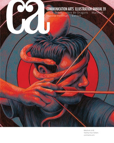
COMMUNICATION ARTS ILLUSTRATION ANNUAL 59
Little Jacket Here Be Dragons Maxine Helfman Exhibit
Manifold
May/June 2018 Twenty-Four Dollars commarts.com
MAY/JUNE 2018 VOLUME 60, NUMBER 2
COMMUNICATION ARTS ��
��
�� FEATURES
ILLUSTRATION ANNUAL
20 Little Jacket
60 81 100 127 131 147 155 162 170
by Jude Stewart This Cleveland design studio creates projects that are heavy in research and light in spirit.
28 Maxine Helfman
by Dzana Tsomondo Her work imparts her stylist’s eye, and her story reveals her fearless heart. This Florida-based photographer is poised for new challenges.
COVER Mind’s Eye, by Brian Britigan, p. 127.
��
36 Here Be Dragons
by Sam McMillan A production studio is just beginning to unlock the potentials of storytelling in virtual reality.
44 Manifold
by Alessandra Wollner This San Francisco–based experiential marketing agency builds the magic one detail at a time.
52 Exhibit
by Jean A. Coyne The latest and best in visual communication from here and abroad.
Advertising Books Editorial For Sale Institutional Animation Self-Promotion Unpublished Student Work
FRESH Editor/Designer Patrick Coyne Executive Editor Jean A. Coyne Managing Editor MichaelOh Esther Coyne
174
Atelier Irradié Two brothers in Paris, France, employ a mold-breaking design aesthetic for both established brands and startups.
176
Jessica Zollman A Los Angeles photographer is establishing the value of her fresh images on social media.
Associate Editor Esther OhYee Michelle
178
Moth Studio The stories that come out of this London, United Kingdom–based animation studio progress with warmth and charm.
Editor At Large Anne Telford Art Director/Designer Jessica Joni Rivas Reichard Production Manager/Competition Coordinator Lauren Coyne Print Producer Daniel Sambrano
COLUMNS 12
Creativity As marketers rush out pop-ups, Jessica Carew Kraft looks beyond the hype to see what will make these experiences last.
19
Design Culture Wendy Richmond explores what artworks can reveal about their makers, as well as her own art making.
16
Business Illustrators and agents still search for the one. But, as Scott Kirkwood reveals, their relationship has changed with the times.
180
Typography Monospaced fonts aren’t going anywhere. Allan Haley considers the history of a field brimming with unique personalities.
18
Advertising “Everyone is creative!” Ernie Schenck writes why such thinking is wishful and dangerous.
184
Insights In a Q&A, editor and designer Lola Landekic takes us through the deep and growing realm of title design.
Archivist Nancy Clark Lewis Software Engineers Jiping Hu Srividhya Gopalakrishnan Technology Administrator Michael Hoyt Advertising Director Dirk Moeller
Accounting Lois Vega Contributing Editors Sam McMillan Wendy Richmond Ernie Schenck
Editor’s Column Contributors/Directory Favorites Book Reviews Index to Illustration Annual 59 Overheard
Volume 60, Number 2 commarts.com COMMUNICATION arts (ISSN 0010-3519) is published six times a year (January/February, March/April, May/June, July/August, September/October, November/ December) by Coyne & Blanchard, Inc., 110 Constitution Drive, Menlo Park, CA 94025-1107. Periodicals Postage Paid at Menlo Park, CA, and at additional mailing offices.
Production Assistant/Customer Service Representative Khader Yanni
Circulation Director Perry Fotos
DEPARTMENTS 8 10 186 188 190 194
Design/Production Associate Joni Rivas Isabel Bagsik
Copyright 2018 by Coyne & Blanchard, Inc. All pieces reproduced in this issue are under prior copyright by the creators or by the contractual arrangements with their clients. Nothing shown may be reproduced in any form without obtaining the permission of the creators and any other person or company who may have copyright ownership. SUBScRIBER SERVICES: Subscription: 1 year, $53; in Canada, $70; all other countries, $110. All payments in US dollars, Canadian GST: 127848620.
Founder Richard Coyne (1926–1990)
Direct all inquiries, address changes, subscription orders, etc., to: Web: commarts.com E-mail: subscription@commarts .com Phone: 800-688-1971 (US/Canada) Phone: 215-788-5481 (International) Fax: 215-788-6887 Mail: COMMUNICATION arts PO Box 2013 Langhorne, PA 19047 Please allow six weeks for changes.
EDITORIAL AND BUSINESS OFFICE: 110 Constitution Drive Menlo Park, CA 94025-1107 Phone: 650-326-6040 Fax: 650-326-1648 E-mail: ca@commarts.com POSTMASTER: Send changes of address to: Communication Arts PO Box 2013 Langhorne, PA 19047 Canada Post: Publications Mail Agreement #40612608 Canada Returns to be sent to: IMEX Global Solutions, LLC PO Box 25542 London, ON N6C 6B2
Like us on Facebook facebook.com/communicationarts Follow us on Google+ plus.google.com/+commarts Follow us on Instagram instagram.com/communicationarts Follow us on Pinterest pinterest.com/camag Follow us on Twitter twitter.com/commarts
discover the world’s best illustrators VIEW PORTFOLIOS
PREMIUM STOCK
NEWS
search
KOTRYNA ZUKAUSKAITE
theispot.com/kzukauskaite
STEVEN SALERNO
theispot.com/ssalerno
PETER MCDONNELL
theispot.com/pmcdonnell
JING JING TSONG
theispot.com/stock/jjtsong
Royalty-Free Footage + Photos That Move
STOCKSY.COM
EDITOR’S COLUMN
Patrick Coyne
T
his year’s Illustration Competition received a healthy nine percent bump in entries, which included a greater number of international submissions, most notably from Italy and Spain. While we registered modest increases in the number of entries submitted to the book, for sale and institutional categories, we were amazed to see a fifty percent increase in the number of animation entries. “I was surprised by not only how many animation entries there were, but also by how many were of such a high caliber,” says juror Sarah Labieniec. “A lot of the pieces used motion and illustration to tell a story and convey information, which was not only effective, but also completely engrossing. It really showed how powerful illustration can be.” “There were so many amazing animation entries, it was hard to pick one over the other,” juror Chad Beckerman says. “This category is helping broaden and challenge our understanding of what illustration is.” “It was refreshing to see so much animation in the competition,” says juror Emily Kimbro. “More than ever, animation is being utilized as an important storytelling tool, from short GIFs to videos with high production value.” In addition to commenting on the strong showing in animation, the jurors noted what impressed them about the content and style of this year’s entries. “Aside from the sheer number of exceptional illustrations in the competition this year, I was excited to see so many pieces with such simple execution and strong concept,” Kimbro says. “Crafted concepts and ideas that had a point of view or made a bold statement rose to the top,” juror Hylton Mann says. “The illustrations with a definitive style jump out when you’re viewing 4,500 entries.” 8
Illustration Annual 2018
“I loved seeing patterns in the subject matter that reflect both national and international dialogues,” Beckerman says. “Of course, there were a lot of Trump illustrations, each trying to be better than the one before. There were also a lot of anxiety-themed entries. I’ll let you draw your own conclusions as to why.” “The vintage travel poster style and the midcentury children’s book look are making a strong comeback, as well as the blocky, minimalist silkscreen-inspired look,” says juror Victo Ngai. “There is also this one Photoshop airbrush tool that seems to have been used on at least 95 percent of the digitally executed illustrations. There were a couple of exceptions in the book category that felt really fresh, provocative and emotional. I wasn’t familiar with the illustrators—getting acquainted with their work has been the highlight of my judging experience.” The jurors also had some critical observations. “I was disappointed that a fair amount of people submitted work that lacked any cohesion in the series category,” says Labieniec.
CHAD W.
BECKERMAN is an awardwinning designer and creative director at Abrams, where he oversees the design of picture books, novels and graphic novels under the Abrams Appleseed, Abrams Books for Young Readers, Amulet Books and Abrams ComicArts imprints. He is the designer behind such successful children series as Diary of a Wimpy Kid, Origami Yoda, Nathan Hale’s Hazardous Tales, Frank Einstein, The Terrible Two and Bill Nye’s Jack and the Geniuses. He has also designed several bestselling pictures books, including Rosie Revere, Engineer; Trombone Shorty; and Vegetables in Underwear. A frequent judge for illustration competitions, Beckerman studied illustration at the Rhode Island School of Design.
EMILY KIMBRO is the design director for Texas Monthly, where she oversees the design, illustration and photography of the magazine and website. She grew up in Lubbock, Texas, and received a degree in graphic design from Texas Tech University. Previously, Kimbro worked as the art director of Southwest Airlines’ magazine Spirit (now Southwest: The Magazine) and as a designer at Fossil. Her work has been recognized by the City and Regional Magazine Association, Print magazine and the Society of Publication Designers. She lives with her husband and two fluffy Australian shepherds in Austin, where she likes to spend her free time searching for undiscovered swimming holes in the Texas Hill Country.
Photographs by Steve Castillo
Lastly, several jurors reflected on how the field of illustration is evolving.
“Some illustrators didn’t do themselves any favors by entering several different styles into the same series,” adds Mann. “A series should hang together.” “It seemed like there were less classically executed pieces in the mix than I expected,” Kimbro says. “This is potentially because of a shift in medium and the accelerating pace of deadlines.” “In the student and unpublished categories, it’s self-evident that many up-and-coming artists are borrowing the voices of their heroes a bit too much,” Ngai says. “The homogenizing phenomenon I observed concerns me. As a note to myself after the judging: it seems prudent to draw inspiration from outside our immediate community, and it’s beneficial to experiment with different tools— both analog and digital.”
SARAH LABIENIEC is creative director and partner at the San Francisco– based design and illustration studio Lab Partners. Originally from Connecticut, where she grew up dreaming about being a zoologist/Disney animator, Labieniec earned her degree in illustration at Ringling College of Art and Design. She worked as a designer at Berkeley agency Tomorrow Partners and letterpress stationer Hello!Lucky before cofounding Lab Partners with her husband, Ryan Meis. Inspired by childhood memories, nature and their animal companions, Labieniec and Meis have had the pleasure of working on projects for a range of clients, including Seattle Children’s hospital, Target, Tiffany & Co., Warby Parker and Williams-Sonoma.
“Illustration will continue to be incorporated in numerous ways, from editorial to retail campaigns to packaging,” says Labieniec. “There is really no limit to what it can be applied to, and it’s great to see so many companies using it in unexpected ways.” “The field of illustration is becoming more and more global,” Beckerman says. “It is now easier than ever to see the work of illustrators from all around the globe, and this year’s entries reflect that.” A minimum of four out of five votes was required for a project to be awarded in this year’s competition. I would like to extend our grateful appreciation to our jurors for their conscientious efforts in selecting our 59th Illustration Annual. ca
HYLTON MANN is an illustrator and group creative director at Juniper Park\TBWA in Toronto, Canada. Mann was born and schooled in Zimbabwe. After graduating from Rhodes University and AAA School of Advertising in South Africa, he started his career as an art director at Saatchi & Saatchi in Johannesburg. He moved to Vancouver, Canada, in 2002 to work at Rethink. He then moved to Downtown Partners in Toronto. In 2007, he joined Juniper Park as its first creative hire. Along the way, he has won numerous international advertising and illustration awards, from Cannes, Communication Arts, D&AD, the Effies, the London Internationals, the New York Festivals, the Obies and the One Show.
VICTO NGAI is a Los Angeles– based illustrator originally from Hong Kong. “Victo” is a nickname derived from Victoria, a leftover from British colonization. Ngai’s work has appeared in books, newspapers, magazines, advertisements and animations. Among her many clients are Apple, Dreamworks, General Electric, IMAX, Infiniti, Lufthansa, McDonald’s, the New York Times, The New Yorker, Johnnie Walker and the Wall Street Journal. Ngai has received numerous honors, including medals from the Society of Illustrators, the Society for News Design and Spectrum Fantastic Art, as well as recognition from American Illustration, Communication Arts, the New York Times and the Society of Publication Designers.
Communication Arts | commarts.com
9
CONTRIBUTORS/DIRECTORY Features
Featured in this issue
Sam McMillan (wordstrong.com) is a San Francisco Bay Area–based writer and brand strategist, and regular contributor to Communication Arts. In this issue, McMillan uncovers how production studio Here Be Dragons is reimagining the future in VR.
Maxine Helfman maxinehelfman.com Here Be Dragons dragons.org Little Jacket little-jacket.com Manifold wearemanifold.com
Jude Stewart (judestewart.com) has authored two books and written about design and culture for the Atlantic, Slate, Fast Company and the Believer. In this issue, she traces how Cleveland design studio Little Jacket translates research and play into bold work. Dzana Tsomondo (dzanatsomondo@gmail.com) is a freelance writer living and working in New York City. His work has appeared in a variety of publications, from Photo District News to Cool’eh Magazine. In this issue, Tsomondo profiles fearless Florida-based photographer Maxine Helfman. Alessandra Wollner (alewollner.com) is a writer, radio producer and community organizer based in Oakland, California. In this issue, Wollner discovers how San Francisco agency Manifold builds experiential marketing from the ground up.
Columns Allan Haley is a storyteller and a consultant with expertise in fonts. He was director of words and letters at Monotype for fifteen years and has six books and hundreds of articles to his credit. He is a past president of the Type Directors Club. In this issue’s Typography column, he reveals why monospaced fonts have lasting appeal. Scott Kirkwood (scottkirkwood.work) is a freelance copywriter and creative director focused on nonprofits and “do-gooder” brands. Based in Denver, Colorado, he is a frequent contributor to AIGA and Adobe Create magazine. In this issue’s Business column, Kirkwood shows what the shifting landscape of illustration means for agents. Jessica Carew Kraft (writingkraft.com) is an independent print journalist based in San Francisco, specializing in cultural trends and sustainability. Her work has appeared in the New York Times, the Christian Science Monitor, Grist magazine and ARTnews. In this issue’s Creativity column, she reports on how pop-ups can punch above their weight. Wendy Richmond (wendyrichmond.com) is a visual artist, a writer and an educator. Richmond serves on BRIC’s Artists Advisory Council and the MacDowell Fellows Executive Committee. In this issue’s Design Culture column, Richmond finds inspiration in artworks that illuminate their makers. Ernie Schenck (ernieschenck.myportfolio.com) is a freelance writer and creative director. Schenck is an Emmy finalist, a three-time Kelly nominee, and a perennial award winner at Cannes, the CLIOs, D&AD, the FWAs and the One Show. In this issue’s Advertising column, he takes a hard look at the notion that “everyone is creative.”
Exhibit Agência Kindle kindle.com.br Córdova Canillas cordovacanillas.com Creamos creamosagencia.com J Fletcher Design jfletcherdesign.com 180LA 180la.com Pavement pavementsf.com Lorenzo Petrantoni lorenzopetrantoni.com Jack Renwick Studio jackrenwickstudio.com Romance romance-agency.com David Roth & Associates seriousboyfriend.com
Fresh Atelier Irradié irradie.com Moth Studio moth.studio Jessica Zollman jayzombie.com
Advertiser’s Index American Society of Media Photographers 185 Directory of Illustration C4 Stocksy 6 theispot.com C2, 5, 11, 13, C3 Workbook 17
Call for Entries Design/Advertising 2018
193
Submitting work commarts.com/submissions
Writer’s Guidelines commarts.com/write-us No responsibility will be assumed for unsolicited editorial contributions.
Book Reviews Ruth Hagopian (ruth.hagopian@gmail.com) is a freelance writer and editor whose profiles of designers, photographers and artists have appeared in Create, Digital Graphics and Print magazines. She was also a publisher of Online Design magazine and a partner in Visual Strategies, a San Francisco–based design firm. In 2008, Amy Ng founded Pikaland, an online resource for freelance illustrators that sparks thoughts on creativity, illustration and entrepreneurship. Based in Kuala Lumpur, Malaysia, she guest lectures at the One Academy of Communication Design and teaches her own six-week class, Work/Art/Play, via pikaland.com. 10
Illustration Annual 2018
Corrections
In the 2018 March/April issue, on page 88, Dean Moore should have been listed as director on the Change Gout project. In the Design Details column starting on page 172, Mother Design New York should have been listed as Mother Design.
discover the world’s best illustrators VIEW PORTFOLIOS
PREMIUM STOCK
NEWS
search
JULIA BRECKENREID
theispot.com/jbreckenreid
JULIA BRECKENREID
theispot.com/jbreckenreid
MICHAEL AUSTIN
theispot.com/stock/maustin
JEAN TUTTLE
theispot.com/stock/jtuttle
CREATIVITY
Jessica Carew Kraft
© method
When a Pop-Up Becomes an Experience
A colorful striped facade distinguishes the Color Factory from the surrounding buildings in San Francisco (left). DJ May Kwok and dancers performed at a glow-in-the-dark launch party for method’s New York City pop-up launderette, which was open for three days in September 2016.
O
n July 26, 2017, Jordan Ferney posted an announcement on her popular blog Oh Happy Day introducing the Color Factory. She waxed exuberant about its fifteen interactive “experiences”—each revolving around a different color—that sprawl across two stories and 12,000 square feet of a former office building near San Francisco’s Union Square. Her fans responded with characteristic punctuation-heavy posts: “I would love, love, LOVE to visit! It looks incredible, and I can only imagine how amazing it would be in person,” wrote one. “This is so exciting!! I’m sad to miss it, but I can’t wait to see all the awesome Instagram photos,” wrote another.
Thirty-five minutes later, we were standing on the sidewalk. I was holding the same tiny, free (yes, yellow!) ice-cream cone that had been given to everyone upon exit, and wondering: What had been the point of all this marching around inside of a rainbow? Was it the souvenir pixels, immediately uploaded to every social media channel? Or was it the chance to entice a captive audience to shop for things they don’t need in the gift shop?
Ferney brought in artist Leah Rosenberg as creative director and designer Erin Jang as art director. With eleven other artists, they amassed a sequence of rooms that offer up to 700 visitors a day the opportunity to cavort amidst various hues, snapping selfies at every technicolor turn. Initially opened on August 1, 2017, the exhibition became a runaway sensation on Instagram for its photogenic sets, which included generous visual yardage for corporate sponsors Alaska Airlines and method home. To date, it’s extended its run twice.
Pop-up books are designed to get a child’s attention. You turn each page with a sense of anticipation, eagerly awaiting what might pop up on the other side. Will it fly at you? Dazzle you with color? Emerge with hidden characters that fold incomprehensively and disappear as the page gets flipped?
So when I got to visit the space with my eight-year-old daughter when it reopened in January 2018, I was anticipating the bright, bubbly images I had seen, and what reviewers had described as “a perfect storm of bright lighting, cool backdrops and kitsch” and “an Instagrammer’s dream come true.” 12
Illustration Annual 2018
These questions stayed with me long after I’d finished my stickysweet cone in one gulp.
Childlike Glee
When they arose in the early 2000s, retail and culture pop-ups captured that same feeling of childlike surprise and fleeting excitement. There were suddenly new stores, galleries and urban experiences that had to be appreciated before they went poof! Pop-ups appealed to a public that was saturated with repetitive retail, and they became the perfect setting for the naturally curious—or those with incurable FOMO, or fear of missing out. Pop-ups emanate an in-the-know aura because they enable early adopters to continually discover something new and exclusive that
discover the world’s best illustrators VIEW PORTFOLIOS
PREMIUM STOCK
NEWS
search
COLLEEN O'HARA
theispot.com/cohara
JOHN TOMAC
theispot.com/jtomac
FEDERICO GASTALDI
theispot.com/fgastaldi
IVAN CANU
theispot.com/icanu
© Katie Gibbs
CREATIVITY
The ice-cream cone sculptures in the Museum of Ice Cream Miami’s FAN-tastic room (left) are actually giant fans. For three weeks in 2015, Glade welcomed guests to the Museum of Feelings in New York City. The “cloud”-filled Calm room (right) was inspired by the Glade fragrance Lavender & Vanilla.
very few have yet to experience. The limited-time factor lends urgency to the visit and quickly drives ticket sales, press mentions and social media posts. Lately, more and more advertisers have been getting into the game. In 2016, method home partnered with on-demand laundry and dry cleaning service Cleanly to engineer its own proprietary pop-up in New York City. The temporary “Wash & Bold” launderette offered to do free laundry for visitors, connecting method with its progressive, sudsy personality. (Because it partially funded the Color Factory, method was able to leave a wall of teardrop-shaped soap dispensers in the exhibition’s prominent confetti room, subtly marketing its cleaning products.) For the art world, pop-ups provide many of the same benefits, getting eyes on art that might otherwise have languished unseen. The outright acceptance and encouragement of smartphone photography is the new angle on these pop-up attractions. A slew of artsy Instagram-factory pop-ups have been not-so-subtly capitalizing on their attractiveness for social media, harnessing art for commercial opportunity—and selfies. The Museum of Selfies, which opened in Glendale, California, in January 2018, takes the selfie craze to an extreme. Providing elaborate sets for visitors—duckface smirk and seductive smiles welcome—it also displays some provocative exhibits, like one about the surprising number of deaths from ambitious selfie attempts. The museum website promises that visitors’ perceptions of selfies will be transformed, “whether you love them or hate them.” To see the many who love them, just do a search for #museumoficecream or @wearehappyplace on Instagram. Searching for #colorfactory yields a grid of colorful vignettes of rainbow revelers. Yet visitors who had studied the gorgeous, spacious, saturated backgrounds of these Instagram posts before attending the Color Factory would likely have been disappointed if they had taken a moment to pause and observe in between poses. As a physical 14
Illustration Annual 2018
experience and in-the-flesh phenomenon, the Color Factory left much to be desired, and marketers wishing to emulate the success of the project—and the trend of “art museum” pop-up exhibitions in general—might want to pause before copying its playbook line for line. In person, the lighting was just short of squinchingly harsh. Gone were traditional spotlights, and in were high-wattage blue-tinted LEDs. “ ... [M]aybe a warmer light would have felt better to be there, but a whiter light looks better on Instagram,” Ferney told WIRED. Most of the individual spaces had been cut off from windows bringing in natural light, and the circulating air had also gone stale, particularly in the room chock-full of blue balloons. Unfortunately, this instant cabin fever, which was sponsored by Alaska Airlines, probably did not do the brand much of a favor. But who notices a patina of dust when you’re hunched over your device, fiddling with filters? (The people not taking grams. While scarce, they still exist and deserve some respect.) Still, the overwhelming response to the Color Factory was that it made visitors happy. “The real benefit of these immersive, live pop-ups is that they create emotional connections to brands,” says Melanie Shreffler, senior director of insights at Cassandra Report, a New York–based trend forecasting agency. In this respect, the more art-museum-like experiences like the Color Factory aren’t too much different from retail-driven experiences, she says. A perfect example is the Museum of Feelings, created by home scent company Glade, which popped up in Manhattan in late 2015. Its rooms featured emotionally evocative aromas that served as “branded activations,” Shreffler notes, cementing associations in consumers’ minds between Glade and emotions like optimism, joy and calm. Such immersive physical experiences with brands are now more commonplace: GE sponsors maker garages; Everlane welcomed shoppers to amble through its New York City “Shoe Parks” in 2016;
and in the summer of 2017, visitors could stop by the Cheetos Museum in Times Square to see the most oddly shaped snacks. And it’s not just a coastal cosmopolitan trend. The plant-based meat and dairy product developer Impossible Foods hosted a “meateasy” in Chicago in 2017. The “secret” venue was made up to look like a butcher shop, and the agency behind the stunt, Wieden+Kennedy, even had actors from the fictional Chicago Sausage Guild picketing the illicit meateasy while Chicagoans noshed on Impossible’s veggie patties inside. “Having that memorable, unusual experience has a big effect on the consumer’s consideration of the brand,” Shreffler says.
Kodak Moments Sensory memory is what the Color Factory excelled in. The final room featured a giant pit filled with yellow plastic balls that visitors were encouraged to wade around in. It was a joyous reprieve in the moment, and became famous on social media. My daughter could have spent all afternoon flopping around. But we were promised our final treat of ice cream, which got her scampering out. Unfortunately, to access the yellow minicone, we had to traipse through an overpriced curated shop of yellow objects. Even the discipline of behavioral psychology was never so blatant about inducements and rewards. To its credit, the true final moment of the Color Factory was the chance to use a specially made neighborhood map. The creative team had partnered with local businesses to entice visitors to keep exploring after they exited the exhibition. “We always hope to bring heart and generosity into what we do. We wanted to bring color out into the neighborhood and create experiences for everyone to enjoy—not just our visitors,” says Jang, the factory’s art director. Indeed, the exhibition ended up driving foot traffic to the hard-working small shops nearby, like the nail salon next door that offered a manicure matching the stripes on Color Factory’s facade. Along other stops on the map, visitors could participate in a colorful haiku project at 826 Valencia Tenderloin Center (a nonprofit writing and tutoring center for kids) or purchase a pin made by Carissa Potter of Oakland-based printmaking workshop People I’ve Loved (to benefit Larkin Street Youth Services, which helps homeless kids). “[Every experience on the map] is either free, benefits local businesses or [its proceeds are] donated to a neighborhood nonprofit we love,” says Jang. That’s the sentiment that is going to deliver a more meaningful pop-up experience. Dazzle us all you can, and cement your brand in our heads, but then give us something that goes beyond the selfie and points at something more long lasting. We’ll only see an increase of these spectacles, and their impact will continue to reverberate online. But with some guidelines—staying true to the childlike spirit of the pop-up surprise book and applying an ethical lens to the event’s impact—marketers can create more effective pop-up experiences. ca
Color Factory guests received a secret map (top) of seventeen additional color experiences around San Francisco, like Erin Jang’s mural Chinatown Flavor. Experiences in the Color Factory include a blue “balloon bath” (middle), by Jihan Zencirli of Geronimo Balloons with sponsor Alaska Airlines, and a yellow ball pit (bottom), by Carissa Potter of local printmaking workshop People I’ve Loved. Communication Arts | commarts.com
15
BUSINESS
Scott Kirkwood
Illustragent
W
hen actors, writers and illustrators first set out to share their art with the world, nearly all of them ask that one question: How do I get an agent? And if your canvas of choice is the film or the novel, that makes perfect sense. But if your canvas is literally a canvas, you might be asking the wrong question.
“I don’t think illustrators need an agent, period,” says Richard Salzman, who’s represented artists for more than 30 years. Currently, Salzman works with Mark Smith and dozens of others. “When artists contact me and say they’re looking for a rep because they want more business, I’ll tell them, ‘You don’t need a rep for that—you just need to be someone with incredibly rare talent. And if you are that singular talent, which is the only one I’m interested in repping, you don’t need me or any other rep to be successful.’” Ten to twenty years ago, agents normally handled the majority of an illustrator’s marketing outreach. But the digital era has changed all that. Now, Salzman says, artists can easily do that work themselves with an effective portfolio, proper promotion on social media, some paid directory sites, targeted email (or snail mail), and a strong showing in annuals. This means that today’s agents are more focused on helping illustrators navigate the many offers they’re receiving, negotiating more money for lucrative commercial projects and communicating boundaries when client revisions go beyond the original scope. (Editorial commissions are generally set in stone, so even the best agents struggle to increase rates to offset their commission.) Salzman ends up working with roughly one illustrator out of every thousand who contact him. The reps interviewed for this piece typically find new artists by seeking them out. So perhaps the right question is: How do I get an agent to find me? “It’s unfortunate, but we can’t respond to the flood of emails we receive—doing so would be a full-time job,” says Pablo Steffa, founding partner and director at Agent Pekka, a Finnish agency that 16
Illustration Annual 2018
launched a Los Angeles office in August 2017. “Instead, we’re quite active following illustrators on Instagram, Tumblr and the handful of good design blogs in the industry. We’re very proactive in finding new talent, and we generally like to be the ones to approach the artist first.” Case in point: Pekka reached out to Ugo Gattoni in 2012 after seeing his book Bicycle all over blogs and social media; fast forward to 2017, when the relatively unknown illustrator completed key imagery for a campaign promoting a limited edition Hennessy cognac blend. Gattoni now counts Nike and Swiss luxury watchmakers Bucherer and Rolex among his clients. Like Salzman, Steffa seeks out illustrators with a unique, consistent voice. “We want to see a really clear thread throughout their portfolio—someone who can explain their work in a personal way,” says Steffa. “We don’t want illustrators that follow trends. We’d much rather sign artists that are doing their own thing—that’s the sort of stuff that stands the test of time. We think we’re pretty good at finding artists who are just about to become bigger, and we tend to sign them quite fast when they’re on the rise.” Advertisers, of course, are always looking for the next big thing. But they also enjoy working with a known quantity. “Today, reps still act as a sort of seal of approval for commercial work,” says Steffa. “If a rep has an artist in her or his book, it means that artist can cope with the tight deadlines of commercial work. And the agency knows that the rep will sort through pricing and contracts, so there’s no need to handle all the back-and-forth with the artist. Just having a producer on hand from the rep’s side means that you’ll always have someone to answer calls and emails.” “Advertising is extremely fast paced—there are a lot of egos involved and a lot of money on the line, and things don’t always go according to plan,” adds Bianca Bramham, a managing agent and producer at Jacky Winter Group, which has offices in New York and Melbourne. “A lot of clients like to have someone along for the ride who can
jump in when necessary, see potential red flags, and make sure the artist and the client have the space to do what they do best.” On the other hand, having a rep doesn’t always help—it could even hurt. Smaller clients may see the word agent and immediately cringe at the idea of a 25 percent commission on top of the illustrator’s fee, which could also rise if the agent is a particularly savvy negotiator. “If you’ve gotten your work in front of the right art director and it comes down to two artists, they may call the one who doesn’t have a rep [because they know they’ll save a little money],” Salzman says. “The best art directors aren’t hiring someone who’s represented by a ‘reliable vendor;’ they’re seeking out the best illustrators in the world.” The mere fact that a rep’s value is up for debate means that agencies are being forced to adapt. Bramham spent the earliest years of her career in a commercial animation studio working with directors, animators and 3-D technicians before taking on her role at Jacky Winter. That background has proven invaluable as the agency has evolved to encompass the work of a creative production studio. “Today, our value is in playing an active role in the creation of the work,” she says. “As a production partner, we’re working alongside our artists and our clients from start to finish, helping with everything from the brief to project scheduling to making sure it all runs smoothly; whereas a traditional agent might be limited to marketing, relationships and the negotiation side of things, and typically takes a step back once the work goes into production.” That work runs the gamut: Jacky Winter’s roster of storyboard
artists help agencies visualize creative projects when they’re little more than ideas; up-and-coming artists are available to help with smaller, low-budget projects; and the agency has even started helping clients produce live events. Brolga, a Brooklyn-based artist repped by Jacky Winter, recently painted illustrations on a van to promote the launch of shuttle service Chariot in New York City. The very same social media channels that have enabled illustrators to tackle their own self-promotion are also hungry for more content, a need that’s often fed by illustrators, animators and videoproduction teams. “Our clients are commissioning a lot more short-form ‘snackable’ content like animated GIFs, which have really blossomed in the last few years,” says Bramham. “Artists are now being approached as personalities—not just for their work, but for their fan base and their own influence.” So if you’re a budding illustrator looking for representation, don’t worry about it so much. For now, keep feeding that fan base, keep exploring new mediums and keep embracing what makes you unique. Someday, an agent may come calling. Or not. In the end, even the most experienced reps in the industry agree that attaining their services isn’t nearly as important as you might think. “The idea of ‘If I only had a rep, I’d be more successful’ gets it backwards,” says Salzman. “If you’re successful, you have a need for a rep; and at that point, any rep will sign you. Start out by soliciting art buyers so you understand the experience of selling your own work and getting assignments on your own—get all those experiences under your belt before you [start paying a rep to do it for you]. Otherwise, you’re putting the cart before the horse.” ca
WORKBOOK
Communication Arts | commarts.com
17
ADVERTISING
Ernie Schenck
If Everybody Is Creative, Nobody Is
T
here’s a scene in Pixar’s The Incredibles where Dash, the young son in the family of superheroes, has gotten called to the principal’s office. On the ride home from school, Dash’s mom tries to explain to him why they have to hide their powers.
“Right now, the world just wants us to fit in; and to fit in, we’ve got to just be like everyone else.” “But Dad says our powers make us special.” “Everyone’s special, Dash.” But Dash sees the truth for what it is. “That’s just another way of saying no one is.” Apparently, a lot of people in advertising these days haven’t seen The Incredibles. But we’ve all heard it: Anybody can have an idea. We are all creatives. Ideas can come from anyone. It sounds good, doesn’t it. The idea that no matter who you are and what you do for a living, your ideas are worthy of being created as surely as any writer’s or art director’s or designer’s. Hell, were it not for the artificial labels we assign to one another, the next big Super Bowl hit could just as easily be yours. And even if that never happens—well, who’s to say what a big idea is anyway. This slightly south of delusional thinking comes as no surprise, of course. Not when we live in a society that’s willing to end spelling bees because, well, a lot of kids are going to lose in them, and nobody feels good when losing—so hey, how about we just not have spelling bees at all. Not when we hand out participation trophies so that all the kids on the swim team can feel good about themselves instead of trying harder to win next time. In his recent blog post “‘Everybody Is Creative’: The Big Lie That’s Killing Madison Avenue,” New Breed Talent Army cofounder Mark Wnek puts it this way: “For some time now, Madison Avenue’s most senior executives have gotten away with the ‘everybody’s creative’ lunacy. It has allowed them to take millions upon millions of dollars–worth of so-called top creatives off their payrolls—and with nobody going to the wall for quality.” “Lunacy” is too kind. “Dangerously insane” is a better way to describe what’s happened to the idea of the idea. Wnek is right when he writes: “Every day we read stories about how Madison Avenue is failing, yet none bother to explore the obvious link to what is now a serious dearth of true creative talent.” How did it come to this? Where and when did we decide to choose alternative facts over the stark naked truth that very few of us are 18
Illustration Annual 2018
capable of having ideas that connect with human beings? Fewer still can generate those ideas on demand, with the crush of a deadline rushing at you like a freight train. Not everyone agrees with this. Not even every creative. RT Herwig puts it this way: “The fantasy that not everyone is creative, although romantic, is dangerous and outdated. As our industry gets faster and more complex, we need to come up with new ideas quicker, and it takes different kinds of thinking from different disciplines to come together to solve today’s briefs.” No argument there. Getting to great ideas more quickly? Totally. Different kinds of thinking from different disciplines? Here’s where it gets a little foggy for me. If “different” means ideas that are spawned from technology or B-school mumbo jumbo bearing little resemblance to the human condition, I’ll just get off the bus at the next stop. It’s simple. If your idea can pass through the lens of humanity, I’m with you. If it doesn’t, then it might be creative, but it doesn’t count because it isn’t creative in the way humans need it to be. Sir Kenneth Robinson, in one of the most viewed and beloved TED Talks ever, maintains that as children, we are all creative. Then we go to school. We grow up. And whatever creative ability we once had is beaten out of us. What Sir Kenneth failed to point out is that there are some of us who go into advertising and have whatever feeble embers of imagination that might have been left behind wrung out of us. For this, we can thank the holding-company bean counters. Open office plans, those dehumanizing monsters. The siren call of technology. And, of course, a society hellbent on leveling the playing field of creativity. We all want to feel alive. We all want to believe that our ideas are worth something—that we’re more than just gears in the machine. That Sir Kenneth might have been right about everyone else but, dammit, he wasn’t right about us. “We imagine; therefore, we are. We create, and therefore, we deserve a place at the creativity table.” Advertising can keep believing that. It can keep devaluing genuine creativity. Push it to the bottom of the totem pole. It can keep asking itself why it never saw winter coming. Or it can come back to its senses and admit, once and for all, that Dash had it exactly right. If everybody is creative, then nobody is. ca
DESIGN CULTURE
Wendy Richmond
Necessary Pursuits
L
ast January, I headed to the exhibition Modigliani Unmasked at the Jewish Museum in Manhattan with a single goal: to improve my own figure drawings. I wanted to push them beyond their minimalist style, but I didn’t want to lose their simplicity. I found my inspiration in a black crayon sketch: Female Nude with a Lighted Candle and Chandeliers, inspired by Anna Akhmatova. Amedeo Modigliani caught the figure’s gesture concisely and elegantly with an outline. Then he added a contradiction: short, messy lines encasing the outline like a coarse cloak. In my drawing session later that day, I realized that Modigliani’s rough marks did not negate simplicity; they embraced it. Each time I visit an art exhibition, it is more than an enjoyable pastime—it’s a necessary pursuit. My focus depends on the challenges I’m confronting in my own art making. It can be stylistic, like studying Modigliani’s use of line. It can be pragmatic—hunting for lighting solutions or display possibilities. Or it can be theoretical, like exploring language that will help me articulate the impetus for my new body of work. My current project consists of small sculptures, and my studio is the scene of a population explosion: the pieces are jumbled together, overcrowded on shelves and tables. They will soon be moving from this private room to public spaces, and they need to be presented as a family. But how? I visited the Marian Goodman Gallery to see Cristina Iglesias’s installation Phreatic Zones, a sculpture that is more like architecture— a terraced structure that occupies most of a large room. It’s an inside river: water flows over cast aluminum forms that look like glowing, tangled tree roots. Though Iglesias’s installation did not relate directly to my own work, it provoked a surge of thoughts about presentation. First, it sparked practical ideas beyond any I had previously considered: Should I incorporate metallic materials? Add hidden lights? Vary the level of the floor? Second, I was inspired by the atmosphere Iglesias had created; the space energized me and transported me out of the present. In an article in the Huffington Post, Iglesias said, “I use [water] as a material that marks time, that changes, that makes a sound even within its silence, and that makes the places I build active.” When I went to the Museum of Modern Art to see the exhibition Louise Bourgeois: An Unfolding Portrait, I expected to continue in the
same vein; that is, focusing on physical aspects. I’ve always been attracted to Bourgeois’s courageous sculptures and installations— they are big, bold and beautifully constructed. But her prints and books raised a different set of questions about presentation. If your art comes from a private and emotional place, how much of that story do you want to explicitly reveal? Bourgeois never shied away from relating her personal narratives; in fact, she insisted that you know them. Some are literally printed on the pages of her fabric illustrated books—works that reference the tapestries that were the focus of her family’s business when she was a child. The pages of Ode à la Bièvre and Hours of the Day contain text from her diaries: “I had gone back with my children to … see the house where I had grown up and where the river Bièvre flowed…” “I am on the other side of despair and this happens to me four times a day.” For me, her words are compelling because they are simultaneously specific and universal. I recently showed an acquaintance images of my sculptures— broken casts of my hands embedded in slabs and blocks—and her response was: “Eeeww. Stunning, but creepy.” Then I told her about my impetus: it was (and continues to be) a combination of my brother’s terminal illness and my own mild autoimmune disorder. “Ah,” she said. “That changes everything.” At first I was hurt. Isn’t the art supposed to speak for itself? We want the power to come from the work; not from the story about the work. But unexplained art, while strong on its own, may not convey the artist’s intended message. So ask yourself: How much of your backstory do you want to tell? Will your explanation help viewers understand what they are seeing? Or will it provide too much direction, steering them away from finding their own meaning? Days after a museum expedition, I can recall the artworks that I focused on while I was there. But the specific lesson that I gained from each artist—about style or presentation or narrative—often changes, and leaks into one of the other categories. I picture Modigliani’s drawing, and I think about his identity as an Italian Sephardic Jew in Paris. Conversely, I recollect Bourgeois’s emotional text on a handkerchief, and I wonder how I might use fabric in an installation. ca © 2018 W. Richmond
Communication Arts | commarts.com
19
BY JUDE STEWART
s there anything that peeves Joey Parlett and Roger Frank about the branding and design worlds? “No peeves. I’m a perfect Pollyanna. I have more of a fear than a peeve,” says Parlett, Skyping in from Little Jacket’s Brooklyn outpost. Which is? “You follow a formula, you get formulaic work. We have to apply rigor first, but you also need that play element.” Frank, chiming in from the branding studio’s home base in Cleveland, explains further. “Everyone has a [creative] model. You would not be a good practitioner if you didn’t have a model. But you also have to allow for happenstance, those great imaginative leaps.” Parlett interjects. Turns out he does have a peeve. “That thing in branding when people say look at me, look at me, and don’t acknowledge no one wants to look at you. It’s our job to start a conversation worth having. No one cares about what you want to say [as a brand]. You have to say it in a way that provokes [people] to care or gets them to stop for a moment.” Parlett pauses for emphasis, embodying two qualities that are rarely mixed: Midwestern-nice and Brooklyn-straight. This exchange happened relatively late in our 90-minute call. But within minutes of our conversation, I was left with some interestingly conflicted thoughts. First, is it possible to reek of integrity? Because these guys do. Second: their brand of Midwestern-nice entails its own forms of bluntness. Third, and perhaps most important: play can have weight. All these enigmas reveal themselves in Little Jacket’s work style and approach, best described as straightforward, humble and dogged. Little Jacket began in 2004 when Parlett and fellow cofounders Ken Hejduk and Mikey Burton, then all students at Kent State University, began designing concert posters in their
basement. “We were really into this single by [the band] LCD Soundsystem, ‘Losing My Edge,’” Parlett recalls. “It was basically about getting a little older in New York and losing your edge to some 22-year-olds. There’s a line in the song: ‘Little jackets and borrowed nostalgia from the unremembered eighties.’ Being that we started in the music industry, we called ourselves Little Jacket based on that really small lyric that isn’t even quoted correctly from that song.” (Even this remark reveals Little Jacket’s precision and modesty— that lyric quote is absolutely correct.) The team moved from one-off poster design to branding work over time. Burton later left Little Jacket to pursue illustration full-time, while Hejduk left in 2017 to work on product design. Both partings were amicable: Hejduk remains a minority owner, and his wife still works as Little Jacket’s office manager. Parlett stayed on as a designer, and Frank joined in 2009 as a partner and creative director. (The transition was an easy one for Frank because he had frequently collaborated with Little Jacket while he was vice president/associate creative director at Cleveland-based ad agency Marcus Thomas.) Today, Parlett and Frank lead a team of four full-time staff with two part-timers they call “instrumental” to the firm. Teamwork runs deep for Little Jacket, as does a strong multidisciplinary streak. Not so for shallow eye candy and splashy, thoughtless execution. “We are small but mighty,” says Parlett. “There’s no one allowed on our island who doesn’t plus-up what we do.” Design director Christian Woltman says, “I always felt like an owner, even though I’m not.” What attracted him to work at Little Jacket (a job that he secured by accosting Hejduk in the bathroom at an AIGA event) was that “the idea and the execution always matched. Lots of agencies have a good idea that they don’t fully finish. Or beautiful work that doesn’t necessarily have a real idea underneath. Little Jacket had that marriage of idea, design, writing and strategy.”
Captions supplied by Little Jacket. Right: “LAND studio, a nonprofit which specializes in connecting people in Cleveland through public art and spaces, brought us this dream project: making the type provocative in its environment. Our team included a writer who lives in Cleveland’s Buckeye-Shaker neighborhood—he brought a beautiful voice to the project—and Alan Giberson of Alan’s Signs, who impeccably executed the type.” Damien Ware, writer; Joey Parlett, designer; Roger Frank, creative director; Alan Giberson, contributing artist; LAND studio, client. 20
Illustration Annual 2018
LITTLE JACKET branded print and digital materials that could be shared with all participating libraries. At one Washington, DC–based launch event, librarians invited “members of the public to ‘test’ their knowledge of libraries, and surprised them with free cups of coffee. [It] prompted people to spend a moment thinking about libraries and consider how the library might fit into their lives.”
A recent project for the American Library Association (ALA) offers an ideal case in point. Tasked in 2015 with developing the Libraries Transform national public awareness campaign for the ALA, Little Jacket “faced the double whammy of developing a ‘sticky’ and succinct message that shifted traditional perceptions of libraries,” says Sari Feldman, then ALA’s president. Oh, and with almost no paid-media budget. Little Jacket started by uncovering the deeper need behind the brief—the question behind the question. “It’s not that the library has books,” Frank says. “It’s that it enables people to gain knowledge, and that knowledge might be digital. It might be something in the maker space. It might be access to 3-D printers. It might be that they’re going through a career transition or they’re underemployed and they need help. [The library] has staff for that.” The campaign revolved around a single potent word: because. By using this word as the linchpin of the campaign, Little Jacket answered the question of “Why do we need libraries?” with a plethora of answers, such as “Because more than a quarter of US households don’t have a computer with an internet connection” and “Because the world is at their fingertips, and the world can be a scary place.” The approach worked wonders in explaining the multifaceted civic value of the public library system and encouraged library-boosters to supply their own “because” statements. To solve the problem of reach, Little Jacket harnessed the ALA’s wide physical footprint—nearly 120,000 libraries across the United States—by creating
Three years into the campaign, the results are strong. In Indiana alone, the campaign helped generate $3 million in government funding to close the digital divide, giving underprivileged library-goers both free internet access and training to use the web effectively. Frank recalls a proud moment in Little Jacket’s work for the ALA: “One [Indiana] state legislator said, ‘Without this campaign, we might not have connected how important the library is as a link for these constituents.’” He continues: “But just as exciting are the interesting ways that [member libraries] evolved the campaign. They’ve made it their own. They make their own ‘because’ statements, their own expressions.” Currently, 7,500 of ALA’s more than 50,000 member libraries are participating, so there’s a lot more runway ahead. Open Doors Academy (ODA), a Cleveland-based nonprofit, demonstrates that same strain of cheerfully crowdsourced optimism that Little Jacket brings to all of its projects. By engaging middle and high school youth with out-of-school programming, ODA hopes to help them reach their full potential. Frank has served on ODA’s board of directors in various capacities, including as president, since joining Little Jacket. To develop content for ODA’s brand guide and annual reports, Little Jacket cohosts a one-week camp for the kids every summer. “The kids are our compass,” Frank says. “If you try to do an annual report for the kids on how hopeless their lives are, even though many of them are low income with challenges, you wouldn’t do that annual report if you’re being honest. These kids are filled with so much hope and believe so strongly in their future.” “We use [the camp experience] to define what the annual reports will be for the year, and we teach them a little bit about design. … Turns out you can’t teach kids design in a week,” Frank says with a laugh. “But you can teach them
This page: From left to right: managing partner Roger Frank, office manager Micki Hejduk, founder/designer Joey Parlett, strategist Ellen Russell, design director Christian Woltman and account manager/strategist Lora DiFranco. Right: “As a believer in the power of lifelong learning, community-based arts education and career training center NewBridge practices what it preaches. It is constantly tweaking its programming to ensure that its students—both youth and adults from some of Cleveland’s most challenged neighborhoods—have the skills they need to secure meaningful, good-paying jobs in high-demand fields.” Christian Woltman, designer; Roger Frank, creative director; Paul Sobota, photographer; Joey Parlett, illustrator; NewBridge, client. “We made a beer. We had a party and drank the beer. Then we decided to package the beer. This project gave us a chance to better understand what our clients feel throughout the design process. The beer is gone, but we have some beautiful work to show, and we gained a little more client empathy along the way. Cheers to that.” Martin Rickman, writer; Andy Hendricks, designer; Roger Frank/Ken Hejduk, creative directors; Little Jacket, client. 22
Illustration Annual 2018
Communication Arts | commarts.com
23
24
Illustration Annual 2018
LITTLE JACKET our writing techniques and how to interview. They can concept. You can help them ask better questions.” The rigor of Little Jacket’s creative methods—extensive research, close listening, active questioning, constant ego-free iteration—makes it a natural match to work with teenagers. Dr. Annemarie M. Grassi, chief executive officer of ODA, considers this iterative approach key to the studio’s success. “Little Jacket’s drive for perfection for beauty, emotion and a higher level of thought is one of my favorite qualities in the partnership. I love when we come together to review the work being done, argue back and forth about whether or not it meets expectations. When it does, great. But when it doesn’t it is even greater, because while it may be tough to hear initially, they always come back ten times stronger, with a second revision.” In describing Little Jacket’s communication style, Parlett says, “We don’t sugarcoat, but we’re also respectful. I think the most disrespectful thing is not sharing your full opinion with someone.” When asked to describe the ideal Little Jacket client, Parlett remarks, “They find us way more than we find them. Whether nonprofit or for profit, there’s a weight to what we do, but also a joy to it.” Frank adds, “The design starts to feel right when you define the problem really well, you understand where you need to go—the strategy and all that stuff. Then you just play around a little bit. We use fun all the time, where we’re like, ‘Oh, that one’s starting to feel fun.’ That means it doesn’t feel as tense or rigid.”
Left: “The French phrase bon à tirer, or good to shoot, is used in the print industry to indicate when a work is ready to print. Creators sign off on a printer’s proofs to indicate their approval of the finished product. The signatures you see are from the ten Open Doors Academy scholars who participated in creating this year’s annual report. The nonprofit Open Doors Academy provides out-of-school enrichment programming for middle and high school youth.” Christian Woltman, designer; Roger Frank, creative director; Paul Sobota, photographer; Open Doors Academy, client. “We developed a bold message-driven campaign to help challenge perceptions of public schools for the Cleveland Heights-University Heights City School District. The campaign was created to communicate the vitality of the district to new and current community members. Our challenge was to capture the energy and excitement of a diverse district while emphasizing the importance of public education.” Joey Parlett/Christian Woltman, designers; Roger Frank, creative director; Paul Sobota, photographer; Cleveland Heights-University Heights City School District, client. This page: “These five posters are part of the national public awareness campaign that we developed for the American Library Association. Libraries are dynamic centers for learning in the digital age. We created a visual language and a series of statements illustrating the ways libraries evolve to meet the changing needs of communities.” Joey Parlett, designer; Roger Frank, creative director; American Library Association, client. Communication Arts | commarts.com
25
LITTLE JACKET Here’s perhaps the best expression of Little Jacket’s philosophy: its work derives weight from intense research, but that weight can only be fully unleashed through play. “Play is humble,” Parlett says. “It’s like learning an instrument: You practice all your scales and everything. Then when you really learn how to master your instrument, you forget all that stuff, and you just play.” ca
This page: “American Greetings asked us to create murals for the employee stairwells in its new world headquarters. The job was to inspire the creativity of a group of talented creatives.” Joey Parlett, designer/illustrator; Roger Frank, creative director; American Greetings, client. Right: “When we started working with frozen food startup Daily Harvest, the frozen fruits and vegetables that make up its refreshing beverages arrived in less than attractive packaging. We guided Daily Harvest to create a fresh visual identity that matched its delicious products. By working closely with production partners, we were able to provide an innovative, cost-effective packaging solution.” Lauren McAndrews, designer; Christian Woltman, design director; Ken Hejduk, creative director; Daily Harvest, client. “We created a series of posters for the Office of Patient Experience at public healthcare system MetroHealth to remind its team why every moment matters.” Andy Hendricks/Joey Parlett, designers; Roger Frank, creative director; Joey Parlett, illustrator; The MetroHealth System, client.
26
Illustration Annual 2018
Communication Arts | commarts.com
27
MAXINE HELFMAN MOVING TARGETS BY DZANA TSOMONDO I
t is not uncommon to hear artists claim that they don’t care what people think of their work. Of course, it seldom rings true, but it’s an understandable conceit—to share one’s work is to leave oneself dizzyingly vulnerable, and self-preservation is a defining human trait. But when veteran photographer Maxine Helfman says she doesn’t care whether people like her work, I believe her. After all, your average commercial fashion photographer doesn’t turn up on CNN .com because of a racially charged photo series.
“I’m not a documentary photographer or a photojournalist, but every message has many messengers, and I realized that, in my way, I can still get a message out,” Helfman says. She followed that photo series, called Historical Correction, with Fabrication, a 2016 project that posits pointed questions about gender in its portraits of little boys clothed in dresses. “She is not afraid to try new things,” says Leon Banowetz, president and executive creative director of Dallas-based branding and design firm Banowetz + Company. He has been working with “Max” for fifteen years. “Many people get complacent, but Max is always evolving.” I had flown into Fort Lauderdale that morning, and Helfman and I are having breakfast steps from the beach. It’s only ten in the morning, but the sun is already making its intentions known. This, I will come to understand, is the Maxine Helfman default setting. Helfman grew up twenty minutes from where we are now. Born in Michigan, she moved to Miami with her family when she was seven years old, and her parents divorced soon after. Her mother was a secretary, and with three young girls, money was tight.
as the waves breaking in front of us. She brushes her twenties away with a wave of the hand before pinpointing the moment that led her towards a future that, until then, she had only sensed was possible. “I used to walk past the Burdines department store, look at the window displays and think, ‘That would be a fun job,’” Helfman says. “Then I saw a help-wanted ad in the paper, and I talked my way in. It was the first creative thing I ever did.” Helfman had finally found something that moved her. Despite being in her thirties, working with no experience in an environment defined by punishing hours and threadbare budgets, Helfman was quickly promoted. Still, it didn’t take her long to realize that there was no real future for her in retail display. By then, though, Helfman had run into a former coworker who was working as a stylist. Around the same time, a friend of hers got into amateur photography; intrigued, Helfman bought a camera of her own. True to form, Helfman talked her way into a stylist position— even though she was still figuring out what exactly a stylist did. After two years styling interiors for a studio, Helfman struck out as a freelancer. The change brought with it a nomadic lifestyle; she remembers doing her taxes one year and realizing that she had spent 280 days on the road. Given that she was getting so much work in Dallas—and had long told herself that she would get out of Florida—she moved there in 1992. For the next twenty-three years, Dallas would be where she made her career, her marriage and her life.
“It sounds ridiculous now, but I had friends who weren’t allowed to hang out with me because my mother was divorced,” she says. “So you start getting isolated, and then economics isolate you further.”
By 2000, business was humming, but Helfman had grown bored with the niche that she found herself in. “I was doing a lot of big sets, and I really wanted to do smaller stuff— creative stuff, like jewelry and cosmetics. But I didn’t have any of that in my portfolio,” she says. “So when I started testing and couldn’t find photographers who really saw my vision, I just started doing it myself.”
Lacking any real direction, Helfman drifted aimlessly through her teens, high school rolling into low-wage jobs as smoothly
It was at night, in her spare bedroom, that Helfman learned lighting techniques that she still uses today, gaining the
Right: “From ‘Texas Forever: Spring Fashions Go on a Lone Star State Odyssey,’ a Spring 2017 fashion feature for The Cut section of New York magazine. I had just finished a personal series, Exit 219B, which became the inspiration for this project. Rebecca Ramsey, the stylist, chose the wardrobe based on that series and had it shipped to me so I could work with it.” Roxanne Behr, photo editor; Jody Quon, photography director; Rebecca Ramsey, stylist; Traci Moore, hair stylist/makeup artist; Keiryel Mcfail, model; New York, The Cut, client. 28
Illustration Annual 2018
MAXINE HELFMAN
© Maxine Helfman
confidence to swim against the current— again. Looking for new, smaller-scale styling work, she put together a book, figuring that it could also double as a way to get feedback about her photography. After all, no one would know that she had shot the pictures herself. When she bumped into a colleague who had become a creative director at Neiman Marcus, Helfman showed her the images. Impressed, the woman offered her work on several projects. Helfman was eager and excited, but also wary of what it would mean to make this leap. Yes, her ability to pull double duty as the photographer and stylist was an advantage. She also had a wealth of experience working with creative directors and brands—she knew what they wanted and how to do it. On the other hand, she knew that industry photographers—even those she had worked with for years—would consider her persona non grata once word got around that she had forgotten her place. Helfman took on the Neiman Marcus projects hoping to keep her dual role as the photographer quiet in case it didn’t work out. They were daunting assignments, and being both photographer and stylist should have been a nightmare, but Helfman found the experience exhilarating. Still, once the Neiman projects were finished, the only work coming down the pipeline were styling gigs.
Steadily, the volume of work built. She traded that extra bedroom for a small studio, and moonlighting turned into a career shooting commercial still lifes. But, as always, she began to yearn for something more—or at any rate, different. Helfman was eager to do something for herself. After hearing about the FotoFest International biennial in Houston, she created three new bodies of work to submit, in a single insane month. The first two curators she sat down with loved the work, but the last reviewer—after halfheartedly thumbing through—suggested that she try “a Facebook group or something.” Today, that same work is hanging in the permanent collection of the Museum of Fine Arts, Houston. It was an eye-opening experience. “Commercially, if the client is happy, I am happy,” Helfman says. “But as far as personal work, lots of people don’t like things. But I don’t really care. I know I’m doing things for a reason.” Two very big dogs greet me vociferously when I walk in the front door of Helfman’s home in Plantation, Florida. Like much of what’s in this tastefully eclectic home, the dogs recently made the trip to Florida from Texas. The modest space manages to be both spare and teeming with books, art and exotic taxidermy. Knowing Helfman, I can only guess what treasures she left behind. “My whole career has been change. I really believe in embracing change, and I don’t mean ‘there’s a new camera out this week,’” she says.
“So, I’m waiting for a call about a big stylist job, wondering if I will ever shoot again, when I get a call from Nieman saying, ‘We love this. We want you to do these next three projects.’ And then two hours later, I get a call to confirm that stylist project,” Helfman says with a chuckle. “If they had called a couple of hours later, ethically, I would have had to turn Nieman down.”
We are talking about her work, but I sense that we are also talking about her life. Helfman has always grasped adversity with both hands and wrought something of it. After spending more than twenty years in Dallas and shepherding her partner of twenty-three years through a terminal illness, it’s not hard to imagine that she was ready for new challenges. Helfman recently started adapting her techniques so she can work with available light. Her goal was personal— a creative liberation of sorts—but the resulting work brought critical acclaim, which in turn brought new clients to her doorstep.
As she suspected, once word got around, photographers in the industry kept their distance from “the stylist who thinks she can shoot.” Relating the story to me as we wait for the check, Helfman shrugs. It was all was fine by her. She had worked for everything she ever got, and this would be no different.
Jody Quon, photography director at New York magazine, is one of them. It’s an image from Helfman’s Summertime series that inspired Quon to reach out. “One of the things that sets her apart from other photographers is her stylist’s eye,” says Quon. “As a photographer with a background in styling, she has incredible control of the overall aesthetic of her
Right: “For Free To Be, a fall/winter 2017 campaign for Dallas-based fashion retailer Forty Five Ten. Taylor Tomasi Hill and Larry Oliver were inspired by personal work I had done, which became the inspiration for this campaign, which was basically a road trip—stopping in random backyards, empty buildings, small towns, abandoned farmhouses and long, winding roads… in great clothes. The casting of model Julia Banas took it to another level—even after shooting consecutive days in temperatures that were more than 100 degrees.” Larry Oliver, SWOON, the studio, art direction; Taylor Tomasi Hill, Forty Five Ten, creative direction; Lisa Williams, Independent Artists Agency, hair stylist; Shane Monden, Wallflower Management, makeup artist; Julia Banas, The Society Management, model; Forty Five Ten Retail, LLC, client. 30
Illustration Annual 2018
Communication Arts | commarts.com
31
32
Illustration Annual 2018
MAXINE HELFMAN photographs, and the styling always takes a back seat to the overall pulse of the image.” An intriguing part of her new workflow is rooted in travel—in getting to places where she can see differently. Helfman has just come back from India, was recently in Cuba and Ethiopia, and is currently planning trips to Vietnam and Morocco. She’s traveled extensively in Namibia, simply because a photograph of the country captured her imagination. “I would rather risk fucking something up than just doing the same thing over and over. I got rid of the studio, moved here, changed my whole style of working—all because I am ready to see what happens next. What that is, I don’t know yet, and I am comfortable with that,” Helfman says. I believe her. ca
Left: “Another image from the ‘Texas Forever’ fashion feature for The Cut section of New York magazine. The model had stepped inside of a storefront to escape the freezing temperatures during the shoot—and there was the shot.” Roxanne Behr, photo editor; Jody Quon, photography director; Rebecca Ramsey, stylist; Traci Moore, hair stylist/makeup artist; Keiryel Mcfail, model; New York, The Cut, client. This page: “From Historical Correction. While this personal portrait series was inspired by Dutch paintings, I wanted to create a body of work that looked more like an archive rather than a re-creation of existing paintings. After concepting the idea, I sourced all of the wardrobe through vintage shops and eBay—one piece at a time.” Al Tidwell, Kim Dawson Agency, hair stylist/makeup artist; Chris Brooks/Jaeden, Linda McAlister Talent, models.
Communication Arts | commarts.com
33
MAXINE HELFMAN This page: “From a fashion feature story for a Spring 2013 issue of Patron magazine. This season was based on florals, which I complemented with a vintage Dior hat from my personal collection. This image was inspired by my love of painted portraits.” Terri Provencal, editor in chief; Tammy Theis, Wallflower Management, stylist; Shane Monden, Wallflower Management, hair stylist/makeup artist; Shannon, Wallflower Management, model; Patron, client. “Personal portrait project. I’m always inspired by historical painted portraits. When I work with hair and makeup artist Lee Ben Hanan, we regularly create new work without a plan and let it develop.” Lee Ben Hanan, Agency Gerard, hair stylist/makeup artist; DonnaToni Zawackis, model. Right: “From my personal project Previously Occupied. After pulling together personal images shot in historical houses and buildings, I based this series on the concept of the history that previous occupants had in these spaces.” Al Tidwell, Kim Dawson Agency, hair stylist/makeup artist; Ty J, Wallflower Management, model. “Images from a still life personal project. With my background as a stylist and then a still life photographer, I continue to create images. It is a great balance to go between the interaction with people and the quiet of an object.” Maxine Helfman, photographer/stylist.
34
Illustration Annual 2018
Communication Arts | commarts.com
35
FEELS LIKE TRUTH BY SAM MCMILLAN
T
alk to anyone in the virtual reality (VR) industry, and the first buzzword you hear is immersion. Talk to Patrick Milling-Smith of VR production studio Here Be Dragons, and you hear presence, empathy, experience, agency. It is clear that Here Be Dragons is after something bigger than immersion. It’s an ambition, goal, destination and result that becomes apparent as soon as one of Dragons’ works begins to play. It’s the vivid presence of a Holocaust survivor as he makes his final visit to the concentration and extermination camp where his parents and sister were murdered, in “The Last Goodbye.” It’s the horror of watching the man in art installation Real Violence take a baseball bat to a dummy’s head before proceeding to bash its lifelike face in. It’s the breathless drama of an all-night crime spree as experienced through the viewpoint of the 911 operator in VR miniseries Dispatch. It’s truth.
“We don’t want to make tech demos,” Milling-Smith says. “Our goal is to move people—make them feel something.” When it comes to VR, the moment Milling-Smith felt something was the first time he saw “Hello, Again.” In the interactive film, 360-degree cameras, 360-degree binaural audio, facial tracking—and more than 160 musicians—bring Beck’s cover of the David Bowie song “Sound and Vision” to life. “It was a light-bulb moment. It felt as close to an amalgamation of live theater and the craft of cinema as I had yet seen,” says Milling-Smith—high praise considering that he helped bring the Tony Award–winning musical Once to Broadway. Today, Milling-Smith is chief executive officer of Here Be Dragons, which has offices in Los Angeles, New York and London. Formerly known as Vrse.works—which Milling-Smith cofounded with Brian Carmody and Chris Milk, the Henry Ford of VR, in 2014—Here Be Dragons may sound familiar to those who love old maps; the phrase refers to the uncharted territory beyond the mapmaker’s ken. Along with sister
company Within, Here Be Dragons is pushing hard to explore that new territory and tell the truth, whether it be from the slums of Liberia or the streets of New York. But if you want the truth, prepare to work for it.
It’s hard work to make a world Stop reading for a second. Take a look around you. Your binocular sense of depth perception is created automatically thanks to stereopsis, when your brain integrates the differences between the left eye’s image and the right eye’s image. Replicating your sense of depth in VR requires thousands of separate photos all stitched together into a seamless whole using a technique called photogrammetry. The result fools the brain and creates a believable sense of space—one that you can move through in VR with an accurately rendered perception of depth. For Justin Denton, technical creative director at Dragons, the payoff comes when VR “mimics our expectation of the real world; so if an actor drops an object, you can look under the table to see what it is.” Kate Wurzbacher, Dragons’ head of camera, helps make that possible. The custom 360-degree stereophonic camera rigs she designs resemble Hydras with wide-angle lenses. They enable Dragons’ filmmakers to venture below the ocean and above the atmosphere. Ola Björling, creative technical director at Dragons, says, “This is not good old storytelling. You are entirely inside the medium. VR is happening to you in the here and now. It’s a fundamental difference. The story becomes an experience. When you add the concept of agency,” in which a viewer’s actions or intention produces a particular result, “the viewer becomes a participant.” “It’s a false assumption that VR will follow cinema and cinematic storytelling techniques,” Björling says. “But, for now, that is our toolkit. So we need to look to computer games and immersive theater and pick out the jewels.”
Captions supplied by Here Be Dragons. Right: “‘Tree’ is a virtual experience that transforms you into a rainforest tree. With your arms as branches and your body as the trunk, you experience the tree’s growth from a seedling into its fullest form and witness its fate firsthand. ‘Tree’ debuted at the New Frontier exhibition at the 2017 Sundance Film Festival and was also presented at the 2017 Tribeca Film Festival.” New Reality Co., production company; Droga5, ad agency; Rainforest Alliance, client. 36
Illustration Annual 2018
HERE BE DRAGONS
Created to support the United Nations’ advocacy to build resilience in vulnerable communities, “Clouds Over Sidra” follows Sidra, a twelve-year-old living in Jordan in the Zaatari refugee camp, a place that displaced Syrians call home. The immersive VR storytelling puts you in Sidra’s world as she takes you through the camp. Milk created the piece with Gabo Arora, a creative director and senior advisor at the United Nations. By using Vrse tools that Milk helped invent, they removed the frame, eliminated the TV set and created an experience that takes you there, to Zaatari. You sit in a tent with Sidra. You’re there with her during class, on a soccer pitch, at a meal. The result is a deep, profoundly felt sense of human connection. “Clouds Over Sidra” premiered at the World Economic Forum in Davos, Switzerland, in 2015. When it was shown later that year at the seventieth session of the United Nations General Assembly, Milling-Smith remembers that 85 percent of the attendees who tried the pop-up experience were moved to tears. “And the rest were heartless bastards,” he adds, only half-jokingly.
New rules for a new medium On a brilliant fall day in Manhattan, there’s a palpable sense of ferment among the creatives at Here Be Dragons’ office near the Flatiron Building—a feeling that each new film is a chance to invent something new and push the medium forward. “We’re at the Lumière brothers moment,” Milling-Smith says, “the moment when the train comes into the station.” Despite the roster of breakthrough experiences the company has made—for the National Geographic Channel, the New York
Times Magazine, Oculus, the United Nations and the USC Shoah Foundation—Milling-Smith says that Here Be Dragons is just getting started. “We’ve only used ten percent of the capacity of what VR can accomplish.” As more tools are developed and new display technologies are rolled out, VR creators will be able to tap into the remaining 90 percent—not that Here Be Dragons is waiting. “In a world where people are doing tech demos, we work with Kathryn Bigelow,” says Edu Pou, executive creative director at Dragons. Bigelow, the Academy Award–winning director of The Hurt Locker and Detroit, worked with VR creator Imraan Ismail to tell the story of the rangers who defend the elephants of a national park in the Democratic Republic of the Congo against deadly ivory poachers. “The Protectors: Walk in the Ranger’s Shoes” premiered at the 2017 Tribeca Film Festival as National Geographic Channel’s first-ever VR documentary short film. Milling-Smith is talking with movie studios that need marketing pieces, along with a handful of brands—including banks, credit card companies, AT&T, General Electric, Nike and Samsung—helping them understand how VR can help them reach consumers. He also had the strategic vision to bring on Allese Thomson as head of the fine art experiential division at Here Be Dragons. Thomson, a former associate editor and contributor at Artforum.com, has already made her mark at Dragons, helping to produce Real Violence, artist Jordan Wolfson’s groundbreaking—and notorious—VR installation at the Whitney Biennial. Working with artists isn’t just good for art’s sake. It’s also good business and a powerful vehicle for research and development. “Artists think in mediums, while filmmakers think in narrative,” Thomson explains.
This page: From left to right: executive creative director Edu Pou, chief operating officer Fredrik Frizell, technical creative director Justin Denton, chief commercial officer Madelaine Guppy, creative technical director Ola Björling and chief executive officer/partner Patrick Milling-Smith. Right: “‘The Protectors: Walk in the Ranger’s Shoes’ is a documentary short shot in virtual reality that chronicles a day in the life of a ranger in Garamba National Park, managed by African Parks, in the Democratic Republic of the Congo. These rangers are often the last line of defense in a race against extinction as poachers continue to slaughter elephants for their ivory tusks. Facing constant danger—and even death—at the service of these sentient, noble creatures, the rangers can therefore truly be called the unsung heroes in this race against time.” Annapurna Pictures, production company; African Parks/National Geographic Channel, clients. “The Ghost in the Shell virtual reality experience gives viewers a glimpse into the Major’s journey—punctuated with glitches, action and acrobatic intrigue—to find her ghost. Built from the ground up using Unreal Engine 4 and Unity game engines, the experience brings the audience inside the newly reimagined virtual world of Ghost in the Shell.” REWIND, visual effects company; DreamWorks/Oculus/Paramount, clients. 38
Illustration Annual 2018
Communication Arts | commarts.com
39
40
Illustration Annual 2018
HERE BE DRAGONS Her job, as she sees it, is to put the tools of VR in the hands of visionary artists “whose minds exceed their mediums” and then ask them, “If you could do anything, what would you do?” What’s amazing to Thomson is that she can work with artists to develop ideas and then turn to Pou and the engineers at Dragons to “transform [those ideas] into VR that makes sense for a brand.” “When we’re together, everything falls into place,” Pou says. “We’re stronger together. Like the Avengers.” If there is a secret sauce at Dragons, Pou may have captured it best. “Everything we do is at the service of our creative team and the story they want to tell. If a director says, ‘I need to get closer to create a sense of empathy and intimacy,’ we’re not going to tell them, ‘Well, the best practices say to set up your camera rig six to twelve feet away, then get out of the line of sight.’ We’re going to build our own camera that gets them closer,” Milling-Smith says. “On the other hand, if a director says that we need to tell a story with a big-picture perspective, we rig a camera in a helicopter and shoot over Manhattan to take it all in.” That’s just what Here Be Dragons did for “Walking New York,” a VR film that shows how French artist JR created a 150-foot-tall art installation for the cover of a special issue of New York Times Magazine. In the film, a helicopter eventually takes you above the Flatiron plaza, where the installation was pasted, so you can peer down at the piece yourself. As Milling-Smith says, “There is nothing more exciting than telling directors new to the medium what they can achieve with it.” ca
Left: “‘Kids’ is a virtual reality music video for OneRepublic’s single and the first music video ever to be shot using Nokia’s OZO virtual reality camera. Shot in one take, ‘Kids’ follows a female and a male love interest in a vibrant section of Mexico City. They try to get each other’s attention from bedroom windows that span a small alley.” Interscope Records/Nokia Technologies/OneRepublic/Universal Music Group, clients. This page: “Dispatch is a virtual reality miniseries that takes the audience to a place few have ever been—inside the mind of a police dispatcher. Small-town dispatcher Ted, voiced by actor Martin Starr, picks up a call during an all-night crime spree and faces one of the biggest challenges of his career. He is suddenly thrust into a situation where he is no longer a witness to whatever happens on the other end of the line, but rather the only person who can help the victim. The first episode of Dispatch debuted at the 2017 Venice International Film Festival, and the last episode debuted at the 2018 Sundance Film Festival.” Oculus, client.
Communication Arts | commarts.com
41
HERE BE DRAGONS This page: “If you could have just one superpower, what would it be? For Alexandru Duru, the answer is obvious: the ability to fly. That’s why he cofounded Omni Hoverboards, which has transformed hoverboard technology from dream to reality. In an episode of virtual reality series The Possible, you’ll follow his team as it builds and tests a prototype powered by multiple drones. Then, you’ll experience what it’s like to pilot a hoverboard yourself.” General Electric/Mashable/Alfred P. Sloan Foundation/ Within, clients. “‘A Balloon Ride to Space,’ episode four of virtual reality series The Possible, takes you where few have gone before. You’ll witness the construction of a technologically advanced balloon that, when inflated, is as big as a football stadium. Soar 100,000 feet above Earth, and experience an utterly unique and awe-inspiring perspective of the planet we call home. World View Enterprises, the company behind the balloon, plans to offer commercial flights starting in 2018. Until then, ‘A Balloon Ride to Space’ is the closest most of us will get to the very edge of space.” Here Be Dragons/ Within, ad agencies; General Electric/Mashable/Alfred P. Sloan Foundation, clients. Right: “Here Be Dragons and the New York Times came together to capture the birth of a new large-scale street art installation in New York. Renowned French artist JR, famous for posting massive photographs in urban environments, attempts to create a poetic awareness of New York’s storied history as a city of immigrants. The monumental portrait was conceived as a cover for the New York Times Magazine’s Walking New York issue. The virtual reality experience, ‘Walking New York,’ was codirected by Chris Milk, JR and Zach Richter and takes viewers through the making of the cover, a photograph of the 150-foot-tall portrait of a recent immigrant to New York City that was wheat pasted across the Flatiron pedestrian plaza.” The New York Times, client.
42
Illustration Annual 2018
Communication Arts | commarts.com
43
BY ALESSANDRA WOLLNER
hat do an octopus and an engine have in common? Both can reach many places—all at once. Experiential marketing agency Manifold takes the octopus and the engine—which has a many-piped component called a manifold—as its mascot. A giant print of an octopus with its tentacles wrapped around an engine hangs in the conference room of Manifold’s main office in San Francisco. The print is a reminder that powerful experiences are always the product of many creative minds. The image also alludes to the variety of creative services that Manifold offers to get clients’ businesses firing on all cylinders. It’s fitting that there are manifold meanings of Manifold’s name. Not only does the agency provide a full complement of creative services—from brand strategy to mobile installation to public relations (PR)—but also, the agency was established by four cofounders from diverse professional backgrounds. For nearly a decade, Sean Florio, Kelly Long, Brian Mullin and Mike Weaver worked together on Yahoo’s Buzz marketing team, which focused on experiential marketing. The Buzz marketing team performed extremely well, and eventually, the four colleagues concluded that they could—and should— go into business themselves. So on March 15, 2010, all four resigned from Yahoo. The next day, they opened Manifold. Despite making a decision to leave the safety of their salaried positions at the height of the Great Recession, Manifold’s cofounders weren’t cowed. In their time at Yahoo, the team had helped produce attention-grabbing surprises like
“We had a fair level of confidence in our ability to go do it,” says Mullin. “We just had a lot of excitement and felt there were a ton of opportunities. So, we just went for it.” It wasn’t empty bravado that led Manifold’s cofounders to believe they could make it on their own. The quartet has deep knowledge in areas across the board. With a background in internet marketing and magazine production, Mullin oversees Manifold’s creative and technology teams. Florio, trained in PR and communications, leads client services. Long, who worked in corporate communications and PR, directs account procurement. Weaver, who started in artist management in the music industry, directs all elements of Manifold’s production processes and operations. Keeping with the theme of multiplicity, the agency has always had three offices—one in San Francisco, one in Los Angeles and one in Portland. The staff can balloon to 100 when vendors, contractors and expert artisans are tapped to help produce an event, but currently, the agency has 21 full-time employees. Everyone at Manifold is “of many kinds, with different parts, elements and features”—just as in the dictionary definition of the word. The copy on the About page of the agency’s website conveys this variety: “Marketers slash ski instructors, supper club hosts, endurance runners, quail hunters … ” Manifold’s hybrid approach was on full display in a 2012 event for Zynga. The task was to promote Zombie Swipeout, Zynga’s newest mobile game, for which players swipe at the screen to destroy zombies and protect Joey, the sole survivor of a zombie apocalypse. Ahead of release day, actors dressed as zombies lurched through the streets of New York City and San Francisco, handing out “blood pops” (hibiscus-and-mint-flavored popsicles). Their undead paths passed by the offices of media outlets, including CBS Interactive and MTV, the latter welcoming the zombies to answer phones and stagger through a few executive meetings. The campaign generated more than 12.5 million impressions on Twitter and garnered silver in the Best PR Stunt category at the 2013 Ex Awards,
Captions supplied by Manifold. Right: “Bumble, a social and dating app company, partnered with Manifold to take the Bumble user experience offline and bring it into the real world. Bumble Hive NYC, a month-long pop-up space in SoHo, is the first in a series of experiential destinations from the brand. Designed to embody Bumble’s digital experience in physical form, the Hive brought together leading thinkers, artists and entrepreneurs to celebrate the empowerment of women across all facets of life, including health, relationships, technology and education.” Bumble, client. 44
Illustration Annual 2018
© Nate Larson
MANIFOLD
a pop-up concert in Times Square and a Formula One race down the Las Vegas Strip. They had created experiences that wove together event production, digital advertising, social media marketing and media outreach. At the time, these efforts were typically siloed in different departments, but it’s in the gaps that Florio, Long, Mullin and Weaver saw their chance.
MANIFOLD
© Jason Henry
to draw: users fare better on the site if they include a headshot in their profiles.
the Academy Awards of the experiential marketing industry. In August 2012, the agency was recognized by Advertising Age as a Small Agency of the Year. “We truly do believe that good ideas come from everywhere,” Florio says. Manifold’s inclusive approach to ideation means that it holds all-hands-on-deck brainstorming sessions, for which team members across all departments from all three offices can video in. Someone from a “noncreative” department will toss out a quirky idea. And sure enough, that ends up becoming the backbone of the campaign. For the 2017 iteration of GitHub’s annual developer conference, GitHub Universe, Manifold had been discussing ideas for an art piece for the conference, which counted a company called Black Duck Software among its sponsors. What if Black Duck’s art piece is a giant rubber duck made out of rubber ducks, joked Long, the cofounder who oversees accounts. The team laughed… and then made a giant rubber duck made out of rubber ducks. “We lean very heavily into big, simple concepts,” Mullin says. These, he adds, are the successful ones. Such concepts are especially important when it’s on Manifold to create a sensory experience for a brand that exists solely on the screen, which is the ask that Manifold receives from many of its clients, including Google, LinkedIn and Slack. With LinkedIn, Manifold also had a big, simple insight from which
In 2015, Manifold took LinkedIn from the screen to the streets with a mobile photo studio that offered professional headshots and a five-minute consultation with a LinkedIn staffer on how to optimize a profile. The studio went on a two-month-long, sixteen-city tour. “It had the most insane lines I’ve ever seen,” says Kate Ward-Walton, associate creative director at Manifold. “We had professional people in business suits standing in 95-degree heat on the sidewalk in New York for two hours to get onto this bus and have a photo taken.” Seven thousand people ended up passing through the mobile studio. Realizing a big, simple concept often requires complex planning and enormous effort. But that’s OK with Manifold; everyone there is committed to exquisitely executing every element of every idea. For the Bumble Hive, a month-long pop-up that appeared in June 2017 in the SoHo neighborhood of New York City, Manifold devised a space to bring the social networking app Bumble to life. The task? Transform a stark white showroom that had formerly guarded Vera Wang finery into a welcoming beehive abuzz with warmth, community, activity and programming aimed at empowering women. Ward-Walton describes Manifold’s execution of the Hive as “layer on layer on layer on layer.” “When you walk into a Bumble-branded space, you should feel like you’re walking into a warm, glowing hive,” Ward-Walton says. “So it was gold on yellow on mirrors on backlit. Everything was glowing. Everything was warm. Flowers were a huge part of making sure people felt a certain way when they entered the space. The flowers made this space feel lush and soft.” Mullin recalls that Manifold went to Herculean efforts to make this event happen. Because every element of the Hive was backlit, Manifold built false walls six inches away from the real walls to conceal the extensive wiring required to illuminate the space. It was arduous, but as Mullin says, “you can’t break the illusion if you want to do something that great.” Chelsea Cain Maclin, Bumble’s director of marketing, praised Manifold on a job exceptionally well done, saying
This page: From left to right: agency producer Missy Austria, associate creative director Kate Ward-Walton, designer Kailani Novotny, designer Kyle Lee, designer Elli Matejka, creative director Brian Mullin and senior designer Emi Yasaka. Right: “Professional opportunity on LinkedIn begins when you share who you are. To help its members improve their profiles and connect to opportunity, LinkedIn rolled across the country, providing free professional headshots and profile consultations, with LinkedIn employees on hand to help.” LinkedIn, client. “Manifold produced a head-turning spectacle on the launch day of game developer Zynga’s mobile game Zombie Swipeout, unleashing 50 zombies onto the streets of San Francisco and New York City simultaneously. Across both cities, zombies hand delivered ‘blood pops’ to passersby while smaller herds of zombies interacted with and hand delivered blood pops to select media outlets.” Zynga, client. 46
Illustration Annual 2018
© Nate Larson
Communication Arts | commarts.com
47
© JD Hudson
48
Illustration Annual 2018
MANIFOLD that “management and design of the space was really flawless; the renders in yellow looked even better in real life.” Maclin adds that the Hives aren’t over—Manifold is still collaborating with Bumble on more Hives, coming soon to locales beyond Manhattan. “I have and will continue to recommend Manifold again and again,” Maclin says. Uber marketing manager Heidi Vance agrees. After working closely with Manifold to produce a mobile double-decker dining pop-up to celebrate the launch of the Uber Visa card in November 2017, she says, “The thing that I consistently appreciate when working with Manifold is their attention to detail. They sweat the small stuff; every little detail is considered when delivering an experience, from embroidery on napkins to light fixtures to mapping out each moment of the consumer experience.” And it’s not just clients for whom Manifold goes all out. Every year, to hit the creative reset button, the agency makes what it calls a “silver bullet.” Past silver bullets include an arcade game installed in the San Francisco office, called Ms. Manifold; a birdhouse that automatically tweeted photos of birds when they came to feed; and Manipets, a calendar featuring the pets of Manifold—thirteen well-loved dogs. In 2016, when employees voiced their desire to donate their time as an agency, Manifold took on a different kind of silver bullet by partnering with the Make-A-Wish Foundation to fulfill the wish of Wren, a young girl living with a neuromuscular disorder in Portland, Oregon. Wren had wished for a swim spa where she could move as freely as a mermaid. Manifold did her one better. On August 6th, Wren was surprised with that dreamed-about swim spa—plus a full-blown block party. A ska band performed, as did a synchronized swimming troupe. The guests—more than 100 friends and neighbors—were given purple capes emblazoned with a giant W. Mermaids were in attendance, and Portland’s mayor declared it Mermaid Day.
© Jonathan Head/JD Hudson
“With [Manifold],” says Vance, “nothing is impossible.” ca
Left: “To celebrate the launch of the Uber Visa card, Manifold converted a double-decker bus into an elevated mobile dining experience and engaged Alex Guarnaschelli—one of New York City’s top chefs, a judge on Food Network’s Chopped and an Iron Chef—to create neighborhood-inspired meals for a small, invite-only group of Uber power users, frequent riders and members of the media.” Uber, client. This page: “For the previous three years, Manifold has produced GitHub Universe, GitHub’s annual developers event that’s held for more than 1,000 community members in a burnt-out warehouse on Pier 70 in San Francisco’s Dogpatch neighborhood. The brief: Burning Man meets TED, featuring a whimsical vibe combining high-tech and art and creating a sense of community for all who walk through the door.” GitHub, client. Communication Arts | commarts.com
49
MANIFOLD This page: “Manifold imagined and produced a Target experience at Disney’s D23 Expo. The experience celebrated the history of animation and enabled guests to participate in creating their own commemorative D23 Expo gift. The idea centered around the zoetrope, one of several pre–film animation devices that Walt Disney spoke about in his TV special ‘The Story of the Animated Drawing.’ The booth resembled a giant zoetrope, beckoning guests to enter and create their own custom animation.” Target, client. Right: “For more than five years, Manifold has partnered with General Electric (GE) to produce Minds + Machines, GE’s premier Industrial Internet event, which serves as the platform for the company’s major annual announcements and convenes a global community of developers, partners, industry luminaries, technology thought leaders and GE customers to explore the digital transformation of industry and what that means for business.” GE, client.
© Nate Larson
“Manifold helped solar electricity company Sungevity introduce its residential solar energy offering to the East Coast, distilling the message into a simple, unexpected interaction between brand and audience: a solar-powered, biodiesel popsicle truck that refreshed the East Coast.” Sungevity, client.
50
Illustration Annual 2018
Communication Arts | commarts.com
51
© Jonathan Head/JD Hudson/Jackson Patterson
1
52
Illustration Annual 2018
2
1
AOO catalog This catalog for Barcelona-based furniture company AOO utilizes an unconventional format that presents the furniture in two different-sized sections—in one, the pieces are shown in the context of how they can be used; and in the other, furniture dimensions are displayed along with photos of the furniture, which had been shot in a studio with a seamless white backdrop. “The second section showcases the small details that communicate each piece of furniture’s high quality,” say Martí Canillas and Diego Córdova, cofounders of Barcelona– based design studio Córdova Canillas. “This is the first piece we made that has absolutely no text explaining the brand— or the catalog itself—aside from the technical specifications of the furniture. Having to create this catalog with photos alone was difficult, but the result was worth it.” The two different-sized press sheets that make up this catalog are bound with coptic stitch binding. Coke Bartrina/Christian Colomer/Iris Humm/Claudia Mauriño/Jara Varela/Yosigo, photographers; Córdova Canillas (Barcelona, Spain), design firm; Marc Morro, AOO, client.
2
Postmates OOH campaign Ad agency 180LA created an OOH campaign to generate more awareness for on-demand delivery service company Postmates in its biggest market, Los Angeles. “We needed a simple, clear tagline that not only explained what Postmates does as a company, but also showed that Postmates understands what it’s like to use Postmates in Los Angeles,” say Mike Bokman and Jason Rappaport, creative directors at 180LA. “The ‘We get it’ tagline enabled us to do just that. From telling people what Postmates can deliver to showing them that the company understands why they would use its services, it felt like a great jumping-off point for work. In order to be insightful to the city of Los Angeles, we generated more than 50 bespoke executions that considered the combination of the specific media placement, data and the service that Postmates provides. It was a challenge to execute so many unique boards, but the client’s appetite for smart, funny and culturally relevant work made it easier for us. It was especially rewarding to drive around and see our ads plastered all over our own city.” Vicky Mo/Sarah Romanoff, art directors; Scott Fish/Marisa Milisic, writers; Karine Grigorian/Rance Randle, senior art directors; Josh Hacohen, senior writer; Ting Teng, designer; Mike Bokman/Jason Rappaport, creative directors; Eduardo Marques, executive creative director; Jason Lau, art producer; Tim Galvan/Chad Leeper/Keith Turner, studio artists; Rudy Perez, animator/developer; Cecelia Girr, strategy; 180LA (Los Angeles, CA), ad agency; Madeleine Englis/Abby Lunardini/Robert Maebert/Lizz Niemeyer, Postmates, clients. We’re looking for new, outstanding collateral, packaging, print ads, television commercials, direct mail, books and exhibits. For submission details, visit: commarts.com/submissions.
Communication Arts | commarts.com
53
EXHIBIT 1
Millbank Farm identity Millbank Farm is a sixth-generation family-run vegetable and chicken farm in County Down in Northern Ireland. “In a competitive and ever-evolving market, they needed an identity to help the business become a strong, contemporary brand with the potential to adapt, grow and diversify in the future,” say creative director Jack Renwick and designer Susie McGowan of London, United Kingdom–based Jack Renwick Studio. “To make an impact with a modest budget and to keep print and production costs low, we used a color palette born from the colors of the land itself, allowing for two-color and single-color applications. Simple stencils and rubber stamps have also been effective in creating branded paper items for shop produce.” Susie McGowan, designer; Jon Newman, associate designer; Tom Rogers, design director; Jack Renwick, creative director; Jack Renwick Studio (London, United Kingdom), design firm; Millbank Farm, client.
2
Geneal print ad Geneal is a local Brazilian hot dog brand with a limited budget for marketing, but with a strong desire to showcase its hot dogs as the best in Brazil, where the public’s preference is for international fast-food brands. “Though the brand is popular with people over the age of 35, we needed to show that the brand was an available snack option for all ages,” say art director Thiago Alves and copywriter Roberta Bichara of Rio de Janeiro, Brazil–based Agência Kindle. “We thought that Geneal should become a fast-food chain that people will opt to choose when they are deciding where they want to eat. This line of reasoning has since materialized in posters and advertisements.” Thiago Alves, art director; Roberta Bichara, writer; Ana Accioly/Ana Tavares, creative directors; Debora Rosa, senior media producer; Danielle Mannarino, project manager; Agência Kindle (Rio de Janeiro, Brazil), ad agency; Luciana Palhares, Geneal, client.
3
Jdate OOH posters “Jdate wanted every Jewish person in New York to know that Jdate is back,” says creative director David Roth of New York– based David Roth & Associates. “The brand felt it had fallen out of public consciousness, and it was time to change that. My associate creative director, Shaun Bruce, knocked it out of the park with Jewish laptop stickers of dreidels, menorahs and scrolls—plus the kosher energy drink filled with ‘Toraheine.’ If I could start the project over, I would definitely make the tagline on all the ads, ‘Sign up, already.’ I’d also be crystal clear that Jewish grannies are behind the matches—many people get it, but some don’t. Either way, I think everyone realizes it’s a funny campaign and remembers that it’s for Jdate.” Yuriy Mikhalevskiy, writer; Shaun Bruce, associate creative director; David Roth, creative director; Frank Carvalho, Hogarth Worldwide, project director; Randal Ford, photographer; Nora Krupitsky, Hogarth Worldwide, producer; Sabine Rogers, Hogarth Worldwide, senior producer; Donna Grossman Casting, casting; Lauren Weinfuss, Hogarth Worldwide, project manager; Bart Visser, Jdate, senior brand strategist; Hogarth Worldwide, production company; Mark Ody, Jdate, consultant; David Roth & Associates (New York, NY), ad agency; Jdate, client.
54
Illustration Annual 2018
1
2
3
Communication Arts | commarts.com
55
1
2
56
Illustration Annual 2018
EXHIBIT
3
1
Amaro Montenegro mural Amaro Montenegro is a brand of Italian amaro that’s distilled in Bologna, Italy. Stanislao Cobianchi invented the Amaro Montenegro recipe in 1885 and named it after Princess Elena of Montenegro, a past queen of Italy. “To attract clubs in New York and the people who went to them, the brand reached out to Italian advertising agency Armando Testa, Brooklyn, New York– based hand-painted outdoor advertising company Colossal Media and me,” says Milan-based illustrator Lorenzo Petrantoni. “The mural served to make the brand visible in these trendy neighborhoods.” Michele Mariani, creative director; Lorenzo Petrantoni (Milan, Italy), illustrator; Colossal Media/Lorenzo Petrantoni, artists; Raffaele Reinerio, project manager; Armando Testa, ad agency; Marco Montefiori, Montenegro, client.
2
Halau packaging “Halau was trying to market itself as a brand with a more fun way to enjoy fruit snacks, so we had to show that message through the brand’s packaging,” says creative director Jorge Montoya E. of Medellín, Colombia–based Creamos. “That’s why we used a lot of color, style and good taste to attract everyone’s attention. It was difficult to get that perfect production with the printer to achieve the ideal color and details, but we are very proud of creating a bright and thought-provoking identity for the product in a sector where most items are marketed using product photography and conventional designs.” Ricardo Cardona/Daniel Galarza, art directors; Jorge Montoya E., creative director; Creamos (Medellín, Colombia), design firm; Halau, client.
3
Wargaming TV commercial “Gas Station” :30 “In a time when all you heard in the news was terrorism, our client, international online game developer Wargaming, wanted to create a spot to promote its original flagship game, World of Tanks, without endorsing violence. At first, our client didn’t even want to show tanks at all, but it’s hard to imagine World of Tanks without filming tanks,” say writer Victor Chevalier and art director Sébastien Mertens of Paris, France–based ad agency Romance. “We wanted to show that even though tanks are very fun to use in video games, they suck in real life. Originally, the client wanted to only shoot the ‘Gas Station’ spot, but we loved another idea for a parking lot spot so much that we asked production to make two spots instead of one. All we needed was a barrier, as we already had a tank on location. In the end, we managed to convince everybody to shoot the ‘Parking Lot’ spot. Wargaming was also really glad that we shot two spots for the price of one.” Sébastien Mertens, art director; Victor Chevalier, writer; Alexandre Hervé, chief creative officer; THE, sound design; Côme Ferré, director; Romain Roux, senior brand strategist; Sophie Megrous/Valérie Raguenel, executive agency producers; Christophe Lichtenstein, principal; Nicolas Andrieux/Stephanie Leray, project managers; Wanda, production company; Romance (Paris, France), ad agency; Mathieu Brossette/ Maximilien Chaix/Raphaël Labouré, Wargaming, clients.
Communication Arts | commarts.com
57
EXHIBIT 1
Superba! identity Dollar Shave Club wanted to expand its lineup of men’s personal care products into oral healthcare. “We knew the brand had to be inherently masculine, bold and confident to match the powerful flavors and invigorating sensations of the Superba! products,” says creative director Michael Hester of Oakland, California–based design firm Pavement. “Straightforward graphics and bright colors emulate a retro European lifestyle brand in the final packaging design, leaving a lasting impression that differentiates it from the other Dollar Shave Club product lines. The most challenging aspect of this project was creating a brand that worked as well on a toothbrush as it did on a tube. We love how the shadow of the exclamation point is printed on the tubes. We also love the color. With such a simple solution, selecting the right color became critical to the brand’s presence. This particular green felt fresh enough to reflect the nature of the product, and it was also unique enough to reflect the retro European design direction.” Michael Hester, creative director; Pavement (Oakland, CA), design firm; Dollar Shave Club, client.
2
United States Postal Service stamps “The United States Postal Service (USPS) reached out last year to see if I’d be interested in designing a set of stamps to be released in 2018,” says Jay Fletcher, designer and artist at Charleston, South Carolina–based J Fletcher Design. “The USPS decided to create eight different stamps representing separate categories of magic tricks and effects. I created artwork for all eight, but in the end, five were chosen and called The Art of Magic stamps: Production, Transformation, Levitation, Prediction and Vanishing. “Along with the necessity of resonating with a wide range of people, the finished artwork also needed to be simplistic to be read at a small size, and each stamp had to convey its concept. I wanted to play off the look of old magic posters from the 1920s, while also making the stamp set feel elegant and modern. As the process went on, I began to wonder if appealing to everybody, conveying the concepts in a digestible way and having the stamps immediately feel ‘magical’ was too much to ask for. Each design started with a somewhat complicated nonliteral idea that needed to be represented. Fortunately, that struggle isn’t apparent in the end result as all the stamps feel fairly obvious and effortless. I learned a lot about magic, which was fun, but even more interesting was learning about how the USPS works—how it chooses artists, what the timelines are, how artwork is channeled back and forth during the process, what the challenges are of legally vetting the end result, and so on.” Greg Breeding, art director; Jay Fletcher, designer/artist; J Fletcher Design (Charleston, SC), design firm; United States Postal Service, client.
58
Illustration Annual 2018
1
2
“
There was so much great illustration and motion work in the animation category.” —Sarah Labieniec
“
ILLUSTRATION 2018 ANNUAL
Great craft and storytelling. There was a lot to love. I found that the strongest ideas had a clear, singular voice.”—Hylton Mann
1
ADVERTISING 1 Tara McPherson, illustrator Donna Busch, art director Goldenvoice, client Poster for a live Father John Misty performance in Philadelphia. 18 × 24, 5-color, silkscreen, edition of 200.
2 (series) Brian Danaher, illustrator Little & Company, design firm Guthrie Theater, client “This collective of show-stopping art was used to promote a season’s worth of productions for the Guthrie Theater. The art was produced digitally to allow for a variety of executions, including digital advertisements, postcards, playbills, posters, broadcast and out of home.” Digital.
2
60
Illustration Annual 2018
Communication Arts | commarts.com
61
1
ADVERTISING 1 (series) Davide Bonazzi, illustrator Thomas Gibson, art director Nikolaus Drellow/Bill Wanek, writers Will Roth, creative director Ross Brodie/Brian Dunaway, executive creative directors John Vitro, chief creative officer Richard Salzman, curator Vitro, ad agency Brandman University, client “Going back to school is full of pitfalls, resulting in dismal graduation rates. But with Brandman University as a guide, many more students are able to reach their degrees. To help this approach stand out in the education space, we produced imaginative illustrations inspired by editorial art.” Various sizes, digital.
62
Illustration Annual 2018
Communication Arts | commarts.com
63
ADVERTISING
1
1 Owen Gildersleeve, illustrator Red Star Merchandise, production company Another Planet Entertainment/Superfly, clients “Poster for the tenth anniversary of San Francisco’s Outside Lands festival. To reflect the diverse lineup, I created a series of playful type solutions using a bright but selective color palette. These letters were all handcrafted out of paper, using a range of layers to add visual depth. The letterforms were then photographed separately and brought together in a three-column grid format, with an additional X to represent the festival’s tenth anniversary.” 18 × 24, digital.
2 Aad Goudappel, illustrator Isabel Paeme, Ghent University, client For an outdoor poster campaign promoting the Ghent University International Rowing Regatta. Digital.
3 Brian Danaher, illustrator/designer Brian Danaher/Lauren Danaher, art directors Destroyer, client Gig poster for the band Destroyer. 18 × 24, 4-color, screen printed on dark gray stock.
4 Brian Danaher, illustrator Kris Lindquist, creative director Little & Company, design firm Guthrie Theater, client
© Owen Gildersleeve
“Artwork for the Guthrie Theater’s production of An Enemy of the People, which follows Dr. Stockmann, who aims to expose the dangerous water pollution in a Norwegian spa town’s public baths. At first, he’s seen as a hero; but gradually, the whistleblower comes under fire for publicizing a problem that could destroy the town’s economy and reputation. With ripped-from-the-headlines relevance, this highintensity drama reveals the dangers that a single person may face in the quest for truth.” Digital.
5 Pierre Kleinhouse, illustrator Museum of Communism, client Poster for the Museum of Communism. “I was commissioned by the Museum of Communism in Prague to create a series of artworks for its gift shop. The artworks I created were inspired by old communist poster designs and illustrations, as well as famous communist icons. This illustration shows the Soviet bear and a female welder. The woman is located inside the bear, much like a Russian matryoshka doll.” 13¾ × 19¾, digital.
6 Orlin Culture Shop, illustrator Mo Hy, designer Kevin Grady, design director Alice Crippa, associate creative director Myra Mazzei Nussbaum/Nok Sangdee, creative directors Todd Tilford, executive creative director Liz Taylor, chief creative officer Kathy Jaworsky, producer Lord + Thomas, production company FCB Chicago, ad agency Radio Flyer Inc., client “Today, children are playing less, and imaginative play has given way to structured activities and new technology. So to celebrate Radio Flyer’s centennial, we designed a place where no adventure was off-limits—Radio Flyer Adventure Travel, the world’s first travel agency for the imagination. This travel agency was designed to spark kids’ imaginations, encourage creativity and take them on their dream adventures. As part of a series of vintage-style travel posters, Discover Ninja Moose Canyon served as a key inspirational element of the interior decor of this travel agency for the imagination.” 16½ × 23�. 64
Illustration Annual 2018
2
3
4
5
6
Communication Arts | commarts.com
65
1
66
Illustration Annual 2018
ADVERTISING 1 (series) Victo Ngai, illustrator Mesu Lu, art director Amanacliq/Media Arts Lab, ad agencies Apple, client Lucky Rooster. Used for OOH, online and print. Various sizes, multimedia.
Communication Arts | commarts.com
67
1
68
Illustration Annual 2018
ADVERTISING 1 (series) Will Hackley, illustrator/art director/designer Chad Cheek, creative director Elephant In The Room, design firm RiverRun International Film Festival, client “This series of illustrations of fictitious animals was created to promote the rare and unique film selections to be screened at the 2017 RiverRun International Film Festival.” Various sizes.
2 James Lacey, illustrator/art director Dennard, Lacey & Associates, design firm Revival Theatre Company, client “Poster and social media illustration for the Revival Theatre Company’s 2018 production of Sunday in the Park with George, a musical inspired by Georges Seurat’s painting A Sunday Afternoon on the Island of La Grande Jatte. Seurat’s masterpiece comes to life, merging the past and present into beautiful and poignant truths about life, love and the creation of art.” 24 × 36, digital.
2
Communication Arts | commarts.com
69
1
ADVERTISING 1 (series) Hylton Mann, illustrator/art director Juniper Park\TBWA, ad agency Michael Mesure, Fatal Light Awareness Program, client Coffins. “At night, migratory birds are attracted to building lights. This kills 100 million birds annually in America. Used for LinkedIn, Twitter and Facebook.” Various sizes, digital.
2 Edward Kinsella, illustrator William Wilcox, art director Gloves, client Album art for the band Gloves. 6½ × 6½, graphite, ink, gouache on paper.
3 Luke Manning, illustrator/art director Wood Brothers Distilling Co., client “This illustration style created the core brand identity for the Wood Brothers Distilling Co. The large illustration weaves together the history of the brothers, the farm and the product. Spread across the full label of the packaging, it is embossed in a copper foil that reflects the distillery’s copper pipes.” 97/8 × 5½.
70
Illustration Annual 2018
2
3
Communication Arts | commarts.com
71
1
2
3
72
Illustration Annual 2018
4
ADVERTISING 1 Patrycja Podkościelny, illustrator Martin Dupuis, art director Les Évadés, ad agency Cinéclub Film Society, client “Made to promote a screening of Ingmar Bergman’s film Persona for the Cinéclub Film Society. Posters were put up around the location of the screening.” 16 × 24, digital.
2 Scott McKowen, illustrator Christina Poddubiuk, art director Punch & Judy Inc., design firm Groundling Theatre Company, client “Theater poster for a production of Shakespeare’s masterpiece King Lear in Toronto, with Seana McKenna in the title role—so instead of the original patriarchal dynamic, the play became a mother/daughter story. Lear acquires wisdom—too late—as everything in her life is stripped away; the concept for this poster was ‘the eye of the storm,’ with Seana curled into a fetal position.” 8 × 10, scratchboard, digital.
3 Marc Burckhardt, illustrator Brandon Bogajewicz, art director Vinyl Moon, client “Album cover art for a collection of love songs. Vinyl Moon offers its subscriber base high-end vinyl albums with custom artwork and themes.” 20 × 10, acrylic and oil on paper.
5
4 Rory Kurtz, illustrator JP Boilard, art director The National Poster Retrospecticus, client Produced as a limited edition poster celebrating Rocky Mountain National Park as part of the ongoing Fifty-Nine Parks print series. 24 × 32, 10-color, silkscreen.
5 Andy Gonsalves, illustrator Jan Avendano, art director/designer David Adams, creative director Art & Mechanical, design firm Hop City Brewing Co., client “Cheat Day, the newest seasonal beer in the Hop City lineup, is a fullbodied, Black Forest cake–infused porter that can only be described as ‘decadent.’ The illustration highlights Cheat Day’s rich cake flavor and texture, as well as its sour-cherry finish, which is unique to this nontraditional porter. Printed on aluminum cans, the illustration entices craft beer consumers who are looking to try something new and different.” 2 × 2½, digital.
Communication Arts | commarts.com
73
1
ADVERTISING 1 Matt Duffin, illustrator Ryan Thibault, art director Collective Arts Brewing, client “Collective Arts Brewing used this illustration as the primary image for a beer bottle label. Every six months, the grassroots beer company opens a Call for Art to find artworks to showcase on its beer bottles.” 20 × 20, encaustic wax.
2 (series) Hsiao-Ron Cheng, illustrator Martin Dupuis, art director Les Évadés, ad agency Cinéma du Parc, client “This series was made to promote repertoire films playing at Cinéma du Parc. The posters were put up around the location of the screenings.” 16 × 24, digital.
3 Dan Craig, illustrator Tommy Noonan, art director DCX Growth Accelerator, ad agency Elmhurst Milked, client Used for billboards, print ads and online to promote an almond milk. 49 × 17, digital.
74
Illustration Annual 2018
2
3
Communication Arts | commarts.com
75
1
ADVERTISING 1 Rory Kurtz, illustrator Heather Butala, art director BLT Communications, ad agency Sony Pictures, client Official one-sheet key art used in domestic and global marketing for the theatrical release of Edgar Wright’s film Baby Driver. 27 × 40, graphite, digital.
2 (series) Eric Chow, illustrator/art director Definitely Human, client “A set of protagonist posters made to promote The Infinite Bad, a role-playing horror comedy podcast created by Definitely Human. They are used as promotional materials on social media and online.” 13 × 13, digital.
2
76
Illustration Annual 2018
Communication Arts | commarts.com
77
1
ADVERTISING 1 (series) Yuko Shimizu, illustrator Fabian Serrano, Nicosia Creative Expresso, art director Magdalena Gacek, Procter & Gamble, client “Travel packaging and point-of-purchase advertising for SK-II, a skincare brand that is popular in Asia. A series of six artworks were created for six different countries/ areas in Asia, and the packages were exclusively sold as limited editions at each destination airport’s dutyfree stores in fall 2017.” Ink drawing, digital.
2 David de Ramón, illustrator Txaber Mentxaka, art director Paco Adín, creative director Supperstudio, design firm Los Locos de la Bahía, client “One in a series of characters for wine labels and packaging. Each character defines the personality of the wine. This is for a fine red wine that completes its aging underwater—in the Cantabrian Sea on the northern coast of Spain.” 25� × 17¾, digital.
78
Illustration Annual 2018
2
Communication Arts | commarts.com
79
1
80
Illustration Annual 2018
BOOKS 1 (series) Edward Kinsella, illustrator Sheri Gee, art director The Folio Society, client “Series of illustrations for John Steinbeck’s masterpiece East of Eden.” 6¾ × 9¾, ink, gouache, colored pencil on paper.
2 Victo Ngai, illustrator David Curtis, art director HarperCollins Publishers, client “A Lite Too Bright, by Samuel Miller, is about a loss shrouded in mystery, with twists and turns down every railway.” 7½ × 11, mixed media.
3 Robin Mork, illustrator Jaya Miceli, art director Scribner, client “Cover design and illustration for the 2018 paperback edition of Jesmyn Ward’s novel Where the Line Bleeds, which tells the story of twin brothers wrestling with coming of age in rural Mississippi.” 5½ × 8¾, brush and ink, digital.
2
3
Communication Arts | commarts.com
81
1
82
Illustration Annual 2018
BOOKS 1 (series) Coralie Bickford-Smith, illustrator/writer Penguin Books, client “The Worm and the Bird, by Coralie BickfordSmith, is an intricately designed and illustrated story that explores our preoccupation with the everyday.” 10¼ × 7¼, pen, ink, digital.
Communication Arts | commarts.com
83
1
BOOKS 1 (series) Daniel Gray-Barnett, illustrator Miriam Rosenbloom, art director Scribble, client “For the book Grandma Z, by Daniel Gray-Barnett. When Albert is faced with a birthday that is just like every other ordinary day, his eccentric grandmother whisks him away for an extraordinary, imaginative adventure.” Ink, pencil, digital.
84
Illustration Annual 2018
Communication Arts | commarts.com
85
1
2
3
86
Illustration Annual 2018
4
BOOKS 1 Tran Nguyen, illustrator Michael Morris, art director Penguin Random House, client “Cover illustration for Emily Barton’s The Book of Esther: A Novel, which tells the tale of a Jewish heroine, her mechanical horse and their perilous journey to save the Khazar kingdom.” 11 × 15, acrylic, colored pencil.
2 Olaf Hajek, illustrator Priska Peters, art director Actes Sud, publisher “The book Demain entre tes mains, coauthored by Cyril Dion and Pierre Rabhi, delivers an ecological message filled with hope, proposing some solutions and gestures that a child can accomplish to make a contribution.” 6� × 11, acrylic on wooden board.
3 Ellen Weinstein, illustrator
5
Charles Kim, art director Hannah Kim, producer Christopher Hudson, publisher Museum of Modern Art, client “Sarah Suzuki’s book Yayoi Kusama: From Here to Infinity! introduces children to the colorful, dotty world of Yayoi Kusama, who works day and night in her New York studio. Featuring depictions of Kusama’s iconic artworks, this book tells the story of the artist’s journey to cover everything in polka dots, from her paintings and sculptures to her own body and plants to the sky and beyond.” 19 × 12, gouache, collage.
4 Kadir Nelson, illustrator Jenny Kelly, art director Penguin Random House, client “For Sarvinder Naberhaus’s Blue Sky White Stars, which is an inspiring and patriotic tribute to the beauty of the American flag, a symbol of America’s history, landscape and people.” 24 × 24, oil on canvas.
5 Gérard DuBois, illustrator Jean-François Saada, art director Gallimard Jeunesse, client Cover for a French edition of Mary Shelley’s novel Frankenstein. 7 × 10, mixed media.
Communication Arts | commarts.com
87
1
88
Illustration Annual 2018
2
BOOKS 1 Sally Wern Comport, illustrator Jason Zamajtuk, art director Random House Children’s Books, client “Iconic scene of protesters marching across the Edmund Pettus Bridge in Selma, Alabama, for the book Dream March: Dr. Martin Luther King, Jr., and the March on Washington, by Vaunda Micheaux Nelson. This book is a young reader’s introduction to Dr. Martin Luther King, Jr.’s legacy and the significance of the March on Washington in 1963.” 8 × 11½, drawing, digital.
2 Marc Burckhardt, illustrator Raquel Leis Allion, art director The Folio Society, client “Interior art for Ray Bradbury’s classic collection of short stories, The Illustrated Man. The piece accompanied a story titled ‘Marionettes, Inc.,’ which is about an automaton designed to replace a man’s wife.” 12 × 14½, acrylic and oil on paper.
3 Nick Misani, illustrator Gretchen Mergenthaler, Grove Atlantic, Inc., art director Grove Atlantic, Inc., client “The Age of Perpetual Light, by Josh Weil, spans eight stories of light, human progress and the search for a better life.” 5½ × 8¼, digital.
3
Communication Arts | commarts.com
89
1
90
Illustration Annual 2018
BOOKS 1 (series) Florian Althans, illustrator BROTLOS Verlag, client “A modern interpretation of the Kama Sutra, one of the oldest erotic textbooks in the world, with minimalistic graphics. Das Kāmasūtram des Vātsyāyana Mallanaga, or The Kāmasūtram of Vātsyāyana Mallanaga, was translated by Johann Wilhelm Richard Schmidt (1866–1939) from Sanskrit into German. The Kama Sutra is considered a classic and tells about the art of living, in which sexuality has a special meaning.” 11� × 11�.
2 John Hendrix, illustrator Maria T. Middleton, art director Penguin Random House, client
2
“Thanks to her sneak-thieving skills, twelve-year-old Hush Cantrell can fend for herself. But when she’s caught stealing, Hush has to turn over a new leaf. Sneak Thief, written by Faith Harkey, is a life-affirming tale of a Southern girl lost and found and how she learns that pain serves an important purpose, letting one know that something has to change.” 12 × 16, ink, fluid acrylics, digital brushes.
Communication Arts | commarts.com
91
1
BOOKS 1 (series) Anna Balbusso/Elena Balbusso, illustrators Siobhan Hooper, art director Headline Publishing Group, publisher “Portraits of Catherine of Aragon, Jane Seymour and Anne Boleyn for the book cover and frontispiece of Six Tudor Queens, by Alison Weir, a historical fiction series that follows the wives of King Henry VIII. The decorated background was inspired by tissues and tapestries at the Tudor court.” Various sizes, gouache, pencil, pen, digital.
92
Illustration Annual 2018
Communication Arts | commarts.com
93
1
BOOKS 1 (series) André Carrilho, illustrator André Letria, art director Luísa Paiva Boléo, writer Imprensa Nacional-Casa da Moeda/Pato Lógico, clients “For Marquesa de Alorna—Querida Leonor, a book written by Luísa-Paiva Boléo about the tumultuous life of the eighteenth-century Portuguese poet Leonor de Almeida Portugal, nicknamed Alcipe.” Various sizes, graphite on paper, digital.
94
Illustration Annual 2018
Communication Arts | commarts.com
95
1
BOOKS 1 (series) Sonia Pulido, illustrator Nora Grosse, art director Lumen, client “El mejor de los pecados, by Mario Benedetti, is a selection of short stories focused on the act of loving throughout every age.” Various sizes, marker, digital.
96
Illustration Annual 2018
Communication Arts | commarts.com
97
1
98
Illustration Annual 2018
BOOKS 1 (series) Giordano Poloni, illustrator Davide Calì, art director Book on a Tree, ad agency Maison Eliza, client “For C’est toi mon papa?, a book by Elsie W. Right about a little robot wandering through a big city in search of his father.” Digital.
Communication Arts | commarts.com
99
1
BOOKS 1 Ellen Weinstein, illustrator/writer Caitlin Kirkpatrick, editor Kristen Hewitt, designer Chronicle Books, client “For Recipes for Good Luck: The Superstitions, Rituals, and Practices of Extraordinary People. Written and illustrated by Ellen Weinstein, this book bottles the singular recipes for success of leading creatives, politicians, scientists and athletes who made their own luck. Revealing an array of unique practices, from quirky superstitions to preperformance rituals, this visual compendium celebrates—in text and charming illustrated portraits—the real personalities, creative processes and curious habits of these influential people.” 6¼ × 8¼, gouache, collage.
2 Ileana Soon, illustrator Greg Heinimann/Holly Ovenden, Bloomsbury Publishing, art directors Bloomsbury Publishing, client “Book cover for David Guterson’s Snow Falling on Cedars. In 1954, a fisherman is found dead in the nets of his boat, and a local Japanese American man is charged with his murder. Over the course of his trial, it becomes clear that what is at stake is more than one man’s guilt.” 4½ × 6�, digital.
EDITORIAL 3 Nigel Buchanan, illustrator Patrick Crowley, art director Billboard, client Portrait of the singer Beck for a Billboard magazine article reviewing his new album Colors. 10 × 13, digital.
4 Jon Berkeley, illustrator Graeme James, The Economist, designer The Economist, client “Cover illustration for the Economist on the rapid expansion of facial recognition software.” 8 × 11, digital.
5 Paul Blow, illustrator Matt Dorfman, art director The New York Times Book Review, client “For Michael Schaub’s review of Who Is Rich?, Matthew Klam’s book about a middle-aged American adulterer.” 15 × 8½, mixed media, digital.
100
Illustration Annual 2018
2
3
4
5
Communication Arts | commarts.com
101
1
2
3
102
Illustration Annual 2018
4
EDITORIAL 1 Matt Chase, illustrator Carolyn Perot, art director Mother Jones, client Full-page illustration for “Rigged: How Voter Suppression Threw Wisconsin to Trump and Changed the Election,” an article published in the November/December 2017 issue of Mother Jones. Digital.
2 Owen Freeman, illustrator Kelsey Stefanson, art director Shanti Marlar, creative director The Hollywood Reporter, client A true-crime illustration for the Hollywood Reporter article “‘Murder, Mayhem and Torture’ Off the Sunset Strip: The Tragic Story of the Budding Director and His Dead Girlfriend.” 9¾ × 13½, digital.
3 Robert Carter, illustrator Jason Duprau, art director Sharon Adams, writer Eric Harris, editor Jennifer McGill, designer Legion Magazine, publisher
5
“For Legion Magazine. A double-page-spread illustration accompanying ‘Cure or Curse?,’ an article about the use and side effects of mefloquine and the research into this antimalarial medication, administered to Canadian Armed Forces personnel deployed to mosquito-ridden tropical regions.” 15½ × 11¾, digital.
4 Benedetto Cristofani, illustrator Yajaira St. Fleurant, designer Kiplinger’s Personal Finance, client “A spread opener for ‘Keep Your Memory Sharp,’ a Kiplinger’s Personal Finance article about what causes people to lose their memory and ways they can retain it.” 101/2 × 153/4, digital.
5 Edward Kinsella, illustrator Chris Deacon, art director Playboy, client “For a short fiction piece in Playboy about squirrel infestations, group therapy and murder.” 13½ × 16¼, graphite, ink, gouache on paper.
Communication Arts | commarts.com
103
1
2
104
Illustration Annual 2018
3
EDITORIAL 1 Byron Eggenschwiler, illustrator Deanna Donegan, art director The New Yorker, client For the film review of David Lowery’s A Ghost Story. 5 × 3, ink, digital.
2 Mirko Cresta, illustrator Nina Buesing, art director Tricycle: The Buddhist Review, client “For ‘Free in Captivity,’ an article about how meditation got Fleet Maull through a 25-year prison sentence.” 6½ × 47/8, digital.
3 Alex Nabaum, illustrator Erin Otwell, art director Science News, client For the article “Flex time: The brain’s ability to shift connections might ease learning.” 9 × 11, gouache, digital.
4 Edward Kinsella, illustrator Shanti Marlar, art director The Hollywood Reporter, client For the Hollywood Reporter. “Portrait of producer, rapist and piece of shit Harvey Weinstein.” 5 × 6½, graphite, ink, watercolor, gouache on paper.
4
Communication Arts | commarts.com
105
1
106
Illustration Annual 2018
EDITORIAL 1 (series) Ryo Takemasa, illustrator Tomohiro Hosaka, editor Mitsuhiko Kato, designer Shodensha, client The Seasons. “Cover illustrations for Shosetsu NON, a Japanese literary magazine.” 5⅛ × 5¼, digital.
2 David Plunkert, illustrator Françoise Mouly, art director The New Yorker, client October 1, 2017: One Day in a Nation of Guns. “Cover illustration for The New Yorker in response to the Las Vegas massacre.” 77/8 × 10¾, ink, digital.
2
Communication Arts | commarts.com
107
1
EDITORIAL 1 Daniel Stolle, illustrator Alex Hunting, art director The New York Times, client “For ‘Suffer the Little Children: Church Cruelty in Ireland,’ an article about how, on average, one child died every two weeks in a children’s home run by the Catholic Church in Ireland from 1925 to 1961. A combined effort of church and government is underway to shift the blame from the Roman Catholic Church, Ireland’s self-appointed moral authority, to the public and moral climate of society in those years.” 11⅛ × 11⅛, digital.
2 André Carrilho, illustrator Pedro Fernandes, art director Diário de Notícias, client Editorial cartoon for the newspaper Diário de Notícias. Graphite on paper, digital.
3 Michael Glenwood, illustrator Paul Gonzales, art director An Amlotte, designer Los Angeles Times, client Museum Piece. “For an article about a new approach to curating museum shows that focuses on eclectic rather than traditional themes—for example, a show that focuses on the color red rather than a specific period or school of art—as well as ‘impermanence,’ a quick turnover of short-run exhibits.” 10 × 7½, digital.
4 Laura Liedo, illustrator Rachel Orr, art director The Washington Post, The Lily, client “For ‘Nitty Gritty,’ an article about the First Baptist Church shooting in Sutherland Springs, Texas.” Digital.
108
Illustration Annual 2018
2
3
4
Communication Arts | commarts.com
109
1
EDITORIAL 1 Carlo Giambarresi, illustrator Sarah Williamson, art director The New York Times, client “For ‘Yes, the President Can Obstruct Justice,’ a New York Times Op-Ed article about all the lying regarding Trump and the Michael Flynn scandal.” 4 × 4, mixed media, digital.
2 Tim O’Brien, illustrator Dragos Lemnei, art director Entertainment Weekly, client “Dunkirk was Entertainment Weekly’s choice of movie of the year.” 12 × 15, oil on panel.
3 David Plunkert, illustrator Françoise Mouly, art director The New Yorker, client Blowhard. “Cover illustration for The New Yorker in reaction to Trump’s weak response to white supremacist groups after the events in Charlottesville in August 2017.” 77/8 × 10¾, ink, digital.
4 Alex Nabaum, illustrator Michael Hogue, art director The Dallas Morning News, client “For ‘Secessionist Hack,’ an article about Vladimir Putin’s funding of secessionist movements on the right and left in the United States.” 9 × 12, gouache, digital.
5 Cornelia Li, illustrator Nick Gazin, art director Vice Media, client “For ‘I Served 26 Years for Murder Even Though the Killer Confessed,’ an article about a man who realizes the life he has missed when he is finally released after being wrongfully incarcerated for 26 years.” Mixed media, digital.
110
Illustration Annual 2018
2
3
4
5
Communication Arts | commarts.com
111
1
EDITORIAL 1 Tim O’Brien, illustrator Carolyn Perot, art director Mother Jones, client “Portrait of Betsy DeVos for ‘Heavens to Betsy,’ a Mother Jones article about the US secretary of education and her crusade for religious schools.” 11 × 14, oil on panel.
2 Daniel Zender, illustrator Matt Dorfman, art director The New York Times Book Review, client “For a review of You Belong to Me, a noir thriller by Colin Harrison with a protagonist who collects maps.” 4¾ × 6½, mixed media, digital.
3 Brian Stauffer, illustrator Shanti Marlar, art director The Hollywood Reporter, client “For ‘The Trouble with Harvey,’ an article about how Harvey Weinstein used his power to entrap women.” 8 × 10, mixed digital.
4 Kadir Nelson, illustrator Françoise Mouly, art director The New Yorker, client Bright Star. Used as cover art for the July 3, 2017 issue of The New Yorker. 24 × 30, oil on panel.
5 Stephan Schmitz, illustrator Serena Jung, art director Schweizer Monat, client “For an article titled ‘Kein Scherbenhaufen,’ or ‘Not just a pile of shards,’ which is about the importance of making mistakes in order to further one’s career.” 16⅛ × 11¾, digital.
112
Illustration Annual 2018
2
3
4
5
Communication Arts | commarts.com
113
1
2
114
Illustration Annual 2018
3
EDITORIAL 1 Brian Stauffer, illustrator Miles Kohrman, art director The Trace, client “For ‘Missing Pieces,’ the result of a year-long investigation revealing that stolen guns are most likely to be used in violent crimes.” 20 × 12, mixed digital.
2 Antonio Giovanni Pinna, illustrator Matt Dorfman, art director The New York Times, client For “A Noir Novel of Motherhood, With a Modern Twist,” Ellen Umansky’s book review of Woman No. 17: A Novel, by Edan Lepucki. Digital.
3 (series) Jasu Hu, illustrator Heather Palmateer, Smithsonian, designer Smithsonian, client “Portraits of Smithsonian’s June 2017 issue contributors, featuring Elmo Keep, Gary Shteygart and Ana Nance.” 8 × 8, digital.
Communication Arts | commarts.com
115
1
EDITORIAL 1 Dan Bejar, illustrator Siung Tjia, art director The New Republic, client “For the New Republic’s review of Sarah Manguso’s book 300 Arguments, which speaks about the power of the small literary work.” 13 × 14, mixed media.
2 Jason Raish, illustrator Paul Jean, art director The New York Times, client “For ‘Caressing Notes With a Purr,’ an article about Chopin’s catlike sensibilities.” 12 × 12, digital.
3 Alex Nabaum, illustrator Kristin Kellogg, art director Atlanta, client “For an Atlanta magazine article about Jack Barsky, a KGB agent from East Germany who left his family to go undercover in the United States for more than a decade during the Cold War.” Gouache, digital.
4 Edel Rodriguez, illustrator D.W. Pine, art director TIME, client “Cover for a TIME magazine issue headlined ‘The Wrecking Crew,’ on how Trump’s cabinet is dismantling government as we know it.” 11 × 14, mixed media.
5 Andrea De Santis, illustrator Amanda White-Iseli, art director Baltimore, client “For an article in The (Every) Body Issue titled ‘What It Feels Like... to Get a Boob Job,’ which is about a woman getting breast implants after having three kids.” 6½ × 6, digital.
116
Illustration Annual 2018
2
3 4
5
Communication Arts | commarts.com
117
1
2
3
118
Illustration Annual 2018
4
EDITORIAL 1 Jason Raish, illustrator Kathleen Tso, art director Banana, client “For the first-person narrative ‘The Asian American Identity,’ in which Peter Trinh writes about selfdiscovery as he navigates through what the Asian American identity is today. He writes about being ostracized for his Chinese lunch and how he eats dim sum with his friends now.” 8½ × 11, digital.
2 Tim O’Brien, illustrator D.W. Pine, art director TIME, client “For the TIME cover story ‘Nothing to See Here,’ which is about the unprecedented chaos around Trump.” 11½ × 15, oil on panel.
3 Dan Bejar, illustrator Siung Tjia, art director The New Republic, client “The New Republic article ‘The Essential Trump’ is about book publishers rushing out new books that explore the Trump era—but the only one on the best-seller list is Trump himself.” 13 × 87/8, mixed media.
4 Jody Hewgill, illustrator Marianne Seregi, art director Emmet Smith, creative director National Geographic, client
5
“For an excerpt from author Claudia Kalb’s book Andy Warhol Was a Hoarder: Inside the Minds of History’s Great Personalities, which examines the lives of twelve historic figures through the lens of modern psychology. Charles Darwin suffered from anxiety and depression—despite being surrounded by the natural beauty of his life’s work.” 11 × 12½, acrylic on board.
5 Michelle Thompson, illustrator Alex Hunting, art director The New York Times, client “For an article about integrating the children of ISIS into mainstream schools, titled ‘What Should Europe Do With the Children of ISIS?’” 11 × 11, collage, digital.
Communication Arts | commarts.com
119
1
EDITORIAL 1 (series) Jody Hewgill, illustrator Justine Hirshfeld, art director Science News, client “Cover and opener illustration for ‘The Road to Tameness,’ a Science News feature article on the topic of domestication. Did feeding animals change their inherited nature, and thus, their DNA? Or did wild creatures exploit resources created by humans? The article examines fresh ideas about the origins of humans’ relationships with many domesticated species.” 11 × 14, acrylic on Gessobord.
2 Scott Bakal, illustrator Heather Palmateer, designer Smithsonian, client “For ‘Unmasking the Mad Bomber,’ a Smithsonian article about how James A. Brussel used psychiatry to think like a criminal, pioneering the science of profiling.” 11 × 14, acrylic, ink.
3 (series) Hanna Barczyk, illustrator Rina Kushnir, art director The New Yorker, client Spot illustrations that appeared throughout the May 22, 2017 issue of The New Yorker. Various sizes, mixed media.
4 Dan Bejar, illustrator Siung Tjia, art director The New Republic, client “For ‘Weaken From Within,’ a story for the New Republic on Russia’s information warfare and its interference in America’s 2016 presidential election.” 177/8 × 11�, mixed media.
120
Illustration Annual 2018
2
3
4
Communication Arts | commarts.com
121
1
EDITORIAL 1 (series) Edel Rodriguez, illustrator Svenja Kruse/Johannes Unselt, art directors Klaus Brinkbäumer, editor Der Spiegel, client “Series of Der Spiegel covers chronicling the first year of Donald Trump’s presidency: ‘America First,’ ‘Deadly Game,’ ‘You’re Fired!,’ ‘Washington, One Year After’ and ‘The True Face of Donald Trump.’” 12 × 14, mixed media.
122
Illustration Annual 2018
Communication Arts | commarts.com
123
1
EDITORIAL 1 (series) Edel Rodriguez, illustrator Chris Rukan, art director The Washington Post, client “Series of illustrations for a graphic memoir about emigrating from Castro’s Cuba as a child and now living in Trump’s America.” Various sizes, mixed media.
124
Illustration Annual 2018
Communication Arts | commarts.com
125
1
126
Illustration Annual 2018
FOR SALE 1 (series) Chris Buzelli, illustrator SkullKitties, Gummies and America. “A series of paintings I created for my show at Talon Gallery in Portland, Oregon.” Various sizes, oil on wood.
2 Brian Britigan, illustrator Helikon Gallery & Studios, client For Dreamlogic, a group exhibition held at Helikon Gallery & Studios in Denver, Colorado. 11 × 14, colored pencil on paper.
2
Communication Arts | commarts.com
127
1
2
128
Illustration Annual 2018
3
FOR SALE 1 Jorrien Peterson, illustrator Tiera Peterson, producer Fell, design firm/client “This illustrated map, featuring some of the world’s most iconic landmarks, was reproduced on a variety of products, from postcards to wall decals.” 19 × 13, digital.
2 Conor Langton, illustrator Gallery1988, client Based on the mockumentary What We Do in the Shadows. Part of the Crazy 4 Cult art show at Gallery1988 in Los Angeles. 14 × 11, digital, limited Giclée print.
3 Erica Sirotich, illustrator “I created Hairy Christmas as a greeting card for the 2017 holiday season.” 5 × 7, digital.
4 Jaime Sanjuan Ocabo, illustrator “Painted entirely with my fingers on an iPad Pro. I spent more than 100 hours painting this illustration.”
4
Communication Arts | commarts.com
129
1
2
3
130
Illustration Annual 2018
4
FOR SALE 1 Jonathan Burton, illustrator Eric Garza/Rob Jones/Mitch Putnam, art directors Mondo, client “Screen-printed poster commissioned by Mondo for its exhibition Universal Studios Monsters, held at the Mondo Gallery in Austin, Texas. Printed in an edition of 300, all of which have now been sold.” 24 × 36, pencil, graphite powder, charcoal, digital.
2 Davide Bonazzi, illustrator Winter Painting. Used for a season’s greetings postcard. Digital.
INSTITUTIONAL 3 Edel Rodriguez, illustrator Richard Westin, art director Amtrak, The National, client “Map of the Amtrak train system for the National magazine.” 46 × 30, acrylic paint on cigar boxes, pins, ribbon.
4 (series) Leonard Peng, illustrator Jennifer Hom, Uber Technologies, Inc., art director Tomoko Fushimi, client “These illustrations were featured on Uber Design’s Instagram feed to celebrate National Dog Day.” 10 × 10, digital.
Communication Arts | commarts.com
131
1
INSTITUTIONAL 1 (series) Panyeung Chan, illustrator Guangdong Dance Festival, client “Created for the fourteenth annual Guangdong Dance Festival, this series of illustrations was used on a variety of materials, such as billboards, backdrops, brochure covers, flyers, business cards, badges and tickets.” 11¾ × 8¼.
132
Illustration Annual 2018
Communication Arts | commarts.com
133
1
2
134
Illustration Annual 2018
INSTITUTIONAL 1 Justin Tran, illustrator Dropbox, client “For a marketing blog post that promotes the intuitive and collaborative characteristics of Dropbox Paper and highlights key features of Dropbox, such as secure content storage, seamless file sharing and online-only storage. The idea was to encapsulate these features in a single illustrated environment.” Digital.
2 (series) Señor Salme, Synergy Art, illustrator Erick A. Fletes, Elysium Health, art director Elysium Health, client “Señor Salme’s series of illustrations was used as opening art for stories in Endpoints, the scientific publication of New York City–based consumer health company Elysium Health. Salme’s work, which is influenced by comic books, popular culture, symbolist painters and mythology, depicts complex topics in a way that makes them relevant and exciting to an audience that hasn’t experienced science this way.” Digital.
Communication Arts | commarts.com
135
1
INSTITUTIONAL 1 Keith Negley, illustrator Shigeto Akiyama/Luke Hayman, Pentagram, art directors Edmund L. Andrews, writer Steve Hawk/Shana Lynch, Stanford Business, editors Deborah Petersen, Stanford Business, editor in chief Tricia Seibold, Stanford Business, designer Stanford Business, client “Accompanied ‘A Better Way to Tackle Racial Discrimination,’ a Stanford Business magazine article that discusses how understanding people’s perceptions can help improve race relations.” 8 × 10½, mixed media.
2 Sally Wern Comport, illustrator Color-Ad, Inc., fabricator National Park Service, Harriet Tubman Underground Railroad Visitor Center, client “Used within the Harriet Tubman Underground Railroad Visitor Center exhibit educating visitors about Harriet Tubman’s life. This image illustrated one of Tubman’s survival skills—foraging for food.” 10 × 12½, gouache, charcoal, colored pencil.
3 (series) Joey Guidone, illustrator Gaëlle Bassuel, art director YesWeShare, client “Series created for YesWeShare, a platform that improves social relations between colleagues at work and promotes collaborative and circular habits. The series illustrates sharing habits between colleagues at work.” Digital.
136
Illustration Annual 2018
2
3
Communication Arts | commarts.com
137
1
INSTITUTIONAL 1 Brian Stauffer, illustrator Tiffany Grandstaff, art director University of California, Berkeley Library, client “Cover for a brochure on the launch of a new research library at University of California, Berkeley, where researchers from all areas of interest can come to collect and exchange data.” 10 × 10, mixed digital.
2 (series) Mike McQuade, illustrator Shigeto Akiyama/Luke Hayman, Pentagram, art directors Steve Hawk/Shana Lynch, Stanford Business, editors Deborah Petersen, Stanford Business, editor in chief Tricia Seibold, Stanford Business, designer Stanford Business, client “Front and back covers and content dividers illustrating the theme of the Summer 2017 issue of Stanford Business magazine: intelligence. Additionally, three internal content dividers scale the theme’s concept across three sections— Lives, Organizations and World—that align with the motto of the Stanford Graduate School of Business: ‘Change lives. Change organizations. Change the world.’” Various sizes, mixed media.
2
138
Illustration Annual 2018
Communication Arts | commarts.com
139
1
INSTITUTIONAL 1 (series) David Plunkert, illustrator be-pôles New York, design firm Park MGM, client Cow-ches. “Series of large wall murals created for the newly renovated Las Vegas eatery Bavette’s Steakhouse & Bar.” Mixed media, acrylic, digital.
140
Illustration Annual 2018
Communication Arts | commarts.com
141
1
142
Illustration Annual 2018
INSTITUTIONAL 1 (series) Russ Gray/Kortney Greer, illustrators Ty Mattson, art director Mattson Creative, design firm FAO Schwarz, client “FAO Schwarz has been delighting customers for more than 150 years. After the flagship location in New York City closed its doors in 2015, the storied toy retailer came under new ownership, and Irvine, California– based branding agency Mattson Creative was hired to revive and revitalize the iconic brand. The result is a visual identity system that honors the brand’s remarkable legacy and looks forward to inspiring a new generation of kids—and kids at heart.”
Communication Arts | commarts.com
143
1
INSTITUTIONAL 1 Isabel Albertos, illustrator Lotte Grønneberg, art director Journal of the Norwegian Medical Association, client Cover illustration for the Journal of the Norwegian Medical Association about poisonings seen at emergency rooms in Norway. 8¼ × 9, mixed media.
2 Francesco Bongiorni, illustrator Doctors Without Borders/Illustri Festival, clients “Inspired by a Doctors Without Borders campaign and created for the Illustri Festival.” 11¾ × 5¾, mixed media.
3 (series) Ryan Meis, illustrator Stout Design, Inc., design firm Facebook, client “Designed for display across Facebook Data Center locations, this poster series was created to keep employees safe by calling attention to the potential dangers specific to the data center work environment. Bold typography and larger-than-life Greek mythological characters remind employees to use care and caution in the presence of hazards.” 18 × 24, silkscreen.
2
144
Illustration Annual 2018
3
Communication Arts | commarts.com
145
1
146
Illustration Annual 2018
2
ANIMATION 1 (series) ManvsMachine/Not To Scale, illustrators/ directors ManvsMachine, animation mono, art director/writer/creative director/ designer/agency producer/ad agency Zelig Sound, music composer Rumble Studios, audio mixer Not To Scale, producer Blinkk, development partner Project Fi, client “Project Fi” :60, :15, :30 “Project Fi, the new wireless service from Google, is taking on the behemoth wireless carriers that spend billions of dollars on marketing each year. But here’s the thing: people see their phone plan as a necessary evil. Oddly enough, Project Fi customers report extremely high satisfaction ratings. So we tapped into the science of satisfaction to create a campaign that celebrates the feeling you get when something exceeds expectations and leaves you feeling truly satisfied.”
2 Jose Lorenzo, animator Magoz, illustrator/director/client
3
“The Struggle for Happiness” :20 “Finding happiness is harder than it seems— especially for those who suffer from depression. This loop animation captures that struggle with a metaphor of a character who is fighting to get back without falling.”
3 Magoz, illustrator/director Jose Lorenzo, animator C14torce, ad agency SEAT Ibiza, client “Do You Have a Question? Ask!” :20 “Loop animation for the launch of the supermini car SEAT Ibiza. Sometimes, finding answers requires being brave and direct. This animation uses a boxing bag that is shaped like an exclamation mark, turning into a question mark when the character hits it—a metaphor for asking questions and finding answers.”
Communication Arts | commarts.com
147
1
2
148
Illustration Annual 2018
3
ANIMATION 1 Chen Winner, illustrator Renana Aldor/Chen Winner, animators Natasha Maguder, writer/producer Matt Brown, creative director Ariel Armoni, sound designer Studio MM, ad agency CNN, client “CNN: Econundrum” :90 “Studio MM approached me to create an episode for CNN’s ongoing series of animated shorts dealing with ecological conundrums. I was given a short script of the intended animation voice-over, which was about the damages of excessive consumption of plastic bottles. The creative process revolved around developing a visual language that would illustrate these harsh facts about plastic pollution in the simplest and most communicative way possible.”
2 Casey Callahan/Emma Farnsworth, illustrators Sorayya Aminian/Emma Farnsworth, animators Chris Vail, writer Austin Anderson, creative director Mark “Monkey” Watson, group creative director Tracy Wong, executive creative director Casey Callahan, designer John Buroker, HEARby, sound engineer Leigh Eckert/Paul Morgan, agency producers WONGDOODY, ad agency Jon Botten/Caitlen Daniels/Brooke Johnson/Jon Lanthier/Bethany Larsen, Childhaven, clients “The Extraordinary Normal” 1:50 “Childhaven is one of the few organizations worldwide that offers researchvalidated best-practice treatments to heal the trauma of child abuse and neglect. These groundbreaking treatments are tailored to each child to reverse the effects of abuse and neglect and prepare her or him for success in school, at home and beyond. Through these programs, Childhaven works tirelessly to break the cycle of abuse for future generations.”
3 Veronica Padilla, illustrator/writer/creative director Jaime Klein, animator Tiny Movement, design firm/client “Gentle Mentals” 2:30 “Mental illness affects one in four people. It’s a universal human condition, yet it’s still a dark topic we avoid talking about. To change that, we created these relatable animals with issues to soften the stigma of mental illness and help lighten this heavy conversation. If we can smile and speak openly about something that touches so many, we’ll all be better for it.”
Communication Arts | commarts.com
149
1
150
Illustration Annual 2018
ANIMATION 1 (series) Marion Bordeyne/Rafael Mayani/Eric Pautz, illustrators/art directors Henrique Barone/Sitji Chou/Conor Whelan, animators Hammadi Faouzi/Nicholas Ferreira/Jay Grandin/Anne-Lou Graoww/ Shawn Hight/Matt James/Diego MacLean/Salvador Padilla/Taylor Peters/Junyi Xiao, animation Jay Grandin, creative director Giant Ant, director Cory Philpott, producer Teresa Toews, executive producer Spotify, client “Silence = Death—Pt.1” :50, “Silence = Death—Pt.2” :60, “5-4—Pt.1” :50, “5-4—Pt.2” :50, “Bathroom Bans—Pt.1” :50, “Bathroom Bans—Pt.2” :45 “We’re honored to have worked with Spotify to commemorate Pride Month. This series highlights some of the most important milestones in the LGBTQ movement, from the Reagan Era to Gavin Grimm. Taking cues from their chosen illustration aesthetic, we created these fun and informative videos that will live within their curated Pride Playlists.”
Communication Arts | commarts.com
151
1
ANIMATION 1 Eugenia Mello, illustrator/animation Katie Cantrell, art director Facundo Capece, music Demo Duck, production company Hope For The Day, client “Hope for the Day” :70 “A beautiful challenge to navigate the limits between subtle yet strong imagery in order to illustrate the narration, which voices the hardships and victories of expressing, helping and accepting yourself and letting others in. Color and texture were particularly important devices, as well as exploring small, subtle movements, like zooming in to communicate the feeling of being too much inside yourself versus zooming out—letting air, hope and acceptance in.”
2 Joren Cull, illustrator/animator/director/producer John Flansburgh, art director Joren Cull/John Flansburgh/John Linnell, writers The Joren Cull Company, production company They Might Be Giants, music/client “I Like Fun” 3:00 “I was asked by They Might Be Giants to create a music video for the title track of its new album. The band sent me the song and lyrics, and I interpreted it as a narrative and directed, illustrated and animated the video. I’m super proud of it!”
3 Jose Lorenzo, animator Elina, music Magoz, illustrator/director/client “Always Traveling” :40 “Loop animation for the Digital Nomad series on magoz.blog. Luggage is one of the most important objects for a traveler; it sees the same destinations and landscapes as its owner. This was the starting point for creating this animation—luggage as a window that shows where the traveler has been.”
152
Illustration Annual 2018
2
3
Communication Arts | commarts.com
153
1
2
3
154
Illustration Annual 2018
4
SELF-PROMOTION 1 Melinda Beck, illustrator Charles Hively, art director HivelyDesigns, design firm 3x3 International Illustration Show, client Used for 3x3’s call-for-entries poster for the 3x3 International Illustration Show. 12 × 20, digital.
2 Laura Pérez, illustrator “This is personal work I did while traveling around in San Francisco, California. Inspired by the city and the people, I re-created a scene at the Little Roxie.” 19¾ × 27�, digital.
3 Dan Cosgrove, illustrator/art director Dan Cosgrove Design, client Used for self-promotion. 16 × 11, digital.
4 (series) Yuko Shimizu, illustrator Ryan Durinick, designer Gail Anderson, creative director Anthony P. Rhodes, executive director School of Visual Arts, client “This set of three posters was placed all over New York City subway stations in the winter of 2017 to promote creativity and advertise the School of Visual Arts.” Ink drawing, digital.
Communication Arts | commarts.com
155
1
2
156
Illustration Annual 2018
3
SELF-PROMOTION 1 Sergio Ingravalle, illustrator “One from a personal series called Mindshots. It is for personal usage on my blog and social media and as a wall print.” 11¾ × 8¼.
2 Nina Ho, illustrator “Created to capture Hermann Hesse’s book Demian, this image was inspired by this quote from the book: ‘An enlightened man had but one duty—to seek the way to himself, to reach inner certainty, to grope his way forward, no matter where it led.’” 6 × 9, digital.
3 (series) Ryan Bosse/Jordan Cullen, illustrators Brian Gunderson/Ryan Meis, art directors Stout Design, Inc., client “Each holiday season, Stout creates a series of festive cards to send to clients and friends of the studio.” 5 × 8, letterpress.
Communication Arts | commarts.com
157
1
158
Illustration Annual 2018
2
SELF-PROMOTION 1 (series) Kosuke Takebayashi, Studio Takeuma, illustrator “Resistance, freedom, discord and baseless rumors described with familiar tools. This was used for personal promotion.” 5½ × 7¾, digital.
2 (series) Edel Rodriguez, illustrator Ryan Durinick, designer Gail Anderson, creative director Anthony P. Rhodes, executive director School of Visual Arts, client “Series of posters displayed throughout the New York City subway system.” 30 × 46, mixed media.
Communication Arts | commarts.com
159
1
SELF-PROMOTION 1 (series) Sasha Zilberman, illustrator Rutu Modan, curator “Part of an exhibition commissioned by the visual communication department of the Bezalel Academy of Arts and Design, Jerusalem to represent it during Tel Aviv Illustration Week. The illustrations explore Israeli society through depictions of mundane scenery from across the country.” Various sizes, pencil on paper, digital.
160
Illustration Annual 2018
Communication Arts | commarts.com
161
1
UNPUBLISHED 1 Gary Taxali, illustrator “A resistance piece against the growing white supremacist groups in the United States of America.” 4 × 6, mixed media on paper. © Gary Taxali
2 Andrea Ucini, illustrator “Personal piece about how children get neglected when a parent is a victim of depression.” 17 × 21, sketch on paper, digital. © Andrea Ucini
3 Marc Burckhardt, illustrator Paul Roosen Contemporary, client Nightwatchers. One from a series of paintings for Ornithology, a solo show at Paul Roosen Contemporary in Hamburg, Germany. 30¼ × 30¼, acrylic, oil on paper. © Marc Burckhardt
4 Yeojin Shin, illustrator Self-promotional piece. 15 × 15, digital. © Yeojin Shin
5 Michael Koelsch, illustrator “Portrait of Bill Murray from the movie St. Vincent. Classical style with a touch of satire.” 9 × 7½, mixed media, acrylic, gold leaf. © Michael Koelsch
2
162
Illustration Annual 2018
3
4
5
Communication Arts | commarts.com
163
1
164
Illustration Annual 2018
UNPUBLISHED 1 (series) Ana Bustelo, illustrator “The adventures of a child in the Dog God land.” Various sizes, pencil, digital. © Ana Bustelo
2 Jack T. McGrath, illustrator Opiate. “One in a continuing series concerning the postmodern danger of self-justifying passing comforts.” 36 × 48, mixed media on panel. © Jack T. McGrath
2
Communication Arts | commarts.com
165
1
166
Illustration Annual 2018
UNPUBLISHED 1 (series) Yuko Shimizu, illustrator Maëlle Doliveux, Beehive Books, art director Josh O’Neill, Beehive Books, editor in chief Beehive Books, client “A modernized edition of Oscar Wilde’s classic fairy tales from 1888 and 1891. The book will be published in late 2018.” Ink drawing, digital. © Yuko Shimizu
Communication Arts | commarts.com
167
1
UNPUBLISHED 1 Andrea Ucini, illustrator What are the local and global consequences of deforestation? “In this case, following the fall of the tree, the sky (world) with all the other things fall.” 17 × 21, sketch on paper, digital. © Andrea Ucini
2 Jody Hewgill, illustrator “Balance is based on observations from my walks around the city—how certain species are adapting and thriving in the urban environment.” 16 × 20, acrylic on wood panel. © Jody Hewgill
3 Tim O’Brien, illustrator Black Marilyn. 15 × 20, oil on board. © Tim O’Brien
4 Sandra Dionisi, illustrator Pink Lace. “Personal piece exploring various transparent veils over men’s faces.” 16 × 20, acrylic on paper, digital. © Sandra Dionisi
5 Andrea Ucini, illustrator “Personal piece about the psychology of willful blindness.” 21 × 17, sketch on paper, digital. © Andrea Ucini
168
Illustration Annual 2018
2
3
4
5
Communication Arts | commarts.com
169
1
STUDENT WORK 1 Jun Lin, illustrator Jim Salvati, instructor ArtCenter College of Design (Pasadena, CA), school Portrait of photographer Robert Mapplethorpe. 9 × 12, pencil, digital. © Jun Lin
2 Yifan Wu, illustrator Whitney Sherman, instructor Maryland Institute College of Art (Baltimore, MD), school Blessing. “A response piece to The New Yorker article ‘The Desperate Journey of a Trafficked Girl.’” 8½ × 12, digital. © Yifan Wu
3 Bizar Gomez, illustrator Ryan Bubnis, instructor Pacific Northwest College of Art (Portland, OR), school “A piece about the helplessness we have when others ascribe identities to us.” 11 × 14, gouache, colored pencil, digital. © Bizar Gomez
4 Jialun Deng, illustrator Tim Bower, instructor Syracuse University (Syracuse, NY), school “For a school assignment calling for artwork of a celebrity with her or his pets.” 4½ × 6�, digital. © Jialun Deng
5 Zharia D. Shinn, illustrator Fred Lynch, instructor Rhode Island School of Design (Providence, RI), school “The assignment was to create a pastiche of a historical art piece in our own artistic style.” 40½ × 32, paper. © Zharia D. Shinn
170
Illustration Annual 2018
2
3
4
5
Communication Arts | commarts.com
171
1
2
172
Illustration Annual 2018
STUDENT WORK 1 Sookeun Jo, illustrator Tim Handelman, instructor Fanshawe College (London, Canada), school “The hidden beauty from my daily routine. The same place, but a different vibe.” 11 × 7½, ink pen, digital. © Sookeun Jo
2 (series) Noa Gilhar, illustrator Mira Friedman, instructor The NB Haifa School of Design (Haifa, Israel), school “For this series reflecting life moments of pensioners in Haifa, Israel, I illustrated everything in Photoshop as if it was on regular paper. I utilized a Photoshop pencil brush, using many layers of different colored pencils until I got the right shade of a color.” Digital. © Noa Gilhar
Communication Arts | commarts.com
173
1
FRESH ATELIER IRRADIÉ
When brothers Alain and Laurent Vonck launched their studio in 2016, they chose the name Irradié, which means “spreading light”— an apt moniker for a studio that relishes collaborating across different fields, like writing, web development and photography. “We thought it would be interesting to combine our two skills— art direction and project management,” the cofounders say. This versatility bleeds into their client list, which encompasses French fashion designer Christine Phung and Nike. For the sports equipment behemoth, the Paris, France–based studio created bold artworks, which were used in posters, environmental graphics and more to celebrate the launch of the newly renovated Parisian sports gym Jean Jaurès. Patterns, raster graphics and bitmaps color Irradié’s mold-breaking aesthetic. “We also use digital techniques and are very influenced by net.art, generative art and programming,” the Vonck brothers say. There’s plenty to illuminate their way forward. irradie.com
174
Illustration Annual 2018
2
3
4
5
1. “For the launch of its new mobile app Pattern Soup, Ultralab Apps collaborated with Alain Vonck and two other artists to create sixteen patterns and original wallpapers.” Ultralab Apps, client. 2. “Posters for Air Poster 6, a graphic design exhibition that was held in Paris.” Air Poster, client. 3.“To celebrate the new NBA season and Kobe Bryant’s visit to Paris, Nike Europe commissioned Atelier Irradié to create artwork for Le Quartier, an event celebrating the launch of the renovated Parisian gym Jean Jaurès.” Nike, client. 4. “To celebrate the 2016 Union of European Football Associations European Championship, we were invited to create a poster for an exhibition at the Parisian cultural space Le Carreau du Temple.” Air Poster, client. 5. “The visual identity for the 2017 summer edition of the Peacock Society festival in Paris.” The Peacock Society, client.
Communication Arts | commarts.com
175
1
FRESH JESSICA ZOLLMAN
After working as a community evangelist at Instagram for a few years, Jessica Zollman noticed a glut of traditional commercial images flooding brands’ feeds on the platform. “Around the same time, I started receiving requests from companies to create photos in exchange for low-value goods or experiences—instead of being paid the proper amount,” Zollman says. It’s not long after that Zollman learned about Tinker Street*, an agency establishing standards for the value of commercial photography on social media. So began the new leg of her career. Today, the self-taught photographer, who’s based in Los Angeles and repped by Tinker Street*, captures moments that are a far cry from the stifled, highly polished grams she once saw on brands’ feeds. Just look at the images she took for a Google #TeamPixel commercial honoring Pride Month. Featuring LGBTQ+ community members, her photos unwind with vibrant colors and warmth. As Zollman says, “It felt pretty damn good to see people who are often marginalized, underrepresented and underpaid being represented, compensated and celebrated.” jayzombie.com
176
Illustration Annual 2018
2
3
4
5
1. Personal work. “Photographer Lauren Randolph dancing at the Pink Houses, a pop-up art installation of homes in Los Angeles, California, that were painted bright pink by Mural Agency founder Matty Mo, aka The Most Famous Artist, to promote canned-wine brand Nomadica’s rosé.” The Most Famous Artist, artist; Alexa Nikol Curran/Lauren Randolph, contributing artists; The Mural Agency, production artist. 2. “Lifestyle work for Chipotle.” Rachel Herzig, senior designer; Sophie Clark, assistant stylist; Christine Wolheim, food stylist; Katie Newburn, contributing artist; Allanté Bonnét/Hailey Parker, models; Jesse Miller, producer; Myra Ryder/Candice Stewart, General Assembly, strategy; Chipotle, client. 3. “Created to encourage Ford owners to capture and share colorful photographs of their vehicles for a chance to be featured on Ford’s Instagram.” Steve Brouwer, art director; Sue Driscoll, creative director; Stuart O’Neil, executive creative director; Wendy Targus, project director; Jesse Miller, producer; GTB, ad agency; Ford, client. 4. “Self-portrait shot on an iPhone in San Francisco to promote Converse’s Chuck Taylor All Star Wedges.” Jessica Zollman, photographer/model; Megan Upah, manager of media services; Mediavest, ad agency; Converse, client. 5. “Collaboration with Warby Parker for the launch of its summer 2014 frames.” Taylor Bennett, manager of media services; Warby Parker, client. Communication Arts | commarts.com
177
1
FRESH MOTH STUDIO
Monday cinema nights and Friday Vietnamese lunches bookend a typical workweek at London, United Kingdom–based Moth Studio. “If you’re not having fun, you are doing something wrong,” say cofounders Daniel Chester, Marie-Margaux Tsakiri-Scanatovits and David Prosser. Seven full-time creatives compose this animation studio’s small but mighty team. Three years after launching as a full-time studio, Moth has already taken on projects for the likes of Facebook and CNN. For a dose of the studio’s charming work, hit “play” on the animated spots it created for The Salvation Army’s 2017 holiday campaign. “That project allowed us to grow in a directorial and technical way as we embraced new creative challenges and learned about managing a team under a tight schedule,” the cofounders say. With this large-scale project in its portfolio, Moth is poised to tackle even bigger challenges, like the 60-minute animation—complete with a live orchestral soundtrack—it hopes to make one day. moth.studio
178
Illustration Annual 2018
2
3
4
1. “From ‘Gus,’ one of three spots from The Salvation Army’s 2017 Christmas Campaign.” Moth Studio, design/director/animation; Pierre O’Reilly, music; Box Of Toys Audio, sound design; Hornet/Moth Studio, producers; Hornet, production company; The Richards Group, ad agency; The Salvation Army, client. 2. “‘Conception: Catie + Jen’ was produced as part of the New York Times’ animated series Conception, which showcases six real-life stories about becoming a mother.” Moth Studio, design/director/animation/production company; Pierre O’Reilly, music; Ally Mobbs, sound design; Margaret Cheatham Williams, producer; The New York Times, client. 3. “We provided design and animation for the World’s Easiest Decision, the Climate Reality Project’s interactive website, which was created to inspire real change at the 2015 United Nations Climate Conference in Paris.” Moth Studio, design/director/animation/production company; Mustache, developer; Voice of Earth NASA recordings, music; Tool of North America, ad agency; The Climate Reality Project, client. 4. “From ‘Blue,’ the product of a collaboration with CNN and art historian Dr. James Fox for the media company’s Color Scope series, which explores our perception of color and its use across cultures—one shade at a time.” Moth Studio, design/director/animation/production company; Giacomo Smith, music; David Kamp, sound design; Sarah-Grace Mankarious, producer; CNN, client. Communication Arts | commarts.com
179
TYPOGRAPHY
Allan Haley
Monospaced Fonts Old Friends and Drill Sergeants
Howard “Bud” Kettler’s Courier, a monospaced slab serif typeface originally drawn for use in IBM’s typewriters, evokes nostalgia.
M
onospaced typefaces were never intended to be pretty. Like sensible shoes, they were first made to be utilitarian and sturdy. Their job was done in early typewriters— machines that looked like a cross between a piano and a kitchen table. The designs were monospaced because the typewriter carriage moved the paper the same distance each time a typist pressed a key—no matter what letter was selected. Shortly after the typewriter began showing up in offices and homes in the latter part of the nineteenth century, type foundries and manufacturers of typesetting equipment started to offer replicas of typewriter fonts. A bevy of designs and sizes were offered in the 1923 American Type Founders Company specimen book and catalog. Linotype made a dozen typewriter fonts for its typesetting machines, as did Monotype, Intertype and virtually all the other providers of metal type fonts. Typewriter fonts became popular because they evoked a direct, one-on-one communication that had been missing in standard print advertising. According to an American Type Founders advertisement, “Many buyers of printing
180
Illustration Annual 2018
believe that for certain kinds of advertising, nothing can be more effective than the use of a typewriter face … ” The early 1950s saw the release of the classic typewriter face Courier, drawn by Howard “Bud” Kettler for use in IBM’s typewriters. The story goes that the typeface was nearly released with the name Messenger; but after further thought, it was decided that “a letter can be just an ordinary messenger, or it can be the courier, which radiates dignity, prestige and stability.” Courier was then adapted for the company’s Selectric line of electric typewriters, which used an interchangeable spherical typing element—informally called a “golf ball”—that opened up many more font options to typists. By the 1960s, Courier had become the go-to design for everything from screenplays to government documents. To label the typeface as ubiquitous would be an understatement. It and scores of other typewriter fonts easily migrated to phototypesetting technology in the 1970s, and in the 1980s, Courier was one of the handful of fonts available on personal computers.
EVERY ISSUE OF COMMUNICATION ARTS NOW AVAILABLE FOR DIGITAL DOWNLOAD!
GET ALL THE INSPIRATION YOU NEED: STORE.COMMARTS.COM/SINGLE-COPY The most comprehensive history of visual communication. More than 400 issues—from 1959 to today—are now available to inspire you.
Paprika Stuart Hamilton House Industries Unconventional Advertising Kinetic Singapore Melinda Beck Exhibit
March/April 2007 Eight Dollars www.commarts.com
MICHAEL OSBORNE McGARRAH JESSEE TRONIC STUDIO JAMES DAY CHRISTIAN NORTHEAST EXHIBIT TYPOGRAPHY ANNUAL 1
HERMAN MILLER MILTON GLASER TV GRAPHICS INTERNATIONAL COVERAGE MONSTER TYPE TIM MANTOANI EXHIBIT 50TH ANNIVERSARY ISSUE A N N I V E R S A R Y
JANUARY/FEBRUARY 2011
MARCH/APRIL 2009
creative excellence
TYPOGRAPHY ANNUAL 1 MICHAEL OSBORNE McGARRAH JESSEE TRONIC STUDIO JAMES DAY CHRISTIAN NORTHEAST EXHIBIT
50TH ANNIVERSARY ISSUE HERMAN MILLER MILTON GLASER TV GRAPHICS INTERNATIONAL COVERAGE MONSTER TYPE TIM MANTOANI EXHIBIT
years of
COMMUNICATION ARTS
COMMUNICATION ARTS
March/April 2009 Twenty-Four Dollars www.commarts.com
March/April 2012 www.commarts.com
COMMUNICATION ARTS PHOTOGRAPHY ANNUAL 53
Nicoletta Ceccoli National Film Board of Canada Droga 5 Chen Design Associates Exhibit
378
367
5 0 TH
January/February 2011 Twenty-Four Dollars www.commarts.com
TYPOGRAPHY
Dave Farey’s seemingly monospaced typeface Cachet (left) boasts subtle details, like soft terminals. The monospacing and minimalism of Viktor Nübel’s FF Attribute (right) lends it a techy feel.
While Courier does a pretty good job of melding character shapes and fixed-width spacing—as does Century Schoolbook Monospaced and Monaco—other monospaced designs look like they were drawn with crayons and a ruler. A good monospaced typeface is not an easy thing to draw. The obvious problems with monospaced fonts are the lack of proportional spacing and the resulting misshapen characters that try to fill—or fit into—the fixed spaces. While it’s not difficult for readers to decipher the letters, the uneven spaces between them profoundly impair the reading process. Monospaced fonts come in two flavors: the typewriter-like designs that invite readers into copy with a retro friendliness, and designs with the hard-edged personality of a drill sergeant. There are also proportionally spaced typefaces that take on the demeanor of monospaced designs. Cachet, released in 1997, is one of the latter. According to designer Dave Farey, “Cachet is a monospaced, monostroke typeface—that isn’t.” Farey’s goal was to create a typeface that appears to be monospaced and constructed with geometrically precise character strokes, but is more legible and friendlier than typefaces that are limited to a single character width. Farey met his goal by flaring stroke terminals slightly, making curves almost elliptical, and drawing the shoulders of characters like the m and p with a calligraphic flick. These subtleties give Cachet an understated organic mien.
182
wanted to up the ante. The design brief to Kaden and Stan was to create a typeface with the distinctive look of a typewriter font—but with none of its flaws. The result is a soft, friendly design that invites readers into pages at display sizes while doing yeoman service as a text face in both hard copy and interactive environments. Today, ITC American Typewriter can even be found on mobile phones. Then there are the hundreds of typefaces designed to mimic the rough-hewn and at times blotchy output of a raised character striking an ink-laden ribbon. These designs found a welcome home in the grunge typography of the 1990s—in a decade of graffiti, flannel shirts and Pearl Jam, typewriter fonts fit right in. From the 1913 Typewriter design (based on characters printed from a 1913 Underwood typewriter) to the besmudged Uncle Typewriter to the eight styles of the Chandler 42 family, faux typewriter designs became the fonts du jour in a world where everyone wanted to be edgy. They emerged from punk rock basements and were used for everything from alternative-music CD art to posters to videogames to zines. Eventually, they went mainstream. But when that happened, typewriter fonts lost their edge. Like the machines that spawned them, they gathered dust and were soon forgotten—except for the few that became classics of the typewriter font genre.
ITC American Typewriter is another proportionally spaced typeface disguised as a monospaced design. Drawn by Joel Kaden and Tony Stan, it was released in 1974, the 100th anniversary of the invention of the typewriter—when the machines were still widely used in homes and offices.
FF Trixie is a quintessential typewriter font. Originally released in 1991, Erik van Blokland’s design is full of superlatives. According to the FontShop site, FF Trixie is “the most-used typewriter-style font in the world.” And “since 1991, FF Trixie has served as the defacto typewriter font family. … Its capital X is likely the most famous letter in the entire FontFont library,” touts the site. “It was used in The X-Files logo, titles and credits.”
At the time, metal and phototype fonts of typewriter typefaces were being put to use in advertising design for the same reason that advertisers had favored typewriter faces in the early 20th century. The International Typeface Corporation (ITC), however,
The characters in FF Trixie revel in their flaws. They vary in height, rotation and baseline compliance. FF Trixie Rough was designed for use at larger sizes, and displays greater detail of its ragged edges, smudges and blobs. The FF Trixie HD series, released in 2008,
Illustration Annual 2018
“takes full advantage of its OpenType technology.” It has seven alternates for each character, “each glyph with its own variation of weight and roughness.” OpenType also enables randomized setting of the alternates to simulate a true typewritten page. According to FontShop, “The characters appear in hyperrealistic resolution both on screen and in print.” These details, however, come at a price: the fonts demand a processing power that challenges Moore’s Law. Newer additions to the monospaced font family are hard-edged, industrial-strength designs. Because they were essentially drawn to write code, most do not show up on your friendly neighborhood font sites. They go by names like Adaptive Code Regular, Akkurat Mono, Monospace 821 BT and Ti92Pluspc. A few, however, ride with the typographic peloton. While they may have been developed to write code, they became part of the commercial offering of font providers. These new versions have taken on a new personality. “Retro” and “friendly” have been replaced with a stark techno vibe. Viktor Nübel’s FF Attribute is such a design. Like all other fixed-width typefaces, it’s fine for setting code. But Nübel didn’t stop there. He drew a suite of seven weights, from thin to black—each with an italic complement—to create a monospaced super family. It takes monospaced minimalism to new heights: each of the fonts has more than 1400 glyphs, a character set large enough to accommodate every language from Adyghe to Zulu, with more than 100 languages in between. Branding of tech products and websites—in addition to headlines, posters and banners—are all within FF Attribute’s unemotional wheelhouse. Augmenting the monospaced version is FF Attribute Text. Like Cachet, it looks monospaced but, in fact, has proportional characters and spacing. Other typefaces are monospaced versions of popular proportional designs. Both Arial and Helvetica have monospaced siblings. As does Univers and Copperplate Gothic. There is even a monospaced version of ITC Souvenir—but it is the result of the ITC having electronic typewriter fonts made in the early 1980s to show firms like IBM and Xerox the value of typographic fonts over traditional typewriter designs. While monospaced typefaces may be the Willy Loman of type— liked, but not well liked—they serve a purpose beyond stirring up nostalgia, being edgy and setting code. Like blackletter designs and formal scripts, they’re part of the typographic spectrum, and at least one should be on the hard drive of every designer’s computer. ca
With help from OpenType technology, Erik van Blokland’s FF Trixie Rough (top) boasts a greater wealth of details, so it can be used at larger sizes without losing the roughness and authentic typewritten feel of FF Trixie. Joel Kaden and Tony Stan’s ITC American Typewriter (bottom) is proportionally spaced, making it easier to read than the typewriter faces it emulates. Communication Arts | commarts.com
183
INSIGHTS Lola Landekic
Adding Elaine Bass’s Credit Back In This short chunk of text simply won’t do. But translate these words into a few minutes of compelling motion and sound, and now you’ve got an introduction befitting Lola Landekic. After all, an interview with the managing editor of Art of the Title should be preceded by a title sequence of the kind that the online publication zealously explicates. With a designer’s eye and a journalist’s curiosity, Landekic has unraveled the who, the what, the why and the how behind everything from the opening sequence of hit series BoJack Horseman to the “powerful primer” for Alfred Hitchcock’s The Birds. For an especially valuable selection of her work, check out the annual article series “10 Women of Title Design,” which she started in 2015 to celebrate International Women’s Day. When she’s not juggling hats at Art of the Title, Landekic works as a senior designer at HarperCollins. Follow her on Twitter (@lolamachine), where she started the hashtag #womenoftitledesign. —Esther Oh How did you find your passion for title design? If it’s possible to grow up as both a bookworm and a couch potato, that was me. I voraciously tore through books while also wearing out VHS tapes. As a teen, I thought graphic designers were akin to rock stars—that’s how cool the world of design seemed to me. I’ve been shuttling © David Pike between graphic design and literature ever since, straddling that murky space between them. It’s fascinating as hell to distill ideas and whatever’s swilling around in the ether into a form that can be understood by others. When I joined Art of the Title in 2011, it was still a small blog, and I was just interested in writing more. But as I got more involved in managing the site, developing features, and writing more and longer pieces, I started to see how deep the rabbit hole goes. A title sequence can be an entire world in microcosm. It has been endlessly intriguing and a real privilege to learn about the depths of this art form and share that with others. How many times do you have to watch a title sequence before you can write about it? There’s no magic number! To analyze a title sequence, you have to understand its context—what it’s introducing and/or closing. Excepting Casper Kelly’s utterly bananas short “Too Many Cooks,” no title sequence is an island. They’re created 184
Illustration Annual 2018
to support a larger work—films, TV shows, video games, conferences and even music videos—so by necessity, unraveling a title sequence means understanding the story it’s helping to tell. In order to write about a title sequence, I have to watch it a number of times—particularly if it’s a television sequence—as well as the larger work. TV titles are meant to be watched over and over, so understanding how that functions means grasping that experience. On my first viewing of any title sequence, I pay attention to the impact and the emotions that are being triggered. On my second viewing, I investigate that, clock the symbols, note the techniques and consider how it’s all functioning. For something like Tom Kan’s work on the film Enter the Void, the first experience is the purest and most visceral. For something like the sequence for the comedy film Dinner for Schmucks, featuring dioramas created by the Chiodo Brothers, repeat viewings really deliver the good stuff. How are title designers adapting to the rise of online streaming? Title sequences are often prestige projects for designers and studios— not their bread and butter. For studios, adapting often means being willing and able to accept low fees, working with insane turnaround times, and using freelancers to help keep costs down and increase resources while primary staff focus on commercial work. The rise of online streaming and the popularity of title design have created a lot of opportunity as well as a lot of competition for these projects.
Also, with the rise of online streaming, there’s a plethora of content being produced, so designers have to be flexible and work in a variety of styles. In this kind of marketplace, it’s not especially useful to have a signature look, so being able to pivot and adapt aesthetically and technically can really determine your trajectory. You’ve said that “using new digital tools, more people than ever can make their own titling sequences.” How does this democratization come across in the design of today’s title sequences? There’s just so much of it. Title design as an art form has boomed in the last decade. I mean, title design is now being taught at multiple education levels, from high school to university to PhD studies. I hear all the time from teachers who use Art of the Title in their classrooms and from students who reference it. When I taught undergraduate students, I took them through title design projects as well. Students can use title sequences as case studies to understand how to distill a story into small portions, establish mood and set up narratives. What conversations are you trying to update in the realm of design? In particular, I highlight the women and people of color who often go uncredited and rarely make it to the level of creative director. This is a problem in many creative industries, and title design isn’t immune to it. I’ve added dozens of designers who happen to be women to Art of the Title in the last two years so that now, when you scroll through the Designers page, the women of title 2pg.pdf
2
1/9/18
1:10 PM
design are a lot more visible. In March 2015, I started the hashtag #womenoftitledesign to create a resource of women who design titles for film and television. I also create and edit pages on Wikipedia, usually for women designers throughout history. A personal pet peeve is when people attribute a title sequence created by both Saul and Elaine Bass to just Saul Bass, erasing Elaine’s credit and contribution. You’ll probably catch me correcting someone about that on Twitter! How has studying title sequences informed your understanding of design history? It has deepened my understanding of design history, giving it texture and valleys and sharp edges, while also enabling me to contribute to it—to actually write it. My work on Art of the Title involves conducting and publishing firsthand interviews with craftspeople that existing literature has neglected. Design history is written by a select few, so being able to shed light on forgotten and underrepresented figures has been a beautiful part of this work. Making connections between projects that occur 50 years apart or around the world from each other—to see how an idea has been plucked from 1942 and brought into the year 2003, warped and shifted along the way and made fresh again—is so rewarding. For me, it’s an in-depth and long-term study. It’s not just academic, and it’s not just business. And after all these years, it’s also personal. ca
Find a Photographer Search by genre, location, or name
C
M
The free service from ASMP asmp.org/findaphotographer
Y
CM
MY
CY
CMY
K
Photo by NASA
Communication Arts | commarts.com
185
Five Illustrators Share Their Treasured Finds ANNA WRAY
Cambridge, United Kingdom
Spellbinding listen: One of my favorite books that I listened to on audio this past year was The Selfish Gene, by Richard Dawkins. Having something else going on in my mind helps me think more laterally, and it grabs the attention of my restricting inner critic. Mind-blowing work: Dave McKean’s original cover for The Waste Land and Other Poems, by T. S. Eliot. The book was auctioned by Sotheby’s to raise funds for the House of Illustration, a public art gallery in London. McKean cut into the dust jacket and created a sculptural treatment of the type, and his usage of paint, imagery, and symbolism of the tree and mind was gorgeous. I’m a huge fan of poetry, so when it’s combined with the best of art and illustration, I find it mind-blowing. Luminary: Russell Walker is a hugely successful illustrator. He took time off from commercial illustration to concentrate on his career lecturing about illustration and graphic design, but he recently made a comeback into freelance illustration. I love the quality of his lines and his idea-based approach to visual problem solving.
186
Illustration Annual 2018
YAO XIAO
New York City, NY
Worthy investments: The Wacom Cintiq Pro 13 enables me to make quick edits, and I have even completed some large projects on it. Artist-grade supplies are worth every penny— especially a set of acryla gouache from Holbein. This gouache has changed how I perceive traditional painting, and I can’t wait to try out more techniques with it. Promising creative tool: The iPad Pro might change how we sketch and draw and even how we create final illustrations—if it hasn’t already. Dream collaborator: The New York Times is a defining power to a generation of people. The illustrations it publishes simultaneously reflect and define new ideas, topics and styles. I’m always challenging myself to be a part of this conversation. Guilty pleasures: Buying too many art books at the Strand and making Hangzhou, China–style braised pork belly.
VANESSA BRANTLEYNEWTON
Charlotte, NC
Words of wisdom: When I was starting out, I emailed one of my favorite illustrators, David Catrow, asking, “Dear Mr. Catrow, can you tell me how to get into picture books?” This man was probably inundated with so many emails, but he wrote me back saying, “If you want to break into children’s books, do the damn work.” I was so offended, but it was the best thing he could have told me. Studio mainstay: Over the last fifteen years, I’ve been working with Corel Painter. I buy it every three years just to keep up with the newest version. All my work is done in traditional watercolor and gouache, pen and ink, or Corel Painter. Unexpected restorative: I’ve been taking a tai chi class. It has been the best money I’ve spent. You have to slow down—lying there and not thinking about anything and listening to your own breath is so enlightening. Once I get up off the mat, I feel refreshed. I feel like I can hear myself now.
BRIAN REA
CHRISTOPHER DARLING
Los Angeles, CA
Cleveland, OH
Growing market: The demand for motion. We already see it in editorial and publishing imagery, apps, the gaming industry and social media. We’re also seeing it in virtual reality, experiential design and advertising. My suspicion is that the word illustrator may not be robust enough to encompass all these new and exciting aspects of our industry. It’s an amazing time to be someone who makes images and tells stories with them.
Organizational tools: This is self-incriminating, but I use a lot of sticky notes and physical to-do lists, and I tape lots of things to the wall. It is a tame version of the walls of that character from A Beautiful Mind— minus the mathematical genius part.
Treasure trove: I dig through my old sketchbooks, mining for ideas, but on my desk are a couple of books that are absolute gems, like Living on The Earth, by Alicia Bay Laurel; Öyvind Fahlström: Another Space for Painting; Fine Little Day: Ideas, Collections and Interiors, by Elisabeth Dunker; and Tàpies: Das Graphische Werk l’Oeuvre Grave, 1947–1972. Priceless perspective: My assistants listen to me complain about work—then laugh at me. Thank god they’ve never recorded me. I’m eternally grateful to them for putting up with all the embarrassing stuff I ramble about and repeat. I paint and draw for a living—I get to do this. It’s good to remind myself of this on crazy days—or have others remind me.
Eye-opening read: The Real Cost of Prisons Comix includes a lot of illustrated research about US prisons. Much of the research is older, but the statistics have only become exponentially worse—very sobering. Redefining the industry: I am impressed with the research that Whitney Sherman, Jaleen Grove and Susan Doyle have undertaken in their book, History of Illustration. It is one thing to keep making illustrated artifacts, but it’s another to change the way we consider and categorize illustration since there are a lot of voices out there that have not been recognized and chronicled. Gripping illustration: Lisk Feng’s poster for Airbnb, Harlem, is incredible.
Communication Arts | commarts.com
187
Mangasia
The Illustrated Dust Jacket: 1920-1970 By Martin Salisbury 200 pages, hardcover, $39.95 Published by Thames & Hudson thamesandhudsonusa.com
Who would have thought that the colorful book jackets that we often see on bookshelves and in bookstores everywhere started as dull paper wrappings? Before the 1900s, book jackets were known as “dust wrappers,” or plain paper that protected books from the dust and dirt of the city right up to the point of purchase—to be thrown away to reveal the leather bindings beneath. This changed in the 1920s when publishers realized that a book’s cover had the potential to titillate, entice and tell a story through visual metaphor. It became a marketing tool for both artists and writers—one that would change the way books look forever. In The Illustrated Dust Jacket: 1920–1970, Martin Salisbury honors the dust jacket of the era before the digital age, uncovering beautiful works across various popular genres while detailing the work of notable artists at the time, such as Edward Bawden, John Minton and Ronald Searle in the United Kingdom and Edward Gorey, Ben Shahn and George Salter in the United States. Salisbury’s eye for detail is impeccable, and I found myself reading the book almost cover to cover as he brings life and interest to the subject matter— even in the captions accompanying each image (371 illustrations in all!). While at a quick glance, the book offers a feast for the eyes in terms of stylistic range, what stood out is the creativity and imagination displayed by artists who rose to meet the challenges posed by the format and subject matter of this particular art form— elevating the ubiquitous dust jacket from necessity to art. —Amy Ng
188
Illustration Annual 2018
The Definitive Guide to Asian Comics By Paul Gravett
An expansive survey of a book, Mangasia: The Definitive Guide to Asian Comics, by comics expert Paul Gravett, details the history of manga through maps, timelines and art reproductions. After exploring manga’s humble origins in mid-nineteenth-century Japan, the guide then chronicles manga’s expanding influence on cultural and political landscapes throughout Asia, including those of China, South Korea, India and the Philippines. Gravett shows readers that there’s more to manga than big, sparkly eyes and epic robot battles. Even the most enthusiastic fan may be surprised to see manga for what it really is: a preservation of history that’s being continually reimagined through new artistic forms. 320 pages, softcover, $39.95, Thames & Hudson. —Michelle Yee
Reportage Illustration Visual Journalism
By Gary Embury and Mario Minichiello
The art of drawing live events offers great potential for fresh and inventive storytelling. Authors Gary Embury and Mario Minichiello present in-depth advice from their decades as illustrators and their interviews with reportage artists representing a full range of styles and subjects. Included are Jenny Soep’s images of live music sessions, Sue Coe’s depictions of abused elephants healing at an elephant sanctuary in Thailand and Olivier Kugler’s illustrations of the refugee crisis in Europe. Reportage Illustration covers the history, materials and methods of the profession, plus tips for finding work. Whether using sketchbook and pencil or adding online animation and interactive elements, the possibilities will excite illustrators who can work quickly in public and have something to say. 176 pages, softcover, $33.95, Bloomsbury Visual Arts. —Ruth Hagopian
The Life and Art of Bernie Fuchs By David Apatoff 240 pages, hardcover, $44.95 Published by The Illustrated Press the-illustrated-press.myshopify.com
Bernie Fuchs was one of the most successful, awarded and imitated illustrators in the second half of the twentieth century. Just take the cover of The Life and Art of Bernie Fuchs, which features the luminary’s haunting portrait of jazz musician Lil Hardin Armstrong; the artwork vividly displays Fuchs’s ability to capture a personality with just the right pose, the lushest light, and translucent colors that evoke an emotional response. Although illustration styles changed during his career, Fuchs (1932–2009) remains the only illustrator whose work was included in the Society of Illustrators’ annual selection of best work every year for more than 40 consecutive years. He remains the youngest illustrator ever elected to the Society’s Hall of Fame.
Fuchs used the two-thousand-dollar compensation for his loss of three fingers to attend art school. Having had no art training and no painting experience, his art teacher taught him how to hold a pencil and draw. During his prodigious career, which included images for advertising, sports, books, posters, murals and fine art, Fuchs constantly changed and adapted his approach, deeply influencing the course of illustration. His style and inclusion of unusual figures in unexpected poses led to commissioned portraits of presidents, politicians, and numerous athletes and entertainment figures. This book’s large format showcases the details and sensitive line work in Fuchs’s compositions, which are as fascinating as the history they represent. Bernie Fuchs is a must-have for champions of illustration. —R.H.
Editorial illustration, c. 1980. Oil on canvas
Author David Apatoff, an illustration scholar who knew Fuchs (pronounced Fewks), presents the artist’s childhood in O’Fallon, Illinois, as devoid of any artistic encouragement. When an industrial accident ended his dream of becoming a musician,
A New History of Animation By Maureen Furniss 464 pages, softcover, $81.25 Published by Thames & Hudson thamesandhudsonusa.com
Putting together a resource like A New History of Animation is no small feat. The history of moving images is a complex one, with humble beginnings rooted in the first magic lantern, developed in 1659, and in English photographer Eadweard Muybridge’s study of a running horse. The many innovations and techniques perfected along the way gave rise to the various forms of animation that we see today, from video games to Japanese animation. The field of animation is as wide reaching as its history is long, deep and rich.
Editorial illustration, c. 1980. Oil on canvas
118
119
Mural illustration of Christopher Columbus for Royal Caribbean Lines, 1995. Oil on canvas
192
193
out the basics—what is animation and its various permutations— and quickly sends you off into the realm of technology. You learn about industrial post-productions and arts-based practices related to drawn and painted animation, stop-motion, and computer-generated imagery. You are introduced to major studios within the United States and Japan. And you see how animations have come to be produced around the world. —A.N.
With twenty years of experience teaching animation history, Maureen Furniss clearly shows her love of the subject as she brings readers through a timeline of key developments and breakthroughs within the field. The book is filled with an extensive database of historical notes, organized beautifully into chapters that help readers understand the “big picture” that has influenced the development of animation throughout the years. This resource-heavy book is perfect for not only readers who are diving headfirst into animation, but also history buffs who are interested in dipping a toe in the subject. It starts off by laying Communication Arts | commarts.com
189
INDEX TO ILLUSTRATORS
a
Albertos, Isabel 144 hello@isabelalbertos.com isabelalbertos.com Althans, Florian 91 bestellung@brotlos-verlag.de brotlos-verlag.de
b
Bakal, Scott 120 info@scottbakal.com scottbakal.com Balbusso, Anna 92 apiue@balbusso.com balbusso.com Represented by Shannon Associates LLC simon@shannonassociates.com Balbusso, Elena 92 apiue@balbusso.com balbusso.com Represented by Shannon Associates LLC simon@shannonassociates.com Barczyk, Hanna 120 hannaillustration@gmail.com hannabarczyk.com Represented by Purple Rain Illustrators ella@purplerainillustrators.com purplerainillustrators.com Beck, Melinda 155 studio@melindabeck.com melindabeck.com Bejar, Dan 116, 119, 120 dabejar@gmail.com bejarprints.com Berkeley, Jon 100 jon@holytrousers.com holytrousers.com Bickford-Smith, Coralie 83 coralie@cb-smith.com cb-smith.com Blow, Paul 100 paul@paulblow.com paulblow.com Bonazzi, Davide 62, 131 dbonazzi24@gmail.com davidebonazzi.com Represented by Salzman International richard@salzmanart.com salzmanart.com Bongiorni, Francesco 144 francesco.bongiorni@outlook.com francesco.bongiorni.com Bordeyne, Marion 151 marion.bordeyne@gmail.com marionbordeyne.com Bosse, Ryan 157 hello@stoutsf.com stoutsf.com
c
Callahan, Casey 149 wongdoody.com Carrilho, André 94, 108 mail@andrecarrilho.com andrecarrilho.com Carter, Robert 103 rob@crackedhat.com crackedhat.com Chan, Panyeung 132 panyeungchan@gmail.com panyeung.com Chase, Matt 103 matt@chasematt.com chasematt.com Cheng, Hsiao-Ron 74 mail@hsiaoroncheng.com hsiaoroncheng.com Chow, Eric 76 ericwychow@gmail.com ericchow.co.uk Comport, Sally Wern 89, 136 sally@artatlargeinc.com sallycomport.com Represented by Shannon Associates LLC Justin@shannonassociates.com shannonassociates.com Cosgrove, Dan 155 dan@cosgrovedesign.com cosgrovedesign.com Craig, Dan 74 dancraigartist@gmail.com Represented by Bernstein & Andriulli franciner@ba-reps.com ba-reps.com Cresta, Mirko 105 mirkocresta@gmail.com mirkocresta.com Cristofani, Benedetto 103 benedettocristofani@gmail.com benedettocristofani.net Cull, Joren 152 joren.cu@gmail.com jorenmania.com Cullen, Jordan 157 hello@stoutsf.com stoutsf.com
d
Danaher, Brian 60, 64 bdanaher25@comcast.net briandanaher.com
Britigan, Brian 127 info@brianbritigan.com brianbritigan.com
de Ramón, David 78 david@davidderamon.com davidderamon.com
Buchanan, Nigel 100 nigel@nigelbuchanan.com nigelbuchanan.com
De Santis, Andrea 116 info@adesantis.it adesantis.it
Burckhardt, Marc 73, 89, 162 studio@marcburckhardt.com marcburckhardt.com
Deng, Jialun 170 jialundengo@gmail.com jialundeng.com
Burton, Jonathan 131 jb@jonathanburton.net jonathanburton.net
Dionisi, Sandra 168 sandra@sandradionisi.com sandradionisi.com
Bustelo, Ana 165 hola@anabustelo.es anabustelo.es
190
Buzelli, Chris 127 chris@chrisbuzelli.com chrisbuzelli.com
Illustration Annual 2018
DuBois, Gérard 87 info@gdubois.com gdubois.com Represented by Marlena Agency marlena@marlenaagency.com marlenaagency.com Duffin, Matt 74 matt@mattduffin.com mattduffinfineart.com
e f
Eggenschwiler, Byron 105 byron@byronegg.com byronegg.com
Farnsworth, Emma 149 emmalfarns@gmail.com emmafarnsworth.com Freeman, Owen 103 owen@freeman.net owenfreeman.com Represented by Heflinreps sally@heflinreps.com heflinreps.com
g
Giambarresi, Carlo 110 drawnus@gmail.com carlogiambarresi.com Gildersleeve, Owen 64 hello@owengildersleeve.com owengildersleeve.com Represented by Levine/Leavitt agents@llreps.com levineleavitt.com Gilhar, Noa 173 ngilhar@gmail.com noagilhar.wixsite.com/noagilhar Glenwood, Michael 108 michael@mglenwood.com mglenwood.com Gomez, Bizar 170 Bizargomezart@gmail.com bizarthestar.com Gonsalves, Andy 73 andy@andygonsalves.com andygonsalves.com Goudappel, Aad 64 aad@aadgoudappel.com aadgoudappel.com
Hajek, Olaf 87 mail@olafhajek.com olafhajek.com Hendrix, John 91 john@johnhendrix.com johnhendrix.com Hewgill, Jody 119, 120, 168 jody@jodyhewgill.com jodyhewgill.com Ho, Nina 157 ninahur@gmail.com ninahoillustration.com Hu, Jasu 115 jasuhuart@gmail.com jasuhuart.com Represented by Marlena Agency marlena@marlenaagency.com marlenaagency.com
i j k
Ingravalle, Sergio 157 info@maivisto.de maivisto.de
Jo, Sookeun 173 lucy9518@live.com jolucy.ca
Kinsella, Edward 70, 81, 103, 105 info@edwardkinsellaillustration.com edwardkinsellaillustration.com Kleinhouse, Pierre 64 kleinhouse.art@gmail.com pierre-kleinhouse.com Koelsch, Michael 162 mkoelsch@aol.com sporkunltd.com Kurtz, Rory 73, 76 rory@rorykurtz.com rorykurtz.com Represented by Levy Creative info@levycreative.com levycreative.com
l
Lacey, James 69 james@dennardlacey.com dennardlacey.com
Gray, Russ 143 russgr@hotmail.com russgray.net
Langton, Conor 129 conor@conorlangton.com conorlangton.com
Gray-Barnett, Daniel 84 dan@danielgraybarnett.com danielgraybarnett.com Represented by Jacky Winter bianca@jackywinter.com jackywinter.com
Li, Cornelia 110 cornelia.illu@gmail.com corneliali.com
Greer, Kortney 143 ty@mattsoncreative.com mattsoncreative.com Guidone, Joey 136 hello@joeyguidone.com joeyguidone.com Represented by Salzman International richard@salzmanart.com salzmanart.com
h
Hackley, Will 69 hello@elephantintheroom.com elephantintheroom.com
Liedo, Laura 108 hola@lauraliedo.com lauraliedo.com Represented by Joanie Bernstein Art Rep joanie@joaniebrep.com joaniebrep.com Lin, Jun 170 yuujunlin@gmail.com yujunlin.com
m
Magoz 147, 152 magoz@magoz.is magoz.is
Mann, Hylton 70 contact@jptbwa.com jptbwa.com
Ngai, Victo 67, 81 victo@victo-ngai.com victo-ngai.com Represented by Morgan Gaynin Inc. info@morgangaynin.com morgangaynin.com
Manning, Luke 70 hello@pencilstudio.co.uk pencilstudio.co.uk
Nguyen, Tran 87 mail@mynameistran.com mynameistran.com
ManvsMachine 147 hello@mvsm.com mvsm.com Represented by Free Agents hello@freeagents.co freeagents.co
Not To Scale 147 hi@nottoscale.tv nottoscale.tv
o
Mayani, Rafael 151 rafael@giantant.ca giantant.ca
O’Brien, Tim 110, 112, 119, 168 obrienillustration@me.com obrienillustration.com
McGrath, Jack T. 165 hello@jtmcgrathart.com
Orlin Culture Shop 64 brian@orlincultureshop.com orlincultureshop.com Represented by Deborah Wolfe Ltd. info@illustrationonline.com illustrationonline.com
McKowen, Scott 73 scott@punchandjudy.ca punchandjudy.ca McPherson, Tara 60 info@taramcpherson.com taramcpherson.com
p
McQuade, Mike 138 mcquademike@gmail.com mikemcquade.com
Padilla, Veronica 149 veronica@tinymovement.org tinymovement.org
Meis, Ryan 144 hello@stoutsf.com stoutsf.com Mello, Eugenia 152 hello@eugenia-mello.com eugeniamello.com Misani, Nick 89 nick@misani.com misani.com Mork, Robin 81 hello@robinmork.com robinmork.com
n
Stauffer, Brian 112, 115, 138 brian@brianstauffer.com brianstauffer.com
Pulido, Sonia 96 hello@soniapulido.com soniapulido.com Represented by Marlena Agency marlena@marlenaagency.com marlenaagency.com
Stolle, Daniel 108 daniel@danielstolle.com danielstolle.com
r
Raish, Jason 116, 119 jason@jasonraish.com jasonraish.com Rodriguez, Edel 116, 122, 124, 131, 159 edelrodriguez@gmail.com edelrodriguez.com
s
Salme, Señor 135 sayhello@srsalme.com srsalme.com Represented by Synergy Art hello@synergyart.co.uk synergyart.co.uk
Peng, Leonard 131 leonard.peng@uber.com instagram.com/pengtagram
Schmitz, Stephan 112 stephan.schmitz@gmx.ch stephan-schmitz.ch
Pérez, Laura 155 lauraperezgranel@gmail.com lauraperez.net Represented by Anna Goodson Illustration Agency anna@agoodson.com agoodson.com
Shimizu, Yuko 78, 155, 167 yuko@yukoart.com yukoart.com Shin, Yeojin 162 helloyoyo90@gmail.com Shinn, Zharia D. 170 zshinn@risd.edu zhariashinn.com Sirotich, Erica 129 ericasirotich@gmail.com ericasirotich.com Represented by Andrea Brown Literary Agency jennL@abla.com andreabrownlit.com
Plunkert, David 107, 110, 140 dave@spurdesign.com davidplunkert.com
Nelson, Kadir 87, 112 info@kadirnelson.com kadirnelson.com
Poloni, Giordano 99 giopa80@gmail.com giordanopoloni.com
Sanjuan Ocabo, Jaime 129 jaimesanjuanart@gmail.com jaimesanjuanart.com
Pinna, Antonio Giovanni 115 pinnaa@yahoo.it pinnaa.myportfolio.com
Negley, Keith 136 keith@keithnegley.com keithnegley.com
Soon, Ileana 100 ileana.soon@gmail.com ileanasoon.com
Pautz, Eric 151 eric@giantant.ca giantant.ca
Peterson, Jorrien 129 hello@madebyfell.com madebyfell.com
Nabaum, Alex 105, 110, 116 alex@alexnabaum.com alexnabaum.com
Podkościelny, Patrycja 73 patrycja.podkoscielny@gmail.com podkoscielny.com
INDEX TO INDIVIDUALS AND FIRMS
a
Actes Sud 87 Adams, David 73 Adams, Sharon 103 Adín, Paco 78 Akiyama, Shigeto 136, 138 Aldor, Renana 149 Amanacliq 67 Aminian, Sorayya 149 Amlotte, An 108 Amtrak, The National 131 Anderson, Austin 149 Anderson, Gail 155, 159 Andrews, Edmund L. 136 Another Planet Entertainment Apple 67 Armoni, Ariel 149 Art & Mechanical 73
ArtCenter College of Design Atlanta 116 Avendano, Jan 73
b 64
Baltimore 116 Banana 119 Barone, Henrique 151 Bassuel, Gaëlle 136 be-pôles New York 140 Beehive Books 167 Bickford-Smith, Coralie 83 Billboard 100 Blinkk 147 Bloomsbury Publishing 100 BLT Communications 76
170
Bogajewicz, Brandon 73 Boilard, JP 73 Book on a Tree 99 Bordeyne, Marion 151 Botten, Jon 149 Bower, Tim 170 Brandman University 62 Brinkbäumer, Klaus 122 Brodie, Ross 62 BROTLOS Verlag 91 Brown, Matt 149 Bubnis, Ryan 170 Buesing, Nina 105 Buroker, John 149 Busch, Donna 60 Butala, Heather 76
t
Takebayashi, Kosuke 159 studio-takeuma@hotmail.co.jp studio-takeuma.tumblr.com Takemasa, Ryo 107 mail@ryotakemasa.com ryotakemasa.com Taxali, Gary 162 gary@garytaxali.com garytaxali.com Thompson, Michelle 119 info@michelle-thompson.com michelle-thompson.com Tran, Justin 135 justin.d.tran@gmail.com iamjustintran.com
u w
Ucini, Andrea 162, 168 uciniandrea@hotmail.it andreaucini.com
Weinstein, Ellen 87, 100 ellen@ellenweinstein.com ellenweinstein.com Winner, Chen 149 chenchanges@gmail.com chenwinner.com Wu, Yifan 170 wuivan1016@gmail.com yifanwuart.com
z
Zender, Daniel 112 daniel@danielzender.com danielzender.com Zilberman, Sasha 160 Zilbersash@gmail.com instagram.com/zilbersash
c
Calì, Davide 99 University of California, Berkeley Library 138 Callahan, Casey 149 Cantrell, Katie 152 Capece, Facundo 152 Cheek, Chad 69 Childhaven 149 Chou, Sitji 151 Chow, Eric 76 Chronicle Books 100 Cinéclub Film Society 73 Cinéma du Parc 74 CNN 149 Collective Arts Brewing 74 Color-Ad, Inc. 136 C14torce 147
Communication Arts | commarts.com
191
INDEX TO INDIVIDUALS AND FIRMS Cosgrove, Dan 155 Dan Cosgrove Design 155 Crippa, Alice 64 Crowley, Patrick 100 Cull, Joren 152 The Joren Cull Company 152 Curtis, David 81
d
The Dallas Morning News 110 Danaher, Brian 64 Danaher, Lauren 64 Daniels, Caitlen 149 DCX Growth Accelerator 74 Deacon, Chris 103 Definitely Human 76 Demo Duck 152 Dennard, Lacey & Associates 69 Der Spiegel 122 Destroyer 64 Diário de Notícias 108 Doctors Without Borders 144 Doliveux, Maëlle 167 Donegan, Deanna 105 Dorfman, Matt 100, 112, 115 Drellow, Nikolaus 62 Dropbox 135 Dunaway, Brian 62 Duprau, Jason 103 Dupuis, Martin 73, 74 Durinick, Ryan 155, 159
e
Eckert, Leigh 149 The Economist 100 Elephant In The Room Elina 152 Elmhurst Milked 74 Elysium Health 135 Entertainment Weekly
69
f
g
70
Gacek, Magdalena 78 Gallery1988 129 Gallimard Jeunesse 87 Garza, Eric 131 Gazin, Nick 110 Gee, Sheri 81 Ghent University 64 Giant Ant 151 Gibson, Thomas 62 Gloves 70 Goldenvoice 60 Gonzales, Paul 108 Grady, Kevin 64 Grandin, Jay 151 Grandstaff, Tiffany 138 Graoww, Anne-Lou 151 Grønneberg, Lotte 144 Grosse, Nora 96 Groundling Theatre Company 73 Grove Atlantic, Inc. 89 Guangdong Dance Festival 132 Gunderson, Brian 157 Guthrie Theater 60, 64
h
Hackley, Will 69 Handelman, Tim 173 HarperCollins Publishers Harris, Eric 103 Hawk, Steve 136, 138
192
Illustration Annual 2018
81
i j
Illustri Festival 144 Imprensa Nacional-Casa da Moeda
94
James, Graeme 100 James, Matt 151 Jaworsky, Kathy 64 Jean, Paul 116 Johnson, Brooke 149 Jones, Rob 131 Journal of the Norwegian Medical Association 144 Jung, Serena 112 Juniper Park\TBWA 70
Kato, Mitsuhiko 107 Kellogg, Kristin 116 Kelly, Jenny 87 Kim, Charles 87 Kim, Hannah 87 Kiplinger’s Personal Finance Kirkpatrick, Caitlin 100 Klein, Jaime 149 Kohrman, Miles 115 Kruse, Svenja 122 Kushnir, Rina 120
n
National Geographic 119 National Park Service, Harriet Tubman Underground Railroad Visitor Center 136 The National Poster Retrospecticus 73 The NB Haifa School of Design 173 The New Republic 116, 119, 120 The New York Times 108, 110, 115, 116, 119 The New York Times Book Review 100, 112 The New Yorker 105, 107, 110, 112, 120 Nicosia Creative Expresso 78 Noonan, Tommy 74 Not To Scale 147 Nussbaum, Myra Mazzei 64
O’Neill, Josh 167 Orr, Rachel 108 Otwell, Erin 105 Ovenden, Holly 100
Pacific Northwest College of Art Padilla, Salvador 151 Padilla, Veronica 149 Paeme, Isabel 64 Paiva Boléo, Luísa 94 Palmateer, Heather 115, 120 Park MGM 140 Pato Lógico 94 Pautz, Eric 151 Penguin Books 83 Penguin Random House 87, 91 Pentagram 136, 138 Perot, Carolyn 103, 112 Peters, Priska 87 Peters, Taylor 151 Petersen, Deborah 136, 138 Peterson, Tiera 129 Philpott, Cory 151 Pine, D.W. 116, 119 Playboy 103 Poddubiuk, Christina 73 Procter & Gamble 78 Project Fi 147 Punch & Judy Inc. 73 Putnam, Mitch 131
103
l
Lacey, James 69 Lanthier, Jon 149 Larsen, Bethany 149 Legion Magazine 103 Leis Allion, Raquel 89 Lemnei, Dragos 110 Les Évadés 73, 74 Letria, André 94 Lindquist, Kris 64 Linnell, John 152 Little & Company 60, 64 Lord + Thomas 64 Lorenzo, Jose 147, 152 Los Angeles Times 108 Los Locos de la Bahía 78 Lu, Mesu 67 Lumen 96 Lynch, Fred 170 Lynch, Shana 136, 138
r
170
Radio Flyer Inc. 64 Random House Children’s Books 89 Red Star Merchandise 64 Revival Theatre Company 69 Rhode Island School of Design 170 Rhodes, Anthony P. 155, 159 RiverRun International Film Festival 69 Paul Roosen Contemporary 162 Rosenbloom, Miriam 84 Roth, Will 62 Rukan, Chris 124 Rumble Studios 147
m
MacLean, Diego 151 Magoz 147, 152 Maguder, Natasha 149 Maison Eliza 99 Mann, Hylton 70 Manning, Luke 70 ManvsMachine 147 Marlar, Shanti 103, 105, 112 Maryland Institute College of Art Mattson Creative 143 Mattson, Ty 143 Mayani, Rafael 151 McGill, Jennifer 103 Media Arts Lab 67 Meis, Ryan 157 Mello, Eugenia 152
Mentxaka, Txaber 78 Mergenthaler, Gretchen 89 Mesure, Michael 70 Miceli, Jaya 81 Middleton, Maria T. 91 Modan, Rutu 160 Mondo 131 mono 147 Morgan, Paul 149 Morris, Michael 87 Mother Jones 103, 112 Mouly, Françoise 107, 110, 112 Museum of Communism 64 Museum of Modern Art 87
o p
k
110
Facebook 144 Fanshawe College 173 Faouzi, Hammadi 151 Farnsworth, Emma 149 Fatal Light Awareness Program FCB Chicago 64 Fell 129 Fernandes, Pedro 108 Ferreira, Nicholas 151 Flansburgh, John 152 Fletes, Erick A. 135 The Folio Society 89, 81 Friedman, Mira 173 Fushimi, Tomoko 131
Hayman, Luke 136, 138 Headline Publishing Group 92 HEARby 149 Heinimann, Greg 100 Helikon Gallery & Studios 127 Hewitt, Kristen 100 Hight, Shawn 151 Hirshfeld, Justine 120 Hively, Charles 155 HivelyDesigns 155 Hogue, Michael 110 The Hollywood Reporter 103, 105, 112 Hom, Jennifer 131 Hooper, Siobhan 92 Hop City Brewing Co. 73 Hope For The Day 152 Hosaka, Tomohiro 107 Hudson, Christopher 87 Hunting, Alex 108, 119 Hy, Mo 64
170
s
Saada, Jean-François 87 Salvati, Jim 170 Salzman, Richard 62 Sangdee, Nok 64 School of Visual Arts 155, 159 FAO Schwarz 143 Schweizer Monat 112
Science News 105, 120 Scribble 84 Scribner 81 SEAT Ibiza 147 Seibold, Tricia 136, 138 Seregi, Marianne 119 Serrano, Fabian 78 Sherman, Whitney 170 Shodensha 107 Smith, Emmet 119 Smithsonian 115, 120 Sony Pictures 76 Spotify 151 St. Fleurant, Yajaira 103 Stanford Business 136, 138 Stefanson, Kelsey 103 Stout Design, Inc. 144, 157 Studio MM 149 Studio Takeuma 159 Superfly 64 Supperstudio 78 Synergy Art 135 Syracuse University 170
t
Taylor, Liz 64 They Might Be Giants 152 Thibault, Ryan 74 3x3 International Illustration Show 155 Tilford, Todd 64 TIME 116, 119 Tiny Movement 149 Tjia, Siung 116, 119, 120 Toews, Teresa 151 The Trace 115 Tricycle: The Buddhist Review 105 Tso, Kathleen 119
u v w
Uber Technologies, Inc. Unselt, Johannes 122
131
Vail, Chris 149 Vice Media 110 Vinyl Moon 73 Vitro 62 Vitro, John 62
Wanek, Bill 62 The Washington Post 124 The Washington Post, The Lily 108 Watson, Mark “Monkey” 149 Weinstein, Ellen 100 Westin, Richard 131 Whelan, Conor 151 White-Iseli, Amanda 116 Wilcox, William 70 Williamson, Sarah 110 Winner, Chen 149 Wong, Tracy 149 WONGDOODY 149 Wood Brothers Distilling Co. 70
x y z
Xiao, Junyi
151
YesWeShare
136
Zamajtuk, Jason 89 Zelig Sound 147
Editor’s Note Every effort has been made to ensure that the credits comply with information supplied to us. If, for any reason, a misspelling, omission or other error has occurred, notify us within 30 days and we will be able to issue corrected award certificates.
2018
DESIGN &
ADVERTISING COMPETITIONS
LAST CALL
ENTER THE INTERNATIONALLY RENOWNED
DESIGN AND ADVERTISING COMPETITIONS FROM COMMUNICATION ARTS
Promote your talent by entering our highly respected juried competitions in graphic design and advertising. If selected, your award-winning work will be meticulously reproduced in the 2018 Design and Advertising Annuals, and on the Communication Arts website, assuring you maximum exposure to our international audience. Now accepting PDF entries for these competitions.
FINAL DEADLINE: MAY 18, 2018 Each winning entrant will receive a personalized Award of Excellence, milled from solid aluminum.
ENTER ONLINE NOW
COMMARTS.COM/COMPETITIONS
“No, that’s not trash on my desk. That’s process.” Jon Han, via Twitter
“I run on mostly vitriol and Chobani coconut yogurt.” Laurie Rosenwald, via AI-AP’s Profiles
“If I have some messages to convey with my work, I’ll probably last longer.” Emiliano Ponzi, via Communication Arts January/February 2015
“Deadline is code for anxiety-induced insomnia.” Rebecca Mock, via Twitter
“A school of fish, a pride of lions, a curmudgeon of illustrators.” Darren Booth, via Twitter
“I’m reteaching myself Illustrator, and it’s like feeding myself with my foot.” Hannah K. Lee, via Twitter
“Investing in an art school education is a lot like investing in a gym membership. You get out of it what you put in. You have to do the work.” Jen Bartel, via Twitter
STEVEN NOBLE ON THEISPOT.COM/SNOBLE WOODCUTS ENGRAVING SCRATCHBOARD
© Daredevil Brewing Co.
© Big Grove Brewery
© Mosh
© Natural American Foods
© The Bird Restaurant
© Parkside 23
MEADE SHOW AWARD
© Cognac Monnet
ROSEY AWARDS
LURZER’S 200 BEST ILLUSTRATORS
NATIONAL ADDY AWARD
V ERO NICA BALL ART LILJA VeronicaB allart.com
PAT RIC K W E L S H Pat r ic kWels h . co m
J O N ATH A N P LOTK I N S p o nto o ni s t . co m
K A R E N HOL LOWEL L K a re nHollowe ll. com
DAV I D P LU N K E RT Dav i d P l u nke r t . co m
FAU STO MONTANARI Fa u stoMontanari. it
R O B E RT P I Z ZO Ro b e r t P i z zo . co m
M ATT HEW AL L EN MattAlle n. com
Find the world’s best illustrators directoryofillustration.com
AM Y L . FRAZER A myLFraze r.com
ST E V E N N OB L E Steven No ble. co m