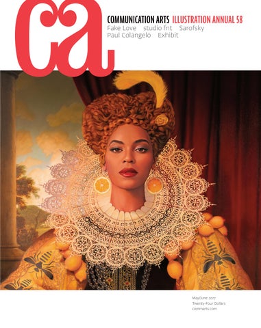
COMMUNICATION ARTS ILLUSTRATION ANNUAL 58
Fake Love studio fnt Sarofsky Paul Colangelo Exhibit
May/June 2017 Twenty-Four Dollars commarts.com
Find the world’s best illustrators directoryofillustration.com
Donna Cross thre e eye s.nz
G ary V e n n g a r yven n illu s t r at i o n. co m
ste p h e n Fu l l e r s te p he nfu l l e r. co . nz
Z aChary pul l en za c harypulle n. com
Donna Cross thre e eye s.nz
G ary V e n n g a r yven n illu s t r at i o n. co m
ste p h e n Fu l l e r s te p he nfu l l e r. co . nz
Z aChary pul l en za c harypulle n. com
steV en n ob l e s teve nnob le .com
am y De Voo G D devo o g d.co m
DaV i D p lu n k e rt d av i d p l u nke r t . co m
J im starr j i mstarr. com
steV en n ob l e s teve nnob le .com
am y De Voo G D devo o g d.co m
DaV i D p lu n k e rt d av i d p l u nke r t . co m
J im starr j i mstarr. com
DaVe Cutler d avecutle rstu dio.co m
J oe y F e lDm a n j o eyfeldm a n . co m
patr i Ck W e l s h p at r i c k we l s h. co m
Ch a rl es lonG c ha r l eslong 3d. com
CA-Serbin-ad-2017.indd 1
DaVe Cutler d avecutle rstu dio.co m
2/27/17 10:18 AM
J oe y F e lDm a n j o eyfeldm a n . co m
patr i Ck W e l s h p at r i c k we l s h. co m
Ch a rl es lonG c ha r l eslong 3d. com
MAY/JUNE 2017 VOLUME 59, NUMBER 2
COMMUNICATION ARTS ��
��
�� FEATURES
ILLUSTRATION ANNUAL
38 Paul Colangelo
79 106 131 157 164 174 178 185 194
by Dzana Tsomondo This Toronto-based photographer’s insightful work brings environmental issues to light.
46 Sarofsky
COVER
Beyonce, Queen Bey, by Tim O’Brien, p. 141.
��
by Monica Kass Rogers Based in Chicago, this production company gets to the heart of its projects with diverse visual techniques.
54 studio fnt
by Yujin Min Minimalism, playfulness and high concepts abound in this Seoul-based studio’s designs.
62 Fake Love
by Carey Dunne A New York–based experiential agency is breaking the mold by creating installations for brands.
70 Exhibit
by Jean A. Coyne The latest and best in visual communication from here and abroad.
Advertising Books Editorial For Sale Institutional Animation Self-Promotion Unpublished Student Work
FRESH Editor/Designer Patrick Coyne Executive Editor Jean A. Coyne Managing Editor Michael Coyne
200
Jasmin Lai This Glendale, California–based artist illustrates worlds you can get lost in.
202
Taek Hyun Kim A designer in Chicago reveals the hidden meaning behind typography.
Associate Editor Esther Oh
204
Myles McGuinness The work of this Oceanside, California–based photographer captures nature’s energy.
14
Design Culture Wendy Richmond encourages artists to understand their importance in society.
24
Business Scott Kirkwood details three agencies that utilize free lancers to create great work.
16
Advertising Ernie Schenck asks educators a hard question: Where is advertising going?
28
Insights Archivist Simran Thadani shares how book design informs human history.
22
Design Issues Sadie Red Wing describes cultural appropriation in design and how it has eroded Native American identities.
32
Emerging Media Sam McMillan discovers how agencies are creating oneofakind campaigns on Instagram.
34
Design/Production Associate Joni Rivas Production Assistant/Customer Service Representative Khader Yanni Archivist Nancy Clark Lewis Software Engineers Jiping Hu Srividhya Gopalakrishnan Technology Administrator Michael Hoyt
Circulation Director Perry Fotos Accounting Lois Vega Contributing Editors Sam McMillan Wendy Richmond Ernie Schenck
DEPARTMENTS
Volume 59, Number 2 commarts.com COMMUNICATION arts (ISSN 00103519) is published six times a year (January/February, March/April, May/June, July/August, September/October, November/ December) by Coyne & Blanchard, Inc., 110 Constitution Drive, Menlo Park, CA 940251107. Periodicals Postage Paid at Menlo Park, CA, and at additional mailing offices.
Print Producer Daniel Sambrano
Advertising Director Dirk Moeller
Environment The responsibility of environmentally sound packaging falls on designers, Anne Telford argues.
Editor’s Column Contributors Web Watch Favorites
Art Director/Designer Jessica Reichard Production Manager/Competition Coordinator Lauren Coyne
COLUMNS
8 10 18 30
Editor At Large Anne Telford
206 208 211 212
Book Reviews Index to Illustration Annual 58 Directory Overheard
Copyright 2017 by Coyne & Blanchard, Inc. All pieces repro duced in this issue are under prior copyright by the creators or by the contractual arrangements with their clients. Nothing shown may be reproduced in any form without obtaining the permission of the creators and any other person or company who may have copyright ownership. SUBScRIBER SERVICES: Subscription: 1 year, $53; in Canada, $70; all other countries, $110. All payments in US dollars, Canadian GST: 127848620.
Direct all inquiries, address changes, subscription orders, etc., to: Web: commarts.com Email: subscription@commarts .com Phone: 8006881971 (US/Canada) Phone: 2157885481 (International) Fax: 2157886887 Mail: COMMUNICATION arts PO Box 2013 Langhorne, PA 19047 Please allow six weeks for changes.
EDITORIAL AND BUSINESS OFFICE: 110 Constitution Drive Menlo Park, CA 940251107 Phone: 6503266040 Fax: 6503261648 Email: ca@commarts.com POSTMASTER: Send changes of address to: Communication Arts PO Box 2013 Langhorne, PA 19047 Canada Post: Publications Mail Agreement #40612608 Canada Returns to be sent to: IMEX Global Solutions, LLC PO Box 25542 London, ON N6C 6B2
Founder Richard Coyne (1926–1990)
Like us on Facebook facebook.com/communicationarts Follow us on Google+ plus.google.com/+commarts Follow us on Instagram instagram.com/communicationarts Follow us on Pinterest pinterest.com/camag Follow us on Twitter twitter.com/commarts
STEVEN NOBLE ON THEISPOT.COM/SNOBLE WOODCUTS ENGRAVING SCRATCHBOARD
© Daredevil Brewing Co.
© Kraken Rum
© Natural American Foods © Mosh
© The Bird Restaurant
© Bear Lion Foods
MEADE SHOW AWARD WINNER
ROSEY AWARDS
CREATIVE MAGAZINE
NATIONAL ADDY AWARD
discover discover world’s the world’s best illustrators best illustrators discover discover thethe world’s the world’s best illustrators best illustrators PORTFOLIOS VIEW PORTFOLIOS PREMIUM PREMIUM STOCK STOCK NEWS NEWS VIEWVIEW PORTFOLIOS VIEW PORTFOLIOS PREMIUM PREMIUM STOCK STOCK NEWS NEWS search search search search
KEN ORVIDAS theispot.com/korvidas ORVIDAS theispot.com/korvidas theispot.com/korvidas KEN KEN ORVIDAS KEN ORVIDAS theispot.com/korvidas JING TSONG theispot.com/stock/jjtsong JING JING TSONG theispot.com/stock/jjtsong JINGJING JING JING TSONG JING TSONG theispot.com/stock/jjtsong theispot.com/stock/jjtsong
PATRICK WELSH PATRICK WELSH theispot.com/pwelsh MICHAEL MICHAEL AUSTIN AUSTIN theispot.com/stock/maustin theispot.com/stock/maustin theispot.com/pwelsh PATRICK PATRICK WELSH WELSH theispot.com/pwelsh MICHAEL MICHAEL AUSTIN AUSTIN theispot.com/stock/maustin theispot.com/stock/maustin theispot.com/pwelsh
discover discover the world’s the world’s best illustrators best illustrators VIEW PORTFOLIOS VIEW PORTFOLIOS PREMIUMPREMIUM STOCK STOCK NEWS
NEWS search
search
JAMES YAMASAKI JAMES YAMASAKItheispot.com/jyamasaki theispot.com/jyamasaki DALE STEPHANOS DALE STEPHANOStheispot.com/stephanos theispot.com/stephanos
JIM SPIECE JIM SPIECE
PETER MCDONNELLtheispot.com/pmcdonnell theispot.com/pmcdonnell theispot.com/stock/jspiece theispot.com/stock/jspiece PETER MCDONNELL
EDITOR’S COLUMN
Patrick Coyne
T
his year’s Illustration competition received a slight bump in entries, mostly due to a significant increase in student participation. And, although the editorial category registered a notable decline in entries, the number of editorial projects selected for inclusion in this year’s Annual exceeded the last several years.
“I was impressed with just how many great pieces had been entered,” says juror Ryan Anderson. “We saw everything from the completely abstract to very tight realism. Agencies, companies and publications are once again coming to appreciate the nuances of emotion that only illustration can provide.” “There were tons of entries to choose from—especially from new talent,” says juror Carolyn Perot. “It was fantastic to see brilliant work from both the old guard and new and unknown illustrators. I was surprised and excited to see some established illustrators totally reinvent themselves.” “The biggest surprise was the large amount of illustrators I’d never seen before,” juror Chris Buzelli says. “It was a refreshing surprise, especially after my experience judging other illustration competitions.” “Maybe what’s old is new, but there were a lot of classically rendered pieces,” juror Lesley Palmer says. “I didn’t see as many vectors or bold poppy colors as I thought I would, given current trends.” “I’m heartened to see that illustration is coming back to hand-drawn and painted styles and moving away from hard-edged computer or photorealistic styles,” says Perot. “But contentwise, illustration is more heavy hitting, brash and irreverent than ever.” “The ability of illustrators to communicate quickly, clearly and shockingly in one strong—often politically motivated—image was evident and on display in the entries,” juror Kristen Nobles says. 8
Illustration Annual 2017
Speaking of politics: “Another surprise was the large amount of Trump illustrations,” Buzelli says. “Illustrators are having an important visual impact on our current political environment, and I can only imagine that number increasing for next year’s competition.” Though jurors had much to like among the submissions, they found several areas lacking. “Coming from the world of children’s book art and young adult fiction covers, I was disappointed that not many entries were from my flourishing, diverse field,” Nobles says. “My biggest disappointment was the lack of quality animation in the competition,” says Anderson. “Maybe animators and illustrators don’t really think of animation when it comes to the Illustration Annual.” Several judges also provided advice for those illustrators whose entries were not accepted. “There was a very fine line between some of the pieces that made it into the Annual and some that did not,” says Anderson.
RYAN ANDERSON is a partner and creative director at Fluid Advertising in Bountiful, Utah. He has received awards from most of the advertising industry’s top shows, and collaborating with talented illustrators has been one of the highlights of his career. His lifelong love of art escalated when he had the opportunity to live in Italy and experience the birthplace of the Renaissance firsthand. He also loves the outdoors and has a bucket list that includes visiting as many national parks as possible. His job has rubbed off on his wife and four children, who have become very astute at recognizing good kerning.
CHRIS BUZELLI was born south of Chicago and grew up oil painting in his grandfather’s television repair shop. After graduating from Rhode Island School of Design (RISD), Buzelli moved to New York City and began his journey as an illustrator. His work has appeared in many publications, on book covers, and in projects for design firms and ad agencies, and his oil paintings can be viewed in various galleries throughout the United States. He has been awarded Gold and Silver medals from the Society of Illustrators and Spectrum. Buzelli paints in his East Village studio, teaches at RISD and the School of Visual Arts, and lives with his wife, SooJin.
Photographs by Steve Castillo
“Generally, the pieces that made it had something that pushed the work to another level. It wasn’t enough to be proficient—the work needed to tell a compelling story.”
“Lots of publishers want animated GIFs and video content,” Perot says. “I hope illustrators can find ways to make these clever and simple—not merely distracting. If animation adds to the story or tells one of its own and entertains
“There were certain styles that dominated the new illustrators’ work that didn’t make it to the final round,” Perot says. “Art directors still favor punchy, conceptual work over complex work that doesn’t have a clear, simple message.”
at the same time, I’m all for it.”
“While many images were strong in their statements, they also seemed a bit one note and lacked a broad spectrum of emotions,” Nobles says.
“Technology has opened up new career possibilities for illustrators,”
“It’s important for artists to remember to steer clear of visual clichés—bird cages to represent entrapment is one example,” says Palmer.
this industry.”
When the judges were asked to suggest other profit centers that illustrators could pursue, one direction dominated their responses.
grateful appreciation to our jurors for their conscientious efforts
KRISTEN NOBLES is founding publisher of the children’s division of Page Street Publishing, located near Boston. She spent thirteen years prior as an art director at Candlewick Press and was a senior designer at Chronicle Books in San Francisco. Nobles graduated from the State University of New York at Buffalo with degrees in communication design and art history and has completed further studies at Harvard University, the Massachusetts College of Art and Design, and the School of Visual Arts. Nobles’s passion for children’s books was passed down from her mother, an elementary teacher, and her grandmother, a librarian.
Palmer agrees. “More and more companies are looking for short video opportunities, particularly for social media.” Buzelli says. “It is up to us to keep pushing for healthier budgets and educating for fair contracts so that more can enjoy working in A minimum of three out of five votes was required for a project to be awarded in this year’s competition. I would like to extend our in selecting our 58th Illustration Annual. ca
LESLEY Q. PALMER, the art director at AARP Media in Washington, DC, works on creative for AARP The Magazine, the AARP Bulletin and digital editions of both. After starting her magazine design career in New York at Hearst, love took her to the DC area, where she has spent the past nine years as art director for AARP’s publications, designing editorial layouts, logos and book jackets. Industry recognition of her team’s work includes nods from Communications Arts, Folio and min. When Palmer’s not pushing pixels, she’s chasing around two little humans at her home in Virginia.
CAROLYN PEROT has been the art director at Mother Jones since 2008. She has been designing pages and assigning illustrations since 1992, having worked at magazines covering technology, business, lifestyle, dogs and politics. She holds undergraduate degrees from California College of the Arts and Stanford University. Her work has been recognized by the Society of Publication Designers (SPD), and illustrations she has commissioned have appeared in American Illustration, Communication Arts and SPD. In 2017, Mother Jones won the Magazine of the Year award from the American Society of Magazine Editors.
Communication Arts | commarts.com
9
CONTRIBUTORS Features
Columns
Carey Dunne (careymdunne@gmail.com) is a Brooklyn-based writer covering arts and culture. Her work has appeared in magazines and online publications, including Brooklyn Magazine, Fast Company, Hyperallergic and Time Out. In this issue, Dunne highlights how New York–based ad agency Fake Love creates one-of-a-kind experiences for brands.
Scott Kirkwood (scottkirkwood.work) is a frequent contributor to AIGA and Adobe Create and HOW magazines. A freelance copywriter and creative director focused on nonprofits and “do-gooder” brands, he lives in Denver, Colorado. In this issue’s Business column, Kirkwood details several design firms that rely on freelance contributors working all across the globe.
Yujin Min (yujin@yujinmin.com) writes about art and culture. Formerly based in London, she now resides in Seoul, South Korea, where she works as an independent curator, journalist and correspondent for numerous international journals. Min’s byline is published regularly in ArtAsiaPacific and LEAP magazines. She credits her degrees in fine arts and art history for her insight into creative visual culture, including contemporary art and design. In this issue, Min delves into the distinctively minimal language of studio fnt, a design firm in Seoul.
Sam McMillan (wordstrong.com) is a San Francisco Bay Area–based writer, brand strategist, and regular contributor to Communication Arts’ Web Watch and Book Review departments. In this issue’s Emerging Media column, McMillan explores how ad agencies are subverting Instagram to create unique campaigns.
Monica Kass Rogers writes and photographs from her home base in Evanston, Illinois. She’s a letterpress printer who creates ephemera at Little Blue Press. She also cohosts the Pig & Weasel, an arts incubator and house concert series. In this issue, Rogers discovers the creative process behind Chicago-based production company Sarofsky’s work.
Sadie Red Wing (sadieredwing.com) is a Lakota graphic designer and advocate from the Spirit Lake Nation of Fort Totten, North Dakota. She holds an MFA in graphic design from North Carolina State University and works as the Creating a Passion for Learning Coordinator for Native Student Programs at the University of Redlands in Redlands, California. In this issue’s Design Issues column, Red Wing discusses what cultural appropriation in graphic design means to Native American identities.
Dzana Tsomondo (dzanatsomondo@gmail .com) is a freelance writer living and working in New York City. He is passionate about music, art and politics, and his work has appeared in a variety of publications, from Photo District News to Cool’eh Magazine. In this issue, Tsomondo travels to Toronto to showcase how Paul Colangelo brings environmental issues to light in his photography.
Wendy Richmond (wendyrichmond.com) is a visual artist, a writer and an educator whose work explores public privacy, personal technology and creativity. Richmond has taught at Harvard University, the International Center of Photography and the Rhode Island School of Design, and she serves on BRIC’s Artists Advisory Council and the MacDowell Fellows Executive Committee. Her latest book is Art Without
Compromise* (Allworth Press). In this issue’s Design Culture column, Richmond rouses artists with a call to action against uncertainty and failure. Ernie Schenck (ernieschenckcreative .prosite.com) is a freelance writer, creative director and regular contributor to Communication Arts’ Advertising column. Schenck is an Emmy finalist, a three-time Kelly nominee, and a perennial award winner at Cannes, the CLIOs, D&AD, the FWAs and the One Show. As a freelancer, an executive creative director at Hill Holliday/Boston and a cofounder of Pagano Schenck & Kay, he has worked on campaigns for some of the most prestigious brands in the world. In this issue’s Advertising column, Schenck asks leading advertising educators about the importance of advertising in the future.
Book Reviews Ruth Hagopian (ruth.hagopian@gmail.com) is a freelance writer and editor whose profiles of designers, photographers and artists have appeared in Create, Digital Graphics and Print magazines. She was also a publisher of Online Design magazine and a partner in Visual Strategies, a San Francisco–based design firm.
Correction
On page 46 of the 2017 March/April Interactive Annual, we incorrectly attributed North’s winning of Columbia Sportswear Company’s account from Borders Perrin Norrander. It should have been BSSP. Our apologies for the error.
Pictured contributors wrote features and columns: Carey Dunne, Yujin Min, Monica Kass Rogers, Dzana Tsomondo, Scott Kirkwood, Sam McMillan, Sadie Red Wing, Wendy Richmond, Ernie Schenck. 10
Illustration Annual 2017
ITINA IG HH ER B TBH AAR ER— BAR— R A I SRR IA NAIG ISSR N HG ES TIB TN AG E— — H EDE U ITIN IYSN A N DAATNN HDD EATITN NHD SH ND TEDRUU S’TSD TRRUYYS’ ’STSR Y ’ S ETTCSIIO T— NNTSSI— O E X P EEECXXTPPAEEETCCX ITO TPAA N OA —N S — SSK TOTOFO SKK TOO PTPH C O H RTRA RYA F SOTOFOF C PCH C OHK GOTRPTO A OG PO GH YO APG PHH Y PHY ++ECCM IINA +ETECM IG A NATR ETO M AH RTRA RYA + CIN N O M A OG PG YO A.PG PHH Y. .P H Y .
STO ST CO KS CY K .SCYO. C MO M
DESIGN CULTURE
Wendy Richmond
What Artists Know
I
’m having a tough time in my studio. Since January 20, my inner critic has become more vocal than usual: “Your art is too personal, self-indulgent and, worse yet, irrelevant!” I am preoccupied with questions: Do I leave my current work behind to instead make art that is explicitly political? Or do I close the door (and my ears) and remain true to the art I have been making for decades? Which artist am I now?
Trump?” author Margaret Atwood wrote: “Fifty years from now, what will be said about the art and writing of this era? The Great Depression was immortalized by John Steinbeck’s Grapes of Wrath … Arthur Miller’s play The Crucible provided an apt metaphor for McCarthyism. … What sorts of novels, poems, films, television series, video games, paintings, music or graphic novels will adequately reflect America’s next decade?”
When I join friends to march and sign petitions and make phone calls in protest, I put these questions on hold and focus on what we’re doing. During a recent morning of group letter writing, we commiserated that many of our actions will be met with defeat. But we vowed to keep at it.
Artists are not simply creators; we are also ambassadors of art, and we can convey its power to others.
Later, in my studio, as I got back to work on a series I’ve been struggling with, it occurred to me that staying committed in the face of repeated failure is nothing new to artists. Our standards are high because we set them ourselves. (Tell me, who is more demanding than you are of yourself?) Our efforts often fall short, but we keep working to achieve the small percentage that exceeds our expectations. Ironically, our ability to tolerate failure makes us the perfect people to endure the long slog ahead of upholding our country’s values. It’s just one of the seemingly contradictory attributes that makes us uniquely qualified to keep fighting.
We are good at waiting Along with being adept at failure, we are patient. We know that it can take months or years to receive a response to our work. We handle rejection, insults and judgments. We persevere.
We trust reflection over reaction My first impulse after the inauguration was to alter my art and make it more political. I tried to commandeer work that I had started with a different intention and ended up flattening it into a superficial— and false—gesture. I threw it in the dumpster. But a few weeks have passed, and I realize that my work unavoidably will undergo change. My current project began two years ago, in response to a single person’s circumstance. It is about the body’s frailties and the desire to protect and be protected. I now see the series in a larger context, with layers of complexity to be mined. Every day, I learn that the personal is indeed political.
We are inspired by the past and create work for the future In her January 18, 2017, article in The Nation titled “What Art Under 14
Illustration Annual 2017
We seek the meaning from the audience We know that the most profound impact our art can deliver comes from our audience. Art that enables viewers and readers and listeners to bring their own authorship goes deeper and lasts longer. It also provides a more effective call to action than didactic sermonizing. On January 20, a group of activists known as Occupy Museums presented Artists Speak Out at the Whitney Museum of American Art in Manhattan. Approximately 32 artists, art groups and institutions gave short presentations, which were videotaped and posted on YouTube by videographer Owen Crowley. The speakers were eloquent and passionate. But for me, the most powerful presentation was not a speech, but an artwork: a musical composition by Tracie Morris and Vijay Iyer. Morris briefly introduced the piece as being “from a lovely musical … it’s about feeling better when you’re afraid, when fascists are at the door.” Iyer’s piano rumbled behind Morris’s mesmerizing repetition of single words and short phrases: “Raindrops. Raindrops and whiskers. Girls in white, boys in white. Tied up with string… When the dogs bite. I simply remember. I simply remember.” Behind the piano, a huge window framed the Hudson River. This is a view that I treasure. It is one of my favorite things. As I listened, I recalled a quote by the artist Ai Weiwei, speaking of contemporary Beijing: “There are no places that you relate to, that you love to go … Everything is constantly changing, according to somebody else’s will, somebody else’s power.” An artist’s practice is rooted in all of these attributes. They are our attributes, and they are needed now. We will read and hear, many times over, the pronouncement “Art is more important than ever.” But consider an even more powerful truth: artists are more important than ever. ca ©2017 W. Richmond
ADVERTISING
Ernie Schenck
The Worry Question
E
very year, literary agent John Brockman puts together one of the most thought-provoking books you will ever encounter. It’s called Edge. Simply put, Brockman goes to some of the most brilliant thought leaders in society—physicists, poets, songwriters, anthropologists, teachers, the list goes on and on— and asks them a single question. In 2006, it was, “What Is Your Dangerous Idea?” In 2009, it was “What Will Change Everything?” It got me thinking. What about advertising?
Boches is right. The days when advertising had the power to shape popular opinion, to really move the needle culturally, have given way to the quick fix, the quick buck, the quick turnaround. And as he points out, it’s this obsession with speed that threatens to shrink this business into a pale semblance of its former self. The dwarf star of business. For Helayne Spivak, executive director of VCU BrandCenter in Richmond, Virginia, it’s not so much the future of advertising that worries her as it is the talent drain we’re facing. “Agencies are no longer the first place that writers, art directors, strategists or experience designers look to start their careers,” says Spivak. “They look to companies like Airbnb and Facebook and Google. Our graduates look for brands that share their desire to make the world a better place. Money means less to them than purpose.”
The days when advertising had the power to shape popular opinion, to really move the needle culturally, have given way to the quick fix, the quick buck, the quick turnaround. Seriously, for those of us caught up in it, is there anything that begs more questions than this heaving, lunging, here-today-gonetomorrow business? And since Brockman isn’t likely to pose any of our advertising questions any time soon, well, I’ve decided to do it myself. But as I like to say, where do you begin? There are so many challenges facing us. And it makes no matter if you’re a junior art director, a chief creative officer or a holding company. There are land mines everywhere. Zig left, and you’re golden. Zag right, and you could shoot yourself in the foot with a hellfire missile. But the one question we all ask ourselves is: Where is it all going? That said, I asked some of the country’s leading advertising school luminaries to answer this question: “What worries you about the future of advertising?” After all, who’s in a better position to shape the future of advertising than the young creatives who stand to gain and lose the most over the long haul? Formerly chief creative officer at Mullen, Edward Boches is currently professor of advertising at Boston University. “The short-term thinking that permeates the current business mindset—[of] both clients and the holding companies that control most agencies— drives the industry to focus more on money, data and short-term results than on real brand ideas, [as well as on] products that don’t simply sell products, but also solve customers’ and society’s real problems.”
16
Illustration Annual 2017
Purpose is going to need to play a much bigger role if we’re going to keep our best and brightest young minds from jumping ship. Just ask Deb Morrison, Carolyn Silva Chambers distinguished professor of advertising at the University of Oregon. “I worry that our students could lose the humanity that makes work great because of the toxic stupidity around them,” Morrison says. “They look at concept and craft, and they want it to mean something.” Finally, this just in from Luke Sullivan, professor of advertising at the Savannah College of Art and Design and insanely successful author of Hey Whipple, Squeeze This: The Classic Guide to Creating Great Ads: “I don’t see enough college students who are able to write. The ability to write is the ability to think clearly. If you can’t write clearly, you can’t think clearly. It means creating an argument—an idea, a proposal, a logic—and then being able to take the reader from A to B and land on C.” Myself, it’s going to come down to resilience. Like Edward says, “The best of the kids I teach are fearless. They want to make something meaningful happen. They want to apply their creativity to making things better. If advertising lets them do that, all will be good.” Yep. ca
Communication Arts Daily OUR DAILY E-MAIL NEWSLETTER
WHAT YOU NEED TO
STAY INSPIRED Communication Arts Daily
Designed to keep you up-to-date on the hottest design, advertising and web projects, our newsletter also links to the most thought-provoking articles we’ve found on the web. Delivered to your inbox every business day, this quick read is just what you need to stay informed and inspired.
SIGN UP IS EASY AND FREE commarts.com/newsletter
Intangible Matter Part of a multidisciplinary series from Chanel and i-D magazine called The Fifth Sense, “Intangible Matter” (lucyhardcastlethefifthsense .i-d.co/en_gb) is a digital art piece that showcases scent and the way it inspires female creativity. With art from London-based artist Lucy Hardcastle, digital firm Stink Studios created an interactive exploration based on tactility. The spaces throughout the site—named Mist, Soft, Beam and Molten— present different interactive objects for visitors to play with; for example, Beam challenges visitors to fire pearls at the walls of an icosahedral prison. Each space provides an individual feeling that
18
relates to the creation process behind perfume. Hardcastle provided Cinema 4D assets to Stink Studios, which then transferred them into WebGL. MatCap textures on 3-D objects helped to create the illusion of lighting. Stink Studios created the site using React and Redux; the visual content was brought to life using Three.js for 3-D graphics; and Stink Studios’ Sono provided the platform for the soundtrack, composed by Fatima Al Qadiri and Chris Lee (Li Yuchun). —Michael Coyne Lucy Hardcastle, artist; Stink Studios, project design and development; Chanel/i-D, clients.
House of Illustration
Fantastic Women
The only public gallery in the United Kingdom devoted solely to illustration? That would be the House of Illustration. But if you can’t make it to the King’s Cross location, check out its website at houseofillustration.org.uk. Recent offerings include a look back at everything from Jo Brocklehurst’s punks and the new romantics of London in the 1980s to children’s book illustration workshops and downloadable education packets for instructors.
If you thought science fiction illustration was the province of arrested adolescents working out their fixation on boobs and bondage, think again. Women are reinventing the genre, and with sci-fi heroines like Arwen, Ripley and Targaryen, it’s about time. Fantastical Women is an online gallery dedicated to showcasing the work of a new generation of female illustrators. Women working in the field of fantasy and sci-fi are invited to send their work to fantasticalwomen.com. —Sam McMillan
Illustration Annual 2017
Facts on the Ground One of the first examples of data visualization was the map. The first ones were precious, closely guarded secrets. Today, thanks to Google and MapQuest, printed maps are going the way of the dodo. To preserve the art form of cartography, curator Dennys Hess has collected extraordinary examples at the Beautiful Maps Tumblr site (mapsdesign.tumblr.com). From maps of the heavens to maps representing early exploration of the new world to a tourist’s guide to Yosemite National Park, you’d be lost without them.
EVERY ISSUE OF COMMUNICATION ARTS NOW AVAILABLE FOR DIGITAL DOWNLOAD!
GET ALL THE INSPIRATION YOU NEED: STORE.COMMARTS.COM/SINGLE-COPY The most comprehensive history of visual communication. More than 400 issues—from 1959 to today—are now available to inspire you.
Paprika Stuart Hamilton House Industries Unconventional Advertising Kinetic Singapore Melinda Beck Exhibit
March/April 2007 Eight Dollars www.commarts.com
MICHAEL OSBORNE McGARRAH JESSEE TRONIC STUDIO JAMES DAY CHRISTIAN NORTHEAST EXHIBIT TYPOGRAPHY ANNUAL 1
HERMAN MILLER MILTON GLASER TV GRAPHICS INTERNATIONAL COVERAGE MONSTER TYPE TIM MANTOANI EXHIBIT 50TH ANNIVERSARY ISSUE A N N I V E R S A R Y
JANUARY/FEBRUARY 2011
MARCH/APRIL 2009
creative excellence
TYPOGRAPHY ANNUAL 1 MICHAEL OSBORNE McGARRAH JESSEE TRONIC STUDIO JAMES DAY CHRISTIAN NORTHEAST EXHIBIT
50TH ANNIVERSARY ISSUE HERMAN MILLER MILTON GLASER TV GRAPHICS INTERNATIONAL COVERAGE MONSTER TYPE TIM MANTOANI EXHIBIT
years of
COMMUNICATION ARTS
COMMUNICATION ARTS
March/April 2009 Twenty-Four Dollars www.commarts.com
March/April 2012 www.commarts.com
COMMUNICATION ARTS PHOTOGRAPHY ANNUAL 53
Nicoletta Ceccoli National Film Board of Canada Droga 5 Chen Design Associates Exhibit
378
367
5 0 TH
January/February 2011 Twenty-Four Dollars www.commarts.com
DESIGN ISSUES
Sadie Red Wing
Decolonizing Native American Design
“De-Enrollment,” from Dakota Mace’s series Woven Juxtaposition, addresses the appropriation of Native American cultures in a T-shirt design for Urban Outfitters. The original T-shirt design (left) features a California Republic bear erroneously wearing a headdress and uses designs from the Navajos of New Mexico, as seen on a Navajo rug (center). A similar California bear (right) has been corrected with designs from a West Coast tribe.
L
et me share with you how awkward it would be for me as a Native American—Lakota and Dakota, to be exact—to design a brochure for a Korean yoga palace or a kosher hot dog joint. I am not Korean or Jewish. I do not know the Korean or Hebrew language. I do not know the traditional visual language of either culture. So why would someone even think of me as an appropriate designer for either project? I am very fortunate to be culturally unique. But I have no business taking on projects centered around a culture I have no understand ing of. And I’d assume others would think the same thing when attempting to use Native American symbolism in decorative material—but I’d be wrong. So… when is it okay to use Native American symbology in graphic design? When it is used in Native American graphic design. And what is Native American graphic design? Graphic design created by Native Americans who use tribal visual languages to represent whatever it is they are designing. Look at Urban Outfitters, for example. Urban Outfitters is already in hot water with Native American tribes who disagree with the use of Pendleton designs on the company’s undies and liquor flasks. Dakota Mace’s admirable work in her Woven Juxtaposition showcase at the University of Wisconsin–Madison in 2016 shows us why. The Navajo photographer roots the original tribal designs used in Urban Outfitters’ products to show evidence of appro
22
Illustration Annual 2017
priation. My favorite piece of the series, “DeEnrollment,” insists that sections of the Pendleton pattern used in the bear on Urban Outfitters’ California Republic Tshirt were appropriated from the New Mexican Navajo rug. However, based on the California focus of the shirt, I would assume it’s meant to represent the Native Americans of the Golden State. But first, you cannot represent the tribes of California with New Mexican anything, and second, tribes along the West Coast traditionally do not wear headdresses. But I am not here to poke fun at Urban Outfitters—I am only curious about the people who developed the idea of appropriating tribal design for consumer profit. Did they think it was OK to use Native American symbolism in any way without the consent of tribal authority? If I had the task of designing the Tshirt, I would do my research. I am from South Dakota; I am foreign to the tribal cultures of California. My first assignment, studying the traditional artifacts made by California tribes, defines the accurate vocabulary used to visually represent the culture. By swapping out the stereotypical icons with the traditional symbols, the bear’s graphics provide a more truthful representation of the California tribal culture. When you accurately communicate the visual language of Native American tribes, you are doing two things: giving identity and pride to a tribe and educating nontribal audiences on that identity. To those guilty of cultural appropriation, I would say, “Research.
PAN-INDIAN TIMELINE 1879–PRESENT 7TH GENERATION
FIGHT FOR SOVEREIGNTY 2000–PRESENT
AMERICAN INDIAN MOVEMENT
AMERICAN INDIAN BOARDING SCHOOL ERA
1968–PRESENT
1879–1973
1870 1880
1940
1950
1970
2000
PRESENT
PAN-INDIAN MOVEMENT 1940–PRESENT
AMERICAN WESTERN “HOLLYWOOD” ERA 1950–PRESENT
Beginning with the establishment of Native American boarding schools, this timeline presents a small part of Native American tribes’ cultural erasure and replacement with a pan–Native American identity. Several movements emerge in the timeline as well—Pan-Indianism, the American Indian Movement and the 7th Generation—to fight against the United States’ overt and covert oppression of Native Americans.
Show greater respect for Native American cultures. You would not feel comfortable using Korean or Hebrew if you did not know these languages. If you do not know what you are communicating by using Native American symbols, don’t use them.” It seems like a no-brainer, but there are still situations where tribal visual languages are exploited by thoughtless designs. And sometimes by Native American designs. Why is cultural appropriation such a sensitive issue? Tribes have a shitty history with the United States—a history people do not like to talk about. Because the topic has been so suppressed, non-Native people have remained numb to the sensitivity of cultural appropriation. They do not like to be reminded of this dark history, so they forget. But forgetting means they do not understand the harm of their oppressive actions. For Native Americans, the sensitivity to appropriation and stereotypes—or the lack thereof—is an education issue. For more than 100 years, our identities, who we are as tribal people, were erased through the assimilation tactic of boarding school. As media advanced in the 1950s, the main visuals that Natives saw relating to their culture were Hollywood’s stereotypical portrayals in Westerns, and reliance on those misrepresentations has led tribes to identify with the “Hollywood Indian” into the new millennium. Relieving ourselves of 100 years of historical trauma cannot happen overnight, but it can happen. This era of the Seventh Generation is
focusing on rebuilding traditions and practicing sovereignty. Aware of our historical dependency on stereotypes, I often ask tribal designers if they can make something look “Native American” —without stereotypes. They say they can, but it depends on their efforts to educate themselves on their own tribe’s visual language. But because Native American design is always considered craft, the push for education in Native American design is not enforced. Tribal designers are colonized to think of themselves as artists, and indigenous people never get recognized as inventors, communicators or problem solvers in the graphic design world. Our voice in the design culture is silent. I thank the Creator for design anthropologist Dori Tunstall, who serves as dean of the faculty of design at OCAD University (formerly, the Ontario College of Art & Design). Both decolonizing design and respecting other cultures in design are starting to gain recognition among design outlets. And Tunstall sees the urgency in specifically decolonizing Eurocentric design curricula and giving Native American students a greater education in design practice and theory. This is the time for conversation about decolonization and respect in graphic design. We tribal designers are just now learning how to address issues that are culturally sensitive for us, like cultural appropriation, as it is still fresh to our nature to do so. Our main focus is making sure our indigenous audiences are represented accurately, appropriately and respectfully as we sustain an identity in the world. ca Communication Arts | commarts.com
23
BUSINESS
Scott Kirkwood
The end of payroll as we know it?
More design firms are relying entirely on freelance contributors to meet their clients’ needs.
T
wenty years ago, Daniel Pink coined the term free agent nation in a Fast Company article that insisted freelancers, independent contractors and temps were poised to recon figure the American economy. In the words of one San Francisco Bay Area interviewee, freelance work enabled people to “assume their own shape rather than fit the shape of some corporate box.” As usual, Pink was ahead of the curve—maybe a little too far ahead. For the next two decades, the great majority of working Americans continued clocking in from nine to five, clinging to the comfort of the same cubicle and the same boss—along with a steady salary and health insurance. Free agents were plentiful, but they certainly weren’t reshaping the workplace in any significant way. The world has officially caught up. Head to any bigcity coffee shop on a Tuesday afternoon, and the evidence is typing on dozens of MacBooks. Millennials are far less committed to corporate structure than gen Xers and baby boomers; you can see it in every Twitter bio that rattles off former employers like badges of honor. At the same time, video conferencing and dozens of sharing tools, like Dropbox, Google Docs, instant messaging and Slack, have erased the distance between coworkers who sit 2,000 miles apart. It’s fair to say that in 2017, individuals’ decisions to shape their own careers are actually changing the landscape of creative agencies. Although design firms have always relied on a stable of freelancers, more and more companies find themselves without a single creative on their payrolls. Common touts itself as an organization that “accelerates the launch and growth of businesses that take care of the planet and all the creatures on it” with the tagline “Do shit that matters.”
24
Illustration Annual 2017
Cofounded by Alex Bogusky, Ana Bogusky, John Bielenberg and Rob Schuham, the agency leverages the members of its creative community to help nonprofits and corporate dogooders fight the scourge of sugary beverages, lower the highschool dropout rate and brand healthyfood startups like Snap Kitchen. Common is also an accelerator of sorts: members pay $99 for a oneyear engagement that includes mentoring, business guidance, introductions and access to other change makers. “Our DNA comes from the agency world, and it’s what our team members are most familiar with,” says Mark Eckhardt, chief executive officer at Common. “So within the context of community, we’ve adopted that way of working.” Such an affinity for collaboration may stem from Eckhardt’s back ground as a professional musician who played drums behind Ben Harper and Whitney Houston, among others. One of Common’s handful of fulltimers, Eckhardt operates out of a home office in Los Angeles, from which he assembles teams of creatives working remotely. Occasionally, he’ll organize an MBA—“maniacal business attack”—a creative blitz that brings clients and creatives into a room with the goal of crafting a campaign or an identity in 72 hours. “Our global network is a combination of thousands of individuals and agencies, so if big clients like General Electric were to knock on our door and say, ‘We’d like to work with you,’ we could provide them with the firepower of a big agency. I’m proud of the fact that I can tell everyone who lands on our doorstep that we can take care of them—and I can say it with a straight face because of the depth of capabilities to which we have access.”
FIND YOUR PERF ECT JOB AT
CREATIVE HOTLIST CREATIVE HOTLIST, THE CAREER SITE FROM COMMUNICATION ARTS MAGAZINE, HAS MORE JOB LISTINGS IN GRAPHIC DESIGN, ADVERTISING AND NEW MEDIA THAN ANY OTHER CREATIVE SERVICES SITE.
Sign up for a FREE account and with a single click, send your Cover Letter, Resume and Links to Work Samples every time you apply to a Creative Hotlist job.
CHIEF MARKETING
DIRECTOR OF
OFFICER
USER EXPERIENCE
SENIOR UX
ARCHIT ECT
VISUAL DESIGNER
PACKAGE DESIGNER
CREATIVE
DESIGN
DIRECTOR
PHOTO STYLIST
STRATEGIC STORYTELLER
JAVASCRIPT
DEVELOPER
The Communication Arts Career Site
MOBILE DESIGN
DIRECTOR
BRAND
STRATEGIST
COPYWRITER VISIT WWW.CREATIVEHOTLIST.COM TODAY AND FIND YOUR PERFECT JOB.
BUSINESS
“Common assembled a kickass team comprised of members from its community—including people from the agencies Fearless Unlimited, Humanaut and Intermark—to create this digital, OOH and in-store campaign (left) for Snap Kitchen, a US healthy eating concept.” Common, ad agency; Snap Kitchen, client. “The 2016 Halloween campaign for Bacardí (center and right) reinterpreted its iconic bat and included animation and wild OOH posters to support the Bacardí and Kenzo digital experience.” Juan Carlos Pagan/Shane Griffin, designers; Sunday Afternoon, design firm; BBDO NY, ad agency; Bacardí, client.
The new model means no more recruiting marathons or layoffs when clients come and go. No more chasing work to feed every mouth on the payroll. And no more need to take on clients who don’t match the agency’s values. One more bonus: being able to call on 4,500 freelance creatives rather than 45 full-timers, which enables the agency to tailor every team to the client’s specific needs. “Creative professionals constantly land on our doorstep and ask how they can get involved with Common,” says Eckhardt. “The majority of those folks either want out of big agencies, are tired of getting beaten up by clients who only care about financial returns on investment or are just seeking more meaning from their work. I think this reflects reports suggesting that nearly half of the workers in the United States will be freelance or independent by 2020 or soon thereafter. Any agency that’s not designing for that future is going to be irrelevant quickly.”
When artists make an agency Juan Carlos Pagan spent most of his career working for traditional agencies, like DDB, Deutsch and 72andSunny, before launching Sunday Afternoon in New York last year. A unique model that’s part design studio and part artist-management agency, Sunday Afternoon leverages its own talent to help clients that include Anheuser-Busch, Asics, Bacardi and Nike. The agency represents each artist individually while helping assemble teams for projects with a lot of moving parts, calling in additional freelancers when necessary. “Sunday Afternoon is structured differently because we’re more interested in working on projects than becoming the agency of record for a particular company,” says Pagan. “There’s still a need 26
Illustration Annual 2017
for that day-to-day contact between a company and an agency, to move the brand forward, but we want to take a more of a SWAT approach. It’s all about being malleable and nimble.” When artists sign on to Sunday Afternoon, they’re committing to those collaborative projects as part of the deal. “Making stuff together is part of the fun,” says Pagan. This new hub-and-spoke approach isn’t just good for agencies. It also gives creatives the space they need to pursue their own passions by taking time off, working whenever they want and making even more connections within the creative community. “Progressive agencies are starting to realize that creative people on their staff—whether designers or art directors or writers—are all artists doing their own thing,” says Pagan. “We need to embrace the fact that they have ambitions of their own. Are you letting your most talented people be autonomous artists? Or are you owning their time, insisting that they bill every hour to a specific client? If that’s the model you embrace, you’re not going to hold onto the best talent for long.”
No computers, no desks, no problem When Steve Rio launched Briteweb seven years ago, the socialchange agency had a small staff in Vancouver, British Columbia. But as the agency started working with the United Nations and the Rockefeller Foundation, Rio started spending more time in New York, which naturally led to more connections with East Coast freelancers. As Briteweb’s client base expanded throughout the continent, the advantages of having every employee under one roof quickly evaporated.
“I remember reading that Silicon Valley visionary Bill Joy once said, ‘The smartest people in the world don’t work for you,’” says Rio. “For Briteweb, the decision to hire more remote contract workers came from a realization that some of the most creative people simply don’t want full-time jobs.” Rio has tapped into a network of young, ambitious workers who have leveraged their experiences traveling, volunteering, starting their own nonprofits and interning at corporate giants to gain more relevant skills than previous generations had at the same age. No doubt, there’s an art to assembling a team of contract creatives. It takes careful planning, thoughtful onboarding and a specific niche. “If you don’t have a really clear vision and a set of values that make people feel ‘This is really a tribe I want to belong to,’ then you’re just another Upwork, a collection of people trying to make a few bucks,” says Rio. “Before we put our structure in place, we needed to understand our own best practices, map out our processes and identify good systems—both human and technological. If you don’t have that infrastructure in place, you end up creating watered-down work.” Briteweb brings on new contractors methodically—after a series of interviews—and then takes each one through an online training process that explains the company’s values and principles with case studies, turning each new freelancer into someone who can faithfully represent the company on every conference call and e-mail. Instead of investing in computers, desks and office space, Briteweb invests in meet-ups, dinners and annual team retreats to forge the social bonds that keep people connected. One of Rio’s freelancers is a former full-time employee who moved to Bali to surf and explore the islands with his new wife. When he put in his notice, Rio asked him if he’d consider moving over to the contractor side of the equation. Now there are weeks when he bills more hours than he had as a full-time employee, earning an income that goes a long way on the island. Another contributor is a teenager who immigrated from India to Vancouver, graduated from high school two years early and enrolled in Emily Carr University of Art + Design after winning a series of 99designs competitions; when he’s not in school, he’s interning at Microsoft, launching a nonprofit or working five to ten hours a week for Briteweb. “Even for our full-time employees, we’ve always had a very open remote-work policy,” says Rio. “It’s four sentences long, and it ends with ‘Enjoy Bora Bora.’” That same logic applies to freelancers, who have spent months traveling in Europe, Asia and South America. Briteweb asks only that employees and contractors have access to speedy Internet and make themselves available for a few hours during the North American workday. “There will always be a role for big agencies,” says Common’s Eckhardt. “But technology is enabling people to launch businesses incredibly fast—and it’s only getting faster. With the exception of tech unicorns, these companies are small and have limited resources, so organizations like ours can play to that crowd and do a lot of business—they may be $50,000 or $100,000 projects, not $80 million projects, but for us, that’s just fine.” ca
“HeForShe is a solidarity movement for gender equality, supported by UN Women. Briteweb worked with UN Women to develop the digital strategy for the campaign, which began with storytelling. New York–based design firm DIA designed HeForShe’s branding.” BriteWeb, project design and development; UN Women, client Communication Arts | commarts.com
27
INSIGHTS Simran Thadani Feeling the Edges of History
In the waters of design, sprayed by swelling, ebbing trends, Simran Thadani anchors herself to pluck treasures from the depths. Whether a Flemish manuscript book of hours or an English type specimen from the 1700s, she surveys every nuance of binding, font and writing as a self-described book historian to create a topography of not only the artifact, but also of the murky seabed. Thadani’s career (working at institutions like the Boston Public Library) and education (penning a dissertation on the history of handwriting instruction in Renaissance England) were foreshadowed early on, when she taught herself gothic calligraphy in middle school. She’s followed the ink ever since. Recently, as executive director of Letterform Archive, she helped get the San Francisco–based nonprofit library and museum off the ground. Even in tech’s mecca, it pays to understand what’s been lingering offshore, under our feet this whole time. —Esther Oh How would you describe your background? I studied English literature in college and grad school, but I’m really a book historian: I study how texts—books, manuscripts, documents, letters, and even prints and pictures—have been made, reproduced, sold, used, discarded and adapted over time. Rather than simply thinking about the contents of a text, I think about its material context: type or writing, ink, paper, binding, transportation, copyright, marginal notes—all the codes and clues that distinguish a given manifestation of a text. So not just Hamlet, but the version of the play that is closest to what was performed on its opening night in the early 1600s; not just The Waste Land, but the T.S. Eliot draft with Ezra Pound’s comments scribbled on it; not just the Bible, but the pocket-sized handmade Bible that an unnamed monk carried around with him in fourteenthcentury France. Like detective work, it’s an approach that involves learning to see objects differently and mining them for clues.
You recently worked as Letterform Archive’s executive director. Tell us about one of your favorite pieces from the Archive’s collection. A Flemish manuscript book of hours from the 1480s. A book of hours is a personal—and often personalized—prayer book that advises its reader of the right prayers to say at the right times, or “hours.” 28
Illustration Annual 2017
Made entirely by hand about 25 years after the development of printing in Mainz, Germany, by Johannes Gutenberg, this is a bespoke object from the early age of mass textual reproduction. Sadly, it’s been damaged by water at its top and outer edges, but I still loved to show it because it so exactly represents just how widely the Archive collects—and why. Although they love beautiful objects, the Archive’s team is not exclusively after perfect copies or even famous artists. This humble, anonymous, damaged book is still a beautiful, inspirational object—and also a super educational tool. We used it to show how medieval books were designed—margins, ruling lines, hierarchy, decoration and so on—as well as to explain how scribes’ broad-nibbed calligraphy pens worked. Also, it was made on animal skin rather than paper, which was always a cool thing to tell a group—you always got one squeamish person who was “icked out” and didn’t want to touch it, but curiosity usually won.
What can today’s creatives learn from books? Understanding the sweep of history, of continuity and of change. For all the talk in the 15th century that the printing press was the work of the devil and in the 21st century that the paper book is dead, even the most game-changing revolutions are slow. Consider that writing systems date back thousands of years; that bound books have looked the way we expect them to look for close to two millennia; that Western printing is barely five hundred years old;
that the Linotype machine was invented only in the nineteenth century; that photo and digital typesetting are merely several decades old; and that the e-book is in, what, its 30s?! To look at books is to study the evolution of a very old idea—the written transmission of information—over centuries. Leafing through a physical book also gives you access to the totality of an author’s or a designer’s thinking on a subject. Although on Google Images you might find a few iconic pictures of Paul Rand’s NeXT branding brochure or Piet Zwart’s catalog for Dutch cable company Nederlandse Kabelfabriek, at a library you can flip through every single spread and compare, contrast and comprehend it all in context. And, most important, if design is about solving problems, then studying books up close gives us a tremendous amount of insight into a particular kind of problem solving. My mentor, Michael F. Suarez, director of the Rare Book School at the University of Virginia, likes to say, “Books are alive with the decisions of their makers.” He’s right: books look and behave the way they do through a combination of judgments and constraints. Studying them illustrates the many trade-offs in bookmaking: discipline versus experimentation, economy versus indulgence, simplicity versus complexity, mass appeal versus specialization. Cost, speed, weight, size, quality—ideas have a real, physical dimension!
How do you think archivists and design historians will come to view today’s digital design work?
Looking back from the future to now, we’ll be recognized as having lived in a moment during which technology was radically enabling. Just as Gutenberg’s printing press allowed for an explosive proliferation of the written word, democratized software and Internet access are making this long moment a crucible for creativity. In ten years, it’s become possible to design and print in 3-D; store oodles of data without hardware on hand; meet and collaborate virtually; and look at work on screens with resolutions more powerful than what the naked eye can detect. This is hugely liberating for creatives, who can now be constrained in what they’re focusing on rather than in what they can see and do. ca
ACCOUNT FOR ALL THE WORK YOU’VE DONE, NOT JUST SOME OF IT.
Looking ahead from now to the future, archivists and historians are
struggling with how to preserve digital materials for the future at all. The pace of change in our digital era is faster than ever. Websites come and go; the majority of new typefaces, if they even rise to mass visibility, fall out of favor; software and file formats become obsolete—remember bitmaps? Artists’ process work is super-hard to preserve when it’s all “born digital.” There’s very little that’s easy to store permanently. Also, copyright and intellectual property concerns mean that some artifacts need to be embargoed. Finally, there’s just vast quantities of it: Where can it all reasonably live? These aren’t easy questions to grapple with. Some people and institutions are taking to just printing stuff out to save it—but then you lose the original form. As creative technology speeds along into the future, we’ll have to come up with creative solutions for caretaking alongside that.
Time tracking, project management, and reporting for creative groups who always want to be sure their time - and money - don't go missing. Get a FREE DEMO today at functionfox.com/demo
Communication Arts | commarts.com
29
Five Illustrators Share Their Treasured Finds ESTHER PEARL WATSON Los Angeles, CA
Studio staples: Winsor & Newton brushes, size 0, and black sumi ink are my go-to tools that I use every day. I paint with dried-out brushes to get that hairy line. Do not ruin your brushes like I do. Delightful delicacies: Alice Neel’s painting of a turkey in the sink with Ajax cleaner. Roz Chast’s cartoons. Guerrilla Girls posters (guerrillagirls.com). Henri Rousseau’s paintings. Leading exemplars: Julia Rothman and Wendy MacNaughton’s Women Who Draw website (womenwhodraw.com). They are helping art directors find underrepresented women and minority artists. Also, my daughter and her friends embroider banners, sew clothes, compose songs and make videos. They remind me to go for it without second guessing yourself.
© Guerrilla Girls
Worth every penny: Pets and their food and care. I have two black-and-white French bulldogs and a tuxedo cat. When they gather around, we yell out, “Tuxedo party!”
30
Illustration Annual 2017
TUNA BORA
Los Angeles, CA
Bookish reflections: I’ve been muting my TV to read one or two chapters of Getting There: A Book of Mentors, by Gillian Zoe Segal. Maybe it’s because I’m trying so many new things at the moment, but reading about others’ stories serves as great inspiration and a good reminder of the uniqueness of everyone’s path to success. Staggering visuals: I just saw Wesley Allsbrook’s art for the virtual reality film Dear Angelica in an Oculus Rift and was thoroughly impressed by her handiwork in such uncharted territory. She slays. Just do you: Following someone else’s work or opinion isn’t a healthy way to build a career, but I’m a big fan of how far Jon Han is taking his editorial work. I would love to see other illustrators go that same distance—in their own ways. Prized purchase: A few years ago, I bought a Leica M9 because I’m obsessed with photography. It cost more than my car at the time.
DADU SHIN
SIMONE NORONHA
KEITH NEGLEY
Brooklyn, NY
New York, NY
Bellingham, WA
New horizons: When I graduated, I saw editorial illustration as the most viable path to success. Now I’m seeing many illustrators creating products—pins, blankets, clothes, hats, ceramics—and branding themselves in ways I didn’t even think of early in my career. Daniel Zender, Tuesday Bassen and Leah Reena Goren come to mind.
Creative flame: The thought that I can also be proud of the work I make, rather than just fulfilling the brief. Last year, I worked on Chicago’s Pitchfork Music Festival, and my custom illustrations were used to brand the whole event. It was cool to see my work used everywhere, from banners and signage throughout the festival to videos to Snapchat geofilters to the festival’s custom app.
Administrative mainstay: This will sound terrible, but I use Mac Stickies for everything. I keep track of my billings, my weekly schedule/deadlines, my passwords, birthdays—everything. Once I accidentally closed the Sticky that had all my current projects that needed billing, and it was a mess. But I don’t care. I love my Stickies.
Mind-blowing work: David Jien’s piece for the New York Times’ Sunday Review article “The Deadly Combination of Heat and Humidity.” Also, whenever Lauren Tamaki posts anything, I am just blown away by how good she is at drawing. Media indulgence: Watching reality TV cooking shows and HGTV. I find them easy to work to, since there isn’t a complex plot line to follow; I can easily jump into and out of an episode. Fresh talent: Gizem Vural’s work has a freedom to it that I don’t often see.
Under-the-radar tool: Standard office stationery is a great canvas because it’s basic and utility focused. My friends and I snail mail each other intricately doodled envelopes. Vibrant newcomer: Uijung Kim. Her work is bright and bubbly. I love the colors she uses, and her characters are incredibly adorable. Compelling style: Almost every illustration by Mark Pernice—his work is always smart and looks effortless, which I’m sure it’s not.
Brilliant creation: Andrea D’Aquino’s illustrated Classics Reimagined: Alice’s Adventures in Wonderland. It was published last year, and it’s so, so beautiful. I love and hate it simultaneously because it’s that good. End-of-week reward: I take my wife and eight-year-old son, Parker, out to eat on Friday nights. It’s our way of celebrating the week, and it’s the one night I can plan with any certainty on not having any work to do. So getting good food with my favorite people is my reward. It’s usually tacos— Parker only likes tacos.
Communication Arts | commarts.com
31
EMERGING MEDIA
Sam McMillan
Interactive Instagram Just Add Stories
B
link, and you’ll miss it. We’ve entered the era of five-second spots. Fast-twitch campaigns. Swipe right. Swipe left. Skip that. Hashtag this. Music videos that once told a story in a scant three minutes now look like long-form documentaries. Who’s got time for it? By the time you’ve read this paragraph, you could have seen ten different ads in your social feed. Diagnosed or not, a new generation of consumers behaves as if it is afflicted with ADHD. To reach these consumers, brands, marketers and creative agencies are speaking to them where they live, which increasingly is on their phones, via Instagram Stories. Billed as an informal way to share images and videos, these posts have a life span of 24 hours. So the experience isn’t just brief, it is ephemeral. The platform presents an intriguing opportunity for brands savvy enough to embrace it. According to Kay Hsu, global lead for Instagram at Facebook Creative Shop, 70 percent of Instagram’s 600 million monthly active users now follow brands. Instagram Stories gives brands “a new creative canvas, one that’s immersive and interactive,” says Hsu. J.Crew is leveraging the Instagram ephemerality to promote one-day presales. Building supply store Lowe’s is working with Instagram Stories tutorials to explain home improvement projects in ten-second-long “how-to” videos. Part of what’s attractive to brands is Instagram Stories’ informality. “[It] lets you tell a story that’s just a moment from everyday,” according to Hsu. As an example, she points to the Mercedes-Benz behind-the-scenes photo shoots, which offer a refreshing departure from the high-gloss, burnished brochures of most car companies. “It’s a different take on the brand that provides intimacy and connection.” The format is relatively new—Instagram launched Stories in August 2016—and Hsu says, “It’s ripe for experimentation.”
Scratch track: spin, skip, tap One of the most successful experiments in Instagram Stories so far has been Bacardi Instant DJ, an interactive experience that transforms the user’s phone into twin turntables designed to play built-in, preloaded tracks. All the user has to do is thumb-tap the virtual turntables. For Marcos Kotlhar and Danilo Boer, BBDO New York’s executive creative directors for the Bacardi Group, and the team responsible for the Bacardi Instant DJ project, the way forward for brands is to adopt the behavior of their audience. “Instagram Stories is meant 32
Illustration Annual 2017
BBDO New York used Instagram Stories to create Bacardi Instant DJ, enabling Instagrammers to play beats and short clips and record scratches with their thumbs.
to skip,” Boer says. “Look at the way Stories is built. They make it in a way to eat short bites of information. You don’t have to watch the full ten-second clip. We told Bacardi, ‘Let’s use the behavior people already do. Skip, skip, skip. Do that, and people won’t hate your ad.’” Kotlhar agrees. “If people skip, make something that skips,” he says. “Skipping has become a habit. Even if your brain is engaged, your thumb is skipping. We had to embrace that behavior and reward people with something entertaining and fun.” Instant DJ exploited the back-and-forth skipping functionality built into Instagram to play a sequence of short clips, beats and scratches on a pair of virtual turntables controlled by thumbs. The team at BBDO New York compiled ten clips to work seamlessly together, then uploaded them to the Bacardi account. There was approximately a minute of content uploaded in total, but players could play as long as they wanted. After 24 hours, the DJ set disappeared, so the team reuploaded the tracks every 24 hours for a week. Bacardi Instant DJ was promoted on Bacardi’s social channels with a reach of 9.6 million followers. According to the Bacardi social team, more people engaged with the Instant DJ campaign than with any other campaign Bacardi has run on social media.
Choose your own Instadventure: Legends of the Hidden Temple Get a clue. Solve a puzzle. And go deep into the experience. That’s exactly what Nickelodeon had in mind when it tapped West Reading, Pennsylvania–based interactive agency Neo-Pangea to turn its Instagram campaign for movie release Legends of the Hidden Temple into an “Instadventure.” Supporting the release of the live-action TV movie inspired by the 1990s television show was a natural fit for Instagram, says Dave Perry, Nickelodeon’s vice president of social
This campaign for Legends of the Hidden Temple, a TV movie based on Nickelodeon’s 1990s game show, encourages visitors to find clues and answer riddles in a virtual Instagram temple. Neo-Pangea implemented multiple Instagram accounts that created continuity by linking to each other.
media. “The original show had contestants completing challenges, answering trivia and finding clues to navigate the hidden temple. We wanted to echo that interactivity through Instagram.” Launched three days before the movie’s premiere, the Instadventure was a clever “hack of the platform without breaking the code,” according to Aaron Beaucher, partner and Neo-Pangea co– creative director. “We were able to exploit most of Instagram’s native functionality to accomplish the game play, with features such as pinch and zoom. With Instagram, you can upload images and tag other people in the image. We created multiple accounts; using the tagging mechanism to link the accounts together, we could lead people through the adventure one clue at a time.”
When Neo-Pangea presented its user-interaction map, Perry recalls, “We would look at it, and it was like our minds would explode,” he says with a laugh. “Their blueprint looked like something Wile E. Coyote designed to build a contraption. It wasn’t a thing of beauty, but that wasn’t the point. The point was to lay out a complex road map.” In all, the account garnered 4,500 followers across all accounts. Two thousand finished the game, and the in-game videos were seen more than 12,000 times. Besides the metrics, the amount of engagement really appealed to Nickelodeon. “To complete a day’s challenge required 25 taps if you clicked everything perfectly,” Perry says. “Typically, it took up to 50 taps to complete a challenge. We felt the engagement rate was extremely high.”
After building a narrative that took players from room to room in search of clues, the team hid amulets throughout each scene so players had to zoom in to find small clues. “Burying an item inside an item inside another was something we hadn’t seen done before,” Beaucher says. “It forced players to look under items, look behind items and took you to another account. The calls-to-action made the experience run deeper.” As the game progresses, players collect badges, take on new challenges and are eventually rewarded with an exclusive bonus video clip.
New stories, new rules
Designing a seamless experience on Instagram that was just hard enough to reward gameplay was a considerable challenge, Beaucher recalls. “The user experience has to make sense to people. The overall complexity demands that right out of the gate, you have to figure out the flow and where the paths lead. We designed it on paper, then ported it over to a wireframe for clarity. Once we did that, we could share it with Dave and his team, so the scope of what we were trying to do was clear.”
Faced with that, what is your brand offering? “Relevance? Information? Entertainment?” Hsu asks. “Whatever it is, it needs to be compelling enough that your audience wants to stay with the platform.”
Meanwhile, back at Facebook Creative Shop, Hsu offers branders and marketers this advice: “To tell your story effectively, tell your story as quickly and visually as possible.” Forgo a narrative arc that introduces characters, conflict and conclusion. Hsu says, “If you are looking for brand recall, get the brand message as prescriptively clear as possible. Bring up the main point quickly. I tell brands, you aren’t competing with other brands. You are competing with babies …, cat videos, dog videos!”
For Boer, it’s all about engagement and attention. “People will continue to engage,” he says. “You just have to talk to them in a different way. If they can only watch for one second, then make a one-second ad.” ca Communication Arts | commarts.com
33
ENVIRONMENTAL
Anne Telford
Joining Green Practices and Design
Designed by cofounders Liz Rudner and Jamel Ramiro, the packaging for paleocentric cannabis-infused edibles brand MoonMan’s Mistress uses recyclable materials and a biodegradable bag on the interior. Rudner and Ramiro commissioned a US printer for their packaging to ensure that environmental guidelines would be met. Jamel Ramiro/Liz Rudner, designers; MoonMan’s Mistress, client.
U
nless you specifically design packaging, you probably don’t think too much about how the items you’re buying are packaged (that is, until you are asked to open a toy for an impatient child). But we are in the early days of a new US administration dedicated to erasing environmental protections, rolling back regulations, withdrawing from international trade pacts and possibly dismantling the Environmental Protection Agency (EPA) altogether. And we can do something about it by joining green practices and design through consumer packaging. We need to practice conscious consumerism today by looking not only at our products, but also at the carbon footprint of the product’s packaging and delivery to our store shelves—or to our doorsteps.
Therefore, it’s our mission to be the brand that lives and breathes health consciousness and environmental responsibility.”
Once labeled “eco” or “green” packaging, the term has morphed into “environmental” packaging or, as Lisa Mathews, strategist and head of packaging at Redfern, New South Wales, Australia–based design firm Frost*collective, has termed it, “mindful” packaging.
In keeping with the less is more motto of environmental design, Raye concludes: “I believe [my job as a designer] is to make it work better, and it doesn’t always mean I need to reinvent the wheel.”
That’s probably a good thing, as the legalization of marijuana in many states has given “green packaging” a whole new meaning. However, that emerging market also has produced an array of smart, savvy and environmentally responsible packaging systems. After all, cannabis is a product of Mother Nature, so it makes sense to mindfully package it. “Our goal was to build an authentic brand that reflected our beliefs on sustainability,” explains Liz Rudner, cofounder, with Jamel Ramiro, of MoonMan’s Mistress, an award-winning, artisanal, paleocentric edibles company. “From locally sourcing high-quality ingredients to developing partnerships with beyond-organic growers to working with a printer that believes in reducing, reusing and recycling, [we] are truly transparent in [our] efforts to be sustainable producers. Ultimately, our bodies and our planet are not scalable or replaceable. 34
Illustration Annual 2017
Many growers have taken up that same mission. “When Clarity Farms, a Washington State third-tier grower, decided to update its package, it contacted me,” relates Robynne Raye of Seattle’s award-winning Modern Dog. “I decided that the current packaging and die cut were almost perfect. I can’t take credit for [the] brilliant original package, which used no plastic or glue …. I could not think of a better design using fewer materials—a genuine concern on the part of the client. So I updated the readability of the typography and omitted the foil embossing, which enabled the package to make it to the recycling bin.”
Several generally accepted factors make packaging more environmentally friendly: recyclable content of materials, reduction of plastic and overall reduction of materials. Many small companies use postconsumer recycled paper, plant-based inks with minimal packaging and refillable glass bottles to hold products. Consumers are driving the demand for more sustainable practices and can bring pressure to bear on companies to walk the green walk. The challenge of such a walk is to design, produce and distribute a product that has the smallest possible carbon footprint and meets reliability standards, as well as package it appropriately and make it appealing to consumers. Of course, from a designer’s perspective, the packaging also needs to distinguish itself from that of its direct competitors. Branding often begins at the packaging, where a product’s aesthetic appeal may speed it off the shelves or out of the online store. This is probably
LAST CALL
DESIGN & ADVERTISING COMPETITIONS 2017 CALL FOR ENTRIES
ENTER THE INTERNATIONALLY RENOWNED
DESIGN AND ADVERTISING COMPETITIONS FROM COMMUNICATION ARTS
Promote your talent by entering our highly respected juried competitions in graphic design and advertising. If selected, your award-winning work will be meticulously reproduced in the 2017 Design and Advertising Annuals, and on the Communication Arts website, assuring you maximum exposure to our international audience. Each winning entrant will receive a personalized Award of Excellence, milled from solid aluminum.
FINAL DEADLINE: MAY 19, 2017 ENTER ONLINE NOW
COMMARTS.COM/COMPETITIONS
ENVIRONMENTAL
Subplot Design Inc.’s packaging for Level Ground Trading Ltd. is made of Canadian Forest Stewardship–certified wood pulp and biodegradable adhesive, plastic and NatureFlex film. Printed by Genpak, the packaging can be composted by consumers after use. Subplot Design Inc., design firm; Level Ground Trading Ltd., client.
truer for high-end beauty products than for any other market; if customers spend upward of $100 on a bottle of perfume, they want it presented in an elegant, prestigious package. But there are inventive ways to combat waste while keeping packaging luxurious. For example, the Body Shop, founded by Anita Roddick, pioneered refillable packaging—shampoos and lotions in plastic bottles that can be refilled time and again. As part of its mission to “Enrich Our Planet,” the Body Shop has committed on its website to, among other things, “develop and deliver three new sustainable packaging innovations” and “ensure that 70 percent of our total product packaging does not contain fossil fuels” by 2020. A more holistic approach considers the production and manufacturing processes of the product as well as how it is packaged. Jamie Matusow, editor of Beauty Packaging magazine, wrote in April 2014: “While some brands and suppliers focus on components made of eco-friendly materials, there is also a growing emphasis on clean production methods and efficient manufacturing processes.” There are plenty of resources for designers who want to tackle the issue of environmentally sound packaging. UPS has established the Eco Responsible Packaging Program to recognize customers who are committed to helping the environment through the use of sustainable packaging. The Sustainable Packaging Coalition (sustainablepackaging.org) is a project by GreenBlue, a Charlottesville, Virginia–based nonprofit that equips businesses with the science and resources to make products more sustainable. Through its work, the nonprofit aims to “build packaging systems that encourage economic prosperity and a sustainable flow of materials.” The book Eco Packaging Now (Images Publishing Shanghai), edited by Tony Ibbotson and Peng Chong, presents a range of innovative approaches—more than 100 ideas from all over the world—many of them using regionally sourced materials. Then there are designers and design studios. Frost*collective has launched a new packaging division called Jack (jack3.com.au), which is devoted to its philosophy of mindful packaging. That philosophy, 36
Illustration Annual 2017
as Mathews writes in her January 2017 article in Marketing online magazine (marketingmag.com.au), includes “less must become more. Packaging creativity must shift from lovely images to thoroughly lovely experiences. “Let’s stop looking for miracle materials that will save the day,” she continues in her article, “do more with what we’ve got and design with purpose: removing the superfluous, keeping the essential, providing only what is necessary to deliver a great branded experience.” “Sustainability, of course, is the present buzzword,” says Matthew Clark, founder and creative director of Vancouver, British Columbia– based brand design firm Subplot Design Inc. “Its ambiguity has given rise to all sorts of criticism about ‘greenwashing.’ For instance, sustainability allows us to use virgin wood products as long as they come from Forest Stewardship Council–certified or other managed forests. While that may seem contradictory, sustainability looks at supply chain, the energy required to produce materials, shipping, waste, etc. Although often overly vague and complex, sustainability is certainly a better way to envision the process.” Subplot proved that sustainability can look good when it created a 100 percent compostable and biodegradable packaging solution for Victoria, British Columbia–based Level Ground Trading Ltd., a direct, fair-trade, organic brand offering a diverse range of coffees sourced from small African and South American farms. Last year, it took another step in reducing its carbon footprint by launching a compostable coffee package using Canadian Forest Stewardship Council–certified wood pulp. Stacey Toews, cofounder and communications catalyst for Level Ground Trading, explains the organization’s big-picture approach. “The big idea is that we want integrity across all of our actions,” she says. “So it’s one thing to source thoughtfully grown products— i.e., organic/biodynamic farmed products from small-scale communities where everyone is working to uphold healthy practices for
Pet food brand Petcurean wanted to put sustainability at the forefront of its GATHER product line. With help from Subplot Design Inc., the pet food brand used Braskem’s green polyethylene to create USDA-certified bio-based bags. Pete Pallett, writer; Peel Plastics, fabricator; Subplot Design Inc., design firm; Petcurean Pet Nutrition, client.
their personal health, soil, water. But we want to extend that thoughtfulness into our behavior in North America—including packaging, facility waste and staff commuting—while bringing the products to market.” No one is better equipped with perspective on mindful design than Eva Anderson, creative director at the MAXIMUS Center of Health Literacy, who built her entire thesis at Rhode Island School of Design around the environmental impact of graphic design in the late 1980s. With Vida Ogarelec—a fellow graduate student then in her second year at the Academy of Art College—Anderson created ECO, a quarterly newsletter that won an EPA Environ mental Merit Award and inspired designers and educators for more than a decade. “Twenty or so years after I completed the thesis, I taught a senior–level class at my alma mater,” Anderson recalls. “I gave the students a packaging project and asked them to include environmental considerations into their solutions. Some went green wholeheartedly. Some just went along because they had to. And some fought it. Today, I understand that change oftentimes happens in nearly invisible ways, but I still fervently believe that designers have a responsibility to develop and produce materials with social and environmental considerations.” Houstonbased designer Lana Rigsby of Rigsby Hull has been quoted as saying, “Begin with the end in mind.” That’s the mindset that will be needed when thinking about tomorrow’s production and packaging going forward. “With the new [US] administration working hard to defang the EPA and generally loosen constraints safe guarding the environment, it is now more important than ever for designers to assume responsibility for the things they produce,” Rigsby says. “Smart use of media has become nothing less than a moral imperative.” There has never been a better time for designers to step up and create design that not only works to sell the product, but also works to save the environment. ca
USEFUL CHECKLIST Matthew Clark offers a useful checklist that Subplot employs. “For our clients, we examine and discuss the full effects of packaging solutions and are honest with these varying dimensions of what it means to produce ‘environmentally sound packaging,’” he says. •
First of all, is the product inside worthy? It should be. Don’t greenwash, or package, a sow’s ear in a silk purse.
•
Reduce first. Use less, spend less, build less. Don’t overdesign or overpackage.
•
Use sustainable sources for all materials. And don’t fool yourself with carbon credits or other fake metrics.
•
Use environmentally friendly processes. It does no good to use postconsumer paper if it was created with chlorine bleach, contains heavy metals, and is printed with toxic inks and foils.
•
Set up secondary uses for packaging that is not compostable. Make it a keepsake or a necessity—but not another reusable shopping bag, please!
•
Compost wherever possible. Recycle when necessary. Try not to add to the landfill at all.
Communication Arts | commarts.com
37
PAUL COLANGELO BY DZANA TSOMONDO
II
meetdocumentary documentaryphotographer photographer Paul Paul Colangelo Colangelo for meet for breakfast breakfast in Toronto, and despite having driven in from three in Toronto, and despite having driven in from threehours hoursaway, he is he bright-eyed and talkative. Early mornings are a given away, is bright-eyed and talkative. Early mornings are a in wildlife photography, a profession that requires forbearance given in wildlife photography, a profession that requires and self-reliance in equal measure. In order to shoot Surviving forbearance and self-reliance in equal measure. In order to shoot Todagin, his series about a herd of rare sheep in northern British Surviving Todagin, his series about a herd of rare sheep in Columbia, he spent three two-month stretches on Todagin northern British Columbia, he spent three two-month stretches Mountain. on Todagin Mountain. “A helicopter drops you off, and then it’s just you and the sheep “A and helicopter drops and then it’s just the sheep the bears andyou the off, wolves,” he says. Evenyou theand wind was and the bears and the wolves,” he says. Even the wind was a problem. “It was like trying to sleep in a paint shaker,” he a problem. wasnext likeday, trying sleep paintclothes shaker,” explains.“It “The yourtotent andinalla your arehe down explains. “The next day, your tent and all your clothes are down in the valley.” in the valley.” Undaunted, he learned to pack more efficiently, stepped up his Undaunted, he learned pack more efficiently, stepped up his camp-cooking abilitiesto and took solace in his lone indulgence, camp-cooking and he took solace in histolone indulgence, a French press.abilities In the end, would propose his now-wife on a that French press. Inwhen the end, would propose his now-wife mountain, she he hiked up to spend atolong weekend. on that mountain, when she hiked to spend a long Before she arrived, Colangelo hadupdriven six hours to weekend. a gift store at theshe regional airport and bought two rings—one andstore one Before arrived, Colangelo had driven six hours wood to a gift case. Perhaps it’s telling that when Iwood ask what atantler—just the regionalinairport and bought two rings—one and his one most demanding field assignment was, that the story antler—just in case. Perhaps it’s telling whenended I ask with whatahis heartwarming about proposing to story his wife. Colangelo most demandinganecdote field assignment was, the ended with a genuinely loves what heabout does, proposing and it shows. heartwarming anecdote to his wife. Colangelo genuinely lovesupwhat does, shows. Time comes a lot he when youand talkit to Colangelo about his work: The patience it takes to wait for the right shot, weather be work: Time comes up a lot when you talk to Colangelo about his damned. The time it takes to make connections with people—who The patience it takes to wait for the right shot, weather be are rightly of outsiders. The time youwith have to invest damned. Thesuspicious time it takes to make connections people—who to do their stories justice. I heard a similar refrain when talked are rightly suspicious of outsiders. The time you have toI invest to his clients and collaborators. Colangelo had told me about a to do their stories justice. I heard a similar refrain when I talked rigorous travel-intensive story he worked on for World Wildlife to his clients and collaborators. Colangelo had told me about a Fund; Alex MacLennan, editorial director at the World Wildlife rigorous travel-intensive story he worked on for World Wildlife Fund, detailed a key to the photographer’s success. Fund; Alex MacLennan, editorial director at the World Wildlife “The team he was with rigorous and notsuccess. always photogFund, detailed a key to had the aphotographer’s raphy-friendly schedule,” MacLennan explains. “He found ways “The teampeople’s he was with had aand rigorous not always to elicit emotions stories,and to make the light work photography-friendly schedule,” MacLennan found regardless of time of day, and to roll with theexplains. punches “He [to get] ways to elicit people’s emotions and stories, to make the light those great shots. I think patience and that magical eye take work of time of day, and to roll with the punches [to him regardless a long way.” get] those great shots. I think patience and that magical eye take him a long way.” Right: Iskut River, British Columbia, from Paul Colangelo’s project Sacred Headwaters. International League of Conservation Photographers, client.
38
Right: Iskut River, British Columbia, from Paul Colangelo’s project Sacred Illustration International Annual 2017 League of Conservation Photographers, client. Headwaters.
Communication Arts | commarts.com
39
PAUL COLANGELO
© Paul Colangelo
Colangelo grew up near Toronto, in Markham, Ontario, a sprawling suburb. His mother was a home maker who left her job as an Xray technician to care for her three sons. His father worked his way up from the IBM Canada mailroom to become the division’s chief accountant. Colangelo’s love for the outdoors was nurtured at the family’s vacation cottage in Haliburton, where he would explore the woods and canoe on a nearby lake. He was also an avid Boy Scout, part of a local troop that camped once a month throughout the year, often in extreme conditions. “I hated it at the beginning, believe me,” Colangelo says. “But eventually, being out in those environments started to feel right.” By his own admission, Colangelo’s path to a career in photog raphy has been unlikely. He wasn’t an artistic child and never owned a camera. He went to Wilfrid Laurier University in Ontario for his business degree. When graduation rolled around four years later, Colangelo’s future seemed neatly laid out with a job offer from an insurance company he had interned at. But, in a bit of Shakespearean irony, his parents gave him a Nikon F55 as a graduation present. “I don’t know what happened, but I was immediately obsessed with it,” Colangelo remembers with a chuckle. “Within months of receiving that camera, I had quit my job, moved to British Columbia and enrolled in a photography program.” Even now, reminiscing in a cozy diner over generous platters of Eggs Benedict and cups of strong coffee, Colangelo can’t quite put a finger on what it was about photography that captivated him all those years ago. “It’s like asking why you love your partner,” he explains. “You could point to some specific things, but it’s really just a gut feeling.” Unsurprisingly, his friends and family were stunned. After all, Colangelo had never even owned a camera before, and here he was throwing everything away to be a photographer. For his part, even he didn’t really have an idea of how he could build a career from his newfound passion, until he discovered the work of celebrated nature photographer Frans Lanting. “As soon as I saw what he was doing, something just clicked. I knew that was it—that was what I was going to do.” Ever the pragmatist, Colangelo knew he had a lot of catching up to do if he wanted to compete with peers who had been taking photos their whole lives. He began looking seriously at Langara College in Vancouver, intrigued by its wellregarded
photography program and the natural beauty of greater British Columbia. “I contacted an alumni of the program, Adam Gibbs, a landscape photographer who works out of British Columbia, and he sent me this long email assess ment of the industry,” Colangelo says with a laugh. “Basically, [he said], if you don’t mind eating crap dinners and being broke for years, it’s the perfect job for you.’” Colangelo’s hustle didn’t stop there. After completing the twoyear program at Langara, he moved to Santa Cruz, California, in order to intern for none other than Lanting, the very photographer who inspired him to enter the field. He cites his six months assisting Lanting as a crucial step not just in honing his skills, but in learning the business. “It was a real window into the whole National Geographic world and the inner workings [of being a professional photographer].” Once his internship ended, Colangelo returned to Vancouver itching to work on a project of his own. That opportunity would arrive in 2009 when he heard about Ali Howard, a woman who intended to swim the 355mile length of the Skeena River in northern BC to bring attention to regional conservation issues—in particular, a Royal Dutch Shell proposal for a coal bed methane development at the source of Canada’s three great salmon rivers, known to native peoples as the Sacred Headwaters. Fascinated by the story, Colangelo finagled an assignment photographing Howard and, paying out of his own pocket, set off for the Headwaters. It would prove a lifechanging decision. “Meeting and speaking with the Tahltan First Nation and smaller communities downriver that were fighting this development, hearing the passion in their voices while standing in this amazing pristine wilderness, and imagining this massive development coming in,” Colangelo says. “Most Canadians don’t even realize how lucky we are to have places like that.” As he dug into the Headwaters story and talked to the local people, everything snowballed. The next summer, he used a grant from the North American Nature Photography Association to return to the Headwaters for two months. Eventually he connected with National Geographic explorerin residence Wade Davis, who had a cabin in the area; together, they networked with members of the International League of Conservation Photographers (ILCP) to bring what Colangelo calls a “SWAT team of photographers” to the region. Their collaboration yielded a book, The Sacred Headwaters: The Fight to Save the Stikine, Skeena, and Nass, and accompanying exhibitions at Mountainfilm in Telluride, Colorado; Banff Mountain Film Festival; and the Vancouver International Film Festival. Their advocacy was only one part of a much
Right: “Sacred Headwaters was an undertaking to raise awareness of a remote wilderness in northern British Columbia. Members of the local Tahltan First Nation were fighting to protect the part of their territory where three rivers—the Stikine, the Skeena and the Nass—all begin. A million-acre coal-bed methane development was slated for the heart of this area, known as Klabona, which means ‘sacred headwaters.’ Because the area was so unknown, little existed in the way of imagery. It can be difficult to inspire people to help protect a place they have never seen. This led me to spend two years documenting the sacred headwaters, aiming to bring this land into the living rooms of those who may never see it themselves. The project culminated in a book with National Geographic explorer-in-residence Wade Davis and the International League of Conservation Photographers. Thanks to conservation campaigns, Klabona is now protected from coal-bed methane developments.” International League of Conservation Photographers, client. 40
Illustration Annual 2017
Communication Arts | commarts.com
41
42
Illustration Annual 2017
PAUL COLANGELO wider movement, but it helped amplify the voices of local activists and ultimately was successful—the Canadian government permanently banned fossil fuel exploration in the region. “From that, I joined the ILCP, and projects spun off of that,” Colangelo says. “My next one was with National Geographic in the same area. That was the beginning of establishing my career.” The editor of Canadian Geographic, Aaron Kylie, has worked with Colangelo several times, most recently for a feature on Wood Buffalo National Park, a piece that would be nominated for a 2015 National Magazine Award in the photojournalism and photo essay category. “A big part of his success can be attributed to his thoroughness and dedication,” Kylie offers. “He seems very willing to go the extra mile to get ‘that shot.’ And he’s very willing to put in the time. I suspect there are few, if any, photographic pursuits where having a great deal of patience and willingness to spend extra time in the field pays off as much as when it comes to wildlife and environmental photography.” This past year, Colangelo traveled to Northern Ireland to shoot an Orange walk: an annual parade by Protestant partisans on July 12th that contentiously travels through
Left: “The Great Migration is a multimedia project for National Geographic and Canadian national current affairs magazine Maclean’s. It tells the story of sockeye salmon, which migrate hundreds—if not thousands—of miles upriver from the ocean against the current in order to return to the place of their birth four years earlier. Upon arriving, they mate and die, but their bodies rejuvenate the forests and rivers, playing an important role in the local ecosystems. During the last decade, their numbers have both dipped to near-collapse levels and swelled to near-record levels, and one of the largest environmental disasters in Canadian history dumped mining effluent into the salmon habitats. This project raised awareness of these threats facing salmon habitats and the incredible phenomenon of their migration and lifecycle.” Jeff Hertrick, National Geographic/Andrew Tolson, Maclean’s, photo editors; Maclean’s/National Geographic, clients. This page: “Salvation Fish tells the story of the last great fishery for eulachon, small, herring-like fish that were once found in abundance from northern California to Alaska. A hundred years ago, they were as important to coastal First Nations as salmon. The small fish arrive in rivers in early spring. Traditionally, this was a time when some First Nation communities were on the brink of starvation, their food stores diminished over a long, harsh winter. Eulachon were the first source of fresh protein large enough to feed an entire village, saving the lives of many and becoming known as ‘salvation fish.’ Although most of the eulachon runs have disappeared, one has remained strong: that of the Nisga’a people on the Nass River.” Chris Combs, photo editor; National Geographic, client. “In northern Canada sprawls one of the largest national parks in the world: Wood Buffalo National Park. It is a land of superlatives and home to the largest remaining herd of wild wood bison in the world. While humanity was decimating the ranks of prairie bison from millions to mere hundreds, the wood bison were hiding out in the northern woods, escaping man’s wrath. But are we finally catching up with them? The local Mikisew Cree First Nation is so concerned about encroaching development that it petitioned UNESCO to investigate the issue and place the UNESCO World Heritage Site on its list of sites in danger. This is a story of the last of the wild bison, the land they live in and the people they share it with.” Jessica Finn, photo editor; Canadian Geographic, client. Communication Arts | commarts.com
43
PAUL COLANGELO Catholic areas of the balkanized province. It’s the sort of thing he wouldn’t have considered earlier in his career, but now it’s an example of something he wants to do more. “Pretty pictures of nature get old really quickly,” he explains. “I prefer a less-Disney look at nature, just trying to look at the lives of people who live in wilderness areas—more towards social documentary.” When we talk about influences, Colangelo cites artists whose work has a darker bent: Jonas Bendiksen, Marcus Bleasdale, Nick Nichols, Brent Stirton. Colangelo’s appreciation for unvarnished realism is reflected in his work; he doesn’t seek out gore, but makes no attempt to buff away nature’s harsh edges. The searing beauty of his series like Salvation Fish is not just the tundra, suspended dreamlike at dusk, or a school of colorful fish shot from below, dull silver bellies and red plumed fins. It’s also the dead seals lashed to boats and towed to shore, eyes lolling, mouths yawning with blood scarlet, then ochre in the water. Or a gutted bear carcass lying in humanesque repose, like an abandoned Halloween costume. There is so much that goes into this sort of work, beyond the obvious. The grant writing, the travel, the logistics, the politics—both local and global—but when I ask Colangelo his greatest asset, his answer is unsurprising. “Passion. Passion for the subject matter. People underestimate how much of a role that plays, and the time spent to get access and how much all of that comes out in the imagery.” ca
This page: “Each spring in Manitoba, Canada, the largest gathering of snakes in the world awakens after eight months of hibernation; then they leave their limestone crevices and converge in a pit to mate. The males emerge first and linger, waiting for the females to emerge. Up to 100 males might try to mate with one female as she tries to escape the pit, forming a ‘mating ball’ around her. Snakes of Narcisse is a multimedia project that tells this quirky natural history story. The video on National Geographic’s YouTube channel has received more than seven million views.” Jeff Hertrick, National Geographic/Andrew Tolson, Maclean’s, photo editors; Maclean’s/National Geographic, clients. “For a Canadian Geographic magazine story on the new Canadian High Arctic Research Station (CHARS). A new research facility being constructed in Cambridge Bay, Nunavut, CHARS will help facilitate polar research by scientists from around the world. I documented the land, wildlife and culture of the Canadian Arctic that will be the backdrop of the forthcoming research.” Jessica Finn, photo editor; Canadian Geographic, client. Right: Two images from Paul Colangelo’s project Surviving Todagin. “This is the story of one of the largest herds of stone sheep in the world and their home, Todagin Mountain. Stone sheep are a mountain sheep similar to the better-known bighorns. This particular herd lives on the plateau of Todagin Mountain in northern British Columbia. Todagin is packed with gold and copper, which a mining company plans to extract via an open-pit mine. With the support of National Geographic, I lived on the mountain for five months over two years to document this story. I also worked with researchers to map the herd’s movements across their habitat to help gauge any potential habitat conflict with the mine.” National Geographic, client. 44
Illustration Annual 2017
Communication Arts | commarts.com
45
SAROFSKY
BY MONICA MONICAKASS KASSROGERS ROGERS
B
uzzing the uzzing the doorbell doorbell to to Sarofsky Sarofsky Corp.’s Corp.’s office office in in Chicago, Chicago, what you what you notice notice first first is is how how well well the the design-driven design-driven production studio Thebuilding building so so melds melds with with its its production studio blends. blends. The industrial environs industrial environs as as to to be be nearly nearly invisible: invisible: The The side side lot lot wears the the scruffy wears scruffy crabgrass, crabgrass, cornflower cornflower and and dog-crap dog-crap look look shared by by most shared most unpaved unpaved patches patches west west of of Fulton Fulton Market. Market. The The taxi-repair man taxi-repair man on on the the corner corner grinds grinds out out aa cigarette cigarette butt. butt. guy slams slams the AA guy the door door of of aa quilted-metal quilted-metal food food concession concession truck truck before trundling back to Pilsen. But inside the before trundling back to Pilsen. But inside the building, building, another world another world waits. waits.
Late on on aa Friday Late Friday afternoon, afternoon, the the long, long, bright bright space space is is full full of of sunlight. On Fridays, everyone in the studio gathers sunlight. On Fridays, everyone in the studio gathers for for shared lunch, aa shared lunch, so so the the smell smell of of the the candied candied bacon bacon somebody somebody made earlier lingers. Just back from Los Angeles, made earlier lingers. Just back from Los Angeles, founder founder and executive executive creative and creative director director Erin Erin Sarofsky Sarofsky and and executive executive producer Steven Anderson sit across from each producer Steven Anderson sit across from each other, other, typing the the creative typing creative brief brief for for the the next next feature feature film film gig gig that that they’ll present to the team. A creative director swoops they’ll present to the team. A creative director swoops by by on aa scooter scooter while on while two two other other designers designers break break for for aa PingPingPong match. match. Pong “This is is exactly exactly how “This how II wanted wanted it it to to be,” be,” says says Erin, Erin, gesturing gesturing with one arm across the sleekly modular space with one arm across the sleekly modular space designed designed by Olson Kundig, a Seattle architecture firm known for by Olson Kundig, a Seattle architecture firm known for creatively repurposing old buildings. “I wanted it to blend creatively repurposing old buildings. “I wanted it to blend into the Chicago surrounds, and it was important to me to into the Chicago surrounds, and it was important to me to have a space that my team would both enjoy and want to have a space that my team would both enjoy and want to live up to. I mean, if you are stuck at a dark, shitty desk in live up to. I mean, if you are stuck at a dark, shitty desk in a basement, your work is going to reflect that. Here, you a basement, your work is going to reflect that. Here, you feel like you are living your best life.” feel like you are living your best life.” That she built the studio in Chicago was borne out of Erin’s That she built the studio in Chicago was borne out of Erin’s love for the city: its opportunities—a lot of Sarofsky Corp.’s love for the city: its opportunities—a lot of Sarofsky Corp.’s advertising work is here, along with a huge talent pool— advertising work is here, along with a huge talent pool— and its better quality of life. Born and raised in Levittown, and its better quality of life. Born and raised in Levittown, New York, Erin holds a BFA in graphic design and an MFA New York, Erin holds a BFA in graphic design and an MFA in computer graphics from the Rochester Institute of Technin computer graphics from the Rochester Institute of Techology. She worked at Digital Kitchen in Chicago and Superfad nology. She worked at Digital Kitchen in Chicago and Superfad in New York City before launching her own firm. “Chicago in New York City before launching her own firm. “Chicago is the nice sweet spot between Los Angeles and New York,” is the nice sweet spot between Los Angeles and New York,” she sums up. she sums up. Like some kind of diviner with a witching rod, Erin’s dogged Like some kind of diviner with a witching rod, Erin’s dogged pursuit of and knack for finding “sweet spots” affects pursuit of and knack for finding “sweet spots” affects
everything everything her herstudio studiodoes: does:plotting plottingtitle titlesequences sequencesfor forfilm and collaborating with with advertisingand and film television; and television; collaborating advertisingentertainment-industry entertainment-industry clients; clients;moving movingamong amongfresh, fresh,fun fun ideas ideas born born of of intuition; intuition;and andworking workingthrough throughlong, long,pressured pressured hours hours sweating sweating the thedetails detailsthat thatmake makethose thoseideas ideastechnically technically perfect. So far she’s been sweet spot–on. perfect. So far, she’s been sweet spot–on. Sarofsky Sarofsky Corp. Corp. isis currently currently working workingon onaaconcept conceptfor forthe the title sequence of a sixth Marvel Studios film as well title sequence of a sixth Marvel Studios film as wellas as taking taking on on more more design-related design-relatedvisual visualeffects effectsfor forfilms. films.The The 20-member team has also touched most of the television 20-member team has also touched most of the television sitcoms sitcoms broadcast broadcast today. today. In In addition, addition, the the studio studio isis garnering garneringaagrowing growingamount amountofof advertising work, including huge commercial projects advertising work, including huge commercial projectsfor for Aleve, Aleve, Capital Capital One, One, CenturyLink, CenturyLink,General GeneralMotors Motorsand and McDonald’s. McDonald’s. Although Although the the studio’s studio’sfilm filmtitle titlesequences sequencesare are the sexy attention-getters, Erin says she’s just the sexy attention-getters, Erin says she’s justas asproud proudofof the the spots spots the the studio studio has has done donefor forad adagencies: agencies:“The “Thework work we produced for Aleve, for example, I hold in as high we produced for Aleve, for example, I hold in as highregard regard as as what what we we did did for for Captain Captain America: America:The TheWinter WinterSoldier.” Soldier.” For For the the Aleve Aleve campaign, campaign,ad adagency agencyEnergy EnergyBBDO BBDOapproached approached Sarofsky Corp. to create life-giving, memorable motion Sarofsky Corp. to create life-giving, memorable motion graphics for the brand. “We felt health-care industry graphics for the brand. “We felt health-care industry packagpackaging had such a stale look,” says Tim Pontarelli, group ing had such a stale look,” says Tim Pontarelli, group creative creative director at Energy BBDO. “We wanted to condense director at Energy BBDO. “We wanted to condense the Aleve the Aleve brand down to a couple iconic elements: the shape brand down to a couple iconic elements: the shape of the of the bottle, the arc and burst with a beam of life. Sarofsky bottle, the arc and burst with a beam of life. Sarofsky [Corp.] [Corp.] came to us with tons of really rich ideas—six or came to us with tons of really rich ideas—six or seven deep seven deep in each bucket. The finished work is beautiful.” in each bucket. The finished work is beautiful.” Sarofsky Corp.’s every-job-is-equally-important attitude is Sarofsky Corp.’s every-job-is-equally-important attitude is a core tenet that has earned the studio loyalty. “[The team a core tenet that has earned the studio loyalty. “[The team crafts] something special every time,” says Tom Gundred, crafts] something special every time,” says Tom Gundred, vice president of worldwide television marketing, creative vice president of worldwide television marketing, creative services for Lionsgate: “Even if it’s not a sexy project, they services for Lionsgate: “Even if it’s not a sexy project, they make sure that they come up with something spectacular. make sure that they come up with something spectacular. They are great listeners and collaborators, which cultivates They are great listeners and collaborators, which cultivates long-term relationships.” long-term relationships.” Likewise, film directors Joe and Anthony Russo say, “We Likewise, film directors Joe and Anthony Russo say, “We met Sarofsky [Corp.] when we were doing Community. We met Sarofsky [Corp.] when we were doing Community. We had such a strong reaction to the main title ideas they had such a strong reaction to the main title ideas they were presenting and are so in love with the work that they were presenting and are so in love with the work that they do, we’ve just been doing job after job with them.” After do, we’ve just been doing job after job with them.” After
“Our first job with by Marvel Studios was the main-on-end title sequence for Captain America: The Winter Soldier. We were introduced to the Marvel executive team Captions supplied Sarofsky. by the film’s directors, brothers Anthony and Joe Russo—we had worked with them on a few of their TV series. This project was an amazing artistic experience Right: “Our first job Studios Captain America: The Winter Soldier. were introduced to the Marvel from the get-go; the with visualMarvel style we landedwas on the had main-on-end us channelingtitle our sequence inner Saul for Bass to create graphic compositions withWe a minimal color palette. This project executive teamthat by the directors, brothers and Joe Russo—we worked with them TV series. project was anatamazing also mandated we film’s tighten our studio’s digitalAnthony and physical security to thehad highest standards. So ifon youa few stopof by,their be prepared toThis check your phone the front artistic experience from zone!” the get-go; the visual style we landedJosh on had us channeling inner Saul to create graphic compositions with aElvas/Tinizsi minimal color desk—we’re a no-photo Erin Sarofsky, creative director; Bodnar/Steven Piet,our editors; DavidBass Mack, illustrator; Patrick Coleman/Duarte palette.” Erin Sarofsky, creativeKline/Xiu director;Sheng Josh Bodnar/Steven editors; David Mack, illustrator; Coleman/Duarte Gadegbeku/Nick Gadegbeku/Nick Hopkins/Alex Liang/Cameron Piet, Spencer/Tnaya Witmer, artists; JeninePatrick Early, contributing artist;Elvas/Tinizsi Matthew Crnich/John Filipkowski, Hopkins/Alex Kline/Xiu Sheng Liang/Cameron Spencer/Tnaya Witmer, artists; Jenine Early, contributing artist; Matthew Crnich/John Filipkowski, visual effects supervisors; Andre Zazzera, 3-D animator; Michael Burke, associate producer; Rachel Steele, executive producer; Marvel Studios, client.visual effects supervisors; Andre Zazzera, 3-D animator; Michael Burke, associate producer; Rachel Steele, executive producer; Marvel Studios, client. 2 46
Illustration Annual 2017 Illustration Annual 2017
SAROFSKY
© Nicholas Calcott
for Captain America: The Winter Soldier, Sarofsky Corp.’s first Marvel film. “We had a difficult complication, and I had a choice,” says Alonso. “I could either fire them or walk them through it. I decided to do the latter because … I thought it would be worth it. So I talked, and the most impressive thing? They listened. And then they did what I needed.
Community, the studio created main titles for Russo brothers– directed TV series Happy Endings and Animal Practice, then the Marvel Captain America films. Pinpointing the “why” behind that, Anthony says, “Sarofsky [Corp.] has an interesting combination between showing you something that’s out of the box, but at the same time, it remains thematically or stylistically relevant to whatever the TV show or movie happens to be. It’s a very difficult balance, but a sweet spot they strike.” At Marvel Studios, executive vice president of physical production Victoria Alonso relies heavily on Sarofsky Corp. for main title work. “I adore Sarofsky [Corp.],” says Alonso. “The title sequence is not some cheap button that we put at the end of a film. For us, it’s like the jewel in the crown, the treasure. Sarofsky [Corp.] has been an essential partner in making it that.” But the production company had to work hard to earn Alonso’s trust. “So often, we meet small companies that want to be part of the Marvel machine,” Alonso explains. “But they completely underestimate what it takes to succeed. So in the beginning, I didn’t want to work with Sarofsky [Corp.], because I thought it would stretch them to the point where they would fail.” The turning point came halfway through making the titles
“Our notes are always brought forward in the imagery,” she continues. “Sometimes what you say in words, you can’t always translate to an image. But they have the ability to view our notes, come back, show us an image and wow us with it.” The design studio’s ability to merge the creative with technical proficiency is also vital. On the film side, it can even do the stereoscopic work for title sequences. “That is no easy task,” says Alonso. “They have figured out how they need to structure themselves technically in a way that fits with our pipeline so that they can give us stereoscopic files. A lot of companies can’t do that.” If there is one story that best illustrates how a small femaleowned production company in Chicago that didn’t even exist ten years ago got to an A-list place in the Marvel universe, it’s Erin’s decidedly low-tech “run toward the fire” doozy. “It started with cootie catchers,” Erin says with a smile—those paper foldup things you put over your fingers and flip back and forth while somebody picks a number, opening a flap to reveal whatever “fortune” is written there. The idea to use these for the community-college-conveying title sequence for successful NBC TV sitcom Community was the fly-by-theseat-of-her-pants pitch Erin made to the show’s creator, Dan Harmon, and director-producers, the Russo brothers. The pitch got Sarofsky Corp. its first big entertainment contract. Hand-folded and scrawled with cartoonish ballpoint pen drawings depicting the show’s stars, Community’s cootie catchers have become an analogous epigraph to everything that’s happened since. “I got a call from a producer asking me to come in the next day to talk about the [Community] title sequence,” Erin explains. “I thought it was going to be a download. You know—they’d
This page: Executive producer Steven Anderson and principal Erin Sarofsky work at a table in Sarofsky Corp.’s building, designed by Tom Kundig and Mark Olthoff of Seattle-based Olsen Kundig Architects. Right: “When New York–based ad agency Anomaly approached us about creating the typography for its energy-filled Budweiser spot for the 2015 Super Bowl, we were incredibly excited. After a deep exploration, we landed on a simple, yet bold approach that utilized both animation and editorial techniques to punctuate our typography’s in-your-face style.” Duarte Elvas, designer; Tnaya Witmer, lead designer; Erin Sarofsky, creative director; Union Editorial, editor; Michael Burke, producer; Steven Anderson, executive producer; PRETTYBIRD, production company; Squeak E. Clean Productions, music company; The Mill, visual effects company; Anomaly, agency; AB InBev, client. “The main title sequence for Animal Kingdom was our second project with John Wells Productions, following Shameless. Wells is known for creating edgy series with incredibly complex characters, and Animal Kingdom is no different. It’s about a family steeped in a life of crime. Ellen Barkin plays the matriarch, Smurf, who runs the show by emotionally manipulating her sons. It’s dark and twisted—a modern-day view of Oedipal behavior. This is what fueled our main title explorations. Our piece focuses on the back tattoo Smurf has of her sons’ names. Macro, high-speed photography of the tattooing process draws you in as flashes of imagery weave the piece together. The entire piece is treated to look a bit weathered.” Duarte Elvas, lead designer; Erin Sarofsky, creative director; Josh Bodnar, editor; Michael Bove, photography director; Michael Burke/Brian Schilling, photographers; Patrick Coleman/Domico Watson/Tnaya Witmer, artists; Cory Davis, Flame artist; Atticus Ross, music; James Babiarz/Annie Maldonado/Stefanie Spiegel, producers; Steven Anderson, executive producer; John Wells Productions, client. 48
Illustration Annual 2017
Communication Arts | commarts.com
49
50
Illustration Annual 2017
SAROFSKY tell me about the show and what they were looking for. But an hour before the meeting the producer called and said, ‘Do you need a TV for your presentation?’ And I was like, ‘Holy shit! They want me to present!’ “This is where most people would run away,” Erin says. “But I thought: ‘It’s really just a conversation.’ So, I ran toward the fire.” Equipped with pen, journal and the knowledge that the show was about an unlikely group of friends at a community college, Erin spent the next half hour writing up ideas. Minutes later, she pitched to a room full of TV executives. “It was fascinating to see the writers ping these ideas back and forth,” she recalls. “For the first time, I really understood the essence of a great title sequence: Making something look good isn’t enough. If you don’t have a really strong idea, you don’t have anything.” Since that seminal moment, Sarofsky Corp. has fine-tuned its idea-focused process to a science. But each project has its challenges. In creating the title sequence for John Wells’s edgy TV series Animal Kingdom, the studio explored the show’s heist theme and criminal behavior—but juxtaposed with the family’s twisted love and codependent relationships. Left: “Chicago-based ad agency Trisect came to us with a simple request: tell the story of Mike’s Hard Lemonade. To communicate Mike’s irreverent brand personality, we developed a minimal illustration style and an unexpected execution—we kept the bottle centered the entire time, animating things around it.” Bhakti Patel, designer; John Filipkowski, creative director; Erin Sarofsky, executive creative director; Steven Piet, photography director; Chris Anderson, illustrator; Matthew Crnich, visual effects supervisor; Brent Austin/Patrick Coleman/CJ Cook/Duarte Elvas/ James Nicky/Tnaya Witmer, animators; Alex Kline/Andre Zazzera, 3-D animators; Michael Burke, producer; Steven Anderson, executive producer; Trisect, agency; Mike’s Hard Lemonade, client. “We at Sarofsky are typography nerds, no doubt about that. So when the opportunity to typeset and animate the credits for Guardians of the Galaxy came up, it was impossible to contain our excitement. It only got better when James Gunn, the film’s director, responded most strongly to our custom type treatment. It’s rare these days that you have the time to dig in and create a font, so we cherished the opportunity.” Jason Hammel/Chris Salvador, designers; Andre Zazzera, 3-D designer; Erin Sarofsky, creative director; Duarte Elvas/Alex Kline/Tnaya Witmer, artists; Matthew Crnich/ John Filipkowski, visual effects supervisors; Erik Crary, producer; Michael Burke, associate producer; Rachel Steele, executive producer; Sarofsky, production company; Marvel Studios, client. This page: “Our main title sequence for Community was one of our earliest projects—and is also one of our most timeless. Creating a cootie catcher, or paper fortune teller, is a very common way for high school students to pass the time. Thinking about community college being an extension of high school, we started imagining an illustrated cootie catcher as a vehicle to introduce the characters. Erin brainstormed themes, then Halley, Sarofsky’s operations manager who has no illustration experience, was tasked with doing the best she could to illustrate them. The results are hilarious and beyond perfect—or imperfect.” Gene Park, designer; Erin Sarofsky, creative director; Eric Thivierge, technical lead; Nik Braatz/Halley Winer, illustrators; Scott Stewart/Andre Zazzera, visual effects supervisors; Matthew Crnich, compositor; Roman Kobryn/Mike Wilson, animators; Rachel Steele, producer; Louise Krakower, executive producer; Dan Harmon/Russo Brothers, client. Communication Arts | commarts.com
51
SAROFSKY “Basically? We had 60 seconds to explore the unsettling bond between this mother and her sons,” Erin says. Sarofsky Corp. reduced hundreds of hours of footage to dozens of flash frames: a worm on a fishhook, a child licking a bright red popsicle, meat going through a grinder—very visceral stuff. The challenge was to connect the complicated relational ideas Sarofsky Corp. wanted to suggest. The visual vehicle? Shooting the making of a tattoo in extreme close-up. Seeing the pucker and dimple as the needle moves in and out of the skin provided a metaphor for the indelibility—and in this case, poison—of the mother-son connection. Fractured Helvetica type stutters in time with the haunting soundtrack by Atticus Ross. “We really like that Sarofsky built a narrative into their visual imagery, [creating] a cohesive impact with the audience,” says Jinny Howe, executive vice president and head of television at John Wells Productions. “A lot of the imagery for the title sequence was symbolic and deliberately disconcerting, but it definitely left you with a specific impression.” Looking ahead, Erin says the hardest thing about her job is trying to strike the right balance between investments made to find and keep the right talent and expenditures necessary to give that talent the tools they need to do work for huge clients like Marvel. “It’s a difficult path, but we’re constantly evolving. Ultimately? I just want to create media that’s relevant to see tangible results—whether that’s movie ticket sales or a documentary doing something good or selling more deodorant—creating the work that influences people to do things. That’s what I enjoy.” ca This page: “The global campaign that Chicago-based ad agency Energy BBDO envisioned for Wrigley 5 Gum was all about building anticipation. The brief asked for the integration of a countdown element into the edit as well as an end tag with a package design.” Duarte Elvas, designer; John Filipkowski, creative director; Erin Sarofsky, executive creative director; Adam Tow, animator; Alex Kline, 3-D animator; Michael Burke/ Erik Crary, producers; Steven Anderson, executive producer; Energy BBDO, agency; Wrigley Company, client. Right: “When promoting a new packaging design for Absolut Vodka’s Electrik, Montréal-based ad agency Sid Lee tasked us with creating a few spots that played off its packaging. The visually stunning result combines references to Tesla coils, static electricity globes and even those goofy plasma balls you could get at Spencer Gifts, plus some serendipitous experiments with Houdini.” Dan Bruce/Duarte Elvas/Michael Siegel, designers; John Filipkowski, creative director; Erin Sarofsky, executive creative director; Brent Austin/Alex Kline, compositors; Anthony Morrelle, 3-D animator; James Babiarz, producer; Steven Anderson, executive producer; Sid Lee, agency; Absolut, client. “Our main-on-end title sequence for Marvel Studios’ Ant-Man was an incredible feat for the studio. The movie seamlessly transports people from human scale to ant scale to atomic scale—something that could have been wildly problematic for many reasons. We decided to develop a main title treatment that focused entirely on these scale changes.” John Filipkowski, lead designer; Erin Sarofsky, executive creative director; Andrew Manne, editor; Chris Anderson, illustrator; Brent Austin/Chris Beers/Patrick Coleman/Duarte Elvas/Nick Hopkins/Alex Kline/Anthony Morrelle/Tnaya Witmer/Andre Zazzera, artists; Matthew Crnich, visual effects supervisor; Cory Davis, Flame artist; Michael Burke/Erik Crary, producers; Steven Anderson, executive producer; Marvel Studios, client. 52
Illustration Annual 2017
Communication Arts | commarts.com
53
STUDIO
FNT
BY YUJIN MIN
T
ucked discreetly beyond the palaces, government offices and shrines of Jongno-gu, Seoul, sits one of the most unique graphic design studios in South Korea, studio fnt. Founded in 2006 by designer Jaemin Lee, the studio has been steadily collapsing boundaries between categories to create a new world of delightfully simple graphic design from Korea. Known for its clean and consistent body of work throughout the years, the studio has flourished through developing a straightforward style. With an emphasis on playful geometric shapes and patterns, lines, and minimalist color palettes, its designs embody the idea that less is more. The studio’s bold application of Hangul scripts also energizes its refreshing and understatedly clean palette. Although many local designers overlook the creative potential of using Hangul, the studio has adapted its native language to generate new possibilities for creative typography, which makes its design all the more unique. At the core of it all lies the studio’s open-ended mindset, which favors the idea of space and abstract matters over concrete forms and rules. Lee and his team appropriately named the studio “fnt,” representing an abbreviation of form and thing, refuting a specific meaning or value. When I sit down for an interview with Lee, he tells me that the studio must continue to take on challenging new projects. “I want to try multiple things, instead of focusing on just one,” he says. After a stint in the online startup arena during the dot-com bubble in the early 2000s, Lee opened his own design studio and began working on small projects. One of the earliest sprang from his passion for music, which started organically, through collecting
Captions supplied by studio fnt. Right: “An international typography biennale that takes place in Seoul, Typojanchi explores various intersections where the art of visible language meets other cultural areas—literature, cities, music, film, politics and economics. The fourth biennale was themed ‘typography and the city’ and named C( )T( ), pronounced either as letters, with C for city and T for typography, or as the word city. Typojanchi 2015 invited typography to play a role as the symbol between physical signifiers and the culturally signified.” Jaemin Lee, art director; Yeji Han/Sohee Kim/Hyeeun Leem/ Doyeon Yang, designers; Hong Kang/Jaemin Lee/Daeun Lee/Youngeun Sohn, lead designers; Kyungsun Kymn, executive director; Kelly Moonkyung Choi/Kiseob Lee/ Jaemin Lee/Chris Ro, curators; zerolab, fabricator; Korea Craft & Design Foundation/ Ministry of Culture, Sports and Tourism, clients. 54
Illustration Annual 2017
Communication Arts | commarts.com
55
STUDIO FNT visions and choosing projects selectively in order to keep an innovative edge.
From left to right: Jaemin Lee, Woogyung Geel and Heesun Kim.
record covers and, eventually, designing vinyl jackets and CD covers for friends and clients. The bookshelves of Lee’s office are filled with stacks of vintage record cases (along with Japanese comic books, or manga, and plastic toys). This passion is evident even now—music continues to play an integral part in Lee’s design practice. Lee’s story took a new turn in 2007 when he joined forces with designer Woogyung Geel. Three years later, Heesun Kim, now the studio’s creative director, joined the group, bringing expertise in the promotion and development of corporate branding for big-name clients. With their diverse sets of skills and knowledge, the tight-knit trio was able to broaden the spectrum of their portfolio. When asked if their friendship has been a key aspect of their lasting partnership, Kim says, “We are good friends, but also have a good understanding of each other’s professional roles, like a triangle.” Having maintained an independent design studio for ten years—a rarity in Seoul, with its many short-lived design studios—their collaborative triangle has clearly been vital to the studio’s success. Fighting against steep odds, studio fnt has built a diverse range of clients that come in vastly different sizes and specialties—from big-box chains like Hyundai Department Store and the Megabox movie theaters to national television network JTBC to cultural institutions like the Junglim Foundation and the National Museum of Modern and Contemporary Art (MMCA) to brands like Sulwhasoo cosmetics. The studio’s client list has continued to grow, with projects for the Bucheon International Fantastic Film Festival (BiFan), the Seoul Record Fair and Typojanchi: International Typography Biennale, all of which have a strong cultural presence in South Korea. In the process of building its ever-expanding portfolio, studio fnt maintains a compact five-member team—Lee, Geel, Kim and two assistant designers—that enables sharing long-term
That edge has been a great asset in attracting clients who are looking to revamp their image. When Hyundai Department Store wanted to revive its brand to stand out from other competitors, studio fnt built on the existing logotype and lilac and deep green color palette—originally designed by New York–based firm Base Design—to present new Korean logotypes, typography and patterns. A central aspect of the studio’s application of the design included an H-motif pattern and a clean, contrasting effect in color and form, which embodied the idea of interlacing the store’s traditional heritage and modern appeal. The studio’s acute understanding of cultural nuances was a huge advantage when working with corporate giant Hyundai, whose market is relatively conservative. Eerang Park, art director of the department store, says, “We wanted to work with studio fnt based on our search for the perfect team that could offer an international perspective of design while having a sharp understanding of the distinct qualities of the Korean market.” When the studio worked on relaunching the brand identity of BiFan in 2016, it similarly had to meet the client’s need to appeal to both Korean and international audiences. The design also aimed to communicate the story behind the festival’s creative energy and global outlook. Known for promoting international films across diverse genres, including sci-fi, romance, horror and thrillers, BiFan has been around for more than a decade and has gained global recognition despite being located in Bucheon, a satellite city of Seoul. With the goals of highlighting the festival’s consistent innovation and emphasizing its contemporary relevance, the studio created the Cell of Fantasy, which ascribed to the festival’s central theme of fantastic imagination. The organically shaped logo has curved edges, accentuated to express a flowing direction and movement. It is accompanied by a custom typeface highlighting features around the curves of the scripts, providing a cohesive visual system for Korean, Chinese and English scripts. The final composition created a distinctively unifying look that appeared to meld different languages together. Another element of studio fnt’s unique appeal has been its ability to refine and simplify complex ideas without being overly academic or dogmatic in its approach. When I ask about the studio’s distinctive qualities, Kim tells me that
Right: “Identity for Megabox, one of the biggest movie theater chains in South Korea. It includes a symbol, logotype and applications, from signage to tickets to beverages. A flexible identity system positions the movie theater as an open space for entertainment and communication.” Jaemin Lee, art direction; Woogyung Geel/Jaemin Lee/Hoesung Lee, design; Heesun Kim, creative direction; Megabox, client. “For Hyundai Department Store, one of the most established department stores in South Korea, we created an entire brand identity based on an already-developed logo and color palette from Base Design’s New York City office. In order to represent this brand’s core concept—duality—we designed a graphic motif of two Hs organically woven together. We also developed a Korean logotype and a refined, segmented color system to be applied to everything—signage, shopping bags, parking tickets, direct marketing materials, printed editorial designs, gift packaging, beverage packaging, ribbon designs and price tags.” Base Design/Jaemin Lee, studio fnt, art direction; Hwanuk Choe/Youngjae Jang/Hyeyoung Yoo/Hae Yoon, Hyundai, Hyungwon Cho/Gunjung Lee/Hyehyun Yi, studio fnt, designers; Base Design/Heesun Kim, studio fnt, creative direction; Youngshin Jang/Ee-rang Park, Hyundai, project directors; Sooeun Kim, project design and development; Base Design/studio fnt, design firms; Hyundai, client. 56
Illustration Annual 2017
Communication Arts | commarts.com
57
58
Illustration Annual 2017
STUDIO FNT the central characteristic of studio fnt’s graphic design is simply kindness to others. “We try to make design that can attract a diverse audience without having to give a difficult explanation,” she explains. “That way, everyone can understand our concepts easily.” Lee’s designs avoid too many colors and visual elements; he limits them to one or two within his work. He has never felt truly comfortable with the idea of making elaborate designs to please an audience or a client. “I just want to inspire new ideas and give a cheerful and lively impression,” he says. Such an approach has earned him positive feedback from clients, who testify to the studio’s credibility and highly satisfactory outcomes. Minhee Lee, curator of the MMCA, is one such advocate, having worked with the studio for three years. “One of studio fnt’s important strengths is its ability to convey an exhibition’s identity through an eclectic range of exhibition and promotional designs,” she states. “A majority of the exhibitions that we collaborated with the studio on have significantly influenced the museum’s visitor ratings. For instance, New Romance: Art and the Posthuman attracted record audience attendance for the Seoul museum.” In its attention-grabbing design for the New Romance exhibition, the studio juxtaposed simple point colors using blue and neon pink to express the dual notion of new
Left: “The young researchers and founders of MILK LAB have not merely been developing better dairy food products without artificial additives, but have also been creating a space for sales and expanding their chain. As MILK LAB specializes in dairy, we focused on milk in the identity design, with a milk splash as the main motif. Typographic elements stay simple, and friendly illustrations invite customers to enjoy MILK LAB’s products.” Jaemin Lee, art director; Gunjung Lee, designer; Woogyung Geel/Jaemin Lee, lead designers; Hyekyung Shin, illustration; Woogyung Geel, project director; MILK LAB, client. “This project for Bucheon International Fantastic Film Festival (BiFan) consisted mainly of two parts: first, renewing BiFan’s identity, including a new symbol and logotype, along with the general design system; second, making posters, banners, souvenir items and a catalog to promote its 20th anniversary. We focused on revealing what differentiates BiFan from all other film festivals, emphasizing images of rich, dynamic adventures.” Jaemin Lee, art director; Hyung Cho/Youngchan Kwon/Gunjung Lee, designers; Woogyung Geel/Dayoung Jeong/Jaemin Lee/Ayong Son, lead designers; Heesun Kim, creative director/strategist; Jeeook Choi, illustrator; Kanghun Lee, BiFan, project director; Bucheon International Fantastic Film Festival, client. This page: “Arts Council Korea and architecture firm Junglim Foundation organized New Shelters, an exhibition that partnered five architects with five teams of nonarchitectural professionals to design a shelter for refugees. For the exhibition’s identity, we focused on roofs to symbolize shelter. To emphasize the interdisciplinary interaction between team members, we made a typographic roof that interlinks the words new and shelters with each other.” Jaemin Lee, art director/lead designer; Dawoon Jeon/Dayoung Jung, designers; Moon Heech, curator; zerolab, fabricator; Lee Kyounghee/Park Seongtae, exhibition developers; Propaganda Press, publisher; Arts Council Korea/Junglim Foundation, clients. Communication Arts | commarts.com
59
STUDIO FNT romantic trends in media art. Like the equally inscrutable topics of science and technology, new media art has always been a challenging theme for nonspecialist art audiences. Yet the studio’s uncomplicated usages of form and color provided an effective visual strategy to make this exhibition seem intriguing for a diverse audience, from all ages and backgrounds. Instead of chasing other trends, studio fnt focuses on interweaving independent ideas and thoughts so as to continue to imbue its work with the quality and genuine authenticity it has become known for. Whether the studio is creating unique and distinguished projects for new media art or big-name department stores, its designs will have a lasting impact on the public’s imagination. ca
This page: “The Record & CD Fair is the first domestic sales event in Seoul to connect South Korean record labels and musicians with fans. For this event, we not only participated in a simple design solution, but also played a role in designing the event as a whole. The design needed to appeal to both the new audience and longtime fans; we had to maintain the retro look of the vinyl records while being contemporary enough to attract a young audience. We used the solid black of a vinyl record as a graphic motif.” Jaemin Lee, art direction/designer; Round & Round, client. Right: “Held in the National Museum of Modern and Contemporary Art, Korea, in Seoul, the exhibition Illusion and Fantasy showcased seven contemporary artists with works that represent their active imaginations in a concrete manner. Tying together the different styles of these artists, we distorted typography to make it neither image nor text. This identity covered promotional materials such as exhibition posters, banners, invitations, leaflets and catalogs.” Jaemin Lee, art director/lead designer; Hyungwon Cho/Gunjung Lee, designers; Minhee Lee, National Museum of Modern and Contemporary Art, Korea, exhibition developer; National Museum of Modern and Contemporary Art, Korea, client. “Cohosted by the National Museum of Modern and Contemporary Art, Korea, and the Museum of Contemporary Art Australia, in Sydney, the exhibition New Romance: Art and the Posthuman uncovers the relationships between human and nonhuman beings as they are explored in art. Reflecting the theme of interaction, two halves of different faces make up a whole one. We applied the same method to illustrate the title.” Jaemin Lee, art director/ lead designer; Hyungwon Cho/Gunjung Lee, designers; Minhee Lee, National Museum of Modern and Contemporary Art, Korea, exhibition developer; National Museum of Modern and Contemporary Art, Korea, client.
60
Illustration Annual 2017
Communication Arts | commarts.com
61
FAKE LOVE BY CAREY DUNNE
A
wooden swing, padded with green shag carpet, hangs wooden swing, padded with green shag carpet, hangs from the cavernous ceiling of experiential marketing from the cavernous ceiling of experiential marketing agency Fake Love’s headquarters in Brooklyn. When agency Fake Love’s headquarters in Brooklyn. When you sit on the swing, don a pair of headphones and kick your you sit on the swing, don a pair of headphones and kick your legs, a light projection featuring the company’s logo spirals legs, a light projection featuring the company’s logo spirals on the adjacent wall, synced to spacey music. As you swing on the adjacent wall, synced to spacey music. As you swing higher, the music crescendos and the glowing graphics get higher, the music crescendos and the glowing graphics get wilder. Eight-bit skulls and stars swirl in an animated vortex. wilder. Eight-bit skulls and stars swirl in an animated vortex. The wall starts to look like a portal that might suck you The wall starts to look like a portal to another dimension into another dimension. that might suck you in. This interactive swing, which Fake Love hand-built and coded, This interactive swing, which Fake Love hand-built and coded, is a small-scale example of the agency’s playful experimenis a small-scale example of the agency’s playful experimentation with augmented reality. It’s also a simple illustration tation with augmented reality. It’s also a simple illustration of the oft-misunderstood term experiential design. Founded of the oft-misunderstood term experiential design. Founded in in 2010, Fake Love promotes major brands with immersive, 2010, Fake Love promotes major brands with immersive, wildly imaginative multimedia spectacles, from light-projected wildly imaginative multimedia spectacles, from lightracetracks for Lexus to virtual reality (VR) videos for the New projected racetracks for Lexus to virtual reality (VR) videos York Times Company, which acquired the agency last year. for the New York Times Company, which acquired the agency Iflast Fake Love’s work often seems the stuff of science fiction, year. that’s because “we live and breathe science fiction,” says If Fake Love’s work often seems the stuff of science fiction, Layne Braunstein, chief creative officer and cofounder. His that’s because “we live and breathe science fiction,” says office is decorated with Star Wars storm trooper figurines, Layne Braunstein, chief creative officer and cofounder. His concept drawings for Star Trek: Deep Space Nine, and a collecoffice is decorated with Star Wars storm trooper figurines, tion of vintage sci-fi books by Aldous Huxley and Philip K. concept drawings for Star Trek: Deep Space Nine, and Dick. In addition to corporate work for brands like Google, a collection of vintage sci-fi books by Aldous Huxley and Philip Levi Strauss & Co. and Twitter, the 25-person agency mainK. Dick. In addition to corporate work for brands like Twitter, tains a steady output of independent experiments, such as Google and Levi’s, the 25-person agency maintains a steady output of independent experiments, such as the office swing
the office swing and apps like Crystal Eye, which transforms and Crystal Eye, an app that transforms digital photos into digital photos into psychedelic art pieces. Many projects psychedelic art pieces. Many projects involve open-sourced involve open-sourced programming. “The people here are programming. “The people here are writing the code everyone writing the code everyone else uses,” says Josh Horowitz, else uses,” Josh Horowitz, executive director and cofounder, executive director and cofounder. “Everyone here is really says. “Everyone here is really nerdy,” Braunstein adds. nerdy,” Braunstein adds. But they’re not just techie sci-fi nerds: everyone on the team But they’re not just techie sci-fi nerds: everyone on the team has an art background. Braunstein studied digital media at the has an art background. Braunstein studied digital media at the University of Florida; Horowitz studied fine arts and advanced University of Florida; Horowitz studied fine arts and advanced digital applications at New York University, then did stints as applications at New Yorkand University, then did stints adigital high school painting teacher an animation director as a high school painting teacher and an animation director at Nickelodeon. Director of technology Blair Neal studied at Nickelodeon. Director of technology Neal studied electronic arts and spent years designingBlair live visuals for indie electronic arts and spent years designing live visuals forthat indie pop acts like Girl Talk. “We look at ourselves as artists pop acts like Girl Talk. “We look at ourselves as artists that happen to work in advertising,” Braunstein says. happen to work in advertising,” Braunstein says. Fake Love’s art chops mean that elegance of design and Fakenality Love’s chopsalways mean take thatpriority elegance of savvy design and origi of art concept over origi nality of concept always take priority over savvy technoltechnology. “We never lead a project from a tech standpoint,” ogy. “We never lead a project from a tech standpoint,” Horowitz says. “It’s very much the opposite. If, at the end Horowitz “It’s very the opposite. If, at the end of the day,says. the best idea much is a bunch of giant inflatable balls of the day, the best idea is a bunch of giant inflatable balls bouncing around Central Park, then we’ll do that. Whatever bouncing around Central Park, then we’ll do that. Whatever we do to bribe someone to have an emotional, entertaining we do to bribe an emotional, entertaining experience cansomeone be basedto inhave technology, but it doesn’t have experience can be based in technology, but it doesn’t have to be.” to be.” This artful approach attracted the New York Times Company It’sFake his artful the York to Love. approach In Augustthat 2016,attracted as part of anNew effort to Times use Company to Fake Love. In August 2016, as part of an effort to branded content to offset declines in print and digital use brandedthe content to offset declines in print digital advertising, company folded Fake Love into and its internal advertising, the company folded Fake Love into its internal marketing arm, T Brand Studio, although the agency will marketingtoarm, T Brand Studio, although the agency“was will continue operate independently. The acquisition continue to operate independently. The acquisition “was about delivering something NBDB—never been done before,” aboutSebastian deliveringTomich, something NBDB—never beenofdone before,” says senior vice president advertising says Sebastian Tomich, senior vice president of advertising and innovation. “We were impressed by [Fake Love’s] talent. and innovation. “Weblend wereofimpressed by [Fake Love’s] talent. Layne has that rare a deep knowledge of technology Layne has that rare blend of a deep knowledge of technology with a brilliant creative mind. I’ve worked with a lot of with a brilliant lot of creatives in my creative day, and mind. that’sI’ve not worked easy to with comea by.” creatives in my day, and that’s not easy to come by.” The New York Times Company first collaborated with Fake The New Yorkwhen Times Company first acollaborated Fake Love in 2015, it commissioned 360-degreewith VR video Love in 2015, when it commissioned a 360-degree VR video to promote the Weinstein Company’s Oscar-nominated film to promote the Weinstein Company’s Oscar-nominated film Carol. The fourth piece of VR advertising since the launch Carol. The fourth piece of VR advertising since the launch of NYT VR—a mobile app that, through Google Cardboard, of NYT VR—a Google Cardboard, enables users mobile to viewapp Newthat, York through Times stories as immersive enables users to view New York Times stories as immersive experiences—Carol: “Dearest…” was the first promotion experiences—Carol: “Dearest…” was the first promotion of its kind for any movie studio. of its kind for any movie studio. “The mantra behind the project was: How can we develop “The mantrathat behind was: How canand wehave develop something you the can project play more than once more something that you can play more than says. once and have more than two different experiences?” Tomich than two different experiences?” Tomich says. Fake Love knew that simply making a traditional movie preview in VR format wouldn’t achieve this goal; the agency
Captions supplied by Fake Love. Right: brand experience experience at at the the US US Olympic Olympic Trials Trials –– Track Track && Field, Field, in in Eugene, Eugene, Oregon, Oregon,that thatwould wouldattract attractathletes athletesand andfans fansto tothe the Right: “Nike “Nike asked asked us us to to create create aa brand ethos We crafted crafted two two experiences experiences in in aa series series of of massive, massive, enclosed enclosed domes domes at at the the center center of of the the event. event. In In the the Innovation Innovation Dome, Dome, ethos of of Nike Nike running running footwear. footwear. We aa large-scale, sculptural projection projection portrayed portrayed the the speed, speed, data data and and beauty beauty of of Nike Nike running running footwear. footwear. Generated Generated in in real real time, time, the the installation’s installation’s large-scale, code-generated code-generated sculptural evolving completely unique unique at at every every viewing. viewing. In In the the Trial Trial Dome, Dome, sixteen sixteen runners runners at at aa time time competed competed on on treadmills treadmills in in aa 360-degree 360-degree evolving audio audio and and visuals visuals were were completely virtual environment. These competitors ran for 60 seconds on a series of ‘infinite roads’ against Olympic athlete Evan Jager’s top speed. Each runner virtual environment. These competitors ran for 60 seconds on a series of ‘infinite roads’ against Olympic athlete Evan Jager’s top speed. Each runner viewed in real real time, time, overlaid overlaid on on the the virtual virtual roads. roads. At At the the finish finish line, line, the the runners runners saw saw their their rank ranksonona afloating floatingleaderboard, leaderboard,and and viewed her her or or his his stats stats and and progress progress in we automatically e-mailed them high-resolution photos of their races that also showed their personal stats, for a lasting digital takeaway.” Ray Butts/ we automatically e-mailed high-resolution photos of them racing that also showed their personal stats, for a lasting digital takeaway.” Ray Butts/John John Design, creative directors; RUFproject, 3-D designer; Tendril, production company; client. Moon,Moon, Nike Nike BrandBrand Design, creative directors; RUFProjects, 3-D designer; Tendril, production company; Nike,Nike, client. 62 2
Illustration Illustration Annual Annual 2017 2017
FAKE LOVE Fake Love knew that simply making a traditional movie preview in VR format wouldn’t achieve this goal; the agency refuses to use novel mediums as gimmicky shortcuts. “Whenever there’s a shiny new toy, that’s all anyone wants to play with,” Horowitz says. “VR is great, immersive and a really unique way to experience media, but VR isn’t an idea. If you have a crappy idea, it’s gonna be crappy in 360 degrees.”
futuristic nostalgia,” Braunstein says. “If you can’t figure out our installations in a few seconds, not unlike a kid’s toy, it’s a fail. Part of the magic of what we do is the discovery. If you’re spending time reading instructions, that magical discovery is lost.”
The idea behind Carol: “Dearest…” was to create “a sliver of insight into the feeling of the film,” Horowitz says. As a VR collage, it cobbles together scenes, set pieces and tiny moments from director Todd Haynes’s beautifully crafted world. “We wanted it to feel like this waking dream, where time isn’t linear,” Horowitz says. Dreamy snowfall, flowers on a trellis, winding toy trains and floating lights surround the viewer; you can spy Cate Blanchett as Carol dining in a restaurant. At the video’s launch, Google Cardboard headsets delivered to New York Times print subscribers enabled 1.3 million readers to inhabit this surreal amalgam of Carol’s world.
Fake Love came up with a clever solution: it recruited Formula 1 racer Jarno Trulli to drive the Lexus IS Hybrid while ten contest-winning Lexus fans did rotations in the passenger seat. As Trulli drove, the contestants traced a racecourse in real time on a touch tablet program, designed and coded by Fake Love, that projected the agency’s designs onto the hangar’s floor in white light. A custom infrared camera system tracked the car’s screeching hairpin turns around the improvised glowing racecourse as Trulli earned points for picking up gold coins and lost points for leaving the projected routes.
After the project’s success, the New York Times Company decided to acquire Fake Love. “When you connect the best creative minds in the industry with the newest technology and then connect that to a power like the New York Times, you’re going to have a pretty killer offering,” Tomich says. Fake Love is one of the first marketing agencies of its kind. “The job I have now isn’t a job that existed five or six years ago,” Neal says. Most advertisers didn’t start using mediums like projection mapping or augmented reality until recently. But despite all their technical sophistication, Fake Love’s projects have a lowest-common-denominator emotional appeal. “We think about a Fisher-Price aesthetic: merging a sense of childhood wonder and simplicity with retro-
Fake Love’s promotion for the high-performance Lexus IS Hybrid is a thirteen-year-old Mario Kart fanatic’s fantasy. The agency created a life-sized, light-projected car-racing video game, staged in a massive aircraft hangar near Rome. “It was a unique opportunity, as Lexus knew what it wanted— a life-sized video game—but had no preconceived notions of how to do it,” says film director Alan Bibby, who hired Fake Love for the project. “We were faced with the challenge that it had to be for real—we couldn’t fake it in post-production. The demand was for both a compelling film and a huge live event.”
Footage of the dazzling live event became Trace Your Road, a broadcast commercial campaign accompanied by a behindthe-scenes documentary that now boasts more than 2.3 million views. “What makes Fake Love special is their approach of coming up with a creative solution first, then figuring out how to do it using technology,” Bibby, who directed the project, says. “They aren’t just technologists or engineers, but artists, too.” This approach also accounts for the success of Music Lifts You Up, a concert for the hearing impaired, starring electronic dance music (EDM) prodigy Martin Garrix. “The client, 7UP, had an insight that the deaf community loves EDM music—it’s quite visceral; they can feel it,” Horowitz says. “The idea really interested us: How can people who can’t hear still feel and experience music?”
This page: cofounders Josh Horowitz, executive director, and Layne Braunstein, chief creative officer. Right: “As an extension of its larger Keep Reinventing campaign, Hewlett-Packard (HP) partnered with Disney to create the Sound Wars experience for the global premiere of Star Wars: The Force Awakens. HP challenged Grammy-nominated producer DJ Snake and Vine star Rudy Mancuso to reinvent the film’s music. A video invited fans to record themselves re-creating two iconic Star Wars themes in their own ways for a chance to have their videos featured on screen and on the red carpet. In order to showcase the submissions and bring fan-generated content to the red-carpet event, we collaborated with ad agency 180LA to create an installation piece using HP’s versatile Pavilion X2 laptops. A microsite gathered light-side and dark-side theme renditions, from which select entries were displayed on the laptops.” 180LA, ad agency; Hewlett-Packard, client. “To promote the new, high-performance Lexus IS Hybrid, production company LOGAN collaborated with us to create Trace Your Road, a live experiential event that visually matched a stylized commercial. We ended up with something entirely new: a life-sized, real-time user-generated racetrack made of light. Trace Your Road pits Formula One driver Jarno Trulli, who’s behind the wheel of an IS Hybrid, against a series of improvised racetracks; one of ten contest winners traced the course on a touch tablet from the passenger seat. Twelve 22K projectors created the racetracks on the floor of an immense aircraft hangar, and a custom infrared camera system tracked the car.” Alan Bibby, director; Dan Sormani, executive producer; LOGAN/Movie Magic International, production companies; Saatchi + Saatchi Milan, ad agency; Toyota Lexus, client. 64
Illustration Annual 2017
Communication Arts | commarts.com
65
66
Illustration Annual 2017
FAKE LOVE To turn an EDM show into a full-body, multisensory experience, Fake Love decked out a music venue for an all-deaf audience. The agency envisioned the space as the soundtrack itself: Walls were covered in speaker cones for the audience to touch, and the bass vibrated through padded flooring. Smoke machines and live visuals announced the beat drop. In the video of the event, crowds of deaf EDM fans dance— some wearing SUBPAC-like vibrating backpacks—and press their chests to the speakers on the walls. More than 4 million people watched the video of the concert, which one audience member called “the best night of [his] whole life.” It demonstrates how Fake Love’s projects “allow people to communicate with each other globally,” as Horowitz says. “Even though a lot of our projects are site specific, they have a global digital reach.” That reach is showcased in Fake Love’s spin on the famous 1971 Coca-Cola Hilltop campaign, “I’d like to buy the world a Coke.” Commissioned by Google to create a 21st-century remix of the Mad Men–era campaign, the agency hacked soda vending machines in cities around the world, adding touchscreens and webcams. From Cape Town to Buenos Aires, participants could record video messages to send to strangers at one of the hacked machines around the globe— along with a free Coke. Web banner ads enabled Internet users to send free Cokes and accompanying messages to hacked vending machines with the click of a button. The whimsical campaign, which won eight international awards, highlighted Fake Love’s knack for creating real emotional connections through its installations.
Left: “To embody the high-end audio company Master & Dynamic’s credo ‘sound is creativity,’ we worked closely with ad agency NSG/SWAT to create a breathtaking event in New York. A series of arresting, interactive geo-metal wall sculptures, offering visual variations on the Master & Dynamic logo, actively occupied the event’s entryway. When touched, the sculptures generated unique sounds and visual projections: the more visitors touched them, the more intense the responses became.“ NSG/SWAT, ad agency; Master & Dynamic, client. “To contextualize modern wearable technology within the history of wearables for MUZSE, a partnership between Intel and production company Milk Studios, we turned a physical gallery space in the heart of New York City’s Meatpacking District into a wearable itself. With integrated stations featuring plaster casts and interactive elements, all linked by string art patterns across the gallery, we placed wearables by function: sound, vision, kinesthetic and data. This series of interactive installations showcases the evolution of wearables across time, telling their stories through a fun, yet informative experience.” MUZSE, client. This page: “7UP and ad agency Deutsch asked us to create a musical happening for electronic dance music (EDM) prodigy Martin Garrix and 7UP’s Music Lifts You Up campaign, but they gave us an inspiring challenge: the whole project had to be specifically tailored for the hearing impaired. We decided to translate an EDM concert experience into a multisensorial activation. Vibrating floors moved to the bass, live visuals reacted to the melody, a huge speaker wall translated specific elements with cymatic experiments, and smoke and wind machines announced the drop. When it was all connected, it reflected the overwhelming power of song.” Persuade, production company; The Richards Group, digital agency; Deutsch, ad agency; Dr Pepper Snapple Group, 7UP, client. Communication Arts | commarts.com
67
FAKE LOVE “We don’t do stunts here,” Braunstein says. “We want people to take a piece of the brand we’re selling and for it to be stuck with them. Once you have a real emotional attachment to a brand, it’s like, you’re done. Brands are realizing that you don’t get that through commercials.” The agency’s name, Fake Love, is in part a self-aware jab at the manipulative nature of advertising. “People come to us to make other people feel a certain emotion,” Braunstein says. “We know we want people to feel a big ‘wow’ moment or cry or get excited when they look at something we’ve made. But these are fake emotions because they’re designed to sell something.” The word fake also suggests the designers’ past, when they felt like outsiders in the advertising world, before being enthusiastically welcomed upon the old guard’s realization that futuristic experiential design might be the future of the industry. “I always feel like I’m faking it a little,” Braunstein says. “I have a strong impostor syndrome. When we won Small Agency of the Year [from Ad Age], I was like, ‘They’re gonna take it away.’” Based on the sheer ingenuity of Fake Love’s work, that doesn’t seem very likely. ca This page: “We partnered with apparel brand Hermès to celebrate the launch of Le MANifeste d’Hermès, a digital platform dedicated to the brand’s line of men’s products. We created an exclusive event at the Museum of Contemporary Art Chicago’s warehouse, reimagining the space for more than 350 distinguished guests. A gorgeous chandelier of giant neon hangers introduced guests to fourteen art installations, playfully displaying its menswear universe’s pieces. Curated interactive and hand-painted photo installations were spread throughout the museum. Choreographed treadmill sportswear performances entertained guests, and a mirror sculpture focused on accessories worn by tutting dancers. Models participated in a live game show, which later transformed into a dance floor for a late-night DJ set.” Hermès, client. Right: “In collaboration with ad agency CAA Marketing, Umpqua Bank orchestrated a partnership between us and production company The Mill. Together, we created an experiential installation, Exhibit: Growth, which toured the Pacific Northwest. A geodesic-domed theater housed a series of grand interactive projections, powered by the Microsoft Kinect for Windows V2. Inside, visitors experienced environments that portrayed a variety of negative emotions, reacting distinctly to the motion of their bodies. A lone seedling was naturally unveiled, glowing in the void. As visitors continue to gesture and move, the seed grew into a vibrant, flourishing tree. Every unique tree eventually revealed that it’s part of a bountiful forest—the Umpqua community.” The Mill, production company; CAA Marketing, ad agency; Umpqua Bank, client. “We reinvented four vintage objects for Station to Station, an amazing cross-country train experience for Levi Strauss & Co. organized by artist Doug Aitken. The objects had to not only connect to social media, but also tell a story in their own right. We tailor-made a 1901 Underwood typewriter for Twitter, reimagined a 1938 Graflex camera for Instagram, repurposed a 1939 Bolex movie camera for Instagram video and customized a 1956 Gibson guitar for SoundCloud. We didn’t want to hide the technology in the objects, but create something entirely new. A dial on the Graflex chose Instagram filters, a guitar pedal logged into SoundCloud and dual lenses on the Bolex created new types of video. Each object had an organic light-emitting diode display that asked creative questions, such as ‘Who are you?’ The train itself broadcast content and experiences for a global audience, and leading and underground creators—including Aitken and musicians Beck and Twin Shadow—developed a series of site-specific happenings.” Doug Aitken, artist; AKQA, ad agency; Levi Strauss & Co., client. 68
Illustration Annual 2017
Communication Arts | commarts.com
69
1
70
Illustration Annual 2017
2
1
Vlow! identity “Vlow! lives in the space between communication, design and architecture. Held in Bregenz, Austria, this international festival for education, discussions and networking draws everyone from across branding, marketing and advertising, including graphic designers, architects, scenographers, photographers, audio and video designers, and managers. In line with the festival’s name, Lucerne, Switzerland–based Studio Feixen decided on a continuous-motion concept and created a compelling visual suite—an animated poster, a modular poster system that created a repeating pattern and an animation that ran across the facade of the nearby Casino Bregenz.” Studio Feixen (Lucerne, Switzerland), design firm; Vlow!, client.
2
Russell Athletic spot “Dear Coach” :60 “‘Dear Coach,’ starts one commercial in the Team On campaign. ‘Dear Seniors,’ begins another. Narrated by a football coach and a graduating senior from an Indiana high school and inspired by actual letters they wrote to each other, ‘Dear Coach’ and ‘Dear Seniors’ honor the bond between player and coach. Apparel company Russell Athletic and its ad agency, Barkley, based in Kansas City, Missouri, did everything possible in their efforts to reach—and pay homage to—the thousands of high school seniors for whom December means the end of their football careers. Online videos accompanied the 60-second ‘Dear Seniors’ commercial, which first aired during the Russell Athletic Bowl. A social media campaign broke the mold of Facebook by featuring real letters—nary an image in sight—from high school coaches to their senior players. And on Instagram, images from famed Friday Night Lights photographer Robert Clark were posted alongside collaged images from student photographers. The gratitude of the audience didn’t ebb, even as the monthlong social media campaign did. Coaches and players continued tagging each other with content well beyond the pitch.” Matt Slider, art director; Brad Jungles/Berk Wasserman, creative directors; Jason Elm, executive creative director; Tim Galles, chief creative officer; Jen Beck, designer; Carson Catlin, motion graphic designer; Robert Clark, photographer; Josh Dubois, editor; Chris Cardetti, strategist; Melany Esfeld/Jasmine Henry, producers; Barkley (Kansas City, MO), ad agency; Russell Athletic, client.
We’re looking for new, outstanding collateral, packaging, print ads, television commercials, direct mail, books and exhibits. For submission details, visit: commarts.com/submissions.
Communication Arts | commarts.com
71
EXHIBIT 1
Reporters Without Borders spot “When I Grow Up” :40 “The nongovernmental organization Reporters Without Borders states that in 2016, 74 journalists were killed in connection with their profession. Ad agency BETC Paris created the film ‘When I Grow Up,’ which ran on TV and online for the organization’s annual fundraising campaign. In the film, children from all over the world are asked what job they would like when they grow up. A lot of kids want to become journalists. But they don’t know about the threats that lie within this occupation.” Jean-Michel Alirol/Pierre Orizet, art directors; Dominique Marchand, writer; Stéphane Xiberras, executive creative director; Bruno Billaudeau, Labo, music; Cyprien Clément-Delmas, Caviar, video director; Benoit Soler, Caviar, director of photography; Catherine Emprin/Guillaume Espinet, project directors; Isabelle Menard, producer; Damien Clanet, project manager; RITA, post-production company; BETC Paris (Paris, France), ad agency; Thibaut Bruttin/Christophe Deloire, Reporters Without Borders, clients.
2
Punton di Leone packaging “Sometimes grocery store aisles are graced with a product so respectful of nature, the work that produced it manages to echo the natural world itself. Such is the case with the high-quality extra virgin olive oil made by Punton di Leone, a farm in the hills of Scansano, Italy. To bring the farm’s deep respect for nature into the packaging of its olive oil, Milan, Italy–based design firm The 6th recruited animals native to Scansano—turtledoves, porcupines, hoopoes and deer—as the olive oil’s protagonists. Represented in a geometric-shaped style, these animals add modernity to a market dusty with antique, hand-drawn illustrations. And in the logo roars yet another animal—the lion, inspired by the farm’s name, Punton di Leone, which means ‘peak of the lion.’” Emanuele Basso, art director; Emanuele Basso/Elena Carella, creative directors; Antonella Manenti, illustrator; The 6th (Milan, Italy), design firm; Punton di Leone, client.
3
CenturyLink Prism TV print ad “‘Lose yourself in more than 300 high-definition channels with CenturyLink Prism TV’—literally. To bring to life Boston-based ad agency Arnold Worldwide’s simple concept—people enjoy CenturyLink Prism TV so much that they actually blend into their couches—Austin-based photographer Randal Ford suggested using specific couch styles. He collaborated closely with a talented set designer and a custom-wardrobe stylist to build four distinct environments, from midcentury modern to bohemian to dated plaid to ‘grandma glam.’ The end result is a feeling anyone can relate to: the bliss of being one with your couch.” Wes Dorsainvil/Sara Goldsmith, art directors; Adam Cote/Melanie Simonich, writers; James Clunie, group creative director; David Register, executive creative director; Jim Elliott, chief creative officer; Randal Ford (Austin, TX), photographer; Ingrid Adamow, art buyer; Arnold Worldwide, ad agency; CenturyLink, client.
72
Illustration Annual 2017
1
2
3
Communication Arts | commarts.com
73
1
2
74
Illustration Annual 2017
EXHIBIT
3 1
1click.ge print ad “When it comes to dense markets, none is as overloaded as that of payday loans. But for the country of Georgia’s 1click.ge, which offers quick, flexible loan solutions, the challenge of standing out in its marketing landscape proved to be a blessing. Especially when Kiev, Ukraine–based ad agency Looma set its eyes on 1click.ge’s logo. Faceted and twisting, it reminded Looma of the supple, yet precise art of origami. So Looma ‘folded’ banknotes, a symbol of finance, in the form of animals that define quickness. The balance of simplicity and originality was just the thing for Looma’s own quick, flexible solution.” Sergey Prokopchuk, Looma, creative director; Katevan Jajanashvili, 1click.ge, project director; Jaroslav Mishenko, Looma, artist; Looma (Kiev, Ukraine), ad agency; 1click.ge, client.
2
MishCatt music video “Another Dimension” 2:50 “Rising Costa Rican singer/songwriter Michelle Gonzalez, better known as MishCatt, plays with graphic overlays of shapes and colors in an energetic music video for her single ‘Another Dimension.’ Inspired by the do-it-yourself aesthetic of the 1980s stop-motion animation featured in the music video for Peter Gabriel’s ‘Sledgehammer,’ MishCatt put her personal touch on ‘Another Dimension’ by working closely with her collaborators, including editors Zack Kash and Dan O’Sullivan and motion graphics artist Colin Kohler of Los Angeles–based production company The Uprising Creative. Codirecting the video with Warren Alexander and Colin Thomas, MishCatt crafted the graphic shapes and shot the stop-motion footage herself. For every minute of hard work, the artist and her team were rewarded with another second of performance perfectly juxtaposed with visual effects. All those seconds coalesced into another dimension of fun and play.” Danna Takako, creative director; Darren Craig, executive creative director; Colin Kohler, motion graphic designer; Denna Thomson, consultant; Zack Kash/Dan O’Sullivan, editors; Warren Alexander/ MishCatt/Colin Thomas, directors; Harper Alexander, director of photography; Kelsey Gilchrist, producer; Jonathan Craven, executive producer; The Uprising Creative (Los Angeles, CA), production company; MishCatt, client.
3
Little Italy identity “Tasked with creating the identity for Little Italy, a new restaurant and pizzeria located in the heart of Amman, Jordan, London’s Here Design looked more than 1,000 miles away for inspiration—to the towns and cities of Italy. What it found was a rich heritage, in Italy’s shop fronts and restaurants and especially in the handwritten, beautifully crafted neon signs of its old gelaterias and salumerias (ice cream shops and delicatessens). The resulting identity brings these touches of Italy to Jordan. Using imperfection as a deliberate design strategy and playing with the authenticity of old signs, crests and icons, Here Design created a stylish egalitarian take on the classic Italian eatery. It has since charmed the design press and Little Italy’s patrons alike.” Ashlea O’Neill, senior designer; Caz Hildebrand, creative director; Here Design (London, United Kingdom), design firm; Little Italy, client. Communication Arts | commarts.com
75
EXHIBIT 1
1
Chicago Symphony Orchestra poster “MusicNOW, a series of four new-music concerts curated by the Chicago Symphony Orchestra’s Mead Composers-in-Residence Samuel Adams and Elizabeth Ogonek, called for visuals no less compelling than its musicality. Chicago-based design firm Thirst provided just that by creating illustrations for each concert, along with a graphic system for flyers, digital ads and on-screen content. A limited edition poster—with offset lithography by Graphic Arts Studio, foil stamping by Artistry Engraving & Embossing Co., Inc., and generous support by Mohawk Fine Papers—further commemorated each concert. “For each illustration, Thirst drew inspiration from the corresponding concert’s music program. The illustration for the first concert, Ear Taxi Festival, celebrates the group of Chicago composers featured in the concert with a collage of architectural photography taken on a cell phone. Steve Reich’s 80th Birthday Celebration honored the legendary composer and his technique of phasing rhythms over time. For Illuminating Boulez, a tribute to the legendary French composer Pierre Boulez, Thirst took to heart the composer’s description of music as ‘a labyrinth, with no fixed route’ and generated an illustration through computer algorithms. And the illustration for On the Edge of Silence features a geometric abstraction of a violin, representing the world premiere of Ogonek’s violin concerto. “All posters were given as gifts to donors and attendees before each concert, creating an experience to be both seen and heard.” John Pobojewski, design director; Kyle Green, design; Artistry Engraving & Embossing Co., Inc./Graphic Arts Studio/Mohawk Fine Papers, producers; Thirst (Chicago, IL), design firm; Chicago Symphony Orchestra, client.
2
McDonald’s McRib digital ad “The McRib is one of McDonald’s most beloved sandwiches. But not every McDonald’s carries the McRib, and those that do feature it for only a few weeks out of the year. This problem has created a devoted, cultish group of fans who search high and low for restaurants selling the McRib. In a series of digital ads, Cossette Chicago imagines what these fans might look like.” Jorge Pomareda, art director; Jeff Oswald, writer; Chuck Rachford, executive creative director; Trevor Gauthier, retoucher; Melody To, senior content coordinator; Cossette Chicago (Chicago, IL), ad agency; McDonald’s MOCNI region, client.
76
Illustration Annual 2017
2
“
A lot of smart pieces, especially politically.”—Lesley Palmer
“
ILLUSTRATION 2017 ANNUAL
A very healthy mix of new voices and experienced pros.”—Chris Buzelli
1
2
78
Illustration Annual 2017
3
ADVERTISING 1 Paul Blow, illustrator WeTransfer, client WeTransfer image illustrating the theme of flow, used as a poster and online. 32� × 20½, mixed media, digital.
2 Donato Giancola, illustrator Jeannie Wilshire/Patrick Wilshire, art directors IlluXCon, client “Used for outreach to convention attendees and the general public.” 60 × 40, oil on panel.
3 Christopher DeLorenzo, illustrator Gabe Usadel, design director Steve Hahn, associate creative director Joe Sciarrotta, chief creative officer Ogilvy & Mather Chicago, ad agency Steppenwolf Theatre Company, client “Poster for East of Eden, one of 40 posters representing 40 plays over 40 years. These limited edition posters were given to ensemble members like Gary Sinise and John Malkovich and auctioned off to patrons to support the theater’s artistic and community programs.” 25 × 37, 4-color.
4 Alix Pentecost Farren, illustrator Josh Garrels/Michelle Garrels, art directors Josh Garrels, client “Album cover for Josh Garrels’s 2016 Christmas album, The Light Came Down. It was inspired by the Dutch and Flemish Renaissance paintings of Pieter Bruegel the Elder and Hieronymus Bosch.” 19 × 21, pen and ink, digital color.
4
Communication Arts | commarts.com
79
1
ADVERTISING 1 (series) Hylton Mann, illustrator/art director Andy Linardatos, writer Andy Linardatos/Hylton Mann, creative directors Terry Drummond/Alan Madill/Barry Quinn, chief creative officers Juniper Park\TBWA, ad agency Fatal Light Awareness Program, client “To create awareness of the dangers of lights on man-made structures and the migratory bird fatalities they cause. The campaign images were used on posters, Facebook and LinkedIn.” Various sizes, digital.
2 Cun Shi, illustrator Gabriel Usadel, design director Steve Hahn, associate creative director Joe Sciarrotta, chief creative officer Ogilvy & Mather Chicago, ad agency Steppenwolf Theatre Company, client “Poster for One Flew over the Cuckoo’s Nest, one of 40 posters representing 40 plays over 40 years. These limited edition posters were given to ensemble members like Gary Sinise and John Malkovich and auctioned off to patrons to support the theater’s artistic and community programs.” 21 × 33, ink on paper, digital.
3 Brian Danaher, illustrator/art director/designer Beirut/Osheaga Music and Arts Festival, clients “Gig poster for Beirut. Prior to writing the band’s album No No No, front man Zach Condon spent time in Istanbul, which gave him a new outlook on music and on life. In an interview, he listed seagulls and open water as the most prominent images of his time spent in the city. The poster design also ties to the song titles ‘Gibraltar,’ ‘Perth’ and ‘August Holland’ and reflects the bright, relaxed vibe of the album.” 18 × 24, 5-color screen print.
4 Olaf Hajek, illustrator Gisella Groenewoud, art director Leolux, client “For Dutch furniture company Leolux. Used on brochures and other print materials and as a background wallpaper for the company’s furniture fairs.” 16 × 20, acrylic on board.
5 Scott McKowen, illustrator Christina Poddubiuk, creative director Punch & Judy Inc, design firm Tantrum Theater, client “Theater poster for a production of Alan Menken and Howard Ashman’s Little Shop of Horrors, a 1986 musical about a hapless flower shop employee who raises a man-eating plant named Audrey.” 8 × 10, scratchboard and digital color.
80
Illustration Annual 2017
2
3
4
5
Communication Arts | commarts.com
81
1
2
82
Illustration Annual 2017
3
ADVERTISING 1 Federico Gastaldi, illustrator Stefano Careddu/Lucio Laugelli, art directors Alessandria Film Festival, client “For the 2017 Alessandria Film Festival’s ad campaign. Used on posters, a website, flyers and social media.” Digital.
2 Corey Brickley, illustrator Lauren Reading, art director Inception Press & Management, client Album artwork for Blood Youth’s debut album Beyond Repair. 20 × 20, digital.
3 (series) Byron Eggenschwiler, illustrator Lara Minja, art director Lime Design, design firm Victoria Symphony Society, client A series created for the Victoria Symphony’s 2016–2017 concert lineup program. 8½ × 8½, pencil, gouache, digital.
Communication Arts | commarts.com
83
1
84
Illustration Annual 2017
ADVERTISING 1 (series) Brian Edward Miller, illustrator Bill Wardlow, REI, art director REI, client For REI’s yearly promotional events and in-store displays.
Communication Arts | commarts.com
85
1
86
Illustration Annual 2017
2
ADVERTISING 1 Joel Santana, illustrator Tampa Theatre, client “Limited edition poster given away at a special event held at the Tampa Theatre.” 12 × 16, digital.
2 Hylton Mann, illustrator/art director Andy Linardatos, writer Andy Linardatos/Hylton Mann, creative directors Terry Drummond/Alan Madill/Barry Quinn, chief creative officers Juniper Park\TBWA, ad agency Fatal Light Awareness Program, client “Used to create awareness of the dangers of lights on man-made structures and the migratory bird fatalities they cause.” Digital.
3 James Lacey, illustrator/art director Dennard, Lacey & Associates, design firm Revival Theatre Company, client “Poster and social media illustration for the 2017 production of Victor/ Victoria by the Revival Theatre Company of Cedar Rapids, Iowa. Set in the 1930s, the musical is about a woman who disguises herself as a gay Polish count who then performs in drag as a woman.” 24 × 32, digital.
3
Communication Arts | commarts.com
87
1
ADVERTISING 1 Fernando Volken Togni, illustrator Drayton Benedict/Mandy Maxwell, art directors Ford Oelman, creative director Academy of Motion Picture Arts & Sciences, design firm The Oscars, client “We invited Brazilian illustrator Fernando Volken Togni to create a single poster by combining elements from all five 2016 Oscar-nominated documentary films: Amy, Cartel Land, The Look of Silence, Winter on Fire: Ukraine’s Fight for Freedom and What Happened, Miss Simone?. The art was used both at the live event and across social media.” 18 × 24, digital.
2 Emmanuel Polanco, illustrator Gabriel Usadel, design director Steve Hahn, associate creative director Joe Sciarrotta, chief creative officer Ogilvy & Mather Chicago, ad agency Steppenwolf Theatre Company, client “Poster for Of Mice and Men, one of 40 posters representing 40 plays over 40 years. These limited edition posters were given to ensemble members like Gary Sinise and John Malkovich and auctioned off to patrons to support the theater’s artistic and community programs.” 25 × 37, 4-color, digital.
3 John S. Dykes, illustrator Seth Neilson/Rachel Stevens, art directors MERCURYcsc, ad agency First Interstate Bank, client “First in a series of three illustrated maps for a First Interstate Bank ad campaign. Details from the series are used across print, animated commercials and online display ads.” 37 × 27, ink.
4 Pete Lloyd, illustrator Thomas Mahlow, Steelarchive, client “Commissioned by Steelarchive for a limited slip-case edition of the classic survival and adventure movie Into the Wild.” 11¾ × 67/8, digital.
88
Illustration Annual 2017
2
3
4
Communication Arts | commarts.com
89
1
90
Illustration Annual 2017
2
ADVERTISING 1 (series) Meryl Rowin, illustrator Jessica Kubinec/Medaya Ocher/Melissa Seley, Los Angeles Review of Books, clients “Author tote bags were created as a fundraising vehicle for the nonprofit Los Angeles Review of Books. Now, more than ever, we need to protect voices and artists.” 10 × 10½, gouache, digital.
2 (series) Arthur D’Araujo, illustrator Guilherme Nóbrega, art director Marcelo Padoca, writer Fernando Reis, creative director José Mollá/Joaquín Mollá, chief creative officers Sebastian Díaz/Oriana San Martin/Alaina Zuniga, executive directors the community, ad agency City of Buenos Aires, client “To educate cyclists, we created illustrations inspired by the way some cyclists act when they’re on wheels.” Used on outdoor and indoor billboards and magazines. Headline: Don’t Act Like a Pedestrian. Digital.
Communication Arts | commarts.com
91
1
ADVERTISING 1 (series) Lydia Nichols, illustrator Amanda Mercer, art director Zac Boswell, associate art director Leslie Parks, design director AUXILIARY Advertising & Design, design firm Amway, client “To brand Amway’s 2016 Founders Council event in London, we looked to the iconic city where it was to take place. Our challenge was to create a fresh perspective on the city’s visual representation and generate renewed excitement for an annual event. We partnered with illustrator Lydia Nichols to develop an identity that’s sophisticated and playful in equal measure. A classic British color palette is utilized in whimsical illustrations of quintessential London characters.” Various sizes, digital.
92
Illustration Annual 2017
Communication Arts | commarts.com
93
1
2
94
Illustration Annual 2017
3
ADVERTISING 1 (series) Matt Brinker/Connor Hill, illustrators/design Magnificent Beard, design firm Noble Rey Brewing Company, client “When the cans are stacked two tall, a full-body illustration representing the style of each beer appears. These rad characters look as good in the beer cooler as they do double fisted. Cheers!” 8 × 4, pen, ink, digital.
2 Marlowe Dobbe, illustrator Kristin Rogers Brown, art director Bitch Media, client “Poster for Bitch Media’s 20th anniversary art show, No Feminism, No Future.” 22 × 17, multimedia, digital.
3 Chris Thornley, illustrator Matt Ferguson, art director StudioCanal, client “For the official promotional poster and the Steelbook Blu-ray cover of the film High-Rise.” Digital.
4 Gérard DuBois, illustrator Serge Marois, art director L’Arrière-Scène, client “For the poster, program and banner for the L’Arrière-Scène 2017 season of children’s theater.” 15 × 16, acrylic, digital.
4
Communication Arts | commarts.com
95
1
ADVERTISING 1 Mike Benny, illustrator Diane Woolverton, art director United States Department of State, client “The theme for the US Department of State’s 2017 Earth Day poster was the biodiversity of the polar regions.” 20 × 30, acrylic.
2 (series) Luke Bott/Kortney Greer/Kendrick Kidd/Ty Mattson/Clark Orr, illustrators Ty Mattson, creative director Mattson Creative, design firm Twentieth Century Fox, client “Critically acclaimed and highly rated, American Horror Story is terrifyingly good television. When Twentieth Century Fox challenged Mattson Creative to create graphics that combined elements from the show’s first five seasons, its resulting eclectic series of designs blended imagery and icons from each season while capturing the spirit(s) across the entire series.” Illustrators’ work shown in the following order: Ty Mattson, Clark Orr, Luke Bott, Kortney Greer, Kendrick Kidd. Various sizes, digital.
2
96
Illustration Annual 2017
Communication Arts | commarts.com
97
1
98
Illustration Annual 2017
2
ADVERTISING 1 (series) Peter Strain, illustrator/art director Arborist, client “Series of cover art made for two singles—‘Twisted Arrow’ and ‘Dark Stream’—and the cover from the band Arborist’s debut album, Home Burial.” Digital.
2 Charles Glaubitz, illustrator Louis Duarte, creative director Terry Drummond/Alan Madill/Barry Quinn, chief creative officers Jayson Schultz, art editor Juniper Park\TBWA, ad agency Miller Lite, client A can design made exclusively for the state of California. 4½ × 6½, digital.
3 Burton Durand, illustrator Parish Ink, client “For a Parish Ink T-shirt. ‘Cracklin’ is deep-fried pork, a southern Louisiana snack.” 9½ × 15, 2-color on a black T-shirt.
3
Communication Arts | commarts.com
99
1
100
Illustration Annual 2017
ADVERTISING 1 (series) Owen Davey, illustrator Susan Carp/Julie Marcus, writers Kelly Wahlstrom/Pear Weerawong, designers Javier Garcia, design director Nicole Flores, associate creative director Katie Jain/Joel Templin, creative directors Hatch Design, design firm SmashMallow, client Used on snack brand SmashMallow’s product packaging, marketing collateral, website and social media. 23 × 13�, digital.
Communication Arts | commarts.com
101
1
102
Illustration Annual 2017
ADVERTISING 1 (series) Daniel Schooler, illustrator Drayton Benedict/Mandy Maxwell, art directors Ford Oelman, creative director Academy of Motion Picture Arts and Sciences, design firm The Oscars, client “We invited UK-based illustrator Daniel Schooler to create a series of posters celebrating the five Oscar-nominated foreign language films, from Colombia, Denmark, France, Hungary and Jordan.” Used both at the live event and across social media. 18 × 24, digital.
2 Rory Kurtz, illustrator Eric Garza, art director Mondo, client “Officially licensed commemorative screen print poster for director Mike Nichols’s The Graduate. Mondo released the poster exclusively at the annual MondoCon in Austin, Texas.” 24 × 36, digital.
2
Communication Arts | commarts.com
103
1
2
104
Illustration Annual 2017
3
ADVERTISING 1 Thoka Maer, illustrator/art director Jonesy NYC, client “Used for retailer Jonesy NYC on a promotional postcard and social media posts.” 5½ × 4¼, pencil on paper, digital.
2 Patrick Leger, illustrator Jacopo Maria Cinti, art director Mr Porter, client “Part of a series used to promote the debut of the Prada collection on the online store Mr Porter.” 8 × 4, digital.
3 Stella Chang, illustrator ModaRévisé LLC, design firm Ming Li Biochemical Technology Co., Ltd., Jean Care Cosmetics, client “Artwork used on the packaging box, sleeve and shopping bag for the Jean Care facial mask set, developed and sold exclusively by Ming Li Biochemical Technology Co., Ltd.” 5⅛ × 6¼, mixed media.
4 Craig Frazier, illustrator
4
Gabe Usadel, design director Steve Hahn, associate creative director Joe Sciarrotta, chief creative officer Ogilvy & Mather Chicago, ad agency Steppenwolf Theatre Company, client “Poster for Death of a Salesman, one of 40 posters representing 40 plays over 40 years. These limited edition posters were given to ensemble members like Gary Sinise and John Malkovich and auctioned off to patrons to support the theater’s artistic and community programs.” 25 × 37, 4-color.
Communication Arts | commarts.com
105
1
ADVERTISING 1 (series) Mike Schneberg, illustrator Brooklyn Flea, client “Three print pieces were run as newspaper ads and posters to promote the Brooklyn Flea.” Tagline: “You never know what you might like.” 16 × 12, digital.
BOOKS 2 Pablo Lobato, illustrator/designer Stuart Ng Books, publisher Portrait of musician Iggy Pop, included in a collection of more than 100 caricatures in the book Pablo Lobato: Another Angle on Caricature. 6½ × 9, digital.
106
Illustration Annual 2017
2
Communication Arts | commarts.com
107
1
108
Illustration Annual 2017
2
BOOKS 1 Peter Diamond, illustrator Nora Rath-Hodann, art director Julie geht ins Museum, publisher “For a young readers’ book titled Klimt, The Golden Painter, by Nora Rath-Hodann. This illustration is for a chapter about artist Gustav Klimt’s fascination with women and his portrayal of them in his art.” 11½ × 16½, india ink, graphite, digital color.
2 Ellen Weinstein, illustrator Caitlin Kirkpatrick, editor Chronicle Books, client Gustave Eiffel’s fear of heights is depicted in Recipes for Good Luck, a book about superstitions and rituals. 6¼ × 8¼, gouache, collage.
3 Laura Freeman, illustrator Rob Wall, art director Sonali Fry, little bee books, publisher “Spread from Fancy Party Gowns: The Story of Fashion Designer Ann Cole Lowe, written by Deborah Blumenthal and illustrated by Laura Freeman. An inspiring picture book about a little-known 20thcentury African American fashion designer who battled personal and social adversity to become one of high society’s most soughtafter fashion designers.” 18 × 11½, digital.
3
Communication Arts | commarts.com
109
1
BOOKS 1 Sébastien Thibault, illustrator Éditions Somme Toute, client “Cover illustration for Hugo Léger’s book Bobos, Chronicles of the Small Pain, about humoristic chronicles of small pain.” 6 × 8, digital.
2 (series) Bill Mayer, illustrator Michael Hendricks, art director Easton Press, client “Animal Farm, by George Orwell, is an allegorical novella first published in England in 1945. According to Orwell, the book reflects events leading up to the Russian Revolution of 1917 and into the Stalinist era of the Soviet Union.” 4¼ × 67/8, gouache, digital.
2
110
Illustration Annual 2017
Communication Arts | commarts.com
111
1
112
Illustration Annual 2017
BOOKS 1 (series) Olaf Hajek, illustrator Jessica Armstrong, art director Storey Publishing, client “Cover and interior for the book Joy in Every Moment: Mindful Exercises for Waking to the Wonders of Ordinary Life, by Tzivia Gover.” 9½ × 11¾, acrylic on board.
2 Daniel Liév, La vida es ilusión, illustrator Leyder Castro, art director Ingrid Jiménez, art editor La vida es ilusión, publisher “Cover art for La vida es ilusión—Volumen dos (Life Is an Illusion— Volume Two), a self-published book of 37 new illustrations by Daniel Liév.” 4¾ × 7½, pencil and ink, digital color.
2
Communication Arts | commarts.com
113
1
114
Illustration Annual 2017
BOOKS 1 (series) Pablo Amargo, illustrator Jot Down Books, client “By Pablo Amargo, Cats Are Paradoxes is a fully illustrated book with seven black-andwhite textless images, which always focus on a black cat.” 77/8 × 77/8, digital.
Communication Arts | commarts.com
115
1
116
Illustration Annual 2017
BOOKS 1 (series) Marc Rosenthal, illustrator Dan Potash, art director Justin Chanda, Simon & Schuster, editor “By Michael Ian Black, A Child’s First Book of Trump is political satire in the guise of a Dr. Seuss–ian children’s book.” 9 × 9, pencil, digital.
Communication Arts | commarts.com
117
1
118
Illustration Annual 2017
BOOKS 1 (series) Greg Paprocki, illustrator/designer Gibbs Smith, publisher/client “These images are from five of the eight titles in Greg Paprocki’s ABC book series for Gibbs Smith.” 6� × 8¼, pen, digital.
2 Chris Buzelli, illustrator Paolo Pepe, art director Random House, client “Book cover for Get in Trouble, by Kelly Link, a collection of strange short stories.” 14 × 20, oil on board.
2
Communication Arts | commarts.com
119
1
120
Illustration Annual 2017
BOOKS 1 (series) Sonia Pulido, illustrator Nora Grosse, art director Lumen, client “Written by Enrique Vila-Matas, Porque ella no lo pidió (Because She Never Asked) is about the life that Sophie Calle should be living during one year. In return, Calle commits herself to living the life Vila-Matas writes about.” Mixed media, crayon on paper, digital.
Communication Arts | commarts.com
121
1
BOOKS 1 (series) Francis Vallejo, illustrator Chris Paul/Lisa Rudden, art directors Candlewick Press, client “Jazz Day: The Making of a Famous Photograph is a picture book written by Roxane Orgill. When Esquire magazine planned an issue in 1958 to salute American jazz, graphic designer Art Kane pitched a crazy idea: How about gathering a group of beloved jazz musicians and photographing them? He didn’t own a good camera, didn’t know if any musicians would show up, and insisted on setting up the shoot in front of a Harlem brownstone. Could he pull it off?” 30 × 20, acrylic, pastel, ink.
122
Illustration Annual 2017
Communication Arts | commarts.com
123
1
124
Illustration Annual 2017
BOOKS 1 (series) Anna Balbusso/Elena Balbusso, illustrators Sheri Gee, art director The Folio Society, publisher/client “Binding and frontispiece from the Folio Society’s edition of William Shakespeare’s Twelfth Night. The binding depicts the twins, Viola and Sebastian. We wanted to communicate the idea of mistaken identity. Viola’s brother reflects in a mirror. The frontispiece depicts Countess Olivia, veiled in mourning. Olivia’s dark dress is richly embroidered; inside her skirt, we represented the play’s opening scene: the ship in the storm and the shipwreck of Viola and Sebastian.” Various sizes, gouache, pencil, pen, collage, digital.
2 Kayla Harren, illustrator Monica Bond, writer Wild Nature Institute, client “From the children’s picture book Juma the Giraffe, written by Monica Bond. Distributed to schools and zoos throughout Tanzania and the United States to promote wildlife education and conservation, the book teaches children why giraffes are special in the animal kingdom through the story of little Juma.” 20 × 10, digital.
2
Communication Arts | commarts.com
125
BOOKS
1
1 Fatinha Ramos, illustrator Porto Editora, client “For ‘Lion and the Mouse,’ a story included in Fábulas de La Fontaine (Fables of La Fontaine), a compilation of different fables using animals to teach life lessons.” 5 × 7¾, mixed media.
2 (series) Paul Kepple, Headcase Design, illustrator Paul Kepple/Max Vandenberg, Headcase Design, designers Lynne Yeamans, HarperCollins Publishers, creative director Headcase Design, design firm HarperCollins Publishers, publisher/client “Written by Jim Colucci, Golden Girls Forever is the first retrospective book on the classic sitcom Golden Girls. These portraits of the main characters—Blanche, Rose, Dorothy and Sophia—appear opposite lengthy interviews with each of the actresses who played them. The emblem is printed in gold ink on the book’s cover.” Various sizes, digital.
2
126
Illustration Annual 2017
Communication Arts | commarts.com
127
1
128
Illustration Annual 2017
BOOKS 1 (series) Merav Salomon, illustrator/art director Naama Tobias, designer Salomon & Daughters, client “Merav Salomon’s The Business of Staying Alive is a pen-and-ink visual book with twelve macabre and poetic categories of how dangerous life is.” 7⅛ × 10¾, black ink on paper.
Communication Arts | commarts.com
129
1
130
Illustration Annual 2017
BOOKS 1 (series) Edward Kinsella, illustrator Sheri Gee, art director The Folio Society, client Five of thirteen images created for a special edition of The Shining, by Stephen King. 7½ × 10½, ink, graphite, colored pencil, gouache, marker, watercolor on Stonehenge paper.
EDITORIAL 2 Scott Anderson, illustrator Darrick Rainey, art director LA Weekly, client “Hillary Clinton and Donald Trump go on a play date at the gun range to illustrate the Best of LA’s Sports & Recreation winners, for a special election-themed issue of LA Weekly.” 10¾ × 11¾, digital.
2
Communication Arts | commarts.com
131
2 1
3
132
Illustration Annual 2017
4
EDITORIAL 1 Garrett Morlan, illustrator Nick Gazin, art director Vice, client “Pencil drawing of the late, great Motörhead founder Lemmy Kilmister for a tribute article.” 9 × 12.
2 Edel Rodriguez, illustrator Nancy Gibbs, editor D.W. Pine, design director Time, Inc., publisher Time, client “For Time magazine’s cover titled ‘Meltdown.’ A portrait of Donald Trump during the 2016 campaign.” 10 × 14, mixed media.
3 Sébastien Thibault, illustrator Alex Hunting, art director The New York Times, client “‘When Europe’s Far Right Came for Me,’ a New York Times opinion piece about the rise of fascist political parties in central Europe.” 9 × 5, digital.
4 Francesco Bongiorni, illustrator Anna Capettini, art director Amica, client “‘The Importance of Being 1.’ Number one is the first one, but not the only one. It’s the smallest number, yet it feels like the greatest. It’s such a protagonist that it quite often ignores all those that come after.” Digital.
5
5 Hanna Barczyk, illustrator Kevin Fisher, art director Audubon, client “For an Audubon magazine article titled ‘The Most Important Bird Law in the Country Needs an Overhaul,’ about the dangers that migrating birds face, such as industrial activities.” 8 × 10⁷/8, ink, acrylic, digital.
Communication Arts | commarts.com
133
1
EDITORIAL 1 Joe Ciardiello, illustrator Kevin Fisher, art director Audubon, client The California condor for Audubon magazine’s back page feature “The Illustrated Aviary.” 9 × 8½, pen and ink, watercolor.
2 Chris Buzelli, illustrator Matthew Cooley/Mark Maltais, art directors Joseph Hutchinson, design director Rolling Stone, client For a review of Sia’s new album, This Is Acting. 12 × 20, oil on board.
3 Tony Rodriguez, illustrator Chris Allen, art director Nash Country Weekly, client “For a review of Willie Nelson’s new crooner album, Summertime: Willie Nelson Sings Gershwin. The inspiration behind this was 1930s pianist and composer George Gershwin. My illustration shows Willie croonin’ as Gershwin’s ghost wraps around him.” 13 × 17, digital.
4 Victo Ngai, illustrator Irene Gallo, art director Tor.com, client “Illustration for ‘Clover,’ a fantasy story on Tor.com about luck, magic and a woman trapped within a cat’s body.” 8� × 13, mixed media, digital.
5 Corey Brickley, illustrator Catherine Gontarek, art director Pennsylvania Gazette, client For the Pennsylvania Gazette’s article about the advancements in self-driving car technology. 18 × 12, digital.
134
Illustration Annual 2017
2
3
4
5
Communication Arts | commarts.com
135
1
3
136
Illustration Annual 2017
2
4
EDITORIAL 1 Enzo Pérès-Labourdette, illustrator Alexandra Zsigmond, art director The New York Times, client “For a New York Times cover article titled ‘What I Learned from Tickling Apes,’ by primatologist Frans de Waal, about the similarities between humans and apes.” 11 × 11, india ink, digital color.
2 Brian Stauffer, illustrator Andrew Horton, art director The Village Voice, client “For ‘Double Jeopardy: Queer and Muslim in America,’ an article in the Village Voice about the fears of living as a practicing Muslim while being gay.” 9 × 11, mixed media, digital.
3 Zohar Lazar, illustrator Lesley Palmer, art director Todd Albertson, design director Scott Davis, creative director AARP The Magazine, client “Worried that your misspent youth could affect your longterm health? Here’s how to assess the damage in eight key areas—and how to make a comeback—in the article ‘Undo the Damage (of Your Rock ‘N’ Roll Years).’” Ink and digital.
4 Tony Rodriguez, illustrator 5
Michael Johnson, art director The Washington Post, client For an article in The Washington Post. “This article describes writer Geoff Edgers’s experience as he attempts to contact Bill Murray with the news that Murray was nominated for the 19th Annual Mark Twain Prize for American Humor.” 9 × 10¾, digital.
5 Eric Chow, illustrator Lynsey Irvine, design director The Observer, client “For the article ‘Artificial Intelligence: “We’re Like Children Playing with a Bomb,”’ an interview with Professor Nick Bostrom on the dangers posed by artificial intelligence.” Digital.
Communication Arts | commarts.com
137
1
EDITORIAL 1 Edel Rodriguez, illustrator Robert Best, art director The Nation, client “Cover for the Nation, ‘Love Fights Back.’ Published after the massacre at the Pulse nightclub.” Mixed media.
2 Leo Espinosa, illustrator Daniel Jiménez Quiroz, Revista Larva, client “Revista Larva, an anthology comic from Medellín, Colombia, asked 80 artists from around the world to illustrate the meanings of specific words, such as madness and gardening. These images will be compiled in a small encyclopedia that serves as the publication’s tenth-anniversary special issue.” 5 × 7, pencil, digital.
3 Jasu Hu, illustrator Irene Gallo, art director Tor.com, client For “Blue Is a Darkness Weakened by Light,” a short fiction article on Tor.com. 9 × 12, digital.
4 Byron Eggenschwiler, illustrator Paul Roelofs, art director Vancouver, client “For a Vancouver magazine article titled ‘Astronaut Wives: Chinese Spouses Looking for Belonging in Vancouver,’ about the families that are left behind when husbands have gone back to Asia to work.” 8 × 11, ink, digital.
5 Melinda Beck, illustrator Audrey Razgaitis, art director The New York Times, client For an article about edible sunscreen. Digital.
138
Illustration Annual 2017
2
3
4
5
Communication Arts | commarts.com
139
1
2
3
140
Illustration Annual 2017
4
EDITORIAL 1 John Hersey, illustrator Rebecca Horne, art director Spectrumnews.org, client “For ‘Testing Viewpoints,’ an article discussing the need for a standardized system to describe functioning in autism, one that also takes autism’s heterogeneity into account.” Watercolor, digital.
2 Jason Raish, illustrator Ryan Wills, art director New Scientist, client “For New Scientist magazine’s ‘Regrets, I’ve Had a Few...,’ an article that takes a scientific look at the hangover.” 18 × 9½, digital.
3 Rob Dobi, illustrator Jessica Reed, art director The Guardian, client “For a Guardian article about Trump’s positive view of torture and how a teacher was puzzled upon discovering that his students also found torture necessary.” 10 × 6, digital.
5
4 Victo Ngai, illustrator Len Small, art director Nautilus, client “For Nautilus magazine’s sports issue’s opener, about how sports fans can affect a game.” 21 × 21, mixed media, digital.
5 Tim O’Brien, illustrator Dragos Lemnei, art director Entertainment Weekly, client Album of the year, Lemonade, for Entertainment Weekly’s year-end best-of issue. 12 × 14½, oil on board.
Communication Arts | commarts.com
141
1
2
142
Illustration Annual 2017
3
EDITORIAL 1 Beppe Giacobbe, illustrator Pierenrico Ratto, art director Antonio Troiano, editor in chief Corriere della Sera, client For an article about the history of escape—and strategies for escaping. 15 × 7, digital.
2 Yuta Onoda, illustrator Karen Freese, art director Crain’s Chicago Business, client “For a Crain’s Chicago Business article titled ‘A Chicago Dad Deals with Witnessing a Murder with His Children.’” 8 × 7, mixed media, digital.
3 Tim McDonagh, illustrator Cheyne Gateley/Chuck Kerr, art directors Variety, client For the Variety magazine article ‘Trump Takes Aim with Libel Threats.’ As his relations with the media worsen, is there chance of a challenge to the First Amendment?” 5½ × 7�, digital.
4 Boris Séméniako, illustrator Alan Knox, art director Financial Times, client For an article in the Financial Times. “The silencing of influential liberal voices signals that a new censorship cycle has begun in China.” 7½ × 10¼, digital collage.
4
Communication Arts | commarts.com
143
1
EDITORIAL 1 Mark Ulriksen, illustrator Françoise Mouly, art director The New Yorker, client “Cover for The New Yorker, depicting a hybrid of the New York Mets’ two dominant long-haired pitchers, Jacob deGrom and Noah Syndergaard.” 12 × 16, acrylic and oil painting on watercolor paper.
2 Brian Stauffer, illustrator Alecia Sharp, art director Christianity Today, client “For ‘The Spiritual Way beyond Bars,’ an article in Christianity Today about how prisoners serving life terms can find a life beyond prison bars through faith.” 8½ × 11½, mixed media, digital.
3 Edel Rodriguez, illustrator Nancy Gibbs, editor D.W. Pine, design director Time, Inc., publisher Time, client “For Time magazine’s cover titled ‘Total Meltdown.’ A portrait of Donald Trump, published during the presidential campaign of 2016.” 10 × 17, mixed media.
4 Patrik Svensson, illustrator Henrik Malmsten, art director Chef & Ledarskap, client “Cover for Chef & Ledarskap, a Swedish journal for headmasters, for an article on the hardships of being a leader within the school system.” 9¼ × 11¼, mixed media.
5 Aad Goudappel, illustrator Francesco Izzo/Len Small, art directors Nautilus, client For the Adaptation issue of Nautilus. Digital.
144
Illustration Annual 2017
2
3
4
5
Communication Arts | commarts.com
145
1
2
3
146
Illustration Annual 2017
4
EDITORIAL 1 Mark Smith, illustrator Linda Pouder, art director Chin Wang, creative director ESPN The Magazine, client Internal cover for ESPN The Magazine’s tribute to Muhammad Ali. 11 × 13, ink, digital.
2 Patrik Svensson, illustrator Edith Gutierrez-Hawbaker, art director Rodale’s Organic Life, client Opener for a Rodale’s Organic Life feature that discusses love at first sight. 8 × 9, mixed media.
3 Iker Ayestarán, illustrator Beth Broadwater, art director The Washington Post, client For an article in The Washington Post. “When appetite meets etiquette: a man with a physically demanding job complains about the tiny portions of some restaurants.” 7 × 5, digital.
4 Red Nose Studio, illustrator SooJin Buzelli, art director PLANSPONSOR, client
5
For a PLANSPONSOR article titled “Chasing Plan Design Perfection.” 10 × 14, 3-D illustration on a photographic print.
5 Owen Freeman, illustrator Matt Dorfman, art director The New York Times, client Cover illustration for the New York Times Book Review of Caleb Carr’s novel Surrender, New York. 10 × 18, digital.
Communication Arts | commarts.com
147
1
2
3
148
Illustration Annual 2017
4
EDITORIAL 1 Jeffrey Decoster, illustrator Robert Priest, art director Priest + Grace, design firm Eight by Eight, client Portrait of Leicester City soccer player Jamie Vardy for Eight by Eight magazine. 9¼ × 11½, gouache, digital.
2 Brian Stauffer, illustrator Carla Delgado/DJ Stout, art directors Pentagram, design firm Drexel University, client “For an article in Drexel University’s Excel magazine titled ‘Second Chances,’ about education reforms designed to end systemic incarceration of young men.” 11 × 13, mixed media, digital.
3 Dola Sun, illustrator Nick Gazin/Matt Taylor, art directors Vice, client “Illustration for a Vice article about a despairing young man who killed someone while in a psychedelic state.” 10 × 6¾, digital.
4 Chris Buzelli, illustrator SooJin Buzelli, art director PLANADVISER, client For the PLANADVISER magazine cover story “How to Protect Your Clients and Yourself.” 14 × 20, oil on board.
5 5 André Carrilho, illustrator Pedro Fernandes, art director Diário de Notícias, client Editorial cartoon on Muhammad Ali’s death in 2016. 87/8 × 13, graphite on paper, digital.
Communication Arts | commarts.com
149
1
EDITORIAL 1 Chris Buzelli, illustrator Sarah Garcea, art director Inc., client “For ‘Taming the Beast,’ a story about regulations that have constrained small businesses using outdated, obtuse and overwhelming bureaucracy.” 15 × 14, oil on paper.
2 Jody Hewgill, illustrator Mark Maltais, art director Joseph Hutchinson, design director Rolling Stone, client “For Rolling Stone’s review of the Avett Brothers’ album True Sadness. The portrait reflects the album’s theme of duality. Decorative details symbolize the simultaneous celebratory and sad moments in life, revealed through the lyrics of the songs.” 10 × 16, acrylic on panel.
3 Andrew Zbihlyj, illustrator Scott Wells, art director Sports Illustrated, client “For Sports Illustrated’s article ‘Going Viral,’ which shows how Zika and the 2016 Rio Olympics brought the world together.” 16 × 11, acrylic, ink, mixed media on board.
4 Brian Stauffer, illustrator Catherine Gilmore-Barnes, art director The New York Times, client “For the New York Times’ science section article titled ‘Escape from Oblivion,’ about a new theory by renowned astrophysicist Stephen Hawking explaining how some matter can escape black holes.” 9 × 12, mixed media, digital.
5 Chris Gash, illustrator Chris Curry, art director The New Yorker, client “For an essay about the producer who nearly convinced J.D. Salinger to adapt ‘For Esmé—with Love and Squalor’ into a film.” 4 × 6, mixed media, digital.
150
Illustration Annual 2017
2
3
4
5
Communication Arts | commarts.com
151
1
2
3
152
Illustration Annual 2017
4
EDITORIAL 1 Anita Kunz, illustrator Chuck Kerr, art director Variety, client “Based on George Lois’s iconic Esquire cover of Richard Nixon, ‘Media Monster’ revisits the idea using Donald Trump.” 11 × 14, acrylic on board.
2 Jon Reinfurt, illustrator Heather Palmateer, designer Smithsonian, client “For a Smithsonian magazine article about the fragile state of the Florida wood rat species and how its main threat is the common domesticated house cat.” 4 × 6, digital.
3 Carlos Zamora, illustrator Pete Hausler, art director The Wall Street Journal, client “For ‘Music Education on the Go,’ an article in the Wall Street Journal about a classical pianist using YouTube as a teaching tool. By playing a few well-chosen snippets of classic compositions, he breaks down the complexity of each piece into five-minute online piano lessons.” 5 × 3¼, digital.
4 Joey Guidone, illustrator Jane Martin, design director The Boston Globe, client
5
“For an article in the Boston Globe titled “Your spouse is cheating on you, on her phone, right now,” about the state of infidelity 20 years into the digital age.” 8 × 9, digital.
5 Brian Stauffer, illustrator Ashley Smestad-Vélez, deputy art director The Village Voice, client “For ‘Fencing In the Undocumented,’ an article in the Village Voice about anti-immigration forces using fingerprint technology to deport the undocumented.” 12 × 15, digital.
Communication Arts | commarts.com
153
1
154
Illustration Annual 2017
EDITORIAL 1 (series) Noma Bar, illustrator Marti Golon, art director Trusted Media Brands, Inc., Reader’s Digest, client “You Be the Judge is an illustrated series on court cases and their outcomes. A monkey took a selfie: Who owns the copyright? A skier dies in an avalanche: Is the resort at fault? Vaping in public: Is it breaking no smoking laws? A bicyclist is bitten by a dog on private property: Is the dog owner liable? A vet is diagnosing animals and prescribing drugs online without seeing the animal in person: Should this be legal?” 4 × 5, digital.
2 David Plunkert, illustrator Zak Bickel, art director The Atlantic, client “For the Atlantic’s review of the HBO series Westworld that explores the robots’ feelings and points of view as they face violence for the sake of human entertainment.” Mixed media, digital.
2
Communication Arts | commarts.com
155
1
156
Illustration Annual 2017
2
EDITORIAL 1 (series) Emiliano Ponzi, illustrator Rina Kushnir, art director The New Yorker, client A reprint of “Silent Spring,” a 1962 article series by Rachel Carson about the impact of chemicals on the environment. 14 × 7, digital.
FOR SALE 2 John Hyatt, illustrator/art director “Cover for an exhibition announcement of seven large paintings of rowing craft, all painted from a bird’s-eye view. Three illustrations, 15 × 40 each, were digitally composed into a single image.” Graphite pencil and digital color.
3 Eric Nyffeler, illustrator 3
John Boilard, art director The National Poster Retrospecticus, client “Poster for the Grand Teton National Park commissioned by the National Poster Retrospecticus, an ongoing celebration of America’s national parks inspired by the historic Works Progress Administration posters.” 7-color screen print.
Communication Arts | commarts.com
157
© Marc Burckhardt
1
3
158
2
4
FOR SALE 1 Matt Dicke, illustrator Dupree Studios, Inc., client Mug Shot Yellow. Part of an ongoing series of mug shots. 6 × 6, mixed media on paper.
2 Marc Burckhardt, illustrator Gallery Shoal Creek, client Painting of the three Fates for an exhibition. 117/8 × 117/8, acrylic, oil on wood panel.
3 Sean Qualls, illustrator Louie Cordero/Jordin Isip, curators Blanc Gallery, client Painting of Kamehameha IV—who ruled Hawaii from 1855 to 1863—for the group show Melted City 4, curated by Jordin Isip and Louie Cordero at the Blanc Gallery, in Quezon City, Philippines.
4 Bob Robinson, illustrator Finch, a wildlife painting based on the photography of Leila Jeffreys. 18 × 24, watercolor, gouache, colored pencils on Arches paper.
5 Jim Salvati, illustrator Lily Ng, designer Marlissa Gardner/Carolyn Bare Miller, clients
5
One from a series of paintings for the 2016 Art Basel Miami Beach exhibition. 23 × 32, oil.
Communication Arts | commarts.com
159
1
FOR SALE 1 (series) Chirag Ahir, illustrator/art director Aki & Aiko, design/client “Series of screen prints for kids clothing brand Aki & Aiko, whose mission is to be fun and playful.” 16 × 20, silkscreen prints.
2 Brad Holland, illustrator Galleria Nuages, client Uncommissioned painting for sale at a Brad Holland exhibition held at Galleria Nuages, Milan. 14 × 11, acrylic.
160
Illustration Annual 2017
2
161
© Carlo Giambarresi
© Star Trek™
1
2
162
Illustration Annual 2017
3
FOR SALE 1 (series) The Heads of State, illustrator/designer Antonio Alcalá, Studio A, art director William J. Gicker, creative director United States Postal Service, client “The United States Postal Service issued these stamps to celebrate the 50th anniversary of the Star Trek™ television show with illustrations inspired by four iconic elements of the program: the starship Enterprise inside the outline of a Starfleet insignia; the silhouette of a crewman in a transporter; the silhouette of the Enterprise from above, revealing a planet within; and the Enterprise inside the outline of the Vulcan salute.” Digital.
2 Carlo Giambarresi, illustrator Personal work sold as an art print and a greeting card. 10 × 10, mixed media.
3 Manuel Kilger, illustrator Gallery1988, client Art print for Gallery1988’s group art show exhibition Guillermo del Toro: In Service of Monsters, curated by Chogrin Muñoz. 16 × 24, printed on wood.
4 Jay Long, illustrator Limited edition print of the original painting The Owltlet. 27½ × 42, oil on linen.
© Jay Long
4
Communication Arts | commarts.com
163
1
FOR SALE 1 Zach Hale, illustrator Liz Burnett, creative director The Matchbox Studio, design firm The State Fair of Texas, client “Poster to announce the State Fair of Texas’s five-year initiative celebrating Texas agriculture.” 18 × 24, silkscreen.
INSTITUTIONAL 2 (series) João Fazenda, illustrator Marta Cardoso, art director Lion of Porches, client “For clothing brand Lion of Porches’ winter catalog. Inspired by London themes.” Various sizes, india ink on paper, digital.
2
164
Illustration Annual 2017
Communication Arts | commarts.com
165
1
INSTITUTIONAL 1 (series) Johanna Goodman, illustrator Amy Hausmann, The New York City Transit Authority, art director The New York City Transit Authority, client “The New York City Transit Authority invited me to create an original artwork for the New York City Transit Authority’s Arts & Design poster program. The artwork is to be displayed in subway stations throughout New York City in 2017 to enhance and enliven the transportation environment for the millions who use the subway and rail system every day.” 30½ × 37½, collage.
2 Matthew Hollister, illustrator Deanna Donegan, art director The New Yorker Radio Hour, client Promotional illustration used for The New Yorker Radio Hour, Episode 63, featuring David Letterman. Digital.
166
Illustration Annual 2017
2
Communication Arts | commarts.com
167
1
168
Illustration Annual 2017
2
INSTITUTIONAL 1 (series) Tom Froese, illustrator 123w, ad agency Ballentine Media Inc., design firm Stong’s Market, client “For legendary Vancouver, British Columbia, Canada, grocer Stong’s Market. Applications included branding, in-store murals and signage, paper grocery bags, reusable shopping bags, gift cards, delivery trucks, and advertising materials.”
2 Conor Langton, illustrator Jeffrey Saks, art director Columbia Magazine, client “A portrait of Jenji Kohan, a Columbia University alumni and the creator of Orange Is the New Black.” 7¾ × 10½, digital.
3 Daniel Zender, illustrator Laurie Henzel, art director Meredith Felt, designer BUST, client “For a BUST magazine article about sexual harassment on the Internet. For years, men on Internet message boards have been sharing revenge fantasies targeting the women who’ve rejected them. What is motivating their repeated references to a violent ‘Beta Uprising,’ and how dangerous are the guys who chat online about it?” 7 × 10, digital.
3
Communication Arts | commarts.com
169
1
INSTITUTIONAL 1 (series) Lisk Feng, illustrator Sha Huang, art director Hello Kongzi, client “Part of several Hello Kongzi installations at New York City’s Grand Central Terminal, these works were projected on both sides of the station.” 13 × 19, digital.
2 Patrick Seymour/Benoit St-Laurent, illustrators Patrick Seymour, art director Ogilvy & Mather Montréal, ad agency Port de Montréal, client “For a LinkedIn post on the Port of Montréal’s business-to-business platform, known as Trading with the World. Influenced by the different sectors where the port is active—in this case, international trade.” Digital.
170
Illustration Annual 2017
2
Communication Arts | commarts.com
171
1
INSTITUTIONAL 1 (series) James Yang, illustrator IAMMAMA, client The Egg Story, from a series of illustrated children’s stories presented on a Hong Kong–based website for young mothers. 17 × 11, digital.
172
Illustration Annual 2017
Communication Arts | commarts.com
173
1
INSTITUTIONAL 1 Maki Yamaguchi, illustrator Supriya Bhatnagar, creative director Leanne Bowers, art editor The Writer’s Chronicle, client “Cover illustration for the October/November 2017 issue of The Writer’s Chronicle, about racism in US creative writing classes.” 11 × 18, watercolor, acrylic, pen, pencil.
2 John Hendrix, illustrator Kate Collins, art director EmDash, design firm The Alcalde, client “Illustration for the article ‘Shaky Ground,’ in Alcalde, the University of Texas at Austin’s alumni magazine. As oil and gas production have boomed again in Oklahoma, earthquakes have become a startling, yet routine occurrence.” 14 × 12, pen and ink, fluid acrylic washes.
ANIMATION 3 (series) Jake Duczynski, illustrator Boris Etingof, designer Curtis Kennedy, music composer Martin Peralta, audio mixer Gina McKeon, producer John-Paul Marin, executive producer SBS Australia, client “My Grandmother’s Lingo” 2:30 “My Grandmother’s Lingo is an online interactive documentary that tells the story of Angelina Joshua, a young Aboriginal woman from East Arnhem Land, Australia. My Grandmother’s Lingo pushes the boundaries of the documentary and online interactive genres by integrating voice recognition and gaming to help preserve an Aboriginal language on the brink of extinction and immerse new and young audiences in a subject that might otherwise have limited appeal.”
174
2
3
Communication Arts | commarts.com
175
1
176
Illustration Annual 2017
2
ANIMATION 1 (series) Albert Chang/Anne Di Lillo, illustrators Johnny Selman, creative director Michael Scandiffio/Christopher Schroeder, producers Selman Design, design firm/client “Super Short Films” 3:00 “Each film in Super Short Films, an ongoing series of animated videos leading up to the 2016 US presidential election, illustrated the opposing verbal takes that Donald Trump and Hillary Clinton had put forward in speeches on specific hot-button issues. The goal was to present viewers with information about their choices during the election and encourage them to get out and vote.”
2 Carson Ting, Chairman Ting Industries Inc., illustrator Seth Benson/Thiébault Delaporte-Richard, animators Carson Ting, art director Josh Shelton/Brig White, writers Brig White, director Benjamin Pacheco, music Sarah DiLeo, executive producer Josh Hamilton, post-production supervisor Future Perfect Music, music company Tool of North America, production company Webby Awards, client “20th Annual Webby Awards” 1:20 “To kick off the 20th annual Webby Awards, I worked with the fine folks at Tool of North America to create this wildly crazy and fun animation video.”
Communication Arts | commarts.com
177
SELF-PROMOTION
1
1 Paul Hoppe, illustrator Prof. Dr. Martin Oswald, City of Weingarten, Office of Cultural Affairs, client “Depicting the baroque landmark Basilica of St. Martin in Weingarten, Germany, this illustration promoted an exhibition of my work and was reproduced on posters, flyers, brochure covers and online.” 14½ × 17½, ink on paper, digital.
2 Serge Bloch, illustrator/art director Michele Mariaud Gallery, client “Used as an invitation for Serge Bloch’s exhibition at the Michele Mariaud Gallery.” 10 × 13½, mixed media.
3 Richard Emberton, illustrator Portfolio piece. 18 × 24, digital.
4 (series) Nathalie Dion, illustrator “A self-promotional series on my new direction in illustration. Used in social media, mail and e-mail campaigns.” Digital.
2
178
Illustration Annual 2017
3
4
Communication Arts | commarts.com
179
1
SELF-PROMOTION 1 Magoz, illustrator/art director “Poster for Second Thought, my first solo exhibition in Barcelona.” 13¾ × 22.
2 (series) Cherie Sinnen, illustrator “This series of insect prints was sent to art directors and designers as a self-promotional mailer. Each recipient received a print each week for one month, receiving four different species in all.” Various sizes, acrylic, digital.
2
180
Illustration Annual 2017
Communication Arts | commarts.com
181
1
SELF-PROMOTION 1 Skye Bolluyt, illustrator Online self-promotional piece about every woman’s natural prickly situation. Digital.
2 Davide Bonazzi, illustrator A Special Gift, used on a postcard. 4 × 6, digital.
3 (series) Dale Stephanos, illustrator “Portraits of musicians we lost in 2016. Used on a promotional mailer and posters.” Various sizes, oil on canvas mounted on board.
2
182
Illustration Annual 2017
3
183
1
184
Illustration Annual 2017
UNPUBLISHED 1 (series) Neil Shigley, illustrator “Large-scale portraits of the homeless people living near my studio.” Luther 49, 36 × 48; Dave 41, 36 × 48; Eddie 51, 36 × 48; George 70, 48 × 72. Block prints mounted on canvas-covered panels. © Neil Shigley
Communication Arts | commarts.com
185
1
UNPUBLISHED 1 Gérard DuBois, illustrator “In reaction to the horrible Orlando shooting.” 7¼ × 11¼, acrylic, digital. © Gérard DuBois
2 Jess LaGreca, illustrator “Dwight Schrute is a character from The Office. The show and the character are favorites of mine.” 8 × 10, digital. © Jess LaGreca
3 Thomas Fluharty, illustrator “Study of the man in line form, part of the Prismacolor Indigo Bleu 901 series.” 24 × 18. © Thomas Fluharty
4 Marcellus Hall, illustrator New York City Subway Station. 18 × 11½, watercolor. © Marcellus Hall
2
186
Illustration Annual 2017
3
4
Communication Arts | commarts.com
187
1
UNPUBLISHED 1 (series) Ned Drew/Brenda McManus, BRED, illustrators “An animal series based on the triangle for a children’s book we are developing. Each animal was printed in six to eight colors on a Vandercook Universal III letterpress.” 14 × 17. © Ned Drew/Brenda McManus
2 (series) Gregory Manchess, illustrator/writer Joe Monti, editor Michael J. McCartney, design director Saga Press, Simon & Schuster, publisher “Above the Timberline is a visual novel about a teenager searching for his explorer father, lost in the frozen wasteland.” 37 × 15, oil on linen. © Gregory Manchess
2
188
Illustration Annual 2017
Communication Arts | commarts.com
189
1
UNPUBLISHED 1 Kyle Simmers, illustrator “A response to new guidelines in Alberta, Canada, regarding gender identity in education and athletics.” 8 × 8, digital. © Kyle Simmers
2 Mark McGinnis, illustrator “Unarmed black men and women are being executed across America just because of their skin color.” 4¼ × 5½, digital. © Mark McGinnis
3 Colleen O’Hara, illustrator Portrait of Donald Trump. 8½ × 11¾, digital. © Colleen O’Hara
4 Gary Taxali, illustrator “Created in response to the tragic mass shooting at the Pulse nightclub in Orlando, Florida.” 5 × 8, mixed media. © Gary Taxali
5 Ileana Soon, illustrator The Great Adventure. “‘I travel not to go anywhere, but to go ... The great affair is to move.’ —Robert Louis Stevenson.” 16 × 9, digital. © Ileana Soon
190
Illustration Annual 2017
2
3
4
5
Communication Arts | commarts.com
191
1
192
UNPUBLISHED 1 (series) Roy Huerta, Sacred Atomic Disco, illustrator A series documenting makers in their studios and lab spaces. 24 × 17, mixed media, graphite, pen, ink, watercolor. © Roy Huerta
Communication Arts | commarts.com
193
1
STUDENT WORK 1 Sophie Cangelosi, illustrator Mary Anne Lloyd, instructor Maine College of Art (Portland, ME), school “Me Are We is a chapter in Phantasma, a senior thesis body of work that navigates the physical, mental and emotional experiences of a chronic anxiety disorder. This piece focuses on the sensation of often having multiple conflicting internal dialogues present at once.” 12 × 18, Risograph print. © Sophia Cangelosi
2 May Ta, illustrator Rick Reese, instructor California State University (Long Beach, CA), school “Response to an article about how obese patients receive worse care because doctors can’t see beyond their fat.” 8½ × 11, digital. © May Ta
3 Logan Spector, illustrator Daniel Powers, instructor Savannah College of Art and Design (Savannah, GA), school Catcalling. 9� × 12½, digital. © Logan Spector
4 Xinmei Liu, illustrator Jordin Isip, instructor Pratt Institute (New York, NY), school “Depicts the isolation between the young Chinese generation and traditional values.” 15 × 15, ink, digital. © Xinmei Liu
5 Eun Sung Do, designer/illustrator Hyesung Park, instructor School of Visual Arts (New York, NY), school “New York” :60 “An animated illustration based on a story from architect Daniel Libeskind.” Digital. © Eun Sung Do
194
Illustration Annual 2017
2
3
4
5
Communication Arts | commarts.com
195
1
STUDENT WORK 1 Ka Young Lee, illustrator Chris Kuzma, instructor OCAD University (Toronto, Canada), school The Gallery. “Breaking the sacred buffer zone between painting and viewer in a gallery.” 11 × 17, digital. © Ka Young Lee
2 May Ta, illustrator Robin Richesson, instructor California State University (Long Beach, CA), school “A spread from my picture book about a family during wartime.” 14 × 8, ink on paper. © May Ta
3 (series) Wenjia Tang, illustrator Allan Comport, instructor Maryland Institute College of Art (Baltimore, MD), school “Strange creatures based on an ancient Chinese text about myth and geography.” 11 × 17, digital. © Wenjia Tang
2
196
Illustration Annual 2017
3
Communication Arts | commarts.com
197
1
198
Illustration Annual 2017
STUDENT WORK 1 (series) ShinYeon Moon, illustrator Marshall Arisman/Carl Titolo, instructors School of Visual Arts (New York, NY), school “Fairyland is a picture book based on a poem of the same title by Edgar Allan Poe.” 8 × 10, ink, digital. © ShinYeon Moon
2 May Ta, illustrator Mark Michelon, instructor California State University (Long Beach, CA), school “For an article about failure in adoption leading to child abandonment.” 11 × 16, mixed media. © May Ta
2
Communication Arts | commarts.com
199
1
FRESH JASMIN LAI
It’s not unusual to find yourself lost in the worlds drawn by Glendale, California–based painter and illustrator Jasmin Lai, who herself is no stranger to getting pulled into them. “I remember that as a kid I would get lost painting, just going at it for hours,” she says. Lai helped create background art for cartoons like Steven Universe during her time at Cartoon Network, and she gleans her sense for visual storytelling from her strong attention to detail. “I’m always trying to create a world that is believable and inviting to viewers,” she says. “I approach this by paying attention to various details throughout the picture, from capturing a specific time of day, weather and mood to observing, researching and gathering references.” She now enjoys taking a collaborative approach to projects, both as art director at international design firm Chromosphere and as an instructor at the California Institute of the Arts. “I think visual communicators have a key societal role in lifting the intellect and spirit of people,” Lai says. “It’s so important that we join heads, share our ideas and inspire each other!” jasminlai.tumblr.com
200
Illustration Annual 2017
2
3
4
5
1. “Background for ‘June,’ a short created for Lyft. The kaleidoscope design was the central motif emulating a driver’s view, an explosion of shapes and colors receding into one vanishing point.” Chromosphere, design firm; Broad Reach Pictures, production company; Lyft, client. 2. Personal work. “The sky and Earth are molded into shapes that harmonize with each other, as if a godly force beyond our control is sculpting them.” 3. Personal work. “I captured some of my favorite moments in Los Angeles. In this image, I’m driving home on scenic State Route 73.” 4. “A concept panorama for ‘Colosse: A Story in Virtual Reality,’ a virtual reality experience created for Oculus’s Mobile VR Jam 2015. A giant colossus has fallen and is overgrown with plant life.” Kevin Dart, art director; Chromosphere, design firm; Facebook, Oculus VR, client. 5. “For design firm Chromosphere’s 2016 holiday card. This painting encapsulates the nearly surreal beauty of Moscow’s GUM Department Store and Saint Basil’s Cathedral.” Chromosphere, design firm.
Communication Arts | commarts.com
201
1
FRESH TAEK HYUN KIM
Cut-ups, deconstructions and multiple dimensions—the experiments that Chicago-based designer Taek Hyun Kim conducts in his designs seek to uncover the invisible. Kim’s curiosity to explore text in all possible dimensions began at a young age. “I often used to spend all day filling up my notes with different handwriting styles,” he recalls. “Naturally, I realized I had to work in something related to type.” This interest led him to pursue a BFA in visual communication design from Hongik University in Seoul, South Korea, followed by an MFA in visual communication design from the School of the Art Institute of Chicago. Now at Chicagobased design firm Thirst, Kim continues to explore typographic design and its intersection with web-based processes, video and 3-D design, as well as how design can be a catalyst for social change. “I’m trying to see how graphic designers can change small communities, societies and the world surrounding us by making invisible voices visible with visual language,” says Kim. “I feel like that’s my duty as a trained purveyor of one of the most powerful communication methods in the world.” taek-kim.com
202
Illustration Annual 2017
2
3
4
5
6
7
1. “Identity for Exhibit Columbus, an annual exhibition of architecture, art, design and community. Inspired by midcentury optimism, Alexander Girard and Paul Rand.” Rick Valicenti, art director; Thirst, design firm; Exhibit Columbus, client. 2. “Book cover design for the Busan Biennale Organizing Committee in Korea.” Busan Biennale, client. 3. “Poster for the School of the Art Institute of Chicago’s architecture, interior architecture and designed objects program.” John Pobojewski, art director; Anna Mort/Rick Valicenti, photo-illustrators; Thirst, design firm; School of the Art Institute of Chicago, client. 4. “A wordmark, monogram and custom alphabet in honor of the 20th anniversary season of Eighth Blackbird, a Grammy Award–winning musical ensemble.” John Pobojewski, art director; Thirst, design firm; Eighth Blackbird, client. 5. “Poster submitted to the Korean Society of Typography Exhibition in Seoul. It reads ‘multiple perspectives’ in Korean, representing a modern urban society where multiple perspectives coexist.” Rick Valicenti, art director. 6. “Poster for Like a Friend, the 2014 benefit performance by Hello Africa, a charitable a cappella chorus.” Hello Africa, client. 7. “The letter Z for A to $, a series of 36-by-48-inch alphabetic art prints installed at Eight O Five, a new residential high-rise building in Chicago.” Rick Valicenti, art director; Thirst, design firm; Eight O Five, client. Communication Arts | commarts.com
203
1
FRESH MYLES MCGUINNESS
The energy of nature transcends reality, and it’s this transcendence that pervades the work of Oceanside, California–based photographer Myles McGuinness. “The ocean and the outdoors are the most dominant natural forces in my life,” he explains. “I was raised on snow and saltwater, and living in a bunch of different places with varying cultural, geographic and personal palates inspired my sense of expression.” After working as an art director for ad agencies on both US coasts, McGuinness took the plunge into full-time freelance photography and has since shot for clients like Land Rover, REI and the North Face. One project for the tourism organization Visit California took him on a journey around rural California, from coastal redwoods to inland deserts to pristine lakes to snowcapped mountains. “My work environment is the environment, and that’s always evolving,” McGuinness says. “Traveling to new places affects your personal experience, and it’s those unique experiences that I aim to capture.” mylesmcguinness.com
204
Illustration Annual 2017
2
3
4
5
6
1. “From a series that captured professional skateboarder Bob Burnquist going big on a custom-made, floating ramp. Shot on location at Lake Tahoe for Visit California’s Dreamers campaign.” Rob Petrie, creative director; Dave Mering, executive creative director; Greg Carson, chief creative officer; Kerry Krasts, writer; Liz Ross, executive producer; MeringCarson, ad agency; Visit California, client. 2.“For Rumble Supershake’s campaign focused on the need to Feed the Good.” Becky Nelson, art director; Jeremy Dahl, creative director; Heather Smith, producer; Bex Brands, design firm; Rumble Drinks, client. 3. “For Visit Napa Valley’s print campaign Legend Has It.” Lucho Ortega, art director; Scott Conway, creative director; Greg Carson, chief creative officer; Liz Ross, executive producer; MeringCarson, ad agency; Visit Napa Valley, client. 4. “The Embraced by Mana campaign utilizes imagery that reinforces the iconic beauty of the Tahitian experience and the unique culture of the islands.” Lucho Ortega, art director; Scott Conway, creative director; Greg Carson, chief creative officer; Liz Ross, executive producer; MeringCarson, ad agency; Tahiti Tourisme, client. 5. “From our first day scouting and shooting locations in Barbados for an Eidon ad campaign.” Rebecca Wilkinson, art director; Annie Brunet, creative director; Brune & Blonde, design firm. 6. Personal work. “After wrapping up ten days of shooting in Tahiti, Mo’orea and Bora Bora, I had the chance to stay a few extra days to do some shooting of my own.” Communication Arts | commarts.com
205
Artless
Art & Illustration by Simple Means
The Business of Creativity
By Marc Valli and Amandas Ong
How to Build the Right Team for Success By Keith Granet 224 pages, hardbound, $40 Published by Princeton Architectural Press papress.com
Undoubtedly, there are creatives who enjoy handling the financial, negotiating and marketing sides of their businesses. But for the majority who don’t, The Business of Creativity offers advice: hire a professional— even if it’s on the smallest scale—if these important tasks aren’t one of your strengths. After analyzing why creatives often have trouble negotiating and asserting their value, author Keith Granet takes them on a step-by-step journey, outlining key business skills that must be covered to maximize their creativity. He details how to find the right people as soon as possible and how to start building teams that will help everyone succeed. Written in clear, persuasive instructions, Granet shares the wisdom gained from his 25 years of consulting with design businesses through his firm, Granet & Associates. He augments the text with lists, charts and graphs that clarify a broad range of topics, from troubleshooting financial challenges to executing Instagram strategies. Although the process requires introspection on the part of designers to establish their motivations and purpose, their answers are crucial to determining how they will communicate their distinct value to clients and how they will proceed with their team. Clear communication is key, a message Granet underscores when he shares the solutions that worked for his own clients. Their experiences support his encouragement that we are “not alone.” If The Business of Creativity has one theme, it is that all design is a collaborative effort. The book is a valuable resource for practices that will appeal both to new businesses determined to get it right and to established businesses that know they can do better. —Ruth Hagopian A Note on Billing and Cash Flow
Designers who are just starting to build their firms and hire their first employees may not realize that there can be significant—and financially challenging—lag time
INTERIOR DESIGN
between the work that a firm does and when it gets paid. When you’re a solo practi-
FEE TYPE
Hourly 1
% of Purchases
Per square foot 2 Lump sum 3
Northeast
Southeast
Midwest
South
West
tioner, this can be frustrating, but once you have a staff to provide for, it can become
$ 100–300
75–250
75–250
75–250
100–250
more than just frustrating.
30–35 %
25–30
25–30
25–30
30–35
$ 20
10
10
10
15
You’re paying your employees as they do their work for you, generally in the
middle and at the end of the month. Your clients, however, are probably only paying you monthly, at best, and you can only bill them for work that you and your staff
(Based on numbers above but locked in from beginning)
have already done. And then they may
1. Range from junior designer to principal
not pay you for thirty, forty-five, or even
2. Design fee plus markup
3. Usually based on lump-sum fee plus markup
time you will have gone through as many
FEE TYPE
Hourly 4 % of Construction Per square foot 5 Lump sum 6
Employees enter time sheets
sixty days after you’ve billed them. In that as four pay periods for your employees.
Design firm receives payment
Draft invoice
The first thing to realize is that you
ARCHITECTURE Northeast
Southeast
Midwest
South
West
$ 100–350
75–250
75–250
75–200
100–300
15–18 %
8–10
8–12
8–12
15–18
$ 100
75
75
65
90
(Based on numbers above but locked in from beginning) 4. Range from draftsperson to principal 5. Adjusted as project increases in size 6. Based on percentage but is not adjusted as project increases in cost
will need a chunk of capital, some cash on hand, before you add staff; the sec-
Client cuts payment
ond thing is the importance of billing in
1.5
Approve invoice
The collection cycle
a timely manner—and then following up and collecting on those billings.
Client approves invoice
If you have the systems in place to
Send invoice Client receives invoice; addresses any issues
get your billings out by the first or second week of every month and then have someone who can help you chase down
payment, then you are likely to see income for those invoices in closer to thirty than sixty days. Even then, though, you’re looking at two payment cycles before the funds from a client come in, so you need to have enough overall cash flow—that is, 1.4 Fee structures by region. These are average fee structures for interior design and architecture, but individuals in any creative field can use these numbers to determine fees.
funds coming in from the (timely, efficient) invoices of prior months—to cover the the onion costs of your 6.1 staff Peeling and other overhead expenses. FIG 1.5
FINDING YOUR STRENGTHS AND WEAKNESSES
So let’s start with how to understand your strengths and weaknesses, as well as
32
Human Resource Management
T HE BUSI N E SS O F CR E AT I VI T Y
THE FINANCIER: PROTECTING YOUR INVESTM ENT
At the core are all the things only 33you should do.
what you don’t know. The exercise is simple and will help you to evaluate where you would like to be spending more or less of your time. It takes no real effort to identify your strengths and weaknesses, if you are honest with yourself. And yet it is difficult because we are not always the best judge of our own talents. FIG 6. 2 Start by listing what you absolutely love to do and work your way down to the things you wish you did not have to do. Then rank that list of activities in order of
Research Drawing
how skilled you feel you are at each—not considering whether you love doing them or not, but rather prioritizing those that truly belong on your plate because they are your highest and best use. Make a copy of your list, removing your ranking, and share it with the person you are most connected to and who knows you the
Project Management
Financial Operations
Clients
controller, or CFO. Another example might be project management: really getting into your projects may not be the best use of your time. In the end, the layers that
Marketing
remain are your core skills—the work you truly enjoy. FIG 6.1 Project mgmt.
One client of mine probably has the most fulfilling job of anyone I know. He has narrowed down the thing he is best at and has mastered the art of allowing others
Operations
in his organization to handle everything else. He is the lead architect for most of his projects; after he conceives the designs he hands them off to his skilled team to be
“Have a vision for your work to make it easier for people to identify you with a certain kind of task.” G I L S C H A F E R 1 70
206
Illustration Annual 2017
loves his job because he gets to do what he loves and nothing less. One day he commented to me
5 5
12 10
Financial
5 5
Human resources
5 5
Desired time spent (total 50 hours)
Administration
5 5
Actual time spent (total 50 hours)
executed. My client spent years nurturing the right team so that their skills complemented each other to produce beautiful work. He
16 hours
10 9
3
that he was “the least unhappy person” he knew. That is truly what each of us deserves to feel.
THE BU S INE SS OF CRE ATIVITY
6. 2
A sample graph showing a principal’s actual versus desired time spent on various activities
T H E T H IN G S O N LY YO U CA N D O
17 1
The pleasure of seeing art created with simple tools and formed with simple lines never gets old. Using pencils, crayons and paint, the 49 artists in Artless present vibrant, personal and idiosyncratic expressions, including a witty portrait made by Misaki Kawai with bright orange yarn. Describing the art as “deceptively sophisticated,” authors Marc Valli and Amandas Ong show the raw, spontaneous quality in many of the works and elicit some revealing comments about the processes behind these works with their brief questionnaire. Artless inspires our imagination with work by multigenerational talents, from Jean-Philippe Delhomme to Louis Granet, whose daily artwork consists of comics in the morning, canvas in the afternoon and the computer at night. 272 pages, hardbound, $40, Laurence King Publishing. —R.H.
Sunday Sketching By Christoph Niemann
Equal parts fun and existential, Christoph Niemann’s Sunday Sketching features not only a collection of his illustrations, but also a romp into his creative process and his career as the columnist for the New York Times’ Abstract Sunday feature. Niemann’s witty illustrations bring the ups and downs of the illustration career to life; he compares the profession to training as an athlete, saying that with no pain, there’s no gain—and little work that will resonate with others. Sunday Sketching makes both a great coffee table book and an easily accessible motivational tool for illustrators who need a little push to get things flowing. 272 pages, hardbound, $40, Abrams. —Michael Coyne
The Process Is the Inspiration By House Industries, Ken Barber, Andy Cruz, Rich Roat and J.J. Abrams 400 pages, hardbound, $31.45 Published by Watson-Guptill crownpublishing.com/imprint /watson-guptill
When House Industries’ cofounder Andy Cruz had the chance to drive one of his heroes, artist and hot-rodder Ed “Big Daddy” Roth, back to his hotel from a party, Roth left him with a bit of wisdom: “You don’t own anything until you give it away.” This seed germinated into the Delaware-based type foundry’s current ethos, a seemingly “never say no” attitude, which has been aided by the many creative hobbies that Cruz and cofounder Rich Roat have brought into their work to produce an extensive output ranging from brands to fonts to toys to clothes to traditional Japanese ceramics to the logo for Jimmy Kimmel Live!
create anything in a new medium, whether a clock or a TV title, presents all kinds of challenges, but the studies behind many of House Industries’ projects stress the importance of collaboration and trial and error—really proving to readers that the process is the inspiration. This book is a necessary read for fans of House Industries’ distinctively retro style and for any creatives with boundless imagination. —M.C.
Previous sPread: Eldreth warned us about color inconsistencies that resulted from their firing process. To us it was a feature, not a problem. Below & right: Somehow the stuff we loved lost part of its personality as we refined it to conform to the digital world. Eldreth helped to bring back the soul of the letters and reminded us what we dug about stencils in the first place. Facing Page: Our stoneware collection before going into the kiln. The red clay becomes brown and the white stenciled art turns cobalt blue.
Behind every one of those projects is another inspiring story. As one example, there’s the time Cruz stopped by the Sausalito, California, plant of Catherine Bailey and Robin Petravic’s Heath Ceramics. Cruz posts a picture of his visit on House Industries’ blog. Bailey sees it and calls him up, and the next thing they know, they’re picking out fonts for a ceramic clock. Learning how to
National Geographic Infographics Edited by Julius Wiedemann 480 pages, hardbound, $69.99 Published by Taschen taschen.com
From charting the historical migration of humans to showing how planes track hurricanes to illuminating the effects of feeding poultry antibiotics, National Geographic has long journeyed with its readers to explore the human world. And no matter the subject, each presentation of its data has been paired with an infographic. Collected and edited by Julius Wiedemann, National Geographic Infographics presents a compendium of the illustrations and data visualizations that have appeared in National Geographic from the magazine’s beginning in 1888 to the present day. A discussion with the eminent information designer Nigel Holmes prefaces the collection, which stresses the influence of National Geographic on the discipline of information design. Holmes notes that whereas other publications have abandoned hand-drawn infographics, National Geographic has not. It’s just one of the things that continues to make the magazine’s visualizations truly memorable.
Each infographic is paired with the date of its publication and a caption, which helps fill any contextual holes in the infographic. Together, these captions make the book more than just an illustration reference; they turn it into a resource for natural historians as well. Such a relationship is inevitable in any collection of National Geographic, which has constantly paired art and science over its run. As Holmes writes, “If the content of newspapers … is referred to as the ‘first draft of history,’ the work in National Geographic could easily be called the ‘final draft of science and exploration.’” If National Geographic can be considered the final draft, then this collection is the footnote of those final drafts, equally useful for artists and natural historians alike. —M.C. AnimAl World
001-037_NATIONAL_GEOGRAPHIC_INFOGRAPH_JU_INT_03431.indd 36 36 001-037_NATIONAL_GEOGRAPHIC_INFOGRAPH_JU_LITHO_03431.IND7
28.09.16 17:56 10:50 21.09.16
001-037_NATIONAL_GEOGRAPHIC_INFOGRAPH_JU_INT_03431.indd 37 37 001-037_NATIONAL_GEOGRAPHIC_INFOGRAPH_JU_LITHO_03431.IND7
216-283_NATIONAL_GEOGRAPHIC_INFOGRAPH_JU_INT_03431.indd 216-283_NATIONAL_GEOGRAPHIC_INFOGRAPH_JU_LITHO_03431.IND7 259-261 259-261
261
28.09.16 17:56 10:50 21.09.16
28.09.16 22.09.16 10:47 10:57
Communication Arts | commarts.com
207
INDEX TO ILLUSTRATORS
a
Ahir, Chirag 160 hello@supersta.co akiandaiko.com Amargo, Pablo 115 estudio@pabloamargo.com pabloamargo.com Represented by Purple Rain Illustrators ella@purplerainillustrators.com purplerainillustrators.com Anderson, Scott 131 scott@scottandersonstudio.com scottandersonstudio.com Ayestarán, Iker 147 ilustracion@ikerayestaran.com ikerayestaran.com
b
Balbusso, Anna 125 apiue@balbusso.com balbusso.com Represented by Shannon Associates LLC info@shannonassociates.com shannonassociates.com Balbusso, Elena 125 apiue@balbusso.com balbusso.com Represented by Shannon Associates LLC info@shannonassociates.com shannonassociates.com Bar, Noma 155 Represented by Dutch Uncle joel@dutchuncle.co.uk dutchuncle.co.uk Barczyk, Hanna 133 hannaillustration@gmail.com hannabarczyk.com Represented by Purple Rain Illustrators ella@purplerainillustrators.com purplerainillustrators.com Beck, Melinda 138 studio@melindabeck.com melindabeck.com Benny, Mike 96 mbenny@austin.rr.com mikebenny.com Bloch, Serge 178 sergebloch@gmail.com sergebloch.net Represented by Marlena Agency marlena@marlenaagency.com marlenaagency.com Blow, Paul 79 paul@paulblow.com paulblow.com Bolluyt, Skye 182 skye@skyebolluyt.com skyebolluyt.com
Brinker, Matt 95 info@magnificentbeard.com magnificentbeard.com Burckhardt, Marc 159 studio@marcburckhardt.com marcburkhardt.com Buzelli, Chris 119, 134, 148, 150 chris@chrisbuzelli.com chrisbuzelli.com
c
Cangelosi, Sophie 194 sophiecangelosi@gmail.com sophiecangelosi.com Carrilho, André 148 mail@andrecarrilho.com andrecarrilho.com Chang, Albert 169 albertchang24@gmail.com albertchangdesign.com Chang, Stella 105 stella@modarevise.com modarevise.com Chow, Eric 137 ericwychow@gmail.com ericchow.co.uk Represented by i2i Art Inc. info@i2iart.com i2iart.com Ciardiello, Joe 134 joe@joeciardiello.com joeciardiello.com
d
Danaher, Brian 80 bdanaher25@comcast.net briandanaher.com D’Araujo, Arthur 91 talktodara@arthurdaranjo.com arthurdaraujo.com Davey, Owen 101 owen@owendavey.com owendavey.com Decoster, Jeffrey 148 misterjeff@charter.net jeffreydecoster.com Represented by Heart info@heartagency.com heartagency.com DeLorenzo, Christopher 79 cmdelore@gmail.com chrisdelorenzo.com Represented by Agent Pekka pascale@agentpekka.com agentpekka.com
Hoppe, Paul 178 info@paulhoppe.com paulhoppe.com Represented by Shannon Associates LLC justin@shannonassociates.com shannonassociates.com
Dobi, Rob 141 robdobi@gmail.com robdobi.com
Giacobbe, Beppe 143 bgiacobbe@me.com beppegiacobbe.com
Drew, Ned 189 info@brednation.com brednation.com
Giambarresi, Carlo 163 beef_art@hotmail.com carlogiambarresi.com
Hu, Jasu 138 jasuart@gmail.com jasuhuart.com Represented by Marlena Agency marlena@marlenaagency.com marlenaagency.com
DuBois, Gérard 95, 193 info@gdubois.com gdubois.com
Giancola, Donato 79 donato@donatoarts.com donatoart.com
Duczynski, Jake 174 jake.duczynski@gmail.com jake-duczynski.tumblr.com
Glaubitz, Charles 99 Represented by Jennifer Vaughn Artist Agency jenvaughnart@gmail.com jenvaughnart.com
Durand, Burton 99 burtondurand@gmail.com burtondurand.com Dykes, John S. 88 john@jsdykes.com jsdykes.com
e
Eggenschwiler, Byron 83, 138 byron@byronegg.com byronegg.com Emberton, Richard 178 richardemberton@gmail.com richardemberton.com Espinosa, Leo 138 leo@studioespinosa.com studioespinosa.com
f
Fazenda, João 164 info@joaofazenda.com joaofazenda.com Feng, Lisk 170 liskfeng@gmail.com liskfeng.com Fluharty, Thomas 186 theflus@integra.net thomasfluharty.com Represented by Lemonade Illustration Agency studio@lemonadeillustration .com lemonadeillustration.com Frazier, Craig 97 studio@craigfrazier.com craigfrazier.com Freeman, Laura 109 freemanhines@comcast.net lfreemanart.com
Di Lillo, Anne 169 anne@annedilillo vimeo.com/annedilillo
Freeman, Owen 147 owen@freeman.net owenfreeman.com Represented by Heflinreps sally@heflinreps.com heflinreps.com
Bongiorni, Francesco 141 francesco.bongiorni@outlook .com francescobongiorni.com
Diamond, Peter 109 peter@peterdiamond.ca peterdiamond.ca Represented by The Loud Cloud ellen@theloudcloud.com theloudcloud.com
Froese, Tom 169 hello@tomfroese.com tomfroese.com Represented by Mendola Artists tom@mendolaart.com mendolaart.com
Bott, Luke 88 lukejbott@gmail.com lukebott.com
Dicke, Matt 159 mail@mattdicke.com mattdicke.com
Bonazzi, Davide 182 info@davidebonazzi.com davidebonazzi.com Represented by Salzman International richard@salzmanart.com salzmanart.com
Dion, Nathalie 178 Represented by Anna Goodson Illustration Agency shamel@agoodson.com agooodson.com
208
Dobbe, Marlowe 95 marlowe@dobbe.com marlowe.dobbe.com
Gastaldi, Federico 83 gastaldi@salzmanart.com federicogastaldi.com Represented by Salzman International richard@salzmanart.com salzmanart.com
Do, Eun Sung 194 eunseong86@gmail.com eunsungdo.com
Brickley, Corey 83, 134 velvetundergrad@gmail.com coreybrickley.com Represented by Début Art info@debutart.com debutart.com
Illustration Annual 2017
g
Gash, Chris 150 mr.gash@mac.com chrisgash.com Represented by Synergy Art luke@synergyart.com synergyart.co.uk
Goodman, Johanna 166 johanna@johannagoodman.com johannagoodman.com Goudappel, Aad 144 aad@aadgoudappel.com aadgoudappel.com Represented by David Goldman Agency dg@davidgoldmanagency.com davidgoldmanagency.com Greer, Kortney 88 mattsoncreative.com Guidone, Joey 153 hello@joeyguidone.com joeyguidone.com Represented by Salzman International richard@salzmanart.com salzmanart.com
h
Hajek, Olaf 80, 113 mail@olafhajek.com olafhajek.com Hale, Zach 164 zach@matchboxstudio.com matchboxstudio.com Hall, Marcellus 186 marcellushall@gmail.com marcellushall.com
Huerta, Roy 190 royhuerta@gmail.com royhuerta.com Hyatt, John 157 john@johnhyattillustration.com johnhyattillustration.com
k
Kepple, Paul 126 pkepple@headcasedesign.com headcasedesign.com Kidd, Kendrick 88 kkidd@shepherdagency.com kendrickkidd.com Kilger, Manuel 163 manuel.kilger@gmx.de manuelkilger.com Kinsella, Edward 131 info@edwardkinsellaillustration .com edwardkinsellaillustration.com Kunz, Anita 153 akunz@anitakunz.com anitakunz.com Kurtz, Rory 103 rory@rorykurtz.com rorykurtz.com Represented by Levy Creative info@levycreative.com levycreative.com
l
Lacey, James 87 james@dennardlacey.com dennardlacey.com LaGreca, Jess 186 jlagartwork@gmail.com jesslagreca.com
Harren, Kayla 125 kaylaharren@gmail.com kaylaharren.com
Langton, Conor 169 conor@conorlangton.com conorlangton.com
The Heads of State 163 studio@theheadsofstate.com theheadsofstate.com
Lazar, Zohar 137 z@zoharlazar.com zoharlazar.com
Hendrix, John 174 mail@johnhendrix.com johnhendrix.com
Lee, Ka Young 196 kl12te@student.ocadu.ca bykayounglee.com
Hersey, John 141 john@hersey.com hersey.com
Leger, Patrick 105 patricklegerart@hotmail.com patrick-leger.com
Hewgill, Jody 150 jody@jodyhewgill.com jodyhewgill.com
Liév, Daniel 113 liév@lifeisanillusion.com lifeisanillusion.com
Hill, Connor 95 info@magnificentbeard.com magnificentbeard.com
Liu, Xinmei 194 brownielxm@gmail.com catmoverart.net
Holland, Brad 160 brad-holland@rcn.com bradholland.net
Lloyd, Pete 88 hello@petelloydillustration.com petelloydillustration.com
Hollister, Matthew 166 contact@matthewhollister.com matthewhollister.com
Lobato, Pablo 106 Represented by Anna Goodson Illustration Agency info@agoodson.com agoodson.com
Long, Jay 163 jaylong@jaylong.com jaylong.com
m
Maer, Thoka 105 hello@thokamaer.com thokamaer.com Represented by Frank Sturges Reps frank@sturgesreps.com sturgesreps.com
Nichols, Lydia 92 hello@lydianichols.com lydianichols.com Nyffeler, Eric 157 eric@ericnyffeler.com ericnyffeler.com
o
O’Brien, Tim 141 obrienillustration@me.com obrienillustration.com
r
Raish, Jason 141 jason@jasonraish.com jasonraish.com Ramos, Fatinha 126 hello@fatinha.com fatinha.com Represented by Illustopia ines@illustopia.com illustopia.com Red Nose Studio 139 chris@rednosestudio.com rednosestudio.com Represented by Magnet Reps art@magnetreps.com magnetreps.com
Seymour, Patrick 170 patrickseymour@mac.com Shi, Cun 80 cun@cunshiart.com cunshiart.com Represented by Agent Pekka pascale@agentpekka.com agentpekka.com Shigley, Neil 185 neilshigley@yahoo.com neilshigley.com
O’Hara, Colleen 186 colleendraws@gmail.com colleenohara.com
Manchess, Gregory 189 manchess@mac.com manchess.com
Onoda, Yuta 143 yuta@yutaonoda.com yutaonoda.com Represented by Rapp|Art info@rappart.com rappart.com
Reinfurt, Jon 153 jon@reinfurt.com reinfurt.com
Sinnen, Cherie 180 cherie@cheriesinnen.com cheriesinnen.com
Robinson, Bob 159 robertnrobinson@gmail.com
Orr, Clark 88 clarkorr.com clarkorr@me.com
Rodriguez, Edel 133, 134, 138 edelrodriguez@gmail.com edelrodriguez.com
Smith, Mark 147 marksmith71uk@gmail.com marksmithillustration.com
Paprocki, Greg 119 greg@gregpaprocki.com gregpaprocki.com
Rodriguez, Tony 134, 137 tonyrodriguezillustration@gmail .com tonyrodriguezillustration.com Represented by Sullivan Moore kate@sullivanmoore.com sullivanmoore.com
Mattson, Ty 96 ty@mattsoncreative.com mattsoncreative.com Mayer, Bill 110 bill@thebillmayer.com thebillmayer.com
p
McDonagh, Tim 143 tim@mcdonaghillustration.com mcdonaghillustration.com Represented by Handsome Frank hello@handsomefrank.com handsomefrank.com
Pentecost-Farren, Alix 79 apentecostfarren@gmail.com alixfarren.com Pérès-Labourdette, Enzo 137 enzo@artofenzo.com artofenzo.com
McGinnis, Mark 193 mistermcginnis@gmail.com mistermcginnis.com
Plunkert, David 155 dave@spurdesign.com davidplunkert.com
McKowen, Scott 80 scott@punchandjudy.ca punchandjudy.ca
Polanco, Emmanuel 88 contact@emmanuelpolanco.com emmanuelpolanco.com Represented by Colagene apham@colagene.com colagene.com
McManus, Brenda 189 info@brednation.com brednation.com Miller, Brian Edward 85 brian@orlincultureshop.com orlincultureshop.com Represented by Deborah Wolfe Ltd. info@illustrationonline.com illustrationonline.com Moon, ShinYeon 199 hi@shinyeon-moon.com shinyeon-moon.com Morlan, Garrett 133 garrett@garrettmorlan.com garrettmorlan.com
n
Ngai, Victo 134, 141 victo@victo-ngai.com victo-ngai.com
Ponzi, Emiliano 157 info@emilianoponzi.com emilianoponzi.com Represented by Magnet Reps art@magnetreps.com magnetreps.com Pulido, Sonia 121 hello@soniapulido.com soniapulido.com Represented by Marlena Agency marlena@marlenaagency.com marlenaagency.com
q
Qualls, Sean 159 seangqualls@gmail.com seanqualls.com
Rosenthal, Marc 117 rosenthal.draws@gmail.com marc-rosenthal.com Rowin, Meryl 91 merylrowin@gmail.com merylrowin.com
s
Salomon, Merav 129 merav.salomon@gmail.com meravsalomon.com Salvati, Jim 159 salvatidesign@earthlink.net salvatidesign.com Represented by Emillions Art marlissa@emillionsart.com emillionsart.com Santana, Joel 87 joel@theartofsantana.com theartofsantana.com Schneberg, Mike 106 schne1128@gmail.com mikeschneberg.com Schooler, Daniel 103 daniel.schooler@googlemail.com danielschooler.com Séméniako, Boris 143 bs@borissemeniako.fr borissemeniako.fr Represented by Purple Rain Illustrators ella@purplerainillustrators.com purplerainillustrators.com
Simmers, Kyle 193 kylesimmers@gmail.com kylesimmers.com
Soon, Ileana 193 ileana.soon@gmail.com ileanasoon.com/illustration Spector, Logan 194 spector.logan@gmailcom loganspector.com St-Laurent, Benoit 170 benoit.st.laurent@me.com benoitstlaurent.ca Stauffer, Brian 137, 144, 148, 150, 153 brian@brianstauffer.com brianstauffer.com Stephanos, Dale 182 dale@dalestephanos.com dalesillustration.com Strain, Peter 99 peterstrain@msn.com peterstrain.co.uk Represented by Début Art info@debutart.com debutart.com
AARP The Magazine 137 Academy of Motion Picture Arts & Sciences 88, 103 Ahir, Chirag 160 Aki & Aiko 160 Albertson, Todd 137 Alcalá, Antonio 163 Alcalde 174 Alessandria Film Festival 83 Allen, Chris 134 Amica 141 Amway 92
Anderson, Scott 131 Arborist 99 Arisman, Marshall 199 Armstrong, Jessica-Lynn 113 The Atlantic 155 Audubon 133, 134 AUXILIARY Advertising & Design 92
b
Ballentine Media Inc. 169 Beirut 80 Benedict, Drayton 88, 103 Benson, Seth 177 Best, Robert 138 Bhatnagar, Supriya 174 Bickel, Zak 155 Bitch Media 95 Blanc Gallery 159 Bloch, Serge 178 Boilard, John 157 Bond, Monica 125
u
Ulriksen, Mark 144 mark@markulriksen.com markulriksen.com Represented by Heflinreps heflinreps@gmail.com heflinreps.com
v
Vallejo, Francis 122 fvallejo.illustration@gmail.com francisvallejo.com Volken Togni, Fernando 80 nandovt@gmail.com fernandovt.com Represented by Snyder NY kristina@snydernewyork.com snydernewyork.com
w y
Weinstein, Ellen 109 ellen@ellenweinstein.com ellenweinstein.com
Yamaguchi, Maki 174 info@makiyamaguchi.com makiyamaguchi.com Yang, James 173 james@jamesyang.com jamesyang.com
Sun, Dola 148 sunyisha@gmail.com dolasun.com Svensson, Patrik 144, 147 patrik@psillustration.se psillustration.se
t
Ta, May 194, 196, 199 maypta18@gmail.com maytta.com
z
Zamora, Carlos 153 carloszamoradesign@gmail.com carloszamora.com Represented by Purple Rain Illustrators ella@purplerainillustrators.com purplerainillustrators.com Zbihlyj, Andrew 150 andrew@pieceofshow.com pieceofshow.com Represented by Sullivan Moore info@sullivanmoore.com sullivanmoore.com
Tang, Wenjia 196 wjtangart@gmail.com wenjiatang.com Taxali, Gary 193 gary@garytaxali.com garytaxali.com
Zender, Daniel 169 daniel@danielzender.com danielzender.com
INDEX TO INDIVIDUALS AND FIRMS
a
Thornley, Chris 95 chris@raid71.com www.raid71.com Ting, Carson 177 carson@chairmanting.com chairmantinginc.com
Magoz 180 magoz@magoz.is magoz.is
Mann, Hylton 80, 87 Represented by Jennifer Vaughn Artist Agency jenvaughnart@gmail.com jenvaughnart.com
Thibault, Sébastien 110, 133 sebastienthibaultillustrations@ gmail.com sebastienthibault.com Represented by Anna Goodson Illustration Agency info@agoodson.com agoodson.com
Bongiorni, Francesco 141 The Boston Globe 153 Boswell, Zac 92 Bowers, Leanne 174 Breakey, Annabelle 101 BRED 188 Brinker, Matt 95 Broadwater, Beth 147 Brooklyn Flea 106 City of Buenos Aires 91 Burnett, Liz 164 BUST 169 Buzelli, SooJin 147, 148
c
California State University 196, 199 Candlewick Press 122 Capettini, Anna 141 Cardoso, Marta 164 Careddu, Stefano 83 Carp, Susan 101 Castro, Leyder 113 Chanda, Justin 117 Chef & Ledarskap 144 Christianity Today 144 Chronicle Books 109 Collins, Kate 174
194,
Communication Arts | commarts.com
209
INDEX TO INDIVIDUALS AND FIRMS Columbia Magazine 169 the community 91 Comport, Allan 196 Cooley, Matthew 134 Cordero, Louie 159 Corriere della Sera 143 Crain’s Chicago Business 143 Curry, Chris 150
Hamilton, Josh 177 HarperCollins Publishers 126 Hatch Design 101 Hausler, Pete 153 Hausmann, Amy 166 Headcase Design 126 The Heads of State 163 Hello Kongzi 170 Hendricks, Michael 110 Henzel, Laurie 169 Hill, Connor 95 Horne, Rebecca 141 Horton, Andrew 137 Huang, Sha 170 Hunting, Alex 133 Hutchinson, Joseph 134, 150 Hyatt, John 157
d
Danaher, Brian 80 Davis, Scott 137 Delaporte-Richard, Thiébault 177 Delgado, Carla 148 Dennard, Lacey & Associates 87 Diário de Notícias 148 Díaz, Sebastiån 91 DiLeo, Sarah 177 Do, Eun Sung 194 Donegan, Deanna 166 Dorfman, Matt 147 Drexel University 148 Drummond, Terry 80, 87, 99 Duarte, Louis 99 Dupree Studios, Inc. 159
i
IAMMAMA 172 IlluXCon 79 Inc. 150 Inception Press & Management 83 Irvine, Lynsey 137 Isip, Jordin 159, 194 Izzo, Francesco 144
e
j
Easton Press 110 Éditions Somme Toute 110 Eight by Eight 148 EmDash 174 Entertainment Weekly 141 ESPN The Magazine 147 Etingof, Boris 174
f
Jain, Katie 101 Jiménez, Ingrid 113 Jiménez Quiroz, Daniel 138 Johnson, Michael 137 Jonesy NYC 105 Jot Down Books 115 Julie geht ins Museum 109 Juniper Park\TBWA 80, 87, 99
Fatal Light Awareness Program 80, 87 Felt, Meredith 169 Ferguson, Matt 95 Fernandes, Pedro 148 Financial Times 143 First Interstate Bank 88 Fisher, Kevin 133, 134 Flores, Nicole 101 The Folio Society 125, 131 Freese, Karen 143 Fry, Sonali 109 Future Perfect Music 177
k
g
Galleria Nuages 160 Gallery Shoal Creek 159 Gallery1988 159 Gallo, Irene 134, 138 Garcea, Sarah 150 Garcia, Javier 101 Gardner, Marlissa 163 Garrels, Josh 79 Garrels, Michelle 79 Garza, Eric 103 Gateley, Cheyne 143 Gazin, Nick 133, 148 Gee, Sheri 125, 131 Gibbs, Nancy 133, 134 Gibbs Smith 119 Gicker, William J. 163 Gilmore-Barnes, Catherine Golon, Marti 155 Gontarek, Catherine 134 Groenewoud, Gisella 80 Grosse, Nora 121 The Guardian 141 Gutierrez-Hawbaker, Edith
h
Hahn, Steve 79, 80, 88, 105 Hale, Zach 164
210
Illustration Annual 2017
Kennedy, Curtis 174 Kepple, Paul 126 Kerr, Chuck 143, 153 Kirkpatrick, Caitlin 109 Knox, Alan 143 Kushnir, Rina 157 Kuzma, Chris 196
l
L’Arrière-Scène 95 La vida es ilusión 113 LA Weekly 131 Lacey, James 87 Laugelli, Lucio 83 Lemnei, Dragos 141 Leolux 80 Liév, Daniel 113 Lime Design 83 Linardatos, Andy 80, 87 Lion of Porches 164 little bee books 109 Lloyd, Mary Anne 194 Lobato, Pablo 106 Los Angeles Review of Books 91 Lumen 121
m
150
147
Madill, Alan 80, 87, 99 Maer, Thoka 105 Magnificent Beard 95 Magoz 180 Mahlow, Thomas 88 Maine College of Art 194 Malmsten, Henrik 144 Maltais, Mark 134, 150 Manchess, Gregory 188 Mann, Hylton 80, 87 Marcus, Julie 101 Maria Cinti, Jacopo 105 Michele Mariaud Gallery 178
Marin, John-Paul 174 Marois, Serge 95 Martin, Jane 153 Maryland Institute College of Art 196 The Matchbox Studio 164 Mattson Creative 96 Mattson, Ty 96 Maxwell, Mandy 88, 103 McCartney, Michael J. 188 McDonagh, Tim 143 McKeon, Gina 174 Mercer, Amanda 92 MERCURYcsc 88 Michelon, Mark 199 Miller, Carolyn Bare 163 Miller Lite 99 Ming Li Biochemical Technology Co., Ltd., Jean Care Cosmetics 105 Minja, Lara 83 ModaRévisé LLC 105 Mollá, Joaquín 91 Mollá, José 91 Mondo 103 Monti, Joe 188 Mouly, Françoise 144 Mr Porter 105
Peralta, Martin 174 Pine, D.W. 133, 134 PLANADVISER 148 PLANSPONSOR 147 Poddubiuk, Christina 80 Port de Montréal 170 Porto Editora 126 Potash, Dan 117 Pouder, Linda 147 Powers, Daniel 194 Pratt Institute 194 Priest + Grace 148 Priest, Robert 148 Punch & Judy Inc. 80
q r
n
Nash Country Weekly 134 The Nation 138 The National Poster Retrospecticus 157 Nautilus 141, 144 Neilson, Seth 88 New Scientist 141 The New York City Transit Authority of New York City 166 The New York Times 133, 137, 138, 147, 150 The New Yorker 144, 150, 157 The New Yorker Radio Hour 166 Ng, Lily 163 Stuart Ng Books 106 Noble Rey Brewing Company 95 Nóbrega, Guilherme 91
o
The Observer 137 OCAD University 196 Ocher, Medaya 91 Oelman, Ford 88, 103 Ogilvy & Mather Chicago 79, 80, 88, 105 Ogilvy & Mather Montréal 170 123w 169 Onoda, Yuta 143 Orr, Clark 96 The Oscars 88, 103 Osheaga Music and Arts Festival 80 Oswald, Prof Dr. Martin 178
p
Pacheco, Benjamin 177 Padoca, Marcelo 91 Palmateer, Heather 153 Palmer, Lesley 137 Paprocki, Greg 119 Parish Ink 99 Park, Hyesung 194 Parks, Leslie 92 Paul, Chris 122 Pennsylvania Gazette 134 Pentagram 148 Pentecost-Farren, Alix 79 Pepe, Paolo 119
Quinn, Barry
80, 87, 99
Rainey, Darrick 131 Random House 119 Rath-Hodann, Nora 109 Ratto, Pierenrico 143 Razgaitis, Audrey 138 Reading, Lauren 83 Reed, Jessica 141 Reese, Rick 194 REI 85 Reis, Fernando 91 Revista Larva 138 Revival Theatre Company 87 Richesson, Robin 196 Rodale’s Organic Life 147 Roelofs, Paul 138 Rogers Brown, Kristin 95 Rolling Stone 134, 150 Rudden, Lisa 122
s
Sacred Atomic Disco 193 Saga Press 188 Saks, Jeffrey 169 Salomon & Daughters 129 Salomon, Merav 129 San Martin, Oriana 91 Savannah College of Art and Design 194 SBS Australia 174 Scandiffio, Michael 177 School of Visual Arts 194, 199 Schroeder, Christopher 177 Schultz, Jayson 99 Sciarrotta, Joe 79, 80, 88, 105 Seley, Melissa 91 Selman Design 177 Selman, Johnny 177 Seymour, Patrick 170 Sharp, Alecia 144 Shelton, Josh 177 Simon & Schuster 117, 188 Small, Len 141, 144 SmashMallow 101 Smestad-Vélez, Ashley 153 Smithsonian 153 Spectrumnews.org 141 Sports Illustrated 150 Steelarchive 88 Stephanos, Dale 182 Steppenwolf Theatre Company 79, 80, 88, 105 Stevens, Rachel 88 Stong’s Market 169 Storey Publishing 113 Stout, DJ 148 Strain, Peter 99 Studio A 163 StudioCanal 95
t
Tampa Theatre 87 Tantrum Theater 80 Taylor, Matt 148 Templin, Joel 101 The State Fair of Texas 164 Time 133, 134 Time, Inc. 133, 134 Ting, Carson 177 Chairman Ting Industries Inc. 177 Titolo, Carl 199 Tobias, Naama 129 Tool of North America 177 Tor.com 134, 138 Troiano, Antonio 143 Trusted Media Brands, Inc., Reader’s Digest 155 Twentieth Century Fox 96
u
United States Department of State 96 United States Postal Service 163 Usadel, Gabriel 79, 80, 88, 105
v
Vancouver 138 Vandenberg, Max 126 Variety 143, 153 Vice 133, 148 Victoria Symphony Society The Village Voice 137, 153
83
w
Wahlstrom, Kelly 101 Wall, Rob 109 The Wall Street Journal 153 Wang, Chin 147 Wardlow, Bill 85 The Washington Post 137, 147 Webby Awards 177 Weerawong, Pear 101 City of Weingarten, Office of Cultural Affairs 178 Welch, Jeff 88 Wells, Scott 150 WeTransfer 79 White, Brig 177 Wild Nature Institute 125 Wills, Ryan 141 Wilshire, Jeannie 79 Wilshire, Patrick 79 Woolverton, Diane 96 The Writer’s Chronicle 174
y z
Yeamans, Lynne
126
Zsigmond, Alexandra Zuniga, Alaina 91
137
Editor’s Note Every effort has been made to ensure that the credits comply with information supplied to us. If, for any reason, a misspelling, omission or other error has occurred, notify us within 30 days, and we will be able to issue corrected award certificates.
DIRECTORY Featured in this issue Paul Colangelo paulcolangelo.com
Fake Love fakelove.tv Sarofsky sarofsky.com studio fnt studiofnt.com Exhibit Barkley barkleyus.com BETC Paris betc.com Cossette Chicago cossette.com Randal Ford randalford.com Here Design heredesign.co.uk Looma looma.pro The 6th the6th.it Studio Feixen studiofeixen.ch Thirst 3st.com The Uprising Creative theuprisingcreative.com Fresh Taek Hyun Kim taek-kim.com Jasmin Lai jasminlai.tumblr.com Myles McGuinness mylesmcguinness.com
How to Reach Us Communication Arts 110 Constitution Drive Menlo Park, CA 94025-1107 (650) 326-6040 (650) 326-1648 fax commarts.com E-mail: ca@commarts.com advertising@commarts.com competition@commarts.com customerservice@commarts .com dealer@commarts.com editorial@commarts.com letters@commarts.com Social: facebook.com/ communicationarts google.com/+commarts instagram.com/ communicationarts pinterest.com/camag twitter.com/commarts Submitting Work commarts.com/submissions No responsibility will be assumed for unsolicited editorial contributions. Writer’s Guidelines commarts.com/write-us Subscriptions commarts.com subscription@commarts.com (800) 688-1971 US/Canada; (215) 788-5481 outside the US and Canada. Subscription Rates US: one year $53; two years $99. Canada: one year $70 (US); two years $129, includes GST #127848620. International: one year $110 (US); two years $199.
Send change of address notification at least 45 days prior to effective date; include both old label and new address. Send subscription orders and address changes to: Communication Arts PO Box 2013 Langhorne, PA 19047 Toll Free (US/Canada) (800) 688-1971 Phone (International) (215) 788-5481 (215) 788-6887 fax
Typography Typotheque’s Greta Sans Compressed, Condensed, Extended and Standard (designed by Peter Biľak and Nikola Djurek).
Retail Sales To carry Communication Arts in your store, call Perry Fotos at (650) 326-6040 or e-mail dealer@commarts.com. Single Issues January/February Typography Annual March/April Interactive Annual May/June Illustration Annual July/August Photography Annual September/October Design Annual November/December Advertising Annual
Software Adobe InDesign for page layout; Microsoft Word for word processing; Adobe Photoshop for scanning and positioning images.
Printer Schumann Printers, Inc. 701 S Main Street Fall River, WI 53932 (920) 484-3348 Paper West Linn, Sonoma Gloss 80 lb. Cover Verso Paper, Influence Gloss 70 lb. Text
$24 $24 $24 $24 $24 $24
California residents, add 9% sales tax. Canadian residents, add 6% GST. All orders: add $5 (US) per issue; outside US add $6 (US) per issue, for shipping.
Advertiser’s Index An Event Apart Commarts Daily Corel Creative Hotlist Directory of Illustration FunctionFox Gerald & Cullen Rapp Hoefler & Co. theispot.com Neenah Stocksy
C3 17 15 25 C2 29 C4 11 5, 6 19 12
Call for Entries Design/Advertising
35
Hardware Apple 27-inch iMac computers running on a Windows network; Dell LCD monitors; HP LaserJet 8100 laser printer; Xerox Phaser 7760 color laser printer.
Communication Arts | commarts.com
211
“Sometimes feel badly best Iillustrators “It’s one thingFind the world’s directoryofillustration.com asking a potential client to be inspired for more money, but by my work, it’s I think the feeling of being taken advantage another to steal of is much worse.” my idea.” —Malika Favre, via Here London 2016
—Alice X. Zhang, via Twitter
Do nna Cross th reeeye s.nz
G ary V e nn g a r yven n illu s tr atio n .co m
ste p h e n Fu l l e r s te p he nfu l l e r. co . nz
Z aCh a ry pul l en za c ha r y p u lle n. com
Do nna Cross th reeeye s.nz
G ary V e nn g a r yven n illu s tr atio n .co m
ste p h e n Fu l l e r s te p he nfu l l e r. co . nz
Z aCh a ry pul l en za c ha r y p u lle n. com
“When someone says ‘have fun with it,’ what they “‘Illustrate’ means ‘to illuminate.’ mean is ‘stay within the parameters inside my Our focus and head that I’m not properly articulating.’” responsibility as —Jordan Scott, via Twitter
“Illustrators who sarcastically call me a real artist should meet the fine artists who dismiss me as an illustrator. You have a lot in common.”
“IF YOU STARTED WHEN YOU SAID YOU WOULD, YOU’D ALREADY BE FINISHED.”
steVe n n ob l e s tevennob le .com
am y De VooG D devo o g d.co m
DaV i D p lu n k e rt d av i d p l u nke r t . co m
steVe n n ob l e s tevennob le .com
am y De VooG D devo o g d.co m
DaV i D p lu n k e rt d av i d p l u nke r t . co m
DaVe Cutler d avecutle rstu dio.com
CA-Serbin-ad-2017.indd 1
—Frank Stockton, via Twitter DaVe Cutler d avecutle rstu dio.com
—Becky Simpson, via Twitter
illustrators are to bring light into the world. You can do it.” J i m sta rr j i m s t a r r. com
J i m sta rr j i m s t a r r. com
—Giuseppe Castellano, via Twitter
“Every illustrator takes a stance— whether intentional or not— about what normal, outdated and progressive mean.”
J oe y F e lDm an j o eyfeldm a n .co m
patr i Ck W e l s h p at r i c k we l s h. co m
Ch a r l es lonG c ha r l e s l o ng3d. com
2/27/17 10:18 AM
—Sophia Foster-Dimino, via Communication Arts Insights Online, July 2016 J oe y F e lDm an j o eyfeldm a n .co m
patr i Ck W e l s h p at r i c k we l s h. co m
Ch a r l es lonG c ha r l e s l o ng3d. com
3
14
11
13
10
12 1
Unique 1
1
1
1 1
1
1 3
1
8
12 9
7
9
9
9
9
9
9
4
9
4
4 9
9
15
9
9
9
9
We are one of a kind.
12
8
1
1
1
1
1
1
1
9
2
1
11
1
9 9
9
9
9
9
9
9
9 9
9
9
9
9
9
9
9
9
9
9
9
9
9
1
3
9
9 9
9 9
9
9 9 9
9
3
9 5
1
1
1
How are we unique? 1
11
9
1 1
9
3
1
4
4
1
1
7
9
9
1
1
1
9 9
9
9
9
9 9
9
5
9
9
9
9 9
9
9 9
9 9
9
9 9
9 9
9
9
9 9
9
9
9
9
9
7 12
9
9
9
4
8
4
11
1
1
9 7
Fight the rising tide of conformity.
7
7
6
6
12
12 8
8 10
8
10
10
10
10
12 8 10 8 10 10 10
10
12 12
10
8 10
12
10
12
8
10
8 12
2
1
1
13
11
6
12
1
1
2
1
1
1 1
14
6
1
1
1
1
1
1
1
1 1
1
1
1 1
1 1
1 1
1 1
1 1 1
1
1 1
11
1
1 1
1
1 1
If our clients and their users have unique and diverse needs, why do all our websites act and look the same? Stand Apart from the crowd. Learn advanced techniques, absorb new ways of thinking, and find deep creative inspiration at An Event Apart—the leading design conference for web and interaction professionals. You’ll come away inspired to create original, meaningful work. And isn’t that why you became a designer in the first place?
aneventapart.com/ca JOIN US IN 2017
BOSTON MAY 15–17
WASHINGTON DC JUL 10–12
1 1 1
3
9 10
14
15
5 2
13
3
5
1 4
12
3
2
2
11
CHICAGO AUG 28–30
SAN FRANCISCO OCT 30–NOV 1
DENVER DEC 11–13
1
1 1
4
www.rappart.com
representing Illustrators
Daniel Hertzberg
featured artists
Sean McCabe
Greg Mably
Nigel Buchanan
Gwen Keraval
GIFs or Jifs? Chi Birmingham
The 2017 Tote Bags Margaret Kimball
The Best of 2016 Dan Page
blog
Casey at the Bat Mark Fredreickson