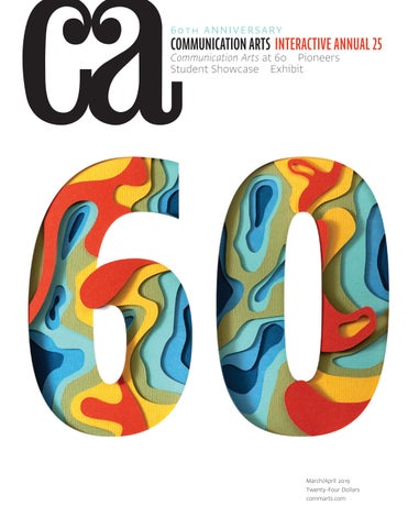
60 T H A N N I V E R SA RY
COMMUNICATION ARTS INTERACTIVE ANNUAL 25
Communication Arts at 60 Pioneers Student Showcase Exhibit
March/April 2019 Twenty-Four Dollars commarts.com
The future of interaction design is human. ROBOTS AREN’T DESIGNING WEB LAYOUTS—YET. All the algorithms on earth can’t beat the creative insight of one skilled designer focused on helping users. At An Event Apart, the design conference for UX and front-end professionals, you’ll soak up new ideas in web page layout and new standards that make them possible. Discover what’s here and what’s coming next. Learn from 17 industry-leading designers, thinkers, and makers. Take back the future! Interact with the best designers and developers in interaction design. Set yourself Apart—and save $100 with code AEACA.
aneventapart.com/ca JOIN US IN 2019:
SEATTLE MAR 4–6
BOSTON MAY 6–8
WASHINGTON DC JUL 29–31
CHICAGO AUG 26–28
DENVER OCT 28–30
SAN FRANCISCO DEC 9–11
MARCH/APRIL 2019 VOLUME 61 NUMBER 1
COMMUNICATION ARTS ��
�� FEATURES
��
28 Communication Arts at 60
by Patrick Coyne Our editor reveals how a family business became the leading journal of visual communications.
36 Timeline
A 60-year overview of visual communications and its relationship to society, culture and technology.
60 Pioneers
by Ruth Hagopian Thirty-one designers, advertising creatives, illustrators and photographers who have left behind unforgettable work.
76 Exhibit
The latest and best in visual communication from here and abroad.
83 Student Showcase
Our editor’s fifth annual selection of portfolios by fourteen promising students of visual communication.
98 25 Years of Interactivity
A brief visual history of innovation in interactive media, from early websites to virtual reality.
��
INTERACTIVE ANNUAL 104 134 136 144 160 166
Websites/Microsites Mobile Social Environmental Other Interactive Media Student Work
FRESH Editor/Designer Patrick Coyne Executive Editor Jean A. Coyne Managing Editor Esther Oh
178
Weitong Mai With fluid lines and thoughtful details, a London-based illustrator unravels tricky concepts.
180
Cole Wilson This Brooklyn-based photographer captures everything from soccer cleats to food in just the right light.
182
Monochrome In the realm of virtual reality, a Parisian studio is redefining what art can look like.
Production Director Lauren Coyne
10
Design Culture Looking through her past columns for CA, Wendy Richmond reflects on the enduring relationship between creativity and culture.
Education Across the country, organizations supported by the Coyne Family Foundation are making an impact, as Sam McMillan uncovers.
12
Advertising Ernie Schenck asks six advertising creatives to pick the game changers that have upended the industry.
18
Voices Ellen Shapiro looks at how designers have adapted—and are still adapting—to the times.
184
Production Assistant/Customer Service Representative Khader Yanni Competition Coordinator/ Administrative Assistant Rachel Whitaker
Software Engineer Srividhya Gopalakrishnan Technology Administrator Michael Hoyt Advertising/Circulation Director Dirk Moeller Contributing Editors Sam McMillan Wendy Richmond Ernie Schenck
Contributors/Directory Editor’s Column Favorites Book Reviews Index to Interactive Annual 25 Overheard
Volume 61, Number 1 commarts.com COMMUNICATION arts (ISSN 0010-3519) is published six times a year (January/February, March/April, May/June, July/August, September/October, November/ December) by Coyne & Blanchard, Inc., 110 Constitution Drive, Menlo Park, CA 94025-1107. Periodicals Postage Paid at Menlo Park, CA, and at additional mailing offices.
Design/Production Associate Isabel Bagsik
Archivist Nancy Clark Lewis
Insights In a Q&A, writer and game designer Erin Hoffman-John sheds light on the game industry.
DEPARTMENTS 5 6 16 186 188 190
Editor At Large Anne Telford Art Director/Designer Joni Rivas
COLUMNS
24
Associate Editor Michelle Yee
Copyright 2019 by Coyne & Blanchard, Inc. All pieces reproduced in this issue are under prior copyright by the creators or by the contractual arrangements with their clients. Nothing shown may be reproduced in any form without obtaining the permission of the creators and any other person or company who may have copyright ownership. SUBScRIBER SERVICES: Subscription: 1 year, $53; in Canada, $70; all other countries, $110. All payments in US dollars, Canadian GST: 127848620.
Founder Richard Coyne (1926–1990)
Direct all inquiries, address changes, subscription orders, etc., to: Web: commarts.com E-mail: subscription@commarts .com Phone: 800-688-1971 (US/Canada) Phone: 215-788-5481 (International) Fax: 215-788-6887 Mail: COMMUNICATION arts PO Box 2013 Langhorne, PA 19047 Please allow six weeks for changes.
EDITORIAL AND BUSINESS OFFICE: 110 Constitution Drive Menlo Park, CA 94025-1107 Phone: 650-326-6040 Fax: 650-326-1648 E-mail: ca@commarts.com POSTMASTER: Send changes of address to: Communication Arts PO Box 2013 Langhorne, PA 19047 Canada Post: Publications Mail Agreement #40612608 Canada Returns to be sent to: IMEX Global Solutions, LLC PO Box 25542 London, ON N6C 6B2
Like us on Facebook facebook.com/communicationarts Follow us on Instagram instagram.com/communicationarts Follow us on Pinterest pinterest.com/camag Follow our RSS feed commarts.com/feed Follow us on Twitter twitter.com/commarts
CONTRIBUTORS DIRECTORY Features
Exhibit
Columns
BBDO Toronto bbdo.ca Cossette cossette.com Date of Birth dateofbirth.com.au D8 d8.uk Andy Fackrell andyfackrell.com FCB Inferno fcbinferno.com formascope formascope.design Pentagram pentagram.com Craig Ward wordsarepictures.co.uk Wieden+Kennedy wk.com
Ruth Hagopian (ruth.hagopian@gmail.com) is a freelance writer and editor whose profiles of designers, photographers and artists have appeared in Create, Digital Graphics and Print magazines. She was also a publisher of Online Design magazine and a partner in Visual Strategies, a San Francisco– based design firm. In this issue, she profiles 31 pioneers in the fields of design, advertising, photography and illustration.
Sam McMillan (wordstrong.com) is a San Francisco Bay Area–based writer and brand strategist, and regular contributor to Communication Arts. In this issue’s Education column, he discovers how the Coyne Family Foundation is supporting diversity initiatives across the country. Wendy Richmond (wendyrichmond.com) is a visual artist, a writer and an educator whose work explores public privacy, personal technology and creativity. Her latest book is Art Without Compromise* (Allworth Press). In the Design Culture column, Richmond writes about the value of diverse culture. Ernie Schenck (ernieschenck.myportfolio.com) is a freelance writer and a creative director. He is an Emmy finalist, a three-time Kelly nominee, and an award winner at Cannes, the Clios, D&AD, the FWAs and the One Show. In the Advertising column, Schenck presents six advertising industry game changers. Ellen Shapiro (visualanguage.net) is a graphic designer and writer based in Irvington, New York. Author of The Graphic Designer’s Guide to Clients (Allworth Press) and more than 200 magazine articles and posts about design, illustration, photography and visual culture around the world, she has been contributing to Communication Arts since 1991. In this issue’s Voices column, she asks prominent names in the design industry to speak to its past, present and future.
Book Reviews
Michael Coyne (mcoyne90@gmail.com) is a freelance writer. Having previously worked for Communication Arts, he now plans on attending graduate school for a master’s degree in creative writing. Rachel Elnar is a designer, a writer and a cofounder of TypeEd (type-ed.com), which helps graphic designers with grids and hierarchies and with choosing typefaces.
Fresh Weitong Mai weitongmai.com Monochrome monochrome.paris Cole Wilson colecwilson.com
Advertiser’s Index An Event Apart Creative Hotlist Shutterstock Zahara Reps
C2 11, 23 C4 C3
Call for Entries Design & Advertising 2019 Photography 2019
7, 185 19
Corrections In the 2019 January/February issue, for the Kiliii Yuyan feature starting on page 44, Yuyan was born in Annapolis, Maryland, not Washington, DC. His early years were spent shuttling back and forth between the United States and a village in what is now northeastern Manchuria, not southeastern Siberia. His grandmother kept picture books of a Nanai boy riding the back of an orca, not a sturgeon. He enrolled in a skin-on-frame, not a skin-on-bone, kayak-building workshop. On page 131, Lucas Sharp should have been listed as type director as well as a typeface designer on the Beatrice typeface project. On page 163, Dawson College is located in Montréal, not Toronto. In the 2018 November/December issue, on page 141, the credits for the “Haircut” video project should have been listed as: Edd Baptista/Steven Kim, art directors; Brandon Tralman-Baker, writer; Natalie Armata/Alanna Nathanson, creative directors; Dan Wong, Eggplant Picture & Sound, managing director, creative; Jules Casting, consultant; Kristofer Bonnell, OPC, director of photography; Griff Henderson/Cameron Lasovich/Stephen Sora, Saints Editorial, editors; Saints Editorial, editorial company; Jamie Pennock, Eggplant Picture & Sound, voice talent director; Dan Horton, Eggplant Picture & Sound, sound engineer; Jason Jeffrey, OPC, director; Sam Javanrouh, Eggplant Picture & Sound, visual effects artist; Helen Thach, Eggplant Picture & Sound, visual effects supervisor; Mark Driver, Eggplant Picture & Sound, colorist; Gino Cantalini, strategist; Max Brook, OPC/Stephanie Hickman, Saints Editorial/Candice McHugh, Eggplant Picture & Sound/Tory Osler, Saints Editorial/Nicola Treadgold, Eggplant Picture & Sound/Rob Tunnicliff, Brave Productions/Harland Weiss, OPC, producers; Kristen Huys, agency producer; Brave Productions/OPC, production companies; Eggplant Picture & Sound, post-production company; Giants & Gentlemen, ad agency; Testicular Cancer Canada, client Communication Arts | commarts.com
5
EDITOR’S COLUMN
Patrick Coyne
W
elcome to the 60th anniversary issue of Communication Arts! Looking back at this amazing journey has been bittersweet, as we’ve rediscovered so much historical work that continues to inspire, but we’re also forced to acknowledge the passing of so many of our industry’s early innovators. In addition to my article on the history of the magazine, we’ve included an update of our visual timeline, which we first published 20 years ago. Special thanks to our editor-at-large Anne Telford and her husband, Stephen Orr, who has a background in academic research, for curating the political and cultural content for the first 40 years of the timeline. We’ve also included 31 brief biographical sketches of creatives who helped define the field of visual communications. Choosing whom to profile was difficult. The most frustrating part of this issue was omitting people and projects we felt were significant, and there is so much more we wanted to include. We hope you will consider this issue a valuable reference into our field’s rich history.
2019 Interactive Annual
“I was pleasantly surprised to see a lot of projects that touched upon relevant social issues and tried to bring attention to a cause,” says juror Isabel Kantor. “I was surprised by the marketing and social initiatives and how they are more functional than ever before,” juror Megan Meeker says. “Some of this year’s campaigns really blur the lines between product design and marketing.” “Integrated digital campaigns were one of the strongest areas in this year’s judging, and I applaud those that took the time to truly understand their clients, and work from simple, great ideas,” says juror Michael Kern. Several jurors commented on how technological limitations actually encourage creativity. “Any emerging technology brings us a new set of limits to play within, and we’re seeing a lot of creators exploring these limits and figuring things out in cool ways,” juror Pablo Vio says. “Natural language processing and speech input are areas where boundaries are being challenged right now, and those challenges are bringing about a lot of creative answers.” “Mediums always have technical limitations, but the gems focus on transcending the medium with
Photographs by Steve Castillo
The big surprise for this year’s competition was the increasing number of websites submitted and, subsequently, selected as winners. Only one mobile submission was selected for inclusion and, for the first time since we added the category in 2011, not a single tablet entry was selected. The environmental category, the second largest in terms of submissions, continues to showcase some of the most innovative work.
“I was impressed with experiences that left the screen or played out across multiple locations, platforms and devices,” juror Josh Goldblum says. “The projects that blended fabrication, hardware and technology really stood out.”
6
Interactive Annual 2019
DESIGN &
ADVERTISING
2019 COMPETITIONS
DEADLINE: MAY 3, 2019
Promote your talent by entering our highly respected juried competitions in graphic design and advertising. If selected, your award-winning work will be meticulously reproduced in the 2019 Design and Advertising Annuals and on the Communication Arts website, assuring you maximum exposure to our international audience. Each winning entrant will also receive a personalized Award of Excellence, milled from solid aluminum.
ENTER ONLINE NOW COMMARTS.COM/COMPETITIONS
EDITOR’S COLUMN storytelling where users forget what platform they are even on in the first place,” says Meeker. Despite all the attention given to the potential of augmented reality (AR), the jury found this year’s AR submissions wanting. “There was no shortage of disappointing AR applications in contention this year,” Goldblum says. “AR has definitely made technical strides, but if the tech is presented just for its own sake, it won’t carry the project.” “There was an industry-wide trend to pitch and execute virtual reality (VR)/AR work that was poorly thought out and rapidly executed,” says Kern. “I have yet to see a well-rounded campaign that actively integrates these technologies with mass-market appeal.”
JOSH GOLDBLUM is the founder and chief executive officer of Bluecadet, an experience design agency with offices in both Philadelphia and New York that works with cultural institutions, universities and missiondriven organizations. He has overseen the design and development of interactive experiences and planning strategies for clients such as Doctors Without Borders, the Bill & Melinda Gates Foundation, MoMA, National Geographic and the Smithsonian Institution. As a pioneer in the technological transformation of the cultural sector, Goldblum is a frequent speaker at industry conferences and symposia. He lives with his wife and two children in Philadelphia.
“Mobile web was also surprisingly weak,” Kern says. “For as much as people are on their phones and utilizing mobile tech, sites are just not doing anything new or pushing the envelope. It was disappointing to not see people taking advantage and thinking uniquely about the mobile form factor.” “Story development and expressing the intent behind the project were stumbling blocks for many of the entries I saw,” says Vio. “A lot of projects lean too heavily on technology to elevate the concept rather than taking a few steps back and really crafting a story that connects with users in a meaningful way.” In addition to requesting comments on this year’s submissions, I also asked the jurors a series of questions about the future of digital interactivity. What business, cultural and social developments will alter the role of interactive media in the future? “As leaps in technology become unlocked, machine learning will scale at a much larger percentage and be ingrained in almost every daily interaction inside and outside our homes,” says Meeker. “Imagine: even the smallest microinteractions, like changing the temperature, will become a thing of the past since your devices, home and even Lyfts will all have smart sensors and remember your patterns and preferences.” “Recent issues around privacy and the segmentation and reliability of content should inform the content we make and how we present it,” Goldblum says. “I’d love to see more work that creates and promotes more inclusive conversations and communities across various identity lines.” What breakthroughs will be required for VR to become more widely accepted? 8
Interactive Annual 2019
ISABEL KANTOR is a senior technology director at R/GA in New York. She helps drive innovation by working at the intersection of technology, business and culture. In the past, Kantor had led R/GA’s Software Platform Lab, part of the Technology Consulting effort globally, and managed the technology team at R/GA Bucharest, where she helped pioneer R/GA’s integrated cross-office collaboration model. Before R/GA, Kantor started her career as an engineer at ESI Design, MindShare and Ford Motor Company, where she developed interactive experiences. Kantor holds a master’s degree from New York University and a bachelor’s degree in computer science from Grinnell College.
“For any physical exercise or movement applications, the technology needs to have a certain level of fidelity so that users can use it for more than five minutes at a time without starting to feel dizzy,” says Kantor. “That’s a very big hurdle that I’ve seen a lot of projects still dealing with, even very recently.” “VR is a wonderful technology with a currently limited audience,” Kern says. “People just don’t want to wear devices as a general rule. When the screens become embedded chips and contact lenses, we will be really close, but that’s still relatively far in the future.” How will the continued diversification of personal electronic devices affect interactive design? “I believe interactive design will become a lot more specialized, and we’ll have just mobile interaction designers, just VR interaction designers, etc.,” says Kantor. “First, the tools are still lagging behind how most of the great interaction designers of our generation think,” Kern says. “When the tools catch up, our job will get easier. Secondly, new devices will challenge us to keep learning and alter the paradigm of how we interact with the world around us.” “As the sharing economy progresses, we’ll be able to interact with our own personalized information on any surface or texture that we pass,” Meeker says. “Designers will need to solve for temporary ownership of products, asking questions like, ‘What information can be digested within 30 seconds?’ and ‘Will users respond via touch, sound or thought?’” “As creatives and makers leading interactive design, it is our responsibility to not only have our fingers on the pulse of the latest and greatest inventions, but also to learn from user behaviors and consumption habits,” says Vio. “As long as we keep user empathy at the core of how we adapt to new interactive paradigms and new
MICHAEL KERN is executive creative director and a cofounder of Salt Lake City, Utah– based Welikesmall (WLS). Kern’s passion for storytelling through design, technology and strategy-based communication derives from a desire to give meaning to the world around him and create emotional connections. At WLS, Kern has worked with clients including Adobe, American Express, Disney, Google, Nike, PlayStation, Reebok, Specialized and Starbucks. His continued focus is on pushing the possibilities of design, pursuing cinematography and directing opportunities, thinking, creating permanent good, raising his family, and riding a bike fast.
MEGAN MEEKER is a product design manager at Lyft in San Francisco, California. She has been working in the Bay Area for more than a decade, focused on the intersection of the physical and digital and creating products for the connected world. Inspired by the fusion between hospitality and machine learning, Meeker orchestrates initiatives with thoughtful design solutions that are accessible for all. She continues this work at Lyft, managing the insurance, safety and support teams distributed across various headquarters, states and time zones. Outside of the office, Meeker pursues the craft of calligraphy and is always up for a round of golf.
devices, we can design for any platform. Our will to evolve how we work and adapt our approach will be imperative to keep pushing the envelope within interactive.” Selection for this year’s annual required a minimum of three out of five votes. Judges were not permitted to vote on projects with which they were directly involved; I voted in their stead. The winning projects, including links and case-study videos, can be viewed on our website at commarts.com. I would like to extend our grateful appreciation to our jurors for their conscientious efforts in selecting our 25th Interactive Annual.
PABLO VIO is executive creative director and one of three founders of Jam3. Currently based out of the company’s headquarters in Toronto, Canada, his approach to storytelling, complex programming and high-concept design has lead to acclaimed interactive projects for Facebook, Ford Motor Company, Google, Microsoft, the National Film Board of Canada and the United Nations. His vision has helped grow the company from a three-man operation to one of the world’s top design and experience studios. Now, with more than 70 employees from Toronto to Los Angeles to Montevideo, Uruguay, Vio’s current focus is on daily operations and expansion of the creative department.
Robert Grossman, 78, was a prolific illustrator who chronicled and caricatured a half-century’s worth of politicians, pop culture figures and social issues. He also drew the occasional book and album cover and made animated commercials. Despite all of his politically oriented drawings, he may be best known for the poster he created for Airplane!, a 1980 disaster-movie parody. Grossman received a BA degree at Yale University in 1961, where he edited the humor magazine The Yale Record. In his career, Grossman drew more than 500 magazine covers, including our 1971 Sin special issue, guest edited by Peter Bradford, Ralph Caplan and Philip Gips.
Jim Ales, 60, spent seventeen years as design director of the Monterey Bay Aquarium, where he helped build a cohesive identity for one of the world’s most respected marine wildlife nonprofit organizations. Ales worked with the aquarium to spearhead its Seafood Watch program, which promotes sustainable consumption of marine life. Among his many honors, Ales was awarded the AIGA Environmental Leadership Award for his work at the aquarium and was selected as a Fellow of the AIGA San Francisco chapter in 2015. He was a judge for us in 2007.
Susan Jackson Keig, 99, was an internationally noted graphic designer and art director with a career spanning seven decades. She held various positions, from working as superintendent of art for the Medford School District in Oregon, to teaching at the University of Kentucky and the Institute of Design, to working in design firms as a graphic designer and art director, prior to opening her own consultancy in the mid-1970s. Keig is recipient of more than 250 awards, including being named a Fellow of the AIGA Chicago chapter and a distinguished alumna of the University of Kentucky. We published an article on Keig in 1971, and she was one of our original contributing editors when the magazine launched in 1959.
Rolland “Ron” Anderson, 82, was known as the godfather of Minneapolis advertising. Anderson’s advertising career began in 1962 at Knox Reeves in Minneapolis, where he eventually became a creative director and mentor to young talent including Sue Crolick, Nancy Rice and Tom McElligott. Outside the agency, Anderson was also part of a freelance ad team with McElligott and Pat Fallon called Lunch Hour Limited prior to the formation of Fallon McElligott Rice. We published an article on Anderson in 1978. He was a judge for us in 1979.
Jane Maas, 86, started her advertising career at Ogilvy & Mather in the 1960s, rising from junior copywriter to creative director. In 1976, she became senior vice president at Wells, Rich, Greene, where she helped develop the I Love New York tourism campaign featuring graphic designer Milton Glaser’s iconic heart. In 1982, her appointment as president of Muller Jordan Weiss made her one of the first women to lead a major New York advertising firm. In 1989, she became president of the New York office of Earle Palmer Brown, where she retired as chairwoman. ca
In Memoriam It is with deep sadness that I acknowledge the recent passing of several influential members of the creative community.
Communication Arts | commarts.com
9
DESIGN CULTURE
Wendy Richmond
Culture is Sticky
T
his issue marks the 60th anniversary of Communication Arts magazine, and like any anniversary, it’s an opportunity for reflection. I reviewed the columns I’ve written in CA (since 1984!), looking for those that still resonate. I found one from November 1999 that was an indicator of topics I would pore over in the new millennium. It began with this paragraph:
“We know the world through frames and filters. Some filters are tangible, like television, the internet, newspapers and magazines. Some are ephemeral, like current styles and trends. And some are deeply entrenched, like the environments in which we were raised, or the cultures that embrace or reject each of us.” As my experiences have accumulated over the years, I’ve watched filters shift, each one influencing the way I see the world and my place in it. The most persistent of all was (and still is) the filter of cultural identity.
I remember how much I enjoyed the vibrancy of this kind of assemblage, and I wanted to bring its riotous color and abandoned objects into my work. But I was conflicted. “Along with this inspiration, I had a feeling of separateness: this is not my culture, so I can only be an observer.” “In order to create something that truly communicates, the work must be authentic, and authenticity requires first-hand knowledge. I was afraid that any adoption—or adaptation—of someone else’s culture would be appropriation… Worse yet, I did not appreciate the fact that I had a distinct cultural identity of my own.” When I was writing that column, I sought the advice of a wise friend, and he gave me an alternative perspective. “You do have a cultural identity,” he said, “and it is an amalgamation of cultures. Culture is like chocolate at 98 degrees. It’s sticky, and you can’t help getting it on you.”
As an artist, I’m especially lucky when I’m exposed to—and can participate in—the wealth of cultures outside of my own. The definition of cultural identity is how one perceives oneself in terms of belonging to a group, whether that group is based on nationality, ethnicity, sexuality, religion, lifestyle and so on. As an artist, I’m especially lucky when I’m exposed to—and can participate in—the wealth of cultures outside of my own. These interactions bring depth to my work; they make me a better communicator. But including elements of other cultures comes with the potential of appropriation. I was thinking about this tension in March 2002 in my column titled “Respecting Culture.” “Artists and musicians (think Picasso and Paul Simon) have incorporated foreign culture in their work. Is it appropriation or creativity? There is such a thing as cultural wealth, and once it has been offered to the public, the original owners have no other choice but to share its value and witness its transformation. On the other hand, sharing culture can instigate empathy and mutual growth, where both parties benefit.” In December 2004, I wrote about the filter of culture again, because I needed to understand my own conflict: I wanted to include other cultures in my work, and my motivation was admiration and a desire for connection. But did I have the right? I had just visited Tijuana, Mexico, and was excited by the adrenaline I felt as I walked through the city: “I saw stores, houses, signs and cars that were unique assemblies of resurrected materials.” 10
Interactive Annual 2019
My friend made me realize that as Americans, we are exposed to many cultures, and we absorb everything from mannerisms and gestures to ideas and beliefs, and that becomes part of who we are as unique individuals.
This was a turning point for me. Instead of seeing myself as limited to a static cultural identity, I started to recognize that I am part of an ever-changing cultural consciousness. Sticky culture is exciting! That recognition has since influenced my choices of where I live and what I seek for intellectual and creative nourishment. Now, more than fourteen years later, I enjoy an environment that celebrates the mixture and morphing of cultural identity. But I have a new and growing worry. As this multiplicity spreads and is exuberantly shared, it is simultaneously being shut down. The value of diverse culture is being questioned at our borders. We have a president who is disgusted by the stickiness of culture and does not want to “get any on him.” Cultural identity has become a divider. As citizens, we know how dangerous this is to our nation’s health and safety. But there is another, more subtle danger: this barrier-making can rob us of our creativity. Without diverse culture, we will have lives—and, by extension, art, music, dance, theater and literature—that are sterile, colorless and exclusionary. Do you want to be an artist in a country that blocks culture at its borders? This is a threat to our work. If we don’t share our cultural identities, we’re doomed. ca © 2019 W. Richmond
FIND YOUR PERF ECT JOB AT
CREATIVE HOTLIST CREATIVE HOTLIST, THE CAREER SITE FROM COMMUNICATION ARTS MAGAZINE, HAS MORE JOB LISTINGS IN GRAPHIC DESIGN, ADVERTISING AND NEW MEDIA THAN ANY OTHER CREATIVE SERVICES SITE.
Sign up for a FREE account and with a single click, send your Cover Letter, Resume and Links to Work Samples every time you apply to a Creative Hotlist job.
CHIEF MARKETING
DIRECTOR OF
OFFICER
USER EXPERIENCE
SENIOR UX
ARCHIT ECT
VISUAL DESIGNER
PACKAGE DESIGNER
CREATIVE
DESIGN
DIRECTOR
PHOTO STYLIST
STRATEGIC STORYTELLER
JAVASCRIPT
DEVELOPER
The Communication Arts Career Site
MOBILE DESIGN
DIRECTOR
BRAND
STRATEGIST
COPYWRITER VISIT WWW.CREATIVEHOTLIST.COM TODAY AND FIND YOUR PERFECT JOB.
ADVERTISING
Ernie Schenck
60 Years of Blockbusters, Culture Shapers and The Advertising That Changed Everything
C
ommunication Arts has seen some insanely great work in the last 60 years. And yet, precious little of it has turned advertising upside down and, in some cases, influenced our culture and who we are as a society. I asked six prominent names in advertising, one for each decade in the years since CA started publishing, to pick the one. The mutant. The game changer that rocked everything.
’60s
What can you say about advertising in the ’60s. It was Mount St. Helens. It was the San Francisco earthquake. What happened at Doyle Dane Bernbach (DDB) forever upended the business and the world. And Ted Bell was there. Smack dab in the middle of it all.
Ted Bell: Think small. (VW) Lemon. (VW) Ted Bell is a bestHave you ever wondered how the man who selling author. drives the snowplow drives to the snowHe was a junior copywriter at plow? (VW) You don’t have to be Jewish DDB, president to love Levy’s. (Levy’s Jewish Rye) We try and chief creative harder. (Avis) It’s ugly, but it gets you officer of Leo Burnett, and there. (VW) I sometimes wonder if it pays worldwide creative to make beer this way. (Utica Club) Adverdirector of Young tising is the art of persuasion. (Bill Bernbach) & Rubicam. It lets me be me. (Clairol) The 60-second excitement. (Polaroid) We don’t take off until everything is kosher. (El Al) Sometimes playing it safe is the most dangerous thing you can do. (Bill Bernbach) Tsk, tsk. (Chivas) We have to sell a Nazi car in a Jewish town. (George Lois) The car was so utterly preposterous, we had to Americanize it as quickly as possible. (Helmut Krone) Starting Dec. 23, the Atlantic Ocean will be 20% smaller. (El Al) Will we ever kill the bug? (VW) An idea can turn to dust or magic, depending on the talent that rubs against it. (Bill Bernbach) 12
Interactive Annual 2019
We freed ourselves from the borrowed elegance of Detroit ads, the columned mansion, the beautifully gowned woman… (Helmut Krone) Don’t let the low price scare you off. (VW) It makes your house look bigger. (VW) The Chivas Regal of scotches. (Chivas) Mass transit. (VW Bus) It was all so desperately simple. (Sir Alan Parker) Ugly is only skin-deep. (VW)
’70s
There was more to the ’70s than Donna Summer, Apollo 13 and the Pentagon Papers. In advertising, Coca-Cola was teaching the world to sing, and a soon-to-be iconic brand was getting Americans to see fast food in a way they never had. Joey Cummings remembers. Joey Cummings is chief executive officer at The Joey Company in New York. As a creative director, Cummings has held the creative reins at Bozell, TracyLocke, Ted Bates, Saatchi & Saatchi, DDB Chicago and Leo Burnett.
Joey Cummings: In 1971, a small fast food chain and its Chicago agency, called Needham, Harper & Steers, were inspired to disrupt a price-driven category by talking about the “why” (the big buzzword of today) of the brand. Keith Reinhard, later to be my boss for many years, saw a gaping opportunity. The consumer insight was: moms get tired of preparing meals, kids get tired of “finish your peas, please” and dads get put off by the high cost of eating out.
“You Deserve a Break Today” was an idea with emotional bull’s-eye precision. It was brilliant in not only describing “why” McDonald’s existed, but also in putting “you” at the center of this great brand’s purpose. The campaign was grounded in creating “content” (another buzzword today) that instilled important and uplifting human values and behaviors. Told in jingle, in dance and in poignant stories that tickled your funny bone or tugged at your heart, the campaign created what later became the “Chicago” school
Communication Arts Daily OUR DAILY EMAIL NEWSLETTER
WHAT YOU NEED TO
STAY INSPIRED Communication Arts Daily
Designed to keep you up-to-date on the hottest design, advertising and web projects, our newsletter also links to the most thought-provoking articles we’ve found on the web. Delivered to your inbox every business day, this quick read is just what you need to stay informed and inspired.
SIGN UP IS EASY AND FREE commarts.com/newsletter
ADVERTISING of advertising. It taught young creatives how to birth a big emotional idea based on a pivotal consumer insight, craft a story, write a lyric and even write the notes the lyric underscores.
’80s
The ’80s marked the rise of the outlier. The Davids who went toe to toe with the Goliaths. Fallon McElligott Rice. Wieden+Kennedy. Leonard Monahan Saabye. They proved great work could happen anywhere. If anyone knows the ’80s, it’s Tom Monahan. Tom Monahan was a cofounder of the highly acclaimed Leonard Monahan Saabye and a former advertising columnist for CA from 1990 to 2000.
Tom Monahan: Arguably, the 1980s may be the greatest turning point in the history of creative advertising thanks to one ad. Apple’s “1984” not only influenced television advertising forever after; it upped the ante for creative in all media.
Prior to “1984,” we did commercials. After “1984,” we did films. Anthems. Events. And it wasn’t just because Chiat/Day hired bigtime film director Ridley Scott. The concept was grander than grand. Production bigger than big. It turned buzz into the holy grail of communications.
’90s
The ’90s. Oh mama. What a decade. If you loved long copy, this was your time. High concept was the coin of the realm. Design was an obsession. Craft mattered. And few creatives lived every moment of it like John Doyle. John Doyle: When I first saw the Nike Women’s Fitness campaign, I was the father of two little girls and a toddler son. It made me feel that my daughters not only had permission, but also the right to dream and to realize their dreams; that my son could witness that in his sisters and his mother; and that I could learn from them as well and be inspired by their lives. One of the most awarded creatives in advertising, John Doyle is a freelance art director and creative director.
It was a campaign from a company that needed to establish a dialogue with women, to reach women who were not athletes, but who had the physical, inherent capacity and desire to participate in sports. Many women heard it and felt it.
After “1984,” commercials became less, well, commercial. “1984” showed no product. Yet, in extremely dramatic fashion, it made a hitherto niche brand into a category, not to mention an advertising industry leader, stealthily unveiling a product line with intelligence and ’tude that changed the world.
More than any other advertising of the decade, the Nike women’s campaign had the greatest cultural and ad industry impact by far. Although few came close to the truth and authenticity in the Nike women’s campaign, the work was subsequently emulated for the entire decade. Yes, many advertisers still like to create commercials that sell, sell, sell. But “1984” separated visionary marketers from career ad hacks, proving that compelling brand building could happen through bold, elegant storytelling. The industry has not been the same since. “1984” also substantially elevated the world’s biggest marketing stage, the Super Bowl. That “event” concept has permeated virtually all media ever since. It illustrated return on creative investment in inarguable fashion. It ran once. It got millions of “free” impressions before YouTube made such a thing child’s play. It turned creativity into a hard asset. Good will. Suddenly, even accountants could understand this hitherto esoteric thing, “The Concept” (well, kinda). Hail, “1984”! 14
Interactive Annual 2019
Nike was the messenger that enabled a voice to be expressed at a time it needed to be heard the most. It was a collaborative effort. Nike recognizing the importance of reaching women, and Wieden+Kennedy looking within itself and assigning writer Janet Champ and art director Charlotte Moore to the task. The culture and the intensity of client and agency had to be of one accord and one conviction in order to produce a campaign like this. They were. And they did.
1998–2008
There aren’t enough numbers on the Richter scale to measure the earthquake that was branded entertainment in the early 2000s. By now, we
all know how Fallon and BMW turned the ultimate driving machine into the ultimate turn-the-industry-upside-down machine. Greg Hahn explains. Greg Hahn is chief creative officer of BBDO New York.
Greg Hahn: The decade ushered in monumental changes in technology and media. Seated directly behind all that change was Advertising.
In terms of the above, BMW Films stands as the poster child for the shift that took place. (Full disclosure, I worked at BMW’s agency, Fallon, during the launch, but did not work on the groundbreaking first round and the work I’m referring to. All interest is nonvested.)
Rob Schwartz is the chief executive officer of TBWA\ Chiat\Day NY.
Rob Schwartz: The decade begins with Obama and ends with Trump. The end of civility and sanity, and the beginning of sheer WTF?
2009–2018 sees a rise in our obsession with technology. From next-generation iPhones to the launches of iPad and the Square payment system. It’s also the beginning of platforms like Instagram, Snapchat and Pinterest. And the thorough dismantling of traditional TV. In advertising, we see the thorough digital transformation of damn-near everything.
BMW Films changed the entire model of Advertising. Starting with the math and the media. In the early days of the internet, even before broadband became broadly adopted, BMW Films placed a bet on online content. Reversing the traditional model, it put all the money on the production and very little on the media. Betting that if the content was of great quality, people would seek it out.
So what’s the game-changer idea of the decade? The one idea we never saw coming that suddenly altered the way we think about everything?
It also changed many God/David Ogilvy–given rules of the traditional commercial. Gone were the normal time constraints and typical product shots and proof points. This was Movieplex-style entertainment that showed, not told, how badass BMWs were. At that time, very few car clients wanted you to put bullet holes and kidnap victims in their cars. But BMW and Fallon understood that in order for this to work, it had to feel vastly different than Advertising.
But the idea that changed the way we think about ideas was Small Business Saturday, from American Express.
Before I unveil the Game Changer, here are some runner-ups: Dove’s Sketches, Prudential’s Day One and Nike’s FuelBand. I also can’t ignore Bing’s Decode Jay-Z, Gatorade’s Replay and State Street’s Fearless Girl.
The idea was so simple yet so powerful: inspire shopping at small businesses right when America does its holiday shopping. It was a stunt that became a movement that became an official resolution passed by the US Senate. Unanimously.
BMW Films launched in 2001, and suddenly after its unprecedented success, a lot more Advertising began to look and feel a lot less like Advertising.
2009–2018
These last ten years have been as wild and wooly a ride as any we’ve ever known, both as an industry and as a society. It’s been up. It’s been down. And it’s been chock-full of surprises. Including Rob Schwartz’s pick for game changer of the decade.
Today, it’s on the national calendar. Thursday is Thanksgiving. Then Black Friday. Then Small Business Saturday. The idea changed our lives. It also spawned other behavioral changing ideas, like REI’s #OptOutside. In a decade of incredible ideas, Small Business Saturday stands out as the game changer. It changed business. It changed consumer behavior. It changed the game for anyone thinking about how to create on behalf of a brand. What about you? What would your six have been? Email me at ernie. schenck@gmail.com, and I’ll include your list on Facebook, Twitter and LinkedIn. ca Communication Arts | commarts.com
15
Five Interactive Designers Share Their Treasured Finds CANDY CHIU
JOHN MAEDA
Motivational tunes: I have a customized Spotify playlist that mainly includes jazz and math rock, but I especially like the music of the Japanese band toe and the Taiwanese indie band No Party For Cao Dong. This indie band broke the boundaries of music, which made its music become even more successful. In a similar way, designers also wish to break the boundaries of visual design, to both bring a nice experience to users and seek their own identification as designers.
Useful tools: For the organizing work I do on the internet, I use the Chrome extension Toby. The interface design tool Figma is also impressive; it’s especially good for collaboration across distributed teams.
candychiu.com Hong Kong, China
Trend source: For websites, it would be siteInspire, as only the best websites will be featured. I also sometimes join seminars to get inspiration from what designers are sharing. Although we sit in front of our monitors looking at different designs, we seldom really listen to how other designers think. So, going to seminars can bring reflection and improvement. Workday necessity: I always bring my Bose QuietControl 30 noisecanceling earphones when I go to work, as my commute takes a long time.
16
Interactive Annual 2019
Automattic Inc. Boston, MA
Inspirational reading: Oliver Jeffers: The Working Mind and Drawing Hand because I didn’t know the whole context behind why he dipped me in paint. Creative challenge: To get inspired, I make new things that make me uncomfortable. An example is my new YouTube channel, John Maeda Is Learning. I have so much respect for YouTubers now! Guilty pleasure: Shopping. I grew up in a family business, and my mother’s only escape was to go to the mall. She always brought me along, so I learned to love shopping. Reliable help: I am dyslexic; luckily, my assistant is always able to decode me.
JENNY JOHANNESSON
BRYAN BRAUN
TIFFANY TAYLOR
Malmö, Sweden
Sparkbox Dayton, OH
Netflix Los Angeles, CA
Favorite collaborator: Aristide Benoist! We’ve already worked together on two projects—my portfolio and the Epicurrence site—and it was a dream. I’ve never worked with a developer who nailed the implementation of my designs in combination with such smooth and perfectly timed animations. He’s very passionate about his work, and it shows.
Daily routine: I enjoy biking to the office. It gets my blood pumping and helps me feel energized for the day.
Workflow management: Abstract offers multiple services to help designers, but the main aspect I love is its version control for Sketch files. Using the tool does require you to change your design workflow, but the benefits of being able to collaborate and not worry about file versions are so worth it.
Valuable platforms: Winning site of the day on Awwwards and The FWA made my portfolio traffic shoot through the roof. Other than that, Twitter has turned out to be very engaging. I actually once landed a job at Ueno through designer Chad Tafolla, someone I got to know on Twitter. Underappreciated resource: Pinterest. It’s a great tool to collect and organize all the design inspiration I run into on the web. It’s not all cooking and interior decorating on there. Primary stress reliever: A tough workout followed by a good night’s sleep. I also have almost all notifications off on my phone. That helps too.
Go-to tools: All of my personal projects go into Evernote. It’s easy to search, and it’s available on all my devices. When I’m working with others, it’s hard to beat Dropbox. Eye-opening read: Aarron Walter’s book Designing for Emotion helped me see that great design work requires that you understand things like psychology and human behavior. Graphic design skills will only get you so far. Mind-blowing work: I recently started using Vimeo, and I was way impressed by its video upload workflow. It wasn’t splashy or anything—just intuitive every step of the way. I love seeing complexity made simple. It’s like magic. End-of-day reward: That feeling of progress. It could come from closing a Jira ticket, seeing a new subscriber or watching a feature go live. Whenever I look back on my day and see that tangible forward motion, I’m feeling great.
Creative fuel: I use Google Play Music to stream music and am always working to a beat. I mix it up between lo-fi hip-hop and chillwave stations when I want to concentrate, and when I need to recharge, I listen to indie Korean hip-hop. Since I don’t understand much Korean, the lyrics never distract me like English language music does; the production of the beats and the way the rappers flow their verses are incredibly addictive. Following now: I’ve followed so many brand accounts on Instagram based on the aesthetics of how they present their companies in each post. Some standouts are Brandless, Allbirds, and several cosmetics companies, like Glossier, 3CE and romand.
Communication Arts | commarts.com
17
VOICES
Ellen Shapiro
Looking Back and Looking Forward appy birthday, CA. You’re 60 years old! For 40 or so of those years, most graphic designers did more or less the same thing. Sure, there were stylistic debates and regional differences. In 1980, a poster for a country music festival in Texas and a poster for a lecture on architecture at an Ivy League college could have been featured on the same page of the CA Design Annual. The two posters would have looked very different, but the two designers most likely had similar educations in art school or university art departments. Surely, both sketched their concepts on tissue, specified the type from a typesetter’s specimen book, received repro proofs, cut them out with an X-Acto knife and pasted them up on illustration board using a T-square and triangle. In the past 20 years, things changed so rapidly, thoroughly and remarkably that any ten different designers in different cities, or even in the same office (or coworking space or airplane cabin), might be doing entirely different things. They could have graduated from institutions with different kinds of design programs, or not attended a design program at all. Successes are being achieved by self-taught designers who learned their craft via online platforms
Graphic design has expanded way beyond print to include motion, sound, narrative, web, interactive, user interface—even performance, virtual reality, writing and theory. No one knows this better than Warren Lehrer. He earned his MFA in 1980, began teaching soon after, and is a founding faculty member of the Designer as Author program at New York’s School of Visual Arts and head of the graphic design program at Purchase College, State University of New York. “There used to be one unspoken presumption about the kind of work graphic designers do—corporate—and one narrow set of accepted aesthetic parameters—corporate modernist,” Lehrer recalls. “I never fit into those boxes, so I appreciated getting my hands on as many tools and methodologies as I could. Luckily, the usual conventions have been blown wide open. The best design educators I know are emphasizing meaning, storytelling, content, voice, metaphor, perspective, and the work’s potential impact on humans, communities and the planet. In addition to teaching craft and process, they help students discover what they care about and want to contribute to.” For Lehrer and many others, the possibilities of authorship and entrepreneurship have opened up new opportunities, often necessitated by economic realities. With each financial meltdown—from the 1987 stock market crash, to 2000’s burst of the dot-com bubble, to 9/11, when everything came to a standstill for weeks and months, to the 2008 global financial crisis—more and more designers began researching market needs and developing products, writing books, opening online stores and getting their stuff in brick-and-mortar stores. “The embrace of design authorship also reflects the maturation of the field as well as an acknowledgement of our roots,” says Lehrer, who himself is the author and designer of books that are also performance pieces. “The pioneers of modern graphic design were poets, artists, inventors, revolutionaries. We’re coming full circle.”
High and low are not at war with each other, but part of a wide spectrum. like LinkedIn Learning, where some courses are taught by Sean Adams, chair of the graphic design department at ArtCenter College of Design. High and low are not at war with each other, but part of a wide spectrum.
The profession, expanded The way the public thinks about designers has changed too. When newsstand magazines do an issue or story about design, it’s almost always fashion or interior design. Or industrial and product design. But to those who do think about graphic design, it isn’t a rarified, ivory-tower profession like it was mid-last-century. When we close our eyes and imagine the designer of the present or future, it isn’t Paul Rand, solo, in suit and tie, consulting to the chief executive officer of Westinghouse. It’s more likely a group of diverse young individuals setting up the interior of a museum shop or working at flickering monitors on the skyscraper floor where MTV animations are created. 18
Interactive Annual 2019
So, what do we call ourselves now? Still, it might seem like half the world doesn’t value graphic design as much as we’d like. Too many people, including potential clients, think they can do it all by themselves with a few keystrokes. Or that they can get it online for $5. Or that they can get us to do it cheap, cheap, cheap. Or that it’s a technical trade, given the way computer graphics has replaced auto shop for low achievers at many high
PHOTOGRAPHY COMPETITION 2019 C A L L FOR EN TR I ES
© Michael Clark
FINAL DEADLINE: MARCH 22, 2019 ENTER THE MOST PRESTIGIOUS PHOTOGRAPHY COMPETITION IN THE WORLD
Categories include Advertising, Books, Editorial, For Sale, Institutional, Motion/ Cinematography, Self-Promotion, Unpublished and Student Work. If selected, your award-winning work will be beautifully reproduced in the print and digital editions of the 2019 Photography Annual, and on the Communication Arts website.
Each winning entrant will receive a personalized Award of Excellence, milled from solid aluminum.
ENTER ONLINE NOW:
COMMARTS.COM/COMPETITION/2019-PHOTOGRAPHY
VOICES schools. On the other hand, the whole world wants to be a brand. If the phrase “graphic design” never really caught on in the vernacular, the word “branding” surely did. Twenty years ago, brands were Sears and Coca-Cola and their ilk. Now Sears is in bankruptcy protection and sugary soft drinks are being debated in state senates and banned by school boards. But everybody and everything is a brand. That’s not necessarily a bad thing. “Contemporary culture is almost entirely composed of brands,” says Debbie Millman, chair of the Masters in Branding program at the School of Visual Arts and author of Brand Thinking and Other Noble Pursuits. “Everything we consume— even the most basic commodities like water and salt—are brands,” she says. “Experiences are brands. People are brands. Brands are so persuasive in their personal, political, economic, aesthetic, psychological, moral, ethical and social consequences that they leave no part of us untouched. Historically, brands were pushed down from the corporation to the people. But the equation has flipped,” Millman explains. “Branding has become democratized, and the
says McGowan, combined with instant global connectivity via social media, email and text meant that designers in first-world countries began competing with people in cheaper labor markets. “The atomization of digital design work—the precursor to total automation—exploded the massification of design services,” she contends, so that thousands of people could offer low-cost services online. “It also allowed more and more people to express themselves creatively, which is fantastic,” she adds, “but it has created a Dunning-Kruger effect, a cognitive bias in which people of low ability or talent have illusory superiority and mistakenly assess their abilities as greater than they are.” On the plus side, I must add, global connectivity has created a way for talented artists around the world, especially in Asia and Eastern Europe, to promote themselves and attract significant clients and projects. Some of the most interesting work on Behance, Instagram and stock sites is created in places like Ukraine and Romania. Tony Cordero, head of creative at Liquid Agency in San Jose, California, frames things in even broader terms. “What we’re seeing is a recurring democratization of technology. It happened in the initial era of desktop publishing, when suddenly everyone with a Mac, fonts and a printer thought they could open a design shop. There will always be services like Fiverr,” he says, “which embrace technology to offer low-cost ways to get things done. But, as many buyers experience, those services focus on commoditizing production. Once you ask them to solve a design challenge and not execute a task, the system breaks. Those business are built on the premise of assembly”—and often imitation—“not ideation.”
“The Pink Pussy Hat is proof positive that branding is not just a tool of capitalism. It can bring people together for the benefit of humanity.” —Debbie Millman results are not commercially driven. #PinkPussyHat and #BlackLivesMatter and #MeToo are brands that were created by the people for the people, not for financial gain. They, and many others, are being created to signify what people believe. The Pink Pussy Hat is proof positive that branding is not just a tool of capitalism. It can bring people together for the benefit of humanity.” True, massive social transformations can materialize when an idea goes viral—something that would have been unthinkable even ten years ago, before Arab Spring became synonymous with internet activism. As brand strategist Marty Neumeier wrote in The Brand Gap: How to Bridge the Difference Between Business Strategy and Design: “A charismatic brand is any product, service or company”—now, let’s add concept or movement—“for which people believe there’s no substitute. Any brand can be charismatic, even yours.”
Graphic design, democratized We’re all in favor of democracy and the kind of democratization Millman describes. Many of us, though, aren’t fans of the democratization that made design tools accessible to all. Heather McGowan, a “future of work” strategist based in Boston, credits the personal computer and software for making design so accessible that “just about anyone can create or attempt to create a digital design product—from a logo to a website to a movie or video game.” Are just-about-anyone’s products professionally designed? No, but to them, good enough. The deluge of ads pushing services like 99designs and Fiverr and platforms like Wix and Squarespace have helped this trend along immeasurably. This democratization, 20
Interactive Annual 2019
What’s really changed? So, how do people of greater abilities and talents—whether trained in design school or self-taught—communicate their value in a huge global marketplace where online bidding and buying might be more the norm than the exception? Ed Gold, author of three editions of The Business of Graphic Design and former chair of the Communications Design department at the University of Baltimore, has been to more design offices than most people on the planet. Gold estimates that in addition to running a large design department and teaching, he’s visited 50 to 60 firms and interviewed 100 designers. He told me that he’s arrived at a surprising conclusion: Not much of real importance has changed at all. “Sure, the tools we use have completely changed,” he says. “Design offices have gotten smaller. Most of us have reduced our staffs; the competition is far more widespread; many deliverables have shifted from print to electronic. But we’ve adapted to those changes, and some of them have helped us thrive. Our unique contribution to society has never changed,” he asserts. “We still have to create visual ideas that no one, including ourselves, ever thought of before, and we have to execute them in stunning and thought-
provoking ways. And we can’t use the same solution twice. That makes our profession even more challenging, since most businesses find a process that works for them and repeat it over and over. Or they sell things other people have designed and made. All of which are reasons I believe that the people who practice our profession are so unbelievably special.” “While everything we now call ‘the business of graphic design’ will change over the next 60 years,” Gold concludes, “I really doubt that the thinking part of our profession will ever change—assuming that we’re not under three feet of water by then. And assuming that we come up with more effective ways to advertise our abilities and talents to the public.” Not everyone’s offices have gotten smaller, however. Dana Arnett, current AIGA president (Adams and Millman are former presidents) and founding partner of VSA Partners, with offices in Chicago, San Francisco and New York, has prospered by building a large, sustainable organization with fourteen partners and a staff of more than 150, including strategists, user experience architects and infrastructure engineers. “As content and channels continue to blur across devices and platforms, design is the great differentiator for making meaning in our media-rich society,” Arnett says. “This disruption is an avenue for designers to explore new pathways and methods for thinking, creating and generating value.” He encourages everyone to read the new AIGA Design Futures report (aiga.org/aiga-designfutures), which examines seven trends shaping the practice of design. “It’s intended to help all of us prepare for the changing demands of clients and the emerging opportunities for design influence,” he says.
Staying useful and relevant In Homo Deus: A Brief History of Tomorrow, best-selling author Yuval Noah Harari posits that over the next few decades, we humans will lose our economic usefulness. He points out that, for the most part, pilotless drones have already replaced soldiers fighting in the trenches. Robots and 3-D printers are replacing garment workers.
machine learning researchers. How was it made? Well, after being fed a data set of 15,000 portraits painted between the 14th and 20th centuries, a “generator” made a new “old master” image. It sold for $432,500. With many more to come. AI, or artificial intelligence, is also applying itself to writing. A New York Times story, “A.I. Is Beginning to Assist Novelists,” profiled an author who types in the beginnings of his thoughts and sentences—which his computer analyzes and finishes. The author is more than pleased by the “lovely language” and creativity of the computer’s work. Last fall, Gmail started trying to finish my sentences. After a few frustrating hours, I turned that feature off, but I kind of like its suggested responses to emails, like “Great idea!” “Thanks for the tip!” and “That would be fun!” The idea that everything we have come to value as craft, profession and passion will be no longer valid, and that we might become as irrelevant as a travel agent in a world with TripAdvisor, doesn’t sound like much fun. I can’t help remembering “The Future of Non-Productive Work” by Michael Harrington, a reading assigned in The Critical Essay, a class I took when I was a student at the University of California, Los Angeles. In the 1960s, Harrington predicted that when computers take over our jobs, everyone will get paid for butterfly watching and stamp collecting. That doesn’t sound so appealing, either. We love what we do. Let’s make sure that the next generations of designers love what they do too. Jim Cross, who headed the Los Angeles office where some of the world’s most exquisite annual reports were designed, muses about his training and skills: “I was fortunate to have worked in the pre- as well as the post-computer eras,” he says. “I knew how to use chalk and markers to comp concepts crisply and freshly. My instructors taught me to indicate typefaces by sharpening a pencil based on the point size and whether the face was to be serif or sans serif. Because print was the medium I worked in, I knew how to paste up boards for reproduction and use overlays for what might be called layered art today.”
Let’s make sure that the next generations of designers love what they do too. Algorithms that know the position, speed and destination of every car on the road will navigate those roads more safely and with less stress for all of us—and put every Uber, Lyft and taxi driver out of business. Many travel agents, stockbrokers and medical diagnosticians are already obsolete. After all, who can search and analyze data and get answers faster and more accurately than IBM’s Watson? So, what about us “creatives”? Will those of us who craft images and words to communicate messages be out of business too? Hmm. Last October, the auction house Christie’s offered a painting—a portrait of a nobleman in a gilt frame—that had been created by an algorithm designed by a Paris-based collective of artists and
More importantly, Cross knew how to listen to clients to discern the essence of the company story, and then craft—and present and sell— a solution that eloquently expressed it.
“Much has changed, including the aesthetics,” he says. “Now it seems that the purpose of many pieces is to entertain, surprise or excite, sometimes at the expense of the audience, who can’t even remember the product or service. We’ve got to keep in mind what will remain constant through the years,” he asserts, “the ability to conceptualize and create work that communicates with clarity, strength and integrity.”
New paradigms in education How do you teach communicating with clarity, strength and integrity in an era when students need to learn how to use ever-more-complex software in order to get a job? Ina Saltz, Communication Arts | commarts.com
21
VOICES an influential designer who’s been teaching at the City College of New York for eighteen years, is one of the educators committed to preparing young people for the future. “Students need to be ready to play a role that encompasses many nongraphic aspects: user experience, strategy and psychology, and business and leadership skills. They need to network, to leverage their social media skills to promote themselves and make themselves visible. Their portfolios, bios and resumes need to be on multiple platforms. It’s a tall order,” Saltz says, “and one way to make room for all the new essentials is to shift software training online, allowing time for more individualized classroom critiques.” “For the first time, we have the tools that give us the luxury of time to think,” says Sean Adams. “As more of the work we do is automated by AI, templates and machine learning, clients will increasingly value our thinking. Anyone can download a nice template, but designers will always be needed to come up with smart, unexpected and at times provocative ideas.” Futurist Heather McGowan has the most provocative idea ever. “We need to establish design training as foundational literacy for the entire workforce,” she says. “I don’t mean that everyone should be able to create desirable artifacts, but they need to learn the important skills of problem finding and framing, problem-solving through user-centric processes, propositional and iterative thinking through prototype testing, and expression through use of visuals and new media.”
Design thinkers? Just like “commercial artists” ultimately became “graphic designers,” the title “graphic designer,” for many, has morphed into “design thinker.” Design Thinking, with initial caps, has been the subject of articles in publications from Harvard Business Review to The CEO Magazine and Entrepreneur. Marty Neumeier explains: “Design thinking caught fire in the business world because the same approach we designers use to address creative challenges can also be used to address business challenges: strategy formulation, decision making, business modeling, crisis management, even leadership itself. To address a deficiency in traditional business thinking—that business leaders can’t imagine what they don’t know—design thinking inserts a step called ‘making,’ which is what we creative people do for a living. We propose concepts that traditional thinkers can’t imagine. We sketch, prototype, document, test, explain. Our making skills change what clients know and what they do. We’re the key to their innovation.” Whether design thinking is a buzzword or a true paradigm shift, the ripple effect is so big that august institutions of higher education are following the lead of IDEO, the company that started it all. A virtual course in Design Thinking has been posted online by Stanford University, free for all to access. Cornell Engineering School offers a Design Thinking Certificate “to help working professionals stand apart” via “the high-quality learning experience of an Ivy League institution.” Courses include Gathering User Emotions, Generating User-Centered Solutions, Design Prototyping, and Testing and Iteration. A similar program is offered by the EMERITUS Institute of Management in collaboration with the Massachusetts Institute of Technology Sloan School of Management, Columbia Business School and Tuck School of Business at Dartmouth.
“For the first time, we have the tools that give us the luxury of time to think.” —Sean Adams Are we ready? Nancy Lerner, principal of Otherwise Incorporated, a Chicago firm that serves artistic, civic, educational and social communities, answers, “Yes. Here, we pride ourselves on being versed in many different disciplines. We are all about issues, options, system shifts and possibilities.” Two-thirds of the creatives in Lerner’s office are under the age of 30, and she notes that many young designers see design as a vehicle for purpose and want to participate in broad movements for change. “Our job is to encourage and harness that yearning for meaning.” That yearning was evident when I visited Parsons The New School in New York City last fall to speak to a class of second-career graphic designers. They were young professionals from all over the world whose undergraduate majors ranged from philosophy and political science to media studies and art history. They’d begun careers in coding, sports coaching, media buying and real estate marketing—and believe that graphic design offers them, and the world, more. The students’ aspirations—“We want to make a difference, and we want to be listened to”—were summed up in this comment by Vanessa Douglas, who’d worked in nonprofit management: “We’re not here for decoration. Let us help you!” 22
Interactive Annual 2019
This is serious business. And it goes way beyond posters and things printed on paper. Alas, many of those elegant annual reports don’t exist anymore; most public companies post their financial results online. But every manufacturing company wants to be the next OXO.
A new Wild West? Or of real consequence to the world? “Today, we find ourselves back in the Wild West of design that we felt at the advent of the internet,” says Tony Cordero. “We need to keep sharpening our abilities and stay open to leveraging new tools, trends and solutions. We don’t know what the future will bring, but at our agency, we’re preparing by surrounding ourselves with critical thinkers who can solve problems in different creative ways and by forming partnerships that expand our skill sets into areas like virtual or augmented 3-D spaces.” Phil Balagtas, founder of Speculative Futures, an international community of meetups, offers this optimistic set of possibilities: “We will need to play a distinctive role on a global scale. Governments and corporations will find value in a new kind of thinking
through design. To be truly relevant, we will need to be part of preemptive planning for large-scale problems like climate change, natural disasters, rising populations, terrorism, disease and food production. We will retain our identity as experience designers, but we’ll need to anchor ourselves deeper into the operations of businesses so that institutions will employ our research, strategy and critical thinking skills.” “If we learn how to truly examine and appraise what we do in a way that emphasizes relevance to the rest of the world, society will understand what design is and value its contributions in the same way art, music and architecture are valued,” says Khoi Vinh, principal designer at Adobe. “Then we’ll finally be able to explain what we do to our parents. Halleluyah!” On a more serious note, Vinh adds: “In truth, the future is already here. At our MAX conference last October, we previewed Project Aero, which lets designers create augmented-reality experiences from the work they do in Photoshop and Illustrator. And Adobe XD, our new UX/UI design tool, debuted the ability to prototype voice interactions alongside traditional tools for apps and websites—a huge game changer that instantly turns us into voice designers as well as visual designers. Right now, we’re actively helping our users translate the timeless principles of good design directly into new immersive technologies.”
“Thirty years ago, I assumed we’d all be wearing silver jumpsuits in 2019,” says Sean Adams. “I’m not good at predicting the future,” he admits, “but looking back, I’m endlessly surprised that what we do at its core is the same today as it was 60 years ago: we work with clients to determine an issue, address a specific audience, design a solution and execute it across multiple media. One of the most powerful, enduring symbols of the 1950s, William Golden’s CBS eye—which signified the company’s shift from radio to television— was applied to print and TV ads and promotional items. The breadth of media is different than the 1951 options, but we still use words, forms, colors and imagery to communicate ideas. Therefore, I suggest that we all wear silver jumpsuits as a sign of unity.” Has anyone suggested that a sense of humor is also necessary for the profession’s long-term relevance? That wouldn’t be a bad idea. When Paul Rand consulted with the chief executive officers of Westinghouse and IBM, he surely employed humor as part of the arts of presentation and persuasion. What will the pages of the CA Design Annual look like 2079? Even the wisest can only speculate. As Yuval Noah Harari writes in 21 Lessons for the 21st Century, “Nobody can predict the changes we will witness in the future. Any particular scenario is likely to be far from the truth. Change itself is the only certainty.” ca
Communication Arts | commarts.com
23
EDUCATION
Sam McMillan
Opening Doors. Providing Opportunity. Making Impact.
© Steve Belkowitz
The Richard and Jean Coyne Family Foundation
In Seattle, the AIGA Link Program has done more than ten outdoor murals around the city. This mural at Seattle Canine Club (left) was designed and led by San Francisco–based artist Chelsea Wong, a former Link student and the daughter of Link founder Paula Wong. In Philadelphia, students in a University of the Arts Summer Institute photography course (right) learn about natural light and portraiture through an in-class shoot.
H
istorically, the graphic design industry has included few people of color. In 1965, the wake of the Watts riots, one designer decided to do something about that. Bill Tara, an illustrator and contributor to Communication Arts, started the Tutor/Art program. Working with inner-city high school students in Los Angeles, Tara helped them build their portfolios so they could apply for art school scholarships. Students coming out of the Tutor/Art program achieved a phenomenal track record of receiving scholarships. Richard and Jean Coyne, the cofounders of Communication Arts, were so impressed with the results that after Tara died, they decided to create a foundation to carry on his work. Twenty-nine years later, the Richard and Jean Coyne Family Foundation supports seventeen nonprofit programs across the country working with underrepresented youth. Grants range from $20,000 to $50,000 a year and are disbursed to organizations including AIGA, ArtCenter College of Design, Cooper Union and Massachusetts College of Art and Design, as well as smaller community organizations such as Project Osmosis in Chicago and Inneract Project in San Francisco. Jean Coyne and Patrick Coyne, Richard and Jean’s son, administer the foundation’s giving. As he explains, “While we do fund scholarships and mentoring programs at the college and university level,
24
Interactive Annual 2019
we like to distribute money directly to organizations where one or two people in their community looked around and said, ‘We need to make a difference.’ We want the money to go directly to the people who are passionate about mentoring their own local kids. That’s where we make the impact.” His goals haven’t wavered much from Tara’s original aim: provide an introduction to graphic arts, illustration and photography (and now, digital media) so talented students of color can develop skills, build portfolios, win scholarships and enter the visual communications industry as professionals capable of earning a living.
You can’t become what you can’t see For students of color from immigrant families or low-income backgrounds, there may be a lack of knowledge of graphic design as a viable profession. So Vernon Lockhart, a graphic designer and executive director of Project Osmosis in Chicago, makes sure designers of color show up and represent. “Osmosis is like a book mobile for design,” he says. “We visit schools and get kids to look around their classrooms. We ask, ‘How did the lights get here? Why does the furniture look like that?’ The answer is, ‘They had to be designed.’ The lights, the furniture, the shoes the kids wear. Those were designed by people: lighting designer, furniture designer, fashion designer. Project Osmosis exposes students to the path of a designer and what they do.”
EVERY ISSUE OF COMMUNICATION ARTS NOW AVAILABLE FOR DIGITAL DOWNLOAD!
GET ALL THE INSPIRATION YOU NEED: STORE.COMMARTS.COM/SINGLE-COPY The most comprehensive history of visual communication. More than 400 issues—from 1959 to today—are now available to inspire you.
Paprika Stuart Hamilton House Industries Unconventional Advertising Kinetic Singapore Melinda Beck Exhibit
March/April 2007 Eight Dollars www.commarts.com
MICHAEL OSBORNE McGARRAH JESSEE TRONIC STUDIO JAMES DAY CHRISTIAN NORTHEAST EXHIBIT TYPOGRAPHY ANNUAL 1
HERMAN MILLER MILTON GLASER TV GRAPHICS INTERNATIONAL COVERAGE MONSTER TYPE TIM MANTOANI EXHIBIT 50TH ANNIVERSARY ISSUE A N N I V E R S A R Y
JANUARY/FEBRUARY 2011
MARCH/APRIL 2009
creative excellence
TYPOGRAPHY ANNUAL 1 MICHAEL OSBORNE McGARRAH JESSEE TRONIC STUDIO JAMES DAY CHRISTIAN NORTHEAST EXHIBIT
50TH ANNIVERSARY ISSUE HERMAN MILLER MILTON GLASER TV GRAPHICS INTERNATIONAL COVERAGE MONSTER TYPE TIM MANTOANI EXHIBIT
years of
COMMUNICATION ARTS
COMMUNICATION ARTS
March/April 2009 Twenty-Four Dollars www.commarts.com
March/April 2012 www.commarts.com
COMMUNICATION ARTS PHOTOGRAPHY ANNUAL 53
Nicoletta Ceccoli National Film Board of Canada Droga 5 Chen Design Associates Exhibit
378
367
5 0 TH
January/February 2011 Twenty-Four Dollars www.commarts.com
EDUCATION Project Osmosis runs Design Explorers programs that pair high school students with mentors in different design disciplines; conducts a ten-week business incubator for students; hosts a citywide design competition; and holds a two-day Design Youth Forum in connection with the University of Illinois at Chicago School of Design and the School of the Art Institute of Chicago. One hundred twenty students from across the city participate. “More than 50 designers of color are working in the [design] profession because of Project Osmosis,” Lockhart says. “We would not have done what we’ve been able to do without the foundation’s support.” The Worldstudio Foundation launched in 1993. As cofounder Mark Randall recalls, “The issues we wanted to address then have not changed. If anything, they’ve gotten worse than ever. We never see other cultures expressed in a white, Eurocentric view of design. We live in a multicultural society. To be truly reflective of what we are as a culture, we need to be inclusive of all kinds of creative viewpoints.” With support from donors including the Coyne Family Foundation, Worldstudio Foundation offers need-based scholarships for college students from the first year through the graduate level. With each scholarship awarded, Randall looks for talent, minority status and the student’s desire to use design as a tool for positive social change. Since 1995, Worldstudio Foundation has offered around fifteen to twenty scholarships a year, and began collaborating with AIGA in 2005 to execute the program. Cumulatively, more than a million dollars has been awarded to over 700 students. Some of those students have gone on to work at Pentagram, teach at Parsons School of Design and exhibit artwork at the Whitney Biennial. In Seattle, the AIGA Link Program works with 30 students a year, conducting classes with high school juniors and seniors at twelve schools throughout the Seattle area, offering portfolio workshops and awarding scholarships. As Terry Marks, one of the Link Program coordinators, says, “Our great hope is to work with kids who may not know that college could be in their future.” Reviewing the application essays is eye-opening, Marks says. “There are kids who were withdrawn, locked-in, suicidal, retching in the bathroom, who write, ‘This program has given me a rung up the ladder to normalcy.’” The Link Program earmarks $25,000 from the Coyne Family Foundation to award five students a year with scholarships. “This kind of amazing, selfless giving needs to be talked about more,” Marks says. “The Coyne Family Foundation has allowed us to impact at least 30 students a year since 1994. That’s a significant number of lives.”
The San Francisco Bay Area’s Inneract Project (IP) “empowers underrepresented youth through design education and links them to opportunities to explore design in career and life.” From top to bottom: Teachers and students at IP’s Mobile App Bootcamp at Facebook. Students design wallets out of paper at IP’s Youth Design Academy 1, Oakland location. Students get help on a design exercise during IP’s Youth Design Academy 1, San Francisco location. Students get assistance on a design exercise that deals with developing a built environment. 26
Interactive Annual 2019
© Connor Fenwick
© Connor Fenwick
Project Osmosis student photographer Connor Fenwick took both of these images at the 2018 Osmosis Design Youth Forum, held at the University of Illinois at Chicago’s School of Design. A student (left) works with design teacher volunteer Gregory Stapleton and Osmosis instructor Cyaira Adams; another (right) works on a graphic design project.
Maurice Woods, executive director of the San Francisco Bay Area’s Inneract Project, sees the case for diversity in the design industry as the “universal question” his organization is trying to solve. “There are not enough designers of color behind the wheel to represent our culture. We need a true representation—one that’s more accurate,” Woods says. Working with African American, Latino, and Asian students in middle school, high school and beyond, Inneract Project aims to “empower young people of color to envision their future through design,” Woods says. The Coyne Family Foundation helps underwrite the free programs at Inneract Project, including a youth design academy, design boot camps, classes and workshops, as well as studio and museum tours. “Ultimately, we are trying to get kids of color to own their culture and the way that culture is represented,” Woods says. “Design is a conduit to all the things we interact with every day. There’s no better profession than design to promote diversity of thought in the world.” “Most of our students weren’t even born when the Coynes started supporting ArtCenter for Teens and ArtCenter at Night,” says Darryl Mori, senior director, Foundation and Government Relations at ArtCenter College of Design. Over 24 years, the Coyne Family Foundation has given scholarships to ArtCenter so low-income students with the potential to pursue a college education can afford it. “Art schools are inherently expensive,” Mori explains. “High student/teacher ratios and equipment costs make it an expensive educational model. The scholarships are crucial to leveling the playing field. Cumulatively, Coyne Family Foundation contributions have added up to over a million dollars. That’s a lot of people who have been affected by the Coyne Family Foundation’s generosity.” If there’s a single thread that ties together the philosophy of giving at the Coyne Family Foundation, it is its sustained support and personal involvement in the mission. Erin Elman, director of the Pre-College and Outreach Programs and dean of the College of Critical & Professional Studies at the University of the Arts in
Philadelphia, says, “I still have all the typewritten letters from Jean Coyne. There’s an authenticity to the way they manage their funding. They do it for all the right reasons, not to have their names on a plaque on the wall.” Since 1990, the Coyne Family Foundation has made possible scholarships for 286 high schoolers taking first year–level courses at the University of the Arts’ Summer Institute and Saturday School.
From agreement to action Twenty-nine years after the Coyne Family Foundation began, demographics of minorities in the field have improved, but by woefully small amounts; in 2017, the second annual Design Consensus by AIGA and Google reported that only 8.1 percent of the more than 13,000 designers surveyed were Hispanic, 10.4 percent were Asian and 3.4 percent were African American. “Everyone says we need more diversity,” Patrick Coyne says. “But I’m not seeing action. We need new ideas, new faces, new viewpoints, new approaches and more new organizations to get involved.” “The creative workforce does not represent the diversity of the general public. There is a disconnect there,” Coyne says. “Creative work is being produced from a single viewpoint, which creates a monocultural bias. I believe if we can get people from more diverse backgrounds into the industry, we’ll see breakthrough work— something new, exciting and original. Designers are creators and curators of culture. If we are all coming from the same, limited background, we’re missing a lot of opportunity.” Looking toward the future, Coyne hopes to increase the foundation’s rate of support and build a network of mentoring organizations across the country so they can share best practices, leverage what’s working, discuss problems and find solutions. “Instead of doing this alone, let’s talk to similar organizations in other cities,” he says, “so we can build relationships, convince other institutions to get involved and create even more opportunities.” ca Visit coynefamilyfoundation.org to learn more about the organizations the Coyne Family Foundation proudly supports. Communication Arts | commarts.com
27
60
Communication Arts at BY PATRICK COYNE
M
ost magazines begin as a marketing exercise— identify an underserved audience and determine potential revenue from advertising and ancillary activities. The creation of Communication Arts, however, was a solution to a problem unrelated to publishing.
In the mid-1950s, my father, Dick Coyne, and his business partner, Bob Blanchard, were running a successful design firm on the San Francisco Peninsula that included their own in-house typesetting shop. They also wanted to build a color separation and litho-stripping facility in order to provide better service to their growing list of clients and satisfy their interest in improving reproduction techniques, but there simply wasn’t enough work from the design business to keep such a facility profitable. After numerous discussions, their best idea was to launch a commercial art magazine to pick up the slack. There certainly was a need. At the time, there wasn’t a true national magazine on the subject, and the ones that were available reproduced work so poorly that they really weren’t worth reading. Dick and Bob’s goal was to showcase quality work from around the country, showing as much in color as possible by using offset lithography to reproduce work originally printed by letterpress, the most common printing method during that time.
Above: Lloyd Pierce designed our inaugural cover, which featured mechanical-color screen tints and the original CA logo, designed by Freeman Craw and closely related to his Craw Clarendon Condensed. Right page: Dick Coyne and Bob Blanchard. Typographer Jay McKendry with some of the foundry type used to set the first issues of CA. Cover of a prepublication tight comp used to obtain subscriptions and advertising. Bottom: Cover and two spreads from a sixteen-page prelaunch brochure. The largest use of the brochure was for counter displays in art stores that were selling subscriptions and single copies of CA. Brochures were also mailed to key people in the field to solicit subscriptions and attract submissions of work that might be shown in the magazine.
One of the biggest obstacles was the lack of accurate screen tints in the four-process colors to match the special inks and colored papers used on letterpress. Dick and Bob’s solution was to create process color screen tints in 10 percent increments and then print master sheets showing all the possible combinations. “One thing was certain: we couldn’t do the kind of magazine we wanted without the litho prep facility,” Dick said. “And since no other ideas had emerged, it looked like we couldn’t have the prep facility without the magazine, and our curiosity and interest in improving reproduction techniques would be squelched.” On the assumption that the publication could succeed, Dick and Bob proceeded with their plans. A cameraman and a litho stripper were hired. A horizontal camera with glass screens for separations and halftones was installed. Film processors were not yet available, so all the film had to be developed by hand. “With that marvelous new toy back there, it was more difficult
28
Interactive Annual 2019
Communication Arts | commarts.com
29
CA AT 60 to concentrate on the design work,” Dick said, “but our litho personnel were busy creating the master screens and film for the color charts.” Given the concept behind the publication—a trade magazine printed by lithography that’s more dependent on circulation than on advertising—it was essential to build a broad subscription base in a hurry. “The name assumed a great importance in our thinking— maybe too much importance,” Dick said. “When we were planning the magazine, we changed the name about once a day. At times, three or four people in our design studio could be working on a magazine project, each with a different name. We didn’t want to live with the generic term commercial art, but we weren’t sure we could live without it. We settled on a compromise. Like most compromises, it was never very satisfactory.”
Volume 1, Number 1
CA, The Journal of Commercial Art was published in August 1959. It was the first magazine in the United States printed by offset lithography. “The name was more popularly received by the art store owners than by many practitioners in our field, who believed commercial art invoked images of somebody in a closet-sized room with a bare light bulb and a green eyeshade,” Dick said. After a few issues, and Design was added to the title. Two years later, the name was changed to CA Magazine. The Journal of the Communication Arts was added as a subtitle in 1964, and the name was finally changed to Communication Arts in 1969. “Our initial content included a number of how-to articles, the best I’ve read,” Dick said. “We also tried to balance the editorial with idea and stimulation features.” Regional art director clubs were also valuable wellsprings of editorial content. Robert Miles Runyan and Jim Fitzgerald designed the cover for CA-60, the first CA Annual. The winners of the competition were selected by a jury of seven. Four parallel juries (consumers, management, ad account executives and creatives) chose first, second and third choices in each category. Interestingly, the only entries that were unanimously chosen by all four parallel juries were two McCall’s spreads, art directed by Otto Storch.
30
Interactive Annual 2019
“Art director clubs were very important years ago,” said Jean Coyne, Dick’s wife and current executive editor. “We also had people stationed in various cities who would feed us information about up-and-coming people and who we should keep our eye on.” Advertising, however, was a disappointment. The first issue carried only ten pages. The December 1959 issue carried less than two. In order to increase revenue, Dick and Bob decided to launch an annual competition, whose winners would be published in an Annual in the magazine. “We were in trouble and needed to do something with impact, something that would get attention,” Dick said. “At that time we asked ourselves if another show was really necessary. But we figured the field could stand another.” That first competition, held in 1960, received more than 5,000 entries for design, advertising, illustration and photography work. A jury of seven creative professionals was invited to select which projects would be included in the Annual. As an added experiment, four parallel juries selected their first, second and third choices in each of the categories of work that had been selected by the main jury. One parallel jury consisted of three consumers; another had two corporate presidents, and an executive vice president representing management; the third had three advertising account managers; and the last had an artist, a designer and an art director. The experiment resulted in very little consensus, and it was never repeated. “The parallel juries didn’t work at all,” Jean said. Despite the initial rough start, it quickly became apparent that the competition’s benefit to the magazine would be more than just financial. “When we launched the first competition, we weren’t totally Art Shipman, Dallas-based Neiman Marcus art director, designed this 1962 cover as a statement on the fleeting life of newspaper advertising. This was also the first issue after our conversion to bimonthly circulation.
Left: The CA Color Guides was a series of books published in the early 1960s showing the result of overprinting inks in different combinations of 10 percent increments. While commercially successful, color consistency was crucial, requiring Dick to supervise the entire press run. “That almost killed him because he had to be on press all the time, watching,” Jean said. “I think that’s the closest he thought about quitting.” This page: Production for the first 30 years before the introduction of desktop publishing. Because most of the work shown in the magazine had been previously printed and could not be cropped, layouts had to be extremely accurate. Many featured projects had type or other elements close to the edges, and after a 60 to 75 percent reduction, tolerances became very tight. Artwork was measured, and reductions were calculated on enlarged reduction wheels recalibrated for accuracy (above). Full-size layouts were done on precision squared light tables (left) using templates showing the folios and margins. Paste-ups were done on 70 lb. coated printing paper taped right over the layouts. Rules were first inked by hand and corners were scraped using a knife while working under an engraver’s glass for accuracy. The balance of the overdrawn rule was easily opaqued on the negative film. The windows were created with red stripping film and lithographer’s tape. Type proofs were set into position with tape. While not very presentable, these paste-ups were extremely accurate and only had to last long enough to make it to the darkroom for a negative line shot. For reasons of quality and savings in time and money, much of the stripping was done in-house, with pages delivered as four-ups to the printer, ready to burn plates.
One of our best-received covers appeared in 1966, when the Ajax white knight commercials were brightening our television screens. Los Angeles–based photographer Peter James Samerjan rented the same suit of armor used in the commercials and hired actor Calvin Brown, who obviously enjoyed the idea as much as we did.
“Frodo Lives!” Two of the buttons on this 1967 cover carry that message. These buttons, along with beads, amulets and so forth, were common hippie adornment. Our decision to show them was triggered by the rock posters we reproduced in the issue. The posters had a rare appeal, and they offered a new kick for those who were attracted to the subculture they reflected. William Arbogast, photographer.
Communication Arts | commarts.com
31
CA AT 60 aware of what a wonderful door we had opened,” Dick said. “No research effort could duplicate the awareness this gave us on what is going on everywhere. As a plus, we got to spend a few days with a group of interesting people.” There were many memorable moments in those early years of judging. For instance, in 1961, the jury was invited to attend a reception at the Art Directors and Artists Club of San Francisco. A chartered bus delivered the jury to the event. But when it was time to leave, several jurors were not to be found. “Dick said, ‘Don’t worry about them; they’ll find their way back to Palo Alto,’” Jean said. “I was a worrier, so I was worried, but everybody showed up to judge the next day.” The most notable incident occurred in 1962 when CBS creative director Lou Dorfsman accidently drove a rented camper through a covered pedestrian crosswalk at the hotel where the competition was being held, demolishing the walkway’s roof. “We thought the hotel was going to bill us for the damage, putting us out of business,” Jean said. “They never did.” Despite the added income from competition entry fees, ad pages dropped off and new subscriptions dwindled when the economy fell into a recession in the early 1960s, causing the new business to struggle financially. “I don’t remember how many times we debated giving up… or wondered if tomorrow was the day that somebody else would make that decision for us,” Dick said. “But we hung on stubbornly… cut the staff, cut our salaries, worked longer hours. Blanchard and I not only wrote and did the layouts, we did most of the litho stripping too. We didn’t bother with paste-ups—we put the magazine together in negative film flats, ready to burn plates. Anything to save time and a buck.” To address the increasing debt, the design studio was sold to the employees, the type shop was spun out as a separate company and the color separation division was eventually sold to the printer. As the economic and physical punishment dragged on, Blanchard left to go into business for “Not qualified” had been the explanation for the lack of minority participation in the visual arts. Why not qualify minority talent? Bill Tara, a contributor to CA in the ’60s, created Tutor/Art, training Los Angeles inner-city high school students so they could prepare portfolios for art school. A story on Tutor/Art was included in this 1968 issue. William Arbogast, photographer.
32
Interactive Annual 2019
himself, but Dick stuck it out, finally managing to get out of debt in the early 1970s by sheer force of will. During that decade, circulation grew substantially, as did competition entries. The illustration and photography categories were spun off into their own competition and Annual in 1976. In 1983, the Design and Advertising Annual was split into two Annuals by discipline, as was the Illustration and Photography Annual in 1984.
Transition
At the end of 1989, Dick arranged for the sale of the magazine to me; my brother, Eric; and my sister, Marti. In 1990, Dick was diagnosed with inoperable lung cancer and died of a stroke less than three months later. While his death was a terrible blow to all of us, we continue to have a lot of pride in keeping his legacy alive. We’ve also been fortunate that our mother, Jean, who was involved with the business from the beginning, remains actively involved. My daughter, Lauren, and her husband, Dirk, are also on staff. My son, Michael, is a contributing writer. The fact that CA is really a small family business has been one of the keys to its success, as economic decisions are not based on increasing short-term shareholder value, but on providing value to subscribers.
Evolution
Like the rest of the industry, the next big evolution for CA followed the dawn of interactive media. At the 1994 Design Annual judging, all nine judges huddled around a computer, viewing the first interactive media entries we’d ever received. It took them 30 minutes to review the projects—all three of them. We still had thousands of print entries to judge within three days and realized the whole system would collapse if we got more interactive entries in the future. Our solution was to launch a fifth competition, for interactive design, in 1995, publishing our first Interactive Annual that same year. A reproduction of a limited edition poster created by Dick Hess and Sam Antupit, this 1969 cover was an idea inspired by the unfortunate incident when pop artist Andy Warhol was shot. Everyone agreed that the image made a statement by symbolizing a decade of artistic, social and political unrest. StettnerEndress, photographer.
Above left: Our first desktop-published issue was May/June 1990, produced with Ready, Set, Go! publishing software by Manhattan Graphics on three Apple Macintosh IIci workstations, each with 100MB hard drives and 5MB of RAM—priced then at $10,000 each. Far from a smooth transition, it quickly became a crash course in typesetting. Ream after ream of bond paper spewed from our laser printer as we worked on the rag, letterspacing, word spacing and kerning, all the while discovering typos and paragraphs that had reragged themselves between versions of the same page. Today, like most publications, we use Adobe software running on iMacs in a server/client topology. Below left: During the transition years, when we’d receive some artwork as printed samples and some as digital files, layouts were produced using a proprietary program that automatically calculated the reproduction size of a project after we keyed in the original dimensions. After positioning the projects in a page configuration, the program created a data file that included page geometry and image box definitions. InDesign interpreted the data file to build a document. Image files were then imported and positioned. Below: Proofreading is still done in hardcopy form—typically three rounds of reading and correction, and then proofs are assembled into sixteen-page forms as they would run on press. We’ve still found it best to look at the pages in a format that’s as close as possible to the final printed form.
A special 1972 issue on the environment, edited and designed by Dugald Stermer. The cover was a needlepoint rendering by Mary Stermer from the 1970 cover of Dugald Stermer’s book The Art of Revolution. We received several letters from subscribers grumbling that if they wanted environmental coverage, they would join Friends of the Earth. Alfredo Rostgaard, symbol; William Arbogast, photographer.
A major part of this 1974 issue was devoted to the creation of annual reports during tough financial times. Photographer William Arbogast was given the “burning question” assignment. His solution would have been just as relevant during the recent Great Recession.
Communication Arts | commarts.com
33
CA AT 60 In 2009, we revamped our publishing model again, cutting our frequency to six issues a year instead of the confusing eight-issue schedule—five Annuals, one for each competition, and three multitopic issues—we had been following since 1984. In 2010, we added our sixth and final competition, for typography. Today, every issue we print contains winning work from one of our six juried competitions—Design, Advertising, Typography, Illustration, Photography and Interactive Media—along with feature profiles and columns. Our most recent change has been the digitizing of our entire archive of issues. Nancy Lewis, our archivist and my wife, supervised the scanning of more than 70,000 pages of content and processed them for publishing online through electronic publishing platform Issuu. We hope readers will find this a valuable addition to their subscriptions and an important tool in researching the history of visual communications—it certainly has been invaluable in the production of this anniversary issue.
Thank you CA is fortunate to have been staffed by such talented team members over the years. I’d like to publicly thank them for all they’ve done to help us grow. I’d also like to thank our numerous contributors who have written for us. A special thanks to our initial contributing editors—William Condit, Wendell Davenport, Ira Goldblatt, Susan Jackson Keig, Tobias Moss, James Peck, Emile Pirro, Ted Poyser, Harold Quiram and Robert S. Robison—who were our eyes and ears until the competitions helped bring new work to us. Thanks also to Art Inman, our original printer, whose Our 1991 cover, Frog Spurn, is one from a set of fifteen illustrations for Bizarre Birds & Beasts, published by Dial Books/USA and Pavilion Books/UK, with an environmental theme, written and illustrated by London-based James Marsh. This was an extremely popular cover, and we went on to reproduce it as a poster and lapel buttons.
34
Interactive Annual 2019
faith in the magazine and generous credit and financial aid carried the magazine through some difficult years and who, up until his death in 2007, served as a member of our board of directors. Also, thanks to our current printer, Schumann Printers, Inc., which shares our vision of quality. Thank you also to our advertisers who believe in us. Many thanks to our distinguished jurors—all 1,339 of them to date. Not only did these fine people contribute their time and energy for the judging, but they have also been a tremendous help in defining our editorial direction. Personal thanks have to go to my father, Dick Coyne, whose belief that the magazine was worth doing made it the success it is today. I feel fortunate to continue his personal vision of quality. “This is a good field. I’ve never regretted being a part of it,” Dick said. “It offers a unique amount of challenge, excitement and personal satisfaction—also, the opportunity for anyone with adequate talent, who is willing to work hard and always give it their best shot, to achieve a good monetary reward.” Most importantly, thank you to all of you, our readers, for supporting us with your ideas, advice, subscription dollars and competition entry fees so we can bring you the quality publication you deserve. As all publications continue to struggle with declining advertising revenue and increasing competition for attention, we are grateful for the support you have given us these past 60 years. As Dick once said, “The magazine will be around as long as it can perform enough service to this field that you believe it’s worthwhile keeping CA alive.” ca RJ Muna’s 1997 cover photograph, from a series of nudes for a gallery show, provoked comments from readers. Some felt that “ ... the contempt shown for this model is not justifiable.” Others saw “ ... a dance move, one that each interpreted in his or her own way; most of us saw celebration and joy.” Muna said, “What would it look like if you asked a dancer to express the concept of noise?”
The sixth iteration of commarts.com was launched in early 2016. In order to build the site, we had to venture outside our small company for help. After interviewing several firms, we decided to ask Code and Theory to design our site due to its experience in creating content-heavy sites for the Los Angeles Times, Bloomberg and Hearst. The team came up with a beautiful, fully responsive design that we feel accurately reflects our aesthetic and brand. Based on the results from reader surveys, we organized the content by discipline, by specific print issue and in a customizable image gallery. We also added Book Reviews and Favorites to our existing mix of feature profiles and columns.
For the Gallery view (left), one of our biggest challenges was updating eleven years of legacy data, which has necessitated a lot of manual work to clean up. Also, adding tags so projects can be filtered by media and industry type in the Gallery view required four interns more than two months to view 31,479 projects and their captions in order to determine the most appropriate tags. Our Magazine view (above) gives subscribers online access to every single issue we’ve published. Subscribers can also download PDFs of each issue included in their subscription. Individual issues can also be purchased and downloaded.
Edel Rodriguez’s 2006 depiction of Che Guevara generated angry letters from both Che supporters and detractors. It also generated more newsstand sales than any other multitopic issue in our recent history.
Randal Ford’s 2014 cover image of his son, photographed after falling off a bathroom counter, elicited several complaints from readers who found the image offensive. Ford explained: “As a photographer, I believe you find your personal work and voice in your surroundings, and I felt like the ‘shiner’ needed to be documented. It showcased a tough personality that is often the case with two-year-old rough-and-tumble boys.”
Communication Arts | commarts.com
35
TIMELINE
The following 24 pages provide a brief, 60-year overview of the evolution of creativity in visual communications and its relationship to society, culture and technology. First created 20 years ago for our 40th anniversary, this timeline was expanded for our 50th anniversary, and now again for our 60th. We’ve included projects and campaigns that have been noted as influential by our competition judges, other published sources or individual creatives. Work from the most recent years was chosen solely from our Annuals due to the absence of corroborative sources. Space constraints limited our coverage to work from the United States and Canada, and the positioning of work is approximate; exact dates are often difficult to ascertain due to a lack of public documentation, conflicting dates found in multiple sources and project durations that span more than a year. Our selection is not intended as a comprehensive history; it is, of course, open to debate as you will certainly cite different projects as having an influence on your own career as a creative professional. 36
Interactive Annual 2019
graphic design & advertising
YEARS
1960 International Paper logo: Lester Beall
Saul Bass designs title sequence and directs shower scene for Alfred Hitchcock’s film Psycho
Communication Arts first issue
Parisian Bakery identity: Marget Larsen
NASA “meatball” logo (revived in 1992): James Modarelli
Litton annual report: Robert Miles Runyan & Associates VW Beetle print campaign begins: Doyle Dane Bernbach
Exodus film logotype: Saul Bass & Associates
Westinghouse logo: Paul Rand
Monet exhibition poster: Norm Gollin
Eagle Shirtmakers print ad: Weiner & Gossage
Hunt Foods print ad: Young & Rubicam
“Around the world” ad for IBM: Benton & Bowles
politics & culture
60
1959
Xerox photocopying machine
Kennedy and Nixon debate on television
Cuba: Castro takes power
U2 spy plane shot down
France: de Gaulle becomes president Hawaii becomes 50th state
Ornette Coleman releases Free Jazz US nuclear sub circumnavigates Earth underwater
George Grosz dies Frank Lloyd Wright dies Barbie introduced IBM 401 computer
Robert Noyce creates planar integrated circuit, allowing commercial development
John F. Kennedy elected president
1963
1962
1961
Commemorative postage stamp for the centennial of the Emancipation Proclamation: Georg Olden
United Parcel Service logo: Paul Rand
Burlington Industries annual report: George Tscherny Eros magazine: Herb Lubalin, art director
Hillside Press logo: Keith Bright Holiday magazine: Frank Zachary, art director
Levy’s Bread print ad: Doyle Dane Bernbach CBS Television Network print ad: Lou Dorfsman/Al Amato
Show magazine: Henry Wolf, art director
Wolfschmidt vodka print ad: Papert, Koenig, Lois
American Broadcasting Company trademark: Paul Rand
Chun King TV commercial: BBDO, agency; Freberg Ltd., production company
Helvetica (Linotype), a reinterpretation of existing Grotesks by Edouard Hoffmann and Max Miedinger in 1957, becomes one of the most widely specified typeface families in the US during the ’60s and ’70s. Redesigned and expanded as Neue Helvetica in 1983
Newton Minow, FCC chairman, lambastes TV as a “vast wasteland,” calls for more federal regulation; the same day, Hubert Humphrey calls TV “the greatest single achievement in communication that anybody or any area of the world has ever known” First manned space flight, Yuri Gagarin orbits Earth Thalidomide birth defects
T. Eaton Co. Ltd. print ad: Jack Parker, art director National Broadcasting Company ad: Chermayeff & Geismar, designers; McCann-Erickson, agency
Alan Shepard first American in space
Campbell’s Soup Cans: Andy Warhol
Amnesty International formed
Seattle World’s Fair: Man in the Space Age
Berlin Wall constructed
Cuban Missile Crisis
Ernest Hemingway kills himself
John Glenn becomes first American to orbit Earth
Assassination of Dominican Republic president Rafael Trujillo Molina MIT develops first timesharing computer
Avis Rent a Car ad campaign: Doyle Dane Bernbach Roper poll shows 36% of Americans favor TV as an information source vs. 24% for print John F. Kennedy assassinated, Lyndon B. Johnson becomes president Édith Piaf dies
The Jetsons Marilyn Monroe dies
Anthony Burgess’s novel A Clockwork Orange
Martin Luther King Jr. gives “I Have a Dream” speech First interracial network commercial: Wisk detergent
Army-Navy football game: first instant replay in television sports Digital Equipment Corporation introduces first minicomputer
Communication Arts | commarts.com
37
1964
graphic design & advertising
TIMELINE
1965
Fuller Paints Company logo: Saul Bass & Associates
Chicago magazine: Carl Regehr Knoll International corporate identity: Unimark International
“The blind are also color blind” newspaper ad during debate of Civil Rights Voting Guarantee Bill: Carson/Roberts
Rebellion, in denim blue and Carnaby Street brights from London, gives the decade a youthful look
Mobil corporate identity: Chermayeff & Geismar Talon trade ad: Delehanty, Kurnit & Geller The White Father book cover: Milton Glaser
Lyndon Johnson political TV commercial (during his campaign against Barry Goldwater); the “Daisy” TV commercial of a girl picking daisies cut with a countdown to nuclear explosion was shown only once: Doyle Dane Bernbach, agency; Tony Schwartz, production company
John Orr Young chas tises his colleagues for their support of ciga rette advertising in his monthly newsletter
politics & culture 38
AC Nielsen Company ceases measuring radio audiences Surgeon general’s report links smoking to lung cancer
Chivas Regal print ad: Doyle Dane Bernbach Mary Quant makes miniskirts popular Mandela condemned to life in prison; South Africa excluded from Olympics due to apartheid Khrushchev ousted from power G.I. Joe, first “action figure” doll for boys, introduced Martin Luther King Jr. receives Nobel Peace Prize
Interactive Annual 2019
New York subway system map: Vignelli Associates
Coty lipstick print ad: Papert, Koenig, Lois
First appearances at local Washington, DC franchises by Ronald McDonald
Escalation of Vietnam War Cassius Clay wins heavyweight crown Beatles first US concert
IBM “introduced programmed composi tion for the paper tapes driving Linotype machines”—“basis of computer typeset ting” or “The notion of storing type as mathematical formulae in digital form intro duced by the German firm Hell” Warning labels required on all cigarette packages
Winston Churchill dies Malcolm X assassinated Great Northeast blackout Le Corbusier dies
1966
1967
1968
Mother & Child masthead: Herb Lubalin/Tom Carnase/Alan Peckolick Mobil (public service anti drunkdriving print ad): Doyle Dane Bernbach
Bob Dylan poster: Milton Glaser
Mexico City Olympics stamps: Lance Wyman/ Peter Murdoch and Associates Che Guevara cover for Evergreen Review: Paul Davis Woolmark trademark: Francesco Saroglia John Wanamaker newspaper ad: inhouse
AlkaSeltzer: “Man vs. Stomach” animated TV commercial: Jack Tinker & Partners, agency; Electra, production company
HuntWesson Foods print ad: Young & Rubicam
Esquire magazine cover: George Lois
Los Angeles County Human Relations Commission news paper ad “Is your neighborhood allwhite or allAmerican?”: Chiat/Day
Psychedelic poster: Wes Wilson
Public Service newspaper ad: Doyle Dane Bernbach Exxon logotype: Raymond Loewy
Volkswagen “floating Beetle” ad: Doyle Dane Bernbach China: Cultural Revolution begins (1966–1976)
TV stations required to give equal time to anti smoking messages
AntiVietnam demonstrations in US
Expo 67, R. Buckminster Fuller designs US pavilion
Dr. DeBakey implants first artificial heart during surgery
First concerts by Velvet Underground Riots in Watts, Los Angeles
CBS News “Black History” series newspaper ad: Lou Dorfsman
India: Indira Gandhi becomes prime minister Maxfield Parrish dies
SixDay War
Che Guevara executed Dr. Christiaan Barnard performs first successful heart transplant
Student riots in France Martin Luther King Jr. assassinated Czechoslovakia invaded Mexico City Olympics Stanley Kubrick film 2001: A Space Odyssey North Korea seizes the USS Pueblo My Lai massacre
Robert F. Kennedy assassinated
Richard Nixon elected president
Communication Arts | commarts.com
39
1969
graphic design & advertising
TIMELINE
1970
United California Bank “best tellers in town” TV commercial: Doyle Dane Bernbach, agency; Richards & Myers, production company West magazine: Mike Salisbury
Direction Sports print ad: Chiat/Day
ITC Avant Garde Gothic: Herb Lubalin/Tom Carnase
The Push Pin Style: published by Communication Arts
The National Urban Coalition (the Advertising Council), various celebrities and Hair cast members sing “Let the Sunshine In” TV commercial: Ketchum, MacLeod & Grove, agency; MPO Videotronics, production company
Friends of the Earth “Memo to the Fur Industry” trade ad: Freeman, Mander & Gossage
Vietnam War protest poster: Art Workers’ Coalition
politics & culture
Mary Georgene Berg Wells Lawrence earns $225,000/year, highest salary for a woman in the world NAB Code Authority lifts ban on advertising of feminine hygiene sprays and powders Vidifont introduced by CBS Television; one of the first electronically generated typefaces for TV
American Airlines poster: Fred Troller Associates
First Concorde flight
Solzhenitsyn wins Nobel Prize for literature
Richard Nixon becomes president
War in Vietnam spreads to Laos and Cambodia
Woodstock
Chile: Allende elected
France: de Gaulle resigns, Pompidou elected
Apollo 11—Neil Armstrong first person on the moon
Libya: Gaddafi takes power
Saturday Evening Post folds after 148 years
Tate-LaBianca murders; Manson arrested
US troops first withdrawn from Vietnam
News reports of the My Lai massacre
Interactive Annual 2019
Herman Miller’s Sweet Corn Festival poster: Stephen Frykholm/Philip Mitchell
Public Broadcasting Service begins
Chappaquiddick
40
Alka-Seltzer “Mama Mia” TV commercial: Doyle Dane Bernbach, agency; Zieff Films, production company
Bell System “bell” trademark: Saul Bass & Associates
de Gaulle dies Kent State massacre Apollo 13 mission The first Earth Day is celebrated in the US
The Beatles give their last studio perfomance
1971
1972
1973
“Swoosh” symbol: designed by student Carolyn Davidson, sold to Nike for $35
Jockey Tall Man and Big Man underwear trade ad: Levine, Huntley, Schmidt & Beaver
Peridot Films poster: Push Pin Studios
Smithsonian Traveling Exhibition poster: David Ashton
Perdue chicken print ad: Scali, McCabe, Sloves, Inc.
Mennen Company packaging: Ernie Smith Official symbol for the US Bicentennial: Chermayeff & Geismar
American Tourister print ad: Doyle Dane Bernbach
Pacific Film Archive poster: David Lance Goines
American Airlines poster: Doyle Dane Bernbach
Tobacco advertising banned on TV Stronger warning labels against smoking required on packs David Hockney swimming pool paintings A Clockwork Orange film: Stanley Kubrick China admitted to UN 26th Amendment gives The Ed Sullivan Show 18-year-olds the right ends; All in the Family to vote debuts Intel invents microprocessor
Beethoven piano concerto poster: Dan Friedman
Florence Eiseman Clothes poster: McDonald, Davis, Weller
Photosun print ad: Warner, Bicking & Fenwick, Inc.
Metroset introduced by MGD Graphic Systems (Rockwell International); fonts stored digitally as outlines First antialiased digital fonts developed at MIT NAB and networks agree to limit TV commercial time in children’s programming slots from 16 minutes per hour to 12 minutes per hour
NAB Code Authority lifts ban on advertising of tampons and sanitary napkins Running Fence environmental sculpture: Christo Texas Instruments produces pocket calculator Watergate break-in Nixon overwhelmingly reelected president
Senate Watergate hearings begin First commmercial fax machines First oil crisis Recession Arab-Israeli War Britain, Ireland, Denmark join EEC Lyndon B. Johnson dies
Picasso dies Roe v. Wade decision legalizes abortion
Nixon visits China
Communication Arts | commarts.com
41
1974
graphic design & advertising
TIMELINE
1975
National Zoo environmental graphics: Wyman & Cannan
Southern Airways “Orgy” TV commercial: McDonald & Little, agency; Sedelmaier Films, production company
NASA “worm” logo (discontinued in 1992): Danne & Blackburn
Department of Transportation symbol signs: Cook and Shanosky Associates
United Airlines trademark: Saul Bass & Associates
National Air and Space Museum poster: James Miho
Earth tones marked the ’70s. Rusts, oranges, browns and the infamous avocado green often make the ’70s the butt of color jokes
ITC Garamond (adapted from M.F. Benton): Tony Stan 7UP: live and animated Busby Berkeley–style “U N C O L A” TV commercial: J. Walter Thompson, agency; Robert Abel & Associates, production company
Hebrew National beef hot dogs “We answer to a higher authority” TV com mercial: Scali, McCabe, Sloves, agency; Steve Horn, production company Kawasaki “lets the good times roll” campaign: Cunningham & Walsh
Ragú spaghetti sauce “Now that’s Italian!” TV commercial: Waring & LaRosa, agency; Bob Giraldi, production company
politics & culture
Moreno invents smart card for storing and processing computer data
Steve Jobs and Steve Wozniak design the Apple I First laser phototype setter introduced by Monotype
Solzhenitsyn expelled from USSR and stripped of Soviet citizenship Arafat welcomed at UN End of dictatorship in Portugal Nixon resigns, Gerald Ford becomes president
Wall Street Journal campaign: Jim Johnston Advertising
Hank Aaron breaks Babe Ruth’s alltime home run record Patty Hearst kidnap ped by Symbionese Liberation Army
First word processors with VDTs introduced by Wang, Vydec, Lexitron and Linolex Home Box Office launched by Time Inc. Gunsmoke ends after 20 years Bic disposable razor ApolloSoyuz mission
42
Interactive Annual 2019
Death of Franco and Chiang Kaishek Khmer Rouge takes Phnom Penh Start of Lebanese Civil War Jaws is first $100 million film End of US involvement in Vietnam Altair 8800 first personal computer on market Byte begins publication
1976
1977
1978
NBC introduces new logo; discovers it to be almost identical to that used by the Nebraska ETV Network
“Powers of Ten” film: Charles and Ray Eames Bell Centennial designed for AT&T, specifically for telephone directory typesetting: Matthew Carter
Wet magazine launches: Leonard Koren
Kawasaki: “Ultimate Trip” TV commercial (Hallucinogenic imagery of motorcycle ride caused this ad to be censored by ABC and CBS for being “antisocial,” “inducing people to take drugs” and “contributing to the use of drugs by motorcyclists”): J. Walter Thompson, agency; Robert Abel & Associates, production company US National Park Service’s Unigrid system: Vignelli Associates/National Park Service
Fresh Paint poster: Implement, Ltd.
Campaign for North Carolina Department of Tourism: McKinney Silver & Rockett CBS Records Chicago album cover: John Berg WTBS becomes “superstation” on cable TV Cray 1 supercomputer US Bicentennial Roots published
US Supreme Court decision permits lawyer advertisements for first time Apple Computer founded, Apple I launched Roots TV miniseries airs
Jimmy Carter elected president
Hewlett-Packard portable microcomputer First optic fiber phone lines
Punk music movement in England Star Wars film Sadat visits Israel US tests neutron bomb Man Ray dies Apple II introduced; first personal computer with color graphics capability Mao Tse-tung dies; Gang of Four coup attempt crushed by Deng Xiaoping
Nike marathon poster: John Brown & Partners
Showtime cable network launched by Viacom Italy: Aldo Moro assassinated by Red Brigades Camp David agreements: Sadat and Begin receive Nobel Peace Prize Jim Jones cult suicide in Guyana
John Paul II first Polish pope Norman Rockwell dies Epson introduces dot matrix printer San Francisco mayor George Moscone and supervisor Harvey Milk are assassinated by former supervisor Dan White
First test-tube baby born, in England
France: Centre Georges Pompidou opens
Communication Arts | commarts.com
43
1979
graphic design & advertising
TIMELINE
1980 “Stars in Motion” symbol for 1984 Summer Olympics: Robert Miles Runyan & Associates
Washburn College Bible: Bradbury Thompson BMW North America “The Ultimate Driving Machine” print ad: Ammirati & Puris The Napier Company jewelry print ad: Lord, Geller, Federico, Einstein ITC Franklin Gothic (M.F. Benton, 1904): Vic Caruso
Federal Express “When it absolutely, positively has to be there overnight” TV commercial: Ally & Gargano, agency; Sedelmaier Productions, production company
Brigham Young University poster: McRay Magleby
Maxell print ad: Scali, McCabe, Sloves Nikon print ad: Scali, McCabe, Sloves
Fetish: The Magazine of the Material World: Doublespace
Architecture Dallas poster: Pirtle Design
Helvetica poster: Jack Summerford
politics & culture
HJ Heinz annual report: Corporate Graphics
44
Absolut Vodka print ad: TBWA Advertising
NAB Code Authority lifts ban on advertising of pregnancy test kits and “jock-itch” remedies
Sony Walkman
Adobe Systems introduces PostScript
First laser printercopier
ESPN launched
Three Mile Island accident Iran: fall of the Shah, rise of Khomeini, Iranians take US embassy and hostages Vietnam invades Cambodia, expels Khmer Rouge Sonia Delaunay dies
Interactive Annual 2019
CNN launched by Ted Turner
Soviet army invades Afghanistan
Walter Cronkite hands over CBS anchoring duties to Dan Rather First Nielsen reports for syndicated programming Margaret Thatcher elected British prime minister
Iran-Iraq War begins Second oil crisis Ronald Reagan elected president Poland: Solidarity movement led by Lech Walesa
John Lennon killed
1981
1982
1983
Vertigo clothing store logotype: April Greiman
Wendy’s “Where’s the beef?” TV commercial: Dancer Fitzgerald Sample, agency; Sedelmaier Productions, production company
Tulip Time poster: Herman Miller Corporate Communications Rudy VanderLans founds and art directs Émigré
Technicolor annual report: Robert Miles Runyan & Associates
Perrier “Earth’s First Soft Drink” print ad: Waring & LaRosa
Lite Beer from Miller TV commercial: Backer & Spielvogel, agency; Steve Horn, Inc., production company
Dallas Zoo logo: Richards, Sullivan, Brock & Associates
L.J. Skaggs and Mary C. Skaggs Foundation annual report: Vanderbyl Design
A History of Graphic Design: Philip B. Meggs
A Day in the Life: Rick Smolan
The San Diego Zoo print ad: Phillips-Ramsey
1984 Summer Olympics poster: April Greiman/Jayme Odgers
Honda Motor Company poster: Needham, Harper & Steers
Alaska Airlines TV commercial: Chiat/Day/Livingston, agency; Sedelmaier Productions, production company FCC deregulates radio broadcasting Page-makeup systems introduced using menus and mouse interface First digital type foundry, Bitstream Inc., founded by Matthew Carter and Mike Parker First AIDS cases recognized France: Mitterrand elected president Egypt: Anwar Sadat assassinated
First Space Shuttle flight
USA Today founded
Iran frees US hostages
NAB TV Code struck down in US v. NAB
Prince Charles marries Lady Diana Spencer Death of Bobby Sands (of the Provisional IRA) after 66 days of hunger strike
Home Shopping Network launched First artificial heart transplant, by Dr. William DeVries
MTV launched
Falklands War
Sandra Day O’Connor appointed first woman justice of the US Supreme Court
State of emergency declared in Nicaragua
First IBM personal computer
Knoll hot pepper poster: Pirtle Design
Royal Caribbean print ad: McKinney Silver & Rockett
First laptop computer— Epson HX-20
Final episode of M*A*S*H
Compaq Computer Corporation founded; first IBM PC clone
American and French scientists identify AIDS virus
Ridley Scott’s film Blade Runner, based on Philip K. Dick novel
Strategic Defense Initiative
US invades Grenada Lotus 1-2-3 spreadsheet program introduced R. Buckminster Fuller dies
Compact disc introduced
Israel invades Lebanon, expels PLO from Beirut
Communication Arts | commarts.com
45
1984
graphic design & advertising
TIMELINE
1985 AT&T digitized globe logo: Bass & Yager
Nike outdoor board for 1984 Summer Olympics: Chiat/Day
™
Early Emigre typeface designs: Zuzana Licko John Hancock Financial Services “Real life, real answers” TV commercial: Hill, Holliday, Cosmopulos, agency; Pytka, production company
Rolling Stone “Perception/Reality” print ad: Fallon, McElligott, Rice
“1984” Apple Macintosh TV commercial: Chiat/Day, agency; Fairbanks Films, production company
PepsiCo: “Archaeology” TV commercial: BBDO, agency; Pytka, production company
Bartles & Jaymes wine cooler TV commercial: Ogilvy & Mather, agency; Pytka, production company
Children’s Defense Fund poster: Fallon McElligott
Royal Viking Line company publication: Jonson Pedersen Hinrichs & Shakery
1984 Summer Olympics environmental graphics: Sussman/Prejza & Co.
Nancy Reagan red and red or yellow power ties are ’80s color staples. Money and power were sociological earmarks of the decade. Red, black and glitter gold are fitting colors to sum up this era
Christo wraps Pont Neuf Soviet Union: Gorbachev elected secretary general of Communist Party
PageMaker introduced by Aldus Corporation I.M. Pei selected to design the Grand Louvre India: Indira Gandhi assassinated Apple Macintosh launched
Spain and Portugal enter EEC Ronald Reagan reelected president AT&T broken up Geraldine Ferraro runs for vice president
Interactive Annual 2019
Swatch watch poster parodies Herbert Matter’s Swissair poster from the 1930s: Koppel and Scher
Potlatch annual report: Jonson Pedersen Hinrichs & Shakery
First laser printer introduced by Apple (using PostScript)
politics & culture 46
One from a series of Shoshin Society posters commemorating the bombing of Hiroshima: BYU Graphics
State of emergency declared in South Africa
Great Britain and Ireland sign Anglo-Irish Agreement New Coke introduced
1986
1987
1988
Next Computers logo: Paul Rand
Progressive Corporation annual report: Nesnadny & Schwartz
American Express “Membership has its priviliges” print ad: Ogilvy & Mather
Steuben Glass “The Clearest Form of Expression” print ad: Doyle Graf Mabley
Zolo playsculpture: Higashi Glaser Design
Hanna Winery label: The Office of Michael Manwaring
Royal Viking Line print ad: Goodby, Berlin & Silverstein
Cracker Barrel Old Country Store annual report: Thomas Ryan Design “I Heard It Through the Grapevine” California Raisins TV commercial: Foote, Cone & Belding, agency; Will Vinton Productions, production company
Ralph Lauren Chaps poster: Duffy Design Group “This is your brain on drugs” TV commercial: keye/donna/pearlstein, agency; Pytka, production company
Expeditors International annual report: Van Dyke Company
Adobe Illustrator software introduced
AC Nielsen introduces “people meter,” replacing diary system
Chernobyl disaster
Fontographer (by Altsys) first software enabling users to design highresolution typefaces on personal computers Launch of first permanently manned space station
NYNEX Yellow Pages TV commercial: Chiat/Day, agency; Koetz & Company production company KRON-TV San Francisco is first major-market station to air a condom commercial
Burger King: Herb campaign is enormous flop
Start of perestroïka and glasnost
Levi’s 501 jeans TV commercial: Foote Cone & Belding, agency; Power & Light, production company
Titanic found Challenger disaster Channel Tunnel project announced Libyan “line of death”
Rupert Murdoch launches Fox Broadcasting Co. Start of intifada HyperCard introduced
The Society of Text book cover: MIT Press Design
“Joe Isuzu” TV commercial: Della Femina, McNamee WCRS, Inc., agency; Travisano DiGiacomo Films, production company
van Gogh Irises sells for $49 million World population five billion Iran-Contra Scandal Baby M trial about surrogate motherhood INF Treaty signed by US and USSR to eliminate intermediate, landbased nuclear weapons
Museum of Modern Art exhibition poster: April Greiman
B-2 Stealth Bomber First world conference on AIDS George H. W. Bush elected president Pan-Am 747 explodes from terrorist bomb over Lockerbie, Scotland; 270 die
Peace agreements in Cambodia Pakistan: Benazir Bhutto becomes prime minister, “First woman leader in a Muslim country”
Black Monday on Wall Street
Communication Arts | commarts.com
47
1989
graphic design & advertising
TIMELINE
1990 Eveready Energizer “Still Going” pink bunny TV commercial: Chiat/Day/ Mojo, agency; Coppos Films, production company
Il Fornaio identity: Michael Mabry Design
Template Gothic (Emigre) experimental typeface inspired by common plastic lettering templates but with a postindustrial twist of irregular nuances in the character shapes within the typeface: Barry Deck Time Warner annual report: Frankfurt Gips Balkind
Nike: “Bo Diddley” TV commercial, first of Bo Knows campaign: Wieden & Kennedy, agency; Pytka, pro duction company
Reebok “Bungee” TV com mercial: Chiat/Day/Mojo, agency; Plum Productions, production company
Groucho poster: Seymour Chwast
Nike Air “Just Do It” print ad: Wieden & Kennedy
Keds Corporation “Shoeshine kit” print ad: Leonard Monahan Lubars & Partners
Bathhouse Theatre poster: Art Chantry
Beach Culture magazine: David Carson Bicycling West poster: Gerald Bustamante
politics & culture
The Timberland Company print ad: Mullen
48
Madonna PepsiCola commercials pulled by BBDO after one airing due to controversy over the “Like a Prayer” video
7.1 magnitude Loma Prieta earthquake rocks San Francisco Bay Area
Channel Tunnel workers link up under English Channel
South African Nelson Mandela freed after 27½ years of imprisonment
US invades Panama
Children’s Television Act
Canon color laser copier
Romania: Ceausescu and wife executed and government overthrown
Canon Qpic stillvideo camera, records single frame images onto floppy disk
Time Inc. and Warner Communications merge ($14 billion) Tiananmen Square massacre Salman Rushdie condemned to die by Ayatollah Khomeini after publication of The Satanic Verses
Interactive Annual 2019
Sony camcorder
Dalai Lama wins Nobel Peace Prize Mikhail Gorbachev named Soviet president
Berlin Wall demolished; collapse of Eastern European communist “regimes”
Reunification of Germany Lech Walesa elected president of Poland General Manuel Noriega surrenders in Panama Yugoslav Communists end 45year monopoly of power Soviet Communists relinquish sole power
Hubble Space Telescope launched Iraqi troops invade Kuwait and seize petro leum reserves, setting off Persian Gulf War Margaret Thatcher resigns as British prime minister First democratic election in Haiti Global ban on CFCs, to start in 2000
1991
1992
Apriori clothing print ad: Weiss, Whitten, Carroll, Stagliano
1993
WIRED magazine: John Plunkett/ Barbara Kuhr Knoll stationery standards: Chermayeff & Geismar Metro Furniture brochure: Michael Mabry Design
FF Meta (FontShop International), a humanistic sans serif typeface family: Erik Spiekermann The Village Voice subscription ad: Mad Dogs & Englishmen
HarleyDavidson print ad: Carmichael Lynch Dr. Martens print ad: Cole & Weber
The Dunham Company boots “They get the job done” print ad: Doyle Advertising & Design Group IABC poster: Pattee Design
Black & Decker annual report: Cook and Shanosky Associates
Everlast activewear print ad: Goldsmith/Jeffrey
Saturn “A Different Kind of Car Company” TV commercial: Hal Riney & Partners, agency; Dektor Higgins & Associates, production company
Many advertisers, including Procter & Gamble Co. and major airlines, pull ads during news coverage of the Gulf War
South Africa: end of apartheid
Founding of CIS (Commonwealth of Independent States)
Chicago Board of Trade annual report: VSA Partners, Inc.
YMCA/Chicago annual report: Samata Associates Start of civil war in Yugoslavia
Russia: Boris Yeltsin inaugurated—first freely elected president Last three hostages freed in Lebanon Three Baltic republics win independence
Maastricht Treaty takes effect, creating European Union
Supreme Court reaffirms right to abortion
Emperor Akihito visits China; SinoJapanese trade agreements
Bill Clinton elected president
UN intervention in Somalia Yugoslav Federation broken up Riots in Los Angeles after four officers acquitted in Rodney King beating case
Healthtex print ad: The Martin Agency
Earth Technology annual report: Rigsby Design
Myriad Multiple Master (Adobe Systems, Inc.), first multiple master typeface: Robert Slimbach/Carol Twombly
UN forces win Persian Gulf War
Collapse of communism in Russia; Gorbachev temporarily deposed in military coup
Nike TV commercial: Wieden & Kennedy, agency; Pytka, production company
Hurricane Andrew, $20.6 billion damage in South Florida alone Johnny Carson retires
David Letterman leaves NBC for CBS Final episode of Cheers Vaclav Havel elected Czech president Fire kills 72 Branch Davidian religious cult members as ATF assaults their compound in Waco, Texas IsraeliPalestinian accord
Ruth Bader Ginsburg appointed to US Supreme Court
Toni Morrison wins NAFTA approved Nobel Prize for literature
Communication Arts | commarts.com
49
graphic design & advertising
TIMELINE
1994
1995 United States Holocaust Memorial Museum: Ralph Appelbaum Associates The Document Company Xerox trademark: Landor Associates
Racism poster: James Victore
VizAbility CD-ROM: MetaDesign
Rolling Stone: Fred Woodward
World Cup Soccer ’94 environmental graphics: various design firms
Little Caesars Pizza “Training Camp” TV commercial: Cliff Freeman & Partners, agency; Propaganda Films, production company
California Fluid Milk Processor Advisory Board “Got Milk?” TV commercial: Goodby, Silverstein & Partners, agency; Propaganda Films, production company
Altoids “The Curiously Strong Mints” poster: Leo Burnett Company Seven titles: Kyle Cooper
Consumers buy corals, soft yellows and yellowgreens. Effects such as pearlescent, iridescent, holographic and metallic are changing the future of color
Norwegian Cruise Line “It’s different out here” print ad: Goodby, Silverstein & Partners
TIME print ad: Fallon McElligott
politics & culture
FedEx corporate identity redesign: Landor Associates
50
Dewar’s print ad: Leo Burnett Company
Olympic skater Nancy Kerrigan attacked
Nelson Mandela elected president of South Africa
Republicans take control of Congress
Mexican ruling party presidential candidate Luis Donaldo Colosio assassinated
Richard Nixon dies
US Shuttle rendezvous with Russian space station Mir
Rwandan tribal warfare kills thousands Jacqueline Kennedy Onassis dies Major League Baseball players strike, no World Series
Interactive Annual 2019
The Public Theater poster: Pentagram Design
Northridge earthquake
Kobe earthquake Singer Selena slain in Texas Oklahoma City federal building bombing Fighting escalates in Bosnia and Croatia Israeli prime minister Yitzhak Rabin slain by Jewish extremist
Criminal trial of O.J. Simpson opens in California
1996
1997
1998
Turner Classic Movies “Director of the Month” title sequence: R/Greenberg Associates Rock and Roll Hall of Fame and Museum Rock Facts handbook: Pentagram Design
Swiss Army Brands print ad: Mullen Advertising
Apple Computer, Inc. “Think Different” poster: TBWA Chiat/Day
Golden Gate National Parks Association poster: Michael Schwab Mercedes-Benz “Service” print ad: Lowe & Partners/SMS Conductus annual report: Tolleson Design Anheuser-Busch Budweiser beer “Clydesdales” TV commercial: DDB Needham, agency; Propaganda Films, production company
Triangle Theatre poster: Luba Lukova Studio
David Byrne Feelings CD packaging: Sagmeister, Inc.
Volkswagen tradeshow booth: Mauk Design
General Motors EV1 print ad: Hal Riney & Partners
American Oncology Resources annual report: Rigsby Design, Inc.
Rational Software annual report: Cahan & Associates Polaroid “See what develops” print ad: Goodby, Silverstein & Partners
Senate ratifies major arms reduction treaty Bob Dole wins primaries Britain alarmed by deadly mad cow disease Jazz great Ella Fitzgerald dies
The English Patient sweeps the Academy Awards Bill Clinton reelected president Olympic Park bombing in Atlanta
Steve Jobs returns to Chess computer Deep Apple Computer Blue defeats world chess champion Garry Kasparov Suspected Unabomber Theodore Kaczynski is arrested at his mountain cabin
Mars, Inc. Snickers “Not going anywhere for a while?” TV commercial: BBDO, agency; @radical.media, production company
Dial-A-Mattress TV commercial: Dweck & Campbell, agency; hungry man, production company
Mother Teresa dies
Huge explosions detonated within minutes of each other in Nairobi, Kenya, and Dar es Salaam, Tanzania, at American embassies; hundreds die and thousands are wounded
Edinburgh researchers produce the first clone of an adult animal, Dolly the sheep Princess Diana dies Titanic becomes highestgrossing movie to date Madeleine Albright becomes first female secretary of state Heaven’s Gate cultists commit mass suicide Tony Blair is appointed prime minister of the United Kingdom
Volkswagen New Beetle outdoor poster: Arnold Communications, Inc.
Tiger Woods wins the US Masters at age 21
Theodore Kaczynski sentenced to four life terms in prison, ending the Unabomber saga Florida wildfires burn over 40,000 acres, hundreds of buildings damaged or destroyed South Park pioneers potty-mouth TV
Frank Sinatra dies Clinton impeached by the House of Representatives over the Monica Lewinsky sex scandal
Communication Arts | commarts.com
51
1999
graphic design & advertising
TIMELINE
2000
New Leaf Paper logo: Elixir Design, Inc.
Xilinx annual report: Cahan & Associates
Gotham (Hoefler & Frere-Jones), based on vernacular lettering in New York: Tobias Frere-Jones Colors reflect consumers’ desire for simplicity, spirituality and to celebrate cultural blending
iMac packaging: marchFIRST
E*Trade identity: Michael Patrick Partners
Absolut DJ website: Red Sky Interactive
Scrabble print ad: Ogilvy & Mather Singapore
Blue Q Dirty Girl products: Haley Johnson Design Company
Harley-Davidson print ad: Carmichael Lynch Anheuser-Busch “Whassup” TV commercial: DDB, agency; C&C Films, production company
The REMEDI Project website: Josh Ulm
Tibor Kalman: Perverse Optimist: Pentagram Design
Tazo bottled tea: Sandstrom Design
American Legacy Foundation “Bodybag” TV commercial: The Alliance, agency; Redtree Productions, production company
Target print ad: Kirshenbaum Bond & Partners
politics & culture
L.L. Bean print ad: Mullen Advertising
52
Outpost.com “Gerbils” TV commercial: Cliff Freeman & Partners, agency; hungry man, production company
The Economist poster: Abbott Mead Vickers/BBDO
Hugo Chávez becomes president of Venezuela
Y2K worries lead to no major catastrophes
Shakespeare in Love wins Best Picture
Trial of suspected bombers in Pan Am Flight 103 Lockerbie bombing (1988)
Dr. Jack Kevorkian convicted for assisting suicide Kosovo War Columbine High School massacre First Apple iBook released Last Checker Cab in New York City is retired Pervez Musharraf takes over Pakistan in coup d’état
Interactive Annual 2019
Volkswagen “Turbonium” sitelet: Arnold Communications, Inc.
Mars Climate Orbiter lost due to metric/ imperial unit confusion Introduction of BlackBerry as a paging device Large protests in Seattle against World Trade Organization—the “Battle of Seattle”
AOL buys Time-Warner Windows 2000 released Vladimir Putin elected president of Russia Elián González returned to Cuba by US government Vermont legalizes civil unions for same-sex couples
Vicente Fox becomes president of Mexico; end of PRI rule Crash of the Air France Concorde in Paris Summer Olympics in Sydney, Australia USS Cole bombed at Aden, Yemen International Space Station receives first crew US Supreme Court halts Florida recount George W. Bush elected president
2001
2002
2003
Drive-Thru Records poster: Aesthetic Apparatus
Looplabs: Crash!Media
LAX entrance environmental graphics: Selbert Perkins Design
UPS replaces iconic Paul Rand– designed logo: FutureBrand
“Ambush” BMW web film: Fallon MINI poster: Crispin Porter + Bogusky
Six Feet Under opening titles: Digital Kitchen
Neutraface (House Industries), based on geometric lettering specified by midcentury architect Richard Neutra: Richard Neutra/Christian Schwartz
Suburban Auto Group “Trunk Monkey” TV commercial: R/West, agency; Hidden City, production company
McIlhenny Co. print ad: DDB Dallas
Procter & Gamble poster: Saatchi & Saatchi
Skin book cover: Ellen Lupton/ James Bullen
Poster created in response to 9/11: Craig Frazier
5inch CDs: Segura Inc. Rewarding Lives post 9/11 exhibit for American Express: The Moderns
Del Monte annual report: Howry Design Associates
E*Trade “Monkey” TV commercial: Goodby, Silverstein, agency; hungry man, production company
New York Times reporter Daniel Pearl kidnapped and murdered
Wikipedia launches Former Yugoslavian President Slobodan Milošević surrenders for war crimes charges Netherlands passes first law since Roman Empire legalizing same-sex marriage Nepal royal massacre Toyota hybrid Prius is released worldwide Anthrax mail attacks Barry Bonds hits 72 home runs, breaking single-season record
The Land of Nod “Nodblocks”: Michael Mabry Design
Non-Euro currencies (the French franc, German mark, Italian lira, etc.) no longer valid currencies 9/11 attacks on World Trade Center and Pentagon Invasion of Afghanistan, Operation Enduring Freedom Apple releases first iPod Enron bankruptcy
A Beautiful Mind wins Best Picture WorldCom files for Chapter 11 bankruptcy protection (largest in US history to date) Congress passes joint resolution authorizing President Bush to use force against Iraq
CBC Radio 3 website: in-house
IKEA “Lamp” TV commercial: Crispin Porter + Bogusky, agency; Morton Jankel Zander, production company
Beltway sniper attacks
Martha Stewart indicted
CIA leak scandal begins
Chechen separatists take over Moscow theater
Space Shuttle Columbia comes apart during reentry, killing all aboard
Last original Volkswagen Beetle manufactured in Mexico
Hu Jintao becomes general secretary of Chinese Communist Party
First diagnosed SARS reported in Vietnam
First Chinese-manned space launch
Hu Jintao becomes president of People’s Republic of China
Michael Jackson indicted on new child molestation charges
Invasion of Iraq
Capture of Saddam Hussein
UN weapons inspectors go into Iraq BlackBerry smartphone introduced Sarbanes-Oxley Act impacts annual report design
President Bush announces end of major combat operations in Iraq before a “Mission Accomplished” banner
Communication Arts | commarts.com
53
2004
graphic design & advertising
TIMELINE
Sega Beta-7 integrated campaign: Wieden+Kennedy
2005
Bahamas Ministry of Tourism logo: Duffy & Partners
Tribeca Film Festival poster: Ogilvy & Mather, Brand Integration Group
10 Cane Rum bottle: Burger King “Subservient Werner Design Werks Chicken” website: Barbarian Group/Crispin Porter + Bogusky
Pedigree outdoor board: TBWA\Chiat\Day
Mt. Sinai Medical Center print ad: DeVito/Verdi
AIGA: Vancouver Culture Guide: Ricky Castro/Brooke Mackay Skittles “Sheepboys” TV commercial: TBWA\Chiat\Day, agency; Moxie Pictures, production company
Citi “Chassis” identity theft TV commercial: Fallon, agency; Thomas Thomas Films, production company
Clearview granted interim approval for use on American road signs: Terminal Design, Inc. Target outdoor board: Peterson Milla Hooks
Herman Miller SEE magazine: Cahan & Associates
Heath Ceramics brochure: Volume Design, Inc.
Color trends become wildly divergent as consumer moods swing toward indulgence over abstinence
Las Vegas Convention and Visitors Authority “What happens here” TV commercial: R&R Partners, agency; Hungry Man, production company
The Baby Owner's Manual: Headcase Design
politics & culture
Janet Jackson has “wardrobe malfunction” at Super Bowl
UN reports crimes against humanity by Sudan in Darfur
The Lord of the Rings: The Return of the King wins eleven Oscars
Martha Stewart serves five-month sentence
Launch of YouTube
Boston Red Sox win first World Series since 1918
North Korea becomes nuclear power
George W. Bush reelected president
Kyoto Protocol imposes greenhouse gas limits
Orange Revolution in Ukraine
First solo flight around the world by millionaire Steve Fossett
Terrorist attacks on Madrid trains, killing 190 Revelations of prisoner abuse at Abu Ghraib Massachusetts legalizes same-sex marriage Ronald Reagan dies First private spaceplane, SpaceShipOne
Interactive Annual 2019
Geico “Caveman” TV commercial: The Martin Agency, agency; Omaha Pictures, production company
Formica tradeshow booth: Kuhlmann Leavitt, Inc.
Apple iPod print ad: TBWA\Chiat\Day
54
Lemony Snicket’s A Series of Unfortunate Events end titles: Axiom/MWP
Huge earthquake centered off Sumatra devastates Southeast Asia with ensuing tsunami tidal waves; more than 185,000 die
Death of Pope John Paul II, Cardinal Joseph Ratzinger becomes Pope Benedict XVI
Terri Schiavo’s life ends after lengthy family battle that ended up in US Congress
50th anniversary of Disneyland Lance Armstrong wins seventh Tour de France First Space Shuttle launch (Discovery) since the Columbia disaster Hurricane Katrina causes evacuation of New Orleans, great damage and loss of life Tom DeLay indicted
2006
2007
2008
One Laptop per Child foundation logo: Pentagram Design
California Milk Processor Board “Get the Glass!” website: North Kingdom/Goodby, Silverstein & Partners
Publix Super Markets packaging: Publix Creative Services
Nike Zoom Mobile: R/GA
Philips Bodygroom website: Struck Design/Tribal DDB New York HP “Hands” TV Commercial: Goodby, Silverstein & Partners, agency; Motion Theory, production company
GE Fortune Innovation Conference graphics program: Stone Yamashita
Apple “Mac vs. PC” TV commercial: TBWA\Media Arts Lab, agency; Epoch Films, production company HBO “Voyeur” integrated campaign: BBDO New York
Quiksilver, Inc. annual report: Stoyan Design London 2012 Olympic logo: Wolff Olins. Animated footage of Worldchanging book: Sagmeister Inc. the logo was removed from the organizers’ website after fears it would trigger epileptic seizures.
Lexus IS Hologram: Team One
There are people out there whose sole mission in life is to cause you to blow your cool and lose the girl. They are, The Gamekillers.
Stanford Lively Arts integrated branding program: Chen Design Associates
T HE ON E UPPER Anything you can do, he can do better.
With his uncanny ability to take what you said and do you one better, The One Upper can kill your game faster than any other Gamekiller, or so he would lead you to believe. If you’ve got one, he’s got two. If you ran a 10K, he just finished his third marathon. If you went mountain climbing, he’s summited
Halo 3 integrated campaign: McCann Worldgroup/TAG
Volkswagen widget: Domani Studios/Crispin Porter + Bogusky
Everest—without a Sherpa. While his boastful tales
Mad Men titles: Imaginary Forces
are enough to make a man’s blood boil, The Axe Dry wearer keeps his cool by letting The One Upper’s arrogance talk himself out of the picture. Silence is not only golden, it also gets the girl.
Don’t Me
Do Me
You
Coca-Cola integrated branding program: Turner Duckworth
©2005 UNILEVER
Keep Your Cool. Axe Dry. Learn more at gamekillers.com
Axe “Gamekillers” campaign: Bartle Bogle Hegarty
Smirnoff viral video: Bartle Bogle Hegarty, agency; HSI Productions, production company
Signature Theatre commemorative book: Design Army
Russia cuts natural gas to Ukraine
Hillary Clinton launches bid for White House
Slobodan Milošević dies in his cell
First female Speaker of the House, Nancy Pelosi
Iran announces it has produced enriched uranium
Apple launches the iPhone
Israel invades Lebanon in reprisal to Hezbollah kidnapping of two Israeli soldiers War in Somalia begins Pluto demoted to “dwarf planet” status by International Astronomical Union Google buys YouTube
Virginia Tech massacre Four arrested for plotting to bomb JFK International Airport Recovery of The Scream and another Edvard Munch painting Saddam Hussein sentenced to death, executed just before end of year
Concert for Diana at Wembley Stadium Live Earth concerts around the world Final book in Harry Potter series released
Collapse of I-35 bridge over Mississippi River in Minneapolis, Minnesota 100th anniversary of the Boy Scouts Myanmar protests Marion Jones admits to using banned substances and relinquishes five Olympic medals Benazir Bhutto assassinated Subprime mortgage crisis begins Led Zeppelin reunion
Fidel Castro resigns as president of Cuba Cyclone Nargis kills 130,000 in Myanmar Chengdu earthquake kills over 69,000 in central China Terrorist attacks in Mumbai, India, kill 195 Musharraf resigns as president of Pakistan Lehman Brothers files for bankruptcy $750 billion bailout approved by Congress
Barack Obama becomes first African American presidentelect of the United States Summer Olympics in China
Communication Arts | commarts.com
55
2009
graphic design & advertising
TIMELINE
2010 The Cooper Union logo: Doyle Partners
Western Railway Museum poster: Duncan/Channon
Teknion showroom: Vanderbyl Design
Eames auction catalog: Jennifer Mahanay/Wright Whopper Sacrifice Facebook campaign: Crispin Porter + Bogusky Dos Equis “Most Interesting Man in the World” TV commercial: Euro RSCG New York, agency; @radical.media, production company
Andrew Bird poster: Aesthetic Apparatus
Kraken rum bottle: Stranger & Stranger
Vibrant colors bring reassurance and respite during the Great Recession
Shiner print ad: McGarrah Jessee
Help Remedies packaging: ChappsMalina/ Little Fury
MINI poster: Butler, Shine, Stern & Partners
360 Architecture identity program: Design Ranch
politics & culture
Poster for the 2008 San Antonio Zoo Ball: Bradford Lawton
56
Chicago Cubs outdoor: Jones
Snickers TV commercial: BBDO New York, agency; MJZ, production company
Michael Jackson dies
BP oil spill
President Obama orders more troops to Afghanistan
Apple launches the iPad
General Motors files for bankruptcy Swine flu pandemic Iranians protest presidential election results Kanye West interrupts Taylor Swift at MTV Video Music Awards Time Warner spins off AOL and Time Warner Cable Google acquires AdMob
Interactive Annual 2019
Old Spice’s “Smell Like a Man, Man” TV commercial: Wieden+Kennedy, agency; MJZ, production company
Elena Kagan confirmed to the US Supreme Court Zynga launches FarmVille NASA discovers water molecules in the polar regions of the moon US unemployment rate hits 10.2 percent Fort Hood mass shooting Geneva County shooting spree
US Supreme Court rules in favor of Citizens United Haiti earthquake 33 Chilean miners rescued after being trapped underground for 69 days Affordable Care Act signed into law by President Obama
Kathryn Bigelow becomes the first woman to win the best director Oscar Eyjafjallajökull volcanic eruptions Printer cartridge bomb plot Cheonan, a South Korean naval ship, sinks; North Korea denies responsibility WikiLeaks posts classified documents President Obama declares end to US combat operations in Iraq
2011
2012
2013 Mohawk identity program: Pentagram
Honey & Mackie’s packaging: Wink Procter & Gamble Bounty poster: Leo Burnett Toronto
MoMA German Expressionism exhibition graphics: in-house
john st. case study video parody: john st., agency; Sons and Daughters, production company
City Year print ad: Arnold Worldwide
Allstate “Mayhem” TV commercial: Leo Burnett, agency; The Directors Bureau, production company
PUBLIC Bikes poster: Morla Design
United States Green Building Council annual report: Polygraph
Harriet Series (Okay Type) is a rational serif typeface inspired by both transitional faces, such as Baskerville, and modern faces, like Century, while also adopting contemporary features: Jackson Cavanaugh
Wee Society poster: Office: Jason Schulte Design IBM THINK exhibit: Ralph Appelbaum Associates Inc./ Mirada/ SYPartners
Austin Beerworks packaging: Helms Workshop
Fleet Feet Sports annual report: Elephant in the Room
PUMA packaging: fuseproject, design firm
Volkswagen “The Force” TV commercial: Deutsch, agency; Park Pictures, production company
New York Lottery poster: DDB New York
Open Doors Academy annual report: Little Jacket Toyota Sienna “Swagger Wagon” music video: Saatchi & Saatchi LA
Crown Maple Syrup packaging: Studio MPLS
Arab Spring uprisings
Facebook buys Instagram
Japan earthquake, tsunami and nuclear disaster
Nelson Mandela dies
JOBS Act signed into law by President Obama
Oslo bombing and Utøya mass shooting Osama bin Laden killed Syrian civil war begins
NASA’s final space shuttle mission
Catherine Middleton and Prince William marry
Penn State child sex abuse scandal
Drought and famine in East Africa
Steve Jobs and Kim Jong-il die
Muammar Gaddafi killed
Aurora, Oak Creek and Sandy Hook mass shootings
HealthCare.gov launches with serious technical difficulties
Trayvon Martin killed
Curiosity rover lands on Mars
US consulate in Benghazi attacked
President Obama visits Myanmar
Deferred Action for Childhood Arrivals announced by President Obama
David Petraeus scandal Barack Obama reelected president
Ram Trucks “Farmer” TV commercial: The Richards Group, agency; 3008, production company
Québec Automobile Insurance Corporation TV commercial: lg2, agency; Quatre Zéro Un, production company
Xi Jinping named president of the People’s Republic of China
Hurricane Sandy tears through the East Coast
Occupy Wall Street
US congresswoman Gabrielle Giffords critically injured in Tucson supermarket mass shooting
Newsweek Mad Men special issue: Hill Holliday Boston
Boston Marathon bombing Edward Snowden reveals US government mass surveillance Atmospheric carbon dioxide reaches a level of more than 400 parts per million
Jorge Mario Bergoglio becomes Pope Francis US Supreme Court strikes down key part of Defense of Marriage Act Detroit files for bankruptcy Twitter goes public Sarin attack in Ghouta, Syria Washington Navy Yard mass shooting Typhoon Haiyan kills more than 6,000 in the Philippines
Communication Arts | commarts.com
57
2014
graphic design & advertising
TIMELINE
2015
Montréal en histoire identity program: Paprika
Avocados From Mexico TV commercial: GSD&M, agency; Biscuit Filmworks, production company
National September 11 Memorial & Museum: Local Projects
Molson Canadian beer fridge campaign: Rethink Softer colors act as an antidote to modern-day stress while suggesting future-facing creativity and originality
Chandra rugs pattern catalog: Ferreira Design Company
Snickers print ad: BBDO Toronto
350 Action Climate Name Change campaign: Barton F. Graf 9000
Spotify identity: COLLINS
Subaru “Meet the Barkleys” TV commercial: Carmichael Lynch, agency; SKUNK, production company
Meg J. Roberts poster: Eric Karnes
Los Angeles Institute of Architecture and Design annual report: Brad Bartlett Design HBO Go digital advertising: SS+K, agency; O Positive, production company
Druk (Commercial Type) was designed without a normal width and nothing lighter than a medium weight; it’s meant to be either heavy and condensed or heavy and wide: Berton Hasebe
politics & culture
Scotland votes to remain part of the United Kingdom
58
ISIL releases videos of beheadings Bill Cosby rape allegations
Procter & Gamble, Always #LikeAGirl TV commercial: Leo Burnett Chicago/Leo Burnett London/Leo Burnett Toronto/ MSLGROUP, agencies; Chelsea Pictures, production company
Michael Brown and Eric Garner killed
US Supreme Court legalizes same-sex marriage nationwide
Russia’s annexation of Crimea
Philae lander touches down on comet Sony Pictures hack Schoolgirls kidnapped by Boko Haram
Interactive Annual 2019
Charlie Hebdo shooting
Ebola epidemic in West Africa
US Supreme Court rules that a warrant is required to search a cell phone
Gatorade “Ben Jackson, Never Finished” online video: FleishmanHillard Chicago/ VML, agencies; Shawn Corrigan Pictures/ Steve Boyle Photo, production companies
Malaysia Airlines Flight 370 disappears ISIL takes control of Mosul, Iraq South Korean ferry Sewol capsizes United States–Cuba relations thaw
Charleston church, San Bernardino and Umpqua Community College mass shootings Europe’s refugee crisis Greece’s $95-billion bailout package approved China replaces one-child policy with two-child policy Nepal earthquake
Volkswagen emissions test scandal FCC enacts strict net neutrality rules Hurricane Patricia hits Mexico Bombings and shootings in Paris, France, including at the Bataclan theater Russia joins Syrian civil war Saudi Arabia and United Arab Emirates lead intervention in Yemen Myanmar’s Rohingya refugee crisis
2016
2017
2018 Cialis Staycations postcards: DDB Canada
Bloomberg San Francisco Tech Hub environmental graphics: Volume Inc.
Center for the Study of Political Graphics identity: Blok Design
Equator coffee bags: Studio Scott
Nike pop-up store: Hybrid Design Firecracker Pizza mural: TOKY
State Street Global Advisors Fearless Girl installation: McCann New York
REI #OptOutside campaign: Venables Bell & Partners
“Say No To Spec” video: Zulu Alpha Kilo
Radio Flyer poster: FCB Chicago
Canadian Journalists for Free Expression print ad: Juniper Park\TBWA
El Salvador massacre victims poster: Underline Studio Colin Kaepernick ad: Wieden+Kennedy
Burger King print ad: DAVID
McDonald’s Restaurants of Canada Ltd. outdoor board: Cossette, ad agency
Fort Point identity: Manual, design firm Spotify “Pride Stories” animation: Giant Ant
YO BK Hot Yoga poster: J. Walter Thompson New York
State Fair of Texas identity: Matchbox Studio
SFMoMA visual identity: San Francisco Museum of Modern Art Design Studio
United Kingdom votes to leave the European Union
North Korea announces successful hydrogen bomb test
Kellyanne Conway uses phrase “alternative facts”
Orlando nightclub shooting
David Bowie, Fidel Castro, Prince and Antonin Scalia die
Robert Mueller appointed to lead investigation of Russian interference in 2016 US presidential election
Russia interferes in US presidential election Democratic National Committee email leak President Obama visits Cuba Colin Kaepernick takes a knee Panama Papers published
Ecuador earthquake Transgender people allowed to enlist in US military AlphaGo beats Lee Sedol Hurricane Matthew Standing Rock protests Donald Trump elected president
NFL players take a knee Las Vegas and Sutherland Springs church mass shootings #MeToo movement Charlottesville protests Bombing at Ariana Grande concert
Polaris Music Prize poster: Monnet Design Budweiser America packaging: Jones Knowles Ritchie
It’s a Tide Ad TV campaign: Saatchi & Saatchi New York, agency; Ratting Stick Traktor Inc., production company
Camp and Woolsey fires
Women’s March Total solar eclipse Opioid epidemic declared a national public health emergency Hurricanes Harvey, Irma, Jose and Maria
Parkland, Thousand Oaks, Santa Fe High School and Pittsburgh synagogue mass shootings March For Our Lives and national school walkout to protest gun violence Facebook–Cambridge Analytica data scandal Stormy Daniels scandal Christine Blasey Ford accuses Brett Kavanaugh of sexual assault
P&G “The Talk” TV commercial: BBDO New York, agency; The Corner Shop, production company
Jamal Khashoggi assassinated Meghan Markle and Prince Harry marry AT&T–Time Warner merger Democrats win control of US House of Representatives Trump administration’s family separation policy Net neutrality repealed Microsoft buys GitHub George H. W. Bush dies
Communication Arts | commarts.com
59
Pioneers
Many talented people made major contributions to visual communications and have since left us. To honor them, as well as provide our younger readers some insight into their profession’s history, we’ve assembled a cross section of influential creatives— some well known and some less so—whose impact is still being felt today.
Marget Larsen ...-...-Although the graphic design industry ...-was dominated by men in the 1960s, ...-Marget Larsen (1922–1984) forged ...-her own path. She was a designer ...-whose work helped define the San ...-Francisco design aesthetic. ...-Larsen grew up in Burlingame, California, and worked for Joseph Magnin (JM), a department store known for its trendsetting fashion. The advertising, posters and packaging she created with illustrator Betty BraderAshley for the JM brand were so memorable, they are still treasured today. Larsen’s cheery and versatile Christmas boxes were especially popular promotions. Printed with bold typography and ornamentation, the packages were so colorful and appealing that they negated the need for wrapping paper. Larsen then joined advertising innovator Howard Gossage at Weiner & Gossage. The agency created ingenious ads, such as the wrappers she designed as part of a new look for Parisian Bakery—a groundbreaking use of paper bags as a promotional device. She later partnered with Robert Freeman to open Intrinsics, Inc., which offered clients boutique design services and creative consulting. Larsen’s typographic skills, inventive designs and instinct for what works advanced San Francisco as a center of creativity.
Above: Parisian Bakery design program, 1961
Ruth Hagopian wrote a brief biographical sketch on each individual to accompany a sampling of their work from our archives.
60
Interactive Annual 2019
Left: Joseph Magnin Christmas packaging, 1963
Right: David’s Delicatessen packaging, 1966. Robert Freeman, art director; Richard Stearns, writer; George Dippel, illustrator
Gene Federico
Neil Fujita
.
. ...He was called “the art director’s art ....director.” Gene Federico (1918–1999) ....elevated the role of typography in ....advertising and illustrated the ...power of clever, uncomplicated ....graphics. Federico was born in New ....York’s Greenwich Village, and it was ..... .... ...during his school days that he discovered the work of leading European advertising artists. He was particularly captivated by a Cubist-inspired poster by A.M. Cassandre; Federico responded to its striking geometry and subtle hues, which influenced his early posters. By the late 1940s, after a brief stint in the editorial world, Federico took a job at Grey Advertising and then Doyle Dane Bernbach. In 1967, he cofounded New York ad agency Lord Southard Federico, which later became Lord Geller Federico Einstein. Deeply immersed in the aesthetics and possibilities of type, Federico once designed a sixteen-page booklet titled Love of Apples that showcased his experiments with metal type. For more than four decades, Federico crafted visual puns in ads and elegantly integrated text with pictures. He quietly pushed against the boundaries of American advertising design. Left: Print ad for Napier fine fashion jewelry, 1981. Anne Conlon, writer; William Helburn, photographer; Lord, Geller, Federico, Einstein, agency
...-Integrating the nuances of fine art and ...-design, Sadamitsu “Neil” Fujita ...-(1921–2010) created iconic record and ...-book covers that showcased his ...-virtuosity. Born in Waimea, Hawaii, ...-Fujita’s artistry came to the atten...-tion of William Golden at Columbia ...-Broadcasting System, who hired him in 1954 to design album covers at Columbia Records. Fujita commissioned work from abstract expressionist painters and leading photographers—and sometimes used his own paintings—to express a visual dynamic that complemented the music’s energy. His vivid painting of circles, stripes and curves for Time Out by the Dave Brubeck Quartet is timeless—as exuberant and rhythmic today as when it was first published in 1959. Wanting to expand the variety of his work, Fujita created a design subsidiary of a public relations firm he joined in 1963, establishing Ruder, Finn & Fujita (later Fujita Design). Fujita’s typographic skills and graphic sensitivity enabled him to produce book covers with memorable details, such as the crimson hatpin with the bulbous head he added to the title of In Cold Blood. For The Godfather, his extension of the top of the G to the d in the title accentuated the ominous power of those three letters. “I didn’t just design the type for those book jackets,” Fujita said. “I drew it with my quill pen, using india inks and dyes.” Left: The Godfather book cover, 1969 Below: Westinghouse print ad, 1962 Below left: Dave Brubeck Quartet Time Out album cover, 1959
Right: Print ad for Lauffer crystal, 1970. Dick Lord, writer; Henry Sandbank, photographer; Lord, Geller, Federico and Partners, agency
Left: Woman’s Day print ad, 1953. Doyle Dane Bernbach, agency
Communication Arts | commarts.com
61
Muriel Cooper ...-Through her work as a book designer, ...-researcher and educator, she pro...-foundly affected the way information ...-is presented. Muriel Cooper (1925– ...-1994) helped develop early computer ...interfaces, breaking ground in the -then-unknown space where technology and design meet. Born in Brookline, Massachusetts, she became a freelance designer at the Massachusetts Institute of Technology Office of Publications in the 1950s. After establishing her own design studio in the early 1960s, she designed the MIT Press colophon, and was named the MIT Press’s design director in 1967. Cooper designed the classic book Bauhaus and oversaw the production of about 500 books. She had a lasting effect on the publication of university books throughout the United States. In 1974, Cooper cofounded MIT’s Visible Language Workshop with Ron MacNeil. The integration of type, graphic design, technology, art and animation became the focus of her research. In the 1980s, she became a founding member of the MIT Media Lab. She was the first woman granted tenure at the Lab, where she pioneered interface design and encouraged the next generation of designers to experiment. Left: Bauhaus book cover, 1969
Lou Dorfsman ...-
...- Best known for his consummate skill ...-in developing the Columbia Broad...-casting System (CBS)’s advertising ...-and corporate identity, Lou Dorfs-.. ...-man (1918–2008) played a crucial role ...-in building the CBS brand.
......-A native of New York City, Dorfsman began his tenure at CBS in 1946, later becoming creative director of the CBS television network after William Golden’s death in 1959. Dorfsman was named the director of design for all of CBS and, ultimately, senior vice president and creative director for marketing communications and design. During his time at CBS, he did it all. He designed sets for CBS Morning News and Walter Cronkite’s CBS Evening News. He produced newspaper ads. He created annual reports. The print projects he worked on were exemplary, including the limited edition book created to commemorate the first manned moon landing, with a dust jacket embossed to represent the lunar surface. Dorfsman also oversaw the graphics for the CBS headquarters in Manhattan, known as Black Rock, from the interior signage to the type for the elevator-inspection stickers. His “magnum opus,” a behemoth typographic work called the Gastrotypographicalassemblage that he directed the overall design of, graced a cafeteria wall of Black Rock and now lives on at the Culinary Institute of America’s Hyde Park campus.
Below: Communication by Design exhibition cover, 1964 Left: Gastrotypographicalassemblage, 1966. Tom Carnase/Lou Dorfsman/Herb Lubalin, designers
Right: The New York Times full-page print ad promoting CBS’s coverage of John Glenn’s orbit of the Earth in Friendship 7, 1962 Left: Screen capture from one of several works in progress on 3-D information programs that were demonstrated at TED5 by Cooper, then director of the Visible Language Workshop at MIT, 1994 62
Interactive Annual 2019
Left: Trade ad to CBS advertisers, 1962. Al Amato/Lou Dorfsman, designers
Hal Riney
Robert “Bob” Peak
...He helped establish San Francisco . as a creative hub of the advertising ...industry. In a career spanning .nearly 50 years, Hal Riney (1932– 2008) produced advertising that was engaging in its honesty, humor, understatement and emotion. ...Riney is known for his work on the successful 1984 campaign to reelect Ronald Reagan as president. The campaign included the optimistic “Morning in America” commercial, which Riney wrote and narrated. He also created the characters Frank and Ed for E & J Gallo Winery’s wine cooler line, which he named Bartles & Jaymes. Riney ended up writing 143 commercials for the product over three years. His agency also snagged the Saturn account in 1988 and helped make its launch a resounding success with the tagline “A different kind of company. A different kind of car.” Riney grew up in Longview, Washington, and joined BBDO San Francisco in 1956, beginning in the mail room and working his way up to executive vice president, creative director. In 1976, he opened Ogilvy & Mather’s San Francisco office, purchasing it from Ogilvy in the late 1980s and renaming it Hal Riney & Partners. In 1998, the agency was sold to Publicis Groupe. The legendary ad man retired at the apex of the regional ad industry he helped create.
...--His dazzling montages transported ...-viewers into movies’ cinematic ...-worlds. Illustrator Robert “Bob” ...-Peak (1927–1992) was highly skilled ...-at painting numerous characters ...-and scenes into a single blended ...-image, changing the look of movie ...-...-advertising from traditional static headshots and film stills to intricate narrative art. The poster artwork that Peak created in 1961 to promote West Side Story paved the way for more than 130 film posters, such as those for My Fair Lady, Apocalypse Now and five Star Trek films, among many others. He was born in Denver, Colorado, and moved to New York in 1953, where his drawing skills quickly led to advertising and editorial assignments. Peak illustrated 45 covers for TIME, and his portrait of Mother Teresa for a 1975 cover was particularly poignant. Sports Illustrated also called on him for memorable assignments, including a safari with the Shah of Iran and a Grand Prix tour with champion racer Jackie Stewart. Peak was also known for his work for the US Postal Service—especially the 30 stamps he designed to commemorate the 1984 Summer and Winter Olympics. Although he was dubbed “the father of the modern movie poster,” his influence can be felt well beyond the lights of Hollywood. Left: TIME cover painting of Mother Teresa, 1975. David Merrill, art director
Right: Yamaha print ad, 1976. Bernie Vangrin, art director; Don Hadley, writer; Richard Leech, illustrator; Botsford Ketchum, agency
Below: United Artists’ Apocalypse Now promotion art, 1979. Murray Smith/Don Smolen, Smolen, Smith and Connolly, art directors Below left: Warner Bros.’s My Fair Lady souvenir book drawing, 1964. Bill Gold, Bill Gold Advertising, art director
Above: Reagan/Bush ’84 “Prouder, Stronger, Better” TV commercial, 1984. Barbro Eddy, producer; John Pytka, director; Pytka, production company; Tuesday Team/ West, c/o Della Femina, Travisano & Partners, agency Left: Blitz-Weinhard beer print ad, 1979. Jerry Andelin, art director; Dennis Foley, writer; Robert Grossman, illustrator; Ogilvy & Mather, agency Communication Arts | commarts.com
63
Robert Miles Runyan ...---Known as the creator of the modern ...-annual report, Robert Miles Runyan ...-(1925–2001) elevated corporate ...-communications by showing how ...-financial statements to sharehold...-ers could be presented with style ...-and sophistication. Born in Nebraska, Runyan opened his own studio, Robert Miles Runyan & Associates, in 1956 in the coastal neighborhood of Playa del Rey, near Los Angeles. In 1959, Runyan designed a revolutionary annual report for Litton Industries. Although the electronics company was young at the time, he utilized artful still life photographs and graphics to represent the company’s story and connect it to a broader history. The report was among the first to present a company within the context of current social and economic trends. The result combined typographic elegance and striking imagery with the editorial flow of a sleek magazine. A resounding success, the report ushered in professional accolades and commissions for Robert Miles Runyan & Associates. Runyan’s firm also created logos, identities and packaging for clients like Mattel and the Los Angeles Rams. He designed the symbol for the 1984 Summer Olympics, held in Los Angeles. The “Stars in Motion” logo featured three stars shaped from horizontal bars of red, white and blue to represent speed. “What I achieved can never be taken away,” he said of the project. “I’m etched in history.”
Paula Green She believed in selling with words. Paula Green (1927–2015) was a copywriter and ad executive who thought an ad must make a sensory or “gut” connection with a consumer to work. A Los Angeles native, she moved .to New York and joined Doyle Dane ..Bernbach, where she worked with legendary art director Helmut Krone on Avis. Her “We try harder” slogan revolutionized the rent-a-car industry, and Green later became the agency’s first woman creative management supervisor. In 1969, she struck out on her own, cofounding Green Dolmatch with her husband, Murray Dolmatch. Later becoming Paula Green Advertising, her agency worked for clients including the American Cancer Society, Goya Foods, the New York Times and Subaru. Green helped cement Goya in the minds of shoppers with such lines as, “There’s a bean for every girl and boya, in the food store section known as Goya.” To help the International Ladies’ Garment Workers’ Union encourage Americans to buy union-made clothing, Green wrote the lyrics for the song “Look for the Union Label.” In an industry dominated by men, she immortalized words and became a pioneer.
Left: Avis print ad, 1963. Helmut Krone, art director Below: Wedgwood print ad, 1958. Bert Steinhauser, art director; Arnold Rosenberg, photographer
Above: Los Angeles Olympic Organizing Committee “Stars in Motion” logo for the 1984 Summer Olympics, 1980
Above: Motorola Aviation Electronics poster, 1961. James Fitzgerald, designer Right: Litton Industries annual report cover, 1959
64
Interactive Annual 2019
Above: International Ladies’ Garment Workers’ Union “Look for the Union Label” TV commercial, 1975. Malcolm Dodds, music
Arnold Varga
Art Paul
..-Innovative and fearless, Arnold Varga ..-(1926–1994) created sophisticated ..-designs, witty illustrations and ..-full-color newspaper ads that ..-readers had never seen before. ...He was an art director with little training and an illustrator with poor eyesight. Yet, his work was so fresh and engaging, the image would sell without selling.
...-
Varga was born in McKeesport, Pennsylvania, and was a teenager when he first offered to draw for retail stores. He continued to develop his skills and worked for several advertising agencies, including BBDO in Pittsburgh. During the late 1950s, he freelanced for department stores, including Horne’s, Higbee’s and Wanamaker’s. Writer Alan Van Dine often wrote copy, but didn’t know for which client. “It was completely backwards,” he said. “Arnold would say, ‘I want to do a watermelon.’ Or, ‘a baby carriage.’ My job was to come up with something lively to connect the visual.” By the 1960s, design magazines Communication Arts, Graphis and Pagina 3 were praising Varga’s work. Varga had a special fondness for Christmas, and, in 1967, he created a caricature of Scrooge for the Horne’s Christmas newspaper ad. It received so much attention, Horne’s reprinted it as posters, postcards and Christmas cards. For a holiday ad for Wanamaker’s, Varga greeted newspaper readers with a startled gnome. The headline said, “Rediscover your elf self.”
...-
...-A simple drawing of a bunny with ...-a tuxedo bow tie, drawn in an hour ...-by artist Arthur Paul (1925–2018), ...-became a corporate identity and ...a publishing phenomenon. Paul was ..the founding art director of Playboy ... magazine, and his bunny became one of the world’s most recognizable logos.
He was born in Chicago and studied at Chicago’s Institute of Design, originally called the New Bauhaus upon its founding by Bauhaus master László Moholy-Nagy. His studies were influenced by the German Bauhaus aesthetic, with its clean lines and simplicity. In 1953, while working as a freelance illustrator and designer, Paul was contacted by Hugh Hefner, who wanted a modern look for his publication. In return, Hefner offered artistic freedom. Paul continued to oversee the design of the magazine for the next 29 years. With an eye for talent, Paul commissioned illustrations from local and international artists, such as Shel Silverstein, Andy Warhol and Salvador Dalí. He also experimented with pop-up pages, collages, die-cut patterns and placing the logo inside different cover designs to challenge readers. Hefner summed up Paul’s contribution to the world this way: “Arthur, quite frankly, was responsible for changing the nature of commercial illustration.”
Right: John Wanamaker newspaper ad, 1978. Albin A Smagala, art director; James R. Spark, writer; Louise Reeves/Arnold Varga, designers Above: Playboy logo, 1954 Right: Playboy inaugural issue cover, 1953
Left: Anaconda Aluminum print ad, 1971. Tom Ladyga, art director; Preston Moore, writer; James Johnston, creative director; GriswoldEshleman, agency Right: Newspaper ad for department store Cox’s, 1960 Above: Opening spread for a Harry Crews short story, 1976. Kunio Hagio, illustrator; Len Willis, designer Communication Arts | commarts.com
65
Betty Brader-Ashley ...--Glamorous, confident and cool, Betty ...-Brader-Ashley (1924–1986) introduced ...-a new style to fashion advertising ...-in the 1950s and 1960s that continues to inspire today’s illustrators. ...Expressing the casual sophistication ...of the San Francisco Bay Area, her ...drawings became synonymous with the trendy department store Joseph Magnin. Beginning as a seamstress for Marshall Field’s, BraderAshley transitioned to fashion illustration and worked for May Co., Neiman Marcus and several ad agencies. In the 1950s, she freelanced and traveled to Europe before joining Joseph Magnin. Brader-Ashley became a chief illustrator, often working with Marget Larsen, the store’s savvy art director. They produced ads, promotions and posters, which often featured a two-figure composition, a bold gesture and a striking graphic pattern. Focused more on attitude than sales copy, her illustrations caught the attention of both shoppers and the design community for their individualist spirit and playful sense of optimism. Her stylized figures captivated the Joseph Magnin customer and elevated the JM brand, which reached its height in the 1960s with more than 32 retail stores.
Allan Fleming ...-Known as Canada’s leading graphic ...-designer, Allan Fleming (1929–1977) ...-championed all aspects of cultural ...-life in Canada during its mid-century ...-effort to secure its identity. While ...-working at MacLaren Advertising ...-during the 1960s, Fleming was influen...-...tial in nation-building projects, which included postage stamps, the national flag and Expo 67. He was born in Toronto and, at sixteen, began working at various firms before studying typography and book design in England during the early ’50s. Fleming joined Cooper & Beatty as typographic director and designer in 1957. When he received the opportunity to design a new logo for Canadian National Railways, the task required a design that would refresh the company’s image. The result, launched in 1960, combined the C and the N into a single flowing line. Today, the logo is a timeless modernist symbol of motion. Fleming was also chief designer at the University of Toronto Press, using his typographic skills and keen sense of information design to advance the look of scholarly publishing in Canada. The breadth of Fleming’s portfolio enabled him to reach beyond borders, influencing future generations of graphic designers in many fields.
Left: Print ad for department store Joseph Magnin, 1961. George Coutts, art director Below: Cal Tjader Quintet album cover, 1956
Above: Maclean’s cover, 1962 Above right: Ontario Science Centre logo, 1969
Above: Cooper & Beatty moving announcement, 1958 Left: Print ad for department store Joseph Magnin, 1959. Marget Larsen, art director 66
Interactive Annual 2019
Left: Canadian National Railways logo, 1960
Helmut Krone
Deborah Sussman
...The work of art director Helmut Krone ..(1925–1996) defines modern advertis..ing. The groundbreaking campaigns ..he worked on for Avis, Colombian ..coffee and Volkswagen remain visually compelling today despite decades of imitators. Krone was a native New Yorker and was interested in product design until the 1950 New York Art Director’s show convinced him that advertising was worth pursuing. He became an art director at Doyle Dane Bernbach in 1954 and, except for a few years spent creating his own agency during the 1970s, stayed for more than 30 years until he retired in 1988. Krone’s obsession was “newness,” and his design for the Think Small campaign for Volkswagen was unlike anything else in the automotive sector. Krone also took every negative condition about the car—unchanging, dirty, dented—and made them positives in the subsequent ads. The campaigns were a rapid success, as was the “We try harder” ads for No. 2–rated Avis, and the creation of Juan Valdez, a character concocted to promote Colombian coffee. Krone said, “Great advertising really has to be talked about by people and become part of the national scene.” And his did.
...-
...
Celebrated for her vivid signage and ...-graphic architecture, Deborah Sussman ...-(1931–2014) spotlighted California’s ...-design aesthetic to the world. ...-Working with architect Jon Jerde ...-on the 1984 Summer Olympics in ...-Los Angeles, she helped create the ...-...-colorful wayfinding and identification system and supergraphics that transformed the city into a Technicolor extravaganza. She was born in Brooklyn, New York, and landed in Los Angeles in the summer of 1953 for an internship in the office of Charles and Ray Eames. During her stints in the Eames office, she worked on everything from furniture showroom designs to films to packaging, and clients included the Ford Foundation, the Government of India and IBM. Beginning in the 1960s, Sussman developed her work in environmental graphics, from signage to “graphitecture,” collaborating with architects and planners to thoughtfully infuse bold color—quite literally—into the built environment. In 1968, she founded Deborah Sussman & Company, which was renamed Sussman/Prejza & Company when she was joined by her husband, architect and urban planner Paul Prejza, in 1980. The firm’s projects included corporate identities and many traveling exhibits, an identity program for the City of Santa Monica, and corporate interiors for Hasbro.
Left: Volkswagen print ad, 1960. Julian Koenig, writer; Wingate Paine, photographer
Left: Champion Papers The Printing Salesman’s Herald, Issue 32, 1973. Ave Pildas, assistant designer
Below: Avis print ad, 1965. Paula Green, writer
Below: The “look” of the 1984 Summer Olympics, developed in collaboration with The Jerde Partnership, 1983. Deborah Sussman/Paul Prejza, partners in charge; Debra Valencia, senior designer; Mark Nelson, project manager
Below: Hasbro Bradley toy showroom display, 1984. Mark Nelson/ Debra Valencia, designers; Barton Myers Associates, architect
Left: Porsche print ad, 1982. Tom Yobaggy, writer; David Langley, photographer
Communication Arts | commarts.com
67
Robert Abel
Diane Rothschild
...-A pioneer of computer-generated ani...-mation and visual effects, Robert Abel ...-(1937–2001) created films, commer...-cials and interactive classroom ...-materials. He was also a director, ...-producer and writer who won ...-Emmys for his work on the documen...-taries A Nation of Immigrants and The Making of the President, 1968 and a Golden Globe for 1972’s Elvis on Tour.
She was an advertising executive and copywriter who wrote with “class, wit and intelligence,” said Ari Merkin, who worked with her in the mid’90s. Across a career spanning nearly 40 years, Diane Rothschild (1943–2007) helped create memorable campaigns for numerous companies, including Chivas Regal, IBM, Mobil Oil and Volkswagen.
Abel and Con Pederson founded Robert Abel & Associates (RA&A) in 1971 and adapted the computerized camera system used for 2001: A Space Odyssey to create special effects for broadcast graphics and commercials. Abel later established Synapse Technologies. Among the multimedia projects the firm produced was an educational project for IBM called Columbus: Encounter, Discovery and Beyond. The multilayered multimedia database enabled students to explore still images and graphics, text, videos, and audio to better understand the culture, politics and people from the 1400s to the present day. A visionary whose versatility earned him numerous honors, Abel mentored a generation of talent at RA&A, who would go on to launch or work for the top companies in the field of computer-generated imagery. “The essence of what I do is that I take risks,” Abel said. “Every time I set out to do a project, I go out to do something never done or seen before.” Left: TRW “Line” TV commercial, 1984. Thomas Smith, art director; Charles H. Withrow, writer; Michael C. Marino, creative director; Kenny Mirman, designer/ director; Frank Vitz, technology director; Jim Barrett, production designer; Wyse Advertising, agency
Born in Manhattan, New York, Rothschild joined Doyle Dane Bernbach as a copywriter in 1973, launching her career. She worked her way up the ladder and became executive vice president, creative director and a member of the agency’s board of directors. During her time there, she was known as the agency’s most awarded copywriter. In 1986, Rothschild formed Grace & Rothschild with former Doyle Dane Bernbach chairman Roy Grace, where she oversaw clever campaigns. Grace & Rothschild’s clients included Range Rover, J&B Scotch and Sterling Motor Cars. In one print ad created for Range Rover, an image showing the off-road vehicle driving through a stream is accompanied by copy that reads, “We brake for fish.” A holiday-season ad for J&B Scotch states “ingle ells, ingle ells. The holidays aren’t the same without J&B.” In a print ad for Sterling Motor Cars, numerous features that come standard with the vehicle are listed, and the copy reads, “Find another $28,500 car with all this and we’ll buy it for you.” Left: Range Rover print ad, 1991. Don Miller, art director; Gary Cohen, writer; Carl Furuta, photographer Below: Print ad for J&B Scotch whisky, 1991. Christopher Graves, art director; Craig Demeter, writer
Right: Scene from the short film “High Fidelity,” 1984. Randy Roberts, designer/ director; Ann Kerbel, technology director; Rick Ross, editor
Left: Columbia Pictures logo, 1976
68
Interactive Annual 2019
Left: Range Rover print ad, 1994. Allen Richardson, art director; Ari Merkin, writer; Jerry Cailor, photographer
Mary Ellen Mark
Rudolph de Harak
..-
...-
..-..- By chronicling the lives of marginalized ..- people, Mary Ellen Mark (1940–2015) .. --became one of the most dedicated -..-documentary photographers of her .- generation. She was born in Philadel.- phia, and after moving to New York ..City in the late 1960s, she photographed .- ....Vietnam War demonstrations, the women’s liberation movement, transvestite culture and New York’s Times Square. While on assignment for an alumni magazine, she met the managing editor of Look magazine, who later accepted Mark’s pitch to photograph young heroin addicts in London. Her work appeared in numerous magazines, including The New Yorker, TIME and Vanity Fair. Mark also shot production stills of more than 100 films, including Mike Nichols’s Catch-22 (1970) and Francis Ford Coppola’s Apocalypse Now (1979). Mark forged strong relationships with her subjects. For example, while photographing on the set of One Flew Over the Cuckoo’s Nest, she learned of the maximum-security women’s ward of Oregon State Hospital, where the movie was primarily filmed. She later spent five weeks living in the hospital, photographing the women who were patients in the ward. She also began photographing homeless youth on the streets of Seattle in 1983; the work was later developed into a documentary film as well as one of the many books that showcase her work today. Below: Backstage at the Alcazar theater, Thailand, A Day in the Life of Thailand, 1995. Rick Smolan/David Cohen, project directors; Leslie Smolan, art director; Collins Publishers, publisher
...-In a multidisciplinary career, he was ..-a graphic and environmental designer ...with a modernist aesthetic. Rudolph .-de Harak (1924–2002) was born in ..Culver City, California, and moved to ..New York in 1950 before becoming .. promotion art director of Seventeen .. magazine. He started his own design office in 1952 and, over his career, taught at Cooper Union and designed book jackets, album covers and posters. In the mid-1960s, exhibition design became a facet of his career, and de Harak helped design pavilions at Expo 67 and Expo 70. For the Cummins Engine Company’s corporate museum in Columbus, Indiana, de Harak conceived of the museum’s centerpiece—a spectacular “exploding” diesel engine with each of its parts suspended by wire. He also worked on the design of the photographic timeline and typographic displays for the Metropolitan Museum of Art’s Egyptian wing. Requiring painstaking research, the project took ten years to complete. An office building at 127 John Street in lower Manhattan benefitted from de Harak’s ambitious environmental graphics, including a futuristic neon-lit tunnel entryway and a threestory-high digital clock. “I prided myself in thinking that I would come up with some kind of form configuration that had such a dignity of its own, or a power of its own,” de Harak said, “that it would imply the idea, or some idea, to the person who came in contact with that.” Left: Detail from the Cummins Engine Company corporate museum, 1985
Above: “The US Interview: Meryl Streep,” 1994. Jennifer Crandall, photo editor
Left: The Ricky Reyes Hair Salon, Manila, The Philippines: A Journey Through the Archipelago, 1996. Jill Laidlaw, project editor; Didier Millet, Archipelago Press, publisher
Above: 127 John Street illuminated digital clock installation, 1970. William Kaufman Organization, developers Left: Westminster Records album cover, 1962
Communication Arts | commarts.com
69
Cipe Pineles
Franklin McMahon
...-
...-He was an artist-reporter using charcoal ...-drawings to convey a larger truth. ...-For more than 50 years, Franklin ...-McMahon (1921–2012) freelanced for ...-major newspapers and magazines. ...-In 1955, Life assigned him to produce ...-courtroom sketches during the trial ...for the murder of Emmett Till. McMahon used a small spiral notebook in the Mississippi court, later redrawing the sketches on larger sheets of paper and adding watercolor. On-site reporting became his life’s work.
...-...Her design had an originality and so...-phistication that distinguished her ...-from her American peers. Austrian...-born Cipe Pineles (1908–1991) was ...-an artist, illustrator and trailblazer ...-who became the art director at ...-pioneering publications.
Cipe (pronounced seepe) was born in Vienna and arrived in New York when she was thirteen years old. After graduating from Pratt Institute, she was hired to assist M.F. Agha, the art director of Condé Nast publications, in 1932. He encouraged her to experiment and find inspiration in fine art. She continued to move up in the magazine world, and by the mid-1940s, she was shaping the design of Glamour as its art director. She later served as art director at Seventeen and Charm. Pineles commissioned fine artists, such as Jacob Lawrence and Andy Warhol, to illustrate articles, and her playful modernist approach earned the magazines prestigious design awards. In 1943, after ten years of nominations, she became the first female member of the Art Directors Club of New York, paving the way for future female designers. In 1975, she became the first woman inducted into its Hall of Fame.
McMahon was born in Chicago and covered almost every US presidential campaign and national political convention from 1960 to 2008. He was at the Richard Nixon–John Kennedy debates, Kennedy’s funeral and Nixon’s resignation. He followed the civil rights movement, including the Selmato-Montgomery march and the 1968 Chicago riots following Martin Luther King Jr.’s assassination. And he watched Neil Armstrong’s walk on the moon from Mission Control Center in Houston during the space race. McMahon produced numerous books and films of his work and bristled at the title illustrator. His drawings, he said, were never “after the fact.” They captured landmark events as they unfolded—a life’s work of storytelling that amounts to nearly 9,000 drawings. Left: Chicago magazine feature “Housing, Fair and Otherwise,” 1966 Below: One in a series of paintings and drawings published in Look as part of a story on the “new” Japan, 1963
Above: Parsons School of Design poster, 1979. Janet Amendola, illustrator Above right: Seventeen cover, 1949. Francesco Scavullo, photographer Right: Proposed Vogue cover, 1939
70
Interactive Annual 2019
Above: Personal piece. Martin Luther King Jr. and Ralph Abernathy singing “We Shall Overcome” in Selma, Alabama, 1965
Lester Beall
Jay Chiat
...-Self-taught at a time when posters ..-and ads were the domain of illustra...tors and apprentices, Lester Beall ...-(1903–1969) is credited with ..-inventing the profession of art .. director. He sowed the seeds of modernist visual design in the United ...States and championed its concise organization with integrated elements that convey both a commercial message and an emotional response.
.....He was the brains behind the agency ....that helped transform advertising in ....the 1970s and 1980s. Morton Jay Chiat (1931–2002) was chairman and chief executive of Chiat/Day, best ..known for popularizing the Energizer ...Bunny and creating the I Love L.A. cam.... ... paign for Nike and the “1984” spot for Apple, which is credited with elevating the status of the Super Bowl commercial.
A Kansas City native, Beall developed an interest in modern art movements, such as Dadaism and surrealism, and combined modernist aesthetics with a freedom to experiment in his design work. Beall moved his studio from Chicago to New York in 1935 and developed work in corporate identity, editorial, packaging, posters and more. In the 1950s and 1960s, Beall became a leader in the emerging corporate design movement. Known for his comprehensive identity program for International Paper, he also produced one of the first graphic standards manuals in the industry. His clients included Abbott Laboratories, Caterpillar Tractor and Connecticut General Life Insurance Co. Beall later moved to Dumbarton Farm in rural Connecticut and set up his own modernist office.
Chiat was passionate and restless, claiming his real talent was for “losing clients.” Yet, Chiat/Day became one of the top agencies in the country. Chiat focused on both the business and creative sides, and Chiat/Day grew from a regional shop with 50 employees to a global powerhouse with 1,200 employees and, in the early 1990s, billings of more than one billion. Born in New York City, he became creative director of a small Orange County ad agency before leaving in 1962 to open his own shop in Los Angeles, Jay Chiat & Associates. When Jay Chiat & Associates merged with Faust/Day in 1968, Chiat/Day was born. It would go on to be named Agency of the Decade by Advertising Age in 1990, and its client list has included American Express, Nissan and Reebok. Today, Chiat/Day lives on as TBWA\Chiat\Day.
Throughout his career, he created powerful graphics using bold primary colors, photomontage, arrows, lines and angled type. Continually advancing his work beyond “the aesthetics of yesterday,” he wrote, “For me, tradition handicaps, while experimentation helps the creative artist.” Right: Connecticut General corporate identity manual, 1959 Below: Rural Electrification Administration poster, 1937
Above: Nissan outdoor board, 1987 Left: Apple ad congratulating IBM on its first personal computer, 1981. Tom Tawa, art director/creative director; Steve Hayden, writer Below: Honda print ad for its first car introduced to the United States, 1971
Above: International Paper trademark, 1958 Communication Arts | commarts.com
71
Howard Gossage ...-Known for his unconventional philoso...-phy and progressive ideas, adman ...-Howard Gossage (1917–1969) was ...-often called the “Socrates of San ...-Francisco,” in part for his erudite ...-comments, as well as the ambience --cultivated in his Barbary Coast agency. ....= The converted firehouse of Weiner & Gossage—established in 1957 and later renamed Freeman, Mander & Gossage—became a kind of salon where John Steinbeck, Buckminster Fuller and Tom Wolfe would convene. Gossage was famous for his wit and long-copy ads, which attracted readers and created anticipation for the next installment. For example, an ad for Fina Oil and Chemical Co. spoofed oil industry clichés by introducing Fina’s “additive of the future,” dubbed Pink Air—a superior air with which to fill one’s tires. A later ad encouraged readers to send in coupons for a free sample of Pink Air. Continuing the tonguein-cheek campaign, another ad asked readers to send in ideas for the best way to use Pink Asphalt. Gossage pioneered interactive advertising well before the proliferation of digital. An outspoken critic of his industry, he believed advertising was too valuable to waste on commercial products and should instead be used to further social causes. His work for the Sierra Club ushered in the environmental movement, and he helped establish Friends of the Earth.
Tomoko Miho ...-She possessed an adroit sense of compo...-sition and visual ingenuity. Tomoko ...-Miho (1931–2012) combined unique ...-spatial solutions with a modernist ...-approach to design posters, cata...-logs, logos, environmental graphics and signage. Born in Los Angeles, she and her family were incarcerated in an internment camp in Arizona during WWII. After the war ended, she studied at the Minneapolis School of Art and Art Center School in Los Angeles and later took an influential tour of Europe with her husband, Jim Miho, where she met with prominent designers, like Armi Ratia and Josef MüllerBrockmann. She then worked for New York City–based studio George Nelson Associates Inc. under creative director Irving Harper, where she designed for brands like Herman Miller. She continued working for the furniture brand throughout her career, including designing showroom lighting installations while leading her own studio, established in 1982. Her other clients included Aveda, the Isamu Noguchi Foundation and the Museum of Modern Art. Miho is best known for her masterful sense of scale and her powerful minimalism. She challenged perspective, employed trompe l’oeil illusions and expanded the depth of the twodimensional plane. Below: Great Architecture in Chicago poster, 1967. Rodney Galarneau, photographer; Center for Advanced Research in Design, design firm
Right: Sierra Club print ad, 1968. Jerry Mander, writer; Marget Larsen, designer; Freeman, Mander & Gossage, agency
Above: Omniplan Architects poster, 1971
Left: American Petrofina newspaper ad, 1961. Robert Freeman/George Dippel, art directors; Marget Larsen, designer; Howard Gossage, writer; Weiner & Gossage, Inc., agency 72
Interactive Annual 2019
Left: Fondation Cartier pour l’art contemporain Paris Architectures invitation, 2001
Al Parker
Morton Goldsholl
...-He was known as the creator of the ...-modern glamour aesthetic in women’s ...-magazines. Illustrator Al Parker ...-(1906–1985) lifted the spirits of ...a nation recovering from the Great ...Depression with his pictures of ...beautiful women. He was born in St. Louis, Missouri. After winning honorable mention in a national cover competition sponsored by House Beautiful in 1930, other publications began commissioning his work. Parker later moved to New York City and began illustrating a charming series of mother-and-daughter covers for Ladies’ Home Journal. The first cover was introduced in 1939. Before publishing the last cover in 1952, the Journal produced posters of his art in order to attract advertisers. They highlighted the popularity of the mother-daughter pairs, whose matching outfits had inspired a fashion trend that spread to stores across the country. As magazines turned to photographic covers by the late 1950s, Parker kept experimenting and received assignments from Sports Illustrated and Fortune. He was celebrated for his strong compositions and his chameleon-like ability to keep changing style and direction. In 2001, as part of a series honoring American illustrators, the US Postal Service released a stamp featuring his artwork.
...----Acclaimed for his corporate branding, ...--films and progressive hiring prac...--tices, Morton Goldsholl (1911–1995) ...--combined the experimental and ...--the commercial. .-..Born in Chicago, Goldsholl opened ...-a freelance office in 1941 and established Goldsholl Design & Film Associates with Millie Goldsholl, his wife, in 1955. Morton took charge of the design division while Millie began building the film division. Having been inspired by their studies at Chicago’s Institute of Design, with its emphasis on Bauhaus principles and the possibilities of film, they began to garner attention for their inventive “designsin-film.” Experimenting with light, photography and moving images, the studio applied avant-garde filmmaking techniques to mainstream advertising. Their practice attracted and fostered a generation of local filmmakers. The studio’s integration of art, design, advertising and visual culture led to a wide range of work—commercials, corporate branding, trademarks, packaging, films and print ads—for major clients, including Kimberly-Clark, 7UP and Revlon. Goldsholl worked on iconic logos for the Peace Corps and Alcoa and designed the Motorola “batwing M” logo, still in use after more than 60 years. The Goldsholls’ 40 years of work demonstrated the power of art, design and advertising. Left: Bauer & Black elastic goods packaging, 1959 Below: 7UP packaging, 1975. Morton Goldsholl/ Thomas Miller/John Weber, illustrators
Above: Portrait of Broderick Crawford for the cover of TV Guide, 1971. Jerry Alten, art director
Above: From a Sports Illustrated article about the Monaco Grand Prix, 1964. Richard Gangel, art director Right: Ladies’ Home Journal cover, 1948. William Fink, art director. Parker’s mother-and-daughter cover illustrations appeared from 1939 to 1952
Above: Motorola logo, 1955
Communication Arts | commarts.com
73
Art Kane
Georg Olden
..-
...-
Born in New York City, Kane served as art director of Seventeen magazine and studied photography with acclaimed art director Alexey Brodovitch. In 1958, he gathered 57 jazz musicians outside of a Harlem townhouse; the result, now known as A Great Day in Harlem, is one of the most iconic images in music history. Yet, visually, it is unlike most of his work, which was provocative, experimental and playful.
Born in Birmingham, Alabama, Olden and his family later moved to Washington, DC. He had an interest in cartooning and took art classes at Virginia State College, dropping out after the attack on Pearl Harbor in 1941 to design for the Office of Strategic Services. After WWII ended, Olden joined CBS and became the head of network on-air promotions. He oversaw graphics for many shows, like I Love Lucy, Lassie and Gunsmoke.
..-In the urban milieu of post–World War ..-II New York, Art Kane (1925–1995) ..-evolved into one of the great ..-photographers of the 20th century. ..-From the 1950s through the early ..-1990s, he created numerous images for such publications as Life and Vogue, .. ..including his portraits of music royalty like Bob Dylan, Aretha Franklin and the Rolling Stones. He also photographed for major brands, including Coca-Cola and Volkswagen.
He brought his fresh concepts to life by employing odd angles, strange settings and saturated colors. Kane preferred natural light but would “own” his subjects, directing them into deliberate poses. He would also sandwich transparencies to create montage images with layered meaning, such as his print of a young Black boy overlaid with a white gate. “Reality never lives up to itself visually for me,” he said. “As a photographer, I’m not observing too carefully where I’m going, because tripping over a stone might just lead to something marvelous.”
In 1960, Olden changed industries to advertising, first working at BBDO and later for McCann Erickson. He designed the statuette for the Clio Awards and won seven for his work, along with multiple medals from the Art Directors Club of New York. Olden, the grandson of a slave, also designed a commemorative postage stamp in 1963 that honored the 100th anniversary of the Emancipation Proclamation.
Left: HarleyDavidson print ad, 1976. David Kennedy, art director; Benton & Bowles, agency
Below: CBS The Silent Gun teleplay title card, 1956
Above: Cacharel print ad, 1977. Robert Delpire, art director Left: Esquire magazine, A Great Day in Harlem, 1958. Robert Benton, art director 74
...-When Georg Olden (1920–1975) was ...-the guest on TV’s I’ve Got a Secret in ...-1963, a celebrity panel tried guess...-ing one of his achievements. Olden ...had several. The award-winning designer was one of the first African . Americans to work in the budding television industry, the first artist to design news graphics at CBS, and the first African American to design a stamp for the US Postal Service.
Interactive Annual 2019
Left: CBS Small World discussion program title card, 1959
Left: USPS stamp commemorating the 100th anniversary of the Emancipation Proclamation, 1963
John Berg
Phyllis Robinson
...-
...-With a discerning eye for imagery, ...-a love of unique typography and his ...-latent humor, John Berg (1932–2015) ...-brought Columbia Records to the ...-forefront of the music industry. He ...-was an innovator with more than ...-5,000 album covers produced under ...his leadership, including Bruce Springsteen’s 1975 album Born to Run. Berg’s choice of a charmingly candid photo of Springsteen leaning on saxophonist Clarence Clemons is an iconic example of his visual instincts and a cover that became a classic. Berg was a native New Yorker and worked at Doyle Dane Bernbach and Esquire before joining Columbia, where he is credited with commissioning work from some of the best designers, photographers and illustrators, including Milton Glaser, Richard Avedon and Edward Sorel. Berg also utilized the gatefold cover, which doubles the space available for artwork. “The record would fall out on the floor when you opened it up,” Berg said of Bob Dylan’s 1966 album Blonde on Blonde, which opened vertically to show a rectangular portrait of Dylan. “That was a big selling point,” he said of the unconventional album packaging. During his 25 years at Columbia, he was nominated for 29 Grammys, winning four for his work on album covers for Barbra Streisand, Bob Dylan, Thelonious Monk and Chicago.
....
......As a writer and creative director, her .....work was an integral part of her .....agency’s success for decades. Phyllis Robinson (1921–2010) left the promotion department at Grey Advertising . ...to become copy chief of Doyle Dane ...Bernbach when it opened in 1949. She ...--broke ground during a time when few women were in senior management positions at ad agencies. When Robinson joined the fledgling agency, she was paired with art director Bob Gage. They helped produce popular ads for Ohrbach’s department store, Polaroid and Levy’s Real Jewish Rye bread. For one Doyle Dane Bernbach campaign for Levy’s Real Jewish Rye bread, the copy “You don’t have to be Jewish to love Levy’s Real Jewish Rye” accompanied images of people from different ethnic backgrounds enjoying sandwiches. For a long-running campaign for Polaroid featuring the actors James Garner and Mariette Hartley, the playful banter sounded so natural that viewers believed the actors were really married. George Lois, who briefly worked with Robinson at Doyle Dane Bernbach, called her “the first great modern advertising writer.” She was a mentor and a mensch and continued working at the agency until her retirement in 1982. Left: Polaroid print ad, 1967. Bob Gage, art director/designer; Dick Richards, photographer Below: Clairol print ad, 1971. Allan Buitekant, art director
Above: Bessie Smith Any Woman’s Blues album cover, 1970. Philip Hayes, illustrator
Above: Chicago Chicago II album cover, 1970. Nick Fasciano, artist Right: Thelonious Monk Solo Monk album cover, 1965. Paul Davis, illustrator Communication Arts | commarts.com
75
1
1
Sport England TV commercial “Fit Got Real” :60 This one-minute spot is the latest from Sport England’s This Girl Can campaign, which is funded by the National Lottery and aims to inspire more women to get active. The campaign seeks to redefine what it means to get active by democratizing exercise for all women. It challenges the conventional idea of what exercise looks like and encourages the traditional sports and exercise world to adapt to the lives of real women. “We uncovered the insight that there were three principal barriers—time, money and energy—which stopped certain groups of women from engaging in more conventional forms of exercise,” says FCB Inferno executive vice president Sharon Jiggins. “Our solution lay in championing unconventional ways for women to get active that overcame these three barriers. We put a huge amount of energy into our casting, avoiding actors and models to ensure that what we produced was accurate, inclusive, relatable, authentic and inspiring.” Ali Dickinson/Jack Walker, creative directors; Owen Lee, executive creative director; Georgi Banks-Davies, director; Todd Banhazl, director of photography; Simone Grattarola, Time Based Arts, colorist; Ellie Johnson, editor; 750mph, audio mixer; Ben Gulvin, sound engineer; Vicki Holgate/Laura Pirkis, strategy; Tom Lindo, strategist; Cathy Green, producer; Bridie Scriven, agency producer; Nikki Chapman, broadcast producer; Kate Taylor, executive producer; Sharon Jiggins, project manager; Skunk, production company; tenthree, editorial company; UNIT, post-production company; FCB Inferno (London, United Kingdom), ad agency; Kate Dale, Sport England, client.
2
Gastropolis identity Gastropolis is a modern Armenian gourmet food market offering fifteen distinctive culinary options in one location. The challenge for Yerevan, Armenia–based formascope was to develop a unifying visual identity that would also highlight the specialty of each culinary option. “We created an identity using simple shapes and content; the logo—a circle and two lines—constantly transforms by dynamic principle and creates radically different culinary icons using the same shapes,” say Ani Gevorgyan, Karen Gevorgyan and Armenak Grigoryan, formascope’s cofounders. “From the very beginning, we set out to create a style that demonstrates the identity’s relationship with form on a conceptual basis. We also created patterns; then, we applied this design system on all media kits and brand communications.” Ani Gevorgyan, writer; Karen Gevorgyan/Armenak Grigoryan, designers; formascope (Yerevan, Armenia), design firm; Gastropolis, client. We’re looking for new, outstanding collateral, packaging, print ads, television commercials, direct mail, books and exhibits. For submission details, visit: commarts.com/submissions.
76
Interactive Annual 2019
2
Communication Arts | commarts.com
77
EXHIBIT 1
ActionAid animation ActionAid is an international charity that works with women and girls living in poverty. To communicate its mission to a mass audience on social media channels, Glasgow, Scotland–based D8 created a one-minute animated video. “We developed a visual style and narrative to tell the story in a way that is both factually accurate and emotionally engaging,” says the firm. “We had to ensure the illustrations of violence were not graphic or gratuitous without compromising on impactful storytelling. There was also a really tight deadline, which limited the amount of animation and detail that we could produce.” Chris Newton, illustrator; David Beattie/Stephen McKay, animators; Jo Stein, project manager; D8 (Glasgow, Scotland), design firm; Kirsten Armstrong/ Alexa Phillips, ActionAid, clients.
2
Québec City Tourism identity Competition is fierce between destinations in the global tourism industry. To ensure it maintains its appeal, Québec City needed a distinctive and unifying brand reflecting both its heritage and what it is today. “We designed a brand with an easily recognizable icon that would become associated with Québec City and its surrounding area,” says Barbara Jacques, Cossette’s vice president of branding and design. “Taking the shape of turrets, mountains and a crown, the acute accent that tops the Québec City Tourism logo recalls iconic local landmark Château Frontenac, the topography of the capital and the city’s heritage, influenced by both the French and British crowns.” Renaud Belles-Isles/Jasmin Brochu/Olivier Caron/Serge Côté/Yanick Giroux/ Zoé Forest Paradis, designers; Barbara Jacques, creative director; Ghislain Martineau, retoucher; Fjord, music; Studio Expression, sound designer; Zoé Béland/Élodie Fournier/Pierre-Antoine Lavoie/Joannie Roy/Julie Simard, project managers; Louis Duchesne/Nathalie Houde, strategy; Attraction Québec, production company; Cossette (Montréal, Canada), ad agency; Québec City Tourism, client.
3
Over and Above Africa short film “A Guardian” 1:30 The purpose of this film is to raise awareness for Over and Above Africa, a new nonprofit that is supplying ranger groups across East Africa with drones in order to help fight poaching. “The film emotionally holds viewers by using collective nouns as a narrative device; we wanted each scene to feel like a page turned in a children’s storybook,” says writer/creative director Andy Fackrell. “With the discovery of poachers, a sinister shift heightens the inevitable scene of a ‘slaughter’ of elephants. A story of this scale relied on the incredible generosity of a caring industry to produce such a powerful film. From Cape Town to Los Angeles, the industry’s best talent offered their time for free.” Mariya Munsey, art director; Andy Fackrell (Amsterdam, The Netherlands), writer/creative director; Ezio Bosso, artist; Sam Coleman, Giant Films, director; Devin Toselli, Giant Films, director of photography; Adam Pertofsky, Rock Paper Scissors/Matthew Swanepoel, Giant Films, editors; Marjorie Sacks, Rock Paper Scissors, assistant editor; Sony Music Italy, music; Izolina de Vasconcelos, Giant Films, stylist; Nella Coetzer, Giant Films, production manager; Boris Vossgatter, Giant Films/Shannon Worley, Nice Kitty Films, producers; Cindy Gabriel, Giant Films, executive producer; Giant Films, production company; Rock Paper Scissors, editorial company; Wool & Tusk, music company; a52, post-production company; Kerry David/Jennifer Pfister, Over and Above Africa, clients.
78
Interactive Annual 2019
1
2
3
Communication Arts | commarts.com
79
1
2
80
Interactive Annual 2019
EXHIBIT
3
1
Scholastic environmental graphics Scholastic is the world’s largest educational publisher and distributor of children’s books, home to favorite series like Harry Potter, Clifford the Big Red Dog and Captain Underpants. Pentagram created environmental graphics for the publisher’s corporate headquarters in New York that reimagine the iconic characters in a series of largescale artworks and installations. “The unique approach was inspired by the office’s location in historically art-rich SoHo and brings the interiors to life in a dynamic and magical way,” says Sarah McKeen, a project manager in the New York office of Pentagram. “The installations integrate the characters into the architecture in a variety of materials and media in an artistic way so that the space feels vibrant, witty and joyful.” Paula Scher, art director; Courtney Gooch/Paula Scher/Rory Simms/Joy Wu, designers; Sarah McKeen, project manager; Pentagram (New York, NY), design firm; Richard Robinson, Scholastic, client.
2
RXBAR OOH campaign Protein bar brand RXBAR has a cult following in urban centers where young, busy people are on the lookout for something healthy to snack on; however, they have no time for the hyperbole that many brands use to attract them. “RXBAR’s commitment to simple, high-quality ingredients inspired the brand’s broader attitude to take the BS out of the world of food,” say group strategy director Bruno Frankel, art director Christen Brestrup and writer Bertie Scrase from Wieden+ Kennedy’s Portland, Oregon, office. “Nowadays, people are bombarded and surrounded by overthought, boring messaging, so we cut through the clutter with something fresh and aesthetically pleasing that also made them chuckle. Retaining humor in such a simple execution was tough. We hope it paid off.” Christen Brestrup/Helen Rhodes, art directors; Jonathan Marshall/Bertie Scrase, writers; Christina Piluso/Brad Simon, designers/illustrators; Micah Walker, creative director; Jason Bagley/Eric Baldwin, executive creative directors; Simone Takasaki, design; Scott Darling, photographer; Saskia Thomson, retoucher; Andrea Bakacs/Kristin Holder, producers; Lauren Walker, project manager; Wieden+Kennedy (Portland, OR), ad agency; Charlie Hart, RXBAR, client.
3
Dr. Scholl’s TV commercial “Her Feet” 1:50 The brief was to create an emotional piece for Dr. Scholl’s that targets active people who don’t necessarily see Dr. Scholl’s footcare products as being relevant to their lives. “The new ‘Born to Move’ tagline inspired the idea of telling a life story,” says BBDO Toronto vice president, associate creative director Chris Booth. “I was fascinated by the idea of communicating this story and the emotion of her journey only by ever seeing her feet. This is what made the piece truly unique and ownable. I recently had a beautiful baby girl. I was proud to use her for the opening and closing shots, and I love that this spot will become a beautiful reminder of her first movements.” Chris Booth, art director/writer/associate creative director/director; Todd Mackie/Denise Rossetto, chief creative officers; Chris Bonnell, photographer; Adam Madrzyk, director of photography; Brian Williams, editor; Imprint Music, music; Beatrice Bodogh, producer; Luke Bryant, line producer; Dan Ford/Liane Thomas, executive producers; Stephanie Page/Saloni Wadehra, project managers; Skin and Bones Film Company, production company; Saints Editorial, editorial company; Fort York VFX, post-production company; BBDO Toronto (Toronto, Canada), ad agency; Cheryl Burt/Kate Dinham/ Brieanna Harburn, Bayer, clients. Communication Arts | commarts.com
81
EXHIBIT 1
Mageze packaging Mageze is a magnesium-based product range that provides effective relief for sports strains and general muscle aches and pains. DPP Pharmaceuticals was seeking clarity in messaging and a strong shelf presence to make it easy for its customers to find what they need. “We looked at competitors in the market and found that many of the packaging designs looked either dated and cluttered or didn’t communicate the sports and health benefits in their designs,” says the design team at South Melbourne, Australia–based Date of Birth. “Since we were inspired by the translucency of magnesium oil, we chose to present the oil in a clear bottle. Carrying this through with a simplistic typographic design solution, we positioned the brand with a clean, striking look and feel, utilizing clear, white packaging substrates with a bright splash of orange to evoke health and vitality and ensure a strong shelf presence.” Bianca Nardo, art director; Michael Nguyen, lead designer; John Mastro, creative director; 3D2D, 3-D designer; Date of Birth (South Melbourne, Australia), design firm; DPP Pharmaceuticals, client.
2
Squarespace murals Squarespace has been building an online Instagram campaign around the lines “Dream it,” “Name it,” “Build it,” “Grow it” and “Share it.” The final line was “Make it,” and for that, Squarespace wanted to create a physical OOH solution that people could react to in a real-life space. “I knew the piece had to be graphic and impactful, but I liked the idea of bringing digital pieces to an analog, hand-painted surface, so I proposed several designs and techniques that would give us a tech feel, realized by human hands,” says designer Craig Ward. “Once we locked on a concept, it was just finessing. The real challenge was for the muralists, who had to translate 30,000 sharpedged pixels of artwork to a rough brick wall. The public’s response has been wonderful, with so many passersby taking photographs of the pieces and sharing them online.” Craig Ward (New York, NY), designer; Squarespace, client.
82
Interactive Annual 2019
1
2
STUDENT SHOWCASE 2019
OUR 2019 STUDENT SHOWCASE FEATURES FOURTEEN TALENTED ADVERTISING, DESIGN, ILLUSTRATION AND PHOTOGRAPHY STUDENTS, REPRESENTING VISUAL COMMUNICATION PROGRAMS IN THE UNITED STATES AND CANADA.
Selected from student portfolios recently posted on Creative Hotlist, the Communication Arts career site, these students were chosen by our editors for the originality of their ideas and for producing work at a professional level. Additional work from these and other students can be found on creativehotlist.com, where students can upload their portfolios, free, to be considered for future showcases.
Communication Arts | commarts.com
83
1
© Vanessa Lam
© Dorothy Leung
STUDENT SHOWCASE
Paige Bowman birdfingers.net School: Sheridan College. Hometown: Victoria, Canada.
2
3
Graduating: April 2019. Major: Illustration. Areas of interest: Fine art illustration, mural painting, animated illustration. Work experience: Assistant to lead curator, Vancouver Mural Festival 2018 (May–August 2018); Live painter, Strathcona Street Party (July 2018); Live painter, Vancouver Craft Beer Week (June 2018); Artist, Vancouver Mural Festival 2016 (August 2016). Cultural influences: Eastern European 1 “The mural I created for Vancouver Mural Festival folklore illustration, Chinese brush painting, 2016 depicts beings from Buddhist cosmology: Balinese sculptures, Japanese woodcuts. the wrathful god Yama, who protects the gates Artistic influences: Nomi Chi, James Jean, Takashi Murakami, Lyle Partridge, Tyler Keeton Robbins. Dream job: Lead artist on a multimedia, audiovisual live event that has a heavy art component and incorporates interactive technology, like augmented or virtual reality!
to nirvana and judges the dead on their way to the afterlife, and the demon Mara, who embodies temptation and succumbing to our desires.” Vancouver Mural Festival, client.
2 “I’ve always been more interested in owning a motorcycle than a car—there’s something about the freedom of riding one that you can’t find with any other vehicle. Custom painting helmets involves a lot of planning, but this end result is among my favorite custom jobs so far.” Joshua Lovan, client.
3 “In this piece, I was experimenting with incorporating isometric illustration into my usual work. The bathhouse is inspired by the one from the classic Hayao Miyazaki film Spirited Away, with its seemingly endless rooms.” Marco Cibola, instructor.
4 Personal project. “I’ve always been in love with birds, especially ravens and crows. Their intelligence and crafty nature have made them some of my favorite animals. This imagery of a bird with many feet that’s struggling to unbind itself from an entanglement of ropes is a metaphor for my own insecurities.”
84
Interactive Annual 2019
4
1
STUDENT SHOWCASE
Pragun Agarwal pragun-agarwal.com
School: Maryland Institute College of Art. 2
Hometown: New Delhi, India.
3
Graduating: May 2019. Major: Graphic design. Areas of interest: Typography, calligraphy, branding, publication design, illustration. Awards: OpenIDEO Challenge Top Idea winner (2018); Kyoorius Student Awards (2014).
1 “Type specimen dedicated to the libre fonts by 4
Velvetyne Type Foundry embodying the opensource movement. Every visual element in this layout was curated from open-source websites and collections.” Adam Lucas, instructor.
2 “Cinema 4D enables designers to experiment and play with materials and finishes. This typographic artwork reflects that experimentation through the word blob.” Kiel Mutschelknaus, instructor.
Work experience: Intern under J. Abbott Miller, Pentagram (May–August 2018); Graphic designer, Codesign (April 2014– September 2016). Cultural influences: Indian festivals, street art. Artistic influences: Saul Bass, Zach Lieberman, Job Wouters. Dream job: Apple, Google, IDEO.
3 Personal project. “Trying out new tools, inks and materials is what really drives me to make artworks with a fresh and distinct visual output. I conveyed the phrase rain stains with watercolors, adding another layer of meaning and complexity to the final piece.”
4 “Poster design for the Work In Progress Museum as a part of my GD MFA elective at the Maryland Institute College of Art. This museum provides a space for people to celebrate the idea of a process through a constructive and collaborative manner.” Antonio Alcalá/Jason Gottlieb, instructors.
Communication Arts | commarts.com
85
STUDENT SHOWCASE
1
Jake Peterson jellyfishjake.com School: Brigham Young University. Hometown: Portland, Oregon. Graduating: April 2019. Major: Art direction. Minor: Design. Areas of interest: Art direction, advertising, driving a stick shift.
2
Awards: Young Ones ADC (2018); American Advertising Federation of Utah (2018); D&AD New Blood Awards (2018). Work experience: Senior art director, BYU Adlab (December 2017–present); Art director, BYU Adlab (February–December 2017); Adobe Creative Cloud instructor, Harold B. Lee Library (January 2016–August 2017); Industrial design intern, Gallagher (May 2016–August 2016); Marketing, sales intern, Little Bird (March–August 2015). Cultural influences: Damien Chazelle, Fenty, Reddit, TOILETPAPER magazine, West Africa. Artistic influences: Jean-Michel Basquiat, Shepard Fairey, Keith Haring, David Hockney, Diogo Machado.
1 “What makes the perfect creative? We don’t
3
really know. But we tried to narrow it down to three qualities that the BYU Adlab champions: fearless ambition, boundless electricity and tireless craft. They now rest on a wall in the Adlab. They serve as a physical embodiment of our mantra.” Jagger Moore, writer; BYU Adlab, ad agency; Pat Doyle/Jeff Sheets, instructors.
Dream job: Art director at an independent 2 “Gold’s Gym, home of the revenge bod.” Forrest Quinn, writer; Tabitha Sumsion, photographer; advertising agency. Kevin Kelly/Jeff Sheets, instructors.
3 “Fifty-three percent of millennials say they would be embarrassed to admit they met somebody online. We wanted to remind potential Tinder users that if you’re happy and you know it, it doesn’t matter where you met someone. Love is what you make it.” Jagger Moore, writer; Kevin Kelly/Jeff Sheets, instructors.
86
Interactive Annual 2019
StudentShowcase_MU.indd 86
3/18/19 11:21 AM
1
© Austin Walsh
STUDENT SHOWCASE
2
Lauren Hakmiller laurenhakmiller.com
School: The University of Kansas. Hometown: Lawrence, Kansas. Graduating: May 2019. Major: BFA in visual communication. Minor: Art history. Areas of interest: Branding, illustration, art direction, editorial, fashion, product photography. Awards: AIGA KC A14 Design Awards (2018); MSU Glitch National Student Competition & Show (2018); AIGA KC A13 Design Awards (2017).
3
1 “Inspired by the theme ‘Renaissance,’ Kiosk 57 returns to a classic, gridded style of design that allows for creative breaks but focuses on the purpose of an art and literary magazine— to showcase great writing and artwork.” Lauren Hakmiller/Chloe Hubler/Sarah Pickert/Michael Zager, designers; Jenny O’Grady, creative director; Lauren Hakmiller, photographer; Andrea Herstowski, instructor.
2 “The Metaphysical Psychic Shop of Lawrence is
Work experience: Creative intern, Whiskey Design (May–December 2018); Design intern, Design Ranch (August– December 2017); Teaching assistant, The University of Kansas (August– December 2017). Cultural influences: Streetwear, altindie music, the ’90s. Artistic influences: Virgil Abloh, A24 Films, OMFGCO, Rainbow Kitten Surprise, Cole Sprouse. Dream job: Working in the design world and making things I believe in.
a fresh, psychedelic twist on an age-old story. The new look is young, punchy and vibrant, appealing to a wider client base. This brand is complete with an interactive tarot card box that enables the hypnotizing logo to blink as the box slides open.” Roberto Muntoreanu, instructor.
3 Personal project. “Yolk is a restaurant that celebrates the insides, beginning with what makes quality food and good people. Yolk celebrates the uniqueness of the ‘insides’ in its own visual quirks. The grid that guides the system is built entirely from the lines of the inside of the spiky serif logotype.” Michael Crichton, photographer.
Communication Arts | commarts.com
87
STUDENT SHOWCASE
1
Ashley Stewart
behance.net/astewa266851 School: Savannah College of Art and Design.
3
Hometown: Raleigh, North Carolina. Graduating: June 2019.
2
3
Major: Graphic design. Minor: Art history. Areas of interest: Publication design, design for good, package design, branding, 2-D illustration, printmaking. Work experience: Graphic design intern, NCR Corporation (June–August 2018). Cultural influences: Feminism (all waves), international adoption, multicultural families, self-identity, historical parallels and pop culture. Artistic influences: Saul Bass, Bauhaus, A.M. Cassandre, Albrecht Dürer, Memphis style, postmodern designers (Siegfried Odermatt, Rosmarie Tissi and Wolfgang Weingart), Massimo Vignelli and so many more! Dream job: Working abroad for a wellknown branding agency.
4
1 “The goal of this project was to create a design
that portrays the essence of a dress from the Guo Pei: Couture Beyond exhibit presented at SCAD FASH in Atlanta, Georgia. While exhibiting high-quality craftsmanship through specialized production methods, I created an invitation that represents Guo Pei’s Ming vase gown.” Peter Wong, instructor.
2 “For this class assignment, I researched a French typeface, Didot, and learned about its history and modern application. I learned that Didot is often paired with fashion-related content; however, I wanted to focus on its dramatic typographic anatomy of boundary-pushing thick and thin strokes throughout the booklet I designed.” Melissa Kuperminc, instructor.
3 “Coming from green-thumb families, we devel-
oped Bloom, vases made from seed-embedded paper that can be planted back into the earth. Minimal in waste and color, these vases enhance the brilliance of the plants within them. Tags with written and drawn instructions that assist users accompany the final products.” Connie Lee/Ashley Stewart, designers; Peter Wong, instructor.
88
Interactive Annual 2019
4 “Inspired by the innovative and playful work of postmodern designers Rosmarie Tissi, Wolfgang Weingart and Dan Friedman, I created a design and stationery system for this class assignment. The final promotional package consisted of an envelope, a cancellation seal, multiple variations of stamps and a first-day cover.” Peter Wong, instructor.
1
© Alahna Waters
STUDENT SHOWCASE
Daniel Castro Maia dcmaia.art 2
School: California College of the Arts (CCA). Hometown: Campinas, Brazil. Graduating: May 2019. Major: Illustration. Areas of interest: I like 3-D modeling and rendering, and I try incorporating it into my work—usually in the form of reference for a finish. I enjoy learning new software and completing graphic and web design side projects. I also dabble in urban photography and printmaking, but my work in those areas has a long way to go! In terms of illustration, I veer towards narrative, and I like emphasizing mood and immersion. Awards: AI-AP’s Latin American Ilustración 7; CCA Creative Achievement Award; CCA First Year Honors Program nomination.
3
1 “Half-page illustration for an article that celebrates the fiftieth anniversary of Sputnik and recollects the technological advancements born from the space race. I saw those achievements as the legacy of Sputnik and used this concept as a basis for the illustration.” Adam McCauley, instructor.
2 “An interactive poster depicting a scene from The Things They Carried, a book by Tim O’Brien based on his experience during the Vietnam War. There are hidden QR codes around major characters that, when scanned, redirect the viewer to a short web comic about a character.” Sophia Foster-Dimino, instructor.
3 “For this full-page illustration assignment, I could choose and illustrate any genre. I chose tech noir, and I decided to emphasize the art deco movement—the root of the noir genre— and combine it with the futurism of traditional tech genres.” Chris Koehler, instructor.
Cultural influences: American art deco, Brazilian history, Latin music. Artistic influences: I’m very influenced by technical processes like wood engraving and etching. I love too many contemporary artists to name, including Rovina Cai, Tracie Ching, Daniel Danger, Victo Ngai and Olly Moss. Several older artists come to mind too, like Franklin Booth, Gustave Doré, J. C. Leyendecker, Moebius…There’s so much to be influenced by! Dream job: There are several clients I would love to work with one day, but truly, anything that grants me a living with illustration sounds like a plus.
Communication Arts | commarts.com
89
STUDENT SHOWCASE
1
Yuxin Xiong
yuxinxiong.myportfolio.com School: Syracuse University, S.I. Newhouse School of Public Communications.
2
3
Hometown: Jiangxi, China. Graduating: May 2019. Major: Advertising. Minor: Japanese studies. Areas of interest: Graphic design, postproduction and art direction. Awards: Communication Arts Advertising Annual (2018); Creativity International Awards (2018); Graphis New Talent Annual (2018).
1 “People always try to find a quiet place for different reasons. Bose headphones are your door to a quiet world.” Kevin O’Neill, instructor.
Work experience: Art director intern, 180. 2 “Domestic violence victims seek help at the initiation of the violence, but these signals are ai (May–August 2018); Advertising intern, often ignored by their friends and family. An Ogilvy (May–August 2017); Ad designer, The interactive billboard with a visual illusion helps Daily Orange (February–December 2017). people realize that. When people walk by, the billboard asks people whether they see the Cultural influences: Everything I grew up beast in the picture.” Kevin O’Neill, instructor. with: traditional Chinese architecture, 3 “People are eager to find a delicious protein bar 4 traditional Chinese clothes, Chinese that can provide them with energy. thinkThin calligraphy, traditional Chinese painting is an energy bar that tastes like dessert.” Kevin and traditional Chinese patterns; O’Neill, instructor. everything I love: animation, fountain pens 4 “People usually eat Doritos while watching and ink, Japanese culture, and Japanese TV or streaming movies. Doritos is the classic design; and everything that surrounds me: movie snack that you can eat in different, classmates, coffee, dreams, emotion, interesting ways.” Kevin O’Neill, instructor. family, fiction, friends, games, Greek mythology, literature, magazines, the Museum of Modern Art, music, news, photography and teachers.
Artistic influences: Animation, traditional Chinese architecture, traditional Chinese clothes from different dynasties, contemporary advertising, manga, movies, the Museum of Modern Art and the Palace Museum. Dream job: A creative director with a strong cultural background and strong graphic design skills.
90
Interactive Annual 2019
1
STUDENT SHOWCASE
Elizabeth Galian elizabethgalian.com 2 School: School of Visual Arts (SVA). Hometown: Bayport, New York. Graduated: May 2018. Major: Graphic design. Areas of interest: Motion graphics. Awards: Silas H. Rhodes Scholarship (2018); Adobe Design Achievement Awards semifinalist (2018); SVA Design Departmental Award (2016). Work experience: Freelance motion graphics designer, Viacom (May 2018– present); Motion graphics intern, Viacom (September 2017–May 2018); Graphic design intern, PledgeMusic (May–August 2017). 3
1 “The assignment: create a logo animation for Spotify. The concept: air both creates and lifts sound through the vibration of air molecules.” Gerald Soto, instructor.
2 “The assignment: create a logo animation for Spotify. The concept: music illuminates and reveals. In the animation, sound becomes light, illuminating a hidden city.” Gerald Soto, instructor.
3 “The assignment: create an animation revealing
4
something about your mind’s eye. The concept: a look into a graphic designer’s messy mind. I wanted to communicate the mess that exists inside a creative’s head during the design process.” Gerald Soto, instructor.
Cultural influences: Urban landscapes have a huge impact on my work. Their cramped, layered physicality is visually inspiring, and I love the way you have to really look to see the details. Artistic influences: The people I’ve grown with in school and the creatives I’ve met through work. Seeing how others work and think is so inspiring, and I’ve been fortunate enough to be surrounded by creatives who genuinely want to help each other grow. Dream job: Anywhere that I get to design and animate an idea worth thinking.
4 “Saving Grace in Uganda is a nonprofit with a mission to end homelessness for children in Uganda. The logo symbolizes care and growth, which is visualized in the roof element of the mark (above the U for Uganda) and the arrow created in the counter form of the logo.” Ivan Chermayeff/Tom Geismar/Sagi Haviv/Mackey Saturday, instructors.
Communication Arts | commarts.com
91
1
© Phaedra Williamson
STUDENT SHOWCASE
Kristopher Burris kristopherburris.com
School: The Art Institute of Atlanta. Hometown: Atlanta, Georgia.
3
2
Graduating: June 2019. Major: BFA, digital photography. Awards: American Advertising Awards, Bronze Student (2018); Graphis New Talent Annual, Gold (2018). Cultural influences: I have been influenced by many things, which include but are not exclusive to Texas, the place of my birth, and St. Louis and East St. Louis, where I spent my youth. The United States Navy and my family are the strongest and most powerful instruments that took me into manhood. My photography is a direct representation of the preservation of these influences that pushed me towards excelling in my pursuits and endeavors. Artistic influences: My eye tends to be captured by fine art rather than commercial photography. Dream job: To get my own studio fully running with a solid bank of clients and to be able to focus my full attention on my career specializations, such as luxury portraiture and products. For the longer road, I would eventually like to teach and spread my experiences to future generations.
1 “The inspiration for this photograph, Cinderella, was a story of rags to riches. I used a more rustic background to illustrate the idea of rags, and designer clothing with the elaborate headpiece to signify royalty.” Kristopher Burris, art director/Rebelle London, designer; Andrew Segovia, creative director; Monifa Gaddist, model; Lynda Green, instructor.
4
2 “My goal was to create a very textured and colorful scene true to how crawfish would be served. Crawfish boils are usually spread out on newspaper and covered in cajun seasoning, so that was the inspiration for how to prop this still life.” Taylor Bareford, instructor.
3 “I was charged with taking a great interior photograph with a lot of design within the frame. In 4 “I took a photograph of my aunt, who is a Liberian my mind, you could not get any better than the refugee. She has had many hard times in her interior of a chapel. This particular chapel is in life, but I wanted to capture just how wonderful St. Louis, Missouri.” Taylor Bareford, instructor. a person she is even through tragedy. She is at peace.” Nicole Jacobs-Licht, instructor.
92
Interactive Annual 2019
1
2
STUDENT SHOWCASE
Hannah Smoot
3
hsmoot.com
School: Rhode Island School of Design. Hometown: Jochiwon, South Korea. Graduating: May 2021. Major: Illustration. Areas of interest: Freelance illustration, game art design, editorial illustration, commercial art. Awards: Fred Lazarus IV Artscape Prize (2016); WorldWide Kids Drawing Contest (2016). Work experience: Various commissions, including illustrations for a Johns Hopkins international survey (2016).
4
1 Personal project. “This is the portrait of a family in the order of power, with the boy in the top left as the patriarch and the baby in the bottom right as the youngest. This piece uses bold shapes to create movement and a shared element in the family.”
2 Personal project. “Two outsiders are stealthily infesting the area with a large heap of Brads. It’s for the greater good, but the public has yet to know of their benefits.”
Cultural influences: Because I grew up in various countries due to my parents’ jobs, my art is influenced by the cultures of China, India, Korea and the United States. Artistic influences: Medieval religious art (particularly medieval Christian art’s use of bold colors and clothing), ’80s science fiction art. Dream job: Freelance illustrator.
3 “A self-portrait in which I am standing in a room with mirrors facing each other. I was exploring the way the face deteriorates as it recedes into the infinite space.” Molly Kaderka, instructor.
4 Personal project. “ILU is the name of a passenger ship. ILU, which is an abbreviation of I Love You, can be portrayed through the hand signals of the ship in its stationary position. The illustration shows the facade of the ship; the rest is a long cylindrical shape.”
Communication Arts | commarts.com
93
STUDENT SHOWCASE
1
Audra Linsner audralinsner.com
School: Syracuse University, S.I. Newhouse School of Public Communications.
2
Hometown: Clifton Springs, New York. Graduating: May 2019. Major: Advertising. Areas of interest: The intersection between advertising and public good, as well as the role that design and typography play in this. Awards: Graphis New Talent Annual. Work experience: Assistant illustration editor, The Daily Orange (January 2017– present); Art direction intern, Heartbeat (May–August 2018); Social media fellow, Believe in Syracuse (January–May 2017). Cultural influences: I’m influenced a lot by the people around me and their perspectives, as well as pop culture. Having grown up in a teeny-tiny town in upstate New York—which is not Westchester— I appreciate and work hard to understand a wide range of views and intersections of identities.
1 “The Smithsonian Institution is a staple in the life
Artistic influences: My Instagram feed is positively saturated with talented illustrators, muralists and letterers. These makers give me the courage to try new things, work diligently to find visual solutions and create so that I can find my artistic style.
3 “It’s an undisputed truth: since 1853, Levi’s has
Dream job: Starting my own greeting card and paper company.
94
Interactive Annual 2019
of any child prodigy.” Kevin O’Neill, instructor.
2 “Zilchables tableware is made straight from nature. All utensils, plates, cups and straws are biodegradable and compostable, unlike traditional disposable tableware that lasts forever in landfills.” Mel White, instructor. been making your butt, rear or fanny look the best.” Kevin O’Neill, instructor.
3
1
2
STUDENT SHOWCASE
Alejandro Escobar aescobarart.com 3
School: Savannah College of Art and Design.
4
Hometown: Rochelle, Illinois. Graduating: May 2019. Major: Illustration. Minor: Motion media design. Areas of interest: Concept art and development, publication illustration, animated illustration. Awards: Society of Illustrators, student scholarship exhibition (2018); Port City Review journal exhibition (2018); Ringling College Best of Illustration exhibition. Work experience: Illustrator/concept designer, JCB, (September–November 2018); Illustrator/concept designer, Disney Imaginations (September– November 2018). 3 “For this project, I was directed to make an 1 “For this project, I was directed to make a narrative illustration for the Aesop fable ‘The Stag at the Pool.’ I emphasized the entanglement of the deer’s antlers within the branches while also creating dynamic movement with the curved arrow coming towards him.” Tom Casmer, instructor.
2 “I was directed to illustrate a book cover for the story Daughter of Necessity. I made the protagonist, a woman who can weave the threads of fate, blinded by her hair since she cannot control the fates she creates and uses her own hair to weave the future she desires.” Rick Lovell, instructor.
editorial portrait of Elizabeth Taylor. To emphasize her expression, I juxtaposed the flat, textured, graphic shapes of the hair and background with the rendered, smoother areas of the face and shoulders.” Don Rogers, instructor.
4 “For this project, I was directed to create a concept painting for a temple environment that includes foliage, primates and an element of mysticism. I created an abandoned temple with an ancient, weathered, magical statue, using light rays and hue shifts to create movement around the painting.” Arden Von Haeger, instructor.
Cultural influences: The time I spent reading books, playing role-playing games and getting to intimately know the kind, hilarious people of my hometown. Artistic influences: I look at the work of Gerald Brom, Sam Wolfe Connelly, Gustav Klimt, Malcolm Liepke, Jeremy Lipking, Karla Ortiz, John Singer Sargent, Joseph Todorovitch, John William Waterhouse and N. C. Wyeth. A lot of these artists created artworks that are based in realism but added their own stylistic flair, which I try to emulate in my own work. Dream job: I would love to work at Riot Games as a character splash illustrator or design fantasy book covers. I’d also love to work at Giant Ant doing illustrationfocused motion design or designing album covers for indie artists.
Communication Arts | commarts.com
95
STUDENT SHOWCASE
Bowook Yoon bowook.com
1
2
School: School of Visual Arts. Hometown: Seoul, South Korea. Graduating: April 2019. Major: Advertising. Minor: Design. Areas of interest: Side projects. Awards: AD STARS (2017, 2018); ADC Awards (2018); ADDY Awards (2018); ANDY Awards (2018); Clio Awards (2017, 2018); Creativity International Awards (2018); Graphis New Talent Annual (2017); New York Festivals (2018).
3
Work experience: Art director intern, Droga5 (June–August 2018). Cultural influences: I live in New York City and came from South Korea, so I can mix two different cultures. Artistic influences: I am inspired by street art, including flyers, graffiti and trash. Dream job: Art director in the advertising industry.
1 “To make people acknowledge the effect of exercising in Gold’s Gym, this billboard maximizes the strong power of exercise by using the medium.” Ha Jung Song/Bowook Yoon, art directors; Bob Mackall/Jack Mariucci, instructors.
2 “These advertisements used Roy Lichtenstein artworks to emphasize the difference between clear skin and skin with acne.” Ha Jung Song/ Bowook Yoon, art directors; Bob Mackall/Jack Mariucci, instructors.
3 “This advertisement promotes ProActive dog food by comparing pets to wild animals.” Ha Jung Song/Bowook Yoon, art directors; Bob Mackall/Jack Mariucci, instructors.
96
Interactive Annual 2019
3
1
STUDENT SHOWCASE
2
3
Kayle Riebel kayleriebel.com
School: The University of Kansas. Hometown: Humboldt, Kansas. Graduating: May 2019. Major: Visual communications. Minor: Art history. Areas of interest: Branding and packaging design.
4
Awards: Capstone Award, best rebrand (2018). Work experience: Design intern, Kinfolk Creative (October 2017–present); Designer/printer, Sideline Ink (September 2015–present); Design intern, FLOC5 (May 2017–January 2018). Cultural influences: Nature, outdoors, minimalist living. Artistic influences: AfterAll Studio, Bauhaus, Aaron Draplin, skinn branding agency, Swiss modernism and anything letterpress. Dream job: Somewhere that challenges my creativity. I think I would fit in best at a branding firm or working in-house for an outdoor recreation company. 1 “Fifty-Four is the reinvention of a small-town drive-in theater that closed in 2009, where the local residents spent their glory days. The update cultivates the nostalgia of the past while modernizing the drive-in to lend itself to the area’s younger outdoor enthusiasts.” Jeremy Shellhorn, instructor.
2 “Minim was designed for tiny-home enthusiasts
3 “Kathryn Lee Bridal is an atelier that has mastered design and craft to produce beautiful customtailored dresses for brides all over the United States. Kathryn Lee makes every bride’s dream dress a reality and offers totally custom and unique options, as well as pieces from its collection, fitted to every customer.” Sarah Beshears, art director; FLOC5, design firm; Kathryn Lee Bridal, client.
and enables these homeowners to travel the world with their tiny abodes. Today, it is hard to 4 “Bellé Pellé Soap Co. puts love plus passion into every handmade bar of soap. Its skin-loving find a place to park tiny homes because the ingredients are 100 percent natural and are movement is relatively new, but Minim seeks to made for every skin type. Bellé Pellé focuses alleviate this problem.” Matt Kirkland, instructor. on bringing new scents and experiences to every home with its local, organic ingredients.” Sarah Beshears, art director; FLOC5, design firm; Bellé Pellé Soap Co., client. Communication Arts | commarts.com
97
“What do I think is going to happen to interactive media? We’re going to go online. The CD is going to go the way of the floppy disk.” —Paul Souza, 1995
Wired News, 1994. Wired Digital, multimedia production company
Years of Interactivity It was only 25 years ago that a few pioneering creatives struggled with crude technology to deliver the first interactive experiences. Today, interactive media has revolutionized visual communications by becoming an integral component of our society with increasing influence over commerce and culture. We’ve captured just a small portion of this medium’s exciting evolution on the following pages, with a selection of work from our past Interactive Annuals and insightful comments from some of our previous jurors.
VizAbility, 1995. MetaDesign, multimedia production company
Leonardo da Vinci, 1997. Corbis Corporation, multimedia production company/client
98
Interactive Annual 2019
1999
Discovery Channel Online, 1995. Jessica Helfand Studio, design firm
1998
1997
1996
1995
“I see the internet as a social movement more than anything else. To think that the way the web is now is the way it will always be is just crazy.” —Auriea Harvey, 1999
“What you’re going to see is the struggle to figure out how you make money and how you create a balance so it doesn’t interfere with the experience.” —Barbara Kuhr, 2000
Digital Depot, 2004. Kossmann.dejong/LUST, project design and development
Visual Thesaurus 2.0, 2003. Plumb Design, site design and development
2004
2003
“I can envision people with wireless devices that give them incredible access to information in the environments that surround them—that keep them connected and untethered to their plugged-in workstations.” —Guthrie Dolin, 2001
2002
2001
2000
The Star-Spangled Banner, 2000. Hello Design, site design and development
Subservient Chicken, 2004. Crispin Porter + Bogusky/ The Barbarian Group, project design and development
Communication Arts | commarts.com
99
25 YEARS OF INTERACTIVITY
“The page metaphor is dead, and people are finally understanding what to do now that we don’t have pages.” —Liz Danzico, 2008
102 Minutes: Inside the Towers, 2005. NYTimes.com, site design and development
Philips Bodygroom, 2007. Struck/Tribal DDB, project design and development HBO Voyeur, 2008. Big Spaceship, project design and development
“I know what the future won’t be, and that’s a flat panel screen on my refrigerator that’s connected to the web, that kind of nonsense.”
100
Interactive Annual 2019
2009
2008
2007
—Jeffrey Veen, 2005
2006
2005
Lexus IS Hologram, 2006. Team One, project design and development
“Augmented reality is really neat, touchscreens are a lot of fun, interactive storefronts are compelling stuff. But you need to have a fundamental reason to be doing it in the first place.” —Rachel Pasqua, 2010
Hard Rock Cafe RockWall, 2010. Obscura Digital, project design and development
Bear 71, 2013. Jam3, project design and development
Slavery Footprint, 2012. Unit9, project design and development
“It will be interesting to see how online privacy affects the future of social networking and how people respond to their data being owned and exposed by social networks.” —Dustin Callif, 2014
2014
2013
2012
2011
2010
Hello, Again, 2015. Hudson Rouge, project design and development
Communication Arts | commarts.com
101
25 YEARS OF INTERACTIVITY
“Similar to what happened to mobile when the smartphone emerged, everything will change when wearable tech can do more than just one thing well.” —Winston Binch, 2015
Fall in Love VR, 2018. Moth + Flame/Oculus/ Q Department/Tool of North America, project design and development
The Field Trip to Mars, 2017. McCann New York, project design and development
Legislative Explorer, 2015. Schema Design, LLC, project design and development
“Going forward, I think much of ‘design’ will come in the form of interaction, whether we’re talking to Siri or Alexa, streaming media on our smart TVs, or controlling the consoles in our cars.”
Interactive Annual 2019
2019
2017
2016
2015 102
2018
Google Spotlight Stories “HELP,” 2016. Bullitt/Google ATAP/The Mill, project design and development
—Libby Bawcombe, 2017
“
Storytelling has really taken the forefront in this year’s entries, and that’s a great thing.” —Michael Kern
“
INTERACTIVE 2019 ANNUAL
Physical installations were very interesting this year. Creativity is exploding right now in what can be done with technology to enhance a physical space.” —Isabel Kantor
INTERACTIVE ANNUAL 25: WEBSITES/MICROSITES
Hi, We’re Tillamook “Having visited the Tillamook creamery this year, I can say without a doubt that the website emotes the same love for quality that you feel in person.” —Megan Meeker tillamook.com/national
Overview: Tillamook, a 110-year-old farmer-owned dairy co-op, needed to build brand awareness in the Midwest and Southeast as it headed east. So digital agency Hello Design created Hi, We’re Tillamook, a site rich with interactives, games, 360-degree experiences and videos that introduce new fans to the things that set Tillamook apart. • The site is part of a larger national effort to bring Tillamook to the national stage. • The average user spends several minutes exploring all the interactive modules. • The top module has been 23 Questions with Taryn, where viewers follow a Tillamook farmer on her morning chores while she answers questions about her life as a farmer, as well as Tillamook’s values.
Kirby Bittner, writer Hajime Himeno, design director David Lai, creative director Colin Chan/Meet Trivedi, developers Justin Blackwell, technology director Ryo Shiina, director of photography Karen Andres, agency producer Sara St. Hilaire, senior producer George Lee, digital production director Scott Arenstein, executive agency producer Skylr Ciolino, production designer Hello Design (Culver City, CA), project design and development Tillamook, client 104
Interactive Annual 2019
“Beautiful photography!” —Isabel Kantor
Comments by David Lai: What do you think are the project’s core features? “Microinteractions and simple games bring everything about Tillamook to life in a range of ways. Immersive video content covers topics like how Tillamook ice cream is made. Through 360-degree experiences, you can stand in a field with cows or trek down a Tillamook river. The Voyage of the Morning Star introduces Tillamook’s history of shipping cheese to Portland via river in an 8-bit-style game. Use the Moo Mixer to create your own beat with melodic moos, squishy mud and crunchy hay. Input your favorite kind of beer to find the perfect Tillamook cheese pairing. When you’re ready, you can access the Where to Buy module and go get some for yourself!” What was the thinking behind the navigation structure? “Navigation was created with a mobile-first mind-set, so users can simply scroll and explore, quickly tapping in and out of each bite-sized interaction. This simplicity enables us to track success module by module and learn more about what users in different metros really care about. It also allows users to make their way through the site at their own pace. To speak to each user in the most impactful way, the site uses dynamic targeting and messaging. Depending on a user’s location, they’ll get customized info on where to find Tillamook products locally and what Tillamook popups will be happening near them.”
What software, back-end technology and programming languages were used? “The site was built in React, which enables it to be more app-like and leverage the technology of each user’s device. For example, the site can tap into the accelerometer on a phone to let users look around in 360-degree modules and play minigames like the Voyage of the Morning Star by tilting their devices. Other modules, such as the Never-Ending Cheese Pull and the Moo Mixer, let users tap and swipe to interact within the experience.”
Communication Arts | commarts.com
105
INTERACTIVE ANNUAL 25: WEBSITES/MICROSITES
Squarespace Timeline “Squarespace’s dedication to creative and advertising is truly impressive.” —Michael Kern Overview: To celebrate its fifteen-year anniversary, Squarespace wanted to create a timeline showcasing its major milestones, from platform and feature updates to marketing campaigns and key partnerships. Starting with a simple list of company events, an in-house team created an immersive experience that takes viewers on a journey through Squarespace’s history.
squarespace.com/about/timeline
• The back end was built using the Squarespace Developer Platform. • Thirteen people were involved in the project, including two designers and four developers. • The project took six months to complete.
Katie Knecht, writer Andrew Kim/Chris Ramirez, designers Andre Ribeiro, associate creative director Ness Higson, creative director David Lee, chief creative officer Anthony Casalena, principal Christine Cha/Charlton Roberts/Timothée Roussilhe/Nick Sahler, developers Ayla Richards, content coordinator John Yates, project manager Squarespace (New York, NY), project design and development/client 106
Interactive Annual 2019
“Squarespace created a website that promotes storytelling by actually removing the need to scroll.” —Megan Meeker
Comments by Andrew Kim, Katie Knecht, Andre Ribeiro and Timothée Roussilhe: Describe the purpose of the project and its target audience. “Originally, the communications team submitted a creative brief for a company history timeline module to be added to Squarespace’s About page. The goal was to tell Squarespace’s story through a visual timeline, giving site visitors—customers, potential customers, recruits and press—an understanding of where the company has been. Our immersive creation quickly outgrew the About page, and it now lives as a microsite that we link to, giving viewers an understanding of our brand identity while sharing major milestones. As an added bonus, employees were able to enjoy the timeline on the big screen during our in-office anniversary celebrations.”
Are there any other technical features you’d like to call attention to? “It was fun to build the looping loader, which ticks through random numbers and letters but also manages to stop and showcase the dates of the timeline. Another important piece was building our own state manager—something similar to Redux—to be able to manage the data and different states, as well as manage different animations between these. We also spent a good amount of time focusing on different animations to guide the user, and the details on the user interface.”
What was the thinking behind the navigation structure? “To use as many natural behaviors as we could. We used the scroll behavior of the browser as a way of triggering different years, and by using the left and right arrows, visitors can easily go through the events. We also created a progress bar indicator with dots to indicate each event. By hovering over those dots, visitors get a preview of each milestone. For those who just want to quickly go through all the milestones, there is a ‘View All Events’ link in the top right corner. When clicked, this link triggers a simplified version of the timeline using mostly text, revealing photos on link hover.” Communication Arts | commarts.com
107
INTERACTIVE ANNUAL 25: WEBSITES/MICROSITES
If This Then Domino’s “I am an enormous fan of IFTTT, and this was a genius move by Domino’s. They do fun and tech better than most.” —Michael Kern
Overview: If This Then Domino’s is a partnership between Domino’s and automation service IFTTT that enables users to set up an automated Domino’s order triggered by almost any event, from a rainy day to the zombie apocalypse. Created by Legwork Studio, the digital experience begins with an animation showing how the process works; then, the site lands on a grid of illustrations, one for each possible trigger. Users can search the triggers, jump off to set up their automated order or submit their own ideas for a trigger.
ifthisthendominos.com
• The experience aims to educate users on how IFTTT works and encourages them to use it to set up their automated Domino’s order. • The site includes a cel-animated tutorial video, an infinite grid, unique illustrations for the triggers and a masking menu transition. • Legwork Studio used Vue.js.
Legwork Studio (Denver, CO), project design and development Crispin Porter Bogusky, ad agency Domino’s, client 108
Interactive Annual 2019
“As clever a way to sell pizza as I’ve ever seen. These applets look fun, and the illustration and polish on the user interface are fantastic.”—Josh Goldblum
Comments by Matt Wiggins, partner/interactive, Legwork Studio: How many people and/or agencies worked on the development? “We worked closely with the team at Crispin Porter Bogusky over the course of eight weeks or so to make sure their vision was realized. As with any of our projects that involves both the animation and the interactive teams, the biggest challenge was figuring out how to integrate the content produced on the animation side with dev tricks on the interactive side.” Are there any other technical features you’d like to call attention to? “This was one of our first largescale projects with the Vue.js framework, and we have nothing but good stuff to say. One of our biggest technical challenges was the infinite grid browsing view. Accounting for uneven grid item counts, different screen sizes and different drag directions—all while maintaining smooth browser performance—was a total brain buster!”
What was the response? “It was genuinely awesome. First and foremost, people are using it, and that is the true measure of success. For us, this was one of our first unique, challenging interactive projects in a while as we had recently spent more time focusing on larger dot-com rebuilds and experiential stuff. The response from the design community has been nothing short of amazing. We’re very thankful and happy to be back doing more of this type of stuff.”
Communication Arts | commarts.com
109
INTERACTIVE ANNUAL 25: WEBSITES/MICROSITES
Nuclear Dissent “The blending of documentary footage, motion graphics and novel user interface really drew me into this story.” —Josh Goldblum nucleardissent.com
Overview: This interactive documentary is a cautionary tale about nuclear testing, told through the lens of the activists who helped change history. Created by digital design and production company Jam3, Nuclear Dissent explores the weapons tests, the protests and the propaganda in order to uncover how the protest movement brought nuclear testing to an end. By making a historical event relevant and evocative to today’s audiences, the documentary inspires people to take action. • Nuclear Dissent is divided into five chapters. • In total, there are more than 70 archival pictures, 20 3-D objects, 40 audio files, 5 documentary videos and 8 full CGI 360-degree scenes compatible for virtual reality. • The site is also available in virtual reality for mobile and is optimized for Google Cardboard, for which Jam3 used WebVR.
110
Interactive Annual 2019
Booker Sim, writer Phill Dodd, user experience director John Flores, motion graphic designer Steven Mengin, lead designer Vinicius Araujo, creative director Pablo Vio, executive creative director Annie Bedard, strategy Matt DesLauriers/Tomasz Dysinski/Craig Hill/Alejandro Mesa/ Gauthier Pompougnac/Amélie Rosser/Benson Wong, developers Vadim Namniak, lead developer Aaron Morris, technology director Calum Moore, picture editor Natasha Utting-Moa, director Grayson Matthews, sound designer Charlotte Purdy, producer Sean Crawford, digital producer Heather Phenix, executive producer Sula Greene/Erin Ray, production coordinators Aparato, 3-D animation company Rogue Productions, production company Jam3 (Toronto, Canada), project design and development
“Historical education and preservation is crucial in today’s global climate. Without profound work like this, the potential to slide backwards remains preeminent. Highly entertaining and thought provoking.” —Michael Kern
Comments by Steven Mengin, Vadim Namniak, Heather Phenix and Pablo Vio: What do you think are the project’s core features? “One of the main features of the website is the interactive and explorable 360-degree environment that is shown after each chapter. We created these 360-degree scenes in 3-D from archived photos. These scenes visualize the unseen damage from radiation and poison on land and underwater—otherwise invisible to the naked eye—which not only adds a layer of 3-D, but also makes the scenes truly come alive. Another core feature is the nuclear bomb visualizer. Users can enter any address and select a bomb to see it visualized with contextual fallout information on a map. Users can really understand the scale of the impact of a nuclear bomb relative to their own lives, neighborhoods and surroundings.”
What was the thinking behind the navigation structure? “We wanted to make it simple for people to access all parts of the site without a menu. The vertical navigation design also metaphorically speaks to nuclear weapons, which explode in a vertical motion. We designed the navigation to be always present on the website. We wanted the user to be able to choose between a linear approach with the main ‘next’ button, or exploring the documentary in a more organic way using the vertical menu.” How did this project compare with others you’ve worked on in the past? “The project was particularly special because it touched on a topic that was completely relevant in present-day media. At the same time as the production of Nuclear Dissent, there was heavy news coverage around the world about Trump, North Korea and nuclear threat. With regards to the storytelling, Nuclear Dissent is different in comparison to some of our projects that do not feature a more linear story. We tell the story of what happened in the past, how it affects us in the present and how history could repeat itself in our near future.”
Communication Arts | commarts.com
111
INTERACTIVE ANNUAL 25: WEBSITES/MICROSITES
Curious Critters “Another example of great animation and educational storytelling. The characters were very interesting as well, and I loved the fact that you can choose your character before starting the experience.” —Isabel Kantor curiouscrittersclub.com
Overview: The Curious Critters Club is an adventure club that invites six- to eight-year-olds to help science identify new, mysterious creatures. A coproduction between La boîte à pitons, a company that makes interactive digital experiences for children, and Yoozoo, an animation company, the transmedia project uses technology to develop children’s curiosity. As part of the project, web development and branding firm Akufen created a website that is not only fun to explore, but also delivers abundant content and information. • Children acquire general knowledge about the creatures and their habitats across the project’s various formats. • The site’s simple navigation enables young users to explore by themselves. • 3-D assets were created using Cinema 4D.
Steve Wilson, illustration Production Bulles, sound designer Yoozoo, producer Akufen (Montréal, Canada), project design and development La boîte à pitons, client 112
Interactive Annual 2019
“The characters are totally charming and fun to play with. I spent an unusual amount of time exploring this site.” —Josh Goldblum
Comments by Akufen: What do you think are the project’s core features? “The decision to use transmedia is precisely linked to its engaging and multidimensional aspects, which enables us to discover the universe of traditional and folkloric tales. Children have multiple points of entry and multiple levels of storytelling, helping them acquire general knowledge about the creatures and their habitats. This takes place across the project’s various formats.” How many videos, images and other media elements does the site have? “The design style of the website is in line with the target audience—fun, bubbly, colorful, and it makes good use of illustrations—while the user experience remains pretty simple. Every detail of the site has been thought through, and that is why you will find custom animations and transitions everywhere. It was very important for us to create a dynamic website. A child even told us once that it was ‘better than Pokémon Go.’ We’re not huge players, but we’ll take the compliment!” Did you use any applications, tools or techniques that you hadn’t used before? “Curious Critters was the first project where we dealt with that many 3-D assets made with Cinema 4D. For this, we were forced to establish an efficient workflow between designers and developers as the project was evolving to make sure we would still be able to meet our deadlines. Our second strategy was to develop some tools/graphical user interfaces so our designers could easily modify the amount, position, colors and rotations of each object on the planet to give it the look they wanted.”
Communication Arts | commarts.com
113
INTERACTIVE ANNUAL 25: WEBSITES/MICROSITES
Outrider Foundation—Bomb Blast “A novel way to display information and statistics. Great interaction and visuals.” —Isabel Kantor
Overview: To help the Outrider Foundation tackle the difficult topic of nuclear proliferation, digital agency Bluecadet designed and developed Bomb Blast. This interactive map personalizes the threat of nuclear catastrophe, an issue that often feels distant and abstract, by letting users visualize the effects of a nuclear blast on any location in the world. Observing the effects of a nuclear blast on your hometown or a loved one’s hometown localizes the impact and makes it much more real.
outrider.org/nuclear-weapons/interactive/bomb-blast
• To date, Bomb Blast has more than two million unique users. • Two developers at Bluecadet worked on the project, with contributions from historian Alex Wellerstein. Three designers also worked on the design and motion design. • The project took two years to produce.
Wyatt Glennon, art director Jillian Hammer, designer Josh Goldblum, chief strategy officer Chris Arasin/Putra Bonaccorsi, developers Ksenia Dynkin/Madeleine Osborn/Liz Russell, content coordinators Nick Greenawalt, motion graphics Liz Quann, producer Sam Winfield, production designer Maya Bogdanow, production manager Alex Wellerstein, researcher Bluecadet (Philadelphia, PA), project design and development Outrider Foundation, client 114
Interactive Annual 2019
“A thoughtful storytelling experience that strikes a perfect balance of lean-in and sit-back content, tackling big issues with clear user experience and a striking presentation.” —Pablo Vio
Comments by Emily Archer, associate producer, Bluecadet: Describe any special interactive features. “Bomb Blast’s interactive features enable users to create an extremely customized nuclear visualization. In addition to specifying the location of a blast, users can choose between different types of blasts and bombs to simulate different effects.” What was the most challenging aspect of the project? “One of our challenges was finding a balance in the interactive’s design between the gravity of the situation and not wanting it to get so dark that it was off-putting or, on the other end of the spectrum, too fun and gamified. The final overall tone is a sense of dread, but paired with an intrinsic beauty in the execution of the design that creates a powerful user experience.” Did you use any applications that you hadn’t used before? “The map is powered by Mapbox; we used its map, map style editor and geocoding API to build a feature-complete prototype that we then refined with map styling, user interface elements and visual treatments.”
Communication Arts | commarts.com
115
INTERACTIVE ANNUAL 25: WEBSITES/MICROSITES
Cowboy “Cowboy removes any roadblocks to ride by implementing low-impact test ride sessions, live chat and a play-by-play of how the bike operates.” —Megan Meeker cowboy.com
Overview: When European electric bike startup Cowboy came to Ueno with only a name and a bike prototype, the full-service digital agency worked closely with the startup for three months, building its brand from the ground up. Ueno also created a marketing and e-commerce website, as well as a mobile app that unlocks key features of the bike. • Ueno’s team of five designers and developers in the United States and Iceland collaborated closely with Cowboy’s three Brusselsbased cofounders. • The new brand and website launched in April 2018. • Shortly after launching, Cowboy raised a round of $3 million in seed funding from multiple investors.
Jamie Aguilo, writer Romain Briaux, 3-D designer Marco Coppeto/Arnar Ólafsson/Kwok Yin Mak, designers David Navarro, creative director Cowboy, developer Ueno (New York, NY), project design and development Tanguy Goretti/Adrien Roose/Karim Slaoui, Cowboy, clients 116
Interactive Annual 2019
“An artful balance of color, type and photography blurs the line between entertainment and information, keeping you intrigued from beginning to end.”—Pablo Vio
Comments by Elizabeth Donovan, marketing director, Ueno: What do you think are the project’s core features? “As the foundation for its digital presence and beyond, Ueno created an unexpectedly playful visual identity for Cowboy, avoiding any Wild West references, except for a subtle nod to a cowboy’s spur in the logo. It all comes together on the product section of Cowboy’s new website—a detailed and immersive experience through the bike’s features with bold typography, strong colors, fun photography, subtle animations and crisp messaging.” What was the thinking behind the navigation structure? “Using a clean and easy layout, the navigation focuses on the product and its features and details. Photography and animations take up the most prominent areas of the screen, spiced up with copy, user interface elements and the brand color, magenta, for specific callouts and calls to action that immerse users in the Cowboy e-bike universe.” Is the audience you were targeting a particularly difficult one to reach? “E-bikes are the future of urban cycling, but they are a lot more expensive than standard bikes, and some users have the misconception that they’re like motorbikes. We had to build a bridge to these users to make e-bikes approachable and explain the advantages of going electric.”
Communication Arts | commarts.com
117
INTERACTIVE ANNUAL 25: WEBSITES/MICROSITES
HuffPost—Listen to America “Scrolling manipulates audio playback controls to deliver an insightful pulse on America today.” —Megan Meeker
huffingtonpost.com/interactives/listen-to-america
Overview: In late 2017, a team from HuffPost took a road trip across the United States, interviewing 1,700 people about their concerns for politics, their communities and the economic future. In preparation for the US midterm elections, HuffPost wanted to expose a cross section of views and opinions from these interviews in an interactive format, so digital innovations agency Gladeye created a journey into the hopes and fears of a nation. The site enables visitors to hear vox-pop commentary from ordinary citizens across 25 US cities. • The project was launched just prior to the 2018 US midterm elections. • The site contains about 300 individual vector illustrations and corresponding sound files. • A core team of five people at Gladeye worked on the development of the project, along with the client team at HuffPost. Audio interviews were transcribed and analyzed by Hattaway Communications.
Gladeye (Auckland, New Zealand), project design and development HuffPost, client 118
Interactive Annual 2019
“Simplicity in storytelling is the ultimate sophistication, and this project hits the nail on the head.” —Pablo Vio
Comments by Tarver Graham, chief executive officer, Gladeye: What do you think are the project’s core features? “The site had to include audio and text of hundreds of sound bites from interviewees, but we wanted the experience to be less like filtering a database and more like taking a journey through a community— more qualitative human experience than quantitative data analysis. The design solution is a simple one: an unbroken line follows the user down the page and draws the portrait of each individual, one at a time, as we listen to their commentary. The line is a metaphor for both the road trip itself and the connections between people, places and ideas. Each person’s audio plays as their portrait is animated on the screen, and if you scroll quickly, you can initiate a kind of ‘town hall’ chatter of many voices all together.”
What was the thinking behind the navigation structure? “Hundreds of hours of video interviews were first transcribed and analyzed to discover common themes that would define the data schema and ultimately the site navigation. But we ended up making quite simple user experience choices, with pages connected by graceful transitions. Page loads are clunky and disruptive, so we structured the site to basically avoid them altogether and animate transitions as much as possible. Once you’ve picked a topic, the site effectively becomes like a long one-pager. This makes scrolling the key mechanic, and we like that simplicity.” How did this project compare with others you’ve worked on in the past? “Political projects are always contentious. Even if most of our team feels strongly in one direction or another, we’re very conscious of offering an inclusive workplace that accepts different worldviews. What we like about this project is that it doesn’t assume a political position. It just lays out a variety of human experiences and opinions and lets visitors interpret those how they will.”
Communication Arts | commarts.com
119
INTERACTIVE ANNUAL 25: WEBSITES/MICROSITES
Zero Studios “Simple, clean design backed by silky-smooth animations always does the trick!” —Pablo Vio
zero.nyc
Overview: To introduce its work and values to prospective clients and talent, Zero Studios created a website that balances utilitarian simplicity with unexpected moments that surprise and delight. • The site includes a flexible and modular case study template. • The site is built into WordPress for content management. • The first phase of the site was designed and developed in a month.
Chelsea Atwell, art director Molly Rosenblum, writer Mark Goldstein, creative director Corentin Fardeau/Josh Kirk/Jose Morel, developers Joseph Salvatori, technical lead Joseph Delaney/Andrea Meilgaard, producers Will Halcomb, production designer Zero Studios (New York, NY), project design and development/client 120
Interactive Annual 2019
“A simple, elegant site where the content really shines.” —Josh Goldblum
Comments by Mark Goldstein, founding partner and creative director, Josh Kirk, creative technologist, and Andrea Meilgaard, project manager: What do you think are the project’s core features? “Zero’s brand is centered around simplicity and the idea of two contrasting values—punk and peace—living in harmony. On the surface, the site—and our brand—is stark: black and white and stylistically reminiscent of the simplicity inherent to traditional Swiss graphic design. This enables our work to really be the highlight of a user’s initial experience. To lighten the vibe and provide some differentiation from the typical agency website, we introduce a handful of intriguing and unexpected moments throughout, our most, dare we say, iconic example being the hands that appear on-screen to reveal content and provide a means to get back to the top of the page. A flexible and modular case study template enables us to quickly put together work samples while adapting to the needs of a project’s story.” What was the thinking behind the navigation structure? “We implemented a smooth scroll on the site and placed the navigation fixed to a sidebar on the left of the screen. Clicking the navigation presents the compartmentalized primary navigation—Work, About and Design Feed. We designed it that way to simplify the overall site and create opportunities for nice moments throughout.” Was the topic/subject of the project a new one for you? “We’ve all built dozens of portfolio sites over the years. At times, it can be difficult to think of something new. We wanted to make something fresh that didn’t take itself too seriously. Just like us.”
Communication Arts | commarts.com
121
INTERACTIVE ANNUAL 25: WEBSITES/MICROSITES
The Cool Club “Slick and clean. Wonderful small touches.” —Michael Kern Overview: The Cool Club makes card games that feature some of the most influential women and men of our time. When the brand needed an online presence to boost sales and secure its playful identity, experience design studio Wonderland created a site with a simple user experience design highlighting the distinctive artwork of the products. • Microanimations help guide users through the site.
thecoolclub.co
• Wonderland used Lodash, WooCommerce, WordPress, Popmotion, Sass, Netlify, Apache and PHP. • The project took four weeks to produce.
Martijn van der Does, creative director Maarten Vleugels, programmer Wonderland (Amsterdam, The Netherlands), project design and development/client 122
Interactive Annual 2019
“Beautiful color palette and illustration. Loved the approach.” —Isabel Kantor
Comments by Katherine Blom, digital producer, and Martijn van der Does, Wonderland: What do you think are the project’s core features? “This site speaks to users in a playful way. The inclusion of lots of microinteractions, balanced in visual harmony with fluid motion and animations that smoothly transport users between navigational contexts, really brings the brand to life. Not only does each microanimation serve as a facilitator for interaction, but also, it provides the user with feedback and instruction on where to go next. It attracts the users’ attention and makes sure they don’t overlook anything important.” What software, back-end technology and programming languages were used? “For creating the visuals, we used our own animation framework—IMOG, ‘The (Interactive Motion Graphics) JavaScript Framework.’ It makes it possible to run multiple rendering technologies in sync. IMOG exposes the same logic that applies to DOM elements, Three.js objects, SVG elements, etc. In this way, we can have perfect control over all the animations. The card animations were done with the WebGL API using Three.js. We used Oimo.js for the physics, which is a lightweight 3-D physics engine for JavaScript. Oimo.js actually is quite old, so we had to rewrite aspects of it to make it work for what we needed it to do.”
Are there any other technical features you’d like to call attention to? “We love the way Vue.js controls the DOM through data. Though, stand-alone Vue isn’t SEO’s best friend. That’s why we created our own boilerplate to start using Vue.js and make development easier for ourselves. So, NuWB was born, our framework based on top of Nuxt.js for creating universal Vue.js applications, and it presets all the configuration to make static generation more enjoyable. NuWB pulls the contents from our back end and extracts them for easy use in our boilerplate. As a result of using NuWB and deploying to a redundant global CDN, we’re serving pages and assets quickly and consistently.”
Communication Arts | commarts.com
123
INTERACTIVE ANNUAL 25: WEBSITES/MICROSITES
Oat the Goat “I was totally sucked into this experience. I’m not sure how much of a technological feat it is, but it is wonderful and effective storytelling.” —Josh Goldblum oatthegoat.co.nz
Overview: Oat the Goat is an interactive, web-based, animated storybook launched as a bullying prevention initiative by New Zealand’s Ministry of Education. Created for four- to seven-yearold children, the story takes place in a 3-D world rendered in an illustrated style. In some chapters, readers have to make a choice, and are able to immediately see the consequences of their choices as the characters continue to act out the story. Oat the Goat introduces readers to the effects their actions can have and encourages them to think about what Oat experiences during his adventure. • The Ministry of Education launched Oat the Goat in primary schools across New Zealand during Bullying-Free New Zealand Week. • Oat the Goat is available on mobile and desktop, with full support for Māori and English. • The project took eight months to produce.
124
Interactive Annual 2019
Josh Fourt-Wells/Thomas Gledhill, art directors Lennie Galloway, writer Tony Clewett/Pip Mayne, executive creative directors James Mok, chief creative officer Jenni Doubleday, director of creative services Carl Sarney, strategist Celine Giovanni/Elliot Stronge, developers Matt Wilson, senior developer Josh Fourt-Wells/Scotty Wilson, illustrators Matt von Trott, director Damon Duncan/Josh Fourt-Wells/Geoff Kirk-Smith/Katie Naeher/Craig Speakman/Gary Sullivan, 3-D animators Marcos Godoy, 3-D modeling Corban Koschak, motion graphics Graham Kennedy, audio mixer Dave Fane/Piripi Taylor, voice talents Alistair Fraser/Hamish McKeich/New Zealand Symphony Orchestra, music Tane Upjohn-Beatson, composer Clare Bone/Rebecca Casey, producers Nick Pengelly, digital producer Matt Barnes, digital production director Sarah-Jane Ferens/Melissa Neustroski, project managers Assembly, production company James Dean/Liquid Studios/Shirleyanne McDonald-Shaw/Tamara O’Neill, music companies Assembly (Auckland, New Zealand)/FCB New Zealand, project design and development FCB New Zealand, ad agency Cecilia Gardiner/Janina Hanify/Pirihira Hollings/Ministry of Education, clients
“This project is a great example of interactive storytelling. The beautiful illustrations, great animations and story are very captivating and immersive.” —Isabel Kantor
Comments by Matt von Trott and Matt Wilson: What do you think are the project’s core features? “It was important that Oat the Goat feels like a story made just for Kiwi kids. So, not only is it available in te reo Māori and English, but also, each chapter was illustrated to represent a New Zealand environment, from kauri forests to Waitomo-esque caves. We enhanced these locations with the birdsong of native tui and wood pigeons along with traditional Māori musical instruments in the sound design. We also worked with the New Zealand Symphony Orchestra to develop a unique score that complements the native landscape.” What was the most challenging aspect of the project? “Oat the Goat is one of the largest web projects we’ve ever worked on, clocking in at around twelve minutes of narrative animation, spread through eleven scenes, with a voice-over narration track (in two different languages, synced to captions), a sound effects layer and an orchestral score. Scenes feature up to eight animated characters at once, and every scene is a unique set of scenery, textures and animation. All the characters’ animations are played in real time, which was a performance and asset-size challenge, but this let us respond immediately to user interactions and made everything feel more alive than prerendered content would. We wrote just shy of 13,000 lines of TypeScript plus enough HTML and responsive CSS to glue it all together.” What was the response? “The response to the site in New Zealand has been very positive. In just three weeks, the online story received more than 80,000 unique visits, or 61 percent of our target audience. With many teachers reading Oat the Goat to classrooms, we know we’ve reached far more. Most impressively, it is now an official part of the New Zealand curriculum.” Communication Arts | commarts.com
125
INTERACTIVE ANNUAL 25: WEBSITES/MICROSITES
Upperquad “Great design brought to life with impeccable attention to detail.” —Pablo Vio
upperquad.com
Overview: It had been more than two years since Upperquad built its last website, so the independent creative studio became its own client to relaunch upperquad.com. In the process, the studio shot new photography, overhauled its case studies, experimented with motion and evolved its brand. • The site’s core audience is potential clients and prospective employees. • To implement the scrolling animations, Upperquad used ScrollMagic coupled with TweenMax. • The studio used Siteleaf as the content management system, along with Jekyll as the static site generator.
Emmanuelle Bories, designer Jason Dietrick, creative director Danielle LaRoy, strategist Louis Amiot, developer Le Wei, technical lead Upperquad (San Francisco, CA), project design and development/client 126
Interactive Annual 2019
“Loving the bold usage of colors and animation stylings. Simplicity is always a good policy.” —Michael Kern
Comments by Jason Dietrick, creative director, Danielle LaRoy, strategist, Phil Ruppanner, founder, and Le Wei, technical director: How many people and/or agencies worked on the development? “While we had a small internal team dedicated to the project, we wanted to be sure that visitors really got to know us through the site. To do that, we put a big emphasis on our photography and got everyone involved. Each week, a different person in the office took their turn with the camera. This allowed us to capture one another in our natural state and remove the barriers that typically come up when the camera comes out. Some photos were inevitably better than others, but we had a ton of fun doing it and found some hidden photography talent in the office, too. Each week, we set aside our favorites, and those are the photos you see on the site.” What do you think are the project’s core features? “One of the first features that visitors will notice when they land on the site are these always-moving, always-evolving shapes. The shapes are the conceptual building blocks of the site; they’re flexible, energetic elements that spin, slide, bounce and react to what’s happening on the page. These shapes transformed over the course of the project, taking on a metaphorical meaning of their own as they come together and interact with one another. For us, these shapes represent the ideas and creativity that we infuse into our designs every day. They’re what makes our site—and the work we do—uniquely ours.”
What software, back-end technology and programming languages were used? “To implement the complex design, we created a custom 24-column grid system using flexbox. This enabled us to position images, text and other elements very precisely and keep the layout consistent across screen sizes. We used a linear interpolation function in SCSS to continuously adjust the dimensions of various elements and combined that function with rem units to smoothly scale the font sizes up and down, which also contributed to the responsiveness of the site.”
Communication Arts | commarts.com
127
INTERACTIVE ANNUAL 25: WEBSITES/MICROSITES
Tallest Building on the Internet “A well-crafted 3-D motion experience that takes scrolling to new heights and delivers on both form and function.” —Pablo Vio tallestbuildingontheinternet.com
Overview: Mitsubishi Electric wanted to break out as a major provider in the US market with the first-ever cross-sales campaign showcasing its major building solutions and unique technologies. The Tallest Building on the Internet is a virtual representation of the campaign message, “Together, we can build more efficient buildings.” The site draws visitors into a building to investigate and learn about the brand’s key building system technologies. • The objectives of the campaign and website were to drive brand awareness and acquire leads from commercial building owners, developers, general contractors and architects. • The site launched in January 2018 and has received 80,000 visitors to date. • The project took seven months to complete.
Jon Guest, group creative director Kevin Rosen, strategy Loica, production company Welikesmall, project design and development MRM//McCann (Salt Lake City, UT), ad agency Mitsubishi Electric, client 128
Interactive Annual 2019
“I loved the use of scrolling to convey the feeling of a tall building.” —Isabel Kantor
Comments by Dustyn Eskelson, senior user interface developer, and Brian Robinson, vice president, group account director: What was the thinking behind the navigation structure? “Unlike most websites, where you start at the top of the page, users are asked to enter our building at ground level and then scroll up to navigate and interact with the different floors. Each floor within our enormous virtual building features a key building system technology: heating, ventilation and air conditioning; elevators; escalators; and uninterruptible power supplies. Users can see firsthand how our innovative approach to a building’s key systems brings the right solutions in an impactful way, making a building more efficient and profitable.”
What software, back-end technology and programming languages were used? “Vue.js, GreenSock and JavaScript for the site structure, animation and performance; MP4 videos were used to animate the building through the floors; YouTube to educate about the technology highlighted on each floor.” How many videos, images and other media elements does the project have? “The scroll up the building design is a video in itself, created and animated by production company Loica. Each floor’s unique solution experience includes a 60to 90-second custom technology video that brings the solution to life to demonstrate its benefits. Visitors can also watch customer testimonial videos, see specific product information, find links for deeper learning and interact with a savings calculator, which illustrates their potential cost savings by switching to Mitsubishi Electric and also converts site visits into sales leads.”
Communication Arts | commarts.com
129
INTERACTIVE ANNUAL 25: WEBSITES/MICROSITES
Rapha “Visually stunning and technologically progressive, it caused us to wonder if the world is truly ready to move on from Amazon shopping. We remain skeptical and hopeful.” —Michael Kern
rapha.cc
Overview: When crafting a new digital home for cult cycling brand Rapha, digital product agency Work & Co’s aim was to deliver an experience that does more than sell. By suggesting local rides, helping users book a cycling holiday, offering advice from cycling legends and connecting users to Rapha’s Clubhouses, Rapha. cc encourages users to get out and ride every day. • The site caters to both seasoned cyclists and newcomers. • Users can select a proficiency level to find the right products. • The site launched in May 2018. James Ayres/Ryan Leitz/Joe Stewart/Seth Terpstra/Lauren Thomas, design Mohan Ramaswamy/Caleb Yarian, strategy Oliver Dore, engineering Scott Davis/Work & Co (Brooklyn, NY), project design and development Rapha Racing Limited, client
130
Interactive Annual 2019
“Putting context front and center, Rapha isn’t selling products—it’s selling an experience.” —Megan Meeker
Comments by James Ayres: What was the thinking behind the navigation structure? “Our strategy was to redesign for a modular content structure that simplifies the overall experience and allows for greater flexibility. The new navigation we introduced focused on three areas: Shop, Ride and Stories. Not only is it a more streamlined structure, but also, by elevating all three to stand on equal footing, it’s a more cohesive representation of what the brand offers. We also focused on simplifying Rapha’s large array of product stock keeping units so that finding the right shirt wouldn’t be daunting or tedious. Additionally, we employed a visual approach that elevated the overall site experience to better match the premium reputation of the Rapha brand.”
Describe any special interactive features. “Rapha sells apparel, but for its customers, it’s much more than a retailer. It’s a lifestyle. The site must—on every single page— excite users about the global cycling community. Interactive content abounds. For example, visitors to the site can see daily calendar updates of when group rides are taking place.” Was the topic/subject of the project a new one for you? “To help us better understand Rapha’s core users, we had to ingrain ourselves in their world. Our team decided to hold weekly group rides throughout the project. It helps that as a core value, Rapha invests in—and believes in—great design. That’s evident in its premium cycling products. Actually getting into the gear helped the entire team push boundaries aesthetically. What’s more, the collective experience of riding as a team inspired us all and helped us feel even more confident that we could deliver a superior digital experience that Rapha enthusiasts would love.” Communication Arts | commarts.com
131
INTERACTIVE ANNUAL 25: WEBSITES/MICROSITES
Foosball World Cup 18 “This project reminded me of a site that would have been produced at the height of Flash, which isn’t a bad thing at all. Amazing attention to detail and an eye towards performance.” —Josh Goldblum Overview: Digital creative agency AQuest’s new AQlab team was looking for side projects that could help it define its direction. Since the Italian soccer team had failed to qualify for the 2018 World Cup, the idea was born to create an online game where users can play foosball in an international real-time event like the World Cup. In Foosball World Cup 18, users choose their teams, and the 3-D environment reacts and adapts to the selected team colors. The opposing team is chosen randomly, and the gameplay lasts for three minutes. Using artificial intelligence, the best teams display better performances.
foosballworldcup18.com
• Since launching during the 2018 World Cup, the site has received 50 thousand visitors, with a peak of eight thousand users a few days after its release. • The project was created using Three.js, Vue.js, Oimo.js, WebGL and API in C# ASP.NET on Microsoft Azure. • The project took three months to produce.
Fabio Minerva, art director Valentina Zardini, writer Michele Resenterra, 3-D designer Giovanni Trento, designer Manuel Mancini/Ivan Zambanello, developers William Manco, interactive developer Alessandro Franceschini, sound designer AQuest, AQlab (San Giovanni Lupatoto, Italy), project design and development/client 132
Interactive Annual 2019
“Foosball is the ultimate tech company pastime. AQuest has taken this to the next level and is showing its dev chops along the way.” —Megan Meeker
Comments by Lorenzo Cordioli, technical lead, Manuel Mancini, Fabio Minerva, Valentina Zardini and Ivan Zambanello: What was the thinking behind the navigation structure? “The navigation is very easy and intuitive. It’s divided into five steps: start, team selection, game side selection, tutorial and game. The user is constrained by a step-by-step path that takes her to the foosball field.” Did you meet with any out-of-the-ordinary obstacles during development? “There are two kinds of in-game interactions: the player that hits the ball, and the ball that bounces against the soccer field borders. We created a test environment where hundreds of balls were falling on an inclined surface; these balls would then impact with a rotating rectangular ‘paddle’ that simulated the movement of the players. After some early enthusiasm, we realized that the model had some problems: the ‘paddles’ of the players were not parallelepipeds, but concave shapes; the players connected to every rod had to behave as a single physical body; the lateral movement generated from the mouse interfered with the physics engine calculations, so it could not calculate the player-ball collisions correctly; and the physics engine was lacking a continuous collision detection, so it created issues when collisions with the ball were happening at a high speed. We evaluated a variety of physics engines that could solve these problems. In the end, we chose Oimo.js in a modified version, adapted for our needs. With Oimo.js, we could manage concave shapes, and the collision detection system was sufficient enough to manage all of the ball bounces while maintaining performances at a high level. We solved the problem of the movement of the rods with the mouse by passing the data directly to the ‘force pulse’ physics engine generated by
the player’s input instead of directly linking the mouse movement to the coordinates of the objects.” Are there any other technical features you’d like to call attention to? “The lights that reflect on every player are ‘virtual lights,’ generated in runtime from the inside of the material of the game field, modified to be ‘deceived.’ Instead of building the lights with Three.js, we gave the material the coordinates of the lights— that do not exist in the scene—and so it thinks that it has lights, and it generates reflections directly on the material fragment shader. Performances are better because all the calculations of these lights are only on this material. Before arriving at this, we had tried many other solutions, like generating tailor-made textures to simulate reflections.”
Communication Arts | commarts.com
133
INTERACTIVE ANNUAL 25: MOBILE
Adobe 2018 Mobile Study “An interesting way to visualize data and personalize a report.” —Isabel Kantor
Overview: After surveying 500 marketers and information technology (IT) professionals on the future of mobile technology, Adobe turned the data into the Adobe 2018 Mobile Study. To house the findings, digital agency Welikesmall built a mobile-first website that utilizes machine learning. A series of interactive features gathers user input; for example, visitors pick between two target audiences—marketer or IT professional—by physically tilting their mobile device. The combined inputs trigger machine learning to alter fonts, styles, colors and design elements. In the end, each visitor is presented with a personalized report of the 2018 mobile trends. • The project includes eight videos, dozens of data visualizations, mobile moments and several up-front minigames. • The interactive features include a minigame to determine and respond to a visitor’s attention span, and interactions with a 3-D, augmented reality (AR)–style environment to select personal preferences. • The site was built using Vue.js, Three.js, native GLSL shaders, modified Bootstrap, Google Geolocation API, GSAP and Waypoints.
Alex Fuller, Write On/Matthew Rayback, Adobe, writers Tori Bonagura, designer Kal Nguyen, associate creative director Adam Morgan/Josh Souter, Adobe, creative directors Steve Gustavson, Adobe/Michael Kern, Welikesmall, executive creative directors Lena Dibble, Adobe, strategist Mitchell Barton/Luke Jensen/Anna Larson, developers Kyle Cummings, senior developer Elan Bartholomew, interactive developer Paul Solomon, technology director Kimball Gardner, Adobe, editor Stephen Montague, Adobe, producer Kari Juip, executive producer Welikesmall (Salt Lake City, UT), project design and development Adobe, client 134
Interactive Annual 2019
“This think piece folds in an additional layer of storytelling and data visualization with each swipe of the finger.” —Megan Meeker
Comments by Michael Kern: Was the project part of a larger promotional campaign? “Yes. Adobe builds a number of reports/studies like this each year; they are meant to inform and educate the public about the current status and trends of the web. This experience was the main piece of content in a campaign that included email, social, ads and other media—all driving to the report.”
page. We wish people would think about mobile more creatively because most of us spend more time on our mobile devices than in front of a desktop computer. The future of technology is exciting.”
Did you meet with any out-of-the-ordinary obstacles during development? “This was our first project that involved aestheticbased machine learning, so there were really no rules on how to start. One major challenge was including older mobile devices so that the content maintained relevance for every user across devices. Additionally, we employed hardware detection and GPU frames-per-second performance checks to determine the level of detail needed to deliver a fluid and polished experience. A few years ago, this would not have even been possible in-browser. Creating this all as a web app in-browser avoided the issue of forcing users to download a native app just to experience the report. We wanted a seamless and technologically innovative experience from the moment you click the link to experiencing AR in a browser.” Did you learn anything new during the process? “Our team played with many new technologies early on to determine the best methodology to build the Adobe 2018 Mobile Study. The mobile web space seems to still be driven by highly conservative ideologies when the reality is you can create some really unique and interesting work. Mobile web has so many possibilities, and it’s not just resizing a website and slapping it up in a long-scrolling Communication Arts | commarts.com
135
INTERACTIVE ANNUAL 25: SOCIAL
Destination Pride “A powerful, elegant tool for social self-reflection and an excellent use of data to move the needle for social change.” —Pablo Vio Overview: The global LGBTQ+ community has been engaged in a long and ongoing struggle for equality. To a large extent, that struggle plays out across a country’s laws, rights and cultural landscape. To complicate matters, laws and policies vary by country and even region. FCB/SIX’s brief: Draw attention to the fact that these inequalities still exist and help the LGBTQ+ community navigate them across borders. To do this, the agency created DestinationPride .org, a data-driven search platform that reimagines the pride flag as a dynamic bar graph and then uses it to visualize the world’s LGBTQ+ laws, rights and social sentiment. • After searching for any place on Earth, users get its pride flag visualization and can then discover why it’s scoring the way it does. • FCB/SIX’s team logged more than 5,000 hours producing DestinationPride.org and its campaign materials. • To date, DestinationPride.org has engaged users from 166 of the world’s 195 countries. There have been 85,000-plus destinations searched and flags generated.
Devon Williamson, art director Stuart Thursby, associate art director James Ly, writer Kristy Pleckaitis/Patrick Stolk-Ramaker, user experience designers Andrew Bernardi/Dave Laing/Krystle Mullin, associate creative directors Ian Mackenzie, executive creative director Fred Levron, worldwide creative director John Fung/Zac Matheson, strategists Anna Percy-Dove, executive strategy director Heung Lee/Jonathan Sanford, developers Andrew Yang, database programmer Madara Ranawake/Lina Vaisman, technical leads Jacob Ciesielski, technology director Andrea Cook, director Lindsay Hann, producer Gillian Morrison, digital producer Khizra Arshad/Andrea Barrett/Shalta Fardin/Ashley Whitaker, project managers Alter Ego, animation company Grayson Matthews, music company FCB/SIX (Toronto, Canada), project design and development/ad agency PFLAG Canada, client 136
Interactive Annual 2019
“Using the bars of the pride flag as an immediately legible infographic is clever, informative, effective and shareable.” —Josh Goldblum
Comments by Ian Mackenzie, executive creative director, FCB/SIX: Did you meet with any out-of-the-ordinary obstacles during development? “The project required an extraordinary approach to data transparency. We’re talking about hundreds of thousands of data points involving laws, policies and social media activity. We struggled to balance the simplicity of the idea and its initial visualization, with more complicated aspects of data transparency. Our solution involved the design principle of progressive disclosure, basically letting each user decide how deep they want to go, and when.”
How did time constraints affect your final solution? “From inception, it took more than a year to get to market. We think— and hope—the craft and taking the time to get it right shows in the final product, which is much simpler than earlier iterations of the site. Most notably, the pride flag visualization only emerged through design iteration, long after we’d already built our first working prototype. If we’d given the project much less time, it’s almost certain we’d never have landed on the pride flag visualization that makes it strong.”
Is the audience you were targeting a particularly difficult one to reach? “The question was: How do you target LGBTQ+ people living in places with laws that are openly hostile to this community? To solve it, we used Facebook ads targeting to connect with marginalized communities in hard-to-reach places. Ads ran in local languages and were contextual to local news events. For example, during a time of government-sanctioned hostility towards the LGBTQ+ community in Russia and Uganda, we used Facebook to find people who lived in those places and were ‘interested in’ both LGBTQ+ issues and travel. In total, we ran campaigns in 92 countries and 46 languages. What we noticed was that, in general, the lower the destination’s score, the higher that community’s engagement with our creative. This suggests that the campaign’s positive message stood out for LGBTQ+ communities living in relatively harsh conditions.”
Communication Arts | commarts.com
137
INTERACTIVE ANNUAL 25: SOCIAL
Live Moves “Using Instagram polls for art direction breathes new life into user-generated content.” —Megan Meeker
Overview: With the launch of IGTV—Instagram’s feature for watching long-form, vertical videos—Bacardí wanted to give its fans a way to not only consume content, but also help create it. By tapping into the polling feature of Instagram Stories, ad agency BBDO New York invited fans to act as the director of a music video. Starting with an Instagram Story composed of 30 different segments, fans weighed in on twelve different polls over nine hours to decide on things like locations, choreography and camera angles, shaping the video in real time. After the filming was complete, the poll segments of the Story were removed, and the final music video, “Live Moves,” aired as a two-minute film on IGTV. • The video featured World of Dance–winning duo Les Twins and music by Grammy-nominated DJ A-Trak. • The project took a week to produce. • The experience received an average of 7,200 poll votes per hour, 1.1 million views in the first 24 hours and more than 31.5 million media impressions to date.
Taylor Marsh/Joao Unzer, creative directors Danilo Boer/Marcos Kotlhar, executive creative directors Greg Hahn, chief creative officer David Lubars, worldwide creative director Chris Cummings/Jen Leung/Patrick Tomasiewicz, strategic planners Carlos Flores, editor Albert Salas, director of photography Les Twins, contributing artist Malia James, director A-Trak & YehMe2, music Jonathan Hsu, line producer Luke Butler/André Rowe, Jr., production company producers Julia Millison, agency music producer Andrew Osborne, senior producer Michael Gentile, executive producer Sofia Handler, executive agency producer Noreen Masih, project manager David Rolfe, chief production officer BBDO Studios, production company BBDO New York (New York, NY), project design and development/ad agency Bacardí, client 138
Interactive Annual 2019
“‘Live Moves’ uses a new Instagram feature and creates something unique and surprising, with real impact and results.” —Josh Goldblum
Comments by Taylor Marsh: What was the thinking behind the navigation structure? “We wanted every poll to make fans feel like they were actually on set as the director and helping to shape the video. Each poll segment also used a combination of different split-screen layouts and designs to keep viewers engaged and having fun.” Did you meet with any out-of-the-ordinary obstacles during development? “There were a couple of interesting challenges. First was using Instagram polls in ways that had never been done before—turning them vertically or using a slider or emojis to enable people to make choices between two different video clip options. Second was tracking the poll results and responding with new video content in real time. The experience had a total of 1,024 different potential video outcomes.” Was the project part of a larger promotional campaign? “Bacardí had recently launched its Do What Moves You brand platform—an invitation to live life as your true self. Oftentimes, expressing yourself in public can feel daunting or intimidating. By seeing established influencers showing their stuff, it added a level of accessibility and intimacy that fans can identify with and aspire to achieve themselves.” Communication Arts | commarts.com
139
INTERACTIVE ANNUAL 25: SOCIAL
100,000 Hugs for SickKids “Going from the expression bear hug to making actual physical bear hugs—what a great idea!” —Isabel Kantor
Overview: To help bolster Kraft Peanut Butter’s consumer loyalty and brand love while reinforcing its position as the brand of choice for Canadians, ad agency Rethink turned the Kraft Peanut Butter bears into a physical product and married them with technology. The result, the Kraft BearHug Bears, a pair of Wi-Fi-connected bears, united loved ones across Canada through the simple act of a hug. When one of the bears is hugged, it activates the other. The agency turned bear hugs into donations for the SickKids children’s hospital. • The campaign was picked up by K-pop band BTS, which helped the agency achieve its goal within hours. • Rethink worked with media agency Starcom and public relations company The Colony Project on the development of the campaign. • The campaign took twelve weeks to produce.
140
Interactive Annual 2019
Jake Bundock/Rebecca May/Laura Vardy, art directors Geoff Baillie/Gabrielle Elliot/Kyla Galloway, writers Mike Dubrick/Ian Grais/Joel Holtby/Chris Staples/Aaron Starkman, creative directors Sean McDonald/Julian Morgan, strategists Tom Mountain, editor Patrick Tomasso, director Laura Rioux, agency producer Jay Smith, visuals editor Upstate, post-production company Heyd & Seek Inc., production company Rethink (Toronto, Canada), project design and development/ad agency Kraft Peanut Butter, client
“A great idea brought to life through creative innovation to bring awareness to a great cause!” —Pablo Vio
Comments by Kai de Bruyn Kops, account manager, and Julian Morgan: What do you think are the project’s core features? “We kicked off the campaign with a live stunt that connected Canada’s two largest cities via two ten-foot-tall connected bears and a live digital portal. When Canadians shared enough hugs at the event, we proceeded to hand out our regular-sized bears to the crowd— one for them to keep and the other to give to a loved one. Demand was amplified through a Snapchat filter and Twitter takeover that enabled Canadians to share hugs with loved ones for a chance to win the bears. We continued to rally all of Canada by partnering with SickKids to put Canadians’ hugs to good use. Hugs were collected through hashtags on Twitter and Facebook, and physically at an event at SickKids with our ten-foot-tall connected bears. For every hug, the brand donated one dollar to SickKids.”
Is the audience you were targeting a particularly difficult one to reach? “Our target, millennial families, are highly targeted and thus less receptive to traditional advertising. To break through, we chose to express a belief—that we’re better together—that would resonate with all Canadians.”
What was the response? “Our goal was to collect 100,000 hugs for SickKids. In under six hours, we collected more than 400,000 hugs. Thanks to Canada and a grassroots campaign by BTS, our final hug count was more than 2,000,000. The campaign garnered 147,905,410 total impressions and 18,730,412 total video views, with the bears quickly becoming a hot-ticket item. In fact, we had more than 1,200 contest entries across Facebook, Twitter and Instagram, each one accompanied by a personal story explaining whom the bears would be shared with.” Communication Arts | commarts.com
141
INTERACTIVE ANNUAL 25: SOCIAL
Not A Target— Teleprompter “Original usage of the Facebook Live feature.” —Isabel Kantor Overview: Leading up to and on World Humanitarian Day 2017, the United Nations (UN) needed global citizens to act on behalf of civilians in conflict zones. To get people to connect with the cause, ad agency VMLY&R worked closely with Facebook to create a Facebook Live camera effect. Acting as a teleprompter, the social media filter fed in a script of a real firsthand account of civilians caught in conflict. The filter was developed specifically for Facebook Live so that the video of a Facebook user narrating the script would begin to stream immediately upon recording, capturing real reactions from the user. The last line of the teleprompter clearly summarized the mission of the Not A Target campaign. • World Humanitarian Day takes place every year on August 19 to raise awareness of the critical plight of civilians in conflict zones. • The filter went live 24 hours before World Humanitarian Day 2017 and was easily available through Facebook. • Viewers were prompted to record their own videos, creating a wider network of global citizens spreading the word.
Gabriel Jardim/Duri Lim, art directors Elliott Graham, senior art director Sarah Bass/Mike Breighner/Guto Monteiro/Rich Whelchel, writers Silmo Bonomi, group creative director Harsh Kapadia, executive creative director Mike Wente, chief creative officer, North America Debbi Vandeven, chief creative officer Tarini Shrikhande, strategic planner Rafi George/Jonathan McKinnell, developers Craig Elimeliah, creative technologist Aaron Morris/Josh Wolf, technology directors Chris Furse, executive director Britney Sirianni, production company producer Kate Boccio/Charlotte Ford/Cynthia Lin, project managers Sonia Bashash/Adrian Belina/Dirk van Ginkel, production designers Cohn & Wolfe/Facebook/Chris Jones, consultants Jam3, production company VMLY&R (New York, NY), project design and development/ad agency Christian Clark/Sarah Gilbertz/Karim Saba/Marie-Angie Vassallo, United Nations Office for the Coordination of Humanitarian Affairs, clients 142
Interactive Annual 2019
“Storytelling at its core is something of a lost art. I was excited to see a concept that utilized its audience to engage in creating social change.” —Michael Kern
Comments by Gabriel Jardim, Harsh Kapadia and Guto Monteiro: Were there any specific demands that made the project easier or harder? “The impact of conflict on civilians is abstract for most people to understand. Our campaign needed to create relevancy and empathy around conflicts that are happening thousands of miles away and urge people to lend their voices to those who don’t have one. To do this, we leveraged social behaviors that our audience—digitally savvy citizens of developed countries—were already familiar with. User-generated content posts get, on average, a 4.5 percent higher conversion rate than branded posts, so we understood that encouraging our audience to tell real stories of conflict would be far more effective than if the UN told the same stories in a traditional way.” Was the project part of a larger promotional campaign? “The UN officially kicked off the initiative by posting a video of Stephen O’Brien, then UN under-secretary-general for humanitarian affairs, reading a story from the teleprompter. The post encouraged Facebook users to spread the message by creating their own videos; in parallel, paid posts targeted users with a direct link to act and sign a petition. The full experience leveraged the entirety of
Facebook’s mobile platform to create a truly frictionless transition from seeing a video to creating your own and sharing it.” What was the response? “While the filter focused on new video generation and not on petition signatures, the UN still gathered close to 27,000 petition signatures from global citizens to present to UN stakeholders.”
Communication Arts | commarts.com
143
INTERACTIVE ANNUAL 25: ENVIRONMENTAL
Play the City “A brilliant use of augmented reality (AR) to turn the busy streets of New York City into a modern-day movie score—the soundtrack of our lives.” —Pablo Vio Overview: The GRAMMYs was bringing music’s biggest night back to New York. In order to bring more music to the city, an Uber was outfitted with artificial intelligence (AI) cameras and an AR screen to create songs triggered by the objects and people the car passed. Everything from bikes and fire hydrants to street signs and even the height of people’s heads determined the sounds and pitch of notes played inside the Uber. Riders watched from the back seat as a unique song was composed and animated live before their eyes. • Conceived by TBWA\Chiat\Day Los Angeles, the production was led by Tool of North America in partnership with its creative technology team nøcomputer. • This activation was the final promotional piece in the Recording Academy’s Long Live Music campaign for the 60th GRAMMYs. • An accompanying film documents the work and the experience.
144
Interactive Annual 2019
Nomi Malik, TBWA\Chiat\Day, art director Marco Monteiro, TBWA\Chiat\Day, senior art director Ryan Siepert, TBWA\Chiat\Day, writer Armando Samuels, TBWA\Chiat\Day, senior writer Jason Karley, TBWA\Chiat\Day, creative director Linda Knight, TBWA\Chiat\Day, executive creative director Renato Fernandez, TBWA\Chiat\Day, chief creative officer Ben Priddy, Tool of North America/Wim Vanhenden, nøcomputer, creative technologists Phil Montgomery, Tool of North America, director Erika Buder, TBWA\Chiat\Day, associate producer Jason Manz, Tool of North America, producer Adam Baskin, Tool of North America/Dustin Callif, Tool of North America/ Joshua Greenberg, Tool of North America/Nancy Hacohen, Tool of North America/Erich Joiner, Tool of North America/Anh-Thu Lee, TBWA\Chiat\ Day, executive producers Rock Paper Scissors, editorial company Tool of North America (Santa Monica, CA), production company/project design and development SHED, visual effects company TBWA\Chiat\Day, ad agency Recording Academy, client
“A nice mash-up of techniques and technologies to create something bigger than the sum of its parts.” —Josh Goldblum
Comments by Tool of North America: Did you meet with any out-ofthe-ordinary obstacles during development? “When you agree to do an outdoor activation in New York City in the middle of winter, you prepare yourself for the likelihood of cold weather and some snow. You don’t, however, prepare yourself to be pummeled by something called a bomb cyclone right smack in the middle of the most critical period of development. But there we were, wearing layer upon layer, hoofing through feet of snow to get to our garage, huddled around our computers, putting in final revisions and performing critical debugs.” What software, back-end technology and programming languages were used? “The software was built in openFrameworks, spread across two powerful computer towers that we stuffed in the trunk of an Uber and connected to a local router. Each machine handled different elements of the AR process in order to optimize speed of processing. The signal the machines received came from the GoPro that was wired directly to Machine 1, which essentially ran the computer vision. Machine 1 would split the signal to send to both machines. Machine 2 received some of the data from Machine 1 to then augment the audio engine that played the instrument. The graphics would then be played over this. Everything was then constructed in a way that enabled the AR screen to face the rear passenger seat. All of this computing happened in less than .2 seconds.”
What was the most challenging aspect of the project? “If the speed of the car was ever much faster than the speed of the AR process, the images displayed would be of people and objects long past the car, breaking the whole experience. We had to extensively test in and out of the car to find target speeds and observe perceptual differences, and then optimize the software performance to match. We were able to tune the system latency to about .1 to .15 seconds. We determined from this that the car could go no more than 30 miles per hour, or about 44 feet per second. This meant the car would have moved four to six feet in the time to run the full process, and based on the distance of the curb to the window and perspective calculations, the subjects would have only moved a little bit in the window while we’re displaying them.” Communication Arts | commarts.com
145
INTERACTIVE ANNUAL 25: ENVIRONMENTAL
ILLUMINATIONS: human/nature “It’s refreshing to see how technology can be used in a communal way outdoors, especially in the context of social impact.” —Megan Meeker Overview: Contemporary artist Sarah Fuller, multimedia entertainment studio Moment Factory and the Banff Centre for Arts and Creativity collaborated on a journey of discovery through Banff National Park in Alberta and Rouge National Urban Park in east Toronto. In ILLUMINATIONS: human/nature, visitors became participants. Divided into groups, they carried and operated portable devices, such as speakers, projectors and lights, to experience multimedia moments. By weaving together unseen narratives of humans and nature, the experience enabled visitors to reconnect with nature while considering their place within it and their role in its future preservation. • The event was initiated by the Banff Centre for Arts and Creativity for Canada’s 150th anniversary celebrations. • The experience took place in Banff National Park from October 5 to 7, 2017, and in Rouge National Urban Park from October 19 to 21, 2017. • The project took two years to produce.
Sarah Fuller/Moment Factory, creative directors Moment Factory (Montréal, Canada), project design and development Banff Centre for Arts and Creativity, producer/client 146
Interactive Annual 2019
“I love the usage of portable projectors to tell a story about one’s surroundings. It’s a great way to keep the audience engaged and participating.” —Isabel Kantor
Comments by Moment Factory: What was the thinking behind the navigation structure? “Upon arrival at the site, a specially crafted tool kit was distributed among each group. Each kit included various types of handheld multimedia devices disguised as Parks Canada gear: maps, lanterns, flashlights, backpacks and more. The group explored the park together using the tool kit. The operation was foolproof thanks to a wireless deployable system that turned the tools automatically on and off, triggering video content, special effects, music and voice-over. With the tools uniquely activated at different spots across the park, participants worked together to stage multimedia moments of discovery. From salmon swimming up the Rouge River to a submerged town of Lake Minnewanka, each moment was a combination of multimedia effects created by the tool kit.”
Did you meet with any out-of-the-ordinary obstacles during development? “The climate was a big obstacle during development. At one point, the Rouge site flooded. The fact that it was a portable multimedia experience gave us a lot of flexibility. During Banff representations, one night we had to run the experience without any electricity on-site due to a storm the day before. The experience ran 100 percent because it was relying on batteries and portable multimedia tool kits.”
How did this project compare with others you’ve worked on in the past? “What makes this project unique is that for the first time, we decided to put multimedia equipment directly in the public’s hands. As both sites are national parks, the team also sought a ‘leave no trace’ approach for the project. To minimize on-site installation, the entire operation was designed to be battery powered and portable; participants could ‘pack in and pack out’ their experience. We further neutralized the project’s carbon footprint with the purchase of carbon credits, another first for Moment Factory.”
Communication Arts | commarts.com
147
INTERACTIVE ANNUAL 25: ENVIRONMENTAL
Lyft Auto Tunes “I love seeing work that is just plain fun. It’s this combination of art and technology that makes interaction design an intellectual pursuit worth following.” —Michael Kern
Overview: To celebrate the GRAMMYs’ 60th anniversary and its return to New York City for the first time in fifteen years, Lyft created a series of concerts—with cars as the instruments and the streets and parking lots of the city as the stage. Innovation studio and ad agency Deeplocal toured a fleet of tricked-out vehicles around the city during the weekend leading up to the awards, using car horns, alarms and lights to re-create GRAMMY-nominated songs. • Lyft posted a hero video of the stunt as well as each song the car symphony played, for a total of eight videos. • Collectively, the videos posted on Lyft’s channel have more than three million organic views. • The project took nine days to produce.
Deeplocal (Pittsburgh, PA), project design and development Lyft, client 148
Interactive Annual 2019
“This proves that anytime our audience takes an object or experience for granted, there’s an opportunity. Taking something as mundane as a row of parked cars and turning it into an instrument creates a truly surprising public moment.” —Pablo Vio
Comments by Caroline Fisher, creative marketing manager, Deeplocal: What do you think are the project’s core features? “With a team of composers, engineers and car technicians, we outfitted our cars with branded vinyl wrapping, LEDs and modified speakers. Then, during the weekend leading up to the awards, we parked our orchestra discreetly in permitted lots in Brooklyn and Manhattan, which were chosen due to high foot traffic and visibility. We used the alarm system and lights to draw attention, and when enough of a crowd had gathered, a wireless remote triggered all five cars to begin the show in sync. The cars used their horns, wipers, door-locking beeps and subwoofers to create the music, with each car playing a different part of the rhythm through a medley of our GRAMMY-nominated tracks.”
alarms, it’s highly unlikely those sounds would ever inspire them to dance. We surprised and delighted New Yorkers by turning one of the most annoying sounds in the world into an opportunity to make people smile, bring people together and celebrate the music of the GRAMMYs.”
Are there any other technical features you’d like to call attention to? “We installed a custom receiver into each vehicle, enabling us to wirelessly control the headlights and blinkers, as well as LED lighting effects on the roof and below the car. We put in subwoofers, and hid speaker bars behind the front and rear bumpers of all the cars. A single transmitter synced all of the cars together. Music was played back on each car from a recorded SD card while lightingcontrol messages were transmitted live in sync with the notes.” Is the audience you were targeting a particularly difficult one to reach? “While New Yorkers may be used to a symphony of car Communication Arts | commarts.com
149
INTERACTIVE ANNUAL 25: ENVIRONMENTAL
Prescribed to Death “What a creative and innovative way to use technology to bring attention to a spreading medical issue.” —Isabel Kantor
Overview: The National Safety Council (NSC) conducted a national survey and found that while 87 percent of Americans believe opioid overdoses are a national crisis, they aren’t worried about their own risk of addiction or the potential abuse of prescriptions. To help Americans understand that the threat is sitting in their own medicine cabinets, the NSC worked with ad agency Energy BBDO to create Prescribed to Death. The memorial humanizes the opioid crisis by featuring the faces of 22,000 victims who died from prescription opioid overdoses carved onto 22,000 pills. • NSC also sent Warn Me Labels—insurance card stickers that prompt conversation with medical professionals—to small businesses and large corporations nationwide; more than 1,021,000 Warn Me Labels have been distributed to date. • Through earned public relations, fifteen cities hit hardest by the crisis heard about the memorial and asked to host it. • The installation took six months to produce.
150
Interactive Annual 2019
Allie Salzman, art director Dane Canada, senior art director Brynna Aylward/Lucy Butka/Angela Williams, writers Hung Vinh, lead designer Jaehyuk Choi/Erin Knott/Ramiro Silva, design Cinzia Crociani/Amy Ditchman/Meg Farquhar/Alejandro Juli/ Michael Shirley, creative directors Andrés Ordóñez, chief creative officer Lauren Brown, strategic planner Larry Gies, chief strategy officer Hyphen-Labs, exhibition developer Mike Bodge, creative technologist Sean Berringer/Casey Cobler/Liz Deegan/Bryan Simpson, editors Jamin Clutcher, artist Tucker Walsh, director Sarah Krohn, sound designer Mitch Monzon, agency producer Camila Hummel, associate producer Natalie Ksiazek, producer Kendall Fash, post-production producer Daniel Kuypers, agency music producer Shobin Mathew, senior producer Andrew Sommerville, executive producer John Pratt/Matt Scoville, executive agency producers Brian Cooper, executive integrated producer Blue Smith, project manager Luke Morrison, colorist Flare/The Mill, editorial companies m ss ng p eces, production company Energy BBDO (Chicago, IL), project design and development National Safety Council, client
“Creating authentic emotional response is the most difficult challenge in any work. This campaign was the perfect merger of technology, product, visual creative and intuition. Truly impactful and thought provoking.” —Michael Kern
Comments by Andrés Ordóñez, chief creative officer, Energy BBDO: What do you think are the project’s core features? “Victims’ stories are told within the installation and on a dedicated website. At the Chicago memorial, a new pill was carved every 24 minutes to dramatize how often a person dies of a prescription opioid overdose. To provide a tangible tool to stop the future devastation of lives, we created Warn Me Labels—insurance card stickers to prompt conversation with medical professionals—which were provided free of charge along with safe pill disposal envelopes to all who visited the memorial or inquired through the website. The memorial didn’t conclude in Chicago; it was built to travel, later visiting cities across the country, including Pittsburgh, Atlanta, Washington, DC, Buffalo and more.” Are there any other technical features you’d like to call attention to? “Data was not only the inspiration for this project; it was essential in how the memorial was crafted and brought to life. We started with data—22,000 lives lost—and used real facial data to develop an algorithm to create the carved pills. This was implemented in the computer numerical control machine that produced the miniature carvings live on-site. Visitors could add to the data in person and online by contributing details about their lost loved ones to the memorial.”
What was the greatest challenge that you and your team faced during development? “We had to make sure we carved the pills perfectly to honor the victims we were depicting. Lots of testing went into carving the pills and finding the right machine to do so. But the most challenging part was getting to know the real families behind the victims.”
Communication Arts | commarts.com
151
INTERACTIVE ANNUAL 25: ENVIRONMENTAL
Google Assistant SDK: Poster Maker “Always inspiring to see designers harness the power of open source in a unique way.” —Michael Kern
Overview: Working as the creative technology partner to the Google Assistant marketing team, innovation studio and ad agency Deeplocal created a poster-making robot to captivate conference attendees at Google I/O. The Poster Maker was built with the Google Assistant SDK for devices, which helped it create unique works of art through voice collaboration with each attendee. The ease of the integration enabled Deeplocal to create custom Actions, so users could choose the artworks’ colors, shapes and designs, drawing with the Google Assistant in real time. • Because the user is in command of the Poster Maker, no two posters are alike, ensuring a bespoke piece of art for each conference attendee. • Deeplocal used Python, Node.js and Paper.js. • Deeplocal open-sourced Poster Maker on GitHub.
Deeplocal (Pittsburgh, PA), project design and development Google, client 152
Interactive Annual 2019
“This is an ingenious execution that merges artificial intelligence, speech and hardware to create tangible masterpieces. The complexity here is almost completely hidden behind a simple, fun user experience.” —Pablo Vio
Comments by Caroline Fisher, creative marketing manager, Deeplocal: What software, back-end technology and programming languages were used? “We built Poster Maker with the Google Assistant Software Developer Kit (SDK). The Google Assistant provides a conversational user interface using Actions on Google and Custom Device Actions, which enable you to define device-specific query patterns, intents and responses. What’s more, Poster Maker will still be able to answer questions and help you get things done during the sketching process. The Assistant SDK for devices embeds your application in the Google Assistant, so there’s no need to sign in and out of custom applications.” Are there any other technical features you’d like to call attention to? “The best part of the Poster Maker is that we open-sourced it so that you can build your own. All you need is a Raspberry Pi that runs the Google Assistant SDK for devices and the plotter controls. We housed the software in a frame built from machined aluminum with a Corian drawing surface. With a custom 3-D printed machined aluminum marker changer, the Poster Maker is able to switch between colors at a moment’s notice.” How many visitors has it received since launch? “Poster Maker has been to conferences and events around the world. So far, it has traveled to Google Mountain View (Google I/O), London (Google Zeitgeist), Côte d’Azur (Google Beach at Cannes Lions) and Paradise Valley, Arizona (Google Zeitgeist).” Communication Arts | commarts.com
153
INTERACTIVE ANNUAL 25: ENVIRONMENTAL
Vallea Lumina “Light and its manipulation is a technique that has often been at the forefront of photography but severely lacking in the world of installations. Moment Factory is making some wonderful work and pushing our senses in the process.” —Michael Kern
Overview: How do you add to the enchantment of an already mind-blowing landscape? This was the challenge that Moment Factory tackled while crafting a storytelling experience between Cougar and Rainbow Mountains near Whistler, British Columbia. Adding a layer of mystery and enchantment to the mountains’ natural beauty, the multimedia entertainment studio created Vallea Lumina, a night walk brought to life with video projections, lighting, sound and special effects. Along an accessible 4,590-foot pathway, visitors follow clues left by two hikers toward a secret valley filled with wonders. • Moment Factory developed this evening experience in collaboration with The Adventure Group Whistler, complementing its lineup of outdoor entertainment activities. • More than 2,500 Instagram posts have used the hashtag #ValleaLumina. • The project took six months to produce.
Moment Factory (Montréal, Canada), project design and development The Adventure Group Whistler, client 154
Interactive Annual 2019
“The entire outdoor excursion is a digital Easter egg, unexpectedly discovering the next hidden message or secret feature.” —Megan Meeker
Comments by Moment Factory: Did you meet with any out-of-the-ordinary obstacles during development? “The physical path that leads visitors from Cougar Mountain to Rainbow Mountain and back was explored, walked, evaluated and created by our technical team, The Adventure Group Whistler and JoyRide, experts in mountain bike trail building. The path was built with the utmost respect for the environment and to ensure the best path into which to integrate our scenographic elements.” What was the most challenging aspect of the project? “Using technology outdoors is challenging, from making sure the installation can withstand all weather conditions to making sure the technology is hidden. Multimedia is seamlessly integrated in the surroundings—not only to respect the environment, but also to be as unobtrusive as possible so day visitors are not bothered by the equipment. Our methods for installing equipment have been recommended by professional arborists to ensure that the longterm health of the flora is protected.” How did this project compare with others you’ve worked on in the past? “Every Lumina night walk experience we create is unique and adapted to the location in which we work. Vallea Lumina is the eighth Lumina night walk in our series. Other Lumina night walk experiences are in Québec, Ontario, Japan and Singapore. Moment Factory has worked on more than 400 multimedia experiences over the years; each project is different by its nature or by its creative endeavor.” Communication Arts | commarts.com
155
INTERACTIVE ANNUAL 25: ENVIRONMENTAL
Draw to Art “I love the use of machine learning to create more interesting ways to sort and discover art.” —Josh Goldblum
Overview: Since 2011, Google Arts & Culture has digitized art collections from museums around the world in order to make art more accessible to everyone. To help people discover the pieces in the collection in a relevant and personal way, Google Creative Lab created Draw to Art. The experience uses machine learning to match people’s doodles to drawings, paintings and sculptures in the collection. A series of interactive easels enables anyone to use Draw to Art at events and cultural spaces. • To date, ten easels have been produced. • The easels have been featured in fifteen-plus public exhibitions and events, including in the Grand Palais in Paris and the Long Museum in Shanghai. • The project took five months to produce.
Google Creative Lab (London, United Kingdom), project design and development Google, client 156
Interactive Annual 2019
“Leave it to Google to create an immersive search experience that caters to all doodling skill levels.” —Megan Meeker
Comments by Xavier Barrade, creative lead, Google Creative Lab: From concept to completion, how long did the project take to produce? “The project development was around five months, from idea to launch. We started from a simple idea—‘drawing to discover art’—and created a video prototype to show how it could work and to green-light the project. We spent the first month of production testing different machine learning models in collaboration with artist Kyle McDonald and Google Arts & Culture. We then prototyped different user interfaces and finalized the digital design. The last step was to work with a product designer to create and produce the interactive easels. We were involved in every aspect of the project, from the initial idea to the physical design of the installation.” What software, back-end technology and programming languages were used? “Using TensorFlow, we trained a deep neural network— using the Sketchy database—to recognize visual features in doodles, like shapes, lines and perspectives. We also trained it to recognize the same features in paintings, sketches and sculptures from the Google Arts & Culture collection so Draw to Art can associate doodles to similar works of art. The best matches are then presented to the user, who can rate them to help teach the neural network and improve the results for everyone. The technology we developed is unique because it does not depend on tags or words; the recognition and matching happens purely visually, making it a more relevant and creative way to discover art.” What was the thinking behind the navigation structure? “Draw to Art was built to be easily usable by everyone with little explanation—draw something on the left of the canvas, and visually similar artworks are presented on the right. It directly connects the user’s creativity with the creativity of the masters. Users’ sketches are used to surface masterpieces.” Communication Arts | commarts.com
157
INTERACTIVE ANNUAL 25: ENVIRONMENTAL
Amazon Jurassic Box Experience “The scale is impressive and effective—both the box and the social campaign.” —Josh Goldblum Overview: When Amazon Media Group wanted to do something big and buzzworthy to promote the release of the Universal feature film Jurassic World: Fallen Kingdom, creative production partner Tool of North America built the largest Amazon box ever created and shipped a “65-million-year-old” dinosaur from Costa Rica to the Grove outdoor mall in Los Angeles. • #AmazonFindsAWay was a fully integrated stunt that was executed in the weeks leading up to the US premiere of the film and immediately prior to its international release. • The box was designed with audio haptics to deliver a variety of dinosaur sounds in real time. • An original teaser was written and produced to build hype for the stunt.
Carissa Landis, Amazon, art director Cameron Frantz/Travis Meidell, Amazon, associate creative directors Kate Kemp, Amazon, creative director Anthony Reeves, Amazon, executive creative director Steve Mapp, Tool of North America, director Ryan Hawthorne, Tool of North America, 3-D animator Taylor Bro/Jean Chang, Tool of North America/Molly Fleet, Amazon, producers Carrie Schaer, Amazon, senior producer Adam Baskin/Dustin Callif/Joshua Greenberg/Nancy Hacohen, Tool of North America, executive producers Tool of North America (Santa Monica, CA), production company/project design and development Amazon, client 158
Interactive Annual 2019
“Well-executed obvious concepts with singular focus are powerful and require courage. Impressive.” —Michael Kern
Comments by Tool of North America: Was the project part of a larger promotional campaign? “Director Steve Mapp worked with Tool Innovation to incorporate the central theme of the film within the overarching story of the stunt via a teaser video, which Amazon and Universal released on their social channels the day prior to a citywide driving event; it featured the tagline ‘An Amazon delivery 65 million years in the making. #AmazonFindsAWay.’ During the live event alluded to in Mapp’s teaser, a motorcade of more than a dozen sport utility vehicles and Jurassic-branded Jeep Wranglers flanked the 40-by-12foot box as it made its way from the Port of Los Angeles past iconic landmarks, with a quick visit to Universal Studios for Steven Spielberg to check it out, then finally landing at the Grove. The stunt culminated with a live event, produced by Red Rock Entertainment, at which the film’s stars, Bryce Dallas Howard and Chris Pratt, participated in a dramatic unboxing of a spectacular dinosaur statue. Everything was captured, edited and posted on Amazon’s and Universal’s platforms within the week following the live event.”
This earned media was incremental to the paid media surrounding the campaign by Amazon and Universal. Highlights included postings from The Big Bang Theory star Kaley Cuoco and iconic Los Angeles hot dog stand Pink’s Hot Dogs, and morning news coverage by KTLA.”
Was there a viral component that was successful? “The team from Tool worked with local news and social influencers to deliver real-time user-generated content and press from the stunt. In the two days following the drive, the box mysteriously sat at the highest visibility point within the Grove complex, and it was supervised by brand ambassadors and enjoyed by the public.” What was the response? “The campaign generated more than ten million impressions from several hundred user-generated posts, with the highest levels of engagement on Twitter, Instagram Feed and Instagram Stories. Communication Arts | commarts.com
159
INTERACTIVE ANNUAL 25: OTHER INTERACTIVE MEDIA
NSynth Super “A eureka moment of musical experimentation meeting creativity to create something truly unique and useful and completely new. The possibilities are endless.” —Pablo Vio Overview: Exploring how machine learning might give musicians new ways to be expressive and creative, Google Creative Lab created the NSynth Super. Using this experimental physical instrument, musicians can play and make music with sounds generated by the NSynth machine learning algorithm. The instrument’s intuitive interface enables musicians to focus on the music rather than the instructions. Google Creative Lab also made all of the source code, schematics and design templates available for download on GitHub so that anyone can build an NSynth Super using readily available components. • Google Creative Lab included several features familiar to musicians, like volume envelope and wave position controls and MIDI input. • NSynth Super was built using the Magenta and TensorFlow machine learning tools, Python, Linux, Raspberry Pi, and openFrameworks. • The project received Honorable Mention in the Experimental category for Fast Company’s 2018 Innovation by Design Awards.
Google Creative Lab (London, United Kingdom), project design and development Google, client 160
Interactive Annual 2019
“Inspires experimentation for all via simple interactions to create music and open-source code to build more devices.” —Megan Meeker
Comments by Zebedee Pedersen, creative technologist, Google Creative Lab: What was the thinking behind the navigation structure? “We spent a lot of time exploring different ways to navigate the world of sound created by the algorithm before arriving at the simple navigation interface used in NSynth Super. The two core features of this interface are: the ability to select four source instruments very easily, narrowing down the more than 100,000 new sounds inside the device, and the touch panel itself, which enables musicians to intuitively navigate the world of sound they have selected.”
teams. We used machine learning techniques, like dimensionality reduction [reducing the number of random variables under consideration], and created mathematical plots to inform our user interface and physical design, resulting in an interface that is highly expressive and makes the most of the innovative machine learning technology powering the instrument.”
How did time constraints affect your final solution? “We challenged ourselves to build an initial hardware prototype of NSynth Super within the first couple of weeks. This helped to validate our initial interface designs, and it also gave us key learnings for the rest of the project that enabled us to arrive at better design solutions quicker.” From concept to completion, how long did the project take to produce? “The creation of the instrument itself was completed in less than six months by a core team at Google Creative Lab in collaboration with a handful of specialist designers and coders. Because the project is so technical at its core, the design process was an especially close collaboration between the design and tech Communication Arts | commarts.com
161
INTERACTIVE ANNUAL 25: OTHER INTERACTIVE MEDIA
The Colorblind Viewer “Hopefully this will inspire the rest of the world to consider how they too can design for every person.” —Megan Meeker
Overview: When the state of Tennessee wanted to remind travelers how special its fall scenery is, ad agency VMLY&R realized that there are roughly thirteen million Americans who have never seen the changing fall colors because they suffer from red-green color blindness. The agency wondered: What if Tennessee could be where they saw the true colors of fall for the first time? To make this possible, the agency created the Colorblind Viewer, a scenic viewer equipped with high-tech lenses that help alleviate red-green color blindness. • On October 26, 2017, the viewers were permanently installed at three of Tennessee’s scenic vistas. • As color-blind people used the viewers, the agency captured their emotional reactions for a short promotional film. • The Colorblind Viewer was featured on the TV show The Henry Ford’s Innovation Nation. Mars Denton, art director Amy Willsey, writer Betsy Jemas/Ryan Simonet, creative directors Stephen Martin/Allison Pierce, group creative directors Derek Clark, executive creative director John Godsey, chief creative officer, North America Debbi Vandeven, chief creative officer Ryan Schooley, technical lead Andy O’Neil, editor Chusy Jardine, director Nick Keenan, music Ethan Downing, executive agency producer Jason Cooper/Megan Davey/Kelly Fischer/Nikki Hardin/Alyssa Murfey/Bill Patterson/Katie Rogers, project managers EnChroma/FlyteVu/Natalie Logan/Kent Streeb, consultants Plan A Films, production company VMLY&R (Kansas City, MO), project design and development/ad agency Cindy Dupree/Jill Kilgore/Nekasha Pratt/Kevin Triplett/Brian Wagner, Tennessee Department of Tourist Development, clients 162
Interactive Annual 2019
“This project makes you question the gifts we may take for granted and the gifts we can give others. A really elegant and empathetic project.” —Josh Goldblum
Comments by Allison Pierce: Was the project part of a larger promotional campaign? “Tennessee wanted travelers to know it has some of the best fall foliage in the country. The challenge was standing out to an audience that is bombarded with the same picturesque fall landscapes from dozens of states year after year. Our aim was to get them to see Tennessee’s fall beauty with fresh eyes—by showcasing it through the eyes of color-blind people experiencing it for the first time. So instead of buying into the cluttered paid media space, we bought three scenic viewers and some high-tech lenses and created an installation that not only promoted Tennessee’s fall colors; it actually changed lives. This strategy opened the state up to a brand-new audience: the millions of Americans affected by color blindness who may not have previously been interested in traveling to see fall foliage.”
Associated Press and NBC Nightly News as well as sites like Upworthy and GoodNewsNetwork, resulting in 662 million earned impressions and $2.5 million in earned media value. The weeks following the campaign, hotel revenue near viewer locations was up 9.5 percent over the previous year. The public even began lobbying for the viewers to be installed in other states and parks across the country. Tennessee is currently working on a manufacturing process to make that possible.”
Is the audience you were targeting a particularly difficult one to reach? “Because of the limited window of fall foliage, we used paid media to promote the film on YouTube, Facebook and Twitter to 21- to 54-year-olds within short driving distance of Tennessee. Secondly, we targeted people with color-blind-related search history. As the news stories began to spread, we used paid support to amplify the best coverage.” What was the response? “As video views quickly reached nine million, the story became national news, with features on the Communication Arts | commarts.com
163
INTERACTIVE ANNUAL 25: OTHER INTERACTIVE MEDIA
100LB Coupon “The industrial design of a 100-pound coupon leans into the fact that coupons always have fine print with strings—or in this case, weight—attached.” —Megan Meeker
Overview: Second Skin, a new line of athletic wear, needed to get extreme endurance athletes’ attention. Any activation would need to fit into this niche group’s lifestyle. So, ad agency VMLY&R made athletes sweat for their rewards by creating the 100LB Coupon. Anyone brave enough to take this fully redeemable coupon to a DICK’S Sporting Goods store got 100 percent off Second Skin gear. • The 100LB Coupon was forged from steel and weighed a full 100 pounds. • Each coupon was worth up to $500 in Second Skin products. • The agency first activated the coupons in El Segundo, California, on August 26, 2017, and concluded at CrossFit’s Wodapalooza in Miami, Florida, on January 14, 2018.
Matt McNary, art director Jake Scovell, associate art director Patrick Farrell, writer Grant Minnis, creative director Derek Anderson, group creative director Aaron Evanson, executive creative director John Godsey, chief creative officer, North America Debbi Vandeven, chief creative officer Emily Dore, strategic planner Bray Addison, editor Michael Kinney, senior producer Chad Martin/Kara Nelson/Abbie Schmid, project managers Freddie Wise, production supervisor Endeavor/Haworth Marketing + Media, consultants Kansas Castings, fabricator VMLY&R (Kansas City, MO), project design and development/ad agency Melissa Christian/Ryan Eckel/Kristen Garmey/Jacque Skowvron, DICK’S Sporting Goods, clients 164
Interactive Annual 2019
“Digital and off-line connections are notoriously fraught with issues, but this was one of the smartest campaigns of the year. Anytime you can capture the imagination of a captive consumer, you have a win on your hands.” —Michael Kern
Comments by Aaron Evanson: Is the audience you were targeting a particularly difficult one to reach? “The 100LB Coupon targeted extreme endurance athletes who participate in CrossFit, Spartan Races and Ironman Triathlons. These athletes flip tractor tires, run 30 miles without stopping, crawl in the mud under barbed wire and jump through fire for fun. Their approach to self-improvement is borderline masochistic. Knowing they’re athletes who live for an extreme challenge, we gave them one by letting them earn free gear the hard way.” Describe any special interactive features. “Before each event, we promoted the activation on Facebook for mass reach. During each competition, we had major brand influencers and brand ambassadors push clues like GPS coordinates on their Instagram Stories, alerting athletes in real time to where they could get their own 100LB Coupon. Every few minutes after launching a new coupon, we’d post more clues to help athletes claim one. After finding them, athletes were then instructed to cash them in at a DICK’S Sporting Goods. In total, we deployed 20 coupons across five events. All were redeemed.” What was the response? “A 25 percent increase in Instagram followers, 4.5 million impressions and more than 2 million video views.” Communication Arts | commarts.com
165
INTERACTIVE ANNUAL 25: STUDENT WORK
Invisible Sculptures “I love the playful approach to interface and interaction. A great set of experiments around nonvisual and nontraditional interface design.” —Josh Goldblum Overview: Invisible Sculptures is a series of artistic experiments that challenges human perception through sculptures that can only be “seen” with senses other than vision—they are made out of sound (Sculpture I and Sculpture II), heat (Sculpture III), directional airflows (Sculpture IV) and odor (Sculpture V). To perceive these objects, viewers must align multiple sensory functions to find and feel the form, texture and boundaries of each sculpture. • Visitors interact with the sculptures by feeling the air and syncing their senses. • People have engaged with each sculpture for up to one minute and more. • The sculptures have been shown at three different art venues.
Yeseul Song, designer/developer Nancy Hechinger, instructor New York University, Interactive Telecommunications Program (New York, NY), school © Yeseul Song 166
Interactive Annual 2019
“So creative! Loved the way this project leverages our senses—sound, touch, smell—to convey its message.” —Isabel Kantor
Comments by Yeseul Song: What motivated you to create Invisible Sculptures? “There are spaces that exist but are not visible. For instance, in a restaurant, people tend to avoid sitting near bathrooms or garbage cans. Although there is nothing physical, I can sense invisible boundaries around those spaces. I wanted to create a place where invisible forms are perceivable. Invisible Sculptures invites audiences to develop senses toward structures and boundaries that affect us but are not visible to us.”
I asked the audience to use clay to mold physical sculptures in the likeness to what they had experienced. It is interesting to note that although everyone was provided a similar experience, each person’s interpretation had some variation in the shapes. The sound sculptures (Sculpture I and Sculpture II) resulted in the most consistent clay sculptures while the odor sculpture (Sculpture V) resulted in a huge variety between what people saw.”
What software, back-end technology and programming languages were used? “It varies depending on each sculpture. To list some of them: openFrameworks, a software music sequencer, infrared cameras, a thermal camera, the invisible spectrum of the electromagnetic spectrum and infrared heating elements. During the development phase, I made multiple invisible sculpture prototypes with different sensing technologies and a variety of complexities in the form. I conducted user testing with the prototypes to find a sweet spot for the sculptures, which are perceptible but not too easy to get. The sculptures also sit on top of identical plinths, which were designed to hide all of the hardware components, and each is independent from the others. This provides viewers with a seamless experience without being distracted by the technology used to create it.” What was the response? “From my observation and visitors’ feedback, most people were amused and inspired. Some people were confused at first when being pushed to deactivate their primary sense, vision, but soon became immersed in the experience. Communication Arts | commarts.com
167
INTERACTIVE ANNUAL 25: STUDENT WORK
Synesthesia—Extended Perception “I was glad to see students exploring the potential and vocabulary of immersive, interactive environments.” —Josh Goldblum
Overview: Synesthesia is a perceptual phenomenon experienced by very few people, which makes it hard to understand. Even some synesthetes are unaware of their exceptional ability. In order to give people insight into the everyday life of a synesthete, students at Stuttgart Media University created Synesthesia—Extended Perception, an interactive installation that implemented various types of media to give visitors an experience in which their senses are fully catered to. • Interactive procedurally generated content was displayed on the LED floor and walls in the installation’s showroom. • The exhibition took place on the evening of July 5, 2018, and was experienced by more than 500 visitors. • Eight students worked for six months to complete the project, putting in more than 400 hours of work per person.
Niels Keller/Maria Mühr/Franziska Schicht/Jonathan Tenhunen/Marcel Werner, designers Kai Kirn/Valentin Schneider, developers Markus Hirsch, programmer Ursula Drees, instructor Hochschule der Medien (Stuttgart, Germany), school © Markus Hirsch/Niels Keller/Kai Kirn/Maria Mühr/Franziska Schicht/ Valentin Schneider/Jonathan Tenhunen/Marcel Werner 168
Interactive Annual 2019
“Did the students actually build this? Because it looks professional.” —Michael Kern
Comments by Niels Keller: What was the thinking behind the navigation structure? “Visitors are not supposed to hinder each other from experiencing the installation at their own pace. First, visitors enter an entry room, which serves as a portal into the world of synesthesia. Next, visitors arrive in the main showroom, which makes up the interactive part of the installation. The last room is the information room, which explains our approach and provides more detailed information for those who are interested.”
design and lay out our build in the studio. All of the audio content was produced and mixed with Ableton and Max for Live. The LED walls were controlled with the lighting software Madrix.”
Are there any other technical features you’d like to call attention to? “We implemented more than 20 sqm2 of touch interactive LED floor, which reacts to people walking on it, as well as LED balls in combination with infinity mirrors to act as a display. Also, our central control unit—which is controlled by hand gestures, enabling visitors to interact and change the surrounding LED walls’ content—was entirely self-built and programmed from the ground up. It operates with four leap motion controllers connected to four personal computers, with which the visitors’ hand movements are tracked and projected onto the LED walls as shapes and colors. On top of that, we suspended an 8.2 audio system around our self-constructed showroom for maximum immersiveness.” What software, back-end technology and programming languages were used? “We used the software vvvv for programming and for communication between media devices. Vectorworks was used to Communication Arts | commarts.com
169
INTERACTIVE ANNUAL 25: STUDENT WORK
Expressive Tactile Controls “I look forward to a future full of expressive controls. There is little better in the world than seeing inanimate objects wonderfully brought to life.” —Megan Meeker Overview: Push buttons, sliders, switches, dials—we use such controls every day and everywhere, and we barely notice them. But what if controls had unique personalities, and they could express their emotions through haptic feedback? Hayeon Hwang approached this question in Expressive Tactile Controls, a series of research experiments that aims to expand the capability of tangible interfaces and improve haptic interaction. Hwang constructed button prototypes that are able to express themselves with various tactile and kinesthetic feedback, like vibration and movement. • Expressive Tactile Controls is an ongoing research project; the first experiment took three and a half months to complete. • Hwang presented the project at the New York University Interactive Telecommunications Program Spring Show and the NYC Media Lab Demo Expo in 2018. • The project was awarded in the Engineering category at NYC Media Lab’s 2018 Summit.
Hayeon Hwang, designer Gabriel Barcia-Colombo/Tom Igoe, instructors New York University, Interactive Telecommunications Program (New York, NY), school © Hayeon Hwang 170
Interactive Annual 2019
“Another great example of leveraging senses—this time through haptic feedback—to explore emotions and give a sense of ‘personality.’” —Isabel Kantor
Comments by Hayeon Hwang: What do you think are the project’s core features? “The project aims to expand the capability of tangible interfaces and improve haptic interaction. I believe that haptic feedback elements in controls can facilitate an intuitive interaction design and enrich the user experience. After the first experiment, I explored some use cases with lighting. For example, when using the Stubborn button, turning on multiple light bulbs will require stronger force than turning on a single light bulb. It will let users immediately feel how much they are using their energy when pressing the button.”
personalities the buttons meant to express but asked them to guess instead. Based on the users’ feedback, I refined the haptic effects to describe emotions in a way that most people would understand.”
Are there any other technical features you’d like to call attention to? “I built a series of buttons that behavior designers can control programmatically. The buttons are controlled by an Arduino microcontroller and consist of assorted actuators and sensors required to create the characteristic behaviors. After building the physical prototypes, I developed a dashboard application to observe constant input and output values of haptic activity and to assign an individual tactile effect conveniently. The software was written in JavaScript/ HTML/CSS, the p5.js library and Arduino.” Did you meet with any out-of-the-ordinary obstacles during development? “The challenge was to express the characters’ features only through tactile feedback. I built the prototypes rapidly for user testing. During user testing, I did not let users know what Communication Arts | commarts.com
171
INTERACTIVE ANNUAL 25: STUDENT WORK
FLUX “What I enjoyed about this one was how they used phones to get kids moving. I’ve seen apps on iPads or larger screens try to do this, but it’s great to see it done so well on a mobile phone.” —Isabel Kantor
Overview: Millennials spend an average of 223 minutes a day on their phones. In order to transform some of this phone time into an active experience, a team of seven students at Rochester Institute of Technology (RIT) created FLUX, a mobile game that redefines touchscreen gestures with full-body interactions. Running in place powers the game. Instead of tapping to jump, users have to physically jump. And instead of swiping to change direction, users turn their bodies. FLUX motivates people to get their blood pumping while having fun on their phones. • FLUX was the result of RIT’s New Media Team Project. • The game was developed in C# using Unity, and the environment visuals were 3-D modeled in Cinema 4D. • FLUX was exhibited at Imagine RIT: Innovation and Creativity Festival.
Melissa Hochadel/Jack Kaiser/Solomon Mercurio/Rikesh Mistry/Amy Pham/ Riley Yankowich, designers Megan Smith, developer Sten McKinzie/Adam Smith, instructors Rochester Institute of Technology (Rochester, NY), school © Melissa Hochadel/Jack Kaiser/Solomon Mercurio/Rikesh Mistry/ Amy Pham/Megan Smith/Riley Yankowich 172
Interactive Annual 2019
“Impressive and fun! An innovative way to address screen overuse that keeps people active and engaged.” —Pablo Vio
Comments by Amy Pham: What do you think are the project’s core features? “In addition to the main game, users can earn FLUX Facts cards when they meet certain achievements. With these cards, users can learn how getting active benefits their health, and easily spread the word by sharing them with family and friends. We also have an activity tracker. After each game session, users see how long they’ve been moving and work their way up to their daily target time. This gets logged into the activity tracker, where users can see how they’ve done throughout the week. To push themselves to move more, they can raise their daily goal time.”
it into data that shows how much force was applied to the phone. If it passed a certain threshold, that would mean the user is jumping. If it didn’t reach this threshold but was higher than a lower threshold, that meant that the user was running.” What was the response? “Many people of all ages visited our exhibit, and there were smiles all around. Kids would finish and get back in line to play again, and we had friends compete against one another. We got responses like ‘It’s wonderful seeing my son up and active while on the phone’ and ‘As someone who does not exercise, I would definitely exercise to this!’”
Are there any other technical features you’d like to call attention to? “The most unique technical feature of FLUX is how we detect whether our user is jumping, running or standing still. We got data from the accelerometer found in smartphones and converted
Communication Arts | commarts.com
173
INTERACTIVE ANNUAL 25: STUDENT WORK
Indigo “My favorite part about this project was the usage of light to create an ambient mood.” —Isabel Kantor Overview: Indigo is an audio-visual performance designed for a 120-foot-wide screen. The screen acted as a backdrop as live electronic music was created onstage. The music was transformed into data on the fly, and signal processing techniques were used to isolate recognizable elements of the sound and map them to visual elements on the screen. • Indigo was shown at the Interactive Telecommunications Program’s Big Screens Show in 2017, hosted at the IAC Building in Manhattan. • The project needed to fill almost 9.5 million pixels over a 120-foot-wide screen. • The project was created using C++, openFrameworks, Open Sound Control and SoundFlower.
Michael Simpson/Yeseul Song, designers/developers Mimi Yin, instructor New York University, Interactive Telecommunications Program (New York, NY), school © Michael Simpson/Yeseul Song 174
Interactive Annual 2019
“The real-time visual graphics seemed to create a pretty compelling and surprising canvas. I appreciated the variety and interest created with a limited color palette and grid.” —Josh Goldblum
Comments by Yeseul Song: Describe the purpose of the project and its target audience. “The project was designed to be shown at an event hosted at the IAC Building in New York. The IAC Building was designed by Frank Gehry and comes equipped with a magnificent screen that is 120 feet long and faces the west-side highway. Indigo was designed to be displayed on that screen and performed in the hallway for the event, which was attended by several hundred.” Describe any special interactive features. “The audio-visual system we created reacts to any kind of sound. The system analyzes the sound and generates graphics accordingly. The system interacted with the music we were creating during the performance. The performers interacted with the piece, not the audience.” What was the response? “The audience found the experience to be immersive and meditative. People appreciated the contrast between simple and complex. We believe that we made good use of the big screen and the architecture of the IAC Building. Instead of trying to say too many things, we focused on creating a ‘space’ with consistency in the color theme, music and dynamics of the graphics—we believe it worked.” Communication Arts | commarts.com
175
INTERACTIVE ANNUAL 25: STUDENT WORK
My Cells and I “Among the student work, this project stood out distinctly. Wellexecuted print and digital working in tandem in a cohesive, surprising way. Delightful.” —Michael Kern Overview: My Cells and I, a children’s book that integrates a mobile app in the reading experience, teaches readers about biology by taking them on a journey into the human body. Children dive into the body tissue, the cells, the organelles inside the cells and the DNA while interacting with the app. • The original video posting of the project has more than 1.2 million views, plus 14,000 shares. • The app was developed in the Unity game engine using C#. • The project took a year to produce.
Omer Viner, designer/developer/writer Amitay Gilad, instructor Bezalel Academy of Arts and Design (Jerusalem, Israel), school © Omer Viner 176
Interactive Annual 2019
“A beautifully crafted and truly remarkable way to bridge the gap between digital and print. Very inspiring!” —Pablo Vio
Comments by Omer Viner: What do you think are the project’s core features? “Every page has its own corresponding screen, which enables the readers to interact with the information shown in the book. One of my favorite pages is the DNA page, which explains the process by which DNA helps build the cells. The application screen accompanies the text and helps the reader interact with the DNA directly, move it around and see it change with every action. It enables kids to learn something they didn’t know before, through touching and feeling the DNA ‘directly.’”
questions, I brought my experience in both worlds into one book. I thought about myself as a child, taking a magnifying glass and looking at ants in the garden, or wondering and asking about the human body. I wanted to awaken the same feelings I felt then among other children, and as both a designer and a developer, I felt that I had the ability to do so.”
Did you meet with any out-of-the-ordinary obstacles during development? “The most complicated task was designing the user experience and making sure the different elements of the project work well together as a whole. The process of making the book included writing texts, drawing illustrations, creating animations, programming and paper engineering. The process also included researching different options, and I was surprised to find that the ideal way to combine the different elements was the most simple one. It wasn’t that easy to weave two different elements together into one experience, but the idea charmed me with its simplicity.” What drew you to this idea? “I graduated from a joint program of BSc in the Hebrew University of Jerusalem and BDes in the Bezalel Academy of Arts and Design in Jerusalem. Towards the beginning of this project, I asked myself, ‘Who am I, and what does it mean to be both a designer and a developer?’ In order to answer these Communication Arts | commarts.com
177
1
FRESH WEITONG MAI
When Weitong Mai was still a student at Camberwell College of Arts in London, United Kingdom, she received her first commercial commission. The illustration was for a subway poster for Moleskine and Chinese online retail platform Tmall.com, and the hyperdetailed scene she drew—undulating hills overflowing with characters and objects—took her months to finish. “Since then, I’ve realized the importance of finding a balance between my own aesthetic and personal expression and the client’s needs,” she says. After graduating, she interned at illustration, animation and design studio Shotopop, and as a freelancer, she’s been gracing everything from drink labels to magazine pages with her thoughtful details and fluid lines. “I am fascinated with different forms of lines,” she says. “The flexibility of lines enables me to fulfill every idea I have.” While Mai curves around artistic obstacles, she takes a hard line on dedication. “My parents used to tell me to take full responsibility on every decision I make,” she says, “So, I want to be responsible to my family, my clients and myself.” weitongmai.com
178
Interactive Annual 2019
2
4
3
5
1. “Illustrated subway poster and key visual of related products for the Chinese internet technology company NetEase.” Nicole Gu, art director; NetEase, client. 2. “For British fiction and poetry magazine Firewords’ tenth issue.” Dan Burgess, Firewords, client. 3. “Personal piece inspired by Dr. Margaret McCollum’s story in the short film ‘Mind the Gap.’” 4. “Cover illustration for German magazine Mixology’s October 2017 issue.” Christine Gundelach, art director; Mixology, client. 5. “Personal piece inspired by my neighbor’s daily routine of walking along the beach and feeding seagulls.” Communication Arts | commarts.com
179
1
FRESH COLE WILSON
This photographer serves up a visual buffet on his website. Click on “Sport,” for instance, to see soccer players and the blur of cyclists streaking past. “YUMMY” leads to chefs and richly plated meals. And sections titled “Faces,” “More Faces” and “Even More Faces” show that everyone from writer Ta-Nehisi Coates to Kermit the Frog has been at the receiving end of Cole Wilson’s gaze. “I’m a bit of a ‘yes’ person,” he says, with a comprehensive portfolio to show for it. An art school dropout and a former bicycle mechanic, Wilson began working for himself when he moved to New York City. He’s now based in Brooklyn, with a client list that includes the New York Times and Reebok. “Soccer is a bit of an obsession for me, and for the last few years, I’ve been trying to push my work in that direction,” he says. “Food and beverage photography, along with my soccer and athletic work, seem to be two markets for me to try branching out to in a commercial sense.” colecwilson.com
180
Interactive Annual 2019
2
3
4
5
1. “Young soccer players from major league soccer academies participate in adidas’s Elite Soccer Program camp.” adidas Soccer, client. 2. “Photographed for an ongoing personal project on youth soccer academies worldwide. Young players from the Levski Sofia football club in Bulgaria (left). Youth academy jerseys at Cruz Azul football club in Mexico (right).” 3. “New York City–based fans of Chelsea Football Club (CFC). Emmy has a CFC tattoo on her arm and bartends at a soccer bar.” Thomas Watt, creative director; Chelsea Football Club/Cultureshock Media, clients. 4. “This shoot shows an athlete with Puma’s Future soccer cleats in Brooklyn Bridge Park.” Cooper Lemon, Eight by Eight, art director; Lake Retreat, ad agency; Puma, client. 5. “Nigerian Canadian model Folasade Adeoso wears the 2018 Nike x Nigeria Super Eagles soccer jersey ahead of the 2018 World Cup.” Cooper Lemon, Eight by Eight, client. Communication Arts | commarts.com
181
1
FRESH MONOCHROME © Esteban Wautier
After the three founders of this Paris, France–based studio met at digital agency ultranoir, where they were producing websites, they discovered another calling. “We felt that this market was slowly disappearing,” say Axel Aubert, JB Grasset and Guillaume Nicollet, “so we decided to move to a new territory—the virtual reality (VR) space, where everything has yet to be created.” Established in 2017, their studio has crafted VR pieces for the likes of adidas and Christian Dior, helping to establish VR as an essential creative medium of branding. “Brands will create experiences between games, art and learning experiences. We believe that real-time VR experiences will be the future of media,” the cofounders say. The Parisian studio has already released a manifesto on the ten principles for good VR, and inspired by the idea of an art gallery dedicated to VR creation, even modeled its office to look like a boutique—a space that bridges art and technology. What’s in the future for this pioneering firm? “To be considered one of the top worldwide studios in VR creation.” monochrome.paris
182
Interactive Annual 2019
2
3
4
5
1. “Using Unreal software, we produced an interactive VR experience to entertain the young, trendy audience at a special event held at ASICS House Paris.” Guillaume Nicollet/Axel Aubert/JB Grasset, creative directors; ASICS, client. 2. “Eternal Landscape (2017) is artist Yang Yongliang’s first work based in VR. The audience can walk inside the immersive Chinese landscape of the painting while wearing VR goggles.” Axel Aubert, art director; Yang Yongliang, creative director/client. 3. “An interactive VR tour of ShAKe, a new mixed-use development where the concepts of work, nature, services and social life are mixed with modern architecture.” Gabriel de Laubier, creative director; Nacarat/ShAKe, clients. 4. “A VR experience to promote dental prosthesis laboratory Made in Labs. The goal was to have the viewer travel inside an imaginary factory.” Axel Aubert/Guillaume Nicollet, creative directors; Made in Labs, client. 5. “To promote the adidas Deerupt sneaker in Europe, we created a VR experience that served as a central installation. This production is an interactive interpretation of the main grid pattern on the sneaker.” Guillaume Nicollet/Axel Aubert, creative directors; adidas, client.
Communication Arts | commarts.com
183
INSIGHTS Erin Hoffman-John Building Game Worlds
For Erin Hoffman-John, games can be hard work. After all, it’s no easy feat to craft a world rich with emotion, rules, art and characters that both delights and challenges a community of players. Since entering into the realm of game design in the late ’90s, when she began working as an assistant world-builder on the medieval fantasy game DragonRealms, she’s led design at GlassLab, a nonprofit studio that developed educational games, and has helped produce titles including Kung Fu Panda World and Doki-Doki Universe. A true storyteller, Hoffman-John’s world-building is not limited to screens. She also spins stories from words, having penned the Chaos Knight fantasy series, published by Pyr. Currently, she is a lead prototyper and game designer at Google and the creative lead at Sense of Wonder, an indie maker of games with a social mission. She works so that others may venture beyond newly opened doors. —Esther Oh
How did you find your passion for game design and learn the necessary skills? I started out with play-by-email role-playing on America Online as a teenager in the mid-’90s and decided to create my own group. This involved what I now recognize as game design: world creation, rules creation and community management. One of my players introduced me to a text-based game called GemStone, made by game development company Simutronics. I didn’t like GemStone, but I did get enthralled by a spinoff called DragonRealms. I played enough of that game to more or less master it, though I never level capped, and was then hired as an assistant game designer—a common thing with online games at the time was to pull from the player base for new hires. This was mostly a hobby, but I did it throughout college, and it allowed me to have a slow, steady, project-oriented apprenticeship in game development. How does fiction writing feed the work you do as a game designer? Storytellers have different language for what we understand to be engagement structures in user experience. These structures have their roots in human psychology and so translate across disciplines. Most of it is subconscious, but when you have strong training in storytelling—whether through apprenticeship or formal instruction— you develop instincts for the kinds of things that generate drama, surprise, intrigue and wonder. Things like foreshadowing and reversal 184
Interactive Annual 2019
have direct analogues in game design because they are “deep psychology”—and because human beings experience life as a linear story, even if they are engaging with a machine or system. Fiction and storytelling help me stay grounded in the player’s moment-tomoment experience and in things like the deeper themes, the core psychology of what will draw a person to a kind of experience. What conversations would you like to see the game industry having? I would like to hear more about how to create games for people who aren’t currently part of the game-playing community. The industry itself has been in an inward-turning cycle. What usually happens is the market wants to fund things it thinks already work, which usually means making more games for people who already play a lot of games. I’m interested in the makers of games pushing outward against that and broadening the field, bringing in more kinds of players. There are so many things we haven’t made games about yet, and so many people who could be making games if we would bring them in. What monetization models are gaining popularity in the game industry? The industry is very large, and the monetization models vary depending on what subset you’re thinking about. I do think there has been a growing realization that just selling $40 or $60 of software and calling it a day is no longer enough in the most commercial parts of the industry. Downloadable content extensions have been part of that reality for quite a while, and free-to-play is maturing into more
dedicated player bases, where vanity add-ons and seasonal content yield a greater long-term profit than the single sale. I will say that I think a lot of the way we think about this is very antiplayer—the notion of “monetization” itself suggests that “monetizing” is something that happens to a player, which is fairly antihuman, and we talk about “lifetime value” rather than giving continual value to a player such that they want to buy things from us. “Monetization” as a field in games is still immature philosophically. How is the rise of streaming impacting the industry? Streaming is having a dramatic effect, and the way it is yielding new avenues for experience design is very delightful to me. I’m an introvert and an “active” media type, so neither the performer/streamer role or the audience is something I naturally connect with, but I definitely understand them as new roles in the space of massively multiplayer archetypes, which is exciting. Similar dynamics emerge in massively multiplayer online games (MMOs)—emergent communities, dynamic influence and rapid information transfer. I love that stuff, and streaming in a way turns every game into an MMO at least in terms of creating communities and repeat engagement. What is the most exciting game world you’ve experienced recently? The thing that leaps to mind is still Pokémon Go, only because of the way it so effectively creates another world on top of our own and the way it galvanizes a new generation toward an IP I quite like. I like this question because I read fiction and play games primarily for their worlds—I’m fond of new ones. In more recent games, I will say
I’m consistently fond of the worlds created by video game developer Lucas Pope, who recently released his second solo game, Return of the Obra Dinn. I don’t necessarily want to live in those worlds, but I greatly admire their execution and uniqueness. What excites you about storytelling today? Storytelling and games have never been so blended as they are today. The rise of successful visual novel and choice-based story games on mobile is very exciting to me because it’s among my favorite game styles—text-based, language-based—and it seems to be really finding a market. These things tend to wax and wane, but if there becomes a large, sustainable market for that kind of game, it will be very exciting for storytellers, especially given the decline of the paper book market. I only wish I had less screen fatigue. I find myself reading older books for that reason, and also for fiction study. What advice do you have for a game designer who’s just starting out? Make small games, finish them and publish them. A completed board game that you play with your friends, with an eye for how to make it better, is worth ten 100-page design documents—but do not ever write a 100-page design document. This is in some ways enormously hypocritical of me to say because I don’t make board games, but I had the advantage of a creation space with players that I’m not sure exists anymore. I would also say to cultivate critical thinking about games. Read scholarly work about games—Caillois, Huizinga, Bogost, Flanagan—as well as the practical—Fullerton, Schell, Koster. Take it slow. It’s hard work, but it’s worth it. ca
Communication Arts | commarts.com
185
Critical Theory and Interaction Design Edited by Jeffrey Bardzell, Shaowen Bardzell and Mark Blythe Hardcover, 840 pages, $90 Published by The MIT Press mitpress.mit.edu
The term critical theory refers to a collection of schools of philosophy in academia that can and do get applied to many things—from these emerged important ideas such as feminism and postcolonialism. In Critical Theory and Interaction Design, editors Jeffrey Bardzell, Shaowen Bardzell and Mark Blythe have assembled 40 essays from an array of philosophers—from Umberto Eco to Slavoj Žižek—that apply critical theory to interaction design. I’ll be honest: This book is not an easy read. It is not a particularly light read, either, nor is it, at 840 pages, particularly light. It is going to make you, brave interaction designer, question yourself. Are your creations truly making a difference? Critical Theory and Interaction Design will just as likely bruise your motivation to work on valueless apps as it will bruise your foot if you drop it. But hear me out: this book is a necessary read. While many essays do not relate to interaction design directly, there are several that excellently bridge the gap between concept and application. For example, in “Performing Interaction Design with Judith Butler,” Ann Light, who is a professor at Northumbria University’s School of Design, writes on how, after reading Butler’s theories on gender construction, she better understands why users might reject narrow definitions of gender embedded in computer operations. How can you improve your approach to solving the world’s problems not only from a technological standpoint, but also from a philosophical standpoint? Critical theory will only help you design more effectively. —Michael Coyne
186
Interactive Annual 2019
Hacking Product Design A Guide to Designing Products for Startups By Tony Jing
The world of tech startups can seem like a strange factory pumping out ever sleeker products. In Hacking Product Design: A Guide to Designing Products for Startups, product designer and Medium writer Tony Jing guides readers on a tour of the general inner workings of tech companies both big and small. Written in an efficient manner befitting a book with the word hacking in its title, this guide highlights the soft skills that can help designers succeed in the industry, unveiling how to work with engineers, design in the context of culture, evaluate a new product and more. 116 pages, softcover, $32.99, Apress. —Michelle Yee
Playing Smart
On Games, Intelligence, and Artificial Intelligence By Julian Togelius
Are games the future of artificial intelligence (AI)? Is AI the future of games? Can games and AI for games help us understand intelligence? Yes, yes and yes, argues Julian Togelius in Playing Smart. Writing for an audience that does not have master’s degrees in computer science, he simplifies such basics as how neural networks and evolutionary algorithms work so readers can grasp the importance of AI for game design, and vice versa. Perhaps the most fascinating question Togelius broaches is: What is intelligence, and thus, artificial intelligence? Long after the last page, this question will linger, along with a strong urge to play games and learn. 192 pages, hardcover, $21.95, The MIT Press. —Esther Oh
Browsers, Devices, and Fonts A Designer’s Guide to Fonts and How They Function on the Web By Gary Rozanc Softcover, 196 pages, $59.95 Published by CRC Press crcpress.com
As a designer, it’s not an easy job to extend visual standards for typography across multiple mediums and specify them for web applications. Browsers, Devices, and Fonts: A Designer’s Guide to Fonts and How They Function on the Web by Gary Rozanc attempts to help with this task. The book doesn’t cover the fundamental aspects of type design and screen reading, nor the best design practices for typography on the page; it’s more of a guide that walks you through how to put fonts on a web page and get them to display correctly. It gives you what you need to let you make the typographic decisions that inform a design system and then hand your work off to a developer confidently.
implement hosted fonts from Typekit (now Adobe Fonts), understand file formats, optimize images, analyze page performance, work with breakpoints and much more. Although code snippets are provided, you will need to have some familiarity with writing HTML and CSS and implementing code. There is also a multitude of software tool options, and personal tips, so it may take you a while to meld all this advice into a workflow that’s right for you. If you know code and want to evaluate fonts on the page in order to make better design decisions, this book suffices. —Rachel Elnar
Much of the book is highly technical and gets into the nitty-gritty right away. It covers how to set up a device lab, work with CodePen,
Conversational Design By Erika Hall; foreword by John Maeda Softcover, 130 pages, $21 Published by A Book Apart abookapart.com
Chatbots and virtual assistants are popping up everywhere these days. When designed well, conversational interactions can be natural, quick and even delightful. But when designed poorly, not even the most breezily written responses can conceal the screech of the underlying digital machinery. Just because it talks like a human or texts like a human doesn’t mean that it’s truly human-centered design.
Like a pleasant conversation with a helpful coworker, Hall’s writing flows with guidance, examples and humor. Her recommendation to read poems for their fresh language is lovely, and her list of “avoidably ugly words” should be hung up and expanded. Conversational Design will come as a welcome balm if you’re struck speechless at the thought of leaping into this new world of machines that sound like humans. Because, as Hall writes, “there is no next big thing, only the next step in an unfolding story of how people use technology to be more themselves.” —E.O.
Erika Hall reminds us of this in Conversational Design. She reaches beyond the gleam of conversational interfaces by digging deep into the heart of what it means to be human. You’ll gain a newfound appreciation for human language as Hall outlines the core principles of conversation—for instance, providing just enough information and being polite—which she translates into design principles for human-computer interaction. Hall also digs into how to develop an appropriate personality for your product or service, and shares tips that will help your design team escape hierarchy and reams of documentation to work in a more conversational—namely, collaborative and immediate—manner. Communication Arts | commarts.com
187
INDEX TO INTERACTIVE ANNUAL 25 a
A-Trak & YehMe2 138 Addison, Bray 164 Adobe 134 The Adventure Group Whistler Aguilo, Jamie 116 Akufen 112 Alter Ego 136 Amazon 158 Amiot, Louis 126 Anderson, Derek 164 Andres, Karen 104 Aparato 110 AQuest, AQlab 132 Arasin, Chris 114 Araujo, Vinicius 110 Arenstein, Scott 104 Arshad, Khizra 136 Assembly 124 Atwell, Chelsea 120 Aylward, Brynna 150 Ayres, James 130
b
c 154
Bacardí 138 Baillie, Geoff 140 Banff Centre for Arts and Creativity 146 Barcia-Colombo, Gabriel 170 Barnes, Matt 124 Barrett, Andrea 136 Bartholomew, Elan 134 Barton, Mitchell 134 Bashash, Sonia 142 Baskin, Adam 144, 158 Bass, Sarah 142 BBDO New York 138 BBDO Studios 138 Bedard, Annie 110 Belina, Adrian 142 Bernardi, Andrew 136 Berringer, Sean 150 Bezalel Academy of Arts and Design 176 Bittner, Kirby 104 Blackwell, Justin 104 Bluecadet 114 Boccio, Kate 142 Bodge, Mike 150 Boer, Danilo 138 Bogdanow, Maya 114 Bonaccorsi, Putra 114 Bonagura, Tori 134 Bone, Clare 124 Bonomi, Silmo 142 Bories, Emmanuelle 126 Breighner, Mike 142 Briaux, Romain 116 Bro, Taylor 158 Brown, Lauren 150 Bundock, Jake 140 Butka, Lucy 150 Butler, Luke 138
188
Interactive Annual 2019
Callif, Dustin 144, 158 Canada, Dane 150 Casalena, Anthony 106 Casey, Rebecca 124 Cha, Christine 106 Chan, Colin 104 Chang, Jean 158 Choi, Jaehyuk 150 Christian, Melissa 164 Ciesielski, Jacob 136 Ciolino, Skylr 104 Clark, Christian 142 Clark, Derek 162 Clewett, Tony 124 Clutcher, Jamin 150 Cobler, Casey 150 Cohn & Wolfe 142 Cook, Andrea 136 Cooper, Brian 150 Cooper, Jason 162 Coppeto, Marco 116 Cowboy 116 Crawford, Sean 110 Crispin Porter Bogusky 108 Crociani, Cinzia 150 Cummings, Chris 138 Cummings, Kyle 134
d
Davey, Megan 162 Davis, Scott 130 Dean, James 124 Deegan, Liz 150 Deeplocal 148, 152 Delaney, Joseph 120 Denton, Mars 162 DesLauriers, Matt 110 Dibble, Lena 134 DICK’S Sporting Goods 164 Dietrick, Jason 126 Ditchman, Amy 150 Dodd, Phill 110 Domino’s 108 Dore, Emily 164 Dore, Oliver 130 Doubleday, Jenni 124 Downing, Ethan 162 Drees, Ursula 168 Dubrick, Mike 140 Duncan, Damon 124 Dupree, Cindy 162 Dynkin, Ksenia 114 Dysinski, Tomasz 110
e
Eckel, Ryan 164 Elimeliah, Craig 142 Elliot, Gabrielle 140 EnChroma 162 Endeavor 164 Energy BBDO 150 Evanson, Aaron 164
f
Facebook 142 Fane, Dave 124 Fardeau, Corentin 120 Fardin, Shalta 136 Farquhar, Meg 150 Farrell, Patrick 164 Fash, Kendall 150 FCB New Zealand 124 FCB/SIX 136 Ferens, Sarah-Jane 124 Fernandez, Renato 144 Fischer, Kelly 162 Flare 150 Fleet, Molly 158 Flores, Carlos 138 Flores, John 110 FlyteVu 162 Ford, Charlotte 142 Fourt-Wells, Josh 124 Franceschini, Alessandro Frantz, Cameron 158 Fraser, Alistair 124 Fuller, Alex 134 Fuller, Sarah 146 Fung, John 136 Furse, Chris 142
g
132
Galloway, Kyla 140 Galloway, Lennie 124 Gardiner, Cecilia 124 Gardner, Kimball 134 Garmey, Kristen 164 Gentile, Michael 138 George, Rafi 142 Gies, Larry 150 Gilad, Amitay 176 Gilbertz, Sarah 142 Giovanni, Celine 124 Gladeye 118 Gledhill, Thomas 124 Glennon, Wyatt 114 Godoy, Marcos 124 Godsey, John 162, 164 Goldblum, Josh 114 Goldstein, Mark 120 Google 152, 160 Google Arts and Culture 156 Google Creative Lab 156, 160 Goretti, Tanguy 116 Graham, Elliott 142 Grais, Ian 140 Grayson Matthews 110, 136 Greenawalt, Nick 114 Greenberg, Joshua 144, 158 Greene, Sula 110 Guest, Jon 128 Gustavson, Steve 134
h
Hacohen, Nancy 144, 158 Hahn, Greg 138 Halcomb, Will 120 Hammer, Jillian 114
Handler, Sofia 138 Hanify, Janina 124 Hann, Lindsay 136 Hardin, Nikki 162 Haworth Marketing + Media 164 Hawthorne, Ryan 158 Hechinger, Nancy 166 Hello Design 104 Heyd & Seek Inc. 140 Higson, Ness 106 Hill, Craig 110 Himeno, Hajime 104 Hirsch, Markus 168 Hochadel, Melissa 172 Hochschule der Medien 168 Hollings, Pirihira 124 Holtby, Joel 140 Hsu, Jonathan 138 HuffPost 118 Hummel, Camila 150 Hwang, Hayeon 170 Hyphen-Labs 150
i j
Igoe, Tom
170
James, Malia 138 Jam3 110, 142 Jardim, Gabriel 142 Jardine, Chusy 162 Jemas, Betsy 162 Jensen, Luke 134 Joiner, Erich 144 Jones, Chris 142 Juip, Kari 134 Juli, Alejandro 150
k
Kaiser, Jack 172 Kansas Castings 164 Kapadia, Harsh 142 Karley, Jason 144 Keenan, Nick 162 Keller, Niels 168 Kemp, Kate 158 Kennedy, Graham 124 Kern, Michael 134 Kilgore, Jill 162 Kim, Andrew 106 Kinney, Michael 164 Kirk, Josh 120 Kirk-Smith, Geoff 124 Kirn, Kai 168 Knecht, Katie 106 Knight, Linda 144 Knott, Erin 150 Koschak, Corban 124 Kotlhar, Marcos 138 Kraft Peanut Butter 140 Krohn, Sarah 150 Ksiazek, Natalie 150 Kuypers, Daniel 150
l
La boîte à pitons 112 Lai, David 104 Laing, Dave 136 Landis, Carissa 158 LaRoy, Danielle 126 Larson, Anna 134 Lee, Anh-Thu 144 Lee, David 106 Lee, George 104 Lee, Heung 136 Legwork Studio 108 Leitz, Ryan 130 Leung, Jen 138 Levron, Fred 136 Lim, Duri 142 Lin, Cynthia 142 Liquid Studios 124 Logan, Natalie 162 Loica 128 Lubars, David 138 Ly, James 136 Lyft 148
Mühr, Maria 168 Mullin, Krystle 136 Murfey, Alyssa 162
n
Naeher, Katie 124 Namniak, Vadim 110 National Safety Council 150 Navarro, David 116 Nelson, Kara 164 Neustroski, Melissa 124 New York University, Interactive Telecommunications Program 166, 170, 174 New Zealand Symphony Orchestra 124 Nguyen, Kal 134 nøcomputer 144
s
Saba, Karim 142 Sahler, Nick 106 Salas, Albert 138 Salvatori, Joseph 120 Salzman, Allie 150 Samuels, Armando 144 Sanford, Jonathan 136 Sarney, Carl 124 Schaer, Carrie 158 Schicht, Franziska 168 Schmid, Abbie 164 Schneider, Valentin 168 Schooley, Ryan 162 Scovell, Jake 164 Scoville, Matt 150 SHED 144 Shiina, Ryo 104 Shirley, Michael 150 Shrikhande, Tarini 142 Siepert, Ryan 144 Silva, Ramiro 150 Sim, Booker 110 Simonet, Ryan 162 Simpson, Bryan 150 Simpson, Michael 174 Sirianni, Britney 142 Skowvron, Jacque 164 Slaoui, Karim 116 Smith, Adam 172 Smith, Blue 150 Smith, Jay 140 Smith, Megan 172 Solomon, Paul 134 Sommerville, Andrew 150 Song, Yeseul 166, 174 Souter, Josh 134 Speakman, Craig 124 Squarespace 106 St. Hilaire, Sara 104 Staples, Chris 140 Starkman, Aaron 140 Steve Wilson 112 Stewart, Joe 130 Stolk-Ramaker, Patrick 136 Streeb, Kent 162 Stronge, Elliot 124 Sullivan, Gary 124
o
Ólafsson, Arnar 116 O’Neil, Andy 162 O’Neill, Tamara 124 Ordóñez, Andrés 150 O’Rourke, Brian 144 Osborn, Madeleine 114 Osborne, Andrew 138 Outrider Foundation 114
m
m ss ng p eces 150 Mackenzie, Ian 136 Malik, Nomi 144 Mancini, Manuel 132 Manco, William 132 Manz, Jason 144 Mapp, Steve 158 Marsh, Taylor 138 Martin, Chad 164 Martin, Stephen 162 Masih, Noreen 138 Matheson, Zac 136 Mathew, Shobin 150 May, Rebecca 140 Mayne, Pip 124 McDonald, Sean 140 McDonald-Shaw, Shirleyanne McKeich, Hamish 124 McKinnell, Jonathan 142 McKinzie, Sten 172 McNary, Matt 164 Meidell, Travis 158 Meilgaard, Andrea 120 Mengin, Steven 110 Mercurio, Solomon 172 Mesa, Alejandro 110 The Mill 150 Millison, Julia 138 Minerva, Fabio 132 Ministry of Education 124 Minnis, Grant 164 Mistry, Rikesh 172 Mitsubishi Electric 128 Mok, James 124 Moment Factory 146, 154 Montague, Stephen 134 Monteiro, Guto 142 Monteiro, Marco 144 Montgomery, Phil 144 Monzon, Mitch 150 Moore, Calum 110 Morel, Jose 120 Morgan, Adam 134 Morgan, Julian 140 Morris, Aaron 110, 142 Morrison, Gillian 136 Morrison, Luke 150 Mountain, Tom 140 MRM//McCann 128
Roussilhe, Timothée 106 Rowe, Jr., André 138 Russell, Liz 114
p 124
Patterson, Bill 162 Pengelly, Nick 124 Percy-Dove, Anna 136 PFLAG Canada 136 Pham, Amy 172 Phenix, Heather 110 Pierce, Allison 162 Plan A Films 162 Pleckaitis, Kristy 136 Pompougnac, Gauthier 110 Pratt, John 150 Pratt, Nekasha 162 Priddy, Ben 144 Production Bulles 112 Purdy, Charlotte 110
q r
Quann, Liz
114
Ramaswamy, Mohan 130 Ramirez, Chris 106 Ranawake, Madara 136 Rapha Racing Limited 130 Ray, Erin 110 Rayback, Matthew 134 Recording Academy 144 Reeves, Anthony 158 Resenterra, Michele 132 Rethink 140 Ribeiro, Andre 106 Richards, Ayla 106 Rioux, Laura 140 Roberts, Charlton 106 Rochester Institute of Technology Rock Paper Scissors 144 Rogers, Katie 162 Rogue Productions 110 Rolfe, David 138 Roose, Adrien 116 Rosen, Kevin 128 Rosenblum, Molly 120 Rosser, Amélie 110
t 172
Taylor, Piripi 124 TBWA\Chiat\Day 144 Tenhunen, Jonathan 168 Tennessee Department of Tourist Development 162 Terpstra, Seth 130 Thomas, Lauren 130 Thursby, Stuart 136 Tillamook 104 Tomasiewicz, Patrick 138 Tomasso, Patrick 140 Tool of North America 144, 158 Trento, Giovanni 132 Triplett, Kevin 162 Trivedi, Meet 104 Twins, Les 138
u
Ueno 116 United Nations Office for the Coordination of Humanitarian Affairs 142 Unzer, Joao 138 Upjohn-Beatson, Tane 124 Upperquad 126 Upstate 140 Utting-Moa, Natasha 110
v
Vaisman, Lina 136 van der Does, Martijn 122 van Ginkel, Dirk 142 Vandeven, Debbi 142, 162, 164 Vanhenden, Wim 144 Vardy, Laura 140 Vassallo, Marie-Angie 142 Viner, Omer 176 Vinh, Hung 150 Vio, Pablo 110 Vleugels, Maarten 122 VMLY&R 142, 162, 164 von Trott, Matt 124
w
Wagner, Brian 162 Walsh, Tucker 150 Wei, Le 126 Welikesmall 128, 134 Wellerstein, Alex 114 Wente, Mike 142 Werner, Marcel 168 Whelchel, Rich 142 Whitaker, Ashley 136 Williams, Angela 150 Williamson, Devon 136 Willsey, Amy 162 Wilson, Matt 124 Wilson, Scotty 124 Winfield, Sam 114 Wise, Freddie 164 Wolf, Josh 142 Wonderland 122 Wong, Benson 110 Work & Co 130 Write On 134
y
Yang, Andrew 136 Yankowich, Riley 172 Yarian, Caleb 130 Yates, John 106 Yin Mak, Kwok 116 Yin, Mimi 174 Yoozoo 112
z
Zambanello, Ivan 132 Zardini, Valentina 132 Zero Studios 120
Editor’s Note Every effort has been made to ensure that the credits comply with information supplied to us. If, for any reason, a misspelling, omission or other error has occurred, notify us within 30 days and we will be able to issue corrected award certificates.
Communication Arts | commarts.com
189
“Design is only 50 percent design. The rest is herding cats.”
“Training algorithms to make qualitative decisions usually makes me uneasy.” Gretchen Anderson, via Twitter
Kim Goodwin
“I remember neatly into a box, especially as a developer with The future of being able to a creative sideinteraction or a designer with a technicaldesign side.” navigate in the is human. dark without “Don’t underestimate an iPhone’s glow “People often ask the power of the follow-up email.” to guide me.” me the best tools
“Don’t be so hard on yourself if your skills don’t fit
Marcy Sutton, via CreativeMornings Seattle
ROBOTS AREN’T DESIGNING WEB LAYOUTS—YET. All the algorithms on earth can’t beat the creative insight of one skilled designer focused on helping users.
At An Event Apart, the design conference for UX and front-end professionals, you’ll soak up new ideas in web page layout and new standards that make them possible. Joshua via Twitter Discover what’s here andKissi, what’s coming next. Learn from 17Ben Pieratt, via Twitter industry-leading designers, thinkers, and makers.
for doing UX design. The best tools are listening and asking questions.”
Take back the future! Interact with the as best imagined designers and by the tech “The future, developers in interaction design. Set yourself Apart—and save $100 with code AEACA.
Clarissa Peterson, via Twitter
SEATTLE MAR 4–6
BOSTON MAY 6–8
industry, will be people wandering
around their homes, talking to objects. aneventapart.com/ca
My grandpa was born for this.” IN 2019: Aaron JOIN Levie, US via Twitter
WASHINGTON DC JUL 29–31
CHICAGO AUG 26–28
DENVER OCT 28–30
SAN FRANCISCO DEC 9–11
Ashton Rogers
Andy Mahr
Mike Smolowe
Tosca Radigonda
Chris Litwin
Bonnie Holland
310 383-1985 zaharareps.com
fierce
Look poised. Look smooth. Look ready to pounce. Whatever look you’re going for, you’ll find everything you need to make it happen at Shutterstock.
It’s not stock. It’s Shutterstock. www.shutterstock.com