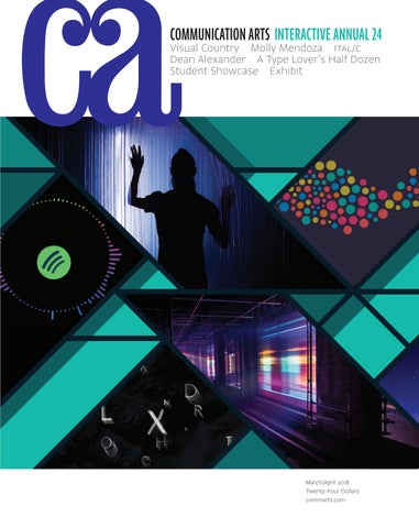
COMMUNICATION ARTS INTERACTIVE ANNUAL 24
Visual Country Molly Mendoza ITAL/C Dean Alexander A Type Lover’s Half Dozen Student Showcase Exhibit
March/April 2018 Twenty-Four Dollars commarts.com
MARCH/APRIL 2018 VOLUME 60 NUMBER 1
COMMUNICATION ARTS ��
FEATURES
��
��
��
20 ITAL/C
44 Dean Alexander
28 Molly Mendoza
52 A Type Lover’s Half Dozen
36 Visual Country
60 Exhibit
by Julie Prendiville Roux From Southern California, this design studio infuses client and personal work alike with a decidedly clean visual language. by Claire Sykes Using bold brushstrokes and overlapping textures, a Portland, Oregon–based illustrator is creating art that does no harm. by Ellen Shapiro This New York agency may take a full day to shoot seconds of content, but the result will drum up likes faster than you can say, “stop-motion.”
COVER
Source images (left to right, from top to bottom): Kontinuum—An Underground Journey Through Time installation, p. 136; Seeing Theory student work, p. 152; Spotify SAM student work, p. 156; Tim Roussilhe website, p. 100.
by Michael Coyne A photographer has found a home base in Baltimore, Maryland—and in the uncrowded space where humor, fashion and storytelling overlap. by Tamye Riggs A type lover shines a light on six typefaces and the stories behind their modern and dynamic forms. by Jean A. Coyne The latest and best in visual communication from here and abroad.
67 Student Showcase
Our editor’s fourth annual selection of portfolios by fifteen promising students of visual communication.
��
�� INTERACTIVE ANNUAL 84 108 116 118 126 142 150
Websites/Microsites Mobile Tablets/Handheld Devices Social Environmental Other Interactive Media Student Work
FRESH Editor/Designer Patrick Coyne Executive Editor Jean A. Coyne Managing Editor Esther Oh
158
Eleanor Shakespeare This London, United Kingdom– based illustrator’s photomontages give rich texture to timely topics.
160
Jason A. Frank By chasing life’s true moments, a Los Angeles photographer creates images that nourish one’s spirit.
Associate Editor Michelle Yee
162
Regina Souli With a critical mind and a sharp eye, this Athens-based designer strikes right to the heart of a brand.
14
Design Culture Wendy Richmond looks to the future, when our bodies’ physical and mental limitations may become a thing of the past. Creativity From New York City to San Francisco, Caroline Tiger takes note of the venues that offer inspiration in real life.
15
Advertising In this age of clicks and likes, Ernie Schenck pauses to pay homage to craft and execution.
166
Insights In a Q&A, Fabricio Teixeira explains how he’s translating UX into a language anyone can understand.
Print Producer Daniel Sambrano
16
Typography Elizabeth Carey Smith traces the history of the high-fashion world as only a typographer can.
Design/Production Associate Isabel Bagsik
172
Archivist Nancy Clark Lewis
Design Details E-sports is booming. Haniya Rae reports on the need for good design in this growing market.
Editor’s Column Contributors Favorites Book Reviews
Production Assistant/Customer Service Representative Khader Yanni
Software Engineers Jiping Hu Srividhya Gopalakrishnan Technology Administrator Michael Hoyt Advertising Director Dirk Moeller
DEPARTMENTS 8 12 168 170
Art Director/Designer Joni Rivas Production Manager/Competition Coordinator Lauren Coyne
COLUMNS
164
Editor At Large Anne Telford
175 Directory 176 Index to Interactive Annual 24 178 Overheard
Circulation Director Perry Fotos Accounting Lois Vega Contributing Editors Sam McMillan Wendy Richmond Ernie Schenck Founder Richard Coyne (1926–1990)
Volume 60, Number 1 commarts.com COMMUNICATION arts (ISSN 0010-3519) is published six times a year (January/February, March/April, May/June, July/August, September/October, November/ December) by Coyne & Blanchard, Inc., 110 Constitution Drive, Menlo Park, CA 94025-1107. Periodicals Postage Paid at Menlo Park, CA, and at additional mailing offices.
Copyright 2018 by Coyne & Blanchard, Inc. All pieces reproduced in this issue are under prior copyright by the creators or by the contractual arrangements with their clients. Nothing shown may be reproduced in any form without obtaining the permission of the creators and any other person or company who may have copyright ownership. SUBScRIBER SERVICES: Subscription: 1 year, $53; in Canada, $70; all other countries, $110. All payments in US dollars, Canadian GST: 127848620.
Direct all inquiries, address changes, subscription orders, etc., to: Web: commarts.com E-mail: subscription@commarts .com Phone: 800-688-1971 (US/Canada) Phone: 215-788-5481 (International) Fax: 215-788-6887 Mail: COMMUNICATION arts PO Box 2013 Langhorne, PA 19047 Please allow six weeks for changes.
EDITORIAL AND BUSINESS OFFICE: 110 Constitution Drive Menlo Park, CA 94025-1107 Phone: 650-326-6040 Fax: 650-326-1648 E-mail: ca@commarts.com POSTMASTER: Send changes of address to: Communication Arts PO Box 2013 Langhorne, PA 19047 Canada Post: Publications Mail Agreement #40612608 Canada Returns to be sent to: IMEX Global Solutions, LLC PO Box 25542 London, ON N6C 6B2
Like us on Facebook facebook.com/communicationarts Follow us on Google+ plus.google.com/+commarts Follow us on Instagram instagram.com/communicationarts Follow us on Instagram instagram.com/communicationarts Follow us on Pinterest pinterest.com/camag Follow us on Twitter twitter.com/commarts
2018
DESIGN &
ADVERTISING COMPETITIONS
CALL FOR ENTRIES
ENTER THE INTERNATIONALLY RENOWNED
DESIGN AND ADVERTISING COMPETITIONS FROM COMMUNICATION ARTS
Promote your talent by entering our highly respected juried competitions in graphic design and advertising. If selected, your award-winning work will be meticulously reproduced in the 2018 Design and Advertising Annuals and on the Communication Arts website, assuring you maximum exposure to our international audience. Now accepting PDF entries for these competitions.
DEADLINE: MAY 4, 2018 Each winning entrant will receive a personalized Award of Excellence, milled from solid aluminum.
ENTER ONLINE NOW
COMMARTS.COM/COMPETITIONS
CC RR EE AA TT EE DDBB YY
Stocksy is artist-owned an artist-owned cooperative raising Stocksy is an cooperative raising the the bar bar — and industry’s expectations — and the the industry’s expectations — — of stock photography cinematography. of stock photography andand cinematography. SC TO CYK.SCYO. C STO KS MO M
BY RESPECT
EDITOR’S COLUMN
Patrick Coyne
W
e saw a drop in the number of entries submitted to this year’s Interactive Annual, which can largely be explained by the one-year moratorium placed on Publicis Groupe agencies from entering creative competitions. That said, there were a lot of innovative entries to judge, including several headset-based virtual reality (VR) projects and our first voice-controlled app submissions. The experiential marketing trend also continues to grow, which resulted in an increase in the number of environmental category entries. We also saw more student entries, many of which were socially minded.
“Across all the categories, it was wonderful to see smart, creative projects that were servicing real causes in meaningful ways,” says juror Erika Tarte. “I sincerely hope this isn’t a trend so much as a shift in brand values and recognition of the importance of design for social impact.” “I was surprised by how many experiential entries there were this year,” juror Jason White says. “It’s clear that even more studios and agencies are engaging in this arena.” “I was especially excited to see experiential design leaving the boundaries of cultural institutions and museums, and starting to play a role in day-to-day life,” says juror Fanny Krivoy. “I wish there were more VR/augmented reality (AR) submissions, but these technologies are still in their infancy,” juror Eva Mautino says.
Not all of the judges’ commentary on this year’s entries were laudatory and, in the interest of balanced reporting, I’ve included some of their more critical opinions. “Quite a few sites are trying almost too hard to grab people’s attention with extra animations or visual trickery often not needed for the content and messaging of the site itself,” says Mautino. “I was surprised to see so many promising and visually stunning entries struggle with interactive storytelling,” Tarte says. “Many entries packaged traditional, linear media in beautiful web, environmental and VR wrappers without consideration for the unique challenges and opportunities provided by those mediums.” “I was surprised to see the amount of case studies that still use the tired method of convincing me of the campaign’s success with metrics that are seemingly inflated or generally unimpressive,” says Hadinger. “I assumed the industry had moved on from these tactics, but apparently the formula is still in use today.” In addition to requesting comments on this year’s submissions, I also asked the jurors a series of questions about the future of digital interactivity. What business, cultural and social developments will alter the role of interactive media in the future? “Interactive media will be more prominent in all aspects of society,” Mautino says. “As
Photographs by Steve Castillo
“The entries that got me playing—rather than forcing me into a leaned-back experience—were intriguing and captivating,” says juror Stephen Hadinger.
“It was also great to see a plethora of entries that involved the use of artificial intelligence,” White says. “There were some innovative uses of this new technology that I found inspiring.”
8
Interactive Annual 2018
Communication Arts Daily OUR DAILY EMAIL NEWSLETTER
WHAT YOU NEED TO
STAY INSPIRED Communication Arts Daily
Designed to keep you up-to-date on the hottest design, advertising and web projects, our newsletter also links to the most thought-provoking articles we’ve found on the web. Delivered to your inbox every business day, this quick read is just what you need to stay informed and inspired.
SIGN UP IS EASY AND FREE commarts.com/newsletter
EDITOR’S COLUMN more companies and institutions are investing in interactive media, the quality of the work will increase and reach bigger audiences.” “The role of multinational corporations in providing services that have long been the purview of governments is already changing the role of the designer and interactive media itself,” says Tarte. “Good stories will be less important than real services and products that will be primarily experienced through interactive media.” “Algorithms, machine learning and artificial intelligence will continue to impact the way in which we design as they provide an affordance for creating dynamic media that’s tailored to each individual user in real time,” Hadinger says.
STEPHEN HADINGER is the partner and global design director of Siberia, a design and engineering firm with offices in Berlin, London, New York and San Francisco, where he’s helped expand its international creative footprint. Crossing disciplines for more than ten years, Hadinger uses his experience in everything from creative direction to product development to physical computing to help push what’s possible for brands. He’s created numerous award-winning ad campaigns for BBH New York, co:collective and AKQA San Francisco, where he led the establishment of its creative technology practice. He currently lives in San Francisco with his wife, Layla, and their two cats, Sid and Jazz.
How will the continued diversification of personal electronic devices affect interactive design? “Ideally, we will leverage the strengths of each device to match it to the goal of the experience that we are designing,” says Krivoy. “As designers, we will need to continue broadening our understanding of technology and data and partnering with technologists who will help us tackle more complexity and design better experiences.” “With the wider adoption of different devices, users will be more demanding of the content they decide to interact with, putting more pressure on creators to focus on better interactive design,” Mautino says. “Clear user interface design is needed to level the landscape of the myriad devices out there,” says White. “With the evolution of internet-connected objects and as the Internet of Things continues to grow with momentum, our mobile devices are going to be the keys that unlock compelling and engaging experiences that interact with our physical environment,” Hadinger says. “I’m excited for the near future in which people get back to exploring the world around them rather than looking down at a small screen in their hands.” “Gone are the days that users engage with a product or service through only one device or even through a visual interface,” says Tarte. “By necessity, interactive designers will need to design with consideration of a medium’s idiosyncrasies and opportunities, and challenge the notion that there’s any ‘right’ device for a particular service.” What breakthroughs will be required for VR to become more widely accepted? “To many people, VR is still a nebulous medium that they associate with the headset and not the experiences that live within,” Hadinger 10
Interactive Annual 2018
FANNY KRIVOY is the founder and creative director of New York City– based Studio Analogous, which builds digital products, services and capabilities for mission-driven organizations. Today, much of Krivoy’s focus revolves around inclusion, designing for oftenoverlooked groups who have a lot to contribute to business and culture. Krivoy studied design at Instituto de Diseño de Caracas in Venezuela and graduated with honors from the London College of Communication. Before Analogous, Krivoy was senior vice president of experience design at Schematic (now Possible) and held executive creative director positions at Renegade and Organic.
says. “It’s still in its infancy and therefore only has a small sample size of resources, tools and ‘best in class’ examples that make it easy for those who are interested in the field to acclimate themselves to the breadth of capabilities. And until the hardware becomes more accessible and distributed, brands are going to be reluctant to invest production budgets in experiences that will garner such little visibility.” “Technology breakthroughs are needed so that the devices are less cumbersome, uncomfortable and expensive,” says Krivoy. “Once the novelty wears off and the technology becomes more accessible, it will be an invaluable tool.” “We need to find the right fit for VR so it becomes purposeful,” Mautino says. “We should focus on specific areas to allow for a more natural and focused interaction, such as education. If kids start using it in the classroom, they’ll naturally be more inclined to use VR for other purposes too.” “VR will gain wider appeal when more affordable headsets match the quality and processing power of their higher-end competitors, and designers have more intuitive tools for interactive and collaborative experiences,” says Tarte. “But I’m more interested in AR becoming a more widely accepted technology—the hardware needed for compelling AR experiences is already in most of our pockets.” Selection for this year’s annual required a minimum of three out of five votes. Judges were not permitted to vote on projects with which they were directly involved; I voted in their stead. The winning projects, including links and case-study videos, can be viewed on our website at commarts.com. I would like to extend our grateful appreciation to our jurors for their conscientious efforts in selecting our 24th Interactive Annual.
EVA MAUTINO is the chief administrative officer for Stockholm, Sweden– based visual effects and digital animation studio Important Looking Pirates. Prior to joining the firm in 2017, Mautino was director of production for B-Reel in Venice, California. Born in Italy, she started her advertising career in post-production and animation in Stockholm; in 2006, she joined B-Reel to combine her film and web knowledge. Mautino then moved to London to head the B-Reel UK office as its managing director, later relocating to Los Angeles to run the West Coast office. She also ran the Los Angeles chapter of SheSays, facilitating knowledge sharing among women in the creative industry.
ERIKA TARTE is the creative director of experiential design at New York City– based Edelman Digital, where she applies emerging technology to the needs of communications marketing and leads an internal creative technology laboratory. Tarte was previously the director of visual experience design at Local Projects, where her award-winning work encompassed everything from educational apps to immersive interactive installations to branding. She holds an MFA in graphic design from the Rhode Island School of Design and a BA in history from the University of California, Berkeley, which actually comes in handy more often than one would expect.
In Memoriam It is with deep sadness that I acknowledge the recent passing of several influential members of the creative community. Margo Chase, 59, founded Chase Design Group in 1986 in Los Angeles, quickly earning a reputation in the entertainment industry for her custom lettering and gothic imagery for high-profile clients like Cher, Madonna and Prince. She also designed logos for the popular TV shows Angel and Buffy the Vampire Slayer. She had expanded her company into a global brand design firm, with offices in New York and Bristol, producing work for multinational clients including Nestlé, PepsiCo and Procter & Gamble. Chase was a judge for us in 1992, and we published a feature article on her firm in 1993. Ivan Chermayeff, 85, along with his business partner Tom Geismar, created some of the most recognizable corporate identity programs of the second half of the 20th century. His designs for Pan Am, Showtime Networks and the Smithsonian Institution are considered iconic. A past president of AIGA, Chermayeff was the recipient of gold medals from the institute and from the Society of Illustrators. He was named to the Art Directors Club Hall of Fame in 1981. We published feature articles on Brownjohn Chermayeff & Geismar in 1960 and Chermayeff & Geismar in 1970 and 1994. Chermayeff was also a judge for us in 1973. Julius Friedman, 74, was a Louisville, Kentucky–based graphic designer, photographer and artist. Well known for his posters for the Louisville Ballet and Louisville Orchestra, Friedman also contributed to a 1985 poster exhibition commemorating the 40th anniversary of the bombing of Hiroshima. His work is in the permanent collections of the Museum of Modern Art, the National Gallery of Art, the Poster Museum at Wilanów, and various corporate and private collections.
JASON WHITE is the cofounder and executive creative director of Chicago-based conceptual design agency Leviathan. With expertise in motion design, White guides his team through the production of high-profile projects for global brands, agencies and entertainers. Under his creative lead, Leviathan has worked with major brands, including BMW, Nike, North Face and Samsung, as well as with the recording artists Drake, Skrillex and Amon Tobin. A guest speaker at numerous industry conferences, White has seen his work featured in international media outlets, including Communication Arts, the Creators Project, Motionographer, Stash and WIRED.
A recipient of the Kentucky Art Council’s Governor’s Awards in the Arts, Friedman was a judge for us in 1985. Mo Lebowitz, 84, worked as an agency art director and graphic designer, but was best known as the proprietor, or “Prop,” of the Antique Press, which he established in 1960. With an eclectic collection of letterpress equipment and fonts of metal and wood type, he produced a steady stream of broadsides, pamphlets, invitations, holiday cards, posters and other ephemera that were widely collected by his friends and acquaintances in the graphic design community. We published a feature article on the Antique Press in 1971, and Lebowitz was a judge for us in 1974. Alan Peckolick, 76, was a designer, art director and fine artist, but is particularly recognized for his expressive lettering as a protégé and partner of graphic designer Herb Lubalin. Peckolick worked as an assistant to Lubalin after graduating from Pratt Institute in 1964. He left in 1968 to open his own design office, but rejoined Lubalin in 1972 at the firm Lubalin, Smith & Carnase. Peckolick coauthored Herb Lubalin: Art Director, Graphic Designer and Typographer in 1985 and wrote Teaching Type to Talk, a compendium of his own career, in 2013. We published a feature article on Peckolick in 1971. Pete Turner, 83, was a photographer whose career spanned 60 years. He received acclaim for the saturated color images he shot for Esquire, Look and Sports Illustrated, as well as for advertisers and record album covers. The recipient of more than 300 awards from advertising and design associations, he received the Outstanding Achievement in Photography Award by the American Society of Magazine Photographers (now American Society of Media Photographers) in 1981. We published a feature article on Turner in 1976. He was a judge for us in 2001. ca Communication Arts | commarts.com
11
CONTRIBUTORS Features
Michael Coyne (mcoyne90@gmail.com) is a freelance writer based in Washington, DC. Having previously worked for Communication Arts, he now plans on attending graduate school for a master’s degree in creative writing. In this issue, Coyne spends time with Dean Alexander, whose work pushes against the boundaries within photography. Julie Prendiville Roux, cofounder of Los Angeles–based creative agency Handmade Productions (handmadeca.com), has been writing for Communication Arts since 1987. In this issue, Prendiville Roux visits the Los Angeles office of ITAL/C and delves into the design firm’s elegant work. Tamye Riggs is a writer, editor, designer and event planner who is hopelessly devoted to type. A proud member of the Alphabettes, she has authored and/or edited eight books on type and design and serves as executive director of the Association Typographique Internationale (ATypI). Riggs also works with the typographically obsessed team at Type Network. In this issue, Riggs spotlights six fresh typefaces, each with a visual language uniquely its own. Ellen Shapiro (visualanguage.net) is a graphic designer and writer based in Irvington, New York. Author of The Graphic Designer’s Guide to Clients (Allworth Press) and more than 200 magazine articles and posts about design, illustration, photography and visual culture around the world, she has been contributing to Communication Arts since 1991. In this issue, Shapiro profiles Visual Country as the agency creates short-form content for the world’s biggest brands— a fraction of an inch at a time. Claire Sykes (sykeswrites.com) is a freelance writer based in Portland, Oregon, covering design, arts and culture, philanthropy, health and wellness, and business. Within the visual arts, she writes regularly for Communication Arts, Photographer’s Forum magazine and the American Photographic Artists’ website;
her byline has also appeared in Applied Arts, Camera Arts, HOW and Photo District News. In this issue, Sykes pinpoints what drives illustrator Molly Mendoza’s tactile and vivid work.
Columns
Elizabeth Carey Smith (elizabethcareysmith .com) is a New York City–based typographer who specializes in design and creative direction for type foundries, branding, fashion and the arts. She speaks and writes regularly for conferences and publications around the world. In this issue’s Typography column, Carey Smith uncovers which typefaces have come to define the fashion world’s most iconic brands. Haniya Rae (haniyarae.com) is a Brooklynbased freelance design and technology journalist who’s written for the Atlantic, Communication Arts, Print and Popular Science, among other publications. In this issue’s Design Details column, Rae explores the rapidly expanding business of e-sports branding. Wendy Richmond (wendyrichmond.com) is a visual artist, a writer and an educator whose work explores public privacy, personal technology and creativity. Richmond has taught at Harvard University, the International Center of Photography and the Rhode Island School of Design, and she serves on BRIC’s Artists Advisory Council and the MacDowell Fellows Executive Committee. Her latest book is Art Without Compromise* (Allworth Press). In this issue’s Design Culture column, Richmond reveals that the optimized human body is already upon us. Ernie Schenck (ernieschenck.myportfolio .com) is a freelance writer, creative director and regular contributor to Communication Arts’ Advertising column. Schenck is an Emmy finalist, a three-time Kelly nominee, and a perennial award winner at Cannes, the CLIOs, D&AD, the FWAs and the One Show. As a freelancer, an executive creative director at Hill Holliday/Boston
and a cofounder of Pagano Schenck & Kay, he has worked on campaigns for some of the most prestigious brands in the world. In this issue’s Advertising column, Schenck shines a light on an overshadowed hero of advertising—craft. Caroline Tiger (carolinetiger.com) is a design writer living in Philadelphia, where she also directs content and communications for product design consultancy Bresslergroup. She has contributed work to many publications, including Dwell, Entrepreneur and WIRED. In this issue’s Creativity column, Tiger presents nine venues in the United States and beyond where designers can see inspiration up close.
Book Reviews
Ruth Hagopian (ruth.hagopian@gmail.com) is a freelance writer and editor whose profiles of designers, photographers and artists have appeared in Create, Digital Graphics and Print magazines. She was also a publisher of Online Design magazine and a partner in Visual Strategies, a San Francisco–based design firm. Sam McMillan (wordstrong.com) is a San Francisco Bay Area–based writer, brand strategist and regular contributor to Communication Arts’ Book Review department.
Correction
In the November/December 2017 Typography column “Variable Fonts: The Second Coming of Gutenberg?” Khoi Vinh’s blog was mistakenly identified as Substraction.com. It should be Subtraction.com. Our apologies for the error. In the January/February 2018 feature on photographer Natasha V., Nathalie Cusson should have been credited as the art director on the close-up image of the beauty product on page 50.
Pictured contributors wrote features and columns: Michael Coyne, Julie Prendiville Roux, Tamye Riggs, Ellen Shapiro, Claire Sykes, Elizabeth Carey Smith (Photo credit: Catalina Kulczar), Haniya Rae, Wendy Richmond, Ernie Schenck and Caroline Tiger. 12
Interactive Annual 2018
FIND YOUR PERF ECT JOB AT
CREATIVE HOTLIST CREATIVE HOTLIST, THE CAREER SITE FROM COMMUNICATION ARTS MAGAZINE, HAS MORE JOB LISTINGS IN GRAPHIC DESIGN, ADVERTISING AND NEW MEDIA THAN ANY OTHER CREATIVE SERVICES SITE.
Sign up for a FREE account and with a single click, send your Cover Letter, Resume and Links to Work Samples every time you apply to a Creative Hotlist job.
CHIEF MARKETING
DIRECTOR OF
OFFICER
USER EXPERIENCE
SENIOR UX
ARCHITECT
VISUAL DESIGNER
PACKAGE DESIGNER
CREATIVE
DESIGN
DIRECTOR
PHOTO STYLIST
STRATEGIC STORYTELLER
JAVASCRIPT
DEVELOPER
The Communication Arts Career Site
MOBILE DESIGN
DIRECTOR
BRAND
STRATEGIST
COPYWRITER VISIT WWW.CREATIVEHOTLIST.COM TODAY AND FIND YOUR PERFECT JOB.
DESIGN CULTURE
Wendy Richmond
The Body As Isn’t
W
hen my mom was 91, she needed cataract surgery for her left eye. Her right eye, operated on years before, still had perfect 20/20 vision. The doctor suggested a novel approach: tailoring the new lens for close-up vision, specifically for reading. Mom, who hated wearing reading glasses, said, “Let’s do it!” After the surgery, she adjusted immediately and was able to see far and near, reading even small print. No glasses needed. With this procedure, not only had Mom’s deterioration been reversed; she had also achieved a state superior to what is considered normal. This is what we do. When confronted with aging, disease and injury, our society seeks to slow down (or reverse) the direction the body is taking. We have developed vaccines to prevent disease, prosthetics to replace missing parts, drugs and therapies to cure illnesses, medicines to alleviate pain, potions and procedures to enhance our appearance. The goal has been clear: bring the body back to its baseline; in other words, back to what nature originally supplied. But that goal is changing as we redefine what is “normal.” Where is the line between assisting the body to maintain or return to its natural state, and augmenting the body beyond its abilities? How do we decide what is desirable, justified or repellent? What is ethical? What do we accept and what do we defy? When do we move from the body as is to the body as isn’t? I have a friend who is a fan of the cultural movement called transhumanism. He believes that we can, and should, use technology to improve the human condition. Why limit ourselves to the current standards of physical and intellectual capability, let alone the average lifespan? A playfully journalistic approach to this topic was offered in March 2015, when VICE Media’s online magazine and video channel Motherboard presented a series titled “Goodbye, Meatbags.” Theneditor-in-chief Derek Mead wrote, “Will the human body become obsolete? ... When other people hack themselves to gain a leg up, will our regular-old fleshy bodies be able to compete?” This sounds extreme, but all evidence points to a future full of expectations and demands: our bodies will not have pain, will not age, will not deteriorate, will not fail, will not be ugly. You don’t like the destiny prescribed by your DNA? Well then, change it. Decisions lie ahead. They may be small, like my mom’s—the possibility of freedom from eyeglasses. Or they may be huge—
14
Interactive Annual 2018
deciding whether you should undergo a procedure that will alter your body forever. You will gather the facts and choose a path by balancing the state of technology with your desire for (or fear of) change. But do not ignore the subtle factors that surround you—factors that will influence each choice more than you know. Your perceptions are based not only on what’s happening inside of you, but also on what’s happening around you. As I see it, the primary influences are scientific, societal and personal. Scientific advances are ubiquitous, from a tiny pacemaker delivered to the heart through a catheter to a cochlear implant that can be revised with software. On any day, you can gather news reports of body-based game changers. For example, a Wall Street Journal article titled “Digital Pills That Talk to Your Doctor Are Here” describes “an antipsychotic pill that signals smartphones once it reaches the gut so doctors can track whether patients are taking their medication.” Or, as explained in the Los Angeles Times article “Companies start implanting microchips into workers’ bodies,” “The syringe slides in between the thumb and index finger. Then, with a click, a microchip is injected in the employee’s hand.” With this chip—the size of a grain of rice—a person can “open doors, operate printers or buy smoothies” with a simple wave. Approximately 150 workers already have the implant. The second factor is societal pressure. With each new medical advance, our expectations change and thus increase our urge to take advantage of it. The most obvious area is beauty. We’re influenced by what is available and what is perceived as appropriate by our culture. How far will we go to achieve the currently attractive nose? Height? Breasts? Eyes? Then there is personal circumstance, when the objective becomes subjective. As our bodies change because of disease, aging or injury, we revise our judgment about what interventions are acceptable. Everything is different when something happens to you or someone you love. Along with encouraging me to see movies like Ghost in the Shell, my transhumanist friend asks disquieting questions: “Why should I need sleep? Why is normal hearing so restricted? Why don’t we have eyes that can see for miles or X-ray vision like Superman?” He believes that we will—and must—take charge of our own evolution. He tells me, “The future is gonna be awesome.” ca © 2018 W. Richmond
ADVERTISING
Ernie Schenck
Where Is Mark Oakley When We Need Him?
O
nce upon a time, in an advertising universe far, far away, I worked with an art director by the name of Mark Oakley. (Mark, I hope you’ll forgive me for dragging you into this, but somehow, I don’t think you’ll mind.) Mark was talented. That went without saying. But he was also something else. Here was a creative that was as possessed as anyone I’ve ever known. No, his head didn’t spin around. He didn’t projectile vomit all over his desk. To my knowledge, he was never known to levitate in client meetings. And yet, his obsession with execution—with craft—was a wonderment. Long into the night, there would be Mark, hunched over a light box—and you either know what that is or you don’t—sifting
It’s easy to blame technology, to lay our disinterest in craft at the doorsteps of Facebook and Twitter and Instagram. Who can afford to dither over lighting and type and sound design when all that matters is likes and hits and clicks? It’s a new reality now. It’s faster. It’s leaner. And it doesn’t care two licks about attention to detail because detail means nothing if nobody sees it or is moved by it. And while technology might be a convenient scapegoat, if anyone’s responsible for the wounding of craft, it’s our entire culture. In Fredrik Backman’s novel A Man Called Ove, a curmudgeonly and gnarly widower laments a world in which craft—sawing things and nailing things and shaping them into the stuff of art—seems as relevant to society as velociraptors. “These days, everything had to be computerized, as if that was how they built the Coliseum and the pyramids of Giza. They’d managed to build the Eiffel Tower in 1889, but now one couldn’t come up with the bloody drawings for a one-story house.”
Concept will always be king. But craft will always be the crown prince inches from the throne. through a pile of photographs. Good one. Good one. Bad one. Good one. Bad one. There was no middle ground. No creative purgatory. You were good or you were bad. In or out. End of discussion. It was like that with everything. You did it 1000 percent—or what was the point. It was like that once. There was no content. There were words. Ideas ruled, and they ruled from the mountaintop. But craft? This was the Amazing Technicolor Dreamcoat. Big ideas were the plutonium core. Explosive and powerful and blinding. But big execution was the detonator. No detonator, no explosion. There are still a lot of big ideas in advertising. Real big. But the explosions aren’t so fierce anymore. A pop here. A boom there. Nothing so wonderful that it sears your retinas. In some ways, we champions of the idea might have created a monster. Concepts are everything, we told ourselves. Who cares if you cut this scene or that scene? What does it matter if the talent’s wearing brown shoes or black shoes? Nobody appreciates detail. Not even other creatives. Embrace the idea, and all else can be forgiven. But it can’t.
Want to lay a wood floor? No worries. Home Depot makes it easy as 1-2-3! Engine trouble? Why get your hands dirty when a computer has diagnostics that can pinpoint the problem in a few seconds. We don’t want to get our hands dirty. We don’t want to get our minds dirty. We just want a new floor. We just want our cars to work. We don’t have the patience for craft anywhere else. Why would we in advertising? Yet, how do we explain our love and admiration for beautifully crafted TV shows? Downton Abbey. Game of Thrones. The Crown. Westworld. It goes on and on. Yes, the stories are great. But the lighting, the costuming, the set designs—even the typography—all of it is so damn perfect. Never before has such attention been paid to producing the kind of detailed television that can be dismissed as a fantasy. The entire maker movement is built on craft. Musicians have never been more focused on craft as they are right now. There’s a school in Newport, Rhode Island, that teaches wooden boatbuilding using ancient tools—and I mean ancient. There’s a waiting list to enroll that’s seven years long. Concept will always be king. But craft will always be the crown prince inches from the throne. Take away craft, and the king, though still mighty, starts to look a little undressed. A little blurry. A little smudged around the edges. Just ask Mark Oakley. ca Communication Arts | commarts.com
15
TYPOGRAPHY
Elizabeth Carey Smith
Nestled in quilted black lambskin, the classic interlocking Cs of a silver-tone clasp (left) confirm that the handbag is, indeed, from Chanel. The fashion house’s iconic logo was designed by Coco Chanel herself in the early 1920s. The original Yves Saint Laurent YSL mark (right) provides a stately backdrop at a fashion show. Launched in the early 1960s, the monogram was designed by artist A.M. Cassandre, who mixed sans serif and serif typographic elements with roman and italic forms.
I
n an interview with rock critic Lester Bangs in the 1980s, writer and punk musician Richard Hell said, “If you invent yourself, you love yourself. The idea of inventing yourself is creating the most ideal image that you could imagine.” He was referring to the constructs of fashion—how in the 1980s New York City punk scene, your clothing choices, DIY haircut and level of neglect helped you clarify who you were to the audience.
Fashion is about self-invention and self-expression—the secure and insecure ways we reflect ourselves to ourselves and to others. It is both inward-looking and committed to the gaze. Our consumption of fashion can be dismissed as superfluous and vapid because it often is those things. But it is also a high art, one whose roots and sociological contexts are just as consequential as how the clothing itself is crafted. Fashion bridges the universal and the personal, giving key information about wearers to the people around them. Similarly, typography informs and expresses. It is both invisible and seen, the levels of which are determined by typeface designers (makers) and graphic designers (users). Like fashion, type surrounds us, and it is inextricable from everyday life. (Society couldn’t function for one day without letters, and we probably shouldn’t leave the house unclothed.) But it moves away from fashion since 16
Interactive Annual 2018
it’s mostly literal, while fashion is more nebulous. And while both are deeply affected by context, interpretations of fashion are broader, with perception and hyper-self-awareness as society’s primary goals. So how do fashion and type reconcile alongside each other? When the two meet—whether it’s in editorial contexts, fashion labels and brand rollouts, or simply letters on clothing—we see the gamut of cliché, precedent and appropriation, all in service of how we describe both fashion and type.
What is “beautiful” type? In making fashion images, people use words like feminine, delicate, beautiful and elegant. Similarly, creative directors, art directors and clients often request type that is beautiful, delicate and feminine. But what does that actually mean? The majority of the time, these words are describing a high-contrast serif typeface, one that typically utilizes extremely thin stroke widths on the upstrokes and, by comparison, extremely thick stroke widths on the downstrokes. These words are describing Didones, a portmanteau meaning a typeface that has the structure of Didot or Bodoni or something of its ilk.
© Musée Yves Saint Laurent Paris/Guy Marineau
© Isabel Bagsik
Type in Couture
EVERY ISSUE OF COMMUNICATION ARTS NOW AVAILABLE FOR DIGITAL DOWNLOAD!
GET ALL THE INSPIRATION YOU NEED: STORE.COMMARTS.COM/SINGLE-COPY The most comprehensive history of visual communication. More than 400 issues—from 1959 to today—are now available to inspire you.
Paprika Stuart Hamilton House Industries Unconventional Advertising Kinetic Singapore Melinda Beck Exhibit
March/April 2007 Eight Dollars www.commarts.com
MICHAEL OSBORNE McGARRAH JESSEE TRONIC STUDIO JAMES DAY CHRISTIAN NORTHEAST EXHIBIT TYPOGRAPHY ANNUAL 1
HERMAN MILLER MILTON GLASER TV GRAPHICS INTERNATIONAL COVERAGE MONSTER TYPE TIM MANTOANI EXHIBIT 50TH ANNIVERSARY ISSUE A N N I V E R S A R Y
JANUARY/FEBRUARY 2011
MARCH/APRIL 2009
creative excellence
TYPOGRAPHY ANNUAL 1 MICHAEL OSBORNE McGARRAH JESSEE TRONIC STUDIO JAMES DAY CHRISTIAN NORTHEAST EXHIBIT
50TH ANNIVERSARY ISSUE HERMAN MILLER MILTON GLASER TV GRAPHICS INTERNATIONAL COVERAGE MONSTER TYPE TIM MANTOANI EXHIBIT
years of
COMMUNICATION ARTS
COMMUNICATION ARTS
March/April 2009 Twenty-Four Dollars www.commarts.com
March/April 2012 www.commarts.com
COMMUNICATION ARTS PHOTOGRAPHY ANNUAL 53
Nicoletta Ceccoli National Film Board of Canada Droga 5 Chen Design Associates Exhibit
378
367
5 0 TH
January/February 2011 Twenty-Four Dollars www.commarts.com
© Courtesy of the Cary Graphic Arts Collection, Rochester Institute of Technology
TYPOGRAPHY
The November 1950 (left) and September 1958 (middle) issues of Harper’s Bazaar display art director Alexey Brodovitch’s bold compositions overlaid with the Didot masthead that he first introduced in the late 1930s. A cover for Elle’s 2016 Women in Hollywood issue (right) features the magazine’s compressed Didone masthead, which contrasts with the condensed bold sans serif letterforms underneath.
Didones’ hairline serifs are perpendicular to each other, with round or teardrop-shaped terminals and what Dutch type designers would call “translational” stroke variation. The most common of these typefaces—which fall under the classification of “Modern”—are Didot, designed and cut by Firmin Didot (1764–1836), and Bodoni, designed and cut by Giambattista Bodoni (1740–1813). Et voilà. Those evocative, provocative words usually mean one of these; though, I can’t recall an art director ever specifying which Didot or Bodoni. (Being specific about type and its qualities makes art directors nervous. Maybe it’s because they don’t want to get demeaned by typographers.) So, why did Didones become the precedent in fashion? When digging through the Condé Nast archives, I found a treasure trove of typographic exploration illustrating how type and lettering coexisted with increasingly arresting fashion imagery. But determining why—and where and how—was not as simple as I’d assumed it would be.
18
However, almost simultaneously, geometric sans serifs appeared alongside these Didones. Typefaces like Futura marked a spirit of European modernism, futurism and universalism. The impetus for sans serifs and derivative lettering must have come, at least in part, from the brand marks of fashion labels themselves. Chanel’s logo is an easy one to conjure, with its utilitarian, blocky capitals uncharacteristically depicting a quiet elegance. The interlocking Cs of the brand mark were most likely borrowed from the (literal) brands of saddlery and leather goods shops like Hermès, founded in 1837, and Louis Vuitton, founded in 1854. Gucci followed soon after Chanel, with an even more derivative logo of two Gs. Hence, another typographic precedent—interlocking sans serif capital letters—was established.
Almost certainly starting with Vogue magazine, Didones’ connection to fashion is cemented. From a design history perspective, Didones’ association with fashion is particularly supported by Alexey Brodovitch’s art direction of Harper’s Bazaar, which used Didot exclusively and deliberately. In his Eye magazine essay “Through Thick and Thin: Fashion and Type,” Abbott Miller says of Brodovitch’s typography: “Didot was the black blade that cut the white space of his layouts.”
By the 1950s, the labels that we most associate with high fashion had been born: Balenciaga, Balmain, Chanel, Christian Dior, Givenchy, Gucci, Hermès, Lanvin and Louis Vuitton. These labels formed the nexus of haute couture during its golden age. Their logos were of such a decided visual language that new designers who subsequently contributed to haute couture also emulated these marks. Yves Saint Laurent’s logo, designed by A.M. Cassandre in 1962, was a meld of all of these precedents—thin letterforms, an ambiguous semi-serif and overlapping letterforms as a brand mark. Diane von Furstenberg emulated this amalgamation, too, for her eponymous label, launched in the 1970s. Others in this newer guard of designers, like Valentino and Ralph Lauren, maintained the language.
It really wasn’t until the 1950s that Didones—which had been jostled, omitted and reintroduced throughout the first half of the 20th century—stayed put in fashion magazines. Still, somewhere along the way, high-contrast Didones became the primary typographic language used to denote fashion.
Futura (and later, a whole crowd of grotesques) claimed the voice of downtown fashion and culture. Former Elle design director Evan Campisi described the magazine as an indie magazine coming to mainstream fashion magazines. It’s intentionally unladylike, defiantly contrasting with the exclusive luxury of uptown fashion. In the
Interactive Annual 2018
minds of younger magazines and their audiences, Didones feel like the old definition of luxury. Street style has risen to prominence, and collections are now tribes. Today’s many designers of note originally made their names in downtown minimalism and street style. Calvin Klein (1968) and Dolce & Gabbana (1985) both hitched themselves to what was regarded as young and avant-garde by incorporating geometric sans serifs in their respective logos. And when the Yves Saint Laurent ready-to-wear line rebranded a few years ago as Saint Laurent, it used Helvetica for the logo. To me, this signifies a permanence to the notion that downtown fashion is as valuable as uptown fashion. Stylistically—and perhaps philosophically—there’s a difference between Yves Saint Laurent and Saint Laurent. The transition within the label makes sense, though—Yves was known for capturing a daring edge and an androgynous beauty; Saint Laurent has adapted to our times in a kind of perfect emulation of that spirit. Seeing this kind of leap is super exciting, and it also elucidates logos like Tom Ford’s. Tom Ford became the creative director for Gucci in 1994, elevating the fashion house again after its brand became oversaturated. While Ford is known for a kind of ultimate sex and luxury, he’s parked his logo in the camp of downtown, of new and innovative, of young but not immature. Of contemporary sophistication. Of beauty even more than youth. So it’s kind of funny to see that Karl Lagerfeld has branded himself as he has, post–Tom Ford. Lagerfeld has been the creative director of Chanel since 1983 and Fendi (interlocking letter logo!) since 1985. But when it came time to rebrand himself, he joined the side of the downtown edge, which can only be expected from a man who sports a white ponytail and looks that dapper (that’s a wink at Mr. Matthew Carter, by the way). What can be determined from these grotesque choices? Essentially that no one is taking chances in the space where type meets fashion. But if a maverick does make that jump from the precedent, and it is accepted, it is because that designer has gained an unprecedented level of respect early on—or the unique visual language originates from a voice in the industry you’d be stupid to question. Either way, if you pull it off, you can be sure to be ripped off. Because fashion. ca
This range of logos and wordmarks represents a who’s who of high-fashion labels. The horse-drawn carriage of the Hermès logo nods to the brand’s roots as a harness workshop, while its slab serif letterforms recall the Memphis typeface, designed by Dr. Rudolf Wolf in 1929. Below is Lanvin’s wordmark, which uses a Transitional typeface that’s neither Old Style nor Modern, and Gucci’s signature double-Gs, designed by founder Guccio Gucci’s son Aldo Gucci. Saint Laurent’s logo follows. Although then–creative director Hedi Slimane scandalized the fashion world in 2012 when he rebranded Yves Saint Laurent’s ready-to-wear line as Saint Laurent, using Helvetica for the logo, the refresh was actually a revival of the wordmark and name of the ready-to-wear boutique that Laurent originally debuted in 1966, called Saint Laurent Rive Gauche. At the bottom of the page are wordmarks for Louis Vuitton, Dolce & Gabbana and Calvin Klein, whose geometric sans serif letterforms evoke Futura, designed by Paul Renner in 1924. Raf Simons, chief creative officer of Calvin Klein, debuted a new, all-uppercase wordmark for the brand in February 2017. Communication Arts | commarts.com
19
BY JULIE PRENDIVILLE ROUX
N
estled between a Mexican café festooned with bright lettering announcing daily specials and a hair and nail salon punctuated with Halloween cats and witches, ITAL/C is a clean, white pause in the landscape. A blank canvas of a storefront in Venice-adjacent Mar Vista, California. Cofounders/creative directors Matt Titone and Ron Thompson have found a niche in such canvases. For clients ranging from Google to the quaint sandwich joint down the street, Titone and Thompson bring a careful eye and elegant solutions to their projects. For headwear brand Flexfit, the team designed a catalog detailing the 2018 line. “We’ve done the same kind of catalog every year,” says Flexfit’s marketing director Peter Choi. “We approached ITAL/C and said that we wanted to do something different this year. I got excited when they not only listened, but also pushed back. They pushed us into an uncomfortable range. We ended up discovering different and new things about our company. We’re representing ourselves in a new light.” Thompson’s path to design was circuitous. He started in the College of Architecture and Urban Studies at Virginia Tech and then attended Old Dominion University, where he majored in urban design and geography. “I was interested in how cities work and things like how a street can be improved with sidewalks and trees,” he says. “But after working at an engineering/mapping firm, I realized I was more into the graphical nature of displaying data than the inner workings of a city.” Titone had attended Savannah College of Art and Design before landing at ad agencies TBWA\Chiat\Day and Saatchi & Saatchi Los Angeles (LA), among others, and also freelancing along the way. It was at
Saatchi & Saatchi LA that the two met. Thompson was freelancing at the end of 2008 and took a full-time position at the agency in early 2009. Titone was freelancing there at the same time. The goal was to build out a Saatchi design team. Thompson remembers, “I was hesitant to go full-time. Advertising is not necessarily my cup of tea. It’s intrusive. Nobody seeks out an ad. Instead, they’re drawn to the design of a book or a wine bottle. Those are things that someone actually wants in their life.” Titone adds, “Design is such a small part of advertising. Advertising is generally about the big idea and how to sell it. Now we can really focus on design with our clients. Advertising is just not as fun for us, which is why we started ITAL/C.” They set up shop in 2012. Titone and Thompson have kept ITAL/C small, by design. They are at the core, and they bring in freelancers, photographers, illustrators and writers, as needed. Thompson explains, “If we say we want to have 20 people, we have to make a certain amount of money. We like being flexible, and we like taking on pro bono work. Right now, we’re able to take on jobs we want and turn down work we feel is not a good fit.” Stepping inside the storefront—they lock the door so shoppers don’t wander in to browse the wares that don’t exist—their sleek space is as compact as a railroad car, with three rooms in a row. In the first, a long table holds a bank of desktops, where Titone, Thompson and freelancers work. The white walls are covered in light-hued wooden frames holding a variety of images: a lineup of vintage surfboards, logo tests, stills from shoots. Next, a living room–style space is cozy and tasteful, with chairs, a couch, and a coffee table brimming with books, magazines
Captions supplied by ITAL/C. Right: “Headspace is a meditation app with one mission: to improve the health and happiness of the world. And with millions of users in more than 190 countries, it’s well on its way. With such a fast-growing brand and product platform, Headspace brought us in to help it with a new brand book that communicates its mission and aesthetic both internally to new employees as well as externally to media outlets.” Headspace, client. 20
Interactive Annual 2018
Communication Arts | commarts.com
21
ITAL/C
© Julien Roubinet
want produced, and it ends up working for us in the longer term because people will see the Indoek work and want to work with us,” Titone says. “The Owen Wright project was a perfect example of this. It garnered a ton of publicity in the first year of the studio—it sort of went ‘viral,’ although I hate that word, and in turn brought us a lot of clients who wanted to hire us for motion design. Indoek has become a self-promotion vehicle for the studio.”
and gadgets. Along a sideboard, a sheet of portraiture, beautifully illustrated by Titone, is pinned to the wall. The third space is kitschy and fun—a tiki torch, masks—a place to have drinks, perhaps. A back door leads out to a small parking lot. ITAL/C’s boutique size has afforded Titone and Thompson the time and space to operate a personal project, Indoek. Through this surf culture brand, they produce their own art, in the form of beautiful, meticulously designed books, community publications, and whatever strikes them as interesting and fun, such as a motion graphics video about surfer Owen Wright, “The Anatomy of Owen,” that is at once gorgeous and powerful. In it, the dimensions of Wright, who happens to possess a far larger physique than most surfers, are laid out in a motion-graphics-slash-coffee-tablebook schematic. Titone says, “We worked on every aspect of it ourselves: we did the research on athlete stats; wrote the script; shot and clipped hundreds of photos of Owen; and designed, animated and edited the video. It was a true labor of love, but it paid off big time in getting us more studio work down the road. It really put us on the map and became a project we are still known for.” For a studio with no new business personnel, that’s the side benefit of Indoek—it’s an ingenious way of attracting clients while also fueling Titone’s and Thompson’s own passions. “We use Indoek to make the types of projects we
For both their commercial and personal work, their sense of spare elegance pervades. It’s not that everything looks the same, as with some studios that have a signature look; each project or piece has its own personality, but never wanders off into gilding-the-lily land. “We’ve always had our own style,” Titone says. “But previous jobs have definitely trained us to be versatile. You are what you eat, so when forming the studio and putting together our website, we were very deliberate about what projects to show and what specific style we wanted to be known for. We really love classic, clean, smart—but fun—design, like the work of Charles and Ray Eames or other midcentury modern designers. Their work was very clean and sophisticated, but there was also a sense of playfulness throughout. I would say Eames is our biggest inspiration overall as a studio.” Tapping into their artful selves for Reebok, the two created a magazine-style catalog in 2015—a hybrid between editorial and advertising, called Reebok Rally. Hiring multiple photographers and writers for the project, ITAL/C produced a piece that evokes real-life challenges women athletes and weekend warriors face, showcasing Reebok wear while illuminating an active life. “We actually moved into the storefront space the same week we got Reebok Rally. That was the biggest project we’ve had as a studio from both a production standpoint and the budget,” Titone says. “It was huge for us to get that project because it showed that we were capable of directly handling a large-scale project for a big brand like Reebok without going through an ad agency. We were very fortunate to have worked with the head of marketing at Reebok, who was previously at Saatchi, so she knew how we worked and trusted us with the job.” Avelina Daum, now senior manager, brand creative marketing at Samsung, recalls, “We wanted femininity without being too flowery. ITAL/C is very easy to work with. They’re great listeners, and they can implement
This page: Cofounders Matt Titone and Ron Thompson. Right: “ITAL/C was commissioned to design custom hat manufacturer Flexfit/Yupoong’s 2018 catalog, which was filled with 110 styles of hats and 1,000 product stock keeping units. We took the Flexfit brand in a stronger, cleaner and bolder direction with the redesign of the catalog. The new art direction has since translated into product tech icons and seasonal print ads.” Flexfit/Yupoong, client. “Owen Wright is a Herculean figure in a sea of short, scrawny professional surfers. His tall, muscular build breaks the mold of the stereotypical surf stature. In this anatomical study of his physique, we highlight his enormous presence compared to his pro-surfing peers as well as other professional athletes. The comparisons are quite surprising. We created both a still photography motion graphic video piece and a microsite component, which features a full-scale image of Owen with which to get up close and personal.” Indoek, client. 22
Interactive Annual 2018
Communication Arts | commarts.com
23
24
Interactive Annual 2018
ITAL/C their vision while staying on brand. They were such fresh air to work with.” Before the 2016 presidential election, Google asked ITAL/C to generate stickers that would appeal to college students and younger millennials in the “I Voted” style. Lots of them—at least 500 different lighthearted, humorous sayings and designs, using #Iregistered. Then, as election day approached, the team designed a new set, #Ivoted, and released animated illustrations to share on platforms like Instagram and Facebook and through Gboard, Google’s keyboard for mobile devices. One of ITAL/C’s first projects combined Toyota and NASA. When the Endeavour space shuttle was moved from Florida to its new home at the Los Angeles–based California Science Center in 2012, a Toyota Tundra was the vehicle used to haul the massive shuttle from Los Angeles International Airport to the museum, a fifteen-mile trek
Left: “Reebok commissioned us to concept, produce and design the magazine layout for the second issue of its women’s magazine and catalog, or magalog, called Reebok Rally. The issue was a fall/ winter release, so we came up with a theme of ‘Elements’ to play off the changing of the seasons, the weather and the elements of a healthier, fitter lifestyle. The theme also played out graphically throughout the 50-page issue in the headline type treatments and the image layouts.” David Black/Patrick Dougherty/Bjorn Iooss, photographers; Reebok, client. “The Indoek Venice issue is the first in a series of large-format newsprint city guides that highlight our favorite surf towns around the globe. Published by ITAL/C, the Venice issue offers 84 pages of editorial content, featuring interviews with Dogtown legend Skip Engblom, by Trace Marshall; Venice, Los Angeles, California–born pro surfer Rick Massie, by World Surf League commentator and surf legend Strider Wasilewski; and Deus Ex Machina, Lone Wolfs, Chad Marshall of Mollusk Surf Shop and Surfing Cowboys, among others. The issue is also packed with photo essays from the likes of David Black, Kenny Hurtado, Peter Karnig and Kassia Meador, and illustrations by Ty Williams.” Indoek, client. This page: “Engaging the nation’s youth to get out and vote is no easy task. Leading up to the heated 2016 presidential election, Google reached out to have us design a grassroots initiative promoting voter registration among young college students and first-time millennial voters. We designed more than 500 stickers for the #Iregistered initiative, which were distributed across universities and college campuses nationwide. Young voters wore the light-hearted stickers as a badge of honor for registering to vote. Then, closer to election day, we changed the messaging to #Ivoted and released a slew of quick animated illustrations that were incorporated into the virtual keyboard app Gboard and made shareable on social media channels like Instagram and Snapchat.” Google, client. “One of ITAL/C’s first jobs included branding, illustration and site design for the historic haul of NASA’s space shuttle Endeavour from Los Angeles International Airport to its new home at the California Science Center. A Toyota Tundra pickup truck ended up towing the massive shuttle down the home stretch to its final destination. To celebrate and document the momentous occasion, we created an identity around the ‘Tundra Endeavour’ and designed an HTML experience site.” Saatchi & Saatchi Los Angeles, ad agency; Toyota, client. Communication Arts | commarts.com
25
ITAL/C for which trees had to be cut down in order to fit the behemoth space traveler. ITAL/C teamed up with Saatchi & Saatchi LA and branded the mission, creating illustrations and designing a site for the campaign, called Tundra Endeavour. Illustrated schematics and dramatic photography first counted down the haul, and then documented it. The project mirrors a museum installation in its thought and execution. Titone says, “We love doing projects like this, that are not only for a big brand, but also have a tie to Los Angeles. As East Coast transplants who now call Los Angeles home, it’s really cool to work on projects that make us feel more part of this ever-evolving community.” Thompson recalls the beginnings of ITAL/C—specifically, choosing its name. “We wanted something short and easy to remember. Italic and italicizing are in the vernacular of the field we’re in. Plus, if a word is italicized in a paragraph, it stands out in an elegant way instead of shouting at you.” Just like the studio itself. ca
This page: “Conceived in the clubs and the electronic dance music party scene, Boon Vodka represents modern, youthful spirit, elegant mischief and energetic good times. Music is at the heart of the brand. With that in mind, our approach to the branding and packaging was to design something bold and sophisticated—but most importantly, fresh and provocative. Most top-shelf vodka brands showcase the product in tall, clear bottles. To stand out on the shelf and appeal to a younger demographic, we designed a sleek, modern, matte black canister with silk-screened white sound wave lines wrapping all around.” Boon Vodka, client. Right: “With the launch of its flagship location in downtown San Diego rapidly approaching, Pendry Hotels tasked us with creating its brand style guide, a full property collateral system for San Diego and Baltimore, the brand website, print ads, and a slew of sales and promotional brochure assignments to maintain the momentum leading up to the opening. All of these deliverables incorporated unique patterns and an illustration language that reflected the classic, yet playful brand tone of Pendry.” Pendry Hotels, client.
26
Interactive Annual 2018
Communication Arts | commarts.com
27
MOLLY MENDOZA
BY CLAIRE SYKES
C
rammed between the double bed and the bookshelf, facing a window with its view of city rooftops and crows, a red drawing table waits.
In her tiny studio apartment in Portland, Oregon, Molly Mendoza dips her brush in sumi ink and sweeps the kolinsky-hair fibers across the paper. She’ll eventually scan the black pigment into the computer and digitally edit her brushy strokes and opaque shapes, adding subtle washes and punches of color. Her pieces romp across the pages of Nautilus and Bitch, on Adobe’s website and Hazlitt, and in her indie comic for Zainab Akhtar’s ShortBox. Mendoza’s clients revel in her illustrations, their signature cartoon-like forms layered with patterns and textures that verge on the frenetic and the abstract.
“There’s a youthfulness and energy to her work, a freshness and liveliness that are unusual,” says Gail Blumberg, who runs Blumberg Design in Menlo Park, California, and served as art director for some of Mendoza’s Adobe illustrations. “A lot of people rely so heavily on the computer, seduced by how perfect you can get the image that it loses its emotional and tactile, physical-world feel. Molly’s illustrations feel handmade, like a real person did them.” A real person who cares. “I’m concerned about who I’m doing illustration with—my clients; who my work is serving and how will it impact people; and where it fits into the context of the world right now, and historically here in the United States. There’s a lot going on here, and I want to make sure I’m doing right by the people who are treated unjustly in this world,” says Mendoza, 26, who also works part-time at Portland’s Land Gallery, among several galleries that have exhibited her work. Mendoza strives to reflect the beauty and strength of women and queer and trans people of color (QT/POC) in her illustrations. “I can’t bring myself to do anything that promotes people who hurt the environment or threaten my rights or the rights of others,” she says. It’s why she especially enjoys working with Kristin Rogers Brown, art director at Portlandbased nonprofit organization Bitch Media.
The feeling is mutual for Brown, who was Mendoza’s instructor during her senior year at Portland’s Pacific Northwest College of Art (PNCA). Once Mendoza graduated in 2014, “I couldn’t wait to dig in and work with her,” says Brown. “Her fluid mark making has an energy to it that is both graphic and expressive in a way that I really like, and that brings out a visual narrative in every illustration. And it gives her characters agency and power.” She appreciates Mendoza’s rough and loose thumbnails. “Molly is usually able to determine a metaphor or second story to complement the article fairly quickly,” Brown says. “And she’s the easiest to work with. It’s a dream when you can partner together at the idea stage and get to the crux of the story before the visual work is done. Then, iterating different possibilities for an article is substantial, not just decorative. She’s not just re-creating a moment in the article; she’s telling a story.” Mendoza, who welcomes candid critiques of her sketches, gladly tosses ideas around with her clients and listens to their advice on new directions. Blumberg keeps turning to her “because I can ask her for something really ambitious, whether I have an idea already or not,” she says. “She may come back with something that wasn’t what I had in my brain, but it always surprises and delights me.” Once Mendoza and her client have settled on the image, she runs with it on her own. After adding shading and details and finishing as much as she can with her brush, she scans the illustration into Photoshop to add color and line work and delete what feels too crowded. One of Mendoza’s go-to motifs is that of overlapping visual elements, which lends itself well to nuanced subject matter. “I threw the most difficult projects at Molly because I knew she could do them,” says Anshuman Iddamsetty, a podcast producer in Toronto and former art director at Hazlitt. “She stands out in her ability to layer translucencies of meaning. Even in some of her busiest illustrations, there’s cohesion, and room for the eye to travel—to roam.” And for the heart and gut to feel.
Right: “I had never created an illustration based on scientific journals, so making one to accompany George Klein’s article ‘Resisting Cancer’ was a much-welcomed challenge.” Lisa Modica, art director; George Klein, writer; The Scientist, client. 28
Interactive Annual 2018
MOLLY MENDOZA
© Maddie Maschger
When Iddamsetty hired Mendoza to illustrate an essay written by a woman who survived a sexual attack in Los Angeles, she created a fierycolored image of a naked woman fighting off a tiger. “I wanted to show anger and violence clashing, and I accessed those feelings from my own experience with sexual abuse, as well as my empathy for the author. The story and what happened to her enraged me, and I couldn’t help but unleash that anger upon the piece itself,” says Mendoza. “I made the red mean her anger and crammed the figures into the composition to depict the humid, claustrophobic Los Angeles heat that the author described. I added a lot of detail in the tiger’s face to make it stand out like a violent obstruction.” “Molly can take the most emotional elements presented in the text and synthesize them into something brand new, serving as the connective tissue that wouldn’t otherwise be apparent to the author or editor. You want to dive deeper into the illustration and, I hope, the words that accompany it,” Iddamsetty says. “That’s charisma, a rare trait in an illustrator.” Take her image accompanying an article on resisting cancer, for The Scientist. Mendoza wondered, “How else can you draw cancer without it looking like a bad cell or monster?” So she drew the feeing of it, in a mass of stormy reds and blacks looming over a small figure holding
This page: “For David Bruce Fonseca Guimaraens and Filip Verheyden’s essay ‘Port: A Refresher,’ Fermin and I wanted to portray the flavor of port wine in all of its glory through location.” Fermin Albert, art director; David Bruce Fonseca Guimaraens/Filip Verheyden, writers; Sabor Journal, client. “As part of a collaborative project between footwear brand KEEN and the Pacific Northwest College of Art (PNCA), five PNCA creatives were invited to create work inspired by KEEN’s UNEEK shoe. I went with a cool, dreamy illustration of someone underwater as well as a high-energy image of kids running through the jungle.” Ashley Williams, art director; KEEN Footwear, client. Right: Personal project. “Years ago, my friend purchased some water-soluble crayons for me. I began experimenting with them by drawing portraits of people.” “To accompany ‘How to Keep Running,’ Lauren Quinn’s essay on Hazlitt about her sexual abuse.” Anshuman Iddamsetty, art director; Lauren Quinn, writer; Hazlitt, client. 30
Interactive Annual 2018
Communication Arts | commarts.com
31
32
Interactive Annual 2018
MOLLY MENDOZA a shield. Her newest comic for ShortBox, The Worst, follows swim-team girls through spilled secrets, gossip and fallings-out, trials she remembers all too well from her youth. “With comics, I go slowly, lingering on a variety of emotions in how I draw the hands and other details. I’m going through the beats,” says Mendoza. “With editorial, it’s quick, bam, one loud beat.” Music helps. “If I hear a song that’s hitting the same emotional notes of the illustration, I’ll put it on repeat and totally get sucked into it, trancelike. It’s rhythmic, making the decisions about the piece,” says Mendoza, who loves R&B, nineties hip-hop, lo-fi and noise music. She remembers the happiness of making her very first drawing, while in kindergarten, of a turtle leaving footprints in the sand. For Mendoza, growing up in the nineties in Romeoville, Illinois, meant going into Chicago with her family, watching anime, reading manga and playing Final Fantasy video games. All the while, she kept drawing. She started taking art seriously in middle school, making friends by doing their portraits. When her family moved to Surprise, Arizona, her new art teachers saw talent and encouraged her to practice diligently. After graduating from high school, Mendoza took drawing and photography classes at nearby Estrella Mountain Community College. It was there that photography instructor Peter Bugg introduced her to the art-gallery scene and the idea of going to art school. “For the first time, I felt I wanted to be an artist,” she says. When she started attending PNCA in the fall of 2011, she aimed for a general fine arts degree. Then she realized that her interest in science, history and current events would pair well with drawing and even make her a living. “I saw illustration as a way for me to reach out and talk to people, as I did while growing up, and amplify their voices. I knew that’s where my heart really was.” In art school, Mendoza started her first indie comic, Singer’s Cave, with illustrator and life partner Sage Howard—her
Left: “Anshuman and I had some interesting discussion about Laura Maw’s essay ‘Rhythms of Fear.’ One idea was that street harassment can feel a lot like a horrifying game where you battle your way to a safe point—but then you have to make that trip again and again.” Anshuman Iddamsetty, art director; Laura Maw, writer; Hazlitt, client. “To accompany Fiona McCann’s article ‘Behind the Curtain: Meet the People Who Make the Portland Art World Possible.’ It was a joy to make because I love visual clutter, and I was given the OK to clutter this one up quite a bit.” Amy Martin, art director; Fiona McCann, writer; Portland Monthly, client. This page: “Pages from The Worst, a comic that I wrote and illustrated. The Worst is about two best friends on a swim team who have a falling out.” Molly Mendoza, writer/illustrator; Zainab Akhtar/Clark Burscough/ Comics & Cola, curators; Comics & Cola, publisher; ShortBox, client. Communication Arts | commarts.com
33
MOLLY MENDOZA illustrations, his words—an ongoing underdog fantasy adventure about cave-dwelling spirit creatures. For her senior thesis, she created a 48-page dreamy visual narrative called Voyage, based on the Voyager 1 mission. The PDF of Voyage, which she sent to magazine editors and art directors after taking a postgraduation month off, grabbed the attention of her first clients, including Nautilus, the New York Times and others that still commission her today. Although she was “scared to death,” Mendoza loved being her own boss. “I didn’t want to confine myself; there was so much I wanted to do. I wanted to make my own mistakes and build my own voice and see where it would all go,” she says. Now she pushes herself by writing and illustrating a graphic novel she’s already a hundred pages into. In May 2017, she also painted her first mural, for a joint temporary-murals project called Fresh Paint. She was the first of three emerging local artists sought out for this, by Portland’s Regional Arts & Culture Council and Open Signal, a community media center. “It was a lot more difficult than I thought it would be, but I had fun,” says Mendoza, who likens her colorful urban-neighborhood-themed mural to her editorial illustrations, sans brushstroke texture. Whether on a wall or a website, or in a book, a magazine or a zine—wherever illustrations appear in the world— Mendoza would like to see more women and QT/POC, and to see them respectfully depicted. “Especially in art director positions, too. It’ll make the industry stronger,” she says. And when it comes to her own work? She envisions doing more murals, comics and editorial projects outside of Portland and the United States. “And I’d love to have a bigger studio.” ca
This page: “A spot illustration and creative development for Nautilus’s Issue 31: Stress. It was fun to create samples of rocks to find the perfect marriage of colors and textures.” Len Small, art director; Nautilus, client. “For Sage Howard and my collaborative comic Singer’s Cave, which is about a ghost girl named Zaira who lives in a cave with a community of monsters.” Sage Howard, writer. Right: “For Fresh Paint, a joint temporary-murals project sponsored by Portland’s Regional Arts & Culture Council and community media arts center Open Signal. The two kids in this mural look out to the street with notebook and camera in hand, ready to get the word from the community.” Regional Arts & Culture Council, curator; Open Signal, client. “Spreads from my thesis, Voyage, a 48-page visual narrative on the Voyager 1 mission, the wonders of space exploration and the hopeful contents of the Voyager Golden Record.” Meg Hunt, art director. 34
Interactive Annual 2018
Communication Arts | commarts.com
35
Where stop-motion magic is made BY ELLEN SHAPIRO
I
n a loft above a restaurant supply store in New York’s Lower East Side, three people are squatting on the floor, hovering over a few square feet of pastel seamless. With white-gloved hands, they move objects—a swimsuit, a straw hat, a beach bag, sunglasses, a magazine—a fraction of an inch at a time while a camera bolted to a pole near the ceiling captures every movement and a videographer scrutinizes the frames on screen. In a few weeks, the resulting ten seconds of content will attract many thousands of views, likes and shares on Facebook, Instagram, Snapchat, Twitter and Vimeo—and drive lots of traffic to the client’s website. This is what goes on every day at Visual Country by Meagan Cignoli. At least ten projects are always in progress, from written treatments and storyboards to shooting and editing to delivery in formats sized for everything from digital banners to promotions that are part of large-scale campaigns. In the advertising world, where there are few women owners, company founder and creative director Meagan Cignoli has had a lightning-fast trajectory. Five years ago, discontented with her career in fashion photography, she began experimenting with stop-motion on Vine, crafting and posting tabletop still lifes that moved. Within weeks, the results attracted the attention of corporate marketers and agency creative directors. “Brands took notice of the clean, fresh aesthetic and the microformat that hadn’t existed before,” says Visual Country’s chief executive officer Amber Lee. “They wanted to get on the platform.”
Cignoli and Lee met in 2009 at a downtown club where Lee was performing. Cignoli was the photographer who’d studied at the Fashion Institute of Technology and the School of Visual Arts. Lee was the singer/songwriter/business school grad with experience in account management and the technology sector. “Meagan offered to do a photo shoot of my band,” Lee recalls. “We started doing shoots together, with me providing craft services and consulting.” Cignoli adds, “At first, Amber helped book clients and determine rates for my work, while I helped get press coverage for her music. Now we’re involved in every aspect of each other’s lives, including heading a team where everyone plays lots of roles and wears lots of hats.” A million social media followers after becoming partners, Cignoli and Lee moved production from a Brooklyn apartment to their self-designed 5,000-square-foot studio. There, a staff of 20 have created work that’s won a Cannes Lion, a gold ANDY, and awards from the Art Directors Club of New York and the London International Awards, which “honor the legends, pioneers and embodiments of excellence in advertising, digital, branded content, music and sound, branded entertainment, design, and production.” By excelling at all those things, Visual Country has amassed a client list that reads like a who’s who of top brands: fashion designers, food and beverage makers, purveyors of luxury goods, hotel groups, banks, automakers, retailers, and tech companies. All of whom want a million followers too.
Captions supplied by Visual Country. Meagan Cignoli was the creative director on all projects shown, and Amber Lee was the executive producer. Right: “Fine-leather luxury goods brand Delvaux approached Visual Country to showcase the latest addition to its handbag collection, with the goal of highlighting the unique features of the bag in a surreal and magical way. Using fluid animation, we brought the personality of the bag along with its beautiful construction to life.” Kata Farkas, art director; Nick Graham, editor; Charmaine Ayden, Karla Otto, senior managing editor; Michael Popp, photographer/director/retoucher; Chelsea Lee, sound design; Jenita Spirtovic/Ayla Weisz, producers; Karla Otto, agency; Delvaux, client. 36
Interactive Annual 2018
Communication Arts | commarts.com
37
VISUAL COUNTRY
© Amber Lee
© Dayane Ohira
Slack and Dropbox. Animation footage is captured in Dragonframe. Adobe Lightroom, After Effects and Premiere are used to process and retouch still images, delete animation aids like strings, combine multiple shots into one, and add and mix sound. Music, either commissioned or licensed, is a big part of every video’s success.
Cignoli, though, is the one whose name is on the door. “Your work is worth a lot more when your name is known,” she asserts. Although she’s hands-on with the styling of every project, she’s the first to credit the studio’s team of multitasking producers, scriptwriters, art directors, videographers, editors and prop masters. Depending on the creative direction, the staff and freelance crew can also include carpenters, illustrators, paper sculptors and chefs. If there’s a live action element, there are also casting agents, actors, stylists, and hair and makeup artists. Social media continues to challenge advertisers because it’s so easy to click on “hide ad” when a sponsored post pops up. Cignoli’s success comes from perfecting a secret sauce that, by blurring the line between commerce and art, gets people to watch content they may not realize—or care—is an ad. “Stop-motion is the best way to tell a story quickly,” she explains. “No words are needed, which can be very appealing for brands, especially those that market to international audiences. But it’s a laborious art, requiring hours of moving objects one millimeter at a time and stitching together hundreds of individual frames. Once you press play, though, the images make magic that captures people’s attention and gets them watching over and over again.” “Stop-motion garners more engagement, more shares, than any other medium,” adds Ivy Quejado, Visual Country’s sales and communications director. “The style has a cool factor, but also a warm, humanizing touch that reflects Meagan’s and Amber’s personalities.” Although stop-motion isn’t new—the technique was used to make some of the earliest films—software is now a major player. Visual Country’s workflow and assets are organized in
To coordinate all this talent and activity, Visual Country has fine-tuned its working methodology. “Every project starts with a written treatment,” Lee explains. “We make sure that up front, our clients are clear on issues like how many rounds of review are included. Detailed storyboards get everyone to focus on the direction, so there’s little ‘let’s figure this out as we go’ or ‘we can change it later.’ We develop a solid plan before one frame is captured. This minimizes revisions and gets all stakeholders on board and excited about the work.” “There’s lots of collaboration and conversation with the client during the treatment and storyboarding phases,” Cignoli adds, “because once boards are approved and prepping starts, the concept gets locked down and changes are limited. With live action, which involves multiple takes and results in more footage to choose from, you can be freer in execution later in the process. With stop-motion, what you shoot is what you get, and it takes a full day to shoot fifteen seconds. Clients are welcome on set, but they don’t need to be here. Our work has a consistency they’ve come to expect, and we work hard to deliver on that promise.” Recent work for Clinique is one example of Visual Country’s process and attention to detail. “Clinique has an iconic look that we didn’t want to mess with, but we elevated it in our own way,” says Cignoli. “Our mock-ups in Photoshop gave the client a true sense of how things would look. Props were swapped in and out, and the palette of pastels with pops of primary colors was tweaked until everything looked perfect on camera.” Art director Effie Speridakos adds, “We try to have a wink in each piece that we create—a playful element or a bright, colorful palette. Something to bring a smile to our audience. We get the client’s branding and messaging across, but why not create a moment of joy at the same time.” For an advertorial for Tommy Hilfiger’s blog, the challenge was to show three perfect outfits for beach destinations in fifteen seconds. Lee and director Michael Popp built the background with sand and paint. “This is where the job gets fun,” Lee says. “You get to experiment. Sand doesn’t come in the exact color we wanted, so Michael and I tested mixing wall paint into a bucket of sand—and it worked. It took us two days to build that beach, but that’s something that
This page: Meagan Cignoli (left), founder and creative director, and Amber Lee (right), chief executive officer. Right: “For the holiday season, Visual Country developed a series of short and festive videos for Clinique’s social channels, highlighting the theme of gifting.” Sasha Koren, Estée Lauder, executive creative director; Michael Marabella, Visual Country/Lauren Rohrig, Estée Lauder, producers; Anna Gelman, associate producer; Robyn Weiss-Jimenez, Estée Lauder, art producer; Michael Popp, lighting designer; Estée Lauder, client. 38
Interactive Annual 2018
Communication Arts | commarts.com
39
40
Interactive Annual 2018
VISUAL COUNTRY distinguishes us—we’re perfectionists who pay attention to the smallest details, whether it’s the exact color, the way something moves or the sound effects used to narrate the story.” That perfectionism shows in before-and-after pieces for Lowe’s that demonstrate how to transform a small closet into a coffee bar, a kids’ homework nook, or a dedicated storage space for bikes and sports equipment. “The team made dozens of mock-ups with various mixes of wall colors and props,” Lee says. “Some decisions were practical—brand goals, budget, availability of materials, products the client wanted to feature—and some were creative choices. As always, the key was balancing commerce and art.” On the day of my visit, three shoots were underway, and the loft was buzzing with meetings in the lounge, prepping in the kitchen and prop selection in the storeroom filled with flea-market finds and every kind of dish, shoe and hat. All of this was happening four floors above one of the busiest streets in the Lower East Side, where those who arrive by subway are now greeted by a sign at the top of the escalator in the Delancey Street station that flashes: “Full Character Sets Serif and Sans Serif” in between “Watch Your Step” and “Have a Nice Day.” Yes, designers and photographers have moved into this neighborhood, which was once home to New York’s poorest immigrants. Like this eclectic, changing corner of the city, Visual Country is expanding into new forms. “We kept our-
Left: “Visual Country, Lowe’s and ad agency BBDO teamed up for the second time since their Fix in Six collaboration to produce a total of three videos for a new Instagram series. Each 35-second video was comprised of 64 microclips that were each less than a second long. The microclips walk the user through the transformation of three empty vertical spaces—whose dimensions exactly match the Instagram Stories window—into three useful spaces: a fun and functional bike closet, an elevated personal coffee bar, and a playful children’s nook.” Marcus Johnston, BBDO, art director; Jim Connolly, BBDO, writer; Molly Adler/ Mike Sweeney, BBDO, creative directors; Tim Bayne, BBDO, executive creative director; David Lubars/Greg Hahn, BBDO, chief creative officers; Chelsea Lee, Visual Country/Alex Lubars/Jeff Reagan, BBDO Studios, editors; Erin O’Keefe, Visual Country, stylist; Michael Popp, director; Ali Gladstone, BBDO, producer; Anna Gelman, Visual Country, associate producer; Michael Gentile, BBDO Studios, agency producer; Bob Estrada/ Kristin Tomborello, BBDO, executive producers; Giancarlo Colaianni, production designer; AJ Rowe, BBDO Studios, production manager; BBDO/BBDO Studios, agency; Lowe’s, client. This page: “Tommy Hilfiger and Time Inc. approached us with an editorial partnership sharing the perfect packing list for three travel destinations. Visual Country created a high-sensory video to communicate the different elements for the clients’ advertorial. The video serves as an introduction to the editorial piece that lives on the Tommy Hilfiger blog. During the initial launch, Travel + Leisure hosted the video ad across its site.” Erin O’Keefe, art director/writer; Francesca Scutari, Time Inc., creative director; Eugene Kolb, editor; Paul Havel/ Chloe Rappaport, animators; Ayla Weisz, producer; Michael Popp, production designer; Time Inc., agency; Tommy Hilfiger, client. Communication Arts | commarts.com
41
VISUAL COUNTRY selves a certain size over the years so we could focus on high-quality work and being creative, rather than the stresses of growing bigger,” Cignoli says. “But now we’re opening a Los Angeles studio and working on a TV script. We’ll continue to specialize in short videos, but we’re also exploring longer-form content, with more narrative for the film and TV spaces. We’re always looking for new, exciting ways to tell stories—after all, that’s how you remain relevant and keep people engaged with your feed and your brand.” ca
This page: “Flower delivery company UrbanStems tasked Visual Country with creating a video that brought its garden-to-door delivery service to life. The paper-craft garden, street and bouquet were inspired by UrbanStem’s lighthearted and approachable brand.” Kata Farkas, art director/writer; Chloe Rappaport, editor; Anna Gelman/Julie Jungwon Seo, models; Chelsea Lee/Michael Popp, directors; Ayla Weisz, producer; Anna Gelman, associate producer; Lauren Bates, UrbanStems, executive producer; Julie Jungwon Seo, production designer; Cole Lemaster, UrbanStems, manager of graphic design; UrbanStems, client. Right: “To celebrate the launch of Converse’s Woven collection, Visual Country created an animated video showcasing the shoes’ woven nature.” Jamie Tallerico, Converse, art director; Paul Havel, writer; Chelsea Lee, editor; Michael Popp, director; Paul Havel/Michael Popp, animators; Austin Bryant, Converse/Ayla Weisz, Visual Country, producers; Jenita Spirtovic, project manager; Converse, client. “To help Twitter celebrate its tenth birthday, we created a video inspired by Chinese artist Ai Weiwei’s tweet regarding how Twitter is blocked in China. The flowers are representative of his project With Flowers, for which he placed a fresh bouquet in the basket of a bicycle every morning until the Chinese government returned his passport to him. In 2015, he regained his passport and the right to travel freely.” Kata Farkas, art director; Julie Jungwon Seo/Chelsea Lee, editors; Julie Jungwon Seo, model; Michael Popp, director/animator; Jenita Spirtovic, producer; Madison Duncan, Niche Media, agency producer; Kata Farkas/ Julie Jungwon Seo, production designers; Niche Media, ad agency; Twitter, client.
42
Interactive Annual 2018
Communication Arts | commarts.com
43
DEAN ALEXANDER FAMILIARIZING THE UNFAMILIAR verything has a story. Dean Alexander’s studio is full of them. Alexander works from a converted post office in Baltimore’s Federal Hill neighborhood. Brick houses surround the building, and inside, there are too many spaces to explore: The huge area where Alexander builds his sets and shoots photos. An enclave that rewards stylists with enough natural light to perfect hair and makeup. The bathroom, with a luxurious claw-foot bathtub that models can relax in postshoot. And a comfy hangout nook. Here, Alexander sits on a green couch, cradling a mug of hazelnut coffee as an oil painting of three figures floating in a tub on a stormy sea looms overhead. “There’s an apartment on the second floor of the studio,” says Alexander, looking up. “Karl Connolly rented that apartment from [my wife and I]. He painted that when he was in graduate school, and it showed at the Walters Art Museum. He’s an amazing artist; he paints in a completely different style now—ultramodern lines.” Sharp-eyed fans familiar with Alexander’s work might recognize the couch that the director and photographer is sitting on, which served as a prop in a brand film for Georgetown Optician titled “Our Family Knows Glasses.” Alexander’s work for the eyewear brand—created with Washington, DC–based agency Design Army—will strike an instant chord with anyone who loves the quirky aesthetic of The Addams Family and The Royal Tenenbaums. It has certainly swept judges at the London Fashion Film Festival, Communication Arts’ 2016 Photography Competition and the One Show off their feet. Such accolades reflect how solid Alexander’s relationship with Design Army has become. After cofounding Design Army in 2003, Jake and Pum Lefebure—chief executive officer and chief creative officer respectively—kept track of Alexander’s work for years before collaborating with him in 2009 on a project for Washingtonian Bride & Groom magazine. “Fast forward to 2018, and we can’t even count the number of shoots or awards we’ve won working with Dean,” the Lefebures state. “Design Army is a very hands-on agency, and to us, Dean is like a partner, not a vendor,” says Pum Lefebure. “He
BY MICHAEL COYNE
works with our creative team every step of the way, from scouting to art directing to bringing the vision together for the client. The best part about working with Dean is that we like the same things, so there isn’t a lot of guessing on the day of the shoot.” “The Georgetown Optician films—motion and still—were one-day shoots,” Alexander says. “People think we’re lying when we say that.” Another recent collaboration between Alexander and Design Army promotes CityCenterDC, an urban mixed-use development in Washington, DC. In the spot, dancers from The Washington Ballet—which Alexander and Design Army have also created work for—perform a choreographed dance, wearing brightly colored clothes that pop against the gray, contemporary-style architecture of the development. A humorous vein runs through the work, with its strong focus on repetition and surreal aesthetics—similar to the ambience that pervades the Georgetown Optician campaigns. “For CityCenterDC, we had a clear objective of what we had to show and shoot, but Dean’s great eye came into play on this production,” Jake Lefebure recalls. “He captured the movement and energy flawlessly. We also shot it in the fall, in the rain, in the cold—but you would never be able to tell. Dean has a great technical side that complements his creative mind.” Alexander’s creativity continually pushes him to explore new boundaries of storytelling. “For me, having a well-executed image that is beautiful—but also has a thread of humor or fashion—feels a lot more memorable,” he explains. “You might have these neat little packages in your head— you know what humor is, you know what a fashion shoot is—but when everything starts to get mixed up, you pay attention to it more. I’ve always been fascinated with where everything intersects.” This fascination with intersections began fueling Alexander from an early age. Raised near Harpers Ferry, West Virginia, right on the state’s border with Maryland, his interest in photography bloomed during a special-interest photography course at his middle school. “My dad was trusting enough to
Right: “From the print ad component of CityCenterDC’s The District of Joy campaign, which also included a fashion film produced simultaneously by the same teams. Shot on-site at CityCenterDC, a mixed-use development in downtown Washington, DC, the campaign focuses on the energy and design that make up the three city blocks, which have enlivened the downtown with world-class shopping, dining and events.” Sucha Becky/Heloise Condroyer, art directors; Mark Welsh, writer; Terica Walton, senior designer; Pum Lefebure, creative director; Christine de Lassus/Dale Johnson/Yoichi Tomizawa, stylists; Design Army, agency; CityCenterDC, client. 44
Interactive Annual 2018
© Rashid Belt
DEAN ALEXANDER let me use his SLR [single-lens reflex camera], which was bold of him,” Alexander says with a laugh. “We had a toy closet down in the basement, and I cleared out all the toys and made it into a darkroom. And—excuse the pun—it clicked for me.”
After winning several student photography competitions at the local, state and national levels while in high school, Alexander was even more certain of his desire to work in photography, but continued exploring how to apply his love for the medium. An interest in intersectional and multimedia art brought him to Baltimore. “I went to University of Maryland, Baltimore County because it had a program that blurred the lines between still photography, film, multimedia, music and performing arts,” he says. “I thought, ‘I’ll be an aerial photographer,’” recalls Alexander, whose father worked for the Air National Guard at Joint Base Andrews in Maryland. “And then when I started to teach skiing, I thought, ‘I’m going to be a ski photographer!’ And then I was travelling internationally a lot, and I thought, ‘I’m going to be a National Geographic guy.’ So I applied photography to everything that was an interest in life, but I knew that I would be a photographer.”
This page: “Shot on location at the historic Greenbrier resort in West Virginia for a spring fashion feature story titled ‘In Bloom.’” Kim Van Dyke, art director; Pascale Lemaire/Andrea Mitchell/Brandon Russell, stylists; Katrina Hunter, model; Baltimore STYLE, client. Right: “Using the same characters and playful approach as the Georgetown Optician short fashion film ‘The Eye Ball,’ the still photo print ads juxtapose eye-chart typography with portraits of the Voorthuis faux family. We paid careful attention to ensure that the glasses were the true stars of the shots. Using the same team for both the film and still campaigns made it easier to connect them in a tight and cohesive way.” Mark Welsh, writer; Lillian Ling, senior designer; Pum Lefebure, creative director; Dale Johnson/Michel Onofrio, stylists; Design Army, agency; Georgetown Optician, client. “The short fashion film ‘Our Family Knows Glasses’ tells the trueish story of the family behind fashion eyewear retailer Georgetown Optician in a quirky, creative way and with a high-fashion sensibility. The shoot location was at a historic mansion in Maryland horse country.” Sucha Becky/Mariela Hsu, art directors; Mark Welsh, writer; Gabriela Hernandez, designer; Pum Lefebure/Jake Lefebure, creative directors; David Grossbach, editor; Dean Alexander, director; Design Army, agency; Georgetown Optician, client. 46
Interactive Annual 2018
Communication Arts | commarts.com
47
48
Interactive Annual 2018
DEAN ALEXANDER Out of school, Alexander worked on the society page of the Baltimore Sun newspaper and for USA Today magazine as a stringer, but eventually recognized that photojournalism wasn’t his calling. “I felt like my strength was more in producing photos that didn’t exist yet,” he says. “[Conceptual shots] were just fun; it was being able to be a sanctioned smartass, in a lot of ways. Whatever you’re supposed to shoot, you can put a little fun twist on the whole thing.” This ethos would carry him to work for ad agencies. Eventually, he cofounded a studio with a friend before striking out on his own in the late 1990s. Though Alexander had originally set his sights on New York or Los Angeles, he found a home base in Baltimore that’s proven to be as creatively stimulating as it is convenient. From his studio, “you can walk to Penn Station [the major train hub in Baltimore], and the Baltimore/Washington International Thurgood Marshall Airport is ten minutes away,” he says. “So if we’re shooting in my studio and using New York–based models or stylists, we’ll typically bring them in the evening before, they’ll stay overnight, we shoot the next day and they go home that night. If we shoot with models out in Miami, they fly from Miami that morning, we shoot and they go home. “And the talent in Baltimore is mind-boggling,” he continues, noting that sometimes when he’s out on location out of town, he finds himself wishing that he had brought local Baltimore set builders or stylists with him. Bold, fun concepts continue to underpin much of Alexander’s work. For IBM, he visited everywhere from California to London to Shanghai from 2006 to 2013 to shoot a series of photos for the company’s business materials; each shot translates a concept into a carefully considered visual metaphor. “This would be innovation,” says Alexander, pulling up an image of an agricultural field
Left: “Shot in-studio to promote the production of Next to Normal for the theater Baltimore Center Stage. The story centers around a mother who struggles with worsening bipolar disorder and the effects that her illness and its management have had on her family. The set and props were fabricated for the shoot.” Bill Geenen, art director; Baltimore Center Stage, client. This page: “IBM commissioned me to capture symbolic and metaphoric imagery for various words and phrases, which were given upon the start of each assignment. It was up to me to select how and where in the world to capture them. In the images shown, the word was innovation. The shots needed to feel aspirational and somewhat futuristic in tone, showing the idea of ‘what could be.’ These images were taken in the Imperial Valley in California, where farmers have transformed the desert into fertile and productive land, and in London, United Kingdom, where someone on the London Eye Ferris wheel would have a unique perspective over the city. The campaign took me throughout North America, Europe and Asia.” Don Gordon, project manager; IBM Consulting, client.
Communication Arts | commarts.com
49
DEAN ALEXANDER on his computer. “This is the Imperial Valley in California, which is in the middle of the desert. Because the farmers irrigate [their fields] off the Colorado River and put these furrows in with GPS technology that are perfectly straight, [they’re able to grow] most of the United States’ produce in the winter months from this valley.” The emotion and the conceptual elements that Alexander imbues in his work have fueled what has proven to be another longstanding creative relationship. Trevor Villet, group creative director of Baltimore-based creative brand agency Planit, hired Alexander in 2004 to shoot chemicaldelivery pipes for a technical business-to-business print piece. “[My partner at the time and I] wanted to inject some emotion into something very rarely viewed as emotional, and we came across this guy whose photography work was heavily emotional,” Villet recalls. “But I distinctly remember seeing a few scientific shots in his portfolio in which he captured something very interesting, real and nonclinical. We hired Dean for the job and descended upon Scranton, Pennsylvania, in the middle of a snowstorm, and he delivered in every single way.” For the Under Armour soccer campaign that Alexander recently worked on with Planit, the agency’s design team contrasted Alexander’s product shots with his lifestyle photographs. Villet credits Alexander for imbuing the typically hardcore pro-athlete brand with approachability. “[Dean] just sees so many possibilities and would rather go down a few rabbit holes than risk missing the chance at something better than the comp,” Villet says. “What he brought to our Under Armour work is an eye for where it can go without pushing it too far from its bounds.” It’s these types of projects—the ones that defy clichés— that excite Alexander the most. And who better to help tell their stories than him. “That’s my whole wheelhouse,” he says. “I want to constantly be in unfamiliar territory.” ca
This page: “Feature fashion story shot on location in Jaipur and Pushkar, Rajasthan, India. The US and Shanghai crews shot throughout Rajasthan for the thirteen-page story.” Calvin Cheong, art director; Dale Johnson, stylist; Alyona Subbotina, model; Dilip Kungwani, producer; Elle Malaysia, client. Right: “Shot to promote the world premiere of The Washington Ballet’s ALICE (in wonderland). The images were used in print ads, transit posters and bus wraps, as well as for a Washington Life Magazine cover and feature article about the ballet’s upcoming production.” Mariela Hsu, senior designer; Pum Lefebure/Jake Lefebure, creative directors; Design Army, agency; The Washington Ballet, client. “This creative exploration was produced with ad agency Planit and Under Armour’s brand marketing team. The goal was to create a sports story within Under Armour’s New Prototype campaign about something other than training. This image was shot on location in an abandoned warehouse in Baltimore; the backboard and basketball net were fabricated and aged to match the environment.” Phil Reisinger, art director; Trevor Villet, associate creative director; Ed Callahan, creative director; Kin Ellentuck West, set designer; Planit, ad agency; Under Armour, client.
50
Interactive Annual 2018
Communication Arts | commarts.com
51
I
’m typographically obsessed. I don’t see typefaces merely as tools for carrying words. I see them as exciting creations imagined into being by a rare breed of artiste—passionate geniuses who sacrifice a little piece of their heart to every letterform they draw.
A TYPE LOVER’S
HALF DOZEN BY TAMYE RIGGS
I don’t remember how or when this mania first came over me, but I remember working for the in-house art department of a small West Coast fashion retailer when I was in college. We used a lot of Helvetica, which I found a tad limiting. I lived for the special projects where I could use more eclectic faces, and I still recall the thrill of working with my favorite typographic guilty pleasure, Mistral. Roger Excoffon’s frenetic script was a force to be reckoned with, its forms moving relentlessly forward while remaining utterly in control, like a jungle cat poised to pounce. Pure muscle, energy and grace. There’s a special place in my heart for display script hybrids like Mistral, though I can’t explain why I fall in love with any particular faces. They just call to me, wrapping their shiny little stems and tails around my heart, their interior spaces burning white-hot into my brain. They urge me to find out all about them, to plumb the depths of their creators’ inspirations and life stories. I’m eternally in discovery mode to find these typefaces, hungrily devouring new releases by my friends and colleagues and scouring the net for fresh work by talented souls I have yet to meet. Recently, six such typefaces have been on my mind: two serifs and two sans, plus two display faces that are capable of being subbed in for scripts. Some of these typefaces revive historic forms. Others were only lightly influenced by retro designs. Still others were driven by quirky client requests and technological challenges. But all are decidedly modern and embody the dynamic personalities of their makers. I’d like to introduce you to these faces, which were all designed to enliven any type lover’s collection. Let’s discover the stories behind this versatile typographic sextet, shall we? ca
52
Interactive Annual 2018
� #
𝄞𝄞
FORMA
P ilot DJR
kop Vulf
ius Mono MU guyot
� LTI
A TYPE LOVER’S HALF DOZEN
KOPIUS
In March 2016, a newsletter arrived in my inbox, announcing a new typeface by Sibylle Hagmann. I’ve long been a fan of the Swiss-born graphic designer and educator, who runs her independent foundry, Kontour, from her adopted home in Houston, Texas. I immediately clicked to see more. Kopius is a striking design informed by Hagmann’s research into how isolation and a dearth of resources influenced type development in the German Democratic Republic after World War II. Hagmann was inspired by Herbert Thannhaeuser’s Liberta, an Antiqua type family designed in the 1950s for Dresden’s VEB Typoart, East Germany’s only type foundry. In contrast with the oppressiveness of the times, Liberta evoked a jaunty, open air. While not a strict revival, Kopius expresses the spirit of the saucy Liberta, featuring open, rounded counters and gently curved stems, with a hint of the flat brush playfully warming the Antiqua model. Charming yet robust, Kopius has been optimized for continuous reading on paper and screen. Hagmann added pictorial elements, such as labels, weight-adjusted arrows and word logos, which act as typographic building blocks. While she envisions Kopius on editorial and packaging, Hagmann is pragmatic about how it will be used. “Type designers are suppliers of form to shape content, and a typeface is used in any capacity the end user sees fit,” Hagmann says. I can see Kopius a century from now, decorating the weathered brick exterior of a long-shuttered organic grocery store—a ghost sign, faded but resilient, still turning the heads of all who pass by. kontour.com/kopius
54
Interactive Annual 2018
abc abc ABCDEFGHI
JKLMNOPQR
STUVWXYZ STUVWXYZ
123456789
5678 5678
aa←↑↗↓ ←↑↗↓
GUYOT
When I was treated to a sneak preview of Ramiro Espinoza’s sumptuous Guyot in the fall of 2016, I couldn’t wait to see what this beauty would become. The result of research that Espinoza completed at the Plantin Instituut voor Typografie (Plantin Institute of Typography) in Antwerp, Belgium, Guyot was inspired by the work of French punch cutter François Guyot, who worked in Antwerp during the sixteenth century. Espinoza also studied the work of seventeenth-century designers like Nicholas Kis and incorporated features like the higher-contrast forms and larger terminals popularized in the later period of the century. Guyot boasts a wealth of typographic features, such as swashes, ligatures and small capitals. The result is a modern twist on a classical serif family, with text and headline cuts refined for legibility. Espinoza published Guyot in 2017 through Retype, the foundry he runs with Paula Mastrangelo from their studio near The Hague. Before emigrating to the Netherlands in 2003, Espinoza worked as a newspaper designer in his home country of Argentina. He drew on that experience to fine-tune Guyot for editorial usage.
12345
☞£¢&©☙ abcdefghijklmn
“I made Guyot sturdy and pointed on purpose, because these attributes are present in the kind of newspaper fonts I like,” Espinoza says. “They need to be strong, contrasted, angular and have a real presence on the page. At the moment, I am working on a more economical version specifically adjusted for the press.” While Guyot would look right at home on the pages of a glossy magazine, I imagine it making theme parks incredibly classy. With its sturdy, finely cut forms, Guyot would make a capable wayfinding assistant, even as its dramatic swashes inform the shape of one hellacious rollercoaster ride. re-type.com/fonts/guyot/
opqrstuvwxyz abcdefghijklmn
opqrstuvwxyz
m us d
Communication Arts | commarts.com
55
A TYPE LOVER’S HALF DOZEN
MULTI
Multi Multi Multi! I’d seen it around for awhile—Spanish designer Laura Meseguer developed this warm sans in 2011 on a custom commission for a Dutch newspaper publisher. After reworking and expanding the family, she published the series in 2016 through Type-Ø-Tones, the foundry she helms with José Manuel Urós. Founded in 1990, Type-Ø-Tones is known for innovative display types driven by Spanish culture and by the art and lettering found in the designers’ surroundings. While Meseguer had released a number of display designs, Multi was her first foray into creating an expansive text family. Meseguer’s typefaces have always been as friendly and interesting as she is; with Multi, she took a position between the humanist and glyphic models, infusing her design with tempered vibrancy. She carefully balanced personality with features designed to enhance readability and economy, such as a generous x-height, shortened ascenders and descenders, and multiple optical sizes. “It was my aim to find a gesture, a mood and a vitality to match the attributes of dynamism, optimism and originality, which were translated into special features that differentiate Multi from other sans serif typefaces,” Meseguer says. “It has a kind of handmade quality that is reflected in a number of details: the slight flare and asymmetry of the stems; the tilted base; and the relevance that acquires the notch, from almost imperceptible to remarkable, when increasing weight. This gives dynamism to the words and the text.” Multi’s bountiful charms shine brightest in the heavier weights—we need to see it set big. Perhaps some progressive little city will rebrand and select Multi for its identity. Even the smallest town’s moniker would look majestic and welcoming emblazoned on the side of a water tower in Multi Poster. laurameseguer.com/multi
ABCD
EFGHIJ EFGHIJ klmnopq klmnopq
rstuvw rstuvw
xyz
«¼½¾»€№£©#
0123456789
Hänsel Hänsel
und undGrätel Grätel [%?!&$@]
56
Interactive Annual 2018
FORMA DJR
I adore “tight but not touching” typography, a style popularized in 1960s and 1970s advertising. When big, open letterforms are lovingly nested together like a puzzle, a word becomes art. In the spring of 2016, I was introduced to an imaginative revival of a midcentury gem typifying the genre: Forma DJR, by David Jonathan Ross. Designed by Aldo Novarese with a team of Milanese creatives, Forma was originally published in 1968 by Italy’s Nebiolo foundry as its entry into a market dominated by Swiss neo-grotesques like Helvetica and Univers.
abcdefghi jklmnopqr stuvwxyz
ABCDEF
0123456789
@$?!#%
Long an admirer of Forma, publications designer Roger Black thought it would be perfect for his revamp of the Asia Tatler magazines. Ross, then a Font Bureau designer, began drawing the custom versions in 2013, releasing the retail collection under his DJR label in the fall of 2016. Ross and Black’s collaboration benefited from research assistance from Indra Kupferschmid, who unearthed metal Forma in Germany, printing proofs for Ross to study. Rather than going for a by-the-book digitization of Forma’s metal casting or Novarese’s sketches, Ross integrated some of the artifacts that result from printing ink on paper—slightly rounded corners and gentle swelling at stem ends, for example. He developed Forma DJR in five optical sizes, adjusting spacing and design features to cover a range of applications, from micro text to banner heads. “Working with our revival’s tight-but-not-touching approach to letterspacing turned out to be surprisingly tricky,” Ross says. “It has to be done more systematically—and with a lot of kerning exceptions. It took a lot of testing to figure how tight it should be in each of the sizes.” While Forma wasn’t fully appreciated in its time, Ross’s rendition of this Italian import has enough star power to knock its more understated peers off the top of the charts. djr.com/forma
&&& {[¢£€©¼½¾]}
Communication Arts | commarts.com
57
A TYPE LOVER’S HALF DOZEN
VULF MONO
I first encountered OH no Type Co.’s Vulf Mono during the second half of 2016. I took one look at designer James Edmondson’s specimens and the stories behind his new typeface and felt a little overwhelmed—there was a lot to take in. It was a typewriter face, but it flaunted exaggerated serpentine curves. It was monospaced, yet did not appear constrained by that often restrictive zone. It was light, but it had a dark side. Edmondson had built an impossibly harmonious hybrid typeface, with design details that should conflict, but didn’t. I played a quick word association game. That’s when it came to me—Vulf Mono is the typographic version of the Hydra (but the good kind), multiheaded and wearing many hats. Vulf Mono was created at the behest of the funk band Vulfpeck, when bandleader Jack Stratton came to Edmondson seeking a bold monospaced font referencing the Light Italic typeface from IBM Selectric typewriters. Edmondson built a four-weight family with italics, a collective as soulful as the music that helped inform the design. At first glance, the enormous ball terminals that tip the strokes of Vulf Mono command all the attention. But a second look reveals intriguingly curved pathways and deftly carved notches making inroads into forms. Vulf Mono bears few straight lines, which is unusual for typewriter faces. The lowercase italic i comfortably straddles the gap between the h and the j. The contradictions work. “Most people that buy it are fans of Vulfpeck, and they’re not always designers,” Edmondson says. “It’s often the first typeface they’ve ever purchased, so I love that it could be a gateway drug in some way.” ohnotype.co/product/vulf-mono
abcdefghijklm nopqrstuvwxyz ABCDEFGHIJKLM NOPQRSTUVWXYZ
AaBbCc 012345
6789 %$£¢©𝄞𝄞𝄞
&¼½¾
58
Interactive Annual 2018
@?! @?!
PILOT
When I first saw Pilot in the summer of 2017, I was reminded of everything I had ever loved about Mistral: a typeface full of energy, movement and humor. Aleksandra Samuļenkova, a Latvian-born graphic designer who came to the Netherlands by way of Berlin, commenced work on Pilot in 2012 while studying at the Royal Academy of Art in The Hague. It all began with a TypeCooker recipe. “TypeCooker is a tool by Erik van Blokland which generates a bunch of random parameters for your type sketch,” Samuļenkova says. “One of the parameters in my recipe required me to use only straight lines.” For her Master Type and Media final project, Samuļenkova discovered that drawing “satisfying” letter shapes using only straight lines is much easier when forms are narrow, so she focused on condensed forms. She spent five years fleshing out Pilot, constantly reworking shapes for fit and appearance, and then released the family with the independent Dutch foundry Bold Monday.
abcdefghijklmnopqrstuvwxyz ABCDEFGHIJKLMNOPQRSTUVWXYZ
abcdefghijklmn OPQRSTUVWXYZ 0123456789
���
While Pilot may look deceptively retro, Samuļenkova says she was not influenced by vintage type design. “But in the very early stages of my work, I found out that the letterforms I was working on reminded me of a certain genre from a certain time,” she says. That genre was midcentury sci-fi. Anachronistically organic hand lettering and sign painter– style typography were often seen on book covers, movie posters and other 1930s–1950s cultural ephemera depicting the brave new world of the future. In the ’50s, Pilot would have capably carried the title of a Ray Bradbury novel. Tomorrow, it should be part of the livery dressing the first commuter rocketship shuttling people to coworking spaces in another galaxy. I’ll bet you anything that Samuļenkova would be first on board. boldmonday.com/typeface/pilot
&$?!%
@©/№ Communication Arts | commarts.com
59
1
60
Interactive Annual 2018
2
1
YETI catalog YETI doesn’t have the luxury of direct communication with its customers since it has no physical stores—aside from its flagship store in Austin, Texas. Wanting to help the wholesale brand find a vehicle to engage with customers, Austin–based ad agency McGarrah Jessee came up with the concept for YETI Dispatch, a semiannual catalog that documents stories from the wild and the gear that fuels them. Dispatch introduces the brand to new customers while retaining interest with familiar customers. “Our hope is that people will recognize that YETI takes the time to talk to people as people instead of trying to sell them something new,” say account director Lucas Lane and creative director Derek Bishop. “We made an effort to not look at other brand catalogs or journals for inspiration. Instead, we looked at some other sources, like the outdoor and sports industries for a creative muse.” Patrick Girts/Colin Lapin, writers; Stu Taylor, designer; Eric Erickson, senior designer; Derek Bishop/Tim Cole, creative directors; Beth Bond/Yvonne Cullinan, quality assurance; Chandra Eklund/Robert Stolusky/Nicole Truly, production artists; McGarrah Jessee (Austin, TX), ad agency; YETI, client.
2
Uber short film “Boxes” 1:20 To start a conversation about the traffic situation in major Asian cities and what Uber and others can do to solve it, Gothenburg, Sweden–based ad agency Forsman & Bodenfors created a short film called “Boxes.” “We wanted to show the absurdity of traffic in a new light and emphasize the fact that most people travel in cars by themselves,” say art director John Bergdahl and writer Jacob Nelson. “Asia is a huge continent with different ways to look at life. The most challenging part was to find a solution that everybody loved.” John Bergdahl, art director; Rikke Jacobsen/Jacob Nelson, writers; Johan Fredriksson/Emelie Lindquist, designers; Mano Copenhagen/ Oath, consultants; Paul Hardcastle, editor; Jenny Ring, music; Adam Berg, director; Mattias Rudh, director of photography; Kate Wynborne, production manager; Alison Arnold/Bjarne Darwall/Sanna Fagring/ Helen Johansson, strategists; Leo Bovaller/Bjarne Darwall/Tobias Nordström, strategic planners; Ben Croker, producer; Alexander Blidner, agency producer; Johan Lindström, executive producer; Leo Wilk, post-production producer; Indio, production company; Swiss, visual effects company; Forsman & Bodenfors (Gothenburg, Sweden), ad agency; Uber Asia Pacific, client.
We’re looking for new, outstanding collateral, packaging, print ads, television commercials, direct mail, books and exhibits. For submission details, visit: commarts.com/submissions.
Communication Arts | commarts.com
61
EXHIBIT 1
Underground at Ink Block identity The land under the I-93 expressway, which is a key point connecting the South End and South Boston, found new life when the Massachusetts Department of Transportation hired Landing Studio to help transform the eight-acre space into an urban park. “[Real estate company] National Development became stewards of the space and hired us,” says Fritz Klaetke, design director of Boston-based design firm Visual Dialogue. “The 170-foot mural at the main entrance gets people’s attention and lets them know that something interesting is going on inside. Twenty-two miles of wayfinding path stripes, which reference the official colors of highway signs, lead visitors back into the heart of the park.” Shuyao Bian/Anthony Pham/Aiden Symes, Visual Dialogue, designers; Fritz Klaetke, Visual Dialogue, design director; Dan Adams/Marie Law Adams, Landing Studio, design; Cey Adams/Doug Weathersby/ Percy Fortini-Wright/Hoxxoh/Imagine/Marka27/Steez Design/Vyal One, artists; Visual Dialogue (Boston, MA), design firm; National Development, client.
2
Red Bull Music Academy Festival Los Angeles 2017 OOH campaign “Red Bull Music Academy is a recognized program that plays an important part in developing the next generation of musicians,” says Marshall Rake, co–creative director of Los Angeles–based design firm Public-Library. “Music festivals tend to have a very traditional and similar execution. Rather than approach this challenge with that mindset, we attacked it in the same way we would with a fashion campaign or collection. We created a design system and an art direction that capture the energy of the city and portray familiar artists in an unfamiliar way, as well as introduce new acts with the same irreverence.” Evan Gütt/Massive Assembly, motion graphic designers; Scottie Cameron/Where It’s Greater, photographers; Grace Danico/Luke Pelletier, illustrators; Public-Library (Los Angeles, CA), design firm; Red Bull Music Academy, client.
3
Brooke Bond TV commercial “Peace One Day” :60 “Tea has been a catalyst for people to find common ground. To reflect this insight, Brooke Bond asked us to create a spot for the International Day of Peace that generated awareness and reflection,” say global creative director Tomás Ostiglia and creative supervisor André Toledo of LOLA MullenLowe in Madrid, Spain. “We wanted the spot to be as cinematic and rich as possible. Our main references were dream sequences from different films. We wanted to shoot at night so the spot would have a more surreal feeling to it, but summers in Spain only have about seven hours of darkness, so we had to shoot quickly. We also decided to work with real people and not with actors, which gave the spot a lot of authenticity, naturalness and credibility. It was a challenge not knowing how the couples would work together during the shoot.” Diego Limberti, art director; André Toledo, writer; Fabio Brigido/ Tomás Ostiglia, creative directors; Pancho Cassis, executive creative director; Ben Curtis, consultant; LOLA MullenLowe (Madrid, Spain), ad agency; Unilever, Brooke Bond, client.
62
Interactive Annual 2018
1
2
3
Communication Arts | commarts.com
63
1
2
64
Interactive Annual 2018
EXHIBIT
3
1
Municipal Libraries of València identity València, Spain–based design firm Nueve Estudio rebranded València’s municipal libraries, a network of 31 libraries spread throughout the city. “We wanted to let all Valèncians know— whether they live in urban or suburban locations—that the library is a public square for shelter, leisure and work,” says Nueve Estudio. “For this reason, we surrounded a letter B—for Biblioteca, or library—with four brackets that delimit the space as the main symbol. The visual identity is recognizable even without the logo and just with the use of bold typography, and pure yellow to highlight the headlines. All the pieces—brand, stationery and campaign—are connected.” Nueve Estudio (València, Spain), design firm; València City Council, client.
2
Rosenbach Museum & Library interactive exhibit The scientific subject matter of the Frankenstein & Dracula: Gothic Monsters/Modern Science exhibit was a departure for the Rosenbach Museum & Library, where most of the exhibits focus on writers and their literary works. “Though the exhibit does focus on the writings of Mary Shelley and Bram Stoker, it looks mainly at the science that inspired the gothic novels, as well as the themes of consent, the fear of the unknown and scientific overreach,” says Liz Russell, project manager at Philadelphia-based digital agency Bluecadet. “We developed the interactive digital experiments with the intention of engaging visitors with contemporary scientific issues. The projection, including a looping animation and sound bed, sets the tone for the exhibition, whereas the touchscreen is the creation space where the visitor becomes ‘the scientist.’” Bluecadet (Philadelphia, PA), digital agency; Rosenbach Museum & Library, client.
3
The Salvation Army TV commercial “Emma” :60 London, United Kingdom–based animation firm Moth Studio was approached by New York–based production company Hornet—in partnership with Dallas-based ad agency The Richards Group—to create a series of animated spots for The Salvation Army’s seasonal Red Kettle campaign. “Wanting to evoke the warm, nostalgic tones of Christmas, we felt that having the spots as tales within a storybook would appeal to young and old alike,” Moth Studio says. “We animated the characters by hand while incorporating some 3-D into the backgrounds in order to keep the visuals fresh and engaging. We decided to have the film ‘Emma’ set on the warm West Coast, contrasting with the other two typically seasonal films. It was certainly an interesting design task to think about a visual representation without the more stereotypical imagery.” Bianca Beneduci Assad/Carlos De Faria/Tyler DiBiasio/Marguerite Dumans/Anne-Louise Erambert/Anne Escot/Freya Hotson/Reg Isaac/ Tucker Klein/Matt Lloyd/Mick O’Sullivan/Harry Slinger-Thompson/ Sabine Volkert/Lior Wolff-Epshtein/Jennifer Zheng, animation; Luke Carpenter/Luke Doyle/Lindsay Horner, 3-D modeling; Daniele Baiardini/ Qian Shi, editors; Stef Roberts, assistant editor; Pierre O’Reilly, music; Box Of Toys Audio, sound designer; Hornet, production company; Moth Studio (London, United Kingdom), animation company; The Richards Group, ad agency; The Salvation Army, client. Communication Arts | commarts.com
65
EXHIBIT 1
1
Britain’s Beer Alliance print ad One from a series of five ads for a cross-industry group of brewers, pub companies and beer organizations. The ads seek to broaden the perception of beer with women and men who still only think of lager when they think of beer. “We thought it would be better to deliver the news that beer goes well with lots of different foods via a series of engaging works of art, in which different types of food literally ask you to have a beer with them,” says Mark Hunter, executive creative director of ad agency The Community London. “The most challenging thing was dealing with five different artists in four different countries within a very short delivery timeline. After working on computers most of the time, it’s easy to forget that actual drawing by hand takes a while. And then the changes you request take a while too! But it’s worth the wait in the end.” Marcos Quinn/Stephen Vaughan, designers; Adam Brewster, design director; Mark Hunter, executive creative director; David Cunningham, project director; Bob Venables, illustrator; Mick Bailey, program manager; Jarrod Cocksedge, strategic planner; The Community London (London, United Kingdom), ad agency; Britain’s Beer Alliance, client.
2
Novarroz packaging Novarroz, a rice miller based in Portugal, handles rice in all its stages, from the agricultural farming to the processing to sales. Wishing to offer more current branding and packaging choices, it tasked Aveiro, Portugal–based design firm Super. Brand Consultants with kickstarting its rebranding and redefining its communication strategy. “At its core, Novarroz is deeply interested and knowledgeable of rice in its many varieties and origins, so our take was to celebrate each variety on its own,” the design firm says. “In a dynamic market, demand can lead rice production in unexpected ways, so it was absolutely necessary to create an open and customizable layout for each rice product package. Rice packaging does not usually feature illustration, but we managed to design a layout that respects the integrity of each separate product. Each of the packages can stand on its own due to the fact that each of the illustrations gives the package its own story and setting.” Frederico Pompeu, art director/illustrator; Laura Moreira, creative director; João Magalhães, executive creative director/ strategy; João Magalhães/Laura Moreira/Frederico Pompeu, development partners; Super. Brand Consultants (Aveiro, Portugal), design firm; Novarroz, client.
66
Interactive Annual 2018
2
STUDENT SHOWCASE 2018
THIS YEAR’S SHOWCASE FEATURES FIFTEEN PROMISING ADVERTISING, DESIGN, ILLUSTRATION AND PHOTOGRAPHY STUDENTS FROM VISUAL COMMUNICATION PROGRAMS IN THE UNITED STATES AND ABROAD. Selected from more than 200 student portfolios recently posted on Creative Hotlist, the Communication Arts career site, these students were chosen by our editors for the quality of their conceptual thinking and the meticulous execution of their craft. Additional work from these and other students can be found on creativehotlist.com, where students can upload their portfolios for free and be considered for future showcases.
Communication Arts | commarts.com
67
STUDENT SHOWCASE
1
Hayley Powers Thornton-Kennedy hayleypowers.com School: Maryland Institute College of Art.
2
Hometown: San Diego, California. Graduating: June 2018. Major: MFA illustration practice. Areas of interest: Editorial illustration, graphic narrative and lifestyle illustration. Awards: American Illustration 36; Society of Illustrators, MoCCA Arts Festival, silver medal (2017). Work experience: I’m new to being an illustrator. Prior to pursuing my MFA, I was a freelance web designer in New York City. Cultural influences: I’ve been drawn to the protest art and action that have been pervasive in every realm of our cultural moment, and I hope that I can add my voice to that growing tide. I am also deeply inspired by other women creators and look to those who came before me as models of artistic tenacity. For years, Patti Smith has 1 “I asked my mother for a memory and received a beautiful recollection of a summer day in been a constant muse. 1978. For this series, I used digital collage to
Artistic influences: I’m constantly looking piece together drawings on loose paper and color blocks, evoking the layered process of at contemporary artists—illustrators, recalling a memory.” Kimberly Hall, instructor. photographers, musicians, writers, etc.— for moments of inspiration. I’ve always 2 “Paper dolls are a fun exercise. Every week or so loved the work of artist collectives, and this semester, I’ve drawn new outfits on these lately have been very drawn to the doothree characters. I use real clothing items as references for each set, and I theme them dle-filled letters and scratch papers that the based on wherever my mind is at the moment— surrealists shared with each other, as well I was thinking about how to best keep growing as the clever and beautiful work created by for this set.” Daniel Krall, instructor. Push Pin Studios in the 1960s. In terms of 3 Personal project. “A week before the Women’s form and color, Henri Matisse, who has March on Washington, I opened ten commission been my favorite artist since I was very slots for free posters inscribed with any message young, has endlessly inspired me. Dream job: Lately, I’ve been dreaming about becoming a visual journalist and traveling to places where I can gain insight into the lives and homes of others so I can tell their stories with my illustrations. 68
Interactive Annual 2018
desired. What resulted was a series of illustrations and a newfound drive to use my work to be an agent of change.”
3
1
STUDENT SHOWCASE
3
2
Ashton Dewey ashtondewey.com
School: University of Kansas. Hometown: Overland Park, Kansas. Graduating: May 2018. Major: Visual communication. Minor: Art history. Areas of interest: Publication design, brand identity and illustration. Awards: Honor roll; University of Kansas School of Architecture & Design, dean’s list; Dallas Society of Visual Communications, National Student Show & Conference, Best Junior Portfolio (2017), Best Sophomore Portfolio (2016). Work experience: Graphic design intern, University of Kansas (summer 2016). Cultural influences: I draw most of my inspiration from surf and skateboarding publications and the surrounding culture, such as board graphics, fashion and music. The work of David Carson has been the most influential in that area. 2 “This poster is an infographic that examines the drought that occurred in California from 2011 to 2017 by showing the volume of water loss in the ten major fresh-water reservoirs. The statistics are taken from the California Data Exchange Center and accompanied by Google Maps shots of the reservoirs.” Andrea Herstowski, instructor.
3 ““A travel guide for the city of Tokyo. Broken 1 “This typographic workbook explains the standard rules of how to handle typography through general dos and don’ts, font selection, and grid usage. It uses oceanographic imagery and concepts to explain these concepts.” Andrea Herstowski, instructor.
into sections by city districts, the publication recommends places to eat, shop and enjoy nightlife. It also includes facts about the culture of Japan, as well as costs and best ways to travel around the city.” Japan-guide.com, writer; Andreas Hogan, Hochschule Trier Kommunikationsdesign, instructor.
Artistic influences: I’ve always been drawn to pop and abstract expressionist painters, mainly because of their eccentric and unpredictable nature. Artists like David Hockney, James Rosenquist and Andy Warhol rise to the top of the list due to their comments on popular culture and advertisements of the late 20th century. Dream job: To work for a surf or skate publication on the West Coast, such as Thrasher, Transworld and What Youth. I’d also like to work for a board company later on to design brand identities and graphics that would go on skateboards, snowboards and surfboards.
Communication Arts | commarts.com
69
STUDENT SHOWCASE
1
Sebastian Huynh sebastianhuynh.com School: School of Visual Arts.
2
Hometown: Brooklyn, New York. Graduating: May 2017. Major: Graphic design and digital design. Areas of interest: User-centric design, user experience, typography, branding/ identity, technology and information architecture. Awards: Graphis New Talent Annual, gold and silver awards (2017). Work experience: Freelance, Chermayeff & Geismar & Haviv. Cultural influences: Cultural amalgamations and the hybridization of design styles, relics of urban decay in cities such as London and New York, and the vintage “opium den” era in Shanghai. Artistic influences: Peter Ahlberg, conceptualism, Carin Goldberg, Damien Hirst, Robert Mapplethorpe, Takashi Murakami, New York School abstract art from the ’60s through the ’80s and Massimo Vignelli. Dream job: User experience designer/ digital branding at Huge.
70
Interactive Annual 2018
1 “For the design and execution of this LP cover, I researched and took inspiration from the colors and patterns used in Senegalese culture, as well as its typographic vernacular.” Peter Ahlberg, instructor.
2 “Tasked with redesigning the 1990s Us Weekly photography book Crazy Sexy Cool in the language of wood type, I took inspiration from nineteenth-century circus advertising posters.” Carin Goldberg, instructor.
3 “I took inspiration from the vernacular of the blueprints that were used in the sketching, ideation and production of the chairs included in The Modern Chair, a fictional exhibition at the Museum of Modern Art. I used the native design language of blueprints as the primary imagery for the exhibition posters.” Carin Goldberg, instructor.
3
1
2
STUDENT SHOWCASE
Ashley King
kingviews.photography School: Art Institute of Atlanta. Hometown: Columbus, Georgia. 3
Graduated: September 2017. Major: Digital photography. Areas of interest: Portraiture, location photography and commercial product photography. Awards: The Art Institute of Atlanta Portfolio Awards, Best in Show (summer 2017).
4
1 “This project required me to compose a shot with a model, a piece of furniture and a prop.” Taylor Bareford, instructor; Marlo Williams, client.
2 “I didn’t want to photograph just any athlete; that’s why I chose a fitness trainer. She pushed through each activity as I framed light around her.” Lynda Green, instructor; Lacy Bernhardt, client.
3 “For my portfolio, I had to include a composite shot with three different elements. After shooting the Diesel watch on a neutral background, I duplicated parts of the crown on the left side of the image.” Taylor Bareford, instructor.
Cultural influences: I surround myself with creative people. Doing so helps me look at life from various perspectives and find beauty in ordinary things. Anytime I watch a sporting event, attend a concert, walk the halls at school or roam around the city, I find myself viewing my surroundings as I would a live photoshoot. Once I picked up a camera, everything I saw became a tangible moment. Within a few clicks, I am able to turn my vision into a reality everyone can see. Artistic influences: Commercial photographer Matt Hawthorne. His work is super clean and detailed. I also like Annie Leibovitz’s work; her portraits are incredible. I like reading fashion, editorial and lifestyle magazines to research trends and see what appeals to certain demographics. Dream job: I want to be a commercial photographer and operate my own studio as well as capture portraits and product shots on location.
4 “When the model wanted images taken for personal use, I decided to showcase him, his denim and his red shoes against the white seamless.” Taylor Bareford, instructor; David Nwokocha, client. Communication Arts | commarts.com
71
STUDENT SHOWCASE
Yi Jun Lin yjwork.com
1
2
School: Academy of Art University. Hometown: Singapore. Graduating: May 2018. Major: Graphic design. Areas of interest: Packaging design, publication design, brand identity, visual systems and typography. Awards: None yet, except for a Communication Arts short list! Work experience: Creative intern, Casper (June–September 2017). Cultural influences: My cultural influences are a mishmash. I come from Asia but have an international perspective, so I am constantly borrowing from all over.
1 “Vista is an experimental bilingual magazine made to be read in two ways: Spanish in the landscape orientation and English in the portrait orientation. The covers were designed to reflect the bidirectional concept with a masthead and images that can similarly be viewed in both perspectives.” Michael Taylor, instructor.
Artistic influences: I try to pay attention 2 “Part of a series of three books about eggs for to everything visual in my environment— the adventurous eater. Presented as field guides especially book art and the visual language complete with richly set type and vintage-style of films. I like tactile experiences—anything illustrations, the books describe various types of that takes users offline and immerses eggs, where to find them—from farm to ocean— them in something physical. and how to eat them.” Ariel Grey, instructor. Dream job: To work in a multidisciplinary 3 “Vuelta was conceived as a range of natural powdered paints. The recyclable paper packaging design studio that not only builds brands, reflects the ecological aspects of the product but also contributes to product design and with earthy, neutral tones. It features graphic development for consumers. die cuts of nature elements for each type of paint.” Thomas McNulty, instructor.
72
Interactive Annual 2018
3
1
STUDENT SHOWCASE
Chris Foss
2
foss.design
School: University of Illinois at Chicago. Hometown: Chicago, Illinois. Graduated: March 2018. Major: Graphic design, with an associate degree in photography technology. Areas of interest: Web design, systems and identity. Work experience: Designer, Color Wheel Products LLC (2016–present); designer, Innovation Artists (2015–present); photographer, Nimlok Chicago (2016). Cultural influences: The vibrancy of Chicago. Artistic influences: International typographic style. 3
1 “This is a proposed installation for the common area of the design department at the University of Illinois at Chicago. This projection uses an anamorphosis technique where the projection appears normal at first look—but is distorted as you walk past it. The letterforms are black so that they contrast with the stark white paint of the building.” Chris Foss/Faith Koh, designers; Amir Berbic, instructor.
Dream job: Creating identity, web design and marketing collateral at a small studio or a large design agency.
2 “By photographing projected forms and folded paper models, I illustrated the meaning of anxious.” Amir Berbic, instructor.
3 “Experimental typography created using the premise of ‘layering.’ The process included 43 individual layers of laser-cut cardstock.” Amir Berbic, instructor.
Communication Arts | commarts.com
73
1
© Pamella Pinard
STUDENT SHOWCASE
Jesse Ellingson jesseellingson.com
School: IDEA School of Design, Capilano University.
2
Hometown: Vancouver, Canada. Graduating: April 2018. Major: Visual communication. Areas of interest: Branding, editorial, book design and typography. Awards: Communication Arts Typography Annual (2018); Applied Arts Student Awards (2017); RGD Student Awards, Intent Award for Print Design, honorable mention (2017); Applied Arts Georges Haroutiun Scholarship, runner-up (2017); GDC/BC Salazar Awards, honorable mention (2017); Lexus National 1 “The exhibition Spectacle of Tragedy addresses the dark past of the American circus. I created Design School Challenge, finalist (2016). Work experience: Freelance graphic designer (June 2013–present); design intern, Rethink (June–September 2017); design intern, Seven25. Design & Typography Inc. (May–September 2016). Cultural influences: My love of reading has helped me make unexpected connections between different things, which is what design is all about! Music is also a regular source of inspiration for me.
a mysterious tone by contrasting the bright cheeriness of the circus with stories of atrocity and gloomy imagery. I utilized a muted color palette and distressed typography inspired by old circus posters and newspapers.” Judy Snaydon, instructor.
2 “Nordsjøen is a fictional Norwegian shipping company. The challenge was to present dry information in an engaging way. The report utilizes toned-down photography and smaller pages that use colors pulled from shipping containers. The typography conveys a gridded industrial feel that engages viewers as they read each section of the report.” Vida Jurcic, instructor.
Artistic influences: I keep a close eye on the design I see around me in my everyday life. I also take a lot of inspiration from design history and influencers in the field, 3 “This book cover addresses alternative ways to combat world hunger, specifically via ecosuch as Michael Bierut, Peter Mendelsund nomic policy. The back contains a perforated and Jan Tschichold, to name a few. Dream job: I love design enough that I would be happy working at a lot of places, but Pentagram is definitely at the top of that list!
74
Interactive Annual 2018
slipcover that calls for readers to sign a prewritten letter asking the president to address these issues at the G20 summit.” Carol Aitken, instructor.
3
2
STUDENT SHOWCASE
© Courtney Haskell
1
Hillary Laurent hillarylaurent.com 3
4
School: Brigham Young University (BYU). Hometown: Mesa, Arizona. Graduating: April 2018. Major: Illustration. Areas of interest: Oil painting, pen and ink, printmaking, and sculpture. Awards: Oscarson Discovery Grant for an academic internship (May 2017); scholarship from the Portrait Society of America to attend the Art of the Portrait conference in Atlanta, Georgia (April 2017); BYU, Department of Design, talent scholarship (April 2017 and 2016).
3 “A Beginning is a portrait I painted of Eve from the
1 “This painting was done with Amelia Earhart in mind. I wanted to embody the legacy she left behind, so I incorporated strong colors, textures and edges by using a palette knife and big strokes.” Robert Barrett, instructor.
2 “My aunts are some of my most trusted friends and women I look up to in life. The woman here resembles their warmth and kindness. This was a breakthrough piece for me with regards to the alla prima style. I emphasized lost edges and successfully navigated the planes of the face.” Robert Barrett, instructor.
Bible. Her gentle demeanor and my use of earth tones help viewers imagine the beginning of life and beginning their own new journey. Richard Schmid’s painterly brushwork was an inspiration for this piece.” Robert Barrett, instructor.
4 “Through the use of lost and found edges, I communicate that we, too, lose and find ourselves throughout this journey called life. The title, She Is, suggests the importance of finding oneself and understanding that we each have value as individuals.” Michael Parker, instructor.
Work experience: Freelance illustration (January 2017–present); graphic designer, editorial illustrator and storyboard artist intern, Deseret Digital Media, KSL.com (May–September 2017). Cultural influences: Alla prima, or “direct painting,” influences my oil painting. I love black-and-white etchings and woodblocks—their delicious lines warm my heart. I also like the didactic art of the baroque period. Artistic influences: Carolyn Anderson’s brushwork and style, Robert Barrett, Bernini, Josh Clare’s gentle yet aggressive use of oils, Rose Datoc Dall’s colors, David Dibble, Daniel Keys, Susan Lyon, Candace Rideout, Norman Rockwell’s execution and skill, William Heath Robinson’s lines, John Howard Sanden, the line work of John Singer Sargent’s prints, Richard Schmid’s brushwork, Mary Whyte, and Zhaoming Wu’s edges. Dream job: Painting art for temples of the Church of Jesus Christ of Latter-day Saints and other religious associations.
Communication Arts | commarts.com
75
STUDENT SHOWCASE
1
Carol Sabbagh carolsabbagh.photo
School: Fashion Institute of Technology.
2
Hometown: Brooklyn, New York. Graduating: May 2020. Major: Photography. Minor: Art history. Areas of interest: Fine art photography. Awards: Macy’s/Gordon Parks Foundation Scholarship recipient (2017). Cultural influences: I am primarily influenced by the city around me. The sheer number of people on the street—the number of personal stories simultaneously unraveling on any given block—grabs my attention. I am fascinated by the technology that subsumes them. I am intrigued by the subway and its movement, and wish to highlight my perspective on this seemingly mundane system of commute. Artistic influences: I am inspired by pho1 “The reflections I focus on in the subway transtographers Henri Cartier-Bresson, Todd Hido form my mundane commute into something and Vivian Maier. Their uses of emotion, exciting. The subway serves as a portal from composition and reflection shape my body the chaos of the outside world to the concepof work. tual world, filled with an abundance of light, Dream job: To be a fine art photographer whose work is featured in galleries and personal collections worldwide.
76
Interactive Annual 2018
shapes and colors.” Sean Hemmerle, instructor.
2 “I compare nature in its unadulterated form to urban living, through the lens of technology— the reflection of my black iPhone screen. I attempt to underscore the reality that we, as a species, have evolved to see the world merely through the screens of our devices.” Sean Fader, instructor.
1
2
STUDENT SHOWCASE
Katie Ehrlich katieehrlich.com
School: Washington University in St. Louis.
3
Hometown: Los Angeles, California. Graduating: May 2018. Major: Communication design. Areas of interest: Print design and photography. Awards: Columbia Scholastic Press Association, Gold Circle Award (2014). Work experience: Design intern, Wolcott Architecture Interiors (May– August 2017); teaching assistant, Harvard-Westlake School journalism camp (June–July 2016); marketing intern, Gensler (June–August 2015).
4
1 “This data visualization compares the racial breakdowns of inmates in each state to the national racial breakdown of America’s population, revealing our country’s disturbing trend of incarcerating African Americans more than any other race.” Jonathan Hanahan, instructor.
2 “I really enjoyed inventing this geometric system and figuring out all the ways I could apply it to each letterform.” Amy Auman, instructor.
3 “Matt Mullican’s poem “Untitled” tells the story of a life from birth to death. Using stripes as a recurring motif enabled me to experiment with form and materiality that could evoke the timeline of life.” Amy Auman, instructor.
Artistic influences: It’d be easy for me to list some of my favorite artists as artistic influences; but honestly, it’s the people in my life that have the greatest impact on my art. My high school yearbook teacher, Jen Bladen, got me into graphic design. I still see her aesthetic in my work today—especially in my grids and layouts. My dad has been my biggest photographic inspiration. He’s been teaching me photography since I could walk, and I aim to be as good as him one day. As I’ve gotten older, our work has bounced off each other as we’ve pushed each other to try new things. Dream job: I’ll know it when I find it.
4 Personal project. “In Barcelona, I fell in love with street photography. I enjoyed exploring the relationships between the ancient city and its contemporary population.”
Communication Arts | commarts.com
77
1
© Mercedes Bleth
STUDENT SHOWCASE
Laura Douglas lauracdouglas.com
2
3
School: University of Georgia. Hometown: Atlanta, Georgia. Graduated: December 2017. Major: Graphic design. Areas of interest: Visual identity design, packaging design, print, illustration and pattern design. Awards: C. Clifton Chandler Memorial Scholarship for graphic design (2017); Jack Davis Scholarship for illustration (2017). Work experience: Graphic designer, University of Georgia, Expanded Food and Nutrition Education Program (September 2017–present); design intern, Maine Media Collective (May–July 2017); design intern, Umano (January–December 2016).
4 4
Cultural influences: I am drawn to the spirited and compassionate world all around, which serves as a constant source of inspi- 1 “In my NASA rebranding project, I positioned NASA’s mission to focus on space agriculture, ration. I am passionate about bringing research and colonizing Mars as a habitable authenticity to all areas of my work, and environment. With the rebrand resting on the I want to leave viewers with a sense of joy, values of passion, authenticity and reliability, vibrancy and freedom unique to their the tone of voice and visual approach appear circumstances. Designing with people in friendly, trustworthy and approachable.” mind is key—it will always influence the Christopher Knowles, instructor. essence and message of my work. 2 “I designed a poster that focuses on animal cruArtistic influences: I’m a visual and introspective thinker with a love for people and the natural world. I’m inspired by history and learning its patterns, and how those rhythms are inevitably tethered to the pres3 ent moment. Ultimately, this ties to how I approach research and content creation, where process and product reflect collective, curated ideas. My design aesthetic roots itself in simplicity, with the idea that good design is as intuitive as it is aesthetic. Dream job: Art director for a small creative studio nestled in the mountains.
78
Interactive Annual 2018
elty in the dairy industry. My idea was to expose how the commercial food industry often sells falsified ‘happy’ stories to mask the reality behind its products and means of production.” Moon Jung Jang, instructor. Personal project. “The Seedpod Collection began with one simple interest: a brilliant blue hue. I used a grid to design each symbol and carefully chose complementary colors to enhance dimensionality. My approach allowed for an overall pleasing uniformity in shape, scale and color.”
4 Personal project. “I explored a variety of color combinations and graphic elements to create a logo. I wanted to incorporate a few different styles within one mark; as you can see by the various explorations, I considered many options.”
1
STUDENT SHOWCASE
Samuel Kim samuelkim.design 2
School: School of Visual Arts.
3
Hometown: Chicago, Illinois. Graduating: 2019. Major: Graphic design. Areas of interest: Branding, user interface/user experience design, campaign design and album art direction. Awards: School of Visual Arts Enhanced Chairman’s Merit Award. Work experience: Design assistant, George Tscherny Inc. (April 2017– present); assistant, Tobi Kahn (January 2017–present). Cultural influences: Korean plus American plus memes.
4
Artistic influences: Bauhaus, hip-hop, Tobi Kahn, neo-expressionism, Oscar Niemeyer, Pablo Picasso, Paul Rand, Paula Scher, suprematism and George Tscherny. 2 Personal project. “This is an homage to a musician named G.Soul, who composed a chaotic yet poetic state of emotion in a controlled manner through his music. I illustrated that in my own medium.” Kim Dowon, Elle Korea, photographer.
Dream job: To use design as social remedy and make enough money to take care of my family.
3 “This poster shows the public a hint of the idiosyncratic experience of Frank Ocean’s quiet yet powerful music and performance.” Nabil Elderkin, photographer; Eileen Hedy Schultz, instructor.
4 “Grant Wood’s American Gothic was reinterpret-
1 “I applied elements of medieval art to the cover design as a foil to Kanye West’s experimental music, illuminating the conceptual quality and approach of his album. Through this peculiar combination, the similarities within the juxtaposition will come as a nice surprise to his fans.” Ronin 47, Splash News, photographer; Eileen Hedy Schultz, instructor.
ed to create a new story and a positive connotation of the Febreze brand. The couple is smiling because they have successfully ‘refreshened’ their marriage by eliminating odors.” Corel Theuma, instructor.
Communication Arts | commarts.com
79
STUDENT SHOWCASE
1
2
3
4
Kathleen O’Hara kathleenohara.us
School: Massachusetts College of Art and Design (MassArt). Hometown: Scituate, Rhode Island. Graduating: May 2017. Major: Illustration. Areas of interest: Concept art and fantasy art. Awards: MassArt book award; MassArt scholarship. Work experience: Clients include Brandeis Magazine, Columbia magazine, Drawing magazine, Half Price Books, Many-Sided Dice Publishing, OncArt Inc., Worcester Magazine and Zullo Gallery. Cultural influences: The subject matter of my work is generally influenced by medieval culture, which is the starting point for a lot of fantasy art. I love designing and illustrating arms and armor reminiscent of the medieval period. Artistic influences: I’ve always been influ1 “Great Bear’s Folly is a cloak made out of a giant enced by concept art and fantasy art in genbear that gives its wearer magical benefits, eral, but I’m especially influenced by the art such as resistance to cold. I illustrated a hero of the game Magic: The Gathering. Each card’s of old standing tall in the snowy wilderness image is beautifully rendered and cleverly while wearing the cloak, providing a narrative highlights the function of the card. and showcasing its use.” Many-Sided Dice Publishing, client.
Dream job: I would love to work for game 2 “One of the pieces I created for Zullo Gallery’s publisher Wizards of the Coast and create show Mass Art Provocation. The pieces showcase art for Magic: The Gathering and Dungeons & young women in armor, highlighting their Dragons. The subject matter of both games strength and power as individuals making their suits me perfectly, and it has been my marks on the world.” Irena Roman, instructor; dream to produce work worthy of being feaZullo Gallery, client. tured on a card or in a book. 3 “The Green Rider’s Whale is a magical item used to summon large animals you can ride and use to fight evil. The item is heavily tied to nature; I emphasized this with the dramatic use of sunlight and leaves. This was a commissioned project done outside of school for Many-Sided Dice.” Many-Sided Dice Publishing, client.
80
Interactive Annual 2018
4 “The Guise of the Death Bear is a magical headdress that grants one the power to turn into a rage-filled beast. The glowing eyes and long nails foreshadow the oncoming transformation. This was a commissioned project done outside of school for Many-Sided Dice.” ManySided Dice Publishing, client.
1
© Alex Haro
STUDENT SHOWCASE
Jesus Originales
originales.myportfolio.com School: Wichita State University.
2
Hometown: Wichita, Kansas. Graduating: May 2019. Major: Graphic design. Areas of interest: Packaging, fashion and graphic design. Awards: Scholastic Honorable Mention as a high school senior (2015). Cultural influences: Music and the culture around it. I like to be aware of what is popular and, in some way, implement that into what I am creating—not necessarily visually, but in approaching a project as a whole. Artistic influences: Ahn Sang-soo and David Carson for their work in typography. Their influences reach my work not only through typography, but also in how I approach a design as a whole—even when the design does not feature typography at all.
3
1 “Tesla magazine showcases the progression of the Tesla company. Each spread focuses on new developments or new products the company has made.” Mark Dykes, instructor.
2 “Making Someone Unhappy explores melancholic depression. As the viewer begins to open the album and look inside, she or he starts to see what a person with melancholic depression might be feeling. I reinforced this by using imagery of water and clouds and depictions of people falling and drowning.” Mark Dykes, instructor.
Dream job: To create cover art or album/ physical packaging for a musician. Although the packaging for music is not as practical as it once was, it is what I would like to do. I love telling visual stories and creating a visual representation of something sonic.
3 “The discoveries and theories of the past, whether right or wrong, have contributed to the knowledge we have today. As a means of telling the entire story, the front cover continues to the back of the book, depicting theories that were once accepted while also displaying our current knowledge of the universe.” Mark Dykes, instructor.
Communication Arts | commarts.com
81
STUDENT SHOWCASE
1
Caroline Degnan carolinedegnan.com
School: University of Kansas (KU).
2
Hometown: Sunfish Lake, Minnesota. Graduating: May 2018. Major: Visual communication. Minor: Marketing. Areas of interest: Publication and print design, digital marketing, advertising, and photography. Work experience: KU Department of Design (2017–present); design intern, Firstborn 1 “Word of Mouth is a typographic starter kit Multimedia Corporation (summer 2017); equipped with all the essentials you need to sorority rush design chair (2015–2017). master typography. The kit is designed to help the everyday designer conquer the typographic Cultural influences: I am influenced by world.” Andrea Herstowski, instructor. urban and international settings. My mother grew up in Africa, and at an early 2 Cover and spread for A Pub Crawl: This Is a Book About Public Typography. “As graphic designers, age, I was exposed to brightly colored we spend much of our time working with tribal Ankara wax fabrics. The play of colors typographic applications, from magazines to and patterns, as well as the nonverbal computer screens. Typographic experience— cues the fabrics portray, have always both formal and informal—and lettering intrigued me. I find these same cultural permeate our everyday environment. This is influences in my old hometown of Detroit, a book about the typographic life that inhabits Michigan—in the burned-out buildings the bar life we all know and love.” Patrick and graffiti-covered walls and in places Dooley, instructor. like the Heidelberg Project, an outdoor art 3 “Poetic Design is a fictional conference put on environment where discarded goods by industrial designer Karim Rashid. It encomcreate an artistic statement. passes five different types of designers and
Artistic influences: Images, places and people in a natural, innocent and uncorrupted state. I prefer art and design that make a statement, like Banksy’s street art and Bruce Weber’s photographs. Dream job: I see myself working in the publication or the digital marketing world. I would love to travel for my job and continue to draw upon other countries and cultures to give life and purpose to my designs.
82
Interactive Annual 2018
highlights the stories told by their work. Poetic Design touches on topics like Why Design, Challenging Design, Happiness by Design and Iconic Design.” Andrea Herstowski, instructor.
3
“
I was happy to see quite a few functional experiences done really well.” —Eva Mautino
“
INTERACTIVE 2018 ANNUAL
Design for awareness and social causes was certainly a dominant theme in this year’s entries.” —Erika Tarte
INTERACTIVE ANNUAL 24: WEBSITES/MICROSITES
Uber: Where To? “It’s a beautiful site with plenty of little details and microinteractions that elegantly walk you through the new features of Uber’s latest release.”—Stephen Hadinger Overview: When Uber redesigned its app, the ride-sharing behemoth teamed up with production company MediaMonks to create a campaign site that highlights the app’s new features and ride-request flow—and why they’re better than ever. The singlepage site leads with an anthem video and then proceeds to show users how the app fits into their everyday lives. As users scroll through the site, animations unfold to show the new features in action, along with product demonstration videos that beckon them to use Uber to make it to their next destinations. • The site was localized in more than 50 languages. • In the first two weeks, the site received 19 million views. • The project took eight weeks to complete.
Alexander Otto, MediaMonks, art director Ana Heller, senior writer Mason Field/Mirtho Prepont/Catherine Ray/ Donald Wong, designers Roger Oddone, senior designer Chris Doe, MediaMonks, design Shalin Amin/Ben Einziger, MassiveMusic/Peter Markatos/Rian O’Neill, creative directors David Bourke, Avocados & Coconuts, director of photography Timmy Fisher, MK12, artist Chris Newman, Avocados & Coconuts/Wesley ter Haar, MediaMonks, directors Teddy Dibble, MK12/Liz England/Sam Heller/Jesse Romero, producers Catherine Lee, MediaMonks/Elad Marish, Swell Music + Sound/Arianna Pilram, senior producers Dalia Burde, Avocados & Coconuts/Kiki McDaniel, MassiveMusic, executive producers Carey Head, chief production officer Uber (San Francisco, CA), project design and development/client 84
Interactive Annual 2018
uber.com/whereto
“The video is an effective way to demonstrate how to use the software while adding innovative and compelling motion graphics effects.”—Jason White
Comments by Carey Head and Rian O’Neill: What was the thinking behind the navigational structure? “We wanted to keep the experience as simple and light as possible—to take users through the experience as they would in the app. The conclusion was to create a single-scroll site with no featured navigation—other than scrolling through the experience—to learn more about the new app and its benefits.” Did you learn anything new during the process? “Try as you might, you can’t do everything yourself internally. Nor should you try. A great partnership—or many great partnerships—can yield wonderful creative results and turn into a lasting relationship. Bringing our partners in as close as we could to our teams, processes and thinking was critical to this project’s success.”
How did time constraints affect your final solution? “Executing with less time can force you to make decisions faster—and stick with them. This won’t help the agenda that you are feeling at the time, but it does make for a clearer, more focused path forward.”
Communication Arts | commarts.com
85
INTERACTIVE ANNUAL 24: WEBSITES/MICROSITES
Globe Collection and Press at MICA “What struck me about this site is that it’s both fun and easy to explore. It’s packed full of original style that expresses the collection at MICA.”—Jason White
Overview: When Globe Poster Printing Corporation, one of the most prolific and influential printing operations of the 20th century, closed up shop in 2011, the Maryland Institute College of Art (MICA) became the new home for Globe’s wealth of wood types, letterpress cuts, posters and ephemera. With the goal of celebrating and preserving Globe’s work for future generations, Globe and MICA worked with Baltimore, Maryland–based digital creative studio Drexler to build a digital archive of the printing company’s iconic pieces. • The site’s navigational structure prioritizes the story of Globe and its new home at MICA. • Drexler shot one opening video and four ambient clips for the site. • The front end is driven by HTML, JavaScript and Sass.
Michael McNeive, design director Daniel Givens, lead developer Drexler (Baltimore, MD), project design and development Allison Fisher/Mary Mashburn, Globe Collection and Press at MICA, clients 86
Interactive Annual 2018
globeatmica.com
“Succeeds in a simple experience that’s nonetheless as eclectic and playful as its content.”—Erika Tarte
Comments by Daniel Givens and Michael McNeive: From concept to completion, how long did the project take to produce? “Globe/MICA originally approached us in 2012 to design the site. The project stalled several times due to MICA’s massive archiving effort. During the downtime, we initiated a few redesigns. As we got closer to launch, we overhauled the code to bring it in line with our current practices. The site soft-launched in late 2016 and officially launched on February 22, 2017.” What is the project’s core feature? “The exciting, vibrant and diverse collection, which not only shows off the beautiful posters that Globe made, but also the parts that made Globe really quirky and unique. It was our job to capture the often loud and over-the-
top visual language of Globe and present it in a clean and detailed way. Whether it’s the initial scroll on key pages that reference ‘curtains’ being pulled back on a stage, the touches of video or the various scroll animations on the collection landing page, we pay homage to printing and the visual language of Globe without taking away from the content on the page.” What software, back-end technology and programming languages were used? “This project was built on WordPress and customized to best manage the unique content. One of the main goals of the site is to grow its Globe archive. As web technologies continue to advance, we’ll work closely with the Globe team to create thoughtful features and updates that suit the content. We also have visions of developing a WordPress-based digital archive platform that archivists can use.”
Communication Arts | commarts.com
87
INTERACTIVE ANNUAL 24: WEBSITES/MICROSITES
Change Gout “Beautiful, clever, innovative educational piece on what could be a very difficult subject matter to explain. The information, the interaction, the sound effects —all support the concept of deconstructing a medical condition in order to get to know it, treat it and change it.”—Fanny Krivoy Overview: You may know that gout is a form of inflammatory arthritis, but do you know what it feels like to live with the pain of gout? To transform public and professional attitudes surrounding the age-old disease and help health ad agency Langland market pharmaceutical company Grünenthal’s landmark gout treatment, digital design and production company Jam3 created the Change Gout website. Here, users can explore a seven-minute documentary and a WebGL visualization of a crystalline human body. Both documentary and visualization are embedded with hot spots that lead to additional video content and digestible information, fleshing out the medical condition with empathy. • The documentary has five hot spots, and the WebGL visualization has 31 hot spots; the site also houses a resource library about gout. • Jam3 used React and a custom Blender script to build the site. • The project took six months to complete.
Candy Lee, user experience designer Mat Jankowski, designer Steven Mengin, lead designer Vinicius Araujo/Greg Bolton, creative directors Pablo Vio, executive creative director Marco Donnici/Jonathan McKinnell/Vadim Namniak/ Marcelo Rodriguez/Arjun Vegdav, developers Matt DesLauriers, lead developer Miguel Moraleda/Aaron Morris, technology directors John Flores, animator Sean Crawford/Booker Sim, producers Greg Benedetto, executive producer Erin Ray, production coordinator Jam3 (Toronto, Canada), project design and development Langland, ad agency Grünenthal, client 88
Interactive Annual 2018
changegout.com
“Well-crafted experience on all levels, from design to animation to all the content layers. I hope that more experiences like this will shed light on poorly understood health issues.” —Eva Mautino
Comments by Jam3: Did you meet with any out-of-the-ordinary obstacles during development? “Langland UK had commissioned us to create the site’s large crystalline sculpture, which was modeled after one of the characters in the documentary and serves as a metaphor for the physical pain and urate crystal accumulation caused by the disease. While we were on set, the tank used to create the crystalline sculpture exploded during the initial shoot—we had to delay the shoot and, therefore, the creation of the content.”
users could easily navigate through and digest the information— to provide a powerful and emotional hook to draw them in. By presenting information in a resource library, we provide users with quick answers to specific questions. Users who want to understand the effects of gout can explore the documentary, the WebGL human visualization and additional content about the disease.”
Was the subject of the project a new one for you? “Our experience in interactive production prepared us for the development of the project, yet designing for this subject matter was new. With the majority of content focused around graphs and statistics, our design approach balanced medical and modern for a sleek, clinical presentation of statistics and facts. Since the subject was human-centric, our site reflected the topic in the same light. Our 3-D WebGL body takes inspiration from gout’s crystalline structure. Through this visual representation, we illustrate the effects that gout has on a patient’s life and convey that there’s more to gout than the symptoms on the surface.” Is the audience you were targeting a particularly difficult one to reach? “The healthcare community is a large audience, and the level of interest in interactive content differs between generations. We wanted to ensure that Communication Arts | commarts.com
89
INTERACTIVE ANNUAL 24: WEBSITES/MICROSITES
Jerusalem, We Are Here “They efficiently wove together Google Street View with video and audio content to create a virtual tour that was an interactive and engaging way to experience a documentary.”—Stephen Hadinger
Overview: If houses, streets and neighborhoods could speak, what stories would they tell? Jerusalem, We Are Here is an interactive documentary that digitally reunites Palestinians with the Jerusalem neighborhoods from which they were expelled in 1948. Funded by a grant from the Social Sciences and Humanities Research Council of Canada, this experience was created by Toronto-based studio Helios Design Labs as part guided tour and part collective mapping activism project. It immerses users in the neighborhood of Katamon, inviting them to explore the past to better understand the present. • The experience is available in English and Arabic, which means that all aspects had to take both left-to-right and right-to-left text into account. • The front end was developed in JavaScript using Angular.js, which connects to a Node/Express API on the server side. • The project, which took eighteen months to complete, premiered at the Montréal International Documentary Festival.
Alex Wittholz, interactive creative director Iain Campbell/Daniel Sundy, developers Mike Robbins, creative technologist Marina Parisinou, associate producer Livia Alexander/Dorit Naaman, producers Heather Grieve, interactive producer Anwar Ben Badis/Mona Hajjar Halaby, consultants Helios Design Labs (Toronto, Canada), project design and development Dorit Naaman, director/client 90
Interactive Annual 2018
jerusalemwearehere.com
“They’re using the ‘interactive map-based story’ genre in a more meaningful and politically powerful way than any site I’ve seen before.”—Erika Tarte
Comments by Heather Grieve, Dorit Naaman, Daniel Sundy and Alex Wittholz: Did you meet with any out-of-the-ordinary obstacles during development? “We had to come up with a way to move through a Google Street View–based walking tour of Jerusalem while syncing to an audio narration. While we toyed with the idea of having videos play between tour stops, in the end, we wrote a script that enables the user to move along a fixed path through Google Street View panoramas at her or his own pace. To make this work, we devised an algorithm that filtered out unwanted panoramas and normalized the number of ‘steps’ on the journey.”
Did you use any applications that you hadn’t used before? “We used a couple of open-source applications to get the data for the building elements on the mapping side. First, we would get map coordinates from geojson.io and then convert them into a query script that we would run in overpass-turbo.eu. Afterward, we would use Overpass Turbo’s OpenStreetMap to get the GeoJSON data, which we used to create the individual buildings in Google Maps.”
Describe any special interactive features. “The walking tour portion of the experience contains a series of immersive panoramas that were shot on location and subsequently overlaid with audio, video and content hot spots. The ambient audio contains presentday street sounds overlaid with music that would have been heard in Jerusalem in the 1940s. The interactive map combines a stylized map with image overlays in the form of historical aerial photography and land surveys. Individual buildings on the map are divided into pre- and post-1948, containing historical and personal information provided via click.” Communication Arts | commarts.com
91
INTERACTIVE ANNUAL 24: WEBSITES/MICROSITES
Hungry Month of March “The mixed-media art direction for the site complemented the subject matter, keeping the narrative easily digestible without forcing video content on users.”—Stephen Hadinger hungry.nfb.ca
Overview: Though expressly and unabashedly a Newfoundland story, the Hungry Month of March site also taps into the global phenomenon of people maintaining and revitalizing time-honored food traditions like hunting, foraging, fishing, gardening, cellaring and preserving. Coproduced by Rock Island Productions and the National Film Board of Canada, the interactive video anthology follows the rhythm of the seasons. It features fourteen short profiles of ten suppliers who enjoy the abundance of spring and summer while preparing for the lean months of fall and winter. • The interactive video anthology is a story about both food and people. • The site features fourteen short videos of ten suppliers. • The videos are marked by images whose handcrafted aesthetic evokes the homespun, rustic nature of the subject matter.
Aubyn Freybe-Smith, art director/interface designer Rosemary House, Rock Island Productions, writer Patrick Matte, programmer Bruce Alcock, illustration Annette Clarke/Dana Dansereau, National Film Board of Canada/Rosemary House, Rock Island Productions/Nicholas Klassen, National Film Board of Canada, producers Aubyn Freybe-Smith/Patrick Matte, project design and development National Film Board of Canada (Montréal, Canada), client 92
Interactive Annual 2018
“I appreciated the appropriately simple and straightforward interaction design, which melted into the background of enticing illustrations and the incredible documentary video series. This goes to show that less is sometimes more, and good interaction design sometimes means letting the content take center stage.”—Erika Tarte
Comments by Nicholas Klassen, producer, National Film Board Digital Studio: What was the thinking behind the navigational structure? “The site is organized in a linear fashion according to the seasons in order to mimic the actual rhythm of gathering and preparing food throughout the year. It starts with the sparseness of winter, moves into the abundance of spring and summer, and ends with fall. Additionally, users can also navigate through a conventional menu.”
and maintaining yesterday’s culinary traditions. We wanted a piece that was not only specific to Newfoundland and Labrador, but also would resonate throughout North America and around the world.”
What was the most challenging aspect of the project? “The local eating phenomenon in Newfoundland and Labrador is fueled by high-end chefs in the capital city of St. John’s who are reimagining the idea of haute cuisine in a remote and harsh northern landscape. The attention these chefs are receiving is well deserved, but we wanted to profile the grassroots efforts of the ordinary Newfoundlanders producing the food necessary for this culinary revival. It was a challenge to figure out what role haute cuisine should play in our story. In the end, the high-end restaurants and chefs in St. John’s are peripheral to our piece, mentioned mostly in passing.” How did you approach the audience? “While it was essential that the people of Newfoundland and Labrador see themselves reflected in the piece, the subjects are also part of a global movement of farmers and chefs who are making use of local sources Communication Arts | commarts.com
93
INTERACTIVE ANNUAL 24: WEBSITES/MICROSITES
Mixtape of You “The subtle art of the mixtape brought back in a simple and playful interactive experience—how can anyone possibly resist? Great use of a customizable playlist to promote a radio station.”—Eva Mautino mixtapeofyou.com
Overview: Toronto radio station Boom 97.3 plays ’70s, ’80s and ’90s music that bring listeners back to the carefree moments of their lives. For its first foray into the digital realm, Boom 97.3 wanted to drive engagement with its listeners in a fun and meaningful way. To do so, Toronto-based ad agency No Fixed Address Inc. created a site that reminds users of the simple joy of making, naming and sharing mixtapes. • The site was built in HTML5 and connected to Spotify. • Eighteen people from No Fixed Address Inc. worked on the project. • It took two months to complete.
Dhaval Bhatt, writer Phil Dodd, user experience designer Randy De Melo, designer Dhaval Bhatt/Shawn James, creative directors Rachel Lai, strategist Max Rusan, programmer Sumit Ajwani/Alora May, producers No Fixed Address Inc. (Toronto, Canada), project design and development/ ad agency Boom 97.3, client 94
Interactive Annual 2018
“A fun, nostalgic campaign that’s appropriate for this radio station’s audience.”—Fanny Krivoy
Comments by Dhaval Bhatt: What are the project’s core features? “We were very careful to re-create the experience of making a mixtape as closely as possible—everything from selecting tapes and labels to pressing play and record. These details are what make the experience awesome and something that people love coming back to.”
A staggering 78 percent of the customizable tapes were shared on social media and more than six million targeted impressions were generated within the greater Toronto area.”
How many videos, images and other media elements does the project have? “In addition to the website, the campaign included GIFs, and a limited number of posters and vintage cassette players were given out to radio winners. The campaign also included a promotional element: every day, we played people’s customized mixtapes live on air.” What was the response? “With cassettetape nostalgia at its peak in pop culture, the campaign surpassed every engagement benchmark on a shoestring budget. More than 70 percent of site visitors created a mixtape and, when last checked, more than 14,000 mixtapes were created. Communication Arts | commarts.com
95
INTERACTIVE ANNUAL 24: WEBSITES/MICROSITES
Bear 71 VR “I was impressed when Bear 71 was released as an interactive documentary several years ago, and translation of the work into virtual reality (VR) makes the content even more powerful. Kudos to the National Film Board of Canada for creating an experience that serves both the content and the medium of VR.” —Erika Tarte
Overview: What would you do if people were invading your home? The National Film Board of Canada (NFB) poses this question in an interactive documentary that follows Bear 71, a tagged female grizzly bear that is tracked by trail cameras in Canada’s Banff National Park. In collaboration with Google, International Documentary Film Festival Amsterdam’s DocLab and the Netherlands Institute for Sound and Vision, NFB reunited with Torontobased studio Jam3 to reimagine the project, which was first released as a Flash site in 2012, as an immersive WebVR experience. Follow Bear 71 as she attempts to survive in a formerly secluded habitat now teeming with human visitors and suburban expansion. • Bear 71 VR has received 84,000 visitors since it launched. • A core team of five to seven people worked on the project. • The project was built with HTML5, WebGL and WebVR.
J.B. MacKinnon, writer Pedro Barroso/Steven Mengin, Jam3, graphic designers Aubyn Freybe-Smith, Jam3, interface designer Dirk van Ginkel/Pablo Vio, Jam3, creative directors Matt DesLauriers/Marco Donnici/Tomasz Dysinksi/Wenchen Li/Arturo Paracuellos/ Gauthier Pompougnac/Fabio Toste, Jam3, programmers Aaron Morris, Jam3, technical lead Leanne Allison/Jeremy Mendes, artists David Christensen, National Film Board of Canada/Sean Crawford, Jam3/Dana Dansereau/Loc Dao, National Film Board of Canada/Michael Dobell/Ben McEvoy, Jam3/Rob McLaughlin/Janine Steele/Bonnie Thompson, National Film Board of Canada, producers Loc Dao/Rob McLaughlin, National Film Board of Canada, executive producers Jam3, project design and development National Film Board of Canada (Montréal, Canada), client 96
Interactive Annual 2018
nfb.ca/bear71VR
“The interactive documentary was impressively crafted when it was initially released for the web, but it’s even more emotionally impactful the second time around when experienced through VR.”—Stephen Hadinger
Comments by Laura Mitchell, project manager, National Film Board of Canada: What are the origins of the Bear 71 story? “The project was originally conceived by Being Caribou filmmaker Leanne Allison, who was inspired after sifting through thousands of trail camera pictures from the Bow Valley and seeing all the wildlife activity. As she was piecing together a story, digital media creator Jeremy Mendes came on board. He was especially drawn to how closely the trail pictures resembled surveillance camera photos. Leanne said that at that moment, Bear 71 became a ‘story not only about a grizzly bear, but also about how much we rely on technology to relate to each other and also to the natural world.’” From concept to completion, how long did the project take to produce? “Bear 71 originally launched as a Flash site in 2012. Since Flash is no longer supported in some browsers, we were eager to explore HTML5 and WebVR as a way to preserve the project’s legacy and stretch the experience of the story. We started prototyping in June 2016 and developing the project in October 2016. The project was featured at the International Documentary Film Festival Amsterdam in November and shown by Google at New Frontier’s VR Bar at the Sundance Film Festival in January 2017.” What are the project’s core features? “The immersive nature of VR. The 3-D world, expressed as data through a grid, becomes a digital landscape surrounding users as they explore the landscape of the Bow River valley. Additionally, WebVR demonstrates that it’s still possible to innovate on the web in browsers like Chrome. The National Film Board is a public institution, and we saw this project as a chance to support the democratic web. Using open web standards allows for free expression and for everyone to enjoy the experience.” Communication Arts | commarts.com
97
INTERACTIVE ANNUAL 24: WEBSITES/MICROSITES
The Parker Palm Springs “An ambitious project that succeeded in transforming a typical promotional and e-commerce site into a strong editorial statement, with an elegance that resonated on both the visual and experiential levels.”—Erika Tarte theparkerpalmsprings.com
Overview: “The day I awoke and started dreaming.” This line begins a whimsical memoir told in the first person about a day spent at the Parker Palm Springs. The tale unfolds on the homepage of the Parker’s website, which was renovated by New York–based digital agency Canvas United after the hotel had been remodeled by designer Jonathan Adler. To evoke the typical Parker experience, Canvas sprinkled fun animations, clever illustrations and dreamy vignettes throughout the site. Once users have scrolled to the bottom of the homepage, the words “The time is now” coaxes them to book their own special stays in Palm Springs. • The site was built with semantic HTML5, modular Sass and ES6, using the Middleman static site framework. • Canvas United installed Barba.js to pull off fast, smooth page transitions that aren’t interrupted by page reloads. • The site took four months to complete.
Milena Drejer, art director Christina Cooper, senior designer Taua Baccarin, creative director John Kaminsky, principal Leslie Cohn-Wein, software engineer Devon Winders, technology director Gina Min, producer Jeremiah Mercury, executive producer Molly Wei, project manager Canvas United (New York, NY), project design and development The Jack Parker Corporation, client 98
Interactive Annual 2018
“Vibrant site for a premium experience. I love its simplicity, attention to detail and usage of mixed media. You want to explore more after getting a feel for what your stay at the Parker would be like.”—Eva Mautino
Comments by Taua Baccarin, Leslie Cohn-Wein, Milena Drejer and John Kaminsky: What is the project’s core feature? “The signature element of the website is the long linear homepage. As visitors scroll through the story of a day at the Parker, they don’t know what they will come across next—this emulates the twists, turns and unexpected reveals of the hotel property itself. This is a hotel that has a central courtyard adorned with a seven-foot-tall bronze banana; capturing such eccentric and clever touches was key. The lower-level pages of the site continue the spirit of the homepage, but have a more pragmatic job to do: efficiently delivering information about the hotel and facilitating bookings.” Are there any other technical features you’d like to call attention to? “To pull off the unique hour-by-hour storytelling concept on the homepage, we built an analog clock scalable vector graphic that fixes into place beyond the hero panel. As the clock hits each new panel, CSS animations rotate the hour and minute hands to the new panel’s time. We also have subtle parallaxing and short Cinemagraphs embedded on the page to add depth and interest to the experience and mimic the fun animated GIF illustrations found throughout the rest of the site.” What was the most challenging aspect of the project? “Striking a balance of giving just enough away to intrigue site visitors and make them feel confident in booking a stay, yet not revealing too much and spoiling the magic of the in-person experience of the hotel. We wanted to capture the unique aesthetic between the emotional storytelling-focused aspects of the site as well as its functional commerce-focused aspects.” Communication Arts | commarts.com
99
INTERACTIVE ANNUAL 24: WEBSITES/MICROSITES
Tim Roussilhe “A very minimal, polished site with a modest design and type embellishments that help break the monotony of the simplistic layout without distracting from the featured work.”—Stephen Hadinger timroussilhe.com
Overview: New York–based creative developer and designer Tim Roussilhe freshens the traditional portfolio in this playful website. While a simple layout presents Roussilhe’s projects without much fuss on a single page, humorous touches, like the phrase “Do not press this,” tempt you to keep scrolling—and clicking. The delightful animations and details that spring up each time you reach a new section will keep you smiling until the very end. • The site progresses from the main section to featured projects to a brief biography about Roussilhe before ending on a thank-you message. • Roussilhe used Sketch, React, Redux and PostCSS to create the site. • The project took four weeks to complete.
Tim Roussilhe (Brooklyn, NY), project design and development/client
100
Interactive Annual 2018
“Intriguing, humorous, beautifully done portfolio piece. It shows a true passion for design, attention to detail and some theater. What is especially nice about it is that each piece of the portfolio gets to shine on its own within the flow of the website.”—Fanny Krivoy
Comments by Tim Roussilhe: What was the thinking behind the navigational structure? “The main structure lives inside one page, and there is a linear progression to the site. As users scroll, they can browse different sections. I wanted to keep the user interaction pretty simple. For example, when users reach a project tile and wait, the video will start playing.” What software, back-end technology and programming languages were used? “The site is built using React.js. I played with physics in several places, like the animated letters and the video player progress indicator. I also created 2-D interactive animations using the excellent library Pixi.js. Finally, the graphic of the maneki-neko—a common Japanese figurine of a cat—in the footer is purposely distorted with the help of shaders.” What was the most challenging aspect of the project? “Designing and developing for myself. I had so many ideas that I wanted to try. Keeping things simple and coherent was not always easy. For example, for a while, the footer was a video of an aquarium that reacted to the user’s mouse movement in a really bubbly way. Sadly, it was a bit too psychedelic.” Communication Arts | commarts.com
101
INTERACTIVE ANNUAL 24: WEBSITES/MICROSITES
JFK Terminal 4 “Finally, a well-designed and easy-tonavigate airport terminal experience. Why can’t they all be like this?” —Eva Mautino
Overview: If you’ve ever got a layover at John F. Kennedy International Airport, make sure to stop by Terminal 4 (T4), the only privately operated terminal in the United States. T4 and its operator, JFK International Air Terminal LLC, had recently undergone a rebrand, and T4 was in need of a new digital presence that not only serves as a hub for traveler information, but also cements T4 as a leader in the aviation space. So Brooklyn, New York–based firm Ronik Design built a site from scratch, with project management and brand strategy from communications firm Marino. The result, which offers everything from a flight tracker to a searchable terminal map, makes flying into and out of T4 a breeze.
jfkt4.nyc
• The site contains more than 300 individual images and illustrations. • Ronik used Node.js, Nunjucks, Sass, Serverless, TakeShape and Vue.js to create the site. • The project took around eight months to complete. Randy Hecht, writer Christina Allan/Milan Moffatt/Jared Pike, designers Nicole Barth/Roberto Gonzalez Rey, co–creative directors Dani Friedman, Marino, strategist Mark Catalano, principal David Chapman, creative technologist Ronik Design (Brooklyn, NY), project design and development JFK International Air Terminal LLC, client
102
Interactive Annual 2018
“It’s not every day that one witnesses a cool airport website. I appreciate the design aesthetic and ease of use.”—Jason White
Comments by Nicole Barth and Mark Catalano: What was the most challenging aspect of the project? “Dealing with the dynamic custom typography in the browser. The custom type—created by Base Design and called Terminal Four Open and Terminal Four Filled—is cool and clever. It was inspired by the lines of the airport tarmac and designed for use as headline and display text, as well as the T4 logo. We built a toggle into the content management system that enables editors to assign colored fill text to specific words for emphasis, and used alternate ligatures for the 4 glyph and the T4 characters. We wanted these characters to match the logotype whenever they are used in headings. Using the ligatures adds polish to the design.”
pride that T4 has for being a part of the city. John F. Kennedy International Airport is such a quintessential part of New York, and using the .nyc puts a big sign on the front door that says that T4 is a proud New Yorker.”
What was the thinking behind the navigational structure? “It is influenced by the principle of ‘guide and delight.’ It was important for us to accomplish two things with the navigation: be very clear and direct with users, and let T4’s brand personality shine. We used the branded prefix 4 on appropriate navigational elements, such as in ‘4INFO’ and ‘4YOU.’ The navigation on the main page has large flyout panels, which display subsections and subpage links as well as friendly phrases. We also provide several jumping-off points, especially from the homepage, to expose important areas of the site.” What are the project’s technical features? “One of the most unique things about the site is the URL. With the decision to go with a nontraditional top-level domain, JFKT4.nyc definitely makes a statement over JFKT4 .com. Everyone agreed that we needed to project the Communication Arts | commarts.com
103
INTERACTIVE ANNUAL 24: WEBSITES/MICROSITES
Phoenix The Creative Studio “This site projects a lot of personality through pleasant uses of interaction and motion design. The various layouts, typography selections and color palettes are considered and appropriately complement the subject matter as it’s showcased. Overall, it’s a fun and well-designed repository for Phoenix’s work.”—Stephen Hadinger Overview: What better way to celebrate three years as an agency than by building a new website with Easter eggs hidden throughout? Montréal-based digital and branding agency Phoenix The Creative Studio served as its own client when it created a fresh site as part of its rebranding. Boasting intuitive navigation and a clean layout, the result not only showcases Phoenix’s work, but also reflects the agency’s commitment to have fun while creating. • Twelve Easter eggs are hidden throughout the site. • Phoenix developed the site using ES6 JavaScript, Barba.js, the GreenSock Animation Platform, Smooth Scrollbar, Bodymovin, Hammer.js, jQuery and Lodash. • A team of six completed the project in four months.
Louis Paquet, creative director Deven Caron/Jérémy Minié, interactive developers Fouad Mallouk, executive director Phoenix The Creative Studio (Montréal, Canada), project design and development/client 104
Interactive Annual 2018
phoenix.cool
“Smooth animations and crisp design. A fun site to keep exploring and a spot-on representation for a creative studio.”—Eva Mautino
Comments by Fouad Mallouk: What are the project’s core features? “The slider on the homepage, the drag-and-drop navigation between the projects and, of course, the Easter eggs hidden throughout the website. On the site, there are more than 100 photos and videos, which present Phoenix’s projects and the studio itself. What was the response? “The website has won many awards, including Site of the Day on Awwwards and Website of the Day on CSS Design Awards (CSSDA). It was also a finalist for Best Website of the Year on CSSDA. All these awards gave the company huge visibility, with more than 10,000 unique visitors on the site within the first week. The animations and the Easter eggs also have great responses on social media. Since we launched the website, more than 22,000 different viewers have already visited it for about four minutes and three seconds each.” What was the most challenging aspect of the project? “The development and getting all the site content ready, from the projects to the text. The slider on the homepage and the site design were also quite complicated. Since we were making this website for ourselves, it was even more difficult to create it since we had to find time to work on the site between our other projects. That being said, it was really fun to be able to incorporate all the crazy concepts we had in mind.” Communication Arts | commarts.com
105
INTERACTIVE ANNUAL 24: WEBSITES/MICROSITES
HeroSmiths “Interesting campaign turning ordinary people into some kind of heroes, creating awareness of a common condition and something that people can do to help others.” —Fanny Krivoy
Overview: According to the Centers for Disease Control and Prevention, about 610,000 people die of heart disease in the United States every year. And according to the Mayo Clinic, taking aspirin may help in the case of a heart attack. To help spread the word and create a network of aspirin carriers, Bayer called on Americans with the last name of Smith to become HeroSmiths. Chicago-based ad agency Energy BBDO created and made available kits—containing a keychain case in which to carry aspirin, a coupon for Bayer Aspirin and educational information on the symptoms of a heart attack—to arm and empower these HeroSmiths to potentially help save a life one day. • Smith is one of the most common surnames in the United States. • Kits were given to 1,800 residents of Fort Smith, Arkansas, with the last name of Smith. • The campaign coincided with American Heart Month.
Chris Cavalieri, art director Hung Vinh, lead designer Agustin Ballerio/Alejandro Juli/Fernando Passos, associate creative directors Josh Gross/Pedro Pérez, creative directors Alistair Robertson, executive creative director Andrés Ordóñez, chief creative officer Rowley Samuel, integrated production director Flare BBDO, editorial company Maverick, production company Energy BBDO (Chicago, IL), project design and development Bayer Aspirin, client 106
Interactive Annual 2018
bayeraspirin.com/surviving-a-heart-attack/the-herosmiths
“An interesting insight birthed a great platform that can easily translate to different markets around the world. It’s a relatable angle that lends itself to messaging that informs audience members while also empowering them to help make a change within their own social circles.”—Stephen Hadinger
Comments by Energy BBDO: Was the project part of a larger promotional campaign? “There is a heart attack every 42 seconds, and they’re unpredictable. You never think you’re going to have a heart attack or that someone else is going to have a heart attack near you. Because of this, people don’t carry aspirin on them, even though chewing aspirin during a suspected heart attack could help save a life. So Bayer sought to create a safety net of aspirin carriers with the last name of Smith.” What was the most challenging aspect of the project? “We went to a town with one of the highest heart attack rates in the country to arm every Smith with aspirin and see our theory in action. These Smiths became the voice of the brand in an online documentary series. We even went to public events, where people are more likely to have heart attacks, to recognize and arm Smiths.” Was there a viral component that was successful? “People took it upon themselves to recruit more Smiths, spreading the message and growing our network of aspirin-carrying HeroSmiths.” Communication Arts | commarts.com
107
INTERACTIVE ANNUAL 24: MOBILE
XFINITY xFi “Taking cumbersome and obscure tasks from a black box to the palm of your hand. XFINITY xFi handles the onboarding and management processes of a complex system very smoothly, streamlining them into an easy, intuitive and manageable application.”—Fanny Krivoy Overview: Pause access to the internet for a specific amount of time. Set automated parental controls, like a bedtime mode. And self-install your WiFi, simply by downloading an app and scanning a QR code. Thanks to xFi, an app created by an in-house team at Comcast, managing WiFi has never been so easy and fun. Benefitting from extensive ethnographic studies, xFi empowers even the most technophobic customers to take control of their WiFi with the help of playful avatars. Since launching in April 2017, the app has garnered glowing reviews on the app store, and it is now available to more than twelve million homes. • With xFi, users can also connect devices with the people who use them, easily troubleshoot issues, find poor connections and dead spots throughout their homes, and check devices’ streaming capabilities. • Nearly 100 team members were involved with the project. • The project took eighteen months to complete.
Lily Cho/Lily Jen/Keith Rangnow, user experience designers Yoonji Lee, designer Cristobal Oltra/Jason Silverman/Peter Simon/Christopher Taylor, senior designers Angela Amato, associate creative director Steven Leardi, creative director Tom Loretan, executive creative director Hilary Beck/Henry Dickson/Lee Sargent, developers Marcus Loechner, lead developer Brendan Rohan, information architect Geoffrey Zabell, project manager Comcast (New York, NY), project design and development/client 108
Interactive Annual 2018
“Slick app design; dense instructions thoughtfully packed into simple, intuitive steps, while remaining beautiful.”—Jason White
Comments by Angela Amato; Alexis Calabrese, UX copywriter; Lily Jen; Cristobal Oltra; Jason Silverman; and Kate Ünver, senior copywriter: How many videos, images and other media elements does the project have? “We extended existing design standards to include the colors, gradients, typography, illustrations, animations, profiles, tone and voice, and additional user interface components necessary to create a best-in-class product. In particular, the illustrations helped to create the right metaphor for customers. We wanted impactful, engaging visuals that could communicate exactly what a customer is supposed to do, relying less on technical language and industry jargon and more on a simple, straightforward visual experience, ripe with high-level, sometimes playful imagery. We’d estimate that about 60 illustrations—some animated, some static— are sprinkled throughout the entire experience.”
xFi for the average consumer. It speaks volumes to the quality of our designers that they can step out of their comfort zone to create something by living it, breathing it, taking it home with them and experiencing the product. They had to gain empathy for the user. And so they did.”
What software, back-end technology and programming languages were used? “Available on mobile, web and set-top box, xFi was built using HTML, CSS and JavaScript. Notable libraries used include Polymer, Vue.js and Redux. Though mobile—iOS and Android—is the core experience, we had to be cognizant of our multiplatform touchpoints, which include a stand-alone responsive web experience, an app on our XFINITY X1 TV platform and a number of customer service components for our agents.” Did you learn anything new during the process? “We had a strong team of user experience designers who didn’t necessarily have expertise in networking or in WiFi. It was imperative for us to learn the difficult technical side of things so we could properly humanize Communication Arts | commarts.com
109
INTERACTIVE ANNUAL 24: MOBILE
Speak to Go “The dream of traveling by making a wish. By integrating voice commands into the virtual reality (VR) experience, you forget that you have to view it through the device, and you’re transported to any corner of the world in the blink of an eye.”—Fanny Krivoy Overview: With WebVR, you don’t need an app or downloads to experience VR on the web. When the technology was first added to Chrome, Google Creative Lab wanted to demonstrate to developers how combining web technologies and native mobile features can create unique VR experiences that are accessible to everyone. So it created Speak to Go, a WebVR experiment that enables anyone with a phone and a mobile VR viewer to be teleported to any location in the world. Simply say where you want to go, and presto! It’s the next best thing to a magic carpet. • Say Google’s signature search expression, “I’m feeling lucky,” to be taken to random places, such as the Great Barrier Reef and Antarctica. • Speak to Go was one of eight experiments used to launch Google’s WebVR Experiments platform (experiments.withgoogle. com/webvr). • More than 200,000 people have tried Speak to Go since it launched.
Google Creative Lab (London, United Kingdom), project design and development/client 110
Interactive Annual 2018
“It’s so simple and approachable that anyone from a child to my grandmother could hop in and have fun while also unintentionally becoming acquainted with WebVR’s capabilities.”—Stephen Hadinger
Comments by Xavier Barrade, creative lead, Google Creative Lab: From concept to completion, how long did the project take to produce? “It was first prototyped during a WebVR hackathon by a few members of the Google Creative Lab 5, an internship program we run in Google Creative Lab. The prototype delighted internal stakeholders, and a three-person team developed it over a month to make it ready for a public launch.” Are there any other technical features you’d like to call attention to? “To create Speak to Go, we brought together WebVR, Google Maps API, Web Speech API, Google Cardboard (or Google Daydream) and mobile features, like the microphone and the gyroscope.”
How many videos, images and other media elements does the project have? “We created a simple demo video showing a dad from our creative team using the app with his son. The demo drove viewers to the experience, which was hosted on the Google Chrome YouTube channel to target users with an interest in the brand.”
Communication Arts | commarts.com
111
INTERACTIVE ANNUAL 24: MOBILE
Quest to LEGOLAND “Perfect example of how to reach your audience in an engaging and nonintrusive way, making both kids and parents happy. Great idea that’s very nicely produced.” —Eva Mautino
Overview: Here’s a hot tip for any parents driving to the LEGOLAND theme park in Florida: download Quest to LEGOLAND. The app will not only keep kids entertained during the long car ride to the resort, but also encourage them to look away from the screen and learn about their surroundings. Kansas City–based ad agency VML created the app by transforming the phone’s GPS into an immersive LEGOLAND adventure. Mapped in real time using Google Maps data, the experience adjusts to any changes in the route. As real-world destinations are integrated into imaginary storylines and games, the road trip is transformed into the best ride at LEGOLAND. • More than 5,000 kid-friendly landmarks were chosen and integrated into the experience. • Because every trip is based on specific routes, what kids see in the app is unique to them, just as with a traditional GPS. • If the family loses cellular network, the app switches to time mode until the signal is regained.
Edi Loyola, art director Everett Ching/Raihana Halim, senior art directors Justine Cotter, senior writer Laurie Hollar, associate creative director Harsh Kapadia, group creative director Debbi Vandeven, chief creative officer Mike Wente, chief creative officer, North America Sanya Deshpande/Tarini Shrikhande, strategic planners Craig Elimeliah/Josh Wolf, technology directors Cynthia Lin, producer Kolby Slocum, executive agency producer Eric Beane/Peter Chobanian/Julia Mooradian/Cindy Morales/ Becka Vigorito, project managers The Zoo, consultant MediaMonks, production company VML (Kansas City, MO), project design and development/ad agency Rex Jackson/Audrey Padgett, LEGOLAND Florida Resort, clients 112
Interactive Annual 2018
“Cool concept. Love that this project is both innovative and educational.” —Jason White
Comments by Craig Elimeliah and Harsh Kapadia: What are the project’s core features? “Kids can choose a pirate, adventure, kingdom or beach theme and follow a LEGO Minifigure on a route to LEGOLAND Florida that’s mapped in real time using GPS. Along the way, they’ll unlock themed missions, answer trivia and learn about the world around them as landmarks they pass pop up onscreen right before their eyes. With a total of 40 games and more than 1,000 pieces of contextual trivia, what you see in the app depends on the route you take, so every trip is unique. As kids share new discoveries with parents, the trip becomes an interactive and educational game for the entire family.”
power of real-time location-based information engages kids just as it does adults. Through the use of data, gamification and creativity, we’ve offered 912 families to date a new way to experience road trips.”
What software, back-end technology and programming languages were used? “Quest to LEGOLAND was built using the Unity 3-D engine to display a user’s journey. Native iOS and Android apps were published. Other languages and APIs used: Node.js, PHP, Google Maps API and Google GPS API.” What was the response? “Within the four months since launch, the app recorded that 36,385 landmark milestones had been generated, 23,296 pieces of trivia had been read, 9,866 quizzes had been taken and 1,422 games had been played. That’s 785 hours of blissfully ‘Are we there yet’–less travel time, proving that by giving kids the right information about their environment and stimulating their cognitive thinking, long car journeys don’t have to be a problem. Also, the average time spent in the app is 9.42 minutes, revealing that kids are keeping Quest to LEGOLAND open during their live trips. The Communication Arts | commarts.com
113
INTERACTIVE ANNUAL 24: MOBILE
Expedia Visit Britain “This project was a joy to experience. Absolutely charming from concept to casting, and impeccable execution throughout.”—Erika Tarte Overview: To help Expedia and VisitBritain show travelers that there’s more to Great Britain than London, 180LA created five unique versions of the same film, which take place in Manchester, London, the Scottish Highlands, Cornwall and Wales. In each film, a quirky local proudly claims that her or his corner of the country is the only place that travelers need to visit. In this experience, it only takes a push of an arrow key or a turn of the phone to take in all that Great Britain has to offer. • The project was part of a joint partnership between Expedia and VisitBritain that included broadcast and a separately produced campaign, #OMGB: Home of Amazing Moments. • Looping GIFs run during the loading portion of the experience. • The project took between six and seven months to complete.
114
Interactive Annual 2018
Mariusz Kucharczyk, art director Anton Skvortsov/Camille Theveniau, user experience designers Quentin Gauvrit, user experience director Julian Faas, motion graphic designer Florian Bodet/Cary Ruby, associate creative directors Karan Dang/Pierre Janneau/Dan Kroeger, creative directors William Gelner, chief creative officer, North America Andrzej Aleksiejuk/Michal Kleszcz/Martin Kmieciak/Michal Obielecki/ Filip Przydryga/Piotr Rogulski/Artiom Vassiljev, developers Sergey Bolshov, lead developer Zbigniew Czarnecki, technical lead Thomas Davis, creative technologist Matt Dilworth/Luc Giddens/Matt Prickett, assistant editors Steve Gandolfi/Sam Jones, editors Tim Sidell, director of photography Gretchen Capatan/Dave Damant/Nicholas Hiegel/Kevin Jones/Eric Mason, artists Joe Dixon/Tim Main, directors John Bolen, sound engineer Per Hallberg, composer Scott Boyajan/Annabelle Dunbar-Whittaker/Amburr Farls/Rachel Rumbold, producers Nina Marien/Fabien Terrasse, interactive producers Chianne Peterson, digital producer Ryan Schmidt, integrated producer Lauren Cascio/James Drew/Michelle Eskin/Kayt Hall/Luke Jacobs/ Craig Keppler/Guy Rolfe/Rich Rowe/Jonathan Sanford, executive producers Natasha Wellesley, integrated production director Kaitlyn Battistelli/Jason Wallis, colorists Pete Smith, visual effects supervisor Eve Acton/Dominic Berzins/Adam Mingay/Tom Watson, quality assurance Cut+Run, editorial company Formosa Group, post-production company FRIEND London/UNIT9, production companies Human, music company Electric Theatre Collective, visual effects company 180LA (Los Angeles, CA), project design and development/ad agency Expedia, client
“What a fresh take on local knowledge for travel! It makes me—as a traveler—get a real taste for the country and its people, the places, and the sights. It’s seductive, funny and impeccably executed.”—Fanny Krivoy
Comments by Cary Ruby: What are the project’s core features? “The matching framing and the nearly identically timed dialogue. The transition between locations needed to be seamless so users could follow the story. We utilized local slang and accents to create nuance and character between the locations and the five Brits. Along with these subtle differences, each actor had to walk and talk in perfect time with their counterparts in the other four destinations.” What software, back-end technology and programming languages were used? “The gyroscope technology in mobile phones enabled users to switch between the five films, moving north, south, east and west to the five destinations in Great
Britain with a simple turn of their phone. We also captured data in real time that told users, based on their viewing, how much time they spent in each destination. At the end of the experience, this data was presented with recommendations on what to do in each of the locations. If users clicked on any of the hotels or activities, they were taken to Expedia.com, where they could begin building their customized vacation itinerary for that location in Britain and book their trip.” Was the topic/subject of the project a new one for you? “The way we went about solving the brief certainly was. The biggest challenge was creating the rigid synchronization between five simultaneously playing films and figuring out how a viewer could flip between the five films without experiencing any delay. If the experience buffered or paused at any point, the whole project would be a disaster. Ultimately, we effectively created one giant film that users simply move through. We bought ourselves some time for this large master film to load by creating looping GIFs that introduce the locations and provide simple instructions on how to navigate.”
Communication Arts | commarts.com
115
INTERACTIVE ANNUAL 24: TABLETS/HANDHELD DEVICES
AARP The Magazine’s Special Health & Wellness Issue “I like the clean design layout, along with the practical use of playback media.”—Jason White Overview: We all know the drill: Get up off the couch. Eat better. And adopt a healthier lifestyle. But it can be a slog to read about low-sugar diets and workout routines in print and online. To make it easy and fun for those who are in their 50s and older to take control of their health, AARP launched AARP The Magazine’s Special Health & Wellness Issue, a one-off app-based tablet magazine that is structured like a traditional editorial publication. With more than a hundred media elements to enjoy, like animations on stretching and interactive articles on food, readers are just a swipe, scroll and tap away from a healthier future. • The issue features tips and advice from experts like neurosurgeon Dr. Sanjay Gupta, physician Dean Ornish, fitness instructor Denise Austin and surfer Laird Hamilton. • The app has received 12,500 visitors since it launched in March 2017. • AARP The Magazine’s editorial and creative publications teams completed the app in a year.
Lesley Q. Palmer, art director Scott A. Davis, creative director Gabrielle deGroot Redford, editor William Horne, executive editor Katrina Zook, photo editor Jane Clark, director of photography Joseph Broda, digital producer Christopher Boardwine, production manager AARP (Washington, DC), project design and development/client 116
Interactive Annual 2018
“What would typically be fairly mundane editorial content comes to life in this interactive and engaging publishing platform. It leaves no detail overlooked and encourages readers to participate with the issue in ways you simply couldn’t with a print magazine.”—Stephen Hadinger
Comments by Lesley Q. Palmer: What are the project’s core features? “What to Expect in Your 50s, 60s and 70+ (an interactive experience that asks users to select their decade). Mysteries of the Human Body—Explained (videos). The Brain Health Maximizer (an interactive clock). Fifteen Minutes to Fitness (exercise animations). Stretch It Out (stretching animations). Perfect Day of Eating (meal scroll).” Are there any special navigational features? “Each story in the app was built in stacks. So if a user gets too deep down a stack, she or he can use the buttons we included to get back to the beginning of the story.” What was the response? “It is no coincidence that this app has been wildly successful, with by far the most user engagement of the three tablet magazines we have done and a 118 percent return on investment—nearly double that of the next best tablet magazine’s return on investment. The number of AARP renewals and new memberships emanating from the app also far exceeded our projections, and anecdotally, we have received rave reviews for this mobile health app. Also, the Mysteries of the Human Body standalone videos, which were promoted on our YouTube channel, received more than 9,000 views combined.”
Communication Arts | commarts.com
117
INTERACTIVE ANNUAL 24: SOCIAL
InstantDJ “Fun campaign turning a mainly visual app—Instagram—into a music game.”—Fanny Krivoy
Overview: Most millennials skip ads and branded content—and that’s exactly what fuels this interactive experience by Bacardi. Seeking a new approach to engage its music-loving audience on mobile social platforms, the spirits brand embraced skipping behavior to make it part of the fun in InstantDJ, the first-ever Instagram Stories hack. BBDO New York transformed the social platform into a DJ simulator by hijacking the Instagram Stories feature that enables users to tap to go backward and forward. By tapping between short video clips of beats, samples and scratches, users mixed their own tracks to their heart’s delight. • The only technology used was the native interface of Instagram Stories. • InstantDJ garnered more than 200,000 plays and increased the Bacardi Instagram following by 383 percent. • The project generated more than eleven million in earned media impressions.
Bhanu Arbuaratna, designer Jim Connolly/Marcus Johnston, associate creative directors Danilo Boer/Marcos Kotlhar, executive creative directors David Lubars/Greg Hahn, chief creative officers Julian Cole/Heather LeFevre/Patrick Tomasiewicz, strategy Filip Williander, creative technologist Bo-Yoon Kim/Justin Volz, assistant editors Alex Lubars/Thomas Niles, editors Andrew Osborne/Sam Wootton, directors of photography Richard Peete, director Alex Lubars, animator DJ Esquire/DJay Jung, music Jake Falby/Jimmy Harned/Ibra-Heem, composers Ali Gladstone/David Rolfe/Kristin Tomborello, agency producers Jake Falby/Mary Beth Minthorn/Elizabeth Munoz, producers Julia Millison, agency music producer Traci Carlson, executive producer Rob Yapkowitz, production designer Michael Gentile, production manager Chris D’Andrea, colorist BBDO Studios, editorial company/production company tonefarmer, music company BBDO New York/BBDO Studios, project design and development BBDO New York (New York, NY), ad agency Bacardi, client 118
Interactive Annual 2018
“Just a genius use of a creative platform! So smart, yet so simple. I was immediately delighted and more than a little jealous.”—Erika Tarte
Comments by BBDO New York: What are the project’s core features? “Gamifying the tap back and forth feature in Instagram Stories to enable users to feel like they’re mixing on DJ turntables. Skipping is usually bad for a brand, but InstantDJ turned it into a fun activity that increased engagement. To make it clear where the user was within the story, we created a stylized timeline interface that showed the user which sound clip she or he was playing.” How many videos, images and other media elements does the project have? “Essentially, InstantDJ was made up of eight short video clips that were uploaded to Instagram Stories, so production was simple. From concept to completion, InstantDJ took less than a month to produce. BBDO Studios, along with music production
and sound design company tonefarmer, brought the project to life. Bacardi has long been a champion of music and nightlife, so InstantDJ fit within a larger campaign from the brand.” Were there any specific demands that made the project easier or harder? “The audience we targeted, millennials, is particularly difficult to reach. While they may be very active on Instagram, most skip branded posts. That’s why we made skipping part of the fun. The time constraints were actually helpful because they pushed us to be the first brand to create an Instagram Stories hack. Instagram Stories had only been live for a couple of months when InstantDJ launched.”
Communication Arts | commarts.com
119
INTERACTIVE ANNUAL 24: SOCIAL
#BackedByAxe “Marketing that connects fiction and reality with a purpose done at its best. It showed how to use Kickstarter as a platform to reach the right audience for the show and let them spread the word. A simple and well-executed idea, plus nice (non)use of media-buy money to support other entrepreneurs.” —Eva Mautino
Overview: Showtime’s hit series Billions is about billionaire Robert “Bobby” Axelrod and his investment company. To promote Billions’ second season and help it reach a new audience, New York–based marketing and technology agency Narrative_ got the show’s fictional investment company, Axe Capital, to fund real-world projects through Kickstarter. Once creators reached their funding goals, they spread the word across social media that they had been #BackedByAxe. • Narrative_ employed a team of three creatives, a strategist and a producer to conceptualize the campaign and build assets for promotion. • Once the Axe Capital page was live on Kickstarter, Narrative_ scoured the crowdfunding platform to find new companies. • The project included a vetting process to ensure that companies would be optimal to be #BackedByAxe.
Morgan Owen, art director Tyler Sharkey, writer Benjamin Vendramin, chief creative officer Sabina Khilnani, strategist Tricia Clarke-Stone, principal Stephen Wang, interactive producer Aaron Royer, integrated production director Narrative_ (New York, NY), project design and development Showtime Networks Inc., client 120
Interactive Annual 2018
“Truly innovative and effective.”—Jason White
Comments by Sabina Khilnani and Benjamin Vendramin: Describe any special interactive features. “First, we created a profile page for Axe Capital, the fictional company from the show. Then, Axe Capital began funding creators’ projects, getting them to their funding goals. We communicated with the creators via direct messaging to get them excited and engaged. Once funded, each company was provided with assets to share on social media, which served as a badge to tell the world that they had been #BackedByAxe. Axe Capital then took to Kickstarter message boards to congratulate each company and spread the word.”
million. Additionally, creators became influencers and evangelists for the show by promoting the campaign not only on Kickstarter, but also on their social channels—Facebook, Instagram, Twitter— even creating thank-you videos and posts. Axe Capital was inundated with funding requests thanks to an article about the campaign in Forbes magazine, and it funded a total of thirteen companies by the season finale of Billions.”
Did you use any applications that you hadn’t used before? “This was the first time that we leveraged the Kickstarter platform, and since no one had done anything like this before, there were a lot of questions: Can we do this? How do we do this? Should we be stealthy or overt about the fact that it is a fictional company from a TV show that is really investing in these projects? But we did feel quite certain that once news got out and Axe Capital brought creators to their funding goals, it would create a lot of buzz.” What was the response? “Earned media and press coverage of the campaign drove engagement with the Kickstarter community and achieved a reach of 30 Communication Arts | commarts.com
121
INTERACTIVE ANNUAL 24: SOCIAL
Dove Real Beauty Filter “A clever way for Dove to inject itself into the conversation on an emerging platform and a smart extension of an already successful campaign.”—Stephen Hadinger
Overview: Seeking to reaffirm its stance that real beauty doesn’t need any filters or retouching, Dove decided to “hack” the beautiful lens on Snapchat. The brand worked with ad agency Ogilvy & Mather Toronto to infiltrate the filter on the most popular day of the week to use Snapchat, ensuring that Dove’s Real Beauty messaging reached a younger audience across Canada. The resulting filter didn’t thin the face, lighten skin or make eyes appear larger. By not changing a thing, it showed users that their real beauty is enough. • The project supported Dove’s global recommitment to real beauty. • Seven people worked on the project. • It took three weeks to complete.
Joe Morris/Cressida Sobrevilla, art directors Pam Danowski, writer Alex Furrer/Brian Murray, chief creative officers Crystal Sales, strategist Harbinger Communications/Mindshare Canada, strategic planners Ogilvy & Mather Toronto (Toronto, Canada), project design and development Daniel Alter/Maya Atallah/Leslie Golts/Robyn Kennedy, Unilever, Dove, clients
122
Interactive Annual 2018
“Sometimes, simple is the best approach. An effective and beautiful hack of existing technology.”—Jason White
Comments by Crystal Sales: What was the most challenging aspect of the project? “Getting Snapchat to let us ‘hack’ its most popular filter on the most popular day of the week. We worked closely with the lens team from Snapchat to meet the deadline. We also wanted to keep the integrity of the lens that was created by Ogilvy, so we went through many iterations of the lens before we were happy.” Is the audience you were targeting a particularly difficult one to reach? “Yes. Younger females are not always receptive to conventional Dove Real Beauty messaging, so we needed to make
sure that we spoke to them on a platform and in a way that was natural.” How many visitors has the project received since launch? “More than 2.2 million Snapchatters played, used or viewed the lens, and these selfie-loving target users played with the lens for more than seventeen seconds each for a total of 644,000 minutes of engagement. This campaign garnered more than 1.7 million impressions through direct Snap messages and stories.”
Communication Arts | commarts.com
123
INTERACTIVE ANNUAL 24: SOCIAL
Unsafety Check “A powerful social activation and clever subversion of a tool that has become synonymous with the world’s worst moments in recent history. While Safety Check was developed to cut through infrastructural noise and provide pressing information, Unsafety Check succeeds in cutting through a noisy activation space to deliver a clear and powerful message.” —Erika Tarte
Overview: In 2014, Facebook launched Safety Check to enable its users to mark themselves as “safe” during disasters and crises. And in 2017, Black Lives Matter launched the social web app Unsafety Check to help African Americans mark themselves as “unsafe” across the United States. Created by J. Walter Thompson New York, Unsafety Check hacks Facebook Safety Check’s functionality to enable African Americans to declare how they feel. By sharing the issues of Black Lives Matter with family, friends and followers, users made the message personal. • The app was designed to be mobile first. • Unsafety Check launched as part of the Black Lives Matter Week of Action, which encouraged supporters of racial equality to get involved in daily activist-oriented tasks between Martin Luther King Jr. Day and the day of Trump’s inauguration. • The project received mainstream coverage from media outlets, including Bustle, Fast Company and NewsOne. Mo Osunbor/Jessica Toye, senior art directors Daniel Del Toro/Chris Phillips, senior writers Sujay Debsikdar, designer Jennifer McBride, design director Brent Choi, chief creative officer William Mincy, technical lead Kamran Aslam/Juan Turcios, technology directors Angela O’Neill, digital producer J. Walter Thompson New York (New York, NY), project design and development Black Lives Matter, client 124
Interactive Annual 2018
“Clever twist on Safety Check, turning it into an alert and a call to action.”—Fanny Krivoy
Comments by Jessica Toye: From concept to completion, how long did the project take to produce? “Three months. We met obstacles with timing; approval by the Black Lives Matter movement, which includes 48 chapters; and ensuring that we were clearly relaying their feelings towards the movement.”
What was the response? “In the first week alone and with no paid support, the web app achieved more than 40 thousand unique visitors, more than 20 million media impressions and the participation of celebrities, including Eric Haywood, Talib Kweli, Janet Mock and Russell Simmons.”
What was the thinking behind the navigational structure? “The structure closely followed the Facebook structure, automatically bringing the person’s name into the post, but sharing it like an image. Our development team utilized the Facebook and Twitter API. Controlling the message was important to Black Lives Matter in order to prevent messages of hatred and racism. Social media users of all backgrounds could also share a post to show their solidarity. We also gave users the opportunity to anonymously share personal stories of when they felt unsafe. The app drives traffic back to the Black Lives Matter website, where people can learn how they can take action.” Communication Arts | commarts.com
125
INTERACTIVE ANNUAL 24: ENVIRONMENTAL
Wallis Annenberg PetSpace “A great example of how interactivity can enhance every little aspect of our lives, including those of our pets. The whole experience is educational, emotional and purposeful.”—Eva Mautino Overview: It greets visitors as soon as they arrive at Wallis Annenberg PetSpace. The wall, called PetVision, is one of the four interactive experiences created by Seattle, Washington–based design studio Belle & Wissell, Co. for the pet adoption center in Playa Vista, California. Other experiences include PetBook, which introduces guests to adoptable animals; the Wag Center Gallery, which presents profiles of the human/animal bond; and the location-aware Wallis Annenberg PetSpace App. From sharing white papers about the therapeutic impact of animals to posting photos of new pets, there are plenty of ways that visitors can delve into this interactive suite. • The system pulls from five data feeds provided by five different vendors in multiple locations. • The project took eighteen months to complete. • The grand opening of Wallis Annenberg PetSpace, held on June 24, 2017, attracted a large number of attendees, including Instagrammer The Dogist. Eric Harvey, art director Stuart Lee, Storyline Studio, 3-D designer Isabella Vasquez, designer Edrea Lita, senior designer Thomas Ryun, creative director Tim Willis, Storyline Studio, strategy Gabe Kean, Belle & Wissell, Co./William Smith, Storyline Studio, principals Matt Clifton/James Hurlbut/Darin Reid, developers Scott Thiessen, senior developer Edward Tang, technology director Natalie Karbelnig, content coordinator Carol Laumen, Wallis Annenberg PetSpace, director Cinny Kennard, Annenberg Foundation, executive director Sarah Trueblood, producer Howard Litwak, Annenberg Foundation, project manager Serge Bokach, quality assurance Belle & Wissell, Co. (Seattle, WA), project design and development Wallis Annenberg PetSpace, client 126
Interactive Annual 2018
“They’ve effectively leveraged technology as a utility—not as a distraction— to help increase the number of adoptions through meaningful interactions at every touchpoint.”—Stephen Hadinger
Comments by Belle & Wissell, Co.: How many videos, images and other media elements does the project have? “PetVision, the interactive wall that greets visitors as soon as they arrive, presents approximately 60 interactive elements out of the hundreds available, made up of curated and usersubmitted stories, events and adoption profiles. PetBook, which flanks each adoption suite, presents the profiles of the animals inside, a selection of successful adoption stories and examples
showcasing the human/animal bond, along with a quiz that tests visitors’ pet-ownership knowledge. The Wag Center Gallery presents a collection of special relationship stories that profile examples of the human/animal bond. Through the app, visitors can access any content they’ve favorited on-site or in-app, along with content that has been featured within the other on-site experiences.” Describe any special interactive features. “The playful system in which adoptable animals appear to be texting visitors, revealing information about themselves. This appears in all instances where you discover an adoptable animal’s profile. A unified favoriting system shared across all experiences—with the app as the repository for your favorited content—helps visitors engage with the content now or later.” Are there any special navigational features? “During the attract mode, when visitors are far from the PetVision wall, the collection of orbs are always active, combining to form graphic illustrations and returning to their united circular form. As visitors approach and touch the wall, a smaller collection of content breaks off from the larger mass and positions itself around the visitor. Visitors can move freely through the content cluster in front of them, exploring what interests them. The whole cluster can be rotated to bring stories closer. Once a visitor leaves, that cluster of content is absorbed back into the larger collection, and the attract mode resumes.” Communication Arts | commarts.com
127
INTERACTIVE ANNUAL 24: ENVIRONMENTAL
Data Lens “A smart and engaging way of displaying data that enables users— through the lens metaphor—to get visibility of what’s happening in the different areas of the world and see the surprising results when the focus of two users overlap.” —Fanny Krivoy
Overview: When the visitor center at NASA’s Goddard Space Flight Center called upon Bluecadet to help it interpret and present scientific data to the general public, the Philadelphia-based digital agency knew that the experience had to be digestible and fun. After all, who wants to sift through intimidating statistics to discover the answers to questions like “How does water move around Earth?” So Bluecadet created an interactive tool that transforms powerful data sets into rich data visualizations. The experience, called Data Lens, invites visitors to explore, compare and juxtapose Earth’s air, water and life systems. Visitors can follow dust particles from the Sahara to the Amazon, observe waves of phytoplankton blooms and watch the changing of seasons from the vantage of space—all with the swipe of a finger. • NASA employs thousands of scientists, engineers and technologists who focus on advancing humanity’s understanding of the Earth as an environmental system. • Data Lens is located in the Neighborhood Earth exhibit at the Goddard Visitor Center in Greenbelt, Maryland. • The project was built using custom software developed in Cinder, a C++ library.
Bluecadet (Philadelphia, PA), project design and development NASA Goddard Visitor Center, client 128
Interactive Annual 2018
“I appreciate the playful interpretation of NASA’s complex planetary data as well-designed, compelling, rich data visualizations.”—Jason White
Comments by Peter Hall, senior producer, Bluecadet: What are the project’s core features? “Data Lens invites visitors to explore the interconnections between Earth’s air, water and life systems while conveying the magnitude and complexity of NASA’s work toward understanding our planet.” Describe any special interactive features. “Guests can combine lenses to reveal new stories and insights, evidencing the power and beauty found when layering these powerful data sets.” What was the thinking behind the navigational structure? “The experience takes what might otherwise be daunting scientific data and renders it as compelling and playful. By exploring and engaging with these visualizations, visitors not only discover the interplay among our planet’s systems, but also experience a sense of awe and a better understanding of the way our world works.”
Communication Arts | commarts.com
129
INTERACTIVE ANNUAL 24: ENVIRONMENTAL
100 Plates “Great creative concept and a fantastic use of new technology.”—Jason White
Overview: From December 2016 through January 2017, passersby strolling in downtown Jacksonville may have noticed paper plates forming the number 100 in a window of the Jessie Ball duPont Center. This art piece was part of an experience designed to educate the public on food insecurity. Created by Jacksonville, Florida–based firms Castaño Group and Brunet-García Advertising, the interactive installation told the story of Jimmy, a boy living in an urban food desert. When someone touched conductive ink “buttons” on the installation’s wooden surface, animations were projected onto it, bringing Jimmy’s story to life. Upon finishing his story, visitors were encouraged to make a donation to regional food bank and food distribution center Feeding Northeast Florida at a nearby kiosk. • The installation consisted of twelve animations, eight illustrations and fourteen audio files. • The project was developed in TouchDesigner using Python as the programming language. • It took approximately three weeks to complete.
Jack Twachtman, writer Kedgar Volta, interactive creative director Katy Garrison, illustrator Castaño Group (Jacksonville, FL), project design and development Brunet-García Advertising, ad agency Feeding Northeast Florida, client 130
Interactive Annual 2018
“I was impressed with this execution’s balance between storytelling and communicating hard facts, and its use of simple technology to create multiple points of engagement for a diverse range of viewers. The sculptural installation component is almost poetic.”—Erika Tarte
Comments by Joash Brunet, operations director, Castaño Group: What was the thinking behind the navigational structure? “The navigational structure was designed with a focus on visual narrative and simple, sequential storytelling. The intent behind that approach was to recalibrate the way audiences digest information about food insecurity, giving the issue emotional—not just statistical—gravity. We also wanted to create a navigational structure that offered universal ease of engagement and use.”
and real interaction through simple touch. Bare Conductive’s Electric Paint and the Touch Board sensor enabled the touchsensing capabilities.”
Did you meet with any out-of-the-ordinary obstacles during development? “Time constraints and the fact that this was a donated project for Feeding Northeast Florida posed fiscal and creative challenges to everyone involved with this project. Because we had an accelerated timeline, the space design, buildout design, display design, animation and software development all had to take place concurrently. We tackled design, fabrication and programing all at once. This created unique challenges since all those working on this project needed to be in-step with one another even as they worked in their various silos. Also, the time and resources required for this donated project put logistical and scheduling stress on both Castaño Group and Brunet-García.” Did you use any applications that you hadn’t used before? “Prior to this project, we had never used conductive ink in concert with TouchDesigner as a trigger for projection mapping. This application of interactive technology enables users to create functional circuitry Communication Arts | commarts.com
131
INTERACTIVE ANNUAL 24: ENVIRONMENTAL
Follow the Green Book “Great use of film and interactivity to immerse users in a sensitive subject.”—Eva Mautino Overview: For African Americans, travel across the segregated landscape of Jim Crow America was fraught with uncertainty and danger, so they relied on word-of-mouth recommendations and travel guides like The Negro Motorist Green Book to safely navigate the country’s challenging roads. To place the Smithsonian National Museum of African American History and Culture’s visitors in the shoes of an African American traveler during the Jim Crow era, McLean, Virginia–based firm Cortina Productions created Follow the Green Book. In this interactive exhibit, visitors step behind the wheel of a 1949 Buick sedan, where they can use a touchscreen dashboard to select where to stop for gas, food and lodging. Along the way, scenes derived from the firsthand accounts of African American travelers are projected onto the windshield of the car. • Visitors use a stylized map to select places to stop during their trip from Chicago, Illinois to Huntsville, Alabama. • They can flip through an abridged digital version of the 1949 edition of The Negro Motorist Green Book. • Windows Presentation Foundation and Adobe After Effects were used to create the experience.
Cortina Productions (McLean, VA), producer National Museum of African American History and Culture, project design and development/client 132
Interactive Annual 2018
“I’m always impressed when a museum interactive actually succeeds at fostering communication and collaboration between visitors, especially when the subject matter is one that’s so critical to engage in dialogue.”—Erika Tarte
Comments by Cortina Productions: What are the project’s core features? “This interactive experience combines originally produced scenes based on the firsthand accounts of African American travelers, which are projected onto the car’s windshield, with a touchscreen dashboard that visitors use to choose where to stop for gas, food and lodging during their journey.” Did you learn anything new during the process? “It was a challenge to direct the visitor’s attention back and forth between the touchscreens mounted on the dashboard of the car and the scenes
being projected on the windshield. We learned a lot about how to pace out content and direct the visitor’s eyes from one screen to the other.” What was the most challenging aspect of the project? “Creating fictionalized scenes that not only conveyed the drama of each encounter, but also showed visitors the historical facts behind each scene. Cortina Productions developed a unique production process to create the immersive scenes. Historic images and film clips were composited together to create the street-level view for each location. Actors in period wardrobe were shot in front of a green screen and integrated into the re-created locations. During filming, these settings were mapped on set to enable actors to move and interact seamlessly within the digital environment. Postproduction incorporated fluid camera movements and visual effects to give scenes the look and feel of a classic 1940s film. Fictional scenes segue into a montage of historical images, quotes and newspaper headlines that reveal the true events that inspired the scene. This technique enabled us to convey the drama of each encounter with the fictionalized scenes while emphasizing to the visitor that every scene was a real experience for an African American traveler during the Jim Crow era.” Communication Arts | commarts.com
133
INTERACTIVE ANNUAL 24: ENVIRONMENTAL
Marvin @ 7 Tide: Brand Experience Center “Far from ‘technology for technology’s sake,’ this impressive project uses technologies creatively and smartly in order to service a user experience that is both magical and practical.”—Erika Tarte Overview: Neither a catalog nor a sample does justice to Marvin’s highly customizable windows and doors. For example, one type of window can have thousands of different color and material combinations. To fully reflect Marvin’s offerings, Boston, Massachusetts– based digital ad agency INPHANTRY created the Marvin brand experience center, a public interactive showroom located in the Boston home-design space 7 Tide. The center has it all, from Moleskine notebooks boasting radio-frequency identification (RFID) to an interactive touch table that has more than 10,000 animated renderings and can track objects placed upon it. Users can design and visualize their projects in real time in this showroom experience. • The center leverages RFID, tactile recognition technology, projection mapping and a custom customer relationship management (CRM) system. • Technology included Ruby on Rails, HTML, CSS, JavaScript, Swift for iOS, Swift for MacOS and Swift for tvOS. • A team of ten to twelve people completed the project in eighteen months.
Manuel Flores, art director Paul Saraiva, 3-D designer/executive producer Regi Jacob, associate creative director Kevin Lee, creative director Kevin Thomas, creative technologist Derek Tran, technology director Trevor Metcalfe, producer Cameron King, project manager INPHANTRY (Boston, MA), project design and development Bruce Boisen/Barbara Bradlee Hunter/Keenan Burns/Miana Hoyt Dawson/ Naomi Mancha, A.W. Hastings & Co., clients 134
Interactive Annual 2018
“The virtual at the service of creating the reality of your dreams. Smart design and technology applied to a task that would otherwise be difficult to do with the same results.”—Fanny Krivoy
Comments by Regi Jacob, Kevin Lee, Paul Saraiva and Derek Tran: What are the project’s core features? “The RFID tracking and CRM systems are integral to capturing each user’s personal journey and preserving the experience so that it can be leveraged in the design process and shared with multiple stakeholders. The ability to render customized products in real time based off of each user’s physical interactions with components like wood grains or paint chips is also key to creating a more personal and immersive experience. Finally, the ability to make size and scale adjustments that can be rendered in real time is a powerful feature that brings designs to life. When users can stand in front of a projection and make adjustments based on their own preferences, tastes and even physical attributes like height, they feel as though they are truly designing the home of their dreams.”
was until we immersed ourselves in the user journey. While it was a learning process to get up to speed on an entire industry, our approach to concepting and user experience—whether it’s for an app, a website or a physical showroom—is pretty much the same. And when ideating for such a specific objective, our background in consumer experiences really helped to bring a more human and emotional element to the concept.”
How many videos, images and other media elements does the project have? “All together, including photorealistic renders and 3-D models, literally tens of thousands. A vast amount of material combinations needed to be programmed and rendered for the visualizations.” Was the topic of the project a new one for you? “Yes and no. We had never worked with the building and construction industry before, and we had no idea how complex the process of choosing windows for your home actually Communication Arts | commarts.com
135
INTERACTIVE ANNUAL 24: ENVIRONMENTAL
Kontinuum— An Underground Journey Through Time “It’s not often that you witness a truly immersive, interactive multimedia experience that transports visitors to new dimensions.”—Jason White Overview: The journey started in an abandoned cinema. Kontinuum, an immersive experience coproduced by Montréal-based studio Moment Factory and the Ottawa 2017 Bureau, invited those celebrating the 150th anniversary of Canada’s confederation to walk through what would become Ottawa’s Lyon light rail transit station. First, visitors captured the “frequency” of their bodies via a 3-D body scan. As they descended further underground, navigating through a labyrinth of spaces—such as a kinetic moving tunnel and immersive light zones—each visitor’s frequency was visually processed in real time in order to be integrated into the finale, an “invisible train” that was re-created and projected every ten minutes. Visitors watched their own 3-D image pass by aboard the “train” before making their way back to the surface. At home, they could retrieve their unique frequency from the cloud in the form of a holographic photo. • During the show’s two-month run, more than 300,000 3-D body scans were created, used in the final show and uploaded onto the cloud. • The experience was tagged more than 5,000 times on Instagram. • The project took approximately one and a half years to complete.
Moment Factory (Montréal, Canada), project design and development Ottawa 2017, coproducer/client 136
Interactive Annual 2018
“This is a really impressive, thoroughly immersive execution with killer art direction.”—Erika Tarte
Comments by Yael Braha, multimedia director, and Geneviéve Forest, producer, Moment Factory: What are the project’s core features? “Across the multilevel experience, Kontinuum features one zone with twelve interactive sign-in kiosks, one immersive double-mirror video room, one 300-foot-long lighting and video zone in the main tunnel that uses both platforms, a kinetic moving tunnel, and additional interactive and immersive light zones. Its deepest level, the platform, boasts a 320-foot-long installation composed of more than 2,000 feet of LED strips, hundreds of lights and six projection screens visible from both sides of the platform. The original musical score is carefully coordinated with bold light sequences to amplify visitors’ sense of immersion, carrying them on a surreal imaginative journey where time and space are suspended. The end of the experience is staged like a public transit station exit.”
had to adapt the visual content, interactivity, music and scenography to a location that had not yet been completed. Ultimately, this challenge was integrated as a central component of the aesthetics— we gave the experience an ‘under-construction’ look that included pipes, tarps and other construction materials, and it featured custom audio announcements.”
What was the thinking behind the navigational structure? “During the experience, visitors choose whether to enter a door on the right or the left. These two immersive experiences were inspired by the emotions evoked by different ways of traveling and by drawing a metaphorical connection to the functions of the left and right sides of the brain. Inbound, or the left door and the left brain, transports visitors to a cool, monochromatic and introspective space. Outbound, or the right door and the right brain, offers a warm, colorful and extroverted environment.” What was the most challenging aspect of the project? “The site’s ongoing construction and constant evolution made it unusually challenging to create this experience. Our team Communication Arts | commarts.com
137
INTERACTIVE ANNUAL 24: ENVIRONMENTAL
ArtLens Exhibition “A playful, wide and deep experience enabling museum visitors to connect with art in simple, physical ways and interact amongst themselves.”—Eva Mautino Overview: While the Cleveland Museum of Art enjoyed a watershed moment in 2012 when it launched Gallery One, enabling visitors to use touchscreens to better understand the artworks, it didn’t fulfill the museum’s larger goals of increasing viewership and encouraging visitors to explore the other galleries. So the museum called upon Potion Design to reinvent the entire experience, changing the hardware, software and even the architectural layout of the space. The New York–based interactive design firm “embedded” sixteen custom games into the artwork and integrated six projection walls with software that tracks visitors’ body movements, gazes and facial expressions. The result is a fully immersive mixed-reality gallery that invites visitors to do everything from mirroring the pose of a character in an artwork to altering the emotion of a portrait by making a face. • The system currently employs 1,300 artworks in the museum’s collection, and it is connected to 3,500 artworks on display. • Potion designed custom computer vision and machine learning for facial tracking and analysis of artworks. • On average, visitors are playing with ArtLens for more than nine and a half minutes; some interact for more than 20 minutes.
Jeffrey Strean, Cleveland Museum of Art, art director Lori Wienke, Cleveland Museum of Art, writer Rhea Laroya/Edyta Lewicka, Potion Design, interactive designers Ruth Chung/Xiaoyin Sun, Potion Design, designers Matthew McNerney, Potion Design, design director Phillip Tiongson, Potion Design, principal Cameron Browning/Ritesh Lala/Filippo Vanucci/Luobin Wang, Potion Design, creative technologists Steve Varga, Potion Design, technology director Claire Bradley/Drew Radtke, Potion Design, associate producers Emily Hirsch, Cleveland Museum of Art, producer Abby Palmer/Nikolai Soudek, Potion Design (New York, NY), senior producers Jane Alexander, Cleveland Museum of Art, project design and development/ client 138
Interactive Annual 2018
“Gestural navigation put to good use to enable museum visitors to interact with the pieces in ways that they can’t do with the object itself—I do not particularly like the amusement park activities in the museum context, but I do like the segments that enable users to better understand the museum collection.”—Fanny Krivoy
Comments by Matthew McNerney: What are the project’s core features? “Sixteen custom games that employ three distinct visitor inputs—body gesture, gaze tracking and facial recognition; the ability for multiple players to use the system simultaneously; a fully updateable content managment system with custom-designed web tools to enable the museum to customize the experience at will; and seamless Bluetooth integration with the museum’s app so all artworks that a visitor learns about during game play will be saved to her or his app.” Did you meet with any out-of-the-ordinary obstacles during development? “Digital projectors require the darkest environments to look their best, but our sensors and cameras needed the visitors to be well lit for the best experience. This required careful coordination to ensure that light was controlled perfectly between the art, the projectors and the visitors. We also needed to thoroughly vet the art curation in relationship to our games to ensure that there were no cultural insensitivities or misinformation given. And from a software perspective, training our software to accurately recognize emotions in real time, rather than from a photo, and developing an intuitive interface for visitors to control the games with their body gestures all proved challenging.”
willing to put in the work to make that a reality. The Cleveland Museum of Art, having taken on this challenge once before, knew what it was signing up for and rose to the occasion.”
How did this project compare with others you’ve worked on in the past? “The sheer scope of this project was daunting—sixteen distinct experiences across three different interfaces, all tied into a fully updateable system. It engaged more than half of our employees and required more prototyping than ever before. Most institutions have the aspiration to leverage their entire digital database, but very few are Communication Arts | commarts.com
139
INTERACTIVE ANNUAL 24: ENVIRONMENTAL
Coca-Cola Times Square Billboard “The robotic billboard is truly impressive, but what spoke to me was the thoughtful orchestration of creative content across the individual tile modules.”—Jason White Overview: In 1920, Coca-Cola debuted its first Times Square sign. Fast forward to August 2017, when the brand introduced a Times Square sign that moves. Concepted by Minneapolis-based digital ad agency space150, the 42-by-68-foot billboard features 1,760 independent, computerized LED modules that seamlessly extend and retract, bringing dimension, shape and motion to out-of-home advertising. Introducing the world’s first and largest 3-D robotic billboard—one that’s sure to grab the attention of even the most blasé New Yorker. • The billboard was created and fabricated by Coca-Cola’s engineering, information technology and marketing teams, with help from space150 and other partners. • The LED modules are individually programmable. • The billboard is designed to withstand the elements—rain, snow, sleet—and even has its own weather station.
Andrew Beckman/Jae Foster/Travis Stearns, designers Ollie Bauer, associate creative director Barrett Haroldson, group creative director Brian Ritchie, executive creative director Brock Davis, worldwide creative director Ned Lampert, strategist Billy Jurewicz, principal Shawn Roske/James Squires, technology directors Julio Obelleiro, interaction director Vincent DeZutti, assistant editor Marc Jensen/Dutch Thalhuber, executive directors Matt Hunstad, video director Becca Schwitzer, integrated producer Katie Brown, integrated production director Josh Lundquist, visuals editor space150 (Minneapolis, MN), project design and development/ad agency The Coca-Cola Company, client 140
Interactive Annual 2018
“The digital transcends the screen and becomes a 3-D physical—and almost sensorial—effect. It’s as if the liquid is alive on the billboard and will overflow. It’s as if the curves of the logo shape into a 3-D bottle.” —Fanny Krivoy
Comments by Mickey Nelson, director of public relations, space150: From concept to completion, how long did the project take to produce? “The billboard was custom built from the ground up and refined over the last five years. This has included multiple working prototypes with various arrays of LED modules to allow for rigorous testing and iteration in order to ensure that the hardware, software and visual integrity of the sign would come to life. This also included content exploration and optimization at each iteration and evolution. In fact, for the last year, a smaller working test sign made up of 150 modules has been running continuously in Colorado.”
the motion algorithmically to ensure the most fluid sign motion and optimal design aesthetic. Agency space150 designed the software to be user friendly; extensive software development, programming and design knowledge are not required to upload new content.”
What software, back-end technology and programming languages were used? “Whereas previous billboards for the brand required creative assets designed specifically for them, the new billboard takes a more collaborative and innovative approach. We developed APT (agency preview tool), a custom software platform for the sign, to allow for 3-D simulation and enable the brand to easily preview, modify and export content for playback on the Times Square sign. This makes it simple for any creative partner to create beautiful motion and shape on the billboard.” Are there any other technical features you’d like to call attention to? “The system only requires two content files, one of which is the visual; the other informs the position of each module. Once content is uploaded, the software communicates to individual modules and executes Communication Arts | commarts.com
141
INTERACTIVE ANNUAL 24: OTHER INTERACTIVE MEDIA
Air Force Special Ops: Nightfall “I appreciate the comprehensive strategy of building a top-shelf virtual reality (VR) game, accompanied by a holistic media plan.” —Jason White
Overview: You may have heard of the United States Navy SEALs and the United States Army Rangers—but what about the United States Air Force Special Operations Command? To discover what the special operations units of the United States Air Force do— and whether you have what it takes to join—pick up Air Force Special Ops: Nightfall. In the branded game, developed by Austin, Texas–based ad agency GSD&M in partnership with PlayStation, you can test your skills at a high-altitude low-opening jump school. Strap on your VR headset to experience jumping out of a plane at 30,000 feet. • The game was developed to promote awareness of the United States Air Force Special Operations Command. • It outperformed all other PlayStation VR games released during the summer of 2017. • The game took eighteen months to complete.
Derek Dollahite, design Cheyenne Gallion/Travis Waid, creative directors Tom Gilmore/Jeff Maki, group creative directors Jay Russell, executive creative director Bo Bradbury/Norah Rudyk, strategy Elizabeth Thompson, strategic planner PlayStation, game developer Maddie Page, content coordinator Lisa Valencia, project manager GSD&M (Austin, TX), project design and development/ad agency United States Air Force, client 142
Interactive Annual 2018
“Well executed and appropriate for the audience.”—Fanny Krivoy
Comments by Jeff Maki and Norah Rudyk: Was the project part of a larger promotional campaign? “Yes, it was part of a much larger, first-of-its-kind integrated campaign to drive awareness and interest in the United States Air Force Special Operations Command. Video games index highly among potential recruits for the Air Force—more specifically, the Special Ops career fields. The game helped to better educate gamers and immerse them into the Special Ops world.”
Did you meet with any out-of-the-ordinary obstacles during development? “We worked with the United States Air Force to understand the realities of the jumps and training to make sure it was as authentic of an experience as possible. PlayStation, GSD&M and the United States Air Force worked on the development.” What was the response? “More than 100,000 downloads. And with almost fifteen minutes of playtime per player, it outperformed all other PlayStation VR games released during the summer of 2017.”
Communication Arts | commarts.com
143
INTERACTIVE ANNUAL 24: OTHER INTERACTIVE MEDIA
Ask Stubb “Fun use of Alexa to bring the spirit of Stubb’s brand to life in a playful and useful way. I love how simple it is and the fact that it’s based on actual archival material.”—Eva Mautino
Overview: As anyone who has used Amazon Alexa knows, the voice service provides capabilities called “skills.” In 2017, Austin, Texas– based agency Proof Advertising launched a new skill that was nearly 50 years in the making. Created for sauce brand Stubb’s BarB-Q, the skill acts as a hands-free manual full of barbecue knowledge from C.B. “Stubb” Stubblefield. Proof dug way back in the audio archives to find real Stubb wisdom spoken by the late barbecue master. Just by saying, “Alexa, ask Stubb,” users can listen to favorite tunes, hear barbecue tips and get recipes from the man himself. • The skill includes ten tips, more than 20 recipes and a few of Stubb’s favorite songs. • Users can order Stubb’s Bar-B-Q sauce directly from the skill. • After the first week of launch, Ask Stubb was featured as a popular skill on the Alexa Skills Store.
Joy Barnett/Brad Converse, writers Matt Morris, interactive designer George Ellis, creative director Lane Jordan, interactive creative director Craig Mikes, executive creative director C.B. Stubblefield, voice talent J Hausmann, project design and development Proof Advertising (Austin, TX), ad agency Stubb’s Bar-B-Q, client 144
Interactive Annual 2018
“I need to be really impressed and convinced of its benefit for me to enable an Alexa skill. This activation did just that by going beyond stunt use of a new technology to provide interesting and practical information through a very creative and charming experiential layer.”—Erika Tarte
Comments by Craig Mikes: From concept to completion, how long did the project take to produce? “After quickly building a prototype, the entire process took approximately eight weeks. A lot of our developer’s time was spent sitting alone in a room, talking to Alexa.” Did you meet with any out-of-the-ordinary obstacles during development? “Although working with new technology and being inventive is always a challenge, developing a product with no visual interface was a new challenge for us. We tried to create an intuitive experience even though there is no physical device to engage. We also had a limited amount of relevant audio sound bites spoken by Stubb to work with, so creating a seamless dialogue back and forth between Alexa and the user required a balance of creativity and functionality. We had to find natural ways to blend Stubb’s sound bites and Alexa’s information together. It was interesting to see how they could play off each other.”
What was the thinking behind the navigational structure? “Designer and author Golden Krishna said it best: ‘The best interface is no interface.’ Amazon Alexa was a natural choice for this execution, as it’s a key component of the modern kitchen. All you have to do is ‘Ask Stubb’ in order to have him and Alexa guide you through recipes, tips, music and ordering.”
Communication Arts | commarts.com
145
INTERACTIVE ANNUAL 24: OTHER INTERACTIVE MEDIA
Ahlan Bear “What a beautifully executed concept. It was refreshing to see that the solution was not just another mobile application, but instead properly considered its audience and delivered a physical object that utilized technology creatively and effectively.” —Stephen Hadinger Overview: Though Canada continues to be a stronghold of safety and acceptance for Syrian refugees, many arriving in Canada face another barrier: language. To help build the English language skills of refugee children in Canada and connect them to their new home, creative agency Rethink partnered with COSTI Immigrant Services, one of the largest immigrant service organizations in Canada, to create a teddy bear—and not just any teddy bear. Give the bear a squeeze, and it speaks phrases in both Arabic and English. The bear’s name? Ahlan, which translates to “welcome” in Arabic. • Rethink recorded phrases spoken by Sasha Nafaa, a former refugee. • Each phrase was programmed into a sound module that was enclosed in the bear; it plays the audio when the bear is hugged. • Syrians have been helping in the production process of creating Ahlan Bears.
146
Interactive Annual 2018
Simon Au, art director Aaron Starkman, writer Ian Grais/Art Mullin/Chris Staples/Aaron Starkman, creative directors Leah Gregg, strategist Vlad Nikolic, engineer Dustin Gamble, creative technologist Paul Skinner, editor Brian Smith, director of photography Phil Connell, director James Andrews, animator Narine Artinian/Joey Bilewicz, producers Kyle Hicks, digital producer Monika Ghobrial/Sarah Vingoe, broadcast producers Lauren Grudzinski/Becky Rudson, project managers Mitchell Gall, production artist Clinton Homuth, colorist Wingman, animation company Alter Ego, production company Vapor RMW, music company Rethink (Toronto, Canada), project design and development/ad agency COSTI Immigrant Services, client
“Simple, touching and an excellent example of human-centered design. The designers really put themselves in the recipients’ shoes to understand their state of mind when they are entering a new country as refugees. The Ahlan Bear acts as a promise to the future and becomes a key tool for facilitating inclusion.”—Fanny Krivoy
Comments by Kyle Hicks and Aaron Starkman: How many videos, images and other media elements does the project have? “Developed in collaboration with language and resettlement experts, this little bear speaks more than 60 unique pairs of sentences in English and Arabic. Useful sentences like ‘What is your name?’ and ‘How are you?’ plus Canadian touchstones like ‘I love hockey!’ and ‘Let’s build a snowman!’ give refugees a reference point to help them feel connected and at home.” What was the most challenging aspect of the project? “Keeping up with the amount of bears we had to make. As they were made by hand and labor intensive, a lot of time went into creating them. The main problem with this was that we didn’t want any kids to feel left out. If we were to start over knowing how well they would be received, we would have produced Ahlan Bears that speak more languages right off the bat, for all the refugees coming into Canada.” What was the response? “The Ahlan program was a huge success. John McCallum, Canada’s previous minister of immigration, refugees and citizenship, came out to support the initiative, flying to Toronto and handing out Ahlan Bears to newly arrived refugees. Ahlan is also providing employment to Syrians, who have been helping in the production process as a way to introduce themselves to the Canadian workforce. The program grew across Canada as new refugees arrived. As the program expanded, Canadian media outlets shared Ahlan Bear and its message of inclusivity. We already started the process of including more languages in the Ahlan Bear program to reach other refugee groups. Countries around the world, such as Australia, have also reached out to adopt the Ahlan program.” Communication Arts | commarts.com
147
INTERACTIVE ANNUAL 24: OTHER INTERACTIVE MEDIA
Fall in Love “We are just at the beginning, but it’s great that we are humanizing virtual reality (VR) and artificial intelligence (AI) and experimenting with how to create deep connections with people through a headset.” —Eva Mautino
Overview: No need to swipe right to find love in this VR experience. To offer a compelling alternative to today’s app-fueled dating scene, Santa Monica, California–based production company Tool of North America and Oculus created Fall in Love. Drawing inspiration from the New York Times article “The 36 Questions That Lead to Love,” the experience starts in a forest, where the user sees framed portraits of five potential love interests. After selecting someone, the user chats with that actor, who replies with prerecorded video clips that blend seamlessly. And with the help of facial tracking and voice recognition software, users won’t have to rely on clunky controllers to see where the conversation leads. • The project contains video clips of five actors responding to about 25 questions each. • It has received press from Deadline Hollywood, Fast Company, the Future of StoryTelling, PopSugar and Variety. • The project took sixteen weeks to complete.
Morgan Sussman, Tool, director of photography Kevin Cornish, Tool, director Dorian Dargan, Oculus, associate producer Kate Roughan, Tool, producer Adam Baskin/Dustin Callif/Sarah DiLeo/Oliver Fuselier, Tool/Erich Joiner/ Yelena Rachitsky/Colum Slevin, Oculus/Julia Sourikoff, Tool, executive producers Katherine Bachert, Oculus, production manager Moth + Flame/Oculus/Q Department/Tool (Santa Monica, CA), project design and development Oculus, client 148
Interactive Annual 2018
“Intimate conversations that merge both VR and AI while being well executed—since VR projects tend to revolve around CGi content, it’s refreshing to see the human side.”—Jason White
Comments by Julia Sourikoff: What software, back-end technology and programming languages were used? “By re-creating human conversation in VR and letting people fall in love with real people—not CG avatars—we hoped to reach a wide audience that’s curious about new forms of connection.
We used Maya to create 3-D models of the environment and realistic textures. Programming was done in Visual Studio, primarily using C#. After Effects was used on some of the videos for post-production cleanup.” Was the topic of the project a new one for you? “This was Tool’s first piece of original intellectual property by a rostered director. It was an entirely new process for us to develop a concept, package it, sell it, produce it, strategize around distribution and finally bring it to the consumer market. I think we’re going to see more brands acting as entertainment studios, bringing great stories to life on emerging platforms.” Is the audience you were targeting a particularly difficult one to reach? “Any audience is difficult to reach with VR. Scale is the biggest challenge of the medium right now. It helped to have builds for both Samsung Gear VR and Oculus Rift devices, but that’s still a pretty small audience. Touring the project at festivals and events helped spread the word, but I would love for more people to experience it firsthand.” Communication Arts | commarts.com
149
INTERACTIVE ANNUAL 24: STUDENT WORK
Tome: Connecting Real People to Real Books “I love this concept, the design execution and the product’s final result. I could definitely see myself and my friends using this to encourage each other to read more often and to discover new titles based on our preferences.” —Stephen Hadinger
Overview: Intrigued by the challenge of encouraging more people to read printed books, designer Chung Yu Chen conducted research and interviews, finding that the most effective way of motivating people to read is by increasing their sense of being connected to other people. So Chen created a prototype of a sharing economy–based app called Tome, which enables users to find others with similar reading tastes. Instead of deepening the lines between books, social media and people, Tome seeks to rebuild the relationship between them. • Chen created Tome for his master’s thesis project. • The project includes a prototype of a mobile app, a promotional website (tomereads.me), a promotional video, and designs for a poster series, a postcard series and a letterpress bookmark. • It took almost a year to complete.
Chung Yu Chen, designer Carolina de Bartolo/Dave Gottwald/Phil Hamlett/Anthony Jagoda, instructors Academy of Art University (San Francisco, CA), school © Chung Yu Chen 150
Interactive Annual 2018
“Clever concept. Excellent user interface, along with well-presented project documentation.”—Jason White
Comments by Chung Yu Chen: What are the project’s core features? “The core value of Tome is building the bridge between printed books and people. The idea was inspired by a quote by food journalist Michael Pollan: ‘You are what you eat.’ It’s the same in the book world—we are what we read. During my research, I found that most people start to read a book because their friends or others with similar reading tastes recommended it to them. To achieve this strong and trusted recommendation mechanism, Tome enables you to build a virtual bookshelf based on your book collection in the real world; this collection becomes your profile, which helps you connect with other users with similar reading tastes. With Tome, you can find thousands of books that were recommended by readers who have unique reading tastes, just like you. You can borrow books around the neighborhood from other users—the neighborhood becomes your library. Tome gives you the motivation to read more by visualizing your reading activities and connecting you to the right books, keeping you inspired.”
easy to use. It enables users to accomplish their tasks efficiently and helps them easily get back to reading.” What was the response? “After publishing the project on Behance, it was featured in several design communities, including the AIGA Member Gallery, Adobe After Effects and the interaction gallery of Behance.”
What was the thinking behind the navigational structure? “Tome uses a tab bar as the main navigational system, which is designed to be simple to understand and Communication Arts | commarts.com
151
INTERACTIVE ANNUAL 24: STUDENT WORK
Seeing Theory “Making statistics simple and understandable is a true information communication challenge that the creators behind this project succeeded at, demonstrating keen creative coding skills in service of effective interactive information design.”—Erika Tarte students.brown.edu/seeing-theory
Overview: Statistical literacy is becoming increasingly important in today’s data-driven society, but many have trouble grasping highly symbolic mathematical equations, expressions and formulas, let alone applying them to their daily lives. Enter SeeingTheory.io, an educational website that makes the field of statistics more accessible by inviting users to explore a collection of fifteen interactive web visualizations. Each presents a bite-sized concept that is commonly encountered in a standard introductory statistics curriculum, from random variables to chance events. • During peak traffic, the website was receiving more than 150,000 unique page views daily. • The website made it to the front pages of Reddit (7,742 points; 93 percent upvoted) and Hacker News (189 points). • Additional visualizations are being actively developed.
Jingru Guo, designer Tyler Dae Devlin/Daniel Kunin, developers Daniel Xiang, writer Caroline Klivans, instructor Brown University/Rhode Island School of Design (Providence, RI), schools © Tyler Dae Devlin/Jingru Guo/Daniel Kunin/Daniel Xiang 152
Interactive Annual 2018
“Interactive visualizations of statistics is not an easy subject. This experience does it in a magnificent and unique way. I wish I had something like this when I was studying!”—Eva Mautino
Comments by Tyler Dae Devlin: What was the thinking behind the navigational structure? “Our goal was to organize the website in such a way that the fifteen visualizations didn’t feel like disjointed components. To emphasize the fact that the fifteen concepts fit together to form a conceptual whole, the website was organized hierarchically. For example, three visualizations make up a unit, and each unit builds on top of the previous one.”
Seeing Theory is accessible at absolutely no cost, there is large potential to bring this into school systems that may not have sufficient funding for traditional materials like textbooks and online learning platforms, which are often overpriced. We share the belief that education is a public good and a fundamental right—not a luxury to be enjoyed only by those who can afford it.”
How does your program make use of technology to excite students about learning? “The interactive visualizations were created using Mike Bostock’s D3.js library. While D3 has been enormously popular since its initial release in 2011, most users of the library have focused on creating data visualizations, which present information. Seeing Theory, on the other hand, uses D3 to create concept visualizations, which present ideas. The advantages of using D3 are manifold. Dynamic visualizations enable us to illustrate ideas in ways that aren’t possible with the static figures found in textbooks and on blackboards. Interactive visualizations encourage students to take an active role in their learning. Whereas lectures and readings are inherently linear, progressing from start to finish, the visualizations on Seeing Theory create a forking tree of possible ways to interact with the material.” Who does your project serve? “We believe that Seeing Theory is a valuable learning aid for any student who is not being adequately served by existing educational systems and resources. Since Communication Arts | commarts.com
153
INTERACTIVE ANNUAL 24: STUDENT WORK
Hidden in Plain Sight “Bringing attention to the people we walk by every day, but never notice, is tricky. This installation manages to tell their stories in a visual and compelling way.”—Eva Mautino Overview: The installation Hidden in Plain Sight shares the unheard stories of those who work in every corner of New York City: street food vendors. In this series of portraits, each work features video and audio merged into small 3-D-printed high-fidelity sculptures of food carts and the people behind them: Ana Herrera, Dany Hassan and Thiru Kumar. When users interact with a food cart, audio is triggered, and the vendor starts sharing her or his story. As listeners learn about each vendor as well as the city’s complex street-vending system, minimalistic animations are mapped on top of the carts. • Michelle Hessel produced the installation between January and May 2017 for her thesis project. • The project was shown at New York University’s Interactive Telecommunications Program Spring Show 2017, where 1,500 people saw it. • People can learn more about the project at the website hiddeninplainsight.xyz.
Michelle Hessel, designer Gabe Barcia-Colombo, instructor New York University, Interactive Telecommunications Program (New York, NY), school © Michelle Hessel 154
Interactive Annual 2018
“I liked how the artist told big stories through a miniaturized medium, contrasting the older format of audio with the new, through 3-D printing. The little details are what make the stories that much more interesting and inviting.”—Stephen Hadinger
Comments by Michelle Hessel: Why did you focus on street food vendors? “After moving to New York, I started noticing the vendors across the city. I found out that immigrants make up 90 percent of the street-vending community in the city. I also learned that—due to the limited number of legal permits—there is a black market to rent someone’s permit for two years. Bids can go as high as $25,000 for what would normally cost less than $800.”
the human body and create high-fidelity 3-D models with detailed textures. Still, I had to do a considerable amount of post-production work in 3-D modeling software to make my models printable. After many tests, the final versions of the models were 3-D printed in full color. For the cart visuals, I made sketches, animated them in After Effects and projection mapped them on top of the small sculptures.”
What are the project’s core features? “The stories behind the food carts. Thiru Kumar is a very successful Sri Lankan vendor who is proud to serve his vegan food in Washington Square Park. Dany Hassan is a Moroccan man who, like many others, came to New York following the American dream. He has a daughter and a wife who live in Morocco; he sees them through WhatsApp. Ana Herrera is an Ecuadorian woman who has served hot dogs and tamales in Corona, Queens, for many years. She owns two push carts—but because of the city’s cap on the number of street vending permits, she has to keep them at home.” What software, back-end technology and programming languages were used? “I used Photogrammetry to scan the carts; it took 637 pictures to get every detail of Kumar’s cart. To scan the vendors, I used Structure Sensor, an infrared sensor for mobile devices. It enabled me to capture the dense geometry of Communication Arts | commarts.com
155
INTERACTIVE ANNUAL 24: STUDENT WORK
Spotify SAM “A compelling use of technology that provides a solution—not just a story—for those in need.” —Stephen Hadinger
Overview: How can technology help people who not only have a fragile mental state, but also a hard time adapting to new technologies? Miriam Elias and Nellie Santee’s answer to this question takes the form of a conceptual interactive feature called Spotify SAM. Seeking to help those with dementia or Alzheimer’s, Spotify SAM uses big data to identify the song being hummed by the user. It then serves a playlist with similar songs in the hopes that these tunes will trigger past memories and help stimulate neurological functions. • A hum triggers the software and initiates generation of a playlist. • The playlist is based on Spotify’s big data. • SAM’s algorithm identifies the specific song being hummed.
Mariam Elias, designer Nellie Santee, writer Jerrod New, instructor Miami Ad School (Miami, FL), school © Miriam Elias/Nellie Santee 156
Interactive Annual 2018
“This is a clever use of two existing technologies in service of a noble cause—while also being fun for all!”—Erika Tarte
Comments by Miriam Elias and Nellie Santee: Describe any special interactive features. “Spotify SAM, as a software, could live in a device as ubiquitous as a smartphone or a home device and listen to what the user is saying at all times.” What was the thinking behind the navigational structure? “By avoiding the need for a visual interface, Spotify SAM is ideal for people with motor and visual difficulties. A simple hum would trigger the software and initiate the playlist. We also thought it would be nice to integrate Spotify SAM with other smart home features, such as smart lights and smart picture frames, to create a whole experience.”
Is the audience you were targeting a particularly difficult one to reach? “As millennials, it’s hard to put ourselves in the shoes of people who lived most of their adult lives without any contact with modern technology. We aimed to provide them with an interface that is so easy to use that they wouldn’t even notice it. We had to do a lot of research to back up our idea and be confident that the science behind it was on point. So it’s not a gimmick, and it could actually help improve the mental health of patients with Alzheimer’s.”
Communication Arts | commarts.com
157
1
FRESH ELEANOR SHAKESPEARE
158
Interactive Annual 2018
Colors and cutouts unfurl in Eleanor Shakespeare’s photomontages. Take her piece on the resurgence of musicals for The Washington Post, in which stars Emma Stone and Ryan Gosling dance amongst rows of red theater seats as composer, playwright and actor Lin-Manuel Miranda stands atop a city skyline. The effect is complex rather than chaotic—a visual fit for a modern story. “It’s so important to see one’s artwork in a context broader than the here and now and to understand how one thing informs another,” says Shakespeare, who has created work for clients ranging from the Guardian to the Atlantic. Based in London, United Kingdom, the illustrator recently created richly textured images that tell the stories of five refugees in author Mary Beth Leatherdale’s book Stormy Seas: Stories of Young Boat Refugees. As Shakespeare says, “It’s always a great privilege when your work overlaps with the issues that you are personally and emotionally invested in.” eleanorshakespeare.com
2
4
7
3
5
6
8
1. “For Marisa Bate’s weekly column for online platform The Pool. This illustration was about self-reflection and self-analysis, which are both necessary processes that enable us to improve and grow as humans.” Vicky Bird, art director; The Pool, client. 2. “For an article about Vienna’s culture. Viennese cuisine has much more to offer than the strudel and schnitzel it is known for.” Isabella Fernandes, art director; easyJet Traveller, client. 3. “For a Politico article about the top 20 women who are shaping Brussels.” Alistair Walker, art director; Politico, client. 4. “The fourth project I’ve worked on with the design team at the Guardian was for a long read about the flaws in neoliberalism.” Christophe Gowans, art director; The Guardian, client. 5. “For an article about the resurgence of musicals, which have been increasing in popularity since the release of the film La La Land in 2016.” Michael Johnson, art director; The Washington Post, client. 6. “One from an ongoing series of illustrations for BBC World Histories magazine. This piece was about the new European Union rules on data roaming and whether connectivity abroad benefits our experience of traveling.” Susanne Frank, art director; BBC World Histories, client. 7. “Personal work for International Women’s Day. The growing feminist movement is seeing millions of men and women fighting for women’s rights, from equal pay to diversifying representation in male-dominated industries.” 8. “From a series of illustrations for a story about the 1970s cult film Wanda, in which the main character commits a series of robberies.” Caroline Smith, art director; Topic.com, client. Communication Arts | commarts.com
159
1
FRESH JASON A. FRANK
160
Interactive Annual 2018
To most people, skateboarding and photography are apples and oranges. But not to Jason A. Frank. “When I’m creating photos, I chase that same exhilaration I feel when I’m skateboarding,” the Los Angeles–based photographer says. The resulting images recall an adventurous spirit that wouldn’t feel out of place on giant waves and rocky mountainsides. Frank got his start by attending the Hallmark Institute of Photography, and after graduating from the school with honors, he worked part-time in the rental department of a camera shop. “Working as a photo assistant also taught me invaluable lessons on how to run a business and obtain and manage clients,” says Frank. He’s been pushing forward ever since. His portfolio includes a personal project featuring Paralympic and adaptive sports athletes, and he’s also got his eye on shooting ad campaigns for companies like Patagonia, REI and Vans. No matter where his work takes him, one thing is certain: during Frank’s shoots, creativity will always run wild. jasonafrank.com
2
5
3
4
6
7
1. Personal work. “At the time this photo was taken, Casey Followay was a sixteen-year-old track-and-field adaptive athlete who was training with the hopes of qualifying for the Paralympics team. Born with spina bifida, Casey uses a specialized wheelchair, which he propels with his arms. He is passionate about introducing others with physical disabilities to the world of adaptive sports.” 2. Personal work. “Photo of a sailboat.” 3. “Part of a portrait series featuring the participants and volunteers of A Walk On Water, a Newbury Park, California–based nonprofit organization that gives children with special needs the chance to ‘walk on water’ by pairing them with surfers.” A Walk On Water, client. 4. Personal work. “Aerial shot of a swimmer on her back.” 5. Personal work. “A hockey player swiping a spray of ice into the air.” 6. “N.E.Surf invited me to head down to Cape Cod to snag some footage of a nice swell that was approaching.” N.E.Surf, client. 7. Personal work. “Alicia Dana, who is based in Vermont, was an avid road cyclist and cross-country skier in her teens. At the age of seventeen, she fell from a tree and was paralyzed from the waist down. In her late twenties, she began handcycling, and today she is a decorated Paralympic athlete. I was lucky enough to spend the day with her while she unpacked from her cycling trip in Italy.”
Communication Arts | commarts.com
161
1
162
FRESH REGINA SOULI
Interactive Annual 2018
When Regina Souli attended her first art exhibition at the age of ten, she left with more questions than answers. “I constantly explored painters, art movements and museums after that—first by stealing books from my mother’s large library and later by traveling,” Souli recalls. In the process, she unearthed Bauhaus, De Stijl and typography—and kindled an interest in design. That flame has stayed with her as she’s traveled from Greece to London, where she completed postgraduate studies at the London College of Communication and Central Saint Martins and cofounded the studio Design Devision, and back to Greece. Today, the Athensbased designer is two years into running her own practice. With international clients that range from a jewelry brand to a series of electric guitar workshops, she delves into design research to create meaningful communication. “The most important part of any project is the research—getting to the subject’s core and the client’s needs,” Souli says. “A movie, a walk, a journey, a song— design is not just a practice; it’s also a lifestyle.” reginasouli.com
2
3
4
6
5
7
1. “Identity for Masterclass of Electric Guitar, a series of electric guitar workshops created by guitarists Leonidas Artemakis and Tolis Zavaliaris. The logo combines the Latin and Greek alphabets, and the typography imitates the movement of guitar strings when they produce sound.” Masterclass of Electric Guitar, client. 2. “Identity for photographer and documentarist Athina Souli. The logo presents the photographer’s initials rendered in geometrical forms and combined with a slab serif wordmark.” Athina Souli, photographer/client. 3. “Identity for Wunderkammer, an online art photography platform founded by photographer Anna Skladmann. Inspired by the word Wunderkammer, or ‘the cabinet of curiosities,’ the logo represents the letters as curiosities in a cabinet.” Design Devision, design firm; Anna Skladmann, client. 4. “Identity for T SEATING, a collection of high-quality upholstered furniture designed by London furniture and objects studio/distributor ELEMENTARY. The logo is inspired by the Greek islands and the sofa legs.” ELEMENTARY, client. 5. “One from a series of silkscreen posters created as personal work. The posters spell out the numbers of the new year. All posters use silver, gold and blue and were hand printed by Athens, Greece–based printing studio SilkBastards.” 6. “Reminiscent of a sunset, the lookbook for the Adoucissement jewelry collection reaffirms the sculptural elements of jewelry designer Ioanna Souflia’s work. It accompanied her Paris Fashion Week 2016 exhibition.” Nikos Papadopoulos/Athina Souli, photographers; Daphne Iliaki, stylist; Ioanna Souflia, client. 7. Personal work. “36 Days of Type invites designers, illustrators and graphic artists from all over the world to offer their views on the letters and numbers of the alphabet. Inspired by the idea of deconstruction, my letter D was featured in the project’s second edition.” Communication Arts | commarts.com
163
CREATIVITY
Caroline Tiger
Graphic Design IRL
T
he internet overflows with resources for graphic designers —the AIGA archives, Behance, Design Is History and even Pinterest yield riches—but digital is no match for seeing work in person. Luis Bravo, creative and brand engagement director at the Philadelphia Museum of Art, cites Paula Scher’s A Huey P. Newton Story poster for the Public Theater as an example of what’s lost when graphic design is digested on-screen. “The poster is a classic example of Paula’s use of type as image,” Bravo says, “but you have to see it in person to appreciate that she was working with a bad photograph of the actor [Roger Guenveur Smith].” Scher clipped him out from the background, added a halftone effect to the image and blew it out to make it usable. The poster also uses a series of dark colors—red, blue and green—that never accurately show up online. “The difference between seeing an object online and seeing it in person is a bit like the difference between texting or emailing and conversing in person,” says Laura Flusche, executive director of the Museum of Design Atlanta (MODA). “Either way, you get a certain amount of information, but when you talk to someone in person, you see microgestures, you perceive body language— there’s more there than just the words.” Then there are the libraries and archives where you can actually touch printed pieces. “You can understand what else it includes besides the single iconic shot that might be in the history books,”
Philadelphia Museum of Art 2600 Benjamin Franklin PKWY Philadelphia, PA philamuseum.org In the past six years, the museum’s modern and contemporary design group, Collab, has sponsored major exhibitions, like Double Portrait: Paula Scher and Seymour Chwast, Graphic Designers (2012–2013) and Work on What You Love: Bruce Mau Rethinking Design (2015–2016). To supplement Work on What You Love, Mau conducted three design-thinking workshops in conjunction with Philadelphia cultural organizations in 2016. “For an exhibit to cut through the noise,” says Bravo, “it needs to have an angle and show the power and relevance of design. It can’t just be posters on a wall. People need to understand the how and the why. … why does this matter? How is this work relevant to me?”
164
Interactive Annual 2018
says Ellen Lupton, senior curator of contemporary design at Cooper Hewitt, Smithsonian Design Museum. Exhibiting any kind of design in a museum setting is inherently problematic, but graphic design comes with particular challenges. In her essay “Graphic Design at the Museum,” design critic Alice Twemlow highlights the complications that come with removing graphic design from its commercial context. “A museum cannot accommodate graphic design’s multiplicity, or its ephemerality,” Twemlow writes. “Since only one example of each item is shown frozen in time, we are often presented with a poster trapped in continual promotion of an event that continues to recede into the past or a logo still trumpeting the core values of a now defunct corporation.” Flusche has spent a lot of time thinking about these challenges. “I think a museum does its best when it is able to provide visitors with some kind of contextual understanding of the objects it’s showing,” she says. “While we [at MODA] may appreciate the aesthetic qualities or historical importance of a work of graphic design, we also work very hard to help visitors understand how that object functions or functioned in the world.” Angelina Lippert, curator at Poster House—a much-anticipated museum opening in New York City in 2019—points to the differences in the perception of art and design among museumgoers as another obstacle to overcome. Art is something we’ve seen revered in textbooks as the unique expressions of creators’ minds, but posters
Vignelli Center for Design Studies 1 Lomb Memorial Drive Rochester, NY vignellicenter.rit.edu The New York City Subway diagram, the American Airlines logo—the work of Massimo and Lella Vignelli, founders of Vignelli Associates, needs no introduction. In 2008, the Vignellis donated materials from their 40-year career to the Rochester Institute of Technology in order to translate their archive into a valuable resource for designers. The Vignelli Center for Design Studies, which opened in 2010, is a museum of the prolific couple’s work. It is also a hub for design education, where everyone from students to practicing professionals can admire the Vignellis’ classic designs, as well as collections featuring work by such luminaries as Michael Bierut and Bruno Monguzzi.
Museum of Design Atlanta 1315 Peachtree Street NE Atlanta, GA museumofdesign.org Located in midtown Atlanta, this museum also organizes exhibitions that root design in the context of larger topics and issues. In early 2017, the exhibition Food by Design: Sustaining the Future looked at how individuals and organizations are redesigning every part of our food system to make it more healthful, sustainable and equitable. The featured projects came from a wide range of disciplines, including graphic design, industrial design, architecture, urban planning and user experience design. Flusche says, “Graphic design is essential to covering a topic like that because it’s such an important tool for communicating information, and a big part of facing any challenge is figuring out how to communicate about it effectively.”
are the things we tacked up in our childhood bedrooms. They’re printed in multiples, created to sell products or ideas.
But Lupton has noticed that “quite a few museums have been
“On the rare occasion when posters are featured at a major museum in the United States,” Lippert told Steven Heller in a Q&A for Print magazine, “they are typically treated like the red-headed stepchildren within the collection.”
museums devoted to design are making a go of it.” This is reflected
Cooper Hewitt, Smithsonian Design Museum 2 East 91st Street New York, NY cooperhewitt.org
including design in their overall programs.” She says that “more in the following nine venues, both established and up-and-coming, that are committed to shining a comprehensive and creative light on graphic design. All are well worth visiting in person. ca
Herb Lubalin Study Center of Design and Typography The Cooper Union 41 Cooper Square, RM LL119 New York, NY lubalincenter.cooper.edu
Founded in 1897 in the mold of Paris’s Musée des Arts Décoratifs, this venerable design museum reopened in 2014 after a three-year renovation. Today, the museum incorporates interactive technology that enables visitors to dig deeper into the designs on display, “save” items to build their own collection and try their hands at designing. As “the only museum in the United States devoted exclusively to historical and contemporary design,” the Cooper Hewitt has an expansive collection of design objects. The museum frequently weaves design into multidisciplinary exhibitions that examine a topic or a time period. Lupton points out that the museum’s library is open to the public by appointment. It’s also possible, but more difficult, to access the permanent collection. “Be patient and have a purpose for what you want to see,” she advises.
If you’ve seen the ITC Avant Garde typeface or the original World Trade Center logo, then you’re already familiar with the unique visual language of Herb Lubalin. In 1985, the Herb Lubalin Study Center of Design and Typography opened at the Cooper Union to honor the late designer and share his extensive body of work with the design community. Although one can find everything from copies of Fact magazine, which Lubalin art directed, to his iconic lettering at the Study Center, most of the archive features work from other designers and studios, like Lester Beall, Lou Dorfsman, Push Pin Studios and Paul Rand. To visit the Study Center, just contact curator Alexander Tochilovsky in advance. Who knows what you’ll find in this small space in New York’s East Village.
Poster House 119 West 23rd Street New York, NY posterhouse.org
Design Museum 224–238 Kensington High Street, London United Kingdom designmuseum.org
When it opens in New York City’s Chelsea neighborhood in 2019, this museum will highlight a medium that is often overlooked by its American contemporaries: posters. In a Q&A for Print magazine, director Julia Knight revealed what visitors can expect to see at Poster House, from a show on 1980s handpainted movie posters from Ghana to the museum’s own collection of Organization of Solidarity with the People of Asia, Africa and Latin America resistance posters. As Knight told Heller, “Our first year of programming showcases how much diversity there is in this world.” The museum’s advisory board also includes graphic design royalty, such as Tochilovsky and Paula Scher, who designed the identity for Poster House with her team at Pentagram.
Though it reopened in London’s posh Kensington neighborhood in 2016, the Design Museum has humble beginnings, starting as a basement gallery at the Victoria and Albert Museum. Designer Terence Conran, who established the space in 1981, helped open the museum in its first standalone building, in 1989 near the Tower Bridge. Today, the Design Museum takes the same route as the Museum of Design Atlanta by integrating relevant examples of design into exhibitions to help tell broader stories. California: Designing Freedom, a late 2017 exhibition about the global reach of California’s midcentury modernism, included an examination of the graphic languages and culture of communication coming out of the state from the 1960s to the present.
Chicago Design Museum Block 37 108 N State Street, 3rd floor Chicago, IL chidm.com The Chicago Design Museum operated as a pop-up from 2012 until 2014, when it moved into its permanent space in the Loop after raising money through Kickstarter. In an interview with the Society for Experiential Graphic Design, Tanner Woodford, who founded the museum with Mark Dudlik, describes the Chicago Design Museum as a “community-based organization that is backing into museology”—committees of volunteers curate, set up and break down exhibitions that span design disciplines from graphic to systems design. (The space is closed between exhibitions.) The shows are as innovative as the business model—Hey! Play! Games in Modern Culture, which ran from October 2017 to February 2018, explored game design and the modern gaming industry. A 2016 exhibition, ChicagoMade: Great Ideas of Humanity, invited artists and designers to create posters that responded to quotes from famous thinkers. Letterform Archive 1001 Mariposa Street #307 San Francisco, CA letterformarchive.org In 2014, graphic designer/publisher Rob Saunders established the Letterform Archive in San Francisco to share his vast collection of type specimens, posters, books, calendars and more with the public. This already copious collection of design ephemera doubled when the Letterform Archive acquired the private collection of late Dutch publisher Jan Tholenaar in 2015; the Letterform Archive shared a post recalling when the collection, housed in “263 boxes that collectively weighed six tons and occupied nine shipping crates,” showed up on its doorstep. Lupton calls the Letterform Archive a “must-see,” adding that it is “doing a tremendous job covering the full history of typography.” Like the Study Center, the archive is open by appointment only.
Communication Arts | commarts.com
165
INSIGHTS Fabricio Teixeira Giving Chatbots a Voice
Take out your smartphone. Do a web search for UX. And prepare your eyes for content galore: trend reports, tutorials, design conference roundups, think pieces… Nestled in the cream of 71 million or so results is the Medium publication UX Design Collective. Fabricio Teixeira started the blog back when he was new to the world of user experience design—before the term UX dominated job boards and headlines. Countless posts later, and he’s still at it. Today, Teixeira balances coediting duties with his day job as a design director at New York–based digital product agency Work & Co. He’s written about everything from diversity in design to chatbots—and always in a language that anyone can understand. —Esther Oh
How did you make the transition from advertising to user experience design and learn the necessary skills? To be completely honest, that transition was quite accidental. I studied advertising back in the day and always dreamed of working as an art director for a big ad agency. Then a good friend referred me to an internship position at Isobar, the biggest digital agency in Brazil, to work as an “information architect.” I had no idea what that was, but I was up for the challenge. I remember Googling things like sitemap and wireframes the night before the interview. I got the job, and that was when my passion for design started. But the process of learning about a discipline I had never heard of wasn’t easy. There wasn’t any literature available in Portuguese about user experience, so in order to access the right content, I had to learn both UX and English at the same time. I found myself digging into books, blogs, articles, papers—anything I could find about the topic. I would spend at least one hour every morning reading about UX and finding ways to apply what I learned to the projects I was working on that week. When did you and Caio Braga first get the idea to create uxdesign .cc? I started the blog eleven years ago while I was learning about UX myself. Writing and publishing content on the blog was an interesting way for me to remember all the things I was learning. I launched the blog under a different name—the term UX wasn’t a thing back 166
Interactive Annual 2018
then—and I was only writing in Portuguese. Today, the blog has become the largest repository of knowledge for UX designers in South America. It was only in 2013 that I decided to start doing the same thing in English—that’s when I invited Caio to help me out. Caio has the brilliant superpower of sensing the zeitgeist of the UX design community and knowing exactly what people are interested in reading. Our goal with uxdesign.cc today is to help designers make sense of everything that’s being published online about UX. The topic is becoming increasingly popular, but with that comes a lot of clutter, noise and disorientation. The blog is our attempt at curating some of that content and giving it back to the community in a more structured and digestible way. You’ve written a lot of articles and resource guides for uxdesign.cc. Are there any terms or words that you avoid using as a UX design writer? We avoid complicated words. There are too many people using complex jargon to protect their positions as specialists—“If no one else can understand UX, then maybe they will pay me to help them out.” We go in the exact opposite direction, using simple terms and plain English to make UX as accessible as possible. How do you keep from feeling like you’re writing about the same things week after week? I don’t ever get that feeling because there’s always something new to write about. We work in an industry that’s
rapidly evolving alongside the technology we use to enable experiences for our users. As I go through my day, I feel like I have a new article idea every hour—if only I had more time to sit down and capture everything. Chatbots have become very popular. But are brands approaching them in the right way? Chatbots are an incredibly hot topic in our industry right now—automating and scaling one-to-one conversations using technology appeals to lots of brands and services. But despite our best intentions, chatbots sometimes fail to deliver user experiences that are as seamless, delightful and efficient as we envisioned them to be. As with any new technology, brands are rushing to get something out in order to be seen as “innovators” and “the first of” in their categories. But focusing on the “what” makes them forget about the “why.” What are the best use cases for bots? What is the user need you are trying to solve with the bot you are creating? And most important: Is the bot really able to solve that problem, or do limitations in the technology restrict the bot from fully serving the user’s needs? Asking these questions sooner rather than later can avoid a lot of unnecessary investments in chatbots that may eventually fail. 2pg.pdf
2
1/9/18
1:10 PM
When you’re designing a chatbot, what is the scriptwriting process like? How do you decide what the right “voice” for the bot is? The best way to test out a script for a bot conversation is to read it out loud with someone and reenact what that conversation is going to sound like. Does it sound natural, like a conversation two people would actually have in real life? If it doesn’t, maybe that conversation shouldn’t be included in your bot’s flow. Thinking about the tone of voice is another important aspect of building a bot—and this means more than just adding emojis at the end of every sentence. Like any character, a bot should have a personality that aligns with the brand’s tone of voice. Deciding on the right tone comes with a lot of trial and error as you iterate new versions of the script and decide which words to use—and not use. How has managing other designers made you a better designer? When you are a manager, you are designing the experience of your team members. As any other experience you design, you have to understand who your “users” are, what they want (career goals), what they need (skills and development), how their journeys will unfold (career path) and which pain points you have to remove from their journeys. Being a manager is one of the most exciting design challenges one can possibly have, and it takes a lot of empathy, humility and hard work to get it right. ca
Find a Photographer Search by genre, location, or name
C
M
The free service from ASMP asmp.org/findaphotographer
Y
CM
MY
CY
CMY
K
Photo by NASA
Communication Arts | commarts.com
167
Five Interactive Designers Share Their Treasured Finds BAPTISTE BRIEL Watson/DG Los Angeles, CA
Career investment: Following the WebGL trend and experimenting with new technologies, such as WebVR and WebAR. Latest tech: The developers at Firefox, Google Chrome and Safari are doing a great job, and they offer a ton of new resources for web developers. I suggest downloading Chrome Canary, an experimental version of Google Chrome, and visiting developers.google.com/web/updates/ to keep up to date on what’s new. Stress reliever: I like to think about space and the fact that we are on a planet that is spinning around our sun at 67,000 miles per hour; our planet is part of a galaxy that is part of a supercluster of galaxies. That makes everything in our daily lives seem pretty boring and useless. Dream collaborators: SpaceX and NASA. There’s still so much design work that needs to be done for space exploration. For example, how do you implement a design system that works in space? What should the user experience in a spacecraft be like? There’s so much room to grow when it comes to designing for our daily lives in space.
168
Interactive Annual 2018
MIKAILA WEAVER R/GA New York, NY
Efficiency booster: Music. When I really need to grind on a deadline, music and noise-canceling headphones help me focus on the task at hand. It’s like a performance-enhancing drug. If you don’t believe me, check out the book This Is Your Brain on Music: The Science of a Human Obsession, by Daniel Levitin. Smart assistant: I’m a total Google fangirl. I love my Pixel in Really Blue, and I rely on intelligent personal assistant Google Now for a lot of my news. I just tell it what I’m interested in, and it serves me a constant stream of relevant articles from a variety of sources. Promising tool: Screen-design tool InVision Studio and the promise of real-time collaboration sound absolutely dreamy to me. Designing digital products and services requires so many analog processes for staying organized. If it’s not done with care, it’s madness. Ideal partners: I want to work with anyone who is different from me and can bring a fresh perspective. Diversity of race, gender, age, background, sexuality, skill set and worldview make for better work, and it’s especially important for designers to create work that’s inclusive.
ARISTIDE BENOIST
KATHRYN MCELROY
BARBARA SPANTON
Freelance Paris, France
argodesign Austin, TX
Varian Medical Systems Canada, Inc. Ottawa, Canada
Better than caffeine: Winning prizes. In addition to making me feel proud of my hard work, prizes from the FWA, the CSS Design Awards and the Webby Awards offer me a lot of visibility—the majority of my clients come from those platforms.
Organizational system: My folder system for saving and storing all my files. I take time to set up a folder structure at the beginning of each project and mirror it in Google Drive and Evernote.
Worthy splurge: Good notebooks, like the Moleskine Classic Soft Cover—specifically the extralarge version with blank pages. Life’s too short—and your ideas are too good—for bad notebooks.
Pipelines for new business: We mainly use Twitter and Instagram to showcase our company, and some work does come through those platforms. But our main sources for new business are word of mouth and the conceptual work that we publish through channels such as Fast Company and Medium.
Game changer: Automation across various levels, from the repetitive tasks we do in our own design work to those done by the people using our products and services. Automation will shift the role of user experience in the future. So much of our work is still about making tasks easier, but what if we can eliminate them altogether? I’m excited to see what automation allows us to focus on next.
Publicity engine: Awwwards.com. After winning a Site of the Day award, I received 10,000 visitors on my site—in just one day. Reel inspiration: I’m in love with main title sequences. The latest reel for Prodigal Pictures, title designer Danny Yount’s studio, is the most recent piece that inspired me. Emerging talents: Designers: Anthony Goodwin, Benjamin Guedj, Rolf Jensen, Jenny Johannesson, Ben Mingo and Brijan Powell. Developers: Baptiste Briel, Florian Morel, Julien Renau and Jean-Christophe Suzanne. Agencies: Active Theory, Immersive Garden, Ueno and Watson/DG.
News curator: I have a highly curated Twitter feed that provides me with a diverse view into not only the latest tech, but also a variety of other domains, like science, writing and product design. Inspiring read: The books that stood out the most have been research professor Brené Brown’s. She writes about empathy, vulnerability, courage and how to live a wholehearted life. I’m currently reading Rising Strong, which tackles how to come back once you’ve fallen. It’s applicable to my career and job as much as my personal life.
Creative fuel: Screenshots and photos. I’m constantly saving pictures of great design examples—or even photos of physical systems we have to navigate—on my phone and laptop. It can be anything, from a just-intrusive-enough notification to a clever tooltip that guides me to create a password.
Communication Arts | commarts.com
169
Design Systems A Practical Guide to Creating Design Languages for Digital Products By Alla Kholmatova 288 pages, hardcover, $29 Published by Smashing Media AG smashingmagazine.com
Intrigued with identifying the features that create a high-functioning, enduring web design system, Alla Kholmatova created this practical guide based on her experience as an interaction and visual designer and her research of five companies, each with different design challenges. As multiple designers work on larger, more complex websites, modular design systems are serving their need for access to consistent form and function styles. Design Systems first analyzes the core building blocks of a design system, and then follows with a process to create and maintain a pattern library. The library tool is for collecting and sharing design patterns with guidelines on their use. It includes perceptual patterns—the aesthetic choices of color and typography that focus on how a product should intuitively feel. In addition, there are functional patterns, such as buttons and headers that enable certain user behaviors. One engaging system is the Visual Loudness Guide. Designed by Tom Osborne, it presents buttons and links as a suite of different volumes that range from Shout (representing a “Buy Now” button) to Murmur (a “Close” button). The volume helps define its purpose and easily conveys its prominence to the organization’s team, providing a common, shared language for more effective collaboration. Written for designers, user experience practitioners and product teams, Design Systems is an insightful primer with both a human and a technical focus. “We owe it to ourselves and the people who use our products,” writes Kholmatova, “to constantly consider and challenge the shape this language takes, and be thoughtful in what we contribute to it.” —Ruth Hagopian
170
Interactive Annual 2018
User Experience Revolution
A Practical Battle Plan for Putting the User at the Heart of Your Business By Paul Boag
The benefit of customer service is still a tough sell in the digital world. Author Paul Boag is shocked by how little organizations know about their users and how they use outdated assumptions and data to reach their markets. Boag is a digital strategist and user experience designer who advocates for the entire organization working toward the customer’s needs and interests. Readers will enjoy his informal style as he takes them on a comprehensive journey of ideas and actions designed to change attitudes. Using research and real-world experience, he’ll show management, teams and staff that their contributions toward serving, and not selling, will help them build their products and enhance their brands. 248 pages, hardcover, $29, Smashing Media AG. —R.H.
Ecstatic Worlds
Media, Utopias, Ecologies By Janine Marchessault
Welcome to the Anthropocene, when news of melting ice caps and extreme weather events batters our Twitter feeds and TV screens. For an intellectual respite, just add Ecstatic Worlds to your Amazon cart. In this sweeping work, Dr. Janine Marchessault, professor of cinema and media studies at York University in Toronto, weaves together a network of artists and thinkers who upended the post-WWII era with such media projects as The Silent World, an underwater film by Jacques-Yves Cousteau, and the Dolphin Embassy, a dolphin communication platform (yes, you read that right). In showing us how these experiments created ecstatic collective experiences, Marchessault hopes that we rethink what it means to be a truly global human in the twenty-first century. 368 pages, hardcover, $35, The MIT Press. —Esther Oh
Augmenting Alice The Future of Identity, Experience and Reality By Galit Ariel 256 pages, hardcover, $39 Published by BIS Publishers bispublishers.com
What will augmented reality (AR) and virtual reality (VR) do to plain old regular reality? Using the framework of Alice’s Adventures in Wonderland, Galit Ariel seeks to answer that question by examining the nature of experience itself. The “through-the-looking-glass” experience—in which digitally mediated experiences of the world, our news and our social bonds have become the norm—promises the potential for a transformative technical platform. Ariel calls it “the augmented era.”
of AR goggles? Ariel does some serious thinking about the role of personhood and individual autonomy when corporations that control our access to a new reality become drivers of markets, and cross-border media giants. The self-proclaimed nerds who saw the Holodeck on the bridge of the starship Enterprise and said, “I want that,” may well want to read Augmenting Alice before they design a new pair of digital rose-tinted glasses. As Ariel suggests, nothing less than the way we see the world may be at stake. —Sam McMillan
Augmenting Alice begins by defining the two realms of interaction. VR posits an immersion into an entirely new world that replaces the user’s environment. AR, on the other hand, supplements existing reality by layering a digital enhancement on it, in the form of sound, graphics, video or GPS data. The book is a theoretical look at a hypothetical future. If fake news on Facebook can swing an election, what happens when we don a pair
Technically Wrong Sexist Apps, Biased Algorithms, and Other Threats of Toxic Tech By Sara Wachter-Boettcher 240 pages, hardcover, $24.95 Published by W. W. Norton & Company books.wwnorton.com
Wachter-Boettcher has written a book for post-Weinstein times. Studded with anecdotes taken from research studies, Twitter accounts and Wachter-Boettcher’s own experience as a web consultant, Technically Wrong shows us what can go wrong with the assumptions made in the garages and board rooms of Silicon Valley—especially when it’s the men in the room who make the final decisions. Even more importantly, Wachter-Boettcher shows us how to fix the problem, one form field, push notification and hiring decision at a time. —S.M.
Have you read the terms of service agreement that comes with the new app you just installed? You might want to after reading Technically Wrong, by Sara Wachter-Boettcher. As technology becomes pervasive in our lives—from reading radiology charts to the algorithms judges rely on when they hand down a sentence in court—Technically Wrong takes a hard look at how assumptions, biases and actual harms are encoded into the software that rules our world. How does it happen? As Wachter-Boettcher points out, no one sets out to design a racist app or a sexist photo filter. And yet, when a design studio or production house convenes a meeting—and mostly young white men are sitting at the table—that’s what inevitably happens. According to the stories Wachter-Boettcher frames in Technically Wrong, products end up getting designed and produced based on stereotypes and stale user personas (minivan mom, anyone?) instead of real-world data, user needs and input from half the target market: women. Communication Arts | commarts.com
171
DESIGN DETAILS
Haniya Rae
It’s All in the Game
© Adela Sznajder
© Robert Paul for Blizzard Entertainment
The Booming E-Sports Design Market
Seoul Dynasty bested New York Excelsior in the final match of the inaugural Overwatch League preseason (left), which took place in December 2017 inside Blizzard Arena in Burbank, California. Seoul Dynasty’s logo—a stylized black-and-gold tiger head—represents a modern royal seal symbolizing “strength, courage and good fortune.” Overwatch publisher Blizzard Entertainment worked collaboratively with all of the Overwatch League teams to create the brands that fans see today. French player Richard “shox” Papillon (right) competes at a DreamHack Masters event for the game Counter-Strike: Global Offensive. The logo for e-sports organization G2 Esports is featured on the chest of his jersey. A lower-third graphic in the left-hand corner of the screenshot displays shox’s stats from the last game; Jacob Lundmark designed and art directed this on-air graphic as part of the broadcast package. When designing the NYXL wordmark (below), Mother Design NY was inspired by the ad-hoc textures of New York City, from its crosswalk markings to its steam vents.
T
he video opens with a glimpse of sneakers pounding against the gritty steps of the New York City Subway. “Prove you have what it takes,” the narrator says. “In this game, you choose to become the hero.” Those same sneakers barrel through the industrial alleyways of Brooklyn, climb over a fence and scramble up a ladder before the person wearing them finally tags a rooftop wall with NYXL. For those not in the know, NYXL stands for New York Excelsior, a newly created e-sports team that competes within the multiplayer online shooter game Overwatch. The team launched in October 2017, about a year after Blizzard Entertainment, the game’s publisher, announced a new city-based e-sports league for Overwatch composed of twelve teams that compete for the Overwatch League championship. Whether you’re a fan of NYXL, the Shanghai Dragons or another team in the league, you can now buy official team and league merchandise at the Blizzard Gear Store and root for your favorites to win matches in the inaugural season, which started in January 2018. The performance bonuses that are up for grabs amount to $3.5 million.
172
Interactive Annual 2018
Three and a half million?! That’s right: e-sports is a big business now. The value of sponsorships during the playoff rounds of major tournaments in 2017 ranged from $75,000 to $17 million, according to Esport24, a syndicated service tracking the brand exposure that sponsors get during e-sports tournaments. (Nielsen, the information, data and measurement company that developed Esport24, also launched the new vertical Nielsen Esports in 2017.) Market intelligence firm Newzoo predicts that brand investment in the e-sports industry will more than double from its 2017 expenditure of roughly $700 million to $1.5 billion by 2020, and it estimates that current global viewership is about 385 million people. Arguably, the advent of powerful streaming platforms, namely Twitch, fuels the popularity of e-sports, with fast feedback via live chats that make for an intensely individualized version of a stadium uproar, complete with insider emojis and language. “There is a professional attitude to this,” says Danielle Horanieh, the managing director of Mother Design New York, which produced that heart-pumping promotional video for New York Excelsior and also created the team’s identity and branding. “There are established players. E-sports has been legitimized now that big tech investors are behind it.” In the past few years, investors have been snapping up promising teams. In 2015, a group of investors, including Memphis Grizzlies
© Blizzard Entertainment
Renders of jerseys for three Overwatch League teams. Midnight- and electric-blue lines help plant New York Excelsior’s flag logo (left) firmly in the realm of “edgy.” A jersey for the Los Angeles Valiant (middle) is emblazoned with the team’s logo, a gold-winged helmet that evokes Los Angeles’ championship tradition. On the other hand, the jersey for the Florida Mayhem (right) pops with bright yellow, which represents Florida’s nickname, the Sunshine State. The long-form Immortals logo (below) was designed in-house, with no outside creative help.
co-owner Steve Kaplan and rock band Linkin Park’s venture capital firm Machine Shop Ventures, purchased e-sports franchise Team 8, which competes in the North American League of Legends Championship Series, and renamed it Immortals, launching a multigame e-sports organization with the same name. Since then, Immortals’ logo has changed from a side-facing helmet outlined in black against a blue background to a sleeker, more streamlined teal logo, with the o in Immortals as a contained helmet
graphic. The organization has also picked up a Dota 2 team and signed Super Smash Bros. players; all don Immortals jerseys. And in the fall of 2017, the organization announced its newest franchise— the Los Angeles Valiant, which has already competed in the Overwatch League against New York Excelsior. (NYXL has its own venture-backing through Sterling.VC, a division of Sterling Equities.)
entertainment: The Lakers, Galaxy, Kings, Ducks, Dodgers, Angels, USC and UCLA—among others—are all championship organizations. Furthermore, the Oscars, Grammys and other awards shows that recognize excellence are awarded in Los Angeles and are often gold in color. Gold captures the essence of this city, and we endeavor to be the next great Los Angeles sports franchise.” Which brings us to why Blizzard’s Overwatch League is unique. Since each franchise in the league is tied to a city—or cities, as Florida Mayhem represents both Miami and Orlando—it gives fans something specific to rally around. Perhaps city-based teams will reflect what’s seen in professional sports stadiums; enter any Major League Baseball stadium, for example, and you’ll see logos crowding the scoreboard and walls. Kevin Tang, a graphic designer at Twitch who designs ad banners, motion graphics and event spaces for branded content on the platform, notes that you’d be hard-pressed to see such a clutter at an e-sports tournament. Instead, he equates e-sports gamers to NASCAR racers.
The Valiant logo, interestingly, wasn’t designed fully internally or by an outside agency, but with Blizzard. Ari Segal, president and chief operating officer of Immortals, explained that working with the publisher would help create a sense of continuity among the league’s teams. In this sense, Blizzard would be like the league commissioner. As for the Valiant design—it’s distinctly Hollywood Regency.
“In the most competitive e-sports tournaments, the stadiums and stages tend to be owned by one or two unified brands, and all the branding seems to happen on the … players,” notes Tang. Each team playing within the tournament has its own logo, typically displayed on the front of the jersey, either in the center of the chest or just above the breast. Sponsor logos can be seen just about anywhere, but mostly on the player’s sleeve or back.
“It was important that the colors and logo feel indigenous to Southern California,” says Segal. “Los Angeles is known for glamour and success, and for championships and excellence in sports and
The dominant aesthetic of e-sports events themselves “is sort of nightclub plus electronic dance music, with lots of metallic sheen and electric reds and blues,” says Tang. This makes sense because Communication Arts | commarts.com
173
© Robert Paul for Blizzard Entertainment
© Robert Paul for Blizzard Entertainment
DESIGN DETAILS
Scenes from the inaugural Overwatch League preseason. The Los Angeles Valiant and the Los Angeles Gladiators square off in the first game of December 9th, 2017 (left). The day before, fans had cheered on the San Francisco Shock and the London Spitfire as they competed in a match (right). Seismograph waves in the Shock’s branding reference the earthquake activity of the San Francisco Bay Area. The Spitfire badge resembles an English football insignia; the fighter plane it contains pays homage to the United Kingdom’s Royal Air Force.
most e-sports tournaments happen in dark arenas with opening ceremonies and concerts that occur before the actual gaming or during intermission. (There may also be complementary events, like cosplay competitions, going on nearby.) Events can have brand partnerships and offer items with a cobranded look, such as the limited edition Coca-Cola cups and “thundersticks” sold inside Los Angeles’s Staples Center during the 2016 League of Legends World Championship. (For the event, Coca-Cola also hosted more than 200 viewing parties across Canada, Europe and the United States.) For any given e-sports tournament, you can expect that the company hosting the tournament, be it an independent events company or the game’s publisher, will have a logo for the specific event. Tournaments, teams and leagues aren’t the only entities flashing recognizable e-sports brands and sponsors. Sean Plott, an e-sports commentator who goes by the alias Day[9], has an online store full of swag branded with the Day[9] logo. There are also special icons for fans to purchase and use as an icon on the days of a major event; for the recent League of Legends All-Star 2017 event, fans who are also players of the game could use in-game money to buy a branded avatar displaying the logo of the team they were cheering for, using it as something akin to a profile picture while they played the game. And in December 2017, League of Legends publisher Riot Games released a short documentary titled “Scouting Grounds,” which follows unsigned North American players as they show off their gaming prowess to professional teams during a scouting event. In the documentary, the players sport jerseys displaying the event logo on a sleeve. Regardless of who’s hawking which brand in the e-sports space, the industry is growing—fast. Jacob Lundmark, an art director at the 174
Interactive Annual 2018
Swedish e-sports events and production company DreamHack, describes a world in which there are neither defined rules nor enough professional designers and art directors; often, those designing for tournaments are left figuring out how to make all the pieces of the e-sports identity puzzle work together without much help. “I do everything from final art on print, designing and animating broadcast packages, web product design, designing B2B presentation templates, setting visual guidelines, and designing social media templates,” says Lundmark. “One day, I might be art directing a major rebrand of a flagship product, and then the next day, I’m doing data entry on 40 business cards.” Since the space is so new, Lundmark notes, there’s also a lot of wrestling for creative control with publishers that want to brand their own leagues and tournaments. The lack of a governing body over e-sports doesn’t help, as it has led to cringe-worthy DIY-type designs for some players and teams. “There are some bigger teams that are endemic to the e-sports world that have done a great job branding,” says Spencer Gervasoni, a strategist at Mother Design who worked on the NYXL branding. “We wanted to bring a little more polish. There is so much room to bring top-notch branding to the e-sports world.” Agencies and designers can also expect to see more partnerships with brands not usually associated with video games. Horanieh mentions that Mother Design New York is thinking about collaborations with New York streetwear brands, such as Supreme, that might reflect the team’s identity. After all, if the goal of e-sports is to rise to the level of the National Football League or Major League Baseball, it’ll need to prove just how cool it can be. ca
DIRECTORY Featured in this issue
Student Showcase Caroline Degnan carolinedegnan.com
Dean Alexander deanalexander.com
Ashton Dewey ashtondewey.com
Forma DJR djr.com/forma
Laura Douglas lauracdouglas.com
Guyot re-type.com/fonts/guyot/
Katie Ehrlich katieehrlich.com
ITAL/C italic-studio.com
Jesse Ellingson jesseellingson.com
Kopius kontour.com/kopius
Chris Foss foss.design
Molly Mendoza mollymendoza.com
Sebastian Huynh sebastianhuynh.com
Multi laurameseguer.com/multi
Samuel Kim samuelkim.design
Pilot boldmonday.com/typeface/pilot
Ashley King kingviews.photography
Visual Country visualcountry.com
Hillary Laurent hillarylaurent.com
Vulf Mono ohnotype.co/product/vulf-mono
Yi Jun Lin yjwork.com
Exhibit Bluecadet bluecadet.com
Kathleen O’Hara kathleenohara.us Jesus Originales originales.myportfolio.com
The Community London thecommunityagency.com
Carol Sabbagh carolsabbagh.photo
Forsman & Bodenfors fb.se
Hayley Powers Thornton-Kennedy hayleypowers.com
LOLA MullenLowe lola-mullenlowe.com McGarrah Jessee mc-j.com Moth Studio moth.studio Nueve Estudio n-u-e-v-e.com Public-Library public-library.org Super. Brand Consultants super-bc.com Visual Dialogue visualdialogue.com Fresh Jason A. Frank jasonafrank.com Eleanor Shakespeare eleanorshakespeare.com Regina Souli reginasouli.com
How to Reach Us Communication Arts 110 Constitution Drive Menlo Park, CA 94025-1107 (650) 326-6040 (650) 326-1648 fax commarts.com E-mail: ca@commarts.com advertising@commarts.com competition@commarts.com customerservice@commarts .com dealer@commarts.com editorial@commarts.com letters@commarts.com
Social: facebook.com/ communicationarts google.com/+commarts instagram.com/ communicationarts pinterest.com/camag twitter.com/commarts Submitting Work commarts.com/submissions No responsibility will be assumed for unsolicited editorial contributions. Writer’s Guidelines commarts.com/write-us Subscriptions commarts.com subscription@commarts.com (800) 688-1971 US/Canada; (215) 788-5481 outside the US and Canada. Subscription Rates US: one year $53; two years $99. Canada: one year $70 (US); two years $129, includes GST #127848620. International: one year $110 (US); two years $199. Send change of address notification at least 45 days prior to effective date; include both old label and new address. Send subscription orders and address changes to: Communication Arts PO Box 2013 Langhorne, PA 19047 Toll Free (US/Canada) (800) 688-1971 Phone (International) (215) 788-5481 (215) 788-6887 fax Retail Sales To carry Communication Arts in your store, call Perry Fotos at (650) 326-6040 or e-mail dealer@commarts.com.
Single Issues January/February Typography Annual March/April Interactive Annual May/June Illustration Annual July/August Photography Annual September/October Design Annual November/December Advertising Annual
$24 $24 $24 $24 $24 $24
California residents, add 9% sales tax. Canadian residents, add 6% GST. All orders: add $5 (US) per issue; outside US add $6 (US) per issue, for shipping. Hardware Apple 27-inch iMac computers running on a Windows network; Dell LCD monitors; HP LaserJet 8100 laser printer; Xerox Phaser 7760 color laser printer. Software Adobe InDesign for page layout; Microsoft Word for word processing; Adobe Photoshop for scanning and positioning images. Typography Typotheque’s Greta Sans Compressed, Condensed, Extended and Standard (designed by Peter Biľak and Nikola Djurek). Printer Schumann Printers, Inc. 701 S Main Street Fall River, WI 53932 (920) 484-3348 Paper West Linn, Sonoma Gloss 80 lb. Cover Verso Paper, Influence Gloss 70 lb. Text Advertiser’s Index American Society of Media Photographers An Event Apart Commarts Daily Creative Hotlist Stocksy
167 C4 9 13 6
Call for Entries Design/Advertising 2018
5
Communication Arts | commarts.com
175
INDEX TO INTERACTIVE ANNUAL 24 a
AARP 116 Academy of Art University 150 Acton, Eve 114 Ajwani, Sumit 94 Alcock, Bruce 92 Aleksiejuk, Andrzej 114 Alexander, Jane 138 Alexander, Livia 90 Allan, Christina 102 Allison, Leanne 96 Alter, Daniel 122 Alter Ego 146 Amato, Angela 108 Amin, Shalin 84 Andrews, James 146 Annenberg Foundation 126 Araujo, Vinicius 88 Arbuaratna, Bhanu 118 Artinian, Narine 146 Aslam, Kamran 124 Atallah, Maya 122 Au, Simon 146 Avocados & Coconuts 84
b
Bacardi 118 Baccarin, Taua 98 Bachert, Katherine 148 Badis, Anwar Ben 90 Ballerio, Agustin 106 Barcia-Colombo, Gabe 154 Barnett, Joy 144 Barroso, Pedro 96 Barth, Nicole 102 Baskin, Adam 148 Battistelli, Kaitlyn 114 Bauer, Ollie 140 Bayer Aspirin 106 BBDO New York 118 BBDO Studios 118 Beane, Eric 112 Beck, Hilary 108 Beckman, Andrew 140 Belle & Wissell, Co. 126 Benedetto, Greg 88 Berzins, Dominic 114 Bhatt, Dhaval 94 Bilewicz, Joey 146 Black Lives Matter 124 Bluecadet 128 Boardwine, Christopher 116 Bodet, Florian 114 Boer, Danilo 118 Boisen, Bruce 134 Bokach, Serge 126 Bolen, John 114 Bolshov, Sergey 114 Bolton, Greg 88 Boom 97.3 94
176
Interactive Annual 2018
Bourke, David 84 Boyajan, Scott 114 Bradbury, Bo 142 Bradlee Hunter, Barbara 134 Bradley, Claire 138 Broda, Joseph 116 Brown, Katie 140 Brown University 152 Browning, Cameron 138 Brunet-García Advertising 130 Burde, Dalia 84 Burns, Keenan 134
c
Callif, Dustin 148 Campbell, Iain 90 Canvas United 98 Capatan, Gretchen 114 Carlson, Traci 118 Caron, Deven 104 Cascio, Lauren 114 Castaño Group 130 Catalano, Mark 102 Cavalieri, Chris 106 Chapman, David 102 Chen, Chung Yu 150 Ching, Everett 112 Cho, Lily 108 Chobanian, Peter 112 Choi, Brent 124 Christensen, David 96 Chung, Ruth 138 Clark, Jane 116 Clarke, Annette 92 Clarke-Stone, Tricia 120 Cleveland Museum of Art 138 Clifton, Matt 126 The Coca-Cola Company 140 Cohn-Wein, Leslie 98 Cole, Julian 118 Comcast 108 Connell, Phil 146 Connolly, Jim 118 Converse, Brad 144 Cooper, Christina 98 Cornish, Kevin 148 Cortina Productions 132 COSTI Immigrant Services 146 Cotter, Justine 112 Crawford, Sean 88, 96 Cut+Run 114 Czarnecki, Zbigniew 114
d
Damant, Dave 114 D’Andrea, Chris 118 Dang, Karan 114 Danowski, Pam 122
Dansereau, Dana 92, 96 Dao, Loc 96 Dargan, Dorian 148 Davis, Brock 140 Davis, Scott A. 116 Davis, Thomas 114 de Bartolo, Carolina 150 De Melo, Randy 94 Debsikdar, Sujay 124 deGroot Redford, Gabrielle 116 Del Toro, Daniel 124 Deshpande, Sanya 112 DesLauriers, Matt 88, 96 Devlin, Tyler Dae 152 DeZutti, Vincent 140 Dibble, Teddy 84 Dickson, Henry 108 DiLeo, Sarah 148 Dilworth, Matt 114 Dixon, Joe 114 Dobell, Michael 96 Dodd, Phil 94 Doe, Chris 84 Dollahite, Derek 142 Donnici, Marco 88, 96 Dove 122 Drejer, Milena 98 Drew, James 114 Drexler 86 Dunbar-Whittaker, Annabelle 114 Dysinksi, Tomasz 96
Friedman, Dani 102 FRIEND London 114 Furrer, Alex 122 Fuselier, Oliver 148
Human 114 Hunstad, Matt 140 Hurlbut, James 126
g
e
Einziger, Ben 84 Electric Theatre Collective 114 Elias, Mariam 156 Elimeliah, Craig 112 Ellis, George 144 Energy BBDO 106 England, Liz 84 Eskin, Michelle 114 Esquire, DJ 118 Expedia 114
f
Gall, Mitchell 146 Gallion, Cheyenne 142 Gamble, Dustin 146 Gandolfi, Steve 114 Garrison, Katy 130 Gauvrit, Quentin 114 Gelner, William 114 Gentile, Michael 118 Ghobrial, Monika 146 Giddens, Luc 114 Gilmore, Tom 142 Givens, Daniel 86 Gladstone, Ali 118 Globe Collection and Press at MICA 86 Golts, Leslie 122 Gonzalez Rey, Roberto 102 Google Creative Lab 110 Gottwald, Dave 150 Grais, Ian 146 Gregg, Leah 146 Grieve, Heather 90 Gross, Josh 106 Grudzinski, Lauren 146 Grünenthal 88 GSD&M 142 Guo, Jingru 152
Ibra-Heem INPHANTRY
118 134
Jackson, Rex 112 Jacob, Regi 134 Jacobs, Luke 114 Jagoda, Anthony 150 James, Shawn 94 Jam3 88, 96 Jankowski, Mat 88 Janneau, Pierre 114 Jen, Lily 108 Jensen, Marc 140 JFK International Air Terminal LLC 102 Johnston, Marcus 118 Joiner, Erich 148 Jones, Kevin 114 Jones, Sam 114 Jordan, Lane 144 Juli, Alejandro 106 Jung, DJay 118 Jurewicz, Billy 140
k
h
Faas, Julian 114 Falby, Jake 118 Farls, Amburr 114 Feeding Northeast Florida 130 Field, Mason 84 Fisher, Allison 86 Fisher, Timmy 84 Flare BBDO 106 Flores, John 88 Flores, Manuel 134 Formosa Group 114 Foster, Jae 140 Freybe-Smith, Aubyn 92, 96
i j
Hahn, Greg 118 Hajjar Halaby, Mona 90 Halim, Raihana 112 Hall, Kayt 114 Hallberg, Per 114 Hamlett, Phil 150 Harbinger Communications 122 Harned, Jimmy 118 Haroldson, Barrett 140 Harvey, Eric 126 A.W. Hastings & Co. 134 Hausmann, J 144 Head, Carey 84 Hecht, Randy 102 Helios Design Labs 90 Heller, Ana 84 Heller, Sam 84 Hessel, Michelle 154 Hicks, Kyle 146 Hiegel, Nicholas 114 Hirsch, Emily 138 Hollar, Laurie 112 Homuth, Clinton 146 Horne, William 116 House, Rosemary 92 Hoyt Dawson, Miana 134
Kaminsky, John 98 Kapadia, Harsh 112 Karbelnig, Natalie 126 Kean, Gabe 126 Kennard, Cinny 126 Kennedy, Robyn 122 Keppler, Craig 114 Khilnani, Sabina 120 Kim, Bo-Yoon 118 King, Cameron 134 Klassen, Nicholas 92 Kleszcz, Michal 114 Caroline Klivans 152 Kmieciak, Martin 114 Kotlhar, Marcos 118 Kroeger, Dan 114 Kucharczyk, Mariusz 114 Kunin, Daniel 152
l
Lai, Rachel 94 Lala, Ritesh 138 Lampert, Ned 140 Langland 88 Laroya, Rhea 138 Laumen, Carol 126 Leardi, Steven 108 Lee, Candy 88 Lee, Catherine 84 Lee, Kevin 134 Lee, Stuart 126 Lee, Yoonji 108
LeFevre, Heather 118 LEGOLAND Florida Resort 112 Lewicka, Edyta 138 Li, Wenchen 96 Lin, Cynthia 112 Lita, Edrea 126 Litwak, Howard 126 Loechner, Marcus 108 Loretan, Tom 108 Loyola, Edi 112 Lubars, Alex 118 Lubars, David 118 Lundquist, Josh 140
m
Munoz, Elizabeth 118 Murray, Brian 122
n
MacKinnon, J.B. 96 Main, Tim 114 Maki, Jeff 142 Mallouk, Fouad 104 Mancha, Naomi 134 Marien, Nina 114 Marino 102 Marish, Elad 84 Markatos, Peter 84 Mashburn, Mary 86 Mason, Eric 114 MassiveMusic 84 Matte, Patrick 92 Maverick 106 May, Alora 94 McBride, Jennifer 124 McDaniel, Kiki 84 McEvoy, Ben 96 McKinnell, Jonathan 88 McLaughlin, Rob 96 McNeive, Michael 86 McNerney, Matthew 138 MediaMonks 84, 112 Mendes, Jeremy 96 Mengin, Steven 88, 96 Mercury, Jeremiah 98 Metcalfe, Trevor 134 Miami Ad School 156 Mikes, Craig 144 Millison, Julia 118 Min, Gina 98 Mincy, William 124 Mindshare Canada 122 Mingay, Adam 114 Minié, Jérémy 104 Minthorn, Mary Beth 118 MK12 84 Moffatt, Milan 102 Moment Factory 136 Mooradian, Julia 112 Moraleda, Miguel 88 Morales, Cindy 112 Morris, Aaron 88, 96 Morris, Joe 122 Morris, Matt 144 Moth + Flame 148 Mullin, Art 146
Naaman, Dorit 90 Namniak, Vadim 88 Narrative_ 120 NASA Goddard Visitor Center 128 National Film Board of Canada 92, 96 National Museum of African American History and Culture 132 New, Jerrod 156 New York University Interactive Telecommunications Program 154 Newman, Chris 84 Nikolic, Vlad 146 Niles, Thomas 118 No Fixed Address Inc. 94
Pilram, Arianna 84 PlayStation 142 Pompougnac, Gauthier 96 Potion Design 138 Prepont, Mirtho 84 Prickett, Matt 114 Proof Advertising 144 Przydryga, Filip 114
q r
o
Obelleiro, Julio 140 Obielecki, Michal 114 Oculus 148 Oddone, Roger 84 Ogilvy & Mather Toronto 122 Oltra, Cristobal 108 180LA 114 O’Neill, Angela 124 O’Neill, Rian 84 Ordóñez, Andrés 106 Osborne, Andrew 118 Osunbor, Mo 124 Ottawa 2017 136 Otto, Alexander 84 Owen, Morgan 120
p
Padgett, Audrey 112 Page, Maddie 142 Palmer, Abby 138 Palmer, Lesley Q. 116 Paquet, Louis 104 Paracuellos, Arturo 96 Parisinou, Marina 90 The Jack Parker Corporation 98 Passos, Fernando 106 Peete, Richard 118 Pérez, Pedro 106 Peterson, Chianne 114 Phillips, Chris 124 Phoenix The Creative Studio 104 Pike, Jared 102
Q Department
148
Rachitsky, Yelena 148 Radtke, Drew 138 Rangnow, Keith 108 Ray, Catherine 84 Ray, Erin 88 Reid, Darin 126 Rethink 146 Rhode Island School of Design 152 Ritchie, Brian 140 Robbins, Mike 90 Robertson, Alistair 106 Rock Island Productions 92 Rodriguez, Marcelo 88 Rogulski, Piotr 114 Rohan, Brendan 108 Rolfe, David 118 Rolfe, Guy 114 Romero, Jesse 84 Ronik Design 102 Roske, Shawn 140 Roughan, Kate 148 Roussilhe, Tim 100 Rowe, Rich 114 Royer, Aaron 120 Ruby, Cary 114 Rudson, Becky 146 Rudyk, Norah 142 Rumbold, Rachel 114 Rusan, Max 94 Russell, Jay 142 Ryun, Thomas 126
s
Sales, Crystal 122 Samuel, Rowley 106 Sanford, Jonathan 114 Santee, Nellie 156 Saraiva, Paul 134 Sargent, Lee 108 Schmidt, Ryan 114 Schwitzer, Becca 140 Sharkey, Tyler 120 Showtime Networks Inc. 120 Shrikhande, Tarini 112 Sidell, Tim 114 Silverman, Jason 108
Sim, Booker 88 Simon, Peter 108 Skinner, Paul 146 Skvortsov, Anton 114 Slevin, Colum 148 Slocum, Kolby 112 Smith, Brian 146 Smith, Pete 114 Smith, William 126 Sobrevilla, Cressida 122 Soudek, Nikolai 138 Sourikoff, Julia 148 space150 140 Squires, James 140 Staples, Chris 146 Starkman, Aaron 146 Stearns, Travis 140 Steele, Janine 96 Storyline Studio 126 Strean, Jeffrey 138 Stubblefield, C.B. 144 Stubb’s Bar-B-Q 144 Sun, Xiaoyin 138 Sundy, Daniel 90 Sussman, Morgan 148 Swell Music + Sound 84
t
Vanucci, Filippo 138 Vapor RMW 146 Varga, Steve 138 Vasquez, Isabella 126 Vassiljev, Artiom 114 Vegdav, Arjun 88 Vendramin, Benjamin 120 Vigorito, Becka 112 Vingoe, Sarah 146 Vinh, Hung 106 Vio, Pablo 88, 96 VML 112 Volta, Kedgar 130 Volz, Justin 118
w
Tang, Edward 126 Taylor, Christopher 108 ter Haar, Wesley 84 Terrasse, Fabien 114 Thalhuber, Dutch 140 Theveniau, Camille 114 Thiessen, Scott 126 Thomas, Kevin 134 Thompson, Bonnie 96 Thompson, Elizabeth 142 J. Walter Thompson New York 124 Tiongson, Phillip 138 Tomasiewicz, Patrick 118 Tomborello, Kristin 118 tonefarmer 118 Tool 148 Toste, Fabio 96 Toye, Jessica 124 Tran, Derek 134 Trueblood, Sarah 126 Turcios, Juan 124 Twachtman, Jack 130
Waid, Travis 142 Wallis Annenberg PetSpace 126 Wallis, Jason 114 Wang, Luobin 138 Wang, Stephen 120 Watson, Tom 114 Wei, Molly 98 Wellesley, Natasha 114 Wente, Mike 112 Wienke, Lori 138 Williander, Filip 118 Willis, Tim 126 Winders, Devon 98 Wingman 146 Wittholz, Alex 90 Wolf, Josh 112 Wong, Donald 84 Wootton, Sam 118
x y z
u
Uber 84 Unilever 122 UNIT9 114 United States Air Force 142
v
Valencia, Lisa 142 van Ginkel, Dirk 96 Vandeven, Debbi 112
Xiang, Daniel
Yapkowitz, Rob
152
118
Zabell, Geoffrey 108 The Zoo 112 Zook, Katrina 116
Editor’s Note Every effort has been made to ensure that the credits comply with information supplied to us. If, for any reason, a misspelling, omission or other error has occurred, notify us within 30 days and we will be able to issue corrected award certificates.
Communication Arts | commarts.com
177
the tab.”
“We design in screens and interactions, but people’s experiences occur in moments.”
Casey Johnston, via Twitter
Katy Mogal, via UX Week 2016
“Some days you’re the browser, and some days you’re
“Any significant design problem is a human
“There is bad
problem. And human problems require
design, and then
negotiating with other humans.”
there’s shared-
Erika Hall, via Twitter
“YOU WANT A USER INTERFACE DESIGNER WHO CAN ALSO CODE AND WRITE BRAND GUIDELINES; THAT’S GREAT! NOW PLEASE SUPPLY THREE SALARIES.” Chappell Ellison, via Twitter
touchscreen-
“Good design means never having to say, ‘Click Here.’”
inside-a-public-
Shawn Leslie, via Twitter
Gustavo Fontana, via Twitter
bathroom design.”
“Copywriters, authors, linguists, voice actors, casting directors, screenwriters—hell, even songwriters—are all about to get into the user experience game.” Jason Amunwa, via Digital Telepathy’s blog
If this page were a website, you’d have left already.
The average person spends 2.5 seconds on your website. Give us three days, and we’ll improve that. YOUR SITE’S VISITORS decide to stay or leave during the time it takes your first screen to load. Even the world’s best product can’t survive a sluggish online experience. And performance optimization is only one of a thousand skills at which today’s designer must excel.
That’s why smart UX and front-end designers attend An Event Apart. It’s three days of high-end, carefully curated design, code, and content, presented by modern masters. Check our schedule and see. To design a better website, attend a better web design conference.
aneventapart.com/ca Join us in 2018
SEATTLE APR 2–4
BOSTON JUN 25–27
WASHINGTON DC JUL 30–AUG 1
CHICAGO AUG 27–29
ORLANDO OCT 8–10
SAN FRANCISCO DEC 10–12