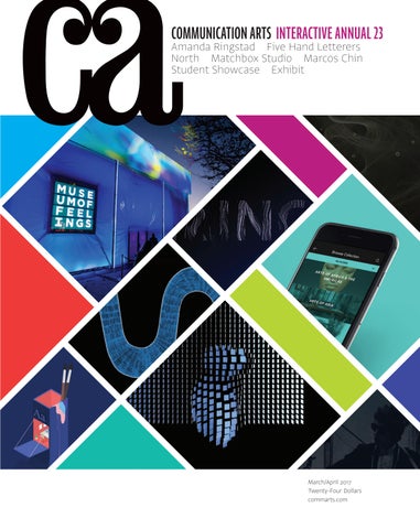
COMMUNICATION ARTS INTERACTIVE ANNUAL 23
Amanda Ringstad Five Hand Letterers North Matchbox Studio Marcos Chin Student Showcase Exhibit
March/April 2017 Twenty-Four Dollars commarts.com
3
14
11
13
10
12 1
Unique 1
1
1
1 1
1
1 3
1
8
12 9
7
9
9
9
9
9
9
9
9
4
9
4
9
4 4
8
12
9
9
9
9
9
9
9
9
9
We are one of a kind.
12
8
1
1
1
1
1
1
1
9
1
11
9
9
9
9
9
9
9
9 9
9
9
9
9
9
9
9
9
9
9
9
9
9
1
3
9
9 9
9 9
9
9 9 9
9
3
9 5
1
1
1
How are we unique? 1
11
9
1
1 1
9
9 9
3
1
4
4 2
1
1
7
9
9
1
1
1
9 9
9
9
9
9 9
9
5
9
9
9 9
9 9
9
9 9
9 9
9
9 9
9
9
9
9
9
9
7 15
1 1 1
3
9 10
14
15
5 2
13
3
5
1 4
12
3
2
2
11
4
11
1
1
9 7
Fight the rising tide of conformity.
7
7
6
6
12
12 8
8 10
8
10
10
10
10
12 8 10 8 10 10 10
10
12 12
10
8 10
12
10
12
8
10
8 12
1
1
14
6
13
11
6
12
1
1
2
1
1
1 1
2
1
1
1
1
1
1
1
1 1
1
1
1 1
1 1
1 1
1 1
1 1 1
1
1 1
11
1
1 1
1
1 1
1
1 1
If our clients and their users have unique and diverse needs, why do all our websites act and look the same? Stand Apart from the crowd. Learn advanced techniques, absorb new ways of thinking, and find deep creative inspiration at An Event Apart—the leading design conference for web and interaction professionals. You’ll come away inspired to create original, meaningful work. And isn’t that why you became a designer in the first place?
aneventapart.com/ca JOIN US IN 2017
SEATTLE APR 3–5
BOSTON MAY 15–17
WASHINGTON DC JUL 10–12
CHICAGO AUG 28–30
SAN FRANCISCO OCT 30–NOV 1
DENVER DEC 11–13
4
MARCH/APRIL 2017 VOLUME 59 NUMBER 1
COMMUNICATION ARTS ��
FEATURES
��
��
��
28 Matchbox Studio
52 Amanda Ringstad
36 Marcos Chin
60 Five Hand Letterers
44 North
70 Exhibit
by Tom Biederbeck Strong creative teams make strong design work, as this Dallas-based design studio shows. by Caitlin Dover Based in New York City, this artist approaches his symbolic illustrations with an intense dedication to detail. by Julie Prendiville Roux A love of exploration forms this Portland, Oregon–based ad agency’s one-of-a-kind creative process.
COVER
by Claire Sykes This Seattle-based photographer captures playful abstractions of forms in her visually refreshing work. by Michael Coyne A classic art form is alive and well in the inventive work of these five hand letterers.
Source images (left to right, from top to bottom): Museum of Feelings installation, p. 154; RadioEight website, p. 118; MING Labs website, p. 102; Mia Journeys mobile app, p. 134; My Grandmother’s Lingo website, p. 100; M Studio: Alex Motzenbecker, Creative Developer website, p. 114; Waaark website, p. 104; Bob Dylan: Studio A Revisited website, p. 126.
by Jean A. Coyne The latest and best in visual communication from here and abroad.
77 Student Showcase
Our editor’s third annual selection of portfolios by fifteen promising students of visual communication.
��
�� INTERACTIVE ANNUAL 94 128 138 140 142 160 162
Websites/Microsites Mobile Tablets/Handheld Devices Social Environmental Other Interactive Media Student Work
FRESH Editor/Designer Patrick Coyne Executive Editor Jean A. Coyne Managing Editor Michael Coyne
170
Kate O’Hara From Reno, Nevada, this illustrator takes dark, disturbing themes and makes them beautiful.
172
Will Strawser This New York City–based photographer finds human truths within his impressionistic work.
Associate Editor Esther Oh
174
Brief A Vancouver, British Columbia–based firm, Brief enriches its work with worldly influences and solid colors.
14
Design Culture Wendy Richmond details a method to overcome your inability to describe your work.
18
Emerging Media Yolanda Zappaterra uncovers how augmented reality revolutionizes installation design.
15
Advertising Ernie Schenck argues that while advertising may not save the world, it should help.
22
Business Amy Ng showcases three illustration collectives that found strength in numbers.
Print Producer Daniel Sambrano
16
Typography Allan Haley details four typefaces that don’t sacrifice character for versatility.
Design/Production Associate Joni Rivas
24
Archivist Nancy Clark Lewis
Creativity 1980s and 1990s nostalgia prevails in an uncertain political climate, Caitlin Dover reports.
176
Software Engineers Jiping Hu Srividhya Gopalakrishnan Technology Administrator Michael Hoyt
Circulation Director Perry Fotos Accounting Lois Vega
DEPARTMENTS
Volume 59, Number 1 commarts.com COMMUNICATION arts (ISSN 0010-3519) is published six times a year (January/February, March/April, May/June, July/August, September/October, November/ December) by Coyne & Blanchard, Inc., 110 Constitution Drive, Menlo Park, CA 94025-1107. Periodicals Postage Paid at Menlo Park, CA, and at additional mailing offices.
Production Assistant/Customer Service Representative Khader Yanni
Advertising Director Valerie Pippin
Insights The grit and grace of soccer inspire Case Jernigan’s multimedia animations.
Editor’s Column Contributors Web Watch Favorites
Art Director/Designer Jessica Reichard Production Manager/Competition Coordinator Lauren Coyne
COLUMNS
8 12 27 178
Editor At Large Anne Telford
180 182 184 186
Book Reviews Index to Interactive Annual 23 Directory Overheard
Copyright 2017 by Coyne & Blanchard, Inc. All pieces reproduced in this issue are under prior copyright by the creators or by the contractual arrangements with their clients. Nothing shown may be reproduced in any form without obtaining the permission of the creators and any other person or company who may have copyright ownership. SUBScRIBER SERVICES: Subscription: 1 year, $53; in Canada, $70; all other countries, $110. All payments in US dollars, Canadian GST: 127848620.
Direct all inquiries, address changes, subscription orders, etc., to: Web: commarts.com E-mail: subscription@commarts .com Phone: 800-688-1971 (US/Canada) Phone: 215-788-5481 (International) Fax: 215-788-6887 Mail: COMMUNICATION arts PO Box 2013 Langhorne, PA 19047 Please allow six weeks for changes.
EDITORIAL AND BUSINESS OFFICE: 110 Constitution Drive Menlo Park, CA 94025-1107 Phone: 650-326-6040 Fax: 650-326-1648 E-mail: ca@commarts.com POSTMASTER: Send changes of address to: Communication Arts PO Box 2013 Langhorne, PA 19047 Canada Post: Publications Mail Agreement #40612608 Canada Returns to be sent to: IMEX Global Solutions, LLC PO Box 25542 London, ON N6C 6B2
Contributing Editors Sam McMillan Wendy Richmond Ernie Schenck Founder Richard Coyne (1926–1990)
Like us on Facebook facebook.com/communicationarts Follow us on Google+ plus.google.com/+commarts Follow us on Instagram instagram.com/communicationarts Follow us on Instagram instagram.com/communicationarts Follow us on Pinterest pinterest.com/camag Follow us on Twitter twitter.com/commarts
MAKE MAGIC HERE. Green screen, color correction and endless production and post-production capabilities. Whatever your vision entails, SNEAKY BIG Studios has the equipment and talent to bring it to life. All without the hassle or cost of working in a big city. Find out more at sneakybig.com
SCOTTSDALE, AZ
AHIGSEITN GERT— BHAER — BAR— R A I SRI A NIGSRITN BHA IH N IY N S’TD A N DATNHDEATN IH NDED TU S ED T RU SRUYS’TSR Y ’ S ANTSI O —N S — E X P EECXTPAEETCXITP OAENTCSITO — SO T FOPCSHK TOOPTCH TRH O G T RO A GH RY APHY O F SOT FO C K OKO GP AO PH YP + ECM IN +AETCM IN AETRM O AH T RO A GH RY A .P H Y . + CIN O G AG P Y .P
STS O TCO K CS K YS . CY O . CMO M
EDITOR’S COLUMN
Patrick Coyne
T
his year’s interactive competition welcomed a 5 percent jump in submitted entries. Although websites and microsites continued to make up half of all entries, we saw a significant increase in the environmental category, reflecting the growing trend in immersive experiential marketing. By contrast, we saw a significant decrease in the tablet category, which may portend a declining interest in the tablet as a standalone development platform.
“It was refreshing to see—even though this competition is really focused on interactivity—a bounty of excellent graphic design and typography at play in most of the entries,” juror Nathan Moody says. “It’s good to see that the basics aren’t getting overlooked.” “Interactivity has always been about taking the little things and making them unforgettable and beautiful,” adds juror Harold Jones. “This still holds true today.” “I was surprised by the number of parallax sites we reviewed,” juror Libby Bawcombe says. “Some were subtle and interesting, others were brash. I appreciate designs that included clever uses of parallax-style elements without going over the top.”
“Mobile continues to be a place where smart user experience and design can make an enormous difference,” juror Ben Hughes says. “I was struck by the use of inexpensive and readily available sensors,” Moody says. “From accelerometers to rangefinders to motion sensors, this is one area where extending system input beyond the mouse, keyboard, finger and voice really made a material improvement in the impact of many pieces.” I asked the judges what they felt were the weakest areas in this year’s entries. “A predominance of entries that felt like ‘animated’ and one-way experiences,” says Elmsly. “I was hoping to see more entries that created a way to truly engage and interact beyond clicking.” “We reviewed a few sites that were ambitious and visually gorgeous, but they lacked direction, took forever to load, and required special plug-ins and browsers,” Bawcombe says. “I crossed those off the list immediately.” “No one is doing great virtual reality [VR],” says Jones. “There is a big trend in second-screen VR experiences, and while you do get a full 360-degree field of view, there is still a drastic lack of interactivity and storytelling in these experiences.” “VR still has a long way to go,” adds Hughes. “The technology is sexy, but it still feels like a gimmick rather than a smart way to solve problems.”
Photographs by Steve Castillo
“There seems to be a resurgence of Flash-style web animation— accompanied by a sense of lightheartedness and play,” says juror Keri Elmsly. “In the entries that were apps and sites for cities and institutions, it was great to have such
elegant and effortless designs make accessible what is commonly dense and hard to wade through.”
8
Interactive Annual 2017
DESIGN &
ADVERTISING COMPETITIONS
2017 CALL FOR ENTRIES
ENTER THE INTERNATIONALLY RENOWNED
DESIGN AND ADVERTISING COMPETITIONS FROM COMMUNICATION ARTS
Promote your talent by entering our highly respected juried competitions in graphic design and advertising. If selected, your award-winning work will be meticulously reproduced in the 2017 Design and Advertising Annuals, and on the Communication Arts website, assuring you maximum exposure to our international audience. Each winning entrant will receive a personalized Award of Excellence, milled from solid aluminum.
DEADLINE: MAY 5, 2017 ENTER ONLINE NOW
COMMARTS.COM/COMPETITIONS
EDITOR’S COLUMN I also asked the jurors a series of questions about the future of digital interactivity. How will the continued diversification of personal electronic devices affect interactive design? “I’m not convinced that the current form of personal device—the cell phone—is going to continue to be additive to our field,” says Elmsly. “I’m looking forward to the landscape of the Internet of Things and wearables maturing so we are not walking around with our faces in tiny screens and bumping into things. I’m excited by technology that supports togetherness instead of separation.”
LIBBY BAWCOMBE is a senior visual product designer with NPR’s digital media team. She collaborates with designers, developers and editorial teams to bring NPR’s unique storytelling to listeners and readers across different platforms. Bawcombe was formerly digital design director at the Atlantic, where she led user experience, art direction and responsive design of the digital experiences for theatlantic. com and citylab.com. Prior to this, she spent thirteen years as manager/senior multimedia designer at the Newseum, the museum of news in Washington, DC, where she designed interactive touch experiences for platforms as large as gallery walls and as small as phones.
BEN HUGHES is executive creative director at Stink Studios New York, a creative studio helping forwardthinking clients succeed in digital culture. The studio has helped move the needle for Adult Swim, Google, Nike, Sony, Spotify, Twitter and other brands. Previously, Hughes worked at B-Reel, Mother, R/GA and Wieden+Kennedy New York, building a body of work that stretches from conceptually led film storytelling to digital products and experiences. His work is included in the permanent collection at the Museum of Modern Art in New York. A proud native of Buffalo, New York, he currently resides in Brooklyn with his wife and two sons.
“New and better devices, plus continually changing specs, will continue to keep designers on their toes,” says Bawcombe. “While it’s popular to think that we’ve never seen so many devices, platforms and methods of delivery, this has been the story of digital design since the Internet was born. Going forward, I think much of ‘design’ will come in the form of interaction, whether we’re talking to Siri or Alexa, streaming media on our smart TVs or controlling the consoles in our cars.” “As new device forms take shape and become accepted, it will be up to us to help create the methods and narratives that provide unforgettable experiences for these platforms,” Jones says. “Developing strategies and best practices are responsibilities we all carry.” What breakthroughs will be required for VR to become widely accepted? “We need a mental breakthrough to separate 360-degree video from the broader concept of VR.” Bawcombe says. “If we see more uses of VR as a tool—in medicine, travel and education, for example—we can expect augmented experiences to go beyond fancy videos.” “VR must become a lot more social to be an accepted experience,” says Moody. “The fact that you’re shut off from your environment and others has benefits for some types of experiences, but whether it will become a mainstream method of consuming content will largely be based on how much of a shared, or shareable, experience it can become.” “In general, I feel the conversation around VR is being driven by the needs of the companies who have invested heavily in it, not the audience,” Hughes says. “It will have huge implications for gaming and exotic things like remote surgery, but I’m not sure it’s ever going to be widely accepted as a mass storytelling platform.” 10
Interactive Annual 2017
What business/cultural/social developments will alter the role of interactive media in the future? “I really believe that we’re flirting with the limits of human bandwidth and attention,” says Hughes. “That’s the next problem to solve—how we create experiences that stand out because of the single-mindedness and focus they provide.” “Experiences that become relatable stories that can be told to others, in person and online, will always be the key to success,” Moody says. “While culture changes all the time, the nature of story is truly universal. If people feel like their perspectives have been changed, even in small ways, that’s where any media has its greatest success, and interactive media is no different.” “The broader implementation and social acceptance of artificial intelligence and machine learning will open up opportunities for interactive storytelling,” Jones adds. “Users will continue to move away from the screen as new forms of interactivity become more immersive in our daily lives.” “Building worlds that span virtual, augmented and real life is within our reach,” Elmsly says. “Interactive media in all its forms is responsible for much of this blending of reality. As designers, our responsibility to research and ask questions of our clients and ourselves is more critical than ever.” I would like to extend our grateful appreciation to our jurors for their conscientious efforts in selecting our 23rd Interactive Annual. Selection for this year’s annual required a minimum of three out of five votes. Judges were not permitted to vote on projects with which they were directly involved; I voted in their stead. The winning projects, including links and case-study videos, can be viewed on our website at commarts.com.
NATHAN MOODY, design director of San Francisco– based Stimulant, has designed awardwinning interfaces, interactions, illustrations, motion and sound for more than two decades in almost every artistic medium and communication channel for some of the world’s best-known companies and brands. He was schooled as an illustrator, has trained as a motion designer and is experienced as a designer; this broad range of experiences informs his cross-pollinated, holistic approach to the art and craft of experience design. Moody is also a published author, an awards judge and a frequent public speaker, as well as a sound designer and a musician. He lives to explore what he doesn’t yet know.
KERI ELMSLY is chief creative officer of Second Story, part of SapientRazorfish, overseeing offices in Atlanta, New York and Portland, Oregon. For more than fifteen years, she has specialized in developing and producing ambitious visual art and design projects, including public art, large-scale interactive installations, touring shows and gallery works. She brings an artist’s sensibility to the studio, with a keen eye on the intersection of art and technology. Based in London prior to joining Second Story, she has worked with a range of museums, festivals, galleries and artists, including Mira Calix, Quayola, United Visual Artists and Universal Everything.
In Memoriam It is with deep sadness that I acknowledge the recent passing of several influential members of the creative community. Harry Jacobs, 87, was known as the “Dean of Southern Advertising.” He began as an art director at Atlanta’s Cargill, Wilson & Acree in 1959. He became the agency’s president in 1971. In 1976, he joined The Martin Agency as president and its first creative director. Jacobs was inducted into the American Advertising Federation Hall of Fame, the One Club Creative Hall of Fame and the Virginia Communications Hall of Fame. We published a feature story on The Martin Agency in 1985, and Jacobs was a judge for us in 1983 and 1988. Elaine Lustig Cohen, 89, began her prolific graphic design career almost by accident. Assisting husband Alvin Lustig until his death in 1955, she completed the signage project for the celebrated Seagram Building originally assigned to her husband by architect Philip Johnson. Among her clients were the Federal Aviation Administration, General Motors, the Jewish Museum, Rio de Janeiro’s Museum of Modern Art, the Museum of Primitive Art and the 1964 World’s Fair. Elaine Lustig Cohen was awarded the AIGA Medal in 2011. Tim Mantoani, 47, was an internationally acclaimed photographer best known for Behind Photographs, a portrait series of famous photographers holding their most iconic images. Mantoani studied photography at the Brooks Institute of Photography and opened his studio in San Diego in 1995. His list of clients included Coca-Cola, Epson, Newsweek, Oakley and Sports Illustrated. In 2006, Mantoani took a 20-by-24-inch Polaroid camera and began shooting Behind Photographs. We published a feature article on his project in 2009. Fred Papert, 89, worked at several ad agencies in New York, including Kenyon & Eckhardt, before launching Papert Koenig Lois
HAROLD JONES is partner_ technology for WorkInProgress, a Boulder, Colorado–based agency that launched in 2016. Prior to this, he was vice president/ executive creative technology director of CP+B, also in Boulder. Jones is the creative technologist responsible for shaping Domino’s into the technology giant it is today. From Domino’s Live, which offers an interactive look at pizza making, to the Domino’s iPad app, which set new benchmarks for conversion and average price per order, Jones’s work has contributed to what NPR dubbed “a tech company that happens to make pizza,” as well as to CP+B receiving a Cannes Titanium Grand Prix and a Grand Clio.
(PKL) in 1960 with partners George Lois and Julian Koenig. One of the first agencies to go public, PKL was also one of the first to supplement employee salaries by offering stock options. The agency reached its peak in 1967 with more than 200 employees and a list of clients that included Maypo cereal, the New York Herald Tribune, Wolfschmidt Vodka and Xerox. Papert was a judge for us in 1962. Rodney Smith, 68, was a photographer renowned for taking sumptuous black-and-white photographs that displayed a sense of symmetry, order and design with the occasional touch of Magrittelike surrealism. He worked for a wide range of clients in fashion, finance, publishing and more, including Bank of Boston, Bergdorf Goodman, the H.J. Heinz Company, New York Life Insurance Company, the New York Times Magazine, Sak’s Fifth Avenue and Waterford Crystal. We published a feature on him in 1998. Murray Tinkelman, 82, was an award-winning illustrator and educator who won gold medals from the Art Directors Club of New York, the Society of Illustrators and the Society of Publication Designers. In 1970, he was named Artist of the Year by the Graphic Artists Guild of New York. He taught at the Parsons School of Design and in the undergraduate and graduate programs at Syracuse University. In 1999, he was the recipient of the Distinguished Educator in the Arts award from the Society of Illustrators. Jack Unruh, 80, was a Dallas-based illustrator whose work graced the pages of numerous books and magazines, including Rolling Stone and Texas Monthly. A passionate outdoorsman, he also illustrated an array of flora and fauna for publications like National Geographic and Field & Stream. Unruh received the Hamilton King Award from the Society of Illustrators in 1998 and was inducted into the Society of Illustrators Hall of Fame in 2006. He was a judge for us in 1997. ca Communication Arts | commarts.com
11
CONTRIBUTORS Features
Tom Biederbeck (tbiederbeck@gmail.com) is a writer, editor, publisher and visual communicator. Formerly, he was editor of STEP inside design magazine. In this issue, Biederbeck profiles Matchbox Studio, a Dallas-based design studio with a versatile portfolio and a bountiful spirit. Caitlin Dover (twitter.com/caitlindover) is a writer and editor based in New York City. She has held editorial positions at BMW Guggenheim Lab and Print and has taught at Pratt Institute. Dover holds an MA in design history from Bard Graduate Center. In this issue, Dover showcases New York City artist Marcos Chin and his ever-expanding skill set. Julie Prendiville Roux, cofounder of Los Angeles–based creative agency Handmade Productions (handmadeca.com), has been writing for Communication Arts since 1987. In this issue, Prendiville Roux uncovers the creative secret that drives Portland, Oregon– based ad agency North. Claire Sykes (sykeswrites.com) is a freelance writer based in Portland, Oregon, covering design, arts and culture, philanthropy, health and wellness, and business. Within the visual arts, she writes regularly for Communication Arts, Photographer’s Forum magazine and the American Photographic Artists’ website; her byline has also appeared in Applied Arts, Camera Arts, HOW and Photo District News. She’s on the exhibition committee for the Blue Sky Gallery, an internationally esteemed photography gallery in Portland, and she serves as a roving reviewer for the nonprofit Photolucida. In this issue, Sykes travels to Seattle and discovers how Amanda Ringstad’s unique photographic vision informs her work.
Columns
Allan Haley is a storyteller and a consultant with expertise in fonts, font technology, type and typographic communication. Formerly
president of the Type Directors Club and executive vice president of the International Typeface Corporation, he was director of words and letters at Monotype for fifteen years and has six books and hundreds of articles to his credit. In this issue’s Typography column, Halley disproves the misconception that a typeface cannot be both distinctive and versatile—with four fonts that are. In 2008, Amy Ng founded Pikaland, an online resource for freelance illustrators that sparks thoughts on creativity, illustration and entrepreneurship. Based in Kuala Lumpur, Malaysia, she guest lectures at the One Academy of Communication Design and teaches her own six-week class, Work/Art/Play, via pikaland.com. In this issue’s Business column, Ng uncovers how illustrators have teamed up to form collectives and to promote their work. Wendy Richmond (wendyrichmond.com) is a visual artist, a writer and an educator whose work explores public privacy, personal technology and creativity. Richmond has taught at Harvard University, the International Center of Photography and the Rhode Island School of Design, and she serves on BRIC’s Artists Advisory Council and the MacDowell Fellows Executive Committee. Her latest book is Art Without Compromise* (Allworth Press). In this issue’s Design Culture column, Richmond shares how being interviewed can help you flesh out a personal description of your work. Ernie Schenck (ernieschenckcreative.prosite .com) is a freelance writer, creative director and regular contributor to Communication Arts’ Advertising column. Schenck is an Emmy finalist, a three-time Kelly nominee, and a perennial award winner at Cannes, the CLIOs, D&AD, the FWAs and the One Show. As a freelancer, an executive
creative director at Hill Holliday/Boston and a cofounder of Pagano Schenck & Kay, he has worked on campaigns for some of the most prestigious brands in the world. In this issue’s Advertising column, Schenck discusses how creatives don’t have to sacrifice progressive ideals in their line of work. Yolanda Zappaterra (yolandazappaterra .wordpress.com) is a London-based writer and blogger. She writes about architecture, design, fine art, photography, food and travel for a range of European publications— including Time Out and Blueprint. She has written five books on editorial design and illustration and contributed to numerous city guide books. Her latest book is Skylines: A Journey Through 50 Skylines of the World’s Greatest Cities. In this issue’s Emerging Media column, Zappaterra discovers how installation designers augment cultural sites with augmented reality.
Book Reviews
Ruth Hagopian (ruth.hagopian@gmail.com) is a freelance writer and editor whose profiles of designers, photographers and artists have appeared in Create, Digital Graphics and Print magazines. She was also a publisher of Online Design magazine and a partner in Visual Strategies, a San Francisco–based design firm. Sam McMillan (wordstrong.com) is a San Francisco Bay Area–based writer, brand strategist, and regular contributor to Communication Arts’ Web Watch and Book Review departments.
Corrections
In the 2017 January/February issue, on page 140, David Blumberg should have been listed as designer and Roy Burns, III should have been listed as design director on the Lewis Communications signage project.
Pictured contributors wrote features and columns: Tom Biederbeck, Caitlin Dover, Julie Prendiville Roux, Claire Sykes, Allan Haley, Amy Ng, Wendy Richmond, Ernie Schenck, Yolanda Zappaterra. 12
Interactive Annual 2017
FIND YOUR PERF ECT JOB AT
CREATIVE HOTLIST CREATIVE HOTLIST, THE CAREER SITE FROM COMMUNICATION ARTS MAGAZINE, HAS MORE JOB LISTINGS IN GRAPHIC DESIGN, ADVERTISING AND NEW MEDIA THAN ANY OTHER CREATIVE SERVICES SITE.
Sign up for a FREE account and with a single click, send your Cover Letter, Resume and Links to Work Samples every time you apply to a Creative Hotlist job.
CHIEF MARKETING
DIRECTOR OF
OFFICER
USER EXPERIENCE
SENIOR UX
ARCHIT ECT
VISUAL DESIGNER
PACKAGE DESIGNER
CREATIVE
DESIGN
DIRECTOR
PHOTO STYLIST
STRATEGIC STORYTELLER
JAVASCRIPT
DEVELOPER
The Communication Arts Career Site
MOBILE DESIGN
DIRECTOR
BRAND
STRATEGIST
COPYWRITER VISIT WWW.CREATIVEHOTLIST.COM TODAY AND FIND YOUR PERFECT JOB.
DESIGN CULTURE
Wendy Richmond
The Interview Tool
I
was in the local café, my favorite place to write. But the task at hand—constructing a cohesive presentation about my current artwork—was getting nowhere. I had all the visuals, but my attempts to put together the words to accompany them were failing. I suffer from the same problem that many of my fellow visual artists have: describing my artwork is an agonizing challenge. So I e-mailed my friend Susan Hodara, a journalist who has interviewed countless artists for hundreds of articles she has written about the arts, including several for Communication Arts. I asked her for help, and we made a date. Susan arrived at my studio armed with an audio recorder, a notebook, a list of questions and her laptop, everything she needed to conduct our interview. We worked the entire afternoon, and by the time Susan left, we had developed language that clearly articulated the concepts for my presentation. Using her well-honed process, Susan was able to extract what I had not been able to verbalize myself. As an artist, your primary language is a visual one. But there are many times when you need words to support your work, whether for an exhibition catalog, a lecture, a grant proposal or an artist statement. You’ve probably found all sorts of how-to guides, but in my experience, these do-it-yourself approaches are not careful investigations. They may provide the aid of a standard blueprint, but they cannot unearth a truly insightful result. As I think back to my interview with Susan, I see that the steps she used were vital for achieving clear, honest language about my art.
1. Record Susan turned on her recorder and began asking me questions about my intentions, my inspirations and the evolution of this particular body of work. As I responded, she pushed me further: “What do you mean?” “Tell me more.” “Why?” I had to think hard; I found myself rephrasing my descriptions, adding details I’d overlooked and taking back platitudes I had flippantly spewed. The more we talked, the more excited I became, seeing my work in new ways. Susan knew from experience that her questions would help me illuminate the heart of my work.
2. Transcribe and distill We completed the interview after an hour, and I went for a long walk while Susan transcribed our conversation on her computer. 14
Interactive Annual 2017
This was no mundane activity; it was her practiced method of absorbing the information I’d shared. “Listening to the interview and typing the words is when I really hear what was being said,” she told me. “As I listen, I distill. I notice repeated subjects and key words, and I start to recognize the essence of what’s being communicated. I hear statements that are vague or not fully thought through and statements that feel true and significant. It’s not possible to grasp this material during the interview stage. It’s only while transcribing that these important aspects arise.”
3. Organize The resulting document was more than a written transcription. Yes, these were my words, but Susan had organized them into a unified structure. The sentences were cohesive, free of my occasional meandering. There were subheadings identifying themes and content, from Seeds and Sticky Fingers to Armor and Drawing to Materials and Research. There was clarity that I had been unable to uncover by myself; the pages made my thoughts seem orderly, less daunting than when they’d been spinning around in my brain. I was confident that this would provide a substantial framework for the writing I needed to prepare. Susan e-mailed me the document and went home. But there were two more steps, and they came from me. The first actually happened before we started: I acknowledged that I needed the skills of a professional and made a request. We agreed upon compensation (happily, a barter) and a dedicated, distraction-free period of time, which helped me commit to the process. The other step took place after she left. I reviewed her transcript and pulled out the pieces that I felt would best serve the visuals for my presentation. I had to make changes and clarifications, but instead of being annoyed, I was delighted that I knew what I wanted to modify. Since then, I’ve mined the transcript repeatedly, for proposals, press releases and the many occasions when I’ve had to describe my work, from short e-mails to extensive studio visits. The Interview Tool is not a conversation with a book club buddy or neighbor or life partner: You need to work with someone who is trained and has specific expertise. Nor is it about hiring someone to deliver a polished, finished document. Instead, it is an opportunity to engage in a thoughtful, instructive process that will serve you far beyond the immediate task. ca © 2017 W. Richmond
ADVERTISING
Ernie Schenck
Poets of Emptiness “We are sometimes as important as priests or poets, but until we dedicate ourselves to worthier goals, we are poets of emptiness.” —Jerry Maguire
I
t’s been 20 years since Jerry Maguire wrote The Things We Think and Do Not Say, the manifesto that got him fired and changed his life. For those of you who were still finger painting in kindergarten class, Jerry Maguire was the lead character—played by Tom Cruise— in Cameron Crowe’s seminal movie about a high-powered, highpaid, high-living sports agent who makes the earth-shaking decision to throw the whole thing overboard to find his higher purpose. There are a lot of Jerry Maguires in advertising now, creatives who aren’t afraid to think there’s more to a career than a gold lion. For them, it’s not enough to do great work anymore. It’s not enough to make so much money it makes your eyes hurt. Important, yes. But more important is a question that all too few creatives have asked themselves: Is what I’m doing making a difference in the world?
Roy Spence is one of the cofounders of Austin, Texas–based ad agency GSD&M and as sweet and grounded a guy as you will ever find in this business. These days, he runs a consultancy called the Purpose Institute that helps companies discover, articulate and bring to life their deeper purposes in the world. As Spence puts it, it’s not what you do, it’s what you stand for. For Jerry Maguire, it meant nothing to be a hot-shit sports agent, a profession that, in the 1990s, was second only to rock star in its dream job status. What he came to see was that at the end of the day, the money couldn’t make up for the shallowness of his life. What he did was a far cry from what he stood for.
“Recently I was asked by the son of a client, in so many words, what do you stand for? I was lost for an answer. At fourteen, I wasn’t lost for that answer. At eighteen, I wasn’t lost for an answer. At 35, I was blown away that I had no answer.” —Jerry Maguire
It’s a rare few of us who will ever know what it’s like to work for a brand like Patagonia or Toms Shoes or Warby Parker. And though the idea of flat-out refusing to work for specific brands or industries— say, tobacco, firearms, pharma, big oil—seems noble, more often that not, unless you carry a lot of creative firepower in that brain of yours, well, it’s pretty much a surefire ticket down the elevator. But what if, despite the brand, you could find a way to do good and keep your job at the same time? In the documentary Art and Copy, the legendary George Lois suggests we can make advertising that reflects how we think life should be. “Cast Muslims and LGBTQ people,” he says. “Put a black Santa in your Christmas ad. Advertising can be subversive.” Yes, it can. As I write this, there are at least six spots for different brands with a message of people coming together to reject the things that divide us, as exemplified by a spot for Amazon in which a priest and an imam, both with bad knees, each surprise the other with a pair of kneeling pads. This is how the creatives thought the world should be. This is how they fed their purpose.
“A life is not worth living if you are sleepwalking through it. We cannot just survive; anything goes. We can take control of our lives. We can quit sleepwalking. It’s time to move forward, to make mistakes if we have to, but to do it with a greater good in mind.” —Jerry Maguire Let’s be honest. This is advertising. And although our powers are many, we are never going to broker peace in the Middle East. We are never going to stand in the way of the sixth extinction or keep the Ross Ice Shelf in Antarctica from collapsing. But our world does not have to begin and end at Cannes. We can choose to train our weapons on lifting the world in whatever ways we are able to lift it. Or we can be the hot-shit sports agent who chooses to do the work, turning a blind eye to the world beyond the team rooms and the pool tables and the TV shoots. And that’s fine, too. It all depends on which poet you want to be. ca Communication Arts | commarts.com
15
TYPOGRAPHY
Allan Haley
Designs of Distinction New typefaces that stand out—and fit in.
T
he more distinct a typeface, the less versatile it is. As typeface designs become more distinctive, their demeanor begins to encroach on their ability to perform well in a variety of applications. Generally, this is a good typographic rule, but—as with most things typographic—there are exceptions. A bevy of new typeface families has come forward to challenge this rule with aplomb. These new designs are equally at home in display headlines and long-form text, in footnote-sized copy and billboard messaging. They are large families that provide a wide range of applications, yet do not fade into the background. They can be used with equal confidence on screen and in print. Basically, they stand out—and fit in.
Between Black 1 Between Black 2 Between Black 3 Between “Between” may seem an odd name for a typeface—until you learn what it’s all about. There are three states to this new design from Akira Kobayashi. Although different from each other, they all have the same humanistic foundation, ensuring that any copy set in them is approachable and friendly. It’s this ability to transition “between” the designs that makes the family especially adaptable and flexible. Kobayashi designed the Between typeface in response to the current use of rounded and humanist sans serif designs over the cool and steady grotesques of the last several decades (read: Helvetica, Univers, Gotham and Proxima Nova). Between has 48 styles, each comprising eight weights and complementary italics. “It started with the one in the middle,” explains Kobayashi. “Between 2 was based on the idea of the sans serif version of my Cosmiqua typeface. It strikes a balance, being crisp and highly legible on one hand and organic and friendly on the other. [For] Between 1, I melded industrial and humanistic sans serif design ethics. Between 3 is a freestyle sans with an uplifting, youthful character. It’s a lighthearted combination of handwriting and sans serif letterforms.” Each variation of Between is subtle, but telling. All three share the 16
Interactive Annual 2017
same uppercase and lowercase x-height, along with many of the same letterforms. This is where the fluidity between the designs comes from. Print and interactive designers can choose characters from any of the Between typeface variations with confidence that they will blend harmoniously with the surrounding glyphs. Not all communication designers are proficient or comfortable working outside the basic family of a typeface, but learning how to use tools like the multiple designs of the Between family and the stylistic sets in OpenType is well worth it.
Neue Kabel Thin Neue Kabel Regular Neue Kabel Black Neue Kabel The Neue Kabel family, from Marc Schütz, was inspired by the original charm of Rudolf Koch’s 1927 design, Kabel. Because Kabel was released as just one weight and grew to a family of nine designs over several years, various versions of the family are dissimilar in proportion and suffer from varying character traits. Nevertheless, Koch’s Kabel design clearly stands out from the crowd. The geometric characteristics of its Art Deco design were the result of an experiment of sorts—an odd experiment for Koch, however, who prided himself on his calligraphic ability. Although the specimen booklet that announced Kabel went to great lengths to explain the rational behind the design and to prove its geometric heritage, a little scrutiny reveals that this was more window dressing than design formula. Although geometric in form, Koch based his character proportions on artistic sensibilities—and perhaps a creative whim or two. Kabel’s character shapes and proportions can be traced to ancient Greek lapidary letters, Venetian old style type designs and—of course—calligraphy. In the 1970s, International Typeface Corporation (ITC) drew the first revival of Koch’s Kabel, ITC Kabel. Essentially a 1970s display face with bell-bottom proportions and a pinch of Haight-Ashbury, it is a caricature of the first design. Distinctive, yes. But versatile? Not so much. Schütz’s goal was to preserve Kabel’s demeanor while removing the inconsistent details of the early 20th-century design. He began with extensive study of proofs and specimens of Koch’s
original typeface. Neue Kabel celebrates the style and spirit of Koch’s design while providing the versatility and family range needed for it to excel in a wide variety of print and digital environments. The result is that copy set in Neue Kabel appears much like Koch’s design, but is clearly a fresh interpretation of the master calligrapher’s work. The family’s versatility comes from its breadth of designs. Neue Kabel’s eighteen roman and italic designs are available as OpenType fonts featuring small caps, eight sets of figures and many historical stylistic alternates—a wealth of designs and options to choose from.
Queulat Thin Queulat Regular Queulat Black Queulat Until the turn of the century, you could count the number of Latin American type foundries on no more than two hands—and Latin American typeface designers were just as rare. Clearly, things have changed dramatically over the last several years. Latin American typeface designers are creating some of the hottest new designs, and Latin American type foundries have become downright abundant. One of the most prodigious is the Chilean foundry Latinotype, with the success of its Australis and Queulat designs and the number of its typeface families approaching 150. Latinotype contributing designer Jorge Cisterna’s Queulat family is 25 fonts of Clarendon-inspired design, infused with a measure of geometric sans and a bit of upright script. “My goal was to develop a modern, friendly typeface,” says Cisterna. “Although the design process was based on these precepts, thanks to its multiple influences and large number of alternative characters, the design is quite distinctive.” Queulat’s square-jawed Clarendon foundation benefits from the three pillars of typeface legibility: big features, restrained design characteristics and distinctive character shapes. Its large lowercase x-height, open counters and sturdy serifs all aid in establishing high levels of legibility. In addition, stroke weight changes are subtle; its serifs, although robust, are not overly elongated or distracting. Geometric sans characteristics are apparent in characters like the lowercase a, e and g, Queulat’s italics have a delightful brush script quality, and its many alternate characters introduce a lighthearted vibe. Of the happy-go-lucky alternates, Cisterna says, “I thought it would be a good idea to add ludic elements to the typeface so it could be used for logotypes as well as short blocks of text copy, like pull quotes and captions.” The family comprises regular and soft designs, each with complementary condensed counterparts and a multitude of alternate
characters. Added to this is a special “unicase” design of uppercase and lowercase characters drawn to the same height. Queulat means “faraway lands” in the language of the Mapuche people of south central Chile and west central Argentina. Cisterna, who lives and works in Chile, says, “I’ve always felt that Chile is so far away from the rest of the world, so I thought it would be a good name for the typeface.”
Quitador Ultra Light Quitador Regular Quitador Bold Quitador Sometimes there are unexpected changes when type designers start modifying their work. Take Arne Freytag’s slab serif Quitador family. Released about three years ago, it was well received by the graphic and interactive design communities. Yet he felt that a sans serif counterpart would help broaden the reach of the initial design and give designers more typographic versatility. After several months of work, his Quitador Sans suite of typefaces joined the family. Freytag was successful in drawing a sans serif complement to the existing Quitador design, and he also accomplished something else. He created a typeface with a completely different demeanor. Where Quitador has the resolve and stature typical of slab serif typefaces, Quitador Sans is lithe and airy. The unifying, flattened strokes and square shoulders combined with a generous x-height and open apertures give both designs a leg up on screen imaging. They take maximum advantage of available pixel real estate with little loss of character fidelity. The broad strokes of Quitador’s lowercase, which curve into serifs, become delightful cursive attributes in Quitador Sans. In addition, uppercase and lowercase counters in the Sans are more open, creating an affable and inviting mien. These changes make Quitador Sans somewhat more legible than its slab serif sibling, creating a more versatile design—especially on screen. A strict classification of Quitador is difficult. Freytag pursued his own interpretation of a square serif typeface, creating a design that is somewhere between geometric and humanistic. Then, from this foundation, he drew a sans serif counterpart that shares many traits of the serifed design, but that is also—in many ways—quite different. Is the Quitador family distinctive? For sure. And versatile? Roger that. Fonts of the above typefaces are full of character, not just full of characters. With memorable letterforms, thoughtful attention to issues of legibility, alternative character options, family range and language support, these are designs of distinction—and versatility. ca Communication Arts | commarts.com
17
EMERGING MEDIA
Yolanda Zappaterra
Augmented Reality in the Cultural Sector
When visitors to Casson Mann’s Centre International d’Art Pariétal Montignac-Lascaux hold a companion de visite (left) device up to a painting, a graphic layer with the painting’s name will appear on their screen. They can also trigger an information hot spot (right), which offers audio commentary.
W
hen augmented reality (AR) is being rolled out in midmarket hotels, you know it’s made the leap from pioneering sectors like gaming to the mainstream market. That’s what happened last year when hub, the technologyled subbrand of the British hotel chain Premier Inn, began using AR wall maps in its four London hotels. It’s a no-brainer, really, an original way for guests to learn about the area they’re in—they simply download the hub app and tap area bubbles overlaid on their handset screen’s map for more information.
18
Lascaux, in the Dordogne region of France. Designed by UK creative agency Casson Mann, the center walks visitors through a representation of a nearby historical site that has been off-limits for years: the caves of Lascaux. Discovered by four boys in 1940, these caves are covered with stunning wall paintings of animals that roamed the area some 17,000 years ago. The new center offers a near-perfect facsimile of the cave system, and it further engages visitors with complementary content. “It allows visitors to contemplate the artwork up close, but also feel like they’re part of the surroundings via a range of interactive interpretation aids [spread] through four different spaces,’ says Craig Riley, a director at Casson Mann.
But it’s not only the hotel industry that recognizes the value of augmented reality. In the cultural sector, AR and, increasingly, mixed reality (MR) are being used to enhance the museum experience and engage visitors with content in new, innovative ways. The technologies are in their infancy and shrouded in secrecy, but David Sheldon-Hicks, cofounder and executive creative director of London-based creative studio Territory—which leads the field in creating immersive digital experiences and virtual worlds across film, graphics, visual effects, gaming and broadcast—is enthusiastic about the possibilities these technologies offer museums. “The beauty of AR and MR is that the technology is far less an intrusive experience than virtual reality,” he says. “They blend reality with created reality and content in a way that can be very powerful. This is particularly relevant to museums and exhibitions, as the ability to take physical objects and places and augment them with additional graphics and animations allows a blend of two moments that can transform a person’s understanding of a concept.”
“[The project] presented many challenges,” says Dinah Casson, cofounder and creative director of Casson Mann. “But perhaps the greatest was the search for ways to take visitors away from their smartphones and to allow themselves to be washed with the glory and mystery of the images in the cave: in essence, to remember the power of the unedited, unfiltered experience.”
A powerful example of this already captivates visitors at the recently opened Centre International d’Art Pariétal Montignac
It’s this need to retain the strength of the content while creating a better way to engage with it that appeals to museums and
Interactive Annual 2017
To create a narrative, Casson Mann has used a combination of AR and virtual reality (VR) on both a handheld device, called a CdV (companion de visite, or “visiting companion”), and 3-D stereoscopic glasses because, as Riley says, “both methods have a relationship with what the visitor sees in front of them. The combination allows interpretation without having labels or physical graphic panels cluttering the space and getting in the way of the experience.”
Communication Arts Daily OUR DAILY E-MAIL NEWSLETTER
WHAT YOU NEED TO
STAY INSPIRED Communication Arts Daily
Designed to keep you up-to-date on the hottest design, advertising and web projects, our newsletter also links to the most thought-provoking articles we’ve found on the web. Delivered to your inbox every business day, this quick read is just what you need to stay informed and inspired.
SIGN UP IS EASY AND FREE commarts.com/newsletter
EMERGING MEDIA
Armed with 3-D stereoscopic glasses, visitors can explore the Lascaux cave system digitally (left). Both AR and VR are used in the Lascaux Interpretation Center, with AR devices enhancing the physical installation (right) and VR devices fostering interactions with content that isn’t physically there.
curators, for whom one of AR’s clear advantages is the ability to load different content onto a device for different users’ needs. This is the case at Lascaux, which offers different modes for accessibility needs as well as adults and two ages of children. And it’s not a one-way street. The European Union–funded CHESS project (Cultural Heritage Experiences through Socio-personal interactions & Storytelling) creates nonlinear, bespoke experiences by matching visitors to a range of predetermined personas. Crucially, story lines can be adapted to respond to visitors’ preferences and interests, which can inform future curation of spaces and exhibits. As James Thomas, managing director of the London studio of creative agency Bond, explains: “Digital experiences provide the curation staff with direct feedback—highlighting where visitors went [and] which content was most liked, consumed, skimmed and ignored. Combining this with visitor comments, feedback and thoughts on social media, designers are able to provide the curation team with interactive dashboards that highlight the success of the exhibition’s impact and reach. This information not only helps curation teams to engage better, but also allows them to react in real time to a visitor’s engagement experience.” Thomas has been working with Bond’s Helsinki office on an exhibition at the Design Museum, Helsinki, titled the Renewed Collection Exhibition. Telling the story of how design was used to help develop Finland’s modern welfare state, the exhibition uses a range of digital tools to display materials that previously weren’t available to museum visitors, including the more intangible museum artifacts, such as historical events and narratives. Thomas believes that “using tools in the right way enables the curation staff to deliver a balanced experience.” But he cautions overreliance on these new modes of engagement. “Most visitors who enjoy cultural experiences are led, to an extent, by the storytelling of the curation staff,” he 20
Interactive Annual 2017
says. “I believe the technologies in this space should be used to complement that storytelling and not overpower it; this way, the visitor’s imagination is left to explore both the physical and digital worlds. If the technology is used to enhance the physical exhibition, to bring to life the story being told, then I think [it] is the correct balance—rather than using technology for its own sake, which can be restrictive.” In the Netherlands, experience design and production agency Tinker Imagineers leads in enhancing physical exhibitions with AR and MR. Michel Buchner, creative technologist at the company, led a VR project in 2016 as part of an immersive experience called the Nest for Nestlé. The experience immersed visitors in a VR world that utilized a wide range of digital media to create both a historic time-traveling story and a large interactive table where visitors could explore current issues in food production. Eye scanners, VR glasses and Microsoft Kinect games were just some of the digital elements used, along with the VR elements. Of these latter, Buchner says, “The technology develops so fast that the production would be run totally differently today.” More important than the technology is knowing what to do with it as it’s developed, he insists. “As the experience worldwide grows, it’s more a matter of reading the literature and doing a lot of testing,” Buchner explains. “And asking yourself what it does to the viewer. And making the distinction between the wow of the first VR/AR experience and a meaningful, well-orchestrated experience. Technology is crude at the moment, but once it gets better, it will be more convincing. The more convincing, the more tangible it will be. MR will change the way we learn, give information and design.” AR is currently in an unfocused phase, with a proliferation of platforms—such as Microsoft’s HoloLens, Google’s Tango and future iterations of Google Glass—making it hard to predict what
Three images from Tinker Imagineers’ installation for Nestlé. Visitors were encouraged to interact with a variety of VR and motion-capture devices, as well as a large interactive table, to raise their awareness on issues involving food consumption.
will eventually lead the field. But Buchner believes that as mapping platforms (Aurasma and Tango tablets and smartphones) and associated plug-ins (GuidiGO Studio and GuidiGO AR Composer) are refined, museums will be able to use AR to offer much more intelligent engagement with content than VR offers. “With VR, you can create a world that is closed, but will let you experience Jurassic Park,” he says. “But with AR, you can have a live dinosaur in the museum hall, in relation to the real skeleton on display. Present space and virtual space are combined.” In this way, it would be easy for a museum to offer visitors things like a Pokémon GO–style treasure hunt through the gallery, an exhibit in its original context and virtual characters moving around in front of the visitor. Territory is currently experimenting with HoloLens and other devices. Sheldon-Hicks says, “For a studio like ours, with an interest in mixing graphics with photographic imagery, this new paradigm becomes exceptionally interesting and appealing. To place design, art, animation and information into the real world and for the virtual to interact and respond to the real world is like nothing else. The new opportunities and exploration for creatives are very exciting. [But] I don’t see [AR] replacing any technology or mediums; it will find a new space of creativity to inhabit.” The US-based startup Magic Leap is also on Territory’s radar. “I’m fascinated by what they’re looking into, as the promise of its
technology—a head-mounted virtual retinal display—looks incredible … despite the mystery and secrecy surrounding the project,” says producer Alice Ceresole, who joined Territory from the Light Surgeons, an East London cross-disciplinary media arts practice. But she also sounds a cautious note. “It’s important that the technology is used for the right reason, and a good collaborative relationship between curators, exhibition designers, creative technologists and content producers should take that into consideration,” she explains. “After that, it’s about how the technology and content support the exhibition narrative or story point. Sometimes the use will be functional and explanatory in the same way as a reference book or a diagram can be, but perhaps we can use it like other art forms, to inspire and help people experience the world in a new way that only this new medium can make possible.” It’s impossible to predict just what the medium will make possible, but that’s what’s exciting about it, says Buchner. “The whole of society is changing into digital communication. We prefer to find our partners based on logarithms, [rather] than a standing pitch in the pub. Is it good or bad? I don’t know; it’s just an effect of the changing times.” But there’s one thing, he says, that won’t change. “Human curiosity. It will be our job to stimulate the imagination of our audience … because not all AR/VR representations need to be realistic. You can still make suggestions and ask [spectators] to fill in the gaps and have their own interpretation.” ca Communication Arts | commarts.com
21
BUSINESS
Amy Ng
© Stephen Lenthall
© Jere Salonen
Going far, going together
Cover from Peepshow Collective’s self-titled book (left), published by Index Book in 2012. A shot of Peepshow Collective’s headquarters (center), replete with plenty of illustrations and objets d’art. An illustration from Peepshow Collective member Jenny Bowers’s ongoing series Weekending (right), which depicts a family’s life and activities on the weekend. Jenny Bowers, illustrator.
T
here is the occasional blowup, but stress can do that to you,” says Spencer Wilson with a chuckle when asked what it has been like working with the seven other members of the Peepshow Collective for 20 years. “It’s like having a relationship—the stress can come from the pressure of the job more than how we’re getting on together.” In an age where individualism is celebrated and where fame is almost always a one-person show, it’s refreshing to see strength in numbers. Based in London, the Peepshow Collective specializes in animation, art direction and illustration. The collective won the Emmy for Outstanding Animation in 2015, for its work on How We Got to Now, a collaborated British and American documentary TV series that explored the legacies of great ideas over six episodes.
“We started out as a group of people who all went to college in Brighton and moved to London together. Everyone could continue to work together and support each other in trying to create work,” muses Miles Donovan. “We met in 1995, graduated in 1998 and started the collective in 2000. We’d have one portfolio with everyone’s work in it, and we would take it around, do exhibitions together and print postcards—it would be cheaper when there’s a group of us involved.” This economy of scale was something they all benefited from, and being in a group helped them stay focused and motivated. “Leaving college, you can easily lose sight of what you want to achieve,” Donovan continues. “So being part of the collective or the group… we were all going to the same place, but individually—it made more sense to go as one.” The Peepshow Collective’s arrangement is unique. Apart from being represented collectively by Snyder in New York and Canada, its members are also represented individually by various agencies in the United Kingdom, the United States and Europe. Take Peepshow 22
Interactive Annual 2017
member and animation director Pete Mellor, who’s represented by Trunk Animation in the United Kingdom, which is where a big chunk of the collective’s work comes from. “There are also people who would cold-call us or they might have seen our work—we certainly hope that’s the case. And we thought, ‘Oh, that’s nice. Let’s call them,’” Mellor says. The rest of the time, commissions happen a lot more organically; when one of the group members gets featured by the press, she or he mentions Peepshow, and its website gets linked to the article. “We could use Google to track where our traffic is coming from, but life is too short for that sort of stuff,” Mellor says with a laugh. The Peepshow Collective veers toward more commercial work, but at the other end of the spectrum, the Parallel Universe Collective puts personal projects center stage. With a reach that extends to New York City, Hamburg, Berlin and Stuttgart, the collective was founded in 2012 by Laura Breiling, Cynthia Kittler, Riikka Laakso, Barbara Ott, Kati Szilágyi and Ji Hyun Yu, who met while studying graphic design in Germany. The collective started with the publication of its first zine, Schiff Unter Palmen (Ships Under Palms), which pokes fun at cruise ships, and has continued to create zines on an almost yearly basis, featuring collaborations on ideas and work with different artists. “For each zine, one person or sometimes two people become the art director,” says Kittler. “We share the costs, talk about ideas and collaborate with artists whom we have never met, but whose work we admire. It also pushes us to try something we’ve never done before. The zines we’ve done are low budget, so we aren’t taking risks on huge amounts of money that might threaten our friendship.” Without a shared studio space, the members of the Parallel Universe Collective keep in touch through constant WhatsApp and Facebook
Three posters from members of the Organisation of Illustrators Council for the first annual Illustration Arts Fest in Singapore, featuring the work of illustrators Caleb Tan (left), Chris Chai (center) and Shian (right). Caleb Tan/Chris Chai/Shian, illustrators; Illustration Arts Fest 2016, client.
Messenger chats, and as their individual practices grow and they scatter geographically, being in a collective offers emotional support as well as a platform for discussing business. “Sometimes we get pitches from the same clients, but it never feels like competition,” Kittler says. “We get to talk about the client, payments and prices, and we are able to advise each other.”
Singaporeans to be able to interact in person with illustrators whose work they might recognize from the Internet or through commercial projects. Having a permanent place in the monthly market helps promote the individual members as well, some gaining commercial work and commissions as a result of flexing their creative muscles during the portrait painting sessions.
“Clients choose us based on our work, not because one of us will do it for cheaper, etc. So for us, the collective isn’t a job; it’s about friendship and having fun,” Szilágyi notes.
Collectives are a labor of love for members, and although benefits can be intangible, it pays for a collective’s members to view it as a long-term commitment: the more they put into it, the more they’ll get out of it. A collective is like a co-op in many ways. “To keep the group going, you need volunteers and a lot of groundwork,” says Ng. “Because the OIC has been unstructured for so long, we’re coming up with new ways to see how we can work better together as friends.”
Being in a collective offers flexibility, too, as in the case of the Organisation of Illustrators Council (OIC) in Singapore. Although the formally named OIC brings to mind a very structured, business-like entity, reality paints a different picture—the collective’s motto is zero paperwork and maximum fun. “The name OIC is a joke,” says cofounder Michael Ng. “We’re not a business or company, and our name is a way of sticking out our tongue at illustration societies. We want to focus on the fun parts of being illustrators and illustrating, rather than having our egos boosted by winning and giving out awards. We’re all about the work.” The OIC started out as a way to band local illustrators together in a very loose, unstructured way. “We were meeting familiar faces at events, and we thought it would be nice to have a gathering of illustrators to put a face to the name—that’s where it all started.”
When working within a group—whether it’s an informal co-op, a structured business entity or a platform for fun collaborations, one thing is clear: friendship and a sense of camaraderie are important. “It’s worked for us to be friends first and a collective second,” says Mellor of the Peepshow Collective. “It means that you know people’s strengths and weaknesses. You learn to have conversations and talks that aren’t awkward. We don’t have a human resources department that we can go through if we’re upset. We have to talk to each other.”
The group’s members have since been invited to participate in Red Dot Design Museum, Singapore’s monthly Market of Artists and Designers (MAAD), where they draw portraits for modest fees— a program now in its ninth year. “In the beginning, it was disorganized,” says Ng. “Now, we have an online sign-up form for those who are interested in participating and to know which artists can make it so there won’t be any rude surprises!” MAAD enables
In a world where bottom lines are constantly expounded, where profits, numbers and clients take center stage, the sometimes messy and organic way collectives do their work is a refreshing reminder that more may be merrier. As the saying goes, if you want to go fast, go alone, but if you want to go far, go together. It seems that doing it together and doing it well have brought these collectives very far indeed. ca Communication Arts | commarts.com
23
CREATIVITY
Caitlin Dover
Backward and Forward
Designer Camille Walala created this display (left) of her products for London boutique Aria during the 2015 London Design Festival. Camille Walala, designer; Aria, client. “Cutouts” card (right) by Dusen Dusen for Paperless Post. Amanda Pickens/Ellen Van Dusen, designers; Ellen Van Dusen, artist; Dusen Dusen, design firm; Paperless Post, client.
A
few days after the 2016 election, I was taking a walk to clear my head when I passed a grocery delivery truck parked by the sidewalk. Peeling red script on the vehicle’s side spelled out this phrase: “The taste you grew up on.”
2014 comeback of Memphis Group style and that it continues to permeate products and interiors, with art deco references, geometric shapes and pastels showing up in ceramics, furniture and paint colors.
After a presidential campaign that focused, successfully, on the idea of bringing back another time, this creaky slogan suddenly rang with new meaning for me. I began thinking about nostalgia and how the last few months had illustrated its extraordinary power—and had also shown how amorphous and difficult it is. Our cultural and aesthetic experiences blend with our real-world memories, informing our emotions and worldview. Before the election, an NPR segment brought together women of various political persuasions. When asked what the phrase “make America great again” meant to her, a Republican voter cited Leave It to Beaver. For her, the television show, which ran from late 1957 to mid-1963, was a talisman of a better time. It was the taste she grew up on.
In graphic design, the 1980s and 1990s resurgence has taken many forms, appearing in illustrations, motion graphics and prints, among others. Bubble letters, neon and teal—they’re all back. Londonbased designer and illustrator Kate Moross used updated versions of confetti patterns to adorn covers she did for the Guardian’s Guide magazine, and a 2016 Paperless Post collection by New York–based clothing and home goods designer Ellen Van Dusen (whose Dusen Dusen home and fashion line was already a touchstone for the 1980s visual trend) also uses revamped confetti patterns. Londonbased graphic artist Camille Walala’s vibrant, saturated patterns are full of 1980s-style bounce, and London-based French illustrator Malika Favre’s bold New Yorker covers have more than a little Patrick Nagel about them.
The formative tastes of younger generations are different, of course, but no less significant. From generation X (full disclosure: that’s my demographic) through the millennials, our nostalgia is for all things 1980s and 1990s. It’s hardly news that the styles from these periods have seen a major, lengthy revival. As Vulture’s Jen Chaney pointed out in her article “It’s 2016. Why Are We Still Obsessed with the ’80s?” the 1980s resurgence has been going strong since the early 2000s, gaining ground and changing form ever since. Her evidence is grounded in 21st-century movies, music and TV—from reboots of The Karate Kid and A Nightmare on Elm Street to Bruno Mars to The Americans. Fashion has long been playing with 1980s colors and shapes, and references to Memphis Group, a design and architecture group in Milan, Italy, have become hugely present in interior design. On Gizmodo, Alissa Walker noted the 24
Interactive Annual 2017
Perhaps the most successful resurrection of 1980s graphic styles can be seen in the title sequence of Netflix series Stranger Things. Attention to period detail is the hallmark of the much-lauded show, and that thoughtful consideration is more than evident in the glowing red letters of a customized Benguiat typeface that glide— with just the right amount of analog flicker—across the black opening screen, accompanied by a reverberating synth track. The titles are Stephen King covers, R/Greenberg Associates titles and the feeling of late-night movie-watching parties all rolled into one: pure nostalgic delight. The director of the sequence, Michelle Dougherty of Los Angeles– based studio Imaginary Forces, brought her own relationship with the era to bear on the project. “My memories of the ’80s are pretty
Stills from MTV’s series Gender Bent by And/Or. Erin Kilkenny, art director; Kendra Eash/Kelli Miller, creative directors; Tammy Hahn/Olga Povarchuk, designers; Tammy Hahn/Dmitry Morozov/Olga Povarchuk, animators; And/Or, production company; MTV, client.
vivid,” she says. “The movies from the ’80s had an impact on me. … I thought this sequence shouldn’t feel like it was for an ’80s show, but rather, an ’80s movie. Big. Impactful.” She also had memories of working with that era’s technology earlier in her career. “Optical titles were shot on film, so sometimes there were little inconsistencies or happy accidents that I was looking to mimic,” she explains, though she adds, “If you worked at an optical house in the ’80s and had filmed a sequence like ours and if it had as many inconsistencies as we added, you probably would have been out of a job.” She worked on the titles with “animator extraordinaire” Eric Demeusy, who is young enough to have missed that film age. “It was fun to talk [with him] about how it used to be,” she says. “It felt … similar to when our parents or grandparents say, ‘When I was your age, I used to have to walk through snow.’ But it was true. Technology was so different then.” For Kelli Miller, cofounder and creative director of Brooklyn-based studio And/Or, one of the best qualities of 1980s and 1990s design can be found in those pre-Adobe imperfections that Dougherty brought to life. “I think there is a sense of playfulness and discovery in that work that is fascinating,” she says. Miller, 40, and her team created a teaser for MTV that, like Dougherty’s project, was specifically geared to recall the period—in this case, Terry Gilliam’s animations for Monty Python, which, she notes, sprang from the 1970s, but bled into the early 1980s. In 2017, seamlessly produced visuals are the norm, but, says Miller, “there is just a really nice self-awareness to making things that are not perfect, that have some kind of wonky kinks in the system, which early experimentation with technology encouraged.” The period’s aesthetics can have a similarly freeing quality for creatives who were brought up in the church of modernism. Los Angeles–based designer Annie Nguyen says, “I think [1980s] design was a lot more wild.” Her work for an album by synthwave artist Com Truise is tailored to evoke the era, complete with space
imagery, a pink-and-teal palette, and a sans-serif logotype that blazes across the composition. Nguyen, 30, says that her reference for the design was Atari video game covers. “On the one hand, I absolutely love the discipline of Swiss and German design,” she says. “I love grids, order and the ‘less is more’ approach. … However, I’m strangely attracted to Patrick Nagel’s illustrations and the deco, digital and tropical movements and to the ’90s, which to me was the decade of dirty design with people like David Carson. If you look at early Neville Brody, Stefan Sagmeister and Paula Scher, there’s a lot of movement and emotion. This is not to say there is no longer emotion or movement in today’s design, but it was a lot more blatant then.” Some designers may also find the 1980s palette a refreshing change of pace. Notes Bellingham, Washington–based illustrator Keith Negley, “Since the early to middle 2000s, color palettes in a lot of illustrations were very muted: lots of yellows, oranges and browns. Giving your illustrations an old and weathered patina was kind of a thing for a while. And we might be seeing a reaction to that, finally, with bright magentas and cyans and crisp, flat shapes.” But why are younger generations pining for magenta and “wild” design to begin with? Kate Simmons—who runs Mirror80, a blog dedicated to 1980s and 1990s design and its contemporary reinterpretation, sometimes labeled “retro-modern”—has her own interpretation of the phenomenon: “The ’80s revival is the first major style revival to happen during a time that involves the wide use of the Internet and social media,” she says. “In this age of rapid technological development, there’s something appealing about a time when American culture was more unified. For example, there were a limited number of TV stations in the 1980s. People watched the same shows and listened to a lot of the same music.” Dougherty points to a similar source for the 1980s resurgence. “It’s the antithesis of the rapid growth of technology,” she says. “I think it’s really comforting for people to see something from their past. I guess we need something warm in an era where everyone is Communication Arts | commarts.com
25
CREATIVITY looking at their phones, when everything feels a little uneasy and uncertain—this period offers that.” As illustrated by the voter who cited Leave It to Beaver, comfort is certainly a key element of nostalgia; and for young people in this country, the last decade posed the kinds of challenges that might make anyone wish to be soothed. When you are in school—or have just graduated—and the worst economic disaster in decades upends your real-world dreams, the Pegasus stickers and MTV videos of your childhood can be cheering. It may well be another reason for the extended lifespan of this particular nostalgic wave, which, as Chaney notes, has lasted longer than visual comebacks usually do. Sources of nostalgia are not equal, however. One of the delights of Stranger Things is that the show, along with its on-point titles, enables us to enjoy a type of entertainment that we love and remember and that also captures the unease that ran through the era and its art. In fact, the Upside Down, the eerie parallel universe at the heart of the show, is an excellent metaphor for that interweaving of warmth and dread. The genres that form Stranger Things’ DNA come from a period that, as many who were adults then will tell you, was hardly a bucket of rainbows and unicorns, neither in terms of its political landscape nor in terms of all the art that responded to it. “I think the zeitgeist of the ’80s was rebellion: expressions of disgust and unhappiness over President Ronald Reagan, the anarchy that came with the punk movement,” says Dougherty. By contrast, she notes, “there was this embrace for the abundance in the country. Perhaps it is sort of reflective of today, with so many people identifying with similar sentiments.” Miller cites the revolutionary art forms that were born from this period as an inspiration: “Anything coming out of the [do-it-yourself] punk underground is a constant influence for me: punk and riot grrrl zines, graphics from record labels like Dischord, Kill Rock Stars, Rough Trade and Sub Pop.” Miller suggests that those who use 1980s and 1990s styles in the most interesting ways—and she counts the Stranger Things title designers among them—are those who bring a “newness” to that influence. “It’s kind of boring to regurgitate exactly what has been done in the past,” she says. “It should be a place of inspiration that you can build from and add your own voice and reflections to.” If nothing else, we learned last year that we should take nostalgia seriously. As Miller and her fellow designers make clear, we should also look for the ways it can help us reimagine and improve the future, rather than simply trying to bring back an imagined past. We can look to bygone times for comfort, and they can also propel us forward. ca Stills from Imaginary Forces’ titles for Netflix series Stranger Things (above). Eric Demeusy/Arisu Kashiwagi/My Tran, designers; Michelle Dougherty, creative director; Peter Frankfurt, executive creative director; Eric Mason, Flame artist; Imaginary Forces, production company; Netflix, client. SPELLS Hawaii Com Truise event poster (below). Annie Nguyen, designer; SPELLS, client. 26
Interactive Annual 2017
Jacob Lawrence: The Migration Series Created by artist Jacob Lawrence in 1940–1941, The Migration Series is a 60-panel epic painting that tells the story of the great migration: the movement of more than six million people of African descent out of the southern United States, beginning in 1910. To promote the reunion of all 60 panels and their inclusion in People on the Move: Beauty and Struggle in Jacob Lawrence’s Migration Series at Washington, DC–based museum The Phillips Collection, St. Louis–based design agency TOKY created lawrencemigration.phillipscollection.org, a site that explores the societal, cultural and political impact of the great migration. Visitors can experience these effects firsthand by
reading real letters migrants sent to loved ones and engaging with an interactive map that demonstrates how populations shifted over time. Photographs and video content illuminate the culture of Harlem, New York, in the 1920s and 1930s, just one of the urban areas affected by the migration; a curated Spotify playlist features songs by celebrated Harlem renaissance musicians. The Phillips Collection also invites visitors to contribute to the series by creating a 61st panel, with submissions being taken from Facebook and Twitter posts with the hashtag #Panel61. —Michael Coyne Jay David, designer/creative director; Eric Thoelke, executive creative director; Daniel Korte/Kathy Sprehe, developers; Melissa Allen, interactive developer; TOKY, project design and development; The Phillips Collection, client
Inspirational interfaces
Work/life balance
User interface (UI) practitioners will geek out over the range and depth of the UI examples curated by the team at Collect UI. Based on a daily challenge posted at Dribbble, Collect UI takes screen grabs of the submissions and archives them according to category. As of this writing, 7,024 designs have been submitted. From the humble 404 message to the functional Subscribe button to exotic virtual reality viewers, there’s a bounty of inspiration served daily at collectui.com.
If you have a love/hate relationship with your job in design and tech, Magenta is for you. Heavy on day-in-the-life personality pieces (do we really need to know what a brand director had for breakfast?), the posts here provide from-the-trenches advice, inspiration and examples from leaders in design, branding and entrepreneurship who hope to prove that “work life” is not a contradiction in terms. Be inspired. Do your best. Stay sane at magenta.as. —Sam McMillan
After the ecstasy of inspiration, the agony of the style guide Often created as an afterthought, style guides are typically written in the same way. Formulaic instructional copy usually follows a “do this, don’t do that” set of rules and practically guarantees that once the guides are handed off, they’ll gather digital dust. The website styleguides.io aims to change that with an enormous collection of articles, books, podcasts, conference presentations, tools and examples, including the never-published 1982 DC Comics style guide—which goes to show that even superheroes need style guidance.
Communication Arts | commarts.com
27
the test of time and studios that don’t is a delicate formula, expressed in personal relationships and sound business sense. The Matchbox formula has staying power.
MATCHBOX
STUDIO BY TOM BIEDERBECK
L
iz Burnett looks the very picture of the Dallas business person as she picks me up for a day at Matchbox Studio. Casually chic in her black Chevrolet Suburban, with the essential knowledge of where to get the city’s best coffee, she has urban style to go with her design chops. And between her and Jeff Breazeale, her partner at Matchbox, there’s always something surprising peeking out, from Burnett’s love of the outdoors and hunting (the Suburban is for her dogs) to Breazeale’s slyly subversive wit. They’re both Dallas transplants, Burnett from rural Arkansas and Breazeale from Andover, Massachusetts (“Townie,” he dryly observes). Yet they’re right at home in a city that’s known for combining muscular business acumen with disarming, even folksy charm. They’ve managed to assemble the most desirable—and durable—client list in the city, the state and beyond. The question is how. It clearly isn’t lack of ambition that’s led Matchbox to 20 years of success. But you only have to spend a little time with the principals to know there is more to their passion than the desire to succeed. On top of their raw talent is their commitment to deriving joy from the creative process, achieving work/life balance, building lasting relationships with clients and community, and forming a professional family built on integrity and respect.
There’s talent in abundance among the nineteenstrong Matchbox staff; the same could be said for any number of their peers. But the difference between studios that stand
Make no mistake: Matchbox Studio is a design firm with a smile on its face—a fact that’s not lost on its list of soughtafter clients, some of whom have worked with this Dallas studio for nearly its entire history.
Before big
Everything may be big in Texas, and Matchbox Studio’s home city of Dallas may be known as “Big D,” but Burnett and Breazeale started small, in a tiny room in Burnett’s home. Entering the room, Breazeale’s nephew said, “This place is so tiny, you should call it Matchbox.” So they did. Burnett and Breazeale had met and become friends while studying design at Texas Christian University. They didn’t link up professionally right after graduation—Burnett went to Eisenberg And Associates in Dallas, and Breazeale worked at VSA Partners in Chicago—but in hindsight, that they’d eventually share a studio seemed almost inevitable. As Burnett describes it, “When we were in school, Jeff and I always said we’d have a studio together. I know, everybody says that. In our case, we made it happen.” But first, she ran the idea past her father. “He told us partnerships never work. Then we went and did it.” The name stuck. And so did the partnership, which thrived on a recipe that combines urbanity with approachability. Today, the studio’s work is as sunny and surprising as the funky, sleek 5,000squarefoot space it calls home in Dallas’s historic Deep Ellum warehouse district. The Matchbox touch is more a process than a look. “We’re focused on this being a place where every one of us likes to go to work,” says Breazeale. “This was never a point on a business chart or a formal goal. As we got bigger, it’s the one thing that never changed—we aim to have fun at what we do. For Liz and me, our job is to bring out the best in our people. The atmosphere here is encouragement. As leaders, our attitude has to be positive for us to be creative.” Minimalism is not for Matchbox. “We’re not trying to ‘out cool’ the next guy,” Breazeale explains. “We like to think our work has impact, but not through a setup and a punch line. We don’t do zingers, but we do like a wink and a nod. We’re not going to do work that’s passé in a couple of years. Our key elements are fun, energy and surprise. It’s design that entertains and moves people.”
Captions supplied by Matchbox. Right: “Located in a new urban development in Richardson, Texas, Good Union Urban BBQ is a new restaurant concept whose brand reflects its fresh, responsibly sourced approach to barbecue. The owner wanted to focus on good food, good people and good vibes. Our brand design intentionally strays from clichés of rustic wood and metal for a more modern look—brand elements reference traditional barbecue vernacular, but in upbeat and completely unexpected ways.” Mitchell Ditto, writer; Zach Hale, designer; Liz Burnett, creative director; Good Union Urban BBQ, client. 28
Interactive Annual 2017
MATCHBOX STUDIO charged by the experience here, they wouldn’t want to work anywhere else.”
© Steven Visneau
body body body
Matchbox may be a model for a design studio in our eclectic era. The partners happily acknowledge that the firm doesn’t have a signature visual style. Instead, the work ranges freely, from cheeky, in-your-face graphics for BrainDead Brewing (“the only art we’ve ever done that the client has tattooed on his body,” observes Breazeale) to chill, urban minimalism for One Uptown, a Dallas development. “We take a lot of pride in not having a style,” Burnett says. “We’re thrilled when people say they knew we did a particular project— especially if they say it doesn’t look like anything they’ve seen from us before. When we come up with a concept or construction that works especially well, we don’t repeat it, no matter how often we’re asked.” Among those who have followed the arc of Matchbox through the years is Don Clampitt, owner and CEO of Dallas-based Clampitt Paper, a regional paper distributor with 22 locations in five states that celebrated its 75th anniversary in 2016. He praises Matchbox as both client and supplier and describes the studio as a “bright light” in the industry… and not just in Dallas. The Matchbox personality, he says, is “professional, with a lot of fun thrown in.” Clampitt also respects that work/ life balance is a priority at Matchbox, a fact that’s clear to those outside the studio—clients know the Matchbox staff doesn’t stay late. Breazeale says, “We go home to our families at 5:30. When that’s the expectation, you find a way to get the work done. Except for that one guy.” (More about that guy later.) “Our families have celebrations together. My father is amazed at our time-off policies. We’d like people to be so
And it all works. The elegant, deeply nested invitation that Matchbox created for Clampitt’s Invitation Only event is proof, Clampitt says, of the designers’ ability to “take a good idea and make it better.” The event was a customer-centered adventure that would take guests through a world of invitations created through the years with Clampitt Paper, with examples drawn from the distributor’s voluminous archives. For the invitation, Matchbox designed a series of enclosures—matryoshka-style—to express the theme in a way a design audience can appreciate: conceptual, tactile and physically engaging. “In any large market, there are tons of invitations competing for the creative community’s attention,” observes Clampitt. “Matchbox knows what’s going to capture people’s attention and get them to respond. Like any good invitation, this is one you have to hold in your hands to believe. People don’t RSVP nowadays, but for this event, we had more than 200 responses out of the 250 who got invitations … and many of those people brought their colleagues. We had a packed house, and I fully credit the invitation for that. “The designer on the project was Zach Hale,” Clampitt continues, adding, “Zach’s got what I call ‘good design blood’—his father is creative director at Fossil Group.” Hale, who has since been named creative director for Matchbox, is “that one guy” with carte blanche to stay late at the office. (Did he need a note from his family?)
From the opera house to the midway
Nowhere is the versatility of Matchbox’s approach more evident than in their branding for a steady roster of opera companies: Dallas, Fort Worth, Los Angeles, Palm Beach. Jennifer Schuder was chief marketing officer and director of outreach with the Dallas Opera when the string started. “I remember when there were just three of them in the studio—Liz, Jeff and Josh [Bishop, now interactive creative director],” she recalls. Over the next nine years of working with Matchbox, Schuder says, she never saw the studio’s work with other operas as a conflict—on the contrary, she says it was a benefit. “As their knowledge of opera grew, they became more effective at talking about it with wider and wider audiences. That was good for business for us.” She sums up the Matchbox touch in a way that echoes
This page: “The Matchbox team, shot at their Deep Ellum studio by Steven Visneau. Left to right: Alejandra Breazeale, Mitchell Ditto, Sean Walker, Katie Kitchens, Dustin Deville, Liz Burnett, Victoria Waggoner, Jared Simpson, Rachel Negahban, Ryan Raschbaum, Jeff Breazeale, Cosme Olivas, Josh Bishop, Zach Hale, Morgan Richter, Bronte Carney, Sara Junkin, Camille Long.” Right: “BrainDead Brewing is a new brewpub where craft brew nerds and craft brew newcomers can come together over a unique selection of BrainDead and other local beers. To reflect its irreverent and off-the-wall style, we developed the brand to have a loose, almost unfinished quality, using everything from hand-drawn typography to quirky illustrations. Copywriting set the tone with lines like ‘Beer. Food. Good.’ and ‘Don’t Overthink It.’ that embrace the BrainDead brand.” Mitchell Ditto, writer; Zach Hale/Mark Travis, designers; Jeff Breazeale, creative director; Mark Travis, illustrator; BrainDead Brewing, client. “The State Fair of Texas is a 130-year-old institution that brings more than 2 million people to the Dallas fairgrounds each year. Matchbox was asked to elevate the brand to better reflect the fun Texas spirit of the event. All marketing and environmental pieces were redesigned to make every part of the fair experience as big and bold as Texas.” Katie Kitchens, designer; Liz Burnett, creative director; State Fair of Texas, client. 30
Interactive Annual 2017
Communication Arts | commarts.com
31
32
Interactive Annual 2017
MATCHBOX STUDIO Clampitt: “In the work we did with them, every project we brought in, they took and elevated the creative appeal beyond what we’d thought of.” The concepts Matchbox developed for the opera were envisioned to enable expansion into additional pieces and further evolution. Schuder says this is especially important because opera work requires more than marquee posters and program graphics. “For example, opera companies stage ancillary events—performances in parks, bars and schools— to familiarize audiences and widen their appeal. Matchbox always builds in extra layers of detail, where you can pull the overall visuals apart and use different elements for other events or other purposes. As the amount of pieces we needed grew, the cohesiveness and the layers of their designs grew.” After ten years with the Dallas Opera, Schuder is now senior vice president of marketing at the State Fair of Texas, which Matchbox left its mark on for the first time in 2016. It was an extensive mark: media placements last year exceeded 6,500, with 500 separate ads. Matchbox designed all the promotional and collateral materials except radio and TV placements. “The fair was a tradition for Matchbox before it ever started working on the project,” Schuder says. “Matchbox is right down the street from our grounds, and it’s always had a fair day, when the whole studio comes out. So it already had its own ‘family’ tradition. What we’ve focused on together is helping the millions of people who attend start their own Texas State Fair family traditions.” That’s a mission drawn right from the Matchbox playbook, Schuder says, because it’s about conveying the fun of the fair’s experience. And it’s a big experience, she notes,
Left: “The Dallas Museum of Art’s International Pop exhibit featured a collection of pop art and midcentury design from around the world. For the environmental graphics, we drew inspiration from the times and utilized bright colors and simplistic design elements. Each gallery room was flooded with colors that designated a specific region and filled the space with bold pops of energy not common to the museum.” Rachel Negahban, designer; Liz Burnett, creative director; Dallas Museum of Art, client. “Clampitt Paper, a Dallas-based paper company, threw a party celebrating the beauty of traditional paper invitations. Inspired by the concept of Russian nesting dolls, the invitation could be opened piece by piece—an idea that supported the fun and surprise of opening a handmade invitation. Colored stock paper, gold metallic ink, foil stamping and ornate patterns created elements of surprise at every turn.” Zach Hale, designer; Liz Burnett, creative director; Clampitt Paper, client. This page: “Bone Daddy’s House of Smoke is a popular Texas barbecue restaurant with a funky ‘juke joint’ vibe. Taking cues from the owner’s collection of Deep South folk art and adding a touch of Texas barbecue culture, the brand uses hand-set wood block type, rich colors, screenprinted textures and the amazing illustrations of Nate Williams to bring the atmosphere to life.” Wayne Geyer, writer; Liz Burnett/Zach Hale, designers; Liz Burnett, creative director; Nate Williams, illustrator; Bone Daddy’s House of Smoke, client. Communication Arts | commarts.com
33
MATCHBOX STUDIO with 277 acres of attractions and 110 events going on at any one time. “The energy they brought to everything, the bright colors, the textured illustrations layered with photography—it makes you feel like you’re walking down the midway, smelling the cotton candy.” Towering above that midway every year is Big Tex, the fair’s 55-foot-tall cowboy icon (he’s literally an icon—the fair’s URL is BigTex.com) and the one attraction every fair-going family wants their photo taken in front of. In 2016, the fair’s theme was Celebrating Texas Agriculture, and the centerpiece of Matchbox’s suite of materials was a screen-printed poster of Big Tex himself, illustrated by Hale. The poster’s visual elements—chunky, folky imagery in a limited palette of bright primary colors—are evident in web graphics, animations, souvenir cups, programs and countless other items. “Did I ever guess we’d put a chicken on Big Tex’s head for our theme art?” marvels Schuder. “No. Matchbox always knows exactly when and how to push it. But I also appreci-ate that when we need to do 500 ads, there’s a process and a plan to execute that. Matchbox is a studio with a right brain and a left brain. Very few creative groups, even large agencies, can match that.” ca This page: “Antèks Home Furnishings and Antèks Curated are upscale boutiques specializing in Southwestern and ‘sophisticated rustic’ furniture, housewares, goods and gifts. As part of a larger rebranding effort, we designed a reversible catalog to show each store’s unique products: ‘Home’ focused on furniture and housewares, and ‘Curated’ focused on goods and gifts. Printing on newsprint embraced the contemporary, yet rustic aesthetic of the stores and also offered the client a cost-effective solution.” Mitchell Ditto, writer; Zach Hale, designer; Liz Burnett, creative director; Antèks, client. Right: “Family-owned and -operated, Willie Jim’s Pie Co., in Sherman, Texas, serves up sweet and savory pie recipes that have been passed down for generations. Inspired by classic Americana, our brand design is clean, simple, warm and welcoming—designed to stand the test of time, just as Willie Jim’s recipes have.” Mitchell Ditto, writer; Zach Hale/Tim Hale/ Mark Travis, designers; Willie Jim’s Pie Co., client. “The Dallas, Texas–based Real Estate Council holds a Giving Gala each year to raise funds for its foundation’s good works in education, housing, jobs and the environment. Based on the gala’s theme of ‘old-timey traveling Western carnival,’ our invitation featured a rotating Ferris wheel that highlighted information and functioned as a game—emphasizing the fun to come. Popcorn bags were used as envelopes for the invitation and during the night of the event.” Zach Hale, designer; Liz Burnett, creative director; The Real Estate Council, client.
34
Interactive Annual 2017
Communication Arts | commarts.com
35
MARCOS CHIN BY CAITLIN DOVER
O
ur first encounters with the illustrators who shape our world often occur before we even know who they are. Their images become part of our lives when we notice their stunning ad work or eye-catching animation in the course of a busy day. That’s how I first encountered Marcos Chin: while riding the New York City subway to work in the early aughts, I became fascinated by his evocative campaign for online dating platform Lavalife. His alluring characters and the starry and butterfly-like trails of flirtations that floated between them perfectly conveyed the start of a magical—and sexy—romance. Some years later, I again ran into Chin’s work when his panels for MTA Arts for Transit graced my subway car. I delighted in his reimagining of Grand Central Terminal’s crowds as a fashion show, with the station’s architectural elements doubling as dramatic skirts and hats. The style was more intricate than that of the Lavalife campaign, but the inspired visual storytelling and spellbinding illustrative world still drew me in. Chin’s real-life world, as embodied by his studio in Brooklyn’s Gowanus neighborhood, has the cheerful order of an artist who is both disciplined and endlessly experimental. The small space somehow accommodates an inviting, organized work area complete with computer desk, drawing table, comfy toile easy chair and sheepskin rug; a jam-packed storage area; dressmaker’s dummies and stacks of fabric; and a serious industrial sewing machine. The illustrator, 41, has an instantly engaging, friendly energy mixed with a sense of quiet reserve. It’s not surprising to hear that although he enjoyed playing with friends as a child, he spent a lot of time alone (often under the care of his much-loved aunt), drawing and “making objects.” Chin,
the youngest of three, grew up in Toronto, where his family had moved when he was about two years old. Ethnically Chinese, Chin’s extended family had lived for decades in Mozambique, but his parents made the decision to relocate in the wake of the Mozambican civil war, so his childhood was spent entirely in Toronto, in a neighborhood he describes as “incredibly multicultural.” Neighbors included another Chinese family, from Macao, who lived down the street, as well as families from the Philippines, the Caribbean, India and Pakistan. “I played cricket with my Guyanese friends; I ate roti when I went to my friend’s place,” recalls Chin. “I learned about different cultures through my friends.” When he was a child, Chin’s love of drawing led him to reproduce his favorite characters from TV and comic strips, like Wolverine and Garfield. Kind of random, as he puts it, but then again, “They’re both bad dudes, right? They embrace the dark sides of themselves.” Chin’s siblings were also artistically skilled; he used to copy his brother’s drawings. “We would sit on the bed together and draw,” Chin recalls. Around age ten, Chin started watching a Canadian TV show focusing on fashion; mesmerized, he was moved to make his own clothing designs. He particularly liked the work of the late American designer Patrick Kelly, a fashion star of the 1980s. “His clothing was really bright and colorful,” says Chin. “[In] one particular show … there was this transformation component. I remember doing a drawing of a dress that turned into a butterfly.” When the time came for college, however, studying fashion was out of the question. Chin’s father, who had worked at a few different factories in Toronto, among them a clothing factory, warned Chin that a career in the fashion industry would require significant financial backing. Chin attended York University for a year on a scholarship in fine arts, but then transferred to the Ontario College of Art and Design, “sort of behind my parents’ backs.” Art school proved to be a lifeline. “I was surrounded with people I could really identify with,” he says. He ended up focusing on illustration, in part as an outcome of this exciting new creative and social environment. “I didn’t know that illustration even existed as a career back then,” he explained. “I just saw that there were students in the school who did these drawings that I really connected with, so I decided to apply.” After graduation, Chin established himself in Toronto as an illustrator, with early editorial assignments coming from trade magazines and other publications. Then, in 2001, he was hired for the Lavalife campaign; its immediate and lasting success— the campaign continued until 2010—provided him with more financial freedom and visibility than many illustrators enjoy so early in their careers. He says, “I don’t think anyone knew that [my] illustrations would become a branding device
Right: “For a Hers magazine article titled ‘Falling Off the Workout Wagon.’ Most of the drawing was done using Illustrator; then, I layered hand-drawn lines and textures on top of the vector drawing using Photoshop. My intention was to create a pattern effect by drawing characters who were all slightly different from each other and then placing an individual character amongst them who was doing the opposite of what they were doing; it was tricky not to make this single character stand out too much.” Hers, client. 36
Interactive Annual 2017
Communication Arts | commarts.com
37
MARCOS CHIN [for Lavalife]. I thought that branding was about logo. … We didn’t know that the campaign would carry on for as long as it did.”
© Marcos Chin
With Lavalife bringing him a steady paycheck and with more ad work coming in, Chin began contemplating a move to New York City. “A lot of my heroes and mentors came here, and I just wanted to be part of that,” he says. “There was still a lot for me to learn, and I felt that being in New York could help me learn some of those things and turn me into a better artist.” He visited the city repeatedly over the course of two years, and in 2005, he moved into his first New York apartment. Within two weeks, he had started dating his now-boyfriend; today, they share an apartment in Prospect Heights, walking distance from Chin’s Gowanus studio. Reflecting on his early days putting down his professional roots in New York, Chin recalls, “It didn’t really feel like a formal networking kind of thing; it was more like building friendships.” Chin’s ability to connect with people often informs his work, and not just as a means of getting assignments. “I think my style [is] shaped strongly by the interactions I’ve had with friends, acquaintances and even strangers—talking with them and letting them introduce me to more art, illustration and design.” Chin has had summer residencies at Cooper Union and the School of Visual Arts, where he currently teaches, and he loves having those opportunities to meet other creatives. “You can see what [other people] are doing. And they’re artists from around the world, some of whom can’t speak English, yet you’re still talking with them somehow.” Learning, in all its forms, is essential to Chin, and he is always taking a class of some kind. A course in silkscreening led to further classes at the Fashion Institute of Technology, forays into drapery, sewing and textile design, and a T-shirt line (currently on indefinite hold). He has studied animation and, more recently, creative writing. He plans to take swimming lessons soon. “As an adult, I’m trying, if I can—because life’s
too short—to do as many things that I’ve always wanted to do while I can still do [them].” That attitude applies to his illustration work, too. When I visited his studio, he was finalizing his second coloring book, the follow-up to last year’s Fairies in Wonderland: An Interactive Coloring Adventure for All Ages, from HarperCollins Publishers’ Harper Design imprint. Chin approached Harper about creating his own book, and the editor responded by inviting him to make illustrations as part of the increasingly popular adult coloring-book genre. “To be asked to participate and to create a coloring book—I thought, ‘why not?’ I’m that kind of guy who’s like, ‘Don’t say no unless you’ve tried it.’” His Fairies in Wonderland illustrations are in an intensely detailed style—“carpal-tunnel-detailed,” he says, with a laugh. The patterns of intertwined vegetal and floral shapes, drawn with Chin’s signature sinuous line, would be right at home on a lush textile. This book and other projects demonstrate the virtuosity with which he molds his style to suit the needs of a specific client or concept. On his blog, Chin wrote about making an illustration for Complex magazine of Arnold Schwarzenegger and his various on-screen foes. As with the images in the coloring book, one can get lost in the details, but here it’s the sharply conceived composition that holds the eye. Chin writes in his blog, “You’ll notice in my rough drawing, there are blue shapes; I do this oftentimes, i.e., block in shapes that represent elements on the page in order to figure a composition that suits me.” When he starts working on an assignment, Chin generally makes thumbnail sketches (“chicken scratches,” he calls them) of a few concepts, then uses Adobe Illustrator to create final images. He often will layer in hand-rendered techniques, such as airbrush painting; sometimes he’ll print out the digital piece, paint on it with watercolors, and then rescan it. It’s a process of adding and taking away, he says. “Kind of like how I used to work when I was doing paintings—very organic and intuitive.” The rich results of this approach are on display in his illustrations for the parodic children’s book Ella, from Viking Children’s Books, Mallory Kasdan’s sendup of Kay Thompson’s Eloise set in present-day, hipster New York. The colorful drawings in Ella have a playfulness and sensitive use of space that pay homage to the legendary Hilary Knight, illustrator of
Right: “For a PLANSPONSOR magazine article about socially responsible investing. Primarily an ink drawing, I colored it using Photoshop and drew some elements in Illustrator. One of the challenges I faced while working on this illustration occurred during the concept stage when I was illustrating the large fish. I intended for the fish to be read in two ways: first, as one large fish and, second, as a school of many fish. Compositionally, it was important that this transition appear gradual and natural, as opposed to abrupt.” SooJin Buzelli, art director; PLANSPONSOR, client. “For an Annabelle magazine article about same-sex adoption. It was important that I use the LGBTQ Pride colors; however, I was concerned that having so many different colors would make the illustration feel too loud. I wanted the piece to feel soft and quiet. Figuring out how many colors to use, their correct temperatures and where to place them felt like a balancing act.” Annette Keller, art director; Annabelle, client. “For a Women’s Health magazine article about networking. The drawing was a combination of vector-drawn elements, made using Illustrator with hand-drawn inked lines. I don’t often like to use symbols in my drawings, but in this case, I wanted to include a question mark in a way that made it cohesive with the rest of the drawing. Choosing to have the fish food form the question mark felt like the right approach.” Nia Lawrence, art director; Women’s Health, client. 38
Interactive Annual 2017
Communication Arts | commarts.com
39
body body body
40
Interactive Annual 2017
MARCOS CHIN Eloise and one of Chin’s illustration heroes. “Marcos’s work for that book just brought it to life in a manner that no one else could have executed,” says Jim Hoover, Chin’s art director at Viking Press. “He brings a sense of whimsy, style and a legit cool factor that is incredibly difficult to balance, and he does it effortlessly.” Len Small, the art director at Nautilus, who hired Chin for a series on the topic of symmetry in science, also speaks to the illustrator’s ability to make complicated, smart work look easy: “Marcos has a deceptively dashing combination of line and shape. You don’t know how cleverly all the elements work together until you’ve looked into the artwork and back out again. Marcos is polite and thorough, yet his artwork wildly pushes boundaries and expectations.” Pushing boundaries is exactly what Chin likes best: “I enjoy working with clients who want to use illustration in an unexpected way, beyond the printed page.” He likes seeing his work in book and magazine form, too, but “to see it translated into textiles, a projection, or covering an entire vehicle feels wonderful.” Luckily for Chin, he has had the opportunity to see his artwork in all of those contexts. As part of a multipart campaign for the 2013 launch of Target in Canada, his visuals were wrapped around city buses, and in the spring of 2015, his illustrations were animated and projected for an event promoting season six of Game of Thrones. “It turned this 2-D, traditional illustrated piece into something that moved and was interactive,” he says. He Left: “For a cover for The Walrus magazine. I wanted to repeat the line of kissing male and female couples from foreground to background, but then have an element of surprise occur somewhere within the composition. Near the bottom of the image is a kissing female couple.” Antonio DeLuca, art director; The Walrus, client. “For Ebony magazine. This illustration was actually an unpublished iteration because it felt too sexy, which is funny because my original intention was to visually communicate a provocative topic—female sexual addiction—in a way that didn’t appear lewd or vulgar. In any event, the piece that eventually went to press had a woman who was not eating honey, but stood looking ashamed amongst her flower and plant surroundings.” Lynnette Galloway, art director; Ebony, client. “For print and online ads for Fiat. It was one of two pieces for Fiat that used the word style as its inspiration and concept.” Fiat Automobiles, client. This page: “For the Washington Post in celebration of Washington, DC’s 100th anniversary of the Cherry Blossom Festival. The cherry blossoms were especially challenging to draw. Although I cut and pasted sections of the leaves in order to save time (deadline!), it was important that the cherry blossoms didn’t just look like tiled wallpaper, but still retained some kind of natural, organic quality.” Kim Vu, art director; The Washington Post, client. “For an article about surfing in the New York Times’ sports-centric quarterly Play Magazine. It was tricky to draw the sand in a way that alludes to water and waves. Initially, I visualized the sand and water as separate elements, so when I drew them, they appeared disconnected. After some trial and error, I realized that I needed to view these components as being made of the same ‘stuff.’ When I redrew the water and sand, I drew them as one entire component, then changed the colors of each of them and added some details to make one environment look more like water and the other like sand.” Dragos Lemnei, art director; Play Magazine, client. Communication Arts | commarts.com
41
MARCOS CHIN was thrilled when people began standing “in” the piece so the projected drawings covered them. “I love the idea of having viewers participate and dialogue with artwork.” Chin says that one of his forthcoming projects will use 3-D mapping technology to present the illustration in a way that’s unique and unexpected (a nondisclosure agreement precludes further description). And he’s challenging himself in other ways. He says he is “trying to build up courage to someday do a graphic novel.” Meanwhile, he’s exploring what he can do with writing fiction, a genre he loves because it’s all about “being introduced to a new world.” Whatever he does, we can count on Chin to keep expanding his own horizons—and ours. ca This page: “For in-store flyers and cards for a Buenos Aires, Argentina– based Diesel retail store. This drawing is probably one of the few I have done using 50 percent vectors and 50 percent hand-drawing. The challenge here was rendering the hair in such a way that it also looked like knitted fabric.” Diesel, client. “For a Nautilus magazine article describing the science behind emergency exits. This was one of the most challenging illustrations I have done, only because with so many geometric decorative shapes covering the space, the illustration could have easily flattened out. Although I did want this drawing to appear decorative and somewhat flat, it was equally important to express the depth of the room.” Len Small, art director; Nautilus, client. Right: “For United Nations Stamps to celebrate International Dance Day. This particular sheet had six stamps on it that were already laid out in a certain way. I had to create a composition that worked as a whole, but could also be separated into smaller compositions for each stamp.” Sergio Baradat, art director; United Nations Stamps, client. “For an article on living with chronic pain published in The New York Times Magazine. This is one of the earliest examples of when I started to combine vector drawings with inked lines. The challenge was making these visual elements appear cohesive.” Jeff Glendenning, art director; The New York Times Magazine, client. “For Car and Driver magazine’s ‘Lightning Lap’ article, an annual feature on performance cars’ race times on the Virginia International Raceway. I was inspired by the drawings of ghosts, monsters and spirits done by some Japanese artists, including Utagawa Kuniyoshi, and I had to combine many figures into a composition that felt right. It’s hard to describe what ‘right’ means. Usually, I trust my instinct and know when I should stop or when I need to add more characters or other visual elements.” Car and Driver, client.
42
Interactive Annual 2017
Communication Arts | commarts.com
43
By 2010, they had bought out Johnson Sheen to become the principals of North. At North, they melded the best parts of their solidly tethered, highly acclaimed, traditional advertising wins with straight-up, hands-on crafting and what Ray calls “casting,” or finding the right person for the right task, no matter how unexpected the match might be. Case in point: he was impressed with his children’s babysitter and felt that he might be a good fit for North. He convinced the young man, Anthony DeMarco, to answer phones at the front desk; now DeMarco helps run the agency’s bustling studio.
BY JULIE PRENDIVILLE ROUX
I
t turns out that Radiohead figures prominently in the success of creative agency North. Formerly Johnson Sheen Advertising, the Portland, Oregon, agency was looking for a new creative director in 2006, a heavy hitter who would be willing to leave an established agency and bring street cred to a lesser-known, boutique-sized shop in the artsy Pacific Northwest city-town. Two different sources gave the recruiter one name: Mark Ray, then managing partner and executive creative director at Arnold Worldwide in Boston, heading up Jack Daniel’s, Southern Comfort and Volkswagen, alongside entertainment branding efforts and new business. Meanwhile, Rebecca Armstrong, who first came to Portland in 1992 by way of London, England, worked her way up from account executive to managing director at Cole & Weber United. But when the agency closed the Portland office and moved all of its operations to its Seattle headquarters, Armstrong stayed in Portland, consulting at Johnson Sheen, helping the agency with its rebranding. She recalls, “Pat Johnson asked me to have dinner with Mark when they flew him in. When I picked him up in my crappy Jeep, I was listening to Radiohead—the same track he had been listening to on the plane.” Armstrong nods knowingly and says, in her understated manner, “That was a sign.” (The song was “The Tourist” from the album OK Computer.) At dinner, Armstrong and Ray talked about the traditional paradigm of an agency in the Pacific Northwest—looking all over the world for big-name directors, asking for favors, outsourcing. They agreed: “There’s so much talent right at our back door, in this town so steeped in music and art. Let’s find talent here.”
“[Ray] took it one step further,” Armstrong says. “He said, ‘Let’s do it ourselves.’” The two set off on an alchemy-forged journey to create a do-it-yourself, brand-centric, egoless culture for themselves and their clients.
“Let’s do it ourselves” became a mantra/business model. Mind you, if you’re going to throw down that gauntlet, you’d better have some crafty, crazy-talented people around. Like Portland itself, with its strata of clean sophistication, rustic, historical buildings, rampant handmade art and music, and uniquely signature neighborhoods, the people of North are layered with talents, innovation and motivation. Situated in a 1930s printing plant that has historic designation status, the agency is open and airy, filled with natural woods, steel, colors that work harmoniously. Portland-based Skylab Architecture designed the space with a single word as direction: exploration. Ray says he then added this wish: don’t make it look like an ad agency. Armstrong describes the result. “What they came back with was a series of boxes meant to represent the kinds of temporary laboratories found in the Arctic and Antarctic.” North’s 35 staffers—some of whom have impressive traditional ad agency pedigrees and some of whom don’t (the blend is nicely eclectic)—serve as art directors, designers, writers, creative directors, producers, and account and strategy personnel. But they are also, variously, poets, musicians, found-art artisans, editors, photographers and even a perfumer. All reside under the North mantle, creating work for clients and concurrently working on their own projects, thanks to this art/business model that benefits all. It’s important to Ray and Armstrong that the staff members not leave their personalities and talents at the door. Creative director Ashod Simonian (he’s the perfumer) says, “Here, we go home at 5:30 to go hike or be with the kids, but a lot of us come back at 9 or 10 to work on our own magazine covers, posters, sculpture, anything.” Luke Perkins, executive creative director and partner, is a photographer and director. Like Ray, he came to Portland from ad agency Arnold Worldwide, where he served as senior vice president, creative director, on Volvo, New Balance, Volkswagen and other brands. Before that, he was at creative agency Modernista!, working on Cadillac, Hummer, Timberland and Bono’s (PRODUCT)RED. “More than once, I have thought about leaving advertising to try and become a full-time photographer or director,” says Perkins. “North allows me to do both. It’s a fun and exciting way to keep all my creative sides happy and curious. I also think that this
Captions provided by North. Right: Posters and packaging for Deschutes Brewery. “Deschutes Brewery was one of the first craft pioneers in the country to make some truly amazing beers. This campaign saluted these early adopters and invited everyone else to jump in. The photography came from a road trip from Portland to a client meeting in Bend. Oregon practically shoots itself.” Ashod Simonian, art director; Jim Carey, writer/creative director; Mary Kyser/Topher Sinkinson, designers; Mark Arnold, senior designer; Mark Ray, chief creative officer; Nathan Plowman, strategist; Chris Hornbecker/Mark Ray, photographers; Peter Calandra, producer; Genny Fruechtel Richardson, project director; Mark Hegadus/Jason Randles, Deschutes Brewery, clients. 44
Interactive Annual 2017
NORTH
© Chris Hornbecker
and leadership. North saw the gold mine in her and took full advantage, bringing her back as the company’s spokeswoman after winning the account from ad agency Borders Perrin Norrander.
modern, multidisciplinary creative is who we tend to attract at North.” And, of course, North also attracts clients that feel comfortable signing on to an agency process that’s unlike one they’re used to. “Chemistry is 90 percent of this,” Armstrong says. That may be true, but at North, collaboration is the other hallmark of a win-win agency/client relationship. “I interviewed about six agencies, all in the Portland area. I knew North was the one within 30 seconds of walking into their place,” says David Karr, cofounder and brand director of organic foods Guayakí and its label, Yerba Mate. He recalls a brand redesign he contracted North for five years ago. “[The team] came back from one of their internal brainstorming sessions with a tagline we didn’t contract them for and hadn’t paid for. It was ‘come to life.’ At first it didn’t resonate that much; we thought it was interesting. But then it grew and grew on us. People here started using it in their e-mail signatures. Now we’re producing our own ‘come to life’ films, profiling people who are connected to us through our brand. North is so in our brand, listening to our brand, understanding our brand.” One campaign, for Columbia Sportswear Company, stars a feisty older woman who’s clearly in charge of the place. She strikes you as either brilliant casting or the real thing. She’s the real thing—Chairman of the Board Gert Boyle, whose parents founded Columbia Hat Company in 1938, after fleeing Nazi Germany. Working in the company and then leading it through the expansion of all ilk of cold-weather gear, Boyle has become a 92-year-old rock star in the halls of sportswear, gaining trade press and awards for her product innovation
In one spot, she works on her desktop in her office, monitoring a team of product testers stranded on a tiny desert island. A drone drops a box down to them. Yeah!!! They’re excited, envisioning medium-rare steaks, or maybe lobster, or what about a six-pack of beer? The box lands, and it contains a note: ‘Finish your time sheets.’ It’s charming and funny and also delivers a laser-focused brand message— single-minded product obsession and, hence, owning the job of keeping you cozy in frigid weather. Stuart Redsun, Columbia Sportswear’s senior vice president and chief marketing officer, says, “I came on board two years ago, and North had already been selected to work on Columbia. When you’re new in a marketing role, you want to be sure you have someone you can trust.” He felt comfortable immediately. “I can’t stress enough the importance of collaboration,” he continues. “[We] get the delicate balance between creating a fun story and the fact that we need to sell a product and excite our employees.” He explains that North has the ability not only to listen, but also to collaborate on the right story. “They’re very open,” he says. North’s client list is eclectic and includes Clif Bar, Stanley (a brand of Pacific Market International), Anchor Brewing Company, Granite Gear, Pacific Foods of Oregon, the Lincoln Center and Focus Features. Work output may be digital, TV, print, or preroll films for Hulu, YouTube and Facebook. One part of the handmade culture at North is type design. The designers, art directors and studio artisans regularly make up entire typefaces. They might start with an old sign they’ve spotted in one of Portland’s many colorful neighborhoods, or maybe they see a wrought iron fence while traveling abroad. They take the image and hand-cut wood or cardboard to form a few letters. The shapes are then scanned into their system, which they use to manipulate an entire typeface. In the agency’s work, there are numerous examples of entire print ads and short films whose every aspect, from the typeface to the North staffer operating the camera, is homegrown, in-house. The inspiration for Anchor Brewing Company’s Keeping It Real campaign came directly from the brewing company’s San Francisco headquarters—vintage photographs, which ended up being the main art, as well as painterly signage from San Francisco’s Gold Rush days.
Right: “Drive south along the beautiful Oregon coast past Manzanita and Garibaldi, and eventually you’ll pull up right next to one of the state’s biggest tourist attractions: a giant cheese factory. Go a mile further, and you’re in the city of Tillamook, an oasis of pastoral farmland, microbreweries and cows. Like, a lot of them. So when the city asked us for a new branding campaign, we went with the bovines. Because everybody likes cows—and where do you think all that cheese comes from? A new identity, including logos, street banners, merchandise, tour books and web properties, followed suit.” Kristina Day, writer; Andy Kendig, designer; Luke Perkins, executive creative director; Mark Ray, chief creative officer; Summer Lambert, strategist; Peter Calandra, producer; Brianna Babb, project director; City of Tillamook, Oregon, client. Poster campaign for Stanley PMI. “When we drew a Venn diagram of ‘manliness’ and ‘studliness,’ we realized #Stanleyness overlaps in the middle. These are real-life stories from current Stanley fans, immortalized in an illustration style straight out of 1950s adventure novels.” Ashod Simonian, art director; Eric Samsel/Ashod Simonian, creative directors; Al James/Aaron James, creative directors; Luke Perkins, executive creative director; Mark Ray, chief creative officer; Jordan Delapoer, strategist; Michael Koelsch, illustrator; Peter Calandra, producer; Kyle Stuart, project director; Stanley PMI, client. 46
Interactive Annual 2017
Communication Arts | commarts.com
47
48
Interactive Annual 2017
NORTH Simonian remembers, “When we saw these hand-painted signs, we just took out our phones and started shooting.” North of North is the agency’s studio space, Further. It’s a ten-minute drive (in a Jeep Wagoneer, natch) with a panoramic view of the Forest Park Conservancy—the skyline surrounding Portland is festooned with a crown of firs and cedars. Further is ensconced in a sculptor’s warehouse space. If you were lucky enough to have shop class at your high school, you will recognize this space. It’s exactly the same, sans hovering teachers. Band saws, rusty files of all sizes, cutting mats, hand-drawn art everywhere. Hand-cut letterforms for clients or perhaps staffers’ own projects lie around like penny nails. Lots of them. Week-to-week, and sometimes day-to-day, the space transforms itself to meet the needs of North clients: one week, Further might be given over to constructing a huge bandstand; another, to an enormous assembly line putting swag bags together. The space perfectly Left: TV commercial for Clif Bar, featuring hungry squirrels chasing a pair of hikers who have a nut butter–filled Clif Bar. “Squirrels love nuts. People love nuts. Then Clif Bar made one of its bars with nut butter filling, and now the natural order of things is anarchy.” Eric Samsel, writer/creative director; Luke Perkins, executive creative director/director; Mark Ray, chief creative officer; Jordan Delapoer, strategist; Kelly Brickner, editor; Ville Vaajakallio, visual effects supervisor; Digital One, sound design; Brad Goldthwaite, producer; Steve Rauner, executive producer; Brianna Babb, project director; Food Chain Films, production company; FAKE, visual effects company; Lauren Hatfield/Dan Hickle, Clif Bar, clients. Print ad for Anchor Brewing Company. “In San Francisco, the 1960s and 1970s were all about love. And beer. We wanted to build a time machine and just send everyone back there, but instead, we made print ads.” Ashod Simonian, art director; Eric Samsel, writer; Eric Samsel/Ashod Simonian, creative directors; Luke Perkins, executive creative director; Mark Ray, chief creative officer; Anchor Brewing Company, photography; Peter Calandra, producer; Andy Kendig, production designer; Brianna Babb, project director; Lynn Lackey, Anchor Brewing Company, client. Poster for Yakima car racks. “You know what is fun? Your buddy Frank. Know what’s not? All your stuff. So get Frank in your car—and your stuff out of your car and onto your roof using Yakima’s rack systems. We sent cameras to some friends so they could show us how they would take even more friends. Also, our planning director wrote the tagline.” Thomas Morris, art director; Jordan Delapoer/Aaron Robnett, writers; Andy Kendig, designer; Aaron Robnett, creative director; Mark Ray, chief creative officer; Jordan Delapoer, strategist; Ali Greer/Road Trip Recruits, photography; Peter Calandra, producer; Steve Rauner, executive producer; Brianna Babb, project director; Yakima, client. This page: Commercial for Columbia Sportswear featuring employees who field-test Columbia’s products on a rainy, rocky island. From the shelter of her office, Gert Boyle delivers a package by drone; the excited employees open it, only to find a curtly written note telling them to fill out their timesheets. “Chairman Gert Boyle built Columbia Sportswear on the promise that every product sold is first Tested Tough, by whatever means necessary. At 93, she still comes to work every day and will brook none of your slacker ways—so knock it off.” Ben Carter, art director; Aaron Robnett, writer/creative director; Luke Perkins, executive creative director; Mark Ray, chief creative officer; Arcade Edil, editor; Pete McCracken, type designer; Chris Hooper, director; Digital One, sound designer; Steve Rauner, executive producer; Margaret Alvarez, project director; Über Content, production company; Brickyard VFX, visual effects company; Natalie Hayes/Stuart Redsun, Columbia Sportswear, clients. Communication Arts | commarts.com
49
NORTH captures the hands-on concept that Ray so completely envisioned and fully embraces; Perkins, as well: “I started my career in the studio, and I think that’s really influenced me. You learn so much so fast. I learned more there in three months than I would have learned in grad school.” It’s fitting that Radiohead sparked Armstrong’s instinct— music is hard-wired into the company’s DNA. Ray, who was a film student in school, started a music label in the Midwest in 1996 while he was freelancing on the Jack Daniel’s account at Simmons Durham in St. Louis. He later became a global creative director at the agency. When Arnold Worldwide bought Simmons Durham in 2001, it asked him to stay on as head creative director on the account. Ray says, “I was working on my record label, playing in a band and in advertising. I have always felt that music gives you early clues of what engages someone.” “We look at how bands make fans,” Simonian adds. “We say, what band is the brand? If they had a T-shirt, what would it look like?” “We’re not a studio band,” Ray says. “We’re an indie band.” ca This page: “Changing a trimmer head used to rank down there with root canals and paying the cable bill as ways to spend your Saturday afternoon. But our client Oregon changed all that with the Gator SpeedLoad, a trim line replacement that eliminates all the nasty tangles and frustrations. This thing sells itself, so our job was to simply show a problem/solution product demo, then get out of the way. Credit is also due to the reviewers of antiquated models of gas-powered trimmer heads on Amazon—pure comedy gold.” Eric Samsel, writer/creative director; Luke Perkins, executive creative director; Mark Ray, chief creative officer; Kelly Brickner, editor; Kevin Fletcher, photography director; Luke Perkins/Mark Ray, directors; Brad Goldthwaite, Food Chain Films, producer; Steve Rauner, executive producer; Kyle Stuart, project director; Laurie Barton, Blount International, Oregon, client. Right: “Production company Laika makes beautiful, incredible worlds by blending classic animation techniques with state-of-the-art technology. When we were asked to create buzz for Kubo and the Two Strings, we followed suit by illustrating and handcrafting a map of Kubo’s journey, bringing it to life with interactive YouTube annotations.” Kristina Day, writer; Andrew Indrisie, senior designer; Ashod Simonian, creative director; Luke Perkins, executive creative director; Mark Ray, chief creative officer; Stuart Perkins, strategist; Josh Kletzkin/Kelly Lyon, editors; Anthony DeMarco/Scrappers Morrison, artists; Mode Adjust/Brian Smith, motion graphics; Digital One, sound design; Matt Genz, producer; Steve Rauner, executive producer; Alex Gatewood, project manager; Blake Caudle, production designer; Matt Lipson, Focus Features/Laika, clients. “In 1805, Lewis and Clark ran out of whiskey on the banks of the Columbia River in the Columbia River Gorge. In 2014, two guys from Hood River, Oregon, decided the dry spell had lasted long enough. They quit their day jobs and started making distilled spirits with a long-lost dash of adventure and fortitude. While Roy and Chris perfected their recipes, we told their story in packaging, merchandise, tasting room experiences, and web and social channels. We’re certain that much like Lewis and Clark’s journals, the legend of Camp 1805’s daring exploits will be passed down through generations.” Jim Carey, writer; Sam Robinette, designer; Mark Ray, design director/chief creative officer; Jim Carey/Ashod Simonian, creative directors; Anthony DeMarco, illustrator/type designer; Peter Calandra, producer; Derek Müller, project manager; Andy Kendig, production designer; Roy Slayton/ Chris Taylor, Camp 1805 Distillery, clients. 50
Interactive Annual 2017
Communication Arts | commarts.com
51
AMANDA RINGSTAD BY CLAIRE SYKES
Y
ou never know what you’ll see, looking through Amanda Ringstad’s eyes. Follow her around her Seattle neighborhood, and it could be as simple as the way two colors bounce off each other or as lucky as a great dumpster-dive find. It’s all inspiration for the 36-year-old, who says, “I notice things that are a little off or unique. A lot of my work has to do with taking an object and reconstructing it in a way that lets you see it in a different light.” Stalks of asparagus ride a caster wheel against a pale pink background. Tape dispensers balance themselves like acrobats. Blue sunglasses, a single pair, and their noonday shadow lounge in an orange heat. The subjects that “pose” before Ringstad’s camera express the curiosity and sense of exploration she brings to every shoot. Spare, yet elegant, surprising and often humorous, her still lifes and product shots have appeared in Bloomberg Businessweek and Fast Company; online at Refinery29 and Sight Unseen; in Starbucks and Amazon promos; and on designers’ and artists’ websites —to name just a few of her clients. Seattle-based glass artist John Hogan is another. “Amanda is an artist who offers her unique and creative approach to anything she’s shooting,” he says. “She treats products as props for making art photography that’s completely unexpected. You ask, ‘What is this thing?’ It’s abstracted. And that
adds a creative legitimacy to the object’s design—because of the creativity she’s putting into the shot. Her work is more experimental than any other photographer’s that I’ve seen.” Ringstad photographs mostly inside her modern, 1,000square-foot loft, where she lives and works. In her kitchenette, a small table does double duty for eating and working. A larger one—with multiple C-stands, studio lighting and various shooting surfaces—is where she stages most of her shoots. Across the room, her computer sits on a wheeled white table, with a chalkboard behind it and fashion magazine pages tacked up nearby. Dried mesquite, a bird’s nest and rocks rest on the gas fireplace’s mantle, along with geometric wood and brass blocks scattered about the space. She climbs a ladder to sleep, but could easily be up all night, too. “It’s nice to work when I want. I like thinking about my shoots, always problem solving,” says Ringstad. “But it’s sometimes a challenge because I can never completely distance myself when I’m here.” It’s one reason she loves hiking and kayaking with her boyfriend. Wearing blue denim overalls and white sneakers, she sits on an orange couch beside a small bookshelf that holds a mix of titles, on topics ranging from the arts to physics to food. Behind her, an east-facing sliding-glass door opens onto a small balcony with potted plants. Just beyond, pressed against a flawless blue sky, a yellow tower crane stands over a half-built condominium building. You could say Ringstad is also a work in progress. Like Seattle and its current boom in population—and in design firms—she has come into her own as a photographer. She was born and raised in the city’s suburbs. “It’s a conscious choice for me to live here,” she says. “I know I’d get more work in New York, but I’m growing in the place I’m growing. There’s a lot of opportunity.” What about the competition? “I don’t bog myself down with that. I’m focusing on what’s true to me.” For Ringstad, this means letting her own nature take its course, and it’s an experimental one. Ample time with a project gives her room to explore ideas. Graphic design, especially Bauhaus and mid-20th century, inspires her. So do art deco, children’s book illustrations, and the art of Douglas Coupland, Irving Penn and Josef Albers. As for those fashion magazine ads on her wall, she says, “It’s always good to see things I admire, and if it’s what companies are hiring photographers to do, it reminds me of what’s successful.”
Right: “From a series that involved shooting desks and stationery for industrial designer Tom Dixon’s promotional purposes. These kinds of objects are a dream for me to work with. Given the freedom to choose my own direction, I wanted to show the products in a somewhat dissociated manner. Since the products are geometric and colorful, I decided to play up those qualities in an exaggerated, but soft way.” Luke Fenech, art director; Tom Dixon, client. 52
Interactive Annual 2017
© Amanda Ringstad
AMANDA RINGSTAD Ringstad seeks out surface materials beyond the traditional sweep—woven papers and wood, trashturned-treasures and secondhand-store deals, fabrics like silver lamé and velvet. Those blue sunglasses rest on a mirror covered with orange acrylic. In another project, glittered paper lit from the side looks like outer space.
“It’s amazing what you can do with light. It’s a crucial aspect and what I think about most for a shot,” says Ringstad. “Shadows can add structure and create more shapes.” From four light sources, she formed multiple geometric and symmetrical shadows that play off the sharp corners of Hex Weights by Seattle company Iacoli & McAllister. Industrial designer Jamie Iacoli, the company’s co-owner, says, “It’s not just a paperweight, but also a thing of beauty. Amanda takes the ethos we put into our objects and expands on it. I’m blown away by what she does.” Gels on Ringstad’s lights shed color on her shadows and surfaces, such as the pastel peachy pinks and greens in her photo of those acrobatic tape dispensers. Then there’s the shot she took for the cover of Bloomberg Businessweek of a police body camera, basically a plain black box. Her red and cyan gels create an arresting effect, evoking emergencyvehicle flashers. A successful image also keeps people looking at it, something else Ringstad considers. In one of her personal, promotional photos, false eyelashes tilt at different angles, enhanced by geometric makeup sponges, to continually guide the eye around. Ringstad herself has always enjoyed looking at things. “I remember, as a kid, the tile floor in our house with this ’70s pattern; I’d sit there and stare at it, and afterwards, it would look entirely new.” Her mother, a dietitian, fostered her interest in the arts and encouraged her to draw and paint. Her father, a mechanical engineer who loved taking
pictures, brought out her natural curiosity about how things work and soon handed off the family-photographer role to her. She studied sculpture and photography—and took other art classes—at the University of Hawai’i at Mānoa. “As a shy person then, photography gave me license to be purposefully curious while exploring places and ideas and to let my imagination go,” Ringstad says. She received a BFA in photography in 2004 and started doing weddings, portraits, photojournalism and catalog photos—first in Hawai’i and then in Seattle. She also worked assistant jobs, organizing stock portfolios and retouching, while shooting landscapes and still lifes on her own. “I took whatever I could as I learned how to use my camera and be a photographer.” More and more gigs came her way, sparking her to begin freelancing full time in 2011. Ringstad met a lot of Seattle designers through social circles, including Iacoli, industrial design firm Ladies & Gentlemen Studio, and the design agency Civilization; the work they collaborated on caught others’ attention. A year later, Maria Bianco, owner of Bianco Artists based in Seattle, signed Ringstad to her roster. Together, they edited Ringstad’s work so Bianco could present and market her aesthetic to commercial and editorial clients nationwide. Word of mouth, Instagram and blogs soon led more designers and artists to her. “Amanda is a dream collaborator,” says Gabriel Stromberg, creative director at Civilization. “She’s an artist with an open-ended creative sense, but also understands how that fits into the design process. She communicates and works well within a project’s structure. You know she’s going to do her thing and come up with something that’ll blow your mind.” As much as Hogan also enjoys being a part of the creative process with Ringstad, he says, “I’m not sure that’s the best way to work with her. When you leave her to her own privacy, you’ll probably get something that’s more personal and focused.” What does go on in that loft of hers? “I lock myself into this zone,” says Ringstad. “It’s a very intoxicating place to be—very euphoric. It feels so good to try out new things,
Right: “Refinery29 asked me to create a series of images for an editorial on what 100 calories actually looks like. I worked with art director Ida Hariri and design director Ly Ngo—they wanted a pop art feel with colorful backgrounds for each featured food. The challenge was to create interesting vignettes of each food in an iconic, sculptural way so each image could stand strongly on its own. This was a fun trial-and-error effort.” Ida Hariri, art director; Ly Ngo, creative director; Refinery29, client. Personal work. “I was looking for creative approaches to food photography at the time and wanted to try some surreal ideas for a personal series. My friend Ryland Quillen, who’s a stylist, helped me; it was a pretty spontaneous shoot and, overall, a really good time. I had no grand expectations except to create something unexpected. Freedom can sometimes work really well.” Ryland Quillen, stylist. “I love working with artists like John Hogan; he encourages his work to be shown from a different perspective. I shot this promotional series for John’s site with the help of stylist and art director Ashley Helvey. The unique quality of John’s work is ideal for experimenting with light and color. His process creates a refraction that changes with every angle, and we focused on playing that up. I used colored cards to reflect into his pieces, creating a subtle, yet remarkable effect.” Ashley Helvey, art director; John Hogan, John Hogan Designs, designer/client. 54
Interactive Annual 2017
Communication Arts | commarts.com
55
56
Interactive Annual 2017
AMANDA RINGSTAD and the only way to get there is to experiment and give myself some allowance to mess up and try again.” Ringstad errs toward simplicity “because it speaks volumes, more than having too much going on in the shot. If I can make the object look good on its own, then I’ve succeeded.” Take the promotional campaign for Death Over Dinner. Designed by Civilization, the campaign included an online interactive guide to enhance the end-of-life experience. For the website, Ringstad took a dinner plate, a folded napkin, flatware and glassware and removed their meanings, leaving only their shapes to photograph. “I try to think about objects as mere forms,” she says. “This gives me unlimited options to do something unconventional with them, yet still let them be those things. Even if it’s an ordinary shoe or cup, everything has a positive attribute that you can work with. A certain product may not be the coolest, but you can play off its surface, color or shape and focus on the environment around it or how the lighting will make the composition. There’s always an opportunity to do something potentially interesting. I want people to stare at the image and consider what it is.” She also wants her photographs to inspire her clients. They inspire Iacoli, who says, “There’s a sense of wonder Left: “Let’s Have Dinner and Talk About Death is a project by the nonprofit Death Over Dinner to foster inspiring and constructive conversations about end-of-life decisions. Design agency Civilization wanted positive imagery that would be used for the campaign and website. I worked with creative director Gabriel Stromberg, and together we selected tableware to arrange in bright, illustrative, unconventional ‘table settings’ that incorporated an eclectic spirit.” Gabriel Stromberg, creative director; Civilization, design firm; Death Over Dinner, client. “Part of a series for design collective JOIN Design’s REFLECT show, exhibited in New York at the design fair Sight Unseen OFFSITE 2016. Designers byAMT and John Hogan created a pair of glass glasses. To promote the show, they wanted photography that extended the premise ‘reflect,’ so I naturally gravitated to using reflective surfaces and complementary colors.” Alissia Melka-Teichroew, byAmt, designer; John Hogan, artist; SallyAnn Corn, producer; JOIN Design, client. “One in a series of images for a Bloomberg Businessweek cover story on the Axon police cameras. Since this is not an immediately identifiable object, it is challenging to connect the camera to its use in a way that works for the viewer. After a few tests, creative director Clinton Cargill gave me the direction to ‘let the light create the composition.’ I decided to use the symbolism of red and blue gels to make a connection to law enforcement and to shape a graphic image of interest.” Clinton Cargill, creative director; Bloomberg Businessweek, client. This page: “A cast glass piece not yet assembled into a sconce and an outtake from images of cast glass pieces shot for designer Anthony Bianco. I took the opportunity to play with glass shapes and create different compositions.” Anthony Bianco, Bianco Light & Space, client. “Monica Khemsurov, cofounder of the online magazine Sight Unseen, asked me to photograph Q&Q SmileSolar watches. I appreciate these kinds of commissions because there isn’t a desire for a perfect product shot. I decided to abstract the aspects of solar and time by creating duplicate sunlike shadows on either side of the watch. I didn’t need to focus on the brand, so I focused on the shape and how I could manipulate it to reject its traditional use.” Sight Unseen, client. Communication Arts | commarts.com
57
AMANDA RINGSTAD in Amanda’s creative process. It makes me want to dig in and get more creative with my own designs.” Ringstad, too, is evolving as an artist and envisions someday doing film and art direction and fleshing out her unexplored ideas into huge fine art photographs. “I’m not limited to anything in my mind,” she says. “As long as the curiosity is there on my end, I can keep going.” As she traverses new visual terrain, who knows what she’ll see! ca
This page: “Because Iacoli & McAllister Hex Weights are so clean and simple, I wanted to multiply the shapes. For these images for magazine ads, I acquired as many Hex Weights as I could and came up with various arrangements, placing multiple lights in a symmetrical orientation for a multishadow effect.” Jamie Iacoli/Brian McAllister, designers; Iacoli & McAllister, client. Right: Personal work. “I picked up some false eyelashes and makeup sponges. Thinking about the peculiarity of both products, I immediately had the desire to glue the lashes to the makeup sponges. I ended up stacking them and creating little vignettes of this combo.” “Fast Company asked me to shoot the Denny, the winner of Oregon Manifest’s Bike Design Project. Instead of shooting the bike straight on, I decided to shoot it lying down to give the image an interesting perspec tive and a strong graphic look.” Celine Grouard, Fast Company, art director; Fast Company, client. Personal work. “Thinking about the interesting design of tape dispensers, I wanted to disassociate their function and highlight their shape. I discovered how well the shapes balanced on each other. The clear plastic of the tape dispensers led me to further define the shapes with colored gels.”
58
Interactive Annual 2017
59
HAND LETTERERS BY MICHAEL COYNE
A
funny thing happens every so often: a forgotten design discipline, buried by technological innovation, suddenly experiences a renaissance. Hand lettering, or perhaps more accurately “typographic illustration,” is not new; stemming from the early 1900s craft of show card lettering and sign painting, the practice was largely abandoned because of printing’s increasing accessibility and the 1990s rise of digital media. Now, hand lettering and typographic illustration have exploded onto social media, in branding and in ad campaigns. So why has the discipline come back into style with such a vengeance? The answer may well be personality, as demonstrated by these five hand letterers and typographic illustrators, who show their personalities through their diverse approaches.
Martina Flor
It’s important to mention that typographic illustration and hand lettering are different from calligraphy. That difference is what Martina Flor set out to highlight in the web-based project “Lettering vs. Calligraphy” (letteringvscalligraphy .com), which pit her against calligrapher and friend Giuseppe Salerno. “We created one letter per day for over a year,” Flor explains from her coworking space in Berlin. Each day’s letter would be assigned an attribute, “[like] a sexy S or an introverted E, so each piece would tell a little story,” she says. “[Salerno] would execute it with calligraphy by writing the letter, and I would with lettering by drawing it.” The finished pieces were uploaded online, displayed side by side and voted on by the site’s visitors. For Flor, the project’s lasting impact came from the practice of drawing more than 200 letters with distinct personalities. “That’s a big library,” she says. “If I get a little bit of a block or don’t know what direction to take, I go back to this library for inspiration!” For clients such as Levi Strauss & Co., Random House and The Washington Post, Flor breathes personality into her work through its letterforms and their compositions. For a book cover for Laura Amy Schlitz’s A Drowned Maiden’s Hair:
A Melodrama (Candlewick Press, 2006), Flor researched Victorian-era typography to match the novel’s setting; her finished work encapsulates the book’s atmosphere with gilded type, fine line work, and swooping ascenders and descenders. Book covers make up some of Flor’s favorite commissions. “You have to condense a book—maybe 300 pages—into just one image,” she elaborates. “At the same time, [the book’s sales] depend on you and the artwork you make. It’s an interesting challenge.”
Erik Marinovich
One half of the indomitable San Francisco–based duo Title Case—the other half is Jessica Hische—and cofounder of the lettering blog Friends of Type, Erik Marinovich discovered his love of letters through his work at design firm Landor’s New York office, where he modified fonts for packaging to give them a custom feel. After moving to Los Angeles, he began noticing that his letterforms increasingly overtook everything else in his sketchbooks. “I’d had a bad freelance meeting,” Marinovich recalls. “I drew this doodle and sent it to one of my old coworkers in New York. He said, ‘This is awesome! You should post it somewhere.’ I asked, ‘Where?’ He said, ‘Let’s make a blog!’ Within an eight-hour period, Friends of Type was born.” What was on that doodle? “Well,” Marinovich says with a laugh, “swear words always tend to come out in moments of conflict, and it was a really bad meeting. I wrote, ‘Thank you and fuck you.’” Those bold words, in equally bold orange letters, hint at the intersection of classic techniques and modern culture that Marinovich explores in his work for clients, like the Criterion Collection, Google and the New York Times. For a Sprite limited edition can design, he created a set of sixteen illustrations from song lyrics by Missy Elliott, 2Pac and J. Cole, using a different lettering style for each artist. This project had its origins in a self-initiated series by Marinovich, an avid hip-hop fan. “Each artist has this signature sound or phrase,” he says.
Right: Editorial illustration for Fortune’s 2014 “40 Under 40” feature. Jordan Metcalf, letterer; Josue Evilla, art director; Fortune, client. “A chalk mural commissioned by Etsy for its holiday pop-up store’s window display in SoHo, New York. Having been inspired by John Hughes, the last line in Ferris Bueller’s Day Off was perfect for the occasion: a reminder to those who are too busy to stop and enjoy life, especially during the holidays.” Erik Marinovich, letterer; Aaron Carambula/Dennis Payongayong/Jason Wong, designers; Etsy, client. “The Washington Post commissioned me to illustrate an article about the misuse of the word frankly, especially in Washington circles. I created decorative letter shapes inspired by the ones used on banknotes.” Martina Flor, letterer; Emmet Smith, The Washington Post, art director; The Washington Post, client. “Over four days, 200 studs were pounded into black pleather for the cheeky American Greetings’ line justWink. Intended for badass parents with hearts of gold, the card put an edgy spin on an otherwise gentle congratulations.” Danielle Evans, letterer/photographer; Chris Ryniak, art director; Mark Harvey, creative director; justWink, American Greetings, client. “Better the Devil You Know is a typographic treatment created using ink and a water-brush pen. The artwork was used on tote bags and merchandise for the international design conference Semi Permanent in 2012.” Gemma O’Brien, letterer; Semi Permanent, client. 60
Interactive Annual 2017
“So I thought it would be interesting to listen to a particular song that [has that], and then—in a Lubalin- or Carnase-type of way—evoke that personality into the letterforms.” From the rounded letters of Elliott’s verses to the angular forms that represent 2Pac’s lyrics, Marinovich’s dynamic approach energizes each letterform.
Gemma O’Brien
“When I got an opportunity in my second year at [college] in Sydney to work in the letterpress studio, I had a tutor who taught me how to set type by hand,” Gemma O’Brien says from the attic studio of her home in Sydney, Australia. “That was, for me, the starting point for my passion in lettering and words.” Initially, O’Brien dove deep into typography’s history, but instead of pursuing straightforward type design, she sought to combine her loves of type and illustration. “I always wanted to fuse typography with illustration and bring it to life by adding dimension, depth and texture,” she explains, adding that she felt limited by working solely on the screen. “I started to draw and combine illustration with lettering. Even if I was working with existing [typefaces], I was like, ‘How can I take one to a new level by adding something unique to it?’” Whether creating intense typographic compositions or simple brush scripts, O’Brien elevates messages beyond semiotics with dimensionality and high-level concepts. Among her favorite projects are murals, which she has created for the 2016 AIGA Design Conference in Las Vegas, Nevada, the apparel brand Volcom, Inc., and others. “[My mural] work for Volcom … was the first large illustrative large-scale lettering I did,” O’Brien recalls. “For an event, I painted [its] slogan,
‘True to this.’ It took two days of painting.” The finished slogan was displayed in an event space for 24 hours and then painted over. The ephemerality and scale inspired O’Brien to create an installation for the Laguna Beach, California–based LCAD Gallery in 2016. “The text that was used was taken from digital commands, [like] when you’re filling out a form and it says, ‘Prove you’re human,’” O’Brien explains. “To me, these phrases spoke to something in relation to life and legacy. I brought them to life in large-scale lettering that you have to experience by walking through it. It’s like the opposite of typography on the written page.”
Jordan Metcalf
Expressive ornamentation and abstractions that harness multiple geometric planes can be found throughout the work of Jordan Metcalf, who astutely experiments in the handlettering scene from a shared space in the Woodstock neighborhood of Cape Town, South Africa. Already experienced with print design, web design, and directing and designing animated commercials, he began exploring typography and illustration in his personal work; those experimentations were the catalyst for new commissions. “I’d been uploading these experimental typography pieces that I’d been playing around with on the side to Behance,” he recalls. “I got really lucky, and they featured my projects a couple times. They were basically collections of random illustrated words or phrases, but it resonated with companies, like Nike, seeing typographic illustration as an emerging illustration trend with commercial merit.” For Metcalf, a project for Nike was just the beginning. He has since gone on to create work for an impressive group of
This page: Above, from left: Martina Flor, Erik Marinovich, Gemma O’Brien, Jordan Metcalf and Danielle Evans. Right: “Walker Books approached me to design the cover of a reissue of A Drowned Maiden’s Hair, by Laura Amy Schlitz. Since the book targets teenagers, I combined a lively color scheme with a contemporary take on Victorian typography.” Martina Flor, letterer; Maria Soler Cantón, Walker Books, art director; Walker Books, client. “A quote from the Disney movie Dumbo, printed by Risograph for the Handsome Frank Emporium at London’s graphic arts festival, Pick Me Up.” Martina Flor, letterer; Handsome Frank, publisher. “Vanity Fair Spain approached me to illustrate an opener for its ‘50 Guests’ feature. The brief was to create an elegant lettering piece resembling an invitation to an exclusive party.” Martina Flor, letterer; María San Juan, Vanity Fair Spain, art director; Vanity Fair Spain, client. “Design magazine AD Spain commissioned me to design the opener for a feature on trends in product design and architecture. I created a piece with dimensional letter shapes combined with script lettering in a vivid color scheme.” Martina Flor, letterer; Patricia Ruigómez, AD Spain, art director; AD Spain, client. 62
Interactive Annual 2017
© TC Worley
© Amelia Dowd
© Jason Madara
© Jules Villbrandt
FIVE HANDLETTERERS
Communication Arts | commarts.com
63
64
Interactive Annual 2017
FIVE HANDLETTERERS clients, including Adweek, Reebok and WIRED. For National Geographic’s Yellowstone issue, the magazine commissioned Metcalf to create an illustrated cover to frame painter Heinrich C. Berann’s panorama of the national park. The resulting piece utilizes classical typography and ornamentation peppered with hidden images of Yellowstone’s camping, scenery and wildlife. “What I jokingly say about the National Geographic job is that … people who aren’t designers suddenly understood what I do,” Metcalf says with a laugh. “My parents got really excited about it; they bought copies and showed all their friends who would come to their house.”
Danielle Evans
For Danielle Evans, the inspiration for her style came from a conversation she had with a friend about design. “Good design is like a cup of coffee that offers you a beautiful experience—the heat from the cup, the aromas in your nose— instead of just drinking it to survive,” she explained to her friend. “I want people to feel those ‘feels’ when they look at
Left: “Logotype printed on promotional material for Mohawk Fine Papers to help it attract and engage customers to learn more about its products.” Erik Marinovich, letterer; Katie Barcelona, creative director; Mohawk Fine Papers, client. “Sprite’s Obey Your Verse campaign features sixteen limited-edition cans with three distinct lettering styles that pay tribute to the artistic lyricism of 2Pac, Missy Elliott and J. Cole.” Erik Marinovich, letterer; Michael Gluzman/Craig Stroud, The Coca-Cola Company, creative directors; The Coca-Cola Company, client. “Ad campaign for Propel Water, created with ad agency mono. Photographed by JUCO, the dynamic imagery reinforces the expressive hand-lettered headline.” Erik Marinovich, letterer; Amanda Clark/Erika Schumacher, mono, creative directors; JUCO, photographer; mono, ad agency; Propel Water, client. “IDEO and Massachusetts Mutual Life Insurance Company joined together to create the Society of Grownups, a shop to help foster financial literacy and help everyone embrace her or his inner adult. The artwork is for a mural explaining the group’s manifesto; it can be seen at the Society of Grownups’ brick and mortar location in Boston’s Brookline neighborhood.” Erik Marinovich, letterer; Lindsey Turner, creative director; Society of Grownups, client. This page: Self-initiated lettering piece made with acrylic paint and brush. Erik Marinovich, letterer. “Fear Less is a hand-drawn mural displayed in the foyer of the Summit building as part of my artist residency at Powder Mountain in 2014. Over the next ten years, Summit will build an epicenter of innovation in the heart of Utah’s Wasatch Mountains. This mural aimed to capture the entrepreneurial spirit of the people building it and those who will visit in the future. It began as a graphite sketch before being transferred to the wall, where it was completed with Sharpies in seven hours.” Gemma O’Brien, letterer; Summit Series, client. “Prove You’re Human is one piece of a hand-painted typographic installation created in 2016 for the Laguna College of Art and Design’s gallery, in Laguna Beach, California. The show was made up of four key pieces of text drawn from password forms, Wi-Fi–connection error messages and CAPTCHA tests. The original drawings were made through a combination of techniques— calligraphic brush lettering, illustration and manipulation of digital fonts— and then were scanned, projected onto the gallery walls and painted over the course of a week.” Gemma O’Brien, letterer. Communication Arts | commarts.com
65
66
Interactive Annual 2017
FIVE HANDLETTERERS my work.” Her friend responded: “Well, why don’t you make something out of coffee?” From her studio in Columbus, Ohio, Evans pushes hand lettering into three dimensions with illustrated sculptures, exploring the typographic qualities of everything from coffee grounds to plants to shoelaces to whole lobsters. “I found that when I used objects or materials, there were no rules,” Evans says. “Like shaving cream: as much as I want it to be smooth and slick, that’s not how it works. It’s fluffy. It squirts out inconsistently. It’s its own master. I started realizing that every object is this way—it has a breaking point, a bending point and a point where it will do what you want it to do.” Evans imbues the unique personality of each material into every piece she creates, for a client roster that includes Disney, Target and the Tazo Tea Company. An assignment for the Seattle Times brought her to Columbus’s Huntington Park baseball stadium; the brief requested that the phrase “another fresh start” be made from peanuts and Cracker Jack to celebrate the Seattle Mariners’ new season. “The fact that it was in this specific environment with these graphics that alluded to old-timey baseball cards—it was very magical,” Evans says. “Surrounding yourself with a powerful environment can push work that much further to be purposeful.” “And I helped the stadium discover it had an ant problem!” she cheerfully adds.
The return of craft Hand lettering’s reemergence can be tied to a larger renewed interest in craft, in response to an inundation of digital
Left: Remember Me. Created in 2016 for the Laguna College of Art and Design’s gallery, in Laguna Beach, California. Gemma O’Brien, letterer. “People Who Love to Eat Are Always the Best People is a mural commis sioned by Westfield Corporation for the entrance to the new streetstyle food court at Westfield Chatswood shopping center, outside Sydney, Australia. aMBUSH Gallery oversaw the project and featured many artists, whose works were used throughout the venue. This quote from American chef Julia Child was hand painted in the space over four days.” Gemma O’Brien, letterer; aMBUSH Gallery, design firm; Westfield Corporation, client. “True to This is a handpainted mural created for a pop event that screened a film celebrating the Volcom brand. The idea was to capture the energy and spirit of the three pillars that has held up the brand since 1991: skateboarding, snowboarding and surfing.” Gemma O’Brien, letterer; Volcom, client. This page: “Cover for National Geographic’s May 2016 Yellowstone issue, a broad and indepth look at the multifaceted landscape that is Yellow stone National Park. As such, the cover had to reflect the rich history and diversity of the park without focusing on any specific aspect. The illustration references both the magazine and the history of the park and features a painting created for the National Park Service by noted Austrian panoramist Heinrich C. Berann.” Jordan Metcalf, letterer; Emmet Smith, art director; National Geographic, client. Editorial illustration for GQ South Africa magazine for its “35 Cool Guys Under 35” feature. Jordan Metcalf, letterer; Aiden Steenkamp, creative director; GQ, client. Communication Arts | commarts.com
67
68
Interactive Annual 2017
FIVE HANDLETTERERS design. From the 1990s to today, digital design ruled the scene; although it opened design’s doors by offering everyone pixel-perfect fonts and desktop publishing, it also increased homogenization. “Automation and the ease of access to fonts and the democratization of design—that’s all amazing, but how do we keep it human?” O’Brien asks. “I think that is what drove this shift and return to [craft]. It’s got texture. It’s got evidence of human touch. It feels … real.” Now that hand lettering’s back in the public eye, it’s fairly safe to say that the discipline will appear on many murals, book covers and designs to come. Flor, who has previous experience as an art director, notes the discipline’s lasting power. “The design community has realized the power of using hand lettering in communicating a brand or [for] book or magazine covers,” she says. “I think it’s becoming one more tool in art directors’ and creative directors’ tool sets.” ca
Left: “Part of a design toolkit for Ad Age’s special feature ‘Top Campaigns.’ The challenge of the artwork was to be modern, fresh and unlinked to any specific era.” Jordan Metcalf, letterer; Jennifer Chiu, art director; Ad Age, client. “Editorial illustration for Adweek’s ‘Power List.’ The feature celebrates the most influential leaders in marketing, media and technology, so my illustration conveyed a fun, tongue-in-cheek Illuminati/secret society feeling.” Jordan Metcalf, letterer; Ron Goodman, art director; Adweek, client. Personal work. “For this piece, I experimented with isometric perspective, space and texture.” Jordan Metcalf, letterer. “On behalf of the FYI Network for SXSW Interactive, Civic Entertainment Group and I built a food-lettering mural to display free food for visitors and inspire tasteful guest interaction. Joseph Alessio and I assembled, replenished and maintained the wall throughout the three-day festival.” Danielle Evans, art director/3-D designer/food stylist/letterer; Rachel Pumroy, designer; Daniel Cavazos/Robin Marchant, photographers; Joseph Alessio, contributing artist; Sarah Emery, associate producer; Annie Vaughan, quality assurance; MadeFirst, fabricator; Ellen Basile, exhibition developer; Civic Entertainment Group, agency; FYI, client. This page: “In honor of baseball’s Opening Day, the Seattle Times invited me to celebrate the Mariners and its fresh start to the 2016 Major League Baseball season. I built and photographed this project at a local baseball field for context, choosing an anamorphic lettering treatment in peanuts and Cracker Jack.” Danielle Evans, letterer/typographer/retoucher; Richard Boudet, designer; Frank Mira, creative director; Seattle Times, client. “Denise Price, owner of D&A Paper Company, contacted me to create a small social campaign for the post-Christmas winter season. The catch? Incorporate into the shot her wiggly nine-month-old daughter, Amelia— the A of D&A. Lettering was cut from paper in a snowflake stencil style and propped with various products and cold-weather sundries. The final image was captured moments before the model ruined the set in an uncharacteristic prenap rage.” Danielle Evans, creative director/letterer/ photographer/stylist; Amelia Price, model; Denise Price, D&A Paper Company, client. “Cadillac’s publication for its well-driven clientele was looking for a lush, garden-inspired headline to compliment its article on Jason Mraz’s personal manifesto. I created oversized lettering on a grid of foam bricks, then planted hundreds of shrubs, succulents and fake IKEA plants into warm earth.” Danielle Evans, letterer/photographer/retoucher; Cassidy Zobl, art director; Erin Robey, stylist; Cadillac, client. Communication Arts | commarts.com
69
© Thomas Ekström
1
70
Interactive Annual 2017
2
1
Sentralen identity “The building that once housed Norway’s oldest savings bank—Oslo Sparebank—is now home to Sentralen, a workplace for more than 350 creative people and home to six venues for cultural experiences. Tasked with creating Sentralen’s cohesive visual system, Oslo-based design studio Metric Design looked into the building’s history. Originally two linked buildings, the main building combined elements of neoclassicism and romanticism, marking a change of style in Norwegian architecture. To connect the two buildings and bridge their historical and contemporary identities, Metric Design, working with Oslobased type designer Ellmer Stefan, drew from Oslo Sparebank’s old logotype. The resulting visual identity, logo and wayfinding system transcend time to both honor the building’s roots and look toward its future.” Metric Design (Oslo, Norway), design firm; Sentralen, client.
2
Nike installation “To help Nike celebrate British distance runner Mo Farah, Wieden+Kennedy London created an in-store installation featuring the running shoes the Olympian was wearing when he won four gold medals, two at the London 2012 Summer Olympics and two at the Rio 2016 Summer Olympics. The shoes are housed in a large wall-like case. A bold, inspirational manifesto celebrates the athlete’s discipline and dedication and alludes to Farah’s intensive training methods. The piece was on show in Niketown London at Oxford Circus before being gifted to the British Athletics Federation to find a permanent home.” Gustavo Kopit, art director; Barnaby Blackburn, writer; Sanam Petri/Anders Stake, creative directors; Tony Davidson/Iain Tait, executive creative directors; Danielle Stewart, executive producer; Paul Colman/ Andy Wright, planners; Wieden+Kennedy London (London, United Kingdom), ad agency; Nike, client.
We’re looking for new, outstanding collateral, packaging, print ads, television commercials, direct mail, books and exhibits. For submission details, visit: commarts.com/ submissions.
Communication Arts | commarts.com
71
EXHIBIT 1
1
Scopitone Festival identity “Founded in 2002, the Scopitone Festival celebrates electronic culture and digital arts throughout various locations in Nantes, France. To create the graphic identity for the fifteenth Scopitone, Barcelona-based design studio Hey embodied the original festival’s essence, a jukebox that could show film—the forerunner to modern music videos—in its heyday during the 1960s. Hey created an identity inspired by TV color bar test patterns.” Hey (Barcelona, Spain), design firm; Stereolux, client.
2
GOLDTOE print ad “GOLDTOE tasked Florida-based Bright Red\TBWA with infusing emotion into the low-interest category of socks. GOLDTOE produces more than half of all men’s dress socks sold in US department stores, having been the standard-bearer in the industry since the early 1930s. Whether you have dreams of the corner office or of seeing the world, you’ll be comfortable achieving them in a pair of GOLDTOE socks.”
3
Museum of Science and Industry exhibit “The U-505 Submarine exhibit has been a popular draw at Chicago’s Museum of Science and Industry since 1954, but the museum recognized the need for a new media component to enhance visitor engagement. Chicago-based creative agency Leviathan was brought aboard by Lincolnwood, Illinois–based design agency Luci Creative to help create a ‘diving simulator’ attraction. Three interactive stations use 4-D sound, three large screens and console game–quality graphics, as well as analog controls. After receiving training on the simulated U-boat’s unique physical controls and information on the dangers that its operators faced, visitors are catapulted into a thrilling mission in which the fates of sub and crew are solely in their hands.” Anthony Malagutti, art director/3-D designer; Kyle Shoup, creative director; Jason White, executive creative director; Kirill Mazor, editor; Lisa Starc, artist; Nik Braatz/Jesse Willis, animators; Andrew Butterworth, 3-D animator; Kevin Razmus, interactive developer; Adam Berg, hardware developer; Austin Mayer, technology director; Ellen Schopler, senior producer; Chad Hutson, executive producer; Luci Creative, exhibition developer; Ravenswood Studio, fabricator; Leviathan (Chicago, IL), interactive design; Museum of Science and Industry, Chicago, client.
72
Interactive Annual 2017
© Enric Badrinas
Philip Laue, writer; John Towler, associate creative director; Rob Kerr, executive creative director; Matthew Coughlin, photographer; We Monsters, retoucher; Emily Barrow, producer; Bright Red\TBWA (Tallahassee, FL), ad agency; GOLDTOE, client.
2
3
Communication Arts | commarts.com
73
EXHIBIT 1
Umbra Shift catalog “Representing emerging designers and a contemporary take on furniture and design objects, Umbra Shift is an extension and youthful evolution of parent brand Umbra’s 30-year history of thoughtful design for everyday items. As part of Vancouver, British Columbia–based design studio Post Projects’ ongoing collaboration with the brand, the 2016 Umbra Shift catalog features new product designs. Executed as a soft-folded newsprint piece, the catalog was distributed to Umbra Shift’s network and functions as a key communication piece for the brand’s presence at international design and furniture expositions.” Eduardo Barcelon, designer; Beau House/Alex Nelson, creative directors; Ross Milne, project manager; Post Projects (Vancouver, BC), design firm; Umbra Shift, client.
2
Norton by Symantec film “Having long protected people from malware, Norton by Symantec turned its focus to another online threat: cyberbullying. Norton partnered with ad agency Grey San Francisco to inspire parents to help their children both address cyberbullying and overcome its effects, through the film ‘Raise Your Voice Against Cyberbullying.’ Victims recall raw accounts of past attacks, breaking the silence of cyberbullying as their parents hear of these attacks for the first time.” Bryan Evans, art director; E Slody, creative director; Curt Detweiler, chief creative officer; Kate Murphy/Marcus Pettersson/Tracy Silagi, designers; Peyton Wilson, director; Stoeps Langensteiner, director of photography; Jessica Wise, line producer; Tamika Miller, production supervisor; Daniel Tuggle, integrated production director; Irene Liang, planner; Allison Amon/ Jonathan Gribetz/Lisa Mehling, executive producers; Chelsea Pictures, production company; Grey San Francisco (San Francisco, CA), ad agency; Norton by Symantec, client.
3
Tide TV commercial “To drive home the idea that for 70 years, consumers have rated Tide the number one most-trusted detergent brand on the market, Saatchi & Saatchi New York and Tide are owning the category of clean and establishing the need for a high-performance detergent in It’s Got to Be Tide. The new campaign, directed by Max Sherman from Anonymous Content, brings back the brand’s iconic tagline ‘If it’s got to be clean, it’s got to be Tide’ through a series of three comical, yet relatable situations that showcase the idea that if something must be clean, Tide is the only brand to trust.” Paul Bichler, executive creative director; Jay Benjamin, chief creative officer; Eric Stern, managing director, creative; Jon Magel/Andrew Rea, Flame artists; Aaron Langley/Tom Scherma, editors; Chrissy Doughty/Nellie Phillips, assistant editors; Cosmo Street, editorial company; duotone audio group, music company; Juan Aboites, sound designer; Andy Green, audio mixer; Max Sherman, director; Bobby Shore, director of photography; Sofie Borup, Company 3, colorist; Isil Gilderdale, line producer; Michael Walker, production designer; John Doris, integrated production director; Cara Flynn/Gio Lobato/Jacob Vogt, producers; Luiza Naritomi, senior integrated producer; SueEllen Clair/Diana Dayrit/Ross Hopman/Eric Stern/Greg Tiefenbrun/Maura Woodward, executive producers; Kerry Haynie, head of production; Anonymous Content, production company; Switch FX, visual effects company; Saatchi & Saatchi New York (New York, NY), ad agency; Procter & Gamble, Tide, client.
74
Interactive Annual 2017
1
2
3
Communication Arts | commarts.com
75
EXHIBIT 1
1
Mathias Dahlgren Edition packaging “The Grand Hôtel in Stockholm, retailer Dafra Försäljning and chef Mathias Dahlgren developed a modern and high-quality set of pots and pans and asked Stockholm-based design agency Essen International to create a packaging solution for their premium products. Starting its process with key insights gained through retail visits and analysis of the national and international competition and benchmarks, Essen realized that there was an overload of information and that competitors tended to use product images on their packaging. Seeing an opportunity to create something unique, Essen turned to the cooking philosophy of Dahlgren, one of the most famous and prominent chefs in Sweden, for inspiration. Dahlgren places natural ingredients and taste at the center of his creations, so Essen aimed for simplicity strengthened with functionality. By displaying the kitchenware measurements in bold typography and placing them on the packaging, as if they were ingredients in a pan, Essen breathed a fresh note of Scandinavian minimalism into a crowded kitchenware packaging space.” Danny Jian, creative director; Daniel Teame, strategy; Essen International (Stockholm, Sweden), design firm; Karolina Åsberg, Dafra Försäljning/Filip Odelius, Grand Hôtel, clients.
2
Lake Louie Brewing poster “Tom Porter started Lake Louie Brewing during a self-described midlife crisis. After spending more than 20 years as an engineer, Porter was looking for a big change in his life. With a few years of home brewing experience, he wrote a business plan, cashed in his 401(k) and converted a metal storage shed on his property into a three-barrel brewery. Today, Lake Louie Brewing has expanded to a fifteen-barrel brew house. In 2016, Lake Louie produced seventeen varieties, five being year-round staples. To celebrate the brewery’s growth, Madison, Wisconsin–based ad agency Shine United designed a poster series, one of which is featured here, that trumpets Porter’s story. By using the brand’s colors, honest headlines and photography, the posters share the beverages of Lake Louie Brewing as well as the hard work and dedication that goes into them.” Audelino Moreno, art director; Brianna Delphey, writer; John Krull, creative director; Chris Hynes, photographer; Chad Bollenbach, digital imaging; Shine United (Madison, WI), ad agency; Lake Louie Brewing, client.
76
Interactive Annual 2017
2
STUDENT SHOWCASE 2017
THIS YEAR’S SHOWCASE FEATURES FIFTEEN OUTSTANDING ADVERTISING, DESIGN, ILLUSTRATION AND PHOTOGRAPHY STUDENTS FROM VISUAL COMMUNICATION PROGRAMS IN THE UNITED STATES AND ABROAD. Our editors chose these students from the more than 250 portfolios recently posted on Creative Hotlist, the Communication Arts career site, based on their creative problem solving abilities and the quality of their craft. Additional work from these and other students can be found on creativehotlist.com, where students can upload their portfolios for free and be considered for future showcases.
Communication Arts | commarts.com
77
1
© Marlee Schuld
STUDENT SHOWCASE
2
Megan Snelten megansnelten.com
School: University of Kansas. Hometown: Lake Zurich, Illinois. Graduating: May 2017. Major: Visual communication design. Minor: Art history. Areas of interest: Brand identity, publication and print design, illustration, and printmaking.
3
Awards: Honor roll; dean’s list; AIGA Kansas City AXII, winner (2016); Dallas Society of Visual Communications (DSVC), National Student Show & Conference, winner (2016, 2015); DSVC, National Student Show & Conference, best sophomore portfolio (2015). Work experience: Graphic design intern, Carpenter Collective, Kansas City, MO (September 2015–present); graphic design coordinator, KU Alternative Breaks, University of Kansas, Lawrence, KS (August 2015–May 2016); graphic design intern, Blacktop Creative, Kansas City, MO (June– August 2015). Cultural influences: From news articles to 1 “Amsterdam is full of character and unusual sights. Inspired by the condensed, skewed road construction to contemporary art buildings, decorative gables and unique exhibitions, I tend to search for inspiration culture of Amsterdam, the typeface Gable is in everything I interact with. just a little bit off, yet just right for this quirky city.” Andrea Herstowski, instructor. Artistic influences: I’m drawn to the work of Alexander Girard and Henri Matisse. I admire their use of simple shapes, their unexpected color palettes and, most of all, their handmade approach to a clean, graphic style. Dream job: Currently, my dream job is to work for Hum Creative in Seattle—I am obsessed with its work. One day, when I have more experience, I would love to open a design studio of my own.
78
Interactive Annual 2017
2 “Photography captures experiences and makes memories visual. Pinhole, a fictional double-sided magazine, shares the travel stories of four college students. One side shares the glorified stories of travel through digital photography while the other shares the mistakes and learning experiences through pinhole photography.” Andrea Herstowski, instructor.
3 “During my semester abroad in Florence, Italy, the food, culture and people inspired me to create a cohesive print series. Through different printmaking processes—linoleum cut, copper plate etching and woodcut—I was able to capture my experiences with Italian culture while learning new image-making techniques.” Lucy Jochamowitz, instructor.
1
© Estvan Vermeulen
STUDENT SHOWCASE
Peter Assenga
behance.net/petersteaparty School: Stellenbosch Academy of Design and Photography.
2
Hometown: Dar es Salaam, Tanzania. Graduated: December 2016. Major: Art direction. Areas of interest: Advertising, film and illustration. Awards: Adobe Design Achievement Awards, semifinalist (2016); Communication Arts Advertising Annual (2016); Graphis; Loeries Awards/Student, Newspaper/& Magazine Advertising, bronze winner, and Print | Indoor Posters, finalist (both 2016); Lürzer’s Archive Student of the Year, second runner-up (2016).
3
Work experience: Junior art director intern, King James Group, Cape Town, South Africa (June–August 2016).
3
1 “This concept demonstrates how easy it is to ignore the victims of human trafficking by flipping the page. We often think it’s not our problem, and we choose not to be involved. By shutting ourselves away, we shut the victims away—literally.” Matt Grobler, instructor.
2 “This concept plays on the exaggeration of security warning signs, which make people cautious without necessarily being able to see what the sign is warning them about. Likewise, Fender amplifiers will make your music sound powerful on any stage, no matter how big.” Caroline Piotrowski, instructor.
3 “DHL can pack anything into a box. The German parcel division of DHL launched DHL Maxitransport, a new customer service for the transportation of cumbrous objects like furniture and household appliances. Customers can ship almost everything that can be carried by two people.” Caroline Piotrowski, instructor.
Cultural influences: Cherry-picking from everything I see, hear, read and experience—so from my childhood up until now, a great collection of elements that interest me has stayed with me. I’m currently into memes and really bad puns. Artistic influences: Mario Bava, Louise Fili, Erik Kessels, Janice Poon, Quentin Tarantino, Tim Walker, Jessica Walsh and, of course, the Perlorian Brothers. Dream job: I want to do the kind of work that excites me, so I’m not really worried about getting a high-paying job right now. I just want to start working with people I admire.
Communication Arts | commarts.com
79
STUDENT SHOWCASE
1
2
2
3
Thibault Magni www.thibaultmagni.fr
School: Université du Québec à Montréal (UQAM). Hometown: Bagnols-sur-Cèze, France. Graduating: April 2017. Major: Graphic design. Areas of interest: Graphic design, branding and identity, and edition and printed design. Awards: Applied Arts, Student Awards (2016); Coop UQAM scholarship (2016, 2015).
4
Work experience: Graphic designer and webmaster, Centre UQAM, Montréal, Canada (September 2016–present); communication manager, Le Blogg, Lyon, France (December 2013–April 2014); graphic designer intern, Notre Studio, Rochetoirin, France (June–July 1 “An original screen-printed fanzine. The use of 2013); writing and print intern, Le Progrès, seven fluorescent colors evokes the theme of Lyon, France (March 2013). Cultural influences: I grew up near Lyon, France, where I first learned about design. 2 In 2014, I moved to Canada and discovered a new way of design and a new way of life. I love traveling, to be inspired by different cultures. Artistic influences: Philippe Apeloig, Ernst 3 Haas and David Hockney. I love to work with fragmentation in design. This can be in several domains, like fragmentation of space, time and sound... Dream job: Creative director or graphic designer anywhere in the world, but particularly in Vietnam.
80
Interactive Annual 2017
summer in a Scandinavian-inspired style.” Andrée-Anne Dupuis-Bourret, instructor.
The Maze, a 4-color screen-printed poster. “An experiment around orientation and the loss of references, playing with hidden information and glow-in-the-dark ink.” Andrée-Anne DupuisBourret, instructor. Canadian postage stamps. “The aim was to define Canada’s identity based on its diversity. The stamps, based on a grid of five columns by five rows, symbolize the ten provinces of the country. Two diagonals also divide the space into three parts, symbolizing the three territories.” Alfred Halasa, instructor.
4 “Fragrance packaging inspired by the 1920s. The name ‘Faces’ plays off the different translations of the English (body parts) and the French (the facets of an object). The shape of the bottle is inspired by geometric chandelier pendants, like those in The Great Gatsby.” Louis Gagnon, instructor.
1
STUDENT SHOWCASE
Shreya Gupta
shreyaillustrations.com School: School of Visual Arts. 2
3
Hometown: Kanpur, India. Graduating: May 2017. Major: MFA. Minor: Illustration as visual essay. Areas of interest: Editorial illustration, packaging, book publishing and fashion illustration. Work experience: Illustrator, editorial illustrations for Fast Company, New York, NY (October–November 2016). Cultural influences: Illustrations containing a lot of detail and decorative elements.
1 “From a story that I illustrated about a mother 4
whose daughter gets kidnapped. This double spread shows the mother’s mental state upon her daughter’s kidnapping.” Viktor Koen, instructor.
Artistic influences: Chris Van Allsburg, Virginia Frances Sterrett and Shaun Tan. Dream job: Book illustrator with London–based publisher Folio Society.
2 “I illustrated a series called Obsessive Compulsions, a visual exploration of various types of obsessive compulsive disorders (OCDs). Pedophile OCD involves involuntary thoughts about harming or molesting a child. The sufferer undergoes severe anxiety and is so distressed that she or he would rather take her or his own life than harm the child.” Victo Ngai, instructor.
3 “From my Obsessive Compulsions series. Hoarding OCD sufferers are unable to discard their belongings, even if they pose a danger to themselves or their families.” Victo Ngai, instructor.
4 “My contribution to a student-produced zine on the theme of dead birds.”
Communication Arts | commarts.com
81
STUDENT SHOWCASE
1
Joanna Tang
joannatangdesign.com 2
School: University of North Texas. Hometown: Dallas, Texas. Graduating: May 2017. Major: Communication design. Areas of interest: Branding, packaging, print and editorial design. Awards: Dallas Society of Visual Communications, National Student Show & Conference, best total campaign (2016); University of North Texas, top junior portfolio (2016); University of North Texas, top sophomore portfolio (2015).
3 4
Work experience: Graphic design intern, 70kft, Dallas, TX (June–October 2016). Cultural influences: People and patterns from other cultures, indie films, British literature, and Scandinavian design. Artistic influences: Films with beautiful cinematography, particularly by Wes Anderson, David Fincher and Tom Hooper; fashion trends; and anything vintage. Dream job: I would love to work at a boutique design studio, as an in-house designer—or anywhere between, as long as there’s coffee.
1 “Dr Teal’s body products combine the revitalizing and relaxing benefits of Epsom salt and essential natural oils. The purpose of the packaging redesign is to elevate the look, just as one feels elevated from using the products. The twist-top packaging emphasizes that unwinding experience.” Karen Dorff, instructor.
2 “Etsy wants the way things are made and produced to become more human centered. The string typography in the cover image of the company’s annual report cover was inspired by the notion of working with your hands.” Karen Dorff, instructor.
82
Interactive Annual 2017
3 “The fictional company PINE is basically a Netflix for books. The website design is formatted in a vertical accordion style to mimic bookshelves. The minimalist design lets the beautiful book covers speak for themselves.” Jude Landry, instructor.
4 “Asgard Brewing Company is a Norse-themed brewery. The branding and logo redesign are driven by clean Nordic style and the northern lights. The logo consists of mythical Norse symbology: the Eye of Odin, his pair of ravens and the nine worlds.” Clinton Carlson, instructor.
1
STUDENT SHOWCASE
Teresa Meier teresameier.com
School: Academy of Art University. Hometown: Salem, Oregon. Graduated: May 2016. Major: Photography. Areas of interest: My focus is in fine art, where I have the most freedom in production and execution and can incorporate a variety of genres. Awards: Academy of Art University, second place portfolio award (2016); Taking Focus, Inc., Fiscal Sponsorship Program (2016). Work experience: Adjunct professor, Art Institute of Portland (2016–present); photography instructor/founder, Light Box Laboratories, Portland, OR (2013–present).
1 “The Witness Within series was a cathartic journey of self-exploration to investigate and decipher my personal history and its effect on my visual style as an artist. The journey was delineated by the classic hero quest narrative. Aesthetically, the series is inspired by magical realism and the universally understood characteristics of fairy tales.” Tamara Hubbard, instructor.
Cultural influences: I grew up with the dichotomy of swimming in pristine mountain rivers surrounded by old-growth forests, then returning home to newly developed suburban areas. I find myself creating and imposing the order and symmetry of suburban life on the freedom of natural landscapes. Artistic influences: Erik Almås’s Alice’s Adventures in Wonderland image featured in Communication Arts in 2011 was a huge inspiration. I have long been inspired by painters such as Frida Kahlo and Andrew Wyeth; the magical realism and worlds of Gabriel García Márquez; the genre-bending stories of Neil Gaiman; the mystery and humor of René Magritte; and so many photographers: Gregory Crewdson, Cig Harvey, Kirsty Mitchell, Fredrik Ödman, Eugenio Recuenco, Alexia Sinclair, Richard Tuschman. Dream job: To be an artist and always make things. I love learning, exploring and creating.
Communication Arts | commarts.com
83
STUDENT SHOWCASE
1
David Nguyen nguyenr.com
School: California State University at Long Beach. Hometown: Gardena, California. Graduating: May 2017. Major: Graphic design. Areas of interest: I’m still in the process of figuring out what I want to specialize in, but I really enjoy making conceptdriven work in any area of design that I can.
2
Work experience: Freelance designer, Hallmark Cards, Feeln (August 2016– present). Cultural influences: My work usually revolves around client or concept rather than self, so no cultural influences really show through. Artistic influences: Some designers make you feel like you’re always one step behind. Those designers—the ones I sort of hate—have the biggest influence 1 “A timeline that illustrates the inconsistencies on me and my work. The work they do in the investigation of the John F. Kennedy solves problems in ways I wouldn’t have assassination. The front sheet contains thought of. I look at the clever way they excerpts from the Warren Commission, and approach problems and apply it to my the bottom contains conspiracy theories that question the report. The ‘facts’ vellum sheet is own solutions. Dream job: Being in school, I really appreciate having the freedom to choose which projects to take on. I would love to become successful enough as a freelancer to have that same amount of freedom.
84
Interactive Annual 2017
3
hung in front of the theories, and when it’s pushed, the conspiracy theories show.” Andrew Byrom, instructor.
2 “A redesign for the Los Angeles Times newspaper. The idea was to make the newspaper more on-the-go friendly by dedicating the cover to the biggest story and making the bottom portion of the paper into something like a flip book. Readers can easily flip through headlining stories without opening the paper.” Andrew Byrom, instructor.
3 “Nuda is Italian for ‘naked.’ Organic juice will separate if left still. The label shows the brand’s trust in its product. If the juice does not separate, the label will not show. Once shaken, the label will disappear, making the bottle as pure as the juice inside.” Andrew Byrom, instructor.
1
STUDENT SHOWCASE
3
Franziska Volmer franziskavolmer.com
School: Köln International School of Design.
2
Hometown: Cologne, Germany. Graduating: July 2017. Major: Integrated design. Areas of interest: Communication design, motion graphics and web design. Awards: Deutsches Studentenwerk, 29th poster competition, top 30 (2015); Mut zur Wut (Courage to Rage) poster competition, top 100 (2015); L’Oréal Cosmétique Active, International Jury Award, first place (2012).
3
1 Cards and cover for the card game Raum Manie, or Space Mania. “The aim of the card game is to improve players’ spatial imagination with 3-D objects, both playfully and in a new way. I worked with the out-of-date anaglyph technique to create movies and also used this filter technology on static images.” Iris Utikal, instructor.
2 “May 6, 2011, is an important personal date: it’s when I decided to study design. This poster visualizes the process from a black-and-white stable life to a more colorful and creative future full of movement and spiritedness. The printing process’s overlapping of basic colors created a color explosion.” Jason Booher/Pan Terzis, instructors.
3 “Arrangements Are the Half Rent poster. The topic is the scarcity of affordable living space for students.” Michael Gais/Iris Utikal, instructors.
Work experience: Freelance work for Studio Paeper and Black & Code (January 2015–present); freelance work for SKIA GmbH (May 2012–present); freelance work for Dirk Gilson and Ulrike Schmitt (October 2016); freelance work for Technische Hochschule Köln (August– November 2014); freelance work for Eventim (December 2012–June 2013). Artistic influences: I go through the world with open eyes, but I don’t forget to dream. This is how I get inspired— aside from exhibitions and talks. In my free time, I love drawing and creating art. Street art is one example of my experimentation with freehand and stencils. Dream job: There are so many nice agencies—Zeichen & Wunder, Strichpunkt and many more—that are creating really good design. One day, I would love to work for one of them! My ultimate goal is to become a freelance graphic designer so I can travel and work around the world to get inspired every day.
Communication Arts | commarts.com
85
1
© Ermal Hajrizi
STUDENT SHOWCASE
Isaac Morrier
3
2
morriercreative.com
School: Yale University. Hometown: Hudson, New Hampshire. Graduating: May 2017. Major: Sociology. Areas of interest: Brand strategy, art direction, copywriting and design. Work experience: Freelance creative (November 2010–present); graphic designer, Digital Media Center for the Arts, Yale University, New Haven, CT (August 2016– May 2017); associate art director, DigitasLBi, Boston, MA (June–August 2016); graphic designer, Trinity Mobile Networks, New Haven, CT (September 2015–June 2016); account coordinator, SapientNitro, New York, NY (June–August 2015).
4
Cultural influences: Sociological research, 1 “Every year, Y Fashion House does a campaign Internet culture, athletics, the diversity of to recruit new models for its winter fashion my school and growing up in a small town show. The photos were made by projecting the in New Hampshire have all left their marks. same graphic onto several of the returning models. They were printed as posters, and to Artistic influences: I’ve been heavily promote the castings online, they were posted influenced by designers and artists who on social media by the models and were also use their work to play with the nature of super-cut into GIFs.” Y Fashion House, client. their medium, like Liz Deschenes, Alvin Lucier, Thomas Ruff and Jessica Svendsen, 2 “The Yale Fall Film Forum brings together filmmakers and screenwriters from across the as well as my college peers, the MFA university to show work and start collaborcandidates at Yale School of Art, and my ations. I began by making a typographic teachers Henk Van Assen, Justin Berry, animation for online promotion of the event, Louetta Chickadaunce and Yeju Choi. then tiled and distorted the frames to make
Dream job: Building brands at an agency, challenging both traditional branding and the traditional ad agency model.
the print poster.” Digital Media Center for the Arts, client.
3 “The Yale Symphony Orchestra began its 51st season in fall 2016. The vivid color and flowing forms of the opening concert’s poster design are 4 “The Yale Symphony Orchestra’s November meant to evoke both the passionate music of concert, titled Three Viennese Bees, featured the the night’s all-Russian program and the Yale work of three alliterative Austrian composers: Symphony Orchestra’s rich musicality.” Yale Beethoven, Berg and Brahms. Earlier versions of Symphony Orchestra, client. the designs more strongly referenced the Austrian flag, but I incrementally abstracted that element until it was present just in the waving type.” Yale Symphony Orchestra, client.
86
Interactive Annual 2017
1
© Moranne Layani
STUDENT SHOWCASE
Katie Cornett
katiecornettphotography.com School: Santa Monica College.
2
Hometown: Houston, Texas. Graduating: December 2017. Major: Photography. Areas of interest: Food and lifestyle photography. Work experience: Freelance photographer, photographer’s assistant and retoucher (2014–present). Cultural influences: I gather inspiration from all kinds of places! Films, music, travel, wedding photography, National Geographic—the list goes on. My food photography is often inspired by something completely unrelated to the food itself—a feeling, a color, a place, a texture—anything that helps me envision a mood.
3
1 “Flatbread pizza, shot and styled for a test session. I wanted to show the texture of the toppings while using the geometry of the slices for an appetizing, yet imperfect setting.” Craig Mohr, instructor.
Artistic influences: Caravaggio, Josef Koudelka, Sebastião Salgado, Andrew Scrivani and Ami Vitale. Dream job: Editorial travel photographer.
2 “This image of steak tacos started with a color palette. The purples and greens create a totally different mood than the reds and yellows that often come to mind with tacos. So much food is brown. The colors we choose often do a lot of the visual work.” Craig Mohr, instructor.
3 “Pomegranates are incredible. They look like gemstones and have an intriguing structure. I used low-key sidelight to shape the fruit and make the seeds glow.” Craig Mohr, instructor.
Communication Arts | commarts.com
87
STUDENT SHOWCASE
Krishnapriya (KP) Dutta Gupta
1
2
3
krishnapriyadesign.com
School: Academy of Art University. Hometown: New Delhi, India. Graduating: 2017. Major: Graphic design. Areas of interest: Typography, branding, print and editorial design, and photography. Awards: Communication Arts Typography Annual (2017); HOW International Design Awards, merit (2017); Adobe Design Achievement Awards, semifinalist (2016); Communication Arts Design Annual (2016); Communication Arts Typography Annual (2016); Graphic Design USA, American Graphic Design Awards (2016).
4
Work experience: Associate designer, Razorfish, San Francisco, CA (summer 2016); 1 “I redesigned the corporate social responsibility associate creative director, Ogilvy & Mather, annual report for Staples with its sustainability Bangalore, India (2012–2013); associate and responsibility values in mind, using 100 percent recycled paper and 2-color printing for creative director, McCann Erickson, the production. I used Staples’ brand of colored Bangalore, India (2010–2011); creative group recycled papers to create contrast and to break head, Ogilvy & Mather, New Delhi, India sections.” John Nettleton, instructor. (2004–2011). 2 “Poster for ‘The Forgotten Windows,’ a hypoCultural influences: I grew up in New Delhi, thetical lecture series that explores classic India, which has a profusion of extremely window designs across geographies and colorful festivals. From the sumptuously millennia. This poster shows Indo-Islamic decorated pandals and temples to the latticed windows, focusing on their calligraphic traditional religious art of the goddess molding of light and shade into masterful idols and geometric motifs applied in showpieces of function and form.” Kathrin Blatter, instructor. every household—these are my strongest cultural influences. 3 “Typographic book covers for three novels by Haruki Murakami, my favorite author. Narrated Artistic influences: My father is a profesunder the backdrop of Japanese social and 4 “Poster series to promote the hypothetical brand sional artist and graphic designer. His color political conditions, the novels have similar Grey Geeks, which is a service that teaches and composition experiments have had recurrent themes of alienation and loneliness, seniors how to use mainstream devices. The a strong influence on my own work. I have and a surreal, melancholy tone runs through all poster intended to communicate, primarily, the also been inspired by the works of Otl three.” Andrew Loesel, instructor. benefit of staying connected and, secondarily, Aicher, Michael Bierut, Shigeo Fukuda, Josef how Grey Geeks can help senior adults ease into Müller-Brockmann and Erik Spiekermann. technology.” David Hake, instructor. Dream job: To work in my own design studio. 88
Interactive Annual 2017
1
STUDENT SHOWCASE
Kenneth Guthrie
kennethguthrie.weebly.com School: University of Arkansas at Little Rock (UALR).
2
Hometown: Cabot, Arkansas. Graduated: December 2016. Major: Studio art with an emphasis on photography. Areas of interest: Fine art and commercial photography. Awards: Joan R. Taylor Scholarship; Windgate Foundation Scholarship; Friends of the Arts Scholarship; Alexa Mena, Student Competitive Cash Award; William G. Cooper Jr. Honors Program, award for art; Equinox. Work experience: Photographer, UALR’s Discover UALR (October–November 2016); photographer’s assistant, UALR’s Puppy Mugs Pet Photo Fundraiser (April 2015).
3
1 “Hot and Cold deals with the struggle to make decisions. What the brain wants might not always be what the heart needs, and these situations can manifest a raging storm within us. Trying to find equilibrium between two opposite desires is not uncommon, although the results may never be truly satisfying.” Joli Livaudais, instructor.
2 “Underneath My Eyelids explores restlessness in a beautiful, yet chaotic way. The work suggests the notion of trying to relate the physical world to a dream-like state, where one might feel more whole within the self. The circles suggest perfections and imperfections alike, cycles of thought and contemplation.” Joli Livaudais, instructor.
3 “Take a Breath references the constant battle with time and its force against an individual. Like a flashback or fleeting moment, this image suggests that time is erratic.” Joli Livaudais, instructor.
Cultural influences: As a member of the gay community, I look for ways to express myself boldly in the work I create. Pushing boundaries in order to provoke conversation is something that has always interested me. Artistic influences: I keep a snatch file, where I pull images of work from other artists and photographers that speak to me on a creative level. Finland-based photographer Marja Pirilä and Los Angeles–based photographer Maggie West are two talented artists I’m currently studying. Dream job: It would be so cool to photograph for Vogue, and I would love to teach at a university. Ultimately, just being a working artist is my dream job. I never want to stop making art because how sad would that be?
Communication Arts | commarts.com
89
STUDENT SHOWCASE
1
2
Anaële Pélisson anaelepelisson.com
School: School of Visual Arts. Hometown: Lyon, France. Graduating: May 2017. Major: Design MFA. Areas of interest: Editorial design, user experience and user interface design, poster design, and identity and branding. Awards: Adobe Design Achievement Awards, finalist (2016). Work experience: Intern, Studio Paradise, New York, NY (fall 2016); intern, The Collected Works, New York, NY (2016); intern, Musée 1 “Brik is an organizational app that helps users build their schedules around their work and d’art contemporain de Lyon, Lyon, France personal lives. This app can also disable the (2014); intern, Melbourne agence conseil en phone for a certain amount of time so users communication, Lyon, France (2013). don’t get distracted from the tasks they have Cultural influences: I have a great interest in French and European arts and culture. I also have a passion for traveling and experiencing different cultures. Every time I travel, I look for the most curious and unexpected objects and situations that embody the culture of the country I am in.
set for themselves.” Serifcan Ozcan, instructor.
2 “Inckognito is an anti-intrusion font that prevents ‘eyesdropping’ in public spaces. After a quick training, the user, but not the people around him or her, is able to perfectly read it. It creates a personal safe space in public areas like subways and street corners.” Allan Chochinov, instructor.
Artistic influences: A mix of traditional and 3 “Mental Aquarium is a collection of poems by contemporary French visual arts. Literature, Julien Pélisson. The illustrations are visual poetry, rap and anthropology are my transcriptions of the readings of the poems. greatest sources of inspiration. Films are The entire book was silk-screen-printed.” Julien also very important, not only because they Pélisson, writer; Steven Mazzola/Coline Munier, are so visually rich, but also because they photographers; Sandra Kleinwechter, illustrator. are a wonderful reflection of the world we live in. And I admire the work of Ill Studio and Les Graphiquants, both in Paris, France, and Project Projects, in New York City, for always being at the forefront with their thinking and their innovative solutions. Dream job: Working in an environment that encourages interdisciplinary work. My long-term goal is to open my own multidisciplinary studio where designers of different skills and passions can come together to work and collaborate. 90
Interactive Annual 2017
3
1
STUDENT SHOWCASE
2
Sara Kendall sarakendall.net
School: College for Creative Studies. Hometown: Hartland, Michigan. Graduating: May 2017. Major: Illustration. Areas of interest: Editorial and children’s book illustration. Awards: Society of Illustrators, Student Scholarship Competition (2016); College for Creative Studies, Student Exhibition (2015, 2016); College for Creative Studies, Artistic Merit Scholarship.
3
1 “In this fairy tale, a king hides his donkey ears from everyone but his barber. His barber can’t keep the secret and whispers it into a hole. Reeds growing from the hole are made into a flute that will only play the words ‘the king has donkey ears.’” Chuck Gillies, instructor.
2 “I designed this image to function as a wraparound cover for the classic noir The Postman Always Rings Twice, by James M. Cain. In the book, a woman and her lover conspire to kill her husband.” Cathy Gendron, instructor.
3 “This illustration was conceived as an interior illustration for the post-apocalyptic novel Oryx and Crake, by Margaret Atwood. In this scene, our protagonist uses a bucket of water and sand as a metaphor for chaos.” Stephen Schudlich, instructor.
Cultural influences: I’ve always been drawn to the strange and off-kilter. Whether I’m watching a Wes Anderson movie or reading a book by Oliver Sacks, my interest is always in viewing humanity through its idiosyncrasies. This aesthetic comes through in my character designs and in my love of rendering faces that are not quite right. Artistic influences: My shape design is strongly influenced by early 20th-century poster design, especially the Danish artist Sven Brasch. I’m also captivated by the book cover art of Ferenc Pinter and the pattern-rich prints of Ray Morimura, for their wonderful compositions and inspired shape designs. And, of course, I have a requisite passion for the Vienna Secessionists in general and a certain Mr. Gustav Klimt in particular. Dream job: I would love to freelance in both the editorial and children’s literature markets. Chapter book covers hold a special appeal, as they shaped my love of reading growing up and rooted the seeds of imagination that are still in my head.
Communication Arts | commarts.com
91
© Caroline Fiss
STUDENT SHOWCASE
1
2
Kylie Vandeven kylievandeven.com
School: University of Kansas. Hometown: Kansas City, Missouri. Graduating: May 2017. Major: Visual communication. Minor: Journalism and strategic communication. Areas of interest: Advertising, digital and social marketing, mobile design, branding, and photography.
3
Awards: Cannes Lions International Festival of Creativity, Roger Hatchuel Academy, selected participant; University of Kansas School of Architecture, Design & Planning, honor roll. Work experience: Designer, University of Kansas Information Technology communications team, Lawrence, KS (July–December 2016); art director intern, VML, Kansas City, 1 “Fernweh—a German noun that means MO (January–March 2016); creative services ‘adventure,’ ‘a travel bug’ and ‘the opposite of design intern, VML, Kansas City, MO (May– homesickness’—is a travel magazine I wrote and August 2015). photographed during my semester abroad in Cultural influences: While studying in Germany for four months, I was exposed to the histories, traditions and social atmospheres of diverse countries in Europe. These cultural experiences have shaped my global perspective on advertising and design. Artistic influences: I am lucky to be surrounded by mentors, peers and professors who inspire and challenge me to be a better creative every day. Dream job: Somewhere in the ad world that enables me to travel and use advertising and design for good!
92
Interactive Annual 2017
Trier, Germany. I used vivid color and expressive typography throughout the publication to illustrate the richness of each personal travel experience.” Andreas Hogan, instructor.
2 “This three-cover series reimagines the branding of Ken Kesey’s controversial novel One Flew Over the Cuckoo’s Nest. The book covers represent the thought-provoking subject matter of the novel, banned by many educational institutions, through a combination of collage, photography and typography.” Andrea Herstowski, instructor.
3 “The Online Museum of Soda Pop is a curated collection of soda pops catalogued by their various characteristics. The interactive website uses color, space and imagery to explore different styles of information design.” Tyler Galloway, instructor.
“
Simple storytelling continues to bring the best work forward.” —Harold Jones
“
INTERACTIVE 2017 ANNUAL
I applaud the team behind Field Trip to Mars for skipping the constraints of the headset and creating an alternative definition of VR.”—Keri Elmsly
INTERACTIVE ANNUAL 23: WEBSITES/MICROSITES
Zumtobel US Website Redesign “A hardworking site that has a lot to do and does it all beautifully.” —Ben Hughes
Overview: “Make it easy to sell and pitch your products. Your website is currently doing exactly the opposite.” Not the sort of response you want to hear from a customer survey. But such fighting words were just the inspiration that led lighting company Zumtobel to redesign its website. In collaboration with Anton & Irene, a design studio in Brooklyn, New York, Zumtobel crafted a new site, one where lighting designers, architects and sales agents can easily peruse the company’s extensive catalog. And with lighting specification information no more than three clicks away on the site’s elegantly designed platform, zumtobel.us just became a whole lot brighter. • Nearly 4,000 product files were organized and loaded into the site’s content management system (CMS). • Since the redesign’s launch, sessions have increased by almost 250 percent. • A team of six—four from Zumtobel and two from Anton & Irene—completed the project in four months.
Irene Pereyra, Anton & Irene, user experience designer Anton Repponen, Anton & Irene, designer Karianna L. Haasch/Mark Nowak/Frederik Ropertz, Zumtobel, content coordinators Nikolaus Johannson, Zumtobel, project manager Anton & Irene, project design and development Zumtobel (Highland, NY), client 94
Interactive Annual 2017
zumtobel.us
“Simple, clean design. Great product photography.” —Harold Jones
Comments by Karianna L. Haasch: What was the thinking behind the navigation structure? “The redesign needed to meet three criteria: It must be easy for customers to use; it must be beautiful; and specification sheets must be available in three clicks—three to four clicks is the industry standard. So the site’s navigation is designed around
our products—all products are accessible from the homepage. Inspirational application stories bring the products into context and link back to the product pages.” What software, back-end technology and programming languages were used? “The entire site is built in HTML with a responsive approach. A lot of time was spent perfecting the front-end code to make everything work superfast and utilize smooth transitions to enhance the browsing experience. In addition to the site, a custom CMS was built in Python to simplify the process of updating and adding new content.” Were there any specific demands that made the project easier or harder? “The sheer size of the project and the limited amount of resources posed significant challenges. Internal sources estimated that the project would take one year—time that we did not have. We were losing website traffic and customers, which called for an immediate solution. To tackle the task, team members worked in parallel, with at least four people working on separate tasks at all times. This way, we completed the project with unprecedented quickness.” Communication Arts | commarts.com
95
INTERACTIVE ANNUAL 23: WEBSITES/MICROSITES
Science Friday Website “The conversational tone, supported by the palette and moving elements of the site, held my attention without distracting me from the content.” —Keri Elmsly sciencefriday.com
Overview: Since 1991, it has been Science Friday’s mission to engage listeners of all ages with the latest science news on public radio stations and online. So Philadelphia- and New York– based digital studio Bluecadet had plenty to work with when it translated the radio show’s diverse content—which ranges from articles to broadcasts to educational resources to guided science experiments—into a new site fit for today’s science lovers. The resulting design brings Science Friday’s content to life with vibrant colors, muted patterns and subtle animations that make it a pleasure to browse. • Bluecadet created the new site with a flexible WordPress framework. • Thanks to a global audio player, visitors can explore the site while listening to Science Friday uninterrupted. • The new site’s exploratory format has increased page visits by 25 percent.
Wyatt Glennon, designer Josh Goldblum, creative director Troy Lachance, executive creative director Henry Steinberg, developer Putra Bonaccorsi, senior developer Mark Llobrera, technology director Maya Bogdanow, associate producer Jeff Wiesner, producer Bluecadet (Philadelphia, PA), project design and development Science Friday, client 96
Interactive Annual 2017
“Less is more when it comes to content-first website design. The animated details and ultraclean, blocky layout make this site a paragon of navigational ease while exuding the wonder of science and the natural world.” —Nathan Moody
Comments by Maya Bogdanow, Putra Bonaccorsi, Mark Llobrera and Christian Skotte, codirector and head of digital at Science Friday: What are the project’s core features? “The site-wide, persistent audio player is one of the most important features of this project. Science Friday produces a wide range of content, so we also focused on creating a modular content authoring system that enables the editorial team to create more diverse and expressive content. The educational resources are another great feature of the site. These are among Science Friday’s newer kinds of content and were the most underserved by its old CMS. The new ‘Educational’ content type not only gives content authors a flexible modular layout, but also can handle a lot of different kinds of embedded media while remaining responsive.”
Any technical features you’d like to call attention to? “The site-wide, persistent audio player. Enabling users to stream episodes and segments while browsing the site was a key feature that we prototyped and tested very early on. The audio player is progressively enhanced; users can access audio even if JavaScript is unavailable, but JavaScript improves the experience. This particular feature required us to make sure that pages would load without the browser being refreshed. To accomplish this, we incorporated a well-known plugin, Ajaxify WordPress Site, and created our own custom JavaScript code for a seamless experience that encourages users to listen to the segment while browsing articles and educational resources.” How did this project compare with others you’ve worked on? “This project differed from Bluecadet’s other projects in that Science Friday had very specific needs for its content that its existing site was not meeting. Science Friday had begun creating new kinds of content after its previous website redesign, and the show had a long list of hacks it was using to force that site to meet the needs of the new content. We were able to create not only a beautiful site, but also one that fit Science Friday’s content needs and can evolve as those needs change.” Communication Arts | commarts.com
97
INTERACTIVE ANNUAL 23: WEBSITES/MICROSITES
Dada Data “The inclusion of a plug-in to insert a bit of Dada into the lives of visitors after they leave the site is a spot-on execution of the movement’s principles… and a clever way to do what all museums strive for, which is to extend their collection outside the walls of the institution.” —Nathan Moody
Overview: “One cannot understand Dada,” wrote the editor of the Dada Almanach, Richard Huelsenbeck. “One must experience it.” With that in mind, Montréal-based digital firm Akufen created Dada Data, an experiential, interactive documentary and online “antimuseum” that celebrates the movement’s centennial. Through the site’s six Dada Hacktions, visitors can have their Instagram photos incorporated into Dada collages, their Tweets turned into manifestos and their online ads made into Dada slogans with an ad blocker. The purely fresh tribute won accolades from several online sources and documentarian awards, as well as the online community at large. • Each of the site’s sections reflects different disciplines within the Dada movement. • A DADA-Depot randomly organizes and curates a selection of Dada art. • Akufen utilized Node.js, WebGL and WebSockets to build the site.
David Dufresne/Anita Hugi, writers/producers Bruno Choinière, co-creative director Christian Lebel, technology director/interactive producer Akufen (Montréal, Canada), project design and development SRG SSR, client 98
Interactive Annual 2017
dada-data.net/en
“A beautiful representation mixed with subtle interactivity and great use of typography. As a former art student, this makes me jealous.” —Harold Jones
Comments by Bruno Choinière and David Dufresne: What was the most challenging aspect of the project? “Giving tribute to a major artistic movement without drifting into museology or commemoration while staying true to the Dada spirit and simultaneously breaking from it. It was a huge challenge to be representative of the creative folly of the Dada movement. To do so, we called on the entire team to diversify our own idea of the imaginary.” Is the audience you were targeting a particularly difficult one to reach? “We had no particular audience, but were surprised by two specific points. First, we were astonished by the hype our project had on Reddit, which demonstrated that we accomplished our goal of presenting Dada using new, contemporary methods. Second, we
were caught off-guard by the respect we received from certain wellknown collectors of the Dada movement; certain museum curators even saw the project as the movement’s direct descendant.” How did this project compare with others you’ve worked on? “Comic Sans can be a very nice font—Dada! But in all seriousness, Dada Data was given complete freedom by broadcasters and producers. This freedom motivated us to push the limits and project as far as possible. Once we reached our destination, the success the site had with the general public— as well as with critics—made us very optimistic. When speaking of creation, freedom usually pays off.”
Communication Arts | commarts.com
99
INTERACTIVE ANNUAL 23: WEBSITES/MICROSITES
My Grandmother’s Lingo “A fantastic example of online interactive storytelling with a cultural message that needs to be heard—and, more important, spoken.” —Keri Elmsly
Overview: When Angelina Joshua’s grandmother passed away, the world lost one of the only three remaining speakers of Marra, an indigenous Aboriginal language. Joshua realized that without the preservation of Marra, her culture would quickly disappear. Created with SBS, a national Australian public radio, online and television network, My Grandmother’s Lingo takes a look at how technology can help protect a language on the brink of extinction, and it also gives Joshua’s story a voice—from recovering from an unexpected brain aneurysm to her work in preserving Marra at the Ngukurr Language Centre, in Ngukurr, Northern Territory, Australia. • My Grandmother’s Lingo features 8 videos, 1,000 images and 100 audio files. • Visitors can progress through the story by providing voice input via a microphone. Voice recognition was made possible with JuliusJS. • More than 60 JavaScript libraries and frameworks were used to create the site.
Boris Etingof, interactive developer Jake Duczynski, animator Martin Peralta, sound designer Curtis Kennedy, composer Gina McKeon, producer John-Paul Marin, executive producer SBS Australia (Artarmon, Australia), project design and development/client 100
Interactive Annual 2017
sbs.com.au/mygrandmotherslingo
“The stark illustrations drew me in. Then I’m invited to use my microphone and practice words from Marra, one of Australia’s oldest indigenous languages. These elements—plus strong storytelling—connected me personally to something very foreign.” —Libby Bawcombe
Comments by Boris Etingof and Gina McKeon: How did this project compare with others you’ve worked on? “At SBS Online, our online documentaries have to be innovative— something we’ve never attempted before. Incorporating voice recognition into an online documentary was an important and rewarding challenge.” Were there any specific demands that made the project easier or harder? “Consultation with Angelina Joshua and her elders in Angelina’s remote community in far northern Australia was an incredibly important step in the production of My Grandmother’s Lingo. Ensuring that the story accurately portrayed her life and community was essential. Central to this was how her story was to be represented through illustrator Jake Duczynski’s interpretation of her story. The consultation process took a substantial amount of production time and was demanding, but essential.” What was the response to the site? “The response has been incredible—from both Australian and international communities. The site was a 2016 nominee for the prestigious Walkley Award for Excellence in Journalism: Multimedia Storytelling. The site also won FWA of the Day and Awwwards Site of the Day. We received positive feedback from the community at the center of the story, Ngukurr, from communities across Australia and from communities across the world, all facing the crisis of trying to preserve their indigenous languages.”
Communication Arts | commarts.com
101
INTERACTIVE ANNUAL 23: WEBSITES/MICROSITES
MING Labs “The site constantly keeps me exploring. Great use of subtle motion to keep the user engaged.” —Harold Jones
Overview: The character for míng (“bright” in Mandarin), , contains the characters for both “moon” and “sun,” fusing two contradictory elements into one concept. Similarly, Munich, Germany–based digital firm MING Labs’ site balances yin and yang—“dark” and “light”— through a minimalistic, yet immersive approach. With development by Pavel Zyr and digital firm Relax, we are the good guys, the site reflects the same mantra that guides MING Labs when it designs and builds solutions for its clients. • The company’s name, MING Labs, was chosen to reflect the studio’s European and Asian heritage. • The site received 30,000 visitors in the first week of its launch and 60,000 within two months. • Relax, we are the good guys built the site in Node.js, using roots.cx to generate the static site, Babel to compile, RequireJS to load modules and WebGL for the line engine.
Kristina Würz, writer Jacob Grubbe, designer/creative director Martin Balfanz/Morten Christensen/Stefan Georg/Felix Nielsen/ Pavel Zyr, developers Felix Nielsen, technical lead Stine Hein/Peter Zöll, producers MING Labs/Relax, we are the good guys/Pavel Zyr, project design and development MING Labs (Munich, Germany), client 102
Interactive Annual 2017
minglabs.com/old/en
“At a moment when too many studio websites are taking a maximalist approach, this one keeps it clean with simple interactions and hypnotic animations.” —Ben Hughes
Comments by Jacob Grubbe and Felix Nielsen: What was the thinking behind the navigation structure? “Essentially, the site only has two pages: Work (night) and About (day), and users can easily navigate between them with the W and A buttons on the sides of the screen. Scrolling to the end of the page also provides a transition, going from one time of day to the other—just like sunrise and sunset. Version 2.0 of the site will have an endless infinity scroll through day and night.”
What are the site’s core features? “The design concept—a study of light. Míng essentially refers to light during night and day; hence, everything you see is based on a preliminary study of light. For instance, light behaves as both particles and waves, reflected in the design by shapes, lines and how everything animates. Light always fades—thus, it appears as gradients. In darkness, the human eye can’t distinguish color, and shapes are defined by light—but in light, shapes are defined by shadows, and the eye can distinguish most colors. This is reflected through delicate lines and no colors on the Work page and by more dominant and colorful areas based on real-sky color schemes on the About page.” What impact has the site had on increasing client awareness? “With our previous website being outdated, this new release definitely confirms in numbers the importance of having an up-to-date, engaging experience that reflects your brand, product and service offerings. We had numerous, loyal clients before the redesign, but new inquiries have increased by around 1,000 percent since launch.” Communication Arts | commarts.com
103
INTERACTIVE ANNUAL 23: WEBSITES/MICROSITES
Waaark “From all the entries of creative studio websites this year, Waaark stood out in its approach with a lighthearted, visually compelling statement about its studio and aesthetic.” —Keri Elmsly Overview: A bright, fresh color scheme, playful illustrations and smooth animations welcome visitors to the site for French web design studio Waaark, formed by animator, art director, designer and illustrator Jimmy Raheriarisoa and animator and developer Antoine Wodniack. On this fully responsive site, Waaark puts its best foot forward by making use of innovative techniques. Every pixel deliberately presents Raheriarisoa’s and Wodniack’s talents, focusing on their animation, illustration, development and design projects with just as much brilliance as the two creatives infuse into their work. • The site’s animations utilize HTML5 Canvas and Scalable Vector Graphics (SVG). • Wodniack built the site in WordPress. • From naming to launch, Waaark’s site took fourteen months to complete.
Jimmy Raheriarisoa, art director Samuel Burrows/Baptistin Lanvier, writers Antoine Wodniack, developer Waaark (Marseille, France), project design and development/client
104
Interactive Annual 2017
waaark.com
“The literal fluidity of transitions and designation of on-screen space make this site feel organic and unique.” —Nathan Moody
Comments by Jimmy Raheriarisoa and Antoine Wodniack: What are some of the project’s core design elements? “The art direction was inspired by what we like: a kawaii-style color scheme and isometric vector illustrations. We wanted to do something colorful and happy for our site, with a simple navigation structure that kept the essentials. Our goal was to attract clients with our creativity and personality, rather than with long copy.” What software was used to create the animations? “We used After Effects and then exported the animations to SVG with Hernan Torrisi’s plug-in Bodymovin. Bodymovin will change the web design industry by giving motion designers more important roles in website creation. We also used GreenSock’s library for more general animations, Canvas and some CSS animations.” What was the response to the site? “We were featured on many websites and won several awards, and we gained 1,000 followers on our Twitter account in two weeks. The site received more than 300,000 visitors during its first five months—we still can’t believe it!”
Communication Arts | commarts.com
105
INTERACTIVE ANNUAL 23: WEBSITES/MICROSITES
PixelWeaver “This concept of making digital into physical through a simple algorithm was a winner from the start. Personalization in textiles is something the fashion industry is slowly starting to pay attention to, and we need projects like this to point the way.” —Keri Elmsly
Overview: Code meets fashion in this algorithmically driven online app. Boston digital firm Sosolimited teamed up with custom clothier Print All Over Me and the Processing Foundation—a nonprofit that promotes digital literacy in the arts—to create PixelWeaver, a microsite that generates fashion designs based on visitors’ image searches. Users can create bomber jackets, scarves, T-shirts and tote bags with PixelWeaver’s algorithm, sampling their searches’ top results to create a one-of-a-kind, pixelated pattern that recalls glitch art. The generative aspects of the site garnered the attention of Co. Design, Dezeen and VICE’s The Creators Project, and PixelWeaver was named a finalist in Fast Company’s 2016 Innovation by Design Awards. • Users can adjust parameters to get “chunky” or “delicate” results. • PixelWeaver cuts up images using the JavaScript library p5.js, a set of tools that makes coding accessible to artists. • Thirty percent of the proceeds go to the Processing Foundation.
Eric Gunther, Sosolimited, art director John Rothenberg, Sosolimited, creative director Alex Olivier/David Wicks, Sosolimited, programmers Print All Over Me/Processing Foundation/Sosolimited (Boston, MA), project design and development Meredith Finkelstein/Jesse Finkelstein, Print All Over Me/Lauren McCarthy/Daniel Shiffman, Processing Foundation, development partners Processing Foundation, client 106
Interactive Annual 2017
“Simple, fun and oddly beautiful.” —Ben Hughes
Comments by Olivia Johnson, graphic designer at Sosolimited, Alex Olivier and John Rothenberg: Was the topic/subject of the project a new one for you? “Our studio has created many data-driven and remixed works of art. We’re used to taking a fire hose of data and using it to make engaging and thought-provoking work. But with PixelWeaver, our data source was purely visual, which was a departure from our typical numerical and text-based datasets.”
after sorting and weaving pixels, many of the images retained the feel or mood of the original search term. The garments became almost like cyphers for a user’s search history.”
What was the most challenging aspect of the project? “We wanted to design an application that could transform the essence of a word into a beautiful garment. Because PixelWeaver can use any Internet search query as a seed, some remixes look nicer than others! Making an app that keeps the search term’s visual identity while generally producing a quality aesthetic was a balancing act. Part of the fun is making beautiful creations from surprising sources, like a T-shirt made from the search results for ‘grandma.’” How did time constraints affect your final solution? “Because of the app’s short development process, we went with our gut when building the app. We liked the idea of wearing the ‘average’ image of an object. As we began to play with our software, we experimented and obscured the source imagery more and more. We found that even Communication Arts | commarts.com
107
INTERACTIVE ANNUAL 23: WEBSITES/MICROSITES
Google Fonts Redesign “As a frequent user of this site, I appreciate the improved layout and the control I have over the font-sorting options. The Featured section has a high-end look that highlights recommendations.” —Libby Bawcombe fonts.google.com
Overview: When it first launched in 2010, Google Fonts had the dual purposes of introducing more variety into web typography and optimizing compression and cross caching. Now redesigned, Google Fonts engages visitors by placing typography front and center, making it easy for designers and developers to explore and use the fonts. Layers of interaction and experimentation enable visitors to connect with the fonts personally; new tools give Google Fonts’ users the ability to play with color, font pairings and scale as well as dynamic type specimens to explore its robust directory of open-source fonts. • Visitors can access analytics on each font, including the countries in which it is most popular and the number of times the Google Fonts application program interface has served it over the past week. • The site’s front end was built in AngularJS with Angular Material, Java 8 and JavaScript. • A team of ten people took nine months to complete development.
Yuin Chien/Zachary Gibson, interface designers Rob Giampietro, creative director Google (San Francisco, CA), project design and development/client 108
Interactive Annual 2017
“Long awaited and so worth it! Incredibly useful tool and presented effectively—the fonts are the stars, as it should be. I’m a big fan of the restrained color palette.” —Keri Elmsly
Comments by Yuin Chien and Zachary Gibson: What are some of the project’s core features? “To optimize the browsing experience while keeping features like filter and search accessible, we designed the user interface (UI) containers to adapt to different user flows. The search panel on the right enables visitors to explore the Search and Filter feature and can be dismissed with a click. A localized toolbar simplifies and facilitates the editing of sample text. The option to apply your changes and preview them across all font families is also readily available. The font selection bottom drawer is accessible
anywhere in the directory without additional navigation, making important information easy to reference at any point during a browsing session.” How did time constraints affect your final solution? “Instead of proposing new features that would require heavy technical resource, we focused on creating engaging, playful user experiences with visual design and UI animations.” What was the response? “We received many positive reviews from the press, including Fast Company, Hacker News and The Verge, in addition to a lot of love on Twitter. The redesign won three awards: two from Communication Arts and one from the Society of Typographic Arts’ STA 100. Today, Google Fonts is viewed more than 15 billion times a day in more than 135 languages worldwide. Since the launch of the redesign, the number of users has increased more than 15 percent.”
Communication Arts | commarts.com
109
INTERACTIVE ANNUAL 23: WEBSITES/MICROSITES
Boston.gov “I’ve long been jealous of the digital tools available to citizens of European countries, which make everything from looking up building codes to paying your taxes easy and intuitive. This project begins to close the gap with a model I hope other cities will follow.” —Ben Hughes Overview: From ordering birth certificates to finding out where their cars have been towed, Bostonians need to access government services every day. But after more than a decade since the last redesign of its website, the city of Boston recognized that its site was out of touch with such a wide array of needs— especially in its lack of mobile responsiveness. Partnering with design firm IDEO and Boston-based development company Acquia, the city created a sleek, easy-to-use site that quickly directs Bostonians to the services they need. The voice of the city’s services also takes center stage, with key messages displayed right on the homepage. • The redesign features an updated brand and rewritten copy to make the site easier to understand and navigate. • Built in Drupal, Boston.gov is hosted in the cloud to provide a reliable, secure experience. • Since its launch, the site has welcomed more than 670,000 users, for more than 3.8 million page views.
IDEO, design Acquia, programming City of Boston (Boston, MA), project design and development 110
Interactive Annual 2017
boston.gov
“This is—happily—the opposite of most city websites. Boston.gov clearly prioritized the needs of residents and visitors. Common tasks and frequent questions are put front and center, and the visual design is easy to read and browse.” —Libby Bawcombe
Comments by James Duffy, digital content manager for the city of Boston, and Sebastian Ebarb, head designer for the city of Boston: What was the thinking behind the navigation structure? “On the old site, city hall employees often struggled to communicate key messages, and citizens found it difficult to locate and understand that same information. To solve this problem, the team put themselves in citizens’ shoes and completely rethought the site’s structure, organizing information by ‘guides.’ Guides are curated collections of resources. Using these guides, citizens can easily access information on complex issues, like moving or buying a home.”
What was the most challenging aspect of the project? “Although we were able to bring over the majority of the city of Boston’s old website to the new boston.gov, there are still legacy applications in place. Most of these require a longer discovery period to find out how to make them work with Drupal. We’ve set a goal to completely migrate these off the old site and shut it down after about a year.” Did you learn anything new during the process? “The redesign was rooted in citizen involvement from day one. We invited visitors to a pilot website in January 2016, testing designs and ideas with members of the community. Through focus groups, interviews and surveys, they tore up the old way of organizing content—by department, a hallmark of many government websites. The digital team adapted the site based on feedback from users— including the blind, those who had never used a computer before and those who speak very little English—and added new content and features every couple of weeks until formally launching the new site on July 20.”
Communication Arts | commarts.com
111
INTERACTIVE ANNUAL 23: WEBSITES/MICROSITES
Arc’teryx Winter 2016 Lookbook “Intelligent interactions and gorgeous photography make this lookbook a pleasure to browse.” —Ben Hughes
Overview: Winter apparel brand Arc’teryx wanted an online experience that emphasized how it keeps people both warm and fashionable in rural and urban environments alike. This online lookbook, created by Vancouver, British Columbia–based digital creative agency Pound & Grain, highlights adventurous travel stories by showing Arc’teryx’s products in their natural habitats. Instead of the usual lookbook design driven by e-commerce, Pound & Grain designed a scroll-driven experience that places a strong importance on digital storytelling. • The site features fifteen outfits; each outfit displays one large hero image, seven outfit and story shots, and three photos that show its three layers. • Visitors can click on products to open pop-ups with more product information and the option to purchase. • Pound & Grain built the site with the ASP.NET framework and used HTML5, CSS3 and JavaScript for the front-end design.
Graham MacInnes, interface designer/creative director Kanitha Player, developer Cameron Lee, technology director Dano Pendygrasse/Angela Percival, Arc’teryx, photographers Tara Steinberg/Kelsey Westbrook, producers Pound & Grain (Vancouver, Canada), project design and development Raluca Axente/Julian Kenchenten/Dano Pendygrasse/Angela Percival/Alex Sutcliffe/John Wootton, Arc’teryx, clients 112
Interactive Annual 2017
arcteryx.com
“Taking the paradigm of vertical-scroll web pages and using them to reveal layers of clothing is both elegant and appropriately informative for a technical clothing company. The excellent content and photography make this a class-leading experience.” —Nathan Moody
Comments by Cameron Lee, Graham MacInnes, Jackson Murphy, creative director at Pound & Grain, and Kelsey Westbrook: What was the most challenging aspect of the project? “Although we had previously worked with Arc’teryx, we had typically focused on product experience. This was the first time we tackled an entire lookbook. The biggest challenge was crafting an experience that would ensure that users were engaged with the journey and could interact with and view the products. We accomplished this by creating seamless transitions, so users don’t have to rely on traditional navigation.”
What was the thinking behind the navigation structure? “The content for this site is defined by two locations: Revelstoke, British Columbia, and Oslo, Norway. Because of this, we wanted to create access to either of these locations at any point in the experience. The location switcher enables this by instantly loading up the other destination in one click. A custom system for fluidly loading content provides a seamless transition between individual pages and the two main locations—content is always loaded dynamically with AJAX. We accomplished this by linking the page’s scroll directly to the navigation. When users reach the bottom of the page, it automatically loads the next activity.” Describe some special interactive features. “There was a concerted effort to keep the experience clean and the content as the primary focus. We developed custom interactive tools that enable users to explore athletes’ layering systems. We also developed the ability for users to fluidly explore locations and activities through scrolling. We paid close attention to the transitions between pages to develop a motion and transition framework that seamlessly aligns with the brand.” Communication Arts | commarts.com
113
INTERACTIVE ANNUAL 23: WEBSITES/MICROSITES
M Studio: Alex Motzenbecker, Creative Developer “Simple motion treatments while creating a sense of space with graphics and transitions.” —Harold Jones Overview: Designers search for developers who share their passion for color, layout and Interactive. Developers hope to work with designers who won’t overlook the technology of the site in pursuit of creative intent and design. Creative developer Alex Motzenbecker manages to perfectly balance the relationship between design and development with a personal website that showcases his animation and user experience design talents right alongside his engineering skills. Fluid 3-D animations transition from one colorful page to the next, fostering a functional and highly engaging experience throughout Motzenbecker’s portfolio. • The site was developed in JavaScript and CSS 3D. • The project was created for an audience of designers and technologists. • Motzenbecker created two separate websites: one for desktop and another for mobile and touch devices. Both websites use the same data for content.
Alex Motzenbecker (New York, NY), creative technologist Teresa Horgan, Teresa Horgan Photography, photographer M Studio LLC, project design and development 114
Interactive Annual 2017
mstudio.com
“This is what I imagine happens when math looks pretty. Motzenbecker shows both technical skill and visual restraint and resists the urge to overdo it.” —Libby Bawcombe
Comments by Alex Motzenbecker: What was the most challenging aspect of the project? “Although it was initially helpful, the most challenging aspect of the project was the open-ended timeline. As a labor of love, I found time to work on the site between life and client work, often during nights and weekends. The fact that I did not have a deadline enabled me to continually evolve the design and create new features I hadn’t originally planned for. But because there was no official launch date, the potential for improvements, new features and bug fixes
was endless. Feedback from fellow creative developers helped me realize when it was time to stop working and launch the site.” What was the thinking behind the navigation structure? “The idea was to use the navigation as an engaging and structural component of the site. The navigation is the website. Each page layout on the site is unique, but the pages are unified by the constantly transforming navigation. The more traditional fixed navigation on the left acts as an anchor within the 3-D space. The mobile site mimics this effect in a 2-D space, which is better suited for smaller touch screens.” What software, back-end technology and programming languages were used? “The site was written primarily in JavaScript and CSS and uses the GreenSock Animation Platform animation library. A custom tool on the back end creates static JSON files that are loaded by the site. Great care was taken in optimizing the speed of the animations by minimizing any extraneous browser painting and layout updates. The 3-D elements were created using CSS 3D transforms. Working with CSS 3D was difficult because browser support for it varies widely, but I chose it specifically to challenge myself to work within the Document Object Model and avoid using the canvas tag or plug-ins.” Communication Arts | commarts.com
115
INTERACTIVE ANNUAL 23: WEBSITES/MICROSITES
The Hidden Worlds of the National Parks “A touch of the old-school travel brochure combined with fullscreen video created that essential reaction: ‘I want to be there.’” —Keri Elmsly Overview: Rappel down crevasses in Alaska’s Kenai Fjords. Explore the active volcanoes of Hawai‘i. Swim through coral reefs on a shipwreck at Florida’s Dry Tortugas islands—all without leaving your computer. Created by Stink Studios, Google and Ghost Robot, this site celebrates the US National Park Service’s centennial with interactive tours of five US national parks. Using 16:9 and 360-degree video, the tours also explore the science behind these geographically diverse parks, with content that lets visitors explore the night sky, navigate like a bat and witness glacial erosion over time. • The site’s content was made possible by a team of 60 people, including film by director Adam Newport-Berra of Ghost Robot, audio by Silver Sound and music by composer Kaitlyn Aurelia Smith. • Google drove traffic to the site by replacing Google Maps’ Pegman icon with a park ranger. • From ideation to launch, the site took five months to complete.
Silver Sound, sound designer Kaitlyn Aurelia Smith, music B-Reel/Ghost Robot/Where the Buffalo Roam, production companies Stink Studios (Brooklyn, NY), project design and development Google Brand Studio/Stink Studios, ad agencies Google, client 116
Interactive Annual 2017
artsandculture.withgoogle.com/nationalparks
“A great mix of various forms of technology and interactivity.”—Harold Jones
Comments by Sean Manion, senior interactive producer at Stink Studios: How many videos, images and other media elements does the site have? “Lots. In 26 days, we traveled almost 20,000 miles by boat, plane and a tricked-out school bus. During that time, we captured eleven terabytes of footage. The final experience contains more than 25 minutes of film content—much of it in 360 degrees. We wanted to capture what made each park so special and unique.” Did you use any applications that you hadn’t used before? “For this project, we worked in React. This isn’t the first time we’ve worked with this framework, but this project is one of the largest we’ve produced with this library. Our development teams—across Stink Studios’ two offices, in Brooklyn and London—decided early on that React was the right tool for the job.” What was the response to the site? “The response from press and people alike has been amazing. The 360-degree content has been extremely well received. We’re most excited about the educational component of the campaign. Google gave out Google Cardboard to the National Park Service and the parks featured on the site, and more will be delivered to schools around the country. Google’s also sponsoring field trips to US national parks for Title I children who have never been to one before. As proud of this site as we are, nothing beats seeing the real thing.”
Communication Arts | commarts.com
117
INTERACTIVE ANNUAL 23: WEBSITES/MICROSITES
RadioEight “It manages to beautifully capitalize on the current vogue of audio storytelling while also being unlike any other site this year. A strange and powerful work of interactive art.” —Ben Hughes Overview: How do you measure the condition of our planet? By the dreams of our children, the next generation. Conceived by multidisciplinary creative studio Yonder, RadioEight presents a collection of children’s dreams from Africa, Asia and the Americas. Seattle-based design firm Belle & Wissell, Co. led the collaborative design, development and production of the site. The main page’s visual experience centers on a swirling cloud of node elements that evaporate, float and materialize in a surreal 3-D environment, enticing viewers to explore its content by selecting the nodes or clicking on a color-coded strip of threads located at the bottom of the page. On this site, dreams are everywhere. • The site initially featured nearly 200 dream recordings and will continue to grow as children submit more. • WebGL was used to implement 3-D simulation and particle systems. • From concept development to content collection to launch, the project took six months.
Eric Harvey, interactive designer Edrea Lita, designer Gabe Kean, lead designer Mark Bashore/Katrina Crawford/Gabe Kean, co-creative directors Alex Maurouard/Ed Tang/Scott Thiessen, developers Nikita Baiju/Mark Bashore/Colman Bashore/Frehiwot Belete/Jesse Solomon Clark/Katrina Crawford/ Nasser Ferej/Ritesh Hada/Sujan K.C./Koji Minami/ Prakash Sharma/Ayatam Simenh, content coordinators Mark Bashore/Jesse Solomon Clark, sound designers Jesse Solomon Clark, music composer Natalie Karbelnig, producer Belle & Wissell, Co. (Seattle, WA), project design and development Bill & Melinda Gates Foundation, client 118
Interactive Annual 2017
radioeight.net
“An intuitive tool for actually listening to the children’s stories—the visual design and interface amplified the power of voice.” —Keri Elmsly
Comments by Gabe Kean: What was the thinking behind the navigation structure? “We felt like it needed to be unconventional and exploratory in nature to reflect the content it presented. We took several steps to simplify it so the visitor could focus on selecting and listening to each dream. The podcast and mobile version present the dreams in a preassembled digest format in which they are grouped together by theme.” Were there any specific demands that made the project easier or harder? “The fact that the core website content needed to be collected firsthand made it particularly challenging. It required team members to travel and make field recordings and also to find partners around the globe to facilitate content collection in places we weren’t able to visit in person. From an audio standpoint, it’s
very challenging to make recordings in a variety of settings and have consistent sound quality. Comprehensive audio adjustments and the introduction of a layered music soundtrack aided in stitching together the audio-visual into a cohesive experience.” Did you meet with any out-of-the-ordinary obstacles during development? “While recording in Nepal, Katrina Crawford captured several accounts just hours before the Gorkha earthquake hit in April 2015. It was a very dangerous situation.”
Communication Arts | commarts.com
119
INTERACTIVE ANNUAL 23: WEBSITES/MICROSITES
FEELM “This is the answer to the tyranny of choice. Curation of your film choice based on feelings—a huge help after a long day. Brilliant idea, and the design effectively serves that idea.” —Keri Elmsly
Overview: Genres are out. Feelings are in. FEELM is a crowdpowered film discovery platform created by a community of movie lovers that changes the way we search for movies. An elegantly designed scrolling feature on the homepage invites users to finish the sentence “I feel like,” prompting them to explore movie titles with phrases like “believing in love,” “breaking the rules” and “emptying a box of tissues.” Then, in one place, FEELM gives you everything you need to decide what you feel like watching: a synopsis, a trailer link, reviews and direct links to find the film on multiple platforms, from iTunes to Netflix. • Twelve people from Portland, Oregon–based digital firm Red & Co. worked on FEELM. • Red & Co. used Meteor for the web and mobile application framework, MongoDB to store data, and Swift for FEELM’s Apple TV app. • The site has received 1 million visitors since launch.
Red & Co. (Portland, OR), project design and development/ad agency/client
120
Interactive Annual 2017
feelm.com
“The focus on an emotional state to align users to a movie is unique, interesting and piques a level of curiosity toward titles I was not familiar with.” —Harold Jones
Comments by Mira Kaddoura, Red & Co.’s founder, and Marco Murillo, executive interactive producer at Red & Co.: Did you use any applications that you hadn’t used before? “This was the first time we’ve developed an app for Apple TV. We chose to use Meteor for our application framework because it enabled us to reuse many components on web and mobile devices. But Meteor can’t yet build for Apple TV, so we were forced to write the app in Apple’s Xcode, Swift and the TVMLKit JS library. We had to come up with a way to keep Apple TV updated with all the latest films, so we created an internal application program interface that the app uses to pull in fresh data every time it’s loaded.”
would build components for the web that wouldn’t work the way we wanted on mobile. It took a lot of finesse and trial and error to create a consistent experience. Getting the scroller to feel right was difficult: the scroller accepts mouse scroll wheel, touch and keyboard input all at once. Devices make assumptions about event parameters, leading to some funny situations when you forget to normalize that data.”
Are there any special navigation features? “The ability to scroll endlessly through all of the feelings. Once you reach the end, it will loop around to the beginning. Selecting a feeling and then a film presents a detail page with links to stream the trailer to your device, get a collection of services to watch the film now, share the film on social media and add the film to a list so you can watch it later. Each of the Watch Now services links directly to the provider, so the experience is seamless. The share button generates a phrase that tells others how you’re feeling as well as which film you’re watching. The Add to List button synchronizes your list from the app to the web, so you can view it no matter which device you’re using.” Were there any specific demands that made the project easier or harder? “FEELM is on iPhone, iPad, Apple TV and the web. We wanted to streamline the development process by reusing components on all devices. This presented challenges, as we Communication Arts | commarts.com
121
INTERACTIVE ANNUAL 23: WEBSITES/MICROSITES
Not Yet “Not Yet lightens existential dread by offering facts, figures and safety suggestions in an effort to introduce the idea of memorial planning. Making awful things less scary—like how to escape from a sinking car—is a great way to connect with users.” —Libby Bawcombe not-yet.ca
Overview: Although Mount Pleasant Group is a collective of cemeteries and funeral centers, they don’t want you to die—not yet, anyway. A colorful website by design firm UNION in Toronto, with animations by Tendril and sound design by Pirate, both in Toronto as well, features helpful advice on how to stay alive, whether the instructions dictate what to do if you’re in an avalanche, being attacked by an anaconda or choking on food. The site sparks conversations on funeral preplanning by reminding people that because you preplanned, there’s a lot of life left for you to live without worry. • The site includes a quiz that reminds visitors of all the steps they need to take to effectively preplan their funerals. • Ten animated videos made up the centerpiece of an associated online campaign, which included banners, native advertising, print and takeovers. • The site took approximately five months to complete.
Glen D’Souza, art director Michael Takasaki, writer Eric Sorensen, user experience director Glen D’Souza/Michael Takasaki, associate creative directors Lance Martin, executive creative director Igor Barsi/Brock Beldham/Adrian Stiegler, developers Julie Riley, agency producer Gregg Vertes, project manager Tendril, production company UNION (Toronto, Canada), project design and development Mount Pleasant Group of Cemeteries, client 122
Interactive Annual 2017
“Clever, funny and smartly designed to ask questions that are often ignored. Well-designed death planning—we actually need this.” —Keri Elmsly
Comments by Michael Takasaki: Describe the purpose of the project. “Funeral planning can be a taboo subject for many people. We wanted to shift the focus to the positive—celebrating life—while encouraging dialogue on the importance of preplanning in a lighthearted way. The message is that Mount Pleasant wants you to live a long and fulfilling life, because the more you live, the more you leave to remember.”
What was the most challenging aspect of the project? “The subject of end-of-life planning is typically a somber one—and not one that many consumers want to be confronted with. We used humor as a way to begin the conversation about an otherwise avoidable topic, celebrating life while encouraging dialogue on the importance of preplanning.” Is the audience you were targeting a particularly difficult one to reach? “Since we were targeting people aged 55 years and up, we were reaching a group of active online users. However, they use online media in a different way than younger consumers. Our insights helped us shape our online media approach and how we sought out—and found—our target audience. In addition, the creative idea was designed to soften the approach to funeral planning. The videos were used to drive as many visits as possible to the microsite; once on the site, users were encouraged to take a quick quiz and find out how simple preplanning can be.”
Communication Arts | commarts.com
123
INTERACTIVE ANNUAL 23: WEBSITES/MICROSITES
Printed By Somerset “This is the definition of delight. Full of Easter eggs and cheeky nods to the digital world, this paper website is so unexpected and a great idea.” —Libby Bawcombe Overview: It may seem impossible to digitally replicate print’s tactile quality, but that’s exactly what Leo Burnett Toronto accomplished with this “paper” website for Somerset, one of Canada’s top printers. More than 20 printing techniques were used on a single, duplexed press sheet. Every interaction was shot in stop-motion. Online interactions add to the site, including a map with stickers that can be magnified, a GIF made with Scanimation and embossed buttons. The result brings a truly tactile print experience to online audiences. • The site features more than 2,000 images, compiled into GIFs and PNGs to optimize loading times. • Potential customers can order an actual print version of the site. • The project took three years to complete.
Ryan Crouchman/Dejan Djuric/Pedro Izzo, art directors Andrew Caie/Marty Hoefkes, writers Ryan Crouchman/Dejan Djuric/Pedro Izzo/Jeffrey Watkins, designers Lisa Greenberg/Judy John, creative directors Ryan Crouchman/Lisa Greenberg/Sean Ohlenkamp, group creative directors Judy John, chief creative officer Kayla Osmond, strategy Joshua Hansen, strategic planner Jacqueline Adediji/Margaret Beck/Dan Purdy, developers Felix Wardene, creative technologist Luis Albuquerque/Arash Moallemi, photographers Dejan Djuric/Kristina Marija Valiunas, illustrators Sabrina De Luca/Laurie Filgiano, producers Tracy Wightman, project manager Leo Burnett (Toronto, Canada), project design and development Printed By Somerset, client 124
Interactive Annual 2017
printedbysomerset.com
“In an era when skeuomorphism has a bad name, this site takes it to its logical and appropriate extension: physical paper and stop-motion animation as interface elements. The tropes of 1980s desktop publishing interfaces add a certain nostalgia to the site that underlies the sophistication of its technological and artistic quality.” —Nathan Moody
Comments by Dejan Djuric: What are the project’s core features? “Everything is real, and everything is related. We took inspiration from digital interactions, everything from the navigation bar to the zoom feature on the street maps. This was the guiding context to our decision making for the printed website. That way, when the site was viewed online, it would appear authentic, yet still familiar.” Did you meet with any out-of-the-ordinary obstacles during development? “The entire essence of the website felt out of the ordinary. We essentially built our insight around one core problem: How do you represent a printing company, which relies on a tactile, printed experience, in a digital medium that always exists behind a screen? This led us down the path of capturing stop-motion and bringing the printed piece into the digital realm. Photographer Luis Albuquerque was extremely patient during the shooting phase, capturing more than 2,000 separate images that would later be compiled into what the website is today.” Is the audience you were targeting a particularly difficult one to reach? “We aimed to target the snobbiest perfectionists around: designers. They’re trained to look for imperfections, and it is their natural inclination to find faults in concept or design. Pleasing them, or even getting them to notice Somerset without skepticism, was a big challenge that was ultimately baked into the entirety of the brand’s core insight.” Communication Arts | commarts.com
125
INTERACTIVE ANNUAL 23: WEBSITES/MICROSITES
Bob Dylan: Studio A Revisited “The music visualizations are so creative. This site is not afraid of visual breathing room—everything was just in its place.” —Libby Bawcombe Overview: To promote Bob Dylan’s collector’s edition box set, titled The Cutting Edge 1965–1966, Sony’s Legacy Recordings commissioned ad agency Havas New York and production company Studio6 to create a site that would reach a younger generation of Dylan fans. The firms discovered that Dylan had recorded the box set’s songs in two separate studios, both named “Studio A.” Naturally, this discovery called for a virtual Studio A with a modern interface. Avoiding clichés like mixing boards and microphones, Studio A Revisited features a minimal user interface designed for touch and a responsive site that can be enjoyed on any platform.
thecuttingedge.bobdylan.com
• The experience digitizes Dylan’s Studio A recording sessions—some of which have never been heard by fans. • Visitors stay on the site for an average of 20 minutes, a rare feat for such a site. • More than half of the site’s visitors have been under the age of 44. Woonji Kim, Studio6, art director Joseph McHeffey, Havas New York, user experience designer Soobin Park, Havas New York, designer Scott Galbraith, Havas New York/Charles Marrelli, Studio6, creative directors Can Misirlioglu, Studio6/Jason Musante, Havas New York, group creative directors Toygar Bazarkaya, Havas Worldwide, chief creative officer, North America Katie Campo/Rachel Korenstein, Havas New York, strategists Dalton Ridenhour, Havas New York, programmer Angus Lo, Havas New York, developer Jad Mintun/Jian Xu, Havas New York, creative technologists Vin Farrell/Rich Rosenthal/Sylvain Tron, Havas Worldwide, content coordinators Brandon Jiaconia, Studio6, sound engineer Michael Bucchino/Stuart Culpepper/Anna Santiago, Havas New York, digital producers Jessica Cheung, Havas New York, digital production director Nicholas Williams, Studio6, executive producer Michael Shagalov, Havas New York, quality assurance Studio6, project design and development Havas New York (New York, NY), ad agency Sony Music Entertainment, Legacy Recordings, client
126
Interactive Annual 2017
“Iconic and memorable experience that keeps you wanting more.” —Harold Jones
Comments by Studio6: Was the project part of a larger promotional campaign? “Bob Dylan: Studio A Revisited has always been about the music. It’s a project for which we were able to unearth amazing treasures from an artist at the height of his career and put them, quite literally, to good use. We believe that this work is more than a promotional website for a box set release. It’s a vital, dynamic part of Bob Dylan’s canon—and the most accurate depiction of the mid-1960s recording experience.”
Were there any specific demands that made the project easier or harder? “The brief from Sony’s Legacy Recordings required us to find a way to break through the clutter of music streaming services like Spotify, reach a new generation of fans and grow Dylan’s fan base beyond the aged 50 and older demographic. We had to do all of this with a very limited budget. To make the experience relevant to a global audience, we created a responsive website that can be enjoyed across platforms, including mobile. We wanted fans to be able to touch the music— and feel touched by it.” What was the response to the site? “Given the limited promotional budget, our key performance indicators for the Dylan experience were threefold: user engagement, audience age and press coverage. We delivered an average user session of 20 minutes—an unheard of number for a site of this nature. More than half of the organic visitors were under the age of 44. And we were able to generate real journalism—not just press release regurgitation—in media outlets like the A.V. Club, Rolling Stone and WIRED, delivering more than 100 million press views during our two-week launch window.”
Communication Arts | commarts.com
127
INTERACTIVE ANNUAL 23: MOBILE
Shop with the Force “The attention to detail in every aspect of this site was beautiful.” —Harold Jones
Overview: With the release of a new Star Wars movie amidst the throes of the 2015 holiday shopping season, clothing brand Stance wanted to get people excited about its Star Wars– themed socks. An immersive mobile experience turned the tired product carousel into a Star Wars fan’s dream come true. Mobile users could tilt and shake their phones to shop, and the experience was equally compelling on desktop, where users could enable their webcams to navigate via hand gestures. So strong was the force that the socks sold out in less than two weeks. • The underlying technology was a mixture of HTML5 and JavaScript. The custom framework, Hydra, was used for front-end development. • The site has had 66,493 visitors since its launch. • From concept to completion, the project took six weeks.
Chris Rutkowski, art director Jack Collier/Ben George, writers Sean Jackson, designer Nick Rodgers, creative director Josh DiMarcantonio, executive creative director Andrew Gage, producer Sean Carnage, digital producer Ricardo Diaz, digital production director Alex Cohn, executive producer Screen Novelties, production company Zambezi (Culver City, CA), project design and development/ad agency Active Theory, development partner Stance, client 128
Interactive Annual 2017
“Fun is horribly underrated; it can be incredibly powerful and open minds to new possibilities. Simple sensors and sophisticated computer vision help make this brand come alive while making playful references to the original films.” —Nathan Moody
Comments by Sean Carnage: What was the thinking behind the navigation structure? “We took visitors right to the product—Stance’s Star Wars character socks had such personalities, we made them stand-ins for the original trilogy actors in re-creations of classic scenes. The ‘force’— touchless accelerometer control on mobile and responsiveness to hand gestures on desktop—also brought a huge amount of magic to the user interface. The experience is ‘on rails,’ only progressing in one linear direction. This kept production and development costs down. It also reinforces the Star Wars narrative structure: a roller-coaster ride that always moves forward.” Are there any other technical features you’d like to call attention to? “Unlike the webcam-enabled tracking algorithm used on desktop, on mobile camera, access via native web proved
impossible. The mobile site accomplishes the force effect through touchless accelerometer controls that link a user’s accelerometer to a visual feedback loop—‘force particles.’ The motion tracking is stable, reliable and tolerant of 180 degrees of tilt at any angle.” What would you do differently if you could start the project over? “Hide an Easter egg in the experience. If a user failed to defeat Darth Vader, it would populate a special Stance gift bundle in her or his shopping cart named ‘I’m for your father.’”
Communication Arts | commarts.com
129
INTERACTIVE ANNUAL 23: MOBILE
Virgin America’s New App “Virgin America’s new app is exactly what you would expect from Virgin: it’s cool. The lighthearted animations and easy interactions make an app that is one of the better examples of product design we reviewed.” —Libby Bawcombe
Overview: Exasperation inevitably settles in the hearts of all who enter the airport—not so for the Virgin America flyer, who has the airline’s mobile app to thank. The handy mobile tool enables iOS and Android users to quickly book flights, manage travel and get real-time notifications when it’s time to check in. It can even switch modes on the day of travel to focus on check-in essentials. And with the ability to store personal information, by the time you land, the app will already know that, no, you’d rather not jostle for armrests in the middle seat. • The app builds on the unique design of Virgin America’s website, which Work & Co redesigned and developed in 2014. • Fast Company hailed it as the app that “puts a travel agent in your pocket.” • The app took thirteen months to design and develop.
Laura Ambrose/Sang Kim/Ryan Leitz/Andrew McBride/Joris Rigerl/Paul Samples/Joe Stewart, design André Carvalho/Carlos Conejo/Jefferson Delfes/Neil Duggan/Zeh Fernando/Allen Gleyzer/Tiago Luchini/Vitor Makoto/Vladimir Mitrovic/Nikolas Moya/Igor Oliveira, engineering Build, illustration Scott Davis/Michael Evans, project managers Work & Co (Brooklyn, NY), project design and development Virgin America, client 130
Interactive Annual 2017
itunes.apple.com/app/id1106642940
“Clean and sophisticated design in a crowded space.” —Harold Jones
Comments by Lindsay Liu, group director, marketing: What are the project’s core features? “Booking a flight in 60 seconds or less: the app stores preferences, like preferred credit cards, companion information, seat preference and your favorite destinations, in order to prefill as much as possible. Getting realtime flight update and check-in notifications. Being contextually aware: automatically shifting into ‘travel mode’ on flight day to focus on what travelers care about most, like quickly checking in, picking or upgrading seats, storing the mobile boarding pass, and seeing flight alert information. Virgin is also the first airline to integrate with Spotify to provide destination-themed playlists.”
intelligence. This means that if we make one update, it pushes to both platforms. This is a highly unique approach that enabled us to develop quickly, and it also will enable easier updates and maintenance.”
What software, back-end technology and programming languages were used? “The front end is written completely in native code for iOS and Android. Work & Co also invented a new platform that shares the same business and experience intelligence across multiple platforms on C++ and Lua. A Lua virtual machine is embedded and wrapped with a hardware adaptation layer codenamed ‘Maku.’” Did you meet with any out-of-the-ordinary obstacles during development? “We simultaneously developed native iOS and Android apps so guests have access to the full suite of rich features from any mobile device. We made no compromises in creating the fastest and most enjoyable travel app, choosing to build native apps over the industry standard of WebView or an off-the-shelf platform. Even though both apps are purely native at the user interface level, we developed a custom platform for sharing business and experience Communication Arts | commarts.com
131
INTERACTIVE ANNUAL 23: MOBILE
Spot On—A Birth Control and Period Tracker “The combination of hardcore functionality with a joyful presentation makes this application feel deeply human.” —Nathan Moody
Overview: Women of the world, meet the Spot On app. Powered by the Planned Parenthood Federation of America, this birth control and period tracker features simple interfaces like the Health Diary, which turns an otherwise mundane task—recording one’s periods and all the symptoms, moods and activities that come with it—into a delightful experience, thanks to emojis, physics and bubbles. The app also provides gentle birth control and period reminders, along with insights from Planned Parenthood experts. By using the app consistently, women can better understand what affects their menstrual cycles and how their cycles affect their bodies. And that’s a beautiful thing. Period. • The app utilizes 48 illustrations, 17 animations, 36 icons, 39 emojis, 12 day-view templates and 193 total day-view insights/prompts. • Small Planet Digital developed the project with Planned Parenthood’s Digital Product Lab. • Development started in May 2015, and the first version of Spot On for iOS was released in March 2016.
Stephanie Casper, art director Isar Chang/Ji Yun Kim/Lucia Kim, designers Fred Lee, chief strategy officer Jiri Bruchanov/Alec Montgomery/Javier Moreno/Angie Sanders/Chris Schepman/Tammy Tyberg, developers Quinn McHenry, senior developer Joana Lehman, executive producer Small Planet Digital (Brooklyn, NY), project design and development Planned Parenthood Federation of America, client 132
Interactive Annual 2017
“The tone doesn’t make assumptions about why the user wants to track her period or birth control. Instead, the app offers playful ways to personalize data, moods and activities. There were lots of clever details, like the calendar scrubber that predicts cycles.” —Libby Bawcombe
itunes.apple.com/app/id1039914781
Comments by Fred Lee and Joana Lehman: Did you meet with any out-of-the-ordinary obstacles during development? “Effectively making several apps—one for each method of birth control that was represented at launch as well as an option for no method—and ending up with an app that has more possible states than there are atoms in the universe. We calculated this! Making a complicated app that is simple to use means shifting a lot of complexity toward development. In particular, handling when the user doesn’t know the answer to a question places a lot of burden on the app’s logic.” What was the thinking behind the navigation structure? “If users haven’t used the app for four days, we can’t assume they missed their birth control methods—maybe they just haven’t checked in or maybe they lost their phones! A system we lovingly call AUNTi—your trusted, all-knowing artificial intelligence auntie—helps sort out the context and knows to ask the user only relevant questions. So we know to ask if users are keeping up with their pills only within the context that it’s today, the user is on the pill and she hasn’t taken it yet.” Describe any special interactive features. “The day view randomly selects a health, birth control or period insight in a scaling template depending on a user’s inputs for that day. And it’s not a feature per se, but the app also has a dinosaur mascot named Cycleosaurus! Who needs heavily gendered butterflies and flowers when you can have a dinosaur?” Communication Arts | commarts.com
133
INTERACTIVE ANNUAL 23: MOBILE
Mia Journeys “Museum apps are really hard to get right. Mia’s app is a beautiful, useful tool that complements the visitor’s journey.” —Libby Bawcombe itunes.apple.com/app/id1058993004
Overview: Art museums have long served as epicenters of cultural heritage, but in recent years, new competition for our time and attention has arisen in the never-ending stream of digital diversions. To reengage the public with the permanent collection of the Minneapolis Institute of Art (Mia) on the occasion of its 100th anniversary, the Mia Journeys app helps modernize how the public interacts with museums. Designed as a way to get members to visit and to look up and engage with art they might not otherwise have sought out, Mia Journeys enables users to personally curate and share museum trips that are both relevant and rewarding. • The app provides a new, more adventurous way to experience the nearly eight-acre museum campus. • Mia Journeys is part of a three-museum consortium experimenting with free membership in exchange for increased insight into member experience. • A five-person team completed the project in four months.
Drew Lintvedt/Amy Martin, senior art directors Mark Wagner/Todd Zerger, associate creative directors John Biondi, executive creative director SapientNitro (Minneapolis, MN), project design and development/ ad agency Minneapolis Institute of Art, client
134
Interactive Annual 2017
“The struggle is real. This smart app solves the ‘encyclopedic museum’ problem with playlists that make a broad collection feel manageable and personal.” —Ben Hughes
Comments by Todd Zerger: How many videos, images and other media elements does the project have? “The Journeys app supports an infinitely expanding set of media, including images, videos, audio, maps and loyalty promotions. Additions come as the museum develops deeper content in support of each piece of artwork. Currently, the app supports the entire visible collection—though this represents approximately 20 percent of Mia’s holdings. The app’s intent is not to capture and hold the attention of users, but to propel them through the museum, where they can enjoy and engage with the art itself.” Were there any specific demands that made the project easier or harder? “The use of wayfinding technology like Wi-Fi and Bluetooth inside an enormous, three-story, marble-and-granite
building proved to be a challenge. Any technology like infrared that might jeopardize the art was obviously not an option. We worked around it strategically, but hope to be able to revisit wayfinding as indoor GPS technology evolves.” What was the response? “We are still awaiting a clear sense of the results in terms of data, but initial interest has been encouraging. Evaluation of the results will be based on data gathered from members’ usage of the app, app store downloads and social engagement among other sources. In addition to the intrinsic appeal of digital engagement and making deeper information available, there are plans for incentives; for example, discounts at the museum store or café based on aspects of a journey, like duration and location.”
Communication Arts | commarts.com
135
INTERACTIVE ANNUAL 23: MOBILE
The Met for Android “In a crowded museum where the sheer volume of objects can overwhelm, the design and functionality of this app was a clear, reassuring way to learn and be guided without fuss. That is an important design criteria for me when facing a multitude of choices.” —Keri Elmsly Overview: No more waiting in a long line to purchase tickets for the Metropolitan Museum of Art (Met)—the Met for Android app from digital firm Fuzz can help with that. It can also help you plan your visit, navigate the museum and get key information exactly when you need it. Eager to see the Robert Lehman collection or The Death of Socrates painting, by Jacques Louis David? Simply tap your Android phone to view their locations on an interactive map. Guests can even create their own map of favorites before they visit, making for a truly bespoke two million–square-foot art experience. • The app is a complete native application utilizing the standard Android framework. • Fuzz’s partners at the Met developed the application program interface, which delivers an XML feed for content. • The Huffington Post said the app, which has been downloaded by tens of thousands of users since its launch, is “something we can’t help but love.”
Brett Spiegel, creative director Stavros Ladeas, software engineer Leonard Collins, technology director Staci Weixlmann, senior producer Fuzz (Brooklyn, NY), project design and development Liz Filardi/Loic Tallon, The Metropolitan Museum of Art, clients 136
Interactive Annual 2017
“The Met basically invented the problem of the encyclopedic museum, which makes this thoughtful and tightly designed app especially welcome.” —Ben Hughes
play.google.com/store/apps/details?id=org.metmuseum.android.met
Comments by Brett Spiegel: What was the thinking behind the navigation structure? “The Met for Android is full of rich content, highlighting the happenings of the museum and its 5,000 years of art history. It was important to balance this content with tools to make planning a trip and visiting the museum seamless. The core navigation uses Android’s tab pattern and focuses on the rich content, divided into swipeable sections that each take on a different bold color. A second-drawer navigation is available for tools such as tickets, audio guides and memberships.” Are there any special navigation features? “From our user research, the most demanded features were a digital map and the ability to quickly locate an exhibit or specific artwork. To ensure
that the map was never more than a tap or two away, the icon to access it was made present on nearly every screen. In addition, all exhibits and artwork can be instantly located on the map with one tap.” Were there any specific demands that made the project easier or harder? “The client demanded that we fully commit to a great Android app and not be constrained by the navigation decisions made for the website and iOS app. The Met’s willingness to fully embrace the Android community—and create a product on its terms—meant that we had the freedom to design platformunique interactions.”
Communication Arts | commarts.com
137
INTERACTIVE ANNUAL 23: TABLETS/HANDHELD DEVICES
Melody Jams “Fun and simplicity win the day with this app. The sound is well executed and makes both adults and children smile. The combination of manual play with prearranged compositions is compelling and stands up well to repeated use.” —Nathan Moody
itunes.apple.com/app/id1094833642
Overview: Melody Jams lets kids direct a jam band of their very own with fun animated characters and recorded music tracks. By selecting a musician to drag onto the stage, users can mix and match different tracks and instruments to compose unique songs. Best of all, there’s an option to jam along with songs, using the app’s built-in instruments— including a drum set, a keyboard and a xylophone—that utilize a tablet or mobile device’s touchscreen. • Arbitrary created Melody Jams with the programming languages Swift and Objective-C and Apple’s SpriteKit framework. • The app has received more than 400,000 downloads from around the world. • Melody Jams took about a year to complete.
James Bartley, creative director Georg Fischer, programmer Jamie Kosoy, technology director Nathan Mckee/Hani Zahra, music Matt Cook, producer Arbitrary (Montara, CA), project design and development/client
138
Interactive Annual 2017
“One of the better kids games out there.” —Harold Jones
Captions supplied by James Bartley and Jamie Kosoy: What was the most challenging aspect of the project? “Our team was remotely scattered around the world. We never actually met in person until after launch. Animation and music were handled in New York, whereas code was largely centered in San Francisco and Germany. We had to learn how to show each other progress and collaborate closely in spite of the enormous geographic distance between us.” What was the thinking behind the navigation structure? “Melody Jams has three levels that we refer to as ‘jams.’ Each jam features a set of adorable monster musicians that can be dragged from the bottom of the screen onto the stage. Each jam has a different theme to it. For example, our Mars Disco jam has a futuristic feel, with each monster dressed in jetpacks and space suits. Kids can also tap a button to switch to playing a variety of different instruments related to that jam—a xylophone, a keyboard and so on.” What was the response? “The response has blown our minds. As this was our first collaboration together and a bit of a side project, we felt excited just completing it and getting it out into the world. Since Melody Jams launched in April 2016, Apple has featured us internationally; we were reviewed by The Washington Post; and we were the number one kids app in markets from Vietnam to Poland. Best of all, we’ve seen videos posted online from kids around the world playing with our app. It’s amazing.”
Communication Arts | commarts.com
139
INTERACTIVE ANNUAL 23: SOCIAL
#TheReal10 “A smart and timely social hack.” —Ben Hughes
Overview: To celebrate women’s equality, the US Department of the Treasury invited the public to discuss via the hashtag #TheNew10 which woman from US history it should place on the $10 bill. But when women average $7.90 for every $10 made by men, there’s as much to question as to celebrate. Enter a viral campaign by the American Association of University Women (AAUW), Rethink and WONGDOODY that enabled women to reveal how a US $10 bill truly looks for them based on their ethnicities. The social media campaign hijacked the Treasury’s Twitter hashtag for a real gender equity discussion. • A video introduced the campaign by reillustrating Alexander Hamilton as women of various ethnicities— and changing the bill’s value to match each woman’s wage gap in the process. • Visitors to #TheReal10’s site (thereal10.org) can upload their photos to an altered $10 bill template. • Six members of Congress shared #TheReal10 on social media.
Pam Fujimoto/Marie Richer, art directors Ronnie Lee/Jamie Umpherson, writers Pam Fujimoto/Ian Grais/Chris Staples/Aaron Starkman, creative directors Damara Dikeou, strategist Michelle Asp, developer Thomas Dagg, editor/director of photography/photographer/ director Tami Noa Levy, illustrator Dustin Anstey/Narine Artinian, producers Jessica Goodwin, digital producer Monika Ghobrial, broadcast producer RMW Music, music company Rethink (Toronto, Canada), project design and development Rethink/WONGDOODY, ad agencies American Association of University Women, client 140
Interactive Annual 2017
“An incredibly impactful piece that strikes tension in a widely known form factor.” —Harold Jones
through social media. The AAUW and its supporters were thrilled when President Obama listened and responded by introducing equal pay legislation.”
Captions supplied by Aaron Starkman: How did this project compare with others you’ve worked on? “It’s the first time we’ve used an existing hashtag to a client’s benefit. We turned #TheNew10 into #TheReal10 and used the hashtags together as a rallying cry for women involved in the fight for equal pay. Just as we hoped, pay equity immediately took over #TheNew10 conversation. Instead of the intended celebration and design ideas, the Treasury received a flood of images of our altered bill and of our videos demanding real change instead of just symbolic change.”
Is the audience you were targeting a particularly difficult one to reach? “Getting through to Congress is a tough feat. So when we had an idea that would be circulated through something it was already paying close attention to, we realized that hijacking the conversation would be way more successful than any major media buy could ever be. In the end, we received not only the buzz we were hoping for, but also much-needed social change.”
What was the response? “Women were quick to add their own pictures and messages to the altered bill and share it on social media, sending a strong message to lawmakers—their voices were heard loud and clear. Six members of the US Congress joined in the uproar and shared our idea with fellow lawmakers and voters
Communication Arts | commarts.com
141
INTERACTIVE ANNUAL 23: ENVIRONMENTAL
Smart Bins “Beautiful design and good informational flow with a clear call to action. I’d love to see this rolled out.” —Keri Elmsly Overview: Sorting garbage into compost, recycling or landfill can be a surprisingly difficult task. To help University of Washington (UW) students with it, the Smart Bins installation features separate receptacles, each fitted with a scale, a microcomputer and a digital screen. When in use, the digital screens show how much money is saved by proper composting and recycling and the hypothetical campuswide savings if everyone did the same; when not in use, the screens show correctly sorted trash items cascading into each bin. For the 10 to 40 people per hour who have used Smart Bins since it launched at a UW campus café, throwing out garbage just became fun. • The project is powered by several Raspberry Pis, programmed in Python. • After installation, correct composting increased by 20 percent, and incorrect recycling decreased by 15 percent. • The project, originally a concept developed by UW graduate students, took seven months to complete.
Dana Lee/Fanny Luor, motion graphic designers Kristine Matthews, design director macMonkey Digital Studios, programmer Hart Boyd/Carly Lynch, photographers Chad Hall/Jordan Kiga/Sarah Reitz, researchers Jack Johnson/Linda Wagner, senior researchers Emily Newcomer, consultant Pacific Studio, fabricator Karen Cheng, project design and development University of Washington (Seattle, WA), client 142
Interactive Annual 2017
“As sophisticated as the implementation is, this project succeeds by doing only one thing and doing it extremely well. And although it almost seems like technology overkill, the slick presentation layer enhances the effectiveness of the message.” —Nathan Moody
Comments by Karen Cheng: What are the project’s core features? “First, the bins give users positive feedback for throwing away their waste. This was very surprising to users, because the normal trash experience is mindless—people generally don’t think at all when throwing something away. Second, users were very engaged by the video loop that plays when the bins aren’t in use. We call the loop ‘Sort Stream’ because it shows a stream of correctly sorted items falling into each bin. It was difficult finding an attractive way to show trash— garbage is inherently ugly! After several iterations, we found that arranging the items precisely—upright, in neat rows—gave the animations a kind of deliberate beauty and dignity.”
of waste correctly diverted from landfill increased by 8 percent— a substantial environmental impact. For perspective, from 2009 to 2013, diversion increased 1 to 2 percent annually; from 2013 to 2015, diversion increased 3 to 5 percent annually from the implementation of public area/restroom paper towel composting. An unexpected result: the installation was quite popular because it was fun for students to throw away their garbage and receive feedback. This popularity generated an increased volume of trash, which required more labor from custodians to service. Our team is now seeking additional funding to create a new and improved version of the installation.”
How many videos, images and other media elements does the project have? “Three Sort Stream videos—one each for compost, recycle and landfill—and three different ‘talk bubbles’/scale alerts— one for each of the bins. Each bubble/scale alert explains how much money could be saved if everyone at UW recycled or composted the same amount as the user has just thrown away. Savings are calculated by weight—UW pays $145 per ton for landfill and $60 per ton for compost, and recycling is free.” What was the response? “After installation, correct composting increased by 20 percent, and incorrect recycling decreased by 15 percent. The overall amount Communication Arts | commarts.com
143
INTERACTIVE ANNUAL 23: ENVIRONMENTAL
AnyPixel.js “Sometimes the best form of interactivity is one that enables other forms of interactivity to be created.” —Harold Jones Overview: Google might have the greatest public lobby in all of New York City. Try not having fun while interacting with the 5,880 light-up arcade buttons—controlled by a web page—that make up its lobby’s permanent installation. To beget even more fun, AnyPixel.js was created to enable everyone, at any level of expertise, to build their own displays, simply by running apps they created for them. With this open-source software and hardware library, you can hack code and schematics to create your own version of New York City’s greatest lobby installation. • The installation launched in Google’s New York City headquarters in spring 2016. • Off-the-shelf arcade buttons—5,880 of them—were used as pixels. • You can learn more about the display and AnyPixel.js at a dedicated website (googlecreativelab.github.io/anypixel); it includes a link to the open-source instructions on GitHub.
Google Creative Lab/Deeplocal (Pittsburgh, PA), project design and development Google, client
144
Interactive Annual 2017
“In a world full of touchscreens, I love how this gives new life to inexpensive buttons and switches.” —Ben Hughes
Comments by Google Creative Lab: What are the project’s core features? “AnyPixel.js’s straightforward hardware and software framework make it easy to build any display where each pixel is an interactive element. You could use it to build an interactive display using light switches, light boxes or balloons. The software is written in simple web code. All you need to know is how to draw on an HTML canvas element. The content on the installation at Google New York is nothing more than a series of JavaScript web apps. Since everything is open source, anyone can create her or his own interactive display. The hardware varies by your execution when you build your own display, but you can learn more about the one we used at Google at github.com/ googlecreativelab/anypixel/tree/master/hardware.” What software, back-end technology and programming languages were used? “The permanent display in Google’s New York headquarters uses AnyPixel.js and has three major components. First, hardware: independent modules each contain a custom driver and an LED board with 196 pixels—buttons with embedded LEDs. The modules are daisy-chained on an IP network. Next, the front end and interactive apps: the custom web content that drives the interactions. They define what the pixel states should be—colors—and they receive button presses as events. For example, a very simple app could change a pixel’s color when a user touches it. All that is needed is knowledge of Canvas and JavaScript. Finally, the back end: a Chrome application runs the apps and handles all communication between the hardware modules and the app. It communicates with the modules over user datagram protocol and also handles any system diagnostic data.”
Were there any specific demands that made the project easier or harder? “We wanted to make something anyone can play with—even a class of kids learning to program. So we spent a good deal of effort making the content creation system very simple. The layers for putting content on the wall—and receiving input from the wall—are abstracted for the content developer: you simply draw your pixels to a canvas and receive button clicks as events. Anyone who can make a simple piece of web content can build interactive content using AnyPixel.js.”
Communication Arts | commarts.com
145
INTERACTIVE ANNUAL 23: ENVIRONMENTAL
Self Composed “I loved the clever combination of photograms and selfies, using the visitor’s own likeness and the contents of her or his pockets to create art. This experience probably reveals more about the visitor than she or he would initially suspect.” —Libby Bawcombe
Overview: Self Composed, a photo booth located in the expanded San Francisco Museum of Modern Art, refreshes the idea of the photo booth for the smartphone age. Visitors can create their own artwork inside the museum by placing personal objects onto the photo booths’ glass tabletops. The moment of delight comes when they recognize themselves in their resulting shadows—an eye composited onto a smartphone, a nostril seen in a wallet. Revealing a visitor’s visage through a photogram of everyday objects, Self Composed is part hands-on art, part self-reflection and pure inspiration to think more critically about the selfie. • Each unit has a separate video designed to attract visitors when it is not in use. • Visitors receive a printout of their work that includes instructions to download the image and share on social media using the hashtag #SelfComposed. • In the first four months, more than 60,000 Self Composed works were created.
Jaqueline Jiang/Phil Lu/Erik Natzke, designers Sonja Hernandez/Will Ruby/Sam Wick, lead designers Ming-en Cho/Ben Farrell/Patrick Reynolds, developers Sean Voisen, lead developer Angelie Herreria/Lisa Pedee/Kyla Tripp, project managers Adobe Systems (San Francisco, CA), project design and development/client 146
Interactive Annual 2017
“This exhibit forces thought about the objects we consider intimate and how, quite literally, we frame ourselves by our possessions. This reflection upon the self, ego and materialism is utterly appropriate for the location and institution. The interactions are so cognitively streamlined that the user can’t help but be successful.” —Nathan Moody
Comments by Will Ruby and Sam Wick: Did you meet with any out-of-the-ordinary obstacles during development? “Much of the work throughout was in protecting what was good—even as we added the supporting structures around the very first simple prototypes to make them function in the museum. We even agonized over adding the singular button; we were so protective of the core interaction.”
is for the cameras—there’s a custom steel boot holding a solenoid that fires to manually actuate each camera’s power button morning and night: the button pusher robot. If you’re ever standing by the cabinets when they fire, you can actually hear them clunk.”
Was the topic/subject of the project a new one? “This was new for most of us. Designing for that context comes with a number of challenges. To begin with, creating a unique experience with photography is difficult in itself—it’s well-trodden territory. Then, finding something that was conceptually appropriate for the museum and worthy of being there made it exceedingly difficult. There were also a number of more practical concerns. The unit had to withstand a constant stream of people with minimum maintenance. It also needed controls to turn it on and off within museum hours, which posed some unexpected hurdles.” Are there any other technical features you’d like to call attention to? “We were balancing image quality with robustness and ease of maintenance for the museum. To that end, we worked very hard to make our film-grade camera equipment tie in to the museum’s larger exhibit control systems, which took some doing and required some post-install shakedown. The most extreme case Communication Arts | commarts.com
147
INTERACTIVE ANNUAL 23: ENVIRONMENTAL
Wind | DKNY x NEW INC “The simplicity and elegance of using fans triggered by the subway to activate the fabric made this stand out, especially in a crowded landscape of screen-based window displays.” —Keri Elmsly Overview: Think of New York City’s clothing store windows, and your mind will inevitably jump to an image of well-dressed mannequins. But for DKNY’s collaboration with the museum-led incubator NEW INC, interactive designer Karolina Ziulkoski decided to bring a different kind of window installation to life. Complete with a bench, curtains and monitors displaying an idle subway platform, the installation sensed whenever someone hurried by on the sidewalk. Suddenly, the monitors would switch to a video of a train approaching the platform. Fans billowed the curtains to reveal mannequins. And inside, entranced passersby could sit on a bench to listen to a patchwork of stories heard in the New York City subway. • A Kinect sensor tracked the movement of patrons passing by on the street. • When movement was recognized, a video of a subway train played, and fans billowed curtains, revealing DKNY mannequins. • The project took two and a half months to complete.
Karolina Ziulkoski (New York, NY), art director/interactive designer/ creative director/programmer/artist/producer/architect/project design and development Dulphe Pinheiro Machado, writer/contributing artist/video director/sound editor No.4 Studio, fabricator DKNY, client 148
Interactive Annual 2017
“Simple and relevant to the physical space.” —Harold Jones
Comments by Karolina Ziulkoski: What are the project’s core features? “The piece works because of its simplicity—movement generates wind, wind blows curtains. So the interaction is triggered by something that makes sense to the content. There is no need for instructions as it engages people by using what they are already doing: walking on the sidewalk. The reveal of the mannequins is like a ‘secret’ that you activate.”
live stream. The novelty of this project was in the hardware: I used a relay for the first time, since I was controlling 120-volt fans with an Arduino that can power only five volts. I chose a solid state relay mainly to avoid the clicking sound when it turns on and off—since it would be activated many times throughout the day, it would be quite annoying for store associates.”
How many videos, images and other media elements does the project have? “There are two subway videos, which alternate between the idle platform—when there is no movement—and the train passing. This media establishes the subway context, helping people to make the connection with the wind generated by subway cars as they move in the station. The other media component includes the audio stories you hear inside the store when sitting on a bench similar to the ones in the New York City subway. The goal is to evoke what happens on the platform as you hear other people’s stories by chance.” What software, back-end technology and programming languages were used? “I used Arduino and Max/MSP, tools I’ve used before. The movement sensing was done directly in Max/ MSP, just by analyzing the camera’s Communication Arts | commarts.com
149
INTERACTIVE ANNUAL 23: ENVIRONMENTAL
Port of Vancouver, Canada “There’s something very clever about the utterly utilitarian seating arrangement also being used as a projection surface. The content is simple, bold and does just enough, without excessive adornment.” — Nathan Moody
Overview: The Port of Vancouver is the largest port in Canada. It creates more than 100,000 jobs in the supply chain across the country. And the port welcomed 805,435 cruise passengers in 2015 alone. These are just some of the tidbits of information that visitors can touch at the Port of Vancouver Discovery Centre—yes, touch. In the center’s fully immersive atmosphere, striking infographics and photography are made interactive through projection onto touch-sensitive benches, offering up fascinating and fun facts for visitors of all ages and serving as useful tools during events like press conferences. Users can skim information at a high level or dig down to discover one of the most important ports in North America. • The project features touchscreen film–backed Corian-surfaced benches that needed precise calibration, but provide a durable interactive projection surface. • Touchscreen content includes animated infographics on the port’s activities and operations. • The project took thirteen months to complete.
Christopher Allen, art director Jill Southern, graphic designer Dylan Staniul, creative director Paul Conder/Josh Dunford, strategy Jeff Greenberg, programmer Shaun August, Eos Lightmedia, lighting designer Burnkit (Vancouver, Canada), project design and development Port of Vancouver, client 150
Interactive Annual 2017
“The striking design elevates what could be a dry subject, but my favorite part is how the interactive tables double as event seating.” —Ben Hughes
Comments by Rhys Kearns, design intern: What are the project’s core features? “Film-backed touchscreen technology; a multimodal space where the touch-sensitive projection surfaces can split apart and the center can morph from a ‘discovery’ to a ‘town hall’ setting; dozens of videos; a library of photographic imagery; and a fully interactive conceptual illustration of the harbor from the perspective of the shoreline.” What software, back-end technology and programming languages were used? “Displax touch film and software, a TUIO server, and ActionScript 3.”
What was the response? “The response has been overwhelmingly positive. Being adjacent to Vancouver’s downtown cruise ship terminal and within a hub of tourist activity, the Port of Vancouver Discovery Centre welcomes, educates and delights tourists and locals alike on a daily basis.”
Communication Arts | commarts.com
151
INTERACTIVE ANNUAL 23: ENVIRONMENTAL
The Field Trip to Mars “This project defines magic and wonder, and it’s the first time a truly immersive virtual reality (VR) experience can be meaningfully shared amongst its participants. A perfect blend of content, hardware and experience design.” —Nathan Moody
Overview: It was the stuff of Elon Musk’s dreams. To capture its role in making manned travel to Mars a reality, technology company Lockheed Martin decided to inspire and prepare the people we’ll be sending there—today’s schoolkids—with a field trip to Mars. After Washington, DC–area students filled what they thought was an ordinary school bus, its windows transformed to reveal that it was anything but. As the Martian landscape surrounded them, the surprised riders whooped and pointed at another world, one unconstrained by headsets or goggles. • The project is the first-ever shared group VR experience. • Two hundred virtual square miles of Mars surface were directly mapped to the streets of Washington, DC. • Unreal Engine 4 was used to render the Martian surface.
Kavon Johnson, art director Joe Moon, writer David Waraksa, creative director Josh Grossberg, group creative director Dan Donovan/Vann Graves/John Mescall, executive creative directors Sean Bryan/Tom Murphy/Eric Silver, chief creative officers Eric Perini/Sebastian Savino, producers Chance Bassett, senior producer Nathy Aviram, executive producer Christine Lane/Kathy Love, executive integrated producers Eric David Johnson, executive integrated music producer Framestore, visual effects company McCann New York (New York, NY), project design and development Lockheed Martin, client 152
Interactive Annual 2017
“This project deftly skips the currently unsolved problem of ‘social VR’ by using the bus as an immersive environment. Instantly memorable and on point for the client. Imagine if every trip to school was more than a way to get from A to B.” —Keri Elmsly
Comments by Josh Grossberg: How many videos, images and other media elements does the project have? “We started by creating 200 virtual square miles of the surface of Mars, which was directly mapped to the real streets of Washington, DC. The virtual experience showcased geological features, the Curiosity rover, a realistic base camp and even a massive Martian dust storm. And then we bought a school bus.” Describe any special interactive features. “We completely gutted the bus to install our custom-built switchable electric glass screens—which transitioned from transparent to opaque—and paired them with 4K transparent LCD displays. We then re-outfitted the bus to make it look and feel like any other school bus.” Are there any other technical features you’d like to call attention to? “By integrating our virtual Mars surface, custom screen technology, GPS, three-axis accelerometer, magnetometer and laser-surface velocimeter, the bus became our VR ‘headset,’ creating the first-ever headset-free group VR vehicle experience.”
Communication Arts | commarts.com
153
INTERACTIVE ANNUAL 23: ENVIRONMENTAL
Museum of Feelings “This project stood out for its vivid and sensory approach to elevating the product. When you create a place that draws people in by speaking simply to their emotions, it’s a powerful communication tool.” —Keri Elmsly Overview: The Museum of Feelings smelled like millennial spirit. To show its target audience that scent has the power to change how they feel, the interactive New York City pop-up experience used fragrances to evoke emotions and turn them into art. Each scent-driven exhibit provoked different emotional responses that became part of the data in the building’s displays—only after users experienced firsthand that scents could spark feelings like energy, joy and optimism was it revealed that the 60-year-old brand, Glade, was behind the new-age experience. • The Museum of Feelings was the experiential component to the Feel Glade campaign. • The 58,858 visitors who attended— some waited for more than four hours in line—spent an average of 37 minutes in the museum. • The project took one year to complete.
Sarah Dembkowski, writer Amy Rumbarger, designer Jon Morgan, creative director Donna Charlton-Perrin/Tereasa Surratt, group creative directors Maru Kopelowicz/Liz Taylor, executive creative directors Joe Sciarrotta, chief creative officer Kim DeNapoli/Annie Larimer, producers RadicalMedia, production company Ogilvy & Mather Chicago (Chicago, IL), project design and development/ad agency S.C. Johnson, Glade, client 154
Interactive Annual 2017
“The installation is gorgeous, but making a brand like Glade cool and relevant is the real feat here. One for the consumer packaged goods record books.” —Ben Hughes
Comments by Sarah Dembkowski: What are the project’s core features? “The Museum of Feelings’ unbranded exterior was equally dramatic day or night, using a custom algorithm to display the feelings of Manhattan like a mood ring. Inside, fragrance-inspired exhibits translated emotions into LED lights, a massive kaleidoscope, rings of energy and tranquil clouds. MoodLens, the museum’s digital extension created in partnership with Twitter, was the world’s first ‘living’ selfie, changing color to reflect the user’s mood. The emotional selfies could also be experienced on a mobile device through a microsite that analyzed the user’s motion input. MoodLens selfies populated a Living Gallery, enabling on-site and online visitors to track the emotional status of cities around the world through data visualization.”
resulting data mix was assigned to one of eight key emotions. For the museum’s exterior, a color was assigned to the building each hour, and users creating unique MoodLens selfies had their photos manipulated based on these inputs. For example, if it was snowing in New York City, and the stock index was positive while people were tweeting positive sentiments, the output would be a joyful green color.”
What was the thinking behind the navigation structure? “The 5,300-square-foot structure was developed with architecture and design firm Rockwell Group, multimedia studio RadicalMedia and the Tate Modern art gallery. A simple, yet modern design was utilized to drive interest, awareness and visitor traffic through a thoughtfully choreographed arc of five multisensory, scentinspired exhibits. The experience culminated with a retail space filled with brand ambassadors in custom wardrobes designed by fashion designer Chromat, as well as curated fragrances that invited further interaction and exploration. An interactive scent table invited visitors to experience scent in a tactile, personal way.” Are there any technical features you’d like to call attention to? “We used several sources of geo-focused real-time data. Location-based weather conditions, such as temperature, humidity and wind speed, were aggregated. Index and stock value ranges were pulled from the New York Stock Exchange. Keyword search sentiment was sourced from Twitter. The Communication Arts | commarts.com
155
INTERACTIVE ANNUAL 23: ENVIRONMENTAL
520 West 28th “The unified design language between space, media and interaction delivers effectively on the promise of potentially living in a piece of fine art... Indeed, it feels as if the visitor is shopping in one.” —Nathan Moody
Overview: According to the late visionary architect Zaha Hadid, “Every project should have a strong idea. That central idea should always remain intact.” Such a strong idea took form in 520 West 28th, a luxury condominium designed by Hadid. Fused with LED lighting, where the lines coalesce and flow into one, this immersive, transitional building called for a sales experience no less compelling in its design. Design agency HUSH was happy to provide just that. Visitors can journey through the animated, LED-lit sales gallery, exploring the condominium’s features, scattered like interactive breadcrumbs along the way. And at the end, a tempting concoction awaits: an app-triggered immersive animation offering realistic interactive renderings of 520 West 28th. Those in the market for a luxury home in New York City will find it hard to resist. • This is Hadid’s first residential building in New York City. • The sales gallery is punctuated with rich content experiences framed by unique physical and digital design details. • The project took six months to complete.
HUSH Studios, Inc. (Brooklyn, NY), project design and development Zaha Hadid Architects, client 156
Interactive Annual 2017
“The elements of Zaha Hadid’s architecture are set into motion to envelop visitors, who can control the environment around them. This provides a unique sense of place.” —Libby Bawcombe
Comments by HUSH: What are the project’s core features? “Designing high-touch, customizable experiences for luxury buyers in a gallery format to drive sales by bringing Zaha’s creative vision to life in a clear, compelling way while real estate developer Related Companies completed construction.”
be communicated, how it would be technically done, and then painstakingly taking this back to the core of the concept and the experience.”
Are there any other technical features you’d like to call attention to? “HUSH designed an app exclusively for brokers. The simple, portable, easy-to-use Broker App enables brokers to continuously engage guests. If a prospective guest/tenant is intrigued, the broker can access a feature from the app that will trigger an immersive animation, ultimately resulting in a realistic interactive rendering.” Did you meet with any out-of-the-ordinary obstacles during development? “One of the main creative and technical challenges was delivering a subtle experience appropriate for the moment and space; it wasn’t about showing off technology or overloading the visitor with information, but delivering—not overdelivering—content at the right moment in a seemingly effortless, yet curated way. The challenge here was the art of uncovering all of the information that needed to Communication Arts | commarts.com
157
INTERACTIVE ANNUAL 23: ENVIRONMENTAL
Libbie Mill Library Media Installation “A lot of work in this category seems designed for spectacle, which makes this intimate and enveloping installation stand out.” —Ben Hughes Overview: Past becomes present in the interactive installation at the Libbie Mill Library in Henrico County, Virginia. Imagining more than just a traditional kiosk in its new space, the library wanted to provide the county’s citizens with an interactive destination where they can learn about the county’s rich history—through the voices of the everyday residents who experienced them. A sculptural wall and table experience deliver the stories of one of America’s oldest counties through first-person storytelling, archival photography and evocative 4K footage of the area today. Community members are not only connected to the invisible history all around them, but also celebrated for their role in shaping Henrico County’s future. • The installation comprises seven integrated screens and an accompanying touch table. • A motion graphics piece plays on the exterior of the installation, depicting the county’s evolution. • The project took eight months to complete.
Swanny Mouton, art director Kirsten Southwell, user experience designer Sarah Schulte/Jordan Tull, senior designers David Waingarten, creative director Jeremy Rotsztain, senior developer Matthew Arnold, engineer David Brewer, database programmer Philippe Laulheret, interactive developer Don Davies, technical lead Nora Bauman, senior content coordinator Jennifer Dolan, senior producer MTek, fabricator Second Story, part of SapientRazorfish (Portland, OR), project design and development Henrico County Public Library, Libbie Mill, client 158
Interactive Annual 2017
“I was struck by the purposefulness of the installation, defining a space for the experience rather than just applying the experience to a wall, like so many touchscreens do. There is a clear delineation between the input and output surfaces, so as to not complicate where attention should be focused.” —Nathan Moody
Comments by Nora Bauman, David Brewer and Jeremy Rotsztain: What was the thinking behind the navigation structure? “By creating a welcoming semicircular space with deliberate visibility from one side to the other, we ensured users would never feel isolated from the community they’re a part of. Inclusion, connection and accessibility were central themes for this project—after all, history belongs to all of us, and libraries do, too.”
creative coding. We used the Most Pixels Ever library to synchronize content across the seven screens. Content in the experiences is managed with a custom content management system built using Ruby on Rails. The displays are Planar Clarity Matrix LCDs.”
Describe any special interactive features. “We extended the spirit of inclusion, connection and accessibility into our approach to content, opting to tell the stories on the wall in first person. Presenting these narratives from the perspectives of everyday people who experienced them makes Henrico’s history more affecting, relatable and human for modern visitors. They learn about education from Virginia Randolph, who dedicated her life to improving schooling for African Americans in the rural South. They discover the history of transportation in Henrico through Richard Byrd, a local pilot who flew to the South Pole and returned a national hero.” What software, back-end technology and programming languages were used? “We programmed the front-end graphics, networked animations, and touchscreen interactions in C++ and OpenGL using the openFrameworks toolkit for Communication Arts | commarts.com
159
INTERACTIVE ANNUAL 23: OTHER INTERACTIVE MEDIA
Senator for the Day “Smartly leverages digital outof-home to create an irresistible sharing opportunity that also feels like a natural part of the experience.” —Ben Hughes
Overview: It’s easy to be a senator for a day at the Edward M. Kennedy Institute for the United States Senate (EMK Institute), where visitors can stand in a full-scale replica of the US Senate. To reflect the EMK Institute’s participatory vibe, an app by Boston-based ad agency Hill Holliday pushed photos of visitors out in real time to digital billboards–turned–campaign posters. Images of the billboards were then captured so the participants could share them on social media. By extending the reach of traditional media with modern channels, the campaign punched above its weight and helped motivate the public to participate in its democracy. • Hundreds of visitors participated in the campaign while it was live. • About 20 people worked on the project. • The project took six months to complete.
Kevin Daley/Khari Streeter, art directors Craig Johnson, writer Craig Johnson/Khari Streeter, creative directors Kevin Daley, group creative director Lance Jensen, chief creative officer Michael Walton, developer Rob Erskine, creative technologist Steve Callan, technology director Kevin Boyle, editor Mike Grasela, director of photography Mike Rubenstein, integrated producer Gretchen Taipale, executive producer Jennifer Maiona, project manager Chris Martin, quality assurance Hill Holliday Bubble, editorial company Hill Holliday (Boston, MA), project design and development/ad agency Edward M. Kennedy Institute for the United States Senate, client 160
Interactive Annual 2017
“A personal way for visitors to connect with the government. I especially liked how kids could literally see themselves as senators—what a great way to encourage young people to consider public service!” —Libby Bawcombe
Comments by Rob Erskine and Craig Johnson: Describe any special interactive features. “We built a custom administrative control panel that let EMK staff approve campaign stickers as they were taken. This data was sent to our media partners in XML and updated in real time, so EMK visitors had a good chance of seeing their campaign stickers on a billboard on their drives home from the museum—we wanted to make them senator for a day on the same days they visited the museum.”
is built on a PHP microframework called Slim. On the front end, we built a custom photo-cropping tool to work seamlessly with pinching and other multitouch gestures. We then sent the photo as a Base64 string to the back end, where we generated multiple campaign stickers to serve back to the user in a matter of seconds.”
Are there any special navigation features? “We put a lot of care into the experience because it had to be fast and easy: How do people usually hold iPads and take pictures? How do they type when standing and holding the device? These questions framed our navigation. We built a linear progressive navigation that sweeps from panel to panel to make users focus on the task at hand. This engaged users and made the experience feel a lot quicker than it actually was.” Are there any other technical features you’d like to call attention to? “The whole experience is a single-page application whose front end is built on HTML5, CSS3 and JavaScript. The back end Communication Arts | commarts.com
161
INTERACTIVE ANNUAL 23: STUDENT WORK
REKORD Concept App “That this concept is so obvious yet no one has built it makes it a winner. The open nature of its utility makes it just the kind of app that would surprise the market with emergent uses. Its conceptual hook into tracking New Year’s resolutions is effective, but the fact that it has a myriad of uses beyond this makes it feel useful— even desirable.” —Nathan Moody Overview: Whether shedding those pesky pounds or learning French, the resolutions that merrymakers set on New Year’s Eve always seem to wilt by spring. It’s a phenomenon solved by the concept app REKORD from Minhua Iris Zhu. Inspired by today’s wearables and apps, which manage everything from walking habits to stress levels, REKORD similarly helps people track their resolutions— and, more important, stay motivated. Users can easily set tasks from six predefined categories or customize their own. And after a user finally tackles guitar or runs five miles, the app distills the data into a neat graphic, perfect to share on social media with the hashtag #BOOM. • REKORD was an individual thesis project. • Statistics show that 45 percent of Americans make New Year’s resolutions, but only 8 percent are successful in achieving their goals. • The project took six months to complete.
Minhua Iris Zhu, designer Alfred C. Sanft/Andrew Weed, instructors Arizona State University (Tempe, AZ), school © Minhua Iris Zhu 162
Interactive Annual 2017
“I appreciate the focus on being accountable to oneself, especially when resolutions are made and broken. This student’s concept app shows beautiful ways to stay on track.” —Libby Bawcombe
Comments by Minhua Iris Zhu: What was the thinking behind the navigation structure? “The navigation for each individual task includes calendar, status and pattern views so users can check their progress from different perspectives. The calendar enables users to see an overview of their progress over time, and the status view zooms in to a specific day and then shows each activity’s details.” What was the most challenging aspect of the project? “Studying and exploring the app’s form. During research, target users mentioned that the app’s visual design plays an important role in their overall satisfaction with it. I tried various methods— from paper prototypes to 3-D modeling—to achieve the visual design I wanted. The final form is based on all these experiments and is an abstraction of both physical and digital.” Was the topic/subject of the project a new one for you? “Coming from an engineering background, my ongoing interest is to combine technology and design and visualize the beauty of information. This inspired me to research the possible solutions of using data visualization to effectively solve this long-term problem.”
Communication Arts | commarts.com
163
INTERACTIVE ANNUAL 23: STUDENT WORK
Mnemograph “Sometimes an analog form of communication is the best way to connect with someone.” —Harold Jones Overview: Getting people to share intimate memories is no easy task. Despite this, the installation Mnemograph, by Rebecca Lieberman, manages to do just that by connecting two people via a writing desk—but no ordinary one. Embedded with networked hardware—scanner, printer and custom software—the digital-andanalog contraption invites participants to anonymously respond to a prompt by writing down a personal memory. After submitting their papers through a slot in the desk, participants then receive back a print of a similar memory. Whether it’s written by a stranger or a friend is unknown—the important factor is the common language of memory. • Lieberman wanted to design the interaction as both an invitation to participate and a rewarding experience. • An anonymous site displayed a collection of submitted memories. • The project took four months to complete.
Rebecca Lieberman, designer/developer Gabriel Barcia-Colombo, instructor New York University, Interactive Telecommunications Program (New York, NY), school © Rebecca Lieberman
164
Interactive Annual 2017
“This project exhibits the best outcome of any technology: facilitating emotional human connections. Connecting people through stories and memories reminds us all of what we have in common. That alone makes this work important as an aspirational reference point for the entire industry.” —Nathan Moody
Comments by Rebecca Lieberman: How did time constraints affect your final solution? “Despite lots of user testing, the timeline meant that I settled on the first form that made sense to me: a desk. If I’d had more time, I would have explored others—perhaps something evoking a voting booth, a wall or prayer shrine, or something small and modular that could be put in public spaces.”
a small document scanner embedded in the desk. The scanner saves the image to the local server and then uses an optical character recognition application program interface to recognize the prompt. Then it automatically sends the memory ‘match’ as an image to a small photo printer embedded in the top of the desk, and the image comes out another slot for the other participant.”
What software, back-end technology and programming languages were used? “Mnemograph uses a combination of embedded offthe-shelf hardware and custom software written entirely in Node.js, a JavaScript framework. The installation runs on a Mac mini, which acts as the local server and communicates between the scanner and printer. When a person puts a memory in the slot, it passes through
What was the response? “Early on, I realized this project would only be as strong as people’s contributions; it is a living, breathing installation that changes with the addition of each new memory. The response in multiple contexts has been positive—people enjoy the experience of sharing and getting something back, and they also contribute intimate memories. Some contributions are really funny. Some are mundane, but there is beauty in that, too.”
Communication Arts | commarts.com
165
INTERACTIVE ANNUAL 23: STUDENT WORK
Kanna Outdoor Adventures App “I wish more professional apps were designed with this level of thoroughness and care.” —Ben Hughes
Overview: It’s difficult to heed the call of the wild when you don’t have outdoor skills or the right connections. Enter the Kanna Outdoor Adventures App from Dylan May. Users of this concept app who wish to, say, hike on Mount Shasta, but want some company while doing so can easily plan a trip and meet up with fellow mountaineers. Kanna’s users can also evaluate each other’s skills to better find matches with complementary abilities. Facilitating it all is Kanna’s up-to-date route and destination pages, aggregated via the social media posts you’re obligated to share after you do something as cool as climbing a mountain. • All interaction animations and motion prototyping were created in After Effects. • The project was a finalist in the 2016 Adobe Design Achievement Awards. • The project took four months to complete.
Dylan May, designer Kyle Sipple, photographer Jay Merryweather, instructor Southern Utah University (Cedar City, UT), school © Dylan May 166
Interactive Annual 2017
“I am intrigued by the idea of an app that connects people who want to explore the outdoors, but who may lack skills or people to join them. From park info to equipment to calendars to weather to social media tools, this is an ambitious student project.” —Libby Bawcombe
Comments by Dylan May: What are the project’s core features? “Kanna lets users create adventures and invite others to join them while supplying all of the information one needs to successfully plan the outing. As members join an adventure, new channels of communication open up to enable an easy flow of information and collaboration in preparation for the trip. Users can also rate each other’s abilities, which helps them find companions with complementary skills.” What was the thinking behind the navigation structure? “It was built around the three primary goals users would most likely have: to find information enabling them to head outdoors, to find an adventure to join and to view social feeds from adventurers they are following.” Are there any special navigation features? “When viewing lists of routes and adventures, the user has the ability to view the list as info dominant or image dominant. This became an option because many people are driven to get outside to see the beauty of nature, so enabling users to browse based on imagery—as opposed to stats—seemed appropriate.”
Communication Arts | commarts.com
167
INTERACTIVE ANNUAL 23: STUDENT WORK
Plip App “Experience design that cuts through the social noise. The interface and modes are tuned to our existing social app behaviors and take it a step further, drawing these together with a focus on place. Nice to see this design avoiding the look and feel of ‘maps.’” —Keri Elmsly Overview: You may already Tinder, Snapchat, Yik Yak, Periscope, Kik, Whisper and Nearby, but do you Plip? Unlike most social media apps, Patrick Blanchard’s Plip doesn’t use hashtags or followers to connect people; instead, it anchors anonymous text posts, or “plips,” to specific coordinates. So if you need to launch an urgent plip one morning after work (“Ugh why do I have to see cute dog guy at 8 a.m. when I just got done with an overnight shift?”), other users within the immediate vicinity can collect your plip, favorite it and reply back (“OK, so who is cuter, the dog or the guy?”). Users can collect plips by setting distance and age (e.g., plips no more than 50 feet away and no older than two days) and easily view their app stats, such as the number of plips collected and what their most popular launch days are. Sharing your cute dog guy sightings with those around you just got a whole lot easier. • The interface is based on existing social media interactions. • Plip connects local communities and facilitates dialogue in shared spaces. • The app also records the distances users walk.
Patrick Blanchard, designer Andrea Herstowski/Jeremy Shellhorn, instructors University of Kansas (Lawrence, KS), school © Patrick Blanchard 168
Interactive Annual 2017
“One of the most thorough pieces of student work I came across.” —Harold Jones
Comments by Patrick Blanchard: What are the project’s core features? “It rethinks how people connect digitally by activating communication through their shared physical spaces.” What was the thinking behind the navigation structure? “Plip features fresh interfaces that have obvious roots in existing social media interactions. This introduces new methods of experiencing social content and sharing online while remaining accessible to new users.” Are there any special navigation features? “A cool color palette positions Plip within the realm of popular social media giants, and unique shades of blue and purple combine in ways that give Plip a sense of individuality.”
Communication Arts | commarts.com
169
1
FRESH KATE O’HARA
Ask any naturalist, and she or he will tell you that nature is as brutal as it is beautiful. Reno, Nevada–based illustrator Kate O’Hara imparts that same paradox of beauty and brutality in her illustrations, for which she finds inspiration from her time spent in nature. “I’ve always been drawn to scientific illustration and work from artists like John James Audubon and Ernst Haeckel,” she says. “I love how they breathed life into their illustrations of animals.” O’Hara often captures animals at their liveliest—and sometimes most gruesome—moments: a crane wrestling against writhing snakes, a dog carrying a dying hare in its mouth back to a hunter. These dark themes, combined with her vibrant realism, compel you to closely examine the fine point of life’s exquisite claws. “The disconcerting elements that I infuse in my work make you look twice,” she says. “I love making dark and disturbing things beautiful.” kate-ohara.com
170
Interactive Annual 2017
2
3
4
5
6
7
8
1. Book cover illustration and design for Norah Woodsey’s young adult novel, Lifeless. Norah Woodsey, client. 2. For Minneapolis-based gallery space Light Grey Art Lab’s exhibition Skate or Die. Lindsay Nohl, creative director; Light Grey Art Lab, publisher. 3. Depiction of the constellation Lepus for Light Grey Art Lab’s Cosmos Tarot & Oracle Deck. Lindsay Nohl, creative director; Light Grey Art Lab, publisher. 4. For University of the Arts magazine Edge. Benjamin Brotman, art director; Edge, client. 5. Illustration and design for the album Dust Bunny, by Twink, the Toy Piano Band. Mike Langlie, client. 6. For Amber Lotus Publishing’s 2017 Day of the Dead wall calendar. Lydia Hess, art director; Amber Lotus Publishing, client. 7. “Personal illustration satirizing the phrase world peace.” 8. Two of spades design for card deck Playing Arts, the third edition. Vlad Korzinin, creative director; Playing Arts, client. Communication Arts | commarts.com
171
1
FRESH WILL STRAWSER
Surrealism can be more real than realism—a paradox that New York–based photographer Will Strawser artfully proves in his photography. “The search to uncover truth fuels me,” the pho tographer says. “This almost seems hypocritical, since I create fantasy stories in my photos, but the truth isn’t always in the environment. The truth is in the story of the soul.” His commercial work resonates with imagination, from shooting gypsy punks for an anythinggoes creativity festival to snapping a portrait of hip hop artist Curren$y behind the wheel of one of the artist’s classic cars. Strawser’s secret? Blaring music in his studio while he works to fuel his imagination. “I also love to keep things lighthearted on set,” he says. “It’s important to remember that great work comes when everyone is passionate and excited!” willstrawser.com
172
Interactive Annual 2017
3
2
4
5
6
1. “A collaboration for submission to the North American Hairstyling Awards. The shoot consisted of building a nine-by-four-by-six-foot Plexiglas aquarium.” Nico Merritt, creative director. 2. “For a (585) magazine fashion editorial titled ‘Dumpster Chic.’ Photographed on location at the Monroe County Recycling Center, near Rochester, New York.” Kate Sonnick, creative director; (585) magazine, client. 3. The Gallery Girl. Part of a project showcasing ‘Rochetypes,’ four archetypes representing Rochester, New York’s style. Kate Sonnick, creative director; (585) magazine, client. 4. “An ad campaign for the Rochester Fringe Festival. The idea involved creating a traveling performer show, which required a large production complete with an Airstream trailer.” Daniel Jones, art director; Kate Sonnick, creative director; Rochester Fringe Festival, client. 5. The Dandy. Part of the project ‘Rochetypes’. Kate Sonnick, creative director; (585) Magazine, client. 6. “Hip-hop artist Curren$y in New Orleans for a HotNewHipHop artist feature.” Alex Szpakowski, creative director; HotNewHipHop, client. Communication Arts | commarts.com
173
1
FRESH BRIEF STUDIO
A strong sense of geometry and solid color fields infuse the work of Brief, a design firm formed by married couple Thomas Albrighton and Banafsheh Pourpezeshk. Although the studio is physically anchored in Vancouver, British Columbia, Canada, the pair’s creative influences come from their travels around the globe. “At Brief, we create design that we feel has an international appeal,” explains Pourpezeshk, “something that you could see on the other side of the world and would not think looked out of place.” Keeping conceptual design at the forefront, Brief provides small businesses with design strategies strong in concept and personality. “We have intentionally kept Brief small for a unique oneonone design experience with our clients, and we collaborate with a carefully selected network of expert individuals for other project needs,” the pair says. “We believe you should do only what you are best at.” brief-studio.com
174
Interactive Annual 2017
3
2
4
5
6
1. “Our identity for the restaurant Torafuku, in Vancouver, British Columbia, Canada, juxtaposes the simple palette of its interior design and architecture and represents its craft and personality.” Torafuku, client. 2. “The new Doors Open Vancouver event will enable the public of Vancouver to explore many of the city’s most interesting buildings. We created a simple, playful design that references architecture’s basic shapes.” City of Vancouver, client. 3. “Orazio’s Olive Oil is 100 percent traceable from tree to table. We translated simplicity, modesty and a celebration of family history into the design of the mark and throughout the brand.” Orazio’s Olive Oil, client. 4. “Mister, an ice cream shop in Vancouver that uses liquid nitrogen to make its ice cream, approached us to develop an innovative brand identity. The brand unites signage, packaging and business cards with bright blue inks and a repeated pentagon motif.” Mister, client. 5. “This vivid identity for interdisciplinary design studio Leckie Studio Architecture + Design sets it apart from other architecture firms.” Leckie Studio, client. 6. “Vancouver’s first refill shop, the Soap Dispensary specializes in premium soaps, household cleaners, personal care products, do-it-yourself ingredients and fine edibles. In collaboration with the owners, we created a brand that plays off the geometric shapes and color palette of the interior.” The Soap Dispensary, client. Communication Arts | commarts.com
175
INSIGHTS Case Jernigan
Relearning the Art of Soccer Case Jernigan captures soccer as myth. He bottles its tears and sweat in ink, collage and paper animations. Sound, too, textures his work, thanks to Josh Giunta, Jernigan’s partner at their Brooklyn studio Make Savvy. And coloring it all are shades of emotion. His pieces undulate with astute heart between soccer’s grit and soccer’s glory. Sometimes the rise is metaphorical, like the divine goal he animated in a piece for the Guardian. Other times, the drop is as literal as an infamous head butt or a cascade of tear gas on a riotous crowd. He’s created animations for Nike and Italian soccer club Juventus, as well as paper cutouts for such publications as the New York Times and music magazine The FADER. Be it still or moving, paper or ink, soccer or football, it’s all the same to Jernigan. With multimedia fluency and fervor, an artist always finds a way into the work. —Esther Oh
How did you get started in animation? I’ve always loved animated movies and TV shows. I collected racks of VHS tapes as a kid— Japanese films like Akira and stop-motion pieces like Wallace and Gromit. A true child of the 1980s, I filled my head with superheroes and Saturday cartoons, Batman and Dragon Ball Z. I remember a moment from sixth or seventh grade: I told myself, “I’m going to be an animator in Japan.” I was a flighty kid, though, so I ended up playing competitive tennis and pretending to be a writer until falling headfirst into oil painting. Painting served as my primary medium until about two years ago, when it clicked that my works in paper and my drawings could be manipulated for video.
I met some great people and watched the drama of the 2006 FIFA World Cup unfold in the heart of Italy as well as in the host country, Germany. A small group of us ventured to the fan mile for the quarterfinal between Germany and Argentina. When Germany won, Berlin erupted. A man fell through a glass window, shots fired out over the crowd, riot police bashed in the heads of a mass of brawlers and a fine mist of lager descended over us. I had never seen such fervor, and it rekindled my interest in the game and its culture.
What is it about soccer that inspires your imagination as an artist?
I’m a victim of my own nostalgia. As I get older, childhood influences surface in my artwork, and I can’t ignore them.
Soccer is linked to emotion and place and superstition. One of the original versions of “soccer” surfaced in the Middle Ages. It involved carrying a ball by any means necessary through a warren of medieval streets. An infinite number of participants and a no-holds-barred strategy resulted in broken bones and concussions.
I played soccer as a kid, but slowly lost interest. Then, in 2006, I spent a summer with an Italian host family and studied art history in Florence. I had placed Italy on a pedestal for years, but nothing could prepare me for the impact of being there. Donatello sculptures casually draped across facades. Frescoes and oil paintings. The luminous ochers and reds of the architecture. The room at the
As the game became more sophisticated and bound by rules, clubs formed with highly specific identities, colors and histories. I love that Juventus FC’s black and white stripes were inspired by an English soccer club—Notts County FC—in the early 1900s. I love that the number “10,” made famous by players Diego Maradona, Pelé and so many others, is held up reverentially as a symbol. I love every
How did soccer become the theme of your animations?
176
Uffizi Gallery that held Leonardo da Vinci’s Annunciation and the double portraits of the Duke and Duchess of Urbino, by Piero della Francesca. Magical.
Interactive Annual 2017
strategy, tactic, formation and intricacy of the game and consider myself a student of its history.
a problem-solving mode that isn’t overly reliant on facility with the hand or a tool.
Your animations observe soccer’s iconic moments—which stand out for you?
Are there any clichés you try to avoid in your animation work?
In 1986, Maradona dragged Argentina to the FIFA World Cup Trophy by sheer force of will. In Argentina’s match against England, he scored the slaloming drive that many call the “goal of the century.” I’ve made multiple versions of that moment; in the most recent, he is propelled through a channel of lights, up toward a collaged figure of Christ holding out an outstretched palm. Maradona’s face is plastered across Argentina and parts of Naples—where he also played—as a form of deity, so when I draw him, I look for links to the cosmos, religious icons and Renaissance painting.
I try not to get too sucked in to what’s popular about soccer. If I try to work topically, the results are generally blasé. If soccer player Neymar gets a new haircut, I might find a way into that because I’ve always loved sports haircuts, from tennis player Andre Agassi’s cut to soccer player Ronaldo Luís Nazário de Lima’s half-moon forehead stubble. But if a new wunderkind comes along and scores three goals in his first match, I can’t just leap in there and try to immortalize it. I have to find a connection with the action, the player or my own memories to be able to go deeper with the imagery. It all comes back to being a kid, looking at the posters on my wall of tennis player Pete Sampras and soccer player Alexi Lalas, spending long afternoons watching sports or playing street hockey in the cul-desac. If I can tap into that reservoir of memory, then, typically, I know that what I’m making will be strong.
I also frequently revisit French player Zinedine Zidane’s head butt against Italian player Marco Materazzi in the 2006 FIFA World Cup, for which Zidane was expelled from the match. The madness of that moment, watched by millions around the globe, sticks with me. I’m attracted to moments that leave a trail of consequences—little wrinkles in sports history.
Your style utilizes a range of media, including collage, ink drawings, paint and paper cutouts. How do you adapt it to different projects? I force myself to use different means and tools to make artwork. If I can make the movement or drawing with great ease, then I’ll switch which hand I’m using or invert colors in order to see things differently. I’ll pick imagery at random or from my sketchbook and work in an imposed context—anything to trick my brain into
What advice do you have for people just entering the field of animation? Learn as much as you can from the people you admire, both living and historical. Then spend a few years stomping around in the mire, trying to sort out your teachers’ thoughts, your own expectations, your low self-esteem, your jealousy, your parents—whatever it is—in your head. And just keep making. Then, when you see that glimmer of light that feels like something akin to a voice, grab onto it. And don’t stop. ca
Communication Arts | commarts.com
177
Five Interactive Designers Share Their Treasured Finds IRENE AU
Khosla Ventures Palo Alto, CA
178
HUSANI OAKLEY GoldBean New York, NY
Psychology meets design: The Design of Everyday Things, by Don Norman, changed my life. I first read it when I was in graduate school. The book gave me a framework for thinking about how I could shape my career by merging my interests in psychology and technology.
Fresh media: The Wall Street Journal’s piece exploring the music of Hamilton (graphics. wsj.com/hamilton) is a fantastic example of what can happen when technology and design are blended. Its methodology is enlightening (graphics.wsj.com/ hamilton-methodology).
Great UX, in real life: My family enjoys staying at the Upper House in Hong Kong, our favorite hotel in the world. Its restaurant Café Gray Deluxe has the most amazing pancake, which we dubbed “The Life-Changing Pancake.” Recently when my husband stayed there, the staff had the pancake waiting for him as he arrived! I’m blown away by the hotel’s level of attention to personal details and the extent to which it meets customer needs before the customer is even conscious of the need.
Well of inspiration: CodePen (codepen.io) is a great resource for not only viewing inspiring design elements, but also the code to execute them. Sometimes, these ideas just exist on their own, waiting to inspire a small part of a much larger idea or project. Isn’t that what’s amazing about the Internet? All these talented minds expressing themselves, being able to dip into the well of everything and pull out something interesting, something inspiring, something actionable. It’s fantastic.
End-of-day ritual: Before going to bed, I always spend a few moments in supported fish pose (salamba matsyasana) to open my chest, back and shoulders and in reclined bound angle pose (supta baddha konasana) with sandbags on my legs to open my hips. It’s a great way to end the day—the whole body is open.
Under-the-radar site: A Periodic Table of Motion (foxcodex.html. xdomain.jp).
Interactive Annual 2017
Emerging talent: Tiffany Rayside’s work (@tmrDevelops on Twitter, codepen.io/tmrDevelops) is phenomenal. Literary magic: Stop what you’re doing and go read Virginia Heffernan’s Magic and Loss: The Internet as Art. It will change how you think about the medium we work in.
KELSIE VAN DEMAN
TOBIAS VAN SCHNEIDER
REBECCA USSAI
Wieden+Kennedy Amsterdam Amsterdam, The Netherlands
Semplice New York, NY
R/GA Chicago, IL
Idea corkboard: I am a big fan of Pinterest. I have Pinterest boards for pretty much everything in my life. It is a fantastic way to organize inspiration for projects, emerging tech, dream vacation destinations and Halloween costumes for your dog.
Online library: I collect all my reading recommendations on my website at vanschneider.com/reading. Two books I recently enjoyed a lot are Charles Duhigg’s The Power of Habit: Why We Do What We Do in Life and Business and Ryan Holiday’s Ego Is the Enemy. I always recommend that every designer read as many books as possible outside the traditional design field.
Trend forecaster: R/GA curates a newsletter and trend report called FutureVision. Articles on noteworthy emerging technology and other trends are shared daily. Every other month or so, the leadership team publishes deeper trend briefs and perspectives on relevant topics, such as “Connected Commerce.”
Art, upended: Google’s Tilt Brush app for virtual reality is a game changer for creative people across many industries. I love seeing the look of awe on kids, clients and artists alike the first time they step inside a 3-D space and paint using Tilt Brush. When you’re literally standing in the middle of your own artwork, the creativity just pours out.
Reliable news: Definitely Twitter. I mean, just following inspiring people and friends is enough to stay inspired and informed. I rarely read the news or follow any tech sites. All the news I get is straight from Twitter. I use Twitter’s list feature a lot, so I basically set up my own news dashboard, powered by the people.
Shots of energy: I love using the sites Pttrns (pttrns.com) and siteInspire (siteinspire.com), the browser extension Muzli, and the blog Little Big Details (littlebigdetails.com). The discovery phase of projects is always my favorite and the most energizing. Required reading: The article “Design Machines,” by Travis Gertz (louderthanten .com/coax/design-machines). It’s about how there is a culture of sameness happening in design and how a lot of that is because we’re really comfortable just looking at what “this other successful site did” and because analytics sometimes takes priority. It was half wake-up call, half rally cry. Designers need to trust their intuition and be brave enough to craft an experience that can stand out.
© James Duncan Davidson
Vulnerable to success: This year, I watched Dr. Brené Brown’s TED talk, “The Power of Vulnerability,” and was immediately inspired to read her books. I always assumed that showing any type of vulnerability at work would be seen as a weakness, but Brown argues that it’s our biggest strength.
Daily dose of humor: Always “Poorly Drawn Lines”—every day!
Communication Arts | commarts.com
179
Data-Driven Graphic Design Creative Coding for Visual Communication By Andrew Richardson 196 pages, softcover, $53.95 Published by Fairchild Books (Bloomsbury Publishing) bloomsbury.com
Paint by numbers. Or use functions, variables and loops. For a recent generation of adventurous graphic designers, these make up the new language of design. In Data-Driven Graphic Design, Andrew Richardson shows readers how data, code and algorithms harness the power of the computer to generate innovative visual expressions. For many of us, the computer is a tool constrained by software that we use to paint, design, draw and lay out graphics. But for intrepid creatives willing to roll up their sleeves and cut code, the computer is a digital foundry capable of taking data and lines of code—the default generative computer language of the book is called Processing, by the way—and transforming it into new visual and sonic digital forms. For Richardson, code just isn’t a programming language; it is a way of thinking, as essential as paper and pencil, chisel and stone. Increasingly, the results of generative computing are finding their way into dance studios, gallery walls, graphic design, museum installations and music. Lavishly illustrated with full-color examples and as densely layered with visual information as a Pollock drip painting, the chapters of Data-Driven Graphic Design explore topics such as modeling digital ecosystems, creating public installations, using code as a data visualization tool and employing random numbers to create patterns, and working with dynamic typography. Each chapter explains key concepts, walks readers through essential techniques, and concludes with a step-bystep tutorial—including sample code—and a link to resources on the companion website. —Sam McMillan
180
Interactive Annual 2017
Your Inner Critic Is a Big Jerk And Other Truths About Being Creative
By Danielle Krysa
We all have a nagging voice in our head from time to time that undermines our confidence and creativity. Beloved art blogger Danielle Krysa—The Jealous Curator (jealouscurator.com)— draws from her wealth of experiences working with artists to offer trenchant and practical advice on how to ignore that inner critic and get to work. Ten chapters tackle the biggest blocks and obstacles to creativity. Martha Rich’s quirky illustrators are a perfect fit for this cheeky little tome that deserves a place on your drawing table. 136 pages, hardbound, $16.95, Chronicle Books. —Anne Telford
The Visual Biography of Color By Frank Jacobus
If you’ve ever wondered about the history of blue in Pepsi’s logo or why basketballs are orange, this book will both amuse and provoke with its collection of charts, diagrams and maps. To illustrate different colors’ impact on global culture and communication, Frank Jacobus journeys through the color spectrum by interpreting both current and historical data from highly diverse topics, such as four centuries of poems referencing purple and the mapping of the red-light districts throughout the world. Some diagrams are baffling with their tiny type and dense linear flow, but most are reader friendly and include painting, poetry and pop culture segments, complementing their subject’s inventive structures. 276 pages, flexibound, $34.95, ORO Editions. —Ruth Hagopian
Think Wrong How to Conquer the Status Quo and Do Work That Matters
By John Bielenberg, Mike Burn and Greg Galle, with Elizabeth Evitts Dickinson 252 pages, softcover, $35 Published by Instigator Press thinkwrongbook.com
Organized as a strategic guide, the book advocates for deep questioning and deeper listening to discover the true nature of any challenge. The authors’ directive is to dream beyond the safety of “right” thinking and its status quo solutions. With the crisp legibility and layout of classic Swiss design, Think Wrong engages readers with a compact framework of actions and the conversational tone of a mentor who wants to help you find a better way. It’s an ambitious pursuit, but as the book asks, “What’s worthy of your life’s work?” —R.H.
If you’re frustrated by the lack of fresh ideas and innovation at work, you’re not alone. Think Wrong begins with a typographic “Thwack!” and fights for all the creative plans and breakthroughs that were smacked down before they ever had a chance. Authors John Bielenberg, Mike Burn and Greg Galle, along with Elizabeth Evitts Dickinson, know that the craziest ideas often lead to results with the most impact. And by leading readers through techniques, tools and drills, they help get those impactful solutions into the world. Think Wrong showcases a variety of projects that all successfully turned a vision into a reality. Innovators are encouraged to be bold and think like artists or scientists and to strengthen their process to make it greater. It worked for David Batstone, whose nonprofit organization Not for Sale helps protect people from human trafficking. By thinking wrongly, he created a healthy beverage with a village in the Peruvian Amazon, improving the economy of seven communities vulnerable to exploitation.
Sustainable Graphic Design Principles and Practices
By Peter Claver Fine 256 pages, softcover, $39.95 Published by Bloomsbury Academic (Bloomsbury Publishing) bloomsbury.com
The relationship between consumption in North America and its effects on much of the world demands that designers examine not just the design, but also the branding, manufacture and packaging of products; they must accept responsibility for adopting sustainable principles and practices in their work. Given the enormity of the subject matter, you know going in that this is not light reading, but any designer wishing to have a positive impact in her or his field will find this book challenging, insightful and inspiring. —A.T.
Peter Claver Fine has set out to reorient the learning, researching and teaching of graphic design closer to sustainability—an enormous task, but one that is well begun in this innovative textbook. Building on the historically important writings of Victor Papanek, Fine moves beyond Papanek’s Design for the Real World: Human Ecology and Social Change to discuss design in the disposable world, a world under increased threat of ecological damage and catastrophe. He presents a complex problem and offers methods to solve it through examination and education. The book is divided into chapters that address messages, process, packages, space, social design and the teaching of graphic design at a human scale. Detailed case studies introduce contemporary design initiatives, providing a methodology to absorb basic tenets from design history and avoid past mistakes. “Planned obsolescence” of products, what constitutes “new” and what is truly necessary—as opposed to merely desirable—are all design problems and ethical conundrums that require careful examination in a new century. Communication Arts | commarts.com
181
INDEX TO INTERACTIVE ANNUAL 23 a
Acquia 110 Active Theory 128 Adediji, Jacqueline 124 Adobe Systems 146 Akufen 98 Albuquerque, Luis 124 Allen, Christopher 150 Ambrose, Laura 130 Anstey, Dustin 140 Anton & Irene 94 Arbitrary 138 Arc’teryx 112 Arizona State University Arnold, Matthew 158 Artinian, Narine 140 Asp, Michelle 140 August, Shaun 150 Aviram, Nathy 152 Axente, Raluca 112
b
162
B-Reel 116 Baiju, Nikita 118 Balfanz, Martin 102 Barcia-Colombo, Gabriel 164 Barsi, Igor 122 Bartley, James 138 Bashore, Colman 118 Bashore, Mark 118 Bassett, Chance 152 Bauman, Nora 158 Bazarkaya, Toygar 126 Beck, Margaret 124 Beldham, Brock 122 Belete, Frehiwot 118 Belle & Wissell, Co. 118 Biondi, John 134 Blanchard, Patrick 168 Bluecadet 96 Bogdanow, Maya 96 Bonaccorsi, Putra 96 City of Boston 110 Boyd, Hart 142 Boyle, Kevin 160 Brewer, David 158 Bruchanov, Jiri 132 Bryan, Sean 152 Bucchino, Michael 126 Build 130 Leo Burnett 124 Burnkit 150 Burrows, Samuel 104
c
Caie, Andrew 124 Callan, Steve 160 Campo, Katie 126 Carnage, Sean 128
182
Interactive Annual 2017
Carvalho, André 130 Casper, Stephanie 132 Chang, Isar 132 Charlton-Perrin, Donna 154 Cheng, Karen 142 Cheung, Jessica 126 Chien, Yuin 108 Cho, Ming-en 146 Choiniére, Bruno 98 Christensen, Morten 102 Clark, Jesse Solomon 118 Cohn, Alex 128 Collier, Jack 128 Collins, Leonard 136 Conder, Paul 150 Conejo, Carlos 130 Cook, Matt 138 Crawford, Katrina 118 Crouchman, Ryan 124 Culpepper, Stuart 126
d
Dagg, Thomas 140 Daley, Kevin 160 Davies, Don 158 Davis, Scott 130 De Luca, Sabrina 124 Deeplocal 144 Delfes, Jefferson 130 Dembkowski, Sarah 154 DeNapoli, Kim 154 Diaz, Ricardo 128 Dikeou, Damara 140 DiMarcantonio, Josh 128 Djuric, Dejan 124 DKNY 148 Dolan, Jennifer 158 Donovan, Dan 152 D’Souza, Glen 122 Duczynski, Jake 100 Dufresne, David 98 Duggan, Neil 130 Dunford, Josh 150
e
Eos Lightmedia 150 Erskine, Rob 160 Etingof, Boris 100 Evans, Michael 130
f
Farrell, Ben 146 Farrell, Vin 126 Ferej, Nasser 118 Fernando, Zeh 130 Filardi, Liz 136 Filgiano, Laurie 124 Finkelstein, Jesse 106
Finkelstein, Meredith Fischer, Georg 138 Framestore 152 Fujimoto, Pam 140 Fuzz 136
i j
106
IDEO 110 Izzo, Pedro
g
Gage, Andrew 128 Galbraith, Scott 126 Bill & Melinda Gates Foundation 118 Georg, Stefan 102 George, Ben 128 Ghobrial, Monika 140 Ghost Robot 116 Giampietro, Rob 108 Gibson, Zachary 108 Glennon, Wyatt 96 Gleyzer, Allen 130 Goldblum, Josh 96 Goodwin, Jessica 140 Google 108, 116 Google Brand Studio 116 Google Creative Lab 144 Grais, Ian 140 Grasela, Mike 160 Graves, Vann 152 Greenberg, Jeff 150 Greenberg, Lisa 124 Grossberg, Josh 152 Grubbe, Jacob 102 Gunther, Eric 106
124
Jackson, Sean 128 Jensen, Lance 160 Jiaconia, Brandon 126 Jiang, Jaqueline 146 Johannson, Nikolaus 94 John, Judy 124 Johnson, Craig 160 Johnson, Eric David 152 SC Johnson, Glade 154 Johnson, Jack 142 Johnson, Kavon 152
k
h
Haasch, Karianna L. 94 Hada, Ritesh 118 Zaha Hadid Architects 156 Hall, Chad 142 Hansen, Joshua 124 Harvey, Eric 118 Havas New York 126 Havas Worldwide 126 Hein, Stine 102 Henrico County Public Library, Libbie Mill 158 Hernandez, Sonja 146 Herreria, Angelie 146 Herstowski, Andrea 168 Hill Holliday 160 Hill Holliday Bubble 160 Hoefkes, Marty 124 Horgan, Teresa 114 Teresa Horgan Photography 114 Hugi, Anita 98 HUSH Studios, Inc. 156
K.C., Sujan 118 University of Kansas 168 Karbelnig, Natalie 118 Kean, Gabe 118 Kenchenten, Julian 112 Kennedy, Curtis 100 Edward M. Kennedy Institute for the United States Senate 160 Kiga, Jordan 142 Kim, Ji Yun 132 Kim, Lucia 132 Kim, Sang 130 Kim, Woonji 126 Kopelowicz, Maru 154 Korenstein, Rachel 126 Kosoy, Jamie 138
l
Lachance, Troy 96 Ladeas, Stavros 136 Lane, Christine 152 Lanvier, Baptistin 104 Larimer, Annie 154 Laulheret, Philippe 158 Lebel, Christian 98 Lee, Cameron 112 Lee, Dana 142 Lee, Fred 132 Lee, Ronnie 140 Lehman, Joana 132 Leitz, Ryan 130 Lieberman, Rebecca 164 Lintvedt, Drew 134 Lita, Edrea 118 Llobrera, Mark 96 Lo, Angus 126 Lockheed Martin 152 Love, Kathy 152 Lu, Phil 146 Luchini, Tiago 130 Luor, Fanny 142 Lynch, Carly 142
INDEX TO INTERACTIVE ANNUAL 23
m
o
M Studio LLC 114 MacInnes, Graham 112 macMonkey Digital Studios 142 Maiona, Jennifer 160 Makoto, Vitor 130 Marin, John-Paul 100 Marrelli, Charles 126 Martin, Amy 134 Martin, Chris 160 Martin, Lance 122 Matthews, Kristine 142 Maurouard, Alex 118 May, Dylan 166 McBride, Andrew 130 McCann New York 152 McCarthy, Lauren 106 McHeffey, Joseph 126 McHenry, Quinn 132 Mckee, Nathan 138 McKeon, Gina 100 Melody Jams 138 Merryweather, Jay 166 Mescall, John 152 The Metropolitan Museum of Art 136 Minami, Koji 118 MING Labs 102 Minneapolis Institute of Art 134 Mintun, Jad 126 Misirlioglu, Can 126 Mitrovic, Vladimir 130 Moallemi, Arash 124 Montgomery, Alec 132 Moon, Joe 152 Moreno, Javier 132 Morgan, Jon 154 Motzenbecker, Alex 114 Mount Pleasant Group of Cemeteries 122 Mouton, Swanny 158 Moya, Nikolas 130 MTek 158 Murphy, Tom 152 Musante, Jason 126
Ogilvy & Mather Chicago Ohlenkamp, Sean 124 Oliveira, Igor 130 Olivier, Alex 106 Osmond, Kayla 124
154
p
n
Natzke, Erik 146 New York University, Interactive Telecommunications Program, 164 Newcomer, Emily 142 Nielsen, Felix 102 Noa Levy, Tami 140 Nowak, Mark 94 No.4 Studio 148
Pacific Studio 142 Park, Soobin 126 Pedee, Lisa 146 Pendygrasse, Dano 112 Peralta, Martin 100 Percival, Angela 112 Pereyra, Irene 94 Perini, Eric 152 Pinheiro Machado, Dulphe 148 Planned Parenthood Federation of America 132 Player, Kanitha 112 Pound & Grain 112 Print All Over Me 106 Printed By Somerset 124 Processing Foundation 106 Purdy, Dan 124
r
RadicalMedia 154 Raheriarisoa, Jimmy 104 Red & Co. 120 Reitz, Sarah 142 Relax, we are the good guys 102 Repponen, Anton 94 Rethink 140 Reynolds, Patrick 146 Richer, Marie 140 Ridenhour, Dalton 126 Rigerl, Joris 130 Riley, Julie 122 RMW Music 140 Rodgers, Nick 128 Ropertz, Frederik 94 Rosenthal, Rich 126 Rothenberg, John 106 Rotsztain, Jeremy 158 Rubenstein, Mike 160 Ruby, Will 146 Rumbarger, Amy 154 Rutkowski, Chris 128
s
Samples, Paul 130 Sanders, Angie 132 Sanft, Alfred C. 162 Santiago, Anna 126 SapientNitro 134 Savino, Sebastian 152 SBS Australia 100
Schepman, Chris 132 Schulte, Sarah 158 Sciarrotta, Joe 154 Science Friday 96 Screen Novelties 128 Second Story, part of SapientRazorfish 158 Shagalov, Michael 126 Sharma, Prakash 118 Shellhorn, Jeremy 168 Shiffman, Daniel 106 Silver, Eric 152 Silver Sound 116 Simenh, Ayatam 118 Sipple, Kyle 166 Small Planet Digital 132 Smith, Kaitlyn Aurelia 116 Sony Music, Legacy Recordings 126 Sorensen, Eric 122 Sosolimited 106 Southern, Jill 150 Southwell, Kirsten 158 Spiegel, Brett 136 SRG SSR 98 Stance 128 Staniul, Dylan 150 Staples, Chris 140 Starkman, Aaron 140 Steinberg, Henry 96 Steinberg, Tara 112 Stewart, Joe 130 Stiegler, Adrian 122 Stink Studios 116 Streeter, Khari 160 Studio6 126 Surratt, Tereasa 154 Sutcliffe, Alex 112
t
Taipale, Gretchen 160 Takasaki, Michael 122 Tallon, Loic 136 Tang, Ed 118 Taylor, Liz 154 Tendril 122 Thiessen, Scott 118 Tripp, Kyla 146 Tron, Sylvain 126 Tull, Jordan 158 Tyberg, Tammy 132
u
Umpherson, Jamie 140 UNION 122 Southern Utah University
166
v
Valiunas, Kristina Marija Port of Vancouver 150 Vertes, Gregg 122 Virgin America 130 Voisen, Sean 146
124
w
Waaark 104 Wagner, Linda 142 Wagner, Mark 134 Waingarten, David 158 Walton, Michael 160 Waraksa, David 152 Wardene, Felix 124 University of Washington 142 Watkins, Jeffrey 124 Weed, Andrew 162 Weixlmann, Staci 136 Westbrook, Kelsey 112 Where the Buffalo Roam 116 Wick, Sam 146 Wicks, David 106 Wiesner, Jeff 96 Wightman, Tracy 124 Williams, Nickolas 126 Wodniack, Antoine 104 WONGDOODY 140 Wootton, John 112 Work & Co 130 Wüerz, Kristina 102
x z
Xu, Jian
126
Zahra, Hani 138 Zambezi 128 Zerger, Todd 134 Zhu, Minhua Iris 162 Ziulkoski, Karolina 148 Zöll, Peter 102 Zumtobel 94 Zyr, Pavel 102
Editor’s Note Every effort has been made to ensure that the credits comply with information supplied to us. If, for any reason, a misspelling, omission or other error has occurred, notify us within 30 days and we will be able to issue corrected award certificates.
Communication Arts | commarts.com
183
DIRECTORY Featured in this issue
Will Strawser willstrawser.com
Marcos Chin marcoschin.com
Student Showcase Peter Assenga behance.net/petersteaparty
Danielle Evans marmaladebleue.com
Katie Cornett katiecornettphotography.com
Martina Flor martinaflor.com
Krishnapriya Dutta Gupta krishnapriyadesign.com
Erik Marinovich erikmarinovich.com
Shreya Gupta shreyaillustrations.com
Matchbox Studio matchboxstudio.com
Kenneth Guthrie kennethguthrie.weebly.com
Jordan Metcalf jordan-metcalf.com
Sara Kendall sarakendall.net
North north.com
Thibault Magni thibaultmagni.fr
Gemma O’Brien gemmaobrien.com
Teresa Meier teresameier.com
Amanda Ringstad amandaringstad.com
Isaac Morrier isaacmorrier.com
Exhibit Bright Red\TBWA brightredtbwa.com
David Nguyen nguyenr.com
Essen International esseninternational.com Grey San Francisco grey.com Hey heystudio.es Leviathan lvthn.com Metric Design metricdesign.no Post Projects postprojects.com Saatchi & Saatchi New York saatchiny.com Shine United shineunited.com Wieden+Kennedy London wklondon.com Fresh Brief brief-studio.com Kate O’Hara kate-ohara.com 184
Interactive Annual 2017
Anaële Pélisson anaelepelisson.com Megan Snelten megansnelten.com Joanna Tang joannatangdesign.com Kylie Vandeven kylievandeven.com Franziska Volmer franziskavolmer.com How to Reach Us Communication Arts 110 Constitution Drive Menlo Park, CA 94025-1107 (650) 326-6040 (650) 326-1648 fax commarts.com E-mail: ca@commarts.com advertising@commarts.com competition@commarts.com customerservice@commarts .com dealer@commarts.com editorial@commarts.com letters@commarts.com
Social: facebook.com/ communicationarts google.com/+commarts instagram.com/ communicationarts pinterest.com/camag twitter.com/commarts Submitting Work commarts.com/submissions No responsibility will be assumed for unsolicited editorial contributions. Writer’s Guidelines commarts.com/write-us Subscriptions commarts.com subscription@commarts.com (800) 688-1971 US/Canada; (215) 788-5481 outside the US and Canada. Subscription Rates US: one year $53; two years $99. Canada: one year $70 (US); two years $129, includes GST #127848620. International: one year $110 (US); two years $199. Send change of address notification at least 45 days prior to effective date; include both old label and new address. Send subscription orders and address changes to: Communication Arts PO Box 2013 Langhorne, PA 19047 Toll Free (US/Canada) (800) 688-1971 Phone (International) (215) 788-5481 (215) 788-6887 fax
$24 $24 $24 $24 $24
California residents, add 9% sales tax. Canadian residents, add 6% GST. All orders: add $5 (US) per issue; outside US add $6 (US) per issue, for shipping. Hardware Apple 27-inch iMac computers running on a Windows network; Dell LCD monitors; HP LaserJet 8100 laser printer; Xerox Phaser 7760 color laser printer. Software Adobe InDesign for page layout; Microsoft Word for word processing; Adobe Photoshop for scanning and positioning images. Typography Typotheque’s Greta Sans Compressed, Condensed, Extended and Standard (designed by Peter Biľak and Nikola Djurek). Printer Schumann Printers, Inc. 701 S Main Street Fall River, WI 53932 (920) 484-3348 Paper West Linn, Sonoma Gloss 80 lb. Cover Verso Paper, Influence Gloss 70 lb. Text
Retail Sales To carry Communication Arts in your store, call Perry Fotos at (650) 326-6040 or e-mail dealer@commarts.com. Single Issues January/February Typography Annual
March/April Interactive Annual May/June Illustration Annual July/August Photography Annual September/October Design Annual November/December Advertising Annual
$24
Advertiser’s Index An Event Apart Commarts Daily Creative Hotlist Held & Associates Hoefler & Co. SNEAKY BIG Studios Stocksy Call for Entries Design/Advertising 2017
C2 19 13, 177 C4 C3 5 7
13
EVERY ISSUE OF COMMUNICATION ARTS NOW AVAILABLE FOR DIGITAL DOWNLOAD!
GET ALL THE INSPIRATION YOU NEED: STORE.COMMARTS.COM/SINGLE-COPY The most comprehensive history of visual communication. More than 400 issues—from 1959 to today—are now available to inspire you.
Paprika Stuart Hamilton House Industries Unconventional Advertising Kinetic Singapore Melinda Beck Exhibit
March/April 2007 Eight Dollars www.commarts.com
MICHAEL OSBORNE McGARRAH JESSEE TRONIC STUDIO JAMES DAY CHRISTIAN NORTHEAST EXHIBIT TYPOGRAPHY ANNUAL 1
HERMAN MILLER MILTON GLASER TV GRAPHICS INTERNATIONAL COVERAGE MONSTER TYPE TIM MANTOANI EXHIBIT 50TH ANNIVERSARY ISSUE A N N I V E R S A R Y
JANUARY/FEBRUARY 2011
MARCH/APRIL 2009
creative excellence
TYPOGRAPHY ANNUAL 1 MICHAEL OSBORNE McGARRAH JESSEE TRONIC STUDIO JAMES DAY CHRISTIAN NORTHEAST EXHIBIT
50TH ANNIVERSARY ISSUE HERMAN MILLER MILTON GLASER TV GRAPHICS INTERNATIONAL COVERAGE MONSTER TYPE TIM MANTOANI EXHIBIT
years of
COMMUNICATION ARTS
COMMUNICATION ARTS
March/April 2009 Twenty-Four Dollars www.commarts.com
March/April 2012 www.commarts.com
COMMUNICATION ARTS PHOTOGRAPHY ANNUAL 53
Nicoletta Ceccoli National Film Board of Canada Droga 5 Chen Design Associates Exhibit
378
367
5 0 TH
January/February 2011 Twenty-Four Dollars www.commarts.com
3
14
11
“The most 10 important 11 12 thing about technology is to remember that it has an off switch.”
13
3
12
1
Unique 1
1
1
1 1
1
1 3
1
3
5
9
9
9
9
9
9 4
9
4
7
15
12
9
9
9
9
9
9 9
9
9
9 9
1
1
1
1
1
1
1
1
1
1
1
1
1
1 1
9
9
9
9
9
9
9
9
9
9
3
9
9
9
9
9
9
9
9
9
9
9
9
9
9
9 9 —Jared via Twitter 9 Spool, 9 9
9
9
9
We are one of a kind.
12
9
9
9
9
9
5
9
8
9
9
9
9
—Tiffany Shlain, via HOW Design Live 2016 9 9 9
4
8
9
9
9
9
9
9
9
9
4
9
1 1 1
15
9
5
1
2 10
3
2
9
4
7
8
12
2
“NOTHING ENDS WELL 13 THAT STARTS14WITH THE SENTENCE ‘FIRST, GO TO PREFERENCES...’” 9
9
9
9
1
9
9
4
9 9 9
9
3
9
“Am I the only like a Bizarro World, where every poster, one who feels business card and piece of ephemera must Fight the rising tide insane pressure follow a template system.” —Nick Sherman, via Twitter of conformity.to become some kind of coding “Naming my children “If designers don’t mastermind in will heavily depend on have product order to ‘futurewhat domain names ownership and proof’ my job?” are still available.” 9
“Sometimes modern web design feels 1
4
4
9
9
2
1
11
9
1
1
1
How are we unique? 1
11
5
3
7
4
11
1
1
9
7
7
7
6
6
12
12
8
8 10
8
10
10
10
10
12 8 10 8 10 10 10
10
12
12
10
8 10
12
10
12
1
1
13
11
6
12
1
1
2
1
1
1
1
14
6
8
10
8 12
2
1
1
1
1
1
1
1
1 1
1
1
1 1
1 1
1 1
1 1
1 1 1
1
1 1
11
1
1 1
1
1 1
1
1 1
If our clients and their users have unique and diverse needs, why do all our websites act and look the same? Stand Apart from the —Gabby Lord, via Twitter crowd. Learn advanced techniques, absorb new ways of thinking, and —Joanna Bird, via Twitter find deep creative inspiration at An Event Apart—the leading design conference for web and interaction professionals. You’ll come away inspired to create original, meaningful work. And isn’t that why you became a designer in the first place?
aren’t held accountable for “Now that we’ve agreed success metrics, designers should code, can we we don’t have also agree designers should a seat at the table.” know how to write?” aneventapart.com/ca JOIN US IN 2017
SEATTLE
BOSTON
—Mike Monteiro, via Twitter WASHINGTON DC CHICAGO
—Marissa Louie, via Twitter
APR 3–5
MAY 15–17
JUL 10–12
AUG 28–30
SAN FRANCISCO OCT 30–NOV 1
DENVER DEC 11–13
M&P CURTET
PATRICK MOLNAR
M&P CURTET
WOLFGANG ZAC
TAYLOR CASTLE HELDANDASSOCIATES.COM (323) 655-2979
WILSON HENNESSY
DIANA ZALUCKY
NEIL DACOSTA
JESSE DITTMAR
NEIL DACOSTA
WOLFGANG ZAC KEVIN ARNOLD
DAVID SALAFIA