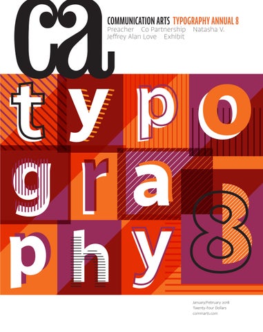
COMMUNICATION ARTS TYPOGRAPHY ANNUAL 8
Preacher Co Partnership Natasha V. Jeffrey Alan Love Exhibit
January/February 2018 Twenty-Four Dollars commarts.com
THINK CLASSIC COLORS
®
LET THE PAPER BE THE STARAND ELICIT JUST THE RIGHT RESPONSE. FROM IMPERIAL RED TO COOL GRAY, EXCITING NEW CLASSIC® COLORS WILL FULFILL ALL YOUR COMMUNICATION NEEDSAND EMOTIONAL CRAVINGS. SO BE SMART. BE HEARD. BE COLORFUL. AND ALWAYS START WITH A POINT OF HUE.
• NEW COLORS Imperial Red Cobalt Military Aubergine Cool Gray
NEENAHPAPER.COM/CLASSIC #THINKCLASSIC
Cadet Gray Chambray Bare White
JANUARY/FEBRUARY 2018 VOLUME 59 NUMBER 6
COMMUNICATION ARTS ��
��
��
FEATURES
TYPOGRAPHY ANNUAL
28 Jeffrey Alan Love
69 81 85 88 92 98 106 110 118 118 122 129 139 142 144 154
by Esther Oh Once silhouettes have sprung from this St. Louis illustrator’s mind and landed on the page, there’s no looking away.
36 Co Partnership
COVER
Radio-Canada typeface, p. 130.
��
by Tonya Turner Drink in this Australian agency’s branding and packaging work and savor the complex notes of storytelling.
44 Natasha V.
by Dzana Tsomondo Lighting, tweaking, shooting—a Toronto-based photographer elevates the ballet of still life photography by following her own rhythm.
52 Preacher
by Julie Prendiville Roux Brands flock to this Austin, Texas, agency for campaigns that keep the scriptures of powerful advertising.
60 Exhibit
by Jean A. Coyne The latest and best in visual communication from here and abroad.
Posters Ephemera Brochures Advertising Packaging Identity Books Periodicals Digital Media Environmental Motion Typeface Design Calligraphy Miscellaneous Unpublished Student Work
FRESH Editor/Designer Patrick Coyne Executive Editor Jean A. Coyne Managing Editor Esther Oh
172
Abby Haddican A world of inspiration converges in this Saint Paul, Minnesota– based designer’s work.
174
Jingyu Lin This Chicago-based photographer’s images beckon you to step inside an intimate world.
Associate Editor Michelle Yee
176
Marco Palena An Italian illustrator uses the fine tip of a pencil to capture the most delicate emotions.
Art Director/Designer Joni Rivas Production Manager/Competition Coordinator Lauren Coyne
COLUMNS 12
Advertising Ernie Schenck draws a definite line between the boss—and everyone else.
18
Editor At Large Anne Telford
Insights In a Q&A, curator Alexander Tochilovsky shares just how much history is lurking behind the designs you thought you knew.
13
Design Culture Wendy Richmond encourages millennials to shoulder the burdens of following their passions.
20
Design Details Hate it or love it, there’s no denying that brutalism packs quite the punch, as Yolanda Zappaterra reports.
Print Producer Daniel Sambrano
14
Voices As three US organizations show Jenn McKee, good design can do a lot of good in local communities.
Design/Production Associate Isabel Bagsik
24
Archivist Nancy Clark Lewis
Creativity Garrick Webster uncovers why a global tribe is rising up around screen printing’s younger—and cooler—cousin.
Production Assistant/Customer Service Representative Khader Yanni
Software Engineers Jiping Hu Srividhya Gopalakrishnan Technology Administrator Michael Hoyt Advertising Director Dirk Moeller
DEPARTMENTS 8 10 178 180 182 185 186
Circulation Director Perry Fotos Accounting Lois Vega
Editor’s Column Contributors Book Reviews Favorites Index to Typography Annual 8 Directory Overheard
Volume 59, Number 6 commarts.com COMMUNICATION arts (ISSN 0010-3519) is published six times a year (January/February, March/April, May/June, July/August, September/October, November/ December) by Coyne & Blanchard, Inc., 110 Constitution Drive, Menlo Park, CA 94025-1107. Periodicals Postage Paid at Menlo Park, CA, and at additional mailing offices.
Copyright 2018 by Coyne & Blanchard, Inc. All pieces reproduced in this issue are under prior copyright by the creators or by the contractual arrangements with their clients. Nothing shown may be reproduced in any form without obtaining the permission of the creators and any other person or company who may have copyright ownership. SUBScRIBER SERVICES: Subscription: 1 year, $53; in Canada, $70; all other countries, $110. All payments in US dollars, Canadian GST: 127848620.
Contributing Editors Sam McMillan Wendy Richmond Ernie Schenck Founder Richard Coyne (1926–1990)
Direct all inquiries, address changes, subscription orders, etc., to: Web: commarts.com E-mail: subscription@commarts .com Phone: 800-688-1971 (US/Canada) Phone: 215-788-5481 (International) Fax: 215-788-6887 Mail: COMMUNICATION arts PO Box 2013 Langhorne, PA 19047 Please allow six weeks for changes. EDITORIAL AND BUSINESS OFFICE: 110 Constitution Drive Menlo Park, CA 94025-1107
Phone: 650-326-6040 Fax: 650-326-1648 E-mail: ca@commarts.com POSTMASTER: Send changes of address to: Communication Arts PO Box 2013 Langhorne, PA 19047 Canada Post: Publications Mail Agreement #40612608 Canada Returns to be sent to: IMEX Global Solutions, LLC PO Box 25542 London, ON N6C 6B2
Like us on Facebook facebook.com/communicationarts Follow us on Google+ plus.google.com/+commarts Follow us on Instagram instagram.com/communicationarts Follow us on Pinterest pinterest.com/camag Follow us on Twitter twitter.com/commarts
SAVE $100 OFF ANY 2– OR 3–DAY EVENT WITH CODE
AEACA
CALLING ALL COMPULSIVES! If geeking out over craft is your idea of a great time, have we got an event for you. An Event Apart is the conference for web & front-end designers and UXers who care more than the average practitioner about design details great and small. We’re the conference where responsive design and “mobile first” were born—the one that introduced new layout ideas powered by CSS Grid while other shows were still introducing audiences to frameworks.
In great cities across the U.S., perfectionists and obsessives (in other words, designers) flock to our shows to learn inspiring new ideas before anyone else hears about them, and to get deep in the weeds with the industry’s most engaging speakers and forwardlooking practitioners. From prototyping to animation, pattern libraries to progressive web apps, the place to learn is An Event Apart. Because we’re the one conference that really sweats the … well, you know.
aneventapart.com/ca
SEATTLE
BOSTON
APR 2–4
JUNE 25–27
JOIN US IN 2018 WASHINGTON DC CHICAGO JUL 30–AUG 1
AUG 27–29
ORLANDO
SAN FRANCISCO
OCT 8–10
DEC 10–12
CRR REE EAA A EDD DBB B CC TTTEE YYY
Stocksy Stocksy is isan anartist-owned artist-owned cooperative cooperative raising raising the bar Stocksy is an artist-owned cooperative raising thethe barbar ——and and the industry’s industry’s expectations expectations — and thethe industry’s expectations — —— of ofstock stock photography photography and cinematography. cinematography. of stock photography andand cinematography. TOO CK . .CM COOM M S TS OSTC KC S YKS .S CYYO
BY RESPECT
EDITOR’S COLUMN
Patrick Coyne
T
his year’s typography competition held a few surprises. When we looked over the 132 entries that were selected as winners from the 1,750 submissions, we saw a strong showing of periodicals—who says print is dead. Also, the number of motion graphic submissions and selections significantly increased from last year. The biggest disappointment was the decline in the number of typefaces that were submitted, but this year’s winning typefaces are more diversified and include two non-Latin and two blackletter typeface families.
“The entries were quite diverse and surprisingly innovative,” juror Chad Michael says. “Many of the entries that stuck out in my mind handled type in new and innovative ways, adding to the diversity and evolution of typographic design.” “There were some definite visual terrain shifts that emerged throughout the bulk of the entries,” says juror Ksenya Samarskaya. “There’s currently a tilt towards monoline scripts, and thankfully, hipster font lock-ups are dying out.” Not all trends were seen in a positive light.
“The student entries were lacking a bit,” says juror Michael Stinson. “They all seemed to come from just one school.” “So many entries pulled from the limited, dated set of design school 101 typefaces: Helvetica, Goudy, Optima, etcetera,” Samarskaya says. “It feels like designers still approach type from a viewpoint of fear, going for the safe fallback options instead of opening themselves up towards greater experimentation.” Among my questions to the jurors, I asked what they’d like to see more of in future competitions. “It would be great to see more editorial and layout entries rather than just font development and lettering,” says Stinson. “This will give the [Communication Arts Typography Annual] a broader range that will attract more interest. It would also be great to see more film title treatments.”
Photographs by Steve Castillo
“There were a large amount of entries using food to create scripted type,” Michael says. “It’s time we hang
this execution up to dry. This has been the go-to solution for several food and restaurant ad campaigns over the past few years, and it has become too repetitive. We were looking for not only a beautiful use of type, but also refreshing solutions.”
8
Typography Annual 2018
“My primary career discipline has been focused on packaging, so of course I’d love to see more packaging entries selected in both the design and type annuals,” says Michael. “I’d also like to see the continued growth of conceptual thinking in design. In the packaging categories especially, I’ve seen more and more deep thinking when it comes to the execution of the product and the brand’s story. Designing something that is simply ‘pretty’ is much easier than designing something that’s both ‘pretty’ and smart.” “I’d love to see more global entries—to see type adapted to different languages, giving nods to different histories and traditions,” says Samarskaya. I asked which technical developments will change the way we use typography in the future. “There were a few entries that used typography and augmented reality (AR) to create works that users could physically interact with in real time,” says Michael. “As we move forward, we can expect to see much more AR. It’s going to open up a whole new way of thinking about type, design and the spaces we live in.” “The technical developments [that have] the potential to shift the output of the typographic community are: augmented reality, in terms of integrating more moving type into our environment; variable fonts and what they can do [to help create] better web type; and greater integration between writing systems and the swapping of languages—this isn’t quite technical, but it seems technically-adjacent,” says Samarskaya.
CHAD MICHAEL runs a design studio in Dallas, Texas, that is dedicated solely to branding and package design. Michael’s studio designs primarily for the spirits and alcohol industry, but it has also completed projects for playing card, cigar and tattoo companies. His designs often employ custom typography, elaborate detailing and rich conceptual thinking. Michael launched his studio in 2014 after working as head designer for some of New York’s most awarded agencies. His client list includes the Almanac Beer Company, Jack Daniel’s, Entertainment Weekly and E. & J. Gallo Winery. He has received numerous accolades and has been featured in publications and books including Communication Arts, HOW, LogoLounge, Los Logos and Print.
Stinson is not as optimistic. “The digital landscape and the constant upgrading of software will encourage designers to spend less time on typography in the future,” he says. “As production time frames continue to pinch, we’ll see less time spent on typography.” Lastly, I asked which challenges the next generation of type designers currently faces. “Future type designers are going to struggle more due to the immense amount of typefaces available,” Michael predicts. “It’s going to be more difficult to develop typefaces that bring something new to the table.” “The limits and high initial investment required for commercial viability have been an issue in type design since I’ve been involved [in the industry],” says Samarskaya. “It continues today and into the foreseeable future. People are still not used to paying for type, and different platforms for monetization are still being tested.” While a minimum of two out of three votes was required for inclusion in this year’s Typography Annual, more than half of the selected projects received a unanimous vote. Judges were also not permitted to vote on projects in which they were directly involved. I would like to extend our appreciation to our jurors for their conscientious efforts and to Kamal Mansour, linguistic typographer at Monotype, who graciously assisted our jurors by providing insights on the legibility and appropriateness of non-Latin typeface entries. ca
KSENYA SAMARSKAYA is the founder of Samarskaya & Partners in New York City, which specializes in visual communication via brand strategy, identity design, typographic layout, type design and occasional design for the internet. With deep roots in the worlds of Latin and Cyrillic type design, Samarskaya has collaborated on dozens of typefaces with the likes of Apple, Font Bureau, Frere-Jones Type, Google, Hoefler & Co., MCKL, Monotype and WeWork. Samarskaya is a founding member of Alphabettes, has served on the board of AIGA/NY, and recently joined the faculty of Harbour. Space, a private university in Barcelona, Spain, that teaches technology, design and entrepreneurship.
MICHAEL STINSON is the creative director and type editor at Ramp Creative in Los Angeles, California. He is also a typographer, a graphic designer and a design educator, and he serves as a typography instructor at Laguna College of Art and Design. In 2012, he and Rachel Elnar cofounded TypeEd, whose mission is to educate designers on the fundamental theory of type and to preserve the integrity of visual communication. Having worked for more than twenty years in the industry, Stinson’s identities and annual reports have been recognized by Communication Arts, Graphis, Mohawk Fine Paper, the Type Directors Club and others. Conversely, he’s served on the juries of the Graphis, the One Show Design and the Young Ones design competitions.
Communication Arts | commarts.com
9
CONTRIBUTORS Features Julie Prendiville Roux, cofounder of Los Angeles–based creative agency Handmade Productions (handmadeca.com), has been writing for Communication Arts since 1987. In this issue, Prendiville Roux spends time with Preacher, an Austin ad agency whose work will make believers out of any advertising skeptic. Dzana Tsomondo (dzanatsomondo@gmail .com) is a freelance writer living and working in New York City. His work has appeared in a variety of publications, from Photo District News to Cool’eh Magazine. In this issue, Tsomondo tries to keep up with Natasha V., a still life photographer based in Toronto. Tonya Turner (tonyaturner.com.au) has worked as a journalist in newspapers across Australia and is now based in Brisbane, writing about design, architecture, home interiors, food, the arts and travel. In this issue, Turner discovers how Co Partnership, a Sydney design agency, expertly bottles the terroir of the brands it works with.
Columns Jenn McKee is a Michigan-based freelance writer and editor. Previously a staff arts and entertainment reporter for the Ann Arbor News, she now writes for publications such as the Detroit Free Press and works as an assistant editor for Great Lakes Review. In this issue’s Voices column, McKee looks to three organizations that are helping their communities. Wendy Richmond (wendyrichmond.com) is a visual artist, a writer and an educator whose work explores public privacy, personal technology and creativity. Richmond has taught at Harvard University, the International Center of Photography and the Rhode
Island School of Design, and she serves on BRIC’s Artists Advisory Council and the MacDowell Fellows Executive Committee. Her latest book is Art Without Compromise* (Allworth Press). In this issue’s Design Culture column, Richmond hopes to unburden millennials with some sage advice. Ernie Schenck (ernieschenck.myportfolio .com) is a freelance writer, creative director and regular contributor to Communication Arts’ Advertising column. Schenck is an Emmy finalist, a three-time Kelly nominee, and a perennial award winner at Cannes, the CLIOs, D&AD, the FWAs and the One Show. As a freelancer, an executive creative director at Hill Holliday/Boston and a cofounder of Pagano Schenck & Kay, he has worked on campaigns for some of the most prestigious brands in the world. In this issue’s Advertising column, Schenck cautions bosses against befriending their coworkers. Garrick Webster (imageandtext.co.uk) is a United Kingdom–based journalist, editor and writer who has been working in the creative industry for the last 20 years. In 2011, he curated Memories, a book in support of the UK cancer charity Maggie’s Centres. In this issue’s Creativity column, Webster discovers why Risograph printing may just be the balm that today’s carpal tunnel–afflicted creatives need. Yolanda Zappaterra (yolandazappaterra .wordpress.com) is a London-based writer and blogger. She writes about architecture, design, fine art, photography, food and travel for a range of European publications—including Time Out and Blueprint —and has published many books on architecture, editorial design and illustration. In this issue’s Design Details column,
Zappaterra unpacks the controversy surrounding brutalism.
Book Reviews Angelynn Grant (angelynngrant.com) is a Boston-based graphic designer, writer and educator. She has taught at the Rhode Island School of Design, the Art Institute of Boston, Simmons College and the Massachusetts Institute of Technology. Ruth Hagopian (ruth.hagopian@gmail.com) is a freelance writer and editor whose profiles have appeared in Create, Digital Graphics and Print magazines. She was also a publisher of Online Design magazine and a partner in Visual Strategies, a San Francisco–based design firm. Allan Haley is a storyteller and a consultant with expertise in type. He was director of Words and Letters at Monotype for fifteen years and has six books and hundreds of articles to his credit. He is a past president of the Type Directors Club and was executive vice president of the International Typeface Corporation. Ben Olsen (twitter.com/benaca) is a Londonbased design and lifestyle journalist. He has written and edited for such publications as Elle, GQ and Monocle on topics ranging from high design to hip-hop and from geometric prints to geography.
Correction
In the 2017 November/December issue, on page 88, Luis Arraiza should have been listed as senior copywriter and Jorge Machado as technology director on the Jolly Rancher campaign.
Pictured contributors wrote features and columns: Julie Prendiville Roux, Dzana Tsomondo, Tonya Turner, Jenn McKee, Wendy Richmond, Ernie Schenck, Garrick Webster and Yolanda Zappaterra. 10
Typography Annual 2018
FIND YOUR PERF ECT JOB AT
CREATIVE HOTLIST CREATIVE HOTLIST, THE CAREER SITE FROM COMMUNICATION ARTS MAGAZINE, HAS MORE JOB LISTINGS IN GRAPHIC DESIGN, ADVERTISING AND NEW MEDIA THAN ANY OTHER CREATIVE SERVICES SITE.
Sign up for a FREE account and with a single click, send your Cover Letter, Resume and Links to Work Samples every time you apply to a Creative Hotlist job.
CHIEF MARKETING
DIRECTOR OF
OFFICER
USER EXPERIENCE
SENIOR UX
ARCHIT ECT
VISUAL DESIGNER
PACKAGE DESIGNER
CREATIVE
DESIGN
DIRECTOR
PHOTO STYLIST
STRATEGIC STORYTELLER
JAVASCRIPT
DEVELOPER
The Communication Arts Career Site
MOBILE DESIGN
DIRECTOR
BRAND
STRATEGIST
COPYWRITER VISIT WWW.CREATIVEHOTLIST.COM TODAY AND FIND YOUR PERFECT JOB.
ADVERTISING
Ernie Schenck
Friends Don’t Let Friends Be Creative Directors
E
very Tuesday night, a bunch of us would change into our uniforms, make sure someone was stopping for beer, pile into our cars and drive across town. It went on like this all summer. Women and men. Interns and agency veterans. Art directors and account executives. Nobody wanted to miss a softball game. And who could blame them. After getting emotionally pummeled by your biggest client, watching your ticket to Cannes slip into oblivion, and spending yet another night with cheap beer, shitty pizza and no clue what you were going to present in the morning, a couple of hours on a weed-
this time. The problem is: You know that Jill just found out her boyfriend is cheating on her. Milo told you his kid is struggling to get off opioids. And Sally is a really sweet kid who brought a German chocolate cake in last month because, you know, your birthday. Letting a few creatives go can be hard enough no matter how compassionate you are. But when those creatives are your friends? Agonizing. Reason 2: True story. Two A-list creatives decide to go out on their own. With two clients already signed on, they’re going to be flat-out busy right out of the box, so they bring a young project manager with them. The three of them went to college
You’re the creative director. And being everybody’s buddy, as well as everybody’s boss, is a recipe for disaster.
together. It’s going to be one big happy family—until the project manager thinks he ought to have an American Express corporate card and his own parking space, just like his two buddies, er, bosses. When the people who work for you see you as a friend, they see you as an
choked baseball diamond seemed like nirvana. It did for everyone on that softball team. And it did for me. Or so I thought. We all know about the creative directors from hell. And hell, let me tell you, can be anywhere. There be monsters in this business. Make no mistake: They will dress you down and beat you up. They will shame you and embarrass you. They will make you want to go home and kick your dog. And when you’re done, you will swear to yourself that someday, when you’re the creative director, things are going to be different. You’ll be kind to your creatives. You’ll nurture them. You’ll have their backs in meetings. You’ll stick up for their ideas. You’ll… be their friend. And your career will be dead on arrival. As I quickly discovered on that baseball diamond, hanging out with the peeps might make you seem more human and—for a moment— it might make you seem like you’re on the same frequency as everyone else. But you’re not. Somewhere between fantasy and reality is a barrier, and no amount of elbow rubbing is going to change that. Because the fact is: you’re the creative director. And being everybody’s buddy, as well as everybody’s boss, is a recipe for disaster. Reason 1: The agency just lost a huge piece of business. Much as you hate to let any of your people go, there’s no getting out of it 12
Typography Annual 2018
equal. They’re not. Reason 3: Yet another true story. Agency X finds out it’s on a bunch of short lists at Cannes. But Agency X isn’t Agency Deep Pockets, so it can only send a few creatives. The question everyone asks is: How did an associate creative director who had little to do with any of the potential Lion winners make the cut? Oh, that’s right. He’s friends with the creative director. That sucking sound you hear? That’s the agency’s morale going down the toilet. Reason 4: Then there’s that wretched no-man’s-land called “Between-A-Rock-And-A-Hard-Place.” You know, like when it’s review time and you’ve got to sit there and pass judgment on your creatives. What ought to be a clear-headed, objective evaluation of somebody’s performance over the last year can turn uncomfortably sticky when that somebody also happens to be Sam, the art director you hang out with on the weekends. Maybe your friendship doesn’t influence you in the slightest. Good for you. But what if it does? What if Sam comes out smelling like a rose when she’s really just a petunia. It’s not fair to you. And it’s not fair to Sam or her career. Nobody wants a bully for a creative director—but nobody should want a buddy either. It might not seem like it, but one is as bad as the other. ca
DESIGN CULTURE
Wendy Richmond
“When I Was Your Age… ”
I
promised myself I would never say the words when I was your age. But it happened yesterday during my conversation with Donna, a millennial who describes herself as a designer/writer/artist/ barista. She has written a collection of short stories and is ready to begin the journey of self-publishing. We talked about the tasks she faces: editing, proofreading, cover and interior design, typesetting, marketing, promotion, distribution, and pricing, to name a few. All the necessary tools—so many tools!—are at her fingertips.
Burden #2: Bad Men
“When I was your age,” I said, wincing, “publishing a book was a completely different experience.”
This behavior was rampant, but a new awareness was emerging. Young people began talking, identifying the problem in open dialogues. We could see that supposedly “mild” transgressions were harmful, and that power, when abused, crushes creativity.
Many of you reading this column are like Donna: millennials born in the 1980s who work in the creative arts. I can’t help but make comparisons to the early stages of my own professional life. Like you, I was encouraged to follow my passions and dreams. I did, and I still do. But I fear it is harder for you. Compared to my generation, who embarked on careers thirty to forty years ago, the opportunities and outlets for your artistic talents have grown exponentially. But so have the burdens. You are told you can do anything, and you are expected to do everything. As one young Brooklynite who is juggling acting, playwriting and a catering business said to me, “I’m drowning in choice.”
Burden #1: DIY Thirty years ago, if you were a writer lucky enough to have a publisher, you also had professionals to produce, market and distribute your book. But along with the personal computer came desktop publishing—an early indicator of the DIY revolution— introducing a set of digital tools that offered more control and subsequently more pressure. Now, as a writer—or a musician, filmmaker or any other creative professional—you can (“should”) Do It (all) Yourself. Clearly, the time required to learn these tools is overwhelming. But the bigger problem is the resulting lack of quality. Training yourself in Photoshop or Final Cut Pro is one thing, but gaining experience in design, photography, filmmaking, writing and marketing is another. The growth in opportunities to publish and exhibit creative work online is matched by a decline in professional expertise. Many online outlets have no submission criteria, no editing, curating or critiquing. And because numbers are the easiest form of measurement, we judge the success of a creative work by the quantity of likes, views, shares and retweets it receives, many of which are generated by bots.
In my column “First, Accept No Harm” (Communication Arts November 2007), I wrote about a young woman attending art school in the early 1980s. Her photography teacher showed interest in her work and praised her inventiveness. Hungry for guidance, she was pleased with the attention, until one day that “guidance” occurred in the darkroom. She pulled away, and the teacher’s praise soon dried up. So did her confidence.
We expected the abuse to go away. But as we’ve learned from the disclosures about Donald Trump, Harvey Weinstein and God knows who else by the time you read this, bad men are more covert and still use their power not only to dominate, but also to cover their tracks.
Burden #3: Conflicting Expectations Early in my career, my expectations for success were ambitious but realistic. I was part of several startups: small groups of entrepreneurs who wanted to combine art, design and technology, with an emphasis on creativity. As the startups grew, we received pay raises and stock options, often before we even asked for them. Then a shift occurred. We began to hear about speedy fortunes made in Silicon Valley, and expectations changed. One friend told me that his primary goal was to sell his small design firm. His role models were not Paul Rand or Massimo Vignelli; they were Steve Jobs and Bill Gates. Pursuing creativity was not enough; now you had to pursue wealth. This exposes the problem for the elders who know and love you and want you to be happy. We are conflicted. “You can do anything,” we say. “Follow your vision.” So you take that inspirational path, and suddenly, when you graduate from art school, those of us who supported your creative explorations start nagging you about health insurance, student loans and credit card debt. We tell you to dream, and then we yell, “Wake up!” These are just a few of the growing burdens that you millennials must contend with. But I will continue to tell you—implore you—to pursue your creative passions and dreams. And thirty years from now, as you hear yourself say to your students or children or young colleagues, “When I was your age… ,” I hope you will do the same. Otherwise, we are lost. ca © 2018 W. Richmond
Communication Arts | commarts.com
13
VOICES
Jenn McKee
Design for Good
Callouts (left) and a conceptual rendering (right) of a home that LA-Más designed for Los Angeles County’s accessory dwelling unit pilot program. LA-Más, design/architect; Genesis LA, strategic planner; Nous Engineering, engineer; Habitat for Humanity Los Angeles, consultant; Councilmember Gil Cedillo/Mayor Eric Garcetti’s Innovation Team, development partners; Grace Lee/Trent Wolbe, clients.
F
lying in the face of conventional wisdom, designers have long made a point of sweating the small stuff. More than anyone, they understand the enormous impact of subtle design choices, whether it’s a storefront’s paint color, the layout of a public park or a logo. Armed with this knowledge, designers with a desire to make a positive difference at the local level have been bringing their skills to those who may need it most. A movement that captures this ethos—called Design for Good by AIGA—has taken root in the industry, but some design firms have been using this idea as a guiding principle, if not their raison d’être, for years. Here are three organizations that are using their detail-oriented superpowers for good.
LA-Más Los Angeles nonprofit LA-Más (Spanish for “the most”) consolidates architecture, urban planning and policy knowledge through the combined forces of co–executive directors Elizabeth Timme and Helen Leung. Both Timme and Leung are Los Angeles natives, and Leung grew up in the Frogtown neighborhood (also called Elysian Valley) where LA-Más’s seven-person office is located. Founded in 2012 by Timme and landscape architect Mia Lehrer (who now serves on the board of directors), LA-Más “helps lower-income and underserved communities shape their future through policy and architecture.” In six years, LA-Más has done much more than interior and exterior design. It has helped small business owners develop marketing plans and access government resources. It has 14
Typography Annual 2018
reimagined public spaces with installations and gotten involved in community planning. And it has helped drive the alternative-housing conversation in Los Angeles. This last issue is a big one. An estimated 50,000 unpermitted accessory dwelling units (ADUs), or “backyard homes,” exist in the city, signaling a housing crisis brought on, in part, by a housing shortage and skyrocketing rents. As part of an ADU pilot program, LA-Más helped design a 1,000-square-foot, two-story, two-bedroom home with a garage—for a total construction cost of under $200,000. “We’re really crossing our fingers,” says Leung of the project. “There’s so much potential and excitement around it.”
LA-Más began as an outgrowth of Timme’s frustrations with the skewed priorities that constrained the design of a children’s hospital she had worked on in Los Angeles, and the very different materials-related challenges she had faced while designing health care buildings in Rwanda and Liberia as a graduate student. Timme envisioned marrying available resources with more user-friendly design and empowering underserved communities to have a say in how their neighborhoods are growing and changing. Shortly after Timme returned to Los Angeles and cofounded LA-Más, Leung came on board to provide the firm with more public policy and urban planning expertise, as well as community engagement skills. The two have led LA-Más to redesign everything from a commercial strip in the Watts neighborhood to grocery stores committed to offering fresh produce and healthy food options to dead ends near LA-Más’s office, which now feature colorful murals.
Communication Arts Daily OUR DAILY EMAIL NEWSLETTER
WHAT YOU NEED TO
STAY INSPIRED Communication Arts Daily
Designed to keep you up-to-date on the hottest design, advertising and web projects, our newsletter also links to the most thought-provoking articles we’ve found on the web. Delivered to your inbox every business day, this quick read is just what you need to stay informed and inspired.
SIGN UP IS EASY AND FREE commarts.com/newsletter
VOICES “We’ve gotten really good about being efficient with our team,” says Leung. “And we welcome opportunities to work in other cities. But there are plenty of things for us to do in Los Angeles.”
Firebelly Design Dawn Hancock was in her midtwenties when her father, who’d long suffered from rheumatoid arthritis, passed away. (Her mother had died of lung cancer nearly fifteen years earlier.) Even before her father’s death, Hancock had been taking on pro bono projects for nonprofits in her off-hours, seeking the kind professional fulfillment she didn’t get from working at a large Chicago-based software development company. But in this watershed moment, Hancock finally took the leap. In 1999, she launched her own business, naming her company Firebelly Design after an Adbusters-style cultural and political zine she had dreamed of launching in college. Her first client, a former coworker’s friend who constructed handmade guitars, needed help with a website. Friends, referrals and word-of-mouth marketing helped Firebelly grow into the eighteen-person boutique firm it is today. Hancock maintains a family-like atmosphere at her company while keeping its “do good” mission in focus; once, she even took her entire staff on a surprise volunteer trip to Thailand. Each year, Firebelly collaborates with the Public Media Institute and the Co-Prosperity Sphere to present a weeklong exhibition called Typeforce, which spotlights emerging typographic artists and designers. “I’d seen designers in my studio, usually younger people, who felt like you have to move to New York or Los Angeles to make it and really become part of ‘the scene,’” says Hancock. “People here are doing some really cool work, but we’re in the Midwest, where you don’t talk about yourself a lot. So I thought: Let’s celebrate up-and-coming artists and give them a platform. Let’s celebrate younger people while the older guard gets the awards and has their day. … it’s starting to put Chicago on the map more.” In 2007, Firebelly also started the 501(c)(3) organization Reason to Give to provide school supplies, children’s clothing, computers and other items to families living in the company’s Humboldt Park neighborhood. “We were seeing gentrification happen, and we felt like we may be part of the problem. Instead, we wanted to be part of the solution,” says Hancock. “We wanted to help our neighbors, so we started talking to community centers and churches to get a sense of what’s going on and how we could help.” Yet another local need is education, which has become the sole focus of Reason to Give in recent years. Firebelly’s conference
Firebelly created an identity (top) that’s as fearless as the young girls who learn to design, code and build at Girls Garage, launched by nonprofit Project H Design. To showcase the talent of the third Typeforce exhibition, Firebelly designed a catalog (middle; bottom) whose blind-embossed cover and strategically placed die cuts beckon the reader to peer inside. 16
Typography Annual 2018
© Neil Alexander
© Sharon Risdorf
Homeboy Industries’ new offices (left) in a former printing facility includes a ramp, which is used as a raceway by those who are in wheelchairs due to gang-related events. Detroit Collaborative Design Center/Sander Architects, design; Homeboy Industries/Jobs for a Future, clients. St. Joseph Rebuild Center’s campus (right) includes six trailers connected by an outdoor gathering space. Building Detail/Detroit Collaborative Design Center/studioWTA, design; Catholic Charities Hispanic Apostolate/Harry Tompson Center/Lantern Light, Presentation Sisters/St. Joseph Church, clients.
room becomes a community classroom on a number of nights each year; while childcare is provided in a nearby room, experts volunteer their time to talk about resume writing, computer skills, parenting, healthy eating, personal finance, immigration and more. Finally, Firebelly’s most enduring program, Grant for Good, has been running since 2004. The grant provides a nonprofit organization with one year of comprehensive branding and design services. “Good design can give people from an organization a different level of confidence, so they’re actually excited to show their business card or their website,” said Hancock. “Investing an entire year involves hundreds and hundreds of hours, but I love that. You see the change in [grant recipients’] faces when we unveil our ideas to them. It’s like they suddenly realize, ‘Yeah, that’s exactly who we are.’”
Detroit Collaborative Design Center Detroit Collaborative Design Center (DCDC), a nonprofit urban design and architecture firm housed at the University of Detroit Mercy (UDM), is staffed by seven full-time professionals and a few student interns who get hands-on experience collaborating with communities. “The idea I brought to the center was: How do you model it after a teaching hospital?” says executive director Dan Pitera. DCDC began in the mid-1990s when former UDM School of Architecture dean Stephen Vogel enlisted a faculty member, Father Terrence Curry, to establish the Neighborhood Design Studio (NDS). Over time, NDS grew into DCDC. When Pitera took the reins in 2000, he expanded the range of services to include strategic planning, landscape design, urban design and experimental installations, turning DCDC into the full-service center it is today. The vast majority of projects happen in DCDC’s own backyard— corridors, neighborhoods and parks in Detroit, where good design helps in “preparing for investment to occur,” says Pitera—but
occasionally, DCDC goes further afield. It designed Homeboy Industries’ offices and training center in Los Angeles, where young adults can find an alternative to gang life through jobs, life skills and employment opportunities. And in the wake of Hurricane Katrina, it collaborated with four faith-based organizations in New Orleans to help design the St. Joseph Rebuild Center, which aims to collectively support and care for the city’s homeless population. “We argue that design is actually a social justice issue and that thoughtful design is actually an essential human need,” says Pitera. “No one would argue that if you put a child in an elementary school that’s well designed—versus an elementary school that’s poorly designed—that child will develop differently. No one argues with that. So then why wouldn’t that be the case with our homeless shelters, our substance abuse centers, our housing, our community centers, our public centers and so on?” DCDC doesn’t “pitch” ideas or projects, but rather responds to and works with communities that are seeking change. One way that DCDC learned a great deal about the region’s wants and needs was by helping with a civic engagement strategy of the Detroit Future City Strategic Framework, which reached an estimated 90,000 local residents. Still, the small details that designers obsess about sometimes make the biggest difference. DCDC once worked with a substance abuse clinic and installed a wall that traumatized kids could write on. “We finish this wall, and I get a phone call. The director’s in tears. She’s trying to tell me a story about a young man, maybe fourteen or fifteen. They had been working with this kid for seven years. He had never smiled—ever,” says Pitera. “His first time interacting with this wall, and when they were talking with this kid, he started to smile.” ca Communication Arts | commarts.com
17
INSIGHTS Alexander Tochilovsky Get Past the Way Something Looks
“Somewhere in my travels, I lost a handful of Communication Arts from the ’60s. I wish I had them now!” someone recently lamented on the Herb Lubalin Study Center of Design and Typography’s Instagram account. Thankfully for this commenter, the Study Center’s curator, Alexander Tochilovsky, knows exactly where to find vintage issues of Communication Arts. Tochilovsky regularly posts design ephemera from the center’s archives; a quick scroll reveals colorful graphics from Sister Mary Corita Kent, type lock-ups from Herb Lubalin’s studio and one wall clock from legendary New York firm M&Co. Though they warrant no filters, such artifacts are better admired in person at the Cooper Union, where the Study Center is located. If you time your visit just right, you can also catch an exhibition curated by Tochilovsky; sit in on a free lecture hosted by Type@Cooper, the postgraduate certificate program he cofounded; and attend Typographics, the festival he helped conceive. Those who attended his Brooklyn lettering tour during last year’s festival surely couldn’t resist posting their own images of the design history all around. —Esther Oh What misconceptions do people have about Herb Lubalin or his work? In my experience, Herb Lubalin tends to be one of the more pigeonholed designers. He is often identified by the designs that have stayed popular and the ones that have come back in vogue, like his calligraphically inspired expressive lettering and his tightly typeset logos, which often use interlocking forms of the ITC Avant Garde typeface. In reality, his output and influence are much deeper and more immense than just those two forms. Always against seeing a single style dominate design, he was instead interested in finding the appropriate visual solution for each project. The other misconception is that he did everything himself. Most of that very expressive lettering work he’s often credited with was done by his staff. His employees and business partners were some of the most skilled lettering artists working in the United States. Sadly, they don’t get as much recognition these days. People like Tom Carnase, Tony Di Spigna, Alan Peckolick and John Pistilli did much of this work. Herb had a great eye for spotting talented individuals who could execute his vision flawlessly. 18
Typography Annual 2018
What’s one object from the Study Center’s collection that has informed your understanding of history? The archive as a whole has helped me understand history in a more nuanced way. Objects of graphic design—by their nature—are made to communicate; as such, they lock in a lot of important information. Looking at any object of design can unlock the greater bit of context and history embedded in it. One example that stands out is Fact magazine, which Herb Lubalin art directed for its entire span, from 1964 until it ended in 1967. The magazine exposed the injustices that its publisher, Ralph Ginzburg, saw happening in the United States. Looking at the magazine today, you get a strong sense of the volatility and energy of the ’60s. The magazine took on such heavy topics as racial discrimination, police brutality, the Vietnam War and rising political tension in the United States. One issue from 1964 took aim at the lack of safety standards among Detroit’s auto manufacturers; the issue’s headline was “American Cars Are Death Traps.” The central article, based on research done by a young Ralph Nader, exposed the poor practices of the car companies in protecting the public. This resonated, and the following year, Nader published his findings in a book called Unsafe at Any Speed: The Designed-In Dangers of the American Automobile. The book caused a much bigger outcry and led to Senate hearings.
It helped the passage of the National Traffic and Motor Vehicle Safety Act in 1966—the first significant automobile safety legislation in the United States. Which “hidden gem” designer do you think more people should know about? There needs to be a greater focus on the many female graphic designers who are overlooked in the established canon of graphic design, like Jacqueline Casey, Elaine Lustig Cohen, Cipe Pineles and Barbara Stauffacher Solomon. I would also encourage people to look into the work of Lica and Albe Steiner, the power couple of postwar Italian graphic design. At this point, do you think it’s still possible to have an original idea in design? Yes, undoubtedly so. Designers have a lot of original thought to offer, especially since technology is rapidly changing. Every new shift in technology calls for new solutions and new forms of visual communication. Who could have predicted how much information we would be absorbing on our phones? Interaction within such a small amount of real estate necessitates new solutions. Is there a particular piece of technology that you’re excited to incorporate into the Study Center? We are actively trying to find a good method of cataloging our collection—digitizing the contents of the archive and making them available to people online. It’s also vital to preserving the collection. I don’t want a simple cataloging tool, but rather something that
creates a deeper immersive experience into the content, leading to greater discovery and insight. Something that goes beyond simply tagging, enabling viewers to make connections across pieces in a richer way. I’m not sure what this will look like, but machine learning and the existing database building technology make me curious to see what happens. What changes do you want to bring to the way designers approach design history? I want designers—and especially design students—to understand how useful design history can be. It’s not merely factual information. Designers can learn a lot from looking at historical materials by digging beneath the surface of a piece to find the context embedded in the work. Every design object’s appearance is manifest of the individual making it, the time during which it was made and the tools available at that time—but the concepts and the thinking behind those objects are often timeless. We just have to get past the way something looks by asking how it got there and what caused it to look that way. Unfortunately, we aren’t taught how to look at design history. I’m trying to change that through the Study Center and its various projects. What advice do you have for a designer who wants to start her or his own personal design archive? It’s surprising how much is available out there if you start looking. Visit every secondhand store you pass. Look in the sale bins at records stores and in paperback book sections, which often contain design gems that cost nearly nothing. Also, trade with your friends for their design work; it will all be really useful and important in a few years. ca
Communication Arts | commarts.com
19
DESIGN DETAILS
Yolanda Zappaterra
Opposing the Myth of Good Design
For Bauhaus, the Bauhaus Dessau Foundation’s magazine, Our Polite Society art directed the third issue (on the essence of objects) and the fourth issue (about Bauhaus photography) (left). Paria Radikal designed a booklet (right) to accompany Räume Öffnen, an exhibition exploring how artists can improve uncultivated spaces in cities.
A
subversive act came back to me recently. While reading about the trend of brutalism in design, I recalled what David Carson did to a dull interview with singer Bryan Ferry for a 1994 issue of Ray Gun. Carson set the entire piece in Zapf Dingbats, making a stinging statement about the emptiness of content that offers readers nothing new. As the great Tibor Kalman, founder of the New York City design firm M&Co, would say in an interview for Eye magazine two years after Carson published his message, “Design is just language and the real issue is what you use that language to do.” Like Carson’s infamous piece, today’s designs are eschewing easy visual communication in favor of a more complex design response. White space or clashing colors, sans serif fonts, minimal ornamentation and very few on-page elements abound in websites like Bloomberg.com and the Drudge Report, and the style is spreading offline. But where did brutalism originate? And is it anything more than just another trend amongst many? An architectural style not only spawned the word brutalism, but also buildings that used the most fundamental construction material—concrete. Indeed, the word derives from the French phrase for ‘raw concrete,’ béton brut, as coined by architect Le Corbusier. But brutalist architecture was not intended to be “a mildewed lump of elephant droppings,” as Prince Charles once described a brutalist complex. Its genesis lies in postwar modern-
20
Typography Annual 2018
ism, which made the most of new manufacturing processes to quickly and cheaply replace civic buildings and educational institutions in war-ravaged cities. Brutalist architecture built on that aesthetic as a coherent, rational step forward. Raw is one word that describes the aesthetic, which has since relocated from cities to websites and more. Jeremiah Shoaf, designer and curator of online typography resource Typewolf, offers another: harsh. “Saturated, sometimes clashing colors with nontraditional layouts are a hallmark of the style,” he says. “It’s a reaction against designers building sites using frameworks and templates, which has led to everything starting to look the same—slick, friendly and corporate.” (Just see brands like Apple and Airbnb.) Global practitioners of the style would agree—among them Adrian Bruno Pruß and Kolja Fröhlich, cofounders of German design studio Paria Radikal. “Graphic design contents are constantly repeating themselves. Consumers are tired of the whole ballyhoo, and you cannot overexcite people anymore,” they say. “The retrogression and tendency to a more simple style is the predictable consequence of the overload.” In the Netherlands and Sweden, design studio Our Polite Society adds another dimension to the emergence of the style. “For us, the brutalist current in graphic design also comes from the punk DIY culture and fanzine production of the late 1970s—the whole ‘This is
PHOTOGRAPHY
COMPETITION 201 8 CALL FOR ENTRI ES
© Sandro
DEADLINE: MARCH 9, 2018 ENTER THE MOST PRESTIGIOUS PHOTOGRAPHY COMPETITION IN THE WORLD
Categories include Advertising, Books, Editorial, For Sale, Institutional, Motion/ Cinematography, Self-Promotion, Unpublished and Student Work. If selected, your award-winning work will be beautifully reproduced in the print and digital editions of the 2018 Photography Annual, and on the Communication Arts website.
Each winning entrant will receive a personalized Award of Excellence, milled from solid aluminum.
ENTER ONLINE NOW:
COMMARTS.COM/COMPETITION/2018-PHOTOGRAPHY
DESIGN DETAILS
FUEL hints at the complex visual language of artist Rebecca Warren’s sculptures in this cover (left) of an exhibition catalog for Rebecca Warren: The Living. Kim Hyung-Jin of Workroom designed a poster (middle) to promote the lecture series From Clinics to Screens: How to Embrace Your Needs and Desires for Happiness. Art Collider, Korea National University of Arts, client. The typeface OPS Capitalis Brutalis balances modernity and antiquity in Our Polite Society’s sign (right) for the 2014 exhibition of the prestigious Prix de Rome award.
a chord… now form a band’ thing. This ideology actually greatly resembles architectural brutalism,” say partners Jens Schildt and Matthias Kreutzer. They recall the words of architect and Bauhaus graduate Max Bill, who said that restraints and low budgets led him to use “robust, cheap materials whose natural qualities complemented each other” for the iconic Hochschule für Gestaltung Ulm (Ulm School of Design) building in Ulm, Germany. “One had to use whatever means at hand to build or publish something. We started Our Polite Society in the crash year of 2008; maybe that’s why our work lacks coziness,” muse Schildt and Kreutzer. Brutalist design may be au courant, but its bones are hardly new. The work of United Kingdom–based design and publishing company FUEL has always contained the building blocks of brutalism: sparse, clean design, Swiss Style fonts and pared-back graphics. “We sometimes explain this as a reaction to the 1980s and 1990s work we were surrounded by as students, which favored content over style. But this could be postrationalizing an approach that actually reflects our attitudes and personalities. We’ve always been independent, outsiders and—at the start at least—a little arrogant,” recalls cofounder Damon Murray. Provocation also plays a part for Paria Radikal, which says, “Maybe the trend evolves from fun, from boredom, as a protest or—like for us—from enjoying protest and from the will to provoke. In brutalism, functionality, bulkiness, and focus on materials and constructions harmonize [the design] and also [help it] clearly stand out from the crowd.” The inventive work of South Korea–based design studio Workroom also exhibits many brutalist traits. Cofounder Kim Hyung-Jin attributes the studio’s output to an appreciation of the simple, clean design of the 1950s. “I love the Swiss Style; it’s true. When I started graphic design, it seemed quite different from the other styles I had known—American postmodern or the highly decorative 22
Typography Annual 2018
Japanese graphic style.” On the wider trend of brutalism, he says, “It comes from a contempt for the idea of ‘graphic’ design and the love for a ‘joke.’” Other agencies that utilize attributes of the style refute the idea that their work is purposely brutalist. “Our work exists somewhere down the line of modernism, of which brutalism is part, but it would be boring to reduce it to just that one aspect by labeling it,” says Our Polite Society. “Our definition of brutalism, if we were to have one, would probably somehow oppose the myth of ‘good design.’ Brutal as in crude, losing control maybe, being big and small at the same time—epic.” Stripping away graphic elements to achieve an unpolished design is the foundation of brutalism. In Tim Lindacher and Steffen Hotel’s case, the style lent itself perfectly to the content. After coming across brutalist web “nondesign” back in 2012 and 2014, Lindacher and Hotel began exploring design directions for their A Mag A Month project in Germany. From the very first issue, they decided to reduce the design to basics, refining the style for the second issue, on land speed records and the vehicles that attempted to break them. “We wanted to create something rough, jarring and ragged that would fit perfectly with its counterpart—the [cars]. These vehicles … were not built for the purpose of being pretty. All they had to do was go as fast as hell … and that is what we wanted to create with this design. No ornaments, no colors, nothing,” says Lindacher. For an unexpected twist, they used a sans serif font with inverted characters, called Sneak, from Konstanz, Germany–based independent type design collective Tightype. “It’s fascinating that this [desire to produce Swiss Style fonts] still seems to be a natural reaction to the modernist legacy, to question the norm by making your own version,” says Our Polite Society. “Sometimes it seems like everyone has designed their own. It’s
a confirmation and a counterstatement at the same time … that’s a very constructive way of making things your own and to try to figure out your position. If you look at it like that, the form and the question of good and bad is secondary; it’s all about doing it, about energy.” For designers, it is also about making sure the design is fit for its purpose. Craigslist, which is regarded as a prime example of brutalist web design, is one of the first places you’d turn to for a used coffee table or a secondhand bike. “If you want to showcase design—for example, in a magazine—you can push your own design until it’s ‘more important’ than what you actually want to show. In the case of Craigslist, design’s role is to help the user find things quickly. Design is not only about making things look good. It is also about finding solutions and then fixing them with good design. So brutalist design definitely has a role and place in design, unless it misses its original [intent],” says Lindacher. Murray concurs: “I’m not quite sure what ‘legitimate design’ or ‘nondesign’ or ‘good design’ are. Craigslist has been designed, which means decisions have been made about appearance; the choices might appeal to some designers as an example of ‘nondesign,’ but they remain design decisions. What is essential is how we use these design elements—how we make them serve a purpose.” Miguel Naranjo and Diego Etxeberria, cofounders of Madrid-based design studio Naranjo–Etxeberria, conclude, “If you can do simple and powerful, you don’t need more. … we believe in a strong functional message mixed with the visual culture of the moment we are living in right now.” When all is said and done, the similarities between brutalist architecture and design go beyond a tidy list of words. Both emerged during perplexing and frightening shifts—the compulsion to create order and simplicity is one reaction; the desire to create something that reflects harshness is another; and the real fact of limited budgets, leading to raw solutions, is a third. As Our Polite Society says, “Brutalism strongly connects to a design position which is about ‘nothing but organization: social, technical, economical, psychological organization,’ as Hannes Meyer said of building and the Bauhaus.” So, will brutalist design endure? Shoaf thinks so. “Like all design trends, it will pass, but I think brutalism with leave its mark. The recent Dropbox redesign was definitely inspired by the brutalist movement, which shows that even a big company can be open to a look that is a little weird, even if it is a little off-putting. Hopefully this mainstream acceptance will lead to designers pushing the boundaries a bit more, and maybe [it will] make brands realize that they don’t always have to go with safe and generic design choices.” ca
To kick off the first issue (top) of their A Mag A Month project—on the theme of motocross racing—Steffen Hotel and Tim Lindacher found inspiration in the ’90s graphics of old motocross race footage. Lindacher’s poster (bottom) for a basement rave in Speyer, Germany, plays with echoes and sound waves. Communication Arts | commarts.com
23
CREATIVITY
Garrick Webster
The Rise of Riso
The Holodeck, a Birmingham, United Kingdom–based printmaking and bookbinding space, brought the playful, retro aesthetic of Cat Sims’s lifestyle illustration Orange (left) to life as a Risograph print. RISOTTO designs and prints Risograph pieces from its zero-waste studio (right) in Glasgow, Scotland.
W
ith the rise of photography in the second half of the nineteenth century, new schools of art quickly bloomed. Maybe the camera could produce a perfect likeness, but could it inspire the viewer like the rich colors and wild brushstrokes of the impressionists? Or the expressionists, cubists and abstract surrealists who followed? The same mindset is prevailing in the design world today—only this time, in response to digital technology. The human hand is no match for the clinical geometry offered by vector graphics, the scientific consistency of the digital color palette or the highdynamic-range photography instantly available on our smartphones. Images can now be tweaked to precision without so much as moving from our computers. It all seems too good to be true.
24
because of her line-led, comic book–inspired style. “It adds another layer to my work and lifts it somehow.” The Risograph 007 first launched in 1984, courtesy of the Riso Kagaku Corporation of Japan. In some ways, the technology sits at the interface between analog and digital. Riso printers were designed to be a fast, cheap way of outputting runs of 50 to 5,000 copies—too many to economically photocopy and too few to justify the setup costs of offset printing. Riso printers are still manufactured, and today’s models plug directly into a computer. However, the basic models only print one color at a time. Feed your pages through two, three or four times, changing the master artwork and the ink each run, and you can achieve exciting, multicolor results. Experimenting with the ink is one of the things devotees find addictive about Riso.
In response, creatives who want to make images—rather than process them—are finding new ways of bringing the fallibility of the real world into their work. The last decade has seen a rising interest in everything from screen printing and letterpress to figure drawing and papermaking. The latest technique to be embraced by designers and illustrators pursuing an authentic look and feel is Risograph printing.
“Risographs shine most in situations where the artist or designer is effectively exploring the possibilities of the machine’s spot colors, the overprints and the relationships between the colors. There’s something intrinsically inspiring to our CMYK-saturated eyes to see color combinations outside of the standard offset gamut,” says Matt Davis, owner and operator of Perfectly Acceptable Press in Chicago.
“I’ve become very enthusiastic about Riso as a medium,” says Cat Sims, zine publisher, artist and rising star of the London design scene. Risograph printing is ideal for artists like Sims, and not just
Perfectly Acceptable is one of many Riso print shops that have popped up around the world in the last five years. According to Davis, much of the impetus in the United States came from
Typography Annual 2018
EVERY ISSUE OF COMMUNICATION ARTS NOW AVAILABLE FOR DIGITAL DOWNLOAD!
GET ALL THE INSPIRATION YOU NEED: STORE.COMMARTS.COM/SINGLE-COPY The most comprehensive history of visual communication. More than 400 issues—from 1959 to today—are now available to inspire you.
Paprika Stuart Hamilton House Industries Unconventional Advertising Kinetic Singapore Melinda Beck Exhibit
March/April 2007 Eight Dollars www.commarts.com
MICHAEL OSBORNE McGARRAH JESSEE TRONIC STUDIO JAMES DAY CHRISTIAN NORTHEAST EXHIBIT TYPOGRAPHY ANNUAL 1
HERMAN MILLER MILTON GLASER TV GRAPHICS INTERNATIONAL COVERAGE MONSTER TYPE TIM MANTOANI EXHIBIT 50TH ANNIVERSARY ISSUE A N N I V E R S A R Y
JANUARY/FEBRUARY 2011
MARCH/APRIL 2009
creative excellence
TYPOGRAPHY ANNUAL 1 MICHAEL OSBORNE McGARRAH JESSEE TRONIC STUDIO JAMES DAY CHRISTIAN NORTHEAST EXHIBIT
50TH ANNIVERSARY ISSUE HERMAN MILLER MILTON GLASER TV GRAPHICS INTERNATIONAL COVERAGE MONSTER TYPE TIM MANTOANI EXHIBIT
years of
COMMUNICATION ARTS
COMMUNICATION ARTS
March/April 2009 Twenty-Four Dollars www.commarts.com
March/April 2012 www.commarts.com
COMMUNICATION ARTS PHOTOGRAPHY ANNUAL 53
Nicoletta Ceccoli National Film Board of Canada Droga 5 Chen Design Associates Exhibit
378
367
5 0 TH
January/February 2011 Twenty-Four Dollars www.commarts.com
© We make it
CREATIVITY
Blue, bright red and grey pop in a flyer (left) for Vice City, an exhibition series that ran in the dieschönestadt gallery in Halle, Germany, from 2011 to 2012. We make it printed the flyer on a Risograph FR3950. Moritz Grünke, designer. A collection of limited edition calendar prints (right) bursts with the bold vibrancy that all of RISOTTO’s in-house products are known for.
cartoonists and do-it-yourself (DIY) zine publishers. In Europe and Asia, the trend is driven by illustrators, design studios and small publishers. Moritz Grünke, who cofounded We make it in Berlin in 2012, loves the way Riso printing brings the artwork to life. “Large areas of plain color don’t look as dead as when printed offset, and even very clean and sleek vector drawings become vibrant in style,” says Grünke. This comes about for two reasons. First, the process works much better with uncoated papers up to A3 in size, so paper textures are ingrained in the work. Second, fully saturated colors don’t work very well. They smudge easily and are picked up by the paper feed roller. Most printers recommend 80 percent saturation or less. The use of halftones, patterns and textures not only resolves the issue, but also adds complexity to the work. “The Riso is perfect for line drawings, watercolors, and pencil or charcoal drawings, as the dither screening involved makes the prints look like the original, or at least very close to it,” says Grünke. “We sometimes work for brands and agencies that love to have this handmade touch for their reports or flyers [in order] to look more… individual.” Daria Tessler, a Portland, Oregon–based artist who grew up with a zine addiction, still remembers the day in the 1990s when she found out that Riso printing was available at Kinko’s. She planned her DIY opus around it, but by the time the book was ready, the Risograph printers had disappeared. The retro appeal of it still grips her. “Riso printing can create a sort of patchy look. Not all of the toner fuses with the paper, so you have to be prepared for a distressed look. It’s not going to be clean and crisp like a digital print, which has its own idiosyncratic appeal. I like flaws and embrace them,” she says. Today she uses Riso for her mythical comics. It’s perfect for their lost-in-time feel. In Paris, young Swedish designer Cecilia Hansson is waiting for a print to come back from Riso Presto. The print’s representation of 26
Typography Annual 2018
a tiger viewed from above, with overlapping colors, seems ideal for overprinting. She’s so excited about the technique that she wants her own printer. She explains: “That way, I can work more experimentally with the printing process. I would love to try my ideas in Riso before they are finished products—and perhaps also build images, creating layer after layer while printing.” For other creatives, the attraction is simply in the fact that Riso printing is similar to screen printing in both process and aesthetic, but without the hassle of making screens, spreading inks, waiting for them to dry and cleaning up afterwards. “A lot of the same ideas apply. Colors can overlap to create secondary colors, which expands your color palette. You need to plan color fills with trapping, so the color fills overlap slightly with the line work. This gives the printer a little more leeway in terms of getting all of the colors to line up properly,” says British illustrator Beth Woollvin. “I’m a big lover of screen printing, so when I don’t have the time to hand print, I can use Risograph printing for a similar finish on a quicker turnaround.” When you consider the practical aspects of Riso printing, the reasons to favor it stack up fast. It’s quick and cheap, and it doesn’t require much infrastructure and space. Its versatility is increasing, with paper feeders now accommodating weights up to 110 lb cover (300 gsm), making Riso printers compatible with card and cover stocks. Perhaps the most attractive aspect is its low impact on the environment. Gabriella Marcella founded RISOTTO in Glasgow in 2012, designing her own range of stationery and printing specialist projects for a range of clients. One of her aims is to produce more with less. “Riso printing in itself is a highly energy-efficient and sustainable printing method, making for an ethical product unmatched by other printing methods. The inks are nontoxic and soy based, and the stencils are made from plant fiber. Unlike litho printing, it only takes a single print for the screen to be fully inked and ready for printing.”
© Jason Chow
Originally screen printed in four colors, Ellie Hodesdon’s illustration of eight fish native to Scotland (left) charms viewers when it is Riso printed in new colors by Hato Press. To experiment with Risograph printing, O.OO creates a calendar every year. For 2017, O.OO focused on two-color overlap in the 360°365 days calendar (right).
No metal plates. No cleaning up. The messiest it gets is when you remove the used master stencil to switch colors. Yet, the technique feels very hands-on because of the layers of color and the handling of the paper. It is this tactility that led Pip Lu and YuxXan “Forty” Liu to set up O.OO Risograph & Design Room in Taipei in 2014. “We’ve often heard that paper-based design will eventually be eliminated due to the burgeoning advancement of electronic devices. But human hands are very sensitive organs, and Riso offers not only vibrant color, but also a sense of texture. We were pretty confident that people would find Risograph printing interesting,” says Lu. Liu continues: “Our interest in Risograph began from a postcard we bought abroad. As it was not on trend in Taiwan back then and there were no related services or information about such printing techniques, we decided to initiate it ourselves and let more people know about this interesting printing method.” Like many Riso print shops, O.OO is opening the technique up to creatives by holding workshops. Lu and Liu see themselves as part of a network that’s promoting all that’s good about Riso across the world. Workshops, exhibitions, open studios, talks, clubs, free online resources—all help expand the Riso community. A lucrative market for preloved Riso machines has even spiked on eBay.
In London, Hato Press has been one of Riso’s biggest proponents, with fortnightly printing workshops and plans for short courses. “There’s definitely a Riso community within which people promote the process and share ideas on how to use the machines—this has certainly encouraged the evolution of the process,” says Leanne Richards at Hato. “It’s an accessible process. It’s user friendly, which is why workshops are so successful and also another reason for the interest surrounding the process.” According to Richards, Riso printing is now taken more seriously as a means of producing art editions while maintaining a connection to the creative process. And although its limitations will always be supplemented through machine add-ons and software (at colorlibrary.ch, for instance, you’ll find more advanced ways of separating colors), its charm remains in that touch of unpredictability. At Hato, the four printers in the shop seem to have their own personalities. “It’s hard to rely upon them; they’re quite fragile and fussy at times, like most printers,” says Richards. “One will happily feed 300 gsm; another is great for achieving a well-registered print. A big part of having success with this process is understanding that it is not black and white, but the more familiar you become with the nuances, the more you are able to control them.” ca Communication Arts | commarts.com
27
BY ESTHER OH
T
he question struck Jeffrey Alan Love in the midst of a dry spell—not in terms of work, which he was getting plenty of at the time, but in terms of passion. Love’s was wearing thin.
Korea and not knowing the languages, so that barrier became even greater.” He ticks off the places he’s lived: Germany, Texas, Germany again, North Carolina, Nebraska, South Korea, Hawai‘i, Colorado, Florida… “and on and on and on,” he finishes.
Not so long before that, Love had dreamed of making art for a living. After creating a fledgling illustration portfolio from assignment prompts he had found from art director SooJin Buzelli, Love sent out mailers and emails like clockwork. A month after he landed his first “real” assignment with The Progressive magazine, he began making enough money to quit his job at an art supply store. His whole career stretched before him.
It’s his stories of Germany that later compel me to look up images of Winnweiler, the village where he, his younger brother and his parents once lived. On Fridays, they ate schnitzel and played UNO at the hotel down the block. During the weekends, they explored the surrounding woodlands and farmlands on volksmarches, or organized fitness walks. And it’s in Germany that Love first laid eyes on the Victor Ambrus– illustrated Tales of King Arthur book. “For someone who was very much a bookworm and lived in sort of a magical, makebelieve world in their head, it was perfect,” Love explains. “I’d be running around pretending to be Robin Hood or King Arthur or whoever, and there are castles everywhere, so you didn’t have to imagine very hard to pretend that you were there.”
And yet, “I wasn’t happy doing the stuff I was doing,” says Love, who had been freelancing while working as an adjunct instructor at Virginia Commonwealth University (VCU) in Richmond. “There’s a type of cancer that runs in my family, so it was recommended that I get tested for it. The first tests were bad; I had to have all these cameras shoved in me, and I was just scared for a month. … You think you have all this time and that life will go on forever, and then life looks down on you and says, ‘Think again.’” “So I just said, ‘What would I want to do?’”
From the beginning
Here is what Love has done: Illustrations for the likes of The New Yorker and the online science fiction and fantasy magazine Tor.com. An award-winning—and his first-ever—book cover for Wolves, Simon Ings’s 2014 work of science fiction. More than 100 paintings for author Kevin Crossley-Holland’s Norse Myths: Tales of Odin, Thor and Loki, out next month. And, of course, the sketches he’s posted to his Instagram account, which has attracted 65 thousand followers. Although Love’s career started just five or six years ago, the pearls he’s strung onto it began forming in his childhood. “I had a hard time making friends, little nerdy kid with glasses,” he says with a laugh, touching his black glasses, “always feeling like an outsider, and moving to Germany or South
Although he spent his twenties working toward a “brain degree” in filmmaking, then creative writing, at Colorado College and touring with his college band, National Eye, art always simmered on the backburner. So when his wife and college sweetheart, Gwyneth, went to medical school in Virginia, Love followed suit. “I wanted to go to VCU to study with George Pratt, who’s a comic book artist and illustrator,” says Love. “And of course the year that I got there, he had just left to go teach at Ringling College of Art and Design. So perfect timing.” Instead, Love met his future mentor, Sterling Hundley. When he attended the Illustration Academy that summer in 2008, he filled his toolbox with the essentials of making art: value, shape, edges and the knowledge that clients hire you for your brain rather than your wrist. But Love needed to mangle a few nails before he could actually make use of any of this knowledge. And it wasn’t just his career that he was building anew: after completing the Illustration Academy at age 30 and dropping out of VCU, Love was divorced, working at a grocery store and sleeping in his car.
Right: “For an article in Nautilus’s Nothingness issue, about the null hypothesis and why we can’t rule out the existence of Bigfoot. This piece was a turning point for me. I needed to hint that something is there, even though there isn’t any proof—looking back, that’s pretty close to what I’ve been going after with my art. I want much of my work to be like a Rorschach inkblot—to suggest the appearance of something without an actual drawing of that something. I always ask, ‘How much information is enough? When can I stop?’” Len Small, art director; Nautilus, client. 28
Typography Annual 2018
Communication Arts | commarts.com
29
© Timmy Trabon
JEFFREY ALAN LOVE
“Making a living as an artist was … not even a dream at that point,” says Love. Still, he painted and drew—sometimes in his car, other times in coffee shops—and snuck into Hundley’s office hours at VCU. When he began working as Hundley’s apprentice, he logged five days at the art supply store and two days with Hundley. What little time he had left, he spent on his own work. It took years before he realized, “I can’t keep delaying any longer.” “I could have started making money and getting work a lot earlier, but my work looked like Sterling’s—my work looked like other people’s,” says Love. “It was derivative, it was hit or miss qualitywise, sometimes amateurish, sometimes OK, so I kind of waited as long as I could.” These were the thoughts initially pressed into his head: “‘I should learn how to draw classically and build up value with pencil and do all these studies, and then I should do an oil,’” he recalls. But “by an hour into [the painting], I’m hating myself and my life. You have to be true to your temperament, your personality—so for me, I liked to work quickly. I loved graphic design stuff; I liked strong shapes … how can I bring that sort of visceral design feeling into my work? But also, how can I have it not just be like I’m cutting out construction paper and pasting it on there?” Love found the answer while illustrating Bigfoot for Nautilus magazine. “It sounds stupid, and I can’t believe it took me This page: “Interior illustration from my first book, Notes from the Shadowed City, which I started when I broke my foot. I had limited mobility, so I painted in my sketchbook every day while keeping my foot elevated. I set up my desk to have only a few supplies within easy reach. I need limitations—too many options, and I never get anywhere. It’s one reason why I stay away from Photoshop.” Jeffrey Alan Love, writer/ illustrator; John Fleskes, designer; Flesk Publications, client. “Cover art for A Song for No Man’s Land, by Andy Remic—a combination of World War I and Welsh mythology. A British soldier is wounded, and as he is hunted by the enemy, they begin to warp and change into shape-shifting ghosts made of tree flesh. I couldn’t have written a better assignment for myself if I tried.” Irene Gallo, art director; Tor.com Publishing, client. Right: “I created Orange Skies as concept art for the graphic novel I’m currently writing and illustrating—a personal piece that could point me in the direction I would like the graphic novel to go.” 30
Typography Annual 2018
Communication Arts | commarts.com
31
32
Typography Annual 2018
JEFFREY ALAN LOVE so long to figure this out: white paint doesn’t show up on white paper,” he says. “That’s it. It’s like, well, obviously. But for some reason on that piece, it made sense to me. That’s sort of dictated everything I’ve done since.” By adding texture to his silhouettes, he’s found a way to “[paint] light onto the object.” To do so, Love uses everything from house-painting rollers to smooth sticks scavenged on the beach. For personal pieces, Love goes in directly with paint and ink; but for client work, he sketches in Photoshop. “Once I have the composition, I’m on easy street,” he says. “If the composition is worked out, and you can tell what it is, you can get away with murder texturewise and mediawise within the actual piece.” When it comes to color, Love keeps it classic: black, white and the occasional pop of red. “Nowadays with Photoshop, everybody can paint with every single color ever invented, and they often do. So to stand out, why not limit yourself?” Also, it’s savvy time management. “If you make 99 percent of the piece black, how fast is that gonna be? Like, shoo shoo shoo, and then one little bit of paint and you’re done. It took you fifteen minutes. I’m attracted to sparseness in design; also, it’s pretty smart deadlinewise.” His dream is to paint a black square for a client brief, which he got pretty close to in a cover for Johns Hopkins Magazine. Although he’s whittled his process down to fit magazine deadlines, these days he only spends about five percent of his workload on editorial illustrations. “Now I work on book covers, where the deadline is a month or two away,” he says. “So I’m given space to work on my own things.” It all ties back to that month when cancer threatened to swallow Love whole. Instead, it did quite the opposite. “I just said, ‘I’m going to stop doing the editorial stuff that I don’t like to do. I don’t care if I have to go back and get a regular job, a 40-hour-a-week job. I’d rather make art that is meaningful and never get paid for it again than to keep doing this,’” Love recalls. “So I just made a bunch of paintings over that month, and [my test] was a false positive.” Today Love says, “I can write it and paint it myself so I get to do these dream projects instead of spending my career hoping they come along.” Notes from the Shadowed City, which he published through Flesk Publications in 2016, Left and top of this page: Three illustrations for Norse Myths: Tales of Odin, Thor and Loki, by Kevin Crossley-Holland. “I painted more than 150 pieces for this book, which has art on every page. My son was born in the middle of this project; it made for some interesting months. Towards the end, I was painting three pieces a day to meet my deadline.” Ben Norland, art director; Walker Books, client. Bottom of this page: “For ‘Closer,’ a short story by Osgood Vance about the last baseball game during the end of the world. A dream of mine is to paint a black square as an appropriate solution for a client’s project. I almost got there with this piece.” Jared Shurin, art director; Jurassic London, client. Communication Arts | commarts.com
33
JEFFREY ALAN LOVE certainly qualifies. Not quite a comic book, not quite an illustrated book, “it’s like this weird, different thing.” Notes is neatly summed up by its first line: “I cannot remember my name or how I came to be in this place.” Written in the point of view of an amnesiac wandering across a strange land, the book first took form when Love broke his foot. Chair-ridden, he filled his sketchbooks with this and that, both images and words. “It was 80 percent dreaming,” Love says. The last 20 percent, which he describes as having to wake up, entailed “a big corkboard, like the Breaking Bad writers room” to fill in plot gaps. The resulting images recall textured Rorschach inkblots. And as you map the rocky terrains of the horned warriors, sprawling trees and sharpened swords that have bubbled up from Love’s youth to rest, again and again, throughout Notes, you feel as if you might just stumble into the cradle of his journey as an artist.
From now on, only love
It is, from Love’s perspective in St. Louis, Missouri, a summer afternoon. Earlier, he had given me a tour of his studio as gracefully as one can through Skype, showing me the table where he writes from 9 a.m. to 11 a.m. He pointed out his seven-foot-long, hundred-year-old drafting table and described his giant Epson scanner. In the corner, he said, were a pair of very hungry cats, Biscuit and Pie, and off to the side, the entrance to the kitchen, from which his son, Arthur—born not long after he and Gwyneth remarried three years ago— streaks in. “There’s a lot of herding that goes on,” he said. It’s getting late. Love tells me that he’s writing his own novel, comic book and children’s book, and he’s looking forward to teaching at the Illustration Academy, as he has been doing for the past few summers. But all of that can wait: it’s time to pick up Arthur from daycare. ca This page: “For John Arcudi and James Harren’s comic Rumble. I love comics and have always dreamed of doing covers for them. This was my first published work for a comic, and I’m currently working on my graphic novel, which should be released in 2018.” John Arcudi/James Harren, art directors; Image Comics, client. “For an article about the history of using bicycles in wars. The first British soldier believed to be killed in WWI was a reconnaissance cyclist.” Stephen Haynes, art director; Bicycle Times Magazine, client. Right: “Cover art for Wolves, by Simon Ings. This was my first-ever book cover. I didn’t know if I’d ever get to do another one, so I threw everything I had at it.” Nick May, art director; Gollancz, client. “Cover art for A Song for Quiet, by Cassandra Khaw. This is the second cover in Persons Non Grata, Khaw’s Lovecraftian horror series. The prompt asked for a saxophonist with the seed of something that can destroy the world growing within him, and every time he plays, he calls forth Lovecraftian horrors. Tentacles are wonderful design elements, much like horns, and I love having them curve and play across images. I imagined the saxophonist as a sort of Cthulhu [a cosmic entity created by writer H. P. Lovecraft] and Pied Piper of Hamelin [a piper who leads a town’s children away].” Christine Foltzer, art director; Tor.com Publishing, client. “War 1 is another personal piece I created to explore different brushes and mark-making tools for my graphic novel. It will be a panel in the graphic novel.” 34
Typography Annual 2018
Communication Arts | commarts.com
35
CO PARTNERSHIP BY TONYA TURNER
O
n a bright, crisp winter’s day in Sydney, Australia, a photo shoot is taking place in the studio of Co Partnership. Mischief hangs in the air as owners Zoe Green, 42, and Max Harkness, 37, banter and laugh with some of their staff while trying to act natural for the camera. A few dirty jokes later, and it’s all finished. Green and Harkness return to their desks in the second studio they’ve expanded into. It’s shared with an architectural firm in a small building of creatives in the now überhip inner-city enclave of Surry Hills.
“We’re growing so fast,” Green says. On the walls behind her, dozens of bottles of alcohol line the shelves. She’s not a big drinker (“It makes me fall asleep”), unlike Harkness—her partner in business and in life—but it’s not unlikely to catch Green enjoying a glass of wine or craft beer at a local bar with her colleagues at the end of the workweek. Instead, these bottles are a showcase of the ten-member company’s work. As a branding and packaging agency specializing in premium alcohol, Co Partnership’s clients include local and global wine, beer and spirits producers. It’s familiar territory for Harkness, who grew up in the southern city of Adelaide, Australia, surrounded by some of the country’s biggest and most famous wine-producing regions. As a teenager, Harkness spent most weekends with his family going to vineyards and festivals thrown on the front lawns of wineries. “Everyone from Adelaide has this generic, really good knowledge of wine,” Green explains. “They’re just born with it.” For Harkness, it also helped that his mother, Barbara Harkness, ran her own business naming wine brands and designing wine labels, including the world-famous Yellow Tail brand and its iconic image of a jumping wallaby. Ten thousand miles away in the United Kingdom, amid the brick buildings and bustling streets of London, Green had fallen in love with the city she grew up in. “I’d go to Camden Town, where my nan lived, and see punk rockers and Rastafarians and skinheads and think, ‘Who are these people? They’re amazing!’” she recalls. “I loved my city from the minute I could see it for what it was: edgy and different. There’s a real anarchy about London.”
Soon after starting her design degree at the Camberwell College of Arts, she became entranced with London’s underground music scene. By the time she completed her studies, she started designing record labels, album covers, nightclub identities and band logos outside of the hours she worked as a receptionist at a design studio. Not long after colleagues noticed her jumping on the computers after work, she was offered a junior designer role. But five years later, she knew she’d never get the type of exciting, challenging briefs that she had received from the music industry with a portfolio full of projects for food brands, so she spent every weekend for the next nine months designing hypothetical projects. After sending her new portfolio out, she got three job offers in three weeks and accepted a position at Lewis Moberly, one of London’s leading branding and packaging agencies whose clients include Moet & Chandon and Bollinger. Enter Harkness, who joined the agency about three years later after traveling to London following a relationship bust-up. While he had a childhood of happy memories, Harkness was excited to explore other cities outside his hometown, where skateboarding had been a big part of his life. He says, “I lived and breathed it. Just the individual creativeness of it—it’s technical and it’s free.” After switching out of a strict private high school and completing a foundation course in graphic design in Adelaide, he moved to Sydney and got a job working for a wine label printer, which was followed by a four-year stint as a production and mock-up artist for an agency working with fast-moving consumer goods. “I’d print these really high-end mock-ups by hand,” he recalls. “I’d mix the inks by hand, print them by hand and assemble them by hand. It really gave me a good understanding of print techniques.” His experience at these two firms would pave the way for what was to come. “The printer and mock-up labels are a key piece of Co Partnership’s DNA, in the way that we think about the printing and the technical capabilities and challenges before we start designing,” Green elaborates. Harkness and Green worked together at Lewis Moberly for six months before the economic crisis took hold of their jobs. It was only then that they started seeing each other, bonding
Captions supplied by Co Partnership. Zoe Green is the creative director and Max Harkness is the creative production director on all projects shown. Right: “With the ambition of producing the artisan gin of Tasmania, Lark Distillery tasked us with naming and packaging its new gin. During our naming process, we uncovered the mystique of Tasmania, a ‘Lost Pocket’ at the end of the world. For our label design—a window for the curious to peer into this lost pocket—we created the illusion of infinity by repeating label inside label. The gin’s key ingredient, the native mountain pepperberry, covers the label.” Lark Distillery, client. 36
Typography Annual 2018
© Danil Gorskikh
Communication Arts | commarts.com
37
CO PARTNERSHIP
over their affection for edgy subcultures and their passion for hip-hop music (“At the moment, we can’t get enough of Kendrick Lamar,” says Green). Harkness’s mom had wound down her business, and the pair—who’d moved to Sydney by then—used her industry contacts to get new work. After landing a big wine client, they officially started Co Partnership in 2011. It was a rough beginning; a year in, Co Partnership was owed $80,000 when its biggest client went broke. But from out of the wreckage, one of its earliest designs survived: The Hidden Sea, an existing wine brand in need of a redesign. So Harkness and Green did what they do best and delved deep into the stories behind the product, bringing it to life on the bottle. Millions of years ago, Australia’s Limestone Coast was sub-
This page: Cofounders Zoe Green and Max Harkness. “Brookie’s Byron Dry Gin is made with a passion to highlight the regeneration of the rainforests in the Northern Rivers region of New South Wales, Australia. To capture this story and reflect the experience of visiting Cape Byron Distillery’s property, we used silver tin capsules to reference the tags hanging from the macadamia trees and recycled sugarcane for the label’s paper stock. Brookie’s signature logo is hand lettered to retain imperfections for a personal touch and an established feel. The Brookie’s B lettermark—created from two leaves embossed in a rich copper foil—is surrounded by a deep emerald green to place the brand at the heart of the rainforest.” Cape Byron Distillery, client.
“The Panama Geisha coffee bean has won so many prestigious competitions that it has been put into a class of its own: ‘the best of Panama.’ Mr Black bought the 2016 winning batch of Geisha. To package a limited ‘farm-toglass’ coffee liqueur, we found inspiration in Panama’s distinctive cigar labels and brought the handcrafted label to life by using gold foil flourishes embossed onto high-quality cotton stock. For the ‘back label,’ we built on the brand’s existing nocturnal theme and art directed United Kingdom artist Greg Coulton to illustrate Panama’s native spectacled owl, which reveals itself as the bottle empties.” Greg Coulton, illustrator; Mr Black, client. 38
Typography Annual 2018
© Guy Davies
Right: “To refresh Mr Black’s coffee liqueur brand and create more meaning for its growing customer base, Co Partnership established the brand’s positioning around the idea of coffee worship, creating a logomark of an eye and a coffee bean to allude to spiritual awakening and the culture of coffee worship. Brooklyn, New York–based creative studio Young Jerks created artwork for the label and the screen-print reveal.” Young Jerks, illustrator; Mr Black, client.
© Guy Davies © Guy Davies
Communication Arts | commarts.com
39
© Guy Davies © Guy Davies
40
Typography Annual 2018
CO PARTNERSHIP merged underwater, and marine fossils now lie buried in the region, contributing to the fertile soil that helps produce the wine. Magnificently, these include whale fossils. Co Partnership engaged New York–based Jon Contino to illustrate the majestic creature on the new label. Not stopping there, the pair screen printed the illustration on the bottle to make it feel “textural, like the [limestone] ground.” Justin Moran, director of sales for Limestone Coast Wines, which acquired the vineyard and has worked with Co Partnership on many projects, describes the studio’s work as well thought out, beautiful and engaging. “The key thing that sets [Green, Harkness and their team] apart is the back research they do in the category, asking who the target consumer is and how the story will resonate before they start their design,” he says. “They take care in the early stages and may even challenge the brand owners’ thinking to make sure everything is aligned.” Indeed, challenging predictable thinking is the thing that Harkness and Green enjoy most about their work. It’s something Green first learned to do while working at Lewis Moberly. “It was a creative-led agency, and I’d just come from a clientled agency where a client would say, ‘I don’t like that color; make it blue,’ and the agency would just change it without asking any questions,” she says. “At Lewis Moberly, [the creative director is] very forthcoming in asking the client, ‘Why?’ They ask the right questions, they put their neck on the line, they really challenge the client to get the best result— it was the first time I’d seen an agency behave so ballsy.” Greg Logan, a director at Southern Wild Distillery in Tasmania, worked closely with Co Partnership on the branding and packaging of Dasher + Fisher, the distillery’s new gin range. It’s fair to say that he is one happy client. “During the pitch process, [Green and Harkness] were the only ones who traveled down to Tasmania, met our distiller and understood the place we are from—and our brand is all about place. They got it, and got us,” he says. Tasked with disrupting the spirits category with a modern approach, Co Partnership designed a bold, graphic mark representing the surrounding mountains, meadows and ocean and used botanical illustrations printed on the inside of the back label to create a poetic snow-globe effect through the shoulder of the bottle. After working with the firm on a number of other jobs, Logan describes Co Partnership’s work as nothing short of refreshing and completely unexpected. “It’s not derived from anything
else; it stands out within the category, but yet, sits perfectly within it,” he says. “[Green and Harkness] spend quite a bit of time understanding what you want, then what the category is doing. Their work oozes personality and likability, and they are both the ultimate professionals, but are very different. Green is very funny, passionate and endearing. Harkness is measured, proactive and reassuring. They balance each other.” When it came to rebranding Australia’s award-winning craft beer Modus Operandi, Co Partnership was in its element. The small, dedicated brewery wanted to switch from glass bottles to cans, at the time associated with cheap, inferior beer in Australia. But cans are more cost effective, lighter to transport and, most importantly, they keep the beer fresher. So Co Partnership came up with a brand positioning statement— “Beer first. No shortcuts”—designed a logo to reinforce it and applied an innovative random-labeling technique with a handcrafted feel to sleek 500-milliliter cans resembling silver brewing kettles. Within twelve months of the new can hitting the fridges, sales for Modus Operandi tripled, and in 2016, the beer won gold for packaging at the Australian International Beer Awards. “When we do strategy for a brand, we try to find out what makes it unique, what its purpose is and what makes it stand apart,” says Green. “Before we start designing, we have a thorough strategic stage where we really uncover the thing we can hang our hat on in the design phase.” In 2017, Co Partnership won first and second place at the Dieline Awards for its work on the wine labels The Underground Project and Friends of Friends. These followed its win at the Australian Graphic Design Association Design Awards in 2016, for which the whole team was brought on stage for its work on Mr Black’s limited edition Panama Geisha Coffee Liqueur, made from one of the world’s most expensive and rare coffee beans. For this project, the team drew inspiration from Panama’s distinctive cigar labels, represented in gold foil flourishes. As for the brand’s famous back label, Co Partnership commissioned United Kingdom–based artist Greg Coulton to illustrate Panama’s native spectacled owl, which strikingly reveals itself as the bottle empties. Tom Baker, cofounder and managing director of Mr Black Spirits, was drawn to Co Partnership for its unconventional approach. “Co Partnership had produced a number of nontraditional, yet very punchy jobs for other liquor clients,” he says. “We found that many agencies we spoke with were
Left: “Gin brand Dasher + Fisher is named after two rivers in the region. Each Dasher + Fisher gin features an ingredient from a different part of the rivers’ journeys: pepperberry from the mountains, citrus and lavender from the meadows, and wakame—or seaweed—from the waters of the Bass Strait. We summarized these journeys in a bold, graphic mark and used botanical illustrations to highlight the story behind each gin. The illustrations create an eye-catching snow-globe effect through the shoulder of the bottle.” Anne Hayes, illustrator; Southern Wild Distillery, client. “After establishing Modus Operandi Brewing Co.’s core belief—‘Beer first. No shortcuts’—we formed a brand mark from a continuous line. The craft beer scene in Australia had yet to embrace cans, despite the fact that aluminum cans keep beer fresher longer. Seeing this as an opportunity to stand out from the crowd, we designed a modern can with individual paper labels randomly applied for each beer type. This means that a run of beer labels can be easily printed, ensuring that the cans make it into the market quickly and more cheaply. To keep in line with Modus Operandi’s public brewery, we used raw materials— stainless steel, timber, uncoated kraft stocks, heat-branded wood—across the touchpoints.” Modus Operandi Brewing Co., client. Communication Arts | commarts.com
41
CO PARTNERSHIP a little too reliant on traditional cues of packaging design … Co Partnership crafts brands that are instantly credible. While some of this comes from its clients, you’re never left thinking, ‘Is this some virtual, made-up brand?’ with any of its work. Its style has a realness. You can feel the brand’s passion, craft and integrity with the work.”
This page: “To help wine brand Samuel Wynn & Co address young male drinkers who typically choose beer over wine, Co Partnership drew inspiration from the life of wine industry legend Samuel Wynn. By turning each wine label into a filmic poster, Co Partnership brought the brand’s stories to life. Inspired by the language of craft beer, the new branding also features chunky typography and a custom bottle.” Treasury Wine Estates, client.
© Guy Davies
Along with Harkness’s ability to make a mean coffee, Baker was also taken with Co Partnership’s down-to-earth attitude. “Harkness and Green are an energetic little duo without the shit. No agency gush. No unnecessary client service. A small team of hard-working, exceptionally friendly and talented designers that make stuff. A great blend of London art school and Australian no-bullshit sensibility.” Cheers to that, Co Partnership. ca
“Dominated by ‘old-world’ white labels, the premium wine market offers consumers little choice to make a statement purchase. This insight revealed an opportunity to turn the typical label on its head for wine brand Friends of Friends. We hijacked a classic wine label with a host of quirky, delightful personalities illustrated by artist Gary Taxali. Our collaboration continues with every vintage, creating a collectable series to share with friends and friends of friends.” Gary Taxali, illustrator; The Friends of Friends Wine Company, client. Right: “It is important to the founder of Salvador Coffee Roasters that his brand’s packaging captures the flair and romance of Brazilian café culture in the memory of his grandfather, Quintana Salvador, who made coffee at home and became the inspiration for the brand. We extended a modern identity across every pack of coffee and treated each individual coffee roast like a minibrand. This involved writing five unique brand stories and hand lettering each logo. A label dieline was also engineered to easily adhere to the bags with a tear perforation for the opening—a cost-saving innovation.” Salvador Coffee Roasters, client.
“We helped Hungerford Hill develop a wine brand that leverages its equity while appealing to a younger audience. Our thinking was a response to the brand’s name, The Underground Project, which captures the range of experimental wines created by Hungerford Hill’s winemakers. Redacted documents, leaked experiments and secrets from the winemakers’ bunker inspired our design, which enabled us to easily change shape, bottle size and copywriting across the wine varieties—all with their own ‘secret’ story—but still have them look like a set. Our bold stripes also distinguish the brand within the crowded online market.” Hungerford Hill, client. 42
Typography Annual 2018
© Guy Davies
“Hungerford Hill matured its 2013 Shiraz in new French and American oak barriques for eighteen months prior to selecting only seven for bottling. This attention to the vigneron’s, or winemaker’s, craft inspired us to bring the maturing process to the bottle. Stencil typography is regularly seen on wine barrels, so we elevated this style and stamped our more elegant version across a real wood substrate, using a silver foil to add drama. The wooden label, made from real timber laminated to adhesive for printing and bottle application, is a print innovation.” Hungerford Hill, client.
Communication Arts | commarts.com
43
© Guy Davies
© Guy Davies © Guy Davies
NATASHA v. N O DAYS O F F BY DZANA TSOMONDO
I
can’t draw. I can’t paint. Photography is the only thing I can really do with my hands,” Toronto-based still life photographer Natasha V. tells me as we work our way through a couple of small plates at Bar Isabel in the city’s Little Italy neighborhood. She is explaining her love for illustration and how important other forms of art can be for keeping her own batteries charged. “I really try not to look at photography because I hate to be influenced by what’s popular right now,” she elaborates. “You have to evolve and you have to change to survive in this industry, but you have to be you.” As I will learn, being Natasha V. means being in constant movement: always thinking, always driving, always willing to get in early and be the last to leave. It comes as no surprise to discover that she is an avid runner—not because of her lithe physique, but because of the energy in her voice and the restlessness in her eyes. V.’s aesthetic pairs a gift for conceptual storytelling with a deep palette, all with the aplomb of an artist who has mastered her craft. She has placed work in publications like Elle, InStyle and Red while building relationships with clients like EOS, Holt Renfrew and Hudson’s Bay. As president of Blu Design and Communications Inc., a New York–based design, advertising and branding agency, Liz Padilla has worked with V. many times. “The two that stand out in my mind the most are the Hazelton Lanes spring campaign and Beauty Underground for Hudson’s Bay,” she says. “These two projects gave Blu creative freedom, and with the help of Natasha, we were able to get the strong, captivating images that delivered… [Natasha] not only delivers on the proposed creative, but then goes one step further and puts her spin on it, giving you the shot that you usually end up going with.” There is a clarity to V.’s work that stands out in a field all but besotted with lush opulence. Whether of fashion or food, her photographs are effortlessly clean and elegantly simple, with crisp lighting and refreshingly cool colors; here beauty speaks for itself in soft tones, with no need to shout above the din. If all this sounds dispassionate, make no mistake: V.’s aesthetic
is nothing if not sensual. By nature, fashion photography is a study in fetishism. But her images have a palpable sheen, as if everything has just been wiped down but is still wet to the touch. Food is voluptuous, visual umami: pale squid backstroking in a lake of swollen orange segments, half-finished meals where disemboweled pies totter amidst crumbling wedges of rich cheese, fine napkins and sleek cutlery. V. and her agent, Jooli Kim of JK Productions, Inc., have been collaborating for three years. After hearing about her from an art buyer, Kim—who was struck by V.’s use of color and patterns—kept tabs on her for some time before the opportunity came to work together. “I think Natasha’s work is a standout because she can create the modern, unique, classic image,” Kim offers, before breaking that down further. “The classic quality is within her photographic approach, avoiding the overly retouched result and attempting to get most of the shot in-camera. The unique is [her] creative process ... [it’s] what inspires Natasha, making images new again. And the modern is her beautifully effortless aesthetic.” When I arrive at V.’s studio in Toronto’s east end, a shoot for Dauphine Magazine is already in full swing. The photographer is centered in the high-ceilinged room, circling her subject, a diamond-encrusted alligator necklace. V.’s assistant and a product stylist move about her in complementary orbits, the three of them acting as one; adjusting this, adding that, crimping and smoothing, and all the while shooting, shooting, shooting. At a table off to the side, a representative for the jeweler and an attendant security guard look up from their devices to watch this delicate ballet, which has been going on for hours. If V. feels any pressure, it doesn’t show. She greets me and is as affably unruffled as she was sipping cocktails the night before at Bar Isabel. And why not—this is her element. For all the activity, V. runs a lean operation and is more dependent on imagination and intuition than on gear. A cluster of grapes isn’t working as an accent to the jewelry, but a quick nibble turns it into a naked stem that makes the shot. “I don’t like using too many lights. I rarely have more than three or four
Right: “Cover of Air Canada’s enRoute magazine. The theme of this issue was Brussels, Belgium. I focused on its vibrant art scene while also paying tribute to the famous Belgian waffle.” Nathalie Cusson, art director; Air Canada, enRoute, client. 44
Typography Annual 2018
Communication Arts | commarts.com
45
NATASHA V. lights on set,” she says. For her, lighting is about subtlety and nuance—something that is suffused throughout the tableau and not a spotlight. Her energy and her insistence that they try seemingly everything make it easy to forget that she has been here all day. “You never look at it and say, ‘Oh, it’s good enough!’ It’s about pushing as far as you can with the ideas and not being satisfied. You have to treat every job like it’s the biggest job you’ve got so far,” V. insists. That persistence comes up again and again when you talk to her clients, past and present. Nathalie Cusson, creative director at Scooter Design Inc. in Montréal, remembers one project vividly: a story about fragrances for Canadian magazine Glow. “The article was about how, throughout the world, scent preferences vary with cultures,” she remembers. “I wanted a cityscape made out of bottles. Easier said than done. We worked a lot at ‘making it work,’ even after the day of the shoot, in post-production.” Even when Cusson began to doubt her own idea, V. kept plugging away and, lo and behold, that same image ended up winning awards. Born into a military family in the former Yugoslavia, V. grew up moving often, eventually settling in Sarajevo. She went to university with an eye on the arts but found herself growing bored with one thing, then another, until she took a black-andwhite photography course. It was love at first sight. “I was imagining myself being really old, like 35 or 40,” V. says with a chuckle, “wondering what could I be doing in life where I would not be bored, and the answer was this. Because it has to be different; it’s not a routine. You cannot ever be in a routine in photography.”
This page: “Beauty awards pages are sometimes hard to conceptualize without identifying specific products. Here, we played with typical visual cues for winning—gold, crowns, etc. Product stylist Rodney Smith and I had full freedom to paint any beauty product gold to create this striking concept.” Faith Cochran, art director; Rodney Smith, stylist; More Magazine, client. “Canada Goose jackets have been worn by some of the most prolific adventurers throughout the years. The amazing prop stylist Silvana Sacco re-created those jackets, and with dramatic lighting, I made them look like objects displayed at a museum.” Michelle Donnelly, creative director; Daniel Onori, stylist; Silvana Sacco, prop stylist; Canada Goose, client. Right: Personal project. “I shot pristine jewelry objects looking strangely extraterrestrial in the natural environment of Badlands National Park.” Personal project. “Heavily textured lipsticks were superimposed to create a moody and tactile image.” Personal project. “Eye shadow can sometimes look like an abstract object floating in space, so I placed several containers underwater and took photos as they slowly—and very differently—floated in space.” 46
Typography Annual 2018
Communication Arts | commarts.com
47
48
Typography Annual 2018
NATASHA V. Ironically, her first project was essentially a still life: a study of empty shoes and how they take on the characteristics of their owners. V. was a quick study, debuting her first exhibit at the National Museum in Sarajevo at the ripe old age of 21. Caught up in her new passion, V. barely registered the turbulence building under the surface of Yugoslavian society. Tensions that had been worsening since the death of strongman Josip Tito in 1980 were pushed to the breaking point by the fall of the USSR, and civil war broke out in 1990. V. had traveled to Belgrade seeking supplies for her next show only to find out that she could not return home. To escape the growing chaos, V. emigrated to Canada in 1994. She landed in Ottawa and quickly enrolled at Algonquin College, eager to pick up where she had left off. It was there that she first worked with color and never looked back. In search of better professional opportunities, V. moved to Toronto in 1998 when the city was in the midst of a film production boom. She found a gig assisting a fashion photographer and, after a few months, was offered some freelance work shooting jewelry for one of his clients. For the next year, she kept assisting while building her own portfolio on the side. Once she started reaching out to ad agencies and magazines, she met a rep right around the same time she got her first assignment. It was an advertising shoot for Quo cosmetics, and the ad agency was looking for a new approach. Instead of a product shoot, it went for something a little more conceptual, which was perfect for V. They ended up using crushed makeup to spell out smudged messages. “It was a small shoot, but it got a lot of attention because it was a new approach to the market and so much different than everything else,” she recalls.
Left: “This story was about jewelry trends, but with cats on the set, it turned out to be about cats too! The hand model was incredibly still and patient while we tried to get the cat into the right position—and then to look in the right direction. Cookies and bribes didn’t work much!” Krystal Lunardo, creative director; Dauphine Magazine, client. “Sometimes, products don’t need much added to them to make them shine. This is one of those objects. By creating an impossible form of the necklace hanging in the air, we underlined the product’s cheeky message.” Nicole Stafford, art director; Hudson’s Bay, The Room, client. “This is the second image in a series on fully edible makeup. The first image featured a Black Forest cake made with lipstick, and this was a take on ‘ready-to-bite’ lipstick.” Nicole Staffors, art director; FASHION Magazine, client. “Part of an ad campaign for The Room, an upscale department of Canadian retailer Hudson’s Bay.” Nicole Stafford, art director; Hudson’s Bay, The Room, client. This page: “From a campaign for the cosmetics store Murale. Three bold images show the different textures and colors of the beauty world.” Christine Vickers, creative director; The Production Kitchen, design firm; Murale, client. “The client needed iconic beauty images for its rebranding campaign.” Julianna Le, designer; Jordan Poirier, creative director; Concrete, design firm; Velour, client. Communication Arts | commarts.com
49
NATASHA V. When I ask how her work has changed over time, V. mentions dimensionality. Saying that she used to shoot everything “flat,” she points to an early beauty shoot where she took close-up portraits of a dark-skinned model whose full lips were made up with eye-popping pastels. Depth, texture, contrast and color all hang in a balance, resulting in a photograph that is eye-catching, sophisticated and beautiful—all at the same time. The project is a remarkably limber bit of advertising, but more importantly, it gave V. a framework for rounded, more sculpted images. V. is at the point in her career where she can look back to see how far she has come as well as look ahead to new challenges. “As a younger photographer, you get hired because of your creative vision, but you get into all the layers of advertising, and you get boxed in,” she explains. “It took a long time for me to really push my vision—to add my voice and know that people are going to listen.” On the question of the future, she stays true to her nature: there will be no standing still. She is looking for the next level, and that doesn’t just mean bigger accounts and more resources. It means pushing everything, across the board. “Ultimately, the challenge is how to take my career further. That can be new visual themes, new, subtler ways of lighting things, or even how to take my lighting techniques and apply them to moving images,” she says. “We will see how I progress and where I finish, but those are the things on my mind.” Her answer, then, is firmly in character: always hungry, never satisfied, eyes firmly on the horizon. ca
This page: “The story was about the best beauty products. Each beauty category was shot as a close-up, seeming abstract at first but recognizable on a second look.” Sandy Kim, art director; Glow, client. “For a story about sensual scents.” Faith Cochran, art director; More Magazine, client. Right: “Designed for extreme weather, Canada Goose’s Expedition Parka comprises more than 100 pieces. Shot over two days, this image shows every single item that goes into making this parka, with every part carefully placed to create a giant puzzle.” Caroline Nitsch, art director; Canada Goose, client. Personal project. “Shot to test the new Fujifilm X-T2 camera.”
50
Typography Annual 2018
Communication Arts | commarts.com
51
PREACHER Preacher
By Julie Prendiville Roux
BY JULIE PRENDIVILLE ROUX
W
hile it’s tempting to jump right to puns and stereotypes when thinking about Austin, Texas– based creative agency Preacher, it may be wise to resist the urge. Exercise self-control, for God’s sake. But, you know what—don’t. Feel free to indulge in comparisons between the pulpit and this other spreader of the good word. Thump the Bible of brand evangelism. This Preacher, like any successful preacher, has true believers (clients and the targets they resonate with), disciples (agency staffers) and even—in a nod to more structured practices— a trinity at the helm: Rob Baird, chief creative officer; Krystle Loyland, chief executive officer; and Seth Gaffney, chief strategy officer. At Preacher-central in downtown Austin, there is even a pew, and stained glass windows line a rambling conference room. As one enters, a painted wall proclaims, “Spreading the good word.” Baird, Loyland and Gaffney met at the New York office of advertising agency Mother, each landing there between 2006 and 2010. They worked together on a project basis; over time, they noticed that when they teamed up, the work was excellent and the process flowed pretty much seamlessly— the three were a winning combination. “We learned at Mother that the more our individual jobs overlapped, the better it worked,” says Loyland. “We have extreme accountability to each other. Nothing is done just because the client said so. We found that when we worked together, it cut out a lot of the nonsense.” In 2013, they decided to not only open their own shop, but also to leave town. “We wanted to compete on a different playing field than Mother and all the places and friends we knew in New York,” says Baird. Loyland and Baird are from the Austin, Texas, area, so the arts-and-music-oriented city became a natural contender for relocation. Gaffney, who had barely even set foot in Texas, was philosophical: “Two of my favorite people were from Texas, so I felt good about it. I’d been to Austin three times before we officially launched at South by Southwest in 2014: once a few years earlier on a trip with friends from both coasts; once with Rob, Krystle and our significant others for a week in August
2013 to make sure we could stand the heat; and then a final time to scout places to live and office spaces in January 2014. It was a leap of faith for sure—mostly for my wife, who was pregnant with our first child… though in fairness, she was trading a fifth-floor walk-up apartment for a house with a garden. We got minilemon and lime trees!” Austin’s focus on art and music proved a perfect fit for Preacher. “We started by finding local talent for our clients,” says Loyland. Over time, they’ve come to tap into talent from all over the world. But Austin’s art scene has a special place at Preacher: when the three found the space they would ultimately land in, they loved that it had a full gallery space for local painters, photographers, illustrators and sculptors. “Austin has become our fourth partner,” says Baird. Loyland adds, “And we have a lot of cold-weather clients who don’t mind that meetings happen here.” Tommy John—founded by chief executive officer Tom Patterson, a former medical device salesperson—designs and manufactures high-end undergarments for men. Patterson, who had spent his days calling on clients in a suit and tie, decided to make it his business to improve men’s underwear, which had been a major source of discomfort for him. In 2014, comedian Kevin Hart was seen wearing Tommy John boxers in one of his videos. The brand reached out to Hart, and he eventually became an investor in the company. That was when chief marketing officer Josh Dean was new to Tommy John. He asked Preacher to help out. “Right after I joined Tommy John, I started talking with Rob about the brand,” says Dean. “Preacher literally felt like an extension of my team. The first piece of work we did was over Christmas when Kevin [Hart] came to the [Tommy John] office and said that he wanted to create some additional content. We had a briefing with Kevin, and within a week, Preacher came up with ideas. We turned the project around by the first week of January and produced fifteen films. Everyone was rolling up their shirtsleeves. There was no precious creative. Rob has an extremely good eye, and he’s also extremely flexible.”
Captions supplied by Preacher. Rob Baird is the chief creative officer on all projects shown. Right: “Casper called on Preacher to introduce its brand and one-of-a-kind mattresses to new markets. We helped Casper avoid traditional showroom antics by creating The Snooze Bar, an a.m. coffee bar/p.m. cocktail lounge. People could book naps or drop by for screen-printed pillowcases, slippers, waffles and signature drinks. This immersive pop-up experience traveled from Washington, DC to Austin to San Francisco.” Eric Pieper, art director; Alex Roka, designer; Katie Stoller, agency producer; NA Collective, production company; Monica Brouwer, Casper, client. 52
Typography Annual 2018
Communication Arts | commarts.com
53
© Danny Clinch
PREACHER
Loyland’s loyalty to Tommy John reflects the agency’s own brand essence: “Tommy John is a great example of Preacher at its most natural. We’ve been working with them since our early days, and have collaborated and shared success. We care about their business as much as they do and use that accountability to influence smart, brave work that will actually work.” That belief in their clients’ brands is where the name Preacher comes from. “We knew we didn’t want our own names to be the company name,” Baird explains. “The name came from what we wanted to build. We wanted to be known for being a really happy place to work. We wanted to believe in the work we were doing, and also the brands we work on. We are extrainterrogative. It’s not so much ‘who will work with us,’ but ‘who will we work with?’ Our promise to the people who work here is that if they give their very best, we’ll make sure to partner with clients who are worth it.” Preacher is located on the upstairs floor of a downtown building. Most recently, the floor was occupied by Karma Lounge, a cocktail and dance club. When the lounge moved on, it left This page: Cofounders Seth Gaffney, Krystle Loyland and Rob Baird. “Squarespace tapped Preacher to help it benefit the David Lynch Foundation. Director and photographer Sandro created vignettes that capture actor John Malkovich taking on the roles of director David Lynch’s most iconic characters. We developed and launched the digital experience, which we named Playing Lynch, a collaborative meditation on the work of David Lynch. With PlayingLynch.com as the hub, we seeded the campaign with a social media push that included hidden Squarespace sites and an array of clues on Reddit, SoundCloud and Lynch fan sites.” Cody Ackors/Joe Hartley, writers; Karl Hébert/Taryn Kealani, designers; Carson Mobley, strategist; Paul Aaron, executive producer; Grant Watson, project manager; wild, production company; David Lee/Amory Wooden, Squarespace, clients. Right: “We told the narrative of singer Leon Bridges’s rise to fame through a 60-second commercial, a 30-second commercial that launched during the Grammys, a website redesign and the short documentary film ‘This Is Home,’ which Squarespace activated around the country.” Josh Stolz, art director; Ally Farrish, writer; Taryn Kealani/Eric Pieper, designers; Joel Parr, developer; Andy McGraw, Cartel, editor; Danny Clinch, photographer/ director; Leon Bridges, music; Stacey Higgins/Katie Stoller, agency producers; Grant Watson, project manager; Milkt Films, production company; David Lee/Amory Wooden, Squarespace, clients. 54
Typography Annual 2018
Communication Arts | commarts.com
55
56
Typography Annual 2018
PREACHER a cavernous, blank space with an attached annex. When Loyland, Gaffney and Baird toured it, they asked that no walls be put up and that they be allowed to design the interior; the owner said yes. That annex became the local gallery, and the rest of the space is in the style of a rambling living room. A large kitchen anchors one side and a winding conference room anchors the other. In the center, rows of worktables are home to staff. Baird’s laptop sits smack in the middle, symbolizing his hands-on, in-the-center-of-it-all role at the agency. “Rob sees everything that goes out the door,” Loyland says. “We are an agency of shared values, respect and ambition. Culture is not a beer tap and a ping-pong table. Everything we do is to allow that.” Gaffney adds, “While it’s clearest to describe Rob as the creative visionary, Krystle as our business leader and me as the strategy guru, the truth is: the lines are much blurrier. We all share the same beliefs about creative problem solving and rich culture building.”
Left: “Although Knob Creek started the craft bourbon movement a quarter century ago, the brand had gotten lost in the wave of newer, trendier options. We were tasked with redefining the brand’s voice and identity across all platforms so that this proud bourbon can reclaim its rightful place on liquor shelves across the country. Our rebrand spans the web, print, out-of-home, social, video, experiential, merchandise and apparel. Every piece in the campaign, called This Creek Runs Full, works together to build an aspirational brand world where experience matters and full bourbon flavor is earned the hard way.” Jimmie Blount, art director; Joe Hartley, writer; Daniel Seong, designer; Jess Neil, strategist; Jeff Johnson, photographer; Grant Watson, project manager; Ivan Hidalgo/Eric Weber, Beam Suntory, clients. “To turn the This Creek Runs Full campaign into an experience that would immerse bourbon drinkers in Knob Creek’s brand world, we created Whiskey and Eggs, a roadshow of hard-earned flavor. Partnering with grill brand Big Green Egg, the experience brought a taste of Knob Creek’s home of Clermont, Kentucky, to top culinary festivals around the country. Our tent, custom built by Austin-based Kartwheel Craftsmanship, combined the visual language of the campaign with educational elements from the distillery, setting itself apart from the seas of white festival tents. The menu’s custom food and drink pairings elevated Knob Creek’s flavor at every turn. The result? A lot of happy guests, clean plates and empty glasses.” Jimmie Blount, art director; Joe Hartley, writer; David Clark, Kartwheel Craftsmanship/Daniel Seong, designers; Jess Neil, strategist; Sarah Kerry, executive producer; Grant Watson, project manager; Eric Weber, Beam Suntory, client. This page: “Dunk Tank” :30 “ESPN’s Longhorn Network (LHN) focuses on the Texas Longhorns, the sports teams that represent the University of Texas at Austin, whose campus is nicknamed ‘The 40 Acres.’ The campaign All the Live Long Day presented LHN and its metaphorical transmitter tower in a Texas field dubbed ‘The 41st Acre.’ The field is filled with everything and everyone Texas sports fans love, just like the network itself.” Cody Ackors, art director; Peter Rosch, writer; David Shafei, director; Katie Stoller, agency producer; Fueld Films, production company; Jill Husak, Longhorn Network, client. Communication Arts | commarts.com
57
PREACHER Amory Wooden, director of brand marketing at the webdesign service Squarespace, has worked with Preacher for two years. “With most agencies, there’s waiting and waiting and waiting for the big reveal, which may turn out to be disappointing. With Preacher, they’re side by side with us the whole time. Krystle, Rob and Seth don’t just get the work done; they are personally invested in it. They were supposed to make a 30-second spot for the Grammys for us, and they managed to hire noted musician documentarian Danny Clinch.” The spot was to feature singer/songwriter Leon Bridges, following his road from dishwasher to noted artist. “They knew that photographer Danny would capture Leon,” Wooden continues. “They were able to work it out so that Danny and Leon could travel together for four days on his tour bus. They weren’t just doing the job—they were looking at who Leon Bridges is. What’s in his soul?” Sounds like religion. ca
This page: “George Mendes, a Michelin-starred chef and friend of Preacher, was about to open his new restaurant in New York City. He entrusted us to develop the entire brand identity and key assets for Lupulo, Portuguese for ‘hops.’ We created everything from the signage and menus to the water bottles and business cards. We are especially fond of the fiery rooster logomark, affectionately nicknamed Rick.” Taryn Kealani/Eric Pieper/Alex Roka, designers; George Mendes, Lupulo, client. Right: “The Big Adjustment” :60 “Existing not just as a premium apparel and undergarment company, Tommy John also has a single-minded mission: to put a stop to the male adjustment epidemic. We helped Tommy John launch its refreshed brand on all fronts, including the web, social, email, digital display, radio and broadcast. Our first campaign addressed the epidemic directly—‘When you’re uncomfortable, we’re all uncomfortable’—which struck a chord beyond views and had a big impact on the business.” Taryn Kealani/Eric Pieper, art directors; Joe Hartley, writer; Andy McGraw, Cartel, editor; Guy Shelmerdine, director; Stacey Higgins/Shannon Worley, agency producers; Smuggler, production company; Josh Dean, Tommy John, client. “Tommy John brought its message somewhere especially relevant: the hot, sticky, uncomfortable subway commute. The brand took over New York City’s Wall Street station to wake men up to the problem they’ve ignored for far too long—male adjustment—and let them know that a solution exists.” Cody Ackors/Fawad Khan, art directors; Joe Hartley, writer; Carson Mobley, strategist; Amanda VanAntwerp, project manager; Josh Dean, Tommy John, client.
58
Typography Annual 2018
Communication Arts | commarts.com
59
1
ASICS in-store posters and online ads “ASICS has taken a new step by launching an apparel range that pushes the lifestyle aesthetic with functional materials, taking notes from its Japanese heritage. As a result, ASICS JYUNI offers minimalist and modern pieces in a black and a white collection. Birmingham, United Kingdom–based brand and design agency Green Room was tasked with creating a global campaign that celebrates the progressive design of the collection. The fabrics, style, craftsmanship and innovation from Japan inspire a Zen-like aesthetic that conceived a theme around empowering the individual against the constraints of time. Shown from online to in-store posters and across the retail journey, the pieces drive awareness, raise buyers’ perceptions of ASICS apparel and increase their consideration to purchase.” Mike Patist, designer; Paul Silcox, creative director; Mayoo van Wissen, project director; Mick de Lint/ Gary Houlder, photographers; Green Room (Birmingham, United Kingdom), ad agency; Stephanie High, ASICS, client.
2
Tarka Indian Kitchen identity “With seven locations throughout Texas, Tarka Indian Kitchen has been recognized as one of the hottest upscale fast-casual restaurant chains in the country. The name Tarka translates into the sizzle and pop of spices when they hit a hot pan, a sound and aroma that welcomes diners. On the heels of its expansion, Tarka asked Pittsburgh, Pennsylvania–based brand design agency Wall-to-Wall Studios to help it initiate a comprehensive rebrand in order to realign all of its touchpoints with the quality of its food and experience. Wall-to-Wall first created a bold logotype and a secondary brand mark that represents the concept behind the name Tarka with line work influenced by the Indian rangoli, a symbol of welcome. The studio also designed a set of graphic seals to augment the visual library, as well as a set of custom icons and related pattern work. The seals and the icons help everyone, from first-time visitors to Tarka devotees, navigate the menu.” Ann Trondle-Price, writer; Nathan Fussner/Emily McGaughey, designers; Doug Dean, lead designer; Larkin Werner, creative director; Wall-to-Wall Studios (Pittsburgh, PA), design firm; Tarka Indian Kitchen, client.
We’re looking for new, outstanding collateral, packaging, print ads, television commercials, direct mail, books and exhibits. For submission details, visit: commarts.com/submissions.
60
Typography Annual 2018
1
2
Communication Arts | commarts.com
61
EXHIBIT 1
Al Sirhan Shoes identity “Sometimes, the very heritage you’ve spent years building can be the weight that keeps you firmly rooted in the past. This was the case for Al Sirhan Shoes, one of the oldest shoe stores in Kuwait. Well trusted, but seen as an outdated, maledominant brand, Al Sirhan Shoes was in need of a rebrand that redirected its sturdy roots to a contemporary marketplace flooded with both female and male shoppers. Kevin Cantrell Studio helped with just that. Partnering with Sharq, Kuwait– based agency Beattie + Dane, the Salt Lake City, Utah–based studio created both an English and an Arabic logotype that speak to an international audience. The studio also created a diamond mark, an authentic seal of heritage that nods at shoppers from the tops of the brand’s shoeboxes. The modular system, created with updated patterns that weave around the diamond mark, nods as well—to Al Sirhan’s past and a step ahead to its future.” Kevin Cantrell, art director; Erik Attkisson, Satellite Office, writer/ strategy; Kevin Cantrell/Wael Morcos, designers; Beattie + Dane, ad agency; Kevin Cantrell Studio (Salt Lake City, UT), design firm; Al Sirhan Shoes, client.
2
The Shins music video “Half a Million” 3:20 “The process to create the music video for the song ‘Half a Million’ was a long one. It started with directing duo LAMAR+NIK, otherwise known as Jesse Lamar High and Nik Harper, filming the Shins against a white backdrop. They then edited the footage before printing the frames—4,868 in total—onto sticker paper. After cutting out 5,566 stickers, LAMAR+NIK numbered and separated the stickers by scene. It took more than 40 locations, some sweltering with summer heat, to finish filming the stickers being layered in sequence. All this to say: there are no shortcuts to grand visual illusions.” LAMAR+NIK (Norman, OK), directors; Columbia Records/The Shins, clients.
3
Levi’s spot “Circles” 1:30 “Levi’s believes that when we come together, we dance in circles. We move as one and celebrate the individual who takes the center. To help the classic denim brand celebrate unity and individuality, San Francisco–based ad agency FCB West created ‘Circles,’ a commercial in which dance, music and Levi’s harmonize to connect the crowd. It declares, ‘Let’s live how we dance. Let’s #LiveInLevis.’” Paul Foulkes, art director; Matt Ashworth, writer; Mike Long, group creative director; Karin Onsager-Birch, chief creative officer; Simon White, strategy; Ryan Riley, strategic planner; Charlotte McConnell, senior producer; Arlene Bae/Lauren Geismar, project managers; FCB West (San Francisco, CA), ad agency; Levi’s, client.
62
Typography Annual 2018
1
2
3
Communication Arts | commarts.com
63
1
64
Typography Annual 2018
EXHIBIT
2
1
The Broadview Hotel identity “An architectural landmark in Toronto’s east end has been restored and reimagined as a luxury boutique hotel—The Broadview Hotel. To balance the hotel’s new contemporary voice with the building’s lively past and gritty east-end roots, Toronto, Canada–based studio blok design created a bold identity, branding everything from wayfinding to in-room items to menus to the hotel’s spaces themselves. Witty touches of color and language pay homage to the eclectic details found throughout the hotel’s interiors.” Marta Cutler, writer; Andrew Cha/Vanessa Eckstein/Jaclyn Hudson/ Steven Tachauer, designers; Marta Cutler/Vanessa Eckstein, creative directors; blok design (Toronto, Canada), design firm; The Broadview Hotel, client.
2
Odell Brewing Company poster “Odell India Pale Ale (IPA) is seemingly approved by everyone. Coupled with more than ten years of history, it’s been the go-to IPA for beer drinkers across the mountain west since the early 2000s. Denver, Colorado–based creative agency Cactus’s assignment was to develop a campaign that highlights the beer’s rich history as well as its approachability. The agency’s solution was simple: show all the walks of life who enjoy Odell IPA on a regular basis. This poster series was displayed at Odell Brewing Company on August 3rd, 2017—IPA Day.” Sarah Berkheimer, art director; Shea Tullos, writer; Jim Morrissey, creative director; Norm Shearer, chief creative officer; Mark Tanner, production artist; Jamie Lamora, project manager; Jon Barnett, strategy; Cactus (Denver, CO), ad agency; Odell Brewing Company, client.
3 3
Philharmonie de Paris poster “Since its inauguration in January 2015, the Philharmonie de Paris has worked on the principle of accessibility and open-mindedness towards music and people. The French cultural institution hopes to tear down barriers between different musical styles and their audiences by offering exceptional acoustics, international programming, and new types of concerts and workshops. Ad agency BETC Paris helped it do so with the creation of three colorful posters that mix food and music together under the tagline ‘no limits to music.’ The poster series has one clear message: come and devour music at the Philharmonie de Paris.” Nicolas Prado, art director; Audrey Coffignot, associate art director; Clara Lafuente, writer; Francis de Ligt/Nathalie Dupont, creative directors; Rémi Babinet, chief creative director; Paul & Martin, photographer; Christine Lefers, art buyer; Florence Douaud, producer; Catherine Emprin/ Peter Feurmour/Isabelle Picot, project managers; BETC (Paris, France), ad agency; Luc Broté/Hugues de Saint Simon, Philharmonie de Paris, clients.
Communication Arts | commarts.com
65
EXHIBIT 1
1
Barra Atlantic Gin packaging “On the Scottish island of Barra, local craftsman Michael Morrison gathers seaweed by hand. This seaweed is the key botanical used in Barra Atlantic Gin, which is produced by his company, Isle of Barra Distillers Co., in Scotland. In order to create an identity for a brand rooted in the perfect blend of ingredients—the local kelp, the skilled people behind the company and the small archipelago at the heart of it all—Glasgow, Scotland–based design studio D8 decided to approach the theme of ‘blends’ literally. First, D8 drew a color palette from the Barra landscape and commissioned several original patterns from paper marbler Jemma Lewis. The patterns not only evoke Barra’s shores, but also form a physical link between the gin and its packaging. The studio then designed a logotype as fluid as the marbled pattern, as well as secondary marks to reflect the gin’s premium quality and origins. The positioning, ‘Island Born, Fearless Spirit,’ conveys Morrison’s home pride and adventurous nature. “The bottle also marks a global packaging first, showcasing the unprecedented use of label-ready adhesive stock from paper merchant G . F Smith’s Colorplan paper range. Global label solution provider Multi-Color Corporation helped give complexity to the marbled pattern by printing a silver foil followed by a sequence of semiopaque whites underneath the marbling that shimmer and give the illusion of depth, like looking into a silvery rock pool along Barra’s shores. The label’s shade of blue matches Imperial Blue, the G . F Smith paper color that D8 used for the outer packaging, and a pinstriped emboss matches Cord, a type of embossing available through the Colorplan range. Each bottle is wrapped in a tissue stock bearing the marbled pattern.” David Shanks, writer; Steven Bonner, design director; Ash Lennie, interactive designer; Rachel Holliman, project manager; D8 (Glasgow, United Kingdom), design firm; Isle of Barra Distillers, client.
2
Le Silpo print ad “Le Silpo, a grocery store in Kiev, Ukraine, is full of tasty delicacies. It is a destination for those hungry for the finer things in life—people who have experienced a lot and have developed a taste for exclusive entertainment. To cater to such discerning palates, Kiev-based branding and advertising agency Tough Slate Design created a series of print ads in which money is not an issue.” Yaroslav Cherkunov/Sergii Shakh/Oksana Zmorovych, art directors; Roman Davydyuk, senior art director; Dima Tsapko, creative director; Tough Slate Design (Kiev, Ukraine), ad agency; Le Silpo, client.
66
Typography Annual 2018
2
“
There was an impressive amount of high-quality entries.” —Michael Stinson
“
TYPOGRAPHY 2018 ANNUAL
I saw foot-in-the-door augmented reality experimentations. I pushed them through with my vote, and hope that encourages more experiments.”—Ksenya Samarskaya
1
68
Typography Annual 2018
POSTERS 1 (series) Feedtype, typographer Alix Neyvoz Gauthier, art director Gauthier (Montréal, Canada), design firm Centre du Théâtre d’Aujourd’hui, client “Five posters from a series featuring a new look for Centre du Théâtre d’Aujourd’hui. The concept showcases heroes and antiheroes—portraits of individuals and communities resisting the system.” 48 × 72, 4-color, offset.
2 Louise Fili/Nicholas Misani, Louise Fili Ltd., designers Louise Fili, Louise Fili Ltd., art director Gail Anderson, Visual Arts Press, Ltd., creative director Anthony P. Rhodes, Visual Arts Press, Ltd. (New York, NY), executive creative director School of Visual Arts, client “Since the mid-1950s, the School of Visual Arts (SVA) has invited faculty members—all practicing professionals—to showcase their talents, reach new audiences and promote SVA through the SVA Subway Series, a series of posters designed specifically for the city’s subway system. MFA Design and BFA Design faculty member Louise Fili designed this poster. Inspired by the object poster, a popular poster style of the early 1900s, it employs Italian-inspired typography.” 4-color.
2
Communication Arts | commarts.com
69
POSTERS
1
1 Yewon Yoo (Seoul, South Korea), designer TE12, client
소
“Hwatu (War of Flowers) is a traditional game that uses playing cards that originated in Japan. Each flower symbolizes a single month, and the style of painting has been localized in South Korea since the 1950s. In the game, Hong dan is one of the sets that can win the game, with three points from the pine tree (January), the plum blossom (February) and the cherry blossom (March). This poster is an experimental piece that reinterprets Hong dan from a graphic design perspective.” 24 × 33⅛, 4-color, digital printing. Typeface: Sandoll GothicNeo 3.
나 무
홍 홍 홍
2 David Kampa, typographer/designer Kampa Design (Austin, TX), design firm AIGA Austin/Austin Ad Fed, clients
매
단 단 단 화
“Poster for a scholarship that was generously created by the joint efforts of the Austin Ad Fed and AIGA Austin to honor my daughter, Maura Rose Kampa. The theme, Fire Inside, focuses not only on the quality of students’ work, but also on their desire and drive to succeed.” 11 × 17, digitally printed by CSI Printing in Austin, Texas, on Stardream Quartz from Olmsted-Kirk Paper Company. Typeface: Neutraface Bold.
3 (series) Julien Hébert (Montréal, Canada), designer Association Typographique Internationale (ATypI), client
70
Typography Annual 2018
꽃
2
벚
“A series of posters promoting the ATypI 2017 conference, whose theme was ‘Atypique.’ This was a great opportunity to experiment with expressive hand lettering.” 24 × 36, digital printing. Typeface: Guillon.
3
Communication Arts | commarts.com
71
1
POSTERS 1 Valentina Casali/Marco E. Romano, letterers Sunday Büro (Jesi, Italy), design firm Lettering da, client “Cultural project Lettering da’s aim is to catalog and study letterforms from the streets of different cities throughout Italy; in this case, Jesi. By using the Suminagashi Japanese paper marbling technique for the lettering of the exhibition poster, we re-created the marbled effect of one of Jesi’s most popular signs. The letters are characterized by a lack of counterpunches and a strong geometric construction.” 27 × 39, digital printing.
2 Scott Biersack (Phoenix, AZ), letterer/designer/illustrator VGKids, print producer Type Hike, client “In celebration of the National Park Service’s centennial, David Rygiol and James Louis Walker invited 60 designers and typographers to create a unique poster for a park they love. 100 percent of the profits were donated directly to The Centennial Campaign to give the parks another spectacular century.” 24 × 36, 6-color, silkscreen.
3 (series) Emanuel Cohen, designer/art director Sacha Cohen, photographer Ben Meïr Ohayon, assistant photographer Gérardine Jeune, stylist Marie-Hélène Rodriguez, project manager 26 Lettres (Montréal, Canada), design firm Juste pour rire, client “Promotional poster for stand-up comedian Eddy King’s new one-man show Mokonzi, which means ‘chief’ in Congolese. King was photographed in a way that would portray stature and importance, just like the bust portraits we often see on currency. To achieve an African feel without using classic patterns, we turned the title into the main typographic element. We created a geometric, dynamic pattern to generate rhythm and graphic impact.” 24 × 36. Typeface: Favorit.
72
Typography Annual 2018
2
Mise-en-scène par Christian Viau Billets en vente 514 790-1111 www.hahaha.com
Théâtre 30 octobre Eddy MO KON St– au 3 novembre King ZI Denis 2018
Mise-en-scène par Christian Viau Billets en vente 514 790-1111 www.hahaha.com
Théâtre 30 octobre Eddy MO KON St– au 3 novembre King ZI Denis 2018
Mise-en-scène par Christian Viau Billets en vente 514 790-1111 www.hahaha.com
Théâtre 30 octobre Eddy MO KON St– au 3 novembre King ZI Denis 2018
Mise-en-scène par Christian Viau Billets en vente 514 790-1111 www.hahaha.com
Design : 26 Lettres / Photo : Sacha Cohen
Design : 26 Lettres / Photo : Sacha Cohen
Théâtre 30 octobre Eddy MO KON St– au 3 novembre King ZI Denis 2018
Design : 26 Lettres / Photo : Sacha Cohen
Design : 26 Lettres / Photo : Sacha Cohen
3
Communication Arts | commarts.com
73
1
POSTERS 1 (series) Nicolas Ortega, designer Craig Ward, design director Dan Kelleher, chief creative officer Deutsch (New York, NY), ad agency Lauren Danziger, MeatPacking District, client “In association with the New York Hall of Science, the Children’s Museum of the Arts staged an 8,000-square-foot pop-up exhibit for five- to twelve-year-olds that showcased work and workshops at the intersection of science and art. We were tasked with creating an identity and design system that brought this concept to life.”
2 Sean Freeman, typographer/illustrator/photographer Eve Steben, art director/prop stylist/producer THERE IS (London, United Kingdom), design firm Another Planet Entertainment, client “For this special-edition gig poster for notorious goofball musician Mac DeMarco, we wanted to create something super playful and quirky, with big, bold type. We came up with the idea of making our lettering out of good old classic chewed bubble gum. With lots of sticky business and dribble bits, we made a nice real-life pink mess by hand and photographed it.” 18 × 24, 4-color, digital printing. Typeface: Clarence Word Regular.
74
Typography Annual 2018
Adventures in Art + Technology 03/01 — 04/30 | 459 West 14th Street | meatpackingdistrict.com/artech
2
Communication Arts | commarts.com
75
1
POSTERS 1 Dan Ferro, designer Milton Un, design director Marty Senn, chief creative officer Carmichael Lynch (Minneapolis, MN), ad agency/client “Gig poster for Carmichael Lynch’s annual Roofstage Pass concert series.” 18 × 24, 3-color, digital printing.
2 Fidel Peña, designer Claire Dawson/Fidel Peña, art directors Underline Studio (Toronto, Canada), design firm The Advertising & Design Club of Canada, client “In November 2016, the Advertising & Design Club of Canada hosted Design New York in Toronto. Guest speaker and curator Paula Scher, partner at Pentagram New York, curated work from six of New York’s top studios. Underline developed a typographic poster that represents New York as a condensed, crazy city full of energy and elegance.” 19½ × 27½, 2-color, offset printing. Typefaces: Druk Condensed, NB International Pro.
3 Jon Daly, designer Karrie Gurnow, art director Truth Collective (Rochester, NY), ad agency Causewave Community Partners, client “Rochester, New York–based nonprofit Causewave Community Partners hosted Robin Koval, chief executive officer of Truth Initiative, as the keynote speaker for its annual celebratory breakfast and fundraiser. Slaying Giants was a dramatic reimagining of the huge, unwieldy, almost unconquerable challenges that both Causewave and Truth Initiative take on. As brutal as the giant is beautiful, art and typography combine to breathe life into a powerful foe—the tobacco industry—exposing the effects that tobacco has on society.” 18 × 24, 2-color, printed on newsprint. Typeface: Native.
76
Typography Annual 2018
2
3
Communication Arts | commarts.com
77
1
POSTERS 1 Riccardo Sabatini (Firenze, Italy), typographer Davide Mosconi, art director Yuri Ancarani, client “Poster for Rio Grande, the latest video installation by director Yuri Ancarani. The Rio Grande is one of the principal rivers in the southwest United States and northern Mexico. Along the way, it forms part of the Mexico–United States border—a liquid frontier between the two nations. This ‘living on the edge’ is the main subject of the video. The two headlines of the poster represent the two borders and lose definition in the middle, as if they’re merging into the water.” 2-color, silkscreen. Typefaces: Dharma Gothic, Maple.
2 Jessica Carpenter/Tad Carpenter, designers/illustrators Carpenter Collective (Kansas City, MO), design firm Pipeline Productions, client “Limited edition commemorative poster for the Violent Femmes show in Kansas City.” 18 × 24, 3-color, silkscreen. Printed at Vahalla Studios.
78
Typography Annual 2018
2
Communication Arts | commarts.com
79
1
80
Typography Annual 2018
2
How do we stack up? It’s a question we seem to constantly ask ourselves. Our brains want to know how we are measuring up compared to everyone else. Do we matter more than other people matter? Is our position more valuable than another person’s position? People can spend their entire lives trying to determine where they stack on the proverbial totem pole of the human race, however, those who do will one day be sorely disappointed to find out that there was no ranking measurement against anyone else at all. There was only the assessment of how their life measured up to their own personal potential. When we compare ourselves to someone else we will always have to rank ourselves as either superior or inferior to that other person, and neither of those assessments will ever be factually accurate. Admittedly, a person can be better than someone else at one particular task, but that doesn’t qualify them as superior.
Attempting to gauge how we are doing in comparison to someone else will never lead to an accurate evaluation because no two people are ever exactly alike. We come from different backgrounds. We possess different talents. We have different strengths and weaknesses. So how then would it ever be a fair assessment to hold ourselves and any other person to the exact same measuring stick? In life there is no “superior” or “inferior” and there is no measuring stick that ranks us in order of importance. Everyone is exactly equal in importance to this world and it isn’t possible for any one person to become more or less important than any other person. So then what do we aim for? How do determine excellence? How do we become “the best”? We start by redefining what we believe “the best” is. We start by recognizing that being “the best” is something relating to you, and only you. It’s about achieving YOUR best, ranked solely against yourself and your own past performance and your own future potential.
Look at your own natural talents and abilities and write them down in a list. Then ask yourself, how you can further develop those talents and abilities? How can you hone them to make them the very best they can be? In addition, ask yourself what natural gifts you have that you have not yet begun to grow and develop? Write those down too. Recognize that becoming your very best will take an ongoing effort of improving the talents you already have, discovering your gifts still waiting to be developed, and continuously looking for undiscovered gifts and talents yet to rise to the surface.
One way to do this is to ask yourself, “Where are the decisions I am making today going to lead me?” and, “Am I better today than I was yesterday?” and, “Do I have goals in place to help improve me tomorrow?
Make a list of the qualities we don’t like about ourselves that we would like to change. For example, are we impatient, are we judgmental, are we lazy, etc. Write these qualities down and then set goals to help you change these into qualities you can be proud of.
It is often said that “If you continuously compete with others, you become bitter, but if you continuously compete with yourself, you become better.” We have to remind ourselves daily that our goal isn’t to be better than anyone else. Our ultimate goal is to be better today than we were yesterday, and have a plan in place to help us become even better tomorrow.
Recognize that every day we are the result of every past decision we have made up to that point. And tomorrow we are going to be the direct result of the decisions we are making today. So if we are doing things today that will make us better tomorrow, and we continue that pattern day after day, we are always going to be in the process of becoming our best.
Coming to recognize every gift and talent we possess within us takes a lifetime. Many of them surface during times of trial and difficult experience. Many surface as we gain more wisdom. Let’s face it, we will likely never know everything we are truly capable of until life forces us to prove it to ourselves.
POSTERS 1 Barrett Fry, designer DJ Stout, art director Pentagram (Austin, TX), design firm Lucy’s Fried Chicken, client “Lucy’s annual event celebrates all things Texas: fried chicken and beer. To create typography for this year’s poster, we used chicken bones from a bucket of Lucy’s chicken.” 18 × 24, 3-color, silkscreen. Typeface: Futura Bold.
2 Thorbjørn Gudnason (Brooklyn, NY), typographer/designer/art director Sid Lee USA, client “A motivational poster that illustrates the challenges of personal growth in the digital era. The entire typographic composition, Japanese for ‘tomorrow more and better,’ supports the notion that if you continuously compete with others, you become bitter; but if you compete with yourself, you become better.” 24 × 36, 1-color, digital printing. Typeface: NB International.
EPHEMERA 3 Rachel Roth/Morgan Stephens, designers Ingred Sidie, art director Design Ranch (Kansas City, MO), design firm Spencer Museum of Art, client
3
“The Spencer Museum of Art explores art’s capacity to spark curiosity, inspire creativity and create connections. Design Ranch was asked to design materials for the reopening gala, Lux Naturalis. Drawing inspiration from the museum’s architectural renovation, we created materials that reflect the wholly transformed space and experience, as well as the theme of light and transparency seen throughout. Unique processes and details, interesting type, and clear holographic foil enabled readers to experience the invitation from a new perspective, just as invitees were encouraged to do in the new space.”
Communication Arts | commarts.com
81
1
82
Typography Annual 2018
EPHEMERA 1 (series) Olga Vasik (Chelyabinsk, Russian Federation), typographer/designer Card Nest Ltd., art director/client “These humor-filled cards send well-wishes with a healthy dose of sarcasm in the form of an afterthought.” 4⅛ × 57/8, 2-color, “New Home” card is printed with a gold foil.
Communication Arts | commarts.com
83
1
84
Typography Annual 2018
#290 janvier –février 2017 : Frankenstein, Fulvio Bernasconi, Isaki Lacuesta, Cinéma québécois, Marcel Hoehn, Béjart …
2
janvier –février
janvier
Frankenstein Bernasconi Lacuesta Québec Hoehn Béjart …
février
21 22
Avec Isaki Lacuesta, c’est l’idée d’un cinéma voyageur qui est à l’œuvre. Faire un film est presque comme une excuse qui lui permet d’accéder à des lieux, de connaître des gens, de vivre des moments et de revenir chez soi pas tout à fait le même. Des périples qui l’amènent au Mexique et dans les capitales européennes avec Cravan vs Cravan, au Mali avec Los pasos dobles et El cuaderno de barro. A l’inverse, certains de ses films révèlent sa culture et son Espagne natale à travers les yeux d’une jeune Japonaise (La leyenda del tiempo) ou ceux d’Ava Garner (La noche que no acaba).
La Cinémathèque suisse propose un éclairage sur l’œuvre trop méconnue du cinéaste catalan Isaki Lacuesta. De nombreux films circulant entre fiction et documentaire sont au programme, ainsi que l’avant-première de son nouveau long métrage, La propera pell, une coproduction suisse réalisée en duo avec sa scénariste de toujours, Isa Campo, et qu’il viendra présenter le 26 janvier au Capitole.
janvier
18:30
ma
31 CIN février
je
18:30
me
15:00
09 CIN 15 CIN
février
28 CIN
Espagne · 2002 · 97' · v.o. s-t fr. Documentaire de Isaki Lacuesta 16/16 DC
Projeté avec Microscopías en avant-programme En 1918, le poète et boxeur Arthur Cravan disparaissait mystérieusement dans le golfe du Mexique. Aujourd’hui, le boxeur et artiste Frank Nicotra suit sa trace de la Suisse au Mexique, en passant par Paris, Londres et Barcelone. Premier long métrage d’Isaki Lacuesta qui brosse à la fois le portrait d’une figure de la boxe et celui d'une sorte d'alter ego. « J'ai toujours pensé que le film pouvait être une fiction, Cravan lui-même étant le premier à inventer des histoires sur sa vie. Et puis, j'envisageais le film comme un jeu de miroirs déformants : Nicotra ressemble à un Cravan actuel, et les poètes barcelonais de l'avant-garde, ainsi que le peintre Eduardo Arroyo, qui sont un peu les Francis Picabia et Marcel Duchamp de l'époque. Comment l'art Dada est devenu, en quelque sorte, l'art contemporain » (Isaki Lacuesta).
janvier
Projeté avec Teoria de los cuerpos en avant-programme Sur fond d’hommage au chanteur légendaire de flamenco Camarón de la Isla, La leyenda del tiempo (titre de l’un de ses albums les plus célèbres) développe deux fictions parallèles : celle d'Isra, un enfant gitan qui refuse de chanter depuis la mort de son père et qui rêve de voyager loin de son île natale. La leyenda Et celle de Makiko, une jeune Japonaise qui se rend en Andalousie del tiempo pour suivre des cours de chant et apprendre à extérioriser (The Legend of Time) ses sentiments à travers un mode d'expression très éloigné Espagne · 2006 · 115' · v.o. s-t fr. de sa culture. Une magnifique bande sonore accompagne De Isaki Lacuesta le parcours hésitant de ces deux personnages en quête Avec Israel Gómez, Makiko Matsumura, d’eux-mêmes. Un film poétique, entre fiction et documentaire, Francisco José Gómez sélectionné dans de nombreux festivals internationaux, tels 10/12 DC que Rotterdam, Las Palmas, Nantes et San Sebastián.
février
janvier
ma
15:00
31 CIN février
ma
lu
18:30
21:00
30 CIN février
ve
18:30
17 CIN
Cravan vs Cravan
février
je
15:00
je
18:30
ve
21:00
02 CIN 16 CIN 24 CIN
Los condenados (The Damned) Espagne · 2009 · 99' · v.o. s-t fr. De Isaki Lacuesta Avec Daniel Fanego, Arturo Goetz, Leonor Manso 14/16 35mm
Projeté avec Soldats anònims en avant-programme Exilé en Espagne depuis trente ans pour avoir lutté autrefois contre la dictature militaire argentine, Martín reçoit un appel téléphonique d’un ancien camarade, Raúl, qui lui demande de revenir au pays pour exhumer le corps de leur compagnon d’armes Ezéquiel. Ils se retrouvent, mais les années ont passé et les convictions et valeurs qui les liaient n’ont plus tout à fait le même sens à leurs yeux… Troisième long métrage d’Isaki Lacuesta et sa première fiction « classique », Los condenados est un thriller autour de la mémoire et de la violence, où ne sont mentionnés ni villes, ni lieux, ni groupes de guérilleros concrets. « C’est un film sur des conflits qui se produisent dans le monde entier » précise le cinéaste. Il a remporté le Prix de la critique internationale au Festival de San Sebastián en 2009.
1 (series)
Cinéaste de la tangente Avant-première : La propera pell d'Isaki Lacuesta et Isa Campo
19
Image : Alou Cisse dans Los pasos dobles d'Izaki Lacuesta (2011)
Les longs métrages
EPHEMERA
Rétrospective Isaki Lacuesta
me
21:00
sa
18:30
ma
15:00
La noche que no acaba (All the night long) Espagne · 2010 · 80' · v.o. s-t fr. Documentaire de Isaki Lacuesta 10/14 DC
01 PAD 11 CIN 21 CIN
Los pasos dobles (The Double Steps) Suisse, Espagne, Mali · 2011 · 86' · v.o. s-t fr. De Isaki Lacuesta Avec Bokar Dembele, Miquel Barceló, Alou Cisse 10/14 DC
ma
15:00
me
18:30
ma
21:00
07 CIN 22 CIN 28 CIN
El cuaderno de barro Suisse, Espagne · 2012 · 60' · v.o. s-t fr. Documentaire de Isaki Lacuesta 10/14 DC
février
ve
18:30
ma
21:00
je
21:00
03 CIN 14 CIN 23 CIN
“Materials for FCB Chicago’s third annual open house. The colors, the metallic finishes and the structural treatment of the typography pay homage to the John Hancock Center, which the agency calls home. Drawing from the architectural cues of the monolith, the central visual features five rows of doors, representing the floors that FCB Chicago occupies. In contrast to this austerity, the mark offers an ornamental detail that expresses the idea of ‘openness’ in the intertwining letters and numerals.” Poster: 67½ × 90, chrome vinyl; invitation: 4½ × 6½, 4-color, Scodix foil; enamel pin: ¾ × 1, 4-color, foil. Typefaces: Aperçu, Aperçu Mono.
Projeté avec Las variaciones Marker le 31 janvier et le 15 février, et Resonàncies magnètiques le 9 février. L’Espagne et ses exotismes ont toujours attiré Hollywood et ses étoiles. Ava Gardner était l’une d’entre elles. Elle y tourna quelquesuns de ses plus grands succès et tomba amoureuse d’un pays qui, à l’époque franquiste, souhaitait flirter avec le glamour et le cinéma. Avec ce documentaire, Isaki Lacuesta rend un hommage insolent et amoureux à Ava Gardner en faisant dialoguer les personnages qu’elle a incarnés, et la femme fatale à la réputation sulfureuse que décrivent différents témoins interviewés. La qualité de La noche que no acaba tient essentiellement à la manière élégante du cinéaste de mêler une Ava de fiction et une Ava plus réelle, et d’agencer avec subtilité et intelligence documents d’archives, témoignages et séquences de films. Selon une vieille légende malienne, chaque être humain possède un double pouvant vivre à n’importe quel moment ou endroit, que chacun a le devoir de retrouver avant d'espérer pouvoir devenir soi-même. L’artiste contemporain Miquel Barceló pense voir ce double en François Augiéras, peintre et écrivain français du début du XXe siècle, qui a sillonné les mêmes contrées que lui. Los pasos dobles retrace la quête de Barceló parti à la recherche d’Augiéras et des traces qu’il laissa en Afrique, notamment sa légendaire « chapelle Sixtine », un blockhaus français perdu au milieu du Sahara qu’il couvrit de ses peintures. « Film d’une belle liberté formelle et intellectuelle qui invite à mettre en veilleuse les catégories mentales européennes pour s’ouvrir à une certaine porosité africaine » (Norbert Creutz, Le Temps, 2012). Projeté avec In Between Days Il y a plus de 20 ans, le peintre plasticien Miquel Barceló effectue un voyage dans le désert du Sahara, depuis l'Algérie jusqu'au Mali. A l'issue de ce périple, sa peinture et sa vie ont totalement changé et il décide d'installer son atelier au Mali dans le village de Gogolí. Depuis lors, il y passe depuis de longues périodes. Le fruit de ces séjours est bien connu dans le monde entier, mais jusqu'ici aucune image de son atelier africain n’existait. Isaki Lacuesta part à la rencontre de cet artiste et filme son spectacle, créé avec le chorégraphe Josef Nadj, dont la représentation a lieu au sommet de la falaise de Bandiagara. Avec un mur d'argile mouillé, il recrée les gestes du quotidien, comme ceux de pilonner le grain dans des calebasses, et évoque les monstres fantastiques de l'imaginaire malien.
Cinq citoyens espagnols voient leur vie se briser suite à une crise économique. N’ayant plus rien à perdre, ils élaborent un drôle de plan pour sauver leur peau et celle de leurs concitoyens… Des personnages déjantés, des anti-héros évoluant dans une sorte de western moderne et dans un monde en pleine dérive où l’excès reste toujours la meilleure arme, Murieron por « Murieron por encima de sus posibilidades offre des clins d'œil encima de sus délirants à des films comme Vol au-dessus d'un nid de coucou posibilidades ou Apocalypse Now. Un humour très noir, un portrait terrible Espagne · 2014 · 100' · v.o. s-t fr. de l'Espagne corrompue, un spectacle saugrenu, ce long métrage De Isaki Lacuesta est en somme une démonstration de pure folie qu'il faut mettre Avec Raúl Arévalo, au crédit du ce cinéaste inclassable, audacieux et surprenant Imanol Arias, qu'est Isaki Lacuesta » (Alfonso Rivera, Cineuropa, 2014). Bruno Bergonzini
BROCHURES 2 Luca Iiriti/Roei Regev/Richard Smith,
16/16 DC
24
25
Les autres films de la rétrospective Les films issus du cinéma québécois de ces dernières années ont en commun de rayonner à l’international. Sélectionnés aux festivals de Cannes, Venise, Sundance, Rotterdam, Locarno ou Berlin, ces œuvres traversent les frontières, se font connaître et donnent parfois même l’occasion à certains réalisateurs et acteurs d’entamer des carrières à l’étranger. Outre ce point, c’est surtout la diversité des genres qui règne : comédies (Starbuck), thrillers (Prisoners), essais (Nuit#1, Le Météore), films citadins (Montréal la blanche), ruraux (Le Vendeur, Le Démantèlement) ou transnationaux (Incendies, Café de Flore, Inch’Allah, Rebelle). janvier
lu
18 :30
30 CIN
La Donation Canada · 2009 · 96' De Bernard Emond Avec Elise Guilbault, Jacques Godin, Eric Hoziel 16/16 DC
février
je
21 :00
02 CIN
Polytechnique Canada · 2009 · 77' · avec s-t angl. De Denis Villeneuve Avec Karine Vanasse, Sébastien Huberdeau, Maxim Gaudette 14/14 35mm
février
me
18 :30
01 PAD
J’ai tué ma mère Canada · 2009 · 96' · avec s-t fr./all. De Xavier Dolan Avec Anne Dorval, Xavier Dolan, Suzanne Clément 14/16 35mm
34
Une urgentologue montréalaise se rend à Normétal, une petite ville minière, pour remplacer un collègue. Celui-ci lui laisse tous ses patients et souhaite qu’elle reprenne le poste de façon permanente… Après La Neuvaine (2005) et Contre toute espérance (2007), La Donation est le dernier opus de la trilogie de Bernard Emond portant sur les vertus théologales : la foi, l’espérance et la charité. Un drame psychologique dénué de maniérisme où le cinéaste propose une réflexion sur la souffrance humaine et l’impuissance face au sort tragique de ses semblables. « La Donation, malgré ses références religieuses, est un film où Dieu est absent, et qui donne à la question ‘ comment vivre ? ’ une réponse totalement laïque, où la seule transcendance est celle de valeurs humaines » (Bernard Emond).
Première suisse Assis à une table, un jeune homme écrit une lettre. Il compte entraîner avec lui dans la mort le plus de jeunes femmes possible, dans un acte qu'il qualifie de politique… Drame réalisé par Denis Villeneuve, absent des grands écrans depuis Maelström en 2000, et inspiré des témoignages des survivants de la tuerie survenue le 6 décembre 1989 à l’Ecole Polytechnique de Montréal. Marc Lépine, un étudiant, s’était introduit dans le bâtiment armé d'un fusil d'assaut, blessant et tuant nombre de ses camarades féminines. L'un des gestes les plus meurtriers au Canada à l'endroit des femmes. Denis Villeneuve a reconstitué cet événement tragique à travers le regard d’étudiants, mais aussi en suivant au plus près l’assassin, l'affolement collectif dans les couloirs et les classes, les visages horrifiés. Hubert Minel, 17 ans, ne supporte plus sa mère, ses manies, ses goûts, sa manière d’être. Troublé par cette relation amour / haine qui l’obsède et rongé par la hargne qu’il éprouve à l’égard d’une femme qu’il aimait jadis, Hubert trouve refuge dans l’art et dans une relation amoureuse avec Antonin… « Dans ce premier film, Xavier Dolan se met en scène, s'expose, joue avec sa propre histoire familiale (…) et place sa quête de style plus haut que ses règlements de comptes. Benjamin du Festival de Cannes en 2009, il met dans sa marmite autobiographique citations littéraires ravageuses et hommages cinéphiles exaltés (…) Mélancolique sur le fond (impasse d'une relation fusionnelle parvenue à son terme), le film restitue par sa forme la fougue et l'effervescence d'une psyché adolescente » (Louis Guichard, Télérama, 2009).
Image : Céline Bonnier dans La Passion d'Augustine de Léa Pool (2015)
Jackson Bernard/Mo Hy, senior designers Kevin Grady/Todd Tilford, executive creative directors Liz Taylor, chief creative officer Steve Hutchings, contributing artist Julie Regimand, print producer Lord + Thomas, production company FCB Chicago (Chicago, IL), ad agency
typographers Clément Rouzaud, associate designer Richard Smith, design director Jannuzzi Smith (London, United Kingdom), design firm Cinémathèque suisse, client “To help Cinémathèque suisse (the Swiss Film Archive) present its extensive film screenings and related events in a bimonthly periodical, we automated the typesetting, compiling data exported from the institution’s extensive database into XML on the fly and processing it through a range of layout templates. This dramatically simplified implementation and production tasks while improving typographic accuracy and consistency. The information is stratified and color coded to help the reader navigate through the different content themes.” 116 pages, 5½ × 8¼, 4-color, perfect bound. Typeface: Neuzeit Office.
35
Communication Arts | commarts.com
85
1
2
86
Typography Annual 2018
BROCHURES 1 Commercial Radio Productions Ltd. Artroom, design Commercial Radio Productions Ltd., production company Commercial Radio Productions Ltd., 903 Openbox (Hong Kong), client “The HKest Film Festival’s theme paid tribute to the golden age of the Hong Kong film industry. Film advertisements back then were mainly placed in newspapers, so the flyer was designed as a nostalgic newspaper, with classic hand-drawn headlines and a complementary serif Chinese typeface that recalls memories of old Hong Kong.” Two-sided, 13 × 21, 2-color, folded. Typefaces: DF Li Song HK, Kangxi Zidian.
2 Daniel Robitaille, designer Louis Gagnon, art director Paprika (Montréal, Canada), design firm Eureka, client “Intended for architects and designers, Eureka’s latest catalog showcases the company’s wide range of decorative lighting products. Light was the central theme of Paprika’s design, which uses positive/ negative typography to play with light and shadow. Bleeding the cover typography to the top, fore and tail edges creates the illusion of light being projected around the catalog.” 668 pages, 9 × 12¼, 4-color, plus 1 PMS, perfect binding. Typeface: Circular.
Communication Arts | commarts.com
87
ADVERTISING 1 (series) Ron Larson, writer Tom Callan/Adam Hessel, creative directors Nicholas Capanear, executive creative director Arthur D’Araujo, illustrator Jon Parkinson, producer GSW New York (New York, NY), ad agency MiracleFeet, client “We created a series of advertising posters to help the nonprofit MiracleFeet create awareness for children born with clubfoot, a birth defect where the foot is twisted out of shape or position. The condition creates an environment in which parents are deeply ashamed. Assuming it’s some sort of witchcraft, communities consider clubfoot a curse. It often leads to abandonment, poverty and abuse.”
2 (series) Juan Carlos Pagan, typographer Jens Marklund, designer Shane Griffin/Ahmed Klink/Juan Carlos Pagan, co–creative directors Josh Dickinson, photographer Sunday Afternoon (New York, NY), design firm DesGin, client “OOH poster campaign for a new gin brand called DesGin. We removed the bottle label and created a series of in-camera typographic distortions by shooting typography through a filled, bare bottle of DesGin. Each word includes the word gin: ImaGINe, VirGIN, OriGIN and BeGIN.”
88
Typography Annual 2018
1
2
Communication Arts | commarts.com
89
1
ADVERTISING 1 (series) Kris Wong, lead designer David Nguyen, design director Karin Soukup, creative director Matt Luckhurst, chief creative officer Shea Jackson, producer COLLINS (San Francisco, CA), design firm Emma Bailey/Jason Davis/Robyn Higdon/Lara McCormick/Julie Nunn/Sarah Owens/Thomas Rockwell, Exploratorium, clients “The Exploratorium is a public learning laboratory that explores the world through science, art and human perception. COLLINS worked with the Exploratorium to reimagine its marketing for After Dark, an adults-only Thursday night event series. The new campaign uses op art influences—drawn from the Exploratorium’s archives—and thought-provoking language to speak to the altered perception the series provides and the independent, critical thought it inspires.” Typeface: Benton Sans Extra Compressed Bold.
90
Typography Annual 2018
Communication Arts | commarts.com
91
1
PACKAGING 1 (series) Yumiko Kinoshita Menikoff, typographer/designer Marisa Crane/Derek Shimizu, art directors Andy Brawner, associate creative director Ben Nelson/Jennifer Quotson, creative directors Lindsay Huibregtse, producer Tricia Garner, print producer Starbucks (Seattle, WA), design/client “This canvas tote was designed for the Starbucks Reserve Roastery & Tasting Room installation The Art of Coffee. The interplay between type, flag imagery and language represents diversity and our welcoming ethos.”
2 Julián Cardozo, designer/illustrator Lucho Correa, creative director Lip Ltda (Bogotá, Colombia), design firm Bogotá Beer Company, client “Bogotá Beer Company, the largest craft brewery in Colombia, asked us to design the label and image for its new coffee stout beer, Macondo.” Typeface: Knockout No. 26.
3 (series) Alana Lyons, designer Christian Helms, art director Helms Workshop (Austin, TX), design firm Bionic Brew, client “Revolutionary in nature and rebellious in spirit, Bionic Brew hit the ground running as the first craft brewery in one of the world’s largest urban villages— Shenzhen, China. Its increasing popularity means a new, more diverse audience. To supercharge that growth, we worked with the team in Shenzhen to build an arresting packaging system that references Chinese folklore and speaks to both a Chinese- and English-language audience.”
4 Kristmar Muldrow, designer Amy Pastre/Courtney Rowson, art directors SDCO Partners (Charleston, SC), design firm Taylor Bruce, Wildsam Field Guides, client “The box-set packaging is designed to house a combination of three field guides, which point travelers towards unforgettable experiences.”
92
Typography Annual 2018
2
3
4
Communication Arts | commarts.com
93
1
PACKAGING 1 (series) Michael Hester, designer/creative director Dave Stevenson, illustrator Pavement (Oakland, CA), design firm Cooperstown Distillery, client “When Cooperstown Distillery created Cooper’s whiskies, they were deemed the finest products to come from the distillery’s line of spirits. The branding of the whiskies needed to reflect the company’s deep appreciation for American history and more than a passing appreciation for local author James Fenimore Cooper. The name pays homage to the author, and the gold-embossed lettering, indigo blue background and classic design on each individually numbered bottle speak to American craftsmanship at its highest level.”
2 Tom Lane, typographer/designer Ginger Monkey Design (Liverpool, United Kingdom), design firm Whitetail Sprits Ltd., client “The majestic white-tailed sea eagle, Europe’s largest bird of prey, is synonymous with the Isle of Mull, Scotland. Nesting beside the Tiroran Estate, these legendary birds are the inspiration behind this family-owned gin brand, which is based on the southwest side of the island.”
3 Tom Crosby, typographer/designer/art director Scott Carslake/Anthony De Leo, creative directors Voice (Adelaide, Australia), design firm Longview Vineyard, client “In response to the product’s name and focus on its scenic origins in the Adelaide Hills of South Australia, a typographic portrait of the landscape represents the vineyard’s vast panoramic views, steep inclines and rising rows of vines, while establishing ‘vista’ as the clear typographic focus of the packaging.”
4 (series) Stranger & Stranger (San Francisco, CA), designer/design firm Compass Box, client “This collection of craft whisky sub-brands expresses the distinct character of each spirit.”
5 Ross Clodfelter/Shane Cranford, Device Creative Collaborative (Winston-Salem, NC), designers Martin Davidson, writer Krispy Kreme, client “Krispy Kreme approached Device to help it reintroduce its coffee beverage platform to consumers by redesigning its iconic coffee cup. Krispy Kreme had reformulated its entire coffee platform to pair perfectly with its doughnuts, so it wanted to move away from its dominant big green logo. It was looking for a distinctive approach that would signal to consumers that its coffee was new and different. Our solution incorporated elements from Krispy Kreme’s 80-year heritage, bringing authenticity to more than just its doughnuts while creating a fun and engaging consumer experience.” Typefaces: Craw, Gotham.
94
Typography Annual 2018
2
3
4
5
Communication Arts | commarts.com
95
1
PACKAGING 1 (series) Mark Nizinski, designer Conor McFerran, executive creative director Lift Collective (Chicago, IL), design firm Great Central Brewing Company, client “Great Central Brewing Company (GCBC), Chicago’s first dedicated contract brewery, helps growing craft brands expand their capacity. The packaging for GCBC’s German-style house offerings—brewed to demonstrate capability and build client trust—presented an opportunity to tell the GCBC story and reinforce its position as a quality-focused service provider. The series relies on a fixed grid to anchor large wraparound type treatments that uniquely capture the spirit of each beer. Contrasting varnish applications and seasonal color changes further contribute to an engaging user experience, whether as a single can, in multipacks or on shelves.” Typefaces: Blaktur, Calafia, Cyclone, DIN, LaSalle, Sentinel, Turnpike.
2 Matt Shapiro, letterer/senior art director Brandon Guthrie/Matt Shapiro, designers Neil Hinson, writer Robert Shaw West, executive creative director Dwayne Fry/Rachel Wells, strategic planners THE REPUBLIK (Raleigh, NC), ad agency Graybeard Distillery, client “With Irish bloodlines, distilled-from-rice smoothness and a good bit of lore, Bedlam Vodka is a clear departure in the me-too vodka category. The packaging is designed to stand apart and tell the brand’s story in a compelling manner. To capture Bedlam’s rebellious and rugged demeanor in an authentic way, all branded elements are entirely hand lettered.”
3 Tom Lane, typographer/designer Ginger Monkey Design (Liverpool, United Kingdom), design firm Brandon Johnson, Bohemian Revolution Beverage Co., client “Brandon Johnson, founder of the Bohemian Revolution Beverage Company, tasked Ginger Monkey Design with bringing its new health food drink, Gypsy Tonic, to life. The vision was to make the label feel at home with an 1800’s apothecary scene while keeping a modern edge. We initially created the design by hand; this helped draw out an authentic handmade quality within the design. The label was later digitally redrawn to make it easier to manage for print.”
firm Graton Spirits Company LLC, client “The vodka-flavored vodka that vodka would drink if vodka could drink vodka.”
5 Shawn Ritzenthaler, senior designer/illustrator Miguel Pérez, associate creative director MiresBall (San Diego, CA), design firm Coronado Brewing Co./Surfrider Foundation, clients “Coronado Brewing Company, the craft beer brand known for its coastal mindset, teamed up with the Surfrider Foundation to market a new collaboration beer. An illustrated Poseidon and playful lettering highlight the national foundation’s work to protect the oceans and beaches. With proceeds going to support the care of the coastline, the packaging made a big impact on the environment and on the shelf.” 96
Typography Annual 2018
© Mikey Litchfield, Potluck Creative
4 Stranger & Stranger (San Francisco, CA), designer/design
3
4
© Mark Scoggins
2
5
Communication Arts | commarts.com
97
2
1
3
6 5
4
8 7
IDENTITY 1 Jennifer Lucey-Brzoza, designer Oat (Somerville, MA), design firm Greydon House, client
3 Christer Tschamler, letterer Kristi Neville, design director Christina Gregg, project manager Diverge Branding (Colorado Springs, CO), design firm Focus on the Family, client
“Greydon House believes that an authentic Nantucket experience explores history and the tranquility of the island’s timeless sublimity. The branding solution weaves the warmth of “Brio is a teen girl magazine filled with inspiring a village inn together with the service and ease faith-based stories, fashion tips and advice.” of a fine hotel. Its immersive design transports those who desire an intimate experience to an 4 Rachele Riley (Greensboro, NC), designer environment of respite, providing a distinct Colby Caldwell, REVOLVE, client connection to the island nation of Nantucket.” “Holler, an online arts and culture forum for the creative community of western North Carolina, 2 Logan Ogden, designer is spearheaded by Asheville-based arts Sam Soulek, design director organizations REVOLVE and the Media Arts 10 Thousand Design, design firm Project. Its issues are shaped by members of Colle McVoy (Minneapolis, MN)/Hatch, clients an editorial board in collaboration with the “Hatch is a multidisciplinary innovation studio community. The word holler means to cry out, within Colle McVoy. Because the studio was as to attract attention. The logo design brand new, the logomark needed to quickly represents the sound of a call resonating communicate its purpose while still feeling like outwards. I chose Franklin Gothic Medium part of the larger agency. Created using a threebecause of its tone, its legibility, and its dimensional form, the H emphasizes the studio’s traditional use for displays and headlines in maker ethos, which extends from digital to newspapers and editorial print.” Typeface: physical exploration, and provides a more dynamFranklin Gothic Medium. ic form that lives in multiple environments.” 98
Typography Annual 2018
5 Louis Chapdelaine, art director
,
Linda Dawe, writer Richard Bélanger, associate creative director Barbara Jacques, creative director Antoine Bécotte, chief creative officer Nathalie Houde/Sophie-Annick Vallée, strategic planners Isabelle Beauchemin/Ève-Marie Boutet/ Charlotte Fabre/Lorraine Grouvel, project managers Cossette (Montréal, Canada), ad agency Handicap International, Humanity & Inclusion, client “We’re proud of our commitment to serving vulnerable populations and people with disabilities; our helping hand symbol reflects this. For us, the hand represents not only reaching out, comforting and caring, but also volunteering and saying no to injustice. The hand is a universal symbol that transcends language and literacy. It was important that our new logo integrate HI, recognized all over the world to denote Handicap International. HI has now evolved to stand for humanity and inclusion.”
9
6 Tim McGrath, designer 3 Advertising (Albuquerque, NM), ad agency 505 Central, client “Logo for a new live/work/play development at 505 Central in Albuquerque, New Mexico. The logo is reflective of the art deco style of the building.”
7 Alexander Skoirchet, letterer Michal Janicki, art director Studiobema (Chicago, IL), design/client “Type design for the title sequence and promotional materials for the short independent film ‘Matchsticks.’ The dimensionality of each letter conveys the physicality of a matchstick book.”
8 Richard Bélanger, art director/associate creative director Richard Rochette-Villeneuve, writer Antoine Bécotte, chief creative officer Sophie-Annick Vallée, strategic planner Andréanne Lessard/Axelle Nau/Mira Zaharijevic, project managers Cossette (Montréal, Canada), ad agency MTELUS, client “A new brand identity for MTELUS, the international concert venue formerly known as Métropolis. The M is a tribute to the performing arts and their artists and craftspeople; it is inspired by the profound energy of music. Powerful spotlights intersect, creating crossbeams of light to illuminate the entire scene. Solid and anchored in the present moment, the identity evokes the glory of a spectacle, the power of sound and the moment when a concert experience sends vibrations through every person present.”
9 Hans Thiessen, designer/art director Ian Grais/Dre Labre/Mark Scott/Chris Staples, creative directors Kyle Hicks, producer Rethink (Toronto, Canada), ad agency Toast and Jam, client “Toast and Jam, a Toronto-based audio house, wanted an identity that showcases its belief that the right audio can change everything. The solution: let audio design the identity. We developed a program that translates the unique rhythm, pitch and tempo of any piece of audio into a dynamic shape-shifting wordmark.”
Communication Arts | commarts.com
99
1
100
Typography Annual 2018
2
IDENTITY 1 (series) Kelly Shield (Camperdown, Australia), art director Chester Garcia/Renae Smith, writers Chester Garcia, The Lawns, client “Identity for The Lawns, a new restaurant located within a bowling club in Sydney, Australia. We created a modern/vintage English garden party look and feel by using modern takes on vintage-style typography and illustrations throughout the brand collateral.” Typefaces: Harbour, Jude, Trade Gothic Lt Std.
2 (series) Tsvetislava Koleva/Ivaylo Nedkov, designers Ivaylo Nedkov, creative director Vasil Germanov/Teodor Peevski, photographers Vera Schwartz/Nadezhda Stefanova, project managers FourPlus Studio (Sofia, Bulgaria), design firm Make&Take Pizza, client “At the Make&Take fast food pizza place, you can customize your pizza from dough to topping. The visual identity reflects the essence of the service and stresses how important the customer’s input is to the preparation of the pizza. The logo is composed of two parts— ‘make’ has three handwritten variations, while we used a clean, strong font for ‘take.’ The typographic approach was used in all brand communication, including business cards, pizza boxes, uniforms, illuminated signs and advertising materials.” Typeface: Avant Garde.
Communication Arts | commarts.com
101
1
IDENTITY 1 (series) Kristmar Muldrow, designer Amy Pastre/Courtney Rowson, art directors SDCO Partners (Charleston, SC), design firm Lily Kanter, client “Poste and Co. is a luxury invitation design and stationery business. Multilayer emboss and engraving techniques pair with premium papers to elegantly convey the company’s commitment to providing high-quality products for its customers.”
2 (series) Kevin Cantrell, letterer/designer Erik Attkisson, writer/strategic planner Kevin Cantrell Studio (Mantua, UT)/Satellite Office, design firms Bent Shoe Brewing Company, client “From the North Fork of the American River in Northern California to the shores of the Pacific, Bent Shoe Brewing is for those who make. In developing a brand and a positioning strategy for the Sacramento, California, area brewery, Kevin Cantrell Studio tapped into Bent Shoe’s spirited belief in those who make the things with which we interact, from determined architects to hard-working horse farriers to tireless restaurateurs. The comprehensive brand system— which includes custom lettering, the proprietary typeface Bent Shoe Serif, print collateral, digital applications, signage, advertising and packaging—rings with the steel of the American West.”
102
Typography Annual 2018
2
Communication Arts | commarts.com
103
1
IDENTITY 1 (series) Ji Park/Ran Zheng, designers Joseph Han, design director Natasha Jen, creative director Georgina McDonald, project manager Pentagram (New York, NY), design firm Storefront for Art and Architecture, client “Pentagram created ARTIFACT, an identity and materials for the Storefront for Art and Architecture’s 2017 Spring Benefit event. ARTIFACT captures the escalating discord across the political and media landscape while investigating the role of an artifact in this volatile climate. The graphics address issues of identity and authority with a jarring visual vocabulary that juxtaposes metal-cast blackletter typography—evoking historic documents and newspaper mastheads— with degrading bitmap letterforms and images that transform, break down and come together again.”
2 (series) Anthony Verge, art director Jacques de Varennes, creative director Sylvain Grégoire/Marc Rivest Rivest, contributing artists lg2 (Québec, Canada), design Cécile Testud, Orchestre Symphonique de Québec, client “Orchestre Symphonique de Québec’s new brand platform and promotional pieces reflect the orchestra’s lively, timeless symphonic experience.” Typeface: Trade Gothic Condensed No. 20 (modified).
104
Typography Annual 2018
2
Communication Arts | commarts.com
105
1
IDENTITY 1 (series) Sébastien Paradis, designer Richard Bélanger, art director/associate creative director Philippe Brassard, writer Barbara Jacques, creative director Antoine Bécotte, chief creative officer Stéphanie Leduc, strategic planner Isabelle Beauchemin, project manager Cossette (Montréal, Canada), ad agency Léger Marketing, client “Company reports are typically dry and visually flat, so we created a new way to present them. Ovation is a tool that determines the level of engagement between a brand and its consumers. After designing a logo that represents the ultimate goal for today’s brands—a consumer giving a standing ovation—we built a brand identity that deconstructs the logo to depict data and graphics in an engaging, modern way.”
BOOKS 2 (series) Paul Kepple, designer Richard Ljoenes, creative director Headcase Design, illustrator/design firm Lucas Wittmann, editor Kurt Andrews, production manager Regan Arts (New York, NY), publisher/client “The 2 AM Principle: Discover the Science of Adventure, by Jon Levy. Jon Levy used to be a nerd. Now he runs with the bulls in Pamplona, battles actor Kiefer Sutherland in Jenga and crashes million-dollar weddings. How did he do it? A breakthrough four-step process for building the perfect adventure, from picking the right team to choosing the right mission and taking the right risks—with plenty of stories from Levy’s own exploits to show you how it’s done. The cover features a die-cut and a spin-wheel with some of the adventures mentioned in the book.” 2-color plus neon orange. Typefaces: Idlewild, Mercury, Myriad Pro, Sackers, Univers, Vitesse.
106
Typography Annual 2018
2
Communication Arts | commarts.com
107
1
BOOKS 1 Yan-Ting Chen (Keelung City, Taiwan), designer National Taiwan University of Science and Technology, Department of Architecture, client “Cover of the National Taiwan University of Science and Technology Department of Architecture’s annual design portfolio. Based on three-by-three grid parameters, readers can design their own ‘rubber alphabets’ cover.”
2 Gustavo Piqueira, designer Casa Rex (São Paulo, Brazil), design firm Ateliê Editorial, client “Cover design for Macunaíma, by Mário de Andrade. This classic modernist 1928 novel narrates the journey of an antihero who is an unparalleled image of Brazil’s national identity.” Silkscreen on Cartão Couro No. 40.
2 3 Sean Freeman, typographer/photographer Jackie Seow, design director Cat Marnell, writer Eve Steben, prop stylist/producer THERE IS (London, United Kingdom), design firm Simon & Schuster, publisher Cover of How to Murder Your Life: A Memoir. “To adorn the memoir of wild child and ex–beauty editor Cat Marnell, we created this cover art using some glossy, feminine, high-energy and slightly distressed color-pop lettering made out of various types of makeup that were mixed together and photographed. For an extra eye-candy factor and an enhanced tactile feel, the type was brought to life in print using embossing, foil and spot UV.”
4 Richard Ljoenes, designer/creative director Kathy Huck, editor Kurt Andrews, production manager Regan Arts (New York, NY), design firm/publisher/client “Cover art for ‘Manly Health and Training,’ a thirteen-part series that was published in the New York Atlas in 1858 and was recently discovered to have been written by Walt Whitman under the pen name Mose Velsor. This nearly 47,000-word health manifesto features earnest recommendations for eating, sleeping and exercise, emphasizing moderation and focusing on the holistic relationship between the mind and the body.” Typefaces: Eldon WF, Epsom WF, Graveney WF, Huntley WF, Poplar, Scotch Roman, Type No. 8 WF, Type No. 9 WF, Type No. 1 WF.
5 Richard Ljoenes, designer/art director Regan Arts (New York, NY), design firm “Paperback cover of Inherited Disorders: Stories, Parables & Problems, Adam Ehrlich Sachs’s rueful, absurd and entertaining look at the eternally vexed relations between fathers and sons. A son receives an inheritance from his father and tries to dispose of it before it destroys him. Inherited Disorders tells this elemental story in more than 100 hilarious, shrewd and surreal variations. Sachs lays bare the petty rivalries, thwarted affection and mutual bafflement that have characterized the filial bond since the days of Davidic kings.” Typefaces: Alternate Gothic, Balloon, Eagle, Futura, Minion, Railroad Gothic, Sign Painter.
108
Typography Annual 2018
3
4
5
Communication Arts | commarts.com
109
1
BOOKS 1 (series) Martina Flor, Studio Martina Flor (Berlin, Germany), designer Nora Grosse, Penguin Random House, art director “Penguin Random House approached me to design a series of covers for a collection of classic novels by American writer James Ellroy. The brief tasked me with creating covers that reflect the atmosphere of the noir crime novels, with a subtle vintage flavor to them. I used a high-contrast color scheme and combined it with sharp sans serif letterforms. The composition varies from cover to cover, and the strong noise treatment adds both light and depth to the piece.”
PERIODICALS 2 Andre Jointé, designer Fred Woodward, design director Peter Hapak, photographer GQ (New York, NY), client “‘The Outsiders’ is a portfolio of actors photographed by Peter Hapak for the January 2017 issue of GQ.”
110
Typography Annual 2018
2
Communication Arts | commarts.com
111
1
PERIODICALS 1 Abbott Miller/Andrew Walters, designers Pentagram (New York, NY), design firm Patsy Tarr, 2wice Arts Foundation, client “Dance Ink, Volume 8, Number 2 presents a collaboration between the celebrated choreographer Pam Tanowitz and dancer Melissa Toogood, documented by award-winning photographer Pari Dukovic. Conceived and designed by Pentagram and Dance Ink’s publishers, the issue makes connections between the lines of dance performance and the graphic language of letterforms in order to pay tribute to an iconic modernist work of dance and design.” Typeface: Ano.
2 Griffin Funk, designer Fred Woodward, design director GQ (New York, NY), client “‘The Hotel that Vanished,’ a story by Joshua Hammer about an Italian hotel that was buried in an avalanche, appeared in the August 2017 issue of GQ.”
3 Nancy Campbell/Trevett McCandliss (New York, NY), designers/creative directors Molly Magnuson, photographer Mariah Walker, stylist Cecilia Elguero, prop stylist Kristin Young, editor Earnshaw’s, client “Inspired by jungle iconography, we created custom typography to open a summer fashion story for Earnshaw’s October 2016 issue.” Typefaces: Braggadocio, Bureau Grotesque Seven Nine.
112
Typography Annual 2018
2
3
Communication Arts | commarts.com
113
1
PERIODICALS 1 Ryan Haskins/Rebecca Matt, designers Lillian Ling, art director Sucha Becky, creative director Pum Lefebure, chief creative officer Jake Lefebure, project manager Design Army (Washington, DC), design firm Maryland Institute College of Art, client “The Maryland Institute College of Art is one of the oldest and most prestigious art schools in the country. When it approached us to help it find an exciting and interactive way to unite its 20 graduate programs, we developed and designed a semiannual magazine to connect students, alumni, faculty and prospective students, enabling them to share ideas, news and art.” Typefaces: Fresco Pro, Tiempos Headline, Tomica.
2 Nancy Campbell/Trevett McCandliss (New York, NY), designers/creative directors Trevett McCandliss, photographer Christina Nicole Errante/Ann Loynd, stylists Greg Dutter, editor-in-chief Footwear Plus, client “For this jazzy fashion story, which appeared in the March 2017 issue of Footwear Plus, we created typography inspired by musical notation.” Typefaces: Miller, Sonata.
3 John Muñoz, designer Fred Woodward, design director Craig McDean, photographer GQ (New York, NY), client “‘Hollywood’s Handsomest, Wittiest, Song-and-Danciest, Leadingest Leading Man’ is a profile of Ryan Gosling, written by Chris Heath and photographed by Craig McDean for the January 2017 issue of GQ.”
114
Typography Annual 2018
2
3
Communication Arts | commarts.com
115
1
2
116
Typography Annual 2018
3
PERIODICALS 1 Eve Steben, designer Mike Ley, art director David Moretti, creative director Sean Freeman, illustrator THERE IS (London, United Kingdom), design firm WIRED, client “For a WIRED article about the physiology of pain. The idea was to evoke the feeling of pain in a scientific and emotional way, based on the metaphorical use of pins and needles. We played with intensity visually through gradients of levels between points in the lettering, as well as through flourishing additions in synaptic-like line movements.” Typeface: Futura Medium (modified).
4
2 Kevin Cantrell, letterer Mike Ley, art director David Moretti, creative director Joe Pugliese, photographer Anna Goldwater Alexander, director of photography Erik Attkisson, strategic planner Satellite Office/WIRED, ad agencies Kevin Cantrell Studio (Mantua, UT), design firm WIRED, client “Obsessive distiller Bryan Davis invented a contraption for aging booze—fast. His goal: to create highly engineered, rapidly prototyped spirits that are unlike any you’ve tasted before. WIRED commissioned Kevin Cantrell Studio (KCS) to assist in expressing this through typography unlike any you’ve seen before. Inspired by the art deco roots of Davis’s machine, KCS and WIRED developed a modernized deco look and feel imbued with a sense of speed, which is also reflected in the photography and line ornamentation.”
3 Griffin Funk, designer Fred Woodward, design director Richard Burbridge, photographer GQ (New York, NY), client “‘All the Petty Horse-Sh!t’ is a profile of Billy Bob Thornton, written by Taffy Brodesser-Akner and photographed by Richard Burbridge for the November 2016 issue of GQ.”
4 Jan Šabach, designer/art director Code Switch (Northampton, MA), design firm Font, client “Cover for the May/June 2017 issue of the Czech design magazine Font. This issue is all about chewing gum, so a deconstructed piece of gum felt like an appropriate design solution.” Typeface: Futura.
Communication Arts | commarts.com
117
1
DIGITAL MEDIA 1 Ana Gomez Bernaus (Venice, CA), designer Show Us Your Type, client “Show Us Your Type invites designers to illustrate names of cities with their signature style. To have my submission for Seoul show the mix between high tech and tradition that exists in the city, I created the characters with bubbles, which are organic and natural, but at the same time represent a marvelous material behavior.”
ENVIRONMENTAL 2 Pamela Rounis, designer Lisa Nakamura, associate creative director Ian Grais/Chris Staples, creative directors Kerry Bhangu, producer Endeavour Neon, production company Rethink (Montréal/Toronto/Vancouver, Canada), ad agency “We have a saying around the Rethink office: keep going. It means pursuing the best possible solution to a creative problem and never settling for anything less. We made three of these infinity mirrors to grace walls at all of our Rethink offices.”
3 Stewart West, designer Jason Johnson, art director John Johnson/Stewart West, creative directors Tami West, fabricator Qualtrics Creative, design Qualtrics (Provo, UT), client “We wanted the environment at the Seattle office of Qualtrics to be fun as well as productive. The Brewcade encourages our employees to get to know one another outside of their usual circles and to take some time every day to do something enjoyable and refreshing.” Typeface: Braggadocio.
4 Tyler Cristobal, senior designer Don Hollis, creative director Zack Wilkie, fabricator Hollis Brand Culture (San Diego, CA), design firm Brett Miller, Eat.Drink.Sleep., client “Nestled along the shores of Lake San Marcos, California, the sleepy Quails Inn restaurant sat vacant and in disrepair for nearly a decade before being reimagined as Decoy, a nature-inspired restaurant that celebrates getaway lakeside vacations, tackle shops, family cabin living and hearty hunting lodges. A feature wall of unexpected proportions invites patrons to ‘Get Lost’ in the forest and find their own path within a multilayered, hog wire, larger-than-life needlepoint tapestry. The custom type uses a cross-stitched metal grid pattern as the base, with a parachute cord to create the letterforms.”
118
Typography Annual 2018
2
3
4
Communication Arts | commarts.com
119
1
ENVIRONMENTAL 1 Jake Dalton, designer Aaron Opsal, creative director Jessica Milander, project manager DS Arts, fabricator The Brand Hatchery (Dallas, TX), design firm Toyota Motor North America, client “A chandelier was made out of more than 100 Toyota car parts. The negative space between the parts spells the word drive on the floor of one of the lobbies at the headquarters of Toyota Motor North America. The installation helps reinforce the One Toyota vision of challenging the status quo.”
2 Christopher Rouleau (Toronto, Canada), designer Cutler and Gross, client “The objective was to create a dynamic typographic mural around the concept of optics. The final solution incorporated a classic Snellen chart, which was manipulated by hand during the scanning process. The red and blue layers were shifted to create a 3-D effect. The eight-by-twelve-foot design was then executed in latex paint, carefully swatched to work with 3-D cinema glasses. The mural now functions as a permanent interactive exhibit, with glasses available for all guests.”
3 (series) Matt Rector, designer Milton Un, design director Josh Leutz, group creative director Marty Senn, chief creative officer Carmichael Lynch (Minneapolis, MN), ad agency Jack Link’s Beef Jerky, client “Ahead of the × Games in Minneapolis, Carmichael Lynch took over a light rail station with extreme branding.”
120
Typography Annual 2018
2
3
Communication Arts | commarts.com
121
1
ENVIRONMENTAL 1 Erin Hyelin Kim (New Haven, CT)/ Prin Limphongpand, designers Yale School of Architecture, client “Banner and title wall for the annual YES! Year End Show at the Yale School of Architecture.” Typefaces: Druk, Neue Helvetica.
MOTION 2 Stefan G. Bucher, 344 Design LLC (Pasadena, CA), designer/illustrator Unnamed Press, publisher “LetterHeads Teaser Video” :75 “Teaser video for the new book Stefan G. Bucher’s LetterHeads: An Eccentric Alphabet, published by Unnamed Press. The video, which features some of the characters from Stefan G. Bucher’s new alphabet of 3-D sculpted characters, was shown at design conferences and online.”
3 Sylvain Dion, art director John Halliday, senior art director/creative director Nicolle St Amand, writer Lyndon Navalta, animator Philippe Gariépy, editor Apollo Studios, music company Jérémy Comte, director Derek Branscombe, director of photography Sabrina Lalonde, project director Arlene Dickinson/Greg McFarlane, strategists Michael Mooney, music producer Michel Fortin, executive producer Aimee Churchill, project manager Morrison Films, production company Fly Studio, post-production company Venture Communications (Calgary, Canada), ad agency Alan Ulsifer, FYidoctors, client “Contagious” :60 “As a new brand in the competitive eyecare market, Visique needed an immediate increase in awareness. When you see the world with optimism, you’re more open to human connections—even on a gloomy day. This spot demonstrates that a positive outlook is contagious and that the desire to connect is everywhere if you choose to look for it.”
122
Typography Annual 2018
2
3
Communication Arts | commarts.com
123
1
124
Typography Annual 2018
2
MOTION 1 (series) Josh Leutz, group creative director Marty Senn, chief creative officer Matt Rector, designer Milton Un, design director Pixel Farm, animation company Carmichael Lynch (Minneapolis, MN), ad agency Jack Link’s Beef Jerky, client “Jack Link’s takeover animations” :15, :15, :15 “Ahead of the × Games in Minneapolis, Carmichael Lynch took over a light rail station with extreme branding.”
2 (series) ManvsMachine (London, United Kingdom), creative director/production company Nike Brand Design, client “Air Max Day ’17 series” :15, :30 “With our approach to the campaign’s graphic language being quite diverse, we took a reductionist approach with our typeface’s letterforms. By using geometries loosely based on Futura Extra Bold Condensed and executing them in a way that references the product’s iconic ‘Air Max Bubble,’ we developed typography that’s flexible enough to live in both 2-D and 3-D while being reskinned with a plethora of graphic styles.”
Communication Arts | commarts.com
125
1
MOTION 1 Michael Bierut/Britt Cobb/Daisy Lee, designers Pentagram (New York, NY), design firm The Architectural League of New York, client “Alchemy” :20 “Each fall, the Architectural League of New York throws a party called the Beaux Arts Ball. Each year, the location and the theme changes, and Pentagram creates a new graphic identity to promote and provide a unifying motif for the event. This year, Pentagram used typography to express the idea of transformation and change. Starting with the letter A, Pentagram used a series of interstitial steps to morph the form into L, then C and so on. Pentagram then applied the elements to tote bags, invitations, animated GIFs and a handheld flip-book that served as the event’s program.”
2 Ben Gallegos, art director Tim Mele, designer David Manzo, animator Courtney Marquard, editor Antfood, music composer Mackenzie Alexander, producer GrandArmy (New York, NY), ad agency Converse, client “Bringing Justice To Life” :25 “Converse and DC Comics teamed up to create limited edition Justice League Chucks, featuring iconic characters from the Justice League universe. To celebrate this release, GrandArmy created a series of films that reinterprets and remixes classic DC imagery with heavy-hitting custom typography.”
3 MamboMambo (Québec, Canada), creative director Studio Nord Est, production company La Bande Vidéo, client “La Bande Vidéo” :45 “Inspired by the media arts, this typographic sequence advertises the new branding of La Bande Vidéo, a Québec-based media arts organization on a mission to create and distribute artists’ work.”
126
Typography Annual 2018
2
3
Communication Arts | commarts.com
127
1
128
Typography Annual 2018
Display Extra Light Display Extra Light Italic Display Light Display Light Italic Display Regular Display Regular Italic Display Semi Bold Display Semi Bold Italic Display Bold Display Bold Italic Display Extra Bold Display Extra Bold Italic Display Heavy Display Heavy Italic Display Black Display Black Italic Text Light Text Light Italic Text Regular Text Regular Italic Text Bold Text Bold Italic Text Black Text Black Italic
TYPEFACE DESIGN 1 (series) Martina Flor/Jan Fromm/Phillipp Neumeyer/Daria Petrova, typeface designers Luc(as) de Groot (Berlin, Germany), type director “The typeface Koning originated as a high-contrast version of the Corpid family in order to satisfy a newspaper customer who wanted just a bit more difference between the thin and the thick strokes. The high contrast required a new shape language—and over time, a new name. Koning Display, with ten weights, has the highest contrast; Koning Text, with eight weights, has a medium contrast, which makes it work well in small sizes. Koning is Dutch for ‘king’—a king that represents elegance and prestige while still being in touch with his people, just like this typeface, with its display and text parts, is.”
Communication Arts | commarts.com
129
1
TYPEFACE DESIGN 1 (series) Étienne Aubert Bonn/Charles Daoud (Laval, Canada)/Alexandre Saumier Demers, typeface designers Julie Desilets, Radio-Canada, client “Radio-Canada is a versatile humanist typeface built for the client’s digital, broadcast and print platforms. The goal was to create an extensive type family that is readable when placed in long copy, but also has character when used in headlines. Its many subtle details, such as angled descenders and ascenders complemented by unexpected serifs, help give the type family a distinctive personality. Its built-in character set supports more than 200 languages, and its x-height was calculated to guarantee excellent legibility.”
130
Typography Annual 2018
Communication Arts | commarts.com
131
1
132
Typography Annual 2018
TYPEFACE DESIGN 1 (series) Jérémie Hornus/Ilya Naumoff/Alisa Nowak, typeface designers Black[Foundry] (Paris, France), foundry “The core design of the Vesterbro family is the poster weight. This imaginative high-contrast typeface combines characteristics from Scotch Roman and Garalde models. Warmer than most Didot-inspired display faces, Vesterbro Poster has friendly, organic shapes, with a generous x-height and short serifs. Surprised at how well this typographic mash-up worked, the team derived a text version with the same properties. The regular weight has more pronounced serifs and a fairly low contrast, giving it a calm yet confident look on the page. As the weight increases, the typeface gains impact without losing its supple charm.”
Communication Arts | commarts.com
133
1
TYPEFACE DESIGN 1 (series) Khajag Apelian/Wael Morcos, Morcos Key (Brooklyn, NY), typeface designers Christian Schwartz, Commercial Type, type director Commercial Type, client “In expanding Graphik to support Arabic, the objectives were to balance the visual quality of the Latin without simply imitating its shapes and to create an Arabic typeface that can operate in both text and display settings. Graphik Latin neatly straddles the line between the round bowls like a geometric sans, but with the structures and proportions of a European grotesk. Similarly, Graphik Arabic combines the simplified strokes of a grotesque with the structures and proportions of a fluid script. Graphik Arabic meaningfully departs from calligraphic detailing to present a utilitarian workhorse with a plain style.”
134
Typography Annual 2018
Communication Arts | commarts.com
135
1
ABCDEFGHIJKLMNOPQRSTUVWXYZ ABCDEFGHIJKLMNOPQRSTUVWXYZ
136
Typography Annual 2018
2
“We are interpreters
—not merely translators
between sender and receiver. What we say and
how we say it makes a
difference. If we want to speak to people,
we need to know
their language. In order to design for
understanding,
TYPEFACE DESIGN 1 (series) Yu Liu/Yanran Liu/Xuan Zhang, typeface designers Zhiwei Zhu, Studio 5 at Central Academy of Fine Arts, Beijing, type director Sang-soo Ahn, creative director agTypography Lab/Ahn Graphics/AmorePacific design center Digital & CI design team, design firms Hanyi Fonts, foundry AmorePacific (Seoul, South Korea), client “A set of typefaces developed as a corporate social responsibility project by the Korean cosmetics company AmorePacific, Arita began its thirteenyear journey in 2005 by providing each typeface free of charge to the public. It was first heralded with Arita Dotum before becaming a complete typeface family with the addition of its sibling typefaces—Arita Sans in 2011, Arita Buri in 2013 and Arita Heiti in 2017. Arita Heiti aims to contribute to the culture and peace of East Asia. Its solid structure and simple strokes reflect the elegant beauty and inner health of East Asian women.”
2 Wei Huang/Lucas Sharp, typeface designers Lucas Sharp, type director Sharp Type (Brooklyn, NY), foundry/client “Respira is inspired by a particular style of Spanish blackletter often found in illuminated manuscripts of Andalusia. Its austere vertical stems contain only an implication of serifs, which allows for tight overall spacing. The lowercase alternates resulted from our late discovery that the more stylized forms, like the a and the k, were not actually stenciled, but are so high-contrast and old that the hairlines had gradually faded from view. The uppercase of Respira is an original design that bears a closer resemblance to English Textura than to the capitals of the Spanish style.”
we need to understand design.”
Erik Spiekermann
Communication Arts | commarts.com
137
1
138
Typography Annual 2018
2
TYPEFACE DESIGN 1 (series) Alex Camacho, typeface designer Alex Camacho Studio (London, United Kingdom), client “The Origen family is a hybrid between Textura and Rotunda fonts, characterized by a dynamic calligraphic flow. It can be used in editorial, advertising and packaging designs to capture viewers’ attention through its refined details. The family has three different weights—light, regular, bold—and an additional decorative set of capital letters. Each of the four styles has characters for all Latin-based languages.”
CALLIGRAPHY/ HAND LETTERING 2 (series) Juan Carlos Pagan, designer Sunday Afternoon (New York, NY), design firm Aberlour, client “Aberlour single malt whisky is named after where it is made. It means ‘the mouth of the chattering burn’ in Gaelic, and this wild mountain water stream is part of the Aberlour story. The typographic renderings 12, 16 and 18—for each age of whisky in the catalog— are portrayed rising from the famous water source from which the whiskies are made.”
Communication Arts | commarts.com
139
1
140
Typography Annual 2018
2
CALLIGRAPHY/HAND LETTERING 1 Zac Jacobson, designer Jacobson Design Shop (Milwaukee, WI), design firm Type Hike, client “I used the complementary colors of the rocks and the water to give the feeling of the landscape without illustrating it. The lettering is imperfect and rigid in order to mimic the mineral-rich rock. The layering of the other elements was inspired by the layering of minerals in the rock. All typography was hand drawn. Thanks to Type Hike for helping to protect and preserve the outdoors.” 24 × 36, 2-color, silkscreen.
2 Wells Collins (Denver, CO), designer Strōk, client
3
“Strōk develops golf products in collaboration with its fans. The fans asked for a logomark that looks like it belongs in the golf industry, while the owners wanted a mark that stands out among the competition. We interpreted these requests to mean that the mark should be timeless, dynamic and strong. Additionally, we created a logotype that is legible at all sizes—particularly small sizes—and on uneven surfaces like those of dimpled balls.”
3 Ivaylo Nedkov, designer Vera Schwartz, project manager FourPlus Studio (Sofia, Bulgaria), design firm Airtracks Snowboards, client “Berlin-based company Airtracks Snowboards specializes in affordable, well-built snowboards. For the Hit & Run snowboard, we focused on the culture of graffiti art. The name represents graffiti writers striving to put their names on walls as quickly as they can before disappearing, much like snowboarders who quest to conquer many slopes.”
Communication Arts | commarts.com
141
1
CALLIGRAPHY/HAND LETTERING 1 Jeff Harrison, designer Bryan Collins/Jeff Harrison/Rob Sweetman, creative directors Tom Lane, Ginger Monkey Design, illustrator One Twenty Three West (Vancouver, Canada), ad agency Wine Syndicate, client “For this traditional Pinot Grigio from Kaltern, Italy, we created the brand from the ground up. We started with the name, L’Ora, which means ‘wind’—as this growing region gets a strong wind off the local lake, we felt that was perfect. We then created the label design, which represents this lake wind blowing across the vineyard.”
MISCELLANEOUS 2 Sam Wick (San Francisco, CA), Adobe, lead designer Faran Najafi, Adobe, photographer Adobe, client “For the Adobe Remix project, creatives are asked to reinterpret the Adobe logo. My inspiration was drawn from my personal experiences with Adobe, which originated in print design. I wanted to celebrate that with a nod to printing, while also incorporating the digital aspects that are so important to Adobe. The result is a three-dimensional representation of pixels that form the Adobe logo. It’s constructed entirely from colored paper, meticulously arranged to give the illusion of a color gradient.”
2
3 Richard Bélanger, art director/associate creative director Richard Rochette-Villeneuve, writer Antoine Bécotte, chief creative officer Sophie-Annick Vallée, strategic planner Andréanne Lessard/Axelle Nau/Mira Zaharijevic, project managers Cossette (Montréal, Canada), ad agency MTELUS, client “To serve as the opening act and to mark the beginning of each show, we created a live spotlight version of the logo for MTELUS, the international concert venue formerly known as Métropolis. The M—a tribute to the performing arts, their artists and their craftspeople—was inspired by the profound energy of music.”
4 (series) Julien Hébert, designer Louis Gagnon, art director Paprika (Montréal, Canada), design firm Canada Post, client “For the 50th anniversary of Formula 1 in Canada, Canada Post issued a set of stamps featuring five of the fastest drivers to win the Formula 1 Grand Prix Du Canada, each representing a different decade in the history of the race.” 4-color, plus 1 silver PMS. Typefaces: Domaine, Founders Grotesk.
142
Typography Annual 2018
3
4
Communication Arts | commarts.com
143
1
MISCELLANEOUS 1 Matthew Wyne, designer Emily Wells, art director Wyne Enterprises (San Francisco, CA), design firm Gastronomista/Letters & Liquor, clients “Negroni Week is an annual charitable event created by Campari and Imbibe magazine. This commemorative bandana draws upon Campari’s rich heritage of Italianflavored design.”
2 Sion Hsu, designer Sion Hsu Graphic (Caotun, Taiwan), design firm Ben Chen Photography, client “Business card design for Ben Chen Photography.” Typeface: DIN.
3 Jose Ortiz (Brooklyn, NY), design director P.S. 10, client “T-shirt for P.S. 10 Magnet School for Math, Science and Design Technology in Brooklyn, New York. It was produced using a rainbow of colors designed to increase brain power.”
UNPUBLISHED 4 Joo Ha (Seongnam-si, South Korea), designer “Through the process of visualization, we consciously and subconsciously transform abstract concepts and thoughts into visual forms. In this poster, Korean letters are filled with moving circles. These circles represent countless attempts at visualization as they freely fly back and forth through different letterforms. Until they discover a certain path for a visualization, the circles continuously move to form various shapes.” Typeface: Sandoll Gyeokdonggulim Regular. © Joo Ha
144
Typography Annual 2018
2
3
4
Communication Arts | commarts.com
145
1
146
Typography Annual 2018
UNPUBLISHED 1 (series) Qiushuo Li (New York, NY), typographer/designer/ creative director/design firm “Kimo is a custom font inspired by product design company ACME Studio’s Legacy series. It applies the basic geometric shapes and the primary colors from the ACME logo. These examples showcase the font applied in different weights. The design also leaves room for designers to combine other elements into the letters at display size.” Typefaces: Brandon Grotesque, Kimo. © Qiushuo Li
Communication Arts | commarts.com
147
UNPUBLISHED
1
1 Albert Trulls (Barcelona, Spain), letterer/designer/illustrator “Capital letter G for the fourth edition of 36 Days of Type, a project that invites designers, illustrators and graphic artists to express their personal spin on letters and numbers.” © Albert Trulls
2 (series) Nicholas Misani (New York, NY), designer “Fauxsaics is a personal series of realistic lettering-based mosaic illustrations whose forms are dictated by the limitations and conventions of traditional mosaic techniques. It combines my love of lettering, interior design and decorative arts. I first started experimenting with creating mosaics digitally while working for Louise Fili; the technique emerged organically over the years. Depending on the complexity of the tiling pattern, each fauxsaic—composed of 6,000 to 10,000 hand-drawn, individually colored tiles—takes between twelve and 24 hours to create.” © Nicholas Misani
2
148
Typography Annual 2018
Communication Arts | commarts.com
149
1
UNPUBLISHED 1 (series) Riccardo Sabatini (Firenze, Italy), typographer “My annual contribution to 36 Days of Type, the global project that invites designers, illustrators and graphic artists to design a letter or number of the Latin alphabet every day for 36 days. I created mine using a strictly geometric design system and five colors.” © Riccardo Sabatini
2 Kelcey Towell, designer Katy Fischer, creative director Eric Thoelke, executive creative director Geoff Story, photographer TOKY (St. Louis, MO), design firm “Creative Process, the brainchild of the Saint Louis Fashion Fund, is a speaker series that fosters creative ventures in St. Louis. When designing a poster for the series, we attempted to emulate the creative process associated with garment production by physically stitching letterforms. In the end, we produced a digitized version of the lettering that mimics the tension of stitched thread, reflecting the process that fashion designers often go through when working with form, function and fabric.” © TOKY
150
Typography Annual 2018
2
Communication Arts | commarts.com
151
1
UNPUBLISHED 1 Tanya Yeremeyeva (Brooklyn, NY), designer “A personal project inspired by the political frustrations of 2017. The lettering, which illustrates one of Joseph Goebbels’s principles of propaganda, states that propaganda must facilitate the displacement of people’s aggression by specifying the target for their hatred. This principle is widely applied today.” © Tanya Yeremeyeva
2 Juan Carlos Pagan (New York, NY), designer “Poster made for a group art show in New York City.” 40 × 60. © Juan Carlos Pagan
3 Huang Di/Sun Youqiang, designers Sun Youqiang (Tianjin, China), art director/design firm “This font design combines 3-D Chinese characters in different visual/spatial dimensions that share the same spatial dimension through deliberate dislocation so that each Chinese character has a multiperspective, contradictory 3-D effect.” © Sun Youqiang
4 Logan Doyle (Bloomington, IN), typographer/designer “Lights is a step in the progression of an approach/methodology to graphic design and typography that I develop through my daily personal projects. It is an exploration into manipulating the letters of a typeface to create something that pushes beyond merely picturing typography as words and letters— transforming it into works of art.” Typeface: Aller. © Logan Doyle
2
152
Typography Annual 2018
3
4
Communication Arts | commarts.com
153
1
STUDENT WORK 1 (series) Sharleen Chen, designer/art director/typographer Anther Kiley/Théotime Vaillan/Lorraine Wild/Michael Worthington, instructors California Institute of the Arts, (Valencia, CA), school “In this age of booming development and interest in virtual and augmented reality, how can graphic designers utilize and incorporate these technologies as tools of our practice? All Mixed Up investigates how the conventions of traditional graphic design—specifically in relation to the poster format—can evolve in a mixed-reality space. It addresses the challenges and opportunities that come with mixed reality and evaluates the potential of designing within this environment.” Typefaces: Audree, Brown, GT Haptik. © Sharleen Chen
2 (series) Axel Lindmarker, designer Peter Ahlberg, instructor School of Visual Arts (New York, NY), school “Cover for an essay by David Foster Wallace. By combining a mathematical pattern that forms a tornado with the yellow color of a tennis ball, we fully express ‘Tennis, Trigonometry, Tornadoes.’ One version of the print is on the actual book cover; another is on the plastic book jacket. During everyday use, the book jacket moves, creating a tornado that drags the type with it.” Typefaces: Akzidenz-Grotesk BQ Regular, Akzidenz-Grotesk BQ Bold. © Axel Lindmarker
154
Typography Annual 2018
2
Communication Arts | commarts.com
155
1
ŌRĀKAU
ĀKE! ĀKE! ĀKE!
1864 • Rewi’s Last Stand
Pukekaroa A LONE TOTARA TREE STANDS
Sons of this place let this of you be said, that you who live are worthy of your dead. These died that you who live may keep, home, honour, freedom, till you fall asleep.
Section 4 The Division departs the Sailly and crosses the Lys into Belguim
1914~1918 156
Typography Annual 2018
2
STUDENT WORK 1 (series) Alistair McCready, designer Peter Gilderdale, instructor Auckland University of Technology (Auckland, New Zealand), school “Kahu has been designed as an exploration into how a typeface might act as a form of monument. It is particularly inspired by the story of the Australian and New Zealand Army Corps and the typography of war memorials scattered across New Zealand. Kahu’s core structure is based on classical Roman inscriptions and also references modern derivatives, such as Eric Gill’s Perpetua and Jean François Porchez’s Le Monde. The flared stems give way to the classical stroke or cut, while overall letter width is indicative of more industrial Roman types.” © Alistair McCready
2 Görkem Keskinkol, designer/art director/typographer/ calligrapher Mehtap Uygungöz, instructor Anadolu Üniversitesi (Eskişehir, Turkey), school “Dimensions” :60 “Until you have the right perspective, calligraphy may seem illegible, so you may perceive your calligraphy as a failure. However, it is possible to identify everything by just trying. This is where perception wins. Sometimes you win; sometimes you learn.” © Görkem Keskinkol
Communication Arts | commarts.com
157
1
STUDENT WORK 1 Allie Smith, art director Eric Doctor, instructor Miami Ad School (New York, NY), school “The Girl on the Train novel is all about perspective and the complex distortion of reality that can occur when viewing a situation through different eyes. The mirror image depicts how the narrative is told through the rose-colored glasses of the girl on the train.” © Allie Smith
2 (series) Xingwei Huang, designer Kenneth Deegan/Brankica Harvey, instructors School of Visual Arts (New York, NY), school “Identity design for Nom Wah Tea Parlor.” © Xingwei Huang
2
158
Typography Annual 2018
Communication Arts | commarts.com
159
1
160
Typography Annual 2018
STUDENT WORK 1 (series) Tsvetislava Koleva, designer/art director Georgi Stoilov, photographer Christina Borissova/Kostadin Kokalanov, instructors National Academy of Arts (Sofia, Bulgaria), school “Strokes, Shapes & Light is a spatial design study of basic calligraphy techniques interpreted through paper craft models. Each paper model is based on the trace, pressure and gesture of writing with a particular calligraphic tool. This way, the paper becomes a medium for writing, and the movement becomes a spatial object. The result is a series of photographs combining interesting mixtures of structure, volume and light.” © Tsvetislava Koleva/Georgi Stoilov
2 Hamidreza Sohrabi, designer Jillian Coorey, instructor Kent State University (Kent, OH), school “A project about how I’m struggling as a designer who has recently moved to a new country and a new culture. In a poster that uses type as image, I used 26 words to create a maze that shows the idea of me being lost between different cultures. Because I’m 26, I used 26 words—thirteen English and thirteen Persian words represent the two different cultures.” Typefaces: B Mitra Bold, Tamil Sangam MN Bold. © Hamidreza Sohrabi
2
Communication Arts | commarts.com
161
1
STUDENT WORK 1 (series) Sofie Hwang Lee, designer Bob Aufuldish/Leslie Becker/Jennifer Jerde, instructors California College of the Arts (San Francisco, CA), school “This thesis book explores the weight and elusiveness of meaning and the limitations of language in our pursuit of authentic communication. It’s perfect bound with the interior of the book arranged in sets of multiple French folds. Each turn of the page takes the reader through the words of Emily Dickinson’s poem ‘We Learned the Whole of Love,’ while a multitude of additional associated words are revealed through a total of 325 hand-cut windows.” 146 pages, 6½ × 2¾, 1-color. Typeface: Mrs Eaves. © Sofie Hwang Lee
162
Typography Annual 2018
Communication Arts | commarts.com
163
1
164
Typography Annual 2018
STUDENT WORK 1 (series) Jesse Ellingson, designer Vida Jurcic, instructor Capilano University (North Vancouver, Canada), school “Nordsjøen is a fictional Norwegian shipping company. The challenge was to present dry information in an engaging way. The report utilizes toned-down photography and smaller pages that have colors pulled from shipping containers. The typography conveys a gridded industrial feel that engages viewers as they read each section of the report.” Typefaces: FF Container, Geomanist Medium, OCR-A. © Jesse Ellingson
Communication Arts | commarts.com
165
1
STUDENT WORK 1 (series) Yuma Naito, designer Brad Bartlett, instructor ArtCenter College of Design (Pasadena, CA), school “AFROPUNK Festival was a school project at ArtCenter College of Design. The challenge was to communicate the idea of a festival as well as a human rights movement at the same time. My solution was to create a new visual language through typography.” Typefaces: APF Display, Cooper Black, Courier. © Yuma Naito
166
Typography Annual 2018
Communication Arts | commarts.com
167
1
168
Typography Annual 2018
STUDENT WORK 1 (series) Hua-Yi Ma/Bei-En Wang, designers Ken-Tsai Lee, instructor National Taiwan University of Science and Technology (Taipei, Taiwan), school “Identity for the Taiwan International Documentary Festival. The reality of the documentary is always a concern of the audience. Thus, we presented our core concept—reality—by putting short footage together.” Typefaces: Gill Sans, Gothic Pro, Kozuka. © Hua-Yi Ma/Bei-En Wang
Communication Arts | commarts.com
169
1
STUDENT WORK 1 (series) Julia Anderson, designer Swapnil Mathkar, instructor Savannah College of Art and Design (Savannah, GA), school “The assignment was to design an entirely new magazine. In order to create a glitch art magazine, I wanted the communication to be clear without being overwhelming. I also wanted to maintain an immediate digital aesthetic; thus, the monospace typeface. The feature article focuses on glitch textile work created by artist and designer Phillip Stearns. I found his works to be unique to the community, and they enabled me to experiment freely with imagery and layouts.” Typeface: OCR-A. © Julia Anderson
2 Erik Vass, designer Deborah Shmerler, instructor University of Tennessee (Knoxville, TN), school “Creating unique letterforms to communicate a message goes beyond experimenting with typefaces. The word huddle implies a message of warmth and embrace—attributes conveyed through the warm color tone and the formative process. The letterforms—made from plaster and held until solid— convey this message. This piece embodies the connotative meaning of huddle by creating a close, intimate circle of communication and familiarity between its component elements.” © Erik Vass
3 (series) Austin Moore/Wylee Sanderson, designers Department of Design, instructor University of Central Oklahoma (Edmond, OK), school “The University of Central Oklahoma Department of Design’s Letterpress & Prototyping Lab, which is open to all design students, recently expanded its capabilities. The Tools of the Trade workshop was held to familiarize students with the new equipment and processes. This poster series highlights the hands-on experiences with processes and materials that students can have at the Lab.” Typeface: DINOT Medium. © Austin Moore/Wylee Sanderson
170
Typography Annual 2018
2
3
Communication Arts | commarts.com
171
1
FRESH ABBY HADDICAN
Beyoncé. Art deco. The Golden Girls. With such an eclectic mood board, it’s no wonder that Abby Haddican’s work demands closer inspection. “I’m at my best creatively when I have a lot of different kinds of projects going on at the same time,” the Saint Paul, Minnesota–based designer says. Such gumption defines Haddican’s five-year career, which began after Haddican enrolled in art school with two years of experience as a Peace Corps volunteer in Ukraine—but with no art background. That didn’t stop her from landing a plum postgraduate internship at Saint Paul–based studio Werner Design Werks, where you’ll find her today. Clients may range from a Chinatown-based beverage startup to an organic whiskey and bourbon distillery, but Haddican always finds a fresh way forward. “I usually have something loosely in mind—some sketches to light the way,” she says. “But more often than not, I just jump into Adobe Illustrator and move shapes or type or color around until something starts to click.” Sometimes she finds solutions that surprise even herself. abbyhaddican.com
172
Typography Annual 2018
2
3
4
5
1. “Elisa Gabbert’s L’Heure Bleue, or the Judy Poems goes inside the mind of Judy, one of the three characters in Wallace Shawn’s The Designated Mourner, a play about the dissolution of a marriage in the midst of political conflict. L’heure bleue is French for ‘the blue hour,’ the twilight period notable for its beautiful blue light.” Black Ocean, client. 2. “Book cover for a volume of poetry by the late Slovenian poet Tomaž Šalamun. The type used on the book jacket is a custom typeface I designed for this project.” Black Ocean, client. 3. “Postcard promoting the Tokyo Type Directors Club Exhibition in Minneapolis.” Sharon Werner, creative director; Werner Design Werks, design firm; AIGA Minnesota/Minneapolis College of Art and Design/Werner Design Werks, clients. 4. “Identity and stationery for Oleson Sales LLC, a Minneapolis-based sales company. With its diacritical marks, the logo I designed serves as a pronunciation clue for the company’s slightly unusual name.” Sharon Werner, creative director; Werner Design Werks, design firm; John Oleson, client. 5. Personal work. “I’m obsessed with drawing faces. All of my meeting notes are covered in tiny doodles of people. This series of illustrations reduces the characters’ faces to simple, graphic shapes and restricts them to a square format.” Communication Arts | commarts.com
173
1
FRESH JINGYU LIN
It’s hard to capture love, but Jingyu Lin did a fine job when she snapped eight duos, from couples to siblings, for a 2017 Valentine’s Day piece for i-D. It was a fitting assignment for Lin, who’s wholeheartedly embraced photography since her student days at the University of Illinois at Urbana-Champaign. “A month into school, it hit me: once you’re out in the real world, you spend about 75 percent of your life working,” Lin says. It didn’t take her long to commit 100 percent to the art form she’d been practicing since high school. In the years since, her images have added warmth to publications like Bullett Magazine and Nylon. “As cheesy as it sounds, I’m a complete believer in only surrounding yourself with positivity,” the Chicago-based photographer says, “so any project I create that can send that message out, I do it.” Lin— who’s got her eyes set on New York City and documentary photography—has plenty more positivity left in her arsenal. jingyulin.com
174
Typography Annual 2018
2
4
3
5
6
1. “Rock duo Foxygen photographed at the Vic Theatre in Chicago for Bullett Magazine.” Alexandra Weiss, art director; Bullett Magazine, client. 2. “Derlyn Perez photographed for New York Model Management.” New York Model Management, client. 3. “Models Ana, Tynece and Blue photographed for clothing retailer Sicko Cartel.” Sicko Cartel, client. 4. “For the Bullett Magazine fashion editorial ‘Crystal.’” Alexandra Weiss, art director; Laura Gordon, stylist; Caitlin Krenz, hair stylist/makeup artist; Crystal Zapata, model; Bullett Magazine, client. 5. “For the Coeval Magazine fashion editorial ‘Calling All Creatures.’” Donald Gjoka, art director; Ellen Grace, stylist; Arpita Brahmbhatt, hair stylist/makeup artist; Madison Nicole Hahn, assistant stylist; Olivia Forte, model; Coeval Magazine, client. 6. “For the Teeth Magazine fashion editorial ‘Somebody’s Sins, But Not Mine.’” Devin Duckworth, art director; Luis Cruz, stylist; Milian Bonillo, makeup artist; Mary Pierce, model; Teeth Magazine, client. Communication Arts | commarts.com
175
1
FRESH MARCO PALENA
Marco Palena often makes his illustrations the old-fashioned way—with a pencil in one hand and a book in the other. Although the Pescara, Italy–based illustrator has already won awards from illustration contests and commissions from Italian publishing house Logos Edizioni, it was only recently that he discovered illustrated books. “A whole world opened up to me—a world that I knew little about,” he says. Palena has not only gotten his bearings in this new world of illustration, but also—with a touch of help from Photoshop—has taken his work into the realms of the dreamy and the conceptual. It’s no wonder that he counts Italian painter Caravaggio as one of his favorite artists. “Basically, my illustrations arise from an emotion and a project,” Palena says. “I only draw who I am and what I feel around me with a style that plays on the spectator’s emotions. The emotion that emerges from reading a text is what I want to convey.” Palena transforms graphite into vignettes recalling a storybook world. marcopalena.blogspot.com
176
Typography Annual 2018
2
4
3
5
6
1. Il nuotatore (The swimmer). “For the July 2014 issue of Illustrati magazine, published by Logos Edizioni. The drawing is inspired by John Cheever’s short story ‘The Swimmer.’” Lina Vergara Huilcamán, art director; Logos Edizioni, client. 2. Blind. “This piece for Illustrati’s September 2017 issue is the result of a collaboration between nonprofit CBM Italia ONLUS and Logos Edizioni to bring people closer to a little-known world—that of the millions of blind children living in different countries.” Lina Vergara Huilcamán, art director; Logos Edizioni, client. 3. Librerie in fiore (Bookshops in blossom). “Poster for a yearly project that celebrates the blossoming of books and culture in Italy together with the arrival of spring. The project invites bookshops to create a special shop window with flowers and books in order to celebrate the return of spring. The drawing won awards from the World Illustration Awards 2017 and the Associazione Autori di Immagini’s (Association of Image Authors’) Annual 2017.” Lina Vergara Huilcamán, art director; Logos Edizioni, client. 4. Natura morta (Still life). “Cover for Illustrati’s November 2015 issue. Time passes; things pass.” Lina Vergara Huilcamán, art director; Logos Edizioni, client. 5. Specchio magico (Magic mirror). “Cover for Illustrati’s September 2014 issue. The magic mirror reflects who we really are or—if you prefer—who we would like to be, assuming that there is a difference.” Lina Vergara Huilcamán, art director; Logos Edizioni, client. 6. L’Abbandono (The abandoned). “For Illustrati’s May 2014 issue. An invite and an homage to the memory of what has been abandoned and, by being abandoned, has gotten a new life, even if only for a moment and only for me; an opportunity, an open door for the future.” Lina Vergara Huilcamán, art director; Logos Edizioni, client.
Communication Arts | commarts.com
177
Explorations in Typography Second Edition
By Carolina de Bartolo with Stephen Coles and Erik Spiekermann
TwoDimensional Man By Paul Sahre 320 pages, hardbound, $37.50 Published by Abrams abramsbooks.com
Each year, hundreds of design books that neatly present case study after case study are published, guiding readers through their subjects’ creations. Eschewing such a route, though, is exactly what makes Two-Dimensional Man, by Paul Sahre, such a revelation. The graphic memoir instead offers a razor-sharp view of Sahre’s life in design, charting the experiences and day-to-day exchanges that have shaped Sahre into the designer he is today. Sahre begins with his escape from his suburban “Wonder Bread America” upbringing and his entry into a world that he’s since made his own, revisiting his 30-year career in fast-paced chapters. The sublime layout toys with typography, and pictures and artwork punctuate his many stories, such as designing the typeface Fur ExtraRounded (and seeing it picked up for an ad campaign for Dr. Scholl’s) and the time he and his team built—then destroyed—a life-size pink monster hearse. But far from simply blowing his own trumpet, Sahre also recalls notable failures to dramatic effect, including a doomed, expletive-laden meeting with the band Steely Dan. Throughout, Sahre also weaves in notions of politics and family, revealed through stories of the deeply affecting relationships he’s had with his brothers. These include times with his brother Angus, who died in 2005 following his struggles with alcoholism, and Greg, with whom he collaborated on a global project. The resulting memoir is enlightening, entertaining and sobering at different points—but always illuminating. —Ben Olsen
178
Typography Annual 2018
Readers who value the art of fine typesetting will appreciate this revised and expanded edition, intended for intermediate-to-advanced typographic study. Using the same excerpt written by Erik Spiekermann for each of her “explorations,” Carolina de Bartolo shows how typographic decisions—including point size, indent and leading—can produce multiple effects. Each exploration includes specifications to re-create the typesetting and layout, and Stephen Coles has contributed an index of typeface combinations, as well as a list of low-cost or free alternatives to all the typefaces used in the book. While elucidating the logic behind type usage, this skillfully designed edition inspires an appreciation of the expressive qualities of typography and its potential for experimentation. 216 pages, hardcover, $65, 101 Editions. —Ruth Hagopian
Made in North Korea
Graphics from Everyday Life in the DPRK By Nicholas Bonner
As a 25-year resident of Bejing and cofounder of Koryo Tours, British author and filmmaker Nicholas Bonner has made hundreds of trips to the Democratic People’s Republic of Korea (DPRK) and collected characteristic designs prohibited to tourists. This survey showcases the postcards, packaging and comics he hoarded from 1993 to 2005, before the arrival of digital design. Admiring the designs’ idiosyncrasies, rhythmic artwork and craftsmanship, Bonner’s text describes the beauty and mystery of everyday life in the totalitarian state. It’s a rare glimpse, especially for US travelers who are severely restricted from visiting the DPRK following tourist Otto Warmbier’s tragic death after being imprisoned for attempting to remove a propaganda poster from his hotel. 240 pages, flexibound, $39.95, Phaidon Press. —R.H.
The Visual History of Type By Paul McNeil 672 pages, hardbound, $85.00 Published by Laurence King Publishing laurenceking.com
The Visual History of Type, by Paul McNeil, deserves a place on every designer’s bookshelf. It is a beautiful and edifying visual anthology of the craft of typeface design from Gutenberg’s fonts to twenty-first-century display designs—with more than 320 typefaces showcased in between. Typefaces are presented in double-page spreads centered around a high-quality reproduction of an original specimen showing of the design. Many are facing pages that disappear into the spine, giving the delightful impression that you are looking at the actual specimen book. In addition to a brief overview of the typeface’s history, McNeil also provides a “typeface table” that offers a snapshot of details, such as who designed the typeface and when it was first used. The Visual History of Type does, however, have a problem. It’s too big. Once it’s on your bookshelf, its sheer size will make you
Futura The Typeface Edited by Petra Eisele, Dr. Annette Ludwig and Isabel Naegele 520 pages, hardbound, $65.00 Published by Laurence King Publishing laurenceking.com
Published in conjunction with an exhibition celebrating the ninetieth anniversary of Futura, held at the Gutenberg Museum in Mainz, this book takes readers on a geographic tour of Futura’s impact in Germany and beyond.
think twice before pulling it off. The compendium cries out to be a two-volume edition. Some of the typeface choices are also a bit odd. For example, ITC Lubalin Graph is not a particularly good representation of Herb Lubalin’s work—history has proven that ITC Avant Garde Gothic is a more important design. And while Karl Gerstner is a seminal figure in twentieth-century graphic design, his typeface is not one of his notable contributions. When you do pull it off your bookshelf, The Visual History of Type is a powerful reference tool and a joy to flip through. Just don’t put it on the top shelf. —Allan Haley 1951
Banco
Ty Banco Ca Sans serif Ke Geometric, capitals Te Letterpress Da 1951 De Roger Excoffon Fo Fonderie Olive Co France
In 1951 the Deberny & Peignot foundry was preparing to publish a new typeface by Marcel Jacno (1904–89), the leading designer and typographer working in post-war France. It was to be called simply Jacno. At that time, competition was fierce for fashionable display types in a volatile market. For foundries that hit on a successful design, sales could be lucrative, but disastrous otherwise.
Characteristics All capitals character construction Slight incline overall Strokes are tapered top to bottom C O Q P R S Strokes are disjointed
Connections Jacno Choc ITC Banco Serge Black
The rivalry between Fonderie Olive and Deberny & Peignot was so intense that when one of Olive’s in-house designers, Roger Excoffon (1910–83), saw a picture of Jacno’s unpublished typeface in a magazine, he decided to create a new design that would completely outclass it. ‘I hastily sketched a few letters in a style not identical but belonging to the same visual family’, he later admitted. When presented with Excoffon’s proposal, a playful and dynamic alphabet of capital letters, Marcel Olive is reported to have declared ‘Banco!’, a French expression meaning ‘Let’s do it!’, which also conveniently mimicked ‘Jacno’.
1948 1955 1995 2012
Availability Banco is available from Monotype and resellers
Specimen Banco type specimen. Fonderie Olive, Marseilles, c1951 (280x200mm)
328
Designed and manufactured by Olive at breakneck speed, Banco was on the market within two months. Its appearance was striking: an imposing capital alphabet that is slightly inclined, it is top-heavy with broad strokes that are very subtly tapered from top to bottom. Its letters seem to be the brushwork of an energetic hand, a trait typical of Excoffon’s painterly approach to display letters. The various parts of the characters are naturally constructed but often completely separate from each other, capturing the dynamism and humanity of calligraphic forms. Banco became a meteoric bestseller that was equally popular with printers and designers, completely eclipsing Marcel Jacno’s typeface. Its immense success revitalized Olive as a manufacturer of fashionable display typefaces and established Roger Excoffon as one of the most innovative type designers of his generation. When ITC commisioned Phill Grimshaw to design a digital revival in 1995, he usefully extended Banco with a very well-matched lower case and an accompanying light weight.
Impact
1965
Ty Impact Ca Sans serif Ke Geometric Te Letterpress Da 1965 De Geoffrey Lee Fo Stephenson, Blake & Co. Co UK
Impact is a sans serif display typeface created in 1965 by British graphic designer and typographer Geoffrey Lee (1929–2005) for the Stephenson, Blake foundry. In the 1960s bold, condensed headline faces such as Helvetica Inserat and Compacta (pp368–69) were the height of fashion. This trend was probably inspired by the radical page layouts for the eradefining German magazine Twen, designed by Willy Fleckhaus using Walter Haettenschweiler’s Schmalfette Grotesk typeface for headlines. The magazine achieved cult status in the international design community, and Schmalfette Grotesk was also seen on the pages of Paris Match and Haettenschweiler’s seminal Lettera publications.
Characteristics Thick strokes with small internal spaces Tight letter spacing Extremely large x-height Extremely short ascenders J r Alternates
Connections Thorowgood’s Grotesque Anzeigen Grotesk Schmalfette Grotesk Compacta
1832 1943 1954 1963
Availability Impact is widely available
329
Impact was intended for display use only. In a crowded market, what made it ‘quite different and so good’, as its promotional leaflet described it, was simply that it was somewhat shorter than Compacta and somewhat fatter than Helvetica Inserat. Impact’s ultrabold strokes, compressed letter spacing and minimal internal spaces are specifically intended, as the name suggests, to make an immediate visual impression in headlines. Impact has an extremely large x-height, extending nearly to the top of the capital letters. As a result, ascenders are so short that they look stunted, and descenders are even shorter. In recent times Impact’s ubiquity has increased, since it comes preinstalled on Windows and Mac computers and is also now distributed as one of Microsoft’s core fonts for the web.
Specimen Impact type specimen. Stephenson, Blake & Co., Sheffield, c1965 (130x210mm)
372
373
provide fascinating reading about this time period. After pages of stunning modernist typographic designs and layouts from the late 1920s and early 1930s, it’s shocking to see Futura gracing layouts that include photos of Hitler, the swastika and other troubling signs of Nazism, including an invitation to a book burning event. The book ends with a fun chapter about Futura’s role in the moon landing. Although Renner didn’t live to see his letterforms grace the first plaque installed off our planet, it’s a fitting tribute for this timeless typeface. —Angelynn Grant
In 1924, Paul Renner was already a well-known type designer when he was commissioned to create “the typeface of our time.” He sketched the phrase five different ways—one of these would be used to develop what we know today as Futura. Upon its release, the typeface was immediately popular across bookmaking, signage, advertising and magazines. One 1930 ad for Futura has the headline: “A Typeface Conquers the World.” Renner criticized Nazi cultural policy in 1932 (“Political idiocy, growing more violent and malicious every day, may eventually sweep the whole of Western culture to the ground with its muddy sleeve.”) and Futura was, for a time, negatively politicized. Chapters by Christopher Burke, Steven Heller and Andreas Koop Communication Arts | commarts.com
179
Five Typographers Share Their Treasured Finds ELIZABETH CAREY SMITH The Letter Office Brooklyn, NY
Typotheque The Hague, The Netherlands
Underappreciated resource: Intuit QuickBooks has been so good for my solo studio. Other than that, I don’t think that much about tools of that variety. That said, I think that designers need to learn to use Sketch more and more. I have always been a print designer, but less and less do I have the luxury of avoiding making digital products. It’s the world we live in now.
Must-see typeface: Shiva Nallaperumal studied at the Maryland Institute College of Art in Baltimore, where he created Calcula, a mazelike typeface with interlocking shapes that blurs the boundaries between hand lettering and type design. It’s programmed to use thousands of ligatures in each of its layering styles, where each letter reacts to neighboring letters, adapting to its context.
The latest books: The latest is a funny term with typography because it doesn’t necessarily indicate “new type.” For my birthday, I got the gorgeous Aldus Manutius: A Legacy More Lasting Than Bronze book, designed by Jerry Kelly and published by the Grolier Club. It came out in 2015, but Aldus Manutius was a Venetian printer in the fifteenth and sixteenth centuries. And I enjoyed Carol Twombly: Her Brief But Brilliant Career in Type Design, a biography about the Adobe type designer’s career in the ’80s and ’90s. The one that is probably most popular—but also sooooo good—is the Paula Scher: Works monograph, published by Unit Editions. Get that one.
Under-the-radar conference: A little-known conference called Robothon that is organized every three years at the Royal Academy of Art, The Hague. It is about type and technology, so it attracts software developers, type designers and school alumni.
118
119
15 For the update in 2013, PS customized the original typeface, Neutraface 2, to create a full alphabet with the circular forms of the round letters all filled in. 16 Custom typeface Jelly Roll. 17 Poster for the 2015-2016 season.
15
17
16
AaBbCcDdEeFf GgHhIiJjKkLlMmNn OoPpQqRrSsTt UuVvWwXxYyZz AaBbCcDdEeFf GgHhIiJjKkLlMmNn OoPpQqRrSsTt UuVvWwXxYyZz 384
62
62 U.S.A. Extreme Weather, 36 3/4" × 54 1/8", acrylic on handpulled silkscreen, 2016. U.S. Distances, 78" × 115", acrylic on canvas, 2015. U.S.A. Median Home Prices, 36 3/4" × 54 1/8", acrylic on handpulled silkscreen, 2016. U.S. Driving Times and Mileage, 36 3/4" × 54 1/8", acrylic on hand-pulled silkscreen, 2014. U.S.A. Airline Routes, 36 3/4" × 54 1/8", acrylic on handpulled silkscreen, 2014. U.S.A. Interstate, 78" × 115", acrylic on canvas, 2015. U.S. Demographics and Economy, 36 3/4" × 54 1/8", acrylic on hand-pulled silkscreen, 2015. U.S. Area Codes and Time Zones, 36 3/4" × 54 1/8", acrylic on hand-pulled silkscreen, 2014. U.S. Geography and Climate, 36 3/4" × 54 1/8", acrylic on hand-pulled silkscreen, 2014. U.S. Counties and Zip Codes, 36 3/4" × 54 1/8", acrylic on handpulled silkscreen, 2015. Detail of U.S. Counties and Zip Codes, 2015 (see opposite).
180
PETER BIL’AK
Typography Annual 2018
Promising tool: I am biased, of course, but Fontstand, an app that enables you to try some of the best fonts around for free or rent them for a short time, changes things for both type foundries and users. For type foundries, it makes new typefaces more accessible and faster to adopt; in the past, it would take years before a typeface became popular. For users, Fontstand enables them to use the best fonts for any project —not just the project with a large budget.
SAHAR AFSHAR
Doctoral researcher and typeface designer Birmingham, United Kingdom Mind-blowing work: I wish I’d designed Alkes Thai Display, by Kaja Słojewska, just finished it as part of her MA in typeface design project at the University of Reading. Go-to pens: Recently, I’ve grown quite fond of the Copic Wide Markers range. They have a cut similar to the traditional cut of reed pens—used to write Arabic calligraphy—but the sharpness and large nib lend to some interesting shapes when you write. I’ve been using them as a source of inspiration, and they’re really fun to use when drawing. Local letterpress: I love Winterbourne Press in Birmingham, United Kingdom. It’s a charming space with a type room that stores many different wood and metal types and a range of fully restored presses, including an Arab hand-fed platen press and several Adana presses. The staff is amazing, and they hold letterpress workshops regularly throughout the year. Guilty pleasure: Does anyone ever answer this honestly? Chocolate on whipped cream on ice cream on a pizza float in a pool.
FERNANDO DÍAZ
TipoType Montevideo, Uruguay
Trusty test: The color vision test from EnChroma [a company that makes glasses that enhance color perception for people with color vision deficiency]. Being color blind is much more common than you might think—especially for men. I suffer from mild protanomaly [a type of red-green color blindness], which is not that bad, but I would suggest that every designer get tested; after all, color psychology is one of our main tools as designers. And if you are color blind, don’t worry; just ask for a little help when choosing colors. Game changer: For a long time, we only had FontLab Studio 5 as a tool for creating typefaces; but fortunately, Glyphs appeared and changed the market for the best. A healthy competition is taking place between the Glyphs app and the new FontLab VI that will be very beneficial for type designers. Now we have two companies competing to improve their software and provide the best solution for us. I have both just in case!
TÂNIA RAPOSO
Freelance designer and Type@Cooper West coordinator Oakland, CA Fresh direction: There is a lot of interesting work coming from Europe right now, with a special focus in France. For example, I admire Production Type not only for the typefaces it releases, but also for the work it puts into showcasing its typefaces in printed specimens. Its specimens are probably the best in the business nowadays—not only do they showcase the typeface, but also, they often come with historical or contextual essays related to the presented typeface. Inspiration IRL: The Letterform Archive is my go-to place to do research. I am lucky to live in the San Francisco Bay Area and have easy access to its collection. Emerging voice: Ellmer Stefan. In 2016, he created the Pyte Foundry and released a typeface every Monday that would only be available for one week. The new projects that Ellmer has been involved in this past year are equally interesting and worth following, such as the Non-Alphabets— typographic material exhibition that he completed with Austria-based type designer Johannes Lang.
Communication Arts | commarts.com
181
INDEX TO TYPOGRAPHY ANNUAL 8
a
Aberlour 139 Adobe 142 The Advertising & Design Club of Canada 76 agTypography Lab 137 Ahlberg, Peter 154 Ahn Graphics 137 Ahn, Sang-soo 137 AIGA Austin 70 Airtracks Snowboards 141 Alexander, Anna Goldwater 117 Alexander, Mackenzie 126 AmorePacific 137 AmorePacific design center Digital & CI design team 137 Anadolu Üniversitesi 157 Ancarani, Yuri 78 Anderson, Gail 69 Anderson, Julia 170 Andrews, Kurt 106, 108 Another Planet Entertainment 74 Antfood 126 Apelian, Khajag 134 Apollo Studios 122 The Architectural League of New York 126 Arraiza, Luis 74 ArtCenter College of Design 166 Artroom@Commercial Radio Productions Ltd. 87 Association Typographique Internationale (ATypI) 70 Ateliê Editorial 108 Attkisson, Erik 102, 117 Aubert Bonn, Étienne 130 Auckland University of Technology 157 Aufuldish, Bob 162 Austin Ad Fed 70
b
Bruce, Taylor 92 Bucher, Stefan G. 122 Burbridge, Richard 117
c
Bailey, Emma 90 Bartlett, Brad 166 Beauchemin, Isabelle 98, 106 Becker, Leslie 162 Becky, Sucha 114 Bécotte, Antoine 98, 99, 106, 142 Bélanger, Richard 98, 99, 106, 142 Bent Shoe Brewing Company 102 Bernard, Jackson 85 Bhangu, Kerry 118 Biersack, Scott 72 Bierut, Michael 126 Bionic Brew 92 Black[Foundry] 133 Bogotá Beer Company 92 Bohemian Revolution Beverage Co. 96 Borissova, Christina 161 Boutet, Ève-Marie 98 The Brand Hatchery 120 Branscombe, Derek 122 Brassard, Philippe 106 Brawner, Andy 92
Caldwell, Colby 98 California Institute of the Arts 154 Callan, Tom 88 Camacho, Alex 139 Alex Camacho Studio 139 Campbell, Nancy 112, 114 Canada Post 142 Cantrell, Kevin 102, 117 Kevin Cantrell Studio 102, 117 Capanear, Nicholas 88 Capilano University 165 Card Nest Ltd. 83 Cardozo, Julián 92 Carmichael Lynch 76, 120, 125 Carpenter Collective 78 Carpenter, Jessica 78 Carpenter, Tad 78 Carslake, Scott 94 Casa Rex 108 Casali, Valentina 72 Causewave Community Partners 76 Centre du Théâtre d’Aujourd’hui 69 Chapdelaine, Louis 98 Ben Chen Photography 144 Chen, Sharleen 154 Chen, Yan-Ting 108 Churchill, Aimee 122 Cinémathèque suisse 85 Clodfelter, Ross 94 Cobb, Britt 126 Code Switch 117 Cohen, Emanuel 72 Cohen, Sacha 72 Colle McVoy 98 COLLINS 90 Collins, Bryan 142 Collins, Wells 141 Commercial Radio Productions Ltd. 87 Commercial Type 134 Compass Box 94 Comte, Jérémy 122 Converse 126 Cooperstown Distillery 94 Coorey, Jillian 161 Coronado Brewing Co. 96 Correa, Lucho 92 Cossette 98, 99, 106, 142 Crane, Marisa 92 Cranford, Shane 94 Cristobal, Tyler 118 Crosby, Tom 94 Cutler and Gross 120
d
182
Typography Annual 2018
Dalton, Jake 120 Daly, Jon 76 Danziger, Lauren 74
Daoud, Charles 130 D’Araujo, Arthur 88 Davidson, Martin 94 Davis, Jason 90 Dawe, Linda 98 Dawson, Claire 76 de Groot, Luc(as) 129 De Leo, Anthony 94 de Varennes, Jacques 104 Deegan, Kenneth 158 Department of Design 170 DesGin 88 Design Army 114 Design Ranch 81 Desilets, Julie 130 Deutsch 74 Device Creative Collaborative Di, Huang 152 Dickinson, Arlene 122 Dickinson, Josh 88 Dion, Sylvain 122 Diverge Branding 98 Doctor, Eric 158 Doyle, Logan 152 DS Arts 120 Dutter, Greg 114
e
Earnshaw’s 112 Eat.Drink.Sleep. 118 Elguero, Cecilia 112 Ellingson, Jesse 165 Endeavour Neon 118 Errante, Christina Nicole Eureka 87 Exploratorium 90
f
114
Fabre, Charlotte 98 FCB Chicago 85 Feedtype 69 Ferro, Dan 76 Fili, Louise 69 Louise Fili Ltd. 69 Fischer, Katy 150 505 Central 99 Flor, Martina 110, 129 Studio Martina Flor 110 Fly Studio 122 Focus on the Family 98 Font 117 Footwear Plus 114 Fortin, Michel 122 FourPlus Studio 101, 141 Freeman, Sean 74, 108, 117 Fromm, Jan 129 Fry, Barrett 81 Fry, Dwayne 96 Funk, Griffin 112, 117 FYidoctors 126
g
Gagnon, Louis 87, 142 Gallegos, Ben 126 Garcia, Chester 101 Gariépy, Philippe 122 Garner, Tricia 92
94
Gastronomista 144 Gauthier 69 Germanov, Vasil 101 Gilderdale, Peter 157 Ginger Monkey Design 94, 96, 142 Gomez Bernaus, Ana 118 GQ 110, 112, 114, 117 Grady, Kevin 85 Grais, Ian 99, 118 GrandArmy 126 Graton Spirits Company LLC 96 Graybeard Distillery 96 Great Central Brewing Company 96 Gregg, Christina 98 Grégoire, Sylvain 104 Greydon House 98 Griffin, Shane 88 Grosse, Nora 110 Grouvel, Lorraine 98 GSW New York 88 Gudnason, Thorbjørn 81 Gurnow, Karrie 76 Guthrie, Brandon 96
h
Ha, Joo 144 Halliday, John 122 Han, Joseph 104 Handicap International, Humanity & Inclusion 98 Hanyi Fonts 137, 152 Hapak, Peter 110 Harrison, Jeff 142 Harvey, Brankica 158 Haskins, Ryan 114 Hatch 98 Headcase Design 106 Hébert, Julien 70, 142 Helms, Christian 92 Helms Workshop 92 Hessel, Adam 88 Hester, Michael 94 Hicks, Kyle 99 Higdon, Robyn 90 Hinson, Neil 96 Hollis Brand Culture 118 Hollis, Don 118 Hornus, Jérémie 133 Houde, Nathalie 98 Hsu, Sion 144 Sion Hsu Graphic 144 Huang, Wei 137 Huang, Xingwei 158 Huck, Kathy 108 Huibregtse, Lindsay 92 Hutchings, Steve 85 Hwang Lee, Sofie 162 Hy, Mo 85
i j
Iiriti, Luca
85
Jack Link’s Beef Jerky Jackson, Shea 90
120, 125
Jacobson Design Shop 141 Jacobson, Zac 141 Jacques, Barbara 98, 106 Janicki, Michal 99 Jannuzzi Smith 85 Jen, Natasha 104 Jerde, Jennifer 162 Jeune, Gérardine 72 Johnson, Brandon 96 Johnson, Jason 118 Johnson, John 118 Jointé, Andre 110 Jurcic, Vida 165 Juste pour rire 72
k
m
Kampa, David 70 Kampa Design 70 Kanter, Lily 102 Kelleher, Dan 74 Kent State University 161 Kepple, Paul 106 Keskinkol, Görkem 157 Kiley, Anther 154 Kim, Erin Hyelin 122 Kinoshita Menikoff, Yumiko 92 Klink, Ahmed 88 Kokalanov, Kostadin 161 Koleva, Tsvetislava 101, 161 Krispy Kreme 94
l
La Bande Vidéo 126 Labre, Dre 99 Lalonde, Sabrina 122 Lane, Tom 94, 96, 142 Larson, Ron 88 The Lawns 101 Leduc, Stéphanie 106 Lee, Daisy 126 Lee, Ken-tsai 169 Lefebure, Jake 114 Lefebure, Pum 114 Léger Marketing 106 Lessard, Andréanne 99, 142 Lettering da 72 Letters & Liquor 144 Leutz, Josh 120, 125 Ley, Mike 117 lg2 104 Li, Qiushuo 147 Lift Collective 96 Limphongpand, Prin 122 Lindmarker, Axel 154 Ling, Lillian 114 Lip Ltda 92 Liu, Yanran 137 Liu, Yu 137 Ljoenes, Richard 106, 108 Longview Vineyard 94 Lord + Thomas 85 Loynd, Ann 114 Lucey-Brzoza, Jennifer 98 Luckhurst, Matt 90 Lucy’s Fried Chicken 81 Lyons, Alana 92
Ma, Hua-Yi 169 Magnuson, Molly 112 Make&Take Pizza 101 MamboMambo 126 ManvsMachine 125 Manzo, David 126 Marklund, Jens 88 Marnell, Cat 108 Marquard, Courtney 126 Maryland Institute College of Art 114 Mathkar, Swapnil 170 Matt, Rebecca 114 McCandliss, Trevett 112, 114 McCormick, Lara 90 McCready, Alistair 157 McDean, Craig 114 McDonald, Georgina 104 McFarlane, Greg 122 McFerran, Conor 96 McGrath, Tim 99 MeatPacking District 74 Mele, Tim 126 Miami Ad School 158 Milander, Jessica 120 Miller, Abbott 112 Miller, Brett 118 MiracleFeet 88 MiresBall 96 Misani, Nicholas 69, 148 Mooney, Michael 122 Moore, Austin 170 Morcos Key 134 Morcos, Wael 134 Moretti, David 117 Morrison Films 122 Mosconi, Davide 78 MTELUS 99, 142 Muldrow, Kristmar 92, 102 Muñoz, John 114
n
Naito, Yuma 166 Najafi, Faran 142 Nakamura, Lisa 118 National Academy of Art Sofia 161 Nau, Axelle 99, 142 Naumoff, Ilya 133 Navalta, Lyndon 122 Nedkov, Ivaylo 101, 141 Nelson, Ben 92 Neumeyer, Phillipp 129 Neville, Kristi 98 Neyvoz, Alix 69 Nguyen, David 90 Nike Brand Design 125 903 Openbox 87 Nizinski, Mark 96 Nowak, Alisa 133 Nunn, Julie 90
o
Oat 98 Ogden, Logan 98 Ohayon, Ben Meïr 72 University of Central Oklahoma 170
One Twenty Three West Opsal, Aaron 120 Ortega, Nicolas 74 Ortiz, Jose 144 Owens, Sarah 90
142
p
Pagan, Juan Carlos 88, 139, 152 Paprika 87, 142 Paradis, Sébastien 106 Park, Ji 104 Parkinson, Jon 88 Pastre, Amy 92, 102 Pavement 94 Peevski, Teodor 101 Peña, Fidel 76 Penguin Random House 110 Pentagram 81, 104, 112, 126 Pérez, Miguel 96 Petrova, Daria 129 Pipeline Productions 78 Piqueira, Gustavo 108 Pixel Farm 125 P.S. 10 144 Pugliese, Joe 117
q
Qualtrics 118 Qualtrics Creative 118 Orchestre Symphonique de Québec 104 Quotson, Jennifer 92
r
Radio-Canada 130 Rector, Matt 120, 125 Regan Arts 106, 108 Regev, Roei 85 Regimand, Julie 85 THE REPUBLIK 96 Rethink 99, 118 REVOLVE 98 Rhodes, Anthony P. 69 Riley, Rachele 98 Ritzenthaler, Shawn 96 Rivest, Marc 104 Robitaille, Daniel 87 Rochette-Villeneuve, Richard 99, 142 Rockwell, Thomas 90 Rodriguez, Marie-Hélène 72 Romano, Marco E. 72 Roth, Rachel 81 Rouleau, Christopher 120 Rounis, Pamela 118 Rouzaud, Clément 85 Rowson, Courtney 92, 102
s
Šabach, Jan 117 Sabatini, Riccardo 78, 150 Sanderson, Wylee 170 Satellite Office 102, 117 Saumier Demers, Alexandre
130
Savannah College of Art and Design 170 School of Visual Arts 69, 154, 158 Schwartz, Christian 134 Schwartz, Vera 101, 141 Scott, Mark 99 SDCO Partners 92, 102 Senn, Marty 76, 120, 125 Seow, Jackie 108 Shapiro, Matt 96 Sharp, Lucas 137 Sharp Type 137 Shield, Kelly 101 Shimizu, Derek 92 Shmerler, Deborah 170 Show Us Your Type 118 Sid Lee USA 81 Sidie, Ingred 81 Simon & Schuster 108 Skoirchet, Alexander 99 Smith, Allie 158 Smith, Renae 101 Smith, Richard 85 Sohrabi, Hamidreza 161 Soukup, Karin 90 Soulek, Sam 98 Spencer Museum of Art 81 St Amand, Nicolle 122 Staples, Chris 99, 118 Starbucks 92 Steben, Eve 74, 108, 117 Stefanova, Nadezhda 101 Stephens, Morgan 81 Stevenson, Dave 94 Stoilov, Georgi 161 Storefront for Art and Architecture 104 Story, Geoff 150 Stout, DJ 81 Stranger & Stranger 94, 96 Strōk 141 Studio 5 at Central Academy of Fine Arts, Beijing 137 Studio Nord Est 126 Studiobema 99 Sunday Afternoon 88, 139 Sunday Büro 72 Surfrider Foundation 96 Sweetman, Rob 142
t
National Taiwan University of Science and Technology 169 National Taiwan University of Science and Technology Department of Architecture 108 Tarr, Patsy 112 Taylor, Liz 85 10 Thousand Design 98 University of Tennessee 170 TE12 70 Testud, Cécile 104 THERE IS 74, 108, 117 Thiessen, Hans 99 Thoelke, Eric 150 3 Advertising 99
Communication Arts | commarts.com
183
INDEX TO TYPOGRAPHY ANNUAL 8 344 Design, LLC 122 Tilford, Todd 85 Toast and Jam 99 TOKY 150 Towell, Kelcey 150 Toyota Motor North America 120 Trulls, Albert 148 Truth Collective 76 Tschamler, Christer 98 26 Lettres 72 2wice Arts Foundation 112 Type Hike 72, 141
u
v
Vaillant, Théotime 154 Vallée, Sophie-Annick 98, 99, 142 Vasik, Olga 83 Vass, Erik 170 Venture Communications 122 Verge, Anthony 104 VGKids 72 Visual Arts Press, Ltd. 69 Voice 94
w
Walker, Mariah 112 Walters, Andrew 112 Wang, Bei-En 169 Ward, Craig 74 Wells, Emily 144 Wells, Rachel 96 West, Robert Shaw 96 West, Stewart 118
Ulsifer, Alan 122 Un, Milton 76, 120, 125 Underline Studio 76 Unnamed Press 122 Uygungöz, Mehtap 157
West, Tami 118 Whitetail Sprits Ltd. 94 Wick, Sam 142 Wild, Lorraine 154 Wildsam Field Guides 92 Wilkie, Zack 118 Wine Syndicate 142 WIRED 117 Wittmann, Lucas 106, 108 Wong, Kris 90 Woodward, Fred 110, 112, 114, 117 Worthington, Michael 154 Wyne Enterprises 144 Wyne, Matthew 144
Yoo, Yewon 70 Young, Kristin 112 Youqiang, Sun 152
z
y
Yale School of Architecture Yeremeyeva, Tanya 152
122
Zaharijevic, Mira 99, 142 Zhang, Xuan 137 Zheng, Ran 104 Zhu, Zhiwei 137
Editor’s Note Every effort has been made to ensure that the credits comply with information supplied to us. If, for any reason, a misspelling, omission or other error has occurred, notify us within 30 days and we will be able to issue corrected award certificates.
INDEX TO TYPEFACES USED a
e f
i j k
g
l m
Akzidenz-Grotesk BQ Bold 154 Akzidenz-Grotesk BQ Regular 154 Aller 152 Alternate Gothic 108 Ano 112 Aperçu 85 Aperçu Mono 85 APF Display 166 Arita Heiti 137 Audree 154 Avant Garde 101
b
B Mitra Bold 161 Balloon 108 Bent Shoe Serif 102 Benton Sans Extra Compressed Bold 90 Blaktur 96 Braggadocio 112, 118 Brandon Grotesque 147 Brown 154 Bureau Grotesque Seven Nine 112
c
Calafia 96 Circular 87 Clarence Word Regular FF Container 165 Cooper Black 166 Courier 166 Craw 94 Cyclone 96
d
Dharma Gothic DIN 96, 144
184
78
Typography Annual 2018
74
DINOT Medium 170 Domaine 142 Druk 122 Druk Condensed 76 Eagle 108 Eldon WF 108 Epsom WF 108 Favorit 72 Founders Grotesk 142 Franklin Gothic Medium 98 Fresco Pro 114 Futura 108, 117 Futura Bold 81 Futura Extra Bold Condensed 125 Futura Medium 117 Geomanist Medium 165 Gill Sans 169 Gotham 94 Gothic Pro 169 Graphik Arabic 134 Graveney WF 108 Guillon 70
h
GT Haptik 154 Harbour 101 Huntley WF 108
Idlewild 106 NB International 81 NB International Pro Jude
Kahu 157 Kangxi Zidian 87 KIMO 147 Knockout No. 26 90 Koning 129 Kozuka 169
87
Maple 78 Mercury 106 Miller 114 Minion 108 Mrs Eaves 162 Myriad Pro 106
n o
Native 76 Neue Helvetica 122 Neutraface Bold 70 Neuzeit Office 85 OCR-A 165, 170 Origen 139
Poplar
76
108
Radio-Canada 130 Railroad Gothic 108 Respira 137
101
LaSalle 96 DF Li Song HK
p r s
Sackers 106 Sandoll GothicNeo 3 70 Sandoll Gyeokdonggulim Regular 144 Scotch Roman 108 Sentinel 96 Sign Painter 108 Sonata 114
t
Tamil Sangam MN Bold 161 Tiempos Headline 114 Tomica 114 Trade Gothic Condensed No. 20 104 Trade Gothic Lt Std 101 Turnpike 96 Type No. 8 WF 108 Type No. 9 WF 108 Type No. 1 WF 108
u v
Univers
106
Vesterbro 133 Vitesse 106
DIRECTORY Featured in this issue Co Partnership co-partnership.com Jeffrey Alan Love jeffreyalanlove.com Preacher preacher.co Natasha V. natashav.com Exhibit BETC betc.com blok design blokdesign.com Cactus cactusdenver.com Kevin Cantrell Studio kevincantrell.com D8 d8.uk
How to Reach Us Communication Arts 110 Constitution Drive Menlo Park, CA 94025-1107 (650) 326-6040 (650) 326-1648 fax commarts.com E-mail: ca@commarts.com advertising@commarts.com competition@commarts.com customerservice@commarts .com dealer@commarts.com editorial@commarts.com letters@commarts.com Social: facebook.com/ communicationarts google.com/+commarts instagram.com/ communicationarts pinterest.com/camag twitter.com/commarts
Green Room greenroomdesign.com
Submitting Work commarts.com/submissions No responsibility will be assumed for unsolicited editorial contributions.
LAMAR+NIK lamarplusnik.com
Writer’s Guidelines commarts.com/write-us
FCB West fcbwest.com
Tough Slate Design toughslatedesign.com Wall-to-Wall Studios walltowall.com Fresh Abby Haddican abbyhaddican.com Jingyu Lin jingyulin.com Marco Palena marcopalena.blogspot.it
Subscriptions commarts.com subscription@commarts.com (800) 688-1971 US/Canada; (215) 788-5481 outside the US and Canada. Subscription Rates US: one year $53; two years $99. Canada: one year $70 (US); two years $129, includes GST #127848620. International: one year $110 (US); two years $199.
Send change of address notification at least 45 days prior to effective date; include both old label and new address. Send subscription orders and address changes to: Communication Arts PO Box 2013 Langhorne, PA 19047 Toll Free (US/Canada) (800) 688-1971 Phone (International) (215) 788-5481 (215) 788-6887 fax
Typography Typotheque’s Greta Sans Compressed, Condensed, Extended and Standard (designed by Peter Biľak and Nikola Djurek).
Retail Sales To carry Communication Arts in your store, call Perry Fotos at (650) 326-6040 or e-mail dealer@commarts.com. Single Issues January/February Typography Annual March/April Interactive Annual May/June Illustration Annual July/August Photography Annual September/October Design Annual November/December Advertising Annual
Software Adobe InDesign for page layout; Microsoft Word for word processing; Adobe Photoshop for scanning and positioning images.
$24 $24 $24 $24 $24 $24
California residents, add 9% sales tax. Canadian residents, add 6% GST. All orders: add $5 (US) per issue; outside US add $6 (US) per issue, for shipping.
Printer Schumann Printers, Inc. 701 S Main Street Fall River, WI 53932 (920) 484-3348 Paper West Linn, Sonoma Gloss 80 lb. Cover Verso Paper, Influence Gloss 70 lb. Text Advertiser’s Index An Event Apart Commarts Daily Creative Hotlist Epson Hoefler & Co. Neenah Stocksy
5 15 11, 19 C4 C3 C2 6
Call for Entries Photography 2018
21
Hardware Apple 27-inch iMac computers running on a Windows network; Dell LCD monitors; HP LaserJet 8100 laser printer; Xerox Phaser 7760 color laser printer.
Communication Arts | commarts.com
185
hand drafted “I’m actually having THINK“Just CLASSIC a bunch of type and typography-related COLORS forgot to Instagram the whole thing like heart palpitations, some kind of 2009 designer.” and not the good kind.” ®
LET THE PAPER BE THE STARAND ELICIT JUST THE RIGHT RESPONSE. FROM IMPERIAL RED TO COOL GRAY, EXCITING NEW CLASSIC® COLORS WILL FULFILL ALL YOUR COMMUNICATION NEEDSAND EMOTIONAL CRAVINGS. SO BE SMART. BE HEARD. BE COLORFUL. AND ALWAYS START WITH A POINT OF HUE.
Joanna Bird, via Twitter
“Are there enough typefaces? That’s like saying, ‘Are there enough chairs?’ Why are people still designing chairs?” Natasha Jen, via Typographics 2017
“THERE ARE FOUR KINDS OF PEOPLE IN THIS WORLD: PEOPLE WHO ARE REGULAR, PEOPLE WHO ARE BOLD, PEOPLE WHO ARE ITALIC AND PEOPLE WHO ARE DINGBATS.” Mitch Goldstein, via Twitter
“The best car analogy for a bad typeface revival is the PT Cruiser.” Dave Foster, via Twitter
Tad Carpenter, via Twitter
“You can be much more daring [on the web], and then still I see so many boring type choices.” Indra Kupferschmid, via Typographics 2016
“I believe that by learning what the subtle details are and by learning to pay close attention to them, any designer concerned with typography can learn • NEW COLORS
to use type in ways that are more readable, more Imperial Red Cobalt beautiful, and, most importantly, more expressive
of their graphic intent.”
Military
Aubergine Cool Gray
Betty Binns, via Better Type
NEENAHPAPER.COM/CLASSIC #THINKCLASSIC
Cadet Gray Chambray Bare White
A PRINT IS PROOF OF THE PATH YOU’VE CHOSEN. PRINT YOUR LEGACY.
JOHN PAUL CAPONIGRO PHOTOGRAPHED BY TIM MANTOANI
epson.com/printyourlegacy EPSON is a registered trademark and EPSON Exceed Your Vision is a registered logomark of Seiko Epson Corporation. All other product and brand names are trademarks and/or registered trademarks of their respective companies. Epson disclaims any and all rights in these marks. Copyright 2017 Epson America, Inc.