Visual Brand Guide


How we use our logo is crucial in keeping the CC brand consistent and professional. Proper usage also builds brand equity and recognition.
The Colorado College identity consists of two elements: the mark and the wordmark. The full brandmark execution should be used whenever possible. However, when using the full execution is not possible, then the following pages illustrate all of the approved brandmark lockups and color options. To simplify CC’s brand guidelines, only a solid execution of the CC mark will be used (diagonal lines and overlay options have been sunset).
The use of only these approved formats will ensure the CC brand is consistent and cohesive.
The horizontal, full brandmark uses the CC mark in Tiger Gold (Pantone© 1235 C) and the wordmark in black. The brandmark should be used when the background color or image is light enough to allow full readability of both the mark and wordmark.
Logo files are available on the Brand Website in all of the approved colors and orientations. Your logo download package will contain several different file formats. This is how and when to use each format:
This is the most versatile file type for users without access to design software. Because it is vector-based, it can be scaled to any size without losing fidelity. Use this file type when providing files to designers, printers, swag vendors, sign manufacturers, etc.
PNGs can be used in a wide variety of applications (digital and print), and they maintain a transparent background, unlike JPGs, which allows them to be placed on colored backgrounds.
*Do not increase the size of the PNG files to be larger than the size provided in the download. This will distort the file causing a pixelated effect.
coloradocollege.edu/logos
The logo for the global corporation Symantec cost $1.28 billion. Why? Symantec had to acquire Verisgin, the company that owned the trademark for the checkmark symbol, which was a key element of Symantec’s new branding. Other pricey logos: British Petroleum ($210 million), Accenture ($100 million), and BBC ($1.8 million— for 3 letters).
Alternative brandmarks should never take the place of the full brandmark. However, factors like background color and available space are reasons to use alternate brandmarks.
Alternate logos are available in two-color, single color in black, white, and Tiger Gold, as well as a vertical format in the same colors.
The CC mark should never be black in a two-color format—only a single color option.
Horizontal Vertical
The CC mark, as a standalone, is allowed to be used only in executions where size parameters are extremely limited, and the full logo cannot fit without interferring with readability. Examples include social media profiles, web banner ads, and small-scale swag like stickers.



Whenever the logo is used, a clear zone must surround it to ensure visibility and impact. The clear zone should be 1/4 of the height of the logo. No graphic elements should invade the clear zone, and this applies to all logo and mark elements.
Example Clear Zone Size (Based on a 1”-h logo)
For maximum impact and readability, there is a minimum size based on the height of the logo.
Minimal Size for Print
Optimal Size for Print
To maintain the integrity, consistency, and readability, the logo must be presented clearly and legibly. The logo must always be reproduced from the approved digital files provided on the branding website. Alterations of any kind are forbidden.
Additional factors to consider when using the logo include colors, photo or pattern backgrounds, and the clear zone. This is not an exhaustive list, but illustrates the most common incorrect uses of the logo.
Do not change the colors.
Do not use the mark in black unless it’s a 1-color execution.
Do not rotate the logo.

Do not alter the proportions of the logo.
Do not outline the logo.
Do not allow for poor reproduction with low resolution files. Approved files are provided on the branding website.
Do not fill the logo with patterns.
Do not display on a pattern, texture, or photograph that provides inadequate contrast or is overly busy.
Do not combine with other icons, logos, typography, or graphic elements.
Do not apply drop shadows or special effects to the logo.
A secondary logo is an approved execution of the CC brandmark with an accompanying department, office, or division name.
Secondary logos are custom-created by the Office of Communications & Marketing to ensure that they adhere to CC’s brand guidelines. OCM provides you with vector EPS and PNG files for a multitude of use-case executions.
Like the primary brandmark, each secondary logo is available in two-color, one-color, horizontal, and vertical executions. Also, like the primary brandmark, the two-color execution with the Tiger Gold CC mark and black text is the preferred option.
Primary Secondary Logo Brandmark
To request a secondary logo, fill out a project request form on the brand website. Office of Communications & Marketing
Alternate Secondary Logo Brandmarks
The College seal is the institution’s formal mark of authority and tradition. It has limited use across campus.
The college seal is reserved for use by academic departments, the Office of the President (including associated programs such as President’s Leadership Awards), the Cabinet, Board of Trustees, academic events like Commencement, and official documents such as diplomas.”
The seal can only be used in CC’s core brand colors and metallic gold for special documents: Tiger Gold, Black, White, and Pantone Metallic Gold 8642 C.
Use of approved brand colors builds brand recognition and establishes brand consistency.
All institutional communications (email banners, letterhead, newsletters, templates, forms, webpages, invitations, etc.), both internal and external, require use of the primary colors to ensure easy identification of CC collateral.
Tints are used for a multitude of reasons. First, it creates visual hierarchy—full strength colors = primary focus and lighter tints = supporting elements. It provides consistency without color overload. For tables and charts, using different tints between the rows improves readability. The visual contrast allows the eye to separate each row.
TIGER GOLD
PANTONE 1235 C
Hex: #EAB337
RGB: 234, 179, 55
CMYK: 0, 32, 96, 0
80% TINT
Hex: #fec256
RGB: 254, 194, 86
CMYK: 0, 26, 76, 0
60% TINT
Hex: #ffd080
RGB: 255, 208, 128
CMYK: 0, 10, 57, 0
30% TINT
Hex: #ffe5bb
RGB: 255, 229, 187
CMYK: 0, 10, 29, 0
CC BLACK
Hex: #000000
RGB: 0, 0, 0
CMYK: 50, 50, 50, 100
80% TINT
Hex: #342f2e
RGB: 52, 47, 466
CMYK: 66, 65, 64, 62
60% TINT
Hex: #5c5756
RGB: 92, 87, 86
CMYK: 61, 56, 55, 29
30% TINT
Hex: #a09c9c
RGB: 160, 156, 156
CMYK: 40, 34, 34, 1
Hex: #ffffff
RGB: 255, 255, 255
CMYK: 0, 0, 0, 0
Secondary colors should only be used for marketing campaigns and promotional materials for students and external audiences like prospective students, parents and families, and alumni. The primary palette should dominate the materials, especially in high-profile areas like covers for brochures, booklets, etc. However, the secondary palette can play a large role in those materials as a more robust palette is needed for campaigns and other large-scale initiatives.
Colorado College’s secondary color palette draws directly from the natural environment that shapes our sense of place. These hues were inspired by the landscapes surrounding our campus: the red rock formations of the Garden of the Gods, the evergreen forests on Pikes Peak, the sandstone architecture that anchors our grounds, and the vivid skies that frame a bluebird day in the Rockies.
When choosing the secondary colors, be cognizant of the tone of the piece. Is it supposed to generate excitement for students? The brights might be the best approach. Is the piece more formal? The jewel tones and pastels may work best for that. Home in on no more than three colors for a piece.
Consistent use of CC’s primary colors will build recognition and equity. If the secondary colors are predominantly used on a design, that weakens the brand equity.
When creating materials for the College, follow the two-thirds/one-third rule. The primary colors should be used on two-thirds of the design. Secondary colors should only be applied in one-third of the design.

Headline Line 1
Headline Line 2
Headline Line 3
Faceseque molorer natem. Nam santian tionse de eum alignimin nonecto ribusci officto occume officiatur? Os accusam experio nsectatem fuga. Pudam et veliquunt quis asi berecat empore, comnitam re nis am quae nos con post earit, sunt es sam la dolorem. Pudant, nullut quia digentores illorro cumquiatque voluptaes etur.

Subheader
Faceseque molorer natem. Nam santian tionse de eum alignimin nonecto ribusci officto occume officiatur?

Subheader
Faceseque molorer natem. Nam santian tionse de eum alignimin nonecto ribusci officto occume officiatur?
Subheader
Faceseque molorer natem. Nam santian tionse de eum alignimin nonecto ribusci officto occume officiatur?
Example of a flyer that follows the two-thirds/one-third rule.
PANTONE 289 C
Hex: #1C2840 | RGB: 28, 40, 64 | CMYK: 98, 84, 46, 51
PANTONE 262 C
Hex: #4C2D4E | RGB: 76, 45, 78 | CMYK: 66, 90, 41, 35
PANTONE 5743 C
Hex: #43492D | RGB: 67, 73, 45 | CMYK: 67, 50, 88, 49
PANTONE 7598 C
Hex: #A34D2D | RGB: 163, 77, 45 | CMYK: 19, 82, 100, 10
PANTONE 7533 C
Hex: # 453A2D | RGB: 69, 58, 45 | CMYK: 4, 63, 75, 57
PANTONE 7417 C
Hex: #C84E3C | RGB: 200, 78, 60 | CMYK: 4, 85, 85, 0
PANTONE 226 C
Hex: #D00070 | RGB: 208, 0, 112 | CMYK: 0, 100, 25, 0
PANTONE 2230 C
Hex: #288AA1 | RGB: 40, 138, 161 | CMYK: 98, 26, 32, 1
PANTONE 381 C
Hex: #CEDA42 | RGB: 206, 218, 66 | CMYK: 25, 0, 100, 0
PANTONE 521 C
Hex: #A57FB2 | RGB: 165, 127, 178 | CMYK: 36, 56, 4, 0
PANTONE 203 C
Hex: #F0ADCB | RGB: 220, 169, 191 | CMYK: 2, 39, 1, 0
PANTONE 290 C
Hex: #C1D8EA | RGB: 193, 216, 234 | CMYK: 26, 5, 3, 0
PANTONE 9224 C
Hex: #F3F0EB | RGB: 229, 225, 230 | CMYK: 1, M 2, 4, 2


Consistent typography is an essential component when building brand recognition and equity.
TYPOGRAPHY
CC uses two primary typefaces: Proxima Nova and Archer. Both are available through the Adobe Creative Cloud. Any employee with a College Adobe account can access these typefaces. There are alternative typefaces you can use when creating documents in Word, PowerPoint, and Excel that must remain consistent across platforms and operating systems. These typefaces are: Arial (substitute for Proxima Nova), Georgia (substitute for Mixta Pro), and Rockwell (substitute for Archer).
1234567890!@#$%?.,”&*()
Proxima Nova Condensed
ABCDEFGHIJKLMNOPQRSTUVWXYZ
abcdefghijklmnopqrstuvwxyz
1234567890!@#$%?.,”&*()
Proxima Nova Wide
ABCDEFGHIJKLMNOPQRSTUVWXYZ
How and when do I use Proxima Nova?
Proxima Nova is the primary typeface for body copy. Different weights and sizes can be incorporated for headlines and callouts. Proxima Nova Condensed can be used for body copy only if space is tight. Finally, Proxima Nova Wide is for headline use only.
abcdefghijklmnopqrstuvwxyz
1234567890!@#$%?.,”&*()
A secondary typeface is one that is limited for special case scenarios. For example, Mixta Pro is an elegant serif and usage is reserved for formal documents such as letters from the president, Commencement materials, or invitations to formal events. Mixta Pro should not be used on a regular basis. It is available through Adobe fonts.
Mixta Pro
Fun Fact: What’s the difference between a typeface and a font?
A typeface refers to the overall design of the letters, numbers, and symbols in a set. A font is a specific variation within a typeface that specifies size, weight, style, and spacing of the text. For example: Proxima Nova is the typeface, but Proxima Nova Bold Italic 14pt is the font.
Arial is the approved substitute for Proxima Nova when creating documents in Word, PowerPoint, and Excel that must remain consistent across platforms and operating systems.
Additional Widths
Arial Narrow
Georgia is the approved substitute for Mixta Pro when creating documents in Word, PowerPoint, and Excel that must remain consistent across platforms and operating systems.
Rockwell is the approved substitute for Archer when creating documents in Word, PowerPoint, and Excel that must remain consistent across platforms and operating systems.
• Hierarchy is an organizing system for establishing order in a set of data.
• It is established through the use of font qualities: size, scale, weight, and width.
• It is also established by using complementary font pairings and color.
• There are typically at least two levels of hierarchy: headline and body. More complex documents have more levels, like additional headline styles, calls-to-action, and captions.
Proper hierarchy guides the eye to read the content in order of importance. When hierarchy hasn’t been established, it’s difficult to find a starting point, see any particular call-outs, or decipher what sections of content go together. It’s also important in digital for accessibility. Screen readers use established hierarchy to properly convey information architecture and importance.
• People read left to right, top to bottom; hierarchy should create a smooth flow to guide people through the content.
• Do not center more than two to three sentences of text. Larger amounts of text should be left aligned. The eye needs a consistent starting point for each line to prevent eye fatigue, improve legibility, and allow for skimming.
• Hierarchy can be established through size, weight (bold, semibold, etc.), and color.

H1
Proxima Nova Wide Bold, 24pt Leading: 28pt Tracking: 10pt
H2
Archer Semibold, 20pt Leading: 24pt Three-and-a-half weeks with a break to recharge
H3
Proxima Nova Semibold, 16pt Leading: 20pt At CC, we think differently
H4
Archer Semibold Italic, 14pt Leading: 18pt The luxury of focus
12pt | CC’s Block Plan is 3.5 weeks long.
Body
Proxima Nova Regular, 10–12pt Leading: 14–16pt
Caption
11pt | CC’s Block Plan is 3.5 weeks long. 10pt | CC’s Block Plan is 3.5 weeks long.
Proxima Nova Condensed, 9pt Leading: 11pt A photo caption should include the name of the student, class year, and a photo credit. Example: John Doe ’27 relaxes on Tava Quad. Photo by Jamie Cotten / Colorado College
Pull Quote
Archer Regular, 14pt Leading: 18pt “A pull quote is a nice callout in an article to alert the reader to something important.”
What if I don’t need this many levels in my project? Not all documents will need this many levels of headlines, or specialty styles like captions and pull quotes. For example, if you ony have a headline, subhead, and body copy, then use H1, H2, and Body.
:
H2 Georgia Bold
/
Georgia Italic
These guidelines apply to campus-wide communications distributed to internal and external audiences—such as newsletters, presidential messages, Around the Block, etc. These emails are sent through email marketing platforms like Emma and Slate, and they use the same alternative typefaces of Arial and Georgia. However, Rockwell is not available across all email platforms and devices, so it is not used in these instances. These guidelines do not apply to routine email correspondence between employees, students, or external contacts via Outlook.
Assets like graphic elements and patterns enhance a brand’s visual identity giving it dimension, variety, and elements of surprise and delight.
Patterns are a great way to enhance a design and add dimension to a piece. CC’s patterns were designed based on architectural details of iconic campus buildings—such as the windows of Worner Campus Center and the bell tower of Cutler Hall. Patterns should be used as an accent and not overpower the main design and messaging. They should not distract from the readability and core content of a piece.
Patterns can be used in two ways.
• The first is using the pattern in full strength color against black or white. Full color produces a very strong impact and should be used only in small doses to avoid the project being overly busy.
• The second is to use them in a tone-on-tone execution. This means that the pattern itself would be an 80% color tint against a background of the same color at 100%.
• Patterns cannot be rotated.
Use core brand colors (Tiger Gold, CC Black, and White) when working with patterns unless it’s a campaign-specific piece.
Tone-on–Tone Example
The CC Mountains are allowed to be used in several instances: graphic element, icon, and layout shape. In the graphic element instance, the mountains provide a graphic enhancement to the design. They can be a solid color or pattern fill.
The mountains should never be used in place of the logo.
Examples of accepted use
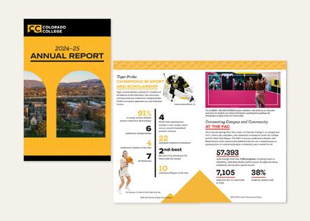
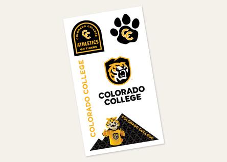

Icongraphy plays an important role in a brand. It helps visually designate categories, calls to action, and wayfinding directions.
The CC icon library contains both customized icons specific to CC’s brand and general icons that are commonly used such as email, phone, directional arrows, etc. Not all actions or categories merit the use of an icon. They are meant to call attention to a section or action-item, and they shouldn’t be used without a purpose—i.e., they’re not a visual design element out of context.
Icons are available in two styles: solid outline and solid fill. They are simple and clean. Colors are limited to Tiger Gold, Black, or White.
Photography’s role is to showcase the CC student experience in and outside of the classroom, highlight the beautiful campus, and capture our sense of place in Colorado.
Photography is the most visually impactful element of the CC brand. CC’s photos are authentic, colorful, vibrant, and bright, and they showcase all aspects of the CC experience—classes, student activities, athletics, the main and Baca campuses, study abroad, events, and featured students.
Photography should pique the interest of prospective students and their families to want to come to CC and create a sense of nostalgia for alumni.
Relatable, inclusive, engaging, authentic, emphasizing academic rigor, environmentally inclusive with classroom and hands-on experiences, variation of majors.






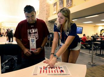
Authentic, playful, engaging, personable, inclusive, showing the spectrum of campus life from events to residential life to club and varsity sports.








Student Experience: Beyond the Block CC students have many options to study outside of the classroom— including field study, study abroad, internships, signature programming like Career Catalyst, and hands-on learning.
These photos should be relatable, engaging, vibrant, and inclusive of all of the opportunities we have outside a traditional class.






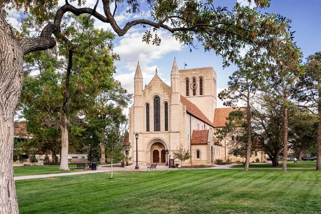
Architecture
Scenic, seasonal, striking, establishes sense of place.



Landscapes and urban subjects, emphasizing our mountain setting, dynamic downtown, and the broader Southwest.. CC’s environment is colorful, vibrant, striking, and unique.










As a rule of thumb, photography should always be full color. However, the CC brand has several options for framing and adding a duotone accent when needed to create depth and focus. There needs to be a balance when using these effects, and they should not be applied to every photo.
Adding inset frames to photos creates a focal point and emphasizes the Block Plan. Frames can be thick or hairline (the size for a hairline should be 1–2 point. If the frame is going over the photo, faces cannot be obstructed.
Another approved option is to use a thick frame and apply 80–90% opacity to it to add dimension and pops of color to poke through from the photo.


Another option with framing is to create a a multi-dimensional look with the subjects breaking out of the frame. This concept is a reference to the Block Plan fostering out-of-the-box thinking.
The frame needs to be thick (3–4 point for smaller photos, 6–10 for larger photos)) with an opacity of 100%.




The focus lens graphic can also be applied to the front of a photograph in the same manner as the frame option. The Block Plan emphasizes deep focus, and this graphic can call attention to that.
The lens can also be used in the out-of-the-box execution.
Applying an 80–90% transparency to the frame in both executions is permitted, but not required.


The focus lens has to be vertically and horizontally centered on a photo. It cannot be moved offcenter to focus on a single area.
The focus lens cannot obstruct faces.


The block funnel execution with photography highlights the Block Plan’s 3.5 weeks in a visually interactive way. Like the other photography framing and treatments, this style should be an impact accent and not used more than once per page.
The funnel can be mixed with photos, solid colors, and tone-on-tone patterns. However, the center circle always needs to contain a photo.



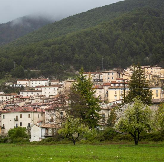
There are several options for treatments and effects to apply to photography to create visual interest. Do not apply them to every photo in a piece—there needs to be a balance and purpose for using the treatments or effects.
Nesting a photo inside of itself and decreasing the size of the inner photo creates an engaging prism-like effect, adding depth to the image. There is the option to include a frame around the inner image. Be mindful of awkward cropping when nesting—faces and body parts should not be cut off. All effects are options when creating a printed piece. Digital use should be limited to large graphics—not small banners as it creates a readability issue.
Another option with the prism effect is to make the background photo a duotone tint with one of CC’s brand colors. The front photo should not have duotone applied.




Duotone photo backgrounds can compliment content, add color, and provide depth. When using a duotone background, it’s essential to prioritize readability by ensuring a dramatic contrast between the background color and the text colors. Another option for readability is to make a colored text box over the photo.

IT’S ALL ABOUT WHO YOU KNOW — LIKE REALLY, TRULY KNOW.

Page and graphic layout must adhere to a grid for clean, legible materials.
A grid is a structure of columns and guidelines used in print, app, and digital layouts. Every grid, no matter the size, consists of columns, gutters (space between columns that separate content and improve readability), and margins (empty areas on the outer edges of the layout that frame the design). Utilizing a grid design keeps content organized, hierarchy intact, and text legible.
The number of columns and guides, as well as the gutter and margin dimensions, are dictated by the size of the piece.
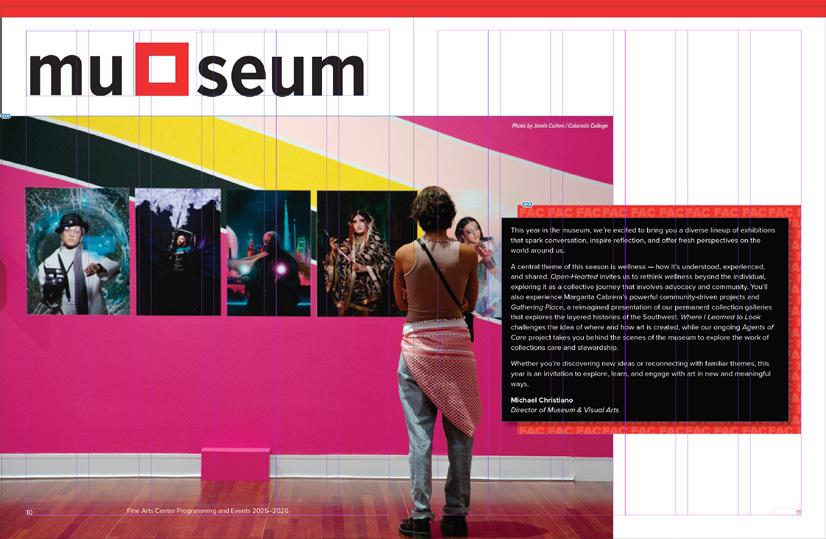
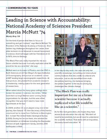
Traditional two-column grid layout on 8.5x11. For best readability on this paper size, two columns is ideal for text, though three can work in certain situations.
CC’s campus has several iconic buildings that stand out in the landscape and are very recognizable. While many architectural elements are already represented in the patterns, two buildings have unique features that work well as layout designs. These layouts should be used sparingly and only when necessary to create a high impact.
• Tutt Library’s brick facade
• Palmer Hall’s arched entryway
Palmer Hall Arch
A single arch should always have a photo inside, but if the size allows, text can be included. The three arches can only contain photos. The shapes cannot obstruct faces. An example of a high-impact use of the arches would be a cover to a brochure, the front of a postcard, or an Instagram graphic.








The Tutt brick layout works best for a 2-page spread or a single full page. The 2-page would work best in a brochure or other multi-page document. The single page would work well on the back of a flier or a multi-page document. All of the content—both visual and copy—should relate. Having many topics covered within the spread is too busy. Text inside any of the Tutt Library bricks should be left aligned, and the text boxes themselves should not be slanted. Faces cannot be cut off or obstructed within the shape. It’s not required to fill every brick with a photo or copy. They can be filled with a brand color or tone-on-tone pattern. This creates breathing room on the spread, and allows the audience to process the content.


A combination of 4 of the bricks can also be used as a page background frame. 2-Page Spread







Background Frame
Background Frame